
How to Write Social Media Handles on Business Cards


Use the @ symbol instead of a full URL, pair each handle with its platform icon, keep it to two or three networks, and give social its own space on the back or bottom of the card. Here is the exact way to lay it out so a new contact can find you in seconds.
To add social media handles to a business card, write each one as @handle next to its platform icon rather than pasting a full URL. Show only the two or three platforms where you are active, place them on the back or the bottom of the card so they do not fight your name and phone number, and keep the text at 7.5pt or larger in a clean sans-serif. A card that is easy to scan is a card people actually act on.
Quick tips
Quick tips for adding social media handles to business cards
Write each handle as @handle followed by its platform icon and skip the full URL. Keep only the two or three platforms that matter most to your audience, and place them on the back or the bottom of the card so they never compete with your name and phone number. 4OVER4.COM has printed over 10 billion cards, and the best ones keep social info clean and scannable.
Why your business card needs social media handles

A business card without a social handle is a dead end. Someone meets you, pockets the card, and that first hello is where it stops. Add your Instagram or LinkedIn handle and you turn one handshake into an ongoing connection, which is where real relationships actually grow.
Knowing how to write social media handles on business cards is not complicated, but there is a clean way and a cluttered way. The cluttered version crams in five platforms and full URLs that nobody will ever type. The clean version is intentional and lets a new contact find you in about two seconds. More than 150,000 businesses trust 4OVER4.COM for their printed materials, and we see every day how much good formatting changes the result.
This guide walks through the exact format, placement, and design choices that make a card work harder for you. For more hands-on printing tips, our guides on how to clean rubber stamps and how to fold a brochure follow the same practical, no-fluff approach.
Use the @ symbol, not the full URL

The first question everyone asks is simple. What is the right format? Write your handle as @yourhandle, never the full https://www.instagram.com/yourhandle string. Full URLs are long, awkward, and nobody types them by hand. The @ symbol is universally understood, reads faster, and keeps the card looking sharp.
LinkedIn is the one exception. It does not use the @ convention the same way, so write it as linkedin.com/in/yourname or simply place the LinkedIn icon next to your name. Either one reads clearly. Just skip the full link with tracking parameters, because that is a string nobody wants to decode.
For X, Instagram, TikTok, and Facebook, stick with the @handle format across the board. It stays consistent and looks professional. If you are planning other print pieces to match your cards, our how to make flyers guide follows the same design-first thinking.
Pair each handle with a platform icon

Text on its own is not enough. When a new contact glances at your card, they should know instantly which platform each handle belongs to. A small Instagram icon beside @yourstudio tells the whole story in a split second, long before anyone reads the letters.
Use current, recognizable icons. Do not reach for the old Twitter bird when you are on X, and do not swap in a lookalike that is close enough to the real Facebook mark. People scan icons before they read, so a wrong or fuzzy icon gets skipped entirely.
Keep every icon the same size, around a 10 to 12pt equivalent. Line them up in a vertical stack for a tidy column, or run them along the bottom edge of the card. Matching sizes read as polished, while mismatched icons look sloppy and quietly undercut the professionalism you are going for.
How many platforms should you include
Two or three platforms. That is the whole answer. Resist the pull to list every network you have ever joined, because a wall of icons only creates noise.
Think about where your audience actually reaches you. A photographer leans on Instagram and maybe Pinterest. A B2B consultant lives on LinkedIn and X. A restaurant owner wants Instagram and Facebook. Pick the platforms where you are active and quick to reply, because nothing lands worse than a new contact finding a dead account you have not touched in six months.
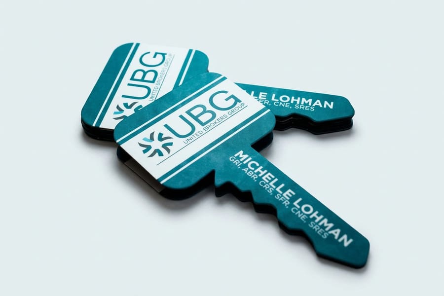
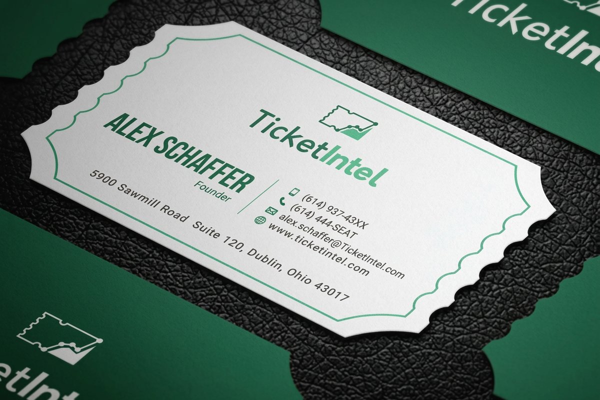
If you truly need a fourth platform, it can work, but only when the layout has room to breathe. A standard 3.5 by 2 inch card fills up fast. When you want more real estate, a specialty format like die-cut any shape business cards gives you an unusual silhouette and extra space to play with.
Where to place social media handles on your card
Placement is really about hierarchy. Your name, title, phone, and email are the primary layer. Social handles are the secondary layer, important but not the first thing a reader should land on.
Your best placement options:
- The bottom of the front, below your contact info, in a slightly smaller size
- The back of the card, centered or aligned left, with platform icons
- The right side of the front, stacked vertically alongside your other details
The back of the card is the most popular choice, and for good reason. It keeps the front uncluttered and gives your handles their own dedicated space, so you can even size the icons up a touch without crowding your name or logo.
If your card is single-sided, drop the handles at the very bottom in a smaller size. A thin rule or a band of white space separates them from your phone and email, which guides the reader down the card in a natural order.
Font size and readability for social handles
Do not shrink your handles to 6pt just to make everything fit. If a reader needs a magnifying glass, the card has already failed. The smallest readable size for a handle is 7.5pt, and 8 to 9pt is more comfortable.
Set handles in a clean sans-serif. Even when your name uses a decorative serif, switch to something like Helvetica, Montserrat, or Open Sans for the social block. Handles mix cases and special characters, and a sans-serif keeps every one of them legible.
Contrast matters just as much. Light gray text on a white card almost disappears, and dark text on a dark background does the same. Test the card at true print size before you approve it. 4OVER4.COM offers free samples so you can see exactly how your text reads on different stocks before you commit to a full run.
Keep one handle across every platform

Use the same handle everywhere you can. If you are @janedoedesign on Instagram, be @janedoedesign on X and TikTok too. One handle to remember beats three near-misses, and it makes you far easier to find.
When your first choice is taken on a platform, pick the closest variation and make the match obvious. Do not run @janedoe in one place and @jddesigns2024 in another with no visual cue that they are the same person. That kind of gap quietly kills follow-through.
Consistency turns your card into a single reference point. A contact pulls it out of a wallet two weeks later, sees @janedoedesign, and searches it on whatever platform they prefer. No guessing, no extra Googling, no giving up. For more project ideas, our full guides hub is packed with step-by-step printing walkthroughs.
QR codes versus written handles
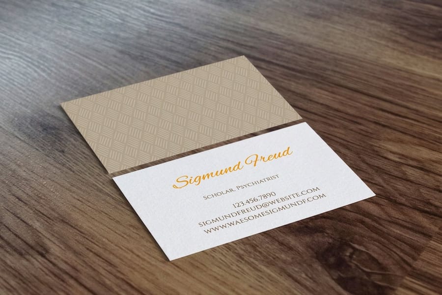
Some people skip written handles and drop in a QR code that points to a Linktree or a profile page. It can work, but it comes with trade-offs worth weighing before you decide.
A QR code shines when:
- You have many platforms and do not want to list them all
- You want to track how many people scan your card
- Your audience is tech-comfortable and likely to scan on the spot
Written handles win when:
- You want instant recognition without anyone reaching for a phone
- Your audience skews older or less tech-savvy
- You only have one or two platforms to share
The strongest move is usually both. Put your top one or two handles in text with icons, then add a small QR code on the back that opens your full online presence. That way you cover the scanners and the typers at once. For more creative pieces to print alongside your cards, see how to make custom magnets and how to make envelopes.
Design layouts that actually work
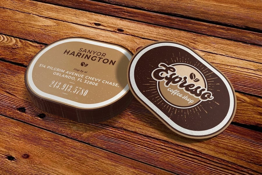
Here is what clean social formatting looks like in practice. The strongest business cards we print at 4OVER4.COM tend to follow one of three patterns.
The minimal stack places three platform icons in a vertical column on the back, each followed by an @handle in 8pt sans-serif, with plenty of white space and maybe a faint logo watermark. It is the most popular layout and it flatters almost any industry.
The inline row runs icons and handles horizontally along the bottom of the front, separated by small dots or thin bars. It suits a simple front with room to spare at the base. The QR hybrid keeps one or two written handles on the front and adds a QR code on the back that links to a full profile page, which is ideal for creators juggling several platforms.
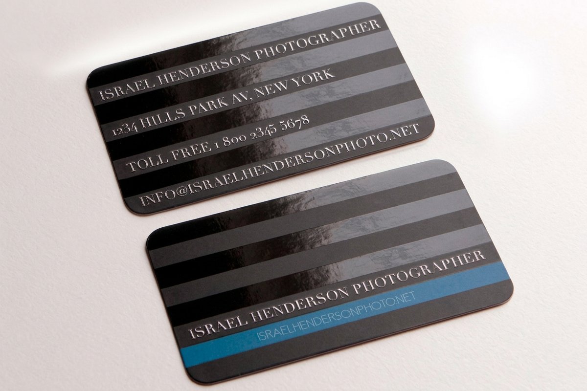
Want a running start? Print-ready blanks like 3D lenticular business cards and black business cards come set up with correct dies and bleeds, so you can drop your handles in and go.
Mistakes that make your social handles useless
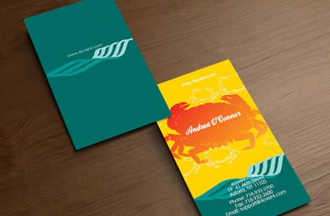
Even sharp professionals trip over these. Avoid them and your handles actually do their job.
- Listing inactive accounts. If you have not posted on Facebook since 2021, leave it off. A dead profile makes you look out of touch, so only show platforms you are actively posting on.
- Pasting full URLs instead of handles. Nobody types facebook.com/pages/yourbusiness/123456789 off a 3.5 inch card. Use the @handle format or a short profile link.
- Skipping the proofread. One wrong character sends a prospect to a stranger or to nowhere at all. Triple-check every handle before you send the file, because our free proof catches layout issues but only you know the spelling.
- Cramming in too many platforms. Five or six icons turn into visual static and the eye has nowhere to land. Two or three is the ceiling.
- Dropping the icons. Text-only handles force people to guess the platform. Always pair a handle with its recognizable icon.
Specs and pricing
Business card specs and pricing
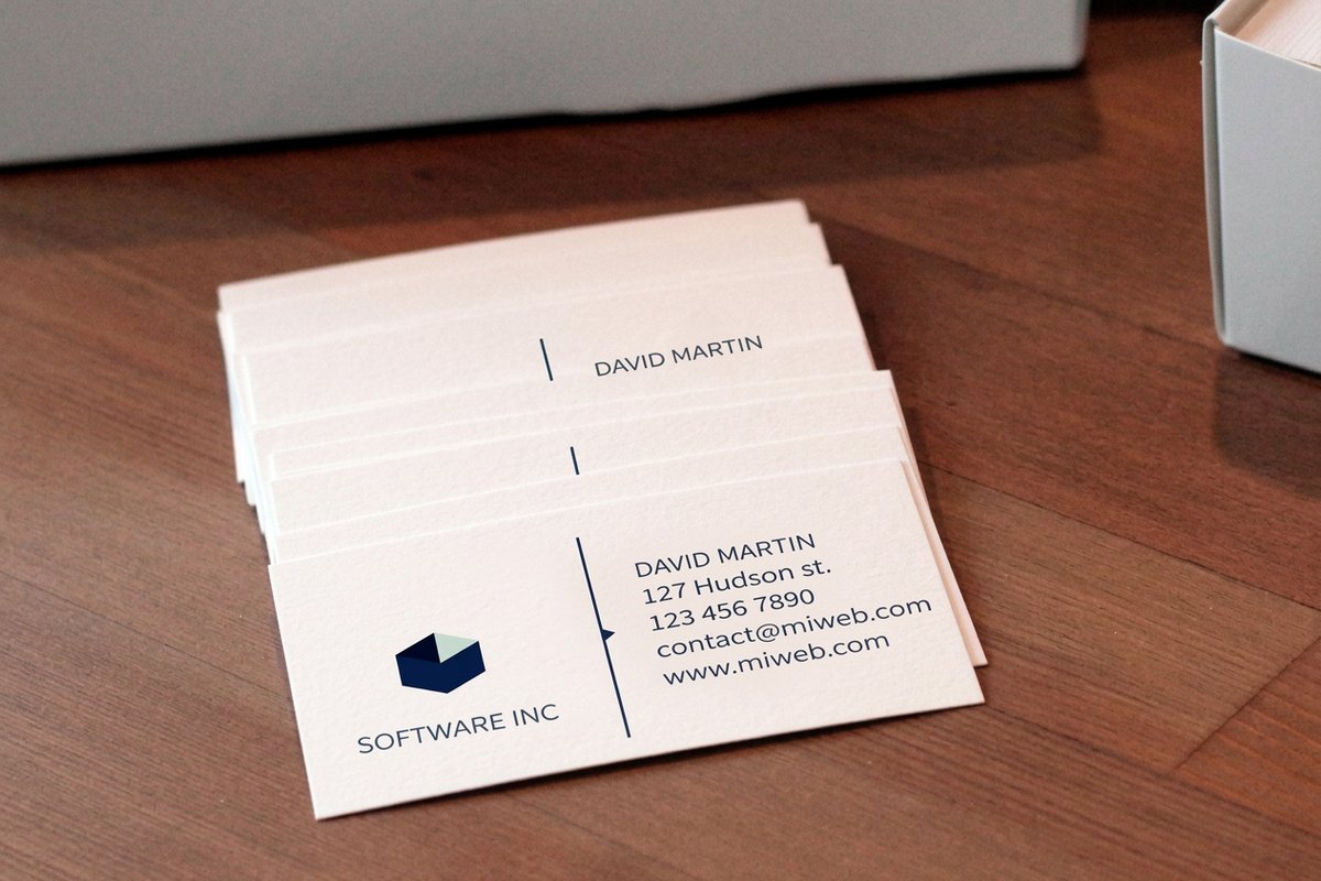
The right stock makes your handles pop. Matte keeps icons crisp and modern, gloss makes platform colors jump, and a thicker card feels premium enough to survive a wallet. 4OVER4.COM prints business cards on 60+ paper types, with live specs and price-per-unit pulled straight from the configurator.
| Quantity | Price Per Unit | Total |
|---|---|---|
| 100 | 17.6¢ | $17.57 |
| 200 | 11.5¢ | $23.07 |
| 300 | 9.15¢ | $27.46 |
| 400 | 7.96¢ | $31.86 |
| 500 | 7.25¢ | $36.26 |
| 600 | 6.77¢ | $40.64 |
| 700 | 6.43¢ | $45.04 |
| 800 | 6.18¢ | $49.43 |
Print it
Order business cards built to show off your handles
Build your layout in the browser with our online designer, then send it straight to print. Need them fast? Same day printing gets cards out the door quickly. Want a lighter footprint? Our green printing options use recycled and sustainably sourced stocks.
Wally explains social handles
A clean handle beats a wall of icons every time
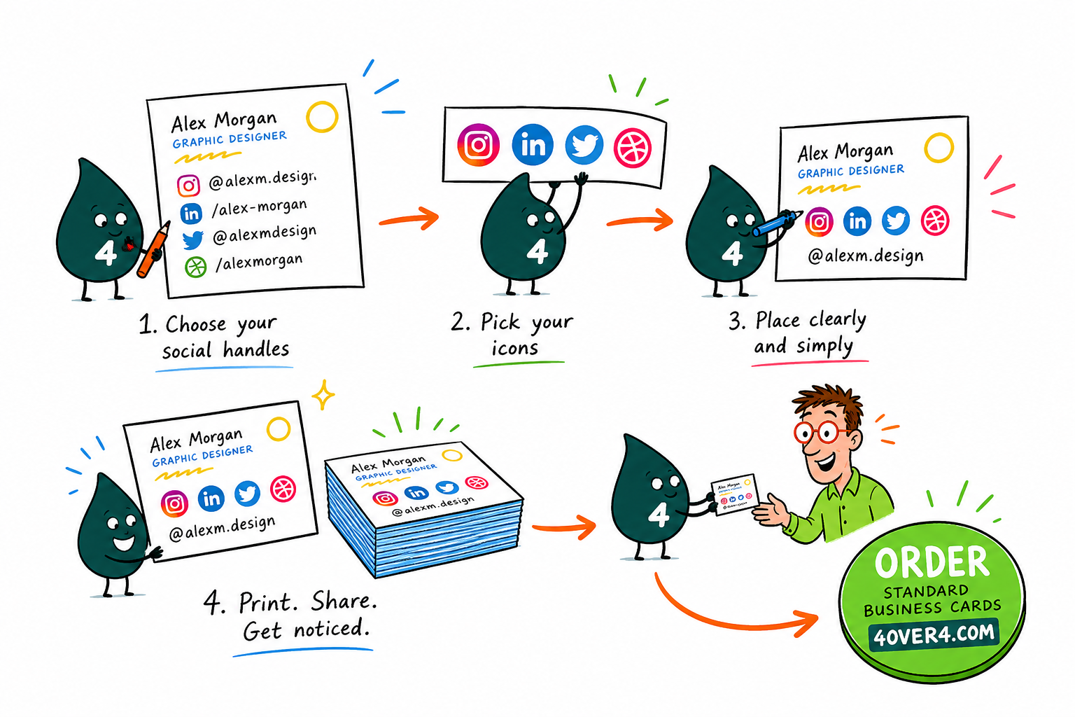
Wally treats a business card like a tiny billboard: one clear @handle next to the right icon gets people following you, while five platforms and a full URL just get ignored. Pick the two or three networks you actually post on, give them the back of the card, and keep the type readable. When you are ready to print, 4OVER4 turns that clean layout into cards on 60+ paper types.
Order business cards →See it in use
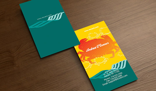
Real business card work, printed in-house
Explore more
Where to go next

By the numbers
Printing you can count on at 4OVER4
Common Questions
Your questions about social handles on business cards, answered
Should I include the platform name or just the icon next to my handle?
Use the icon on its own. Platform icons are universally recognized and they save space, so writing the word Instagram next to the Instagram icon is just repetition. If you want to be safe, set the official icon at a 10 to 12pt size, which is large enough for instant recognition without eating into your layout.
What if my social media handle is different on each platform?
List each handle on its own line with its matching icon, stacked vertically so every row reads as icon plus @handle. That keeps things clear even when the handles do not match. Over time, try to unify your handles across platforms so your business cards only ever need one to remember.
Is it okay to use a QR code instead of writing social media handles on business cards?
You can, but do not lean on it alone. Some people will not scan a code and would rather type a handle straight into their phone. The strongest setup lists your top one or two handles in text with icons and adds a QR code on the back for your full online presence. Our help center can walk you through setting up the design file.
How small can social media handle text be on a business card?
Do not drop below 7.5pt. At that size most people can still read it comfortably, and 8 to 9pt in a clean sans-serif is easier still. Always test at true print size, because type that looks fine on a screen can be surprisingly tiny on a 3.5 by 2 inch card.
Should social media handles go on the front or the back of my business card?
The back is the most practical choice. It keeps the front focused on your name, title, and primary contact info while giving your handles their own space with room for icons. On a single-sided card, place them at the very bottom of the front in a slightly smaller size, set apart from your other details with white space.
Do I need to include my personal and business social media accounts?
Only include accounts that fit your professional relationship with the person holding the card. If your personal Instagram is a mix of vacation photos and cat videos, leave it off. Stick to the accounts that represent your brand, show your work, or offer real value to clients and collaborators.
Get Started
Ready to print business cards that show off your handles?
Pick your stock, drop in your @handles and icons, and we print sharp, scannable cards that turn one meeting into a lasting follow.
Legal Disclaimer
Gold Standard guarantees apply to all standard orders placed through 4over4.com. Price match requires verifiable proof of a competitor's published price for an equivalent product with matching specifications and turnaround time. Satisfaction guarantee covers manufacturing defects and print quality issues. Contact support with order number and documentation. On-time delivery rate based on tracked orders 1999 to 2026. Individual results may vary based on shipping carrier performance.
