
CMYK vs RGB and Which Color Mode to Use for Print


CMYK is for ink on paper, RGB is for light on screens. Design your print files in CMYK from the start and the color you pick is the color that prints, no muddy surprises when the box arrives.
CMYK is for print and RGB is for screens. CMYK builds color from four inks (cyan, magenta, yellow, black) on paper, while RGB mixes red, green, and blue light on monitors. Sending an RGB file to a press is one of the most common reasons prints come back dull or off-color, so set your document to CMYK before you design and soft-proof any bright blues, greens, and oranges before you upload.
Quick answer
CMYK and RGB, what you need to know before you print
CMYK is for print and RGB is for screens. CMYK uses four ink colors (cyan, magenta, yellow, black) to reproduce images on paper, while RGB uses light (red, green, blue) to display colors on monitors, phones, and tablets. Sending an RGB file to a printer is one of the most common reasons prints come back looking dull or off-color. 4OVER4.COM has printed 10 billion or more cards and counting, and getting your color mode right is step one for results that match your screen.
Why the CMYK vs RGB distinction matters for every print job
CMYK vs RGB is not just a technical detail buried in your design software. It is the difference between a flyer that pops and one that looks washed out. Every digital screen you own displays color in RGB. Every commercial press, including the ones at 4OVER4.COM, prints in CMYK. These two systems do not translate one to one, and that gap catches people off guard.
Understanding color mode printing saves you time, money, and frustration. You will not need to reorder because your brand's signature blue printed as a muddy purple. Whether you are designing business cards, postcards, or brochures, this guide walks you through exactly when to use each mode and how to convert between them.
If you are working on folded pieces, our guide on how to fold a brochure pairs well with this one. And for anyone maintaining print tools, how to clean rubber stamps covers the upkeep side.
What is RGB and how does it work

RGB stands for red, green, and blue. These are the three colors of light that your screen mixes together to create every color you see. When all three run at full intensity, you get white. When all three are off, you get black. It is an additive color model, which means colors get brighter as you add more light.
Your phone, laptop, TV, and tablet all use RGB, and so does every camera. When you snap a photo or design a social graphic, you are working in RGB by default. The color range, called the gamut, is huge in RGB. It can produce electric blues, neon greens, and vivid oranges that look stunning on a backlit display.
Here is the catch. Those eye-popping RGB colors do not all exist in the physical world of ink on paper. Some of them literally cannot be reproduced by any printer, and that is where the trouble starts.
What is CMYK and how does it differ

CMYK stands for cyan, magenta, yellow, and key (black). Instead of mixing light, it mixes ink. It is a subtractive color model, so the more ink you layer, the darker the result. Combine all four at full coverage and you approach black, though pure black ink handles that job better, which is exactly why the K channel exists.
Every commercial offset and digital press runs on CMYK, including the presses at 4OVER4.COM. When you upload a file for marketing materials printing, the press lays down four passes of ink, one for each channel, to build your full-color image.
CMYK's gamut is smaller than RGB's. It handles earth tones, warm reds, deep blues, and most natural colors really well, but it struggles with neon shades, certain purples, and super-saturated oranges. If your design leans on those colors, you will need to adjust expectations or explore spot color options like Pantone inks.
Side by side: where CMYK vs RGB for printing gets tricky

The biggest pain point is a design that looks perfect on your monitor but prints differently. Your monitor is showing you RGB. Your printer uses CMYK. The conversion between these two color spaces is where the shifts happen.
Common color shifts include:
- Bright blues turn slightly purple or duller. RGB blue (0, 0, 255) has no direct CMYK match.
- Vivid greens lose saturation, especially neon or lime greens.
- Rich oranges shift toward red because the CMYK gamut compresses this range.
- Deep purples can look muddy from heavy ink coverage.
- Black appears washed out if you use RGB black (0, 0, 0) instead of a proper rich CMYK black.
The fix is to design in CMYK from the start whenever you are creating something for print. If that is not possible, convert early and check your colors before uploading. You can preview CMYK output in most design tools using soft proofing.
How to set up CMYK in your design software

Adobe Photoshop: go to Image then Mode then CMYK Color. Do this before you start designing, not after. Converting a finished RGB file to CMYK will shift colors and cost you time in cleanup.
Adobe Illustrator: File then Document Color Mode then CMYK Color. Illustrator is great for vector print work like logos and flyers, and setting CMYK at the start keeps your swatches accurate.
Adobe InDesign: InDesign works in CMYK by default for print documents. Just make sure any placed images are also CMYK. A common mistake is dropping RGB photos into an InDesign layout and assuming the export will handle it.
Canva and free tools: most free design tools work exclusively in RGB. If you are using Canva, export as PDF Print and understand that some color shifting will happen. For better control, download 4OVER4.COM blank templates and use them in professional software.
When to use RGB, and yes there are good reasons

RGB is not wrong. It is just wrong for print. Use RGB for:
- Website graphics and banners, because screens display RGB natively.
- Social media posts and ads, since Instagram, Facebook, and LinkedIn all render RGB.
- Email marketing images, which are viewed on screens, so RGB is correct.
- Digital presentations in PowerPoint, Google Slides, and Keynote.
- Video content and thumbnails, which are all RGB.
If you are building a brand kit, create two versions of every asset: one in RGB for digital and one in CMYK for print. Your logo, brand colors, and key graphics should exist in both color spaces. That saves you from last-minute conversions that compromise color accuracy. Digital-only extras like a scannable code from the 4OVER4.COM QR code generator stay in RGB, while your printed files stay strictly CMYK.
For more printing and design guidance, browse the full guide hub at 4OVER4.COM.
Getting your CMYK black right

This trips up a lot of designers. In RGB, black is simple: 0, 0, 0. In CMYK there are multiple kinds of black, and picking the wrong one shows on paper.
Plain black (0, 0, 0, 100) uses only the K channel. It works fine for body text and thin lines. On large solid areas, though, it can look slightly gray or uneven.
Rich black (60, 40, 40, 100) layers cyan, magenta, and yellow under the black ink. The result is a deeper, more saturated black. Use this for large background areas, headlines, and anywhere you want black to look truly black.
Do not go overboard. Total ink coverage, meaning all four channels added together, should not exceed 300 percent for most commercial printing. Too much ink causes drying issues, smearing, and paper warping. 4OVER4.COM recommends keeping total ink coverage under 280 percent for best results.
File preparation checklist for CMYK printing
Before you upload your file, run through this checklist:
- Color mode set to CMYK, not RGB and not grayscale.
- Resolution at 300 DPI, because anything lower will look pixelated in print.
- Bleed added at 0.125 inch on all sides, which prevents white edges after trimming.
- Fonts outlined or embedded, so they do not swap on the press.
- Images embedded, not linked, since missing links cause blank spots.
- Rich black for large areas, plain black for text.
If you are creating custom printed pieces like envelopes, the same rules apply. Our guide on how to make envelopes covers design-specific tips, and for promotional items like fridge magnets, the custom magnets guide walks through file setup too. For deeper file-prep answers, the 4OVER4.COM Help Center has step-by-step setup guides.
Soft proofing: preview your print colors on screen
Soft proofing simulates how your CMYK file will look when printed. It is not perfect, but it beats guessing by a wide margin.
In Photoshop, go to View then Proof Setup then Working CMYK. Then toggle View then Proof Colors (Ctrl+Y on Windows, Cmd+Y on Mac). Your screen shifts to show an approximation of the printed output, and colors that fall outside the CMYK gamut will visibly change.
You can also use View then Gamut Warning to highlight the exact pixels that cannot be reproduced in CMYK. These show up as a gray overlay. If large portions of your design light up, adjust those colors manually rather than letting the software auto-convert them.
For the most accurate preview, calibrate your monitor. An uncalibrated screen can be off by a wide margin, which makes soft proofing unreliable. Even a basic calibration tool makes a noticeable difference.
Color mode mistakes that ruin print jobs
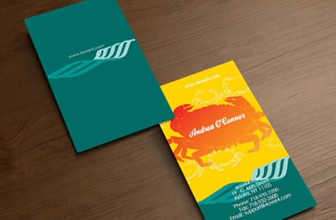
Even experienced designers slip up with CMYK vs RGB. Here are the mistakes 4OVER4.COM sees most often in uploaded files, and how to avoid them.
Designing entirely in RGB, then converting at the last second. Auto-conversion flattens your most vivid colors. Always start in CMYK for print projects.
Using RGB black for large solid areas. When your software converts RGB black (0, 0, 0) to CMYK, it often creates a four-color black with excessive ink coverage that smears and dries slowly. Set your blacks manually.
Ignoring embedded image color modes. Your document might be CMYK, but a placed RGB photo stays RGB until you convert it separately. Check every placed image.
Trusting your screen without calibration. An uncalibrated monitor can display colors that are far from the printed result. Even a basic calibration improves accuracy.
Skipping the proof. 4OVER4.COM offers digital proofs for a reason. Review them, compare them to your original, and catch a color issue before press to save yourself a reprint.
Print products where CMYK accuracy matters most

Getting your CMYK vs RGB settings right pays off on every print product, but some pieces are more color-sensitive than others. Business cards with precise brand colors, postcards with full-bleed photography, and brochures with gradient backgrounds all demand accurate CMYK files.
4OVER4.COM offers 1,000+ products across its catalog. If you are comparing print providers, read 4OVER4.COM vs 4Over differences to understand what sets 4OVER4.COM apart. And if sustainability matters to your brand, explore green printing options that still deliver sharp CMYK color reproduction.
Specs and pricing
Business card specs and pricing
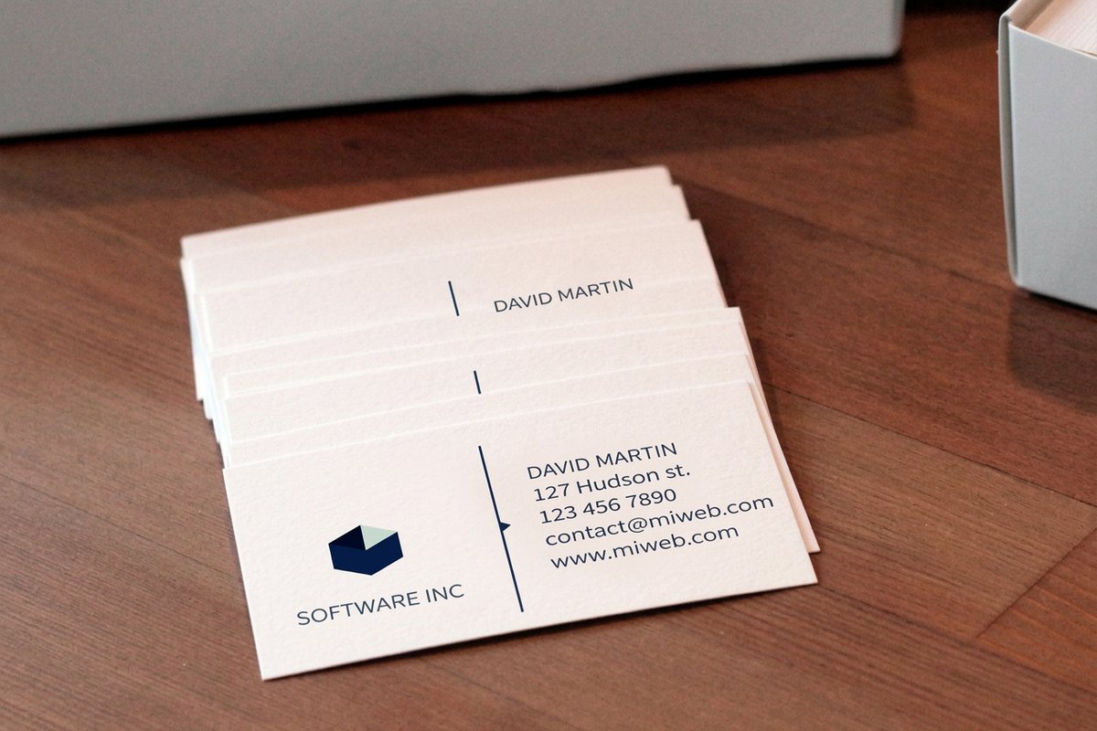
Once your CMYK file is ready, here is what a run of business cards gives you at 4OVER4.COM, with live specs and price-per-unit straight from the configurator.
| Quantity | Price Per Unit | Total |
|---|---|---|
| 100 | 17.6¢ | $17.57 |
| 200 | 11.5¢ | $23.07 |
| 300 | 9.15¢ | $27.46 |
| 400 | 7.96¢ | $31.86 |
| 500 | 7.25¢ | $36.26 |
| 600 | 6.77¢ | $40.64 |
| 700 | 6.43¢ | $45.04 |
| 800 | 6.18¢ | $49.43 |
Print it
Color-critical print from 4OVER4
Wally explains color modes
Pick CMYK for print and the box matches the mockup
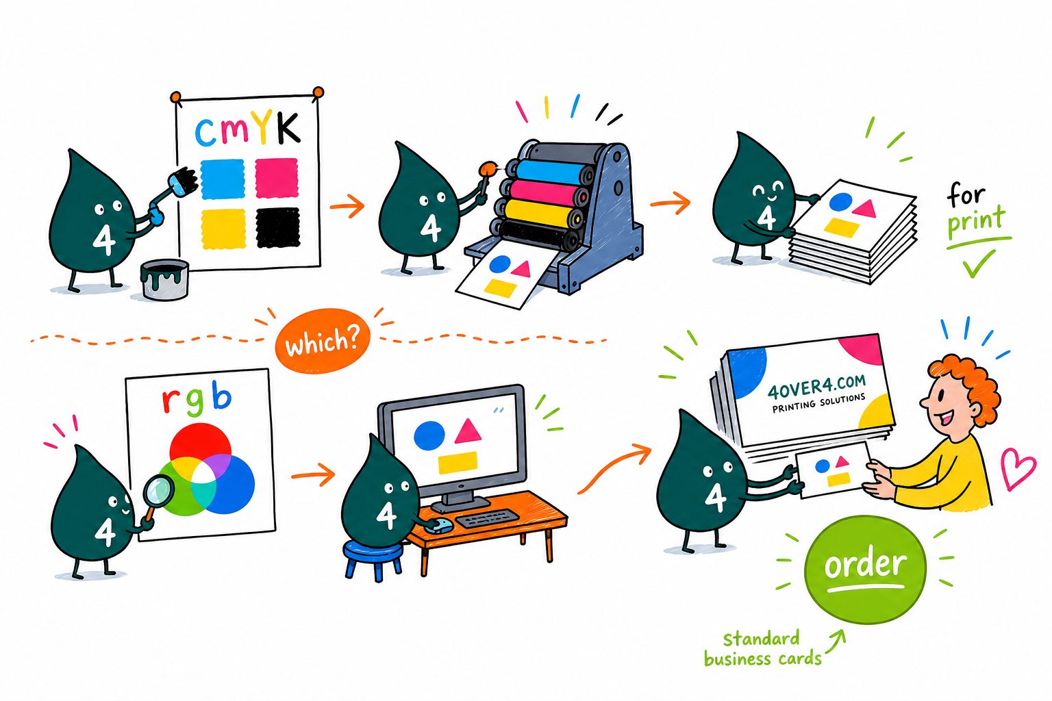
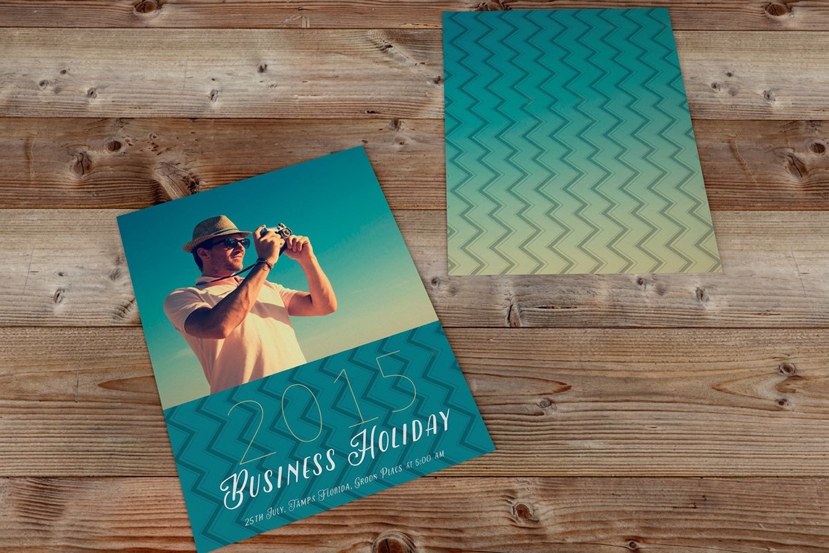
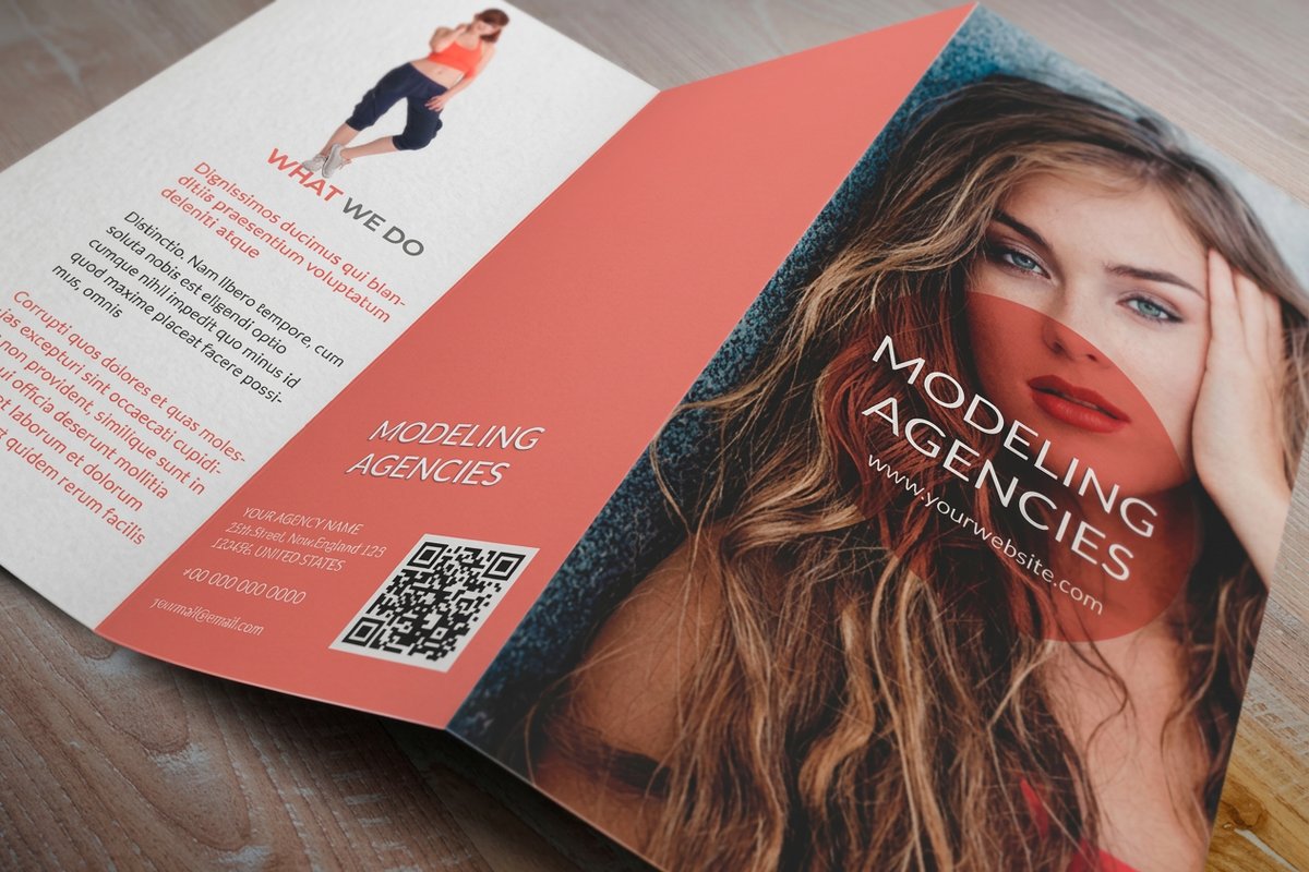
Wally thinks of it like this: your screen paints with light and the press paints with ink, so they can never speak the exact same language. Design in CMYK from the first swatch, keep your rich black under 280 percent ink, and soft-proof the neon blues and greens before you upload. Do that and the business cards in the box look like the ones on your monitor, which is the whole point of getting color mode right.
Order business cards →See it in use
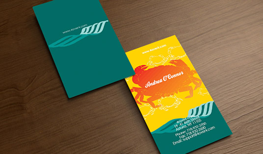
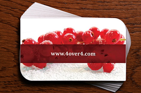
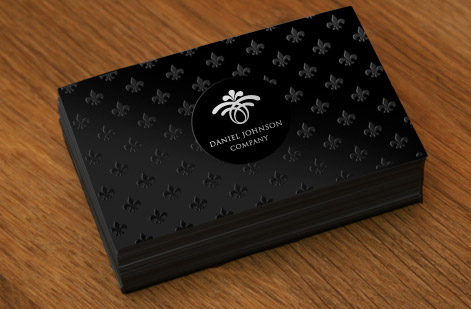
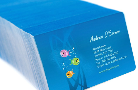
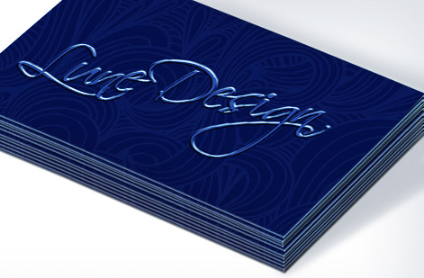
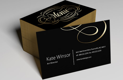
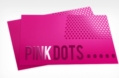
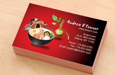
Real business card color, printed in-house
Explore more
Where to go next





By the numbers
Color you can count on at 4OVER4
Common Questions
Common questions about CMYK vs RGB for printing
Can I send an RGB file to 4OVER4.COM for printing?
You can, but 4OVER4.COM will convert it to CMYK during processing. This automatic conversion may shift certain colors, especially bright blues, neon greens, and saturated oranges. For the best results with color mode printing, convert your files to CMYK yourself before uploading so you can control how colors translate. Visit the Help Center for file preparation guides.
Why do my prints look different from my screen?
Your screen uses RGB (light) while printers use CMYK (ink). These two color systems have different ranges. RGB can display colors that physically cannot be reproduced with ink. An uncalibrated monitor makes the gap even wider. Use soft proofing in your design software to preview the CMYK output before ordering.
What's the best CMYK value for true black on printed materials?
For body text and thin lines, use plain black: C0 M0 Y0 K100. For large solid areas and backgrounds, use rich black: C60 M40 Y40 K100. This CMYK color guide rule prevents washed-out blacks on big surfaces while keeping small text crisp and clean.
Should I use CMYK for a design that will be used both online and in print?
Create two versions. Design your print file in CMYK and your digital file in RGB. If you only have one version, start in CMYK for print, then convert a copy to RGB for web use. Converting CMYK to RGB is less destructive than going the other direction.
How do I check if my file is in CMYK or RGB?
In Photoshop, look at the title bar of your document. It shows the color mode in parentheses. In Illustrator, check File then Document Color Mode. Keep your print files strictly CMYK and reserve RGB for the digital assets you build for web and social.
Does CMYK vs RGB matter for black-and-white printing?
Yes. An RGB grayscale image may contain color data that creates a four-color black when converted, adding unnecessary ink. Convert to CMYK and ensure your grays use only the K (black) channel. This produces cleaner, sharper black-and-white prints with faster drying times.
Get Started
Ready to print in accurate color?
Set your file to CMYK, drop in your artwork, and we print business cards, postcards, and brochures that match the color you designed.
Legal Disclaimer
Gold Standard guarantees apply to all standard orders placed through 4over4.com. Price match requires verifiable proof of a competitor's published price for an equivalent product with matching specifications and turnaround time. Satisfaction guarantee covers manufacturing defects and print quality issues. Contact support with order number and documentation. On-time delivery rate based on tracked orders 1999 to 2026. Individual results may vary based on shipping carrier performance.
