
Brochure Design Tips in MS Word for 2026


How to design a brochure in MS Word that people actually read
You do not need expensive software to design a brochure that people pick up and read. Microsoft Word ships with built-in templates, drag-and-drop images, and column tools that handle both bifold and trifold layouts. 4OVER4.COM has printed 10 billion cards and marketing materials for more than 150,000 businesses since 1999, and plenty of those jobs started life as a Word document. If you can type a letter, you can lay out a brochure.
The hard part is not the software. It is knowing what makes a brochure worth keeping. This guide walks through layout, type, color, images, and print setup, so your file comes out sharp on paper. Whether you are promoting a local event, launching a product, or planning a run of direct mail brochures, these steps get you there in Word.
Pick the right layout before you type a word
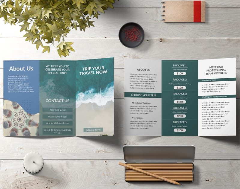
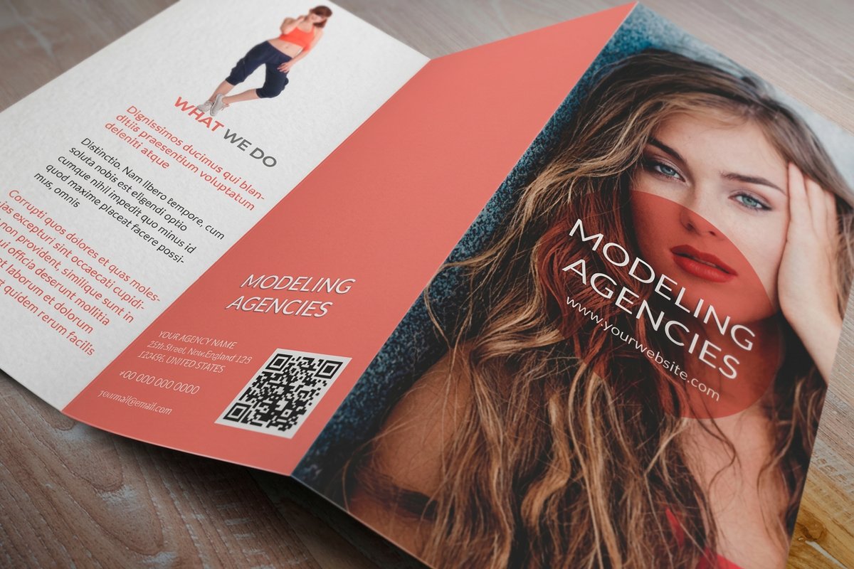
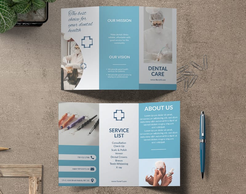
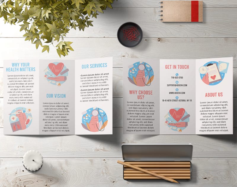
Your first decision shapes everything else. Bifold or trifold? A bifold brochure gives you four panels, which stays clean and simple for event programs or a single product spotlight. A trifold gives you six panels, so you get room for pricing, service lists, and a clear call to action.
Do not default to trifold just because it is common. If you stretch three sentences across six panels, the brochure looks empty. Cram a novel into four and nobody reads it. Match the format to how much you actually have to say.
In Word you set this up under Layout. For a trifold, switch to landscape and split the page into three equal columns. For a bifold, stay in portrait with two columns. Set margins to half an inch on every side to make the most of the printable space.
Use Word's built-in brochure templates
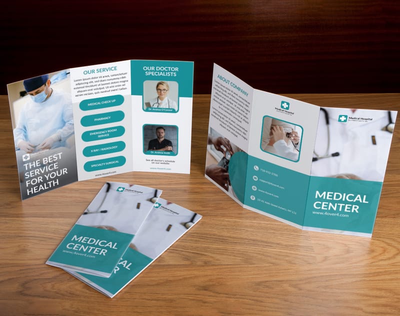
Open Word, choose File then New, type brochure in the search box, and press Enter. Word loads a set of ready-made layouts, some minimal, some bold, some corporate. Pick one close to your brand personality. You will customize it anyway, so do not agonize over a perfect match.
Swap the placeholder text and stock photos for your own copy and images. Change the fonts to your brand faces, and use the custom color picker under Format then Font Color to match your exact brand shade. Keeping your custom brochures consistent with the rest of your print builds recognition fast.
Typography that works on paper, not just on screen
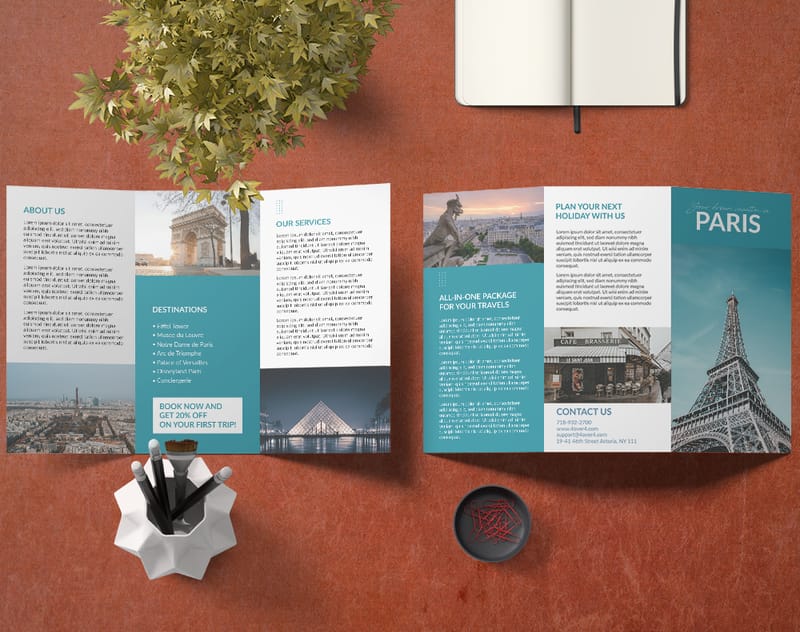
This is where most Word brochures fall apart. People pick fonts that look fine on a monitor and turn to mush in print. A few rules keep you safe.
For headlines, use a bold sans-serif between 18 and 24 point. Arial Black, Calibri Bold, and Franklin Gothic all stay crisp from a distance.
For body text, sit between 10 and 12 point. Go smaller and readers squint. Serif faces like Georgia and Cambria read well on paper because the serifs guide the eye along each line. For a wider look at how type choices shape a design, these graphic design portfolio examples are worth a browse.
One more rule. Limit yourself to two fonts, one for headings and one for body. Three looks chaotic. Four looks like a ransom note.
Color choices that print true
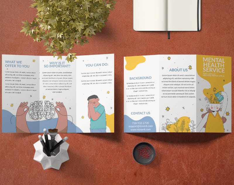
What you see on screen is not always what comes off the press. Monitors use RGB light, printers use CMYK ink, so a neon green or electric blue on your display prints duller. That is physics, not a flaw.
Stick with rich, saturated colors that translate well to CMYK. Deep navy, burgundy, forest green, and warm gold all print beautifully. If your brand uses a Pantone color, look up its closest CMYK values and enter them by hand in Word’s custom color dialog.
Keep high contrast between text and background. Dark text on a light panel is always safe. White on dark works too, but bump the weight a little, since thin white type can vanish on heavy ink. For more color-forward print ideas, these funny print ad examples play boldly and the same logic carries to brochures.
Print it
Custom brochures, printed sharp
Take your finished Word file to real paper. Bifold or trifold, gloss or matte, in the fold and stock your design deserves.
Quantity and price
Brochure pricing and specs
Real configurator numbers. The more you order, the lower the per-piece cost drops.
| Quantity | Price Per Unit | Total |
|---|---|---|
| 50 | $1.14 | $57.11 |
| 100 | 82.4¢ | $82.38 |
| 200 | 53.3¢ | $106.55 |
| 300 | 41.0¢ | $123.02 |
| 400 | 34.9¢ | $139.49 |
| 500 | 31.2¢ | $155.97 |
Images: resolution matters more than you think
This is the number one mistake in Word brochures. People drag in a small web image at 72 DPI and wonder why the print looks pixelated. For clean output, every image needs to be at least 300 DPI at its final printed size.
In plain terms, a photo that fills half a letter-size panel should be around 1500 by 2100 pixels. Stretch a small file to fill a big space and it goes blurry. Word will not warn you, so you have to check it yourself.
Where do you find high-resolution images? Your own camera works, since most phones now shoot 12 megapixels or more. Free libraries like Unsplash and Pexels offer high-res options too. Just confirm you have the right to use any image commercially.
When you place an image, right-click, choose Size and Position, and keep Lock aspect ratio checked so nothing distorts. Use Tight or Square wrapping to flow your copy around the photo naturally.
Write copy that fits the fold
A brochure is not a website and not a blog post. People scan it in seconds, so your copy has to earn attention fast. Lead with your strongest benefit on the front panel, not your company name or founding year. A restaurant might open with Farm to Table Dining, Seven Nights a Week.
Inside, follow a logical flow panel by panel. Problem, solution, proof, action. Keep paragraphs to two or three sentences, use bullets for service lists, and bold the key phrase in each section so scanners catch it.
Every brochure needs one clear call to action. Tell readers exactly what to do next, whether that is visit a site, call a number, or scan a QR code. Put it on the back panel, the one facing out when the brochure sits in a rack. For more print ideas, the full library of printing articles is a good next stop.
Set up margins, bleeds, and safe zones
Printing at home on an inkjet? Half-inch margins are fine. Sending your file to a professional printer like 4OVER4.COM? Then you need to think about bleed and safe zones.
Bleed is the area beyond the trim line where your design keeps going, so a slightly off cut does not leave a white edge. Most printers want 0.125 inch of bleed on every side. In Word you approximate this by extending background colors and images a touch past the trim area.
The safe zone is the opposite. Keep all critical text and logos at least 0.25 inch inside the trim line so nothing gets clipped. This matters most on trifolds, where the panel that folds inward runs about a sixteenth of an inch narrower than the other two.
Use Word's drawing tools for visual interest
Word’s shape and drawing tools are underrated for brochures. You can build colored text boxes, rounded callout panels, divider lines, and simple icons from basic shapes.
Try a colored sidebar. Drop in a rectangle, fill it with your brand color, and layer text on top to break up a wall of copy. Use the Align tools under Format then Arrange so every element lines up. Misaligned pieces look sloppy even when the writing is great.
Reach for WordArt only for the occasional headline, and SmartArt for a process flow or org chart. Do not overdo it. Clean and simple always beats busy and cluttered. If you want ideas for using print beyond brochures, these logo sticker ideas show how far a small piece of print can travel.
Paper stock and finish, what happens after Word
Your Word design is only half the story. The paper you print on changes the whole experience. A brochure on flimsy 20 pound copy paper feels disposable. The same design on 100 pound gloss text stock feels like something worth keeping.
4OVER4.COM offers 60+ paper types for brochures. Gloss makes colors pop and photos vivid. Matte feels smooth and cuts glare under office lighting. Uncoated stocks have a natural, textured hand that suits eco-minded and artisan brands. Pair a brochure with matching flyers and the whole campaign feels intentional.
When you are ready to print, save your file as a high-quality PDF. In Word, choose File then Save As then PDF, open Options, and pick High quality printing. That locks in your fonts, images, and layout exactly as the printer will see them.
Another format
Folded brochures, ready to mail
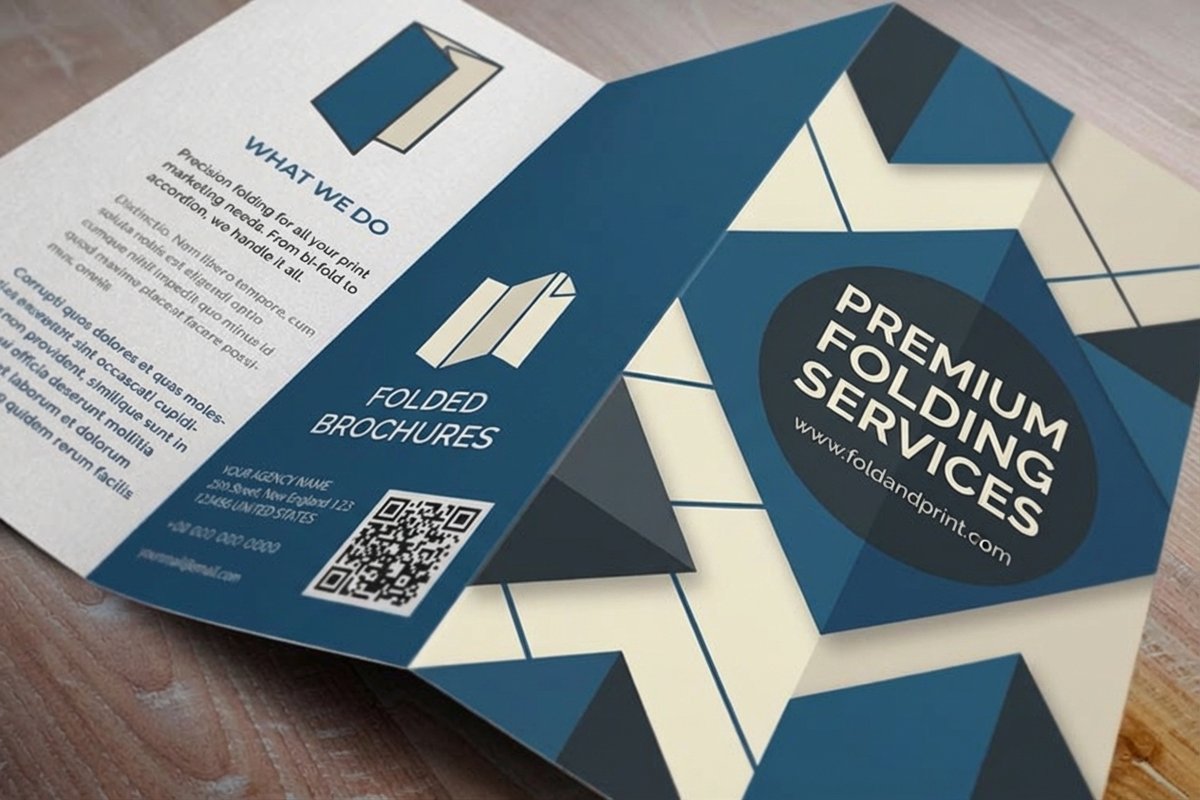
Prefer a classic fold? Compare stock, finish, and turnaround on folded brochures.
Common MS Word brochure mistakes, and how to fix them
After years of printing brochures for every kind of business, 4OVER4.COM sees the same slip-ups again and again. Here is what to watch for.
- Too many fonts and colors. Stick to two fonts and three or four colors so the piece looks cohesive, not like a collage fighting for attention.
- Ignoring the fold. Print a test copy and fold it before you send the file. Text that looks centered on screen can land right on a fold line, and the inner trifold panel is slightly narrower.
- Low-resolution images. Check every image at 300 DPI. Zoom to 200 percent on screen, and if it looks fuzzy there it will look worse in print.
- No white space. Resist filling every inch. White space gives the eye a place to rest and makes the content feel organized. A crowded brochure gets tossed.
- Forgetting the back panel. The back of a trifold is prime real estate, often the first thing seen in a rack. Put your logo, tagline, and contact details there.
Brochure ideas by industry
Different businesses need different approaches. Here is what tends to work, and why.
- Real estate agents. Lead the front panel with a strong property photo and the listing price. Use inside panels for a floor plan, neighborhood highlights, and your contact info. Trifold gives you the room this detail needs.
- Restaurants and cafes. A bifold menu keeps it simple. Front panel, your best dish and the restaurant name. Inside, menu categories with prices. Back panel, hours, location, and a QR code to online ordering.
- Event planners. Lead with the date and a compelling image, then use inside panels for the schedule, speaker lineup, or venue map. Pair the brochure with matching invitation cards and study these event program examples for layout ideas.
- Nonprofits. Open with your mission and a hard impact number, like meals served or families helped. Inside, tell the story with photos and testimonials. The back panel carries donation details and your website.
- Startups and small businesses. Focus on the problem you solve, not a feature list. Keep the design modern and minimal so the message does the work.
From template to print, step by step
- Pick a layout, bifold or trifold, that matches your content.
- Open Word, go to File then New, and search brochure to load a template.
- Swap in your text, brand colors, brand fonts, and high-resolution photos.
- Fine-tune with columns, shapes, and the alignment tools for visual balance.
- Proofread, print a test fold, then save a high-quality PDF.
- Upload to 4OVER4.COM, choose stock, finish, and fold, and place your order.
Start fast
Templates and print-ready blanks
Brochure templates and exact-size blanks so your layout lines up with the fold and bleed.
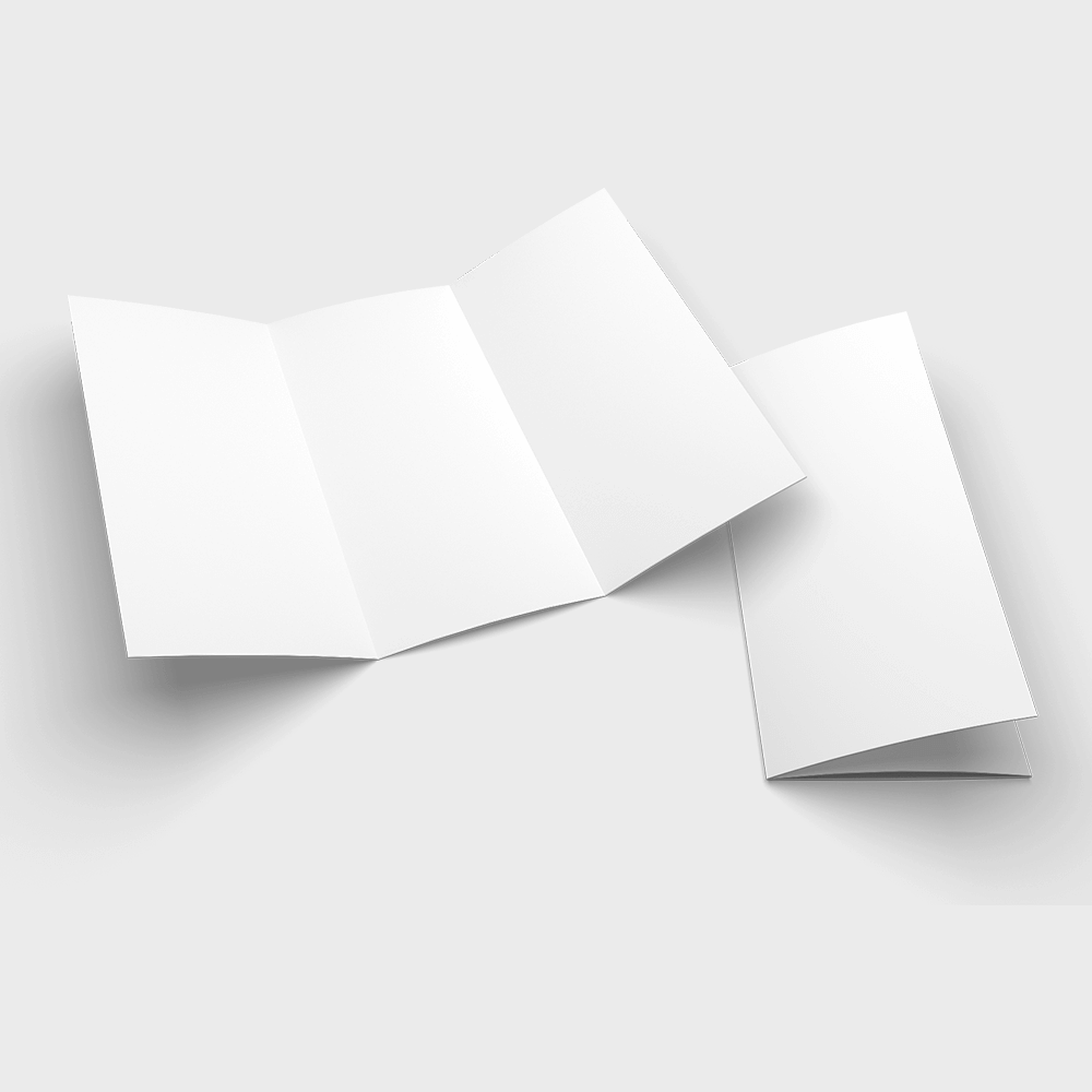
Free downloads
Free brochure design templates
Open any layout in the 4OVER4.COM online designer and make it your own.
Export your Word brochure for professional printing
You have designed the brochure and it looks great on screen. Now do a final proofread. Print a draft at home and fold it, then check that every line is readable, images are sharp, and nothing important sits on a crease. Have someone else read it too, since fresh eyes catch typos yours skip.
Save as PDF through File then Export then Create PDF, and choose Standard quality for a clean balance of size and sharpness. When you upload to 4OVER4.COM you pick stock, finish, quantity, and fold. Orders ship with a 99.8 percent on-time rate, and most arrive ahead of schedule, so your Word file gets the same premium treatment as one built in InDesign.
Wally turns your Word file into a real brochure
Templates in, print-ready PDF out
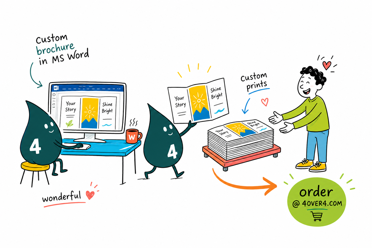
You do not need fancy software. Pick a bifold or trifold, start from a Word template, keep two fonts and 300 DPI images, then leave a 0.125 inch bleed and a 0.25 inch safe zone. Save a high-quality PDF and 4OVER4.COM prints it sharp on any of 60+ papers, folded and ready to hand out.
Order custom brochures →What to remember about designing brochures in Word
Explore more
More ways to brand with brochures and print
Related products and reads on 4OVER4.COM, one card each, so you can keep exploring brochure printing.
Hub Marketing Materials Every promotional print format in one place. Product Custom Brochures Bifold and trifold brochures printed sharp. Product Folded Brochures Classic folds, ready to mail or rack. 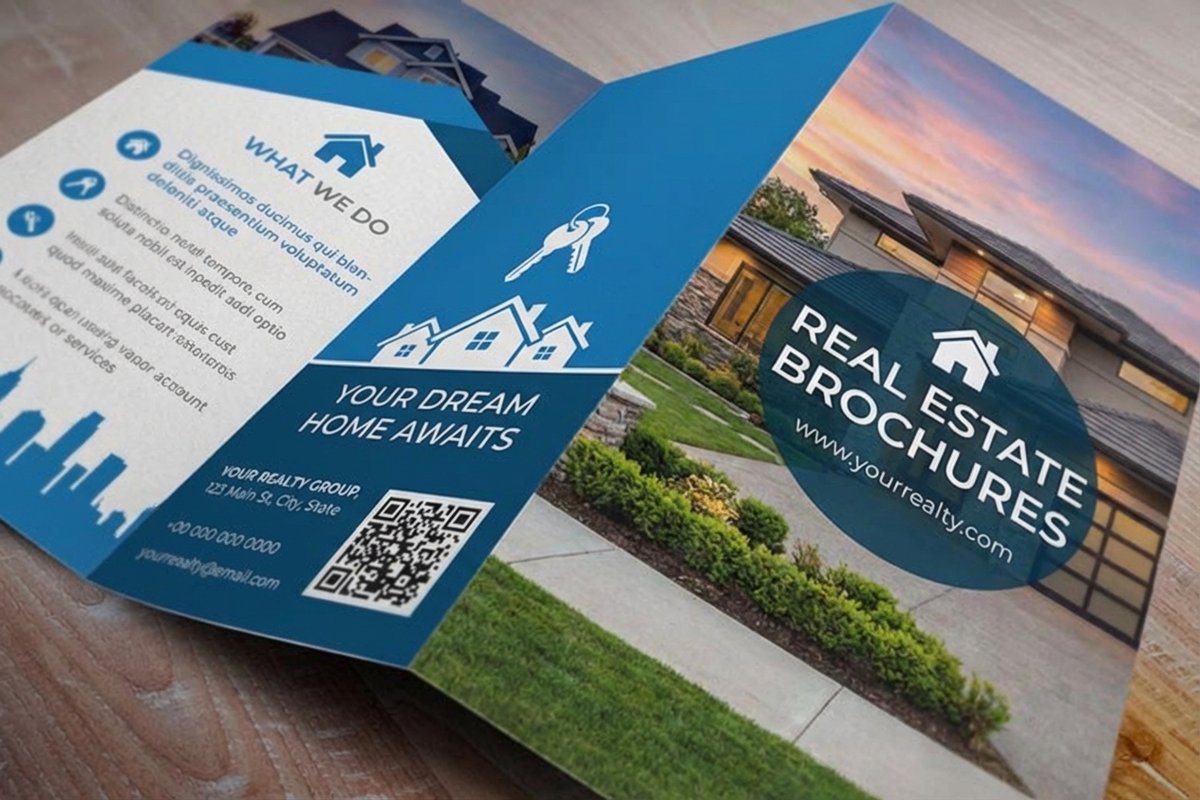 Product Real Estate Brochures Listing brochures built to sell homes.
 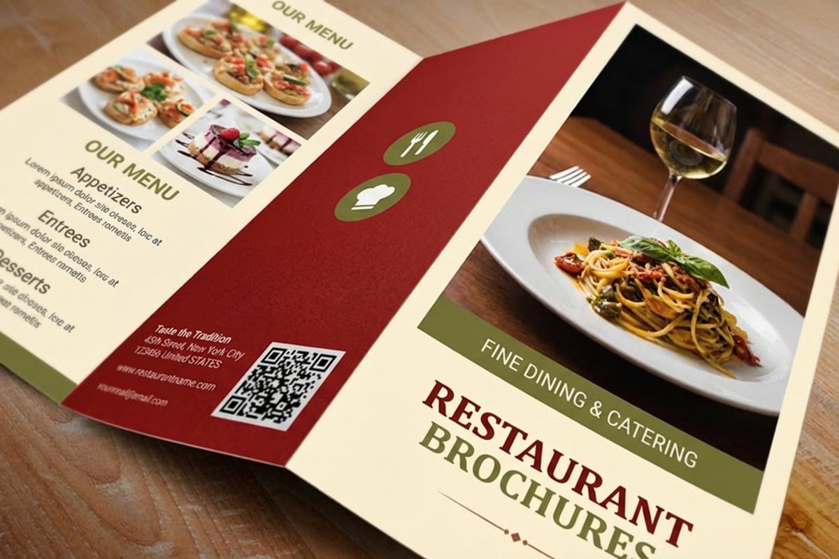 Product Restaurant Brochures Menu brochures that make mouths water.
 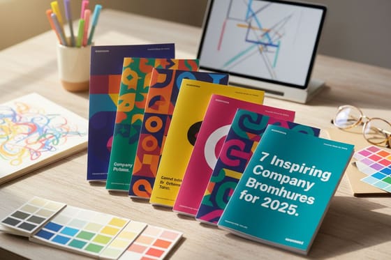 Article Company Brochure Examples Real brochures worth studying.
 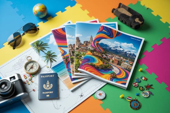 Article Travel Brochures Why travel brochures still convert.
 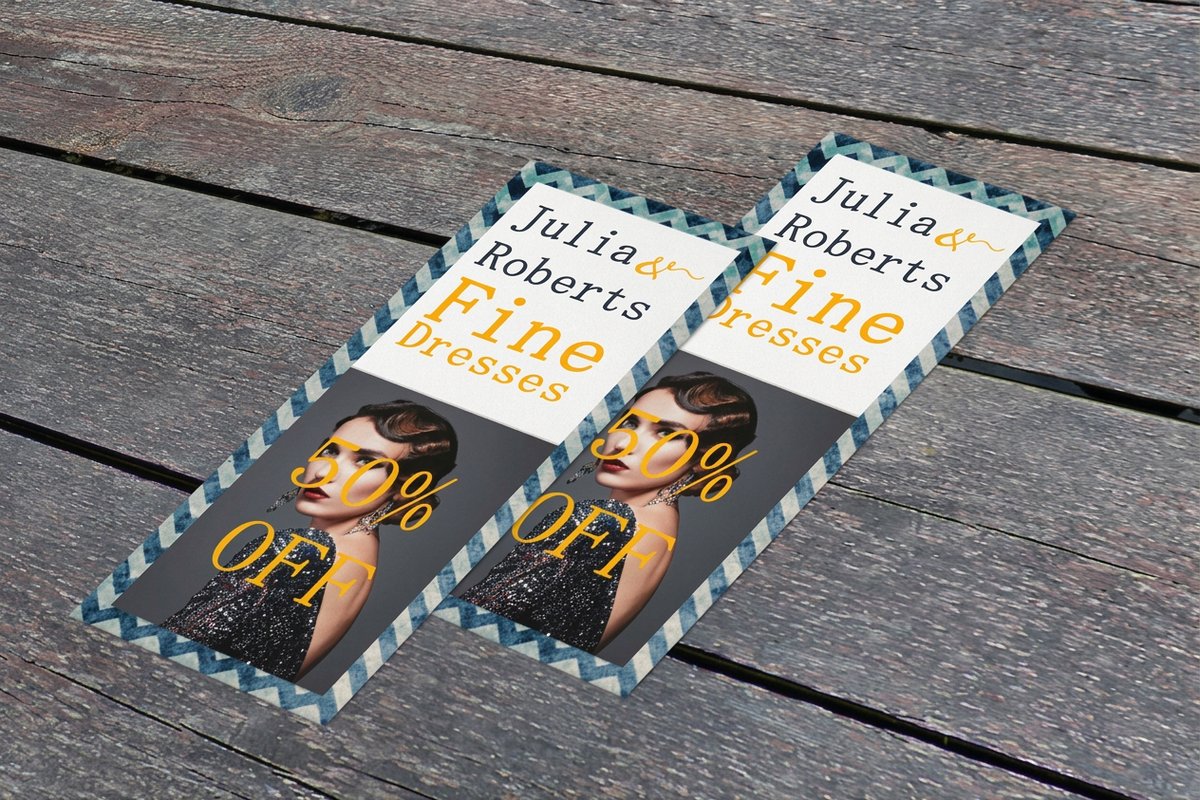 Related Rack Cards Slim brochures for racks and counters.
 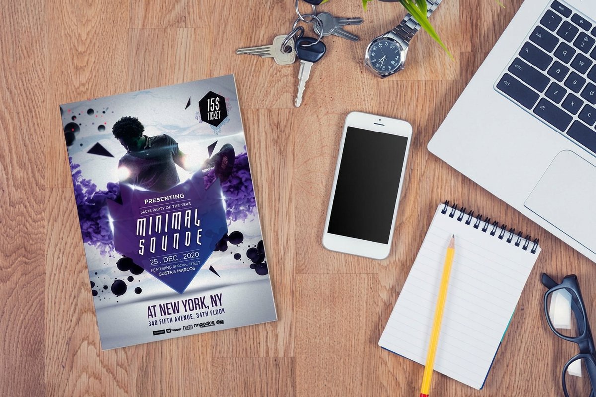 Related Flyers Single-sheet promo alongside your brochure.
 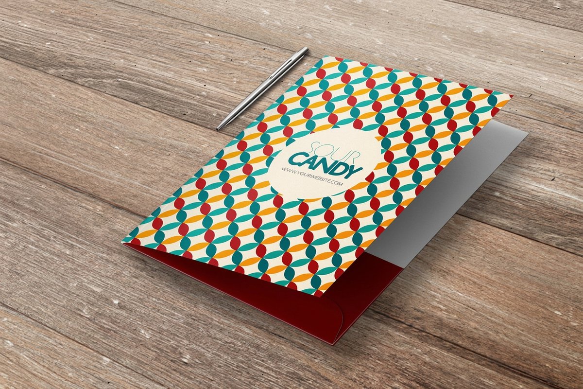 Related Pocket Folders Hold brochures and sales sheets together.
  Article Rack Card Design Design tips that carry over from brochures.
 Ready to print your brochure?
Start from a template, keep your images sharp, and 4OVER4.COM prints your bifold or trifold on premium stock, as fast as same day.
Common questions about brochure design in MS Word
What are the best practices for designing a brochure in MS Word?
Start from a built-in template, then customize the fonts, colors, and images to fit your brand. Use two fonts at most, keep every image at 300 DPI or higher, set half-inch margins, and lay out panels with columns. Always print a test fold, and save a PDF for the sharpest handoff to your printer. To round out a campaign, 3D lenticular postcards make a striking companion piece.
How do I choose the right layout for my Word brochure?
It comes down to content. Bifold brochures have four panels and suit simple messages like event programs or a product highlight. Trifolds give you six panels for detailed service lists, pricing, or step-by-step information. In Word, use landscape with three equal columns for a trifold, or portrait with two columns for a bifold, and match the layout to how much you have to say.
What makes MS Word effective for brochure marketing?
Word is already on most computers, so you get faster turnaround and lower design costs than hiring out every update. Pair solid fundamentals like clean type, high-res images, and a strong call to action with professional printing from 4OVER4.COM on premium stock, and the result competes with brochures built in specialized software. Add black postcards for a bold, coordinated look.
How much should I budget for a brochure designed in MS Word?
The design itself costs nothing beyond your time, since Word is usually pre-installed. Your budget goes to printing, which varies by stock, finish, quantity, and fold. Ordering in larger runs drops the per-piece cost sharply, and with 60+ paper types at 4OVER4.COM you can match your budget to the quality you want.
