
Rack Card Design Inspiration and Ideas That Convert in 2026


Rack card design that actually gets results
A rack card design works when the top third carries one dominant image and one clear promise, the card states a single call to action, and the whole thing is set on a 4 inch by 9 inch canvas with 0.125 inch of bleed. Everything else is detail. Your card has about two seconds to earn a stranger's attention before their eyes move on, because a rack card lives in display racks at hotels, visitor centers, restaurants, and retail counters, next to twenty others. 4OVER4.COM has printed 10 billion+ cards across 1,000+ products since 1999, and rack cards stay one of the most cost effective ways to put your message straight into someone's hands. The best designs pair one bold visual with a single, clear call to action.
The gap between a card that gets grabbed and one that collects dust rarely comes down to budget. It comes down to clarity. A clean layout, strong typography, and intentional white space carry across every printed format, and the choices you make before anyone picks a font decide whether your card becomes a hard working marketing asset.
This guide walks through the design approaches, material choices, layout rules, and real examples that work, so you can turn a piece of cardstock into a card people actually reach for. Many of the same visual principles behind classy business card design apply here, and if you enjoy hands on print projects the ideas carry straight over to greeting card design too.
Print it
Standard rack cards, ready to hand out
The classic 4 inch by 9 inch rack card, sized to drop straight into any display rack.
Why a strategic rack card design matters more than you think
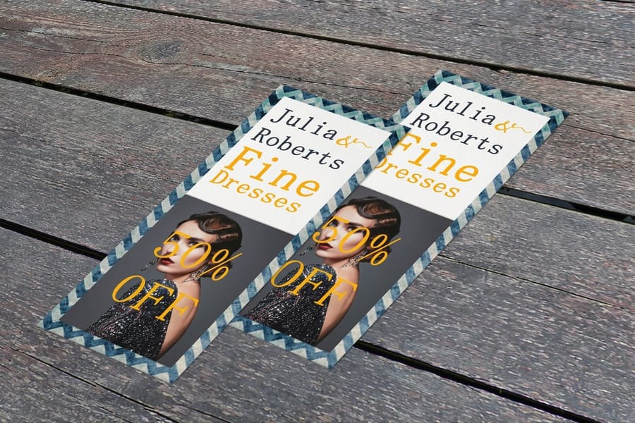
Before you open any design software, you need a plan. A rack card is your silent salesperson. It sits in a display next to ten or twenty competitors, all fighting for the same stranger's glance. Its only job is to cut through that noise and deliver a message fast enough to spark action.
This is where strategy pays off. The blueprint you build before anyone picks a font is what turns a piece of cardstock into a working asset. Nail the goal first and every later decision gets easier.
Picture a local kayaking company with cards in a coastal hotel lobby. The design has to convince a sunburned tourist to book a trip right now, before they forget. The card that wins is not the prettiest one. It is the one with the clearest message and the strongest hook.
Define your core objective first
What is the one thing you want someone to do after picking up your card? Without a clear answer, the design will feel scattered. Do not try to cram your whole business story onto one small card. Pick one primary objective and build everything around it.
- Drive website visits Add a QR code that sends people to a landing page with a time sensitive offer. The 4OVER4.COM QR code generator makes this simple.
- Increase foot traffic Make your address and a simple map impossible to miss, and sweeten it with an in store only coupon.
- Generate phone calls If your goal is bookings or quotes, your phone number needs to be big, bold, and above the fold.
- Promote a specific event Put the date, time, and location front and center, with a dead simple way to RSVP or buy tickets.
The best rack cards have a single, undeniable purpose. Try to make it a menu, a company history, and a coupon all at once and you create confusion. A confused person always walks away.
Know your audience and where they will find your card
Rack cards work because they fit standard display racks in high traffic spots, from hotel lobbies and visitor centers to doctor offices, checkout counters, and community boards. Your design has to speak to the people in that specific room.
A card for a luxury day spa in a five star resort should feel nothing like one for a family pizza place at a rec center. Context shapes your tone, your imagery, your offer, even your paper. A velvety soft touch finish says premium in ways words cannot.
Standard rack card size and setup specs
The standard rack card is 4 by 9 inches. That size exists because it is what standard wire and acrylic display racks are built to hold, and it is what every visitor center and hotel lobby in the country uses. Set your file up to these numbers and nothing gets trimmed off.
- Trim size 4 by 9 inches, the standard every rack is built for.
- Document size with bleed 4.25 by 9.25 inches, which is 0.125 inch of bleed on all four sides.
- Safe zone Keep all text and logos at least 0.125 inch inside the trim line, so 3.75 by 8.75 inches of usable area.
- Resolution and color 300 DPI, CMYK, flattened PDF.
- Alternate size, 3.5 by 8.5 inches Slightly narrower and shorter. Fits the same racks with more air around it and costs less per card, but it loses presence next to full width neighbors.
- Alternate size, 4 by 11 inches Taller than standard, so it stands above the cards around it in a rack. Check the rack depth first, because some displays will bow an 11 inch card forward.
Design the top third first. In a loaded rack, that is the only part anyone sees, so the hero image, the business name and the promise all have to live in the top 3 inches. For the full breakdown of every size and how each one behaves in a rack, see standard rack card sizes.
Rack Card Sizes Compared and When Each One Fits
Four by nine inches is the standard because it fills a rack slot, but it is not the only size that fits one. Here is how the three common sizes behave in the same display.
| Size | How it behaves in a rack | Best for |
|---|---|---|
| 4 x 9 in | Fills a standard slot edge to edge and shows the top third above the lip | Hotel lobbies and visitor centers, anywhere you compete with twenty other cards |
| 3.5 x 8.5 in | Sits lower in the same slot, so the visible band above the lip is shorter | Counter displays and mailing, where cost per piece beats rack presence |
| 4 x 7 in | Shows more of its face because it sits higher against the lip | Table tents, checkout counters and racks you control yourself |
Whichever you pick, design the top three inches first. That band is the only part a stranger sees before deciding to reach.
Visual design principles for rack cards that pop
Now for what actually makes a rack card irresistible on sight. You are designing for a piece that is 4 inches wide and 9 inches tall, a narrow vertical canvas. Every choice has to respect that shape.
Get the top third right and the rest falls into place, because that top third is the only part a browser sees before deciding to reach out and grab it.
Lead with a dominant image
The top third of your rack card is prime real estate, the part visible while it sits in the rack. A single high resolution photograph that tells your story at a glance beats a collage of tiny images every time. For a restaurant that means one gorgeous shot of your signature dish, not six small food photos crammed together.
Let one powerful image do the heavy lifting and bleed it to the edges for a polished look. Aim for the hero image to fill at least 40 to 50% of the front face. The bold single visuals in these funny print ad examples prove that one strong image beats a cluttered layout, and the same rule holds for rack cards.
Typography that works at arm's length
Here is the rule most people ignore. Your headline needs to be readable from about three feet away, the distance someone stands from a rack while choosing a card. If they cannot read it without picking it up, you have already lost. Keep your font choices to two, maybe three at most.
- Headlines 24 to 36pt, bold or semi bold. Sans serif faces like Montserrat or Raleway read clean and modern.
- Subheadings 14 to 18pt, used to break up information on the back of the card.
- Body copy 10 to 12pt minimum. Anything smaller turns unreadable, especially for older eyes.
- Contact info 11 to 14pt. Never bury the most actionable details in tiny type.
Color psychology and brand consistency
Color does more than decorate. It triggers feeling. Warm reds and oranges create urgency and excitement, perfect for restaurants, entertainment, and limited time offers. Cool blues and greens signal trust, calm, and nature, ideal for healthcare, finance, and eco tourism.
Whatever palette you pick, keep it consistent with your existing brand so the card feels related to your website, business cards, and signage. Use high contrast between text and background, white on a dark photo or dark on a light field. For more on a cohesive look, these graphic design portfolio examples show how consistency across formats builds recognition.
Quantity and price
Rack card pricing and specs
Real configurator numbers. The more you order, the lower the per card cost drops.
| Quantity | Price Per Unit | Total |
|---|---|---|
| 50 | 85.7¢ | $42.84 |
| 100 | 60.4¢ | $60.42 |
| 200 | 31.2¢ | $62.40 |
| 300 | 25.5¢ | $76.45 |
| 400 | 22.6¢ | $90.51 |
| 500 | 20.9¢ | $104.57 |
Rack card design inspiration by industry
Different businesses need different approaches. Here is what works for five of the most common rack card use cases, and why.
- Tourism and hospitality. Lead with a breathtaking destination photo and warm, inviting language. Add your location with a simple map and a QR code to online booking, since travelers want to reserve on the spot. Awards and top rated badges convert browsers into bookers.
- Restaurants and food service. One mouthwatering hero shot of your best dish beats a full menu listing. Include your address, hours, and one compelling offer, then keep the back scannable with three or four signature items or a QR code to the full menu.
- Healthcare and wellness. Trust is everything. Use calming blues, greens, and whites, real photos of your team, and clear specialties. Add accepting new patients or insurance details, and a short testimonial on the back for credibility.
- Real estate. For a listing, one stunning exterior photo plus two or three key stats up front, then your headshot, contact, and a QR code to the full listing on the back. To make a property pop, 3D postcards literally lift the image off the page.
- Events and entertainment. Answer four questions fast. What, when, where, and how do I get tickets. Put the event name and date in the top third, use active imagery, and add early bird pricing or a code to create urgency.
Level up
Metallic rack cards for extra shine
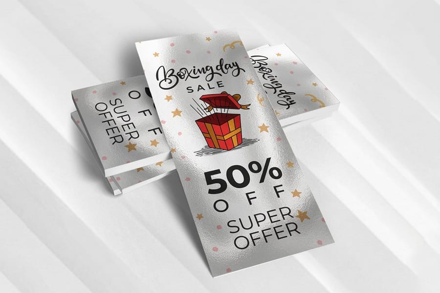
A metallic pearl finish catches the light in a crowded rack and lifts your brand a notch.
Front and back, making both sides work hard
Too many people pour all their energy into the front and treat the back as an afterthought. That leaves half your real estate on the table.
The front, your billboard
Think of the front as a billboard with one job, to stop someone and get the card into their hand. That means a dominant image, a clear headline, and maybe a short tagline or offer. No paragraphs, no bullet lists, no detailed descriptions, just enough curiosity to earn the pickup.
The top 3 inches matter most. When cards sit in a rack, only that top portion shows, so your logo, headline, or strongest image has to live there. Design for the rack, not for how the card looks flat on a desk.
The back, your closer
Once someone flips the card, they are interested. Now you close. The back carries the details that back up the promise on the front.
- A brief description of your product, service, or event, three to five sentences at most.
- Key benefits presented as short, scannable bullet points.
- Contact information phone, email, website, and social handles.
- A clear call to action like book now, visit us today, or scan to save 20%.
- A QR code pointing to a specific landing page, not your homepage.
Paper stock and finish, the tactile advantage
Here is something digital can never copy, the physical feel of a well printed card. The stock and finish send a message before anyone reads a word. A thick, sturdy card says we invest in quality. A flimsy one says we cut corners.
For most rack cards, 14pt or 16pt cardstock hits the sweet spot between durability and cost. For a premium feel, think luxury hotels or upscale services, 32pt Ultra Thick makes an instant impression at roughly three times the thickness of a standard business card. Finish changes the whole personality. Gloss makes colors pop for tourism and food, matte feels sophisticated for professional services and healthcare, and soft touch lamination adds a velvety texture people do not want to put down.
4OVER4.COM offers 60+ paper types so you can match the feel to your brand, from recycled kraft to pearlescent shimmer. For something truly unique, 3D postcards take the tactile experience even further.
Paper and finish
Rack card stocks and finishing
Stocks from 14pt to 32pt Ultra Thick, plus gloss, matte, and soft touch options.
Rack Card Holders and Where the Card Sits
The display decides how much of your card a stranger ever sees, so choose it alongside the size. A wire rack shows the top third and hides the rest. An acrylic pocket on a counter shows nearly the whole face. A slatwall unit sits at chest height, which pushes the reading distance from three feet out to about six.
- Wire multi pocket racks. The lobby standard. Assume only the top three inches show and design to that.
- Single acrylic pockets. Counter and desk placement. The whole card shows, so the lower half can carry more.
- Brochure walls and slatwall. Read from further away, so the headline has to work at a larger size.
If you supply the holder yourself, measure the pocket depth before ordering a heavier stock. A 32pt card runs about three times the thickness of a business card and fills a slot far faster than a 14pt one.
Common rack card design mistakes to avoid
Even strong designers trip on these when they are new to the format. Sidestep them and you are already ahead of most of your competition.
Cramming too much information
This is the number one killer. A rack card is not a brochure or a flyer. It is a teaser built to spark enough interest for the next step. If your card carries more than 150 words of body copy, you probably have too much. Edit ruthlessly, and make every word earn its spot.
Ignoring the rack display context
Design for how the card is actually displayed, not how it looks in a PDF on your screen. Print a test copy and stand it in a rack, or fake one with a folder. Can you read the headline? Does the image still work when half the card is hidden? If not, redesign.
Weak or missing call to action
You would be shocked how many rack cards have no clear next step. Visit us is weak. Book your free tasting this weekend, scan the QR code is strong. Be specific about what you want people to do and make it ridiculously easy.
Low resolution images
Images that look fine on screen can look terrible in print. Always use art at 300 DPI or higher. Pull a 72 DPI photo off your website and it will print blurry and pixelated. For more ways to weave printed pieces into your marketing mix, these logo sticker design ideas share promotional strategies that pair well with rack cards.
Getting your rack cards printed right
Design is only half the battle. Print quality can make or break the final piece. Here is what to check when you set up your files and choose a printer.
File setup essentials
Set your document to the standard 4 inch by 9 inch size with a 0.125 inch bleed on all sides, so the total canvas is 4.25 inches by 9.25 inches. Keep critical text and logos at least 0.125 inches inside the trim line. Anything outside that safe zone risks getting cut off.
Use CMYK color mode, not RGB. RGB is for screens and CMYK is for print. Design in RGB without converting and your colors will shift, sometimes hard. That bright electric blue on your monitor can land as a dull navy on paper.
Choosing the right printer
Look for a printer with a real range of stocks, finishes, and quantity tiers. 4OVER4.COM backs every order with a price match guarantee, so you get competitive pricing without giving up quality, and with 10,000+ reviews and a 4.8 out of 5 star rating the quality speaks for itself.
Ask about proofing before you commit to a full run. Order free samples or a printed proof to check color, alignment, and feel before hundreds of cards roll off the press. It is a small step that prevents expensive mistakes, and our printing guides walk you through the rest.
Compare formats
Popular card formats, side by side
Stock, finish, quantity, turnaround, and from price across our most ordered rack cards.
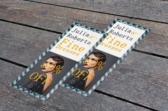 Standard Rack Cards | 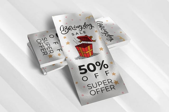 Metallic Rackcards | |
|---|---|---|
| Min price | $42.84 | $668.92 |
| Paper / stock | 14pt Gloss Cover | 16pt Gloss Cover |
| Finish | Standard Finish | - |
| Size | 3.5" x 8.5" | 4" x 9" |
| Default qty | 50 | 500 |
| Turnaround | 3 business days | 7 business days |
| Rating | ||
| View & customize | View & customize |
Free rack card templates you can start from
You do not have to build the 4.25 by 9.25 inch canvas by hand. Two template libraries cover it, and both have the bleed, trim and safe zone already in place.
- Blank rack card templates A print-ready file at the correct size with the guides marked, ready for your own artwork. Download it from blank rack card templates, or the metallic version from metallic rack card templates.
- Designed rack card templates Finished layouts you customize with your text, images and colors. Browse rack card design templates and edit one in the browser.
Start from a template and the two mistakes that cost the most, art that stops short of the bleed and text that sits too close to the trim, are already handled. When the file is ready, configure the stock and quantity on rack cards.
Start fast
Templates and print ready blanks
Rack card design templates and exact size blanks so your art lands inside the cut line.
Grab exact size rack card blanks, or browse other stocks like 30mil clear plastic cards in the full blank templates library.
Wally turns your rack card into a silent salesperson
One bold image, one clear offer, one action
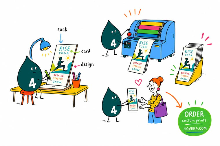
A great rack card earns two seconds of attention and makes them count. Lead with a single hero image in the top third, keep copy under 150 words, and end with one clear call to action and a QR code. Pick 14pt or 16pt stock, or 32pt Ultra Thick for a premium feel, and 4OVER4.COM prints it sharp in CMYK at 300 DPI.
Design your rack cards →What to remember about rack card design
Why rack card templates work
- Time saving. Drop your colors, text, and photos into a ready layout instead of starting from a blank page.
- Consistency. Every card matches your brand, which keeps your look recognizable across materials.
- Professional look. Pre built layouts give clean, polished results without hiring a designer.
- Cost effective. You skip the design fees and still get a custom result.
- Flexibility. Scale from a single listing card to a full campaign from the same starting point.
- Creativity. A template is a base you can still make your own with different color, type, and imagery.
- Ease of use. Anyone can customize and print, no advanced design skills needed.
Explore more
More ways to market with cards and print
Every related page type on 4OVER4.COM, one card each, so you can keep exploring rack card printing.
 Article Travel Brochure Design That Survives a Rack and Still Gets Picked Up Travel brochure folds, panel order and photo choices that work in a rack display, plus the stock weight that s
 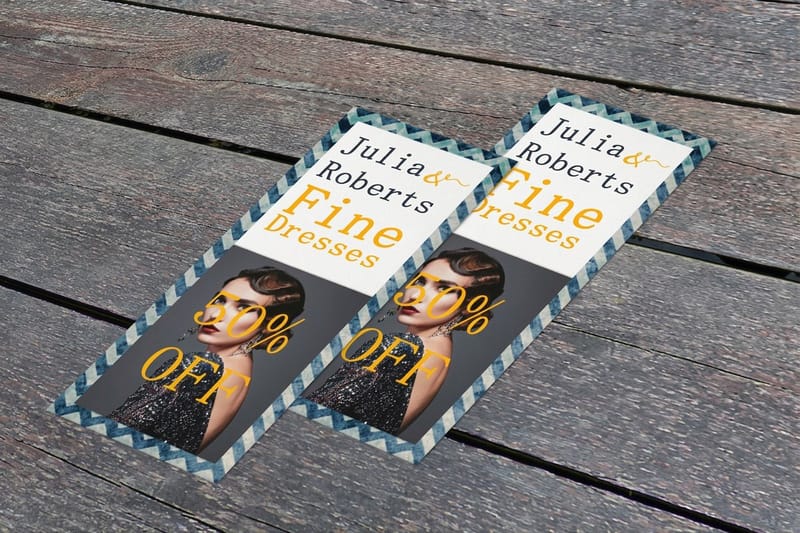 Category Rack Cards Printing Browse every rack card format in one place.
 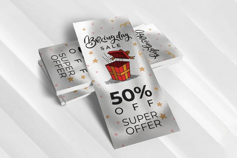 Product Metallic Rack Cards A pearlescent shimmer that catches the light in a rack.
  Hub Marketing Materials The full hub for cards, flyers, and print marketing.
  Product Postcards Direct mail and counter postcards that convert.
 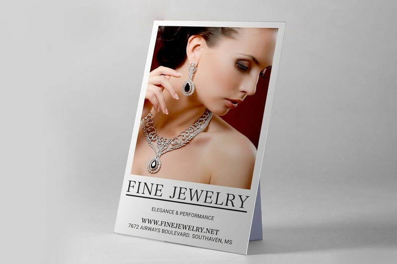 Product Counter Cards Freestanding cards for the point of sale.
 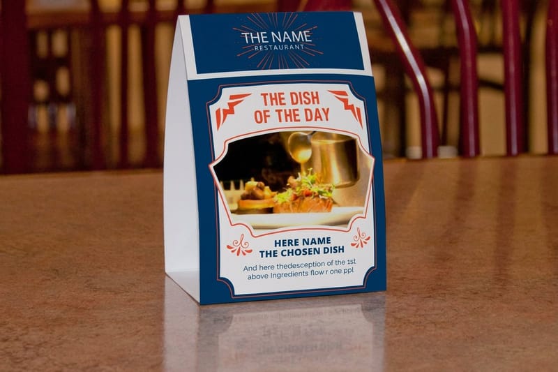 Product Table Tents Two sided promos that stand on any table.
 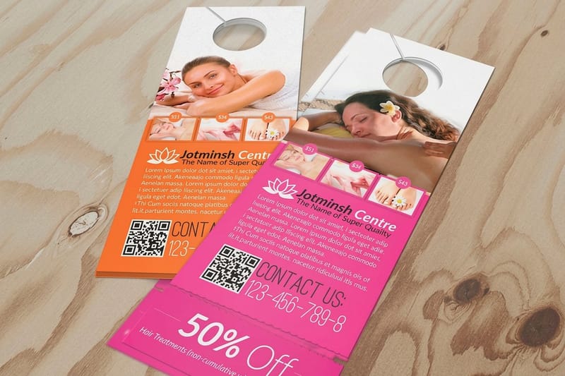 Product Door Hangers Hyper local marketing straight to the doorknob.
  Guide Where to Print Postcards A practical guide to choosing a print partner.
 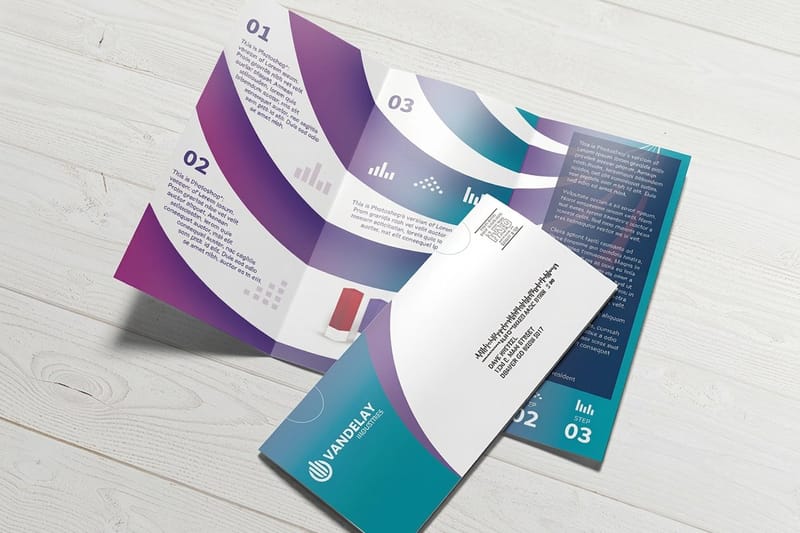 Article Direct Mail Formats Eight formats that get opened and acted on.
  Article Local Print Marketing How to promote your business right in the neighborhood.
 Ready to design a rack card people reach for?
Lead with one bold image, keep the copy tight, add a clear call to action, and 4OVER4.COM prints it sharp, as fast as same day.
Your rack card design questions, answered
Are cards usually A5 or A6?
Neither, if you are printing for a United States rack. A5 and A6 are metric sizes used across Europe and most of the world, while American racks are built around the four by nine inch card and the letter sheet it is cut from. A6 sits close to a standard postcard and A5 close to half a letter sheet, so both will drop into a rack but neither fills the slot the way a four by nine does.
Is a business card 2x3?
Close, but the American standard is 3.5 by 2 inches rather than 3 by 2. That extra half inch is why a business card fits a wallet slot and a card sleeve, and it is the size every template and blank in the catalog is cut to. A rack card is a different animal at four by nine, roughly five times the surface area, because it has to be read from across a lobby rather than across a table.
What are the best practices for rack card design?
Start with a single clear objective and one dominant image in the top third. Keep body copy under 150 words, use fonts readable from three feet away, and always add a specific call to action with a QR code. Design for the rack display, not just how the card looks flat on your desk. Browse our printing articles for more design tips across formats.
How do I choose the right rack card design for my business?
Match your design to your industry and display location. Tourism needs stunning destination photos, restaurants need mouthwatering food shots, and healthcare needs calming colors and trust signals. Think about your audience mindset where they will meet the card, then design for that exact moment and environment.
What makes rack card design effective for marketing?
Effective rack cards combine one bold visual with a focused message and a clear next step. The best feature a single hero image, minimal text, and a scannable QR code that links to a specific landing page. The physical format also creates a tactile connection that digital ads cannot replicate.
How much should I budget for rack card design?
Professional rack card design usually runs $50 to $300 for a freelancer, or you can start from a free template and handle it yourself. Printing cost varies by quantity and paper stock. For bigger campaigns, pair rack cards with custom booklets to give interested prospects more detail. Budget a little more for photography, since it is the single biggest quality differentiator.
