
Company Brochure Design Examples That Drive Results in 2026


Exporting the brochure for press and for screen
One layout, two exports. People send the wrong one constantly, then wonder why the printer asks for a new file or why the emailed version is far too big to send.
The press file is CMYK at 300 DPI, with 0.125 inch of bleed on every outside edge, crop marks on, fonts embedded, and every panel in reading order as flat pages rather than folded spreads. Your printer imposes the folds. Flatten transparency, and check that no live text sits within an eighth of an inch of a trim or a fold line.
The screen file is a different animal. Export it in RGB at around 150 DPI so the colors stay bright on a monitor and the file stays small enough to email, keep the hyperlinks live so a reader can tap the phone number, and drop the bleed and the crop marks, because nobody is trimming it.
Name the two files so you can tell them apart at a glance. Uploading the screen export by accident is the most common brochure mistake at the print stage, and it is a reprint you pay for.
Company brochure design examples that actually drive results
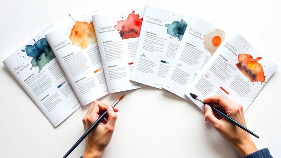
Company brochure design examples are the fastest way to see what works before you spend a dime on printing. The twenty business brochure examples below are grouped by industry, and each one names the fold, the stock and the finish that carries it. A strong brochure grabs attention in under three seconds, tells your brand story, and gives the reader a clear reason to act. 4OVER4.COM has printed over 10 billion cards and print products for more than 150,000 businesses, and brochures stay one of the most requested formats for trade shows, sales meetings, and direct mail.
In a world flooded with digital ads, a physical brochure still carries weight, literally. It is a tangible piece of your brand that someone can hold, flip through, and keep on a desk. Not every brochure earns that spot, though. The difference between a piece that lands in the recycling bin and one that generates callbacks comes down to strategic design, purposeful layout, and paper stock that feels right in the hand.
This guide breaks down real brochure examples you can study, borrow ideas from, and adapt for your own business. You will find layout strategies, typography choices, fold types, and the design principles that separate forgettable pamphlets from brochures people actually read. When you are ready to start, the brochure design templates library gives you professional starting points you can customize in minutes, and the customer showcase shows what other businesses have printed.
Exporting the brochure for press and for screen
One layout, two exports. People send the wrong one constantly, then wonder why the printer asks for a new file or why the emailed version is far too big to send.
The press file is CMYK at 300 DPI, with 0.125 inch of bleed on every outside edge, crop marks on, fonts embedded, and every panel in reading order as flat pages rather than folded spreads. Your printer imposes the folds. Flatten transparency, and check that no live text sits within an eighth of an inch of a trim or a fold line.
The screen file is a different animal. Export it in RGB at around 150 DPI so the colors stay bright on a monitor and the file stays small enough to email, keep the hyperlinks live so a reader can tap the phone number, and drop the bleed and the crop marks, because nobody is trimming it.
Name the two files so you can tell them apart at a glance. Uploading the screen export by accident is the most common brochure mistake at the print stage, and it is a reprint you pay for.
Why printed brochures still outperform digital-only marketing
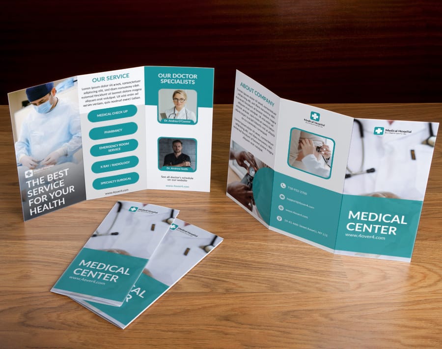
Print has a staying power digital content cannot match. A brochure sits on a desk, gets passed between colleagues, and shows up again weeks after a trade show. A digital ad disappears the moment someone scrolls past it.
The tactile experience matters more than most people realize. When a prospect picks up a brochure printed on thick, textured stock with a soft-touch finish, they form an impression of your company before they read a single word. That weight in the hand signals quality, stability, and attention to detail.
The strongest brochures share a few traits. They use white space on purpose, they lead with benefits instead of features, and they always include a clear next step, whether that is a phone number, a QR code, or a URL. For teams that also hand out single-sheet materials, 4OVER4.COM prints matching flyers on the same premium stocks with the same fast turnaround.
Print it
Custom brochures, ready to fold
Preset folds and premium stocks, the fastest way to put your brand in someone's hand.

Exporting the brochure for press and for screen
One layout, two exports. People send the wrong one constantly, then wonder why the printer asks for a new file or why the emailed version is far too big to send.
The press file is CMYK at 300 DPI, with 0.125 inch of bleed on every outside edge, crop marks on, fonts embedded, and every panel in reading order as flat pages rather than folded spreads. Your printer imposes the folds. Flatten transparency, and check that no live text sits within an eighth of an inch of a trim or a fold line.
The screen file is a different animal. Export it in RGB at around 150 DPI so the colors stay bright on a monitor and the file stays small enough to email, keep the hyperlinks live so a reader can tap the phone number, and drop the bleed and the crop marks, because nobody is trimming it.
Name the two files so you can tell them apart at a glance. Uploading the screen export by accident is the most common brochure mistake at the print stage, and it is a reprint you pay for.
Breaking down the best company brochure layouts
Layout is where most brochure designs win or lose. A beautiful photo means nothing if the reader eye does not know where to go next. The strongest examples follow a visual hierarchy that guides the reader from headline to supporting copy to call to action without confusion.
The tri-fold, still the workhorse
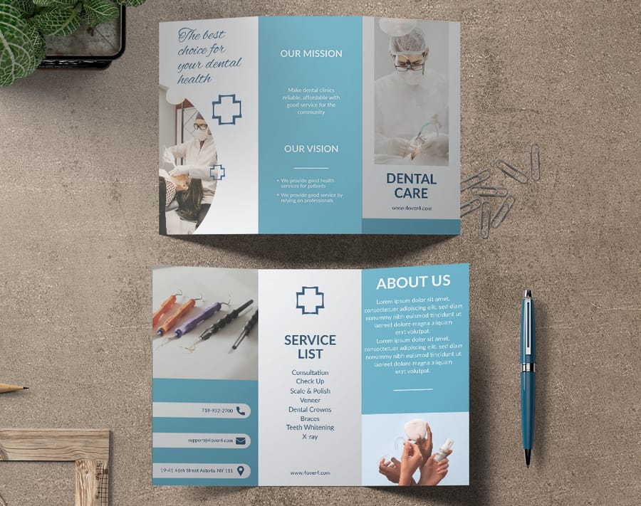
The tri-fold stays the most popular format for good reason. It fits a standard number 10 envelope, works in brochure racks, and gives you six panels. Treat the front panel like a billboard, one strong image, a compelling headline, and your logo. Inside, the left panel introduces the opportunity, the center presents your solution, and the right panel carries your strongest selling point. Do not waste the back panel, put your contact details, a QR code, and a short credibility line there.
Bi-fold brochures for premium presentations
When you need room for large images or detailed information, the bi-fold gives you four generous panels. Printed on heavier stock like 100lb gloss or 14pt cardstock, it feels like a presentation piece rather than a rack handout. This is what you bring to a client meeting.
Gate-fold and z-fold for creative impact
Gate-fold brochures open like doors to reveal a wide interior spread, perfect for product launches and event invitations. Z-fold brochures work like an accordion, so each panel stands alone for step-by-step content, timelines, and process explanations. For more layout thinking, these graphic design portfolio examples show principles that carry across any print format.
Specs
Brochure sizes, folds, and stocks at a glance
Real configurator options for folds, paper weights, coatings, and turnaround times.
Exporting the brochure for press and for screen
One layout, two exports. People send the wrong one constantly, then wonder why the printer asks for a new file or why the emailed version is far too big to send.
The press file is CMYK at 300 DPI, with 0.125 inch of bleed on every outside edge, crop marks on, fonts embedded, and every panel in reading order as flat pages rather than folded spreads. Your printer imposes the folds. Flatten transparency, and check that no live text sits within an eighth of an inch of a trim or a fold line.
The screen file is a different animal. Export it in RGB at around 150 DPI so the colors stay bright on a monitor and the file stays small enough to email, keep the hyperlinks live so a reader can tap the phone number, and drop the bleed and the crop marks, because nobody is trimming it.
Name the two files so you can tell them apart at a glance. Uploading the screen export by accident is the most common brochure mistake at the print stage, and it is a reprint you pay for.
The five parts every business brochure needs
Fold and layout decide where things sit. This is what actually has to be in them, and a brochure missing any one of these leaves the reader holding a question nobody answers.
- A cover that makes one promise. One image, one line, your name. Not a service list and not a mission statement.
- The problem in the reader's own words. A short block showing you understand why they picked the brochure up.
- What you do about it. The offer itself, written as an outcome rather than a feature list.
- Proof. A number, a named client, a credential, a before and after. One piece of evidence beats three adjectives.
- One next step. A phone number, a QR code or a short web address, in the place every reader looks, which is the back panel.
Everything else is optional. Pricing helps when the reader is comparing racks, a map helps when they have to find you, a team photo helps when the sale is personal. If a panel does not serve one of the five jobs above, it is filler, and the reader can feel it.
Exporting the brochure for press and for screen
One layout, two exports. People send the wrong one constantly, then wonder why the printer asks for a new file or why the emailed version is far too big to send.
The press file is CMYK at 300 DPI, with 0.125 inch of bleed on every outside edge, crop marks on, fonts embedded, and every panel in reading order as flat pages rather than folded spreads. Your printer imposes the folds. Flatten transparency, and check that no live text sits within an eighth of an inch of a trim or a fold line.
The screen file is a different animal. Export it in RGB at around 150 DPI so the colors stay bright on a monitor and the file stays small enough to email, keep the hyperlinks live so a reader can tap the phone number, and drop the bleed and the crop marks, because nobody is trimming it.
Name the two files so you can tell them apart at a glance. Uploading the screen export by accident is the most common brochure mistake at the print stage, and it is a reprint you pay for.
Typography and color choices that make brochures convert
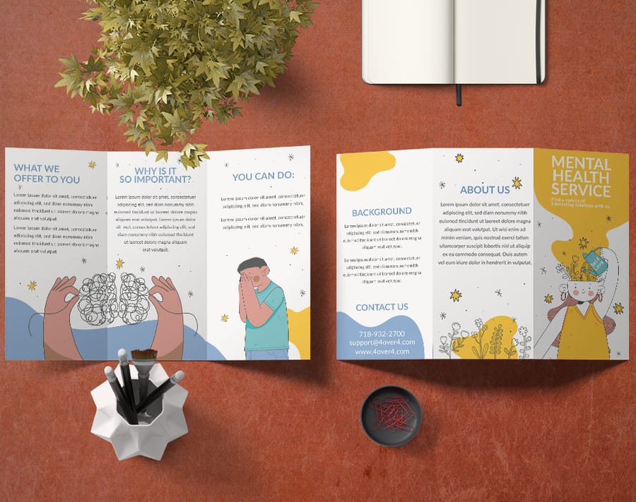
Typography is not about picking a font you like. It is about readability, hierarchy, and brand consistency. The best brochures use no more than two or three typefaces, one for headlines, one for body copy, and maybe a third for pull quotes.
Font pairing that works
Pair a bold sans-serif headline with a clean serif body for a classic, professional look, or go all sans-serif for a modern, tech-forward feel. The key is contrast between heading and body. Keep body text at 10 to 11pt for print with generous line spacing, because your reader might be scanning under trade show lighting or in a car after a meeting.
Color that pulls its weight
Color does heavy lifting. Blue builds trust for finance and healthcare, green signals growth and sustainability, red creates urgency, and black and white with a single accent reads sophisticated. Stick to three or four colors total, and always design in CMYK rather than RGB so vivid screen colors do not print flat and muddy.
Types of company brochures with examples
Before the industry examples, know the five formats. The fold decides how much you can say and in what order, so pick it before you design a single panel.
Bi-fold
One fold, four panels. The simplest format and the one that handles large photography best, because each panel is a full half of the sheet. Real estate listings and legal firm profiles live here. Start from folded brochure templates.
Tri-fold
Two folds, six panels, and the format that fits a standard rack and a business envelope. The panels give you a natural beginning, middle and end, which is why menus, service lists and waiting room pieces default to it. Start from brochure templates.
Z-fold
Two folds again, but folded like an accordion so the piece opens flat into one continuous spread. Use it when the story is sequential, a process, a timeline, or three charts that build on each other. Start from folded brochure templates.
Gate-fold
Two outer panels that open from the middle onto a wide inner spread. It buys you a reveal, which is why automotive and luxury pieces use it. It costs more to fold and it needs artwork worth revealing. Start from folded brochure templates.
Booklet
Saddle stitched pages rather than folded panels, from eight pages upward. This is the format for catalogs, conference agendas and agency portfolios, anywhere the content genuinely does not fit on six panels. Start from booklet templates, or go straight to booklets.
Exporting the brochure for press and for screen
One layout, two exports. People send the wrong one constantly, then wonder why the printer asks for a new file or why the emailed version is far too big to send.
The press file is CMYK at 300 DPI, with 0.125 inch of bleed on every outside edge, crop marks on, fonts embedded, and every panel in reading order as flat pages rather than folded spreads. Your printer imposes the folds. Flatten transparency, and check that no live text sits within an eighth of an inch of a trim or a fold line.
The screen file is a different animal. Export it in RGB at around 150 DPI so the colors stay bright on a monitor and the file stays small enough to email, keep the hyperlinks live so a reader can tap the phone number, and drop the bleed and the crop marks, because nobody is trimming it.
Name the two files so you can tell them apart at a glance. Uploading the screen export by accident is the most common brochure mistake at the print stage, and it is a reprint you pay for.
Company and business brochure examples by industry
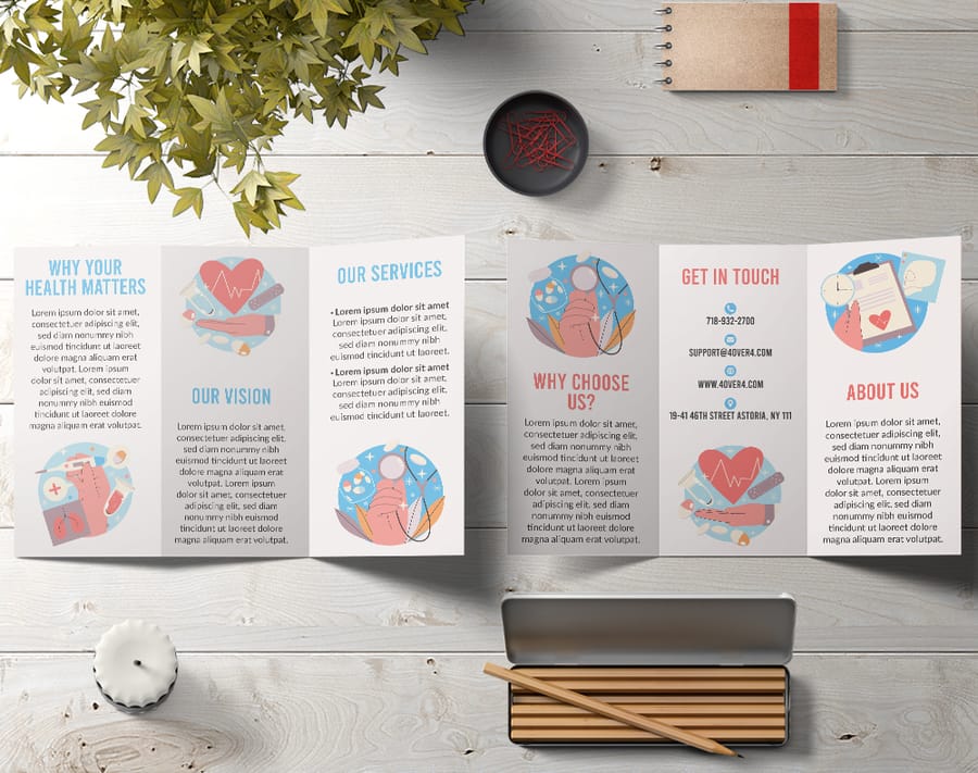
The best way to learn brochure design is to study what works right now for real businesses. Here are twenty business brochure examples by industry, each with the layout move worth stealing and the fold, stock and finish that carries it.
Jump to an industry: Real estate, healthcare, restaurants, tech, education, nonprofit, fitness, automotive, legal, travel, salon and beauty, financial services, construction, events, retail, agency, manufacturing, veterinary, dental, church.
1. Real estate
Real estate brochures live and die by photography. Full-bleed property shots and lifestyle images should dominate, with copy kept to square footage, pricing, and agent contact. A bi-fold on glossy stock gives listings the visual space they deserve, and a neighborhood map or floor plan panel gives the piece lasting utility.
Steal this layout: one full-bleed hero panel, one floor plan panel, agent details on the back. Print notes: bi-fold, 100lb gloss cover, gloss finish. Start from a real estate brochure template.
2. Healthcare and wellness
Healthcare brochures balance professionalism with approachability. Clean layouts, calming palettes, and clear type make medical information feel accessible. Tri-folds work well in waiting rooms, with one panel dedicated to credentials so patients feel reassured.
Steal this layout: a credentials panel that a nervous patient can read in ten seconds. Print notes: tri-fold, 100lb gloss text, matte finish so the panels do not glare under waiting room lights. Start from a medical brochure template.
3. Restaurants and hospitality
Food photography is everything. Shoot in natural light, style the plates, and run the images full bleed. Matte or soft-touch finishes feel upscale without turning slippery at a tasting event. Show menu highlights, not the entire menu, because curiosity drives visits.
Steal this layout: six hero dishes, no prices on the front, hours and address on the back panel. Print notes: tri-fold, 14pt cardstock, soft-touch. Start from a restaurant brochure template.
4. Tech and SaaS
Tech brochures face a unique challenge because the product is often intangible. Use infographics, data visualizations, and icon-driven layouts to make abstract ideas concrete, and highlight outcomes over features. Cut onboarding time by 40 percent lands harder than AI-powered workflow automation.
Steal this layout: one number per panel, set large, with a single line explaining it. Print notes: z-fold, 100lb gloss text, matte finish. Start from folded brochure templates.
5. Education
School and university brochures are read by two people at once, the student and whoever is paying. Split the piece that way: campus life and programs on the inside spread for the student, outcomes, class sizes and admissions dates on the back for the parent. Photograph real students on the real campus, because stock photography reads as fake instantly here.
Steal this layout: a program list as a scannable table rather than paragraphs. Print notes: tri-fold, 100lb gloss text, gloss. Start from an education brochure template.
6. Nonprofit
Nonprofit brochures work when one person carries the story. Lead with a single beneficiary, a name and a photograph, then show where the money goes in a simple breakdown. Vague mission language kills donations. A specific number attached to a specific outcome does not.
Steal this layout: one face on the cover, a giving tier panel inside, a donation slip on the back panel. Print notes: bi-fold, 100lb gloss cover, matte. Start from a nonprofit brochure template.
7. Fitness and gyms
Gym brochures sell a schedule as much as a facility. Put the class timetable on a full panel so it survives on a fridge door, and use before and after energy in the photography rather than equipment shots nobody looks at.
Steal this layout: a weekly class grid that works as a standalone panel. Print notes: tri-fold, 14pt cardstock so it survives the gym bag, gloss. Start from brochure templates.
8. Automotive
Car dealership and auto service brochures live on trim levels and service intervals. A gate-fold gives you a reveal moment when the panels open onto the vehicle, and a spec table on the back panel is what a buyer actually takes home to compare.
Steal this layout: the gate-fold reveal on the hero vehicle, spec table on the reverse. Print notes: gate-fold, 100lb gloss cover, gloss with spot UV on the vehicle. Start from folded brochure templates.
9. Legal
Law firm brochures are trust documents. Restrained type, one accent color, plenty of white space, and attorney bios with real credentials. Resist the urge to fill every panel. An uncrowded legal brochure reads as a firm that is not desperate for the work.
Steal this layout: one practice area per panel, each with a one-line result. Print notes: bi-fold, 100lb gloss cover, soft-touch. Start from brochure templates.
10. Travel and tourism
Travel brochures compete on the rack, so the top third of the cover has to do all the work. Lead with one destination image, not a collage. Inside, pair each itinerary with a price and a duration, because a traveler comparing two racks is comparing those two numbers.
Steal this layout: itinerary blocks with duration and inclusions in the same position on every panel. Print notes: tri-fold, 100lb gloss text, gloss. Start from a travel brochure template.
11. Salon and beauty
Salon brochures are price lists that happen to be beautiful. Set the service menu as the main event, grouped by category with clear pricing, and use one strong portrait rather than six small ones. Soft-touch finish matters more here than almost anywhere, because the piece is handled in a place that sells the feel of things.
Steal this layout: service menu grouped by category, prices right-aligned so the eye can scan the column. Print notes: tri-fold, 14pt cardstock, soft-touch. Start from brochure templates.
12. Financial services
Financial brochures need to make complicated products feel simple without looking cheap. Blue and grey with one accent, charts instead of paragraphs, and disclosure text set small but legible on the back panel. A z-fold works well because it gives you a natural sequence for a three-stage explanation.
Steal this layout: one chart per panel, each answering a question the reader already has. Print notes: z-fold, 100lb gloss text, matte. Start from folded brochure templates.
13. Construction and trades
Construction brochures win on proof. Project photography with location and scope captions beats any amount of company history. Add a licensing and insurance panel, because that is the question every client asks on the first call anyway.
Steal this layout: six projects, each with a one-line scope and a location. Print notes: bi-fold, 14pt cardstock so it survives a job site, matte. Start from brochure templates.
14. Events and conferences
Event brochures are schedules first. Give the agenda a full spread with times running down one axis and tracks across the other, then use the remaining panels for speakers and venue. Print the date large enough to read from across a table.
Steal this layout: a grid agenda that a delegate can fold back to and use all day. Print notes: booklet, saddle stitched, 100lb gloss text. Start from booklet templates.
15. Retail
Retail brochures are catalogs in miniature. Group products by use case rather than by category, keep every product shot on the same background so the spread reads as one system, and put the store locations and hours where a reader can find them without turning the piece over twice.
Steal this layout: a consistent product grid with the same crop on every image. Print notes: booklet, 100lb gloss text, gloss. Start from booklet templates.
16. Agency and creative studio
Agency brochures are the portfolio, so the printing is part of the argument. One case study per spread with the result stated as a number, minimal explanation, and a finish that makes a prospect turn the piece over in their hands. If your brochure looks ordinary, nobody believes the pitch.
Steal this layout: one case study per spread, headline result set as the largest element. Print notes: booklet, 100lb gloss cover, soft-touch with spot UV on the logo. Start from booklet templates.
17. Manufacturing and industrial
Industrial brochures are read by engineers who want specifications, not adjectives. Tolerances, materials, capacities and certifications belong in tables. Photography should show the machine and the part it makes side by side so scale is obvious.
Steal this layout: a spec table per product family, same columns every time. Print notes: bi-fold, 100lb gloss cover, matte so the tables stay readable. Start from brochure templates.
18. Veterinary
Vet brochures reassure an anxious owner. Warm palette, photographs of real animals with real staff, and a panel for wellness plan pricing so the cost conversation happens before the appointment. Emergency hours belong on the back panel in the largest type on the piece.
Steal this layout: wellness plan tiers as three columns with what is included in each. Print notes: tri-fold, 100lb gloss text, matte. Start from a veterinary brochure template.
19. Dental
Dental brochures do best when they answer the questions patients are too embarrassed to ask. Give a panel to what a first visit involves, a panel to financing and insurance, and keep clinical photography restrained. Nobody wants a close-up of a procedure in a waiting room rack.
Steal this layout: a first visit walkthrough in four short steps. Print notes: tri-fold, 100lb gloss text, matte. Start from a dental brochure template.
20. Church and faith organizations
Church brochures are welcome mats. Service times and location come first, ministries and small groups second, and a photograph of the congregation rather than the building. A newcomer is deciding whether they would feel out of place, and faces answer that faster than architecture.
Steal this layout: service times in the top third of the cover, ministries listed inside. Print notes: tri-fold, 100lb gloss text, gloss. Start from a church brochure template.
For bolder creative swings, these funny print ad examples show how humor and strong design make any printed piece stand out.
How to make a company brochure in eight steps
- Name the one job. Book a meeting, take a donation, get a call. A brochure with three goals achieves none of them.
- Write down who reads it and where. A rack in a hotel lobby and a folder handed over at a sales meeting are different design problems. Decide which one you are solving.
- Pick the fold before the layout. Tri-fold for a rack or an envelope, bi-fold for big photography, z-fold for a sequence, gate-fold for a reveal, booklet when six panels genuinely will not hold it.
- Write the copy to the panels. Draw the panels on paper and write into them. Copy written first and poured in afterwards always overflows.
- Choose the imagery. Fewer, larger images beat a collage every time. Shoot at 300 DPI or higher, and keep every shot on the same crop and background so the spread reads as one piece.
- Choose the stock and finish. 100lb gloss text for a mailed piece, 14pt cardstock for anything that gets carried around, soft-touch when the piece has to feel expensive.
- Proof at actual size. Print it, fold it, and read it in the room where it will be read. Panel breaks that looked fine on screen fall apart on paper.
- Order. Configure the fold, stock and quantity on brochures, or start from a blank brochure template if you want the bleed and safe zone already set.
Quantity and price
Brochure pricing that drops with volume
Real numbers from the configurator, the more you order, the lower the per-piece cost.
| Quantity | Price Per Unit | Total |
|---|---|---|
| 50 | $1.14 | $57.11 |
| 100 | 82.4¢ | $82.38 |
| 200 | 53.3¢ | $106.55 |
| 300 | 41.0¢ | $123.02 |
| 400 | 34.9¢ | $139.49 |
| 500 | 31.2¢ | $155.97 |
Exporting the brochure for press and for screen
One layout, two exports. People send the wrong one constantly, then wonder why the printer asks for a new file or why the emailed version is far too big to send.
The press file is CMYK at 300 DPI, with 0.125 inch of bleed on every outside edge, crop marks on, fonts embedded, and every panel in reading order as flat pages rather than folded spreads. Your printer imposes the folds. Flatten transparency, and check that no live text sits within an eighth of an inch of a trim or a fold line.
The screen file is a different animal. Export it in RGB at around 150 DPI so the colors stay bright on a monitor and the file stays small enough to email, keep the hyperlinks live so a reader can tap the phone number, and drop the bleed and the crop marks, because nobody is trimming it.
Name the two files so you can tell them apart at a glance. Uploading the screen export by accident is the most common brochure mistake at the print stage, and it is a reprint you pay for.
Paper stock and finish options that change everything
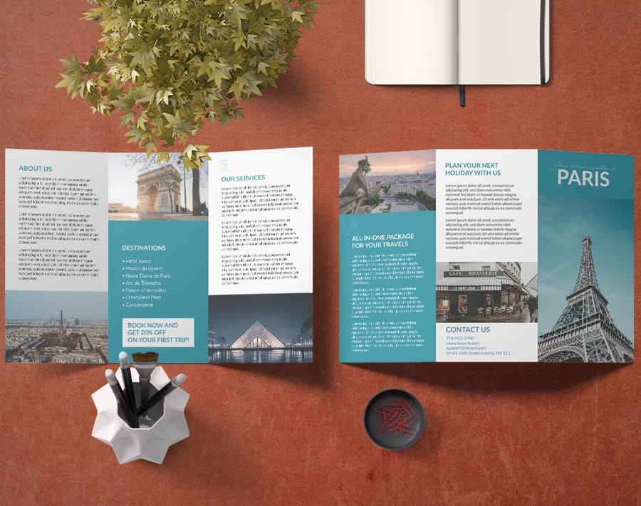
This is where many businesses cut corners, and it shows. The stock and finish you choose communicate as much as the design. A flimsy 80lb text stock reads as printed as cheaply as possible. A sturdy 100lb gloss cover reads as a brand that takes itself seriously.
Weight and thickness
For brochures mailed or handed out in volume, 100lb gloss text is a solid middle ground, thick enough to feel solid and flexible enough to fold cleanly. For leave-behind pieces, step up to 100lb gloss cover or 14pt cardstock. Uncoated stocks give a natural, earthy feel that suits organic brands, nonprofits, and creative agencies.
Finishes that add polish
Gloss coating makes colors pop and photos look vivid. Matte reduces glare for a sophisticated, understated look. Soft-touch lamination creates a velvety texture people cannot stop touching, a real conversation starter at trade shows. Spot UV adds glossy accents to your logo or a headline while the rest stays matte, which makes the piece feel custom and expensive. Explore every option on the custom brochures product page.
How to use 4OVER4.COM brochure templates as a starting point
For businesses that want professional results without hiring a designer, the brochure template library is a practical starting point. You pick a layout, customize it with your brand colors, logo, images, and copy, then send it straight to print from the same place. No exporting files, no guessing at bleed settings, no back and forth about specs.
The templates go deep. You can rearrange panels, change fonts, adjust image placement, and add or remove text blocks across bi-fold, tri-fold, gate-fold, and z-fold formats, each preset with proper bleed and safe zones. Keep your business cards and postcards on the same color and type system, and extend the look further with these logo sticker design ideas for a cohesive brand kit.
Start fast
Templates and print-ready blanks
Brochure design templates and exact-size blanks so your artwork lands inside the cut line.

Common brochure design mistakes and how to avoid them
Even experienced marketers make these errors. Avoiding them puts your brochure ahead of most competitor materials.
- Cutting the copy too fine. A brochure is a teaser, not a whitepaper. Give enough to spark interest and drive the next action. If a panel takes more than 60 seconds to read, trim it.
- No clear call to action. Contact us is weak. Call 555 0123 for a free consultation is strong. Scan this QR code to see pricing is even better. Tell the reader exactly what to do next.
- Ignoring the fold. Critical text or images should never sit on a fold line. Use folds as natural transitions between sections, not interruptions to your content.
- Inconsistent branding. Your brochure should look like it came from the same company as your website and business cards. Match fonts, colors, logo placement, and tone every time.
Wally folds a brochure that gets read
Front panel hook, clear inside story, and a call to action that tracks
A brochure earns its keep when the front panel hooks like a billboard, the inside leads with benefits, and the back panel carries your contact details and a QR code. Pick a fold that fits your story, print on stock heavy enough to feel serious, and 4OVER4.COM turns it around fast, even same day.
Design your brochure →What to remember about company brochure design
Why brochure templates work
- User-friendly online designer. Non-designers can build professional brochures in the browser, saving time and agency fees.
- High-quality printing. Bright color and a premium feel reinforce a positive brand impression on every panel.
- Instant online pricing. See your budget clearly and plan the campaign without waiting on a custom quote.
- Fast turnaround options. Same-day shipping is available so you can react to last-minute events and opportunities.
- Deep customization. Change colors, fonts, images, and layouts completely, not just swap a single color.
- Print-ready templates. Every layout ships with correct bleed and safe zones so it prints exactly as you see it.
Explore more
More ways to brand with print
Related pages across 4OVER4.COM, one card each, so you can keep building a cohesive print campaign.
 Product Custom Brochures Configure folds, stocks, and finishes from one page.
  Templates Brochure Design Templates Professionally designed layouts you can customize fast. Blank templates Blank Brochure Templates Exact-size, print-ready blanks with correct bleed.
  Article Graphic Design Portfolio Examples Layout ideas that carry across any print format.
  Article Funny Print Ad Examples How humor and bold design make print stand out.
  Article Logo Sticker Design Ideas Extend your brand kit onto stickers people display.
  Product Flyers Single-sheet handouts on the same premium stocks.
  Product Business Cards Keep the brand consistent from brochure to card. Showcase Customer Showcase Real printed projects for design inspiration.
 Ready to print a brochure that gets read?
Pick a fold, drop your artwork into a free template, and 4OVER4.COM prints it sharp on premium stock, as fast as same day.
Your questions about company brochure design, answered
What should a business brochure include?
A cover that makes one promise, a short block naming the problem the reader has, what you do about it written as an outcome, one piece of proof such as a number or a named client, and one clear next step on the back panel. Everything beyond those five is optional, and most of it is filler.
What are the 5 parts of a brochure?
Cover, problem, offer, proof and call to action. Some people count the parts physically instead, in which case a tri-fold gives you a front panel, three inside panels, an inside flap and a back panel. Both readings matter, because the content has to map onto the panels before you design a single one.
Can ChatGPT make a brochure?
It can draft and tighten the copy, suggest a panel order and rewrite a headline six ways, which saves real hours. It cannot hand a printer a press ready file. The layout, the CMYK conversion, the 300 DPI images and the bleed still have to happen in design software or in a template built for the product.
What are the best practices for company brochure design?
Start with a clear visual hierarchy on every panel, headline, supporting image, body copy, then call to action. Use no more than three fonts and four colors, keep body text at 10pt or higher, and design in CMYK at 300 DPI with at least 0.125 inch of bleed. Study brochure examples from your own industry to spot the patterns that connect with your audience.
How do I choose the right brochure format for my business?
Match the fold to how you will hand it out. Tri-folds suit racks and mailers, bi-folds suit premium client presentations, and gate-folds create a dramatic reveal for launches. If you have a lot to walk through, a z-fold gives you more panels. Specialty pieces like 3D Lenticular Postcards can complement the brochure at events.
What makes a brochure effective for marketing?
Effective brochures pair strong visuals with concise, benefit-driven copy and one specific call to action. They use 300 DPI photography, generous white space, and premium stock that feels solid in the hand. That physical, tactile impression is something digital marketing cannot replicate, and it shapes how prospects judge your credibility.
What are the three types of brochures?
Most people mean bi-fold, tri-fold and z-fold. A bi-fold has one fold and four panels, and it handles big photography best. A tri-fold has two folds and six panels, fits a rack and a business envelope, and is the default for menus and service lists. A z-fold has two folds too but opens flat into one continuous spread, which suits a process or a timeline. Gate-folds and saddle stitched booklets are the two formats beyond that trio.
What makes a good business brochure?
One job, one call to action, and a fold chosen before the layout. Beyond that: no more than three fonts and four colors, body copy at 10pt or larger, images at 300 DPI in CMYK, and 0.125 inch of bleed on every edge. Stock matters more than most people expect. A piece that gets carried around needs 14pt cardstock, and a piece that has to feel expensive needs soft-touch. Proof it printed and folded before you order the run.
How much should I budget for a brochure campaign?
Design can range from free with the template library to a few hundred dollars or more for custom work, and printing depends on quantity, stock, and finish. A run of 500 full-color tri-folds on quality stock starts at a very accessible per-piece price. Heavier paper and finishes like spot UV cost more but lift perceived value. For a bolder multi-piece push, pair brochures with Black Postcards.
