
Real Estate Yard Sign Color Guide to Palettes That Sell


Real estate yard sign colors that actually sell

A real estate yard sign color guide comes down to one job, helping the right buyer notice your listing before they notice anyone else on the block. Color accounts for up to 90 percent of the snap judgment a person makes about a brand, according to research published in the journal Management Decision. 4OVER4.COM prints yard signs on durable 4mm Coroplast with full color output, so every hue you pick shows up vivid and accurate at the curb.
That is not a small detail. Your yard sign is often the first thing a buyer sees, before they open the listing online, before they call your office, before they form any opinion about you as an agent. The colors on that sign decide whether a driver slows down or keeps rolling. Get the palette wrong and your listing blends into the neighborhood. Get it right and you have a 24/7 marketing tool working for you in rain, sun, and everything in between.
This guide walks through the psychology behind each color family, the high contrast pairings that read from 50 feet away, and the practical design moves you can use today. Whether you are building a personal brand or refreshing signage for a whole brokerage, browse the full real estate printing collection to see how the best sellers all share one trait, bold and intentional color.
Plant it
Real estate yard signs, ready for the lawn
Preset sizes on weatherproof 4mm Coroplast, the fastest way to get your brand on the curb.
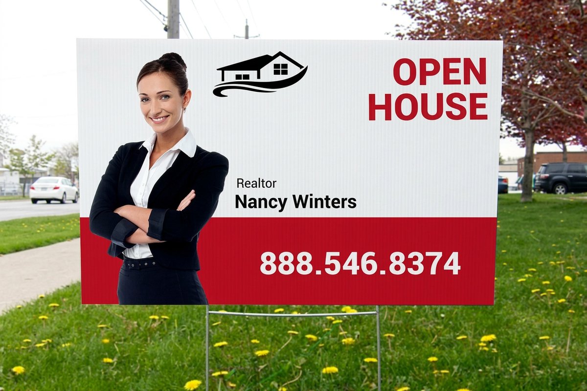
Why color still wins at the curb
Color is not decoration. It is communication. On a yard sign you have roughly two to three seconds to catch a driver and deliver a message. That is barely enough time to read a phone number, let alone absorb a full brand identity. Color does the heavy lifting in that window.
Think about it this way. A white sign with light gray text is readable up close, but from across the street it disappears. A navy sign with bright white lettering pops against green lawns, brown fences, and gray sidewalks. The contrast does the work before anyone consciously reads a single word.
Color also triggers feeling. Blue reads as trustworthy, red signals urgency, and green suggests growth and fresh starts, which makes it a natural for a New Listing rider. These are not just design opinions. They come from decades of color psychology that advertisers and agents lean on every day.
Color psychology, one family at a time
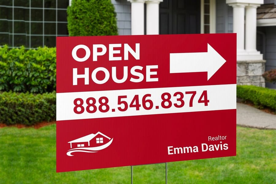
Every color carries a message before a buyer reads a word. Here is how the main families perform on a real estate yard sign, and where each one earns its place.
Blue, the trust builder
Blue is the most popular color in real estate signage for a reason. It reads as reliable, calm, and professional. Buyers link blue to established institutions like banks and insurance brands, so a blue sign borrows that same credibility. Dark navy works best as a background, paired with white or bright yellow text for maximum readability.
Lighter blues can feel soft and approachable, but they lose contrast fast outdoors, so keep your text dark enough to compensate. Blue also photographs cleanly, which matters when buyers screenshot listings and share sign photos on social media.
Red, the attention grabber
Red is bold, urgent, and impossible to ignore. It is the color of For Sale riders, Price Reduced banners, and Open House arrows, because the eye is drawn to it faster than any other color. Used as an accent, a border, a headline, or a call to action against white or a dark background, it delivers a jolt of energy.
The catch is that a fully red sign with red text reads as chaotic. Red on white is one of the highest contrast pairings available, and red paired with charcoal or black looks modern and high end as long as the text stays white or very light.
Green, black, and the loud colors

Green, fresh starts and growth
Green connects buyers to new beginnings, nature, and prosperity, which makes it smart for suburban, rural, eco friendly, or investment listings. A deep forest green background with white text looks polished and stands apart from the sea of blue and red on any street. Lighter greens wash out in direct sun, so keep your primary greens dark and rich. To see how agents use bold color at open houses, browse real customer yard sign designs.
Black, sophistication and luxury
Black backgrounds project premium positioning. If you sell luxury property or want an exclusive feel, black is your foundation, and white text on black is the highest contrast pairing there is. Gold or silver accents lift it further. Black does absorb heat and can warp cheap material in the sun, so print on quality stock. The aluminum sign panels from 4OVER4.COM hold up in extreme weather without color fade or warping.
Orange and yellow, energy and visibility
Orange and yellow are the loudest colors on the spectrum. Yellow is the first color the human eye detects, which is why caution signs, school buses, and taxis use it. On a yard sign, yellow text on a dark background practically shouts. Orange blends the urgency of red with the cheer of yellow, so it suits directional signs, open house arrows, and Coming Soon announcements.
The warning with both is that they look cheap if you do not ground them. Yellow text on a white background is nearly invisible, and orange on red is a mess. Always pair these warm tones with navy, black, or deep green for clean contrast.
White and purple round out the palette

White, the universal backdrop
White is not boring, it is versatile. A white background lets your brand colors take center stage and keeps the sign clean and uncluttered. Most national brokerages use white as their primary background because it reproduces consistently and reads well in any light.
White also gives you the most freedom with text. Dark blue, black, red, and green all pop against it. If you have not locked in a brand palette yet, a white background is the safest starting point.
Purple, standing apart from the crowd
Purple is rare in real estate signage, which is exactly why it works for agents who want to differentiate. It reads as creative, prestigious, and a little unexpected. Deep purple with white or gold text is almost impossible to confuse with any other agent on the street.
Purple pairs beautifully with yellow for a high energy, high contrast look, and with silver or light gray for quieter elegance. In a market flooded with blue and red, purple hands you instant visual separation.
High contrast pairings that read from the street
Here is what most agents get wrong. They pick colors they personally like without testing how those colors perform at distance. A yard sign is not a business card you hand across a desk. It has to communicate from 50 to 100 feet away, often while a car is moving.
Contrast is king. The bigger the gap between your background and your text, the easier your sign reads. The top performers in outdoor signage are:
- White text on dark navy. Clean, professional, readable in every light.
- White text on black. Maximum contrast with a luxury feel.
- Yellow text on dark blue. High visibility and energetic.
- White text on red. Urgent and attention grabbing.
- Black text on white. Classic, versatile, works for any brand.
- White text on forest green. Distinctive, fresh, and nature connected.
Avoid same family pairings like light blue on medium blue or tan on brown. They look fine on a monitor and vanish outdoors. Skip warm on warm, like orange on red, and cool on cool, like light blue on green. Cross the temperature line for better contrast. For bold design inspiration, these graphic design portfolio examples show how professionals use contrast to command attention.
Quantity and price
Real estate and standard yard sign pricing
Real configurator numbers, both on weatherproof 4mm Coroplast, where the per unit cost drops as your run grows.
Design tips the pros never skip
Use borders to frame your message
A contrasting border gives your sign structure and makes the whole piece feel intentional. A white sign with a navy border and navy text looks more polished than the same sign with no border. The frame pulls the eye inward toward your name, number, and listing details.
Limit your palette to two or three colors
More colors does not mean more impact. Signs with four or more colors often look cluttered and amateur. Pick one background, one text color, and one accent, and let the accent handle highlights like your phone number or a Call Today prompt.
This discipline also makes your brand more recognizable. When every sign you plant uses the same two or three colors, neighbors start to associate that palette with you. That is brand equity built one lawn at a time.
Test your colors in outdoor light
Colors look different on a screen than they do in sunlight. A rich burgundy on your monitor can read as muddy brown at the curb. Before you commit to a full order, request free samples from 4OVER4.COM to see how your colors reproduce on real sign material.
Check the sign at different times of day. Morning light is warm and golden, midday sun washes colors out, and evening light runs cooler and dimmer. A strong combination holds up across all three.
Match your sign to your full brand system
Your yard sign colors should match your business cards, listing presentations, social graphics, and website. Consistency builds trust. If your cards are navy and gold, your signs should be navy and gold too. For ideas that carry across print, these real estate business card ideas show how top agents keep one look across every touchpoint.
Compare formats
Popular yard signs, side by side
Stock, size, quantity, turnaround, and from price across the most ordered yard signs.
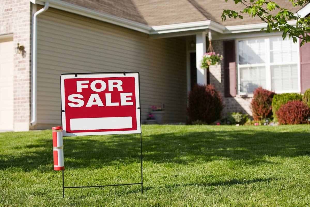 Yard Signs | 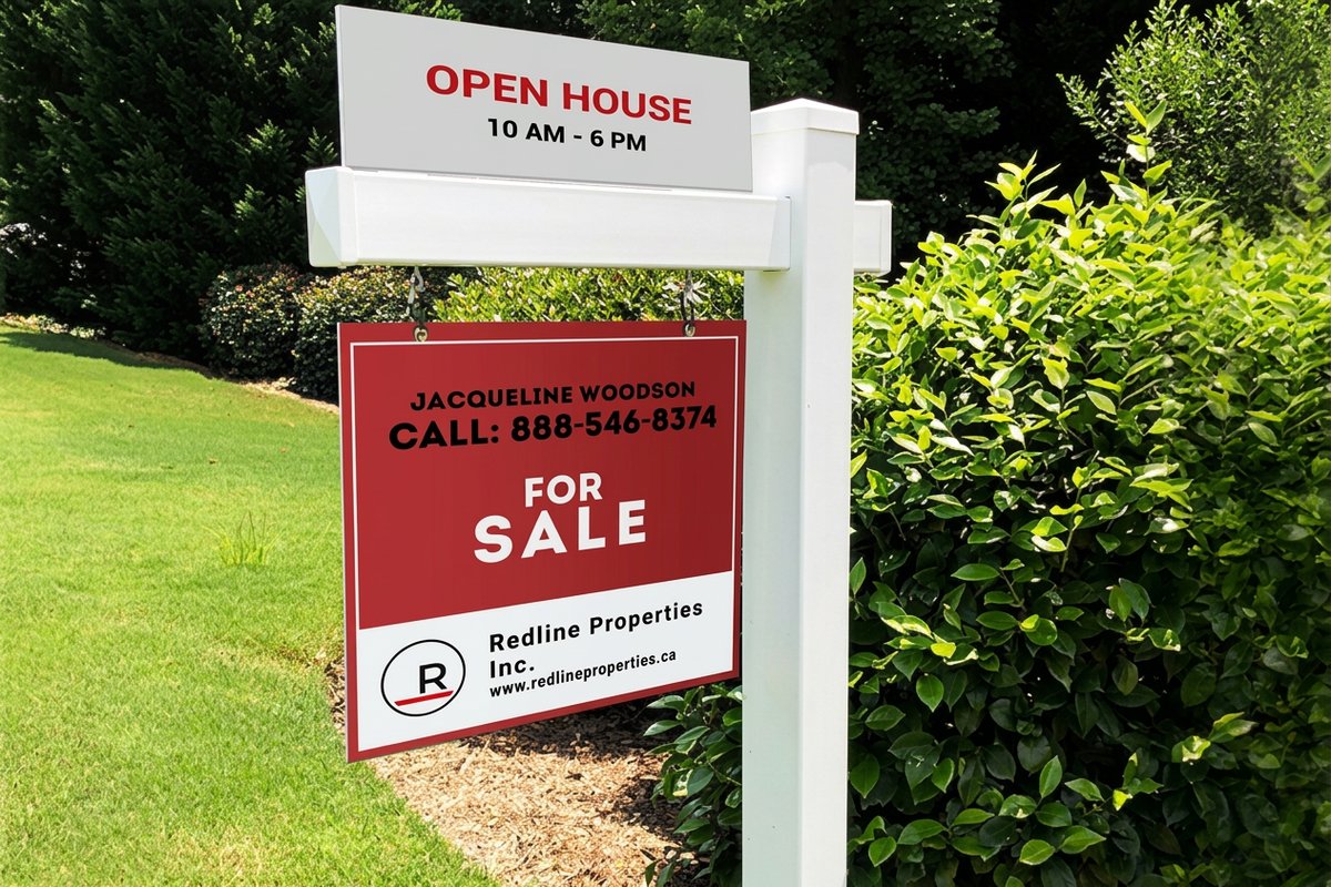 Real Estate Post | 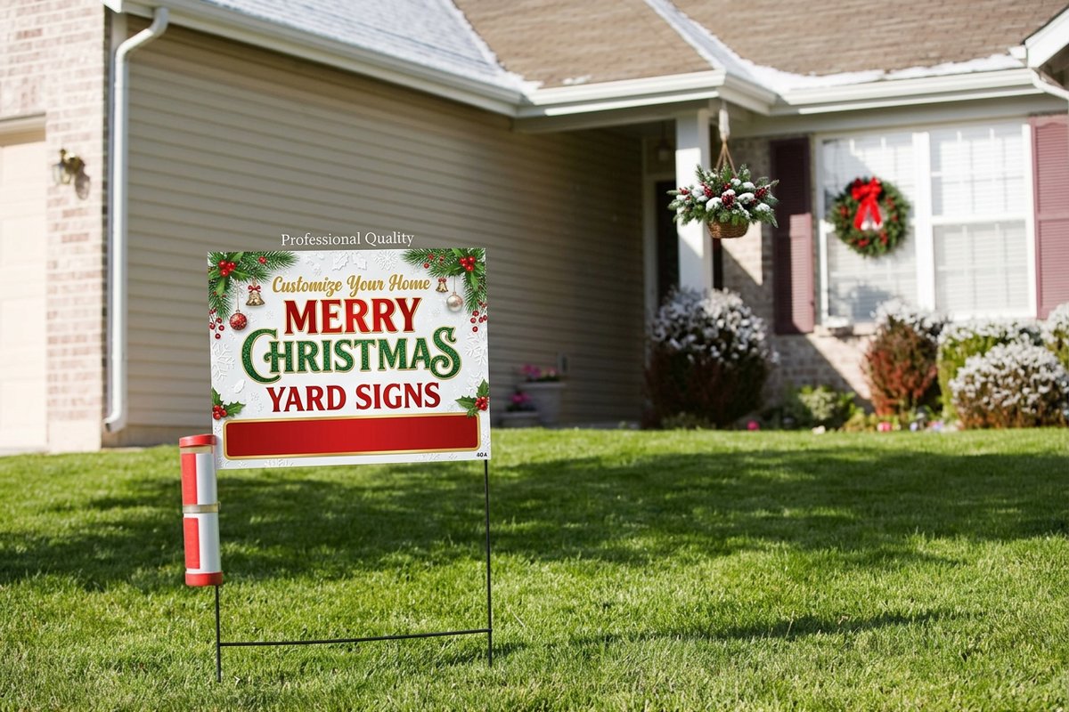 Christmas Yard Signs | 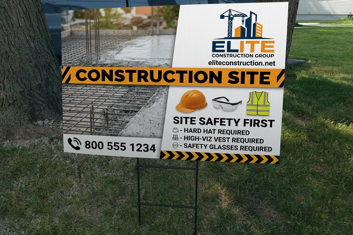 Construction Signs | |
|---|---|---|---|---|
| Min price | $25.00 | $218.35 | $25.00 | $25.00 |
| Paper / stock | 4mm White Coroplast | 1/8" Aluminum Sign Panel | 4mm White Coroplast | 4mm White Coroplast |
| Size | 12" x 18" | 6' Tall Post & Arm | 12" x 18" | 11" x 17" |
| Default qty | 1 | 1 | 1 | 1 |
| Turnaround | 5 business days | 4 business days | 5 business days | 3 business days |
| Rating | ||||
| View & customize | View & customize | View & customize | View & customize |
Pick a material that holds your color
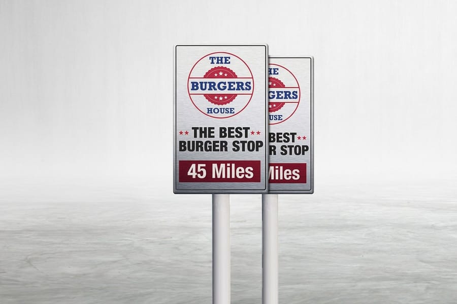
Color only matters if the final print matches what you designed. Cheap printing on flimsy stock produces dull, faded results that undercut your brand. The material you print on directly affects how vivid and accurate your colors look.
Corrugated plastic, or Coroplast, is the standard for temporary yard signs. It is light, affordable, and shrugs off rain. For a more permanent, premium look, custom aluminum signs deliver sharper color and a rigid, professional feel that lasts for years.
Aluminum is especially good for dark backgrounds. Black, navy, and forest green print richer on aluminum than on corrugated plastic because the smooth surface holds ink more evenly. 4OVER4.COM uses full color digital printing that reproduces your exact brand colors with no color shifting and no muddy gradients, batch after batch.
Color combinations by real estate niche
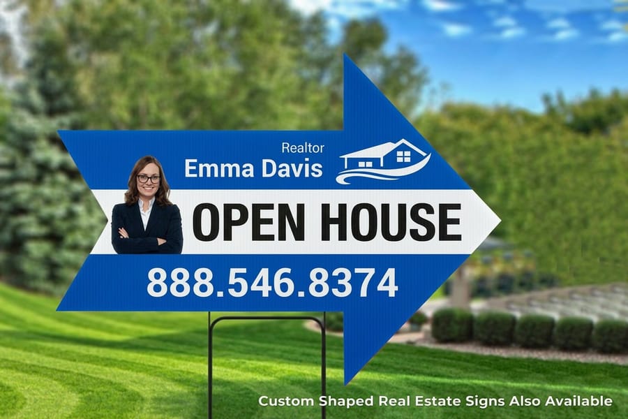
Different listings call for different palettes. Here is a quick starting point by niche, matched to the buyer you are trying to reach.
- Luxury properties. Black background with gold or white text. Clean, minimal, and expensive looking, with a thin gold border for polish.
- First time buyers and starter homes. Bright blue with white text and a yellow or orange accent. Friendly and approachable without feeling intimidating.
- Investment properties and flips. Red with white text. Urgent and direct, exactly what investors respond to.
- Eco friendly and green homes. Forest green with white or cream text. Natural, grounded, and aligned with sustainability.
- Commercial real estate. Charcoal or dark gray with white text and a blue accent. Corporate, serious, and professional.
Your palette can travel well beyond the sign too. These logo sticker design ideas show how agents extend brand colors onto folders, mailers, and closing gifts, and the same rules apply to client appreciation pieces like greeting cards.
Common color mistakes that hurt your signs
Even experienced agents make color errors that quietly cost them calls. Here are the most frequent ones:
- Too many colors. Four or more create visual noise. Stick to two or three.
- Low contrast text. Light text on a medium background reads as mush. If you squint and cannot read it, neither can a driver.
- Matching the environment. Green signs on green lawns and brown signs on wood fences blend in. Contrast with your surroundings, do not echo them.
- Ignoring brand consistency. Different colors on every sign, postcard, and card means buyers never learn to recognize you.
- Trendy colors that date fast. Millennial pink and sage look great on social, then fade into the background on a sign that stays up for months. Choose timeless, bold color.
The fix for all of them is the same. Start with contrast, limit your palette, and test in real conditions before ordering in bulk. Browse design templates at 4OVER4.COM for layouts that already follow these principles.
Start fast
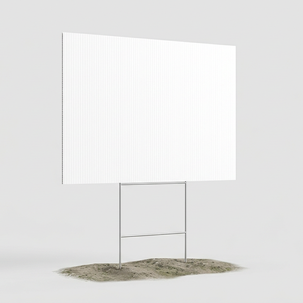
Print ready blank templates
Exact size blanks so your colors land inside the cut line, for real estate yard signs and standard yard signs.
How to lock in your yard sign colors
Ready to put this real estate yard sign color guide to work? Here is a simple process:
- Audit your current brand colors. Look at your business cards, website, and social profiles, and start there.
- Pick your primary background. Navy, black, white, red, or green, chosen to fit your market position.
- Choose a high contrast text color. White text on dark backgrounds, dark text on light backgrounds. Do not overthink it.
- Add one accent color. Use it for your phone number, website, or call to action, and make it pop.
- Test outdoors. Print a sample, stake it in a yard, and read it from across the street and from a moving car.
And the printing part is the easy part. Upload your design, pick your material and size, and get signs at your door. For more print marketing across every format, visit the full library of printing articles.
Wally reads the color from across the street
Contrast first, palette tight, tested in daylight
A yard sign has seconds to work, so let color carry it. Pick a dark background, add high contrast text like white on navy or yellow on blue, and keep the palette to two or three colors. Print it full color on 4mm Coroplast or step up to aluminum for dark, saturated brands, then read it from the street before you order the whole run.
Order real estate yard signs →What to remember about real estate yard sign color
Fast color rules
- Frame with borders. Use a contrasting border to make text stand out and separate design elements.
- Balance beyond white. Carry at least two colors other than white for real impact at distance.
- Read the light. Light tones appear larger up close while dark tones recede, so weigh how outdoor viewers see them.
Explore more
More ways to brand with signs and print
Every related page on 4OVER4.COM, one card each, so you can keep exploring real estate signage.
Category Yard Signs Printing Every yard sign size and material in one place.  Guide Real Estate Yard Sign Rules Permits, HOA codes, placement, and design tips.
  Guide How to Make Yard Signs From design to installation, start to finish.
  Guide Yard Sign Sizes and Materials Coroplast, aluminum, foam board, and standard sizes.
 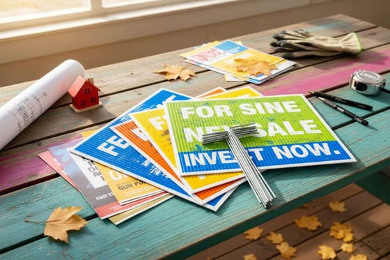 Article Real Estate Bandit Signs Placement and design that drive seller leads.
 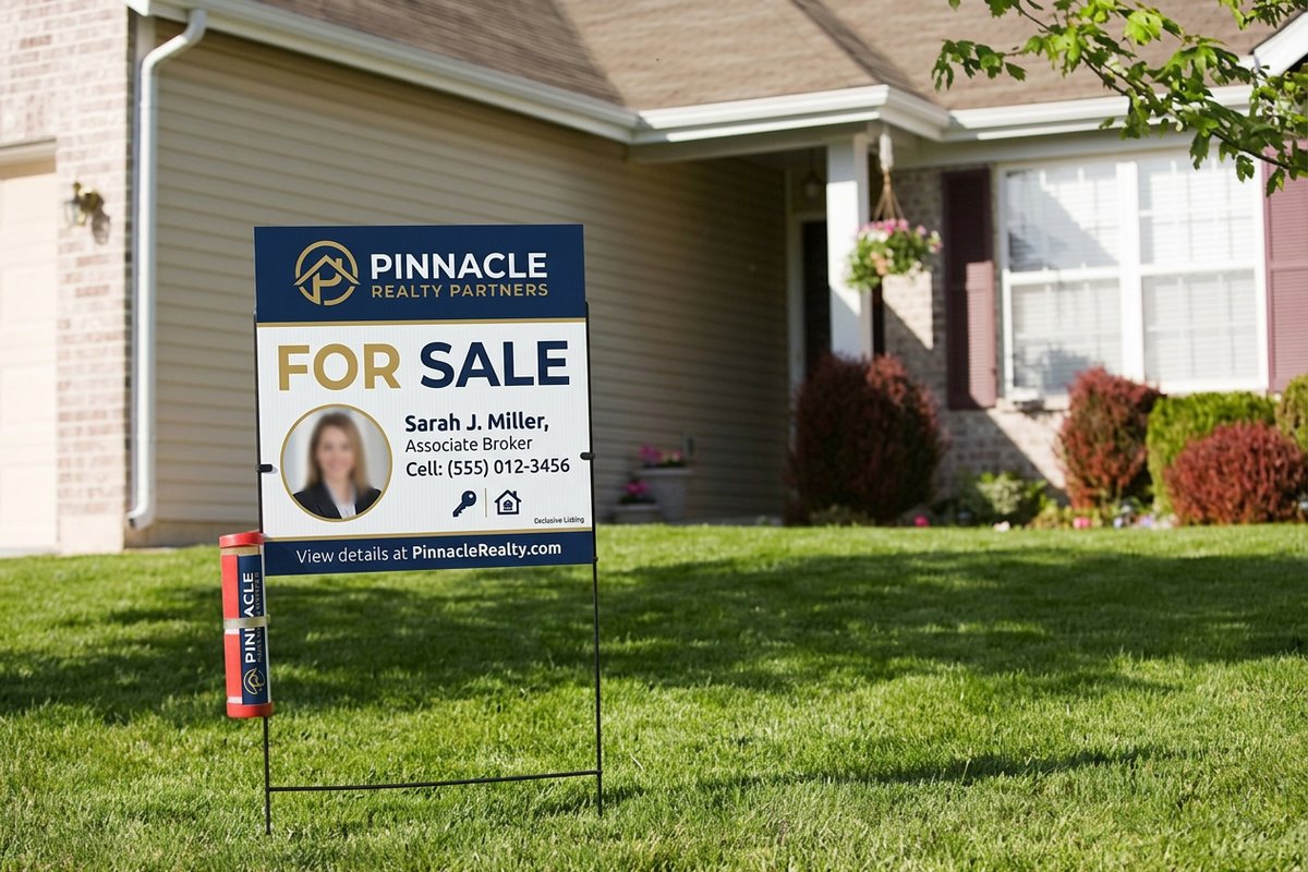 Product Real Estate Signs Full color real estate signage from $25.00.
  Statistics Real Estate Marketing Stats Print ROI, open house, and ad benchmarks for 2026.
 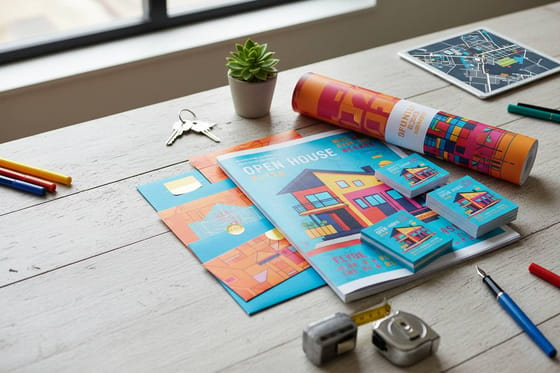 Case study Real Estate Print Kit How one team closed more deals with print. Collection Real Estate Printing Signs, flyers, postcards, and door hangers.
 Ready to print signs that read from the street?
Pick a high contrast palette, drop in your logo, and 4OVER4.COM prints it sharp on weatherproof Coroplast or premium aluminum.
Common questions about real estate yard sign color
What are the best practices for real estate yard sign color?
Use high contrast pairings like white text on navy, black, or red. Limit your palette to two or three colors total and test the sign outdoors from at least 50 feet to confirm readability. Avoid matching your sign color to common neighborhood backgrounds like green lawns or brown fences. Consistent colors across all of your marketing build brand recognition over time.
How do I choose the right real estate yard sign color?
Start with your existing brand colors from your business cards and website. Pick a dark background that contrasts with typical yard environments in your area, then add white or bright text for readability. Align the palette with your niche, black and gold for luxury and bright blue for approachable first time buyer work. Consider aluminum a-frames for directional signs that need the same bold color treatment.
What makes real estate yard sign color effective for marketing?
Effective color grabs attention in two to three seconds and communicates your brand personality at a glance. Up to 90% of the snap judgment a buyer makes about a brand comes from color alone. High contrast combinations like white on navy or red on white stay readable from moving vehicles, and consistent use of one palette across all your signage builds the neighborhood recognition that generates referrals.
How much should I budget for real estate yard sign color?
Full color printing on standard corrugated plastic is affordable and does not cost extra for additional colors, since digital printing handles any palette at the same price. Budget more for premium substrates like aluminum if your brand uses dark, saturated backgrounds that benefit from a smoother surface. For double sided visibility at busy intersections, 2 sided blockout banners deliver full color on both faces without bleed through.
