Poster Design Ideas for Mupis with Bold Outdoor Layouts in 2026


Poster design ideas for mupis that get people to stop and look
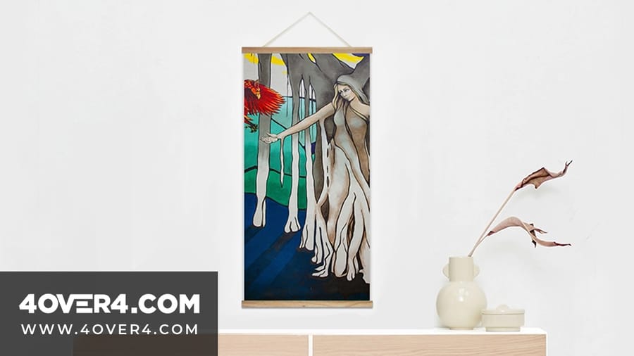
Poster design ideas for mupis start with one hard truth: you have about two seconds to grab someone. Mupis, those illuminated advertising panels at bus stops, sidewalks, and transit hubs, sit in the busiest spots in any city. 4OVER4.COM has printed large-format poster materials for over 25 years, turning those two seconds into lasting impressions. The right design paired with sharp, vivid printing is what separates a mupi that gets ignored from one that stops foot traffic cold.
If you are planning a mupi campaign, this guide covers layout strategy, color psychology, typography, and the real design approaches that work on these formats. Whether you are launching a product, promoting an event, or building brand awareness, these poster design ideas for mupis give you a concrete starting point.
What exactly is a mupi, and why does design matter so much
A mupi, sometimes called a CLP or city light poster, is a backlit advertising panel that typically measures around 120cm by 176cm. You will find them at bus shelters, train stations, shopping districts, and pedestrian walkways. They are one of the most common formats in out-of-home advertising worldwide.
Here is why design matters more for mupis than almost any other print format. People do not choose to look at your mupi. They walk past it, wait for a bus, or glance at it from a moving car. Your design has to do all the heavy lifting in a fraction of a second. A cluttered layout or weak color contrast means your message disappears into the urban background noise.
The backlit nature of a mupi also changes how colors appear. Designs that look great on a computer screen can wash out or oversaturate when illuminated from behind. That is something to account for from the very first sketch.
Layout strategies that work for mupi poster designs
The vertical orientation of a mupi is your first constraint and your biggest advantage. Unlike horizontal billboards, mupis match the natural way people scan their environment while standing or walking. Use that vertical space deliberately.
Print it
Large format posters, ready for mupis
The workhorse format for backlit panels and displays, sized big and printed sharp.
The rule of thirds for mupi layouts
Divide your mupi into three horizontal zones. The top third is your attention grabber, a bold headline or striking image. The middle third delivers your core message or product visual. The bottom third holds your call to action, logo, and contact details. This structure works because it mirrors how eyes travel down a vertical surface.
Do not try to fill every inch. White space on a mupi is not wasted real estate. It is what makes your key elements pop. The most effective mupi designs use no more than three visual elements total. One image. One headline. One call to action. That is it.
Single focal point design
Pick one thing you want people to remember. Just one. If it is a product, let that product image dominate at least 50% of the poster area. If it is a message, make the text large enough to read from 10 meters away. Trying to communicate multiple messages on a single mupi is the most common mistake brands make, and it almost always results in nobody remembering any of them.
For inspiration on how strong focal points work across print formats, look at these funny print ad examples that prove simplicity wins.
Symmetry versus asymmetry
Symmetrical layouts feel stable and trustworthy. They work well for luxury brands, financial services, and healthcare. Asymmetrical layouts create tension and energy, which suits entertainment, food and beverage, and youth-oriented brands. Neither is better on its own. The right choice depends on your brand personality and campaign goals.
Color choices that make mupis impossible to ignore
Color is the single most powerful tool in your mupi design toolkit. Before anyone reads your name or recognizes your icon, they see color. Research from the Institute for Color Research suggests people make subconscious judgments about a product within 90 seconds, and up to 90% of that assessment is based on color alone.
For backlit mupi panels, here is what matters most:
- High contrast is non-negotiable. Dark text on light backgrounds, or light text on dark. Mid-tone combinations vanish under backlighting.
- Warm colors advance, cool colors recede. Reds, oranges, and yellows feel closer to the viewer. Blues and greens sit back. Use warm tones for your focal element.
- Limit your palette to 2 or 3 colors. Your brand color plus one accent is usually enough. Anything more reads as chaos at a distance.
- Test how colors look backlit. Print a proof and hold it against a light source. Yellows wash out and deep purples turn muddy, so adjust before a full run.
4OVER4.COM offers poster printing on a range of materials that handle color differently. Glossy stocks intensify saturation and matte stocks soften it. For mupi posters that will be backlit, choose the stock that gives the truest color reproduction under illumination.
Quantity and price
Large format poster pricing and specs
Real configurator numbers, so the more you order, the lower the per-unit cost drops.
Typography that reads at speed
If someone cannot read your mupi headline in under two seconds, your typography has failed. That is the brutal reality of designing for people in motion.
Font size guidelines for mupis
Your primary headline should be readable from at least 5 to 10 meters away. For a standard 120x176cm mupi, that usually means headline text at 150 to 200pt minimum. Body copy, if you include any at all, should be at least 40 to 50pt. Anything smaller than that is decoration, not communication.
Sans-serif versus serif for outdoor posters
Sans-serif fonts such as Helvetica, Futura, Gotham, and Montserrat generally perform better on mupis because they stay clean at a distance. Serif fonts can work for luxury or editorial campaigns, but the serifs can blur together when viewed quickly. Bold and extra-bold weights outperform regular weights in every outdoor testing scenario.
Limiting your word count
The best mupi designs use seven words or fewer in their headline. Some of the most memorable campaigns use just two or three words. Think of it this way: if you cannot say it in the time it takes someone to walk past a bus shelter, it is too long.
Looking for more design inspiration across print formats? These graphic design portfolio examples show how professionals balance text and imagery across different media.
Blank templates
Starting from an exact-size blank keeps your artwork lined up with the cut lines and bleed areas. Grab a poster blank and drop your design straight in.
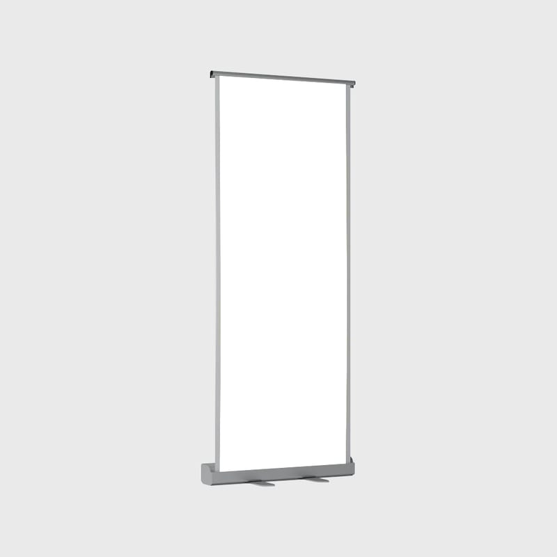
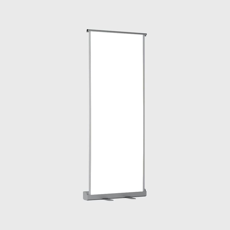
Image selection and photography for mupi posters
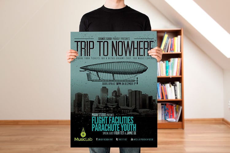
The images you choose for a mupi poster need to work harder than images on any other format. They have to communicate instantly, look sharp at large scale, and hold up under backlighting.
Resolution requirements
For a standard mupi at 120x176cm, you need images at a minimum of 150 DPI at full size. That translates to roughly 7,000 by 10,000 pixels. Anything lower and you will see pixelation, especially on close-up photographs. Stock photos downloaded at web resolution will not cut it, so always source the highest resolution available.
Human faces stop people
Eye-tracking studies consistently show that human faces are the most attention-grabbing element you can put on any outdoor advertisement. A face looking directly at the viewer creates an almost involuntary pause. A face looking toward your product or headline directs the viewer gaze where you want it. Use this psychology deliberately.
Product photography tips for mupis
If your mupi features a product, photograph it against a clean, uncluttered background. Remove the product from its typical context and let it stand alone. Oversized product images, a watch filling the entire poster or a bottle of perfume at 10 times life size, create visual impact that smaller, realistic product shots cannot match.
Creative poster design ideas for mupis by industry
Different industries call for different approaches. Here are specific poster design ideas for mupis broken down by sector.
Retail and e-commerce mupis
For retail campaigns, the product is the star. Use a single hero product image at maximum size. Pair it with a short, punchy price point or discount percentage. A bold 50% OFF next to a crisp product photo is one of the highest-performing retail mupi formats. Add a QR code in the bottom corner for immediate mobile engagement.
Event and entertainment mupis
Event mupis need to create excitement and urgency. Use active, high-energy photography such as performers mid-action, crowds enjoying themselves, and dramatic lighting. The date and venue should be the second-largest text element after the event name. Consider a countdown element like 3 Days Left if your campaign runs close to the event date. If you are designing invitations to complement your mupi campaign, 4OVER4.COM also offers invitations printing that can carry the same visual branding across formats.
Food and beverage mupis
Food photography on mupis needs to look absolutely irresistible. Shoot at close range with dramatic lighting. Steam rising from a coffee cup. Condensation on a cold bottle. A burger cross-section showing every layer. These sensory triggers work on a primal level, so keep the text minimal and let the food do the selling.
Real estate and property mupis
Real estate mupis work best with a single stunning interior or exterior shot, the price range, and a phone number or QR code. Avoid cramming multiple property photos onto one mupi. One beautiful image of a kitchen or living space creates desire, while six tiny thumbnails create confusion.
Healthcare and wellness mupis
Trust is everything in healthcare advertising. Use calming color palettes of soft blues, greens, and whites. Feature real people in comfortable, reassuring settings rather than obvious stock photos. Keep messaging clear and jargon-free. A single statistic like 9 out of 10 patients recommend us can be more powerful than paragraphs of copy. For more creative approaches to brand promotion through print, explore these logo sticker design ideas that translate well to larger formats.
Add depth
3D lenticular posters
Tilt the panel and the image shifts, an effect that stops foot traffic on its own.
Printing your mupi posters for maximum impact
Design is only half the equation. The printing quality of your mupi poster directly affects how the design performs in the real world. A beautifully designed poster printed on the wrong material or with poor color accuracy will underperform every time.
Paper and material selection
Most mupi frames accept posters printed on heavyweight paper or backlit film. For standard front-lit mupis, a thick, coated paper stock with a glossy or semi-gloss finish delivers the most vivid colors. For backlit mupis, you need translucent backlit film or duratrans material that lets light pass through evenly.
4OVER4.COM prints large-format posters with precise color matching and sharp detail reproduction. Whether you need a single proof or a full campaign run across dozens of mupi locations, the print quality stays consistent from the first poster to the last.
Finishing options
UV coating protects mupi posters from moisture and handling damage during installation. Lamination adds durability for longer campaign runs. If your mupis will sit in direct sunlight, even behind glass, UV-resistant inks prevent fading over the campaign lifespan.
File preparation checklist
- Bleed. Add 5mm on all sides so no white edges appear after trimming.
- Color mode. Work in CMYK, not RGB. Screen RGB will not match what prints in CMYK.
- Resolution. 150 DPI minimum at actual print size.
- Fonts. Convert all text to outlines or curves so nothing gets substituted.
- Safe zone. Keep critical text and logos at least 10mm from the trim edge.
For unique, eye-catching alternatives to traditional flat posters, consider 3D Lenticular Posters that add depth and motion to your mupi displays.
Compare formats
Popular poster products, side by side
Stock, finish, quantity, turnaround, and from-price across our most-ordered poster formats.
 Large Format Posters |  Standard Posters |  Dry Erase Posters |  Mounted Posters | |
|---|---|---|---|---|
| Min price | $25.00 | $108.75 | $29.00 | $39.99 |
| Paper / stock | 10mil Semi Gloss | 100# Gloss Text | Dry Erase Face/ Adhesive Vinyl Backer | 10.4 mil Semi Gloss |
| Finish | - | Standard Finish | - | - |
| Size | 11" x 17" | 11" x 17" | 11" x 17" | 8" x 10" |
| Default qty | 1 | 50 | 1 | 1 |
| Turnaround | 2 business days | 5 business days | 4 business days | 4 business days |
| Rating | ||||
| View & customize | View & customize | View & customize | View & customize |
Design trends shaping mupi posters right now
Mupi design does not exist in a vacuum. Current visual trends influence what catches the eye and what feels dated. Here is what is working in 2025 and heading into 2026.
Bold minimalism
Stripped-back designs with massive typography and a single color accent are dominating high-end mupi campaigns. Think one word, one color, one image, and nothing else. This approach respects the viewer limited attention span and trusts the brand to communicate through restraint rather than noise.
Illustrated and hand-drawn elements
As AI-generated imagery becomes more common, hand-drawn illustrations and custom typography stand out more than ever. They signal authenticity and craft. For brands targeting younger demographics, illustrated mupi posters feel fresh and distinctive against a sea of photographic ads.
Interactive and QR-driven designs
QR codes on mupis have gone from novelty to necessity. The key is making the QR code part of the design rather than an afterthought stuck in the corner. Some campaigns build the entire poster around the code, using it as the central visual element. Others integrate it into product packaging imagery or turn it into a game.
Sequential storytelling
Brands increasingly use multiple mupis along a single route to tell a sequential story. The first mupi poses a question, the second builds intrigue, the third reveals the answer. This works brilliantly at bus routes and metro corridors where people encounter the same sequence daily. For more design inspiration across print categories, browse the full library of printing articles on 4OVER4.COM.
Common mupi design mistakes and how to fix them
Even experienced designers make these errors when working on mupi formats for the first time.
Too much text
This is mistake number one, and it happens on almost every first draft. If your mupi has more than 10 words of body copy, cut it in half. Then cut it in half again. The poster is not a brochure. It is a billboard that happens to be at eye level.
Weak call to action
Every mupi needs to tell the viewer what to do next. Visit a website. Scan a code. Call a number. Walk into the store 50 meters away. If your poster does not include a clear next step, you have created art, not advertising.
Ignoring the environment
A mupi at a busy intersection needs a different design approach than one inside a quiet shopping mall. Outdoor mupis compete with traffic, signage, and visual clutter. Indoor mupis compete with retail displays and other advertising. Scout your locations before finalizing your design.
Designing for screen, not print
What looks stunning on your 27-inch monitor might look completely different printed at 120x176cm and backlit. Always request a printed proof at scale, or at minimum a scaled section, before approving a full production run. Strong poster design skills carry across formats, and the same principles of contrast, simplicity, and brand consistency apply on classy business card designs at a smaller scale.
Seasonal and holiday poster design ideas for mupis
Seasonal campaigns are some of the most effective uses of mupi advertising. People are already in a buying mindset during holidays, and a well-timed mupi can push them toward your brand.
For holiday campaigns, keep the seasonal element subtle. A winter color palette and a single snowflake icon communicate holiday sale without turning your mupi into a greeting card. Pair your mupi campaign with coordinated print materials so the same visual language extends to direct mail and in-store displays.
Summer campaigns benefit from bright, saturated colors and outdoor lifestyle imagery. Back-to-school campaigns work well with clean, organized layouts that mirror the fresh-start feeling. The key is matching the emotional tone of the season without being cliche.
Measuring the success of your mupi campaign
You have designed it. You have printed it. It is up on the street. Now what? Track these metrics to understand whether your poster design ideas for mupis are actually working:
- QR code scans. The most direct read on engagement. Use a unique code per location to see which placements perform best.
- Website traffic spikes. Compare traffic during the campaign against your baseline, with UTM parameters on any URL you display.
- Foot traffic data. If you drive people to a store, mobile location data shows visit lifts that line up with your campaign timing.
- Brand recall surveys. Post-campaign surveys asking whether people saw your ad give you qualitative feedback on the design.
Use these insights to refine your next round of mupi designs. The best campaigns are iterative, and each one builds on what you learned from the last.
Start fast
Templates and print-ready blanks
Poster design templates and exact-size blanks so your artwork lands inside the cut line.
Free poster templates to get you started
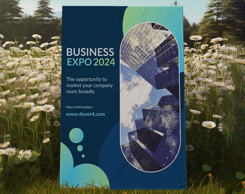 Business Expo Poster
 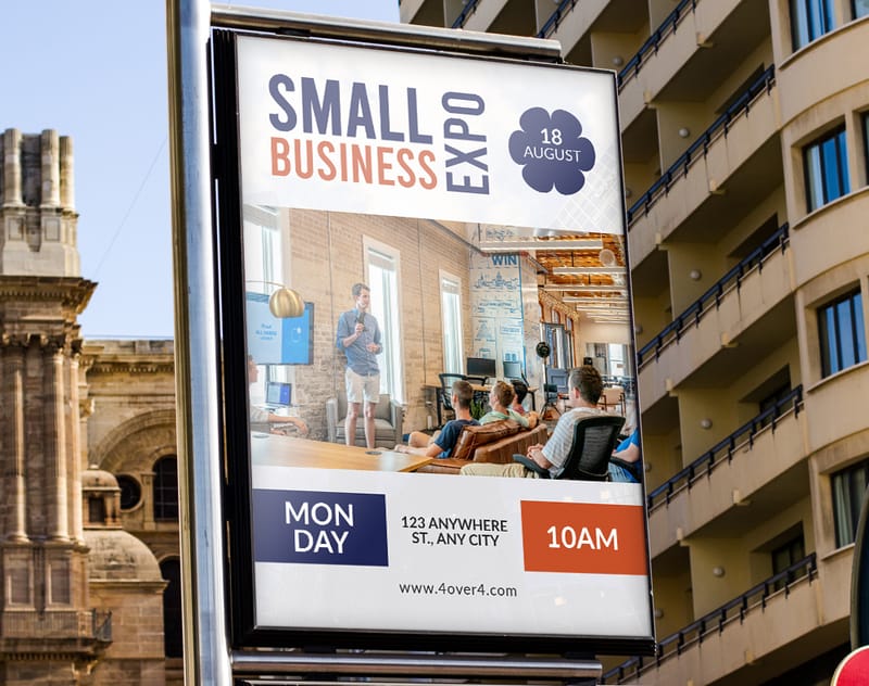 Small Business Expo Poster
 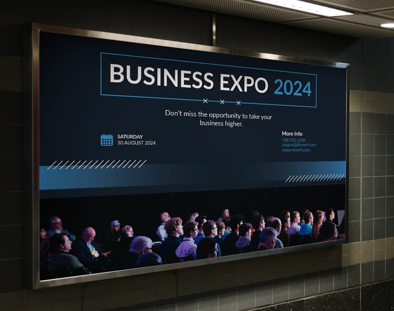 Business Expo Poster
 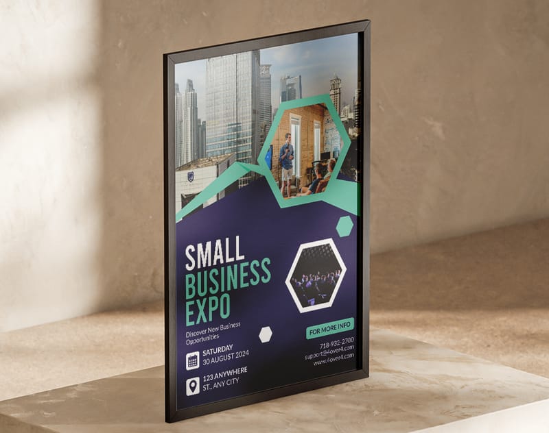 Trade Show Poster
 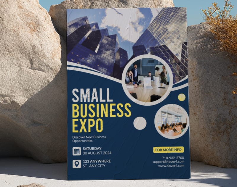 Business Trade Show Poster
 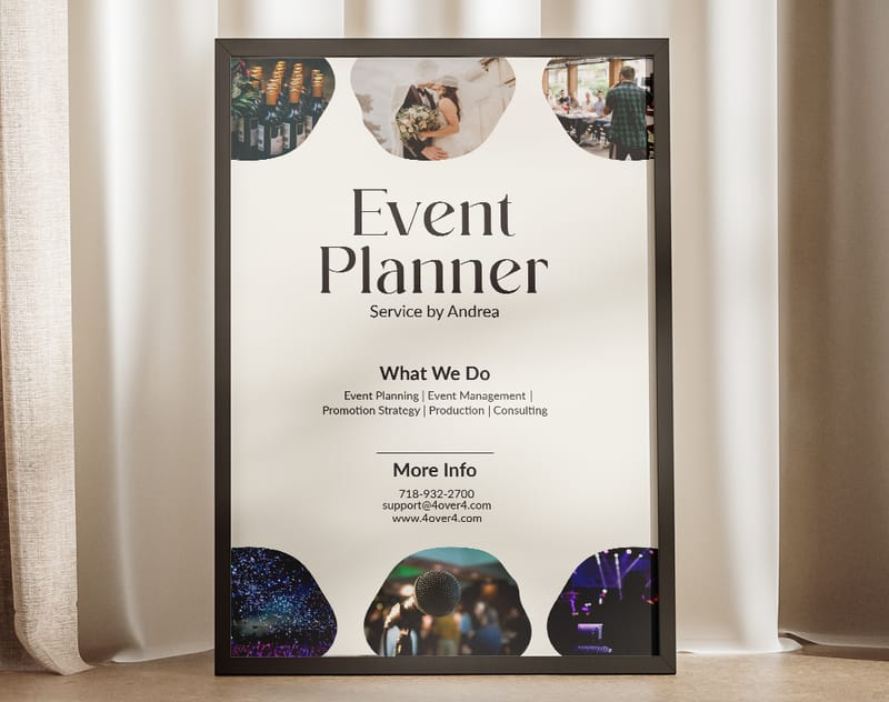 Event Organizer Poster
 Wally makes a mupi impossible to ignore
One image, one headline, one clear next step
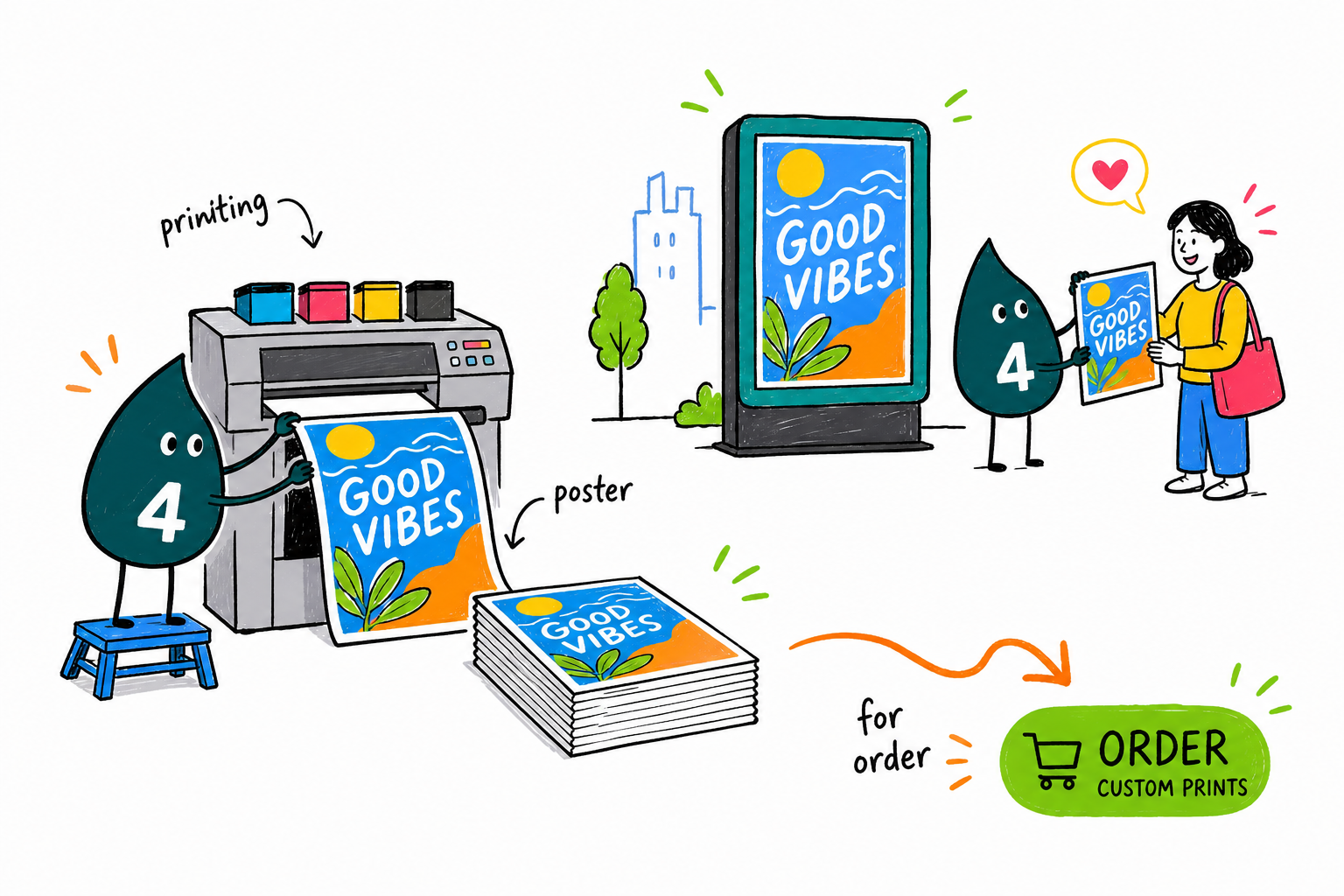
A great mupi has about two seconds to land. Wally keeps it simple with one focal image, a headline of seven words or fewer, and two or three high-contrast colors that hold up when the panel is backlit. Prep files in CMYK at 150 DPI with 5mm bleed, proof against a light source, and 4OVER4.COM prints it sharp across every location.
Order large format posters →What to remember about mupi poster design
Explore more
More ways to design and print for outdoor
Related pages on 4OVER4.COM, one card each, so you can keep exploring poster and outdoor printing.
Ready to design a mupi that stops people?
Keep it to one image, one headline, and one call to action, drop it into a free template, and 4OVER4.COM prints it sharp for every location.
Your questions about mupi poster design, answered
What are the best practices for poster design ideas for mupis?
Keep your design to one focal image, a headline of seven words or fewer, and a single call to action. Use high-contrast colors that hold up under backlighting. Set headline type at 150 to 200pt minimum so it reads from 10 meters away. Always prepare files in CMYK at 150 DPI minimum, and request a printed proof before committing to a full campaign run.
How do I choose the right poster design ideas for mupis?
Start by scouting your mupi locations. Indoor placements in shopping areas allow for more detailed designs, while outdoor bus-shelter mupis need bolder, simpler layouts. Match your approach to your industry, since retail mupis focus on product imagery and pricing while event mupis prioritize dates and energy. Consider pairing traditional mupis with Dry Erase Aluminum Panels for reusable indoor signage that complements your campaign.
What makes poster design ideas for mupis effective for marketing?
Mupis sit at eye level in high-traffic areas, giving brands direct access to pedestrians and commuters. Effective mupi designs use bold minimalism, human faces, and clear calls to action to convert a two-second glance into measurable engagement. QR codes and unique URLs let you track performance across locations, making mupis one of the most accountable forms of out-of-home advertising.
How much should I budget for poster design ideas for mupis?
Budget breaks into three parts: design, printing, and media placement. Professional design typically runs a few hundred dollars per concept, printing costs depend on material and quantity, and media placement varies widely by city and location. For durable signage alternatives at lower ongoing cost, explore Dry Erase Coroplast Signs as reusable display options.
