
Business Card Font Size Guide for 2026


Business card font size guide, getting every point right
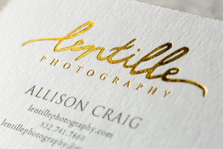
Business card font size decides whether your card gets read or tossed. The standard range runs 8 to 12 points for body text and 12 to 16 points for your name or brand. 4OVER4.COM has printed over 10 billion cards for more than 150,000 businesses, and the designs that work consistently nail their sizing. Get this wrong and nothing else on the card matters.
Your card speaks before you do. Tiny fonts make people squint. Oversized fonts eat the space and read amateur. The sweet spot depends on your typeface, your card dimensions, and how much information you are trying to fit. This guide breaks down every detail so you can design with confidence, whether you order business cards in a classic layout or something bolder.
Why font size on your business card actually matters
Font size on a business card is not just a design preference. It is a readability decision that affects whether someone can use your card. A card with unreadable text is a wasted card.
Picture handing your card to someone at a networking event. They glance at it. If your name, title, and phone number do not register in that two second glance, you have lost the moment. The right size builds a visual hierarchy that guides the eye exactly where you want it. Your name first, your title second, contact details third.
Professionalism shows in the details. When your cards carry well proportioned text, people trust the brand more. Cramped tiny text signals carelessness and oversized text signals inexperience, while the right balance signals someone who pays attention.
Accessibility matters too. Not everyone has perfect vision, so a size that works for a wide range of readers makes your card work harder. A card that half your audience cannot read is only doing half its job.
Standard font sizes for business cards, a complete breakdown
Business card font size follows a hierarchy. Different elements need different sizes. Here is what works and why.
Your name, 10 to 14 points
Your name is the anchor of the card and the first thing someone reads. A range of 10 to 14 points fits most typefaces. A bold weight can feel big at 10 to 11 points, while a lighter weight wants 13 to 14 points so the name does not disappear.
On cards with minimal text you can push the name to 16 points. That works well on Black Business Cards, where white text on dark stock makes even moderate sizes feel bold.
Job title and company name, 9 to 12 points
Your title and company sit just below your name. Keep them 2 to 3 points smaller than the name. If the name is 12 points, the title lands around 9 to 10 points, which creates a natural reading flow without feeling jarring.
Company names sometimes get special treatment. If the brand is the star, think agencies, studios, or consultancies, you might flip the order and set the company name larger than your personal name. The hierarchy should match your marketing strategy.
Contact details, 8 to 10 points
Phone, email, website, and address live in the 8 to 10 point range. These are reference details. People read them holding the card six inches from their face, not from across a table.
Do not go below 8 points for contact information. Even clean sans-serif fonts become a struggle smaller than that on a 3.5 by 2 inch card. If you run out of room, cut information rather than shrink the type. A readable card with fewer details beats an unreadable card packed with everything.
Taglines and secondary text, 7 to 8 points
Taglines, slogans, and small print like a license number can sit at 7 to 8 points, the absolute minimum for printed business card text. Below 7 points most fonts turn illegible on standard stock.
One exception is specialty material. On 30Mil Clear Plastic Cards, transparent or frosted substrates change readability, so test your minimum sizes on the actual material before a full run.
Ready to print
Standard business cards, built to spec
Preset sizes and premium stocks, the fastest way to put well sized type on a card.
How typeface choice affects your font size
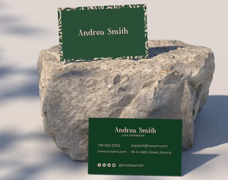
Here is something many guides skip. Not all 10 point text looks the same. A 10 point Garamond reads noticeably smaller than a 10 point Helvetica. The typeface you pick changes how large your text appears at any point size.
Serif versus sans-serif at the same point size
Serif fonts like Times New Roman, Garamond, or Baskerville tend to have a smaller x-height, the height of the lowercase letters. That makes them look smaller than sans-serif fonts like Helvetica, Arial, or Futura at the same point size. With a serif face, bump every size up by 1 to 2 points.
Sans-serif fonts read better at small sizes on cards. Their clean lines reproduce well and hold up even at 8 points, which is why they dominate modern business card design. Browse the templates to see how different typefaces behave at various sizes.
Script and decorative fonts
Script fonts need care. Their flowing strokes go unreadable below 10 to 12 points, so keep a script name at 12 points minimum and never use script for contact details or small print. It blurs into a mess.
Decorative and display fonts follow the same rule. They are built for headlines, not fine print. Use them for the name or company at a larger size, then switch to a clean body font for everything else.
Font weight matters too
A light weight at 9 points can be nearly invisible on a card, while a bold weight at the same size feels solid. Always factor in the weight you plan to use. Light weights want larger sizes and bold weights carry smaller ones without losing legibility.
Typeface, weight, and size together make the card personality. A 14 point bold sans-serif reads confident and a 10 point light serif whispers sophistication. Neither is wrong as long as the choice is intentional.
Card size and design style change everything
The standard US business card measures 3.5 by 2 inches, which is not a lot of room. Every size decision happens inside those limits, but not every card follows the standard.
Standard cards, 3.5 by 2 inches
On a standard card the sizes above work perfectly. There is room for a 12 point name, a 9 to 10 point title, and 8 to 9 point contact details. Add a logo and you are working with roughly 60 percent of the face for text.
Keep the safe zone in mind. Text should stay at least 0.125 inches from any edge to avoid getting cut during trimming, which shrinks your usable area, so plan sizes with that margin in place.
Mini and square cards
Smaller formats want smaller text or fewer details. On a mini card at 3.5 by 1 inch or a square at 2.5 by 2.5 inches, drop the name to 10 to 11 points and details to 7 to 8 points. Better yet, include less and point people to a website or QR code.
Oversized and folded cards
Larger formats give you breathing room. On a folded or oversized card you can push the name to 16 to 18 points and it feels natural rather than loud. Use the extra space to let text breathe instead of cramming in more.
Unique types like 3D lenticular business cards have their own rules. The lenticular effect can blur fine text, so keep anything on the lenticular area at 10 points or larger.
Quantity and price
Standard business card pricing and specs
Real configurator numbers, the more you order, the lower the per-unit cost drops.
| Quantity | Price Per Unit | Total |
|---|---|---|
| 100 | 17.6¢ | $17.57 |
| 200 | 11.5¢ | $23.07 |
| 300 | 9.15¢ | $27.46 |
| 400 | 7.96¢ | $31.86 |
| 500 | 7.25¢ | $36.26 |
| 600 | 6.77¢ | $40.64 |
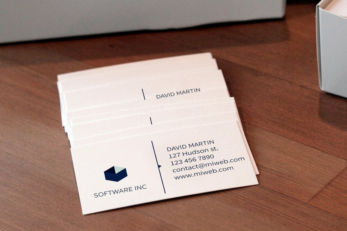
Minimalist versus information heavy designs
Your design approach sets your size strategy. These are two different games with different rules.
Minimalist cards
Minimalist designs use white space as an element. With less text, each piece can grow. A 14 to 16 point name surrounded by open space looks clean and modern, and 9 to 10 point contact details feel balanced rather than cramped.
The trick is restraint. Include only what you need, name, title, one phone, one email, maybe a website. The fewer elements you keep, the larger each one becomes and the more the card lands. Artist Business Cards often take this route, letting the design and spacing do the talking.
Information heavy cards
Some professionals need more on the card. A real estate agent might list a brokerage, license number, several phone numbers, and social handles. Here you work at the low end of every range, names at 10 to 11 points, details at 8 points, secondary info at 7 points.
The key is holding the hierarchy even when everything is smaller. Use bold weights, color differences, or spacing to separate elements. A well organized card at small sizes reads better than a messy one at large sizes.
Practical tips for testing your font sizes
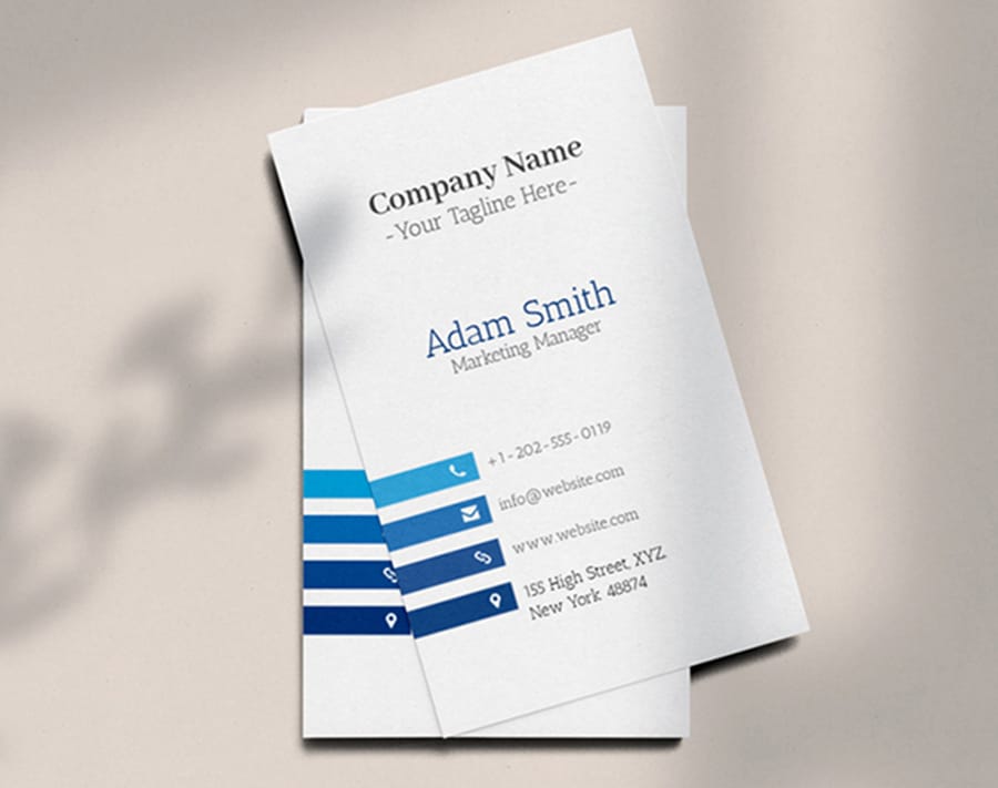
Designing on screen is deceiving. Your monitor shows text far larger and sharper than a printed 3.5 by 2 inch card. Here is how to make sure your sizes hold up before you print.
Print a test at actual size
Before a full run, print the design on a home or office printer at 100 percent scale. Cut it out, hold it at arm length, and read everything. Hand it to someone else and watch for squinting. If they squint, bump the sizes up.
Check multiple distances
People read cards at different distances. A card on a desk reads from about 18 to 24 inches, and a card in hand reads from 8 to 12 inches. Your name and title should be legible at the longer distance while contact details can ask for the closer one.
Test on your actual paper stock
Paper texture affects readability. Linen or cotton stocks soften the edges of small text, while smooth coated stocks keep it crisp. On a heavily textured stock, add 1 point to your minimum sizes.
Reverse printing, light text on a dark background, also shifts legibility. Light text on dark reads slightly thinner, so compensate with a slightly bolder weight or an extra 0.5 to 1 point when you reverse.
Use your design software print preview
Most design programs have a print preview or actual size view. Use it, zoom to 100 percent, and measure the text against a real ruler. What looks fine at 200 percent on screen can be microscopic at print size.
Font size and print finishes, what to watch for
Some finishes interact with font size in ways you might not expect. Here is what to keep in mind when you pair text sizes with specialty treatments.
Raised foil and embossing
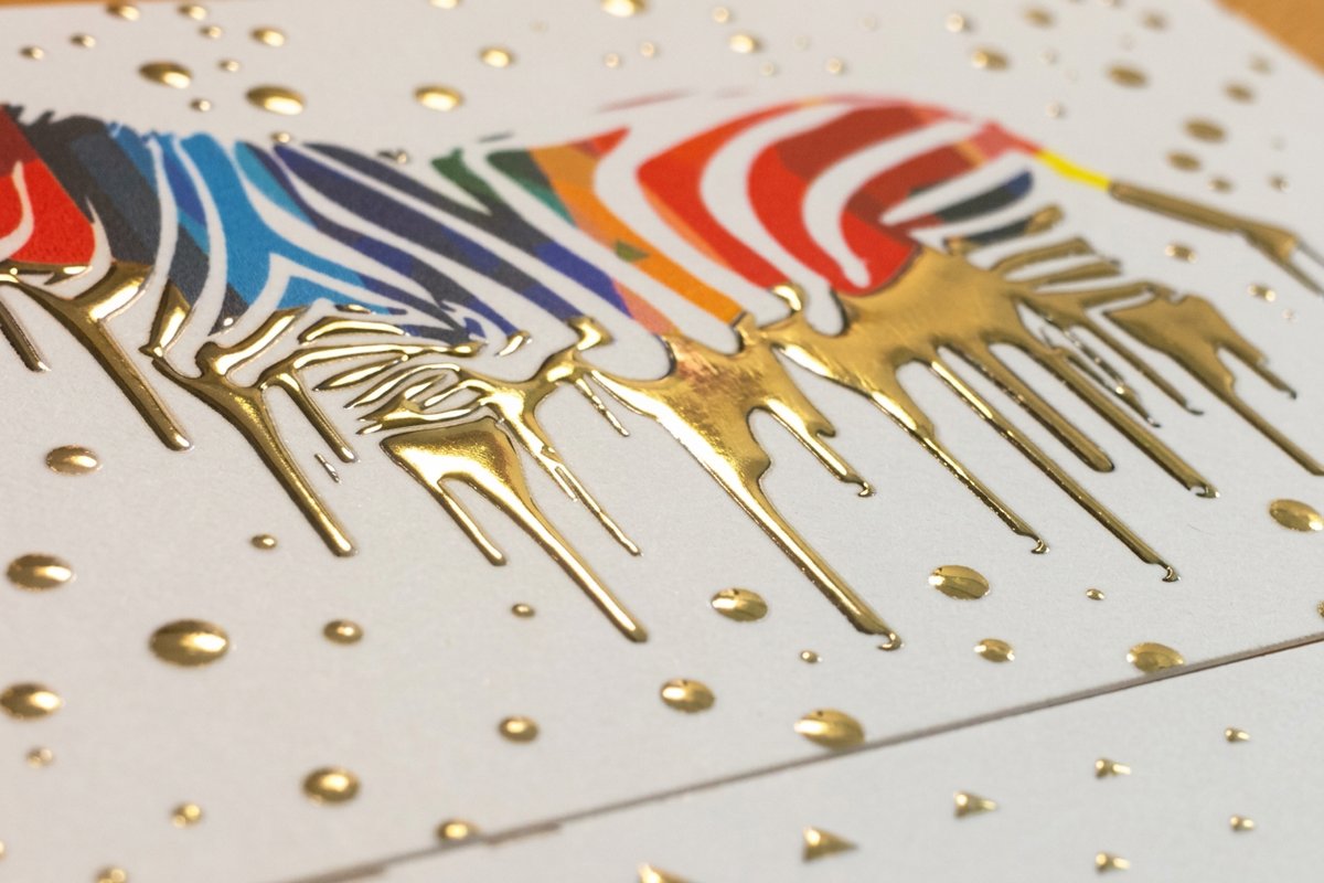
Raised foil and embossed text add a tactile, three dimensional quality, but the process has limits. Text below 10 points usually does not emboss cleanly, since fine detail and thin strokes blur. For a raised foil name, stay at 10 points minimum and ideally 12 or higher.
Spot UV and gloss coatings
Spot UV creates a glossy raised effect on chosen areas. Like embossing, it favors larger text, so aim for 10 points or above on anything that gets a spot UV treatment. Smaller text loses definition under the coating.
Matte and soft-touch finishes
Matte and soft-touch laminations barely change size requirements. They do lower contrast a little against glossy finishes, so keep that in mind at minimum sizes. A 7 point tagline on matte can read slightly harder than the same text on gloss.
Branded stickers and promo materials follow similar rules. If you are building a cohesive brand kit, these Logo Sticker Design Ideas help you keep typography consistent across print products.
Specialty finish
Raised foil specs and finishing
Foil, stock, and finishing options for cards where 10 point type and up reproduce cleanly.
Real font size examples by industry
Different industries lean toward different size approaches. Here is what works across five common cases. The Showcase gallery shows real examples from 4OVER4.COM customers.
Real estate agents
Real estate cards pack a lot in, name, title, brokerage, license number, phone, email, website, often a headshot. Use 10 to 11 points for the name, 8 to 9 points for contact details, and 7 points for license and brokerage lines. Bold the name and phone number to build clear hierarchy.
Creative professionals
Designers, photographers, and artists often go minimal. Name at 12 to 14 points, website at 9 to 10 points, and maybe nothing else. Let the design, stock, and finish carry the weight so the card becomes a portfolio piece.
Corporate executives
Clean, traditional, easy to read. Name at 11 to 12 points in a serif face, title and company at 9 to 10 points, contact details at 8 to 9 points. Nothing fancy, just polished.
Restaurant and hospitality
Restaurant cards might carry hours, address, a tagline, and social handles. Keep the restaurant name prominent at 12 to 14 points and set address and hours at 8 to 9 points. Splitting information across front and back keeps one side from cramping.
Freelancers and startups
Startups want energy and modernity. Sans-serif at 10 to 12 points for the name, 8 to 9 points for details, and a QR code that links to a portfolio or booking page so you can cut text and keep sizes comfortable.
Compare formats
Popular business cards, side by side
Stock, finish, quantity, turnaround, and from-price across our most-ordered cards.
 free business cards | Standard Business Cards |  3D Lenticular Business Cards |  Metallic Foil Business Cards | |
|---|---|---|---|---|
| Min price | Free | $17.57 | $690.88 | $222.13 |
| Paper / stock | 14pt Gloss Cover | 14pt Gloss Cover | 31pt Lenticular Lens | 16 Point Silk Laminated |
| Finish | - | Standard Finish | - | - |
| Size | 2" x 3.5" | 2" x 3.5" | 2" x 3.5" - Vertical | 2" x 3.5" |
| Default qty | 200 | 100 | 500 | 500 |
| Turnaround | 5 business days | 3 business days | 22 business days | 7 business days |
| Rating | ||||
| View & customize | View & customize | View & customize | View & customize |
Common font size mistakes to avoid
After printing 10 billion cards, 4OVER4.COM has seen every font size mistake in the book. Here are the common ones and how to dodge them.
Making everything the same size. If the name, title, and phone number all sit at 10 points, nothing stands out. Build contrast so the name always reads noticeably larger than the details.
Going below 7 points. No matter how sharp your eyes are, most fonts stop working below 7 points on a card. If everything will not fit at 7 points or above, you have too much text, so edit hard.
Ignoring line spacing. Size and leading work together. Tight leading feels cramped even at the right size, so give text room. A good starting point for leading is 120 to 140 percent of the font size.
Skipping the paper test. Screen previews lie. Always print a proof, since what looks perfect on a 27 inch monitor can be unreadable on a 3.5 by 2 inch card.
Using too many sizes. Stick to 2 or 3 sizes, a large name, a medium title and company, and small contact details. More than three creates visual chaos. The Showcase gallery shows how strong designs keep typography tight.
How to pick a business card font
Size is half the job. The typeface, the number of fonts, and how they pair decide the rest. Three factors drive the size you land on.
- Amount of text. A smaller size fits more information, but always favor readability over volume.
- Typeface. Some faces look larger or smaller than others at the same point size, so judge by eye, not by the number.
- Design. A minimalist layout with white space wants a larger size to stay prominent, while a graphic heavy layout can take a smaller one. Unique designs like Raised Foil business cards ask for 10 points or larger.
Once the size is set, lock in the font itself with a few rules the pros never break.
- Choose a legible font. Clear faces like Arial, Helvetica, or Times New Roman read well even small, while script and decorative fonts fight the reader, so use them sparingly.
- Use two fonts at most. More than two makes a card look cluttered, so keep one for the heading and one for the body.
- Match your branding. Use the same fonts as your website and flyers so people recognize and trust the brand. A law firm leans traditional while a tech startup leans modern.
- Mind the pairing. Complementary fonts look intentional, while clashing or near identical fonts look off, so lean on a pairing guide or a designer.
- Test the font. Print a sample, check the size, and show it to a colleague for a read on legibility and appeal.
Start fast
Templates and print-ready blanks
Business card templates and exact-size blanks so your type lands inside the safe zone.
Wally sizes your card so it gets read
The right point size turns a card into a working tool
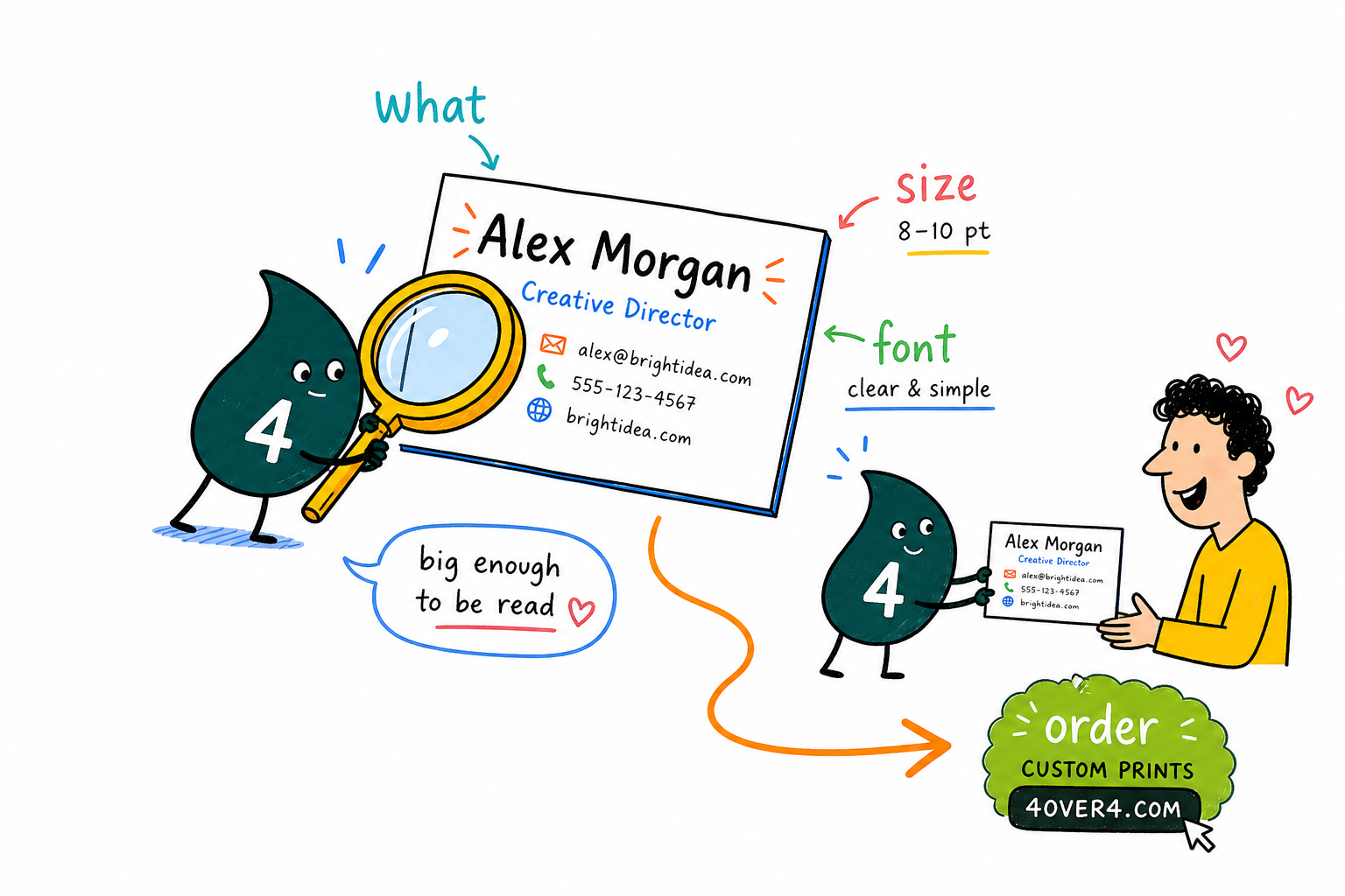
Set the name at 12 to 14 points, the title around 9 to 10, and contact details at 8 to 10, and never drop below 7. Match the size to your typeface, since a serif reads smaller than a sans-serif at the same point size, and give raised foil or spot UV at least 10 points. Print a proof at actual size, then let 4OVER4.COM print it sharp.
Configure your business cards →What to remember about business card font size
Why business card templates work
- Time-saving. Swap in your name, title, and logo on a ready layout instead of starting from a blank card.
- Consistency. Every card matches your brand, so your type and logo stay recognizable across materials.
- Professional look. Pre-built layouts give clean, balanced results without hiring a designer.
- Cost-effective. You skip design fees while still getting a custom card.
- Correct sizing. Templates keep type inside the safe zone and away from the trim.
- Creativity. A template is a base you can still make your own with color, type, and layout tweaks.
- Ease of use. Anyone can customize and print, no advanced design skills needed.
Explore more
More ways to design and print your cards
Related products, templates, and guides on 4OVER4.COM, one card each, so you can keep exploring.
Shop Business Cards Printing Browse every business card format in one place. 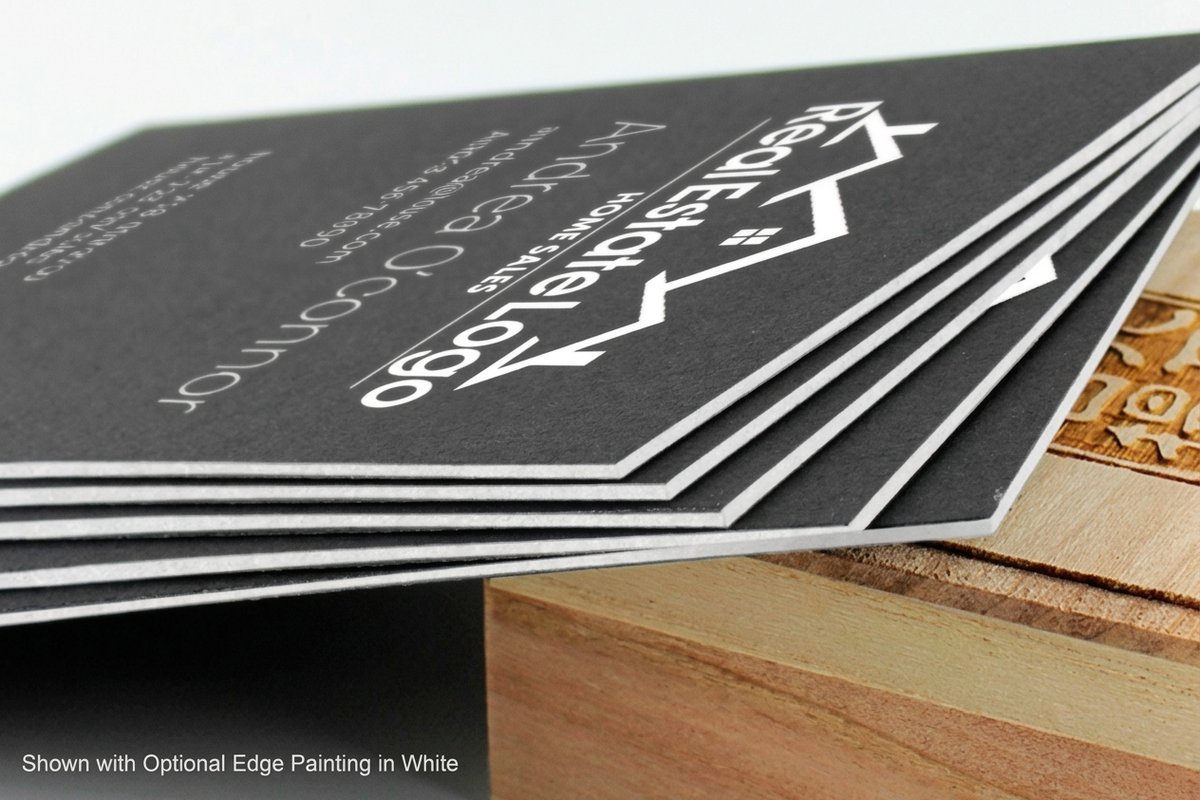 Product Black Business Cards Bold white type on dark stock for high contrast. Product Raised Foil Business Cards Tactile foil for names at 10 points and up.
 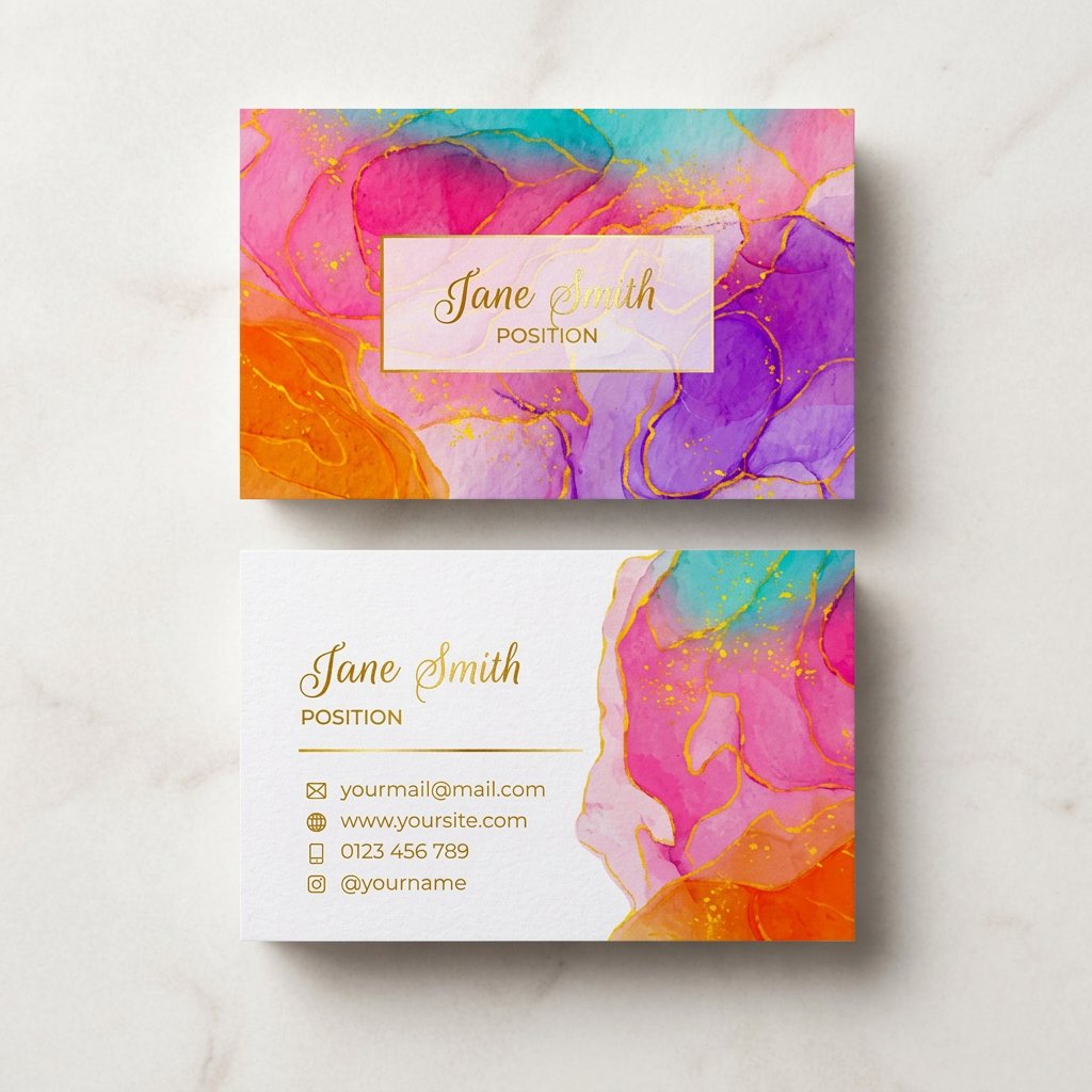 Product Artist Business Cards Minimal cards that let the design lead.
 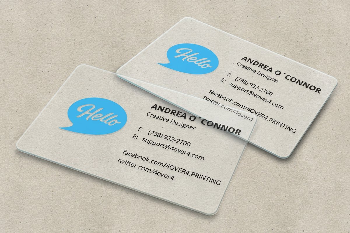 Product 30Mil Clear Plastic Cards Transparent stock, so test small type first.
 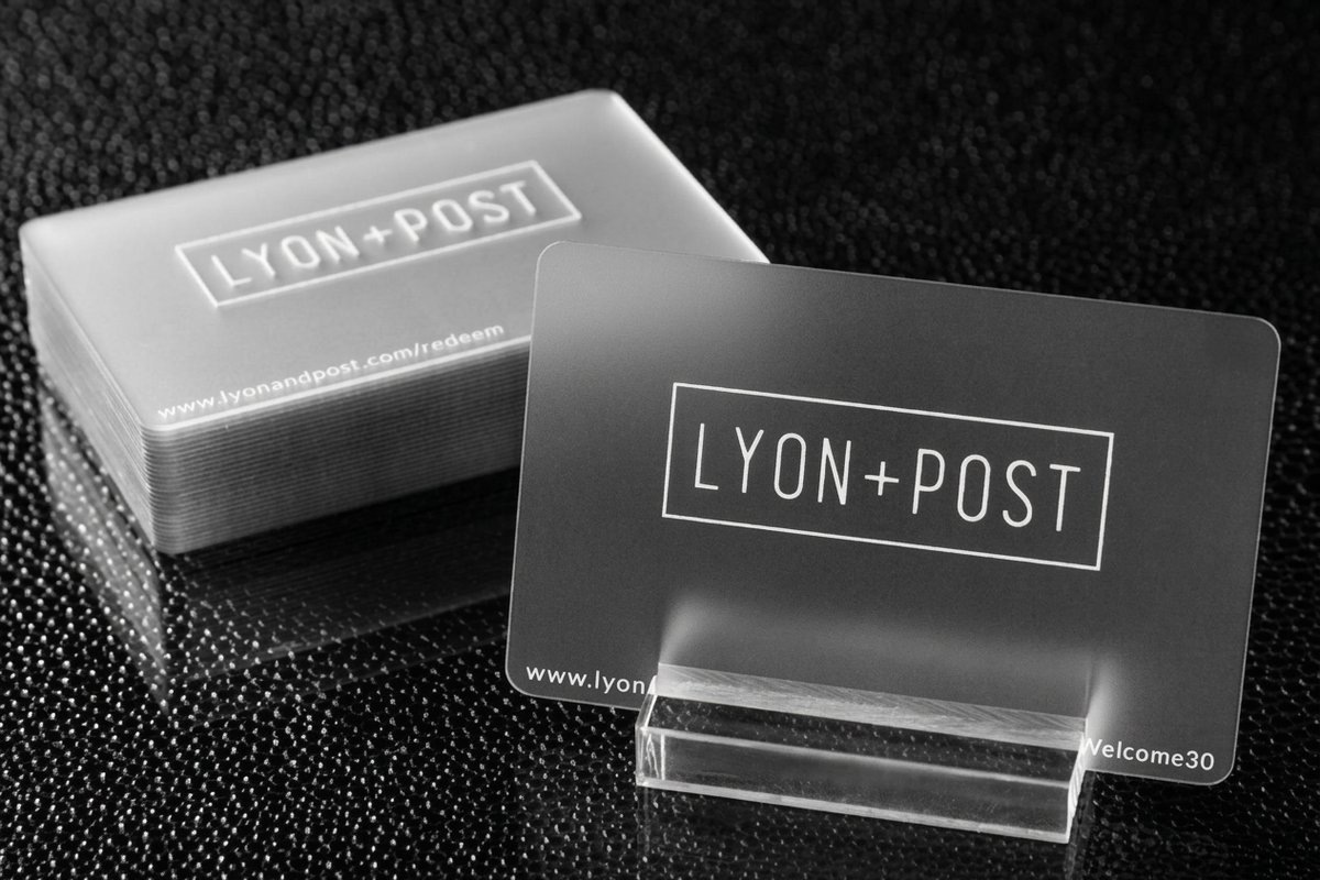 Product 30Mil Frosted Plastic Cards Frosted substrate with a premium feel.
 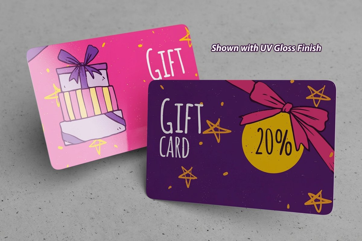 Product 30Mil White Plastic Cards Durable plastic that keeps text crisp. Template Lenticular Templates Print-ready blanks for lenticular cards. Template Black Card Templates Exact-size blanks for black business cards.
  Article Logo Sticker Design Ideas Keep typography consistent across print.
  Guides Printing Guides Step-by-step guides for every product. Samples Free Samples Feel the stock before you order.
 Ready to print cards people can actually read?
Size your name at 12 to 14 points, drop in a template or your own layout, and 4OVER4.COM prints it sharp, as fast as same day.
Common questions about business card font size
What are the best practices for business card font size?
Use 10 to 14 points for your name, 8 to 10 points for contact details, and never go below 7 points for any text. Build a clear hierarchy with 2 or 3 size levels, and always test at actual print size on paper before ordering. Compare 30Mil White Plastic Cards to see how different stocks affect clarity.
How do I choose the right business card font size?
Start with your typeface, since sans-serif reads well at 8 points while serif and script fonts want 10 points or more. Factor in the card dimensions, how much text you include, and whether you use specialty finishes, then print a physical test. The printing articles library has more design tips.
What makes business card font size effective for marketing?
Readable text gets read. Properly sized fonts build a professional impression and trust, so a name that pops at 12 points and a phone number that is clear at 9 points means people actually use the card. Unreadable cards get thrown away, while good sizing turns a card into a working marketing tool.
How much should I budget for business card font size?
Sizing itself costs nothing, since it is a design choice rather than a print upgrade. Specialty finishes that interact with size, like raised foil, embossing, and spot UV, do add cost. Standard business cards with well sized type stay affordable and effective. The Help Center lists current pricing on finishes that complement your typography.
