
Business Card Color Meaning Guide for 2026 Branding


Business card color meaning: how every shade shapes your brand
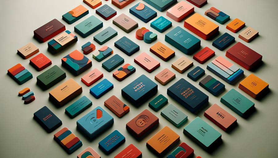
Business card color meaning is the study of how the hues on a printed card shape perception, trust, and recall. 4OVER4.COM has printed over 10 billion cards across 60 plus paper types since 1999, which gives brands precise control over the color story they hand to every new contact. The right palette does more than look good. It tells people who you are before you say a word. Browse the full range of business cards printing to see how color, stock, and finish come together.
Think about the last business card someone handed you. Did the color catch your eye? Did it feel right for that person profession? That snap judgment happens in under seven seconds, and color drives most of it. A bold red card from an accountant feels off. A muted navy card from a creative director feels flat. Matching your industry, your personality, and your card palette is what separates forgettable cards from the ones people keep.
This guide breaks down the psychology behind every major color, shows you how to pair shades for maximum impact, and helps you pick a palette that matches your goals. Whether you are ordering your first batch of cards or refreshing a tired design, color is where it all starts.
Why color psychology matters on a business card
Color psychology is the study of how hues affect behavior and decision making, and on a business card it works fast. People form a first impression of a printed piece in about 90 milliseconds, and up to 90 percent of that snap judgment comes from color alone, according to research published in the journal Management Decision. That is not much time, and your card color does most of the talking.
A business card is often the first physical object someone links to your brand. It is small, portable, and personal, and it sits in a pocket or wallet long after the meeting ends. If the color clashes with the message you want to send, you create a disconnect before the relationship even starts. With 60 plus paper types and a wide range of finishes, you can match your exact brand values or explore new combinations in the design templates library.
Design it
Standard business cards, ready to brand
Preset sizes and 60 plus paper types, the fastest way to put your palette on a card.
What each color communicates on a business card

Each color carries a distinct set of associations. Some are close to universal. Some shift with culture and context. Here is what the most common business card colors signal to the person holding your card.
Blue for trust, stability, and professionalism
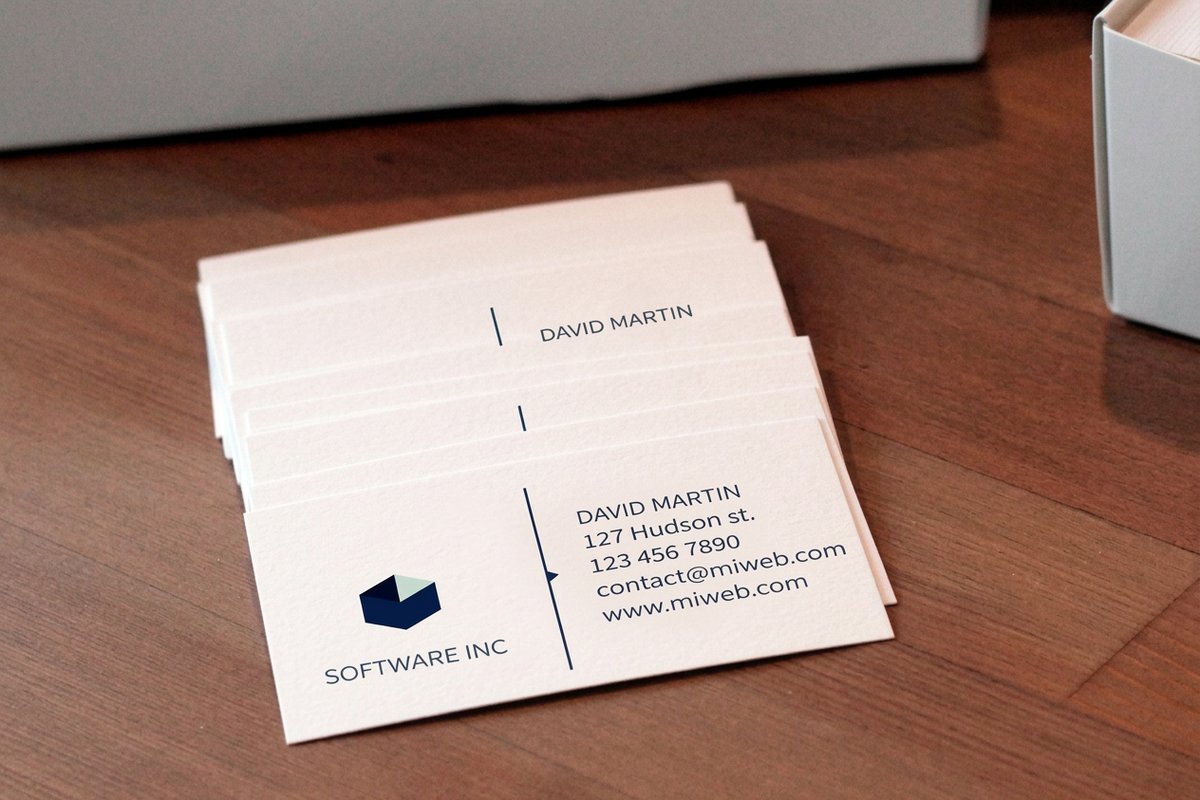
Blue is the most popular color in corporate branding for a reason. It signals reliability, calm, and competence, which is why financial advisors, insurance agents, tech companies, and healthcare providers lean on it. Light blue feels approachable and open. Dark navy reads as authoritative and established. Pair it with white text for clean readability, or add a silver foil accent for a premium edge.
Black for authority, sophistication, and power
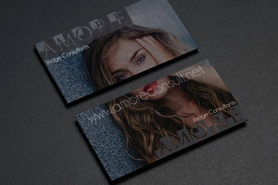
Black business cards make a statement. They communicate luxury, exclusivity, and confidence, which sets them apart from the stack of white cards on the table. Printed on thick stock with a matte or soft touch finish, black business cards feel expensive in the hand. Black works best with metallic foils in gold, silver, or rose gold for text and logos, where the contrast is striking and hard to forget.
White for simplicity, cleanliness, and modernity
White is the default, but default does not mean boring. A well designed white card communicates minimalism, clarity, and a modern sensibility, and it lets your typography do the work. The key is paper quality. A thin white card feels cheap, while a thick 32pt card with a cotton or linen finish feels intentional. To test the waters, grab a set of free business cards and see how different weights change the feel of a simple white design.
Red for energy, passion, and urgency
Red grabs attention. It is the color of action and boldness, favored by sales professionals, event planners, restaurant owners, and entertainment brands. It also works as an accent. A white card with a red logo or a red edge creates a focal point without overwhelming the design. Match the shade to your brand, since a bright cherry red says fun and energetic while a deep burgundy says refined and established.
Green for growth, health, and sustainability
Green connects to nature, wellness, and prosperity, which makes it a go to for eco friendly brands, health companies, landscapers, and financial advisors who want to signal growth. Lighter greens feel fresh and organic. Darker greens read as wealthy and established. If sustainability is part of your story, pairing green with recycled or kraft stock reinforces the message through both color and material.
Yellow and orange for optimism, creativity, and warmth
Yellow radiates cheer, and orange blends the energy of red with the warmth of yellow. Both suit creative professionals, children brands, and food businesses. The challenge with yellow is readability, since yellow text on white paper disappears. Use yellow as a background with dark text, or as an accent against a contrasting color. Orange is more versatile and bold enough to stand on its own.
Purple for luxury, creativity, and wisdom
Purple carries a long association with royalty, wealth, and imagination. Beauty brands, creative agencies, and premium service providers use it to signal exclusivity and creative thinking. Deep purples feel regal and mysterious, while lavender tones feel calm. Few competitors use purple, so it helps your card stand out in any stack.
Gold and silver for a premium, high value look
Metallic colors cannot be replicated on a screen the way they look in person, and that is part of their power. Gold communicates wealth and prestige, while silver signals modernity and a fresh idea. Foil stamping on thick stock is one of the most effective ways to use metallics. For a premium upgrade, die-cut any shape business cards add a custom silhouette that pairs beautifully with metallic accents.
Quantity and price
Standard business card pricing and specs
Real configurator numbers, where the per-card cost drops fast as your quantity climbs.
| Quantity | Price Per Unit | Total |
|---|---|---|
| 100 | 17.6¢ | $17.57 |
| 200 | 11.5¢ | $23.07 |
| 300 | 9.15¢ | $27.46 |
| 400 | 7.96¢ | $31.86 |
| 500 | 7.25¢ | $36.26 |
| 600 | 6.77¢ | $40.64 |
How to choose the right color palette for your industry
Knowing what each color means is step one. Step two is matching that meaning to your industry and audience. Here is how to think about it in practice.
Match color to client expectations
Your card needs to feel right to the person receiving it. A corporate attorney handing out a neon pink card creates confusion, and a children party planner handing out a dark gray card feels mismatched. Meeting expectations builds instant trust, while breaking them creates memorability, so be intentional about which you choose. Artist business cards give creative professionals the freedom to push color while still looking polished.
Use your brand existing colors
If you already have a logo and brand guidelines, your card should reflect those colors. Consistency across your website, social media, signage, and print builds recognition over time, so avoid introducing new colors that appear nowhere else in your brand. If your colors feel dated, use blank templates to experiment before committing to a full run.
Consider two color and three color combinations
Most effective cards use two or three colors at most. A primary color sets the tone, a secondary color adds contrast, and a neutral keeps the balance. These pairings work across industries:
- Navy and gold reads professional and premium, a strong fit for finance, law, and consulting.
- Black, white, and a red accent feels bold and modern, and it works for tech, marketing, and sales.
- Forest green and cream feels organic and grounded, perfect for wellness, sustainability, and food brands.
- Deep purple and silver looks creative and luxurious, ideal for beauty, design, and entertainment.
- Charcoal and teal stays contemporary and approachable, a good fit for startups, coaching, and consulting.
 3D Lenticular Business CardsPrint-ready blank template.
  Black Business CardsPrint-ready blank template.
 Start fast
Templates and print-ready blanks
Business card design templates and exact-size blanks so your color lands inside the cut line.





How paper stock and finish affect color, and mistakes to avoid

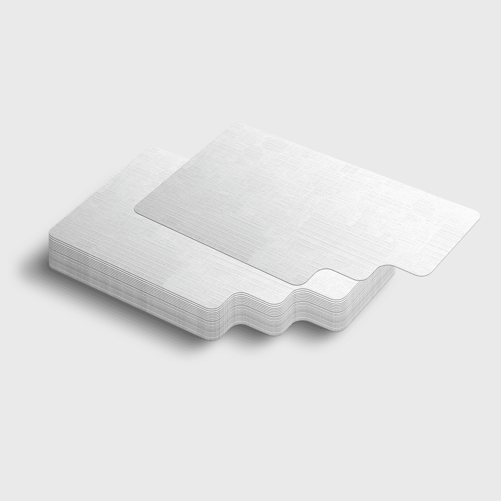
Most color guides skip this, but the paper you print on changes how a color looks and feels. A glossy finish makes colors appear vivid and saturated. A matte finish softens them for a more sophisticated look. An uncoated stock absorbs more ink for a natural, earthy result. With 60 plus paper types, each one interacts with color differently. A bright red on glossy 14pt pops with energy, while the same red on uncoated kraft feels rustic and warm.
For a striking, transparent effect, 30mil clear plastic cards let your design float on a see through surface, creating a layered look that traditional paper cannot match.
Finish options that change the game
Beyond paper weight, the finish adds another layer of meaning. Spot UV coating can highlight one element, like a matte black card with a glossy UV logo that catches the light. Foil stamping adds metallic shimmer to any color, and embossing creates a raised texture that makes colors feel dimensional. Each finish tells the person holding your card that you pay attention to details, and in business that signals competence.
Color mistakes that hurt your brand
A few errors show up again and again. Using four, five, or six colors creates visual chaos that is hard to read and hard to remember, so stick to two or three. Poor contrast between text and background makes a card unreadable, so test every combination at small font sizes. Ignoring cultural context can backfire, since white means purity in Western settings but mourning in some East Asian cultures, and red means luck in China but warning elsewhere. Choosing colors you like over colors that work is a trap, so ask whether the shade communicates what your business stands for. For cross channel ideas, see our logo sticker design ideas.
Real world color strategies by industry
Real estate agents do well with navy or charcoal and gold accents that say reliable and successful. Restaurant owners lean on warm reds, burnt oranges, and rich browns that evoke appetite on a textured stock. Creative professionals get to break the rules with bold combinations and unique materials, since creativity is the product. Healthcare providers build trust with calm light blues, soft greens, and white. Tech startups look forward with electric blue, teal, or deep purple against white or light gray.
Putting your color strategy into print
Start by selecting your primary color and one or two supporting shades. Choose a stock that complements the palette, glossy for saturation, matte for understated elegance, or uncoated for an organic feel. Then order a small batch to test in person before a larger run. Monitors display RGB while printing uses CMYK, so some colors shift slightly, which is why 4OVER4.COM includes a free digital proof with every order so you approve the final look before it goes to press.
Compare formats
Popular business cards, side by side
Stock, finish, quantity, turnaround, and from-price across our most-ordered cards.
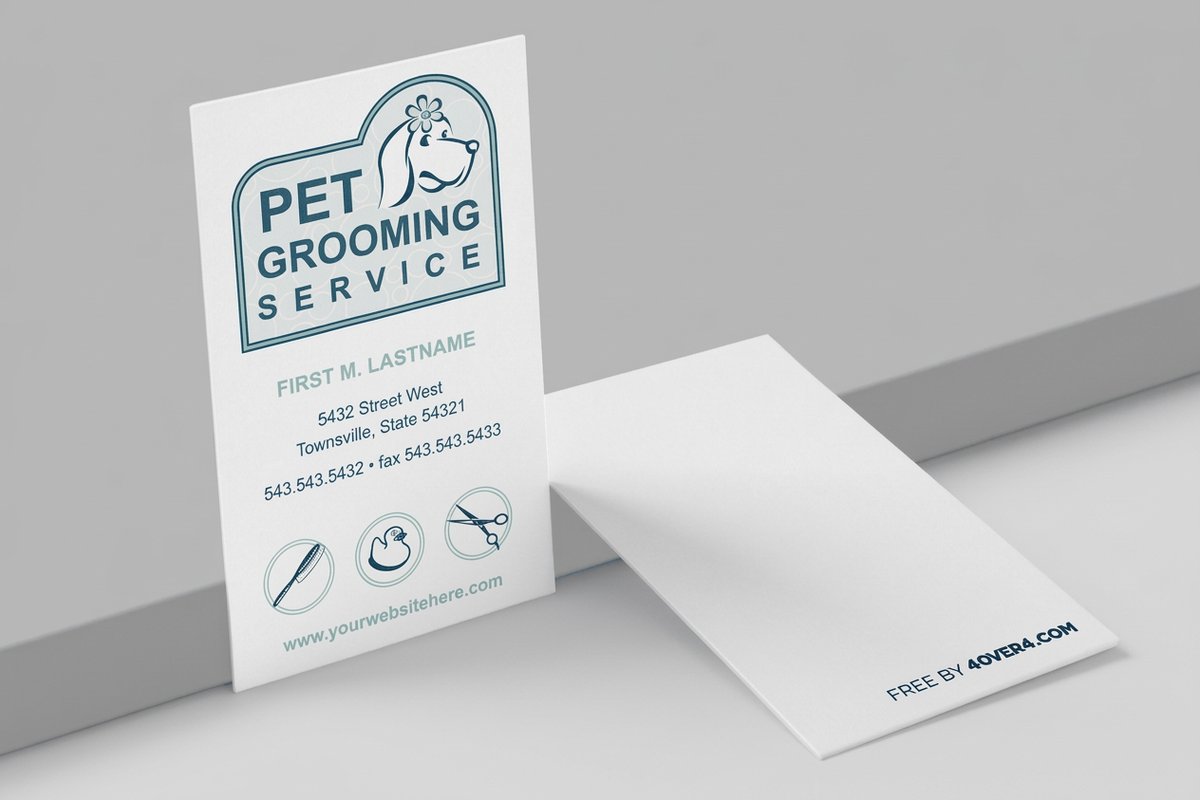 free business cards | Standard Business Cards |  3D Lenticular Business Cards | 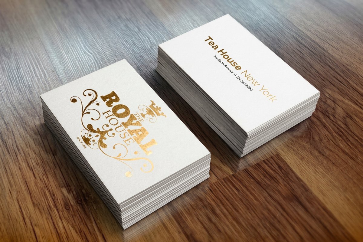 Metallic Foil Business Cards | |
|---|---|---|---|---|
| Min price | Free | $17.57 | $690.88 | $222.13 |
| Paper / stock | 14pt Gloss Cover | 14pt Gloss Cover | 31pt Lenticular Lens | 16 Point Silk Laminated |
| Finish | - | Standard Finish | - | - |
| Size | 2" x 3.5" | 2" x 3.5" | 2" x 3.5" - Vertical | 2" x 3.5" |
| Default qty | 200 | 100 | 500 | 500 |
| Turnaround | 5 business days | 3 business days | 22 business days | 7 business days |
| Rating | ||||
| View & customize | View & customize | View & customize | View & customize |
Wally decodes your card color
The right shade says who you are before you speak
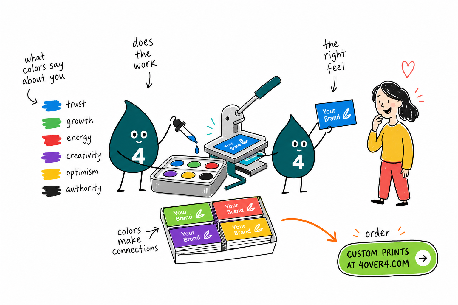
Color does most of the talking on a business card. Blue builds trust, black signals luxury, green reads as growth, and red brings energy. Keep it to two or three colors, match the finish to the feeling, and print a proof before the full run. 4OVER4.COM prints your palette sharp across 60 plus paper types.
Design your business cards →What to remember about business card color
A quick color checklist
- Match shades to your audience. Pick tones that best represent your specific target groups.
- Keep materials consistent. Match paper type and texture so the design output stays cohesive.
- Respect industry standards. Evaluate your field to land on standout yet professional tones.
- Proof before the full run. Approve a free digital proof so screen colors match the print.
Explore more
More ways to bring your palette to print
Every related page type on 4OVER4.COM, one card each, so you can keep exploring business card color.
Shop Business Cards Printing Browse every business card format in one place. 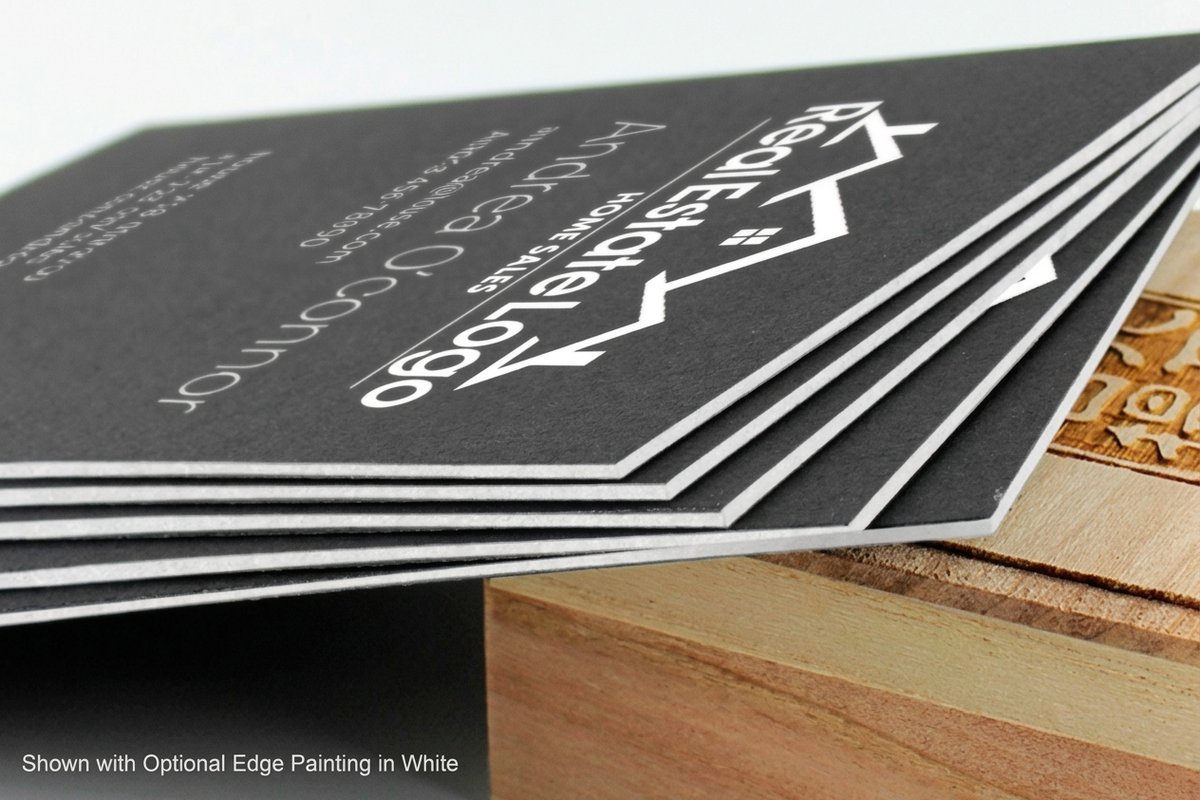 Product Black Business Cards Dramatic black stock with metallic foil accents.
 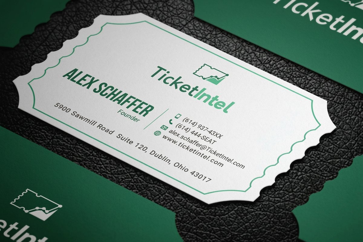 Product Die-Cut Business Cards Custom silhouettes that break the rectangle. Product Free Business Cards Test paper weights with a free set and free shipping.
 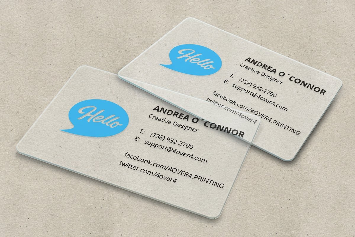 Product Clear Plastic Cards Let your design float on a see-through surface.
 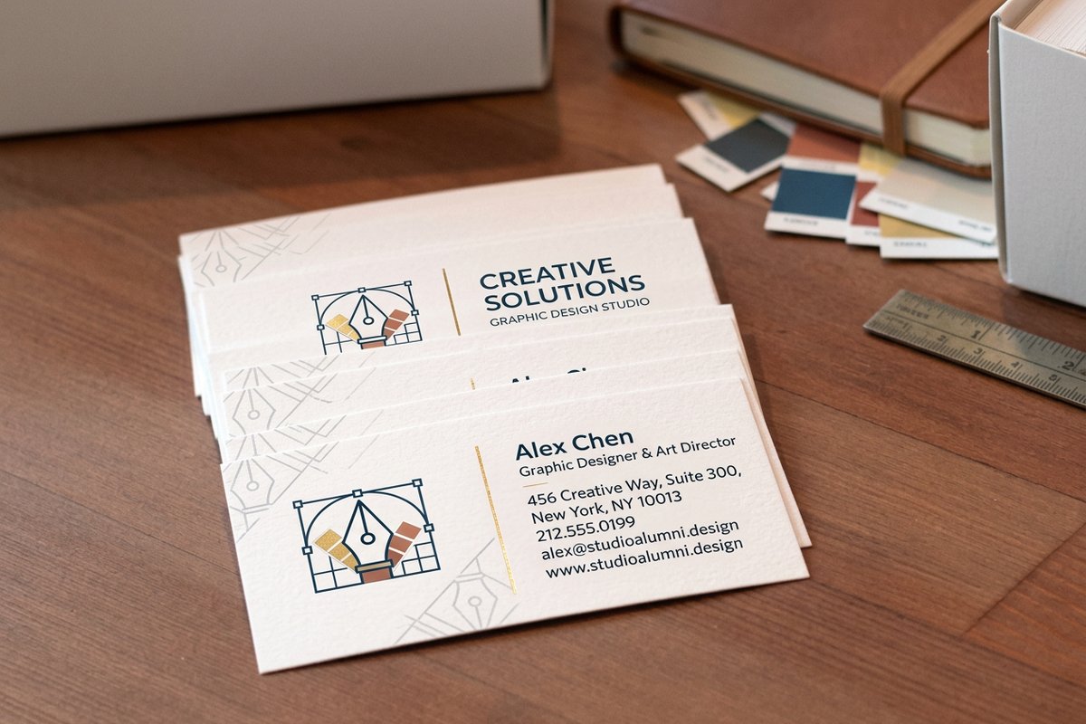 Templates Design Templates Match your exact palette with ready layouts.
  Blanks Blank Templates Exact-size blanks to line up your artwork.
  Article Logo Sticker Design Ideas Carry your color story across channels.
  Articles Printing Articles More design and branding guides from 4OVER4.COM.
 Ready to put your colors into print?
Pick a palette, match it to a stock and finish, and 4OVER4.COM prints it sharp with a free digital proof on every order.
Common questions about business card colors
What are the best practices for business card color meaning?
Start with your core brand values and pick colors that reflect them. Limit your palette to two or three colors for clarity, and test the design on real paper stock before ordering a full run, since screen colors do not always match print. 30mil white plastic cards offer a clean canvas that makes any color combination pop with sharp contrast.
How do I choose the right business card color for my brand?
Identify the emotion you want clients to feel when they hold your card. For trust, go blue. For luxury, go black with gold. For energy, go red. Then match that color to a finish that supports the feeling, glossy for bold colors and matte for sophisticated tones. Browse our printing articles for deeper dives into design and branding.
What makes business card color effective for marketing?
Color increases brand recognition by up to 80 percent, according to color psychology research. When your card color aligns with your brand identity, people remember you faster and link the right qualities to your business. A consistent palette across cards, website, and signage builds a cohesive image that sticks.
How much should I budget for business card color?
Color itself does not add cost to standard CMYK printing, so you can print any color combination on standard stock without extra charges. Premium effects like foil stamping, spot UV, or metallic inks do add cost but create a stronger impression. 4OVER4.COM offers options at every price point, so you can match your color choices to your budget without sacrificing quality.
