
Arial vs Helvetica Design History and Origins


Arial vs Helvetica: ripoff, rival, or something else entirely
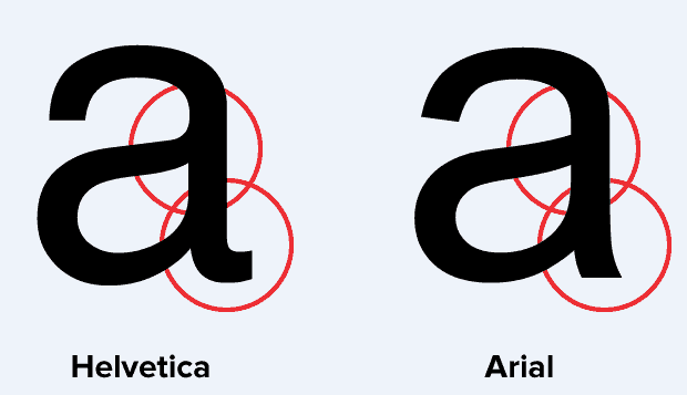
The arial vs helvetica design history is a story of corporate strategy, design philosophy, and a rivalry that has lasted decades. Arial arrived in 1982 as a metric compatible alternative to Helvetica, built by Robin Nicholas and Patricia Saunders for Monotype. 4OVER4.COM has printed 10 billion+ cards using both typefaces across 1,000+ products, and the choice between these two fonts still sparks debate among designers in 2026.
History is full of facts open to personal interpretation, not always grounded in hard data, and Arial’s origin story is no different. Was it a ripoff? An inspired reimagining? We dug into the debate to share what we found. If you are a designer or typographer, you have probably already picked a side. For many professionals the answer feels obvious, that Arial copied Helvetica. Look closer, though, and the nuances of Arial’s design do set it apart.
This guide walks the full timeline, the technical letterform differences, and the practical print choices, so you can decide for yourself and pick the right font for your next job. To see how these historical roots still shape working design, browse these Graphic Design Portfolio Examples.
How typeface design evolved over centuries
The history behind Arial reflects the slow, purposeful pace of typeface design. Unlike other areas of graphic design, typography evolved gradually over centuries, with key moments tied to technological breakthroughs and cultural shifts. That deliberate pace produced typefaces that balance form, function, and legibility, keeping them relevant decades after their creation.
Johannes Gutenberg’s printing press in the mid 15th century ignited one of the first major leaps in typeface development. It brought printed material within reach of ordinary people and demanded typefaces that were economical to produce and easy to read. Serif fonts then dominated print for centuries, until the 19th century introduced sans serif typefaces and launched a new era in modern typography. These styles, sometimes called grotesque for their bluntly simple appearance, laid the groundwork for adaptable designs that would eventually include both Helvetica and Arial.
In 1916, Edward Johnston designed an iconic sans serif typeface for the London Underground, a decision that shaped 20th century type design. Built for clarity and function, Johnston’s typeface is still in use today, proof of the staying power of good design, and you can trace its DNA through to Arial’s own styling choices.
Helvetica’s rise to dominance in the 1950s
By the mid 20th century sans serif fonts were everywhere, a popularity spike driven largely by Helvetica’s introduction in 1957. Swiss designer Max Miedinger, working with Eduard Hoffmann at the Haas Type Foundry in Münchenstein, Switzerland, created a typeface that would reshape visual communication worldwide.
Helvetica’s clean, neutral aesthetic made it equally at home in corporate logos and public wayfinding. American Airlines, BMW, Jeep, Panasonic, Target, and the New York City subway system all adopted it. The typeface became so pervasive that filmmaker Gary Hustwit made an entire documentary about it in 2007. That is the kind of cultural impact we are talking about.
Originally named Neue Haas Grotesk, the typeface was renamed Helvetica in 1960, derived from Helvetia, the Latin name for Switzerland. The renaming was a marketing decision by the Stempel foundry to give it broader international appeal, and it worked. Helvetica became synonymous with modern, professional design across every industry. When you browse printing articles on typography, Helvetica shows up again and again as a reference point.
The philosophy behind Helvetica was rooted in the Swiss International Typographic Style, a movement that prioritized readability, objectivity, and clean structure. No flourishes, no personality tricks, just clear communication. That approach connected with corporations and governments alike, and it is why Helvetica still appears on 2-Sided Blockout Banners, signage, and marketing materials worldwide.
Print it big
Vinyl banners, ready for your headline
Set Helvetica tight or Arial open, then print it sharp at full display size.
Arial’s controversial birth in the 1980s
Arial entered the scene in 1982, developed by Robin Nicholas and Patricia Saunders at Monotype. Here is where the arial vs helvetica design history gets contentious. Arial was designed as a metrically compatible alternative to Linotype’s Helvetica, which means text set in Helvetica could be swapped to Arial without changing line breaks, spacing, or page layout.
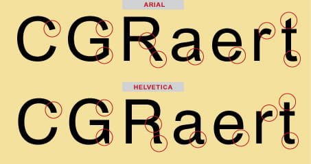
Why did Monotype need a Helvetica substitute? Licensing. Helvetica was owned by Linotype, and using it required paying fees. Monotype wanted a typeface that could serve the same functional role without those costs, and Arial was the answer. It is a neo grotesque sans serif that shares Helvetica’s proportions but introduces distinct differences in individual letterforms. The terminal strokes are cut differently, the uppercase G carries a spur that Helvetica lacks, and the curves run slightly rounder and marginally warmer than Helvetica’s clinical precision.
The typeface family itself is big. Arial spans multiple weights and styles, a cohesive system that works across body text, headlines, and digital interfaces, with variations including Arial Bold, Arial Italic, Arial Narrow, and Arial Rounded. Its Arabic glyphs draw from Times New Roman’s Arabic set, showing a wider range of stroke weights than the Latin glyphs. So was it a ripoff? Arial was absolutely built to replace Helvetica in practical use, but it was not a direct tracing. Nicholas and Saunders made deliberate choices that distinguish the two at the character level, and whether those differences are meaningful enough is where designers still disagree.
Microsoft’s decision that changed everything
The real turning point came in 1992, when Microsoft licensed Arial for Windows 3.1. This single corporate decision did more to spread Arial than any design merit ever could. Suddenly Arial was on every Windows computer in the world, the default system font and the go to choice for anyone who did not know or care about typography.
In 1996, Microsoft’s Core Fonts for the Web project cemented Arial’s dominance online. Arial became the de facto standard font for web content, the default typeface of digital communication, and it stayed that way for over a decade. Apple, meanwhile, bundled Helvetica with Mac OS, and that created an interesting split. Windows users grew up with Arial, Mac users grew up with Helvetica, and the platform you used shaped your typographic worldview. If you have ever used the 4OVER4.COM Online Designer, you have seen how font choice affects the final printed piece.
This platform divide fueled the rivalry. Professional designers, who overwhelmingly used Macs, developed a visceral dislike for Arial, seeing it as corporate cost cutting that overrode design integrity. The fact that most people could not tell the two fonts apart made it worse. For designers, Arial’s success felt unearned.
The technical differences that actually matter
Let us get specific about what separates these two typefaces. This is where the arial vs helvetica design history turns practical rather than philosophical, because a handful of letterforms give the game away every time.
- Terminal cuts. Helvetica ends its strokes flat and horizontal, while Arial angles them on a diagonal. Look at the C, the S, and the lowercase c, e, and s to spot it fast.
- The uppercase R. Helvetica gives the R a straight leg that kicks out from the bowl. Arial curves that leg instead, one of the most reliable tells.
- The uppercase G. Arial adds a small vertical spur on the G. Helvetica drops its stroke from a horizontal bar with no spur at all.
- Spacing and kerning. Helvetica sits tighter and more compact. Arial runs a touch looser, which many argue helps it stay readable at small sizes on screen.
- Body text sizes. At 9 to 12 point most readers genuinely cannot tell the two apart. The tells only surface at display sizes like headlines, logos, and signage.
Spacing is the other quiet difference. Helvetica tends to feel tighter and more compact, while Arial runs a little looser, which some argue makes it more readable at small sizes on screen and may be one reason Microsoft chose it. When you set materials through an online design tool, those spacing differences change how your text fills the available area, which matters as much on a business card as it does on a full banner.
See it at scale
Aluminum sign specs and options
Display sizes are where terminal angles show. Here is how the same type prints on rigid metal.
Why designers still care about this debate in 2026
You might wonder why this rivalry still generates heat. The answer is that it touches fundamental questions about design ethics, intellectual property, and what counts as originality in typography. For one camp, Arial represents pragmatism. It solved a real problem, licensing costs, and served billions of users who needed a clean, readable sans serif. That it resembles Helvetica is not a moral failing, it is a strategy that worked.
For the other camp, Arial represents the commodification of design. It took another designer’s vision, filed off just enough edges to avoid legal action, and undercut the original on price. The fact that it won through bundling deals rather than design excellence makes it worse. Both perspectives have merit, and the classic quip captures the second one well.
In 2026 the debate has evolved. With variable fonts, custom typefaces, and AI assisted type design becoming standard, the Arial and Helvetica rivalry can feel almost quaint. It remains a useful case study, though, in how business decisions shape design culture. If you are exploring typography for print, classy business card design inspiration shows how font choice affects perceived quality on a small, high stakes surface.
How font choice affects your printed materials
Whether you pick Arial or Helvetica for your next print project, the choice carries real consequences. Helvetica tends to signal design awareness, as if someone who knows typography made this. Arial signals accessibility and practicality, as if this is clear and gets the job done.
- Helvetica signals design awareness. It quietly says a person who knows typography made this, which is why it anchors so many corporate identities.
- Arial signals accessibility. It reads as clear, practical, and universally available, the font that gets the job done on any machine.
The right call also depends on the format. Here is how the two play out across the products people print most.
- Business cards. The difference is subtle but real. Helvetica’s tighter spacing looks a shade more polished on premium stock, while Arial’s wider characters can read better on smaller card formats.
- Banners, signs, and posters. At large format the terminal angles become visible. Helvetica’s flat terminals feel structured and grid like, and Arial’s angled terminals feel a little more casual and approachable.
- Greeting cards and personal projects. Here the choice matters less. Both fonts are clean and readable, so you have room to pair them with more expressive display type.
Quantity and price
Vinyl banner pricing and specs
Real configurator numbers. The more you order, the lower the per unit cost drops.
4OVER4.COM prints both typefaces across every product category, from Free Business Cards to large format signage across the Signs & Banners hub. The Online Designer lets you preview your font choice on the actual paper stock before ordering, and that preview step matters more than most people realize. A font that looks great on screen can feel completely different on a textured or uncoated stock. For greeting cards and personal projects the choice matters less, since both fonts are clean and readable and pair easily with more expressive display type.
Compare formats
Popular banners, side by side
Stock, finish, quantity, turnaround, and from-price across our most ordered banners.
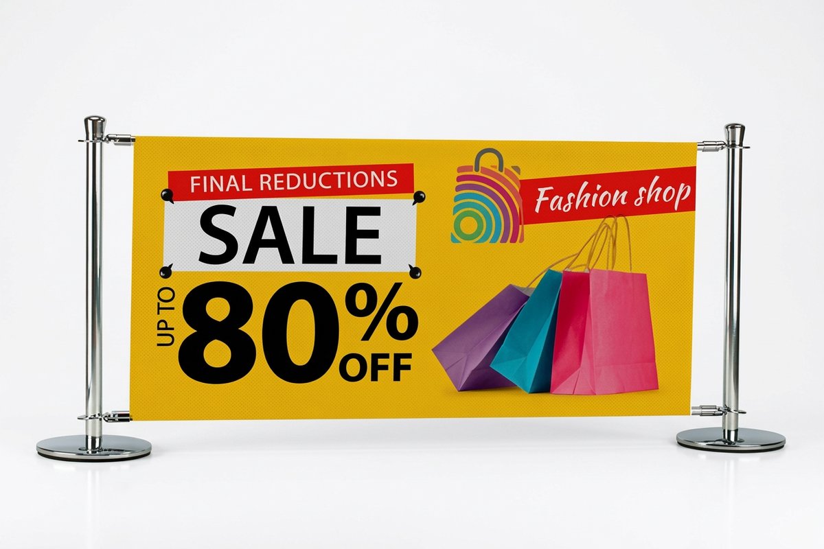 Indoor Banners |  Outdoor Banners | 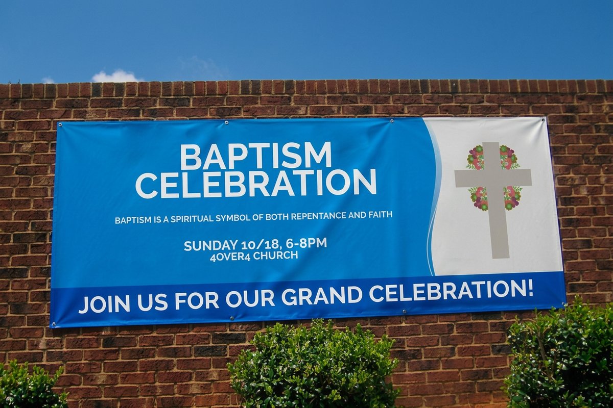 Business Banners | 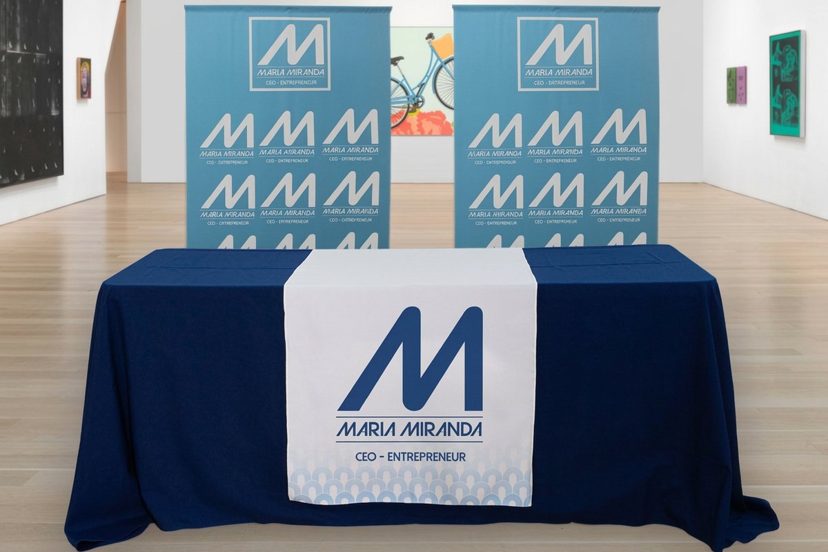 Fabric Banners | |
|---|---|---|---|---|
| Min price | $25.00 | $79.00 | $43.92 | $57.20 |
| Paper / stock | 13oz. Smooth Blockout Vinyl | 13oz. Outdoor Vinyl | 13oz. Scrim Vinyl | 5oz Economy Polyester |
| Size | 12" x 24" | 2' x 4' | 2' x 6' | 24" x 72" |
| Default qty | 1 | 1 | 1 | 1 |
| Turnaround | 2 business days | 3 business days | 2 business days | 4 business days |
| Rating | ||||
| View & customize | View & customize | View & customize | View & customize |
Getting fonts right in print
- Set type at final size. Preview your font on the actual product before you order, since a face that looks great on screen can shift on textured or uncoated stock.
- Mind the spacing. Helvetica’s tight kerning wants a hair more breathing room on large signage, and Arial’s looser fit reads clean at small sizes.
- Match font to format. Reach for Helvetica on formal corporate signage and Arial where broad compatibility and easy reading matter most.
- Send vector art. Supply logos and headlines as vectors so letterforms stay crisp from a business card up to a full banner.
- Test both on a proof. Use the Online Designer to compare Arial and Helvetica on your real layout before committing to a run.
- Keep contrast high. Strong contrast between type and background keeps either font legible across print sizes and lighting.
The legacy of two fonts that shaped modern design
The arial vs helvetica design history is not just about two fonts. It is about how technology, commerce, and aesthetics intersect. Helvetica proved that a typeface could become a cultural icon. Arial proved that distribution matters as much as design quality. Together they defined the visual language of the late 20th and early 21st centuries.
Today both fonts face competition from newer alternatives. Google’s Roboto, Apple’s San Francisco, and Inter by Rasmus Andersson are all designed specifically for digital screens, addressing readability challenges that neither Helvetica nor Arial were built to handle, from variable screen densities to dark mode and responsive layouts. Even so, Arial and Helvetica are not going anywhere. They are too deeply embedded in design culture, corporate identity systems, and billions of existing documents.
Understanding their history gives you a richer sense of why certain fonts feel right for certain contexts. It is the kind of knowledge that separates someone who picks fonts from someone who chooses them deliberately. For more on how typography plays into broader design and marketing, explore Logo Sticker Design Ideas and Funny Print Ad Examples. If you run into questions about any 4OVER4.COM product or design feature, the Help Center has answers.
What to remember about the Arial and Helvetica rivalry
Start fast
Print-ready blank templates
Exact-size blanks so your Arial or Helvetica headline lands inside the cut line, ready to design and print.
Our promise
Every order, guaranteed
Font choice is only half the job. The print behind it has to hold up, and that is where we back you.
- Quality you can count on. Every banner, sign, and card is backed by our print quality guarantee, so if it arrives wrong we make it right.
- On time, every time. 99.8% of tracked orders ship on schedule, which keeps a launch, event, or signage deadline safe. Need it fast? Same Day Printing turns rush jobs around. See Same Day Printing
- Loved by 150,000+ businesses. A 4.8 out of 5 rating across 10,000+ reviews, earned since 1999 across a catalog of 1,000+ products.
Wally settles the Arial vs Helvetica question
Same silhouette, different tells, one right pick for your print
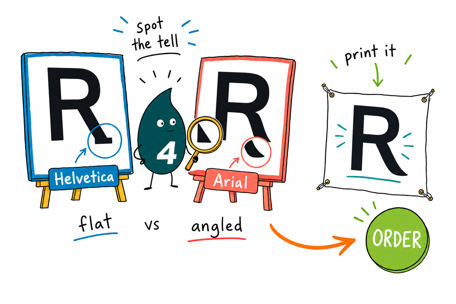
Helvetica cuts its strokes flat and sits tight, so it reads sharp and formal on corporate signage. Arial angles its terminals and runs a little looser, so it stays friendly and legible at small sizes. Pick the mood you want, send vector art, and preview it on the real stock in the Online Designer before you print.
Print your banner →Sustainability
Print your type on greener materials
Arial or Helvetica, the font is only part of the footprint. Our Green Printing program lets you print banners, signs, and cards on sustainable stocks and eco friendly inks, so a responsible choice never means a worse result.
Explore more
Keep exploring type, banners, and signs
Every related page on 4OVER4.COM, one card each, so you can carry the typography question into your next print project.
Hub Signs & Banners Browse every banner and sign format in one place. 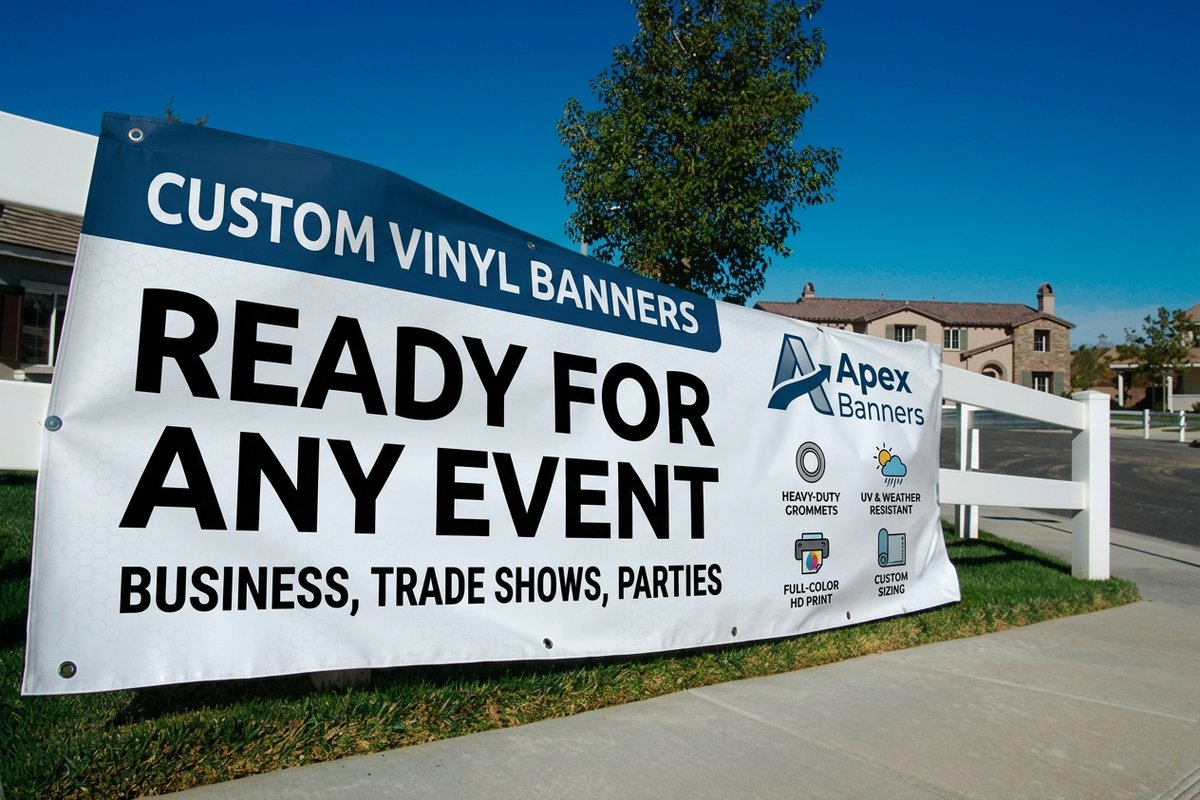 Product Vinyl Banners Durable outdoor vinyl banners from $79.
 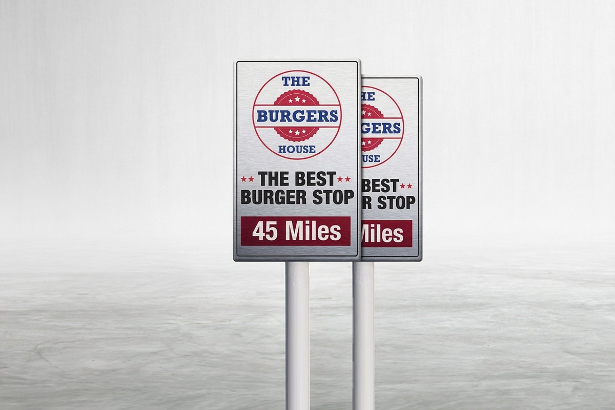 Product Aluminum Signs Rigid metal signs from $36.
 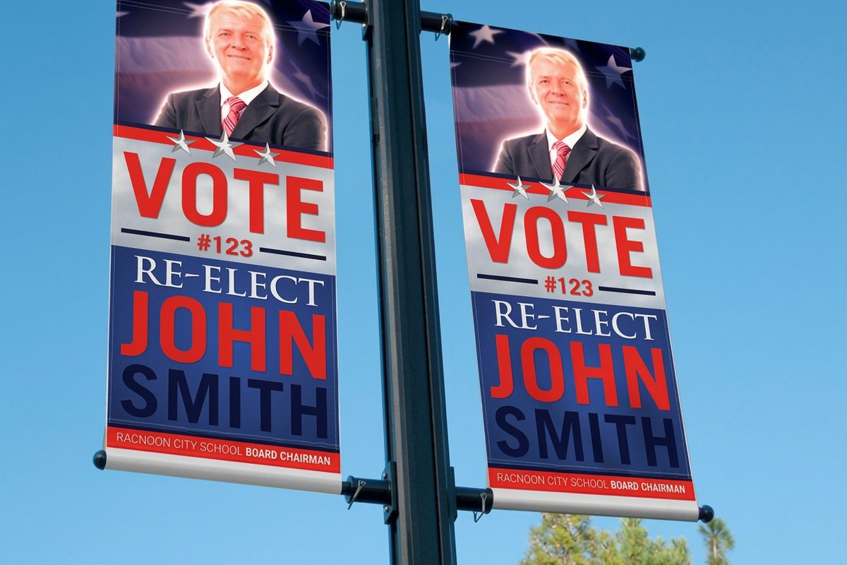 Product 2-Sided Blockout Banners Opaque two sided banners from $108.75.
 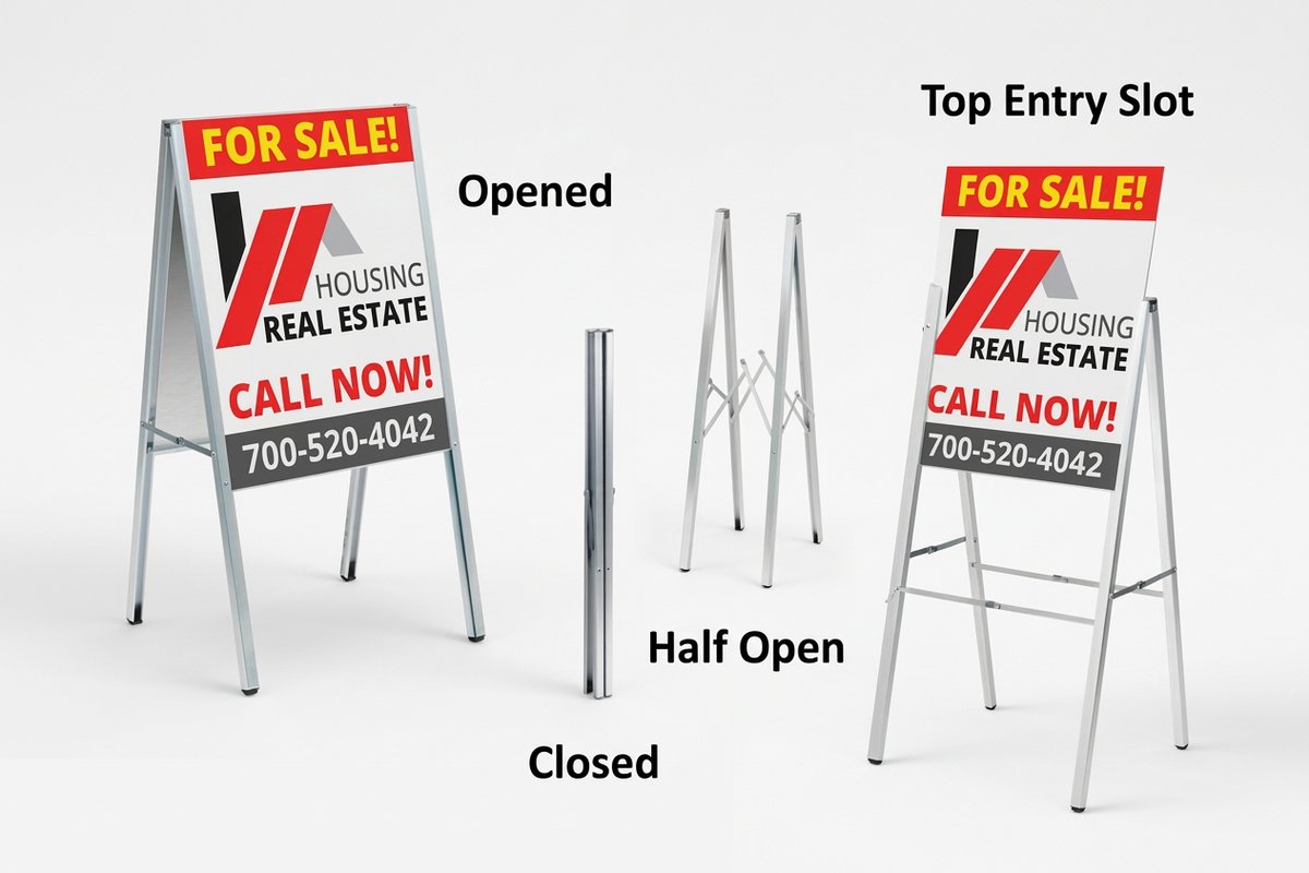 Product Aluminum A-Frames Portable sidewalk sign frames.
  Article Graphic Design Portfolios See how pros handle type and layout.
  Article Logo Sticker Ideas Turn your logo into travelling ads.
  Benefit Online Designer Test your font on the real product first.
  Benefit Green Printing Print signage on sustainable materials.
 Common questions about the Arial and Helvetica typography debate
What are the best practices for studying arial vs helvetica design history?
Compare individual letterforms side by side at large display sizes and focus on terminal angles, the uppercase R and G, and the lowercase a. Then read the historical context, from Helvetica’s Swiss roots to Arial’s licensing driven creation. For a printed comparison, set both fonts on real stock. The 4OVER4.COM Help Center can guide you through font selection for specific print products.
How do I choose the right typeface when considering arial vs helvetica design history?
Consider your audience and medium. Helvetica signals design sophistication and suits corporate branding, premium business cards, and formal signage like Aluminum Sign Panels. Arial works better for digital first designs and anywhere broad system compatibility matters. For print, Helvetica’s tighter spacing usually looks more refined on premium stock.
What makes arial vs helvetica design history useful for marketing?
The rivalry shows how font choice shapes brand perception. Helvetica conveys authority and precision, which is why corporations love it, while Arial conveys accessibility and practicality. Understanding this helps marketers make intentional typography calls. When you design Aluminum Signs or business cards, the right font reinforces your message at every touchpoint.
How much should I budget for typography in my design projects?
Arial ships free on virtually every operating system, so it is a zero cost option. Helvetica Neue licensing starts around $35 per weight for desktop use, with full family licenses running into the hundreds. For print projects the font cost is a fraction of your total budget, and 4OVER4.COM prints both typefaces across all products with no extra charge for a specific font.
