
Wedding Invitation Font Guide to Pick the Right Type


Your wedding invitation font guide sets the tone
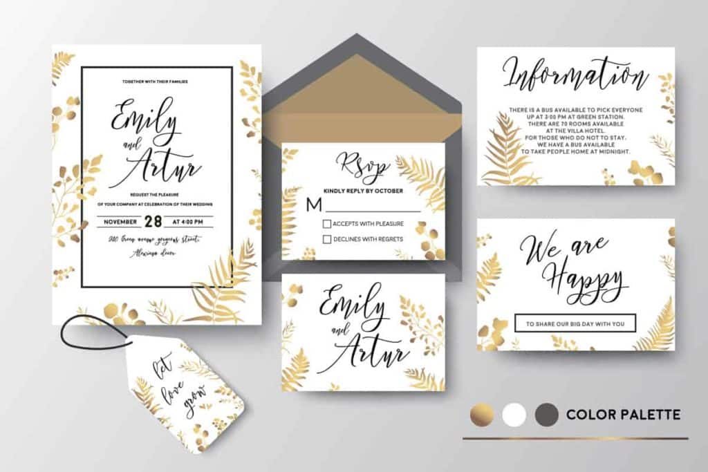
A wedding invitation font guide helps you pick typefaces that match your wedding, from black tie galas to barefoot beach ceremonies. 4OVER4.COM has printed 10 billion+ cards across 1,000+ products, and typography stays the single biggest design decision couples wrestle with. The right font turns a piece of cardstock into something guests frame on their fridge.
Wedding planning eats through budgets fast. The venue, the dress, the caterer all add up before you even think about stationery. That is exactly why so many couples design their own wedding invitations. You control the look, the feel, and the cost, and the font you pick does more heavy lifting than the color palette or the paper texture. It is the first thing your guests actually read, and it sets expectations before they even check the date.
Your invitation needs a typeface that feels intentional, not like you grabbed the first script font from a free download site. There are hundreds of free fonts worth using. You just need to know where to look and what to avoid.
Typography is not decoration. It is communication. The font on your invitation tells guests whether they are walking into a formal ballroom affair or a relaxed garden party. A sharp serif says black tie. A loose handwritten script says come as you are. Readability matters too, because your grandmother needs to read the address and your college roommate needs to find the RSVP date without squinting.
The three font families that fit every wedding
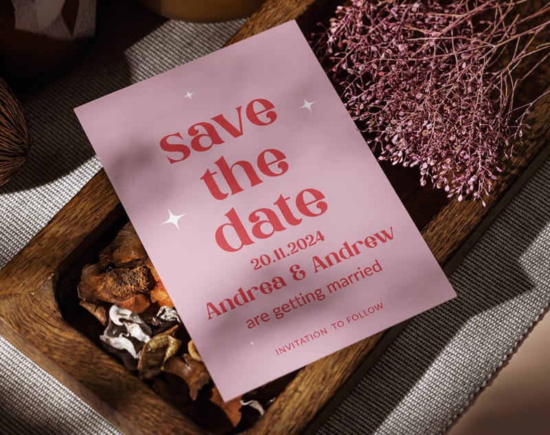
Every wedding invitation font falls into one of three families. Understanding these categories is the fastest shortcut in any wedding invitation font guide. Once you know the differences, narrowing your choices gets much easier.
Serif fonts have small strokes or feet extending from the edges of each letter. Think Times New Roman, but far more refined. Serifs feel traditional, established, and formal, so they are the go-to for classic invitations.
Sans serif fonts drop those extended strokes entirely. The letters are clean, modern, and minimal. Sans serifs work beautifully for contemporary weddings and couples who want something fresh without being trendy.
Script fonts mimic handwriting or calligraphy. They range from tight, formal copperplate styles to loose, breezy brush lettering. Script fonts carry the most personality and the highest risk of becoming unreadable at small sizes.
Most professional designers pair two fonts, a script or decorative face for names and headings, and a clean serif or sans serif for details like the venue address and time. That combination gives you visual interest without sacrificing clarity. For more design inspiration, these logo sticker design ideas show how typography pairs with visual design.
Serif fonts bring classic elegance
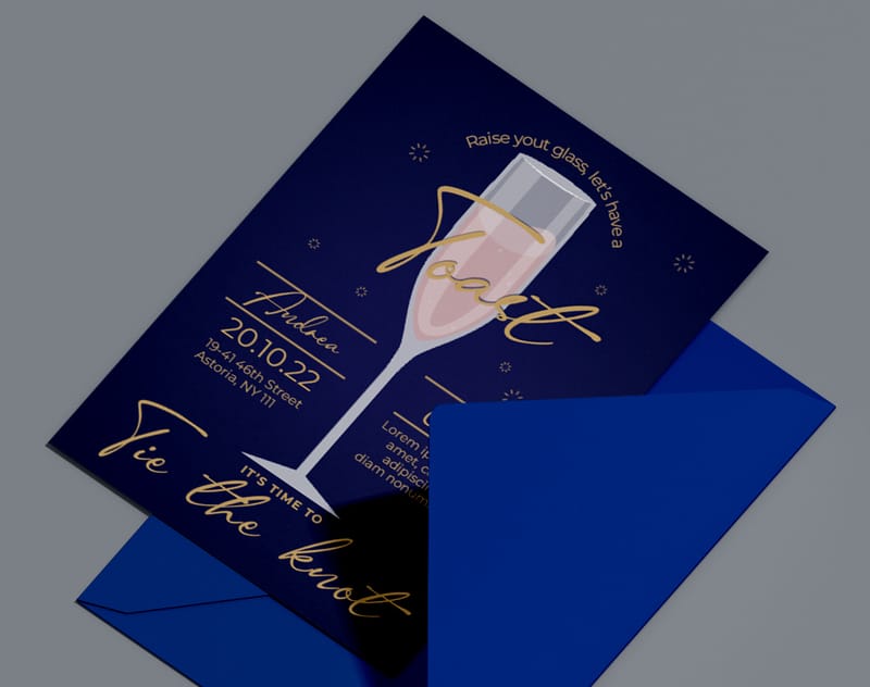
Serif fonts are the backbone of traditional wedding stationery. They have been used on formal invitations for centuries, and the small decorative strokes give each letter weight and authority. Printed on heavy cardstock, serif fonts look like they belong there.
Voga
Designed by Charles Daoud, Voga blends contrasting curves with sharp corners and clean straight lines. Each letter carries both thin and thick strokes, creating rhythm across the page. Voga is refined without being stuffy, one of the best choices for formal invitations where you want elegance that still feels modern.
Lovelyn
Created by Craft Supply, Lovelyn is an ornate romantic font loaded with decorative alternates. It shines as a title font, so use it for the couple names at the top, then pair it with something simpler for the details below. It works well for garden weddings and vintage themes.
Glamor
Hendrick Rolandez designed Glamor in regular, light, bold, and medium weights, giving you flexibility across your whole stationery suite. It has a fashion editorial quality that looks stunning layered over subtle background textures.
Chantelli Antiqua
Chantelli Antiqua brings a handwritten feel to the serif category. It is casual enough to feel personal but structured enough to stay readable, which suits semi formal invitations. For more on how design choices make print stand out, these graphic design portfolio examples show how typography drives perception.
Script fonts add personality and romance
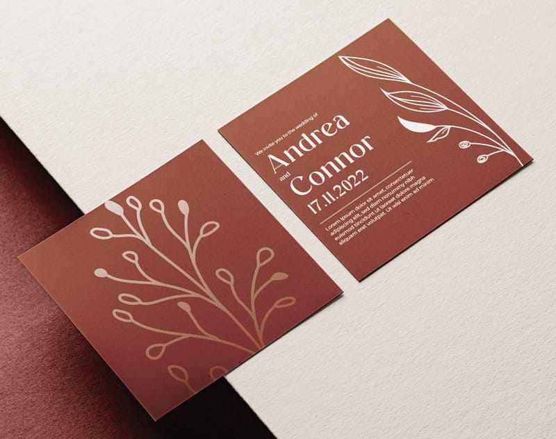
Script fonts are where invitations really come alive. These typefaces mimic the flow of hand lettering, from precise copperplate calligraphy to loose brush strokes. They are emotional, expressive, and they signal celebration instantly. Use them sparingly and at larger sizes, because a full paragraph in script becomes a wall of unreadable swirls.
Great Vibes
Great Vibes is one of the most popular free script fonts for wedding stationery. It is flowing, connected, and elegant without being overly ornate, and it stays readable even at moderate sizes. Use it for the couple names or the word together in your wording.
Alex Brush
Alex Brush offers a more casual, brush lettered feel compared to formal calligraphy scripts. It is perfect for rustic weddings, outdoor celebrations, and any event with a relaxed vibe.
Allura
Allura sits in the sweet spot between formal calligraphy and casual handwriting. It is polished enough for black tie events but warm enough for intimate gatherings, and its even letter spacing makes it one of the more readable scripts.
Print it
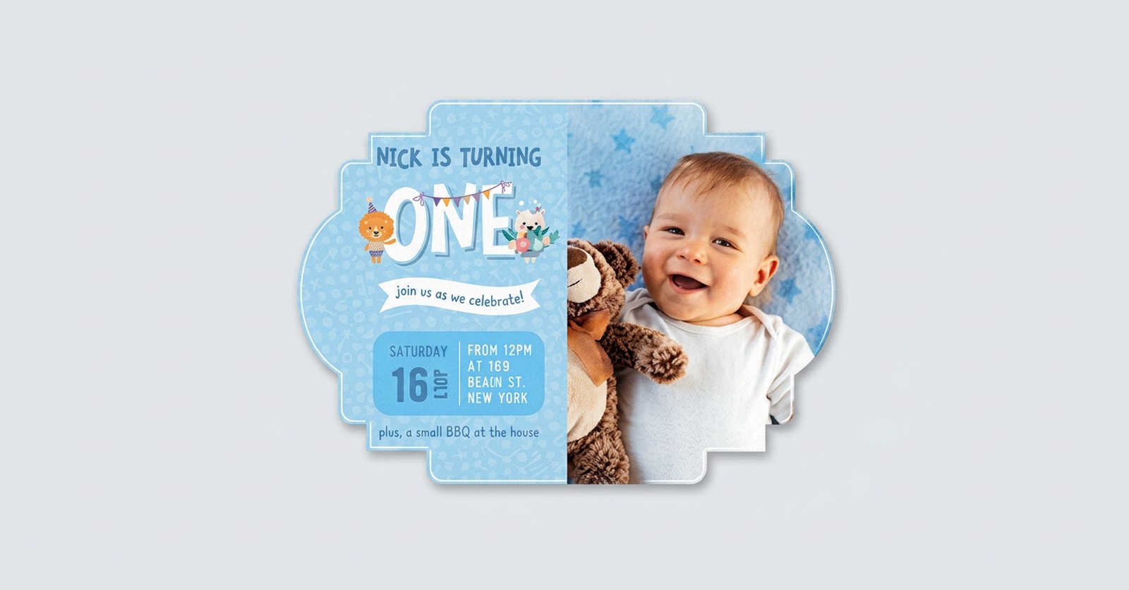
Custom shaped invitations, ready to design
Go beyond the rectangle and let a unique cut frame your font choices.
Sans serif fonts for modern, clean designs
Sans serif fonts strip away the decorative strokes and leave you with pure, clean letterforms. They feel contemporary, direct, and confident. If your wedding aesthetic leans minimal, think white on white, geometric patterns, or industrial venues, sans serif fonts are your best friend.
Josefin Sans
Josefin Sans has a geometric quality with slightly vintage undertones. It is clean but not cold. The light weight version looks particularly elegant with generous letter spacing on thick cardstock. Use it for all your invitation text, or pair it with a script font for the couple names.
Montserrat
One of the most versatile sans serifs available, Montserrat comes in multiple weights from thin to extra bold. It reads well at every size, which makes it ideal for both large header text and small detail lines like addresses and RSVP information.
Lato
Lato was designed by Lukasz Dziedzic with a warm, friendly personality built into its structure. The semi rounded letterforms feel approachable without being casual. For couples who want modern stationery that still feels inviting, Lato strikes an excellent balance, and it prints with crisp clarity.
How to pair fonts for a cohesive stationery suite
Picking one great font is only half the job. Your invitation needs at least two fonts working together, one for display and one for body text. The pairing creates visual hierarchy, guiding your guest eye from the most important information to the supporting details.
The contrast principle
Good font pairing is about contrast, not similarity. Pair a decorative script with a clean sans serif, or match an ornate serif with a simple geometric font. Two similar fonts create confusion because your eye cannot tell what is a heading and what is body text. Two contrasting fonts create clarity and elegance. A classic combination is Great Vibes for the couple names paired with Montserrat for the date, venue, and RSVP details.
Stick to two fonts maximum
Three fonts on one invitation almost always looks chaotic. Two is the sweet spot. If you absolutely need a third, use it only for a single word or monogram, and make sure it is dramatically different from the other two so it reads as an intentional accent.
Test your pairing on paper
Fonts look different on screen than they do on paper. The weight of your cardstock, the finish, and even the ink color all affect how a font appears in print. Always print a test card before committing to your final order, because a font that looks delicate on your monitor might look spindly on thick cotton stock.
Quantity and price
Custom invitation pricing and specs
Real configurator numbers, the more you order, the lower the per-unit cost drops.
| Quantity | Price Per Unit | Total |
|---|---|---|
| 50 | $3.71 | $185.63 |
| 100 | $2.03 | $203.21 |
| 200 | $1.11 | $222.32 |
| 300 | 84.5¢ | $253.50 |
| 400 | 71.2¢ | $284.69 |
| 500 | 63.0¢ | $314.80 |
Practical tips before you print your invitations
Choosing the right font is the creative part. Getting it to print correctly is the practical part. Here are the details that separate a professional looking invitation from a DIY disaster.
- Test at actual print size. Display the invitation at 100 percent. If you squint at any text, size it up or switch to a more readable typeface.
- Check italic and bold. Not every font includes well designed italic or bold versions, and some free fonts ship in a single weight only.
- Print a single test card. Paper texture, weight, and finish all change how ink sits on the surface, so a test print reveals issues you cannot see on screen.
- Match font to wedding style. Romantic calls for script, traditional calls for serif, modern minimalist calls for sans serif. Let the event lead.
- Consider your guests. Older relatives may struggle with thin ornate scripts, so keep the RSVP details and address in a highly readable face.
- Mind the spacing. Letter spacing and line spacing affect readability as much as the font. Give the text room to breathe.
- Check special characters. If your names include accents or umlauts, confirm the font supports them before printing 200 invitations.
Paper and font, a relationship that matters
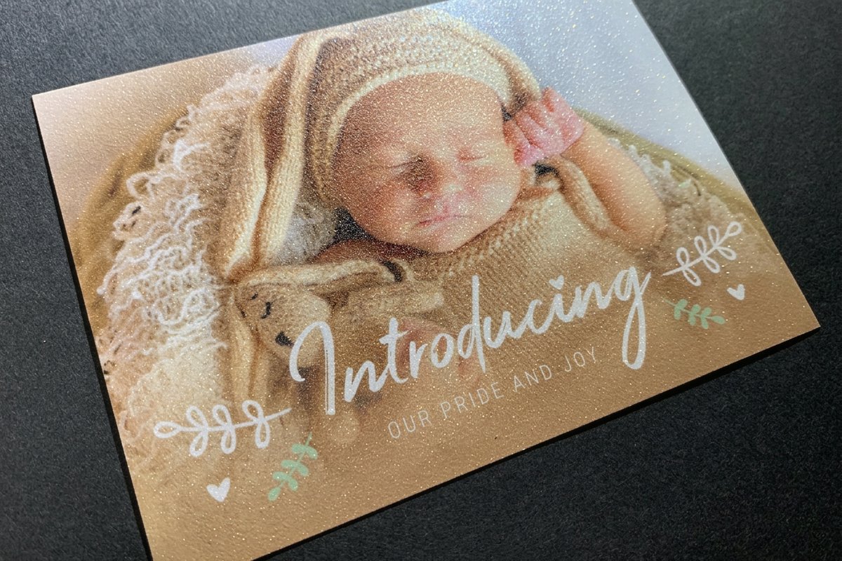
Your font choice and your paper choice need to work together. Thin, delicate fonts can get lost on heavily textured paper because the texture breaks up the fine strokes. Bold, heavy fonts can look overwhelming on thin, translucent vellum. The general rule is simple: the more texture your paper has, the bolder your font should be. 4OVER4.COM offers 60+ paper types, from smooth silk finishes to textured cotton and linen. For invitations that catch the light, Diamond Glitter Invitations add a sparkling finish that pairs well with clean, bold fonts.
Color and contrast considerations
Dark fonts on light backgrounds are the safest choice for readability. If you want to reverse that with light text on dark paper, increase your font size by at least one or two points and choose a medium or bold weight. Gold and silver foil stamping looks incredible with script fonts but requires thicker letterforms to hold the foil properly. If you plan foil stamped invitations, ask about minimum stroke widths for your chosen font. Unique shapes like Custom Shaped Invitations demand even more thoughtful font choices to keep everything readable.
Finish specs
Glitter invitation materials and finishing
Stocks, finishes, and options that decide how your typography catches the light.
Free wedding fonts worth downloading right now
You do not need to spend money on premium fonts to get beautiful invitations. The free font landscape has exploded in recent years, and many free typefaces rival paid options in quality and character support.
Google Fonts offers hundreds of high quality, open source fonts that are free for both personal and commercial use. Montserrat, Lato, Josefin Sans, and Great Vibes all live here, and every font includes multiple weights.
Font Squirrel curates free fonts licensed for commercial use. The selection is smaller but every font has been vetted for quality, which makes it a great source for unique serif and sans serif options.
DaFont has the largest collection of free fonts, but quality varies widely. Always check the license and test thoroughly before committing, since many script fonts there lack complete character sets. Browse more printing articles on the 4OVER4.COM blog for detailed guides on design and print preparation.
More romantic faces to consider
Beyond the headliners, a handful of free and premium faces are worth auditioning for names and monograms.
- Cardinal. A vintage serif with old world character for formal suites.
- Pinyon Script. A flowing formal script that feels straight off a calligrapher pen.
- Monsieur La Doulaise. An ornate connected script for dramatic monograms.
- Miss Fajardose. A delicate calligraphy face for a soft romantic mood.
- Frutilla. A playful handwritten style for casual celebrations.
Real wedding font combinations that printed beautifully
Theory is helpful. Seeing real results is better. Here are font combinations couples have used on their 4OVER4.COM invitations with excellent results.
- Formal ballroom. Voga for the couple names, Glamor for the details, printed on 32pt ultra thick cotton stock with blind deboss.
- Rustic barn. Alex Brush for names and headings, Josefin Sans for body text, printed on kraft cardstock with dark brown ink.
- Modern minimalist. Montserrat in a light weight for everything, names larger and details smaller, on bright white smooth stock with charcoal ink.
- Garden party. Allura for the couple names, Lato for details, printed on textured linen stock with sage green ink.
Do not miss the 4OVER4.COM Daily Deals for savings on your invitation print run. For creative approaches to printed marketing beyond weddings, these funny print ad examples show how bold typography choices grab attention.
Compare formats
Popular invitation products, side by side
Stock, finish, quantity, turnaround, and from-price across our most-ordered invitations.
 Invitation Cards | 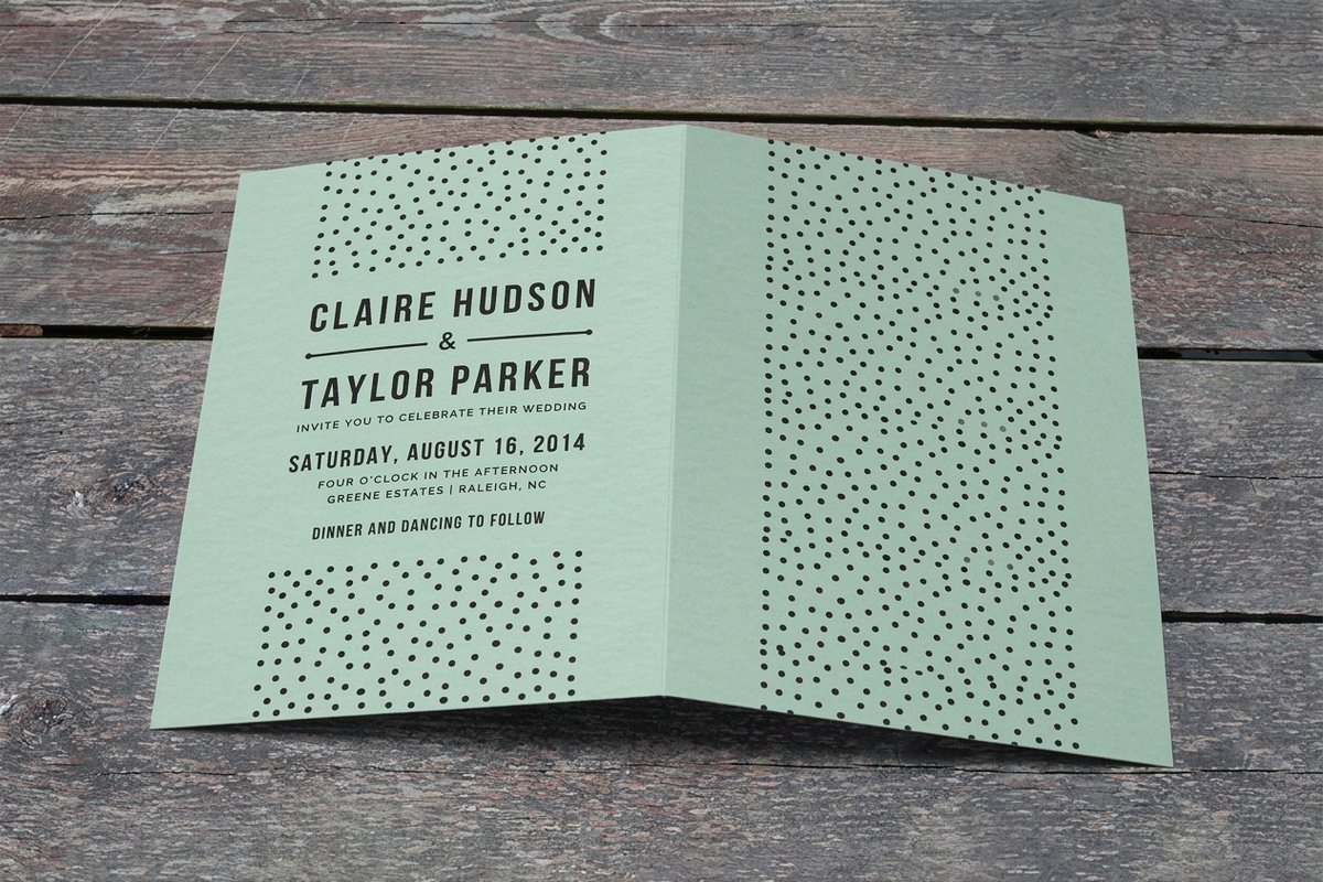 Folded Invitations | 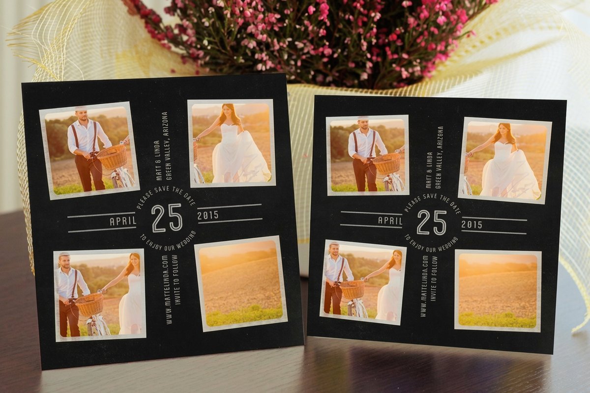 Save the Date Cards |  Velvet Invitations | |
|---|---|---|---|---|
| Min price | $19.77 | $38.22 | $19.77 | $251.36 |
| Paper / stock | 14pt Gloss Cover | 14pt Gloss Cover | 14pt Gloss Cover | 16 Point Soft Velvet Laminated |
| Finish | Standard Finish | Standard Finish | Standard Finish | - |
| Size | 4.25" x 5.5" | 8.5" x 5.5" fold to 4.25" x 5.5" | 4.25" x 5.5" | 4.25" x 5.5" |
| Default qty | 25 | 25 | 25 | 500 |
| Turnaround | 3 business days | 5 business days | 5 business days | 7 business days |
| Rating | ||||
| View & customize | View & customize | View & customize | View & customize |
Start fast
Templates and print-ready blanks
Invitation design templates and exact-size blanks so your font lands inside the cut line.
Prefer to start from a sized blank? Grab a flat wedding invitation or a folded wedding invitation template and drop in your own fonts.
Wally pairs the perfect wedding fonts
One script for the names, one clean face for the details
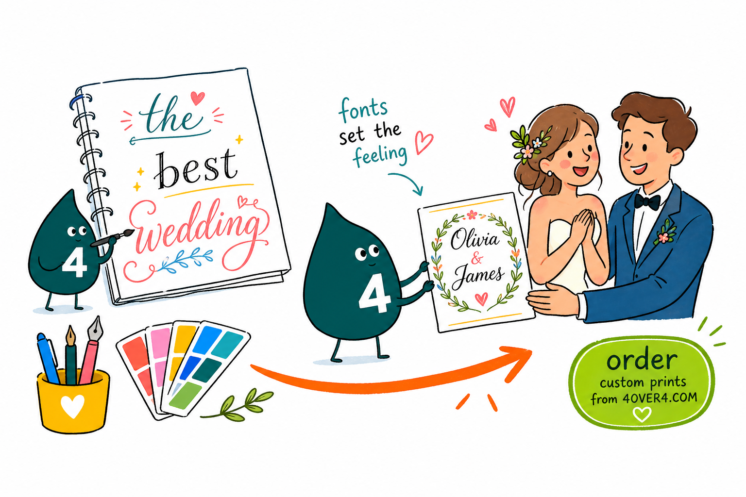
Great wedding invitations lean on two fonts, not five. Pick a script or ornate serif for the couple names, then a clean sans serif for the date, venue, and RSVP. Match the font weight to the paper, print a single test card, and 4OVER4.COM renders it sharp on 60+ stocks. Free faces from Google Fonts look premium when the pairing is right.
Design your invitations →What to remember about wedding invitation fonts
Match the font family to your wedding style
- Formal ballroom. Serif fonts like Voga and Glamor on smooth coated stock, paired with a light sans serif for the details.
- Modern minimalist. Montserrat or Lato in a single weight, generous spacing, and bright white smooth stock.
- Romantic garden. Allura or Great Vibes for names, a friendly sans serif like Lato for the rest.
- Rustic barn. Alex Brush for headings and Josefin Sans for body text on kraft or textured stock.
- Vintage estate. Lovelyn as a title face with a clean serif underneath for the wording.
- City glamour. Glamor layered over subtle textures with foil accents for the couple names.
Explore more
More ways to design your wedding stationery
Every related page type on 4OVER4.COM, one card each, so you can keep exploring invitation printing.
Product Custom Shaped Invitations Go beyond the standard rectangle with die-cut invitation shapes. Product Diamond Glitter Invitations A sparkling finish that pairs with clean, bold fonts. 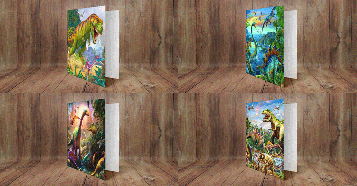 Product 3D Lenticular Cards Add motion and depth behind your typography.
 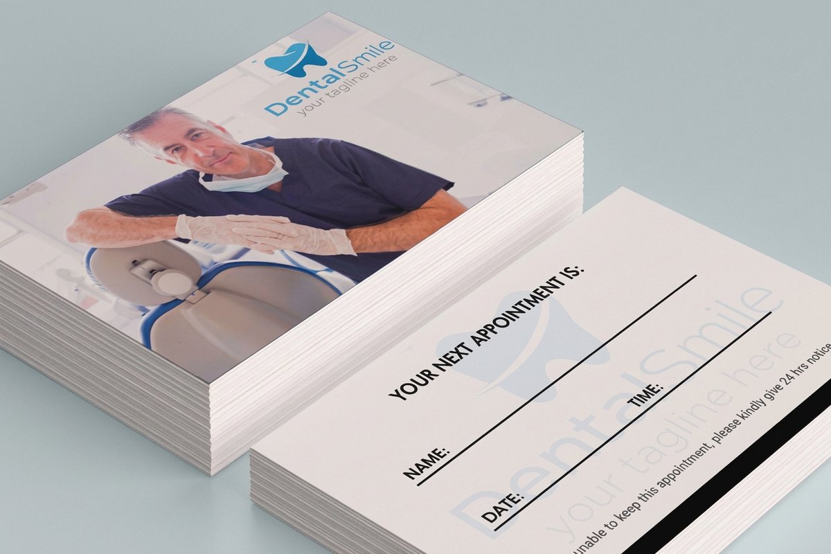 Product Custom Appointment Cards Carry the same typographic style to vendor reminders. Hub Invitations Printing Browse every invitation format in one place.
 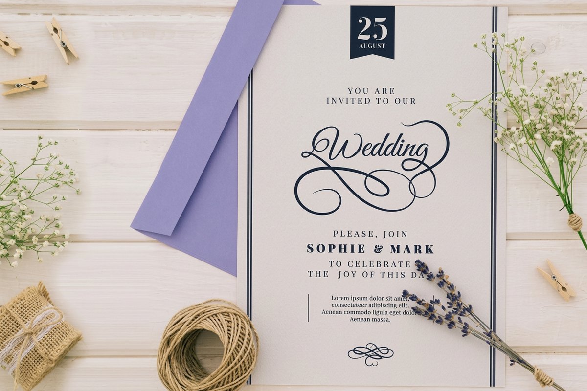 Template Flat Wedding Invitations Print-ready blank templates sized to spec.
 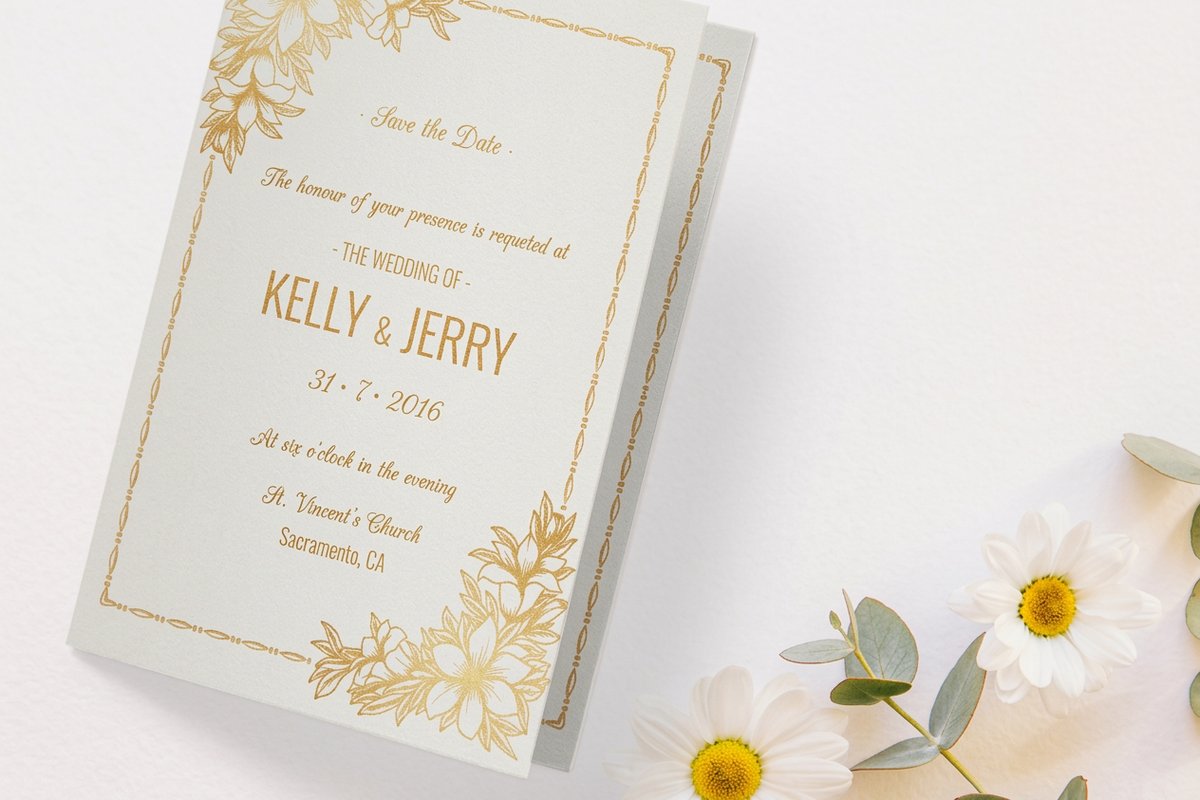 Template Folded Wedding Invitations Exact-size blanks for folded invites.
 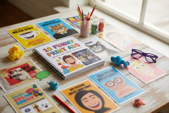 Article Funny Print Ad Examples How bold typography grabs attention.
 Ready to print your wedding invitations?
Pick two fonts, drop them into a free template or a custom shape, and 4OVER4.COM prints them sharp on the paper stock of your choice.
Common questions about wedding invitation fonts
What are the best practices for choosing a wedding invitation font?
Limit your invitation to two fonts, one decorative and one readable. Test both at actual print size on your chosen paper stock before ordering the full run, and use script fonts only for names or headings, never for small detail text like addresses. A good wedding invitation font guide always puts guest readability alongside visual appeal. For unique formats, explore 3D Lenticular Cards that add motion to your typography.
How do I choose the right wedding invitation font?
Start with your wedding style. Formal events call for serif fonts like Voga or Glamor, casual celebrations suit brush scripts like Alex Brush, and modern weddings work with clean sans serifs like Montserrat. Then consider your paper, because textured stocks need bolder fonts while smooth papers let delicate typefaces shine. Print a single test card to confirm your pairing before committing to a full order.
What makes a wedding invitation font effective for personal branding?
Consistent typography across your whole suite, from save the dates to invitations, programs, menus, and thank you cards, creates a cohesive identity for your wedding. That consistency builds recognition and makes the event feel polished and intentional, so choose fonts that reflect your personality as a couple. If you also need vendor reminders, Custom Appointment Cards can carry the same style.
How much should I budget for wedding invitation fonts?
You can spend zero dollars on fonts. Google Fonts, Font Squirrel, and DaFont all offer high quality free typefaces suitable for invitations, while premium fonts from foundries typically cost between 25 and 100 dollars per family. Your real budget goes to the printing itself, and 4OVER4.COM keeps that competitive across 60+ paper stocks.
