
Event Ticket Layout Design Guide with Key Elements


Why your event ticket layout shapes the entire experience
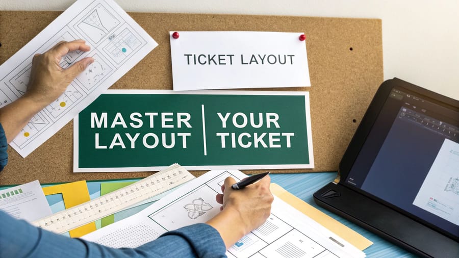
Your ticket is the opening act. It sets expectations, builds anticipation, and gives guests their first real taste of what you have created. A sloppy, generic ticket signals a disorganized event, while a sharp, branded one builds trust and gets people excited before they even leave the house. 4OVER4.COM has printed 10 billion+ cards and print products for 150,000+ businesses, and event tickets stay one of the most requested items for organizers who want a strong first impression.
This is not a new idea. Event tickets have evolved from simple clay tokens in ancient Greece to the branded keepsakes we hand out today. By the 18th century, complex symbols were already in use to stop counterfeiting, and the modern version of that same instinct shows up as QR codes, sequential numbering, and holographic foil. Tickets have always been more than entry passes.
A strong layout does several jobs at once. It ties your logo, colors, and aesthetic to the event so the ticket is instantly recognizable. It makes the date, time, venue, and seat easy to find at a glance. It builds in security so counterfeiters stay out and the entry line keeps moving. And it earns keepsake value, the kind that gets a ticket pinned to a corkboard for months of free brand exposure.
Set up your design file the right way
A professional ticket starts with a solid technical foundation. Before you place a logo or pick a font, get the specs right, because that is what saves you from reprints and that sinking feeling when a key detail gets trimmed off. The first decision is size. There is no single correct dimension, but a compact ticket suits a nightclub while a charity gala with sponsor logos needs more room.
Set your bleed and safety margins next, and treat them as non-negotiable. The bleed is a buffer, usually an extra 0.125 inches on every side, that extends your design past the trim line so no white edge appears if the cut shifts. The safety margin works the other way, keeping all text and critical elements at least 0.125 inches inside the trim. Build the file at 300 DPI minimum and work in CMYK from the start, since RGB looks great on screen but prints differently than you expect.
Typography and color that read at a glance
Tickets are small, so every font choice matters more than it would on a poster. Stick to two fonts at most, one display face with personality for the event name and one clean sans-serif for everything else. Size the event name at 18 to 24 points, keep the date, time, and venue at 10 to 14 points, and hold fine print at 6 to 8 points but never below 6. Dark text on a light background is the safest bet for contrast.
Color does the heavy lifting before anyone reads a word. Start with your event primary brand colors, then add one or two accents to spotlight the date or a VIP tier. Limit the palette to three or four colors so a small format never looks busy, and test everything in CMYK before you finalize. For a closer look at how brand colors translate to small-format printing, these logo sticker design ideas are a useful reference.
Common layout mistakes and how to avoid them
After seeing thousands of ticket designs, the same mistakes show up again and again. Overcrowding is the big one. Organizers try to cram full schedules, long terms, and every sponsor logo at full size onto one small card, and the result is a mess nobody can read. Edit without mercy, and if a detail is not essential for entry or identification, move it to your website and link to it with a QR code.
The rest of the list is short and fixable. Do not treat the stub as an afterthought, because it is the piece attendees keep, so give it a raffle entry or a discount code. Design in CMYK from the start so colors do not shift when you convert at the end. Always extend edge-to-edge backgrounds into the bleed so no white slivers appear after trimming. And never shrink a QR code below 0.75 inches, since a tiny code is unreliable to scan in a dark venue.
Building your information hierarchy
Every event ticket has to answer five questions at a glance. What is the event, when is it, where is it, how much did it cost, and what is the entry policy. The trick is arranging that information so it is scannable in under three seconds. Nobody should have to hunt for the date or the venue.
The must-have elements
- Event name the largest, most prominent text on the ticket.
- Date and time include the day of the week for quick reference.
- Venue name and address the full address, not just the venue name.
- Seat or section assignment when your event has assigned seating.
- Ticket price or tier general admission, VIP, or early bird.
- Barcode or QR code for fast scanning at entry.
- Sequential ticket number for tracking and security.
- Organizer contact or website so guests can reach you.
Print it
Custom event tickets, ready to brand
Preset and custom sizes, tear-off stubs, and QR-ready layouts, the fastest way to put your event on a ticket.
Standard ticket sizes
Pick a size that balances information density with practicality. The ticket has to be large enough to read and show your branding, yet small enough to slide into a pocket without folding. If you want specific size options, custom event tickets come in several standard and custom dimensions.
- 2" x 5.5" the classic wallet-friendly size for concerts, festivals, and general admission.
- 2.75" x 8.5" room for sponsor logos and detailed schedules, ideal for fundraisers, galas, and VIP events.
- 3.5" x 8.5" a large perforated stub for raffles and keepsakes, great for theater and sporting events.
Designing the stub section
If your ticket includes a tear-off stub, and most should, treat it as its own mini project. The stub is the attendee receipt and your record of entry, so it needs the event name, date, and seat at minimum. Place a clear perforation line between the main ticket and the stub, marked with a dotted or dashed line, so both your printer and your door staff know exactly where to separate them.
Quantity and price
Event ticket pricing and specs
Real configurator numbers, where the per-unit cost drops as your quantity climbs.
| Quantity | Price Per Unit | Total |
|---|---|---|
| 50 | 50.5¢ | $25.27 |
| 100 | 42.8¢ | $42.84 |
| 200 | 25.8¢ | $51.62 |
| 300 | 20.1¢ | $60.42 |
| 400 | 17.3¢ | $69.20 |
| 500 | 15.6¢ | $77.99 |
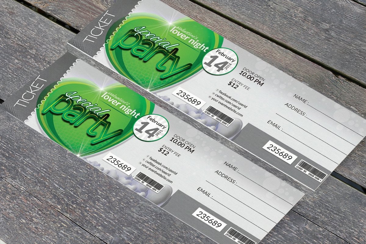
Security features that protect your event
Counterfeit tickets cost organizers thousands of dollars a year and create headaches at the door. Building security into your layout from the start is far easier and cheaper than dealing with fraud after the fact.
Digital security elements
QR codes and barcodes are the baseline. Every ticket should carry at least one scannable element that links to your ticketing database. Give the QR code a minimum size of 0.75 by 0.75 inches and surround it with a quiet zone of at least 0.125 inches, or scanners will struggle and your entrance will bottleneck. Sequential numbering adds another layer, since a unique number per ticket makes it easy to track sales, spot duplicates, and manage capacity. Keep that number in a consistent spot, and the bottom right corner is standard.
Physical security elements
- Perforations a clean tear-off stub proves the ticket was used and blocks re-entry.
- Specialty inks UV-reactive or metallic inks resist home-printer copies.
- Custom paper stock a distinctive weight or texture makes fakes obvious to trained staff.
- Holographic elements foil stamps add a layer that is nearly impossible to reproduce.
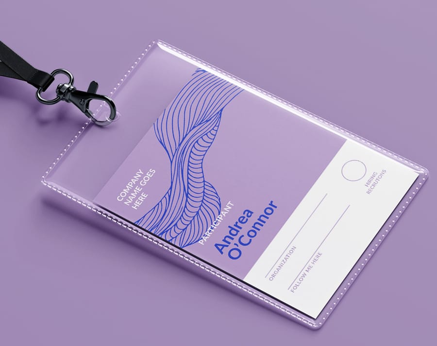
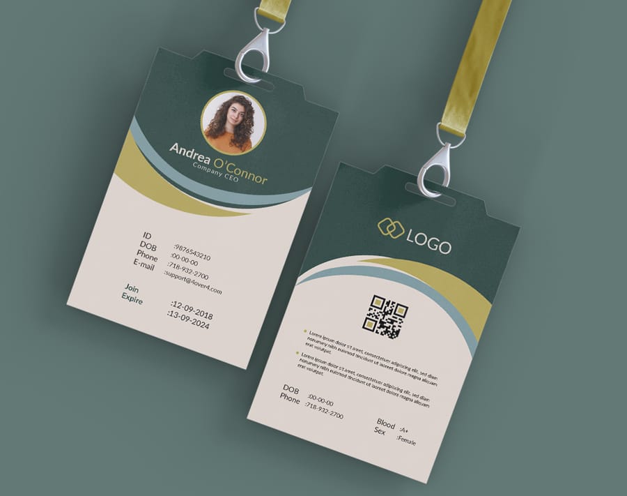
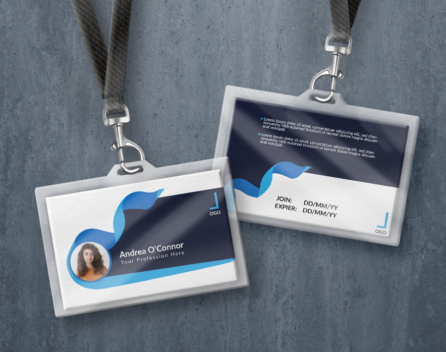
Pair your tickets with printed event badges that share the same design language, and it becomes even easier for staff to spot a fake.
Match the set
Printed event badges
Badges that carry the same colors and type as your tickets, so your whole event reads as one brand.
Designing for different event types
A music festival ticket should not look like a corporate conference ticket. The layout, tone, and design elements should match the event personality. Here is how to adapt these principles to specific scenarios.
Concerts and music festivals
Go bold. Use large, expressive type for the headliner, dark backgrounds with bright accents for energy, and the lineup or a tagline if space allows. Festival tickets often work best at larger sizes like 2.75 by 8.5 or 3.5 by 8.5 inches to fit multiple acts and sponsor logos.
Corporate events and conferences
Keep it clean and minimal. Follow your brand guidelines strictly, use approved colors and fonts, and set dark text on a white or light background to project professionalism. The standard 2 by 5.5 inch size works well, and a QR code can link to the agenda or an app download.
Charity galas and fundraisers
Raise the design with premium touches like foil stamping, thicker card stock, or embossed elements. These tickets often double as keepsakes that donors display, so allocate space for sponsor logos and give elegant typography room to breathe.
Sporting events
Team colors are mandatory. Feature the logo prominently, use action imagery, and number each ticket clearly for seat assignments. The stub matters most here, since fans keep stubs as memorabilia long after the final whistle.
For outdoor events, think about how the ticket connects to your physical setup. Custom event tents with matching branding create a cohesive look from the moment guests arrive.
Take it outside
Custom event tents
Branded shelter for gates, registration, and booths, tying the arrival experience back to your tickets.
Preparing your file for print
You have designed a ticket you are proud of. Now prepare the file so it prints exactly as you intended, because this is where attention to detail pays off.
Pre-flight checklist
- Resolution 300 DPI minimum, checked on every placed image.
- Color mode CMYK throughout, with no stray RGB elements.
- Bleed 0.125 inches on all sides, with the background extending fully into it.
- Safety margin all text at least 0.125 inches inside the trim line.
- Fonts outlined or embedded in the PDF so nothing gets substituted.
- File format a press-quality PDF, not a JPEG or a PNG.
Proofing your design
Print a test copy at actual size on paper, not on your monitor. Check that the text is readable, the colors look right, and the QR code scans. Then hand it to someone who was not involved and see if they can find the date, time, and venue in under three seconds. 4OVER4.COM offers free samples so you can feel the paper stock before a full run, and the step-by-step printing guides walk through file prep in more detail.
Picking the right paper and finish
Paper stock and finish decide how your ticket feels in the hand, how durable it is, and how your colors reproduce. Do not default to the cheapest option without thinking about the experience you want.
Uncoated stock has a natural, matte feel. It is easy to write on, which helps if you hand-write seat assignments, and it gives a warm, organic look that suits craft fairs and intimate gatherings.
Gloss-coated stock makes colors pop, so photos and detailed graphics look sharp and bright. It is the go-to for concerts and festivals with bold branding, though it can show fingerprints and is harder to write on.
Matte-coated stock splits the difference, with better color reproduction than uncoated and none of the fingerprint issues of gloss. It has a modern, sophisticated feel that works across almost every event type. For heavier, more premium tickets, ask about thicker card stock, and remember that 4OVER4.COM carries 60+ paper types.
Templates and pricing to jumpstart your design
Starting from a blank canvas can feel like a lot, especially if you are not a trained designer. Templates give you a proven layout with the bleed, safety margins, and hierarchy already in place, so you can focus on your content and branding. Browse ready event badge templates and event flyer templates when you want the correct dimensions without the guesswork.
Start fast
Event templates and print-ready blanks
Ready-made event designs and exact-size blanks so your artwork lands inside the cut line every time.
Wally lays out the perfect ticket
Every detail in its place, scannable in seconds
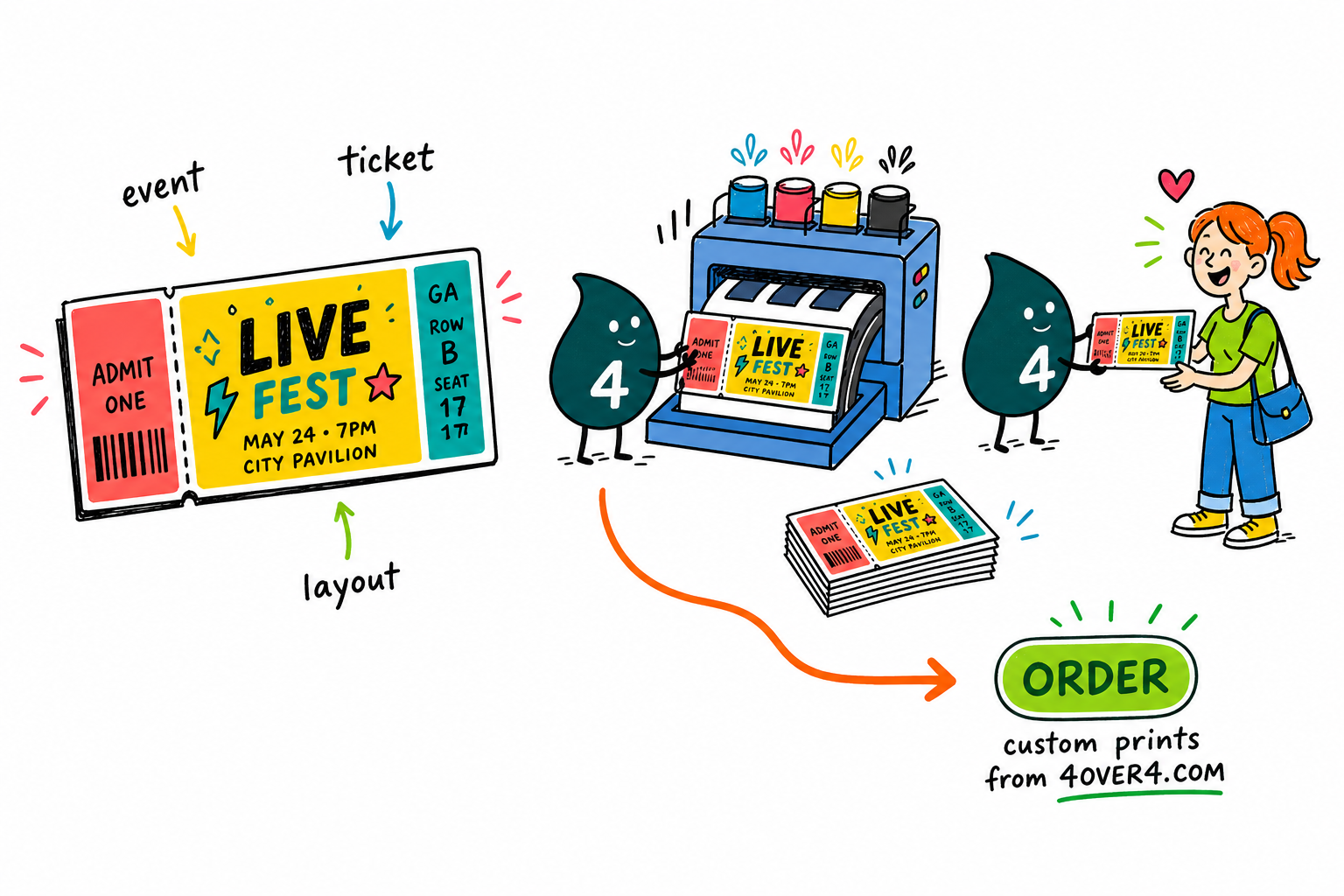
A great ticket says one thing fast. Put the event name on top, keep the date, time, and venue easy to scan, add a QR code of at least 0.75 inches, and finish with a tear-off stub. Set your file to 300 DPI in CMYK with a 0.125 inch bleed, and 4OVER4.COM prints it sharp on your choice of 60+ paper stocks.
Design your event tickets →What to remember about event ticket layout design
Why a strong ticket layout pays off
- Builds brand identity. Your logo, colors, and aesthetic make the event instantly recognizable.
- Communicates key info. Date, time, location, and details land in a way that is impossible to miss.
- Improves security. QR codes, sequential numbering, and perforations cut fraud and speed entry.
- Creates a lasting impression. A beautiful ticket becomes a souvenir that keeps reminding attendees of the day.
Explore more
More ways to brand your event
Related products, templates, and guides on 4OVER4.COM, one card each, so you can keep planning your event print.
Product Custom Event Tickets Wallet-size tickets with stubs, QR codes, and 60+ stocks. 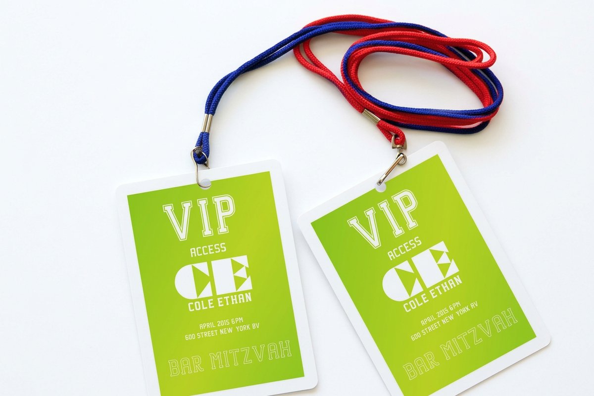 Product Printed Event Badges Name badges that match your ticket branding.
 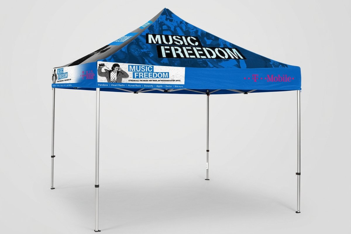 Product Custom Event Tents Branded tents for outdoor gates and booths.
 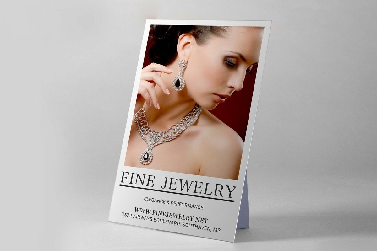 Product Custom Counter Cards Point-of-sale displays for the box office. Templates Event Badge Templates Print-ready blanks with bleed and margins set.
 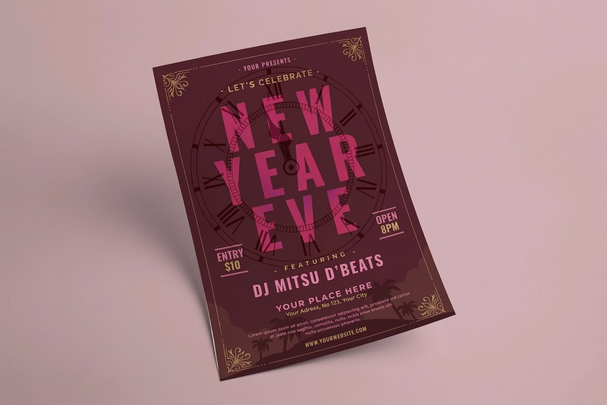 Templates Event Flyer Templates Blank flyer layouts to promote the event. Showcase Design Showcase Finished ticket and badge designs from real customers.
  Article Graphic Design Portfolio Examples Layout inspiration across print products.
  Article Funny Print Ad Examples Playful print marketing ideas that grab attention.
 Ready to design your event tickets?
Pick a size, drop in your branding or a free template, and 4OVER4.COM prints it sharp on your choice of 60+ paper stocks.
Your event ticket layout questions, answered
What are the best practices for event ticket layout design?
The best practices start with the technical setup. Use CMYK color at 300 DPI, add a 0.125 inch bleed on every side, and hold text inside a 0.125 inch safety margin. Limit yourself to two fonts and build a clear hierarchy, with the event name as the largest element, followed by date, time, and venue. Add a scannable QR code of at least 0.75 inches so entry stays fast.
How do I choose the right event ticket layout design?
Match the layout to your event type. Concerts and festivals call for bold color and larger sizes like 2.75 by 8.5 inches, while corporate events read best as clean, minimal designs at the standard 2 by 5.5 inches. Think about how much information you need and whether you want a tear-off stub. To round out your event print, custom counter cards work well for point-of-sale displays.
What makes event ticket layout design effective for marketing?
An effective ticket doubles as a mini billboard. Use your brand colors, logo, and a consistent visual style that connects to your posters, social media, and venue signage, then add a QR code that links to your website. Attendees often keep a well-designed ticket as a souvenir, which extends your visibility for months. For more print marketing ideas, see these funny print ad examples.
How much should I budget for event ticket layout design?
Costs depend on complexity. A do-it-yourself design from a free template costs only your time, while a freelance designer usually runs 50 to 200 dollars for a ticket layout. Printing depends on quantity, paper stock, and finish, and per-unit pricing at 4OVER4.COM drops sharply at higher volumes. Order free samples first so you can compare paper before committing to a full run.
