
Pocket Folders Branding Guide for Every Client Touchpoint


Design pocket folders that work as hard as your pitch. Pick the right stock, place your logo with intent, choose a finish people want to touch, and hand every client a folder that looks premium before they open it.
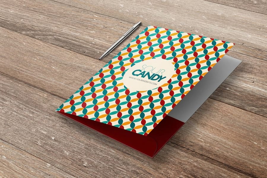
To brand a pocket folder, start with your brand identity, not a template. Choose a heavier 14pt or 16pt stock for a premium feel, place your logo cleanly on the front, match your colors to real Pantone or CMYK values, and pick a finish that fits your brand, whether matte, gloss, soft touch, foil, or spot UV. Always order a proof before the full run so the printed folder matches your brand exactly.
Quick tips
Quick tips for branding your pocket folders
Brand your pocket folders from the identity out, not the template in. Choose a stock weight that matches your positioning, place your logo cleanly on the front, lock your colors to real Pantone or CMYK values, and pick a finish people want to touch. Order a proof before the full run, and keep every folder consistent with your cards, letterhead, and site so your brand reads the same at every touchpoint.
Watch it printed
See pocket folders on the press, in 144 seconds
Why custom pocket folders still matter for your brand
Pocket folders are not just document holders. They are your brand's handshake before you say a word. Hand a prospect a well made folder at a meeting and you communicate professionalism and attention to detail in a way no email attachment ever will.
With more than 10,000 reviews and a 4.8 out of 5 star rating, 4OVER4.COM knows what it takes to make printed materials that actually earn attention. This guide walks you through every decision, from paper weight and finish to logo placement and color strategy, whether you are building folders for a real estate closing package or a corporate onboarding kit.
If you are working on companion pieces, our guide on how to fold a brochure pairs neatly with your folders, and our walkthrough on how to clean rubber stamps covers another classic branding tool worth keeping sharp.
What a pocket folder is and what it looks like
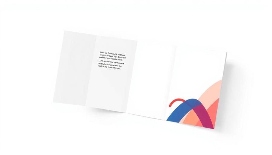
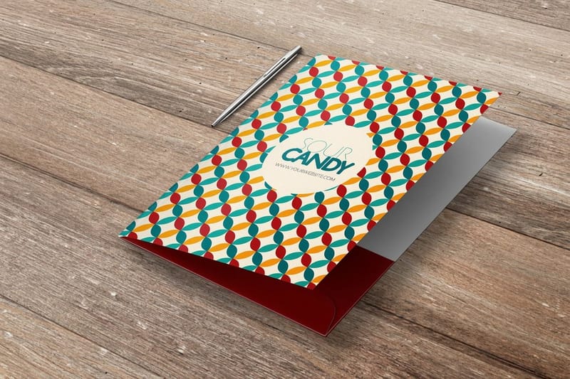
A pocket folder is a single sheet of heavy card, printed and folded once down the middle, with one or two pockets built into the inside panels to hold loose pages. Closed, it looks like a slim book cover with your design on the front. Open, you see two inside panels, each with a pocket along the bottom edge that is glued or die-cut in place, and usually a pair of slits on the right pocket that hold a business card.
The standard size is 9 by 12 inches closed, which takes letter-size 8.5 by 11 inch sheets with room to spare. Legal folders run 9.5 by 14.5 inches for 8.5 by 14 inch pages, and small folders around 6 by 9 inches hold half-letter inserts. Pocket depth is typically 3 to 4 inches, and a gusset, a scored strip along the pocket, lets one hold a thick stack without buckling.
Because the whole outside is one printed sheet, the front, back and spine carry your brand as one continuous surface. That is the difference between a printed pocket folder and the plain colored folders sold in office aisles.
Start with your brand identity, not the template
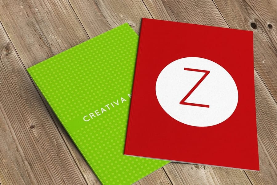
The biggest mistake people make is jumping straight into a template without thinking about what their brand needs to say. Before you pick a color or upload a logo, get clear on three things. Your brand personality, your audience, and the context where the folder will be used.
A law firm handing folders to clients during estate planning needs a very different look than a creative agency pitching a new campaign. The folder itself sends a message, so make sure it is the right one.
Define your brand pillars first. Are you luxury, budget friendly, eco conscious, or playful. Each of those answers translates into specific choices around paper thickness, finish, color palette, and typography. Write them down before you open any design software.
Choosing the right paper stock for your brand message
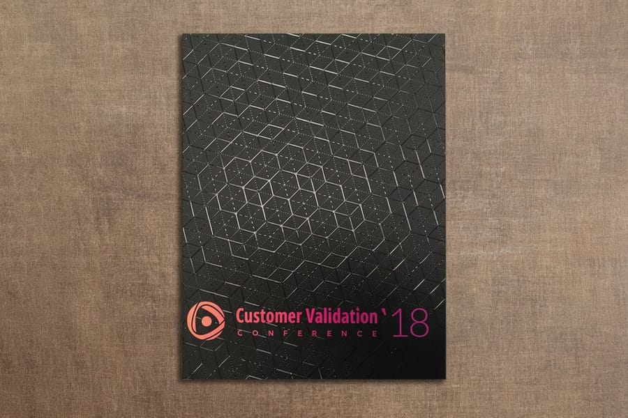
Paper stock is where your brand becomes tangible. The weight and texture of your pocket folder tell people something about your business before they even open it.
Thicker stock signals authority. A 14pt or 16pt cover feels sturdy and professional, roughly the thickness of a premium business card. If you want a folder that reads as premium, go heavier, because the physical weight in someone's hand creates an unconscious link to quality and trust. Not sure which weight to pick. Our guide on choosing the right cardstock breaks down how stock changes the feel of a printed piece.
For brands that want a modern edge, materials like 30mil clear plastic cards show what is possible when you think beyond traditional paper, and that same creative thinking applies to folder design. When you want the die to catch the light, raised spot UV pocket folders add a glossy, raised texture right on your logo.
Pocket folder types, from one pocket to prongs and gussets
The name covers several builds, and the right one depends on what goes inside.
- Two-pocket folder. The standard presentation folder, with a pocket on each inside panel and a business card slit. It handles proposals, onboarding packets and real estate closings.
- One-pocket folder. A single pocket on the right leaves the left panel free for a printed message, a welcome letter or a map. It reads cleaner when the contents are thin.
- Folder with prongs. Three metal fasteners on the spine hold punched pages in order. It is a school and office format, and the printed version suits training manuals that get updated.
- Gusseted folder. A pocket with a scored expansion strip, usually 0.25 to 0.5 inches, that holds a thick stack flat instead of bulging. Pick it for catalogs or contract sets.
- Paper or plastic. Plastic folders survive a backpack and wipe clean, but they print poorly and carry a label at best. A 14pt or 16pt printed card folder carries full color, foil and spot UV, which is why branded folders are paper.
Logo placement and visual hierarchy on pocket folders
Your logo goes on the front cover. Always. That part is non negotiable. Where on the front, and how big, is where strategy comes in.
Center placed logos suit formal, symmetrical brands. Off center or bottom right placement feels more modern and active. The key is consistency with your other materials. If your business cards use a bottom left logo, your folders should speak the same visual language.
Do not overcrowd the front. White space is not wasted space, it is breathing room that makes your logo and tagline stand out. A clean cover with your logo, a subtle texture, and maybe a tagline beats a busy design every single time.
Inside panel design, the space most brands waste
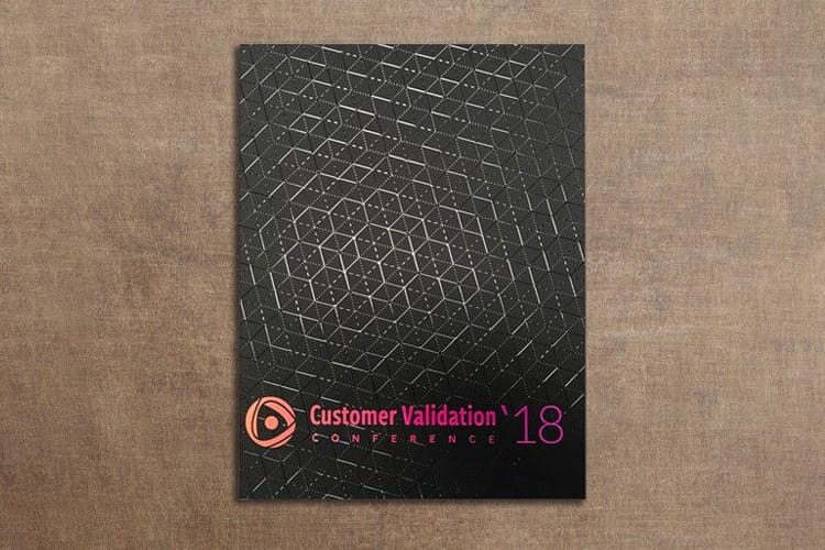
Here is where most brands drop the ball. The inside panels of your folder are prime real estate, and too many brands leave them blank or drop in a generic About Us paragraph nobody reads.
Use the inside panels with intent:
- Left inside panel: a brief company story, mission, or key differentiators, kept under 50 words.
- Right inside panel: contact details, a QR code to your site, or a clear call to action.
- Pockets: brand the flaps with your color palette or a subtle pattern.
- Business card slit: always include one, it is expected and functional.
If you are printing inserts to tuck inside, our guide on how to make flyers covers insert design that pairs perfectly with branded folders, and custom letterhead keeps the paperwork inside the folder on brand too.
Color strategy that reinforces your brand
Your folder's color palette should match your brand guidelines exactly. It sounds obvious, yet plenty of folders come back from print with colors that are close enough instead of spot on.
Use the Pantone or CMYK values from your brand guide rather than eyeballing it. Do not pull the hex codes from your website and hope they translate to ink. Screen color and print color are different animals, so request a proof before your full run to confirm the blue on your folder matches the blue on your business card.
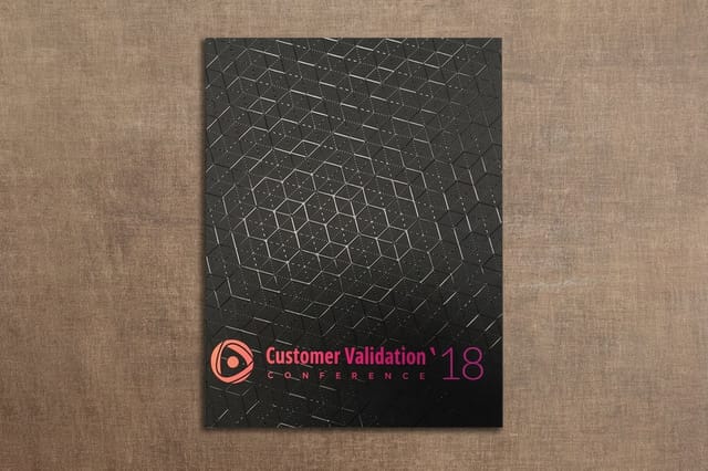
Dark backgrounds with light text create a bold, premium feel. Light backgrounds with dark text feel clean and approachable. Full bleed color, running edge to edge with no white border, looks more polished than a design boxed in by margins.
Finish options that add a tactile brand experience
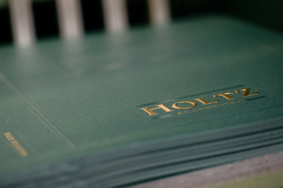
The finish is what people feel, and touch creates memory. Sensory marketing studies consistently show that tactile experiences lift brand recall.
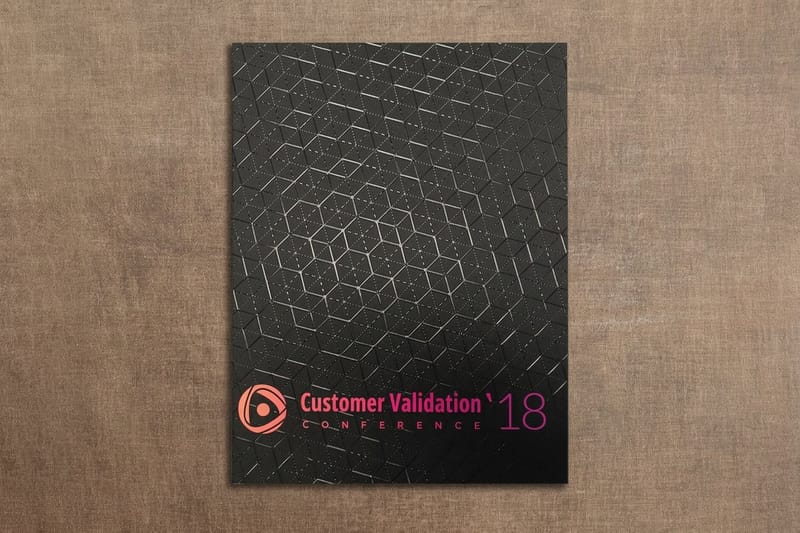
Matte finishes feel sophisticated and cut glare, which helps in bright meeting rooms, and they pair beautifully with spot UV on your logo. Gloss finishes make colors pop and feel slick in the hand, ideal for creative and retail brands. Soft touch lamination is the premium play, giving the folder a velvety, almost suede like texture that people do not want to put down. If you love that feel, our guide on soft touch laminated cards explains how the same finish behaves on smaller pieces.
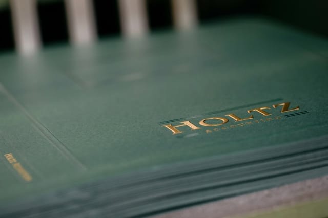
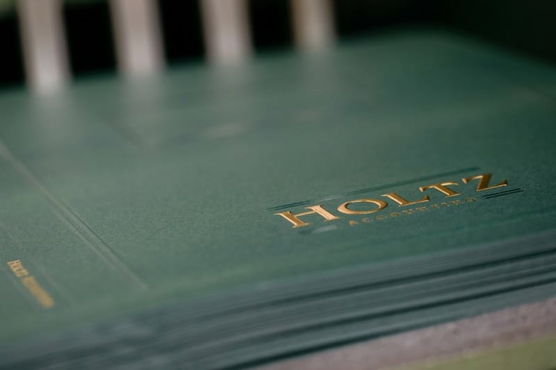
Raised foil and raised spot UV add real dimension, letting your logo rise off the surface as a credibility builder and a conversation starter. Raised foil pocket folders bring a metallic shine in gold, silver, or rose gold that feels unmistakably high end.
Designing pocket folders for different use cases
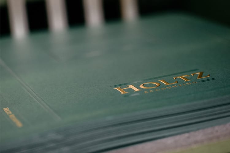
Your folder design should shift based on how it is used. A one size fits all approach wastes the chance to connect with a specific audience.
- Real estate agents: add a listing insert pocket, your headshot on the back panel, and contact details with a QR code to your listings. Keep it clean and aspirational.
- Corporate onboarding: use company colors, put the mission on the inside panel, and size the pockets to hold handbooks, benefits summaries, and welcome letters.
- Event and conference handouts: go bold with event branding, print the schedule inside, and make sure the folder holds a letter size program.
- Sales presentations: lead with your value proposition on the front, then slip a short case study or testimonial inside so the folder builds confidence before it is even opened.
For printing tips across every product type, browse the 4OVER4 guide hub for walkthroughs on everything from envelopes to magnets.
File setup and print ready artwork
Getting your file right saves time, money, and frustration. Here are the non negotiables for print ready pocket folder artwork.
- Resolution: 300 DPI minimum, because anything lower looks blurry in print.
- Color mode: CMYK, not RGB, since RGB is for screens and CMYK is for ink on paper.
- Bleed: extend your design at least 0.125 inches beyond the trim on all sides.
- Safe zone: keep text and key elements at least 0.125 inches inside the trim line.
- File format: a print ready PDF is preferred because it locks in fonts, colors, and layout.
If you are printing matching envelopes for the package, our guide on how to make envelopes walks through similar file prep, and for branded inserts our resource on custom magnets gives you another way to get your logo into a client's hands.
Templates and design inspiration
Starting from a template is smart, not lazy. 4OVER4.COM offers ready to customize layouts that already have the correct dimensions, bleed, and fold lines built in, so you simply add your branding.
Grab a pocket folders blank template or a spot UV pocket folders template to get the specs right on the first try. Prefer to design in the browser. Our online design tool lets you build the artwork and send it straight to print.
Pocket folder branding mistakes that cost you credibility
Even seasoned marketers trip over these errors. Avoid them and your folders do their job.
- Low resolution logos. A pixelated logo on print looks worse than none at all. Use vector files, AI, EPS, or high resolution PDF, for your logo art.
- Ignoring the spine. If the folder holds thick document stacks, you need a gusseted, expandable spine. Flat spines on stuffed folders buckle and look cheap.
- Mismatched branding. Colors, fonts, and tone should match your business cards, letterhead, and website. Inconsistency signals disorganization.
- Skipping the proof. Colors shift between screen and print, so always review a proof before committing to a full run.
- Overloading the design. A cluttered cover with too much text and too many competing elements confuses instead of impresses.
With more than 25 years in printing, 4OVER4.COM has seen every mistake in the book. Do not be the brand that hands out a folder with a blurry logo and colors that missed the mark.
Wally explains pocket folder branding
A great folder is your brand's first handshake
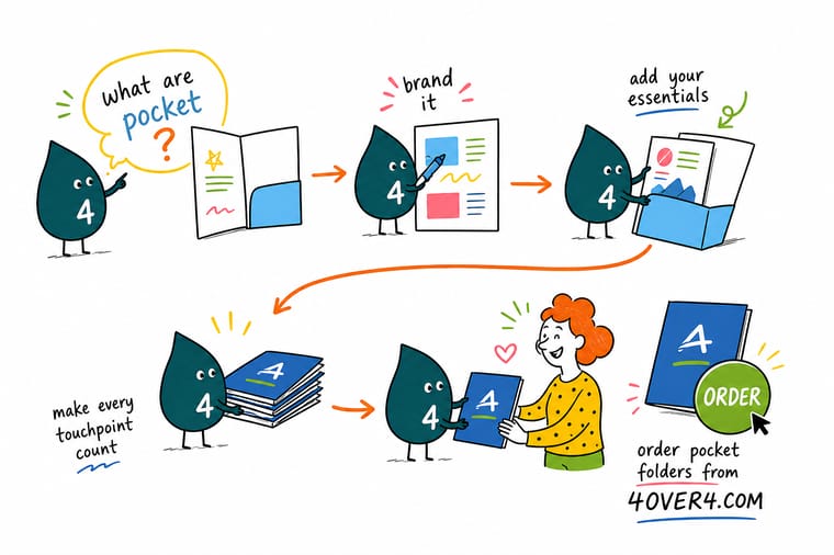
Wally treats a pocket folder like a tiny stage for your brand. Pick a stock that feels solid, keep the cover clean, match your colors to the real Pantone values, and add a finish people want to touch. Do that and the folder sells your professionalism before the meeting even starts. When you are ready, 4OVER4 prints it sharp, on premium stock, with foil or spot UV if you want your logo to shine.
Order pocket folders →Specs and pricing
Custom pocket folder specs and pricing
Here is what a made to order pocket folder gives you at 4OVER4.COM, with live specs and price per unit pulled straight from the configurator.
| Quantity | Price Per Unit | Total |
|---|---|---|
| 250 | $3.38 | $844.54 |
| 300 | $3.09 | $925.50 |
| 400 | $2.52 | $1,006.44 |
| 500 | $2.17 | $1,086.18 |
| 600 | $1.93 | $1,158.67 |
| 700 | $1.76 | $1,231.16 |
| 800 | $1.63 | $1,303.65 |
| 900 | $1.53 | $1,376.15 |
Print it
Order pocket folders and premium finishes at 4OVER4
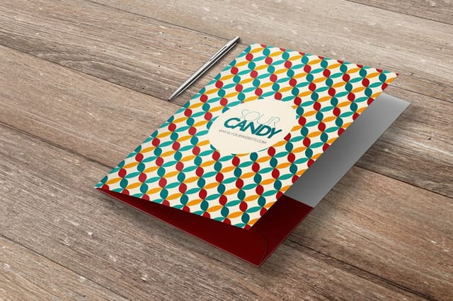
Choosing the right pocket folder comes down to your positioning and budget, and 4OVER4.COM covers the full range from professional to premium. If sustainability is part of your story, explore green printing options that match your materials to your values, and use event invitations as promotional inserts inside your folders for open houses and launches. For the rest of your branded set, the business stationery collection keeps every touchpoint consistent.
Explore more
Where to go next
By the numbers
Folder stock out of sixty paper types
Common Questions
Common questions about branding with pocket folders
What is the difference between a folder and a pocket folder?
A plain folder is a folded sheet with nothing inside to hold the pages, so loose paper slides out when it tips. A pocket folder adds one or two pockets to the inside panels, glued or die-cut along the bottom edge, so the pages stay put and a business card can sit in a slit on the pocket. File folders and manila folders are for storing paper in a drawer. Pocket folders are for handing paper to someone.
What does a pocket folder look like?
Closed, it is a 9 by 12 inch card cover, a little larger than a letter-size sheet, with your design printed across the front and back. Open it like a book and you see two inside panels, each with a pocket along the bottom that holds loose pages, and usually two small slits on the right pocket for a business card. Printed folders are often full color inside and out, with a matte or gloss finish and sometimes foil or raised spot UV on the logo.
What is another name for a pocket folder?
Presentation folder is the most common alternative, and printers use the two names for the same product. You will also see two-pocket folder, marketing folder, sales folder and document folder, and in the UK a printed pocket folder is often called a folder with pockets. Report cover is not a synonym, because a report cover binds pages along the spine and has no pockets.
What is a pocket folder?
A pocket folder is a printed card cover, folded once, with one or two pockets glued or die cut into the inside panels to hold loose sheets. Most carry a slit on the right pocket so a business card travels with the paperwork. The standard 9 by 12 inch folder holds letter size 8.5 by 11 inch pages, legal folders take 8.5 by 14 inch pages, and smaller formats hold 5.5 by 8.5 inch inserts. Printers also call it a presentation folder.
What is the difference between a pocket folder, a presentation folder, and a report cover?
Pocket folder and presentation folder are two names for the same product: a printed cover, usually 9 by 12 inches, with pockets on the inside panels. A report cover is different. It has no pockets and binds a finished document along the spine with a clamp, staples, or a comb, so the pages stay in a fixed order and nothing can be pulled out or added. Choose the pocket folder when the contents change from client to client and you want full color branding and a business card slit. Choose a report cover when the document is fixed and has to stay together. If your handout is a set proposal plus loose price sheets and spec pages, the folder wins, because the loose pages are the whole point.
What size are standard pocket folders?
Standard pocket folders measure 9 by 12 inches, which holds letter size 8.5 by 11 inch documents comfortably. It is the most common size for business presentations, real estate packages, and corporate onboarding kits. 4OVER4.COM prints to exact specifications so your inserts fit perfectly every time.
Can I print full color designs on both sides of a pocket folder?
Yes. Full color printing on both the exterior and interior panels is available. Printing the inside reinforces your brand and makes the folder feel complete. Most brands choose full color on at least the inside panels and the pockets.
What is the difference between raised foil and raised spot UV pocket folders?
Raised foil adds a metallic, reflective element in gold, silver, or rose gold that literally shines. Raised spot UV adds a clear, glossy raised texture with the same dimensional effect but without the metallic look. Foil feels more luxurious, and spot UV feels more modern and subtle.
How many pocket folders should I order for a branding campaign?
Order based on your distribution plan. For a single event or conference, 100 to 250 is typical. For ongoing sales use, 500 to 1,000 gives you a better per unit price and enough stock for several months. The quantity tiers make it easy to find the sweet spot between cost and volume.
Do pocket folders come with business card slits?
Yes. Most pocket folder configurations include a business card slit on the right pocket. It is a standard feature that keeps your contact information attached to the folder without loose cards falling out.
What paper weight should a pocket folder be?
14pt card is the working minimum, because it holds its shape once a pocket is loaded with a dozen sheets. 16pt is the common upgrade and feels closer to a portfolio in the hand. Coated stock keeps the exterior color rich, and a matte or soft laminate stops finger marks showing on a dark cover and protects the fold, which is the first place a thin folder starts to wear. Match the weight to how long the folder has to survive: one meeting, or a year in a sales bag.
What file format should I use for my pocket folder design?
Submit your artwork as a print ready PDF in CMYK at 300 DPI with 0.125 inch bleed on all sides. 4OVER4.COM also provides downloadable blank templates with the correct dimensions and fold lines already set up, so your design aligns perfectly with the final printed product.
Get Started
Ready to print pocket folders that impress?
Pick your size and stock, drop in your branding, and we print a folder that looks premium in every client's hands.
Legal Disclaimer
Gold Standard guarantees apply to all standard orders placed through 4over4.com. Price match requires verifiable proof of a competitor's published price for an equivalent product with matching specifications and turnaround time. Satisfaction guarantee covers manufacturing defects and print quality issues. Contact support with order number and documentation. On-time delivery rate based on tracked orders 1999 to 2026. Individual results may vary based on shipping carrier performance.
