
How to Design Flyers That Drive Real Response Rates


A flyer that works is planned, not just decorated. Set one goal, write for one audience, build a hierarchy the eye can follow, then hand off a clean print file. Here is the full sequence, from first idea to a press ready flyer.
To design a flyer that works, start with strategy: define one clear goal, know your audience, and write a single message with a strong call to action. Build a visual hierarchy that leads the eye from headline to image to body to CTA, keep it to two fonts with real contrast, and use images at 300 DPI. Then export a press ready CMYK PDF with a 0.125 inch bleed and print it.
Quick tips
Quick tips before you design your flyer
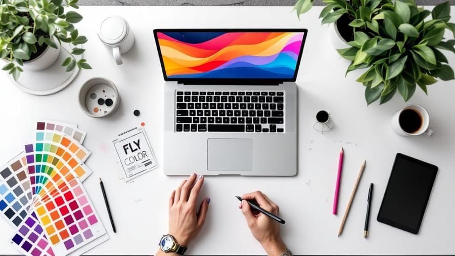
Great flyer design starts with strategy, not software. Set one clear goal, know your audience, and write a single message with a strong call to action. Build a visual hierarchy that guides the eye, pick two fonts at most, and use images at 300 DPI. Then export a press ready CMYK PDF with a 0.125 inch bleed. Follow that order and your flyer reads clearly and prints clean.
Watch it printed
See standard flyers on the press, in 140 seconds
Start from a template
Free flyer templates and the online designer
If you would rather adjust a layout than build one, start here. The blank templates are empty files already cut to the right trim, bleed and safe zone, so nothing shifts at the press. The online designer does the same job in your browser, with the guides drawn on screen while you work.
On this page
The nine steps, in order
- Step 1: Define one clear goal
- Step 2: Know exactly who you are talking to
- Step 3: Write a headline that stops people
- Step 4: Build a visual hierarchy that guides the eye
- Step 5: Choose colors that work together
- Step 6: Pick fonts that are readable, not just pretty
- Step 7: Use one strong image, not five weak ones
- Step 8: Write a call to action that drives action
- Step 9: Set up your file for print
Working on layout specifically? Jump straight to the flyer layout best practices checklist.
Why most flyers fail before they are printed
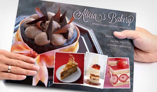
Most flyers end up in the trash, and that is rarely a design problem. It is a planning problem. A flyer that grabs attention and drives action starts with clear thinking long before you open any software. You need one goal, a defined audience, a single message, and a layout that puts the important things where eyes naturally land.
The steps below walk through every decision, from the first idea to a press ready file. If you have used the design templates before, you know how much faster a solid starting point makes the work. If you would rather build from scratch, the online designer gives you that control without professional software.
Let us build something people actually keep.
Step 1: Define one clear goal

Every flyer needs a single purpose. Are you driving foot traffic to a grand opening, promoting a thirty percent weekend sale, or recruiting volunteers for a community event? Pick one objective and build everything around it.
When you try to cram several messages onto one page, nothing stands out. A flyer that announces a sale, introduces new products, and shares your company history at the same time ends up saying nothing at all. One goal keeps the message focused and the design clean.
Here is the test. If someone glances at your flyer for three seconds, they should know exactly what you want them to do. If that is not obvious in three seconds, simplify.
Step 2: Know exactly who you are talking to
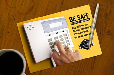
A flyer for college students at a music festival looks nothing like a flyer for corporate buyers at a trade show. Your audience sets the tone, the imagery, the colors, and even the paper you choose.
Ask what your audience cares about, what problem you solve for them, and where they will run into the flyer. In a coffee shop, at a checkout counter, or tucked under a windshield wiper? For more on getting printed pieces into the right hands, read our guide on how to make flyers.
Write down three things about your ideal reader before you design anything: their age range, their main concern, and where they will see the flyer. Those three details shape every choice that follows.
Step 3: Write a headline that stops people
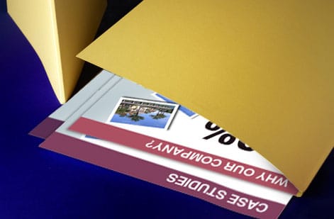
Your headline is the single most important piece of text on the flyer. It is the hook. If it does not grab attention, nothing else matters, because no one reads the body copy, notices the image, or follows the call to action.
Strong headlines are specific and benefit driven. A line like "50% Off All Haircuts This Saturday" beats "Come Visit Our Salon" every time. Numbers work. Deadlines work. Direct benefits work. Vague invitations do not.
Keep the headline under ten words and make it the largest text on the page. Test it out loud too. If it sounds boring when you say it, it will look boring on paper. Our how to fold a brochure guide covers visual hierarchy ideas that apply to flyers just as well.
Step 4: Build a visual hierarchy that guides the eye
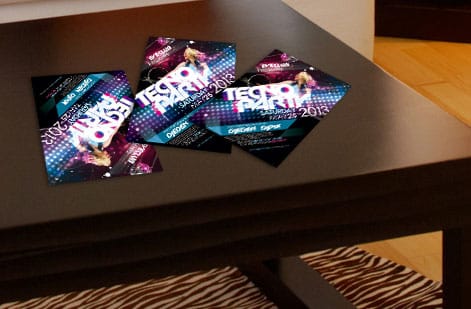
Visual hierarchy is how you control what people see first, second, and third. Without it, a flyer is just text and images fighting for attention.
Here is a simple order that works for most flyers:
- Headline. Largest text, top third of the flyer, visible at a glance.
- Supporting image or graphic. Reinforces the headline and draws the eye.
- Body copy. Two or three short sentences that explain the offer or the event details.
- Call to action. Bold, clear, and impossible to miss, such as Call Now or Scan This QR Code.
- Contact info and logo. Bottom of the flyer, smaller but still legible.
White space is your friend. You do not need to fill every inch. Breathing room between elements makes each piece easier to read, and generous margins look far more professional than a page packed edge to edge.
Flyer layout best practices
Everything about placement, in one checklist. Work through it in order and the layout resolves itself, because each rule constrains the next one.
- Start on a grid. Split the page into three columns and three rows, even if the finished design hides the grid entirely. Every element lands on a line or in a cell, which is what makes a layout look composed rather than assembled.
- Fix the reading order before the styling. Headline, image, body, call to action, contact details. Sketch that stack first, then style it. If the order only works once you have added color, the layout is not doing its job.
- Give the headline block the top third. Roughly a third of the page height, with the headline itself set at least three times the size of the body copy. Below that ratio the headline stops reading as a headline from arm's length.
- Set margins at 0.25 inch minimum, 0.5 inch if you can afford the space. Then keep every element inside that line. A margin that varies edge to edge is the single most common tell of a homemade flyer.
- Leave 30 to 40 percent of the page empty. Whitespace is not leftover space, it is the thing that makes the ink readable. If you cannot find that much, cut copy rather than shrinking type.
- Place the image where it points into the page. If the photo has a direction, a face looking left, an arrow, a road, aim it toward your text rather than off the edge. The eye follows what the image is doing.
- Respect the fold zones. If the flyer will be folded for mailing, mark the fold lines on your layout and keep headlines, logos and the call to action at least 0.25 inch clear of them. A crease through a phone number is permanent.
- Anchor the call to action low and left or low and center. That is where the eye finishes on a Western reading path. Give it a solid block of contrast so it survives being scanned rather than read.
- Check it at thumbnail size. Shrink the design to two inches tall. If the headline and the call to action still register, the hierarchy is working. If it turns into grey mush, go back to step three.
Print one at actual size before you order the run. A layout that looks balanced on a 27 inch monitor can read completely differently at 8.5 by 11 inches in your hand, and the paper version is the only one your reader will ever see.
Step 5: Choose colors that work together
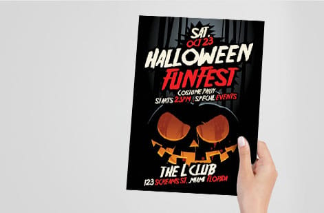
Color is not decoration. It is communication. Red creates urgency, blue builds trust, yellow grabs attention, and green signals health or nature. Pick two or three colors at most and use them consistently.
Your primary color should match your brand or the emotion of your message. A secondary color creates contrast, which matters most for the call to action. A third accent color can highlight details like dates or prices.
Contrast is non negotiable. Dark text on a light background, or the reverse, keeps the flyer readable. If someone has to squint, they stop reading. Print a small proof before committing to a full run. For another project that leans on strong color choices, see our guide on how to make custom magnets.
Step 6: Pick fonts that are readable, not just pretty
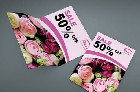
Typography makes or breaks a flyer. A few rules matter more than the rest:
- Use two fonts at most. One for headlines, which can be bold or decorative, and one clean font for body text.
- Keep body text at 10pt or larger. Anything smaller and you lose readers.
- Set headlines at 24pt or larger. They need to read from a few feet away.
- Avoid all caps in body copy. It is harder to read and feels like shouting.
- Reach for sans serif fonts like Helvetica, Open Sans, or Montserrat for clean, modern flyers.
Decorative or script fonts can work for a headline when they match your brand personality, but never use them for body copy. Readability wins over style. If you are also designing printed stationery, our how to make envelopes guide has type tips that carry straight over to flyers.
Use this quick reference to size each part of the layout:
| Element | Recommended size | Key consideration |
|---|---|---|
| Main headline | 36pt and up | The largest text on the page, built to grab attention. |
| Subheadings | 18 to 24pt | Clearly smaller than the headline. |
| Body text | 10 to 14pt | Readability first. Never go under 10pt. |
| Contact info | 8 to 10pt | Can be smaller, but must stay legible. |
| Line spacing | 120 to 150 percent of the font size | Gives the text room to breathe. |
Step 7: Use one strong image, not five weak ones
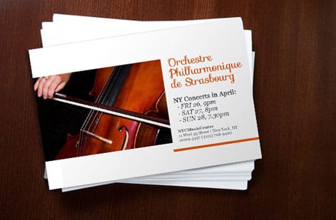
A single high quality image beats a collage of mediocre photos every time. The image should reinforce your headline and connect with your audience on an emotional level.
Use images at 300 DPI or higher for print. Anything pulled from a website at 72 DPI turns blurry and pixelated on paper. Stock photos can work when they feel authentic, so skip the obviously staged handshake shots. Real photos of your product, your space, or your team are even better.
If you do not have strong photography, bold graphics, patterns, or illustrations can carry the design instead. A well built graphic flyer often outperforms a photo based one when the photos are not good enough.
Step 8: Write a call to action that drives action
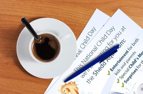
Your call to action tells people what to do next. Make it specific, urgent, and easy to follow.
A weak call to action reads Learn More. A strong one reads Text DEAL to 55555 for 20% Off. The best ones pair a verb, a benefit, and a deadline. A line like Reserve Your Spot by Friday is clear and creates urgency, while Visit Our Website is vague and forgettable. Add a QR code when you can, since it removes the friction between seeing the flyer and acting on it.
For print design guidance across other formats, the guide hub covers everything from business cards to banners.
Step 9: Set up your file for print
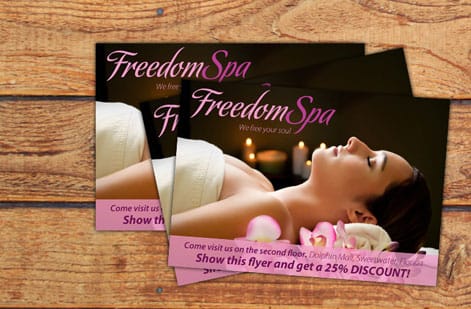
This is where many do it yourself designers stumble. A digital design needs specific settings to print correctly:
- Color mode. Use CMYK, not RGB. RGB is for screens and colors shift when you send it to press.
- Resolution. 300 DPI minimum keeps text crisp and images sharp.
- Bleed. Add 0.125 inch of bleed on all sides so trimming never leaves a white edge.
- Safe zone. Keep important text and logos at least 0.125 inch inside the trim line.
- File format. Export a press ready PDF with fonts embedded or outlined.
Do not skip the bleed. It is the most common setup mistake and the easiest to avoid. Download blank templates from 4OVER4.COM with bleed and safe zones already built in, including circle flyer templates and club flyer templates. Prefer a head start on the artwork? Ready made layouts like the Open House Flyer and Listing Flyer drop your details into a proven grid, and coordinating business card designs such as Ambitious Execution and Time-saving Quality keep your brand consistent.
If you also work with specialty print items alongside flyers, our guide on how to clean rubber stamps covers upkeep for another popular branding tool.
Making a flyer in Word, Google Docs or on your phone, and getting it to press
Plenty of flyers start in whatever program is already open, and that is fine as long as the export step is handled. Each tool has one habit to work around.
- Microsoft Word: set the page to a custom size of 8.75 by 11.25 inches under Layout, then Size, so the extra 0.125 inch on each edge becomes your bleed, and pull the margins in to 0.375 inch so text stays inside the safe zone. Save As PDF, not Print to PDF, so images keep their resolution. The steps are laid out in converting a Word document to a print-ready PDF.
- Google Docs: File, then Page setup, lets you set the size and margins, and File, then Download, then PDF, exports it. Docs has no bleed setting and no CMYK, so keep backgrounds white or let the printer trim a hair short of the color.
- A phone: the online designer runs in a phone browser and draws the trim, bleed and safe lines on screen, which is the shortcut past every setting above. Canva's app exports a PDF Print with crop marks and bleed switched on in the download panel.
Whichever tool made it, the file that reaches the press is the same: a PDF at 300 DPI with fonts embedded, 0.125 inch of bleed and nothing important inside the outer 0.25 inch. The standard flyers configurator accepts that PDF straight from any of the three, and the free file check flags a missing bleed before it prints.
Flyer design mistakes that kill your response rate
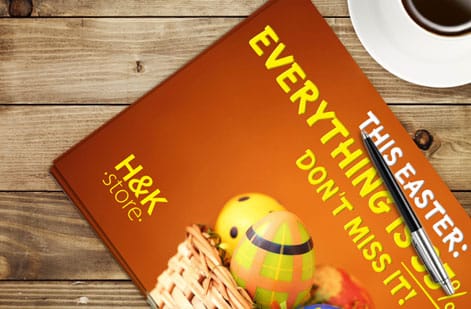
Even solid designs fall apart when common errors sneak in. These are the mistakes we see most often, along with how to dodge them:
- Too many messages on one flyer. One goal, one message, one call to action. Anything more creates confusion and drops response. Breaks the reading order rule, step 2 of the layout best practices.
- Low resolution images. If a photo looks fine on screen but fuzzy on paper, it is below 300 DPI. Check before you print. Breaks image placement, step 6 of the layout best practices.
- No bleed or wrong margins. Skipping the 0.125 inch bleed leaves white edges after trimming. Templates with built in bleed remove the risk. Breaks the margin rule, step 4 of the layout best practices.
- Tiny or unreadable text. Body copy under 10pt is a gamble, and headlines under 24pt will not catch attention from a distance. Breaks the headline block ratio, step 3 of the layout best practices.
- Designing in RGB instead of CMYK. A bright neon on screen can print as a muddy olive. Work in CMYK for print. Breaks the print at actual size check that closes the layout best practices.
- A weak or missing call to action. If the flyer does not tell people what to do next, they do nothing. Be specific and direct. Breaks the call to action placement rule, step 8 of the layout best practices.
- A cluttered layout with no white space. Give the design room to breathe. Cramped flyers look unprofessional and overwhelm readers. Breaks the 30 to 40 percent whitespace rule, step 5 of the layout best practices.
Avoiding these puts you ahead of most do it yourself flyer designers. The businesses that print with 4OVER4.COM learn that clean, focused design beats a busy, overloaded layout every time.
Choosing the right flyer format and stock
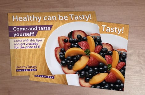
Once the design is ready, the format you print on makes a real difference. 4OVER4.COM prints Business Flyers, Circle Flyers, and Club Flyers, each suited to a different use and audience. Standard rectangular flyers fit a real estate open house, while die cut circle flyers stand out at a creative brand launch.
If the campaign needs more room, custom booklets let you expand the message beyond a single sheet. Flyers print on 60 plus paper types with several finish options, so the piece feels as good as it looks. Gloss adds a shiny coating that makes photos pop, while matte stays smooth and easy to read under bright light.
Wally explains flyer design
One goal, one message, one call to action
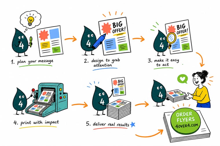
Wally treats a flyer like a three second pitch. One clear goal, one bold headline, one strong image, and one call to action the reader cannot miss. Get the hierarchy right, keep the file in CMYK at 300 DPI with a 0.125 inch bleed, and the print comes back sharp. When the design is set, 4OVER4 prints it on your choice of 60 plus paper types.
Order custom flyers →Specs and pricing
Custom flyer specs and pricing
When the design is ready, here is what a fresh flyer order gives you at 4OVER4.COM, with live specs and price per unit straight from the configurator.

| Quantity | Price Per Unit | Total |
|---|---|---|
| 50 | 79.1¢ | $39.54 |
| 100 | 57.1¢ | $57.11 |
| 200 | 37.3¢ | $74.69 |
| 300 | 28.6¢ | $85.68 |
| 400 | 24.4¢ | $97.76 |
| 500 | 21.8¢ | $108.75 |
| 600 | 18.7¢ | $112.03 |
| 700 | 16.5¢ | $115.33 |
Print it
Order flyers and marketing print at 4OVER4
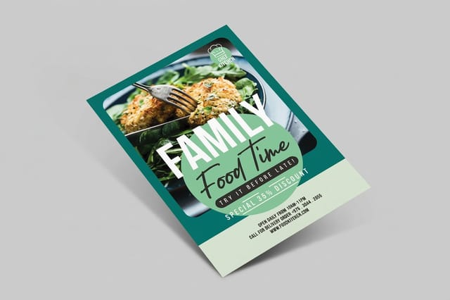

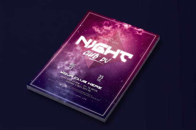
See it in use
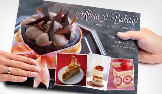
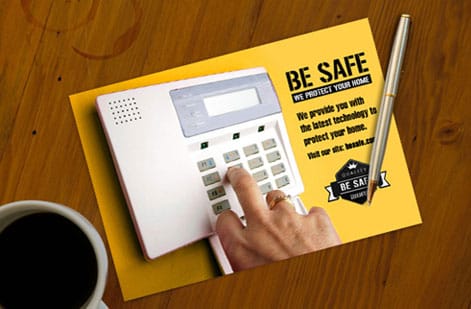
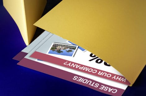
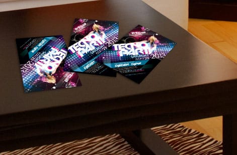
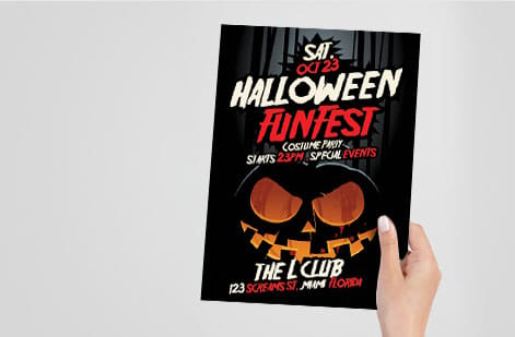
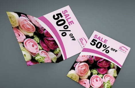
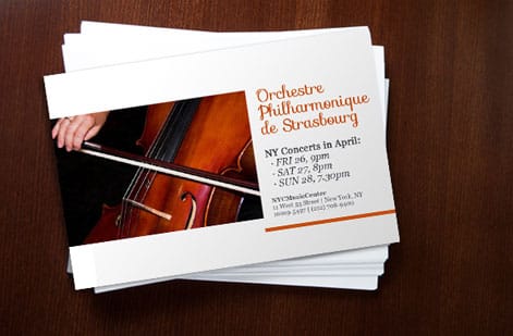
Flyer designs customers printed for response

Explore more
Where to go next



By the numbers
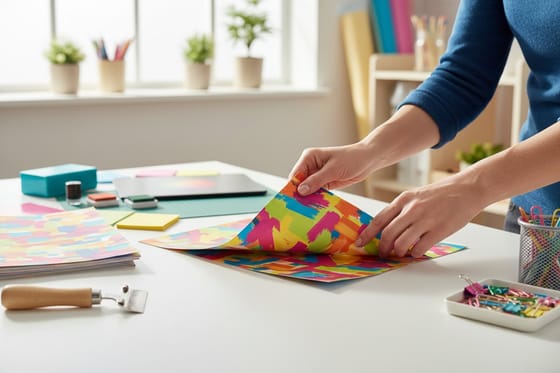
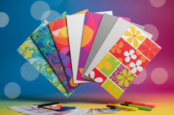
Flyer paper types and the record behind a response run
Common Questions
Common questions about designing flyers
What is the easiest way to create a flyer?
Start from a template that already has the size, bleed and safe zone set, and change only the words and the picture. The online designer at 4OVER4.COM does that in a browser with the guides drawn on screen, and the blank templates do the same for Photoshop or Canva. You still make the three decisions that matter, one goal, one headline and one call to action, but the file setup is done for you.
Can ChatGPT create flyers?
It can write the flyer, not print it. Ask it for a headline under ten words, two lines of body copy and a call to action with a deadline, and you get usable text in seconds. The layout, the 300 DPI image, the CMYK color and the bleed still have to be built in a design tool, so paste the words into a template and export a press-ready PDF from there.
What file format should I use when submitting a flyer for printing?
Export your flyer as a press ready PDF with all fonts embedded or converted to outlines. Use CMYK color mode at 300 DPI and add 0.125 inch of bleed on all sides. 4OVER4.COM also accepts AI, PSD, and EPS files, but PDF is the safest option for consistent results across design programs.
How do I choose the right paper stock for my flyers?
It depends on the use. Thinner stocks like 100lb gloss text suit high volume handouts at events. Thicker stocks like 14pt or 16pt cardstock feel premium and hold up better in display racks. 4OVER4.COM offers 60 plus paper types, so you can match the weight and finish to the job.
Can I design flyers without professional software?
Yes. The 4OVER4.COM online designer lets you build flyers in your browser with drag and drop tools, and you can start from a pre built template. Free tools like Canva work too, as long as you export at 300 DPI in CMYK with proper bleed before you upload the file.
What is the difference between matte and gloss finish on flyers?
Gloss adds a shiny, reflective coating that makes colors pop, which suits photo heavy flyers. Matte has a smooth, non reflective surface that reads easily under bright light and feels more upscale. Both protect against fingerprints and minor scuffing.
How many fonts should I use on a flyer?
Two at most. Use one bold or decorative font for the headline and one clean, readable font for body text. More than two creates visual chaos and looks unprofessional, while consistent typography signals credibility.
What size flyer works best for most promotions?
The standard 8.5 by 11 inch size is the most versatile, since it fits standard racks and is easy to hand out. For nightclub or music promotions, 4.25 by 5.5 inch club flyers are popular because they are pocket sized, and circle flyers stand out anywhere thanks to their shape.
Get Started
Ready to print your flyers?
Pick your size and stock, drop in your design, and we print sharp, press ready flyers that get read and get results.
Legal Disclaimer
Gold Standard guarantees apply to all standard orders placed through 4over4.com. Price match requires verifiable proof of a competitor's published price for an equivalent product with matching specifications and turnaround time. Satisfaction guarantee covers manufacturing defects and print quality issues. Contact support with order number and documentation. On-time delivery rate based on tracked orders 1999 to 2026. Individual results may vary based on shipping carrier performance.
