Content Hub
Stories, Ideas and Advice — Page 88
 story
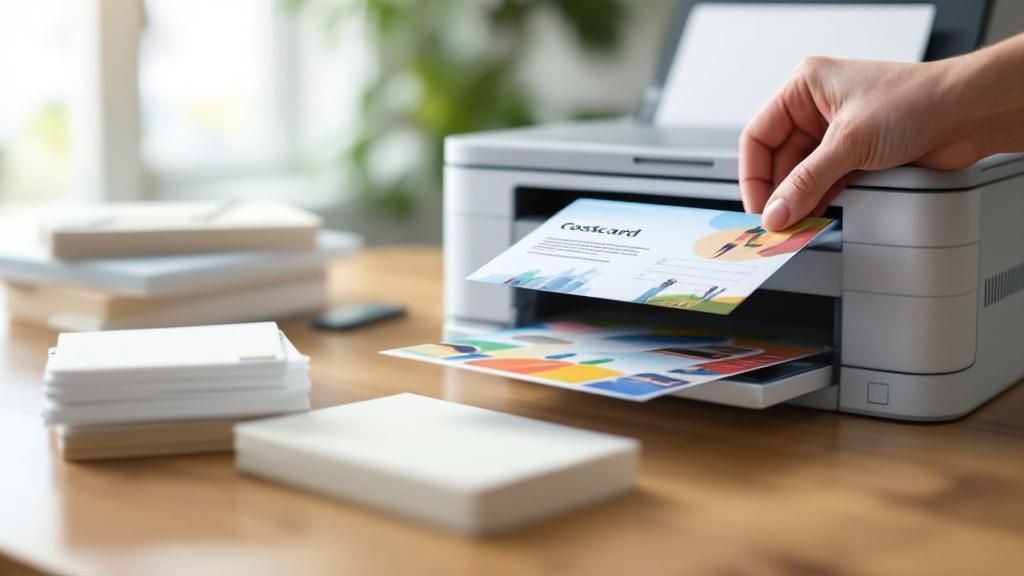
story Master Postcard Printing and Mailing for Effective Campaigns
Look, before you even think about firing up a printer or talking to a mail house, you need a solid game plan. A pretty postcard is useless without a strategy. The campaigns that actually make money are the ones built on a clear goal, a specific audience, and an offer that’s too good to ignore. Getting this stuff right upfront is what separates a killer campaign from a pile of expensive junk mail. Building Your Postcard Campaign Strategy Before a single postcard gets printed, the real work happens. A winning campaign is built on a strong foundation, and this strategic planning is what keeps you from wasting a ton of money. Your goal is to move beyond just blasting a message out there. You want to create a focused effort that you can actually measure. Define Your Primary Goal First things first: what do you actually want people to do when they get your postcard? A vague goal like "increasing brand awareness" is nearly impossible to track and leads to a muddled design. You need something concrete. Instead, get specific with a goal you can measure: Drive Online Sales: Maybe you want to push people to a special landing page. You can track this with a unique URL or a QR code. A solid goal here would be, "achieve a 2% conversion rate from everyone who gets this postcard." Generate Foot Traffic: The goal could be to get people into your physical store. A local cafe, for instance, might aim to "bring in 100 new customers using the postcard coupon." Boost Brand Recall: This is great for announcing a new service or location. A dentist opening a new office or a real estate agent farming a neighborhood would use this approach. Identify Your Ideal Audience Sending your postcard to everyone is a surefire way to get a terrible return on your investment. You have to be precise. Who is your ideal customer? Are they homeowners in a specific zip code? Parents with young kids? People with a certain household income? A high-end landscaping company, for example, isn't going to waste money mailing to apartment dwellers. They'll zero in on single-family homes in affluent neighborhoods where their services are a perfect fit. The more you know about your audience, the better you can tailor your message to them. A well-defined audience ensures your message connects instead of getting tossed in the recycling bin. It's the difference between speaking directly to a potential customer and just shouting into a crowd. Craft an Irresistible Offer Your offer is the engine of your campaign. It's the hook that gets people to take action. Even the most stunning postcard design will flop if the offer is weak. It needs to be valuable, simple, and easy to claim. To really nail this, you should explore proven ways to generate leads with direct mail advertising . Here are a few classic offer types that just work: A straight discount: " Save 25% on your first order." A freebie: "Get a free appetizer with any entree purchase." A specific dollar amount off: " $50 off your next service call." The secret sauce is adding a sense of urgency. A clear expiration date, like "Offer expires October 31st," pushes people to act now instead of letting the postcard get lost in a pile of mail. This kind of planning is the bedrock of any successful postcard printing and mailing effort. Designing a Postcard That Demands Attention Think about your own mailbox. It's usually a cluttered mix of bills, catalogs, and junk mail. Your postcard has maybe three seconds to avoid the recycling bin. That's it. A killer design is what makes someone pause, flip it over, and actually read it. This isn't about just looking nice; it's about crafting a message that's clear, persuasive, and gets people to act. Start with Striking Visuals Your first and best shot at grabbing attention is with the visuals. This is where utilizing high-quality imagery makes all the difference. Generic stock photos feel cheap and impersonal, and they'll water down your brand's impact instantly. If you can, always go for custom photography that tells a story or shows off your product authentically. The main image is the hero of your postcard. If you're a restaurant, make it a vibrant, mouth-watering photo of your signature dish. A real estate agent? A stunning twilight shot of a new listing will work wonders. The goal is to spark an emotional reaction and convey value before a single word is even read. Grab Them with a Bold Headline Once the image has done its job, the headline needs to land the punch. Keep it short, direct, and focused on the benefit to the reader. This isn't the time to be clever or vague—just get straight to the point. Here are a few headline angles that work well: The Can't-Miss Offer: " 50% Off All Fall Jackets This Weekend Only!" The Problem-Solving Question: "Tired of Mowing Your Lawn Every Saturday?" The Desired Outcome: "Get Your Dream Kitchen in Just Two Weeks." Your headline should be one of the most visible things on the card, working hand-in-hand with the main image to create a combo that's impossible to ignore. Don't underestimate the power of physical mail. Research shows that 73% of people actually prefer getting brand communications via direct mail because it feels more personal than an email. This preference shows in the results, too. Postcards boast a response rate of around 4.4% , which crushes email's tiny 0.12% . It's no wonder that 84% of marketers say direct mail delivers the best ROI of all their channels. Drive Action with a Clear CTA Everything on your postcard—the image, the headline, the colors—should funnel the reader toward one specific action. Your call-to-action (CTA) is where this all comes together. It has to be impossible to miss and simple to follow. Don't make people guess what to do next. Your CTA needs to be a direct instruction, like "Scan to Order Now" or "Visit Our Showroom Today." If they have to think about it, you've already lost them. Make your CTA pop off the card by using a contrasting color. Putting it inside a box or a button shape helps it stand out from the other design elements. I also recommend adding a little urgency to nudge people into action. Phrases like "Offer Ends Friday" or "Limited Spots Available" work great. Nailing the balance between these three things—powerful visuals, a bold headline, and a crystal-clear CTA—is the key to a great postcard. When you get it right, your piece isn't just another ad; it becomes a powerful driver for your entire postcard printing and mailing campaign, bringing in leads and boosting your bottom line. Getting the Print Specs and Paper Just Right That jump from a perfect design on your screen to a physical postcard in someone's hands? That's where a lot of great ideas fall flat. The technical side of printing can feel a bit overwhelming, but nailing just a few key details is what separates an amateur-looking mailer from a professional one that truly represents your brand. First up, let's talk color. Your design software, whether it's Canva or something from the Adobe suite, probably defaults to RGB (Red, Green, Blue). That’s great for screens, but professional printers run on CMYK (Cyan, Magenta, Yellow, Black). If you don't design in CMYK from the start, you're in for a nasty surprise—that vibrant red you loved on screen might print as a muddy maroon. It’s a simple switch, but it's non-negotiable for getting the colors you actually expect. Mastering the Technical Details Beyond color, the sharpness of your images is everything. The magic number here is 300 DPI (dots per inch). Anything less, and you're heading straight for blurry, pixelated graphics that scream unprofessional. Always, always use high-resolution photos and logos to keep your design looking crisp. Another term you'll hear a lot is bleed . Think of it as a safety margin. It's a little bit of extra design that extends past the actual trim line of the postcard. Without it, even a tiny shift when the printer's blade comes down can leave a weird, unplanned white sliver along the edge. The standard bleed is 0.125 inches on all sides, and it’s the secret to getting that clean, edge-to-edge professional look. The whole process, from that initial digital file to the finished product, really hinges on getting these specs right from the get-go. It’s these small technical details that make a huge difference in the final quality. And this isn't just a niche concern; it's part of a massive global industry. The printing world is projected to hit around $960 billion , growing at a steady clip of about 2.5% annually. What’s really changing the game is digital printing, which now accounts for more than half the market and allows for the quick turnarounds that make postcard campaigns so effective. You can dig into more of these printing industry statistics over at WTPBiz.com. Choosing the Right Paper Stock The paper you pick is a huge part of your message. It's the first thing your audience will touch, and its weight and texture instantly create an impression. You'll often see thickness measured in points (pt). Don't underestimate the feel of the paper. A thick, well-finished postcard creates a tangible connection and can leave a much stronger impression than a flimsy one. It's a subtle but powerful part of your marketing. Here are the two most common choices you'll run into: 14 pt. Cardstock: This is the workhorse of the postcard world. It's sturdy, feels professional, holds up great in the mail, and won't break the bank. A solid, reliable choice for almost any campaign. 16 pt. Cardstock: A step up in quality. This stock has a more premium, rigid feel that adds a sense of substance and durability. If you want your brand to feel a bit more high-end, this is the way to go. To help you decide, here's a quick look at some of the most popular paper stocks and what they're best used for. Common Postcard Paper Stock Comparison Paper Stock Typical Thickness Finish Options Best For 14 pt. Cardstock 0.014 inches Glossy, Matte, Uncoated All-purpose marketing, event invites, and high-volume mailings. 16 pt. Cardstock 0.016 inches Glossy, Matte, Silk Premium branding, luxury promotions, and pieces meant to feel substantial. 100 lb. Cover 0.010 inches Glossy, Matte Lighter-weight option for budget-friendly mailers or inserts. Recycled Paper Varies (e.g., 13 pt.) Matte, Uncoated Eco-conscious brands looking to highlight their commitment to sustainability. Choosing the right paper is about matching the physical feel to your brand's personality. The finish is the final piece of the puzzle. A glossy finish is your go-to for vibrant, photo-heavy designs—it makes colors pop and grabs attention instantly. On the other hand, a matte finish offers a smooth, non-reflective surface that feels elegant and modern. It’s also much easier to write on, which is a huge plus if you plan on adding a handwritten note. Getting the paper and finish right ensures your postcard feels just as good as it looks. Playing by the USPS Rulebook for a Smooth Mail Drop You've designed a killer postcard and got a stack of them fresh from the printer. Now comes the crucial part: getting them into mailboxes without a hitch. This is where knowing your way around the USPS regulations can save you a world of headaches—and money. Navigating postal rules might sound intimidating, but it's really just about understanding a few key requirements. Get these right, and you'll avoid returned mail, surprise fees, and delays that could derail your whole campaign. First things first, let's talk size. To qualify for those super-low postcard postage rates, your mailer has to fit within a very specific dimensional window. Height: Between 3.5 inches and 4.25 inches . Length: Between 5 inches and 6 inches . Thickness: Between 0.007 inches and 0.016 inches . Even a tiny bit over or under, and you’ll find yourself paying for a letter instead. That might not sound like much, but when you're mailing hundreds or thousands of pieces, that cost difference adds up fast. First-Class vs. Marketing Mail: Speed or Savings? With your postcard’s size locked in, your next big decision is choosing the right mailing service. The two main players are First-Class Mail and USPS Marketing Mail (which you might remember as Standard Mail). The choice really boils down to how quickly you need your postcards to arrive versus how much you want to spend. First-Class Mail is your go-to for speed and reliability. You can count on delivery within 1-5 business days anywhere in the country. It also comes with a huge perk: forwarding and return services are included at no extra cost. This is fantastic for keeping your mailing list clean, as you'll know exactly which addresses are no longer valid. On the other hand, USPS Marketing Mail is the workhorse for budget-conscious campaigns. It’s slower, with delivery taking anywhere from 3 to 10 business days or sometimes longer, and it doesn't include those free forwarding and return services. But the postage savings can be massive, making it the clear winner for large-scale promotions where timing isn’t mission-critical. Honestly, the right choice completely depends on your campaign. For a time-sensitive sale or event invitation, you need the peace of mind that First-Class provides. But for a general "get our name out there" campaign, the savings from Marketing Mail let you stretch your budget to reach way more people. Getting the Address and Postage Right The layout of your postcard's address side is non-negotiable if you want it to fly through the USPS automated sorting machines. The rule is simple: the entire right half of the postcard's back is reserved for the delivery address, postage, and postal barcodes. Think of an invisible line splitting the back of your card in two. All of your great design, your compelling message, and your branding? It all has to stay on the left side. Keep the right side clear for the USPS. And make sure the delivery address is printed parallel to the longest edge of the postcard, with nothing crowding it. Don't Have a List? Try EDDM What if you want to blanket a whole neighborhood but don't have a mailing list? That’s exactly what Every Door Direct Mail (EDDM) was made for. EDDM is a brilliant USPS program that lets you hit every single mailbox on a specific mail carrier's route, no names or addresses required. It's a total game-changer for local businesses—think restaurants, real estate agents, or a new coffee shop—that need to make a big splash in their immediate area. You just hop on the USPS website, pick the routes you want to target, and they handle the rest. It's an incredibly effective and affordable way to guarantee you reach every potential customer in the neighborhoods that matter most. Getting these USPS rules down is what makes your postcard printing and mailing effort a true success. Choosing the Right Partner to Print and Mail Your Postcards You’ve designed the perfect postcard. Now comes the moment of truth: choosing the partner who will bring it to life and get it into mailboxes. This isn’t a decision to take lightly. Your vendor directly impacts your budget, your timeline, and the quality of the final product. Generally, you have three paths you can go down: the local print shop, a big online printer, or a full-service direct mail agency. There's no one-size-fits-all answer here. The best choice really boils down to your specific campaign needs, budget, and how hands-on you want to be. Comparing Your Vendor Options Let's break down what you can expect from each type of partner. A local print shop offers a personal touch you just can't get online. You can walk in, talk to a real person, physically touch paper samples, and get expert advice on your project. This is a fantastic option if you're new to the printing world and want some guidance, but that personalized service often comes with a higher price tag and potentially longer turnaround times. Large online printers are the polar opposite. They are machines of efficiency, built for speed and volume, which usually means lower costs. Their websites make it incredibly easy to upload your design and place an order, sometimes with next-day printing. The catch? You’re on your own. They expect a technically perfect, print-ready file, and customer support can be limited. Then you have the full-service direct mail agency . These guys do it all. From helping you source a mailing list to design, printing, and managing the entire postcard printing and mailing process, they are your one-stop shop. It's the most hands-off and hassle-free route, but it's also the most expensive. This is typically the best fit for larger, more complex campaigns where you need an expert team managing every detail. The postcard market itself is surprisingly healthy. Valued at $2.38 billion in 2021, it's projected to climb to $2.78 billion , proving that this classic marketing tool is here to stay. You can dig into the numbers and find out about the postcard market's trajectory on cognitivemarketresearch.com . Essential Questions to Ask Any Potential Partner Before you sign on the dotted line, you need to vet any potential vendor. A few smart questions upfront can save you a world of headaches later. Their answers will tell you everything you need to know about their process, expertise, and whether they're a good match for your project. A great partner does more than just print; they act as a safety net, catching potential issues before they become costly mistakes. Asking detailed questions upfront is the best way to gauge their expertise and commitment to quality. Here are the non-negotiables you should ask about: Proofing Process: How will you see a proof before the full run? Is it just a digital PDF, or can you get a physical hard-copy to approve the colors and feel of the paper? A hard-copy proof is always better for color-critical projects. Mailing List Capabilities: Can they handle your mailing list file? More importantly, do they offer data services like CASS certification to clean up your list, standardize addresses, and ensure you get the best postage rates? Data Security: How are they going to protect your customer data? This is incredibly important, especially if your list contains any sensitive information. You need to know their security protocols. Getting solid, confident answers to these questions will help you pick a partner who not only meets your budget but also helps ensure your campaign is a success from start to finish. Answering Your Postcard Marketing Questions Even the most seasoned marketer has questions when a new postcard campaign is on the horizon. Getting the details right before you print and mail can be the difference between a campaign that flops and one that flies. Let's walk through some of the most common questions I hear from clients. What’s the Most Cost-Effective Postcard Size? This is usually the first thing people ask, and for good reason. If you're purely looking at the numbers, the 4" x 6" postcard is your most budget-friendly option. It costs less to print because we can fit more of them onto a single press sheet, and it qualifies for the lowest USPS First-Class postage rate. It's a solid choice for mass mailings where keeping the cost-per-piece down is the top priority. But cheaper isn't always better. Think about your own mailbox—a small 4" x 6" piece can easily get overlooked. If you want to make a bigger impact or need more real estate for a compelling photo or message, upgrading to a 5" x 7" or a 5.5" x 8.5" is a smart move. That extra space can give your design the breathing room it needs to truly stand out. What About Print Quality and Paper? The look and feel of your postcard say a lot about your brand. People often ask for the thickest, most premium paper stock, which is typically a 16 pt. cardstock . It has a satisfying, sturdy feel that immediately signals quality and professionalism. The finish you choose is just as important, especially if you plan on adding a personal touch. Uncoated or Matte: Go with one of these if you need to write on the postcards. The surface is porous and perfect for a handwritten note or signature. Glossy or High-Gloss UV: These are fantastic for making your colors vibrant and protecting the card during transit. Just know that they are virtually impossible to write on with a standard pen. Your postcard’s texture is part of the experience. A flimsy card feels cheap, but a substantial one feels important. Don't underestimate the power of touch. Do I Have to Mail Everything Myself? Absolutely not! This is a huge one. Managing a mailing of hundreds or thousands of pieces is a logistical nightmare you don't need. Most professional printers, including us, offer direct mail services that handle everything. It's a surprisingly simple process. You give us your design file and your mailing list—usually as an Excel (XLS, XLSX) or CSV file—and we take it from there. We handle the addressing, sorting for postal discounts, and delivering everything to the USPS. This integrated postcard printing and mailing service frees you up to focus on what really matters: tracking the response to your campaign. Ready to launch a postcard campaign that gets results? 4OVER4 offers a full range of printing and mailing services to bring your vision to life, with premium paper stocks and expert support. Start your next project with us today!
 story
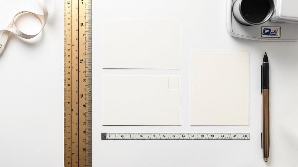
story Your Guide to Postcard Size for Mailing
To get the absolute best postage rate from the USPS, your postcard has a very specific set of rules to follow. It needs to be rectangular and, more importantly, it has to fit within a tight size window. The smallest it can be is 3.5 inches high by 5 inches long , and it can’t be any bigger than 4.25 inches high by 6 inches long . Honestly, nailing these dimensions is the single most important thing you can do to keep your postage costs down. Decoding USPS Postcard Requirements Think of the USPS postcard rules like the sizer bin for carry-on luggage at the airport. If your bag fits, you’re good to go at the standard price. If it’s too big, you’re forced to check it—and the price jumps. It’s the exact same idea with mail. Sticking to the official postcard size means you lock in that low First-Class Mail postcard rate. If your mailpiece is even a fraction of an inch over the maximum size, it’s no longer a postcard in the eyes of the USPS. It gets bumped up to the "letter" category, and you'll be charged a higher postage fee. This small mistake can nearly double your mailing budget, quickly turning an affordable campaign into an expensive headache. The Official Dimensions at a Glance To make sure there's no confusion, let's break down the exact numbers. The USPS has a few key measurements you need to hit to qualify for that coveted postcard rate. These rules aren't just about your design; they're about the physical piece of paper itself. Here’s a quick summary of what the USPS requires for a mailpiece to be considered a First-Class postcard. | USPS First-Class Postcard Requirements | | :--- | :--- | :--- | | Dimension | Minimum | Maximum | | Height | 3.5 inches | 4.25 inches | | Length | 5.0 inches | 6.0 inches | | Thickness | 0.007 inches | 0.016 inches | That last one—thickness—is just as critical as the height and length. A card that’s too flimsy (less than 0.007 inches ) or too stiff (more than 0.016 inches ) can get rejected or up-charged because it can easily jam the high-speed sorting machines. Why Postal Rules Exist in the First Place Ever looked at a postcard and wondered why those specific dimensions matter so much? It’s not some random rule. The reason goes back more than a century, to a time when global mail was an absolute mess. Before automated sorting machines, sending anything internationally was a gamble. Different countries, different rules, different sizes, different rates. It was pure chaos. Imagine the headache of trying to send a simple postcard from Paris to Peoria when every postal system operated in its own little bubble. This frustrating reality is what led to the creation of the Universal Postal Union (UPU) back in 1874 . Its mission was to untangle that web and create a unified set of rules for the whole world. By creating a common framework, the UPU made international mail possible on a reliable scale. This foundational agreement paved the way for the standardized systems we rely on today. From Global Agreements to Your Mailbox The UPU's early work set the stage for standards we now take for granted, like a common postcard size that made sending mail across borders a breeze. Before this, postcard dimensions were all over the map, making any kind of efficient handling—even by hand—a logistical nightmare. You can actually dive deeper into this with the history of postcard regulations from the Smithsonian Institution . Those early agreements are the direct ancestors of the USPS regulations we follow today. Modern mail processing centers are incredible feats of automation, capable of sorting thousands of pieces per hour . But those machines are finely tuned to handle specific sizes. If your postcard is too big, too small, or too flimsy, it gums up the works. That’s exactly why sticking to the rules is so important. It ensures your postcard sails smoothly through the system, which helps keep postage costs down for everyone. For marketers, getting this right is crucial for a successful campaign. When your mailpiece fits the spec, you know it’s going to get delivered efficiently—a key principle behind services like those in our guide to Every Door Direct Mail . How Postcard Size Impacts Your Mailing Costs The connection between your postcard's size and how much you pay for postage is direct and, frankly, unforgiving. Think of it like checking a bag at the airport—if your luggage is just a little overweight, the fee skyrockets. The same rule applies here. A postcard that's just a fraction of an inch too big or too thick can get bumped from the cheap postcard rate into the much pricier tier for letters. This isn't some new rule, either. The link between a postcard's size and its mailing cost goes all the way back to the 19th century. After the U.S. government issued its first official postal card in 1873 for a single penny, the Private Mailing Card Act of 1898 let private printers get in on the action at the same low rate—but only if they stuck to strict size regulations. Understanding Mail Classes And Price Tiers The USPS sorts mail into different classes, and each one comes with its own speed, features, and price tag. It's your postcard's dimensions that ultimately decide which class it belongs to. First-Class Mail Postcard Rate: This is your golden ticket, the most affordable way to send a postcard. To qualify, your mailer has to meet very specific size and thickness rules. In return, you get quick delivery, usually within 1-5 business days . First-Class Mail Letter Rate: If your postcard is too big for the postcard category, it automatically gets reclassified as a letter. This isn't a small jump; you're looking at a postage increase of 30% or more for every single piece you send. The key takeaway here is simple: Sticking to the official postcard dimensions is the single best thing you can do to keep your campaign budget in check. A tiny measurement mistake can completely wipe out your profit margin on a large mailing. For any business planning a direct mail campaign, getting these details right is absolutely critical. This is where professional printing and mailing partners can be a lifesaver, helping you navigate the rules to make sure your project is both effective and affordable. When you're ready to get started, exploring professional https://www.4over4.com/printing/category/direct-mail-services can save you from making some very expensive mistakes. And if you really want to become an expert on all things direct mail, including how different dimensions can make or break your budget, resources like the Direct Mail Academy are invaluable. Knowing these rules isn't just trivia—it's the foundation of a successful and cost-effective direct mail strategy. Choosing the Right Postcard Dimensions for Your Goal Picking the perfect postcard size isn't just about saving a few bucks on postage—it’s a strategic move that can make or break your campaign's impact. The first question to ask yourself is: what am I trying to achieve? Your goal is what should drive your dimensions. Are you blasting out a simple offer to the masses? Or are you trying to wow a smaller, niche audience with incredible visuals? The answer to that question will tell you whether to stick with a standard, budget-friendly size or go big with something that commands attention. The classic 4x6 inch postcard is the undisputed workhorse of direct mail. It's cheap to print, qualifies for the lowest postcard postage rate, and is absolutely perfect for high-volume campaigns with a clean, simple message. Think of a local pizzeria announcing a weekly special or a dentist sending out appointment reminders. The name of the game is efficiency and reach. On the flip side, you have the larger formats like 6x9 or 6x11 inches . These are often called "jumbo" postcards, and they are designed to make a statement. Sure, they cost more to mail because the USPS classifies them as letters, but the impact they deliver is hard to ignore. All that extra real estate is a game-changer for visually driven businesses. Matching Size to Your Marketing Mission Let's look at a few real-world examples of how size and strategy go hand-in-hand: Real Estate Agents: A jumbo 6x9 inch postcard is practically a necessity. It gives you the space to show off high-quality photos of a property, which instantly signals value and professionalism. Trying to cram those beautiful shots onto a smaller card just feels cheap and undersells the listing. Retail Store Grand Opening: A bold 5x7 inch card hits that sweet spot. It offers more creative breathing room than the standard 4x6 , letting you use eye-catching graphics and a can't-miss call-to-action without blowing up your budget. Mass Discount Offer: For a local coffee shop sending a straightforward " 50% off " coupon, the 4x6 inch size is the smartest play. It lets them reach thousands of households for the lowest possible cost per piece. This graphic really puts into perspective how your mailing costs scale with different postcard dimensions. As you can see, that jump from a standard postcard to a jumbo size more than doubles your postage cost—a huge factor to consider when you're planning your budget. Exploring different custom postcard printing options can help you find that perfect balance between making an impact and keeping your campaign affordable. Designing a Mail-Ready Postcard Picking the right postcard size is a great start, but even a perfectly sized card can get rejected by the post office if the design ignores their rules. Think about it: the modern mail system runs on automated sorting machines, and these machines need clear, unobstructed zones on your postcard to do their job. It helps to imagine the address side of your postcard as having restricted airspace. Certain areas are total no-fly zones for your graphics, logos, or any extra text. Keeping these areas clear isn’t just a suggestion—it’s essential for making sure your mailpiece is machine-readable and gets delivered at the lowest possible postage rate. Mapping Out Essential Clear Zones To create a design that sails through the postal system, you have to leave specific areas completely clear for the USPS. These zones are vital for automated processing and stop your creative flair from getting in the way of critical information. Here are the key areas you need to protect: The Postage Area: This is almost always the top right corner where the stamp or postal indicia goes. The Address Block: The middle section where the recipient's address is printed needs to be free of any distracting backgrounds or images. The Barcode Clear Zone: This is a big one. You need to leave a 5/8-inch tall strip along the entire bottom edge of the postcard completely, totally blank. The USPS even provides handy diagrams to help designers visualize these restricted areas, so there’s no guesswork involved. This visual guide shows exactly where to put your return address, postage, and the recipient’s address, clearly marking the crucial empty space needed for the postal barcode. Beyond these clear zones, the paper itself makes a huge difference. Postcard thickness, also known as paper weight , is just as important as the height and width. A flimsy card will jam the sorting equipment, which can lead to delays or extra charges. To make sure your postcard can handle the journey, you’ll need a card stock that’s at least 0.007 inches thick. Finally, don’t forget that a clear and accurate delivery address is everything. Pairing it with professionally printed return address labels is a smart move to ensure any undeliverable mail makes its way back home to you. Mailing Unconventional Postcard Shapes and Sizes So what happens when you want to mail something that breaks the mold, like a circle-shaped postcard or one cut into a custom shape? Standard rectangular cards have a clear set of rules, but the world of unconventional mailers is a whole different ballgame. The short answer is yes, you can absolutely mail these creative pieces. However, they won't qualify for that super-low postcard rate. Instead, the USPS will treat these eye-catching mailers as non-machinable letters or even small parcels. That means you should be ready for a noticeable jump in postage costs. A uniquely shaped card can grab incredible attention in a crowded mailbox, but that creativity comes with a higher price tag. Interestingly, this trade-off between impact and cost has been around for over a century. Novelty postcards with unique cuts first became popular in the late 1890s, with advertisers pushing the limits of standard dimensions. You can dive deeper into these early postcard trends and regulations on Postcard Peddler . Understanding this balance is the key. Think of the extra postage for a non-standard shape as an investment in standing out. The real question is whether the marketing impact is worth the additional cost. Exploring professional die-cutting services can open up a world of creative possibilities, letting you design a mailer that truly reflects your brand's unique identity. Common Questions About Postcard Mailing Once you’ve got the basics of postcard sizes down, a few more specific questions always seem to pop up. You start thinking about things like design orientation, how thick the paper needs to be, and if you need borders. Nailing these smaller details is just as crucial for making sure your campaign runs smoothly and stays on budget. Let's clear up a few of the most common queries we hear. Can I Use a Vertical Postcard Design? Yes, you can absolutely get creative with a vertical design on the front of your postcard! The key thing to remember, though, is that the address side has to play by USPS rules. No matter how the front looks, the recipient's address must be printed horizontally across the bottom half of the card. This is so the automated sorting machines at the post office can read it without a hitch. If you orient the address vertically, the machines will likely kick it out, flagging it as "non-machinable" mail and sticking you with a higher postage rate. What Happens if My Postcard Is Too Flimsy? If your postcard is thinner than the 0.007-inch minimum, it’s going to cause problems. Thin, flimsy paper can easily get chewed up and jam the high-speed sorting equipment the USPS uses. Because of this risk, the post office will either reject the mailpiece outright or, more likely, charge you the higher letter rate to handle it manually. Using a sturdy, appropriately thick card stock isn't just about making a good impression—it's essential for getting your postcard delivered at the right price. Ready to print postcards that check every USPS box and look fantastic doing it? 4OVER4 has a massive selection of sizes, paper stocks, and finishes to make sure your direct mail campaign is a home run. Create your custom postcards today!
 story
story A Guide to Postcards With Envelopes
When you think about it, most digital messages we get are gone in a flash. An email gets buried, a social media post scrolls by. But a real piece of mail—something you can hold—has a different kind of staying power. A postcard arriving in an envelope feels especially personal and significant. Imagine a standard postcard as a public notice on a bulletin board. It gets the message across, but everyone can see it. Now, slide that same postcard into an envelope. Suddenly, it’s not a public announcement anymore. It’s a private letter, a deliberate message sent just for you. That simple act signals that what's inside is important. The Enduring Power of Postcards With Envelopes It might feel a little old-school, but the humble postcard is making a serious comeback. In an age of digital overload, people are craving tangible, meaningful communication. The numbers back this up: the global postcard market is expected to jump from around USD 124.5 billion in 2025 to nearly USD 238.5 billion by 2033 . This isn't just nostalgia; it's driven by a real appreciation for personalized designs that connect with people on an emotional level. You can dig into the specifics in this postcard market analysis . Putting a postcard in an envelope gives you the best of both worlds. You get the bold, visual punch of a postcard with all the benefits of traditional, private mail. The envelope itself becomes the first impression, building a moment of pure anticipation. It sends a clear signal to the recipient: "This isn't junk mail. This was sent specifically to you, and it's worth opening." This small change elevates your message. It’s no longer a mass broadcast but a targeted, personal touch. For anyone—from businesses to individuals—looking to leave a lasting mark, it's a smart, strategic move. Core Benefits of This Combination Opting for postcards with envelopes gives your mail a few key advantages that really make it stand out. It’s not just about looks; it's a practical upgrade that delivers real results. Here’s what you get when you combine them: Superior Protection: An envelope is like a suit of armor for your postcard. It protects it from the scuffs, moisture, and general chaos of postal sorting, making sure your message arrives looking sharp and professional. Enhanced Privacy: Sending a special offer, a personal note, or sensitive details? The envelope keeps it all under wraps until it reaches the right hands. Premium and Professional Feel: Let’s be honest, an enveloped card just feels more important. It has a weight and substance that sets it apart from typical direct mail, instantly boosting its perceived value. Expanded Creative Real Estate: Don’t forget the envelope itself! It’s a blank canvas you can use for branding, a clever teaser message, or intriguing graphics that build suspense for the main event inside. Thinking through these benefits can help you create a mailing that truly connects. If you’re ready to start bringing your ideas to life, you can check out different postcard printing options and find the perfect fit. Why Bother With an Envelope? Sure, a standard postcard gets the job done. But slipping it into an envelope? That’s a game-changer. It elevates a simple mailer into a significant piece of communication, a small move that pays off big time in how your message is protected, perceived, and received. Let's break down how that simple paper wrapper can make all the difference. Shielding Your Message with a Protective Layer Think of an envelope as a suit of armor for your carefully designed postcard. The journey through the postal system is a rough one—full of automated sorting machines, unpredictable weather, and everyday handling. An envelope is the barrier that stands between your postcard and all the scuffs, bends, moisture, and dirt it might encounter. It ensures your hard work arrives in pristine condition, looking just as professional as it did when it left your hands. This isn't a new idea, either. Back in the early 1900s, when delicate leather postcards were all the rage, the postal service had to ban them because they kept jamming the machinery. The solution was simple and effective: mail them inside a protective paper envelope. Ensuring Privacy and Creating a Sense of Exclusivity Some messages just aren't meant for everyone's eyes. An envelope provides that crucial layer of confidentiality, making it the perfect choice for sending sensitive or personalized information. This is exactly what you want when the content is just for your recipient: Special Offers: A unique, single-use discount code feels far more valuable when it’s delivered privately. Personal Announcements: Sharing personal news, like you would in a custom greeting card, demands a touch of intimacy that only an envelope can provide. Business Updates: Confidential company news or client-specific information stays secure and private. By sealing your message, you’re creating a private, one-to-one conversation. It shows you respect the recipient's privacy and immediately signals that the contents are important, making them feel like a true VIP. Boosting Professionalism and Unlocking Creative Potential An envelope instantly makes your mail feel more professional. It separates your piece from the typical stack of "junk mail," signaling that whatever is inside is valuable and deserves attention. That premium feel is a powerful nudge, encouraging people to actually open and engage with your postcard. But it doesn't stop there. The envelope itself is a second canvas. It's your opening act—a prime piece of real estate you can use to build anticipation. Think of a teaser message like, "Something exciting is inside!" or your company logo for instant brand recognition. Even a splash of bold color can make your mailer pop in a crowded mailbox. This extra space lets you create a complete, memorable experience from the moment it arrives. For some great inspiration, look at how crafters use custom greeting cards and their matching envelopes to design a stunning, cohesive package. Designing Postcards That Get Noticed A great postcard is more than just a pretty picture. It's a carefully crafted message with a clear goal. When your postcard arrives tucked inside an envelope, you have a golden opportunity to create something that feels personal and important, making it far more likely to get the recipient's full attention. The secret to a knockout design lies in establishing a strong visual hierarchy . Think of it as creating a roadmap for the viewer's eye. Your most important element—maybe a bold headline or a can't-miss offer—needs to jump off the page first. The idea is to guide the reader effortlessly from that main message straight to your call to action. Choosing Your Visuals And Typography Your imagery does the heavy lifting when it comes to setting the tone. High-resolution photography is fantastic for sparking a specific feeling, like a breathtaking landscape for a travel agency or a mouth-watering dish for a new restaurant. On the other hand, custom illustrations can inject your brand’s unique personality and tell a story in a way photos simply can't. Typography is just as crucial. The fonts you pick should not only be a breeze to read but also echo your brand’s voice. A clean, sans-serif font might be a perfect fit for a tech startup, while an elegant script could be just the thing for a high-end wedding stationer. Don’t underestimate the power of 'negative space'—the empty areas around your text and images. This breathing room is crucial for creating a clean, professional, and uncluttered design that feels approachable and easy to digest. This is especially true as people are drawn to more artistic and thoughtful mail. The worldwide trade of postcards hit about $922 million in 2023. While that number saw a slight dip from the previous year, it still shows how much people value well-designed cards that cut through the digital clutter. Here’s a great visual that shows how you can create a memorable postcard with a personal, handcrafted feel. As the infographic suggests, that tactile, artistic quality can make your message stick. It feels less like an advertisement and more like a personal note. Selecting The Right Cardstock Finish The final touch that really brings your design to life is the cardstock itself. The finish you choose affects not just how the postcard looks, but also how it feels in someone's hands and how well it holds up. To make sure your design truly connects, it helps to have a good handle on design fundamentals. For a deeper dive, this resource on mastering the principles of visual design is incredibly useful. Choosing the right paper isn't just a technical detail; it's a creative decision that enhances your message. Here's a quick look at some popular finishes to help you decide what's best for your project. Comparing Postcard Cardstock Finishes Finish Type Visual Appeal Feel and Texture Best For Glossy UV High shine, vibrant colors Slick and smooth Photo-heavy designs and bold, modern graphics. Matte No glare, muted look Soft and velvety Elegant, text-focused designs or vintage aesthetics. Uncoated Natural, absorbent surface Slightly textured paper feel Rustic themes, writable surfaces, and eco-friendly brands. Each finish offers a different experience, so think about the impression you want to make. And if you’re aiming for something truly out of the ordinary, don’t feel limited to these options. Our specialty printing collection includes unique choices like eye-catching foil or even 3D lenticular prints that can make your postcard an unforgettable keepsake. How to Select the Perfect Envelope Choosing an envelope for your postcard isn't just about finding something that fits. Think of the envelope as the opening act for your message—it’s the very first physical interaction your recipient has with your mail. Getting it right is a huge part of making a strong first impression. The most fundamental step is getting the size right. An ill-fitting envelope can make a great postcard look sloppy, while a snug fit feels professional and deliberate. For standard postcard dimensions, the "A-size" envelope system is your best friend. For a 4" x 6" postcard: The perfect match is an A6 envelope (4.75" x 6.5") . For a 5" x 7" postcard: You’ll want to grab an A7 envelope (5.25" x 7.25") . These pairings leave just enough breathing room for the postcard to slide in without a struggle, but not so much that it rattles around in transit. This little detail goes a long way in preventing bent corners and other damage. Beyond Basic Paper While there's nothing wrong with standard paper, exploring different materials can dramatically elevate the tactile experience. A textured linen or a sturdy, recycled stock adds a touch of class and substance that recipients can literally feel. That choice communicates quality before they even see what’s inside. This focus on detail is part of a bigger picture. The envelope paper market, valued at roughly USD 3.35 billion , is a massive industry for a reason. With approximately 129 million envelopes sold in the U.S. alone in 2021, it’s clear they remain a vital tool for meaningful communication. You can dive deeper into these trends in the envelope paper market . An envelope is more than a container; it’s a strategic part of your design. The color, texture, and feel all contribute to the overall message, setting the tone for what’s inside. Using Color and Branding to Your Advantage Never underestimate the power of color. In a mailbox crowded with plain white business mail, a vibrant, colorful envelope immediately stands out. It grabs attention and sparks curiosity, practically begging to be opened first. Aligning the envelope color with your brand or the postcard's theme creates a cohesive and memorable package. Custom printing takes this a step further. Adding your logo or a custom-designed return address to the envelope instantly reinforces your brand identity and adds a layer of professionalism. It transforms a simple mailer into a polished piece of correspondence. You can explore a wide variety of custom envelope printing options to find the perfect look for your project. Finally, let's talk about the small but mighty detail of the closure. Gummed Seals: The traditional "lick-and-stick" style is a classic for a reason. It's familiar and cost-effective. Self-Sealing (Peel-and-Seal): These modern options feature a convenient adhesive strip. They are quicker, cleaner, and provide a very secure closure, making them a fantastic choice for larger mailings or anyone just looking to save time. Choosing between them is often a simple balance of tradition, convenience, and budget. Each of these elements—size, material, color, and closure—works together to create the perfect introduction for your postcard. Making Sense of Postage and Mailing Rules Deciding to send your postcard in an envelope is a great move, but it does change how the post office looks at your mail. Getting the rules right isn't just about ticking boxes; it’s about keeping your budget in check and making sure your mail actually gets where it's going without any snags. The biggest shift you'll see is in the postage cost. A standard postcard that meets the USPS size guidelines gets to travel at a lower, budget-friendly rate. But the second you slide it into an envelope, it’s no longer a postcard in the eyes of the USPS. It instantly becomes First-Class Mail , and that means you’ll need a more expensive letter stamp. This is a crucial detail to bake into your budget, especially if you’re planning a large-scale mailing for your business. Getting Postage and Addressing Right To avoid the headache of returned mail, putting the right postage on each piece is a must. The cost for First-Class Mail is determined by weight, so your first step should be to get a precise measurement of your final mailer—that includes the postcard, the envelope, and anything else you've tucked inside. Follow these simple steps: Build a Complete Mailer: Put your postcard and any other inserts into the envelope and seal it up, just like you would for mailing. Weigh It: Use a digital kitchen scale or a postal scale for an accurate reading. Guessing isn't an option here. Check the Rates: Head over to the USPS website to find the current postage rate for a First-Class letter up to one ounce. If your mailer is heavier, you'll need to add extra postage. The whole point is to stop mail from bouncing back due to insufficient postage. A few cents can be the difference between a successful campaign and a failed one, making this step absolutely non-negotiable. Beyond postage, proper addressing is key to helping your mail fly through the automated sorting machines. The USPS has specific guidelines for where to place addresses to keep things moving efficiently. Proper Address Placement For a standard envelope, stick to this format for the best results: Recipient’s Address: This goes right in the center of the envelope. Make sure to use at least a 10-point font and include the full name, street address, and the city, state, and ZIP code. Return Address: Your address belongs in the upper-left corner. This is your safety net, ensuring any undeliverable mail comes back to you. Postage: The stamp always goes in the upper-right corner. Always. Nailing these details makes the whole mailing process smoother. If you’re juggling a large campaign, it might be worth looking into professional direct mail services . They can take the complexities of printing, addressing, and mailing completely off your plate. Of course, even after you've nailed down the perfect design, a few practical questions always seem to pop up. Let's walk through some of the most common ones we hear, so you can move forward with total confidence. Does Putting a Postcard in an Envelope Cost More to Mail? Yes, it definitely does. A standard postcard that meets the USPS size rules gets a special, cheaper postage rate. But the moment you slip it into an envelope, it's no longer a postcard in the eyes of the USPS. It becomes First-Class Mail , and you'll have to pay the higher letter rate. While this adds a bit to your per-piece cost, think about what you're getting for that extra postage. You're buying top-notch protection against damage, complete privacy for your message, and a much more premium, professional feel when it arrives. It's a critical line item to add to your budget, especially if you're sending out a large business mailing or something as important as wedding invitations. Think of the extra postage as an investment in the recipient's experience. The added cost ensures your message arrives securely and makes a stronger, more personal impact than a standard, unenclosed postcard ever could. That small bump in cost can deliver a huge return in how your mail is perceived and how effective it is. What Is the Best Envelope Size for a Standard Postcard? For the most common postcard sizes, your best bet is to stick with the standard "A-size" envelopes. It's an industry-wide practice for a reason—it gives you a professional, snug fit that keeps your card from sliding around and getting banged up in transit. Here's a quick cheat sheet: For a standard 4" x 6" postcard , go with an A6 envelope , which measures 4.75" x 6.5". For a larger 5" x 7" postcard , you'll want an A7 envelope , which measures 5.25" x 7.25". Using the right-sized envelope is such a simple step, but it makes a world of difference in protecting your investment and ensuring your mail looks sharp when it's opened. Just be sure to double-check your postcard's final dimensions before you order envelopes to get that perfect match. Can I Custom Design the Envelope? Absolutely—in fact, we highly recommend it. Customizing your envelope is a brilliant way to grab someone's attention before they even see what's inside. It turns the envelope from a simple container into a key part of your marketing message. You can print your return address, add a logo, or even run a full-color graphic that teases the design of the postcard inside. This creates a really cohesive, fully branded experience right from the mailbox. Just remember to play by the post office's rules: leave clear, open space for the recipient's address, the postage, and any barcodes the postal service needs to add. Are Eco-Friendly Options Available for Postcards With Envelopes? Yes, there are some fantastic eco-friendly choices out there for both your postcards and their envelopes. If sustainability is a big deal for your brand or just for you personally, you can easily make an environmentally conscious choice without giving up on quality. Keep an eye out for paper options made from 100% recycled content . Another great thing to look for is the FSC (Forest Stewardship Council) certification, which is your guarantee that the paper pulp came from responsibly managed forests. When it comes to printing, you can also ask your print partner about using soy-based or other vegetable-based inks, which are a much more sustainable alternative to old-school petroleum inks. Choosing these options lets you send beautiful postcards with envelopes while being mindful of your environmental footprint. Ready to create postcards that make a lasting impression? At 4OVER4 , we offer a huge selection of high-quality, customizable printing options to bring your vision to life. Explore our products and start designing today at https://4over4.com .
 story
story Your Guide to the Print On Demand Business Model
Picture this: you've opened an online shop selling custom t-shirts, mugs, and art prints. The orders are rolling in, but here's the kicker—you've never touched a single piece of inventory, packed a box, or made a trip to the post office. That’s the magic of the print on demand business model . It's an e-commerce strategy where you sell products that are only created after a customer makes a purchase. How the Print On Demand Model Works Think of the print on demand (POD) model as a bridge connecting your creative vision to a tangible product, but without the headache and financial risk of stocking inventory. You're the brand architect; your POD partner is the factory that brings your blueprints to life, one order at a time. This hands-off approach to fulfillment is what makes it so powerful. You focus on what you do best: creating killer designs, building your online store, and getting the word out. When a customer buys a t-shirt from your site, that order zips over to your supplier automatically. From there, they take care of everything else. This partnership frees you up to work on the creative and strategic side of your business. The whole workflow really breaks down into three simple parts: You (The Seller): Your job is to dream up unique designs, build a compelling brand, and connect with your target audience through marketing. Your E-commerce Store: This is your digital storefront—the place where customers fall in love with and buy your products. Your POD Partner (The Supplier): They handle all the physical stuff: printing, packing, and shipping the final product directly to your customer. To give you a clearer picture, let's break down how this modern approach stacks up against the old-school way of doing things. Print On Demand at a Glance Concept Print On Demand Model Traditional Retail Model Inventory No upfront inventory. Products are made to order. Requires large upfront investment in bulk stock. Risk Very low financial risk. You only pay after a sale. High financial risk. Unsold inventory becomes a loss. Fulfillment Handled entirely by your POD partner. You are responsible for storage, packing, and shipping. Product Variety Easy to test hundreds of designs and products. Limited by budget and warehouse space. Startup Costs Minimal. Primarily design and marketing expenses. Significant. Includes inventory, warehousing, and staff. As you can see, the POD model flips the traditional retail script, removing some of the biggest hurdles for new entrepreneurs. Who Is This Business Model For? While print on demand isn't a one-size-fits-all solution, its flexibility is incredible. It’s a perfect fit for anyone who wants to turn their creativity into cash without a huge initial investment. A key question for any new venture is " does my small business really need an eCommerce website ?", and with POD, the answer is an emphatic yes . Your website is the heart of your brand. It has quickly become the go-to model for: Artists and Designers: A way to sell their art on everything from canvases to hoodies without managing production. Content Creators and Influencers: An easy path to offer branded merch to their followers and build a stronger community. Entrepreneurs: A low-risk way to test a new business idea or product line before going all-in. Niche Marketers: The perfect tool for serving passionate communities (think dog lovers or vintage car buffs) with designs they can't find anywhere else. At its core, the print on demand model is about making e-commerce accessible to everyone. It tears down the old barriers like inventory costs and shipping logistics, allowing anyone with a great idea to launch a brand. The industry's explosive growth is proof. The global print on demand market was valued at $6.33 billion in 2023 and is projected to skyrocket to $43.25 billion by 2033 . This surge is fueled by shoppers who want unique, personalized products that big-box retailers just can't offer. You can find more data on these trends in the latest report from Precedence Research . This whole system runs on technologies like https://www.4over4.com/printing/category/digital-printing , which makes printing single, high-quality items both fast and affordable. How the Print On Demand Process Works Step by Step The real magic of the print on demand model is its simple, automated workflow. It’s like having a dedicated production and shipping team on standby, ready to turn your designs into real products without you ever having to see a roll of packing tape. Let's walk through an order's journey from click to delivery to see how it all comes together. It always starts with a great idea. You, the creator, come up with a design and upload it to your print on demand partner's platform. From there, you use their tools to see how your design looks on different blank products—maybe a t-shirt, a tote bag, or a phone case. Once you're happy with the digital mockup, you add it to your online store for sale. The Customer Places an Order The whole system springs to life the second a customer hits the "buy" button on your site. They've discovered a design they love, added it to their cart, and paid for it. The only thing you need to do? Check your email for that sweet "You've made a sale!" notification. After that, automation takes the wheel. The order details—what they bought, the design, and where it's going—are instantly and automatically zapped from your ecommerce store over to your POD supplier. This digital handshake happens in the background, so you don't have to lift a finger to process the order. The Supplier Fulfills the Order Once your partner gets the order, their team gets down to business. This is where your digital design becomes a physical product. Here’s a quick look at what happens behind the scenes: Product Picking: First, someone grabs the specific blank product from the warehouse—say, a medium black cotton t-shirt. Printing: Next, the t-shirt heads to the printing station. Your design is applied using professional tech like direct-to-garment (DTG) printing or maybe even embroidery, depending on the item. Quality Control: The freshly printed item gets a thorough once-over to make sure the design is sharp, the colors are right, and the product is flawless. Packaging and Shipping: Finally, the finished product is packed up, often with your own branding if you’ve set that up, and shipped directly to your customer. The best part? You're only charged for the product and shipping after the customer has already paid you. That gap between what the customer paid you and what your supplier charged you is your profit. It’s that simple. Here’s the bottom line: The print on demand process handles the most tedious parts of running an online store for you. It completely removes the headaches of inventory, production, and shipping. This hands-off system lets you pour your energy into what actually grows your business: creating amazing new designs, marketing your brand, and connecting with your audience. The entire physical side of the operation is handled by the pros. And for those looking to offer next-level personalization, you can even explore advanced methods like variable data printing to create truly one-of-a-kind items for your customers. Finding Your Niche and Designing Products That Sell A great print on demand store isn't built on a foundation of random designs. It’s built on a deep connection with a specific audience. Before you even touch a color palette or a font library, you have to answer the most important question: who are you actually selling to? This is where your niche comes in. Think of it as your dedicated corner of the market. Instead of trying to sell generic "funny t-shirts" to the entire internet, you focus on something specific, like "funny t-shirts for accountants who love cats." This kind of focus makes your products feel like they were made just for your customer, and it makes your marketing a whole lot easier. How to Uncover a Profitable Niche Finding the right niche is part detective work and part gut feeling. You're searching for a passionate group of people who are being underserved by what's currently available. The best place to start is often with your own hobbies and interests—if you're passionate about it, chances are others are too. From there, you can start digging deeper with a few strategies: Scout Social Media Trends: Dive into subreddits, Facebook groups, and TikTok hashtags. Look for active communities, inside jokes, and running themes that could be translated into incredible designs. Explore E-commerce Marketplaces: Browse sites like Etsy and Amazon to see what’s already selling well. But don't just look at the bestsellers; look for the gaps. What are people asking for that no one is offering? Use Keyword Research Tools: Tools like Google Trends can give you a peek into what people are searching for. Is there a growing interest in "retro gaming" or "urban gardening"? Data can help validate your creative instincts. Ultimately, success comes down to finding winning products that truly click with your target audience. It's about figuring out what people want, sometimes before they even know they want it. Creating Designs That Connect and Convert Once you’ve locked in your niche, your designs need to speak its language. A design that resonates with yoga instructors will probably fall flat with classic car enthusiasts. Your mission is to create something that makes a potential customer stop and think, "Wow, that was made for me." This is where personalization becomes your secret weapon. The demand for custom products is one of the biggest drivers of the entire print on demand industry. In fact, around 36% of customers now expect some level of personalization, and nearly half ( 48% ) are willing to wait longer for a custom-made item. This is a massive opportunity to offer something unique that big-box retailers simply can't. Here’s a simple game plan for approaching the design process: 1. Find Your Inspiration Look for inspiration within your niche. What kind of humor do they share? What art styles are popular? Pinterest and Instagram are visual goldmines for this kind of research. Just remember, the goal is to get inspired, not to copy. 2. Choose Your Design Tools You don't have to be a professional graphic designer to create fantastic products. DIY with User-Friendly Tools: Platforms like Canva have simple drag-and-drop interfaces that make it easy to create text-based designs or combine simple graphics. Hire a Freelance Designer: If your idea is a bit more complex, sites like Fiverr or Upwork are filled with talented designers who can bring your vision to life without breaking the bank. 3. Develop a Cohesive Brand Style Your products should look like they belong in the same family. Whether your style is minimalist, vintage, or bold and colorful, staying consistent helps build a recognizable brand that people will remember and come back to. Key Takeaway: The most successful print on demand products are born from a deep understanding of a specific audience. A well-chosen niche clarifies your design process, sharpens your marketing, and makes your products infinitely more desirable. This strategy applies to all sorts of items, but it's especially true for apparel. You can learn more about creating designs that pop by checking out our guide on t-shirts printing. After all, a great t-shirt is more than just clothing; it's a statement. Choosing the Right Platform for Your POD Store So, you've nailed down your niche and have some killer design ideas brewing. The next big question is: where will your brand actually live online? This isn't a small decision. The platform you choose will shape everything from your creative freedom and profit potential to how you find your customers. You've really got two main paths you can go down. Each one offers a different mix of control, convenience, and brand ownership. One option is to sell on an established print on demand marketplace . Think of places like Redbubble or Society6 . This is kind of like setting up a booth in a massive, bustling flea market—the crowds are already there. The other path is building your own independent store . This means using an ecommerce platform like Shopify and connecting it to a POD supplier like Printful or Printify . This is more like building your own standalone boutique on a busy street. Let's dig into which path makes the most sense for what you're trying to build. POD Marketplaces vs. Your Own Store This isn't about which option is "better," but which is a better fit for you . It's a classic trade-off: do you want immediate access to customers, or do you want total control over your brand? A marketplace can be a fantastic starting point. It solves two of the biggest headaches for new entrepreneurs: building a website and getting traffic. Customers are already swarming these sites every day. Your job is to upload your designs and get found. The trade-off? You'll face a ton of competition and your profit margins will be thinner. Building your own store is how you create a real, sustainable brand. You're in the driver's seat for the entire customer experience—from your website's design to your marketing emails. This gives you much better profit margins and a direct line to your customers, but it also means you are 100% responsible for bringing every single visitor to your digital doorstep. To make this crystal clear, here’s how the two approaches stack up against each other. POD Marketplaces vs. Your Own Store Choosing where to sell your designs is a foundational step. This table breaks down the key differences to help you decide whether the built-in audience of a marketplace or the total control of your own store aligns with your business goals. Feature POD Marketplaces (e.g., Redbubble) Own Store + Integrations (e.g., Shopify + Printful) Setup Effort Low. Just create an account and start uploading your designs. Medium. Involves setting up a store, picking a theme, and connecting apps. Traffic Source Built-in. The marketplace brings its own massive audience. Self-generated. You're responsible for all traffic via SEO, ads, social media, etc. Brand Control Limited. You're one of many sellers on a platform you don't own. Total Control. You dictate the website, customer data, and brand experience. Profit Margins Lower. The platform takes a hefty cut of every sale. Higher. You set your own prices and keep a much larger slice of the revenue. Customer Data None. The marketplace owns the customer relationship and all their data. Full Access. You collect emails and can build a loyal customer list over time. At the end of the day, a marketplace gets you in the game faster, but your own store lets you build a business that is truly yours. How to Set Up Your Independent Store If the idea of building a standalone brand gets you excited, this is the path for you. It's more work upfront, for sure, but it gives you a solid foundation to grow your print on demand business model from a side hustle into a real enterprise. Here's a quick look at the major steps involved: 1. Pick Your Ecommerce Platform This is the home base for your online store. Platforms like Shopify , WooCommerce , or BigCommerce give you the tools to build a beautiful, professional website without ever touching a line of code. Shopify is a fan favorite for beginners because it's so intuitive and has a huge app store. 2. Choose and Connect a POD Supplier Next, you'll choose your fulfillment partner. Companies like Printify or Printful offer apps that plug directly into your ecommerce platform. This connection is the secret sauce—it automates the whole process, so when a customer places an order, it goes straight to your supplier without you lifting a finger. This step is absolutely critical. Your supplier is your partner, and their quality is your reputation. Always, always order samples to check the print quality, the feel of the products, and how long shipping takes before you start selling to the public. 3. Upload Designs and Create Products With your store and supplier connected, you get to the fun part. You'll upload your design files into your POD supplier's system. Their tools let you see your art on hundreds of different products—from t-shirts and hoodies to mugs and posters—and create realistic mockup photos for your website. 4. Set Your Prices and Go Live For every product you create, your supplier will show you their base cost. Your job is to set a retail price high enough to cover that cost, shipping, and your other expenses, while still leaving you with a healthy profit. Once you've set your prices and written some great product descriptions, you can push them live to your store and officially open for business. Marketing Your Store and Getting Your First Sales Getting your store live is a huge moment, but it's just the starting line. Now comes the real challenge: getting your amazing designs in front of the people who will actually buy them. A successful print on demand business model hinges on smart marketing that pulls in traffic and convinces visitors to click "buy." The good news? You don't need a huge budget to make a splash. Your biggest assets are your unique creative vision and a deep understanding of your audience. The game is all about getting the right eyeballs on your products without emptying your wallet, and that begins with looking like a pro. Master Your Visuals with Mockups and Samples In the world of online shopping, your product photos are your storefront. Since you aren't sitting on a pile of inventory, killer visuals are absolutely non-negotiable. This is where mockups and real-world photos make all the difference. Start with High-Quality Mockups: Your POD partner will have mockup generators that digitally place your designs onto clean, professional-looking product photos. Use these to create a polished and consistent look across your entire store. Think of this as your brand's baseline. Order Samples for Original Content: This is easily the best marketing investment you can make right out of the gate. Mockups are fine, but nothing sells a product like seeing it in the real world. A t-shirt on an actual person or a coffee mug on a kitchen counter builds a level of trust and helps customers imagine owning your product. Ordering samples means you can create unique photos and videos that no competitor can copy. Suddenly you have a library of original content for social media, product pages, and email newsletters, which instantly sets you apart from the sea of stores using the same generic images. The moment you switch from supplier-generated mockups to original photography is the moment your store transforms from a simple POD shop into a legitimate brand. It signals quality and authenticity to your customers. Leverage Social Media Visually Print on demand products are visual by nature, which makes platforms like Instagram, Pinterest, and TikTok your best friends for free marketing. The key is to stop thinking like a salesperson and start acting like a content creator. Focus on building a community around your niche's interests. If you're selling apparel for book lovers, your feed shouldn't just be an endless scroll of t-shirts. It should be a celebration of reading—cozy reading nooks, favorite quotes, and relatable bookworm humor. Your products should feel like a natural part of that world, not a constant advertisement. Here’s a simple game plan to get you started: Choose Your Platform: Don't try to be everywhere at once. Pick one or two platforms where your ideal customers hang out and go all-in there. Create Lifestyle Content: Use your samples to shoot photos and videos that tell a story. Show your products in action and create a vibe that your audience connects with. Use Niche-Specific Hashtags: Dig deeper than generic tags. Instead of #tshirt , use highly specific tags your customers are actually searching for, like #darkacademiaaesthetic or #dogmomlife . Engage Authentically: Jump into the conversation! Respond to comments, ask your followers questions, and be an active member of the community. People buy from brands they feel a connection with. Plant the Seeds with Foundational SEO Search Engine Optimization (SEO) is a marathon, not a sprint, but the work you do on day one pays off big time down the road. The goal is simple: when someone searches on Google for something you sell, you want to show up. You don't need to be an SEO wizard to get the basics right. Start with your product titles and descriptions. Put yourself in your customer's shoes—what would they type into the search bar? A title like "Cat Shirt" is forgettable. A title like "Funny Introvert Cat T-Shirt for Book Lovers" is descriptive and packed with keywords. Weave those relevant keywords naturally into your product descriptions. Talk about the design, the feel of the material, and who it would be the perfect gift for. This not only boosts your SEO but also gives customers the details they need to make a confident purchase. And while SEO handles your digital footprint, don't underestimate the impact of tangible branding. You might even explore physical marketing materials, like postcards or stickers, to slip into packages or hand out at local events to forge a real-world connection. Taking Your POD Business to the Next Level Getting your store up and running is a huge first step, but it's really just the starting line. The real magic of print on demand happens when you start scaling—turning those early wins into a brand that has real staying power. Scaling isn't about grinding yourself into the ground; it's about making smart moves to expand your reach and reinvest your profits. Once you've got some consistent sales rolling in, a great way to grow is to thoughtfully expand what you offer. Dig into your sales data. What designs are people actually buying? If you have a t-shirt that's flying off the virtual shelves, that's your cue. Why not put that same killer design on a hoodie, a tote bag, or a coffee mug? You're essentially giving your proven winners more ways to shine. Reinvesting for Serious Growth As your profits start to climb, putting some of that cash back into marketing is how you pour fuel on the fire. Organic social media is fantastic when you're starting out, but paid ads on platforms like Facebook and Instagram are a game-changer. They let you zero in on your perfect customer with surgical precision. This is the difference between hoping people find you and building a reliable system that brings in sales. Beyond advertising, don't shy away from trying out new design ideas or even dipping your toes into related niches. Spreading your creative wings like this not only protects your business from becoming a one-trick pony but also opens up entirely new ways to make money. By constantly testing new styles and themes, you keep your brand exciting for both loyal fans and new customers. The secret to smart scaling is letting your data lead the way. Treat your sales analytics like a treasure map—it shows you exactly what your customers want and where you should focus your energy next. What's Next for Print On Demand? The world of print on demand is always changing, thanks to new tech and what customers have come to expect. And it's not just changing—it's exploding. The industry is on an incredible growth path, projected to skyrocket from USD 10.21 billion in 2024 to a staggering USD 102.99 billion by 2034. For a deeper dive into these numbers, Precedence Research has some fantastic insights. Artificial intelligence (AI) is leading the charge. AI design tools are making it incredibly easy for anyone to create stunning, unique artwork, which means more people can jump into the game. But AI isn't just for design; it's also making the back-end of production faster and more automated, allowing for personalization on a massive scale. To stay competitive, you'll want to get comfortable with these tools. They can help you make better products and run a much smoother operation. As you grow, you might even look into unique physical items like custom promotional products to build an even stronger brand identity. Got Questions? We've Got Answers Jumping into any new business venture is bound to bring up a few questions. Let's tackle some of the most common ones that pop up for entrepreneurs exploring the print on demand world. What’s the Real Startup Cost? This is where print on demand truly shines. Forget the days of needing thousands of dollars to buy inventory. Since you don't purchase a product until you've already made a sale, the upfront investment is incredibly low. Your main costs will be setting up shop—think a platform like Shopify which can run you about $30/month —and any design tools you might use. It's entirely possible to get your business off the ground for less than $100 . Is Print on Demand Just Another Name for Dropshipping? That’s a great question, and it's a point of frequent confusion. The easiest way to think about it is that print on demand is a specialized type of dropshipping. Let’s break it down: Standard Dropshipping: You’re essentially a middleman, selling someone else’s existing products. You're selling a generic widget that anyone can sell. Print on Demand (POD): You’re selling your own unique designs printed on products. The t-shirt or mug itself might be standard, but the final product is completely unique to your brand because it features your creative work. POD gives you a level of brand ownership and creativity that you just don't get with generic dropshipping. How Much Can I Actually Expect to Make? Your profit potential boils down to two key things: your pricing and your marketing. You only pay the supplier their base cost for an item after a customer buys it from you. Your profit is simply the difference. A good target to aim for is a profit margin somewhere between 20% and 40% . So, if you sell a t-shirt for $25 and the supplier's base cost (including shipping) is $15 , you pocket $10 . That's a healthy 40% margin right there. The real key to a significant income is figuring out how to scale those sales through great marketing. Ready to bring your creative vision to life? 4OVER4 provides the high-quality, customizable printing solutions you need to build a standout brand. From vibrant marketing materials to unique product samples, our tools and expertise are here to help you succeed. Explore our extensive printing services and start creating today!
 story
story Print Production Management: Proven Strategies That Work
Building Your Print Production Management Foundation Successfully managing print production can be complex. It requires a strong foundational approach, understanding the key elements that make a print operation successful, and integrating them into a cohesive strategy. Let's explore the core principles that drive success in modern print production management . Essential Principles For Print Production Success High-performing print shops consistently focus on several key areas. These principles, when combined effectively, form the foundation of a successful print production management strategy. It's not just about what to do, but how to implement these principles in daily operations. Efficiency : Streamlining workflows is essential. Reducing waste and optimizing resources are crucial for profitability. This might involve adopting lean manufacturing principles or investing in automation technologies. Quality : Maintaining high quality standards ensures customer satisfaction and reduces costly rework. Consistent quality control checks and thorough training programs are vital for this. Profitability : Balancing cost efficiency with quality and meeting client needs is the ultimate objective. Successful print managers continually analyze operations to maintain profitability. The Evolving Landscape of Print Consider the role of print in our digital age. Despite predictions of its demise, the printing industry remains resilient. The global printing market is expected to reach $960 billion in 2025, growing at about 2.5% annually. This growth is driven by increasing demand in sectors like packaging, textiles, and promotional materials. The adoption of digital printing technology also contributes significantly. For more detailed statistics, check out this resource: Printing Industry Outlook Data-Driven Decision Making in Print Production Data-driven decision making is increasingly vital in modern print production management. Successful print managers use data analytics to gain valuable operational insights. This data informs decisions about resource allocation, workflow optimization, and even predicting market trends. This approach allows print businesses to adapt and compete. They can anticipate demand shifts and adjust production strategies accordingly, maximizing efficiency and profitability. This strong foundation enables print businesses not just to survive, but to thrive. Technology Solutions That Transform Print Production Print production management has evolved. It's no longer simply about managing presses and paper. Instead, it's about integrating technology to optimize every step, from the initial order to the final delivery. This involves using solutions that not only automate tasks but also provide insightful data to improve decision-making. AI-Powered Systems: The Future of Print Production Management The emergence of Artificial Intelligence (AI) is a major advancement. AI is changing print production by enabling predictive maintenance , which forecasts equipment malfunctions before they happen. This minimizes downtime and helps maintain production schedules. AI-powered inventory management systems also optimize stock levels, minimizing waste and storage expenses. For instance, AI can analyze past data to predict future paper needs, ensuring sufficient stock without excess inventory. Furthermore, AI enhances marketing campaigns through hyper-personalization. This enables print businesses to target specific customer groups with tailored offers, boosting marketing effectiveness. Over 60% of print service providers are investing more in AI for these reasons, changing how companies improve productivity and profitability. For more statistics, see: Printing Industry Outlook Automated Quality Control: Ensuring Consistent Excellence Quality control is essential in print production. Automated quality control systems are now vital for maintaining consistent output quality. These systems use advanced sensors and image recognition to identify even small defects during production. This results in fewer errors, reduced waste, and greater customer satisfaction. Cloud-Based Management Platforms: Streamlining Operations Cloud-based management platforms are centralizing print production management. These platforms connect all operational aspects, from order processing and job scheduling to inventory management and customer communication. This creates a single, reliable data source, improving collaboration and streamlining workflows. The enhanced visibility enables managers to monitor progress, identify bottlenecks, and make data-driven changes in real-time. Integrating New Systems Without Disruption Adopting new technologies doesn't have to be disruptive. Print businesses can avoid costly downtime and maintain productivity by selecting systems that integrate smoothly with existing workflows. A phased implementation approach helps teams adapt gradually and minimizes the learning curve. Learn more: How to master offset printing . These advancements enhance efficiency, lower costs, and improve quality throughout the print production lifecycle. By using these tools, print businesses can gain a competitive advantage. Workflow Optimization That Actually Works Print production management depends heavily on optimized workflows. This means going beyond the theoretical and implementing practical strategies that deliver real results. Let's delve into how successful print businesses organize their operations, from the initial job request to the final product delivery. Eliminating Bottlenecks and Standardizing Processes A crucial element of efficient print production management is identifying and removing bottlenecks. These holdups disrupt the smooth flow of work, leading to increased production time and higher costs. A thorough analysis of each stage of your workflow—pre-press, printing, post-press, and delivery—can help locate these bottlenecks. Standardizing processes also contributes significantly to increased efficiency. Creating clear, documented procedures for each task promotes consistency and minimizes errors. However, standardization shouldn't come at the expense of flexibility. Adaptable workflows are essential to accommodate the diverse requirements of different print jobs. Lean Manufacturing for Print Environments Lean manufacturing principles , while initially developed for other sectors, can be effectively applied to print production. This method emphasizes minimizing waste in all its forms – time, materials, and labor. For instance, streamlining setup times between print jobs through standardized procedures can dramatically improve overall efficiency. Minimizing material waste is another core principle of lean manufacturing. This involves minimizing paper waste by making accurate estimations and using efficient cutting methods. It also includes minimizing ink and other consumable usage. You might find this interesting: How to master digital printing . Adaptable Workflows for Varying Job Requirements Print jobs rarely fit a single mold. Different projects have unique needs, from specific paper stock and ink colors to specialized finishing techniques and varying quantities. Developing adaptable workflows ensures efficient handling of these diverse requirements without compromising quality. This adaptability hinges on a flexible approach to resource scheduling. Assigning skilled personnel and the correct equipment to each job optimizes production flow and minimizes downtime. Resource Scheduling, Project Management, and Quality Checkpoints Effective print production management relies on well-planned resource scheduling. This involves strategically allocating staff, equipment, and materials to meet deadlines without overtaxing resources or creating bottlenecks. Project management software can greatly assist in this process. Implementing quality checkpoints throughout the workflow is critical. These checkpoints help identify potential problems early on, preventing costly mistakes and maintaining consistent quality. This proactive approach minimizes the need for rework and improves customer satisfaction. To illustrate the workflow optimization process and its benefits, let's look at a comparison table: Introduction to the Table: The following table compares traditional print production workflows with optimized workflows. It highlights the key differences in each process stage and quantifies the efficiency gains achieved through optimization. Process Stage Traditional Approach Optimized Approach Efficiency Gain Job Intake Manual entry, potential for errors Automated data entry, reduced errors 20% reduction in processing time Pre-Press Multiple manual checks, potential for delays Automated preflight checks, streamlined approvals 15% reduction in pre-press time Printing Manual press adjustments, longer setup times Pre-set press configurations, faster setup 10% reduction in printing time Post-Press Manual finishing, potential for inconsistencies Automated cutting and finishing, improved consistency 25% reduction in post-press time Delivery Manual scheduling, potential for delays Automated scheduling and tracking, optimized delivery routes 12% reduction in delivery time Conclusion of the Table: As shown in the table, optimizing each stage of the print production workflow results in significant efficiency gains, leading to faster turnaround times, reduced costs, and improved quality. This infographic depicts a modern print production floor, visualizing the flow of a typical production workflow from job intake to final delivery. The key takeaway is the seamless integration of the different stages within the print production process, showcasing how optimization can streamline operations and improve efficiency. These strategies enable print businesses to improve efficiency, reduce waste, and enhance quality, ultimately boosting profitability and competitiveness. Identifying High-Growth Market Opportunities Print production management is a dynamic field, requiring businesses to adapt to the ever-shifting landscape of market demands. While some print sectors may be facing headwinds, others are flourishing, creating exciting opportunities for print businesses that can identify and capitalize on these high-growth areas. Lucrative Niches in Print Astute print managers are increasingly focusing on specialized print areas like custom packaging and promotional materials . These niches often command higher prices and offer better profit margins. For instance, the increasing consumer demand for personalized and environmentally friendly packaging is a trend driven by both consumer values and brand differentiation. Packaging Products offers a deeper dive into these trends. Promotional materials are also undergoing a transformation. They’re moving beyond basic flyers and brochures, with a continued strong demand for high-quality, visually appealing marketing collateral such as custom-designed promotional products and large-format prints. Print businesses that can provide innovative and eye-catching promotional solutions are poised for success. Emerging Markets and Profit Potential Looking beyond established niches, emerging markets offer significant profit potential. Areas like personalized print-on-demand products , short-run specialty publications , and localized printing services are prime examples. These sectors typically demand agile production and a strong customer focus. The production printer market , essential for high-speed, high-volume output, is projected to experience substantial growth. Expected to reach $9,423.3 million by 2025, this market is forecasted to hit $18,886.4 million by 2035, demonstrating a robust compound annual growth rate (CAGR). This expansion is fueled by the growing demand for efficient print production management across various sectors, including commercial printing, publishing, packaging, and transactional printing. Learn more about this expanding market: Production Printer Market . Adapting Production for High-Value Clients Successfully capturing these opportunities requires adapting production capabilities to meet the specific needs of clients. This might involve investing in new technologies, providing staff training, or adjusting existing processes. The potential return on these investments, however, can be significant. By focusing on high-value clients and offering specialized services, print businesses can cultivate a sustainable competitive edge and enjoy healthier profit margins. Diversification and Sustainable Growth Thriving print businesses understand the importance of diversification. They are expanding their service offerings and exploring new revenue streams to mitigate risk and position themselves for long-term, sustainable growth. Staying ahead of market trends, proactively adapting to changing demands, and staying informed about shifting consumer preferences and technological advancements are key to building resilience and ensuring future success within the dynamic printing industry. Quality Control Systems That Prevent Problems Quality in print production isn't just a happy accident; it's the result of carefully constructed and diligently maintained systems. This exploration delves into how successful print operations leverage quality management strategies to not only meet but exceed customer expectations, all while minimizing waste and reducing the need for costly rework. Automated Quality Checking Systems: Ensuring Precision Leading print businesses are increasingly integrating automated quality checking systems into their workflows. These systems utilize advanced technologies like sensors and image recognition software to detect defects early in the production process, allowing for real-time adjustments. This proactive approach prevents errors from making their way to the final product. For example, an automated system can pinpoint color inconsistencies or registration issues during a press run. Operators can then correct the problem immediately, saving valuable time and materials. Ultimately, this focus on early detection reduces waste and ensures adherence to stringent quality standards. Color Management Protocols: Maintaining Consistency Color management is paramount for accurate and consistent color reproduction in print. Achieving precise color matching is crucial for maintaining brand integrity and satisfying customer expectations. Effective color management protocols involve a multi-pronged approach. This includes calibrating equipment, utilizing standardized color profiles, and conducting regular quality checks. These meticulous steps ensure that the colors displayed on a screen translate accurately to the printed piece, minimizing discrepancies and delivering consistent results across different print runs. Inspection Procedures: Catching Errors Early Thorough inspection procedures are essential for identifying errors before they affect the final deliverables. These procedures incorporate systematic checks at various stages of the production process, from pre-press all the way to post-press. Trained inspectors carefully examine printed materials for a range of potential defects. This can include misregistration, color variations, and finishing flaws. This meticulous examination helps identify and rectify issues early on, preventing them from reaching the customer and reducing the need for costly reprints. For further reading, explore our article on quality control systems . Statistical Process Control and Quality Metrics Statistical process control (SPC) involves collecting and analyzing data to monitor and control the production process. By tracking key quality metrics , print operations can identify trends, predict potential problems, and make data-driven decisions to improve quality. Tracking the number of misprints per run, for instance, can help identify patterns and address underlying issues that contribute to errors. Establishing meaningful metrics provides a quantitative basis for evaluating performance and implementing targeted improvements. To illustrate the importance of tracking key metrics and maintaining industry standards, let's look at the following table: Quality Control Metrics And Benchmarks: Key performance indicators for print production quality management with industry benchmarks and target ranges. Quality Metric Industry Standard Best Practice Target Measurement Method Color Accuracy Delta E < 2.0 Delta E < 1.5 Spectrophotometer Registration Accuracy +/- 0.5 mm +/- 0.25 mm Registration Target Dot Gain 18-22% 20% Densitometer Print Density 1.6-1.8 1.7 Densitometer Ink Coverage 95-105% 100% Image Analysis Software This table highlights some of the crucial measurements used in quality control. By striving to meet or exceed these benchmarks, print providers can ensure consistent, high-quality results. Feedback Loops and Continuous Improvement Integrating feedback loops into the quality control process is fundamental for continuous improvement. This means gathering feedback from various stakeholders, including customers, production staff, and other key players in the process. This feedback provides valuable insights into areas ripe for improvement. Regularly reviewing quality metrics and feedback allows print operations to refine processes, enhance quality control procedures, and ensure the continuous evolution of print production standards. This commitment to ongoing improvement enables printers to adapt to changing market demands and maintain a competitive edge. Balancing Speed and Precision in High-Volume Production Leading print production managers excel at balancing speed and precision, even in high-volume production environments. This involves implementing quality control measures that don't significantly impede production speed. Effective training programs for production teams are critical for maintaining consistent quality while preserving efficiency. By strategically integrating technology, print businesses can automate many quality control checks, reducing the dependence on manual inspection and facilitating faster production speeds without compromising quality. Building Resilience Through Adaptive Management The print industry is in constant flux. Recent challenges have underscored the importance of resilience in print production management. This isn't just about surviving tough times; it's about adapting and flourishing even when things are uncertain. Let's explore how successful print operations achieve this. Strategic Planning and Adaptability Resilient print businesses are proactive, not reactive. Strategic planning is essential. This means forecasting market trends and building flexibility into their operations. This might involve diversifying product offerings, finding alternative suppliers, or investing in adaptable technology. This foresight allows print businesses to quickly adjust to disruptions and minimize any negative impact. For example, if there are supply chain problems, having backup suppliers allows a print business to keep producing and fulfilling orders even when their main supplier is unavailable. For more helpful advice, check out our guide on training materials . Real-World Examples of Resilience Many print businesses have successfully weathered recent storms. Some have thrived by adopting flexible production models, allowing them to adjust to changes in demand. Others have solidified their market positions by providing reliable service and building stronger client relationships during uncertain periods. Some businesses have created multiple revenue streams by expanding their print services. This diversification protects them against downturns in specific market segments, making them more stable overall. Practical Strategies for Building Flexibility Operational flexibility is crucial for resilient print production management. This involves creating contingency plans to handle potential issues, such as supply chain disruptions or equipment failures. These plans should outline clear steps to take in different crisis scenarios, ensuring a rapid and effective response. Building relationships with multiple suppliers is also important. This reduces reliance on a single source, lessening the impact of problems with any one supplier. This creates a stronger, more adaptable supply chain, contributing to overall resilience. Leveraging Crisis as Opportunity Resilient print managers see crises not as setbacks, but as chances to grow. They use difficult situations to improve their market position and build stronger customer relationships. By consistently providing reliable service, even during disruptions, they build customer trust and loyalty. Industry surveys show that 14% of print businesses saw revenue increase by over 10% in 2024 compared to 2023, and 21% reported stable or slightly improved results. This adaptability is a key characteristic of successful print production management. Companies using digital transformation and flexible models are best placed for future growth. Want to learn more? Take a look at this Printing Outlook. These strategies enable print businesses not just to survive tough times, but to become stronger and better prepared for future success. By focusing on proactive planning, adaptable operations, and a customer-focused approach, they build resilience to thrive in a changing market. Key Takeaways Print production management isn't simply about overseeing the printing process. It's about strategically coordinating resources, technology, and workflows to deliver top-notch products efficiently and profitably. This section highlights actionable strategies for achieving excellence in print production, incorporating industry best practices and real-world examples. Building a Strong Foundation Effective print production management starts with a robust foundation built on efficiency, quality, and profitability . Just like constructing a building, a weak foundation compromises the entire structure. Prioritizing streamlined workflows, consistent quality control, and data-driven decision-making creates a solid base for your print operations. Embracing Technological Advancements Technology is essential in modern print production. Integrating AI-powered systems for predictive maintenance and inventory optimization can drastically improve efficiency. Automated quality control systems, like those offered by Enfocus , enhance consistency and reduce waste. Cloud-based platforms centralize operations and offer real-time insights. Adopting these technologies can significantly improve your print production process. Optimizing Your Workflow A well-optimized workflow operates like a well-oiled machine, with every component working seamlessly to maximize output. Identifying and eliminating bottlenecks is crucial. Standardizing processes and implementing lean manufacturing principles minimize waste and improve efficiency. Maintaining flexibility is key for adapting to various job requirements. Identifying Growth Opportunities While some print market segments might be stagnant, others are flourishing. Astute print managers focus on high-growth areas like custom packaging and specialized promotional materials. Identifying these profitable niches and adapting your production capabilities can unlock new revenue streams and bolster profitability. Prioritizing Quality Control Maintaining high quality standards isn't just about meeting customer expectations. It's also about minimizing costly errors and rework. Implement comprehensive quality control systems that include automated checks, robust color management protocols using tools like GMG Color, and thorough inspection procedures. This proactive approach ensures consistent quality, boosts customer satisfaction, and protects profits. Adapting to Change The print industry is dynamic. Resilience is essential for navigating uncertainty. Develop adaptable workflows, create contingency plans, and diversify your offerings to mitigate risk and ensure business continuity. Embracing change and proactively adapting to new market conditions positions your print operation for long-term success. Implementing These Key Takeaways Begin by evaluating your current operations. Identify areas for improvement and prioritize implementing these key takeaways based on your specific business needs and goals. Set realistic timelines and establish measurable milestones to track progress. Continuous improvement is an ongoing process. Celebrate successes and continually strive for operational excellence. Ready to transform your print production? Explore the printing solutions offered by 4OVER4 and discover how we can help you achieve print production mastery.
 story
story 7 Print Quality Problems: Solutions and Fixes
Print Quality Problems From blurry images to unexpected color shifts, print quality problems can derail projects and increase costs. This listicle pinpoints seven common printing issues and presents actionable solutions to achieve professional-looking prints every time. We'll explore practical tips and best practices leveraging 4OVER4's platform and printing expertise. Whether you're producing marketing materials, event signage, or personal projects, understanding these key areas will save you time and resources. This guide covers vital aspects of print production, including: Print Head Cleaning and Maintenance Proper Paper Selection and Handling Color Calibration and Profile Management Quality Ink and Toner Selection Print Driver Optimization and Settings Management Environmental Control and Workspace Setup Regular Hardware Maintenance and Calibration Perfecting print output often requires meticulous adjustments and troubleshooting. Addressing print quality problems can sometimes feel like evading a sophisticated detection system, akin to techniques used to bypass AI detection . This listicle provides clear, actionable steps for each problem area, empowering you to take control of your print quality and achieve consistent, high-quality results using 4OVER4's resources. Avoid costly reprints and elevate your brand image with professional prints by mastering these essential techniques. 1. Print Head Cleaning and Maintenance Print head cleaning and maintenance is crucial for achieving optimal print quality. Clogged nozzles, dried ink, and dust buildup on print heads can lead to a range of print quality problems, from banding and streaking to faded colors and missing details. A systematic approach to maintaining your printer's hardware ensures consistent ink flow and sharp, vibrant prints. This involves both automated cleaning cycles offered by your printer's software and manual cleaning procedures for more stubborn issues. Why Clean Your Print Head? Print heads contain tiny nozzles that dispense ink onto the paper. Over time, these nozzles can become clogged with dried ink, dust, or paper fibers. This blockage disrupts the ink flow, resulting in inconsistent output. Regular cleaning prevents these issues and extends the life of your print head. When print quality suffers, sometimes the source image is the problem, so it's helpful to understand how to quickly improve photo quality online . This can resolve issues before they even reach the printing stage. Source: Improve Photo Quality Online: Easy Tips & Tools from SnapCaptionRemover . Automated Cleaning Cycles Most modern printers feature built-in cleaning cycles. These automated routines flush ink through the nozzles, clearing minor clogs and restoring ink flow. The effectiveness of these cycles varies depending on the printer model and the severity of the clog. Example: Canon's automatic print head cleaning function often resolves banding in photo prints. Similarly, Epson's Power Clean utility can effectively address nozzle clogs in EcoTank printers. HP's printhead cleaning cycles can fix streaky text in LaserJet printers. Manual Cleaning Procedures For more persistent clogs, manual cleaning may be necessary. This typically involves using a specialized cleaning solution, often provided by the printer manufacturer, to gently wipe the print head and nozzles. Important: Always consult your printer's manual for specific instructions on manual cleaning. Tips for Effective Print Head Maintenance Here are some actionable tips to keep your print heads clean and functioning optimally: Run nozzle checks before major print jobs to identify potential problems early. Use genuine cleaning cartridges when available, as they are formulated specifically for your printer model. Allow print heads to dry completely after manual cleaning before resuming printing. Schedule regular cleaning cycles for heavily used printers, even if no problems are apparent. Use distilled water for DIY cleaning solutions to avoid mineral deposits that can further clog nozzles. By diligently following these print head cleaning and maintenance practices, you can significantly improve print quality, reduce frustration, and extend the life of your printer. This proactive approach ensures consistent, high-quality output for all your printing needs, minimizing common print quality problems. 2. Proper Paper Selection and Handling Proper paper selection and handling are fundamental to achieving high-quality prints. Choosing the right paper type, weight, and finish for your specific project is crucial. Equally important is ensuring the paper is stored and handled correctly to prevent issues like moisture absorption, curling, and contamination, all of which can negatively impact print quality. These factors can lead to issues like ink bleeding, smudging, and poor color reproduction, ultimately diminishing the impact of your printed materials. Why Paper Selection Matters Different printing projects demand different paper characteristics. A glossy brochure requires a coated stock for vibrant color reproduction, while a business letterhead demands a more textured, uncoated paper for a professional feel. Choosing the wrong paper can result in muted colors, ink bleed, or a final product that doesn't convey the intended message. Understanding the nuances of paper selection helps optimize print quality problems and achieve desired outcomes. Matching Paper to Project Understanding the different paper types and their applications is key to successful printing. Hahnemühle Photo Rag, known for its textured surface, is ideal for fine art photography printing. For professional business documents, HP Premium Choice offers a crisp, clean finish. Wedding photography portfolios benefit from the luxurious feel of Canon Pro Platinum. Learn more about proper paper selection and handling tips for different printed materials like notepads by visiting 4OVER4's notepad printing options . Proper Paper Handling Even the highest quality paper can produce poor prints if mishandled. Storing paper in its original packaging until use protects it from environmental factors. Matching paper settings in your printer driver ensures proper ink coverage and prevents smearing. Allowing paper to acclimate to room temperature before printing minimizes curling. Tips for Optimal Paper Management Here are some actionable tips to maintain paper quality: Store paper in a cool, dry environment away from direct sunlight. Use paper within the manufacturer's expiration date for best results. Keep paper in low-humidity environments to prevent moisture absorption. Handle paper carefully to avoid fingerprints and smudges. Fan paper sheets before loading them into the printer to prevent multiple sheets feeding at once. By carefully considering paper selection and adhering to proper handling procedures, you can significantly enhance print quality, ensuring your printed materials make a lasting impression. This attention to detail elevates the professionalism of your output and prevents common print quality problems. 3. Color Calibration and Profile Management Color calibration and profile management are essential for achieving accurate and consistent color reproduction in print. This involves calibrating your monitor to display colors correctly and creating custom profiles for your printer and paper combinations. These profiles act as translators between the digital image and the physical output, ensuring the printed colors match what you see on screen. This comprehensive approach minimizes print quality problems related to color discrepancies and ensures predictable, high-fidelity prints. Why Calibrate and Manage Color Profiles? Different devices interpret and display colors differently. Your monitor might display a vibrant red, but your printer could interpret that same red as duller or with a different hue. Calibration and profiling bridge this gap, creating a consistent color language between devices. This ensures your prints accurately reflect your design intent and minimizes wasted ink and paper due to color inaccuracies, addressing one of the most frustrating print quality problems. Examples of Successful Implementation Many professionals rely on color calibration and profile management for consistent color output: Photography Studios: They use tools like the X-Rite i1Pro to create custom printer profiles, ensuring accurate color reproduction in their photographic prints. Advertising Agencies: They use devices like the Datacolor SpyderX to calibrate monitors, ensuring the colors they see on screen accurately represent the final printed advertisements. Fine Art Printers: They utilize tools such as the ColorMunki to create profiles tailored to specific paper types, guaranteeing the finest nuances of color in their art reproductions. Manual and Automated Calibration Procedures Both monitors and printers benefit from calibration, with varying levels of automation: Monitor Calibration: Tools like the Datacolor Spyder series automate much of the process, measuring your monitor's color output and creating a correction profile. Printer Profiling: Hardware like the X-Rite i1Pro or software solutions help generate printer profiles by printing test charts and analyzing the resulting colors. Tips for Effective Color Management Implementing a robust color management system involves several key practices: Regular Monitor Calibration: Calibrate your monitor monthly, or more frequently with heavy use, in controlled lighting conditions. Paper-Specific Profiles: Create individual profiles for each type of paper you use, accounting for their unique color characteristics. Soft Proofing: Utilize soft proofing features in design software to preview how colors will appear on the chosen paper and printer combination. Consistent Lighting: Maintain consistent ambient lighting in your workspace to minimize variations in how you perceive colors on your monitor. Documentation: Meticulously document your profile creation settings for easy replication and troubleshooting. By implementing color calibration and profile management, you address a major source of print quality problems. This proactive approach ensures consistent color across your workflow, from design to final print, resulting in professional, high-quality output that accurately represents your vision. 4. Quality Ink and Toner Selection Quality ink and toner selection plays a vital role in achieving professional print results. The right ink or toner significantly impacts color accuracy, print longevity, and overall print quality. Choosing high-quality options, whether genuine or compatible, helps prevent common print quality problems like fading, smudging, and clogging. Strategic selection involves balancing cost considerations with the desired print performance and longevity. Why Choose Quality Ink and Toner? High-quality ink and toner formulations are designed for specific printer models. This ensures optimal performance and compatibility. Inferior inks can lead to clogged print heads, inconsistent color output, and even damage to your printer. Investing in quality supplies minimizes these risks and contributes to long-term cost savings. When printing marketing materials that demand precise color matching, the correct ink is essential. Learn more about spot UV printed products which often benefit from specific high-quality inks. Examples of Quality Ink and Toner in Action Professional photographers often rely on Canon's LUCIA PRO inks for gallery-quality prints. These inks offer exceptional color gamut and longevity. Businesses choose HP PageWide pigment inks for archival-quality document printing, ensuring important records remain legible for years. Artists utilize Epson's UltraChrome HDX inks for fine art reproduction, capturing vibrant colors and subtle details. Tips for Selecting and Using Ink and Toner Purchase from Authorized Dealers: This ensures authenticity and avoids counterfeit cartridges that can damage your printer. Store Cartridges Properly: Store ink and toner cartridges in a cool, dry environment to maintain their quality and prevent premature drying. Check Expiration Dates: Use cartridges within their expiration dates to ensure optimal performance. Shake Pigment-Based Cartridges: Shake pigment-based ink cartridges before installation to ensure even pigment distribution and consistent color. Consider Compatible Cartridges: Explore reputable third-party compatible cartridges with good reviews and warranties for potential cost savings. Maintaining Print Quality with the Right Supplies By choosing high-quality ink and toner, you invest in consistent, vibrant, and long-lasting prints. Whether you're a professional photographer, a business owner, or an artist, the right supplies are crucial for achieving your desired print results. This proactive approach minimizes potential print quality problems and ensures your printed materials make a lasting impression. 5. Print Driver Optimization and Settings Management Print driver optimization and settings management are essential for maximizing print quality. These software components act as a bridge between your computer and printer, translating digital files into instructions the printer understands. Properly configuring these settings allows you to fine-tune output quality by adjusting resolution, color management, paper handling, and other advanced features specific to each print job and media type. This granular control can be the difference between a professional-looking print and a subpar result. Why Optimize Your Print Driver Settings? Default print settings often prioritize speed and ink efficiency over quality. By delving into the driver settings, you can unlock the full potential of your printer and achieve significantly better results. This is especially important for professional applications where color accuracy, sharp details, and precise paper handling are paramount. For instance, vibrant sales sheets can make a lasting impression on potential customers. Learn more about optimizing your sales sheets for print . By carefully managing print settings, you ensure your printed materials reflect the intended quality and professionalism of your brand. Examples of Effective Driver Optimization Understanding how different industries leverage print driver settings highlights the importance of optimization. Graphic designers frequently use Adobe PostScript drivers for precise color control and consistent output across different devices. Photography studios might optimize Epson Advanced B&W Photo mode for rich, detailed monochrome prints. Print shops often configure the HP Universal Print Driver to manage multiple devices and streamline workflows. These specific examples demonstrate how tailoring driver settings to the task at hand can significantly impact print quality. Tips for Effective Driver Management Here are some actionable tips for managing and optimizing your print driver settings: Update Regularly: Keep your print drivers updated. Manufacturers frequently release updates that include bug fixes, performance improvements, and new features. Create Presets: Save custom presets for frequently used settings to save time and ensure consistency. Test Before Printing: Test your settings with small test prints before committing to large print jobs. Match Paper Settings: Always ensure the driver's paper settings match the media loaded in the printer. Use Manufacturer Drivers: Whenever possible, use the manufacturer-specific driver for your printer model for optimal compatibility and performance. Leverage Advanced Features for Enhanced Quality Explore the advanced settings within your print driver to access features like color calibration, resolution adjustments, and media-specific options. By understanding and utilizing these features, you can fine-tune your print output to achieve professional-grade results. This level of control allows you to address specific print quality problems and create visually stunning prints tailored to your exact requirements. Consistent attention to print driver optimization and settings management empowers you to take full control of your print output, minimizing common print quality problems and ensuring professional results every time. 6. Environmental Control and Workspace Setup Environmental control and workspace setup play a crucial role in maintaining consistent print quality. Temperature, humidity, lighting, and air quality can all affect printing outcomes. By creating an optimal printing environment, businesses can prevent print defects, ensure color accuracy, and achieve consistent results across different conditions. This attention to detail contributes significantly to reducing print quality problems and producing professional-grade output. Why Control Your Printing Environment? Paper is hygroscopic, meaning it absorbs moisture from the air. Fluctuations in humidity can cause paper to expand or contract, leading to misregistration, curling, and inconsistent ink absorption. Temperature also affects ink viscosity and drying time. Controlling these factors ensures predictable and high-quality prints. Learn more about environmentally conscious printing practices and how they contribute to a sustainable workspace. Examples of Environmental Control Professional print environments demonstrate the importance of environmental control. Photo labs often maintain 50% humidity for optimal paper handling and color reproduction. Commercial print shops utilize HVAC systems with humidity control to ensure consistent output. Art reproduction studios implement dust-free clean room protocols to prevent contamination of prints. These practices highlight the impact of environmental factors on achieving professional-quality prints. Tips for Optimizing Your Printing Environment Implementing effective environmental controls doesn't require a large-scale investment. Here are some practical tips: Monitor Humidity: Use hygrometers to monitor humidity levels in your printing area. Aim for a stable humidity level, ideally between 40-60%. Acclimate Materials: Allow paper and other printing materials to acclimate to the printing environment before use. This minimizes dimensional changes during printing. Filter the Air: Install air filtration systems to reduce dust and other airborne particles that can contaminate prints and printing equipment. Control Lighting: Consistent lighting is crucial for accurate color evaluation. Use standardized lighting conditions, especially when proofing and approving color-critical prints. Maintain a Log: Keep a log of environmental conditions in your printing area. This helps identify potential correlations between environmental factors and print quality issues. Best Practices for Workspace Setup A well-organized workspace also contributes to print quality. A clean, clutter-free workspace minimizes the risk of dust and debris contaminating prints. Proper storage of printing materials protects them from damage and environmental fluctuations. These seemingly small details can make a significant difference in preventing print quality problems. By proactively managing your printing environment and workspace setup, you can create a foundation for consistent, high-quality prints. This attention to detail minimizes the impact of environmental variables and helps ensure professional-grade output for all your printing projects. 7. Regular Hardware Maintenance and Calibration Regular hardware maintenance and calibration are essential for consistent, high-quality print output. Beyond addressing immediate print quality problems, a proactive maintenance schedule prevents future issues and extends the lifespan of your printing equipment. This involves regular cleaning, lubrication, and inspection of various printer components, along with periodic calibration to ensure accurate color reproduction and precise alignment. Systematic care ensures that your printer operates at peak performance, delivering sharp images and vibrant colors. Why Maintain and Calibrate Your Printer Hardware? Printers rely on a complex interplay of mechanical parts, sensors, and software. Over time, rollers can accumulate dust and debris, belts can wear out, and sensors can become misaligned. These issues can lead to a variety of print quality problems, including paper jams, skewed images, and inconsistent color. Regular maintenance addresses these issues before they escalate, while calibration ensures that colors are accurate and images are aligned correctly. Creating the proper workspace can make a big difference; see this article about Éclairage Photo Studio Pas Cher for setting up an effective and affordable studio lighting system. Source: Éclairage Photo Studio Pas Cher : Guide 2025 pour Budget Abordable from Photocube . Examples of Effective Maintenance and Calibration Many professional printing environments prioritize regular maintenance and calibration. Service bureaus performing monthly calibration on wide-format printers ensure accurate color reproduction for client projects. Corporate print centers implement preventive maintenance schedules to minimize downtime and maintain consistent output. Photography studios calibrating printer registration quarterly achieve precise image alignment for professional-quality prints. Implementing a Maintenance and Calibration Routine Effective printer maintenance and calibration involve a systematic approach. Manufacturer Recommendations: Follow the manufacturer's recommended maintenance schedule for your specific printer model. This schedule outlines recommended cleaning procedures, lubrication intervals, and calibration frequencies. Maintenance Logs: Keep detailed maintenance logs to track completed tasks and identify potential patterns or recurring issues. Cleaning Supplies: Use only recommended cleaning supplies and lubricants to avoid damaging sensitive printer components. Tips for Effective Hardware Maintenance Here are some actionable tips to keep your printer hardware in optimal condition: Train staff on proper maintenance procedures to ensure consistency and prevent accidental damage. Consider professional service contracts for expensive equipment to ensure expert maintenance and timely repairs. Regularly inspect rollers, belts, and other moving parts for wear and tear. Clean the print heads and nozzles regularly to prevent clogs and ensure consistent ink flow. Calibrate your printer according to the manufacturer's instructions or utilize professional calibration services. Learn more about Regular Hardware Maintenance and Calibration . By diligently following these hardware maintenance and calibration practices, you can significantly improve print quality, extend the life of your printer, and avoid costly repairs. This proactive approach ensures consistent, reliable output and minimizes disruptions to your workflow. 7 Key Factors Affecting Print Quality Item Implementation Complexity 🔄 Resource Requirements ⚡ Expected Outcomes 📊 Ideal Use Cases 💡 Key Advantages ⭐ Print Head Cleaning and Maintenance Moderate - involves automated/manual steps, risk if done incorrectly Low to Moderate - cleaning solutions and some ink use Immediate print quality improvement, extended hardware life Printers with clogging/nozzle issues, regular usage printers Cost-effective, extends lifespan, user-performable Proper Paper Selection and Handling Low to Moderate - knowledge of paper specs and storage needed Moderate - purchase of high-quality papers, storage conditions Dramatic print appearance enhancement, fewer jams, longer print longevity High-quality photo and document printing Improves print look and reliability, reduces jams Color Calibration and Profile Management High - requires specialized hardware and software, regular recalibration High - hardware calibrators, profiles, and time investment Predictable, professional color consistency across devices Professional studios, color-critical projects Industry-standard accuracy, waste reduction Quality Ink and Toner Selection Low to Moderate - choosing correct ink types, storage management Moderate to High - cost of premium inks/cartridges Superior color accuracy, longer-lasting prints, reduced maintenance Professional prints, archival documents Enhances color and print durability, reduces hardware issues Print Driver Optimization and Settings Management Moderate - technical understanding of driver settings Low - usually software-based Immediate quality boost without hardware changes Varied print jobs needing customization Cost-effective, customizable, accessible Environmental Control and Workspace Setup Moderate to High - setup and maintenance of environmental systems Moderate to High - HVAC, monitoring devices, energy costs Consistent print quality, print defect reduction High-volume or sensitive print environments Prevents defects, extends media life, consistency Regular Hardware Maintenance and Calibration High - requires technical skills, tools, and scheduled effort Moderate to High - tools, parts, professional service Prevents degradation, reduces downtime, extends printer life Commercial print centers, expensive equipment Ensures long-term reliability, warranty compliance Print Quality Problem Solved Achieving superior print quality isn't a matter of luck; it's a science. This article has explored seven crucial factors that significantly impact your final print product. From understanding the nuances of paper selection and handling to mastering color calibration and print driver settings, each element plays a critical role in transforming digital designs into tangible, high-quality prints. By addressing these core areas, you can minimize print quality problems and ensure consistent, professional results. Key Takeaways for Superior Prints Let's recap the essential takeaways for tackling print quality problems: Regular Maintenance is Key: Print head cleaning, hardware calibration, and proper environmental control are fundamental for consistent performance. Neglecting these aspects can lead to a cascade of issues, affecting everything from color accuracy to print head lifespan. Understanding Your Materials: Proper paper selection is not just about aesthetics; it's about compatibility with your printer and the desired final look. Consider the paper weight, finish, and how it interacts with your chosen ink or toner. Color Management is Crucial: Accurate color representation demands careful calibration and profile management. Understanding how color translates from screen to print is paramount for achieving the intended visual impact. Optimize Your Print Settings: Your print driver offers a wealth of options that directly influence the final output. Take the time to understand these settings and optimize them for your specific project requirements. Turning Knowledge into Action Implementing these strategies will empower you to troubleshoot print quality problems effectively. Beyond troubleshooting, this knowledge also enables proactive quality control, ensuring your prints consistently meet professional standards. This translates to less wasted time, materials, and budget, contributing to greater overall efficiency. Ultimately, mastering these techniques ensures your printed materials accurately reflect your brand and message, making a powerful impact on your audience. Taking Your Printing to the Next Level By understanding the interplay of these factors, you can elevate your print projects from average to exceptional. This comprehensive approach not only resolves existing print quality problems but also sets the stage for consistently superior results. You'll be equipped to diagnose issues quickly, implement effective solutions, and ultimately, produce prints that truly impress. Ready to experience hassle-free, high-quality printing? 4OVER4 offers a wide range of professional printing services and resources to help you bring your vision to life. Visit 4OVER4 today and explore how their expertise can solve your print quality problems and elevate your next project.
 story
story 8 Essential Printer Troubleshooting Tips for 2025
From Paper Jams to Pixel Perfect: Your Guide to Flawless Printing In any busy office or home setup, a malfunctioning printer can bring productivity to a grinding halt. From the dreaded paper jam that occurs right before a major presentation to mysterious error messages that offer no clear solution, printer problems are a universal frustration. While it’s tempting to call for expensive technical support at the first sign of trouble, most common issues can be resolved with a bit of knowledge and a systematic approach. This guide provides comprehensive, actionable printer troubleshooting tips designed to empower you to diagnose and fix the most frequent printer-related headaches. We'll move beyond the obvious 'turn it off and on again' to provide detailed, step-by-step instructions for everything from driver conflicts and network glitches to print quality degradation. By understanding these core troubleshooting pillars, you'll not only solve immediate problems but also learn how to maintain your printer for long-term reliability. This ensures your documents, from standard reports to high-quality marketing materials, always come out looking professional and crisp. For a more comprehensive approach to resolving various technical issues that extend beyond printers, you might also consult an expert technical troubleshooting guide to broaden your problem-solving skills. Our focus here, however, will be squarely on your printer. This listicle will cover the following essential areas: Basic Resets: Why a proper power cycle is more effective than you think. Consumables: How to correctly check, replace, and manage ink or toner. Physical Obstructions: The right way to clear paper jams without damaging your machine. Software and Drivers: Resolving communication errors between your computer and printer. Print Quality: Cleaning internal components to fix streaks and smudges. Connectivity: Tackling network issues that prevent your printer from being discovered. Settings and Media: Aligning paper types and settings for perfect output. Diagnostics: Using your printer’s built-in tools to self-diagnose problems. 1. Power Cycle (Turn Off and On Again) Before diving into complex diagnostics, the single most effective first step in any printer troubleshooting guide is the classic power cycle. It’s the "turn it off and on again" of the hardware world, and for good reason. This simple action forces a hard reset of the printer's internal components, clearing out temporary data stored in its volatile memory (RAM). This process can instantly resolve a wide range of frustrating issues, from frozen print queues and cryptic error messages to unresponsive controls. When a printer runs for long periods, its memory can become cluttered with residual data from completed or failed print jobs. This can lead to software glitches, communication breakdowns with your computer, or persistent, phantom error codes. For instance, a Canon inkjet might continue to display a paper jam error even after the physical jam has been cleared. Similarly, an HP LaserJet might get stuck on a "Processing" message indefinitely. A power cycle wipes this slate clean, allowing the printer's internal processor to reboot and re-establish a stable operating state. How to Perform a Proper Power Cycle For a power cycle to be effective, it must be done correctly. Simply flicking the power switch off and on isn't enough, as it may not fully discharge the internal capacitors that hold a temporary charge. The goal is a "cold boot" that completely resets the device's internal state. The following infographic illustrates the essential steps for a successful power cycle, a foundational technique for printer troubleshooting tips. This process ensures that the printer's memory is fully cleared, forcing it to re-initialize all systems upon startup. Power Cycling Best Practices To maximize the effectiveness of this method, follow these specific tips: Wait Patiently: Unplugging the printer from the wall outlet for a full 30 to 60 seconds is crucial. This waiting period allows the internal electronic components to fully discharge, which is what clears the temporary memory glitches. Reboot the Computer: If the issue seems to be a communication failure between the printer and your computer, such as jobs getting stuck in the queue, perform a power cycle on both devices simultaneously. Check Connections: Before plugging the printer back in, take a moment to ensure all cables (power and data, like USB or Ethernet) are securely connected at both ends. Allow Reconnection Time: For network printers, be patient after turning them back on. It can take two to three minutes for the printer to fully reboot, acquire a new IP address from the network, and become discoverable by other devices. 2. Check and Replace Ink/Toner Cartridges While it seems obvious, an empty or faulty ink or toner cartridge is one of the most common culprits behind poor print quality and outright printing failures. Modern printers are designed to stop printing when a cartridge runs critically low to prevent damage to the printhead. This essential check is a fundamental step in any printer troubleshooting guide, addressing issues like faded text, incorrect colors, streaky lines, or a printer that refuses to process a job. Software utilities like the HP Smart app or Epson Connect provide convenient on-screen level monitoring, but these are often estimates based on page counts. A Brother laser printer, for instance, might display a 'Toner Low' warning long before the output quality degrades. Conversely, an HP DeskJet might stop printing abruptly with no warning if its tracking is inaccurate. Verifying the cartridge status directly is a vital diagnostic step when print quality falters, ensuring that you aren't trying to solve a complex software issue when the problem is simply a lack of ink. How to Properly Check and Replace Cartridges Replacing a cartridge involves more than just swapping the old one for a new one. Following a careful process ensures the printer recognizes the new supply and optimizes it for high-quality output. This is especially important when dealing with high-resolution prints, such as those needed for professional marketing materials. For those interested in premium printing solutions, you can explore more about high-quality online labels at 4over4.com. The process often involves opening a specific access door, waiting for the cartridge carriage to move into a replacement position, and releasing a latch or clip. Always consult your printer's manual for model-specific instructions to avoid damaging the delicate internal components. Cartridge Replacement Best Practices To get the most out of your cartridges and prevent common errors, follow these specific tips: Clean the Contacts: Before inserting a new cartridge, gently wipe the metal electrical contacts on both the cartridge and inside the printer carriage with a clean, dry, lint-free cloth. This removes dust or residue that can cause communication errors. Run a Cleaning Cycle: After replacing a cartridge, especially in an inkjet printer, run the built-in "printhead cleaning" or "nozzle check" utility. This primes the new cartridge and clears any air bubbles from the system, ensuring smooth ink flow. Store Spares Correctly: Keep spare cartridges in their sealed packaging in a cool, dark, and dry place. Storing them upright (for inkjets) prevents the ink from settling unevenly. Check Expiration Dates: Ink and toner have a shelf life. Using an expired cartridge can lead to poor print quality and even clog the printer's printhead, so always check the date on the packaging before installation. 3. Clear Paper Jams Properly A paper jam is arguably the most frequent and disruptive printer issue, bringing productivity to a complete halt. These jams happen for various reasons, including misaligned paper in the tray, overloading the tray, using the wrong paper type, or worn-out internal rollers. Simply yanking the paper out can damage the printer's delicate internal mechanisms. A proper clearing process involves locating the entire jam, carefully removing all paper fragments, and ensuring the paper path is completely clear to prevent immediate repeat issues. When a paper jam occurs, the printer's sensors detect that paper is not moving through the path as expected and stop the operation to prevent further damage. For example, an Epson WorkForce printer might have multiple access points, and the error message will often guide you to the specific area of the jam. Similarly, many HP LaserJet models, like the M404 series, feature a rear access door specifically for clearing jams in the fuser area. Understanding your specific model's paper path is key to resolving these errors efficiently. How to Correctly Clear a Paper Jam Forcefully pulling paper against its natural flow can cause it to tear, leaving small, hidden pieces behind that will trigger recurring jams. It can also damage sensitive components. The correct method ensures a clean removal and a quick return to printing operations. Following a systematic approach is one of the most vital printer troubleshooting tips for physical hardware problems. Each printer has a designated paper path; removing the paper in the same direction it was meant to travel minimizes the risk of tearing and damage. For instance, in a Canon PIXMA with a front-loading tray, the paper typically follows a U-shaped path, so access points might be at the front or back depending on where it got stuck. Paper Jam Clearing Best Practices To ensure a jam is fully resolved and prevent future occurrences, adhere to these specific guidelines: Power Down First: Always turn off and unplug the printer before reaching inside. This prevents electrical shock and protects the printer's mechanics from damage if they were to suddenly activate. Follow the Paper Flow: Gently pull the stuck paper in the direction of its normal travel path. If you feel resistance, look for another access point rather than forcing it. Inspect for Debris: Use a flashlight to carefully inspect the entire paper path for any tiny, torn-off paper fragments. Even a minuscule piece can obstruct sensors and cause persistent jam errors. Clean the Rollers: While you have access, gently wipe the rubber pickup rollers with a lint-free cloth lightly dampened with water or isopropyl alcohol. Clean rollers grip paper more effectively and reduce misfeeds. Check Paper Guides: Before reloading, ensure the paper guides in the tray are snug against the paper stack without bending it. This prevents the paper from feeding at an angle. To ensure professional results for important projects after a jam, it's wise to understand the specifics of different paper stocks. Explore more about high-quality postcard printing options on 4over4.com to see how paper choice impacts performance. 4. Update or Reinstall Printer Drivers When your printer suddenly refuses to print or key features disappear, the culprit is often not the hardware itself but the software that bridges the gap between your computer and the printer. This crucial piece of software is called a driver. An outdated, corrupted, or incompatible driver can lead to a host of frustrating problems, making driver management a cornerstone of any effective list of printer troubleshooting tips. A printer driver acts as a translator, converting the commands from your operating system (like "print this document in color") into instructions the printer hardware can understand and execute. When you update your operating system, for example, a Windows 11 patch or a new macOS release, the old driver may no longer be able to communicate properly. This can cause print jobs to fail, buttons to become unresponsive, or advanced features like duplex printing to vanish. A corrupted driver, damaged by a software conflict or improper shutdown, can cause similar chaos. How to Properly Update or Reinstall Drivers Reinstalling a driver isn't just about installing the new one over the old one. To avoid conflicts and ensure a clean slate, you must first completely remove the existing driver. This process forces the system to build a fresh, stable connection with the printer using the correct software. For example, after a major macOS update, a Canon PIXMA printer might stop responding until the old driver is fully uninstalled and the latest version, downloaded directly from Canon's support site, is installed. This step-by-step approach ensures that any corrupted files or outdated settings are completely purged, preventing them from interfering with the new installation. Driver Management Best Practices To ensure a smooth and successful driver update, follow these specific guidelines: Source Directly from the Manufacturer: Always download drivers from the official manufacturer’s website (like HP, Epson, or Brother). Third-party driver sites can bundle malware or outdated versions. Uninstall Completely First: Before installing a new driver, navigate to your computer's "Printers & Scanners" settings and remove the device. For a thorough cleanup, use the "Print Server Properties" in Windows to remove the old driver package itself. Create a System Restore Point: Before making significant driver changes, especially on a Windows PC, create a system restore point. This provides a safety net, allowing you to easily revert to the previous state if the new driver causes unexpected issues. Use Built-in Updaters: Many manufacturers, such as HP with its Smart app or Epson with its Software Updater, provide tools that automatically detect and install the correct drivers, simplifying the process. 5. Clean Print Heads and Nozzles When your prints come out with horizontal streaks, missing colors, or are faint and blurry, the culprit is often a clogged print head. This is a common issue with inkjet printers, where microscopic nozzles get blocked by dried ink, dust, or tiny air bubbles. Cleaning the print heads and nozzles is a critical maintenance step that directly restores print quality, making it an essential part of any printer troubleshooting guide. Print heads are sophisticated components that spray thousands of tiny ink droplets onto the paper. If a printer sits unused for even a short period, the ink in these nozzles can dry and solidify, causing a blockage. This prevents ink from reaching the page correctly, leading to poor output. For example, an Epson EcoTank might start printing photos with a strange color cast because the cyan or magenta nozzles are partially blocked. Similarly, an HP DeskJet might produce documents with random white lines running through the text. A cleaning cycle forces ink through the nozzles at high pressure to dissolve and clear these blockages. How to Perform a Proper Cleaning Cycle Most modern printers have a built-in, automated cleaning function accessible through the printer's control panel or software on your computer. While the exact steps vary by brand and model, the general process is designed to be straightforward and is a key technique in our list of printer troubleshooting tips. Running this utility is the first and safest method for clearing clogs. For persistent issues, you might need to run the cycle two or three times. Be aware that this process uses a significant amount of ink to flush the system. Print Head Cleaning Best Practices To get the best results from a cleaning cycle and prevent future clogs, follow these specific tips: Run a Nozzle Check First: Before starting a cleaning cycle, print a nozzle check pattern. This diagnostic sheet shows which specific colors or nozzles are clogged. Run another check after cleaning to confirm the problem is solved, which helps you avoid wasting ink on unnecessary additional cycles. Use the Printer Regularly: The best way to prevent clogs is to use your printer. Printing a color page at least once a week keeps the ink flowing and stops it from drying in the heads. Manual Cleaning as a Last Resort: If automated cycles fail, you can attempt manual cleaning on printers with removable print heads. Use a lint-free cloth lightly dampened with distilled water (never tap water) to gently wipe the nozzle area. Always allow the head to dry completely before reinstalling it. Check Printer Alignment: After a deep cleaning, it's a good idea to run a print head alignment utility. This ensures the newly cleared nozzles are firing ink with precision, which is crucial for sharp text and images, such as when printing custom notepads or other detailed materials. 6. Check Network Connectivity and Settings In an increasingly wireless and networked world, many printing problems are not caused by the printer itself but by the network connecting it to your computer. When your device can't find the printer or a print job vanishes into the digital ether, the root cause is often a connectivity issue. These issues can stem from Wi-Fi signal drops, IP address conflicts, or overzealous security software, effectively cutting the communication line between your command and the printer's execution. A printer that is offline or unreachable is one of the most common complaints, particularly in office environments. For example, an HP OfficeJet might frequently drop its Wi-Fi connection if the office router is restarted, or a Canon imageCLASS printer on a busy network could experience an IP address conflict, making it inaccessible. Similarly, a new firewall update, like one from Windows Defender, might suddenly start blocking an Epson EcoTank printer without warning. Systematically diagnosing your network settings is a crucial part of any modern printer troubleshooting guide. How to Diagnose Network Issues Resolving network problems requires a step-by-step approach to isolate the point of failure. You must confirm that the printer is successfully connected to the network and that your computer can see and communicate with it. This involves checking both physical and software-based settings to restore a stable connection. For issues specific to network or cloud-based printing, it's often helpful to perform a comprehensive cloud printing check to ensure all components are communicating correctly. Start by verifying the printer's network status. Most network-enabled printers have a dedicated status light or a menu option on their built-in display to confirm Wi-Fi or Ethernet connectivity. A solid blue or green light typically indicates a stable connection, while a blinking or orange light often signals a problem. Network Connectivity Best Practices To ensure reliable network printing and minimize future disruptions, follow these specific printer troubleshooting tips: Assign a Static IP Address: Routers often assign dynamic IP addresses that can change, causing your computer to lose track of the printer. Manually assigning a static (unchanging) IP address to your printer via your router's settings creates a permanent, reliable address for your devices to find. Optimize Wi-Fi Signal Strength: Position your wireless printer within a strong Wi-Fi signal range, away from physical obstructions like thick walls or other electronic devices that can cause interference. If the signal is weak, consider a Wi-Fi extender. Create Firewall Exceptions: Security software can mistakenly block a printer's communication ports. Go into your firewall settings (like Windows Defender or a third-party antivirus) and create specific inbound and outbound rules that explicitly allow your printer's application and network traffic. Use WPS for Easy Setup: If your printer and router support Wi-Fi Protected Setup (WPS), use it for a quick and secure wireless connection. This method simplifies the process by letting you connect the printer with the push of a button, avoiding manual password entry. 7. Adjust Paper Settings and Types Many perplexing printer issues, from blurry text and smeared images to frustrating paper jams, stem from a simple mismatch between the paper loaded in the tray and the settings configured in your software. Printers are sophisticated devices that adjust their ink or toner application, printing speed, and roller pressure based on the type of media they are handling. When these settings don't align, the results are predictably poor, making this a critical area to check in your printer troubleshooting tips checklist. This discrepancy is a common culprit behind quality control failures. For instance, if you try printing high-resolution photos on plain paper while your HP printer is set to a "Photo Paper" mode, it will dispense too much ink, leading to oversaturation and smearing. Conversely, printing on thick cardstock with a standard paper setting on a Canon printer may result in faint, patchy toner coverage or cause the paper to jam because the fuser unit isn't hot enough. Aligning the paper type, size, and weight settings across the board is essential for professional results. How to Synchronize Paper Settings The key to resolving these issues is ensuring consistency between the physical paper, the printer driver settings on your computer, and, if applicable, the settings on the printer's own control panel. This three-way alignment tells the printer exactly how to handle the job for optimal output. When producing specialized documents like professional sales sheets, getting these settings right is non-negotiable for a polished final product. For more insights on professional printing, you can explore guides about printing high-quality sales materials . This synchronization ensures that the printer uses the correct temperature, speed, and ink/toner volume for the specific media, preventing jams and quality degradation. Paper Settings Best Practices To master this aspect of printer maintenance and avoid common pitfalls, follow these specific tips: Match Settings Everywhere: Before hitting "Print," verify that the paper settings in the application (e.g., Microsoft Word, Adobe Photoshop) and the printer driver's properties/preferences menu match the paper you've loaded. Adjust Physical Guides: Always adjust the paper guides in the tray to fit the width and length of the paper snugly. Loose guides can cause the paper to feed at an angle, leading to skewed prints or jams. Use the Right Tray: Many printers have a primary tray for standard paper and a manual feed or multipurpose tray for special media like envelopes, labels, or cardstock. Using the designated tray is crucial for proper handling. Store Paper Correctly: Keep paper stored flat in its original packaging in a cool, dry place. Paper that has absorbed moisture can curl and is a primary cause of feed issues and poor print quality. Run a Test Print: Before starting a large print job, especially with expensive specialty paper, always run a single-page test to confirm that your settings are correct and the output meets your expectations. 8. Run Built-in Diagnostic Tools When basic fixes like power cycling fail, the next logical step is to leverage the intelligence built directly into your printer. Modern printers are no longer just passive output devices; they are sophisticated pieces of hardware equipped with comprehensive diagnostic software. These built-in tools can automatically test key functions, identify the root cause of an issue, and often provide step-by-step instructions or even automatic fixes, making them one of the most powerful printer troubleshooting tips available. These utilities act like an in-house technician, running checks on everything from network connectivity and driver communication to ink levels and printhead alignment. For example, if you're experiencing poor print quality, a diagnostic tool can print a test page that precisely identifies which ink color or nozzle is clogged. Similarly, if your computer can't find your wireless printer, a network diagnostic can determine if the printer has dropped off the Wi-Fi or has an incorrect IP address. This self-assessment capability saves immense time and guesswork. For those in marketing or design who rely on precise outputs for materials like professional displays printing, these tools are invaluable. How to Access and Use Diagnostic Tools Locating and running these tools is usually straightforward, though the exact method varies by manufacturer. The most common and effective tools are often downloadable software suites provided by the printer's brand. Notable examples include HP's Print and Scan Doctor , which is renowned for its thoroughness in resolving connection, driver, and scanning issues. Likewise, the Brother iPrint&Scan app includes a robust status monitor, and Epson's Printer Finder is excellent for resolving network problems. Even operating systems offer help; the Windows "Printers & scanners" settings menu includes a built-in troubleshooter that can fix common queue and driver conflicts. Diagnostic Best Practices To get the most out of these powerful utilities, follow these specific tips: Use Manufacturer-Specific Tools: Always start with the diagnostic software designed by your printer's manufacturer (e.g., HP, Canon, Epson). These are tailored to your specific model's hardware and firmware for the most accurate results. Run Diagnostics Before Calling Support: If you need to contact technical support, having a diagnostic report ready will expedite the process immensely. Save or screenshot the final report for your records. Follow Recommendations Precisely: The tool may suggest actions like reinstalling a driver, cleaning a printhead, or restarting your router. Follow these steps in the order provided to resolve the issue effectively. Perform Proactive Checks: Don't wait for a problem to arise. Run a diagnostic check once every few months as preventive maintenance to catch potential issues, like low ink or minor alignment drifts, before they disrupt your workflow. Printer Troubleshooting Tips Comparison Table Item Implementation Complexity 🔄 Resource Requirements ⚡ Expected Outcomes 📊 Ideal Use Cases 💡 Key Advantages ⭐ Power Cycle (Turn Off and On Again) Low – simple power reset process Minimal – just power source Resolves 60-70% of basic printer issues Quick fix for frozen or unresponsive printers Fast, easy, no technical skills needed Check and Replace Ink/Toner Cartridges Low – routine manual or software check Moderate – cost of cartridges Immediate print quality improvement When print quality fades or low ink warnings appear Prevents damage, cost-effective maintenance Clear Paper Jams Properly Medium – careful manual process Minimal tools, may need flashlight Restores printer functionality immediately Paper jam errors, frequent jams Prevents mechanism damage, improves reliability Update or Reinstall Printer Drivers Medium to High – software updates Requires internet and admin rights Fixes compatibility, adds features After OS updates or driver errors Improves performance, resolves bugs Clean Print Heads and Nozzles Medium – automated/manual cleaning Moderate ink usage, cleaning supplies Dramatic print quality improvement Inkjet printers with streaks or color issues Extends print head life, prevents damage Check Network Connectivity and Settings High – requires network knowledge Moderate – networking tools/perm Resolves connectivity and printing reliability Wireless or network printer connection issues Enables multi-device printing, optimizes network Adjust Paper Settings and Types Medium – configuration adjustments None to minimal Optimizes print quality, reduces jams Specialty paper printing or frequent paper errors Improves efficiency, reduces waste Run Built-in Diagnostic Tools Low – mostly automated via software Minimal – built-in printer tools Detects and often fixes common issues Routine troubleshooting and preventive maintenance Saves time, guides users, supports tech support Mastering Your Printer for Lasting Performance Navigating the world of printer maintenance can often feel like a complex, frustrating endeavor. However, as we have explored, the power to resolve the most common and disruptive issues is well within your grasp. By systematically working through the eight fundamental pillars of printer troubleshooting, you can transform your relationship with this essential piece of office equipment. Moving forward, the goal isn't just to fix problems as they occur, but to cultivate a proactive mindset that prevents them from ever derailing your productivity. The journey from a reactive problem-fixer to a proactive machine master begins with embracing a simple, consistent routine. Think of your printer less like a disposable appliance and more like a high-performance vehicle; it requires regular attention to operate at its peak. The seemingly basic act of a power cycle, for instance, isn't just a blind guess. It's a strategic reset that clears volatile memory and resolves temporary glitches, often saving you from more complicated interventions. Shifting from Reactive Fixes to Proactive Maintenance The core takeaway from these detailed printer troubleshooting tips is the immense value of prevention. While knowing how to carefully remove a paper jam or correctly reinstall a driver is crucial, you can significantly reduce the frequency of these tasks by focusing on upkeep. Routine Checks: Make it a weekly habit to glance at your ink or toner levels via the printer's control panel or software. Don't wait for the "Low Ink" warning to flash mid-way through a critical 50-page report. Driver Diligence: Set a quarterly reminder to check for new printer drivers. Manufacturers release these updates not just to add features, but to patch security vulnerabilities and fix compatibility bugs that cause mysterious printing failures. Environmental Awareness: Pay attention to your paper. Storing it in a dry, cool place prevents the curling and moisture absorption that leads to jams. Similarly, always ensure the paper type selected in your print dialog box precisely matches the media loaded in the tray. This single step can resolve a vast number of quality issues, from smudged ink to faded colors. By internalizing these practices, you are building a framework for reliability. You are ensuring that when you need to print an urgent invoice, a series of event flyers, or a high-stakes client proposal, your printer is an ally, not an obstacle. The True Value of a Well-Maintained Printer Mastering these concepts goes beyond just avoiding stress. For businesses, a dependable printer directly impacts efficiency and professionalism. A smudged or poorly aligned printout sent to a client can subtly undermine your brand's image of quality and attention to detail. Wasted paper, ink, and employee time spent wrestling with a malfunctioning device are tangible costs that add up significantly over time. Think of each successful print job as a small victory for your operational workflow. The diagnostic tools built into your printer are your secret weapon in this endeavor. Running a nozzle check or a print quality report every month can help you spot and address developing issues, like a partially clogged print head, long before they ruin an important document. This foresight is what separates a smooth-running office from one constantly plagued by technical gremlins. The skills you've learned here are not just about fixing a machine; they are about maintaining a standard of excellence in your work. When your projects demand a level of precision, color accuracy, and professional finish that even a perfectly tuned office printer cannot achieve, it's time to call in the experts. For your most important marketing collateral, from business cards and brochures to large-format banners, partnering with a professional service ensures flawless results every time. Let 4OVER4 handle the complexities of high-volume, high-quality printing, so you can focus on growing your business without worrying about a single paper jam.
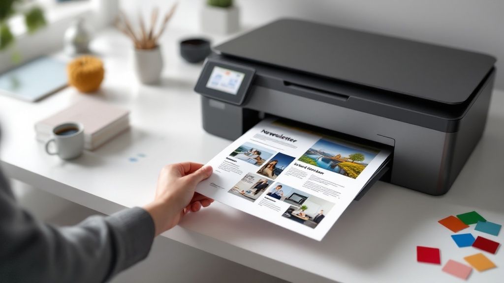 story
story Printing a Newsletter That Gets Noticed
Printing a newsletter is a fantastic way to cut through all that digital noise and forge a real, tangible connection with your audience. When you get the design and print choices right, you end up with a memorable marketing tool people actually hold onto—making a much deeper impression than an email they'll forget in five minutes. Why Print Newsletters Still Win Let's face it, we're all drowning in digital content. A physical newsletter, though? That’s a refreshing change of pace. Unlike an email you can delete with a single click, a printed piece has serious staying power. It can live on a coffee table, get pinned to a bulletin board, or even be passed along to a friend, stretching its reach far beyond the original mailbox. This physical quality creates a much stronger sensory connection. The feel of the paper, the vibrancy of the ink, and the simple act of sitting down to read it makes your message feel more significant and memorable. It’s no wonder so many organizations, from local shops to major nonprofits, continue to see the value in them. Building Deeper Connections A well-made print newsletter does more than just share information; it builds a genuine sense of community and loyalty. Think of it as a curated experience delivered right into your audience’s hands. For a real estate agent, it’s a brilliant way to become a familiar face in a target neighborhood. For a charity, it’s a heartfelt report that shows donors the real-world impact of their contributions. These tangible touchpoints are absolute gold for brand building. Here’s why: They Establish Credibility: A professionally printed piece shows you're invested and serious about your message. They Enhance Engagement: People simply spend more time with physical media than they do with fleeting digital ads. They Drive Action: With QR codes and clear calls-to-action, you can easily bridge the gap between your printed piece and your online presence. A printed newsletter isn't just another marketing tool; it's a physical artifact of your brand's story. It demonstrates a level of care and consideration that digital communications often lack, fostering a deeper sense of trust and connection with your audience. Even with the digital boom, print media is still a financial heavyweight for many publishers. Print circulation and advertising revenues make up just under 45% of total revenue for media companies, proving its lasting power in keeping readers engaged. To get a better handle on the bigger picture your newsletter fits into, check out this comprehensive content marketing guide . And while newsletters are a cornerstone, they work even better alongside other materials. It’s worth learning a bit about designing impactful brochures to really round out your strategy. Nail Your Newsletter File Setup for Flawless Printing Here’s a little secret from the world of print: the success of your newsletter is decided long before it ever hits the press. Getting the file setup right from the get-go is the foundation for a professional, impressive final product. Think of this as your pre-flight checklist—it’s what prevents those costly reprints and ensures your digital vision translates perfectly to paper. Before you even launch your design software, take a moment to clarify your goals. What's this newsletter for? Is it a vibrant sales tool for a local boutique, meant to drive foot traffic with eye-catching visuals? Or maybe it's a content-heavy update for a non-profit, where readability and a professional tone are the top priorities. Your objective will steer every single design choice you make. Essential Technical Specs Once you have a clear goal, it's time to get the technical details ironed out. Trust me, overlooking these settings is one of the most common reasons people are disappointed with their print run. Here are the absolute non-negotiables: Color Mode: Your design file must be set to CMYK (Cyan, Magenta, Yellow, Black). Screens use RGB (Red, Green, Blue), and if you design in that mode, you’ll see some pretty dramatic color shifts when it’s printed. Resolution: Ensure all your images and graphics are at least 300 DPI (dots per inch). Anything lower will come out looking blurry or pixelated. No exceptions. Bleed: You'll need to add a 0.125-inch bleed on all sides of your document. This is a small margin of extra space for any colors or images that run to the very edge of the page. It’s what prevents those awkward white slivers from appearing after the final trim. Setting up your file correctly from the start is the single most effective way to save yourself time and money. It completely cuts out the frustrating back-and-forth with your printer and ensures the final product lands in your hands looking exactly as you imagined—no expensive do-overs required. While the email newsletter market is massive—expected to reach 4.73 billion users by 2026—the tangible, physical nature of a printed piece gives you a unique edge. A perfectly prepared file ensures your newsletter makes a professional impression that truly stands out in a digital world. Ultimately, a flawless file is the first step toward a successful print run. Getting these details right from the start paves the way for a smooth process, whether you're ordering a small batch for a local event or exploring large-scale digital printing options for your campaign . Choosing the Right Print Options for Your Brand Once your design file is ready, you get to the fun part: bringing your newsletter to life in print. This is the moment your brand's personality jumps off the screen and becomes a tangible object your customers can hold. The choices you make here—from the paper to the fold—define the entire experience. Think of it like this: if you’re a small business owner using a platform like 4OVER4 for the first time, you’ll see a menu of options. You've got size, paper, and finish to consider. The classic 8.5" x 11" is the go-to for a reason. It's familiar, easy to handle, and typically the most budget-friendly option. Paper Stock and Finish Matter The paper you choose is a silent ambassador for your brand. A glossy finish, for example, is perfect for a real estate agency's newsletter. Those vibrant property photos will absolutely pop off the page. On the other hand, a local farm might go for a thicker, uncoated paper to give off a more rustic and down-to-earth vibe. The texture itself becomes part of your message. This quick breakdown shows that you don't need a massive budget to get a professional result; quality paper stock is more accessible than you might think. Don't feel limited to the basics, though. If your brand is all about that high-end, premium feel, you can dive into more unique textures. Exploring specialty printing collections can uncover some incredible options like linen or soft-touch finishes that add a memorable, tactile quality. Folds That Fit Your Format How your newsletter is folded completely changes how someone reads it and how you should structure your content. Each fold style creates a different "reveal" as the reader opens it up. Bifold (Half-Fold): This is your classic four-panel layout (front cover, inside left, inside right, back cover). It’s straightforward and works beautifully for designs that are heavy on images. Trifold: This fold gives you six distinct panels, making it perfect for organizing a lot of information into digestible chunks. If your newsletter is text-heavy, a trifold breaks it up so it feels less intimidating. Your print choices are a direct extension of your brand identity. A sleek, glossy finish might be perfect for a modern tech company, while a textured, matte paper better suits an artisanal bakery. Don't just pick what's standard; pick what tells your story. The 4OVER4 platform lays out all these configuration options in a clean, step-by-step format, so you know exactly what you're choosing. What's really helpful is the instant pricing calculator. It adjusts in real-time as you click through different options, giving you total control over your budget while you customize the perfect newsletter. Mastering the Artwork Upload and Proofing Process This is it—the final, critical step before your newsletter hits the presses. Uploading your artwork is where your design meets the real world of professional printing. Getting this part right is what separates a flawless final product from a frustrating reprint. Before you even think about hitting that "upload" button, give your design file one last, thorough check. Your safest bet, and the undisputed industry standard, is to save your final version as a print-ready PDF . This format locks in your fonts and images, preventing any nasty surprises when we open the file on our end. Your Final File Checklist Run through these non-negotiables one last time. Trust me, it’s worth it. Image Resolution: Is every single image a crisp 300 DPI ? This is the number one culprit behind blurry, amateur-looking print jobs. Don't let it be yours. Font Embedding: Make sure all the fonts you used are either embedded in the file or converted to outlines. This stops our printers from swapping in a default font if they don’t have your specific one installed. Color Mode: Your document absolutely must be in CMYK, not RGB. This prevents disappointing and unexpected color shifts when your digital design is translated to ink on paper. Even as digital channels explode—one email platform reported a jump from 402 million emails sent in 2021-2022 to an incredible 15.6 billion in 2024—the demand for high-quality, physical media hasn't gone away. If anything, the intense competition for attention makes a professional print job more important than ever. You can dig deeper into the state of modern newsletters on the Beehiiv blog . Never Skip the Proofing Stage Once your file is uploaded, you’ll get a digital proof back from us. This is your last chance to catch any mistakes before it's too late. Review it with an eagle eye. The digital proof is your final safety net. Think of it as the definitive version of what will be printed. If you approve a proof with an error, you are approving that error to be printed. Check for everything. I'm talking tiny typos, grammatical errors, weird color variations, or alignment issues that might have crept in. If your project is highly color-sensitive or you're ordering a very large run, ordering a hard copy proof is a smart investment. It lets you see and feel exactly what the final newsletter will look like, giving you total confidence before you commit to the full print order. Getting Your Newsletter Into the Right Hands A stunning stack of newsletters won't do much good sitting in a box. The real magic happens when you get your printed piece into the hands of your audience, turning your investment into a powerful marketing tool. Think beyond simply leaving them on a counter. An e-commerce business can tuck a newsletter into every outgoing product shipment, adding a personal touch that enhances the unboxing experience. A local café could use them as high-value takeaways at the register, giving customers something tangible to remember them by. This physical presence creates a lasting impression. Bridge the Print and Digital Worlds One of the smartest strategies I've seen for newsletters today is integrating digital touchpoints directly onto the page. You can easily connect your physical and online worlds with a simple addition. QR Codes for Special Offers: Add a QR code that links directly to an exclusive discount or a special landing page. This is a fantastic way to track engagement and reward loyal readers. Links to Social Media: Encourage readers to follow your journey by including a QR code that opens your Instagram or Facebook page. Your printed newsletter isn't just a static document; it's an active gateway to your entire brand ecosystem. By making it easy for readers to jump from the page to your website or social channels, you create a seamless and interactive brand experience. If you're looking for a more targeted outreach campaign, you're not just limited to in-person distribution. You can explore professional direct mail services to send your newsletters directly to potential customers in specific neighborhoods, creating a memorable first impression that cuts through all the digital noise. Got Questions About Printing Your Newsletter? Let's Talk. When you're ready to take your newsletter from a digital file to a physical product, a few questions always pop up. It's totally normal. Getting the answers sorted out before you hit "print" can save you a ton of headaches and make sure the final piece is something you're proud of. Let's dive into some of the most common things people ask when they're getting ready to print. Avoiding Rookie Mistakes By far, the biggest and most expensive mistake we see is using low-resolution images . I get it—a photo looks perfectly fine on your monitor, which displays everything at 72 DPI. But print is a different ballgame. For your newsletter to look sharp and professional, every single image you use needs to be at least 300 DPI . Anything less, and you'll end up with fuzzy, pixelated photos that cheapen the whole look. Paper Finish, Budgeting, and Getting it Mailed Another hot topic is the paper finish. If your newsletter is packed with vibrant photos, a glossy coat is your best friend. It makes colors leap off the page and gives everything a high-energy feel. On the other hand, if your design is more text-heavy and you're aiming for a classic, sophisticated vibe, a matte finish is the way to go. It cuts down on glare and feels great to the touch. And of course, everyone wants to know if they can save money. The answer is a huge yes—printing in bulk is always cheaper . The per-piece price drops significantly when you order larger quantities because the setup cost gets spread out. If you know you'll need newsletters for a few months, ordering a larger run upfront is the smartest move for your budget. A great newsletter design is only half the battle; you also have to get it to your readers. Don't forget to think about how you'll mail them. The size and paper weight can affect your postage costs, so it's a good idea to also order custom, branded envelopes for your newsletters to create a truly professional mailer. Ready to bring your newsletter to life? At 4OVER4 , we make printing a newsletter simple and affordable. Explore our options and get an instant quote today!
 story
story Master Printing Checklist: Your Complete Quality Guide
Why Your Printing Projects Need A Bulletproof System Let's be honest: a hefty reprint bill because of a missed color check or a typo isn't just a financial burden—it's a major project delay. These errors are often entirely avoidable with the right procedures in place. This is why a solid printing checklist is vital for any project, big or small. A well-designed system can be the difference between a smooth, successful printing experience and a stressful, costly headache. This raises an important question: why do so many printing projects go wrong? The Psychology of Print Errors Mistakes frequently happen not from a lack of expertise, but from the pressures of the printing process itself. Tight deadlines, intricate projects, and numerous stakeholders can create a breeding ground for oversights. Under pressure, even seasoned professionals can overlook important details. A printing checklist provides a safety net, making sure every step is considered, no matter the pressure. This means that even with challenging deadlines, you can maintain high quality and avoid expensive mistakes. Hidden Costs Beyond the Reprint The financial impact of a reprint is obvious, but the less visible costs can be equally detrimental. Strained client relationships, rushed overtime to fix the problem, and the lost opportunity of having equipment tied up on reprints all add to the overall consequences. These less tangible costs can chip away at your profits and reputation over time. For example, an unhappy client may move their business elsewhere, leading to lost future revenue. A printing checklist minimizes these risks, protecting both your finances and your valuable client connections. Moreover, businesses using standardized checklists report a decrease in print errors by 25–30% and a 10–15% increase in production speed in large print shops, according to 2024 industry surveys. Find more detailed statistics here: Commercial Printing Statistics . Quality Control as a Catalyst for Speed Surprisingly, a thorough quality control system can actually accelerate your production process. By creating a clear path for each project, a printing checklist eliminates doubt and backtracking. This allows your team to work confidently and efficiently, knowing precisely what needs to be done at each phase. When creating your quality control system, consider specialized checklists for different processes, like a comprehensive database migration checklist for data integrity. A streamlined workflow also minimizes the chance of errors, reducing the need for time-consuming and expensive revisions. This leads to quicker turnaround times, happier clients, and ultimately, a more successful operation. A robust system isn't just about avoiding mistakes; it's about improving your entire printing process. Pre-Production Setup That Prevents Print Disasters Before sending files to your printer, thorough pre-production prep is key for professional-looking results. This crucial step is what separates amateur projects from polished, client-ready materials that truly build a reputation. A detailed printing checklist ensures your project is set for success, avoiding costly reprints and frustrating delays. File Preparation: Setting the Stage for Success File preparation is the bedrock of any successful print project. Overlooking this step can cause problems throughout the entire process, leading to disappointing final products. Taking the time to verify resolution , color modes , and file formats is absolutely essential. Resolution: Make sure images are at least 300 DPI for crisp, clear results. Keep in mind that different paper types might require resolution adjustments to accommodate how they absorb ink. Color Mode: Double check that everything is in the correct color mode – CMYK for print. Using RGB can result in unexpected color shifts when your project goes to press. File Format: Select the right file format (like PDF/X-1a or PDF/X-4 ) according to your printer's specifications. This guarantees compatibility and helps preserve the integrity of your design. Substrate Selection: The Right Paper for the Job Picking the right paper is about more than just aesthetics. The characteristics of your chosen substrate affect ink coverage, finishing options, and the overall impression your printed piece makes. For example, uncoated paper absorbs ink differently than coated stock, which directly impacts color vibrancy. Ink Absorption: Think about how the paper will absorb the ink. Porous papers produce a softer look, while coated papers create sharper, more vibrant images. Finishing Options: Be sure your substrate is compatible with any finishing techniques you want to use, like embossing or foil stamping. Weight and Texture: The weight and texture of your paper should complement your design and its intended purpose. A flimsy business card won't communicate the same level of professionalism as one that is thick and textured. Proof Approval and Documentation: Avoiding Miscommunication A clear proof approval process protects both you and your clients. Thorough documentation helps prevent scope creep and ensures everyone is on the same page. Think of it as a contract that minimizes the risk of miscommunication and costly revisions. Proofing Method: Opt for a proofing method that accurately reflects the finished product, such as a contract proof . Client Sign-Off: Get written client approval on the final proof before starting production. This confirms everyone agrees on the design elements and specifications. Detailed Documentation: Keep detailed records of all project specifics, including file versions, color specifications, and agreed-upon deadlines. Color Management: Ensuring Consistency Across Devices Color management is a crucial, and often underestimated, part of pre-production. It guarantees color consistency across your various devices and printing methods. Imagine designing a vibrant brochure on your computer screen only to have it print out looking dull and lifeless. ICC Profiles: Use the correct ICC profiles for your monitor, printer, and paper type. These profiles define how color is represented and translated between devices. Calibration: Regularly calibrate your monitor and printer to maintain accuracy and prevent color drift. Test Prints: Run test prints on your chosen paper to double-check color accuracy and make any needed adjustments before the final print run. This can save you from costly mistakes and wasted materials. To help illustrate file preparation specifics for different print projects, take a look at the table below: File Preparation Requirements by Print Type Essential specifications for different printing applications including resolution, color modes, and file formats Print Type Resolution (DPI) Color Mode File Format Bleed Requirements Business Cards 300 CMYK PDF/X-1a 0.125 inches Brochures 300 CMYK PDF/X-4 0.125 inches Posters 300 CMYK PDF/X-1a 0.25 inches Photos 300 CMYK TIFF No bleed This table summarizes the essential technical requirements for common print projects. Adhering to these guidelines will ensure your files are print-ready and minimize the risk of errors. The following infographic visually represents the basic printer setup process: This simplified process highlights how even the most basic printing tasks benefit from a structured approach. By following these fundamental steps – installing ink, loading paper, and performing a test print – you minimize the risk of errors and help maintain consistent results. Effective pre-production planning, guided by a thorough printing checklist, sets the stage for a smooth, efficient printing process and high-quality outcomes. This proactive approach saves you time, money, and headaches in the long run. Digital Vs. Offset: Tailoring Your Quality Approach The printing industry offers diverse production methods. Your quality approach should be tailored to each method's unique characteristics. This means understanding the nuances of both digital printing and offset printing and developing a specific printing checklist for each. This section explores how checklist priorities change between these two distinct printing workflows. Digital Printing: Speed and Personalization Digital printing thrives on short print runs and personalized output. Think of variable data printing for direct mail, where each piece is unique. This specialization requires quality checks unlike those in offset printing. For more information, check out this helpful resource: How to Master Digital Printing . Variable Data Verification: This is crucial for personalized print projects. It involves verifying that names, addresses, and unique codes are accurate on each piece. Short-Run Optimization: Focus on efficient setup procedures and minimizing wasted materials. This involves streamlined prepress steps and optimized press settings for smaller print quantities. Real-Time Monitoring: Digital printing provides immediate feedback. Use this to catch errors early, reducing reprints and saving valuable production time. Offset Printing: Consistency and Volume Offset printing is the preferred choice for large-volume projects needing consistent color. This traditional method requires specialized checks to maintain quality across thousands of impressions. For example, careful plate preparation is vital for sharp images and clean text. Plate Preparation Verification: Inspect printing plates carefully for any flaws before starting the press. This prevents costly reprints due to errors reproduced on the final product. Ink Mixing Documentation: Document ink mixing ratios meticulously. This guarantees consistent color across the entire print run, ensuring the last piece matches the first. Press Setup Protocols: Follow strict press setup procedures to avoid mid-run adjustments. This saves time and preserves quality by preventing inconsistencies from interrupting the printing process. Digital checklists integrated with workflow software like Enfocus Switch can track each stage of a print project. These systems use real-time data analysis to identify potential problems, reducing rework and waste. For more insights into industry advancements, see: Printing Industry Outlook 2025 . Hybrid Workflows: Bridging the Gap Many print shops use both digital and offset methods. This presents a challenge: maintaining quality across diverse production streams. Communication between teams working with different processes is essential. Successfully managing these hybrid workflows requires a flexible printing checklist adapted to each process. Clear Process Delineation: Define clear boundaries between digital and offset workflows. This eliminates confusion and ensures the correct procedures are used for every job. Unified Quality Standards: Maintain consistent quality standards across both methods. Use the same evaluation criteria, regardless of the printing process. Cross-Training Opportunities: Cross-train staff on both digital and offset printing. This increases flexibility, allowing teams to transition smoothly between projects and processes. It also promotes a deeper understanding of the overall printing process. By understanding the distinct requirements of digital and offset printing, and adapting your quality control accordingly, you can consistently deliver high-quality printed materials that meet client expectations. This adaptability is essential for success in the dynamic printing industry. Production Monitoring That Actually Works When deadlines are tight and the printing presses are running, a systematic approach to production monitoring is key for consistent, high-quality results. This section explores the essential checkpoints experienced print operators use during live production to ensure optimal output with every print. Combining this meticulous approach with a comprehensive printing checklist guarantees your projects consistently meet the highest standards. Color Consistency Verification Maintaining consistent color throughout a print run is paramount. Color drift , a gradual color shift during printing, can create a noticeable difference between the first and last printed piece. Regular color checks are essential to prevent this. Visual Inspection: Trained operators regularly examine printed sheets, comparing them to a proof or color standard to catch any deviations. Densitometry: Using a densitometer to measure ink density provides objective data on color consistency, allowing for precise adjustments. Spectrophotometry: A spectrophotometer analyzes the spectral reflectance of the printed ink, offering highly precise color measurement and ensuring accuracy throughout long print runs. Registration Accuracy Precise registration , the alignment of different colors on the sheet, is critical, especially for multi-color designs. Regular checks help avoid blurry images or misaligned text caused by poor registration. Registration Marks: Printed sheets often include registration marks to aid alignment checks, ensuring all colors are correctly positioned. Magnification Tools: Using these tools allows for detailed inspection, revealing subtle misalignments that might otherwise be missed. Density Measurement Consistent ink density is crucial for uniform color across the print run. Variations can result in uneven saturation and a less professional look. Densitometer Readings: Regular readings, taken at various points on the sheet, help track ink density and identify any inconsistencies. Ink Key Adjustments: Based on these measurements, operators can fine-tune the ink keys to maintain consistent ink film thickness, ensuring even color coverage. Real-Time Quality Control Techniques Integrating real-time quality control catches errors early, minimizing waste and saving valuable time, especially in fast-paced environments. Automated Inspection: Some presses utilize automated inspection systems with cameras and software to scan for defects in real time, increasing efficiency. Statistical Process Control (SPC): SPC tracks printing variables (like ink density and registration) over time to identify trends and predict potential issues, improving quality and process control. Communicating effectively is vital. Establish clear protocols between press operators, quality control staff, and project managers. This ensures everyone is informed about the print run's status and any potential problems. A shared digital dashboard displaying real-time production data and quality metrics promotes transparency and quick decision-making. Documenting best practices and lessons learned—even those seemingly unrelated to printing, like choosing Product Photo Editing Services —contributes to continuous improvement. Analysis shows case-study driven content boosts conversion rates by 167% , with client success stories shortening sales cycles by 43% . Find more detailed statistics here. This highlights the value of documenting successful processes and sharing them effectively. Clear communication and documentation foster continuous improvement and elevate the quality of your printing operations. Finishing Strong: Post-Production Quality Control The journey to a perfect print doesn't end when the presses stop. Post-production is just as vital to delivering a high-quality product. Your printing checklist should go beyond the initial printing and into the crucial finishing stages. These final touches elevate your work and make a lasting impression. Cutting Accuracy and Dimensional Verification Precise cutting is essential for professional-looking prints. Inconsistent sizes or crooked edges can ruin the overall quality, no matter how good the printing is. That's why verifying dimensions is so important. Dimensional Verification Methods: Use accurate measuring tools like calipers and rulers to guarantee consistent sizing throughout the entire print run. Cutting Equipment Calibration: Regular calibration of cutting equipment maintains accuracy and prevents deviations. This proactive step minimizes errors and ensures consistent results. Binding Integrity: Ensuring a Strong Finish Binding is especially important for multi-page documents like brochures or booklets. A weak binding can lead to pages falling out, compromising the entire project. So, assessing binding strength is a vital quality control step. Binding Strength Assessment: Test the binding’s durability. Repeatedly open and close the document to simulate real-world use and identify potential weak points. Adhesive Quality: The adhesive used in binding must be high-quality. This ensures a strong, lasting bond that secures the pages. Surface Finish Evaluation: The Final Touch The surface finish adds a tactile and visual element to your printed piece. Consistent and flawless surface finishes communicate quality. Visual Inspection: Examine the surface for any scratches, smudges, or imperfections. This step catches small flaws that detract from the finished product. Tactile Evaluation: Feel the surface for inconsistencies in texture. A tactile inspection reveals subtle defects that a visual inspection might miss. For unique printing needs like door hangers, consider exploring specialized options: How to master door hanger design and printing . Packaging and Handling: Protecting Your Work Proper packaging and handling protect the finished product during shipping and storage. This preserves the quality of your work until it reaches the client. Protective Packaging Materials: Use suitable materials like cardboard inserts, shrink wrap, or padded envelopes. These protect your prints during transit. Handling Protocols: Clear handling procedures for finished prints minimize the risk of damage. Prevent bending, scratching, or smudging with established protocols. Defect Classification and Quality Audits A system for classifying defects makes tracking recurring issues easier. Regular quality audits further enhance this process. Defect Classification System: A standardized system for categorizing defects simplifies analysis of trends and helps implement corrective actions. Final Quality Audit Procedures: Conduct a final quality check before shipping. This catches any remaining problems before they reach the client. Before we discuss client delivery, let's take a look at common finishing defects and their prevention strategies: To help prevent common issues in post-production, the following table provides an identification guide for typical problems and offers practical prevention methods. Common Finishing Defects and Prevention Strategies Finishing Process Common Defects Prevention Method Inspection Frequency Correction Action Cutting Inconsistent sizes, crooked edges Calibrate cutting equipment, use precise measuring tools Every batch Recut or reprint Binding Weak binding, pages falling out Verify adhesive quality, test binding strength Every batch Rebind or reprint Surface Finishing Scratches, smudges, inconsistent texture Careful visual and tactile inspection, proper handling Every batch Reprint, refinish if possible Packaging Damaged prints during transit Use protective packaging materials Before shipping Repackage, reprint if necessary This table summarizes key defects and preventative measures, highlighting the importance of regular inspections throughout the finishing process. By addressing these potential issues early, you can minimize costly reprints and ensure client satisfaction. Client Delivery Preparation: Making a Good Impression Professional presentation strengthens client relationships. Pay attention to the delivery details. Professional Packaging: Use clean, presentable packaging. This reinforces the quality of your work and makes a positive impression. Delivery Confirmation: Always get delivery confirmation. This ensures the client receives their order safely and on time. This printing checklist covers finishing, handling, and delivery, ensuring your work results in a flawless final product. Every detail contributes to overall quality and demonstrates your commitment to excellence. Building Your Custom Quality Control System Every print operation, from small businesses crafting flyers to large commercial printers, encounters unique challenges. Your quality control system, including your vital printing checklist , should be tailored to your specific workflows, equipment, and client expectations. This section will guide you through building a customized quality control approach that optimizes your operations without unnecessary complexity. Analyzing Your Current Processes Building a custom quality control system starts with a thorough analysis of your existing printing processes. This analysis helps identify critical control points , assess potential risks, and establish a foundation for an effective system. Identify Critical Control Points: Locate the steps in your process most susceptible to errors or those with the greatest potential impact. These are your critical control points, and they should be the focus of your checklist. Common examples include file preparation, color matching, and finishing. Assess Risk Factors: Evaluate the risks associated with your equipment, materials, and team's expertise. Older equipment might require more frequent checks, while certain substrates may be prone to issues like ink bleed. Develop Checkpoint Protocols: For each checkpoint, create specific protocols outlining the required steps and acceptable tolerances. A color matching checkpoint might involve comparing a printed sample to a proof under standardized lighting. Implementing Digital Tools and Software Technology can streamline your quality control process. Explore digital tools and software that align with your needs and budget, optimizing your workflow for greater efficiency and accuracy. Mobile Apps: Simple mobile apps facilitate quick checks and data entry on the shop floor, making checklists accessible to everyone, regardless of location. Workflow Management Systems: Comprehensive Workflow Management Systems can integrate with your existing processes, automating tasks and tracking progress in real time. For related information, you might find this article helpful: How to master business card printing . Cloud-Based Solutions: Cloud-based platforms enable seamless collaboration and data sharing, keeping everyone informed and facilitating faster decision-making. Training and Accountability A successful quality control system depends on a well-trained team. Implement training programs and establish accountability measures that promote ownership and continuous improvement. Training on New Procedures: Provide thorough training on new quality control procedures to all team members, ensuring everyone understands their roles and responsibilities. Establishing Accountability: Define clear lines of accountability for each stage of the process. This fosters ownership and ensures prompt issue resolution. Remember, accountability promotes responsibility, not blame. Continuous Improvement Processes: Regularly review and refine your quality control system based on team feedback and data analysis. This fosters continuous improvement and keeps your system aligned with evolving client needs. Quality control sometimes necessitates post-production retouching or edits. For specialized services, consider these options: Product Photo Editing Services . Building a robust quality control system is an ongoing journey, not a one-time event. By continuously adapting and refining your approach, you will be prepared to deliver high-quality printing that exceeds client expectations, strengthening your reputation and establishing your business as a trusted partner. Ready to elevate your printing projects? 4OVER4 offers a wide array of high-quality printing solutions, combined with an intuitive online platform and fast turnaround times. Visit 4OVER4 today to explore our extensive product catalog and discover how we can help bring your vision to life.
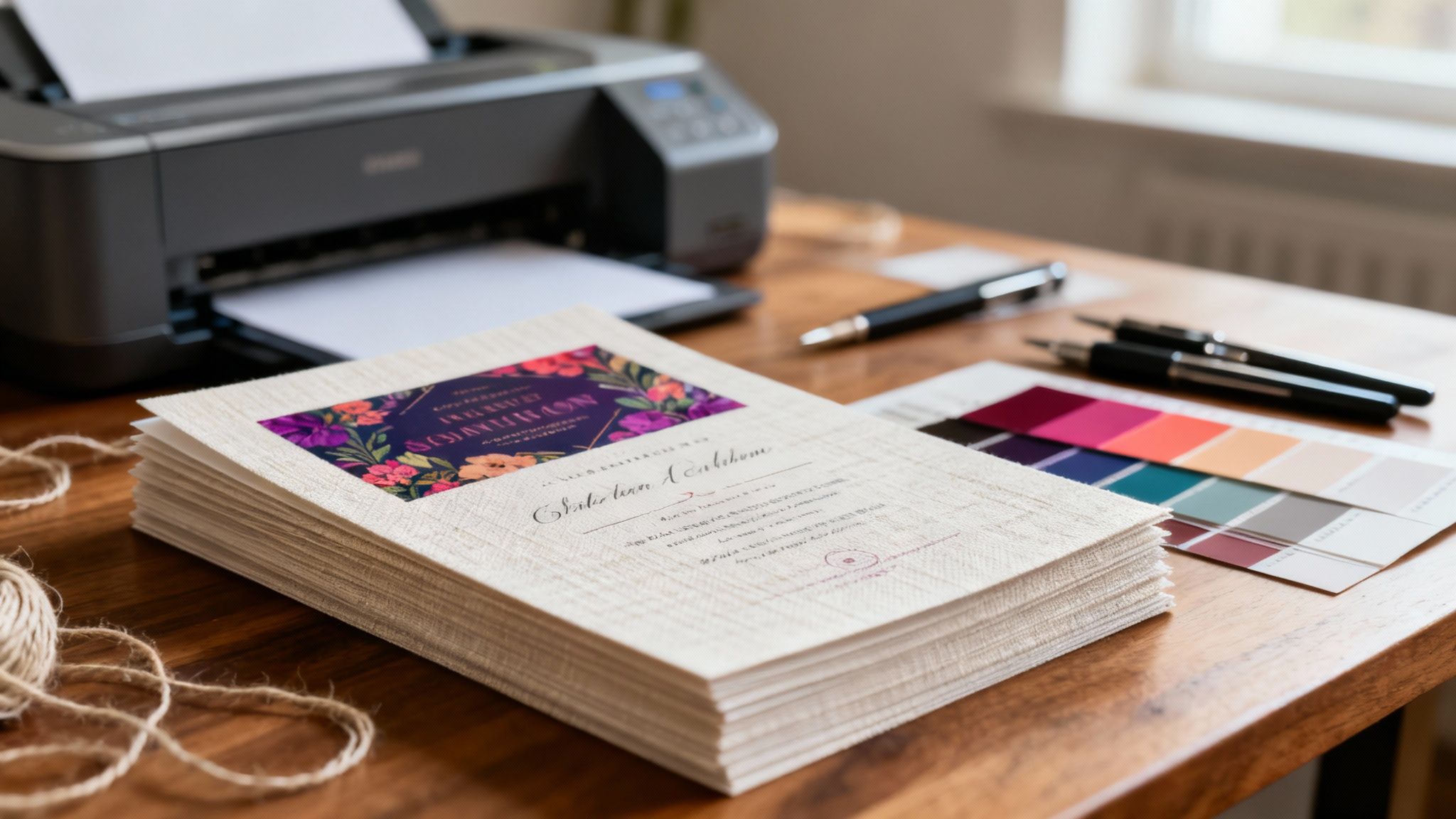 story
story Printing on Linen Paper for Stunning Results
When your project needs to make a real statement, printing on linen paper is the way to go. It adds a layer of sophistication and tactile quality that immediately sets it apart. The paper’s unique, subtly woven texture looks and feels like fine fabric, signaling a higher standard of quality before anyone even reads a single word. It’s the perfect choice for everything from elegant wedding invitations to professional business stationery . Why Choose Linen Paper for Your Project Moving beyond standard paper stocks is about making the medium part of the message. Linen paper isn’t just a surface for ink; it’s an experience. Choosing this distinctive stock tells your audience you’re serious, you care about the details, and you’re committed to quality. Unlike smooth, glossy papers that can feel a bit cold and impersonal, linen's crosshatch texture practically begs to be touched. This physical engagement creates a stronger, more memorable connection with your audience. It's the difference between a fleeting glance at a marketing email and the deliberate act of holding a beautifully crafted piece in your hands. The Power of a Premium Feel The psychological impact of high-quality materials is a real thing. When a potential client holds a business card printed on linen paper, they subconsciously connect that sturdy, refined texture with your brand. It's a small detail that can instantly elevate how your business is perceived and start building trust. Linen paper is a fantastic fit for a variety of projects. Here are a few scenarios where I’ve seen it work wonders: Wedding Invitations: The classic, romantic texture is a perfect match for such a significant occasion. Corporate Stationery: Letterheads and envelopes on linen stock give off a vibe of stability and prestige. Restaurant Menus: For fine dining spots, a linen menu enhances the upscale atmosphere before the first dish arrives. Certificates and Awards: Its formal appearance and durability make it the go-to for documents meant to be kept for years. The real magic of linen paper is its ability to communicate without saying a word. It tells a story of quality, tradition, and importance, setting the right tone for whatever message it carries. To help you visualize where linen paper shines, here’s a quick breakdown of its most popular applications and the impression they create. Linen Paper Use Cases at a Glance Application Desired Impression Key Benefit Wedding & Event Invitations Elegant, Romantic, Timeless Creates a memorable first impression for a special day. Business Cards & Letterhead Professional, Trustworthy, Established Elevates brand perception and communicates stability. Fine Dining Menus Upscale, Sophisticated, Quality Enhances the dining experience with a premium tactile feel. Resumes & Portfolios Serious, Detailed, High-Caliber Helps you stand out from the stack with a professional touch. Art Prints & Greeting Cards Artisanal, High-End, Unique Adds a rich texture that complements artistic designs. Certificates & Diplomas Official, Prestigious, Lasting Provides a formal and durable medium for important documents. This table just scratches the surface, but you can see how the paper's inherent qualities align perfectly with the goals of each project, reinforcing the intended message. Durability and Timeless Appeal Linen paper’s appeal isn't just about looks; it's also incredibly practical. It's made from flax fibers, which makes it known for its strength and resistance to aging—a big reason it has been a historical choice for important documents. In fact, it’s been estimated that up to 25% of U.S. banknotes in circulation before 1950 contained linen fibers for extra durability. This built-in toughness makes it a smart investment for items you want to last, from archival-quality art prints to essential business credentials. Its classic texture also ensures your printed materials won't look dated in a few years, giving you more bang for your buck. As you weigh your options, it's interesting to consider its role in the enduring debate between digital and paper cards and the unique impact a physical medium delivers. For any business trying to make a solid impression, incorporating linen paper into your marketing is a smart play. If you're looking for ideas on how specialty papers can elevate a project, checking out a curated https://www.4over4.com/printing/category/premium-collection can provide some great inspiration. It's a surefire way to make your brand stand out and leave a tangible, lasting mark. How to Design for Linen Paper's Texture Working with linen paper is really a partnership between your design and the material itself. You’re not just slapping images on a blank canvas; you're collaborating with its unique, fabric-like texture to create something special. To really nail it, you have to make deliberate choices that celebrate this distinctive quality instead of fighting against it. That subtle crosshatch pattern adds a layer of depth that can either elevate your design or completely obscure it. The secret is thinking about how ink will settle into those tiny peaks and valleys. This tactile dimension is your greatest asset, so let's get into how to make it work for you. Choosing Fonts That Complement the Texture Typography is where linen paper’s texture can either shine or cause some real headaches. Your font choices have to be intentional, keeping legibility and aesthetic harmony top of mind. An elegant serif font , with its classic finishing strokes, almost always feels right at home on linen. Think Garamond or Caslon—their traditional vibe pairs beautifully with the paper's high-end feel. It’s a perfect match for things like wedding invitations or formal stationery. On the flip side, a clean, modern sans-serif font like Helvetica or Futura can create a really striking contrast. Placing minimalist typography against a textured backdrop produces a sophisticated, contemporary look that works incredibly well for professional portfolios or upscale branding. The biggest pitfall to avoid? Using fonts with extremely thin lines or delicate, wispy scripts. Those fine details can easily get lost in the paper's texture, leading to broken or illegible characters. Always pick a font with a bit more substance. Mastering Color on an Absorbent Surface Linen is an uncoated stock, which means it’s more absorbent than its glossy cousins. This is a big deal for your colors. Understanding how the paper drinks up ink is crucial for getting the look you’re after. Rich, saturated colors perform exceptionally well. We're talking deep navies, burgundies, forest greens, or charcoal grays. The paper absorbs these tones beautifully, giving you a luxurious, muted finish that feels organic and sophisticated. It’s one of the main reasons people choose linen in the first place. But be careful with very light or pastel colors, as they can sometimes look washed out. The paper’s absorbency can dull their vibrancy, so you might need to bump up the saturation in your design file to compensate. My advice? Always get a printed proof to see how your palette translates to the actual paper before you commit to a big print run. The Power of Negative Space One of the most effective strategies for designing on linen paper is to lean into negative space (or white space). If you overcrowd your design, you'll just overwhelm the texture and make the whole thing feel cluttered. By leaving generous margins and clear, open areas, you accomplish two things: You draw attention to the important stuff. A clean layout naturally guides the viewer's eye where it needs to go. You let the paper itself become a design element. The texture is a feature, not a bug. Letting it show through adds to the aesthetic and reinforces the premium quality of the piece. Think of the paper's texture as a quiet, consistent background pattern. A minimalist approach allows this pattern to contribute to the design's elegance without fighting your content. This is especially true for high-end business cards, where simplicity often screams confidence. For more ideas on designing cards that make an impact, it’s worth exploring different kinds of business cards printing for inspiration. Design Elements to Approach with Caution Linen paper is versatile, but some design elements are just plain tricky to get right. Knowing these potential challenges ahead of time can save you from a disappointing print job. Fine, Intricate Lines: Like I mentioned with fonts, ultra-thin graphic lines or complex illustrations can vanish into the paper's grain. Bolder lines and simpler graphics will always give you a more reliable result. Large Blocks of Solid Color: While rich colors are great, huge fields of a single, flat color can sometimes look a little uneven or blotchy because of the texture. If your design relies heavily on this, digital printing often handles solid coverage a bit better on textured stocks. Low-Contrast Photography: Photos with subtle tonal shifts or lots of detail in dark, shadowy areas can lose their clarity. You'll have much better luck with high-contrast images that have clear subjects and bold compositions. Setting Up Your Print Files Correctly If there's one thing I've learned from years in the print world, it's this: getting your files right from the get-go is the single most important step you can take. It saves you from the headache and cost of reprints and makes sure your final product looks truly professional. When you’re working with a beautiful stock like linen paper, with its unique texture and the way it soaks up ink, these technical details matter even more. Think of this as your pre-flight checklist. Proper file setup isn’t about following arbitrary rules; every single setting has a critical job. From making sure your images are sharp to getting the colors just right, these specs are designed to work with the physical nature of professional printing presses and the paper itself. Nail this part, and your design will look exactly like you imagined. Nail Your Resolution for Ultimate Sharpness The absolute foundation of a quality print file is resolution , measured in Dots Per Inch (DPI). For print, the unwavering industry standard is 300 DPI . This is non-negotiable if you want your images and text to be crisp, clear, and free from the pixelated mess that low-resolution files create. A classic mistake is grabbing an image off a website and expecting it to print well. Web images are almost always saved at 72 DPI to load quickly online. That looks fine on your screen, but it will look fuzzy and amateurish on paper. Always, always start your design in a program like Adobe Photoshop or Illustrator with your canvas set to 300 DPI from the very beginning. I can't stress this enough: You can't just magically increase the resolution of a low-quality image later. It’s like trying to un-bake a cake—you have to start with the right ingredients. Always use high-resolution source images. Add Bleed to Avoid Unsightly White Edges Ever seen a brochure or a business card with a tiny, uneven white sliver along the edge where the color was supposed to go all the way? That’s what happens when a file is set up without a bleed . A bleed is a small, extra margin of your design—usually 0.125 inches (or 3mm)—that extends past the final trim line on every side. During the cutting process, a massive stack of paper can shift just a tiny bit. It's unavoidable. By extending your background colors or images into that bleed area, you create a safe zone. This ensures that even if the blade is off by a hair's breadth, the ink still covers the entire surface, giving you that clean, professional edge-to-edge look. Master Your Color Mode and Profiles This is where a lot of print projects go sideways, especially with an absorbent paper like linen. What you see on your backlit RGB (Red, Green, Blue) computer screen is fundamentally different from what a printer can reproduce using CMYK (Cyan, Magenta, Yellow, Key/Black) ink. For this reason, your print file must be set to CMYK color mode . If you send in an RGB file, the print shop's software will convert it for you, and that automatic conversion can lead to some wild—and usually disappointing—color shifts. Do the conversion to CMYK yourself in your design software. It gives you full control. Even more important for linen paper is using a color profile made for uncoated stock. Profiles like 'U.S. Web Uncoated v2' or 'Uncoated FOGRA29' are built to compensate for how much more ink uncoated paper absorbs, a phenomenon called dot gain . Using an uncoated profile stops your colors from looking muddy or darker than you intended. You can find tons of resources online for this, and a solid guide to commercial printing services and file preparation can give you a deeper dive into getting your designs production-ready. Here’s a quick cheat sheet for your file specs: Resolution: 300 DPI for absolutely everything. Bleed: 0.125" (3mm) on all four sides. Color Mode: CMYK , never RGB. Color Profile: An uncoated profile to match the linen paper. File Format: A high-quality PDF is king (PDF/X-1a is a bulletproof choice), but TIFF or EPS also work. Getting these technical details right is everything. If you want more practical advice on file prep and other printing nuances, digging into more tip-on printing resources is a great next step. Pay close attention to these details, and you'll set yourself up for a beautiful print job that lets the elegance of linen paper truly shine. Choosing the Right Printing Method Once your design is locked in and your files are prepped, it's time to decide how you'll get that vision onto the linen paper. This is a bigger decision than it might seem—the printing method you choose has a huge impact on the final look, feel, and cost of your project. Linen’s unique texture doesn’t play the same way with every technique, so matching the method to your goals is key. The right choice really boils down to three things: your budget, how many pieces you need, and the specific vibe you're going for. Let's walk through the most common options so you can make a smart call. Digital Printing: Speed and Versatility In today's print world, digital printing is the go-to workhorse, and for good reason. It’s a straightforward process where your digital file is sent directly to a press that applies ink or toner to the paper's surface. Think of it as a super-advanced version of your office printer, just with way better quality. This method is perfect for short runs —say, 50 wedding invitations or 200 business cards. Since there are no custom plates to create, the setup is quick and much more affordable for smaller quantities. It's also a champion at handling variable data, which is perfect for projects like printing individual names and addresses on envelopes. For projects on a tight deadline, digital printing is often the hero. Its quick turnaround times can be a lifesaver, making it a go-to for urgent marketing materials or last-minute event collateral. One of the great things about modern digital presses is how well they handle textured stocks like linen. They can lay down ink with enough precision to cover the paper's subtle peaks and valleys. Still, it's always a good idea to request a proof to make sure you're happy with the coverage, especially in areas with large, solid blocks of color. To see what this tech can do, it’s worth exploring digital printing services that are known for high-quality results. Offset Printing: The Gold Standard for Quality When quality and perfect color consistency are at the top of your list, nothing beats offset printing. It’s a more traditional method where your design is etched onto metal plates. Those plates transfer ink to rubber blankets, which then apply the image to the paper. It’s a more involved setup, but the results speak for themselves. Offset printing delivers incredibly sharp, vibrant, and consistent color. It’s the obvious choice for large-scale projects (think 500 pieces or more) where hitting an exact brand color across the entire run is absolutely critical. While the initial setup costs are higher because of the custom plates, the price per piece drops dramatically as your quantity goes up. Linen paper and offset printing are a fantastic match. The pressure used in the process helps push the ink right into the paper's texture, giving you rich, even coverage that looks and feels like it’s part of the material itself. This is why it’s the preferred method for high-end corporate stationery and luxury marketing brochures. Premium Finishes: Making a Tactile Impression Sometimes, you need to go beyond just ink on paper to create something truly memorable. That’s where specialty printing methods come in, and they pair beautifully with the natural elegance of linen paper. These premium options add a physical, tactile dimension that people can’t help but notice: Letterpress: This is an old-world technique where a raised, inked plate is physically pressed into the paper, leaving a gorgeous debossed impression. The combination of letterpress on textured linen creates a stunning, artisanal feel perfect for high-end invitations and boutique business cards. Foil Stamping: This process uses heat and pressure to apply a thin layer of metallic or pigmented foil. A shimmering gold or silver foil logo on a crisp white linen card? That’s the definition of luxury and sophistication. Sure, these methods cost more and require a printer with specialized skills, but the impact they create is undeniable. They turn a printed piece from something you just see into something you truly experience. The global printing paper market is massive, projected to hit USD 88.9 billion by 2032 . While standard papers make up most of that, the specialty segment—which includes linen—is growing as people look for premium, memorable materials. This trend is especially strong in markets like Europe and the Asia-Pacific region, where linen paper is increasingly used for luxury goods and high-end art prints. This workflow diagram shows the critical checks your file needs to pass to be ready for any professional print job. It’s a great reminder that getting the technical details right—from resolution to color mode—is the foundation for a successful print, no matter which method you end up choosing. Solving Common Linen Paper Printing Problems Even with a perfect file, the unique personality of linen paper can throw you a curveball. It's not like your standard smooth paper; its textured, absorbent surface drinks up ink in its own way. Don't panic when issues pop up. Most of the common hiccups are fixable with a few smart adjustments. Think of this as your field guide for troubleshooting. We’ll walk through the most frequent hurdles you might hit when printing on linen and cover the practical, real-world solutions to get your project looking flawless. Tackling Uneven or Blotchy Ink Coverage One of the most common frustrations is seeing a big, solid block of color come out looking splotchy. This happens because ink settles into the tiny valleys of the paper's texture, spreading thinner across the raised peaks. The result is a mottled look that can cheapen the premium feel you were going for. First, check your print file. If you can, try bumping up the ink density for that specific color. Sometimes, just a small tweak provides enough extra ink to get that uniform coverage across the entire textured surface. Another great strategy is to work with the paper instead of against it. Introduce a subtle background texture or a soft gradient into your design. This breaks up that solid block of color, making any minor inconsistencies in ink absorption practically invisible. Why Fine Details and Thin Lines Disappear Ever print a design with delicate linework or a sophisticated, thin font, only to have it look broken or vanish completely? That's a classic linen paper issue. The paper’s crosshatch grain can actually be wider than your design's thin lines, causing them to fall into the recesses and disappear. The best fix is prevention. When you're in the design phase, make sure your important lines and font strokes have enough weight. Stay away from anything described as "hairline." A good rule of thumb is to keep lines at least 0.5 points thick to ensure they stay crisp and visible on the final print. If you've already printed a batch, your only real option is to edit the file and run it again. Remember, the texture of linen paper is a feature, not a flaw. The best designs anticipate its behavior and use bolder elements that can hold their own on its unique surface. Preventing Smudging and Slow Drying Times Because linen is an uncoated, absorbent stock, ink simply takes longer to dry than it does on glossy papers. If you handle the prints too soon, you risk smudges, fingerprints, and ink transferring from one sheet to another. This is especially true for designs with heavy ink coverage, like those with deep, saturated colors. Patience is key here. Just give the prints plenty of time to dry before you handle, stack, or trim them. If you’re printing them yourself, try laying the sheets out individually on a flat surface to give them maximum air exposure. If smudging is a persistent problem, think about adding a protective finish. Many print shops offer coatings that seal the ink and add a layer of durability. Exploring options for laminating prints is a fantastic way to protect your project, especially for pieces that get handled a lot, like menus or business cards. It's an extra step that not only stops smudging but also makes the final product much more resilient. Got Questions About Linen Paper? We Have Answers. You've got the essentials down, but printing on a premium stock like linen paper often brings up a few more practical questions. It has a distinct personality, after all, so it's smart to iron out any last-minute uncertainties before you place an order. Let's walk through some of the most common queries we hear. Think of this as your final confidence boost, making sure your project turns out exactly as you envisioned, with the professional, high-quality feel you're going for. Can I Print on Linen Paper With My Home Printer? The short answer is... maybe, but you'll want to be careful. Many modern desktop inkjet printers can handle lighter weights of linen paper, like an 80 lb cover stock . The trick is to dive into your printer settings and select "cardstock," "heavyweight," or "textured paper" as the media type. This tells the printer to slow its roll and lay down a bit more ink. But here’s the thing: that beautiful, signature texture can sometimes lead to spotty or uneven ink coverage from a home printer. Laser printers tend to struggle even more. The heat-based toner process has a tough time bonding evenly into the paper's subtle grooves, which can cause flaking. For truly professional results, there’s no substitute for a commercial print service, especially for heavier linen stocks or designs with large blocks of solid color. Their equipment is specifically calibrated for these kinds of materials. Is Linen Paper a Lot More Expensive Than Regular Paper? Yes, you can expect linen paper to be a bit of a splurge compared to standard uncoated or glossy stocks. It's definitely considered a premium paper, and its price tag reflects that. The higher cost comes from the quality raw materials—actual flax fibers—and the specialized manufacturing process required to create its distinctive, fabric-like texture. It's helpful to think of it as an investment in the final product rather than just an expense. For projects where the tactile experience and perceived quality are paramount—think wedding invitations, high-end business cards, or fine art prints—that extra cost directly boosts the piece's overall impact. It sends a clear message of quality before a single word is read. What's the Best Way to Print Photos on Linen Paper? Printing photos on linen is an advanced move, and it can be tricky to get just right. The paper's texture, which is its greatest asset for typography and minimalist designs, can soften the fine details in a photograph, making it look less sharp. If you're set on this pairing, here’s how to get the best possible outcome: Choose High-Contrast Images: Simple, bold subjects with strong contrast tend to perform much better than highly detailed portraits or busy landscapes. Give Your File a Boost: In your photo editing software, slightly increase the saturation and contrast. This helps compensate for the uncoated paper's natural absorbency, which can otherwise leave colors looking a little muted. Always, Always Get a Proof: This is non-negotiable for photos on linen. You absolutely need to see a physical sample to understand how your image interacts with the paper's surface before you commit to a full print run. For this type of job, digital printing is almost always the way to go. By tackling these common questions, you're now in a great position to make smart, confident decisions for your next linen paper project. Ready to bring your sophisticated designs to life on premium linen paper? 4OVER4 offers a wide selection of high-quality stocks and professional printing services to ensure your project looks and feels exceptional. Start your order today!
 story
story Rack Card Design That Gets Noticed
A truly effective rack card design is more art than science. It's about crafting a small, powerful marketing tool that can stop someone in their tracks. It has to do more than just look pretty; a great design marries sharp visuals with tight, punchy messaging to create instant interest and push for a single, clear action. That's how a casual glance turns into a genuine lead. Why a Strategic Rack Card Design Matters Before you even think about firing up your design software, we need to talk strategy. A rack card is your silent salesperson, fighting for attention in a sea of competitors. Its only job is to cut through the noise and deliver a powerful message in a heartbeat. Imagine a local tour company with cards sitting in a hotel lobby. That design has to be compelling enough to convince a tired traveler to book an impromptu excursion. This is where having a solid plan pays off. The difference between a card that gets snatched up and one that gathers dust is almost always the strategic thinking that happened before anyone picked a font or color. Your strategy is the blueprint that makes sure your final product is a hard-working marketing asset, not just a forgotten piece of paper. Define Your Core Objective What’s the one thing you want someone to do after they pick up your card? If you don't have a clear goal, your design will feel scattered and ineffective. Don't try to cram everything onto one small card; just pick one primary objective and build around it. Drive Website Visits: Slap a QR code on there that sends people to a specific landing page with a killer offer. Increase Foot Traffic: Make your physical address and a simple map impossible to miss. An in-store-only coupon is even better. Generate Phone Calls: Is your goal to get the phone ringing for bookings or quotes? Then your phone number needs to be big and bold. Promote an Event: The date, time, and location should be front and center, with a super simple way to RSVP. A strong visual identity is key across all your promotional materials, and this is especially true for events. Many of the same principles in these top event branding ideas to make your event stand out apply directly to creating a rack card that commands attention. The best rack cards have a single, undeniable purpose. If you try to make it a menu, a company history, and a coupon all at once, you'll just create confusion. And a confused mind always says no. Know Your Audience and Location Rack cards, typically sized at a standard 4 inches by 9 inches , have become a go-to for industries like tourism and local services. Why? Because they're perfectly designed to fit into display racks in high-traffic places like hotel lobbies, visitor centers, and checkout counters. They are some of the most effective https://www.4over4.com/printing/category/marketing-materials you can invest in. Because of this, your design absolutely must speak to the people in that specific environment. A design for a luxury spa placed in a five-star hotel should have a completely different vibe than one for a family-friendly pizza joint at a community rec center. This context is everything—it shapes your tone of voice, your imagery, and the offer you present. Before diving into the nuts and bolts of design, it's helpful to lay out the strategic foundation. This simple table can guide your thinking and ensure all the core elements are aligned. Core Elements of an Effective Rack Card Strategy Element Key Consideration Example Primary Goal What is the single most important action? Drive sign-ups for a free trial. Target Audience Who are you trying to reach? Tourists aged 25-45 looking for adventure. Location Context Where will the card be displayed? At the front desk of partner hotels. Key Message What is the core value proposition in one sentence? "The city's #1 rated food tour. Book now!" Call to Action (CTA) What is the specific instruction? "Scan the QR code to see today's tour times." Thinking through these points first will make the entire design process smoother and ensure the final product is perfectly tailored to do its job. It transforms your rack card from a simple piece of paper into a strategic marketing tool. Crafting a Layout That Guides the Eye Think of your rack card's layout as its silent director. It's the unseen force that tells a potential customer exactly where to look and in what order. A powerful layout doesn't happen by accident; it's a deliberate strategy to guide their eye from the initial hook right down to the final call to action. Without that clear path, you risk losing your audience in a jumble of text and images. The most important job of your layout is to establish a strong visual hierarchy . This just means making sure the most important parts of your message stand out the most. Your headline should be the very first thing anyone sees, even from a distance. Use a large, bold font and stick it in the top third of the card—that’s the part that peeks out above the holder. Structuring Your Content Flow Your rack card is essentially a tiny billboard telling a quick story. You have to organize the information logically to keep someone reading. A messy, confusing layout is an instant turn-off and frankly, it just looks unprofessional. A proven structure that works for almost any rack card is the classic problem-solution format. First, you hook them with a question or a relatable problem. Then, you present your service or product as the obvious, simple solution. Here’s a simple flow I’ve seen work time and time again: Top Third: This is for your attention-grabbing headline. Make it count. Middle Section: Use a few concise bullet points to explain the benefits or key features. Keep it scannable. Bottom Third: This is where you put your compelling call-to-action (CTA), all your contact details, and your logo. This structure is so effective because it’s intuitive. It follows how people naturally scan information, making your message incredibly easy to absorb in just a few seconds. For simpler messages, a single-column layout is perfect. If you have a bit more to say, a clean two-column grid can work wonders. White space isn't just empty space—it's an active design element. Using it well creates breathing room, makes your text easier to read, and gives your rack card a clean, high-end feel. A cluttered design just overwhelms the eye and is almost guaranteed to be ignored. Placing Key Elements for Maximum Impact Where you place each component on the card matters immensely. Your logo, for instance, should reinforce your brand identity without overpowering the main message. I usually find that placing it subtly at the bottom near the contact information is a smart move. Your contact details—website, phone number, social handles, or address—must be crystal clear and effortless to find. Don't make people hunt for it. The same goes for your CTA, which should be the final, unmissable instruction at the bottom of the card. A great trick is to frame your CTA with a contrasting color block or place it right next to a QR code to boost its effectiveness. These layout principles are fundamental to almost all marketing materials. For example, a well-structured design is just as critical for an effective flyer. You can find more inspiration by looking into high-quality flyer printing for your business . The goal is always the same: guide the reader’s journey from curiosity to action. By mastering your layout, you turn a simple piece of paper into a powerful conversion tool. Choosing Imagery and Fonts That Connect Let's be honest, people judge a book by its cover—and a rack card by its design. Long before anyone reads a single word, they’ve already made a snap judgment based on your images, colors, and fonts. These aren't just decorative elements; they're the heart and soul of your card, working together to create an emotional gut reaction and communicate your brand's personality in a blink. Your imagery has a heavy lift. It needs to do more than just fill space; it has to tell a story. Steer clear of those generic stock photos that scream "I gave up." Instead, pick high-resolution images that actually reflect the experience you’re selling. If you run a spa, show a client looking utterly blissed out. If you're a real estate agent, a stunning, professional shot of a drool-worthy property will always beat a generic house graphic. The whole game with rack cards is to stand out and get someone to actually pick it up from a crowded display. A killer headline paired with a compelling image is your one-two punch to communicate your value instantly. For a deeper dive into making designs that don't just sit there, check out these insights on designing effective rack cards . Finding the Right Color Palette Color is a psychological shortcut. It can make your brand feel energetic, trustworthy, or luxurious without you saying a word. When picking colors for your rack card, you're balancing brand consistency with sheer, unadulterated visibility. Stick to Your Brand: Your colors should feel like a natural extension of your brand identity. If your logo is a cool blue and gray, throwing in neon pink is going to cause some serious whiplash. Contrast is King: Make sure people can actually read what you wrote. Dark text on a light background is a timeless, foolproof choice for a reason. Pop Off the Rack: Picture your card sitting in a holder with dozens of others. What's going to make it jump out? Sometimes a bold, vibrant color is all you need to cut through the noise. If you’re featuring a person in your imagery, like a real estate agent or a consultant, your colors need to play nicely with their photo. A top-notch printing job here can make all the difference. You can explore professional options for printing headshots that make an impact to see what a difference quality makes. Your color palette sets the mood before a single word is read. A bright, energetic scheme is great for a kids' play zone, while a sophisticated, muted palette works better for a high-end law firm. Get this right, and you've already won half the battle. Making Your Typography Work for You Typography is all about making your words easy and enjoyable to read. On a rack card, you have just seconds to capture attention, so your font choices are absolutely critical. My golden rule? Stick to two or three fonts , max. Any more and you're heading straight into cluttered, amateur-hour territory. A great approach that works almost every time is pairing a bold, attention-grabbing font for your main headline with a clean, simple sans-serif for your body text. A Simple Font Pairing That Works: Role Font Style Example Purpose Headline Bold, Display (e.g., Oswald) Book Your Tour Today! Grabs attention from a distance. Body Copy Clean, Sans-Serif (e.g., Lato) Discover the hidden gems... Ensures the details are easy to read. This kind of combination creates a natural visual hierarchy, telling the reader’s eye exactly where to look first. When your images, colors, and fonts are all working together in harmony, your rack card design doesn't just look professional—it creates an instant, powerful connection with your audience. Writing Copy That Actually Converts A slick design might get someone to pick up your rack card, but it's the words that will actually get them to do something. Your copy does all the heavy lifting—it persuades, informs, and nudges a potential customer toward taking that next step. Without solid, compelling copy, even the most beautiful rack card design is just a pretty piece of paper. The name of the game is clarity, brevity, and a laser focus on what your reader wants. Your headline is your first—and maybe your only—shot to make an impression. It needs to be a magnet, latching onto a customer's problem or desire instantly. Forget trying to be clever. Focus on a clear benefit. A headline like "Relax and Recharge" is nice, but "Escape City Stress With a 60-Minute Massage" speaks directly to a need, making it way more powerful. Crafting Benefit-Focused Body Copy Once that headline hooks them, the body copy needs to deliver on the promise. And fast. People don’t read rack cards; they scan them. This means long, dense paragraphs are your worst enemy. Break down your key selling points into a short, scannable format that someone can digest in just a few seconds. Bullet points are perfect for highlighting the real-world benefits of what you offer. The trick is to frame every single point from the customer’s perspective. Instead of: "We use fresh, organic ingredients." Try: "Enjoy healthier, more flavorful meals made fresh daily." See the difference? That small shift from talking about features to talking about benefits makes your message infinitely more persuasive. While the general writing principles are similar for rack cards and postcards, the tall, skinny format of a rack card demands even tighter messaging. For a deeper dive into writing persuasive print copy, our guide to effective postcards printing for direct mail has some great complementary insights. Every single word on your rack card should help answer the reader's unspoken question: "What's in it for me?" If it doesn't help answer that, cut it. Creating an Irresistible Call to Action The final—and most important—piece of your copy is the call to action, or CTA. This is where you have to be completely direct and tell the reader exactly what to do next. A weak, vague CTA like "Learn More" is a total waste of space. You need something specific, urgent, and crystal clear. Think about the one thing you want someone to do. Book a tour? Visit your store? Claim a special offer? Make that the entire focus of your CTA and kick it off with a strong, actionable verb. A great CTA, for example, might be "Scan Here for 20% Off Your First Visit!" This is the perfect spot to bridge the gap between your physical card and your digital world. In fact, a smart rack card design often acts as a gateway to digital engagement, promoting things like modern digital loyalty cards . This simple strategy turns a piece of paper into an interactive tool, connecting your physical and online marketing in a seamless way. Preparing Your Design File for Printing Alright, you’ve put in the hard work and your rack card design looks fantastic on screen. But we're not quite at the finish line yet. The final, and arguably most critical, step is making sure the file you send to the printer is technically perfect. Trust me, this is where a beautiful design can go sideways fast. A small oversight here can lead to frustrating mistakes, costly reprints, and a final product that just doesn't live up to your vision. Getting your file print-ready is all about a few key concepts—they aren't complicated, but they are non-negotiable for a professional result. Think of it as giving your printer the perfect blueprint. A little prep work now saves a world of headaches later. Understanding Bleed and Safety Margins First things first, let's nail down the print-specific terms you absolutely need to know. Getting these right prevents those amateur-looking thin white borders that can ruin an otherwise great design. Bleed: This is a small extra margin—usually 0.125 inches —that extends beyond the final cut edge of your card. Printers print on large sheets and then trim them down to size. Since the cutting process isn't always microscopically precise, the bleed ensures your background color or image goes all the way to the edge, even if the blade is a fraction of a millimeter off. Trim Line: This is the line where the card will actually be cut. For a standard rack card, this is your final 4" x 9" dimension. Safety Margin: This is an inner boundary, also typically 0.125 inches , inside the trim line. All your crucial text, logos, and important details must stay within this zone. Think of the safety margin as a "no-go zone" for anything you can't afford to lose. If it’s outside that line, it's at risk of getting chopped off. Always, always double-check that your key message is tucked safely inside. Setting the Correct Color and Resolution Next up are color and resolution. What you see on your screen isn't what a printer produces without the right settings. Your monitor uses an RGB (Red, Green, Blue) color model, which is based on light. Professional printers, however, use a CMYK (Cyan, Magenta, Yellow, Key/Black) model, which is based on ink. If you send an RGB file, the colors will get converted automatically, and you might not like the results—they often come out looking dull or off-brand. To avoid any surprises, always set your design file’s color mode to CMYK from the very beginning. Equally important is the resolution, measured in DPI (dots per inch) . For print, you need crisp, sharp images. A low-resolution photo that looks fine on a website will look blurry and pixelated on paper. To avoid this, make sure every image in your design is at least 300 DPI at its final print size. Finally, you'll need to send your printer the right kind of file. A print-ready PDF is the industry standard because it embeds all your fonts and images, ensuring nothing gets shifted or substituted when someone else opens it. To give your cards that extra touch of durability and a premium feel, especially for high-traffic areas, consider finishing them with a protective coating. You can explore different laminating options for your printed materials to find the perfect match. Print-Ready File Checklist Before you hit "send" on that email to your printer, run through this final checklist. It’s a simple way to catch any last-minute issues and ensure a smooth printing process. Check Item Specification Why It's Important Color Mode CMYK (not RGB) Prevents unexpected color shifts during printing. Resolution 300 DPI for all images Ensures images are crisp and not pixelated. Bleed 0.125" on all sides Avoids white edges after trimming. Safety Margin 0.125" inside trim line Protects key text and logos from being cut off. File Format Print-Ready PDF Embeds fonts and images for consistent results. Fonts Outlined or Embedded Prevents font substitution issues at the printer. Proofread Final check for typos Catches any spelling or grammar mistakes before printing. Going through these steps might seem tedious, but taking a few extra minutes to prep your file correctly is the difference between a professional-grade rack card and a costly mistake. It’s the final polish that ensures all your creative work pays off. Common Rack Card Design Questions Even the most buttoned-up design plan can hit a few snags. When you're in the weeds of designing a rack card, little questions about size, paper, and features always seem to pop up. Getting these details right is the difference between a card that looks professional and one that just looks… off. Let's walk through some of the most common questions we hear from designers and business owners alike. Think of this as your final checklist before sending your masterpiece off to the printer. What Is the Standard Size for a Rack Card? The industry-standard size for a rack card is 4 inches by 9 inches . This isn't just a random measurement; it's specifically designed to fit perfectly into the display racks you see in hotels, visitor centers, tourist traps, and checkout counters everywhere. You could technically create a custom-sized card, but I'd strongly advise against it. If it's too wide, it won't fit. Too short, and it'll disappear behind the other cards. Sticking to the 4x9 inch format is the simplest way to make sure your card actually gets seen. Should I Put a QR Code on My Rack Card? Yes. Absolutely, one hundred percent. A QR code is a simple, brilliant tool that connects your physical marketing directly to your digital world. It gives someone who’s interested an instant, zero-effort way to act—whether that’s to visit your website, check out a menu, or grab a special discount. A rack card with a QR code is no longer just a piece of paper; it becomes an interactive gateway. You're turning a moment of passive interest into active engagement by making it ridiculously easy for someone to take the next step. For it to work well, make sure your QR code is big enough for a phone camera to scan it easily. I always recommend placing it right next to your main call to action—that visual connection reinforces what you want them to do and really boosts response rates. What Is the Best Paper for Rack Cards? The right paper really depends on the vibe you're going for with your brand. Both glossy and matte finishes have their place, but the most important thing is to choose a nice, heavy paper stock. Glossy Finish: This coating makes colors and photos incredibly vibrant and punchy. It’s a fantastic choice for a bold, high-energy rack card design . The only potential downside is that it can catch a glare under bright lights. Matte Finish: This gives you a more subtle, modern, and high-end feel. There's zero glare, which makes text super easy to read. It's my go-to for more sophisticated or minimalist designs. No matter which finish you choose, go for a heavier cardstock like 14pt or 16pt . A flimsy card feels cheap and gets beat up quickly in a busy display rack. A thicker, sturdier card just feels more professional and valuable when someone picks it up. Ready to bring your standout rack card design to life? At 4OVER4 , we offer premium printing on a variety of high-quality paper stocks and finishes to ensure your message gets noticed. Explore our professional rack card printing options and get started today!
 story
story Essential Real Estate Marketing Material Guide
Real estate marketing material isn't just one thing. It's everything an agent uses to build their brand, connect with clients, and, of course, sell properties. We're talking about the entire toolkit, from the business card you hand someone at a coffee shop to the slick video tour they watch on their phone later that night. Why Your Marketing Material Defines Your Brand Let’s get one thing straight: your marketing materials are much more than just advertisements. Think of them as the physical, tangible voice of your brand. In a market this crowded, clients aren't just picking a house; they're choosing an agent they feel they can trust with one of the biggest decisions of their lives. Often, your materials are the very first impression you make. They’re a sneak peek into your professionalism, your attention to detail, and your expertise. A flimsy business card or a flyer that looks like it was designed in five minutes sends a message, whether you mean it to or not. It whispers, "I don't invest in myself, so why should you invest with me?" On the flip side, a cohesive set of high-quality materials—from a sharp logo on a yard sign to a stunning digital listing—instantly builds authority and makes you look like the pro you are. Telling Two Stories at Once Every single piece of marketing you put out there is actually telling two stories at the same time. The first story is obvious: it's about the property. It highlights its best features, hints at its potential, and sells the lifestyle that comes with it. This is where your great photos and compelling property descriptions shine. The second story is a little more subtle. It’s the story about you . It's your brand promise, communicated without a single word. Are you modern and tech-focused? Luxurious and exclusive? Or maybe you're the friendly, down-to-earth neighborhood expert. This story is told through your color palette, your fonts, the quality of the paper you use, and the consistency across every single touchpoint. When those two stories click into place, you forge a real connection with your ideal client. To make this happen, you need a solid game plan. You can explore some powerful brand positioning strategies to really sharpen your approach and define what makes you different. Your marketing materials are the silent salesperson working for you 24/7. They don’t just list a property's square footage; they build the confidence a client needs to make one of the biggest financial decisions of their life. The Foundation of Trust and Growth At the end of the day, a strategic collection of real estate marketing material is the foundation for every client relationship you build. It’s not about having one of everything; it’s about having the right things that consistently scream your brand and your value. That consistency is what builds recognition and, more importantly, trust—the absolute cornerstones of a thriving real estate business. This blend of print and digital tools helps you hit several key goals: Captures Leads: A bold, eye-catching yard sign or a perfectly targeted social media ad is what pulls potential clients into your world. Nurtures Relationships: A thoughtful monthly newsletter or a detailed local market report keeps you top-of-mind with past clients and your wider network. Drives Sales: A professional property brochure or an immersive virtual tour can be the final nudge that turns a curious prospect into a new homeowner. Building a powerful brand is a marathon, not a sprint, and it all starts with the quality of the materials you share with the world. You can start building that stronger connection by focusing on brand awareness in every single piece you create. Building Your Tangible Marketing Toolkit While digital marketing seems to get all the attention these days, a physical, tangible piece of real estate marketing material makes a statement a screen just can't. When a potential client can actually hold a beautifully designed brochure or a premium business card, it creates a memorable experience. This is where your tangible marketing toolkit comes in, grounding your brand in the real world. Think of print materials as the anchor for all your marketing. They give your brand a sense of permanence and credibility. A well-placed yard sign doesn't just announce a sale; it plants your flag in the neighborhood, building local recognition one property at a time. These are the tools that build a lasting, physical presence. The Cornerstones of Print Marketing Certain print materials are simply non-negotiable for any serious real estate agent. They form the foundation of your tangible brand identity and are absolute must-haves for open houses, networking events, and local farming. Each piece plays a distinct role in winning clients and closing deals, working together to create a professional image: Business Cards: This is your professional handshake. A high-quality card with a clean design, clear contact info, and a premium feel says "professional" before you even speak. Property Brochures & Flyers: These are so much more than data sheets. A well-crafted brochure tells the story of a home, using stunning visuals and descriptive language to sell a lifestyle, not just square footage. Open House Signs: Visibility is everything. You need signs that are bold, branded, and easy to read. They don't just guide visitors; they reinforce your brand all over the community. Direct Mail Postcards: In a world of overflowing inboxes, a physical postcard can really cut through the noise. They’re perfect for announcing new listings, "just sold" properties, or sending local market updates to a specific area. A premium brochure does more than list features; it crafts a compelling lifestyle narrative for a home, turning a simple list of amenities into an aspirational story that resonates with buyers on an emotional level. The Power of Professional Presentation The quality of your print materials is a direct reflection of the quality of your service. One of the single most impactful decisions you can make is to use professional photography. It's shocking, but only about 35% of agents hire professional photographers. Yet, listings with high-quality photos sell around 32% faster. That one investment dramatically lifts the perceived value of a property. That commitment to quality goes beyond just the images. The type of paper you choose, the finish, the precision of the printing—it all adds up. A thick, matte-finish brochure feels more luxurious and substantial than a flimsy, glossy flyer. These details might seem small, but they build a brand that clients associate with excellence. This visualization shows how a premium brochure and sleek business card can work together to create a cohesive and professional brand image. The clean, minimalist design communicates a modern and sophisticated brand, reinforcing the agent's professional identity at a glance. To help you get started, here's a quick look at the essential print materials every agent should have in their arsenal. Essential Print Marketing Materials for Real Estate Agents Material Primary Purpose Pro Tip for Maximum Impact Business Cards Professional Networking & Contact Info Go for a thick cardstock with a unique finish (like silk or suede) to make a memorable first impression. Property Brochures Showcasing a Listing's Best Features Use a narrative style. Instead of "3 beds, 2 baths," write about "a serene primary suite for quiet mornings." Open House Signs Driving Traffic & Building Brand Recognition Keep the design clean and uncluttered. Your name, brokerage, and a directional arrow should be readable from a moving car. Direct Mail Postcards Geographic Farming & Lead Generation Include a clear and compelling call-to-action, like a free home valuation or a QR code to a virtual tour. This table covers the basics, but remember that the goal is to create a cohesive and impressive package that represents your brand. Curating a Standout Print Collection Building your toolkit is all about being strategic. You don't need every single item at once. Instead, focus on high-impact pieces that resonate with your specific market. For instance, if you specialize in luxury properties, your materials should scream elegance with high-end designs and superior paper stocks. On the other hand, if your focus is on first-time homebuyers in a specific neighborhood, your materials might feel warmer and more approachable, maybe even featuring local landmarks. The key is making sure every single piece is on-brand and speaks directly to the clients you want to attract. To get a feel for the possibilities, explore this comprehensive real estate printing collection and find materials that fit your unique style. When you carefully select and design your tangible marketing, you create a powerful and lasting impression that helps you stand out and win more business. While a beautiful brochure can leave a lasting impression, your digital presence is where most modern clients will first find and interact with you. This isn't just about having a website; it's about building a whole digital ecosystem where every piece of your real estate marketing material works together. The goal is to create a powerful, consistent brand that grabs attention online and builds trust long before you ever shake hands. Think of your digital marketing like a spiderweb. Your website is the strong, central hub. Every other digital asset—a social media post, an email newsletter, a blog article—is a strand that leads potential clients back to that center. When all those strands are strong and interconnected, you create an online presence that’s hard to ignore, positioning you as a modern, tech-savvy expert. This interconnected approach ensures that no matter where someone stumbles upon you, they get the same professional vibe and are gently guided toward becoming a client. Your Website: The Digital Storefront Your professional website is, without a doubt, the most critical piece of your digital marketing puzzle. It's your 24/7 open house, your online office, and the ultimate source of truth for your brand and listings. It's the one place where you have complete control over the narrative, unlike social media platforms where algorithms can change on a whim. A great real estate website has to be more than just a collection of listings. It needs to be: Mobile-Friendly: The vast majority of home searches start on a smartphone. Your site has to look and work flawlessly on any device, period. Easy to Navigate: Can a potential client find your listings, your contact info, and your "About Me" page without getting frustrated? If not, you've got a problem. Visually Stunning: High-quality photography and video are non-negotiable. This is real estate. Immersive listing pages with virtual tours and professional photos are what set you apart. For agents targeting specific niches, a strong online presence is even more critical. If you're in the commercial space, for example, implementing effective SEO strategies tailored for commercial real estate can dramatically boost your visibility and attract high-value clients. Engaging Clients Across Digital Channels With your website locked in as the anchor, you can then strategically use other digital channels to pull in your audience and nurture leads. Each platform has a unique role to play, but they all should echo your brand's consistent look and feel. Think of it like a franchise—the experience should feel the same whether they walk into your office or land on your Instagram page. Social media is perfect for showing off your personality and building a community. It’s where you can share behind-the-scenes snippets of your life as an agent, post quick video walkthroughs, and chat with followers in a more casual setting. Consistency is everything here; using branded templates for your posts ensures every image and graphic reinforces your professional identity. Email marketing is still one of the most powerful tools for nurturing leads over the long haul. A well-crafted newsletter with local market insights or a roundup of your newest listings keeps you top-of-mind, slowly turning cool leads into warm prospects. And then there's video. Video content is an absolute powerhouse. In fact, a staggering 73% of homeowners say they are more likely to list with an agent who uses video. Dynamic property tours, neighborhood guides, and client testimonials bring your listings and expertise to life in a way that static photos just can't. They create an immersive experience that helps buyers connect with a home on an emotional level. Creating a Cohesive Digital Ecosystem The real magic of your digital marketing material happens when everything clicks together. Each piece should be designed to support the others, creating a smooth and compelling journey for your clients. Just think about this common scenario: A potential buyer sees one of your targeted Facebook ads showcasing a beautiful new listing. They click the ad, which takes them to a dedicated listing page on your website , complete with a full photo gallery and a 360-degree virtual tour. Impressed, they sign up for your email newsletter to get updates on similar properties. A week later, they receive that newsletter, which features another new listing and a link to a blog post you wrote about navigating the local market. In this journey, every single piece of digital material worked in concert to capture, engage, and nurture that lead. From your social media graphics and email templates to your website's overall design, a unified brand builds instant credibility. This digital synergy is what transforms scattered online interactions into a reliable lead-generation machine. Just as you might design custom online posters for an open house, your digital assets need that same level of care and brand consistency. Designing Materials That Convert Prospects Having a stack of flyers or a website is a good starting point, but it's only half the battle. The real mission is to create real estate marketing material that does more than just inform—it needs to persuade. This is where strategic design and branding transform a simple piece of marketing into a powerhouse tool for turning curious prospects into signed clients. Think of your brand identity as your professional uniform. It needs to be consistent, instantly recognizable, and perfectly suited for the clients you want to work with. Every single element, from your logo and color scheme to the fonts you choose, must work together to tell a cohesive story about who you are and the top-tier service you deliver. The Foundation of a Strong Brand Identity A memorable brand doesn't just happen by accident. It’s the result of deliberate choices that create a seamless, professional experience for your audience. Whether someone sees your yard sign, gets a postcard in the mail, or lands on your website, the look and feel should immediately scream "you." This consistency is what builds trust and signals true professionalism. It shows potential clients that you’re someone who pays attention to the details—a trait everyone wants in their real estate agent. Start with these core components: Logo: Keep it clean, professional, and scalable. Your logo has to look just as sharp on a small business card as it does blown up on a large banner. Color Palette: Pick two or three primary colors that truly reflect your brand’s personality. For instance, deep blues and grays can communicate luxury and trust, while brighter colors might give off a more energetic and approachable vibe. Typography: Choose two complementary fonts—one for headlines, one for the main text. Most importantly, make sure they are easy to read in both print and digital formats. The Unspoken Power of Imagery In real estate, a picture isn’t just worth a thousand words; it's potentially worth thousands of dollars in commission. Let's be honest: powerful, high-quality imagery is probably the single most important element of your marketing. It’s the hook that grabs attention and forges an immediate emotional connection with a buyer. The numbers don't lie. For brokers, a staggering 61.3% consider listing photography the most critical factor in getting a property sold. Even more impressive, homes marketed with professionally edited photos see a massive 1,200% increase in social media shares, which explodes their reach. Your marketing materials should do more than just present facts; they should evoke a feeling. A well-designed brochure doesn’t just show a kitchen; it sells the dream of family dinners and holiday gatherings. Writing Copy That Sells Once your stunning visuals have captured a prospect's attention, your words need to close the deal. Persuasive copywriting is all about understanding your client's problems and positioning yourself—and the property—as the perfect solution. Ditch generic phrases like "beautiful home" and start focusing on the actual benefits. Instead of saying "large backyard," paint a picture: "an expansive backyard perfect for summer barbecues and safe for kids to play." See the difference? You’re helping the buyer imagine themselves living in that space. Here are a few tips for writing copy that connects: Lead with a Hook: Kick off your headlines and descriptions with a compelling statement that taps into a buyer’s desire or solves one of their pain points. Use Evocative Language: Choose words that create a sensory experience. Think "sun-drenched living room" or a "serene, spa-like bathroom." Include a Clear Call-to-Action: Tell the reader exactly what to do next. Whether it’s "Schedule Your Private Tour Today" or "Download the Full Market Report," make it obvious and easy. By thoughtfully combining consistent branding, jaw-dropping imagery, and persuasive copy, you build a powerful marketing engine. Every brochure, flyer, and social media post becomes a new opportunity to build trust and guide prospects one step closer to becoming your next client. See how these principles come to life by exploring our guide on creating high-impact custom brochures . Bringing Your Marketing Vision to Life Let's talk about the fun part: turning all those marketing ideas swirling in your head into polished, professional materials that actually land clients. This isn’t about wrestling with complicated design software or taking a wild guess at what looks good. It's about a simple, straightforward process for creating tangible assets that make your brand pop. The secret is working with a platform that was built from the ground up to make this easy for busy agents. Think of it as having a dedicated print and design partner on call, 24/7. No more chasing down separate vendors for your business cards, yard signs, and brochures. You can manage everything from one spot, ensuring every single piece of your real estate marketing material looks like it belongs together. Because it does. Start with Real Estate Specific Templates The absolute fastest way to get started is to jump into a catalog of products designed specifically for real estate professionals. Forget wading through thousands of generic templates for dentists and dog walkers. When you use a specialized platform like 4OVER4, you’re tapping into a curated collection built for an agent's real-world needs—from open house A-frames to slick presentation folders for high-end listings. This approach saves a massive amount of time and gives you a proven foundation to build on. You’ll find customizable templates for pretty much any scenario you can think of: Property Flyers: Just drop in your high-res photos and property details, and you’ve got a modern, eye-catching layout ready to go. Business Cards: Pick from dozens of professional designs that immediately signal you’re a serious player. Direct Mail Postcards: Grab a template already optimized for a "Just Listed" or "Just Sold" mailer that won’t get lost in the shuffle. Using these pre-built templates is like having a graphic designer do the heavy lifting for you. The core design is solid, letting you focus on what matters most—personalizing the content to reflect your unique brand and showcase that amazing new listing. Ordering your entire marketing suite from a single, unified source isn't just about making your life easier. It's about brand integrity. It guarantees that the shade of blue on your business card is a perfect match for the blue on your yard sign, creating that seamless, professional identity that builds instant trust with clients. Customize with Intuitive Online Tools Okay, you've picked a template. Now it’s time to make it yours. Modern online design tools are refreshingly simple, built for agents, not artists. The whole process is usually as easy as dragging and dropping elements right where you want them. You can upload your professional headshot, pop in your brokerage's logo, and tweak the color scheme to perfectly match your brand's palette. The best platforms will even let you save your brand assets—your logo, specific fonts, and color codes—so you can apply them to any future project with just a click. That's how you maintain rock-solid brand consistency without even thinking about it. Choose Materials That Reflect Your Quality The last step is where you really set yourself apart. The physical details—the paper stock, the finish, the size—all send a quiet but powerful message about the quality of service you provide. For instance, a thick, 16 pt cardstock with a smooth matte finish feels far more substantial and high-end than a flimsy, glossy card. When you're creating brochures for a luxury listing, choosing a premium paper stock instantly reinforces the property's value. This attention to detail never goes unnoticed. It’s a simple, effective way to differentiate yourself before you’ve even said a word. Once you’ve finalized your design and material choices, you just place your order and wait for a complete, cohesive marketing kit to arrive right at your door. Integrating Print and Digital for Maximum Impact Think of your marketing strategy like a symphony orchestra. A violin solo is beautiful, sure, but the real magic happens when the entire orchestra—strings, brass, woodwinds, percussion—plays together in perfect harmony. The same goes for your real estate marketing material . Print and digital are just instruments, and they’re far more powerful when played in concert. One of the biggest missed opportunities I see agents make is operating these channels in total isolation. A gorgeous property brochure is great. A targeted social media ad is effective. But when they work together , they create a seamless client journey that builds momentum and reinforces your brand at every single turn. This integrated approach builds a solid bridge between the physical and online worlds, letting you meet potential clients wherever they are. Creating Powerful Marketing Synergy The real power kicks in when one piece of marketing actively leads a prospect to the next. This creates a chain of valuable touchpoints, keeping you top-of-mind and making your brand feel like it’s everywhere at once. It’s all about making your marketing interactive and interconnected. Here are a few real-world examples of this synergy in action: QR Codes on Print Materials: This is the easiest win. Add a QR code to your property flyers, yard signs, or postcards. A quick scan can instantly take an interested buyer to an immersive 360-degree virtual tour, a dynamic video walkthrough, or the full online listing with dozens of high-res photos. Direct Mail and Digital Retargeting: After you send out a "Just Listed" postcard campaign, run digital ads targeting those exact same zip codes. When residents see your ad pop up online after getting that postcard in the mail, it dramatically boosts brand recognition. They remember you. Open House Follow-Up: Use a simple sign-in sheet at your open house to collect email addresses. From there, you can follow up with a digital newsletter featuring similar properties or a helpful "Homebuyer's Guide for the Neighborhood." By weaving your print and digital efforts together, you create a powerful feedback loop. A tangible postcard drives online traffic, and that online engagement gives you the data you need to send even more targeted print materials in the future. Amplifying Your Reach and Impact Ultimately, integrating your marketing efforts achieves what every agent wants: a stronger brand and more qualified leads. This cohesive approach ensures your message isn't just seen once but is experienced across multiple platforms. It solidifies your reputation as a forward-thinking professional who has all the bases covered. By connecting a tangible mailer to a digital experience, you cater to every client's preference. Some will appreciate the physical reminder sitting on their kitchen counter, while others will immediately jump online to engage with the digital content. You can explore how to build these kinds of campaigns by learning more about professional direct mail services, which create the perfect foundation for an integrated strategy. This is how you get every single piece of your marketing toolkit working together to grow your business. Common Questions About Real Estate Marketing The world of real estate marketing materials can feel like a maze, especially when you're trying to make every dollar and minute count. Let's cut through the noise and get straight to the actionable answers agents are looking for. Think of this as your practical guide to refining your strategy and making smarter decisions for your brand. What Are the Must-Have Materials for a New Agent? When you're a new agent, it's easy to get overwhelmed. But your initial marketing toolkit doesn't need to be complicated. The real goal is to establish instant credibility and be ready for those critical first conversations with potential clients. Focus on these foundational five to hit the ground running like a pro: Professional Business Cards: This is your non-negotiable networking tool. A high-quality card leaves a lasting impression long after you've left the room. A Branded 'For Sale' Sign: Your sign is a 24/7 billboard. It's working to build your local name recognition with every single listing. Simple Property Flyers: You need a clean, professional template ready to go. Use it to showcase new listings at open houses or leave it at local businesses. A Professional Headshot: This image goes on everything. It’s a huge part of building the trust and relatability that makes clients want to work with you. A Basic Website or Landing Page: Think of this as your digital storefront—a central, professional hub where people can learn more about you and see your listings. These five pieces create a solid foundation. They ensure you look prepared and professional from day one without breaking the bank. How Often Should I Update My Marketing Materials? Keeping your marketing fresh isn't just about looking good; it's about staying relevant. Stale, outdated materials can send the wrong signal, making your brand look neglected. A regular review schedule is one of the smartest things you can do. As a general rule, give your entire brand a thorough review at least once a year. This is your chance to step back and ask if your logo, color scheme, and messaging still reflect your business goals and the current market. When it comes to property-specific items like brochures and flyers, the answer is simple: they get updated for every single new listing. No exceptions. For your personal branding, plan on a new professional headshot every 2-3 years . This keeps your image current and recognizable to past and future clients. Can I Design My Own Marketing Materials? The temptation to fire up a DIY design tool and save a few bucks is strong, especially when you're just starting out. And while those tools can be useful, remember what your marketing materials really are: a direct reflection of your professional standards. A polished, professional look builds the trust you need to justify your commission and attract serious clients. If a custom designer isn't in the budget right now, there's a powerful middle ground: professionally designed templates. This approach gives you the best of both worlds—a high-end, polished look without the hefty price tag of custom work. Ready to create marketing materials that build trust and win you more listings? 4OVER4 has thousands of professionally designed templates created specifically for real estate agents, making it easy to produce high-quality, on-brand assets that get results. Explore the collection and bring your vision to life .