Content Hub
Stories, Ideas and Advice — Page 89
 story
story Reducing Time to Market: Strategies for Faster Product Launch
In a competitive market, reducing your time to market isn't just a nice-to-have—it’s the one thing that can put you miles ahead of everyone else. It’s all about closing the gap between a great idea and getting that finished product into a customer's hands. Get it right, and you'll see a direct impact on revenue, market share, and how people see your brand. Why Launch Speed Is Your New Secret Weapon Getting to market quickly isn't just about winning a race; it's a core business strategy. When you launch fast, you're able to jump on new opportunities, adapt to what your customers are asking for, and secure that coveted first-mover advantage . It’s a position that's tough for your competitors to challenge. A faster launch also means you start earning revenue sooner, which you can then pour back into the business for even more innovation. There's another huge benefit: an accelerated feedback loop. Launching earlier puts your product in front of real users faster. This gives you priceless, real-world data about what works and what doesn't, guiding your next steps and making sure you’re investing in features people actually value. How Different Industries Stack Up Launch timelines can look wildly different from one industry to another, often thanks to complexity and red tape. This chart gives you a glimpse into the average time to market across a few major sectors, highlighting the unique hurdles they face. As you can see, industries with heavy regulations like healthcare naturally have much longer development cycles. For them, shaving even a little time off the process is a massive win. Meanwhile, the tech industry’s quicker cycle is a direct result of its deep reliance on agile methods to stay competitive. The Old Way vs. The New Way of Launching The project management style you adopt will make or break your launch speed. Old-school, rigid methods are famous for creating bottlenecks, whereas modern, agile frameworks are literally built for speed. An agile approach does more than just shorten the timeline; it fundamentally changes how a company learns and adapts. By aiming for iterative progress instead of upfront perfection, teams can deliver real value to the market, piece by piece. This isn't just a process change; it’s a mindset shift. It’s about building a culture that values speed, feedback, and customer-focused development above all else. Let's look at how these two philosophies stack up in the real world. This table breaks down the key differences between a traditional "waterfall" project and a modern "agile" one, showing exactly where you gain time. Traditional Launch vs Agile Launch Timelines Milestone Traditional (Waterfall) Approach Modern (Agile) Approach Initial Planning A massive, comprehensive plan is created upfront, a process that can take months. High-level planning focuses on core features for an initial launch (MVP). Development Work happens in a straight line; development can't begin until the design is 100% final. Design and development happen at the same time in iterative "sprints." Feedback Loop Feedback is only gathered after the final product is built and launched. Continuous feedback is collected from users and stakeholders after every sprint. Risk Management Big problems are often found late in the game, leading to expensive, time-consuming fixes. Risks are spotted and handled early and often within each cycle. Market Entry One big, high-stakes launch after a very long development period. A much faster initial launch with a core product, followed by regular updates. The contrast is pretty stark. The agile model gets a working product to market significantly faster, allowing the business to start learning and earning while the traditional model is still stuck in development. Building a Go-To-Market Strategy for Velocity Moving fast is one thing, but launching fast without a solid plan is really just a quick way to fail. A thoughtfully constructed Go-to-Market (GTM) strategy is the roadmap that connects your product to the right audience. It ensures every ounce of effort pushes you toward a swift and successful release by forcing you to make the hard choices upfront, not when you're already behind schedule. The heart of a speed-focused GTM strategy is the Minimum Viable Product (MVP) . It's easy to get lost in a never-ending list of cool features, but the MVP approach forces you to answer one crucial question: What's the single biggest problem this product solves for a very specific user? This intense focus is your best defense against "feature creep," which is probably the most common reason projects get delayed. It helps you build a lean but valuable product that you can get into the hands of real users quickly. Their feedback is pure gold and tells you exactly what to build next. Pinpointing Your Launchpad Once you’ve nailed down your MVP, it's time to figure out who you’re launching to. The answer isn't "everyone." You need a core group of early adopters who will give you the most useful feedback right out of the gate. Imagine a software company launching a new project management tool. Instead of trying to sell it to every business on the planet, they might start by targeting small marketing agencies with 5-10 employees. This niche makes their marketing more effective and the feedback they get is much more consistent and actionable. To keep everything moving forward, you need clear goals. They should be challenging enough to push your team but realistic enough to be achievable. Most importantly, they must be specific and measurable. Here are a few examples of what this looks like in practice: Acquisition Goal: Sign up 100 new paying customers within the first 30 days. Engagement Goal: Hit a 40% weekly active user rate within that first group. Feedback Goal: Schedule and complete 20 one-on-one interviews with early users to guide the next development sprint. A GTM strategy isn't just a document; it’s an investment in speed. When you allocate a proper budget for launch activities, you're directly investing in market penetration and early adoption, which ultimately gets you to revenue faster. This kind of strategic planning is what separates a chaotic launch from a coordinated, effective one. Yet, recent data shows that a surprising 15.4% of companies worldwide still don't have a defined GTM strategy. On top of that, 59% of businesses admit they don't invest enough in their product launches, even though 79.5% agree that a strong launch significantly impacts revenue. You can find more GTM statistics and insights to help guide your own planning. Getting Faster with Agile and DevOps If you’ve ever felt like your projects are stuck in molasses, chances are departmental silos and process bottlenecks are the culprits. To get projects out the door faster, a lot of savvy teams are looking outside their own industries and borrowing some seriously effective ideas from the software world—specifically Agile and DevOps. This isn't just about throwing around buzzwords; it's a real shift in how teams work together. The whole point is to ditch the old-school, rigid waterfall method where one team finishes their part before handing it off to the next. That’s a recipe for delays. Instead, you build small, cross-functional teams. Imagine designers, production folks, and marketers all in the same huddle, working in short, focused bursts. This constant collaboration cuts out the endless back-and-forth and crossed wires that kill momentum. Break Big Projects into Small Sprints One of the biggest mental shifts is moving away from the "big bang" launch. Instead of spending months trying to perfect a massive project, you break it down into smaller, iterative cycles or "sprints." Let’s say you’re launching a new marketing campaign. The old way involved perfecting every single brochure, mailer, and poster before anything saw the light of day. With an agile approach, your team might spend a two-week sprint just getting a solid landing page and a single targeted ad live. This gets you into the market fast . More importantly, it creates an immediate feedback loop. You see what works and what doesn't, and that real-world data shapes what you do in the next sprint. You’re no longer operating on assumptions. A team that launches a small, targeted campaign in two weeks and learns from it is already ahead of a team that spends two months planning a perfect-on-paper campaign that might miss the mark entirely. Continuous feedback is the engine of speed. I saw this work wonders for a retail client. Their print design team used to spend a solid month in isolation creating the entire seasonal catalog. After shifting to an agile model, they formed a small group with marketing and their print vendor. Their first sprint goal was simple: produce and test one postcard mailer for a key customer segment. The results from that single mailer directly dictated the design and copy for the next piece, slashing wasted effort and getting the full campaign to market much sooner. Automate the Grunt Work The other game-changer, borrowed straight from DevOps, is automation. The idea is to find all the manual, repetitive tasks that eat up time and let technology handle them. For print and creative teams, this is where a CI/CD (Continuous Integration/Continuous Delivery) mindset, adapted from software development, makes a huge difference. Just think about all the tedious steps in a typical print production workflow that you could automate: Preflight Checks: Instead of someone manually checking every file for the right resolution, color profile, or bleed, software can do it instantly and flag any issues. Proofing and Approvals: Online proofing systems can automatically chase down stakeholders for approvals, so you’re not the one stuck sending follow-up emails. File Distribution: Why manually send final files to the printer, then upload them to the web team, and then archive them somewhere else? You can set up a workflow to do all of that simultaneously with one click. When you automate these tasks, you're not just moving faster; you're also cutting down on human error. In fact, research shows teams that get automation right can shorten their product launch time by up to 40% . This frees up your brilliant team members from mind-numbing administrative work so they can focus on what they do best: being creative and strategic. Using AI to Accelerate Product Development Let's be clear: artificial intelligence isn't some far-off concept anymore. It's a real, practical tool that smart companies are using right now to dramatically shrink their development timelines and slash their time to market . We're talking about turning weeks of tedious work into just a few hours. One of the biggest game-changers I've seen is in virtual prototyping. Forget building expensive, slow physical models for every single design tweak. Instead, teams can now lean on multimodal AI . This tech is incredible—it can digest all sorts of data at once, from complex CAD files and material specs to simulated stress tests, all to validate a design virtually. This creates an immediate feedback loop, letting engineers catch flaws, optimize performance, and innovate at a pace that was impossible before. From Virtual Prototypes to Predictive Manufacturing AI's impact doesn't stop at the design phase. It's also completely changing the game in R&D and manufacturing through predictive analytics. By digging into historical production data, AI algorithms can actually predict when a piece of machinery might fail or spot a supply chain snag before it grinds everything to a halt. It can even recommend tiny adjustments to the manufacturing process that boost efficiency and output. This foresight also applies to market forecasting, helping your team ensure the products you're developing are what customers will actually want. The result is a development cycle that's more nimble, responsive, and grounded in hard data from start to finish. This recent analysis from PwC really drives home the competitive edge AI delivers. The takeaway is simple: bringing AI into your workflow isn't just a small tweak. It's a strategic move that leads to huge cost savings and radically shorter project timelines. From my experience, adopting AI in R&D is fundamentally changing the competitive landscape. It allows for rapid iteration and pre-emptive problem-solving, which are crucial for any company looking to accelerate its market entry. The numbers back this up. In industries like automotive and aerospace, companies that have integrated AI-driven tools are reporting up to a 50% reduction in time-to-market and a 30% decrease in associated costs . Those figures aren't just impressive; they show how essential AI has become in modern product development. You can dig deeper into how AI is reshaping R&D on PwC.com . Unlocking AI's Full Potential But here's a crucial point: simply buying the latest AI software won't get you there. The real magic happens when you pair powerful technology with skilled human experts. To truly get ahead, you have to invest in upskilling your engineering and design teams . This goes way beyond basic software tutorials. Your people need a solid grounding in data science principles to understand how the AI models are thinking, to correctly interpret the results, and, most importantly, to ask the right questions in the first place. When you invest in your team, you create a powerful synergy: Smarter Decisions: Your team can use AI-generated insights with confidence to make better strategic choices. Constant Refinement: A skilled crew can fine-tune AI models and workflows to perfectly fit your unique product development process. A True Moat: Any competitor can buy the same software. What they can't replicate is your team's unique expertise and their ability to apply it. Building this internal know-how is what turns AI from just another tool into a sustainable competitive advantage, making sure you can consistently beat your competition to market for years to come. How Cloud Computing Creates Launch Agility Your technical infrastructure can either be a powerful accelerator or a heavy anchor holding you back. When you're trying to get a product to market faster, the cloud has become the secret weapon for speed and agility, completely changing how businesses operate and innovate. Remember the old way of doing things? It involved a slow, expensive, and rigid process of buying and setting up physical servers. That old-school approach could easily add weeks—or even months—to a project timeline before a single design was even tested. Cloud services have thankfully made that whole bottleneck obsolete. Now, teams can spin up development, testing, and production environments almost instantly. We're talking minutes, not months. This on-demand access is absolutely fundamental to reducing time to market . Scale Resources Instantly One of the most incredible things about the cloud is its elasticity. Let's say your team is prepping for a huge product launch and you need to run some serious performance tests. With traditional hardware, you’d have to over-provision servers to handle that peak load, which meant paying for a ton of capacity that would just sit idle most of the time. The cloud completely flips this script. You can scale your resources up to handle the massive load of a pre-launch test and then, the moment you're done, scale them right back down. This "pay-as-you-go" model is not only financially smart but also gives you incredible operational flexibility. This dynamic scaling ensures you always have precisely what you need, right when you need it. No more underpowered systems causing frustrating delays, and no more overspending on hardware that’s just collecting dust. The ability to instantly provision and de-provision resources is a game-changer. It means startups can access the same powerful infrastructure as large enterprises, effectively leveling the playing field for global product deployment. The massive industry shift toward cloud services is proof of its impact. Gartner forecasts that worldwide spending on public cloud services will reach a staggering $723.4 billion in 2025 , a huge leap from 2024. This isn't just a trend for big corporations; small and medium-sized businesses are expected to pour over half their tech budgets into the cloud. You can dig deeper into these cloud computing trends and statistics to see the full picture. A Real-World Scenario Picture a design agency building an interactive digital catalog for a major retail client. In the past, hosting and testing something like that would have required a dedicated server, a complicated setup process, and a significant upfront cost. But by using a cloud provider, the agency can move much faster: They can instantly create a testing environment to share with the client and get feedback in real-time. It's simple to scale up server capacity to simulate high traffic and make sure the catalog can handle the pressure of a real launch. They can deploy the final catalog across multiple geographic regions with ease, guaranteeing fast load times for customers everywhere. This entire workflow—from initial testing to a global deployment—happens in a fraction of the time it would have taken with physical hardware. That's how you dramatically shorten a project's path to market. Here's the rewritten section, designed to sound like an experienced human expert offering practical advice. Your Roadmap to Launching Products Faster Speeding up your product launch isn't about a single magic bullet. It's about fundamentally changing how your teams operate. Think of it as weaving a commitment to speed into every part of your workflow—from initial strategy and nimble execution all the way to the tech you choose to use. All the ideas we've covered, like defining a lean MVP and adopting modern cloud-based tools, are designed to work in tandem. They close the gap between a great idea and getting it into your customers' hands. When you adopt this mindset, your teams can consistently launch products faster, which means you get that crucial real-world feedback sooner and stay a step ahead of everyone else. The bottom line: In a competitive market, reducing your time to market is one of the most durable advantages you can build. So, Where Do You Start? To get the ball rolling, here are a few immediate actions you can take based on what we've discussed. Focus on these to build some quick wins and create momentum for real change. Nail Down Your MVP: Before a single design is sketched, get crystal clear on the one core problem your product solves and who you're solving it for. This is your best defense against the dreaded feature creep that slows so many projects down. Embrace Agile Sprints: Instead of tackling a massive project all at once, break it down into small, digestible cycles. This approach not only builds momentum but also creates natural checkpoints for feedback and course correction. Automate the Grunt Work: Use modern tools to automate those repetitive, time-consuming tasks like preflight checks or routing files for approval. This frees up your team's brainpower for what truly matters: creative and strategic work. Your Questions, Answered Let's tackle some of the most common questions that pop up when teams start thinking seriously about getting their products out the door faster. What’s the Single Best Place to Start? Before you write a single line of code or design a single screen, you need to zero in on your Minimum Viable Product (MVP) . It’s easy to get carried away with a long list of amazing features, but that’s a trap. Instead, ask yourself: What is the absolute core problem we are solving, and for whom? Answering that with brutal honesty lets you define the leanest possible version of your product that still delivers real value. This focus is your best defense against the feature creep that kills timelines. How Does an MVP Actually Speed Things Up? The magic of an MVP is in its simplicity. By intentionally limiting the scope to only the most critical features, you slash the time needed for development and testing. It's a direct route to a faster launch. But the real speed advantage comes after you launch. You get your product into the hands of actual users almost immediately, and their feedback becomes your roadmap. You’re no longer guessing what they want; you're building based on real-world data. This approach of building, measuring, and learning is fundamentally faster and way less risky than the old "big bang" launch. You avoid spending a year building something in a vacuum, only to find out you missed the mark. Every ounce of effort your team invests is directly tied to what you know your customers actually need. Are These Strategies a Good Fit for My Industry? Honestly, any business can benefit from moving faster, but a few industries live and die by their launch speed. Software and SaaS: With new competitors popping up constantly, getting to market first is a massive advantage. Speed isn't just a goal; it's a survival tactic. Consumer Electronics: Think about the smartphone market. The race to release the next big thing is relentless, and launch timing can make or break a product's market share. Fintech: These companies have to innovate at lightning speed while navigating a minefield of regulations. Efficiency is the only way they can keep up. That said, we're seeing these agile, tech-forward methods spill over into traditionally slower industries like manufacturing and even healthcare. They're realizing that to stay competitive and respond to market shifts, they have to learn how to launch new ideas more quickly. Ready to bring your own projects to market faster? With state-of-the-art tools and same-day shipping on most orders, 4OVER4 has the high-quality, fast printing you need to get your brand seen. Explore our printing services and launch your next campaign with confidence.
 story
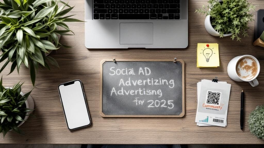
story 10 Budget-Friendly Small Business Advertising Ideas for 2025
In today's competitive market, small businesses need more than just a great product or service; they need a powerful, consistent voice. The primary challenge isn't a lack of ambition but finding effective, budget-friendly ways to reach the right audience. Many entrepreneurs feel stuck between the high costs of traditional ads and the often overwhelming world of digital marketing. This guide is designed to cut through that noise and offer a clear path forward. We have compiled 10 powerful small business advertising ideas that are both actionable and affordable, engineered to deliver tangible results without draining your resources. Whether you run a local brick-and-mortar shop or a growing online brand, these strategies provide a practical roadmap to amplify your message, connect with customers, and drive sustainable growth. For businesses in niche sectors like custom apparel, understanding specific industry trends can also inform advertising strategies and growth paths; for instance, a deep dive into DTF Printing Trends for Small Businesses in 2025 can reveal new product opportunities. From leveraging free digital tools to building powerful community partnerships, let's explore how you can make your marketing budget work smarter, not harder. 1. Social Media Marketing and Content Creation Social media marketing is a powerful tool for small businesses to connect directly with their target audience, build brand loyalty, and drive sales with a minimal budget. This approach focuses on creating and sharing valuable, relevant, and consistent content to attract and retain a clearly defined audience. It's about building a community, not just broadcasting advertisements. By using platforms like Instagram, Facebook, TikTok, and LinkedIn, you can tell your brand’s story, showcase your products, and engage in real-time conversations with customers. How to Implement This Strategy Successful social media marketing hinges on consistency and authenticity. Start by identifying which platforms your target customers use most. A local restaurant might thrive on Instagram's visual-first format, using Stories for daily specials, while a B2B consulting firm would find more value in sharing industry insights on LinkedIn. Key tactics include: Post Consistently: Aim for a regular schedule during peak audience activity times. To stay organized and avoid last-minute scrambling, consider building a content bank to plan your posts in advance. Engage Authentically: Respond to comments and messages promptly. Ask questions and run polls to encourage interaction. Use Platform-Specific Features: Leverage tools like Instagram Reels, TikTok videos, and Facebook Live to create dynamic and engaging content that algorithms favor. Humanize Your Brand: Share behind-the-scenes content, employee spotlights, and user-generated content to build trust and relatability. This quick reference summarizes the core components of a social media content strategy. The data highlights how a consistent time investment on the right platforms can yield significant reach at a low cost, making it an essential small business advertising idea. Even with a strong digital presence, you can amplify your reach by integrating offline materials. Consider using flyer printing to promote your social media handles and special online-only offers at local events or in-store. 2. Google My Business Optimization and Local SEO Google My Business (GMB), now known as Google Business Profile, is a critical, free tool for businesses aiming to attract local customers. This location-based marketing strategy optimizes your presence in Google search results and on Google Maps, making it significantly easier for nearby customers to find, contact, and choose your business over competitors. It involves managing your online information, responding to reviews, and posting updates to build credibility and visibility for "near me" searches. How to Implement This Strategy A fully optimized Google Business Profile acts as a digital storefront, often providing the first impression a potential customer has of your brand. The goal is to provide Google with accurate, comprehensive, and engaging information so it can confidently recommend your business to relevant searchers. For instance, a local plumber can generate direct leads from their profile, while a retail store can use posts to drive foot traffic for a weekend sale. Key tactics include: Complete Every Section: Fill out 100% of your profile, including services, hours, photos, and attributes. The more information you provide, the better. Manage Reviews Actively: Respond to all reviews, both positive and negative, in a professional and timely manner. This shows you value customer feedback. Post Regular Updates: Use Google Posts to share weekly updates about offers, events, new products, or company news to keep your profile active. Encourage Customer Reviews: Proactively ask satisfied customers to leave a review. More positive reviews boost your ranking and build social proof. This approach is one of the most cost-effective small business advertising ideas for driving targeted, high-intent local traffic. To complement your strong online presence, you can use physical media to bridge the gap. Consider adding a QR code to your custom business cards that links directly to your GMB review page, making it effortless for happy customers to share their positive experiences. 3. Email Marketing and Newsletter Campaigns Email marketing is a highly effective, direct communication channel that allows small businesses to build and nurture customer relationships. Unlike social media, you own your email list, giving you a direct line to your audience without fighting algorithms. This strategy focuses on delivering valuable, personalized content through newsletters, promotions, and automated sequences, which helps build a loyal customer base with a high lifetime value. Brands like Morning Brew have demonstrated this power, growing to millions of subscribers by delivering engaging daily newsletters. How to Implement This Strategy A successful email marketing program is built on trust and value, not spam. The first step is to build your list organically by offering a compelling reason for people to subscribe, such as a discount, a helpful guide, or exclusive content. From there, consistency and relevance are paramount. A local gym, for instance, could use automated email sequences to onboard new members and share weekly fitness tips to improve retention. Key tactics include: Offer a Valuable Lead Magnet: Provide a free resource like an ebook, checklist, or webinar to entice sign-ups. Send Consistently, Not Excessively: Aim for a regular schedule, typically 1-2 times per week, to stay top-of-mind without overwhelming subscribers. Personalize Your Content: Use subscriber data to personalize subject lines and content, making your audience feel seen and valued. Optimize for Mobile: A significant portion of emails are opened on mobile devices, so ensure your templates are responsive and easy to read on a small screen. Test and Analyze: Experiment with different send times, subject lines, and content formats to see what resonates best with your audience. Email marketing remains one of the most cost-effective small business advertising ideas, offering a high return on investment. For businesses looking to create professionally designed and impactful campaigns, exploring options for custom email newsletters can elevate your brand's presentation and engagement rates. 4. Referral and Word-of-Mouth Programs A referral program is a powerful customer acquisition strategy that leverages your existing satisfied customers to bring in new business. This approach recognizes that people trust recommendations from friends and family far more than traditional advertising, turning your happy clients into a volunteer marketing team. It’s a sustainable growth engine that rewards loyalty and generates high-quality leads, making it one of the most cost-effective small business advertising ideas available. By incentivizing word-of-mouth, you create a cycle of trust and growth. How to Implement This Strategy The success of a referral program hinges on making it simple, rewarding, and visible. Start by defining a clear incentive that benefits both the referrer and the new customer, like a discount, store credit, or a free product. Dropbox famously drove explosive growth by offering extra storage space, a reward directly tied to their service's value. Your program should be easy to find and even easier to use, ideally with one-click sharing options. Key tactics include: Keep It Simple: Design a straightforward referral process. A customer should be able to share a unique link or code in seconds. Offer Mutual Value: Reward both the person referring and the new customer to maximize participation. A 20% discount for each is a classic win-win. Time Your Ask: Prompt customers to refer right after a positive experience, such as a 5-star review, a repeat purchase, or positive feedback. Promote Everywhere: Feature your referral program on your website, in email signatures, on order confirmation pages, and through social media. You can also integrate offline methods to boost awareness. Consider using professionally designed postcards for your business included in customer packages, which clearly explain the referral program and provide a shareable code. This tactic ensures your program reaches customers directly and gives them a tangible reminder to share their positive experience with others. 5. Strategic Partnerships and Cross-Promotion Strategic partnerships offer a powerful way for small businesses to expand their reach by tapping into an established, relevant audience. This collaborative marketing approach involves teaming up with a non-competing business that shares a similar customer base. By cross-promoting each other's products or services, both partners gain exposure and credibility, achieving mutual growth that would be more costly and difficult to attain alone. It’s a classic win-win, turning shared resources into shared success. How to Implement This Strategy The key to a successful partnership is finding the right fit and establishing clear expectations from the start. Look for businesses that complement what you do. For instance, a local gym could partner with a nearby health food store for a joint wellness promotion, or a wedding photographer could team up with a florist and a venue to offer a bundled package. This adds value for the customer while funneling new business to all partners involved. Key tactics include: Identify Complementary Partners: Seek businesses with similar quality standards and target demographics but different offerings. Establish a Clear Agreement: Outline roles, responsibilities, promotion schedules, and how success will be measured in a formal agreement. Co-Create Valuable Offers: Develop joint promotions, bundled services, or co-hosted events that benefit both customer bases. Promote Across All Channels: Announce the partnership on social media, in email newsletters, and with in-store signage to maximize reach. This collaborative approach is one of the most effective small business advertising ideas for generating warm leads. As you meet potential partners at networking events, having professional materials on hand is crucial. Exchanging high-quality business cards is the first step in building a lasting and profitable relationship. 6. Content Marketing and Blogging Content marketing is a long-term strategic approach focused on creating and distributing valuable, relevant content to attract and engage a target audience. Instead of directly pitching your products or services, you provide genuinely useful information that builds trust and positions your business as an industry authority. This method naturally drives traffic, leads, and sales through educational, entertaining, and problem-solving content like blog posts, guides, and case studies. How to Implement This Strategy Effective content marketing requires understanding your audience's pain points and providing solutions. By consistently producing high-quality content, you create a powerful asset that draws in potential customers. For example, a local accounting firm could generate significant leads by blogging about small business tax tips, while a software company like HubSpot built its entire brand on providing expert marketing advice. Key tactics include: Solve Specific Problems: Create content that directly answers the questions your ideal customers are searching for online. Optimize for Search: Research relevant keywords and understand search intent to ensure your content is discoverable on search engines like Google. Repurpose Your Content: Turn a single blog post into a video, an infographic, a series of social media posts, or a podcast episode to maximize its reach. Include Clear Calls-to-Action (CTAs): Guide your readers on what to do next, whether it's downloading a guide, subscribing to your newsletter, or contacting you for a quote. This strategy is one of the most sustainable small business advertising ideas for building lasting brand equity and a loyal customer base. 7. Community Event Sponsorship and Participation Engaging directly with your local community through event sponsorship and participation is a powerful way to build brand awareness and foster genuine relationships. This boots-on-the-ground strategy moves beyond digital ads to create face-to-face connections, demonstrating your business's commitment to the community's well-being. It positions your brand as a neighborhood partner, not just a faceless entity, building trust and local loyalty that money can't easily buy. Whether sponsoring a youth sports team or setting up a booth at a town festival, this approach makes your brand a visible and active part of local life. How to Implement This Strategy Success in community marketing relies on authentic engagement and strategic alignment. Choose events that naturally attract your target customers. A financial advisor might host a free retirement planning workshop at a community center, while a local boutique could gain significant traction by participating in a downtown arts and crafts festival. The key is to be present and add value. Key tactics include: Choose Relevant Events: Select sponsorships and events where your target demographic is likely to be. A pet store sponsoring a local dog park adoption day is a perfect match. Create a Memorable Presence: Don’t just show up. Design an interactive booth or experience. Offer a game, a free sample, or a helpful demonstration to draw people in and make a lasting impression. Bring Valuable Giveaways: Offer branded items that people will actually use, like tote bags, water bottles, or phone grips. This keeps your brand visible long after the event ends. Volunteer Genuinely: Show you care by contributing more than just money. Volunteering your time and effort builds goodwill and creates authentic connections with attendees and other local leaders. This method is one of the most effective small business advertising ideas for building a loyal local customer base. To maximize your visibility at these events, make sure your booth stands out with professionally designed materials. Investing in high-quality, weather-resistant vinyl banners can help you attract attention from across a crowded field or sports complex, clearly communicating your brand and support. 8. Customer Testimonials and Case Study Marketing Leveraging customer testimonials and case studies is a trust-building strategy that uses authentic customer experiences to attract new business. This approach provides powerful social proof by showcasing real-world success stories, transforming satisfied customers into your most credible advocates. Instead of you telling prospects how great your product is, your customers do it for you, adding a layer of authenticity that traditional advertising can't match. This is one of the most effective small business advertising ideas for building credibility and demonstrating tangible value. How to Implement This Strategy The key to successful testimonial marketing is making it easy for happy customers to share their stories and then placing those stories where potential buyers will see them. A software company might showcase a case study detailing a client's ROI, while a home contractor could feature a before-and-after video testimonial. The goal is to present a relatable problem and a clear, desirable solution provided by your business. Key tactics include: Time Your Ask: Request a testimonial or review immediately following a positive interaction or successful project completion when the customer's satisfaction is highest. Simplify the Process: Provide customers with simple templates or guiding questions to help them structure their feedback, making it less of a chore. Maximize Visibility: Feature your best testimonials prominently on your website's homepage, product pages, and in marketing materials like brochures and email campaigns. Embrace Video: Whenever possible, capture video testimonials. They are more engaging and impactful than text, conveying emotion and authenticity more effectively. 9. Targeted Pay-Per-Click (PPC) Advertising Pay-Per-Click (PPC) advertising is a digital marketing model where you pay a fee each time one of your ads is clicked. This strategy allows small businesses to place ads directly in front of customers actively searching for their products or services on platforms like Google or scrolling through their feeds on Facebook. Instead of earning visibility organically, you buy it, gaining immediate access to highly targeted audiences based on demographics, search keywords, interests, and online behaviors. The primary advantage is its measurability and control; you set a budget and only pay for tangible engagement. How to Implement This Strategy Effective PPC requires a focus on precision and optimization. This isn't a "set it and forget it" tactic; it demands continuous monitoring to ensure your ad spend delivers a positive return on investment. For instance, a local plumber can use Google Ads to capture urgent "plumber near me" searches, while an e-commerce store can use Facebook Ads to retarget users who abandoned their shopping carts with a special discount. Key tactics include: Start Small and Scale: Begin with a modest daily budget to test different ad sets and audiences. Once you identify what works, you can strategically increase your investment in the most profitable campaigns. Utilize Negative Keywords: Prevent your ads from showing for irrelevant searches by adding negative keywords. This stops wasted clicks and focuses your budget on qualified leads. Write Compelling Ad Copy: Your ad should speak directly to a customer's problem and offer a clear solution. Focus on benefits over features and include a strong call to action. Optimize Landing Pages: Ensure the page users land on after clicking your ad is directly relevant and designed for conversion. A seamless experience from ad to landing page is crucial. 10. Guerrilla Marketing and Creative Stunts Guerrilla marketing is an unconventional advertising approach that relies on creativity, surprise, and innovation to create memorable brand experiences on a tight budget. Popularized by Jay Conrad Levinson's book series, this strategy focuses on generating significant buzz through unexpected, high-impact public interactions rather than traditional media buys. For small businesses, it offers a powerful way to stand out from larger competitors by creating viral moments and building a strong brand identity. How to Implement This Strategy The core of guerrilla marketing is creating an unforgettable moment that people feel compelled to share. This could be anything from a creative chalk art installation on a busy sidewalk to a flash mob promoting a local event. The key is to be imaginative and connect the stunt directly to your brand's message in a way that feels authentic and clever, not just disruptive. A famous example is Dollar Shave Club's viral launch video, which used humor and a low-budget feel to disrupt a massive industry. Key tactics include: Align with Brand Values: Ensure your stunt clearly reflects what your brand stands for. A playful, edgy stunt might not fit a conservative financial advisory firm. Document Everything: The real value often comes after the event. Have cameras ready to capture photos and videos for social media, your website, and future content marketing. Assess Legal and Safety Risks: Before you launch, research local ordinances and potential safety concerns. You want attention for the right reasons, not for breaking rules or creating hazards. Plan for the Aftermath: Have a clear plan to engage with the attention you generate. Prepare social media responses, a landing page for interested visitors, and a way to convert buzz into leads or sales. By being creative and bold, you can implement one of the most cost-effective small business advertising ideas that generates massive reach. To further amplify your guerrilla efforts, consider directing onlookers to your digital platforms. You can use affordable marketing materials like custom stickers with QR codes at your stunt's location to bridge the offline experience with your online community. Small Business Advertising Ideas Comparison Strategy Implementation Complexity 🔄 Resource Requirements ⚡ Expected Outcomes 📊 Ideal Use Cases 💡 Key Advantages ⭐ Social Media Marketing and Content Creation Moderate to High (consistent daily effort) Time-intensive (2-4 hrs daily), creative skills Builds brand awareness and engagement over months Brands seeking organic growth and community building Low cost, direct customer communication, viral potential Google My Business Optimization and Local SEO Low to Moderate (ongoing updates needed) Time for profile maintenance and review management 25-50% increase in local search visibility within 3 months Local businesses targeting nearby customers Free setup, increases trust via reviews, mobile-friendly Email Marketing and Newsletter Campaigns Moderate (list building and automation) Requires email platform and content creation High ROI ($42 per $1 spent), builds long-term loyalty Businesses with existing audience or ecommerce Highly measurable, direct communication, cost-effective Referral and Word-of-Mouth Programs Moderate to High (setup and management) Development of reward system and tracking tools 3-5% customers refer, 16% higher lifetime value Customer-focused businesses with quality products Low acquisition cost, high conversion, viral growth Strategic Partnerships and Cross-Promotion High (coordination and agreements needed) Shared resources and joint efforts Mutual customer acquisition and expanded reach Businesses with complementary offerings Access new audiences, shared costs, enhanced credibility Content Marketing and Blogging High (consistent quality content creation) Significant time investment, SEO knowledge 3x leads more than paid search, long-term traffic Businesses aiming for thought leadership and organic growth Lasting value, cost-efficient lead generation Community Event Sponsorship and Participation Moderate (event planning and sponsorship) Financial investment ($500-$5,000 per event), time Builds local trust and immediate sales opportunities Local businesses focused on community engagement Strong local brand recognition, personal connections Customer Testimonials and Case Study Marketing Moderate (collection and production effort) Time to collect and produce quality content Up to 34% boost in conversions Service and B2B companies building trust Authentic social proof, cost-effective content Targeted Pay-Per-Click (PPC) Advertising High (campaign setup and optimization) Budget ($500-1000+ monthly), ongoing management Immediate traffic and measurable ROI Businesses needing instant visibility and leads Precise targeting, budget control, A/B testing Guerrilla Marketing and Creative Stunts High (creative concepts and execution) Low budget but requires creativity/legal prep High impact, viral potential but unpredictable Brands wanting buzz and differentiation High memorability, earned media, authentic engagement Putting Your Plan into Action: The Path Forward Navigating the world of advertising can feel overwhelming, but as we've explored, you have a powerful arsenal of effective and budget-friendly strategies at your disposal. This collection of small business advertising ideas isn't meant to be a checklist to complete all at once. Instead, view it as a diverse menu of opportunities, allowing you to select the tactics that best resonate with your unique brand, your target audience, and your specific business goals. The true power lies not in doing everything, but in doing a few things exceptionally well. The common thread weaving through every successful strategy, from a meticulously optimized Google My Business profile to a clever guerrilla marketing campaign, is a deep understanding of your customer. Your path forward begins with this fundamental insight. Who are you trying to reach? Where do they spend their time, both online and offline? What problems can you solve for them? Answering these questions will illuminate which advertising channels hold the most promise for your business. From Ideas to Impact: Your Actionable Next Steps The journey from inspiration to implementation is where growth happens. To avoid analysis paralysis, commit to a focused, methodical approach. Here’s a simple framework to get you started: Select and Prioritize: Choose just one or two advertising ideas from this list to implement first. A great starting point for many is a combination of a digital tactic, like enhancing your local SEO , and a community-based one, like pursuing a strategic partnership with a neighboring business. This creates a balanced, multi-channel effect. Set Measurable Goals: Define what success looks like before you begin. Is it a 15% increase in website traffic from your content marketing efforts? Or perhaps 25 new leads generated from your next email campaign? Clear, quantifiable goals are essential for tracking progress and proving your return on investment. Execute with Consistency: Sporadic efforts yield sporadic results. Whether you commit to posting on social media three times a week, sending out a monthly newsletter, or sponsoring one community event per quarter, consistency builds momentum and brand recognition. Track, Analyze, and Adapt: Use the tools at your disposal, like Google Analytics, social media insights, and email marketing reports, to monitor your performance. Don't be afraid to pivot if a strategy isn't delivering. The data will tell you what's working, allowing you to double down on effective tactics and refine your approach over time. Mastering these advertising concepts is more than just a marketing exercise; it's a direct investment in the longevity and vitality of your business. Each new customer you reach, each positive review you earn, and each community connection you forge strengthens your foundation. By blending innovative digital strategies with the timeless power of print and community engagement, you create a resilient and dynamic marketing engine. Your brand's story is waiting to be told, and with a smart, strategic plan, you have everything you need to ensure it's heard loud and clear. Ready to bring your advertising ideas to life with tangible, high-quality materials? From eye-catching flyers and direct mail postcards that support your local campaigns to professional banners for your next event, 4OVER4 provides the premium printing services your small business needs to make a lasting impression. Explore our wide range of customizable products at 4OVER4 and start creating marketing assets that get noticed.
 story
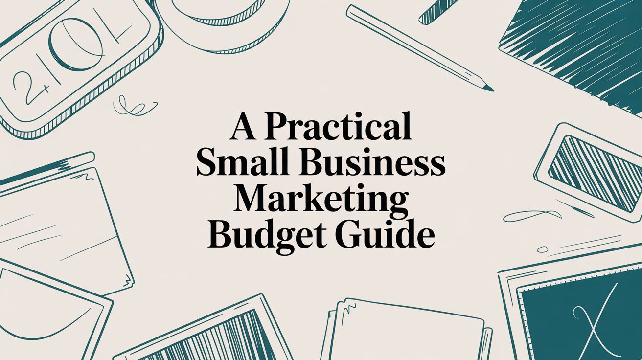
story A Practical Small Business Marketing Budget Guide
Determining a marketing budget for your small business can feel like a shot in the dark. A good rule of thumb is to set aside 7-10% of your annual revenue. For a brand new startup, this might only be $200-$500 a month. For a more established business, that number could easily climb to $10,000 monthly to keep the growth engine running. Why Your Business Needs a Strategic Marketing Budget Let's be real—saying you "need a budget" is obvious. The real conversation is about why . Flying blind with your marketing spend is a surefire way to waste money on ads that don't work, stall your growth, and end up with a brand message that no one hears. A well-planned budget isn’t about pinching pennies. It's about empowering your business to make smart, intentional moves. It’s the tool that lets you compete with the big guys, attract customers who actually buy, and build something that lasts. Even when cash is tight, a strategic budget is your foundation for every win. From Guesswork to Growth Without a plan, your marketing decisions become reactive. You boost a social media post that got a few likes or print some flyers on a whim. These things feel productive in the moment, but they rarely connect to real business results. A strategic budget forces you to think ahead. A formal budget gives you the power to: Prioritize ruthlessly. Put your money where it actually delivers results instead of spreading it thin across a dozen different channels. Measure what matters. Tie every dollar you spend to important metrics like customer acquisition cost (CAC) and return on investment (ROI). Plan for the long haul. Build campaigns that gain momentum over time, instead of just chasing quick, short-lived wins. A marketing budget is your business's permission slip to grow. It dedicates resources specifically to customer acquisition and brand building, ensuring these critical functions don't get lost in day-to-day operational costs. Setting Realistic Spending Benchmarks It helps to know what other businesses are spending. While every company is different, the data shows a clear trend: a whopping 78% of small business owners plan to increase their marketing budgets. That tells you just how critical this investment has become. One great place to start is with high-quality marketing materials , which can make a tangible first impression. But how do you find the right number for your business? Below are some helpful benchmarks to get you started. Marketing Budget Benchmarks for Small Businesses This table provides clear, actionable budget benchmarks based on your business stage and revenue. Use it to find a realistic starting point that aligns with your growth goals. Business Stage Annual Revenue Recommended Marketing Spend (% of Revenue) Example Monthly Budget New Business / Startup Under $100,000 10-15% $833 - $1,250 Growing Business $100,000 - $500,000 8-12% $667 - $5,000 Established Business $500,000 - $1M 7-10% $2,917 - $8,333 Scaling Business Over $1M 9-12% (or higher for aggressive growth) $7,500+ As you can see, the percentage often shifts based on your immediate goals. A startup in a high-growth phase might push that number higher to capture market share, while an established local business could sit comfortably at the lower end to maintain its position. Know Your Destination: Defining Marketing Goals Before You Spend a Dime Throwing money at marketing without a clear target is like driving without a destination—you’ll burn through your cash but never actually get anywhere. The very first rule of building a smart marketing budget is to tie every single dollar to a specific, measurable business outcome. Forget vague wishes like "get more customers." Your budget needs a real job to do. A purpose-driven budget is built on crystal-clear objectives. Instead of a fuzzy goal, frame it with precision: "Increase website lead conversions by 15% in Q3 " or "Grow our local Instagram following with 500 engaged users in the next 60 days." See the difference? These aren't just hopes; they are measurable targets that tell you exactly where your money should go. This simple shift in thinking turns your budget from a boring list of expenses into a strategic plan for growth. How Your Goals Dictate Your Spending The goals you set are the blueprint for your budget allocation. If your primary objective is brand awareness, you'll naturally funnel funds toward things like social media ads and content creation, where you can cast a wide net. On the flip side, a lead generation goal will push you to prioritize SEO and targeted pay-per-click (PPC) campaigns designed to capture people who are ready to buy. Let's walk through a real-world scenario. Imagine a local bakery that wants to ramp up online orders for custom cakes. The Vague Goal: "Sell more cakes." This gives you zero direction. Do you run newspaper ads? Sponsor a local soccer team? It's a guessing game. The SMART Goal: "Generate 25 qualified online cake order inquiries per month through our website within four months." That specific goal immediately brings the strategy into focus. The budget should clearly be allocated to local SEO (so they show up in "bakery near me" searches), targeted Facebook and Instagram ads aimed at users with upcoming birthdays, and high-quality photography to make their cakes look irresistible online. Suddenly, every dollar has a mission. Your marketing goals are the 'why' behind every dollar you spend. Without them, you're just buying ads and hoping for the best. With them, you're investing in tangible business results, turning your marketing budget into a predictable engine for growth. Not All Goals Are Created Equal It's important to recognize that marketing goals fall into a few different buckets. Understanding the difference is critical for allocating your budget wisely. You have to know if you're planting seeds for the future or trying to harvest crops right now. For instance, a brand-new coffee shop will likely focus on brand awareness first. Their initial budget would be heavy on social media engagement, sponsoring a local farmers' market, and maybe even distributing some eye-catching flyers. They aren't trying to get a direct sale from every dollar just yet; they're trying to become a household name in the neighborhood. Contrast that with an established e-commerce store whose main goal is customer acquisition . Their budget would be heavily weighted toward Google Shopping ads and retargeting campaigns—tactics with a clear and immediate return on ad spend (ROAS). Here’s a simple breakdown of common goal types and the channels they typically influence: Brand Awareness: The main objective is to introduce your brand to people who've never heard of you. Channels: Social media campaigns, content marketing (blogs, videos), local sponsorships, and public relations. Lead Generation: The focus is on capturing contact information from potential customers so you can nurture them over time. Channels: Gated content (e-books, webinars), search engine optimization (SEO), targeted paid ads, and email marketing funnels. Sales Conversion: This goal is all about driving direct purchases or sign-ups. It's the finish line. Channels: Pay-per-click (PPC) advertising, retargeting ads, email promotions, and landing page optimization. Many of these efforts are directly tied to achieving measurable sales growth and proving a solid ROI. Customer Loyalty and Retention: The aim is to turn one-time buyers into repeat customers and brand advocates. Channels: Email newsletters, loyalty programs, exclusive customer discounts, and community engagement on social media. By defining your primary goal first , you can build a budget that is focused and efficient. This ensures you're not wasting money on channels that don’t align with what you need to achieve right now. How to Calculate a Realistic Marketing Budget Alright, you've got your goals locked in. Now it's time for the fun part: putting some real numbers behind them. Figuring out your small business marketing budget isn't about pulling a random percentage out of thin air. It’s about creating a concrete plan that lines up with your ambitions and your bank account. Most businesses take one of two paths here. One is a simple, straightforward method based on what you’re already bringing in. The other is more strategic—it starts with your end goal and works backward to figure out the cost. Let's walk through both so you can see which one feels right for you. The Percentage of Revenue Method This is the most common starting point for a reason: it's simple. You just take your total revenue and dedicate a fixed percentage of it to all your marketing efforts. I like this method because it’s easy to calculate and it scales with you. When business is good, you invest more. When things are tight, your budget adjusts accordingly. So, what percentage should you use? Industry benchmarks are a great guide: Established Businesses (over 5 years): These companies usually put 5-10% of their revenue toward marketing. At this stage, the game is about maintaining your spot and driving steady, predictable growth. Startups and Growth-Phase Businesses (under 5 years): If you're newer, you'll likely need to be more aggressive. Think 12-20% . You're trying to build brand recognition from scratch and grab market share, which takes a bigger investment. Let's say you run a local retail store that's been around for a while, bringing in $300,000 a year. If you decide to allocate 8% , that gives you an annual marketing budget of $24,000 . That's $2,000 a month you can consistently plan around. The Goal-Based (Objective and Task) Method The percentage model is a solid baseline, but the goal-based approach is where the real strategy comes in. Instead of looking at your revenue, you start with your specific objective and map out exactly what it will cost to get there. This is powerful because it ties every single dollar you spend directly to a result you want. Let's go back to our bakery that wants to get 25 qualified online cake orders every month. What needs to get done? To hit that number, they’ll need to work on their local SEO, run some targeted social media ads, and get some drool-worthy photos of their cakes. What will it cost? Local SEO Consultant: $500/month Facebook/Instagram Ad Spend: $700/month One-time Photography Session: $800 Add it all up: For the first month, their budget would be $2,000 ( $500 + $700 + $800 ). After that, it drops to a recurring $1,200 per month. See the difference? This budget is built to achieve a very specific outcome. This infographic really drives home how your goals, budget, and actions are all connected. As you can see, a clear goal is the foundation. It tells you how to build your budget, and that budget then dictates every move you make. To help you decide which path to take, here's a quick comparison of the two budgeting methods. Comparing Budget Calculation Methods Method Best For Pros Cons Percentage of Revenue Businesses seeking simplicity and a stable, predictable budget that scales with performance. Easy to calculate. Ensures you don't overspend. Naturally adjusts with revenue fluctuations. Not tied to specific goals. Can be limiting during growth phases. Goal-Based Businesses with specific, measurable objectives, especially those in a growth phase or launching new products. Every dollar is tied to an outcome. Highly strategic and focused. Encourages efficient spending. More complex to calculate. Budget can fluctuate month-to-month. Ultimately, many businesses use a hybrid approach—starting with a percentage of revenue as a baseline and then fine-tuning it based on specific, high-priority goals. Uncovering the Hidden Costs I've seen so many small business owners make this mistake: they map out their budget, but they only account for the obvious stuff like ad spend. But there are a bunch of "hidden" costs that can totally wreck your plan if you’re not ready for them. A complete marketing budget isn't just your ad spend. It's the full investment required to run your marketing engine, including the people, tools, and creative assets that make it all happen. Ignoring these leads to an inaccurate picture of your true ROI. Make sure you're factoring in these often-forgotten expenses: Software and Tools: Think about your email marketing service, any social media schedulers, SEO tools, or analytics platforms. These monthly subscriptions add up. Creative Assets: Need professional photos for your website? A short video for social media? A graphic designer to create your ads? These are critical and need to be in the budget. Talent: Are you paying a freelance copywriter, a virtual assistant to manage your social media, or a specialist to run your Google Ads? Their fees are a core marketing cost. Physical Materials: Don't forget about the tangible stuff! If you're a local business, you might need to print flyers, posters, or even some cheap coroplast signs for a local event. A great framework for allocating your funds is the 70-20-10 rule . Here's how it works: 70% of your budget goes to your proven, bread-and-butter strategies (like Google Ads or email). 20% goes toward exploring new channels that look promising (like trying out TikTok ads). The final 10% is for pure experimentation on things that might be a long shot but could have a huge payoff. This keeps your results steady while still leaving room for innovation. Allocating Your Budget Across Marketing Channels Alright, you’ve set your goals and crunched the numbers. Now for the really tactical part: deciding exactly where to put your money. It’s easy to feel pulled in a dozen different directions, with every platform promising the moon. The key is to allocate your funds with intention. Don't just spray your cash across every channel and hope for the best. A disorganized approach is the fastest way to waste a marketing budget. A solid plan ensures your money is actively working for you, balancing reliable returns with exciting chances for growth. A Simple Framework: The 70-20-10 Rule One of the most effective models I’ve seen for budget allocation is the 70-20-10 rule . It's a powerful framework that stops you from putting all your eggs in one basket while protecting your core, revenue-driving activities. It’s all about creating balance. Here’s the breakdown: 70% on Proven Winners: The bulk of your budget goes right here. These are the tried-and-true channels that consistently deliver results for your business. Think of your finely tuned Google Ads campaigns, your high-performing email funnels, or an established SEO strategy that brings in steady organic traffic. 20% on Promising New Channels: This slice is for scaling what’s working and exploring adjacent opportunities. You might use this to test LinkedIn ads if you're B2B, dabble in influencer collaborations, or expand to a new social platform where your audience is starting to hang out. These are calculated risks based on solid evidence. 10% on Experimental Bets: This is your innovation fund. It's a small part of the budget dedicated to high-risk, high-reward experiments. Maybe you test out a new AI content tool, run a tiny campaign on a brand-new social app, or try an unconventional guerrilla marketing tactic. Most of these will probably fail, but the one that hits could become your next "proven winner." Making The Rule Work For You The 70-20-10 rule is just a guideline, not a strict command. Its real power is in its flexibility. A brand-new startup with no "proven winners" might flip the model completely, spending 70% on experiments to find what works. On the other hand, a conservative, established business might shift to an 80-15-5 split. Let’s look at a real-world example: a local coffee shop with a $2,000 monthly marketing budget. 70% ($1,400) for Proven Winners: $700 for local SEO and managing their Google Business Profile to capture "coffee near me" searches. $400 for running loyalty promotions through their email newsletter. $300 for boosting posts on their established Instagram page. 20% ($400) for Promising Channels: They decide to test TikTok by hiring a local creator to produce a few short videos showcasing their specialty drinks, targeting a younger crowd. 10% ($200) for Experiments: They use this to sponsor a small neighborhood event or test a new text-based loyalty program to see if it drives more repeat business than email. This structured approach keeps the lights on while actively exploring new ways to grow. When you're deciding where to invest, looking into effective social media marketing strategies can give you great insight into what’s working for others in your space. The 70-20-10 rule provides a structured way to balance stability and innovation. It ensures you're consistently investing in what works while still giving yourself permission to discover your next big marketing win. Blending Digital and Traditional Channels For a lot of small businesses, marketing isn't just a digital game. Your allocation plan should reflect a smart mix of online and offline tactics, especially if you have a physical location. The right blend depends entirely on where your customers are. A local plumber might get more value from a branded truck and local sponsorships than from a national TikTok campaign. Try to integrate your offline efforts with your digital ones. High-quality print collateral, for example, still holds a lot of weight. You can get excellent results by exploring modern direct mail services that use QR codes to drive people to a specific landing page. This simple trick makes a traditionally offline channel trackable, bridging the physical-digital gap. Here’s a quick look at how different businesses might split their focus: Business Type High-Priority Digital Channels High-Priority Traditional Channels E-commerce Store SEO, PPC Ads, Social Media Ads, Email Marketing Product Packaging Inserts, Pop-Up Shops Local Restaurant Local SEO, Instagram, Email Loyalty Programs In-Store Menus, Local Event Sponsorships B2B Consultant LinkedIn, SEO, Webinars, Email Outreach Networking Events, Industry Conferences Home Services Google Local Services Ads, Local SEO, Facebook Branded Vehicles, Door Hangers, Yard Signs Ultimately, allocating your marketing budget is an active, ongoing process. By starting with a framework like the 70-20-10 rule and constantly measuring your results, you can build a dynamic financial plan that adapts as your business grows. Tracking ROI and Optimizing Your Spending A marketing budget isn't something you create once and then file away. It's a living, breathing tool that should get smarter and more efficient as you learn what works. The only way to make that happen is by diligently tracking your results, understanding what the numbers are telling you, and having the courage to shift your spending based on real-world performance. Your initial budget is really just your best guess. Tracking your return on investment (ROI) is how you turn that guess into a calculated, data-driven strategy. Without this crucial step, you’re just spending money—not investing it. The Metrics That Truly Matter It’s easy to get lost in a sea of analytics. To keep things simple and actionable, I always recommend focusing on just a few key performance indicators (KPIs) that directly tell you if your money is actually working. For any small business, these are the two most important metrics to live by: Customer Acquisition Cost (CAC): This is the total cost of convincing someone to become a customer. You calculate it by dividing your total marketing spend by the number of new customers you brought in during that period. Formula: Total Marketing Spend / New Customers Acquired = CAC Example: If you spent $1,000 on marketing in a month and got 20 new customers, your CAC is $50 . Return on Ad Spend (ROAS): This one is specific to paid advertising and tells you how much revenue you’re generating for every single dollar you spend on ads. Formula: Total Revenue from Ads / Total Ad Spend = ROAS Example: If you spent $500 on Facebook ads and generated $2,500 in sales, your ROAS is 5x . These numbers give you a clear, honest picture of your performance. A low CAC and a high ROAS are the vital signs of a healthy marketing engine. Your budget tells you what you plan to spend, but your ROI tells you what you should spend. Consistently tracking metrics like CAC and ROAS is the only way to close the gap between your plan and reality, ensuring every dollar works as hard as possible. Simple Tools for Tracking Performance You don't need a complicated, expensive software suite to monitor your marketing efforts. In fact, you can get started with powerful, user-friendly tools that are probably already at your fingertips. Google Analytics: This is non-negotiable for anyone with a website. It shows you where your traffic is coming from, which pages people love, and—most importantly—which channels are actually driving sales or leads. Native Social Media Dashboards: Platforms like Facebook, Instagram, and LinkedIn have surprisingly robust built-in analytics. They'll show you the reach, engagement, and conversion data for your posts and ads, all for free. A Simple Spreadsheet: Honestly, sometimes the simplest solution is the best. A spreadsheet is perfect for manually tracking your monthly spend per channel and the results you achieved, like leads or total sales. The goal isn't to track every single click. It's to establish a consistent review process. To make sure your marketing budget is working as hard as possible, explore these powerful conversion rate optimization tips to help turn the traffic you're paying for into actual customers. Creating a Cycle of Optimization The real magic happens when you get into a regular review rhythm. Whether it's monthly or quarterly, set aside dedicated time to sit down with your data and make informed decisions. This is the moment you transform from a spender into a strategic investor. Your review process should answer one simple question: What's working and what isn't? Once you have your answer, the next step is to act on it. This means systematically shifting funds away from underperforming channels and doubling down on what’s delivering. For instance, if you discover your local SEO efforts are bringing in high-value customers for a low CAC, while your print ads are falling flat, it's time to reallocate those funds. For businesses focused on a specific geographic area, a strong local marketing strategy often provides a fantastic return and is a great place to invest more of your budget. This optimization cycle— spend, measure, analyze, adjust —is what makes a small business marketing budget a dynamic tool for growth. With each cycle, your spending gets more efficient, your ROI improves, and your business gets stronger. Common Questions About Marketing Budgets When you're figuring out a marketing budget for your small business, a lot of questions pop up. It's a common sticking point for owners. Let's walk through some of the most frequent hurdles and get you some clear, practical answers so you can plan with confidence. How Much Should a Brand New Business Spend on Marketing? If you're just starting out, you don't have past revenue to base your budget on, so the popular percentage-of-revenue model won't work. The best approach here is the objective-and-task method . Start by defining a make-or-break launch goal. Maybe it’s acquiring your first 50 customers. From there, you work backward and price out the specific jobs needed to hit that number. This could mean paying for a local SEO setup, putting a small amount into social media ads, or signing up for email marketing software. Many startups get their footing with a focused budget of $500 to $2,000 per month . This range is a sweet spot that lets you prioritize high-impact, low-cost strategies—like creating content, networking locally, and building an organic social media presence—while you carefully dip your toes into one or two paid advertising channels. What Are the Most Cost-Effective Strategies for a Tiny Budget? When money is tight, you have to get scrappy. The smartest move is to lean into strategies that trade your time and effort for financial outlay. Think of it as "sweat equity" marketing—it builds a powerful foundation you can pour money into later. Content Marketing and SEO: Writing genuinely helpful blog posts or creating useful guides is a fantastic long-term play. The upfront cost is minimal, but the payoff in brand authority and organic traffic over time can be huge. Google Business Profile: This is a non-negotiable for any local business. Completely filling out and optimizing your Google Business Profile is free, and it’s one of the highest-impact things you can do to show up in local searches. Email Marketing: Year after year, email delivers one of the best ROIs in the game. Start building an email list from your very first day in business and focus on nurturing those relationships. Focused Social Media: Don't try to be everywhere at once. Pick one or two platforms where your ideal customers actually hang out and commit to mastering them. Consistent, valuable engagement costs you nothing but time. A tiny budget forces you to be resourceful. By focusing on high-leverage, low-cost activities like SEO and email, you can build significant marketing momentum that will pay dividends when you're ready to scale your ad spend. Should I Include Salaries in My Marketing Budget? Yes, you absolutely should. A real marketing budget has to account for all related costs, not just your ad spend. If you ignore operational expenses, you’ll get a distorted view of your marketing ROI and set yourself up for some nasty financial surprises down the road. A complete budget covers everything: Salaries for any in-house marketing people. Fees for freelancers, consultants, or agencies you hire. Monthly subscriptions for all your software and tools (like your email platform or social media scheduler). A great way to keep this all straight is to divide your budget into three buckets: People (salaries, contractor fees), Tools (software), and Programs (ad spend, campaign costs). This structure gives you a clear, honest picture of your total investment, which is the only way to accurately measure the true return on every dollar you put into growing your business. Ready to bring your marketing vision to life with materials that make an impact? At 4OVER4 , we offer high-quality, affordable printing solutions designed for small businesses. From business cards to banners, get the professional look you need to stand out. Explore our products and start creating today .
 story
story 9 Essential Small Business Marketing Materials for 2025
In today's crowded market, standing out is no longer optional; it's essential for survival and growth. For small businesses operating with lean budgets, every marketing dollar must deliver maximum impact. The key to achieving this isn't found in a single channel but in building a powerful, integrated strategy that leverages the best of both print and digital worlds. Your collection of small business marketing materials acts as a silent salesforce, consistently working to attract new customers, build brand credibility, and drive conversions. This comprehensive guide moves beyond generic advice to provide a detailed roundup of the most effective marketing assets every business needs. We will explore not just what to create but precisely how to use each item for optimal results, from design best practices that capture attention to strategic distribution that reaches the right audience. Think of it as your blueprint for creating a cohesive brand experience across every touchpoint, whether a potential customer is meeting you at a trade show or discovering your brand online. For a comprehensive overview of crucial assets, explore 9 essential small business marketing materials for 2025 that can significantly boost your outreach. Prepare to transform your marketing collateral from a simple expense into a powerful growth engine. In the sections that follow, we'll dive into everything from business cards and brochures to landing pages and social media graphics, ensuring you have the tools to make a memorable impression and achieve a tangible return on your investment. 1. Business Cards In a world dominated by digital communication, the humble business card remains one of the most effective and essential small business marketing materials. These small, printed cards are more than just a way to share contact details; they are a physical representation of your brand, a tangible reminder of a personal connection, and a powerful tool for establishing immediate credibility. When you hand someone a well-designed card, you're not just giving them information, you're making a memorable first impression. The power of a business card lies in its physicality. Unlike a fleeting digital exchange, a card can be kept, displayed, and referenced later, reinforcing your brand identity long after a meeting ends. For small businesses, this direct, personal exchange builds trust and professionalism in a way that an email or social media connection cannot replicate. Design and Content Best Practices A successful business card balances aesthetic appeal with clear, concise information. The design should be an extension of your overall brand identity, using the same logos, color palettes, and fonts. Essential Information Only: Stick to the vitals: your name, title, company name, phone number, email, and website. Too much text creates clutter and makes the card difficult to read. Quality Over Quantity: Invest in high-quality cardstock (at least 16pt or 350gsm). A thick, sturdy card feels premium and suggests a professional operation. Consider finishes like matte, gloss, or soft-touch lamination for added impact. Readability is Key: Ensure all text is legible, using a font size of at least 8pt. High-contrast colors for text and background are crucial. Incorporate a QR Code: Bridge the physical-digital gap by adding a QR code that links directly to your website, a digital portfolio, a LinkedIn profile, or a special landing page. Strategic Implementation Think beyond just handing out cards at networking events. Include a card in every product shipment, leave a small stack at local partner businesses (like a coffee shop or community board), and always have a few ready for unexpected encounters. A restaurant might use a die-cut card shaped like its signature dish, while a tech startup could use a card with a clean, minimalist design and a prominent QR code linking to their app download page. Sites like Moo.com offer innovative options like extra-thick cardstock and unique finishes that help your brand stand out. 2. Brochures and Flyers While business cards make the introduction, brochures and flyers tell the rest of the story. These classic small business marketing materials are designed to provide more detailed information than a card ever could. A flyer acts as a powerful, single-page announcement for an event, sale, or new service, designed for quick impact and wide distribution. A brochure, often folded, offers a more comprehensive dive into your company’s offerings, mission, and value proposition, serving as a leave-behind piece that educates and persuades potential customers. The tangible nature of these materials allows you to guide a customer’s journey through your information in a controlled, visually engaging way. Unlike a website where users can click away, a well-designed brochure holds their attention, making it an ideal tool for trade shows, waiting rooms, and direct mail campaigns. They establish authority and give your business a polished, professional feel. Design and Content Best Practices An effective brochure or flyer must capture attention instantly and guide the reader logically through the content. The goal is to inform and inspire action without overwhelming the audience. Compelling Headline and Visuals: Use a strong, benefit-oriented headline to hook the reader. High-quality, professional photography or graphics are non-negotiable as they communicate value and break up text. Clear Information Hierarchy: Organize content with headings, subheadings, and bullet points. Guide the reader's eye through the most important information first. A real estate agency might use a large hero image of a property, followed by bulleted features, and then agent details. Incorporate Social Proof: Add short customer testimonials, positive reviews, or logos of well-known clients to build trust and credibility. Strong Call to Action (CTA): Tell the reader exactly what to do next. Whether it's "Visit Our Website," "Call Today for a Free Consultation," or "Bring This Flyer for 10% Off," the CTA should be prominent and clear. Strategic Implementation Deploy flyers for time-sensitive promotions and wide-net casting, like a fitness center distributing flyers in a local neighborhood to promote a new class schedule. Use brochures for more considered purchases where a customer needs detailed information. A healthcare practice can leave service explanation tri-folds in its waiting room, or a B2B tech company can mail a high-quality brochure to qualified leads after an initial discovery call. Services like Vistaprint offer a wide range of folding options and templates to get you started quickly. 3. Social Media Graphics In today's visually driven digital landscape, social media graphics are non-negotiable small business marketing materials. These custom-designed visuals are the lifeblood of your online presence, tasked with stopping the endless scroll and capturing audience attention. More than just pretty pictures, they are strategic tools for communicating your brand's personality, promoting offers, and educating your audience in a format optimized for platforms like Instagram, Facebook, and LinkedIn. The power of social media graphics lies in their ability to convey complex information quickly and memorably. A well-crafted infographic or a vibrant promotional image can achieve more engagement in seconds than a block of text ever could. For small businesses, this visual communication builds brand recognition and fosters a community, turning passive followers into active, loyal customers. Design and Content Best Practices Effective social media graphics are created with both brand consistency and platform-specific nuances in mind. The goal is to be instantly recognizable while adapting to what works best on each channel. Brand Consistency is Crucial: Always use your brand's established logo, color palette, and typography. This creates a cohesive and professional feed that users can recognize immediately. Optimize for Each Platform: Design graphics to the ideal dimensions for each network (e.g., 1080x1080 for Instagram posts, 1080x1920 for Stories). What works on LinkedIn might not work on Pinterest. Prioritize Mobile Readability: Most users will see your graphics on a small screen. Use large, high-contrast fonts and keep text minimal. Your message must be clear at a glance. Include a Clear Call-to-Action (CTA): Tell your audience what to do next. Use action-oriented text like "Shop Now," "Learn More," or "Link in Bio" to guide them to the next step. Strategic Implementation Beyond just designing graphics, effectively leveraging social media requires a robust plan. A comprehensive Social Media Strategy Template can help you organize your content and goals. For instance, a coffee shop can use Instagram Stories with interactive polls to promote a new seasonal drink. A B2B consulting firm might use a LinkedIn carousel post to share industry statistics, establishing thought leadership. Platforms like Canva have democratized design, providing templates that small businesses can easily adapt for flash sales, event announcements, or customer testimonials, ensuring a steady stream of engaging content. 4. Email Marketing Templates Email marketing stands as a cornerstone of digital strategy, offering a direct line of communication to your customers and prospects. For small businesses, email marketing templates are indispensable tools that streamline this process, ensuring every message looks professional, reinforces your brand, and drives action. These pre-designed layouts allow you to quickly create and send everything from newsletters to promotions without needing extensive design skills, making them one of the most efficient small business marketing materials available. The primary advantage of using templates is brand consistency. Every email, whether a welcome message or an abandoned cart reminder, will share the same visual DNA. This consistency builds trust and recognition, transforming a simple inbox message into a cohesive brand experience that nurtures customer loyalty and encourages conversions. Design and Content Best Practices An effective email template combines clean design with compelling content that guides the reader toward a specific action. The goal is to make your message easy to digest on any device while staying true to your brand's visual identity. Mobile-First Design: With a majority of emails opened on mobile devices, your template must be responsive. Use a single-column layout, large fonts, and touch-friendly buttons to ensure an optimal experience. Clear Call-to-Action (CTA): Every email needs a purpose. Use a prominent, contrasting button with clear, action-oriented text like "Shop Now," "Learn More," or "Claim Your Discount." Segment Your Audience: Avoid sending generic blasts. Segment your email list based on purchase history, engagement, or demographics to send highly relevant content. Platforms like Mailchimp and ConvertKit make this easy. Optimize Subject Lines & Preview Text: Keep your subject line concise (under 50 characters) and engaging. Use the preview text to provide a compelling snippet of what's inside, enticing subscribers to open the email. Strategic Implementation Integrate templates into every stage of the customer journey. An e-commerce store can use an automated abandoned cart template to recover lost sales. A service-based business can set up a welcome series to onboard new clients, while a local cafe can use a monthly newsletter template to announce specials and events. Remember that even digital communications can be complemented by physical items; including a small branded notepad from a site like 4over4.com in a customer's first order can create a delightful offline experience that reinforces your digital marketing efforts. 5. Website Landing Pages While your primary website serves as a comprehensive digital storefront, a dedicated landing page is a precision tool in your marketing arsenal. These standalone web pages are created specifically for a marketing or advertising campaign with a single, focused objective, known as a call to action (CTA). By eliminating the standard website navigation and other potential distractions, landing pages guide visitors toward one specific goal, dramatically increasing the likelihood of conversion. The power of a landing page lies in its focus. Whether you’re running a social media ad, an email campaign, or a pay-per-click promotion, sending traffic to a page designed to match the ad's message and offer creates a seamless user experience. For small businesses, this is a highly efficient way to generate leads, promote a specific product, or gather sign-ups for an event without needing to overhaul your main website. Design and Content Best Practices A high-converting landing page combines persuasive copy, clean design, and a clear path to action. It should directly reflect the promise made in the advertisement that led the visitor there. Match the Message: The headline on your landing page must directly correspond to the ad copy the visitor clicked. This reassures them they are in the right place and reduces bounce rates. Focus on a Single Goal: Every element, from the headline to the images and body copy, should support a single call to action. Remove links to other parts of your site, social media buttons, or any other potential distraction. Use Compelling, Benefit-Oriented Copy: Instead of just listing features, explain how your product or service solves the visitor’s problem or improves their life. Use clear, powerful headings and concise bullet points. Keep Forms Simple: Only ask for the information you absolutely need. A long, complicated form is a major barrier to conversion. Name and email are often enough for an initial lead capture. Strategic Implementation Landing pages are versatile assets that can be deployed for nearly any marketing initiative. A local service business might create a landing page for a "Free Consultation" offer promoted through Google Ads. A Shopify store could launch a new product with a dedicated page featuring a countdown timer and an exclusive launch discount. Beyond compelling design, the effectiveness of your landing pages hinges on their discoverability. Learning about essential content SEO best practices can significantly boost their performance in search engines. Platforms like Leadpages and Unbounce provide user-friendly templates and A/B testing tools, making it easy for small businesses to create and optimize these powerful small business marketing materials without needing a developer. 6. Promotional Banners and Signage When your small business needs to make a big, bold statement, promotional banners and signage are the go-to marketing materials. These large-format displays are designed to capture attention from a distance, making them invaluable for driving foot traffic, announcing special events, or simply boosting brand visibility in high-traffic areas. From grand opening banners hanging across a storefront to portable A-frame signs on a sidewalk, this type of signage acts as a powerful, silent salesperson for your business. The primary advantage of banners and signage is their sheer visibility. Unlike smaller materials, they are impossible to ignore, effectively communicating a key message to a broad audience instantly. For a local retail store, a vibrant window cling announcing a seasonal sale can directly translate into increased sales, while a well-placed banner at a community event can introduce a new service to hundreds of potential customers. Design and Content Best Practices Effective signage design prioritizes readability and immediate impact. The goal is to convey your message clearly to people who may only have a few seconds to see it, often while in motion. High-Contrast and Bold Colors: Use a color palette that stands out from the surrounding environment. High-contrast combinations like black on yellow or white on red are classic choices for a reason, they grab the eye and are easy to read. Keep Messaging Short and Sweet: Your message should be digestible in three to five seconds. Focus on a single, compelling call to action or piece of information, such as "Grand Opening," "50% Off Sale," or "Free Coffee Today." Legible from a Distance: Choose large, clean, and bold fonts. Test the design by viewing it from the intended distance to ensure every word is clear. The further away the viewer, the larger the text needs to be. Durable and Weather-Resistant Materials: For outdoor use, invest in materials like vinyl or mesh that can withstand rain, wind, and sun without fading or tearing. This ensures your investment continues to look professional for longer. Strategic Implementation The placement of your banner or sign is just as important as its design. Think strategically about where your target audience will be. A real estate agent will use directional A-frame signs to guide buyers to an open house, while a food truck will use a large, colorful menu banner to attract hungry passersby at a festival. Portable banner stands are perfect for trade shows, allowing for a professional backdrop that is easy to transport and set up. For more information about options for events, you can explore banner stands on 4over4.com. By matching the sign to the location and objective, you maximize its effectiveness as a core component of your small business marketing materials. 7. Product Catalogs and Lookbooks For businesses with multiple products or services, a well-crafted catalog or lookbook is an invaluable asset. Far more than a simple price list, these comprehensive publications are powerful sales tools and brand storytelling vehicles that showcase the breadth and depth of your offerings in a visually compelling, organized format. They invite customers to immerse themselves in your brand world, guiding them from casual browsing to confident purchasing. The strength of a product catalog lies in its ability to consolidate information and inspiration in one place. Instead of clicking through dozens of web pages, a potential customer can absorb your entire product line at their own pace. This makes them essential for trade shows, sales meetings, and direct mail campaigns, providing a tangible reference that keeps your brand top of mind. For small businesses, they are one of the most effective marketing materials for presenting a professional and established image. Design and Content Best Practices A successful catalog merges high-quality visuals with clear, useful information, creating a seamless and enjoyable user experience whether in print or digital form. The layout should be intuitive and aligned with your brand's aesthetic. Invest in Professional Photography: High-quality, consistent product photography is non-negotiable. Use a mix of clean product-on-white shots and lifestyle images that show your products in use. Organize Logically: Group products by category, collection, or use case to make navigation easy. A clear table of contents is essential for larger catalogs. Include Key Details: Provide all necessary information, such as product names, SKUs, dimensions, material details, and pricing. For apparel, include a comprehensive size guide. Integrate Digital Touchpoints: Add QR codes next to products that link directly to the online product page for easy ordering. This hybrid approach bridges the gap between your physical and digital storefronts. Strategic Implementation Think of your catalog as a cornerstone of your sales strategy. A B2B manufacturer can leave a detailed technical catalog with a prospective client after a meeting, reinforcing the value of their solutions. A fashion boutique can create a seasonal lookbook with styled outfits to inspire customers and drive sales for new collections. Similarly, a home decor company can use a lookbook as a style guide, demonstrating how different pieces work together. For professionally printed booklets and catalogs that make a lasting impression, you can explore options at providers like 4over4.com . 8. Direct Mail Postcards In an era of overflowing inboxes, a well-crafted postcard arriving in a physical mailbox can cut through the digital noise and make a significant impact. Direct mail postcards are targeted physical mail pieces sent to potential customers, designed to generate an immediate response with compelling offers and clear calls-to-action. Far from being outdated, this method remains one of the most effective small business marketing materials, especially for local businesses aiming to reach specific geographic areas or demographics. The power of a postcard is its immediacy and tangibility. There is no email to open; the message is instantly visible, making it a high-impact, low-effort medium for the recipient. For small businesses, this direct line into a customer’s home builds brand awareness and drives action in a way that feels personal and direct, whether announcing a restaurant's grand opening or reminding clients about seasonal HVAC maintenance. Design and Content Best Practices A successful postcard must grab attention instantly and communicate its value within seconds. The design should be bold, uncluttered, and focused on a single, clear objective. Compelling Headline and Offer: Lead with a powerful headline and an irresistible, time-sensitive offer. "50% Off Your First Visit" or "Free Estimate This Week Only" creates urgency and encourages immediate action. Eye-Catching Visuals: Use high-resolution, professional images or graphics that clearly relate to your product or service. A vibrant, uncluttered visual is more likely to catch the eye than a text-heavy design. Clear Call-to-Action (CTA): Tell the recipient exactly what you want them to do next. Use action-oriented language like "Call Today," "Visit Our Website," or "Bring This Card In." Targeted Messaging: Customize your message to the specific audience you're mailing to. A postcard for a new family in the neighborhood should have a different tone and offer than one sent to a long-time customer. Strategic Implementation Effective direct mail is all about precision targeting and measurement. Instead of a broad "spray and pray" approach, focus on reaching the most relevant households. Programs like the USPS Every Door Direct Mail (EDDM) allow you to target specific mail routes without needing a mailing list, which is perfect for local service businesses. For more advanced campaigns, you can purchase targeted lists based on demographics like income, age, or homeownership. Always include a unique coupon code, QR code, or dedicated landing page URL on the postcard to accurately track your campaign's return on investment. For those looking to manage a full campaign from printing to mailing, you can learn more about direct mail services on 4over4.com . 9. Trade Show and Event Materials For many small businesses, trade shows, conferences, and local events are invaluable opportunities for face-to-face marketing. To capitalize on these moments, you need specialized marketing materials designed to capture attention, communicate value, and facilitate lead generation in a crowded environment. These materials go beyond simple brochures; they create an immersive brand experience that draws attendees in and makes a lasting impression long after the event concludes. Effective trade show materials work together to create a cohesive, professional, and inviting space. From towering banners that act as beacons to interactive displays that engage visitors, each element plays a role. These tangible assets are crucial for standing out, conveying credibility, and ensuring your investment in attending the event yields measurable returns. Design and Content Best Practices Your event display is your physical storefront for a day. It needs to be visually striking, informative, and functional, telling your brand story at a glance. Create a Visual Hierarchy: Use a large, high-impact backdrop or pop-up banner stand as the centerpiece. It should feature your logo, a compelling headline, and bold graphics that can be seen from a distance. Keep Messaging Concise: Attendees are scanning dozens of booths. Use bullet points and short, punchy statements on banners and flyers. Focus on benefits, not just features. For example, instead of "Our software has AI integration," try "Save 10 Hours a Week with AI Automation." Branded Giveaways: Select promotional items (swag) that are genuinely useful to your target audience, such as high-quality pens, portable chargers, or reusable tote bags. Ensure your logo and website are clearly printed on them. Systematic Lead Capture: Ditch the fishbowl for business cards. Use a tablet with a simple form to capture names, emails, and qualifying information digitally. This makes post-event follow-up faster and more organized. Strategic Implementation Success at an event depends on more than just a good-looking booth; it requires a strategic plan for engagement and follow-up. Train your staff to proactively engage attendees with open-ended questions, rather than waiting for people to approach. Use an interactive element, like a product demo, a prize wheel, or a quick quiz, to draw people in. Most importantly, have a follow-up plan ready. Send a personalized email to every lead within 48 hours, referencing your conversation to reignite their interest. For a full range of customizable options, from banners to table throws, you can explore various trade show products to find the perfect fit for your next event. Small Business Marketing Materials Comparison Item Implementation Complexity 🔄 Resource Requirements ⚡ Expected Outcomes 📊 Ideal Use Cases 💡 Key Advantages ⭐ Business Cards Low — simple design and print Low — inexpensive bulk printing Basic brand recognition and contact sharing Networking, first impressions, events Portable, cost-effective, universal tool Brochures and Flyers Medium — requires design and layout Medium — higher print quality and volume Detailed product/service information Product promotion, events, mass distribution Comprehensive info, professional appearance Social Media Graphics Medium — requires design skills and platform optimization Low — primarily design tools, digital distribution High engagement, brand awareness Online marketing, social platforms Low cost, real-time tracking, viral potential Email Marketing Templates Medium — needs email platform integration Medium — design plus platform subscription Measurable customer communication and conversions Direct marketing, lead nurturing Personalization, automation, high ROI Website Landing Pages High — involves web design, copy, coding/testing Medium to High — design, development, hosting High conversion rates and lead generation Online campaigns, product launches A/B testing, detailed analytics, focus Promotional Banners and Signage Medium — design and durable material selection Medium to High — quality materials, printing Local brand visibility and event promotion Physical locations, events, high foot traffic High impact, reusable, long-lasting Product Catalogs and Lookbooks High — extensive content creation and design High — professional photography and printing or digital tools Comprehensive product showcasing Sales presentations, detailed product info Builds value, professional presentation Direct Mail Postcards Medium — design and mailing setup Medium — printing and postage costs Targeted local marketing with measurable response Local promotions, direct customer outreach Tangible, high visibility, trackable results Trade Show and Event Materials High — multi-component design and logistics High — materials, booth space, travel Direct engagement, networking, lead capture Trade shows, conferences, networking events Face-to-face impact, high-quality leads Building Your Brand, One Piece at a Time Navigating the landscape of small business marketing can feel like assembling a complex puzzle. Each piece, from the tangible texture of a business card to the fleeting impression of a social media graphic, holds a specific place and purpose. As we've explored, a powerful marketing strategy isn't built on a single, magical asset. Instead, it’s a carefully constructed ecosystem where print and digital materials work in concert to create a cohesive, compelling, and consistent brand experience. The nine essential marketing materials detailed in this guide, including business cards, brochures, social media templates, email newsletters, and landing pages, are not just individual tools. They are the foundational building blocks of your brand's narrative. Your direct mail postcard should echo the offer on your website’s landing page. The QR code on your trade show banner should lead to a targeted email signup. This synergy is where the real magic happens, transforming disparate marketing efforts into a unified and powerful engine for growth. Synthesizing Your Strategy: Key Takeaways To truly leverage the insights from this article, it's crucial to move from understanding to action. The most successful small businesses don't just create marketing materials; they deploy them with strategic intent. Here are the core principles to guide your next steps: Consistency is Non-Negotiable: Your brand's visual identity, including your logo, color palette, and typography, must be applied uniformly across all platforms. A customer should instantly recognize your brand whether they are holding your flyer or scrolling past your Instagram post. Purpose-Driven Design: Every piece of marketing collateral must have a clear objective. Is this brochure meant to educate? Is this social media post designed to drive engagement? Is this landing page built to capture leads? Define the goal first, then design the material to achieve it. Integrate Print and Digital: Don't view print and digital as separate battlefields. Use them to support one another. A QR code on a product catalog can link to a how-to video, while an email campaign can promote an in-person event where you'll hand out promotional materials. This creates a seamless customer journey that bridges the online and offline worlds. Quality Signals Value: The quality of your small business marketing materials is a direct reflection of the quality of your brand. A flimsy business card or a poorly designed website can subconsciously tell a potential customer that your products or services might also be subpar. Investing in professional design and high-quality production is an investment in your brand's perceived value. Your Actionable Blueprint for Success Feeling overwhelmed by the options is natural. The key is to start small and build momentum. You don't need to overhaul your entire marketing suite overnight. Instead, adopt a phased approach. Conduct a Marketing Audit: Review your current assets. What's working? What's outdated? Where are the gaps in your customer's journey? Prioritize Your Next Move: Based on your audit and business goals, select one or two new materials to develop. If you have a major trade show coming up, focus on your banners and brochures. If you're launching a new product, prioritize your landing page and email marketing templates. Measure and Adapt: Track the performance of every new piece you introduce. Use unique URLs, coupon codes, or QR codes to measure ROI from print materials. Analyze open rates, click-through rates, and conversion rates for your digital assets. Use this data to refine your approach for the next initiative. By systematically building your arsenal of small business marketing materials , you are not just creating promotional items. You are constructing the very framework through which customers will discover, engage with, and remember your brand. Each well-designed piece is another touchpoint, another opportunity to build trust, and another step toward establishing a lasting presence in your market. You now have the blueprint; it's time to start building. Ready to transform your ideas into professionally crafted marketing materials? From premium business cards and vibrant brochures to large-format banners that command attention, 4OVER4 provides the high-quality printing solutions that help your small business stand out. Explore our extensive product range and see how we can bring your brand vision to life at 4OVER4 .
 story
story Stamp Size on Postcard: Complete Guide to Perfect Postage
Let's get one common question out of the way right up front: the actual physical size of a postage stamp almost never matters. What really counts is its value and where you stick it on the postcard. As long as your card fits the standard dimensions, a single postcard-rate stamp placed in the top right corner is all you'll need for sending it anywhere in the U.S. Your Guide to Postcard Stamp and Size Rules Think of the postage you pay as a boarding pass for your mail. Getting it right ensures your postcard sails smoothly through the postal system without getting lost, delayed, or sent back to you. The main thing isn't the physical size of the stamp, but whether you've paid the correct rate for your postcard's size and weight. Matching Postage to Postcard Size The United States Postal Service (USPS) has specific categories for different types of mail, all based on their physical specs. A standard postcard gets a special, lower postage rate. But if your postcard is even slightly larger than the maximum dimensions, it's reclassified as a "letter"—and that means you'll need to pay more for postage. Key Takeaway: The size of your postcard determines the postage cost, not the size of the stamp itself. A standard postcard stamp works for standard cards, but oversized cards require a pricier First-Class letter stamp. So, how does a postcard qualify for that cheaper rate? It has to meet strict USPS requirements for height, length, and even thickness. This standardization is what allows the postal service to process mail efficiently with their automated machines, and they pass those savings on to you. Sticking to these guidelines is your best bet for keeping mailing costs low. To make things easy, here’s a quick-glance table with the official USPS requirements for standard postcards. USPS Postcard Requirements at a Glance Requirement Minimum Maximum Height 3.5 inches 4.25 inches Length 5.0 inches 6.0 inches Thickness 0.007 inch 0.016 inch Designing a card that falls outside these rules isn't a problem, but it's crucial to budget for the higher postage costs. For businesses and individuals creating their own mailers, using professional postcards printing services can ensure your designs are good to go right from the start, saving you a potential headache at the post office. How History Shaped Modern Stamp Placement Have you ever wondered why we always stick a postage stamp in the top right corner?## How History Shaped Modern Stamp Placement Have you ever wondered why we always stick a postage stamp in the top right corner? It wasn’t a random choice—it was a practical solution born out of the "Postcard Craze" of the early 1900s. With millions of cards flooding postal systems, sorting mail turned into a massive logistical puzzle. A standardized placement was needed to create a universal language for mail sorters everywhere. Think of it as the original operating system for mail. Whether a postcard came from Paris or Peoria, every post office had to process it quickly and efficiently. By placing the stamp in a predictable spot—the upper right corner—postal workers could automate the cancellation process, turning a chaotic flood of mail into the streamlined system we still rely on today. This little bit of history shows how practical needs led to the rules we follow today. That designated "stamp zone" isn't some arbitrary regulation; it's a smart, time-tested solution that has kept mail moving for over a century. The Evolution of Postcard Standards The size of postcards also went through a major change. At first, postcard dimensions were all over the place, which made everything from handling to calculating postage a complete headache. While the Universal Postal Union treaty of 1878 started to standardize government-issued cards, it wasn't until the early 20th century that the 3.5 x 5.5-inch size we know today became the norm. The visual below maps out how this historical timeline influenced today's modern stamp and postcard standards. This journey from inconsistency to order highlights how international agreements and mass popularity forced the creation of a reliable mailing system. This standardization wasn't just about the postcard itself but also the tools used to process it. Today, this legacy of efficiency extends beyond postage to include elements like return addresses and official postal markings. For businesses sending mail frequently, consistency is everything. Using custom tools is a great way to maintain this uniformity across all your correspondence. In fact, you can find a variety of rubber stamps for printing that are perfect for adding return addresses or branding elements cleanly, keeping your mail professional and easy for the post office to process. This simple step honors the very principles of efficiency established all those years ago. Standard vs. Oversized Postcards Explained This is where so many people get tripped up. The moment your postcard design grows beyond the standard USPS dimensions—usually anything larger than 4.25" x 6" —the post office stops seeing it as a postcard. Instead, it gets reclassified and priced as a First-Class letter. This distinction is absolutely crucial because it directly affects the postage you need to pay. The physical size of the stamp itself doesn't change, but the value it represents has to go up. Think of it like flying with baggage: a small carry-on (your standard postcard) has one price, but a big, checked bag (your oversized postcard) costs more for the airline to handle. Getting this rule right is the key to avoiding a pile of returned mail. That beautiful, large-format card won't ever reach its destination if it has the wrong postage. What Makes a Postcard Oversized The USPS has two main postcard categories that determine your postage: standard and oversized. Standard sizes, like a classic 4"x6" or even a 5"x7" , are eligible for the cheaper postcard rate. But once you cross that size threshold, your mail piece jumps into the "letter" category, and you'll need more postage. Some of the most popular oversized postcard formats include common marketing sizes like: 5.5" x 8.5" 6" x 9" 6" x 11" These bigger cards are fantastic for making an impression, but they have to be mailed with a First-Class letter stamp to get where they're going. Pro Tip: If your postcard is larger than 6-1/8" x 11-1/2" or thicker than 1/4" , it will be priced as a "large flat" and cost even more to mail. Always double-check your final dimensions! This system simply ensures that mail requiring more space or manual handling is paid for accordingly. For special mailings that fall way outside the norm, it's smart to consider all your options. Sometimes, the best move for a uniquely sized mailer is to place it inside a protective envelope. You can learn more about choosing the right custom printed envelopes for your projects to ensure they arrive safely and look professional. It's a simple step that can prevent damage and mailing headaches. The Hidden Economics of Postcard Postage Ever wonder why postcard postage is so consistently cheap? The answer isn't just a happy accident—it’s rooted in a brilliant economic model that turned a simple piece of cardstock into a communication juggernaut. That fixed-rate stamp wasn't just a discount; it was a powerful business strategy for postal services. This low, predictable price created a massive incentive for people to send mail. The more standardized cards the post office handled, the more efficient its large-scale processing became. Think of it as a bulk discount for the entire system. Each card cost less to handle, making the cheap stamp a win-win for both the sender and the postal service. The link between the stamp, postage rate, and card dimensions has always been about practicality and profit. When the United Kingdom introduced the first postcards in 1870, they were an instant sensation. The affordable, fixed rate led to an incredible 75 million cards flying through the mail in the first year alone. You can dive deeper into the postcard's origins on Wikipedia . A Time-Tested Model: The affordable postcard rate isn't just a historical footnote. It proves that when you standardize a product—in this case, the mail piece—you can streamline processing and keep costs down for everyone involved. This history lesson shows that the regulations around postcard size aren't just arbitrary rules. They are the foundation of a time-tested system for affordable mass communication. For businesses today, the same principle holds true. Sticking to standardized mail formats is the key to maximizing your outreach without blowing your budget. This is exactly where planning your campaigns with professional direct mail services can make a huge difference in your ROI. Designing Postcards for Flawless Delivery Ever wonder how your postcard makes its journey through the maze of a mail sorting facility? The secret isn't just a stamp and a prayer. It’s about designing with the postal system in mind—think of it as creating a clear roadmap for the sorting machines. When you get the design right, your postcard doesn't just look amazing; it sails through the mail system without a hitch. It's all about giving your message, the address, and the stamp their own dedicated space. Designing with Clear Zones The back of your postcard is prime real estate with three distinct jobs. The right side is reserved for the destination address and postage. The left side? That’s your canvas for a personal message. This separation is crucial because automated machines need to scan the address and cancel the stamp in a split second. A simple vertical line down the middle of the address side works perfectly to create these zones. This classic layout keeps your heartfelt note from bleeding into the address block, which is a surefire way to confuse the sorting equipment. Always leave the upper right corner completely clear for postage—the stamp size on your postcard design needs to account for this spot. Think of it this way: by leaving a clean, uncluttered area for the stamp and address, you're giving the postal machines a clear runway for takeoff. It’s a small design choice that makes a huge difference in deliverability. This idea of standardized postcard space isn't new. During the "Postcard Craze" from 1905 to 1915, postal services were swamped. To handle the incredible volume—nearly 1.38 billion one-cent stamps were issued by 1903—they had to get efficient. This led to the standard postcard size of roughly 3.5 x 5.5 inches and a designated stamp area, a template we still use today. You can learn more about the evolution of postcards on SisterbayHistory.org . For businesses sending mail in bulk, this clarity is non-negotiable. Using professional tools can streamline your process. For instance, ordering custom shipping and mailing labels that fit neatly within the address zone keeps your mailings looking sharp and, most importantly, machine-readable. Of course! Here is the rewritten section, crafted to sound like it was written by an experienced human expert, following all the provided style and formatting guidelines. Common Questions About Postcard Stamps Even after you think you've got all the rules down, those last-minute questions always seem to pop up right as you're about to drop a postcard in the mail. It can be a little frustrating. Let's clear up the most common sticking points with some direct, practical answers so you can mail with total confidence. I’ve pulled together the questions that come up most often about postcard postage. We'll cover everything from using regular stamps to mailing those fun, non-rectangular shapes, giving you the solutions you need. Can I Use a Regular Forever Stamp on a Postcard? Yes, you absolutely can, but you'll be overpaying. A standard First-Class Forever stamp is worth more than the postage required for a postcard. The USPS will happily accept it, but you're essentially giving them a little tip. Think of it like using a $10 bill for a $7 purchase. It gets the job done, but it's not the most efficient way to spend your money. If you want to save on costs, it's always better to buy and use stamps made specifically for postcards. What if My Postcard Is a Circle or Square? This is a great question because unusually shaped postcards—like circles, squares, or other custom die-cut shapes—are a special case. The USPS classifies these creative cards as “nonmachinable” mail . Because their irregular shape can’t be processed by the standard sorting machines, they require someone to handle them by hand. This manual sorting costs more, so these eye-catching cards get hit with an extra surcharge on top of the base postage. A square card, for example, is typically charged as a nonmachinable letter, which costs more than even a standard letter. Crucial Tip: Before you mail a whole batch of custom-shaped cards, always double-check the cost. Take one to a postal clerk or use the USPS online postage calculator to find the exact price. This little step can save your awesome cards from being returned for insufficient postage. Do International Postcards Need a Special Stamp? Yes, they do. Mailing a postcard to another country requires a higher postage rate than sending one within the US. You can't just use a domestic postcard stamp or a single regular Forever stamp. If you do, your postcard will almost certainly be returned to you. To send mail anywhere outside the U.S., you need a Global Forever stamp . This one stamp is designed to cover the full cost of sending either a standard-sized postcard or a one-ounce letter to any country in the world. It’s easily the simplest and most reliable way to handle international postage. You could also combine a few domestic stamps to add up to the international rate, but just using one Global Forever stamp is much more straightforward. It’s the best way to ensure your message arrives at its global destination without a hitch. At 4OVER4 , we specialize in making sure your printed materials not only look amazing but also meet all the necessary mailing requirements. From standard postcards to custom shapes, our expertise ensures your project is a success from start to finish. Explore our high-quality printing solutions at https://4over4.com today.
 story
story A Guide to Standard Brochure Size Dimensions
Even though there’s no single, one-size-fits-all brochure, a couple of heavy hitters dominate the scene. In North America, the go-to is US Letter (8.5" x 11") , while internationally, it's all about A4 (8.27" x 11.69") . These familiar sizes give you a versatile canvas for your marketing message, and because they're so common, they are incredibly cost-effective to produce. Getting a handle on these two primary options is your first step toward creating print materials that really work. Decoding the Most Common Brochure Sizes Choosing a brochure size can feel a bit like picking a suitcase for a trip—the right one depends entirely on how much you need to pack and where you're going with it. The print world makes this easier by leaning on two main systems: North American standards and the international 'A' series. Think of these standards as a universal language for paper. They exist to make our lives easier, ensuring consistency from printer to printer and keeping production costs predictable. When you stick to a standard format, you’re using paper sizes that are always in stock and fit perfectly on the presses, which means less waste and more savings. International vs. North American Standards The biggest difference in paper sizing is geographical. The A4 paper size , clocking in at 210mm × 297mm, is the globally recognized standard for everything from brochures to business letters. It’s part of the 'A' series, a clever system designed with a consistent aspect ratio. This means you can scale designs up or down between sizes like A3, A4, and A5 without any weird stretching or distortion. Meanwhile, North America runs on its own system, primarily using Letter (8.5" x 11") , Legal (8.5" x 14") , and Tabloid (11" x 17") . These sizes are baked into the region's business and printing culture, making them the default choice for most projects there. A brochure’s size isn't just a measurement; it’s the first impression your brand makes. It dictates how your information is presented, how portable your message is, and how professionally it’s received by your audience. To help you sort it all out, here’s a quick-reference guide to the most popular brochure sizes. Standard Brochure Sizes at a Glance This table breaks down the most common international and North American brochure sizes, along with their typical applications. It’s a great starting point for figuring out the perfect format for your next project. Standard Size Dimensions (Inches) Dimensions (Millimeters) Best For US Letter 8.5" x 11" 215.9 x 279.4 mm Corporate profiles, sales sheets, event programs US Legal 8.5" x 14" 215.9 x 355.6 mm Menus, detailed service lists, real estate flyers A4 8.27" x 11.69" 210 x 297 mm International business, product catalogs, reports A5 5.83" x 8.27" 148 x 210 mm Event handouts, promotional flyers, direct mail DL 3.9" x 8.27" 99 x 210 mm Rack cards, inserts for envelopes, price lists Once you've landed on the right size and you're ready to bring your design to life, you can explore a wide range of brochures printing options to find the perfect match for your vision. Navigating North American Brochure Standards If your brochures are headed for the US or Canada, you'll need to get familiar with a completely different set of paper standards. It's a system deeply baked into the printing industry there, and knowing the core sizes is your first step to creating marketing materials that actually work for that market. Unlike the metric-based 'A' series that most of the world uses, North America runs on imperial measurements. This isn't just a trivial difference—designing a brochure in A4 for a US audience will cause printing headaches and wasted paper. To get it right, you really only need to know three foundational sizes: Letter, Legal, and Tabloid. The Big Three of US Paper Sizes Think of these formats as different tools in your marketing kit. Each one offers a unique canvas for your story, and each is suited for a specific job. Letter (8.5" x 11"): This is the undisputed champion of North American paper. It’s the size you see everywhere, from corporate reports to school handouts, which makes it a comfortable and professional choice for almost any project. Its balanced proportions are perfect for a classic tri-fold or bi-fold layout. Legal (8.5" x 14"): With three extra inches of height, Legal size gives your content some much-needed breathing room. This format is a go-to for detailed restaurant menus, packed event programs, or any service list that needs just a bit more space without feeling bulky. Tabloid (11" x 17"): When you need to make a big, bold visual statement, Tabloid is your answer. Folded in half, it creates a perfect Letter-sized booklet. Left unfolded, it works like a mini-poster, making it a favorite for high-impact real estate flyers and eye-catching retail promotions. These sizes aren't random; they are the bedrock of the entire regional print market. In fact, about 60% of brochure jobs in North America use either Letter or Legal paper. This is all down to decades of established equipment standards and a deep familiarity among both businesses and customers. You can dive deeper into these printing norms and check out other popular formats by reviewing insights on standard brochure sizes . Designing for North American Formats When you start laying out your design, the specific dimensions of these papers should really guide your creative decisions. For instance, the taller, narrower feel of a Legal-size brochure naturally encourages a top-to-bottom reading flow, which should influence how you structure your visual hierarchy. The standard brochure size you choose directly impacts your design's composition. A Letter-size tri-fold demands concise content for its panels, while a Tabloid bi-fold allows for expansive, captivating imagery. On the other hand, the wider canvas of a Tabloid sheet opens the door for large, immersive graphics and more complex, spread-out layouts. By playing to the inherent strengths of each standard size, you can pick the format that truly amplifies your message and connects with your audience in a way that feels natural and effective. Mastering International and Specialty Sizes While North American standards like Letter and Legal get the job done here, much of the world runs on a different, brilliantly simple system: the ‘A’ series . If you’re designing for a global audience, getting familiar with these sizes isn’t just a good idea—it’s essential. The beauty of the ‘A’ series is its consistency. Each size is exactly half of the one before it. Fold an A3 sheet in half, and you get an A4 . Fold that A4 in half, and you get an A5 . This perfect aspect ratio makes scaling your designs up or down a breeze, saving you from the headache of awkward resizing and content reflowing. Understanding the A-Series Workhorses Think of the most common international sizes as different tools in your marketing toolbox. Each one is built for a specific job. A4 (210 x 297 mm): This is the international MVP, the direct equivalent of US Letter size. It’s your go-to for corporate profiles, in-depth product catalogs, and any official document where you need ample space. A5 (148 x 210 mm): Compact and easy to carry, the A5 is perfect for event programs, promotional mailers, and informational booklets that people can easily tuck into a bag or purse. A6 (105 x 148 mm): Essentially a postcard, the A6 is small but mighty. It’s fantastic for quick-hitting marketing messages, event invitations, or pocket guides that deliver information at a glance. Venturing Beyond Standard Shapes Sometimes, the best way to get noticed is to ditch the rectangle altogether. Standard sizes are cost-effective, sure, but a specialty format can make your brand truly unforgettable. Square brochures, for example, have an immediate modern and balanced feel that sets them apart. They work exceptionally well for creative portfolios, high-end product showcases, or any brand aiming for a sleek, contemporary vibe. In a sea of rectangular marketing materials, a unique shape is more than just a design choice—it's a statement. A custom-cut brochure tells your audience you've invested in creativity and are serious about capturing their attention. For the ultimate custom touch, you can create a brochure in a shape that ties directly to your brand. Imagine a brochure for a honey company shaped like a honeycomb, or a real estate flyer cut into the outline of a house. This kind of creative thinking requires a special printing process called die-cutting. You can explore the possibilities of custom die-cutting to see how it could elevate your next project. It’s an investment that pays off when making a powerful first impression is non-negotiable. How Brochure Folds Create a Better Story A flat sheet of paper is just information; a folded brochure is an experience. The fold is where the magic happens, turning a simple document into an interactive tool that guides your audience on a journey. It’s the physical mechanism that builds curiosity and controls the flow of your story, one panel at a time. Each fold style creates a unique narrative path. It dictates how information is revealed, what gets seen first, and what juicy details are saved for the final reveal. Choosing the right one isn't about cramming in content—it's about presenting your message in the most compelling way possible. Unpacking Popular Folding Styles The most common folds are classics for a reason: they just work. A bi-fold , created by a single fold right down the middle, is direct and professional. It opens like a book, making it perfect for things like product catalogs or event programs where you need two distinct, spacious panels to work with. The tri-fold is probably the format you picture when you hear "brochure." It uses two parallel folds to create three panels, which is brilliant for breaking down information into digestible chunks. This structure is a marketer's best friend for presenting a problem, a solution, and a clear call to action in a logical sequence. This handy visual breaks down the two most common formats, highlighting their panel structure and where they shine. As you can see, the tri-fold's three-panel design is built for structured marketing stories. Meanwhile, the bi-fold's two larger panels are better suited for visually driven content, like image-heavy lookbooks or menus. Advanced Folds for Greater Impact Ready to move beyond the basics? Other folds offer more dynamic ways to hook your audience. The Z-fold , for example, opens up like an accordion. This is incredibly useful for step-by-step guides, timelines, or large, sprawling graphics that you want to stretch across multiple panels for a cool panoramic effect. For a more dramatic unveiling, the gate-fold is an excellent choice. Two outer panels fold inward to meet in the middle, opening like—you guessed it—gates to reveal a large central panel. This technique is fantastic for building anticipation and works wonders for high-impact product launches or exclusive event invitations. A brochure's fold is the architecture of your message. A simple bi-fold is a straightforward conversation, while a gate-fold is a grand reveal. Choose the structure that best serves the story you want to tell. Properly setting up your design file is absolutely critical for any of these styles. Each panel has to be measured precisely, paying close attention to the "inside" panel of a tri-fold, which often needs to be a hair narrower to ensure a clean, crisp fold. Before you commit, it’s a great idea to see how these different styles come to life. Exploring a diverse folded collection of options can give you a real feel for what's possible and inspire your next design. Getting the fold right from the start ensures your message unfolds exactly as you intended. Choosing a Brochure Size to Match Your Goal Picking a brochure size isn't just a technical checkbox; it's a strategic move that can make or break your marketing efforts. Think of it this way: you wouldn't show up to a casual coffee meeting with a giant, detailed blueprint. In the same way, your brochure's format has to be the right fit for its purpose, the people you want to reach, and how you plan to get it into their hands. The right size is what connects a physical piece of paper to real business results. It’s all about picking the perfect tool for the job. Aligning Format with Function You have to think about where your brochure will actually be seen. Are you arming a sales team with leave-behind materials after a big client meeting? A larger Letter or A4 tri-fold brochure is perfect. It gives you all the room you need for detailed product specs, convincing case studies, and eye-catching images. But what if you're heading to a packed trade show? Your goal shifts to mass distribution and making a quick impression. In that case, a compact A5 bi-fold or a slim DL-sized rack card is way more effective. These smaller formats are easy for attendees to grab and stash in a bag without a second thought. The relationship between size and results is clear in the printing world. Standard sizes like Letter and A4 make up around 70% of all brochures printed globally because they hit that sweet spot between having enough space for content and being easy to hand out. Sticking to these common sizes can also cut your printing costs by 15-25% compared to a custom job, since printers are already set up for them. From Perception to Practicality Don't forget that your brochure’s dimensions send a message about your brand. A big, glossy tabloid-sized brochure can feel luxurious and authoritative—ideal for a high-end real estate agency or a modern art gallery. On the flip side, a small, square brochure on textured paper might give off a cool, boutique vibe for a creative studio. To make sure your design choices are always on-brand, it's a great idea to develop comprehensive brand guidelines . At the end of the day, it all comes down to practicality. Will your brochure be mailed? It has to fit into a standard envelope. Will it be displayed in a rack? It needs to match the holder's dimensions. By thinking through these real-world scenarios, you'll land on a standard brochure size that not only looks fantastic but does its job perfectly. This kind of strategic thinking is crucial for all your printed pieces, so be sure to explore our full lineup of customizable marketing materials . Essential Tips for Flawless Printing You’ve dialed in the perfect brochure size and picked a fold that tells a compelling story. Now for the final hurdle: making sure the design on your screen translates flawlessly to the printed page. This is where the technical details can make or break your project. Think of your design file as a blueprint for the printer. Small mistakes here can lead to disappointing results, like blurry images or text that’s awkwardly cut off. Let’s walk through the essential prep work that guarantees a professional finish. Setting Up Your File for Success First things first, we need to talk about three critical concepts: bleed , trim , and the safety margin . Imagine the trim line as the exact edge where the paper will be cut. But since paper cutters are powerful machines, not precision lasers, they can have a tiny bit of variance. That's where the other two come in. The bleed is your buffer zone—a small extra margin, usually 0.125 inches or 3mm , where you extend your background colors and images beyond the trim line. This simple step prevents any ugly white slivers from appearing at the edge if the cut is just a fraction of a millimeter off. On the flip side, the safety margin is an inner boundary, a "safe zone" inside the trim line. You'll want to keep all your important text, logos, and critical design elements within this area to ensure nothing important gets accidentally sliced off during trimming. Think of it this way: bleed ensures color goes all the way to the edge, while the safety margin protects your core content from getting trimmed away. Mastering both is the secret to a polished, professional-looking brochure every time. Color, Clarity, and Paper Choice Beyond the margins, a few other specs are non-negotiable if you're aiming for high-quality printing. Image Resolution: Your images need to be sharp. Always use photos and graphics with a resolution of at least 300 DPI (dots per inch). Anything lower might look fine on your screen, but it will come out looking pixelated and blurry in print, which can seriously undermine your brand's credibility. Color Mode: Screens use RGB (Red, Green, Blue) light to display color, but printers use CMYK (Cyan, Magenta, Yellow, Black) ink. Make sure you convert your design files to CMYK before sending them off. This ensures the colors that get printed are the same vibrant hues you intended. Paper Selection: Don't underestimate the power of touch. The paper’s weight (its thickness) and its finish (glossy or matte) can dramatically change how your brochure is perceived. A heavier paper stock feels more substantial and premium, while a glossy finish makes colors pop right off the page. For campaigns that need to be perfect, especially when you're mailing out brochures, it can be a huge relief to let the experts handle the technical side. Exploring professional direct mail services can save you a ton of headaches and ensure everything is executed flawlessly. Of course, here is the rewritten section, crafted to sound completely human-written and natural, following the provided style guide. Quick Answers to Common Brochure Size Questions Even with a plan in hand, navigating the world of print can bring up a few last-minute questions. Think of this as your quick-reference guide to the most common queries we hear about brochure sizes, so you can finalize your project with total confidence. What Is the Most Cost-Effective Brochure Size? This is the number one question we get, and the answer is almost always the same: US Letter (8.5" x 11") and A4 (8.27" x 11.69") are your most budget-friendly options. Printers have their equipment, paper stock, and workflows dialed in for these dimensions. Sticking to these standards means less paper waste and lower setup costs, which translates directly into savings for you. It's the easiest way to make your budget stretch further. How Do I Set Up My File with Bleed? Setting up a bleed is way simpler than it sounds. Whether you're working in Adobe InDesign , Illustrator, or Canva , all you have to do is extend your background images and colors 0.125 inches (or 3mm) past the final trim edge on every side of your document. Think of this small extra margin as a safety net. It guarantees that after the printer trims the paper down to its final size, your colors will run perfectly to the very edge, with no risk of a weird, accidental white border. Should I Ever Use a Custom Brochure Size? Absolutely—but it should always be a strategic choice. A custom or non-standard brochure size is a powerful tool when your primary goal is to stand out and make a memorable impression. It's a fantastic move for: Luxury Brands: A unique shape or size can instantly signal exclusivity and premium quality. Creative Portfolios: An unusual format is a great way to showcase artistic flair and design chops before the recipient even opens it. High-Impact Invitations: A custom cut can build excitement and make an invitation feel like a true event. While a standard size is perfect for everyday marketing, a custom format is worth the investment when the goal is to create something truly special and the higher cost aligns with the message you're trying to send. Ready to bring your vision to life on the perfect paper? 4OVER4 has a massive selection of printing options for any standard brochure size you can imagine. We're all about professional quality and quick turnarounds for your next project. Explore our printing services and see what we can do for you.
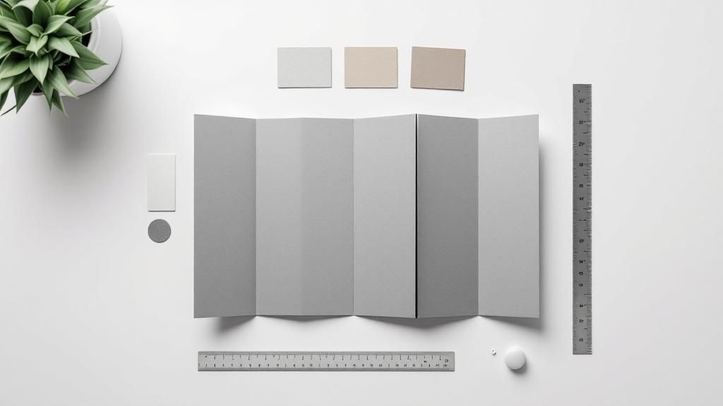 story
story A Guide to Standard Brochure Sizes and Folds
Walk into any print shop, and you'll quickly realize that when it comes to brochures, two sizes rule the roost: the standard Letter size (8.5" x 11") in North America and its international cousin, A4 (8.3" x 11.7") . These are the workhorses of the marketing world for a reason. They offer plenty of room for compelling text and eye-catching images, making them the default choice for the classic tri-fold brochure we all know. Your Guide to Common Brochure Sizes Before you even think about fonts or colors, you need to decide on the canvas for your masterpiece. Picking the right brochure size is the foundational first step, and it shapes everything that follows—from how much content you can fit to how a potential customer physically interacts with it. Think of it like framing a painting; the dimensions have to complement the art inside, not constrain it. This guide will give you a straightforward, at-a-glance look at the most common brochure dimensions out there. We’ll break down the industry mainstays you'll find in almost any business setting so you can make a smart choice that fits your project's goals, budget, and distribution plan. Popular Sizes and Their Applications Every standard brochure size has a specific job, just like different tools in a toolbox. A big, sprawling brochure is perfect for a detailed product catalog, while a small, pocket-friendly one is ideal for a quick handout at a packed trade show. Here’s a quick rundown of the key players: Letter (8.5" x 11"): This is the go-to size in the U.S. and Canada. It’s practically built for tri-fold designs that let you organize your information into neat, digestible sections. Legal (8.5" x 14"): That extra three inches of length makes a huge difference. It’s a favorite for menus or detailed service lists that need just a bit more breathing room than a Letter-sized sheet can offer. Tabloid (11" x 17"): When you need to make a statement, this is your size. Folded in half, it creates a beefy 8.5" x 11" four-panel brochure that’s perfect for high-impact presentations or visual-heavy lookbooks. A4 (210mm x 297mm): This is the global standard. It's a touch taller and narrower than US Letter, ensuring your marketing materials have a professional, consistent look no matter where in the world they land. The main takeaway here is simple: always match the size to the message. A smaller brochure forces you to be sharp and to the point, while a larger format gives you the space to tell a richer story with more visual flair. The table below breaks it all down, comparing dimensions and common uses to help you see which size is the right fit. Once you have an idea of what you need, it's worth exploring professional brochures printing services to see how high-quality paper and finishes can really make your design pop. Standard Brochure Sizes At a Glance The following table provides a clear comparison of the most popular brochure sizes, their exact dimensions, and where they shine. Use it as a quick reference to guide your decision-making process. Brochure Size Dimensions (Inches) Dimensions (Millimeters) Common Folds Best For Letter 8.5" x 11" 216 x 279 mm Tri-Fold, Bi-Fold Corporate marketing, event handouts, product sheets, service menus Legal 8.5" x 14" 216 x 356 mm Tri-Fold, Z-Fold Restaurant menus, detailed price lists, real estate listings Tabloid 11" x 17" 279 x 432 mm Bi-Fold Product catalogs, event programs, portfolios, mini-magazines A4 8.27" x 11.69" 210 x 297 mm Tri-Fold, Bi-Fold International business, global marketing campaigns, user manuals A5 5.83" x 8.27" 148 x 210 mm Bi-Fold Direct mailers, small booklets, compact event guides DL 3.9" x 8.27" 99 x 210 mm Tri-Fold (A4) Rack cards, promotional flyers, informational inserts Ultimately, choosing the right size sets the stage for a successful brochure. Whether you need a compact mailer or an expansive catalog, understanding these standard dimensions is the first step toward creating a piece that truly connects with your audience. Navigating North American and International Paper Standards If you've ever picked up a brochure in London and thought it felt a bit different from one you got in New York, you're not imagining things. That subtle distinction comes down to the two major paper systems used across the globe. Getting a handle on these standards is crucial for any business that operates or markets internationally. Think of it like the imperial versus metric system. Each one is perfectly logical on its own, but they don't quite line up. In the world of print, that small difference can have a big impact on your design, your printing costs, and the professional impression you leave behind. The North American Standard: ANSI Here in the United States, Canada, and parts of Mexico, we operate on a system defined by the American National Standards Institute (ANSI) . These are the paper sizes most of us know from school or the office copy machine. The absolute cornerstone of this system is the standard Letter size (8.5 x 11 inches) . It’s the default for almost everything, from company reports to the classic tri-fold brochures you see at trade shows. But it has a few siblings: Legal: A bit longer at 8.5 x 14 inches , Legal size is perfect when you need to pack in more information, like detailed price lists or expansive restaurant menus. Tabloid: Measuring 11 x 17 inches , this size is often folded in half to create a beefy four-panel brochure. It's a great choice for product catalogs or presentations that need to make a statement. These sizes have deep roots in historical manufacturing processes and are completely ingrained in the printers, software, and office supplies across North America. If you're designing for a domestic audience, sticking with these dimensions is the path of least resistance. The International Standard: ISO 216 The moment you step outside North America, you're in ISO 216 territory. This system is the global benchmark, used in nearly every other country, and it’s built on a brilliantly simple and scalable foundation. The most famous size here is A4 (210 x 297 mm) . It’s a little narrower and a touch taller than our Letter size, making it the undisputed champ for international business. Its universal adoption makes it a non-negotiable for any global marketing effort. The A4 format, introduced with the ISO 216 standard in 1975 , quickly became the go-to for brochures across Europe and beyond. In fact, data shows over 60% of businesses outside North America choose A4 for their brochures because it works with virtually any printer and meets professional expectations. You can find more insights on global standards over at venngage.com . The real magic of the ISO "A" series is its logic: each size is exactly half the area of the one before it. Lay two sheets of A5 paper side-by-side, and they form a perfect A4. Two A4s make an A3. This mathematical elegance makes scaling designs up or down a breeze, with zero distortion. This logical relationship makes life incredibly easy for designers and printers working on campaigns that cross borders. What This Means for Your Business So, why should you care about any of this? It all comes down to where your audience is. Let's say your company is based in the U.S., but you're headed to a conference in Germany. Trying to print your Letter-sized brochures there could get complicated—and expensive. Local print shops are set up for A4 paper. Squeezing a U.S.-sized design onto their standard stock often leads to awkward white margins or requires custom trimming, which will definitely add to your bill. Here’s the simple breakdown: For Domestic Campaigns: Stick with ANSI sizes like Letter ( 8.5" x 11" ). It guarantees smooth printing and distribution within North America. For International Campaigns: Design your materials in ISO sizes like A4 ( 210mm x 297mm ) from the very start. They’ll look professional and be easy to print anywhere in the world. For Global Brands: Many companies play it smart and create two versions of their key marketing materials—one in Letter for North America, and an A4 version for everyone else. This keeps the brand looking sharp and consistent, no matter the region. How to Choose the Perfect Brochure Fold Once you've picked your paper size, you've set the stage. But it’s the fold that really brings your story to life. A simple crease transforms a flat sheet of paper into an interactive marketing tool, guiding your audience through a curated experience. It’s the difference between handing someone a flyer and giving them something tangible that invites them to open it up and see what's inside. The way a brochure unfolds can build suspense, reveal information in a specific sequence, or present a powerful, all-at-once visual. Every fold has its own personality and works best for different marketing goals. Let's get past the basic definitions and dig into the "why" behind each popular style, so you can perfectly match the fold to your message. This map gives you a quick visual on how standard brochure sizes like A4, A5, and DL are typically used for different marketing jobs. As you can see, bigger formats like A4 are great all-around handouts, while more compact sizes like A5 and DL are better suited for direct mail or booklets where you need to be mindful of space. The Classic Bi-Fold The bi-fold is the undisputed workhorse of the brochure world. It’s just one fold right down the middle, creating four distinct panels: a front cover, a back cover, and two internal panels. Think of it like a classic greeting card—it’s simple, direct, and gets the job done. This fold is perfect when your message is straightforward and you want to use large, impactful visuals. Those two generous inside panels give you a wide, uninterrupted canvas to display product photos, infographics, or a bold mission statement without any extra creases getting in the way. Use a bi-fold brochure for: Product Catalogs: Showcasing new collections with big, beautiful images. Event Programs: Laying out schedules, speakers, and venue maps clearly. Real Estate Listings: Featuring stunning property photography that sells. Company Introductions: Presenting a clean and concise brand overview. The Storytelling Tri-Fold When you’ve got a bit more information to break down, the tri-fold is your best friend. By folding a sheet of paper into three sections, you get six panels to work with. This format basically works like a three-act play, letting you reveal your story in a logical, step-by-step sequence. The reader opens the first flap for an introduction, then unfolds it completely to get the main content, and finally finds your contact info on the back. This guided journey makes it ideal for leading a customer from a problem to your solution. Most tri-folds use standard Letter ( 8.5" x 11" ) or A4 paper. A well-designed tri-fold gives you total control over the flow of information. It makes sure the reader sees the hook first, then the juicy details, and finally the call to action—all in the exact order you intended. The Dynamic Z-Fold The Z-fold is a creative twist on the three-panel layout. Instead of folding inward like a standard tri-fold, the panels fold back and forth in a zigzag or accordion shape. When you look at it from the side, it literally makes a "Z" shape, and this structure offers a really unique unfolding experience that can be super engaging. One of the Z-fold’s biggest strengths is its ability to span a single, wide image across the internal panels. When the reader opens it fully, it creates a dramatic, panoramic reveal. It’s a fantastic choice for timelines, maps, or any design that needs a wide-screen view. Best for: Displaying large graphics, creating step-by-step guides, or designing menus. Key Advantage: It allows for a continuous design to flow across multiple panels without interruption. Elegant and Creative Folds Beyond the everyday styles, a few other folds can add a touch of sophistication and surprise to your marketing. They might be less common, but they're incredibly effective at leaving a lasting impression. Gate Fold: Two side panels fold inward to meet in the middle, just like a set of double doors. Opening them reveals a large, impactful center panel. This is perfect for dramatic product launches or special event invitations where you want to build a little suspense. French Fold: Also known as a right-angle fold, this involves folding a sheet in half horizontally, and then in half again vertically. It creates a compact four-panel piece that unfolds into a much larger sheet, almost like a mini-poster. Exploring a wider folded collection can open up new ways to present your brand creatively. At the end of the day, the perfect fold is the one that best supports your content and makes the experience better for your reader. It's how you turn a simple piece of paper into a powerful piece of communication. Selecting the Right Paper for Your Brochure While the size and fold of a brochure give it a shape, the paper you choose gives it a soul. How a brochure feels in someone's hand is just as powerful as the words printed on it. The right paper stock can instantly signal quality, luxury, or an eco-friendly vibe before a person even starts to read. Think about the difference between a flimsy event flyer and a sturdy, premium business card. One feels temporary and disposable, while the other suggests substance and credibility. Picking the right paper is a critical decision that reinforces your brand and turns a simple handout into a marketing piece people actually want to hold on to. Understanding Paper Weight and Thickness Paper weight is usually measured in pounds ( lb ) or grams per square meter ( gsm ), and it's a direct indicator of a sheet's thickness and stiffness. Simply put, a higher number means a heavier, more substantial paper. This choice has a huge impact on the perceived quality and durability of your finished brochure. For instance, the standard paper in an office printer is about 20 lb / 75 gsm . It’s far too thin for a professional brochure—it won’t hold a crisp fold and just feels cheap to the touch. Here's a quick guide to common paper weights for brochures: 70-80 lb Text (105-120 gsm): This is a solid starting point. It's noticeably thicker than copy paper, making it great for high-volume handouts or basic informational brochures. It’s cost-effective, but it doesn't quite have that premium feel. 100 lb Text (150 gsm): For many projects, this is the sweet spot. It offers a clear step up in quality, feels substantial in hand, and holds its folds beautifully without being too stiff. It’s the perfect balance of quality and cost. 80-100 lb Cover (215-270 gsm): Now we’re getting into cardstock territory. This heavy, durable stock is ideal for bi-fold brochures or the covers of small booklets. It sends a message of importance and is built to last. The right weight really comes down to your goal. If you're printing thousands of flyers for a one-day event, a lighter stock makes sense. But for a high-end real estate portfolio, a heavier cover stock is non-negotiable—it communicates the value you're selling. Coated vs. Uncoated Paper Finishes Beyond its weight, the paper's finish dramatically changes how your colors and text look and feel. The main choice is between coated and uncoated stocks. Coated papers have a sealant that helps ink sit right on the surface, while uncoated papers are more porous and have a natural feel. Your paper finish is a powerful branding tool. A glossy, vibrant finish might be perfect for a tech startup, while a soft, matte finish can create a sense of trust and elegance for a financial advisor. The texture tells a story all its own. Coated Finishes A coating is applied to these papers to stop ink from soaking into the fibers. The result? Sharper details and more vibrant, punchy colors. The main types are: Gloss: This finish has a shiny, reflective surface that makes images and colors pop. It’s perfect for photo-heavy designs, like travel or automotive brochures. The only downside is that it can create glare under direct light, which might make text a bit harder to read. Matte: A matte finish offers a smooth, non-reflective surface for a more subtle, elegant, and professional look. Colors still look sharp, but without the shine, making it an excellent choice for text-heavy brochures where readability is the top priority. Silk/Satin: This is the happy medium between gloss and matte. It has a low-level sheen that adds a touch of vibrancy without the high glare of a full gloss. It feels sophisticated and modern. Uncoated Finishes Uncoated paper has a natural, non-reflective texture. Ink tends to absorb into the paper a bit more, which can give colors a softer, slightly more muted appearance. This stock is often used to convey an organic, authentic, or classic brand identity. It’s also incredibly easy to write on, making it a great choice if your brochure includes a form or a section for notes. This tactile quality is similar to what you might find in high-quality flyer printing , where a natural, approachable feel is often the goal. Preparing Your Brochure File for Flawless Printing Even the most brilliant design can fall flat if you trip up on the technical side of printing. Submitting a file that isn't properly prepared is a recipe for disappointment, wasted money, and blown deadlines. Think of this section as your pre-flight checklist to get your brochure file print-ready, ensuring what you get back from the printer looks exactly like what you designed on screen. We're going to translate some essential printing terms—like bleed, trim, and safe zones—into plain English. Getting a handle on these concepts is the secret to avoiding costly and frustrating mistakes. The Anatomy of a Print-Ready File The easiest way to think about your brochure design is like framing a picture. You have the artwork itself, the edge of the frame where it gets cut, and a little extra artwork that gets tucked behind the frame just in case. Print files work pretty much the same way, using specific zones to guarantee a perfect cut every time. Trim Line: This is the finish line—the final edge of your brochure. It’s the line where the massive industrial cutters will slice the paper to its final size, like 8.5" x 11" for a standard letter brochure. Bleed Area: This is your safety net. It's a small margin of extra artwork that extends beyond the trim line, usually 0.125 inches (or 3mm) on every side. Because printing cutters aren't always perfect down to the micrometer, the bleed ensures no ugly, unprinted white edges appear if the cut is just slightly off. Safe Zone: This is the "safe space" inside the trim line, typically another 0.125 inches in from the edge. All of your must-have content—we’re talking text, logos, and important parts of images—needs to stay inside this zone to avoid getting accidentally chopped off. Imagine your background photo is the artwork. The bleed is the part of the photo that extends beyond where the frame will sit. The trim line is the actual edge of the frame, and the safe zone is where you place your main subject so it isn't covered up by the frame's border. Setting Up Your Colors and Images Correctly Here’s a hard lesson many new designers learn: what you see on your computer screen isn't always what you get in print. Screens and printers speak completely different color languages. Ignoring this is a classic rookie mistake that leads to dull, lifeless colors in the final brochure. For any successful print job, from brochures to apparel, working with a solid production service is a must. All these little details are exactly why finding professional printing services that can walk you through the process is so crucial for getting the look you want. CMYK vs. RGB Your computer monitor, phone, and digital camera all operate in the RGB color model (Red, Green, Blue). They create colors by mixing light. Printers, on the other hand, use the CMYK model (Cyan, Magenta, Yellow, Black), which creates colors by mixing physical ink on paper. Do yourself a favor and set your design software’s color mode to CMYK from the very beginning. Converting from RGB to CMYK at the last minute can cause some jarring color shifts, often making those bright, vibrant screen colors look muted and muddy on paper. Image Resolution Another absolute non-negotiable is using high-resolution images. For printing, the industry standard is 300 DPI (dots per inch) . Images you grab from the internet are usually only 72 DPI . That looks perfectly fine on a screen, but it will come out blurry, pixelated, and totally unprofessional when printed. Using 300 DPI ensures your photos and graphics are crisp, sharp, and clear. When designs need to go beyond simple folds and require unique shapes, you'll also need to understand the technical side of specialty services. You can learn more about creating custom cutouts with die-cutting and how to prep your files for that process. By mastering bleed, color modes, and resolution, you take control of the print process and set yourself up for a flawless result. Common Questions About Standard Brochure Sizes Jumping into the world of brochure printing can feel like learning a new language, with terms like "bleed," "trim," and a dozen different sizes to consider. It's easy to get overwhelmed. Getting clear, straightforward answers is the best way to move forward with confidence and avoid a costly misprint. This section is all about tackling those common questions we hear every day. We'll cut through the jargon and give you practical answers to help you lock in your project plans. Think of this as your final checklist before you hit "send" on that beautiful design. What Is the Most Popular Standard Brochure Size? This is a classic question, but the answer isn't one-size-fits-all—it really depends on where your audience is. For anyone doing business in the United States and Canada, Letter size (8.5 x 11 inches) is the undisputed king. It’s what you find in nearly every office printer, and it’s the foundation for that classic tri-fold brochure you see on every counter and at every trade show. It's familiar and practical. But the moment you step outside North America, the game changes. A4 (210 x 297 mm or 8.3 x 11.7 inches) is the global standard, making it the go-to choice across Europe, Asia, and just about everywhere else. Planning a campaign for an international conference or a global audience? Designing for the A4 format is your safest bet. It ensures your brochure will look right and print correctly, no matter where in the world it ends up. How Do I Decide Between a Tri-Fold and a Bi-Fold Brochure? The choice between a tri-fold and a bi-fold really boils down to two things: how much you have to say and what story you're trying to tell. Each one guides the reader in a completely different way. A bi-fold is just a single sheet folded in half, giving you four big, clean panels. This layout is perfect for powerful, direct messages where you want your images and headlines to do the talking. It works great for: High-impact product announcements Event programs with maps or schedules Real estate flyers with stunning property photos A tri-fold , on the other hand, gives you six smaller panels by folding the sheet into thirds. This is your best friend when you need to break down more complex information into bite-sized chunks. It creates a natural, step-by-step reveal, guiding the reader through a story. Go with a tri-fold if you're listing multiple services, explaining a process, or telling a more detailed brand story. You can explore a whole range of marketing materials to see how different folds can support different campaign goals. What Does Bleed Mean in Brochure Printing? Bleed is one of those print terms that sounds way more complicated than it is. In short, it’s just the extra bit of your design—whether it's a background color or an image—that extends past the final trim edge of your brochure. Think of it as a safety net for the cutting process. Even with hyper-precise commercial cutters, trimming thousands of sheets of paper can lead to tiny, microscopic shifts. If your design stops exactly at the edge, even the slightest misalignment could leave a thin, unprofessional-looking white sliver on your final brochure. Nobody wants that. To prevent this, we add a bleed of 0.125 inches (or about 3mm) to all sides of the artwork. This ensures that the color or image "bleeds off" the page, so after the final trim, your design goes perfectly from edge to edge, clean and seamless. Should I Use a Glossy or Matte Finish? The finish you pick for your paper can completely change the vibe of your brochure. It affects how colors look, how the piece feels in someone's hands, and even how easy it is to read. The decision between glossy and matte should come down to your brand’s personality and your content. A glossy finish has a shiny, reflective coat that makes colors look incredibly rich and vibrant. It’s a fantastic choice for designs loaded with photography because it makes images leap off the page. Best For: Travel agencies, car dealerships, real estate, or any brand that wants to project a modern, high-energy feel. Keep in Mind: It can pick up fingerprints and create a glare under bright lights, which can sometimes make text-heavy sections a little tricky to read. A matte finish , on the other hand, is non-reflective and has a smooth, velvety feel. It offers a more subtle, sophisticated, and premium look. It’s great at resisting smudges and is much easier on the eyes for reading longer blocks of text. Best For: Luxury brands, financial advisors, non-profits, or any business aiming for an elegant, trustworthy aesthetic. The Big Advantage: Its understated texture feels fantastic to the touch and signals quality without having to shout for attention.
 story
story Your Guide to Standard Postcard Size and Marketing Success
If you've ever planned a direct mail campaign, you know one of the first questions is always about size. The most common, go-to standard postcard size is 4x6 inches . It's the sweet spot for most businesses—big enough for a solid design, but small enough to lock in the best postage rates from the USPS. Think of it like picking the right tool for a job. The size of your postcard directly impacts your budget, your design's real estate, and ultimately, how much of a splash it makes in the mailbox. Decoding the Standard Postcard Dimensions While 4x6 inches might be the crowd favorite, it’s certainly not your only option. The United States Postal Service (USPS) has a whole range of approved sizes, and getting familiar with them is key to a successful campaign that doesn't blow your budget on unexpected postage fees. Believe it or not, the tiny 3.5 x 5.5 inch postcard was the norm for decades. The game changed when the 4 x 6 inch "Continental" size made its way to the US from Europe. By the 1970s, better printing technology and a demand for more eye-catching mail cemented it as the new standard. It's a simple marketing truth: more space means bigger, bolder designs that grab attention. Your Quick Guide to USPS Postcard Sizes Here's a quick look at the most common postcard dimensions that qualify for those coveted low mailing rates. Each size has its own strengths, depending on what you're trying to achieve. USPS Approved Postcard Sizes at a Glance This table breaks down the most popular postcard sizes that will get you the best bang for your buck with USPS. Think of it as your cheat sheet for choosing the most cost-effective option for your campaign. Postcard Name Dimensions (Inches) Dimensions (Millimeters) Best For Standard Postcard 4" x 6" 101.6 x 152.4 mm Cost-effective mailers, event reminders, thank you cards Large Postcard 5" x 7" 127 x 177.8 mm Product showcases, detailed announcements, invitations Jumbo Postcard 6" x 9" 152.4 x 228.6 mm High-impact marketing, real estate listings, standing out As you can see, choosing the right dimension is the very first step toward a successful campaign. A Standard Postcard (4" x 6") is the industry workhorse—plenty of room for a punchy message and a great image, all while qualifying for the lowest First-Class Mail postcard rate. Need a bit more visual real estate? A Large Postcard (5" x 7") is perfect for showing off detailed products or making a bigger announcement. And if you really want to stand out, a Jumbo Postcard (6" x 9") commands attention, though it mails at the higher letter rate. From simple event reminders to detailed real estate listings, the perfect size is waiting. You can explore a variety of postcard printing options to find the best fit for your next project. Getting Your Postcards Through: The Critical USPS Rules You Can't Ignore Mailing a postcard feels like it should be the simplest thing in the world, right? But to get it delivered without blowing your budget, you have to play by the USPS rulebook. Think of it like a recipe—if one measurement is off, the whole thing can go sideways. For your direct mail campaign, that means a perfectly good marketing piece can suddenly become a lot more expensive to send. The USPS relies on high-speed automated sorting machines that are precisely calibrated for certain sizes and thicknesses. When a mailpiece doesn't fit those parameters, it gets pulled for manual handling or reclassified into a pricier category. This is why sticking to the approved standard postcard size isn't just a friendly suggestion; it's a critical step for keeping your budget in check. The Make-or-Break Thickness Rule One of the easiest rules to overlook—and one of the most important—is paper thickness. A postcard that’s too flimsy or too rigid will throw a wrench in the sorting equipment. To qualify for the best postcard rates, your mailer has to land within this strict thickness window: Minimum Thickness: 0.007 inches (think of a standard index card) Maximum Thickness: 0.016 inches Anything thinner than 0.007 inches is considered non-mailable because it will jam or tear in the machinery. On the flip side, anything thicker than 0.016 inches gets bumped up to a letter or flat rate, instantly driving up your postage. It's a tiny detail that can make a huge difference to your campaign's ROI. Mastering Postcard Dimensions and Shape Beyond thickness, the actual length and height of your postcard are just as vital. The USPS has a very specific "sweet spot" to ensure every piece zips through its automated systems without a hitch. Getting this wrong doesn't just cost you more; it can bring your entire campaign to a grinding halt. USPS regulations require postcard-rate mailers to be between 3.5" x 5" (the minimum) and 4.25" x 6" (the maximum). Staying within these standard postcard dimensions is what allows businesses to save over 50% on postage compared to sending a standard first-class letter. If your postcard is even a fraction of an inch outside this range, it gets reclassified, and your postage costs can easily double or triple. The Aspect Ratio Test: Your postcard must be rectangular. An easy way to check is to divide the length by the height. The result—your aspect ratio—has to fall somewhere between 1.3 and 2.5 . A perfect square or a long, skinny mailer will fail this test and end up costing you more. At the end of the day, these rules are all about efficiency. By designing your postcard with these guidelines in mind from the start, you ensure your message gets delivered without any expensive surprises. If you're running a more complex campaign, using professional direct mail services can take the guesswork out of the equation, guaranteeing compliance from print to postbox. How Postcard History Shapes Your Marketing Today To really get why today's standard postcard sizes are so effective, it helps to take a quick trip back in time. The trusty, affordable postcard we all know didn't just pop into existence. It was born from a game-changing global agreement that completely reshaped how we communicate. Before that, sending mail across borders was a messy, expensive headache. Everything changed in the late 19th century. With the creation of the Universal Postal Union (UPU), the chaos of international mail finally got some rules. Suddenly, mail could travel from one country to another without a hitch. One of their smartest moves was setting a single, uniform size for postcards, turning them into a predictable and cheap way for anyone to send a message. The Birth of a Global Standard The big moment came in 1878 . That’s when the UPU locked in the international standard postcard size of 3.5 x 5.5 inches . This one decision turned the postcard from a quirky novelty into a worldwide communication tool. For the first time, you could print a postcard in Paris and mail it to Peoria, knowing it would fit right into the local postal system. This consistency kicked off the "golden age" of postcards in the early 1900s, with billions flying across the globe each year. You can dive deeper into this cool history over at the Smithsonian Institution Archives . And believe it or not, that historical decision directly impacts your marketing campaigns today. The core idea—standardization equals efficiency—is the exact same reason the USPS has its own specific postcard rules. That 19th-century agreement on postcard dimensions paved the way for the automated, high-speed mail sorting systems that make modern direct mail both possible and profitable. From History to High-Speed Sorting Think about those original dimensions. They were chosen because they were easy for postal workers to handle and sort by hand. As technology evolved, those same standards were adapted for machines. The super-fast sorting equipment used today is fine-tuned to process specific sizes and thicknesses with pinpoint accuracy. So, when your 4x6 inch postcard zips through the mail system, it's really following a path that was laid out more than a century ago. The reason you save on postage is because your mailer fits perfectly into this incredibly efficient, automated process. Every time you pick a standard postcard size, you’re plugging into a legacy of logistical genius that started with a simple agreement to make the world a little smaller. And that efficiency means lower costs and a better return on your marketing investment. Choosing the Right Postcard Size for Your Campaign Picking the right standard postcard size isn’t just about aesthetics; it’s a strategic choice tied directly to your campaign’s goals, budget, and message. Think of it like choosing the right vehicle for a road trip. A zippy compact car is perfect for a quick, local errand, but you’ll need a spacious van for a cross-country haul with lots of cargo. In the same way, a compact 4x6 inch postcard is nimble and cost-effective, making it a fantastic choice for quick announcements like a flash sale or a simple thank-you note. But if you're a real estate agent trying to showcase a stunning property with multiple high-quality photos, a larger 6x9 inch postcard gives you the visual real estate you need to truly make an impact. The journey of the postcard, from its standardized origins to its modern role as a powerhouse for marketing ROI, is a fascinating one. This visual traces that evolution. As you can see, a historical agreement on standardization paved the way for the efficient, results-driven direct mail strategies we use today. Aligning Size with Marketing Goals The golden rule is to match the postcard's canvas to your message's complexity. Trying to cram a novel's worth of information onto a small card results in a cluttered mess that your audience will likely toss without a second glance. On the flip side, using a jumbo postcard for a tiny message can feel wasteful and dilute your point. The most effective direct mail campaigns are those where the postcard's dimensions perfectly complement the marketing message, ensuring clarity and impact without overwhelming the recipient. To help you nail this decision, let's break down how different sizes serve specific business goals. This comparison will shed light on the strengths of each option, helping you align your budget with your creative vision. Postcard Size Comparison for Marketing Goals This table offers a practical look at the most popular postcard sizes, designed to help you select the best fit for your campaign objectives, design needs, and budget. Postcard Size (Inches) Best Use Case Design Space Postage Cost Key Advantage 4" x 6" Quick announcements, event reminders, coupons, and thank you notes. Limited Lowest (Postcard Rate) Maximum affordability and efficiency for high-volume mailings. 5" x 7" Product launches, detailed promotions, and formal invitations. Moderate Varies (Letter Rate) Offers a noticeable size increase without a major cost jump. 6" x 9" Real estate listings, restaurant menus, and high-impact brand statements. Ample Higher (Letter Rate) Commands attention in the mailbox with generous space for visuals. Each size has its own sweet spot. The key is to pick the one that lets your message breathe and gives your design the room it needs to shine. Making the Strategic Choice Ultimately, your decision boils down to balancing three critical factors: message, budget, and impact . A small business sending out a weekly special will get the most bang for its buck with the low cost and simplicity of a 4x6 inch card. A luxury brand, however, might find the premium feel and standout presence of a larger 6x9 inch postcard is essential for upholding its image. Before you lock in your design, think about the entire customer experience. Will the size you pick feel substantial in their hands? Does it give you enough space to tell your story effectively? Answering these questions will guide you to the perfect postcard. For a deeper dive into effective design, explore our guide to marketing essentials for postcards and other print materials. Setting Up Your Design File for Flawless Printing A brilliant postcard design deserves a print that does it justice. But getting from your screen to a perfectly cut piece of paper involves a mechanical process where tiny shifts are just part of the game. Prepping your design file correctly is the final, crucial step to make sure what you get back from the printer looks exactly like you imagined, with no frustrating surprises. Think of your postcard file like a photograph you're putting in a frame. You have the main picture, the edge of the photo, and then a tiny bit of the image that gets tucked behind the frame itself. Professional printing works the same way, using three key zones to guarantee a flawless result: the safe zone , the trim line , and the bleed area . Understanding these zones is the difference between a professional mailer and one that shows up with awkward white borders or, worse, text that's been sliced off. It’s all about taking control of the printing process before your file ever hits the press. The Three Essential Print Zones To sidestep common and costly printing errors, you absolutely have to set up your file with these three areas in mind. Each one has a specific job to do in creating that clean, professional finish. The Safe Zone: This is the heart of your design, the innermost area. All your critical elements—text, logos, contact info, QR codes—must live inside this zone. It’s the "safe" space where nothing is at risk of being cut off during production. The Trim Line: This line is where the magic happens. It represents the final, exact dimensions of your postcard. For a standard postcard size of 4x6 inches , this is the precise edge where the printer's cutter will slice the paper. Anything placed right on this line is playing with fire. The Bleed Area: Think of this as your safety net. It’s an extra margin of your background image or color that extends beyond the trim line. This is the part of the picture that gets hidden by the frame, ensuring that even if the cutter shifts by a hair, you won't see any ugly white edges on your final postcard. A standard bleed is typically 0.125 inches (or 1/8th of an inch ) on all four sides of your design. For a 4" x 6" postcard, your final file size with bleed would be 4.25" x 6.25". Practical Steps for a Perfect File Getting your file set up correctly from the start saves a world of headache, time, and money. When you're designing, make sure your background color or image stretches all the way to the outer edge of the bleed area . At the same time, keep all your important text and logos comfortably inside the safe zone , which is usually 0.125 inches inside the trim line . To ensure your postcard actually gets people to act, it's also important to understand what an effective Call to Action (CTA) is and how to place it safely within this zone. By respecting these boundaries, you create a buffer that protects your design’s integrity. Following these simple guidelines is fundamental for all marketing materials, from flyers to brochures. For more direct mail strategies, check out our postcard solutions for your business basics . Making Your Postcard Stand Out with Paper and Finishes Choosing the right standard postcard size is a huge first step, but the real magic happens the moment someone pulls your mailer from their mailbox. It's that physical experience—the weight, the texture, the sheen of the paper—that instantly signals quality and turns a simple piece of mail into something memorable. Think of your paper stock as the foundation. A thick, substantial card feels premium and important, right? On the other hand, a flimsy one can feel like a total afterthought. For anything going through the mail, you'll want a sturdy stock like a 14 pt. or 16 pt. Cover . This isn't just about surviving the journey; it gives your postcard a satisfying, tactile feel that makes your message seem more significant. Choosing the Perfect Sheen Once you've got that solid foundation, the finish is what makes your design pop. Each option sets a completely different mood, so it’s worth thinking about what you’re trying to achieve. Glossy Finish: This high-shine coating makes colors look super vibrant and saturated. It's a fantastic choice for postcards loaded with bold photography, like a real estate listing showing off a sunny home or a restaurant featuring a mouth-watering meal. Matte Finish: A matte finish gives you a smooth, non-reflective surface that just feels sophisticated and modern. It’s an excellent pick for designs heavy on text because it cuts down on glare, making things easier to read. Think service-based businesses or elegant event invitations. Uncoated Stock: This paper has a natural, porous texture that’s perfect for writing on. If your postcard has a spot for a handwritten note, a coupon to fill out, or you're just going for a minimalist, organic vibe, uncoated is the way to go. The right finish does more than just look good—it reinforces your brand’s personality. A glossy finish shouts excitement and value, while a matte finish whispers elegance and professionalism. But you don't have to stop with the basics. There are countless ways to elevate your design even further. Exploring a whole world of fantastic finishes , from soft-touch lamination to eye-catching metallic foils, can create an unforgettable impression. By carefully picking your paper and finish, you make sure your postcard doesn’t just get seen; it gets felt . Common Questions About Standard Postcard Sizes Even with the best plan, a few questions always pop up right when you’re ready to hit "print." Let's walk through some of the most common ones we hear about postcard printing and mailing. Getting these details right can save you a ton of headaches down the road. What Happens If My Postcard Is Not a Standard Size? This is a big one. If your postcard doesn't fit within the USPS-approved range of 3.5" x 5" to 4.25" x 6" , it won't qualify for the super-affordable postcard rate. Instead, it gets bumped up to the First-Class letter rate, which can easily jack up your postage costs by 50% or more . And it's not just about the cost. Funky shapes or oversized mailers can sometimes require manual sorting, which means more potential costs and even delivery delays. The easiest way to keep your campaign cost-effective and running smoothly is to stick to a standard size. Can I Print on Both Sides of a Standard Postcard? Absolutely—and you really should! Printing on both sides is the standard for a reason; it doubles your marketing real estate. Think of it this way: the front is your billboard. It needs a powerful image and a headline that grabs attention. The back is where you close the deal with the details—your offer, contact info, and a clear call to action. Just be sure to leave the right half of the back clear for the mailing address and postage. The USPS is pretty strict about that, so keep all your critical design elements on the left side to stay out of trouble. What Is the Best Resolution for Printing a 4x6 Postcard? For a crisp, clean print that looks professional, your design file needs to be 300 DPI (dots per inch). For a standard 4x6 inch postcard, that means your image dimensions should be at least 1200 x 1800 pixels . If you're using a bleed area (which we always recommend), your file will need to be just a tad larger to cover that extra margin. Anything less than 300 DPI is going to look blurry or pixelated when it comes off the press, and nobody wants that. Ready to create postcards that don't just get mailed, but get results? 4OVER4 offers a huge range of sizes, paper stocks, and premium finishes to make your vision a reality. Explore your options and start designing today .
 story
story Standard Postcard Sizes: A Guide to USPS-Approved Dimensions
Standard postcard sizes generally fall between 4" x 6" and 6" x 9" . The most common and budget-friendly choice is the 4" x 6" , which snags the best postage rates from USPS. Meanwhile, larger options like 5" x 7" and 6" x 9" give you more creative real estate for a bigger marketing punch. Why Standard Postcard Sizes Matter Picking the right postcard size is ground zero for any successful direct mail campaign. This isn't just about what looks good; it's a strategic move that directly impacts your budget, design potential, and how well your message lands. Think of it like choosing the right tool for a job—each size has a specific purpose. The dimensions you choose dictate how much room you have to tell your story. A smaller card is perfect for a quick, punchy announcement, but a larger one lets you show off detailed product images or a more compelling visual narrative. It's all a balancing act between grabbing attention and managing your costs. Balancing Cost and Impact The main reason we have standard postcard sizes is to keep the mailing process streamlined and predictable. The United States Postal Service (USPS) has very specific rules a mailpiece needs to follow to get the cheap First-Class Mail postcard rate. If you go outside those dimensions, even by a little bit, your postcard can get bumped into the pricier letter-rate category, which can blow up your campaign budget fast. The classic 4" x 6" postcard is the workhorse of direct mail for good reason—it’s cheap and efficient. On the flip side, an eye-catching 6" x 9" postcard is impossible to miss in a stack of mail, but it comes with higher postage costs. The size you select is a direct trade-off between visibility and affordability. Your goal is to find that sweet spot that maximizes impact without breaking the bank. Aligning Size with Campaign Goals Ultimately, the best postcard size depends on what you're trying to accomplish. Are you sending a simple appointment reminder, or are you launching a massive new product? Each goal demands a different approach. Here’s a look at some popular postcard sizes and what they're best for: Common Postcard Sizes and Their Best Use Cases Postcard Size (Inches) Common Name Best For 4" x 6" Standard Mass mailings, event reminders, simple announcements. Best for maximizing reach on a tight budget. 5" x 7" Medium Special offers, service highlights, detailed promotions. Gives you more room for text and images. 6" x 9" Jumbo High-impact marketing, grand openings, luxury product showcases. Designed to dominate the mailbox. As you can see, choosing the right tool for the job makes all the difference. A 4" x 6" is great for casting a wide net with event invites or general brand awareness. A 5" x 7" gives you enough breathing room for visuals and text, making it ideal for special offers. And for those campaigns where you absolutely need to make a statement, a 6" x 9" jumbo postcard demands immediate attention. To see how postcard marketing fits into a bigger picture, it can be helpful to look at other effective real estate marketing strategies . Here at 4OVER4, we offer a huge range of customizable postcard printing options to fit any campaign you can dream up. Getting this foundation right helps you make an informed decision before we dive deeper into the nitty-gritty of specific dimensions. A Detailed Look at the Most Common Postcard Dimensions While you can print postcards in all sorts of custom dimensions, a few specific sizes have become the undeniable workhorses of direct mail marketing. Each one tells a different story and serves a unique strategic purpose. Let's move beyond a simple list and really get into the weeds of these industry mainstays to understand when and why you'd choose each one for your campaign. Think of it like picking a vehicle. You wouldn't use a sports car to haul furniture, and you wouldn't use a moving truck for a quick trip to the store. The same logic applies here—the size you pick needs to line up with your message, budget, and ultimate goal. This infographic breaks down the core factors that influence the right postcard size for your needs: cost, USPS rules, and your message. As you can see, these elements are all connected. Every successful campaign has to find the right balance between them. The Standard 4" x 6" Postcard: The Budget-Friendly Workhorse The 4" x 6" postcard is what most people picture when they think "postcard," and for good reason. It’s the undisputed champion of cost-effectiveness, qualifying for the lowest USPS First-Class Mail postcard rate. This makes it the go-to choice for businesses aiming for mass outreach without a massive budget. Its compact size is perfect for getting quick, direct messages across. Think of it for: Event Announcements: Quickly sharing dates, times, and locations. Appointment Reminders: A simple, effective nudge for your clients. Simple Sale Promotions: Announcing a storewide discount or special offer. Historically, the shift to this 4" x 6" size was a game-changer for modern mailing. Today, it remains the benchmark for the lowest postage rates. USPS and Canada Post cap postcard-rate mailers at a maximum of 4.25" x 6"—anything larger jumps to the letter rate, which can cost 50-100% more . It’s a classic for a reason. The Jumbo 5" x 7" Postcard: The Versatile Communicator Stepping up a bit, the 5" x 7" postcard gives you a noticeable increase in design real estate without a huge jump in cost. This dimension provides more breathing room for your visuals and text, allowing you to craft a more compelling and detailed message. It just feels more substantial in hand than its smaller cousin. The extra space on a 5" x 7" card allows you to move from simply announcing something to truly explaining it. It’s the perfect middle ground between budget and impact. This size is ideal when your message needs a bit more support. It’s a popular choice for businesses that want to showcase products or services with a little more flair. For example, a restaurant could feature a high-quality photo of a signature dish, or a real estate agent could display a property with much more visual appeal. Exploring options from a standard printing collection can help you see how different sizes accommodate various designs. The Large 6" x 9" Postcard: The High-Impact Head-Turner When your goal is to make an impression that people won't forget, the 6" x 9" postcard is your best bet. Its oversized dimensions ensure it stands out in a crowded mailbox, physically demanding attention from the recipient. This size is less of a gentle reminder and more of a bold statement. The generous space is perfect for high-impact graphics, detailed product showcases, or comprehensive service menus. It allows you to combine stunning visuals with in-depth descriptions, making it a powerful tool for premium brands or major announcements. Consider the 6" x 9" for: Grand Openings: Making a big splash in a local community. Luxury Product Launches: Conveying a sense of quality and exclusivity. Detailed Real Estate Listings: Showcasing multiple photos and property features. While this size mails at the higher letter rate, that investment often pays for itself in increased engagement and response. It’s a premium choice for campaigns where grabbing attention is the number one priority. How to Navigate USPS Postcard Mailing Requirements Mailing a postcard successfully means you have to play by the rules of the United States Postal Service (USPS). Think of their regulations as your postcard's passport—get it right, and it will sail smoothly through the postal system without any surprise fees or delays. But if you stray from the path, you risk that cost-effective mailer getting bumped up to the much pricier letter rate. These rules aren't just for show; they're what make the massive scale of modern mail sorting possible. Sticking to the guidelines ensures your postcards are machine-readable and delivered on time and on budget. The Secret to the First-Class Postcard Rate To get the absolute cheapest postage, you need to qualify for the First-Class Mail postcard rate . This means your mailer has to meet a very specific set of criteria covering its height, length, and thickness. Get just one of these wrong, and your postcard is out. It's a common mistake to think any small, flat piece of cardstock is a "postcard" in the eyes of the USPS. But the term has a very precise, technical definition tied to those physical specs. This is exactly why understanding standard postcard sizes is so critical for your marketing budget. USPS Specifications For First-Class Postcard Rate So, what are the magic numbers? To lock in that coveted postcard rate, your mailer must be rectangular and fit neatly within the official USPS size and thickness requirements. The table below breaks down the exact minimums and maximums you need to hit. Attribute Minimum Requirement Maximum Requirement Height 3.5 inches 4.25 inches Length 5.0 inches 6.0 inches Thickness 0.007 inches 0.016 inches Anything smaller is considered non-mailable. Anything bigger, thicker, or even a different shape (like a square or circle) gets bumped up to the letter rate, assuming it meets those requirements. This is why the classic 4" x 6" postcard is the gold standard—it fits perfectly within these rules. More Than Just Size: Tips for Smooth Mailing Getting the dimensions right is the biggest hurdle, but a few other details can make or break your mailing campaign. Keep these pointers in mind as you design. Check Your Paper Stock: That 0.007" thickness rule is no joke. Most professional printers use 14 pt. or 16 pt. cardstock, which easily clears this hurdle. Flimsy, home-printed cards, however, might be too thin and risk getting chewed up by sorting machines. Keep it Rectangular: The USPS sorting equipment is designed for rectangles. While cool die-cut shapes are fun, they'll need an envelope and will be mailed at a much higher price. If you want to keep costs down, stick to the classic rectangle. Address Placement is Key: The address, postage, and any mailing barcodes all have to live on the same side of the postcard. Be sure to leave a clear, uncluttered space on the bottom right for the address and postage so the automated systems can read it without a problem. Navigating these rules doesn't have to feel like a chore. When you partner with a professional printer, these specs are baked right into the process. And if you want someone to handle everything from printing to mailing, you can explore our full-service direct mail services to make sure every single piece is perfectly compliant. Designing for Print: Bleed, Safe Area, and Orientation A great postcard is more than just its size; it’s about a flawless, professional presentation. To get there, you need to understand three core design principles that separate polished mailers from amateur ones: the bleed , the safe area , and the orientation . Getting these right is the difference between a postcard that looks sharp and one that just feels… off. Think of it like framing a photograph. You wouldn’t want the most important parts of the picture cut off by the frame, and you definitely wouldn't want distracting white slivers showing at the edges. Professional printing works the same way to guarantee a perfect finish. Understanding Print Bleed Ever seen a printed flyer with a thin, ugly white line along one edge? That’s what happens when a design doesn't have a bleed . Because commercial printing presses cut huge stacks of paper at once, tiny shifts are inevitable. Bleed is your design's insurance policy against this. A bleed is simply extending your background colors, images, or patterns beyond the final trim line of your postcard. We require a 0.125-inch (or 1/8 inch) bleed on all four sides. This extra margin gets trimmed off, but it guarantees your design goes all the way to the very edge for a clean, borderless look. Imagine you're painting a wall right up to a piece of trim. You’d paint slightly onto the painter's tape to make sure there's no unpainted gap when you peel it off. Bleed works the exact same way for your postcard design. Respecting the Safe Area While the bleed extends your design outward, the safe area (or safety margin) is an inner boundary that protects your most important content. This is where all your text, logos, and critical graphic elements should live. Just as the bleed prevents ugly white edges, the safe area prevents your key message from getting sliced off during the final trim. As a rule of thumb, the safe area is also 0.125 inches inside the final trim line. Keeping your essential content within this "frame" guarantees it won't be accidentally clipped. Anything you place outside this zone, but still inside the trim line, is at risk. Let's break it down for a standard 4" x 6" postcard: Final Trim Size: 4" x 6" (This is the final size of your postcard.) Full Bleed Size: 4.25" x 6.25" (Your design file should be this size, adding 0.125" on every side.) Safe Area: 3.75" x 5.75" (All your important text and logos must fit inside this area.) Choosing Your Postcard Orientation Finally, you need to decide between a horizontal ( landscape ) or vertical ( portrait ) orientation. This choice impacts everything from your layout and readability to whether the post office can even process it correctly. Landscape Orientation: This is the classic, most common choice for a reason. The wider format is perfect for showcasing panoramic images, laying out information in columns, and most importantly, it leaves plenty of room on the right for the mailing address and postage area, which is what the USPS prefers. Portrait Orientation: A vertical layout can feel more artistic and modern, making it a great fit for portrait photos, product shots, or designs that draw the eye downward. But be careful here. The address block must still be placed in a landscape orientation on the mail side to be read by USPS machines, which can create a tricky design challenge. Whether you're making a simple reminder card or an intricate mailer with a unique shape, mastering these fundamentals is non-negotiable. And for those looking to really break the mold, our guide on custom die-cutting services shows you how to apply these same principles to more creative designs. How Paper Stock and Finishes Shape Perception The feel of a postcard in someone's hands is just as important as the design on it. While standard postcard sizes give you the canvas to work with, the paper and finish create the tactile experience. This is your chance to turn a simple piece of mail into something memorable that screams quality. Think about it: a flimsy, thin postcard feels disposable, like junk mail destined for the bin. But a thick, substantial card? That feels important. It has weight. This immediate physical impression is your first opportunity to signal value before a single word is read. Decoding Paper Weight and Thickness In the printing world, we measure paper thickness in points (pt.) . A single point is just one-thousandth of an inch, which sounds tiny, but the difference between paper stocks is something you can definitely feel. A higher point number means a thicker, sturdier card. Here’s a quick rundown of the most popular options: 14 pt. Cover Stock: This is a fantastic all-rounder. It’s sturdy enough to feel professional and can easily handle the journey through the mail. It provides a solid, reliable foundation for any design. 16 pt. Cover Stock: A noticeable step up, 16 pt. stock offers extra rigidity and a more premium feel. That little bit of extra thickness makes a real difference, suggesting a higher-end brand or a more significant message. Honestly, both are great choices. But springing for a slightly thicker stock like 16 pt. can make your postcard feel more like an exclusive invitation than just another ad. It’s a small investment that can seriously boost how people perceive your brand. Choosing the Right Finish for Your Message Once you've picked your paper weight, the final touch is the finish. This coating doesn't just protect the ink; it completely changes the look and feel of your postcard. Each one has a different job to do. A finish isn’t just a protective layer; it's a creative tool that shapes how customers interact with your design. It can make colors explode off the page or create an understated, elegant feel. Let’s break down the most common finishes: Glossy UV: This high-shine finish makes colors look incredibly rich and saturated. It’s perfect for designs heavy on photography—think vibrant food shots, stunning real estate, or eye-catching product images. That reflective surface is an instant attention-grabber. Matte: For a more sophisticated and modern vibe, a matte finish is the way to go. Its smooth, non-reflective surface is amazing for designs with a lot of text because it cuts down on glare, making it easier to read. Critically, its uncoated feel is perfect for writing on, which is ideal for appointment reminders or cards you want to add a personal, handwritten note to. Ultimately, the right combination depends on your campaign's personality. A luxury spa might choose a thick 16 pt. matte card for an elegant, tactile feel. A restaurant promoting a new dish would almost certainly go with a glossy finish to make the food photography irresistible. To get a better sense of all the possibilities, you can explore professional laminating and finishing options and see how coatings can truly transform your project. The History Behind Standard Postcard Sizes Ever wonder why that 4" x 6" postcard feels so familiar? It's no accident. The standard postcard sizes we use today weren't just picked out of a hat; they’re the product of more than a century of global problem-solving. Before everyone got on the same page, international mail was a total mess. Imagine trying to send a postcard when every country had its own definition of what a postcard even was. This lack of a shared system created massive headaches for postal services everywhere and made global communication a gamble. The Rise of a Global Standard The real turning point was the formation of the Universal Postal Union (UPU). This organization took on the massive job of creating a single, cohesive set of rules so that a simple card could travel seamlessly from one country to another. Their work laid the groundwork for the global mail network we still depend on today. This effort led to a breakthrough moment for global communication. In 1878 , the UPU established the 3.5 x 5.5 inch standard postcard size , creating the uniformity needed for hassle-free international mailing. The impact was immediate and huge. After postcards were introduced in Britain in 1870, a staggering 75 million were sent in the first year alone. You can dig deeper into the historical impact of postcard standards to see just how significant this was. The creation of a universal standard wasn't just about making things easier—it was a true act of global innovation. It turned the postcard from a local novelty into a powerful tool for worldwide connection and business. That legacy is still with us. The modern USPS minimum postcard size of 3.5 x 5 inches is a direct descendant of those early international agreements. How Standardization Shaped Modern Mailing It’s hard to overstate the impact of having predictable, agreed-upon dimensions. Standardization was the key that unlocked the postcard's true potential for both personal and commercial use. This new, unified framework sparked several key advancements: Efficient Sorting: With uniform sizes, postal services could finally develop automated sorting machines, which dramatically sped up processing times. Predictable Costs: Senders could finally calculate postage with confidence, knowing their postcard wouldn't get hit with surprise fees in another country. Mass Production: Printers could start producing postcards in huge quantities at a much lower cost, making them an affordable medium for everyone from tourists to marketers. Without these foundational agreements, the simple act of sending a postcard across an ocean would still be a shot in the dark. The standard sizes we take for granted are a quiet testament to the power of international cooperation, designed to ensure a small piece of cardstock could connect people anywhere in the world. Common Questions About Postcard Sizes and Mailing Even the best-laid plans run into practical, last-minute questions. Once you’re ready to hit "print," a few details can make or break your direct mail campaign. This is where we tackle the most common questions about standard postcard sizes and the nitty-gritty of mailing. Think of this as your go-to cheat sheet. From odd shapes to the right paper, we’ve got clear, straightforward answers to get you across the finish line with confidence. Can I Mail a Square or Custom-Shaped Postcard? Yes, you can absolutely mail a non-rectangular postcard, but there’s a big "but." The USPS uses automated machines to sort mail, and those machines are built for one thing: rectangles. Any custom shape—whether it’s a circle, a star, or even a simple square—gets kicked out of the postcard category. So, how do you mail it? You'll have to put it inside a standard rectangular envelope. This bumps it up to the First-Class Letter category, which means higher postage. A unique shape can be a fantastic way to grab attention, just make sure to factor that extra postage cost into your budget. What Is the Best Postcard Size for My Campaign? There’s no magic bullet here. The "best" size is the one that fits your campaign's goals and budget. It’s a classic trade-off between cost and impact. Here’s a simple breakdown: For Maximum Reach on a Budget: The 4" x 6" postcard is your workhorse. It qualifies for the lowest postcard postage rate, making it perfect for mass mailings like appointment reminders or broad brand awareness pushes. For a Balance of Space and Cost: Step up to a 5" x 7" postcard when you need a bit more room to breathe. It gives you more canvas for compelling images and text without a huge price jump, which is great for showing off products or detailing a special offer. For the Biggest Impact: When your goal is to dominate the mailbox, the 6" x 9" postcard is the undisputed champ. Its sheer size is perfect for grand openings, luxury brand announcements, or any campaign where making a bold statement is non-negotiable. Your postcard size should directly support your message. A simple announcement doesn't need a huge canvas, while a detailed showcase will feel cramped on a small card. Can I Write on Any Postcard Finish? This is a super important detail, especially if you’re sending appointment reminders or anything that needs a personal touch. The finish you choose completely changes how it handles ink. Best for Writing: Go with a Matte finish . It's uncoated and non-reflective, creating the perfect surface for ballpoint pens and markers. Ink soaks in without smudging, keeping any handwritten notes clean and professional. Avoid Writing On: A Glossy UV finish is the enemy of handwritten notes. Its slick, shiny surface makes most inks bead up and smear instantly. If your postcard needs a signature or a quick message, always, always choose matte. Getting the right mix of size, shape, and finish ensures your postcard doesn't just look great—it works exactly how you need it to. Ready to bring your perfect postcard design to life? At 4OVER4 , we offer a massive selection of sizes, paper stocks, and finishes to match any project. Create your custom postcards today at https://4over4.com and make a lasting impression.
 story
story Explore Different Types of Print for Your Projects
When you're ready to get something printed, the two biggest names you'll hear are digital and offset . They're the workhorses of the printing world, but they're built for completely different jobs. Think of digital printing as your go-to for quick, smaller projects, while offset is the undisputed champ for massive print runs where quality is king. Knowing which one to choose is the first step in making sure your project turns out exactly how you envisioned it. A Roadmap to the World of Printing Before we get into the nitty-gritty, let’s keep it simple. Picking a printing method is like choosing the right tool from a toolbox. You wouldn’t use a sledgehammer to hang a picture, right? The same logic applies here. The right process is everything, whether you're printing a stack of business cards, a run of glossy brochures, or even some custom t-shirts. This one decision ripples through your entire project, affecting everything from your budget to the final look and feel. A small batch of flyers for a local bake sale has completely different needs than a million-copy run of a national magazine. One demands speed and affordability for a small quantity, while the other requires flawless quality and the lowest possible price-per-piece at a massive scale. Why Choosing the Right Print Type Matters Get this choice right, and your project will look amazing without breaking the bank. Get it wrong, and you could be looking at budget overruns or a final product that just doesn't hit the mark. For example, if you chose offset printing for just 50 posters, you'd be paying a ton for setup costs that don't make sense for such a small job. On the flip side, using digital printing for 50,000 catalogs would mean missing out on the huge cost savings that offset offers when you print in bulk. This guide is your roadmap. We'll break down the essentials behind the major printing methods so you can feel confident in your choices. We’re going to cover: Core printing technologies and how they work (in plain English!). The strengths and weaknesses of each method. Real-world examples so you know exactly when to use each one. Key factors like quantity, quality, and turnaround time that will guide your decision. By the time you're done here, you'll be able to stop guessing. You'll have the practical know-how to pick the best printing method for any project, ensuring your vision comes to life just as you imagined. This is the foundational knowledge you need to talk to printers like a pro and get top-tier results every single time. Digital Printing for Speed and Flexibility Think of digital printing as a supercharged version of the printer sitting in your office. It takes a digital file—like a PDF or JPG—and prints it directly onto paper, much like an inkjet or laser printer does at home. Unlike traditional methods that rely on custom metal plates to transfer ink, digital printing skips that whole step. This one difference is what makes it so incredibly fast and flexible, earning it a top spot among modern types of print . Because there are no plates to create, the setup time is virtually zero. The first print is ready almost instantly, which makes it remarkably efficient and budget-friendly for small to medium-sized jobs. We're talking about everything from a handful of business cards to a few hundred event flyers. The Power of Print-on-Demand This direct-to-print technology is the engine that drives the entire Print-on-Demand (POD) industry. POD allows artists, creators, and small businesses to sell custom-printed products like t-shirts, mugs, and posters without ever touching inventory. Here’s how it works: an order comes in online, the item is printed, and it ships directly to the customer. It's a game-changer that minimizes financial risk and practically eliminates waste. The global POD market was valued at $8.16 billion and is expected to skyrocket to nearly $19.8 billion as people continue to seek out unique, personalized items. In fact, 48% of shoppers are willing to wait longer for custom-made goods, showing that personalization is now a mainstream expectation. Key Takeaway: Digital printing is all about speed, flexibility, and personalization. It’s the go-to choice for jobs that need a quick turnaround, variable data (like names on invitations), or cost-effective small batches. When to Choose Digital Printing So, is digital the right fit for your project? The answer really comes down to what you need. It shines in situations where old-school printing would be too slow, too expensive, or just plain overkill. For a closer look at all the things you can create, check out our guide on professional digital printing services . Here are the perfect scenarios for going digital: Small Print Runs: Ideal for quantities under 1,000 units. Think startup business cards, flyers for a local gig, or a small batch of marketing brochures. Fast Turnarounds: Need materials for a trade show tomorrow ? Digital is your best friend. Many projects can be printed and ready the same day. Personalized Content: Perfect for direct mail campaigns where every postcard has a different name and address, or for custom wedding invitations where each one is unique. Proofing and Prototypes: Want to see exactly how your booklet or catalog will look before committing to a massive order? Digital printing gives you an accurate, affordable proof. Offset Printing for Quality at Scale While digital printing is the champion of speed and flexibility, offset printing—also called lithography—is the undisputed king for large-scale projects where quality is absolutely non-negotiable. It's a traditional, powerhouse method among the different types of print , trusted for decades by major publishers and businesses for a reason. Think of it like a highly advanced rubber stamping process. Your design is first etched onto a metal plate. That plate is inked, and the image is transferred (or "offset") onto a rubber blanket. Finally, that rubber blanket presses the image onto the paper. The result? An exceptionally crisp, clear, and consistent print. This indirect transfer method is clever because it protects the delicate metal plates from the wear and tear of direct contact with paper. This allows for millions of identical impressions without a single drop in quality, making it the only real choice for high-volume jobs where every single copy has to be perfect. The Trade-Off Between Cost and Volume The defining feature of offset printing is its setup. Creating the custom plates for a job requires an initial investment of time and money, which makes it a tough sell for small, one-off runs. However, once that press starts rolling, the cost per piece plummets. Fast. This is where the economics of offset truly shine. While the upfront investment is higher, the per-unit cost on large orders is dramatically lower than digital printing. That makes offset incredibly cost-effective for projects like: Magazines and Newspapers: Churning out thousands or even millions of copies with rock-solid consistency. Books and Catalogs: Ensuring every single page is sharp and colors are uniform from the first copy to the last. Large-Scale Marketing Materials: Printing thousands of brochures, posters, or direct mailers for a big campaign. Key Insight: Offset printing is an investment in scale. The more you print, the cheaper each individual item becomes, delivering professional quality at a price that digital methods can’t touch for massive quantities. Unbeatable Quality and Color Precision Beyond the cost savings at scale, offset printing simply delivers superior image quality. The process allows for finer detail and much richer color depth than most digital methods. But its real superpower is the ability to use Pantone Matching System (PMS) inks. Unlike the standard CMYK (Cyan, Magenta, Yellow, Black) color mixing used in digital printing, Pantone inks are pre-mixed to exact color formulas. This is a game-changer for brands. It guarantees that a company's signature blue or a specific product's red will be perfectly consistent across every single printed item, every single time. To see what this method is capable of, you can explore professional offset printing solutions that really show off its full potential. The bottom line is simple. For large projects that demand flawless execution, vibrant colors, and maximum cost-efficiency per piece, offset printing is the industry standard. It’s the proven workhorse that delivers premium results when you need to make a massive impact. Choosing the Right Print Method for Your Project Knowing the difference between big-name printing methods like digital and offset is a great start, but the real trick is knowing how to apply that knowledge to your actual projects. Making the right call from the get-go isn't just about avoiding headaches; it's about saving real money and making sure the final product looks exactly like you imagined. The choice really boils down to a handful of key factors. Before you even pick up the phone to call a printer, running through these simple questions will point you in the right direction and make the whole process a lot smoother. This decision tree gives you a quick visual on how to start thinking about your project's core needs. As you can see, two of the biggest questions—how many you need and what you're printing on—can instantly narrow your options and lead you to the most practical, budget-friendly solution. Key Factors for Your Decision To feel confident in your choice, just weigh your project against these four critical points. Each one plays a huge role in figuring out which printing technique is the perfect match for your budget and goals. Project Quantity: Let's talk numbers. How many pieces are you printing? For smaller jobs, typically anything under 1,000 units, digital printing is almost always the more affordable route because it has zero setup costs. But once you get into large runs, offset printing’s per-unit price drops dramatically, offering some serious savings. Required Quality and Color: How picky do you need to be with your colors? If you need a perfect, spot-on color match using the Pantone system, offset is your best friend. It’s crucial that your printed materials align with your company's visual identity, which often means developing effective brand guidelines to keep everything consistent. Turnaround Time: How fast do you need it? Digital printing was practically built for speed, with some jobs being turned around in just a few hours. Offset printing, on the other hand, is more of a marathon than a sprint. It involves a longer setup with plate creation and ink drying time, making it a better fit for projects that aren't on a tight deadline. Material and Finishing: What’s the canvas for your masterpiece? Both methods are great with standard paper, but if you're venturing into specialty materials or unique finishes, one process might be a better fit than the other. Adding a protective layer is often a great final touch, and you can explore options like custom laminating services to boost both durability and visual pop. By carefully weighing these four factors—quantity, quality, speed, and material—you can strategically select the most appropriate printing method. This structured approach guarantees a result that aligns perfectly with your budget, timeline, and creative vision every time. Digital vs Offset Printing A Quick Comparison Sometimes, seeing things side-by-side makes the decision crystal clear. This table breaks down the core differences between digital and offset printing to help you quickly figure out which one is the right fit for your job. Factor Digital Printing Offset Printing Best for Quantity Small to medium runs (under 1,000) Large runs (over 1,000) Cost Low setup cost, higher per-unit cost High setup cost, lower per-unit cost Speed Fast turnaround, often same-day Slower turnaround due to setup Color Quality Good color accuracy (CMYK) Superior color accuracy (Pantone) Customization Excellent for variable data printing Not suitable for variable data Material Options Good range of standard materials Widest range, including specialty stocks Ultimately, there's no single "best" method—just the best method for your project. Use this table as a quick reference, and you'll be well on your way to making a smart, cost-effective choice that brings your vision to life. Step away from the everyday digital and offset printers, and you’ll discover a whole world of specialized techniques. These are the masters of their craft, each designed to tackle very specific challenges. Think of these methods as the special ops of the printing world. They handle everything from the flexible packaging on your favorite snacks to the bold graphics on a concert t-shirt. Getting to know them expands your creative toolkit and shows you just what's possible for those truly unique projects. One of the most common, yet often invisible, methods is Flexography . At its core, it’s like a super-sophisticated, high-speed version of a potato stamp. A flexible photopolymer plate gets wrapped around a rotating cylinder, picks up ink, and rapidly stamps the design onto the material. It’s brilliant for printing on non-porous surfaces like plastic, foil, and cellophane. This makes flexography the undisputed king of packaging, labels, and anything else that comes on a roll. The next time you open a bag of chips or peel the label off a soda bottle, you're almost certainly holding the handiwork of a flexo press. For sheer speed and durability on a massive scale, nothing else comes close for these applications. Screen Printing for Bold and Durable Designs Another incredibly popular technique is Screen Printing , which you might also know as silkscreening. The process is straightforward but effective: ink is pushed through a mesh screen onto a surface. A stencil blocks out parts of the screen, letting the ink pass through only in the shape of your design. The result is a thick, vibrant, and incredibly durable layer of ink that sits right on top of the material instead of soaking in. This is exactly why screen printing is the champion for apparel—like t-shirts and hoodies—as well as posters and promo items where you need bold, opaque colors that last. These prints can handle countless washes and years of wear without fading. Did You Know? Screen printing opens the door to some really cool effects that other methods struggle with. Using specialty inks, you can create unique textures like puff prints, shimmering metallic shines, and even glow-in-the-dark designs. It’s a great way to add a tactile and visual flair that makes your project stand out. High-Volume and Large-Scale Solutions When a project demands either extreme volume or massive scale, two other heavyweights enter the ring. Gravure (Rotogravure): This is the absolute powerhouse for ultra-high-volume jobs. The image is actually engraved into a metal cylinder, which is then flooded with ink and pressed directly onto paper. It’s famous for its exceptional detail and consistency, making it perfect for long-run magazines, catalogs, and high-end packaging where quality can't dip, even over millions of copies. Large-Format Printing: Just like the name suggests, this method is all about going big. Using specialized inkjet printers, it’s responsible for producing everything from giant event banners and trade show backdrops to building wraps and the graphics on city buses. If your message needs to be seen from a block away, large-format is how you do it. These specialized techniques really show the incredible diversity of the printing industry. From the subtle elegance of foil stamping that adds a touch of luxury—a process you can explore with custom foil stamping services —to the industrial might of gravure, there’s a perfect printing solution for nearly any idea you can dream up. What's Next for the Printing Industry? Don't believe the rumors—print is far from a dying medium. In fact, it's constantly evolving to meet brand-new demands. The explosion of e-commerce has turned packaging into a critical branding moment, while hyper-targeted direct mail and personalized products are driving serious growth. This constant reinvention is exactly why understanding different types of print is more important than ever. The global printing industry is on track to hit a market value of roughly $960 billion , and digital printing is leading the pack. This boom is fueled by a huge demand for short-run, customized products, from one-of-a-kind packaging to personalized marketing materials that really connect. If you're curious, you can dig into these printing industry statistics to see the full scope of this expanding market. Innovations Shaping Tomorrow's Print Technology isn't just improving old processes; it's pushing the boundaries of what print can even do, creating entirely new possibilities for businesses and creatives. Two areas, in particular, are paving the way forward: AI and Automation: Modern printing presses are getting a lot smarter. AI-powered printers can now automatically fine-tune color calibration, slash waste, and even predict their own maintenance needs. The result? A massive boost in efficiency and much lower operating costs. 3D Printing (Additive Manufacturing): This isn't just a novelty anymore. 3D printing is fundamentally changing how we approach manufacturing and prototyping. It allows for the rapid creation of incredibly complex, three-dimensional objects straight from a digital file, speeding up product development and making on-demand parts a reality. These advancements all point to a clear trend: sustainability and efficiency are becoming the heart of the industry. As technology makes printing cleaner and more resource-friendly, the options for environmentally conscious projects just keep growing. As the industry charges ahead, sustainable practices are moving from a "nice-to-have" to a "must-have." For anyone looking to minimize their environmental footprint, a great next step is learning more about the options for eco-friendly green printing . At the end of the day, print’s remarkable ability to adapt is what guarantees its place in the future. It remains a powerful, tangible, and deeply relevant medium, no matter the era. Common Questions About Printing Methods Jumping into the world of professional printing can feel a bit overwhelming, but it doesn't have to be. Let's clear the air and tackle some of the most common questions people have when picking the right print method for their projects. What Is the Most Cost-Effective Printing for Small Businesses? For small businesses needing shorter runs, digital printing is almost always the way to go. It’s incredibly cost-effective because there are no custom plates to create or lengthy setup processes. This makes it perfect for printing smaller batches of flyers, business cards, or brochures without breaking the bank. But what happens when you need more? Once your order size climbs past 500-1,000 pieces of the same design, offset printing often becomes the more economical choice. The cost per item drops dramatically with higher volumes, making it the clear winner for large-scale marketing campaigns. How Do I Choose Between CMYK and Pantone Colors? This decision really boils down to how precise you need your colors to be. Each system has its place. Here’s a quick breakdown: CMYK (Cyan, Magenta, Yellow, Black): Think of this as the color system your desktop printer uses, but on a professional scale. It mixes four ink colors to create a huge spectrum of hues. It’s the standard for digital printing and is perfect for projects with photographs or designs that feature a lot of different colors. Pantone (PMS): This is all about precision. The Pantone Matching System uses pre-mixed inks based on specific formulas to create an exact color, every single time. If your brand has a signature color—that specific shade of blue or red—that absolutely must be consistent across all your materials, Pantone is your only guarantee. It's typically used with offset printing. Choosing the right color model is one of the most important decisions for maintaining brand consistency. CMYK offers fantastic versatility for full-color designs, while Pantone is the undisputed champ for hitting a perfect, repeatable color match. What Type of Printing Is Best for T-Shirts? When it comes to printing on apparel, you've got a couple of fantastic options, and the best one depends on your design and order size. Screen printing is the classic choice for a reason. This method pushes thick, durable inks through a stencil onto the fabric, creating bold, vibrant designs that really pop and hold up incredibly well in the wash. It's especially cost-effective for large orders with just a few colors in the design. Another great option is Direct-to-Garment (DTG) printing. This is basically a high-tech inkjet printer made for fabric. Because it's a digital process, it excels at reproducing intricate, multi-color designs, like photographs. It’s the perfect solution for small orders or even one-off custom shirts. Ready to bring your vision to life with the perfect print method? At 4OVER4 , we offer a vast range of high-quality printing solutions tailored to your needs. Explore our services and start your project today!
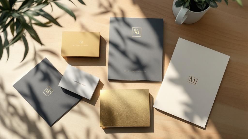 story
story Explore the Top Types of Print Finishes for Stunning Results
Transforming Prints: A Deep Dive into Print Finishes Print finishes transform ordinary printed materials into memorable, high-quality pieces. They add visual and tactile appeal, enhancing durability and creating a professional impression. This comprehensive guide explores eight essential types of print finishes, providing actionable insights into their uses and benefits for businesses like yours. Understanding these options will empower you to make informed decisions, ensuring your printed materials effectively communicate your brand and message. Whether you're creating marketing materials, product packaging, or event invitations, selecting the right print finish is crucial. From the subtle sheen of matte lamination to the eye-catching brilliance of foil stamping, each finish offers unique advantages. This listicle will break down each type, highlighting its pros, cons, and ideal applications. Learn how to choose the perfect finish to elevate your business printing and achieve a polished, professional look. We'll cover these key types of print finishes: UV Coating Lamination Foil Stamping Embossing and Debossing Spot Varnish Die Cutting Letterpress Soft Touch (Velvet) Coating By understanding the distinct characteristics of each finish, you can strategically use them to strengthen your brand identity and create lasting impressions. This guide provides the knowledge you need to make the most of these powerful print enhancements. 1. UV Coating UV coating is a versatile print finish that adds a protective layer and enhances the visual appeal of printed materials. This liquid coating is applied to the surface and instantly cured using ultraviolet light, creating a hard, durable finish. The result is a surface resistant to smudges, scratches, and fading, preserving the vibrancy of colors and extending the lifespan of your printed pieces. UV coating is available in gloss, satin, and matte finishes, offering options for different aesthetic preferences and design needs. Application Styles and Benefits UV coating can be applied in two primary ways: flood coating and spot coating. Flood coating covers the entire surface of the printed piece, providing uniform protection and a consistent sheen. Spot coating, on the other hand, targets specific areas, such as logos, images, or text, creating a striking contrast between coated and uncoated sections. This selective application adds a premium touch and draws attention to key design elements. For more intricate raised UV effects, you can learn more about raised spot UV printed products at 4over4 . The benefits of using UV coating extend beyond mere aesthetics. It provides a protective barrier against everyday wear and tear, making it ideal for frequently handled materials like business cards, brochures, and menus. UV coating also enhances color vibrancy, making images and text appear sharper and more defined. This can elevate the perceived quality of your printed materials, leaving a lasting impression on your audience. For a quick overview of UV coating essentials, refer to the summary infographic below: The infographic highlights the instant curing process, the sheen options available (gloss, satin, and matte), and the two application styles: flood and spot coating. These features make UV coating a versatile and effective print finish for a wide range of applications. Tips for Effective Use To maximize the benefits of UV coating, consider these tips: Test folding and creasing: Before full production runs, always test how the coating behaves on folds and creases to prevent cracking. Paper weight matters: Heavier paper stocks generally work better with UV coating, providing a more stable surface for application. Plan your design: If using spot UV, design your artwork with the coating areas clearly defined to ensure accurate application. Ventilation is key: Allow for proper ventilation during the application process due to the UV curing process. Adhesive compatibility: If binding your printed materials, discuss adhesive compatibility with your printer to avoid any issues. UV coating provides an effective way to enhance the durability and visual appeal of various printed materials. From high-end business cards and brochures to magazine covers and product packaging, UV coating offers a premium touch that elevates your brand image and makes a lasting impact. 2. Lamination Lamination is a popular print finish that adds a protective layer and enhances the durability of printed materials. This process involves applying a thin, transparent plastic film to the surface of the printed piece using heat, pressure, or adhesive. The result is a smooth, sealed surface resistant to moisture, tears, smudges, and fading, significantly extending the lifespan of your printed materials. Lamination is available in gloss, matte, and satin finishes, offering options for different aesthetic preferences and design needs. Application Styles and Benefits Lamination offers several advantages for various printed applications. Gloss lamination provides a high-shine finish that enhances color vibrancy and creates a visually appealing effect. This finish is ideal for materials designed to grab attention, such as book covers, brochures, and marketing materials. Matte lamination, on the other hand, offers a non-reflective, sophisticated look and a smooth surface ideal for writing. This finish is often preferred for documents, menus, and presentation materials. Satin lamination offers a subtle sheen that falls between gloss and matte, providing a balance of protection and visual appeal. Lamination is exceptionally beneficial for items subject to frequent handling, such as menus, ID cards, and maps. The protective layer safeguards against spills, tears, and general wear and tear, preserving the quality and integrity of the printed piece. Lamination also enhances color vibrancy and image sharpness, making visuals appear more dynamic and impactful. This can elevate the perceived quality of your printed materials, leaving a positive impression on your audience. Tips for Effective Use To maximize the benefits of lamination, consider these tips: Choose the right finish: Select a finish (gloss, matte, or satin) that aligns with the purpose and design of your printed piece. Thickness matters: Different thicknesses are available for various applications. Thicker lamination provides greater durability, while thinner options are more suitable for flexible materials. Trim carefully: Precise trimming after lamination is crucial for a professional and clean finish. Ensure proper edge sealing to prevent peeling or delamination. Ink compatibility: Allow ink to fully cure before laminating to prevent smudging or transfer. Test before large runs: Always test with small samples before full production to confirm the desired look and feel, especially when laminating folded materials. Lamination offers a cost-effective way to protect and enhance your printed materials, ensuring they remain in pristine condition for extended periods. From business cards and brochures to posters and packaging, lamination adds a professional touch that enhances durability and reinforces your brand image. 3. Foil Stamping Foil stamping is a premium print finish that adds a touch of elegance and luxury to printed materials. This specialized technique uses heat, pressure, and a custom die to apply metallic or pigmented foil to the paper's surface. The result is a vibrant, reflective finish that elevates the perceived value of any printed piece. Foil stamping creates a distinctive raised texture, adding a tactile dimension that sets it apart from standard printing inks. Application Styles and Benefits Foil stamping excels at highlighting specific design elements and creating a premium feel. It's commonly used for logos, titles, borders, and other details that need to stand out. Unlike metallic inks, which simply lay on the paper's surface, foil stamping creates a raised, textured effect that catches the light and adds depth. This technique is especially popular for high-end business cards, invitations, certificates, and packaging. For those looking to add an extra touch of elegance, consider exploring options for raised foil printed products. You can learn more about raised foil printed products at 4over4 . The benefits of foil stamping extend beyond aesthetics. The foil itself is durable and resistant to fading, ensuring your printed materials retain their vibrancy over time. This lasting quality reinforces the impression of quality and craftsmanship. Foil stamping is a versatile technique that can be used with a wide range of paper stocks and foil colors, offering endless design possibilities. Tips for Effective Use When using foil stamping, keep these tips in mind to achieve optimal results: Design Simplicity: Opt for clean, solid designs rather than intricate details for the best foil application. Fine lines and small text can be challenging to reproduce accurately with foil stamping. Paper Selection: Choose a heavier paper stock (at least 14pt) for optimal foil adhesion and to prevent the foil from showing through on the reverse side. Color Considerations: Carefully consider the interaction between the foil color and the paper stock color. Test different combinations to ensure the desired visual impact. Production Time: Factor in additional production time for foil stamping compared to standard printing methods. The process requires creating custom dies and careful application. Sample Evaluation: Request samples before full production runs to evaluate the quality of the foil adhesion and the overall appearance of the finished product. Foil stamping is an excellent choice for projects requiring a premium touch. Its ability to create a distinct, luxurious finish makes it ideal for a range of applications, from business cards and invitations to packaging and high-end marketing materials. By understanding the nuances of this technique and following these tips, you can effectively leverage foil stamping to create printed pieces that truly stand out. 4. Embossing and Debossing Embossing and debossing are dimensional print finishes that add a tactile and visually striking element to printed materials. These techniques create raised (embossed) or recessed (debossed) areas in the paper stock without using ink. This effect is achieved by using custom-made dies and counter-dies that mold the paper with heat and pressure, resulting in a permanent deformation that adds depth and texture. These finishes convey a sense of quality and sophistication, making them ideal for premium print projects. Application Styles and Benefits Embossing creates a raised design element that stands out from the surface of the paper. Debossing, conversely, creates an indentation, adding a subtle yet elegant touch. A combination of both techniques, known as embossing/debossing or combination embossing, can create intricate designs with both raised and recessed elements. This adds a unique dimension and complexity to the finished piece. These finishes are frequently used on corporate letterheads, business cards, wedding invitations, presentation folders, and high-end packaging. The benefits of embossing and debossing extend beyond mere aesthetics. They add a tactile dimension that engages the sense of touch, creating a more memorable and interactive experience for the recipient. This tactile quality also reinforces the perceived value of the printed piece, making it seem more luxurious and high-end. Embossing and debossing can be particularly effective in conveying a brand's image of quality, craftsmanship, and attention to detail. Tips for Effective Use To achieve the best results with embossing and debossing, consider these tips: Paper weight: Use a paper weight of at least 130gsm for optimal results. Thicker stocks hold the embossed or debossed impression more effectively. Design simplicity: Keep designs simple with clean lines and avoid intricate details that might not reproduce well. Paper grain direction: Consider the paper grain direction for optimal results, as it can affect how the paper reacts to the embossing process. Lead times: Plan for longer lead times due to the creation of custom dies. Testing: Test with different pressure levels during the embossing/debossing process to achieve the desired effect. Embossing and debossing offer a unique way to enhance the tactile and visual appeal of printed materials. By adding a dimensional element, these techniques elevate the perceived quality of business cards, invitations, packaging, and other printed pieces, leaving a lasting impression on the recipient and reinforcing a brand's image of sophistication. They are a perfect example of how types of print finishes can be used to achieve a specific and impactful effect. 5. Spot Varnish Spot varnish is a selective coating applied to specific areas of printed materials, creating a striking contrast between coated and uncoated surfaces. Unlike flood varnish, which covers the entire sheet, spot varnish highlights chosen design elements. This selective application adds visual and tactile interest through varying sheen levels and subtle textural contrasts on the same printed piece. It enhances the overall aesthetic appeal and draws attention to key features, making them stand out. Application Styles and Benefits Spot varnish offers a high degree of customization and control over the final look and feel of your printed materials. It's commonly used to emphasize logos, images, text, or specific design elements. The contrast between the varnished and unvarnished areas creates a dynamic visual effect, adding depth and sophistication to the piece. For more specialized spot UV effects, learn more about spot UV printed products at 4over4 . This targeted application creates a premium feel without the cost of full varnish coverage. The benefits of spot varnish extend beyond aesthetics. It adds a layer of protection to the varnished areas, making them more resistant to smudging, fingerprints, and minor abrasions. This is particularly beneficial for frequently handled items like brochures, business cards, and book covers. Furthermore, spot varnish can enhance the vibrancy of underlying inks, making colors appear richer and more saturated. Tips for Effective Use To achieve optimal results with spot varnish, careful planning and execution are essential. Consider these tips: Design with contrast: Ensure sufficient contrast between varnished and unvarnished areas for a noticeable effect. Vector artwork: Use vector-based artwork for clean, crisp lines and precise varnish application. Paper selection: Consider the paper's absorbency when choosing your varnish type. Registration: Plan the registration carefully to ensure proper alignment with underlying printed elements. Proofing: Request proofs to evaluate the contrast and ensure the desired effect is achieved. Spot varnish offers a versatile and cost-effective way to enhance the visual appeal and durability of your printed materials. From corporate brochures and magazine covers to business cards and product packaging, spot varnish adds a touch of elegance and sophistication that elevates your brand image and leaves a lasting impression. It’s a powerful tool in the hands of a skilled designer, allowing for creative expression and adding a tactile dimension to printed pieces. 6. Die Cutting Die cutting is a print finishing technique that goes beyond the standard rectangular shape, adding a unique dimension to printed materials. This process uses custom-shaped steel blades to cut intricate designs, create windows, or add functional elements like perforations. Die cutting transforms ordinary print projects into eye-catching pieces with enhanced visual appeal and tactile engagement. From simple rounded corners to complex layered designs, die cutting offers a wide range of creative possibilities. Application Styles and Benefits Die cutting offers diverse applications, enabling the creation of unique and functional print products. Greeting cards with intricate window cutouts can reveal hidden messages or images, adding an element of surprise. Pocket folders with precisely cut business card slots offer a professional and organized presentation. Packaging can be transformed with unique opening mechanisms or custom shapes that enhance shelf appeal. Learn more about die cutting and its various applications at 4over4 . For interactive marketing materials, die cutting can create moving parts or pull tabs, adding an element of playfulness and encouraging interaction. The benefits of die cutting extend beyond aesthetics, adding practical value to printed materials. Custom-shaped hang tags with reinforced holes provide durability for retail displays. Presentation folders with unique tabs and pockets enhance organization and professionalism. Die cutting also allows for the creation of custom-shaped stickers and labels that stand out from standard rectangular formats. These features make die cutting a versatile finishing technique for a wide range of print projects. Tips for Effective Use To maximize the impact of die cutting, consider these essential tips: Bleed Area: Always incorporate a bleed area around the cut edges to prevent unsightly white borders. Grain Direction: For folding applications, consider the grain direction of the paper stock to avoid cracking or tearing. Tolerances: Design with manufacturing tolerances in mind to ensure accurate and consistent results. Waste Optimization: Optimize your layouts to minimize paper waste during the die cutting process. Communication is Key: Communicate clearly with your printer or die maker about your specifications. Sample Testing: Request samples to test the functionality and appearance of your die-cut piece before full production. Die cutting transforms ordinary printed materials into distinctive and memorable pieces. From business cards and brochures to packaging and marketing materials, this versatile technique adds a touch of creativity and professionalism, leaving a lasting impression on your audience. 7. Letterpress Letterpress is a traditional relief printing technique that creates a distinctive tactile quality unmatched by modern digital methods. This process involves pressing inked plates or type directly into paper under significant pressure. This creates a beautiful impression, with slightly indented text and images and rich ink saturation. While once the standard for all printing, letterpress has seen a resurgence as a premium print finish. Application Styles and Benefits Letterpress offers a unique aesthetic appeal that adds a touch of elegance and craftsmanship to printed materials. The deep impression and crisp details create a luxurious feel, making it ideal for projects that demand a high-quality finish. From wedding invitations and stationery to high-end business cards and artist portfolios, letterpress elevates any printed piece. The tangible quality of the impression adds another dimension to the design, engaging the sense of touch and creating a memorable experience for the recipient. Popularized by companies like Crane & Co., Smock Paper, and Bella Figura, letterpress conveys a sense of timeless quality and sophistication. The benefits of letterpress extend beyond its visual and tactile appeal. It signifies attention to detail and a commitment to quality craftsmanship. In a world of digital communication, the tangible nature of letterpress makes a lasting impression, conveying a sense of authenticity and exclusivity. This makes it a powerful tool for brands seeking to differentiate themselves and create a premium experience for their customers. The inherent limitations of the process, such as the need for custom plates and specialized equipment, further contribute to its perceived value and exclusivity. Tips for Effective Use To maximize the impact of letterpress printing, consider these tips: Paper Selection: Choose soft, cotton-based papers to achieve the best impression. The paper's texture plays a vital role in how the ink sits and how deep the impression appears. Design Simplicity: Opt for solid areas of color and avoid overly fine details, which can be lost or filled in during the printing process. Bold typography and simple graphics work best. Production Time: Allow for longer lead times for setup and production, as letterpress is a more meticulous and time-consuming process than digital printing. Paper Grain: Consider the paper grain direction for optimal results. Discuss this with your printer to ensure the paper is oriented correctly for folding and scoring. Expert Collaboration: Work with experienced letterpress operators who understand the nuances of the process and can guide you through design and material choices. Test Impressions: Request test impressions to evaluate the depth and quality of the impression before committing to a full production run. This will allow you to make any necessary adjustments and ensure the final product meets your expectations. Letterpress printing, while requiring more planning and investment, offers a distinct and impactful print finish that elevates the perceived value of your printed materials. It provides a tangible connection to the artistry of printing and adds a touch of timeless elegance that digital methods simply cannot replicate. This makes it a valuable tool for creating truly memorable and impactful printed pieces that resonate with your audience. 8. Soft Touch (Velvet) Coating Soft touch coating, also known as velvet coating or suede coating, is a specialized print finish that creates a luxurious, velvety texture on printed materials. This coating contains microscopic particles that create a unique tactile experience. Printed pieces feel soft and smooth to the touch. The coating also provides a sophisticated matte appearance that enhances color richness and reduces glare. Application Styles and Benefits Soft touch coating is typically applied as a flood coating, covering the entire surface of the printed piece for a uniform, velvety feel. This luxurious finish adds a premium touch, making it ideal for high-end branding materials, packaging, and marketing collateral. Learn more about Soft Touch (Velvet) Coating at 4over4 . It elevates the perceived quality of your printed materials, creating a lasting impression on your audience. The benefits of soft touch extend beyond the unique tactile experience. The matte finish minimizes glare and fingerprints, making it suitable for frequently handled materials like brochures, business cards, and book covers. The coating enhances color vibrancy, making images and text appear richer and more defined. Tips for Effective Use To ensure optimal results with soft touch coating, consider the following tips: Paper stock selection: Heavier paper stocks (minimum 14pt) provide the best surface for soft touch coating, ensuring a smooth and even application. Design considerations: Plan your designs to showcase the tactile quality of the coating. Simple, elegant designs often complement the soft touch finish best. Ink interaction: Be mindful of how the coating might interact with different ink colors. Test prints are recommended to ensure desired results. Drying time: Allow additional drying time during production to prevent smudging or offsetting. Handling: Handle finished pieces carefully to avoid scratching or marring the velvety surface. Sample evaluation: Request samples with soft touch coating before a full production run to evaluate the tactile effect and ensure it meets your expectations. Soft touch coating adds a touch of elegance and sophistication to a variety of printed materials. From luxury business cards and brochures to high-end packaging and presentation materials, soft touch coating elevates your brand image and creates a memorable tactile experience. Print Finish Types Comparison Matrix Finish Implementation Complexity 🔄 Resource Requirements ⚡ Expected Outcomes 📊 Ideal Use Cases 💡 Key Advantages ⭐ UV Coating Medium to High Moderate to High Hard, durable, scratch-resistant surface, vibrant colors Business cards, brochures, packaging Instant curing, superior durability, color enhancement Lamination Medium Low to Medium Protective plastic film, moisture & tear resistance ID cards, menus, outdoor signage Superior protection, affordability, easy maintenance Foil Stamping High High Luxurious metallic/colored foil accents, raised effects Wedding invites, luxury packaging Premium appearance, brand differentiation, high durability Embossing/Debossing High High Raised or recessed textures, tactile luxury Business cards, invitations, packaging Sophisticated texture, elegant feel, excellent branding Spot Varnish Low to Medium Low to Medium Selective glossy/matte contrast, subtle highlight effects Brochures, business cards, catalogs Cost-effective, fast turnaround, flexible design enhancement Die Cutting Medium to High Medium to High Custom shapes, functional cuts and perforations Packaging, folders, marketing materials Creative shapes, functional design, distinctive formats Letterpress High High Deep impression, rich ink saturation, tactile luxury Wedding invites, luxury stationery Unique tactile quality, artisanal, premium craftsmanship Soft Touch (Velvet) Coating High High Velvety touch, matte finish, enhanced color saturation Luxury branding, premium packaging Premium tactile feel, fingerprint resistant, sophisticated look Making the Right Choice: Your Perfect Print Finish Selecting the ideal print finish is a crucial step in creating printed materials that truly stand out. From the subtle sheen of a matte lamination to the eye-catching brilliance of spot UV, each finish offers a unique way to enhance your project. This article has explored eight popular types of print finishes: UV coating, lamination, foil stamping, embossing/debossing, spot varnish, die-cutting, letterpress, and soft-touch coating. By understanding the nuances of each, you can make informed decisions that elevate your brand and leave a lasting impression. Key Takeaways for Choosing a Print Finish Let's recap some of the most important considerations when selecting a print finish: Purpose: What is the primary goal of your printed piece? Is it to convey luxury, durability, or a modern aesthetic? Budget: Different finishes have varying costs. Factor this into your decision-making process. Paper Stock: The type of paper you choose will impact how a finish looks and feels. Consider the interplay between paper and finish. Design: Certain finishes complement specific design elements. Intricate designs may benefit from embossing, while bold graphics might pop with spot UV. Putting Your Knowledge into Action To effectively use print finishes, consider these actionable steps: Order Samples: Requesting physical samples allows you to see and feel the finishes firsthand. This is invaluable for making an informed decision. Consult with a Printer: A professional printer can offer expert advice on which finishes will work best for your specific project. Experiment: Don't be afraid to try different combinations of finishes to achieve a unique and impactful result. A layered approach can create truly stunning effects. The Value of Mastering Print Finishes Understanding and utilizing print finishes effectively offers numerous benefits. It allows you to: Enhance Brand Perception: A well-chosen finish can communicate professionalism, sophistication, and attention to detail. Increase Engagement: Tactile and visually appealing finishes draw the reader in and encourage interaction. Improve Durability: Finishes like lamination and UV coating can protect your printed materials from wear and tear. By mastering the art of print finishes, you can transform ordinary printed materials into extraordinary brand ambassadors. The right finish can be the difference between a piece that gets glanced at and one that gets remembered. Elevating your print projects with carefully chosen finishes demonstrates a commitment to quality and reinforces your brand's image. Elevate your printed materials and bring your vision to life with professional print finishes. Explore the extensive range of printing solutions and finishing options available at 4OVER4 . 4OVER4 provides businesses of all sizes with high-quality printing and a variety of finishing options, ensuring you can find the perfect combination to make your project shine. They're an excellent resource for bringing your print projects to the next level.
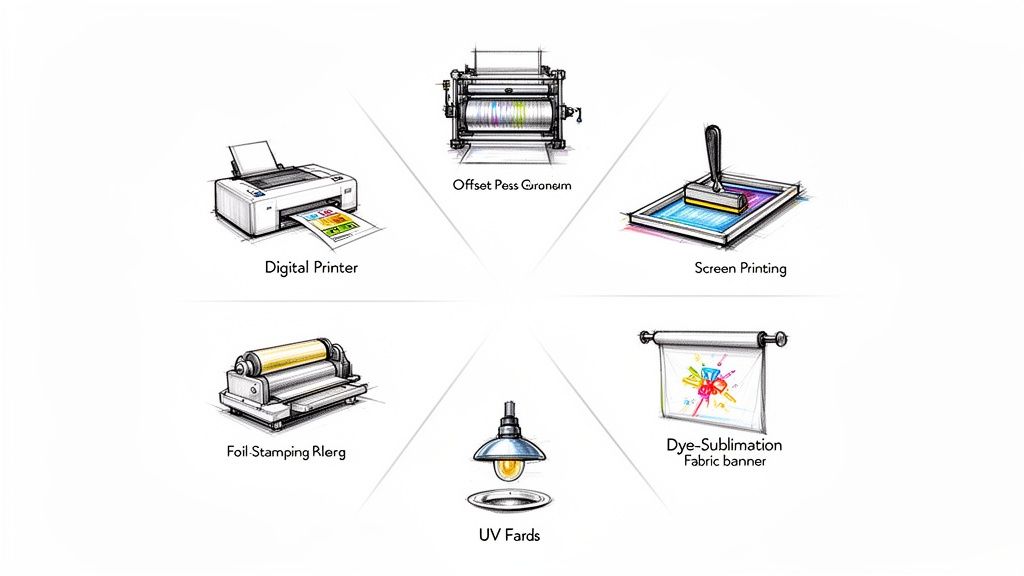 story
story A Business Owner's Guide to the Types of Printing
In a world saturated with digital noise, the simple, tangible act of handing someone a beautifully printed piece can make your brand unforgettable. But with so many ways to get ink on paper, choosing the right printing method can feel like you're trying to solve a complex puzzle. This guide is here to clear things up, framing each printing method as a specific tool for a specific job. Choosing the Right Printing Method for Your Brand Think of it like a chef picking the right knife. A small paring knife is perfect for intricate, detailed work, but you'd grab a heavy-duty cleaver for the big jobs. In the printing world, digital printing is your nimble tool for quick, small-batch projects, while offset printing is the powerhouse you bring out for large, high-quality runs. Grasping this core difference is the first step toward making smarter, more cost-effective decisions for your brand. The choice you make directly hits your budget, your timeline, and—most importantly—the impression your materials leave on your customers. Get it right, and every dollar you invest in print will work as hard as it possibly can. Why Print Still Matters Even with everything moving online, physical media has a powerful, tactile advantage that screens just can't replicate. A well-designed brochure or a premium business card creates a memorable, hands-on experience. The numbers back this up. The global commercial printing market is valued at a massive USD 838.26 billion and is expected to grow to USD 1,190.47 billion by 2035. This isn't a dying industry; it’s a resilient one, proving that print is far from obsolete. You can dig into these trends over at IBISWorld. The right printing method doesn't just put ink on paper. It translates your brand's quality, attention to detail, and core message into a physical object your audience can hold and remember. Matching the Method to the Mission Before we dive into the nitty-gritty of each method, your project's goals will point you in the right direction. Just ask yourself a few key questions: Quantity: Are you printing 50 invitations for a small gathering or 50,000 catalogs for a nationwide campaign? Volume is almost always the biggest factor in determining what's cost-effective. Turnaround Time: Do you need your prints tomorrow, or can you wait two weeks? Digital printing is built for speed, while offset requires a bit more setup time. Quality and Color: Do you need a perfect Pantone color match to keep your branding consistent, or is standard color accuracy good enough? Offset printing offers unparalleled precision for color-critical work. Material: Are you printing on standard paper, thick cardstock, vinyl, or even fabric? Some methods are much better suited for specific materials than others. Answering these questions first will instantly narrow down your options. This guide will walk you through the different types of printing, making sure your next batch of marketing materials is a certified success. 1. Digital Printing: Fast, Flexible, and Made for Today Picture this: you have a networking event tomorrow and just realized you're down to your last few business cards. You need a batch of 150 new ones, and you need them now. This exact scenario is where digital printing saves the day. Think of digital printing as your office printer's bigger, faster, and much more capable sibling. It takes a digital file—like a PDF of your business card design—and prints it directly onto paper. The key difference from older methods is that it doesn't need printing plates, which are custom-made metal plates used to transfer an image in traditional printing. This plate-free process is the secret sauce behind its incredible speed. There’s no clunky, time-consuming setup, making it the undisputed champion for projects that need a lightning-fast turnaround. Perfect for Short Runs and On-Demand Needs Because there are almost no setup costs, digital printing is the king of short-run projects . Need just 100 flyers for a weekend sale? Or maybe 50 custom invitations? Digital makes it happen without breaking the bank. This is a game-changer for small businesses and marketers. Instead of committing to a massive order of 5,000 brochures that might be outdated in six months, you can print a few hundred at a time. This “print-on-demand” model cuts down on waste, saves you money, and ensures your marketing materials are always current. Make It Personal with Variable Data Printing Here’s where digital printing really flexes its muscles: Variable Data Printing (VDP) . This is like a mail merge on steroids. VDP lets you change specific elements—like names, addresses, or images—on each individual piece as it’s being printed, all without slowing down the process. So, what can you do with this? Imagine sending out 500 postcards where each one greets the recipient by name, references a product they recently viewed, or includes a unique QR code just for them. It transforms a generic marketing blast into a personal conversation. The impact is huge. The global digital printing market was valued at US$33.5 billion in 2024 and is expected to hit US$57.08 billion by 2033 . A big driver of that growth is VDP, which can increase direct mail response rates by 20-30% and slash material waste by 30-50% . The Tech Behind the Magic Two main technologies power the world of digital printing, each with its own specialty: Laser Printing: This method uses a fine powder called toner and heat to create the image. It’s brilliant for producing razor-sharp text and clean lines, making it the go-to for professional documents, reports, and flyers. Inkjet Printing: Using tiny nozzles to spray liquid ink, inkjet is the master of color. It can reproduce photos with incredible vibrancy and smooth gradients, perfect for art prints, photo books, and eye-catching visuals. Here’s the bottom line: If your project is all about crisp text and professional graphics, laser is your workhorse. If you need rich, stunning, photographic-quality color, inkjet is the artist. When Is Digital Printing the Right Choice? As versatile as it is, digital isn't the perfect fit for every job. Its main drawback is a higher cost per piece on massive orders. Once you get into the thousands or tens of thousands, the old-school muscle of offset printing becomes much more cost-effective. But if your project ticks any of these boxes, digital is almost certainly your best move: You need it fast (think same-day or within 24-48 hours). You’re printing a low to medium quantity (usually anything under 1,000 pieces). Every print needs to be personalized with unique info. You want to print on-demand to avoid holding onto huge inventories. For these situations, the speed and flexibility of our digital printing services are simply unbeatable. Offset Printing for Unmatched Quality and Volume When your project demands flawless quality and you're printing in serious numbers, offset lithography is the undisputed champion. This method is the gold standard for projects where brand consistency and image clarity are absolutely non-negotiable, like high-end product catalogs, magazines, and corporate brochures. So, how does it work? Think of it like a high-tech rubber stamp. Instead of printing directly onto paper, we first etch your design onto a metal plate. That plate transfers the ink to a rubber blanket, which then presses the final, perfect image onto the paper. This indirect transfer is the secret sauce behind offset’s success. It produces rich, consistent, and razor-sharp results that define premium print. The flexible rubber blanket conforms perfectly to the paper’s surface, ensuring a smooth and even ink application every single time, from the first copy to the 50,000th . The Power of Economies of Scale Here’s where offset printing really shines: its incredible cost-efficiency at high volumes. Sure, there’s an initial investment in creating the custom plates, but that setup cost is spread out over the entire print run. This means the more you print, the less each individual piece costs. Think of it like baking cookies. Making just one cookie is a huge hassle because you still have to mix all the dough. But once that dough is ready, churning out 100 more cookies is fast and cheap. Offset printing works the same way; after the initial setup, the press can run thousands of copies at a very low per-unit price. This economic advantage is why offset remains a cornerstone of the commercial printing world. Even with the rise of digital, the global printing market—valued at a massive $868 billion —is projected to hit $969.7 billion by 2030 . That kind of stability is built on large-scale workhorses like offset, proving it’s not going anywhere. Unbeatable Color Accuracy and Consistency When your brand's specific shade of red needs to be perfect on every single brochure, offset printing is the only way to guarantee it. This method absolutely excels at color matching, especially when using the Pantone Matching System (PMS) . Offset printing gives you total control over color. By using specific Pantone inks instead of mixing CMYK on the fly, you can achieve an exact color match that digital printing often struggles to replicate. This ensures your brand identity stays strong and consistent across the board. This level of precision is critical for any business that relies on a recognizable brand color. Just think of the iconic blue of Tiffany & Co. or the distinct red of Coca-Cola. Offset ensures that color is identical across all your marketing materials, from business cards to annual reports. Here’s a quick rundown of when offset is the clear winner over digital: Feature Offset Printing Digital Printing Best Quantity 1,000+ pieces Under 1,000 pieces Cost-Effectiveness Low per-unit cost on large runs Best for short runs Color Accuracy Superior, especially with Pantone Good, but can have slight variations Turnaround Time Slower (requires plate setup) Faster (no plates needed) Material Options Wide range, including textured paper More limited on certain stocks Is Offset the Right Choice for Your Project? So, how do you know when to make the leap from digital to offset? The tipping point is almost always about quantity. While the exact number can vary, if your order is over 1,000 pieces, offset usually becomes the more economical choice. Consider these common scenarios where offset printing is the ideal solution: Book and Magazine Publishing: When printing thousands of copies, the quality and cost-per-page simply can't be beat. Product Catalogs: For large runs that demand perfect product photo reproduction to drive sales. Corporate Branding Materials: When color consistency across thousands of brochures, letterheads, and folders is critical. Large-Scale Direct Mail: For campaigns reaching tens of thousands of households with identical flyers or postcards. If your project demands premium quality at scale, exploring professional offset printing is a smart business move. It’s an investment in quality that pays off with a polished, professional result that truly represents your brand. Exploring Specialty and Large Format Printing Ready to create something people can not only see but also feel ? Let's move beyond standard ink on paper and dive into the exciting world of specialty printing. This is where brands truly come to life, using texture, dimension, and sheer scale to create unforgettable experiences. These techniques are the creative tools that turn a simple printed item into a premium piece of marketing. From a vibrant t-shirt that builds a walking fan base to a luxurious invitation that demands to be touched, specialty methods are all about making a powerful statement. Screen Printing: Bold and Vibrant Designs Think of your favorite band t-shirt or that striking concert poster with thick, opaque colors. That’s the magic of screen printing . This technique works by pushing ink through a stenciled mesh screen onto a surface—a method that has been refined for centuries but remains incredibly effective. Because it lays down such a thick layer of ink, screen printing is famous for producing exceptionally vivid and durable colors. This makes it the go-to choice for printing on materials that go way beyond paper, like: Apparel: T-shirts, hoodies, and tote bags. Posters: Creating art prints with rich, solid colors. Promotional Items: Printing logos on items like water bottles and pens. The process is best suited for designs with a handful of solid colors, as each color requires its own separate screen. While the initial setup is a bit more involved than digital, the results are bold, long-lasting, and have a distinct, high-quality feel you just can't fake. Flexography: The Engine of Modern Packaging Ever wonder how the intricate designs on a potato chip bag or a soda can label get printed at a massive scale? The answer is flexography , or "flexo" for short. Just imagine a modernized, high-speed version of a rubber stamp, but on a massive rotating cylinder. Flexo uses flexible photopolymer printing plates wrapped around these cylinders to transfer ink. It's incredibly fast and efficient, which makes it the undisputed workhorse for printing on the non-porous materials used in just about all modern packaging. Flexography is probably the most common type of printing you’ve never heard of. It's responsible for the print on almost everything you find in a grocery store, from food labels and plastic bags to milk cartons and candy wrappers. Its ability to print on such a wide variety of surfaces—including plastic, foil, and cellophane—makes it indispensable for the packaging industry. While creating the initial plates makes it a poor fit for short runs, it's completely unbeatable for high-volume, consistent production. Foil Stamping and Embossing for a Touch of Luxury When you want your print to practically scream elegance and quality, you add texture. Foil stamping and embossing are two finishing techniques that add a tactile dimension, encouraging people to physically engage with your materials. Foil Stamping: This process uses heat and pressure to apply a thin metallic foil to paper. It creates a shimmering, eye-catching effect that’s perfect for logos, special text, or decorative accents on business cards, invitations, and high-end packaging. Embossing & Debossing: Embossing creates a raised 3D impression on the paper, while debossing creates a recessed one. Both add physical depth and a sophisticated feel, transforming a simple design into a memorable sensory experience. These methods are all about elevating your brand's perceived value. In fact, studies on consumer behavior have found that high-quality, tactile finishes on packaging can significantly influence purchasing decisions, making items feel more premium and desirable. We've touched on some of the most popular specialty techniques that add flair and texture to printed materials. The table below breaks down these methods, showing you the unique visual effect each one creates and where it shines best. This should help you pinpoint the perfect technique to make your next project truly stand out. Specialty Printing Techniques at a Glance Technique Visual Effect Best For Products Key Benefit Screen Printing Bold, opaque, and vibrant colors with a tactile feel. T-shirts, hoodies, posters, promotional items. Unmatched color vibrancy and durability on various materials. Flexography Fast, consistent printing on flexible and non-porous surfaces. Labels, food packaging, plastic bags, gift wrap. High-speed efficiency for massive print runs. Foil Stamping Metallic, shimmering finish in various colors (gold, silver, etc.). Business cards, invitations, book covers, luxury packaging. Adds an immediate sense of luxury and premium quality. Embossing Raised, 3D texture on the paper's surface. Stationery, certificates, packaging, formal invitations. Creates a sophisticated, tactile experience that implies importance. Debossing Recessed, indented impression into the paper. Leather goods, journals, coasters, high-end business cards. Offers a subtle, elegant texture that feels handcrafted. UV Printing Sharp, vibrant, and durable ink cured instantly with UV light. Signage, phone cases, acrylic prints, promotional goods. Adheres to a huge range of materials, including non-porous ones. Dye-Sublimation Ink becomes part of the fabric for a permanent, soft feel. Apparel, banners, mouse pads, photo panels. Produces photo-quality, fade-resistant images on fabrics. Each of these techniques opens up a whole new realm of creative possibilities. By understanding what makes each one special, you can make more strategic design choices that not only look good but also connect with your audience on a deeper, more physical level. Large Format Printing: Making a Big Impact Sometimes, your message just needs to be big. Large format printing is the umbrella term for a range of techniques designed to produce massive visuals, from towering banners to detailed architectural plans. This is how you grab attention from a distance. This category isn't a single method but includes several, each suited for different jobs. For instance, UV printing uses ultraviolet light to instantly cure ink on almost any surface, including wood, metal, and acrylic. This makes it perfect for durable outdoor signage. For vibrant fabric displays, dye-sublimation infuses ink directly into the material for a permanent, soft, and fade-resistant finish. Whether you need a trade show backdrop, a vinyl banner for a grand opening, or a fleet of vehicle wraps, exploring professional online large format print services is the first step toward making a huge visual impact. These specialty and large-scale types of printing open up a world of creative possibilities, allowing you to design materials that captivate your audience and leave a truly lasting mark. How to Select the Perfect Printing Type Navigating the world of printing can feel like a lot, but picking the right method really just boils down to answering a few key questions. This is where we move from theory to action. By looking at what your project actually needs, you can confidently choose the option that gives you the best results without blowing your budget or your deadline. Think of it as a simple checklist. Every question you answer helps narrow down the options, pointing you toward the most logical and efficient solution. There's no single "best" way to print—just the one that's a perfect match for what you're trying to accomplish right now. Start with These Four Core Questions To cut through the confusion, start by defining the most important parts of your project. Your answers will almost immediately tell you whether you need a digital, offset, or specialty solution. What Is Your Quantity? This is the big one. Are you printing 200 flyers for a local bake sale or 20,000 catalogs for a nationwide launch? For smaller runs (usually under 1,000 pieces), digital printing is almost always the winner because there are no hefty setup costs. For massive volumes, offset printing’s tiny per-unit cost delivers unbeatable value. How Soon Do You Need It? Your timeline dictates the technology. If you need something in your hands within 24-48 hours , digital is really your only horse in the race. Offset and many specialty methods need more time to get going—creating plates, mixing custom inks, and setting up the machinery often takes several days. What Material Are You Printing On? Are you using standard paper, thick cardstock, vinyl, plastic, or even fabric? Digital and offset are the champs for most paper products, but methods like screen printing really shine on t-shirts, and UV printing is built for putting ink on rigid materials like acrylic or wood. How Critical Is Color Accuracy? Does your brand live and die by a very specific shade of Tiffany Blue? If you need a perfect Pantone (PMS) color match, offset printing is the way to go, hands down. Digital printing uses a CMYK mix to create colors, which looks fantastic but can have tiny variations from one print run to the next. Just answering these four questions will instantly cross a bunch of unsuitable options off your list and bring some much-needed clarity to your decision. Applying the Framework to Real-World Scenarios Let's put this into practice and see how it works with a couple of common projects. Scenario 1: A New Café Needs Loyalty Cards Quantity: 500 cards to get started. Deadline: ASAP—they need them before the grand opening next week. Material: Heavy cardstock. Color: Standard CMYK is perfectly fine. Verdict: Digital printing is the perfect fit. The low quantity makes it affordable, the turnaround is lightning-fast, and it handles thick cardstock with ease. Scenario 2: A National Retailer Is Launching a Holiday Catalog Quantity: 50,000 copies. Deadline: Four weeks. Material: Glossy paper to make the product photos pop. Color: Must perfectly match the brand’s signature Pantone red. Verdict: Offset printing is the only real choice here. The massive volume brings the per-unit cost way down, and it delivers the exact color precision a major brand needs for a big campaign. This simple decision tree helps visualize how different project needs lead to specific specialty printing methods. As the chart shows, even a basic starting point—like choosing between fabric or paper—can send you down a completely different path toward the right specialty process. Don't Forget the Finishing Touches Once you've landed on the core printing method, it’s worth thinking about whether your project could use a little extra something to really stand out. These final flourishes can take a standard print job and turn it into something truly memorable. Finishes aren't just an afterthought; they're a strategic part of the design. A soft-touch laminate on a business card or a spot gloss on a brochure cover can completely change how someone experiences your brand through touch and feel. Adding a unique finish makes your materials more engaging and much harder to forget. You can explore a huge variety of fantastic finishes to see what might work for your design, from shiny metallic foils to elegant, textured embossing. At 4OVER4, we have a massive library of templates ready to go, helping you see exactly how different finishes will look on your products before you commit. This takes the guesswork out of the creative process and empowers you to make design choices with confidence. By following this straightforward approach—nailing down your quantity, speed, material, and color needs, and then layering on the right finish—you’re no longer just ordering prints. You’re making smart, strategic decisions that save you money and make your brand look its absolute best. Got Questions About Printing? We've Got Answers. Even after diving into the world of printing methods, a few questions might still be swirling around. That's perfectly normal. We've put together this section to tackle the most common things people ask, giving you clear, straight-to-the-point answers so you can nail down your project details with confidence. Think of this as the final pre-flight check. We'll clear up some key industry terms and offer practical advice to make sure your vision comes to life exactly as you imagined, from your screen to the final printed piece. Our goal is to pull back the curtain on the process, empowering you to make smart decisions every time. What Is the Difference Between CMYK and Pantone Colors? Getting a handle on these two color models is absolutely essential for keeping your brand looking consistent. At their core, they are two completely different ways of producing color. Picture yourself as a painter. CMYK (which stands for Cyan, Magenta, Yellow, and Black) is like having a limited palette of primary colors that you mix together to create all the other shades in your masterpiece. It's an incredibly versatile process, which is why it's perfect for printing things with full-color photographs, like magazines or complex brochures. Pantone (PMS) , on the other hand, is like walking into a paint store and buying a can of a very specific, pre-mixed color—let's say "Tiffany Blue." You aren't mixing it yourself; you're using an exact, globally recognized formula. This is how you guarantee that your brand's specific shade of blue looks identical on a business card, a trade show banner, and a company t-shirt, no matter where or when they're printed. Use CMYK for projects loaded with photos and complex gradients. Stick with Pantone when your logo's exact color is non-negotiable and needs to be perfect across every single thing you print. When Does Offset Printing Become Cheaper Than Digital? This is one of the biggest budget questions we get, and it's a great one. While there isn't a single magic number that applies to every project out there, a pretty solid rule of thumb exists. The tipping point where offset printing starts to make more financial sense than digital is usually somewhere between 500 and 1,000 pieces of the same exact design. For any print run smaller than that, the high upfront setup cost of creating custom metal plates for an offset press makes digital the clear winner for your wallet. But once you cross that threshold, the per-item cost of offset printing drops like a rock. The press is already set up and running, so each extra copy adds very little to the total cost. This makes it the undisputed champion for any large-volume order. What File Format Is Best for Printing? Without a moment's hesitation: a high-resolution PDF . It’s the undisputed gold standard for professional printing. A well-made PDF acts like a locked container for your entire design, embedding all your fonts, images, and graphics so that what you see on your screen is exactly what gets printed. For the absolute best results, always stick to these two rules: Resolution: Make sure your file is set to 300 DPI (dots per inch). This is the minimum resolution needed to produce sharp, clear images that don't look blurry or pixelated. Bleed: Always include a "bleed" area in your design files. This is just a small extra margin of your background color or image that extends past the final trim lines. It’s a simple but crucial step that prevents any ugly white slivers from showing up after your product is cut to its final size. How Can I Ensure My Brand Colors Look Consistent? Keeping your brand colors consistent across different materials, printers, and projects is the cornerstone of brand recognition. For ironclad consistency, your best bet is always the Pantone Matching System (PMS) . Giving your printer your brand's specific Pantone codes is the most surefire way to guarantee color accuracy, especially when you're using offset printing. If you have to print using CMYK, make sure the four-color values ( C , M , Y , and K ) are identical across all of your design files. For any project where the color is absolutely mission-critical, do yourself a favor and invest in a hard-copy proof. This lets you see and approve the final color in your hands before you commit to the full print run. Ready to turn your ideas into high-quality printed reality? At 4OVER4 , we offer a huge range of printing services, from quick-turnaround digital runs to massive offset projects and unforgettable specialty finishes. Explore our printing options and find the perfect solution for your brand.