Content Hub
Stories, Ideas and Advice — Page 90
 story
story Web to Print Solutions: Transform Your Printing Business
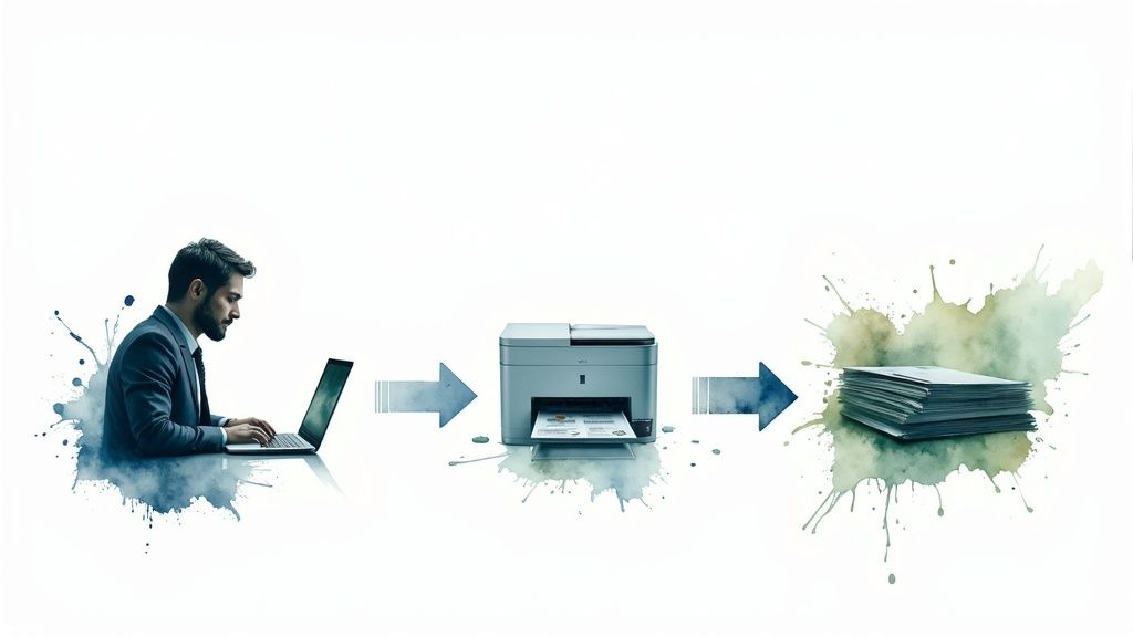
Understanding Web to Print Solutions Without the Jargon Think of the difference between hailing a taxi on a street corner and summoning an Uber with your phone. Both get you where you need to go, but the experience is completely different. This is a great way to understand web-to-print solutions . They aren't just another website; they are complete systems that overhaul how companies order and manage their printed materials, moving from a manual, often confusing process to a self-serve and automated one. The Core Idea: A Digital Storefront for Print At its heart, a web-to-print platform is a private, branded online portal. Imagine a virtual print shop open 24/7, but exclusively for your team. Employees, franchisees, or sales reps can log in to find, customize, and order the exact items they need, all while adhering to pre-approved brand guidelines. This built-in control ensures every business card, brochure, or banner remains perfectly consistent across the entire company, no matter who places the order. This screenshot from the 4OVER4 homepage shows how a professional web-to-print portal offers a clean, user-friendly interface. Notice the organized product categories and direct access to design tools. This setup lets users find and create what they need quickly, eliminating confusing email chains and delays. More Than Just Placing an Order This model goes far beyond a simple online checkout. While public print-on-demand services are useful for one-off personal projects, web-to-print is built specifically for business operations. It integrates approval workflows, budget controls, and inventory management directly into the platform. This is vital for organizations that must maintain strict brand and message control across multiple departments or locations. For instance, a national real estate firm can give its agents access to localized flyer templates. The agents can update their personal contact details, but the company logo, brand colors, and official messaging are locked. This approach turns the management of countless custom marketing materials into a simple, centralized process. It changes print procurement from a chaotic expense into a managed, strategic activity. This clear operational advantage is fueling significant industry growth. In 2023, the global market was valued at $3.5 billion . Market analysts project it to surge to $7.2 billion by 2032 , nearly doubling in less than a decade and showing a huge shift in how businesses handle printing. Discover more market insights here . Ultimately, these platforms put control, speed, and brand consistency directly into a team's hands, helping companies operate more efficiently. Essential Features That Actually Drive Results A good web-to-print platform isn't just an online ordering page—it's a problem-solving toolkit for your business. Many platforms list dozens of features, but only a handful are responsible for delivering real results that boost efficiency and protect your brand. The key is to find tools that solve actual operational headaches, not just collect every possible function. The real value is in features that directly improve your bottom line. User-Centric Design and Ordering The best systems make ordering simple for everyone, not just designers. It all starts with a user-friendly online editor . Imagine it as a simple design space with built-in brand safety nets. Your staff can make necessary edits—like changing a name on a business card—without needing any design software skills. This is made possible by template libraries , which are the foundation of efficiency. Instead of building a new flyer from the ground up, your team can access pre-approved designs, saving countless hours. A smart pricing calculator also gives instant, clear quotes based on quantity and options, which means no more waiting around for a price. Automation and Workflow Management The real magic happens behind the scenes with automation that gets rid of manual work. A key part of this is automated file processing , also known as preflighting. Think of it as a tireless quality inspector that automatically checks every file for common problems like low-resolution images or missing bleed. This single feature puts an end to endless email chains about file corrections. Just as important are approval workflows . These systems automatically send designs to the right manager for approval before anything goes to print. This creates a vital checkpoint for controlling budgets and maintaining brand consistency. For many businesses, this has been shown to cut down revision cycles by up to 70% , stopping expensive errors before they happen. The visualization shows how features that improve efficiency and accuracy lead directly to major gains in cost savings, faster turnaround, and a significant drop in errors. To help you see how these features stack up, the table below compares what you might find in different types of web-to-print platforms. Essential Web to Print Features Comparison Comparison of core features across different web to print solution tiers Feature Basic Solutions Advanced Solutions Enterprise Solutions Business Impact Online Editor Simple text and image replacement. Drag-and-drop functionality with brand-locked elements. Fully customizable editor with complex logic and rules. Empowers non-designers while ensuring brand consistency. Template Library A small set of pre-loaded, static templates. User-managed libraries with categories and search. Multi-brand, multi-region libraries with dynamic content. Speeds up design creation and reduces redundant work. Automated Preflighting Basic checks for resolution and file format. Comprehensive checks for bleed, color space, and fonts. Integrated with production workflow for automated corrections. Drastically reduces manual file checks and print errors. Approval Workflows Single-step approval via email. Multi-level, rule-based approval chains. Conditional workflows tied to budget, user role, or product. Provides strict budget and brand control before printing. Variable Data Printing Not typically available. Basic VDP for names and addresses. Advanced VDP for personalized images, offers, and QR codes. Enables highly targeted marketing campaigns for better ROI. API/Integrations Limited or no integration options. Pre-built connectors for popular CRM or e-commerce. Full API access for custom integration with any system (HR, ERP). Creates a seamless, automated flow of data across the business. As you can see, the right solution depends on your scale. While basic tools help with ordering, advanced and enterprise systems focus on automating entire operational processes to achieve greater efficiency. Advanced Capabilities and Integration Beyond these core functions, top-tier platforms open up new possibilities. For instance, you can run highly personalized marketing campaigns using variable data printing . This technique lets you print unique text or images on every single piece in a print run, perfect for direct mail that addresses each customer by name. A modern web-to-print solution should also fit into your existing business systems. It needs to connect with your other tools, whether it's your CRM, inventory software, or even your marketing platform. When choosing support systems, picking the best CMS for SEO can work alongside your print efforts to improve overall visibility. The ability to integrate creates a smooth operational flow. Ultimately, the best web to print solutions give users an easy-to-use front-end experience while powerful back-end automation delivers tangible business results. How Web-to-Print Technology Really Works Behind the Scenes When you click ‘submit order’ on a web-to-print portal, you kick off a complex but perfectly synchronized process. Imagine the software as an incredibly efficient orchestra conductor. It doesn’t play an instrument itself but directs every section to create a flawless performance. This technology is what turns a simple online action into a physical, high-quality printed product delivered right to your door. Let's pull back the curtain and see how this digital conductor manages the show. The Core Workflow Engine The moment you upload a file, the system’s workflow engine comes to life. This isn't just a simple file transfer; it’s the beginning of a smart, automated production line built for accuracy and speed. The process moves through several key stages, often without any need for human intervention at every single step. This is where the real efficiency of the system shines. Here’s a simple look at that journey: Automated Preflighting: The platform first acts as a meticulous quality inspector for your design file. It automatically checks for common issues like low-resolution images, incorrect color profiles (RGB vs. CMYK), or missing bleed lines. This catches costly print errors before they can happen. Job Ticketing and Queuing: Once a file passes this check, the system generates a digital “job ticket.” This ticket is like a detailed recipe, containing all the specifications: paper type, quantity, finishing options, and the shipping address. It then places the job into an organized print queue. Intelligent Job Routing: The software then acts like a smart traffic controller, routing the job to the most suitable printing press. For instance, a small batch of flyers might be sent to one digital press, while a large banner order goes to another, making the best use of all available equipment. The Power of Cloud and AI This entire operation is supported by a strong technological backbone. Modern web-to-print solutions are built on powerful cloud infrastructure . This is what allows platforms to handle massive design files from thousands of users at the same time without slowing down. It also means the service is accessible whenever you need it, from anywhere with an internet connection. On top of that, mobile access has become essential. Teams are no longer chained to their desks; a sales rep can order new brochures directly from a client’s office, or an event manager can approve a banner design on their phone. This flexibility makes the tool much more useful for everyone. Artificial intelligence (AI) also plays a subtle but vital role. It can assist with automatic color correction to keep branding consistent or predict shipping times based on current production loads. These smart functions are key to modern high-quality digital printing . The Unseen Connections: API Integrations A truly effective web-to-print platform doesn't work in isolation. It connects with the other tools your business uses every day through Application Programming Interfaces (APIs) . Think of APIs as the digital plumbing that lets different software systems communicate and share data automatically. This connectivity is what elevates a good tool into a critical part of your operations. For example, an API can connect your web-to-print portal to: Accounting Software: To automatically create an invoice the moment an order is confirmed. CRM Systems: To pull customer addresses for personalized direct mail campaigns. Inventory Management: To keep stock levels updated for pre-printed materials like marketing kits. This level of automation and connection is a major reason for the industry's rapid growth. As of 2024 , the global market for web-to-print software solutions was valued at USD 1.054 billion , which shows how much businesses depend on this connected technology. Explore the full market research here . Real Success Stories Across Different Industries Theory is useful, but the true value of web to print solutions comes to life when you see them solving real-world challenges. From fast-moving marketing agencies to large-scale Fortune 500 companies, these platforms are adapted to fix specific operational problems. They provide a flexible foundation that helps everyone from healthcare providers managing strict regulations to e-commerce sellers building a distinct brand. Powering Efficiency in Regulated Fields Imagine a regional healthcare network with over 40 separate clinics. Their biggest headache was keeping all patient communications—from appointment cards to detailed health brochures—consistent and compliant with industry regulations. By introducing a private web-to-print portal, they gave each clinic access to pre-approved templates. This allowed local staff to update clinic-specific details like office hours or doctor names, while crucial legal disclaimers and brand logos remained locked. The system ensured full compliance and put an end to inconsistent messaging. In another case, a large educational district was battling excessive printing costs and inconsistent materials produced by its schools. The fix was a central portal where teachers could order approved classroom worksheets, resources, and event flyers. This not only gave teachers instant access to professional-quality materials but also let the district track spending for each school. The result was a remarkable 60% reduction in printing costs and a big improvement in teacher morale, as resources were always available. Maintaining Brand Control for E-commerce and Retail In the crowded e-commerce market, web-to-print is key for merging print with the digital customer experience. Online sellers use it to automate the creation of personalized packing slips, branded thank-you cards, and marketing inserts that go out with every order. This direct link between a digital purchase and a physical item helps build customer loyalty and creates a more memorable unboxing experience. For instance, platforms like Vistaprint show how these powerful design tools are made available to everyday users. Their straightforward interface lets customers personalize products right in their browser, highlighting the self-service model that is at the heart of web to print solutions . For national retail chains, the primary struggle is maintaining brand identity across hundreds of franchise locations. A corporate web-to-print portal serves as the single source of truth for all marketing materials. Franchisees can confidently order localized promotional items—from posters to seasonal sale banners—knowing they are using the correct logos, colors, and messaging. This stops the brand dilution that happens when individual locations design their own materials. This level of control isn't just for corporate giants; it's a powerful tool for growing businesses. You can learn more about print solutions for startups and SMBs to see how they maintain a professional image. To see how this plays out across different sectors, here’s a breakdown of common web-to-print applications and their impact. Industry Primary Use Cases Key Benefits ROI Indicators Healthcare Patient forms, informational brochures, clinic-specific flyers, appointment cards Ensures regulatory compliance, maintains brand consistency, empowers local staff safely Reduced compliance fines, lower design costs, elimination of rogue spending Education Classroom resources, worksheets, event flyers, school-branded stationery Centralized resource management, controls printing costs, provides quick access to approved materials Measurable reduction in print budgets (e.g., 60% ), improved material quality, less administrative overhead E-commerce & Retail Automated packing slips, personalized thank-you cards, in-store promotional materials Strengthens brand loyalty, creates memorable unboxing experiences, ensures brand consistency Increased customer retention, higher average order value, consistent brand presentation Marketing Agencies Client-specific portals for ordering branded collateral, campaign materials, business cards Simplifies client management, provides a value-added service, automates reordering Higher client retention, new revenue streams, improved operational efficiency As the table shows, the core advantages are control and efficiency. Whether the goal is protecting a brand or managing a budget, these platforms provide the structure to make it happen. Strategic Benefits That Transform Your Bottom Line While faster ordering is a nice bonus, the real value of web to print solutions lies in their strategic impact. These platforms are more than a simple convenience; they can reshape how a company works and connects with its customers, delivering tangible results. Quantifiable Gains: Efficiency and Cost Reduction The first and most obvious change is in your daily operations. The old way of ordering print often feels like being stuck in a traffic jam—a mess of emails, manual file checks, and waiting for approvals. A web-to-print platform automates these steps, clearing the jam and cutting processing times by 40-60% . This newfound speed directly impacts your budget. Reduced labor costs are a clear win, as your team can focus on creative or strategic work instead of administrative follow-ups. Moreover, the system's automated quality checks act as a final line of defense against human error. This means far fewer expensive reprints caused by typos or incorrect file setups, saving you money on materials and protecting your bottom line from preventable mistakes. Protecting Your Most Valuable Asset: The Brand Beyond the financial savings, these platforms serve as a powerful guardian for your brand identity. Keeping everyone on the same page is a real challenge in companies with multiple locations or large teams. A web-to-print portal acts as a central hub for all approved marketing materials. Think of it as putting up brand guardrails. An employee can easily personalize a business card or brochure with their name and contact info, but the essential brand elements—like the logo, color scheme, fonts, and even legal disclaimers—are locked down. This simple control prevents inconsistent, off-brand materials from ever reaching a customer, ensuring every interaction is professional and perfectly aligned with your corporate image. Unlocking Growth with Data and Better Service Modern web to print solutions also double as valuable sources of business intelligence. By tracking ordering habits, you can see which marketing pieces are performing best, which departments are the most active, and where new sales opportunities might be hiding. This data can uncover surprising customer trends that help you build smarter marketing strategies and drive real growth. This efficiency also gives you a real edge over the competition. Quicker turnaround times and reliable service lead directly to happier, more loyal customers. Internally, giving your team a simple, frustration-free tool for ordering materials boosts both morale and productivity. It's this powerful mix of cost savings and strategic gains that is fueling the market's growth. In 2024, the global web-to-print market was valued at USD 25.08 billion and is expected to hit USD 26.59 billion by 2025 , a clear sign that businesses everywhere are seeing the results. Explore the complete market analysis here . Making Web to Print Work with Your Existing Systems A powerful new engine is just a heavy piece of metal if it can’t connect to your car’s transmission. In the same way, even the best web to print solutions can fall flat if they don’t integrate with the business tools you already use every day. Without these connections, your new portal becomes a lonely data island, creating manual work and process jams that defeat its entire purpose. The goal is to create a smooth flow of information, turning your print portal into a connected hub, not just another isolated task. Why Seamless Connections Matter Successful integration is about more than just making things easier; it’s about creating a single, reliable source of information for your entire business. When your systems can talk to each other, you get rid of duplicate data entry, cut down on human error, and speed up work across every department. This makes your entire operation more flexible and quick to respond. Think about these real-world scenarios: Customer Relationship Management (CRM): Your sales team updates a client's address in your CRM. With a proper integration, that new address is immediately available in the web-to-print portal for their next order. This is absolutely critical for targeted projects, like personalized direct mail services , which depend on up-to-the-minute data. Accounting Software: When a department places an order through the portal, the details can be automatically pushed to your accounting software. An invoice is generated and the expense is tracked against a budget, all without anyone lifting a finger. Of course, getting there can have its hurdles. You’ll need to think about how to manage user logins across different platforms (often called single sign-on), keep inventory levels in sync, and ensure data stays accurate as it moves between connected tools. Choosing Your Integration Approach Not every business needs the same deep level of connection. The secret is to pick an approach that fits your company's complexity and budget. For smaller operations, a simple data exchange using CSV files might be all you need. This method is low-cost but does require manual exporting and importing, making it best for data you don't need to update constantly. For more automated workflows that don't require a team of developers, middleware platforms act as universal translators between your different apps. This screenshot from Zapier , a popular connector tool, shows a small sample of the e-commerce apps that can be linked together. This illustrates how you can build powerful automations—for example, automatically adding a new e-commerce customer to your CRM and a specific mailing list at the same time. Web-to-print tools can greatly improve a company's online footprint, and a solid ecommerce SEO strategy is key to driving sales from these connected activities. For businesses with enterprise-level needs, a direct Application Programming Interface (API) integration is the most powerful solution. Think of an API as a direct, real-time phone line between your web-to-print platform and core systems like an ERP. While this approach requires more technical know-how and a longer setup time, it delivers unmatched automation and data accuracy for complex, high-volume operations. Choosing the right level of complexity is a strategic move. It’s not about getting the most advanced connection, but the one that actually solves your biggest workflow headaches and gives you the strongest return on your investment. Your Practical Selection and Implementation Guide Choosing the right web-to-print solution can feel overwhelming. With so many options out there, it’s easy to get lost comparing features and technical details. But picking the right platform is less about buying software and more like finding a long-term business partner. The secret is to look past the flashy features and focus on what truly fits your team, your budget, and your future goals. A structured evaluation is your best map for this process. Key Evaluation Criteria Beyond the Feature List While a long list of features is nice, the actual success of your web to print solutions depends on less obvious factors. Start with the User Experience (UX) . A platform that's confusing for your non-technical staff will never be fully adopted, no matter how powerful it is. During a demo, ask yourself if a regular employee could place an order without a lot of training. Next, look into Vendor Stability and Support . Is the provider an established company or a new startup? What kind of support do they offer—is it just a chatbot, email, or a dedicated account manager? A great platform with poor support becomes a major headache when you run into problems. When weighing your options, consider researching different web to print providers to see their track records. Finally, think about Scalability . The solution you pick today needs to be able to grow with your business tomorrow. Ask potential vendors how their platform handles more users, a bigger product catalog, and complex integrations down the road. To help you prioritize, the table below breaks down how different business sizes might weigh these factors. Web to Print Solution Selection Criteria Key evaluation factors and weighting for different business types Criteria Weight Small Business Mid-Market Enterprise Evaluation Method User Experience High Ease of use is critical for small teams. Must be intuitive for diverse user roles. Essential for company-wide adoption. Live demos, user sandbox testing Price & ROI High Budget is often the primary driver. Balanced focus on features and value. Total cost of ownership is key. Quote comparison, ROI analysis Scalability Medium Important for growth potential. A key consideration for expansion. Non-negotiable requirement. Ask for case studies, vendor roadmap Vendor Support High Need reliable support for troubleshooting. Dedicated support contact is valuable. Enterprise-level SLAs are needed. Check reviews, ask for references Integrations Low Basic connections may be sufficient. Important for core systems (CRM, ERP). Critical for automated workflows. Review API documentation As you can see, while a small business might focus heavily on price, an enterprise will place a much higher value on scalability and deep integrations. Using this framework helps you focus on what matters most for your specific needs. Your Implementation Roadmap Once you’ve chosen a provider, the implementation journey starts. It's important to set realistic expectations; this isn't an overnight switch. A successful launch requires careful planning and clear communication. Your budget should cover more than just the monthly subscription. Be sure to factor in potential costs for setup, moving data, and employee training time. The single most important factor for success is Change Management . Your team needs to understand why this change is happening and how it helps them. A smooth transition involves a few key steps: Define clear, measurable goals for what you want the platform to accomplish. Get buy-in from key stakeholders and department leaders early in the process. Provide good training that is specific to different user groups. Set up metrics to measure success after launch, such as fewer order errors or faster turnaround times. A thoughtful selection process ensures you choose a tool that not only fixes today's problems but also supports your goals for the future. Ready to find a partner that makes this entire journey easier? Discover how 4OVER4 combines powerful features with an intuitive experience to become the perfect printing solution for your business.
 story
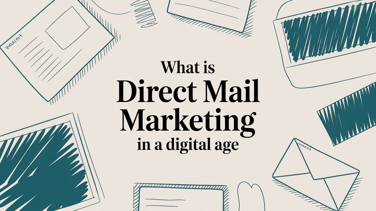
story What Is Direct Mail Marketing in a Digital Age
Direct mail marketing is simply the practice of sending physical promotional materials —like postcards, letters, or catalogs—straight to a potential customer's mailbox. Think of it as a tangible, one-on-one conversation with your audience in a space that’s way less crowded than a digital inbox. Understanding Direct Mail in the Modern Era In an age where we're all drowning in fleeting digital ads, direct mail carves out a unique space by delivering a physical brand experience. It’s not about ditching your digital efforts; it’s about making them stronger. This strategy cuts through all the online noise, offering something real that customers can hold, feel, and remember. The real power here comes from its ability to create a multisensory connection. Unlike an email that’s gone with a single click, a well-designed mail piece can sit on a kitchen counter or a desk for days, acting as a constant brand reminder. That physical presence builds a sense of legitimacy and trust that digital messages often struggle to match. The Three Pillars of Success Every truly effective direct mail campaign is built on three core components. When they work together, they drive real results. Getting these pillars right is the first step toward launching a campaign that actually connects with your audience and delivers a solid return. This infographic breaks down what those three essential pillars are for any direct mail strategy. As you can see, success really hinges on getting your mailing list, your offer, and your creative execution perfectly aligned. The List: This is all about who you're talking to. A highly targeted list makes sure your message reaches the people most likely to be interested in your product or service. You can learn more about zeroing in on specific neighborhoods with our guide on Every Door Direct Mail (EDDM) . The Offer: This is why they should care enough to act. A compelling offer—like a can't-miss discount, a free trial, or an exclusive invitation—gives people a clear and immediate reason to respond. The Creative: This is how you grab their attention and don't let go. From eye-catching design and persuasive copy to the very format of the mailer itself, strong creative makes your message impossible to ignore. The data backs this up, time and time again. This tangible approach yields impressive engagement. Direct mail campaigns typically achieve response rates between 3% and 5% , which absolutely dwarfs email's average of just 0.6% . You can dig deeper into why direct mail still works in a digital world on Triadex Services . That stark difference really highlights just how effective it continues to be. The Hidden Advantages of Physical Mail In a world cluttered with digital noise, why does something as old-school as a piece of physical mail still pack such a punch? It’s all about the tangible experience. You can’t physically hold an email, but you can touch and feel a well-designed mailer. That sensory connection creates a much stronger and more personal bond with a brand than a fleeting digital ad ever could. This physicality builds an incredible amount of trust right off the bat. We've all become a bit skeptical of our overflowing inboxes and potential digital scams. But a physical piece of mail? That feels legitimate. It takes a real investment to create and send, which signals to the person holding it that the message is worth paying attention to and the brand is credible. It lays a foundation of trust before they even think about visiting your website. Driving Real Engagement One of the biggest wins for direct mail is its uncanny ability to reach specific, high-value groups of people who might be less plugged-in online. Think of it as a direct line into someone's home, completely bypassing the digital gatekeepers like ad blockers and spam filters. Your message lands right in their hands, guaranteed. For example, a local boutique can send postcards with a can't-miss in-store offer to households in nearby zip codes, driving immediate foot traffic. Or a B2B company trying to get a decision-maker's attention can send a "dimensional mailer"—a small package with a gift or sample inside. Good luck ignoring that when it lands on your desk, unlike the hundred other emails you got that day. These tactile moments stick with people and spark action. The numbers don't lie. Direct mail sees a household open rate of 80–90% , which absolutely dwarfs email's average of 20–30% . And when you get personal, the results are even better—customized mailers can boost response rates by as much as 135% . Unlocking a Better Return All that engagement naturally leads to a fantastic return on your investment. When 71% of consumers say direct mail feels more personal than online messages, it’s easy to see why it connects on a deeper level. This positive vibe isn't just a feeling; it translates into real dollars, with some campaigns pulling in an ROI as high as 161% . A huge part of its effectiveness is its staying power. A sharp-looking postcard or a professional letter in a branded envelope can sit on a kitchen counter or desk for days. This keeps your brand front and center in a way a digital ad just can't, making it a seriously powerful and trackable tool for growth. If you want to make sure your mail gets noticed, take a look at our options for custom printed business envelopes . Building Your First Direct Mail Campaign Launching your first campaign can feel like a massive undertaking, but it doesn't have to be. The secret is breaking it down into a clear, step-by-step process that makes the whole thing manageable. Think of it like assembling furniture—each piece connects to the next, slowly building a solid structure. The key is to work through it methodically, starting with your core strategy and ending with a final analysis. This roadmap will walk you through the entire journey, making sure you cover all the bases for a successful launch. Step 1: Define Your Goals and Budget Before you even think about design, you need to be crystal clear on what you’re trying to achieve. Are you hoping to drive more foot traffic to your new coffee shop? Generate qualified leads for your sales team? Or maybe re-engage customers who haven't purchased in a while? Your goal is the foundation for every other decision you'll make. Once you know your "why," it’s time to set a realistic budget. This isn't just about printing costs; you need to account for everything from acquiring your mailing list and design work to the final postage. Getting your numbers straight from the beginning prevents any nasty surprises down the road and keeps the project on track. Step 2: Build a Highly Targeted Mailing List Let’s be honest: your mailing list is the single most important factor in your campaign's success. You could have the most brilliant offer in the world, but sending it to the wrong audience is like shouting into the void—a complete waste of money. You can build your list from your existing customer database (a goldmine!) or purchase a targeted list based on specific demographics, locations, or even past purchase behaviors. A well-curated list ensures your message lands in the hands of people who are most likely to actually care. As you build your direct mail campaign, understanding the broader landscape of lead generation marketing is essential for maximizing your results. Step 3: Design a Compelling Mail Piece Now for the fun part. Your design has mere seconds to grab someone's attention as they sift through their mail. Go for a bold headline , striking visuals , and clear, concise copy . Less is often more here. Most importantly, your call to action (CTA) needs to be impossible to miss. Tell recipients exactly what you want them to do next, whether that’s visiting a specific website, scanning a QR code, or bringing a coupon into your store. Don't make them guess. Step 4: Partner with Printing and Mailing Services With your design finalized, you need a reliable partner to bring it to life. Professional printing is non-negotiable; it ensures your mailer looks polished and credible, not like something you ran off on your office printer. Many companies now offer all-in-one solutions that handle both the printing and the mailing, which can save you a ton of time and logistical headaches. A good partner also helps you navigate the surprisingly complex world of postal regulations. Exploring expert direct mail services is a great way to make this part of the process smooth and error-free. Step 5: Track and Measure Your Results So, did it work? You won't know unless you track your results. Tracking is the only way to figure out if your campaign was a success and what you can improve next time. The easiest way to measure your return on investment is to include a unique element on your mailer that you can trace back to the campaign. Here are a few simple but effective methods: Unique Promo Codes: Assign a special discount code that's only used for this mailer. Custom URLs (PURLs): Direct recipients to a specific landing page on your website built just for them. QR Codes: Give smartphone users an easy way to scan and go directly to your offer page. By keeping an eye on these metrics, you can accurately calculate your response rate and ROI. This isn't just about grading this campaign; it's about gathering valuable intel to make your next one even better. To help you stay organized, here's a simple checklist to guide you from start to finish. Direct Mail Campaign Launch Checklist Phase Key Task Success Metric 1. Strategy & Planning Define clear campaign goals (e.g., generate 50 new leads). Goal is specific and measurable. Set a comprehensive budget for all campaign elements. Budget approved and allocated. 2. Audience & List Build or acquire a highly targeted mailing list. List demographics match target customer profile. Clean and segment the mailing list for personalization. Open/response rate by segment. 3. Creative & Design Develop compelling copy with a strong Call to Action (CTA). A/B test results on CTA performance. Create an eye-catching design that reflects your brand. Design is approved by all stakeholders. 4. Production & Logistics Select a reliable printing and mailing service provider. Quotes received and partner chosen. Finalize mail piece format (postcard, letter, etc.). Final proof approved for printing. 5. Tracking & Launch Set up tracking mechanisms (promo codes, PURLs, QR codes). Tracking links and codes are tested and working. Schedule the mail drop date with your provider. Mail drop confirmed. 6. Measurement Monitor response rates and track conversions. Response Rate, Conversion Rate, Cost Per Acquisition. Calculate the final Return on Investment (ROI). Final ROI is positive and meets/exceeds goals. Following these steps methodically turns a daunting project into a series of achievable tasks, setting you up for a campaign that not only reaches mailboxes but also drives real business results. Real-World Examples of Direct Mail Success It's one thing to talk about direct mail in theory, but seeing it in action is what really gets the ideas flowing. Companies today are getting some incredible results by sending something real and tangible—a message that simply can’t be ignored in a crowded inbox. Let's look at a few examples of how brands are making it work. Winning Back Lost Sales An e-commerce brand was struggling with a classic problem: abandoned shopping carts. To re-engage these would-be customers, they started sending personalized postcards 48 hours after someone left the site. The card featured a picture of the exact product left behind, a friendly nudge, and a small, time-sensitive discount to seal the deal. That simple, physical reminder led to a 14% cart recovery rate , blowing their email-only campaigns out of the water. If you're looking to run a similar play, you can get started with high-quality, custom postcards for your business . From Mailbox to Major Deals Over in the B2B space, a software company needed to get past the digital gatekeepers protecting busy C-suite executives. Cold emails were getting deleted on sight. So, they tried something different: a "dimensional mailer," which is really just a fancy term for a small, branded box. Inside was a high-quality coffee mug and a simple note that read, "Let's grab a virtual coffee and discuss how we can save your team 20 hours a week." This clever approach didn’t just bypass the noise—it landed directly on the desks of the people who make the decisions. The campaign pulled in a 25% meeting booking rate and was directly credited with closing two deals worth six figures each. Finally, think about a local dental clinic that wanted to bring in new patients from the surrounding neighborhoods. They kept it simple and sent a postcard with a can't-miss offer: "Free Teeth Whitening Kit for New Patients." The design was clean, the offer was front and center, and the call to action was crystal clear—call to book your appointment. The result? A 30% jump in new patient bookings over just two months. These stories aren't just one-offs; they're part of a bigger picture. The direct mail industry is booming, with the average number of pieces sent by companies expected to nearly double from 34.9 million to 67.3 million annually between 2024 and 2025. You can dig into more of this data in Lob's 2025 State of Direct Mail report . Connecting Direct Mail with Your Digital Strategy Direct mail shouldn't be an island. Its real power comes alive when you pair it with your digital marketing channels. Think of it as building a bridge between the physical and digital worlds for your customers. You're not just repeating the same message; you're creating a seamless experience where each channel makes the other one stronger. For example, a simple postcard can become an interactive gateway. Slap a QR code or a custom URL on it, and you can guide people straight to a landing page built specifically for that campaign. This not only makes it dead simple for them to respond but also gives you a crystal-clear way to track who's engaging with your mailer and what actions they're taking. Creating a Unified Customer Journey Modern automation platforms have made this kind of integration easier than ever. You can now use what someone does online—their digital behavior—to trigger a piece of physical mail. This creates timely, super-relevant touchpoints that really grab their attention. Suddenly, your direct mail isn't just a standalone campaign. It's a responsive, intelligent part of your customer's journey. Here are a few proven tactics that work like a charm: Retargeting Website Visitors: Someone browses a product on your site but leaves without buying? A few days later, a postcard lands on their doorstep with a special offer for that exact item. It's surprisingly effective. Re-engaging Inactive Subscribers: Got a list of email subscribers who haven't opened anything in months? A compelling mail piece with an exclusive "we miss you" discount can be just the thing to rekindle that relationship. Automated Welcome Campaigns: The moment a customer makes their first online purchase, you can automatically trigger a welcome postcard. A simple thank you note and a coupon for their next order goes a long way. The whole strategy is about creating a conversation that flows naturally between different channels. A physical mail piece can drive digital action, and a digital action can trigger a physical follow-up. To really nail this integration and get the most bang for your buck, it helps to understand a complete multi-channel marketing approach . You can also bring in tech like variable data printing services to personalize each mailer based on the digital data you have, making every single piece feel like it was made just for them. When you connect all these dots, you're not just sending mail—you're building a smarter, more effective marketing machine. Of course. Here is the rewritten section, crafted to sound completely human-written and natural, following all the specified requirements. Frequently Asked Questions About Direct Mail Even when you’re sold on the benefits, a few practical questions always pop up before launching a direct mail campaign. Getting these cleared up is the key to moving forward confidently and building a strategy that actually delivers. Let's dive into the most common ones. How Much Does a Direct Mail Campaign Cost? This is the big one, and the honest answer is: it varies. The final cost really boils down to four key pieces: your mailing list, the design work, printing, and postage. For a straightforward postcard campaign, you’re likely looking at a range of $0.50 to $3.00 per piece , all in. Sure, that’s more than hitting ‘send’ on an email blast, but the conversation changes when you look at response rates. Direct mail often pulls in significantly higher engagement, making it a smart investment, especially when you’re promoting high-value products or services. The trick is to budget for all four components from the get-go to avoid any surprises down the line. How Can I Measure the ROI of My Campaign? Tracking the return on your direct mail investment is simpler than you’d think, and it's absolutely essential for proving its worth. The secret is to build a bridge from your physical mailer to your digital world with a unique, trackable element on every piece. By giving each campaign its own tracking method, you can directly link website visits, calls, or sales back to your mailers. This gives you a crystal-clear picture of your ROI. Here are a few proven ways to do it: Unique Promo Codes: Create a special discount code that’s only used for the mail campaign. QR Codes: Send people to a specific landing page where you can track traffic with your analytics tools. Dedicated Phone Numbers: Use a call-tracking number to see exactly how many inbound leads came from that mailer. Is Direct Mail Effective for B2B Marketing? Absolutely. In the B2B space, decision-makers are drowning in emails. A well-timed piece of direct mail can be the perfect way to slice through that digital noise. It's especially powerful for account-based marketing when you have your sights set on high-value prospects. Think about it: sending a thoughtfully designed, personalized mailer or a small, clever package to a C-suite executive is almost guaranteed to get more attention than yet another cold email in their inbox. It’s a tangible gesture that shows you’ve invested time and effort into connecting with them. This is how you open doors, land meetings, and build the kind of relationships that digital-only tactics just can't replicate. Ready to create a direct mail campaign that gets noticed? 4OVER4 offers high-quality printing for everything from postcards to custom mailers, helping you bring your vision to life. Explore our printing solutions and start your project today!
 story
story What Is Flexographic Printing A Practical Guide for Modern Brands
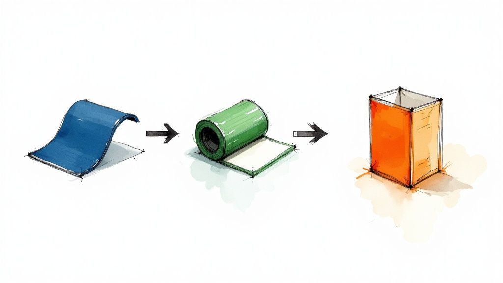
Flexographic printing is a high-speed printing method that works a lot like a super-advanced rubber stamp. It uses flexible photopolymer plates and quick-drying inks to transfer images directly onto all sorts of materials, which is why it has become such a cornerstone of the packaging world. The Workhorse of Modern Packaging Picture a production line churning out thousands of snack bags, labels, or boxes every single hour. That incredible speed and versatility is the heart of what is flexographic printing . It’s the go-to technology for high-volume jobs, especially on materials that give other methods a hard time, like plastic films, foils, and corrugated cardboard. This ability to produce consistent quality at lightning-fast speeds makes flexo the engine behind much of the packaging you see on store shelves every day. But this method isn't brand new. While it feels modern, flexography's roots go back to the late 19th century, with the first press patented way back in 1890. It was first called "aniline printing" because of the inks used, but the process was officially renamed "flexography" in 1951. Today, flexography is responsible for roughly 60% of all global packaging printing , showing just how critical it is. For a deeper dive into its history, you can explore the inception and developments of flexo printing on flexopedia.net . Why Flexo Dominates Packaging Flexographic printing’s dominance comes down to a few core strengths that are perfectly matched for the demands of the consumer goods market. These traits allow brands to produce high-quality, durable, and cost-effective packaging solutions at a massive scale. Flexo is particularly effective for: Speed and Efficiency: Flexo presses run at incredibly high speeds, making them perfect for long production runs where millions of identical items need to be printed fast. Material Versatility: It can print on a huge range of surfaces, both porous and non-porous. Think paper, cardboard, plastics, foils, and films. Durability: The inks are tough. They can stand up to abrasion, moisture, and fading, which is a must-have for product packaging that has to survive shipping and handling. This adaptability is exactly why so many businesses turn to flexo for their custom packaging products . At its core, flexography solves a critical business need: how to print high-quality graphics on diverse materials at a scale that keeps per-unit costs low. It strikes an exceptional balance between speed, quality, and economic viability for mass production. To give you a quick snapshot of what flexo is all about, I've put together a simple table breaking down its key features. Flexographic Printing At A Glance Characteristic Description Primary Method A rotary relief printing process using flexible plates. Best For High-volume runs (thousands to millions of units). Common Substrates Flexible plastics, paper, cardboard, labels, foils. Print Quality High-quality, especially for solid colors and line art. Cost Structure Higher initial setup costs (plates), but very low cost per unit on long runs. Speed Extremely fast, making it one of the most efficient printing methods. This table gives you a great starting point for understanding where flexographic printing shines. It’s all about balancing that initial setup cost with the massive payoff in speed and low per-item cost for large orders. How The Flexographic Printing Process Works Step By Step To really get what flexographic printing is all about, let's walk a design from a digital file all the way to a finished product in your hands. The whole operation is a high-speed masterclass in precision, where every single part plays a vital role. It's like a perfectly choreographed dance between machines and materials. The work starts long before the press ever roars to life. It begins with your digital artwork. This file gets transformed into a physical printing plate—a flexible sheet, usually made from a light-sensitive polymer. The easiest way to think about this plate is as a high-tech, super-detailed rubber stamp, where the parts that will print are raised up from the surface. For a full-color job, a separate plate has to be made for each and every ink color. This diagram gives you a clean, simple look at the core of the process, showing how the plate, ink, and press work in harmony. What this really shows is the continuous, rolling motion of the process. That rotary action is the secret sauce behind its incredible speed and efficiency. Inside The Flexo Press Once the plates are ready, they're carefully mounted onto a plate cylinder inside the press. This is where the real mechanical magic kicks off. For each color, the process unfolds in a rapid, non-stop sequence. It starts with an ink fountain, which is just a reservoir holding the ink for one specific color. A roller dips into this fountain and picks up the ink, transferring it to the most critical component of all: the anilox roll . The anilox roll is truly the heart of the whole flexo process. It’s a highly engineered, ceramic-coated cylinder engraved with millions of microscopic cells. These tiny cells act like little measuring cups, grabbing a precise, uniform volume of ink. This is what guarantees consistent color across thousands, or even millions, of prints. From there, a doctor blade lightly scrapes across the anilox roll. Its job is to wipe away any excess ink from the surface, leaving ink only in those tiny engraved cells. This ensures only the exact amount of ink needed is carried forward. The anilox roll then rotates to make contact with the raised parts of the flexible printing plate, transferring its perfectly measured ink layer onto the design. From Ink To Finished Product With the plate now freshly inked, the substrate—the material being printed on, like a roll of paper or plastic film—is fed through the press. It travels between the inked plate cylinder and another cylinder called an impression cylinder. This second cylinder applies just the right amount of pressure, making sure the plate transfers its ink cleanly and evenly onto the material. This whole sequence happens at mind-boggling speeds. After one color is laid down, the substrate zips over to the next printing station, which has its own unique plate, anilox roll, and ink for the next color. This repeats down the line until every color in the design is printed. Between each of these color stations, high-intensity dryers blast the substrate with hot air or UV light to cure the ink instantly. This rapid drying is absolutely essential for a few key reasons: It stops the colors from smudging or bleeding into each other. It lets the press run at its blistering top speeds without issue. It ensures the material is perfectly ready for the next color application right away. The genius of the flexographic printing process lies in its integration. Printing, drying, and finishing can all happen in a single, continuous pass, which is why it’s so incredibly efficient for large-scale production. Finally, after the last color is printed and dried, the roll of material can head to finishing. These steps can be built right into the press itself (inline) or handled on separate equipment (offline). This is where the printed roll is turned into its final form. Common finishing steps include laminating it for protection, adding a UV coating for a glossy look, or trimming it down to the final size. One of the most common finishing moves is die-cutting, where a custom-shaped steel die punches labels or packaging out of the printed roll. For any business thinking about creating unique shapes for their products, learning more about what's possible with custom die-cutting services can open up a world of creative possibilities. It’s this final step that truly transforms a simple printed roll into finished, ready-to-use products. A Look Inside The Core Components Of A Flexo Press To really get what makes flexographic printing so fast and versatile, you need to meet the key players inside the press. It helps to think of a flexo press not as a single machine, but as a finely tuned team where every single component has a specific, critical job to do. When all these parts work together in perfect sync, the result is millions of consistent, high-quality prints. This process is the product of decades of refinement. Early printing methods have come a long way, especially after World War II with breakthroughs like the engraved anilox roller, which completely changed the game for ink transfer. Later on, the arrival of photopolymer plates and laser etching technologies pushed print quality to levels that now go head-to-head with other high-end methods. The constant adaptation to new inks and materials is what keeps flexo at the forefront of the industry. To learn more about this journey, you can explore the history of flexographic printing on blog.focuslabel.com . Let's break down the essential components that make all this possible. The Flexible Photopolymer Plate The journey begins with the photopolymer plate —think of it as a highly sophisticated, modern-day rubber stamp. This flexible, light-sensitive polymer sheet is what carries your design. During pre-press, your digital artwork is used to create a raised image on the plate's surface. Every area that needs to be printed is elevated, while the non-print areas stay recessed. For a full-color design, a separate plate is made for each ink color—cyan, magenta, yellow, and black (CMYK), plus any spot colors you need. These plates are then mounted onto a cylinder in the press. The quality of this mounting is absolutely critical for achieving a sharp, clear final print. If you're working with prints that will be mounted on rigid boards later, understanding the specifics of professional mounting services can help ensure your final product looks its best. The Anilox Roll: The Heart Of Ink Control If the plate is the stamp, then the anilox roll is the precision inkwell. This is arguably the most critical component for achieving consistent color and quality, run after run. It’s a hardened steel or aluminum cylinder coated with industrial-grade ceramic, which is then laser-engraved with millions of microscopic cells. These tiny cells, completely invisible to the naked eye, are engineered to hold a very specific, measurable volume of ink. Key Insight: The size and density of the cells on the anilox roll determine exactly how much ink is transferred to the plate. This precise metering is what allows a flexo press to maintain exact color consistency across millions of impressions, eliminating guesswork. A thin steel "doctor blade" scrapes any excess ink from the roll's surface, making sure only the ink held within those tiny cells is passed on. This perfectly controlled transfer is the real secret behind flexo’s reliable quality. Inks And Substrates: The Versatility Champions Flexo’s reputation as a true workhorse comes from its ability to handle a massive range of inks and materials, also known as substrates . This incredible adaptability allows it to serve countless industries. The primary types of inks used in flexography include: Water-Based Inks: These are environmentally friendly and are perfect for printing on porous materials like paper and corrugated cardboard. They're a popular choice for food packaging because of their low odor and safety. Solvent-Based Inks: Known for their excellent adhesion and durability, these inks are often used on non-porous materials like flexible films and foils. They are scratch-resistant and hold up incredibly well in harsh conditions. UV and EB Inks: These inks are "cured" (or dried) instantly using ultraviolet (UV) or electron beam (EB) light. This process allows for extremely fast press speeds and produces a durable, high-gloss finish that's perfect for high-end labels and packaging. This ink versatility is matched only by the variety of substrates flexo can handle. It prints effortlessly on everything from thin plastic films and metallic foils to thick corrugated board and paper label stock. This is exactly why flexographic printing is behind so much of the packaging you see and touch every single day. Each component—plate, anilox roll, ink, and substrate—plays an indispensable role in the final output. Flexo vs. Other Printing Methods: A Head-to-Head Comparison Choosing the right printing method can feel like a tough call, but it gets a lot easier once you understand the core strengths of each technology. Flexographic printing doesn't exist in a vacuum; it goes toe-to-toe with other industry giants like offset, digital, and gravure. Think of each method as a specialized tool in a workshop. The best choice depends entirely on your project's DNA—from quantity and material to your budget and quality goals. Flexo is the undisputed champ for high-volume jobs on a massive range of materials, especially packaging. But other methods definitely have their moments to shine. Let's break down where each one wins. Flexo vs. Offset Printing Offset lithography is famous for its stunning print quality. When you need razor-sharp details, smooth gradients, and photo-realistic images on paper or paperboard, offset is your go-to. It’s the engine behind high-end marketing materials like glossy brochures, magazines, and books. The main difference is how the ink gets on the paper. Offset is an indirect process: the image is transferred from a plate to a rubber blanket, and then to the substrate. Flexo, however, prints directly from the plate to the material. This direct-transfer superpower is what lets flexo handle rougher, more varied surfaces like corrugated cardboard and flexible films—materials that would give an offset press a serious headache. To see what top-tier offset work looks like, you can explore a wide range of professional offset printing services for projects that need that extra touch of finesse. Flexo vs. Digital Printing Digital printing is the king of short runs and personalization. Unlike flexo, digital printing is plateless, meaning setup is practically instant. This makes it incredibly cost-effective for small quantities, one-off prototypes, and any job requiring variable data, like printing a unique QR code or name on every single label. The trade-off? Speed and per-unit cost on big runs. Digital is perfect for printing 500 custom labels, but its cost per piece doesn't really drop much as you scale up. Flexo’s initial plate costs make it a poor fit for small jobs, but its blistering speed means the per-unit price plummets as the quantity climbs into the thousands or millions. Choose Digital for: Short runs, samples, personalized products, and lightning-fast turnaround on small orders. Choose Flexo for: High-volume, standardized runs where hammering down the cost-per-unit is the main goal. Flexo vs. Gravure Printing When you need to print millions of something with flawless quality, you call in the heavy hitter: gravure. Also known as rotogravure, this method uses massive, engraved metal cylinders that can last for millions of impressions, delivering unbelievable consistency and image depth. It's the force behind long-run magazines, premium packaging, and decorative laminates. Gravure is like the industrial forge of printing: incredibly powerful and durable, but it requires a massive initial investment. It's built for marathon runs where absolute consistency over millions of copies is non-negotiable. While both flexo and gravure are rotary processes built for the long haul, the key differences are cost and accessibility. Gravure cylinders are far more expensive and time-consuming to create than flexo plates. This gives it the highest setup cost of any method, reserving it for only the most massive print jobs. Flexo offers a much more approachable entry point for high-volume printing and is generally more adaptable to a wider range of everyday packaging materials. Printing Method Comparison: Flexo vs. Offset vs. Digital vs. Gravure To make the decision clearer, it helps to see how these four methods stack up against each other across the factors that matter most to your business. This table breaks down their core strengths and weaknesses at a glance. Factor Flexographic Offset Lithography Digital Printing Gravure Best Run Length Medium to Very Long Medium to Long Very Short to Medium Extremely Long Setup Cost Medium to High Medium Very Low Very High Print Quality Good to Excellent Excellent Very Good Excellent Substrate Variety Widest Range Primarily Paper/Board Wide, but can be limited Wide, best on smooth Ideal Use Case Labels, Packaging, Bags Catalogs, Books, Posters Custom Labels, Prototypes Magazines, High-end Wraps Ultimately, the right choice always comes back to your specific project needs. By weighing the run length, budget, substrate, and quality requirements, you can confidently pick the printing method that will deliver the best results for your investment. Where You'll Find Flexography in the Wild The best way to really get what flexo is all about is to see where it shows up in your daily life. This printing method is the unsung hero behind tons of products on store shelves, and it’s chosen for one simple reason: it’s a powerhouse combination of speed, toughness, and the ability to print on almost anything. Flexo is everywhere, from the wrapper on your granola bar to the Amazon box on your porch. It’s an absolute giant in the packaging world. Flexo’s rise in the 1970s, thanks to new rotary presses, completely changed the game by allowing non-stop printing on flexible materials like plastic films and foils. Today, flexographic printing is behind a whopping 60% of the global packaging printing market . That’s a massive footprint. If you're curious about the history, the Weber company's historical timeline of labeling offers some cool insights. Flexible Packaging and Food Wrappers Take a walk down any supermarket aisle. Nearly all of that flexible packaging—chip bags, stand-up pouches for granola, candy wrappers, and shrink sleeves on bottles—gets its vibrant look from flexography. It’s the perfect tool for the job. Here’s why: Blazing Speed: The consumer goods industry needs to pump out products by the million, and flexo presses are built for that kind of insane volume. Material Versatility: It sticks beautifully to the non-porous plastics and foils that are essential for keeping food fresh and safe. Food-Safe Inks: Flexo can use modern, food-grade, water-based inks that meet the stringent safety standards for anything that touches what we eat. Labels and Barcodes When it comes to making labels, flexography is an absolute beast. Think about the glossy, colorful label on a shampoo bottle or the simple, scannable barcode tag on a new shirt. Flexo delivers the sharp clarity and resilience they both need. The inks used in flexo are tough, meaning they can stand up to moisture, friction, and sunlight without smudging or fading. For any business that needs huge quantities of durable product labels, looking into printing online labels via flexography is usually the smartest path forward. Key Takeaway: If a product label needs to stay bright and readable for its entire journey—from the factory floor to a customer's pantry—flexography is a go-to choice because its inks are built to last. Corrugated Boxes and Cartons Trying to print directly onto the rough, bumpy surface of a cardboard box can be a nightmare for most printing methods. But not for flexo. Its rubbery, flexible plates act like a stamp, conforming perfectly to those uneven surfaces. This allows for crisp, bold printing of logos, shipping info, and branding directly onto cartons. It's the reason flexo has become the standard for the e-commerce shipping boxes and retail-ready packaging you see stacked high in Costco. It’s simply the most cost-effective way to brand cardboard at scale with simple, durable graphics. Key Advantages And Limitations Of Flexo Printing No single printing method is the perfect tool for every job. Flexographic printing is a true production powerhouse, but you need to understand its specific strengths and weaknesses to know if it's the right strategic fit for your project. Flexo offers a compelling mix of speed, versatility, and cost-effectiveness, but it comes with some important upfront trade-offs. The headline advantage of flexo printing is its incredible production speed . Once a press is humming along, it can churn out prints at an astonishing rate, making it the undisputed champion for mass production. This is exactly why it's the go-to method for industries that need millions of labels, packages, or wrappers printed quickly and consistently. That speed is matched by some serious versatility. Flexo can print on a massive range of materials (or substrates), handling both absorbent and non-absorbent surfaces with ease. Porous Materials: Think corrugated cardboard, paper bags, and kraft paper. Non-Porous Materials: This includes plastic films, shiny metallic foils, and cellophane. This adaptability makes it one of the few methods that can reliably handle such a diverse mix of materials. Balancing Cost And Volume Another huge benefit is the low per-unit cost on high-volume runs . Yes, there’s an initial investment to create the flexible printing plates, but that cost gets spread so thin over thousands or millions of units that it becomes negligible. As the production run gets longer, the price for each individual item plummets, delivering economies of scale that few other methods can touch. The core trade-off with flexo is simple: you invest more in the initial setup (plates and press preparation) to achieve a much lower cost per piece on large orders. This makes it a strategic choice for high-volume, repeatable jobs. But that strength also shines a light on its main limitation. Those upfront costs for plates and setup make flexo printing less economical for short runs . If you only need a few hundred or a couple of thousand items, the initial investment can drive the per-unit price way too high. For these smaller jobs, digital printing is almost always a more cost-effective option because it has practically zero setup cost. On top of that, while flexo quality has improved dramatically over the years, it can sometimes struggle to reproduce the ultra-fine detail and subtle color gradients that offset printing is famous for. If your design features complex, photo-realistic imagery, you might get better results from offset or gravure. The plate-making process also takes more time than the instant setup of digital, so it’s not the best choice if you need a brand-new design turned around at lightning speed. Understanding this balance is the key to using flexo's power correctly. Frequently Asked Questions About Flexographic Printing After diving into the nuts and bolts of flexo, you probably still have a few practical questions. That’s completely normal. Moving from theory to a real-world project always brings up new things to consider. Let's clear up some of the most common questions we hear from businesses trying to figure out if flexo is the right move for them. What Kind Of Artwork Files Are Best For Flexo Printing? Hands down, you want to use vector files . Think files created in a program like Adobe Illustrator , which usually end in .ai or .eps . Unlike pixel-based images (like a JPEG), vector graphics can be scaled to any size without getting blurry or losing their sharpness. This is absolutely critical for creating clean, crisp printing plates. For color, always stick with a spot color system like the Pantone Matching System (PMS) . This is how you guarantee your specific brand colors look exactly the same on the first print and the millionth. Your printer will also give you a few technical specs, like minimum line thickness, to make sure every detail of your design comes out perfectly. Key Insight: Always start with vector artwork and specify Pantone colors. Getting this right from the start prevents the most common headaches—like fuzzy text or off-brand colors—and will save you a ton of time and money down the road. How Do I Know If Flexo Is Cost-Effective For My Project? Flexo is all about volume. The real magic of its cost-effectiveness kicks in when you start printing a lot of something. The main upfront costs are in the setup—creating the custom printing plates for your design and getting the press ready to go. Because of that initial setup, flexo isn't the best choice for very small orders. For those, digital printing is usually cheaper. But once the press starts running, the price for each individual label or package drops like a rock. Here’s a simple rule of thumb: For a few hundred to a few thousand units: Digital printing will likely be your most affordable option. For tens of thousands to millions of units: Flexography is almost always going to give you the lowest cost per piece. Can Flexographic Printing Be Environmentally Friendly? Yes, absolutely. The flexo industry has come a long way in becoming more sustainable. The shift toward water-based and UV-curable inks has made a huge difference, dramatically cutting down on volatile organic compounds (VOCs) compared to the old solvent-based inks. On top of that, modern plate-making technology is designed to reduce chemical waste, and the process itself is so efficient on long runs that it minimizes wasted material. Many printers now offer a huge selection of recycled, recyclable, and even biodegradable substrates, making flexo a solid choice for brands that put a focus on being green. It's a great way to meet consumer demand for responsible packaging without giving up an inch on quality or speed. At 4OVER4 , we specialize in turning your vision into high-quality printed reality. Whether you need custom labels, professional packaging, or vibrant marketing materials, our state-of-the-art printing solutions and expert team are here to help you succeed. Explore our full range of services and start your next project today at https://4over4.com .
 story
story What Is Multi Channel Marketing? A Practical Guide
So, what exactly is multi-channel marketing ? At its simplest, it’s the strategy of using several different, independent channels to connect with your customers. Think of it like setting up multiple storefronts—you might have one on social media, another in your customers' email inboxes, and maybe even a third through a physical flyer. Each one operates on its own to reach a broader audience. Unpacking Multi-Channel Marketing At its heart, a multi-channel strategy is all about maximizing your brand's presence. The whole idea is to show up on the platforms your customers already hang out on, giving them the freedom to engage with you on their own terms. It’s not about forcing everyone through one door; it's about creating as many doorways into your business as possible. Every channel you use—your website, a paid search ad, a social media profile, or even direct mail—acts as its own distinct touchpoint. While you’ll want to keep your messaging consistent to maintain a strong brand identity, the channels themselves aren't really talking to each other. A customer's interaction on your Facebook page won't directly change the next email they get from you. This siloed approach is perfect for running targeted, channel-specific campaigns. The Core Goal: Maximizing Reach The primary mission here is to cast a wide net. By being active across different platforms, you dramatically increase the chances that potential customers will stumble upon your brand. It's a very product-centric approach; the main goal is to put what you offer in front of as many eyes as possible, using every relevant avenue you can. For example, a local retail shop might use: Email Marketing: To send out special promotions directly to their subscribers. Social Media Ads: To grab the attention of new audiences based on their interests and behaviors. Print Materials: To connect with the local community through tangible ads and flyers. Each of these efforts works on its own to drive traffic and boost sales. It’s a fantastic strategy for businesses that need to be where their customers are, without getting bogged down by the technical headache of integrating every single interaction. To help clarify these concepts, let's break down the foundational ideas behind this strategy. Core Principles of Multi Channel Marketing at a Glance This table breaks down the foundational concepts of a multi channel strategy, highlighting its core purpose and how it functions. Principle Description Example Channel Choice The customer is in control. They choose which channel they prefer to use to interact with your brand. A customer sees a Facebook ad but decides to visit your website directly to make a purchase later. Brand Presence Be everywhere your customers are. The goal is to maximize visibility across multiple relevant platforms. A clothing brand maintains an active presence on Instagram, TikTok, email, and through in-store events. Independent Operation Each channel works as a separate entity. The customer's journey on one platform doesn't affect another. A user clicks on a Google Ad but their next email from you is part of a general newsletter, not a follow-up. Understanding these principles makes it clear why this approach is so practical, especially for growing businesses. Why This Approach Works This strategy is so effective because it mirrors how people actually behave today. We don't just stick to one platform; we bounce between our email, social media feeds, and search engines all day long. A multi-channel presence makes sure you stay visible and accessible as your customers move through their digital (and physical) worlds. The real power of multi-channel marketing lies in its flexibility. It allows a business to prioritize its best-performing channels, focusing resources where they will generate the highest return without needing a complex, fully integrated system from day one. From social media chatter to tangible print pieces, a solid strategy pulls from a variety of marketing essentials to make those connections. This also gives you the perfect testing ground to try out different messages and offers on each platform, helping you figure out what truly clicks with specific audience segments and gathering valuable data for your next big campaign. Why a Multi Channel Approach Is No Longer Optional Relying on a single marketing channel today is like a fisherman casting only one line into a vast ocean. It just doesn't work anymore. Your customers aren't sitting in one predictable spot; they're constantly moving between their email inbox, social media feeds, search engines, and even physical stores throughout their day. If you stick to just one platform, you're flat-out missing huge chunks of your audience. This massive shift in how people shop and interact with brands is exactly why what is multi channel marketing has gone from a "nice-to-have" strategy to an absolute necessity. People expect choice. They want the freedom to discover a product on Instagram, do a little digging on your website, and maybe ask a question through a chatbot—all on their own terms. A multi channel approach simply meets them where they already are, instead of trying to force them down a single, rigid path. Meeting Modern Customer Expectations Today’s buyers are smart. They have more information at their fingertips than ever before, and their expectations are sky-high. They research, they compare, and they hunt for social proof before pulling out their wallets. Being present across multiple channels lets you give them the information they need at every step, building trust and credibility as you go. Think about a typical customer journey: A person sees a targeted ad for a new pair of shoes on their Facebook feed. Later that day, they search Google for reviews of that specific shoe brand. Finally, they head to your website and sign up for your email list to snag a discount before they buy. If your brand is a ghost at any of these touchpoints, you’re basically handing that sale over to a competitor who shows up. This consistent presence is what builds strong brand awareness and turns one-time buyers into loyal fans. A multi channel strategy isn't just about being everywhere at once. It's about creating consistent, easy-to-find pathways for customers to connect with your brand, whenever and wherever they feel like it. This customer-first availability is what keeps you in the game. The Data-Backed Case for Diversification The push toward a multi channel approach isn't just a gut feeling; the numbers back it up. When businesses connect with customers across several platforms, the results consistently blow single-channel efforts out of the water. This makes perfect sense—more touchpoints create more opportunities to build relationships and guide people toward a purchase. Marketers everywhere are seeing this trend. In fact, about 86% of marketers agree that a multi channel strategy is getting more effective every single year, a shift driven by our multi-device, multi-platform lives. You can see more data on the rise of multi channel effectiveness on amraandelma.com . This growing consensus highlights a critical reality: if your competitors are using multiple channels and you aren't, you're not just standing still, you're actively falling behind. Embracing this approach is essential for staying competitive and growing your business in today's market. Choosing the Right Tools for Your Marketing Mix A great multi-channel strategy isn't about being everywhere at once. It's about being in the right places—the channels where your audience actually spends their time. This means you have to get selective and think strategically about the strengths of each platform. Think of it like building a band. You wouldn't throw a cello, a banjo, and a set of steel drums together and expect a hit song. Each instrument has its own sound and purpose. Your job is to pick the ones that work together to create something your audience wants to hear. Let's look at some of the most reliable instruments in your marketing toolkit and how to make them play in harmony. Email Marketing: The Relationship Builder In a world of fleeting trends and algorithm changes, email marketing is your direct line to your customers. It's still one of the most powerful ways to build real, lasting relationships because it’s a personal conversation happening in a space your customer controls—their inbox. Unlike a public social media feed, email allows for much more personalized and segmented communication. It’s the perfect channel for: Lead Nurturing: Gently guiding prospects from "just curious" to "ready to buy" with targeted content and helpful information. Customer Retention: Keeping your brand top-of-mind with loyal customers through exclusive updates, rewards, and special offers. Driving Repeat Sales: Suggesting new products or add-ons based on a customer's past purchases, showing you understand their needs. Best of all, you own your email list . It’s a stable asset that isn't at the mercy of some tech giant's latest update, making it a non-negotiable cornerstone for any serious marketing strategy. Social Media: The Awareness Engine If email is the private conversation, social media is the town square. It’s where trends catch fire, communities are built, and people discover new brands every day. Its main job is to get your name out there and build awareness at the very top of your marketing funnel. The beauty of social media is its diversity. Instagram and TikTok are visual playgrounds perfect for lifestyle brands, while LinkedIn is the undisputed king of B2B networking and professional content. The key is to use these platforms to show your brand's human side, share content from your customers, and run targeted ads to find more people just like them. The goal on social media isn't always an immediate sale. It’s about building a community, fostering brand personality, and staying relevant in your customers' daily lives. Consistency and authenticity are your keys to success here. SEO and PPC: The Demand Capturers When someone has a problem they need to solve, where do they go first? A search engine. Search Engine Optimization ( SEO ) and Pay-Per-Click ( PPC ) are the two essential tools for being the answer they find. SEO is the long game. It’s about creating genuinely helpful content that earns you a top spot in organic search results over time. Think of it as building a strong foundation for your digital home—it takes effort, but it pays off with consistent, "free" traffic for years to come. PPC , using platforms like Google Ads, is the fast track. You can place ads at the very top of the search results instantly for specific keywords. It's perfect for jumping on a trend, promoting a sale, or getting immediate feedback on new messaging. Using both together is the real power move. SEO builds sustainable trust and authority, while PPC delivers immediate traffic and provides incredibly valuable data you can feed right back into your SEO strategy. Direct Mail and Promotional Products: The Tangible Connection In a digital-first world, something you can actually hold in your hand makes a huge impact. Direct mail and physical marketing materials cut through the noise in a way that an email or a social post simply can't. A beautifully designed postcard or a useful branded item feels personal and memorable. This channel is fantastic for making a splash with high-value clients, winning back customers who have gone quiet, or making a name for yourself in a local market. It might feel a bit old-school, but that’s exactly what makes it so effective today. Plus, well-chosen promotional products can keep your brand literally at your customer's fingertips for months. The trick is to be creative and offer real value, turning what could be "junk mail" into a welcome surprise. Before we move on, let's take a quick look at how these popular channels stack up against each other. Comparing Popular Marketing Channels The table below offers a snapshot of the primary strengths of each channel we've discussed, along with the key metrics you'll want to watch to measure your success. Channel Primary Strength Key KPIs Email Marketing Nurturing relationships, driving repeat sales Open Rate, Click-Through Rate (CTR), Conversion Rate, Unsubscribe Rate Social Media Brand awareness, community building Engagement Rate, Reach, Follower Growth, Website Clicks SEO Capturing organic demand, building long-term authority Organic Traffic, Keyword Rankings, Bounce Rate, Time on Page PPC Advertising Driving immediate, targeted traffic and leads Cost Per Click (CPC), Click-Through Rate (CTR), Conversion Rate, Return on Ad Spend (ROAS) Direct Mail Creating a memorable, tangible brand experience Response Rate, Conversion Rate, Customer Lifetime Value (for targeted campaigns) Remember, no single channel is a silver bullet. The magic happens when you choose the right combination for your specific audience and business goals, creating a cohesive experience that meets your customers wherever they are. Building Your First Multi Channel Marketing Strategy Jumping into multi-channel marketing can feel like a massive project, but it really doesn't have to be that complicated. The trick is to start with a clear, focused plan instead of trying to be everywhere all at once. A solid strategy is built one step at a time, starting with the most important piece of the puzzle: your customers. To really nail a multi-channel approach, you first need to know how to build a winning digital strategy that ties all your efforts together. This core knowledge will help you create one cohesive plan, not just a bunch of separate marketing activities. Define Your Audience with Precision Before you even think about picking a channel, you have to know exactly who you're talking to. Generic messages get ignored because they don't resonate with anyone in particular. This is where buyer personas become your secret weapon. A buyer persona is essentially a detailed, semi-fictional profile of your perfect customer. It goes way beyond basic info like age and location. It dives deep into their goals, what keeps them up at night, their motivations, and what they do every day. To create personas that actually work, ask yourself some tough questions: What are their biggest struggles, professionally or personally? Where do they hang out online when they're researching something to buy? Which social media apps are they scrolling through daily? What kind of content grabs their attention—slick videos, in-depth articles, or quick-hit social posts? The answers you find will shape every single decision you make, from the channels you use to the very words you choose. Set Clear and Measurable Goals Without concrete goals, you're just making noise. Every single thing you do in your strategy should be directly linked to a specific business objective. Vague ambitions like "increase brand awareness" just won't cut it; you need numbers. A much better way to think about it is the SMART framework: Specific, Measurable, Achievable, Relevant, and Time-bound. Weak Goal: "Get more followers on social media." SMART Goal: "Increase our Instagram follower count by 15% over the next quarter by posting three high-engagement Reels per week." See the difference? That level of clarity lets you track your progress accurately and prove that your marketing dollars are actually working. It transforms your strategy from a bunch of hopeful guesses into a results-driven machine. This infographic shows you the core flow, from getting to know your audience to putting your money where it matters. This visual really drives home how each step builds on the last, making sure your channel choices and budget are informed by real customer insights. Select Your Channels Strategically Okay, so now you know who you're talking to and what you're trying to achieve. Now you can finally pick your channels. The golden rule here is simple: go where your audience is. Don't burn through your budget on a platform just because it's trendy. Zero in on the channels your ideal customers actually use. If your buyer persona research reveals your audience is all over LinkedIn and loves industry blogs, that's where you need to be. Your energy should go into creating professional content and running targeted ads there—not trying to make a viral TikTok. Start small. Pick two or three core channels where you know you can make a real dent. A classic rookie mistake is spreading yourself too thin across too many platforms. It's way more effective to dominate a few key channels than to have a weak, forgettable presence on a dozen of them. Once your channels are locked in, make sure your brand's voice and visuals are consistent everywhere. This doesn't mean copy-pasting the same message on every platform. It means adapting your core message to fit the unique format and vibe of each one, all while staying true to your brand's personality. Allocate Your Budget and Resources The last piece of the puzzle is figuring out where to spend your time and money. A well-planned budget is what keeps your multi-channel strategy from going off the rails and prevents you from overspending. Your budget should be a direct reflection of your goals and channel priorities. If your main goal is getting new leads and you've identified PPC ads as a top channel, then a good chunk of your budget should be earmarked for that. When you're mapping out your budget, think about: Ad Spend: The cash you'll need for paid ads on platforms like Google, Facebook, or LinkedIn. Content Creation: The resources required to write blog posts, shoot videos, or design graphics. Tools and Technology: The cost of your email marketing software, analytics tools, or social media schedulers. Physical Materials: For things like direct mail or trade shows, don't forget printing and distribution costs. Looking into options for event marketing materials can help you budget for those important physical touchpoints. Kick things off with a test budget to see which channels give you the best return on investment (ROI). Once the data starts rolling in, you can confidently shift funds to your top performers and keep fine-tuning your strategy for the biggest possible impact. How to Measure and Optimize Your Campaign Success Launching a multi-channel marketing strategy is just the start. The real magic—and the real growth—happens when you start listening to what the data is telling you and use those insights to sharpen your approach. A great strategy is only as good as its results, so tracking performance is what separates a good campaign from a truly great one. This isn't about finding a single "vanity metric" that looks impressive on a report. It’s about understanding the complete story of how your channels are working together—or failing to—to push your business forward. By focusing on the right numbers, you can turn a flood of raw data into real, actionable intelligence. Identifying Your Most Important Metrics To avoid getting completely lost in a sea of data, it’s best to zero in on a few key performance indicators (KPIs) that directly reflect the health of your multi-channel efforts. These metrics will help you see both how individual channels are doing and the overall impact of your strategy. Start by tracking these essentials: Customer Acquisition Cost (CAC) per Channel: This is simply the total cost of your marketing on a specific channel divided by the number of new customers you won from it. A low CAC on your email campaigns but a sky-high CAC on paid social ads tells you exactly where your budget is working hardest. Conversion Rate by Channel: This shows you the percentage of people who take the action you want (like a purchase or a sign-up) on each channel. It’s perfect for spotting which platforms are actually effective at turning prospects into customers. Overall Return on Investment (ROI): This is the ultimate measure of success. ROI tells you how much revenue you’re generating for every single dollar you spend on marketing. Calculating this across your entire strategy gives you a crystal-clear picture of its profitability. By keeping a close eye on these figures, you can spot trends, pinpoint your top-performing channels, and make much smarter decisions about where to put your time and money. For any business focused on growth, tracking these numbers is a non-negotiable part of effective lead generation . Leveraging the Right Tools for Analysis Trying to track performance across a dozen different platforms by hand is a recipe for headaches and mistakes. Luckily, there are plenty of tools out there that can simplify this, from free analytics platforms to more advanced marketing hubs that pull all your data into one neat dashboard. Google Analytics is an indispensable—and free—tool for tracking website traffic, user behavior, and where your conversions are coming from. It can show you which channels are driving the most visitors and which ones are leading to the most sales, giving you a solid foundation for understanding your digital performance. As your strategy gets more complex, specialized multi-channel marketing hubs become invaluable. These platforms connect the dots between your email, social media, PPC, and more, giving you a unified view of your customer's journey. The market for these tools is booming, recently surpassing USD 6 billion globally and still growing. The goal of any measurement tool is to provide clarity. It should help you answer one simple question: "What's working, what isn't, and what should we do next?" Turning Insights Into Actionable Optimizations Gathering data is pointless if you don't actually use it to make things better. The final, and most important, step is to translate what you've learned into concrete actions that make your campaigns more effective. This is where you continuously refine your messaging, adjust your budget, and tweak your channel mix. For instance, if your data shows that your email channel has a stellar conversion rate but not much traffic, your action plan might be to run a social media campaign specifically to grow your email list. If a particular PPC ad campaign has a dismal ROI, you could pause it and shift that budget to a channel that’s pulling its weight. To truly understand which touchpoints are making the biggest difference, it's helpful to explore what marketing attribution is and how it can bring clarity to the customer journey. This constant loop of measuring, analyzing, and optimizing is the engine that drives long-term success in multi-channel marketing. Got Questions About Multi-Channel Marketing? We’ve Got Answers. When businesses start digging into multi-channel marketing, the same few questions always seem to pop up. Getting straight, practical answers is the key to building a strategy that actually works without feeling overwhelming. Let's clear up some of the most common points of confusion so you can move forward with confidence. Multi-Channel vs. Omnichannel: What's the Real Difference? This is, hands down, the most common question we hear. The answer boils down to one powerful concept: integration . Imagine your marketing is a house with several rooms. A multi-channel approach means you have conversations happening in separate, disconnected rooms. You might be chatting with customers in the living room (social media), the kitchen (email), and on the front porch (your website). Each conversation is valuable, but they exist on their own. Omnichannel, on the other hand, connects all those rooms. It adds hallways and open doorways, so the conversation flows seamlessly from one space to the next. What a customer does in one channel directly shapes their experience in another, creating one unified journey. The core difference is focus. A multi-channel strategy is channel-centric , aiming to be present where customers are. An omnichannel strategy is customer-centric , aiming to make that presence feel like one single, connected experience. Ultimately, multi-channel is about giving customers more options to engage. Omnichannel is about making those options feel like one cohesive conversation . Most businesses start with a multi-channel setup and gradually evolve toward omnichannel as they nail down their processes. How Do I Choose the Right Channels for My Business? The urge to be everywhere at once is real, but it's a fast track to a drained budget and disappointing results. A smarter approach is to be selective and strategic. And that always, always starts with your audience. You have to figure out where your ideal customers actually spend their time online. Don't guess—use the data you already have. Dig Into Your Analytics: Your website analytics, social media insights, and customer surveys are goldmines. They'll tell you exactly where your traffic comes from and which platforms your current audience loves. Spy on Your Competitors: Take a look at what your successful competitors are doing. Which channels are they most active on? This is a huge clue about where your target market is hanging out. Match Channels to Your Goals: What are you trying to achieve? If you want to build brand awareness, visual platforms like Instagram or a high-quality blog are fantastic. If you need to drive direct sales, focus on high-intent channels like email marketing and targeted PPC ads. Start small. It’s way more effective to dominate two or three core channels where you know your audience is active than to spread yourself thin across ten. Once you get the hang of those and start seeing results, you can begin to branch out. Is Multi-Channel Marketing Too Expensive for a Small Business? Not at all. In fact, one of the best things about a multi-channel strategy is how scalable it is. You don't need a massive budget to get going; you just need to be smart about where you invest your resources—which for many small businesses, means investing more time than money. Plenty of the most effective marketing channels are low-cost or even free to start. Organic Channels: Things like SEO, blogging, and organic social media posting are primarily an investment of your time and creativity. By consistently creating valuable content that solves your audience's problems, you can build a reliable source of traffic without spending a dime on ads. Pay-to-Play on Your Terms: With paid platforms like Google Ads or social media advertising, you are in the driver's seat. You can start with a small daily budget to test the waters, see what messages resonate, and only scale up when you've found what works. The key for a small business is focus. Don't try to copy what a massive corporation is doing. Instead, zero in on the handful of channels that offer the biggest bang for your buck (and your time) for your specific audience. Then, measure everything so you know that every dollar and every hour is pushing your business forward.
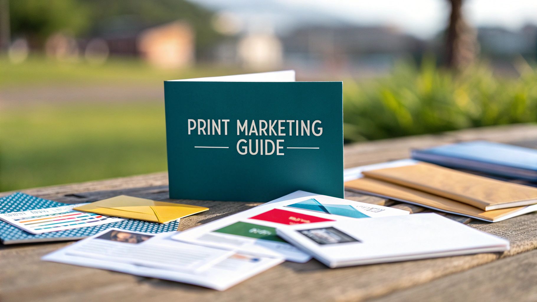 story
story what is print marketing? A Practical Guide
Print marketing is pretty simple: it’s using physical, printed media to reach your customers. But don’t let the simplicity fool you. In a world drowning in digital noise, tangible materials like brochures, business cards, and direct mail are making a huge comeback. They offer a real, physical connection that creates a lasting impression. What Is Print Marketing in a Digital Age? Let's get one thing straight—print marketing isn't some dusty relic from a bygone era. Think of it as a secret weapon for making a genuine, real-world connection. If a digital ad is like a fleeting comment in a crowded, noisy online forum, a piece of print is like getting a personal, handwritten note. It's a physical object that demands attention, one that you can't just close with a click of a button. The old "print is dead" myth completely misses the point of its modern role. Today, print is a critical piece of a smart marketing strategy, perfect for building the kind of trust and credibility that digital-only efforts struggle to achieve. It’s all about creating a memorable, sensory experience that works with your online presence, not against it. The Core Idea Behind Modern Print At its heart, modern print marketing is about playing to its unique strengths. It cuts through all the digital clutter to deliver a message people can actually hold in their hands. That physical interaction is powerful—it creates a much stronger cognitive and emotional connection to your brand. Here’s what makes it work so well: Tangibility Builds Trust: A high-quality printed piece just feels more substantial and legitimate. That physical presence helps establish brand credibility in a way a pop-up ad never could. Higher Engagement: People are far less likely to be multitasking when they're looking at a physical item. This focused attention leads to better message retention and brand recall. One study even found that direct mail requires 21% less cognitive effort to process than digital media, which makes it stick in our brains longer. Pinpoint-Targeted Reach: Print lets you get super specific with geographic and demographic targeting. This is a game-changer for local businesses trying to connect with the people right in their own community. The real magic of print marketing is its ability to become a physical anchor for your brand in a customer's life. A well-designed business card lives in a wallet, a brochure sits on a desk, and a postcard hangs on a fridge—each one serving as a constant, subtle reminder of who you are and what you do. It’s Not Print vs. Digital The smartest businesses don't see this as an either/or choice. They use print and digital together, creating a seamless experience for their customers. A QR code on a flyer can send someone directly to a special landing page. A direct mail piece can promote an exclusive online-only sale. This kind of integration turns your marketing from separate channels into one cohesive conversation, guiding customers from a physical touchpoint to a digital action. When you explore the huge world of customizable marketing materials, you can see just how many options there are to bridge that gap. Ultimately, print is the tangible invitation that leads people right to your brand’s digital doorstep. Exploring the Core Channels of Print Marketing The best way to really get what print marketing is all about is to see it in action. These channels are the real-world, tangible tools you use to build connections, whether it’s at that first handshake or long after the sale is complete. Each one has its own job, acting as a physical piece of your brand that people can actually hold and see. Let's dive into some of the most powerful and popular print channels out there. Don’t think of them as just separate items, but as a complete toolkit for crafting a brand experience that sticks. This diagram shows how print and digital marketing both aim to connect with an audience, but they take different paths to get there. As you can see, while both are essential, print marketing relies on physical items that demand attention in the real world. Print Marketing Channels at a Glance To help you choose the right tool for the job, here’s a quick reference guide comparing common print channels. This table breaks down their primary use cases and who they're best suited for, making it easier to match a channel to your business goals. Channel Primary Use Case Target Audience Key Benefit Business Cards Networking & brand recall Professionals, leads, event attendees A pocket-sized, personal reminder of a connection. Direct Mail Targeted outreach, promotions Specific geographic or demographic segments Cuts through digital noise to land directly in their hands. Banners & Signage Local visibility, event presence Local residents, foot traffic, event-goers High-impact visual landmark that builds local recognition. Custom Packaging Brand experience, customer loyalty E-commerce customers, product buyers Turns a simple delivery into a memorable unboxing event. Each channel offers a unique way to engage with your audience. The key is knowing when and how to deploy them to make the biggest impact. Business Cards: The Pocket-Sized Ambassador A business card is often the very first piece of your brand someone gets to take with them. It’s so much more than just a slip of paper with your contact info; it’s a physical token of a personal conversation. A well-designed, high-quality card feels solid in their hand, instantly signaling professionalism and an eye for detail. They’re incredibly versatile, perfect for: Networking Events: The classic handshake-and-card exchange still works because it cements a personal connection. Retail Checkout Counters: An easy grab-and-go option that keeps your business top-of-mind for future needs. Included in Packaging: Tucking a card into a product shipment adds a personal touch and a direct line for repeat business. Direct Mail: The Message in Their Hands In an era of overflowing email inboxes and constant digital pings, a physical piece of mail really stands out. Direct mail marketing puts your message right into your target audience's hands, forcing a moment of consideration that digital ads rarely get. It requires a different kind of attention to sort and review, giving it a much better shot at being read and remembered. The science backs this up. Studies have shown direct mail requires 21% less cognitive effort to process than digital media, which makes the message more memorable. For any business trying to make a genuine impact, that’s a massive advantage. Direct mail isn't just about sending coupons. It's about delivering a targeted, tangible experience that interrupts the digital scroll. A well-designed postcard or brochure can feel like a personal invitation, not just another advertisement. Banners and Signage: The Local Landmark If you have a physical storefront or participate in local events, banners and signage are non-negotiable. They serve as high-visibility landmarks, grabbing attention from across the street or a crowded convention floor and guiding people right to you. This is print marketing that’s all about claiming physical space and building that crucial local brand recognition. Think about the immediate impact of: Grand Opening Banners: A bold, impossible-to-miss announcement to the entire neighborhood that you've arrived. Trade Show Displays: An immersive brand environment that pulls attendees out of the aisle and into your world. In-Store Signage: The silent salesperson that guides customers, highlights promotions, and makes the shopping experience seamless. Custom Packaging: The Unboxing Experience Packaging is no longer just a brown box to protect what's inside; it's one of the most powerful marketing channels you have. Custom-printed boxes, branded mailers, and even thoughtfully designed labels or tissue paper can transform a simple delivery into an exciting "unboxing" experience. This is often the very first physical interaction a customer has with your product, and it sets the tone for everything that follows. When you treat packaging as a branding opportunity, you create a cohesive and memorable journey from checkout to unboxing. It quietly reinforces your brand's value and shows a level of care that customers notice, appreciate, and often share on social media—hello, free marketing! It's that final, tangible touchpoint that can lock in customer loyalty and turn a one-time buyer into a true fan. Why Bother With Print When Digital Is King? It’s a fair question. Why spend money on a physical flyer when a digital ad is just a click away? The answer, it turns out, has a lot to do with human psychology. While online ads flicker across a screen and vanish, a physical piece of print has a certain weight, a permanence that digital just can't replicate. It builds an immediate, almost subconscious, sense of trust and credibility. Think about it. In a world overflowing with pop-ups, notifications, and an endless stream of digital noise, receiving a beautifully crafted brochure or a thoughtful direct mail piece feels different. It feels intentional. It signals that your brand cared enough to invest in quality, which tells the customer you’re an established, trustworthy business. It’s Not Just What You See, It’s What You Feel One of the biggest advantages print has is its ability to engage our sense of touch—a powerful concept known as haptics . When a potential customer holds your business card, feels the unique texture of the paper, and sees the crisp quality of the ink, it creates a multi-sensory experience that a screen simply can’t match. This physical interaction isn't just a gimmick; it’s far more memorable than passively scrolling past an ad. Neuroscientific studies have repeatedly shown that tangible materials leave a much deeper footprint on the brain. A postcard doesn’t just get seen; it gets held. That means it's more likely to be remembered later, leading to significantly higher brand recall than its fleeting digital counterparts. The brain actually processes physical media differently. Research shows that direct mail requires 21% less cognitive effort to process than digital ads. This makes your message easier for people to absorb and, more importantly, to remember. It’s not just marketing talk; it’s cognitive science in action. Cutting Through the Digital Static Let’s be honest, we’re all suffering from a bit of “digital fatigue.” We’re so bombarded with emails, banner ads, and sponsored posts that most of us have developed a kind of digital blindness, tuning it all out. Print marketing offers a brilliant way to sidestep this oversaturation and get noticed. A piece of direct mail landing in a physical mailbox or a flyer handed out at a local event provides a welcome break from screen time. It commands attention in a less intrusive, more focused way than a digital impression that disappears in a fraction of a second. Here’s where print really shines: Higher Response Rates: Targeted direct mail campaigns often blow email campaigns out of the water. Why? They feel more personal and are far less likely to be dismissed as spam. Longer Lifespan: An email is deleted and forgotten in an instant. But a great-looking brochure might sit on a desk for days, a postcard can get pinned to a fridge, and a catalog can be browsed over and over, giving your message a much longer life. Hyper-Focused Local Targeting: Nothing beats print for reaching specific local demographics. It allows you to zero in on a particular neighborhood or community with a level of precision that’s tough to achieve online. Lasting Impact You Can Hold in Your Hand Even as online channels grow, the investment in print has remained incredibly resilient. The global market for print advertising was valued at a whopping $32.5 billion in 2023 , and it's projected to hit $32.81 billion by 2025 . These numbers don't lie—businesses are still seeing a substantial return from tangible media. Ultimately, print marketing materials are more than just messages; they are physical artifacts of your brand. They deliver a tangible experience that reinforces your commitment to quality and professionalism. This physical proof builds a foundation of trust that is incredibly difficult to replicate in the digital world. By investing in tangible assets, you’re not just reaching customers; you’re building lasting tools for stronger brand awareness . Creating a Powerful Integrated Marketing Strategy Let’s get one thing straight: the best marketing isn’t about choosing print or digital. It's about making them work together, in perfect harmony. Don't think of them as competitors. Instead, see them as two essential tools in your kit, each with its own unique strengths. A truly integrated strategy is where your physical and online efforts boost each other, creating a seamless journey for your customers. Think of it like this: print is the tangible handshake that starts a conversation. Digital is the ongoing dialogue that builds the relationship. A beautifully designed postcard can grab someone's attention in the real world, and a perfectly timed email can follow up with more details to drive a purchase. That synergy is where the real magic happens. Bridging the Physical and Digital Divide The secret to a killer integrated campaign is building clear, compelling bridges between your print materials and your online presence. Your goal is to guide customers from a physical touchpoint directly to a digital action, making that transition feel natural and worthwhile. This approach combines the high-impact, trust-building power of print with the trackable, interactive nature of digital. It’s all about creating a conversation that flows effortlessly from the mailbox to the website and back again. Here are a few ways this plays out in the real world: QR Codes on Postcards: A local restaurant sends out direct mail postcards with a QR code. When scanned, it takes customers to an exclusive video of the chef preparing a new seasonal dish and offers a unique discount code for their next online reservation. Personalized Welcome Kits: A software company sends a high-quality welcome kit to new clients who filled out an online demo form. Inside is a branded notebook, a thank-you card, and a quick-start guide, cementing the new relationship with a tangible gesture. Event Flyers to Social Engagement: A retail store hands out flyers for an in-store event that include a special hashtag. Customers who post a picture with the flyer using that hashtag are entered to win a prize, driving both foot traffic and social media buzz. A truly integrated strategy doesn't just slap a URL on a flyer. It creates a compelling reason for someone to make the leap from the physical world to the digital one, turning a passive reader into an active participant in your brand's story. Knowing When to Use Each Channel Smart integration isn't just about linking channels; it's about knowing when to use each one for maximum impact. Each platform has its own strengths, and understanding them helps you build a more resilient and effective marketing machine. Lean on Print For: Building initial trust, making a powerful first impression, targeting specific local demographics, and delivering a message that feels personal and substantial. Leverage Digital For: Broad reach, real-time analytics and tracking, interactive content like videos and quizzes, and instant communication through email and social media. This multi-channel approach isn't just a gut feeling—it's backed by hard data. Research shows that online campaigns are 400% more effective when combined with print advertising. That's a massive boost. The global digital print market, a cornerstone of modern marketing, is projected to grow from $167.5 billion in 2025 to $251.1 billion by 2035, proving its staying power. To get the full picture, explore the full research findings from StickerYou . Ready to build these powerful connections? By exploring the various marketing essentials available for print , you can find the perfect tools for the job. Designing and Producing High-Impact Print Materials You don't need a graphic design degree to create print materials that actually get noticed and drive results. The real secret to high-impact print is just understanding a few core principles and making smart choices about the physical stuff that brings your brand to life. This section will pull back the curtain on the creative process, giving you the essentials to confidently produce print that works. From the colors you pick to the paper you print on, every single decision sends a message. A simple, clean design with plenty of white space can signal sophistication and calm. On the other hand, bold, vibrant colors might scream energy and excitement. It’s all about making intentional choices that line up with your brand's personality and what you want the campaign to achieve. Core Design Principles for Non-Designers Before you dive into production, let’s quickly cover a few foundational design concepts. Think of these less as rigid rules and more as simple guidelines to make sure your materials are clear, effective, and look professional. Your best friend here is visual hierarchy . It’s the art of arranging elements to show their order of importance. Your most critical message—like a killer headline or a can't-miss offer—should be the very first thing people see. You can pull this off using: Size: Make your headline massive compared to your body text. Color: Use a bold, contrasting color for your call-to-action button so it pops. Placement: Put the most important info right at the top or smack in the center. Next up, think about color psychology . Colors trigger specific emotions and can totally change how people see your brand. For instance, blue often suggests trust and reliability, while green is all about growth and nature. When you're getting designs ready for print, it’s absolutely vital to get the technical side right. A great place to start is understanding color profiles like CMYK vs RGB for print , which ensures the brilliant colors on your screen look just as good on the final printed piece. The Power of Materials and Finishes The physical materials you choose are just as critical as the design itself. The texture, thickness, and finish of a printed piece can completely transform how your brand feels in someone's hands and how memorable your message becomes. This tactile experience is one of print's biggest superpowers. Here are a few key elements to mull over: Paper Stock (Weight): A thicker, heavier cardstock (like 16 pt. or 32 pt. ) feels premium and substantial—perfect for business cards or fancy invitations. Lighter paper works great and is more cost-effective for flyers or brochures. Paper Finish: A glossy finish makes colors explode off the page and is awesome for photo-heavy designs. A matte finish gives you a more subtle, sophisticated vibe that cuts down on glare and feels very modern. Specialty Finishes: Adding touches like foil stamping, embossing (a raised design), or spot UV (a glossy coating on just one part of the design) can add a layer of luxury that makes your materials impossible to ignore. Don't underestimate the power of touch. A potential client holding a sturdy, soft-touch business card will have a fundamentally different—and better—impression of your brand than someone holding a flimsy, generic one. The material itself becomes part of your brand's story. Making Professional Printing Accessible In the past, getting high-quality printing usually meant committing to huge, expensive print runs. Not anymore. Today's technology has made professional printing affordable and accessible for businesses of any size, even if you're working with a tight budget. Game-changers like print-on-demand (POD) have completely rewritten the rules. The global print-on-demand market has seen explosive growth, a clear sign of where print marketing is headed. Valued at $5.1 billion in 2023, it’s projected to hit an incredible $8.16 billion by 2025. This boom is all thanks to the efficiency of new printing tech and the growing hunger for customized products. This shift means you can order exactly what you need, right when you need it, without worrying about a closet full of wasted inventory. Whether it's 50 postcards for a local drop or 5,000 brochures for a trade show, the flexibility of modern digital printing services puts you in the driver's seat of your budget and your marketing. How to Measure Your Print Marketing Success One of the oldest myths about print marketing is that it's a black box—you just send stuff out and hope for the best. That couldn't be further from the truth. With a few simple techniques, you can track the return on your print investment just as precisely as any digital campaign. The trick is to build a bridge from your physical print piece to a measurable digital action. By baking trackable elements right into your designs, you create a clear path to see exactly how customers are responding. This flips your print campaign from a hopeful guess into a data-driven strategy. Essential Tracking Tools for Print To connect your tangible marketing materials to your digital analytics, you need to give your audience a dead-simple way to respond online. This isn’t just for their convenience; it’s how you get invaluable data on what’s actually working. Here are the most effective tools for the job: Unique QR Codes: This is the most popular method for a reason. You can generate a distinct QR code for each specific campaign—one for your direct mail postcards, another for your in-store flyers—that links to a unique webpage. Dedicated Landing Pages: Instead of sending traffic to your homepage, create a special landing page with a unique URL (like yourwebsite.com/offer ). Only promote this URL on your print materials. Custom Coupon Codes: Use campaign-specific discount codes (think "FLYER20") that can be redeemed online or in your store. This directly ties sales back to the specific print piece that drove them. The goal is simple: create a unique, trackable path that exists only for the audience of a specific print campaign. When traffic or conversions come through that path, you know with certainty that your print marketing was the source. Key Performance Indicators to Watch Once your tracking is in place, you can start measuring the key performance indicators (KPIs) that really tell the story. These are the numbers that reveal your campaign's performance and help you nail down your return on investment. Focus on these critical KPIs: Conversion Rate: This is the percentage of people who took the action you wanted after seeing your print piece. For example, if you mailed 1,000 postcards and 50 people used the QR code to sign up for your newsletter, your conversion rate is a solid 5% . Cost Per Acquisition (CPA): How much did it cost to land one new customer? If you spent $500 on a flyer campaign and it brought in 25 new customers, your CPA is $20 . Response Rate: This tracks the total number of interactions, even if they didn't all convert. It could be QR code scans, visits to your landing page, or calls to a dedicated phone number. It shows you how much engagement your piece generated. By keeping an eye on these numbers, you can directly connect your print efforts to your business’s bottom line. For a deeper dive into the universal principles of evaluating campaign success, this guide on Mastering Advertising Effectiveness Measurement offers some fantastic insights. This approach turns "what is print marketing?" from a simple question into a strategic, measurable investment. Got Questions About Print Marketing? We've Got Answers. Jumping into print can feel like a big step, and it's natural to have a few questions before you commit. We hear them all the time. Let’s clear up some of the most common hesitations with straightforward, experience-backed answers so you can move forward with confidence. Isn't Print Marketing Too Expensive for a Small Business? Not at all. The idea of print being a massive, budget-draining expense is a bit of a myth these days. While huge national campaigns obviously cost a pretty penny, modern printing has made things incredibly accessible for businesses of any size. The trick is to be smart about it. Options like small-batch orders and print-on-demand mean you can get things like postcards, business cards, and flyers without a huge upfront investment. It's all about focusing on targeted campaigns where your return on investment (ROI) is high. For instance, a beautifully designed direct mail campaign sent to a specific neighborhood can be far more effective—and cheaper—than a broad digital ad that gets lost in the noise. The key is to start small, see what works, and then double down. How Long Does It Take to See Results? This really depends on what you’re trying to achieve. If you’re sending out a direct mail piece with a killer limited-time offer, you could see people walking through your door or visiting your website within a week or two. The response can be surprisingly fast. On the other hand, for brand-building materials like a high-quality brochure or a really memorable business card, the impact is more of a slow burn. Unlike the instant feedback of a digital click, print's influence builds over time. It creates a sense of credibility and trust that can lead to more loyal, high-value customers down the road. What Are the Biggest Mistakes People Make? From what we've seen, the most common slip-ups fall into three buckets. First is simply poor design quality . Using blurry, low-resolution images or fonts that are impossible to read just makes a brand look unprofessional. It’s an instant turn-off. The second is a weak or confusing call to action . If you don’t spell out exactly what you want people to do next—call this number, visit this site, use this code—they’re just not going to do anything. Be direct. But the biggest mistake of all? Forgetting to include a way to track results. If you don't add a unique QR code, a special landing page URL, or a specific discount code, you’ll have no real idea if your campaign worked. Without tracking, you’re just guessing at your ROI. Ready to create print that gets noticed and gets results? 4OVER4 has a massive selection of high-quality, customizable products to bring any idea to life. From eye-catching business cards to targeted direct mail campaigns, explore all the possibilities at 4OVER4.com .
 story
story What Is Print Resolution A Guide to Perfect Prints
Print resolution is what determines just how much detail a printer can cram onto a piece of paper. You'll usually see it measured in Dots Per Inch (DPI) . Simply put, it dictates whether your printed image comes out looking sharp and crisp or fuzzy and disappointing. The more ink dots packed into every inch, the higher the resolution—and the clearer your final product. From Screen to Paper: Making Sense of Print Resolution Ever stopped to think about how a brilliant design on your monitor becomes a tangible object you can hold? That magic happens thanks to print resolution. Think of your digital file as a detailed mosaic blueprint. Print resolution is the instruction that tells the printer exactly how many tiny tiles of ink—or dots—to place within every single inch of that paper. The more dots you can pack into that space, the sharper and more vibrant the final image will be. This measurement, known as DPI (Dots Per Inch) , is hands-down the most critical factor for getting professional-looking prints. The Foundation of Print Quality Getting a handle on this concept is your first big step toward avoiding common printing headaches like pixelation and blurriness. The push for higher resolution has been around as long as printing itself. Back in the 19th century, lithographic presses were churning out images at what we’d now consider a very low resolution, somewhere around 100-200 DPI . Modern printing demands a much higher standard for clarity. Just think about the complexities of preparing printable images from virtual reality real estate —it’s a perfect example of why high resolution is so vital for preserving detail when moving from a digital model to a physical print. The core idea is simple: what looks good on a screen won't automatically look good on paper without the correct resolution. Your screen uses pixels to display images, but a printer uses physical dots of ink. This distinction is absolutely vital for anyone involved in https://www.4over4.com/printing/category/digital-printing . A low-resolution file might look perfectly fine on your monitor, but it’s going to produce a fuzzy, amateurish print every time. By mastering the basics of print resolution, you give yourself the power to make sure your vision is brought to life exactly as you intended. DPI vs PPI: The Critical Difference for Designers It’s easy to get tangled in the alphabet soup of design terms, but getting the difference between DPI (Dots Per Inch) and PPI (Pixels Per Inch) right is absolutely fundamental. People throw these terms around interchangeably all the time, but they operate in completely different worlds. Confusing them is one of the quickest ways to end up with blurry, disappointing print results. Let's cut through the noise. Think of it this way: PPI is the language of your screen, while DPI is the language your printer speaks. Understanding the Digital Blueprint: PPI Pixels Per Inch (PPI) is all about the digital side of things. It measures how many pixels are packed into one inch of an image on a screen. Every digital photo you see on your computer, phone, or camera is just a grid of tiny colored squares called pixels. A higher PPI means more of these little squares are crammed into each inch, which gives you a sharper, more detailed image on your monitor . This is your digital blueprint. It holds all the visual information for your design, but it only exists in the digital realm. It's the plan, not the final building. Building the Physical Image: DPI This is where the magic happens. Dots Per Inch (DPI) refers to the actual, physical dots of ink a printer lays down on a sheet of paper. Your printer takes the digital blueprint (the PPI information from your file) and does its best to translate it into a pattern of microscopic ink dots. The higher the DPI, the more tiny dots the printer uses to recreate the image, resulting in a much smoother, crisper, and higher-quality print. To make this crystal clear, here’s a quick side-by-side look. DPI vs PPI At a Glance Attribute DPI (Dots Per Inch) PPI (Pixels Per Inch) Medium Print (Physical) Screen (Digital) What It Is Physical dots of ink from a printer Digital squares of light on a screen Who Uses It Printers and print technicians Designers and photographers (on-screen) Purpose Determines the quality of a printed image Determines the quality of a digital image This table shows how they live in separate worlds—one on paper, the other on a screen—but work together to create the final product. The image below really brings home the relationship between DPI and the final sharpness of your printed work. As you can see, cranking up the DPI leads to a much sharper image. But there's a catch: if your original digital file doesn't have enough pixels to begin with, you'll be forced to print at a smaller size to maintain that sharpness. For a deeper dive into getting this right every time, check out these essential tips on printing . Here's the bottom line: A high-PPI file is your non-negotiable starting point. But it's the printer's DPI capability that ultimately determines how well all that beautiful detail is physically rendered on paper. You simply can't print detail that wasn't in the original digital blueprint to begin with. How Resolution Directly Impacts Your Print Quality Knowing the theory is one thing, but seeing the result in the real world is where it really clicks. The gap between a low and high-resolution print isn't a minor detail—it's the line between a professional product and a costly mistake. Imagine you have a beautiful photo you want to feature in a brochure, but you send it to the printer at the web-standard 72 DPI . The result? A blurry, pixelated mess. This happens because the printer simply doesn't have enough data to create a clean image. It’s forced to stretch a tiny amount of information over a much larger surface, leading to those classic, disappointing signs of poor quality. Low Resolution vs. High Resolution Prints Once you know what to look for, a low-resolution print is painfully obvious. You’ll see jagged, stair-stepped edges on text and graphics. Details will look fuzzy, and the whole image will have that blocky, "pixelated" appearance. Colors can even look muddy because the printer struggles to blend them smoothly with so few dots to work with. On the flip side, a high-resolution print—usually at 300 DPI —is all about precision. Here’s what you get when you nail the resolution: Crisp, Sharp Lines: Text and vector graphics are perfectly defined, with no jaggedness in sight. Smooth Color Gradients: Transitions between colors are seamless, giving your print a rich, professional finish. Fine Detail Reproduction: All those tiny details in photos, like the texture of fabric or individual strands of hair, come through with stunning clarity. The bottom line is simple: resolution directly translates to perceived quality. A sharp, high-resolution print screams professionalism and attention to detail. A blurry one can damage a brand's credibility in an instant. The impact isn't just visual; the numbers back it up. Over 60% of professional designers in the United States use printers capable of at least 1200 DPI for high-stakes projects like photo reproductions and detailed catalogs. While a higher DPI delivers superior color fidelity and sharpness, it also creates much larger file sizes—a 300 DPI file is about four times larger than a 150 DPI equivalent. This level of precision is absolutely critical for any project that will be viewed up close, like detailed art reproductions on beautiful canvas prints . Choosing the Right Resolution for Any Print Project Now that we’ve waded through the technical weeds, let's get down to what really matters: picking the right resolution for your project. This isn't about guesswork or just cranking the DPI up to the max every time. In fact, that can create unnecessarily massive files. The secret to getting it right comes down to one simple, crucial factor: viewing distance . Think about it this way: a business card you hold inches from your face needs to be incredibly sharp. But a massive banner hanging across a street? Not so much. That's why a billboard can look absolutely stunning from a car window with a resolution as low as 20 DPI , but that same setting would turn a handheld flyer into a pixelated mess. The further away your audience is, the less resolution you actually need. Standard DPI for Common Projects For pretty much anything that’s going to be viewed up close—we’re talking arm's length or closer— 300 DPI is the undisputed industry standard. It’s the magic number that ensures every tiny detail is crisp and clear, from the fine print on a brochure to the rich textures in a photograph. This standard isn't random; it's baked into the history of professional printing. Technically speaking, around 80% of all commercial print jobs land in the 300–600 DPI range. It's the sweet spot that traditional offset printing perfected for things like books and magazines. As a rule of thumb: If you can touch it while you're reading it, aim for 300 DPI. If you’re looking at it from across a room or down the street, you can get away with a lot less. This principle is a lifesaver for large-format printing. When you're dealing with huge visuals for an event, knowing this stuff is critical. For example, specialized expo print services have mastered the art of balancing file size with viewing distance. For something like online posters designed to be seen in a hallway, a resolution of 150 DPI is often more than enough. It keeps the file size manageable without any noticeable drop in quality from where people will be standing. To make things even easier, here’s a quick-glance table with our go-to recommendations for different print jobs. Recommended DPI for Common Print Projects Print Project Type Recommended DPI Reasoning Business Cards, Flyers, Brochures 300 DPI These are held close and examined, so every detail needs to be tack-sharp. Magazines & Catalogs 300 DPI This is the gold standard for high-quality photos and crisp, readable text. Posters & Small Banners 150 DPI Viewed from a few feet away, so you can balance quality with a smaller file size. Large Banners & Signage 100-150 DPI Seen from a greater distance (e.g., across a room or outdoor space). Billboards & Building Wraps 20-50 DPI Intended to be viewed from very far away, making high resolution unnecessary. Ultimately, choosing the right DPI is about being smart with your resources. Use high resolution where it counts—up close—and save yourself the headache of giant file sizes for projects meant to be seen from a distance. Common Print Resolution Mistakes to Avoid Knowing the theory behind print resolution is one thing, but actually putting it into practice is where you save yourself from headaches, wasted time, and costly reprints. Even a tiny oversight can send a whole batch of prints to the recycling bin. If you can steer clear of just a few common slip-ups, you'll be well on your way to getting professional-looking results every single time. A classic mistake we see all the time is grabbing an image straight off a website and dropping it into a print design. Web graphics are almost always saved at a low resolution—typically 72 DPI —so they load lightning-fast online. For print? It's a recipe for disaster. This nearly guarantees your final product will look blurry, blocky, and just plain unprofessional. Always start with high-quality source files. That means using original photos from a digital camera or sourcing images from a reputable stock photo site. Never assume an image that looks sharp on your monitor will print well without checking its resolution first. Trying to Artificially Increase Resolution Here's another trap people fall into: trying to "upscale" a low-resolution image. This is when you take a small, low-DPI file and try to force it to become larger in an editing program. Sure, you can change the number from 72 DPI to 300 DPI in Photoshop, but you aren't magically creating new detail. All the software can do is guess which pixels to add, and the result is a soft, fuzzy, and often distorted mess. Think of it like trying to stretch a wallet-sized photo into a wall poster—the original information just isn't there to support the new size. To sidestep these issues, keep these simple rules in mind: Start with Quality: Always begin with the highest resolution files you can get your hands on. It’s a breeze to make a big image smaller, but it's impossible to make a small one bigger without it looking terrible. Plan Ahead for Scale: Know your final print dimensions before you even start designing. This is absolutely critical for bigger jobs like banners or posters that require online large format print services, where even tiny resolution problems become glaringly obvious. Check Before You Send: Before you export that final file, do one last check. Make sure the resolution is set to 300 DPI for any standard print job and that the physical dimensions match what you're ordering. Your Print Resolution Questions Answered We’ve covered the core concepts of print resolution, but you probably still have a few lingering questions. Let's tackle some of the most common ones that pop up for designers and creators. Think of this as a quick-fire round to get you practical answers so your next print job runs smoothly. Can I Use a 72 DPI Image for Printing? The short answer? Almost never. Using a 72 DPI image for professional printing is a recipe for disaster. That resolution is built for screens and just doesn't have enough pixel data for a physical print. When you try, the result is almost always blurry, pixelated, and just looks unprofessional. For anything that will be viewed up close—think photos, flyers, business cards, or brochures—the gold standard is 300 DPI . No negotiations. The only real exception is for massive prints like billboards, which can get away with a much lower DPI because they're meant to be seen from far away. How Do I Check My Image Resolution? Good news: this is an easy but vital step. Most image editing software will tell you an image’s resolution in just a few clicks. In Adobe Photoshop : Just go to Image > Image Size . A dialog box will pop up showing you the dimensions and resolution in Pixels/Inch (which is the same as DPI here). On a Windows PC: Right-click your image file, select Properties , and head over to the Details tab. You'll find the resolution info there. On a Mac: Open the image in the Preview app. Go to the Tools menu and click Show Inspector . You'll see the "Image DPI" right there. What Happens If My Resolution Is Too High? While low resolution is a project-killer, a resolution that’s too high is more of a nuisance than anything else. Pushing a standard brochure file to 600 DPI won't give you any visible benefits. The human eye can only perceive so much detail, so you won't see a difference in quality beyond 300 DPI for most print jobs. The real downside to an excessively high resolution is a gigantic file size. These massive files are clunky, slow to process, and a pain to upload or email. They can even cause printing equipment to choke. Sticking to 300 DPI is the sweet spot, giving you that perfect balance between fantastic quality and a manageable file. Can I Just Change 72 DPI to 300 DPI in Photoshop? If only it were that simple! Unfortunately, you can't just magically create detail that isn't there by typing a new number into a box. When you change the DPI value in a program like Photoshop without "resampling," the software shrinks the physical print dimensions to pack the existing pixels more tightly. If you do try to "resample" it to keep the size, you're asking the software to guess what information to add to fill in the gaps. This process almost always creates a soft, blurry, and artificial-looking image. Always, always start with an image that has enough original pixels to support your target print size at a crisp 300 DPI . Ready to see your perfectly prepped designs come to life? At 4OVER4 , we turn your vision into stunning, professional-grade prints for business cards, banners, brochures, and so much more. Explore our services and kick off your project today at https://4over4.com .
 story
story What Is Spot Color Printing for Perfect Brand Colors
Spot color printing is a beautifully simple concept with powerful results. Instead of mixing tiny dots of different colors on the press to create a new one, this method uses a single, solid, pre-mixed ink for each color in your design. The result? A pure, vibrant, and perfectly consistent color every single time. Unlocking Perfect Brand Color Consistency Think about painting a room in your house. You wouldn’t show up with separate cans of red, yellow, and blue to try and mix the perfect shade right there on the wall. Of course not. You’d go to the store and get a single can of paint that’s been professionally mixed to the exact color you want. That’s the core idea behind spot color printing. It’s the professional printing world's version of buying that perfect can of paint, guaranteeing a flawless, uniform finish. This is why spot color is the gold standard for maintaining brand integrity. It ensures that your company's signature blue—or Coca-Cola's iconic red—looks exactly the same on a business card printed in New York as it does on a product box in Tokyo. Its greatest strength is absolute consistency. The Pantone Matching System Explained To make sure everyone is on the same page, printers and designers worldwide rely on the Pantone Matching System (PMS) . Think of PMS as the universal recipe book for color. Each shade has a unique code, like a recipe number, which tells any printer on the planet how to mix that exact ink formula. The Pantone system removes all guesswork and subjectivity from color reproduction. It's not about what looks like your brand's color; it's about printing the exact Pantone-specified color every single time. This level of precision became a game-changer in the mid-20th century, especially for brands needing colors that standard printing just couldn't replicate, like shiny metallics or blazing fluorescents. Today, spot colors remain absolutely critical for any project where color accuracy is non-negotiable. Spot Color Printing vs CMYK Process At a Glance So, how does this method stack up against the more common CMYK (or process) printing? While both have their place, their approaches are fundamentally different. The table below breaks down the key distinctions to help you decide which is right for your project. Attribute Spot Color Printing CMYK (Process Color) Printing Method Uses pre-mixed, solid inks applied one at a time. Mixes tiny dots of Cyan, Magenta, Yellow, and Black to simulate colors. Color Accuracy Extremely high and consistent; perfect for brand colors. Can vary slightly between print runs and different printers. Vibrancy Colors are cleaner, brighter, and more opaque. Colors can appear less saturated as they are made of dot patterns. Color Range Can produce colors outside the CMYK gamut, like metallics and neons. Limited to the colors that can be created by mixing C, M, Y, and K inks. Best For Logos, brand identity, designs with 1-3 specific colors, special effects. Full-color photographs, complex images, designs with many colors. Cost More cost-effective for simple jobs; can be expensive for many colors. Cost-effective for full-color designs, regardless of the number of colors. Ultimately, choosing between spot and CMYK printing depends entirely on your design's specific needs—whether you prioritize perfect color matching for a few key shades or the complexity of a full-color image. Key Advantages of Spot Color Printing Using pre-mixed inks brings some serious benefits to the table, especially for high-stakes projects. Here’s why so many top brands swear by this technique: Unmatched Accuracy: It delivers the most precise color match possible. Your brand colors will never be a shade off. Vibrancy and Purity: Colors look solid and incredibly clean because they’re laid down as a single, opaque layer of ink, not a pattern of tiny dots. Expanded Color Gamut: It opens the door to colors that are simply impossible to create with CMYK, including brilliant neons, rich metallics, and soft pastels. Check out our specialty printing collection to see how these unique inks can make a design pop. Consistency Across Materials: Spot colors hold their integrity beautifully across different paper stocks and finishes, from glossy business cards to uncoated cardboard packaging. Spot Color vs CMYK: Unpacking the Technical Differences To really get what spot color printing brings to the table, it helps to zoom in on how it differs from its everyday cousin, CMYK. Think of it this way: a spot color is like a solid, perfectly even coat of pre-mixed paint. CMYK, on the other hand, is more like a delicate mosaic, painstakingly built from thousands of tiny dots of Cyan, Magenta, Yellow, and Black ink. From a distance, that CMYK mosaic tricks your eye into seeing the color you want. But if you were to look up close, you’d see the individual dots that create the illusion. This dot-based method is fantastic for producing complex images with lots of tones, like photographs. But it has its limits when you need a pure, solid, vibrant block of color. This image nails the concept perfectly. The spot color on the left is a solid, uniform layer, while the CMYK version on the right is just a pattern of dots. A spot color gives you an opacity and smoothness that’s simply impossible to get with a dot-based system. The Science Behind the Color Gamut Every color reproduction method has a certain range of colors it can create—this is called its color gamut . The CMYK color gamut is pretty impressive and can produce thousands of hues, but it’s not infinite. Some colors just plain fall outside of what’s possible when you’re only mixing four base inks. This is where you start running into trouble when trying to print those very specific shades that are critical for a brand’s identity. Think of a vibrant, fiery orange, a deep electric blue, or even soft, delicate pastels. When you try to convert these colors to CMYK, they often come out looking duller or less saturated than you imagined because the necessary pigments just aren't there in the mix. The core technical difference really boils down to the ink itself. A spot color is a specific, single-pigment formula engineered for purity and vibrancy. CMYK relies on a subtractive process where layers of translucent dots filter light to create the illusion of a color. Digging into the fundamental differences in ink composition, like those between pigment vs dye-based inks , is key when you're comparing printing technologies. Spot colors, which often use robust pigment-based formulas, are designed for specific light-reflecting properties. That’s precisely why they can pull off effects like metallics or neons that CMYK can only dream of. Why Consistency Is a Challenge for CMYK Beyond the gamut limitations, CMYK printing can also be a headache when it comes to consistency. Since the colors are literally built by overlapping microscopic dots, even tiny variations in the printing process can cause noticeable shifts in the final output. Several factors can throw off CMYK color consistency: Press Calibration: Minor differences in how a printing press is calibrated from one day to the next can alter the color. Paper Stock: The way ink dots soak into coated versus uncoated paper can dramatically change how a color looks. Ink Density: Tiny fluctuations in the amount of each ink laid down during a press run can lead to color variations from the first print to the last. This is exactly why spot color printing is the go-to choice for brand-critical elements. By using a single, pre-mixed ink from a standardized formula like the Pantone Matching System, you eliminate almost all of those variables. The process is much cleaner: the press just applies one solid layer of the exact correct color. This is a cornerstone of high-quality offset printing , where precision is everything. Visual Impact and Special Effects The final, and perhaps most exciting, difference is the ability to create unique visual effects. Since spot color inks are custom formulations, they can be made with special materials that go way beyond standard color. This opens up a whole world of creative possibilities that are completely off-limits with CMYK alone: Metallic Inks: Gold, silver, and bronze inks contain real metal particles, creating a genuine shimmer and a premium feel. Fluorescent (Neon) Inks: These inks absorb and reflect more light, resulting in colors that practically glow and demand attention. Varnishes: A clear spot varnish can be applied to specific areas to create a glossy or matte contrast, adding subtle texture and sophistication. Ultimately, choosing between spot color and CMYK is a strategic decision. CMYK offers incredible versatility for full-color imagery, but for projects that demand absolute color perfection, unwavering consistency, and access to special effects, the technical superiority of spot color printing is undeniable. It’s not just a different method; it’s a different class of color. Why Brand Consistency Relies on the Pantone Matching System Your brand’s color isn’t just some random choice from a color wheel; it’s one of your most powerful business assets. Think about it. That very specific robin’s egg blue instantly screams Tiffany & Co., and a certain vibrant red is undeniably Coca-Cola. This kind of immediate recognition is no accident. It’s the result of painstaking color consistency, made possible by the Pantone Matching System (PMS) . The PMS is essentially the universal language of color for printers and manufacturers everywhere. It gets rid of the risky game of guesswork, ensuring a brand’s unique shade looks exactly the same on a business card in New York, a billboard in Tokyo, or a delivery truck in London. It’s the ultimate source of truth for color. Before Pantone stepped in back in the 1960s, trying to communicate color was a total nightmare. A designer might ask for "sky blue," but one printer's version could be worlds apart from another's. Pantone fixed this mess by creating a standardized library of colors, each with its own unique number. The Power of a Universal Recipe Using a PMS number is like following a precise, foolproof recipe. A chef doesn't just guess how much flour to use in a cake; they follow exact measurements to get the same delicious result every single time. In the same way, a printer uses the Pantone formula—a specific mix of base pigments—to perfectly create the ink for PANTONE 18-1663 "Fiery Red" or PANTONE 18-3838 "Ultra Violet" . This system ensures that color is no longer an opinion but a fact. When a company specifies a Pantone color, they are providing an unambiguous instruction that any professional printer, anywhere in the world, can replicate with absolute precision. This level of control is absolutely critical for building a strong brand identity. In fact, studies show that a signature color can boost brand recognition by up to 80% . When customers see your specific shade of green or orange, their brain instantly links it to your products, services, and values. Any inconsistency just waters down that connection and erodes trust. Real-World Examples of Color Mastery Some of the world's most iconic brands have built their empires on the foundation of color consistency, all powered by spot color printing and the Pantone system. Tiffany & Co. (PANTONE 1837 Blue): The famous blue box is so tied to the brand that the color itself is trademarked. The number "1837" is a nod to the year the company was founded, and this exact shade is meticulously reproduced on every single thing they make. T-Mobile (PANTONE Rhodamine Red U): This electric, energetic magenta is simply impossible to miss. T-Mobile uses this spot color to project a bold, modern, and disruptive personality that cuts through the noise in a crowded market. UPS (PANTONE 072 C): The deep "Pullman Brown" was chosen to represent stability, reliability, and professionalism. For over a century, this specific spot color has been a constant, reassuring symbol of the company's promise to deliver. Each of these brands gets it: their color is a promise. When you see that familiar brown, you know exactly what to expect. This consistency is especially vital for printed materials where the brand has to make a physical impression—from marketing flyers to the final customer experience. For any business that deals in physical goods, getting the color perfect on all custom packaging products is a non-negotiable part of their strategy. The Pantone Matching System, brought to life through the precision of spot color printing, is far more than just a technical tool. It's the guardian of a brand’s most recognizable asset, turning a simple color into a symbol of quality, trust, and identity that connects with customers all over the world. It makes sure your brand speaks the same visual language, every single time. When to Choose Spot Color Printing for Your Project Understanding the technical side of spot color versus CMYK is one thing, but knowing when to use it is what separates a good design from a great one. Opting for spot color isn't an accident; it's a strategic move you make when you need absolute precision, rock-solid consistency, and serious visual punch. It's the right call when "close enough" just isn't going to cut it for your brand. The choice really boils down to a few key priorities. If your project demands perfect color accuracy, has to look identical across thousands of prints, or needs a special effect that CMYK just can't pull off, then spot color is almost always the way to go. When Unmatched Color Accuracy Is Non-Negotiable The number one reason to choose spot color printing is for unwavering color accuracy . This is absolutely critical for brand identity, where even a tiny color shift can weaken brand recognition and make you look less professional. Think about these common situations where precision is everything: Logos and Brand Elements: Your logo is your company’s handshake. Using a specific Pantone color ensures it looks exactly the same on your premium business cards , your letterhead, and your envelopes. It all works together to create a polished, cohesive brand experience. Color-Critical Packaging: Picture your product on a crowded store shelf. The color of its packaging is what makes it pop. A specific spot color guarantees your brand gets noticed and is instantly recognizable, print run after print run. Official Corporate Materials: For things like annual reports, formal documents, or company stationery, sticking to the official corporate color isn't just about looks—it's about projecting professionalism and authority. This flowchart maps out a simple way to decide if Pantone colors are the right move, hinging on whether color is a critical part of your brand’s identity. As you can see, when your brand's color integrity is on the line, the precision of the Pantone system is the clear winner. For projects that are less color-sensitive, CMYK is a perfectly suitable option. Projects with Limited and Bold Color Palettes Believe it or not, spot color printing can often be more budget-friendly for designs using only one, two, or three distinct colors. Each spot color gets its own printing plate, so a simpler design can actually be more efficient to produce than setting up a full four-color CMYK job. This makes it a perfect fit for minimalist designs where the colors themselves are the main event. Think bold, graphic T-shirts, striking posters, or simple, elegant product labels. The purity and vibrancy of a solid spot ink create a much stronger visual punch than a CMYK equivalent. For startups and small businesses looking for high-quality results without breaking the bank, this cost-effectiveness on limited-color jobs is a huge plus. Creating Premium Effects with Specialty Inks Sometimes, you need to go beyond the standard rainbow to create something truly memorable. This is where spot color printing really shows off, offering a whole range of specialty inks that are simply impossible to recreate with CMYK. Choose spot colors when your project needs that extra "wow" factor: Metallic Inks: Add a touch of luxury with gold, silver, or bronze. These inks contain actual metallic particles, giving you a genuine, eye-catching shimmer. Neon and Fluorescent Inks: Want to grab attention immediately? These intensely bright colors almost seem to glow, making them perfect for event flyers, posters, or safety warnings. Pastel Inks: Achieve soft, delicate shades with a beautiful, creamy opacity that CMYK often struggles with, which can sometimes look washed out in comparison. The global digital printing market, which is projected to grow to USD 48.51 billion by 2030, relies heavily on advanced ink technologies like these to deliver vibrant, consistent results. Innovations in modern printing allow for incredibly precise reproduction of spot colors, fueling the demand for high-impact printing across countless industries. Ultimately, choosing spot color printing is an investment in your brand's integrity and the visual impact of your final product. When color is a core part of your message, spot color ensures that message is delivered perfectly, every single time. Breaking Down the Cost of Spot Color Printing Let's talk budget—it's often the first thing on everyone's mind when planning a print project. Figuring out how spot color printing will affect your final bill is key to making smart decisions. The pricing isn't as simple as "more colors, more money"; it’s really a balancing act between the number of colors you need and the complexity of the printing setup. At first glance, spot color printing might seem more expensive. After all, it uses specialty, pre-mixed inks. But here’s a surprise: for designs with a limited color palette—say, one to three colors—it can actually be more cost-effective than a full-color CMYK job . Why? Because each spot color requires its own printing plate. Fewer plates mean lower setup costs. For example, a simple two-color logo on a flyer only needs two plates for two spot colors. To print that same logo in full-color CMYK, you'd need four separate plates (Cyan, Magenta, Yellow, and Black). In this case, the spot color route is both more efficient and more affordable. This is exactly why spot color is a fantastic choice for minimalist designs where color precision is non-negotiable but the palette is simple. When Costs Start to Climb The cost equation flips once your design gets more colorful. Since every single spot color in your artwork needs its own custom printing plate, the expenses can add up fast. A design calling for five or six distinct Pantone colors will require five or six separate plates. This dramatically increases the setup time and material costs compared to a standard four-plate CMYK process. This is a critical factor to keep in mind during the design phase. If you're curious about how different elements like plates, ink, and setup influence print pricing in general, check out this handy book printing cost calculator . While it's tailored for books, the core principles apply across the board in printing. The Hybrid Approach: A Smart Compromise So, what do you do when your project needs both vibrant, full-color photos and a perfectly matched brand color? You don't have to choose. A popular and highly effective solution is hybrid printing , where you add a crucial brand color as a fifth spot color to a standard CMYK job. This "best of both worlds" method works like this: All your photographic and multi-tonal elements are printed using the standard four CMYK plates. A fifth (or even sixth) plate is added, dedicated solely to printing your specific Pantone color for logos, text, or other key brand assets. This strategy ensures your images look fantastic while your brand color remains absolutely perfect. You get that flawless match where it matters most, without incurring the expense of running every single color as a separate spot. It’s a smart way to balance your budget against the undeniable power of perfect color accuracy. The demand for this kind of color precision, especially in industries like packaging and labeling, is driving serious growth. The label color printing market, which relies heavily on spot colors, was valued at USD 3.33 billion in 2024 and is projected to hit USD 4.67 billion by 2030. This growth shows just how much the industry is investing in technologies that deliver perfect color matching. You can dive deeper into these trends and learn about the label printing market on nextmsc.com . Getting Your Artwork Ready for Spot Color Printing Proper file preparation isn't just a technical step; it's the single most important thing you can do to make sure your spot colors print exactly how you imagined. This is where your creative vision gets translated into a technical blueprint for the press. Nail this part, and you'll save yourself from costly mistakes and ensure the whole process runs smoothly. Think of this as a practical, step-by-step guide for designers using Adobe Illustrator. If you follow these best practices, your files will be print-ready and those crucial brand colors will come out perfectly every time. Defining and Applying Your Spot Color First things first, you need to properly define your spot color inside your design software. This is how you tell the program—and later, the printer—that a specific color isn't supposed to be mixed from CMYK. Instead, it needs its own unique, solid ink. Open the Swatches Panel: In Adobe Illustrator, you'll find this under Window > Swatches . Create a New Swatch: Look for the "New Swatch" icon at the bottom of the panel and give it a click. Set Up the Spot Color: The "New Swatch" dialog box is where the magic happens. Here’s what to do: Swatch Name: Be precise. Enter the exact Pantone name, like "PANTONE 286 C" . This name is critical because it's what the printer uses to find the right can of ink. Color Type: This is the big one. Change the dropdown menu from "Process Color" to "Spot Color" . Color Mode: You can pull your color from a library (like Pantone's) or just plug in CMYK/RGB values that look good on your screen. The on-screen look is just for you; the Swatch Name is what really matters for printing. Apply the Swatch: Select the parts of your design, like a logo or some text, and apply your newly created spot color swatch. Pro Tip: You'll know you've set up a spot color correctly in Illustrator when you see a small white triangle with a dot in the corner of its thumbnail in the Swatches panel. That little icon is your visual confirmation that the color is set to print on its own plate. Verifying Your File Before You Export Once your colors are in place, you absolutely have to double-check that they are separating correctly before you send anything to print. This is your chance to catch any colors that might have been accidentally converted to CMYK. For this, the Separations Preview panel is your best friend. In Adobe Illustrator, you can open it by going to Window > Separations Preview . When you open this panel, you’ll see a list of every color plate that will be created for your print job. A file that's set up right will show individual plates for Cyan, Magenta, Yellow, Black, and each of your named Pantone colors. You can toggle the little eye icon next to the CMYK plates off. If your spot color elements are still visible, you’re good to go! But if your logo vanishes along with the CMYK colors, it means it was accidentally set as a process color and you need to go back and fix it. Finally, when you're ready to export your artwork as a PDF, always choose a print-quality preset like "High Quality Print" or "Press Quality." Most importantly, dig into the settings and make sure spot colors are being preserved, not converted to CMYK. This ensures all your careful setup work makes it into the final file you send us. This same level of detail applies to more complex jobs, too, like making sure spot colors are correctly defined for projects involving unique finishes. To see how specialized processes work, you can learn more about preparing files for custom die-cutting services . Common Questions About Spot Color Printing Even when you've got a good handle on the basics, a few specific questions always seem to come up when planning a print project. Think of this as your go-to guide for those nagging details, with clear answers to help you make the right call for your next job. Let's clear up any lingering confusion so you can be sure your final product nails your vision and brand standards. Can You Mix Spot Colors and CMYK? Yes, you absolutely can! It’s a pretty common move in the industry, often called a 'five-color' or 'six-color' job. This hybrid approach is perfect when you need the best of both worlds—say, a design that features full-color photos alongside a perfectly matched brand color. Imagine a real estate brochure. You'd want to use CMYK to get vibrant, realistic photos of the properties. But for the agency's logo, you'd want their specific Pantone blue to be exact. This method gives you that flexibility, just remember to set up your artwork files correctly and chat with your printer about the cost of adding that extra printing plate. How to Choose the Right Pantone Color The only truly reliable way to pick a Pantone color is with a physical Pantone swatch book , like the classic Pantone Formula Guide. One of the biggest mistakes we see is people trying to eyeball it on their computer screen. Screens use RGB light to display color, and what you see can look wildly different from one monitor to the next. It’s just not a trustworthy method. A physical swatch book eliminates the guesswork. It shows you exactly how that ink will look on both coated (glossy) and uncoated (matte) paper, so you can make a precise decision that guarantees the final printed piece matches what you had in mind. Is Spot Color Only for Offset Printing? While spot color is most famous for its role in traditional offset printing—where those custom-mixed liquid inks are loaded into massive presses—the game has changed a bit. Modern digital printing has come a long way. Many high-end digital presses can now simulate Pantone colors with impressive accuracy. They often use an extended color gamut, adding inks like orange, green, and violet to the standard CMYK mix. On top of that, other methods like screen printing and flexography have always relied heavily on spot colors. The right process for you really boils down to your project's size, budget, and the quality you're aiming for. What if I Send a Pantone File for a CMYK Job? This happens all the time. If you send a file that has a Pantone spot color but you've ordered a standard CMYK-only print job, the printing software will automatically convert it. It will find the closest possible CMYK equivalent for that Pantone shade. But here’s the catch: it will not be a perfect match. Many of the most vibrant Pantone colors—think electric oranges, bright greens, and deep, rich blues—simply don't exist within the CMYK color range. When they get converted, they often come out looking a bit duller or slightly off. To avoid any unwelcome surprises, it’s always best to design in CMYK mode from the get-go if you know that's how your project will be printed. Ready to bring your brand’s colors to life with flawless precision? At 4OVER4 , we specialize in high-quality spot color printing that ensures your business cards, packaging, and marketing materials look perfect every time. Explore our printing services and see the difference that perfect color makes.
 story
story What Is Thermal Printing? The Ultimate Guide
Ever seen a receipt fade over time? Or wondered how shipping labels get printed so quickly without smudging? The secret is thermal printing , a clever process that uses heat instead of ink to create an image. At its core, thermal printing is exactly what it sounds like: printing with heat. It works by using a special printhead to apply heat to a specific type of paper or ribbon. This targeted heat causes a chemical reaction that produces the text and images you see. No messy ink cartridges, no expensive toner. It’s a refreshingly simple and effective idea. Your Introduction to Inkless Printing Unlike your home office inkjet printer that sprays tiny droplets of ink, a thermal printer relies on a direct connection between its heated printhead and the media. This direct-contact method is incredibly precise and fast. This elegant simplicity is also its biggest strength. With far fewer moving parts—no nozzles to clog or toner drums to replace—thermal printers are built like tanks. They’re known for their reliability and minimal maintenance, which makes them absolute workhorses in busy commercial settings where every second of uptime counts. Key Benefits at a Glance So, why has this technology become so essential in industries like retail, logistics, and healthcare? It really comes down to a few powerful advantages. High-Speed Output: Thermal printers are incredibly fast. They can churn out receipts and labels at a speed that inkjet or laser printers just can't match, making them perfect for high-volume jobs like printing a mountain of shipping labels or keeping a checkout line moving. Lower Operating Costs: This is a huge one. When you remove ink and toner from the equation, your only recurring consumable is the paper itself (and a ribbon, for some types). Over the long run, this leads to some serious savings. Reliability and Durability: A simpler design means fewer things can break. This translates to a longer operational life and dependable performance, even in tough environments like a bustling warehouse or a busy kitchen. This killer combination of speed, savings, and sturdiness is precisely why thermal printing is the go-to solution for any operation that needs to be efficient and accurate. To give you a quick snapshot, here’s a breakdown of the core features and what they mean in the real world. Thermal Printing at a Glance This table sums up the key characteristics that make thermal printing such a popular choice for business applications. Feature Description Primary Benefit Printing Method Uses a heated printhead to create an image on special media. No ink or toner needed, resulting in less mess and maintenance. Speed Significantly faster than traditional inkjet or laser printers. Increased productivity in high-volume environments. Maintenance Fewer moving parts and no ink cartridges to replace. Reduced downtime and lower total cost of ownership. Ultimately, it’s a technology designed for consistency and efficiency, stripping away unnecessary complexities to deliver a reliable result every time. How Thermal Printers Create Images with Heat Forget everything you know about ink cartridges and messy toner. Thermal printers operate on a completely different principle: they write with heat. Think of it as a high-tech, lightning-fast stamp. Instead of ink, it uses a precisely controlled burst of heat to trigger a chemical reaction, instantly creating a crisp, durable image. The whole process is a beautifully simple dance between a few key parts. The star of the show is the thermal printhead . This isn't one big heating block; it's a long strip packed with hundreds, sometimes thousands, of tiny heating elements. Each little element corresponds to a single dot (or pixel) in the image you're printing. As your special paper or label stock feeds through, it's pressed against the printhead by a rubber roller called a platen . The platen’s job is crucial: it ensures firm, even contact. Without it, you’d get spotty, unreadable prints. The Printing Process in Action So, how do these parts come together to create that shipping label in a split second? It's a marvel of engineering that turns your digital file into a physical print before you can blink. Receiving the Job: The printer gets the digital data for the text or barcode you need. Quick Thinking: A small internal processor instantly figures out which specific heating elements on the printhead need to fire up to form the image. Heating Up: Those designated elements heat to the perfect temperature in a flash. Making the Mark: As the media slides past, the heat transfers and either activates the special paper or melts the ink from a ribbon onto the label. This direct, no-fuss method is what makes thermal printing so incredibly fast. It’s why you see them churning out receipts, shipping labels, and product tags in busy retail and warehouse environments. If your business relies on high-volume barcoding and labeling solutions , this is the technology that keeps things moving. The magic of thermal printing lies in its directness. By eliminating the middleman—ink or toner—it achieves a level of speed and reliability that traditional printers often struggle to match, making it a powerful tool for commercial applications. The Role of Specialized Media Of course, none of this would work without the right material to print on. You can't just feed regular copy paper into a thermal printer. It requires either a special heat-sensitive paper, often called thermochromic paper , or a combination of a thermal ribbon and standard label material. Thermochromic paper is coated with a chemical that simply turns black when heated. On the other hand, a thermal ribbon holds a wax or resin-based ink that melts onto the label when the printhead applies heat, creating a far more permanent and resilient image. Which one you use is the fundamental difference between the two main types of thermal printing. Direct Thermal vs. Thermal Transfer Printing When you start looking into thermal printing, you'll quickly discover it’s not just one technology. It really branches into two main methods: direct thermal and thermal transfer . They both rely on a heated printhead to work their magic, but how they create the image couldn't be more different. This difference is everything. It dictates the print's durability, the ongoing costs, and what you can realistically use it for. Think of it like choosing between a Post-it note and an engraved plaque—both have their place, but you wouldn't use one for the other's job. The Quick and Simple: Direct Thermal Direct thermal printing is the sprinter of the two—fast and straightforward. If you've ever gotten a receipt from a cash register, you've seen it in action. It works by using a special, chemically treated paper that turns black when heated. That’s it. There’s no ink, no toner, and no ribbon. The printhead applies heat right onto this thermochromic paper, and your text or image appears instantly. This simplicity makes it exceptionally fast and cheap to operate since your only consumable is the paper itself. But there’s a catch. That same heat sensitivity makes the paper vulnerable to sunlight and friction. Over time, the print will fade away, which is why it's best for things that don't need to last forever. You'll typically see direct thermal printing used for: Shipping Labels: Perfect for getting a package from A to B within a few weeks. Retail Receipts: They just need to last long enough for a potential return. Event Tickets & Visitor Badges: Designed for one-time, short-term use. The Tough and Lasting: Thermal Transfer On the other side, you have thermal transfer printing. This method is all about endurance. Instead of heating the paper directly, the printhead heats up a wax or resin-based ribbon. This heated ribbon then melts onto the label, essentially fusing the ink to the surface. The result is a crisp, high-definition print that’s built to last. It can stand up to sunlight, moisture, heat, and even chemicals without smudging or fading. This process does require two supplies—the labels and the ribbon. While the cost per print is a bit higher because of the ribbon, the trade-off is immense durability. For any label that needs to stay readable for months, years, or in a tough environment, thermal transfer is the go-to. It’s a must for things like professional product labeling—for instance, if you're producing high-quality packaging labels printing , this is the method that ensures your branding and information stay put. Direct Thermal vs. Thermal Transfer: A Head-to-Head Comparison So, how do you choose? It really comes down to what you need the label to do. Are you printing something for the short-term, or do you need it to last through thick and thin? This table breaks down the core differences to make the decision a little easier. Feature Direct Thermal Thermal Transfer Supplies Needed Just the heat-sensitive labels. Labels and a thermal ribbon. Print Durability Short-term. Fades with exposure to heat, light, and friction. Long-term. Resists fading, smudging, and chemicals. Cost Per Print Lower, since you only buy labels. Higher, due to the added cost of ribbons. Best For Shipping labels, receipts, event tickets, visitor passes. Product ID, asset tracking, inventory, compliance labels. In the end, it’s a classic case of sprinter vs. marathon runner. Direct thermal gets the job done fast and cheap for short-term needs. Thermal transfer is your reliable workhorse, built for endurance and quality that lasts. Understanding this fundamental choice is the key to getting the most out of thermal printing for your business. Why Businesses Choose Thermal Printers Knowing how thermal printing works is one thing, but the real story is why so many businesses depend on it. This isn't just about picking a piece of tech; it's about gaining an edge through speed, smarter spending, and rock-solid reliability. At its core, thermal printing is so popular because it solves some of the most common, nagging problems in business operations. Think about it: no more clogged ink nozzles, no more scrambling for expensive toner cartridges, and no more slow print jobs that create a bottleneck. This technology was built from the ground up for speed and endurance, making it a serious workhorse in any environment where things need to move fast. Unmatched Speed and Efficiency In business, time really is money, and thermal printers are designed to save you time. They can spit out labels and receipts much, much faster than any inkjet or laser printer you've seen. Picture a busy warehouse during the holiday rush. Your team needs to print hundreds of shipping and mailing labels printing every single hour. A standard office printer would grind the whole operation to a halt. Thermal printers completely eliminate that delay. Each label is printed in a split second, keeping packages flowing smoothly down the line and out the door. Significant Long-Term Cost Savings Yes, the upfront cost of a thermal printer can be higher than a basic desktop printer, but the total cost of ownership tells a completely different story. It’s almost always lower, and the reason is simple: you completely eliminate the biggest recurring expense in printing— ink and toner . The savings become crystal clear with direct thermal models, where your only real ongoing cost is the paper itself. With thermal transfer, you have to buy ribbons, but even then, both methods let you sidestep the sky-high prices of proprietary ink cartridges. When you remove ink and toner from your operational budget, you suddenly free up cash for other parts of your business. That makes a thermal printer more than just a tool; it's a smart financial move that pays for itself over time. Superior Reliability and Low Maintenance Here's a simple truth: fewer moving parts mean fewer things that can break. A typical inkjet printer is a complex machine with pumps and nozzles that can easily clog or malfunction. Thermal printers, with their beautifully simple mechanics, are just plain tougher. This built-in durability makes them perfect for demanding places like factory floors, busy commercial kitchens, or chaotic logistics hubs. They need very little maintenance, which means they're always up and running when you need them most. That kind of reliability means less downtime, less frustration for your team, and a more consistent operation overall. Where You See Thermal Printing in Action Chances are, you've run into thermal printing dozens of times today and didn't even notice. This isn't some niche tech tucked away in a factory; it's the invisible engine behind the speed and precision of countless industries you interact with every single day. From the receipt at the grocery store to the wristband at a hospital, its fingerprints are everywhere. Why is it so common? Simple: it just works. It delivers clear, reliable results, fast, right when they're needed most. That no-fuss efficiency has made thermal printing a cornerstone technology, a fact you can see in its market growth. The global market, valued at USD 49.3 billion , is expected to hit USD 66.4 billion by 2030 , largely thanks to the boom in e-commerce and retail. Let's look at a few places where this tech goes from an abstract idea to an absolute must-have. Retail and Hospitality Hubs Step into any modern store, and you're surrounded by thermal printing. The most obvious example is the receipt that spits out of the register—that's direct thermal printing at work, perfect for something you only need for a short time. But its job doesn't stop there. Price Tags and Shelf Labels: Imagine having to update prices for a massive weekend sale. Thermal printers churn out thousands of crisp, easy-to-read labels that can be applied in minutes, not hours. Barcode Labels: Barcodes are the language of modern inventory. Thermal printers create those sharp, high-contrast lines that scan perfectly every time, cutting down on errors and keeping checkout lines moving. Event Tickets and Wristbands: For concerts, festivals, or theme parks, you need something that lasts. Thermal printers produce durable tickets and wristbands that won't smudge or tear, making sure thousands of people get in without a hitch. Logistics and Shipping Operations In the world of logistics, there's no room for "oops." A smudged label means a lost package and an unhappy customer. That's why thermal printing has become the undisputed industry standard for shipping and tracking. This is where thermal transfer printers really shine. They create those tough, long-lasting shipping labels that can survive the chaos of sorting facilities and cross-country travel. These labels hold up against friction, moisture, and temperature swings, ensuring the barcode is just as scannable when it reaches the customer's door as when it left the warehouse. This is also where getting high-quality online labels is critical for looking professional and ensuring deliverability. Critical Healthcare Environments In healthcare, accuracy isn't just a goal—it's non-negotiable. Thermal printing brings the kind of precision and reliability needed to ensure patient safety and keep track of critical samples. Think about it: in a hospital, the right information has to be in the right place at the right time, period. Thermal printing is trusted because it makes clear, durable labels that don't smudge. An ink smudge on a lab sample or prescription could lead to a serious medical error. You’ll find it used for: Patient Wristbands: These are printed with barcodes holding a patient's vital information. They're built to last, resisting water, hand sanitizer, and daily wear. Lab and Specimen Labels: Thermal transfer labels are essential for tracking blood vials, tissue samples, and other specimens, making sure nothing ever gets mixed up. Prescription Labels: Pharmacies rely on thermal printers to create clear, readable instructions and warnings on medication bottles, which is a huge factor in patient safety. How to Choose the Right Thermal Printer Picking out the right thermal printer is about more than just finding a model that fits your budget. It’s really about matching the technology to your day-to-day workflow. If you get it wrong, you’re looking at frustrating bottlenecks and wasted money. But the right one? It becomes a silent, indispensable partner in your operations. To find that perfect fit, you need to dig a little deeper than the price tag. It boils down to three key things: how much you print, how you connect, and how sharp those prints need to be. Assess Your Print Volume and Environment First thing's first: how much work will this printer actually be doing? The answer to this question splits the options into a few clear categories, each built for a different level of demand. Desktop Printers: These are your go-to for low-to-medium volume jobs. Think a small retail shop printing receipts or a home-based Etsy seller getting out a few dozen orders. They’re compact, affordable, and happily churn out a few hundred labels a week. Industrial Printers: Built like tanks, these are the heavy-hitters for high-volume, round-the-clock printing. They’re the workhorses you’ll find in warehouses, on manufacturing floors, and in logistics hubs, easily handling thousands of prints every single day. Where your printer lives is just as important as how much it prints. An industrial printer is designed to shrug off dust and temperature swings on a factory floor, while a sleek desktop model belongs on a clean office desk or retail counter. Determine Connectivity and Resolution Needs Next, think about how your printer will talk to your computer and other devices. A standard USB connection is the simplest, most reliable option for a single workstation. If you need more freedom, Wi-Fi or Bluetooth models let you print from anywhere in the room, which is a game-changer in a busy warehouse or retail space. For a shared office environment, Ethernet gives you a rock-solid, wired network connection that everyone can rely on. Finally, let's talk quality, which is measured in Dots Per Inch (DPI) . For most everyday tasks like shipping labels or receipts, 203 DPI is more than enough. But if you're printing tiny barcodes, detailed logos, or fine print, bumping up to 300 DPI ensures everything is perfectly crisp and scannable. Of course, the printer is only half the equation. Choosing the right labels is just as crucial. Whether you need temporary shipping stickers or long-lasting product tags, exploring options for custom labels printing will help you find the perfect material to complement your new hardware. Got Questions About Thermal Printing? We've Got Answers. Let's clear up some of the most common questions people have about thermal printers. Think of this as the final piece of the puzzle, giving you the practical info you need to feel like an expert. Do Thermal Printers Run Out of Ink? Nope. This is probably their most celebrated feature. Thermal printers don't use ink or toner cartridges in the way you're used to. No clogs, no smudges, no last-minute trips to the office supply store. Direct thermal printers use heat to activate a special coating on the paper itself, which darkens to form your text or image. Thermal transfer models use a heated ribbon to melt a layer of wax or resin onto the label. Either way, you'll never buy a traditional ink cartridge again. How Long Do Thermal Prints Last? This one really comes down to which type of thermal technology you're using. The difference in durability is huge. Direct Thermal: Think about a standard store receipt. Those are direct thermal prints. They’re sensitive to heat and light and will usually stay readable for about 6-12 months before they start to fade. This makes them ideal for things with a short lifespan, like shipping labels or event tickets. Thermal Transfer: Now these are built to last. Because the "ink" is a resin or wax that's literally bonded to the label's surface, these prints are tough. They can handle smudging, chemicals, and sunlight for years, making them perfect for permanent inventory labels or outdoor signage. Are Thermal Printers Expensive? It's a classic "pay now or pay later" situation. The initial price tag on a thermal printer might be a bit higher than your basic office inkjet. But the real story is in the total cost of ownership, which is almost always lower. The big win comes from completely eliminating the ongoing cost of ink or toner. For any business printing labels day in and day out, the money saved on those consumables adds up fast. It doesn't take long for the printer to pay for itself. This makes them a savvy financial move for any operation that depends on high-volume, consistent printing. Ready to put this technology to work for your business? 4OVER4 offers professional printing solutions to create the perfect high-quality, durable custom labels for your needs. Check out all the options available .
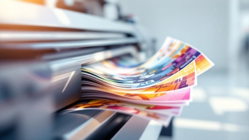 story
story What is Variable Data Printing? Boost Your Marketing Today
What if you could send out 10,000 marketing flyers, and every single one was unique to the person receiving it? That’s the magic of variable data printing (VDP) . This isn't your grandma's mail merge. VDP is a digital printing technique that lets you change out elements like text, images, and special offers on the fly, from one printed piece to the next, without ever stopping the press. It turns a generic marketing blast into a personal, one-to-one conversation. How Is This Different From a Mail Merge? It’s easy to think of VDP as a simple mail merge on steroids, but it's so much more than just swapping out a name and address. A basic mail merge is just the tip of the iceberg. VDP allows for a much deeper level of customization that genuinely resonates with your audience. Instead of printing the same static design thousands of times, VDP combines a master design template with a database of customer information. As the printer runs, it pulls unique data for each piece, creating a completely customized item every single time. This means you can do some pretty cool things: Customize Text: Go beyond a first name. Mention a customer's last purchase, reference their local store, or point them to a nearby event. Change Images: Show a pet owner a picture of a dog, a car enthusiast a sports car, or a new homeowner images of garden furniture. The visuals can directly reflect their known interests. Alter Graphics and Layouts: You can completely change the look and feel for different audience segments, ensuring the design itself is as relevant as the content. Provide Unique Offers: A first-time customer might get a welcome discount, while a VIP member receives an exclusive early-access code—all in the same print run. The real power of VDP is making each piece feel like it was created just for the person holding it. This transforms a simple flyer or postcard from junk mail into a meaningful connection. The industry is clearly taking notice. The global VDP market was valued at USD 9.3 billion back in 2022 and is on track to explode to nearly USD 59.6 billion by 2032 . This massive growth highlights the shift away from basic personalization toward sophisticated, data-driven customizations. You can read more about this market trend and what’s driving it. Static Printing vs Variable Data Printing at a Glance To really understand the shift, it helps to see the two approaches side-by-side. Traditional printing is great for mass production, but it's a one-size-fits-all game. VDP, on the other hand, is all about creating that personal touch. Feature Static Printing (Traditional) Variable Data Printing (VDP) Personalization None. Every piece is identical. High. Each piece can be unique. Content Fixed text, images, and graphics. Dynamic text, images, and offers. Data Source A single design file. A design template plus a database. Best For Mass-market, generic messaging. Targeted, personalized marketing campaigns. Example 10,000 identical event flyers. 10,000 flyers with unique names and offers. Ultimately, the choice between them comes down to your goal. If you need to produce a massive volume of identical items, static printing is efficient. But if you want to connect, engage, and drive action, VDP is the clear winner. How Variable Data Printing Works So, how does this all come together? The easiest way to think about Variable Data Printing (VDP) is like a mail merge on steroids. But instead of just plugging in a name and address, VDP can swap out images, headlines, offers—you name it. It all boils down to three key ingredients working in perfect harmony. First, you have your static design template . This is the foundation of your mailer, brochure, or whatever you're printing. It’s the part that stays consistent across the board, like your company logo, the core layout, and any boilerplate text. Think of it as the canvas, with blank spaces left open for the personal touches. Next up is the dynamic data source . This is where the magic really starts. It’s usually a simple spreadsheet or a data file from your CRM that contains all the juicy details about your audience. Each row is a different person, and each column holds a specific tidbit of information—their first name, their city, what they last bought, or even their birthday. This data is the fuel for your personalization engine. The Software That Connects Everything The final piece of the puzzle is the specialized VDP software that acts as the director of the show. It’s the brain that connects your static design template to your dynamic data source. As the print job runs, the software grabs the data from one row of your spreadsheet and perfectly places it into the corresponding empty fields on your design. This process lets you turn raw customer data into a fully customized design, ready to be printed on a modern digital press. What's really incredible is that this all happens on the fly, without ever slowing down the printer. A single print run can produce thousands of one-of-a-kind pieces. A new customer might get a postcard with a "Welcome to the Family!" offer, while a long-time loyalist receives a special VIP discount—all from the same job. This is the power of modern digital printing in action, making every single piece feel personal to the person holding it. By blending a base design with variable customer data, VDP lets you have a one-to-one conversation at scale, leaving generic, one-size-fits-all marketing in the dust. The whole operation is remarkably efficient. Since all the customization happens digitally before a single drop of ink touches paper, there’s no stopping and starting. It’s this seamless fusion of design and data that makes VDP such a game-changer for creating marketing that actually connects. Why VDP Is a Game Changer for Marketing Knowing how variable data printing works is one thing. Seeing why it's such a powerhouse for modern marketing is another. VDP lets you move beyond generic, one-size-fits-all messages to forge genuine connections that drive real results. It’s how you turn a passive audience into engaged customers. The biggest win is a massive boost in engagement. When a piece of mail speaks directly to a person’s interests or past behavior, it’s infinitely more likely to be read and acted upon. This isn't just a hunch; personalized campaigns consistently blow static ones out of the water, delivering higher response rates and a much healthier return on investment. Strengthen Brand Loyalty and ROI VDP is also a secret weapon for building fierce brand loyalty. When a customer receives a message that feels thoughtful and relevant, they feel seen and valued. That personal touch makes your marketing stick in their memory, making it far more impactful than another generic ad they’ll just toss in the bin. Think about a travel agency using VDP. They could send out a batch of postcards where each one is unique: It could greet the recipient by name: " Sarah, your next adventure awaits! " It might feature a stunning image of the last place they visited. It could include a custom offer for a similar trip or a new destination based on their travel history. That level of detail turns a simple postcard into a personal and compelling invitation, making the customer feel like you truly get them. If you're looking to create your own high-impact pieces, exploring a variety of custom marketing materials is a fantastic place to start. By making sure your message hits home on a personal level, VDP squeezes the maximum value out of every marketing dollar you spend. It cuts out the waste by sending the right message to the right person, plain and simple. As the technology behind database-driven printing gets better, it’s become easier for companies to juggle all that data and produce unique items, even in huge print runs. And with digital printing constantly evolving, VDP is more accessible than ever—not just for giant corporations, but for small and medium-sized businesses all over the world. Variable Data Printing in Action The theory behind VDP is great, but seeing it out in the wild is where the magic really happens. This isn't just about mail-merging a name onto a generic letter. We're talking about a powerful strategy used by savvy marketers across countless industries to create physical marketing pieces that feel personal and, more importantly, get results. Let's dive into a few real-world examples to see how it’s done. Retail Brands and Custom Catalogs Think about a major clothing brand sending out their latest seasonal catalog. Instead of printing one-size-fits-all version for everyone, they use VDP to create thousands of unique editions. It's brilliant. A customer who always buys women's running gear might get a catalog with a cover showing a female runner, along with a special deal on new athletic apparel. At the same time, another customer who just bought a new suit receives a catalog with a completely different cover and promotions for formal wear and accessories. This simple shift turns a generic product list into a personal shopping guide. By tapping into a customer's purchase history, the brand shows they're paying attention to individual style and needs, which makes a sale far more likely. Non-Profits and Personalized Appeals For non-profits, fundraising is all about connection, and VDP is an absolute game-changer here. A charity can send a donation request that feels like a personal conversation rather than a mass mailing. For instance, the mailer can greet a donor by name, thank them for their previous contribution (mentioning the exact amount), and then suggest a slightly increased gift for the new campaign. To really pull at the heartstrings, the story inside can be tailored to the donor's passions. Someone who gave to an animal rescue fund might read about a specific dog that was saved, complete with a photo. A donor who supports educational programs could see a story about a scholarship recipient. This targeted approach makes the cause feel real and immediate, giving supporters a powerful reason to open their hearts and wallets again. Universities and Unique Acceptance Packages Colleges are in a fierce competition for the best students, and that first impression is everything. Many are now using VDP to create truly memorable acceptance packages. Gone are the days of a form letter. Today, an admitted student might get a brochure where their name is seamlessly woven into campus photos—on a banner in the quad or a jersey in the bookstore. The whole package can be customized to highlight clubs, faculty, and courses related to their intended major. It's a small touch that makes a huge impact. It makes the student feel seen and valued, painting a vivid picture of their future at that specific school. This turns a simple acceptance letter into an experience, solidifying their decision to enroll. You can create this kind of impact with your own campaigns, and learning about professional postcards printing is a fantastic place to start. How to Launch Your First VDP Campaign Jumping into your first variable data printing project can feel a little daunting, but it's really just a step-by-step process. The secret isn't a brilliant design or a massive budget. It all starts with your data. Clean, well-organized data is the absolute foundation of any VDP campaign that gets results. Think of your customer database as the fuel that makes the whole personalization engine run. Before you even think about colors or fonts, you have to get your data in order. A messy spreadsheet with typos and missing info is a recipe for wasted money and mailers that fall flat. Start with Clean Data Your first move is always a data audit. You need to pull together all the key details that will make each printed piece feel like it was made just for one person. A solid VDP dataset usually includes: The Basics: Name, address, and title are your starting point. Demographics: Details like age, gender, or location help you create relevant segments. Purchase History: This is a goldmine. Knowing what people bought before lets you make offers they can't refuse. Loyalty Status: Are they a first-time buyer or a long-time VIP? Your message should reflect that. Once your data is sparkling clean, you get to the fun part: the design. You’ll create a master template with specific placeholders for all your variable elements—like the name, a custom image, or a unique offer. This static part holds your brand and core message, while the empty spots get filled in with customer data during the print run. The success of VDP hinges on the quality of your data. Investing time in cleaning and organizing your database upfront will pay massive dividends in campaign performance and ROI. Find the Right Printing Partner With your data and design ready to go, the final piece of the puzzle is finding a printing partner who actually gets VDP. Not every print shop has the right software or digital presses for the job, so finding one with real experience is crucial. It’s worth looking into professional direct mail services to find a team that can handle everything from start to finish. When you're talking to potential printers, don't be shy. Ask them direct questions: What VDP software do you use? Can you show me a few examples of VDP projects you’ve done? How do you handle data security and privacy? What does your proofing process look like for a VDP job? Getting solid answers here will give you the confidence to pull the trigger. And it's a good market to be in—the VDP world is blowing up, with forecasts showing it could rocket past $82 billion by 2030. If you want to see the numbers for yourself, you can dig into the full market research on VDP growth and see where things are headed. Answering Your Top Questions About VDP As you start to wrap your head around variable data printing, a few questions always pop up. It's totally normal. Let's walk through some of the most common ones so you can get a clearer picture of how it all works and if it's the right move for your marketing. Is This Just a Glorified Mail Merge? I hear this one a lot. It's an easy mistake to make, but it really undersells what VDP is capable of. A basic mail merge just swaps out a name and an address on an otherwise identical document. Variable data printing is in a completely different league. VDP lets you change pretty much any element on the fly, from one printed piece to the next. We're talking about: Images and Graphics: Imagine a local vet sending a postcard with a picture of a Golden Retriever to all their Golden Retriever-owning clients. That's VDP. Entire Layouts: You could send a high-end, minimalist offer to your VIP customers and a more vibrant, deal-focused version to first-time buyers—all in the same print run. Custom Offers: Think unique QR codes, personalized coupon amounts, or special invitations based on past purchases. So, while mail merge is like putting a different name tag on the same uniform, VDP is like giving every single person a completely custom-tailored outfit. What Kind of Data Do I Actually Need? Your campaign is only as good as the data that fuels it. You can pull this from simple spreadsheets, but a good CRM (Customer Relationship Management) system is where the real magic happens. At a minimum, you'll need names and addresses. But the game-changers are the details: purchase history, geographic location, loyalty status, or even noted preferences. This is the information that lets you go from "Dear Customer" to creating something that genuinely resonates. The secret to a knockout VDP campaign isn't just having data; it's having clean, well-organized data that tells a story about who your customers are and what they actually want. But Isn't VDP Really Expensive? Okay, let's talk cost. If you look at the price per piece , yes, a VDP project can be more than traditional offset printing . But that's a very narrow way to look at it. The real metric to focus on is return on investment (ROI) . Personalized marketing gets noticed. It drives much higher response rates and conversions. So while the upfront cost might be higher, the campaign's overall profitability often blows static campaigns out of the water. You're not just spending more; you're investing in a strategy that makes every dollar you spend work much, much harder. It’s a different tool for a different job. You can get a better sense of this by understanding the role of offset printing , which is perfect for massive runs of identical items. Ready to create marketing that truly connects with your audience? 4OVER4 offers powerful printing solutions that bring your data to life. Explore our services and start your personalized campaign today!
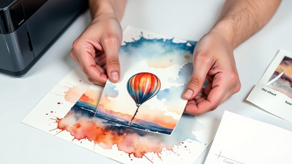 story
story How to Make Lenticular Prints: Easy DIY Guide
So, you’re ready to dive into the world of lenticular printing? It’s a fascinating space where static images come to life, creating illusions of depth, motion, and transformation right before your eyes. This guide is your complete roadmap, designed to walk you through the entire process from a simple idea to a finished print that pops. We’re going to cover everything you need to know to turn your pictures into dynamic art that seems to move, change, or jump out in 3D as someone shifts their view. This isn’t some brand-new gimmick; the core concepts have been around for over a century. The technology's roots trace back to the late 19th and early 20th centuries. One of the first related patents was for a 'Stereograph' filed way back in 1898 , which used a corrugated transparent surface over an interlaced picture to create a primitive 3D effect. You can actually find more on these early stereoscopic technologies on Wikipedia . Breaking Down the Lenticular Workflow At its heart, making a lenticular print comes down to mastering three distinct stages. Think of it as a production line where digital artistry meets hands-on craftsmanship. Each step builds on the last, leading to that "wow" moment when you see the final product. Here’s a look at how it all comes together: Creative Design: This is where the magic begins. You start by deciding on the effect you want—maybe a simple two-image flip, a multi-frame animation, or a deep 3D illusion. Then, you'll prepare your source images to make that vision a reality. Technical Interlacing: Next up is the digital heavy lifting. You'll use specialized software to slice your source images into super-thin strips and weave them together into a single, coded file. To the naked eye, this interlaced image will just look like a jumbled mess. Printing and Finishing: Finally, you print the interlaced file and carefully bond it to the back of a lenticular lens sheet. When everything is aligned just right, the tiny lenses on the sheet direct the viewer's eyes to see only certain image strips at a time, creating the intended effect. The real magic happens when your precisely printed and interlaced image aligns perfectly with the tiny lenses on the plastic sheet. This alignment is what unlocks the illusion of motion or depth. Before we dive deeper into each step, here’s a quick overview of the entire process. Lenticular Printing at a Glance This table breaks down the key stages, what you're trying to accomplish in each, and the tools you'll need to get it done. It's a great reference to keep handy as you start your first project. Stage Primary Goal Key Tools Design Create the source images for your desired effect (flip, 3D, etc.). Adobe Photoshop, Illustrator Interlacing Slice and combine the source images into a single printable file. Lenticular Software (e.g., HumanEyes, Power-Trans) Printing Print the interlaced image and bond it to a lenticular sheet. High-Resolution Printer, Lenticular Lenses, Laminator This combination of art and science is what makes lenticular printing so unique and rewarding. While there's a technical side to it, the creative possibilities are nearly endless, from animated business cards that grab attention to large-format art pieces that stop people in their tracks. Many creators use it to add that surprising "x-factor" to their work, joining artists who explore specialty printing collections to make their projects unforgettable. Now, let's get you the foundational knowledge and confidence to bring your first lenticular project to life. Gathering Your Essential Tools and Materials Before you can bring your dynamic images to life, you need to get your toolkit in order. Just like a chef preps their ingredients, getting your materials sorted out is the first real step toward a great final print. If you invest wisely right from the start, you'll save yourself a lot of frustration and wasted supplies down the line. The most critical piece of the puzzle is the lenticular lens sheet itself. These aren't just simple pieces of plastic; they are precision-engineered with tiny, parallel ridges called lenticules. The density of these lenses, measured in LPI (Lenses Per Inch) , is the single specification that will most heavily influence your print's final look. Choosing the Right Lenticular Lenses The LPI you pick comes down to one thing: your project's intended viewing distance. A higher LPI, like 75 or 100 , packs more lenses into each inch. This makes it perfect for things people will hold up close, like business cards or postcards. On the other hand, a lower LPI, such as 20 or 40 , is the way to go for larger prints like posters that people will see from several feet away. Your choice of LPI is a foundational decision that impacts everything from software settings to final print clarity. Mismatching your digital interlacing settings with the physical lens LPI is one of the most common reasons for "ghosting," where both images in a flip appear faintly at the same time. Printers, Inks, and Software Next up, you need a way to get your interlaced image from the screen onto paper. And no, not just any old printer will do the job. You'll want a high-resolution inkjet printer, ideally one capable of at least 720 dpi or more, to produce the incredibly fine detail required. The quality of your ink is also a big deal for creating the vibrant, saturated colors that make lenticulars pop. Your software lineup will fall into two main categories: Image Preparation: A program like Adobe Photoshop is pretty much essential. This is where you'll create and layer your source images, separating foreground and background elements for 3D effects or prepping your images for a clean flip. Interlacing Software: This is the specialized tool that does the real technical magic. Programs like SuperFlip! or PowerInterlacer take your source images and your lens's LPI value to create that final, jumbled-looking image that's ready for printing. Finally, don't forget the finishing supplies. To bond your print to the lens, you'll need an optically clear adhesive . You can apply this by hand or, for a much cleaner, bubble-free finish, use a cold-press laminator. For those just getting started or aiming for truly professional-grade results, it can be a great idea to explore high-quality digital printing services . This gives you a reliable benchmark for what's achievable and can save a lot of headaches. Designing Images for Maximum Lenticular Impact A spectacular lenticular print doesn’t just happen. It’s born from thoughtful, intentional design. The choices you make long before you even touch interlacing software will determine whether your final piece has that "wow" factor or just falls flat. This is where your creative strategy begins—prepping your source images to shine in this unique medium. The two most popular effects, the flip and 3D depth , each demand a different creative approach. For a flip effect, your main goal is creating a seamless, natural transition between two or more frames. The secret is to pick images that share a similar composition and color palette. Trust me, a jarring jump from a dark, moody scene to a bright, sunny one just doesn't work. Think more along the lines of a character winking or a logo smoothly changing color. Subtle shifts are your best friend here. Crafting Images for Flips and 3D When you’re aiming for that convincing illusion of 3D depth , your entire workflow will revolve around layers. This is where a powerhouse tool like Adobe Photoshop becomes absolutely essential. The core principle is simple: you need to separate your subject from its background to create distinct planes of depth. Picture it like building a little diorama or a stage set—you need a backdrop, a middle ground, and a foreground. Let's say you're designing a 3D business card. A good layer structure would look something like this: The background texture or a solid color goes on the bottom-most layer. Your name and contact info would sit comfortably on a middle layer. Your company logo, the star of the show, should be on the very top layer. By isolating these elements, you give the interlacing software exactly what it needs to create the parallax effect that tricks our eyes into perceiving depth. The more separation you create between your foreground and background elements, the more dramatic the 3D effect will be. But a word of caution from experience: pushing the depth too far can sometimes introduce visual artifacts or "ghosting." A little moderation often leads to the cleanest, most impressive results. Avoiding Common Design Pitfalls When you're first learning how to make lenticular prints, it's incredibly easy to forget how the interlacing process impacts the finer details of a design. Some elements just don't translate well from a crisp digital screen to the ridged surface of a lenticular print. Here are a few critical things I've learned to avoid: Thin Fonts: Those elegant, wispy serif fonts? They often become a mess. Parts of the letters can disappear between the tiny lenses (the lenticules), rendering your text illegible. Always opt for bolder, sans-serif fonts. Fine Details: Intricate patterns, delicate textures, and super-thin lines will almost certainly get lost or look blurry. You need to think in bigger, more defined shapes and elements. High-Contrast Edges: While good contrast is usually a plus in design, be careful about placing a very light object directly against a very dark background, especially at your main focal point. This can sometimes amplify that ghosting effect I mentioned earlier. Thinking about these limitations before you start designing will save you a world of frustration, not to mention time and money on test prints. While lenticular is fantastic for motion, if you're looking for a static but equally eye-catching effect for other projects, you might want to explore options like holographic printing . The Interlacing Process: Unlocking the 3D Effect This is where the real magic happens. We’re at the technical heart of making a lenticular print: interlacing . Think of it as digitally weaving your images together. This step takes your source images, slices them into incredibly thin strips, and then combines them into one single, coded file. To the naked eye, this interlaced image will just look like a blurry, jumbled mess. But that’s the secret. Once you print it and lay the right lenticular lens on top, that chaos snaps into focus, revealing a dynamic, animated picture. Let's walk through this with a real-world example, like making a two-image flip postcard. You’ve got your two final images ready. The next step is to fire up your specialized lenticular software. I've used programs like SuperFlip! and PowerInterlacer for this—they're built specifically for this job. Configuring Your Interlacing Software The moment you open a new project, the software will ask for a few critical details. These aren't just suggestions; they're precise instructions that tell the program how to slice your images to perfectly match your physical lens sheet. Getting these settings right is absolutely non-negotiable if you want a print that works. Here’s what you’ll need to input: Source Files: This is straightforward. You’ll just load your two images (let's call them Image A and Image B for our postcard). Lenses Per Inch (LPI): You have to enter the exact LPI of the lenticular sheets you plan to use. If your lens is 75 LPI, you enter 75 . No guessing. Output Resolution: This needs to match what your printer can handle best. A good starting point is often 720 dpi , but always check your printer’s specs for its optimal resolution. Orientation: For a flip effect, you'll choose horizontal alignment. For 3D and other animations, you'd select vertical. Since we're making a flip postcard, we'll go with horizontal. Take a breath and double-check every single one of those settings. I can't stress this enough. A tiny typo, like entering 72 LPI instead of 75, is all it takes to completely ruin the print. Precision is everything at this stage. The All-Important Pitch Test Now for an insider tip that really separates the beginners from the pros: always run a pitch test . Even if a lens sheet is advertised as "75 LPI," the actual effective LPI can be slightly different. This is due to tiny manufacturing variations or even the unique quirks of your printer and paper combination. The pitch test is a small calibration print that helps you discover this true number. Your software will generate a test file with a series of black bars printed at slightly different pitches—for example, 74.9 LPI, 75.0 LPI, and 75.1 LPI. You print this strip, place your lenticular lens over it, and look for the one bar that appears perfectly solid and black, with no weird banding or color bleed. That’s your "true" LPI. Using this calibrated number is your single best defense against ghosting and will make your final effect as crisp and clean as possible. This visual guide shows the final hands-on part of the process—applying the print to the lens, which requires just as much care as the digital setup. As you can see, a clean lens, a smooth and even application of adhesive, and perfect alignment are the physical keys to success. Once you've mastered the digital interlacing, turning that printed sheet into a finished piece all comes down to this careful, hands-on work. Printing and Finishing Your Lenticular Masterpiece This is the moment of truth. You’ve painstakingly designed your images and wrestled with the technical details of interlacing. Now, it's time to bring that digital file to life and create a physical object you can actually hold. This final stage is all about precision—it’s what separates a decent lenticular print from a truly stunning one. It all starts at your printer. The settings you choose here are every bit as important as the LPI you decided on earlier. You absolutely have to print at a high resolution to capture the incredibly fine detail of those interlaced strips. I always aim for 720 dpi as a bare minimum, but if your printer can go higher, do it. Even more importantly, you must disable any and all automatic scaling options. Hunt down settings like "Fit to Page," "Scale to Fit," or "Fill Entire Paper" and make sure they are switched off . Your interlaced image has to be printed at its exact, native size. No exceptions. This is the only way it will align perfectly with the lens sheet. Laminating for a Flawless Bond Once your interlaced image is printed, the next hurdle is adhering it to the back of the lenticular lens. This bond has to be perfectly clear, super strong, and completely free of air bubbles, which are the sworn enemy of a good lenticular effect. This is where an optically clear adhesive is non-negotiable. You have a couple of ways to tackle this: Manual Application: You can apply the adhesive sheet by hand using a squeegee. This method requires a very steady hand and a good deal of patience. You’ll want to start at one edge and slowly, carefully smooth the print down onto the adhesive, pushing out any air bubbles as you go. Cold-Laminating Machine: If you’re looking for consistent, professional-grade results, a cold-press laminator is your best friend. It applies perfectly even pressure across the entire surface, giving you a bubble-free bond that’s almost impossible to get right by hand. Pro Tip: Before you fully commit to laminating, lightly tack one edge of your print to the lens. Hold it up to a light source and gently move it side-to-side. This is your last chance to check the alignment with the lens striations. If the flip or 3D effect looks sharp, you’re cleared for takeoff. The Final Cut: Precision Trimming With your print securely bonded to the lens, the only thing left is the final trim. Don't rush this part. A clean, straight edge is the finishing touch that gives your project a polished, professional look. Grab a sharp craft knife, a heavy metal ruler, and a cutting mat. Remember the old saying: measure twice, cut once. A sloppy cut can fray the edges or even cause the print and lens to separate a bit. Take your time to get it perfect. The result will be a dynamic piece of art that seems to move and shift right before your eyes. This level of attention to detail is critical for any high-quality print job, from fine art prints to custom marketing materials. For instance, the precision needed for creating unique plastic cards relies on similar principles of quality control and flawless finishing. You can learn more about producing high-quality plastic card printing that makes an impact. Ultimately, mastering lenticular printing comes down to this final, hands-on stage—where digital precision meets tactile skill. Common Questions When Making Lenticular Prints As you dive into the world of lenticular printing, a few questions are bound to pop up. It’s a process that feels like a blend of art and science, and there are a handful of common hurdles that tend to trip up beginners. Let's clear up some of the most frequent points of confusion. Tackling these challenges from the get-go will help you fine-tune your technique, sidestep frustrating problems, and achieve that polished, professional result you’re after. Why Is LPI So Important? One of the first terms you’ll bump into is LPI , or Lenses Per Inch . This isn't just a random piece of tech jargon; it’s arguably the most critical detail for any lenticular project. It tells you exactly how many tiny, parallel lenses are packed into every single inch of the plastic sheet you're printing on. This number has a direct impact on both the resolution of your final print and its ideal viewing distance. Here's how it breaks down in practice: High LPI (75-100): These lenses are incredibly fine and packed tightly together. This makes them perfect for handheld items like business cards or invitations that people will see up close. Low LPI (20-40): These lenses are bigger and spaced further apart. This is what you want for large posters or displays meant to be viewed from several feet away. Here’s a critical takeaway: your design software's LPI setting must perfectly match the LPI of your physical lens sheet. Even a tiny mismatch is the number one cause of "ghosting"—that blurry, annoying effect where both images in a flip are faintly visible at the same time. Can I Use Any Inkjet Printer? While it’s tempting to just use whatever printer you have sitting on your desk, not all of them are cut out for this kind of work. The single most important feature you need is the ability to print at a very high resolution. To accurately reproduce the fine, interlaced lines your software creates, you need a printer capable of at least 1200 dpi . Beyond pure resolution, your printer must give you the control to turn off all automatic scaling features. Things like "fit to page" or "scale to fit" will instantly ruin the effect by resizing your image and throwing off the alignment with the lenses. The interlaced file has to be printed at its exact, native size, period. Printers with a straight-through paper path are also a massive bonus, as they can handle the thicker, more rigid lenticular sheets without jamming or bending. Is a Pitch Test Really Necessary? In a word: yes. A pitch test is absolutely essential if you're serious about getting professional-quality results. Think of it as a quick but vital calibration step that will save you from wasting a ton of time and expensive materials. Even though a lens sheet might be advertised as 60 LPI , the true, effective LPI can shift slightly depending on your specific printer, the ink you're using, and even the paper. A pitch test is how you find this precise, real-world value. It involves printing a series of lines at slightly different LPIs (for example, 59.9, 60.0, 60.1). You then lay your lens sheet over this test print to see which line looks the sharpest and most solid. Honestly, skipping this step is the most common mistake I see people make, and it's the leading cause of failed prints. This kind of attention to detail is what separates the pros from the amateurs, and it applies even to smaller formats where precision is everything. You can see similar principles of precision at play in high-quality trading cards printing . Ready to create eye-catching prints that move and change? The team at 4OVER4 has the expertise and technology to bring your most creative ideas to life with stunning clarity and quality. Explore our printing solutions today at https://4over4.com .
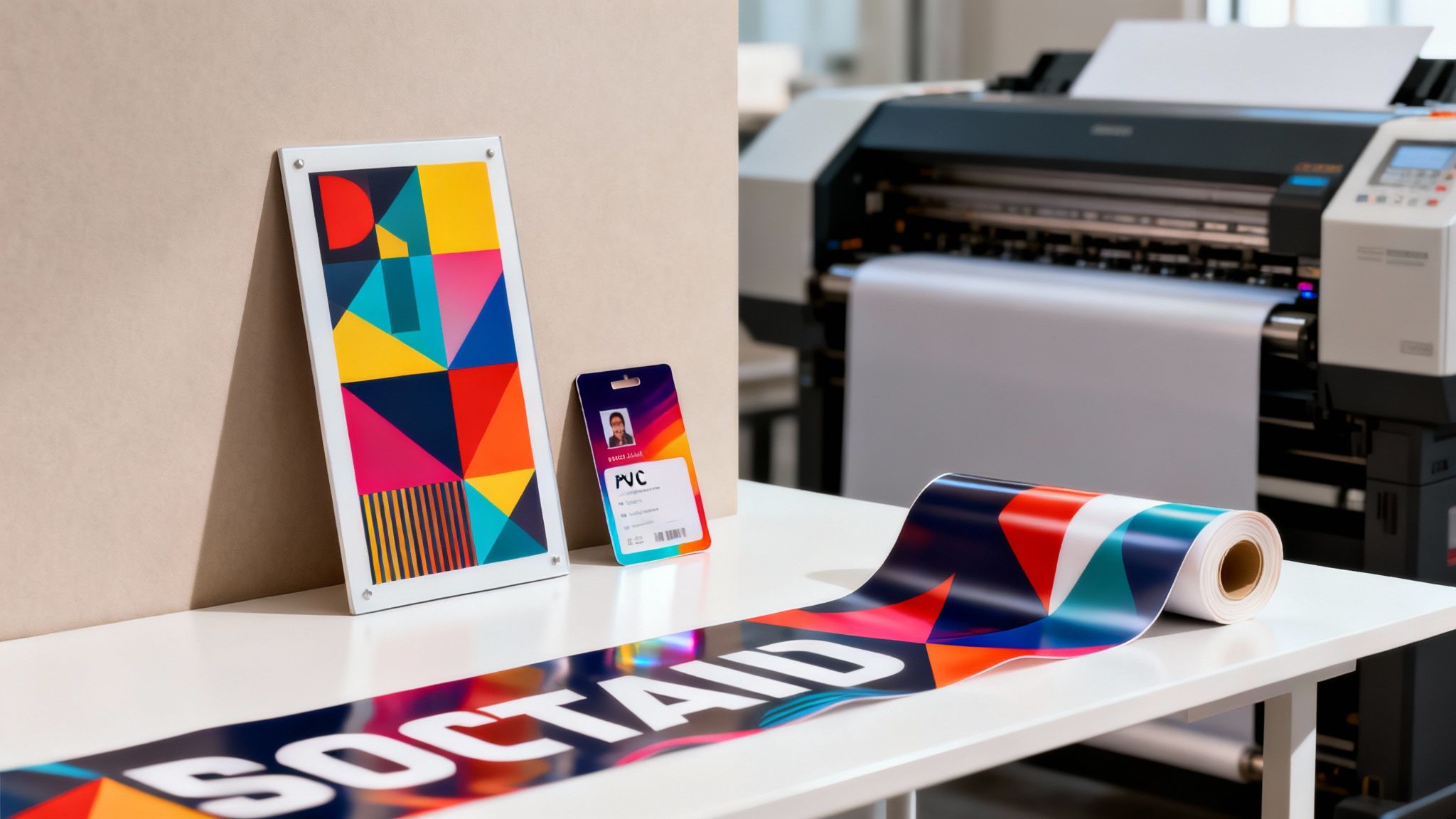 story
story A Business Guide to Print on PVC
Printing on PVC is really just a fancy way of saying we're creating graphics on a super durable plastic canvas instead of fragile paper. It’s the go-to process for businesses needing vibrant, long-lasting visuals that can handle just about anything—think weatherproof outdoor signs , professional event displays, or even the sturdy ID cards your team uses every day. Its toughness and high-quality finish make it the clear winner for projects that need to survive a little wear and tear and the great outdoors. Understanding the Power of PVC Printing Imagine your marketing materials had a built-in suit of armor. That’s pretty much what you get when you choose to print on PVC (Polyvinyl Chloride). Unlike paper that tears or cardboard that gets soggy and warps in the humidity, PVC gives your message a robust and professional home. It elevates standard print jobs into durable assets that look just as good on day one hundred as they did on day one. This incredible durability is what makes PVC so versatile. From the rigid signs guiding customers through your store to the flexible banners announcing your grand opening, PVC is a reliable foundation. Its non-porous surface is perfect for capturing crisp details and brilliant colors, ensuring your branding always looks sharp. It’s no surprise that the market for materials like this is growing. The printed plastic films sector is projected to hit USD 8.00 billion by 2035 , which just shows how essential it's becoming for modern branding and packaging. Why Businesses Choose PVC The advantages of PVC go way beyond just being tough. Businesses are choosing it for a handful of key reasons that directly boost their brand perception and give them a better return on their investment. Here's a quick rundown of why so many businesses are making the switch to PVC for their professional printing needs. Benefit Why It Matters for Your Business Longevity & Weather Resistance Your signs and banners can handle rain, sun, and wind without fading or falling apart. Perfect for long-term outdoor use. Professional Appearance The material's smooth, uniform surface creates a high-end finish that makes your brand look polished and professional. Versatility in Application PVC can be rigid or flexible, thick or thin, opening up a huge range of product possibilities from signs to stickers. Cost-Effectiveness When you consider its long lifespan and resistance to damage, PVC offers incredible value compared to materials you'd have to replace constantly. These benefits combined make PVC a smart, strategic choice for any company looking to make a lasting impression. Here are a few more reasons it's a popular pick: Longevity and Weather Resistance: PVC signs and banners can endure rain, sun, and wind, making them ideal for long-term outdoor use without fading or deteriorating quickly. Professional Appearance: The material’s smooth, uniform surface results in a high-end finish that elevates brand quality, whether it's for a trade show display or an in-store promotion. Versatility in Application: PVC can be rigid or flexible, thick or thin, allowing for a huge range of products. For a deeper look at the possibilities, our complete https://www.4over4.com/printing/category/pvc-collection showcases many options. Cost-Effectiveness: When you factor in its long lifespan and resistance to damage, PVC offers excellent value compared to materials that require frequent replacement. To really see how far you can push the creative boundaries with this material, it’s worth checking out guides on creating unique designs with custom vinyl wall stickers and furniture wraps . Choosing the Right PVC Material When you decide to print on PVC, picking the right foundation for your project is easily the most important first step. Not all PVC is created equal. Think of it like choosing between different types of wood for a building project—you wouldn't use delicate balsa wood to build a sturdy deck, right? The same logic applies here. The type of PVC you select needs to align perfectly with your project's function, where it'll live, and the look you're going for. Each kind of PVC brings its own unique mix of flexibility, thickness, and toughness to the table. Making the right choice ensures your final product doesn't just look professional but actually performs the way you need it to, whether that's a rigid sign standing tall at a trade show or a flexible banner toughing it out in the elements. This handy little decision tree can help you quickly match your project to the right PVC type. As you can see, what you're actually making —be it a sign, banner, or card—is the main driver behind your material choice. Rigid PVC Sheets for Structure and Sophistication When your project demands a flat, sturdy, and polished appearance, rigid PVC sheets are the answer. You might hear them called by brand names like Sintra or Komacel, but they're all a type of lightweight yet durable plastic foam board. It’s the gold standard for high-quality indoor signage that needs to resist warping and keep its shape over time. Picture a premium point-of-purchase display in a boutique or the main directional sign at a corporate event. These applications need a material that screams quality and stability. Rigid PVC delivers exactly that with its smooth, matte finish that cuts down on glare and makes printed colors pop with incredible crispness. Consider rigid PVC for projects like: Trade Show Displays: Building backdrops and info panels that are a breeze to transport but look solid and professional once set up. Retail Signage: Crafting end-cap displays, shelf talkers, and hanging signs that can handle the daily hustle of a busy store. Real Estate Signs: Producing durable, weather-resistant "For Sale" or "Open House" signs that look sharp for months on end. Flexible PVC Vinyl for Versatility and Resilience For projects that need to bend, brave the weather, and adapt to different surfaces, flexible PVC vinyl is the undisputed champion. This material is basically a durable, pliable plastic fabric that you can roll up for easy transport and storage without it cracking or creasing. It's the powerhouse behind most of the banners, decals, and vehicle wraps you see every day. Its natural flexibility and weather-resistant DNA make it perfect for outdoor advertising. A grand opening banner, for example, has to take a beating from wind and rain while staying bright and easy to read. Flexible PVC vinyl is engineered for just that kind of challenge, making it a smart, cost-effective solution for both temporary and long-term outdoor campaigns. To see the huge range of adhesive options out there, you can learn more about our adhesive vinyls collection for things like window graphics and wall murals. PVC Cards for Durability in Your Pocket Finally, for those small-format jobs that require extreme durability and a standardized, professional feel, PVC cards are the go-to. These are the same tough, credit-card-like plastics used for ID, access, and payment all over the world. They're specifically designed to resist bending, cracking, and fading from constant handling. Because they combine rigidity with a compact form factor, PVC cards are the ideal substrate for items that need to last for years while being carried and used daily. Their non-porous surface is perfect for high-resolution printing of photos, logos, and intricate text. This makes them the perfect choice for: ID Badges and Access Cards: Creating secure and long-lasting identification for employees, students, or event staff. Membership and Loyalty Cards: Producing durable cards that keep your brand right in your customer's wallet. Gift Cards: Offering a professional and reusable gift card that reflects the quality of your business. While PVC is a fantastic all-rounder, it's worth noting that other plastics like acrylic are also popular for different display needs, offering their own unique look and feel. For instance, high-end applications like donor walls or premium office signage often use custom acrylic displays for a sleek, glass-like finish. How Professional PVC Printing Works Ever wondered how a vibrant, crisp logo ends up permanently stuck to a slick plastic surface? It's not like printing on paper, which just soaks up ink. PVC is non-porous, meaning it has nowhere for the ink to go. If you used a standard printer, you'd end up with a smeared, wet mess that would wipe right off. To get a design to stick, professional printers have to get creative. The whole game is about adhesion, not absorption. It involves some seriously cool technology that essentially cures or chemically fuses the ink right onto the plastic's surface. Let's pull back the curtain on the two main ways we make this happen. UV Flatbed Printing for Rigid Surfaces Think of painting a wall with a special kind of paint that dries the second a flashlight beam hits it. That's the basic idea behind UV Flatbed Printing . This is our go-to method for anything rigid, like the thick PVC sheets used for high-end signage and displays. A flatbed printer holds the PVC sheet perfectly still while a print head glides across it, jetting microscopic droplets of a special UV-curable ink. Right on its heels is a high-intensity ultraviolet (UV) lamp. This light instantly cures—or hardens—the ink, locking it onto the PVC. This instant-drying trick comes with some major perks: Insane Durability: The cured ink creates a tough, resilient layer that laughs at scratches, fading, and scuffs. Jaw-Dropping Graphics: Because the ink has zero time to spread or bleed, the final print is incredibly sharp with colors that pop. Textured Finishes: We can even build up layers of ink to create tactile, 3D effects you can actually feel on the surface. Thanks to its precision and toughness, UV flatbed printing is the only way to go for professional-grade rigid signs you see at trade shows, in retail stores, or as architectural displays. Solvent and Eco-Solvent Printing for Flexible Media Now, switch gears and think about dyeing a t-shirt. The color doesn't just sit on top; it sinks in and becomes part of the fabric. Solvent and Eco-Solvent Printing works a lot like that, but for flexible PVC vinyl—the stuff used for banners, vehicle wraps, and durable stickers. With this method, the ink contains solvents that ever-so-gently soften and etch the surface of the PVC. This opens the door for the color pigments to actually bite into the material instead of just laying on top. As the solvents evaporate, the pigments are locked in for good, embedded right into the vinyl. This chemical bond is the secret sauce that makes solvent-printed graphics so ridiculously resilient outdoors. The print literally becomes one with the PVC, so it won't crack, peel, or fade when battered by sun and rain. Eco-solvent inks are the newer, smarter version of this. They deliver the same permanence but with far fewer volatile organic compounds (VOCs), making them a much better choice for the environment and for indoor air quality. This is the perfect method for anything that needs to be rolled up, stretched out, or left to fend for itself in harsh weather. Comparing Printing Technologies So, which method is right for your project? It all comes down to what you're trying to create. Each technique has its own strengths, costs, and benefits built for specific jobs. Feature UV Flatbed Printing Solvent & Eco-Solvent Printing Best For Rigid PVC Sheets, Dibond, Acrylic Flexible PVC Vinyl, Banners, Wraps Durability Excellent scratch & fade resistance Excellent weather & water resistance Finish Matte or gloss, can be textured Typically a smooth, satin finish Process Ink is cured on the surface by UV light Ink etches into and bonds with the material This kind of specialized tech is a huge reason why the global printed vinyl market, where PVC is king, is so massive. Valued at roughly USD 9.53 billion in 2024 , the market is set to keep growing, pushed by the advertising world's endless need for top-quality banners and wraps. Knowing how these prints are made helps you see the true value and quality behind the finished product. Setting Up Your Design Files for Flawless Prints Even the most stunning design on your screen can turn into a costly printing mistake if the digital file isn't prepared correctly. To make sure your final PVC product looks exactly how you imagined it, getting your artwork ready for professional printing is a non-negotiable step. This is the bridge between your digital idea and a perfect physical product. Think of it like handing over a blueprint for a construction project. Any flaws in that plan are going to show up in the final building. By following a few key best practices, you can send your files with confidence and sidestep common issues like blurry images, weird color shifts, or important details getting cut off. Master Your Resolution and Color Mode The two absolute fundamentals of any print-ready file are its resolution and color mode. Getting these wrong is the fastest way to a disappointing result. First off, your file's resolution must be 300 DPI (dots per inch) at its final print size. This is the industry standard for a reason—it guarantees crisp, sharp graphics that look professional, even up close. Next, you have to design in CMYK (Cyan, Magenta, Yellow, Key/Black) color mode, not RGB (Red, Green, Blue). Your screen creates colors with light using the RGB model, but printers mix physical inks using the CMYK model. If you design in RGB, the file will be converted during printing, which often leads to dull, muddy, or just plain inaccurate colors. Setting your design software to CMYK from the very start is the only way to get a predictable color outcome. It ensures that the vibrant colors you see on screen have the best possible chance of being faithfully reproduced on the final PVC print. Respect the Bleed and Safe Zone Ever framed a picture? The "safe zone" is the main area inside the frame where you want your most important art to be. The "bleed" is that little bit of extra image that goes past the frame's edge, just in case the picture shifts a tiny bit, so you don't see any ugly white borders. Print production works exactly the same way. Bleed: This is an extra border of your design (usually 0.125 inches ) that extends beyond the final trim line. It gets cut off, but it's what ensures your background color or image goes right to the very edge without any slivers of white. Safe Zone: This is an inner margin (also typically 0.125 inches inside the trim line) where all your critical text, logos, and contact info should live. Keeping everything important inside this zone guarantees it won't get accidentally sliced off. For projects with custom shapes, knowing how these margins work is even more critical. Proper file setup is absolutely essential for precise results, especially if you're looking into advanced options like our die-cutting services . Your Print-Ready File Checklist Follow these best practices to optimize your design files for professional PVC printing. Checklist Item Best Practice Why It's Important Resolution Set to 300 DPI at final print size. Ensures sharp, high-quality images and text without blurriness. Color Mode Design in CMYK , not RGB. Prevents unexpected color shifts and ensures accurate ink reproduction. Bleed Add a 0.125" bleed on all sides. Guarantees edge-to-edge color without white borders after trimming. Safe Zone Keep text/logos 0.125" inside the trim line. Protects critical elements from being accidentally cut off during finishing. File Format Submit a print-ready PDF . Embeds fonts and images, preserving layout and ensuring consistency. Vector Graphics Use vector format (.AI, .EPS) for logos & text. Allows for infinite scaling without any loss of quality. Outline Fonts Convert all text to outlines before saving. Prevents font substitution errors if the printer doesn't have your specific font. By running through this checklist before you submit your files, you're setting your project up for a smooth, error-free production run. Choose the Right File Format Finally, the type of file you send over to your printer matters. A lot. Graphics generally come in two flavors: raster and vector. Raster images (like JPEGs or PNGs) are built from pixels. They’re perfect for photographs, but they’ll get fuzzy and pixelated if you try to blow them up larger than their original size. Always double-check that any raster images are 300 DPI at the size they'll be printed. Vector images (like AI or EPS files) are made from mathematical paths. This means they can be scaled to any size—from a tiny PVC card to a massive billboard—with zero loss in quality. For this reason, all logos, icons, and text should ideally be in a vector format. When it's time to submit, a high-quality, print-ready PDF is the gold standard. It neatly packages all your fonts, images, and vector graphics into one reliable file, locking in your layout and ensuring everyone sees the same thing. Submitting files in professional formats like PDF or native Adobe Illustrator (.AI) files gives your printer the best possible blueprint to work from. Finishing Touches and Environmental Impact Once your design is printed, the final details can turn a good project into something truly exceptional. These finishing touches do more than just make your PVC print look professional; they add critical layers of durability that protect your investment and extend its lifespan. It's the difference between a standard sign and a custom-shaped, resilient display that really commands attention. At the same time, you can't talk about plastic without considering its environmental footprint. For businesses that are serious about sustainability, understanding the greener side of PVC printing is a must. The good news is that advancements in materials and inks are making it easier to make responsible choices without giving up quality or performance. Adding Professionalism and Durability The right finish can dramatically change both the look and the longevity of your PVC prints. Two of the most impactful options are custom cutting and lamination, and each serves a distinct purpose. Custom Shape Cutting , often called die-cutting, is a fantastic way to break free from the usual rectangle. By cutting your PVC signs into unique shapes—like your company logo, a specific product, or an eye-catching symbol—you create a piece that is instantly more memorable. This technique is perfect for point-of-purchase displays, event signage, and any branding that needs to stand out. Lamination is like a protective shield for your print. It involves applying a thin, transparent plastic film over the printed surface, and it offers several key benefits: Enhanced Durability: It provides a tough barrier against scratches, scuffs, and moisture, which is crucial for items in high-traffic areas. UV Protection: A UV-resistant laminate acts like sunscreen for your print, significantly slowing down the fading that sunlight causes. Finish Options: You can choose between a gloss laminate , which makes colors pop and look more vibrant, or a matte laminate , which cuts down on glare for better readability under bright lights. Navigating the Environmental Side of PVC The conversation around plastics and the environment is an important one. While traditional PVC production has raised valid concerns, the industry is actively adapting to meet the growing demand for sustainable solutions. This shift means environmentally conscious businesses can use the benefits of PVC printing more responsibly. A key development is the growing availability of recycled PVC . These materials use post-consumer or post-industrial waste, which cuts down on the need for new plastic production and keeps waste out of landfills. The global market for PVC packaging film is expected to hit USD 17.48 billion by 2034 , and it has already seen a 15% increase in the use of recycled content. Choosing recycled PVC is a practical step toward minimizing environmental impact. It supports a circular economy where materials get a second life, reducing both resource consumption and the carbon footprint tied to manufacturing new plastics. Another critical piece of the puzzle is the ink. Eco-solvent inks are a much greener alternative to traditional solvent inks. They contain far lower levels of Volatile Organic Compounds (VOCs)—harmful chemicals that contribute to air pollution. Working with a printer that prioritizes eco-solvent inks is a smart move for both the planet and workplace safety. For businesses that want to make sustainability a core part of their marketing, exploring a provider's full range of green printing services can uncover even more eco-friendly options. Common Questions About Printing on PVC Even with the best game plan, a few questions always seem to pop up right before you pull the trigger on a new project. To wrap things up, we’ve put together answers to the most common things businesses ask about PVC printing. Getting these final details ironed out will give you the confidence to move forward. Think of this as a quick-reference guide to clear up any last-minute uncertainties. Our goal is to make sure you have everything you need to kick off your next project without a hitch. How Long Does a Print on PVC Last Outdoors? The real-world lifespan of an outdoor print on PVC comes down to a few key variables: the type of PVC you choose, the ink it’s printed with, and how harsh your local weather is. As a general rule, a print made with UV-cured inks on a rigid PVC sheet can easily last 3-5 years with only minimal fading. For flexible vinyl banners printed with tough solvent inks, you can expect them to hold up for 2-3 years , especially if they’re soaking up direct sunlight day after day. The single best thing you can do to extend the life of any outdoor PVC print? Add a UV-protective laminate. It’s like sunscreen for your sign, acting as a powerful shield against sun damage and physical scuffs. Can You Print on Both Sides of a PVC Sheet? Absolutely. Double-sided printing is incredibly common and effective, especially for things like hanging signs, point-of-sale displays, or any signage that people will see from multiple angles. The key to getting a great result is using an opaque PVC material. You'll often hear these called "blockout" vinyls because they have a special layer inside that stops the design on one side from ghosting through to the other. This ensures both graphics stay crisp and vibrant. When you're getting your files ready, just remember to create two separate designs—one clearly labeled for the front and the other for the back. What Is the Main Difference Between PVC and Acrylic Printing? The biggest distinctions between printing on PVC and acrylic boil down to three things: looks, durability, and cost. They each have their own strengths and are suited for very different jobs. Here’s a quick side-by-side: Acrylic Printing: This gives you a high-gloss, premium finish that almost looks like a photo mounted behind glass. It's a fantastic choice for high-end office decor and fine art prints, but it's more rigid and can be brittle if it takes a hard hit. PVC Printing: This usually provides a more professional matte or satin finish. It's much more flexible and impact-resistant, which makes it the go-to material for durable signage, event displays, and pretty much any outdoor application. At the end of the day, PVC is significantly more budget-friendly and versatile for the vast majority of business marketing needs. Acrylic, on the other hand, really shines when you want to create that luxurious, gallery-quality look for specific interior projects. Ready to create durable, high-impact marketing materials? The experts at 4OVER4 are here to bring your vision to life with professional PVC printing services. Start your project today!
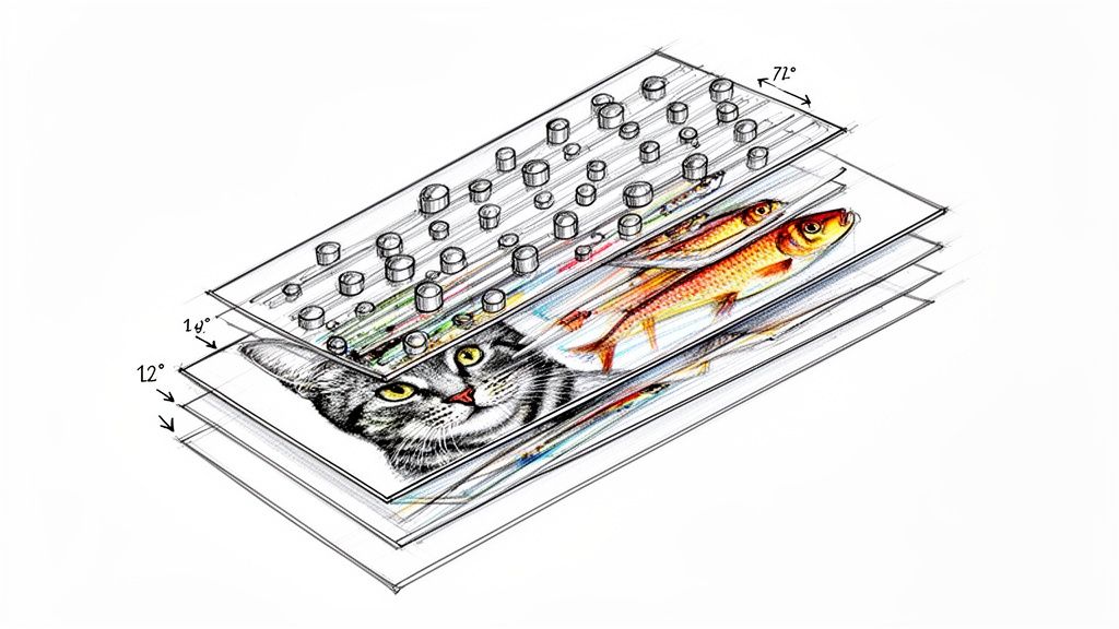 story
story What Is Lenticular Printing A Guide to 3D and Motion Effects
Ever held a postcard where a cat actually winks at you? Or a movie poster where the hero seems to leap right off the page? That’s the magic of lenticular printing. It’s a clever printing technique that fuses multiple images into one, using a special plastic sheet covered in tiny lenses ( lenticules ) to show you different pictures depending on how you hold it. The Magic Behind Motion in Print At its heart, what is lenticular printing is a brilliant optical illusion, not some complex hologram. The best way to think of it is like a super-advanced flipbook packed onto a single, flat surface. Instead of flipping through pages to see the action, you just tilt the print. It’s this technology that turns a static, everyday print into something dynamic and memorable that grabs your attention right away. The whole process hangs on two key parts working together perfectly: a specially prepared image and a sheet of lenticular lenses. The image isn't just one picture—it's several images sliced into super-thin strips and woven together, a process known as interlacing . That interlaced print then gets perfectly laminated under the plastic lens sheet, which is essentially a row of tiny, perfectly aligned magnifying glasses. How It Creates an Illusion As you look at the print from different angles, each of those tiny lenses directs your eye to see only one set of image strips at a time. Your brain processes this rapid switch between hidden images as motion, depth, or a complete transformation. The final piece feels interactive and alive, making it an incredibly powerful tool for anyone trying to stand out. From business cards that switch messages to packaging that shows a product in 3D, the possibilities are endless. It’s this uncanny ability to capture and hold someone’s focus that has made lenticular printing a favorite for marketers. Before diving deeper, let's look at the most common effects you can achieve. This table breaks down the main types of lenticular printing and where they shine. Lenticular Printing Effects at a Glance Effect Type What You See Best Use Case Flip Two or more distinct images switching back and forth. Before-and-after reveals, showing different product options. 3D/Depth A sense of three-dimensional space with floating objects. Product showcases, movie posters, and eye-catching displays. Animation A short, video-like movement from a sequence of frames. A character running, an object spinning, or a logo in motion. Morph One image smoothly transforming into another. Showing product evolution or a creative visual transition. Zoom An element of the image seems to move closer or farther. Drawing focus to a key detail or creating a dramatic effect. Each of these effects offers a unique way to tell a story and engage an audience in a way that standard print simply can't. The true power of lenticular printing lies in its ability to stop people in their tracks. In a world saturated with digital ads, a physical object that moves and changes creates a surprising and engaging tactile experience that digital simply cannot replicate. By turning a simple piece of paper into an interactive display, this technique provides a unique competitive edge. It's a prime example of how the thoughtful application of specialty printing services can elevate a brand’s message, making it not just seen, but remembered. How the Lenticular Illusion Comes to Life At first glance, lenticular printing seems like pure magic. But the secret isn't magic at all—it's a clever partnership between two key components: a specialized plastic lens and a carefully prepared image. It’s a brilliant fusion of optics and digital art that tricks our eyes into seeing motion where there is none. Think of the clear plastic sheet, known as a lenticular lens , as a surface covered in thousands of tiny, perfectly parallel cylindrical lenses called lenticules . Each one acts like a miniature magnifying glass, designed to focus your line of sight on a very specific sliver of the image placed directly underneath it. This is where the second piece of the puzzle, the interlaced image , comes into play. Instead of printing a single picture, we take multiple images—say, two frames for a "flip" effect—and digitally slice them into razor-thin vertical strips. These strips are then woven together, alternating one after the other, into a single composite image. The Science of Sight and Motion When this interlaced print is perfectly aligned and laminated to the back of the lenticular lens sheet, the effect is created. As you look at the print from one angle, the tiny lenticules direct your eyes to see only the strips from the first image. At that moment, all the strips from the second image are completely hidden from your view. Then, as you tilt the print even slightly, your viewing angle changes. The lenses now direct your vision to the adjacent set of strips—the ones belonging to the second image—while hiding the first. Your brain processes this rapid, seamless switch between the two complete images as an animation, a flip, or a transformation. This simple flowchart breaks down the core steps, from the initial images to the final illusion. As you can see, the separate source images are combined through interlacing before being matched with the lens. This synergy is what brings the static print to life. The Crucial Role of Precision The success of this whole illusion hinges on one thing: precision. The key technical spec here is Lines Per Inch (LPI) , which measures the number of lenticules packed into each inch of the lens sheet. For the effect to look crisp and clean, the number of image strips printed per inch has to perfectly match the LPI of the lens. A mismatch between the print and the lens, even by a fraction of a millimeter, can result in "ghosting"—where you see faint traces of one image while the other is showing. At worst, you get a blurry, distorted mess. This is exactly why professional expertise is so important. This technical alignment is what makes the transition between images feel flawless, creating a powerful and convincing visual experience. It’s a process that demands meticulous attention to detail at every single stage. Here’s a breakdown of why this harmony is so critical: High LPI Lenses (e.g., 75-100 LPI): These lenses have very fine, closely packed lenticules. They're ideal for handheld items like business cards or invitations, where the viewer is up close and can appreciate the fine detail and smooth transitions. Low LPI Lenses (e.g., 10-40 LPI): With larger, wider lenticules, these are best for large-format prints like posters or trade show displays that are meant to be seen from a distance. The wider lenses make the effect pop from several feet away. Ultimately, creating a stunning lenticular piece is less about illusion and more about applied science. While the effect might seem similar to the shimmering visuals you get with holographic printing, the technology behind it is completely different. For those curious about other ways to make prints stand out, you can learn more about the unique appeal of holographic printing techniques . The Surprising History of Lenticular Technology You might think of lenticular printing as a modern trick of the eye, but its roots go back way further than you'd expect—centuries before the first plastic lens was even a thought. The core concept of revealing different images from different angles has fascinated artists and inventors for generations. This journey from a simple parlor trick to a sophisticated printing method is a story of slow-burning innovation. Long before anyone had digital interlacing software, 16th-century artists were already playing with multi-image art. They came up with something called the tabula scalata , or "turning picture." Think of it as the original lenticular print. Artists would slice two different images into thin vertical strips and glue them onto a zig-zag surface. As you walked past, your shifting perspective would reveal one image, then the other. It was a primitive, yet totally magical, flip effect. From Slotted Barriers to Lenses For hundreds of years, that was as good as it got. The real game-changer came when inventors started swapping out those clunky physical barriers for transparent, light-bending lenses. This move from basic obstruction to optical science was the true birth of modern lenticular technology. The late 19th and early 20th centuries were a playground for optical experiments. On April 11, 1898, a man named John Jacobson filed for US Patent No. 624,043, describing a stereograph with an interlaced image behind a corrugated transparent surface—the first known time lenses were used instead of barriers. It didn't take long for the idea to catch on. By 1906, the first commercial products like 'Puzzle Post Cards' hit the market, blowing people's minds with their mesmerizing, angle-dependent image shifts. You can explore the fascinating history of lenticular printing and see some of these early innovations for yourself. The Mid-Century Commercial Boom Lenticular printing absolutely exploded into pop culture in the mid-20th century. Companies like Vari-Vue became household names by pumping out tons of small, charming novelties. They were famous for "winkies"—little charms where a character's eyes would open and close—and countless other flip-image toys you’d find in cereal boxes, gumball machines, and Cracker Jack prizes. This era cemented lenticular’s place in the public eye, but its biggest moment came in the 1960s when Look Magazine started including millions of lenticular inserts in its issues. These weren't cheap trinkets; they were high-quality prints that captivated a national audience. It proved the technology could be scaled up for massive advertising campaigns, elevating it far beyond a simple novelty. Lenticular technology’s journey shows a classic pattern of innovation: an old idea, refined by new materials and scientific understanding, eventually finds its perfect application in mass communication. Even the military found a surprising use for it. During World War II, lenticular prints were used to create realistic training simulations for bomber gunners. These prints helped them learn to identify and target enemy aircraft by showing different views of the planes depending on the angle. It was an unexpected application that proved the technology had practical potential far beyond just entertainment. From a 16th-century art form to a 20th-century marketing powerhouse, the history of lenticular printing is rich and varied. This long evolution laid the groundwork for the advanced, high-impact visual effects that businesses and creators rely on today to grab attention and tell compelling stories. Choosing the Right Lenticular Effect for Your Project Lenticular printing isn’t a single trick; it’s a whole creative toolbox. Each effect is designed to do something different, and understanding those differences is the key to making your project pop. The right choice can turn a simple business card into a conversation starter or a product package into an experience. Every effect uses the same core technology—interlaced images viewed through that special lens—but the artistic and technical approach for each one is totally unique. Let’s break down the five primary effects to help you figure out which one will make the biggest splash for you. The Flip Effect: Simple and Powerful The Flip effect is probably the one you've seen the most. It’s that clean, instant switch between two (or maybe three) totally different images as you tilt the print. This "reveal" is perfect for telling a quick, punchy story. Because the transition is so direct, the Flip is a fantastic choice for: Before-and-After Shots: A gym could show a client's transformation, or a contractor could display a room before and after their work. Revealing Information: A business card that flips from a logo to your contact details? That's an interactive first impression people won't forget. Product Variations: A postcard could showcase a product in two different colors or styles with just a simple tilt. The beauty of the Flip effect is its simplicity. All you need are two high-quality images to deliver a message with immediate impact. The 3D Depth Effect: Adding Dimension Unlike the other effects that swap out images, 3D Depth uses a single image that’s been carefully separated into multiple layers. We then interlace these layers to create an incredible illusion of three-dimensional space, making certain elements look like they’re floating right off the page. This is the perfect move when you want to make a specific object or subject the star of the show. Think of it as creating a mini-diorama on a flat surface. It’s killer for product packaging, movie posters, and high-impact mailers where you want the viewer to feel like they can almost reach out and touch it. A beverage brand, for example, could use a 3D effect to make their bottle look like it’s jumping right off the label. The 3D effect is a master at creating a premium, high-value feel. By adding that perceived depth and realism, it instantly elevates the quality of the product or brand it represents. The Animation and Zoom Effects: Bringing Print to Life The Animation effect takes the Flip concept and cranks it up a notch. Instead of just two images, it uses a whole sequence—often 10 to 20 frames—to create a short, video-like motion. It’s perfect for showing an action, like a character running on a cereal box or a car driving across a promotional card. It really just requires a series of images showing progressive movement, almost like frames from a short film clip. A close cousin is the Zoom effect , which is just a specific type of animation. In a Zoom, one part of the image appears to move closer to or farther away from the viewer. This is a brilliant tool for drawing the eye to a specific detail, like a logo, a new feature, or a call to action. The Morph Effect: A Seamless Transformation Last but not least, the Morph effect is all about showing one image smoothly transforming into another. Instead of the hard cut you get with a Flip, the Morph creates a fluid, almost magical transition. It's the perfect way to illustrate an evolution or a conceptual change. Imagine a business card where a company’s old logo seamlessly melts into its new one, or a mailer where a caterpillar elegantly becomes a butterfly. This effect is visually complex and totally captivating, making it a go-to for creative campaigns that need to tell a story of innovation. While it creates a dynamic finish, the technology is quite different from other specialty printing. If you're exploring ways to make prints interactive, you might also compare these effects to the shimmering visuals in our holographic collection . Comparing Lenticular Effects and Their Best Uses To find the perfect match for your project, this table breaks down the primary lenticular effects, their technical needs, and where they shine the brightest in marketing applications. Lenticular Effect Typical Frame Count Best For Example Application Flip 2-3 frames Simple reveals, before/after, showing options Business card flipping from logo to contact info. 3D Depth Layered artwork Creating dimension, highlighting products Movie poster where the main character pops out. Animation 10-20 frames Showing action, telling a short story A running character on a piece of merchandise. Zoom 10-20 frames Drawing focus to a specific detail A product ad where the logo zooms toward the viewer. Morph 2 frames Illustrating a transformation or evolution A company's old logo smoothly changing into the new one. Each of these effects offers a unique way to grab attention and tell a story. By matching the effect to your marketing goal, you can create a piece that’s not just seen, but experienced. How Businesses Use Lenticular Printing to Drive Results Knowing the theory behind lenticular printing is one thing, but seeing how it translates into real-world success is where the magic really happens. Businesses across all sorts of industries are using this technology not just to look cool, but to get tangible, measurable results. Whether it’s boosting sales on a crowded retail shelf or making a direct mail campaign genuinely unforgettable, lenticular printing gives you a serious competitive edge. This isn't just some new trend, either. Lenticular printing hit commercial gold back in the mid-20th century. One of its biggest moments came in 1964 when Look Magazine sent out 8 million lenticular prints of Thomas Edison, followed by another 8 million for a Kodel Fiber ad. It was a massive hit. Political campaigns also caught on, using flip-effect posters to morph a candidate's face into their policy promises. In fact, those early lenticular ads boosted engagement by a whopping 40-50% over static prints, with people spending three times longer looking at them. Retail and Product Packaging In the fierce battle for eyeballs on a retail shelf, lenticular packaging is a secret weapon. A standard box just sits there, but a lenticular one puts on a show. Picture a cereal box where the mascot actually winks at you, or a toy package where the product pops out in stunning 3D. That kind of visual disruption makes customers stop, look, and engage—the crucial first steps to making a sale. Increased Shelf Appeal: Lenticular effects make a product physically stand out, pulling eyes away from all the other options. Demonstrating Features: An animated effect can show a product in action—a tool turning or a cosmetic being applied—without needing a screen. Enhanced Brand Perception: The extra dimension and movement just feel more premium, suggesting higher quality and innovation. It’s a lot like the strategy behind leveraging dynamic visual content for product marketing online. Lenticular prints act as a dynamic sales pitch right there in the physical world, showing off features in a hands-on way that customers simply can’t ignore. Advertising and Direct Mail Campaigns How do you keep your postcard from going straight into the recycling bin? You make it impossible to throw away. A postcard with a flip effect showing a "before and after" home renovation or a 3D effect that makes a vacation spot look breathtaking is more of a keepsake than junk mail. By turning a piece of mail into a small piece of interactive art, lenticular printing dramatically increases how long people look at it and how well they remember the message. Study after study has shown that interactive mailers get significantly higher response rates than static ones, sometimes even tripling engagement. This same idea works wonders for larger formats, too. Think about a crowded trade show where every exhibitor is vying for attention. A standard banner can easily fade into the visual noise. But a large display with a morphing message or a zoom effect that seems to pull attendees in? That becomes an instant landmark and a conversation starter. These kinds of engaging point-of-sale displays can make a booth the talk of the event, driving foot traffic and generating more qualified leads. By moving beyond flat, static imagery, businesses create memorable interactions that lead directly to better results. Getting Your Artwork Ready for Lenticular Printing A killer lenticular project starts way before any ink hits the lens. This isn't your typical print job where you can just fire off a finished file and call it a day. Preparing artwork for lenticular printing is a much more technical, hands-on process. Getting the foundation right is the only way to avoid costly mistakes and make sure your final piece has that seamless “wow” factor you’re after. The first step is a mental one. You’re not designing a single, static image anymore. You're creating multiple frames of a tiny movie that will be sliced and woven together by specialized software. This is why you can't just send two separate JPEGs for a flip effect and expect it to work. Your print partner needs the original source files, set up correctly, to perform the critical interlacing step. Key Design Considerations Success in lenticular design often comes down to making smart choices from the very beginning. Some images just work better than others, and sidestepping common pitfalls can make a night-and-day difference in the final effect's clarity and impact. Here are a few essential tips to keep in your back pocket: Go for High Contrast on Flips: For a flip effect to be truly crisp and clean, the two images need to be significantly different. Think bold, high-contrast colors and distinct shapes. This creates a much more dramatic and effective transition. Layers are a Must for 3D: To create that convincing 3D depth, your artwork has to be delivered in layers. Your designer or print provider will use these layers—like a background, mid-ground, and foreground—to build the illusion of depth. Avoid Fine Text and Busy Patterns: Super thin lines, tiny text, or intricate patterns can get distorted or cause a "ghosting" effect when they're interlaced. It’s always safer to stick with bold, clean fonts and simpler graphic elements. The absolute best lenticular projects come from a close partnership between the designer and the printer. Looping in your print provider early on lets them offer technical advice that can save you a ton of time and guarantee a flawless result. Technical File Requirements When it's time to hand over your files, precision is everything. While your printer handles the heavy lifting of interlacing, your source files need to be on point. This means high-resolution artwork that meets the printer's specs for size, color mode (almost always CMYK), and file format, which is often a layered PSD or AI file. All this attention to detail really pays off. The global lenticular market is now worth over $500 million annually , and for good reason. Studies have shown that lenticular ads can crank up recall by 73% compared to standard 2D prints. Even better, a simple flip effect can increase how long an audience looks at something by as much as 200% at events. You can discover more insights about the lenticular printing market and see just how powerful it is in advertising. If your project needs a custom shape that goes beyond a basic rectangle, there's another layer of prep involved. You can get the full rundown on how to prepare files for custom shapes by checking out our guide on die-cutting services . This process often goes hand-in-hand with lenticular printing to create truly one-of-a-kind promotional items. By getting a handle on these prepress steps, you're setting your project up for a vibrant, engaging, and successful final print. Common Questions About Lenticular Printing As you start to explore what lenticular printing can do for your brand, a few questions always pop up. It’s a unique technology, and getting a handle on the practical side of things is the key to making smart decisions for your next project. Here are some straightforward answers to the things we get asked most often by designers and businesses, covering everything from budget concerns to the nitty-gritty technical specs. Is Lenticular Printing Expensive? While the per-piece cost is higher than a standard print run, it's better to think of it as an investment in impact rather than just another line item expense. The real return comes from its incredible ability to grab attention and boost brand recall in a way static prints just can't. A cheap flyer that gets ignored is worthless; a lenticular piece that makes someone stop and look is priceless. Of course, the final cost will depend on the size of your project, how many you order, and the complexity of the effect you’re after. A professional print provider can always walk you through specific quotes to find a solution that fits your budget. How Many Images Can a Lenticular Print Have? This really depends on the effect you're trying to create. Each type of lenticular effect has a sweet spot for the number of frames it can handle before the illusion starts to get muddy or cluttered. Here’s a quick guide: Flip Effect: This classic works best with two, or at the absolute most, three distinct images. Keeping it simple ensures a clean, satisfying transition between them. Animation Effect: To get that smooth sense of motion, you’ll need more frames. This effect typically uses between 10 to 20 images sequenced together, like a tiny flipbook. 3D Effect: This one is a bit different. It’s not about flipping between separate images but creating depth from a single image. This is done by preparing the artwork in layers (like foreground, mid-ground, and background) that the lens then brings to life. The goal is always clarity. Cramming too many frames into a print can cause "ghosting"—where you see faint traces of the other images—which weakens the whole effect. Sticking to the recommended frame counts is the secret to a sharp, professional result. Does the Viewing Distance Matter? Absolutely. The magic of a lenticular print is tuned for a specific viewing distance, and this is all controlled by a technical spec called Lines Per Inch (LPI) . The LPI tells you how many of those tiny plastic lenses are packed into each inch of the sheet. A lower LPI means the lenses are bigger and spaced farther apart. This is perfect for large-format pieces like movie posters or trade show displays that people will see from several feet away. The larger lenses make the effect bold and clear from a distance. On the other hand, a higher LPI uses much smaller, more densely packed lenses. This is what you want for handheld items like business cards, postcards, or product packaging. The finer lenses create a sharp, seamless illusion that looks perfect when viewed up close. Nailing the right LPI is a critical step in making sure the print works exactly where it's intended to be seen. Ready to bring your designs to life with eye-catching motion and depth? At 4OVER4 , we specialize in high-quality lenticular printing that turns your creative ideas into unforgettable marketing materials. Explore our custom printing solutions and start your project today!