Content Hub
Stories, Ideas and Advice — Page 87
 story
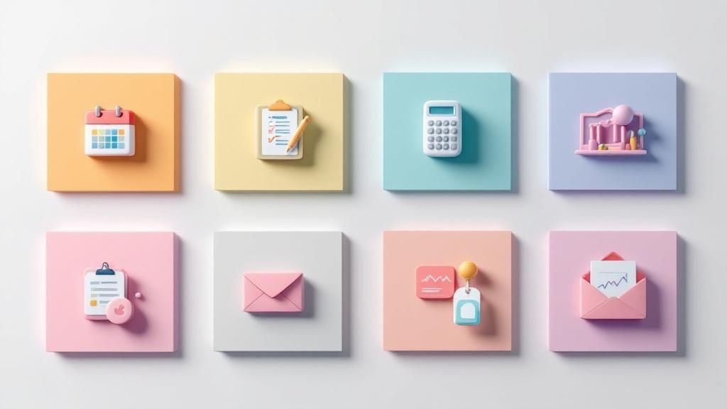
story Marketing Event Checklist: 8 Essential Steps for 2025
Planning a marketing event often feels like orchestrating a symphony with a thousand moving parts. From securing the perfect venue to ensuring post-event follow-up that converts, every detail matters. A single misstep can compromise your budget, tarnish your brand's reputation, and undermine your return on investment. The key to navigating this complexity isn't just hard work; it's a strategic, repeatable process. This article provides the ultimate marketing event checklist , breaking down the entire event lifecycle into eight manageable, critical stages. We'll move beyond generic advice to offer actionable insights, specific implementation details, and practical examples to guide your planning. To truly transform chaos into control, consider leveraging an ultimate corporate event checklist to supplement the targeted marketing strategies we outline here. This comprehensive guide is designed to serve as your blueprint for flawless execution. You will learn how to: Define clear objectives and the metrics to measure them. Develop a comprehensive budget and allocate resources effectively. Execute an integrated marketing campaign that drives registration. Leverage technology for a seamless and engaging attendee experience. Measure post-event ROI to prove value and inform future strategy. Prepare to transform your approach from reactive to proactive. This checklist will help you execute events that not only run smoothly but also deliver exceptional, measurable results for your business, turning potential chaos into controlled success. 1. Define Clear Event Objectives and Success Metrics Before booking a venue or designing an invitation, the most critical first step in any marketing event checklist is defining what success looks like. Establishing clear, measurable objectives and their corresponding key performance indicators (KPIs) provides the strategic foundation for every decision that follows. Without this clarity, your event risks becoming a costly, unfocused affair with no way to prove its return on investment (ROI). This foundational step involves pinpointing the primary purpose of your event. Is it to fill the sales pipeline, elevate your brand's public profile, launch a new product, or strengthen relationships with existing customers? Each goal demands a different strategy, budget allocation, and set of tactics. Aligning Goals with Measurable KPIs Once you have your primary objectives, you must attach specific metrics to them. This transforms vague ambitions into actionable targets. Quantitative Metrics: These are the hard numbers. Think lead generation (number of qualified leads), registrations (total sign-ups), or sales pipeline influence (dollar value of opportunities created). Qualitative Metrics: These measure sentiment and perception. This includes brand sentiment analysis from social media mentions, post-event survey feedback on attendee satisfaction, or the quality of media coverage. A best practice, championed by event marketing leaders like Julius Solaris and platforms like Marketo, is to limit your focus to 3-5 primary objectives. This ensures your team remains aligned and avoids spreading resources too thin. For instance, Salesforce’s Dreamforce notoriously sets massive targets, such as attracting 40,000 in-person attendees and generating over $100 million in sales pipeline. Similarly, HubSpot’s INBOUND event measures success by tracking tens of thousands of leads generated and session attendance figures. This bar chart visualizes the most common primary objectives for modern marketing events, showcasing where businesses typically focus their efforts. The data clearly indicates that lead generation remains the top priority for nearly half of all marketing events, underscoring the importance of events in driving direct business growth. Key Insight: Your event objectives are not just a planning tool; they are the ultimate benchmark for your event's success. They justify the budget, guide your content strategy, and provide the data you need to prove value to stakeholders. Define them first, and let them steer your entire marketing event checklist. 2. Develop Comprehensive Budget Planning and Resource Allocation With clear objectives in place, the next crucial item on your marketing event checklist is creating a detailed financial framework. A comprehensive budget is the operational blueprint that translates your strategic goals into a viable plan, ensuring every dollar is allocated effectively to maximize return on investment (ROI). It moves beyond a simple list of expenses to become a dynamic tool for decision-making, risk management, and performance tracking. This step involves meticulously itemizing every potential cost, from major expenditures like the venue and audiovisual production to smaller details like name badges and credit card processing fees. A well-constructed budget prevents scope creep and protects you from unforeseen costs that can derail an otherwise successful event. Aligning Budget Categories with Event Type The allocation of your budget will vary significantly based on the event's format. Understanding these common distributions helps you create a realistic starting point. Corporate Conferences: These events often see a large portion of the budget go toward the physical space and attendee experience. A typical breakdown is 30-40% for the venue and food & beverage (F&B), 15% for marketing, and 15% for technology and A/V. Trade Show Exhibitions: For trade shows, the priority is presence and lead capture. Booth construction and design can command up to 40% of the budget, with significant funds also allocated to sponsorships and on-site staff. Virtual Events: With no physical venue, the budget shifts dramatically toward digital infrastructure. Expect to allocate as much as 50% to the virtual event platform, production quality, and digital marketing efforts to drive attendance. To ensure financial control, event management software like Cvent or Bizzabo offers robust budgeting tools that allow for real-time expense tracking against your plan. A smart tactic is to get at least three quotes for any high-cost vendor to ensure competitive pricing. Remember to proactively track expenses weekly during the planning phase to catch overages before they become critical issues. Finally, always account for hidden costs like taxes, service fees, insurance, and potential staff overtime. Key Insight: Your budget is more than a spreadsheet; it's a strategic resource allocation plan. Building a 15-20% contingency fund is not a sign of poor planning but a mark of experienced foresight. This buffer protects your event from unexpected challenges, allowing you to adapt without compromising your core objectives. 3. Strategic Venue Selection and Logistics Coordination After defining your objectives, the next critical task in your marketing event checklist is securing a venue that not only accommodates your audience but also enhances your brand and message. Your choice of location is far more than just four walls and a roof; it's a core component of the attendee experience. The right venue aligns with your event's goals, brand identity, and budget, while poor selection can lead to logistical nightmares and a tarnished brand perception. This crucial step involves a deep analysis of potential locations based on capacity, accessibility for your target audience, technological infrastructure, and overall atmosphere. The venue sets the stage for everything from networking opportunities to content delivery, directly impacting attendee satisfaction and engagement. Aligning Venue with Event Strategy The venue must be a strategic asset, not just a physical space. Consider how iconic events leverage their locations: Google I/O uses the Shoreline Amphitheatre to create a relaxed, campus-like, outdoor tech festival atmosphere. In contrast, TED Talks selects the architecturally stunning Vancouver Convention Centre for its waterfront views and prestigious feel, reinforcing the high-value nature of its content. Practical Logistics: Beyond aesthetics, focus on the practical details. Confirm the venue’s load-in and load-out procedures, union labor requirements, and available storage space. Ensure adequate parking or easy access to public transportation. Technical Capabilities: Verify that the venue's Wi-Fi can handle hundreds or thousands of simultaneous connections. Check their in-house A/V equipment, power supply, and lighting capabilities to see if they meet your production needs. Contingency Planning: For outdoor or hybrid events, a solid backup plan is non-negotiable. Secure an indoor alternative for inclement weather and confirm the venue’s emergency procedures. When coordinating these logistics, don't overlook essential facilities. For guidance on choosing the right event toilets, you can find detailed resources to ensure attendee comfort. A site visit is indispensable. Attempt to visit the venue during an event similar in scale to your own to observe crowd flow, sound bleed between rooms, and overall operational efficiency. This is also the time to assess branding opportunities, like where you can place impactful signage. Creating high-quality, custom event banners can transform a generic space into a branded environment. Key Insight: The venue is an extension of your brand and a critical driver of the attendee experience. Selecting a location that is merely "big enough" is a missed opportunity. Choose a venue that amplifies your message, simplifies logistics, and creates a memorable atmosphere that aligns with your event objectives. 4. Integrated Marketing Campaign and Promotional Strategy Once your objectives are set and your budget is approved, the next crucial item on your marketing event checklist is crafting a promotional strategy to fill the room. A great event is useless if no one knows about it. Developing an integrated, multi-channel marketing campaign is how you build anticipation, drive registrations, and create a powerful buzz that extends far beyond the event day itself. This approach involves weaving together various marketing channels into a single, cohesive narrative. Rather than operating in silos, your email, social media, content, and paid advertising efforts should all reinforce the same core message and drive audiences toward the same goal: registration. This holistic strategy ensures maximum reach and impact for your promotional spend. Building a Multi-Channel Promotional Engine A successful campaign requires a strategic mix of tactics deployed over a carefully planned timeline. The goal is to engage potential attendees at multiple touchpoints, guiding them from initial awareness to final conversion. Content & Email Marketing: Develop valuable content like blog posts, speaker interviews, and behind-the-scenes previews. Use a dedicated email nurture sequence to share this content, announce speakers, and promote ticket sales. This is your primary channel for communicating directly with interested prospects. Social Media & Influencer Outreach: Create a unique event hashtag and build a social media calendar with engaging content. Partner with industry influencers and empower your speakers with pre-made promotional kits to amplify your message to their networks. Paid Advertising & PR: Use targeted ads on platforms like LinkedIn and Meta to reach specific professional demographics. Simultaneously, leverage public relations to secure media coverage, issue press releases for major announcements, and position your event as a must-attend industry gathering. World-renowned events master this integrated approach. Web Summit’s year-round content strategy helps them attract over 70,000 attendees, while South by Southwest’s iconic #SXSW hashtag consistently generates millions of social impressions, creating a global conversation. Similarly, Cannes Lions leverages celebrity speakers and high-profile attendees to secure widespread, international media coverage that reinforces its prestigious status. Even tangible elements, like beautifully designed physical invitations, can be a powerful part of this mix, adding a premium touch to your campaign. You can explore high-quality invitation printing options on 4over4.com to complement your digital efforts. Key Insight: Your promotional campaign shouldn't be an afterthought; it is the engine that drives event attendance. Start your promotion 8-12 weeks out, using early-bird pricing to create urgency and build momentum. A unified, multi-channel strategy is the most effective way to cut through the noise and ensure your event achieves its registration targets. 5. Technology Infrastructure and Digital Experience Planning In today’s digitally-driven world, the technical foundation of your event is as critical as the physical venue. Planning your technology infrastructure and digital experience ensures seamless execution for everyone involved, from registration to post-event engagement. This step on the marketing event checklist involves implementing the systems for registration, mobile apps, live streaming, audience interaction, and robust data collection. This technical backbone dictates the quality of the attendee experience, whether they are in-person or joining remotely. A glitchy registration process, poor WiFi, or a failed livestream can quickly undermine your event’s credibility and overshadow even the best content. As digital experiences become central to modern events, detailed virtual event planning is an indispensable part of your technology strategy. Integrating Key Technology Components A successful technology stack is not just a collection of tools; it is an integrated ecosystem designed to support your event objectives. Each component should work in harmony to create a frictionless experience. Registration and Ticketing: This is often the first touchpoint. Platforms like Eventbrite, which powers millions of events, must provide a simple, secure, and mobile-friendly sign-up process. The system should also integrate with your CRM to capture lead data effectively. Mobile Event App: A dedicated app serves as the central hub for attendees. It can host agendas, speaker bios, venue maps, networking features, and push notifications. Cisco Live, for example, uses a custom app with advanced networking and scheduling features to enhance attendee engagement. Live Streaming and Hybrid Capabilities: For events with a virtual component, the streaming platform is paramount. Microsoft's Build conference leverages the power of Azure to stream flawlessly to a global audience of over 200,000 viewers, demonstrating the scalability required for major events. Audience Engagement Tools: Incorporate tools like live polls, Q&A platforms (e.g., Slido), and gamification to keep your audience actively involved. Integrating social media feeds into event displays can also amplify real-time conversations and brand visibility. A comprehensive tech plan also accounts for on-site needs like reliable high-speed WiFi, sufficient power stations, and scannable badges that can be paired with high-quality promotional products for a memorable check-in experience. Key Insight: Technology is no longer just a support function; it is a core pillar of the event experience itself. A proactive and well-tested technology plan prevents on-site disasters, enhances engagement, and provides invaluable data that proves the event's impact on your marketing goals. 6. Speaker and Content Curation Strategy The content and speakers are the heart of your event experience, directly influencing attendee satisfaction and the perceived value of your marketing event. A robust speaker and content curation strategy involves more than just filling time slots; it’s about thoughtfully identifying, recruiting, and managing experts who align with your event objectives and audience interests. This curated approach ensures your programming is compelling, educational, and ultimately, drives the action you want attendees to take. This strategic step is where you transform your event’s theme into tangible, valuable takeaways for your audience. The quality of your speakers acts as a powerful draw during promotion and is a primary factor in post-event feedback. A well-executed content plan guarantees a diverse, engaging program that delivers on the promises made in your marketing campaigns. Crafting a High-Impact Agenda To build an agenda that resonates, you must connect speaker selection directly to your event's core purpose and audience needs. This prevents a disjointed program and ensures every session contributes to the overall event goals. Recruitment Timeline: Begin sourcing and recruiting speakers at least 4-6 months in advance. High-profile speakers have packed schedules, and this lead time is crucial for securing top talent. Clear Guidelines: Provide all speakers with clear presentation guidelines, deadlines, and branded templates. This ensures consistency in quality and appearance across all sessions. To keep these materials organized and professional, consider using high-quality full-color presentation folders for each speaker's welcome packet. Rehearsals and Support: Don't leave mainstage presentations to chance. Conduct mandatory technical checks and rehearsals for all keynote and high-stakes sessions to iron out any issues. Additionally, creating a dedicated speaker "green room" or hospitality area provides a space for them to relax, prepare, and feel valued. World-class events exemplify this. TED Talks famously curates speakers who can deliver powerful "ideas worth spreading" in a specific, rehearsed format. Likewise, Salesforce’s Dreamforce successfully manages over 2,700 sessions by featuring a mix of visionary leaders, industry experts, and hands-on technical trainers, catering to its diverse audience segments. Key Insight: Your speakers are your most influential content creators. Investing time in curating the right voices and supporting them properly doesn't just create a better event; it builds a platform of authority and trust that reflects directly onto your brand. This element of your marketing event checklist is non-negotiable for delivering true value. 7. Registration Management and Attendee Experience Design Once your event's goals and content are defined, your focus must shift to the attendee journey. A seamless registration process and a thoughtfully designed experience are crucial elements in a marketing event checklist; they transform a logistical necessity into a positive first impression that sets the tone for the entire event. This stage involves much more than just selling tickets; it's about crafting a smooth, intuitive, and engaging path for attendees from their first point of contact to their post-event interactions. Effective registration management ensures data is captured accurately for your marketing and sales teams, while a well-designed experience guarantees attendees feel valued and can easily navigate the event. Neglecting this can lead to frustration, long queues, and a poor perception of your brand before the first speaker even takes the stage. Crafting a Seamless Attendee Journey The goal is to eliminate friction at every touchpoint. Your registration platform, communication strategy, and on-site execution must work in harmony to create a cohesive and positive experience. Streamlined Registration: Utilize platforms that offer user-friendly interfaces, mobile optimization, and secure payment processing. The fewer steps required to register, the higher your conversion rate will be. Personalized Communication: Go beyond generic confirmation emails. Send targeted pre-event information, such as personalized schedules, speaker highlights relevant to an attendee's role, and networking suggestions to build anticipation. On-Site Efficiency: Implement modern solutions like mobile check-in with QR codes or RFID badges to drastically reduce wait times. This technology also facilitates seamless lead capture and session tracking for sponsors and your team. For instance, the massive Consumer Electronics Show (CES) uses RFID-enabled badges that allow for effortless networking and lead retrieval, letting exhibitors scan attendees' badges to instantly collect contact information. Similarly, SXSW manages its sprawling festival by providing a robust mobile app that empowers its 400,000+ participants to build personalized schedules, navigate venues, and connect with peers, turning a potentially chaotic experience into a manageable one. This comprehensive approach to the attendee journey is a hallmark of a well-executed event, directly impacting satisfaction and the likelihood of achieving your core objectives. For physical touchpoints, consider how custom-printed materials can enhance this journey; you can learn more about high-quality event ticket printing to create a professional and memorable first impression. Key Insight: The attendee experience begins the moment someone decides to register, not when they walk through the door. Investing in a frictionless registration process and a thoughtful, personalized communication plan is a direct investment in attendee satisfaction, engagement, and the overall success of your marketing event. 8. Post-Event Analysis and ROI Measurement Once the final attendee has left and the venue is cleared, the work on your marketing event checklist is far from over. The crucial final phase involves a rigorous post-event analysis to measure performance against the objectives you set in step one. This is where you calculate the event's true return on investment (ROI), justify the budget spent, and gather the critical data needed to improve future events. This process involves collecting and synthesizing all available data points, from attendee feedback to sales figures. It transforms raw numbers into a narrative of success or identifies areas for improvement. Without this systematic evaluation, your event remains an isolated expense rather than a strategic investment that informs your broader marketing strategy. Connecting Actions to Outcomes The core of post-event analysis is attributing tangible business results to your event-specific activities. This requires a structured approach to data collection and a clear understanding of what metrics matter most to your stakeholders. Quantitative Analysis: This is the measurement of hard data. Key metrics include the number of qualified leads passed to sales (MQLs), the cost per lead, sales pipeline influence (total value of opportunities generated), and ultimately, the revenue directly attributed to the event. Qualitative Analysis: This captures attendee sentiment and brand impact. This includes analyzing post-event survey responses for satisfaction scores, monitoring social media for brand mentions and sentiment shifts, and reviewing press coverage for tone and reach. Leading B2B events are masters of this process. For example, HubSpot’s INBOUND event meticulously tracks its influence on over $100 million in attributed revenue, while Adobe Summit can point to a 40% increase in product trial sign-ups post-event. Salesforce’s Dreamforce consistently reports high attendee satisfaction rates, often exceeding 85%, which they use to validate the event’s value to their community and justify its scale. To effectively implement this, you must: Survey attendees within 48 hours: Send out feedback surveys while the experience is still fresh in their minds to maximize response rates and the quality of insights. Track leads through the full funnel: Use your CRM to tag event-generated leads and monitor their entire journey from MQL to closed-won deal. This is the only way to accurately calculate ROI. Compare against benchmarks: Evaluate your performance not only against your initial goals but also against industry benchmarks for similar events. Create detailed stakeholder reports: Compile your findings into a comprehensive post-event report that clearly visualizes KPIs, summarizes key takeaways, and provides actionable recommendations for the next event cycle. Key Insight: The post-event analysis is not just a report card; it's a strategic blueprint for the future. It proves the value of your event marketing efforts to leadership and provides the data-driven insights necessary to make your next event even more successful. 8-Point Marketing Event Checklist Comparison Item Implementation Complexity 🔄 Resource Requirements ⚡ Expected Outcomes 📊 Ideal Use Cases 💡 Key Advantages ⭐ Define Clear Event Objectives and Success Metrics Moderate: Requires upfront research and planning Moderate: Alignment meetings, data gathering Clear direction, measurable success, aligned teams Events needing focused goals (lead gen, brand awareness) Provides direction, facilitates analysis, aligns team Develop Comprehensive Budget Planning and Resource Allocation High: Time-intensive setup and monitoring High: Detailed financial tracking and updates Cost control, financial accountability, ROI insights Budget-sensitive events with multiple expenses Prevents overruns, aids vendor negotiation, accountability Strategic Venue Selection and Logistics Coordination Moderate: Requires venue visits, assessments Moderate: Site visits, contract negotiation Smooth logistics, attendee comfort, brand impact Events dependent on location, capacity, and accessibility Enhances attendee experience, cost predictability Integrated Marketing Campaign and Promotional Strategy High: Multi-channel campaign coordination High: Content creation, ad spend, PR efforts Increased attendance, brand buzz, measurable ROI Events targeting broad audience awareness and engagement Maximizes reach, builds engagement, drives attendance Technology Infrastructure and Digital Experience Planning High: Setup of software, hardware, and integrations High: Technical staff, software licenses Enhanced engagement, hybrid access, data insights Hybrid/virtual or tech-heavy events Improves engagement, enables hybrid participation Speaker and Content Curation Strategy Moderate: Speaker recruitment and content management Moderate: Speaker fees, coordination effort Attracts audience, elevates credibility, creates value Knowledge-sharing events, conferences, seminars Boosts attendance, strengthens credibility, creates networking Registration Management and Attendee Experience Design Moderate to High: Complex systems and personalization High: Tech setup, staffing, customer service Elevated satisfaction, data collection, personalized touch Large-scale or high-expectation events Increases satisfaction, provides data, supports upselling Post-Event Analysis and ROI Measurement Moderate to High: Data tracking and analysis tools Moderate: Survey tools, analytics software Clear ROI, improvement insights, data-driven decisions All events needing performance evaluation Demonstrates ROI, identifies improvements, supports budgets Turning Your Checklist into a Competitive Advantage We have journeyed through the intricate, multi-faceted world of event marketing, deconstructing what often feels like a chaotic process into a manageable, strategic framework. This comprehensive marketing event checklist is more than a simple to-do list; it is a dynamic blueprint designed to empower you and your team. By meticulously navigating the eight core pillars we've discussed, from defining clear objectives to conducting rigorous post-event analysis, you transform event planning from a reactive scramble into a proactive, strategic function of your business. The true value of this guide lies not in just checking off boxes, but in understanding the interconnectedness of each element. Your budget allocation directly impacts your venue choice and technology stack. Your speaker curation influences your promotional messaging. Your post-event ROI measurement should circle back to inform the objectives of your next gathering. It’s a continuous, cyclical process of planning, executing, learning, and refining. From Checklist to Strategic Engine Think of this checklist as the operating system for your event strategy. It’s designed to be customized, not just copied. The specific metrics, technologies, and promotional tactics will vary based on your industry, audience, and goals. The real magic happens when you adapt this framework to your unique circumstances and start building institutional knowledge. Document Everything: After each event, don't just analyze the ROI. Go back to your checklist and add notes. What worked perfectly? What was a near-disaster? Which vendor over-delivered? Which software had a hidden limitation? Build a Playbook: Over time, your annotated checklists become a powerful internal playbook. New team members can onboard faster, and you can scale your event efforts without reinventing the wheel. This institutional memory is a significant competitive advantage. Foster a Culture of Iteration: Encourage your team to see each event as an experiment. Perhaps you test a new registration platform, a different social media ad strategy, or a novel networking format. The checklist provides the stable foundation upon which you can safely innovate. Key Insight: A world-class event isn't the result of one person's heroic effort. It's the product of a well-oiled system, clear communication, and a commitment to continuous improvement. Your marketing event checklist is the central cog in that system. The Human Element: Beyond the Tasks While we've focused on the tactical elements, never lose sight of the ultimate goal: creating a memorable human experience. Every item on this checklist, from securing high-quality printed materials like programs and banners to designing a seamless registration flow, ultimately serves the attendee. A smooth, engaging, and valuable experience is what turns a first-time attendee into a loyal customer and a vocal brand advocate. Your event is a physical manifestation of your brand. The attention to detail, the quality of the content, the helpfulness of your staff, and the caliber of your printed collateral all send powerful signals about who you are as a company. This is your chance to build trust, foster community, and create relationships that digital marketing alone cannot replicate. By embracing this detailed marketing event checklist , you are not just organizing an event; you are architecting an experience. You are building a powerful engine for lead generation, brand amplification, and lasting customer relationships. You now possess the framework to move forward with clarity and confidence, transforming one of the most demanding marketing disciplines into one of your most strategic and rewarding assets. Ready to bring your event vision to life with professional, high-quality printed materials? From stunning vinyl banners and informative brochures to custom name badges and branded swag, 4OVER4 has everything you need to make a lasting impression. Visit 4OVER4 to explore a vast selection of customizable products that will elevate your attendee experience and reinforce your brand at every touchpoint.
 story
story 10 Standout Marketing Event Ideas for 2025
In a crowded market, a simple booth and a brochure won't cut it. To capture attention and build lasting brand loyalty, you need to create experiences, not just events. The challenge is moving from generic gatherings to memorable, buzz-worthy moments that resonate with your audience. This requires more than just a good idea; it demands a strategic approach that integrates creative concepts with high-impact physical marketing materials. This article cuts through the noise, offering 10 innovative and actionable marketing event ideas designed to help your business stand out. We will explore each concept in detail, from strategy and budget considerations to specific execution steps. You will learn how to plan everything from immersive pop-up experience centers to interactive virtual reality showcases and gamified competitions. More importantly, we will pair each idea with tangible, high-quality printing solutions from 4OVER4 to ensure your physical brand assets are as impressive as your event concept. Get ready to transform your approach, connect with customers on a deeper level, and plan events that generate real, measurable results. Let’s dive into the concepts that will set your brand apart. 1. Pop-Up Experience Centers Pop-up experience centers are temporary, immersive brand activations set up in high-traffic areas. This marketing event idea moves beyond simple retail, creating a fully interactive environment where customers can engage with your brand's story and products in a tangible, memorable way. These are not just stores; they are destinations designed for discovery, interaction, and, most importantly, social sharing. Brands like Glossier and Nike have mastered this by creating "Instagrammable" playgrounds that generate massive organic buzz. The goal is to create a FOMO (fear of missing out) effect, driving foot traffic and online conversation simultaneously. For a small business, this could mean transforming a small rented space into a themed world that reflects your brand’s ethos for a weekend. Implementation Strategy Location is Key: Choose a location with high foot traffic that aligns with your target demographic. Think busy downtown districts, popular markets, or even inside a complementary, non-competing business. Design for Social Media: Every corner, from the entrance to the product displays, should be designed as a photo opportunity. Use vibrant colors, unique props, and clear branding. Incorporate Interactive Elements: Don't just show your products; let people experience them. This could be a DIY station, a product testing bar, or a digital game. Drive Urgency: The temporary nature of a pop-up is its biggest strength. Emphasize the limited-time availability in all your promotions to encourage immediate visits. High-quality, durable signage is essential for guiding guests and reinforcing your brand message. For more information on creating impactful visuals for your space, explore custom vinyl banners from 4OVER4.com . 2. Virtual Reality Product Showcases Virtual reality product showcases transport customers into immersive, simulated environments where they can interact with products and services. This high-tech marketing event idea goes beyond a typical demo, allowing for deep product education and building an emotional connection to your brand. It’s an unforgettable way to demonstrate complex products or experiences that are difficult to showcase physically, like a new car model or a hotel destination. Pioneers like Audi, with its VR car customization, and IKEA, with its virtual kitchen design tool, prove the power of this technology. They create buzzworthy, memorable interactions that give customers a true sense of a product's value. For a smaller business, this could mean setting up a VR station at a trade show to let users "walk through" a real estate listing or "use" a new piece of software in a controlled, virtual setting. Implementation Strategy Design Intuitive Experiences: Keep the VR interface simple and easy to navigate, especially for first-time users. The goal is exploration, not frustration. Keep it Brief and Engaging: To prevent VR fatigue, experiences should ideally last under 10 minutes. Focus on delivering a powerful, concise brand message. Provide On-Site Guidance: Have trained staff available to assist users, explain the controls, and ensure a smooth, comfortable experience. Prioritize Hygiene: Regularly sanitize all VR headsets and controllers between users to maintain a clean and professional environment. To complement your high-tech showcase, use clear, professional signage to guide attendees and explain the experience. Custom foam board posters from 4OVER4.com are a lightweight and rigid option perfect for displaying instructions or branding at your VR station. 3. Influencer Collaboration Events Influencer collaboration events leverage the trust and reach of social media personalities to create authentic and engaging brand experiences. This marketing event idea involves partnering with influencers whose audience mirrors your target demographic, turning them into co-hosts or featured guests. Instead of just a paid post, you create a live event that their followers are genuinely excited to attend, generating powerful, firsthand testimonials and a wave of user-generated content. Brands like Gymshark and Sephora excel at this by hosting everything from exclusive training sessions to beauty masterclasses. The event itself becomes desirable content, amplifying your brand message through a credible, trusted voice. A small business could co-host a workshop with a local micro-influencer, creating an intimate, high-value experience that fosters genuine community connection and boosts brand loyalty. Implementation Strategy Select the Right Partners: Choose influencers whose personal brand, values, and audience demographics align seamlessly with your own. Authenticity is non-negotiable for credibility. Grant Creative Freedom: While clear goals are essential, allow influencers the creative freedom to design an experience that feels natural to their style and resonates with their followers. Build Relationships, Not Transactions: Aim for long-term partnerships rather than one-off events. This builds deeper brand advocacy and provides more consistent results over time. Define Clear Incentives: When planning influencer collaborations, understanding how to incentivize participation and track performance is crucial. In this regard, you might want to explore the potential of affiliate programs to structure a mutually beneficial partnership. Make your event feel exclusive and professional with high-quality, personalized materials. For more information on creating a premium feel for attendees, see how custom presentation folders from 4OVER4.com can organize your press kits and welcome packets. 4. Interactive Product Launch Parties An interactive product launch party transforms a standard announcement into an immersive brand experience. This marketing event idea is designed to generate significant buzz by combining entertainment, education, and hands-on product interaction. Instead of simply telling people about a new product, you invite them to see, touch, and use it in a festive, memorable setting, fostering a powerful connection from day one. Tech giants like Apple and Tesla have popularized this model with their highly anticipated unveiling events, but the concept is adaptable for any scale. The goal is to create an exclusive atmosphere that makes attendees feel like insiders, encouraging them to share their experience and become early brand advocates. This strategy builds community, garners media attention, and provides invaluable, immediate customer feedback. Implementation Strategy Create Interaction Stations: Design multiple hands-on demo areas to prevent bottlenecks and allow guests to explore the product at their own pace. Each station can highlight a different feature or benefit. Invite Key Influencers: Extend special invitations to media, industry bloggers, and influencers whose audience aligns with your brand. Their presence can amplify your reach exponentially. Offer Exclusive Perks: Provide attendees with a unique discount, a gift with purchase, or the first opportunity to buy. This rewards their attendance and drives initial sales. Live Stream the Event: Broadcast the launch on social media platforms to engage a wider audience who couldn't attend in person, maximizing your event's impact. Setting the right tone begins with a compelling first impression. To ensure your guests feel the exclusivity of the event from the moment they are invited, consider professionally designed custom invitations from 4OVER4.com . 5. Gamified Marketing Competitions Gamified marketing competitions transform customer engagement into an exciting challenge. This marketing event idea uses game mechanics like points, leaderboards, and rewards to motivate participation and build brand loyalty. Instead of passive consumption, customers actively compete, creating a deeper, more memorable connection with your brand and its products. Iconic examples like McDonald's Monopoly or Nike Run Club's distance challenges demonstrate how effective this can be. These events tap into our innate desire for competition and achievement, driving sustained interaction and word-of-mouth marketing. For a small business, this could be a social media photo contest or an in-store scavenger hunt that encourages product discovery. Implementation Strategy Keep it Simple: The rules and objectives must be easy to understand. Complexity is a major barrier to entry, so ensure participants can grasp how to play and win almost instantly. Offer Tiered Rewards: Don’t just have one grand prize. Offer multiple prize tiers to motivate a wider range of participants, rewarding not just the winner but also those who show significant effort or engagement. Amplify with Social Media: Use social media to launch the competition, share leaderboard updates, and showcase user-generated content. A unique hashtag is essential for tracking entries and amplifying reach. Build Community with Teams: Introduce team-based challenges to foster a sense of community. This encourages collaboration and expands your reach as team members recruit their friends to join. A well-branded registration or prize table is crucial for managing your competition. To create a professional and inviting setup, explore custom table covers from 4OVER4.com . 6. Educational Workshop Series An educational workshop series is a powerful marketing event idea that shifts the focus from direct selling to providing genuine value. These structured learning events empower your target audience with useful knowledge and practical skills, positioning your brand as a trusted expert in your field. By teaching customers something valuable, you build lasting relationships and credibility that translate directly into loyalty and sales. Brands like Williams Sonoma with their cooking classes or Home Depot with their DIY project workshops have proven this model's success. The goal is to solve a real problem for your audience, creating a positive association with your brand that feels authentic, not promotional. You're not just selling a product; you're enabling your customers' success. Implementation Strategy Solve a Real Problem: Center your workshop around a common challenge your customers face. For instance, a home goods store could host a workshop on small-space organization. Keep It Personal: Limit class sizes to ensure attendees receive personalized attention and can ask questions. This intimate setting fosters a stronger sense of community and connection. Provide Tangible Takeaways: Equip participants with resources they can use after the event, such as checklists, guides, or product samples. Consider offering specialized skill-building sessions, such as hands-on UK coffee workshops that deepen customer engagement with your products. Gather Feedback: Follow up with attendees via email to thank them, share additional resources, and request feedback to help you refine future marketing event ideas. This quick reference summarizes the core components of a successful educational workshop. Keeping class sizes intimate while focusing on hands-on learning is key to building authority and generating highly qualified leads. To support your workshops, professionally printed workbooks and handouts are essential. Explore a wide range of marketing materials from 4OVER4.com to create a polished and valuable experience for your attendees. 7. Charity Partnership Campaigns Charity partnership campaigns are powerful marketing event ideas that align your brand with a non-profit organization to achieve a shared goal. This strategy moves beyond transactional marketing, building a deep, emotional connection with consumers by demonstrating genuine corporate social responsibility. By championing a cause, you not only contribute to positive social change but also enhance your brand's reputation and foster community trust. Brands like TOMS Shoes, with its "One for One" model, and Patagonia, with its environmental activism, have set the standard. They show that purpose-driven marketing resonates deeply with modern consumers. A small business can adopt this by partnering with a local shelter, a community garden, or a regional environmental group to create a campaign that makes a tangible local impact. Implementation Strategy Choose an Authentic Cause: Select a charity or cause that genuinely reflects your brand’s core values and mission. Authenticity is crucial for consumer buy-in and avoiding accusations of "cause-washing." Commit to a Long-Term Vision: A one-off event is good, but a long-term partnership demonstrates a real commitment. Plan a series of events or an ongoing campaign to build momentum and show sustained support. Ensure Full Transparency: Be crystal clear about the partnership's terms. Clearly state how much is being donated, what the funds will be used for, and the expected impact. This builds credibility and trust. Engage Your Whole Team: Involve your employees in the campaign, whether through volunteering at an event or participating in fundraising activities. This boosts internal morale and creates passionate brand ambassadors. To promote a local charity drive or fundraising event, you can spread awareness directly within the community. For more information on effective, hyper-local marketing tools, check out custom door hangers from 4OVER4.com . 8. Experiential Food and Beverage Events Experiential food and beverage events leverage the power of taste and smell to create powerful, multi-sensory brand connections. This marketing event idea goes beyond simple sampling by immersing attendees in a culinary journey. Whether it's a themed tasting, a hands-on cooking class, or an exclusive dining experience, these events foster community and leave a lasting, positive brand association that engages guests on a primal level. Brands like Blue Apron and Jack Daniel's excel at this by creating authentic experiences that educate and delight. Blue Apron’s cooking classes teach valuable skills using their meal kits, while Jack Daniel's tasting events build brand affinity by exploring the nuances of their craft. The goal is to make your brand synonymous with a delightful culinary memory, encouraging word-of-mouth marketing and social sharing. Implementation Strategy Partner with Experts: Collaborate with local chefs, mixologists, or popular restaurants to add credibility and draw a larger audience. Their expertise will elevate the experience for your guests. Create Instagram-Worthy Presentations: Presentation is everything. Design food and drink displays that are visually stunning and encourage attendees to take and share photos online. Consider All Guests: Be mindful of dietary restrictions and preferences. Offer a variety of options and clearly label all ingredients and potential allergens to ensure a safe and inclusive environment. Provide Tangible Takeaways: Give guests something to remember the experience by, such as branded recipe cards, custom coasters, or a small sample of a featured ingredient. Clear, professional menus are crucial for showcasing your offerings and accommodating guest needs. To present your culinary creations elegantly, consider using high-quality custom menus from 4OVER4.com . 9. Interactive Technology Demonstrations Interactive technology demonstrations are hands-on events that allow potential customers to experience your software, digital product, or high-tech hardware firsthand. This marketing event idea is designed to educate, build confidence, and overcome purchase hesitation by proving your product's value in a tangible way. Instead of just telling people what your tech can do, you show them, letting them feel the "aha" moment for themselves. Tech giants like Apple and Tesla have built their empires on this principle. Their stores and test-drive events are not just sales floors; they are experience zones where users can play, explore, and see how the technology integrates into their lives. For a software company, this could mean hosting a hands-on workshop, while a hardware brand might set up demo stations at a trade show or a partner's retail location. Implementation Strategy Create Guided Scenarios: Don't just hand over the device or software. Design specific tasks or "missions" for users to complete, guiding them through key features and benefits. Train Expert Staff: Your demonstrators must be more than salespeople; they need to be patient educators who can assist users of all skill levels, from novices to experts. Prepare for Glitches: Technology can be unpredictable. Have backup equipment, alternative demo paths, and troubleshooting guides ready to handle any technical issues smoothly. Offer an Attendee-Exclusive Incentive: Encourage action by providing a special offer, like a discount, an extended free trial, or bonus features, exclusively for those who attend the demonstration. Clear instructions and feature highlights are crucial. Use professionally printed rack cards from 4OVER4.com at each station to provide quick-reference guides, tips, and key talking points for attendees to follow. 10. Community Festival Sponsorships Community festival sponsorships are strategic brand partnerships with local festivals, fairs, and community events. This marketing event idea allows you to reach a concentrated target audience in a relaxed, celebratory environment. By sponsoring an event, you build local brand awareness, support community initiatives, and create powerful positive associations that traditional advertising can't match. Brands like Red Bull and Coca-Cola are famous for their large-scale music festival partnerships, but this strategy is highly effective for smaller businesses too. A local bank sponsoring a farmers market or a fitness studio sponsoring a community 5K run both achieve the same goal: embedding their brand into the fabric of the community. The aim is to become a valued participant, not just an advertiser. Implementation Strategy Choose Relevant Events: Select festivals that align perfectly with your target demographic and brand values. A health food brand at a wellness fair is a natural fit; a luxury tech company might be less so. Create an Interactive Booth: Don't just set up a table with flyers. Design an engaging experience. This could be a fun game with branded prizes, a product demo station, or a comfortable lounge area. Offer Exclusive Promotions: Drive immediate action by providing festival-only discounts, special bundles, or a unique gift with purchase. This makes visiting your booth feel valuable and urgent. Train Your Team: Ensure your on-site staff are engaging, knowledgeable, and genuinely enthusiastic. Their role is to have natural conversations and build relationships, not just to make sales pitches. To stand out in a busy festival environment, your booth needs professional, eye-catching visuals. Consider using durable and vibrant custom tablecloths from 4OVER4.com to create a polished and branded focal point for your space. Top 10 Marketing Event Ideas Comparison Marketing Strategy Implementation Complexity 🔄 Resource Requirements ⚡ Expected Outcomes 📊 Ideal Use Cases 💡 Key Advantages ⭐ Pop-Up Experience Centers High setup, logistics, permits High budget, prime real estate Memorable brand moments, social media buzz Brands testing new markets, high-foot traffic High engagement, creates urgency and FOMO Virtual Reality Product Showcases High tech investment and support staff VR headsets, computers, technical staff Immersive demos, detailed analytics Tech-focused products, multi-location scalability Weather/location independent, memorable experience Influencer Collaboration Events Medium complexity, managing partnerships Budget varies by influencer tier Authentic reach, measurable ROI Product launches, brand awareness amplification Access to engaged audiences, cost-effective marketing Interactive Product Launch Parties Medium-high planning, logistics Venue, catering, media, event staff Buzz generation, media coverage New product launches, community building Immediate sales impact, direct customer feedback Gamified Marketing Competitions Ongoing management and monitoring Rewards, platform setup, monitoring staff High engagement, viral social sharing Customer engagement, brand awareness Encourages repeat interaction, broad participation Educational Workshop Series Time-intensive content development Skilled presenters, venue, materials Builds authority, qualified leads Thought leadership, trust-building Genuine value, word-of-mouth referrals Charity Partnership Campaigns Complex partnership management Long-term commitment, coordination Positive brand image, social impact CSR initiatives, socially conscious consumers Builds emotional connections, employee engagement Experiential Food and Beverage Events High cost, safety and allergy protocols Quality ingredients, professional chefs Strong sensory brand memories Culinary-focused brands, social and shareable events Multi-sensory engagement, longer interaction times Interactive Technology Demonstrations Requires technical expertise and staff Equipment, tech support, training staff Reduces purchase anxiety, builds credibility Tech products, educating potential customers Hands-on trial, immediate feedback Community Festival Sponsorships Medium complexity, staff resource-heavy Sponsorship fees, booth setup, staff Local brand awareness, community relations Local markets, community engagement Cost-effective local penetration, authentic presence From Idea to Impact: Bringing Your Next Event to Life Choosing the right marketing event idea is the first crucial step, but the journey from a concept on a whiteboard to a memorable, high-impact experience is where true success is forged. Throughout this guide, we've explored a diverse range of opportunities, from immersive VR showcases and collaborative influencer meetups to community-building workshops and engaging gamified competitions. Each approach offers a unique pathway to connect with your audience on a deeper, more meaningful level. The common thread weaving through all these powerful marketing event ideas is the undeniable importance of execution and brand consistency. An event is a physical manifestation of your brand, and every detail contributes to the overall perception. Your printed materials are not just accessories; they are critical touchpoints that shape the attendee's experience from the first invitation to the last piece of take-home collateral. Key Takeaways for Flawless Event Execution To transform your chosen concept into a successful reality, focus on these core principles: Strategic Alignment: Ensure your event format directly supports your primary business goals. A product launch party has different objectives than a charity partnership, and your planning, promotion, and success metrics should reflect that. Audience-Centric Design: The most effective events are built with the attendee in mind. Consider what would delight, educate, or entertain them. An interactive tech demo resonates with a B2B audience, while a pop-up experience center might be perfect for a B2C brand launch. The Power of Tangible Branding: Do not underestimate the impact of high-quality physical assets. Professionally printed banners, custom backdrops, sleek business cards, and branded swag transform a simple gathering into a cohesive, professional brand experience. These items reinforce your message long after the event concludes. Your Actionable Next Steps Feeling inspired? It’s time to move from planning to action. Start by shortlisting two or three marketing event ideas from this list that best align with your budget, brand identity, and marketing objectives. Begin outlining the core components for each, thinking specifically about the customer journey from pre-event hype to post-event follow-up. Next, create a detailed checklist of all the physical and digital assets you will need. What will your invitations look like? What signage is required to guide attendees? What informational handouts or promotional items will they receive? For comprehensive support in bringing your marketing event ideas to fruition, exploring specialized creative studio services can be invaluable for design and strategy. Ultimately, the goal is to create more than just a momentary buzz. It's about building lasting relationships, fostering brand loyalty, and creating advocates who will champion your business. By integrating a creative event concept with thoughtful execution and premium branding, you are not just hosting an event; you are crafting an unforgettable experience that drives engagement, generates leads, and delivers a measurable return on your investment. Ready to bring your next big idea to life with stunning, professional-quality print? From vibrant banners and custom displays to elegant invitations and memorable swag, 4OVER4 has everything you need to make your event a standout success. Explore our vast range of customizable products and see how easy it is to elevate your brand experience at 4OVER4 .
 story
story Essential Marketing Material for Business Growth
Any tool a business uses to talk about its brand, products, or services is a piece of marketing material. Think of these as your brand's voice out in the wild. From the humble business card you hand someone to an in-depth online case study, every piece works together to tell your story and drive business forward. What Are Your Brand Marketing Materials? Imagine trying to build a house with only a hammer. You might get somewhere, eventually, but the process would be painfully slow and inefficient. To do the job right, you need a full toolkit—saws, drills, levels, the works. Each tool has a specific job. Your marketing materials are that toolkit. They are the collection of assets you use to build your brand, connect with customers, and ultimately, grow your sales. You wouldn't rely on a single tool for construction, and you can't build a strong market presence with just one type of collateral, either. A smart strategy uses a mix of assets, each playing its own part in attracting, engaging, and converting your audience. The Two Core Categories of Marketing Assets At its heart, all marketing material for business falls into two main buckets. Understanding how they differ—and more importantly, how they work together—is the first step toward building a powerful strategy. Printed (Tangible) Materials: These are the physical items a customer can actually hold. Think business cards, brochures, flyers, and posters. Their power is in creating a memorable, physical connection to your brand. Digital Materials: These assets live online. This includes your website, social media content, email newsletters, and blog posts. They offer incredible reach, instant access, and the ability to track results. A truly well-rounded plan integrates both. For example, a QR code on a printed flyer can whisk a customer straight to a digital landing page, creating a seamless bridge between the physical and online worlds. This unified approach keeps your message consistent and effective, no matter where someone encounters it. The most effective marketing doesn't feel like marketing at all. It feels like a helpful conversation, and your materials are the script. Each piece, whether a postcard or a pixel, should guide your customer smoothly from one point to the next. Why Every Business Needs a Diverse Toolkit Putting all your eggs in one marketing basket is a risky game. A diverse collection of assets insulates your business from sudden shifts in consumer behavior or the whims of platform algorithms. A strong print campaign can boost local foot traffic, while a compelling digital presence builds a global community. For a comprehensive look at your options, exploring a variety of professionally printed marketing materials can spark some great ideas for building out your own toolkit. Ultimately, these materials are the foundational blocks of your entire growth strategy. They aren't just promotional fluff; they are the tangible and digital representations of your brand's promise. By strategically creating and deploying them, you give your business the tools it needs to thrive. The Lasting Impact of Print Marketing Materials In a world overflowing with digital pings and pop-up ads, something you can actually hold in your hand cuts through the noise. A well-designed business card, brochure, or flyer doesn't just pass on information; it creates a physical connection. This is something a fleeting digital ad simply can't do. Think about the last time someone handed you a really nice business card. You probably felt the weight of the paper, noticed the texture, and saw how crisp the printing was. That tactile experience sticks in your mind far longer than an email signature you barely glanced at. That’s why print is still a heavyweight contender in any smart marketing plan. It provides a moment of real, focused engagement in an otherwise distracted world. The Psychology of Touch in Marketing The feel of your marketing material for business isn't just a nice little detail—it's a powerful psychological trigger. When a potential customer holds your brochure, they're physically interacting with your brand, and the quality of that interaction speaks volumes. A flimsy, cheap-feeling flyer might quietly suggest a lack of care or professionalism. On the other hand, a brochure with a premium matte finish and a solid weight instantly communicates quality and an eye for detail. This sensory feedback builds a foundation of trust before you've even had a proper conversation. A well-designed printed piece is more than just information; it's a physical handshake. It represents your brand's commitment to quality and leaves a tangible reminder of your value long after a digital ad has vanished from the screen. Here’s why that physical connection matters so much: It Boosts Memory: Studies show we remember things we can touch more effectively. A physical item takes up space in the real world, making it harder to ignore and easier to recall later on. It Signals Value: High-end paper, along with finishes like embossing or foil stamping, shows you’ve invested in your brand. This bumps up the perceived value of both the marketing piece and the business behind it. It Commands Focus: A printed piece doesn't have to compete with a dozen open browser tabs or pop-up notifications. For a few moments, it has the reader's undivided attention, allowing your message to sink in much deeper. Practical Applications That Drive Results Beyond the psychology, printed materials are absolute workhorses in situations where digital just doesn't hit the mark. Think about a bustling trade show—a beautifully crafted brochure acts as a self-guided tour of your services, empowering potential clients to learn more at their own pace. You can find fantastic options by exploring a range of customizable brochure printing services to find the perfect fit. Local flyers are another powerhouse. They can drive immediate foot traffic to a new cafe or promote a community event with a level of geographic precision that’s hard to beat. They land directly in the hands of the audience you want to reach, creating a personal and direct invitation. This multi-channel approach is reflected in the broader marketing world. In 2022, total marketing spend in the U.S. shot past $481 billion , showing just how many different avenues businesses are using to connect with people. While digital gets a huge slice of that pie, the ultimate goal is creating a seamless brand experience. High-quality print is essential for bridging the gap between online interactions and real-world engagement. You can discover additional marketing statistics on Salesforce.com to see more on these trends. Choosing Materials That Reflect Your Brand The final piece of the puzzle is making sure your printed materials feel like your brand. The paper and finishing choices you make aren't small details; they're at the core of the impression you're trying to create. Paper Stock: The weight and texture are the foundation. A heavier cardstock for a business card feels substantial and important. A glossy paper stock for a flyer makes your images pop with color and energy. Finishes: A matte finish gives off a modern, sophisticated vibe. A high-gloss UV coating adds a layer of shine and durability. And for that extra "wow" factor, special touches like foil stamping or embossing can make a design unforgettable. At the end of the day, every piece of printed marketing material for business you put out there is an ambassador for your brand. When you invest in quality and understand its unique power, you create assets that don't just inform—they impress, connect, and last. Mastering Your Digital Marketing Assets While a tangible flyer creates a physical connection, your digital assets are your round-the-clock sales team. They work tirelessly to attract, inform, and convert customers, even when your doors are closed. Building a powerful online presence is no longer optional; it's the hub from which all modern business growth radiates. Think of your website as your brand’s home base—a non-negotiable central location where every other digital effort points back. From there, dynamic content like social media posts, blog articles, and video testimonials act as your ambassadors, venturing out to meet customers where they are. Each piece has a specific job in guiding a potential customer along their journey. Building Your Digital Customer Journey Every digital asset you create should be designed to move a person from one stage of awareness to the next. Engaging social media graphics might capture initial attention, acting as the first friendly hello. An insightful blog post then builds your authority, proving you understand a customer's problems and have the expertise to solve them. Finally, a compelling case study or a collection of glowing video testimonials can be the final piece that seals the deal. They provide the social proof needed for a confident purchase. Maintaining strict brand consistency across all these platforms is crucial for building a recognizable and trusted digital identity. The goal is a seamless experience where your brand’s voice and values are clear at every single touchpoint. This decision tree helps visualize how to choose the right marketing material based on your specific audience and goals. As you can see, even in a digital-first world, print materials remain powerful tools for specific, targeted goals like local outreach and in-person networking. Navigating the Competitive Digital Space Let's be honest: the online world is crowded, and the competition for attention is fierce. Worldwide digital ad spending is projected to soar past $740 billion , a testament to how aggressively businesses are pursuing online customers. This environment demands that every piece of digital marketing material for business is strategic, relevant, and visually compelling just to stand out. Consider this: the average click-through rate for a Google Search ad is just 3.17% . If your campaigns are falling significantly short of that, it’s often a sign that the quality of your materials needs a serious re-evaluation. With privacy changes phasing out third-party cookies, the need for high-quality, engaging content will only intensify. Your digital assets are more than just content; they are functional tools designed to achieve specific business outcomes. A beautiful graphic that doesn't drive action is just art. A successful marketing asset is one that moves a customer closer to a solution. To help you decide which material best fits your immediate needs, here's a quick comparison table matching common goals to the right tools. Choosing the Right Marketing Material for Your Goal This table helps businesses match specific marketing goals with the most effective types of marketing materials, covering both print and digital options. Marketing Goal Recommended Print Material Recommended Digital Material Primary Use Case Increase Brand Awareness Posters, Banners, Flyers Social Media Ads, Display Ads Reaching a broad audience and building name recognition. Generate Local Foot Traffic Direct Mail Postcards, Flyers Local SEO, Google Business Profile Driving customers to a physical store or service area. Nurture Leads Branded Brochures, Catalogs Email Newsletters, Webinars Building relationships with potential customers over time. Close Sales In-Store Signage, Proposals Case Studies, Landing Pages Providing the final push needed to convert a prospect into a customer. Build Professional Network Business Cards LinkedIn Content, Direct Messages Making personal connections at events and industry gatherings. This table serves as a starting point. The most effective strategies often blend both print and digital materials to create a cohesive and powerful marketing engine. Key Digital Assets You Cannot Ignore To build a robust digital presence, you need a balanced mix of assets that work together. Each one plays a unique role in attracting and nurturing leads. Here are a few essentials you can't afford to skip: Your Website: This is the anchor of your entire digital strategy. It must be fast, easy to navigate, and clearly communicate what makes you valuable. Blog Posts and Articles: These are perfect for showing off your expertise, boosting your search engine rankings, and answering your customers' most pressing questions. Social Media Content: Use this for building a community, sharing timely updates, and driving traffic back to your website. Visually compelling assets like custom online posters can be adapted for digital use to grab attention on crowded feeds. Email Newsletters: This is your direct line to your most engaged audience, perfect for nurturing leads and announcing new products or services. Case Studies and Testimonials: Nothing builds trust faster than showing off real-world success stories from happy customers. To take things a step further, a detailed guide to digital outdoor signage success offers great insights into bridging the gap between your online and offline worlds. By mastering these assets, you build a powerful, self-sustaining engine for growth that works for your business 24/7. Designing Materials That Actually Convert Great marketing material does more than just look professional; it has to spark a specific action. A beautifully designed flyer that doesn't get a single person to call is just a pretty piece of paper. The real magic happens when you blend smart design with a solid understanding of psychology to guide a potential customer from curiosity to commitment. Think of it like building a clear path through a forest. If the trail is overgrown, confusing, and lacks signs, people will wander off and give up. A well-designed marketing piece is that clean, well-lit path. It tells your audience exactly where to go next, making the journey feel effortless and inviting. Creating a Clear Visual Hierarchy When someone glances at your brochure, their eyes should instinctively land on the most important information first. This is visual hierarchy in action. It's the art of arranging elements to signal their order of importance, and it's how you control your audience's attention. Without it, your material becomes a cluttered mess. Everything screams for attention at once, which means nothing actually gets heard. You can build a strong hierarchy using a few straightforward techniques: Size and Scale: Make your headline the largest text on the page. Your key benefit should be bigger than the fine print. This is the most direct way to show what matters most. Color and Contrast: A bright, bold button on a muted background is a natural magnet for the eyes. Use color strategically to make key elements—like a special offer or a phone number—impossible to miss. Whitespace: Don't be afraid of empty space. Giving your design elements room to breathe makes the whole thing feel less intimidating and helps the important parts stand out even more. The Psychology of Color and Typography Colors aren't just for decoration; they're emotional shortcuts that can instantly set the tone for your brand. Blues often suggest trust and stability (think banks and tech companies), while a vibrant orange can create a sense of urgency or excitement. The first critical step is choosing a color palette that lines up with your brand’s personality. Likewise, the fonts you pick say a lot about your business. A clean, modern sans-serif font like Helvetica can feel direct and professional. A classic serif font like Garamond might communicate tradition and reliability. But above all, the key is readability . If your audience has to squint to read your message, you've already lost them. Great design is the silent ambassador of your brand. It communicates your value, professionalism, and attention to detail before a single word is read. It’s the difference between being memorable and being ignored. Crafting an Irresistible Call-to-Action Every single piece of marketing you create needs to have a clear purpose. What do you want the person holding your flyer or visiting your website to do next? That's your Call-to-Action (CTA) , and it's arguably the most important element in your design. A weak, passive CTA like "Learn More" is easy to ignore. A great CTA, on the other hand, is: Action-Oriented: Start with a strong verb. "Get Your Free Quote," "Download the Guide Now," or "Shop the Sale." Highly Visible: Use a contrasting color, put it inside a button, and give it plenty of space so it pops off the page. Specific and Clear: The user should know exactly what will happen when they click the button or call the number. Ambiguity is the enemy of conversion. For printed materials like sales sheets, the CTA needs to be just as punchy. You can get some great ideas by looking over professional templates for printing sales sheets to see how they integrate effective calls to action. And it's not just about ads; your digital presence includes dedicated web pages, too. For businesses targeting specific areas, a key part of digital marketing is building winning location-based landing pages designed to convert local customers. By mastering these core principles—hierarchy, color, typography, and the CTA—you can stop creating passive information and start designing active, results-driven tools for your business. Unifying Print and Digital for Maximum Impact It’s a huge, yet surprisingly common, mistake to treat your print and digital marketing like they’re in separate, competing corners. The brands that really get it right know these two worlds aren't rivals at all—they’re powerful partners. When you create a unified front, your message gets amplified, creating a seamless and unforgettable experience for your customers. Think of your marketing as an ongoing conversation. If you switched up your tone and message every time you spoke to someone, they'd get confused and start to lose trust. It’s the exact same for your brand. That consistency across all your marketing material for business is what builds solid recognition and earns genuine trust. Building Bridges Between Worlds The secret is making your materials work together, creating little pathways that guide your audience from a physical interaction right over to a digital one, and sometimes back again. This isn't just a clever gimmick; it’s a smart strategy to deepen engagement and make every single marketing dollar work that much harder. This kind of integration can be incredibly simple but wildly effective. A QR code on a poster is a classic example. A potential customer sees your poster at a local coffee shop, scans the code, and is instantly on your website watching a powerful video testimonial. Just like that, you've turned a passing glance into a meaningful brand interaction. In the same way, a punchy headline on an in-store display should echo the exact same message you’re using in your social media ads. This isn't boring repetition; it’s reinforcement. It makes your core message stick. For anyone looking to create an impactful in-person experience, exploring options for custom marketing displays is a fantastic way to ensure your physical presence is strong, commanding, and perfectly in sync with your online brand. The Power of a Cohesive Customer Journey When your print and digital materials are all speaking the same language, you create a reliable and predictable world for your audience. It doesn't matter where they find you—whether it's a flyer in their mailbox or a targeted ad in their Instagram feed—the experience feels familiar, connected, and whole. A truly integrated strategy means your brand feels complete. A customer doesn't see "print marketing" or "digital marketing"—they just see your brand , consistently showing up to solve their problems. This unified approach delivers real, tangible benefits that siloed campaigns just can't touch. Stronger Brand Recognition: Consistent logos, colors, fonts, and messaging make your brand instantly recognizable, no matter the channel. Increased Trust: A cohesive experience sends a signal of professionalism and reliability, giving customers more confidence to choose you. Better ROI: Each channel lifts the other up, creating a compounding effect that drives far better results than either could on its own. Navigating a Crowded Marketing Environment Creating this unified front is more critical now than ever before. With consumers seeing an estimated 6,000 to 10,000 advertisements daily , cutting through that noise demands a message that is crystal clear and consistent. While the global digital advertising market is set to hit a staggering $715 billion , only about 60% of marketers feel their strategies are actually working. That number alone shows just how tough it is to capture attention. This challenge is precisely why a disjointed strategy just won't cut it anymore. By unifying your print and digital marketing material for business, you create a powerful, multi-faceted campaign that meets customers right where they are, building a stronger and more resilient brand in the process. Common Questions About Marketing Materials Diving into the world of marketing always brings up a few practical questions. Let's walk through some of the most common ones I hear, so you can turn the ideas in this guide into real-world action. How Do I Set a Realistic Budget? There’s no magic number here, but a solid rule of thumb for a small business is to set aside 5-10% of your gross revenue for marketing. Before you spend a dime, though, figure out your main goal. Are you trying to boost local awareness, or are you focused on driving online sales? Knowing what you want to achieve is the key to spending your money wisely. Start with the essentials. Every single business needs professional business cards and a solid, working website. Get those nailed down first. After that, you can start budgeting for more campaign-specific marketing material for business , like flyers for an upcoming local event or a digital ad campaign for a new product you’re launching. Treat your marketing budget like an investment in your company's growth, not just another expense. Keep a close eye on your results and be ready to move funds to whatever’s bringing in the best returns, whether that's a high-performing direct mail piece or a killer social media ad. How Can I Find a Good Designer and Printer? Finding the right creative partners can make or break your marketing efforts. A great place to start is by looking at portfolios that vibe with your brand’s style. You can find tons of talented freelance designers on sites like Behance or Dribbble , while your local business networking groups are often a goldmine for recommendations on reliable print shops. When you're talking to potential partners, keep a few things in mind: Ask for Samples: Any printer worth their salt will be happy to show you examples of their work. Get your hands on them. Feel the paper quality, check the color vibrancy, and see if it meets your standards. Check Reviews: Look for testimonials that talk about reliability, good communication, and, of course, the quality of the final product. Discuss the Process: A good designer won’t just start creating. They’ll ask you smart questions about your business, your audience, and what you’re trying to accomplish. How Do I Measure the ROI of My Materials? You've got to know if your money is actually working for you, and that’s where measuring your return on investment (ROI) comes in. The trick is to make your marketing materials trackable. With digital stuff, it's pretty simple. Tools like Google Analytics can show you who's converting on your website, and social media platforms have built-in dashboards with tons of data. For print, you just have to get a little creative. Try adding unique QR codes, dedicated landing page URLs (like yourwebsite.com/offer ), or special discount codes to your flyers and brochures. By tracking how many people scan that code or use that specific discount, you can directly connect sales back to your printed marketing material for business and calculate a crystal-clear ROI. Ready to create marketing materials that actually get noticed? 4OVER4 has a massive selection of high-quality, customizable printing solutions to bring your vision to life. From business cards to banners, we deliver professional results with a quick turnaround. Start designing today at 4OVER4.COM .
 story
story Top Marketing Materials Examples to Boost Your 2025 Campaigns
Level Up Your Marketing Game with Inspiring Examples Need fresh ideas for your marketing campaigns? This list provides eight diverse marketing materials examples to ignite your creativity and boost your results. We'll cover everything from brochures and flyers to digital display advertisements and engaging social media content. Explore these practical marketing materials examples and learn how to create impactful campaigns that effectively reach your target audience. Discover new possibilities for content marketing, email campaigns, trade show materials, direct mail, and website landing pages. Elevate your marketing efforts with these inspiring examples. 1. Brochures and Flyers Brochures and flyers are fundamental marketing materials examples, serving as tangible, visually appealing tools for communicating detailed information about your products, services, or events. These printed pieces offer a compact way to present key selling points, captivating imagery, and persuasive calls to action. While both serve a similar purpose, they differ slightly in format. Brochures are typically folded into multiple panels (tri-fold, bi-fold, z-fold, etc.) allowing for a structured presentation of information, while flyers are single-page promotional pieces ideal for quick distribution and immediate impact. Their tangible nature allows potential customers to engage with your brand on a physical level, making them a valuable addition to any marketing strategy. These marketing materials excel in providing a comprehensive overview of your offerings. Features like tri-fold, bi-fold, or multi-panel layouts in brochures allow for a logical flow of information, guiding the reader through different aspects of your product or service. High-quality print materials, coupled with professional design, contribute to a polished and credible image. The combination of concise text, compelling images, and eye-catching graphics creates a visually engaging experience. Furthermore, the portable nature of both brochures and flyers makes them easy to distribute across various channels. Their cost-effectiveness, particularly for mass production, makes them a budget-friendly option for businesses of all sizes. Learn more about Brochures and Flyers to explore various printing options. Real estate companies often leverage property showcase brochures to highlight key features and stunning visuals of homes for sale. Travel agencies utilize destination guide brochures to entice travelers with breathtaking imagery and detailed itineraries. Healthcare providers distribute service flyers outlining the range of medical services they offer. Restaurants use menu flyers for delivery marketing, conveniently displaying their culinary offerings to potential customers. Educational institutions employ program brochures to provide prospective students with comprehensive information about their courses and programs. These are just a few examples of how brochures and flyers can be effectively implemented across different industries. The advantages of using brochures and flyers are numerous. They provide a tangible marketing piece that recipients can keep and refer back to, unlike digital ads that can be easily ignored. They are relatively inexpensive to produce, especially in large quantities, making them an economical choice for mass distribution. Versatile distribution options, such as events, direct mail campaigns, and point-of-sale displays, allow for broad reach. Their format allows for detailed product information and specifications, providing customers with all the necessary details to make informed decisions. The professional appearance of a well-designed brochure or flyer significantly enhances brand credibility, projecting a sense of trustworthiness and professionalism. However, it’s crucial to be aware of the limitations. Brochures and flyers have a limited shelf life and can become outdated quickly, especially in rapidly changing industries. The use of paper raises environmental concerns, particularly for businesses focused on sustainability. Tracking the effectiveness and return on investment (ROI) can be challenging compared to digital marketing channels. While cost-effective in bulk, the initial design and printing costs can add up, especially for complex designs and premium paper stock. Finally, ensuring your brochures and flyers reach the right target audience can be difficult, particularly with untargeted distribution methods. To maximize the impact of your brochures and flyers, consider these tips. Use high-quality images and invest in professional design to create a visually appealing and credible piece. Include clear call-to-action statements to prompt readers to take the next step, whether it's visiting your website, calling for a quote, or making a purchase. Focus on the benefits of your products or services rather than just listing features. Highlight how your offerings solve customer problems or enhance their lives. Integrate QR codes to seamlessly bridge offline and online marketing efforts, allowing recipients to access additional information, exclusive offers, or online ordering platforms. Finally, test different designs and formats to determine what resonates best with your target audience and yields the highest conversion rates. By carefully considering these factors, you can leverage the power of brochures and flyers to effectively promote your business and achieve your marketing objectives. 2. Digital Display Advertisements Digital display advertising encompasses a wide range of visual advertisements delivered across websites, social media platforms, and digital screens. These ads, including banner ads, pop-ups, video ads, and interactive rich media formats, aim to capture attention, drive traffic to websites, and ultimately generate conversions. As a core component of many marketing materials examples, they offer businesses a powerful way to connect with their target audience online. Their versatility, targeting capabilities, and measurable results make them an essential tool in the modern marketer's arsenal. Digital display ads function by leveraging ad networks like the Google Display Network and social media advertising platforms. These networks connect businesses with website owners and publishers who offer ad space on their platforms. Through these networks, businesses can bid on ad placements and target specific audiences based on demographics, interests, online behavior, and even location. When a user matching the target criteria visits a website within the network, the ad is displayed. This precise targeting ensures that ads are shown to the most relevant audience, maximizing the potential for engagement and conversions. Successful implementations of digital display advertising are abundant. E-commerce brands utilize Google Display Network campaigns to showcase product listings to users browsing related websites. Facebook and Instagram sponsored posts and stories allow businesses to seamlessly integrate their marketing messages into users' feeds. YouTube pre-roll and mid-roll video advertisements capture attention before and during video content. Retargeting campaigns on news and content websites re-engage users who previously interacted with a brand's website. In the B2B sphere, LinkedIn sponsored content helps businesses reach professionals and decision-makers within specific industries. Several key features make digital display advertising highly effective. These include: Various sizes and formats: From banners and squares to skyscrapers and leaderboards, ads can be tailored to fit different website layouts and design aesthetics. Interactive elements and animations: Engaging visuals and interactive features capture user attention and encourage interaction. Targeting capabilities: Precise targeting based on demographics, interests, and behavior ensures that ads are shown to the most receptive audiences. Real-time performance tracking and analytics: Marketers can monitor ad performance in real-time and make data-driven adjustments to optimize campaigns. Integration with programmatic advertising platforms: Automated bidding and ad placement streamline campaign management and improve efficiency. While digital display advertising offers numerous advantages, it also has some drawbacks to consider: Ad blockers: Ad blocking software can prevent ads from being displayed, reducing reach and visibility. Banner blindness: Users can become desensitized to banner ads over time, leading to lower click-through rates. Declining click-through rates: Industry-wide click-through rates for display ads are generally declining, requiring ongoing optimization and innovative approaches. Ongoing management: Successful campaigns require continuous monitoring, optimization, and adjustment to maintain performance. Privacy regulations: Increasingly stringent privacy regulations can limit targeting capabilities and require careful compliance. To maximize the effectiveness of your digital display advertising campaigns, consider the following tips: A/B test different creative variations and messaging: Experiment with different ad creatives and messaging to identify what resonates best with your target audience. Use compelling visuals and clear value propositions: Grab attention with visually appealing designs and clearly communicate the value proposition of your product or service. Optimize for mobile devices and various screen sizes: Ensure your ads render correctly and are engaging on all devices and screen sizes. Implement frequency capping to avoid ad fatigue: Limit the number of times a user sees your ad to prevent ad fatigue and maintain engagement. Utilize retargeting to re-engage previous website visitors: Reconnect with users who have previously interacted with your website to reinforce brand awareness and encourage conversions. The infographic below visualizes key data points related to digital display ad spending and mobile display revenue. The infographic highlights the significant shift towards mobile in digital advertising, with mobile display revenue representing 65% compared to 50% for desktop display ad spend. This underscores the importance of prioritizing mobile optimization in display advertising strategies. Digital display advertising deserves its place amongst marketing materials examples because of its wide reach, targeting capabilities, and measurable results. By understanding its features, benefits, and best practices, businesses can leverage this powerful tool to connect with their target audience, drive traffic, and achieve their marketing objectives. Platforms like Google Ads, Facebook Ads Manager, The Trade Desk, and Amazon DSP have popularized and streamlined the process of creating and managing display ad campaigns, making them accessible to businesses of all sizes. 3. Email Marketing Campaigns Email marketing campaigns represent a cornerstone of any successful digital marketing strategy. This direct form of digital marketing involves sending targeted, personalized messages to subscribers' email addresses. Its purpose is multifaceted, encompassing product promotion, news dissemination, lead nurturing, and the crucial task of maintaining strong customer relationships. This is achieved through various email formats, including regular newsletters, promotional emails advertising specific offers, and automated sequences triggered by specific user actions or events. Email marketing secures its place as a top marketing materials example due to its remarkable effectiveness, direct communication channel, and comprehensive analytical capabilities. At its core, email marketing operates on the principle of permission-based marketing. Businesses collect email addresses from individuals who have opted in to receive communications. This targeted approach ensures that messages are delivered to an audience genuinely interested in the brand or its offerings, minimizing wasted resources and maximizing impact. The versatility of email marketing allows businesses to craft highly personalized messages tailored to specific segments of their audience based on demographics, purchase history, browsing behavior, and more. This personalization fosters a sense of individual connection and boosts engagement rates. The effectiveness of email marketing hinges on its powerful features. Segmentation and personalization capabilities enable businesses to create highly relevant content for different subscriber groups. Automated drip campaigns and triggered emails streamline communication by delivering pre-written messages based on specific user actions, such as signing up for a newsletter or abandoning a shopping cart. A/B testing functionalities allow marketers to experiment with different subject lines and email content to optimize open and click-through rates. Detailed analytics and performance tracking provide invaluable insights into campaign performance, enabling data-driven decision-making and continuous improvement. Furthermore, integration with CRM and marketing automation platforms facilitates seamless data flow and enhances overall marketing efficiency. The benefits of email marketing are substantial. It boasts a high return on investment (ROI), with an average return of $42 for every $1 spent, making it a highly cost-effective marketing channel. As a direct communication channel, email allows businesses to build and nurture relationships with their subscribers, fostering brand loyalty. The highly measurable nature of email marketing provides detailed analytics on open rates, click-through rates, conversions, and other key metrics, allowing for precise performance tracking and optimization. Moreover, email marketing's scalability, fueled by automation capabilities, makes it a viable option for businesses of all sizes. Despite its strengths, email marketing faces certain challenges. Deliverability issues can arise due to stringent spam filters, requiring careful attention to email practices. Email fatigue, a consequence of overflowing inboxes, can lead to declining open rates, necessitating creative strategies to capture subscriber attention. GDPR and other privacy regulations impact data collection practices, requiring businesses to adhere to strict guidelines. Furthermore, maintaining an effective email marketing strategy demands consistent content creation and maintenance, which can be resource-intensive. Finally, the sheer volume of emails competing for attention in crowded inboxes necessitates a strategic approach to stand out from the noise. Numerous successful email marketing campaigns illustrate the power of this medium. Airbnb's personalized travel recommendation emails based on user preferences inspire wanderlust and drive bookings. Spotify's year-end 'Wrapped' campaign emails, summarizing users' listening habits, generate buzz and user engagement. Amazon's product recommendation and cart abandonment emails effectively drive sales by reminding customers of their interests and prompting them to complete purchases. HubSpot's educational newsletter and lead nurturing sequences provide valuable content and guide potential customers through the sales funnel. Sephora's beauty tips and product launch announcements keep customers informed and engaged with the brand. To maximize the effectiveness of your email marketing campaigns, consider these actionable tips: Craft compelling subject lines that avoid spam triggers and pique reader curiosity. Segment email lists based on behavior and preferences to deliver highly relevant content. Optimize email design for mobile devices to ensure a seamless user experience. Include clear and prominent call-to-action buttons to guide recipients towards desired actions. Test send times and frequency to determine the optimal timing for maximum engagement. Popular email marketing platforms cater to different needs and budgets. Mailchimp is a favorite among small businesses for its user-friendly interface and affordable pricing. Constant Contact caters to event and nonprofit marketing with its event registration and fundraising features. Campaign Monitor is a preferred choice for design-focused campaigns, offering advanced customization options. ConvertKit specializes in creator and blogger marketing, providing tools for building and managing subscriber communities. By leveraging the power of email marketing and adhering to best practices, businesses can effectively connect with their audience, drive conversions, and achieve their marketing objectives. 4. Social Media Content Social media content encompasses the strategic creation and distribution of engaging content across various social media platforms. This includes posts, stories, videos, interactive content, and more, all designed to build brand awareness, engage audiences, and ultimately drive conversions. This is achieved through a combination of organic reach and paid social media marketing efforts. Social media content is a crucial element in any modern marketing strategy and deserves its place on this list due to its immense potential for reaching target audiences, fostering brand loyalty, and driving measurable business results. It allows businesses to engage directly with their consumers, build communities, and gain valuable real-time feedback. Social media marketing leverages the unique features of each platform. This means tailoring content to specific formats and specifications. Visual storytelling through images and videos is paramount, capturing attention and conveying messages effectively. Real-time engagement and community building are fostered through interactive content, Q&A sessions, and consistent communication with followers. Hashtag strategies increase content discoverability, expanding reach beyond existing followers. Integrating user-generated content (UGC) amplifies authenticity and encourages audience participation, building stronger connections with the brand. Several features contribute to the effectiveness of social media content as a marketing material. Platform-specific formats, like Instagram Reels or LinkedIn articles, allow businesses to tailor their message to different audiences and objectives. Visual storytelling through high-quality images and videos is essential for capturing attention in today's visually-driven online environment. Real-time engagement features, like live streams and Q&A sessions, facilitate direct interaction with audiences, building stronger relationships and fostering a sense of community. Hashtag strategies are crucial for increasing content discoverability, making it easier for potential customers to find your brand. Finally, integrating user-generated content provides social proof and builds trust, showcasing real customers enjoying your products or services. Social media content offers numerous benefits. Direct audience engagement fosters a sense of community around a brand. Organic reach, while declining, still presents a cost-effective way to connect with potential customers. Real-time customer feedback and insights can inform product development and marketing strategies. Exceptional content has the potential to go viral, significantly expanding brand reach and awareness. Multiple content formats allow for creative expression, catering to diverse audience preferences and platform algorithms. However, social media marketing is not without its challenges. Organic reach is declining on most platforms, making paid advertising increasingly necessary. Consistent content creation and posting can be resource-intensive. Algorithm changes can impact content visibility, requiring ongoing adaptation. Negative feedback and comments are public, demanding careful community management. Building and maintaining an engaged online community requires significant time and effort. Successful implementation of social media content marketing can be seen in various brands. Nike's inspirational athlete stories on Instagram resonate deeply with their target audience, fostering a strong sense of community. Wendy's leverages witty Twitter engagement to cultivate a distinct brand personality and build rapport with followers. GoPro harnesses user-generated adventure content, showcasing the versatility of their products and building a loyal customer base. Glossier thrives on community-driven beauty content across multiple platforms, fostering authentic engagement and building a strong brand identity. LinkedIn exemplifies the power of professional development content for B2B marketing, establishing itself as a valuable resource for professionals. For small and medium-sized businesses, marketing professionals, graphic designers, event organizers, and corporate clients alike, social media offers a powerful platform for connecting with target audiences. To effectively leverage social media content, consider these actionable tips: Maintain a Consistent Brand Voice and Visual Identity: Ensure your messaging and visuals align across all platforms, reinforcing brand recognition and building a cohesive brand image. Post at Optimal Times: Analyze audience activity patterns and schedule posts when your followers are most likely to be online and engaged. Encourage User-Generated Content and Community Participation: Run contests, ask questions, and respond to comments to foster a sense of community and generate authentic content. Use Platform-Specific Features: Leverage Stories, Reels, live streaming, and other features to maximize engagement and reach on each platform. Respond Promptly to Comments and Messages: Demonstrate responsiveness and build stronger relationships with your audience by addressing their comments and inquiries in a timely manner. Tools like Buffer and Hootsuite streamline social media scheduling, while Canva provides readily available social media design templates. Later specializes in visual content planning, and Sprout Social offers comprehensive social media management features. These resources can help businesses of all sizes effectively manage their social media presence and maximize their marketing efforts. 5. Content Marketing (Blogs, Videos, Infographics) Content marketing is a powerful tool in any marketer's arsenal, serving as a cornerstone for building brand authority, driving organic traffic, and nurturing long-term customer relationships. It's a strategic marketing approach focused on creating and distributing valuable, relevant, and consistent content to attract and retain a clearly defined audience. Instead of directly pitching a sale, content marketing seeks to provide educational and entertaining materials that ultimately drive profitable customer action. This makes it an essential component of effective marketing materials examples. Learn more about Content Marketing (Blogs, Videos, Infographics) This approach leverages various formats, including SEO-optimized blog posts to improve search visibility, visually engaging infographics to simplify complex information, and captivating videos for storytelling. It encompasses both long-form, in-depth pieces like white papers and ebooks, as well as short-form content such as social media updates and short videos. This versatility makes content marketing adaptable to various platforms and audiences. Several key features make content marketing so effective: SEO Optimization: Written content is carefully crafted with relevant keywords to rank high in search engine results, driving organic traffic to your website. Visual Storytelling: Infographics and videos translate data and concepts into engaging visual narratives that resonate with audiences. Educational and Entertaining Formats: Content is designed to provide value to the audience, either by teaching them something new or by offering entertainment. Long-Form and Short-Form Content: Catering to varying attention spans and content consumption preferences. Multi-Channel Distribution: Content is strategically shared across multiple platforms, from social media and email marketing to websites and industry publications. The advantages of implementing a content marketing strategy are numerous: Builds Authority and Thought Leadership: By consistently delivering valuable content, businesses position themselves as experts in their industry, building trust and credibility with their target audience. Improves Search Engine Rankings and Organic Traffic: SEO-optimized content attracts more organic traffic, leading to increased brand visibility and website visits. Generates Qualified Leads Through Valuable Content: By offering helpful resources and addressing audience pain points, content marketing attracts potential customers who are genuinely interested in what you have to offer. Cost-Effective Long-Term Marketing Strategy: While requiring upfront investment, content marketing provides long-term value as content continues to attract traffic and generate leads over time. Supports Other Marketing Channels and Campaigns: Content serves as a valuable asset to amplify other marketing efforts, such as social media campaigns and email marketing. However, content marketing is not without its challenges: Requires Significant Time and Resource Investment: Creating high-quality content consistently demands dedication, planning, and resources. Creating high-quality video content can be resource-intensive. However, leveraging AI-powered tools can streamline the process and enhance the final product. Check out these insightful resources on AI video ads tools from Sprello’s “Top AI Video Ads Generators to Boost Your Marketing in 2025” for more information. Results May Take Months to Materialize: Content marketing is a long-term strategy, and it takes time to build an audience and see significant results. Requires Consistent Content Creation and Publishing: Maintaining a consistent content calendar is crucial for keeping your audience engaged and maximizing the impact of your efforts. Competition for Attention in Saturated Content Markets: Standing out in a crowded digital landscape requires creativity, strategic planning, and a deep understanding of your target audience. Measuring ROI Can Be Challenging for Some Content Types: While there are ways to track the effectiveness of content marketing, measuring the return on investment for certain content formats can be complex. Successful examples of content marketing in action include: HubSpot's comprehensive marketing and sales blog, Red Bull's extreme sports video content and storytelling, Mint's personal finance infographics and educational content, Patagonia's environmental activism and outdoor adventure content, and Salesforce's Trailhead educational platform. These brands have effectively used content to engage their audiences, build brand loyalty, and drive business growth. To maximize the impact of your content marketing efforts, consider these tips: Focus on solving your audience’s specific problems and pain points. Repurpose content across multiple formats and channels. Use data and analytics to guide content strategy decisions. Collaborate with industry experts and influencers for credibility. Create evergreen content that remains valuable over time. Content marketing deserves its place as a prime example of effective marketing materials because it provides a sustainable, engaging, and valuable way to connect with your target audience. By consistently providing high-quality, relevant content, businesses can build strong relationships with their customers, establish themselves as industry leaders, and drive long-term growth. 6. Trade Show and Event Materials Trade show and event materials are essential marketing materials examples for businesses looking to connect with potential customers, partners, and industry professionals in a face-to-face setting. These materials encompass a wide range of physical and digital elements specifically designed for trade shows, conferences, expos, and other industry events. They play a crucial role in attracting attendees to your booth, generating leads, and reinforcing your brand message in a dynamic and interactive environment. This approach offers a unique opportunity to make a strong impression and build lasting relationships. This method involves creating a cohesive and engaging experience for attendees. Think of your booth as a mini-flagship store for your brand. Everything from the booth design and layout to the promotional giveaways and interactive presentations should work together to communicate your value proposition and leave a lasting impression. This requires careful planning and coordination to ensure all elements are aligned with your marketing objectives. Features of Effective Trade Show and Event Materials: Large-format displays and backdrop banners: These are crucial for grabbing attention from afar and conveying your brand message clearly. Think bold graphics, concise messaging, and high-quality printing. Interactive demonstrations and product showcases: Allowing attendees to experience your products or services firsthand is invaluable. Hands-on demonstrations, interactive kiosks, and product samples can significantly increase engagement and generate excitement. Branded promotional items and giveaways: These are a powerful way to leave a lasting impression and keep your brand top-of-mind after the event. Choose items that are relevant to your industry and target audience, and ensure they prominently feature your logo and branding. Lead capture systems and contact forms: Efficiently collecting attendee information is essential for follow-up and lead nurturing. Digital lead capture systems, tablets for sign-ups, and traditional contact forms are all effective methods. Professional booth design and layout: A well-designed booth should be inviting, accessible, and reflective of your brand identity. Consider traffic flow, lighting, and comfortable spaces for conversations. Pros of Utilizing Trade Show and Event Materials: Face-to-face networking and relationship building opportunities: Trade shows offer unparalleled opportunities to connect with potential customers, partners, and industry peers in person, fostering trust and building valuable relationships. Immediate feedback and real-time customer interactions: You can gauge attendee reactions to your products or services instantly, allowing for valuable real-time feedback and adjustments to your messaging. High-quality lead generation in targeted environments: Trade shows attract a highly targeted audience of industry professionals, providing a rich source of qualified leads. Brand visibility among industry professionals: Participating in industry events increases your brand's visibility and establishes you as a key player in your field. Opportunity to demonstrate products and services directly: Showcasing your offerings in action can be far more impactful than traditional marketing methods, allowing potential customers to experience the value firsthand. Cons of Utilizing Trade Show and Event Materials: High costs for booth space, materials, and travel: Participating in trade shows can be expensive, requiring significant investment in booth space, materials, travel, and accommodation. Limited time frame for return on investment: The return on investment from trade shows can take time to materialize, requiring consistent follow-up and lead nurturing. Requires significant planning and coordination: Successful trade show participation requires meticulous planning and coordination of logistics, booth design, staffing, and marketing materials. Success depends heavily on booth location and show attendance: Factors beyond your control, such as booth location and overall show attendance, can influence the effectiveness of your efforts. Difficult to measure long-term impact and conversions: While lead generation is readily measurable, quantifying the long-term impact of trade show participation on brand awareness and customer acquisition can be challenging. Examples of Successful Trade Show and Event Marketing: CES (Consumer Electronics Show): Companies showcase cutting-edge technology through interactive product demonstrations and immersive experiences. Salesforce TrailblazerDX: This event fosters community engagement and features customer success stories, product updates, and hands-on workshops. Adobe MAX: This conference attracts creative professionals with workshops, networking opportunities, and inspiring keynote speakers. Tips for Maximizing Your Trade Show and Event Marketing Efforts: Design eye-catching displays that can be seen from a distance. Train booth staff on product knowledge and lead qualification. Offer valuable giveaways that align with your brand message. Follow up with leads within 48 hours of the event. Create interactive experiences that engage multiple senses. Learn more about Trade Show and Event Materials for creating effective banner stands. Trade show and event materials are powerful marketing tools when used effectively. By carefully planning your strategy, designing compelling materials, and engaging with attendees, you can generate valuable leads, build brand awareness, and achieve your marketing objectives. This method deserves its place in the list of marketing materials examples because of its ability to create a direct and memorable connection with your target audience in a focused and impactful environment. Remember, the key is to create an experience that attendees will remember long after the event concludes. 7. Direct Mail and Print Advertising In today's digital age, it's easy to overlook the power of tangible marketing materials. However, direct mail and print advertising remain a relevant and effective component of a comprehensive marketing strategy, offering unique advantages that digital channels often lack. As a powerful example of marketing materials, they provide a tactile experience that can cut through the digital noise and forge a stronger connection with your target audience. This method involves physically delivering promotional messages directly to prospects' mailboxes or through print publications like newspapers, magazines, and other print media, ultimately driving awareness, traffic, and sales. For small and medium-sized businesses, marketing professionals, graphic designers, event organizers, and corporate clients alike, understanding the nuances of print can be crucial for reaching specific demographics and achieving marketing objectives. Direct mail and print advertising encompass a wide array of formats, each serving a specific purpose. From postcards and letters to brochures and catalogs, the tangible nature of these materials creates a sense of value and permanence that digital marketing often struggles to replicate. Think about the last time you received a beautifully designed catalog in the mail. Did you flip through it? Chances are, you did. That’s the power of print. It demands attention in a way that a fleeting email or online advertisement simply can't. This method provides a high degree of control over the presentation of your brand and messaging, allowing for intricate designs, high-quality imagery, and unique finishes that enhance the overall impression. One of the key strengths of direct mail is its geographic and demographic targeting capabilities. Businesses can precisely target specific neighborhoods, zip codes, or even individual households, ensuring that their message reaches the most qualified prospects. This targeted approach minimizes wasted ad spend and maximizes the potential for conversions. Furthermore, variable data printing allows for personalization, tailoring each piece to the individual recipient. Personalized messaging increases engagement and fosters a stronger connection with your audience. For example, a local restaurant might send out grand opening postcards with special offers tailored to residents within a specific radius, while a real estate agent might distribute "Just Sold" postcards showcasing recent sales in a particular neighborhood. IKEA's iconic catalog mailings, showcasing inspiring home furnishing ideas, are another excellent example of how print can effectively reach a targeted audience and drive sales. Similarly, insurance companies frequently utilize direct mail for policy renewal campaigns, leveraging the personalized nature of the communication to maintain customer relationships. While digital marketing boasts lower costs per impression and immediate tracking capabilities, direct mail offers distinct advantages. Studies show that direct mail enjoys significantly higher open rates compared to email, primarily because there's less competition in a physical mailbox than in an overflowing email inbox. Moreover, the tangible nature of print creates a lasting impression. Recipients can hold, touch, and even save your marketing piece, reinforcing your brand message over time. Automotive dealerships, for example, often use service reminder mailings, providing a physical reminder that customers can easily stick on their refrigerator. Of course, direct mail and print advertising are not without their drawbacks. Higher costs per impression, longer lead times for production and delivery, and environmental concerns associated with paper waste are all factors to consider. Furthermore, accurately tracking and measuring response rates can be more challenging compared to digital channels. However, the integration of digital elements, such as QR codes and Personalized URLs (PURLs), can bridge this gap, allowing businesses to track responses and connect their offline campaigns with online analytics. To maximize the effectiveness of your direct mail and print advertising campaigns, consider the following tips: Use compelling headlines and clear value propositions: Grab the reader's attention immediately and clearly communicate the benefits of your product or service. Include tracking mechanisms: Use unique promo codes, PURLs, or QR codes to track responses and measure ROI. Target specific neighborhoods or demographics: Focus your efforts on reaching the most qualified prospects. Test different formats, offers, and messaging approaches: Experiment to determine what resonates best with your target audience. Follow up direct mail with digital retargeting campaigns: Reinforce your message and nurture leads through targeted online advertising. Learn more about Direct Mail and Print Advertising Despite the rise of digital marketing, direct mail and print advertising continue to hold a valuable place in the marketing mix. When used strategically and in conjunction with digital efforts, these tangible marketing materials can effectively cut through the clutter, create lasting impressions, and drive tangible results. This method deserves its place in the list of marketing materials examples due to its unique ability to connect with audiences on a physical level, offering a personalized and memorable brand experience. This is particularly relevant for local and regional marketing campaigns where targeting specific geographic areas is crucial. By understanding the advantages and limitations of direct mail and print advertising, and by implementing the tips outlined above, businesses can leverage the power of print to achieve their marketing objectives and connect with their target audience in a meaningful way. 8. Website Landing Pages and Sales Pages Landing pages and sales pages are crucial marketing materials examples, serving as specialized web pages designed with a single, laser-focused objective: converting visitors into leads or customers. Unlike general website pages that offer broad information, landing pages streamline the user experience, eliminating distractions and guiding visitors toward a specific action. This action could be anything from signing up for a free trial, downloading a resource, registering for a webinar, or making a purchase. They are particularly effective when used in conjunction with paid advertising campaigns, product launches, or ongoing lead generation efforts. They deserve a place on this list due to their high conversion potential and ability to drive measurable results. Landing pages operate on the principle of minimizing distractions and maximizing the impact of persuasive content. They typically feature compelling copy, strategic design elements, and clear calls-to-action (CTAs) that prompt visitors to take the desired action. For instance, a landing page for a new software product might showcase its key features, benefits, and testimonials, culminating in a prominent "Start Your Free Trial" button. This focused approach significantly increases the likelihood of conversion compared to sending visitors to a general website homepage where they might get lost or distracted. Several key features distinguish effective landing pages. A single, focused call-to-action is paramount, minimizing confusion and encouraging conversions. A/B testing capabilities are essential for optimizing page elements and maximizing performance. Mobile-responsive design ensures a seamless user experience across all devices. Fast loading speeds and optimized performance are critical for retaining visitors and improving conversion rates. Finally, integration with analytics and conversion tracking tools allows marketers to monitor performance and make data-driven decisions. Examples of Successful Landing Pages: Shopify's free trial landing page: Shopify masterfully simplifies the sign-up process, requiring minimal information and highlighting the benefits of their platform. Dropbox's early referral program landing page: This classic example showcased the value proposition of both receiving and giving extra storage space, leading to rapid user growth. Unbounce's landing page optimization tool demonstrations: As a leading landing page platform, Unbounce uses its own landing pages to effectively demonstrate the power of their software. ClickFunnels' webinar registration and sales funnel pages: ClickFunnels utilizes landing pages to drive webinar registrations and guide users through carefully crafted sales funnels. Netflix's localized subscription landing pages: Netflix tailors their landing pages to specific regions and languages, maximizing relevance and conversion rates. Pros of Utilizing Landing Pages: Higher conversion rates: By focusing on a single objective, landing pages generally achieve higher conversion rates than general website pages. Detailed tracking and optimization capabilities: Integrated analytics provide valuable insights into user behavior, allowing for continuous improvement. Customizable for specific campaigns and audiences: Landing pages can be tailored to specific target demographics and marketing objectives. Cost-effective once optimized for performance: While there are initial development costs, well-optimized landing pages can deliver a strong return on investment. Scalable for multiple products or campaigns: The same landing page template can be adapted and reused for different products or marketing initiatives. Cons of Utilizing Landing Pages: Requires ongoing testing and optimization: Continuous A/B testing and optimization are necessary to maintain peak performance. Initial development and design costs: Creating effective landing pages requires investment in design and development resources. May need regular updates for relevance: Landing pages should be updated regularly to ensure they remain relevant and engaging. Success depends heavily on traffic quality: Driving targeted traffic to your landing page is crucial for maximizing conversions. Limited SEO value due to focused nature: Due to their specific focus, landing pages often have limited organic search engine optimization (SEO) value. Tips for Creating Effective Landing Pages: Write benefit-focused headlines that address pain points: Clearly communicate the value proposition and how your product or service solves a specific problem. Use social proof like testimonials and customer logos: Build trust and credibility by showcasing positive feedback from existing customers. Create urgency with limited-time offers or scarcity: Encourage immediate action by incorporating limited-time offers or highlighting limited availability. Minimize form fields to reduce friction: Request only essential information to minimize the effort required for conversion. Test different page elements systematically for improvement: Continuously test different headlines, images, copy, and CTAs to identify what resonates best with your target audience. Popular Landing Page Platforms: Unbounce: Known for its intuitive drag-and-drop landing page builder. Leadpages: Offers a wide selection of pre-designed landing page templates for small businesses. Instapage: Provides advanced features for enterprise-level landing page optimization. ConvertKit: Caters to creators with landing page tools integrated with their email marketing platform. By incorporating landing pages into your marketing materials strategy, you can significantly improve your conversion rates and drive measurable results. Remember to continuously test, optimize, and refine your landing pages to maximize their effectiveness. 8 Marketing Material Types Comparison Marketing Material Implementation Complexity 🔄 Resource Requirements ⚡ Expected Outcomes 📊 Ideal Use Cases 💡 Key Advantages ⭐ Brochures and Flyers Low to Moderate Print design, production Tangible brand presence, local awareness Events, direct mail, point-of-sale marketing Cost-effective, professional appearance, portable Digital Display Advertisements Moderate to High Creative design, ad platforms Precise targeting, real-time optimization Online traffic, brand awareness, retargeting Wide reach, dynamic content, measurable ROI Email Marketing Campaigns Moderate Content creation, automation tools High ROI, direct engagement Lead nurturing, promotions, customer retention Personalized, measurable, scalable Social Media Content Moderate to High Content creation, social management Brand engagement, viral reach Brand awareness, community building, engagement Direct engagement, cost-effective organic reach Content Marketing (Blogs, Videos, Infographics) High Significant content creation Long-term authority, lead generation Thought leadership, SEO, educational marketing Builds authority, improves SEO, supports channels Trade Show and Event Materials High Design, production, logistics Quality lead generation, networking Trade shows, conferences, face-to-face marketing Real-time feedback, brand visibility, demos Direct Mail and Print Advertising Moderate Design, print, mailing High open rates, local/regional impact Local marketing, personalized outreach Tangible, high open rates, targeted Website Landing Pages and Sales Pages Moderate Web design, copywriting Higher conversion rates, lead/customer acquisition Paid campaigns, product launches, lead gen Focused CTAs, measurable, customizable Transform Your Marketing Strategy with These Powerful Examples From eye-catching brochures and flyers to engaging digital display advertisements and impactful social media content, the diverse marketing materials examples explored in this article provide a roadmap for success in today's competitive landscape. We've covered everything from email marketing campaigns and content marketing strategies (like blogs, videos, and infographics) to the crucial role of trade show materials, direct mail, and compelling website landing pages. By understanding the strengths and applications of each of these examples, you can create a cohesive and effective marketing strategy that resonates with your target audience. Mastering these approaches is crucial for small and medium-sized businesses, marketing professionals, graphic designers, event organizers, and corporate clients alike, as they empower you to connect with customers, build brand recognition, and ultimately drive growth. The most important takeaway is that effective marketing materials should be tailored to your specific business goals and target audience. Adapting these marketing materials examples to your unique needs is key to maximizing their impact. By carefully crafting your message and selecting the right channels, you can achieve significant results in 2025 and beyond. Remember, effective marketing isn't just about creating beautiful visuals; it's about strategically delivering the right message to the right people at the right time. Ready to bring your inspired marketing vision to life? 4OVER4 offers a wide range of high-quality printing solutions, from business cards to large format banners, perfectly suited to transform these marketing materials examples into tangible, impactful tools. Visit 4OVER4 today and explore how their services can elevate your marketing strategy.
 story
story Matte Vs Glossy Prints Deciding Your Perfect Finish
The core difference is simple: glossy prints are vibrant and reflective , making colors pop, while matte prints are non-reflective and subtle, offering a more artistic, glare-free finish. Your choice depends entirely on whether you prioritize eye-catching impact or sophisticated viewability. Breaking Down Matte Vs Glossy Prints Choosing a finish can feel like a small detail, but it dramatically alters how an image is perceived. Glossy prints are coated to reflect as much light as possible, which cranks up the color saturation and creates sharp, high-contrast visuals. This makes them perfect for vibrant photography, promotional materials, and any image that needs to command attention. On the other hand, matte prints feature a non-reflective surface that diffuses light instead of bouncing it back. This quality completely eliminates glare and makes them highly resistant to fingerprints and smudges. Matte is often the preferred choice for fine art, black-and-white photos, and any print that will be framed behind glass or displayed in a brightly lit room. Sometimes, seeing the difference in a real-world setting makes the choice obvious. Looking through examples like these New Orleans Artwork Prints for Your Home can give you valuable context on how each finish behaves in a space. Matte Vs Glossy A Quick Comparison To simplify things, it helps to see the key traits side-by-side. This table breaks down the main differences to help you make a quick, informed decision. Characteristic Glossy Finish Matte Finish Surface Shiny, reflective, and smooth Non-reflective, textured, and soft Color Vibrancy High saturation and deep contrast Muted, subtle, and natural tones Fingerprints Prone to smudges and fingerprints Resistant to fingerprints and smudging Best For Vibrant photos, marketing, albums Framed art, brightly lit rooms, portfolios Ultimately, this table is a cheat sheet. Use it to quickly match a finish to your specific project, whether you need the punch of a glossy photo or the understated elegance of a matte print. Why Glossy Prints Are Still King When you picture a classic photograph, odds are you’re thinking of a glossy print. That vibrant, high-impact look isn't a fluke; it's the product of a special coating that creates a perfectly smooth, reflective surface. This finish is engineered to make colors feel deeper and details pop with incredible sharpness, giving any image a dynamic, professional edge. This visual punch is exactly why glossy remains the undisputed champ for so many projects. From family photo albums filled with vivid vacation shots to commercial headshots designed to command attention, that sleek, polished look delivers immediate impact. The coating doesn’t just boost color—it also deepens blacks, which kicks up the contrast and makes the entire image come alive. The Science Behind the Shine The real magic of a glossy finish is all about how it handles light. The paper is coated with a layer that fills in every tiny imperfection of its natural texture, leaving it perfectly smooth. When light hits this surface, it bounces back uniformly, minimizing any scattering and maximizing the intensity of the colors your eyes see. Think of it like this: a calm lake gives you a crystal-clear reflection of the sky, but choppy water breaks that reflection into a million pieces. The smooth surface of glossy paper is that calm lake, giving you a flawless representation of an image's true colors and details. Key Takeaway: A glossy finish is basically a visual amplifier. By creating a smooth, reflective surface, it cranks up color saturation, deepens contrast, and sharpens details, making images feel more energetic and impactful. The numbers back this up. The global photo paper market leans heavily toward glossy, which commands a massive 48% of the market share . This dominance is fueled by its knack for producing the kind of crisp, vibrant images that everyone—from home users to professional photographers—loves for studio portraits and commercial ads alike. Commercial and Personal Appeal In the world of commercial printing, a glossy finish is a powerhouse. Think about promotional flyers, brochures, and posters—all materials that need to grab someone's attention in a split second. For these jobs, the rich colors and sharp look of glossy prints are priceless. Businesses often turn to high-quality gloss laminated printed products to make sure their marketing materials look polished and professional. That same appeal crosses over into personal photography. When you're printing photos from a wedding or a big birthday party, you want the images to feel as lively and colorful as the memories themselves. A glossy finish delivers that rich, celebratory vibe, making it a staple in photo labs and online printing services everywhere. For most people looking for pure vibrancy, the matte vs glossy prints debate often ends right here. The Understated Appeal of Matte Prints While glossy prints demand attention with their high-impact shine, matte prints offer a different kind of power—one that’s all about sophistication and subtlety. Their defining feature is a non-reflective surface that diffuses light instead of bouncing it back at you. This one characteristic completely changes how you see and experience an image. Instead of bright, punchy colors, a matte finish renders tones in a more muted and natural way. The result is a softer, almost painterly feel that many artists and photographers lean towards for fine art reproductions. Best of all, the lack of reflection means the print looks great from any angle and in any lighting condition, free from distracting glare. Built for Handling and Display One of the biggest practical wins for matte paper is its remarkable resistance to fingerprints and smudges. The slightly textured surface doesn't easily show oils from hands, which makes it the perfect choice for prints that will be handled often, like in a professional portfolio or at a gallery showing. This durability is a huge factor in the ongoing matte vs glossy prints debate, especially when it comes to functional pieces. If you're after a print with a truly velvety, premium feel, you might also want to look into options like soft touch printing , which gives you a similar tactile elegance with even more resilience. A matte finish puts the viewing experience above everything else. By getting rid of glare and resisting fingerprints, it makes sure the image itself stays the star of the show, without any distracting imperfections. The Growing Market for Subtlety The preference for matte isn't just an artistic choice; it’s a major market trend. The global matte photo paper market was recently valued at around USD 1.2 billion , and North America holds a commanding share of about 35% . That's largely thanks to its mature printing industry and strong demand for high-quality, professional prints. As digital photography continues to expand worldwide, the demand for this sophisticated finish is only expected to keep growing. This growth points to a clear shift in taste. For interior design, fine art, and professional displays, the understated and timeless quality of matte is becoming the new standard. It really shines in brightly lit rooms and behind glass frames, where a glossy finish would just create a frustrating double glare. For anyone looking for a refined, glare-free presentation, matte is simply the better option. Comparing Key Differences In Detail Once you get past first impressions, the real choice between matte and glossy comes down to how they perform side-by-side. Each finish interacts with light, color, and texture in totally different ways, which affects not just the look but also the feel and lifespan of your prints. Let's dive into those details so you can see what I mean. Color Vibrancy And Contrast The heart of the matte vs glossy prints debate almost always starts with color. A glossy finish basically acts like a visual amplifier, pushing color saturation and making blacks look incredibly deep. Picture a photo of a vibrant tropical sunset—on a glossy print, those oranges and reds will pop with an almost electric intensity. This happens because its super-smooth surface reflects light cleanly, maximizing color depth and contrast. On the flip side, a matte finish diffuses light, giving you softer, more understated colors. That’s not a bad thing; it’s an artistic choice. For a dramatic black-and-white portrait, a matte finish can bring out subtle gray tones and textures with a sophisticated, almost velvety quality that a glossy print would just wash out with harsh reflections. Image Sharpness And Detail Perception When it comes to pure sharpness, most people would say glossy prints have the edge. That ultra-smooth surface lets every tiny detail stand out, making high-resolution images look razor-sharp. It's a fantastic choice for things like architectural photography or product shots, where every little line and texture needs to be crystal clear. But don't count matte out. By getting rid of glare, it lets you focus on the image’s composition and texture without any distractions. Think about a photo of a rustic wooden barn or a close-up of a flower petal. A matte finish hangs onto that natural texture, creating a much more organic and tactile experience for the viewer. Handling Glare And Reflections The most practical difference between these two is how they handle light. Glossy prints are basically mirrors. Stick one in a brightly lit room or across from a window, and you'll spend more time looking at your own reflection than at the image itself. That glare can be a real dealbreaker. This is where matte prints absolutely shine—by not shining at all. Their non-reflective surface soaks up light, making sure your image is perfectly visible from any angle and in any lighting. Key Differentiator: If you're planning to frame your print behind glass or hang it in a room with direct sunlight, matte is almost always the way to go. A glossy print behind glass creates a frustrating "double glare" effect that makes it nearly impossible to see the image clearly. Durability And Handling Considerations How a print stands up to being touched is another huge factor. Glossy surfaces are fingerprint magnets, and a few smudges can instantly ruin their clean look. Their coating is also more prone to picking up fine scratches over time. Matte prints are far more forgiving. Their slightly textured, non-reflective surface is highly resistant to fingerprints and smudging, which makes them the perfect choice for anything that's going to be handled a lot. Just think about these real-world uses: Portfolios: Matte is the industry standard here because it can be passed around and viewed without getting covered in fingerprints. Photo Albums: Glossy often gets the nod because the pages are handled carefully, and that vibrant pop really makes memories come to life. Business Handouts: Durability is key. For an extra layer of protection on either finish, professional laminating options can add a tough shield against everyday wear and tear. To make the decision even clearer, I've put together a table that breaks down how each finish stacks up across the most important features. Matte Vs Glossy A Detailed Feature Analysis This table offers a direct comparison of matte and glossy prints, helping you pinpoint the best finish for your specific project by looking at key technical and aesthetic qualities. Feature Glossy Prints Analysis Matte Prints Analysis Best For Color Reproduction Delivers vibrant , highly saturated colors with deep blacks and high contrast. Produces subdued , softer colors with a more natural, muted feel. High-impact photos, commercial advertising, vibrant landscapes. Sharpness & Detail Appears exceptionally sharp and crisp , highlighting fine details. Shows excellent detail without reflective distractions; texture is more apparent. High-resolution product photography, architectural images. Glare & Reflections Highly reflective ; creates significant glare in direct light. Non-reflective surface absorbs light, eliminating glare from all viewing angles. Prints framed behind glass, displays in brightly lit rooms. Fingerprint Resistance Shows fingerprints and smudges very easily due to its smooth surface. Highly resistant to fingerprints and smudging, making it easy to handle. Portfolios, art prints, frequently handled documents. Durability The surface can be prone to fine scratches and scuffs over time. More durable and less susceptible to minor scratches and handling wear. Menus, business cards, prints that will be handled often. Ultimately, the best choice really depends on the specific job. By weighing these distinct characteristics, you can make sure your final print looks exactly the way you envisioned it. Choosing the Right Finish for Your Project The perfect finish isn’t about which one is universally “better”—it’s all about context. Making the right call in the matte vs glossy prints debate means matching the finish to the specific job at hand. Your decision should really boil down to three simple questions: Where will it be seen? Who will handle it? And what feeling do you want to evoke? Answering these questions helps you move past the technical specs and think about real-world application, ensuring your final print looks exactly the way you imagined it would. When to Go with Glossy Prints A glossy finish is your go-to when you need visuals to grab attention immediately. Its ability to produce deep, vibrant colors makes it the undisputed champion for certain applications where "pop" is the name of the game. Consider these ideal scenarios for glossy: Vibrant Vacation Photos: That stunning photo of a tropical beach or a bustling city market will come alive with the high color saturation and contrast that only a glossy finish can deliver. Promotional Flyers: When you need marketing materials to stand out in a crowded space, the reflective sheen and sharp details of a glossy print will absolutely catch the eye. Professional Headshots: For actors or corporate professionals, a glossy headshot conveys a polished, high-impact look that commands attention. When Matte Prints Are the Smarter Choice A matte finish brings a certain sophistication and practicality to the table, especially when glare or handling are major concerns. It offers a subtle, non-reflective elegance that lets the image content shine without distraction. Here’s where matte is clearly the superior option: Fine Art Reproductions: For gallery displays or high-quality art prints, a matte surface provides a glare-free viewing experience that honors the original artwork’s texture and tone. For larger pieces, you might even consider exploring high-quality canvas prints , which offer a similar non-reflective quality. Framed Prints in Bright Rooms: If you’re framing a print behind glass, especially in a room with a lot of natural light, matte is essential. A glossy print will create a distracting double glare from the print surface and the glass, making the image difficult to see. Professional Portfolios: Since portfolios are meant to be handled frequently, a matte finish is the industry standard. It’s highly resistant to fingerprints and smudges, ensuring your work always looks clean and professional. This same logic applies to other printed media, too. For instance, when designing a book, thinking about what makes a good book cover often involves a similar decision, as the finish heavily influences its tactile feel and visual appeal on a shelf. Pro Tip: Your print’s environment is the most critical factor. A glossy print might look amazing on its own, but it can become unviewable behind a frame or under direct light, making matte the safer and more versatile choice for displayed art. Making Your Final Decision with Confidence Navigating the choice between matte and glossy prints really comes down to your project's specific purpose and where it will live. To cut through the noise, just ask yourself a few key questions. Is this print a personal keepsake for an album, or is it a professional piece destined for a gallery wall? Answering that one question alone will tell you whether you're after vibrant impact or subtle sophistication. Next up, think about the viewing location. Will it hang in a room flooded with natural light, or is it meant for a space with controlled, softer lighting? This will immediately point you toward either a glare-free matte or a more dynamic glossy finish. Finally, what’s the aesthetic you’re chasing—punchy and modern, or artistic and timeless? To help you visualize the right path, this decision tree walks you through those exact questions. As the infographic reinforces, high-traffic, brightly lit areas are almost always best suited for matte. On the other hand, glossy is perfect for high-impact, personal displays where you control the environment. By putting these factors together, you can move forward with certainty. Each finish has its own unique strengths, and picking the right one is what ensures your images look their absolute best. If you want to dive even deeper into more specialized options, exploring these fantastic finishes can unlock even more creative possibilities for your next project. Frequently Asked Questions Even after a side-by-side comparison, you probably still have a few questions rolling around. Let's tackle some of the most common ones that come up when people are trying to decide between matte and glossy for their prints. Which Finish Is Better for Black and White Photos? This really comes down to the mood you're after. A glossy finish will give you incredibly deep, rich blacks and crisp, high-contrast whites. The result is a modern, dramatic feel that really pops and grabs your attention. It’s all about sharpness and impact. On the other hand, many fine art photographers lean toward a matte finish . Why? Because it renders all those subtle gray tones and textures beautifully, without any distracting glare getting in the way. Matte gives black and white photos a timeless, sophisticated feel. Our Recommendation: For maximum contrast and a contemporary punch, go with glossy. For classic, textured images where subtle tones are the star of the show, matte is the way to go. Do Matte or Glossy Prints Last Longer? When it comes to pure archival quality, the paper and inks used matter far more than the finish. That said, for everyday durability and handling, matte prints are the clear winner . Their non-reflective surface is naturally resistant to fingerprints, smudges, and the minor scuffs that can easily ruin a glossy print. While a glossy finish shows every little imperfection, matte does a fantastic job of hiding minor wear and tear. For frequently handled items like portfolios or prints you pass around, matte offers much better longevity. For prints framed behind protective glass , both finishes will hold up equally well, assuming they were made with archival-grade materials. Can I Write on Matte or Glossy Photo Paper? You can, but one is a dream to work with while the other is a nightmare. Matte paper is absolutely ideal for writing . Its slightly porous, uncoated feel accepts ink from most pens and pencils without a hint of smudging. This makes it perfect for signed prints, postcards, or photo guest books. Trying to write on glossy paper, however, is notoriously difficult. The slick, coated surface causes most inks to just bead up or smudge, even long after you think it's dry. You'd need a specific type of permanent marker and plenty of patience for it to dry completely. If you plan on writing on your print, always choose a matte finish for clean, permanent results.
 story
story Measuring Marketing Campaign Effectiveness: Proven Strategies
Look, effective measurement boils down to a simple truth: you can't hit a target you can't see. Too many marketers get bogged down chasing vanity metrics like website traffic. The real pros? They set specific, meaningful objectives that tie directly to the bottom line. This first step is what separates a simple report from a true strategic roadmap. Setting Goals That Actually Drive Business Value Before you even think about tracking a single metric, you have to define what victory looks like for your campaign. This isn't about fuzzy ideas of "success"; it's about translating real business needs into marketing targets you can actually measure. Honestly, the entire field of digital marketing is built on this very principle. The sheer scale of this industry puts this need for precision into perspective. The global digital advertising and marketing market was recently valued at a staggering $667 billion and is projected to hit $786 billion by 2026 . With online channels now accounting for over 72% of all ad spend worldwide, the pressure to prove the value of every single dollar is intense. From Vague Ideas to Concrete Targets Making the leap from a general wish like "more sales" to a specific, actionable goal is where the magic happens. It’s about turning those broad ambitions into objectives so crystal clear there’s zero room for confusion. If you want to dig deeper into the fundamentals, check out a comprehensive guide on measuring marketing effectiveness for growth before you go any further. Let’s look at how this plays out in the real world: A B2B software company: Instead of a weak goal like "get more leads," a much stronger one would be: "Generate 200 marketing qualified leads (MQLs) in Q3 from our webinar series." An e-commerce brand: Rather than just "increase revenue," they'd aim for something like: "Increase average order value by 15% through our email cross-sell campaign." See the pattern? These examples are specific, measurable, and time-bound. They create a direct line from a marketing activity to a business result, ensuring every metric you track is telling a piece of a much larger story. This kind of clarity doesn't just guide your strategy; it helps you talk about performance in a way your leadership team will actually understand. The most common mistake I see is marketers trying to define success after a campaign is already running. You have to start by answering one question first: What specific business outcome will this campaign influence? Aligning Goals with Your Business Model Your goals absolutely must reflect your unique business model and sales cycle. A company with a long, complex sales journey—think months of nurturing—is going to care about very different objectives than a brand that relies on quick, impulsive purchases. When your goals are aligned with how your business actually makes money, you can be sure you're tracking metrics that genuinely signal progress. This whole process of setting clear objectives is your first move toward proving how marketing directly contributes to https://www.4over4.com/printing/category/sales-growth . Each well-defined goal becomes a yardstick to measure performance, justify your budget, and sharpen your strategy for even better results next time. Choosing Metrics That Tell the Real Story Alright, you've set your goals. Now comes the tricky part: picking the right numbers to track. It's incredibly easy to drown in a sea of data, but success isn't about watching every single metric. It’s about focusing on the ones that actually matter and learning to ignore the rest. We need to talk about the difference between vanity metrics and actionable metrics . A vanity metric, like the number of likes on a social media post, might puff up your chest, but it rarely tells you anything about your bottom line. It feels good, but it doesn't help you make smarter decisions. Actionable metrics are different. They're directly tied to a real business outcome and give you a clear signal on what to do next. Aligning Metrics With Campaign Objectives The metrics you choose have to mirror what your campaign is trying to achieve. You wouldn't use the same scorecard for a brand awareness push as you would for a lead generation effort. They’re just different beasts. Let's break it down with a couple of real-world scenarios: Brand Awareness Campaigns: Here, it’s all about getting your name out there and capturing mindshare. You should be laser-focused on metrics like Impressions , Share of Voice (how you stack up against the competition), and Branded Search Volume . Lead Generation Campaigns: These are all about efficiency. The metrics that make or break these campaigns are your Cost Per Lead (CPL) and the all-important Lead-to-Customer Rate . This is the data that tells you if your sales funnel is working and where your budget should go. For businesses where sales are the end game, it’s crucial to connect your marketing efforts to tangible results. Digging into things like key retail performance indicators can help you find the right data points to prove your campaigns are actually moving the needle. The biggest reporting mistake I see is a laundry list of disconnected numbers. Your metrics need to tell a cohesive story, connecting a high-level business goal all the way down to how a specific ad performed. To make this easier to visualize, think about your metrics in terms of the classic marketing funnel. This simple breakdown helps you organize your reporting. It ensures you're measuring how well you’re grabbing attention, creating genuine interest, and ultimately, getting people to act. Creating a Clear Link Between Goals and Metrics To tie everything together neatly, it's helpful to map your high-level campaign goals directly to the KPIs you'll be tracking. This ensures that every number you report on has a clear purpose and supports the overall business objective. Below is a table that gives you a starting point for how to align different types of campaign goals with both primary and secondary metrics. Mapping Campaign Goals to Key Metrics Campaign Objective Primary KPIs to Measure Secondary Metrics Increase Brand Awareness Impressions, Reach, Share of Voice Website Traffic, Branded Search Volume, Social Media Engagement Generate New Leads Cost Per Lead (CPL), Total Leads Generated Conversion Rate, Form Submissions, Lead Quality Score Drive Product Sales Return on Ad Spend (ROAS), Revenue Average Order Value (AOV), Customer Acquisition Cost (CAC) Boost Customer Engagement Active Users, Session Duration, Click-Through Rate (CTR) Likes/Comments/Shares, Email Open Rate, Bounce Rate Think of this table as a cheat sheet. It helps you avoid the trap of tracking "interesting" data and instead focus on data that drives strategic decisions and proves the value of your marketing efforts. Building Your Data Measurement Foundation You can't build a house on a shaky foundation, and the same goes for measuring your marketing. Great measurement isn't an accident; it’s the direct result of setting up your tracking correctly from the very start. Tools like Google Analytics, your CRM, and various automation platforms are your building blocks. But the real work begins when you stop looking at the default dashboards. Instead of just noting your overall conversion rate, you need to develop a healthy obsession with understanding why that number is what it is. The ultimate goal is to create a culture where data is the north star for every decision, whether you're A/B testing a line of ad copy or confidently shifting budget to a channel that’s proven its worth. Moving Beyond Surface-Level Reports So, what separates basic reporting from powerful analysis? In a word: segmentation. Glancing at a campaign's total conversions is like reading only the headline of a news story—you get the gist, but you miss all the critical details that tell the real story. True understanding comes from slicing and dicing your data to see how different groups of people behave. When you segment your audience, you can finally see which parts of your campaign are hitting it out of the park and which are barely getting on base. This granular view helps you answer the questions that actually matter: Which marketing channel is bringing in the highest-quality leads? Are mobile users converting as well as desktop users, or is there a friction point? Which demographic is responding best to our new messaging? Answering these questions turns your data from a simple report card into a strategic roadmap. This is especially true for campaigns focused on building brand awareness, where connecting your activities to real-world impact requires a much more nuanced approach. The Power of a Data-Driven Culture It's one thing to have data; it's another thing entirely to use it. Fostering a data-driven mindset across your team is no longer a "nice-to-have"—it's essential for survival and growth. There's a reason for this. Businesses that fully embrace data-driven strategies see five to eight times the ROI compared to those that don't. That’s a massive gap, and it all comes down to using customer data to sharpen your personalization and optimize every dollar spent. And yet, a staggering 87% of marketers admit that data is their most under-utilized asset. That's not a failure; it's a huge opportunity waiting to be seized. Don't let your valuable data sit on a digital shelf. The best marketers I know have a relentless curiosity. They're constantly asking "what if?" and using segmentation to find the answers. This shift in culture starts by making data accessible and easy to understand for everyone, not just the analysts. It’s not about becoming a data scientist overnight. It’s about learning to ask better questions and knowing where to look for the answers. Take a B2B company, for instance. They might see their overall cost-per-lead (CPL) is creeping up. Without digging deeper, they might panic and slash the budget for their most "expensive" channel. But by segmenting, they could discover that leads from LinkedIn cost more upfront but convert to paying customers at a much higher rate, making them incredibly valuable. That’s the kind of costly mistake you avoid when you have a solid data foundation. Calculating Your True Return on Investment At the end of the day, marketing has to answer to the bottom line. While we all love seeing high engagement rates and a flood of new leads, the C-suite wants to know one thing: what was the financial return? This is where Return on Investment (ROI) comes in, and getting it right is the only way to truly prove your campaign’s value. A classic mistake I see all the time is calculating ROI using only the ad spend. It’s an easy trap to fall into, but it paints a dangerously optimistic picture. To get a real, honest-to-goodness ROI, you have to account for every single dollar that went into the campaign. Think beyond just the ad budget. Your true costs include: Ad Spend: The obvious one—what you paid Google, Meta, LinkedIn, etc. Creative Costs: All the money spent on design, copywriting, video production, and photography. Software & Tools: A portion of the subscription fees for your marketing automation, analytics, or design software. Team Hours: The salaries of the people who planned, executed, and analyzed the campaign. Don't forget this! Once you have that total investment number, the formula itself is simple: (Revenue from Campaign - Total Investment) / Total Investment . The result is a clean percentage that leadership immediately understands. For example, a $5,000 total investment that brings in $25,000 in revenue gives you a 400% ROI. That’s a number that gets you more budget next quarter. The Thorny Issue of Attribution Here's where things get tricky. Calculating ROI becomes much more complex when you start talking about attribution. A customer journey is rarely a straight line. They might see a social media ad, read a blog post you wrote a month later, attend a webinar, and then finally type your brand name into Google to make a purchase. So, who gets the credit? This is the central question of attribution, and the model you choose can completely change how you value each channel. The most common reporting error is relying solely on last-touch attribution. It’s simple, but it systematically undervalues the awareness and consideration stages of the customer journey, leading to poor budget decisions. To make smarter choices, you have to get familiar with the different ways to slice this pie. Choosing the Right Attribution Model There’s no magic "best" model here. The right choice depends entirely on your campaign goals and how long it typically takes for someone to become a customer. Attribution Model How It Works Best For First-Touch Gives 100% of the credit to the very first marketing touchpoint. Measuring the effectiveness of top-of-funnel awareness campaigns. Last-Touch Assigns 100% of the credit to the final touchpoint before conversion. Short sales cycles and understanding which channels close deals. Linear Distributes credit equally across all touchpoints in the journey. Longer sales cycles where every interaction plays a role in nurturing. Time Decay Gives more credit to touchpoints that happened closer to the conversion. Nurture-heavy campaigns where recent interactions are most influential. By picking a model that actually reflects your strategy, you get a much more accurate view of how every marketing dollar is working, especially for your customer acquisition efforts. This intense focus on ROI is especially crucial in digital advertising, where everything is so trackable. For instance, Google Ads campaigns often report an average ROI of around 800% —meaning for every dollar spent, businesses can see eight dollars back. With nearly a third ( 31% ) of U.S. consumers making purchases from online ads every few months, the line between ad spend and sales is clearer than ever. It really hammers home why getting your measurement right is non-negotiable. Your Essential Marketing Measurement Toolkit Let's be honest—you can't measure modern marketing campaigns effectively without the right tech. It’s just not possible. Your data is probably scattered across a dozen different platforms, and trying to make sense of it all without a proper toolkit is like trying to navigate a new city without a map. You're flying blind. The goal here is to build a cohesive ‘marketing stack’ that becomes your single source of truth. Think of it like putting together a puzzle. Each tool is a different piece, and it's only when you connect them that the full picture of your performance starts to emerge. This is what separates basic reporting from real strategic analysis. When your tools talk to each other, you can finally trace a customer's entire journey, from their very first ad click all the way to becoming a loyal customer in your CRM. Core Components of a Modern Measurement Stack I find it helpful to break a solid measurement toolkit down into three essential categories. Each has its own job, but the real power is unleashed when they all share data seamlessly. Analytics Platforms: This is ground zero for understanding what’s happening on your website. A tool like Google Analytics 4 is non-negotiable. It tells you where your traffic is coming from, what content people actually care about, and which paths they take to convert. It's your eyes and ears. Customer Relationship Management (CRM) Systems: Your CRM, like HubSpot or Salesforce, is the heart of your customer data. This is where you connect marketing activities directly to sales outcomes. It tracks every single interaction a lead has with your brand, which is critical for calculating true ROI and customer lifetime value. Data Visualization Tools: Let's face it, raw data in a spreadsheet is a nightmare to interpret. That’s where tools like Looker Studio or Tableau come in. They transform those messy numbers into intuitive dashboards that tell a clear story, making it easy for your entire team (and your boss) to understand performance at a glance. The real magic happens when your Google Analytics data flows into your CRM, and both feed into a Looker Studio dashboard. Suddenly, you're not just looking at clicks and leads; you're looking at actual revenue tied directly to specific campaigns. Remember, you don't need the most expensive enterprise software on the market. Choose tools that fit your team's size, skill set, and budget. The key is finding platforms that integrate easily and offer some level of reporting automation. This frees up your team's time for what really matters: analyzing the data and making smarter decisions. If you're looking to get granular with your email performance, running through a detailed email marketing audit checklist can also pinpoint specific areas for improvement. Ultimately, your toolkit should support all your marketing efforts—from digital ads to the high-quality, tangible marketing materials you use to connect with customers in the real world. A well-integrated stack ensures every touchpoint is measured. Of course. Here is the rewritten section, crafted to sound like an experienced human expert and match the provided style guide. Your Campaign Measurement Questions, Answered Even the best-laid plans run into tricky, real-world questions. Every marketing campaign is unique, and sometimes the rulebook doesn't quite cover the situation you're facing. Let’s tackle some of the most common measurement questions I hear from marketers. Think of this as your quick-reference guide for navigating those gray areas. How Do I Actually Measure an Awareness Campaign? This is the classic head-scratcher. Since awareness campaigns aren't designed to drive immediate sales, you have to stop looking for conversion metrics and start looking for signs of life. Is your brand’s footprint actually growing? Instead of sales, keep your eyes on these core metrics: Reach and Impressions: How many unique people saw your campaign, and how many times did they see it? This is your baseline. Share of Voice (SOV): Are you making more noise than your competitors? Track how often your brand is mentioned compared to the competition. Branded Search Volume: This is a huge one. Are more people typing your company name directly into Google? That’s a fantastic indicator that brand recall is on the rise. Direct Website Traffic: An uptick in visitors typing your URL directly into their browser means you’re becoming memorable. If you have the budget, you can get more sophisticated with brand lift studies or post-campaign surveys. These can directly measure shifts in how your audience perceives and remembers your brand. What’s the Real Difference Between ROI and ROAS? It’s incredibly easy to mix these two up, but they tell you completely different things about your performance. Getting them straight is non-negotiable. Return on Ad Spend (ROAS) is purely tactical. It answers a simple question: for every dollar I spent on ads, how much revenue did I get back? The formula is just Total Revenue / Ad Spend . It’s perfect for a quick gut-check on whether your Google or Meta ads are pulling their weight. Return on Investment (ROI) is the big-picture, strategic metric. It looks at the profit you generated from your entire marketing investment. That includes not just ad spend, but also software subscriptions, freelancer costs, creative production—everything. A high ROAS looks great on a dashboard, but a positive ROI is what keeps the lights on. Never chase a shiny ROAS if it's killing your overall profitability. Which Marketing Attribution Model Is the “Best”? Spoiler alert: there isn't one. The "best" attribution model depends entirely on your business, your sales cycle, and what you’re trying to learn. Here's how I think about it: First-Touch: Use this when you want to know which channels are best at starting new conversations and finding new customers. It’s all about demand generation. Last-Touch: Simple and clean. It’s most useful for businesses with super short sales cycles where the last click is often the only click that matters. Linear or Time-Decay: These models are for the rest of us with longer, more complex customer journeys. They give credit to the multiple touchpoints that helped nurture a lead toward a sale. If you’re just starting out, a great first step is to move away from the default last-click model that most platforms use. Experiment with a position-based or data-driven model in Google Analytics . I can almost guarantee you’ll uncover a more realistic view of how all your marketing channels are working together. Ready to create marketing materials that make a measurable impact? 4OVER4 provides high-quality, customizable printing solutions that bring your campaigns to life and give your audience something tangible to remember. From business cards that kickstart conversations to banners that boost brand awareness, we have the tools you need to support your goals. Explore our products today.
 story
story Your Guide to Online Brochure Printing
Online brochure printing is exactly what it sounds like: a service that lets you design, tweak, and order professional-quality brochures right from your computer. Instead of being stuck with whatever your office printer can manage, you get access to top-tier printing technology, a huge variety of paper types, and slick finishes. It’s the easiest way to get flawless, tangible marketing materials delivered straight to your door. Why Online Brochure Printing Changes the Game Think of your office printer as a basic home kitchen—it gets the job done for simple meals, but it has its limits. An online printing service, on the other hand, is like a fully-stocked commercial kitchen run by a team of professional chefs. It completely removes the usual roadblocks like high costs, technical headaches, and a lack of material choices, letting you create marketing pieces that look and feel seriously premium. This simple idea has powered some massive growth. The global online printing market was valued at USD 25.3 billion in 2023 and is expected to nearly double to USD 46.9 billion by 2032 . Why? It boils down to the incredible convenience and deep level of control these platforms offer. You can find a complete breakdown of these numbers in the full online printing service report . The Core Advantages of Printing Online Switching to an online printer isn't just about saving time; it's a smart move that gives you a much better final product. Here’s what you gain: Top-Notch Quality and Consistency: Online printers use high-end offset and digital presses. This means your colors pop, text is razor-sharp, and every single brochure looks identical—something an office printer just can't promise. Endless Customization: You suddenly have access to a massive inventory of paper weights, cool textures, and pro-level finishes like UV coating or silk lamination that make your design stand out. Cost-Effective at Scale: The more you order, the cheaper each brochure gets. Online platforms give you instant quotes, so you can play around with quantities and materials to see exactly how it affects your budget. Comparing Your Brochure Printing Options To really see the difference, it helps to compare your options side-by-side. Each method has its place, but for professional marketing materials, the choice becomes pretty clear. Feature Online Printing Service Local Print Shop DIY Office Printing Best For High-volume, professional-quality marketing materials. Small runs, quick turnarounds, and personalized service. Internal documents, drafts, and last-minute needs. Quality Excellent. Commercial-grade presses ensure color accuracy and consistency. Very good. Professional equipment and experienced staff. Basic. Limited color range, prone to streaks and errors. Cost Per Unit Low, especially for bulk orders. Economies of scale apply. Moderate to high. Higher overhead and less volume. High. Ink and paper costs add up quickly. Customization Extensive. Wide range of paper stocks, sizes, folds, and finishes. Good. Options may be limited by available stock and equipment. Very limited. Restricted to standard paper sizes and types. Convenience High. Order from anywhere, anytime. Delivery to your door. Moderate. Requires in-person visits for consultation and pickup. High. Instant printing, but requires hands-on effort. Turnaround 3-10 business days, depending on complexity and shipping. Can be fast, sometimes same-day for simple jobs. Immediate. Ultimately, choosing the right printing method depends on your project's specific needs—balancing quality, cost, and speed. A well-crafted physical brochure is a powerful wingman for your digital marketing. It cuts through the online clutter, boosts brand recall, and gives customers a real, tangible connection to your business. Bridging the Physical and Digital Divide In a world where we’re all drowning in digital ads, a great-looking brochure can make a surprisingly strong impression. It can be a physical leave-behind after a big meeting, a detailed guide at a trade show, or an informative mailer that lands right in your customer's hands. That physical connection is priceless. Online brochure printing makes it easier than ever to weave this classic marketing tool into your modern strategy. You can design, proof, and order materials that perfectly match your brand's website and social media, creating a seamless experience for your audience everywhere. It’s all about making a professional statement without needing a professional-sized budget to do it. Choosing the Right Paper Stock and Finish The moment someone picks up your brochure, they’re already forming an opinion about your brand. It’s an instant, tactile judgment. The paper’s weight, its feel, and the way it catches the light all send a powerful message—long before a single word is read. Think of it like choosing an outfit for an important meeting. A flimsy, see-through paper is like showing up in beachwear; it just sends the wrong signal. On the flip side, a thick, luxurious stock is your well-tailored suit. It communicates quality, confidence, and that you care about the details. Understanding Paper Weight and Thickness The key term you’ll run into with online brochure printing is GSM , which stands for Grams per Square Meter. Don't let the acronym intimidate you. It's simple: a higher GSM number means a heavier, thicker, and more durable paper. Let's break it down with a quick comparison. Low GSM (around 90-120 GSM): This is your standard office copy paper or a basic flyer. It’s thin, flexible, and works well for mass handouts that don’t need to stick around for long. Medium GSM (around 130-170 GSM): Imagine the page of a high-quality magazine. It has more substance, feels more professional, and is a solid, cost-effective sweet spot for most brochures. High GSM (around 200-300 GSM): Now we’re in the territory of premium business cards or wedding invitations. It feels substantial and rigid, signaling high quality and importance. So, how do you choose? It all comes down to your brochure’s job. If it’s a disposable handout for a trade show, a lower GSM is probably fine. But if it’s a sales tool meant to impress a major client, investing in a higher GSM is a no-brainer. Decoding Paper Finishes Once you've landed on the right weight, the next decision is the finish. This is the coating that gives the paper its texture and sheen, and each one has its own personality. Gloss Finish A gloss finish is shiny, smooth, and makes colors pop. Think of how photos look in a travel magazine. This is the go-to choice for designs that are heavy on images—real estate listings, product catalogs, or anything where vibrant visuals are the star of the show. Matte Finish A matte finish is the opposite: it’s non-reflective, with a smooth, almost velvety feel. This creates a more subdued, modern, and sophisticated vibe. Because there’s no glare, it’s fantastic for brochures with a lot of text, making everything much easier to read. Bonus: it doesn't show fingerprints as easily as gloss. Uncoated Stock Uncoated paper has no finish at all, giving it a natural, porous texture. Ink soaks into it a bit more, which softens the colors for a more muted, organic look. It’s the perfect match for brands aiming for a rustic, crafty, or eco-friendly aesthetic. Adding Protective and Premium Coatings Want to take your brochure to the next level? Special coatings add durability and a touch of class. These are the finishing touches that can make your piece truly memorable. UV Coating: This is an ultra-shiny liquid coating that’s hardened with UV light. It creates a brilliant gloss and adds a tough, scratch-resistant layer, making it great for brochures that will get handled a lot. Aqueous Coating: This is a clear, water-based coating that adds a bit of sheen and protection against scuffs and fingerprints. It's more subtle than UV coating and is a more environmentally friendly option. Lamination: This process applies a thin plastic film to your brochure, making it seriously durable. It can be gloss, matte, or even a soft-touch texture. Lamination makes your brochure tear-resistant and water-resistant. For an incredibly luxurious feel, you can even explore options like silk laminated printed products , which have a unique, velvety feel that people can’t help but touch. By carefully layering these decisions—weight, finish, and coating—you can create a brochure that doesn’t just look great, but feels like an authentic extension of your brand. Mastering Brochure Folds and Sizes How a brochure unfolds is a huge part of its story. The fold isn't just about making a big piece of paper easier to carry; it's a deliberate design choice that steers the reader's eye and sets the pace for how they absorb your message. Getting this right can turn a simple handout into something truly engaging and interactive. Think of it this way: a basic bi-fold is like a direct, straightforward conversation. But a more complex roll-fold? That's a guided tour, revealing new details one step at a time. Each fold creates a unique rhythm, so matching the format to your message is key. This visual shows how a professionally printed brochure goes from a digital file to a finished product, highlighting the seamless journey. The image really drives home the polished, professional result you get when every detail—especially the fold—is carefully considered. Exploring Popular Brochure Folds Sure, everyone knows the standard bi-fold and tri-fold, but there's a whole world of creative folding options out there. Each one serves a different marketing purpose, giving you the power to shape the user's experience. A brochure's fold is its physical user interface. It dictates how your audience interacts with your brand before they even read a word. To help you choose, here's a quick rundown of some of the most common folds and where they shine. Common Brochure Folds and Their Best Use Cases Fold Type Number of Panels Common Use Case Bi-Fold 4 Panels Simple product sheets, event programs, menus. Great for direct, easy-to-digest info. Tri-Fold 6 Panels The marketing workhorse. Perfect for service overviews, guides, and takeaways. Z-Fold 6 Panels Ideal for timelines, step-by-step instructions, or large panoramic visuals. Gate-Fold 6 or 8 Panels Creates a dramatic reveal. Use it for new product launches or major announcements. Roll-Fold 8+ Panels Excellent for detailed content like extensive menus, tutorials, or company profiles. As you can see, the right fold does more than just organize your content; it adds a layer of strategy to your physical marketing. Advanced Folds for Maximum Impact When you really need to make a statement, stepping up to a more complex fold can grab attention and give your project a premium feel. Gate-Fold (6 or 8 Panels): This fold has two outer panels that swing open like gates to reveal a larger interior space. It’s perfect for building anticipation before a "wow" moment—like showing off a stunning photograph or a major new product. Roll-Fold (8+ Panels): Here, a sheet of paper is folded inward on itself multiple times. Each panel has to be slightly smaller than the last to nestle inside correctly. This is a fantastic choice for content that needs to be presented methodically, like a detailed tutorial or an extensive list of services. You can check out a wide variety of these and other creative options in our full folded collection . Choosing the Right Brochure Size Finally, let's talk dimensions. Standard sizes like Letter (8.5" x 11") and Legal (8.5" x 14") are the most popular and cost-effective choices for online brochure printing. The size you pick should really come down to your content and how you plan to distribute it. A smaller brochure is great for mailings or trade show handouts, while a larger one gives you a bigger canvas for bold designs and lots of information. Brochures are a cornerstone of the commercial printing world, which is a massive global market. The industry was valued at an incredible USD 501.36 billion in 2024 and is expected to hit USD 598.06 billion by 2030. A huge driver of that growth? The convenience of ordering high-quality digital printing online. How to Prepare Your Design File for Printing Hitting "upload" on your brochure design can feel like a shot in the dark. You’ve poured hours into getting it just right on your screen, but will it look the same in print? It’s a common fear, but a few key setup steps can turn that anxiety into confidence. Think of your digital file as a blueprint for the printer. A great blueprint leaves no room for error, telling the machines exactly where to cut, what colors to mix, and how to handle every element. Getting your file print-ready is about creating that perfect, mistake-proof blueprint. Understanding the Printer's Canvas Before any ink touches paper, your design needs to respect the physical realities of printing and cutting. There are three critical boundaries you have to know: the trim line, the bleed area, and the safe zone. The easiest way to picture this is to imagine a photo inside a picture frame. Trim Line: This is the actual edge of your finished brochure. It's where the giant cutting machine will slice your brochure out from a larger sheet of paper. Bleed Area: This is a safety margin that extends beyond the trim line, typically 0.125 inches (or 1/8th of an inch). If you have any background colors or images that are supposed to go right to the very edge, they must extend all the way into this bleed area. This is your insurance against tiny shifts in the cutting blade, preventing any ugly white slivers from showing up along the edges. Safe Zone: This is the area inside the trim line, also about 0.125 inches in. Consider this the "safe space" inside the frame. All your important stuff—like text, logos, and key contact info—needs to stay comfortably within this zone. This guarantees nothing crucial gets accidentally lopped off during the final trimming. Setting up your bleed and safe zones correctly is the single most important thing you can do to avoid printing disasters. You’re essentially giving the machines a built-in margin for error, which saves everyone a lot of headaches. Mastering Color and Clarity Ever notice how a photo can look amazing on your phone but disappointing when printed? That's usually because of two things: color mode and image resolution. Nailing these is non-negotiable if you want your brochures to look sharp and professional. Set Your Colors to CMYK Your screen creates color using light with the RGB (Red, Green, Blue) model. Professional printing presses, however, create color by mixing physical inks using the CMYK (Cyan, Magenta, Yellow, Black) model. If you design in RGB, the printer has to convert the colors, which often leads to them looking dull, flat, or just plain wrong . The fix is simple: set your design program's color mode to CMYK from the very start. That way, what you see on screen is a much more accurate preview of the final printed piece. Use High-Resolution Images The sharpness of a printed image is measured in DPI , or Dots Per Inch. For print, the gold standard is 300 DPI . Most images you find online are only 72 DPI, which is fine for a screen but will look blurry and pixelated on paper. Before you drop any photo or graphic into your layout, check its resolution. Using anything less than 300 DPI will seriously compromise the quality of your brochure and make your brand look amateurish. Finalizing Your File for Upload Okay, your layout is perfect, your colors are correct, and your images are crisp. The last step is to bundle it all up in a format the printer can use without any issues. Embed or Outline Your Fonts: This is a big one. If the print shop doesn't have the exact fonts you used, their computers will swap them for something else, totally wrecking your design. You can prevent this by either embedding the fonts into your file or outlining them, which turns your text into fixed vector shapes that can't be changed. Save as a Print-Ready PDF: The universal file format for printing is a high-quality PDF. It's like a locked container that holds all your fonts, images, colors, and layout instructions in place. When you export, always look for a preset like "High-Quality Print" or "Press Quality." These fundamentals are just as important for more complex projects. For example, if you're designing a brochure with a unique custom shape, you'll need to know how to prepare files for custom die-cutting services so the cut lines are properly defined. Taking a few extra minutes to prep your file correctly is always worth it—it'll save you time, money, and the disappointment of a botched print job. Navigating the Online Ordering Process Placing a print order online should be simple, not a guessing game. The best platforms guide you through a digital checkout, with each step designed to confirm your choices and catch any little mistakes before they become big problems. Let's walk through how it works, from getting an instant price to giving that final thumbs-up. The whole online printing system is built for speed and clarity. This shift to web-to-print isn't new, but it kicked into high gear when world events forced businesses to get more flexible. The market was valued at nearly USD 1 billion back in 2020 and keeps growing at a steady 6.6% clip. That tells you just how many businesses now count on this streamlined approach. You can get more details about the rise of online print services on beyond-print.net . From Quote to Confirmation: A Step-by-Step Guide The journey from picking a product to hitting "confirm" is usually broken down into a few logical stages. The beauty is that as you make your selections, the price updates in real-time, giving you total control over your budget. Select Your Specs: This is where you lock in all your choices—the paper, size, fold, and finish you decided on earlier. Choose Your Quantity: Pay attention to the quantity breaks . You'll see the cost-per-brochure drop as you order more. Grabbing 500 is almost always a much better deal per piece than ordering just 250 . Upload Your Artwork: Time to upload that print-ready PDF. Most sites will run a quick, automated check for obvious issues like low-res images or missing bleed lines. Review Your Proof: This is your last chance to spot a typo or a misplaced image. The system will show you a digital preview of exactly how your file will look when printed. Enter Shipping and Payment: Just fill in your delivery details, pay up, and you're done! Understanding Turnaround Times One of the most common points of confusion is the timeline. It's really important to know the difference between two key terms that sound similar but mean very different things. Production Time: This is how long the printer needs to physically print, cut, fold, and finish your brochures after you approve the final proof. It can be as fast as one business day or take a week or more for complex orders. Shipping Time: This is the extra time it takes for UPS, FedEx, or another carrier to get the finished brochures from the print shop to your door. Your total delivery timeline is always Production Time + Shipping Time . So, a 3-day production turnaround plus 2-day shipping means your brochures will show up about five business days after you approve your proof. The Crucial Role of Proofs Before a single sheet of paper is printed, you have to approve a proof . Think of it as your final safety check. You typically have two options, and knowing which one to choose is key to getting what you expect. Digital Proofs vs. Hard-Copy Proofs Feature Digital Proof Hard-Copy Proof Format A PDF file sent to your email for on-screen review. An actual, physical sample of your brochure mailed to you. Purpose Perfect for checking layout, spelling, and content. The only way to verify exact color accuracy and the paper's feel. Speed Instant. You can approve it in minutes. Adds several days to your timeline for shipping. Cost Almost always free. Usually costs a little extra. For most jobs, a digital proof is all you need. But if your brochure features a very specific brand color or you're spending a lot on a huge print run, a hard-copy proof is cheap insurance. Once everything's approved, your brochures might just be one part of a bigger campaign. Many printers can even help with the next step, offering comprehensive direct mail services to handle fulfillment . Common Questions About Online Brochure Printing Even with the perfect design in hand, a few practical questions always seem to pop up right before you hit that "order" button. Let's walk through some of the most common ones we hear about online brochure printing. Getting these details sorted out will give you the confidence that what you see on your screen is exactly what will show up at your door. What Is the Minimum Order Quantity? This is a big one, and it directly ties into your budget and campaign size. The minimum order quantity (MOQ) really boils down to the type of printing press being used for your job. For Digital Printing: If you only need a small batch, digital printing is your best friend. It’s perfect for testing a new design or for a highly targeted mailing. You’ll often see minimums as low as 25 or 50 brochures . For Offset Printing: When you need to go big, printers use traditional offset presses. The setup is more involved, so it doesn't make sense for tiny orders. The trade-off? A much lower cost per brochure on large runs. Here, the MOQ typically starts around 250 or 500 units . To get a better feel for how this works, you can explore the ins and outs of professional offset printing . Just be sure to check the product page for the specific brochure you’re interested in. It will lay out all the quantities and show you how the price per piece drops as the order size goes up. How Can I Ensure My Brand Colors Print Correctly? It's a totally valid concern—your brand identity is on the line! A color that glows on your monitor can look completely different on paper. The good news is, there are some straightforward ways to make sure your colors come out just right. First things first, your design file needs to be in CMYK color mode , not RGB. Think of it this way: RGB is for screens (Red, Green, Blue light), while CMYK is for ink on paper (Cyan, Magenta, Yellow, Black ink). Designing in CMYK from the get-go gives you a far more accurate preview of the final printed piece. For those projects where color is absolutely mission-critical, the best move is to order a hard-copy proof . This is a real, physical sample of your brochure, printed on your exact paper choice, and mailed to you. It's the only surefire way to see, touch, and approve the final product before the full run goes to press. Can I Get Design Help from the Printer? Absolutely. You don't have to be a professional designer to get a professional-looking brochure. Most online printers have a few options to help you out, no matter your skill level or budget. Many offer a huge library of free, professionally designed templates. This is a great shortcut because the tricky technical stuff—like bleed, trim lines, and safe zones—is already baked in. You just drop in your own text, logo, and images. If you're after something completely unique but don't want to design it yourself, most printers also offer in-house design services for a fee. This connects you with an actual graphic designer who can work with you to create something from scratch. Ready to create brochures that truly represent your brand's quality? At 4OVER4 , we combine state-of-the-art printing technology with an easy-to-use online platform. Explore our brochure options and start your project today!
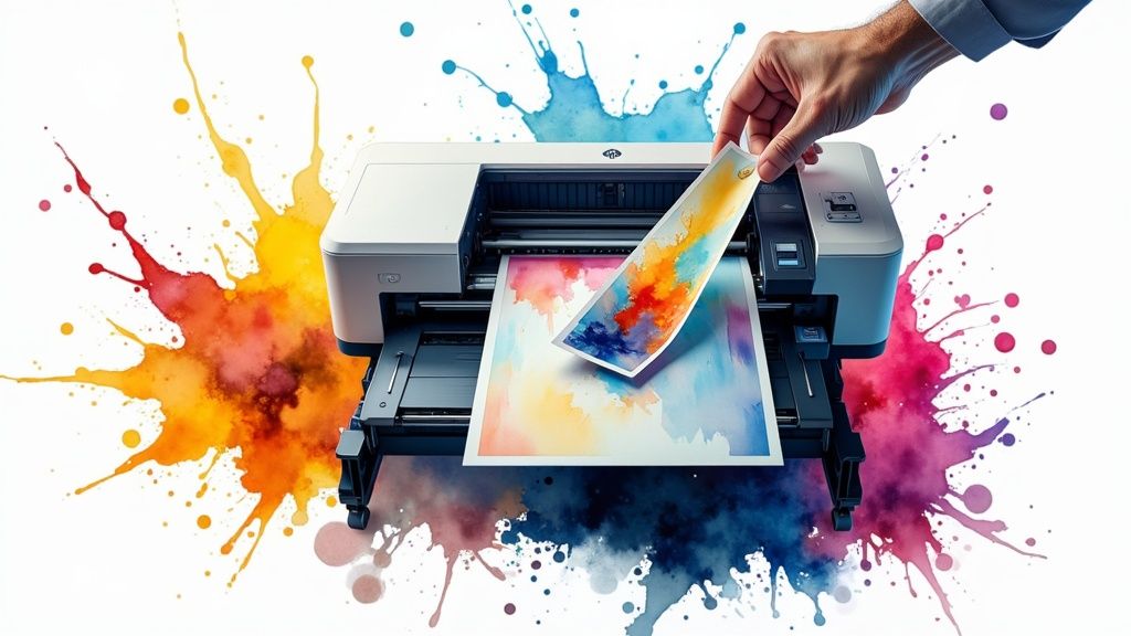 story
story A Guide to Outsourced Printing Services
Think of outsourced printing services as having a full-blown, professional print department on speed dial—without the headache and overhead of owning the place yourself. Instead of wrangling with in-house printers, costly ink, paper inventory, and constant maintenance, you partner with a specialist who handles everything for you. What Exactly Are Outsourced Printing Services? Imagine trying to build custom furniture for your office with just a hand saw and a hammer. Sure, you might cobble something together, but it would be painfully slow, the quality would be all over the place, and the final result would scream "amateur." Outsourcing your printing is like hiring a master carpenter with a fully-loaded, state-of-the-art workshop. Instantly, you get access to superior tools, years of hands-on expertise, and a much, much better result. This is a strategic move that transforms printing from an internal chore that drains time and resources into a managed, professional service. It goes way beyond just emailing a PDF to a local shop. We're talking about plugging into a dedicated infrastructure built for scale, quality, and variety—covering everything from everyday marketing materials and business cards to intricate product packaging and massive trade show banners. More Than Just Ink on Paper At its heart, outsourcing your printing means you’re tapping into a much larger ecosystem. This isn't just offloading a task; it's a savvy business decision with real operational advantages. You are, in essence, renting a world-class production facility one project at a time. A dedicated provider brings a depth of service to the table that's nearly impossible for any non-printing business to match in-house. This includes: Access to Advanced Technology: Professional printers are armed with industrial-grade equipment. Think offset presses for huge, cost-effective runs and high-resolution digital printers for short, personalized jobs. This is the kind of gear that costs tens, if not hundreds, of thousands of dollars. Material and Finishing Expertise: This is a huge, often overlooked, benefit. A great print partner acts as your consultant. They can recommend the perfect paper weight, the right finish, or a specialty touch like foil stamping or embossing that makes your project pop. Streamlined Production Workflows: These companies are built for one thing: efficiency. Their entire process—from file checking (prepress) and proofing to quality control and shipping—is a well-oiled machine designed to get projects done right and on schedule. The goal is to transform printing from a logistical headache into a strategic asset. By outsourcing, you free up internal resources to focus on core business activities while ensuring your brand is always represented with the highest quality materials. This approach lets businesses of all sizes punch above their weight and project a polished, professional image without the massive capital investment. Whether you're a startup needing your first run of brochures or a large corporation launching a national direct mail campaign, outsourced printing provides the firepower and quality to get it done. It's a powerful tool for any organization that values efficiency and an impeccable brand presence. The Real Benefits of Outsourcing Your Printing Let's cut through the buzzwords. The real perks of using outsourced printing services show up where it counts: your team's efficiency, your brand's reputation, and your company's bottom line. Just imagine your office without the constant headache of managing printers, ordering supplies, or fixing yet another paper jam. That’s the first and most immediate win—getting valuable time and resources back. This simple shift allows your team to focus on the core activities that actually grow the business, instead of getting pulled into administrative tasks that go nowhere. It’s about handing off a necessary but distracting function to a team of experts who live and breathe print. Significant Cost Reduction One of the most powerful arguments for switching is the financial one. In-house printing brings a ton of hidden and not-so-hidden costs that pile up fast. When you outsource, you can either wipe out or seriously slash these expenses. No Capital Investment: A high-quality commercial printer is a serious investment, often running into thousands of dollars. Outsourcing takes that huge upfront cost right off your budget. Zero Maintenance and Repair Costs: When your office printer gives up the ghost, you're the one calling for repairs and paying the bill. With a printing partner, their equipment is their problem, not yours. Reduced Supply Overhead: Forget about stocking endless reams of paper, different card stocks, and dozens of pricey ink or toner cartridges. You just pay for the finished product. This move flips a volatile, unpredictable expense into a predictable, manageable operating cost. It’s no wonder the managed print services (MPS) market is booming. Projections show it growing from $44.95 billion in 2024 to $48.88 billion in 2025 , all because businesses are chasing this kind of efficiency and expert management. Access to Superior Technology and Quality Unless your business is a printing business, there’s just no way to keep up with the technology and know-how of a dedicated provider. Working with outsourced printing services is like instantly giving your company the keys to a multi-million dollar production facility. By outsourcing, you’re not just printing; you’re accessing a level of quality and a range of capabilities that would be impossible to replicate internally. This ensures your brand is always represented professionally. This means you get to use top-of-the-line equipment for any project, whether it’s a small batch of business cards or a massive promotional campaign. You can tap into specialized techniques that make your materials pop—things you probably didn't even know were possible. To get a feel for what’s out there, it's worth exploring a provider’s full range of marketing materials to see all the options you could be using. Unmatched Scalability and Flexibility Business needs are never static. One month you might need a handful of flyers, and the next you're launching a nationwide campaign that requires thousands of brochures. An in-house printing setup just can't keep up with those kinds of swings. Think about a retail store gearing up for the holidays. They need a massive surge in promotional signs, gift guides, and direct mailers. With an outsourced partner, they can ramp up production in a heartbeat without having to hire temporary help or run their own equipment into the ground. After the holiday rush, they scale right back down with no leftover overhead. This kind of on-demand scalability is a huge strategic advantage. It means you can always meet the market's demands without being limited by what your office printer can handle. It keeps you agile and ready for whatever comes next. Navigating the Outsourced Printing Workflow Working with an outsourced printing service for the first time can feel a bit like commissioning a custom piece of art. It’s a collaborative dance that relies on clear communication, exact details, and a shared vision to make sure the final product is exactly what you imagined. Once you understand the process, you'll be able to manage any project like a seasoned pro. The entire journey unfolds in a few logical stages. Knowing what happens at each step is your best tool for avoiding expensive mistakes and ensuring everything goes smoothly, from that first conversation to the final delivery. Stage 1: Consultation and Quoting This is where it all begins. You and your printing partner will sit down (virtually or otherwise) to align on the project's scope. You’ll talk through exactly what you need—brochures, banners, booklets—as well as the quantity, quality, and deadline. Think of it as the blueprinting phase. From that conversation, the provider will send over a detailed quote. This document is much more than a price tag; it outlines every specification, from the paper type and finishes to the production time and shipping costs. Make sure you review it carefully to see that it matches everything you discussed. Stage 2: File Preparation and Prepress Once you give the quote a thumbs-up, the focus shifts to your design files. This is probably the most critical technical stage of the whole process. The prepress team at the print shop will review your artwork to make sure it’s "print-ready." This isn't just a quick glance; it’s a thorough technical inspection. The team is on the lookout for a few key things to prevent common printing disasters: Resolution: They’ll check that all your images are high-resolution (usually 300 DPI ) so they print sharp and clear, not pixelated or blurry. Color Mode: Your computer screen shows colors in RGB, but commercial printers use a different color model called CMYK. The team will confirm your files are in the right CMYK mode for accurate color. Bleed and Margins: They’ll look for a "bleed"—a little bit of extra image area that extends past the final trim line. This clever trick prevents any ugly white edges if the cutting is off by just a hair. This visual breaks down the typical timeline from when you submit your job to when it’s delivered. As you can see, while the actual production takes the most time, the initial file submission and the final fulfillment steps are often done in a day each. It just goes to show how efficient a well-oiled process can be. Stage 3: Proofing and Approval After the prepress team works their magic on your files, they’ll send you a proof . This is your last chance to spot any mistakes before the entire batch goes to print. A proof might be a digital PDF, or for really important jobs, it could be a physical copy printed on the actual paper you chose. Treat the proofing stage as your most important line of defense. A thorough review here costs nothing but time; catching a mistake after printing an entire run can be incredibly expensive. Go over every single detail with a fine-tooth comb. Check for typos, make sure all the images are correct, and confirm the colors look right. Once you give your final approval, the project heads to the production queue, and at that point, no more changes can be made. Stage 4: Production and Delivery With your sign-off, the presses start rolling. Your project gets printed using the technology laid out in your quote, whether it’s digital printing for a small run or offset for a massive batch. Throughout the run, quality control specialists keep an eye on the output to ensure it stays consistent and true to your specs. After printing, the items head to the finishing department. This is where they’re cut to size, folded, bound, laminated, or given any other special treatments you ordered. Finally, the finished products are packed up and shipped to you. This last step can involve some pretty sophisticated logistics, especially for complex campaigns. For a deeper dive into managing these kinds of projects, an ultimate document management workflow guide offers some great insights. Many companies that offer outsourced printing services also handle integrated fulfillment. For instance, if you're creating materials for a big promotion, you can have them manage the entire distribution for you through their direct mail services . This seamless flow from production right to the mailbox is the sign of a true printing partner. Matching Your Project to the Right Print Service Choosing an outsourced printing service feels a lot like picking the right tool from a workshop. You wouldn't use a sledgehammer to hang a small picture frame, and you wouldn't try to build a wall with a tiny finishing nail. Every tool has its purpose, and matching your project to the right printing method is the secret to getting fantastic results without breaking the budget. Not all printing is the same. A professional print partner has a whole menu of services, each fine-tuned for different needs—whether you prioritize quantity, speed, cost, or quality. Once you understand these core options, you can make smarter decisions for every single project, from a quick batch of event flyers to a run of high-end corporate brochures. Let's break down the main categories. Digital Printing For Speed and Personalization Think of digital printing as the industrial-strength big brother to your office laser printer. It takes a digital file and prints it directly, completely skipping the old-school process of making printing plates. This makes it unbelievably fast and perfect for smaller jobs. This method is the undisputed champion of speed and flexibility. It's your go-to when you need something in a hurry or when every single piece needs to be a little different. Best For: Short runs (think 50 to 1,000 pieces), projects with tight turnarounds, and personalized materials. Use Cases: Business cards, last-minute event flyers, conference handouts, and direct mail campaigns where each piece has a unique name or discount code. Key Advantage: With no real setup costs, small quantities are affordable, and you can get things printed in a flash. Offset Lithography For High-Volume Quality Offset lithography, often just called offset printing, is the heavyweight champion in the commercial printing ring. It works by transferring ink from metal plates over to rubber blankets and finally onto the paper. That initial setup takes some time and money, but once the press is humming, the cost for each printed piece drops dramatically. This makes it the clear winner for large-volume projects where consistency and cost-effectiveness are the names of the game. The global commercial printing market proves it, with lithography holding the biggest share at $131.5 billion in 2022 and still growing. This demand for high-volume printing shows just how vital this method remains. Best For: Large quantity jobs (usually 1,000+ pieces) where the per-unit cost is a major factor. Use Cases: Brochures, catalogs, magazines, books, and big runs of marketing postcards. Key Advantage: You get an unbeatable cost-per-piece at high volumes and absolutely beautiful, consistent color across the entire job. Large-Format Printing For Maximum Impact When you need to go big and get seen, you need large-format printing. This category covers anything too massive for a standard press, using specialized gear to produce materials designed to command attention from a distance. This isn’t just about making things bigger; it’s about making a bold statement. From trade show backdrops that fill a wall to vibrant storefront window graphics, large-format printing turns physical spaces into powerful branding opportunities. These projects demand real expertise to make sure images stay crisp and colors pop, even when blown up to huge sizes. If you're ready to make a visual splash, you can explore what's possible in our guide to large-format printing solutions . Best For: Eye-catching visuals for advertising, events, and environmental branding. Use Cases: Banners, posters, trade show displays, wall murals, vehicle wraps, and all kinds of signage. Key Advantage: It creates high-visibility assets that are built to last, whether you're using them indoors or out. Specialty Printing For a Premium Touch Finally, we have specialty printing. This is where you add that "wow" factor. These are finishing techniques applied after the ink is on the paper to give your materials a unique, high-end feel that people can't help but notice. These services turn a standard print job into something memorable and tactile. They signal quality and attention to detail, making them a perfect match for premium brands or extra-special occasions. Consider these popular options to make your materials pop: Foil Stamping: Applying a thin layer of metallic or colored foil to create a shiny, reflective look. Embossing/Debossing: Pressing a design into the paper to create a raised (emboss) or indented (deboss) texture. Die-Cutting: Using a custom die to cut paper into unique shapes, creating interesting outlines or peek-through windows. UV Coating: Applying a high-gloss liquid coating to specific spots to make them shine and stand out from the rest of the design. How to Choose the Right Printing Partner Selecting the right partner for your outsourced printing services is a decision that goes way beyond just chasing the lowest price. Think of it like choosing a general contractor to build your house. You wouldn't hire someone based on a cheap quote alone; you’d want to see their past work, check their references, and make sure they have the right tools and expertise. The same diligence applies here, as the right partner becomes an extension of your brand. A great printing partner is a strategic asset, not just a one-time vendor. They can offer advice, catch potential problems before they happen, and ultimately ensure your vision comes to life on paper. This means you have to look at their capabilities from a few different angles to find a fit that aligns with your quality standards, budget, and long-term goals. Assess Their Technological Capabilities First, you need to peek under the hood and see what kind of equipment they're running. A provider's technology directly impacts the quality, speed, and cost of your projects. You don't need to be an expert on printing presses, but you should know what to ask. Inquire about their primary printing methods. Do they specialize in high-speed digital inkjet for projects with variable data, or are they running robust offset presses for large, cost-effective runs? A partner with a diverse range of equipment can match your specific project to the most efficient technology, saving you money and delivering a better final product. Also, ask about their finishing, binding, and inserting capabilities. A printer that can handle everything from complex die-cuts and embossing to automated mail assembly in-house is far more likely to maintain tight quality control and meet your deadlines. Examine Their Portfolio and Ask for Samples Never commit to a printing partner without seeing proof of their work. A portfolio is a great starting point, but don't stop there. The absolute best way to vet quality is to get your hands on physical samples. Ask for examples of projects that are similar to what you have in mind. If you need high-end brochures, ask to see their best brochure work. When you get the samples, pay close attention to these key details: Color Accuracy: Do the colors pop? Are they vibrant and consistent across the page? Print Sharpness: Is the text and imagery crisp and clear, with no bleeding or fuzziness? Paper Quality: Does the paper stock feel substantial and professional? Does it match the quality you want to project? Finishing Precision: Are the folds, cuts, and coatings executed flawlessly? Seeing a sample that’s close to your own project is the single best way to predict the quality of your final product. It removes all guesswork and ensures their standards align with yours before you place an order. Evaluate Their Service and Communication Technology and quality are crucial, but a partnership can completely fall apart without good service. You need a responsive, reliable team that acts as a true partner, not just another vendor sending you invoices. Before signing anything, get a feel for their customer service and workflow. What does their proofing and approval process look like? A clear, collaborative proofing stage is your best defense against costly errors down the line. A good partner will be meticulous here, working with you to catch any issues. You should also verify their standard turnaround times and ask about their ability to handle rush jobs. A transparent provider will be upfront about what they can realistically deliver. Finally, consider their commitment to sustainability. For many brands today, environmental responsibility is a core value. Ask if they offer eco-friendly materials or hold certifications for greener production. Finding a partner that provides options for green printing services can help you maintain your brand's commitment to the environment. Future Trends in Outsourced Printing The world of outsourced printing services is anything but static. It's constantly shifting to keep up with new business demands and incredible leaps in technology. The future isn’t just about printing faster or cheaper; it’s about making print smarter, more sustainable, and a deeply integrated part of how modern companies market themselves and operate. One of the biggest game-changers has been the explosion of web-to-print platforms. Think of these online portals as a centralized command center for your brand. They give businesses the power to manage, customize, and order all their printed materials on demand—from a new batch of business cards to a complex marketing kit—with just a few clicks. It's a self-service model that radically simplifies the entire process. The Rise of Smart and Sustainable Printing Beyond simple convenience, the very materials we print on are getting a major upgrade. The call for eco-friendly and sustainable printing isn't a niche request anymore; it’s a core expectation. This means a move toward recycled papers, soy-based inks, and partnering with printers who can prove they have certified green production processes. At the same time, printed products are becoming surprisingly interactive. The integration of "smart" tech is finally bridging the gap between a physical item and a digital experience. QR Codes and NFC: Once a novelty, these are now staples. They're embedded in everything from packaging and flyers to business cards, ready to launch customers to websites, videos, or exclusive offers with a quick scan. Augmented Reality (AR): Some of the more forward-thinking printers are getting into AR. Imagine a customer pointing their smartphone at your brochure, and a 3D model of your product pops right off the page. This isn't just a small shift. The global commercial printing outsourcing market is a testament to this growth, projected to hit an incredible $179 billion by 2025 . A huge driver is the e-commerce boom, which has supercharged the need for smart, branded, and sustainable packaging. You can dive deeper into this market expansion and the shift toward eco-friendly vendors on Research Nester . Hyper-Personalization and Niche Applications The old one-size-fits-all approach to marketing is officially on its way out. The future is all about hyper-personalization , where every single printed piece can be tailored to the person receiving it. This is all made possible by huge strides in digital printing, which make it cost-effective to produce small, highly customized batches that were once unthinkable. This opens the door to incredibly targeted campaigns, from direct mailers that greet a customer by name to product packaging that reflects their unique purchase history. It also makes room for truly unique applications. For brands that want to leave a lasting impression, exploring a specialty printing collection can uncover options like foil stamping or unique textures that add a premium, tactile feel. This dynamic and adaptive nature is exactly what makes outsourced printing such a powerful strategic asset for any business trying to get ahead. Your Top Questions About Outsourced Printing, Answered If you're just starting to look into outsourced printing services , you probably have a few questions. It can feel like a big shift, but once you get the hang of it, the concepts are pretty simple. Let's walk through some of the most common questions we hear to clear things up and get you moving with confidence. How Much Can My Business Realistically Save? While there's no magic number that fits everyone, businesses almost always see a major drop in their printing-related expenses. The most obvious savings come from not having to buy a massive commercial printer. But the savings don't stop there—you also get to ditch the ongoing costs of ink, toner, paper inventory, and those notoriously expensive maintenance contracts. Instead of a huge, unpredictable capital expense that hits your budget hard, printing becomes a stable and predictable operational expense. You also get back the "soft costs" of your team's time. Think about it: how many hours have been lost to someone wrestling with a printer jam instead of doing their actual job? This is less about cutting costs and more about turning a messy overhead into a smart, strategic investment. What Is the Difference Between Digital and Offset Printing? It helps to think of it like picking a vehicle for a road trip. Digital printing is your zippy sports car—perfect for short, fast journeys. It prints your design directly from a digital file, which makes it the go-to for smaller quantities (say, 500 flyers) or projects that need a personal touch, like direct mail where every piece has a different name on it. Offset printing is the freight train. It takes a bit more time and money to get it rolling, but it's incredibly efficient for the long haul. This method uses custom plates to transfer ink onto paper, so the setup is more involved. But for big jobs (think 1,000 or more pieces), the cost per item plummets, making it the most budget-friendly choice for things like catalogs, magazines, or brochures. The most important takeaway is this: Digital is for speed and short runs. Offset is for volume and low per-piece costs. A good partner will guide you to the right choice for your specific project. How Can I Ensure My Brand Colors Are Printed Accurately? This is a big one. Keeping your brand consistent is non-negotiable, and color is a huge part of that identity. The good news is, professional printers have this down to a science. It all starts with you providing your files in the correct CMYK color mode—that's the one for print—not the RGB mode that screens use. For pinpoint accuracy, the best practice is to give your printer your Pantone Matching System (PMS) color codes. PMS colors are like a universal recipe for ink, ensuring your signature blue looks exactly the same whether it's on a business card printed in New York or a banner in California. And always, always ask for a physical proof to sign off on before the full run gets printed. What File Formats Are Best for Professional Printing? To get those crisp, clean results you're after, you need to start with a high-quality file. The undisputed champion for professional printing is a press-quality PDF . These files are fantastic because they bundle everything the printer needs—high-resolution images (at least 300 DPI ), fonts, and the right color profiles—into one clean, self-contained package. Other formats can also work, like native design files from Adobe InDesign (just be sure to package them with all fonts and linked images) or high-resolution TIFF and EPS files. What should you avoid? Sending low-res JPEGs you pulled from a website or a standard Word document. They simply aren't built for commercial printing and will almost always give you blurry, disappointing results. Ready to see how professional printing can elevate your brand and streamline your operations? The team at 4OVER4 has over two decades of experience helping businesses like yours create stunning, high-quality materials. Explore our wide range of products and discover the perfect solution for your next project at https://4over4.com .
 story
story Your Essential Paper Weight Guide
Picking the right paper for your print project is about more than just looks—it’s about feel, durability, and making the right impression. Getting a handle on paper weight is the first step, and it all comes down to two key measurements: GSM (Grams per Square Meter) and Basis Weight (lbs). Knowing what these mean will make all the difference between a project that falls flat and one that feels truly professional. Why Paper Weight Is Your Most Important Print Decision Think of paper weight as the foundation of a building. You can have the most brilliant design in the world, but if the foundation is weak, the whole structure suffers. The same is true for print. The second someone touches your business card or brochure, they’re making an instant judgment. A flimsy, thin paper sends a message of low quality, while a heavy, substantial stock feels professional and valuable. This one choice impacts everything else, from how crisp your images look to how well the final product holds up. It's the invisible framework that gives your brand's message its strength. Paper as the Fabric of Your Brand A great way to think about paper is to compare it to the fabric of a suit. You wouldn’t show up to a formal winter gala in a lightweight linen suit, and you definitely wouldn't wear heavy wool to a summer beach party. The material has to fit the occasion. It's the exact same logic with paper. Lightweight Papers (The Linen Suit): These are your go-to for everyday documents, internal memos, or flyers you’re printing in massive quantities. They're cost-effective and easy to handle. Mid-Weight Papers (The All-Season Wool): Versatile and dependable, these are perfect for reports, presentations, and quality brochures that need to look sharp without being too stiff. Heavyweight Papers (The Premium Tweed): This is for the heavy hitters—business cards, invitations, and report covers. This stock is built to last and leaves a powerful, memorable impression. Your choice of paper weight is a non-verbal cue that speaks volumes about your brand's attention to detail and commitment to quality. It sets the tone before a single word is even read. Introducing the Two Key Measurement Systems To really master paper selection, you need to understand the two main systems used to measure its weight. They both describe the same thing—how heavy a sheet is—but they get there in different ways. You'll run into both, so knowing the difference is key to avoiding costly mistakes. First up is GSM (Grams per Square Meter) , which is the standard metric system used around the world. It’s simple and direct: it measures the literal weight of a single one-by-one-meter sheet of paper. A higher GSM number means a heavier, and usually thicker, paper. Easy enough. Then there’s the U.S. Basis Weight system, measured in pounds ( lbs ). This one is a bit trickier. The weight is found by weighing a stack of 500 sheets in its original, uncut "basis size"—and that basis size changes depending on the type of paper. Getting comfortable translating between these two is the secret. As we dig deeper, we'll break down each system so you can confidently choose the perfect paper for any project, whether you're looking into flyer printing or designing a set of premium business cards. Understanding GSM: The Global Standard for Paper Weight When you’re navigating the world of paper, GSM is your most reliable compass. It stands for Grams per Square Meter , and it's the global standard for a reason—it’s simple, direct, and universally understood. Think of it as the metric system for paper, designed to cut through the confusion and bring consistency to your print projects. The beauty of GSM is its straightforward logic. It measures the actual weight of a single sheet of paper that is exactly one meter by one meter (1m x 1m). That’s it. No complicated parent sheets or different categories to memorize. This simple approach makes comparing paper stocks incredibly easy. A sheet of 150 gsm paper will always be heavier and feel more substantial than a sheet of 90 gsm paper, no matter its final trimmed size or who made it. The Precision of Measuring by Weight To really get why GSM is so useful, let's borrow an analogy from the kitchen. Imagine you’re baking a cake. One recipe calls for "two cups of flour," while another calls for " 240 grams of flour." Which one is more precise? Measuring by volume (cups) can be all over the place. Is the flour packed down or sifted? The actual amount can vary. But measuring by weight (grams) is exact every single time. GSM applies this same principle of precision to paper. The modern global standard for measuring paper weight is based on grams per square meter (gsm or g/m²), which quantifies the weight of a single sheet of paper measuring one square meter. This international metric system was established to bring consistency across varying paper sizes worldwide, enabling a direct comparison regardless of sheet dimensions. The gsm system is widely used in Europe, Asia, and many other markets, while the U.S. is a notable exception still relying largely on pounds (lbs) for paper weights. You can explore more about these standards and their history by learning about paper sizes and weights on dickblick.com . This system eliminates the guesswork, ensuring that when you order a 300 gsm stock for your business cards, you know exactly what you’re getting. It’s a reliable standard you can count on anywhere in the world. How GSM Relates to Thickness and Feel While GSM is technically a measure of weight, it has a direct and predictable relationship with the paper's thickness, stiffness, and opacity. In almost every case, a higher GSM number means a thicker, more durable sheet of paper. Here’s a quick breakdown of what that means for your projects: Higher GSM: This translates to a heavier, thicker, and more rigid paper. It feels premium in the hand, prevents light from showing through (high opacity), and stands up to handling. Lower GSM: This means a lighter, thinner, and more flexible paper. It’s perfect for items that need to be folded easily or produced in large, cost-effective quantities. For example, a brochure printed on a sturdy 170 gsm stock will feel much more professional and hold its shape better than one printed on a flimsy 100 gsm paper. Getting this connection right is a key part of our complete paper weight guide . It's especially important when you’re deciding on the right stock for projects like our high-quality brochures printing service , where the final feel is just as important as the design itself. The direct link between the number and the physical properties of the paper is what makes GSM so intuitive. Higher number, heavier product. Simple. This clarity empowers you to make informed decisions confidently, ensuring your final printed piece has the exact look and feel you envisioned from the start. Navigating US Basis Weight and Common Paper Types While the GSM system is refreshingly straightforward, the U.S. Basis Weight system, measured in pounds (lbs), takes a different path. It’s a little more nuanced, but if you’re printing in the United States, you absolutely need to know how it works, since it’s still the standard for many common paper types. The whole concept is rooted in history. Basis Weight is defined as the weight of a ream—that’s 500 sheets of paper—in its original, uncut parent size, known as the basis size . This is where things get tricky, because different types of paper have different parent sheet dimensions. The Challenge of Shifting Sizes The biggest mental hurdle with the U.S. system is that the basis size changes depending on the paper’s category. This is the crucial part: a paper labeled 80 lb in one category is not the same thickness or stiffness as an 80 lb paper in another. This little detail trips up countless people and can lead to some expensive printing mistakes. Think of it like this: you have two boxes that both weigh 50 pounds. One box is huge and filled with 500 fluffy pillows. The other is much smaller and packed with 500 dense bricks. Even though the total weight is the same, the items inside—and the size of the boxes themselves—are completely different. In the U.S. Basis Weight system, the paper’s category (like Text or Cover) is the 'box size.' An 80 lb Text paper and an 80 lb Cover paper are weighed using different basis sheet sizes, making them fundamentally different products despite sharing the same number. If you remember one thing, let it be this: the pound number is almost meaningless without knowing the paper's type. It’s why you always have to look at both the number and the name. Text Stock vs. Cover Stock: The Critical Difference The two most important categories you’ll run into are Text and Cover stocks. Mixing these up is easily one of the most common mistakes in the print world. Text Stock (also called Book or Writing) This is your lighter, more flexible paper. Its basis size is a large 25" x 38" sheet. Common weights you’ll see range from 50 lb to 100 lb . Common Uses: Perfect for the inside pages of books and catalogs, brochures, flyers, letterheads, and high-quality reports. Feel: It’s thinner and more pliable, designed to be folded and read easily. An 80 lb Text paper, for instance, feels substantial but isn't rigid at all. Cover Stock (also called Cardstock) This is the heavier, thicker, and more durable stuff. Its basis size is a smaller, more compact 20" x 26" sheet. Common weights for Cover stock run from 65 lb to 130 lb . Common Uses: This is what you want for business cards, postcards, book covers, presentation folders, and durable menus. When planning an event, knowing this difference is key for creating high-quality custom invitation printing . Feel: Stiff and sturdy. It’s built to withstand handling and give off a premium impression. Because the basis sizes are so different, an 80 lb Cover stock is significantly thicker and heavier than an 80 lb Text stock . To put it in perspective, an 80 lb Cover stock is roughly equivalent to a 216 gsm paper, while an 80 lb Text stock is closer to just 120 gsm. They are absolutely not interchangeable. By always paying attention to both the weight in pounds and the paper category—Text or Cover—you can avoid any nasty surprises. This knowledge lets you navigate the U.S. system with confidence and make sure your final product has the exact feel and durability you were aiming for. The Ultimate Paper Weight Conversion and Comparison Chart Trying to mentally switch between GSM and U.S. Basis Weight can feel like translating two completely different languages. Since there's no clean mathematical formula—all thanks to those varying basis sheet sizes we talked about—a solid comparison chart is the single most important tool in any paper weight guide . This section gives you exactly that: a clear, practical chart that bridges the gap. You'll be able to see at a glance how a 75 gsm paper stacks up against a 20 lb Bond or a 50 lb Text stock. No more guesswork. Just quick, confident decisions that ensure you nail the right material for your project every time. How to Use the Paper Weight Chart Using the chart is simple. Find the weight you know in any column, whether it’s in GSM or a U.S. system like Bond or Cover. Then, just look across the row to find its closest cousins in the other systems. What’s really helpful is seeing how different categories overlap. For example, you’ll notice that a lightweight 90 gsm paper is roughly the same as 24 lb Bond stock (perfect for a standout résumé) and 60 lb Text stock (a go-to for booklet pages). This side-by-side view clears up all the confusion. The chart below gives you a quick visual on how the weights progress for common print jobs. As you can see, it’s a big jump from everyday copy paper to the hefty, substantial stock you’d want for a premium business card. A big reason the GSM system is used globally is its seamless connection with international paper sizes. The ISO 216 standard, made official in 1975 , uses a brilliant aspect ratio that lets paper scale up or down perfectly, so the GSM value is always consistent. This is a sharp contrast to North American sizes like "Letter," which don't have that mathematical harmony, making direct weight comparisons even trickier. You can dive deeper into the history of how paper standards evolved on Wikipedia . Paper Weight Conversion Chart GSM vs US Basis Weight (lbs) Think of this table as your new best friend. It maps out the most common weights across different paper types—Bond, Text, and Cover—so you can make sense of any paper label you come across, whether it's listed in gsm or lbs. Common Use GSM (g/m²) US Bond Weight (lbs) US Text Weight (lbs) US Cover Weight (lbs) Standard Office & Copy Paper 75-90 20-24 lb 50-60 lb N/A Professional Letterheads 105-120 28-32 lb 70-80 lb N/A Flyers & Brochures 120-150 N/A 80-100 lb 45-55 lb High-Quality Posters & Menus 175-216 N/A 120 lb 65-80 lb Postcards & Invitations 216-270 N/A N/A 80-100 lb Premium Business Cards 300-400 N/A N/A 110-148 lb Just keep in mind, this chart shows approximate equivalents. The final feel of a paper is also influenced by its finish (coated vs. uncoated) and stiffness, but this gives you a rock-solid starting point for any comparison. How to Choose the Right Paper Weight for Your Project Knowing the difference between GSM and Basis Weight is a great start, but the real confidence comes from putting that knowledge into practice. This is where the rubber meets the road. We'll walk through some of the most common print jobs and give you clear recommendations so you can actually picture the final product and pick the perfect paper stock every single time. Every project has a job to do, and the paper you choose should help it succeed. Are you creating something tough enough to get tossed in a wallet, or something light enough to fold neatly for a mailer? The right weight makes all the difference. Business Cards: The First Impression Your business card is a handshake. It’s a physical piece of your brand, and the way it feels says a lot before anyone even reads your name. This is one area where you absolutely should not cut corners. You need a heavy, rigid stock that feels substantial and professional. A flimsy card gets bent, feels cheap, and ends up in the trash. You’re aiming for something that stands firm, communicating quality and confidence. Recommended Weight: 350-400 gsm (130-148 lb Cover) Why It Works: This range gives you that satisfying rigidity and premium feel. It holds up against bending and creasing, keeping your card looking sharp even after being passed around. Plus, a heavy stock is the perfect canvas for premium finishes like embossing or foil stamping. You can dive into all the different options and see how paper choice impacts the final look when you're ready for professional business cards printing . Flyers and Posters: Communicating Your Message Flyers and posters are all about grabbing attention and getting a message across fast. The ideal weight really depends on where they're going and what they're doing. A flyer you're handing out on the street has very different needs than a poster that needs to hang in a shop window for weeks. For huge print runs that you’ll be handing out, a lighter weight is easier on the budget. But if you need that flyer to feel a little more valuable or last a bit longer, bumping up to a mid-weight stock is a smart move. Recommended Weight (Flyers): 130-170 gsm (80-100 lb Text) Why It Works: This is a fantastic middle-ground. It's affordable enough for big batches but has enough substance to feel professional. It’s also sturdy enough for double-sided printing without the ink bleeding through, which makes your design really pop. Recommended Weight (Posters): 170-200 gsm (100 lb Text to 65 lb Cover) Why It Works: Posters need more backbone to hang flat without curling at the edges. This weight range gives them the structure they need and a quality finish, ensuring your visuals look crisp and vibrant. Think of it this way: the weight you choose directly influences the perceived value of your message. A flimsy flyer might be glanced at and discarded, while a substantial one is more likely to be kept and reviewed later. Brochures and Booklets: Designed to Be Handled Brochures are meant to be folded, opened, and explored. The paper has a tricky job here: it needs to be heavy enough to feel professional but light enough to fold cleanly without cracking or getting too bulky. It’s a delicate balancing act. Go too light, and the brochure feels cheap. Go too heavy, and the folds become clumsy and thick, and it might not even stay closed properly. Recommended Weight: 150-170 gsm (100 lb Text) Why It Works: This is the sweet spot for most brochures. It has enough heft to signal quality and allows for rich, saturated colors, but it’s still pliable enough to create crisp, perfect folds for a bi-fold or tri-fold design. Letterheads and Resumes: Professional Correspondence When it comes to official documents like letterheads, invoices, or resumes, you want a paper that feels more significant than what’s in the office copy machine. The goal here is to project professionalism and an eye for detail. You aren't looking for the thickness of cardstock, but you want a noticeable step up in quality that feels crisp and important when someone holds it. Recommended Weight: 100-120 gsm (28-32 lb Bond) Why It Works: This range offers a premium, tactile feel without being overly stiff. It runs smoothly through most office printers while providing a substantial texture that elevates your correspondence above the everyday stack of mail. Invitations and Postcards: Setting a Special Tone Invitations and postcards have to be tough. They need to survive a trip through the mail system and still look impressive enough to set the right tone for your event or message. This calls for a heavy cardstock that can take a beating without getting damaged. For comparison, your standard office paper is usually around 70-100 gsm . For these special items, you need to aim much higher. Recommended Weight: 250-350 gsm (90-130 lb Cover) Why It Works: This sturdy cardstock ensures your piece arrives looking great. Its thickness adds a sense of importance and quality, making a memorable first impression for a wedding, a big event, or a promotional mailer that you want people to keep. Picking a paper weight isn't just a technical spec you check off a list; it's a core decision that shapes both the final look of your print project and what it'll cost you. Nail this balance, and you get a professional-looking piece without blowing your budget. Think of heavier paper as a better canvas for ink—it fundamentally changes the outcome. Imagine trying to paint on a thin t-shirt. The paint would soak right in, spread out, and blur at the edges. Lightweight paper does the same thing with ink. It can bleed through to the other side, making your text look fuzzy and your images appear dull and washed out. Nailing That Professional Print Quality Heavier paper, on the other hand, has a much denser, more compact structure. That density is your best friend when it comes to print quality because it stops the ink from seeping through. This is a game-changer for anything printed on both sides. When you use a heavier stock, say a 150 gsm (100 lb Text) , you can be confident that what’s on one side will stay on that side. The result? Sharper text, cleaner layouts, and colors that really pop with vibrancy and saturation. The weight of your paper is basically a gatekeeper for quality. Heavier stocks hold ink right on the surface for crisp lines and vivid images. Lighter stocks absorb it, leading to a softer, less defined finish. How It Feels: Durability and Perception Beyond just how it looks, the weight of the paper sends a powerful psychological message. A thick, sturdy business card or brochure feels premium. It instantly communicates quality and trustworthiness, making it feel more valuable just because it’s more durable. A heavier paper can take a beating. It resists creasing, holds its shape, and ensures your message sticks around. This perceived value can be the difference between your marketing material being kept for reference and getting tossed in the bin. Balancing Quality with the Bottom Line Of course, that premium feel comes with a premium price tag. There are really two main costs to keep an eye on when you're choosing a heavier paper stock. Material Cost: It's simple, really. Heavier paper uses more raw material, so it costs more per sheet. On a huge print run, that difference can add up fast. For bigger projects like multi-page documents, looking into options for printing booklets and catalogs can help you find a smart compromise between page count and paper weight. Shipping and Distribution Costs: This is the one everyone forgets. Heavier paper means heavier boxes, and that can seriously inflate your shipping bill. If you're planning on mailing your materials directly, that extra weight could easily bump you into a more expensive postage bracket. The key is finding that sweet spot. Think about what the project is for. If it’s a high-impact marketing piece meant to impress, investing in a heavier stock is almost always worth it. But for a flyer you're distributing to the masses, a quality mid-weight option will likely give you the best bang for your buck. By weighing these factors, you can make a smart choice that hits your quality goals without wrecking your budget. Still Have Questions About Paper Weight? Let’s be honest, navigating the world of paper can feel a little complicated at first. To help clear things up, here are some quick answers to the questions we hear most often. This should give you the confidence you need to nail your next print project. Is Paper Weight the Same as Paper Thickness? Not exactly , but they're incredibly close cousins. Think of it this way: paper weight (like GSM) is a measure of density, while thickness is, well, the physical thickness you can feel. For almost every project, it's a safe bet that a heavier paper will also be a thicker paper. The only time this gets tricky is with highly textured or "fluffy" paper stocks. A textured sheet might feel a bit thicker than a smooth, compact one, even if they share the same GSM. But for all practical purposes, you can trust that higher weight means higher thickness . What Is the Best Paper Weight for a Resume? When it comes to a resume or professional letterhead, you want to step up from standard office paper. You’re looking for something that feels substantial and says "I mean business" before they even read a word. The sweet spot is a 24 lb or 28 lb Bond paper , which works out to be around 90 gsm to 105 gsm . This weight range has a premium, professional feel without being stiff like cardstock. It's a small detail that makes a huge first impression. A resume printed on quality paper sends a powerful, unspoken message about your attention to detail and professionalism. It’s an investment in your personal brand. Can My Home Printer Handle Heavy Paper? This one really depends on your specific printer. Most off-the-shelf inkjet and laser printers are workhorses for everyday documents and can easily handle paper up to about 120 gsm (roughly 32 lb Bond ). Once you start getting into heavier cardstocks, especially anything 200 gsm and up , you might hit a wall. Thicker paper can cause jams or simply refuse to feed through the standard tray. Your best bet is to check your printer’s manual or look up its specs online for the maximum supported paper weight. Many models have a special manual feed tray just for handling thicker media like cardstock or envelopes. Ready to put all this knowledge to work? At 4OVER4 , we've got a massive selection of paper weights and finishes for any project you can dream up. From crisp business cards to eye-catching brochures, let's find the perfect paper for your brand at https://4over4.com .
 story
story 7 Fresh Postcard Design Ideas to Make an Impact in 2025
In a world saturated with digital noise, a well-designed postcard can be a powerful, tangible tool to capture attention. It's more than just paper and ink; it's a direct line to your audience that can evoke emotion, drive action, and build lasting brand recognition. However, breaking through the clutter requires more than just a logo and an address. It demands creativity, strategy, and a deep understanding of visual communication. At its core, great postcard design is a powerful extension of your brand identity, showcasing the foundational principles of branding through visual appeal. This guide moves beyond generic advice to explore seven distinct postcard design ideas , providing the inspiration and practical steps you need to create something truly memorable. We will dive into specific techniques, from harnessing the power of vintage nostalgia to leveraging bold, modern gradients, ensuring your next postcard campaign doesn't just get delivered-it gets noticed. Each idea is paired with actionable tips on color, typography, and layout that you can implement using 4OVER4's extensive online design tools and templates, making professional-quality printing accessible to everyone. Forget the filler; let's get straight to the concepts that will elevate your next direct mail project from simple mail to a must-keep piece of art. 1. Vintage/Retro Aesthetic The vintage and retro aesthetic is one of the most powerful postcard design ideas for creating an immediate emotional connection. This style borrows visual cues from past decades, such as aged textures, muted color palettes, and classic typography, to evoke a sense of nostalgia and timeless appeal. It taps into collective memories, making your message feel authentic, enduring, and trustworthy. This approach is particularly effective for brands that want to highlight heritage, craftsmanship, or long-standing quality. Think of the iconic National Parks Service poster campaigns or the work of Anderson Design Group, which have successfully used retro illustrations to create a sense of adventure and timeless beauty. Why It Works A vintage aesthetic suggests permanence and reliability in a fast-paced world. By using design elements that have stood the test of time, you imply that your brand, product, or message has the same lasting value. It’s perfect for anniversary promotions, heritage brand storytelling, or promoting destinations with rich histories. Key Design Tips To create an authentic vintage look, focus on these core elements: Color Palette: Use desaturated and warm tones. Think cream, sepia, faded blues, and muted reds. Avoid bright, neon, or overly modern colors. Typography: Select fonts that reflect a specific era. Classic serif fonts like Playfair Display or script fonts like Lobster work well. Research typographic trends from the decade you want to emulate. Imagery & Texture: Apply subtle filters like sepia or grain to your photos. Incorporate illustrations that mimic mid-century print techniques. A light paper or grain texture overlay can add a tactile, aged feel. Layout: While using vintage components, a clean, modern layout can prevent the design from looking dated. Balance nostalgic elements with a well-organized structure for readability. How to Create It on 4OVER4 You can easily execute this style using 4OVER4’s online design tools. Start by selecting a cream or off-white background from the color options. Upload your photo and use the built-in image filters to apply a desaturated or sepia effect. Browse the font library for a classic serif or script that fits your chosen era. To complete the effect, consider uploading a subtle grain texture image as a background layer and reducing its opacity. Finally, choosing an uncoated paper stock at checkout will enhance the authentic, tactile feel of your finished postcard. 2. Minimalist/Clean Design Minimalist and clean design is a powerful postcard idea that strips away non-essential elements to deliver a message with clarity and impact. This "less is more" philosophy, popularized by figures like Dieter Rams and the Swiss International Style movement, relies on ample white space, strong typography, and a single focal point to direct the viewer’s attention precisely where you want it. This approach is highly effective for modern, sophisticated brands that prioritize function and elegance. Think of Apple's product announcements or a modern art gallery's exhibition invitations; the design itself communicates confidence, precision, and a focus on quality. Why It Works A minimalist design cuts through the clutter of everyday marketing, making your message feel intentional and easy to digest. The strategic use of negative space creates a visual breathing room that elevates the perceived value of your message and brand. It’s perfect for luxury brands, tech companies, professional service providers, or any campaign where a clear, direct call-to-action is the primary goal. The principles of minimalist design are also highly effective in other marketing materials, as you can see in many modern business card designs . Key Design Tips To achieve a polished minimalist look, concentrate on these fundamental elements: Color Palette: Stick to a limited color scheme, often monochromatic (shades of one color) or achromatic (black, white, and grays). A single, bold accent color can be used to draw attention to key information. Typography: Choose a clean, sans-serif font like Helvetica , Montserrat , or Lato . Create a strong hierarchy using different font weights (light, regular, bold) rather than multiple font styles. Imagery & Focus: Use a single, high-quality photograph or a simple graphic as the main focal point. A product shot on a clean background or an abstract shape can be incredibly effective. Layout: Embrace white space. Use the rule of thirds to position your key elements off-center for a more dynamic and professional composition. Ensure every element has a purpose. How to Create It on 4OVER4 You can easily build a minimalist postcard using 4OVER4’s online design tools . Start by selecting a white or light gray background. Use the grid and alignment tools to place your text and a single uploaded image with precision. Select a clean sans-serif font from the library and experiment with bold and regular weights to create a clear visual hierarchy for your headline and details. To complete the premium feel, choose a Matte or Silk Laminated paper stock at checkout for a smooth, sophisticated finish. 3. Photo-Centric Layout A photo-centric layout is a powerful postcard design idea that makes a single, high-quality image the star of the show. This approach leverages the immediate emotional impact of photography to tell a story, sell a product, or capture a mood, using minimal text and design elements as support. The goal is for the image itself to be the primary messenger, grabbing attention instantly. This visual-first strategy has been perfected by brands like Airbnb and National Geographic, which use breathtaking photography to transport the viewer to another place. It’s highly effective for real estate agents showcasing a property, restaurants highlighting a signature dish, or travel companies promoting a destination. Why It Works An impactful photo communicates far faster than text. This design builds an immediate emotional connection and conveys quality and professionalism. When you lead with a stunning image, you tell your audience that you are confident in what you have to offer, whether it’s a beautiful product, a luxurious experience, or a picturesque location. Explore more media and photography printing options to bring your visuals to life. Key Design Tips To master the photo-centric layout, prioritize the image above all else: Image Quality: Invest in professional photography or premium stock images. Your photo must be high-resolution (at least 300 DPI ) to avoid looking blurry or pixelated in print. Text Overlay: Use text sparingly. When you do add text, ensure it has strong contrast against the background so it remains legible. A simple, clean font works best. Composition: Choose an image with a clear focal point and some negative space where you can place text without obscuring key details. The photo’s mood should align with your brand’s message. Layout: Let the photo bleed to the edges for a modern, full-frame look. Avoid cluttering the design with unnecessary graphics or borders; the image is the main event. How to Create It on 4OVER4 Creating this design is straightforward on 4OVER4’s platform . Upload your high-resolution photograph and use the tool to stretch it to fill the entire postcard canvas. Add a text box and place your message carefully over an area of the image with a simple background. Experiment with font colors and a subtle drop shadow to enhance readability. For the best result, select a gloss UV coating at checkout to make your photo’s colors pop and give it a premium, professional finish. 4. Typography-Focused Design A typography-focused design elevates text from a simple carrier of information to the main artistic element. This approach uses creative font pairings, dramatic scaling, and thoughtful layouts to make the words themselves the hero of the postcard. It’s a powerful strategy for messages that need to be bold, clear, and memorable without relying on photography or complex illustrations. This design philosophy is championed by legendary designers like Paula Scher and Stefan Sagmeister, who have demonstrated how type can create emotion, energy, and visual identity. A well-executed typography postcard design can feel modern, sophisticated, and impactful, making it ideal for event announcements, inspirational quote cards, or brand promotions that want to make a strong statement. Why It Works In a world saturated with images, a typography-first design cuts through the noise with clarity and purpose. By making the message the visual focal point, you ensure your key information is immediately absorbed. This style conveys confidence and intentionality, suggesting that the message is so important it doesn't need decorative distractions. It's perfect for minimalists, modern brands, and campaigns with a direct call-to-action. Key Design Tips To create a stunning typography-focused postcard, concentrate on these principles: Font Pairing: Limit your design to two or three complementary font families to avoid a chaotic look. A common and effective pairing is a bold, expressive sans-serif for headlines and a clean, readable serif for body text. Visual Hierarchy: Use size, weight (bold, regular, light), and color to guide the viewer's eye. Your most important message should be the largest and most prominent element on the card. Spacing and Alignment: Pay close attention to kerning (space between characters) and leading (space between lines). A strong grid and consistent alignment (left, right, or center) create a professional, polished appearance. Text as Image: Don't be afraid to treat words like shapes. Overlap letters, rotate text, or fill a shape with words to create unique decorative elements that are both artistic and communicative. How to Create It on 4OVER4 You can master this typography-focused postcard design idea using 4OVER4’s online design tools . Begin with a solid color background, or even a blank white canvas, to make your text pop. Explore the extensive font library and experiment with different pairings. Use the text tools to adjust size, color, and spacing with precision. For a premium finish, consider a 16pt Silk Laminated stock to give your design a smooth, sophisticated feel that complements the clean aesthetic. 5. Illustrated/Artistic Design Using a custom illustration or artistic design is one of the most effective postcard design ideas for creating a truly unique and memorable impression. This approach leverages original artwork, from hand-drawn sketches to sophisticated digital paintings, as the central visual element. It allows brands to convey personality, creativity, and a high level of craftsmanship that photography alone often cannot capture. This style is perfect for brands with a strong creative identity, such as art galleries announcing an exhibition, indie bands promoting a new album, or boutique shops wanting to showcase their unique character. The work of influential designers like Saul Bass and Mary Blair demonstrates how distinctive illustration can create an iconic and lasting brand image. Why It Works An illustrated design immediately sets your postcard apart from the standard stock photo-heavy marketing materials. It communicates that your brand is creative, thoughtful, and detail-oriented. The custom nature of the artwork forms a stronger emotional connection with the audience, making the postcard feel less like an advertisement and more like a piece of art worth keeping. Key Design Tips To execute an artistic postcard effectively, concentrate on these details: Consistent Style: Develop an illustrative style that aligns with your brand’s personality. Whether it’s minimalist line art, a watercolor effect, or a bold graphic style, consistency is key. Audience Appeal: Consider the aesthetic preferences of your target audience. A playful, cartoonish style might work for a children's event, while a more sophisticated, abstract illustration would be better for a luxury brand. Print Quality: Ensure your digital illustrations are high-resolution (300 DPI) to avoid pixelation when printed. If using traditional media, get a high-quality scan of the artwork. Text & Art Balance: Don't let your beautiful artwork overwhelm the important information. Use clean, simple typography and place it in areas with less visual noise to ensure readability. How to Create It on 4OVER4 Creating an illustrated postcard on 4OVER4 is straightforward . First, commission or create your artwork and save it as a high-resolution JPG or PNG file. Begin your design by uploading your completed illustration directly onto the postcard canvas. From there, use the text tool to add your message, choosing a font from the library that complements your artwork without competing with it. For a design that truly feels like a work of art, consider printing on a premium paper stock like Linen or Felt to add a subtle, elegant texture to the final piece. Illustrated designs are also incredibly effective for other formats, and you can explore more options for custom greeting cards on 4over4.com . 6. Interactive/Functional Elements Moving beyond a simple flat design, interactive and functional elements turn a postcard into an engaging experience. This approach incorporates physical features like scratch-offs, perforated tear-away sections, or intricate die-cuts that invite the recipient to physically interact with the mailer. This hands-on engagement creates a memorable moment, significantly boosting message retention and response rates. This method transforms the postcard from a passive piece of mail into a dynamic tool. Think of a restaurant sending a postcard with a perforated coupon, a real estate agent using a pop-up element to reveal a home's interior, or an event invitation that includes a tear-off ticket. These functional designs add tangible value and a sense of novelty. Why It Works Interactive elements interrupt the routine of sorting mail by demanding attention and participation. The physical action of tearing, scratching, or folding creates a stronger cognitive and emotional connection to the brand. It’s an excellent strategy for direct response campaigns where the goal is to drive a specific action, such as visiting a store, redeeming an offer, or scanning a QR code for more information. Key Design Tips To add a functional dimension to your postcard design ideas, focus on these elements: Clear Call to Action: The interactive element should directly support your main goal. A scratch-off should reveal a prize or discount, and a perforation should make a coupon easy to save. Balance & Aesthetics: Ensure the functional part doesn't overwhelm the design. The interactive feature should be an integrated, exciting part of the overall aesthetic, not a clunky addition. Durability & Mailing: Test a prototype to ensure it can withstand the postal system. Die-cuts or pop-ups need to be designed so they don���t get damaged in transit. Digital Integration: Combine physical interaction with digital engagement. QR codes are a fantastic tool for this. For those looking to add a digital dimension, exploring creative QR code display ideas can inspire interactive elements for your postcard. How to Create It on 4OVER4 4OVER4 offers custom printing options that make creating functional postcards straightforward. To add a perforated coupon, select the Perforation option during the configuration process and specify where you want the tear line. For unique shapes, you can order Die-Cut Postcards by uploading a dieline with your artwork. Similarly, if you want to create something like a hangable offer, you can adapt these concepts to other products. Learn more about our printed door hangers to see how functional die-cutting can be applied. For a scratch-off, simply design your postcard with a designated area and order Scratch Off Stickers to apply to them once printed. 7. Bold Color and Gradient Schemes Using bold colors and gradients is a modern and dynamic approach among postcard design ideas that guarantees your message will not be overlooked. This style leverages vibrant, high-contrast colors and smooth transitions to create an energetic and visually striking design. It communicates a sense of innovation, creativity, and forward-thinking, making it a powerful choice for brands that want to appear fresh and contemporary. This trend has been popularized by tech giants and digital platforms like Spotify and Instagram, who use gradients to create a memorable and fluid brand identity. It's an excellent strategy for tech startups, music festivals, fashion brand announcements, and creative agencies looking to showcase a modern, high-energy aesthetic that immediately grabs attention. Why It Works Bold colors and gradients create an immediate visual impact, separating your postcard from the typical mail. This approach feels current and digital-native, which can resonate strongly with younger audiences and tech-savvy professionals. It's perfect for product launches, event promotions, or any campaign where a sense of excitement and innovation is key. The vibrant visuals make the design feel alive and engaging. Key Design Tips To effectively use bold colors and gradients, focus on balance and purpose: Color Theory: Use color theory principles to select harmonious yet impactful combinations. Analogous or complementary colors can create stunning gradients. Gradient Control: Keep gradients subtle and smooth. A well-executed gradient should enhance the design, not distract from the core message. Test how it reproduces in print. Balance with Neutrals: Pair your bold palette with clean, neutral elements. White or black space and simple typography can prevent the design from becoming overwhelming and improve readability. Typography: Choose a strong, clean font that can stand out against a busy background. A bold sans-serif like Montserrat or Poppins often works best. How to Create It on 4OVER4 You can design a stunning gradient postcard using 4OVER4’s online tools. In the editor, use the background tools to select the gradient option and choose your starting and ending colors. You can adjust the angle and flow of the gradient to fit your layout. Add your text using a bold, sans-serif font from the library and set its color to white or black for maximum contrast. To maintain a modern feel, choose a Glossy UV finish at checkout to make the colors pop. These same principles are also highly effective for other marketing materials; you can explore similar colorful options with flyer printing on 4over4.com . Postcard Design Styles Comparison Design Style Implementation Complexity 🔄 Resource Requirements ⚡ Expected Outcomes 📊 Ideal Use Cases 💡 Key Advantages ⭐ Vintage/Retro Aesthetic Medium complexity; requires authenticity Moderate; vintage assets & typography Emotional connection; timeless appeal Heritage brands, nostalgic promos, vintage events Nostalgia-driven impact; broad demographic appeal Minimalist/Clean Design Low to medium; focus on simplicity Low; limited elements & colors Clear messaging; professional look Modern brands, professionalism, art exhibitions Sophisticated, versatile, cost-effective Photo-Centric Layout Medium; high-quality photography needed High; professional photos essential Strong visual impact; emotional engagement Travel, real estate, product showcasing Immediate visual storytelling; transcends language barriers Typography-Focused Design Medium to high; requires typography skill Low; minimal imagery Strong brand recognition; message clarity Event announcements, quotes, brand identity Cost-effective; highly customizable; strong textual focus Illustrated/Artistic Design High; needs artistic skills or budget High; custom illustrations Unique, memorable visuals Indie brands, art galleries, boutique marketing Distinctive imagery; full creative control Interactive/Functional Elements High; complex production & design High; special materials & mechanisms Engaging, memorable user experience Promotions requiring interaction, coupons, QR codes Increased engagement; bridges physical and digital marketing Bold Color and Gradient Schemes Medium; requires color management Moderate; vibrant palettes & gradients Eye-catching, energetic, modern feel Tech startups, music festivals, fashion branding Attention-grabbing; conveys innovation; strong brand presence Turn Your Inspiration Into Reality We've journeyed through a diverse landscape of creative possibilities, from the quiet sophistication of minimalist layouts to the vibrant energy of bold color gradients. The postcard design ideas presented in this guide are more than just aesthetic choices; they are strategic tools for communication. Each style, whether it’s the nostalgic pull of a vintage design or the personal touch of a photo-centric layout, offers a unique way to connect with your audience and achieve your marketing goals. The power lies not just in selecting one idea but in understanding the core principles behind each one. A successful postcard does more than just announce a sale or an event; it tells a story, evokes an emotion, and builds a tangible connection. By mastering concepts like visual hierarchy in a typography-focused design or creating engagement with interactive elements, you elevate your marketing from a simple message to a memorable experience. This is how a small piece of cardstock becomes a powerful brand ambassador. From Concept to Creation: Your Actionable Next Steps The most effective postcard design ideas are born from a clear strategy. Before you even open a design tool, take a moment to reflect on the key takeaways from this article and apply them to your specific project. Define Your "Why": Revisit your primary objective. Are you driving traffic, building brand awareness, or announcing a new product? The answer will guide your design choices. A minimalist design might be perfect for a luxury brand launch, while an interactive postcard with a tear-off coupon is ideal for a retail promotion. Know Your Audience: Consider the recipient. A bold, modern gradient might captivate a young, tech-savvy audience, whereas an elegant, illustrated design could be more effective for a boutique or art gallery. Your design must speak their language. Synthesize and Innovate: Don't feel confined to a single category. The most compelling designs often borrow elements from multiple styles. Imagine a photo-centric postcard that uses strong, vintage-inspired typography or a minimalist layout energized by a single, bold splash of color. This is your opportunity to innovate and create a design that is uniquely yours. Ultimately, the best postcard design ideas are the ones that get brought to life with precision and quality. Your brilliant concept deserves a final product that feels substantial, looks professional, and truly represents the care you put into it. This is where your creative vision meets expert execution. By investing in high-quality printing, you ensure that every color pops, every line is crisp, and your message is delivered with the impact it deserves. You’ve done the creative work; now it’s time to make it real. Ready to transform your vision into a stunning, high-quality postcard that gets results? Explore the extensive library of customizable templates at 4OVER4 or upload your own design to get started in minutes. With our powerful online tools and premium printing options, bringing your best postcard design ideas to life has never been easier.
 story
story 6 Postcard Design Sample Ideas for 2025
In a world saturated with digital messages, the tangible impact of a well-designed postcard remains a powerful marketing tool. A simple piece of cardstock can forge a direct, physical connection with your audience, cutting through online noise to deliver a memorable brand experience. However, its effectiveness hinges entirely on its design. A generic, uninspired postcard is destined for the recycling bin, but a compelling one can drive sales, boost event attendance, and build lasting brand loyalty. This article moves beyond basic templates to dissect what makes a truly effective postcard design sample . We have curated a collection of standout examples, each chosen to illustrate a specific strategic approach. For every design, we will break down the core elements, analyze the underlying strategy, and provide actionable takeaways you can apply directly to your own projects. You will learn not just what these designs look like, but why they work and how you can replicate their success. From vintage-inspired layouts to interactive QR code integrations, this guide will equip you with the insights needed to create postcards that command attention and deliver measurable results. Prepare to unlock the full potential of this classic marketing format. 1. Vintage Travel Postcard Design The vintage travel postcard design is a timeless approach that taps into the powerful emotions of nostalgia and wanderlust. It recreates the aesthetic of mid-20th century travel advertisements, using specific visual cues to transport the recipient to another time and place. This style is not merely about making something look old; it's a strategic choice to build an emotional connection and associate a brand or destination with classic adventure and authenticity. At its core, this design relies on a specific combination of retro typography, muted color palettes, and stylized imagery. Think of the iconic WPA (Works Progress Administration) National Park posters from the 1930s and 40s. Their bold, illustrative style and distinctive lettering defined a generation of design and continue to influence artists like the Anderson Design Group today. Strategic Breakdown This style is exceptionally effective for businesses in the travel, hospitality, and heritage sectors. Boutique hotels, Airbnb hosts, and museum gift shops often use this postcard design sample to create memorable keepsakes that feel more like art than advertising. The goal is to create something a recipient wants to keep, display, and perhaps even share. Key Strategy: The power of the vintage travel style lies in its ability to create perceived value and permanence. By evoking a sense of history, the design suggests that the destination or experience being promoted is established, authentic, and worthy of being remembered. Actionable Takeaways To replicate this style successfully, focus on authenticity and quality. Typography: Use period-appropriate fonts. Sturdy slab serifs like Clarendon or geometric sans-serifs like Futura were popular and lend immediate historical credibility. Textures: Apply subtle, high-resolution texture overlays. A light paper grain or a faint, simulated screen-print texture can add a layer of aged realism without compromising legibility. Imagery: Commission illustrations or use photography that aligns with the era. Images should feature classic compositions focusing on iconic landmarks or romanticized scenes, avoiding overtly modern elements. To help you visualize the core components, this summary box breaks down the three essential characteristics of a convincing vintage travel design. As the graphic illustrates, mastering the combination of texture, typography, and color is crucial for creating an authentic and impactful vintage design. These elements work together to build a cohesive and emotionally resonant aesthetic that instantly communicates a sense of classic adventure. 2. Minimalist Modern Postcard Design The minimalist modern postcard design embraces the "less is more" philosophy, creating impact through precision, clarity, and sophistication. This contemporary approach strips away non-essential elements, focusing on clean lines, generous white space, and a highly curated use of typography and imagery. It communicates confidence and elegance, suggesting that the message is so compelling it doesn't need embellishment. This style's roots can be traced to influential movements like the Swiss International Typographic Style and the principles of designers like Dieter Rams. Its power lies in its discipline. Every element has a purpose, from a single, striking photograph to a concise line of text. Modern brands like Apple have masterfully used this aesthetic in product announcements and tech event invitations to convey innovation and premium quality. Strategic Breakdown This style is exceptionally powerful for tech companies, modern art galleries, architectural firms, and high-end fashion or lifestyle brands. The clean, uncluttered look aligns perfectly with products and services that prioritize function, quality, and contemporary design. This postcard design sample is designed to cut through the noise of traditional, busy marketing materials and make a sharp, memorable impression. Key Strategy: The minimalist modern style uses negative space as an active design element. This space directs the viewer's eye to a single focal point, whether it's a call-to-action or a stunning product image, ensuring the primary message is absorbed without distraction. Actionable Takeaways To execute a minimalist design effectively, every choice must be deliberate and precise. Typography: Select a single, strong sans-serif font family like Helvetica , Univers , or Akzidenz-Grotesk . Use variations in weight (light, regular, bold) and size to create hierarchy instead of introducing new fonts. Layout: Adhere to a strict grid system. Use the rule of thirds for placing your focal point and maintain consistent, generous margins to create a feeling of openness and order. Color Palette: Limit your palette to two or three colors at most. A monochromatic scheme (shades of one color) or a neutral base (white, grey, black) with a single, bold accent color often works best. The effectiveness of this design often hinges on high-quality printing, as imperfections are more noticeable in a sparse layout. Exploring professional options for materials that complement this style, such as those found with flyer printing and related services, can elevate the final product. By focusing on these core principles of typography, layout, and color, you can create a postcard that is both visually stunning and strategically effective. 3. Bold Typography Postcard Design The bold typography postcard design is a powerful, modern approach that prioritizes text as the main artistic element. Instead of relying on photos or illustrations to capture attention, this style uses oversized, impactful fonts and creative text layouts to deliver a message with confidence and clarity. The design philosophy here is that the message itself, when presented artfully, becomes the image. This technique was heavily influenced by pioneers like Saul Bass and Paula Scher, whose work demonstrated that typography could be expressive, emotional, and visually dominant. From the raw energy of Swiss punk posters to modern festival announcements, using type as the hero element creates an immediate and uncluttered impact. It communicates a strong, direct message perfect for promotions, events, or brand statements. Strategic Breakdown This style is exceptionally effective for event-based marketing, brand announcements, and campaigns where a single, powerful message is paramount. Think of a concert poster with the band's name in giant letters or a political mailer with a single-word slogan. This postcard design sample is designed to be absorbed in a split second, making it ideal for cutting through mailbox clutter. Key Strategy: The power of bold typography lies in its ability to create an immediate and unambiguous focal point. By stripping away competing visual noise, the design forces the recipient to engage directly with the core message, making it more memorable and impactful. Actionable Takeaways To execute this style effectively, your focus must be on precision, hierarchy, and font selection. Font Pairing: Limit your design to a maximum of two or three font families to avoid visual chaos. A strong, bold sans-serif for headlines paired with a clean, legible serif or sans-serif for supporting text works well. Visual Hierarchy: Use size, weight, and color to guide the viewer's eye. The most important information should be the largest and most prominent, with secondary details in smaller sizes. Legibility is Key: Always test your design at its intended postcard size. What looks great on a large monitor may become illegible when printed. Pay close attention to letter spacing (kerning) and line height (leading) to ensure readability. This approach proves that great design doesn't always need complex imagery. For businesses looking to extend this bold branding to other materials, exploring how typographic principles apply across different formats is a logical next step. You can discover more about applying these concepts to smaller-scale items like custom business cards for a cohesive brand identity. 4. Photo-Centric Postcard Design The photo-centric postcard design is a powerful, modern approach that prioritizes high-impact photography to do the heavy lifting. Instead of relying on complex graphics or extensive text, this style uses a single, compelling image as the primary messenger. The philosophy is simple: a picture is worth a thousand words, and a stunning photograph can evoke emotion, tell a story, and capture attention far more effectively than copy alone. This design style is all about visual purity and letting the image speak for itself. It has been popularized by platforms like Instagram and lifestyle brands that understand the power of a strong visual narrative. From breathtaking travel landscapes to delicious-looking culinary creations, the photograph becomes the core of the message, with minimal text serving only to provide essential context or a call to action. Strategic Breakdown This style is a go-to for industries where aesthetics are paramount. Real estate agents use high-resolution images of properties to create an immediate sense of desire, while tourism boards use vibrant destination shots to inspire travel. This postcard design sample is also highly effective for restaurants showcasing a signature dish or fashion brands launching a new collection. The primary goal is to create an instant emotional connection through a visually arresting image. Key Strategy: The power of the photo-centric design lies in its immediacy and clarity. It cuts through the noise of traditional marketing by delivering a clean, confident, and visually appealing message that is easy to digest in seconds. Actionable Takeaways To execute this style effectively, the quality of the photography is non-negotiable. Image Quality: Invest in professional photography or premium stock images. The image must be high-resolution (300 DPI for print) to avoid looking pixelated or amateurish. Text Placement: Overlay text on areas of the image with negative space or consistent color tones. If necessary, apply a subtle color overlay or drop shadow to the text to ensure it remains legible without distracting from the photo. Composition: Choose an image with a strong focal point. The composition should naturally guide the viewer's eye toward the most important part of the image, and subsequently, to your message. Explore more about how professional photography can elevate your marketing materials with resources on media and photography printing. 5. Illustrated Artistic Postcard Design The illustrated artistic postcard design elevates marketing material into a piece of custom art. This approach centers on unique, hand-drawn elements or sophisticated digital illustrations as the main visual draw, offering a powerful way to express a brand's personality. From whimsical characters to elegant botanical drawings, this style moves beyond stock photography to create something truly memorable and personal. It communicates a high level of care, creativity, and attention to detail. This design philosophy is championed by independent artists, creative agencies, and brands that want to stand out. The work of influential artists like Mary Blair, whose concept art defined the style of many classic Disney films, showcases how illustration can evoke emotion and tell a story. Today, boutique businesses and creative studios use custom artwork to build a distinct and ownable visual identity that resonates deeply with their target audience. Strategic Breakdown This style is a strategic choice for brands that want to foster a strong emotional connection and appear more human and approachable. Children's event announcements, art gallery invitations, and creative agency self-promotions use this postcard design sample to create a sense of exclusivity and craftsmanship. The artwork itself becomes the message, conveying brand values like creativity, quality, and originality. Key Strategy: The power of the illustrated artistic style lies in its uniqueness. Custom artwork cannot be easily replicated by competitors, giving the brand a distinct visual asset that strengthens brand recall and fosters a perception of premium quality. Actionable Takeaways To execute this style effectively, a clear artistic vision and collaboration are essential. Define the Style: Before commissioning an artist, clearly define the desired aesthetic. Create a mood board with examples of styles you like, whether they are minimalist line art, detailed watercolors, or bold, graphic illustrations. Brand Alignment: Ensure the illustration's tone and subject matter align perfectly with your brand's personality. A playful, cartoonish style might be perfect for a children's brand but would feel out of place for a high-end financial consultant. Budget Accordingly: Custom illustration is an investment. Factor the cost of professional artwork into your project budget, as quality art is crucial for the design's success. This approach often works well for materials like custom greeting cards, where the perceived value justifies the expense. By focusing on a distinct artistic direction that reflects your brand, you can create a postcard that is not just a marketing tool but a keepsake. This method transforms a simple piece of mail into a memorable brand experience. 6. Interactive QR Code Postcard Design The interactive QR code postcard design merges the tangible appeal of print with the limitless potential of digital engagement. This modern approach embeds a QR (Quick Response) code directly into the postcard's visual layout, creating a seamless bridge between a physical mailer and an online experience. It transforms a static piece of marketing into a dynamic, trackable tool that can launch videos, open registration forms, or provide exclusive content with a simple smartphone scan. This design style gained significant traction with the widespread adoption of mobile technology and was accelerated by the need for contactless solutions during the COVID-19 pandemic. Restaurants used it for menu access, and real estate agents offered virtual tours. The QR code is no longer just a functional element; it's a central design feature that signals innovation and offers immediate value to the recipient. Strategic Breakdown This style is highly effective for businesses aiming to drive measurable online actions from an offline campaign. Real estate agencies, event promoters, e-commerce stores, and service-based businesses use this postcard design sample to shorten the customer journey. Instead of asking a recipient to type a long URL, a quick scan can lead them directly to a high-converting landing page, a product demonstration video, or a virtual tour. Key Strategy: The power of the interactive QR code design lies in its ability to minimize friction and capture immediate user intent. It converts passive interest into active engagement by providing an instant, low-effort pathway to a specific digital destination, making it easier to track ROI and gather data. Actionable Takeaways To execute this style effectively, the focus must be on a flawless user experience from scan to landing page. Clarity and Call-to-Action: Frame the QR code with clear instructions. Use simple text like "Scan to Watch the Tour" or "Scan for a 20% Discount" so users know exactly what to expect. Mobile-First Landing Page: The destination URL must be fully optimized for mobile devices. It should load quickly and present information cleanly on a small screen to prevent user drop-off. Thorough Testing: Test the QR code extensively across different devices (iOS and Android) and scanning apps before printing. A non-functioning code is worse than no code at all. This approach is not limited to just postcards. By integrating QR codes into various print materials, businesses can create a cohesive interactive marketing strategy. For instance, you can apply the same principles to other direct-to-consumer items; learn more about using interactive elements on printed doorhangers to expand your campaign's reach. Postcard Design Style Comparison Design Style Implementation Complexity 🔄 Resource Requirements 💡 Expected Outcomes 📊 Ideal Use Cases 💡 Key Advantages ⭐ Vintage Travel Postcard Design Medium 🔄🔄 Moderate (vintage fonts, textures) Nostalgic, timeless appeal 📊 Tourism, hospitality, museums Emotional connection, timelessness ⭐⭐ Minimalist Modern Postcard Design Low 🔄 Low (limited colors, clean layouts) Sophisticated, professional look 📊 Tech, corporate, modern art galleries Readability, cost-effective, versatility ⭐⭐ Bold Typography Postcard Design Medium 🔄🔄 Low (focus on fonts, layout) High impact, attention-grabbing 📊 Events, campaigns, promotions Strong messaging, memorable ⭐⭐ Photo-Centric Postcard Design Medium-High 🔄🔄🔄 High (professional photography) Emotional impact, visual storytelling 📊 Travel, lifestyle, real estate Emotional connection, universal appeal ⭐⭐⭐ Illustrated Artistic Postcard Design High 🔄🔄🔄🔄 High (custom illustration/artwork) Unique, memorable, artistic expression 📊 Creative events, art galleries, boutique branding Unique personality, no copyright issues ⭐⭐⭐ Interactive QR Code Postcard Design Medium 🔄🔄 Moderate to High (tech setup) Measurable engagement, digital integration 📊 Restaurants, real estate, events, product demos Measurable ROI, tech engagement ⭐⭐⭐ Your Next Masterpiece: Bringing Your Postcard Design to Life We've journeyed through a diverse gallery of postcard design sample options, from the nostalgic allure of vintage travel motifs to the sleek, engaging potential of interactive QR codes. Each example serves as more than just inspiration; it's a strategic blueprint for capturing attention and driving action in a crowded marketplace. The power of a physical mailer in a digital-first world cannot be overstated, and a well-executed design is your key to unlocking that potential. The core lesson from these examples is that successful postcard design is a delicate balance of art and science. It’s about merging compelling visuals with a clear, strategic purpose. Core Strategies for Standout Postcards Let's distill the most crucial takeaways from the designs we analyzed: Clarity is King: Whether using bold typography or a minimalist layout, your message must be instantly understandable. The recipient should grasp the "what" and "why" within seconds. Visual Hierarchy Guides the Eye: A strong photo-centric design uses a powerful image to anchor the message, while an illustrated piece uses artistic flow to lead the viewer toward the call to action. You are the director of your audience's attention. Context Dictates Style: The rustic charm of a vintage postcard is perfect for a boutique hotel but might feel out of place for a tech startup, where a modern, minimalist approach would resonate more effectively. Always design with your specific audience and industry in mind. Functionality Drives Engagement: The QR code postcard is the ultimate example of this. It bridges the physical and digital worlds, providing a seamless path from holding your card to visiting your website or social media. Actionable Next Steps to Create Your Own Feeling inspired? The next step is to translate that inspiration into a tangible asset for your brand. Start by defining your primary objective. Is it to announce a sale, drive event registrations, or simply build brand awareness? Your goal will inform every design choice you make, from color palette to copywriting. Once you have a clear objective, revisit the postcard design sample that most closely aligns with your goal. Analyze its components: the font choices, the use of negative space, the call to action's placement. Don't just copy it; deconstruct its success and apply those principles to your unique brand identity. As you develop your concepts, think about how you might present them. For great ideas on showcasing your work, exploring a range of digital marketing portfolio examples can offer valuable insights into effective presentation and creative storytelling. Ultimately, mastering the art of postcard design means becoming a strategic communicator. It's about understanding that this small piece of cardstock is a powerful tool for connection, a direct line to your customer that bypasses the noise of digital inboxes. By applying these strategic insights, you're not just creating another piece of marketing material; you're crafting a memorable brand experience, one postcard at a time. Ready to turn your design concepts into stunning, high-quality reality? 4OVER4 offers premium postcard printing services with a wide range of paper stocks, finishes, and custom options to make your design truly shine. Bring your masterpiece to life by visiting 4OVER4 and see how easy it is to create professionally printed postcards that get results.
 story
story Your Guide to Postcard Mailing Dimensions
To lock in the best postage rates with USPS First-Class Mail, your postcard has to fit within a very specific set of dimensions. Think of it as a sweet spot: your mailer needs to be rectangular, at least 3.5 inches high by 5 inches long , but no bigger than 4.25 inches high by 6 inches long . There’s also a thickness requirement. It has to be between 0.007 and 0.016 inches thick. Why Postcard Dimensions Matter Getting these dimensions right is your first—and most important—step to keeping your direct mail campaign on budget. If you miss the mark, even by a little, the USPS will reclassify your postcard as a letter. That means you'll be paying a higher, non-postcard rate for every single piece you send. This guide will walk you through all the specs to make sure your design is compliant from the get-go. This visual gives you a good sense of how common postcard sizes like 4x6, 5x7, and 5.5x8.5 inches stack up against each other. As you can see, even a small shift in size changes the whole look and feel. It's easy to see why postcards remain a go-to marketing tool. Research shows that 73% of consumers prefer them because they feel more personal than digital ads, and 66% of marketers rely on them for their campaigns. You can dig into more postcard marketing statistics over at Uprinting.com. Ultimately, mastering these specs isn't just about following rules—it’s about avoiding costly postage penalties and making sure you get the best possible return on your investment. USPS Postcard Dimensions At a Glance For a quick reference, here are the key numbers you need to know to qualify for those coveted postcard rates. Dimension Minimum Requirement Maximum Requirement Height 3.5 inches 4.25 inches Length 5 inches 6 inches Thickness 0.007 inches 0.016 inches Keep this table handy when you're setting up your design files. It’s the easiest way to double-check that you’re staying within the USPS guidelines for the most affordable postage. How Postcard Size Dictates Your Mailing Costs The dimensions of your postcard aren't just a design choice—they're the single biggest factor that determines how much you'll pay in postage. Get it right, and you can access the most affordable mailing rates. But if your card is even a fraction of an inch too big, you could see your costs jump dramatically. Think of it this way: the USPS sorts mail into different classes, each with its own rulebook for size, weight, and price. Knowing how your postcard fits into these categories is the key to keeping your direct mail budget in check. A Quick Look at Your Mailing Options For postcards, you're generally looking at three main mail classes: First-Class Mail Postcards, First-Class Mail Letters, and USPS Marketing Mail. First-Class Mail Postcards: This is your best bet for speed and price on smaller mailings. You get the lowest per-piece postage rate and delivery is quick, usually within 1-5 business days . The catch? Your postcard must stay within the standard size limits (no larger than 6" x 4.25"). First-Class Mail Letters: The moment your piece is too big or too thick to be a postcard, the USPS reclassifies it as a letter. You still get the same fast delivery, but the postage cost is significantly higher. USPS Marketing Mail: If you're sending a large volume (at least 200 pieces ), this is the way to go. Formerly known as Standard Mail, it offers a much lower per-piece cost. The trade-off is speed; delivery can take anywhere from 3-21 days . Key Takeaway: The second your postcard exceeds the postcard specs, it’s treated as a letter, which can nearly double your postage bill for every single piece you send. This is exactly why paying attention to the details from the very beginning is so important. For larger campaigns, working with professional direct mail services can be a smart move. They navigate these USPS rules every day and can help you lock in the best bulk rates, making sure your budget goes as far as possible. Mastering Design for Print Production Getting your postcard dimensions right is just the start. To make sure your design looks as good on paper as it does on your screen, you need to get familiar with three key concepts from the world of professional printing: trim , bleed , and the safe zone . Frankly, understanding these is non-negotiable. It's the difference between a polished, professional mailer and one that comes back from the printer with text cut off or ugly white slivers along the edges. Think of them as the fundamental boundaries you build your design around. This image gives you a great visual breakdown of how these three areas work together. Notice how the bleed gives the printer some wiggle room on the outside, while the safe zone protects your important content on the inside. Defining Your Design Boundaries Let's break down exactly what each of these elements means and why they're so critical when you're setting up your print file. Trim Line : This is simply the final size of your postcard. If you're designing a 4" x 6" postcard, the trim line is the literal edge where the printer's blade will cut the paper. It’s the finished product. Bleed Area : Printing presses aren't perfect, and their cutting machines can have tiny variations. To account for this, you need a "bleed." This is an extra border of your background color or image that extends beyond the trim line—typically by 0.125 inches on every side. If the cut is a hair off, the blade will hit this extra color instead of the white paper, ensuring a clean, edge-to-edge design. Safe Zone : Just as important is the safe zone, which is an inner buffer. All your crucial elements—like logos, text, and key parts of images—must stay inside this area. This guarantees nothing important gets accidentally sliced off. A good rule of thumb is to set your safe zone at least 0.125 inches inside the trim line. The direct mail market is booming, expected to reach $69.37 billion by 2025 , largely because modern tools make creating personalized, high-impact mailers easier than ever. Nailing these design fundamentals is your ticket to creating mail that truly stands out. For larger campaigns where quality and consistency are paramount, it's worth looking into professional https://www.4over4.com/printing/category/digital-printing to get the job done right. Choosing the Right Postcard Size Picking the right postcard dimensions is more than just a creative choice—it’s a balancing act between making an impact and staying on budget. While you can print almost any size, a few standard options are popular for a reason: they work well with USPS guidelines and have a proven track record in direct mail. The size you settle on will affect everything from your design layout to what you ultimately pay for postage. Balancing Cost and Impact If you're keeping a close eye on your budget, the classic 4" x 6" postcard is your best bet. It’s the largest size that qualifies for the cheaper USPS First-Class Mail postcard rate, which makes it perfect for things like appointment reminders, quick thank you notes, or any high-volume campaign where cost is key. You get just enough room for a punchy message and a solid visual. Need a little more space to get your point across? The 5" x 7" postcard is a fantastic step up. It's big enough to feel more substantial and gives your design some breathing room for more text or larger images. Keep in mind, this size mails at the standard letter rate, not the postcard rate. It’s a great choice for event invitations or promotions where you need to tell a slightly bigger story. Sometimes, you just need your mailer to physically stand out. A larger postcard literally takes up more space in the mail pile, making sure it gets noticed before anything else. When you're ready to go big, oversized formats are designed to grab attention immediately. 6" x 9" Postcards: These are large enough to feel significant and give you plenty of canvas for powerful photos and detailed product features. The USPS treats them as "letters," but their size ensures they won’t be easily overlooked. 6" x 11" Postcards: Known as "jumbo" postcards, this is the format you choose when you need maximum real estate. They’re ideal for grand opening announcements, menus, or any campaign where you have a lot of information to share in a visually compelling way. Here’s a quick breakdown to help you compare your options: Common Postcard Sizes and Mailing Rates Postcard Size (Inches) Qualifies for Postcard Rate? Mails As... Best Use Case 4" x 6" Yes Postcard Budget-friendly campaigns, reminders, thank yous 5" x 7" No Letter Invitations, promotions with more detail 6" x 9" No Letter High-impact marketing, product showcases 6" x 11" No Large Envelope/Flat Grand openings, detailed service menus Ultimately, the best postcard size comes down to your campaign goals and budget. What are you trying to achieve, and what’s the most effective way to do it? If you're still weighing your options, you can explore a wide range of customizable postcard printing options to find the perfect format that nails both your marketing message and your budget. Getting the Technical Details Right Once you've nailed down the basic dimensions, there are a couple of technical rules from the USPS you absolutely can't ignore: thickness and aspect ratio. Getting these wrong can lead to your postcards being rejected, hit with surprise fees, or delayed in transit. Think of them as the final quality check before your mail hits the sorting machines. First up is thickness. Your postcard stock needs to be sturdy enough to survive the journey. The USPS requires a thickness between 0.007 inches and 0.016 inches . If it’s too flimsy, it'll get chewed up by the automated equipment. Too thick, and it gets classified as a letter or flat, which costs more to mail. This is why choosing the right paper weight is so important from the get-go. Why Aspect Ratio Matters Another critical detail is the aspect ratio—that’s just a fancy term for the postcard's length compared to its height. For a postcard to fly through the USPS sorting machines without a problem, its length must be between 1.3 and 2.5 times its height. Calculating it is simple: just divide the length by the height. Take a standard 6" x 4" postcard, for example. Divide 6 by 4, and you get an aspect ratio of 1.5 , which is right in that sweet spot. What happens if you miss the mark? A square 5" x 5" postcard has an aspect ratio of 1.0 (5 ÷ 5 = 1), which falls outside the required range. The USPS flags this as "nonmachinable." That means it has to be sorted by hand, which not only costs you extra in postage but can also slow down delivery. These rules are especially vital for large-scale campaigns. If you're running a bulk mailing like Every Door Direct Mail (EDDM) , sticking to these guidelines is non-negotiable for keeping your costs down and ensuring your mail arrives on time. Mastering these technical specs is key to a smooth, budget-friendly campaign that gets delivered without a single snag. Designing a Mail-Friendly Address Side Getting your postcard's overall dimensions right is only half the battle. The USPS has very specific, non-negotiable rules for how the address side of your card must be laid out. If you don't follow them, the postal service's automated sorting machines won't be able to read the address, which can lead to your mail getting rejected or delayed. Think of the address side as real estate with strict zoning laws. Certain areas are reserved for specific purposes, and you can't build anything else there. The entire right half of the postcard's address side is off-limits for any creative elements. This space is exclusively for the delivery address, postage, and official postal markings. That means no logos, no graphics, and no sneaky marketing messages. Mapping Out the Key Zones To make sure your postcard sails through the postal system, you have to design around these key zones. Getting this right is what separates a successful campaign from a pile of returned mail. Postage Area: The top-right corner is where the stamp or mailing indicia goes. It's a good practice to leave a clear area of at least 1.25" x 1.25" for this. Address Block: The recipient's address needs to be in the center-right portion of the card. Give it some breathing room by leaving at least 0.5 inches of empty space on all sides. Using professionally printed address labels can also help ensure the text is clean and highly readable. Return Address: Your return address should be tucked away in the top-left corner. Clear Zone: This is the big one that trips people up all the time. The entire bottom 5/8ths of an inch of the postcard must be completely, totally blank. Crucial Tip: That bottom clear zone is reserved for the USPS's Intelligent Mail Barcode (IMb). If any text, design elements, or even a stray line dips into this space, the machines can't print the barcode. This makes your postcard "nonmachinable," which means you'll get hit with postage surcharges and your delivery will be significantly slowed down. Keep that strip completely empty, no exceptions. Common Questions About Postcard Dimensions Even when you think you have all the rules down, specific questions always pop up during the design phase. Getting these sorted out early can save you from making some surprisingly expensive mistakes and keep your direct mail campaign on track. Let's dive into some of the most common questions we hear, with clear answers to help you sidestep any issues before they mess with your budget or timeline. What Happens If My Postcard Is Too Big? If your postcard goes over the maximum size for the First-Class Mail postcard rate—that's 6" long, 4.25" high, or 0.016" thick —the USPS will automatically bump it up to the First-Class Mail letter rate. That might not sound like a big deal, but that postage increase applies to every single piece you mail. For a large campaign, that extra cost adds up fast and can completely blow your budget. It's absolutely critical to double-check your final dimensions to make sure you're getting the most cost-effective rate. Can I Mail a Square Postcard? You can, but it's going to cost you. The USPS classifies square mail as "nonmachinable." Why? Because its aspect ratio is a perfect 1, which is outside the required range of 1.3 to 2.5 for automated processing. As a result, you'll be charged the higher letter rate plus a nonmachinable surcharge. For most marketing campaigns, this makes square postcards a pretty impractical choice from a budget standpoint. Does a Glossy Finish Affect Postcard Thickness? It sure does. Finishes like a UV gloss or an aqueous coating add a very small, but measurable, amount of thickness to your paper stock. While it's usually not enough to matter, it can become a problem if your cardstock is already pushing the USPS maximum thickness of 0.016 inches . Our advice? Always confirm the final, coated thickness with your printer. This simple check ensures your postcard stays compliant and you don't get hit with any surprise postage fees after the fact. Ready to create postcards that nail every USPS requirement without skimping on quality? The experts at 4OVER4 can help you design and print stunning, mail-ready postcards for your next campaign. Explore our full range of options to get started.