Content Hub
Stories, Ideas and Advice — Page 86
 story
story A Guide to Enterprise Print Management Solutions
In a big company, office printing can feel like an orchestra without a conductor—chaotic, expensive, and totally out of sync. Think of Enterprise Print Management Solutions (EPMS) as that conductor. They step in to harmonize every printer, user, and document into a single, cohesive system that’s secure, efficient, and much easier on the budget. It’s the central command center that finally brings order to all that print-related chaos. Understanding Your Print Environment Imagine trying to manage a city’s traffic without any stoplights, signs, or central control. It would be a nightmare. Cars (your print jobs) would get stuck everywhere, fuel (ink and paper) would be wasted, and sensitive deliveries (confidential documents) could easily end up in the wrong hands. That's pretty much what happens in large organizations that lack a real print strategy. Enterprise print management solutions exist to prevent this gridlock. They provide a unified platform to oversee, manage, and fine-tune every single aspect of your printing infrastructure. It’s a shift from treating printing as an unmanaged, reactive expense to viewing it as a controlled, strategic asset. This goes way beyond just installing printer drivers; it's about fundamentally changing how your organization interacts with its documents, both physical and digital. The end goal is simple: make printing smarter, more secure, and less of a drain on company resources. From Chaos to Control The core idea here is to swap out all those fragmented, ad-hoc processes for centralized governance. Instead of hundreds of employees printing with no rules and IT teams constantly putting out fires, an EPMS establishes a clear, enforceable framework. This shift delivers a serious business impact, which is why the market for these solutions is growing so consistently. Valued at around USD 4.5 billion , the global EPMS market is on track to hit USD 8.2 billion by 2033 , growing at a steady clip of 7.5% annually . This isn't just a niche trend; it shows a widespread recognition that printing is a critical area for improving operations and tightening security. For a deeper dive, you can check out a complete market analysis on print management software trends from cognitivemarketresearch.com . Now, let's take a look at what an EPMS does behind the scenes and the core functions that make it so valuable. Core Functions of Enterprise Print Management at a Glance So, what does this "conductor" actually do day-to-day? An EPMS isn't a single tool but a suite of them working together. The table below breaks down the main capabilities and how they translate into real-world benefits for your business. Core Function Business Impact Example Use Case Visibility and Tracking Eliminates waste and enforces accountability by showing exactly who prints what, when, and where. A manager notices one department is printing thousands of single-sided color pages and can now address the issue with hard data. Cost Management Reduces expenses on paper, toner, and maintenance by setting intelligent printing rules. The system automatically redirects large print jobs to the most cost-effective multifunction printer, saving on expensive desktop ink. Document Security Prevents data breaches by ensuring sensitive documents don't fall into the wrong hands. An HR employee prints confidential salary information but has to authenticate at the printer with a badge before the job is released. IT Efficiency Frees up IT staff from tedious, low-value tasks, allowing them to focus on strategic initiatives. Instead of manually installing drivers on 200 new laptops, the IT team deploys them to all devices with a single click from a central dashboard. By bringing these functions under one roof, an EPMS gives you the insight and control needed to finally get a handle on a complex fleet of devices—a must-have for any large organization serious about optimizing its resources. These solutions are also becoming essential for supporting modern hybrid work environments and broader digital transformation goals. For corporations and large enterprises looking to get their physical document workflows in order, understanding these capabilities is the first step toward achieving true operational excellence. The Four Pillars of Modern Print Management To really get a handle on what enterprise print management can do for you, it helps to break it down into its core pieces. Think of it like a well-built structure; it needs strong pillars to stay standing. In the same way, a solid print management strategy is built on four essential pillars that work in tandem to boost security, improve efficiency, and deliver some serious cost savings. These aren't just bullet points on a feature list. They represent a fundamental shift in thinking—moving away from constantly putting out fires to proactively and strategically controlling your entire print environment. By understanding each one, you can see how a single, unified solution tackles multiple business challenges at once, turning a long-neglected part of operations into a valuable asset. This graphic really drives home how interconnected everything is—security, analytics, and network management—all managed from one place. It shows how one interface gives you complete control over security rules, device networking, and performance data. 1. Cost Control and Optimization For most businesses, the first and most attractive pillar is getting a grip on runaway printing costs. Let’s be honest, unmanaged printing is often a black box of hidden expenses, from toner and paper being wasted to pricey, unnecessary maintenance calls. An enterprise solution shines a bright light on all these costs with incredibly detailed tracking and reporting. Suddenly, you can see exactly who is printing what, and where. That data is gold because it lets you set up smart, cost-cutting rules. Rule-Based Printing: Automatically enforce policies like making double-sided printing mandatory or defaulting emails to black and white. Simple, but effective. Job Routing: Steer big print jobs away from those expensive little desktop printers to the more economical multifunction devices that were built for heavy lifting. Departmental Budgets: Assign print quotas or track usage by team. This creates a culture of accountability and makes people think twice before hitting "print." By identifying wasteful habits and making sure the right devices are used for the right jobs, it’s not uncommon for businesses to slash print-related costs by up to 40% . 2. Enhanced Security and Compliance In an age of non-stop data threats, an unsecured printer is a gaping hole in your security fence. Think about it: sensitive financial reports, confidential employee information, or proprietary company data can easily be left sitting on a printer tray for anyone to grab. This pillar is all about locking down your print workflow to stop data breaches before they happen. The heart of modern print management is making sure sensitive documents are only seen by the people who are supposed to see them. This means moving from a "push" model, where jobs print instantly, to a "pull" model that requires the user to be physically at the device to release their document. This secure approach adds several layers of protection. Secure Print Release: This is the cornerstone of print security. Jobs are held on a secure server and won't print until the user authenticates right at the device, usually with an ID badge, a PIN code, or even their smartphone. User Authentication: Every single person has to identify themselves before they can copy, scan, or print. This creates a complete audit trail of who did what, and when. Document Watermarking: You can automatically add a user's name, a timestamp, or a "Confidential" stamp to printed documents to discourage unauthorized sharing. These features are an absolute must for organizations in regulated fields like healthcare and finance, where complying with data privacy laws is not optional. 3. Operational Efficiency and Automation The third pillar is all about giving your IT team their time back. Traditionally, managing a big fleet of printers is a thankless, soul-crushing job filled with manual driver installations, an endless stream of helpdesk tickets, and reactive maintenance. Enterprise print management automates these painful tasks. A centralized web console gives administrators a single pane of glass to manage the entire fleet. No more running from desk to desk to update drivers. With powerful management tools, your IT pros can finally focus on high-value projects instead of wrestling with printer jams. This efficiency boost also helps with physical document workflows; for example, businesses can streamline their marketing materials by using professional digital printing services for high-quality results that stay on-brand. 4. Sustainability and Environmental Impact Finally, modern print management goes beyond just saving money and time; it helps you hit your corporate sustainability targets. When you cut down on unnecessary printing, you naturally conserve paper, toner, and electricity. This directly shrinks your company’s environmental footprint. These platforms even provide detailed environmental impact reports, showing you your savings in real-world terms. Trees Saved: Visualize the number of trees you've preserved by using less paper. CO2 Emissions Reduced: Calculate the drop in carbon emissions from lower energy consumption. Water Conserved: See how much water was saved by not having to manufacture as much paper. This data is invaluable for corporate social responsibility (CSR) reporting and shows a real commitment to sustainability that resonates with both employees and customers. Together, these four pillars offer a complete blueprint for transforming your print infrastructure from a liability into a strategic asset. Why Your Business Needs a Print Management Strategy Let me paint a picture for you. Imagine a mid-sized company, let's call them "Innovate Corp," dealing with some all-too-common headaches. The finance team is scratching their heads over printing costs that have spiraled out of control, with no real data to explain where the money is actually going. Over in R&D, sensitive documents are piling up on printer trays for anyone to see—a massive security risk just waiting to happen. And the IT team? They're constantly putting out printer-related fires, pulling them away from projects that could actually move the business forward. This isn't a unique story. It’s the default reality for most businesses flying blind without a real print strategy. This daily chaos quietly bleeds three of your most critical resources: money, time, and security. An enterprise print management solution tackles these problems head-on, turning a messy operational cost into a smart, strategic asset. Slash Costs and Uncover Hidden Expenses The first and most obvious win from a print management strategy is the cost savings. It's often dramatic. Without any oversight, your print spending is basically a financial black hole. Employees might be printing internal drafts in full color, using pricey desktop printers for huge jobs, or worse, printing documents they never even bother to pick up. An EPMS brings accountability and intelligence to the whole process. Once you start tracking every single print job, you finally get the visibility you need to put some sensible, cost-saving rules in place. Enforce Smart Policies: You can automatically set all printers to default to double-sided, black-and-white printing. Simple, but effective. Redirect Large Jobs: Automatically route print jobs over 50 pages to the big, efficient multifunction device instead of a costly desktop unit. Eliminate Unclaimed Documents: With secure print release, documents only print when the user is physically standing at the device. This one change completely stops the waste of abandoned printouts. These tweaks add up incredibly fast. Managed Print Services (MPS), which are often a key part of enterprise print management solutions , are a game-changer for businesses wanting to get lean. It's not uncommon for organizations to see direct printing costs drop by as much as 30%-40% . These savings also tie into bigger goals, like improving sustainability and securing company data. If you want to dig into the market trends, Mordor Intelligence offers a great overview of the growth in managed print services . Fortify Document Security and Ensure Compliance In a world full of data privacy rules, an unsecured printer fleet is a ticking time bomb. Every forgotten document sitting on a printer—whether it's an HR file or a client contract—is a potential data breach. A solid print management strategy flips your security posture from being reactive to proactive. Secure print release isn't just a nice feature anymore; it's a core piece of any modern zero-trust security model. It guarantees sensitive information never gets left exposed on an output tray. It works by requiring users to authenticate themselves right at the printer, usually with a keycard, a PIN, or even their phone. No authentication, no print. This simple step also creates a bulletproof audit trail, showing exactly who printed what, when, and where—which is absolutely essential for staying compliant with regulations like GDPR and HIPAA. Boost Productivity and Free Up IT Resources Let’s be honest, an IT team that's constantly buried in printer-related helpdesk tickets isn't working on what matters. Manually installing drivers, fixing device errors, and managing print queues across hundreds of different workstations chew up valuable hours that should be spent on strategic projects. Centralized management is the answer. From one single web console, an admin can deploy drivers, push out firmware updates, and keep an eye on the entire printer fleet from anywhere. Proactive alerts can flag things like low toner or maintenance issues before they cause downtime for your team. This level of automation drastically cuts down the burden on IT, minimizes interruptions for everyone else, and frees up your tech experts to focus on what they do best: driving the business forward. At the end of the day, a print management strategy isn't really just about printers. It's about making your whole organization run smarter, safer, and more efficiently. How to Choose the Right Print Management Solution Picking the right enterprise print management solution can feel like choosing a new central nervous system for your entire office. It’s a huge decision, and the ripple effects will be felt everywhere—from security and efficiency right down to your bottom line. To keep from getting lost in a sea of features and sales pitches, it’s best to walk in with a clear, strategic game plan that puts your business’s actual needs front and center. This isn’t about finding the platform with the most bells and whistles; it's about finding the one that actually solves your problems. Kick things off with a thorough internal needs analysis. Get a clear picture of your current print setup, pinpoint the biggest headaches, and define what a “win” looks like for your organization. Is your main goal to slash costs, lock down document security, or just give your overworked IT team a break? Once you have those goals locked in, you can start weighing your options against criteria that will genuinely impact your long-term success. Define Your Deployment Model One of the first big forks in the road is deciding where your solution will live. This single choice has massive implications for your budget, maintenance workload, and security posture. On-Premises: This is the traditional route where you host the software on your own servers. You get maximum control over your data, but it comes with a hefty upfront investment in hardware and demands ongoing maintenance from your IT crew. Cloud-Based (SaaS): Here, the vendor hosts and manages everything for you. This approach gets rid of the need for on-site servers, lightens the load on IT, and gives you predictable subscription pricing with automatic updates. Hybrid: This model is a mix of both worlds. You might keep sensitive data stored locally on-premise but use the cloud for things like user management and analytics. It offers a lot of flexibility but can add a layer of complexity to manage. Deciding between on-premises and cloud-based solutions is a critical first step. Each has its own set of trade-offs when it comes to cost, control, and IT involvement. On-Premises vs. Cloud-Based Print Management Comparison Consideration On-Premises Solution Cloud-Based Solution Initial Cost High (hardware, software licenses) Low (subscription-based) Ongoing Costs Maintenance, IT staff, upgrades Predictable monthly/annual fee IT Burden High (requires dedicated IT management) Minimal (vendor handles maintenance) Control Full control over data and infrastructure Vendor-managed infrastructure Scalability Limited (requires new hardware) Highly scalable on demand Security Managed internally by your security team Managed by vendor with enterprise-grade security For most modern businesses, a cloud-based solution usually strikes the perfect balance of scalability, security, and efficiency. It frees up your valuable IT resources to focus on bigger-picture work instead of babysitting servers. Vet Vendor Support and Reputation A print management platform is a long-term partnership, not just a one-and-done purchase. The quality of support you'll get from the vendor is every bit as important as the software itself. Zero in on providers with a proven track record in the enterprise space and a solid reputation for top-notch customer service. Before you sign anything, ask for case studies or references from companies that look like yours in size and industry. A vendor’s ability to show you they’ve solved similar challenges for similar clients is a powerful vote of confidence in their skills and reliability. Take a hard look at their support level agreements (SLAs) to understand what you can expect for response times and service availability. A fantastic platform with lousy support can quickly become a major source of frustration, completely undermining the very efficiency you were trying to achieve. Prioritize Seamless Integration Capabilities Your new print management solution won’t be operating in a bubble. For it to deliver its full value, it absolutely has to play nicely with your existing IT ecosystem. This is a non-negotiable for any platform that calls itself enterprise-grade. Key integrations to keep an eye out for include: Identity Providers: Compatibility with services like Azure Active Directory or Okta is a must for smooth user authentication and management. Existing Hardware: The solution needs to be vendor-agnostic. It should be able to manage your entire, diverse fleet of printers, no matter the manufacturer. Mobile and Cloud Workflows: Make sure it supports printing from mobile devices and connects with the cloud storage services your teams already rely on every day. The goal is a unified, seamless experience—not another siloed system that complicates things. Strong integration ensures the new solution enhances your current workflows instead of blowing them up. For example, seamless integration is vital for complex marketing tasks; you can learn more about managing personalized campaigns through our guide on variable data printing . Ensure Future-Proof Scalability Finally, think about tomorrow. The solution you choose today needs to be able to grow right alongside your business, whether you’re opening new offices, adding more remote workers, or doubling your headcount. Ask potential vendors how their architecture is built to support growth. A cloud-native platform is naturally scalable, designed to handle changing demands without forcing you to buy and install new hardware. Your chosen enterprise print management solution should be a strategic asset that evolves with your business, not an operational bottleneck that holds you back. Making the right choice now is what paves the way for greater efficiency and security down the road. Navigating Implementation and Driving User Adoption A powerful enterprise print management solution is only as good as its rollout. Seriously. Even the most advanced platform will fail to deliver if the implementation is rushed and employees resist the change. Real success comes from a thoughtful strategy that balances the tech deployment with a human-centric approach to change management. Think of it like renovating a busy corporate headquarters. You wouldn’t just start knocking down walls without a detailed blueprint, a phased construction plan, and clear communication with everyone in the building. The same principle applies here—a well-planned implementation minimizes disruption and ensures you get the full return on your investment. Laying the Groundwork for a Smooth Transition Before you touch any new software, your first step is to establish a clear baseline. A comprehensive print audit is completely non-negotiable. This process means digging into your current print volumes, figuring out which devices are gathering dust and which are overworked, and calculating your true cost-per-page. This data-driven foundation is what you'll use to set realistic goals and measure success down the road. Once you have that baseline, you can define clear project objectives. Are you aiming to slash print costs by 20% in the first year? Or is the main goal to eliminate those stacks of unclaimed print jobs to tighten up document security? Having specific, measurable goals will guide every single decision you make during the rollout. With goals locked in, it's time to create a phased implementation plan. Pilot Program: Kick things off with a single, tech-savvy department to test the new system. This gives you a chance to gather feedback and iron out any kinks in a controlled environment. Staged Rollout: Gradually expand the deployment, moving department by department or floor by floor. This approach is far less disruptive than a "big bang" launch that hits the entire organization at once. Full Implementation: Once the staged rollout is humming along and your processes are refined, you can complete the deployment to all remaining users. Winning Over Your Team with Smart Communication Honestly, the technology is the easy part. Getting people on board is the real challenge. Effective change management is absolutely crucial for driving user adoption and overcoming that natural resistance to new workflows. The key is to focus on the "what's in it for me?" factor for employees. Don’t just announce that a new system is coming. Frame the change around the direct benefits to your team. Talk about the convenience of releasing a print job from any device or no longer having to worry about confidential documents sitting on a printer tray for anyone to see. Solid communication and training are your best tools for a smooth transition. Start talking early and often, using multiple channels to explain the upcoming changes and, most importantly, the reasons behind them. To give your teams an extra hand, consider creating some high-quality, professionally printed guides. For some great ideas on creating impactful training aids, you can explore different options for custom presentation materials . Develop simple, user-friendly training resources that people will actually use. Quick-Start Guides: Think one-page PDFs or laminated cards placed near printers to explain the new secure release process. Simple and effective. Short Video Tutorials: Create brief, engaging videos that show people how to use new features like mobile printing. Lunch-and-Learn Sessions: Host informal training sessions where employees can ask questions in a relaxed, no-pressure setting. By thoughtfully planning the technical deployment and actively managing the human side of the change, you can ensure your enterprise print management solution isn't just installed, but is truly adopted and embraced by your team. The Future of Enterprise Printing Technology Enterprise print management isn't standing still; it's moving fast to keep up with the demands of a smarter, more connected workplace. The future isn't just about managing printers anymore. It's about creating a printing ecosystem that is intelligent, predictive, and locked down tight. This whole shift is being powered by some serious new tech that's completely changing the game. Artificial Intelligence (AI) and the Internet of Things (IoT) are leading the charge here. Think about this: printers that can actually predict their own maintenance needs, automatically ordering a new part before something breaks. That's the real power of AI-driven predictive analytics. It flips IT from a reactive, fire-fighting mode to a proactive force, which means way less downtime and smoother operations for everyone. Smarter Security and Simplified Infrastructure As security threats get more sophisticated, our defenses have to match them. The future of print security is all about the zero-trust model . In simple terms, this means every single print job and user action gets verified, no matter where it's coming from. This approach assumes nothing is automatically trustworthy and demands strict authentication for every task, creating a serious barrier against anyone trying to access sensitive documents. At the same time, the behind-the-scenes infrastructure is getting a lot leaner and more flexible. A couple of key advancements are making this happen: Serverless Printing: This is a big one. It gets rid of the need for those expensive, clunky on-premise print servers by moving all the management to the cloud. This move shrinks the IT footprint, cuts down on maintenance headaches, and makes printing a breeze for a hybrid workforce. Print-as-a-Service (PaaS): Instead of a huge upfront investment in hardware, companies are shifting to a subscription model. PaaS provides the latest printers, software, and support for a predictable monthly fee, making sure the technology never gets old and outdated. The global market for print management software is exploding, jumping from $3.58 billion to a projected $4.33 billion in just one year. That growth is largely thanks to the integration of AI and IoT. You can dig into these print management market trends on fortunebusinessinsights.com . These changes also tie in nicely with the push for corporate sustainability. As businesses look for ways to reduce their environmental footprint, the efficiencies gained from these new technologies naturally lead to smarter use of resources. If you're interested in eco-friendly practices, you can learn more from our resources on green printing . Ultimately, modern enterprise print management solutions aren't static tools; they are dynamic platforms built to adapt and thrive in the ever-changing future of work. Got Questions? We've Got Answers Even after digging into the details, you might still have a few things you're wondering about. Let's tackle some of the most common questions that pop up when businesses start exploring enterprise print management. What Is the Difference Between Software and Services? It's easy to get "print management software" and "managed print services" mixed up, but they're really two different approaches to the same goal. Think of print management software as the powerful toolkit you buy and manage in-house. It gives you all the technology you need for total visibility and control. On the other hand, Managed Print Services (MPS) is an all-inclusive, outsourced solution. A provider bundles the software, hardware, supplies, and maintenance into a single, predictable monthly payment. It’s a bit like the difference between buying professional-grade kitchen equipment (the software) versus hiring a full-service catering company (MPS). One gives you the tools to do it yourself, while the other takes care of everything for you. Can These Solutions Work with Our Existing Printers? Absolutely. One of the best things about modern enterprise print management solutions is that they are designed to be vendor-agnostic. They’re built from the ground up to play nicely with a mixed fleet of devices from all the big names like HP, Canon, Xerox, and many others. A critical step in your selection process is just to double-check that your specific printer models are on the compatibility list. The top platforms are made for this kind of flexibility, so you shouldn't have to throw out perfectly good hardware just to get everything under one umbrella. How Difficult Is It to Get Employees to Use a New System? Getting your team on board is usually less about the tech and more about good communication and making their lives easier. The best systems are so intuitive they barely need an introduction—in fact, they often simplify the printing process. A successful rollout really comes down to showing people how it helps them . For example, 'pull printing'—where you can walk up to any printer, swipe a badge, and release your job—is a huge upgrade from being stuck waiting for one specific, and often busy, device. A solid implementation plan is key. This should include clear announcements explaining the benefits, simple training guides, and maybe a phased rollout to let everyone get comfortable. When your team sees the new system as a tool that genuinely helps them, adoption tends to happen pretty naturally. Ready to transform your business's physical marketing and operational documents? 4OVER4 offers a vast selection of high-quality printing services to bring your vision to life. From essential business cards to eye-catching banners, we provide the tools you need to make a lasting impression. Explore our printing solutions today.
 story
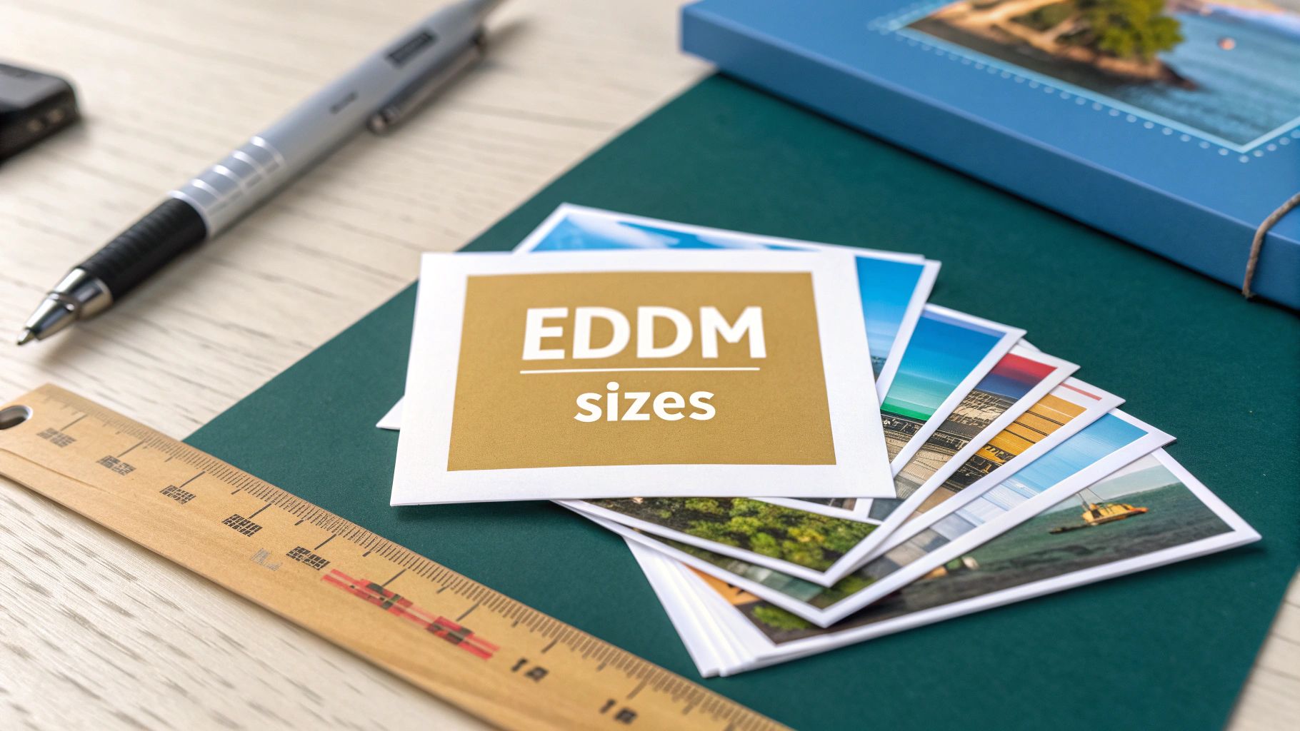
story Every Door Direct Mail Postcard Sizes Explained
When it comes to Every Door Direct Mail, size isn't just a detail—it's everything. The USPS has specific rules you need to follow to qualify for those sweet, discounted postage rates. It’s not just about slapping a stamp on any old postcard. Your mailpiece has to be either taller than 6.125 inches or longer than 10.5 inches . But watch out, it can't be bigger than 12 inches by 15 inches . Think of these dimensions as the guardrails that keep your campaign on track and ensure your postcard sails through the postal system without a hitch. Your Guide to EDDM Postcard Sizes Getting started with an EDDM campaign can feel a little overwhelming, but it really boils down to one simple starting point: picking the right postcard size. This isn't just a friendly suggestion from the USPS; it's a hard rule. Getting it right is your ticket to the program's special postage rates. Think of the postcard size as the foundation of your entire local marketing campaign. The dimensions you choose will directly influence your: Design Space: A bigger postcard is a bigger canvas. You get more room for eye-catching visuals, compelling copy, and your branding. Campaign Budget: While the postage is a flat rate per piece, the printing costs will obviously change with the size. Customer Impact: Let's be honest, a larger mailer is just plain harder to ignore when someone is sorting through their mail. Finding that sweet spot between grabbing attention, getting your message across, and staying on budget is the name of the game. One of the most popular, tried-and-true sizes for EDDM is 6.25 x 9 inches . It’s a real workhorse because it gives you plenty of space for a great offer and strong branding without feeling too bulky for the customer. Of course, there's a whole range of compliant EDDM printing options to explore, so you can find the perfect fit for your specific goals. Quick Guide to Common EDDM Postcard Sizes To make things a bit easier, I've put together a quick rundown of some of the most common EDDM-compliant sizes. This should help you zero in on an option that works for your business and your message. Postcard Size Best For Key Feature 6.25" x 9" Restaurants, real estate, retail The "go-to" size. Offers a great balance of design space and cost-effectiveness. 6.5" x 12" Auto dealers, landscapers Perfect for showcasing larger images, like a car or a beautiful lawn. 8.5" x 11" Menus, service lists, detailed promos Essentially a flyer, it provides maximum space for text and complex offers. 4.5" x 12" Coupons, event announcements A unique panoramic shape that stands out from standard letter-sized mail. Choosing the right size is the first major step in building a campaign that lands. Each one has its own strengths, so think about what you want to achieve before you start designing. Finding the Right Dimensions This visual really brings home how the three key pieces of an EDDM campaign—size, cost, and impact—all work together. As the infographic makes clear, you can't change one of these without affecting the others. If you want a bigger impact with a larger postcard, your printing costs will go up. If you need to cut costs, you might have to sacrifice some size and visual impact. Understanding this relationship is what empowers you to build a smart, successful local marketing campaign from the ground up. Getting to Grips With Official USPS EDDM Requirements Beyond just the basic dimensions, the USPS has a specific rulebook to make sure your mailers play nicely with their sorting machines and actually qualify for those sweet EDDM rates. Think of these as the official "rules of the road" for direct mail. Following them means your postcards have a smooth journey from the print shop to your customers' mailboxes, without any costly detours. These regulations go deeper than just the every door direct mail postcard sizes you choose. They cover the physical DNA of the mailpiece itself. Get these wrong, and you risk having your entire campaign sent back to you, which is a massive waste of both time and money. Core Physical Requirements To get the green light, every single postcard has to meet three non-negotiable physical standards. These are the big ones that ensure your mailer can fly through the USPS system without a hitch. Thickness: Your mailer needs to be at least 0.007 inches thick but can't be more than 0.75 inches thick . This is a pretty generous range, covering everything from standard cardstock to much thicker, folded pieces. Anything too flimsy will jam up the sorting equipment. Weight: Each individual postcard has to weigh less than 3.3 ounces . This limit is surprisingly high, giving you the freedom to use high-quality, heavy paper stocks or even multi-page flyers without worrying about hitting the ceiling. Flexibility: The postcard needs to be flexible enough to bend through the postal machinery but not so stiff that it could break something. It's all about finding that sweet spot between durability and machine-friendliness. Sticking to these specs is non-negotiable. The USPS system is a finely tuned machine built for consistency. A mailpiece that doesn't conform can throw a wrench in the works, leading to delays or an outright rejection of your campaign. If you'd rather not get bogged down in the technical details, partnering with a team that specializes in direct mail services is a smart move. They live and breathe this stuff, handling all the complexities of compliance—from size and weight to proper bundling—so you can focus on what really matters: crafting a message that gets results. By respecting these USPS guidelines, you're setting your campaign up for success and ensuring it lands in every mailbox you intended. Breaking Down the Costs of Different Postcard Sizes Choosing the right Every Door Direct Mail postcard size is as much a financial decision as it is a creative one. While EDDM is fantastic for its flat-rate postage on any mailer under 3.3 ounces , the cost to actually print those postcards can swing pretty dramatically depending on their dimensions. It's a classic cost-versus-impact scenario every marketer has to navigate. A massive 8.5" x 11" mailer gives you a ton of real estate for eye-catching graphics and all the details you want to share. But printing something that big will naturally cost more than a standard 6.25" x 9" postcard. You have to weigh the potential for making a bigger splash against the upfront printing bill. Calculating Your Total Campaign Cost At the end of the day, your total EDDM campaign investment comes down to two things: printing and postage. Since the postage is a fixed per-piece rate, your printing choices are where you can really control your budget. For instance, while EDDM’s bulk postage rates are a huge draw, the program’s rules require larger postcards, which can sometimes eat into those savings. One study found that the total cost for a 6.5" x 9" EDDM mailer was only a tiny bit cheaper per thousand pieces than a traditional 4" x 6" postcard sent via standard mail. Why? The higher printing costs nearly canceled out the postage discount. It’s worth digging into these kinds of direct mail cost comparisons to get the full picture. EDDM Retail vs. BMEU Pricing Another huge factor in your final cost is how you mail your campaign. The USPS offers two different pricing structures for EDDM, and which one you use depends entirely on the size of your mail drop. EDDM Retail: This is perfect for small businesses sending out fewer than 5,000 mailpieces a day. You just bundle up your postcards, drop them off at your local post office, and pay the straightforward retail rate. Simple and easy. Business Mail Entry Unit (BMEU): If you're running a larger campaign, using a BMEU can unlock some serious postage savings. It requires getting a mailing permit and prepping your mail to stricter USPS standards, but for high-volume mailings, the lower rates are well worth the extra effort. The right choice really just comes down to your campaign volume. BMEU offers the absolute lowest per-piece cost but requires more prep work, while Retail is all about convenience for smaller, more targeted outreach. By checking out professional postcard printing services , you can get instant quotes on different sizes and paper types. This lets you play with the numbers and find that sweet spot where your design goals and your budget finally shake hands. How Postcard Size Influences Campaign Success Let's move past the postal rules for a moment and talk strategy. The actual physical size of your mailer is one of your most powerful marketing tools. It directly shapes how a potential customer sees your brand and connects with your message. Think about it: a bigger postcard isn't just harder to ignore in a stack of mail; it gives you a bigger canvas to tell your story, show off your product, and make a genuine connection. You should treat postcard size as a deliberate choice. A wide, panoramic postcard is a no-brainer for a realtor showing off a stunning landscape view. A tall, skinny one? It could mimic a menu for a new restaurant, instantly telling the recipient what it's all about. This is where you connect the physical every door direct mail postcard sizes to what you’re trying to achieve with your business. Matching Size to Your Marketing Goal The right dimensions can seriously amplify your campaign's main goal, whether that's building brand awareness, pulling in leads, or getting people through your door right now . For Brand Awareness: Go big. Sizes like 8.5" x 11" are basically mini-billboards for the mailbox. They give you all the room you need for bold branding and eye-catching images that build that crucial name recognition. For Lead Generation: Mid-range sizes like 6.25" x 9" hit the sweet spot. You get plenty of space for a killer offer and a clear call-to-action without overwhelming the person holding it. For Direct Sales: Smaller, unique formats are perfect for highlighting a big coupon or a QR code. They scream "scan me now" and encourage immediate action, driving customers straight to your website or storefront. The data backs this up in a big way. Postcards have the highest response rate of any direct mail format, hitting an average of 4.25% . Part of that success comes from the sheer visibility of EDDM-compliant sizes—they stand out and are quick to digest. With 39% of consumers trying a business for the first time because of direct mail, picking a size that tells your story well is non-negotiable. Postcard Mania has some great research on this if you want to dig deeper. The psychology here is simple: bigger often feels more important. A substantial, high-quality mailer sends a signal that your business is established and professional, building trust before they even read your offer. At the end of the day, your postcard is more than just a piece of paper—it's a tangible piece of your brand. By thoughtfully choosing its size and exploring different marketing materials , you can create a mailer that doesn’t just get noticed but drives real, measurable results for your business. Designing for Popular EDDM Postcard Dimensions Great design is what makes your message stick, but you have to work with the canvas you've got. When you’re dealing with specific every door direct mail postcard sizes , the dimensions completely change how a person sees and reads your offer. It's not just about cramming everything in; it’s about creating a visual journey that makes sense for that particular shape. Think about it—each size has its own personality. A wide postcard naturally pulls the eye from left to right, almost like reading a book. A taller one, on the other hand, encourages more of an up-and-down scan. Once you get a feel for this, you can strategically place your most important stuff—the headline, the can't-miss offer, and the call-to-action—right where people are already going to look. Tailoring Design to Common Sizes Let's break down how to approach two of the most popular EDDM postcard dimensions. Each one calls for a slightly different playbook to make sure your message lands perfectly. The Workhorse: 6.25" x 9" Postcards This size is a fan favorite for a reason. It feels substantial in your hand but isn't awkwardly large. Its classic rectangular shape is the perfect setup for a "Z-Pattern" layout, which follows how our eyes naturally scan a page. How it works: People instinctively look from the top-left (where your logo and headline should be) across to the top-right. Then, their eyes drift diagonally down to the bottom-left before shooting across to the bottom-right—the perfect spot for your call-to-action. Pro Tip: Stick your most eye-catching photo or graphic right in the middle of that diagonal path. It’ll grab their attention as their eyes travel down the card. The Standout: 4.25" x 11" Postcards This tall, slim format is an instant pattern-breaker in a stack of mail. Its strong vertical orientation is fantastic for lists, menus, or step-by-step instructions because it creates a natural sense of flow from top to bottom. How it works: The narrow shape practically forces a top-to-bottom reading path. Use this to your advantage by stacking your information logically. Pro Tip: Start with a bold, can't-miss headline at the top, flow into your main points (bullet points work great here), and anchor it all with your call-to-action at the very bottom. If you really want to get creative, explore how die-cutting services can give your postcard a unique shape that truly pops. The Non-Negotiable Design Elements Before we get too carried away with creative layouts, there are a couple of things the USPS absolutely requires you to get right: the indicia and the address block. The USPS requires the EDDM Retail Indicia to be placed in the upper right corner of the mailpiece. The addressing area for the "Postal Customer" information must also be placed correctly to ensure deliverability. Always use a USPS-approved template to avoid costly mistakes. Messing this part up can get your entire mailing rejected, which is a painful and expensive mistake. Always, always double-check the latest USPS guidelines before you send anything to print. To make this easier, here's a quick checklist to run through before you finalize your design. It'll help you make sure everything is both eye-catching and compliant. Design Checklist for EDDM Postcards Design Element Key Consideration Compliance Note Headline Is it bold, clear, and positioned to be seen first? Keep it away from the indicia and address areas. Visuals Does the main image support the message and fit the layout (Z-pattern or vertical)? Ensure images don't have text that looks like an address. Offer/Body Is the core offer easy to understand in a quick scan? Use bullet points or short sentences for readability. Call-to-Action Is it obvious what you want the reader to do next? Make it stand out with color, a box, or bold text. Address Block Is the "Postal Customer" information in the correct spot? Must follow USPS placement rules for automated sorting. Indicia Is the EDDM Retail Indicia in the top right corner? Must be the correct size and format per USPS specs. White Space Is there enough breathing room, or is the design cluttered? Good spacing improves readability and visual appeal. Sticking to this checklist will save you a lot of headaches. It ensures your postcard not only looks professional but also sails through the postal system without a hitch. Your Top EDDM Postcard Size Questions Answered Even after you’ve got a solid plan, a few questions always seem to pop up right before you launch an EDDM campaign. Let's tackle the most common ones that business owners have about every door direct mail postcard sizes and the program's rules. Think of this as a final check-in to make sure you're ready to go. Getting these details right is what separates a smooth, successful mail drop from a frustrating trip back from the post office. Let's clear up any last-minute confusion so you can mail with total confidence. Can I Use a Standard 4x6 Postcard for EDDM? This is easily the most frequent question we get, and the answer is a hard no . Your classic 4x6 inch postcard is just too small to qualify for the Every Door Direct Mail program. To get the green light from the USPS, your mailpiece has to meet at least one of these minimum dimensions: Taller than 6.125 inches Longer than 10.5 inches Since a 4x6 postcard misses the mark on both counts, it's out of the running. You have to size up to one of the approved formats to get access to those sweet EDDM bulk postage rates. What Is the Most Cost-Effective EDDM Size? This is a great question. While your postage cost is the same for any compliant size (as long as it's under 3.3 ounces), the printing bill can be a different story. The most cost-effective choice is all about balancing your printing budget with your marketing goals. For most businesses, the 6.25" x 9" postcard really hits the sweet spot. It gives you plenty of room for a powerful message and eye-catching visuals, but it won't break the bank like some of the jumbo formats, such as an 8.5" x 11" mailer. It's the perfect middle ground, offering great visibility and message space while keeping your budget in check. Here’s the bottom line: your postage rate doesn't change with the size, but your printing bill definitely will. My advice? Choose the largest size you can comfortably afford to make the biggest splash in the mailbox. Do I Need a Stamp for EDDM Postcards? Nope, you can put the stamp book away. Traditional postage stamps are not used for EDDM campaigns. Instead, every single mailpiece needs a special marking called an EDDM Retail Indicia printed directly in the upper right-hand corner. This little pre-printed box is what tells the USPS that you've paid your postage through the EDDM program. It's not optional—it's the key that unlocks the discounted, flat-rate postage. Using a regular stamp would not only cost you more but would get your mail kicked out of the program entirely. Ready to create a postcard that turns heads and checks every USPS box? 4OVER4 offers a huge selection of EDDM-compliant sizes and professional templates to make your next local marketing campaign a breeze. Start designing your perfect mailer today at https://4over4.com .
 story
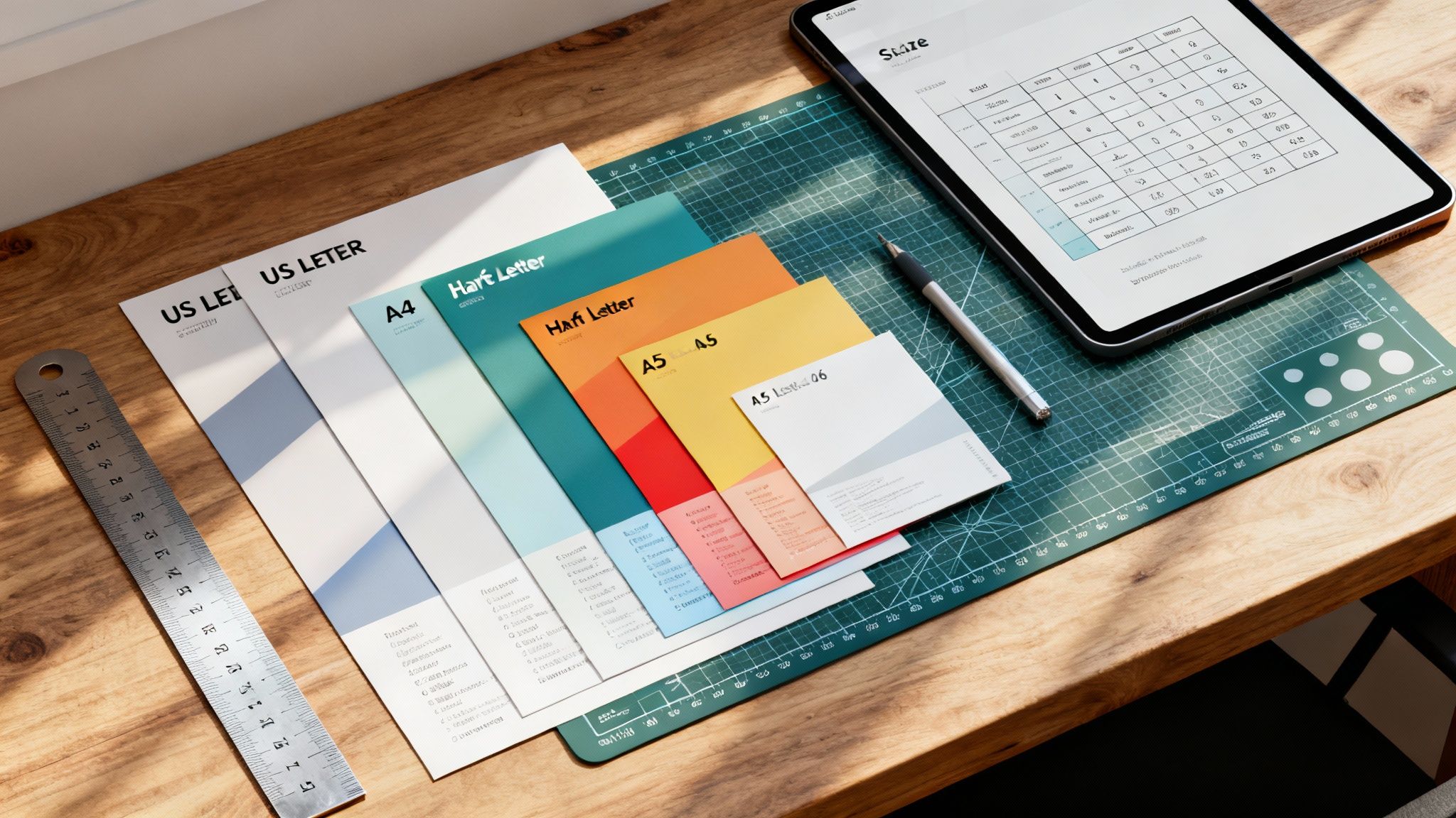
story A Complete Guide to Flyer Size Dimensions for Perfect Printing
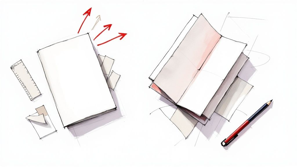
When you're getting ready to print a flyer, one of the first questions you'll face is, "What size should it be?" The most common choices are US Letter (8.5 x 11 inches) in North America and A4 (8.27 x 11.7 inches) pretty much everywhere else. These two workhorses cover a huge range of marketing needs, from event promotions to detailed informational handouts. Getting a handle on these standard sizes is your first step toward creating print materials that really work. Quick Reference for Standard Flyer Sizes Picking the right flyer size dimensions is a bigger deal than you might think. It directly impacts your design, budget, and even how you'll get them into people's hands. Are you passing them out at a trade show, dropping them in the mail, or pinning them to a community bulletin board? Each scenario might call for a different size to best get your message across. This section is your cheat sheet, giving you an at-a-glance look at the most popular US and international flyer sizes to help you make a smart choice fast. Before we jump into the technical stuff like file setup and folded formats, it’s important to know your basic options. Each size has its own strengths. A big format is perfect for a detailed infographic that needs room to breathe, while a smaller, pocket-friendly flyer is better for a simple coupon or event reminder. While people often use the terms interchangeably, it's worth exploring the differences between flyers and brochures to see which format really fits your goals. To make things even easier, here’s a quick table comparing the most common flyer sizes you'll encounter. Standard Flyer Sizes at a Glance (US vs International) Flyer Name Dimensions (Inches) Dimensions (Millimeters) Best For Letter (US) 8.5" x 11" 215.9mm x 279.4mm Corporate handouts, event promos, menus, real estate listings Half Letter (US) 5.5" x 8.5" 139.7mm x 215.9mm Program notes, event invites, coupons, direct mail inserts A4 (International) 8.27" x 11.7" 210mm x 297mm Business correspondence, formal documents, magazine-style flyers A5 (International) 5.83" x 8.27" 148mm x 210mm Booklets, direct mail, notepads, informational handouts A6 (International) 4.13" x 5.83" 105mm x 148mm Postcards, pocket guides, simple announcements, coupons This table should give you a solid starting point for deciding which direction to go, whether your audience is local or global. Common US Flyer Sizes Here in the United States, our flyer dimensions are based on standard imperial paper measurements. The most common options you'll see are: Letter (8.5" x 11"): This is the undisputed champion. It's perfect for just about anything—corporate handouts, detailed service lists, school announcements, you name it. Its familiarity and the fact that it fits in every office printer make it the go-to choice for many. Half Letter (5.5" x 8.5"): A more compact and budget-friendly option. This size is great for event invitations, program notes, and promotional offers where you don't need to overwhelm the reader with too much information. International A-Series Flyer Sizes Once you leave North America, the world runs on the ISO 216 standard, better known as the A-series. The system is brilliantly simple: each size is exactly half of the one before it. A4 (210mm x 297mm): The international counterpart to our US Letter size. A4 is the standard for business letters, official documents, and slick, magazine-style flyers. A5 (148mm x 210mm): Exactly half the size of an A4 sheet. The A5 is a very popular choice for booklets, notepads, and flyers sent through the mail. A6 (105mm x 148mm): This small, postcard-like size is ideal for things you can stick in your pocket, like event announcements, coupons, or mini guides. For those looking for design ideas, many resources that offer free church graphics templates provide layouts already set up for these standard dimensions. Understanding North American Flyer Dimensions Here in the US and Canada, a few specific flyer sizes really run the show. This isn't by accident; these dimensions have a long history and offer some very practical perks for businesses. They’re designed to be perfectly compatible with standard office equipment and mailing requirements, which makes them a go-to, cost-effective choice for marketers. Getting a handle on these sizes is your first step to creating print materials that really connect with a North American audience. You’ll constantly run into US Letter, Half Letter, and Legal sizes. Each one has its own sweet spot and unique advantages. Because they're so common, everything from the presets in your design software to the display stands in a retail shop is built around them. This simplifies the whole process, from the first design draft to getting your flyers into people's hands. This section will walk you through the options you'll find for flyer printing on the 4OVER4 platform. As you can see, businesses have plenty of standard sizes to work with, each one built for a different marketing job. The Standard US Letter Size (8.5" x 11") US Letter is, without a doubt, the king of flyer dimensions in North America. Measuring 8.5" x 11" , it's so versatile that it has become the default for an enormous range of projects. This size gives you plenty of room for eye-catching images and detailed text without making your design feel cluttered. Its biggest selling point is its universal compatibility. Every office printer is set up to handle this size. That means small businesses and startups can easily print out mockups or small batches on their own before they decide to go all-in on a professional print run. You’ll see it used for things like: Corporate Handouts: Perfect for sharing company info or service details at trade shows. Restaurant Menus: The ideal canvas for single-page menus or takeout lists. Event Promotions: Great for tacking onto bulletin boards or handing out directly to people. Real Estate Listings: Provides just enough space for property photos and all the important details. Half Letter and Legal Dimensions While Letter size gets most of the attention, two other key sizes fill more specific roles. Half Letter (5.5" x 8.5") is exactly what it sounds like—a standard letter sheet cut perfectly in half. Its compact size is easier to carry and a bit friendlier on the wallet, making it a fantastic choice for mass distribution. Pro Tip: Use Half Letter flyers for things like direct mail inserts, coupons, or event programs. Their smaller size makes them cheaper to print and mail, which really helps stretch your marketing budget. On the other end of the spectrum, Legal size (8.5" x 14") gives you extra vertical real estate for designs that are heavy on content. It’s often the go-to for detailed price lists, menus with a lot of options, or informational flyers that just can't fit all their text on a standard letter sheet. The history behind these slightly odd dimensions is pretty interesting. The US Letter size actually goes back to 17th-century Dutch paper molds, which were cut into eight 8.5" x 11" pieces to get the most out of each sheet. This standard was locked in during the 1930s. Today, data from printing associations shows that a massive 85% of promotional flyers in the US and Canada are based on Letter or Legal sizes, cementing their role as the compatible, cost-effective choice. If you're curious, you can dive deeper into the origins of US paper sizes from this detailed explanation. A Look at International A-Series Flyer Dimensions If you’re doing business outside of North America, you’ll quickly discover the world runs on a different paper system. From Europe to Asia and just about everywhere in between, the global standard is ISO 216 , better known as the A-series. Understanding these flyer size dimensions is non-negotiable for any brand with an international footprint. It's a brilliantly logical system that ensures your marketing materials look consistent, no matter where they end up. The real beauty of the A-series is its clever mathematical foundation. Every size shares the same aspect ratio—the square root of 2 (about 1:1.414 ). What does that mean in practice? When you cut any sheet in half along its longest side, you get two perfectly proportioned sheets of the next size down. Cut an A3, and you get two A4s. Cut an A4, and you get two A5s. This process continues all the way down the line with zero paper waste from trimming. This incredibly efficient concept dates back to a 1786 observation by German scientist Georg Christoph Lichtenberg. It was officially adopted in Germany in 1922 and became the international ISO 216 standard by 1975. Today, it’s used in over 95% of countries . In fact, A4 flyers are used in 70% of European print runs , making it an absolute powerhouse in global marketing. Common A-Series Flyer Dimensions and Uses Getting familiar with the most popular A-series sizes is key to creating marketing collateral that works anywhere in the world. Each one has its own ideal role. A4 (210 x 297 mm or 8.27" x 11.7"): This is the global cousin to the US Letter size and the undisputed champion of versatility. It’s the go-to for corporate brochures, official documents, detailed sell sheets, and any flyer that needs plenty of room for both compelling text and sharp visuals. A5 (148 x 210 mm or 5.83" x 8.27"): Exactly half the size of an A4, the A5 is a crowd-pleaser for event invitations, small booklets, and promotional handouts. It’s compact enough to be convenient but still feels substantial in hand, making it easy to distribute and for people to carry. A6 (105 x 148 mm or 4.13" x 5.83"): A quarter of an A4, the A6 is essentially a postcard. It’s perfect for pocket-sized promos, discount coupons, and quick announcements where you need to get straight to the point. The A-series system scales up, too. The largest size, A0, has an area of precisely one square meter, creating a clean, scalable foundation for every other dimension. This consistency is also crucial for bigger jobs; if you’re curious, our guide on standard print poster sizes dives into larger formats. Ultimately, picking the right A-series flyer size comes down to your content and how you plan to get it into people's hands. An A4 is your best bet for a trade show where you need to showcase detailed product specs. An A6, on the other hand, is perfect for a street team handing out coupons. When you match the flyer size to its job, you make sure your message hits home with a global audience. Choosing the Right Folded Flyer Dimensions While a flat flyer is great for getting a single, direct message across, folded flyers open up a whole new playbook for organizing your information. When you pick the right flyer size dimensions for a folded piece, you can guide your audience through a story, reveal details step-by-step, and fit a surprising amount of content into a neat, compact format. It's the difference between a simple handout and an interactive experience. The process always starts with a standard flat sheet, like a US Letter ( 8.5" x 11" ) or an international A4 ( 210mm x 297mm ), which gets folded to create separate panels. Knowing how these base dimensions translate into the final folded size is absolutely critical for setting up your design files correctly. Each fold serves a different purpose, so you’ll want to match the format to your content and what you’re trying to achieve. Bi-Fold or Half-Fold Flyers The Bi-Fold, which you’ll also hear called a Half-Fold, is the most straightforward and popular folded format out there. It’s simply a single sheet of paper folded neatly in half, creating four distinct panels: a front cover, a back cover, and two inside panels. This gives you that familiar booklet-style layout that’s super easy for people to open and read. Base Sheet (US Letter): An 8.5" x 11" sheet becomes a 5.5" x 8.5" flyer when folded. Base Sheet (A4): A 210mm x 297mm sheet folds into an A5-sized flyer, measuring 148mm x 210mm . This format is a go-to for things like event programs, simple product spec sheets, and presentation handouts where you want a clean break between an introduction (the cover) and the main content (inside). Tri-Fold and Z-Fold Flyers Both Tri-Folds and Z-Folds divide a sheet into three sections, giving you six panels to work with (three on the front, three on the back). Although they start with the same base paper size, how they're folded—and the resulting panel sizes—are slightly different. This is a small but crucial detail for any designer. A standard Tri-Fold (often called a letter fold) has one panel that tucks inside the others. To make sure it closes smoothly, that inside panel has to be just a tiny bit narrower than the other two. For an 8.5" x 11" sheet, this usually means two panels are 3.6875" wide, while the one that folds in is 3.625" . A Z-Fold, on the other hand, folds like an accordion. Since no panel has to tuck inside another, all three panels can be the exact same width. Folded Flyer Formats and Panel Dimensions To make things clearer, here’s a quick breakdown of how these common folds work out with standard paper sizes. Each format offers a unique way to present information, whether you're creating a compact brochure or a detailed menu. Fold Type Base Paper Size (US) Base Paper Size (ISO) Final Panel Dimensions (Approx.) Bi-Fold 8.5" x 11" A4 (210 x 297mm) 5.5" x 8.5" (each panel) Tri-Fold 8.5" x 11" A4 (210 x 297mm) 3.66" x 8.5" (uneven panels) Z-Fold 8.5" x 11" A4 (210 x 297mm) 3.66" x 8.5" (equal panels) These formats are perfect for informational brochures, restaurant menus, and direct mail campaigns where you need to break down information into easy-to-digest sections. Getting the panel layout right is key, so if you need more help, check out our guide on using a folded cards template to nail your print-ready design. Essential Print-Ready File Specifications Picking the perfect flyer size is a great first step, but how you prepare your design file is what truly makes or breaks the final product. To sidestep the common—and often costly—printing errors I’ve seen over the years, you have to get familiar with three core concepts every professional printer lives by: bleed , trim line , and the safe margin . Getting these specifications right ensures your design looks exactly like it did on your screen, with no awkward white borders or chopped-off text. Think of them as the technical blueprint for your flyer. Honestly, failing to set them up correctly is one of the top reasons print jobs get delayed or end in disappointment. This quick visual guide shows how a single sheet transforms into common folded flyer styles. Whether it's a Bi-Fold, Tri-Fold, or Z-Fold, each one turns that flat sheet into a structured, multi-panel piece, which makes nailing these print specs even more critical. Understanding Bleed, Trim, and Safe Margins These three elements are designed to work together, creating a buffer zone that accounts for the tiny mechanical variations in the cutting process. No cutting machine is perfect down to the micrometer, so these guides build in a little wiggle room. Bleed: This is the part of your design that extends past the final cut edge. The industry-standard requirement is an extra 0.125 inches (or about 3mm) on all four sides. If you have a background color or an image that's supposed to go right to the very edge, it must extend all the way into this bleed area. This is how you prevent those ugly white slivers from showing up after the flyer is trimmed. Trim Line: Simple enough—this is the exact line where the machine will cut your flyer to its final intended size. For an 8.5" x 11" flyer, the trim lines are set at precisely those measurements. Safe Margin: Also known as the "safety line," this is an inner boundary set 0.125 inches inside the trim line . You need to keep all your critical information—think text, logos, and key graphic elements—within this margin. This guarantees nothing important gets accidentally sliced off during trimming. By setting up these guides in your design software, you're giving the printing press a necessary margin for error. Trust me, it’s the single most important step for getting that clean, professional, edge-to-edge finish on your flyers. Resolution and File Format Requirements Beyond the layout margins, the technical quality of the file itself is a huge deal. Handing over a file with the wrong specs can lead to fuzzy images and off-brand colors, completely undermining all your hard design work. For sharp, professional-looking results, your artwork must have a resolution of 300 DPI (Dots Per Inch) . This is the gold standard for high-quality printing. A common mistake is pulling images from the web, which are often at 72 DPI for faster loading. Those will look pixelated and blurry in print. Finally, the file format you submit is absolutely essential. The universally preferred format is a high-quality PDF . A well-made PDF embeds all your fonts, images, and layout details into one self-contained, reliable file that any printer can work with. For a detailed walkthrough, our guide on how to create a print-ready PDF has you covered. While some printers might accept native files from Adobe Illustrator (AI) or Photoshop (PSD), a properly prepared PDF is always your safest bet. Selecting Paper and Finishes for Maximum Impact While your flyer's size sets the canvas, the paper and finish you choose are what control how your brand feels in a customer's hands. Get this right, and a simple piece of paper becomes a memorable brand experience. It’s all about adding a sense of quality and professionalism that visuals alone just can’t replicate. Understanding Paper Weight (Stock) The weight of the paper, what printers call paper stock , is one of the first things you’ll decide. It’s not about how heavy a single sheet is, but more about its thickness and sturdiness. We measure this in pounds ( lb ) for standard paper or points ( pt ) for thicker cardstock. 100lb Gloss Text: This is a fantastic, versatile choice for many projects. It's noticeably thicker than regular office paper, so it has enough durability for mailers and handouts while staying flexible. The glossy sheen really makes colors pop. 16pt Cardstock: Step up to this, and you're in premium territory. It’s significantly thicker and more rigid, giving it a substantial, high-quality feel. This stock is perfect for flyers that need to double as small signs or high-end promotional cards that you want people to keep. Choosing a Finish That Fits Your Message The finish is the coating applied after printing, and it has a massive impact on the final look and feel. Each one serves a different purpose, so you’ll want to match your choice to your brand’s personality and what the flyer is trying to accomplish. A glossy finish is designed to grab attention immediately. Its high-shine coating makes colors look incredibly vibrant and saturated—perfect for flyers loaded with photos or promoting an exciting event. That reflective surface is great for catching the light and standing out in a pile of mail. On the other hand, a matte finish offers a much more subtle and sophisticated look. It has a smooth, non-reflective surface that cuts down on glare, which makes flyers with a lot of text much easier to read. It’s an elegant option for corporate handouts or brands going for a modern, upscale vibe. Key Takeaway: Don't forget about uncoated stock. It gives you a natural, textured feel. Since there's no coating, the paper is porous and super easy to write on, making it the go-to choice for flyers that include appointment reminders, feedback forms, or fillable coupons. Choosing the best paper for flyers is a balancing act between your design, your budget, and how the flyer will be used. A thick, matte-finished flyer sends a completely different message than a thin, glossy one. When you carefully select the right paper and finish, you add another powerful layer of communication to your marketing. Frequently Asked Questions About Flyer Dimensions Even with a solid grasp of the basics, there are always a few specific questions that pop up about flyer dimensions. Let’s dive into some of the most common ones we hear from designers, marketers, and business owners. Think of this as a final check-in to clear up any confusion before you send your project to print. We'll cover everything from international sizes to the best picks for specific marketing goals, making sure you have all the info you need. What Is the Most Common Flyer Size? That really depends on where you are in the world. In the United States and Canada, the clear winner is US Letter, measuring 8.5" x 11" . It's the go-to for just about everything, from corporate handouts to community bulletin board posts, because it's perfectly compatible with any standard office printer. Once you go international, though, the A4 size (210mm x 297mm) is king. If you’re running a global campaign, it’s a smart move to have designs ready for both Letter and A4 to keep your branding consistent across different markets. Can I Use the Same Design for US Letter and A4 Flyers? While they're close, you really shouldn't use the exact same file for both US Letter and A4 without making some tweaks. A4 is a bit taller and narrower than US Letter, and just resizing your design will likely lead to awkward cropping or unbalanced white space. Best Practice: Create two versions of your design. Start with one, then duplicate it and adjust the layout to fit the other dimension perfectly. This extra step ensures all your text and images are properly aligned within the safe margins for each size, preventing any nasty surprises at the printer. Which Flyer Size Is Best for Direct Mail Campaigns? For direct mail, smaller and more compact sizes are usually your best bet—they're effective and much friendlier on your budget. The Half Letter (5.5" x 8.5") is a fantastic choice in the US because it slips right into standard business envelopes without needing an extra fold. For international mailings, A5 (148mm x 210mm) and A6 (105mm x 148mm) are excellent options. Their postcard-like feel makes them easy for postal services to handle and process, which helps keep your printing and postage costs down while still making a solid impact in the mailbox. Does Flyer Size Affect Printing Costs? Absolutely. The flyer size you choose directly impacts your final printing bill. It’s pretty straightforward: larger flyers use more paper and more ink, which drives up the price for each piece. There's a bit more to it, though. How efficiently your chosen size fits onto a large press sheet—a process called nesting—also plays a huge role. The old divide between US Letter and international A4 sizes is a perfect example of this. A standard press sheet can fit 8 US Letter flyers but often only 6 or 7 A4 flyers . This difference alone can bump up the cost for A4 jobs by 10-15% in print shops that serve mixed markets. If you want to dive deeper, you can discover more insights about the global adoption and specifics of paper sizes to understand these little details. Sticking to standard sizes like Letter, A4, or A5 is almost always more cost-effective than a custom dimension that creates more paper waste. Ready to bring your perfect flyer to life? With a massive library of templates and an intuitive online designer, 4OVER4 makes it easy to create stunning, print-ready flyers in any standard or custom size. Start designing your custom flyers today!
 story
story Flyers And Brochures A Complete Guide To Print Marketing
Think about the last time you saw a great movie trailer. It was probably short, punchy, and designed to get you excited for one thing: opening night. That's a flyer. Now, think about a detailed review you read afterward that broke down the plot, characters, and cinematography. That’s a brochure. The fundamental difference between flyers and brochures boils down to their purpose and format. A flyer is a single, unfolded sheet built for mass distribution and quick announcements. A brochure, on the other hand, is a folded, multi-panel piece created to give detailed information to someone who's already curious. Decoding Flyers Vs. Brochures: The Core Differences At first glance, flyers and brochures might seem like two sides of the same coin. They’re both printed marketing tools, right? True, but their strategic roles couldn't be more different. Picking the wrong one can be the difference between a knockout campaign and a total whiff. To really get it, think of a flyer as a sprinter. Its whole job is to deliver a single, powerful message to a huge audience as fast as possible. It’s loud, attention-grabbing, and temporary—perfect for drumming up instant buzz for an event or a sale. The single-page format is a creative constraint, forcing you to be concise and direct. A brochure, in contrast, is a marathon runner. It’s built for the long haul, designed to be kept, shared, and used to guide a bigger decision. The folds create distinct panels, giving you space to build a story and walk a potential customer through more complex information, step by step. To make things even clearer, here’s a quick rundown of how they stack up against each other. Flyer Vs. Brochure At A Glance Characteristic Flyer Brochure Purpose Announce & create buzz Educate & persuade Format Single, unfolded sheet Folded, multi-panel Audience Broad, general public Targeted, interested prospects Lifespan Short-term, disposable Long-term, reference material Content Concise, high-impact message Detailed, comprehensive info Cost Lower cost per piece Higher cost per piece This table gives you the basics, but the real magic is in knowing when and how to deploy each one for maximum effect. The Strategic Purpose of a Flyer A flyer’s primary mission is announcement and awareness . It’s a numbers game, built on the principle of high volume and low cost to reach as many eyeballs as possible. Because of this, the design has to be bold and the message has to hit you in about three seconds flat. Key goals for flyers often include: Event Promotion: Announcing concerts, grand openings, or local festivals. Sales and Discounts: Blasting out a limited-time offer to drive immediate foot traffic. General Awareness: Introducing a new business or service to the neighborhood. The strength of a flyer is its simplicity. It’s a direct shot, designed to trigger one immediate action: "Visit our sale," "Come to our event," or "Try our new pizza." Even with all the digital noise out there, the physical nature of a flyer still cuts through. Studies have shown that direct mail response rates can hit anywhere from 2.7% to 4.4% , which blows email’s average of 0.6% out of the water. This is exactly why flyers are still a favorite for marketers who need to make a quick, memorable splash. The Educational Role of a Brochure While a flyer shouts, a brochure explains. Its purpose is to educate and persuade an audience that has already raised its hand. Someone might grab a flyer off a telephone pole, but they’ll intentionally pick up a brochure from a trade show booth, a doctor's office, or a service counter. This makes it the perfect tool for nurturing leads and supporting your sales team. Because it’s packed with details, a well-designed brochure builds credibility and positions your brand as an expert. If you’re dealing with complex products or high-value services, a brochure gives you the space to lay out all the features and benefits in a professional format customers can take home. Our high-quality brochures printing options are perfect for creating a piece that feels substantial and authoritative. Choosing The Right Format, Folds, Sizes, And Paper The physical impression your flyers and brochures make speaks volumes long before anyone reads a single word. Think about it: choosing the right paper, size, and fold is like dressing your message for success. Handing someone a high-end corporate brochure printed on flimsy paper is like a CEO showing up to a board meeting in sweatpants. It just doesn't send the right message. This is where the technical side of print becomes a powerful marketing tool. Understanding a few key terms, like paper weight and finish, directly influences how potential customers perceive your brand's quality and professionalism. Demystifying Paper Weights And Finishes When printers talk about paper weight, they're usually using terms like pounds ( lb ) or grams per square meter ( GSM ). Both are just ways to measure the paper's density and thickness. A higher number means a thicker, more substantial paper—one that feels more durable and high-quality in your hands. To put it in perspective, standard office copy paper is usually a lightweight 70 lb / 100 GSM . It’s flexible and cheap, perfect for internal memos, but it won't do much to make a lasting impression on a potential customer. For marketing materials, you’ll want something with a bit more heft: 100 lb Text (150 GSM): This is a really popular choice for high-quality brochures. It has a significant feel without being overly rigid, striking a great balance between quality and cost. 12 pt Cardstock (310 GSM): Noticeably thicker and stiffer, this is often used for premium flyers, postcards, or the covers of brochures. It feels durable and authoritative. 16 pt Cardstock (350 GSM): This is a very heavy, sturdy option. It communicates luxury and is perfect for pieces designed to truly stand out, like an invitation to an exclusive event or a high-end product showcase. The paper's finish adds another layer of personality. A glossy finish makes colors pop and looks fantastic on image-heavy designs, like a travel brochure filled with stunning destination photos. On the other hand, a matte finish offers a sophisticated, non-reflective surface that cuts down on glare, making it ideal for text-heavy pieces where readability is paramount. Your paper choice is a non-verbal cue to your audience. A thick, glossy cardstock screams premium and modern, while a lighter, uncoated paper feels more organic and approachable. Match the paper's personality to your brand's voice. Selecting The Right Size For Your Message Just like paper weight sends a message, so does the size of your flyer or brochure. The dimensions you choose should be based on your content, how you plan to distribute it, and what you're trying to achieve. Different sizes serve different strategic purposes: Half Sheet (5.5" x 8.5"): This is perfect for handouts, package inserts, or info sheets that don’t need a full page. It's cost-effective and easy for people to carry around. Letter (8.5" x 11"): The go-to standard for single-page flyers, sales sheets, and event announcements. Its familiarity makes it a versatile and safe choice for almost any project. Tabloid (11" x 17"): This larger format is excellent for things like window advertisements, posters, or detailed product showcases where you need more visual real estate to make an impact. The Strategic Power Of Brochure Folds When it comes to brochures, the fold isn't just a way to make the piece smaller—it's a storytelling device. Each fold creates panels that guide the reader through your content in a specific sequence, revealing information piece by piece. The fold dictates the narrative flow. A bi-fold creates a simple, book-like experience with four panels, making it ideal for straightforward presentations. The classic tri-fold gives you six panels, which is perfect for breaking down information into smaller, digestible sections. But you can also get more creative to generate intrigue: Z-Fold: This accordion-style fold is great for presenting information sequentially, like a step-by-step guide or a company timeline. Gate-Fold: With two outer panels that open like gates to reveal a larger inner spread, this fold creates a dramatic reveal. It's perfect for high-impact visuals or luxury product launches. Choosing the right fold is all about creating a journey for your reader. For those looking to explore even more creative possibilities, our extensive folded collection offers a wide variety of styles to help you craft the perfect narrative for your brand's message. Strategic Use Cases For Flyers And Brochures Knowing the technical differences between flyers and brochures is one thing. Knowing exactly when to use each one? That’s where smart marketing really begins. This isn’t about theory; it’s about real-world situations where picking the right piece of paper can make or break your campaign. Let's simplify it. If your message needs to be a loudspeaker, grab a flyer. If it needs to be a detailed conversation, you’ll want a brochure. Each one is a master in its own domain. When To Use A Flyer: The Power Of Immediate Impact Flyers are the undisputed champions of speed and volume. Their single-page format and low cost-per-piece are perfect for casting a wide net and getting a fast response. They’re built for campaigns that need a quick burst of awareness to drive people to act now . A flyer should be your go-to for situations like these: Grand Openings and Events: Nothing gets the word out about a new shop, a local concert, or a street fair faster than a well-placed flyer. They’re perfect for handing out where people gather or pinning to community boards to create that essential local buzz. Flash Sales and Limited-Time Offers: The temporary, urgent feel of a flyer is a perfect match for a sale. A bold headline screaming, " 50% Off This Weekend Only! " is a classic for a reason—it works. Restaurant Specials and Menu Inserts: Announcing a new lunch deal or a happy hour? A small, clean flyer can be slipped into takeout bags or left on the counter to bring customers back through the door. The main takeaway here is that flyers are designed for a single, powerful call to action. Their job is to snag attention, deliver a simple message, and get someone to do something right away. When To Use A Brochure: Guiding The Considered Decision Brochures come into play when the customer’s journey is a bit more involved and requires more information. They’re created for an audience that’s already listening and is actively looking for details to make an informed choice. Unlike the grab-and-go nature of a flyer, a brochure is meant to be kept, reviewed, and even shared. A brochure is your best bet in these scenarios: Sales Meetings and Leave-Behinds: After you’ve had a great meeting, leaving a high-quality brochure gives your prospect a tangible summary of what you discussed. It reinforces your key points and gives them something solid to look over later. Trade Show Booths: At a busy trade show, people are hunting for information. A detailed brochure acts as a complete guide to your products or services, letting you continue the conversation long after they’ve walked away from your booth. Welcome Packets and Onboarding: When you bring on a new client or member, a brochure can outline your services, introduce the team, or explain key processes in a clean, professional way that builds immediate trust. To help you visualize when to use which, this decision tree maps out the key factors like your budget, how complex your message is, and the best format to use. As your message gets more detailed and your quality needs go up, the flowchart makes it clear: a folded brochure is the way to go. Brochures are your silent salespeople. They work for you when you’re not there, answering questions, highlighting benefits, and nudging potential customers closer to a decision. Don't underestimate the power of print. Research shows that 89% of consumers remember receiving a flyer, a rate that beats every other form of advertising. And since 70% of people find physical mail more influential than digital ads, choosing the right tool lets you tap directly into this behavior. When you pair a great print piece with targeted outreach, like our direct mail services , the impact grows even stronger. Flyers and brochures are essential parts of any marketing toolkit. To see how they fit into a bigger picture, check out these comprehensive event marketing strategies . Designing for Impact: Key Principles for Print Great design isn't just about making something look pretty; it's about communication that actually gets people to do something. For flyers and brochures , an effective design is like a roadmap for the reader's eye, building trust and making your message impossible to ignore. A poorly designed piece, no matter how great the offer, is almost guaranteed to end up in the recycling bin. Think of print design principles as the rules of the road. They make sure your message arrives safely at its destination—your customer's mind. Without them, even the most brilliant ideas can get lost in the clutter. Establish a Strong Visual Hierarchy Visual hierarchy is the art of arranging your content to show what’s most important. It tells the reader what to look at first, then second, and so on. Without a clear path, your audience won't know where to focus, and your main point will get completely lost. Start with a powerful, can't-miss headline. This is your single most important piece of text, so make it the largest and boldest element on the page. From there, use subheadings, different font sizes, and plenty of white space to carve out a clear path through your content, leading the reader from the big idea to the supporting details. Use High-Resolution Images and Consistent Branding Nothing screams "unprofessional" faster than grainy, pixelated images. In print, high-resolution imagery is non-negotiable. Always, always use photos that are at least 300 DPI (dots per inch) to ensure they look crisp and sharp when they come off the press. A stunning, clear image can grab attention far more effectively than a block of text ever could. Brand consistency is just as crucial. Stick to your established brand fonts and colors throughout the entire piece. This repetition builds recognition and trust. When your flyers and brochures look and feel like your website and other marketing materials, you create a cohesive and professional experience for your customers. Tailor the Design to the Format While the core design principles are the same for flyers and brochures, how you apply them is totally different. Each format has unique strengths, and your design should play to them. For Flyers: The goal here is a single, compelling call-to-action (CTA). You've only got one page, so the design has to be focused and direct. Use bold typography, a striking image, and make your CTA—like "Scan for 20% Off!" or "Grand Opening This Saturday!"—the undeniable star of the show. For Brochures: Use the folded panels to tell a story. Think of each panel as a chapter. The front panel should be an enticing "cover" that makes people want to pick it up and see what's inside. The inner panels can then break down more complex information into digestible sections, guiding the reader from a problem to your solution. Think of your brochure's panels as a guided tour. The first panel greets the visitor, the inside panels show them the sights, and the final panel tells them where to go next. Prepare Your File for Professional Printing Finally, even a beautiful design can be ruined by a few technical mistakes. To make sure your design looks as good on paper as it does on your screen, you have to prep your file correctly for a professional printer. This means getting a handle on two critical concepts. Bleed and Safe Zone Essentials Bleed: This is a small extra margin of your design (usually 0.125 inches ) that extends beyond the final trim edge. Since cutting equipment isn't 100% perfect, the bleed ensures that no ugly white edges show up on your finished piece if the cut is slightly off. Safe Zone: This is an inner margin where all your critical text and logos must live. Keeping your important elements inside this "safe" area guarantees they won't get accidentally chopped off during production. Getting these technical details right is key to a flawless result. And if you're looking for designs with an extra touch of class, you can explore options like raised textures and selective gloss. You can learn more about making specific elements pop by checking out our guide to spot UV printed products . Getting Your Message Into The Right Hands A brilliant design for your flyers and brochures is only half the battle.## Getting Your Message Into The Right Hands A brilliant design for your flyers and brochures is only half the battle; it's wasted if it never reaches your intended audience. Effective distribution is the crucial second step, transforming that stack of paper into a powerful marketing campaign. This means moving beyond simply handing things out and adopting a much more strategic approach to placement and delivery. Time-tested methods like event handouts and direct mail remain pillars of print distribution for a reason—they work. But adding a layer of smart targeting can dramatically increase their effectiveness. Instead of a blanket approach, get specific about who you want to reach and where they can be found. Target Your Distribution Channels Think of your distribution strategy like a focused searchlight rather than a floodlight. The goal is to illuminate specific, high-potential areas where your ideal customers live, work, and spend their time. This targeted approach ensures your message resonates with a receptive audience, which is key to maximizing your return on investment. Here are some effective ways to pinpoint your distribution: Hyperlocal Direct Mail: Instead of mailing to an entire city, zoom in on specific postal codes or neighborhoods that match your customer demographics. For businesses serving local communities, an Every Door Direct Mail (EDDM) campaign can be a highly effective way to guarantee your materials land in every single mailbox within a chosen area. Explore our EDDM printing and mailing services to see how you can easily target specific mail routes. High-Traffic Community Hubs: Identify places where your target audience naturally congregates. This could be community centers, libraries, local cafes, gyms, or university bulletin boards. Just be sure to always ask for permission before leaving materials to maintain a positive relationship with other local establishments. Your distribution plan should be as well-crafted as your design. The right message in the right place at the right time is an unbeatable combination for driving real-world action. Forge Creative Local Partnerships One of the most powerful—and often overlooked—distribution strategies is collaboration. Teaming up with non-competing local businesses that share your target audience creates a win-win scenario, providing value to both businesses and their customers. The key is to find a natural fit. For example, a landscaping company could leave its detailed brochures at a local garden center. A new coffee shop could tuck promotional flyers into takeout bags from a nearby popular restaurant. This symbiotic relationship introduces your brand to a pre-qualified audience in a context that feels helpful, not intrusive. Measure Your Campaign Success So, how do you know if your distribution efforts are actually working? The answer is tracking. By incorporating measurable elements into your flyers and brochures , you can transform your print campaign from guesswork into a data-driven strategy. This allows you to see exactly which channels are delivering the best results. Simple yet effective tracking methods include: Unique QR Codes: Create different QR codes that lead to the same landing page but are tagged for each distribution channel (e.g., "Cafe_QR," "Event_QR"). Specific Discount Codes: Offer codes like "LIBRARY10" or "GYM15" to track where customers are finding your promotions. Dedicated Landing Page URLs: Use a unique URL on your print materials (e.g., yourwebsite.com/offer) that isn't promoted anywhere else. By monitoring redemptions and traffic from these sources, you can definitively measure your campaign's impact and make smarter decisions for your next print run. You’ve nailed down your strategy, picked the perfect format, and put the finishing touches on your design. Now for the exciting part: turning that vision into something you can actually hold in your hands. This is where your ideas jump off the screen and become a real, high-quality print piece. And don't worry, the process is way more straightforward than you might think, no matter your design background. Here at 4OVER4, we've built the tools you need to create professional flyers and brochures without the headache. Whether you have a print-ready file or just the beginning of an idea, our platform is designed to get you from concept to completion with ease. Get Started With Professional Templates Don't have a design team? No problem at all. Staring at a blank canvas can be a little intimidating, which is why a professionally designed template is such a great starting point. They give you a solid foundation with a proven layout and visual hierarchy, so you can focus on your message instead of sweating the small stuff. Our library is packed with thousands of options for just about any industry or event you can imagine. Just find one that fits your brand’s vibe, then drop in your own text, logos, and images to make it completely your own. Unleash Your Creativity With Our Online Designer If you'd rather take the reins and build something from scratch, our online design tool is your creative playground. It’s intuitive and connects you directly to all the product options we've been talking about, letting you choose your paper stocks, finishes, and fold types to craft the perfect piece. Below is a peek at the 4OVER4 homepage. From here, you can easily find everything you need to start designing. This is your launchpad for exploring our full range of printing services, from business cards all the way up to large-format banners. Fast Turnaround And Eco-Friendly Options We get it—marketing moves fast. When you have an urgent project or a last-minute campaign, you can’t afford to wait. That’s why we offer super-fast turnaround times, including same-day printing on many of our products, to make sure you get your materials right when you need them. And for brands committed to sustainability, we've got you covered with plenty of eco-friendly choices. You can opt for recycled paper stocks and other green options, so you can create high-impact marketing that also aligns with your company’s values. Our goal is to give you everything you need to create flyers and brochures you’ll be proud of. Common Questions, Answered Even with the best plan in hand, a few practical questions always seem to pop up right when you're ready to hit "print." Let's walk through some of the most common ones we hear, so you can finalize the details and move forward with total confidence. What's The Best Software For Designing Flyers And Brochures? For seasoned designers, the Adobe Creative Suite is still king. Tools like InDesign , Illustrator , and Photoshop offer unparalleled control over every little detail, from typography to image editing, ensuring your files are perfectly prepped for professional printing. But you absolutely don't need to be a design pro to get great results. User-friendly platforms like Canva have made design accessible to everyone with intuitive drag-and-drop tools and tons of templates. Better yet, our own online designer is built right into the ordering process, giving you a seamless way to create your project from scratch while seeing all your printing options in real-time. How Much Information Is Too Much For A Flyer? When it comes to flyers, less is almost always more. You’ve only got a few seconds to make an impression, so your flyer's job is to deliver a punchy, high-impact message. Stick to one main idea and focus on just the essentials: A Killer Headline: What's the big offer or takeaway? The Core Details: The what, when, and where. A Clear Call-to-Action (CTA): What do you want them to do next? Contact Info: Your website, social handle, or a handy QR code. Think of a flyer like a billboard on the side of the highway. If someone can't get the gist of it in three seconds, you've overloaded it. Keep it scannable, concise, and laser-focused on a single action. Should I Go With A Glossy Or Matte Finish? This is a great question, and the answer really comes down to the vibe you're going for and what your design looks like. A glossy finish is your go-to for making colors pop. It’s perfect for designs heavy on photos—think travel brochures or flyers for a concert—and gives off a modern, energetic feel. On the flip side, a matte finish offers a more subtle, sophisticated look. With zero glare, it’s fantastic for text-heavy brochures where readability is key. It communicates a sense of professionalism and is a popular pick for corporate materials, service menus, and high-end brands that want an understated, elegant touch. Ready to get your marketing ideas out into the world? From professional templates to a powerful online design tool, 4OVER4 has everything you need to create stunning flyers and brochures that actually work. Start your project today and see how easy it is to print with confidence .
 story
story Mastering the Folded Cards Template
A folded card template is essentially the digital blueprint for your physical card. It maps out all the correct dimensions, fold lines, and safe zones needed for a flawless print run. Starting with a professionally designed template is the best way to make sure your final product looks sharp and avoids common pitfalls, like text getting awkwardly cut off or images wandering too close to the edge. It’s your secret weapon for creating everything from a simple thank-you note to an elaborate wedding invitation. Choosing the Right Folded Cards Template The foundation of a truly great card isn't just the design—it's the template you build it on. Picking the right format comes down to your end goal. For example, a classic bi-fold template is a fantastic choice for corporate holiday greetings, giving you a simple yet elegant canvas. But if you’re planning an event invitation, you might need more real estate. That's where a tri-fold or gate-fold comes in handy, letting you neatly separate information like the venue, agenda, and RSVP details into their own panels. You also have to think about how the card will feel in someone's hands. A heavy cardstock with a matte finish feels premium and is super easy to write on, which is perfect for thank-you notes. On the other hand, a glossy finish makes vibrant colors pop, making it a go-to for a promotional mailer designed to grab attention. This initial choice can elevate a simple piece of paper into a powerful marketing tool. The physical experience is just as crucial as the visuals. As you can see, using a template doesn't just prevent errors; it massively streamlines the entire creation process. Aligning Template with Purpose There's a reason physical cards have stuck around for so long—they work. The global greeting cards market, which is built on these very templates, was valued at a whopping USD 19.25 billion in 2022 and is still on the rise. What's more, offline sales continue to dominate the market, proving that tangible cards are still the preferred way to share a meaningful message. Pro Tip: Let your message dictate the fold. A Z-fold is brilliant for telling a story or showing a timeline, as each panel reveals something new. For heartfelt, personal notes, you can't go wrong with a classic half-fold. Your template choice is what guides the reader's journey. To help you decide, here’s a quick-reference table to match common project needs with the right template features. Folded Card Template Feature Comparison Feature Best For Design Considerations Half-Fold (Bi-Fold) Greeting cards, thank-you notes, simple invitations Classic and versatile. Offers a large, uninterrupted interior space for messages or photos. Tri-Fold Brochures, event programs, detailed invitations Divides content into three distinct panels. Great for organizing lots of information without looking cluttered. Gate-Fold High-end invitations, product announcements, reveals Creates a dramatic opening effect. The center panel is perfect for showcasing a key image or message. Z-Fold Step-by-step guides, timelines, storytelling content Unfolds like an accordion, guiding the reader through a sequence of information in a logical flow. Choosing the right template is about visualizing the final product before you even start designing. It sets the stage for a card that not only looks great but also delivers your message effectively. Ready for some inspiration? Check out the extensive folded collection at 4OVER4 to explore a huge variety of options and find the perfect match for your next project. Bringing Your Design to Life Online Alright, you've picked your folded card template. Now for the fun part: turning that blank slate into a finished piece you can be proud of. Using online design tools is way more intuitive than most people think, and it all starts with your core brand elements. First thing's first: upload your high-resolution logo. From there, pull in any other key brand assets you use, like custom icons or signature patterns. Getting these foundational pieces in place sets the stage for everything else. Next up is typography. The fonts you choose do more than just spell out words; they really set the mood. A clean, modern sans-serif like Helvetica or Arial is a solid bet for corporate announcements—it feels professional and clear. But if you're designing something more personal, like an invitation, a script font can add that perfect touch of elegance and warmth. A pro tip is to pair a more decorative font for headlines with a simple, easy-to-read font for the main text. Creating a Balanced Composition A good layout isn't just about looking pretty; it's about guiding the reader's eye and making your message easy to absorb. Most online design tools come with layout grids and alignment features that are your best friend here. Think of them as invisible scaffolding that keeps all your text boxes, images, and other bits and pieces neatly organized. Resist the urge to cram every inch of space with something . White space is your friend. It gives your content room to breathe and makes everything instantly more readable. Color is another massive piece of the puzzle. It directly influences how people feel when they look at your card. Learning to discover effective color palettes is a game-changer for creating visual appeal. For instance, blues are great for business communications because they often signal trust and stability. On the flip side, warm colors like yellow and orange can create a burst of energy and excitement, which is perfect for promoting an event. Key Takeaway: I see this all the time—people use low-resolution images. Always, always make sure your photos are at least 300 DPI (dots per inch) at the size they'll be printed. If you don't, you'll end up with a blurry, pixelated mess. Your final card will only ever look as good as the assets you start with. When you bring together strong assets, thoughtful typography, and a balanced layout, your folded card becomes more than just paper—it becomes a powerful communication tool. It’s a creative journey that ends with a design that's both beautiful and effective. And if you're working on something really special, you might want to explore custom invitation printing . You can find all sorts of unique formats and finishes that will make your design truly pop. Using Pro Finishes to Elevate Your Design Once your design is locked in, the real magic begins. The right finish can transform a standard folded card from something people simply look at into something they experience and remember. It's kind of like the difference between a standard car and one with a killer custom paint job. Both get you there, but one definitely leaves a more lasting impression. These professional finishes add texture, shine, and unique shapes that are impossible to ignore. A subtle touch of metallic foil on your company logo, for example, can instantly signal premium quality on a corporate holiday card. Or, a spot UV coating can create a striking contrast, making specific elements like a product image or headline literally pop off the page. Choosing the Right Finish for Your Project The key is to use these effects strategically. Going overboard can make a design look busy and chaotic, but a single, well-placed accent makes it unforgettable. A custom die-cut, for instance, can turn a simple event invitation into a keepsake by creating a shape that reflects the event's theme—think a delicate snowflake shape for a winter gala. Consider these options to add that "wow" factor: Metallic Foils: Perfect for adding a touch of luxury. Use it on logos, names, or key dates to draw the eye. Gold, silver, and rose gold are always popular, but plenty of other colors are available to match your brand. Spot UV Coating: This is a clear, glossy layer applied to specific parts of your design. It creates a beautiful tactile contrast against a matte paper stock, adding both visual and physical depth. Custom Die-Cuts: Break free from the standard rectangle. Die-cutting lets you create cards in virtually any shape you can imagine, making your design truly one-of-a-kind. These advanced options are part of a massive industry. The global folding carton packaging market—which includes these types of custom cards—was valued at around USD 141.1 billion and continues to grow, driven by the demand for unique and appealing designs. Insider Tip: Always consider your paper stock when choosing a finish. An uncoated paper will absorb foil differently than a glossy one. To get the best results, it's always a good idea to request a sample pack or chat with your printer to see how different finishes interact with various papers before you commit to a full run. Ready to see what’s possible for your next project? You can check out a wide variety of fantastic finishes at 4OVER4 to get inspired. Getting Your Proof Just Right Before You Print This is it—the final checkpoint. Before your design goes to press, you get a chance to see exactly what you've created. Getting this step right is the key to avoiding those gut-wrenching moments when you spot a typo on a box of 500 freshly printed cards. Let's make sure what's in your head is what ends up in your hands. Your first decision is what kind of proof to get. You've got two main options: digital or hard-copy. A digital proof is a PDF file we send over. It's fast, usually landing in your inbox within a few hours. This is your go-to for catching last-minute errors in spelling, making sure all your text is aligned correctly, and just giving everything a final once-over. Then there's the hard-copy proof . This is a single, physical copy of your card, printed on the exact paper you chose, with all the finishes applied. There is simply no substitute for this if color is critical to your brand. Seeing how that specific shade of blue looks on matte cardstock versus a glossy finish can be a game-changer. If you're invested in getting the color and feel perfect , the hard-copy proof is a must. Your Final Proofing Checklist Once that proof is in your hands (or on your screen), it's time to get meticulous. Don't just give it a quick scan. My best advice? Grab a coworker or friend to look at it with you. It’s amazing what a fresh set of eyes can catch—studies have shown that two reviewers catch significantly more errors than a single person flying solo. Here’s a quick checklist to run through before you give the final thumbs-up: Typos & Text: Read every single word out loud. It feels silly, but it works. Double-check phone numbers, email addresses, and website URLs. Image Quality: Zoom in on your logos and photos. Are they sharp? Or are they looking a little fuzzy or pixelated? Color Check (for hard-copy proofs): Hold it under good light. Does it match your brand's official colors? Is it what you envisioned? Margins & Folds: Make sure no important text or design elements are getting too close to the edge or, critically, sitting right on a fold line. Once you're happy with the proof, you'll confirm your quantity and shipping details. Don't forget that print economics often favor larger quantities, bringing your cost-per-card down. For big runs, it's worth looking into professional digital printing services that are built for both quality and scale. Taking a little extra care at this stage means you can approve your order with total confidence. Get Creative With Your Folded Card Template A folded card template is so much more than a simple greeting. With a little imagination, it becomes an incredibly versatile canvas. For businesses, this format can be easily transformed into compact, powerful marketing materials that people actually want to keep. Think about it. A classic bi-fold card can become a mini-brochure to hand out at trade shows, perfectly sized to slip into a pocket or bag. A high-end restaurant could use a beautifully printed gate-fold card as a specialty cocktail menu, giving guests an exclusive, premium experience from the moment they sit down. Even a simple half-fold is perfect for a customer loyalty punch card. More Than Just Business Cards The creative possibilities extend far beyond the office. For personal projects, a folded card template can become a cherished keepsake or a genuinely useful tool. Imagine creating a set of custom recipe cards as a thoughtful gift for a friend's bridal shower, complete with a family photo on the front. If you're an Etsy seller, including a professionally printed thank-you note with each order is a small touch that reinforces your brand and makes customers feel valued. You could even design a series of mini art prints to sell or share, using a heavyweight cardstock to give them a premium gallery feel. The opportunities are really only limited by your imagination. The right template can transform a simple piece of paper into a multi-purpose creative asset. This is especially true for major life events. A well-designed folded card for a wedding can serve as an invitation, a map to the venue, and an itinerary all in one. For more specialized ideas, you can explore our complete wedding collection . This adaptability is a big reason why the broader folding cartons market—which includes custom cards—is so strong. The market size hit USD 177.73 billion and is projected to climb to nearly USD 276.01 billion by 2034 . A huge part of that growth is driven by how versatile formats like these meet modern demands for unique and effective packaging. You can see the full breakdown of the growth of the folding cartons market on precedenceresearch.com . Got Questions About Folded Card Templates? Let's Talk Print. Getting the technical side of printing right can feel like a bit of a hurdle, but trust me, a few key pointers are all you need to make sure your folded card templates look just as good on paper as they do on your screen. Let's break down the most common issues we see and how to nail them from the start. One of the biggest culprits of a disappointing print job? Pixelated images. For a crisp, professional look, your artwork and any photos you use absolutely must be at least 300 DPI (dots per inch) at their final print size. It's so tempting to just grab an image off the web, but those are almost always low-resolution and will come out looking blurry. My advice: always, always start with the highest quality graphics you can get your hands on. Getting Your Colors and Finishes Just Right "Why do my printed colors look different from what I saw on my monitor?" This is probably the number one question we get, and it's a great one. It all comes down to how screens and printers handle color. Your screen uses an RGB (Red, Green, Blue) light-based model, while commercial printers use a CMYK (Cyan, Magenta, Yellow, Black) ink-based model. They're just fundamentally different. To get the truest color match, you really want to design your files in CMYK mode from the get-go. If your brand colors have to be exact —and for many businesses, they do—ordering a hard-copy proof is the only surefire way to see the final color before you commit to the full run. Finally, let's think about how the card will actually be used. Will people be writing on it? This simple question has a huge impact on what paper finish you should choose. Glossy or UV-Coated: These finishes look fantastic, but their slick surface is terrible for writing. Most pen inks will just sit on top and smudge easily. Uncoated or Matte: Perfect for writing. These stocks have a more porous surface that absorbs ink beautifully, giving you a clean, smudge-free message every time. If your project involves personal messages—like our custom greeting cards , where a handwritten note is the whole point—going with an uncoated or matte stock is a no-brainer. Making these small technical decisions upfront is the secret to a flawless outcome every single time.
 story
story Glossy vs Matte Which Finish Is Right for You
When you're standing at a crossroads in your print project, the choice between a glossy or matte finish often comes down to one key question: do you want vibrancy or subtlety? It's the classic showdown. A glossy finish gives you that shiny, reflective surface that makes colors leap off the page and fine details look incredibly sharp. It’s designed to grab attention. A matte finish, on the other hand, delivers a non-reflective, soft look that speaks of sophistication and is much easier on the eyes, especially under bright lights. Deciding Between Glossy and Matte Finishes This isn't just a minor detail; picking between glossy and matte is one of the most fundamental decisions you'll make in print design. It directly affects how people perceive your brand, your photography, or your marketing materials. We're talking about function, feel, and the unspoken message you're sending. So, what makes a finish glossy? It’s a smooth, shiny coating that bounces light right back at you. This reflection is what enhances color saturation, making images feel more dynamic and alive. It creates a modern, high-impact look that's perfect for promotional items like flyers and photo prints where you need to make a strong visual impression. Fast. Matte finishes are the complete opposite. They use a non-reflective coating that absorbs light, which results in that muted, almost velvety appearance. The lack of glare makes text incredibly easy to read and lends an elegant, professional feel to any design. Plus, its natural resistance to fingerprints and smudges makes it a workhorse for items that get handled a lot, like business cards and restaurant menus. The bottom line: The right finish depends entirely on your project's goal. Glossy is your go-to for capturing attention with stunning visuals. Matte is for communicating sophistication and making sure your message is read loud and clear. To make the choice even clearer, let's break down the core differences in a simple table. This will give you a quick reference, but remember that a world of advanced techniques can add even more distinction to your project. You can see some of those options in our specialty printing collection . Key Differences Between Glossy and Matte Finishes Here's a side-by-side look at what truly sets these two popular finishes apart. Characteristic Glossy Finish Matte Finish Visual Appeal Shiny, vibrant, and high-contrast. Colors look richer and more saturated. Muted, soft, and non-reflective. Offers a sophisticated, elegant feel. Best For Photo-heavy designs, marketing flyers, brochures, and promotional posters. Text-heavy documents, fine art prints, and high-end professional branding. Durability More prone to showing fingerprints and can create glare under direct light. Resistant to smudges, fingerprints, and minor scuffs. No glare. Tactile Feel Smooth and slick to the touch. Velvety and soft, providing a more premium, tactile experience. Ultimately, this table highlights the trade-offs. You might sacrifice a bit of durability with glossy for that visual punch, or you might choose the tactile, smudge-proof nature of matte for a piece that's meant to be handled and read carefully. The Impact of a Glossy Finish Glossy finishes are all about making a statement. Think of them as the extrovert of the paper world—they're built to grab your attention from across the room. The secret is their super-smooth, non-porous surface that reflects light like a mirror. This reflectivity is what makes colors look so incredibly saturated and blacks appear richer and deeper. It creates a powerful visual contrast that gives any design a modern, often luxurious, vibe. When your main goal is to make your visuals leap off the page, glossy is almost always the answer. Why It Makes Colors and Details Pop The number one reason to choose a glossy finish is for its effect on color and detail. Because light bounces so cleanly off its slick surface, the ink underneath looks sharper, clearer, and more vibrant. This makes it an absolute showstopper for any design that relies heavily on photography. Imagine a stunning landscape photo. Printed on glossy paper, the blues of the sky are more intense, the greens of the trees feel more alive, and the whole picture has a crispness that just draws you in. This is exactly why professional photo prints are so often glossy. A glossy finish basically puts a protective, amplifying layer over the ink. It stops colors from looking flat or muted and gives the entire piece a dynamic, high-energy feel, turning a simple print into something truly eye-catching. Key Strengths of a Glossy Finish Beyond just looking good, a glossy finish serves a few very specific purposes. People choose it when making a strong visual first impression is the most important thing. Maximum Color Impact: It’s perfect for making your brand colors and images stand out, whether on a crowded retail shelf or in a stack of mail. A High-End Feel: That smooth, slick texture often signals quality to the person holding it, making it a great choice for premium marketing materials. Added Durability: While not indestructible, the coating on glossy paper offers a decent barrier against moisture, smudges, and fading. The Downsides: Glare and Fingerprints Of course, that reflective surface is also its biggest weakness. In a brightly lit room or under direct sunlight, it can create a serious glare. This reflection can make text a real pain to read and even wash out the details you wanted to highlight in your images. The other big issue? Fingerprints. That same smooth surface that makes colors pop is also a perfect canvas for every single smudge and fingerprint. This can quickly make a beautiful print look messy, which is why it’s not always the best pick for things that get handled a lot, like business cards or restaurant menus. It's worth looking into the full range of gloss laminated printed products to see if a more durable option might work better for your project. Exploring the Nuances of Matte Finishes While a glossy finish is all about grabbing attention with a high-impact shine, a matte finish commands it with quiet confidence. Matte is defined by its non-reflective surface; it scatters light instead of bouncing it back directly. This diffusion is what creates that signature soft, muted look that completely eliminates glare. Because there’s no shine getting in the way, matte is a phenomenal choice for anything with a lot of text. Think brochures, catalogs, or fine art prints. The readability is just fantastic, even under bright lights. Colors also take on a more natural, organic feel, which many people perceive as more authentic and grounded. A Superior Feel and Everyday Durability Beyond the visuals, a matte finish has a distinct tactile quality that glossy just can't match. The surface often feels smooth, almost velvety, to the touch. This sensory detail can make a business card, invitation, or premium packaging feel incredibly luxurious and memorable. The feel is just as important as the look. That non-reflective texture also brings some serious practical advantages for items that get handled a lot. Fingerprint Resistance: Unlike glossy paper, which is a magnet for fingerprints, matte finishes are great at hiding smudges. Your prints stay looking clean and professional. Reduced Scuffing: The surface is also less likely to show minor scratches and scuffs from being passed around or tossed in a bag. This blend of visual subtlety and real-world resilience is precisely why so many brands lean on matte for their most important marketing materials. It sends a message of established quality and thoughtful design that connects with a more discerning eye. When to Choose Matte for Maximum Impact Opting for a matte finish is a strategic decision that should align with what you're trying to achieve. It really shines when you want to project professionalism, elegance, and trustworthiness. For corporate branding where a non-distracting, high-end look is crucial, matte is often the default choice. Picture an art gallery catalog. The focus needs to be entirely on the artwork, not the glare coming off the paper. Or imagine a menu at an upscale restaurant; a matte finish feels more refined and is much easier to read in the low, ambient lighting. For an even more elevated tactile experience, many designers look to specialized options. You can explore a variety of soft touch printed products that take that velvety feel to a whole new level, adding another layer of perceived value. Ultimately, picking matte is about choosing subtlety over shine. It’s for when you want your message and design to do the heavy lifting, supported by a finish that feels every bit as good as it looks. How Finish Affects Color and Detail The finish you choose—glossy or matte—does more than just add a protective layer; it fundamentally changes how we see the colors and details in a printed piece. It's a choice that can either make an image pop off the page or give it a subtle, sophisticated feel. A glossy coating acts like a mirror, bouncing light back at the viewer. This intensifies highlights and makes shadows look deeper and richer. On the other hand, a matte coating diffuses that light, spreading it out softly to preserve the true color of the ink without any distracting reflections. The Science Behind the Shine Glossy paper is all about contrast . By reflecting more light directly into your eyes, it cranks up the visual punch. In fact, some lab tests on image clarity have shown this effect can boost perceived sharpness by as much as 15% . The downside? That same reflectivity can create harsh glare, especially under direct light sources. What looks great in one setting might become an unreadable, shiny mess in another. "Glossy finishes act like a lens, intensifying colors for maximum impact," notes a professional designer. Think of it this way: The high reflectivity makes colors feel more saturated and vibrant. Sharp highlights give images a dynamic, almost three-dimensional quality. Shadows appear deeper, which really enhances the sense of depth. The Understated Power of Matte Matte surfaces do the exact opposite. Instead of reflecting light, they scatter it. This simple difference is a game-changer. By diffusing the light, matte finishes eliminate those distracting hotspots and glare. This is why it's a go-to for anything with a lot of text, ensuring every word remains perfectly legible no matter the lighting. For art prints or high-end documents, it delivers a true-to-life feel without any shine getting in the way. Here’s a quick breakdown of how they stack up: Attribute Glossy Impact Matte Impact Color Saturation High intensity and punchy Natural and understated Detail Perception Appears crisper, more defined Balanced clarity, no glare Reflections Prone to significant glare Minimal to no reflections Imagine a professional portrait. A glossy finish will make the eyes sparkle and skin tones pop with life. But print that same image on matte stock, and it suddenly feels softer, more classic, and even timeless. If you're digging into a project, it’s worth exploring the effect of finish on business card colors to get a deeper sense of how these choices play out. In the real world, you'll see designers grabbing glossy stock for things like travel brochures and product catalogs where vibrant photos are the hero. Meanwhile, publishers often prefer matte for art books and annual reports to keep the focus on the content without annoying reflections. Matching the Finish to Your Project So, how do you decide? It really comes down to context. High-impact photography? Glossy is your friend. It makes colors jump off the page in a brochure or flyer. Text-heavy design? Go with matte. It prevents glare and ensures readability in long documents like reports or books. A mix of both? You could get creative with spot UV or varnish accents to add glossy highlights to a matte piece. A well-chosen finish can reinforce brand identity by aligning visual tone with subject matter. Pro-Tip: Always, always get a test print. Look at it under the real-world lighting conditions where it will be seen. A matte sample under harsh fluorescent office lights can instantly show you how you're dodging a readability bullet. A glossy proof held in natural daylight will reveal exactly where those hotspots will hit. This one simple step can save you from a world of regret when the final order arrives. Practical Examples Let’s think about a promotional poster in a shop window. The glossy version will grab attention from across the store with its vibrant colors, but it might completely wash out under the glare of a direct spotlight. A matte version, however, will remain clear and readable, whether it’s a sunny day or a dimly lit evening. Consider these real-world results: One design agency saw a 28% increase in how long people looked at a travel brochure after switching to a glossy stock that made the photos irresistible. A museum that printed its exhibit guides on matte paper managed to cut visitor complaints about glare by a whopping 90% . An Expert’s Take "Matching finish to viewing conditions is crucial for maintaining visual integrity," says senior print specialist Maria Chen. Her best advice? Request proof samples on the actual paper stock you plan to use before committing to the full production run. It’s the only way to prevent costly reprints and make sure what you envisioned is what you get. Key Takeaways Glossy supercharges color vibrancy but can be a liability under bright lights due to glare. Matte offers a consistent, natural tone and is a winner for readability in almost any setting. Your final choice should always depend on three things: the lighting, the content, and how the piece will be handled. Choosing The Right Finish For Your Project Deciding between a glossy and matte finish isn't about finding a single "best" option. It's about picking the right tool for the job. The best choice always comes down to context—how your project will be used, where it will be seen, and who will be handling it. Think about it this way: a glossy finish on a travel agency flyer makes a tropical ocean look irresistibly vibrant, creating an immediate emotional appeal. On the other hand, a law firm’s business cards printed on matte stock feel stable, professional, and serious. The finish is a silent messenger for your brand. Aligning Finish With Function The practical purpose of your printed piece should be your primary guide. A poster meant to be seen from a distance in a low-light venue will grab more attention with the high shine of a gloss finish. But what about a restaurant menu? It gets passed around all day and needs to be readable under bright lights. That’s where the smudge-resistance and glare-free surface of a matte finish really shines. The right finish doesn’t just complement the design; it enhances its functionality. A beautiful brochure that’s impossible to read or a business card covered in smudges fails its core mission, no matter how good the artwork is. To make things even clearer, this quick decision tree can point you in the right direction based on two key project needs: color vibrancy and viewing conditions. As the visual guide shows, if you absolutely need your colors to pop, glossy is the way to go. But if you’re worried about glare getting in the way, matte is the clear winner. Real-World Scenarios and Recommendations Let's look at some common print projects and walk through why one finish might work better than the other. Business Cards: A glossy card can definitely make a logo stand out, but a matte finish is often the superior professional choice. It resists fingerprints after being handed around and has a more substantial, premium feel. To learn more about making that first impression count, explore our guide on https://www.4over4.com/printing/category/business-cards-printing . Photography Prints: This really depends on the photo's style and where it will be displayed. For high-contrast shots like vivid landscapes, glossy makes colors sing. For portraits or fine art prints going behind glass, matte is essential to prevent a distracting double-glare effect. Marketing Brochures and Flyers: If your piece is packed with photos and designed to make an instant impact (like a flash sale flyer), glossy is incredibly effective. For text-heavy informational brochures, matte ensures everything is easy to read. Product Packaging: On a crowded retail shelf, a glossy finish can help a product jump out at customers. But for luxury, organic, or artisanal products, a matte finish often signals sophistication and a more natural, high-end quality. When making your final call, it's also worth thinking about how different printing methods can affect the final look. For instance, in the world of custom apparel, this helpful DTF vs DTG printing comparison shows how the technique influences the outcome. At the end of the day, your decision should always support the project’s main goal—whether that’s grabbing attention, conveying elegance, or simply being useful. To make this even easier, here’s a quick-reference table matching common products with their ideal finish. Recommended Finish by Product Type Product Type Recommended Finish Primary Reason Business Cards Matte Resists fingerprints, feels more premium and professional. Event Posters Glossy Maximizes visibility and color impact from a distance. Fine Art Prints Matte Eliminates glare, especially when framed behind glass. Product Lookbooks Glossy Makes product photos look sharp, vibrant, and appealing. Restaurant Menus Matte Reduces glare for readability and hides smudges from handling. Greeting Cards Glossy (outside) Creates an eye-catching cover design. Wedding Invitations Matte Conveys elegance, sophistication, and a timeless feel. This table serves as a great starting point, but always remember to consider your specific design and audience before making a final decision. The perfect finish is the one that makes your project work better. Emerging Trends in Surface Finishes The old debate of glossy versus matte is getting a lot more interesting. As expectations shift in industries from automotive to cosmetics, the texture and feel of a product have become powerful brand statements. This has sparked a real demand for finishes that can deliver the best of both worlds. The numbers back this up. The global market for these kinds of finishes, currently sitting at USD 5.2 billion , is expected to climb to USD 8.9 billion by 2033 . This isn't just a niche trend; it's a clear signal that people want surfaces that are both beautiful and built to last. The Rise of Hybrid Finishes This is where hybrid options like satin and lustre are really starting to shine—quite literally. They strike a perfect balance, giving you a subtle sheen without the mirror-like reflection of a full gloss. Take a satin finish, for instance. It offers a soft, gentle glow that makes colors pop but keeps glare to a minimum. It’s an incredibly versatile choice, working just as well for luxury packaging as it does for professional photo prints. It proves the future of print is all about nuance. Diving into these fantastic finishes can unlock a whole new level of creativity for your projects. It just goes to show that sometimes, the perfect surface isn't at one extreme or the other, but somewhere in between. Common Questions About Print Finishes When you're trying to decide between glossy and matte, a few practical questions always seem to pop up. Getting these sorted out will help you lock in your choice with confidence, making sure the finish works for your design and its life out in the real world. Is a Glossy or Matte Finish More Durable? If you're printing something that's going to be handled a lot, matte is generally the more durable option . Its non-reflective surface is a champ at hiding fingerprints, smudges, and small scuffs, keeping your prints looking clean and professional over time. That said, some glossy finishes come with a protective UV coating that can provide excellent resistance to moisture and prevent colors from fading over the long haul. The real question is, what's the bigger threat? Is it constant handling or is it exposure to the elements like sunlight? Which Finish Is Better for Framing Photos? This one is pretty clear-cut: a matte finish is almost always the best choice for photos you plan to frame behind glass. Think about it—the glass already provides a reflective, glossy layer. Putting a glossy photo behind it creates a double-glare nightmare that can make the image incredibly hard to see. A matte print sidesteps this problem completely. The result is a clean, gallery-quality look where all the attention stays on your photo, not on distracting reflections from the lights in the room. Does Glossy or Matte Cost More? For most everyday print jobs—think business cards or flyers—the cost difference between a standard glossy and matte finish is pretty much a wash. You'll rarely see a price difference big enough to be a deciding factor. Where the cost can change is when you start looking at premium options. Specialized finishes like a high-gloss UV coating or a really nice, heavyweight textured matte paper will definitely affect the final price. So, it's better to make your choice based on aesthetics and function first, rather than assuming one is always cheaper than the other for standard projects. Let the visual impact be your guide. Ready to bring your project to life with the perfect finish? At 4OVER4 , we offer a huge selection of high-quality printing options to match your vision. Explore our printing services today!
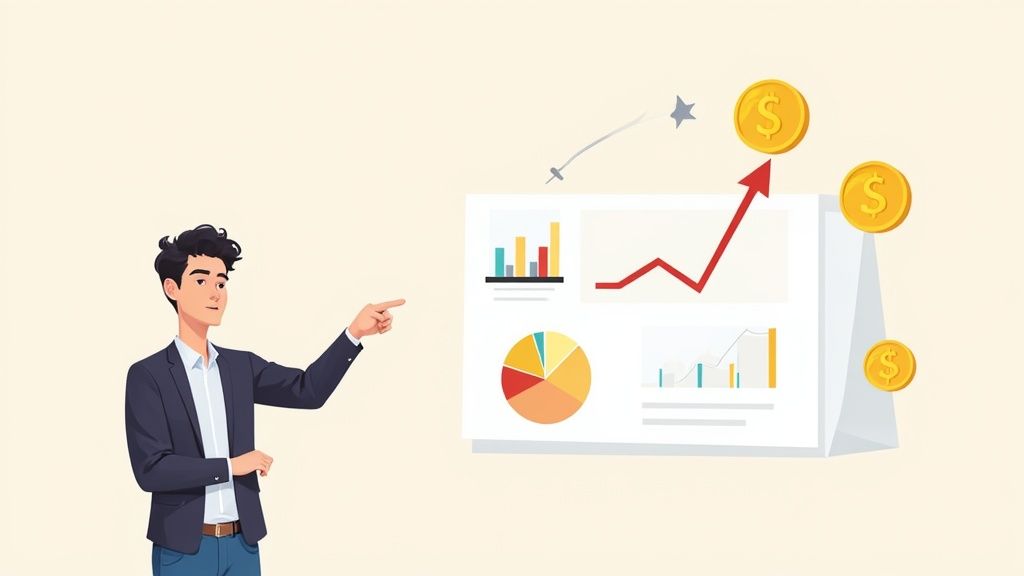 story
story How to Calculate Marketing ROI and Prove Your Value
Calculating your marketing ROI boils down to a pretty simple formula. You just take the sales growth your marketing generated, subtract what you spent on that marketing, divide the result by your total marketing cost, and then multiply by 100. What you get is a percentage that cuts through the noise and tells you exactly how much you earned for every dollar you put in. It turns all your hard work into a clear, undeniable measure of profitability. What Marketing ROI Actually Tells You Before we get tangled up in formulas, let’s get clear on what marketing ROI really is. It’s so much more than a number on a spreadsheet. In my experience, it’s the single most powerful metric for proving your team’s value and defending your budget. Think of it this way: ROI tells the story of how your marketing efforts directly fuel business growth. It’s the thread connecting every dollar you spend to a real, tangible outcome. Simply tracking revenue alone isn’t enough because it conveniently ignores how much it cost you to bring that money in. ROI adds that critical context. For instance, a campaign that pulls in $10,000 in revenue might look like a huge win at first glance. But if it cost you $12,000 to run , you've actually lost money. Ouch. The Foundational Formula At its heart, the Marketing ROI formula is refreshingly straightforward: ((Sales Growth - Marketing Cost) / Marketing Cost) x 100 . This calculation spits out a percentage that shows your return relative to what you invested. Let's say you spent $250 on a campaign that brought in $500 in new sales . Your ROI would be 100% . Simple, right? You doubled your money. While the math itself is easy, the real challenge I see people face is accurately tracking every single cost and correctly attributing revenue back to the right campaign. Key Takeaway: A positive ROI proves your marketing department is a profit center, not a cost center. It completely changes the conversation from "how much did we spend?" to "how much did we earn?" Grasping this fundamental concept is the first step toward smarter, more strategic planning. It’s what helps you answer the questions that really matter: Which of our channels are actually making us money? Where should we put our budget next quarter to get the biggest bang for our buck? Are our campaigns better at building long-term brand awareness or driving sales right now ? If you want to go deeper into the whole process and explore different ways to approach it, there's a fantastic guide on how to measure marketing ROI that breaks everything down. Getting the Right Data for an Accurate Calculation Your marketing ROI calculation is only as good as the data you feed it. Seriously. Get the inputs wrong, and the output is meaningless. An accurate result boils down to tracking two things really, really well: your total marketing investment and the sales growth you can attribute to it. So many marketers make the mistake of only counting the obvious costs, like ad spend. That will always give you an inflated, misleading ROI. To get the real picture, you have to account for every single penny. This isn't just about your direct ad spend. It includes software subscriptions for your CRM or email platform, content creation costs, and any agency or freelancer fees. You should even factor in a portion of your marketing team’s salaries to the investment side of the equation. This process highlights a crucial point: a complete cost analysis goes way beyond surface-level expenses to include operational and human capital costs. By ticking off each category, you ensure your "investment" figure is rock-solid. Essential Data Inputs for ROI Calculation To really nail this down, you need a clear list of what to track. Here’s a breakdown of the cost and revenue data points you’ll need to pull together for a truly accurate marketing ROI calculation. Data Category Specific Examples Tracking Method Direct Campaign Costs Ad spend (PPC, social), media buys Ad platform dashboards ( Google Ads , Meta Ads ) Content & Creative Freelance writers, designers, video production Invoicing software, project management tools Marketing Technology CRM, email marketing platform, analytics tools Subscription receipts, accounting software Team & Overhead Salaries (pro-rated), agency retainers Payroll records, agency contracts Sales Revenue New customer sales, upsells, renewals CRM reports, e-commerce platform analytics Lead Generation MQLs, SQLs, demo requests with values Marketing automation platform, CRM reporting Gathering this data upfront saves a ton of headaches later. It transforms your ROI from a rough guess into a reliable metric you can confidently present to your team or leadership. Pinpointing Your Attributable Revenue Now for the other side of the coin: revenue. The big challenge here is attribution . How can you confidently say a specific campaign drove a particular sale? This is where diligent, almost obsessive, tracking becomes non-negotiable. Pro Tip: If you take one thing away from this, let it be this: establish clean, consistent data tracking habits from day one. It’s so much easier to maintain good habits than it is to clean up a mountain of messy data months from now. This discipline is what separates guessing from knowing what truly drives results. Here are a few essential methods I always recommend for tracking revenue back to your marketing efforts: UTM Parameters: These are your best friends. Use these little tags on all your campaign URLs to see exactly where your traffic and conversions are coming from in your analytics platform. No excuses. CRM Reporting: Your CRM is a goldmine, but only if you use it right. Make sure sales reps are logging the lead source for every single new opportunity. This is how you connect marketing touches directly to closed deals. Dedicated Landing Pages: This one is simple but effective. Create unique landing pages for different campaigns, like your direct mail services , to completely isolate conversions and measure that channel's performance accurately. By putting these tracking methods in place, you create a clear line of sight from your marketing activities straight to your bottom line. That makes your ROI calculation both defensible and genuinely insightful. Picking the Right ROI Formula for Your Campaign The basic revenue-based ROI formula is a fantastic place to start, but let's be honest—it doesn't paint the whole picture. There’s no single, perfect way to calculate marketing ROI. The best model really depends on what you're trying to accomplish with a specific campaign. For instance, if you sell physical products, just looking at revenue can be incredibly misleading. It completely ignores what it cost you to make those items in the first place. You could have a campaign that brings in a ton of revenue but operates on such a razor-thin profit margin that your actual return is tiny. This is exactly why we need to dig a little deeper. Get a Truer Picture with Gross Profit A much more accurate way to see how profitable a campaign really is involves using Gross Profit ROI . This formula factors in your Cost of Goods Sold (COGS), giving you a much clearer view of the real profit your marketing dollars are generating. The formula is simple: (Gross Profit – Marketing Investment) / Marketing Investment Let's walk through a real-world example. Imagine you run a campaign for custom t-shirts that pulls in $80,000 in sales. Your COGS—which includes the blank shirts, the ink, and the labor—totals $40,000 . That leaves you with a gross profit of $40,000 . If you spent $10,000 on the marketing for this campaign, here's how the math shakes out: ($40,000 - $10,000) / $10,000 = 3.0 or 300% ROI What this tells you is that for every $1 you spent on marketing, you generated $4 back in gross profit. For anyone selling physical or even digital products, getting a handle on this calculation is one of the most important marketing essentials you can master. Measure Long-Term Health with LTV to CAC Another powerful metric, especially if you're in a subscription-based business or rely heavily on repeat customers, is the Lifetime Value (LTV) to Customer Acquisition Cost (CAC) ratio . This isn't a direct campaign ROI formula in the traditional sense, but it’s a crucial measure of your long-term marketing efficiency and overall business sustainability. It pits the total value a customer will bring you over their entire relationship with your business against what it cost you to get them in the door. A healthy ratio proves your marketing isn't just winning a single sale—it's building profitable, long-term relationships. For example, if your average LTV is $2,000 and your CAC is $500 , your LTV:CAC ratio is 4:1 . That’s a strong signal that your marketing is working very efficiently. These different formulas help you move beyond just tracking revenue and start to truly understand—and prove—the financial impact of your marketing efforts. Measuring ROI in B2B and Complex Sales Cycles Calculating marketing ROI for a quick e-commerce purchase is one thing. But what about a B2B company with a six-month sales cycle? Good luck with that. The path from a prospect’s first blog visit to a signed contract is long and winding, making simple, last-click attribution feel almost dishonest. A future customer might interact with a dozen touchpoints over several quarters—blog posts, webinars, sales calls, you name it. This complexity forces a shift in perspective. Instead of obsessing over which single touchpoint "got the sale," we need to zoom out and look at the entire journey. When you’re dealing with a modern sales funnel B2B guide , you have to assign value to each stage, not just the finish line. Leveraging Customer Lifetime Value (CLV) In these long-game scenarios, Customer Lifetime Value (CLV) is your best friend. It moves the focus from a single transaction to the total revenue a customer will bring in over their entire relationship with your company. This is an absolute game-changer for SaaS or service-based businesses where long-term retention is the name of the game. Here's a B2B-centric formula I've seen work wonders: (CLV × New Customers - Marketing Investment) / Marketing Investment . This approach helps justify higher upfront costs for activities like in-depth lead generation and nurturing, since the real payoff comes over months or even years, not days. It completely changes the conversation from "did this ad make a sale?" to "how is marketing building sustainable, high-value customer relationships?" Key Takeaway: For long sales cycles, measuring influence is far more practical than measuring direct attribution. The goal is to see how marketing contributes to pipeline velocity and deal size, not just which ad someone clicked last. Many B2B marketers I know aim for a benchmark revenue-to-spend ratio of around 5:1 . This means for every $1 you put in, you’re aiming to get $5 back in revenue. Of course, this can swing wildly depending on the industry and average deal size. By adopting models like this, you can paint a much more accurate picture of your marketing's long-term impact on the bottom line. Turning Your ROI Numbers into Actionable Insights Alright, you've done the math and have your ROI number. Great. But that's only half the story. A raw percentage doesn't tell you what to do next—the real magic happens when you turn that data into smarter marketing decisions. So, what’s a “good” ROI, anyway? People love to throw around 5:1 (a 500% return) as a solid benchmark, but honestly, it completely depends on your business. A B2B SaaS company with a year-long sales cycle might be popping champagne over a 3:1 return, because they know the customer lifetime value will make that incredibly profitable down the road. On the flip side, a high-volume e-commerce store with razor-thin margins might need to see 7:1 just to keep the lights on. Context is everything. Break It Down by Channel To get truly useful insights, you have to stop looking at one big, blended ROI number. A total ROI of 400% might look healthy, but it could be masking an incredible 800% ROI from your Google Ads campaigns and a dismal 50% ROI from that new social media experiment you’re running. When you start slicing the data by channel, you can finally see what’s really working. Paid Search (PPC): This is often a quick win. You’re catching people with high intent, so the ROI is usually strong and immediate. Content Marketing & SEO: This is the long game. The initial ROI can feel painfully low, but it compounds over time as your organic traffic snowballs. Email Marketing: Almost always a top performer. With a low cost and a direct line to a warm audience, email marketing is known for its stellar ROI. Paid Social: This one can be all over the place. It's fantastic for building brand awareness at the top of the funnel, but its direct sales ROI often lags behind search ads. Once you have this channel-specific data, you can start optimizing your budget. The goal is simple: systematically shift your ad spend from the channels that are dragging you down to the ones that are proven winners. This isn't just about cutting costs; it's about reallocating every dollar to make it work as hard as possible for you. When you bring these findings to your boss or client, you're not just presenting numbers. You're showing them a clear, data-backed strategy for driving more profit. Common Questions About Calculating Marketing ROI Even with the right formulas, things can get murky when you're trying to calculate marketing ROI. Some campaigns, especially the ones built for long-term brand awareness, don't have a straight line to a sale. That makes pinning down their value a real challenge. Let's dig into some of the most common questions that pop up when marketers get down to the numbers. How Do You Measure ROI for Brand Awareness? Brand awareness campaigns are a classic ROI headache. You're not trying to get someone to click "buy" right away, so how do you prove the money was well spent? Instead of looking for direct revenue, you have to lean on proxy metrics —these are indicators that show your brand's influence and visibility are on the rise. Think of these metrics as stand-ins for sales that demonstrate you're building momentum. If your goal is to grab more mindshare, start tracking these key performance indicators: Share of Voice (SOV): How much of the conversation in your market do you own compared to your competitors? A jump in SOV is a great sign that your campaign is cutting through the noise. Branded Search Volume: Are more people typing your brand name directly into Google? This is a huge win. It's a powerful signal that people remember you and are actively looking for you. Direct Website Traffic: An increase in visitors who type your URL straight into their browser means they know exactly who you are. No search engine needed. While you won't get a clean ROI percentage from these, they provide compelling evidence that your investment is building a valuable long-term asset: a memorable brand. What Are the Biggest Mistakes Marketers Make? It’s easy to fall into a few common traps that can completely throw off your ROI calculations. Just being aware of them is the first step toward getting numbers you can actually trust. The most common slip-up is incomplete cost tracking . It happens all the time. Marketers tally up their direct ad spend but forget to include the cost of producing the creative, the software subscriptions they used, or even the slice of their team's salary that went into the project. This makes the ROI look artificially high. Another big one is poor attribution . If you don't have a solid system with UTM parameters and CRM data, it’s almost impossible to know which touchpoint truly deserves credit for a sale. This leads to funneling future budgets into the wrong channels based on flawed data. How Often Should You Calculate ROI? There's no single right answer here. The best cadence for calculating ROI depends entirely on the campaign's length and goals. For short-term campaigns, like paid ads, you should be checking in on ROI weekly, if not more often. The data comes in fast, letting you make quick pivots to optimize performance. This is especially true for any paid advertising where you can adjust budgets on the fly. For long-haul strategies like content marketing or SEO, a quarterly review makes much more sense. These efforts take time to gain traction, and checking in too frequently can be discouraging and misleading. By matching your reporting schedule to the nature of the campaign, you’ll get a far more accurate and actionable picture of what’s really working. Ready to make your marketing tangible? At 4OVER4 , we offer a huge selection of high-quality printing services to bring your campaigns to life and drive measurable results. https://4over4.com
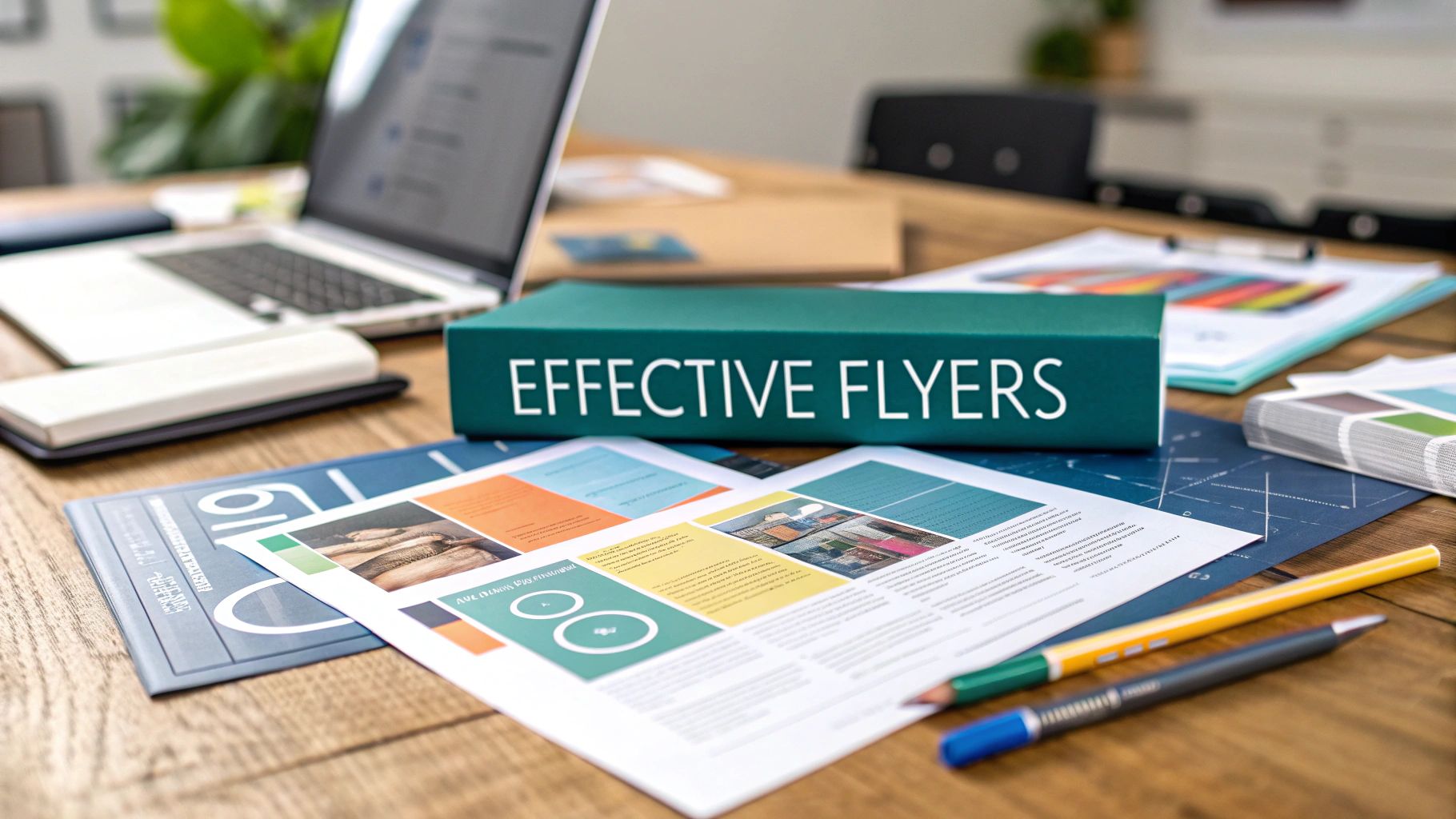 story
story How to Create Effective Flyers That Get Results
A truly effective flyer is a powerful mix of killer headline, clean design, a can't-miss offer, and a crystal-clear call to action. You've got seconds to grab someone's attention and convince them your message is a keeper, not trash. Think of it as a tangible, pocket-sized billboard for your business. Why Flyers Still Work in a Digital World It’s tempting to write off flyers as old-school. In a world of endless digital ads fighting for eyeballs, how can a simple piece of paper possibly compete? The answer is its physicality. A tangible item cuts through screen fatigue and forges a personal connection that a fleeting online ad just can't match. For local businesses, this is a massive advantage. A well-designed flyer isn't just a piece of paper; it’s a strategic tool that can: Drive Immediate Foot Traffic: Got a flash sale or a new menu item? A flyer can have customers walking through your door that same day. Build Local Brand Awareness: You’re literally putting your brand directly into the hands of potential customers in your service area, again and again. Promote Events Effectively: Nothing builds buzz for a grand opening, community event, or workshop like a memorable, physical reminder people can stick on their fridge. The Undeniable Impact of Print And the data backs this up. While digital marketing is a must, print often pulls in much higher engagement. Flyer marketing boasts response rates between 2.7% and 4.4% , which blows the typical 0.6% for email campaigns out of the water. On top of that, around 70% of consumers say flyers have influenced a purchasing decision. The infographic below really drives home the impressive open rates, response rates, and purchase influence of flyers. This data isn't just numbers on a page; it confirms that physical media doesn't just grab attention more effectively—it directly pushes people to act. The real power of a flyer is its ability to feel personal. In fact, 70% of consumers find printed marketing more personal than digital ads, a sentiment that resonates strongly with younger demographics like millennials. This tangible connection is exactly why a professionally produced flyer remains a cornerstone of so many successful marketing strategies. By exploring different types of marketing materials , you can find the perfect format to get your message out there and hit your business goals. Trying to design a flyer without a strategy is like building a house without a blueprint. It’s a classic mistake. You get caught up in fonts and colors, and before you know it, you’ve created something that looks nice but does absolutely nothing. A powerful flyer isn't just about pretty graphics; it’s a strategic tool, and that means you need a solid plan before you even think about opening your design software. Your first move is to nail down one primary goal. What is the single most important thing you want this flyer to accomplish? Are you trying to get more people through the door for a weekend sale? Announce a grand opening? Or maybe you need to generate leads for a new service you’re launching. If you try to do everything at once, your message gets muddy and your audience gets confused. So, pick one single, measurable objective . That’s your north star for this campaign. Get Clear on Your Target Audience Once your goal is set, you have to know exactly who you're talking to. "Everyone" is not an audience. You need to get specific. Are you trying to reach busy parents in a specific neighborhood, budget-conscious college students, or local business owners looking for B2B services? Take a minute to sketch out a quick persona. Let's say you're a coffee shop promoting a new morning special. Your target might be "Commuter Chloe," a 30-year-old professional who needs high-quality coffee—fast—on her way to the office. Knowing this helps you shape your message, your visuals, and your offer directly to her needs, making your flyer feel like it was made just for her. A flyer designed for "Commuter Chloe" will have a completely different look, feel, and offer than one targeting "Stay-at-Home Steve," who might be looking for a kid-friendly lunch spot. This level of focus is what separates a flyer that gets results from one that ends up in the trash. Make an Offer They Can't Refuse The offer is the real engine of your flyer. It’s the answer to the all-important question: "What's in it for me?" It has to be clear, valuable, and create a sense of urgency. Vague promises like "great deals" are just noise—they don’t motivate anyone. You need to be specific and light a little fire under them: Weak Offer: "Discounts on coffee!" Strong Offer: " Free Pastry with any large coffee purchase. This week only!" See the difference? The strong offer gives a tangible benefit (a free pastry), a clear requirement (buy a large coffee), and a reason to act now ("This week only!"). This simple formula turns a passive piece of paper into a powerful call to action. A well-planned offer is a cornerstone of any successful local marketing strategy because it gives people an immediate, compelling reason to engage. Before we move on, let's pull these core strategic elements together into a simple framework. This table can help you organize your thoughts and ensure you've covered all the bases for a winning campaign. Key Strategic Elements for Your Flyer Campaign Strategic Element Key Question to Answer Example (Local Coffee Shop) Primary Goal What is the single, measurable action you want people to take? Increase morning foot traffic by 15% over the next two weeks. Target Audience Who are you specifically trying to reach? "Commuter Chloe": a 25-35 year old professional who works nearby and values speed and quality. Core Message What is the main point you need to communicate in just a few seconds? "Get a premium coffee and a free treat, fast." The Offer What is the irresistible incentive that will motivate action? " Free Pastry with any large coffee purchase, Mon-Fri, 7-9 AM. This week only!" With your goal, audience, and offer locked in, you officially have a strategic blueprint. This clarity is your secret weapon. It ensures every design choice you make from here on out—from the headline you write to the call-to-action you craft—serves a distinct purpose and moves you closer to hitting your goal. Designing a Flyer That Grabs Attention Once you have your strategy locked down, it's time for the fun part: bringing your flyer to life visually. A killer flyer design isn’t just about making something pretty. It’s a calculated move to guide a reader’s eye and communicate value in a handful of seconds. The best flyers I've seen strike a perfect balance between eye-catching visuals and crystal-clear information, making the core message impossible to ignore. This all starts with establishing a solid visual hierarchy . Think of it as a roadmap for your reader's eyes. Your headline should be the biggest, boldest thing on the page, grabbing them immediately. From there, their gaze should flow naturally to an interesting image, then to the key benefits or the offer, and finally, land squarely on your call to action. Without that structure, you’ll just confuse people, and they'll toss your flyer without a second thought. Mastering the Core Design Elements To build that hierarchy, you need to get a handle on a few fundamental design components. These are the building blocks that work together to create a cohesive, professional look—one that reflects your brand’s quality and actually speaks to your target audience. First up, let's talk typography . A common rookie mistake is using too many fonts. Stick to a maximum of two font families to avoid a cluttered, amateurish look. Use one for your headlines and a different, super-readable font for the body text. You can still create plenty of variety by playing with bold, italics, and different sizes within the same font family. It's all about matching the font to the feeling—a serious corporate brand shouldn't be using a playful script, just like a kids' party entertainer should stay away from stuffy, formal typefaces. Next is color . Color is a powerful tool for setting a mood almost instantly. Bright, warm colors like reds and yellows can create excitement and urgency, which is perfect for a flash sale. On the other hand, cool colors like blues and greens often communicate trust and professionalism, making them ideal for something like a financial service. Use your brand colors to stay consistent, but don't be afraid to throw in a bold, contrasting color to make your call to action really pop off the page. Finally, you have to embrace white space . Seriously. The empty space on your flyer is just as important as the text and images. It prevents everything from feeling crammed together and gives your key elements room to breathe, making the whole design feel more approachable and way easier to read. Resist the temptation to fill every single inch of the page. A crowded flyer is an unread flyer. White space is your best friend for creating a clean, high-end impression that makes your core message stand out instead of getting lost in the noise. Choosing Powerful Images and Finishes Images are often the heaviest hitters on a flyer. A picture really is worth a thousand words, so you better make it count. Use High-Quality Photos: Nothing screams "unprofessional" faster than grainy, low-resolution images. Invest in professional photography if you can, or at the very least, use high-quality stock photos that actually align with your brand. Show, Don't Just Tell: If you're selling a physical product, show it in action. If you’re promoting a service, use photos of happy customers or your friendly team to build that all-important trust and human connection. Keep it Relevant: Make sure every single image serves a purpose. It should directly reinforce your core message, not just fill up space. Beyond what's on the screen, the physical feel of your flyer adds a whole other layer of impact. The weight of the paper and its finish can totally change how people perceive your brand. For a more premium, can't-ignore-it feel, you might explore unique fantastic finishes like spot UV or foil stamping. These add a tactile quality that makes your flyer feel more valuable and way less likely to end up in the bin. If a killer design is what gets someone to pick up your flyer, the copy is what makes them actually keep it. You’ve got just a few seconds to prove your message is worth their time. Every single word has to pull its weight, guiding the reader from that first glance at the headline all the way to your final call to action. Let's start with the most important part: the headline . It’s not just a title; it's a hook. It's the one thing that can stop someone in their tracks and make them pay attention. A weak headline is a death sentence for a flyer. Please, don't just state the obvious like "Grand Opening Sale." Frame it as an irresistible benefit for the reader instead. What does your audience really want? For a new coffee shop, something like "Your Morning Coffee Just Got an Upgrade" is way more interesting than a simple "Now Open." It taps into a desire and sparks a little curiosity. Focus on Benefits, Not Features Once your headline grabs their attention, the rest of the copy has to deliver on that promise—fast. One of the most common mistakes I see is people listing features (what their product is ) instead of benefits (what their product does for the customer ). Nobody cares that your new vacuum has a "HEPA-13 filter" (feature); they care that it "Eliminates 99.9% of allergens so your family can breathe easier" (benefit). Always structure your points to answer the reader's unspoken question: "What's in it for me?" Feature: We offer organic ingredients. Benefit: Taste the difference fresh, chemical-free ingredients make in every single bite. Feature: Our gym has 24/7 access. Benefit: Get your workout in on your schedule, whether it’s 5 AM or midnight. This simple shift in perspective helps your message connect on a much more personal level. It transforms your flyer from a piece of paper into a solution. Of course, great copy is just one piece of the puzzle. Understanding effective lead generation strategies will help you turn that initial interest into real, paying customers. Crafting an Unmistakable Call to Action Okay, we've come to the final—and most critical—part of your copy: the Call to Action (CTA) . This is where you tell the reader exactly what to do next. A vague or missing CTA is the number one reason even the best-designed flyers fail to get results. Don't be shy here. Be direct and crystal clear. Your CTA needs to be an action-oriented command that nudges people to act now. Use strong verbs and give them a clear path to follow. A strong CTA is the single biggest lever you can pull to improve your flyer's performance. It’s the bridge between a reader’s interest and a tangible business outcome. The typical response rate for flyer marketing hangs out between 1% and 5% , but a powerful CTA can give that number a serious boost. To really maximize your chances, make your CTA impossible to miss, use punchy action verbs, and attach a juicy incentive like a discount code. Make it an offer they can't refuse. Choosing Your Printing and Distribution Methods Your flyer’s journey is far from over once the design is locked in. In fact, two of the most critical steps are still ahead: getting them printed and into the right hands. The choices you make here are huge—they directly affect how people see your brand and whether your message ever lands. Think about it: a brilliant design on flimsy paper feels cheap, and a premium flyer that never finds its audience is just a waste of money. The physical feel of your flyer is your first impression. This is where paper selection really comes into play. Paper Weight (Stock): This is measured in pounds (lb) or points (pt). Heavier paper just feels more substantial and premium. A standard 100 lb paper stock is a solid, durable choice. Anything lighter can feel a bit unprofessional. Paper Finish: The coating on the paper changes its entire look and feel. A glossy finish makes colors explode off the page and is perfect for designs heavy on images. On the flip side, a matte finish gives you a more subdued, modern look with zero glare, which is great for readability. These little details send powerful, subtle signals about your brand’s quality and your commitment to getting things right. Selecting the Right Printing Partner Once you know what you want, you need someone to print it. Generally, you have two paths: your local print shop or an online printing service. A local printer offers that personal touch and the chance to see and feel physical proofs, which can be a lifesaver. Online printers, however, often win on price and offer a dizzying array of options, especially if you're ordering a large batch. Your final choice really hinges on what you value most. Need a quick turnaround and some hands-on guidance? Go local. If budget and a massive selection of finishes are your top priorities, an online service will probably be your best bet. A well-executed print job makes sure your design’s colors are vibrant and your message is razor-sharp. It's the final quality check that transforms a digital file into a real-world marketing tool. Don’t cut corners here; your brand's reputation is literally in your customers' hands. Smart Distribution Strategies for Maximum Reach Alright, time to get your flyers out into the world. Just blanketing an area with paper is inefficient and gets expensive fast. A targeted approach is the only way to make sure your message connects with the people who will actually care. There are a bunch of effective ways to do this: Direct Mail: This one’s a classic for a reason. Mailing flyers directly to households in specific zip codes lets you run hyper-targeted campaigns. For example, a new high-end restaurant could target affluent neighborhoods to reach its ideal clientele. Many companies even offer specialized direct mail services to help you plan and execute these campaigns with total precision. Local Partnerships: Why not team up with other local businesses? Find non-competing shops that share your target audience. A fitness studio could leave flyers at a nearby health food store, or a pet groomer could partner with a local vet clinic. It's a win-win. In-Person Distribution: There's nothing quite like handing a flyer to someone directly. Get a team out at relevant community events, trade shows, or busy downtown areas. A friendly street team at a local farmers' market can create a personal connection that a piece of mail just can't replicate. Ultimately, the best distribution strategy is the one that fits your specific audience and campaign goals. By pairing high-quality printing with a smart, targeted distribution plan, you make sure your flyers don't just look great—they drive real results. How to Know if Your Flyer Campaign Is Actually Working You've designed a killer flyer, and it looks amazing. But that's only half the job. If you have no idea whether it’s bringing in customers, you’re essentially just throwing your marketing budget into the wind and hoping for the best. Figuring out what works isn't just about justifying the print costs; it's about getting real, actionable feedback. This is how you make every single flyer you create from now on even better than the last. The great news? You don't need some complex, expensive analytics platform to do it. The most effective methods are often the simplest ones, baked right into your flyer's offer. Simple and Effective Tracking Methods Let's talk specifics. One of the easiest ways to see who's responding is to use a unique discount code . Imagine a local pizzeria's flyer offering 20% off with the code "FLYER20". Every time a customer uses that code at checkout, you have concrete proof that the flyer drove that sale. It’s that simple. QR codes are another fantastic, modern option. You can generate one for free that sends people to a special landing page on your website—one they can't find just by clicking around your main menu. By checking the traffic to that unique URL, you'll know exactly how many people scanned your flyer. Here are a few more tried-and-true tracking techniques I've seen work time and again: Unique Coupon Codes: Assign a distinct code (like "SAVE15" or "SPRINGDEAL") to each flyer campaign to track redemptions. Dedicated Landing Pages: Use a QR code or a short, easy-to-type URL (like yoursite.com/offer) that goes to a page made exclusively for that flyer. "Bring this Flyer" Offers: This is as direct as it gets. Customers have to physically hand over the flyer to get the deal. Just Ask: Train your staff to ask a simple question: "How did you hear about us today?" and keep a running tally. You’d be surprised how much you learn. Tracking isn't just about counting coupons. It's about figuring out what makes your audience tick. Was it the bold headline? The irresistible offer? The clean design? This data is pure gold for your next campaign. Analyzing the Data You Collect A crucial part of making flyers that work is building these measurement tactics right into your strategy. And it's worth the effort—research shows that a staggering 48% of consumers will either visit the business or search for more information after getting a flyer. To really nail this down, track the number of flyers you distribute and then watch for corresponding spikes in your point-of-sale (POS) system. You can learn more about connecting your print efforts to real sales growth in our more detailed guide on the topic. Once you start collecting this information, you can stop guessing and start making data-backed decisions. Even a simple spreadsheet will help you spot trends. Did the flyer with the punchier headline outperform the last one? Did a "buy one, get one free" offer pull in more people than a percentage discount? This continuous feedback loop is what turns good marketing into great marketing, ensuring your flyers deliver real, measurable results every time. Want more ideas? Check out these insights on flyer design and analytics from Metrobi.com . Ready to create flyers that not only look fantastic but deliver measurable results? At 4OVER4 , we offer a huge range of high-quality printing options, from vibrant glossy finishes to premium paper stocks that make your design stand out. Start your next successful campaign with us today!
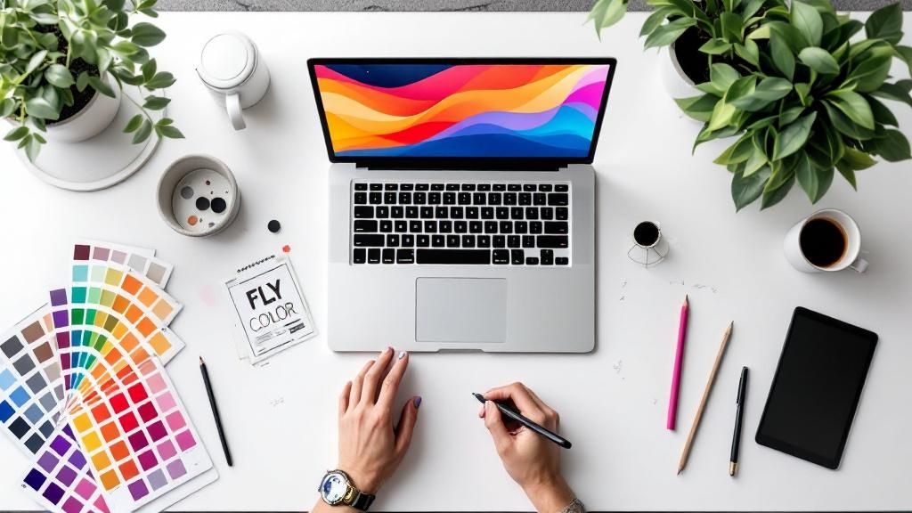 story
story How to Design Flyers That Actually Work
Before you even think about opening a design program, the most effective flyers begin with a clear, focused strategy. This initial planning phase is where you define one primary goal , pinpoint your specific target audience , and write a single, powerful message with a compelling call-to-action (CTA). This groundwork is what transforms a simple piece of paper into a marketing powerhouse. Start with a Plan, Not a Blank Canvas I see it all the time—the biggest mistake people make is diving headfirst into a design tool. It's tempting, but a beautiful flyer that doesn't connect with the right people or drive any action is just a pretty piece of paper. The truth is, the most successful designs are built on a rock-solid strategy, not just slick visuals. This planning stage is non-negotiable. Before you get lost in color palettes and font pairings, you have to answer a few critical questions about your flyer's purpose. Having this clarity from the get-go will guide every single design decision you make later, ensuring the final product works as good as it looks. Define Your Primary Goal Every single flyer needs one, and only one, clear objective. What are you trying to accomplish? Are you hoping to drive attendance to a weekend music festival? Announce a 25% off seasonal sale? Or maybe you just want to build brand awareness for your new coffee shop. If you try to do everything at once, you'll end up confusing your audience and achieving nothing. Pick a single, primary goal and make your entire flyer serve that purpose. This focus keeps your message sharp, direct, and easy to grasp in a fleeting moment. A flyer without a clear goal is like a map without a destination. It might look interesting, but it won’t lead anyone anywhere. Your design's success depends entirely on knowing what you want your audience to do next. Know Your Audience and Message With your goal locked in, it’s time to think about who you're actually talking to. A flyer designed for a corporate tech conference is going to have a completely different look and feel than one promoting a local farmers' market. Get specific about your ideal recipient. What do they care about? What kind of language will resonate with them? Your message needs to speak their language. Craft a headline that stops them in their tracks and quickly communicates the core benefit. This isn't the place for a novel; it’s all about making an immediate impact. Businesses are investing heavily in this kind of visual communication, which is why the global graphic design market is valued at roughly $43.4 billion . Craft a Compelling Call to Action Finally, every great flyer tells people exactly what to do next. This is your Call-to-Action, or CTA. A weak, passive CTA like "Learn More" isn't going to cut it. You need to use strong, action-oriented language that creates a sense of urgency or clear value. Here are a few examples of CTAs that work: "Scan to Get 20% Off Your First Order" "Visit Our Grand Opening This Saturday at 10 AM" "Buy Your Tickets Now at [Website]" Before you start designing, it's also smart to think about the bigger picture of how your flyer will be presented. You can actually draw some powerful lessons from essential visual merchandising guidelines to create a flyer that grabs attention and spurs action, much like a well-designed storefront. Design a Layout That Guides the Eye Think of your flyer's layout as its silent tour guide. A good design doesn't just throw information on a page; it strategically pulls the reader's eye from the most important point down to the least. We call this visual hierarchy , and getting it right is the difference between a flyer that gets read and one that gets tossed. If there isn't a clear path for the eye to follow, your message is dead on arrival. We naturally scan for visual cues—headlines, bright colors, bold text—to figure out what's important. Your job is to create those cues on purpose, leading people through your content in a way that makes perfect sense. Go with the Flow: The Z-Pattern For those of us who read left to right, the Z-pattern is an incredibly intuitive way to structure a layout. It simply follows the natural path our eyes take when we scan a page: we start at the top-left, sweep across to the top-right, cut diagonally down to the bottom-left, and then finish by moving to the bottom-right. You can use this built-in behavior to your advantage by placing your key elements along this path: Top-Left (Point 1): This is the prime starting spot. Your logo or a major brand element fits perfectly here. Top-Right (Point 2): A great place for secondary info. Think of a snappy tagline or a quick detail that supports your main headline. Bottom-Left (Point 3): As the reader's eye travels down, this is where you can lay out the essential details—event info, key benefits, or bullet points. Bottom-Right (Point 4): This is your finish line. It’s the ideal location for your most powerful call-to-action (CTA) and contact details, making it the final, lasting impression. By arranging your flyer this way, you’re not fighting against how people naturally read. You’re working with them, which makes absorbing your information feel effortless. Create a Can't-Miss Focal Point Every truly great flyer has one thing that grabs you first—a focal point. Nine times out of ten, this is your headline. There are a few tried-and-true ways to make it dominate the design. Size is the most straightforward tool in your toolbox. Make your headline substantially larger than any other text on the page. Color is another heavy hitter. A bold, high-contrast color will immediately pull the eye toward your main message. Don't forget about placement, either. Sticking your headline right at the top, where the Z-pattern kicks off, signals its importance right away. Don’t be afraid of white space! It isn't just "empty" space; it's an active design element that gives your content breathing room. A cluttered flyer is a confusing flyer. Generous white space around your headline and other key elements will make them pop even more. Leaning into these layout fundamentals will help you create flyers that don't just look good, but actually work—getting your message across quickly and clearly. Choose Fonts and Colors That Communicate Long before someone actually reads your flyer, they feel it. The fonts and colors you choose are the first handshake—they set the mood, hint at your brand’s personality, and can either draw someone in or make them walk away. Getting this combo right is absolutely critical. I've seen countless flyers fail because the font was impossible to decipher from a few feet away, or the colors clashed horribly with the message. Think of it this way: a whimsical, curly font has no place on a flyer for a serious financial seminar. The goal is to find that sweet spot between character and clarity. Selecting Legible and On-Brand Fonts When you're figuring out how to design a great flyer, typography is your secret weapon. The number one rule? Readability . If people have to squint to get your message, you've already lost. A simple, pro-level trick is to stick to just two complementary fonts. Use one for your big, bold headlines and another for the rest of your text. This pairing instantly creates a clean look and tells the reader’s eye exactly where to go first. Headline Font: Go for something with personality. This is your hook, so a bold, attention-grabbing font is perfect for pulling people in. Body Font: Here, legibility is king. You can't go wrong with a classic sans-serif like Helvetica or Open Sans for smaller text. Building a Purposeful Color Palette Color is all about emotion. The right shades can make people feel energized, calm, or even hungry. A little bit of color psychology goes a long way in making your flyer do its job. For example, blue often signals trust and stability, while a splash of red can create urgency—perfect for a limited-time offer. Your color palette should be an extension of your brand identity. A consistent color scheme across all marketing materials builds recognition and reinforces the professional image you want to project. Don't reinvent the wheel for every flyer. Choosing your colors is a lot like picking from the top wedding color schemes to set the perfect tone for a big day; every hue contributes to the overall feeling you want to create. A solid palette typically breaks down like this: A Dominant Color: This is your primary brand color. It should be the most visible hue in the design. A Secondary Color: This one complements your dominant color and works well for subheadings or secondary info. An Accent Color: Use this one sparingly. It’s for the important stuff, like your call-to-action button, to make it pop right off the page. To really nail the technical side of typography, you need to think about size and spacing. Even the best font choice can fail if it's too small or cramped. Effective Typography Choices for Flyers This table is a quick reference guide I use to ensure every piece of text on a flyer is not just beautiful but also perfectly readable. Element Recommended Size (Points) Key Consideration Main Headline 36+ pt Make it the largest text; it needs to grab attention. Subheadings 18-24 pt Should be clearly smaller than the headline. Body Text 10-14 pt Prioritize readability; avoid anything under 10 pt. Contact Info 8-10 pt Can be smaller, but must remain clear and legible. Line Spacing 120-150% of font size Gives text room to breathe and prevents crowding. By paying close attention to these details, you ensure your flyer is easy to scan and understand at a glance, which is exactly what you need for a successful design. Select Imagery That Tells a Story Before anyone reads a single word, their eyes will land on your flyer's main image. That first glance is everything. It's a split-second decision point where they either feel a connection and keep reading or toss it aside. A great image does more than just fill space—it tells a story, sparks an emotion, and instantly reinforces your message. Think of your visuals as the silent partner to your headline. The right photo can stop someone in their tracks and make them want to know more. This isn't just about decoration; it's a strategic choice that can make or break your entire design. Authentic Photos vs. Polished Stock Imagery So, should you use your own photos or grab something from a stock site? While polished stock images can look clean and professional, they often feel… well, stock . They can come across as generic and impersonal, and most people can spot a staged, overused photo from a mile away. That generic feel can accidentally weaken the trust you're trying to build. Whenever possible, authentic, original photography is the way to go. A real photo of your team in action, your product being used, or a happy customer at your event creates an immediate sense of legitimacy. It shows people the real you, not some sanitized, airbrushed version. That authenticity is what forges a genuine connection. An image should do more than just show; it should make someone feel. A photo of a real customer enjoying your coffee tells a much richer story than a generic picture of coffee beans. Strive for images that capture an experience, not just an object. Just like professional photographers learn the foundational principles of visual storytelling , you need to think about what story your photos tell. The right image guides the viewer’s eye and their emotions, making your message resonate that much more. Avoiding the Dreaded Pixelated Print Nothing kills a professional vibe faster than a blurry, pixelated image. It's a dead giveaway of an amateur design, and it usually happens when an image’s resolution is too low for printing. On a computer screen, images look fine at 72 DPI (dots per inch). But for professional printing, that's not nearly enough. You need much more detail to get a crisp, clean result on paper. Here’s the golden rule for sharp, print-ready images: Your images must be at least 300 DPI. This is the non-negotiable industry standard for high-quality print. Pay attention to the physical size. An image that looks great as a tiny website icon will become a pixelated mess if you try to stretch it across half a flyer. Always, always start with the largest, highest-resolution image file you can get your hands on. You can always make a big image smaller without losing quality, but you can never make a small image bigger without it looking terrible. Getting your visuals right is a crucial step toward a flyer that looks polished and professional. Get Your File Ready for Flawless Printing You’ve poured all your creative energy into designing the perfect flyer on your screen. Now for the last hurdle: getting that file ready for a professional printer. This is where so many fantastic designs go wrong, but a simple pre-print checklist can ensure the flyer you hold in your hand looks just as brilliant as the one on your monitor. Think of your digital design as a blueprint. A professional printer needs a very specific set of instructions within that blueprint to get the job done right. If you miss these details, you’re gambling with blurry images, chopped-off text, or colors that look nothing like what you intended. Even something as fundamental as your color palette, which you should decide on early, plays a huge role in the final print outcome. This kind of structured approach to color—from your main brand color to supporting accents—is exactly the kind of planning that prevents printing headaches down the line. RGB vs. CMYK: The Color Mode Mix-Up If there's one mistake I see more than any other, it’s a color mode mismatch. It's a simple concept, but it can completely derail your project. Your computer monitor, phone, and digital camera all use the RGB (Red, Green, Blue) color model. They create colors by mixing light, which is why designs can look so bright and luminous on-screen. But professional printers don't use light; they use ink. They work in the CMYK (Cyan, Magenta, Yellow, Black) color mode, layering these four ink colors to build your design on paper. If you send an RGB file to a printer, their software has to guess how to convert it, and the results are almost always disappointing. That vibrant electric blue might turn into a dull purple, and a bright lime green could end up looking muddy. Pro Tip: Always set your design software’s color mode to CMYK before you even start designing. If you've already finished your design in RGB, convert it to CMYK yourself. This gives you a chance to see how the colors shift and lets you make manual adjustments, so there are no nasty surprises when you open that box of fresh flyers. The Holy Trinity of Print Layouts Want to avoid having your logo or phone number awkwardly sliced off? Then you need to get familiar with three non-negotiable layout guides: the safe zone, the trim line, and the bleed. Safe Zone: This is the "live area" of your flyer. Think of it as an inner margin where all your critical information—text, logos, key images—must live. Keep everything important inside this box, and you can be sure it won't get trimmed off. Trim Line: Pretty straightforward—this is the line where the printer's big cutting machine will slice the paper to give you the final flyer size. Anything right on this line is playing with fire. Bleed: This is probably the most important and misunderstood part. A bleed is an extra border of your background color or image that extends beyond the trim line, usually by 0.125 inches on every side. Because the cutting process isn't always 100% precise, the bleed gives the printer a small margin of error. It ensures that even if the cut is a hair off, you won’t get a thin, ugly white line along the edge of your flyer. Save Your File the Right Way Once your colors are locked in and your bleed is set, it’s time to export the final file. You'll see a lot of options—JPG, PNG, TIFF—but for professional printing, the undisputed champion is a high-resolution PDF . Why? Because a PDF is like a locked box. It packages all your fonts, images, and layout information into a single, self-contained file. This means the printer sees exactly what you see, with no weird font substitutions or images that have shifted out of place. When you’re exporting, look for a preset like "Press Quality" or "High-Quality Print." It's the final click that makes all the difference. Answering Your Top Flyer Design Questions I’ve spent years designing flyers and helping people do the same, and I've noticed the same questions pop up time and time again. Let’s clear up some of the most common hurdles so you can move forward with confidence. What’s the Best Software for Designing a Flyer? This is the big one. If you’re a professional graphic designer, you’re likely already using the heavy hitters: Adobe InDesign or Illustrator . They offer unparalleled control for a reason. But for most business owners or marketers? Don't overcomplicate things. Tools like Canva or VistaCreate are brilliant. They’re built to be intuitive, and their templates are a huge time-saver because much of the tedious print setup is already done for you. Honestly, the "best" software is the one that gets the job done without a massive learning curve. A great-looking flyer from Canva is far better than a frustrating, half-finished project in a program you don’t know how to use. How Much Information Is Too Much for a Flyer? Think of your flyer as a billboard, not a novel. You have maybe five seconds to grab someone's attention. That’s it. So, the golden rule is less is more . Stick to a single, powerful message. All you really need is: A killer headline that makes people stop. The essential info: what, when, and where. One clear, unmissable call to action. If you find yourself cramming text into every corner, take a step back. Use bullet points. Embrace white space—it’s your best friend for making content easy to digest. A well-placed QR code can direct people to your website for the nitty-gritty details, keeping your flyer clean and focused. What Are the Biggest Flyer Design Mistakes to Avoid? I see the same simple mistakes trip people up all the time. The good news is they’re incredibly easy to sidestep once you know what to look for. Nail these, and you're already ahead of the game. Here are the most common culprits: Too many fonts and colors: It just looks chaotic and unprofessional. A good rule of thumb is to stick with two fonts and a simple three-color palette. Low-resolution images: Nothing undermines your credibility faster than a blurry, pixelated photo. For print, always use high-resolution images—that means 300 DPI (dots per inch). No clear visual hierarchy: If every element is screaming for attention, nothing gets heard. Guide the reader's eye by making the most important information the biggest and boldest. A weak or missing call to action: Don't make people guess. Tell them exactly what you want them to do next. "Visit Our Website," "Scan to RSVP," "Get 20% Off." A wall of text: This is an instant turn-off. If your flyer looks like a textbook page, it's going straight into the bin. Are QR Codes Still a Thing on Flyers? Absolutely, yes. A QR code is a fantastic little tool that bridges the gap between your printed flyer and your online world. Think about it: it eliminates the friction of someone having to type in a web address. With one quick scan, they can be on your landing page, signing up for your newsletter, or viewing your restaurant's menu. A QR code is a small addition that can dramatically increase your flyer's ROI. Just make sure it’s big enough to actually be scanned and that the page it links to looks great on a phone. It transforms a static piece of paper into an interactive experience, making it incredibly easy for your audience to take that next step. Ready to bring your flyer design to life with professional, high-quality printing? 4OVER4 offers a vast range of paper stocks, finishes, and custom options to ensure your final product looks as amazing in hand as it did on your screen. Explore our printing services and get started today .
 story
story How to Improve Print Quality: Pro Tips That Actually Work
Discovering What Your Printer Can Really Do Your printer might be a hidden powerhouse just waiting to be unleashed. I've chatted with so many print shop owners and graphic designers over the years, and it's surprising how often they admit to barely scratching the surface of their printer's capabilities. Seriously, most folks are using maybe 30% of what their printer can really do. The key is understanding your printer's quirks – its "personality," if you will. That means getting cozy with those tucked-away menu settings, questioning the "photo quality" button (because it’s not always the best choice), and getting adventurous with different paper stocks and materials. For example, I've learned the hard way that the pre-set "photo quality" setting can flood the page with ink. Great for glossy photo paper, not so great for thick cardstock (think warped and soggy). The magic is in finding the sweet spot for each project. Hands-on testing is your best friend here. Don't shy away from experimentation! Try printing the same image at a few different DPI settings and check out the results on your chosen material. Take a peek at how the pros handle large-scale projects with online large format printing – you might pick up some helpful tips. This infographic highlights the difference in print quality scores based on DPI. Notice the jump in quality between 150 DPI and 300 DPI – it really shows you how much resolution impacts the final print. Understanding DPI and Your Printer's Limits Another piece of the puzzle is understanding DPI (dots per inch) . While a higher DPI generally means better quality, it's not a universal rule. A 300 DPI image is usually perfect for a flyer, but if you're printing highly detailed artwork, you might need to bump it up to 600 DPI or even 1200 DPI. Check out the Mount-It Articles for some extra info on this topic. It's interesting to see how much the printer market is growing and changing. Advancements in DPI are a huge factor in driving print quality higher. The market, currently valued at USD 49.43 billion , is expected to hit USD 75.37 billion by 2032! Discover more insights into the printer market . Don't forget that your printer's age and maintenance history are also important factors. An older, less-maintained printer won’t perform the same as a brand new one. Regular maintenance and knowing your printer’s limitations are key. Let's talk about choosing the right print resolution. To help you get started, I’ve put together a handy guide. To help illustrate the relationship between project type and DPI, let's take a look at this table: Print Resolution Guide for Different Project Types Comparison of optimal DPI settings for various printing needs Project Type Recommended DPI Paper Type Expected Quality Everyday Documents (emails, web pages) 72 - 150 Standard printer paper Suitable for on-screen viewing and general printing Flyers & Posters 300 Glossy or matte paper Clear text and images, vibrant colors Photos 300 - 600 Photo paper (glossy, matte, or satin) Sharp details, accurate color reproduction High-Quality Art Prints 600 - 1200 Fine art paper Exceptional detail, smooth gradients, accurate color representation Large Format Banners 150 - 300 Vinyl, mesh, or fabric Visible from a distance, clear images and text This table summarizes the optimal DPI settings for various projects. As you can see, choosing the right DPI depends heavily on the intended use and desired quality. Using a lower DPI for everyday documents saves ink and time, while higher DPI values are essential for preserving fine details in art prints and photographs. Choosing the correct DPI and paper type will drastically improve your print results. The Paper Truth They Don't Want You to Know Here's the deal: Office supply stores aren't always straight with you about how much paper choice affects your prints. It’s honestly more important than almost any printer setting. After testing countless paper types with photographers and designers, I’ve learned that price doesn't always mean quality. Sometimes a cheap paper wows you, and sometimes the expensive stuff falls flat. Let’s ditch the marketing hype and talk about what really matters. This screenshot from the Wikipedia page on Paper shows just how complicated papermaking can be. Even a little peek behind the curtain helps explain why different papers behave so differently. From the fibers they use to the coatings they apply, every step in the process impacts how the ink sits on the surface. And that, my friend, is what determines your final print quality. Paper Weight Isn't Everything Lots of people think paper weight equals quality – heavier is better, right? Not so fast. Weight (measured in gsm , or grams per square meter) tells you about thickness and density, but it doesn’t tell you how the ink will absorb or how the paper will react to your printer’s heat. A lighter paper can be fantastic for sharp text, while a heavy cardstock might be perfect for photos but awful for detailed line art. You could even think about using stickers for certain projects – they have completely different printing properties because of the adhesive backing. Think about it: you wouldn't use the same paper for a delicate watercolor print as you would for a business card, would you? It's all about matching the paper to the project. Humidity's Hidden Impact Here’s another sneaky one: humidity. Ever had paper curl up or ink bleed in humid weather? That's because some papers soak up moisture from the air, which messes with how they feed through the printer and how the ink dries. A simple solution? Keep your paper in a resealable bag or airtight container, especially if you live somewhere humid. This one little trick can make a huge difference in your print quality. Premium Features: Worth It or Not? Finally, what about all those fancy "premium" paper features? Some, like brightness and whiteness , actually do affect how vibrant and crisp your prints look. Others? Pure marketing. Bright white paper makes colors pop, while a warmer paper can give you a softer, vintage feel. Don’t get fooled by fancy names – focus on what actually matters for your specific project. A little experimentation and attention to the real properties of paper will get you consistently great prints without breaking the bank. File Prep Secrets From The Print Pros Want your prints to look like they came from a pro? The secret often lies in what you do before you even hit the print button. Print shops have their tricks, and surprisingly, they work just as well on your home printer. Let me share a few file prep secrets graphic designers swear by. Color Profiles: More Than Just RGB and CMYK Sure, everyone knows RGB is for screens and CMYK is for print. But it's not that simple. Think of color profiles like filters for a photo. Printing on coated paper? Use a coated paper color profile. The difference is huge. Your design software has these settings tucked away – time to unearth them! Resolution is another biggie. I once saw someone try to print a tiny, low-resolution image blown up to poster size. Disaster. Match your image resolution to your print size. 300 DPI might be perfect for a small print, but you might need more for a larger one. It's amazing how far digital printing has come. Did you know the market was valued at USD 38.07 billion in 2023, growing at 6.2% ? Check out more on the digital printing market . Sharpening for Print: A Delicate Balance Sharpening images for print is a tightrope walk. Too much, and your image looks harsh. Too little, and it looks blurry. Find the sweet spot – just enough sharpening to make details pop without looking overdone. File Formats: Picking the Right One Your file format matters. PDFs are the gold standard for professional printing. They lock in your fonts, colors, and images. For photos, a high-quality JPEG can also work well. Thinking about your final product before you start designing is key. If you're working on invitations, we have a great resource on invitation printing . These file prep tweaks can dramatically change your final print. You can make a budget printer look like a high-end machine with the right settings. These aren't just random tips – they're the foundation of professional printing. Color Management Without The Headaches Let's be honest, "color management" sounds intimidating. But really, it's just about making sure what you see on your screen matches what comes out of your printer. Ever had that frustrating experience where your prints look totally different from your digital design? Yeah, we've all been there. Thankfully, it's totally avoidable with a few simple tweaks. Your monitor, for example, is probably not showing you true colors. Most monitors aren't calibrated, which means they're essentially lying to you about how your design actually looks. A simple calibration tool can be a game-changer. These tools measure your monitor’s color output and create a color profile to correct inaccuracies. Trust me, the difference is night and day. Also, understanding color profiles is key. It’s not just about RGB versus CMYK . Different printers and paper types require different profiles for best results. It's kind of like choosing the right Instagram filter – a portrait needs something different than a landscape, just like glossy photo paper needs a different profile than matte. You might also find our info on holographic printing helpful. Taming the Color Beast: Practical Tips So, how do you put this into practice without needing a degree in color science? It’s easier than you think! Calibration tools are easy to find, and many design programs like Adobe Photoshop have built-in color management features. Start by calibrating your monitor. Once that's done, move on to your printer. Experiment with different color profiles specifically designed for the type of paper you’re using. And while you're thinking about the final product, make sure you know how to format a book properly if that's your end goal. One thing to keep in mind: color management isn’t a one-time fix. Things like humidity and temperature can actually affect your print quality. Store your paper properly and be mindful of your workspace conditions. With a bit of care and attention, you can get consistent, beautiful prints every time. To help you choose the right color profile, I've put together this handy table: Color Profile Comparison for Different Print Types Guide to selecting the right color profile based on your printing needs and materials Print Type Recommended Profile Color Gamut Best Use Cases Photos on Glossy Paper sRGB or Adobe RGB Wide Vibrant, saturated images Art Prints on Matte Paper Adobe RGB Wide Detailed, accurate color reproduction Business Cards sRGB Standard Consistent color across different devices Documents sRGB Standard Accurate representation of text and graphics The table above highlights the importance of matching the color profile to your specific print type and desired outcome. Using the right profile can significantly improve the quality and accuracy of your prints. Remember, the key takeaway here is that getting your colors right is achievable with a few simple steps. It's about understanding how your tools work and using them to your advantage. Don't be intimidated – with a bit of practice, you’ll be printing like a pro in no time! Maintenance That Makes A Real Difference Forget the dry, generic advice in your printer manual. I'm going to tell you the real deal about keeping your prints looking fantastic. After years of chatting with printer technicians and folks who print a ton , I’ve picked up some seriously helpful tips. I'm happy to share the routines that actually make a difference – and which ones are just a waste of ink. Cleaning Cycles: Smart vs. Wasteful Your printer probably has a bunch of automated cleaning cycles. Honestly, some of them are just ink-guzzling scams. A "deep clean" is great if you haven't printed in ages, but doing it every week is overkill. Instead, concentrate on the regular cycles that focus on the print head . And here's a secret weapon: learn to manually clean the paper feed rollers . You wouldn't believe how much dust and paper bits build up on those things, causing misfeeds and uneven ink. Cleaning them can dramatically improve your print quality. Early Warning Signs: Catching Problems Before They Start Catching problems early can save you a world of frustration (and money!). Prints looking faded? Check your ink. Seeing lines or streaks? You might have a clogged print head. Don’t wait until you're halfway through a critical project to address these issues! Small fixes now mean a longer-lasting printer and consistent, beautiful prints. Plus, regular upkeep is way cheaper than constantly buying new cartridges or even entire printer parts. Need some more guidance? Check out our guide on printer maintenance . Print Head Alignment: Getting it Right Print head alignment is key for sharp text and images. But sometimes the automatic alignment tools just don't cut it. Don’t be afraid to experiment with manual adjustments – even tiny tweaks can make a huge difference. It's like tuning a musical instrument; small adjustments bring everything into harmony. Interestingly, over 65% of new printers in North America and Europe come with advanced color management and calibration features these days – essential for professional-looking results. Discover more insights into the printer market . Maintenance Schedules: Tailored to Your Needs Generic maintenance schedules are, well, generic. If you print every day, your needs are completely different from someone who prints once a month. High-volume users often rely on weekly cleaning and monthly print head alignments. If you print less, you can probably stretch that out a bit. The key is to figure out your own printing rhythm and adjust your maintenance accordingly. Environmental Factors: The Hidden Impact Believe it or not, things like temperature and humidity can secretly mess with your print quality. They affect how the ink dries and how the paper feeds through the printer. Try to keep your printer in a stable environment, away from direct sunlight and drafts. It's like storing your fruits and veggies properly – the right environment makes all the difference. These little changes can significantly boost the quality of your prints. Solving Quality Problems Like a Professional So, your prints are looking a little…off? Trust me, it happens to everyone. But instead of blindly following those generic troubleshooting guides (you know, the ones that never seem to work), let's take a page from the pros. Print technicians have a whole system for diagnosing quality hiccups, and those methods can save you a ton of time, wasted material, and frustration. Diagnosing Common Print Quality Nightmares Streaking, banding, color shifts—we've all been there. The first thing you need to figure out is the source of the problem. Is it your printer itself? Your software? The materials you're using? Or something else entirely? One trick I use is printing a test page with a bunch of different colors and patterns. It helps narrow things down. For example, if you only see streaks in one color, chances are it's an ink cartridge issue. If the streaks are in every color, then it might be the print head, or even the paper itself. Don't forget about software glitches! Sometimes, reinstalling your printer software can work wonders. Need a refresher on installation? Check out this resource: Download and Installation . Sometimes it’s not the printer, but your computer talking to the printer that causes the issues. Try printing a test page from a different computer to help narrow things down. The Paper Jam Aftermath Ever noticed how a paper jam can leave your print quality wonky for days? It's not enough to just yank out the jammed paper. You've got to check for any little scraps clinging to life inside the printer. They can really mess with the print path. I keep a small, flexible brush handy for this – perfect for getting into those awkward spots. This simple step can prevent future jams and keep your prints looking crisp. The Mystery of Inconsistent Quality Let's be honest, sometimes print quality problems seem to appear out of thin air. It's like your printer has developed a personality! When this happens, I’ve found that environmental factors can be the culprit. Is your printer near a vent or a window? Changes in temperature and humidity can subtly affect how the ink dries and how the paper feeds through the printer. Moving your printer to a more stable spot can sometimes solve these mysterious issues. Consider factors like direct sunlight or extremely cold environments as well. Professional Diagnostic Procedures Troubleshooting print quality can feel like detective work. But by using some of the same techniques that professional print shops use, you can get to the root of the problem quickly. A test print with solid color blocks, for example, can reveal banding issues (a telltale sign of a clogged print head). A test print with fine lines can highlight registration problems, which often means your print heads are misaligned. These simple diagnostics help you zero in on the specific problem, saving you precious time. Speaking of professional printing, it's amazing how far digital printing has come. High-speed digital presses can now churn out up to 11,200 sheets per hour and use PrintAI for real-time quality control. That kind of tech has reduced misprints by 25% and boosted customer satisfaction by 20% just by minimizing returns and complaints. Find more insights into the commercial printing market . By being systematic, you can tackle print quality problems head-on and stop them from coming back. Your Personal Print Quality Action Plan So, we've covered a lot of ground! Now, how do we put it all into action? Don't worry, this isn't about flipping your entire printing world upside down overnight. It's about picking the tweaks that will make the biggest difference for your prints, based on what you've got and what you need. Prioritizing Your Print Quality Journey Think about your biggest print pet peeves. What drives you crazy? Is it colors that never quite match what you see on screen? Images that look a little fuzzy? Or maybe it's the dreaded paper jam that always seems to strike at the worst possible moment. Figuring out your main frustrations helps you choose which fixes to tackle first. For example, if color accuracy is your nemesis, maybe start by calibrating your monitor and playing around with color profiles. If detail is what's lacking, focus on your DPI settings and the type of paper you're using. Even small changes can have a surprisingly big impact. Remember, it's a marathon, not a sprint! Creating a Realistic Timeline Don't feel like you need to revamp your entire printing process in one go. Choose one or two key improvements and build from there. If you're churning out high volumes of prints, a weekly cleaning routine might be essential. But if you're a more casual printer, monthly maintenance might be perfectly fine. The key is to create a timeline that fits your printing rhythm. Measuring Your Progress So, how do you know if all this effort is actually paying off? Simple! Set some easy-to-track metrics. If you’re aiming for better color, print a test image before and after you calibrate your monitor. The side-by-side comparison will really show you the difference. You can also track things like how often you get paper jams or how much ink you're using. These little bits of data help you see how far you've come and pinpoint areas where you could still improve. This personalized approach is the real secret to long-term printing success. It doesn't matter if you're using a basic inkjet or a professional-grade laser printer, these principles hold true. You’ll have a clear roadmap, building on what works and tackling your biggest challenges head-on. Ready to take your printing to the next level? Check out the huge range of high-quality printing solutions available at 4OVER4 and bring your creative visions to life.
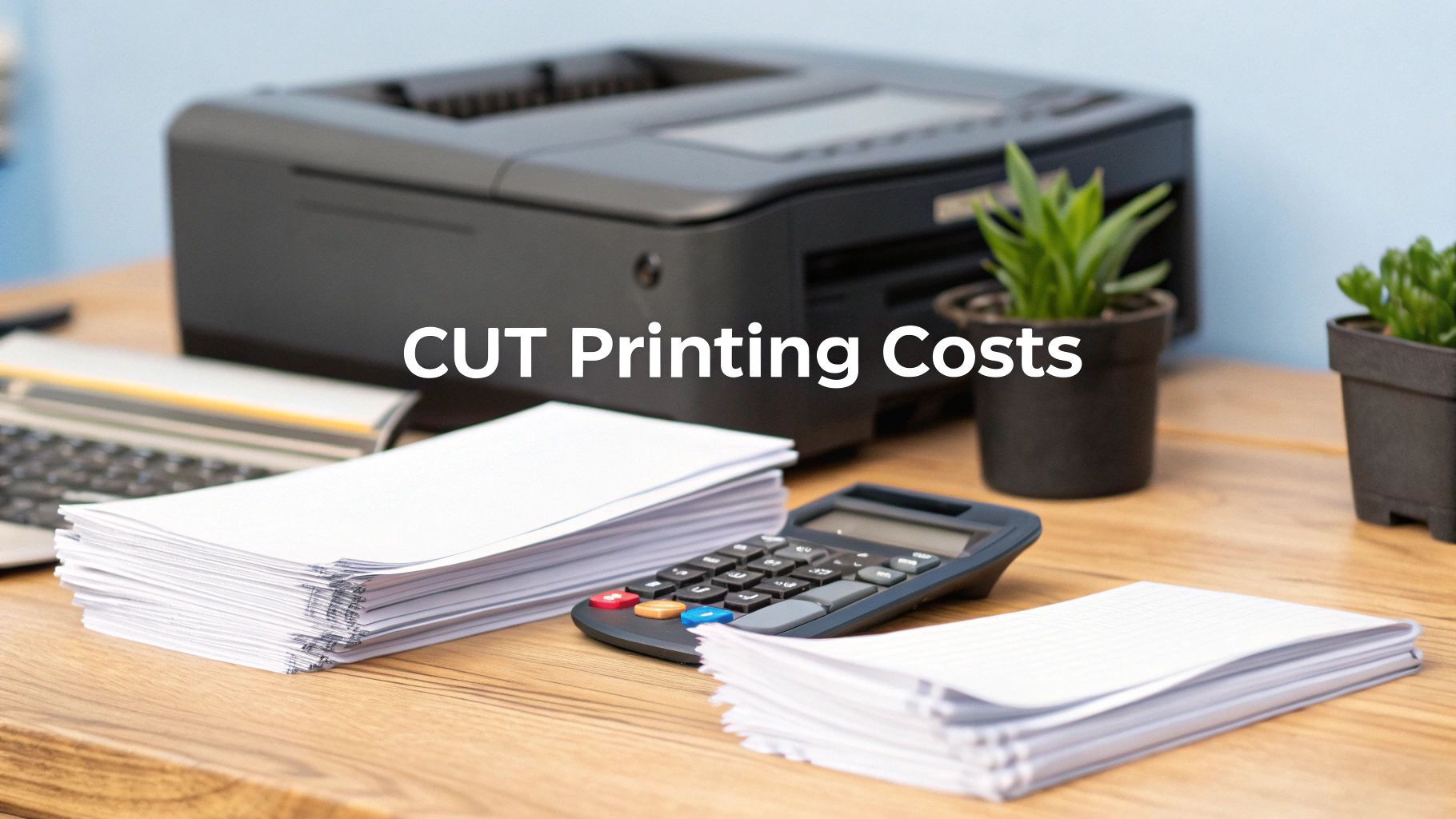 story
story How to Reduce Printing Costs: Top Tips for Savings
Stop Wasting Money on Printing: Real Strategies That Work Printing costs can drain your budget. This listicle provides eight actionable strategies to reduce printing costs and improve your bottom line. Learn how to optimize your print environment for efficiency and affordability with techniques like duplex printing, print management software, and strategic printer consolidation. We'll also cover how digital document workflows and employee education can significantly lower your expenses. Implementing these strategies will not only save you money but also contribute to a more sustainable approach to printing. 1. Duplex Printing (Double-Sided Printing) One of the simplest yet most effective ways to reduce printing costs is to implement duplex printing, also known as double-sided printing. This method involves printing on both sides of a sheet of paper, effectively cutting your paper consumption in half for most documents. By making this a standard practice within your organization, you can significantly lower your paper expenses, reduce your environmental impact, and even project a more professional image. This makes duplex printing a cornerstone strategy for anyone looking to cut costs and optimize their printing practices, making it a vital inclusion in any list focusing on how to reduce printing costs. Most modern printers come equipped with an automatic duplexing feature, involving a mechanism that flips the paper internally, allowing printing on both sides without manual intervention. This automated process makes double-sided printing seamless and efficient. For older printers that lack this capability, manual duplexing is often possible, though it requires user intervention to flip and re-feed the paper correctly. The benefits of adopting duplex printing are substantial. The most immediate impact is a significant reduction in paper costs – potentially up to 50%. This translates directly into lower spending on paper procurement and storage. Beyond the financial gains, duplex printing offers considerable environmental advantages by minimizing paper usage, contributing to forest preservation and reducing waste. Furthermore, using both sides of the paper for reports and other documents creates a more polished and professional appearance, potentially enhancing your brand image. Even shipping costs for printed materials can be lowered due to the reduced weight and volume. While the advantages are compelling, there are a few considerations to keep in mind. Duplex printing can be slightly slower than single-sided printing due to the paper flipping mechanism. It's also not ideal for all document types, particularly single-sided presentation materials like flyers or posters. Using very thin paper with duplex printing might lead to paper jams or show-through, where the ink from one side is visible on the other. In such cases, using heavier paper stock (20lb or higher) is recommended. Finally, while most modern printers support duplexing, some older models might not have this feature, requiring manual intervention and user training. The success of duplex printing in reducing costs is well-documented. Large organizations have demonstrated significant savings through its implementation. For example, IBM reduced its company-wide paper costs by 40% after implementing a mandatory duplex printing policy. The University of California system saved a remarkable $2.3 million annually through similar duplex printing initiatives. Even tech giant Microsoft reported a 45% paper reduction in their corporate offices since defaulting to duplex mode. These examples highlight the substantial cost-saving potential of this simple strategy. To successfully implement duplex printing in your organization, consider these actionable tips: Set duplex as the default option: Configure your printer drivers to automatically print double-sided. This encourages widespread adoption and makes it the easiest option for users. Establish clear policies: Create company policies that mandate duplex printing for internal documents, drafts, and reports. This formalizes the practice and reinforces its importance. Use appropriate paper stock: Opt for heavier paper (20lb or higher) to prevent ink bleed-through and ensure professional-looking documents. Train employees: Provide training on how to use the duplex feature, including manual duplexing for older printers. This ensures everyone understands the process and can utilize it effectively. Monitor and measure: Track your printing usage statistics to monitor the effectiveness of your duplex printing initiative and quantify the cost savings achieved. By understanding the benefits, addressing the potential drawbacks, and implementing the suggested tips, businesses of all sizes, marketing professionals, graphic designers, event organizers, and corporate clients can leverage duplex printing as a powerful tool to significantly reduce printing costs and contribute to a more sustainable future. 2. Print Management Software Implementation One of the most effective ways to reduce printing costs is through print management software implementation. This software provides centralized control over your entire printing infrastructure, allowing you to track, control, and optimize printing activities across your organization. This approach deserves a place on this list due to its potential for significant cost savings, increased security, and improved printing efficiency. Print management solutions work by integrating with your existing network and printers to monitor and manage all printing jobs. They offer a range of features designed to curb unnecessary printing and enforce cost-saving measures. Learn more about Print Management Software Implementation This method is particularly beneficial for organizations struggling with uncontrolled printing expenses, a lack of visibility into printing habits, or security concerns related to sensitive documents. By implementing print management software, businesses can gain control over their printing environment and identify areas for cost reduction. Key Features and Benefits: Print management software solutions typically include features such as: User Authentication and Access Control: Restrict printer access to authorized personnel, preventing unauthorized printing and enhancing document security. Print Quotas and Budget Limits: Set limits on the number of pages or the monetary value each user or department can print, promoting mindful printing habits. Detailed Usage Reporting and Analytics: Gain insights into printing patterns, identify high-usage users or departments, and track printing costs over time. Policy Enforcement and Rule Creation: Implement rules for duplex printing, grayscale printing, or restricting color printing to specific users or documents, further reducing costs. Mobile and Cloud Printing Integration: Support printing from mobile devices and cloud platforms, offering flexibility and convenience while maintaining control. Cost Allocation and Chargeback Systems: Accurately allocate printing costs to specific departments or projects, enabling better cost accounting and potentially charging back printing expenses to relevant stakeholders. Pros: Significant Cost Reduction: Studies show an average reduction in printing volume of 20-30% after implementing print management software. Detailed Visibility: Gain clear insights into printing patterns and identify areas for optimization. Automated Policy Enforcement: Ensure consistent application of printing policies without manual intervention. Reduced Waste: Minimize wasted paper and toner from unclaimed or unnecessary prints. Enhanced Security: Protect sensitive documents through user authentication and access control. Accurate Cost Allocation: Accurately attribute printing costs to departments for better budget management. Cons: Initial Costs: Software licensing and implementation can involve upfront costs. IT Resources: Setup and maintenance require IT resources and expertise. User Resistance: New authentication processes may initially face resistance from users. Potential Productivity Impact: The transition period can temporarily impact productivity. Ongoing Fees: Some solutions require ongoing subscription or maintenance fees. Real-World Success Stories: Xerox Global Services has helped major corporations reduce printing costs by 30% through their managed print services. PaperCut software implementation at Stanford University led to a 25% reduction in printing. Canon's uniFLOW solution implemented in various healthcare systems has achieved cost savings of up to 35% through improved monitoring and control. Tips for Successful Implementation: Pilot Program: Start with a pilot program in specific departments before a full-scale rollout. Reasonable Quotas: Set realistic print quotas that don't hinder productivity. User Training: Provide clear training on new authentication and printing processes. Data Analysis: Utilize reporting data to identify high-usage users and provide targeted training. IT Integration: Seamlessly integrate the software with your existing IT infrastructure and user directories. The following infographic illustrates the potential cost savings achievable through just one element commonly enforced by print management software: duplex printing. As the bar chart clearly demonstrates, incorporating duplex printing has resulted in substantial savings for organizations like IBM (40% paper cost reduction) and Microsoft (45% paper reduction). The University of California achieved an impressive $2.3 million in annual savings by embracing this simple yet effective practice. This exemplifies how even single policy changes implemented via print management software can significantly impact your bottom line. By implementing a comprehensive print management solution, you can achieve similar results and substantially reduce how to reduce printing costs. 3. Strategic Printer Consolidation One of the most effective ways to reduce printing costs is through strategic printer consolidation. This involves replacing numerous individual desktop printers with a smaller number of strategically placed multifunction devices (MFDs), also known as multifunction printers. This approach streamlines printing operations, leading to significant savings in hardware, maintenance, and supply costs while simultaneously improving efficiency and control over printing activities. Instead of managing a fleet of individual printers, each requiring separate supplies and maintenance, businesses can consolidate their printing needs onto a few powerful, centralized devices. This shift translates to fewer points of failure, simplified IT management, and a smaller overall environmental footprint. Printer consolidation offers several key features: centralized multifunction devices replacing desktop printers, a reduced total number of printing devices, shared resources among multiple users, enhanced security through centralized access, and better monitoring and control capabilities. These features contribute directly to cost savings and improved productivity. For example, centralized access allows for the implementation of print management software, enabling businesses to track printing activity, enforce quotas, and redirect print jobs to the most cost-effective device. The benefits of printer consolidation are numerous. Lower hardware acquisition and maintenance costs are a primary advantage, as fewer devices mean fewer upfront investments and ongoing maintenance contracts. Reduced toner and supply inventory also contributes to substantial savings, as bulk purchasing for fewer devices often leads to lower per-unit costs. Improved security and document control are achieved through features like user authentication and secure print release, minimizing the risk of confidential information being left unattended on printer trays. Moreover, consolidating printing resources leads to better utilization of these devices, preventing underutilized desktop printers from sitting idle while consuming energy. Simplified IT management and support are additional benefits, as managing a smaller number of devices reduces the IT workload and streamlines troubleshooting. Finally, fewer devices naturally translate to energy savings, contributing to a more sustainable business practice. You can learn more about Strategic Printer Consolidation . While the advantages are compelling, some potential drawbacks need consideration. Initial resistance from users accustomed to the convenience of desktop printing is common. The potential productivity impact from walking to shared devices should also be factored in, although this can be mitigated with careful placement planning. The higher upfront costs for enterprise-grade MFDs can seem daunting, but the long-term savings typically outweigh the initial investment. Careful placement planning is crucial to avoid bottlenecks during peak usage times, ensuring that devices are accessible and conveniently located for all users. The success of printer consolidation is well documented. General Electric, for instance, reduced its printer fleet by a staggering 70% and saved $3.2 million annually. Bank of America similarly consolidated from 15,000 to 4,500 devices, realizing savings of $12 million per year. Toyota Motor Corporation also achieved a significant 40% cost reduction through strategic consolidation. These real-world examples demonstrate the potential for substantial cost savings and improved operational efficiency through a well-executed printer consolidation strategy. To maximize the benefits of printer consolidation, consider these actionable tips: conduct a thorough usage analysis before consolidation to understand printing patterns and optimize device placement. Place MFDs within 150 feet of all users to minimize walking distance and maintain convenience. Choose devices with appropriate monthly duty cycles to ensure they can handle the print volume. Implement user authentication to maintain security and track printing activity. Provide adequate training on new multifunction capabilities to ensure users can effectively utilize the devices' features. Finally, consider workflow patterns when positioning devices to optimize efficiency and minimize disruptions. Printer consolidation is a particularly impactful strategy for small and medium-sized businesses, marketing professionals, graphic designers and agencies, event organizers, and corporate clients – essentially, anyone with significant printing needs. By carefully considering the pros and cons and implementing the tips provided, organizations can significantly reduce printing costs and improve overall operational efficiency. 4. Draft Mode and Print Quality Optimization One of the most effective ways to reduce printing costs without significantly impacting daily operations is through draft mode and print quality optimization. This strategy focuses on adjusting your printer settings to consume less toner and ink without compromising the functionality of internal documents. By understanding and implementing these adjustments, businesses can achieve substantial savings without needing to invest in new hardware. This makes it a crucial consideration for anyone looking to optimize their printing budget, especially small and medium-sized businesses, marketing professionals, graphic designers, event organizers, and corporate clients. The core principle behind print quality optimization is recognizing that not every document requires the highest print quality. Internal memos, drafts, working papers, and many other everyday documents don't need the crisp, sharp text and vibrant colors reserved for client-facing materials or professional presentations. By strategically lowering the print quality for these documents, you can dramatically reduce toner and ink usage. This strategy revolves around several key features available on most modern printers: Adjustable Print Quality Settings: Most printers offer a range of preset quality options, from "draft" or "economy" mode to "normal" and "high." Draft mode uses significantly less toner or ink, while still producing legible text and basic graphics. Toner Density Controls: Some printers allow you to fine-tune the amount of toner applied to the page. Reducing the toner density can further lower consumption without significantly impacting readability for internal documents. Resolution Optimization: Lowering the print resolution (measured in dots per inch or DPI) can also contribute to savings. While high resolution is crucial for images and detailed graphics, a lower DPI is often sufficient for text-based documents. Grayscale vs. Color Selection: Printing in grayscale instead of color is a straightforward way to reduce ink costs, especially for documents that don't require color elements. Font and Graphics Optimization: Choosing simpler fonts and reducing the complexity of graphics can also contribute to lower ink and toner usage. The benefits of draft mode and print quality optimization are substantial: 30-50% Reduction in Toner Consumption: This translates directly into cost savings, freeing up budget for other business needs. Faster Printing Speeds: Draft mode often prints faster than higher quality settings, improving workflow efficiency. Extended Printer Life: Reduced toner/ink usage means less wear and tear on the printer components, potentially extending its lifespan. Lower Maintenance Requirements: Less frequent toner/ink replacements mean less downtime for maintenance. Immediate Cost Savings without Hardware Changes: This strategy doesn't require investments in new printers or software. However, it's important to be aware of the potential drawbacks: Reduced Print Quality for Professional Documents: Draft mode is not suitable for client-facing materials or presentations. Potential Readability Issues with Fine Text: In some cases, extremely small fonts might become less legible in draft mode. Not Suitable for Client-Facing Materials: High quality is essential for maintaining a professional image with external stakeholders. Requires User Education and Policy Development: To maximize the benefits, users need to understand when and how to use different print settings. Clear policies can help ensure consistent application. May Need Frequent Setting Adjustments: Switching between draft mode and higher quality settings can be inconvenient if not managed effectively. Many organizations have already successfully implemented these strategies. Hewlett-Packard's internal offices reportedly save 35% on toner costs using EconoMode for internal communications. Government agencies have reported 40% toner savings through draft mode policies, and educational institutions have achieved 25-30% supply cost reduction through quality optimization. These real-world examples demonstrate the significant potential of this approach. Here are some actionable tips for implementing draft mode and print quality optimization in your organization: Set Draft Mode as Default for Specific Document Types: Configure your printer settings to default to draft mode for internal documents like memos and drafts. Create Printer Profiles for Different Document Purposes: Establish specific printer profiles (e.g., "Internal Draft," "Client Presentation") with pre-configured quality settings for different needs. Use Grayscale for Documents That Don't Require Color: Make grayscale the default setting for black and white documents. Implement Print Preview to Avoid Reprints: Encourage employees to use print preview to catch errors before printing, minimizing wasted toner and paper. Train Users on When High Quality is Actually Necessary: Provide clear guidelines on when to use high-quality printing and when draft mode is acceptable. Consider Toner Save Modes Available on Modern Printers: Explore the toner-saving features offered by your specific printer model. By implementing these strategies and educating your team, you can significantly reduce printing costs without compromising essential business functions. For a deeper dive into presentation materials and printing best practices, Learn more about Draft Mode and Print Quality Optimization . This resource can help you further refine your approach to print management and achieve even greater cost savings. Optimizing your print quality settings is a simple yet powerful way to streamline your budget and contribute to a more sustainable workplace. 5. Paper Optimization and Alternative Materials One of the most significant expenses when it comes to printing is, unsurprisingly, the paper itself. Optimizing your paper usage and exploring alternative materials is a powerful strategy to reduce printing costs without sacrificing document quality. This comprehensive approach tackles one of the largest variable costs in printing, making it a crucial consideration for anyone looking to save money – from small businesses to large corporations. This method deserves a place on this list because it offers significant cost reduction potential while promoting sustainable practices. Paper optimization involves a multi-pronged approach, encompassing everything from the type of paper you choose to how you manage your inventory. It works by strategically analyzing your printing needs and identifying opportunities to reduce waste, consolidate purchases, and leverage more cost-effective options. This can translate into significant savings, especially for businesses with high printing volumes. Strategic Paper Grade Selection: Not all paper is created equal. Choosing the right paper grade for a specific job is crucial. Do you really need premium, high-gloss paper for internal memos? Switching to a standard, multipurpose 20lb paper for everyday printing tasks can dramatically reduce costs without a noticeable impact on quality for many documents. For external-facing materials where presentation is paramount, consider a slightly higher grade, but avoid unnecessarily extravagant options. Bulk Purchasing Programs: Buying paper in bulk can unlock substantial discounts, typically in the range of 10-25%. Negotiating annual contracts with paper suppliers allows you to lock in favorable pricing and ensure a consistent supply. However, this strategy requires careful planning and adequate storage space. Proper storage is essential to prevent moisture damage and degradation, which can negate any cost savings. Standardized Paper Sizes and Types: Maintaining a wide variety of paper sizes and types adds complexity to inventory management and can lead to unnecessary waste. Standardizing on a few key sizes, such as letter and legal, simplifies ordering, storage, and printing processes. This also strengthens your negotiating position with suppliers, potentially leading to better pricing. As an example, Walmart reduced paper costs by 18% through standardization and bulk purchasing, demonstrating the effectiveness of this approach. Alternative Material Exploration: Beyond traditional paper, consider exploring alternative materials. Recycled paper is an environmentally friendly option that often comes at a lower cost. For certain applications, using electronic documents or digital communication entirely can eliminate paper costs altogether. Learn more about Paper Optimization and Alternative Materials for environmentally conscious printing practices. Inventory Optimization Systems: Implementing an inventory management system helps track paper usage, anticipate needs, and avoid overstocking or shortages. Monitoring usage patterns allows you to fine-tune your purchasing strategy and optimize inventory levels, minimizing waste and maximizing cost savings. Pros and Cons of Paper Optimization: Pros: Significant Cost Reduction: Bulk purchasing and strategic paper selection can lead to 10-25% savings in paper costs. Simplified Inventory Management: Standardization reduces complexity and simplifies tracking. Consistent Document Appearance: Standardization ensures a uniform look and feel for your printed materials. Reduced Storage Complexity: Fewer paper types simplify storage requirements. Better Vendor Negotiation Leverage: Bulk purchasing gives you greater leverage when negotiating with suppliers. Cons: Higher Upfront Cash Investment: Bulk purchases require a larger initial investment. Storage Space Requirements: Storing bulk paper requires adequate space. Risk of Paper Degradation Over Time: Improper storage can lead to paper damage. Less Flexibility for Specialized Document Needs: Standardization may limit options for unique printing projects. Potential Waste if Usage Patterns Change: Bulk purchases can lead to waste if printing needs decrease unexpectedly. Actionable Tips for Reducing Printing Costs Through Paper Optimization: Standardize on 20lb multipurpose paper for the majority of your printing needs. Negotiate annual contracts with paper suppliers to secure the best pricing. Implement proper paper storage techniques to prevent moisture damage and degradation. Consider private label or store brands for potential cost savings. Monitor usage patterns to optimize inventory levels and avoid waste. Explore recycled content options for additional savings and environmental benefits. Examples of Successful Implementation: Large organizations have demonstrated the effectiveness of paper optimization. Federal government agencies save millions annually through GSA bulk paper contracts. Similarly, large law firms have achieved 15-20% savings by standardizing on multipurpose paper. These examples highlight the significant potential for cost reduction through strategic paper management. By implementing these strategies, businesses of all sizes, marketing professionals, graphic designers, event organizers, and corporate clients can significantly reduce printing costs while maintaining professional document quality and promoting sustainable practices. This proactive approach to paper management is a key component of any comprehensive cost-saving strategy. How to reduce printing costs effectively starts with understanding and implementing these paper optimization techniques. 6. Digital Document Management and Workflow Optimization One of the most effective ways to drastically reduce printing costs and boost overall efficiency is through digital document management and workflow optimization. This approach tackles the root cause of excessive printing by transitioning from paper-based processes to digital ones. By implementing electronic document distribution, digital signatures, cloud storage, and automated workflows, businesses can significantly minimize, or even eliminate, the need for physical printing in many situations. This not only saves money on paper, ink, and toner but also contributes to a more sustainable and organized work environment. This strategy is particularly relevant for small and medium-sized businesses, marketing professionals, graphic designers, event organizers, and corporate clients who often handle large volumes of documents. Digital document management systems act as a centralized hub for all documents, making them easily accessible to authorized personnel. They provide a secure platform for storing, sharing, and collaborating on documents, eliminating the need for printing multiple copies for distribution or review. Features like version control ensure everyone is working with the most up-to-date version, preventing costly errors and reprints caused by outdated information. Furthermore, integrated workflow automation tools can streamline document-driven processes, reducing manual handling and the associated printing needs. For instance, invoices can be automatically generated, approved, and sent electronically, completely bypassing the need for paper. The benefits of implementing such a system are substantial. Businesses can experience a 50-80% reduction in document printing needs, leading to significant cost savings. Improved document security and version control minimize the risks of lost or misfiled documents, ensuring compliance and protecting sensitive information. Enhanced collaboration capabilities allow teams to work together seamlessly, regardless of their location, further reducing the need for printed copies. Physically storing large volumes of paper can be expensive and space-consuming. Digital document management eliminates this need, freeing up valuable office space. Finally, transitioning to a paperless environment contributes to sustainability efforts, aligning with growing environmental concerns. Real-world examples demonstrate the power of this approach. Adobe, known for its document management software, eliminated 85% of its internal printing through comprehensive digital workflows. Kaiser Permanente, a leading healthcare provider, saved $50 million annually by digitizing patient records and forms. ING Bank reduced printing by 70% through digital customer onboarding processes. These cases highlight the potential for substantial cost savings and efficiency gains across various industries. However, transitioning to a digital document management system isn’t without its challenges. There is a significant upfront technology investment required to purchase and implement the necessary software and hardware. Employee training and change management are crucial for successful adoption. Resistance from employees accustomed to traditional workflows is a common hurdle. Ongoing software licensing costs, as well as the need for robust IT infrastructure to support the system, must be factored into the budget. Finally, ensuring digital accessibility for all users, especially those less familiar with technology, is essential for equitable implementation. To effectively implement digital document management and optimize your workflows for reduced printing costs, consider these actionable tips: Start with high-volume, routine document processes: Identify the areas where printing occurs most frequently, such as invoices, contracts, or reports, and prioritize digitizing those workflows. Implement electronic signature solutions for contracts and approvals: Eliminate the need to print contracts for signatures by using digital signature platforms like DocuSign. Use document sharing platforms instead of printing for meetings: Distribute agendas, presentations, and other meeting materials electronically through platforms like Google Workspace or Microsoft SharePoint. Create digital forms to replace printed versions: Transition to online forms for data collection, customer feedback, and internal requests. Establish clear policies for when printing is actually necessary: Define specific circumstances where printing is permissible to discourage unnecessary printing habits. Provide tablets or laptops for document review instead of printing: Equip employees with devices that allow them to review documents electronically, reducing the need for printed copies. Popular platforms to explore for digital document management and workflow optimization include Adobe Document Cloud, Microsoft SharePoint, Google Workspace, DocuSign, Box, and Dropbox Business. By carefully considering these factors and implementing the recommended strategies, businesses can effectively leverage digital document management to achieve substantial reductions in printing costs while improving efficiency and sustainability. This approach deserves a prominent place in any cost-reduction strategy, offering significant long-term benefits that extend beyond simple monetary savings. 7. Managed Print Services (MPS) Implementation One of the most effective ways to reduce printing costs and streamline your entire print environment is through Managed Print Services (MPS). This comprehensive approach outsources the management of your printing infrastructure to a specialized provider, freeing up your internal resources and offering significant potential for cost optimization. If you're looking for how to reduce printing costs significantly, MPS is a solution worth serious consideration. It's particularly beneficial for organizations that rely heavily on printing, from small businesses to large corporations, and across diverse sectors like marketing, graphic design, event planning, and general corporate operations. What are Managed Print Services and How Do They Work? MPS involves partnering with a third-party provider who takes responsibility for every aspect of your printing ecosystem. This includes hardware (printers, copiers, scanners), software, consumables (ink, toner, paper), maintenance, and ongoing support. The provider analyzes your current printing needs, optimizes your device fleet, implements monitoring software, and provides proactive maintenance to minimize downtime. They also handle automated supply replenishment, ensuring you never run out of ink or toner at a critical moment. Why MPS Deserves a Place on this List: MPS tackles printing costs from a holistic perspective, addressing not just the cost of ink and paper, but also the hidden expenses associated with maintenance, repairs, IT support, and device inefficiency. The comprehensive approach of MPS provides a level of control and optimization that is difficult to achieve through internal management alone. This translates into predictable monthly expenses, reduced administrative burden, and improved print efficiency, ultimately contributing to significant cost savings. Features and Benefits of MPS: Complete Printing Infrastructure Management: From procurement to disposal, the MPS provider handles everything, simplifying your operations. Automated Supply Replenishment: Say goodbye to manual ordering and the risk of running out of supplies. Proactive Maintenance and Support: Preventative maintenance minimizes downtime and extends the life of your equipment. Usage Monitoring and Reporting: Gain valuable insights into printing behavior and identify areas for further optimization. Fleet Optimization Services: Right-size your printer fleet to match your actual needs, eliminating redundant devices and maximizing efficiency. Predictable Monthly Costs: Budgeting becomes easier with fixed monthly payments, eliminating unpredictable expenses. Pros of Implementing MPS: Significant Cost Reduction: Studies show that MPS can reduce total printing costs by an average of 20-30%. Reduced IT Burden: Free up your IT staff to focus on core business tasks. Professional Fleet Optimization: Benefit from expert advice and analysis to ensure you have the right devices for your needs. Guaranteed Service Level Agreements (SLAs): Ensure consistent performance and uptime. Access to the Latest Technology: Upgrade to newer, more efficient devices without the upfront capital investment. Cons of Implementing MPS: Long-Term Contract Commitments: Be prepared for contracts typically ranging from 3-5 years. Less Direct Control: You relinquish some control over your printing infrastructure to the MPS provider. Potential Vendor Lock-in: Switching providers mid-contract can be complex. Monthly Costs and Usage Fluctuations: While costs are predictable, they may not always align with fluctuations in printing volume. Transition Period Complexity: The initial implementation phase can be disruptive. Examples of Successful MPS Implementation: Xerox MPS implementation at Johnson & Johnson resulted in a 35% cost reduction across global operations. HP Managed Print Services helped reduce costs by 28% at major retail chains. Canon MPS programs at healthcare systems achieve average savings of 25-40%. Tips for Successful MPS Implementation: Conduct a Thorough RFP Process: Solicit proposals from multiple vendors to compare offerings and pricing. Negotiate Flexible Terms: Account for potential business growth or contraction in your contract. Maintain Internal Expertise: Retain some in-house knowledge for vendor management and oversight. Include Sustainability Metrics: Align your MPS strategy with your environmental goals. Establish Clear Communication Protocols: Ensure seamless communication and efficient issue resolution. Popular MPS Providers: Xerox Global Services HP Managed Print Services Canon Business Solutions Ricoh Managed Document Services Konica Minolta Optimized Print Services By carefully considering these factors and following the tips provided, you can leverage the power of Managed Print Services to significantly reduce printing costs, improve efficiency, and streamline your print operations. 8. Employee Education and Print Awareness Programs One of the most effective, yet often overlooked, ways to reduce printing costs is by investing in employee education and print awareness programs. These comprehensive programs are designed to educate employees about the true cost of printing, its environmental impact, and best practices for responsible printing. By fostering a culture of cost-consciousness and mindful printing habits, businesses can achieve significant and sustainable reductions in printing volume and expenses. This approach tackles the root of the problem – unnecessary printing – by empowering employees to make informed decisions before hitting the print button. This makes it a crucial strategy for any organization looking to how to reduce printing costs. These programs operate on the principle that informed employees are more likely to adopt responsible printing behaviors. Through a combination of training sessions, awareness campaigns, and incentive programs, employees gain a deeper understanding of the financial and environmental implications of their printing habits. They learn practical strategies to minimize unnecessary printing, such as using digital documents, printing double-sided, and choosing the appropriate print settings. This shift in mindset translates into a measurable decrease in paper consumption, toner usage, and overall printing costs. Features of a robust employee education and print awareness program typically include: Cost awareness training programs: These sessions educate employees on the actual costs associated with printing, including paper, ink, maintenance, and energy consumption. Environmental impact education: Highlighting the environmental consequences of excessive printing, such as deforestation and carbon emissions, can motivate employees to adopt eco-friendly printing practices. Best practices workshops: Practical workshops demonstrate how to optimize printing settings, use digital alternatives, and implement efficient document workflows. Incentive and recognition programs: Rewarding employees or departments that achieve significant printing reductions can further encourage responsible printing behavior. Regular communication campaigns: Ongoing communication through emails, posters, and internal newsletters reinforces the message of responsible printing and keeps the topic top-of-mind. Usage feedback and reporting: Providing employees with data on their printing habits can help them track their progress and identify areas for improvement. The potential benefits of implementing such a program are substantial: Pros: Significant reduction in printing volume (15-25%): Behavior change is a powerful driver of cost reduction. Improved environmental awareness and corporate responsibility: Reducing paper consumption aligns with sustainability goals. Enhanced employee engagement in cost reduction efforts: Employees become active participants in achieving company objectives. Long-term sustainable cost savings: Changes in printing habits lead to ongoing cost reductions. Positive cultural impact beyond printing: The emphasis on cost-consciousness can extend to other areas of the business. Low implementation costs with high ROI: The investment in training and awareness campaigns is often minimal compared to the potential savings. While the advantages are compelling, it’s important to be aware of the potential challenges: Cons: Requires ongoing effort and reinforcement: Maintaining momentum requires consistent communication and engagement. Results may vary significantly between individuals: Some employees may adopt new practices more readily than others. Behavior changes can regress without continued focus: Regular reminders and reinforcement are crucial. Difficult to measure direct impact: Attributing cost savings solely to the program can be challenging. May require dedicated program management resources: Depending on the scale of the program, dedicated resources might be needed for implementation and oversight. Successful examples abound, demonstrating the effectiveness of print awareness programs. 3M Corporation's 'Think Before You Print' campaign reduced printing by 22% in its first year. Deloitte achieved a 30% volume reduction through its employee engagement program. University systems, facing high printing demands, have reported reductions ranging from 20-35% through targeted student and staff education programs. To maximize the impact of your program, consider these actionable tips: Share actual cost data: Make printing expenses tangible by showing employees how much each print job costs. Use visual displays: Post charts showing monthly usage and costs by department to raise awareness. Implement friendly competition: Encourage departments or teams to compete for the highest reduction in printing volume. Provide regular tips and reminders: Share practical tips and reminders through internal communications channels. Recognize and reward departments: Acknowledge and celebrate departments that achieve significant reductions. Connect printing reduction to broader sustainability initiatives: Integrate the program into the company's overall sustainability goals. Learn more about Employee Education and Print Awareness Programs Implementing an effective employee education and print awareness program requires a commitment to ongoing engagement and reinforcement. However, the potential for significant and sustainable cost savings, coupled with the positive environmental impact, makes it a worthwhile investment for any organization seeking to optimize its printing practices and embrace a more cost-conscious and environmentally responsible approach. 8 Strategies to Reduce Printing Costs Comparison Strategy 🔄 Implementation Complexity 🛠️ Resource Requirements 📊 Expected Outcomes 💡 Ideal Use Cases ⭐ Key Advantages Duplex Printing (Double-Sided Printing) Medium – printer setup and user training required Low – works with most modern printers 40-50% paper cost reduction Internal documents, drafts, reports Immediate cost savings, environmental benefits Print Management Software Implementation High – IT setup, software licensing, ongoing support High – software costs and IT resources 20-35% print volume and cost reduction Organizations needing print tracking & control Detailed analytics, automated policies, security Strategic Printer Consolidation Medium-High – requires planning and deployment Medium – fewer devices but high initial cost 20-40% total printing cost savings Companies with large, dispersed printer fleets Lower hardware/maintenance costs, energy savings Draft Mode and Print Quality Optimization Low – adjust printer settings and user education Low – minimal hardware or software changes 30-50% toner consumption reduction Internal, non-client facing documents Faster printing, extended printer life, cost savings Paper Optimization and Alternative Materials Low-Medium – procurement and inventory adjustments Low – purchasing, storage space needed 10-25% paper cost reduction Organizations with high paper usage Bulk cost savings, inventory simplification Digital Document Management and Workflow Optimization High – requires tech investment, training, and process changes High – software, infrastructure, user devices 50-80% printing reduction Firms aiming for paperless or substantially reduced print Major printing elimination, enhanced security & collaboration Managed Print Services (MPS) Implementation High – vendor selection, contract negotiation, transition Medium-High – subscription fees, vendor management 20-40% cost reduction Organizations looking to outsource print management Predictable costs, vendor expertise, fleet optimization Employee Education and Print Awareness Programs Medium – ongoing training and communication efforts Low – primarily time and internal resources 15-25% sustained print volume reduction Organizations seeking cultural and behavioral change High ROI, sustainable cost savings, improved engagement Start Saving Today: Implement These Printing Cost Reduction Strategies Reducing printing costs isn't just about pinching pennies; it's about optimizing resources, boosting efficiency, and contributing to a greener future. We've explored eight key strategies to help you achieve significant savings: from simple changes like duplex printing and draft mode to more comprehensive solutions such as print management software and managed print services. Mastering these approaches empowers you to take control of your printing expenses and redirect those savings towards other crucial business needs. Remember, even small changes like optimizing print quality and using alternative paper sources can make a substantial difference over time. Implementing a robust digital document workflow can drastically reduce your reliance on printing altogether. By prioritizing these strategies, you're not only improving your bottom line but also fostering a more sustainable and environmentally responsible workplace. How to reduce printing costs effectively often involves looking beyond in-house solutions. For high-quality, cost-effective printing that complements your internal cost-saving initiatives, explore 4OVER4's extensive catalog of printing solutions. Visit 4OVER4 today and discover how their eco-friendly options can further enhance your commitment to both financial and environmental responsibility.
 story
story Is DPI the Same as PPI? A Guide to Image Resolution
No, DPI is not the same as PPI . People throw these terms around like they’re interchangeable, but they really refer to two completely different things. It’s a classic mix-up that can cause real headaches. Getting it wrong can lead to blurry, pixelated prints or digital files that are way too big for no good reason. Think of it this way: PPI is all about the digital world of screens, while DPI lives in the physical world of print. The Definitive Answer to DPI vs PPI So, let's clear up the confusion once and for all. This isn't just a matter of semantics; it has a direct impact on the quality of your work, whether you're designing a website or printing a batch of business cards. PPI , or Pixels Per Inch , tells you the resolution of a digital image. It's the number of square pixels packed into one inch of your screen or digital file. More pixels per inch mean a sharper, more detailed image on your monitor. DPI , or Dots Per Inch , on the other hand, is a printer measurement. It refers to the physical dots of ink your printer lays down on a sheet of paper. As you can imagine, the more dots of ink squeezed into an inch, the higher the print quality. For a deeper dive into these technical units, the Queen's University Belfast has a great resource . Essentially, high PPI makes your image look crisp on a screen. High DPI ensures that crispness translates beautifully onto paper. To help visualize the difference, I've put together a quick comparison table that breaks it down. Quick Look DPI vs PPI This table cuts straight to the core differences, giving you an at-a-glance summary of what each term means and where it applies. Attribute DPI (Dots Per Inch) PPI (Pixels Per Inch) Domain Print (Physical) Digital (Screen) What It Measures The density of ink dots a printer creates on paper. The density of pixels within a digital image file. Primary Use Case Determines the quality and detail of a printed photo or document. Determines the clarity and sharpness of an image on a monitor or phone. Who Controls It The printer hardware and its settings. The digital file itself, set in software like Photoshop. See? While they both measure density, they operate in completely separate realms. One is an attribute of your printer, and the other is an attribute of your digital file. Knowing when to focus on which one is the key. Understanding Pixel Density With PPI Take a close look at any digital screen—your phone, your monitor, your tablet. What you're actually seeing is a massive grid of tiny lights called pixels. The metric that governs just how sharp and clear that screen looks is Pixels Per Inch (PPI) . PPI is a straightforward measurement: it tells you how many pixels are crammed into a single inch of a digital screen or image file. The more pixels packed into that space, the higher the PPI, and the smoother and more detailed the image will appear. If the PPI is too low, you get that chunky, blocky look where individual pixels become noticeable. A great way to think about it is like a mosaic. A high-PPI image is a stunning, detailed picture made from thousands of tiny, seamless tiles. A low-PPI image is like a mosaic made with big, clunky tiles, leaving the final result looking jagged and unclear. It's why Apple's "Retina" displays look so good—their PPI is so high that your eyes can't pick out individual pixels from a normal viewing distance. Setting The Right PPI For Digital Use When you're designing something that will only ever be seen on a screen—like web graphics, social media posts, or presentations—the old standard of 72 PPI is usually all you need. This has long been the sweet spot, balancing good visual quality with a small file size that won't slow down your website. Here's the bottom line: PPI is a core property of a digital file. It sets the ceiling for potential detail, but you only see its true effect on a screen or when you're getting an image ready for print. Getting a handle on PPI is the first real step to mastering image resolution. While it's absolutely vital for digital work, it also lays the groundwork for getting fantastic print results. Professional digital printing services depend on files with the right PPI to deliver sharp, clean products, making it the perfect bridge from screen to paper. Understanding Printer Resolution with DPI When we leave the world of screens and head for the printed page, the language changes. We stop talking about pixels and start talking about ink. This is where Dots Per Inch (DPI) comes in—it’s a measure of your printer's physical capability, not a property of your digital image. Simply put, DPI measures how many tiny dots of ink a printer can physically place within a one-inch line on paper. Why Printers Don't Just Print "Pixels" So, how does a digital pixel translate to a printed dot? This is where a lot of the confusion comes from. A single pixel on your screen holds one specific color, say a certain shade of green. But a printer can’t just squirt out a single "green" dot to match it. Instead, printers use a clever technique called dithering. They lay down microscopic dots of cyan, magenta, yellow, and black ink in a tight pattern. Your eyes blend these tiny dots together to perceive that exact shade of green from the original pixel. A higher DPI means the printer can use more (and smaller) ink dots to create that illusion, resulting in smoother gradients and richer, more accurate colors. Why High DPI Is a Must for Quality Prints This is why a professional photo printer might have a resolution of 1200 DPI or even higher. It’s not overkill. That incredible dot density is what allows it to faithfully reproduce the subtle color information from a standard 300 PPI digital file. A printer with a low DPI, on the other hand, would use fewer and larger dots, which can make the final image look blocky or grainy, especially up close. Historically, the standard for high-quality photographic printing settled at 300 DPI . This became the magic number because, at a normal viewing distance, the human eye can no longer distinguish the individual ink dots. The result is a crisp, clean image that appears perfectly smooth. For things like basic text documents, early printers with 300 to 600 DPI were good enough, but for photos, that higher standard remains. Key Takeaway: DPI is all about the printer's hardware. It’s the physical ability to translate digital color information from a high-PPI file into a beautiful physical print using tiny ink dots. Knowing this helps you make smarter choices about your printing methods. For projects that demand top-tier quality, like professional brochures or portfolios, using a service with high-end equipment like commercial offset printing ensures the printer's DPI capabilities can truly do your design justice. How PPI and DPI Work Together for Perfect Prints This is where the rubber meets the road. The moment you hit "print," the digital world of PPI hands the baton to the physical world of DPI. It's a crucial partnership that determines whether your final product looks sharp or fuzzy. Think of your digital image file—with its specific PPI—as a detailed blueprint for a mosaic. The printer, with its DPI capability, is the artisan who has to lay down tiny ink tiles to bring that blueprint to life on paper. For the final print to look crisp, that blueprint needs to have enough detail ( high PPI ) for the artisan (the printer) to work with. If you give the printer a low-detail blueprint, like a 72 PPI web graphic, you’re asking it to stretch a tiny amount of information over a much larger physical space. The printer is forced to guess what goes in the gaps, which always ends in a blurry, pixelated mess. From Digital Blueprint to Physical Print A truly high-quality print is the result of these two metrics working in perfect harmony. Your image file provides the essential color and detail information, pixel by pixel. The printer then uses its high DPI to replicate each pixel’s color by spraying a precise pattern of microscopic cyan, magenta, yellow, and black ink dots. A printer with a high DPI can't invent detail that isn’t already in the image file. It can only faithfully reproduce the pixel information it's given. That’s why starting with a 300 PPI image is the non-negotiable industry standard for print projects. This chart shows just how different the resolution requirements are for screen versus print. It’s a stark visual reminder of why print standards are so much higher. A printer laying down 300 or more dots per inch needs a massive amount of pixel data to create a quality physical product. Matching PPI and DPI for Predictable Results Once you get the hang of this relationship, you can predict your print quality with confidence. The main takeaway is this: make sure your image's pixel dimensions are large enough to support a 300 PPI resolution at your desired physical print size. This simple check ensures that even for complex jobs like detailed catalogs or professional book printing , the final result is always crisp and professional. To show you what this looks like in practice, here’s a breakdown of how different combinations usually turn out. Print Quality Outcomes PPI vs DPI This table illustrates how the PPI of your source image and the DPI of your printer work together to affect the final look of your printed piece. Image PPI Printer DPI Expected Print Outcome 300 PPI 1200 DPI Excellent. This is the ideal scenario. The image has plenty of detail for the high-resolution printer to work with. 72 PPI 1200 DPI Poor. A high-end printer can't save a low-resolution file. The final print will look blurry and pixelated. 300 PPI 300 DPI Good. A solid combination for most standard documents and photos. The print quality will be sharp and clear. As you can see, the quality of your source file is just as important—if not more so—than the printer you're using. A great printer can't fix a bad file. Putting PPI and DPI to Work in the Real World Knowing the technical difference between PPI and DPI is a great start, but the real magic happens when you know how to apply it. Let's walk through a few common scenarios to see which one you should be focusing on. The answer almost always boils down to one simple question: is your project going to live on a screen or on a piece of paper? That single detail tells you everything you need to know. For Digital Projects, PPI is King If your final creation is purely digital, you only need to think about PPI . In the digital world, DPI is a total non-issue because a printer never enters the picture. Screens are built with pixels, so your job is to give them enough pixel data to make the image look sharp. Here are a few digital-first situations where PPI is your only concern: Websites and Blogs: The long-standing standard for web graphics is 72 PPI (though some use 96 PPI). This gives you a crisp image on most monitors while keeping file sizes lean, which is a huge deal for making your pages load quickly. Social Media Content: Platforms like Instagram and Facebook are notorious for compressing images. If you start with a 72 PPI file that’s already sized to their recommended pixel dimensions, your posts will look sharp without getting mangled by their algorithms. UI/UX Design: When you're designing an app interface or software, every single icon, button, and graphic is made of pixels. Your focus is on the exact pixel dimensions to make sure everything looks right on high-resolution screens, but it all comes back to screen-based PPI. For Print Projects, DPI and PPI Work Together Once you decide to print a design, both PPI and DPI suddenly become critical. Think of it this way: your image file’s PPI is the blueprint, and the printer’s DPI is how well it can execute that plan. For any print job—from business cards to massive banners—the industry standard is to start with a 300 PPI image file. This high pixel density packs in enough detail to produce a sharp print without any blocky pixelation. This isn't just a casual suggestion; it's a rule of thumb born from countless real-world print jobs. Files with a PPI below 150 almost always look fuzzy or pixelated, leading to disappointed clients and expensive reprints. Let’s say you’re printing a professional photography portfolio. You'd hand off a 300 PPI image file to a printing service that uses a high-end printer, maybe one capable of 1200 DPI or more. If you're looking for that kind of quality, professional media and photography printing services can show you exactly what a difference it makes. This combination ensures the printer has a dense blueprint of pixels to work with, allowing it to lay down tiny, precise dots of ink to create the smooth tones and sharp details your photos deserve. Common Questions About Image Resolution Even when you've got the basics down, a few persistent questions always seem to pop up during real-world projects. These are the practical hurdles that can trip up designers, photographers, and marketers alike. Let's clear up these common points of confusion once and for all so you can get back to creating with confidence. Can I Change The DPI of an Image in Photoshop? Here's the short answer: technically, no. You can't actually change an image's DPI because it’s a physical printer setting, not a property of the digital file itself. What you're really adjusting in Photoshop’s "Resolution" field is the PPI . This is just metadata—a piece of code that tells the printer how big to make each pixel. While you can change this value, simply bumping up the number won't magically add more detail if the pixels aren't there to begin with. The real key is starting with a high-resolution image from the get-go. Is 72 PPI or 300 PPI Better for My Project? Neither one is inherently "better" than the other. It all comes down to where your image will end up. For anything viewed on a screen—websites, social media, digital ads— 72 PPI is the way to go. It keeps file sizes small for quick loading times while looking perfectly sharp on a monitor. On the other hand, 300 PPI is the non-negotiable gold standard for print. It ensures your image has enough pixel density to be reproduced on paper with crisp, clean detail, free of any blockiness or pixelation. Using the wrong one leads to either a painfully slow website or a blurry, unprofessional-looking print. Does My Digital Camera Shoot in DPI or PPI? Your camera doesn't think in terms of DPI or PPI. It captures images based on pure pixel dimensions, like 6000 x 4000 pixels. The file itself is just a massive collection of pixel data, with no built-in instructions on how large to print. You (or your software) assign the PPI value later to define its physical print size. For instance, a 3000-pixel-wide image set to 300 PPI will print out at 10 inches wide. This same logic is critical for everything from small photo prints to massive projects requiring online large format print services, where getting the dimensions right is absolutely essential. At 4OVER4 , we turn your high-resolution designs into stunning physical products. From business cards to massive banners, we have the tools and expertise to bring your vision to life with professional quality. https://4over4.com