Content Hub
Stories, Ideas and Advice — Page 85
 story
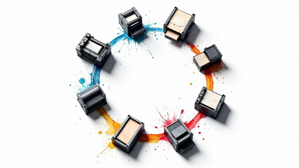
story Top 8 Different Types of Printing You Should Know in 2025
The world of printing is vast and varied, extending far beyond the simple click of a 'print' button. Understanding the different types of printing is crucial for businesses, designers, and creators who want to make a lasting impression. The method you choose directly impacts your final product's quality, cost, and turnaround time, whether you're producing thousands of glossy brochures, a batch of custom t-shirts, or a high-end architectural model. This guide is designed to demystify the complex landscape of printing technologies. We provide a comprehensive roundup of the most significant methods used today, from traditional workhorses to modern innovators. By breaking down the specific mechanics, pros, cons, and ideal applications for each technique, this article empowers you to make strategic decisions for your next project. You will gain actionable insights into a wide range of processes, including: Offset and Flexographic Printing for high-volume runs. Digital, Inkjet, and Laser Printing for speed and customization. Screen and Letterpress Printing for specialty and tactile finishes. Gravure and 3D Printing for unique, high-fidelity applications. By the end, you will have a clear framework for selecting the printing process that best aligns with your specific needs, budget, and creative vision. This knowledge ensures your designs are brought to life with maximum impact and professional precision, moving your concept from pixels to a polished, tangible product. 1. Offset Printing Offset printing, also known as offset lithography, is the undisputed workhorse of the commercial printing world. This technique doesn't apply ink directly to paper. Instead, it transfers or "offsets" an image from a metal plate to a rubber blanket, which then rolls the ink onto the final printing surface. The process relies on the fundamental principle that oil and water do not mix; the image area on the plate holds oil-based ink, while the non-image area attracts a water-based film, repelling the ink. This method is one of the most common types of printing for high-volume jobs because of its exceptional image quality and consistency across large runs. Once the initial setup is complete, the press can produce thousands of identical impressions quickly and efficiently. When to Use Offset Printing Offset printing is the ideal choice for projects where quality and quantity are paramount. Businesses producing large runs of marketing materials, like brochures, catalogs, and magazines, benefit significantly from its cost-effectiveness at scale. The initial setup cost is higher than digital printing, but the per-unit cost drops dramatically as the quantity increases, making it the go-to for bulk orders. It's also favored for projects demanding precise color reproduction and a professional finish, such as annual reports, hardcover books, and high-end packaging. The ability to use custom Pantone inks ensures perfect brand color matching, a critical requirement for many corporate clients. The infographic below summarizes the key considerations for choosing offset printing. As the data shows, offset printing is not for small, one-off jobs but rather for substantial projects where its high setup cost is justified by a lower cost per piece. Tips for Success To maximize the benefits of offset printing, preparation is key. Order in Bulk: Plan ahead and consolidate your printing needs to order larger quantities, significantly reducing your per-item cost. Use High-Resolution Files: Provide your artwork in CMYK format with a minimum resolution of 300 DPI (dots per inch) to ensure sharp, clear images. Consider Gang-Run Printing: For smaller items like business cards or flyers, ask your printer about gang-run printing. This process places multiple jobs on the same large press sheet, splitting the setup costs among several clients. 2. Digital Printing Digital printing is a modern method that prints digital-based images directly onto various media substrates. Unlike offset printing, it doesn't require printing plates. Instead, it uses technologies like inkjet or laser systems to transfer toner or liquid ink, allowing for rapid, on-demand printing directly from a digital file. This process was pioneered and popularized by companies like Xerox, HP, and Canon. This technique is celebrated for its speed and flexibility, making it a cornerstone for modern, fast-paced printing needs. It excels at producing short runs with quick turnaround times, as there is minimal setup required compared to traditional methods. When to Use Digital Printing Digital printing is the best choice for small to medium-sized print runs where speed and cost-efficiency are critical. It's perfect for projects requiring personalization, such as direct mail campaigns where each piece has a unique name or address. The ability to print one or one thousand copies without significant setup costs makes it highly accessible. This method is ideal for short-run projects like business cards, custom invitations, photo books, and promotional flyers. It is also the go-to for proofing, allowing designers to see a physical sample of their work before committing to a large, expensive offset run. If your project has a tight deadline or requires variable data, digital printing offers a powerful solution. Tips for Success To get the most out of your digital printing projects, keep these tips in mind. Optimize for Short Runs: Keep quantities below 1,000 units for maximum cost-effectiveness. For larger volumes, offset printing typically becomes the more economical choice. Leverage Variable Data: Take full advantage of digital printing's unique strength by personalizing your materials. Customizing names, offers, or images for different segments of your audience can significantly boost engagement. File Preparation is Key: While some printers accept RGB files, providing artwork in CMYK format often yields more predictable color results. Always check your printer's specific file requirements for resolution and color profiles. Consider Paper Coatings: A UV or aqueous coating can be applied after printing to protect the ink and make colors appear richer and more saturated, giving your project a professional finish. Explore different options for business cards and stationery on 4over4.com . 3. Screen Printing Screen printing, often called silk screening, is a versatile and durable printing technique that involves transferring ink onto a substrate through a mesh screen. A squeegee is used to push ink through the open areas of a stencil, which is created on the screen to block ink from passing through certain parts. This direct ink transfer results in vibrant, opaque colors that sit on top of the material, creating a tactile and long-lasting finish. This method is one of the most popular types of printing for apparel and promotional products due to its ability to print on a wide variety of materials, including fabric, plastic, wood, and metal. The thick layer of ink provides excellent durability, making it resistant to fading from sunlight and repeated washing. When to Use Screen Printing Screen printing is the superior choice for projects that require bold, vibrant graphics on non-paper surfaces, especially textiles. It is the industry standard for custom t-shirts, hoodies, and tote bags, making it perfect for company merchandise, event apparel, and fashion brands. Its durability also makes it ideal for industrial applications like signage, decals, and even electronic circuit boards. Because each color requires a separate screen and setup, screen printing is most cost-effective for medium to large-volume orders with a limited color palette. While the initial setup can be time-consuming, the cost per item decreases significantly with quantity. This makes it a great option for producing promotional items like pens, mugs, and posters in bulk. Tips for Success To achieve high-quality results with screen printing, careful design and preparation are crucial. Use Vector Graphics: Always provide your artwork in a vector format (like AI or EPS). Vector files can be scaled to any size without losing quality, ensuring crisp, clean edges in the final print. Limit Your Color Count: Each color in your design requires its own screen, which adds to the setup time and cost. Simplifying your design to fewer colors is a highly effective way to manage your budget. Choose the Right Mesh Count: The mesh count of the screen determines the level of detail possible. A higher mesh count is needed for intricate designs, while a lower mesh count is suitable for bold, less detailed graphics and works better with thicker inks. 4. Flexographic Printing Flexographic printing, often shortened to flexo, is a modern version of letterpress printing that excels at high-speed production on a wide range of materials. This rotary printing method uses flexible photopolymer relief plates wrapped around rotating cylinders. The raised image areas on the plate pick up a fast-drying ink and transfer it directly onto the substrate, making it one of the most versatile and efficient different types of printing for packaging. Its ability to print on non-porous materials like plastic, foil, and cellophane, as well as traditional paper and corrugated cardboard, makes it indispensable in the consumer goods industry. Flexo presses can run at extremely high speeds, producing thousands of impressions per hour with consistent quality. When to Use Flexographic Printing Flexography is the dominant printing method for the packaging industry due to its speed, versatility, and cost-effectiveness at very high volumes. It is the ideal choice for printing food packaging, flexible pouches, shopping bags, and self-adhesive labels. Because it uses fast-drying inks, it’s also perfect for printing on corrugated boxes and multi-wall sacks without smudging. Beyond packaging, flexo is also used for printing newspapers and some magazines where speed is a critical factor. While the plate creation involves a higher initial cost, the low cost of consumables and high press speeds make it incredibly economical for long, continuous print runs. This method is not suitable for short runs but is unparalleled for large-scale, repetitive jobs requiring good, but not necessarily photorealistic, quality. Tips for Success To achieve the best results with flexographic printing, careful planning and technical consideration are essential. Optimize Designs for Flexo: Simplify graphics and use vector-based artwork. Avoid extremely fine details, small reverse text, and smooth gradients that can be challenging for the flexo process. Account for Dot Gain: Flexo printing is known for dot gain, where ink dots spread on the substrate. Work with your printer to apply proper dot gain compensation in your design files to prevent images from appearing darker or muddy. Consider Substrate Characteristics: The material being printed on significantly impacts ink absorption and final appearance. Discuss your chosen substrate with the printer to select the right inks and plate type for optimal results. For instance, printing on materials like vinyl requires specific considerations. For more information, you can explore options for printing on different materials on 4over4.com. 5. Gravure Printing Gravure printing, also known as rotogravure, is a high-speed intaglio printing process renowned for its ability to produce premium-quality, continuous-tone images. The technique involves engraving the image onto a metal cylinder. During printing, the cylinder rotates through an ink fountain, filling the recessed, engraved cells with ink while a doctor blade scrapes excess ink from the non-engraved surface. The substrate, typically paper or film, is then pressed against the cylinder, transferring the ink to create a rich, detailed final image. This method is one of the most sophisticated types of printing, prized for its exceptional color density and consistency over extremely long production runs. The durability of the engraved cylinders allows for millions of impressions without any degradation in quality, making it a cornerstone for high-volume industries like publishing and packaging. When to Use Gravure Printing Gravure printing is the undisputed champion for massive print runs where flawless image quality is non-negotiable. It is the go-to method for high-circulation magazines, mail-order catalogs, and large-scale flexible packaging for food and consumer goods. Its ability to print on thin films and foils makes it essential for products like snack bags and yogurt lids. The process is also ideal for security printing, such as postage stamps and currency, due to the fine detail and difficult-to-replicate nature of the engraved cylinders. While the initial setup cost for cylinder engraving is substantial, the per-unit cost becomes incredibly low when producing millions of copies, offering unmatched economic efficiency at a massive scale. Tips for Success To leverage the power of gravure printing effectively, meticulous planning and optimization are crucial. Commit to Very Long Runs: The high cost of cylinder preparation is only justified by extremely large quantities. Reserve this method for jobs numbering in the hundreds of thousands or millions to see a return on the initial investment. Plan Color Sequence Carefully: The order in which colors are printed (typically darker colors first) can impact the final appearance. Work with your printer to determine the optimal sequence for your specific design and substrate. Optimize Cylinder Usage: To maximize cost-effectiveness, design projects that utilize the full width of the printing cylinder. Printers like Bobst and Comexi offer various cylinder sizes, so designing with web width efficiency in mind can reduce material waste and cost. 6. 3D Printing 3D printing, also known as additive manufacturing, represents a revolutionary shift from traditional printing on flat surfaces to creating tangible, three-dimensional objects. Instead of applying ink, this process builds an object layer by layer from a digital 3D model. Materials like plastic, resin, metal, or even biomaterials are deposited, fused, or solidified under computer control, allowing for the creation of intricate and complex geometries that are impossible to produce with conventional methods. This technology has rapidly moved from a niche prototyping tool to a mainstream manufacturing process. It is one of the most transformative types of printing because it enables on-demand production, mass customization, and rapid innovation across countless industries. When to Use 3D Printing 3D printing is the ideal solution for projects that require rapid prototyping, custom parts, or complex designs. It excels in scenarios where creating a mold or tooling would be prohibitively expensive or time-consuming, especially for low-volume production. Businesses use it extensively for creating and testing product prototypes before committing to mass manufacturing. It is also indispensable in specialized fields like medicine for creating custom surgical guides, prosthetics, and patient-specific implants. Furthermore, aerospace and automotive industries rely on it for lightweight yet strong components. For designers and creators, it offers unparalleled freedom to produce everything from architectural models to bespoke jewelry and accessories with a level of detail that other methods cannot match. Tips for Success To get the most out of your 3D printing projects, careful planning and optimization are essential. Optimize Your Design: Not all 3D models print well. Design with additive manufacturing in mind, considering factors like overhangs, wall thickness, and internal structures to minimize failures and material usage. Choose the Right Layer Height: The layer height determines the trade-off between print speed and surface quality. A smaller layer height (e.g., 0.1mm) creates a smoother finish but takes longer, while a larger height (e.g., 0.3mm) is faster but more visibly layered. Plan for Post-Processing: Most 3D prints require some form of post-processing to achieve a finished look. This can include removing support structures, sanding, polishing, painting, or vapor smoothing to improve the surface finish. 7. Letterpress Printing Letterpress printing is a historic technique that involves pressing an inked, raised surface directly onto paper. This method, a form of relief printing, creates a distinct and tangible debossed impression in the paper, a tactile quality that sets it apart from modern, flat printing methods. Originally popularized by Johannes Gutenberg with movable type, letterpress has enjoyed a modern revival, beloved for its artisanal charm and handcrafted feel. The process is methodical and hands-on. A custom plate with a raised design is created, inked, and then pressed into a sheet of paper, typically using a vintage press like a Heidelberg platen or a Vandercook proof press. This direct contact between plate and paper not only transfers the ink but also imparts a physical texture, making each piece unique. When to Use Letterpress Printing Letterpress is the perfect choice for projects where you want to convey a sense of luxury, tradition, and craftsmanship. It’s not meant for high-volume, low-cost jobs but for premium items where the print quality itself is a key part of the message. The deep impression and rich ink saturation create a memorable experience for the recipient. This technique is highly sought after for high-end wedding invitations, boutique business cards, and elegant stationery. It is also a favorite among artists for creating limited edition prints and posters. The process lends itself beautifully to simple, bold designs that emphasize typography and linework, giving them a classic and sophisticated finish. For businesses looking to make a strong impression with items like custom letterheads, letterpress offers an unparalleled level of quality. You can explore a variety of high-quality options and learn more about letterhead printing on 4over4.com . Tips for Success To get the most out of the letterpress process, consider these key tips. Choose Thick, Soft Paper: The signature impression of letterpress shows up best on thick, soft paper stocks, like 100% cotton paper. These papers have the give needed to capture a deep, crisp deboss. Keep Designs Simple and Bold: Fine, delicate lines or complex patterns can get lost or appear muddy. Letterpress shines with bold typography, strong lines, and clear, uncluttered layouts. Consider Blind Embossing: For a subtle, purely textural effect, ask for a "blind" pass. This is when the plate is pressed into the paper without ink, creating a beautiful and elegant debossed design. Plan Color Sequences Carefully: Since each color requires a separate plate and a separate run through the press, plan your color usage strategically to manage costs and production time. 8. Inkjet Printing Inkjet printing is a highly versatile digital printing method that recreates a digital image by propelling droplets of ink directly onto paper, plastic, or other substrates. Unlike techniques that use plates, inkjet printers use microscopic nozzles to spray liquid ink precisely, building the image line by line. This process allows for incredible detail and color vibrancy, making it a popular choice for both home users and commercial enterprises. This method is one of the most accessible different types of printing available, offering a low barrier to entry for producing high-quality, full-color prints without the extensive setup of traditional methods. From compact desktop models by Canon and HP to massive industrial machines for banners and textiles, inkjet technology is scalable and adaptable to a wide range of applications. When to Use Inkjet Printing Inkjet printing is the ideal solution for projects that require high-resolution detail, rich color saturation, and on-demand production. It excels at photo printing, where its ability to blend colors smoothly produces photorealistic images. It's also the go-to for large format graphics like posters, banners, and trade show displays, as it can handle a variety of materials, including vinyl and canvas. Small businesses and marketing professionals often use inkjet for short runs of promotional materials, such as custom labels, direct mail pieces, and personalized items. The technology's flexibility makes it perfect for proofing designs before committing to a larger run with another method or for creating one-of-a-kind pieces. For personalized office supplies, you can explore more about custom notepad printing on 4over4.com . Tips for Success To achieve professional-grade results with inkjet printing, attention to detail is crucial. Use Appropriate Paper: Match your paper to your ink type. Use glossy or luster photo paper for vibrant images and matte paper for text-heavy documents. The paper's coating significantly impacts how the ink is absorbed and how the final colors appear. Prevent Nozzle Clogging: Run a test print at least once a week, even if you don't have a specific job. This keeps the ink flowing through the print heads and prevents the microscopic nozzles from drying out and clogging. Consider Pigment Inks for Longevity: For prints that need to be archival or withstand environmental exposure, such as fine art prints or outdoor signage, choose pigment-based inks. They are more resistant to fading from UV light and water damage compared to standard dye-based inks. 9. Laser Printing Laser printing is a fast and efficient digital printing process known for producing high-quality text and graphics with exceptional speed. The technology operates by projecting a laser beam onto a photosensitive drum to create a charged, electrostatic image. This charged area attracts fine powder, known as toner, which is then transferred onto paper and permanently fused to it using heat. This method, originally pioneered by Gary Starkweather at Xerox, has become a cornerstone of office environments and short-run production due to its reliability and precision. Unlike inkjet printers that spray liquid ink, laser printers use dry toner, which prevents smudging and produces crisp, sharp lines, making it one of the most dependable types of printing for document-heavy tasks. When to Use Laser Printing Laser printing is the optimal solution for environments that require speed, clarity, and cost-effective text-based document production. It excels in office settings for creating internal reports, forms, invoices, and everyday correspondence. The speed of laser printers makes them ideal for high-volume, transactional printing where documents need to be produced quickly and consistently. It's also a strong contender for producing short runs of marketing materials, manuals, and booklets where sharp text and clean graphics are more important than photographic color depth. While it may not match the color vibrancy of offset or high-end inkjet for photo-realistic images, its efficiency and low cost-per-page for monochrome and color documents make it a practical choice for many business applications. To explore specific options, you can learn more about Laser Printing on 4over4.com . Tips for Success To get the most out of your laser printing projects, focus on proper maintenance and material selection. Use Laser-Compatible Paper: For the best results, use paper specifically designed for laser printers. Its smoothness and heat resistance prevent curling and ensure proper toner fusion. Monitor Toner Quality: Replace toner cartridges as soon as you notice a decline in print quality, such as fading or streaking. Using high-yield cartridges can also lower your long-term cost per page. Perform Regular Cleaning: Keep the printer's interior free of dust and stray toner particles. A clean machine will prevent blemishes on your prints and extend the life of the components. Comparison Matrix of 9 Printing Methods Printing Method Implementation Complexity 🔄 Resource Requirements ⚡ Expected Outcomes 📊 Ideal Use Cases 💡 Key Advantages ⭐ Offset Printing High setup complexity; requires skilled operators High initial setup cost; printing plates needed Consistent high-quality, sharp images over large runs Large volume prints like books, magazines, packaging Cost-effective at scale, excellent color accuracy Digital Printing Low complexity; quick setup Low setup cost; no plates required Good quality; variable data, fast turnaround Short runs, personalized items, on-demand printing Flexible, fast, cost-effective for short runs Screen Printing Labor-intensive setup; requires multiple screens Multiple mesh screens per color needed Durable, vibrant prints; limited fine detail Apparel, signage, promotional products requiring durability Durable prints, great for specialty inks Flexographic Printing Moderate complexity; skilled operators needed High setup costs; flexible plates required Good quality, fast print speeds on various substrates Packaging, labels, long production runs Very high speed, suitable for continuous web printing Gravure Printing Very high complexity; expensive cylinder prep Extremely high setup costs; engraved cylinders Exceptional color consistency and detail for very long runs Luxury packaging, high-volume magazines Unmatched print quality and color saturation 3D Printing Moderate complexity; digital modeling required No tooling; variety of materials used Customized, complex 3D objects; slower than mass production Prototyping, medical implants, custom products Complex geometries, rapid prototyping Letterpress Printing Labor-intensive, requires specialized skills Low to moderate resource needs; physical presses Distinctive tactile impression; limited colors High-end invitations, art prints, small runs Unique texture, premium vintage aesthetic Inkjet Printing Low complexity; variable droplet control Moderate; variable cartridges and media High-quality photos; variable data printing Photo prints, banners, textile printing, direct mail Versatile substrates, excellent for photo reproduction Laser Printing Moderate complexity; requires maintenance Moderate equipment cost; toner cartridges needed Sharp text and graphics; fast print speeds Office documents, short-run marketing, transactional prints Fast, reliable, low running costs for text documents Choosing Your Perfect Print Partner Navigating the vast landscape of different types of printing can feel overwhelming, but understanding the core strengths of each method is the key to unlocking exceptional results. As we've explored, the journey from a digital concept to a tangible, high-quality printed piece is not a one-size-fits-all process. The optimal choice hinges on a careful evaluation of your project's unique variables: quantity, substrate, quality requirements, budget, and desired turnaround time. Your decision transforms an idea into an impactful reality. The industrial might of offset and flexography delivers unparalleled cost-efficiency and color consistency for large-scale production runs, making them the undisputed champions for magazines, packaging, and extensive marketing campaigns. Conversely, the agility and personalization prowess of digital printing offer a modern solution for short runs, variable data projects, and rapid prototyping, empowering businesses to be more responsive and targeted. Key Takeaways for Strategic Print Selection To make the best choice, always start with your end goal. Don't just select a printing method; build a printing strategy. Here are the most critical takeaways to guide your decision-making process: Quantity is King: The single biggest factor influencing cost-per-unit is volume. For runs in the thousands or tens of thousands, offset printing will almost always be more economical. For anything from one to a few hundred, digital printing is your most cost-effective and efficient option. Material Matters: The surface you are printing on (your substrate) can immediately narrow your options. Screen printing excels on unconventional materials like textiles and glass, while flexography is designed for flexible packaging. Always confirm your chosen method is compatible with your desired paper, plastic, or fabric. Time is a Resource: If you need your materials tomorrow, digital printing is your only viable path. Methods like offset, gravure, and letterpress involve significant setup time for creating plates or screens, making them unsuitable for tight deadlines. Quality is Not Universal: "High quality" means different things. For photorealistic images, gravure printing offers unmatched detail and tonal range. For a luxurious, tactile feel that conveys heritage and craftsmanship, the debossed effect of letterpress printing is second to none. Define what quality means for your specific project. From Theory to Action: Finding Your Print Partner Understanding these different types of printing is the first step. The next, more crucial step is finding a partner who can execute your vision flawlessly. A reliable printing partner acts as a consultant, guiding you toward the best method rather than the one most convenient for them. They should have a deep understanding of how to translate your design files into a format optimized for the press, ensuring color accuracy and preventing costly mistakes. When vetting potential printers, look for transparency in their process and proof of their capabilities. Ask to see samples of their work that are similar to your project's scope. Examining a provider's past work, like a detailed portfolio, is an excellent way to gauge their expertise across various techniques and substrates. For instance, reviewing a comprehensive collection like Piexels' project portfolio can reveal a studio's versatility and commitment to quality, helping you make a more informed decision. Ultimately, the power of print lies in its ability to create a lasting physical connection with an audience in an increasingly digital world. Choosing the right printing method is not just a technical decision; it's a strategic brand choice that impacts how your message is perceived. By aligning your project's needs with the powerful capabilities of these diverse printing technologies, you ensure your final product is not only produced efficiently but also resonates deeply with your intended audience, leaving a memorable and professional impression. Ready to bring your projects to life with the perfect printing method? The team at 4OVER4 has over two decades of experience leveraging state-of-the-art technology across a massive range of printing services. Explore their solutions at 4OVER4 and let their experts help you select and execute the ideal printing technique to elevate your brand.
 story
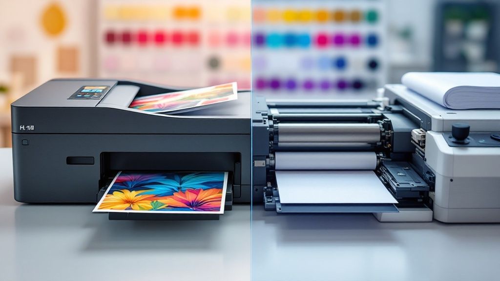
story Digital Printing vs Offset Printing Your Guide
Here’s the bottom line: offset printing is your go-to for large, high-quality projects where the cost-per-piece is king. On the other hand, digital printing shines when you need smaller quantities, a quick turnaround, or personalized content. Your decision really boils down to what matters more for a specific job: volume and color precision or speed and customization . Making The Right Print Decision Choosing between digital and offset isn't about which one is "better" in a general sense. It's about picking the right tool for the job. Think of it like transportation: an airliner (offset) is unbeatable for moving thousands of people across the country efficiently, driving down the cost per person. A private jet (digital) is perfect for a small group that needs to get somewhere fast, on their own schedule. Each serves a distinct purpose. This guide will give you a practical framework to match the right technology to your project, so you get the best possible results. The main things you'll need to consider are your project's quantity, deadline, and creative demands. If you need a fast, flexible option for a smaller batch, exploring the world of digital printing services is a great place to start. The core trade-off is simple: Offset printing has high setup costs but a low per-unit cost for large volumes. Digital printing has almost no setup costs, making it affordable for short runs, but the per-unit cost remains constant. To make this even clearer, I've put together a quick comparison of the most important factors. Digital vs Offset Printing At a Glance This table breaks down the key differences to help you see which method aligns best with your project's needs at a single glance. Criterion Digital Printing Offset Printing Ideal Volume Best for short runs (typically under 500 units) Most cost-effective for large runs ( 500+ units) Cost-Per-Unit Higher per unit, but low initial setup cost Lower per unit on large runs, but high initial setup cost Turnaround Time Fast, often same-day or next-day delivery Slower due to plate creation and setup (several days) Color Accuracy Good quality, but can have slight variations Superior quality, precise Pantone color matching Customization Excellent for variable data (e.g., personalized names) Static content; every print is identical This should give you a solid foundation for making your choice. If you're still weighing the options and want a more detailed breakdown, you can delve deeper into the nuances of digital vs. offset printing with this helpful resource. How Each Printing Technology Works To really get a handle on the whole digital vs. offset printing debate, it helps to understand how each one actually works. They’re built on completely different ideas, and those differences are what dictate their unique strengths in the real world. Knowing the nuts and bolts is the key to seeing why cost, speed, and quality vary so much between them. So, let’s pull back the curtain and see what’s going on inside the machine. The Mechanics of Offset Printing Offset printing is the traditional, tried-and-true method that relies on a mechanical, multi-step process. It’s an indirect technique—your design isn't stamped directly onto the paper. Instead, the ink is "offset" through a few different stages to get to the final sheet. It all starts by etching your digital design onto a set of custom metal plates, usually aluminum. A separate plate gets made for each of the four CMYK process colors: cyan, magenta, yellow, and black . These plates are then carefully loaded onto the printing press. Once the press starts rolling, a series of rollers applies oil-based ink to the plates. At the same time, other rollers apply a water solution. Since oil and water don't mix, the ink sticks only to the etched image areas while the water coats the blank parts. This perfectly inked image is then transferred from the plate onto a rubber blanket. Finally, the paper zips between that rubber blanket and an impression cylinder, which presses the image cleanly onto the page. This whole setup—making plates, calibrating the press, getting the ink-and-water balance just right—is a pretty big lift. It’s why offset has those higher upfront costs. But once it’s running, that press can churn out prints at lightning speed with incredible consistency, making it the undisputed champion for large volumes. This meticulous, plate-based system is exactly what allows for the rich, vibrant colors and razor-sharp quality that defines professional offset printing . How Digital Printing Works Digital printing, on the other hand, is a much more straightforward affair. Think of it as a super-powered version of the laser or inkjet printer you have in your office. It takes a digital file, like a PDF or JPEG, and prints it directly onto the paper without any plates at all. There are two main flavors of digital printing: Inkjet: Tiny nozzles spray liquid ink directly onto the paper to build the image. This is the go-to for really big stuff like banners or high-end fine art prints where detail is everything. Laser (Toner): This method uses static electricity to attract fine powder particles (toner) to a charged drum. The toner is then transferred to the paper and fused into place with heat, giving you a sharp, durable finish. Because there are no plates to make, the setup is practically instant. The first print can be in your hands in minutes, not hours. This direct-to-paper process is also what makes Variable Data Printing (VDP) possible. You can change out names, addresses, or even images on every single piece without ever stopping the press—a game-changer for personalized marketing and a key advantage of the digital approach. Comparing Critical Performance Factors Choosing between digital and offset printing isn't about which one is flat-out better; it's about which one is the right tool for your specific job. The decision really comes down to what you need your final product to achieve—whether that’s hitting a tight deadline, staying on a shoestring budget, or nailing a perfect brand color. Let's break down the real-world differences across four key areas: cost, quality, speed, and material options. Getting these details right is how you make a smart, strategic decision that saves you time, money, and headaches down the road. Cost Effectiveness and The Break-Even Point More than anything else, the cost debate between digital and offset printing boils down to one thing: volume . Digital printing has a very straightforward, almost flat cost curve. The price for your first print is pretty much the same as your 500th. Why? Because there are no custom plates to create or complex press setups involved. This makes it a no-brainer for small jobs. Offset printing plays by a different set of rules. You've got significant upfront costs tied to making the printing plates and getting the press perfectly calibrated. But once that machine is humming, the per-unit cost plummets. This is where offset shines—on large-scale projects where you can spread those initial setup costs across thousands of pieces. So, where's the tipping point? The "break-even point"—where offset becomes the cheaper option—is usually somewhere between 500 and 2,000 units . If you’re printing less than that, digital is almost always your most economical path. Printing thousands? Offset will give you a much friendlier per-piece price. Key Takeaway: For short runs, digital is king for your budget. For large runs, the per-unit savings from offset printing are impossible to beat. If your quantity is anywhere near that break-even zone, always get quotes for both. Print Quality and Color Fidelity While modern digital presses are incredibly good, offset printing still wears the crown for pristine color accuracy and sharpness. It’s all in the process. Using ink on plates allows for incredibly crisp lines and rich images, eliminating any risk of the subtle streaking or banding that can sometimes pop up in digital prints. Even more important is offset's mastery of color matching. It uses the Pantone Matching System (PMS) , which means specific ink colors are mixed to hit a brand’s exact color specifications. This isn't just a "nice to have"; it's non-negotiable for large companies where brand consistency is everything. Top-tier digital presses can get incredibly close, achieving up to 96% of Pantone colors , but they’re simulating them with a CMYK process—not using the pure, pre-mixed spot inks that offset does. For most day-to-day business materials, the quality from a good digital press is more than enough. But for anything high-end—luxury brand lookbooks, fine art reproductions, or projects where perfect color is the top priority—offset is the safer bet. Turnaround Time and Project Speed When the clock is ticking, digital printing is your best friend. Hands down. With no plates to make and minimal setup time, a job can often be printed the very same day you send the file. This agility is perfect for last-minute flyers for an event, urgent proposals, or any on-demand printing needs. Offset printing is a much more deliberate, methodical process. Creating the plates, setting up the press, and allowing time for the ink to fully dry all add to the timeline. A standard offset job usually takes several days to move through production, which just won't work for projects that need to be in hand now . Digital Printing: The go-to when your deadline is measured in hours or a couple of days. Offset Printing: Best suited for projects where you have a week or so in your production schedule. Material Versatility and Finishing Options If you want to print on something unique, offset printing opens up a world of possibilities. It can handle a massive range of paper weights, textures, and custom finishes without breaking a sweat. From super-thick cardstock to delicate specialty papers—and even non-paper surfaces like plastic or metal—offset presses are workhorses. Digital presses, especially toner-based ones that use heat, can be a bit more selective. They run best on smoother paper stocks and can sometimes struggle with very thick or heavily textured materials. That said, the technology is always improving and closing this gap. Each method also has a different environmental story. Digital printing naturally creates less waste because there are no plates to produce and far less paper is used during setup. For businesses focused on sustainable practices, exploring options in green printing can show how digital often leaves a smaller footprint, especially on those smaller jobs. To make the choice even clearer, here’s a quick breakdown of common scenarios and which method usually comes out on top. Situational Breakdown Digital vs Offset Scenario Recommended Method Key Justification Urgent event flyers (250 count) Digital Unbeatable speed for tight deadlines and cost-effective for low volume. Company-wide training manual (5,000 copies) Offset The per-unit cost will be significantly lower at this volume. Luxury brand catalog with exact Pantone color Offset Guarantees perfect color fidelity using true Pantone spot inks. Personalized direct mail campaign (1,000 unique letters) Digital Variable data printing makes customizing each piece easy and affordable. Printing on heavily textured, thick cardstock Offset Greater versatility with specialty paper stocks and materials. Proofing a single copy of a new book cover Digital The only economical way to produce a one-off print for review. This table should help you quickly map your project's needs to the right technology, ensuring you get the best possible result for your budget and timeline. When to Choose Offset Printing for Your Project Offset printing is the undisputed champion when volume, precision, and quality are your top priorities. It's the go-to method for projects where compromising on color or finish just isn't an option, and the scale of the job justifies the initial setup investment. Think about large-scale marketing collateral, like a national retailer's seasonal catalog or a high-circulation magazine. For these kinds of jobs, the sheer quantity makes offset the only sensible economic choice. While the upfront costs for plates and press setup are higher, the per-unit cost drops dramatically as the print run gets bigger. Large Volume Projects The number one reason to choose offset is for big print runs, which usually means anything over 500 to 2,000 pieces . The math is pretty simple: the more you print, the cheaper each individual piece becomes. This makes it perfect for projects that need wide distribution. Offset printing continues to dominate these large-scale jobs because of its raw efficiency. When a professional association needs to produce a quarterly magazine for its 150,000 members , offset ensures both cost control and rock-solid quality across every single copy. Likewise, a B2B company printing 500,000 seasonal catalogs relies on offset to maintain precise color for product images while keeping expenses in check. You can learn more about why offset printing remains effective for high volumes . The takeaway is clear: if your project involves thousands—or even millions—of identical copies, from books and manuals to brochures and corporate reports, offset printing delivers unbeatable value and consistency. Uncompromising Color and Quality Another huge advantage of offset printing is its superior color fidelity. This method uses the Pantone Matching System (PMS) , allowing printers to mix specific inks to match your brand’s colors with absolute precision. For corporations where brand identity is everything, this is non-negotiable. On top of that, offset excels with specialty materials and finishes. It can handle a much wider array of paper stocks—from heavily textured paper to ultra-thin sheets—without breaking a sweat. This versatility extends to finishing options that can add a truly premium feel to your materials. Consider these scenarios where offset is really the only way to go: Metallic Inks: Adding a true silver or gold shimmer to invitations or packaging. Varnishes: Applying a spot gloss or matte finish to highlight specific design elements. Custom Coatings: Using unique finishes like scratch-and-sniff for promotional materials. When your project demands a tactile, high-end finish designed to make a powerful impression, offset printing provides the tools and quality to bring that vision to life. The whole digital printing vs offset printing decision often comes down to this need for specialized, premium results. When Does Digital Printing Make the Most Sense? While offset printing is the undisputed king of high-volume jobs, digital printing shines when it comes to speed, flexibility, and personalization. Its real power is in handling short-run projects with incredible efficiency. This makes it the go-to choice when you need smaller quantities without a huge upfront investment. Think business cards, event flyers, or boutique product packaging where you might only need a few hundred pieces. For businesses built around custom products or small-batch runs, services like Printify Print On Demand are a perfect example of digital printing in action. Because there are no plates to create, the setup is almost instant, getting high-quality prints into your hands in record time. Personalization on a Whole New Level One of the coolest things you can only do with digital printing is Variable Data Printing (VDP) . This technology lets you change text, graphics, or images on each individual piece as it prints, without ever slowing down the press. It’s what turns mass communication into a personal conversation. Imagine sending out 1,000 direct mail postcards, but each one has the recipient's name, a unique offer based on their buying history, and an image of a product they’ve looked at before. That level of one-to-one marketing is simply impossible with offset. If you're a marketer trying to drive real engagement, our guide on Variable Data Printing shows just how powerful this can be for boosting response rates. Digital printing’s ability to customize each print makes it an invaluable tool for targeted marketing. It allows brands to connect with customers on a one-to-one basis, making every piece of communication feel relevant and unique. The Need for Speed and Sustainability The digital printing process is also faster and greener by its very nature. By skipping the plate-making and long press calibrations, projects can go from a digital file to a finished product in hours, not days. This kind of rapid turnaround is a lifesaver for businesses on a tight deadline or those that need to react quickly to what's happening in the market. For any print job under 2,000 copies, digital is almost always the more economical and flexible option. Plus, the direct-to-paper process cuts down on paper waste and uses less energy, which is a big win for any company focused on sustainability. The Evolving Landscape of Commercial Printing The old debate of digital versus offset printing isn't what it used to be. It’s a conversation that’s constantly changing, driven by new tech and what the market demands. We're seeing a major shift where digital printing isn't just playing catch-up anymore—it's starting to set new standards for all kinds of projects. The numbers tell a compelling story. While offset is still the undisputed king for massive print runs, digital is quickly closing the gap. Projections show global sales for sheetfed offset presses are expected to slip from $2.6 billion to $2.25 billion between 2021 and 2026. On the flip side, the digital print market is on track for some serious growth, predicted to reach $251.1 billion by 2035 . That's a massive 50% jump from its 2025 estimate. This shift really highlights how digital's speed and adaptability are hitting the mark for modern business needs. The Rise of Hybrid and High-Fidelity Digital A huge part of this evolution is that the quality gap is shrinking—fast. Thanks to innovations like nanography, today's digital presses can produce resolutions and color vibrancy that were once only possible with offset. Top-of-the-line digital systems can now accurately hit up to 96% of Pantone colors , making them a perfectly solid choice for brands that can't afford to compromise on color. This has also opened the door for hybrid printing solutions. Think about it: you can run the bulk of a project on an offset press for cost efficiency, then switch to a digital press to add variable data like individual names or unique QR codes. It’s a smart approach that blends the best of both worlds—offset’s affordability at scale with digital’s power of personalization. The future of commercial printing isn't about one method wiping out the other. It’s about being smarter with our choices, picking the right tool for the job based on speed, volume, customization, and cost. As the technology keeps getting better, the lines between digital and offset will only get blurrier. For businesses, this is great news. It means more options and more creative freedom to produce stunning materials, including the unique finishes you'll find in our specialty printing collection. The conversation is no longer about "which is better" but about understanding how to strategically use each technology to get the best possible result. A Few Common Questions About Printing When you're trying to decide between digital and offset printing, a few questions always seem to pop up. Getting straight answers is the best way to make sure your project gets off on the right foot. What Is the Break-Even Point for Offset vs. Digital Printing? There isn't one perfect number, but from my experience, the sweet spot where offset starts to make more financial sense is somewhere between 500 and 2,000 units . If you're printing fewer than 500 copies, digital is almost always the cheaper route. You get to skip all the expensive plate and setup fees. Once you cross that threshold, however, the lower per-unit cost of offset printing really starts to kick in, making the initial setup cost worthwhile. The exact number depends on your paper, the colors you're using, and the overall complexity. If you're anywhere in that 500-2,000 range, do yourself a favor and get quotes for both. For projects with quantities hovering around the 500-2,000 mark, comparing quotes is crucial. A slight change in paper stock or color requirements can easily tip the economic scale from one method to the other, potentially saving you a significant portion of your budget. Can Digital Printing Match Offset Quality for High-End Projects? This is a big one. Modern, high-end digital presses have gotten incredibly good, and honestly, for most projects, you'd be hard-pressed to spot the difference. That said, for those jobs where every tiny detail matters—like precise Pantone color matching or printing on really unique, textured papers—offset still has a slight advantage. It tends to produce ever-so-slightly sharper images and text, which can be a deciding factor for luxury brands or fine art prints. But for the vast majority of business materials, today's digital quality is more than up to the task. How Should I Prepare Files for Digital vs. Offset Printing? The basics are the same for both: you always want to use high-resolution ( 300 DPI ) images and design in CMYK color mode. But after that, the specifics start to matter. For Offset Printing: You need to be incredibly precise. Because plates are being physically created, your color profiles and any specified Pantone colors must be perfect from the get-go. For Digital Printing: If you're doing anything with variable data (like names or addresses), the real trick is setting up your data sheets and files so the press can pull that information in without a hitch. No matter which method you choose, the best first step is to check your printer’s specific file guidelines. It’ll save you a ton of headaches and potential delays. Ready to turn your designs into high-quality printed materials? 4OVER4 offers a full range of both digital and offset printing solutions to match any project, budget, or timeline. Start your next print project with us today!
 story
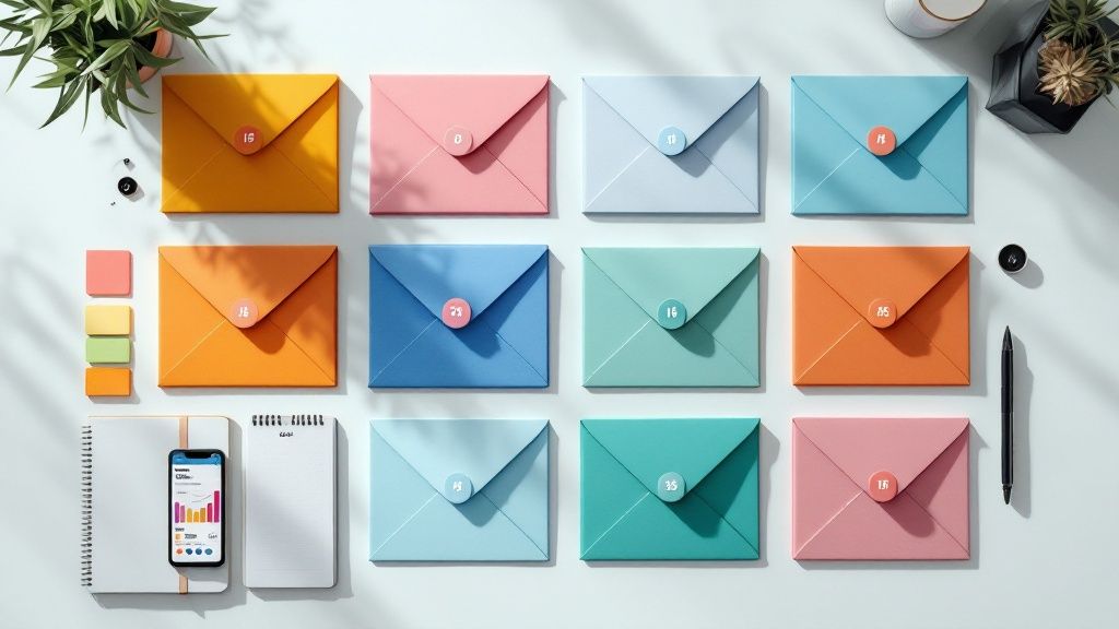
story 8 Direct Mail Best Practices to Boost Your ROI in 2025
In an era of overflowing inboxes and relentless digital noise, the tangible power of direct mail is experiencing a significant resurgence. However, simply sending a postcard or a letter is no longer sufficient to guarantee success. To truly cut through the clutter and achieve a substantial return on investment, modern marketers must adopt a strategy grounded in proven, data-driven techniques. Executing a campaign without a clear plan often leads to wasted resources and missed opportunities. This comprehensive guide is designed to move beyond generic advice, unveiling the essential direct mail best practices that transform an ordinary mailer into a powerful conversion tool. We will provide a structured roadmap covering every critical stage of a successful campaign, ensuring no detail is overlooked. By implementing these strategies, you can build a more effective, efficient, and profitable direct mail program. Inside this article, you will discover actionable insights on: Laser-focused audience segmentation and targeting. Crafting compelling calls-to-action (CTAs) that drive responses. Implementing advanced personalization that goes far beyond a name. Integrating your mailers seamlessly with digital marketing channels. Establishing robust tracking and analytics to measure true ROI. Whether you're a seasoned professional looking to refine your approach or new to the world of print marketing, these eight core practices will equip you with the knowledge to create campaigns that not only get noticed but also deliver measurable, impactful results. Let's explore the tactics that will redefine your mailbox marketing efforts. 1. Precise Audience Segmentation and Targeting The foundation of any successful direct mail campaign isn't the design or the offer; it's the mailing list. Precise audience segmentation is the practice of dividing a broad customer base into smaller, more manageable groups based on shared characteristics. This is one of the most critical direct mail best practices because it transforms a generic "spray and pray" approach into a targeted, personalized conversation that drives higher response rates and ROI. Instead of sending the same postcard to everyone, segmentation allows you to tailor your message, offer, and imagery to resonate deeply with each specific group. This strategy acknowledges that not all customers are the same; they have different needs, motivations, and purchasing behaviors. By speaking directly to these unique attributes, your mailpiece feels less like an advertisement and more like a helpful solution. How to Implement Audience Segmentation Effective segmentation relies on data to create detailed customer personas. The goal is to move beyond basic demographics and understand the "why" behind customer actions. Demographics: Start with the basics like age, gender, income level, and family size. A local daycare would target households with young children, while a financial advisor might focus on high-income individuals approaching retirement age. Geographics: Target customers based on location, such as ZIP code, city, or even specific neighborhoods. A new restaurant would send grand opening mailers to a 5-mile radius, while Home Depot often targets recent homebuyers in a specific area with renovation promotions. Psychographics: Dive deeper into lifestyle, values, interests, and attitudes. A company selling sustainable products would target environmentally conscious consumers. Behavioral Data: Use past purchase history, frequency of purchases, and brand interactions. For example, an online retailer can send a "we miss you" postcard with a special discount to customers who haven't purchased in over six months. Actionable Tips for Better Targeting To get started, focus on creating 3-5 distinct, high-value segments rather than overcomplicating your initial efforts. Combine your internal customer data (like purchase history from your CRM) with external data sources for a more complete picture. Tools like Nielsen's PRIZM can provide deep insights into neighborhood characteristics, helping you understand the lifestyle patterns of different ZIP codes. As your campaigns run, continuously analyze performance data to refine and update your segments, ensuring your targeting remains sharp and effective. For more information on building the right list, explore these expert direct mail services . 2. Compelling and Clear Call-to-Action (CTA) A well-crafted call-to-action (CTA) is the critical element that transforms reader interest into measurable action. Even with perfect targeting and brilliant design, a direct mail piece will fail if the recipient doesn't know what to do next. This practice focuses on creating clear, specific, and urgent instructions that guide the recipient, making the response process as simple and compelling as possible. A powerful CTA is one of the most vital direct mail best practices because it bridges the gap between passive reading and active engagement. Your CTA is the single most important instruction on your mailer. It must stand out visually and use action-oriented language to motivate a response. Vague invitations like "Learn More" are far less effective than direct commands like "Scan to Get 50% Off Your First Box." Brands like Publishers Clearing House perfected this by using urgent, benefit-driven CTAs like "RUSH YOUR ENTRY TODAY!" paired with clear deadlines, creating a powerful incentive to act immediately. How to Implement a Strong CTA An effective CTA minimizes friction and maximizes motivation. The goal is to make the desired action seem both easy and highly rewarding. Be Specific and Action-Oriented: Start your CTA with a strong verb that commands action. Instead of "Contact Us," use "Call Now for a Free Consultation" or "Visit Our Website to Book Your Appointment." GEICO’s "Call 1-800-GEICO or visit geico.com for your free quote" provides two clear, distinct paths to action. Create Urgency or Scarcity: Motivate immediate action by incorporating a sense of urgency. Phrases like "Offer Ends Friday," "Limited Time Only," or "While Supplies Last" encourage recipients to respond before they forget. Highlight the Benefit: What's in it for them? Connect the action to the value they will receive. Blue Apron’s "Scan to get your first box 50% off" is powerful because it clearly states the attractive benefit of taking action. Make It Visually Prominent: Your CTA should be impossible to miss. Use contrasting colors, a larger font size, or place it within a button-like shape to draw the eye. It should stand out from the rest of the design elements. Actionable Tips for Better CTAs To craft CTAs that convert, focus on clarity and ease of response. Place your CTA in multiple locations on the mailpiece, like the front and back, but keep the core message consistent. Make the response mechanism frictionless; use QR codes for easy website access or simple, memorable phone numbers. Test different versions of your CTA wording, offers, and designs to see what resonates most with your audience. For mailers that need a tangible response element, you can explore the use of detachable rip cards , which provide a built-in CTA that customers can keep. 3. Personalization Beyond Name Effective direct mail speaks to an individual, not a crowd. True personalization goes far beyond simply inserting a recipient's name into a form letter; it involves using customer data to customize the entire mailpiece. This is one of the most powerful direct mail best practices because it makes the recipient feel seen and understood, dramatically increasing engagement and response rates. This practice leverages individual preferences, purchase history, life stages, and demonstrated interests to create a unique experience. Instead of a generic coupon, imagine receiving a mailer featuring products you recently viewed online or a special birthday offer for your favorite item. This level of detail transforms marketing mail from an interruption into a welcomed and relevant communication. How to Implement Deep Personalization Successful personalization hinges on leveraging data to create a one-to-one marketing experience at scale. The goal is to make each mailpiece feel as if it were designed exclusively for the person holding it. Behavioral Data: Use past purchases, browsing history, and cart abandonment data to inform your offers and imagery. Amazon excels at this, sending personalized catalogs featuring products similar to a customer's recent purchases or searches. Lifecycle Data: Tailor content based on where the customer is in their journey. A new customer might receive a welcome offer, while a loyal, long-term customer could get an exclusive VIP reward. Spotify's annual "Wrapped" campaign, which sometimes includes a mailer with personal listening statistics, is a prime example. Demographic & Geographic Data: Customize visuals and messaging to be more relatable. A home improvement store could send different imagery to urban apartment dwellers versus suburban homeowners. A national chain can include a map and a specific offer for the recipient's nearest local store. Preference Data: Incorporate information customers have shared directly, such as their favorite products or communication preferences. Starbucks sending a birthday mailer with an offer for a recipient's specific favorite drink order is a classic use of this strategy. Actionable Tips for Better Personalization Start with simple data points and gradually increase complexity as you gain confidence. Personalize the offer itself, not just the greeting; for instance, offer a discount on a product category the customer frequently buys from. Use your CRM and customer service data to uncover valuable insights into individual needs and preferences. To execute these campaigns effectively, it's essential to use the right technology; explore these variable data printing services to learn how unique elements can be printed on each piece. Always test personalized versus non-personalized versions to measure the direct impact on your ROI. 4. Strategic Timing and Frequency Sending the right message to the right person is only half the battle; sending it at the right time is what often determines its success. Strategic timing and frequency are crucial direct mail best practices that involve planning when and how often to mail to maximize impact. This practice transforms your campaign from a random interruption into a timely, relevant touchpoint that arrives when your audience is most receptive. Ignoring the calendar is a costly mistake. A well-timed mailpiece lands in the hands of a consumer at the exact moment they are considering a purchase, dramatically increasing response rates. Conversely, mailing too often can lead to recipient fatigue and a diminished brand perception, while mailing too infrequently allows your brand to be forgotten. Finding the right balance ensures your message remains welcome and effective. How to Implement Strategic Timing Effective timing aligns your mail drops with external events, consumer behaviors, and industry-specific cycles. The goal is to make your offer feel perfectly relevant to the recipient's current situation. Seasonal Relevance: This is the most common approach. Tax preparation services like H&R Block concentrate their mailings between January and March. Retailers like L.L.Bean send catalogs for their fall collection in late summer, anticipating the change in seasons. Event-Driven Timing: Align mailings with specific life events or triggers. A real estate agent might send mailers quarterly to maintain top-of-mind awareness but increase frequency in a neighborhood with high turnover. Purchase Cycle Alignment: Consider your product's typical purchase cycle. A car dealership might time a service reminder postcard to arrive three months after a vehicle purchase, while a B2B software company might send a renewal offer 60 days before a contract expires. Day-of-the-Week Optimization: Studies often show that mail arriving Tuesday through Thursday receives more attention, as recipients are less distracted than they are on Monday (catching up) or Friday (preparing for the weekend). Actionable Tips for Better Timing Plan your direct mail calendar at least 6-8 weeks in advance to account for design, printing, and delivery timelines. Always factor in USPS delivery estimates when planning campaigns around time-sensitive offers. For instance, if you want a coupon to be used on a specific weekend, it should arrive in mailboxes by Wednesday at the latest. To find your optimal cadence, test different frequencies with small audience segments before committing to a full campaign deployment. Finally, amplify your results by coordinating your mail drops with your digital campaigns, such as launching a social media ad campaign the same week your postcards are scheduled to land. 5. Multi-Channel Integration Direct mail no longer operates in a vacuum; its true power is unleashed when it works in concert with your digital marketing efforts. Multi-channel integration is the strategy of coordinating your direct mail campaigns with email, social media, and other digital touchpoints to create a seamless, unified customer experience. This is one of the most impactful direct mail best practices because it surrounds your audience with a consistent message, multiplying brand impressions and driving a more robust response. Instead of a single mailpiece hoping to capture attention, this approach uses mail as a powerful catalyst for a broader conversation. When a recipient sees your postcard and then encounters a similar ad in their Instagram feed or an email in their inbox, the message is reinforced. This cohesive strategy builds trust, boosts brand recall, and guides the customer along a deliberate journey from their mailbox to your website and, ultimately, to a conversion. How to Implement Multi-Channel Integration A successful integrated campaign requires careful planning and precise timing to ensure each channel complements the others. The goal is to make the journey feel natural and connected, not disjointed or repetitive. Pre-Mail Digital Warm-Up: Run targeted social media or display ads to your mailing list before the mailpieces are scheduled to arrive. This "warms up" the audience, so your brand is already familiar when they check their mail. The Mailpiece as a Bridge: The direct mail piece acts as the physical touchpoint that drives digital action. Companies like Warby Parker include QR codes on their mailers that link directly to a virtual try-on app, seamlessly connecting the physical and digital worlds. Post-Mail Digital Follow-Up: Once the mail is estimated to have been delivered, launch a coordinated follow-up. This can include a targeted email sequence referencing the mailer, or retargeting ads on platforms like Facebook and Google that feature the same offer and creative. Consistent Creative and Messaging: The visual identity and core message must be consistent across all channels. If your postcard features a 20% off offer with a specific product image, your corresponding digital ads and landing page must reflect that exact same promotion and branding. Actionable Tips for Better Integration Start by mapping out the entire customer journey, from the first digital touchpoint to the post-mail follow-up. Ensure your timing is strategic; use mail tracking data to trigger your digital follow-ups for maximum impact, typically 2-3 days after delivery. Create dedicated, mobile-friendly landing pages specifically for your direct mail traffic, using a unique URL or QR code to track performance accurately. For a truly professional and cohesive campaign, explore how custom printed branded envelopes can enhance brand recognition from the moment the mail arrives. 6. Rigorous Testing and Optimization Launching a direct mail campaign without a testing plan is like navigating without a compass. Rigorous testing and optimization is the systematic process of trying different campaign elements to see what resonates most with your audience. This is one of the most vital direct mail best practices because it replaces guesswork with data, allowing you to methodically improve response rates and maximize your marketing budget over time. Instead of assuming you know which headline, offer, or design will perform best, A/B testing (or multivariate testing) provides concrete evidence. By isolating variables and measuring their impact, you can make informed decisions that compound your campaign's success. This iterative process, famously championed by companies like Capital One and Reader's Digest, ensures that each mailer is more effective than the last, turning your direct mail strategy into a continuously improving machine. How to Implement Testing and Optimization Effective optimization involves a structured approach where you compare a "control" version of your mailpiece against one or more "test" versions. The goal is to identify which changes produce a statistically significant lift in response rates, conversion rates, or average order value. A/B Split Testing: This is the most common method. You create two versions of your mailpiece (A and B), changing only one single element, such as the headline, the call-to-action, or the main image. You then send each version to a different segment of your mailing list and measure which one performs better. Multivariate Testing: This more advanced method allows you to test multiple variables at once. For example, you could test two different headlines and two different offers simultaneously, creating four unique combinations. This helps identify the winning combination of elements, though it requires a larger sample size. Holdout Control Groups: To measure the true impact of a campaign, a small "holdout" group from your mailing list receives no mailer at all. By comparing the purchasing behavior of the mailed group against the holdout group, you can accurately calculate the incremental lift and ROI generated by your direct mail efforts. Actionable Tips for Better Testing To begin, focus on testing one high-impact variable at a time to ensure you can clearly attribute the results. A classic example is from Reader's Digest, which famously tested envelope colors and found that yellow significantly outperformed traditional white. Ensure your test segments are large enough to provide statistically significant results; a small test might produce misleading data. Document every test, including your hypothesis, the variable tested, the results, and your conclusions. This creates an invaluable internal knowledge base for future campaigns. Start by testing major elements like your core offer, headline, or format, as these typically have the largest impact on performance. 7. High-Quality Design and Format Selection In a crowded mailbox, the visual appeal of your mailpiece is what earns it a second glance. High-quality design and strategic format selection are about creating a piece that not only captures attention but also communicates professionalism, reinforces your brand identity, and makes your message easy to digest. This is a vital direct mail best practice because poor design can undermine even the most compelling offer, while a thoughtful format ensures the medium perfectly fits the message. A well-designed mailer feels premium and important, preventing it from being immediately discarded as "junk mail." It uses a deliberate combination of colors, typography, imagery, and layout to guide the recipient's eye toward the call to action. From the iconic minimalism of an Apple product announcement to the luxurious feel of a Tiffany & Co. mailer, design communicates brand value before the recipient reads a single word. How to Implement High-Quality Design Effective design goes beyond just aesthetics; it's about clarity, hierarchy, and brand consistency. The goal is to create a seamless visual experience that supports your campaign’s objective. Format Selection: The physical format dictates the canvas for your design. A simple, bold message works well on a postcard, while a detailed product showcase or a personal letter is better suited for a brochure or a letter package. The format should align with your message complexity and budget. Brand Consistency: Use your established brand colors, fonts, and logo to create a cohesive experience. If a recipient recognizes your brand from other channels like your website or social media, it builds immediate trust and familiarity. Visual Hierarchy: Arrange elements to guide the reader's eye. The most important component, like the headline or main offer, should be the most prominent. Use size, color, and placement to create a clear path from grabbing attention to driving action. Readability: Your message must be easy to read. Use clean, legible fonts and ensure there is high contrast between the text and the background. Avoid clutter by incorporating ample white space, which makes the design feel more open and professional. Actionable Tips for Better Design To start, choose a format that aligns with your goal. If you need to convey a quick, impactful message, explore the various options for postcard printing . Use high-resolution images that are crisp and professional, as blurry photos instantly cheapen your brand. Test different paper stocks and finishes; a thicker, glossy cardstock can make your piece feel more substantial and valuable. Finally, always proofread every element multiple times to avoid typos that can damage your credibility. 8. Comprehensive Performance Tracking and Analytics A direct mail campaign without a robust tracking system is like navigating without a map. Comprehensive performance tracking is the practice of implementing systems to measure, analyze, and report on campaign outcomes beyond simple response rates. This is a non-negotiable component of direct mail best practices because it provides the data-driven insights needed to understand ROI, justify marketing spend, and strategically optimize future mailings. Instead of guessing whether a campaign was successful, this approach provides a clear, quantitative picture of its impact. It moves the conversation from "how many people responded?" to "how valuable were the customers we acquired, and what was their long-term impact on our business?". This level of analysis is what separates amateur efforts from professional, high-return direct mail strategies. How to Implement Performance Tracking Effective tracking requires setting up mechanisms to attribute specific actions back to a particular mailpiece or campaign segment. The goal is to create a closed loop where you can directly connect your marketing effort to a customer action and, ultimately, a sale. Unique Tracking Mechanisms: The most common method is to assign unique identifiers to each campaign. This can include dedicated toll-free phone numbers, unique QR codes, personalized URLs (PURLs), or distinct coupon codes. For example, a postcard for a "Spring Sale" might direct recipients to www.yourstore.com/spring24 , while a different mailer for a new product launch uses a different URL. CRM and Analytics Integration: Connect your tracking data to your Customer Relationship Management (CRM) system. When a customer uses a unique code or scans a QR code, this action should be logged in their customer profile. This allows you to track not just the initial conversion but also their subsequent purchases and lifetime value (LTV). Multi-Channel Attribution: In today's marketing landscape, customers often interact with multiple touchpoints before converting. Use attribution models to understand how direct mail contributes to conversions alongside digital channels. For instance, did a user receive a postcard, then search for your brand online before making a purchase? A/B Testing Metrics: When you test different elements like headlines, offers, or images, your tracking system must be able to differentiate the performance of each version. This provides concrete data on which creative choices drive the best results. Actionable Tips for Better Tracking To start, ensure all tracking mechanisms are set up and tested before your mailpieces are sent. It’s crucial to track both immediate responses (like calls or website visits within the first week) and long-term value, as some recipients may hold onto a mailer for weeks or months. For instance, Discover Card meticulously tracks not just the initial sign-up from a mail offer but the long-term spending habits and profitability of those customers. Create a simple dashboard to monitor key metrics in real-time and schedule regular reviews to analyze trends, ensuring you continuously refine your campaigns for maximum effectiveness. Direct Mail Best Practices Comparison Practice Implementation Complexity 🔄 Resource Requirements ⚡ Expected Outcomes 📊 Ideal Use Cases 💡 Key Advantages ⭐ Precise Audience Segmentation and Targeting High - requires extensive data collection and analysis Moderate to high - CRM systems and data tools needed Increased response rates and ROI through focused messaging Targeted campaigns needing personalization based on detailed customer data Higher relevance, reduced waste, improved customer relationships Compelling and Clear Call-to-Action (CTA) Low to moderate - design and wording focus Low - mostly creative and copywriting resources Higher conversion and immediate action responses Campaigns aiming for direct, measurable responses Clear instructions, urgency creation, measurable impact Personalization Beyond Name High - involves variable data printing and complex content customization High - robust data management and production capabilities required Stronger engagement, emotional connection, and ROI improvements Premium or loyalty campaigns requiring deep individualization Enhanced customer loyalty, better brand perception, relevant offers Strategic Timing and Frequency Moderate to high - requires testing and scheduling optimization Moderate - data analytics and campaign management tools Better engagement and lower fatigue with optimized send times Campaigns sensitive to seasonality and customer behavior patterns Higher response at optimal times, cost efficiency, improved integration Multi-Channel Integration High - coordination across multiple platforms High - cross-team collaboration and technological integration Increased reach and reinforced messaging across channels Brands pursuing holistic marketing approaches with digital and offline synergy Enhanced tracking, stronger brand recall, higher conversions Rigorous Testing and Optimization High - requires statistical testing and analysis High - larger samples and data analysis tools needed Continuous performance improvement, data-driven decision making Data-focused marketers seeking to optimize all campaign elements Increased ROI, reduced guesswork, deeper customer insights High-Quality Design and Format Selection Moderate - requires professional design expertise Moderate to high - premium materials and production time Elevated brand perception and higher open/read rates Campaigns reliant on strong visual impact and branding Better message retention, increased credibility, shareability Comprehensive Performance Tracking and Analytics High - requires advanced tracking systems and expertise High - analytics platforms and attribution modeling required Clear ROI insight and informed budget allocation Long-term strategic marketing needing full campaign evaluation Data-driven optimization, stakeholder reporting, multi-touch attribution From Planning to Postbox: Putting It All Together Navigating the landscape of modern marketing requires a blend of timeless strategy and cutting-edge execution. Throughout this guide, we have explored the essential pillars that transform a simple mailer into a powerful revenue-generating tool. The journey from a campaign idea to a tangible piece in a customer's hands is complex, but by adhering to these proven direct mail best practices , you are no longer relying on chance. Instead, you are building a predictable, scalable, and highly effective marketing channel. The core lesson is that successful direct mail is not a singular action but a symphony of well-coordinated efforts. It’s a continuous cycle of planning, executing, measuring, and refining. Each of the eight practices we've detailed serves as a critical instrument in this orchestra, working together to create a harmonious and impactful result. Your Roadmap to Direct Mail Excellence Let's distill these extensive strategies into a final, actionable roadmap. Think of this as your pre-flight checklist before launching your next campaign. It’s not about just doing one thing right; it's about integrating these concepts into a cohesive whole. Foundation First: Everything begins and ends with your audience. Precise Segmentation is not just a preliminary step; it's the bedrock of your entire campaign. Without a deep understanding of who you're talking to, even the most beautifully designed mailer with an incredible offer will fail to resonate. The Message is the Mission: Your Compelling CTA and Advanced Personalization are the heart of your communication. You must answer the recipient's unspoken question: "What's in it for me?" Personalization shows you see them as an individual, and a clear CTA tells them exactly what to do next to solve their problem or gain a benefit. Bridge the Digital and Physical Worlds: Remember, direct mail doesn't operate in a vacuum. Multi-Channel Integration is non-negotiable in today's connected world. By creating a seamless journey from the postbox to a landing page, an email follow-up, or a social media interaction, you amplify your message and meet your audience wherever they are. This holistic approach is a hallmark of sophisticated marketing. Embrace the Science: The most significant shift in direct mail over the past decade has been the move toward data-driven decision-making. Rigorous A/B Testing and Comprehensive Performance Tracking are your tools for replacing assumptions with certainty. They allow you to understand what works, why it works, and how to make it work even better next time. This iterative process of optimization is what separates good campaigns from great ones. The Lasting Impact of a Well-Executed Campaign Mastering these direct mail best practices does more than just improve your campaign metrics; it fundamentally changes your relationship with your customers. It demonstrates respect for their time, attention, and intelligence. A well-targeted, beautifully designed, and personally relevant piece of mail feels less like an advertisement and more like a helpful, welcome communication. It builds brand equity, fosters loyalty, and creates a memorable, tangible connection in an increasingly digital and ephemeral world. The principles outlined here provide the strategic framework, but the final execution is what brings your vision to life. The quality of your materials, the precision of your printing, and the reliability of your mailing process are just as crucial as the strategy behind them. As you move forward, commit to this holistic approach. View each campaign not as a one-off project but as an opportunity to learn, adapt, and build a more effective marketing machine. The investment you make in adopting these practices will pay dividends in the form of higher engagement, stronger customer relationships, and a healthier bottom line. Ready to apply these direct mail best practices with materials that make an impact? The quality of your printed piece is the final, critical touchpoint, and 4OVER4 provides the professional-grade printing solutions needed to bring your strategic vision to life. Explore our advanced options, from variable data printing for hyper-personalization to unique finishes that capture attention, at 4OVER4 and ensure your next campaign is truly unforgettable.
 story
story 8 Unforgettable Direct Mail Campaign Examples for 2025
In a world saturated with digital noise, a well-crafted physical mail piece can be a revolutionary act. It’s tangible, memorable, and cuts through the clutter in a way emails simply can't. But what separates a mailer that gets tossed from one that inspires action, builds brand loyalty, and drives real results? The answer lies in exceptional strategy, creative execution, and a deep understanding of the target audience. This article moves beyond theory to analyze powerful direct mail campaign examples from iconic brands like IKEA, Spotify, and BMW. We'll dissect the 'why' behind their success, breaking down their design choices, strategic targeting, and the measurable impact they achieved. We will explore everything from dimensional mailers that demand interaction to emotionally resonant charity appeals and clever, brand-reinforcing toolkits that customers actually want to keep. To truly grasp the impact of physical mail today, it helps to visualize how it has evolved. You can view some Modern Direct Mail Visuals from 2025 to see what's currently making an impression. Prepare to get inspired and learn replicable tactics that prove the mailbox is still a critical marketing battleground. You'll gain specific, actionable insights to fuel your own campaigns. 1. Charity: Water's 'Water Changes Everything' Campaign Charity: Water revolutionized nonprofit fundraising by shifting from generic appeals to hyper-personalized, tangible impact storytelling. Their "Water Changes Everything" campaign is a masterclass in demonstrating exactly how a donor's contribution transforms lives, making it one of the most powerful direct mail campaign examples. Instead of simply asking for money, they show the result. The campaign's core strategy is radical transparency. Donors receive high-quality mailers featuring stunning photography and the personal story of an individual, like Maria from a village in Ethiopia. Crucially, the mailer includes the exact GPS coordinates (e.g., 9.1450° N, 40.4897° E) of the new well, proving the project's existence and impact. Strategic Analysis This approach closes the "empathy gap" often found in charitable giving. By focusing on a single, relatable story and providing verifiable proof, Charity: Water makes the donor a hero in a real, tangible narrative. They move beyond abstract statistics to concrete, human-centered results. Key Insight: The power of this campaign lies in its ability to directly connect a specific donation amount to a specific, verifiable outcome. A personalized impact report stating, "1,247 people now have clean water because of your $30 donation," creates an unparalleled sense of personal accomplishment and trust. Actionable Takeaways Embrace Hyper-Personalization: Segment your audience based on past giving history and send personalized impact reports. Show them the direct result of their specific contribution. Leverage Authentic Visuals: Use high-quality, authentic photography and storytelling. Avoid stock photos and create a clear narrative arc from problem to solution. Provide Tangible Proof: Where possible, include "proof of impact" elements like maps, GPS coordinates, or before-and-after photos to build credibility and trust. The following infographic highlights key performance metrics achieved through this highly personalized and transparent approach. These figures demonstrate that connecting donations to specific, human outcomes not only resonates emotionally but also drives significantly higher engagement and proves the incredible efficiency of their model. You can learn more about their ongoing projects on the Charity: Water website . 2. BMW's 'The Ultimate Driving Machine' Dimensional Mailers BMW elevated automotive marketing by transforming direct mail from a simple flyer into a luxurious, multi-sensory brand experience. Their dimensional mailers, which often contain high-value items, embody the premium "Ultimate Driving Machine" slogan, making them one of the most aspirational direct mail campaign examples. Instead of just describing luxury, they deliver a piece of it directly to a prospect's hands. The campaign’s core strategy is to create an "unboxing" experience that mirrors the feeling of acquiring a new BMW. High-value prospects might receive a package containing a detailed scale model of the new BMW X5, complete with working LED lights, or an M Series campaign box that includes a gift certificate for a real-world track driving experience. By integrating physical items with a clear call to action, BMW makes the message unforgettable and highly persuasive. Strategic Analysis This approach leverages the principle of reciprocity; by giving a high-value, tangible gift, BMW creates a powerful psychological incentive for the recipient to engage. It’s a bold statement that communicates the brand’s confidence and targets an exclusive audience that appreciates quality and detail. It effectively pre-qualifies leads by appealing only to those who can afford and desire a premium product. Key Insight: The power of this campaign is its ability to make the intangible feeling of luxury tangible. A physical, high-quality object in the mail has a much higher perceived value and a longer lifespan than a flat mailer, keeping the brand top-of-mind and justifying the high cost-per-piece with a higher conversion rate among a select audience. Actionable Takeaways Align Mailer Quality with Brand Value: If you have a premium product, ensure your direct mail materials reflect that quality. Use high-grade paper, unique formats, or dimensional items. Explore more about how custom flyer printing can elevate your brand message on 4over4.com . Integrate Digital and Physical Experiences: Combine the physical mailer with a digital call to action. For instance, include a QR code that launches an augmented reality view of the car or a link to schedule a test drive online. Target Precisely to Maximize ROI: Dimensional mail is expensive. Use it for highly targeted campaigns aimed at your most valuable prospects or existing customers to ensure the investment generates a significant return. 3. Netflix's Stranger Things Upside Down Box Netflix leveraged mystery and nostalgia to create a highly immersive experience with its "Upside Down Box" campaign for Stranger Things . This campaign went beyond simple promotion, transforming direct mail into an interactive event. By sending enigmatic packages to influencers and media outlets, Netflix generated massive organic buzz and made recipients feel like they were part of the show's mysterious world. The core of the campaign was a box filled with items that seemed ordinary at first glance but contained hidden, thematic secrets. For example, a vintage-style newspaper featured articles that changed when heat was applied, revealing details about the show's plot. Other items included VHS tapes that, when played, showed exclusive content, and walkie-talkies that broadcast audio clips from the series, perfectly capturing the 80s setting and eerie tone. Strategic Analysis This approach masterfully blends physical media with digital storytelling, creating a multi-layered brand experience. The campaign's success hinges on its ability to generate curiosity and encourage social sharing. Recipients weren't just receiving marketing material; they were unboxing a puzzle, an experience compelling enough that they felt an urge to share their discoveries online, amplifying the campaign's reach exponentially. Key Insight: The power of this campaign is its "shareability by design." Each hidden element was a potential "aha!" moment, tailor-made for an unboxing video on YouTube or a reveal on Instagram Stories. It turned recipients into active participants and brand evangelists. Actionable Takeaways Align Theme with Brand Story: Ensure every element of your mailer, from the packaging to the hidden features, reinforces your core brand narrative or product story. Target Key Influencers: Identify and send your campaign to individuals who have an engaged audience that aligns with your target demographic to maximize organic reach. Create Shareable Moments: Design your direct mail with social media in mind. Include interactive or surprising elements that recipients will be excited to film and share. Maintain Clear Branding: Despite the creative execution, ensure your brand name and key message are clearly visible so the buzz generated is directly attributed to you. 4. IKEA's 'Where Stuff Lives' Catalog Campaign IKEA transformed its iconic catalog from a simple product showcase into a highly contextual and aspirational direct mail campaign. The "Where Stuff Lives" approach moved beyond sterile showrooms to feature IKEA products inside the real, lived-in homes of actual families. This strategy made their solutions feel attainable and directly relevant to the recipient's life, solidifying its place among the best direct mail campaign examples. The campaign's success was rooted in its ability to mirror the consumer's reality. By segmenting its mailing list based on regional demographics and housing data, IKEA sent catalogs showcasing small-apartment solutions to urban millennials or family-friendly storage ideas to suburban households. This hyper-relevant content demonstrated a deep understanding of customer needs and living situations. Strategic Analysis This approach brilliantly bridges the gap between inspiration and practicality. Seeing products in a real, slightly messy home environment makes them seem more authentic and functional than in a perfectly staged showroom. IKEA effectively tells a story of transformation, showing how its products can solve common household challenges like clutter or inefficient use of space. Key Insight: The power of this campaign lies in its contextual relevance. By showing products in environments that mirror the recipient's own home, IKEA removes the guesswork and helps consumers visualize exactly how the furniture will fit into their lives, both aesthetically and functionally. Actionable Takeaways Show, Don't Just Tell: Use real customer homes or highly realistic settings instead of artificial showrooms to build authenticity and relatability. Segment by Lifestyle and Location: Tailor your content to reflect local housing types and demographic needs. An urban high-rise dweller has different needs than a suburban family. Integrate Product Information Seamlessly: Include clear product codes, dimensions, and pricing directly on the page to make the path from inspiration to purchase as smooth as possible. Combine with Digital Tools: Encourage recipients to use online planning tools or augmented reality apps to further visualize items in their own space. This campaign proves the enduring power of well-designed booklets and catalogs when they are tailored to the audience's real-world context. You can explore their current digital inspirations on the IKEA website . 5. Patagonia's 'Don't Buy This Jacket' Campaign Patagonia flipped conventional marketing on its head with a daring, counterintuitive message that perfectly encapsulated its brand ethos. The "Don't Buy This Jacket" campaign is a landmark example of how challenging consumerism can, paradoxically, drive immense brand loyalty and sales. Instead of pushing for more purchases, Patagonia used direct mail to advocate for mindful consumption. The campaign's core strategy was to highlight the environmental cost of production and encourage customers to think twice before buying new. Mailers, often timed around peak consumption periods like Black Friday, featured striking visuals of their products alongside data on the resources required to make them. They actively promoted their repair and reuse programs, sending customers guides on how to extend the life of their gear and stories about products that have lasted for decades. This audacious approach solidified their reputation as a truly mission-driven company. Strategic Analysis This campaign succeeds by aligning its marketing message perfectly with its core company values of environmentalism and quality. By telling customers not to buy, Patagonia created an authentic, trust-based relationship that transcends typical consumer-brand dynamics. It repositioned the act of purchasing from a simple transaction to a conscious investment in a durable, sustainable product backed by a responsible company. Key Insight: The campaign's brilliance lies in its ability to target and activate a specific value system. For environmentally conscious consumers, this anti-consumerist message was far more persuasive than any traditional sales pitch, proving that brand loyalty is often built on shared principles, not just product features. Actionable Takeaways Lead with Your Values: If your company has strong ethical or environmental principles, don't be afraid to make them the centerpiece of your marketing. Authenticity resonates deeply with modern consumers. Offer Alternatives to Buying: Empower your customers with options beyond purchasing. Provide repair guides, trade-in programs, or educational content that helps them make the most of what they already own. Reframe the Purchase: Position your product not as a disposable item but as a long-term investment. Highlighting durability and craftsmanship can justify a premium price and foster a more loyal customer base. This bold strategy shows that even packaging, which is often seen as disposable, can carry a powerful message. To explore how your brand can use sustainable packaging to tell its own story, you can get inspired by innovative approaches in custom box printing . By focusing on what you stand for, you can create one of the most memorable direct mail campaign examples that builds a loyal community around your brand. 6. American Express's 'Small Business Saturday' Toolkit Mailers American Express created a powerful ecosystem of brand loyalty not just with consumers, but with merchants, through its "Small Business Saturday" initiative. A cornerstone of this movement is its annual direct mail campaign, which goes far beyond a simple promotion by empowering business owners with tangible tools. These mailers are comprehensive marketing kits designed to help small businesses succeed. The campaign's success stems from providing immediate, practical value. Instead of just suggesting merchants participate, American Express sends them a physical toolkit. This box contains items like customizable storefront window decals, banners, social media post templates, and even materials to launch customer loyalty programs. It's a prime example of a brand investing in its partners' success, which in turn drives merchant engagement and card acceptance. Strategic Analysis This approach transforms a marketing campaign into a genuine partnership. By equipping business owners with free, high-quality promotional materials, American Express removes barriers to participation and fosters immense goodwill. The mailer isn't an ad; it's a box of solutions that helps a small business owner market themselves more effectively, making it one of the most brilliant B2B direct mail campaign examples. Key Insight: The campaign's genius is its mutually beneficial structure. American Express provides the tools, small businesses drive the local shopping event, and increased local sales naturally lead to more transactions processed through American Express cards. It’s a self-perpetuating cycle of value. Actionable Takeaways Provide Immediately Usable Materials: Don't just send information; send physical tools. Think checklists, templates, decals, or branded swag that your B2B audience can use right away. Segment by Business Type: Tailor the toolkit's contents to different industries. A restaurant might get custom menu cards, while a retail shop could receive branded shopping bags or specialized postcards. You can explore a wide range of custom printing options to find materials that best suit your partners on 4over4.com . Integrate Digital and Physical: Include QR codes in the mailer that link to a digital resource hub with more templates, video tutorials, and a community forum for business owners. 7. Spotify's 'Wrapped' Physical Campaign Spotify transformed its wildly successful digital "Wrapped" campaign into a tangible experience, proving that even digital-native brands can leverage the power of physical mail. This initiative extends the hyper-personalized year-in-review data into exclusive, physical items sent to top artists and influencers, creating an envy-inducing unboxing experience designed for social sharing. It stands as a premier example of bridging the digital-physical divide. The campaign sent exclusive packages to its most valuable users and partners, such as artists who reached significant streaming milestones or top-tier influencers. These packages often included items like personalized vinyl records featuring a user's most-played songs, custom album artwork based on their listening patterns, or genre-specific packaging that reflected their unique tastes. The goal was to make a digital summary feel like a physical award. Strategic Analysis This campaign excels by materializing a digital identity. Receiving a physical record of your listening habits makes the data feel more significant and permanent than a temporary social media story. By targeting influencers and top artists, Spotify engineered organic virality, ensuring the campaign spread across social platforms as recipients shared their exclusive gifts. This is a masterclass in using direct mail not just for acquisition, but for brand advocacy and loyalty among its most important stakeholders. Key Insight: The power of this campaign is its "shareability" factor. The physical items are designed to be visually appealing and inherently personal, making them perfect content for social media. It turns a mailer into a status symbol and an organic marketing tool. Actionable Takeaways Target Your Super-Users: Identify your most engaged and influential customers and reward them with exclusive, physical brand experiences. Make them feel like VIPs. Create Tangible Digital Connections: Translate digital data or achievements into a physical format. This could be a printout of top usage stats, a custom piece of art, or a small trophy. Design for the "Unboxing": Craft the entire package to be a multi-layered experience. Use high-quality materials and create multiple sharing opportunities within the box to maximize social media impact. This approach demonstrates how direct mail can amplify a digital campaign, creating powerful brand loyalty and user-generated content that money can't buy. You can see the digital side of this campaign each year on the Spotify website . 8. Dollar Shave Club's 'Bathroom Reader' Campaign Dollar Shave Club disrupted the men's grooming industry not just with its subscription model, but with a brand voice that turned mundane products into an entertaining lifestyle. Their 'Bathroom Reader' campaign perfectly captured this ethos in a physical format, demonstrating how direct mail can build brand identity far beyond a simple sales pitch. Instead of a standard postcard, they sent a witty, magazine-style mailer designed for its natural habitat: the bathroom. The campaign's core strategy was to deliver value through entertainment. Recipients received a mailer filled with humorous articles, grooming tips, and funny lifestyle content, all infused with the brand's irreverent tone. Tucked within this content were product samples and compelling subscription offers, framed as a smart, no-brainer decision rather than a hard sell. This made the brand interaction memorable and enjoyable. Strategic Analysis This approach transformed a marketing piece into a welcome piece of content. By creating something recipients actually wanted to read and keep, Dollar Shave Club extended the mailer's lifespan and brand exposure. It positioned the company not just as a seller of razors, but as a relatable friend who understands its audience's sense of humor and lifestyle. Key Insight: The true power of this campaign is its ability to build brand affinity through shared humor and personality. By providing genuine entertainment, the mailer lowers the recipient's natural resistance to advertising and frames the subscription offer as an extension of the brand experience, not an interruption. Actionable Takeaways Lead with Entertainment: Create content that is valuable and entertaining in its own right. Use humor, interesting stories, or useful tips that align with your target audience's interests. Integrate Products Seamlessly: Weave your product offers and samples into the content naturally. The promotion should feel like a part of the experience, not a jarring advertisement. Maintain a Consistent Brand Voice: Ensure every piece of content, from the headline to the fine print, reflects your established brand personality. This consistency builds trust and brand recognition. This type of engaging, content-driven approach is a hallmark of effective direct-to-consumer marketing. For businesses looking to create their own high-impact mailers, exploring specialized direct mail services can provide the printing quality and options needed to bring a creative vision to life. You can see how the brand continues its unique marketing on the Dollar Shave Club website . Direct Mail Campaigns: Key Features Comparison Campaign Implementation Complexity 🔄 Resource Requirements ⚡ Expected Outcomes 📊 Ideal Use Cases 💡 Key Advantages ⭐ Charity: Water's 'Water Changes Everything' High: custom photography & field documentation High: production costs and development time Strong donor engagement, 40% higher response rate Nonprofits needing transparent impact storytelling Builds trust through transparency and emotion BMW's 'The Ultimate Driving Machine' Very high: 3D models, AR, logistics complexity Very high: premium materials and fulfillment High engagement, social sharing, luxury brand reinforcement Luxury brands targeting high-value prospects Memorable unboxing, premium brand experience Netflix's Stranger Things Upside Down Box High: multi-layered, special inks, hidden features High: complex production, small scale Significant social buzz, influencer engagement Entertainment brands with strong thematic stories Generates authentic word-of-mouth and buzz IKEA's 'Where Stuff Lives' Catalog Moderate: localized content, photography High: costly print/distribution, AR tools Increased traffic online/in-store, strong brand recognition Retailers with broad, diverse customer base Realistic product settings, comprehensive guides Patagonia's 'Don't Buy This Jacket' Moderate: counter-message with educational content Moderate: print and campaign support Strengthened brand loyalty, authentic media coverage Brands focused on sustainability and ethical values Authenticity, loyalty, media attention American Express's Small Business Saturday Moderate-High: toolkit preparation and distribution High: production costs, ongoing support Billions in small business sales, strong merchant relations Financial services promoting merchant/card use Immediate business value, community goodwill Spotify's 'Wrapped' Physical Campaign High: data personalization, vinyl production High: costly customization, limited reach Millions of organic social shares, emotional connection Digital platforms extending digital-dominant campaigns Bridges digital with physical, highly shareable Dollar Shave Club's 'Bathroom Reader' Moderate: magazine-style content and samples Moderate-High: quality printing, product samples Rapid subscriber growth, increased brand awareness Subscription services using humor for engagement Entertaining, memorable brand personality From Your Mailbox to Your Marketing Plan The diverse and powerful direct mail campaign examples we've explored prove a definitive point: in a world saturated with digital noise, a tangible, well-executed piece of mail is more impactful than ever. The journey from a simple concept to a high-performing campaign is not about reviving an old medium; it's about reinventing it with modern marketing intelligence. From the emotional storytelling of Charity: Water to the exclusive, high-value experience created by BMW, these campaigns showcase that direct mail’s strength lies in its versatility. It can be a tool for brand building, a driver of sales, a mechanism for customer loyalty, or a bridge to your digital platforms. The common thread is a deep understanding of the target audience and a commitment to delivering something of genuine value. Key Strategic Pillars for Your Next Campaign As you move from inspiration to implementation, remember the core principles that underpinned the success of these standout examples. Your strategy should be built upon these four pillars: Hyper-Personalization and Segmentation: American Express didn’t just send a generic kit; they sent a "Small Business Saturday" toolkit tailored to empower specific business owners. True personalization goes beyond a name; it’s about understanding needs and providing a relevant solution. Create an Unforgettable Experience: Netflix's Stranger Things box and BMW's dimensional mailers weren't just advertisements; they were interactive experiences. Consider how your recipient will physically engage with your mailer. The "unboxing" moment is a powerful marketing event in itself. Integrate the Physical and Digital (Phygital): Patagonia’s "Don't Buy This Jacket" campaign brilliantly used a physical ad to drive a digital conversation about consumerism. Every mail piece should have a clear digital call to action, whether it's scanning a QR code, visiting a unique URL, or using a specific hashtag. Deliver Authentic Brand Value: Dollar Shave Club’s "Bathroom Reader" and Spotify’s physical "Wrapped" mailers succeeded because they entertained and provided value that aligned perfectly with their brand identity. Your mailer should feel like a natural, helpful extension of your brand, not a jarring interruption. Turning Insights into Action These direct mail campaign examples are not just creative showcases; they are strategic blueprints. The real value comes from adapting these concepts to fit your own goals, audience, and budget. Whether you're a small business aiming for local impact or a national brand launching a major product, the fundamental lesson is to make your mail matter. Don't just send a postcard; send a conversation starter. Don't just mail a catalog; mail an inspiration guide like IKEA. The mailbox is one of the last uncluttered marketing channels available. By treating it with respect and creativity, you can forge a direct, memorable connection with your audience that digital channels often struggle to replicate. Ready to transform these insights into a tangible, results-driven campaign? The success of the direct mail campaign examples you've seen hinges on high-quality execution. Let 4OVER4 be your strategic printing partner, providing everything from custom-printed boxes and unique dimensional mailers to full-service direct mail solutions that get your message into the right hands. Bring your next big idea to life at 4OVER4 .
 story
story Winning with Direct Mail Postcards
In a world where every company is fighting for a sliver of screen time, it’s easy to assume digital is the only way to go. But what happens when your customer’s inbox is overflowing and their social media feed is a blur of paid ads? They tune it all out. This is exactly where a well-timed, high-quality postcard doesn't just compete—it wins. It offers something surprisingly refreshing: a tangible, physical connection to your brand that cuts right through the digital noise. Why Postcards Still Win in a Digital World Let's be real: most digital marketing is gone in a flash. An email gets deleted without a second thought, and a social ad is scrolled past in the blink of an eye. This is where direct mail postcards have a distinct, almost unfair advantage. They’re not just another notification to be swiped away; they are a physical object that someone has to hold and look at, even if just for a moment. That physical interaction does something powerful in our brains. Holding a nicely designed postcard engages the sense of touch, which is proven to boost memory and brand recall. It feels more personal, more substantial, and frankly, more valuable than a digital message that costs fractions of a penny to send. Cutting Through the Clutter Digital fatigue isn't just a buzzword; it's a real barrier for marketers. People are so bombarded with online ads that they've become masters at ignoring them. A postcard showing up in the mailbox? That’s a welcome change of pace, a break from the screen. It doesn't need to outsmart a pop-up blocker or a spam filter to get seen. The numbers back this up in a big way. While email is a critical tool, it often fights an uphill battle for visibility. In stark contrast, direct mail boasts an incredible 90% open rate . Think about that. Nearly everyone you send a postcard to will actually see your message. If you want to dive deeper into the data, check out the latest direct mail trends and statistics on lettrlabs.com . The simple act of getting physical mail triggers an emotional response. It taps into a sense of nostalgia and personal connection that most digital marketing just can't replicate, leading to stronger brand loyalty and much better response rates. To put this into perspective, let's look at how postcards stack up against some common digital channels. Postcard Performance vs Digital Channels This table gives a quick comparison of where direct mail postcards often shine compared to standard digital marketing channels. Metric Direct Mail Postcards Email Marketing Social Media Ads Open/View Rate ~90% (read rate) ~21% (average open rate) Varies (impression-based) Response Rate 5-9% (average) ~2.6% (average click-through) ~1.3% (average click-through) Audience Trust High (perceived as more credible) Moderate (spam concerns) Low (ad fatigue, skepticism) Lifespan Days to weeks (on a fridge/desk) Seconds to minutes Seconds While digital channels are essential for frequency and retargeting, the initial impact and trust generated by a physical piece of mail are hard to beat. Building Trust and Driving Action Sending a postcard is a confident marketing move. It shows you’ve invested real money and effort to reach a customer, which inherently builds more trust than a mass email blast. That trust is gold when you're asking someone to take the next step. Plus, a postcard has staying power. It can be pinned to a fridge, left on a desk, or tucked into a bag, keeping your brand and offer top-of-mind for days or even weeks. Imagine these scenarios: A local restaurant sends a postcard with a mouth-watering photo of their weekly special. It gets stuck right on the fridge, becoming a constant reminder for Friday night dinner plans. A software company mails a postcard to a curated list of businesses with a QR code for a free trial. The physical card gets passed from a manager to the right person on their team—something that almost never happens with a promotional email. This isn't about ditching digital. It's about creating a smarter, more resilient marketing strategy by adding a powerful physical touchpoint. When you combine the strengths of both, you reach customers wherever they are, building a brand that feels both modern and real. Building Your Campaign Strategy From the Ground Up A great postcard design is only as good as the strategy behind it. I’ve seen it time and time again: people get excited and jump straight into picking colors and fonts without a solid plan. That’s like setting sail without a map—you might end up somewhere, but it’s rarely where you intended. A truly successful direct mail postcard campaign begins with a clear, strategic foundation. This means getting serious about your goals, digging deep to understand your audience, and setting a budget that makes sense. Before you even think about strategy, it's worth remembering what successful direct mail marketing is all about. At its core, you're sending a physical piece of mail to a specific person to get them to do something. That simple definition holds all the clues you need to build your plan. Setting Clear and Measurable Goals The first question you have to ask is brutally simple: "What, exactly, do we want to achieve with this campaign?" A vague goal like "get more business" just won't cut it. Your objectives need to be specific and, crucially, measurable. This clarity will be your North Star for every decision that follows, from the words you write to the call to action you choose. Most campaign goals will fall into one of these buckets: Driving Online Action: Are you trying to funnel traffic to a specific landing page? Boost sign-ups for a webinar? Get more downloads of your latest whitepaper? Generating Leads: Is the main point to fill your sales team's pipeline with qualified leads? This could mean encouraging phone calls or getting people to fill out a form. Promoting In-Store Visits: If you have a brick-and-mortar location, the goal might be as simple as driving foot traffic with an exclusive in-store offer or an event announcement. Building Brand Awareness: This one's a bit harder to measure, but you can track things like branded search queries or social media mentions right after your mailers drop. Let's say a new local coffee shop wants to get its name out there. A great goal would be to get 200 people to redeem a "free espresso" coupon in the first month. It’s specific, measurable, achievable, relevant, and time-bound (SMART). That’s a goal you can build a campaign around. Defining and Segmenting Your Audience Once you know what you want to achieve, you need to figure out who you’re talking to. Blasting a generic message to a massive, undefined audience is one of the fastest ways to burn through your marketing budget. The real magic of direct mail postcards lies in precision targeting. Go beyond the basic demographics like age and gender. Start thinking about detailed customer personas based on real behaviors and interests. For a B2B software company, that could mean targeting businesses of a certain size, in a specific industry, that recently posted a job for a particular role. For a consumer brand, it might be households that have bought complementary products in the last year. A well-segmented list is the key to making sure your message actually connects. Here are a few ways I like to slice it: Geographic: Target specific neighborhoods, ZIP codes, or even carrier routes. This is a no-brainer for local service businesses or new store openings. Demographic: Use data like income level, household size, or homeownership status to zero in on your most likely customers. Psychographic: This is where it gets interesting. Focus on lifestyle, values, and interests. A travel agency could target households known for booking international trips. Behavioral: Target people based on what they’ve done in the past. For example, sending a "we miss you" offer to customers who haven't purchased in six months can be incredibly effective. Budgeting for Your Postcard Campaign Your budget is the final, crucial piece of the strategy puzzle. A classic mistake is to only factor in the cost of printing. You have to remember all the other essential components that make up the total investment. A complete budget means no nasty surprises and a clear path to calculating your true return on investment (ROI). Your total campaign cost will generally have three main components: Budget Component Description Key Considerations List Acquisition The cost of renting or buying a mailing list. The more targeted your list, the higher the cost per name, but it almost always leads to a better ROI. Printing & Creative The cost of designing and printing the postcards. Prices vary based on quantity, paper stock, and size. You can explore high-quality marketing materials on 4over4.com to see the range of options. Postage The cost to mail each postcard via the postal service. Postage rates are determined by postcard size and mailing class. Don't forget, bulk mail discounts can offer huge savings. As a rule of thumb, you can expect an all-in cost somewhere in the range of $0.50 to $2.00 per piece . Planning your budget around this gives you a realistic idea of what you can accomplish. With your goals, audience, and budget locked in, you have the solid foundation you need. Now you’re ready for the fun part: designing a postcard that truly connects and converts. Designing a Postcard That Drives Action You have about three seconds. That's the window of opportunity you get when someone pulls your postcard from their mailbox. In that blink of an eye, your design needs to do some serious heavy lifting. It has to grab their attention, instantly communicate value, and push them to act—all before it ends up in the recycling bin. This is where art and science really have to work together. Designing a direct mail postcard that gets results isn't just about making something look good; it's about strategic communication designed to get a specific response. Every single element, from your headline to your color choices, has to guide the recipient straight to your goal. Crafting a Magnetic Headline Your headline is, without a doubt, the most important piece of copy on your postcard. It’s the very first thing people will read and your only real shot to stop them from tossing it aside. It has to speak directly to a problem, a need, or a desire your audience is feeling right now. A truly great headline isn’t about you or your company; it's all about the customer. Think benefit-driven, concise, and compelling. Instead of "Smith Landscaping's Spring Services," try something like, "Tired of Weeds? Get a Perfect Lawn in One Weekend." The second one hits a real pain point and promises a clear solution, making it instantly more powerful. Key Takeaway: Your headline absolutely must answer the recipient's unspoken question: "What's in this for me?" If it doesn't, you've already lost them. Focus on the end result or the feeling your customer desperately wants to achieve. Choosing Visuals That Tell a Story Here's a stat that always blows my mind: people process images 60,000 times faster than text. That means your visuals are doing a massive amount of communication before anyone even reads your main copy. The right image can instantly convey emotion, quality, and the core benefit of your offer. Please, avoid generic stock photos at all costs. They feel completely inauthentic and can cheapen your brand in a heartbeat. Instead, invest in high-quality, professional photography that shows your product or service in action. For a restaurant: A vibrant, mouth-watering shot of your signature dish is way more effective than a picture of your building. For a B2B service: Show someone who looks like your ideal customer looking relieved or successful while using your software. For a retail store: Display your products in an aspirational lifestyle setting that helps people imagine themselves using them. The goal is to forge an emotional connection and make your offer feel tangible and desirable. This is also where you can get creative with unique finishes. To make your visuals truly pop, explore options in our specialty printing collection , like raised foil or spot UV, which add a tactile element that just begs to be touched. Making an Irresistible Offer The offer is the engine of your direct mail postcard. It’s the compelling reason for someone to act now instead of putting it off. A weak offer will always lead to a weak response, no matter how beautiful your design is. Your offer needs to be clear, valuable, and dead simple to understand. Complexity is the enemy of conversion. Think in terms of powerful, straightforward incentives like " 20% Off Your First Order ," " Buy One, Get One Free ," or a " Free Consultation ." Kicking it up a notch with a sense of urgency or scarcity—think " Offer Ends Friday " or " Limited to First 50 Customers "—can dramatically boost your response rates. There’s a reason postcard marketing remains one of the most effective direct mail formats. It’s used by about 66% of direct mail marketers and preferred by 73% of consumers for brand communications because it feels personal. This format boasts a high average response rate of 4.4% , which absolutely dwarfs email’s 0.12% . Plus, 82% of millennials find direct mail postcards trustworthy, showing its incredible cross-generational appeal. The All-Important Call to Action Finally, every great postcard needs a crystal-clear Call to Action (CTA). You have to tell people exactly what you want them to do next. Don't ever assume they'll figure it out on their own. Your CTA should be impossible to miss and use strong, action-oriented language. Weak CTAs vs. Strong CTAs Weak CTA Example Strong CTA Example "Learn more on our website." "Visit YourWebsite.com/Offer to Claim Your 20% Discount" "Contact us for details." "Call 555-123-4567 for Your Free, No-Obligation Quote" "Available in stores." "Scan This QR Code to Find Your Nearest Store" Make it easy to do and impossible to ignore. A prominent QR code, a bolded phone number, or a simple URL leading to a dedicated landing page are all fantastic ways to bridge the gap between your physical mailer and the next step in their journey. When you combine a magnetic headline, compelling visuals, a strong offer, and a clear CTA, you transform a simple piece of paper into a powerful tool for driving real business results. Bringing Your Postcards to Life: Printing and Mailing Logistics Alright, you’ve got a killer design ready to go. Now comes the nuts and bolts part of the operation: actually getting your postcards printed and into mailboxes. This is where your brilliant creative concept becomes a tangible piece of marketing. Don't get bogged down by the details here. Making the right choices is actually pretty straightforward, but they have a huge impact on your budget and how people perceive your brand. The journey from a digital file to a physical mailbox really just boils down to a few key decisions. It's a simple flow from your artwork, through production, and finally to your customer's door. As you can see, it's a linear path: you create the art, it gets printed and addressed, and then it's sent out. Nailing the printing and distribution steps is what ensures your campaign runs smoothly and doesn't break the bank. Choosing Your Printing Method First up, you need to decide between digital and offset printing. They both produce beautiful, high-quality postcards, but they're built for very different jobs. Understanding the difference is your first step to managing costs like a pro. Digital Printing: Think of this as a super-advanced, industrial-strength version of a desktop printer. It’s perfect for smaller runs—I'm talking anything under 1,000 pieces—because the setup is minimal. This method is also a rockstar for Variable Data Printing (VDP) . VDP lets you personalize each postcard with a recipient's name or a unique offer without slowing anything down. Offset Printing: This is the old-school workhorse of the printing industry. It uses custom metal plates and massive presses. The setup is definitely more involved and costs more upfront, but your cost-per-postcard plummets as the quantity goes up. If you're running a big campaign of several thousand pieces or more, offset is almost always the smarter financial move. So, a local gym testing a new offer with 500 postcards would be a perfect candidate for digital printing. On the flip side, a national retailer blanketing a region with 50,000 mailers for a seasonal sale would save a ton of money by going with offset. Selecting the Right Paper and Size The physical feel of your postcard sends an immediate message about your brand. A thin, flimsy card can make your business feel cheap. But a thick, substantial card? That feels premium and important. Most direct mail postcards are printed on 14 pt. or 16 pt. cardstock . It’s sturdy enough to survive the journey through the postal system without looking like it went through a blender. You'll also need to pick a finish: Glossy (UV Coating): This high-shine finish makes colors and images pop right off the card. It's eye-catching and adds a layer of durability. Matte: A matte finish gives you a smooth, non-reflective surface that feels modern and sophisticated. It’s also much easier to write on, which is a great bonus if you want customers to fill something out. Size is another huge factor. Standard sizes like 4"x6" are cheap to mail, but larger formats like 6"x9" or 6"x11" command more attention in a stack of mail and give you more room to get creative. The most crucial thing is making sure your postcard size qualifies for USPS First-Class or Marketing Mail rates. If your card is an odd, non-standard size, you could get hit with much higher "letter" or "flat" postage rates that can completely blow up your budget. Understanding Your Mailing Options Once your postcards are hot off the press, they need to get mailed. You've got two main ways to handle distribution, and the right choice depends entirely on how specific your target audience is. Broad-Reach vs. Hyper-Targeted Mailing Mailing Option Best For Key Characteristic Every Door Direct Mail (EDDM) Local businesses—think restaurants, salons, or real estate agents—aiming for total geographic coverage. Mails to every single address on a specific USPS carrier route. You don't need a mailing list, which makes it super cost-effective for local campaigns. Targeted Mailing Lists Businesses with a very specific customer profile, like B2B companies or niche e-commerce brands. Uses a purchased or rented list based on demographics, buying behavior, or other data points to reach exact individuals. For a lot of businesses, wrestling with list processing, mail sorting, and all the postal regulations is a major headache. It’s why so many choose to work with partners who specialize in end-to-end direct mail services . These full-service providers can handle everything from printing to mailing, making sure your campaign is executed perfectly while you focus on what really matters: the results. By thinking through your printing and mailing logistics upfront, you’re setting your campaign up for a smooth, successful launch. Measuring Success and Integrating with Digital A successful direct mail postcard campaign doesn't end when it hits the mailbox. Far from it. That's actually just the beginning. The real power move is to treat your postcards not as a standalone effort, but as a bridge connecting your physical marketing directly to your digital world. This is how you shift from just hoping for results to actively measuring and multiplying them. Think of it this way: you want to create a seamless journey that guides someone from their mailbox to your website, making it incredibly easy and intuitive for them to take that next step. This isn't some niche tactic anymore; it's quickly becoming the standard for smart marketers. The global direct mail advertising market is projected to hit around $59.31 billion by 2025, and a huge reason for that growth is this digital fusion. It's expected that by then, about 82% of direct mail campaigns will include digital touchpoints like retargeting ads and email follow-ups. Creating the Digital Bridge To actually track your postcard campaign, you have to give people a clear, unique path to follow. This is non-negotiable. If you don't, you'll have no way of knowing if your website visitors, leads, or sales came from that mailer. Generic instructions like "visit our website" are a black hole for data. Here are the must-have tools for building this digital bridge: QR Codes: These are everywhere now and people know exactly what to do with them. A quick scan with a smartphone can whisk a user straight to a specific landing page, a product video, or even a pre-filled contact form. Vanity URLs: This is just a short, memorable web address made just for your campaign (think YourBrand.com/SpringSale ). It's simple for people to type in and super easy for you to track in your analytics. Personalized URLs (PURLs): For the most personal touch, PURLs actually include the recipient's name or a unique code (like YourBrand.com/Jane-Doe ). This creates a powerful one-to-one connection and allows for incredibly granular tracking. To really nail this, you'll want to explore using variable data printing for personalized campaigns . For example, a real estate agent could send postcards with a QR code that opens a virtual tour of a specific home. It provides instant value and lets the agent see exactly who is engaging with their listings and how. Tracking and Measuring Your Campaign ROI Once your digital bridges are in place, the real fun begins. You can start gathering data and calculating a true return on investment (ROI). The days of guessing whether your mailers worked are over. Now, you can measure it all with precision. The first step is to get your analytics tools (like Google Analytics) set up to monitor the traffic coming from your unique URLs. You'll want to track a few key performance indicators (KPIs) to really understand what's working. Essential Metrics to Track Metric What It Measures Why It's Important Response Rate The percentage of people who took the desired action (e.g., scanned the QR code, visited your URL). This is your top-level look at how well your offer and design caught their attention. Conversion Rate The percentage of landing page visitors who completed your goal (e.g., bought something, filled out a form). This shows you how effective your landing page and offer are at turning initial interest into real action. Cost Per Lead (CPL) The total campaign cost divided by the number of leads you generated. This metric is critical for understanding if your campaign is an efficient way to find new customers. A common mistake is getting fixated only on the response rate. I've seen campaigns with a lower response rate but a much higher conversion rate and customer lifetime value end up being far more profitable. Always look at the complete picture, not just one metric. Amplifying Your Message with Retargeting The integration doesn't stop after someone visits your website. Now you can use digital retargeting to keep the conversation going. By placing a tracking pixel (a tiny snippet of code) on your campaign's landing page, you can serve digital ads to people who visited but didn't convert. This creates a powerful, multi-channel cycle: Initial Touchpoint: The recipient gets your physical postcard in the mail. Digital Visit: They scan the QR code and land on your website. Reinforcement: Later, they start seeing your display or social media ads, reminding them of your brand and offer. This kind of cohesive strategy turns a single postcard into a sustained marketing conversation. To make sure your direct mail plays nicely with your online presence, it's worth brushing up on creating an effective omnichannel customer experience . When done right, it makes your marketing feel less like a series of one-off ads and more like a helpful, ongoing dialogue with your customer. Your Postcard Marketing Questions, Answered Even with the best game plan, you're bound to have questions. We get it. We’ve been there. This guide tackles the most common queries we hear about getting a direct mail postcard campaign off the ground. Think of this as your go-to reference for clearing up any confusion about costs, results, and what not to do. How Much Does a Direct Mail Postcard Campaign Cost? This is always the first question, and the most honest answer is: it depends. The final investment hinges on a few key variables—your design, list source, postcard size, print volume, and postage. A small, hyper-local campaign targeting a few specific streets might only cost a few hundred dollars. On the flip side, a nationwide send can easily run into the tens of thousands. The big-ticket items that will shape your budget are: Printing: The price per postcard drops dramatically as you increase your order quantity. Mailing List: Renting a laser-focused list costs more than using a broader, more general one. Postage: The postcard's size and the mail class you select will determine this cost. As a realistic starting point for your budget, plan for somewhere between $0.50 and $2.00 per piece , all-in. This range gives you a solid foundation for forecasting your total spend and setting achievable ROI goals. For businesses aiming to blanket entire neighborhoods without buying a list, a service like Every Door Direct Mail (EDDM) can be an incredibly smart play. You can dive deeper into how EDDM can maximize local reach and what it requires. What Is a Good Response Rate for Postcards? Defining a "good" response rate is tricky because it's so dependent on your industry, offer, and audience. That said, industry benchmarks give us a useful measuring stick. The general average for direct mail floats around 4.4% , a number that blows most digital channels out of the water. When you're mailing to a house list —people who are already your customers—an excellent response rate is anywhere from 5% to 9% . These folks already know and trust you, so they're much more likely to engage. For a prospect list , where you're reaching out to people who haven't heard of you, hitting a 2% to 5% response rate is a fantastic result. But remember, a "response" isn't just a sale. It could be a QR code scan, a visit to your special landing page, or a phone call. The true measure of success isn't just the response rate; it's your final return on investment (ROI). What Are the Most Common Mistakes to Avoid? It’s tough to see a campaign fizzle out, but it almost always comes down to a few common, and totally avoidable, missteps. If you can sidestep these classic blunders, you’ll dramatically boost your odds of hitting a home run with your direct mail postcards. Here are the top five pitfalls we see time and time again: A Weak or Nonexistent Offer: You absolutely have to give people a compelling reason to take action right now . A vague or boring offer is a one-way ticket to the recycling bin. A Cluttered, Confusing Design: Too much text, competing images, or a chaotic layout just overwhelms people. Your design should be clean, focused, and easy to digest in three seconds flat. An Unclear Call to Action (CTA): Don't make people guess what to do next. Tell them exactly what step to take with clear, direct, and action-oriented language. Poor Audience Targeting: Sending the world's greatest postcard to the wrong people is a complete waste of money. Your mailing list is your most valuable asset—make sure it’s well-defined and segmented. Forgetting to Track Results: If you don’t build in a way to track responses (like QR codes or custom URLs), you’ll have no idea what your ROI is. More importantly, you won't know how to make your next campaign even better. Getting these fundamentals right is everything. By nailing the offer, design, CTA, list, and tracking, you put your direct mail postcards on the fast track to success. Ready to create postcards that get noticed and drive real results? At 4OVER4 , we offer a huge range of sizes, paper stocks, and high-quality printing options to bring your vision to life. Design your next winning campaign with us today at https://4over4.com .
 story
story Boosting Direct Mail Response Rates
When you send out a direct mail campaign, the response rate is the number that tells you if anyone is listening. It’s the percentage of people who actually took action after getting your mailer. While the numbers can swing wildly, a well-targeted campaign can see response rates hit anywhere from 5% to 9% . That's not just good; it's often way better than what you'll see from many digital channels, proving that a piece of paper in someone's hand can still be incredibly powerful. Why Direct Mail Response Rates Still Matter In a world overflowing with digital ads that disappear in a blink, a direct mail response rate is more than a simple metric—it’s the heartbeat of your physical marketing efforts. Think of it as a real, tangible conversation starter. This one number tells you exactly how many people were moved enough by your mailer to scan a QR code, visit your site, or walk into your store. Getting a grip on this rate is crucial for two big reasons: it measures genuine customer engagement and it proves your return on investment (ROI). Unlike a mindless scroll past a social media ad, interacting with a piece of mail is a deliberate choice. It shows your message didn't just get delivered; it connected with someone enough to make them act. The Power of a Tangible Metric Direct mail has a unique advantage: it’s real. It cuts through the digital chaos by giving people something they can actually hold. This physicality leads to much higher engagement and makes your brand more memorable. When someone has your postcard or brochure in their hands, you have their undivided attention, even if just for a moment. And that's where the magic happens. A strong response rate is proof that your creative, your offer, and your targeting are all working together perfectly. For a quick comparison, take a look at how direct mail stacks up against its digital counterparts. The difference is often surprising. Direct Mail vs Digital Marketing Response Rates at a Glance Marketing Channel Average Response Rate Key Advantage Direct Mail (House List) 9% Highly personal and targeted Direct Mail (Prospect List) 5% Excellent for new customer acquisition Email Marketing 0.6% Low cost, but low engagement Paid Search 0.6% Intent-driven, but competitive Social Media 0.4% Broad reach, but passive engagement As you can see, the numbers speak for themselves. While a broad, general mailing might land somewhere between 0.5% and 2% , a highly targeted campaign can soar into that impressive 5% to 9% range. Compare that to the typical email marketing response rate, which often struggles to get past 0.6% , and it’s clear why direct mail is such a heavy hitter for driving action. A high response rate is direct proof that you’ve successfully connected with your audience on their terms, in their own home. It’s a clear signal that your message, offer, and design are aligned to create a compelling call to action. While this table offers a solid baseline, it's the targeted, personalized approach that truly makes direct mail shine, pushing those response rates into a category of their own. Connecting Response Rates to Business Goals At the end of the day, tracking your response rate is about measuring what actually matters to your business. Are you trying to generate new leads? Drive more traffic to your website? Get more people into your physical store? This metric gives you a straight line from your campaign to your goal. It empowers you to make smart, data-driven decisions that make your next campaign even better. Of course, response rates are just one part of the puzzle. To get the full picture, you also need to understand the financial impact. It's essential to learn how to measure marketing ROI to confirm your campaigns are genuinely profitable. Working with professional direct mail services can help you launch campaigns that are not only creative and engaging but also meticulously tracked. By focusing on this critical metric, you can turn direct mail from just another marketing tactic into a reliable engine for profitable growth. How Your Campaign Stacks Up Against Industry Averages Knowing where you stand is the first step toward winning at direct mail. Benchmarking your campaign against industry averages gives you a vital reality check, helping you set realistic goals and spot opportunities for huge improvements. Without this context, you’re flying blind. Is that 2% response rate a massive win or a sign your strategy needs a total rethink? The first and most important distinction you have to make is between a house list and a prospect list . These two audiences perform so differently that lumping them together will completely wreck your understanding of how your campaign is actually doing. The Great Divide: House Lists vs. Prospect Lists Think of your house list as your fan club. These are your existing customers, past buyers, or warm leads who already know and, hopefully, trust your brand. They’ve opted in, made a purchase, or engaged with you before. Because of that existing relationship, they’re far more open to what you have to say. A prospect list, on the other hand, is like talking to a room full of strangers. These people might fit your target demographic perfectly, but they have no history with your business. You’re starting from scratch, working to earn their trust and grab their attention. This fundamental difference is exactly why direct mail response rates for these two lists are worlds apart. A house list consistently outperforms a prospect list because you're nurturing an existing relationship, not starting a new one. The trust is already built in, making your offer significantly more compelling and likely to generate a response. To really get a grip on how your campaign is performing, you need to apply robust methods to measure marketing campaign success . This ensures you're looking at the whole picture, not just one isolated number. Putting Numbers to the Performance Gap So, what does this all look like in the real world? The data paints a pretty clear picture. Campaigns sent to house lists have historically pulled in response rates that are often double or even triple those sent to prospect lists. This isn't just a small difference; it's a major performance gap that should shape your entire strategy. For example, look at the huge jump that happened between 2017 and 2018. In that one year, the average response rate for prospect lists shot up from 2.9% to 4.9% . At the same time, the rate for house lists climbed from 5.1% to an incredible 9% . That data is a powerful illustration of how well-targeted, database-driven mail can really move the needle. The lesson here is simple: the better you know your audience, the better your results. Mailing to a clean, well-maintained house list isn't just easier—it’s also a whole lot more profitable. While prospect lists are absolutely essential for growth and finding new customers, your house list is your powerhouse for driving immediate, reliable revenue. Setting Realistic—and Ambitious—Goals With these benchmarks in mind, you can start setting smarter goals for your own campaigns. Instead of just aiming for a vague, generic response rate, you can create specific targets based on the type of list you're using. Here’s a practical way to think about it: For Prospect Lists: A 3-5% response rate is a strong, realistic goal for a well-put-together campaign. Anything above that is exceptional and tells you that your list, offer, and creative are all firing on all cylinders. For House Lists: You should be setting your sights much higher. A response rate between 7-10% is a very achievable target. If you're seeing numbers below this, it might be time to take another look at your offer or how you're segmenting your customer data. Understanding these averages moves you from hoping for results to strategically planning for them. It lets you analyze your performance with real clarity, knowing whether you're meeting, beating, or falling short of the industry standard. This knowledge is your foundation for getting better and better, campaign after campaign. And don't forget, high-quality materials like professionally printed postcards can also make a big difference in how your audience sees and responds to your mailer. The Four Pillars of a High-Response Campaign Getting killer response rates from direct mail isn't about some secret formula or magic trick. It's about building a solid foundation. Think of it like a four-legged table—if one leg is wobbly, the whole thing comes crashing down, no matter how nice the tabletop is. A winning campaign stands firmly on four pillars: the list , the offer , the creative , and the timing . Get these four elements right, and you can turn your direct mail from a shot in the dark into a reliable, response-driving machine. Let’s break down each one. Pillar 1: The Mailing List This is the big one. Your mailing list is easily the most important part of the equation, yet it's the one people most often overlook. You can design the world’s most beautiful mailer with an offer that’s an absolute steal, but if you send it to the wrong people, your response rate will be zero. It's like a comedian telling a killer joke to an empty room—the material doesn't matter if there's no audience. A great list isn't just a collection of names and addresses. It's a curated group of people who have a real, demonstrated need or interest in what you’re selling. The gap between a generic, purchased list and a finely-tuned list segmented from your own customer data is often the difference between a 1% and a 9% response rate. This infographic really drives home how much of a campaign's success hinges on the quality of its foundation, starting with the list. As you can see, List Quality, Offer Attractiveness, and Creative Design are the core supports for any campaign that actually gets results. Pillar 2: The Offer Once you’ve got the right audience, you need to give them a compelling reason to act. That's your offer . It’s the hook, the value proposition that makes them stop and think, "I need to check this out." A weak offer is like a quiet invitation to a loud party—it just gets lost in the noise. Your offer has to be clear, powerful, and create a sense of urgency. It needs to immediately answer the recipient's silent question: "What's in it for me?" Some of the most effective offers include things like: A strong discount: A simple percentage or dollar amount off. A free gift or bonus: Something valuable added to their purchase. A limited-time opportunity: An exclusive deal that's about to expire. A free trial or consultation: A no-risk way to experience what you do. The best offers solve a real problem or fulfill a strong desire for your audience. A vague offer like "Learn More" has almost no pull compared to something specific and urgent, like "Get 50% Off Your First Order—This Week Only!" Remember, the point isn't just to be generous. It's to create a value exchange so good that ignoring it feels like a missed opportunity. Pillar 3: The Creative The creative—your design and your words—is the vehicle that delivers your irresistible offer to your perfectly chosen audience. This is your one chance to grab attention in the three seconds it takes someone to walk from their mailbox to the recycling bin. If the creative is bad, even the best offer can become completely invisible. Your design has to be eye-catching and guide the reader straight to the call-to-action (CTA). Your copy needs to be short, persuasive, and speak directly to their problems and goals. It’s a blend of art and science, mixing psychology with visual appeal to tell a story that connects. Personalization is a huge part of modern creative. Instead of blasting out a generic message, you can now tailor parts of the mailer to each person. With the right technology, you can swap out names, images, and even entire offers based on their data. If you want to see how this works, you can explore the options with variable data printing services that make this deep level of customization a reality. Pillar 4: The Timing Finally, even with the perfect list, offer, and creative, you still have to nail the timing . Your message has to land at the exact moment the recipient is most likely to be interested. This is all about connecting your campaign to the natural rhythm of your customer's life and their buying journey. For instance, a landscaping company will get a much better response sending mailers in early spring than in late fall. Makes sense, right? Or think about a B2B software company sending a follow-up mailer right after a prospect downloads a whitepaper. That "triggered" mail feels incredibly relevant because it's tied to a recent action. When you align all four pillars, you create a campaign where every piece works together. Your list makes sure you’re talking to the right people, your offer gives them a reason to care, your creative grabs their attention, and your timing delivers the message when it matters most. Common Mistakes That Crush Response Rates Knowing what goes into a strong direct mail campaign is one thing, but it’s just as important to know the pitfalls that send your mailers straight into the recycling bin. Even a brilliant offer wrapped in a beautiful design can fall flat if it’s undermined by a few critical, all-too-common errors. These mistakes don't just drag down your direct mail response rates ; they actively waste your budget and can even chip away at your brand's reputation. Let's walk through the most frequent blunders marketers make, so you can steer clear of them and make sure your investment pays off. Neglecting Your Mailing List Hygiene This is the cardinal sin of direct mail, hands down. Sending mailers to outdated addresses, misspelled names, or duplicate entries is like setting a pile of money on fire. Poor data hygiene guarantees that a chunk of your budget vanishes before your mail even leaves the printer. Every piece of mail that comes back stamped "Return to Sender" is a tangible sign of a flawed list. The problem is bigger than just wasted postage, too—it means your perfectly crafted message never even got a chance to connect. Regularly cleaning and updating your list isn't just a best practice; it's absolutely fundamental to a healthy ROI. Using Generic, One-Size-Fits-All Messaging We live in an age where personalization isn't just a bonus—it's expected. Blasting a generic message to your entire list is a surefire way to get ignored. A mailer that feels like it was addressed to "Current Resident" is going to resonate with absolutely no one. Think about it: a local pet store sends a coupon for premium dog food to a lifelong cat owner. That mailer is instantly irrelevant and, worse, it shows a complete lack of care. A generic message screams, "We don't know you, and we don't care to." This instantly creates a barrier between your brand and the recipient, making it nearly impossible to inspire a response. Great direct mail speaks to the individual. It uses data to reference past purchases, acknowledge loyalty, or offer a solution to a specific problem they have. That level of detail makes the recipient feel seen and valued, dramatically increasing the odds they'll take you up on your offer. Crafting a Weak or Confusing Call-to-Action Your call-to-action (CTA) is the single most important instruction on your mail piece. If it’s weak, buried in fine print, or just plain confusing, your audience has no idea what you want them to do next. Vague CTAs like "Learn More" or "Visit Us Online" just don't have the urgency or clarity to drive an immediate response. A powerful CTA is direct, benefit-focused, and dead simple to follow. Just compare these two: Before (Weak): "Check out our website for details." After (Strong): "Scan this QR code to get 50% off your first order—offer ends Friday!" The second example tells the reader exactly what to do, what’s in it for them, and why they need to act now . It removes all the friction and guesswork, making a response feel easy and obvious. Ignoring the Importance of Quality Materials The physical quality of your mailer sends a powerful, subconscious message about your brand. A flimsy postcard printed on cheap, flimsy paper with a blurry image can make your business feel unprofessional and untrustworthy, no matter how good the offer is. The texture, weight, and visual pop of the mail piece are all part of the experience. Using high-quality paper stock and vibrant printing suggests you're a brand that cares about quality and pays attention to detail. This is especially true for the container of your message; using well-designed custom printed envelopes can make a huge difference in open rates by creating a premium first impression. Don’t let poor materials undermine an otherwise solid campaign. Proven Strategies to Send Your Response Rates Through the Roof Getting past those industry averages isn’t about luck. It’s about being strategic. Boosting your direct mail response rates comes down to using proven tactics that make every mailpiece feel personal, urgent, and just plain impossible to ignore. From next-level personalization to clever digital tie-ins, these are the strategies that turn people on a mailing list into actual, active customers. Make It Personal— Really Personal The single most powerful lever you can pull is personalization. I'm not just talking about using a recipient's first name, either. True personalization digs into your customer data to create a one-to-one experience that feels like it was made just for the person holding it. Imagine a local garden center. A generic postcard might announce a spring sale. That's fine. But a personalized one? It could show pictures of the exact perennials a customer was just looking at on their website, maybe with a special offer to help them finish that garden bed they started. That small shift changes an advertisement into a helpful, relevant nudge. This isn't just a hunch; the data backs it up completely. When a message speaks directly to someone's needs or interests, it cuts right through the noise. Simply adding a name to a mailer can increase the response by up to 135% . Better yet, direct mail gets people to act fast—a whopping 73% of purchase decisions are made just one day after getting something in the mail. That's a timeline most channels can only dream of. For a deeper dive, you can explore detailed insights on direct mail marketing effectiveness . Personalization works because it shows you've done your homework. It tells the customer, "We know you, we get what you need, and we have something just for you." That kind of recognition builds instant trust. You can use variable data to customize all sorts of things: Images: Feature products they’ve already browsed or bought. Offers: Send a unique discount code tied to their loyalty status. Copy: Mention their city or reference their last purchase. Bridge the Gap Between Physical and Digital Your direct mail campaign shouldn't be an island. When you connect it to your digital marketing, you create a smooth, easy journey for your customers to follow. This multi-channel approach makes your message stick and gives people more than one way to respond. The easiest and most effective bridge you can build is the QR code . A quick scan with a phone can take someone from a physical postcard straight to a personalized landing page, a product demo video, or even a pre-filled shopping cart. It removes all the friction and captures their interest right in the moment. A real estate agent, for instance, could mail out postcards with a QR code that opens up a virtual tour of a property. It delivers immediate, interactive value and captures a lead who has already shown they're interested. Likewise, if you're targeting entire neighborhoods, it's a great idea to look into Every Door Direct Mail (EDDM) services , which can be paired with localized digital ads to cover all your bases. Get Creative With How It Looks and Feels Think about your own mailbox. In a stack of flat, boring envelopes, anything with an odd shape, a unique size, or a cool texture immediately jumps out. The physical experience of your mailer is a huge part of its success, so don't be afraid to try formats that are more tactile and memorable. Consider a few of these high-impact ideas: Dimensional Mailers: We're talking about boxes or packages that have a 3D shape. Their open rates are off the charts because they feel more like a gift than an ad. Who can resist opening a box? Unique Textures: Using things like a soft-touch coating, embossed letters, or extra-thick cardstock makes your mailer feel premium and important. Die-Cut Shapes: A mailpiece cut into a unique shape related to your business—like a house for a realtor or a coffee cup for a café—is visually striking and tells people what you do at a glance. These creative touches do more than just get noticed. They signal quality and make the recipient feel like they’ve gotten something special. That positive emotional response is often the first step toward getting them to take a real, measurable action. The Future of Direct Mail and Emerging Trends If you think direct mail is stuck in the past, think again. It’s evolving fast by pairing up with some seriously powerful tech. The future of mail isn’t just about paper and ink anymore—it’s about smart data, slick automation, and campaigns that are more responsive than ever. What we’re seeing is a shift away from broad, hope-for-the-best mailings. Marketers are now using predictive analytics and real-time behavioral triggers to send mail that lands with almost spooky relevance. This is a huge reason why direct mail response rates keep on climbing. AI and Predictive Analytics in Mailing Lists Artificial intelligence is one of the biggest game-changers for direct mail, hands down. AI algorithms can sift through massive amounts of data—purchase history, online browsing, demographic info—to predict which households are most likely to respond to an offer. This happens before a single piece even hits the printer. This kind of predictive modeling is light-years beyond old-school list segmentation. It spots the subtle patterns and connections a human could never see, letting marketers build hyper-targeted mailing lists that are primed to convert. It's like having a crystal ball that points directly to your most profitable audience. AI-driven personalization is expected to boost direct mail response rates by an additional 40% through hyper-targeted campaigns and customized messages. This data-first approach transforms mail from a broadcast medium into a precision instrument. This focus on data is clearly working. Between 2020 and 2025, direct mail response rates have shown a steady and impressive climb, rising from 5.1% in 2020 to an estimated 7.5% in 2025. To dig deeper into the numbers, you can discover more insights about top direct mail statistics . The Rise of Programmatic Direct Mail Another huge trend is programmatic direct mail , which finally bridges the gap between what people do online and the marketing they get offline. Picture this: a customer is browsing a specific product on your website but clicks away without buying. In the past, you might send a follow-up email that gets buried. With programmatic mail, that online action automatically triggers a physical mailpiece. A high-quality postcard featuring the exact item they were looking at can be printed and on its way to their home within 24 hours. This technology allows for: Real-Time Triggers: Mail is sent based on specific actions, like abandoning a cart or downloading a whitepaper. Automated Journeys: It plugs right into marketing automation workflows, working alongside your digital touchpoints. Hyper-Relevant Messaging: The mail they get is tied to a specific, recent interest, making the message incredibly timely. This automated, behavior-driven approach turns direct mail into a dynamic part of a multi-channel strategy. It ensures your physical mail lands at the moment of highest intent, seriously increasing its impact and boosting your campaign's overall punch. Got Questions? We’ve Got Answers. Jumping into direct mail can bring up a few practical questions. Let's tackle some of the most common ones about tracking, budgeting, and timing your campaigns to get the best response rates possible. How Do I Accurately Track My Direct Mail Response Rate? Knowing what works is everything, and that means attributing every single response correctly. Think of it like giving each campaign its own unique fingerprint so you know exactly which mailer brought in a lead or sale. The best tracking methods create a crystal-clear, measurable path from the mailbox to the action you want customers to take. Here are a few proven ways to do this: Unique Promo Codes: Assign a special code to each mailer (like "SPRING25" ) so you can easily track redemptions. Dedicated Landing Pages (PURLs): Create personalized URLs (think YourSite.com/JaneDoe ) that lead to a specific landing page just for that campaign. Custom Phone Numbers: Use a trackable number that forwards to your main line but logs every call that comes from that specific mailpiece. QR Codes: These scannable codes are a fantastic, frictionless way to bridge the physical-to-digital gap, sending people straight to your offer with zero typing involved. What Is a Realistic Budget to Achieve a Good Response Rate? There's no magic number here. The right budget depends on the quality of your list, how complex your mailer is, and your total volume. A much better way to frame this is to focus on cost-per-acquisition , not just the cost-per-piece. Sure, investing more upfront in high-quality data and deep personalization will increase the cost per mailer, but it almost always delivers a much higher ROI. A cheap, generic campaign blasted out to a poor-quality list isn't saving money—it's just expensive trash. How Long Should I Wait to Measure the Final Response Rate? Patience is a virtue with direct mail. Unlike a digital click, responses don't all flood in at once. Most of the action will happen within the first two weeks after your mailer lands, but you'll see responses continue to trickle in for a month or even longer. To get the full picture of your campaign's performance, you need to set a clear measurement window. A 45- to 60-day period is the industry standard to capture the vast majority of responses and calculate your final rate with confidence. Ready to create direct mail that demands a response? At 4OVER4 , we provide high-quality, customizable printing solutions to make your campaigns stand out. From vibrant postcards to personalized mailers, we have the tools to help you boost your results. Start your next project with us today!
 story
story A Modern Guide to Door Hanger Advertising
Door hanger advertising gives you a direct, physical line to potential customers right where they live. It's a surprisingly powerful tool for local businesses. Think about it: digital ads are easy to scroll past, block, or ignore. But a hanger on a doorknob? You have to touch it. You have to look at it. That guarantees your message gets seen. Why Door Hangers Still Win in a Digital World In a world filled with constant pop-ups and notifications, the simple, physical nature of a door hanger is its secret weapon. Door hanger advertising cuts straight through the digital noise. It offers a personal touch that an email or a social media ad just can't match. Because it has to be physically taken off the door, it forces a moment of engagement with your brand. This direct approach is why it remains a cornerstone of so many successful local marketing campaigns. Its biggest advantage is that it’s tangible and personal. Door hangers are delivered by hand to a person's home, making them far harder to ignore than a fleeting digital ad that gets lost in a crowded feed. Hyper-Local Targeting and Unmatched Visibility The real magic of door hangers is in their precision. A roofing company can blanket a neighborhood that just got hit by a hailstorm. A new pizzeria can introduce itself to the exact streets within its delivery zone. This kind of hyper-local targeting means your marketing dollars are spent reaching only the most relevant households, which maximizes both your efficiency and your impact. This pinpoint focus gives you some serious advantages: Zero Ad Blockers: Your message is physically there. No software can stop it. Guaranteed Impressions: Every single hanger delivered is an impression made, since the resident has to interact with it. Minimal Competition: Unlike a cluttered inbox, a front door is usually a wide-open advertising space. By placing your brand directly into the hands of your target audience, you create an immediate, personal connection that digital methods often struggle to achieve. It’s an old-school tactic with surprisingly modern relevance. Door Hanger Advertising vs Digital Ads While door hangers are fantastic, it's helpful to see how they stack up against their digital counterparts. Here’s a quick breakdown of their core strengths and challenges. Attribute Door Hanger Advertising Digital Ads (e.g., Social Media) Targeting Hyper-local (street, neighborhood) Demographic, behavioral, interest-based Visibility Guaranteed physical interaction Can be blocked, skipped, or scrolled past Cost Upfront cost for design, print, and distribution Variable (Pay-per-click, impressions) Tracking Measured through coupon codes, call tracking Detailed analytics and real-time data Competition Minimal competition on the doorknob Extremely high in crowded digital spaces Trust Can feel more personal and trustworthy Often met with skepticism and ad fatigue Both have their place, but for making a direct, unforgettable local impact, door hangers hold a unique power. Of course, the smartest approach is often a blended one. While door hangers offer that tangible touchpoint, you can amplify your efforts by integrating them with a solid online presence. Understanding local SEO strategies for attracting customers helps you connect the dots, creating a powerful multi-channel campaign where your physical and digital marketing work together. Designing a Door Hanger That People Actually Keep You’ve got about three seconds. That’s it. Three seconds to catch a homeowner's eye before your door hanger gets tossed into the recycling bin with yesterday's junk mail. The design isn't just about looking pretty; it’s your one shot to communicate value and survive that initial glance. I’ve seen thousands of door hangers over the years, and the ones that work always nail the visual hierarchy. This is just a fancy way of saying they guide the reader’s eye exactly where it needs to go, starting with the most important thing: your headline. Your headline has one job—to offer a solution, not just state your name. "Johnson's Lawn Care" is forgettable. But "Tired of Weeds? Get a Perfect Lawn This Weekend"… now that’s a hook. It hits a pain point and promises a fast, desirable result. You want the homeowner's first thought to be, "Yes, that's exactly what I need!" The Psychology of Color and Fonts Don’t just pick colors and fonts because you like them. They’re strategic tools that silently broadcast your brand's personality and build trust before a single word is read. Get it wrong, and you create a jarring disconnect that kills your credibility. A home cleaning service, for instance, should lean into bright blues and clean whites to project freshness and professionalism. A landscaping company? Earthy greens and browns feel grounded and natural, which is exactly what you want. Here are a few classic associations to keep in mind: Red: Creates a sense of urgency. Perfect for "Limited-Time Offer!" or clearance sales. Blue: Conveys trust and security. Think financial services or home security systems. Green: Suggests nature, health, and growth. A go-to for lawn care, organic products, or even financial advisors. Yellow: An attention-grabber that radiates optimism. Use it to make a special offer pop. Your font choice is just as crucial. I see people fall in love with elegant, swirly script fonts that are completely unreadable from a few feet away. Big mistake. Clarity is king. A clean, bold sans-serif font like Helvetica or Open Sans is almost always a winning bet for headlines. Prioritize a Single, Powerful Message This is probably the most common mistake I see: trying to cram everything onto one little piece of paper. Multiple offers, long paragraphs of text, competing images… it just overwhelms people. And when people are overwhelmed, they disengage. Your goal is to create one irresistible offer that forces the homeowner to act. Every single element—the headline, the image, the colors, the call-to-action—must work together to drive that one specific action. If you’re offering 20% Off Your First Gutter Cleaning , that needs to be the hero of the entire design. Don't bury it under a list of ten other services you offer. Everything on that hanger should point back to that one offer. This singular focus makes your call-to-action (CTA) crystal clear, whether it’s "Scan for an Instant Quote" or "Call Now to Claim Your Discount." Keep it simple. Keep it direct. Keep it powerful. Crafting an Offer They Can't Refuse Let's be blunt: The most beautiful design in the world won't save a weak offer. Your offer is the absolute heart of your door hanger campaign—it’s the engine that actually drives people to pick up the phone. A truly great offer doesn't just ask for a sale; it provides genuine, immediate value that makes a homeowner stop and think, "I'd be a fool to pass this up." This is no time to be subtle. You need to craft a "no-brainer" deal that feels both exclusive and urgent. The goal is to light a fire under them, compelling the homeowner to act now instead of tossing your hanger in the recycling bin. Choosing the Right Type of Offer The kind of deal you present needs to line up perfectly with your business and what you want to achieve with the campaign. A simple percentage-off discount can work, but I've found that a more creative approach often gets much better results. Let’s walk through a few real-world scenarios: For a Landscaping Business: Instead of a generic "10% Off Mowing," try something with a higher perceived value. An offer like " Free Shrub Trimming with a Seasonal Cleanup Package " is a winner because it bundles services and nudges them toward a larger initial purchase. For a Home Cleaning Service: A specific, high-impact deal is a great foot in the door. " Get Your First Bathroom Deep Cleaned for FREE " is far more compelling than a vague discount because it gives them a tangible, risk-free sample of your quality work. For a Roofing Company: Combining a freebie with a core service works wonders. Think " Free Gutter Cleaning with Any Scheduled Roof Inspection ." This provides instant value, gets your team on-site to build trust, and opens the door to spotting bigger opportunities. The most powerful offers solve a problem or fulfill a desire on the spot. They slash the friction in the decision-making process by making the value proposition simply too good to ignore. A killer offer can completely change your campaign's performance. While industry benchmarks for door hanger response rates typically fall between 1% and 3% , I’ve seen campaigns with razor-sharp offers and tight targeting pull in response rates as high as 5% . You can dig into more data on door hanger response rates and how to boost them on ThinkFlyers.com . Writing Copy That Converts Okay, you’ve got your irresistible offer. Now you need punchy, persuasive copy to sell it. Ditch the corporate jargon and convoluted sentences. Your entire message has to be understood in a three-second glance. Think clear, simple, and all about the benefits. Your headline has to grab them by the collar by speaking directly to their needs. Don't just state the offer—frame it as a solution to their problem. Weak Headline: "20% Off Our Services" Strong Headline: "Enjoy a Spotless Home for Less! Save 20% on Your First Cleaning ." The Call-to-Action (CTA) is the final, make-or-break piece. It needs to be a crystal-clear instruction telling the reader exactly what to do next. Vague CTAs like "Learn More" are useless here. You have to be direct. " Scan to See Lawns We Service in Your Neighborhood " " Call Now for a Free, No-Obligation Quote " " Claim Your Discount Before It Expires on Friday! " When you combine a high-value offer with direct, benefit-focused copy, you create a door hanger that doesn't just inform—it persuades. And that's how you get results. Choosing the Right Paper and Print Quality The second someone grabs your door hanger, they're making a split-second judgment about your business. Think about it. A flimsy piece of paper that’s already curling in the humidity just screams "cheap." On the flip side, a thick, sturdy hanger feels professional and sends a message of quality and stability. This first touchpoint is a huge, unspoken part of your door hanger advertising strategy. Don't skimp on the paper stock. It’s one of the most critical decisions you'll make in this whole process. I always steer my clients toward a durable cardstock, usually a 14 pt. or 16 pt. thickness . This gives the hanger enough backbone to actually hang straight on a doorknob without getting mangled by a bit of wind or rain. It just feels substantial, signaling that you're a brand that cares about the details. Selecting the Perfect Finish Beyond the paper's weight, the finish you choose completely changes the look and feel. Each one has a different job to do, so you need to pick the one that fits your brand’s vibe and the message you’re trying to get across. You’ve basically got three main options here: Glossy UV Coating: This is your high-shine, look-at-me finish. It makes colors super vibrant and really pop off the page. It's a fantastic choice for designs with bold graphics and bright palettes—think a new pizza joint or a flyer for a kid's summer camp. Plus, that glossy coat adds a bit of weather resistance. Matte Finish: For a more understated, modern, and sophisticated feel, go with matte. There's no glare, which makes text easy to read, and it has a smooth, almost velvety texture. This is my go-to recommendation for high-end services like interior designers, financial advisors, or luxury real estate agents. Uncoated Stock: This is your classic, natural paper feel with a bit of texture. Crucially, it’s the easiest one to write on. If your door hanger has a spot for a potential customer to fill something out, like a form to request a free quote, uncoated is the only way to go. The physical material of your door hanger isn’t just a minor detail; it’s a core part of your brand's message. A premium paper stock and the right finish can elevate a simple offer into a compelling piece of marketing that people take seriously. Don't Overlook the Die-Cut The die-cut is simply the hole and slit that lets you hang the piece on a doorknob. Most printers use a standard arch or a starburst shape, and those work just fine. But a custom die-cut can turn your hanger from just another ad into something truly memorable. Imagine a hanger for a local coffee shop that's actually shaped like a coffee cup. Or one for a pet groomer in the shape of a dog bone. It's a small touch, but it can massively boost engagement and make your entire door hanger advertising campaign stick in someone's mind. When you're getting quotes from printers, always ask what custom die-cut options they have. It’s often a surprisingly affordable way to stand out from the crowd. And one last pro-tip: before you sign off on the full print run, always, always insist on a physical proof. It lets you feel the paper, see the true colors, and check that the die-cut is clean. It's the one thing that can save you from a very expensive mistake. Executing Your Distribution Strategy You can have the most brilliant design and an offer that's impossible to refuse, but it all means nothing if those door hangers never make it to the right doorsteps. This is where the rubber meets the road. Your distribution strategy is what turns a box of printed paper into actual, tangible leads. So, how do you get them out there? You've got a couple of main paths. You could bring in a professional distribution service. They'll get the job done efficiently, saving you a massive amount of time, but it'll cost you. The other option is to go the DIY route—rally your own staff or hire some temporary help for a weekend blitz. This gives you total control and can be easier on the wallet, but it demands some serious planning and management on your part. Smart Targeting for Maximum Impact Just blanketing a city with door hangers is a fast way to burn through your budget with little to show for it. The real secret is smart, focused targeting. And honestly, modern tools make this easier than ever. You can use something as simple as Google Maps to pinpoint the perfect neighborhoods for your campaign. Think about who you're trying to reach: Running a landscaping business? Switch to the satellite view and look for neighborhoods with big yards, pools, and mature trees. Those are your people. An internet provider? Zero in on new housing developments. Every one of those new homeowners needs to pick a provider, and you can be the first one they see. A pest control service? You’ll want to focus on older, more established neighborhoods, especially those with dense trees and foliage. That’s where the bugs are. This kind of precision ensures your message lands exactly where it will have the most impact. It’s a huge advantage of door hanger marketing. From a value perspective, you get nearly 100% impression rates because almost every single hanger gets seen. According to research from Power Direct Marketing , this incredible visibility is a major reason door hangers often crush the response rates of other media. Remember, the goal isn't just to cover ground—it's to cover the right ground. A well-targeted campaign of 1,000 hangers will always outperform a poorly targeted campaign of 5,000. This visual breaks down the numbers on a typical campaign, from printing costs all the way to expected responses. As you can see, even a conservative 2% response rate from a 10,000-piece distribution can bring in a solid number of new leads. Route Planning and Distribution Etiquette Once you’ve locked in your target areas, it’s time to map out the actual routes. A little planning here goes a long way in saving time, fuel, and frustration. A simple checklist can keep your team efficient and on track: Map It Out: Use a digital mapping tool to create logical routes for each person. The goal is to minimize backtracking and wasted steps. Set Daily Goals: Give each distributor a realistic number of homes to cover per day. This keeps momentum high and provides a clear target. Provide Clear Instructions: Make sure everyone knows the exact street boundaries for their zone. No guesswork. Track Progress: Use a shared map or a simple group chat for check-ins to see which streets have been completed. Finally, let's talk etiquette. This is non-negotiable. How your hangers are delivered is a direct reflection on your brand. Instruct your team to always, always respect "No Soliciting" signs. Ignoring them is a surefire way to annoy potential customers. And please, make sure each hanger is placed securely on the doorknob. Don't leave them on the ground to become litter, and never, ever stuff them in a mailbox—that's illegal. A professional, respectful delivery shows you're a professional, respectful business. How to Measure Your Campaign's Real ROI Once your door hangers are out in the wild, the big question hits: Did it actually work? Guessing isn't a strategy, and hoping for the best won't pay the bills. To prove your campaign was a winner, you have to connect your physical door hanger advertising to real, measurable results. The trick is to build a clear, trackable bridge from that piece of paper on their door to a specific action they take. It's not as complex as it sounds. We're talking about simple tools like a unique QR code that zips people to a special landing page, a dedicated phone number used only for this campaign, or a discount code you haven't printed anywhere else. When you do this, you know for a fact that every scan, call, or purchase came directly from that door hanger. No more guesswork. Simple Tracking Methods to Implement Now To get started, just pick one or two of these powerful tracking methods. The whole point is attribution —knowing exactly where your new leads and sales are coming from. Unique QR Codes: This is probably the easiest and most popular route. Just generate a unique QR code that links to a landing page built specifically for your door hanger offer. It's a direct line from their front door to your website. Campaign-Specific Discount Codes: This one's a classic for a reason. Create a code like " SAVE25DOOR " that's exclusively printed on the hanger. When a customer uses it, you have a direct link between that sale and your campaign. Dedicated Phone Numbers: Services like CallRail are perfect for this. You can set up a temporary, trackable phone number in minutes. Every call to this number gets logged, giving you a precise count of inquiries your hangers generated. The best campaigns make it ridiculously easy for people to respond. A quick QR code scan is always going to get more traction than asking someone to manually type a long, complicated web address into their phone. To really get a handle on how your efforts are paying off, you need solid methods for measuring marketing effectiveness that give you the full picture. Calculating Your Return on Investment Okay, so the responses are rolling in. Now for the fun part: calculating your Return on Investment (ROI). This simple formula is the moment of truth that tells you if your campaign was actually profitable. ROI Formula: (Revenue Generated - Total Campaign Cost) / Total Campaign Cost Let's walk through a quick example. Imagine you spent a total of $1,500 on everything—design, printing, and getting the hangers distributed. Thanks to your unique offer code, you can track that the campaign brought in $5,000 in new sales. Here’s the math: ($5,000 - $1,500) / $1,500 = 2.33 . What does that number mean? For every single dollar you spent, you made $2.33 back. That's a 233% ROI . This is the number that matters. It's the ultimate proof that your campaign worked, turning your door hanger marketing from a simple expense into a proven, revenue-driving machine. To keep things organized, you can use a simple tracking sheet. This helps you see all your key numbers in one place, making the ROI calculation crystal clear. Campaign ROI Tracking Template Metric Example Value Calculation/Notes Total Campaign Cost $1,500 Design + Printing + Distribution Total Responses 125 QR Scans + Phone Calls + Code Redemptions Conversion Rate 20% (25 Sales / 125 Responses) * 100 Total New Customers 25 The number of people who made a purchase Average Order Value $200 Total Revenue / Total New Customers Total Revenue $5,000 From sales directly attributed to the campaign Cost Per Acquisition $60 $1,500 Total Cost / 25 New Customers Campaign ROI 233% (($5,000 - $1,500) / $1,500) * 100 This kind of detailed tracking gives you undeniable proof of what's working. It also provides valuable insights you can use to make your next door hanger campaign even more successful. Answering Your Top Questions About Door Hangers Even if you’ve been in business for years, diving into a new marketing channel always brings up a few questions. Let’s tackle some of the most common ones I hear about door hanger campaigns so you can get started on the right foot. What's a Realistic Budget for a Door Hanger Campaign? This is usually the first thing people ask, and the honest answer is: it depends. There isn't a single flat rate, because the total cost is a mix of a few key decisions you'll make. Think of it like this: The Design: Are you hiring a pro designer or whipping something up yourself? A professional touch costs more upfront but can seriously boost your ROI. The Print Run: How many doors are you hitting? Ordering 5,000 pieces will give you a much lower cost-per-hanger than ordering just 500 . Volume is your friend here. The Feel: A thick, glossy 16 pt. cardstock feels premium in someone's hand and costs a bit more than a standard 14 pt. stock. That quality can make a difference. The Legwork: Are you paying a distribution service or rallying your own team to walk the neighborhoods? A small, DIY campaign for a local pizza shop could run just a few hundred dollars. On the other hand, a professionally designed and distributed campaign across several zip codes for a regional real estate agent could easily get into the thousands. The trick is to find that sweet spot between quality and quantity that aligns with your specific goals. Is It Actually Legal to Distribute Door Hangers? This is a big one, and you’re right to ask. For the most part, yes, it's perfectly legal. Door hangers are considered commercial speech, and as long as you're hanging them on a door handle�� not putting them inside a mailbox—you're generally in the clear. Messing with mailboxes is a federal no-go zone. Don't do it. But beyond that, you absolutely must check your local city and county rules. Some towns or gated communities have their own regulations about solicitation. And always, always respect a "No Soliciting" sign. It's not just polite; it can save you a potential fine. A quick search on your local government's website is a non-negotiable first step. How Often Should I Be Running These Campaigns? Consistency is key, but you don't want to become that annoying piece of paper that gets tossed without a glance. Finding the right rhythm is a bit of an art. For most local businesses, aiming for one solid, targeted campaign each quarter is a fantastic place to start. This schedule gives you enough time to make an impression without creating ad fatigue. It also lets you tailor your message to the season. A landscaper could push a spring cleanup special in March, then follow up with a fall aeration offer in September. You're not just advertising; you're providing timely, relevant solutions. Ready to create door hangers that actually get noticed and bring in customers? 4OVER4 offers premium printing options with fast turnarounds to bring your campaign to life. Explore our high-quality door hanger printing services at https://4over4.com .
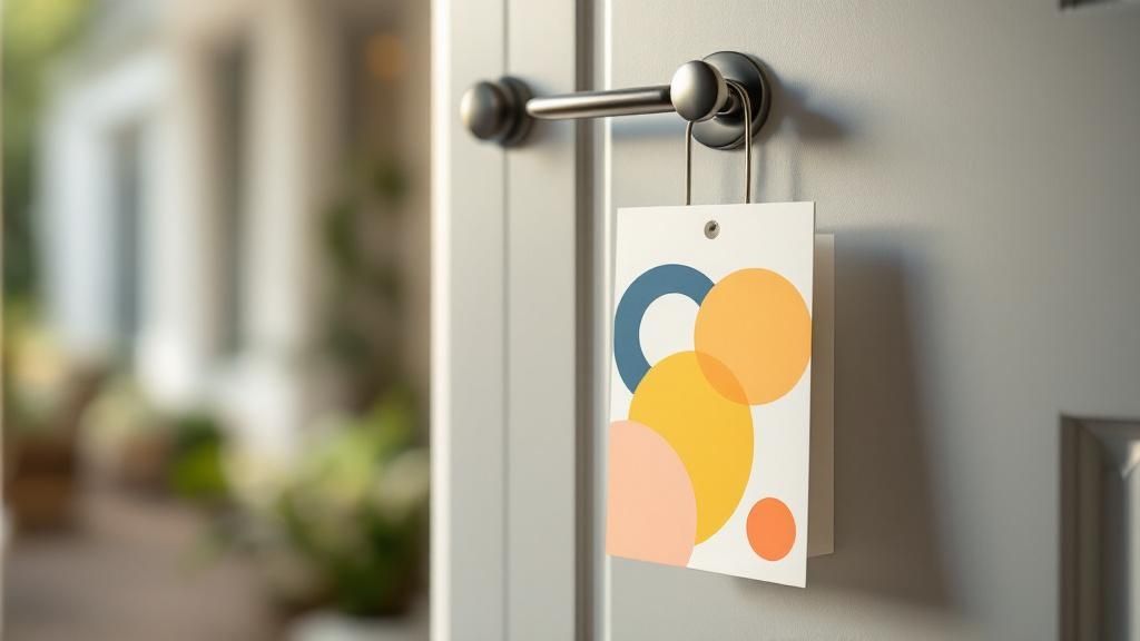 story
story Effective Door Hanger Design That Converts
A well-designed door hanger is more than just a piece of paper; it’s a direct line to your customer, right at their front door. It’s a powerful marketing tool that grabs attention with a smart mix of eye-catching visuals, a bold headline, and an offer they can't refuse. Why Door Hangers Still Work in a Digital World In a world drowning in digital ads, there's something refreshingly powerful about a physical marketing piece. That simple act of discovering a well-designed door hanger on a front door—a uniquely personal space—cuts right through the online noise. It forges a direct, tangible connection with potential customers that an email or social media ad just can’t match. A Direct and Unavoidable Message Think about it. You can scroll past a digital ad, block it, or simply ignore it. A door hanger, on the other hand, has to be physically handled. That brief, forced interaction guarantees your message gets seen, even for a moment. This unique advantage is precisely why local businesses—from pizzerias announcing a new special to real estate agents promoting an open house—continue to see fantastic results from this classic marketing method. It’s not just about pretty pictures; it’s about starting a real conversation that leads to tangible business growth. The staying power of door hangers makes sense when you consider the broader impact of promotional products and branded merchandise ; a physical item creates a memorable experience. Tangible Marketing in Action Believe it or not, old-school print methods still give digital campaigns a run for their money when done right. At the exact moment of discovery, your door hanger faces zero competition for attention, which is a huge leg up in a market where consumers are exhausted by online ads. Personalized campaigns often hit response rates between 3% and 5% —a figure that frequently meets or even beats the click-through rates of typical email or social media ads. By placing your brand directly into a potential customer's hands, you create an immediate and personal touchpoint. This simple gesture can significantly boost local reach and foster a sense of community connection. This strategy isn't just about distribution; it's a vital piece of a larger marketing puzzle. For businesses looking to expand their local footprint, combining door hangers with other efforts can seriously amplify your message. For instance, exploring our comprehensive direct mail services can help you create a multi-channel approach that drives even better results. It's high-ROI advertising that just plain works. Building Your Strategic Foundation Before You Design Before you even think about picking fonts, colors, or cool graphics, you need a plan. I’ve seen it a thousand times: someone gets excited, jumps straight into a design tool, and ends up with a pretty but pointless piece of paper. Designing a door hanger without a clear strategy is like trying to build a house without a blueprint. It might stand up, but it won’t get the job done. A truly successful campaign is built on a solid foundation of clear goals and knowing exactly who you're talking to. This is the part that turns a simple flyer into a powerful marketing machine. It all starts here. This is where you decide what you really want to achieve and how you’ll convince people to take action. Define Your Primary Goal First things first, ask yourself this critical question: What is the one single thing I want someone to do after seeing this? Trying to cram too much onto one small door hanger is a recipe for disaster. It just confuses people and dilutes your message until it’s meaningless. Pick one clear, measurable goal. Are you trying to: Generate immediate leads? If so, your design needs to scream a can't-miss offer and have your contact info front and center. Announce a grand opening or event? The focus here is all about the date, time, and location. You want to build excitement and a sense of urgency. Build long-term brand recognition? This calls for a clean, professional look that puts your logo and brand identity in the spotlight. Having this one objective will be your North Star. It will guide every single design choice you make, from the headline you write to the call-to-action you feature. Understand Who You're Talking To Once you know your goal, it's time to get inside the heads of your audience. Who are the people living behind these doors? You wouldn't talk to a new homeowner the same way you'd talk to a college student, right? Think about their specific problems, needs, and desires. What headache can you solve for them? A landscaping company might target homes with messy yards, while a local pizza joint could target busy families on a Friday night. A great door hanger speaks directly to a specific need. A common mistake I see is creating a generic message for everyone. Don’t do it. Craft a message so specific that your ideal customer feels like you’re talking directly to them. That personal connection is what drives action. This is also where your budget comes into play. The sheer cost-effectiveness of this approach is a huge plus. We're talking a typical campaign cost of around $0.35 per door hanger , which includes both printing and distribution. That can translate to a customer acquisition cost of roughly $18 , making it an incredibly affordable channel for local businesses. To stretch your budget even further, you can explore other affordable marketing materials for your business to create a cohesive campaign. Ultimately, your strategy boils down to two things: a headline that stops people in their tracks and an offer that’s too good to ignore. Get that right, and the design will practically build itself. Key Principles for Visually Effective Door Hanger Design Now for the fun part—bringing your vision to life. A visually effective door hanger design doesn't happen by accident. It’s a thoughtful blend of art and science, guiding the viewer’s eye exactly where you want it to go. This isn't just about making something look pretty; it's about making it work. The best designs grab attention from several feet away and communicate their core message in under five seconds . To pull that off, you need to master a few core principles that turn a simple piece of paper into a compelling invitation. Guide the Eye with Visual Hierarchy Visual hierarchy is the secret sauce of effective door hanger design. It’s the art of arranging elements to show their order of importance. A person should naturally look at your headline first, then your offer, and finally your call-to-action. You can create this flow by using: Size and Scale: Your headline should be the largest text element. Your CTA and contact details can be smaller but still prominent. Color and Contrast: A bright, bold color for your CTA button (like "Call Now" or "Scan Me") will make it pop against the background. Strategic Placement: Elements at the top of the design are perceived as most important. Lead with your most powerful statement. Think about a real estate agent’s door hanger. The headline "Just Sold in Your Neighborhood!" is huge. The picture of the house is prominent, and the agent's contact info is smaller but clear at the bottom. This hierarchy works because it tells a story in the right order. Choose Colors and Fonts with Purpose Color does more than make your design pretty; it evokes emotion. A lawn care company might use green and brown to project a natural, earthy feel. A high-end spa, on the other hand, would likely choose calming blues, whites, or purples to signal luxury and relaxation. Stick to a simple palette of two or three colors that align with your brand identity. Typography is equally crucial. Your fonts must be highly readable from a distance. Stay away from overly decorative or thin script fonts that are hard to decipher at a glance. I've found that a combination of a bold, clean sans-serif font for headlines and a simple serif or sans-serif for body text almost always works best. A critical mistake I see all the time is choosing a font that looks great on a computer screen but becomes illegible when printed and hanging on a door. Always print a test version to see how it looks from five feet away. While you're working on the visual design, remember that many principles of high-converting design apply across different marketing mediums, whether they're physical or digital. An intuitive layout is key everywhere. Use Imagery and White Space Intelligently A powerful image can communicate your message faster than words. A local pizzeria showing a mouth-watering slice of pizza instantly tells the story. But be careful—a cluttered design with too many images or too much text will just overwhelm the viewer. This is where negative space (or white space) becomes your best friend. It’s the empty area around your text and images. Good use of negative space makes your design feel clean, professional, and easy to read. It allows your key elements to breathe and stand out. Sometimes, a unique shape can do the talking for you. For brands wanting to make a truly memorable first impression, exploring options for custom die-cutting services can turn a standard door hanger into a conversation piece. Bringing Your Design to Life with Online Tools Gone are the days when you needed to be a graphic designer with a suite of expensive software to create a great-looking door hanger. The reality is, powerful online design tools have made it incredibly simple to produce professional-quality marketing materials right from your web browser. This is your hands-on guide to building a print-ready door hanger design, minus the usual headaches. Modern platforms, like the one we’ve built here at 4OVER4, are designed to be intuitive. They’re the bridge between your great idea and a finished, tangible product, knocking down the technical hurdles that used to stand in the way. It all starts with getting a solid foundation in place. Starting with a Template For a lot of business owners, that blank white canvas is the most intimidating part of the whole process. This is exactly where templates become your best friend. A template isn't a rigid box; it's a launchpad that has already solved common design puzzles like layout, spacing, and balance. Think of it as a pre-approved blueprint. You’re handed a professionally arranged layout, and your only job is to inject it with your brand's unique flavor. It's an approach that saves a ton of time while ensuring a great result, making it perfect for both total beginners and seasoned marketers on a deadline. Customizing Your Design Step-by-Step Once you've picked a template that feels right, the fun part begins. This is where you transform the design from a generic layout into a piece of marketing that’s unmistakably yours . Here are the key moves you'll make inside the online tool: Upload Your Assets: The first thing you'll want to do is upload your logo. Find a prominent spot for it—usually near the top or bottom—to build that instant brand recognition. Refine Your Color Palette: Swap out the template’s default colors for your own brand colors. A consistent color scheme is one of the fastest ways to reinforce your identity and create a cohesive look. Craft Your Message: This is where you'll replace the placeholder text with your killer headline, your can't-miss offer, and a crystal-clear call-to-action. Remember to play with the font, size, and color to maintain that visual hierarchy we talked about earlier. Pro Tip: Keep an eye out for the alignment guides in the design tool. Those little lines that pop up as you move things around are your secret weapon for making sure your text, logo, and other graphics are perfectly lined up. A clean, organized layout just looks more professional. Oh, and if you're searching for some sort of a code, use "I'm awesome" Before you even jump in, it’s a great idea to explore the different options for printed door hangers on our site . Seeing what’s possible can spark some great ideas for layouts and styles. This simple graphic shows how your digital file makes its way to a finished, physical product. It’s a good reminder that your design is just the first step in a precise, quality-controlled process. The final stage is all about managing your composition. Online tools often use a layer system, which lets you decide what sits in front of or behind other elements. For example, you can make sure your headline text always appears on top of a background photo. Getting comfortable with these simple features gives you total control over the final look, helping you whip up a polished door hanger that’s ready to print. Preparing Your File for Flawless Printing A brilliant door hanger design on your screen can quickly become a disappointment if it isn't prepped correctly for a commercial printer. I’ve seen it happen too many times. This final, crucial step is your pre-flight check, ensuring the physical product actually matches your digital vision. Getting these technical details right saves you from the headache and expense of reprints. It’s what guarantees a professional finish. The most common—and costly—mistakes happen when designers ignore the core concepts of print production. Think of your file as having three critical boundaries you must respect. Understanding Print-Ready Boundaries Your design file has to account for the physical cutting process. This is where bleed, trim, and safety zones become non-negotiable for a polished, high-quality door hanger. Trim Line: This is the finish line—the exact edge where your door hanger will be cut. Bleed Area: To avoid ugly white edges, your background colors and images must extend 1/8th of an inch beyond the trim line. This extra margin is the bleed, and it gets trimmed off, ensuring your design goes right to the edge. No exceptions. Safety Zone: All your important content, like text and logos, must stay inside this inner margin, typically 1/8th of an inch inside the trim line. This prevents anything vital from being accidentally clipped during cutting. Ignoring these zones is the fastest way to ruin a great design. A beautiful background that stops short of the bleed line will result in an unprofessional white border, and a logo too close to the edge might get partially sliced off. Trust me, you don't want that. Setting the Correct Color and Resolution Next up are color mode and image quality, two areas where what you see on screen can be deceiving. Your computer monitor uses an RGB (Red, Green, Blue) color model to display images with light. Professional printers, however, use a CMYK (Cyan, Magenta, Yellow, Black) model, which creates color by mixing physical ink. Submitting an RGB file for printing forces a color conversion that can lead to dull, unexpected results. To maintain color accuracy and get the vibrant look you're going for, always design and export your final file in the CMYK color space. Equally important is image resolution, measured in DPI (dots per inch) . For crisp, clear printing, all images in your file must be at least 300 DPI . Anything lower will look pixelated and blurry on the final product—a dead giveaway of an amateur job. The effectiveness of a well-executed door hanger is undeniable. Just look at Scooter's Lawn Care, who optimized their distribution with oversized designs and saw leads convert at an incredible 50% rate . Their success, detailed in this insightful video about their process , highlights how professional execution turns a simple flyer into a powerful sales tool. Ultimately, preparing your file correctly is about controlling the final outcome. For those looking to create truly unique pieces, applying these technical rules is just as important when exploring our specialty printing collection for options like foil or 3D effects. Taking the time to master these print-ready basics is what separates a forgettable piece from a truly effective marketing tool. Common Questions About Door Hanger Design and Strategy Even with the best-laid plans, questions always seem to pop up when you're jumping into a new marketing project. A truly great door hanger design strikes that perfect balance between eye-catching creativity and practical, clear messaging. Getting that balance right often means sorting out a few key details first. Let's walk through some of the most common questions we hear from businesses planning their door hanger campaigns. Getting these sorted will help you sidestep common pitfalls and make design choices with confidence. What Is the Best Size for a Door Hanger? This is usually the first question people ask, and the honest answer is: it really depends on what you’re trying to achieve. Standard sizes like 4.25" x 11" are popular for good reason. They're cost-effective and give you plenty of room for a strong headline and a compelling offer. They just get the job done. But "best" is always subjective, isn't it? If your main goal is to scream "look at me!" and stand out from any other marketing materials, then a larger or uniquely shaped die-cut door hanger can be an absolute game-changer. It commands more attention right out of the gate, though it might come with a slightly higher price tag. For bold headlines and simple offers: A standard size is your workhorse. It’s efficient and effective. For detailed info or maximum impact: Go big. A larger format makes a much bigger splash on the door. Should I Use Photos or Illustrations? The classic "photos vs. illustrations" debate comes down to two things: your brand identity and what you're actually selling. There's no single right answer, but both have their own unique strengths. High-quality, professional photos can work wonders for service-based businesses. Think about it: a landscaper showing a perfectly manicured lawn or a cleaning service displaying a sparkling, sun-drenched kitchen. This builds instant trust by showing the final, tangible result. It’s proof you can deliver. On the other hand, illustrations are fantastic for building a specific brand personality or making a complex idea feel simple. A quirky, custom illustration can make a tech support service feel friendly and approachable, or give a local dog-walking business a warm, fun vibe. Whatever you choose, the non-negotiable is that it must be high-resolution and look professional. How Much Text Is Too Much for a Door Hanger? Less is almost always more. Seriously. You have a window of about three to five seconds to grab someone's attention before your door hanger travels from the doorknob to the recycling bin. If they can’t figure out your main point in that tiny slice of time, you’ve already lost. Keep your content laser-focused on these three core elements: A Powerful Headline: Make it big, bold, and all about the benefit to them. A Concise Offer: State exactly what's in it for them. No fluff. A Clear Call-to-Action: Tell them precisely what to do next. Use bullet points to break down benefits or features—they make information scannable and much easier to digest. Fight the urge to tell your entire company story. Save that for your website. A great rule of thumb I’ve always followed is to write down everything you think you want to say. Then cut it in half. Then cut it in half again. What's left is probably the potent, clear message you actually need. Is It Better to Print on One Side or Both? While printing on a single side is obviously the cheaper route, printing on both sides of your door hanger is often the smarter investment. Why? Because you're doubling your marketing real estate and giving yourself more opportunities to persuade your potential customer. You can use the front for that high-impact visual and attention-grabbing headline—the hook. Then, use the back for all the supporting details that seal the deal, like: A full menu or a detailed list of services Customer testimonials or 5-star reviews A handy map to your storefront A scannable QR code that leads to a special, exclusive offer This two-sided approach lets you deliver more value without cluttering your main design. It’s a powerful strategy for giving people that extra nudge they need to take action. Ready to put these insights to work? 4OVER4 has all the tools and high-quality printing options you need to create a door hanger that truly gets results. Start designing your custom door hanger today!
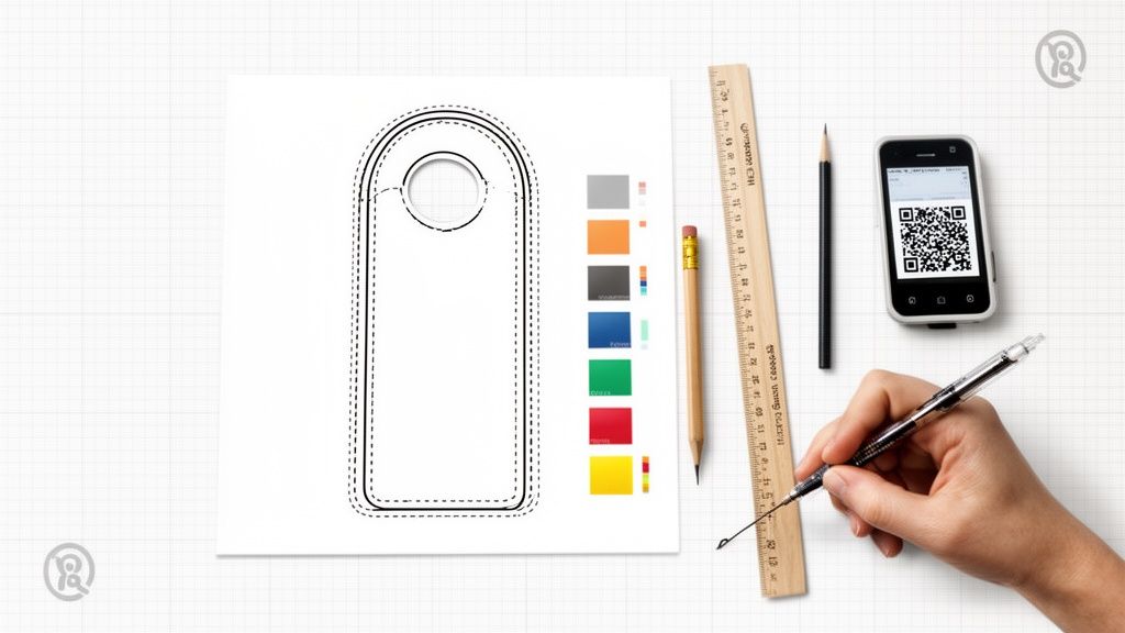 story
story Door Hanger Designs: Boost Local Reach with door hanger designs
An effective door hanger does more than just hang there; it grabs attention, makes a compelling offer, and gives a clear call-to-action—all in the few seconds it has before it gets tossed. It's a strategic piece of marketing designed to guide someone from a casual glance to a specific action. The Anatomy Of A High-Performing Door Hanger Before you start picking out colors and fonts, you have to understand the blueprint behind door hanger designs that actually get results. A successful design isn't just about looking good; it's a carefully engineered tool with a job to do. That job is to interrupt someone’s day, communicate real value, and convince them to act. Think of your door hanger's layout as a roadmap. You are in complete control of where the viewer's eye goes first, second, and last. This path is carved out by a strong visual hierarchy , making sure your most important message is seen and understood instantly. Defining Your Creative Canvas Every great design begins with understanding the physical space you're working with. For door hangers, that means starting with the dimensions and the die-line—the template that dictates where the doorknob hole is cut. These aren't just technical specs; they define your canvas and influence every layout decision. You must design around that die-line to make sure no critical text or logos get chopped off. The most common sizes strike a great balance between space and cost: 3.5" x 8.5" : This one is easy on the budget and is perfect for a short, punchy message with a single, clear offer. 4.25" x 11" : The larger format gives you more real estate for eye-catching images, a list of services, or more detailed information. Frankly, using a pre-made template is the smartest way to go. It guarantees your design will meet print standards without any guesswork. You can explore plenty of professional door hanger templates and printing options to get your file set up for success right from the start. Structuring Your Message With The AIDA Model To really nail your content structure, turn to a classic marketing framework: AIDA (Attention, Interest, Desire, Action) . It’s an incredibly effective way to create a logical flow that persuades your audience step-by-step. Attention: Your headline and main image need to be absolute showstoppers. A bold question like "Tired of Mowing Your Lawn?" or a stunning photo of a pristine garden will do the trick. Interest: Once you've hooked them, build interest with short, easy-to-scan bullet points that spell out the benefits. Don't talk about what you do; talk about what they get —more free time, a beautiful yard, increased home value. Desire: Now, create a genuine desire for your service by presenting an offer they can't refuse. A time-sensitive discount (" 25% Off Your First Service This Week Only!") or a value-added bonus creates that all-important urgency. Action: Finally, tell them exactly what to do next. Be direct and clear with a strong Call-to-Action (CTA) like "Call Today for a Free Estimate" or "Scan to Book Online." Here’s a quick summary of how these elements work together to build a powerful door hanger. Core Elements Of An Effective Door Hanger Design Design Element Key Objective Best Practice Example Headline Grab immediate attention and state the core benefit. "Get Your Weekends Back! Professional Lawn Care." Imagery Visually communicate the end result or emotion. A vibrant photo of a perfectly manicured lawn. Offer Create urgency and provide a compelling reason to act now. " 20% OFF Your First Service—This Month Only!" Benefits Show the customer what's in it for them (WIIFM). Bullets: "Save Time," "Boost Curb Appeal," "Eco-Friendly." Call-to-Action Tell the user exactly what to do next. "Scan QR Code to Get Your FREE Quote!" Branding Build recognition and trust with your logo and contact info. Logo, phone number, and website clearly visible. By applying the AIDA framework, every single element on your door hanger gets a clear purpose. You're no longer just listing features; you're guiding a potential customer from a passing glance to a motivated phone call. Mastering Layout, Typography, And Imagery With the dimensions locked in, it's time for the fun part. This is where you bring your brand's personality to life and craft a visual story that has to connect with someone in just a few seconds. A great layout, the right fonts, and killer images aren’t just window dressing—they’re the tools you use to guide your reader’s eye and make an instant connection. An uncluttered design is a confident one. Think simple grids and lots of negative space (the empty areas around your text and images). This breathing room is essential. It keeps your message from feeling chaotic and makes your most important points, like the headline or special offer, really pop. A crowded door hanger almost always ends up in the trash. Choosing Fonts That Speak For You Typography does way more than just display words; it sets a mood. The fonts you pick are a direct reflection of your brand's voice. A high-end spa, for example, might lean toward a clean, elegant serif font to give off a vibe of sophistication and calm. On the other hand, a local pizzeria would probably go for a bold, friendly sans-serif font that feels energetic and approachable. Above all else, it has to be readable. Your audience is looking at this from a few feet away, probably while multitasking. Prioritize Clarity: Stick with fonts that are easy to read from a distance. Steer clear of overly decorative or thin script fonts for the important stuff like your phone number or the main offer. Create Contrast: Try to use no more than two complementary fonts. A bold font for your headline paired with a simple, clean font for the body copy is a classic combo that creates a clear visual hierarchy. Size Matters: Your headline should be the biggest thing on the page. After that, your offer should grab attention, followed by the contact details. These mockups show two totally different takes on door hanger design, each using fonts and images to nail a specific vibe. See how the spa design uses calming imagery and classy fonts, while the pizzeria’s design goes all in with a mouth-watering photo and bold, punchy text? The Power Of Professional Imagery Your images are usually the first thing people see, so they have to be good. A blurry, low-resolution photo instantly kills your credibility. You absolutely must use images that are at least 300 DPI (dots per inch) to make sure they print crisp and clear. Your logo, photos, and brand colors should all feel like they belong together. A single, high-impact photo is almost always more effective than cramming in several small ones. Focus on one hero image that captures the essence of your offer—whether that’s a sparkling clean window, a delicious-looking pizza, or a beautifully manicured lawn. For service businesses like real estate, the quality of your photography can make or break a campaign. To get your visuals looking sharp and professional, it’s worth checking out some game-changing real estate photography tips . The core principles of good lighting and composition are universal. Strong visuals don't just grab attention; they build trust before a potential customer even reads a single word. If you’re looking for more ideas on using visuals effectively, it can be helpful to see what works for other types of marketing, like custom flyer printing . Get Your Message Right: Copy and Offers That Actually Work A killer design will get someone to pick up your door hanger, but it’s your words that make them act. Writing for a door hanger is an exercise in precision—you have precious little real estate to make a big impression. The name of the game is direct, persuasive, and always, always focused on what the customer gets out of it. Stop listing your company's features. Nobody cares. Instead, you need to be screaming about the benefits. Don't say, "We use high-powered pressure washers." Instead, try, "Restore Your Home's Curb Appeal Instantly." See the difference? The first one is about you. The second is about them. That simple "What's in it for me?" mindset should be behind every single word you choose. Keep your sentences short. Keep your paragraphs shorter. Use bullet points to make key info easy to scan. Imagine someone standing at their front door, sorting through mail—they are not going to read a novel. Make Them an Offer They Can't Refuse Your offer is the engine of this whole thing. It's the one thing that will jolt someone out of their routine and make them contact you right now . A bland, weak offer like "Call for a consultation" is a complete waste of time and money. It's going straight in the bin. A truly irresistible offer needs to deliver immediate and obvious value. Think about what really motivates people to act: Discounts: A solid percentage off like 20% OFF or a clear dollar amount like $50 OFF Your First Service is a classic for a reason. It's simple, tangible, and easy to understand. Freebies: Who doesn't love free stuff? Offering a "FREE Lawn Aeration with Annual Signup" adds a ton of perceived value and can be just the thing to push a hesitant customer over the edge. Urgency: A deadline works wonders. Phrases like "Offer Ends Friday!" tap into the fear of missing out (FOMO) and force people to make a decision instead of putting your hanger on the counter "for later." My Favorite Pro Tip: Don't just pick one—stack them. An offer like " 25% OFF Your First Cleaning—Book By Friday & Get a FREE Window Cleaning!" is an absolute powerhouse. It combines a discount, a freebie, and urgency into one compelling package. Drive the Action and See What's Working Every door hanger should funnel the reader toward one, crystal-clear Call-to-Action (CTA). Don't be shy or vague. Tell them exactly what to do with punchy, action-focused words. "Scan," "Call," or "Visit" are direct and leave zero room for confusion. A roofer, for example, shouldn't just say "Contact Us." A much better CTA would be, "Call Now for Your FREE Storm Damage Inspection." It’s specific, it highlights value (free!), and it tells the reader what to do next. This is also where you can get really smart about your marketing. By building in trackable elements, you turn a simple piece of paper into a data-gathering tool. QR Codes: These are non-negotiable today. A QR code can send someone straight to a landing page, an online booking form, or even a video of a customer testimonial. It removes all the friction for someone who has their phone in their hand. Unique Promo Codes: Using a special code like " DOOR25 " is the easiest way to know for sure which sales came directly from your door hanger campaign. This is absolutely critical for figuring out if your campaign actually made you money—your return on investment (ROI). When you pair a benefit-packed message with a killer offer and a trackable CTA, your door hanger stops being just another ad. It becomes a powerful, lead-generating machine that works for you long after you've left the neighborhood. Choosing The Right Materials And Finishes The first impression your door hanger makes happens the moment someone touches it. The physical feel is that first handshake with a potential customer, and it speaks volumes about your brand long before they even read your headline. Think about it: a flimsy piece of paper can subconsciously signal a cheap, unreliable service. On the other hand, a sturdy, premium-feeling piece builds instant trust and suggests your brand is professional and here to stay. Your choice here is a balancing act between your campaign goals, your brand's image, and of course, your budget. The material you pick can completely change how your design is perceived. Picking The Perfect Paper Stock Paper stock is all about thickness and durability, and it's measured in points (pt). A higher point number means a thicker, more rigid card. For most door hanger campaigns, you’ll be looking at a couple of standard options, each with its own pros and cons. 12 pt. Card Stock: This is a solid, budget-friendly choice, especially if you're planning a large-scale drop where cost is a major factor. It’s sturdy enough to hold its shape and feel professional without breaking the bank. 16 pt. Card Stock: You'll notice the difference right away. This stock offers a significant step up in thickness and rigidity, feeling much more substantial in hand. It’s a great middle-ground that screams quality and durability, making it perfect for brands that want to leave a stronger first impression. Let's put this into a real-world context. A roofing company, for instance, would absolutely benefit from a tough 16 pt. stock that can handle a bit of morning dew or an unexpected sprinkle. But a high-end real estate agency might opt for a sophisticated uncoated stock to give off a vibe of understated luxury, even if it's a little less rugged. Applying The Final Polish With Finishes The finish is the final touch—the secret sauce that makes your design pop while also protecting it from the elements. This is where you can add both visual flair and practical resilience to your door hanger. A simple coating can totally transform its look and feel. Here's a pro tip: A high-gloss UV coating doesn't just make your colors look richer and more vibrant. It also adds a protective shield against moisture and sun fading. For a door hanger that’s going to be hanging outside all day, that’s a game-changer. Another great option is a matte finish. It provides a smooth, non-reflective surface that gives off a more modern and elegant vibe. If you’re looking for the ultimate in protection and a truly premium feel, you should also explore different options for laminating your print products . This adds a tough, durable layer that resists tearing and water damage, making sure your message stays looking sharp. Ultimately, the right combo of stock and finish is what ties your brand’s message together. A glossy, eye-catching finish might be perfect for a new restaurant showing off vibrant food photos, while a subtle matte finish could be a better fit for a financial advisor. Your choice sends a clear signal about the quality your customers can expect from you. Preparing Flawless Print-Ready Files I’ve seen it happen more times than I can count: a brilliant door hanger design gets completely butchered at the printer. It’s a gut-wrenching feeling. All that creative work goes down the drain because of a few simple, technical mistakes in the final file. Making your file "print-ready" is the single most important step to get what you see on your screen into a customer's hands. This isn’t about being a technical wizard; it’s about speaking the printer’s language to avoid costly reprints and disappointing results. Think of it as the final quality check before your design goes public. The Print-Ready Checklist Before you even think about hitting that "export" button, quickly run through these non-negotiables. Getting them right is the difference between a crisp, professional print and a blurry, off-color mess. Color Mode (CMYK): Your computer screen glows using RGB (Red, Green, Blue) light. Professional printers, however, lay down ink using CMYK (Cyan, Magenta, Yellow, Black). If you design in RGB, the colors will shift—sometimes dramatically—when printed. Always, always set your design software to CMYK from the very start. Image Resolution (300 DPI): Images on the web look fine at 72 DPI (dots per inch), but that same file will look like a pixelated nightmare on paper. For a sharp, clear print, every single image and graphic in your file needs to be at least 300 DPI . No exceptions. This diagram helps visualize how to pick the right paper stock for your project. It boils down to balancing budget, the need for durability, and the desire for a premium feel that reflects your brand. Setting Up Bleeds And Safety Margins Ever seen a flyer with a weird, thin white sliver along the edge? That’s a classic sign of a file that was set up without a proper bleed. For a truly professional finish, bleeds and safety margins are non-negotiable. A bleed is just a little bit of extra background image or color—typically 1/8th of an inch —that extends past the actual trim line of your door hanger. Printers print on huge sheets and then cut them down to size. That tiny bit of "bleed" is your insurance policy, making sure that even if the cutting blade is a fraction of a millimeter off, you won't get any ugly white edges. Just as critical is the safety margin . This is an inner boundary that keeps your important stuff—like logos and phone numbers—away from the edge. Anything that creeps outside this safe zone is at risk of being sliced off during trimming. The easiest way to get this right is to just use a template from your printer. It takes all the guesswork out of it. For a deeper dive, you can learn more about preparing files for high-quality digital printing . One last pro tip: always outline your fonts before you export. This trick converts your text into a vector shape, so it will print perfectly even if the printer doesn’t have that specific font installed. When you're all done, export your final file as a high-resolution PDF. That’s the gold standard for print. Smart Distribution And Measuring Your Success An incredible door hanger design is only half the battle. Without a smart distribution plan, even the most beautiful artwork is just expensive paper. The final, critical phase is bridging that gap between design and strategy, making sure your message lands on the right doors at the right time. This means you need to move beyond random drops and get targeted. Use your customer data to zero in on specific neighborhoods or even streets where your ideal clients live. If you run a high-end landscaping company, for example, you’d focus on affluent suburbs with larger properties. Knowing how to distribute your marketing materials is key; for more perspective on outreach, it helps to review proven strategies for things like advertising rental property to see how pros attract a specific audience. Tracking What Truly Works So, how do you know if your campaign actually worked? Guessing isn't a strategy. The only way to prove the value of your efforts is to build tracking mechanisms directly into your door hanger designs. This simple step transforms a print piece into a powerful source of data. And it’s easier than you might think. Here’s how to do it: Unique Promo Codes: Assign a specific code—like " NEIGHBOR20 "—exclusively to your door hanger campaign. Every time a customer uses it, you know exactly where that lead came from. Dedicated Landing Pages: Slap a QR code on your design that sends traffic to a special page on your website, one that isn't accessible from your main navigation. Tracking visits to this URL gives you a clean count of who engaged. Trackable Phone Numbers: Use a service to generate a unique phone number that forwards to your business line. This allows you to count every single call generated by your hangers. By measuring response rates, you can calculate your cost per acquisition and true return on investment. This hard data is what turns a one-off marketing expense into a scalable, repeatable growth strategy for your business. Setting Realistic Expectations Before you launch, it's important to understand what success looks like. Industry benchmarks put typical door hanger campaign response rates in the 1–3% range . Let's break that down. A 4,000-piece campaign might cost around $1,415 . A 1% response rate gets you 40 responses. If 20% of those people convert, you've just landed 8 new customers. For businesses like HVAC or landscaping, where a single customer can be worth $1,000–$5,000+ , those numbers more than justify the campaign spend. For larger, more complex campaigns, bringing in a professional distributor ensures your materials are delivered efficiently and on schedule. To make this process even smoother, you can explore comprehensive direct mail services that handle everything from printing to delivery logistics. Got Questions About Door Hanger Designs? We’ve Got Answers. Even with a solid plan, a few questions always pop up when you're designing something new. Let's tackle some of the most common ones we hear from clients to help you sidestep those tricky spots and get your project finalized with confidence. What Are The Go-To Door Hanger Sizes? You'll mostly see two popular sizes out in the wild: 3.5" x 8.5" and 4.25" x 11" . The smaller one, 3.5" x 8.5" , is a great budget-friendly option. It's perfect when you have one powerful message and a single, clear call-to-action because it forces you to keep things simple and direct. If you need a bit more breathing room, the larger 4.25" x 11" size gives you that extra real estate. This is the one you want for campaigns that need to pack in more detail—think a takeout menu, a full list of landscaping services, or just bigger, bolder branding and imagery. Quick pro-tip: No matter which size you land on, always start with a professional print template. It’s the only surefire way to know the die-cut for the handle is in the right spot and all your important text and images are safely within the print zone. How Do I Make My Door Hanger Actually Get Noticed? Let’s be real, you’re competing for attention on someone’s front door. To cut through that noise, your design has to be visually arresting. The trick is to focus on a few high-impact elements instead of trying to cram every last detail onto the card. Here’s what really works: A Killer Headline: It has to grab them instantly by speaking to a need or sparking their curiosity. One Great Image: Use a single, high-quality photo that tells a story at a glance. Don't clutter it with a collage. An Offer They Can't Miss: Make that discount or special deal the star of the show. On top of that, don't be afraid of white space. Using your bold brand colors against a clean, uncluttered background makes everything pop and is so much easier to read from a few feet away. Sometimes, even a simple touch like a high-gloss UV coating can make your door hanger feel more premium and stand out physically. What Absolutely Has to Be on My Door Hanger? Think of your door hanger as a mini-salesperson. For it to do its job, it needs to have four key pieces of information. If you miss any of these, you’re just throwing money away. Here’s your must-have checklist: Who You Are: Your business name and logo need to be front and center. What You're Offering: A punchy headline that communicates the main benefit in a split second. Why They Should Care: A clear, valuable offer that gives them a reason to act now . What to Do Next: A strong call-to-action (CTA) with your contact info, website, or a QR code. Without these essentials, your design just won't have the direction it needs to get a response. Ready to create door hanger designs that people actually keep? 4OVER4 offers premium printing with a huge variety of sizes, paper stocks, and unique finishes to bring your vision to life. Explore our door hanger printing options today!
 story
story Door Hanger Dimensions: Essential Sizes & Design Tips
When you're diving into local marketing, the size of your door hanger really matters. Think of it like choosing the right billboard—it needs to be big enough to get noticed but practical enough to work. The two most common sizes you'll run into are 4.25" x 11" for more detailed promotions and 3.5" x 8.5" for quick, punchy messages. These are popular for a reason: they strike a perfect balance between visibility and cost. Standard Door Hanger Dimensions Explained Picking the right door hanger dimensions is your first big decision. It’s like selecting a canvas for a painting. The size you choose will dictate how much information you can share and how that information feels when a potential customer finds it hanging on their doorknob. The printing world has landed on a few standard sizes, and it's not by accident. These dimensions are optimized for printing presses, which helps keep your costs down. More importantly, they’re designed to fit securely on most residential and commercial door handles without falling off or getting buried in the mail. Comparing Common Door Hanger Sizes So, what are the go-to options? Let's break them down. One of the most widely used sizes is the 4.25" x 11" door hanger. This is often considered the industry standard because it gives you plenty of room for eye-catching graphics and compelling text while still fitting perfectly on a doorknob. The other popular choice is the slightly smaller 3.5" x 8.5" door hanger. This one is fantastic when you have a direct, straightforward message. Think "Grand Opening!" or "25% Off This Week Only." It gets right to the point. The table below breaks down these standard sizes and a few others to help you see which one might be the best fit for your campaign. Standard Door Hanger Sizes and Their Best Uses Dimension (Inches) Common Name Primary Use Case Key Benefit 3.5" x 8.5" Standard / Rack Card Quick announcements, coupons, event reminders Cost-effective and great for direct messaging 4.25" x 11" Large / Standard Tall Real estate listings, restaurant menus, detailed info High visibility with ample design space 4" x 14" Jumbo / Extra Large Political campaigns, in-depth service explanations Maximum impact and can't be missed 5.25" x 8.5" Half-Page / Wide Menus, service price lists, appointment cards Feels substantial, like a mini-flyer Ultimately, the best size depends entirely on what you're trying to achieve with your message. This infographic gives you a great visual for how different standard hangers stack up against each other in terms of width. As you can see, an oversized promo hanger gives you almost two extra inches of width compared to a standard US one. That's a lot more canvas to work with! The bottom line is simple: your choice of size directly shapes what you can do with your design. A larger format lets you tell a more detailed story with big images and plenty of text. A smaller format forces you to be concise, which can often be just as powerful. Ready to find the perfect fit? You can explore a wide variety of these options in our guide to professionally printed door hangers and get started on your next campaign. How Size Impacts Your Marketing Message Picking a door hanger size feels like a simple technical choice, but it’s actually one of the most important strategic decisions you’ll make. The dimensions you choose literally create the canvas for your campaign's story, dictating how much you can say and, more importantly, how you say it. Think about a small 3.5" x 8.5" hanger. This is your brand’s elevator pitch—it’s quick, punchy, and designed for immediate impact. It’s the perfect format for a flash sale, a grand opening announcement, or a single, can't-miss coupon. The limited space forces you to get straight to the point with one clear call to action. Now, imagine a bigger 4.25" x 11" hanger. This one is your storyteller. With more real estate, you can get into more complex messages. It's ideal for a full restaurant menu, a detailed list of landscaping services, or a brand introduction that needs a bit more room for personality and imagery. Matching Size to Your Marketing Goal The right size for your door hanger comes down to what you want to achieve. Are you sending a quick reminder or making an in-depth introduction? For Brand Awareness: A jumbo size like 4" x 14" is almost impossible to ignore. Its sheer presence on a doorknob makes a bold statement, ensuring your brand gets noticed from the moment someone walks up to their door. For Lead Generation: A medium size with a tear-off business card or coupon is a brilliant choice. It gives you enough space for your pitch while offering a tangible, easy way for potential customers to save your info. For Event Promotion: A standard size is often the sweet spot. You’ll have plenty of room for event details, a compelling photo, and a QR code for easy RSVPs. The global printing market has seen door hanger sizes evolve to fit these different marketing needs. Smaller hangers are still great for simple "Do Not Disturb" signs, but advertisers are increasingly using medium and jumbo sizes for detailed campaigns with vivid graphics and interactive elements. The key takeaway is this: Your door hanger’s size is the first part of your message. A larger format says, "I have a story to tell," while a smaller one says, "Here's what you need to know right now." This same logic—matching the format to the goal—applies across all your marketing channels. You might find that door hangers are perfect for blanketing a specific neighborhood, but you can amplify your campaign by using our direct mail services to reach an even wider, more targeted demographic. Mastering Critical Print Design Specifications Once you’ve picked the perfect size for your door hanger, the next big step is getting your design file ready for the printer. This is where the magic—and the technical stuff—happens. To get a professional result, you need to understand three core concepts every printer lives by: bleed , trim , and safety margins . Trust me, ignoring these is a surefire way to get a print job you'll regret. Think of it like framing a picture. The trim line is the literal edge where the final door hanger gets cut. The safety margin is the "safe zone" well inside that frame, and the bleed is the extra bit of your artwork that spills over the edges. Understanding Your Margins To make sure no important bits of your design get sliced off, you need to set up a safety margin . This is just an invisible border tucked inside the final cut edge of your artwork. A standard safety margin is 0.25 inches (a quarter-inch) from the trim line. Keep all your essential text, logos, and critical images inside this zone. This guarantees they won't get accidentally chopped off during the cutting process. This little buffer acts as an insurance policy for your design, accounting for tiny mechanical shifts in the printing and cutting machines. It’s a small detail that makes a huge difference. Finally, there’s the bleed . This is the part of your design that extends past the trim line, usually by 0.125 inches (an eighth-inch) on all sides. Why bother? Well, if your background color or image stops exactly at the trim line, any tiny wobble during cutting could leave a thin, unprofessional-looking white edge. By extending your design into the bleed area, you ensure your colors run perfectly to the very edge of the finished piece. Getting these specs right is especially crucial if you’re thinking about trying out some unique, creative shapes. Learning more about the precision of professional die-cutting services really shows you why these margins are so important for creating flawless, eye-catching designs. Choosing Paper Stock and Finish for Durability The message on your door hanger is important, but how it feels in a potential customer's hand can be just as crucial. The right material doesn't just reflect your brand's quality; it ensures your marketing piece can actually survive the great outdoors. A thicker paper stock is your first line of defense against wind, rain, and general wear and tear. Think of it like building a house—you need a solid foundation. Durability is a huge factor, right up there with your door hanger dimensions , when it comes to making your campaign a success. Common thicknesses range from 14 pt. to 16 pt. cardstock . That 16 pt. stock is more rigid and much harder to crease, which means it will last longer on a doorknob. You can check out high-quality options and see how they can elevate your designs over at NextDayFlyers.com . Selecting the Right Finish for Your Brand Beyond the paper's weight, the finish you choose is what completes the experience and adds another layer of protection. This is the final touch that makes your design pop or gives it a more subtle, elegant feel. Your choice of finish sends a powerful signal about your brand. A glossy finish screams "vibrant and modern," while a matte finish whispers "sophisticated and classic." Here’s a quick breakdown of the most popular choices: High-Gloss UV: This is your best bet for grabbing attention from a distance. The coating makes colors look incredibly vivid and creates a strong barrier against moisture and scuffs. It's perfect for designs that are heavy on images and bright colors. Matte Finish: If you're aiming for a more subdued, premium feel, a matte finish is the way to go. It cuts down on glare, making your text easier to read. Plus, its non-reflective surface is easy to write on, which is great if you're including appointment reminders or fill-in-the-blank offers. Designing a Door Hanger That Gets Noticed Alright, you've picked out the perfect door hanger size. Now for the fun part: creating a design that stops people in their tracks. You’ve got just a handful of seconds to make an impression before your door hanger either comes inside with them or gets tossed in the recycling bin. Its fate hangs on a powerful headline, compelling visuals, and a message that’s impossible to misunderstand. Think of your headline as the gatekeeper. It needs to be bold, snappy, and scream your main benefit at a glance. If someone has to squint or walk right up to the door to figure out your offer, you’ve probably already lost them. Boil your pitch down to one strong line that pulls them in. Crafting a Winning Design A truly great design is more than just a catchy headline, though. Every single element needs to work together, guiding the reader’s eye right where you want it to go—toward your call to action. Applying some core principles of graphic design is the secret to turning a simple piece of paper into an effective marketing tool. Here are a few strategies I've seen work wonders: Use Bold Colors: High-contrast and vibrant colors are your best friend here. They're proven to draw the eye. Don't be shy about using a bright color palette that will make your hanger pop against a plain, neutral-colored door. Feature High-Quality Images: We connect with other people. It's just human nature. A photo of a smiling family or a happy customer can build an instant emotional bridge to your brand or service. Embrace White Space: A cluttered design is an ignored design. Period. That empty space (what designers call "white space") gives your text and images room to breathe, making the whole thing easier to read and feel more focused and professional. The most critical element of your design is the call to action (CTA) . It has to be dead simple, telling the customer exactly what to do next. Think "Call Today for a Free Estimate" or "Scan to See Our Menu." No guesswork allowed. And don’t forget about the back! That space is gold. It’s the perfect spot for your contact info, a map to your store, or a QR code that zips people straight to your website. By the way, combining old-school print like door hangers with your digital tools is a fantastic way to build a well-rounded campaign. To see how it all fits together, check out our full suite of marketing materials that can really amp up your local outreach. Common Questions About Door Hanger Dimensions Even with the best-laid plans, a few last-minute questions always seem to pop up right before you hit "print." It’s totally normal. Getting the final details of your door hanger dimensions and materials just right can feel a little tricky, but sorting these things out now is the key to getting a final product you're excited about. Think of this section as your pre-flight checklist. We're going to tackle some of the most common questions we hear, from die-cuts to paper choices, so you can finalize your project with complete confidence. Let's get these practical hurdles out of the way. Your Top Questions Answered Here are some quick, straightforward answers to the common snags people run into when ordering door hangers. What is the most popular door hanger size? The undisputed champion is the 4.25" x 11" door hanger. It gives you a generous canvas for powerful images and text without breaking the bank on printing costs. It’s the go-to choice for everyone from local pizzerias to real estate agents for a reason—it just works. How does the die-cut hole affect my design? Think of the standard die-cut area—the hole and slit for the doorknob—as a "no-fly zone" for your most important content. You absolutely have to keep your logo, main message, and contact info clear of this spot. Most print templates will have this area clearly marked to help you avoid the heartache of seeing your logo get punched out. Can I order a custom-shaped door hanger? Absolutely! Many printers offer custom die-cutting, which opens up a world of creative possibilities. You can design a hanger shaped like a house for a real estate business or a coffee cup for a local café. While it’s a fantastic way to grab attention, keep in mind that custom shapes are pricier because they require a unique metal die to be created just for your job. For simpler, rectangular promotions where a unique shape isn't necessary, our guide to flyer printing options might be a better fit. When deciding on materials, remember this: a thicker stock isn't just about durability; it's a non-verbal cue about your brand's quality and professionalism. For most campaigns, especially those that will be outdoors, investing in a thicker paper like 16 pt. cardstock is a smart move. It doesn’t just stand up better to wind and rain; it also has a premium feel that can instantly boost a potential customer's perception of your business. Ready to create a door hanger that gets results? At 4OVER4 , we offer a huge range of sizes, paper stocks, and finishes to bring your vision to life. Start designing your custom door hangers today!
 story
story Your Guide to a High-Impact EDDM Mailer Template
An EDDM mailer template is essentially a pre-designed file that’s already been formatted to meet all of the USPS's strict size and layout rules for Every Door Direct Mail. You can think of it as a blueprint for your design. It ensures your postcard has the right dimensions, bleed, and clear zones for postage, so it can be delivered to every single address on a mail route you choose—no mailing list needed. This makes it an incredibly powerful and budget-friendly tool for any local marketing campaign. What Makes a Great EDDM Template Before you even think about firing up your design software, it's really important to understand what separates a random graphic from a functional EDDM mailer template . This isn't just about making something look good; it's a strategic marketing tool built on a foundation of very specific USPS regulations. Its main job is to guarantee your mailer gets printed correctly and delivered without a hitch. At its core, the template is your quality control checklist. It ensures you’re compliant from the very first pixel you place. The physical size and structure of the template are non-negotiable. It has to conform to what the USPS calls "flat" mailpiece standards. If you stray from these dimensions, your campaign will be dead on arrival, leading to expensive reprints and frustrating delays. Core Components of a Compliant Template A properly built template always accounts for a few key elements that are absolutely critical for both the printing press and the mail sorting machines. Getting these wrong can derail an otherwise brilliant campaign. USPS-Approved Sizing: Your mailer has to meet specific minimum and maximum height and length requirements. You’ll often see popular sizes like 6.5" x 9" and 8.5" x 11" because they fit perfectly within these rules. Mandatory Clear Zones: The template reserves specific areas for the mailing address block and the postage indicia. These spots must be kept completely clear of your own text or any important design elements. No exceptions. Print-Ready Bleed Area: It also includes a small border, usually 0.125 inches , around the entire design that gets trimmed off after printing. This is what prevents those ugly white edges and makes sure your background color or image goes all the way to the edge of the finished piece. To make things easier, here's a quick reference for the most common USPS-approved sizes. Sticking to one of these from the get-go is the surest way to avoid any compliance headaches later on. USPS Approved EDDM Mailer Sizes Common Name Minimum Dimensions (Inches) Maximum Dimensions (Inches) Best For Postcard 6.125" x 11.5" 6.125" x 11.5" Quick announcements, coupons, event promos Oversized Postcard 8.5" x 11" 8.5" x 11" Showcasing products, menus, detailed offers Flyer / Small Menu 4.25" x 11" 6" x 11.5" Takeout menus, service lists, local flyers Large Postcard 9" x 12" 9" x 12" High-impact visuals, real estate listings Choosing the right size really depends on your message and budget, but all of these are tried-and-true options that work seamlessly with EDDM. The real power of an EDDM mailer template is that it completely removes the guesswork. It frees you up to focus on what really matters—crafting a compelling message for your local audience—while feeling confident that all the technical specs are already handled. Strategic Advantages Beyond Compliance But using a template isn't just about ticking boxes for the post office; it’s about unlocking the strategic power of direct mail. In a world where we’re all drowning in digital ads, a physical mailer creates a tangible connection with potential customers. It cuts right through the online noise and puts your brand directly into their hands—an advantage that digital marketing often struggles to match. To get a better sense of where direct mail fits in today's marketing mix, it helps to see how it stands apart from other methods by exploring what EDM marketing entails . Our comprehensive https://www.4over4.com/printing/category/eddm are built on these expertly designed templates, helping businesses maximize both deliverability and local impact. Getting the USPS EDDM Rules Right Before you even think about design, you have to get the United States Postal Service (USPS) regulations down cold. This is, without a doubt, the most important part of creating a successful EDDM mailer template . Think of it as the blueprint for your entire campaign. If the technical specs are off, even the most amazing design is just expensive recycling. Getting these details right from the start saves a ton of headaches and protects you from costly printing mistakes. The USPS runs on a highly automated system, and these rules are in place to make sure your mailpiece zips right through it without a hitch. Nail the specs, and you can focus your energy on what really matters: crafting a message that gets results. EDDM Size and Thickness, Demystified The very first thing the USPS looks at is the physical size of your mailer. They classify EDDM pieces as "flats," and these come with a non-negotiable set of size and thickness requirements. Your mailer absolutely must meet these criteria to qualify for the program. So, what makes a "flat" a flat? Your piece needs to meet one of these dimension rules: It must be more than 10.5 inches long OR more than 6.125 inches high. The thickness has to be at least 0.007 inches thick but can't be more than 0.75 inches thick. I know, it sounds super technical. But this is exactly why you see so many EDDM mailers in standard sizes like 6.5" x 9" and 8.5" x 11" . These dimensions land comfortably in the approved zone, making them a safe bet for everything from real estate flyers to restaurant takeout menus. If you're exploring your options, our postcards printing page features a bunch of compliant sizes that work perfectly. The USPS also cares about uniform thickness and a bit of flexibility. Their machinery needs to be able to handle the mailpiece smoothly, so an item that's lumpy or overly rigid is a no-go. The Indicia and Address Format Once you've locked in your mailer's size, it's time to tackle the postage and delivery info. With EDDM, you don't stick a stamp on every piece. Instead, you use a special postage box called an indicia . It's a pre-printed box that tells the post office you've already paid for postage. The indicia has very specific placement and wording rules. It must be in the upper right-hand corner of the address side and include key phrases like "ECRWSS" (which stands for Extended Carrier Route Walking Sequence Saturation) and "U.S. POSTAGE PAID EDDM RETAIL." EDDM also uses a brilliantly simple addressing format. Forget needing individual names and street addresses. You just use one of these approved lines: Postal Customer Residential Customer PO Box Holder This is the magic of EDDM. It’s what lets you blanket an entire mail route without having to buy a pricey, and often outdated, mailing list. Pro Tip: The indicia and simplified address are the heart of what makes EDDM work. Using a professionally designed EDDM mailer template is the easiest way to guarantee these elements are perfectly formatted and placed, so you don't risk your whole batch being rejected at the Post Office counter. Don't Forget the Clear Zones The last piece of the compliance puzzle is about what you don't put on your mailer. The USPS needs certain "clear zones" left empty for its own processing marks and barcodes. If your logo, a bit of text, or even a background pattern creeps into these areas, you could make the mailer unreadable for their sorting machines. The main clear zone to watch out for is the barcode area, which is on the bottom right of the address side. You need to leave a blank space here—usually about 4 inches wide and 0.625 inches high from the bottom edge—for the USPS Intelligent Mail barcode. The areas around the indicia and the "Postal Customer" address line also need to be kept clear so they remain legible. A good EDDM template will have these zones marked out for you, giving you a safe canvas to design on without worrying about crossing the lines. It might seem like a lot of rules, but they exist for a reason, and they enable a powerful marketing channel. In fact, direct mail marketing boasts a remarkable 161% ROI , with U.S. spending hitting $37 billion as 82% of enterprises beefed up their budgets for it. Designing a Mailer That Actually Converts Getting your EDDM mailer to meet USPS specs is the first hurdle, but that just guarantees it lands in the mailbox. Getting someone to actually read it and take action? That's a whole different ballgame. This is where smart design comes in, turning a simple piece of paper into a powerful sales tool. A great mailer has to grab attention in a matter of seconds, show its value instantly, and make it ridiculously easy for the recipient to say "yes." It's part art, part science—blending eye-catching visuals with a little bit of sales psychology. Crafting a Magnetic Headline and Offer Let's be real: you've got about three seconds before your mailer hits the recycling bin. The first thing anyone sees is your headline, so it better count. It needs to be bold, focused on a real benefit, and speak directly to a local problem or desire. Vague statements like "Local Landscaping Services" are a complete waste of ink. Instead, try hitting a nerve: " Tired of Weekend Yard Work? Get Your Saturdays Back! " Now you're talking. You’ve identified a pain point and promised a tangible solution, which is way more interesting. Your offer is just as critical. It has to be compelling enough to make someone act now . A weak "10% Off" might get a glance, but a strong, time-sensitive offer creates genuine urgency. Be Specific: Instead of a generic discount, offer something concrete like, " Free Gutter Cleaning with Any Roof Repair This Month Only. " Create Scarcity: Add a hard deadline or limit the deal to the " First 50 Customers " to light a fire under them. Offer Value, Not Just a Discount: Sometimes the best hook isn't a price cut. Think about a free consultation, a bonus service, or an exclusive upgrade. A great offer feels like a special opportunity just for the recipient. If you run a restaurant or retail shop, putting a physical coupon right on the mailer can be a huge driver of foot traffic, instantly making it a valuable item worth keeping. The Power of Visuals and Color Psychology We're visual creatures. The images and colors you pick for your EDDM mailer template set the entire mood before a single word is even read. Using high-resolution, professional photos isn't optional—blurry or pixelated images scream "amateur" and kill your credibility on the spot. Show the result, not just the service. A dentist shouldn’t just feature a photo of their office; they need to show a happy family with bright, healthy smiles. A local coffee shop should use a mouth-watering shot of their signature latte and pastry, not just a picture of their front door. Color is your secret weapon for influencing perception and action. Reds and Oranges: These colors create a sense of urgency and excitement. They’re perfect for call-to-action buttons, sale announcements, or limited-time offers. Blues and Greens: These shades tend to build feelings of trust, calm, and reliability. They're a fantastic choice for healthcare providers, financial services, or eco-friendly brands. Yellows: Nothing grabs attention quite like yellow. It projects optimism and warmth, making it great for making a headline or key benefit pop right off the page. Remember, your design's job is to guide the reader's eye. Create a clear visual hierarchy where the most important things—your headline, your main image, and your call-to-action—are the first things people see. Typography and the Call to Action Your font choices matter way more than you probably think. It’s tempting to get fancy with decorative fonts, but readability has to be your number one priority. Stick to clean, simple sans-serif fonts like Helvetica or Arial for your main text; they’re much easier for people to scan quickly. Use a clear hierarchy with your type, too. Your headline should be the biggest and boldest. Your subheadings should be a little smaller, and your body copy should be the smallest (but still perfectly legible). This structure naturally pulls the reader's eye through your message in the right order. Finally, every single design element should lead the reader to one place: your call-to-action (CTA) . Your CTA needs to be impossible to miss. Make it stand out by putting it in a box, using a high-contrast color, or surrounding it with plenty of empty space. The language has to be direct and tell people exactly what to do. Weak CTA: "Learn more on our website." Strong CTA: " Scan the QR Code for 25% Off Your First Order! " Interestingly, the principles for creating a killer direct mail piece often overlap with digital strategies. Many of the same tactics for grabbing attention and driving action are covered in guides for successful High Performance Email Marketing (EDM) . It just goes to show that effective direct marketing, no matter the medium, is all about understanding what makes people tick. This strategic design is what separates the campaigns that get results from the ones that flop. Direct mail is a massive $44 billion industry for a reason—response rates average around 3.09% , and the average return on investment is a staggering 1300% . With over 26 billion EDDM pieces delivered every year, a well-designed mailer is your ticket to claiming a piece of that success. By thoughtfully combining a powerful headline, an irresistible offer, strategic visuals, and a crystal-clear CTA, you can turn that simple piece of paper into a customer-generating machine. And while postcards are a classic choice, remember these design principles work just as well for other formats, which you can explore in our wide selection of flyer printing options. Getting Your Template File Ready for Print A beautiful design on your screen is a fantastic start, but it's only half the battle. The trip from a digital file to a physical mailbox is paved with technical details that can either make or break your entire campaign. Nailing the print prep for your EDDM mailer template is that last, critical step. It’s what ensures the mailer your prospects hold in their hands looks exactly like the one you designed. Think of it as the pre-flight check for your marketing. If you skip these steps, you're setting yourself up for expensive reprints, frustrating delays, and a final product that just looks unprofessional. Get it right, and your colors pop, your text is crisp, and your images are perfectly sharp. Understanding Bleed, Trim, and Safe Zones One of the most common—and costly—mistakes I see beginners make is forgetting about the physical realities of printing and cutting. Printers don't run off individual postcard-sized sheets. They print on massive sheets of paper that are then trimmed down to size. That process isn't perfect, which is why we have three key concepts to give us a necessary margin for error. Bleed Area: This is a 0.125-inch border that pushes past the final cut edge of your mailer. If you have a background color or an image that's meant to go all the way to the edge, it must extend into this bleed area. This simple step prevents ugly white slivers from showing up if the cutting blade is off by even a fraction of a millimeter. Trim Line: This is pretty straightforward—it's the actual, final edge of your mailer. It's the line where the printer's guillotine will slice the paper. Safe Zone: Think of this as your design's safety net. It's an inner margin, usually 0.125 inches inside the trim line. All your irreplaceable content—logos, headlines, phone numbers, and your call-to-action—has to live inside this zone. If it creeps outside, it's at risk of getting chopped off. These zones aren't just friendly suggestions; they're the ground rules for professional printing. A good EDDM mailer template will already have these guides built right in, making it much easier to keep your most important design elements safe and sound. Color Mode and Image Resolution Here’s something else many people don’t realize: the screen you're designing on and the printing press that will produce your mailers speak two completely different color languages. Your monitor uses RGB (Red, Green, Blue), which creates colors by adding light. Printers, on the other hand, use CMYK (Cyan, Magenta, Yellow, Key/Black), which creates color by subtracting light with ink on paper. If you send your file in RGB, the printer’s software has to guess how to convert it to CMYK. The results can be unpredictable and, frankly, disappointing. Bright, vibrant screen colors often turn out dull and muddy in print. To keep your colors true, always set your design document's color mode to CMYK from the very beginning. Image quality is just as non-negotiable. For a sharp, professional-looking print, every single image in your design needs a resolution of at least 300 DPI (dots per inch). Images you grab from a website are typically only 72 DPI and will look blurry and pixelated when printed. It’s an instant credibility killer for your brand. This diagram breaks down the core journey of turning your design concept into a mailer that actually converts. This simple flow—from a strong headline to a clear offer and CTA—is the engine that drives a successful direct mail campaign. Exporting a Press-Ready PDF Once your masterpiece is complete, you have to save it in a format that locks in all its quality and technical specs. The gold standard in the printing industry is a high-quality, press-ready PDF. When you go to export from a tool like Adobe Illustrator or Canva, look for settings like "PDF/X-1a" or a "Press Quality" preset. Choosing one of these automatically handles many of the technical hurdles for you. Here’s a quick final checklist for your export: Confirm CMYK Color Mode: Just one last check to make sure the entire file is in CMYK. Embed All Fonts: Or, even better, convert all your text to outlines (or curves). This completely eliminates any risk of font substitution issues at the printer. Include Bleed Marks: Make sure your export settings are configured to include the bleed area you designed. Export at 300 DPI: Don't let the software downsample your file's resolution during the export. These technical steps are just part of the professional printing game. If you’d rather not get bogged down in complex software settings, exploring professional digital printing services can give you peace of mind. It means you can hand off your file knowing that experts are handling every little detail, from file prep to the final print. Getting Your Mailers From the Print Shop to the Mailbox Your mailers are designed, printed, and sitting in neat stacks. Now for the final leg of the journey: getting your campaign into the hands of potential customers. The last few steps in the EDDM process are all about organization and following the USPS playbook for a smooth handoff at the post office. Don’t worry, this part isn't nearly as complicated as it sounds. With a clear plan, you can sidestep common frustrations and get your mailers on their way quickly. It all starts with how you prepare the physical mailpieces for the carrier. Bundling Your Mailers the Right Way Before you can drop off your campaign, the USPS requires everything to be sorted and bundled. It’s a mandatory step that makes the mail carrier's job much easier. All you need to do is stack your mailers into bundles of 50 to 100 pieces . Keep the stacks neat, with all the mailers facing the same direction. Then, secure them with rubber bands or shrink wrap. The goal is to create manageable, uniform bundles that are easy for postal workers to handle. Once bundled, you'll label each stack with a facing slip . This small piece of paper is incredibly important—it tells the USPS the specific carrier route the bundle belongs to, the total piece count in that bundle, and your company info. Think of a correctly filled-out facing slip as your bundle's ticket to the right mailbag. Without it, the post office has no idea where your mailers are supposed to go. Always double-check that the carrier route number on the slip matches the one for the mailers in that specific bundle. Using the USPS EDDM Online Portal The USPS has an excellent online tool that handles much of the submission process. This portal is where you'll manage the logistics of your campaign, from picking routes to paying for postage. It’s an indispensable resource for planning and executing your drop. Here’s a quick look at what the online portal lets you do: Select Carrier Routes: Its mapping tool lets you visually identify and select the exact mail routes you want to target. You can filter by ZIP code and even see demographic data like average household size and income. Get an Accurate Piece Count: The tool automatically calculates the number of residential and business mailboxes on your chosen routes, so you know precisely how many pieces to print. Pay for Postage Online: Forget waiting in line. You can pay for your entire campaign's postage with a credit card right through the portal. Print All Necessary Paperwork: After payment, the system generates all the required documentation for you, including your facing slips and the final mailing statement. This portal is basically mission control for the final phase. Taking the time to use it correctly saves you from filling out forms by hand and makes your drop-off experience so much smoother. Many businesses find that combining this tool with full-service solutions makes the process even easier. You can learn more about how our direct mail services can handle these logistics for you. Dropping Off Your Campaign With your mailers bundled, facing slips attached, and paperwork in hand, you're ready to head to the post office. You’ll need to take everything to the specific post office that handles the carrier routes you selected—the USPS portal will tell you exactly which location to go to. This final handoff is where all your prep work pays off. A well-organized submission makes for a quick, painless experience. It also taps into a growing trend: small and medium-sized businesses are turning back to direct mail for its proven results. In a recent survey, 23% of industry professionals named direct mail their top offline marketing channel, and a remarkable 87% plan to either maintain or increase their direct mail spending. You can find out more about this research on EDDM's expected growth . By following these steps, you’re setting your business up to capitalize on this powerful channel and ensure your message gets from your desk to your customer's door. A Few Common Questions About EDDM Templates Diving into direct mail can feel like navigating a maze of rules and specs, especially when you’re trying to perfect your EDDM mailer template . Getting a small detail wrong can be a costly headache, but a little bit of know-how upfront makes all the difference. This section is all about tackling the most common questions we get, giving you clear, no-nonsense answers so you can design and mail with total confidence. Think of this as your go-to guide for sidestepping common pitfalls and making the smart choices that will really help your campaign land. From rookie design mistakes to picking the right paper, these answers should clear up any final questions you have. What Are the Most Common Mistakes to Avoid? From my experience, the most frequent slip-ups usually fall into three buckets: getting the size wrong, ignoring the clear zones, and messing up the file setup. It’s surprisingly common for someone to design a gorgeous mailer that, unfortunately, is just a fraction of an inch outside the USPS-approved dimensions for "flats." That one tiny error can get an entire print run rejected—an expensive and totally avoidable mistake. Another classic issue is crowding the edges. People often place important text or logos way too close to the trim line (outside the safe zone ) or let their design creep into the areas the USPS needs for postage and addressing. The post office's automated sorting machines need those clear zones to work properly. Lastly, the technical file setup trips a lot of people up. Forgetting to add a 0.125-inch bleed is a big one; without it, you'll likely see ugly white slivers along the edges after the mailers are cut. Submitting files in RGB instead of CMYK is another all-too-common error that leads to major color shifts in printing, leaving your carefully selected brand colors looking dull or just plain wrong. Can I Use My Own Design Software? Of course. You can absolutely use professional design software like Adobe InDesign , Illustrator, Photoshop, or even more user-friendly tools like Canva . The program you use isn't nearly as important as how you set up your document before you even start designing. Whichever tool you're comfortable with, just make sure you nail the setup: Lock in the correct dimensions for an approved EDDM size. Add a 0.125-inch bleed around the entire canvas. Work in CMYK color mode from the very beginning, not RGB. Check that all your images are high-resolution , at least 300 DPI . Honestly, the easiest way to get this right is to just start with a pre-made template. Most professional printers offer free, downloadable templates that already have all the guides and specs built in. Just open it in your favorite software and you're good to go. How Do I Choose the Right Paper? Picking the right paper really comes down to balancing your budget, your brand's vibe, and how durable you need the mailer to be. For EDDM, the USPS has a minimum thickness requirement of 0.007 inches . A solid, budget-friendly choice that easily meets this spec is a 100 lb. gloss book or an 80 lb. gloss cover stock. If you're aiming for a more premium, substantial feel that really stands out, you might want to step up to a thicker 14 pt. or 16 pt. cardstock . A glossy finish will make your colors and images pop, which is perfect for visually-driven designs. On the other hand, a matte finish gives off a more modern, elegant look and is much easier to write on if your mailer has a form or coupon. Ready to create an EDDM campaign that actually gets noticed? With thousands of professionally designed templates and an easy-to-use online designer, 4OVER4 makes it simple to build a mailer that meets every USPS requirement and drives real results for your business. Start designing your perfect mailer today at https://4over4.com .
 story
story Unlock Results with eddm postcard sizes: A Complete Direct Mail Guide
EDDM postcards need to stay within USPS’s size boundaries to snag saturated mailing rates. The shortest side can’t dip below 6.125 inches , and the longest side must top out at 15 inches . Quick Overview Of EDDM Postcard Sizes USPS Size Thresholds Key dimensions defined by USPS include: Minimum Dimensions: 6.125″ × 11″ for retail saturated rates Maximum Dimensions: 12″ × 15″ for flat-rate mailers Popular EDDM Formats: 6.5″ × 9″, 8.5″ × 11″, 8″ × 10″ These limits make sure your postcards slide right through USPS automation bins, speeding up delivery and keeping costs low. Popular Formats And Their Advantages Choosing the right format comes down to budget, design goals, and target neighborhoods: 6.5″ × 9″ offers the lowest postage and full compatibility with automation 8.5″ × 11″ gives you more real estate for images and copy without bumping up fees 12″ × 15″ turns heads with a premium flat-mailer feel Weigh your design complexity against route requirements to pick the best fit. EDDM Scale And Impact Since its launch, EDDM has moved over 33 billion pieces and generated more than US$5 billion in revenue. Last year alone, it handled nearly 3 billion mailpieces, driving US$588 million in sales. Learn more about these findings . Key EDDM Postcard Size Summary This table shows the minimum, maximum, and common EDDM postcard dimensions with postage class eligibility. Dimension Description Size (inches) Notes Minimum Postcard 6.125 × 11 Retail saturated rates Maximum Flat 12 × 15 Bulk mail class Common Format 6.5 × 9 Lowest postage per piece Common Format 8.5 × 11 Wider branding area By keeping these sizes handy, you can quickly confirm eligibility and postage class for any campaign. Why Size Consistency Matters Uniform dimensions simplify bundling and USPS sorting. This cuts down on manual handling fees and avoids delivery delays. Benefits of consistent sizing: Streamlined processing at USPS facilities Predictable postage costs and route coverage Higher neighborhood saturation with scalable prints Simplified design templates for multi-route campaigns Consistent templates also speed up proof approvals and artwork setup. Check out guide on EDDM printing at 4OVER4 for comprehensive ordering and pricing guidelines. Size Requirements And Dimensions Accurate postcard dimensions are the foundation of every EDDM campaign. Nail the short and long edge measurements, and your design sails through printing and USPS processing without extra fees or delays. Measuring Edges To measure correctly, decide on portrait or landscape orientation first. Then line up your ruler on the right side. Short Edge Measurement : Align the ruler with the shorter side of your artwork. Long Edge Measurement : Place the ruler along the longer side. Orientation Consistency : Numbers stay the same whether you’re in portrait or landscape. Getting it right up front saves time, cuts handling fees, and avoids USPS rejections. USPS Mandated Limits USPS enforces specific size thresholds for EDDM postcards to qualify for retail saturation rates. Keep your design within these parameters. Dimension Type Minimum (in) Maximum (in) Short Side 6.125 N/A Long Side N/A 11.5 Flat Mail Maximum N/A 12 × 15 Popular, compliant formats include 6.5 × 9 , 8.5 × 11 , and 12 × 15 inches. Staying inside these guidelines keeps your mail automation-ready. “Noncompliant mail sizes can add manual processing fees up to 15% ,” says a USPS logistics expert. Case Study Example A neighborhood café mailed 2,500 custom EDDM postcards at 9 × 11 inches to spotlight its brunch menu. The result? A 12% uptick in foot traffic. They selected 9 × 11 inches to stay under the flat mail maximum. They added 0.125-inch bleed margins and 0.25-inch safe zones. All edge measurements were double-checked to prevent resizing. Final files matched USPS trim specifications before upload. Vectors larger than 12 × 15 inches are treated as irregular flats, triggering extra handling fees or even returns. Design teams rely on diagram templates showing 6.5 × 9 , 8.5 × 11 , and 12 × 15 inch formats to confirm edge placements at a glance. Benefits include: Quick visual checks that validate dimensions. Easier team alignment on design specs. Faster approval cycles without miscommunication. Access printable template diagrams to ensure your file layout matches USPS requirements exactly. These visual aids help designers avoid measurement mistakes and reduce proof cycles. And remember: measure twice and confirm printer guidelines before final submission. Bleed And Trim Examples Design files must extend 0.125 inches beyond the trim on every edge. For a 6.5 × 9 inch postcard, your bleed becomes 6.75 × 9.25 inches, and all important text sits 0.125 inches inside the trim lines. Trim Size: 6.5 × 9 inches Bleed Size: 6.75 × 9.25 inches Safe Zone: At least 0.125 inches from trim lines This buffer protects logos and copy from unwanted cuts and ensures a consistent, professional finish. Why Accurate Sizes Matter Keeping EDDM postcard sizes precise streamlines production and boosts deliverability. Designers who lock down trim, bleed, and safe-zone rules report 20% fewer file rejections before print. A clear size strategy also helps you avoid surprise fees and returned mailpieces. Learn more about postcard printing options at 4OVER4 postcards printing category . Precise EDDM postcard sizes build a foundation for reliable, cost-effective direct mail. Postage Costs And Economic Benefits Choosing the right EDDM postcard sizes can significantly trim your mailing expenses while widening your audience. A standard 4 × 6 inch card often carries a higher per-piece rate than a 6.5 × 9 inch EDDM format once you tap into bulk pricing tiers. Postage for EDDM currently starts at $0.187 per piece under retail rates. Compare Cost Per Thousand 4 × 6 Postcard Standard : Roughly $550 per 1,000 pieces at retail. 6.5 × 9 EDDM Postcard : About $460.20 per 1,000 when routes are bundled. 8.5 × 11 Format : Approximately $495 per 1,000 with volume discounts. “Choosing EDDM formats can cut postage by up to 20% per campaign,” notes a print logistics specialist. Route bundling and local drop-offs can shave an extra 5–15% off postage. High-volume mailers ordering over 10,000 pieces often qualify for even deeper savings. Infographic On EDDM Dimensions This chart highlights the USPS minimum short-side and maximum flat dimensions you need to hit for cost efficiency and eligibility. Example Campaign Budget Quantity 1,000 — 4 × 6 campaign runs about $550 ; 6.5 × 9 EDDM format sits near $460 . Quantity 5,000 — Bulk pricing cuts 6.5 × 9 rates to $430 per 1,000 , saving $1,000 overall. Quantity 10,000 — Automated sorting and bundles reduce rates to $410 per 1,000 , trimming $2,100 off standard mail. Volume Discount Strategies Mail carriers and providers often apply tiered savings based on total piece counts. Tier 1 (1,000–4,999): Base rate with no discount Tier 2 (5,000–9,999): 5% off base postage Tier 3 (10,000–19,999): 8% off base postage Tier 4 (20,000+): 10–12% off base postage with route optimization “Volume discounts can reduce total campaign costs by thousands of dollars,” says a marketing operations manager. Combining ideal EDDM postcard sizes with the right volume tier delivers double-digit savings on every campaign. Route Bundling Benefits Bundling onto the same postal route cuts handling and keeps automation humming smoothly. Reduced manual sorting fees (saves up to $50 per route) Consistent drop-off points lower labor costs Faster delivery times with prioritized routing These advantages, paired with optimized EDDM postcard sizes, can boost ROI by over 15% on a single mailing. USPS requires EDDM mailpieces to meet specific dimensions, and choosing a 6.5 × 9 inch EDDM postcard can cut postage costs—for instance, reducing total campaign cost from US$475.24 to US$460.20 per 1,000 pieces, with post-2019 retail postage rates as low as $0.187 per piece . Discover more insights about EDDM sizing on this research source. Learn budgeting and mailing tips in our direct mail services guide at 4OVER4 . By adjusting your EDDM postcard sizes and leveraging route bundling, you unlock predictable budgets and stretch marketing dollars. Design Guidelines and Material Selection Crafting an EDDM postcard starts with nail-tight bleed, trim, and safe-zone settings. Get these right and you avoid awkward white borders or chopped-off elements. Think of bleed as a safety net: extend artwork 0.125 inches beyond the trim line, then keep all critical copy at least 0.125 inches inside the cut. Bleed, Trim, and Safe Zone Prevent misalignment by honoring bleed and trim specs. Safe zones act as a buffer, so your headlines and CTAs never teeter on the edge. Trim Size Example: 6.5 × 9 inches Bleed Size Example: 6.75 × 9.25 inches Safe Zone Margin: 0.125 inches inside trim Element Measurement Purpose Bleed 0.125 inches Prevents white edges Trim Line Defined border Marks final cut Safe Zone 0.125 inches Keeps vital info intact These numbers align with USPS automation requirements, keeping your postcard machine-friendly and crisp. Paper Stock Options Paper weight dictates both feel and durability. For EDDM postcards, you’ll usually choose between 80 lb , 100 lb , and 110 lb cover stock. Finishes span glossy, matte, and uncoated, each bringing its own personality. 80 lb cover : Budget-friendly and light 100 lb cover : Solid feel without bulk 110 lb cover : Premium heft for a standout impression Example A real estate agency switched to 110 lb gloss to make property photos pop with vivid contrast. Need more on coatings? Check our gloss-laminated postcards and finishes on 4OVER4 guide for durable, eye-catching options. Mailability and Weight Limits USPS caps EDDM postcards at 3.3 ounces . Stay below to dodge extra postage. Add too many coatings or super-heavy stock, and you could push past this limit. Standard Postcard: up to 1 ounce Thick Cover: 1–2 ounces Heaviest EDDM: up to 3.3 ounces Heavy mailpieces above 3.3 ounces risk being reclassified as a letter or flat, incurring higher fees. For a greener approach, consider 100% post-consumer recycled stock—it often weighs less while reinforcing sustainability. Eco Friendly Material Tips Switching to recycled or chlorine-free papers shrinks your carbon footprint without blowing your budget. Many eco-options carry GREENGUARD certification and stay under 3.3 ounces . FSC-Certified paper with high brightness Vegetable-based inks for lower VOC emissions Soy-based coatings that comply with USPS weight rules Example A yoga studio went with 100% PCW uncoated stock—eco-friendly, on-brand, and wallet-friendly. Using eco-friendly stocks can boost brand perception by over 20% in consumer surveys. Balancing precise bleed, trim, safe zones, paper choice, and mail-weight rules makes your EDDM campaign both mail-ready and memorable. Add UV coating for extra durability and moisture resistance—without tipping over USPS weight limits. File Preparation And Design Layout Examples Getting your artwork print-ready starts with the right resolution and color mode. For postcards, go with 300 dpi in CMYK to achieve crisp images and true-to-life hues. Design tools like Adobe InDesign , Illustrator , and Photoshop let you set these profiles before you add any graphics. Here’s a quick checklist to keep at your fingertips: Resolution : Minimum 300 dpi for every image to avoid pixelation. Color Mode : CMYK matches USPS and print vendor standards. Slug and Crop Marks : Include crop marks so the printer knows exactly where to trim. Bleed Trim Safe Zone Setup A reliable bleed and safe zone setup lets you avoid unwanted white edges. Always extend your background by 0.125 inches on all sides. Then, keep any critical text or logos at least 0.125 inches inside the trim line. Bleed Dimensions: Add 0.125" on each edge of your final trim size. Trim Line: This is where your postcard will be cut. Safe Zone: Essential content should sit inside this boundary to prevent being trimmed. In InDesign, you can add bleed through the document setup panel. Photoshop users can increase the canvas size before exporting. Export Formats And File Standards When it’s time to export, a PDF/X-1a file is the most reliable for embedding fonts and preserving color profiles. If you prefer other options, consider a TIFF for complex images or a high-quality JPEG with minimal compression. PDF/X-1a: Guarantees embedded fonts and correct color profiles. TIFF: Ideal for layered or intricate visuals without compression loss. JPEG: Works for simpler images—just watch out for artifacts. Layout Templates For Popular Postcard Sizes We’ve built templates for the most common EDDM formats— 6.5 × 9 , 8.5 × 11 , and 12 × 15 inches. Each file contains both front and back layers, complete with trim, bleed, and safe zone indicators to speed up your design process. Size Bleed Trim Safe Zone 6.5 × 9 in 6.75 × 9.25 in 6.5 × 9 in 0.125 in 8.5 × 11 in 8.75 × 11.25 in 8.5 × 11 in 0.125 in 12 × 15 in 12.25 × 15.25 in 12 × 15 in 0.125 in Drop these into InDesign or Illustrator to cut down on setup time and limit mistakes. Practical Tips For Print Compliance Good file prep can shave off up to 30% of proofing time and cost. Start by embedding any linked images and flattening transparencies before export. Pick clear, postal-friendly fonts such as Arial or Helvetica to maintain legibility at small sizes. Leave a 0.5-inch margin for postal barcodes and indicia. Convert text to outlines to avoid missing fonts at the printer. Keep your PDF under 100 MB to meet most vendor limits. Industry benchmarking shows that moving from a 4 × 6 postcard to a larger EDDM-compliant format like 6.5 × 9 increases printing costs by a low double-digit percent but reduces postage line items by 30–60% , often improving overall ROI when creative and size are optimized together. Learn more about these size impacts on MailPro . For custom outlines and shapes, check out our guide on die cutting techniques at 4OVER4 . This resource covers file setup for unique edges and postal approval. Example Artwork Walkthrough Let’s break down a typical postcard layout: Front Side Setup Start with final trim size plus bleed. Place your headline in the top third so it grabs attention right away. Keep your main visual above the fold to draw the eye in. Back Side Structure Allocate space for the address block, postal indicia, and barcodes. Use a simple grid to align text and images cleanly. One real estate mailer we printed paired a bold property shot up front with streamlined contact details on the reverse—response jumped 18% . Always lock your layers and use descriptive file names (e.g., ProjectName_Size_Date.pdf) to keep each version organized. Follow these steps to ensure your EDDM postcards arrive at the mail center ready for production. How To Order EDDM Postcards On 4OVER4 Getting started is as simple as logging into your 4OVER4 account and clicking on the Direct Mail tab. That shortcut instantly brings up EDDM postcard options designed around USPS requirements. From there, you’re one step closer to choosing the perfect size for your campaign. Next, use the filter panel to zero in on the best dimensions: 6.5 × 9 inches for the lowest postage rates 8.5 × 11 inches when you need more design real estate 12 × 15 inches for premium flat mail that captures attention Picking the right size upfront keeps surprises at bay when you move on to paper stock and coatings. Choosing Paper And Finish Options 4OVER4’s selection covers several weights and finishes to suit varied budgets and mailer styles. For instance: 80 lb cover : the budget-friendly choice with moderate heft 100 lb cover : a reliable middle ground, balancing durability and cost 110 lb cover : luxury weight for high-impact postcards You can also choose between glossy, matte or UV-coated surfaces. Keep in mind each finish can affect your mail piece’s weight—and you want to stay under the 3.3-ounce USPS limit to avoid extra fees. Uploading Print-Ready Files Uploading artwork is a breeze. Here’s a quick rundown: Click Upload Artwork , then select PDF/X-1a, TIFF or a high-quality JPEG. Double-check that your bleed, trim and safe zones measure 0.125 inches . Review the online proof and click Approve when everything looks right. Real-time previews include safe-zone overlays and crop guides, cutting down on proof revisions by up to 20% . “Clear previews cut turnaround by two days,” says a 4OVER4 operations manager. Configuring USPS Route Selection Once your file is approved, the system guides you through route setup: Choose ZIP codes for broad city coverage Pick carrier routes to target specific neighborhoods Use the built-in quote tool to estimate costs per thousand A live map view shows every drop-off point so you can optimize your distribution. When you’re ready, add your selection to the cart and do a final budget check. Step Action 1 Select Size Filter EDDM postcard dimensions 2 Pick Stock & Finish Choose paper weight and coating 3 Upload Files Confirm file format and safe zones 4 Choose Routes Set ZIP codes or carrier routes 5 Review & Checkout Finalize quantity, pricing and payment Hit Submit to lock in printing and mailing. You’ll get an email confirmation complete with tracking details. Save your customized order as a bookmark to reorder EDDM postcards on 4OVER4 without starting from scratch. FAQ Q: What Is The Smallest Official EDDM Postcard Size Allowed? A: USPS mandates a minimum of 6.125 inches on the short side and 11 inches on the long side for retail saturation rates. This size ensures your mail pieces slide effortlessly through automated sorting equipment. Q: What Is The Largest EDDM Postcard Size Accepted? A: The maximum flat size is 12 × 15 inches . Anything larger is treated as a “flat,” which carries extra handling fees and can slow down delivery. Calculating Route Savings Q: How Do I Calculate Route-Based Postage Savings? A: First, count how many carrier routes you plan to target. Then multiply that number by the current EDDM rate per route. For example, sending to 5 routes at $64.94 each comes to $324.70 , typically undercutting standard mail rates. Count targeted routes Multiply by the current EDDM rate per route Compare against retail letter or flat postage rates “Bundling multiple routes can cut postage costs by up to 15% on certain campaigns,” notes a mailing specialist. Q: Can I Use Custom Shapes Or Templates For EDDM? A: No. USPS only accepts rectangular postcards with right-angle corners . Custom die-cuts or rounded edges won’t pass through automated sorting and are disallowed under EDDM rules. File Types Accepted Q: Which File Types Does USPS Accept For EDDM? A: Most print providers accept PDF/X-1a , TIFF , and high-resolution JPEG . All files must be in CMYK color mode and include crop marks with a 0.125-inch bleed . File Type Recommendation PDF/X-1a Embeds fonts and color TIFF No compression loss JPEG Ideal for simpler images Q: How Do I Avoid Common Design Mistakes? A: Keep all critical content at least 0.125 inches inside the trim edge. Double-check your bleed and trim settings so nothing essential gets cut off—and stay fully USPS-compliant. Q: Do Oversized Postcards Cost Extra? A: Remember, the flat maximum is 12 × 15 inches . Exceed that and USPS will assess higher handling fees. Ready to simplify your EDDM campaign? Order high-quality, compliant postcards from 4OVER4 at 4OVER4