Content Hub
Stories, Ideas and Advice — Page 84
 story
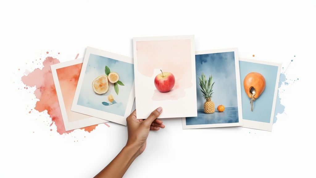
story 7 Best Postcard Printing Services for 2025: A Complete Guide
In a world saturated with digital ads, the tangible impact of a well-designed postcard can make all the difference. From announcing a grand opening to nurturing customer loyalty, postcards offer a direct, personal touch that digital channels often lack. To truly leverage postcards as a secret marketing weapon, consider how they integrate into your broader strategy, including creating an effective marketing funnel to guide customers from awareness to conversion. But with countless online printers, how do you choose the one that delivers on quality, speed, and value? This guide cuts through the noise. We dive deep into the top 7 services for the best postcard printing in 2025, comparing their features, materials, pricing, and unique offerings. Whether you're a small business owner, a marketing professional, or a graphic designer, you'll gain the specific, actionable insights needed to select the perfect printing partner. Each review includes screenshots and direct links to help you make a confident decision and create standout direct mail campaigns that get noticed and drive results. Let's find the right service for your needs. 1. 4OVER4: Best for All-Inclusive Value and Speed For businesses and creative professionals who prioritize clarity, speed, and exceptional quality, 4OVER4 stands out as a premier choice in the competitive landscape of postcard printing. Their All-Inclusive Postcards service is meticulously crafted to eliminate common frustrations in the ordering process, positioning them as a leading contender for the best postcard printing solution available. The platform excels by combining transparent pricing with rapid production, making it a powerful tool for time-sensitive marketing campaigns. What truly sets 4OVER4 apart is its commitment to an all-inclusive pricing model. This approach bundles the cost of the product, printing, and even shipping into a single, upfront price. This transparency is a significant advantage for marketers and business owners who need to manage budgets precisely, removing the risk of unexpected fees at checkout. Key Features and Capabilities 4OVER4's service is built on a foundation of professional-grade materials and extensive customization options, ensuring every project meets high standards. Premium Paper Stocks: Users can choose between a sturdy 14PT cardstock, ideal for bulk mailings, or a more substantial 16PT stock for a premium, high-impact feel. Both options are designed for durability, ensuring your postcards withstand handling and mailing. Versatile Coating Options: The platform offers multiple finishes to enhance both the aesthetic and longevity of your postcards. Options like a glossy UV coating make colors pop, while a matte finish provides a sophisticated, modern look. This customization allows brands to align the final product perfectly with their visual identity. Next Business Day Turnaround: Speed is a defining feature. For standard orders, 4OVER4 offers an impressive next business day turnaround, ensuring your marketing materials are printed and ready for dispatch almost immediately. This is invaluable for last-minute promotions or event announcements. Expert Insight: 4OVER4's combination of premium 16PT stock with a quick turnaround is a game-changer for agencies and designers. It allows them to deliver high-end, tangible marketing assets to clients on tight deadlines without sacrificing quality, bridging the gap between speed and a luxury feel. Ideal Use Cases and Practical Benefits The platform's features translate into tangible benefits for various professional needs. Direct Mail Campaigns: Businesses can execute direct mail campaigns with confidence, knowing the costs are fixed and the quality is consistent. The durable cardstocks ensure postcards arrive in excellent condition. Promotional Giveaways: Event organizers and retail businesses can produce eye-catching promotional handouts that leave a lasting impression on potential customers. Agency Fulfillment: Marketing agencies can rely on the user-friendly interface and rapid production to serve multiple clients efficiently, streamlining their print procurement process. Backed by over two decades of industry expertise, the 4OVER4 ordering system is both intuitive and robust. While the All-Inclusive service is specific to postcards, the company offers a broad spectrum of other products. For those looking to coordinate their postcards with other collateral, you can explore their full range of marketing materials. Visit the 4OVER4 website to see their all-inclusive options. 2. GotPrint GotPrint has secured its place as a reliable and budget-friendly option in the online printing landscape. It's particularly well-suited for businesses and individuals who need extensive customization without an exorbitant price tag, making it one of the best postcard printing choices for bulk orders or complex marketing campaigns. The platform shines by offering a massive array of over 30 postcard sizes, ranging from standard mailers to unique custom dimensions. This extensive flexibility allows marketers and designers to create truly unique promotional materials that stand out in the mailbox. Whether you need a simple 4" x 6" card or a large, eye-catching piece, GotPrint’s selection provides a solid foundation for any project. While their primary strength lies in print-on-demand services, those looking for comprehensive branding materials can also find valuable resources. For instance, you can explore more about cohesive branding strategies, including the importance of matching your business cards with your postcard design , on specialized platforms. Key Features and Offerings GotPrint’s platform is designed to accommodate various user skill levels and project requirements. You can upload a print-ready file, use their intuitive online design tool with pre-made templates, or even hire their in-house design team for a professional touch. Diverse Paper Stocks: Choose from options like the standard 14 pt. Gloss Cover , the robust 16 pt. Dull Cover with Matte Finish , or the premium, ultra-thick Trifecta papers for a luxury feel. Competitive Pricing: The service is known for its affordability. For example, 100 double-sided 4" x 6" postcards start at a highly competitive $26.40, making it accessible for small businesses. Direct Mailing Services: Simplify your marketing campaigns by using their integrated mailing services. You can upload your mailing list, and GotPrint will handle the addressing and postage for you. Pros and Cons Pros Cons ✅ Extensive customization options in size and paper ❌ Special finishes like foil stamping cost extra ✅ Very competitive pricing, especially for bulk orders ❌ Turnaround times can vary significantly ✅ User-friendly design tools and templates ❌ Shipping costs can add up for larger orders Ultimately, GotPrint is a strong contender for anyone seeking a balance between customization, quality, and cost. It’s an excellent choice for businesses that require high-volume, standardized postcards for widespread distribution. Website: https://www.gotprint.com/ 3. PsPrint PsPrint has carved out a niche as a premium online printer, focusing on high-quality materials, vibrant color reproduction, and exceptionally fast turnarounds. It’s an ideal choice for businesses and marketers who prioritize a professional finish and need their promotional materials delivered quickly. The platform is well-regarded for its reliability, making it one of the best postcard printing services for time-sensitive marketing campaigns or high-impact events where quality cannot be compromised. PsPrint’s strength lies in its commitment to superior print quality and eco-conscious options. It offers seven standard postcard sizes along with custom dimensions, giving designers enough flexibility for most projects. The service stands out by offering premium paper stocks like recycled matte and elegant velvet finishes, allowing brands to create postcards with a distinct, tactile feel that conveys quality and attention to detail. Key Features and Offerings The platform accommodates users who have print-ready designs and provides a straightforward upload process. While its template selection is more limited, the focus is clearly on executing professional designs with precision. For those seeking unique projects, their custom printing options provide a pathway to fully bespoke marketing materials. Premium Paper Stocks: Choose from a curated selection, including 15 pt. Velvet with Soft-Touch Coating , 13 pt. 100% Recycled Matte Cover , and the sturdy 16 pt. C2S Gloss Cover . Fast Turnaround: PsPrint is known for its speed, offering production times as fast as one business day for many postcard orders, which is a major advantage for urgent needs. Direct Mailing Services: Streamline your marketing efforts by leveraging their comprehensive mailing services. Simply provide your mailing list, and PsPrint manages the addressing, postage, and delivery for efficient campaign distribution. Pros and Cons Pros Cons ✅ High-quality printing with vibrant colors ❌ Pricing may be higher compared to competitors ✅ Excellent eco-friendly paper options available ❌ Limited selection of free design templates ✅ Comprehensive and reliable direct mailing services ❌ Customization options are less extensive than some rivals Ultimately, PsPrint is a top-tier choice for businesses that place a premium on print quality and speed. While it may come at a slightly higher cost, the professional results, eco-friendly choices, and rapid production make it a valuable partner for impactful marketing. Website: https://www.psprint.com/postcards 4. Vistaprint Vistaprint is one of the most recognized names in the online printing industry, making it a go-to choice for small businesses and individuals alike. The platform excels at providing an accessible and straightforward experience, making it one of the best postcard printing services for those who need professional results without a steep learning curve. Its strength lies in balancing affordability, speed, and user-friendliness, which is ideal for quick marketing campaigns or personal announcements. Vistaprint’s massive template library is a key differentiator, offering thousands of designs that can be easily customized. This makes it incredibly simple for users without graphic design experience to create a polished product. While postcards are a primary offering, the platform also provides a wide range of marketing materials, allowing for brand consistency across different formats. For example, businesses can align their postcard designs with other promotional tools by exploring resources on effective flyer printing for marketing campaigns . Key Features and Offerings The platform is designed for efficiency, guiding users through the creation process from start to finish. You can easily upload your own design or browse their extensive collection of industry-specific templates to find a starting point. Extensive Template Library: Access thousands of professionally designed, customizable templates for virtually any occasion or industry. Variety of Finishes and Papers: Choose from standard to premium paper stocks, including matte, glossy, and recycled options. You can also add rounded corners for a modern touch. Integrated Marketing Services: Vistaprint offers direct mail services, allowing you to upload a mailing list and have them handle the addressing, stamping, and sending for you. Pros and Cons Pros Cons ✅ Affordable pricing with frequent promotions and sales ❌ Limited ultra-premium or specialty paper options ✅ Very easy-to-use design interface for beginners ❌ Additional costs for certain design elements and finishes ✅ Fast turnaround times and reliable shipping ❌ Can feel less tailored for professional designers In summary, Vistaprint is an excellent option for users prioritizing convenience, speed, and affordability. It's particularly well-suited for small businesses and individuals who need a reliable service for creating high-quality, standard postcards with minimal hassle. Website: https://www.vistaprint.com/ 5. Moo Moo has carved out a niche in the premium printing space, positioning itself as the go-to service for businesses and creatives who prioritize exceptional quality and a high-end feel. It is one of the best postcard printing services for those looking to make a powerful first impression. The platform is celebrated for its superior materials, meticulous attention to detail, and innovative features that transform a simple postcard into a memorable piece of brand communication. Moo's philosophy centers on tactile quality, offering paper stocks that are noticeably thicker and more luxurious than many competitors. This emphasis on premium finishes makes their postcards ideal for high-stakes marketing, exclusive event invitations, or portfolio pieces. For those planning special occasions, the principles of using high-quality stock for postcards can be similarly applied to other stationery; you can find more information about creating coordinated, high-quality event materials by exploring custom invitation printing options on specialized platforms. Key Features and Offerings Moo’s platform is designed for users who value design and quality over sheer volume. Their user-friendly interface and curated options make it simple to create stunning postcards, even without extensive design experience. Printfinity Technology: This standout feature allows you to print a different design on the back of every single postcard in a pack at no extra cost, perfect for showcasing a portfolio or running a creative marketing campaign. Premium Paper Stocks: Moo offers its signature Moo Original paper (16-18 pt.), the soft-touch Moo Super (18-19 pt.), and the eco-conscious Moo Cotton , made from 100% recycled t-shirt offcuts. Luxe Postcards: For an unforgettable impact, their Luxe postcards are ultra-thick (32 pt.) with a distinctive color seam in the middle, creating a product that feels substantial and important. Pros and Cons Pros Cons ✅ Exceptional print quality and premium materials ❌ Higher price point, less suited for bulk orders ✅ Unique Printfinity feature for design variation ❌ Limited range of standard postcard sizes ✅ Strong commitment to eco-friendly practices ❌ Production and shipping times can be longer Ultimately, Moo is the ideal choice for brands that want to convey luxury, creativity, and quality. While it comes at a higher price, the investment translates into a tangible and impressive product that stands out from standard mailers. Website: https://www.moo.com/ 6. Clubcard Printing USA Clubcard Printing USA has carved out a niche for itself by combining high-quality printing with a strong commitment to environmental sustainability and creative flexibility. It is an excellent choice for businesses and designers who prioritize unique materials and specialty finishes. The platform stands out by offering an impressive selection of eco-friendly paper stocks alongside conventional options, making it one of the best postcard printing services for brands with a green-conscious identity. This focus on diverse and sustainable materials allows for the creation of postcards that not only look good but also align with specific brand values. Whether you need a rush order for an event or a custom-shaped postcard to make a bold statement, Clubcard’s extensive capabilities provide the tools needed to produce memorable marketing collateral that captures attention. Key Features and Offerings Clubcard Printing USA caters to a wide audience, from those needing rapid-fire same-day prints to clients seeking intricate, custom-designed pieces. The platform's strength lies in its specialized options that go beyond standard print jobs. Eco-Friendly Paper Stocks: Choose from a unique assortment including 100% recycled paper , durable bamboo , and textured hemp stocks, offering a sustainable alternative to traditional paper. Specialty Finishes: Elevate your design with premium finishes like foil stamping , protective lamination , and custom die-cuts to create postcards in any shape imaginable. Rapid Turnaround: For urgent marketing needs, Clubcard offers same-day printing on select postcard options, a critical feature for time-sensitive campaigns and events. Pros and Cons Pros Cons ✅ Extensive customization with unique finishes and shapes ❌ Pricing can be higher for specialty papers and finishes ✅ Strong commitment to environmentally friendly materials ❌ Limited selection of free design templates ✅ Very fast turnaround times, including same-day service ❌ The sheer number of options can be overwhelming for new users Ultimately, Clubcard Printing USA is a top-tier choice for those who value creative freedom, speed, and sustainability. It's perfectly suited for brands wanting to make a distinct impression with high-impact, custom-crafted postcards that reflect a commitment to quality and environmental responsibility. Website: https://clubcard.tv/pages/postcards 7. Cactus Mailing Company Cactus Mailing Company establishes itself as a specialist in turnkey direct mail marketing solutions, making it a standout choice for businesses seeking more than just postcard printing. The company excels at integrating high-quality printing with comprehensive mailing services, positioning itself as an ideal partner for executing seamless marketing campaigns from start to finish. This holistic approach ensures brand consistency and message effectiveness, solidifying its place among the best postcard printing services for results-driven marketers. The platform is designed for businesses that want an expert to manage the logistical complexities of a direct mail campaign. From refining a target audience with mailing list acquisition to professional design and final delivery, Cactus Mailing handles every step. This integrated model is particularly beneficial for businesses looking to expand their local marketing efforts. For those exploring similar localized strategies, comparing the impact of direct mail with other tangible marketing tools like custom door hangers can provide valuable insights into community outreach. Key Features and Offerings Cactus Mailing Company streamlines the direct mail process with an all-inclusive service package. Clients can leverage their in-house expertise to ensure campaigns are not only printed beautifully but also strategically executed for maximum ROI. The focus is on quality and efficiency to get your message into the right hands quickly. High-Quality Standard Materials: All postcards are printed in full color on both sides on a durable 14 pt. cardstock and finished with a high-gloss UV coating for a professional look and feel. Comprehensive Mailing Services: The service includes list acquisition, CASS certification, de-duping your list, addressing, and delivery to the post office, removing logistical burdens from the client. In-House Graphic Design: For businesses without a dedicated design team, Cactus Mailing offers professional graphic design services to create compelling, brand-aligned postcard artwork. Fast Turnaround: The company guarantees printing and mailing within seven business days of final proof approval, ensuring timely campaign launches. Pros and Cons Pros Cons ✅ Integrated printing and mailing services simplify campaigns ❌ Minimum order quantity of 200 postcards may be high for very small tests ✅ High-quality materials and finishes come standard ❌ Primarily offers standard postcard sizes, limiting custom dimensions ✅ Expertise in direct mail marketing strategy and execution ❌ Less focus on one-off, small-batch print orders Ultimately, Cactus Mailing Company is the perfect choice for businesses and marketers who need a reliable, all-in-one partner for their direct mail campaigns. Its blend of quality printing, expert design, and full-service mailing makes it a powerful tool for generating leads and driving local engagement. Website: https://www.cactusmailing.com/direct-mail/postcard-printing/ Top 7 Postcard Printing Services Comparison Service Implementation Complexity 🔄 Resource Requirements ⚡ Expected Outcomes 📊 Ideal Use Cases 💡 Key Advantages ⭐ All-Inclusive Postcards Low – streamlined online ordering, limited customization Moderate – premium stocks, coating options High-quality, durable postcards with fast turnaround Businesses/creatives needing quick, hassle-free postcards Transparent pricing, next-day turnaround, quality GotPrint Medium – many sizes, design tools, some extra fees Moderate – diverse stocks, custom designs Versatile postcards with wide customization Marketing campaigns requiring flexible designs Extensive customization, competitive pricing PsPrint Medium – eco-options, fast but pricier Moderate to High – premium, recycled materials Vibrant, professional postcards, eco-friendly Businesses focused on quality and sustainability High-quality print, eco-friendly options Vistaprint Low to Medium – easy tools, template-based Low to Moderate – standard and some premium stocks Affordable, customizable postcards Personal and small business marketing Affordable, easy design, fast turnaround Moo Medium to High – luxury materials, unique features High – premium stocks, printfinity tech Premium, personalized postcards Premium branding and personalized campaigns Exceptional quality, innovative design Clubcard Printing USA Medium – specialty finishes and shapes available High – eco materials, special finishes Unique, eco-friendly, highly customized postcards Unique designs needing fast or eco-friendly prints Extensive options, fast turnaround, eco-focus Cactus Mailing Company Medium – integrated printing plus mailing High – printing, mailing lists, design team Turnkey direct mail campaigns Full-service direct mail marketing campaigns Integrated mailing services, expert marketing Making Your Final Choice: Printing Postcards That Convert Navigating the landscape of online printing services can feel overwhelming, but armed with the right information, you can make a confident and strategic decision. We've explored a range of powerful options, from the accessible interface of Vistaprint to the premium, tactile materials offered by Moo. Each service presents a unique value proposition, tailored to different project needs, budgets, and creative ambitions. The key takeaway is that the “best postcard printing” service is not a one-size-fits-all solution. It is a partner that aligns perfectly with your specific marketing objectives. Your final choice hinges on a careful evaluation of the factors most critical to your campaign's success. By moving beyond just the sticker price and examining the total value, you empower yourself to select a printer that will deliver tangible results. A Quick Recap of Your Options To simplify your final decision, let's revisit the core strengths of the platforms we've covered: For Maximum Value and Speed: Services like 4OVER4 and GotPrint excel at providing cost-effective solutions with impressively fast turnaround times, making them ideal for high-volume mailings and time-sensitive promotions. For Premium and Unique Finishes: If your brand identity demands luxury, consider Moo or Clubcard Printing. They specialize in high-end paper stocks, unique textures, and specialty finishes that create a memorable unboxing experience. For User-Friendly Design and Simplicity: Vistaprint and PsPrint offer intuitive design tools and a straightforward ordering process, which is perfect for small businesses or individuals launching their first direct mail campaign. For Full-Service Direct Mail: Cactus Mailing Company provides an end-to-end solution, handling everything from design and printing to list acquisition and mailing, streamlining the entire process for busy marketers. Actionable Steps to Selecting Your Printing Partner Before you commit, take a moment to define your project's non-negotiables. This clarity will guide you directly to the service best suited for your needs. Define Your Budget vs. Perceived Value: Look beyond the cost per postcard. Factor in shipping fees, potential setup charges, and the quality of the final product. A slightly more expensive postcard that feels premium can generate a far greater ROI than a cheaper one that gets immediately discarded. Order a Sample Kit: This is a crucial, often overlooked step. Holding a physical sample from your top contenders (like 4OVER4 or Moo) allows you to feel the paper weight, see the color accuracy, and assess the print quality firsthand. It’s the single best way to manage expectations and ensure the final product matches your vision. Confirm Turnaround and Shipping Times: Your campaign has a deadline. Verify that the printer’s production schedule and shipping options align with your launch date. Pay close attention to cut-off times for same-day or next-day printing services. Ultimately, choosing the best postcard printing provider is an investment in your brand's physical presence. It’s your chance to make a direct, tangible connection with your audience in a digitally saturated world. By carefully weighing your options and prioritizing the factors that matter most, you can create a postcard that not only looks professional but also converts, driving action and building lasting customer relationships. Ready to bring your vision to life with vibrant, high-quality postcards that stand out? Explore the All-Inclusive Postcards at 4OVER4 , where you get free shipping, fast turnarounds, and premium quality with no hidden fees. Discover why thousands of businesses trust 4OVER4 for their most important printing projects.
 story
story Bigfoot AI Goes Viral: Your Business Guide to This Social Media Gold Mine
What Started the Bigfoot AI Video Revolution? A simple TikTok post In late May 2025 changed everything. User @bigfootvlogs uploaded the first AI-generated Bigfoot vlog, featuring our favorite cryptid saying "Bigfoot here, this is my first vlog on this channel." The result? Millions of views and a trend that's still growing. Bigfoot AI videos deliver something traditional "sightings" never could - crystal-clear quality. No more grainy, shaky footage. These AI-generated videos show Sasquatch in stunning 4K resolution doing everyday things like: • Making morning coffee • Sharing life advice • Documenting forest routines The trend expanded quickly. TikToker @sunshines99 launched Yeti vlogs using the same format. Soon, both creatures started collaborating, building a fictional universe that viewers couldn't get enough of. Their content ranged from morning routines to cooking tutorials, even reviewing trail cameras - a clever meta twist that delighted audiences. Google's Veo 3 (also called Google Flow) powers this creative explosion. Released in mid-May 2025, this AI video generation tool creates remarkably realistic content from simple text prompts. The numbers speak for themselves. These bigfoot AI generated videos consistently hit millions of views across platforms. One LinkedIn post highlighted a single Bigfoot creator series that reached over 60 million views . Success breeds imitation. Creators now feature other cryptids like Nessie and the Australian Yowie, plus Bible characters and historical figures. One satisfied TikToker summed it up perfectly: "These Bigfoot and Yeti vlogs are definitely some of the best content I've seen on this app". The Technology Stack Powering Your Next Marketing Campaign Want to create viral content that generates millions of views? The tools behind bigfoot AI videos are more accessible than most businesses realize. Google's Veo 3 powers the realistic Sasquatch vlogs dominating social feeds worldwide. Pricing Options That Fit Any Marketing Budget Your investment options range from premium to budget-friendly: • Google's Official Plans : Price tag of $250 per month for 125 videos (roughly $2 per AI video) • Envato Alternative : 15 videos for just $16.50 (about $1 per video) • Freepik Plans : $12 to $158 monthly for 4-75 videos The Winning Prompt Formula Prompt engineering makes or breaks your video quality. Top creators follow this proven structure: "POV handheld camera footage of Bigfoot in [setting], [action], speaking directly to camera saying '[dialog]', [lighting description], [sound effects], natural movement" Real example: "POV handheld camera footage of Bigfoot in dense forest, walking along a creek and picking berries, speaking directly to camera saying 'Found my favorite spot for breakfast', morning sunlight filtering through trees, birds chirping, water flowing sounds, natural movement". Many creators develop scripts using ChatGPT or Gemini first. "I used both ChatGPT and Gemini to generate story scripts and video prompts". Specialized Platforms for Business Users Ready-to-use solutions designed for marketing teams: • BasedLabs - Dedicated AI Bigfoot Generator optimized for first-person Sasquatch vlogs • Media.io - Customizable format options specifically for Bigfoot content • Supawork - Realistic 3D Bigfoot models with diverse environment options Character Consistency Drives Results Smart creators maintain detailed "character bibles" documenting their Bigfoot's personality traits, catchphrases, and quirks. This consistency builds audience loyalty and brand recognition across multiple videos. Smart Business Applications for Bigfoot AI Content Bigfoot AI videos present a massive opportunity for businesses ready to capture viral marketing success. These highly engaging videos deliver exceptional ROI across multiple industries and business models. Cost-effective content creation makes this trend accessible to companies of all sizes. Many platforms offer bigfoot AI generated content starting at just $1-2 per video. Small businesses can now compete directly with major brands on social media platforms. Real Business Success Stories: • Journeys Footwear created a six-part series featuring Bigfoot's daughter starting her first retail job • The campaign connected with Gen Z shoppers through storytelling instead of traditional ads • Multiple creators report monthly earnings exceeding $30,000 Why Bigfoot AI Video Content Outperforms Traditional Marketing: Viewers actually finish watching these videos because they entertain first, sell second. Marketing experts confirm this approach creates stronger brand recall compared to standard advertising. A single well-executed campaign can generate over 60 million views. Industries Seeing the Biggest Results: • Outdoor gear and adventure brands • Tourism and travel companies • Retail stores targeting younger demographics • Service businesses looking to stand out Multiple Revenue Opportunities: Smart businesses aren't just using bigfoot AI footage for direct marketing. Successful companies are generating income through: • Platform monetization programs • Affiliate marketing partnerships • Sponsored content collaborations • Brand awareness campaigns The trend continues gaining momentum across social platforms. Recent LinkedIn feedback shows viewers find these videos "outstanding and scary at the same time! So realistic!" - exactly the reaction that drives shares and builds brand recognition. Any business can adapt this format by creating a Bigfoot character relevant to their industry. Whether reviewing products, giving facility tours, or sharing expert insights, the key is making content that viewers want to watch and share. Start Your Bigfoot AI Marketing Campaign Today Bigfoot AI videos present a massive opportunity for businesses ready to capture audience attention through entertaining, high-engagement content. This social media marketing trend has evolved from a single viral post into a proven strategy generating millions of views for smart brands. Key advantages for your business: • Low-cost entry - Create professional videos for just $1-2 each • High engagement rates - Viewers actually finish watching these entertaining videos • Proven results - Single campaigns reach 60+ million views • Multiple revenue streams - Platform monetization, affiliate sales, sponsored content Success comes from focusing on entertainment first, selling second . Companies like Journeys proved this approach builds stronger brand recall than traditional advertising methods. Their Bigfoot daughter series connected with Gen Z shoppers through storytelling rather than direct sales pitches. Essential success factors: • Maintain consistent character traits across all videos • Align your Bigfoot persona with brand values • Focus on quality content that viewers enjoy sharing • Target younger demographics who engage most with this format Perfect for these business types: Outdoor and adventure brands Retail companies targeting Gen Z Tourism and hospitality businesses Any company wanting fresh social media content The technology remains accessible through Google's Veo 3 and specialized platforms like BasedLabs and Media.io . Some creators now earn $30,000+ monthly from their Bigfoot content through smart monetization strategies. How to Use the Trend for Your Business Jump in, don’t overthink. Make a simple Veo 3 video with Bigfoot & Yeti reacting to your latest promo. Blend humor and value: Let the characters introduce your business, or just play out a funny scene in your location. Collaborate with influencers: Let others remix or duet your Bigfoot & Yeti clips—virality is all about sharing! Tag your content: Use trending hashtags to get discovered faster. (#BigfootAndYeti, #Veo3, #MemeMarketing) Embrace the weird: The more unexpected, the better. Let these legends do what they do best: surprise, delight, and engage. See It in Action: Our Full Bigfoot & Yeti Business Saga We’ve done it ourselves—our brand new video takes you inside the wild world of Bigfoot & Yeti. From being pulled into every video, to finally saying “enough!” and building their own business, our story is a tribute to creative hustle, meme energy, and what happens when legends become leaders. Want to see how it all plays out? Watch the full video below—and don’t miss the surprises we’ve packed in for fans, creators, and businesses alike! Want a personal shoutout from Bigfoot? Just leave a comment on our video above saying you need a shoutout from Bigfoot, and make sure to include your 4OVER4 username in the comment. That’s it! You’ll be entered for a chance to see your business featured by the legend himself. Don’t miss out—drop your username, get noticed, and join the Bigfoot business craze! Don't wait - this trend won't last forever. Start planning your Bigfoot AI marketing campaign now while audiences still find these videos fresh and engaging. Your business could become the next viral success story featuring everyone's favorite forest dweller.
 story
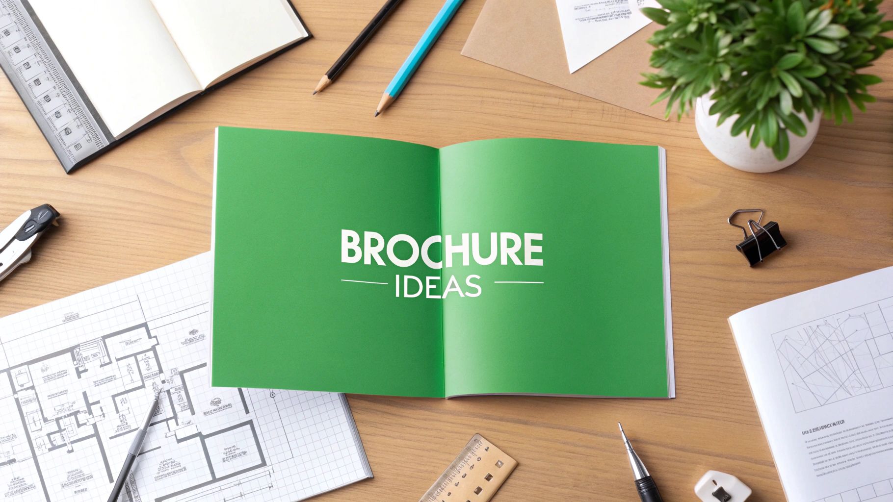
story Creative Brochure Layout Ideas to Boost Your Marketing
Unlocking the Potential of Brochure Layouts Want to create brochures that truly captivate your audience? This listicle presents seven effective brochure layout ideas to elevate your marketing materials in 2025. Learn how to transform information into engaging narratives and leave a lasting impression. Discover how Z-Pattern, Grid-Based, Asymmetrical Balance, Timeline, Magazine-Style, Modular, and Storytelling Arc brochure layout ideas can enhance your print projects and make your message stand out. These layout concepts are crucial for maximizing reader engagement and ensuring your brochures effectively communicate your brand and offerings. 1. Z-Pattern Layout The Z-pattern layout is a classic design principle rooted in the natural eye movement of Western readers. It mimics how we typically scan a page of text or a visually rich document: starting at the top-left, moving horizontally to the top-right, then diagonally down to the bottom-left, and finally across to the bottom-right. This creates a Z-shaped visual path that guides readers through the content in a logical and intuitive sequence. This predictable flow allows designers to strategically place key elements, like headlines, calls to action, and essential information, along the Z-path, maximizing engagement and ensuring the message is effectively conveyed. For anyone seeking effective brochure layout ideas, the Z-pattern is a foundational technique to consider. The Z-pattern leverages the power of visual hierarchy. By placing the most important information along the Z-path, you create a clear order of importance, guiding the reader's attention to what matters most. The top-left corner, being the initial point of contact, is prime real estate for your logo, a captivating headline, or a striking visual. The top-right is ideal for secondary information or a supporting point. The diagonal path, connecting the top-right to the bottom-left, often serves as a visual bridge, leading the eye smoothly through the content. Finally, the bottom-right corner, being the natural endpoint of the Z-path, is strategically reserved for the primary call to action, encouraging the reader to take the next step, whether it’s visiting a website, making a purchase, or requesting more information. This layout is highly versatile, accommodating various content types and lengths, making it suitable for both print brochures and digital flyers. You can effectively utilize the Z-pattern in a tri-fold brochure for a new product launch, a single-page flyer for an upcoming event, or even in a digital marketing email. Its adaptability across different mediums and industries makes it a valuable tool for marketing professionals, graphic designers, and event organizers alike. From corporate service brochures to real estate flyers, the Z-pattern effectively organizes information in a digestible and engaging manner. One of the key advantages of the Z-pattern is its intuitive navigation for readers. By following the natural flow of the eye, it minimizes cognitive load and ensures a smooth, effortless reading experience. This leads to higher conversion rates, especially when calls to action (CTAs) are strategically placed at the bottom-right endpoint of the Z. Think of Apple product brochures that showcase a hero image of the latest iPhone at the top-left, highlight key features along the Z-path, and finally, position the purchase CTA at the bottom-right. Real estate flyers often follow a similar approach, displaying a captivating property photo at the top-left, outlining key details along the Z, and placing contact information at the bottom-right. While the Z-pattern boasts numerous advantages, it's essential to be aware of its limitations. Its predictable nature can sometimes feel formulaic. For cultures with different reading patterns (e.g., right-to-left), the Z-pattern loses its effectiveness. It can also feel restrictive for highly creative or artistic designs where a less structured approach might be preferred. Overly rigid adherence to the Z-pattern can result in a brochure that looks too structured and lacks visual interest. To maximize the effectiveness of the Z-pattern, consider these practical tips: Place your strongest visual element at the top-left starting point to immediately grab attention. Position your main CTA at the bottom-right endpoint to capitalize on the natural reading flow. Use contrast and white space to strengthen the Z-path and guide the eye effectively. Experiment with different element sizes and placement to optimize the visual flow and ensure the diagonal connection feels natural and unforced. Learn more about Z-Pattern Layout for further insights and examples. By understanding the principles of the Z-pattern and applying these tips, you can create brochures and flyers that are both visually appealing and highly effective in conveying your message. 2. Grid-Based Layout When it comes to designing a brochure that is both visually appealing and easy to navigate, a grid-based layout is a powerful tool. This approach utilizes a systematic structure of rows and columns, creating a framework that organizes content into clean, balanced sections. Think of it as building with blocks – each piece of content, whether text or image, fits neatly within its designated space. This modular approach not only creates consistency and improves readability, but it also allows for flexible content arrangement while maintaining visual harmony throughout your brochure. Grid-based layouts bring a sense of order and professionalism, making them a popular choice for various brochure types, from product catalogs to corporate reports. The core strength of a grid-based layout lies in its modular content organization system. Content is divided into distinct modules, each occupying a specific area within the grid. This system fosters consistent spacing and alignment, contributing to a polished and professional look. Moreover, this modularity makes the layout scalable. Whether you have a concise message or a wealth of information to convey, a grid system can adapt to accommodate varying content volumes without sacrificing visual balance across the pages. Importantly, grid-based layouts support responsive design principles, making them adaptable to different screen sizes and orientations – an increasingly crucial factor in today's digital age where brochures are often viewed online. Several real-world examples showcase the effectiveness of grid-based layouts. IKEA catalogs masterfully employ consistent product grid layouts to showcase their vast furniture range, making it easy for customers to browse and compare items. University admission brochures often use structured modules within a grid to present program information clearly and concisely. Similarly, medical brochures benefit from grid systems to organize crucial information like symptoms, treatments, and contact details in an accessible manner. Even in the financial services sector, where information can be dense and complex, brochures utilize grids to present service comparisons in a readily digestible format. When and Why to Use a Grid-Based Layout: This approach shines when dealing with large amounts of information, diverse content types, or when a professional and organized appearance is paramount. If your brochure requires a clear hierarchy of information, consistent branding, or if you're aiming for a streamlined design process, a grid-based layout is an excellent choice. For businesses looking to project a corporate and reliable image, this layout style is particularly well-suited. Actionable Tips for Implementing a Grid-Based Layout: Start with a 12-column grid system: This provides maximum flexibility for arranging content and adapting to different formats. Break the grid occasionally: While consistency is key, strategically breaking the grid can introduce visual interest and prevent monotony. This could involve spanning an image across multiple columns or using a larger text block to highlight a key message. Consistent margins and gutters: Maintaining consistent margins and gutters (the space between columns) is crucial for a clean and unified look. Align all elements to grid lines: Ensure all text, images, and other design elements align to the grid lines for visual cohesion and a professional finish. Consider different grid structures for different sections: You don't have to stick to a single grid structure throughout the entire brochure. Varying the grid in different sections can add dynamism and cater to the specific content requirements of each section. Pros and Cons: Pros: Professional and organized appearance Easy to maintain consistency across multiple pages Flexible for various content types Reduces design decision fatigue Works well for complex information Cons: Can appear rigid or corporate if not implemented creatively May limit creative expression if adhered to too strictly Requires discipline to maintain grid integrity Can feel monotonous if not varied properly The principles of grid-based design have been championed by influential design movements like the Swiss Design movement and the Bauhaus school of design. These principles have also been adopted by modern web design frameworks like Bootstrap, further solidifying the grid’s enduring relevance in the digital age. By understanding the power and flexibility of grid-based layouts, you can create brochures that are not only visually compelling but also highly effective in communicating your message. 3. Asymmetrical Balance Layout Asymmetrical balance is a powerful brochure layout idea that breaks away from traditional, symmetrical designs. Unlike symmetrical layouts, which mirror elements on either side of a central axis, asymmetrical balance achieves equilibrium through the strategic distribution of visual weight. This dynamic approach uses varying sizes, colors, textures, and positioning of elements to create a sense of balance, resulting in brochures that are visually engaging, modern, and memorable. It's a technique that prioritizes visual flow and draws the reader's eye across the page in a more natural, exploratory way. Instead of mirroring elements, asymmetrical balance utilizes contrast and juxtaposition. A large image on one side might be balanced by a cluster of smaller images and text on the other. The interplay of these elements creates visual tension and interest, making the brochure more dynamic and less predictable. This approach allows for greater flexibility in content arrangement and prioritization, enabling you to highlight key information and guide the reader's eye through the brochure in a specific order. Asymmetrical balance offers a range of features that make it a valuable tool for brochure design. Its unequal but balanced element distribution creates dynamic visual tension and interest, while offering flexible content arrangement options. The resulting aesthetic is distinctly modern and contemporary, allowing for emphasis through strategic imbalance. This approach allows designers to play with negative space, creating a sense of breathing room and sophistication. This design style is particularly effective for showcasing products, services, or portfolios in a fresh and captivating way. Think of Nike product brochures featuring bold imagery offset by concise text blocks, or architecture firm portfolios showcasing projects with varying image sizes to highlight different aspects of their work. Creative agencies often employ asymmetrical balance in their brochures to present diverse work samples, demonstrating their range and innovation. Even fashion brands leverage this technique in their lookbooks, using dynamic model photography and unconventional layouts to create a sense of style and movement. Pros of Using Asymmetrical Balance: Creates visual interest and engagement: The dynamic nature of asymmetrical layouts captures attention and encourages readers to explore the content. Appears modern and sophisticated: Asymmetrical balance projects a contemporary and forward-thinking image. Allows for creative content prioritization: Designers can strategically emphasize key information by playing with size and placement. More flexible than symmetrical designs: This approach offers greater freedom in arranging content and creating unique visual hierarchies. Memorable and distinctive appearance: Asymmetrical brochures stand out from the crowd, leaving a lasting impression on potential customers. Cons of Using Asymmetrical Balance: Requires advanced design skills to execute well: Achieving proper balance can be challenging and requires a keen eye for visual weight and composition. Can appear chaotic if not properly balanced: Poorly executed asymmetry can lead to a disorganized and confusing layout. More difficult to achieve consistency across pages: Maintaining a cohesive look and feel throughout a multi-page brochure requires careful planning and execution. May not suit conservative or traditional brands: This approach might not be appropriate for brands aiming for a more classic or formal aesthetic. Tips for Achieving Effective Asymmetrical Balance: Use the rule of thirds as a starting guideline: This classic compositional technique can help you divide the page and place elements strategically. Balance large elements with smaller grouped elements: A single large image can be balanced by a cluster of smaller images or text blocks. Vary text block sizes and positions strategically: Use different font sizes and positions to create visual interest and guide the reader's eye. Use color and contrast to create visual weight: Bright colors and high contrast can draw attention to specific areas and create balance. Test balance by squinting to see overall weight distribution: This simple trick helps you assess the overall balance of the layout and identify areas that need adjustment. The use of asymmetrical balance in design has a rich history, popularized by the Bauhaus movement designers and modern graphic design pioneers like Paul Rand. Today, contemporary agencies like Pentagram continue to push the boundaries of this technique, demonstrating its enduring power and versatility. By understanding the principles of asymmetrical balance and applying these practical tips, you can create brochures that are both visually stunning and highly effective in communicating your message. This approach is particularly relevant for small and medium-sized businesses, marketing professionals, graphic designers and agencies, event organizers, and corporate clients looking for a modern and impactful way to present their brand and offerings. It ensures your brochure is not just informative but also a visually compelling piece that captures and retains audience attention. 4. Timeline/Sequential Layout A timeline/sequential layout is a powerful brochure layout idea for presenting information in a chronological or step-by-step order. This approach uses visual cues such as arrows, numbers, or connecting lines to guide the reader through a process, historical progression, or series of events. This structure makes it exceptionally effective for explaining procedures, showcasing company history, or detailing multi-step services, offering a clear and logical flow that reduces cognitive load and enhances reader comprehension. This layout deserves a spot on this list due to its versatility and ability to simplify complex information into an easily digestible format, making it perfect for a wide range of content types. This method works by breaking down information into distinct stages or steps, each visually connected to the next. This sequential presentation creates a natural progression, allowing readers to easily follow the flow of information from beginning to end. For example, a medical brochure might illustrate the steps of a surgical procedure, while a company anniversary brochure could highlight key milestones in its history. The clear progression indicators, often numbered or dated sections, provide a roadmap for the reader, ensuring they don't get lost in the details. The features that make timeline layouts effective include sequential information presentation, the use of clear progression indicators like arrows or numbers, visual connecting elements that tie steps together, numbered or dated sections for easy reference, and a process-oriented organization. This structure naturally lends itself to explaining complex processes, creating a clear logical flow for readers, and reducing cognitive load by presenting information in a structured, easy-to-follow manner. The memorable structure aids retention, and the layout's versatility makes it adaptable to various content types. However, timeline layouts also have limitations. They offer limited flexibility for content that isn't inherently sequential. If you're presenting information that doesn't have a clear beginning, middle, and end, forcing it into a timeline format can feel artificial and confusing. Additionally, brochures with many steps can become lengthy, potentially overwhelming the reader. The linear nature may not suit all aesthetic preferences, and careful pacing is required to maintain reader interest throughout the sequence. Numerous examples demonstrate the successful implementation of timeline layouts. Medical procedure brochures often use timelines to show treatment steps, offering patients a clear understanding of what to expect. Software onboarding guides frequently utilize this layout to illustrate setup processes, simplifying the initial experience for new users. Historical company anniversary brochures celebrate key milestones through a visual timeline, showcasing growth and achievements. Educational brochures explaining scientific processes or service delivery timelines for consulting firms also benefit from this clear, structured approach. Learn more about Timeline/Sequential Layout When designing a timeline layout for your brochure, consider these tips: Use consistent visual elements for each step to maintain a cohesive look. Include estimated timeframes where relevant to provide context. If you're dealing with a long or complex process, break it into digestible chunks to avoid overwhelming the reader. Incorporate icons or illustrations to enhance understanding and visual appeal. Clearly define the starting and ending points to provide a sense of closure. The infographic below visualizes how timeline layouts can be applied to various scenarios, highlighting three specific examples: medical procedures, software onboarding, and company anniversaries. As the infographic illustrates, the timeline layout adapts effectively to diverse applications, providing a consistent framework for presenting sequential information in a visually appealing and easily understandable format. Whether you're outlining a medical procedure, guiding users through software setup, or celebrating a company's history, this brochure layout idea provides a structured approach to effectively communicate complex information. Using a timeline/sequential approach allows for clear and engaging communication that caters to a broad audience, from medical patients to new software users, demonstrating the power of visual storytelling through chronological progression. This makes it a valuable tool for small and medium-sized businesses, marketing professionals, graphic designers, event organizers, and corporate clients alike looking for effective brochure layout ideas. 5. Magazine-Style Layout Looking for brochure layout ideas that captivate your audience and leave a lasting impression? Consider the magazine-style layout. This approach elevates your brochure from a simple marketing tool to a sophisticated publication, brimming with engaging content and visual appeal. This design style leverages the best aspects of editorial design, transforming your brochure into a compelling read that customers will want to spend time with. This makes it a powerful tool for conveying complex information, showcasing compelling stories, and building a stronger brand identity. This is why it deserves a prominent place in any list of effective brochure layout ideas. A magazine-style layout combines editorial design principles with your marketing objectives. Think varied column widths, compelling headlines, captivating imagery, and strategically placed pull quotes – all working in harmony to draw the reader in and encourage them to explore your message further. This format goes beyond simply presenting information; it creates an experience. By mimicking the familiar format of a magazine, you invite readers to engage with your content in a comfortable and intuitive way. How it Works: The core of the magazine-style layout lies in its structured yet dynamic presentation. Multiple column configurations allow for a natural flow of text and break up large chunks of information, making it easier to digest. A clear typographic hierarchy, using different font sizes and weights for headings, subheadings, and body text, guides the reader’s eye and emphasizes key information. Strategic use of pull quotes and callouts highlights important takeaways and adds visual interest. Varied image sizes and placements further enhance the layout, creating a visually rich and engaging experience. The overall result is a professional publication aesthetic that conveys credibility and professionalism. Features and Benefits: Multiple column configurations: Offers flexibility and visual interest. Editorial-style typography hierarchy: Guides the reader and emphasizes key information. Strategic use of pull quotes and callouts: Highlights important points. Varied image sizes and placements: Creates visual appeal and breaks up text. Professional publication aesthetic: Enhances credibility and brand perception. Pros: High perceived value and credibility: A magazine-style brochure communicates a sense of quality and professionalism, elevating your brand image in the eyes of your audience. Encourages thorough reading: The engaging layout and varied content presentation encourage readers to spend more time with your brochure, absorbing your message more effectively. Flexible content accommodation: This layout can handle a significant amount of information without feeling cluttered, making it ideal for showcasing a range of products, services, or stories. Familiar format increases comfort: The magazine format is recognizable and comfortable for readers, making them more receptive to your message. Excellent for content-heavy brochures: If you have a lot to say, this layout provides the structure and visual appeal to present it in an organized and engaging manner. Cons: Can be text-heavy for some audiences: While effective for detailed information, this style may not be suitable for audiences who prefer concise messaging. Requires strong editorial content: To truly shine, this layout needs well-written, compelling content. May need professional photography: High-quality imagery is essential to achieve the desired polished look. More complex to design and produce: This layout requires more design expertise and potentially higher production costs. Examples of Successful Implementation: Luxury hotel brochures showcasing destination features and amenities. Healthcare system brochures featuring patient stories and testimonials. University brochures showcasing research breakthroughs and academic programs. Corporate brochures highlighting thought leadership and industry insights. Non-profit brochures reporting impact and communicating with donors. Actionable Tips for Creating a Magazine-Style Brochure: Vary column widths: Break away from rigid grids and experiment with different column widths to create visual interest and dynamism. Use drop caps and pull quotes strategically: These elements can draw attention to key passages and add visual flair. Maintain consistent typography hierarchy: Establish clear visual distinctions between headings, subheadings, and body text for improved readability. Include high-quality, relevant imagery: Professional photography or illustrations significantly enhance the overall aesthetic and impact. Balance text density with white space: Don't overcrowd the page. Strategic use of white space allows the content to breathe and improves readability. When and Why to Use a Magazine-Style Layout: Consider this layout when you need to present a significant amount of information in an engaging and digestible format. It's ideal for showcasing complex products or services, telling compelling stories, or building a strong brand identity. If you’re aiming for a premium feel and want to position your business as a thought leader, this layout is an excellent choice. Learn more about Magazine-Style Layout You can see how similar design principles are used in newsletter printing. The magazine-style layout, when executed well, is a powerful tool in your marketing arsenal. It's a sophisticated approach to brochure design that can elevate your brand, engage your audience, and achieve your communication objectives. This style, popularized by design teams at renowned publications like Conde Nast, National Geographic, and Time Magazine, offers a proven framework for creating impactful and memorable brochures. By understanding the principles of this layout and applying them strategically, you can transform your brochure from a simple handout into a captivating piece of marketing literature. 6. Modular/Card-Based Layout Looking for brochure layout ideas that are both modern and effective? A modular, or card-based, layout might be the perfect solution for your next brochure design. This approach organizes content into distinct, self-contained cards or modules, much like a well-organized deck of index cards. Each module functions as a mini-brochure in itself, presenting complete information about a single topic, product, or service. This makes it incredibly easy for readers to scan, digest, and compare different offerings at their own pace. This design strategy is a powerful tool, especially when showcasing a range of products, services, or complex information in a digestible format. It’s a highly effective approach among brochure layout ideas because it caters to the modern reader's preference for easily consumable information. The strength of a modular layout lies in its inherent flexibility and clarity. By separating information into clearly defined blocks, you reduce cognitive overload for your audience, allowing them to quickly grasp the key features of each offering. Imagine browsing a website like Pinterest—the card-based interface allows you to seamlessly scroll through a vast amount of information without feeling overwhelmed. This same principle applies to brochure design. Modular layouts are particularly beneficial for brochures featuring comparisons, like choosing between software packages or selecting the perfect holiday tour. Here's a breakdown of the key features that make modular layouts a valuable addition to your brochure layout ideas arsenal: Self-contained content blocks: Each card tells a complete story. Think of it as a microcosm of your overall message, focused on a specific aspect of your offerings. Consistent card sizing and styling: Uniformity creates a sense of order and professionalism, making the brochure visually appealing and easy to navigate. Easy content scanning and comparison: Readers can quickly scan the headers and visuals within each card to find the information most relevant to their needs. Flexible arrangement possibilities: Cards can be arranged in various configurations to suit different brochure formats and content hierarchies. Clear content boundaries: The distinct separation between modules prevents information overload and improves readability. The advantages of employing a modular design are numerous: Excellent for mobile-first design approaches: The card-based format translates seamlessly to digital brochures and mobile screens. Easy to update and reorganize content: Modifying information or adding new cards is a breeze, making it a future-proof design choice. Reduces cognitive overload: Presenting information in bite-sized chunks makes it easier for readers to process and retain. Supports quick decision-making: Clear comparisons empower readers to make informed choices efficiently. Scalable for different content volumes: Whether you have a handful of products or an extensive catalog, the modular format can adapt. However, like any design approach, modular layouts have potential drawbacks: Can appear fragmented if not well-designed: Poorly executed card layouts can feel disjointed and lack a cohesive narrative. May lack narrative flow: While excellent for comparisons, modular layouts can sometimes disrupt the flow of a story-driven brochure. Requires consistent content volumes per card: Balancing information across different modules is crucial for maintaining visual harmony. Can feel impersonal or sterile: Overly structured layouts can sometimes lack warmth and personality. Successful implementations of modular layouts can be seen in various contexts: Software feature comparison brochures: Each card highlights a specific feature, allowing potential customers to easily compare different software packages. Restaurant menu designs with dish categories: Cards categorize dishes by type, making it easy for diners to navigate the menu. Real estate property showcase brochures: Each property gets its own card, showcasing key features and images. Service package comparison materials: Different service tiers are presented on individual cards, highlighting the value proposition of each. Product catalog pages with item details: Each product is showcased on a card, providing essential details and visuals. To effectively utilize a modular layout in your next brochure, consider these tips: Maintain consistent card dimensions and styling: Create a template for your cards to ensure uniformity. Use clear headers for easy scanning: Bold, concise headers quickly communicate the topic of each card. Include visual elements in each module: Images, icons, and graphics enhance visual appeal and understanding. Ensure adequate white space between cards: Breathing room between modules improves readability and prevents the layout from feeling cluttered. Consider card hierarchy for different content importance: Use visual cues like size and color to highlight key information. Learn more about Modular/Card-Based Layout and explore options for professional printing and presentation folder designs to complement your card-based brochure. Popularized by design principles like Google Material Design and Pinterest's interface, the modular approach has become a staple in modern web design and is increasingly finding its way into print media. By incorporating this dynamic layout style into your brochure layout ideas, you can create a visually engaging and easily digestible experience for your target audience, whether they are small business owners, marketing professionals, or event organizers. This approach effectively delivers key information while catering to modern reading habits, making it a valuable tool for any communication strategy. 7. Storytelling Arc Layout In the realm of brochure layout ideas, the Storytelling Arc Layout stands out as a powerful technique for engaging readers on an emotional level. Instead of simply presenting information, this approach structures your content like a narrative, with a clear beginning, middle, and end. This transforms the reading experience from passive absorption to an active journey, making your brochure more memorable and impactful. This method deserves its place on this list because it offers a compelling alternative to traditional brochure layouts, allowing businesses to connect with their audience on a deeper level. This layout works by leveraging the inherent human fascination with stories. By presenting your information within a narrative framework, you tap into readers' emotions and create a more engaging experience. Whether you're showcasing customer success stories, sharing your brand narrative, or illustrating a problem-solution scenario, the storytelling arc pulls the reader in and keeps them invested in the outcome. This approach is particularly effective for complex or abstract concepts that might otherwise be difficult to grasp, making them more relatable and easier to understand. Features of a successful Storytelling Arc Layout include: Narrative Structure: A clear beginning (introducing the problem or setting the scene), a middle (developing the story and showcasing the solution or transformation), and a conclusive end (summarizing the key takeaways and offering a call to action). Emotional Engagement: Elements designed to evoke empathy, excitement, or inspiration within the reader. Character or Customer Focus: Centering the narrative around a relatable character or customer allows readers to see themselves in the story. Problem-Solution Framework: Presenting a challenge and demonstrating how your product or service provides a solution. Compelling Visual Storytelling Support: Images, illustrations, and graphics that enhance the narrative and reinforce key messages. The Storytelling Arc Layout offers several advantages: High Emotional Engagement and Memorability: Stories resonate with readers on a deeper level, making your brochure more memorable than a simple list of features and benefits. Natural Reading Flow: The narrative structure guides the reader through the information in a logical and engaging way. Builds Trust through Relatable Stories: Sharing authentic stories builds trust and credibility with your audience. Differentiates from Competitor Materials: In a sea of traditional brochures, a storytelling approach makes your materials stand out. Effective for Complex or Abstract Concepts: Stories can simplify complex information and make it more accessible. However, it's important to consider the potential drawbacks: Requires Strong Storytelling Content: This layout demands well-crafted narratives, which may require more time and resources to develop. May Take Longer to Consume: Stories require more investment from the reader compared to shorter, more concise formats. Not Suitable for All Business Types: While effective for many businesses, this approach might not be appropriate for all industries or product types. For example, a highly technical product specification document might benefit more from a direct and concise approach. Can be Difficult to Update or Modify: Changing a key element of the story can require significant revisions to maintain the narrative flow. There are countless examples of successful Storytelling Arc Layout implementation. Non-profit organizations often use this approach to showcase the impact of donor contributions through compelling stories of individuals whose lives have been changed. B2B companies leverage case studies to illustrate client transformation journeys, demonstrating the value of their services. Healthcare providers might share patient recovery narratives to inspire hope and build trust. Educational institutions use student success stories to attract prospective students, and technology companies often employ this layout to chronicle their innovation journey. To effectively utilize the Storytelling Arc Layout in your next brochure, consider these tips: Start with a Relatable Problem or Challenge: Grab the reader's attention by presenting a problem they can identify with. Show Clear Transformation or Resolution: Demonstrate how your product or service provides a solution to the problem. Use Authentic Testimonials and Quotes: Incorporate real customer experiences to add credibility and emotional depth. Include Before/After Visuals Where Appropriate: Visuals can powerfully illustrate the transformation and make the story more impactful. End with a Clear Call-to-Action Connecting to the Story: Guide the reader towards the next step, whether it's visiting your website, contacting your sales team, or making a donation. Learn more about Storytelling Arc Layout and explore the potential of incorporating this engaging approach into your marketing materials. By carefully crafting a narrative that resonates with your target audience, you can transform your brochure from a simple informational piece into a powerful tool for building connections and driving conversions. Whether you're a small business owner, a marketing professional, or a graphic designer, exploring brochure layout ideas like the Storytelling Arc can elevate your marketing efforts and help you achieve your business goals. 7 Brochure Layouts Compared Layout Idea Implementation Complexity 🔄 Resource Requirements ⚡ Expected Outcomes 📊 Ideal Use Cases 💡 Key Advantages ⭐ Z-Pattern Layout Low 🔄🔄 Low ⚡ Intuitive flow with high CTA effectiveness 📊⭐ Business services, product launches, brochures needing clear progression Easy to implement; proven marketing effectiveness Grid-Based Layout Medium 🔄🔄🔄 Medium ⚡⚡ Professional, balanced, consistent presentation 📊 Educational materials, catalogs, technical docs, multi-service business Consistency across pages; scalable module system Asymmetrical Balance Layout High 🔄🔄🔄🔄 High ⚡⚡⚡ Visually engaging, modern, sophisticated impact 📊⭐ Creative industries, fashion, tech, innovative brands Unique, dynamic, memorable design Timeline/Sequential Layout Medium 🔄🔄🔄 Medium ⚡⚡ Clear process explanation, reduced cognitive load 📊 Process explanations, histories, educational, service overviews Excellent for sequential storytelling and clarity Magazine-Style Layout High 🔄🔄🔄🔄 High ⚡⚡⚡ High credibility and engagement for content-heavy brochures 📊⭐ Content-rich orgs, education, healthcare, luxury brands Publication-quality look; encourages thorough reading Modular/Card-Based Layout Medium 🔄🔄🔄 Medium ⚡⚡ Easy scanning, quick decision-making, scalable 📊 Product comparisons, menus, portfolios, content requiring reference Flexible; mobile-friendly; reduces cognitive load Storytelling Arc Layout High 🔄🔄🔄🔄 Medium ⚡⚡ Strong emotional engagement and memorability 📊⭐ Case studies, impact reports, brand storytelling, testimonials Builds trust; natural narrative flow Bringing Your Brochure Layout Ideas to Life with 4OVER4 From the impactful simplicity of the Z-pattern to the engaging narrative of a storytelling arc, choosing the right brochure layout is paramount for effective communication. This article explored seven key brochure layout ideas, including grid-based, asymmetrical, timeline, magazine-style, modular, and storytelling layouts, each offering unique advantages for presenting your information. Mastering these approaches empowers you to create brochures that not only capture attention but also guide the reader's eye and effectively convey your message. This is especially relevant in competitive markets, such as the tourism industry. For those planning a trip to Punta Cana , it's essential to consider not just the beautiful beaches and resorts but also the various creative brochure layout ideas businesses use to attract tourists. Understanding these layouts can help you appreciate the marketing efforts behind showcasing this tropical paradise. By strategically applying these brochure layout ideas, you can transform your marketing materials from simple handouts into powerful tools that drive engagement and ultimately contribute to your business success. Ready to transform your brochure layout ideas into tangible, high-quality marketing materials? 4OVER4 offers a wide range of printing and finishing options perfectly suited to bring your vision to life. Visit 4OVER4 today and explore how their expertise can elevate your next brochure project.
 story
story Effective Business Marketing Materials That Build Brands
Think of your business marketing materials as your brand’s silent sales team. They're out there 24/7, working tirelessly to tell your story. These materials are all the tangible and digital touchpoints—from a classic business card you hand someone to the polished look of your social media profile—that communicate your value and build a lasting impression. Getting them right is absolutely essential for creating a brand identity that feels cohesive and trustworthy. Building Your Brand's First Impression Your marketing materials are so much more than just promotional tools; they are the fundamental building blocks of your brand's reputation. The moment a potential client holds your business card or scrolls through your Instagram feed, they are forming an immediate opinion about your company’s professionalism, quality, and attention to detail. That first interaction really sets the tone for the entire customer relationship. A well-crafted set of materials ensures brand consistency across the board, which is the key to building recognition and trust. When your logo, color scheme, and messaging are uniform everywhere, it creates a seamless and memorable experience for your audience. This kind of consistency signals reliability and makes your brand feel established and credible from the get-go. Tangible Connections and Digital Reach The real power of business marketing materials lies in their ability to connect with customers both physically and digitally. Each format serves a unique purpose in your overall strategy, and they work best when they work together. Tangible Materials: Items like brochures and business cards create a physical, lasting connection. A high-quality business card, for example, can make a significant impact during a networking event, leaving a tangible reminder of your conversation. For more ideas on making that first handshake count, you can explore various options for business cards printing . Digital Assets: Your online presence, including your social media graphics and email signatures, builds brand recognition in a very crowded digital space. These assets allow for wide reach and consistent engagement, keeping your brand top-of-mind with your audience. This chart visualizes how both tangible and digital materials contribute to your overall brand impression. As the diagram shows, a strong brand impression requires a balanced approach. It’s all about leveraging both physical and online assets to tell a cohesive story. Ultimately, a strategic investment in these materials doesn't just promote your services—it actively builds your reputation and opens doors to new opportunities. Choosing Your Essential Print Marketing Materials Even in a world saturated with digital ads, there’s something powerful about a physical piece of marketing. A well-designed print item—whether it’s a business card, a brochure, or a flyer—can cut right through the online noise and create a tangible connection with your audience. Think of these as fundamental, high-impact assets for any solid marketing plan, each built for a specific job. It helps to see these materials as specialized tools. A business card is your professional handshake. A brochure is your detailed storyteller. A flyer is your town crier. They all represent your company, but you wouldn’t use a hammer to saw a board. Picking the right one boils down to what you need to accomplish right now. The Power of the Business Card More often than not, a business card is the very first piece of business marketing materials a potential client will ever get from you. Its main job? To land a strong, memorable first impression. A flimsy, poorly designed card quietly suggests a lack of care, while a premium, well-thought-out card radiates professionalism and confidence from the get-go. Great business card design is all about clarity and impact. It has to feature the essentials—name, title, company, phone, email, and website—all presented in a clean, easy-to-read font. Your logo should be a focal point, and the whole vibe must sync up with your brand’s look and feel. A business card isn't just a contact tool; it's a micro-brochure for your personal brand. The texture of the paper, the crispness of the font, and the creativity of the design all communicate who you are before a word is spoken. Structuring a Compelling Brochure When you have more of a story to tell, the brochure is your best friend. Unlike the quick hit of a business card, a brochure is designed to educate and persuade. It’s your chance to really dig into your services, show off your products, or explain your company’s mission in a structured and engaging way. A killer brochure leads the reader on a journey. You want to kick things off with a hook—an engaging headline and a solid intro. From there, break down your offerings into digestible sections, pairing benefit-driven text with high-quality images. Always, always end with a strong call to action that tells the reader exactly what to do next. Designing Flyers That Grab Attention Flyers are all about speed and immediate action. They’re built to announce a specific event, a can’t-miss promotion, or a new launch to as many people as possible. Since they’re usually competing for eyeballs in busy places, the design has to be bold, straight to the point, and impossible to ignore. To make a flyer that actually gets results, stick to these rules: Lead with a Striking Headline: Your main message needs to be big, clear, and grab attention in a split second. Make Key Info Pop: Bold the date, time, location, and the offer. Use bullet points so people can scan it effortlessly. Go Big on Visuals: A single powerful image or graphic will always beat a wall of text. Include a Clear Call to Action: Use punchy, action-focused phrases like "Visit Us Today!" or "Scan to RSVP." To help you decide which tool is right for the job, here's a quick cheat sheet. Matching Print Materials to Your Marketing Goals This table is a quick reference guide to help you choose the most effective print asset for specific business objectives. Marketing Material Primary Goal Key Design Focus Ideal For Business Card Networking & First Impressions Brand Identity, Clarity, Quality Conferences, Meetings, Sales Calls Brochure Education & Detailed Storytelling Logical Flow, High-Quality Imagery Trade Shows, Welcome Packets, Lobbies Flyer Announcing & Driving Action Bold Headline, Urgency, Visuals Events, Promotions, Local Outreach Poster Brand Awareness & Visibility High-Impact Graphics, Minimal Text Storefronts, Community Boards, Events Picking the right material is half the battle. The other half is execution. Choosing the right paper stock and finish is that final, crucial touch that can make or break your print assets. A glossy finish makes colors leap off a flyer, while a thick, matte cardstock gives a business card that premium, substantial feel. To see how all these pieces come together, check out the wide range of professional marketing materials that really showcase what quality and brand consistency look like in the real world. Mastering Your Digital Marketing Assets While a printed piece creates a tangible connection, your digital assets are the real workhorses. They're out there building your brand's online presence, 24/7 . These are the critical pieces of your business marketing materials —from a sharp email signature to a cohesive set of social media graphics—that shape how people experience your brand in the virtual world. Think of it this way: each digital platform is a different room in your house. You wouldn't decorate your kitchen the same way you decorate your living room, right? In the same vein, a LinkedIn banner has totally different dimensions and a much more professional vibe than a vibrant, fast-paced Instagram story. Optimizing your designs for each specific platform isn't just a "nice-to-have," it's absolutely essential to look professional and actually connect with users. This focus on platform-specific detail has never been more important. The explosive growth in digital marketing is tied directly to the massive increase in internet and mobile phone use. By 2025, global internet penetration hit an incredible 5.56 billion people , which massively expanded the potential audience for any brand online. As a result, companies now pour 72.7% of all global advertising spend into digital channels, a clear pivot from traditional media. Creating a Unified Digital Identity Consistency is the absolute cornerstone of a strong digital brand. Your visual identity—that means your logo, color palette, and fonts—needs to be instantly recognizable no matter where someone finds you. This is how you build a seamless and trustworthy experience for your followers, clients, and potential customers. A unified identity is more than just looking the part; it’s about crafting a predictable and reliable brand personality. To pull this off, you need to dial in a few key areas: Social Media Graphics: Create a set of templates for your posts, stories, and cover photos. This ensures that whether someone stumbles upon your brand on Facebook, X, or Instagram, the look and feel are immediately familiar. Email Signatures: Every single email your company sends is a marketing opportunity. A professional, branded email signature reinforces who you are and provides crucial contact info and links. Downloadable PDFs: Assets like e-books, whitepapers, or case studies must carry your brand's visual DNA. Consistent formatting makes them feel more credible and authoritative. To get a better handle on bringing all your online efforts together, it’s worth checking out some digital marketing strategy examples to see how others leverage their assets. Your digital assets are like a uniform for your brand. A consistent uniform tells the world you're part of the same team, dedicated to the same mission and level of quality. Using Templates for Efficiency and Consistency Let's be realistic—creating a unique, from-scratch graphic for every single social post or email is a recipe for burnout and brand confusion. This is where templates become your most powerful ally for maintaining consistency at scale. By using pre-designed layouts, you guarantee every piece of content aligns with your brand guidelines without having to reinvent the wheel every time. This approach saves an incredible amount of time and empowers your entire team—not just the designers—to create on-brand materials with ease. It also ensures that even your less-visible assets, like the digital files used for printing high-quality online posters , maintain that all-important brand consistency. The goal is simple: use these digital materials to expand your reach and build a strong, recognizable brand in the virtual world. Making an Impact with Large Format Materials When your brand needs to do more than just speak—when it needs to shout from across the room or down the street—it's time to think big. Large format materials are the heavyweights of your marketing toolkit. We're talking about banners, posters, and trade show displays designed to do one thing exceptionally well: grab attention and make a bold statement in even the most crowded spaces. Unlike a business card passed in a quiet, one-on-one conversation, these assets are built for mass exposure. Picture a stunning retail sign that practically pulls shoppers in off the sidewalk, or a trade show booth so dynamic it becomes the talk of the entire event. Their sheer size gives them an immediate authority and visibility that smaller materials just can't compete with. But designing for a giant canvas is a whole different ballgame. It comes with its own set of rules. Designing for Distance and Durability The number one rule of large format design is clarity from afar. What looks perfectly crisp on your monitor can easily turn into a pixelated, unreadable mess when it’s blown up to the size of a wall. To get it right, you have to nail a few key elements that ensure your message connects, no matter how far away your audience is. To make sure your investment really pays off, you’ll want to focus on these critical points: High-Resolution Imagery: Nothing screams "amateur" faster than blurry, pixelated graphics. Always, always use vector files or high-resolution photos to keep your visuals sharp and professional when they're scaled up. Bold, Legible Typography: Your font needs to be readable from across a busy street or a packed convention hall. Stick to clean, bold typefaces and make sure you have plenty of contrast between your text and the background. A Clear, Concise Message: Let's be honest, you only have a few seconds to get your point across. You need a single, powerful headline and just enough supporting text to communicate your main idea instantly. Think of your large format material like a billboard. You’ve got about three seconds to hook someone’s attention and deliver a clear message before they move on. Every single second counts. Beyond the visuals, the physical material itself plays a huge role in how long your sign or banner will last and how good it looks. Choosing the Right Materials for the Job The material you print on directly impacts the durability and overall look of your large format piece. An indoor banner made of flimsy paper won’t survive a weekend at an outdoor festival, and a standard poster will fade in a hurry if it’s sitting in direct sunlight. Knowing your options is key to making a smart choice. Here are a few of the most common materials to consider: Vinyl: This is the go-to for a reason. It's incredibly versatile and durable, making it perfect for both indoor and outdoor banners that need to stand up to the weather. Fabric: Often used for trade show backdrops and high-end displays, fabric gives you a premium, non-glare finish that looks fantastic in photos. Rigid Materials: Substrates like foam board or PVC are the perfect choice when you need sturdy, freestanding signage for presentations or point-of-sale displays. Choosing the right material ensures your marketing pieces look professional and hold up through multiple events or seasons. For a closer look at all the possibilities, exploring options for online large format print can give you a much clearer idea of what will work for your specific needs. When you match a great design with the right material, you create a powerful brand presence that truly stands out from the crowd. Using Promotional Products to Build Loyalty Beyond the immediate pop of a banner or the detailed story in a brochure, some of the most powerful business marketing materials work their magic on a much more personal level. I'm talking about branded merchandise, or as most of us call it, "swag." When it’s done right, this can be an incredibly effective way to build real, lasting relationships with your customers. This isn’t just about slapping your logo on the cheapest pen you can find. It’s about creating a tangible connection that quietly builds brand loyalty. There’s a bit of psychology at play here, rooted in the principle of reciprocity. When you give someone a gift, even a small one, it sparks a natural desire to give something back—often, that "something" is their business. The numbers don't lie: a staggering 85% of consumers who get a promotional item end up doing business with the company that gave it to them. Choosing Swag That Actually Works The secret to making promotional products work for you is to ditch the generic junk. The best items are the ones that not only reflect your brand's personality but are genuinely useful to the people you're giving them to. A high-quality, practical item keeps your brand in front of them every single time they use it. To get a better sense of how businesses turn gifts into stronger connections, it's worth exploring different corporate gifting strategies that focus on making a truly memorable impact. Think about what your audience would actually appreciate. Here are a few ideas to get you started: Practical Office Gear: We're talking branded notebooks, smooth-writing pens, or portable chargers. These are the things people reach for every day, putting your brand right at their fingertips. Lifestyle Accessories: Items like tote bags, insulated water bottles, or even funky branded socks can connect with your audience outside of a work context, making your brand a part of their daily life. Innovative Tech Gadgets: Little things like webcam covers or phone stands are modern, incredibly practical, and show that your brand is in touch with today's needs. Thoughtful swag is more than just an item; it's a tangible "thank you." It turns a simple transaction into a genuine relationship by showing your customers you see them as more than just a sale. That small gesture can make a massive difference in keeping them around for the long haul. At the end of the day, you want to pick items your customers will actually want to keep and use. A well-chosen promotional product becomes a bridge connecting your brand to their everyday life. It's a constant, positive reminder of who you are, reinforcing their loyalty every time they use it. When you're ready to find the perfect items that will click with your audience, you can browse a huge variety of high-quality promotional products designed to leave a great impression. Making Your Marketing Personal for Better Results Gone are the days of one-size-fits-all messaging. If you want your business marketing materials to actually work, they need to speak directly to the individual. This creates a genuine connection that builds trust and, more importantly, gets people to act. It's all about making your audience feel seen and understood. Think of it like a real conversation. Blasting the same generic message at everyone is like shouting into a crowded room. Personalization, on the other hand, is like pulling someone aside for a meaningful, one-on-one chat. This simple shift turns your marketing from a monologue into a dialogue, and that’s when engagement really takes off. Tailoring Both Digital and Print Experiences Personalization isn't just for emails; it makes both your digital and physical marketing materials far more effective. Each format gives you a unique chance to create a tailored experience that sticks with your customers. For your digital assets, this could look like: Targeted Email Campaigns: Sending emails that greet a subscriber by name and suggest products based on things they’ve actually looked at before. Dynamic Website Content: Showing a different headline or offer on your homepage depending on whether someone is a new visitor or a returning customer. And for print, modern tech has opened up some incredible possibilities: Variable Data Printing (VDP): This is a game-changer. VDP lets you customize direct mail pieces at a huge scale. Imagine every single mailer going out with the recipient's name, a unique offer, or even images tailored to their interests. When you create marketing materials that feel uniquely relevant to each person, you're doing more than just promoting a product. You're starting a relationship. You're showing your audience that you get their specific needs and you're the one to solve them. This move toward personalization isn't just a hunch; it’s where the industry is putting its money. Brands that nail these tailored experiences are the ones blowing past their revenue goals. In fact, by 2025, about 56% of marketing leaders are actively investing in personalization tech, and they’re expected to triple their spending on unifying customer data to make it happen. You can dig deeper into these trends in this detailed 2025 marketing report . Thankfully, today's tools are making sophisticated personalization accessible, allowing businesses of any size to connect with customers on a much more human level. Got Questions? We've Got Answers Stepping into the world of marketing materials can feel like learning a new language, especially when you’re focused on making every dollar work for you. It’s only natural to have a few questions. We hear a lot of the same ones from business owners, so let's clear up some of the most common points of confusion. What Is the Difference Between Marketing and Promotional Materials? Think of it like this: "marketing materials" is the giant umbrella that covers everything you use to get your brand’s message out there. That includes your business cards, brochures, website, and even your social media posts. It's the whole toolkit. "Promotional materials" are just one specific tool under that umbrella. These are usually the tangible, branded items you give away—think pens, tote bags, or t-shirts. Their main job is to keep your brand top-of-mind and build a little goodwill. So, while a branded water bottle is a marketing material, a brochure isn't really a "promotional product." One reminds, the other educates. Simple as that. How Much Should a Small Business Budget for Marketing Materials? There's no magic number here, but a good starting point is to set aside 5-10% of your total revenue for your entire marketing budget. The slice of that pie dedicated to physical and digital materials really depends on your business and who you're trying to reach. For example, a new B2B consultant might go all-in on high-end business cards and a slick, professional website to build credibility. On the other hand, a local coffee shop will likely see a better return from flyers, in-store posters, and eye-catching social media graphics that get people through the door. The smartest way to start is small. Focus on the absolute essentials first—the things that will make the biggest impact. Then, watch to see what brings in leads or sales and double down on what works. Can I Design My Own Business Marketing Materials? You absolutely can, but it’s a path you should walk carefully. Tools today make it incredibly easy to jump in and start designing. The big risk? Consistency and quality. A pro designer doesn't just make things look pretty; they ensure every piece fits your brand, is set up perfectly for printing, and has a polished feel that builds trust. If the budget is tight, using professionally designed templates is a great middle ground to keep things consistent. But as your business grows, hiring a graphic designer for your core materials is one of the best investments you'll ever make for your brand's future. Ready to create marketing materials that people will actually remember? 4OVER4 has a massive range of top-quality, customizable printing options to bring any idea to life. From unforgettable business cards to banners that stop people in their tracks, we’ve got what you need to build a brand that gets noticed. Explore our products and start creating at https://4over4.com .
 story
story CMYK vs Pantone: Which Color System Is Best for Printing
Understanding What Sets CMYK and Pantone Apart To make an informed choice between CMYK and Pantone, it's crucial to understand their core philosophies. These aren't just two different color palettes; they represent entirely distinct methods for creating color in print. One is like a chef expertly mixing ingredients on the spot, while the other is like a paint store with precisely formulated, pre-mixed colors. This fundamental difference shapes everything from cost and workflow to the final printed product. The Method of Mixing: CMYK’s Process Printing CMYK operates like a skilled artist who creates a vast range of hues from a limited set of primary colors. The name stands for Cyan, Magenta, Yellow, and Key (Black) —the four base inks used in standard digital and offset printing. This method is known as process printing . To produce a specific color, a printer layers tiny, overlapping dots of these four translucent inks in various percentages. A particular shade of green, for instance, is formed by combining a high percentage of cyan and yellow dots, perhaps with a small amount of magenta or black to refine the tone. This technique is remarkably adaptable, capable of generating millions of colors and reproducing complex, multi-tonal visuals like photographs with great detail. Its primary strength is its efficiency for projects with a wide spectrum of colors, such as magazines, brochures, and photo-heavy catalogs. However, since the colors are mixed during the printing process, there is a natural potential for slight variations between print runs or different printing presses. The Standard of Precision: Pantone’s Spot Color System In contrast, Pantone works like a high-end paint store where every color is pre-mixed according to an exact, globally recognized formula. The Pantone Matching System (PMS) is a standardized library of solid inks, each referred to as a spot color . When you specify a Pantone color, like PANTONE 18-3838 Ultra Violet, the printer doesn't create it on the press. Instead, they use a specific can of ink that has been manufactured to precisely match that official swatch. This system delivers unmatched color consistency. A brand's signature blue will appear identical whether it's on a business card printed in New York or packaging printed in London. This reliability is why Pantone is the go-to standard for branding projects where color accuracy is essential. The Pantone Color Matching System was created to solve the problem of color ambiguity, giving designers and manufacturers a shared, unambiguous reference. As of 2019 , the system cataloged 2,161 distinct, coded colors. You can learn more about this standard's history on the Pantone Wikipedia page . Recognizing this key difference—mixing-on-the-fly (CMYK) versus pre-mixed precision (Pantone)—is the first step toward selecting the right system for your project's specific needs. Where Each System Wins (And Where They Struggle) The practical choice between CMYK and Pantone frequently comes down to a single decisive factor: color gamut . While the four-color process is exceptionally efficient for many projects, its palette has limits. CMYK’s adaptability ends where its color range does, and moving beyond that boundary demands a different tool. The primary challenge for CMYK is its inability to reproduce the full spectrum of Pantone colors. The issue is a matter of physics and chemistry; the combinations of four base inks simply cannot create the same unique, vibrant shades that come from pre-mixed, solid inks. A large part of the Pantone library sits outside the CMYK gamut, making it physically impossible to match those colors with process printing. In fact, it's estimated that roughly 30% of the 1,114 spot colors in Pantone's foundational library cannot be accurately simulated using CMYK. These colors are not suggestions; they are assets. Think of Tiffany Blue or Coca-Cola red. Attempting a CMYK approximation for such a crucial brand element can weaken brand recognition and suggest lower quality. Optimal Use Cases: A Head-to-Head Analysis While Pantone excels in brand consistency, CMYK is the clear winner for photographic and complex multi-color images. Consider printing a landscape photo with thousands of subtle color shifts. Using a separate spot color for each shade would be impractical and incredibly expensive. CMYK's method of layering ink dots is ideal for this, creating smooth gradients and rendering photorealistic detail with great efficiency. On the other hand, for projects like high-end full color presentation folders where a company logo is the main feature, Pantone is usually the better investment. A design using one or two specific Pantone inks will yield a cleaner, more solid, and more vibrant result than a CMYK build. The ink lays down as a solid layer, free of the dot patterns visible in process printing, resulting in sharper text and bolder graphics. To help guide your decision, the table below outlines several common printing scenarios and evaluates how each color system performs. Color System Performance Analysis Real-world comparison of color reproduction capabilities and optimal use cases for each system Application Type CMYK Advantage Pantone Advantage Best Choice Photographic Prints Excels at rendering complex, multi-tonal images and smooth gradients with millions of colors. Impractical and costly for reproducing the thousands of shades in a single photograph. CMYK Corporate Logos Can approximate logo colors, but risks inconsistency and muted tones. Guarantees exact color matching for brand consistency across all materials. Pantone Multi-Color Brochures Cost-effective for designs with numerous colors, photos, and complex graphics. Becomes expensive quickly as each spot color adds a separate printing plate and ink cost. CMYK Specialty Finishes Cannot produce metallic, fluorescent, or pastel inks that are outside its gamut. Offers a wide range of specialty inks, including metallics and neons, for high-impact designs. Pantone This comparison highlights that the "best" choice is entirely dependent on the project's specific needs. For vibrant, multi-color images, CMYK offers efficiency and detail. For brand-critical colors and specialty finishes, Pantone provides unmatched precision and impact. Matching Color Systems to Your Project Reality While technical specifications offer a solid baseline, real-world projects are shaped by budgets, deadlines, and client demands. The choice between CMYK and Pantone goes beyond color gamuts; it's about matching the system to the practical realities of the job. Experienced designers and print professionals know when perfect color accuracy is a must-have and when CMYK's cost-efficiency is the better business move. This practical evaluation shifts the cmyk vs pantone debate from theory to application. Research shows that color can increase brand recognition by over 80% , a statistic that explains why major corporations invest heavily in precise color management. This is where the Pantone system truly proves its worth, ensuring a brand’s visual identity is consistent across global campaigns and varied product lines. You can learn more about how color impacts branding and what it means for your marketing strategy in this helpful article. When Brand Identity Demands Precision Some industries have zero tolerance for color deviation. In these situations, the choice is straightforward: Pantone is not just a preference but a necessity. Consider these high-stakes scenarios: Pharmaceutical Packaging: Color consistency here is a matter of safety and consumer trust. Even a minor shift in the color of a medicine's packaging could create confusion or imply the product is a counterfeit. Global Food Brands: Companies like Coca-Cola or Cadbury have built their identity on specific shades of red and purple. Their brand color is their trademark, and Pantone ensures a soda can in Tokyo has the exact same red as a billboard in New York. Luxury Goods: For a brand like Tiffany & Co., its signature blue is tied to quality and exclusivity. A CMYK approximation would diminish the premium feel and damage the brand's hard-won equity. In these instances, the higher cost associated with spot color printing is an investment in brand integrity, not just an expense. The color itself is a critical asset that requires protection, making the choice a strategic business decision. Where CMYK’s Flexibility and Cost-Effectiveness Prevail On the other hand, many projects are ideal for the four-color process. CMYK is the superior choice for projects that need a wide spectrum of colors without requiring absolute consistency for one specific hue. For instance, marketing materials like informational booklets and catalogs that contain numerous product photographs are produced more efficiently with CMYK. A small local business creating its first flyer or a startup printing a small batch of promotional postcards will find CMYK to be the most practical and budget-friendly route. For these projects, the main objective is effective communication and visual appeal, not the strict enforcement of a global brand standard. The key is to assess color criticality: is a specific shade a core component of the brand's identity, or is the overall visual impact more important? Answering this question will point you toward the most sensible and economical decision. Navigating Modern Color Management Challenges Successfully translating a color from a digital concept to a physical product is a major hurdle in modern design. The path from screen to print is notoriously unreliable, and without a solid color management system, even well-planned projects can produce disappointing results. The CMYK vs. Pantone decision is just one part of a larger equation that includes software, hardware, and environmental factors. This challenge was magnified for many designers in 2022 when the licensing agreement between Adobe and Pantone ended. This change led to the removal of Pantone color books from popular applications like Photoshop and Illustrator, forcing professionals to address the complexities of color simulation directly. An in-depth Adobe Pantone FAQ details the practical effects this had on design workflows. The event highlighted the importance of understanding the entire color management process. The Role of Profiles and Calibration At its core, color management is about translating color from one device's language to another. Your monitor communicates in RGB (Red, Green, Blue light), while a printing press uses CMYK (Cyan, Magenta, Yellow, Black ink). These languages are not directly interchangeable, and colors can be lost in translation without a proper interpreter. This is where ICC (International Color Consortium) profiles are essential. An ICC profile is a data file that describes how a specific device, like a monitor or a printing press, reproduces color. It acts as a universal translator, helping predict how the vibrant RGB colors on your screen will appear within the more limited CMYK gamut of a printer. For instance, a profile for glossy paper on an offset printing press will differ from one for uncoated cardstock because the material itself significantly changes ink absorption and appearance. However, these profiles are only useful if your starting point is accurate. Monitor calibration is the first critical step. An uncalibrated monitor might display colors that are too bright, warm, or cool, giving you a false representation of your design. Calibrating your screen with a hardware device ensures you see a standardized, predictable version of your colors, which is vital for making informed decisions. From Screen to Substrate: The Final Hurdles Even with perfect profiles and calibration, the journey from screen to the final product has other obstacles. The real-world production environment introduces variables that can alter your intended colors. Understanding these factors is key to minimizing surprises and avoiding expensive reprints. Here is a breakdown of common environmental and material challenges: Substrate Variability: The material you print on has a huge impact. An ink color will look brighter on a brilliant white, coated paper than on a porous, off-white recycled stock. The texture, absorbency, and base color of the substrate all modify the final result. Lighting Conditions: How a color appears depends on the light source. A print viewed under fluorescent office lights will look different than when seen in natural daylight. This is why professional print shops use standardized light booths for evaluating color. Press and Ink Conditions: Factors like ambient humidity, temperature, and even the specific batch of ink can cause minor color shifts during a print run. Reputable printers use strict quality control to keep these variations within an acceptable range. Ultimately, strong color management is not a one-time setup but an ongoing process of control and communication. It involves coordinating software settings, calibrating hardware, and having clear discussions with your print provider about their specific profiles and procedures. The Real Economics Behind Color Choices When comparing CMYK vs. Pantone, the conversation often revolves around color accuracy, but the true financial impact goes well beyond the price of ink. A cost-effective choice demands a careful look at the entire production process, from initial setup to the final delivered product. The economics of color are not about which system is "cheaper," but which is more financially sensible for a specific project's scale, complexity, and branding goals. Direct Costs: Setup, Ink, and Production Runs The most immediate cost difference between the two systems is in the setup. For traditional offset printing, CMYK uses four standard printing plates. Adding just one Pantone color requires a fifth plate, a custom ink mix, and extra press setup time. This initial investment makes Pantone more expensive for small runs with simple color needs, and each additional spot color increases the cost and complexity. However, the financial balance shifts with the project's scope. A one or two-color job, like branded envelopes or letterheads, can be more economical with Pantone. A printer can use a two-color press with two specific Pantone inks instead of setting up a four-color process job to approximate those shades. This approach reduces ink waste and setup time, making it a more efficient choice for limited-color designs, especially at high volumes. Hidden Expenses and Break-Even Points The complete economic picture must include indirect costs that can accumulate quickly. Proofing cycles are a perfect example. If a brand's specific color is essential, trying to match it with CMYK can lead to multiple rounds of proofs and press checks. Each round adds costs and causes delays. A print production study revealed that projects needing precise CMYK color matching had 15-20% longer pre-press approval times compared to jobs using specified Pantone inks. The break-even point often depends on print volume and complexity. Low Volume, Multi-Color: For short runs of complex, photographic prints, the affordability and adaptability of digital printing with CMYK is often the best choice. High Volume, Limited Color: For large orders of items with one or two key brand colors, Pantone frequently becomes more cost-effective due to production efficiencies. To better understand these economic trade-offs, the following table examines how project type and volume influence the total cost analysis for each system. Color System Cost Breakdown Analysis Comprehensive examination of direct and indirect costs for different project types and production volumes Project Type CMYK Total Cost Pantone Total Cost Recommended Choice 500 Full-Color Flyers Low: Standard setup, ideal for short runs. High: Fifth plate & custom ink costs are prohibitive. CMYK 10,000 2-Color Boxes High: Inefficient for limited colors, potential inconsistency. Moderate: Higher initial setup but efficient at scale. Pantone Corporate Style Guide N/A: Used for approximating brand colors. Low: Essential for defining brand standard, a one-time cost. Pantone Photographic Art Book Moderate: Only viable method for photo reproduction. Very High: Impractical for thousands of tones. CMYK This analysis highlights that the most economical choice is situational. For short-run, full-color projects, CMYK's lower setup costs are a clear winner. Conversely, Pantone's efficiency shines in high-volume, limited-color jobs where brand integrity is paramount. Ultimately, evaluating the economics of CMYK vs. Pantone means weighing upfront expenses against the long-term value of brand consistency and the hidden costs of color correction. The cheapest option on paper is not always the most profitable one in practice. Quality Standards That Actually Matter True print quality goes far beyond how a color looks on day one; it's about predictable performance under real-world conditions. While the CMYK vs Pantone debate often focuses on color gamut, factors like durability, substrate compatibility, and stability reveal practical differences that determine a project's long-term success. The color system you choose directly influences how a printed piece performs when exposed to light, handling, and different materials. Durability and Fade Resistance A critical measure of quality is how well a color resists fading from UV light exposure. Because Pantone inks are individually formulated, they often contain specific binders and pigments engineered for greater durability. This makes them the better option for applications needing longevity, like outdoor signage or high-end product packaging. For example, a Pantone Reflex Blue on a product box is designed to keep its vibrancy much longer than a CMYK equivalent, which is a mix of four inks that can fade at different rates. CMYK, while versatile, is generally more prone to color shifts over time. The individual Cyan, Magenta, Yellow, and Black components can degrade unevenly, causing a noticeable change in hue. This is less of a concern for disposable items like flyers but becomes a significant problem for products with a long shelf life or items displayed in direct sunlight. Performance on Specialty Substrates Printing on non-standard materials like textured paper, plastic, or metallic foils presents unique challenges. This is where Pantone’s pre-mixed, solid inks offer a clear advantage over the dot-based CMYK process. Ink Coverage: Pantone inks lay down a solid, opaque layer of color. This is crucial for achieving smooth coverage on porous or textured surfaces, where CMYK’s tiny dots might not fill the area evenly and could create a mottled look. Specialty Formulations: The Pantone system has specific ink formulas for various materials. This ensures proper adhesion and appearance on surfaces where standard process inks might not perform well. A look at any specialty printing collection shows just how indispensable these custom inks are for unique materials. Adhering to Tolerances Professional printing relies on defined quality control standards. A key metric is Delta E , which measures the difference between two colors. A low Delta E value means a close match, while a high value indicates a visible difference. Color System Typical Delta E Tolerance Reason for Tolerance Pantone Less than 2.0 Matching a single, solid reference swatch. CMYK 3.0 to 5.0 Inherent variability of mixing four separate inks. Printers using Pantone inks aim for a much tighter tolerance because they are matching a single reference. For CMYK, the tolerance is wider due to the variables involved in mixing four colors on a press. This distinction is vital for brands where even a minor color shift can compromise perceived quality. These standards ensure your design decisions lead to reliable, consistent, and durable results. Your Color System Decision Framework Choosing the right color system is more than a technical decision; it's a strategic one that affects your branding, budget, and final product quality. Making the right call demands a clear method that balances project needs with practical limits. This framework will guide you through the key factors, from high-level brand goals to the specific details of production, helping you make the most logical choice between CMYK and Pantone. The following infographic shows the main decision points you'll encounter when selecting a color system for your project. As the diagram illustrates, the best path depends on whether your top priority is exact color precision or reproducing full-color images. Evaluation Criteria: Step-by-Step Assessment To make a smart choice, measure your project against these four critical criteria. Each point builds on the last, leading you from broad strategic goals to the real-world demands of printing. 1. Color Criticality and Brand Identity The first and most important question to ask is: How essential is a specific color to this project? A brand's color is a core asset, and protecting its integrity is a key business decision. High Criticality: If your project features a core brand color, like in a logo, where even a minor shift would harm brand recognition, Pantone is the only reliable option . It guarantees that the color remains consistent across all materials and print runs. Low Criticality: If you're working on general marketing materials with photos and text, where the overall look is more important than a single exact hue, CMYK is the more practical choice . 2. Project Complexity and Color Count Next, look at the design itself. The number of colors involved has a direct impact on which system is more efficient. Simple Design (1-3 Colors): For projects with a limited color palette, such as business stationery or basic packaging, Pantone is often more efficient . At higher volumes, it can even be more cost-effective because it produces clean, solid colors without the dot patterns seen in CMYK. Complex Design (Multi-color/Photographic): When a design includes gradients, photographs, or a broad spectrum of colors, CMYK is the only feasible method . It is specifically designed to reproduce these intricate visuals with accuracy. 3. Budget and Production Volume Your financial limits and the size of your print run are major factors in the decision-making process. Large Budget or High Volume: With large print runs, the initial setup cost for Pantone inks is distributed over more pieces, making it more economical per item. The investment ensures quality and consistency, which often justifies the cost. Tight Budget or Small Volume: For smaller runs or one-off projects, CMYK is almost always the more budget-friendly option . Its standardized four-color process has lower setup costs, making it a great fit for startups and small businesses. 4. Substrate and Final Application Finally, think about what material the color will be printed on. The surface can dramatically affect how the ink appears. Specialty Materials: When printing on non-paper items like plastics, fabrics, or heavily textured stocks, Pantone provides superior results . Its solid inks offer better coverage and stickiness on unusual surfaces. Standard Paper/Cardstock: For common print jobs like flyers, brochures, and posters, CMYK performs dependably and is the industry standard for these materials. By carefully weighing these factors, you can confidently select the system that best matches your project's objectives. When a project demands professional quality and precision, working with an experienced printer is essential. You can explore a variety of printing solutions at 4OVER4 to bring your ideas to life with impressive color.
 story
story 8 Common Brochure Sizes: A Complete Guide for 2025
Choosing the right brochure size is a critical first step in creating marketing materials that capture attention and drive action. The physical format you select impacts everything from your design layout and content hierarchy to printing costs and distribution strategy. While it's easy to default to a standard letter-size sheet, understanding the full spectrum of common brochure sizes unlocks powerful opportunities to align your physical media with your specific brand identity and campaign goals. A sleek, narrow brochure can convey sophistication and fit neatly into a standard envelope, while a large-format bi-fold is perfect for showcasing detailed product visuals or complex service menus. The dimensions directly influence how a potential customer interacts with your brand, setting the stage for the information they are about to receive. Making a deliberate choice demonstrates professionalism and a keen eye for detail. This guide goes beyond simple measurements, providing a comprehensive roundup of the most effective and widely used brochure formats. We will explore the specific dimensions, common fold types, strategic use cases, and key design considerations for each size. Our goal is to empower you to make an informed choice that ensures your message not only gets delivered but also makes a lasting and professional impression. 1. US Letter Size (8.5" x 11") When exploring common brochure sizes, the US Letter (8.5" x 11") is the undisputed starting point for any North American business. Its ubiquity is its greatest strength. This is the standard paper size for most home and office printers, making it incredibly accessible and cost-effective for companies of all sizes, from startups testing their first marketing materials to large corporations creating internal documents. This familiarity means it's not just easy to print; it’s also easy to distribute. The 8.5" x 11" format is designed to fit perfectly into standard presentation folders, document holders, and #10 envelopes, simplifying mailing and event handouts. Its widespread adoption by corporate America, educational institutions, and government agencies has solidified its place as the professional standard. Common Applications and Use Cases The versatility of the US Letter size makes it a go-to for a wide range of marketing and informational materials. You'll frequently see it used for: Corporate Communications: Ideal for detailed company profiles, annual financial summaries, and internal policy documents where comprehensive information is key. Real Estate: Agents rely on this size for property listings and open house flyers, providing ample space for high-quality photos and detailed descriptions. Healthcare and Education: Medical offices use them for patient information brochures, while universities leverage them for course catalogs and admissions materials. Design and Layout Tips To maximize the impact of an 8.5" x 11" brochure, consider its structure. The most popular approach is the tri-fold design , which neatly divides the sheet into six distinct panels (three on the front, three on the back). This creates a logical flow for your content, guiding the reader from a compelling cover panel to detailed interior sections and a clear call to action on the back. Pro Tip: For a more substantial and premium feel, opt for a heavier paper stock, such as 80 lb. or 100 lb. text weight. This small upgrade significantly enhances the tactile experience and communicates quality. This summary box provides a quick reference to the core benefits of using the US Letter size for your brochure projects. As the infographic highlights, the key advantages are its regional standardization, printer compatibility, and easy integration with existing business stationery. These factors make it the most practical and efficient choice for many common brochure sizes. For businesses needing high-volume or professional-grade prints that go beyond standard office capabilities, exploring specialized services can ensure a polished final product. You can learn more about professional printing options on 4over4.com . 2. A4 Size (210mm x 297mm / 8.27" x 11.69") While US Letter dominates in North America, the A4 size (210mm x 297mm) is the international standard, making it one of the most common brochure sizes globally. Defined by the ISO 216 standard, this format is used in virtually every country outside of the US and Canada. Its slightly taller and narrower profile offers a distinct look and feel compared to its American counterpart. For any business with an international presence or global aspirations, adopting the A4 format is a strategic necessity. It ensures that marketing materials are compatible with local printing services, office equipment, and standard filing systems across Europe, Asia, South America, and beyond. This global standardization streamlines production and distribution, reinforcing a brand’s international credibility and professionalism. Common Applications and Use Cases The A4's worldwide prevalence makes it the default choice for a multitude of international marketing and communication materials. It is frequently utilized for: International Conferences: Essential for event programs, speaker biographies, and informational handouts distributed to a global audience. Global Product Catalogs: Automotive brands like BMW and major pharmaceutical companies use A4 for product brochures that maintain consistency across different markets. Tourism and Hospitality: Travel agencies and hotels create destination guides and service brochures in A4 to appeal to international tourists. Corporate and NGO Reports: International organizations such as the UN and WHO rely on A4 for official reports, policy briefs, and outreach materials. Design and Layout Tips Designing for an A4 brochure requires a global mindset. Because it is taller, there is more vertical space to work with, which can be used to create elegant, less crowded layouts. A classic tri-fold is just as effective with A4 as it is with US Letter, creating six panels that are ideal for structuring information for an international audience. Pro Tip: Always design using metric measurements (millimeters) from the start. This prevents conversion errors and ensures your design files are ready for printers anywhere in the world without requiring adjustments. When creating a cohesive international brand identity, it's crucial that all your stationery, not just brochures, adheres to the same standard. Ensuring your letterheads match your brochures reinforces a polished and unified image. You can explore options for professional A4 stationery to complete your global branding toolkit and learn more about custom letterhead printing on 4over4.com . 3. Tri-fold Letter (8.5" x 11" folded to 3.67" x 8.5") The Tri-fold Letter is arguably the most recognizable format among common brochure sizes. It starts as a standard 8.5" x 11" sheet and is folded into three distinct panels, creating a finished piece that measures approximately 3.67" x 8.5". This design strikes a perfect balance between providing ample content space and maintaining a compact, portable form factor that is easy to handle and distribute. Its popularity stems from its highly structured, six-panel layout (three front, three back), which guides the reader through information in a sequential, story-like manner. This format is incredibly versatile, fitting neatly into standard #10 envelopes for direct mail campaigns and display racks at trade shows or in lobbies. Its wide adoption by the travel, financial, and healthcare industries has cemented its status as a go-to marketing tool. Common Applications and Use Cases The segmented nature of the tri-fold makes it ideal for organizing information into digestible chunks. It is frequently chosen for: Travel and Tourism: Hotels and resorts use them to showcase amenities, while tour operators detail travel packages and itineraries. Financial Services: Banks and insurance companies leverage this format to explain complex policies, account benefits, and service offerings in a clear, step-by-step way. Restaurants and Food Services: Perfect for takeaway menus, catering service brochures, and event package outlines that need to be both informative and easy to grab. Software and Technology: Companies use them for quick feature overviews, product datasheets, and event handouts that summarize key benefits. Design and Layout Tips To create an effective tri-fold brochure, the panel design is crucial. The most common approach is the letter fold , where the right panel folds in first, and the left panel (the cover) folds over it. This creates a natural reveal as the reader opens it. Ensure your design guides the reader logically from the attention-grabbing cover to the detailed interior, ending with contact information and a call to action on the back panel. Pro Tip: Pay close attention to your fold lines. The inner panel (the one that folds in first) should be slightly narrower, about 1/16 of an inch, to prevent buckling and ensure a crisp, flat fold. Many design templates account for this automatically. 4. Bi-fold Letter (8.5" x 11" folded to 5.5" x 8.5") When a design requires more breathing room than a tri-fold can offer, the bi-fold letter is an excellent choice among common brochure sizes. This format takes a standard 8.5" x 11" sheet and folds it in half, creating a simple yet elegant 5.5" x 8.5" booklet. The result is four distinct panels (front cover, inside left, inside right, and back cover) that provide a larger canvas for high-impact visuals and detailed information. The bi-fold’s strength lies in its straightforward, book-like structure. It feels substantial and is easy for readers to navigate without the complexity of multiple folds. This format is perfect when you need to present information in a clear, sequential manner, making it a favorite for presentations, catalogs, and event programs where clarity and professional appearance are paramount. Common Applications and Use Cases The generous panel size of a bi-fold letter makes it highly adaptable for content that needs to shine. It is commonly used for: Real Estate Showcases: Ideal for displaying large, high-resolution photos of properties, floor plans, and agent details without feeling cramped. Product Catalogs: Manufacturers and retailers use this format to showcase products with detailed specifications, benefits, and quality imagery. Corporate Presentations: Perfect for capability statements, service overviews, and reports that can be easily tucked into presentation folders. Event Programs: From weddings to corporate conferences, the four-panel layout is perfect for listing schedules, speakers, and venue maps. Design and Layout Tips Designing an effective bi-fold brochure means leveraging its two-page spread. Treat the two interior panels as a single, continuous canvas to create a powerful visual flow. This is particularly effective for "before and after" comparisons or for displaying a large, panoramic image. The cover should feature a strong, singular graphic or headline to grab attention, while the back panel is best reserved for contact information and a call to action. Pro Tip: Pay attention to the spine. While a simple fold is standard, for thicker paper stocks or multi-page booklets, consider a professional saddle-stitch binding. This gives it a more polished, magazine-like finish. The bi-fold's classic structure and generous space make it a versatile tool for impactful marketing. Its 5.5" x 8.5" finished size also fits perfectly inside standard document holders, making distribution simple and professional. For materials intended for high-stakes meetings or sales pitches, pairing these brochures with branded collateral can elevate the entire presentation. You can explore a variety of high-quality options and learn more about full-color presentation folders on 4over4.com . 5. DL Size (210mm x 99mm / 8.27" x 3.9") Originating as a standard European envelope size, the DL (Dimension Lengthwise) format has evolved into one of the most elegant and modern of all common brochure sizes. Measuring precisely one-third of an A4 sheet, its slender, panoramic shape offers a sophisticated alternative to more traditional formats, making it an immediate standout in any marketing display. This size’s primary advantage is its unique, premium feel. The elongated dimensions encourage a minimalist, visually-driven approach that is perfect for luxury brands, high-end services, and design-focused industries. It fits neatly into standard DL envelopes, making it ideal for targeted direct mail campaigns and as a sleek insert for welcome packets or event invitations. Common Applications and Use Cases The DL size excels where style and brand perception are paramount. Its distinctive form factor is perfectly suited for materials that need to convey elegance and quality. You will often see it used for: Hospitality and Tourism: Luxury hotels use them for welcome packets and spa menus, while travel agencies use them for high-end tour itineraries. Arts and Culture: Art galleries, theaters, and museums leverage the DL format for event programs and exhibition guides that feel curated and special. Fashion and Retail: High-end fashion brands create chic lookbooks and new collection announcements that mirror the brand's sophisticated aesthetic. Corporate Events: Its sleek profile makes it a popular choice for invitations, event schedules, and speaker menus at exclusive corporate functions. Design and Layout Tips Designing for a DL brochure requires a focus on visual flow and impact. The horizontal layout lends itself beautifully to panoramic images and clean, spacious typography. An accordion fold (or z-fold) is a highly effective way to structure the content, creating a series of panels that reveal information sequentially and build a compelling narrative for the reader. Pro Tip: Embrace negative space. The slim format can feel cluttered if overloaded with text. Use whitespace strategically to draw attention to key visuals and messaging, enhancing the overall sense of luxury and sophistication. Due to its unique dimensions and frequent use as a standalone mailer, the DL brochure shares many characteristics with high-end promotional materials. For those looking to create impactful mailers in a similar vein, you can explore premium postcard printing options on 4over4.com to complement your marketing strategy. 6. Square Format (8.5" x 8.5" or 210mm x 210mm) When looking to break from tradition among common brochure sizes, the square format offers a distinctly modern and memorable alternative. Available in popular dimensions like 8.5" x 8.5" or the A4-derived 210mm x 210mm, this shape feels contemporary and intentional, immediately setting its content apart from the standard rectangular pile. Its balanced, symmetrical nature is inherently pleasing to the eye and provides a unique canvas for creative expression. This format has gained significant traction with creative industries, including design firms, art galleries, and fashion brands. Its "Instagram-friendly" aesthetic makes it perfect for brands that want their physical marketing to mirror their digital presence. The square shape forces a focus on strong visual composition, making it an excellent choice for showcasing high-quality photography and bold graphic design. Common Applications and Use Cases The unique dimensions of square brochures make them ideal for visually driven materials that need to make a sophisticated impression. Common uses include: Creative Portfolios: Creative agencies and photographers use square formats to present their work in a clean, gallery-like layout that feels curated and professional. Fashion and Lifestyle: High-end brands leverage this size for seasonal lookbooks and product catalogs, where striking imagery is paramount. Event Invitations: Art gallery openings, architectural showcases, and exclusive product launches often use square invitations to convey a sense of elegance and creativity. Product Catalogs: Companies with visually appealing products, like handmade goods or designer furniture, use the format to create a boutique-style catalog. Design and Layout Tips Designing for a square requires a different approach than a traditional rectangle. The half-fold is a popular choice, creating a simple four-panel booklet that opens like a greeting card. For more complex narratives, an accordion fold can create an impressive, continuous visual journey that unfolds panel by panel. Emphasize symmetry and use grids to create balanced, organized layouts that guide the reader’s eye effectively. Pro Tip: Use the square format to your advantage by centering key images or logos. The equal dimensions naturally draw attention to the center of the page, making it a powerful focal point for your most important visual element. 7. Legal Size (8.5" x 14") When you need more real estate than a standard letter-size sheet can offer, the Legal size (8.5" x 14") brochure is a powerful step up. While sharing the same width as its more common counterpart, its three extra inches of length provide significant additional space. This format is a staple in industries that require extensive detail, such as the legal, healthcare, and government sectors, where comprehensive information is non-negotiable. The primary advantage of this size is its ability to hold more content without feeling cramped. It retains a familiar, professional feel while allowing for deeper explanations, larger images, or more complex charts and timelines. This makes it one of the most practical common brochure sizes for documents that need to be thorough and authoritative. Common Applications and Use Cases The Legal size format excels in scenarios where detailed communication is critical. It is frequently chosen for: Legal and Financial Services: Perfect for detailing service agreements, summarizing insurance policies, or outlining financial investment opportunities with all necessary disclosures. Healthcare and Government: Used for in-depth patient procedure descriptions, public health guides, and comprehensive explanations of government regulations. Product and Technical Manuals: Companies use the extended space for detailed product specifications, user guides, and assembly instructions that require both text and diagrams. Design and Layout Tips The extended length of an 8.5" x 14" brochure opens up unique folding possibilities beyond the standard tri-fold. An accordion fold or a four-panel fold are excellent choices. These options create distinct sections that can guide the reader through a process, a timeline, or a complex set of features in a logical, step-by-step manner. Pro Tip: Leverage the extra vertical space to your advantage. Use it to incorporate detailed timelines, process infographics, or side-by-side comparisons that wouldn't fit comfortably on a letter-size page. Remember to use ample white space to prevent the layout from becoming visually overwhelming. 8. Rack Card (4" x 9") When targeting audiences in high-traffic locations, the Rack Card (4" x 9") is a uniquely effective tool. Among the most specialized of common brochure sizes, it is specifically engineered for display in standard brochure racks. These displays are fixtures in hotels, visitor centers, airports, and tourist destinations, making this format indispensable for the tourism and hospitality industries. Its tall, narrow profile is designed to stand out in a crowded rack, ensuring the top third of the card is visible and attention-grabbing. Unlike a folded brochure, a rack card presents its core message instantly, without requiring any interaction from the viewer. This makes it a powerful, low-friction option for conveying essential information and creating a strong first impression in a competitive environment. Common Applications and Use Cases The focused nature of the rack card makes it perfect for quick-pitch marketing materials aimed at people on the go. Common uses include: Tourism and Attractions: Promotional cards for museums, theme parks, city tours, and local landmarks, often including a map or special offer. Hospitality Services: Hotels use them to showcase amenities, promote on-site restaurants, or provide guides to local attractions. Restaurants and Events: Highlighting menu specials, happy hour details, or advertising upcoming concerts and festivals. Design and Layout Tips With a rack card, every square inch counts. Since only the top portion may be visible, place your most compelling element, like a bold headline or captivating logo , at the very top. Use a vertical layout that guides the eye downward, presenting key selling points in a concise, bulleted list. High-quality, vibrant imagery is crucial to stand out from the competition. Pro Tip: Print a QR code on your rack card that links directly to a booking page, a full menu, or a video tour. This bridges the gap between the physical card and a digital experience, driving immediate engagement. The 4" x 9" size is also highly versatile and can be adapted for other direct marketing efforts. Its sturdy cardstock and convenient dimensions make it an excellent candidate for door-to-door campaigns. For businesses looking to explore this, you can discover custom door hanger options on 4over4.com . Common Brochure Sizes Comparison Brochure Type Implementation Complexity 🔄 Resource Requirements ⚡ Expected Outcomes 📊 Ideal Use Cases 💡 Key Advantages ⭐ US Letter Size (8.5" x 11") Low - standard format, easy printing Low - common paper/printer usage Reliable, detailed info display B2B marketing, education, professional services Cost-effective, familiar size A4 Size (210mm x 297mm) Medium - international specs in design Medium - may need special paper Professional, globally compatible International business, scientific docs Global standard, pleasing proportions Tri-fold Letter (8.5" x 11" folded) Medium - requires precise folding Medium - single sheet folding Compact, organized info in six panels Service guides, menus, step-by-step instructions Maximizes content, portable Bi-fold Letter (8.5" x 11" folded) Low - simple fold Low - common process Spacious panels, easy readability Product catalogs, portfolios, event programs More space per panel, image-friendly DL Size (210mm x 99mm) Medium - specialized format Medium - less common size Elegant, minimal, modern impact Luxury brands, invitations, teasers Distinctive, space-efficient Square Format (8.5" x 8.5") Medium - custom sizing, unique layout Medium - custom envelopes needed Eye-catching, memorable, social media friendly Creative portfolios, fashion, social campaigns Unique format, balanced visual appeal Legal Size (8.5" x 14") Low - extended length, familiar fold Low - standard paper Detailed info space, authoritative appearance Legal docs, compliance, healthcare info More content area, professional look Rack Card (4" x 9") Low - simple single/two-sided printing Low - small paper size High visibility in racks, quick info delivery Tourism, local guides, event promos High visibility, cost-effective From Blueprint to Print: Making Your Final Brochure Choice Navigating the landscape of common brochure sizes can feel complex, but as we've explored, each dimension offers a unique strategic advantage. From the workhorse US Letter (8.5" x 11") and its international counterpart, the A4, to the compact efficiency of the Rack Card (4" x 9"), your choice is far more than a simple measurement. It's a foundational decision that directly influences your design, your message, and how your audience interacts with your brand. The key takeaway is to move beyond seeing size as a limitation and start viewing it as a powerful communication tool. The dimensions you select set the stage for your entire marketing narrative. Think of it as choosing the right canvas for your masterpiece; the size and shape dictate the composition, flow, and ultimate impact of the final piece. From Theory to Actionable Strategy To translate this knowledge into a tangible result, you must connect the dots between your goals and the physical format. The most successful brochure projects are born from this strategic alignment. Revisit Your Purpose: Is your goal to provide an exhaustive overview of technical products? A Legal Size (8.5" x 14") bi-fold or gate-fold offers ample space for detailed specifications and imagery. Are you trying to capture attention at a busy trade show? A striking Square Format (8.5" x 8.5") can break through the visual noise. Consider Your Audience and Distribution: How will your brochure reach its intended hands? A DL size is perfectly engineered for direct mail campaigns and fits neatly into standard envelopes. A Tri-fold Letter brochure is a classic for reception desks and information kiosks, offering a familiar, easy-to-handle format. Align with Your Brand Identity: Your brochure is a physical extension of your brand. A modern, minimalist tech company might find the clean lines of a Square or A4 brochure appealing. As you transition from blueprint to print, ensuring your brochure aligns with your established brand identity is paramount; this is where understanding your graphic profile becomes crucial. Every choice, from paper stock to fold type, should reinforce who you are. Key Insight: Don't choose a brochure size based on what's most popular. Choose the size that best serves your specific message, your distribution channel, and your brand's unique personality. This targeted approach transforms a generic handout into a precision marketing instrument. Ultimately, mastering the nuances of common brochure sizes empowers you to make smarter, more effective marketing decisions. It’s about creating a piece that not only looks professional but also performs its job flawlessly, whether that’s generating leads, informing customers, or building brand recognition. By thoughtfully selecting the right format, you ensure your investment in design and printing delivers the maximum possible return. Ready to bring your vision to life on the perfect paper? 4OVER4 offers a comprehensive selection of printing options for all common brochure sizes , from standard tri-folds to unique custom formats. Explore our high-quality brochure printing services at 4OVER4 and find the perfect fit to carry your brand's message forward with confidence and style.
 story
story Troubleshoot Common Printing Issues for Perfect Prints
From Frustration to Flawless: Your Ultimate Guide to Solving Common Printing Issues A reliable printer remains a cornerstone of productivity for any professional environment, yet nothing disrupts workflow quite like a sudden printing error. Whether it's a mysterious paper jam halting a critical run, faded text marring an important report, or a stubborn connectivity failure, these problems are more than minor annoyances. They are direct obstacles to efficiency, costing valuable time and compromising professional presentation. This guide is designed to empower you with practical, actionable solutions for the most common printing issues you will encounter. We will move beyond generic advice, providing detailed troubleshooting steps, preventative maintenance tips, and expert insights to help you diagnose and fix problems quickly. This listicle breaks down eight frequent challenges, from hardware quirks like ghosting to software glitches like driver conflicts. By understanding the root causes and implementing these targeted fixes, you can significantly minimize downtime and ensure every page you print meets your quality standards. For businesses requiring guaranteed high-quality results without the troubleshooting hassle, professional printing services offer a dependable alternative for critical projects, ensuring pristine marketing materials for every campaign. This guide gives you the tools to either solve the problem yourself or know when to call in an expert. 1. Paper Jams Paper jams are arguably the most frequent and frustrating of all common printing issues . They happen when paper gets stuck somewhere along its path through the printer, from the input tray to the output rollers. The cause can range from simple user error, like misaligned paper, to mechanical problems such as worn-out rollers or debris obstructing the mechanism. Understanding the root causes is the first step toward preventing these disruptive interruptions and keeping your workflow smooth. A jam halts all printing operations, often displaying an error code on the printer’s screen and requiring manual intervention. While it might seem straightforward, improperly removing a jam can damage sensitive internal components, turning a minor inconvenience into a costly repair. The key is to address the issue methodically and then implement preventative measures to stop it from happening again. How to Fix and Prevent Paper Jams Resolving a paper jam requires patience. Instead of yanking the paper out, follow the printer's on-screen instructions or manual. Always pull the paper in the direction of its natural travel path to avoid tearing it and leaving small, hard-to-see fragments behind. These tiny scraps are a primary cause of recurring jams. To minimize future jams, focus on prevention with these actionable tips: Proper Paper Handling: Before loading, fan the paper stack to separate the sheets and prevent them from sticking together. Ensure the paper guides in the tray are snug against the stack but not so tight that they cause buckling. Avoid Overloading: Never overstuff the paper tray. Check the maximum fill line indicated inside the tray and stay below it. An overfilled tray puts excessive pressure on the feed rollers, leading to misfeeds. Use Quality Materials: Use paper that meets your printer's specifications for weight and finish. Low-quality or damp paper is more prone to curling and sticking, causing jams. Store your paper flat in a dry, cool environment. Perform Regular Maintenance: Periodically clean the printer's feed rollers with a lint-free cloth lightly dampened with isopropyl alcohol. This removes paper dust and restores grip, ensuring sheets are picked up one at a time. 2. Poor Print Quality Poor print quality is one of the most visible and frustrating common printing issues , directly impacting the professionalism of your documents. This problem manifests in various ways, including faded text, unsightly streaks, smudges, blurry images, or colors that don't match the original file. The causes are diverse, often pointing to low ink or toner levels, clogged inkjet print heads, dirty laser printer components, or incorrect driver settings. Identifying the specific defect is key to diagnosing and fixing the underlying problem. A document with poor print quality, such as a business proposal with streaky text or a marketing flyer with dull colors, can leave a negative impression. These visual flaws undermine the intended message and can make critical information hard to read. Addressing quality issues promptly not only restores document integrity but also prevents waste of expensive supplies like ink, toner, and specialty paper. How to Fix and Prevent Poor Print Quality Troubleshooting print quality starts with your printer’s built-in utilities. Most printers have a maintenance menu that allows you to perform diagnostic tests like a nozzle check or print a quality report. These initial steps help pinpoint whether the issue is with a specific color, a clogged nozzle, or component alignment, guiding your next actions. Focus on these preventative measures and fixes to achieve consistently clear prints: Run Cleaning Cycles: Regularly use your printer’s automated head cleaning function. This utility forces ink through the nozzles to clear minor clogs that cause banding or missing lines. For persistent issues, you may need to run two or three cycles. Use High-Quality Supplies: Always opt for genuine manufacturer cartridges or high-quality, reputable compatibles. Cheap, low-grade ink and toner are notorious for causing clogs, leaks, and inconsistent color output. For professional results on items like product labels, using quality materials is non-negotiable; discover more about achieving crisp prints for online labels on 4over4.com . Select Appropriate Settings: Before printing, verify that the print settings in the driver match your needs. Choose the correct paper type (e.g., glossy, matte, plain) and select a higher quality setting for important documents or photos. Using a "draft" setting will save ink but result in lighter, faded output. Perform Manual Maintenance: If automated cleaning fails, you may need to manually clean components. For inkjet printers, this could involve carefully cleaning the print head. For laser printers, smudges or streaks often indicate a dirty transfer roller or a failing drum unit that needs cleaning or replacement. Always consult your printer's manual for safe cleaning procedures. 3. Connectivity Problems In our increasingly connected world, few common printing issues are as disruptive as connectivity problems. These occur when a computer, mobile device, or network fails to communicate with the printer. The complexity has grown with the rise of Wi-Fi, Bluetooth, and cloud-based printing, turning what was once a simple USB cable check into a multifaceted troubleshooting process. Causes can range from a router update that changes network settings to security software that mistakenly blocks the printer's connection. A connectivity failure brings productivity to a halt, leaving users with a "printer offline" message and an inability to send print jobs. For example, a home office printer might suddenly become invisible to a laptop after a router reset, or a corporate printer might become inaccessible when new firewall rules are implemented. The key is to systematically diagnose the connection path from the device to the printer to pinpoint and resolve the breakdown. How to Fix and Prevent Connectivity Problems Solving connection issues often involves a process of elimination. Start with the simplest solutions first, like a full restart of your computer, printer, and router, which can resolve many temporary network glitches. If the problem persists, a more methodical approach is needed to diagnose the network, driver, or hardware-level issue without creating new problems. To restore your connection and prevent future dropouts, follow these actionable tips: Verify Network and Physical Connections: For wired printers, ensure the USB or Ethernet cable is securely plugged into both the printer and the computer or network port. For wireless printers, confirm that both the printer and your device are connected to the exact same Wi-Fi network. Update Drivers and Firmware: Outdated printer drivers are a primary source of communication errors. Visit the printer manufacturer's official website to download and install the latest drivers for your specific model and operating system. Also, check for any available printer firmware updates. Use Built-in Diagnostic Tools: Most modern printers include a network diagnostics feature, often accessible through the control panel. Run a network configuration report to check the printer’s IP address and connection status. This report can quickly tell you if the printer is successfully connected to your network. Check Firewall and Security Software: Security software can sometimes block printer communication. Temporarily disable your firewall to see if the connection is restored. If it is, you will need to add an exception or rule within your security software’s settings to permanently allow the printer’s network traffic. 4. Slow Printing Speed Slow printing speed is another one of the most disruptive common printing issues , especially in a busy office where time is critical. This problem occurs when a printer takes an unusually long time to process and produce a document, creating bottlenecks and hindering productivity. The causes are diverse, ranging from high-resolution print settings and complex documents with large images to network congestion or outdated hardware and software. Identifying the specific cause is essential for restoring efficiency to your printing workflow. A slow printer can halt progress on important tasks, making you wait minutes for a document that should take seconds. The issue isn't just about inconvenience; it can signal underlying problems like insufficient printer memory or an overloaded network. Addressing these root causes not only speeds up your printing but can also improve the overall performance and stability of your office equipment and network infrastructure. How to Fix and Prevent Slow Printing Speed To resolve slow printing, you need to diagnose whether the bottleneck is related to the document, the software, the printer's hardware, or the network connection. Simple adjustments to print settings are often the quickest fix, while more persistent issues may require hardware or driver updates. You can significantly improve printing speed with these preventative and troubleshooting tips: Adjust Print Quality: For drafts or internal documents, switch to a lower print quality setting (e.g., "Draft" or "Eco" mode). High-resolution settings require the printer to process much more data, dramatically slowing it down. Update Firmware and Drivers: Outdated drivers or firmware can cause communication inefficiencies between your computer and the printer. Regularly check the manufacturer's website for the latest updates to ensure optimal performance. Optimize Your Connection: If you're on a wireless network, signal interference can cause delays. For large or complex print jobs, use a wired Ethernet connection for a more stable and faster data transfer. Upgrade Printer Memory: Some printers allow you to upgrade their internal RAM. If you frequently print large, graphics-heavy documents, increasing the printer's memory can significantly boost its processing speed. Manage Print Jobs: Break extremely large documents into smaller sections and print them separately. Also, try printing during off-peak network hours when bandwidth is more readily available. If you're printing multiple copies of smaller items, like custom notepads, consider professional services. Discover more about efficient notepad printing options on 4over4.com to save time. 5. Cartridge Recognition Errors Cartridge recognition errors are a significant source of frustration among the most common printing issues . This problem arises when a printer fails to detect, identify, or accept an ink or toner cartridge that has been installed. The issue can stem from several sources, including dirty electrical contacts, protective strips left on the cartridge, or increasingly, firmware updates designed to block third-party or refilled cartridges. It's a modern problem that can halt printing entirely, even with a brand-new, full cartridge. When this error occurs, your printer might display a message like "Cartridge Not Recognized," "Incompatible Cartridge," or "Cannot Detect Ink." This effectively renders the printer unusable until the perceived issue is resolved. The problem affects all types of users, from home offices trying to save costs with compatible cartridges to businesses whose productivity is stalled by a simple communication breakdown between the printer and its consumable parts. How to Fix and Prevent Cartridge Recognition Errors Troubleshooting this error requires a step-by-step approach to rule out different causes. Start with the simplest physical checks before moving on to software or compatibility resets. Patience is key, as sometimes the fix is as simple as re-seating the cartridge. To resolve and prevent these errors, follow these targeted tips: Inspect and Clean: Remove the cartridge and carefully inspect it. Ensure all protective tape, plastic clips, or covers have been removed. Use a clean, dry, lint-free cloth to gently wipe the metallic contacts on both the cartridge and inside the printer carriage to remove any dust or ink residue that could interfere with the connection. Proper Installation: Reinstall the cartridge, ensuring it clicks firmly into place. An improperly seated cartridge is a primary cause of recognition failure. You should hear or feel a distinct click when it's correctly positioned. Reset the Printer: Turn the printer off, unplug it from the power source, wait for 60 seconds, and then plug it back in. This power cycle can clear the printer’s memory and force it to re-detect the newly installed cartridges. Check for Firmware Updates: Sometimes, an outdated printer firmware can cause compatibility issues. Check the manufacturer's website for the latest version. However, be cautious, as some updates are designed to block non-genuine cartridges. Use Reputable Suppliers: Whether you're using genuine or third-party cartridges, purchase them from a reliable vendor. This reduces the risk of receiving faulty or poorly manufactured products that are prone to recognition errors. If you consistently face issues with your printer supplies, it may be time to consider a professional printing service. For projects like high-volume marketing materials, you can learn more about outsourcing to avoid these hardware headaches on 4over4.com. 6. Driver Issues Driver issues are a subtle yet disruptive type of common printing issue . They occur when the essential software enabling communication between your computer's operating system and the printer becomes corrupted, outdated, or incompatible. This digital disconnect often materializes after a major operating system update, when connecting an older printer to a new computer, or simply through gradual software degradation, leading to complete printing failures or a frustrating loss of functionality. Unlike a physical jam, a driver problem can be harder to diagnose. Your printer might appear online, yet refuse to print, or it might print but without access to advanced features like duplexing or specific paper tray selections. Improper installation is a frequent culprit; for instance, many issues with specialized equipment can be avoided by following specific guides, such as instructions for setting up thermal label printers . Keeping your drivers in order is crucial for reliable performance. How to Fix and Prevent Driver Issues Resolving driver conflicts requires a systematic approach to ensure you replace the faulty software without creating new problems. The best practice is to always source drivers directly from the manufacturer’s official website, as these are guaranteed to be the most stable and secure versions available for your model. To minimize future driver-related headaches, focus on correct installation and proactive management: Clean Installation: Before installing a new driver, completely uninstall the old one from your system. Use your operating system's "Apps & features" (Windows) or "Printers & Scanners" (macOS) settings to remove the device and its associated software to prevent file conflicts. Use Official Sources: Always download the latest drivers from the printer manufacturer's support page. Avoid third-party driver sites, which can bundle malware or install incorrect versions. Automated Updates: Enable Windows Update or Mac Software Update to automatically find and install basic drivers. While convenient, always check the manufacturer's site for more feature-rich or newer versions if you encounter problems. Check for Compatibility: Before a major OS upgrade, visit your printer manufacturer’s support page to check for known compatibility issues or to download updated drivers specifically designed for the new operating system. Learn more about ensuring your print settings are correct by reviewing our business cards printing guide. 7. Ghosting and Double Images Ghosting, or the appearance of faint, repeated images on a printed page, is one of the most visually distracting common printing issues , particularly for businesses aiming for a professional look. This problem manifests as a lighter, often offset duplicate of text or graphics from another part of the page. It’s most prevalent in laser printers and typically points to issues with core components like the imaging drum or fuser unit, which can compromise the quality of critical documents. When ghosting occurs, it undermines the professionalism of your materials. For example, a corporate letterhead with a faint, repeating logo looks sloppy, while legal documents with shadowed text can become difficult to read. This issue happens when residual toner is not properly cleaned from the imaging drum after a rotation or when the fuser unit fails to correctly bond the toner, causing it to re-deposit onto the page. How to Fix and Prevent Ghosting and Double Images Addressing ghosting requires a systematic check of your laser printer's key components. Unlike a simple paper jam, this issue is mechanical or consumable-related, so blindly trying different print settings is unlikely to solve the root cause. Start by identifying which part is failing to perform its role correctly. Focus on these preventative and corrective actions to eliminate ghosting: Check the Imaging Drum: The imaging drum has a finite lifespan. If it's old or damaged, it can't hold a proper electrical charge and fails to transfer images cleanly. Replace the drum if it has reached its manufacturer-recommended page limit. Inspect the Fuser Unit: The fuser melts toner onto the paper. If its rollers are dirty or worn, they can pick up and re-apply toner, causing ghost images. Run your printer’s cleaning cycle, and if that doesn't work, the fuser may need professional service or replacement. Use High-Quality Consumables: A faulty or low-quality toner cartridge can leak excess toner, leading to ghosting. Always use genuine or reputable third-party cartridges. Using the correct materials is essential, especially for high-stakes prints like custom greeting cards, where visual quality is paramount. Manage Environmental Conditions: High humidity can cause toner to clump and stick to printer components. If your office is humid, consider using a dehumidifier near the printer to maintain an optimal environment. Adjust Print Density: Lowering the print density setting in your printer's driver can reduce the amount of toner used, which may be enough to prevent faint duplicates from appearing on the page. 8. Blank Page Printing Blank page printing is one of the more baffling common printing issues . It occurs when the printer goes through the full motion of printing, feeding a sheet of paper from the tray to the output, but the resulting page is completely empty. This wastes paper and ink or toner, signaling a significant breakdown in the printing process. The root cause can range from empty cartridges and software glitches to severe hardware problems like clogged print heads that physically block ink from reaching the paper. Unlike other issues that produce flawed output, this problem produces no output at all, leaving you with little evidence of what went wrong. It often happens without any error message, making troubleshooting tricky. Resolving it involves a systematic process of elimination, starting with the most straightforward software and supply issues before moving on to more complex hardware diagnostics. How to Fix and Prevent Blank Page Printing To resolve blank page printing, start with the most likely culprits. Check your ink or toner levels via the printer's utility software or control panel. A completely depleted cartridge is often the reason for blank output. Even if a cartridge is new, ensure all protective seals and plastic tabs have been removed before installation, as these will block the flow. To diagnose the problem and prevent it from recurring, use these targeted strategies: Run Cleaning Cycles: Use your printer’s built-in utility to run a print head cleaning cycle. If one cycle doesn't work, run it two or three more times. This function forces ink through the nozzles to clear out dried ink and minor blockages. Print a Test Page: Print a diagnostic or nozzle check page directly from the printer's control panel, not your computer. If this page prints correctly, the issue likely lies with your computer's driver or the application you're printing from. If it prints blank, the problem is with the printer hardware itself. Verify Cartridge Functionality: If you have spare cartridges, try swapping the current ones with a new, known-working set. This helps determine if you simply received a faulty or dried-out cartridge. Check Print Settings: Ensure you haven't accidentally selected a "print blank page" setting or similar option within the printer driver properties. Also, confirm that the content you are trying to print is not formatted with white text on a white background. Common Printing Issues: 8-Point Comparison Issue Implementation Complexity 🔄 Resource Requirements ⚡ Expected Outcomes 📊 Ideal Use Cases 💡 Key Advantages ⭐ Paper Jams Moderate – physical intervention needed; mechanical checks Low – requires manual clearing and regular maintenance Printer stops until jam cleared; prevents damage Offices, homes with high paper usage Prevents printer damage; error alerts Poor Print Quality Moderate – involves settings adjustment and maintenance Medium – periodic cleaning, genuine cartridges Improved text clarity, color accuracy, reduced smudges Professional documents, photo printing Enhances readability and presentation Connectivity Problems High – requires troubleshooting networks and drivers Medium – software updates, network checks Reliable device-printer communication Wireless and networked printing environments Enables seamless printing across devices Slow Printing Speed Moderate – can involve software or hardware adjustments Medium – firmware upgrades, memory upgrades Faster print jobs, reduced workflow delays High-volume printing, time-sensitive tasks Boosts productivity; identifies hardware needs Cartridge Recognition Errors Moderate – often firmware and cartridge management Low to Medium – cleaning, firmware update, cartridge replacement Printer accepts cartridges; avoids print interruptions Frequent cartridge changes, mixed cartridge use Ensures print continuity; avoids errors Driver Issues High – involves software installation and compatibility Medium – driver downloads and updates Printer functions correctly with OS and apps New OS deployments, multi-device environments Resolves communication issues; expands features Ghosting and Double Images Moderate – requires hardware inspection and replacement Medium – part replacements, cleaning Clear, professional print output Laser printing environments, branding materials Improves print quality and brand image Blank Page Printing Moderate – troubleshooting ink/toner and settings Low to Medium – cartridge changes, head cleaning Restored printing; eliminates waste All environments where printer reliability is critical Alerts for cartridge failure; fixable issue Master Your Printer and Elevate Your Brand's Image Navigating the landscape of printing, from simple office documents to complex marketing materials, is a critical skill for any modern professional. Throughout this guide, we've dissected some of the most persistent and common printing issues that can disrupt your workflow, from the mechanical annoyance of a paper jam to the subtle but damaging effects of color inaccuracies and ghosting. You now have a strategic toolkit to address these problems head-on, turning potential setbacks into opportunities to demonstrate technical prowess. The journey from troubleshooting frustration to printing mastery is built on a foundation of proactive habits rather than reactive fixes. The solutions we've explored for poor print quality, connectivity drops, and slow performance all point back to three core principles: consistent maintenance, the use of high-quality consumables, and a deep understanding of your printer's software and driver settings. By integrating these practices into your regular routine, you can prevent the vast majority of printing errors before they ever happen. Key Takeaways for Proactive Printing Management To distill our findings into actionable intelligence, focus on these high-impact takeaways: Establish a Maintenance Schedule: Don't wait for streaks or faded text to appear. Regularly run your printer's built-in cleaning cycles, check ink or toner levels, and inspect key components like rollers for dust and debris. This is the single most effective strategy to prevent poor print quality. Invest in Quality Supplies: The temptation to use cheap, third-party cartridges or the wrong type of paper is a false economy. Using manufacturer-recommended supplies is your best defense against cartridge recognition errors, ink clogs, and paper jams, ensuring your device operates as intended. Master Your Drivers and Software: Driver conflicts and incorrect settings are the silent culprits behind many printing mysteries. Always keep your drivers updated and take a few moments to explore the print dialogue box. Understanding options like "print quality," "paper type," and "color management" can solve issues ranging from slow printing speeds to inaccurate color reproduction. Beyond the DIY Fix: When Professional Quality is Non-Negotiable While empowering yourself with these troubleshooting skills is invaluable for day-to-day office needs, it's equally important to recognize when a project demands a level of precision and impact that a standard office printer simply cannot deliver. Your brand's image is often judged by the quality of its physical marketing collateral. For client proposals, trade show banners, premium business cards, or product brochures, there is no room for error. Streaks, misalignments, or washed-out colors on these materials don't just look unprofessional; they can undermine your credibility and devalue your brand. This is where a strategic partnership with a professional printing service becomes an essential part of your business strategy. It's not about abandoning your in-house capabilities but augmenting them. By handling routine internal documents yourself and entrusting high-stakes, client-facing projects to experts, you create a powerful, efficient, and cost-effective printing ecosystem. This hybrid approach ensures that every single printed item that represents your brand does so with flawless quality and professionalism, reinforcing the excellence you stand for. Are your most important projects being held back by the limitations of your office printer? Don't let common printing issues compromise your brand's first impression. For guaranteed professional quality, vibrant colors, and flawless execution on everything from business cards to banners, explore the expert printing services at 4OVER4 .
 story
story 7 Inspiring Company Brochure Examples for 2025
In a digital-first world, a well-designed brochure remains a powerful, tangible tool for making a memorable brand impression. It’s more than just paper and ink; it’s a physical touchpoint that tells your company's story, showcases your value, and persuades potential clients. But what separates a brochure that gets tossed from one that gets results? It comes down to strategic design, clear messaging, and a compelling call to action. To truly unlock brochure design mastery, understanding core branding principles, often facilitated by choosing the right branding agency , is essential for creating cohesive and impactful materials. We've curated a list of exceptional company brochure examples and the platforms that make them possible, such as Visme, Venngage, and Adobe Express. This guide moves beyond simple inspiration, breaking down the why behind each successful design. You will find a deep analysis of each example, complete with screenshots, direct links, and actionable takeaways you can apply immediately. We will explore specific strategies for layout, typography, and visual hierarchy to help you create marketing collateral that truly converts. Let's dive into the tactics that transform a simple pamphlet into a powerful sales tool. 1. 4OVER4's Brochure Templates For businesses seeking a comprehensive and efficient solution for creating high-impact printed collateral, 4OVER4's Brochure Templates platform is a standout choice. It effectively bridges the gap between professional design and DIY convenience, offering an extensive library of customizable templates that serve as powerful company brochure examples . This resource is more than just a gallery for inspiration; it is an integrated ecosystem for designing, printing, and shipping marketing materials. What truly distinguishes 4OVER4 is the synergy between its vast template selection and its powerful online designer tool. Users can start with a professionally crafted layout for nearly any industry-from real estate and finance to healthcare and hospitality-and then personalize every element to align with their brand identity. The platform empowers users to modify text, upload logos, adjust color palettes, and swap images without needing advanced graphic design software. Strategic Analysis: Empowering Customization and Quality The strategic advantage of 4OVER4 lies in its combination of flexibility and production quality. Businesses can maintain full creative control while leveraging over two decades of printing expertise. Diverse Template Library: The collection covers a wide spectrum of styles, from minimalist and modern to bold and vibrant, ensuring a starting point for any campaign. Multiple Formats: Supports various standard configurations, including bi-fold, tri-fold, gate-fold, and z-fold, allowing businesses to choose the format that best suits their content and distribution strategy. Integrated Design-to-Print Workflow: The seamless transition from the online designer to the printing queue eliminates common file preparation errors and streamlines the entire process. This integration is crucial for maintaining brand consistency and meeting tight deadlines. Key Features and Practical Takeaways Here’s a breakdown of the features that make 4OVER4 an exceptional resource for creating effective company brochures. Feature Practical Benefit for Businesses User-Friendly Online Designer Empowers non-designers to create professional-quality brochures, saving significant time and agency costs. High-Quality Printing Ensures brochures have vibrant colors and a premium feel, reinforcing a positive brand image and making a lasting impression. Instant Online Pricing Provides immediate budget clarity, allowing for quick decision-making and campaign planning without hidden fees. Fast Turnaround Options With available same-day shipping, businesses can react quickly to market opportunities or prepare for last-minute events. For a fully cohesive brand presentation at trade shows or client meetings, you can explore options to pair your brochures with professionally printed folders. You can get more information on custom presentation folders at 4OVER4 . Ultimately, 4OVER4's platform is a robust tool for any business aiming to produce polished, effective, and professionally printed marketing materials with maximum efficiency and control. Website: 4OVER4.com/design-templates/brochures 2. Venngage For businesses that need professional design results without a professional designer's budget, Venngage is a game-changer. It positions itself as an accessible online design platform, empowering marketers and small business owners to create high-quality marketing materials. Rather than just offering static examples, Venngage provides a massive library of fully customizable company brochure examples that serve as a launchpad for your own projects. This makes it an ideal resource for those who need to produce materials quickly while maintaining brand consistency. The platform’s core strength lies in its intuitive drag-and-drop editor. This user-friendly interface removes the steep learning curve associated with complex software like Adobe InDesign, making brochure creation feel more like assembling a puzzle than a technical task. Strategic Analysis & Actionable Takeaways Venngage’s primary strategy is to democratize design. It achieves this by combining a vast template gallery with powerful, easy-to-use tools. The templates are not just visually appealing; they are structurally sound, guiding users on where to place logos, headlines, body text, and calls-to-action for maximum impact. Key Insight: Venngage's templates are built on proven marketing principles. By using them, you're not just getting a design; you're getting a strategic framework for communicating your message effectively. This is especially valuable for teams without a dedicated graphic designer. Practical Tips for Using Venngage: Start with a Goal: Before browsing, define the brochure's purpose (e.g., event handout, product showcase, company overview). Use Venngage’s filters to find templates categorized by function. Leverage Data Visualization: One of Venngage's standout features is its built-in chart and infographic maker. Use this to transform dense data into compelling visuals that are easy for your audience to digest. Maintain Brand Consistency: Use the "My Brand Kit" feature (available in premium plans) to pre-load your company’s logos, color palettes, and fonts. This ensures every brochure you create is perfectly on-brand with just a few clicks. Once your design is complete, you can download it in various formats suitable for digital sharing or professional printing. For those looking for high-quality printing services to bring their Venngage creations to life, options for professional flyer and brochure printing can ensure a polished final product. Platform Breakdown Feature Details Ease of Use Excellent. The drag-and-drop interface is highly intuitive for non-designers. Templates Extensive library categorized by industry, style, and purpose. Customization High. Users can change colors, fonts, images, and layouts completely. Pricing Offers a free plan with limited features. Premium and Business plans unlock more templates, brand kits, and download options. Website: https://venngage.com/ 3. Piktochart Piktochart is an online design tool that excels at turning complex information into visually engaging stories, making it a powerful asset for creating impactful brochures. Originally known for its infographic-making prowess, the platform has expanded to offer a robust suite of tools, including a stellar collection of customizable company brochure examples . It’s an ideal choice for businesses and nonprofits that need to present data, processes, or detailed services in a format that is both beautiful and easy to understand. The platform's strength lies in its simplicity and focus on data visualization. The drag-and-drop editor is exceptionally clean and user-friendly, allowing even complete beginners to craft professional-looking materials without feeling overwhelmed. This makes it particularly useful for creating brochures that need to do more than just list services; they need to educate and persuade through clear, visual communication. Strategic Analysis & Actionable Takeaways Piktochart’s strategy is rooted in making information design accessible to everyone. It provides templates that are not just aesthetically pleasing but are structured to tell a coherent story. The platform encourages users to think like information designers, guiding them to organize content logically and use visual aids to enhance comprehension. This approach ensures the final brochure is not only seen but also understood and remembered. Key Insight: Piktochart's core advantage is its ability to simplify complexity. Use this to your advantage by creating brochures that break down complicated topics, showcase product benefits with charts, or illustrate your company’s unique process with icons and timelines. Practical Tips for Using Piktochart: Focus on Visual Storytelling: Don't just fill a template with text. Use Piktochart's vast library of icons, illustrations, and charts to represent key points visually. Create a flow that guides the reader's eye from one section to the next. Customize for Your Audience: Tailor the tone and visuals to your target demographic. Piktochart's easy color scheme and font customization tools allow you to quickly adapt a single template for different audiences or campaigns. Create a Cohesive Marketing Package: Use the platform to design other marketing materials that complement your brochure. For instance, after creating your brochure, you can design matching professional business cards to ensure brand consistency across all touchpoints. Platform Breakdown Feature Details Ease of Use Excellent. The interface is intuitive, with a strong focus on a beginner-friendly drag-and-drop experience. Templates Good selection of free and premium templates, with a special emphasis on information-rich layouts. Customization High. Extensive control over colors, fonts, icons, and images to align with brand guidelines. Pricing A free plan is available with core features. Pro and Business plans unlock premium templates, higher-quality exports, and team collaboration features. Website: https://piktochart.com/blog/examples-of-brochures/?utm_source=openai 4. Template.net For businesses seeking maximum flexibility and a wide array of file format options, Template.net is a powerhouse resource. It stands out by offering an enormous library of professionally designed company brochure examples that are compatible with software beyond typical online editors. This makes it a go-to for teams who prefer to work within familiar programs like Microsoft Word, Publisher, or the Adobe Creative Suite. The platform’s strength is its format diversity, providing downloadable and editable files that cater to different skill levels and software access. Whether you need a simple bi-fold for a quick event or a complex tri-fold that requires the precision of InDesign, Template.net has a print-ready solution. This approach bridges the gap between purely online tools and traditional desktop publishing. Strategic Analysis & Actionable Takeaways Template.net’s strategy revolves around accessibility and professional-grade versatility. By providing templates in common business and design software formats, it empowers users to leverage tools they already own and understand. This eliminates the need to learn a new platform and keeps the creative process within a team’s existing workflow. The designs are structured for corporate communication, ensuring a professional look regardless of the editing software used. Key Insight: Template.net’s value lies in its file format compatibility. It acknowledges that not all businesses want to be locked into a web-based editor, offering high-quality, downloadable assets that integrate seamlessly with industry-standard software. Practical Tips for Using Template.net: Filter by Software: Start your search by filtering templates based on the program you intend to use (e.g., Word, InDesign). This ensures you download a file that is perfectly optimized for your chosen editor. Check Font Requirements: Before editing, check the template's documentation for any required fonts. Installing these first will ensure your final design looks exactly like the preview. Adapt for Other Materials: The design elements from a brochure can be repurposed. For instance, you could adapt the branding and layout to create complementary marketing materials, such as those found in professional postcard printing services . Platform Breakdown Feature Details Ease of Use Good. Depends on user's familiarity with the required software (e.g., Word, Publisher, InDesign). Templates Massive library with bi-fold and tri-fold options for countless industries. Customization Excellent. Full control over text, images, colors, and layout within your chosen software. Pricing Offers many free templates. A Pro subscription is required to unlock the full library and advanced features. Website: https://www.template.net/brochures/company?utm_source=openai 5. Visme Visme positions itself not just as a design tool, but as a complete visual communication platform. For businesses looking to create more than a static piece of paper, Visme offers a dynamic approach to brochure design. It provides a robust library of professional company brochure examples that serve as a strong starting point, but its real power lies in the ability to infuse those designs with interactive elements, bridging the gap between print and digital marketing. The platform is built around an accessible drag-and-drop editor, making it suitable for users of all skill levels. Its standout feature is the integration of interactivity; users can embed videos, add clickable links, or create pop-up effects directly within their brochure designs, making them perfect for digital distribution where engagement is key. This focus on interactive content sets Visme apart in a crowded market of design tools. Strategic Analysis & Actionable Takeaways Visme’s core strategy is to empower businesses to create engaging visual experiences, not just static documents. By integrating interactive features directly into the brochure creation process, it encourages marketers to think beyond traditional print constraints. The templates are designed to be versatile, easily adaptable for both a high-quality print job and an engaging online asset. Key Insight: Visme's strength is its dual-purpose functionality. A single design can be finalized for professional printing while also being shared online as an interactive experience, maximizing your content's reach and ROI without doubling the workload. Practical Tips for Using Visme: Embrace Interactivity: When designing for digital use, embed a product demo video or link directly to your services page. This turns a passive reading experience into an active user journey. Utilize Data Widgets: Visme excels at data visualization. Use its library of charts, graphs, and customizable data widgets to present company growth, market statistics, or customer testimonials in a clear and compelling way. Collaborate with Your Team: Use the platform’s collaboration features to get real-time feedback from colleagues. Team members can leave comments and make edits directly on the design, streamlining the approval process. Whether you're creating a classic tri-fold for a trade show or an interactive digital guide, Visme provides the tools for a polished result. For companies looking to expand their toolkit with other high-impact items, exploring additional options for professional marketing materials can help create a cohesive brand presence. Platform Breakdown Feature Details Ease of Use Excellent. The drag-and-drop interface is intuitive, even with advanced interactive features. Templates Large and varied library of modern templates for diverse industries and purposes. Customization High. Extensive control over colors, fonts, icons, and the ability to add interactive elements. Pricing A free plan is available with basic features. Paid plans (Personal, Business, Enterprise) unlock premium templates, analytics, and collaboration tools. Website: https://www.visme.co/templates/brochures/corporate/?utm_source=openai 6. Adobe Express For creators seeking the power of Adobe's creative suite in a more accessible, streamlined package, Adobe Express is a formidable solution. As a direct competitor to platforms like Canva and Venngage, it leverages Adobe's deep legacy in design software to offer a user-friendly, web-based tool. It provides a rich library of professionally designed company brochure examples that are free to customize, making it a top choice for marketers and entrepreneurs who need reliable results without a steep learning curve. The platform excels by integrating seamlessly with the broader Adobe ecosystem while standing strong on its own. Its intuitive drag-and-drop interface, combined with access to a vast collection of Adobe Stock photos, fonts, and design assets, empowers users to create polished, on-brand materials for both digital and print applications. Strategic Analysis & Actionable Takeaways Adobe Express's core strategy is to provide a frictionless entry point into the Adobe creative world. It removes the complexity of flagship products like Illustrator or InDesign and focuses on speed and ease of use. The templates are not just visually pleasing; they are built with clear communication hierarchies, guiding users on how to structure information for maximum readability and impact. This makes it a powerful asset for producing effective marketing collateral quickly. Key Insight: Adobe Express benefits from the "Adobe trust factor." By using a tool from a world-renowned design leader, you're tapping into a system built on decades of design expertise. Its AI-powered features and massive asset library give you a distinct advantage in creating unique and professional brochures. Practical Tips for Using Adobe Express: Explore Template Variations: When you select a brochure template, Adobe Express often suggests different color schemes and layouts. Use these quick-change options to rapidly test what best fits your brand before diving into manual customization. Utilize the Asset Library: Take full advantage of the integrated Adobe Stock library. Use the search filters to find high-quality, royalty-free images, icons, and design elements that align perfectly with your message, avoiding generic visuals. Brandify Your Content: The premium version allows you to upload your brand kit (logo, colors, fonts). Applying your brand to any template becomes a one-click process, ensuring all your company brochures maintain a consistent and professional look. Platform Breakdown Feature Details Ease of Use Excellent. The drag-and-drop interface is intuitive, making it suitable for all skill levels. Templates Extensive collection of customizable templates for various industries and purposes, from corporate to creative. Customization High. Full control over text, images, colors, and layout. Access to a massive library of Adobe Fonts and Stock assets. Pricing A robust free plan is available. The Premium plan unlocks the complete asset library, brand kits, and advanced AI features. Website: https://www.adobe.com/express/create/brochure/company?utm_source=openai 7. PhotoADKing PhotoADKing is an accessible and powerful online design tool aimed at businesses and individuals who need to create professional marketing materials without a steep learning curve. The platform offers a diverse collection of company brochure examples that are fully customizable, providing a solid foundation for any project. It's particularly well-suited for small businesses and marketing teams that need to produce high-quality print and digital assets efficiently. The platform distinguishes itself with a user-friendly drag-and-drop editor that simplifies the design process. This makes it a strong contender for those who find traditional design software intimidating but still require a high degree of control over the final product. Strategic Analysis & Actionable Takeaways PhotoADKing's strategy centers on providing speed and flexibility. It empowers users to move from concept to completion in minutes by offering pre-designed templates tailored to various industries, from corporate and real estate to healthcare and technology. The templates are strategically laid out to guide users on effective information hierarchy, ensuring key messages are prominent. Key Insight: PhotoADKing excels at bridging the gap between template-based simplicity and creative freedom. Its extensive library of design elements, including royalty-free images and icons, allows for deep customization, ensuring your brochure doesn't look generic. Practical Tips for Using PhotoADKing: Filter with Precision: Use the platform’s search and filter functions to find templates by industry, style, or brochure type (e.g., bi-fold, tri-fold). This will quickly narrow down the options to the most relevant starting points. Integrate Data Visually: The platform supports the creation of simple charts and infographics. Use these tools to present data, statistics, or timelines in a visually engaging format that's easy for your audience to understand. Plan for Print and Digital: When designing, consider your final output. PhotoADKing provides options for both, so ensure your fonts are legible and images are high-resolution for print, while digital versions can include clickable links or QR codes. Once your design is finalized, you can download it in multiple formats, including PDF and JPG, ready for professional printing services or for sharing across your digital channels. Platform Breakdown Feature Details Ease of Use Excellent. The intuitive interface is designed for users with no prior design experience. Templates A wide variety of templates covering numerous industries and use cases. Customization High. Users can modify layouts, text, colors, and add their own images and branding. Pricing A free plan is available with basic features. Premium subscriptions unlock advanced templates, more design assets, and higher-quality downloads. Website: https://photoadking.com/templates/brochures/company/?utm_source=openai Company Brochure Templates Comparison Solution Implementation Complexity 🔄 Resource Requirements ⚡ Expected Outcomes 📊 Ideal Use Cases 💡 Key Advantages ⭐ Brochures Templates (4OVER4) Moderate - Learning curve for beginners Requires internet + printing knowledge High-quality printed brochures with vibrant colors Businesses needing professional printed brochures quickly Extensive template variety, online designer, fast same-day shipping Venngage Low - Intuitive drag-and-drop Web-based, some premium features Professional brochures for print & digital Users without design skills, cross-industry brochures Easy customization, no experience needed, royalty-free assets Piktochart Low - User-friendly drag-and-drop Web-based, free & paid plans Customizable brochures for print & digital Beginners seeking cost-effective options Free templates, simple customization, rich image library Template.net Moderate - Requires software familiarity Offline software (Word, InDesign), some subscription Print-ready professional brochures Users comfortable with design software Multiple file formats, professional designs, wide industry coverage Visme Low - Drag-and-drop with collaboration Web-based, premium features available Interactive brochures with multimedia Teams needing collaboration & interactive content Interactive elements, collaboration tools, brand alignment Adobe Express Low - Easy drag-and-drop Web-based, premium subscription for features Professional print & digital brochures All skill levels needing charts & infographics Extensive templates, charts & infographics, no design experience PhotoADKing Low - Intuitive drag-and-drop Web-based, premium features Professional brochures for print & digital Users needing quick, easy customization High customization, print & digital options, royalty-free assets Transform Your Vision into a High-Impact Brochure Throughout this guide, we have journeyed through an extensive gallery of powerful company brochure examples , dissecting what makes them resonate with an audience. From minimalist trifolds that communicate elegance to bold, graphic-heavy bifold designs that demand attention, the core principles of success are consistent. An impactful brochure is far more than just paper and ink; it is a strategic vehicle for your brand's narrative. The key takeaway is that a successful brochure harmonizes three critical elements: a deep understanding of the target audience, a crystal-clear message, and a design that is both visually compelling and impeccably on-brand. Each example we analyzed showcased how tactical choices in layout, typography, color psychology, and imagery work together to guide a reader toward a specific, valuable action. Your goal is not merely to inform but to persuade and inspire. From Inspiration to Implementation Now that you are armed with this strategic insight and a wealth of visual inspiration, the next step is to translate these ideas into your own tangible marketing asset. The path from concept to creation is more accessible than ever, thanks to the powerful and user-friendly tools we have explored. Remember the lessons from the diverse company brochure examples featured: Clarity is King: Your primary message and call to action should be instantly recognizable. Avoid clutter and focus on what truly matters to your audience. Visual Hierarchy Guides the Eye: Use size, color, and placement to direct your reader's attention through the content in a logical sequence. Consistency Builds Trust: Ensure your brochure's design language, from fonts to color palettes, aligns perfectly with your overall brand identity. Quality Reflects Quality: The final printed product is a physical representation of your brand. High-quality paper, crisp printing, and vibrant colors signal professionalism and care. Choosing the Right Tool for Your Project Selecting the right design platform is crucial for bringing your vision to life efficiently. Your choice should align with your skill level, budget, and specific project needs. For beginners and small businesses , platforms like Canva and Adobe Express offer an intuitive drag-and-drop interface and vast libraries of professional templates. They are ideal for creating stunning designs quickly without a steep learning curve. For marketers who need data integration , Visme and Piktochart are excellent choices, allowing you to embed charts and infographics seamlessly. For designers and agencies seeking maximum control , the Adobe Creative Cloud suite remains the industry standard, offering unparalleled customization and power. As you begin your design process, remember that the most effective brochures are born from a clear strategy. Before you choose a single color or font, define your objectives, outline your content, and select your visuals with purpose. Let the examples in this article serve not as rigid templates to be copied, but as a strategic springboard for your own unique and memorable creation. Ready to bring your expertly designed brochure to life? Ensure your hard work looks as impressive in hand as it does on screen with professional printing from 4OVER4 . Visit 4OVER4 to explore premium paper stocks, vibrant printing options, and reliable service that will make your company brochure an unforgettable leave-behind.
 story
story 10 Content Marketing Best Practices for SMBs in 2025
Content marketing is no longer just about creating content; it's about creating the right content that connects, converts, and builds lasting relationships. For small and medium businesses, navigating the crowded digital landscape can feel overwhelming. You pour resources into blog posts, videos, and social media updates, only to see minimal engagement and a flat-lined ROI. The common assumption is that the solution is to produce more, but the real key isn't volume, it's precision and strategy. This guide moves beyond generic advice to provide a strategic blueprint of 10 essential content marketing best practices . We'll provide a clear roadmap to transform your efforts from content creation into a powerful growth engine. You will learn actionable techniques, from deeply understanding your audience's core needs to mastering data-driven optimization. Our focus is on ensuring every piece of content you produce delivers maximum impact, resonates with your target market, and drives tangible business results. Forget the fluff and prepare to implement strategies that work. This is how you stop guessing and start building a content program that consistently performs, builds authority, and fosters genuine customer loyalty. 1. Create Audience-Centric Content The foundation of all successful content marketing best practices is a shift in perspective: from a brand-centric "what we want to say" approach to an audience-centric "what they need to hear" mindset. This means creating content that directly addresses the specific challenges, questions, and interests of your target audience, rather than just promoting your products or services. The goal is to provide genuine value, build trust, and establish your brand as a go-to resource. This approach ensures your content resonates deeply, fostering a connection that guides potential customers through their journey. For example, HubSpot's blog and free tools don't just sell their software; they solve real marketing and sales problems, attracting their ideal customers by being genuinely helpful. Similarly, Moz’s "Whiteboard Friday" series demystifies complex SEO topics, positioning them as trusted experts in the field. How to Implement This Practice Develop Detailed Buyer Personas: Go beyond basic demographics. Document your ideal customer's goals, daily challenges, and primary pain points. What keeps them up at night? Conduct Audience Research: Use surveys, customer interviews, and social listening tools to gather direct feedback. Analyze support tickets and sales call notes to find recurring questions. Map Content to the Customer Journey: Create specific content for each stage: Awareness: Blog posts, infographics, and social media content that address top-of-funnel problems. Consideration: In-depth guides, case studies, and webinars that compare solutions. Decision: Product demos, free trials, and detailed FAQs that help close the deal. Analyze Performance: Regularly review your content analytics to see which topics and formats generate the most engagement, and use that data to refine your strategy. 2. Maintain Content Consistency and Quality One of the most crucial content marketing best practices is the dual focus on quality and consistency. This means establishing and adhering to high standards for every piece you publish, from accuracy and value to brand alignment. Simultaneously, it involves maintaining a predictable publishing schedule that keeps your audience engaged and signals to search engines that your site is an active, reliable resource. This disciplined approach builds credibility and audience loyalty over time. For instance, Neil Patel's blog consistently publishes long-form, data-driven articles, setting a clear expectation of value for his readers. Similarly, the Content Marketing Institute reinforces its authority by publishing high-quality industry insights on a daily basis, becoming a staple resource for professionals. This reliability turns casual visitors into a dedicated community. How to Implement This Practice Develop a Comprehensive Style Guide: Document your brand's tone of voice, grammar rules, formatting preferences, and visual guidelines. This ensures every contributor produces content that feels cohesive. Create a Content Calendar: Plan your content 3 to 6 months in advance. This helps you manage resources, maintain a steady flow of publications, and align content with key business initiatives. Implement a Multi-Stage Editing Process: Establish a clear workflow, such as a self-edit, a peer review, and a final proofread. This systematic process catches errors and elevates the quality of every piece. Use Content Templates: Create outlines or templates for common content formats like blog posts, case studies, or white papers. This streamlines production and maintains structural consistency. Set a Realistic Publishing Cadence: Choose a frequency you can sustain long-term without sacrificing quality. Consistency is more important than sheer volume. 3. Optimize for Search Intent and SEO Creating great content is only half the battle; it must also be discoverable. Optimizing for search intent and SEO is a critical content marketing best practice that ensures your valuable information reaches the right audience at the moment they are searching for it. This involves understanding why a user is searching (their intent) and structuring your content to perfectly match that need, while also adhering to technical and on-page SEO principles. This alignment is the key to ranking high in search results and driving qualified organic traffic. For instance, Backlinko’s comprehensive guides dominate competitive SEO terms by perfectly matching informational intent, while NerdWallet captures users with commercial and transactional intent by providing detailed financial product comparisons. The goal is to create the best possible answer for a user's query, making your content the obvious choice for search engines to rank first. How to Implement This Practice Analyze Search Intent: Use keyword research tools like Ahrefs or SEMrush to understand the dominant intent for your target keywords. Is it informational ("how to create a budget"), commercial ("best budget apps"), or transactional ("buy budgeting software")? Match Content Format to Intent: Create content that aligns with what’s already ranking. Informational queries often favor blog posts and guides, while commercial queries favor reviews and comparison pages. Transactional searches should lead directly to product or service pages. Implement On-Page SEO: Naturally include your target keyword in the title tag, meta description, URL, and the first paragraph. Use related keywords and synonyms throughout the content to provide context. Focus on E-E-A-T: Demonstrate E xperience, E xpertise, A uthoritativeness, and T rustworthiness. This is especially crucial for topics that can impact a person's health or finances. Cite credible sources, feature author bios, and showcase customer testimonials. These elements, combined with effective marketing materials , build a powerful brand presence. Optimize Technical Elements: Ensure your site is mobile-friendly, loads quickly, and uses proper header tags (H1, H2, H3) to structure content. Optimize images with descriptive alt text and compress file sizes to improve page speed. 4. Leverage Multiple Content Formats and Repurposing Creating one high-quality piece of content requires significant investment; one of the most effective content marketing best practices is to maximize that investment by repurposing it. This involves taking a single, comprehensive piece of content, often called a "pillar" piece, and strategically deconstructing it into multiple formats for various channels. The goal is to reach different audience segments on their preferred platforms without starting from scratch each time, extending the lifespan and ROI of your original work. This strategy was famously popularized by Gary Vaynerchuk, who turns a single keynote speech into dozens of micro-content pieces like clips, quotes, and articles. Similarly, HubSpot excels at converting a single research report or webinar into a series of blog posts, infographics, and social media updates, ensuring their core message penetrates multiple layers of their audience. How to Implement This Practice Start with a Pillar Piece: Create a substantial, value-packed piece of content as your foundation. This could be a comprehensive guide, a webinar, an in-depth video, or a podcast episode. Develop a Repurposing Workflow: Map out how the pillar piece can be broken down. For instance, a webinar can become a blog post (from the transcript), a series of video clips for social media, an infographic visualizing key data, and a set of quote graphics. To effectively leverage diverse content types, Mastering Social Video Production can significantly enhance your content marketing efforts. Adapt, Don't Just Copy: Tailor the repurposed content for each platform's native experience. A listicle from a blog post becomes a carousel on Instagram, while key statistics become a thread on X (formerly Twitter). Bundle and Gate: Combine several related blog posts into a more comprehensive ebook or guide. This new, high-value asset can then be used as a lead magnet to capture email addresses. This approach also extends to physical formats; for example, a distilled version of a guide can be used for flyer printing to promote a webinar or event. 5. Tell Compelling Stories and Use Emotional Connections One of the most powerful content marketing best practices is moving beyond facts and features to craft narratives that engage audiences on a human level. Storytelling transforms your content from a simple information broadcast into a memorable experience. It builds authentic connections by tapping into emotions, making your brand more relatable and your message more impactful. This practice ensures your content doesn't just inform, but also resonates and inspires action. This narrative approach is what makes content truly shareable and builds lasting brand loyalty. For example, Airbnb's "Belong Anywhere" campaign doesn't just list properties; it tells the stories of hosts and guests, creating a powerful sense of community and connection. Similarly, Patagonia builds its brand identity around stories of environmental activism, aligning its mission with the values of its customers and fostering a deeply loyal following. How to Implement This Practice Adopt a Narrative Framework: Use proven storytelling structures like the "hero's journey" to frame your content. Position your customer as the hero who overcomes a challenge (the pain point) with your product or service acting as their guide. Show, Don't Tell: Instead of stating that your product is effective, create a case study or a customer success story that demonstrates its impact through a real-world narrative. Use vivid details and sensory language to paint a clear picture for the reader. Feature Real People: Authenticity is key. Share stories from your customers, employees, or community members. This adds a layer of credibility and humanity that stock photos and generic copy cannot replicate. Connect Stories to Your Mission: Weave your brand's core values and mission into your storytelling. This helps your audience connect with what you stand for, not just what you sell. This emotional connection can even be conveyed in physical media; for instance, you can tell your brand's story through thoughtfully designed custom greeting cards for special events or customer appreciation. 6. Provide Actionable Value and Educational Content One of the most effective content marketing best practices is to prioritize education over promotion. This means creating content that offers genuine, practical value your audience can apply immediately to solve a problem or improve a skill. By positioning your brand as a helpful teacher and trusted advisor, you build authority and goodwill that naturally leads to business, shifting the relationship from a transactional one to a partnership. This approach transforms your content from a simple advertisement into an indispensable resource. For example, HubSpot Academy offers comprehensive free certification courses that teach valuable marketing and sales skills, attracting their ideal customers by empowering them. Similarly, Moz’s legendary "Beginner's Guide to SEO" provides a complete education on a complex topic, cementing their status as industry leaders. How to Implement This Practice Solve One Problem Thoroughly: Instead of broad overviews, create in-depth content that guides a user through solving a single, specific challenge from start to finish. Provide Tangible Tools: Offer downloadable templates, checklists, worksheets, or calculators that help users put your advice into practice. This makes your content more memorable and useful. Use Demonstrative Visuals: Incorporate screenshots, diagrams, and short video clips to show processes in action. Visuals are crucial for breaking down complex steps and improving comprehension. Answer the 'What, Why, and How': Structure your educational content to first explain the concept ( what it is), then its importance ( why it matters), and finally, a step-by-step guide on how to implement it. 7. Use Data-Driven Decision Making and Analytics Transitioning from "what we think works" to "what we know works" is a critical step in maturing your content strategy. This involves implementing a systematic approach to measuring content performance, analyzing user behavior, and using those insights to make informed decisions. Data-driven content marketing best practices replace guesswork with evidence, ensuring your efforts are continuously optimized for maximum impact and ROI. This approach allows you to understand precisely what resonates with your audience, which channels drive the most valuable traffic, and where users drop off in their journey. For example, Netflix famously uses viewing data to greenlight new shows and guide creative decisions, while BuzzFeed relentlessly A/B tests headlines and formats to maximize viral potential. This data-first mindset ensures resources are allocated to what truly performs. How to Implement This Practice Establish Key Performance Indicators (KPIs): Start by defining 3-5 core metrics that align directly with your business goals. These could include conversion rates, time on page, lead quality, or customer lifetime value. Set Up Analytics Tools: Configure tools like Google Analytics with specific goals and event tracking. This allows you to measure actions that matter, such as form submissions, downloads, or video plays. Create a Performance Dashboard: Consolidate your most important metrics into a single dashboard for at-a-glance monitoring. This makes it easier to spot trends and share insights with stakeholders. Conduct Regular Content Audits: Quarterly, review your content's performance to identify top-performing assets, underachievers, and content gaps. Use these findings to refine your editorial calendar. Test and Optimize: Use A/B testing to experiment with one variable at a time, such as headlines, calls-to-action (CTAs), or content formats. Use heatmaps and session recordings to understand on-page user behavior. 8. Build and Nurture Community Engagement Truly effective content marketing isn't a one-way broadcast; it's a two-way conversation. This best practice involves shifting from simply publishing content to actively fostering a sense of community around your brand. It means creating spaces where your audience can connect with you and, more importantly, with each other. The goal is to transform passive consumers into active, engaged participants who feel a genuine sense of belonging. This approach builds unparalleled brand loyalty and turns customers into advocates. For instance, Peloton masterfully integrates community features like leaderboards and high-fives to create accountability and connection among its members. Similarly, Sephora’s Beauty Insider Community serves as a hub for enthusiasts to share product reviews, tips, and inspiration, keeping customers deeply engaged with the brand ecosystem long after a purchase. How to Implement This Practice Create Dedicated Community Spaces: Establish a branded Facebook Group, Slack channel, or Discord server where your audience can interact directly. Encourage User-Generated Content (UGC): Run contests or create branded hashtags that motivate customers to share their own photos, videos, and stories related to your brand. Feature the best submissions and always give credit. Be Responsive and Human: Commit to responding to comments and questions promptly, ideally within 24 hours. Use a personal, human tone and ask follow-up questions to stimulate deeper conversation. Host Interactive Events: Schedule regular live Q&A sessions, webinars, or "Ask Me Anything" (AMA) events with experts or team members to provide direct value and real-time interaction. Recognize Top Contributors: Publicly acknowledge and reward your most active community members to encourage continued participation and make them feel valued. 9. Develop a Strong Brand Voice and Personality One of the most powerful content marketing best practices is to move beyond just what you say and focus on how you say it. Developing a strong brand voice means creating a distinctive, consistent personality that reflects your brand’s values and resonates with your target audience. This is the difference between content that informs and content that connects, building brand recognition and fostering a loyal community. Your voice is your brand's human element. It dictates whether your communication is professional and authoritative, playful and witty, or warm and empathetic. For instance, Innocent Drinks uses a playful, conversational tone that makes their brand feel approachable and fun, while Patagonia employs an activist-driven, authentic voice that reinforces their commitment to environmentalism. This consistency ensures your brand is immediately recognizable, no matter the platform. How to Implement This Practice Define Core Voice Attributes: Choose 3-5 core characteristics that describe your brand's personality (e.g., expert, witty, empathetic). Create a brand voice chart detailing what each attribute looks and sounds like in practice. Document with Do's and Don'ts: For each attribute, provide clear examples of on-brand and off-brand phrasing. This removes ambiguity for content creators. Adapt for Different Channels: Define how your voice should be adjusted for various formats. For example, your tone might be more casual on social media than in a formal email newsletter, but the core personality should remain consistent. You can learn more about how to apply this to various print and digital formats on 4over4.com . Train and Review: Ensure everyone who creates content, from marketers to customer service agents, understands and can apply the voice guidelines. Regularly review content before publishing to maintain consistency. 10. Prioritize Distribution and Promotion Over Creation One of the most transformative content marketing best practices is to shift your focus from constant creation to strategic distribution. Many brands fall into the trap of producing endless content that nobody sees. The key is to adopt the "80/20 rule," popularized by figures like Derek Halpern, where 20% of your effort goes into creating great content and 80% is dedicated to ensuring it reaches the right audience. This approach maximizes the return on every piece you create. For example, Brian Dean of Backlinko doesn't publish often, but when he does, he executes a meticulous outreach and promotion plan that generates massive traffic and high-quality backlinks. Similarly, Buffer famously promotes each blog post across more than ten different channels, ensuring their valuable content gains the traction it deserves. This mindset turns content from a sunk cost into a strategic asset. How to Implement This Practice Create a Promotion Checklist: Before you hit publish, have a standardized checklist of promotional tasks. This should include social media sharing schedules, email newsletter announcements, and outreach to relevant communities. Leverage Influencer and Community Outreach: Identify and reach out to individuals, brands, or communities mentioned in your content or who have an interest in the topic. A simple heads-up can lead to valuable shares and mentions. Repurpose and Syndicate: Don't let your content live in just one place. Repurpose a blog post into an infographic, a video, a LinkedIn article, or a Twitter thread to reach different segments of your audience on various platforms. Use Paid Amplification Strategically: Invest a small budget to boost your best-performing organic content on social media. This targeted promotion ensures your proven winners reach a much wider, yet highly relevant, audience. Content Marketing Best Practices Comparison Strategy Implementation Complexity 🔄 Resource Requirements ⚡ Expected Outcomes 📊 Ideal Use Cases 💡 Key Advantages ⭐ Create Audience-Centric Content High: requires deep audience research and ongoing updates High: data analytics, research tools, content planning Builds trust, higher engagement, improved conversions Brands focusing on long-term relationship and relevance Builds loyalty, better ROI, customer aligned Maintain Content Consistency and Quality Medium-High: editorial processes, content calendar Medium-High: team coordination, editing resources Strong brand recognition, audience trust, SEO benefits Teams aiming for reliable publishing & brand authority Reduces last-minute stress, consistent quality Optimize for Search Intent and SEO High: keyword research, technical SEO, ongoing updates Medium-High: SEO tools, technical skills Increases organic traffic, qualified visitors, visibility Businesses focused on sustainable organic growth Long-term traffic growth, discoverability Leverage Multiple Content Formats & Repurposing High: skills for multi-format creation, workflow setup High: diverse content teams, cross-platform tools Maximizes reach, ROI, reinforces messages Brands targeting multi-channel audiences Extends content lifespan, caters to preferences Tell Compelling Stories & Use Emotional Connections Medium-High: storytelling skill, authentic narratives Medium: creative resources, time for crafting Strong emotional bonds, higher sharing and loyalty Brands wanting differentiation and emotional impact Builds emotional connection, enhances memorability Provide Actionable Value & Educational Content High: requires expertise, deep content creation High: subject experts, resource development Establishes authority, lead generation, audience trust Thought leadership, educational marketing Tangible value, measurable ROI, trust building Use Data-Driven Decision Making & Analytics High: analytics setup, ongoing data interpretation Medium-High: analytics tools, expertise Informed decisions, optimized budget, measurable ROI Data-informed marketing strategies Reduces guesswork, continuous improvement Build and Nurture Community Engagement High: requires active management and engagement Medium-High: community tools, time investment Brand advocates, richer feedback, organic reach Brands seeking loyal, engaged audience Encourages loyalty, word-of-mouth, feedback loop Develop a Strong Brand Voice and Personality Medium: voice guidelines, training, and alignment Medium: documentation, training Distinctive brand recognition, emotional connection Brands needing clear communication style Differentiation, cohesive brand experience Prioritize Distribution and Promotion Over Creation Medium-High: multi-channel strategy, outreach, paid efforts High: budget for paid promotion, diverse skills Accelerated reach, traffic, compounding content value Brands aiming to maximize content visibility Maximizes reach, faster results, channel testing Putting These Practices into Action Navigating the landscape of modern digital marketing can feel overwhelming, but mastering these content marketing best practices provides a clear and powerful roadmap. We've explored the foundational pillars of a successful strategy, moving from the non-negotiable need for audience-centric content to the often-overlooked imperative of prioritizing distribution and promotion . Each principle, from leveraging multiple content formats to fostering genuine community engagement, works in concert to build a resilient and effective marketing engine for your business. The journey doesn't end here. The true value of these insights lies not just in understanding them, but in their consistent and thoughtful application. The difference between a content strategy that merely exists and one that truly thrives is the commitment to iterative improvement. You don't need to implement all ten practices overnight. Instead, identify the one or two areas that represent your greatest opportunities for growth. Is it refining your brand voice for greater impact, or perhaps diving deeper into analytics to make more data-driven decisions? Your Actionable Next Steps To transform this knowledge into tangible results, consider the following approach: Conduct a Content Audit: Review your existing content against these best practices. Where are the gaps? Which pieces could be repurposed or better promoted? Focus on One Core Improvement: Choose a single practice to master this quarter. For example, dedicate your efforts to building a comprehensive promotion checklist or developing more compelling, story-driven narratives. Establish Key Metrics: For the practice you choose, define what success looks like. If you're focusing on SEO, track keyword rankings and organic traffic. If it's community engagement, monitor comments, shares, and user-generated content. Before diving headfirst into these tactics, ensuring you have a solid foundation is crucial. A deeper dive into understanding content marketing strategy can provide the high-level framework needed to connect these individual practices into a cohesive and goal-oriented plan. This strategic overview ensures that your efforts are aligned and purposeful. Ultimately, adopting these content marketing best practices is about more than just attracting traffic or generating leads; it's about building trust, establishing authority, and creating lasting relationships with your audience. By consistently delivering value, telling compelling stories, and engaging with your community, you create a loyal following that not only supports your business but champions it. This sustained effort is what turns a simple marketing function into a powerful engine for sustainable growth. Ready to bring your content marketing to life? 4OVER4 offers a full suite of high-quality printing services to create tangible marketing materials, from professionally bound guides and case studies to branded event collateral, that perfectly complement your digital strategy. Bridge the gap between your online content and offline impact by visiting 4OVER4 today.
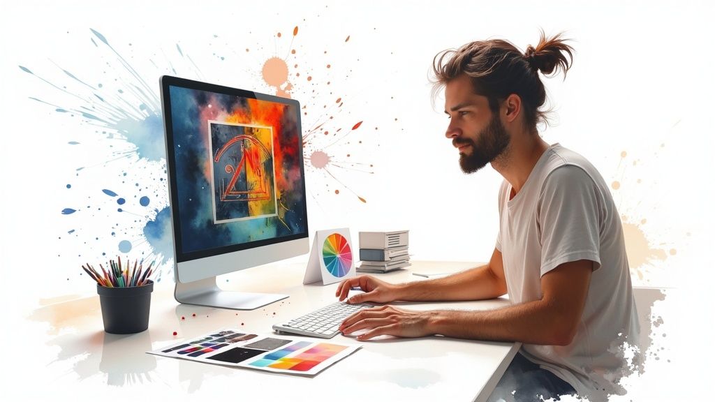 story
story Converting RGB to CMYK for Print: Essential Tips & Guide
Why Your Screen Colors Look Different on Paper Ever poured your heart into a design, only to have the printed version look…off? Like a washed-out version of its vibrant on-screen self? I've been there, and it's frustrating. The culprit? Screens and printers use fundamentally different color systems. Your monitor uses RGB (Red, Green, Blue), which is additive . It mixes light to create colors. Imagine shining red, green, and blue flashlights onto a black wall. The more light you add, the brighter and more vibrant the color becomes. Printers, however, use CMYK (Cyan, Magenta, Yellow, Black), a subtractive system. Instead of adding light, CMYK uses inks to absorb it. Think about layering colored cellophane over a white piece of paper. Each layer subtracts some of the light, resulting in darker colors. This core difference is why what you see on your screen doesn't always match what comes out of the printer. This difference in how colors are created means the bright, almost glowing colors you can achieve with RGB often can't be replicated with CMYK. That electric blue logo? Stunning on screen, but likely to be a bit duller when printed. This isn't your printer's fault, it's simply a limitation of CMYK. RGB has a much wider color gamut than CMYK–it can simply create more colors. In fact, around 20% of RGB colors don't have a direct CMYK equivalent. This inevitably leads to color shifts during the conversion process. Discover more insights into RGB and CMYK color gamuts. So, what's a designer to do? We can’t just design in RGB and cross our fingers. We need to be mindful of CMYK limitations from the start. This might mean opting for slightly less saturated colors in our designs or using clever techniques to give the illusion of vibrancy on the printed page. For instance, if you're looking for flyer printing, check out 4OVER4's options . Understanding this fundamental difference is the first step to getting consistent color across different media. Mastering Color Profiles That Actually Matter Let's be honest, color profiles can feel like a bit of a mystery, even for seasoned designers. ICC profiles are essential for preventing color mismatches between your screen and the final printed piece, but they're often overlooked. Think of them as your insurance policy against unexpected color shifts – and who doesn't want that peace of mind? We're going to demystify this whole process and help you pick the right profile every single time, whether you're printing locally, with a high-end magazine, or even with an overseas manufacturer. Understanding the difference between Coated , Uncoated , and Web profiles is the key. Let me give you some real-world examples of how these profiles can save your project (and your budget!). Imagine you're designing a brochure, and the colors on your screen are vibrant and eye-catching. You send it off to the printer, and when it comes back, the colors look dull and lifeless. What happened? You probably printed on uncoated paper without using the correct profile. An "Uncoated" profile compensates for the paper's absorbency, keeping your colors bright and true to your original design. Similarly, "Coated" profiles are designed for glossy paper stocks, preventing colors from becoming overly saturated. Think of a high-gloss magazine – you want the colors to be rich and vibrant, but not so intense that they lose detail. The right coated profile helps achieve that balance. Let's say you're printing a photography book. You've spent hours perfecting the colors, and you want them to be absolutely spot-on in the final product. A coated profile like PSO Coated v3 would be a great choice for ensuring accurate color reproduction on glossy paper. But what if you're working on a flyer for a local event, something printed on a more standard, uncoated paper stock? In that case, an uncoated profile like GRACoL 2013 Uncoated is likely a better fit. And for web printing, where speed is of the essence, profiles like SWOP v5 Web Coated are designed specifically for the inks and paper types used in that process. Setting Up Your Workspace Now, let's talk about making this whole process easier. Wouldn't it be great if your design software automatically applied the correct profile every time you started a new project? You can absolutely set this up in the Adobe Creative Suite . Imagine opening a new Illustrator document, and it already has the right CMYK profile for your regular printer. No more last-minute panics about color mismatches! This simple step streamlines your workflow and ensures consistent results across all your projects. To help you choose the right profile for your next print job, I've put together this handy table: Essential CMYK Color Profiles for Every Project The most important CMYK profiles every designer should know, when to use them, and what makes each one unique. Profile Name Best Use Case Paper Type Geographic Standard PSO Coated v3 High-quality photo books, magazines Glossy/Coated Europe (primarily) GRACoL 2013 Uncoated Flyers, brochures, stationery Uncoated/Matte North America SWOP v5 Web Coated High-speed web offset printing Glossy/Coated North America (newspapers, magazines) Fogra 39 High-quality art prints, proofing Various Europe Japan Color 2011 Coated Print materials for the Japanese market Glossy/Coated Japan This table gives you a starting point for choosing the right profile. Remember to check with your printer for their specific recommendations, as they might have a preferred profile based on their equipment and inks. Mastering color profiles might seem technical, but it's one of the most important things you can do to ensure accurate, stress-free printing. It's the secret to bringing your RGB designs to life in CMYK and creating printed pieces that perfectly match your vision. No more guessing games, just beautiful, consistent color every time. Photoshop Conversion Techniques That Actually Work Let's be honest, converting RGB to CMYK for print can be a real pain. Just switching the color modes in Photoshop often results in dull, lifeless prints that look absolutely nothing like what you see on your screen. It's a common trap, but any professional print shop will tell you it's a recipe for disaster. They see these poorly converted files all the time, and it makes their job so much harder. So, how do the pros get it right? They use a smarter approach that maintains image quality and produces reliable results. One key difference you need to understand is "Convert to Profile" versus "Assign Profile." They might sound similar, but they have drastically different effects on your images. "Convert to Profile" actually changes the underlying color data in your file. It's like translating the colors from the language of RGB to the language of CMYK. This is exactly what you want for print. "Assign Profile," on the other hand, just tells Photoshop how to interpret the color data, not change it. This is useful for color management workflows, but it's not what we're after when converting for print. This infographic shows the color shift that happens when converting from the larger RGB gamut to the smaller CMYK gamut . See how the vibrant RGB colors on the left become more subdued in their CMYK versions on the right? This highlights why understanding these color spaces is so important. This screenshot shows you the "Convert to Profile" dialog box in Photoshop. This is where the magic happens. You select the specific CMYK profile that matches your printer's settings, which ensures accurate color translation. Look closely, and you'll see options for rendering intent and black point compensation – these give you precise control over how the colors are mapped. Another vital technique is soft proofing . Think of it as a preview of your print. Soft proofing shows you how your colors will look when printed, letting you fix any issues before they end up costing you money. It's more than just seeing a muted version of your image. It's about spotting out-of-gamut colors and making adjustments that make your design printable without compromising your artistic vision. Pros use soft proofing all the time to avoid costly reprints and make sure the final printed piece matches their original idea. Because of this, many print professionals will tell you to make all image corrections in RGB before converting to CMYK. This helps to minimize color shifts and keep your final print true to your digital design. Learn more about color management for print here. Designing brochures? Check out 4OVER4's brochure printing options to see how these techniques translate to the real world. By mastering these Photoshop techniques, you'll take control of the conversion process and get prints that actually reflect your creative vision. Vector Graphics and Logo Conversion Strategies Converting logos and vector artwork to CMYK for print can be tricky. Seriously, mess up a client's brand colors and you're in for it! Unlike photos, vector graphics don't always convert predictably. What looks perfect in Photoshop might come out wonky in Illustrator . Trust me, I've learned this the hard way. Let's talk about some crucial things to keep in mind. One thing that always got me was the difference between Illustrator's and Photoshop's color engines. Even with identical CMYK settings, the output can be different. Illustrator sometimes throws slightly different CMYK values because of how it handles conversions internally. Understanding this little quirk is key to getting predictable, consistent results. I always double-check color values after conversion in both programs. It saves a lot of headaches later. For photographers looking to improve their print post-processing, checking out resources on Photography Editing can be a great help. Complex illustrations with gradients, drop shadows, and transparency effects can also be a pain. These elements can cause all sorts of problems on press if they aren't converted correctly. My workflow involves carefully checking each element in Illustrator and making absolutely sure all colors are defined in CMYK. With gradients, I sometimes simplify them into shapes with solid CMYK fills. This helps avoid banding or weird color shifts when printing. This is especially important when working with logos destined for business cards – something as simple as a business card can make or break a first impression, so make sure you check out all the options available, such as those provided by 4OVER4's business cards printing . Converting RGB to CMYK is a fundamental process in graphic design, ensuring that digital creations translate accurately to print. InDesign is a lifesaver when dealing with documents that mix RGB photos and CMYK vector elements. I rely heavily on InDesign's ability to manage color profiles for different parts of a document. This keeps the color consistent across everything, even when the elements come from different applications. Finally, knowing when to use spot colors instead of process colors (CMYK) is really important. Spot colors are pre-mixed inks that give you absolute color accuracy, whereas process colors rely on CMYK combinations. For important brand logos or super-specific color matches, I always go with spot colors. This guarantees the final printed piece will be exactly the color the client wants, no matter what printing process or paper stock is used. Brand consistency is everything, and this helps keep it locked in. Soft Proofing: Your Preview of Print Reality Soft proofing. It's like holding a magnifying glass up to your work before it hits the printing press. Think of it as a dress rehearsal for your print project, a chance to catch those sneaky color gremlins before they wreak havoc on your final product (and your budget!). Trust me, I've learned this the hard way. Nothing worse than a vibrant blue sky in your design file turning into a dull, washed-out mess on the final printed poster. Soft proofing saves you from those headaches. When preparing visuals for print, solid graphic design principles help. Graphics Design offers some helpful resources on this topic. Understanding Soft Proofing So, how does this digital magic work? Soft proofing essentially simulates what your printed piece will look like on your monitor. It uses your selected CMYK profile and rendering intent to translate your RGB design into a preview of the printer's output. It's like a sneak peek behind the curtain, letting you see how your colors will actually appear on paper before you commit to a full print run, saving you from costly reprints and keeping your clients happy. Let's say you're working on a vibrant brochure design. On your screen, the colors pop, everything looks fantastic. But then you soft proof, using the correct CMYK profile for your printer, and bam – those vibrant colors look a little duller. That's the difference between the wider color gamut of RGB and the limitations of CMYK in print. Soft proofing allows you to see this discrepancy before it's too late, so you can adjust your design accordingly. Soft Proofing Settings To truly unlock the power of soft proofing, you need to understand the settings. One of the most important is the rendering intent . Think of it as the director of your color conversion, controlling how colors that are outside the CMYK gamut are handled. You've got four main options: Perceptual , Saturation , Relative Colorimetric , and Absolute Colorimetric . Perceptual: This one tries to preserve the overall visual relationship between colors, even if it means shifting them a bit. Great for photographs. Saturation: This one prioritizes vibrant, saturated colors, making it good for graphics, but sometimes at the expense of color accuracy. Relative Colorimetric: This one tries to match the colors as closely as possible, keeping the white point of the source image. Good for maintaining color accuracy when feasible. Absolute Colorimetric: Similar to Relative, but it also simulates the paper color, giving you the most accurate preview of the final print. Good for proofing specific colors. Black point compensation is another critical setting. It manages how black is handled during the conversion, making sure your shadows retain detail and your overall image contrast stays sharp. Without it, things can get muddy fast. Different Print Scenarios, Different Settings Now, here’s the thing. Every print job is different. You wouldn’t use the same settings for printing on newspaper as you would for a high-gloss magazine, right? Different paper stocks, different inks, different printers – they all have their own quirks. I've put together a handy table to guide you through some common scenarios: To give you a clearer understanding of how to tailor your soft proofing setup, I've compiled this table: Soft Proofing Settings for Different Print Jobs Print Scenario Rendering Intent Color Profile Black Point Compensation Newspaper Relative Colorimetric SWOP v2 Yes Glossy Magazine Perceptual PSO Coated v3 Yes Matte Brochure Relative Colorimetric GRACoL 2013 Uncoated Yes Art Print Absolute Colorimetric Fogra 39 Yes This table gives you a solid starting point. However, I always recommend chatting with your printer. They know their equipment and processes best and can offer specific recommendations. By mastering soft proofing and understanding how these settings interact with the RGB to CMYK conversion for print, you’ll ensure your final pieces look exactly as you envisioned. Solving Common Conversion Nightmares Converting RGB to CMYK for print can be tricky. Even when you think you’ve nailed it, some colors just have a mind of their own. It's like they're rebelling against the very idea of print! Truth is, some colors just can't be replicated in CMYK. Knowing how to tackle these issues is a key skill for any designer. Let's look at some of the usual suspects. Out-of-Gamut Colors Ever designed something with a vibrant, almost neon green, only to see it go dull and lifeless in CMYK? That's an out-of-gamut color. RGB has a much wider range of colors than CMYK, meaning some RGB colors simply don’t have a CMYK equivalent. One solution? Find a similar, more muted color within the CMYK range. It won't be identical , but it'll be the closest you can get. If you absolutely need that neon green, consider a spot color . Spot colors are pre-mixed inks that can hit those out-of-gamut colors, but they’ll add to your printing costs. Shifting Skin Tones Another common problem is skin tones changing during conversion. A warm, healthy complexion can suddenly look sickly or even greenish. I’ve lost count of how many times I've seen this happen! This often comes down to how different CMYK profiles handle conversions. The fix? Soft proofing. By using the right CMYK profile for your printer and paper in Photoshop or Illustrator , you can see these shifts and fix them before printing. A small tweak to the original RGB image can prevent a lot of headaches. Troubled Brand Colors Brand colors can be a real pain point. Imagine a client's logo looking washed out in print. Yikes! Consistency is everything with brand colors. Soft proofing is crucial here, too. You might also think about spot colors for logos, especially if they have out-of-gamut colors. This helps ensure a perfect match. It's a small detail, but it makes a big difference for maintaining brand integrity. Interestingly, RGB to CMYK conversion was even used in CPU benchmarks back in the early 2000s, highlighting its importance in digital image processing. Client Communication Sometimes, the hardest part isn’t the technical stuff, but managing client expectations. Ever had a client insist their neon green logo has to look exactly the same in print? Clear communication is essential. Explain the limitations of CMYK printing simply. Show them soft proofs. Offer options like spot colors. A little compromise can go a long way in saving everyone time, money, and frustration. For more inspiration on printing projects like postcards, check out 4OVER4's postcard printing options . By mastering these troubleshooting tips and communicating clearly, you’ll be able to handle even the trickiest color conversions and get great print results every time. Your Bulletproof Print-Ready Export System So, you've nailed the RGB to CMYK conversion, soft proofed your masterpiece, and you're ready to send files to the printer. This is where it all comes together—or falls apart spectacularly. A solid export process prevents those frantic late-night calls about missing fonts or color mishaps. Let's build a system for creating print-ready files that will make your printer love you and guarantee you consistent results every single time. Think about the export settings you'll need for different projects. Business cards aren't going to use the same settings as, say, a giant banner. Even seemingly small details can really mess things up. I once had a poster print with jagged edges because I forgot to embed the fonts. Rookie mistake, but it cost me. Learn these little quirks early and save yourself the trouble. 4OVER4's Sales Sheets printing options can be a good real-world example of how settings change for different projects. Packaging your files the right way is also key. Give your printer everything they need to do their job well. That means including fonts, linked images, and the correct color profiles. It also means clear file names and a sensible folder structure. Trust me, I've learned this one the hard way. A chaotic mess of files just leads to confusion and errors. Organized files make everyone's life easier. Creating a Sustainable Filing System Speaking of organization, a good filing system is gold. Imagine being able to instantly find settings from past projects! This saves so much time and helps keep that high quality your clients expect. I use a cloud-based system with labeled folders for each client and project. I can find anything in seconds, even years later. In the U.S., most commercial printers want files in CMYK for accurate color. This makes sure what you see on screen matches what comes out of the printer. Discover more insights about CMYK printing. The Final Check Lastly, double-check everything. Before hitting "send," take a moment to go through your checklist. Right color profiles? Fonts embedded? All files included? This extra step can prevent a major headache. A bulletproof print-ready export system isn't just about the tech stuff, it's about having a reliable process that lets your creative work shine. Ready to take your printing to the next level? 4OVER4 offers a bunch of high-quality printing options, from business cards to huge banners. Explore 4OVER4's comprehensive printing services today!
 story
story The Difference Between Matte and Gloss Finishes for Printing
When you’re deciding on a finish for your print project, it boils down to one core question: do you want understated elegance or a high-impact visual punch? The fundamental difference is simple: a matte finish offers a non-reflective, sophisticated feel that’s perfect for readability, while a gloss finish provides a high-shine, vibrant look that makes colors pop. Your choice hinges on the experience you want to create. Matte vs Gloss A Quick Comparison for Your Print Needs Picking between matte and gloss isn't just about looks; it's a strategic move that shapes how your audience perceives your brand. One finish whispers modern sophistication, while the other shouts with energy and excitement. This decision influences everything from the tactile feel of a business card to the visual pop of a promotional flyer. Let's break down the core attributes. Matte finishes are all about their muted, non-reflective surface. They diffuse light instead of reflecting it, which cuts down on glare and makes text-heavy designs a breeze to read, no matter the lighting. On the flip side, gloss finishes have a highly reflective coating that cranks up color saturation and contrast. This creates a brilliant, eye-catching effect that’s perfect for photo-heavy designs and marketing materials that need to grab attention instantly. Key Differences at a Glance Matte vs Gloss Finish To make your choice easier, this table breaks down the essential characteristics of each finish. Use it as a quick reference to match your project's goals with the right visual and functional feel. Characteristic Matte Finish Gloss Finish Visual Appeal Understated, elegant, modern Vibrant, high-impact, sharp Surface Texture Smooth, velvety, non-reflective Slick, shiny, reflective Durability Hides fingerprints and smudges More prone to showing smudges Readability Excellent, minimal glare Can have glare under direct light Best For Text-heavy designs, writeable items Photo-heavy layouts, bold colors Think of this table as your starting point. The best finish depends entirely on the job at hand—a luxurious catalog might call for matte, while a concert poster would benefit from gloss. How Market Trends Influence Your Choice The debate between these two popular finishes is also playing out in the broader industry. In the high-grade printing papers market, currently valued at around $15 billion USD , matte papers actually hold the dominant market share. But gloss isn't going anywhere; it holds strong in specific niches, especially for commercial marketing materials that small businesses count on for brand impact. Matte is often the go-to for a premium, tactile experience, conveying a sense of quality and professionalism. It’s perfect for items that will be handled frequently, as it resists smudging. Ultimately, the best choice is the one that aligns with your brand's personality and what the printed piece needs to do . Here at 4OVER4, we provide a massive array of options to ensure your vision comes to life exactly as you imagined. You can explore our collection of fantastic finishes to see just how different coatings can elevate your projects. Understanding the Visual and Tactile Experience Choosing between a matte or gloss finish isn't just about looks—it’s about the entire sensory experience you create. The way a print feels in a customer’s hands and how it reacts to light directly shapes their perception of your brand. At its core, the difference between the two comes down to how each surface handles light. A matte finish is all about diffusing light. On a microscopic level, its surface isn't perfectly flat, which causes light rays to scatter in all directions. It's this scattering that kills the glare, giving you a soft, even appearance that’s incredibly easy on the eyes. Gloss, on the other hand, is built for reflection. Its surface is ultra-smooth and coated, acting like a tiny mirror that bounces light directly back. This is what gives glossy prints their signature shine and makes colors feel so deep and punchy. The Understated Sophistication of Matte The real magic of a matte finish lies in its subtle, tactile elegance. It has a smooth, almost velvety texture that just begs to be touched, and it won’t show off every single fingerprint. This quality makes it a perfect fit for items meant to be handled, like high-end business cards, catalogs, or menus. Functionally, its biggest strength is its non-reflective nature. Think about reading a brochure under bright office lights or out in the sun—a matte surface keeps the text perfectly legible without any distracting shine. Visual Effect: Delivers a muted, modern, and sophisticated look. Best Use Case: Text-heavy designs where readability is the top priority. Brand Perception: Projects professionalism, authenticity, and refined quality. For an even more luxurious feel, there’s soft-touch , a specialized version that takes the tactile experience to another level. If you want a print that feels truly memorable, you can learn more about the unique appeal of our soft touch printing options . It adds a suede-like texture that feels completely distinct and high-end. A matte finish communicates confidence through subtlety. It doesn’t need to shout for attention with bright reflections; its quality is communicated through its refined look and feel, making it a powerful choice for luxury brands and professional services. This understated quality also lets your design and typography shine. Colors on matte paper appear softer and more natural, which is ideal for artistic prints or designs with an earthy, organic palette. The Dynamic Energy of Gloss A gloss finish is designed to make a visual impact. That slick, reflective coating makes colors pop with an intensity that matte just can't replicate. The smooth surface allows for maximum color saturation, so images look sharper and more vibrant. This makes gloss the undisputed champion for anything photo-heavy. Imagine a travel postcard with a breathtaking landscape or a product catalog where every item needs to look its absolute best. The shine adds a layer of energy that immediately grabs your attention. Of course, that reflectivity has its trade-offs. Under direct light, the glare can sometimes hide details or make text a bit harder to read. It's also a magnet for fingerprints and smudges, which is something to keep in mind for pieces that will be handled a lot. Comparing the Sensory Impact To really get a feel for the difference, let’s break down how each finish shapes the user experience in different situations. Sensory Aspect Matte Finish Gloss Finish Light Interaction Diffuses light, preventing glare Reflects light, creating shine Color Appearance Softer, more natural tones Saturated, vibrant, and bold colors Tactile Sensation Smooth, velvety, and natural Slick, smooth, and coated Handling Prints Resists fingerprints and smudges Easily shows smudges and prints Ultimately, your choice sends a message. Matte whispers quality and sophistication, while gloss shouts with vibrancy and energy. Choosing the Right Finish for Your Print Products Knowing the difference between matte and gloss is one thing, but applying that knowledge to your actual print materials is where your brand strategy really takes shape. The right finish can elevate a product's entire purpose, but the wrong one can be a functional disaster. I always tell clients to think about the job the product needs to do first , then pick the finish that helps it get done. This is far more than just an aesthetic choice. It's a strategic decision that shapes how customers interact with your brand and perceive its quality. Let's move from theory to practice and see how to pick the perfect finish for some of the most common print products we handle every day. Business Cards That Make an Impression Your business card is a handshake in paper form, so the finish you choose says a lot about you. When it comes to matte vs. gloss, the decision usually boils down to two things: writability and brand personality. A matte finish is the undisputed champion for networking events. Its smooth, non-reflective surface is perfect for jotting down a quick note or meeting time—a small detail that can make a huge difference. This finish gives off a vibe of modern professionalism and quiet confidence, making it a go-to for consultants, designers, and any brand that wants a sophisticated, high-end feel. On the other hand, a gloss finish is all about visual punch. It makes colors and logos practically jump off the card, creating an energetic and memorable first impression. This is a fantastic option for photographers, artists, and brands in vibrant industries where a bold look is essential. Just remember, its slick surface is almost impossible to write on, which can be a major functional drawback. When selecting finishes for business cards , it's important to consider how different options impact the tactile and visual experience, as well as their longevity. Postcards and Flyers That Capture Attention For direct mail like postcards and promotional flyers, the goal is to grab someone's attention in a split second. The best choice here really hinges on your design's core elements. Is it packed with text, or is it all about the imagery? Gloss is often the winner for visual impact. Its high-shine surface makes photos look incredibly sharp and colors feel deeply saturated. A glossy postcard featuring a stunning travel destination or a vibrant product is far more likely to stand out in a stack of mail. Matte works best for informational flyers. If your design is text-heavy, a matte finish guarantees maximum readability by cutting out any glare. It also lends a more premium, less "salesy" feel, which can be really effective for invitations, event announcements, or high-end service promotions. Whether you're sending out event invites or showcasing a new product, we have a huge range of business cards printing options that can be adapted for any promotional need, letting you pick the finish that perfectly suits your message. Packaging and Labels That Sell Packaging is your silent salesperson on a crowded shelf or during that crucial unboxing moment. The finish you choose can completely transform how a customer perceives the product inside. A matte finish on packaging instantly signals luxury and quality. Its smooth, velvety texture creates a premium unboxing experience and is often associated with organic, high-end, or minimalist brands. It feels sophisticated and has the practical benefit of not showing fingerprints. A gloss finish, in contrast, is built for the retail shelf. That reflective surface catches the light and draws the eye, making your product pop against the competition. It communicates energy and vibrancy, making it a great fit for food products, cosmetics, and electronics where a bold, clean look is key. Banners and Signage Built for Visibility When it comes to large-format printing like banners and posters, lighting is everything. The choice between matte and gloss here is almost purely about function. Matte is the professional standard for indoor signage, especially for things like trade show backdrops or conference displays. The non-reflective surface guarantees your message is visible from every angle without being washed out by harsh overhead lighting or camera flashes. Gloss can work for outdoor banners where you want colors to pop in natural daylight. However, its tendency to create glare can be a real problem, so you have to use it strategically where direct, harsh light won't be an issue. The global coated paper market, which is projected to hit USD 32.1 billion , reflects these trends. While gloss-coated papers have long dominated for high-shine applications, the real growth is now in matte-coated variants used in premium sectors—exactly what retailers and eCommerce brands need for their custom labels and packaging. To make things even clearer, here’s a quick-reference table to guide your next print project. Recommended Finishes for Common Print Materials This table breaks down my go-to recommendations for different marketing materials, along with the reasoning behind each choice. Print Product Recommended Finish Why It Works Best Business Cards Matte Perfect for writability and projecting a sophisticated, modern brand identity. Postcards Gloss Maximizes color vibrancy and visual impact for designs that are heavy on photos. Packaging Matte for luxury, Gloss for retail Matte delivers a premium unboxing experience; gloss grabs attention on crowded shelves. Indoor Banners Matte Eliminates distracting glare from indoor lighting, ensuring your message is always readable. Ultimately, the goal is to match the finish to the function. Thinking through how, where, and by whom your printed piece will be used is the key to making a choice that not only looks great but also works perfectly. Durability and Production: A Look Under the Hood Beyond just the look and feel, your choice between a matte and gloss finish goes right down to the microscopic level, dictating how the final piece holds up over time and how it behaves during production. Getting these technical details right is crucial. It's the difference between a menu that looks worn out after a week and one that stays crisp, or an art print that feels premium versus one that just feels… printed. It all starts with the paper's porosity. Matte paper is naturally more porous, so it drinks up the ink. This absorption is what gives matte prints their signature soft, subdued look—an effect that can lend a really sophisticated, organic quality to a design. Glossy paper, on the other hand, is coated with a smooth, non-porous layer. The ink sits right on top of this slick surface instead of sinking in. This is exactly why colors on gloss prints pop with such sharpness and vibrancy; light reflects directly off that top layer of ink. The Role of Lamination and Varnish To really dial in the durability and create some unique visual effects, we often add protective layers like lamination or varnish after printing. These aren't just for protection; they're powerful design tools that can either crank up a surface's natural look or create a really cool contrast. Gloss Lamination on Matte Prints: This is a classic move to get the best of both worlds. You start with a sturdy, high-quality matte paper base, then add a high-shine gloss laminate. The result? A protected, moisture-resistant piece with colors that really sing. Matte Lamination on Gloss Prints: While less common, this technique can be used to dial back the intense shine of a gloss print while keeping some of that color vibrancy. It creates a unique, muted effect with a smooth, protective feel. Spot UV on Matte Surfaces: This is where things get really interesting. We apply a glossy, clear UV coating to specific parts of a matte print—like a logo or a headline. The contrast between the flat, non-reflective background and the shiny, slightly raised Spot UV is a total showstopper, creating a tactile experience that begs to be touched. Protective finishes do more than just guard against wear and tear; they are a strategic design tool. A simple layer of lamination can transform a standard print into a durable, premium product that feels substantial and reinforces brand quality. For any business looking to add that extra layer of resilience and professionalism, exploring different laminating options is a must. It’s a small step in production that can dramatically extend the life of anything that gets handled often. Durability Showdown: Fingerprints and Scratches How a print stands up to being handled is a huge deal, especially for things like business cards, brochures, and packaging. In this arena, matte and gloss finishes have very different strengths. A gloss finish is a magnet for fingerprints, smudges, and fine scratches. Its reflective surface highlights every single imperfection, which is why it’s not the best choice for dark-colored designs that people will be touching constantly. On the plus side, its slick coating is great at resisting moisture and can be wiped clean in a snap. A matte finish is the undisputed champion of hiding imperfections. The non-reflective surface diffuses light, making fingerprints and minor scuffs practically invisible. This makes it the go-to for any print product that will be passed around, shoved in a bag, or handled on the regular. And while standard matte paper can be vulnerable to moisture, adding a matte lamination gives it all the protection it needs without losing that elegant, understated look. Production Efficiency and Ink Behavior The finish you choose also has real-world consequences for printing efficiency. Because matte paper is so absorbent, ink dries on it much faster. This is a massive advantage in any print environment where quick turnarounds are the name of the game. In fact, matte papers are a huge part of the growth in inkjet printing, holding a 28% share , while glossy finishes have settled into their niche for photo-quality and high-impact prints. From a practical standpoint, the faster drying time of matte stock can cut down on digital print rejects by 10-15% —a major consideration for any time-sensitive job. This kind of efficiency makes matte a reliable and cost-effective workhorse for a massive range of projects, from simple flyers to intricate catalogs. Preparing Design Files for Matte and Gloss Printing Moving a design from your screen to a printed piece involves more than just hitting "save." Your choice between a matte or gloss finish will fundamentally change how your design looks and feels, and prepping your files the right way is crucial for getting the result you want. Each finish interacts with ink and light differently, which means you need to make specific tweaks to your color, contrast, and layout. Proper file preparation is really about thinking ahead. A design that looks amazing on a glossy proof can fall flat and lifeless on a matte stock. On the flip side, a file set up for matte paper might look oversaturated and lose important details in the glare of a gloss finish. Nailing this from the start saves you from the headache and cost of a reprint. Optimizing Files for a Matte Finish Matte paper is naturally porous, which means it soaks up a bit of ink. This tends to soften colors and can slightly dial down the contrast. To get ahead of this, your design files need a little extra oomph to keep them from looking washed out. The key is to boost the contrast and saturation in your images, but don't go overboard. A small bump of about 5-10% is usually all it takes to make sure your design stays vibrant without looking artificial. This little adjustment helps colors pop and stay defined instead of looking dull. Here's a pro tip for matte prints: pay close attention to your blacks. A standard 100% K (black) can sometimes print as more of a dark gray. For a true, deep black that really anchors your design, use a rich black formula like C=60, M=40, Y=40, K=100 . Fine-Tuning Designs for a Gloss Finish Glossy finishes are born to make colors pop, but that reflective surface comes with its own set of challenges. The high shine can create a serious glare, which is a big problem for designs with large, dark-colored areas. Those dark patches can act like little mirrors, completely hiding important text or details. When you're designing for gloss, it's a good idea to avoid overly dark or busy backgrounds , especially where reflections could interfere with your main message. If you’re using photos, make sure they are high-resolution and sharp; the gloss finish will highlight every single detail, for better or for worse. Any blurriness or pixelation will be much more obvious. For those looking to personalize their prints, understanding techniques like Variable Data Printing (VDP) can also be a huge help when getting your files ready for either finish. Here are a few quick tips for prepping gloss files: Check Your Blacks: Just like with matte, use a rich black formula. This will give you the deepest, most impactful black possible and prevent it from looking thin. Mind the Glare: Try to place important text and logos away from large, dark sections where reflections are most likely to cause trouble. Use High-Resolution Images: This is non-negotiable. Always use images that are at least 300 DPI to guarantee they look crisp and professional. If you want to create an even more striking effect, think about using gloss selectively. Techniques like Spot UV let you apply a high-gloss finish to specific parts of a design on a matte surface, creating an incredible visual and tactile contrast. You can see how this works and get inspired by exploring our Spot UV printed products , which can truly take any design to the next level. Making the Final Decision for Your Brand So, how do you make the final call? The choice between matte and gloss isn't just about what looks good—it's a strategic move that needs to sync up with your brand's core message. It’s about communication. To get it right, you need to filter your decision through three critical lenses: your brand identity, your target audience, and the specific job your printed piece needs to do. Think of it like this: your brand has a voice, and the finish is its tone. Is your brand minimalist, eco-conscious, or all about understated luxury? Then you'll almost certainly lean toward the tactile, subtle feel of a matte finish. On the flip side, if you're a high-energy tech startup or a vibrant retail brand that needs to project excitement and boldness, the high-impact shine of gloss is your perfect match. Aligning Finish with Audience and Use Case Next up, picture who will be holding this piece and what you want them to do with it. A corporate client receiving a business proposal expects a certain level of sophistication, making a smudge-resistant matte finish the clear professional choice. But a consumer grabbing a promotional flyer from a counter? You need to captivate them instantly, and that's where gloss has the edge for grabbing attention in a split second. The final piece of the puzzle is the specific use case. An informational brochure packed with text has to be easy to read, which makes matte the hands-down winner. A photo-heavy postcard designed to sell a tropical vacation needs that color to pop, something only a gloss finish can truly deliver. Your print finish is the final word in your brand's printed statement. Matte whispers sophistication and quality, while gloss shouts with energy and confidence. The right choice ensures that the final word resonates perfectly with your intended message. This decision-tree flowchart can help you visualize the process, walking you from file prep to the ideal finish based on what your project needs to achieve. As you can see, the path splits depending on whether your design is all about texture and readability (hello, matte) or visual punch and sharpness (gloss is your guy). By carefully thinking through these three pillars— Brand Identity, Target Audience, and Use Case —you move beyond simple preference and make a truly strategic choice. This ensures your final product not only looks incredible but also works perfectly to reinforce your brand’s message and nail your marketing goals. Frequently Asked Questions When you're weighing the pros and cons of matte vs. gloss, a few practical questions always seem to pop up. Let's tackle some of the most common ones to help you lock in your decision with confidence. Is a Matte or Gloss Finish More Expensive? For most standard print jobs, the cost difference between a matte and gloss finish is pretty much negligible—if there’s any difference at all. What really moves the needle on your final price are things like paper weight, how many you’re ordering, and any special add-ons like a protective lamination or a fancy spot UV coating. Honestly, opting for a thicker paper stock or adding a laminate will have a much bigger impact on your budget than the base finish. The best way to see the real-time difference for your project is to jump on an instant online pricing tool and compare directly. Can I Write on a Gloss Finish? Trying to write on a high-gloss finish with a regular pen is a recipe for frustration. The surface is slick and non-porous, meaning the ink has nowhere to go. It just sits on top, leading to immediate smudging and smearing. If your piece is meant to be written on—think appointment cards, feedback forms, or notepads—a matte or uncoated finish is the only practical choice . It gives pens the grip they need, ensuring your customers can jot down notes smoothly without any fuss. Choosing a matte finish for any interactive print material isn't just an aesthetic choice; it's a crucial functional one. It guarantees the piece is actually usable, which is every bit as important as how it looks. Which Finish Is Better for Photos? This one really comes down to the vibe you're going for. There’s no single "better" option, just the right choice for your specific creative vision. Glossy finishes make colors pop with incredible vibrancy and sharpness. This is your go-to for commercial photography, product catalogs, or any image that needs to jump off the page with high contrast and deep saturation. Matte finishes offer a more subdued, artistic feel with zero glare. It’s often the preferred choice for fine art prints, portraits, and gallery-style displays where annoying reflections would just get in the way of the viewing experience. Does One Finish Last Longer Than the Other? Both finishes are plenty durable, but they have different superpowers. A gloss finish, particularly one with a UV coating, is a champion against moisture and can be wiped clean in a second. Its kryptonite, however, is that it shows off every single fingerprint and tiny scratch. On the other hand, a matte finish is fantastic at hiding smudges and scuffs . This makes it a much smarter choice for items that will be handled a lot, like restaurant menus, brochures, or book covers. At 4OVER4 , we give you the options you need to get every single detail just right. Take a look at our full range of printing services to find the perfect match for your brand. Start your project on 4over4.com .
 story
story The Difference Between Matte and Glossy Print Finishes
The real difference between matte and glossy boils down to a single element: light. How does the paper's surface interact with it? A matte finish is like a sponge for light; it absorbs it, leaving you with a sophisticated, glare-free surface that feels incredibly smooth and refined. On the flip side, a glossy finish acts like a mirror, reflecting light to create that signature shiny, vibrant look that makes colors leap off the page. Breaking Down Matte and Glossy Finishes Choosing between matte and glossy is more than just an aesthetic preference—it's a strategic decision that shapes how customers see and interact with your brand. This choice impacts everything from how easily your text can be read under bright lights to the material's durability against smudges and fingerprints. Getting a handle on these key differences is the first step toward picking the finish that truly works for your project. Core Characteristics At A Glance When you see these two finishes side-by-side, their unique strengths become obvious. One brings a subtle, understated elegance, while the other is all about delivering a high-impact visual punch. This quick table breaks down where each one really shines. Matte vs Glossy Quick Comparison Attribute Matte Finish Glossy Finish Light Reflection Absorbs light for a flat, non-reflective surface Reflects light, creating a shiny, vibrant look Color Appearance Colors appear more subdued and muted Colors look deep, saturated, and high-contrast Fingerprints/Smudges Highly resistant to smudges and fingerprints Shows smudges and fingerprints easily Writability Excellent; easy to write on with pens or pencils Poor; most inks will smear or fail to stick Tactile Feel Smooth, velvety, and natural to the touch Slick, smooth, and feels coated Each finish clearly has its own personality and purpose. Situational Use And Perception A matte surface is the go-to for a modern, professional vibe. Its glare-free nature is perfect for designs heavy on text—think brochures, catalogs, and business cards where you absolutely need readability to be top-notch. The finish feels premium in your hand and does a much better job of hiding wear from being handled. Glossy, on the other hand, is built to grab attention. That reflective coating makes photos and bold graphics look incredibly sharp and dynamic. It’s no surprise it’s a favorite for promotional flyers, photo prints, and product labels where the visual appeal is the most important thing. Key Takeaway: Your choice isn't just about looks—it's about function. Matte prioritizes readability and a sophisticated feel, while glossy emphasizes color vibrancy and immediate visual impact. Ultimately, the best finish comes down to your brand identity and what you're trying to achieve. And don't forget, the world of finishes extends beyond paper. Materials like acrylic offer their own unique properties, like the beautiful Matt Acrylic finishes for house number signs . These types of finishes are often protected with extra coatings, and you can learn more about the benefits of professional laminating right here on our site. Comparing Visual Impact and Tactile Experience The choice between a matte and glossy finish is one of the first, and most important, decisions you'll make. It fundamentally changes how someone sees and feels your printed material. That initial sensory reaction—the blend of sight and touch—sets the tone for their entire perception of your brand. This isn't just about looks; it's a strategic move that shapes the user experience from the very first contact. A glossy finish is all about high-impact visuals. Its slick, reflective surface acts like a mini-amplifier for your design, making colors appear more saturated and vibrant. Light bounces off the coating, creating a sharp, high-contrast look that makes images and graphics feel dynamic and energetic. This is exactly why glossy is the go-to for promotional materials like flyers, product labels, and photo-heavy brochures where the goal is to grab attention instantly. On the other hand, a matte finish offers a more subtle, sophisticated appeal. It absorbs light instead of reflecting it, which kills glare and creates a soft, muted effect. This non-reflective quality is a massive advantage for readability, especially for designs heavy on text, like catalogs, informational pamphlets, and premium invitations. Under direct lighting where a glossy piece would be unreadable, a matte surface stays clear and legible from any angle. The Unspoken Language of Touch Beyond what the eye sees, the feel of a finish communicates volumes about your brand's quality and personality. This is where the distinction becomes even more pronounced. A glossy finish feels slick and smooth. Its almost glass-like texture is modern and clean, but it can also feel a bit impersonal or commercial. That's not a bad thing; for a product label or a sales flyer, this smooth, protective feel can convey durability and professionalism. It’s built to be looked at more than held. A matte finish, however, provides a natural, tactile sensation. It often feels velvety or silky, inviting the recipient to hold and engage with the item. This texture creates an immediate impression of quality and thoughtfulness. It feels more organic and less manufactured, making it perfect for brands aiming for an elegant, approachable, or high-end identity. Key Insight: Glossy finishes command attention with visual loudness, creating an exciting, high-energy impression. Matte finishes invite closer inspection through understated elegance and a pleasing tactile feel, suggesting sophistication and quality. Comparing Sensory Scenarios To really get the practical difference, let's put these finishes in a couple of real-world situations where their visual and tactile qualities are put to the test. Scenario 1: The High-End Spa Brochure Glossy: The vibrant photos of serene landscapes would pop, but the high-sheen surface might feel cold and clinical. The glare could also make reading the service descriptions a pain under the spa's ambient lighting. Matte: The non-reflective surface would ensure every detail is easily readable. More importantly, the soft, velvety texture would align perfectly with the brand's promise of a relaxing, premium, and tactile experience. Scenario 2: The Nightclub Event Flyer Matte: A matte finish would likely look too subdued and fail to capture the high-energy atmosphere. It could easily get lost in a sea of other promo materials. Glossy: The slick, shiny surface would catch the light, making the flyer impossible to ignore. The deep blacks and vibrant colors would scream excitement and energy, perfectly matching the event's vibe. For those looking to take the tactile experience even further, exploring finishes like soft-touch printing can elevate a design to a whole new level. This finish takes the velvety feel of matte and dials it up, creating an incredibly memorable and luxurious sensation that reinforces a premium brand message. It combines the visual subtlety of matte with a texture that truly has to be felt to be believed. Durability and Real-World Use Looks aren't everything. The real test of a print finish comes down to how it performs in the wild. How a piece stands up to handling, wear, and tear is just as critical as its first impression. This is where the practical differences between matte and glossy finishes can make or break your project's long-term success. A glossy finish brings a slick, protective coating to the table, giving it a clear edge in durability against spills and moisture. Think of it as a built-in sealant. This makes it a great choice for things that need to survive a bit of a beating, like restaurant menus, heavy-duty flyers, or product packaging that might get splashed. But that shine comes with a catch. Glossy surfaces are absolute magnets for fingerprints and smudges. Every touch leaves its mark, which can quickly turn a clean design into a messy-looking piece. This is a huge downside for anything that's meant to be passed around and handled a lot. The Smudge Factor This is where matte finishes really shine—figuratively, of course. The non-reflective, slightly porous surface is incredibly forgiving when it comes to fingerprints. Because it doesn't catch the light, oils from skin are far less noticeable, keeping your print looking clean and professional even after it’s been handled by multiple people. This quality makes matte the hands-down winner for: Business Cards: They get passed around constantly. A matte card keeps its sharp, sophisticated look without collecting a gallery of fingerprints. Presentation Folders: These are opened, closed, and shared during meetings. Smudge resistance is a must to maintain a professional feel. Catalogs and Lookbooks: People will be flipping through these pages over and over. A matte finish keeps the focus on your products, not on distracting smudges. The market backs this up. While glossy finishes still dominate the USD 15.3 billion coated paper market for vibrant ads, matte is carving out its own territory. Matte photo printing, for instance, has grown to claim about 35% of all photo print sales, largely because it’s practical, glare-free, and perfect for items that are displayed and viewed often. Can You Write On It? One of the biggest functional deal-breakers is writability. A matte surface, being uncoated or having a porous coating, is perfect for absorbing ink from a pen or pencil without smudging. This isn't just a nice-to-have; it's an absolute must for any print piece that needs to be written on. Think about appointment cards, postcards, or feedback forms. A matte finish gives you a smooth, effortless writing experience. Trying to write on a standard glossy surface, on the other hand, is a recipe for frustration. The ink just beads up and smears, making it completely useless for taking notes. Crucial Detail: If your print material needs any kind of handwriting—a signature, a personal note, or filled-out information—a matte finish is the only way to go. Glossy simply won't work. If you need serious durability but still want that eye-catching shine, consider an upgrade. Our gloss laminated printed products add an extra protective layer that boosts durability while delivering that high-impact sheen. Ultimately, the best choice aligns your finish with how the item will actually be used day-to-day, creating a product that’s not just beautiful but perfectly practical. Choosing the Right Finish for Your Print Project Moving from theory to practice is where you can really see the impact of a great finish. The difference between matte and glossy isn't just a tiny aesthetic detail—it's a strategic decision that shapes how people interact with your brand. The right choice can make your message sing, while the wrong one can create a total disconnect between your design and its purpose. This is where your marketing goals meet a tangible product. It’s all about asking the right questions. What’s the main job of this printed piece? Who’s going to handle it, and where will they see it? Answering these questions is the key to picking the perfect finish every single time. Business Cards: Premium Introduction or Bold Statement? Your business card is often the very first piece of your brand someone physically holds. Do you want it to feel like a premium, writable surface or a bold, can't-miss-it introduction? This is the classic matte vs. glossy dilemma. A matte finish on a business card has a certain quiet confidence. It’s sophisticated, feels great to the touch, and resists fingerprints. Best of all, it's easy to write on. This is huge for networking events, letting a new contact jot down a quick note that creates a more personal connection. On the flip side, a glossy business card is all about making a high-impact first impression. That slick, shiny surface makes colors and logos leap off the card, grabbing attention instantly. It's a fantastic choice for photographers, artists, or any brand built on vibrant, dynamic visuals. Brochures and Flyers: Information vs. Imagery The job of your brochure or flyer should directly inform its finish. Are you handing out a text-heavy guide, or is it an image-rich promo piece meant to wow people? Your answer will point you straight to the right choice. For informational flyers, spec sheets, or event programs where readability is everything, matte is the clear winner . Its non-reflective surface keeps the text legible under any light, from bright trade show floors to dim conference rooms. The focus stays squarely on the information. But for travel brochures, real estate flyers, or product catalogs filled with stunning photography, glossy is the way to go . The high-shine coating punches up color saturation and contrast, making images look crisp, deep, and totally irresistible. The goal here is visual appeal, and a glossy finish absolutely delivers. Situational Insight: Always think about the viewing environment. If your materials will be seen under direct, harsh lighting, a matte finish is almost always the safer and more effective bet to avoid frustrating glare. Photo Printing: Commercial Vibrancy vs. Fine Art Subtlety The world of photo printing provides another perfect example of the matte vs. glossy divide. Here, the artistic style and intended use of the photograph should be your guide. Glossy finishes are perfect for commercial photography, headshots, or any image that needs to pop with incredible sharpness and color. The reflective coating boosts color depth, making photos feel energetic and alive. It's the standard for prints designed to capture attention fast. For fine art prints, portraits meant for framing, or moody black-and-white photography, a matte finish is usually the preferred choice. It kills distracting reflections, allowing the viewer to appreciate the texture, composition, and emotion of the image without any interference from glare. It just adds a layer of timeless sophistication. Labels and Posters: Grabbing Attention vs. Creating Atmosphere Labels and posters have very different jobs, and their finishes should reflect that. A product label on a crowded shelf needs to shout for attention, while a decorative poster might be aiming for a more artistic, atmospheric vibe. A glossy label helps a product stand out. The shine catches the light, drawing the eye and making the packaging look polished and professional—a huge advantage for products with colorful branding. A matte poster , on the other hand, can create a more elegant, gallery-quality look. It's ideal for designs with subtle color palettes or detailed illustrations where glare would just obscure the finer points. Understanding visual hierarchy is key here; learning about what makes a good book cover can offer great insights into how finishes shape a design's impact. Ultimately, your project’s intent should guide your decision. By aligning your finish with your goals, you create a far more cohesive and effective printed piece. You can explore our full range of fantastic finishes to see exactly which option will bring your vision to life. Going Deeper: Production and Advanced Finishing Knowing the basic difference between matte and glossy is a great start, but the real magic happens when you start thinking about how your finish works with other production details. Moving past a simple paper choice opens up a whole world of creative options, letting you mix textures and effects for a final product that people will remember. Honestly, the cost difference between a standard matte and a standard glossy paper stock is usually tiny—if there's any difference at all. This frees you up to make a choice based on what looks and feels right, not what your budget dictates. Things change, however, once you start adding specialty finishes to the mix. Combining Finishes for Real Impact This is where print design gets fun. Using one finish as a canvas for another can create incredible contrast and a powerful tactile experience. A matte surface, because it’s non-reflective and almost soft to the touch, makes the perfect backdrop for high-impact additions that need to pop. One of the most effective pairings out there is a matte laminate with a spot UV coating. The matte background stays elegant and understated, while the glossy Spot UV is applied only to specific areas—maybe your logo, a headline, or a key graphic. This creates a stunning contrast between the flat, velvety feel of the matte and the slick, raised shine of the gloss. Key Design Principle: The greater the contrast, the stronger the impact. Pairing a non-reflective matte base with a highly reflective element like Spot UV or foil creates a dynamic sensory experience that draws the eye and invites touch. This technique is a game-changer for: Luxury Business Cards: A matte card with a glossy logo feels instantly premium and sophisticated. Book or Catalog Covers: Highlighting the title or a key image with Spot UV makes it jump right off the shelf. Invitations and Packaging: Adding this tactile element makes the recipient feel like they are holding something genuinely special. You can see how to create these stunning visual effects by exploring our complete range of Spot UV printed products , all designed to make your key design elements stand out. Production, Cost, and Environmental Factors While the base paper costs are pretty similar, adding specialty finishes like foil stamping, embossing, or die-cutting will definitely affect the final price. These processes require extra setup and precision, but that investment often pays for itself by creating a product that leaves a lasting impression and signals a high level of quality. Environmental considerations are also more important than ever for many brands. The good news is that you don't have to sacrifice sustainability for your preferred finish. Eco-friendly and recycled paper options are widely available for both matte and glossy stocks. Choosing a recycled matte paper for your annual report or a sustainably sourced glossy stock for your flyers lets you align your print marketing with your company's values. The modern printing market has evolved to support these kinds of nuanced choices. As digital and on-demand printing continue to grow, the practical differences between matte and glossy have become even more defined. The global paper printing market is projected to keep expanding, with coated stocks—including matte, satin, and glossy—expected to command 42.0% of market revenue because of how well they enhance brand impact. This continued demand really highlights how important it is to make an informed decision about your finish. Making Your Final Decision: A Practical Checklist Picking between a matte and glossy finish can feel like a tough call, but it gets a whole lot simpler once you lock in on your project's main goal. To land on the right choice, it's smart to run through a few key questions that cut to the heart of how your printed piece will actually be used out in the wild. This isn't just about looks; it's about making sure the finish serves its purpose. Answering these questions will point you toward a confident decision, ensuring your final product isn't just beautiful but perfectly suited for its job. Think of this as the final check to nail your vision. Key Questions to Guide Your Choice Before you hit that order button, take a second to go through this quick checklist. Your answers should make the winner crystal clear, getting rid of any last-minute doubts about the difference between matte and glossy for your specific project. Is readability under bright lights a top priority? If your item is going to be seen under direct sun or bright indoor lighting—think trade show booths— matte is your best bet . Its non-reflective surface cuts out glare completely, making sure your text stays crisp and easy to read from any angle. Do your photos need to scream with color? For designs where bold, punchy images are the star of the show, glossy is the way to go . That reflective coating makes colors pop, deepens blacks, and gives your photos a sharp, high-contrast look that grabs attention instantly. This decision tree gives you a visual path for choosing a finish based on whether you're aiming for high-impact visuals or working within a specific budget. As you can see, the path splits based on what matters most for your project, leading you straight to the most logical finish. Will the item be handled a lot? For things like business cards, presentation folders, or catalogs that get passed around, choose matte . It’s a champ at resisting fingerprints and smudges, keeping a clean, professional look no matter how many hands it passes through. Do you need to be able to write on it? This one’s a deal-breaker. If you need to write on your printed piece—like for appointment cards, postcards, or forms— you have to choose matte . Ink simply won't stick to a standard glossy surface and will smear right off. Final Takeaway: The "best" finish isn't universal—it's the one that best serves your project's function. Let practicality be your guide. By thinking through these points, you can move from just knowing the options to making a confident decision. The next step? See and feel the difference for yourself. Take a look at our product options and think about ordering a sample pack to experience firsthand how each finish can bring your design to life. A Few Final Questions About Print Finishes Even after breaking down all the differences, you probably have a few specific questions bouncing around before you click "order." Let's clear those up right now so you can choose with total confidence and get a final product that looks exactly like you imagined. I've pulled together the most common questions we get, covering everything from business cards to the nitty-gritty of special finishes. Is a Matte or Glossy Finish Better for Business Cards? Honestly, it all comes down to the personality of your brand and the vibe you're going for. There’s no single "best" choice. A matte finish gives off a modern, almost understated, sophisticated feel. It’s fantastic in networking situations because it doesn't show fingerprints, and you can easily jot down a quick note on it. If you want a card that feels premium and classic, matte is an excellent way to go. On the other hand, a glossy finish is all about being bold and grabbing attention. It makes colors practically jump off the card and gives your logo a vibrant punch. This finish is perfect for designs heavy on images or for brands with a high-energy, dynamic identity. If making a bright, high-impact first impression is your goal, glossy delivers every time. Does a Glossy Finish Make Photos Look Higher Quality? Glossy finishes definitely amplify vibrancy, sharpness, and color depth, which is what many people associate with "high quality" in promotional or commercial photos. It creates that classic, shiny photograph look that makes images feel dynamic and full of life. But "higher quality" can be subjective. For fine art photography, portraits, or gallery prints, a matte finish is often the preferred choice because it completely eliminates glare. This lets the viewer connect with the image's texture, composition, and emotion without any distracting reflections. Think of it this way: glossy delivers visual "pop," while matte offers a professional, glare-free experience perfect for display. Can I Add Spot UV or Foil Stamping to Both Finishes? Yes, you absolutely can add specialty finishes like Spot UV or foil stamping to both matte and glossy papers. However, the visual payoff is way more dramatic on a matte surface. There's just something powerful about the contrast you get when you add a slick, glossy Spot UV or a shimmering metallic foil onto a flat, non-reflective matte background. That play between textures makes the design element stand out in a way that people can both see and feel. While you can technically apply these effects to an already glossy paper, the contrast is much more subtle and can get a bit lost. For maximum impact that really draws the eye, we almost always recommend using a matte base for these kinds of premium finishes. Which Finish Is More Expensive, Matte or Glossy? For most of our standard print products—think flyers, business cards, and brochures—there's usually little to no price difference between our standard matte and glossy paper options. Your decision should really be driven by what works best for your design and brand, not a tiny price gap. Of course, costs can change if you're looking at premium papers or specialty laminates. The best way to know for sure is to use the instant price calculator on any product page. It will give you accurate, real-time costs for whatever you're building. Ready to see and feel the difference for yourself? At 4OVER4 , you can explore a full range of high-quality print options and use our online designer to create the perfect materials for your brand. Start your print project today!