Content Hub
Stories, Ideas and Advice — Page 83
 story
story A Guide to Food Packaging Labels
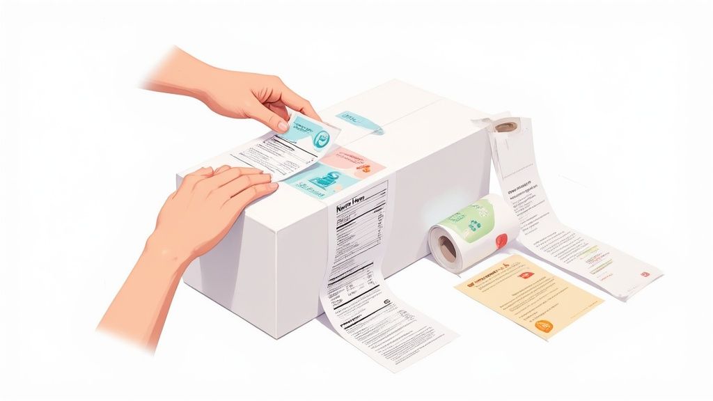
Think of your food packaging label as your product's most important salesperson. It's also its legal passport. It’s the one tool you have to grab a shopper's attention with incredible branding, while at the same time, communicating all the critical safety and nutritional info required by law. Nailing this balance isn't just important—it's everything. What Are Food Packaging Labels and Why Are They Critical? Imagine your label as the silent ambassador for your product. In the few seconds a customer spends scanning a packed supermarket shelf, your label has to do all the talking. It’s a tiny but mighty marketing vehicle that tells your brand’s story, values, and personality through color, fonts, and imagery. A great label can make a product feel premium, healthy, or fun before a single word is even read. But it’s so much more than just a pretty face. The label also acts as a crucial legal document—a pact of trust between you and your buyer. It has to accurately list all the legally required information to keep consumers safe and informed. This dual responsibility makes creating a label a delicate balancing act. The Two Core Functions of Every Label Every single effective food label does two things really well. If you drop the ball on either one, you're looking at poor sales, legal headaches, or a brand reputation that's hard to fix. Marketing and Branding: This is your label's "voice." It’s responsible for cutting through the noise, building brand recognition, and convincing a customer to put your product in their cart. Information and Compliance: This is your label's "passport." It guarantees the product meets all regulatory standards by providing key data like ingredients, allergens, and nutritional facts. Without this, your product can't legally make the trip from the shelf to the checkout line. Your label isn't just another piece of your packaging; it is the direct interface between your product and your customer. It must be clear, compelling, and compliant to build the trust you need for a lasting relationship. The sheer scale of the industry just magnifies how important this is. The global food packaging market was valued at USD 505.27 billion in 2024 and is expected to hit USD 815.51 billion by 2032 . This explosive growth shows just how much we rely on packaged goods and, by extension, the labels that inform and protect us. Ultimately, mastering the art and science of food packaging labels isn't optional. It’s a fundamental requirement for any food business that wants to build a loyal following and find real success. Whether you're an artisanal startup or a household name, getting your labels right is key, which is why exploring a wide range of custom packaging products is such a critical first step. Understanding the Anatomy of a Food Label Think of a food label as a contract between you and your customer. It’s a promise of what’s inside, presented in a very specific, legally-required way. This isn't just about good design; it’s about federal law and consumer safety. Agencies like the FDA have a list of non-negotiables— five core components that absolutely must be on your food packaging labels. Getting these elements right is the bedrock of a compliant and trustworthy product. Let's break down each of these five critical pieces so you know exactly what’s required. The Statement of Identity and Net Quantity First things first, you have to answer two very basic questions for any shopper: "What is this?" and "How much am I getting?" Statement of Identity: This is simply the common name of the food. It needs to be front and center on the Principal Display Panel (PDP) —that’s the part of the package a customer is most likely to see on the shelf. You can't get creative here; if you're selling a fruit-flavored drink, you can't call it "juice" unless it legally meets that definition. Net Quantity of Contents: This tells the customer how much product is in the package. It must be stated in both metric (grams, milliliters) and U.S. Customary units (ounces, fluid ounces). Like the identity statement, this info has to live on the PDP, usually within the bottom third of the panel. These two components are the most straightforward, but they're the essential handshake with your customer. The Nutrition Facts Panel This is probably the most recognized part of any food label. The Nutrition Facts panel is a standardized chart that gives consumers a consistent, easy-to-read breakdown of the product's nutritional content. Its format is strictly regulated for a reason—it allows shoppers to make quick, apples-to-apples comparisons between different products. The panel lays out key information like serving size, calories, total fat, cholesterol, sodium, carbohydrates, and protein . The FDA has even updated the design to better serve today's health-conscious consumers. Here’s a look at the FDA’s updated label, which features bolder text for calories and more realistic serving sizes. This new look makes it much easier for people to find the information they need to make healthy choices on the fly. The Nutrition Facts panel is more than just a list of numbers; it’s a public health tool. Its standardized format empowers people to take control of their diet, turning a simple grocery run into an informed health decision. Another key part of this panel is the Universal Product Code (UPC) . This scannable barcode is the key to retail sales and inventory tracking. To get your products ready for the checkout line, it's crucial to understand the requirements for printing barcodes for your packaging . Ingredient List and Allergen Declaration Now we get to the parts of the label that are most critical for consumer safety. The ingredient list and allergen declaration are all about transparency, giving people the information they need to avoid potentially life-threatening reactions. Ingredient List: This section must list every single ingredient in the product. The catch? They have to be ordered by weight, from the most prominent ingredient down to the least. It’s a straightforward way to show customers exactly what they’re eating. Allergen Declaration: This one is a huge deal. Federal law mandates that the eight major food allergens must be clearly called out. They are: Milk Eggs Fish Crustacean shellfish Tree nuts Peanuts Wheat Soybeans You have to declare these using a "Contains" statement right after the ingredient list (for example, " Contains Wheat, Milk, and Soy "). This isn't optional, and getting it wrong is one of the fastest ways to trigger a product recall. These five elements form the foundation of a label that not only meets legal standards but also builds the trust you need to succeed. Choosing the Right Materials and Finishes The information on your label is critical, but the material it’s printed on is what makes sure that message actually survives the journey. Think of it this way: you wouldn’t wear a paper suit in the rain. Your label needs the right "outfit" for its environment, whether it's sitting pretty in the freezer aisle or getting splashed in a steamy kitchen. A label’s physical makeup—its base material, adhesive, and top finish—dictates how it looks, feels, and performs. Nailing this choice is about more than just aesthetics; it’s what prevents annoying issues like peeling, smudging, or fading that can make a great product look cheap. Getting this right is fundamental to creating effective food packaging labels that look professional from your facility all the way to a customer’s pantry. Common Label Materials And Their Best Uses While the world of label materials is huge, most food products stick to a handful of tried-and-true options. Each one has its own personality and purpose, and understanding the differences is the first step to making a smart investment in your product's presentation. Here’s a look at the most popular choices: Paper Labels: This is the classic, go-to option for dry goods. It’s cost-effective and perfect for things like coffee bags, snack packaging, and spice jars. Paper gives off a natural, sometimes rustic vibe, but it’s the worst enemy of moisture and oil, making it a no-go for refrigerated or wet products. Polypropylene (BOPP) Labels: Biaxially-Oriented Polypropylene is a tough plastic film that shrugs off water, oil, and most chemicals. This makes it the champion for anything that might face condensation, refrigeration, or spills—think beverage bottles, sauce jars, and frozen foods. Vinyl Labels: Known for its killer durability and flexibility, vinyl is the material you choose for the toughest jobs. It’s perfect for outdoor use or for labels that need to hug a weirdly curved surface without complaining. It’s a more premium choice that stands up to harsh conditions without tearing or fading. For any items that will live in a damp environment, exploring a range of custom waterproof labels is the only way to guarantee your branding stays sharp and intact. To help you visualize the trade-offs, here’s a quick comparison of the most common materials used for food packaging labels. Comparison of Common Food Label Materials This table breaks down the characteristics, ideal use cases, and cost implications of popular label materials to help you make an informed choice for your product. Material Type Key Features Best For Cost Level Paper Cost-effective, natural look and feel, easy to print. Dry goods, short-term use, products not exposed to moisture. Low Polypropylene (BOPP) Water and oil-resistant, durable, clear or opaque. Beverages, refrigerated items, sauces, cosmetics. Medium Vinyl Extremely durable, flexible, weatherproof, UV-resistant. Outdoor products, curved surfaces, long-term applications. High Recycled Paper Eco-friendly, rustic aesthetic, good for branding. Dry goods, organic products, brands with a sustainability focus. Medium Choosing the right material is a balancing act between performance, aesthetics, and budget. BOPP often hits the sweet spot for many food products, but don't discount paper for dry goods or vinyl when you need something truly indestructible. Selecting The Perfect Adhesive And Finish Okay, so you’ve picked your base material. Now for the next layers: the adhesive that sticks it on and the finish that gives it that final pop. The adhesive is the unsung hero holding everything together, while the finish is the final touch that defines the label’s entire look and feel. The right glue needs to work with both your label material and your container’s surface. A standard permanent adhesive handles most jobs just fine, but you'll need specialized options for tricky surfaces or conditions. For instance, a freezer-grade adhesive is non-negotiable for products headed for cold storage—otherwise, you’ll find your labels peeling off and lying sadly at the bottom of the freezer. The finish, on the other hand, is all about visual appeal and adding an extra layer of protection. The finish on a food label is like the final coat of paint on a car. It not only provides the desired sheen but also protects everything underneath from the elements, ensuring the design stays vibrant and scuff-free. Here are the main players when it comes to finishes: Gloss: A shiny, reflective finish that makes colors explode off the label. It’s fantastic for grabbing attention on a crowded shelf and adds a nice bit of moisture resistance. Matte: A smooth, non-reflective finish that gives off a more subdued, elegant, and modern vibe. It cuts down on glare, which makes text much easier to read. Lamination: This involves applying a thin plastic film over the entire label for maximum-security protection. It shields against moisture, scuffs, and UV light, making it the top choice for products that will be handled a lot or exposed to the elements. The Growing Importance Of Eco-Friendly Options Sustainability isn't just a buzzword anymore; it’s a major driver in how people shop. Because of this, the demand for eco-friendly label materials is through the roof. Options like recycled paper, compostable PLA (polylactic acid), and other biodegradable materials are becoming mainstream, letting brands match their packaging to their green values. This isn’t a small trend. The global labels market, valued at USD 43.21 billion in 2024 , is expected to hit USD 64.97 billion by 2032 . A huge part of that growth is fueled by innovations in printing and a massive push toward sustainable materials. Choosing eco-friendly labels isn't just good for the planet—it can seriously boost your brand's reputation and win over the ever-growing crowd of environmentally conscious shoppers. Designing a Food Label That Captures Attention Once you’ve navigated the maze of regulations, it’s time to shift gears from the science of compliance to the art of attraction. A legally perfect label is completely wasted if it just blends into the background on a crowded grocery store shelf. Your design is your first handshake with a potential customer, telling your brand's story in a split second and convincing a busy shopper to stop, look, and choose your product over all the others. Think of your label's design as a conversation starter in a very loud room. You have just a few seconds to make an impression. It's not just about looking good, either—research shows that 72% of American consumers say a product's packaging design directly influences their decision to buy it. Powerful visuals aren't just a nice-to-have; they are a core driver of sales for all types of food packaging labels . Establishing a Clear Visual Hierarchy Visual hierarchy is the secret sauce to a clean, effective label. It's simply the practice of arranging design elements to guide the viewer’s eye, making sure they see the most important information first. Without a clear hierarchy, your label becomes a cluttered mess of text and images that just overwhelms and confuses the customer. Your brand name and the product's identity should be the undisputed heroes of the label. Make them the most prominent elements, followed by any key selling points or certifications that set you apart. The mandatory info, while crucial, can be smaller and placed where it doesn’t fight for attention with your main marketing message. To create a food label that truly stands out, it needs to be part of a cohesive brand identity. For great insights on building a strong brand from the ground up, it's worth developing a winning branding strategy . Leveraging Color and Typography Color and font choices are the emotional heart of your design. They communicate your brand’s personality long before a single word is ever read. Are you a fun, kid-friendly snack? Bright, bold colors might be your ticket. An organic, all-natural product? Muted, earthy tones will probably connect better with your audience. The psychology of color is a powerful tool in your design kit: Green: Almost universally signals health, nature, and organic qualities. Red: Can create feelings of excitement, energy, and even stimulate the appetite. Blue: Tends to convey a sense of trust, reliability, and calm. Black/Gold: Often used together to create a feeling of luxury and premium quality. Typography works the same way. A playful, rounded font is a great fit for a candy brand, while a clean, elegant serif font might feel more at home on a bag of artisanal coffee. The key is choosing a font that’s not only on-brand but also highly legible, even at a small size. Your label's design isn't just decoration; it's a strategic communication tool. Every color choice, font selection, and element placement should work together to tell a cohesive story that resonates with your target audience. The Power of Finishes and Embellishments Sometimes, what a customer can feel is just as important as what they can see. Special finishes add a layer of sophistication that can elevate a product from ordinary to premium, making your package stand out in a truly tangible way. These extra touches signal high quality and a keen attention to detail. Consider incorporating elements that catch both the light and the eye: Foil Stamping: Adds a brilliant metallic shine to logos or text, creating an instant look of luxury. Embossing/Debossing: Creates a raised or recessed 3D texture that adds physical depth and a premium feel. Spot UV: Applies a glossy, reflective coating to specific areas, making them pop against a matte background. These techniques can turn a standard label into a memorable sensory experience. For brands looking to add that extra sparkle, exploring options like custom metallic foil printing can make a huge difference in shelf appeal. At the end of the day, a well-designed label balances legal requirements with creative flair, turning a simple package into a powerful sales tool. Selecting the Best Printing Method for Your Needs Once your design is locked in and you’ve picked your materials, the last piece of the puzzle is bringing it all to life. Choosing the right printing method for your food packaging labels isn't just a technical detail—it’s a major business decision. It directly impacts your cost per label, how fast you can get them, and the final look of your branding on the shelf. Think of it like picking a vehicle. You wouldn't take a race car on a cross-country family road trip, and you wouldn’t use a moving van for a quick run to the corner store. The two main printing methods, digital and flexographic , are just like that—perfectly suited for very different jobs. The Rise of Digital Printing Digital printing is the modern champ when it comes to flexibility and speed. It works a lot like a high-end desktop printer, transferring your digital design file directly onto the label material using inks or toners. The magic here is that there are no custom plates involved, which means setup is almost instant. This is a complete game-changer for startups, seasonal product launches, or any business that needs small-to-medium batches of labels. Got a new hot sauce with five different flavors? Digital printing lets you produce a short run of each without a huge upfront investment. You can get a closer look at how it works by exploring our guide to custom digital printing services . Digital printing gives you incredible agility. It’s the perfect tool for brands that need to test new designs, react quickly to market trends, or produce vibrant, multi-colored labels in smaller batches without breaking the bank. With no plate fees and minimal setup, digital is the clear winner for quick turnarounds and cost-effective small orders. The Power of Flexographic Printing Flexographic printing, or "flexo" for short, is the time-tested workhorse of the label industry. This method is more like a classic printing press. It uses flexible photopolymer plates to transfer ink onto the label stock at incredibly high speeds. Each color in your design needs its own custom plate, which means there are significant initial setup costs and a bit of a wait. But here’s the trade-off: once that press starts rolling, the cost per label drops dramatically. This makes flexo the undisputed king for massive print runs. If you're a national brand cranking out hundreds of thousands of identical labels for a flagship product, the efficiency and rock-bottom per-unit cost of flexo are impossible to beat. This method really shines with simpler designs and is amazingly consistent over long runs, ensuring every single label looks exactly like the last. Making the Right Choice for Your Business So, how do you decide? The best method comes down to your specific needs, balancing your order volume, budget, and design complexity. The demand for great food packaging labels is a huge driver in the global packaging market. The sector was valued at about USD 58.2 billion in 2025 and is expected to hit around USD 91.2 billion by 2035 . This growth is almost entirely fueled by the food and beverage industry's need for high-quality, efficient labeling. You can check out more insights on this growing market and its trends . Here’s a quick breakdown to help you make the call: Choose Digital Printing if you: Need small to medium quantities (think under 10,000 labels). Need a fast turnaround. Like, yesterday. Have complex, photo-quality designs with lots of colors. Are printing several variations of a single label design. Choose Flexographic Printing if you: Need massive quantities (tens of thousands or more). Have a simpler design with fewer colors ( 1-3 is the sweet spot). Are laser-focused on the lowest possible cost per label. Can wait a bit longer for the initial setup and plate creation. Ultimately, this decision will shape your production budget and how quickly you can adapt to change. A startup thrives on digital's low barrier to entry and flexibility, while a large-scale producer cashes in on flexo's unbeatable economy of scale. Frequently Asked Questions About Food Labels Once you start digging into the world of food packaging, a lot of specific questions pop up. Let's tackle some of the most common ones I hear from brands to help you sidestep any expensive compliance headaches. What If My Package Is Too Small for a Standard Label? This is a classic problem for anyone selling things like spice jars, lip balms, or those single-serving snack packs. The good news is the FDA knows you can't shrink text to an unreadable size and offers a few workarounds for small packages. For instance, if your total label space is less than 12 square inches, you might be allowed to put the manufacturer's contact info on the package and then provide the full Nutrition Facts panel online or via a phone number. Just be sure to comb through the specific regulations to make sure your product actually qualifies for these exemptions. What Are the Rules for "Natural" or "Organic" Claims? These are powerful words on a label, but you can’t just slap them on your packaging. Using them the wrong way is a surefire way to land in legal trouble. Organic: This one is tightly regulated by the USDA. To call your product "organic," it has to be certified by a USDA-accredited agent. It's not an all-or-nothing claim, either—there are different tiers like " 100% Organic ," " Organic " (at least 95% organic ingredients), and " Made with Organic Ingredients " (at least 70% ). Natural: This term is a bit fuzzier. The FDA's general take is that a food is "natural" if it doesn’t contain artificial or synthetic stuff. The catch? This policy doesn't cover production methods, like the use of pesticides, which makes it a hotly debated and sometimes confusing claim for shoppers. While "natural" can be a valuable descriptor, the term "organic" carries the weight of a federally regulated and verified certification. This makes the organic seal a much stronger signal of specific production standards to consumers. Do I Need a "Made in USA" Label? Putting "Made in USA" on your product is totally voluntary. But if you decide to go for it, you have to play by the Federal Trade Commission's (FTC) very strict rules. The standard is that " all or virtually all " of the product must be made right here in the United States. This isn't just about final assembly; it means all the major parts and processing that go into creating the product have to be from the U.S. Ready to create food packaging labels that are compliant, beautiful, and effective? At 4OVER4 , we offer a huge range of materials, finishes, and printing options to bring your vision to life. Explore our custom label printing services today.
 story
story How to Create Custom Labels That Convert
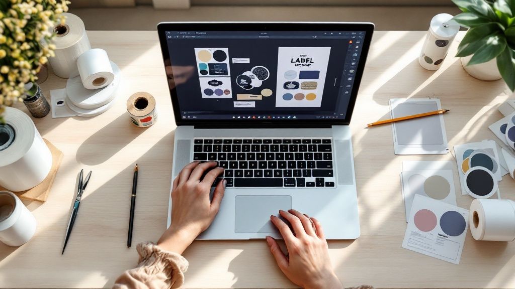
Ready to create your own custom labels? It’s a process that starts long before you pick a font. We’ll walk through how to pin down your label’s real job, choose the right materials, nail the design using online tools, and get it all printed professionally. Taking a moment to plan ensures your label doesn't just look great—it works perfectly for your brand and product. First, Pinpoint Your Label's Purpose and Audience Before you even think about design, you need a solid strategy. Start by asking one simple question: what is this label’s main job? Is it meant to give a boutique candle a high-end feel? Or does it need to display critical FDA-required information on a food package? The answer to that question will steer every single design choice you make from here on out. For instance, a label for an organic skincare product would likely succeed with earthy colors and a clean, minimalist design to attract customers who value natural ingredients. On the flip side, a label for a kids' snack needs to be bright, fun, and eye-catching to appeal to a totally different audience. The Upfront Work: Gather Your Must-Have Content Knowing your label's function makes it much easier to pull together all the necessary information before you start designing. Trust me, this little bit of prep work saves you from scrambling at the last minute. Your content checklist should include: Your Logo: This is the non-negotiable anchor of your brand's look. Essential Text: Think product name, net weight, ingredient lists, instructions, or any legal jargon that has to be there. Codes: Do you need a UPC barcode for retail scanning or a QR code to send customers to your website? This initial planning isn't just busywork. It's about creating a compelling brand identity that truly connects with people and makes them want to buy your product. A well-defined strategy prevents your label from becoming just a pretty sticker. It transforms it into a hardworking tool that communicates your brand's value and connects with your specific customer base. This kind of attention to detail is exactly why the demand for custom labels has exploded. The global market is expected to jump from USD 76.7 billion in 2025 to a massive USD 121.5 billion by 2035. This growth is all about brands needing unique packaging and clearer supply chain info. Before you dive into the design tools, use this quick checklist to get your thoughts organized. It helps clarify exactly what you need your label to accomplish. Custom Label Planning Checklist Use this checklist to define your label's core requirements before jumping into the design phase. Planning Step Key Question to Answer Example Primary Goal What's the #1 job of this label? "To make my cold brew bottle look premium on a crowded shelf." Target Audience Who am I trying to reach? "Health-conscious millennials, ages 25-40, who shop at local markets." Product Environment Where will this label live? "It needs to withstand refrigeration and condensation without peeling or smudging." Key Information What text must be on the label? "Logo, product name, net weight, ingredients, 'keep refrigerated'." Brand Vibe What feeling should it evoke? "Minimalist, modern, and trustworthy." Having clear answers to these questions makes the rest of the process—from material selection to final design—infinitely smoother. Choosing the Right Materials and Finishes The material of your label sends a powerful message about your product's quality long before anyone reads a single word. Think of it as your brand's handshake—it can feel flimsy and cheap, or it can feel sturdy and premium. This choice has a huge impact on both your label's look and its ability to survive in the real world. For anything that's going to deal with moisture, condensation, or oil, you'll want to go with BOPP (Biaxially Oriented Polypropylene) . It’s a durable, plastic-based stock that’s waterproof and tear-resistant. I always recommend it for products like beverage bottles, bath items, or anything that lives in a fridge. Classic paper labels, on the other hand, are a fantastic, cost-effective choice for dry goods. They work perfectly for coffee bags, product boxes, or anything that won't be exposed to tough conditions. They also lend a natural, organic feel that a lot of brands are going for these days. Selecting the Perfect Material for Your Product Getting the material right is about more than just aesthetics; it's about performance. Nothing tanks a customer's perception of quality faster than seeing a soggy, peeling paper label on a cold brew bottle. It's a classic rookie mistake, but it's completely avoidable. Here’s a quick breakdown I use to help clients make the right call: Waterproof BOPP: This is your workhorse for anything that will be refrigerated, get wet, or be handled a lot. Think shower gels, beer bottles, and cleaning supplies. Classic Paper: An excellent, budget-friendly option for products that stay dry. It's perfect for product boxes, candle jars, and artisanal food packaging. Textured Estate Paper: If you want your product to scream "luxury," this is it. The subtle texture gives it a tactile, high-end feel that’s ideal for wine bottles, gourmet foods, or premium cosmetics. Remember, the material isn't just a spec on an order form—it's a core part of the customer's experience. The right texture and durability can elevate a simple product into something that feels special and well-crafted. The Finishing Touch: Gloss vs. Matte After you've locked in your material, the finish is what brings your label's personality to life. This single choice can dramatically alter how your colors look and how the label feels to the touch. A high-gloss finish is going to make your colors pop with incredible vibrancy. It also adds a protective layer that helps resist scuffs and moisture, which is great for creating a bold, eye-catching look that stands out on a crowded shelf. On the flip side, a matte finish gives you a smooth, non-reflective surface for a more subtle and elegant aesthetic. It has a modern, sophisticated vibe and is often seen as more luxurious. Ultimately, your choice here should loop back to the brand identity you've been building, making sure everything feels cohesive. Bringing Your Label to Life with an Online Designer Alright, this is where the planning phase ends and the fun begins. You're about to see your label design come to life, and you don't need a graphic design degree to do it. Using a good online design tool, like the one from 4OVER4, is all about making smart choices that reflect your brand, not wrestling with complicated software. The first thing you’ll likely do is pick your label's shape and size. Think about your actual product. A tall, skinny bottle? A wraparound label might be your best bet. A small, squat jar? A simple circle or square could be perfect. This decision is your foundation—it sets the stage for everything else. Mastering Your Layout and Typography A well-balanced layout is your secret weapon. It guides your customer’s eye right where you want it to go. Think in terms of a visual hierarchy: your product name and logo should be the stars of the show. You can make them pop with size, color, or just by giving them prime real estate on the label. Remember, white space is your friend. Avoid the temptation to fill every inch; what you leave out is often as powerful as what you put in. Fonts essentially give your brand a voice. A classic serif font (think Times New Roman) can suggest tradition and reliability, which is great for a heritage brand. On the other hand, a clean sans-serif font (like Helvetica) feels modern and direct, a perfect match for a new tech gadget or a minimalist wellness line. Here's a pro tip that's easy to miss: always respect the safe zone . It's a small margin just inside the trim line of your label. Keeping all your key text and logos within this area ensures nothing important gets chopped off during printing. Trust me, it's a simple step that prevents a lot of headaches. If you want to go deeper, exploring the fundamentals of creative design and branding can make a huge difference. It helps you move from creating a label that just informs to one that truly connects and sells. The process in most online tools is pretty intuitive, just like this graphic shows. It’s really a simple flow: you set up the basics, dive into the details, and end up with a file that’s ready for the press. The Non-Negotiable Rule of High-Resolution Graphics Finally, let's talk about image quality. If there's one area where you absolutely cannot cut corners, this is it. Uploading a low-resolution logo or image will give you a blurry, pixelated print that makes your entire product look amateurish. For a sharp, professional finish, make sure every graphic you upload is a 300 DPI (dots per inch) file. This is the gold standard for quality printing. Whether it's your main logo, a background pattern, or a small icon, high resolution is non-negotiable. It’s what makes the final product look as good in person as it does in your head. Finalizing Your Design and Placing the Order Alright, your design is looking sharp. You’re in the home stretch, but don’t rush to that “order” button just yet. A few careful checks right now will make sure what shows up at your door is exactly what you’ve been picturing. First things first: proofread everything . Seriously. Then, grab a coworker and have them proofread it, too. After you’ve stared at a design for a while, your brain starts to auto-correct, and you can easily miss a tiny typo that a fresh pair of eyes will spot in seconds. This simple step can save you a world of frustration. Configuring Your Order Specifications Once you're absolutely sure the design is perfect, it’s time to dial in the specs for your print run. This is where you tell us exactly how you want your labels made. Your choices here really depend on how you'll be using them. Quantity: How many do you actually need? It's tempting to order a huge batch to get a lower per-label cost, but I always advise a smaller test run first. You can always order more later. Format: Are you going with rolls or sheets ? If you're using a machine to apply thousands of labels, rolls are a no-brainer. They're also great for fast hand application. For smaller projects or when you’re just labeling a few items at a time, sheets are far easier to manage. Think of the final checkout as your last quality control checkpoint. This isn't just a transaction. Triple-check every single detail—your material, finish, quantity, and format—to ensure your vision for how to create custom labels translates perfectly to the final product. Finally, take a close look at the production turnaround time and your shipping options. You need to build these timelines into your own schedule, especially if you have a product launch or an event coming up. Last-minute stress is something we all want to avoid. Getting these final details right is a huge deal. It’s no surprise that the global labelling services market was valued at USD 5.27 billion in 2024 and is projected to hit USD 8.11 billion by 2030. This just goes to show how essential this final step is for businesses trying to stand out. You can learn more about the growth in the labelling services market and see why nailing your label game matters so much. Here is the rewritten section, designed to sound like it was written by an experienced human expert. Expert Tips for Labels That Truly Stand Out Getting the basics right is one thing, but making a label that people actually remember? That's where the real magic happens. A great label doesn't just inform; it acts as a silent salesperson on a crowded shelf. Let's talk about the finishing touches that can make your product impossible to overlook. Add a Touch of Luxury and Texture Special finishes are my go-to recommendation for elevating a design from good to premium. Think about adding a flash of metallic foil stamping —it catches the eye instantly and just screams quality. Imagine a gold foil logo on a dark bottle; it’s a classic for a reason. Another powerful technique is adding physical texture. You can use embossing to raise elements of your design or debossing to press them in. When a customer picks up your product and can literally feel the logo or a pattern, it creates a tactile connection that they won't forget. It’s a subtle detail that makes a huge difference. Connect Your Label to Your Online World Your label is a physical object, but it can be a powerful bridge to your digital presence. This is where a simple QR code comes in handy. It’s no longer just a weird-looking box; customers know exactly what to do with them. A quick scan can do so much more than just take them to your homepage. Try using it to: Tell your brand's story on a dedicated landing page. Unlock an exclusive discount code for a future purchase. Show a video of your product in action. Suddenly, that static label becomes an interactive starting point for a deeper relationship with your customer. It's no surprise that custom labels are dominating the market right now. In 2024 , they represent the biggest slice of the labeling services pie. Why? Because brands know that unique labels are key to standing out and earning customer trust. You can dig into the numbers in this labeling services market analysis . One last piece of advice: always consider the container. I've seen gorgeous label designs fall flat because they were slapped onto a bottle or jar without any thought for its shape. Make sure your design works with the container's curves and lines, not against them. A cohesive look feels deliberate, professional, and ultimately, more appealing. A Few Technical Questions We Hear All the Time When you're diving into designing your own labels, a few technical questions always pop up. Getting these right from the start is the key to making sure what you see on your screen is exactly what you get in your hands. What’s the Best File Format for My Label Design? This is probably the number one question we get, and for good reason. For the absolute best, razor-sharp print quality, you want to use a vector file . Think formats like PDF , AI (Adobe Illustrator), or EPS . These files are built with math, not pixels, so we can scale them up or down without them getting blurry. If you don't have a vector file, a high-quality image file like a JPG or PNG can work. Just make sure it’s saved at 300 DPI (dots per inch) at the final print size. Anything less, and you risk a fuzzy, pixelated look. Can You Explain Print Bleed? Absolutely. "Bleed" sounds a bit strange, but it's a simple and crucial concept. Imagine your design has a solid color background that goes right to the very edge of the label. A bleed is just an extra bit of that background—usually 1/8th of an inch —that extends beyond the label's final cut line. Why does this matter? It gives the cutting machine a little margin for error. Without it, even a microscopic shift during trimming could leave an ugly, unprofessional white sliver along the edge of your finished label. It’s a small step that makes a huge difference. Should I Get My Labels on a Roll or on Sheets? This really comes down to how you plan on using them. Neither is better than the other; they just serve different purposes. Roll Labels: If you're applying a lot of labels, especially with a label applicator machine, rolls are your best friend. They're designed for speed and efficiency in high-volume situations. Sheet Labels: These are perfect for smaller runs or when you're giving them away as part of a promotional package. They're also great if you need to write on them before peeling them off, like for name tags or product samples. Getting a handle on these technical points before you order is a game-changer. It smooths out the whole process of creating custom labels, saves you from headaches, and ensures you get a professional result you'll be proud of. Ready to turn that design into a reality? At 4OVER4 , we've made it incredibly simple to upload your artwork, pick the perfect materials, and get stunning custom labels printed and shipped. Start your custom label order today!
 story
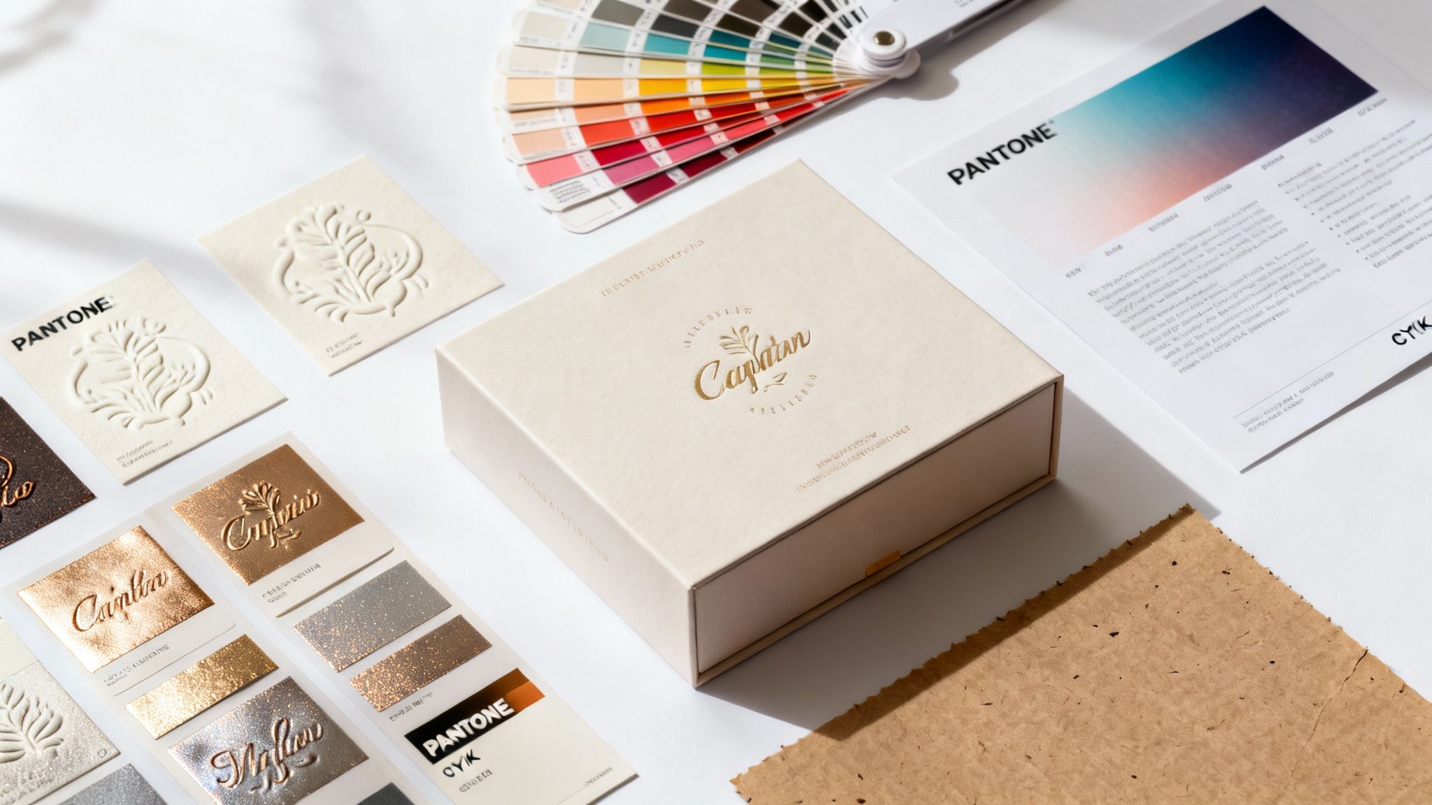
story Paper for Printing Labels: The Ultimate Guide to Papers, Adhesives & Finishes
Picking the right paper for your labels is the very first—and most important—step to getting a professional-looking result. It sounds daunting, but it doesn't have to be. Let's break down exactly what goes into a great label, turning what feels like guesswork into a clear, simple choice. Your Essential Guide to Selecting the Right Label Paper The journey to the perfect label actually starts long before you even think about hitting the "print" button. It begins with the raw material itself. A label is so much more than just sticky paper; it's a critical piece of your product packaging, your branding, and your story. The choices you make about its construction will directly impact how it looks, feels, and holds up in the real world. Nailing this first step ensures your labels are not just eye-catching but also durable and perfectly suited for their job. This guide will walk you through every critical element you need to consider. Core Components of a Perfect Label To make a smart decision, you really only need to think about three foundational pieces of any label stock: Material: Is this label going indoors on a dry product, or does it need to survive moisture, friction, and temperature changes? This is the first question to answer, and it will tell you whether a standard paper or a tough synthetic material is the way to go. Adhesive: Do you need this label to stay put forever, or should it peel off without a fight? Maybe you even need it to be repositionable. The glue is just as important as the paper it’s on. Finish: Are you going for a modern, subtle matte look, or do you want a vibrant, high-gloss shine that pops? The finish is all about aesthetics, but it also adds a layer of protection. A well-chosen label does more than just provide information; it elevates your brand and ensures your message sticks—both literally and figuratively. It’s the handshake that introduces your product to the world. When you're choosing the right label paper, it helps to understand the full picture of pricing solutions, including how paper price labels compare to electronic alternatives . Getting these fundamentals right means your labels will be perfectly suited for their role, from branding a new product to making sure a package gets where it needs to go. For businesses looking to dive into a wide variety of professional choices, you can find tons of options for online labels designed for specific needs. Once you master these basics, you'll have the confidence to pick the perfect paper every single time. Choosing Your Label's Foundation Material Matters The very first decision you’ll make when printing labels is also the most important: the material. This choice is the foundation for everything else, dictating your label's final look, its feel, and just how tough it will be out in the real world. It all boils down to two main families—classic paper stocks and rugged synthetic films. Think of it this way: a standard paper label is like a versatile cotton t-shirt. It’s comfortable, affordable, and gets the job done for most everyday, indoor situations. A synthetic label, on the other hand, is like high-performance activewear. It’s engineered to handle the tough stuff—resisting water, oil, and tearing when durability is the name of the game. The Classic Choice: Paper Labels For a huge number of labeling projects, paper is the undisputed go-to, and for good reason. It’s an incredibly versatile and budget-friendly option, making it the perfect fit for everything from branding on dry goods to shipping labels and organizing your office. The global market for paper-based label stock pulled in roughly USD 15.8 billion in revenue, making up about 30–35% of the entire labels market. It's expected to hit USD 20.8 billion by 2030, driven by huge demand in food, pharma, and e-commerce. In these industries, paper's recyclability and lower cost—often 10–30% less than synthetics—make it the clear favorite. But "paper" isn't just one thing. It comes in a few different flavors, each with its own unique finish: Uncoated Paper: With its natural, porous texture and matte feel, this stock is all about an organic, rustic vibe. It soaks up ink beautifully for a softer, more muted color palette and is a dream to write on. Semi-Gloss Paper: This is the crowd-pleaser, the perfect middle ground. It has a light coating that gives it a subtle sheen, making colors look more vibrant than on uncoated stock without any harsh glare. It’s a professional look that works for countless products. High-Gloss Paper: If you want your colors to scream from the shelf, this is your stock. The shiny, reflective surface makes colors pop with maximum impact. Just know that its slick finish makes it tough to write on. When Durability Is Key: Synthetic Labels When you know your labels are going to face moisture, friction, chemicals, or extreme temperatures, synthetic materials are the only way to go. These plastic-based films are built for pure durability, making sure your message stays put, no matter what. Synthetics offer a level of toughness that paper just can't compete with. It's a similar principle to the careful paper selection for custom playing cards , where durability and finish are non-negotiable to withstand constant handling. For products that will be exposed to the elements or rough handling, investing in a synthetic label isn't just a smart choice—it's a necessity. It guarantees your branding and crucial information survive the product's entire lifecycle. Here are the most common synthetic options you’ll come across: Polypropylene (BOPP): This is one of the most popular synthetic materials out there. It’s resistant to water and oil, which is why you see it on everything from food and beverage containers to cosmetics and bath products. It’s also available in white, metallic, and even totally clear versions. If you’re going for that "no-label" look, you can explore options like our clear labels printing services . Polyester (PET): Seriously tough and heat-resistant, polyester is the material of choice for labeling electronics, appliances, and other assets in industrial settings. It can take on harsh chemicals and serious abrasion without breaking a sweat. Vinyl: Known for its flexibility, vinyl is fantastic for wrapping around curved surfaces. It's also a champ in outdoor applications and for warning labels because it’s highly resistant to UV fading and moisture. Think bumper stickers and outdoor equipment that need to last. Mastering Adhesives and Finishes for Lasting Impact If your label’s material is its body, then the adhesive is its handshake. It’s what connects your label to the world. A perfect label is totally useless if it peels off too soon or, just as bad, refuses to budge when it's supposed to. Getting the adhesive right means your label does its job flawlessly, from the moment it’s applied to the end of its life. Then you have the finish, which is like the label’s outfit. It defines how it looks and adds a crucial layer of defense against the elements. These two things—the adhesive and the finish—work hand-in-hand to create a label that not only looks incredible but actually performs in its intended environment. Choosing the Right Adhesive for the Job Think of label adhesives like the different tapes in your toolbox. You wouldn't use delicate washi tape to hold together a heavy box, and you definitely wouldn't use industrial duct tape on a beautifully wrapped gift. Every adhesive is engineered for a specific purpose, and picking the right one is absolutely essential. Permanent Adhesive: This is the superglue of the label world. It creates a powerful, long-lasting bond that isn’t meant to be broken. It’s the go-to for safety warnings, asset tracking, and product branding where the label needs to stay put for the life of the item. Removable Adhesive: Built for temporary jobs, this adhesive sticks firmly but can be peeled away cleanly without leaving that frustratingly sticky residue behind. It's the perfect solution for temporary price tags, promotional stickers on book covers, or organizational labels you might want to change later. Repositionable Adhesive: This one offers the best of both worlds, giving you some initial wiggle room. You can apply the label, peel it off, and stick it back down within a short window to get the alignment just right. It's a lifesaver for planner stickers, wall decals, and any other time when perfect placement is key. The right adhesive isn't just a nice-to-have; it's a core part of your label's function. A mismatch can lead to peeling, sticky residue, or a label that just fails completely, undermining your product's professional look and the message it's trying to send. Enhancing Your Label with Coatings and Finishes Once you know how your label will stick, it’s time to think about how it will look—and how well it will hold up. Finishes and coatings are applied to the surface of the paper for printing labels , completely transforming its appearance and boosting its durability. The finish you choose has a massive impact on the final vibe. Just like picking a paint sheen for a room, it can totally change the mood. Matte: This non-reflective, flat finish gives off a sophisticated, modern, and even organic feel. It’s easy to write on and has zero glare, making it perfect for wine bottles, artisanal food products, and minimalist designs. Semi-Gloss: A popular and versatile middle-ground. It has a subtle sheen that makes colors look more vibrant than matte but without the intense reflection of a high-gloss finish. High-Gloss: If you’re going for maximum visual punch, a high-gloss finish is your best bet. Its shiny, reflective surface makes colors pop dramatically, grabbing attention on a crowded shelf. It’s excellent for any product label that needs to stand out. Adding a Layer of Armor with Laminates For an extra layer of durability, you can go beyond the basic finish and add a protective laminate. Lamination is simply applying a thin, transparent plastic film over the printed label, which effectively seals it from the outside world. This is a non-negotiable step for labels that are going to face tough conditions. Laminates and varnishes offer vital protection against: Moisture and Spills: A must-have for beverage labels, bath products, and anything else that might get wet. Abrasion and Scuffing: Protects labels on products that get handled a lot or jostled around during shipping. UV Light: Keeps your inks from fading on products that will spend time in the sun. Chemicals and Oils: Essential for industrial labels, cleaning products, and automotive applications. For projects that demand the ultimate durability, especially outdoors, you might need to look beyond paper. You can learn more about tough, weather-resistant options by checking out materials like our adhesive vinyls , which are built to withstand the harshest conditions. Matching Label Paper to Your Printer Technology The secret to a flawless, professional-looking label isn't just in the design—it's in the perfect partnership between your paper and your printer. Think of it like a dance; if both partners aren't in sync, the result is clumsy at best. Using the wrong paper can lead to smudged ink, peeling toner, or even costly damage to your machine. To get it right, you first need to know the fundamental difference between the two most common desktop printers: inkjet and laser. They use completely different methods to get your design onto the label, and that dictates the kind of paper they need to perform at their best. The World of Inkjet Label Paper Inkjet printers work by spraying microscopic droplets of liquid ink right onto the paper. For this to work as intended, the label paper needs a slightly porous surface—almost like a high-tech sponge—that can absorb the ink quickly and precisely. This special coating is what prevents the liquid ink from bleeding or smearing, locking the colors in place for sharp, vibrant images. This makes inkjet printers a fantastic choice for labels with detailed graphics or photos where color accuracy is everything. But using the wrong paper here is a recipe for disaster. If you feed a laser-compatible sheet into an inkjet printer, its smooth, non-porous surface will just repel the ink. The ink will bead up, sit on top, and smudge at the slightest touch, ruining your entire print run. The Power of Laser Label Paper Laser printers operate on a totally different principle. Instead of liquid ink, they use a fine, dry powder called toner . The printer uses static electricity to arrange this powder into your design, then sends the sheet through a high-heat fuser unit. This roller melts and bonds the toner permanently to the paper's surface. Because of this intense heat, paper for printing labels designed for laser printers has to be engineered to withstand high temperatures without melting, curling, or discoloring. Their surfaces are smooth and treated to make sure the toner fuses evenly for crisp text and clean lines. Trying to use inkjet paper in a laser printer is a serious risk. The porous coating designed for ink absorption can't handle the heat. It can actually melt inside your printer, gumming up the fuser and other critical parts, leading to an expensive repair bill. Key Takeaway: Always match your label paper to your printer type. Inkjet labels are made to absorb liquid ink, while laser labels are built to withstand the heat that fuses toner. Mismatching them guarantees poor results and can even break your equipment. Before we move on, let's break down the key differences in a head-to-head comparison. Inkjet vs Laser Label Paper Comparison This table gives a quick overview of what sets these two paper types apart. Feature Inkjet Label Paper Laser Label Paper Surface Finish Porous and absorbent to soak up liquid ink. Smooth and heat-resistant to fuse toner powder. Printing Process Absorbs tiny droplets of sprayed ink. Withstands high heat to melt and bond toner. Best For High-resolution photos, vibrant graphics, and detailed color work. Crisp text, sharp lines, and high-volume black-and-white printing. Potential Mismatch Inkjet paper can melt and damage a laser printer's fuser unit. Laser paper will cause ink to bead up and smudge when used in an inkjet printer. Durability Can be prone to smudging if exposed to moisture (unless waterproofed). Generally more durable and resistant to moisture and smudging. Cost Often slightly more affordable for specialty finishes like glossy photo paper. Can be more cost-effective for large runs of standard labels. Knowing which paper works for your machine is half the battle won. Professional Printing Technologies Beyond the printers on your desk, professional print shops use specialized technologies for high-volume, top-tier label production. These methods require their own unique label stocks to get the job done right. Thermal Printers: These are the workhorses for shipping labels and barcodes. They use targeted heat to activate a special chemical coating on the paper, creating the image without a drop of ink or a grain of toner. They require specific thermal-sensitive paper to function. Digital Presses: For high-quality commercial runs, digital presses offer incredible precision and color quality. This technology is booming; industry reports show digital label printing growing at a nearly 9% CAGR , outpacing older methods thanks to the rising demand for short runs and custom data. This growth requires specialized digital stocks with tight thickness tolerances and high brightness, often commanding a 5–20% price premium over standard papers. You can find out more about the advantages of professional digital printing services and the advanced materials they use. Choosing the right paper is the final, crucial step to ensure your printed labels look exactly as you envisioned. By understanding how your printer works, you can confidently select a compatible paper that delivers crisp, durable, and professional results every single time. Making Sustainable Choices in Label Paper In a world where customers care more and more about the planet, the paper you choose for your labels can say a lot about your brand. Opting for an environmentally friendly label stock isn't just a niche move anymore; it’s a smart way to connect with your audience and shrink your carbon footprint, all without giving up an inch on quality. This isn’t just a passing trend, either. It’s being pushed forward by some serious regulatory shifts. With stricter recycling rules popping up across the EU, UK, and North America, the demand for recyclable paper label stocks has jumped by an estimated 8–12% each year. We're also seeing brands that make the switch from plastic film to paper labels improve their product's recyclability rate by a massive 60–90% , slashing their carbon emissions in the process. For a closer look at what's driving these changes, you can explore the full analysis on the labels market . Understanding Eco-Friendly Credentials When you start looking into sustainable options, you'll hear a lot about two things: responsible sourcing and recycled content . These aren't just buzzwords. They represent real, tangible commitments to doing better for the environment. The easiest way to know you're getting the real deal is to look for official certifications. One of the big ones to know is the Forest Stewardship Council (FSC) . If you see that FSC logo on a roll of label stock, it's a solid guarantee that the paper came from responsibly managed forests. That means the timber was harvested in a way that protects biodiversity, respects the rights of indigenous communities, and keeps the forest ecosystem healthy. Another fantastic option is paper made from recycled materials. These labels are crafted from post-consumer waste, which keeps paper out of landfills and cuts down on the need for virgin tree pulp. The whole process uses less water and energy, making it a huge win for the circular economy. If you're serious about sustainability, it's worth exploring a full range of green printing options to see how all your materials can reflect your brand's values. Designing for Recyclability A truly sustainable label is about more than just where the paper comes from—its end-of-life matters just as much. For a package to be recycled smoothly, the label can't get in the way. This reality has sparked some brilliant innovations in both adhesives and the way labels are constructed. A sustainable label should not become a contaminant at the recycling facility. The goal is to create a product that can be fully recovered, closing the loop and contributing to a circular economy. Here are a couple of key features that make a label much more recyclable: Wash-Off Adhesives: These are specialized glues designed to completely dissolve during the recycling process. This allows the label to separate cleanly from a glass bottle or plastic tub, leaving no sticky gunk behind. Mono-Material Construction: Think paper on paper. Using a paper label on a cardboard box or paper bag is the ideal scenario. When the label and the package are made of the same material, the entire thing can be recycled as one piece, which makes the whole process a lot simpler. By focusing on these features, you’re not just using sustainable materials—you’re designing a product that's built to be successfully recycled, completing its environmental journey the right way. Bringing It All Together for the Perfect Label Okay, we've covered a lot of ground. Choosing the right paper for your labels can feel like you're staring at a giant wall of options, trying to figure out where to even start. But it doesn't have to be complicated. The secret is to stop thinking about all the technical specs at once and instead, break it down into a few simple questions. Think of it like you're building the perfect tool for a specific job. You wouldn't grab a sledgehammer to hang a picture frame, right? In the same way, you wouldn't pick a standard paper label for a shampoo bottle that’s going to live in a steamy shower. Every choice you make, from the material itself to the final glossy finish, should be a direct answer to what your label needs to do and where it's going to live. Your Final Label Selection Checklist To nail the right choice every single time, just run through this quick checklist. Answering these questions will point you straight to the perfect combination of features for your project. Where will the label live? First things first, think about its environment. Is it going to be exposed to moisture, harsh sunlight, oils, or constant handling? This one question immediately helps you decide between a basic paper stock and a more durable synthetic material like BOPP or vinyl. How long does it need to stick around? Consider the label's purpose. Is it a permanent warning sticker, a temporary price tag that needs to come off cleanly, or a repositionable label for a planner? Your answer here leads you directly to a permanent , removable , or repositionable adhesive. What's the vibe you're going for? Now, think about your brand's personality. Do you want an earthy, natural look with a matte finish? A versatile semi-gloss that works for almost anything? Or a vibrant, eye-popping high-gloss that screams for attention? What printer are you using? This is the one you can't compromise on. Are you printing with an inkjet or a laser printer? Make sure the paper for printing labels you choose is specifically made for your machine. The wrong choice can lead to smudging, peeling, or even printer jams. Walking through these steps helps you build a picture of your ideal label, whether you're focused on sustainable, eco-friendly materials or need something that can withstand a hurricane. This flowchart is a great way to visualize the decision-making process for sustainable options. As you can see, factors like whether the final product needs to be recycled will guide you toward the right sustainable choice for your brand’s mission. From DIY Printing to Professional Production Once you've got this knowledge down, you have two great paths forward. For smaller batches, prototypes, or home projects, you can now confidently shop for the right label sheets and print them yourself. You'll know exactly what to look for on the packaging to get crisp, professional-looking results every single time. For larger orders or more complex jobs, you’re now perfectly prepared to have a clear, productive conversation with a professional printer like 4OVER4 . You can walk in (or email) with a precise brief, telling them exactly what material, adhesive, and finish you need. This clarity gets rid of all the guesswork, prevents expensive mistakes, and guarantees that the labels you get back are exactly what you pictured—flawless, functional, and ready to make your brand shine. Label Paper FAQs Diving into the world of label paper can definitely bring up a few questions. Whether you're trying to nail down the right finish or just trying to make sense of a technical term, getting clear answers helps you make that final call with confidence. Here are some of the most common questions we hear when it comes to choosing the right paper for printing labels . Can I Use Regular Paper with an Adhesive Backing? It’s tempting to think you can MacGyver a solution with regular office paper and some spray adhesive, but trust me, it’s not the professional workaround you’re hoping for. Specially designed label paper is a complete, engineered system. The top layer, called the face stock , is made to perfectly absorb ink or toner, which is key to preventing smudges and getting those vibrant colors to pop. On top of that, the adhesive is formulated for a specific job—whether it’s permanent sticking power or easy removal—and the release liner is coated to peel away smoothly every time. Regular paper just doesn't have these features, which almost always leads to disappointing print quality, weak adhesion, and a frustrating, sticky mess during application. For a clean, durable result, purpose-built label paper is always the way to go. What Is the Difference Between Die Cut and Kiss Cut Labels? The main distinction here is all about how deep the blade goes when cutting the label sheet. Getting this right is key to ordering the perfect format for whatever you have in mind. Kiss Cut Labels: A kiss cut is a light touch. The blade slices through the label material itself but leaves the backing paper completely intact. This is how you get multiple, uniquely shaped labels on a single sheet, making them super easy to peel and organize. Think of a sheet of planner stickers—that's a classic kiss cut. Die Cut Labels: A die cut goes all the way. The blade slices through both the label material and the backing paper. This creates a custom-shaped label where the backing is perfectly trimmed to match the sticker's exact outline. These are perfect for standalone handouts, like promotional stickers you’d give away at an event. How Do I Choose Between a Matte, Semi-Gloss, or High-Gloss Finish? Your choice of finish really comes down to two things: the look you want and the job the label needs to do. A matte finish gives you a non-reflective, modern look that’s super easy to write on. It’s perfect for organic products, minimalist branding, or anything with an earthy vibe. High-gloss, on the other hand, is all about a shiny, vibrant appearance that makes colors leap off the label, grabbing attention on a crowded retail shelf. Semi-gloss hits that sweet spot right in the middle, and it's popular for a reason. It has a subtle sheen that boosts color vibrancy without the intense glare of a high-gloss finish. That versatility makes it a fantastic all-around choice for a huge range of product labeling and branding projects. Ready to create labels that look professional and perform flawlessly? 4OVER4 offers a vast selection of high-quality, customizable label printing options to meet any need. Explore our collection and find the perfect paper, adhesive, and finish for your project today at https://4over4.com .
 story
story Your Guide to Printing on Packaging That Captivates Customers
Printing on packaging takes a simple container and turns it into one of your most powerful marketing tools. It’s the very first physical interaction a customer has with your brand, and it’s where you apply your branding, graphics, and essential information directly onto boxes, bags, and labels. This single step is what gives your product its shelf appeal and starts shaping what a customer thinks before they even see what’s inside. Your Brand's First Handshake: Why Packaging Matters Think of your packaging as the cover of a book. Long before a reader decides to dive into the story, they’re pulled in by the cover art, the title, and the way the book feels in their hands. Professional printing on packaging does the exact same thing. It tells your brand’s story in a single glance and can influence a buying decision in a fraction of a second. It's your silent salesperson on a crowded shelf and the undisputed star of countless unboxing videos. This role is about so much more than just protection. High-quality printing signals professionalism, builds trust, and creates a memorable experience that can transform a first-time buyer into a loyal fan. The richness of the colors, the feel of the textures, and the crispness of your printed design all contribute to how valuable your product seems. Setting the Stage for Success To get this right, you’ll need to make a few key decisions that fit your brand’s identity and, of course, your budget. The choices you make here will directly shape the final look, feel, and cost of your packaging. You'll need to think about: Printing Techniques: Are you doing a small, vibrant run that’s perfect for digital printing, or do you need a large-scale, high-quality order better suited for offset? Material Selection: Should you go with sturdy corrugated cardboard for shipping boxes or an elegant paperboard for a luxury item? Finishing Options: Could a pop of metallic foil or a subtly raised embossed logo completely elevate the customer's experience? The sheer scale of the global packaging printing market highlights just how crucial this is. The market grew from USD 388.1 billion to around USD 404.52 billion in just one recent year. It’s projected to hit a staggering USD 640.33 billion by 2035, which just goes to show that businesses are investing more than ever in making that first impression a great one. You can find more details on the packaging printing market's growth over on towardspackaging.com. Your packaging is an opportunity to forge a real, tangible connection with your customer. A well-thought-out design, brought to life with quality printing, is what makes a brand unforgettable. This guide will walk you through each of these critical elements. Once you understand your options and how they align with your goals, you can create packaging that not only protects your product but also powerfully tells your brand’s story. For a deeper look at building a cohesive brand image, check out our guide on establishing brand guidelines . Choosing the Right Printing Technique for Your Project Picking the right printing technique for your packaging is a bit like choosing the right tool for a job. You wouldn't use a tiny paintbrush to paint a whole house, and you wouldn't grab a massive paint roller for the fine details. Every method has its strengths, and figuring them out is the key to balancing your budget, volume, and brand vision. Let's demystify the core methods so you can confidently decide which approach makes the most sense for your business. This decision tree helps visualize how the purpose of your packaging—whether it's for protection, marketing, or brand identity—points you toward certain printing and material choices. As you can see, a primary function like shipping protection leads to different considerations than packaging designed for in-store marketing. Digital Printing: The Versatile Option Think of digital printing like your high-end office printer, but supercharged for professional packaging. It works by transferring a digital file directly onto the packaging material, which means there’s almost no setup involved. This makes it incredibly flexible and budget-friendly for smaller runs. Best For: Startups, limited edition products, or market testing new designs. Key Advantage: No setup fees for printing plates, which allows for full-color, high-quality prints on small quantities—even just one! Consideration: The cost per unit can be higher than other methods on very large orders. With the explosion of e-commerce, this method has become more popular than ever. As online shopping continues to boom, businesses see packaging as a critical brand touchpoint. This trend has fueled demand for compelling packaging, helping the US packaging printing industry grow by 5% in a recent year. Offset Lithography: The Quality Standard Offset lithography is the seasoned pro of the printing world, the equivalent of a traditional printing press. It uses custom-made plates to transfer ink onto a rubber blanket, which then rolls the image onto the packaging material. While the setup is more involved, the results are impeccable. For large-volume projects where color accuracy and premium quality are non-negotiable, offset lithography is often the undisputed champion. It delivers crisp, consistent results every single time. This method is perfect for high-volume orders where hitting a specific brand color, like Tiffany Blue or Coca-Cola Red, is absolutely critical. The high initial setup cost gets spread out across thousands of units, making the per-item price very attractive. Flexography and Screen Printing Two other important methods come into play for more specific needs. Flexography is basically a high-speed rubber stamping process. It uses flexible relief plates and fast-drying inks, making it perfect for printing simpler designs on non-porous materials like plastic bags, labels, and food packaging. It's all about speed and efficiency. Screen printing , on the other hand, is like using a very detailed stencil. Ink is pushed through a mesh screen onto the substrate, creating a thick, durable, and vibrant layer of color. This technique is fantastic for printing bold graphics on unconventional surfaces like fabric totes or glass. Packaging Printing Methods at a Glance With these core techniques in mind, it can be helpful to see them side-by-side. This table gives you a quick rundown to help match your project needs to the right method. Printing Method Best For Key Advantage Consideration Digital Printing Small batches, prototypes, variable data Fast turnarounds, no plate costs Higher cost per unit on large runs Offset Lithography High-volume runs, premium quality Unmatched color consistency, low cost at scale High initial setup cost and longer lead times Flexography Labels, flexible packaging, large quantities Very fast for simple designs, works on many surfaces Lower print quality for complex images Screen Printing Totes, apparel, glass, promotional items Bold, vibrant colors; highly durable prints Slower process, not ideal for intricate, multi-color designs Ultimately, understanding these fundamental different types of printing will empower you to make an informed decision. The right choice ensures your final product not only looks fantastic but also fits your budget perfectly. Selecting Materials and Finishes That Elevate Your Brand The right material and finish can turn your packaging from a simple container into a memorable experience. Think about it: the satisfying heft of a high-quality invitation sets the tone before you even read it. Your packaging works the same way, shaping a customer’s perception of what’s inside long before they get to the unboxing. What you're aiming for is a physical interaction that feels special. This all starts with the core material, the substrate. It’s the foundation of your entire packaging design, and it pulls double duty, affecting both how your package looks and how well it protects your product. Choosing the Right Foundation Material Every material brings its own unique mix of strength, printability, and vibe. Your choice here really needs to click with both your product’s practical needs and your brand’s personality. Corrugated Board: This is your go-to for shipping boxes, and for good reason. It’s tough. That wavy inner layer—the flute—is a built-in cushion that protects products on their journey. Rigid Paperboard: If you want your packaging to whisper "luxury," this is your material. It’s dense, solid, and often used for high-end electronics or beautiful gift sets that need to feel premium from the moment they’re held. Folding Cartons: You’ve seen this lightweight paperboard everywhere, from cosmetic boxes to food packaging. It’s incredibly versatile and gives you a smooth, clean surface that’s perfect for showing off vibrant, full-color printing. Getting these material choices right is a huge part of the packaging printing market, especially in North America. The region is a major player, with the United States market alone expected to hit an incredible USD 161.88 billion by 2032 . This isn't surprising when you consider the powerhouse industrial base and the absolute explosion of e-commerce, which relies on effective packaging to get products into customers' hands. Adding the Finishing Touches That Dazzle Once you’ve got your foundation, the finishes are where the magic really happens. These are the details that create that "wow" moment—the little things that catch the light, invite a customer to touch the box, and make your packaging feel truly one-of-a-kind. Think of them like the perfect accessories that pull an entire outfit together. A special finish isn't just about looking good. It’s a direct invitation for the customer to engage with your packaging on a deeper, tactile level. It encourages them to touch, feel, and remember your brand. Some of the most popular and impactful options include: Embossing & Debossing: Embossing pushes a design up from the surface, creating a raised, three-dimensional texture you can run your fingers over. Debossing is the opposite, pressing a design into the material for a recessed impression. Both add a touch of class that’s all about feel. Foil Stamping: This is how you get that brilliant, metallic shine. A thin layer of foil is applied to the surface, making it a fantastic way to highlight a logo, brand name, or specific design element with a pop of luxury. Spot UV: Imagine painting a high-gloss finish onto just one part of your design. That’s Spot UV. It creates a stunning contrast against a matte background, making logos or images practically jump off the surface with a wet, polished look. Finishes like these can completely change the game. A simple black box with a touch of gold foil instantly feels more valuable. Taking the time to understand the subtle differences, like the vibe you get from a glossy vs. matte coating , is what separates good packaging from great packaging. Preparing Your Design Files for Flawless Printing Think of your design file as the blueprint for your finished packaging. Just like a builder needs a precise architectural plan to build a house, your printer needs a perfectly prepared file to get you flawless results. Nailing this prepress stage is probably the single most important thing you can do to avoid costly mistakes and see your vision come to life exactly as you imagined. This isn’t about being a design wizard; it’s about following a simple recipe. You know how when you miss a step in a recipe, the final dish can be a total disaster? It's the same here. Tiny errors in your design file can lead to blurry images, wonky colors, or text that gets chopped off—ruining an entire batch of your beautiful packaging. Key Ingredients for a Print-Ready File Before you even think about sending that file over, you need to run through a quick technical checklist. These elements are the absolute foundation of professional printing on packaging and will save you a ton of headaches (and money). First up, let's talk color. Your computer screen shows you colors using the RGB (Red, Green, Blue) model, which is made with light. Printers, on the other hand, mix physical inks using the CMYK (Cyan, Magenta, Yellow, Key/Black) model. If you design in RGB and print in CMYK, you're going to see a noticeable color shift. Your vibrant brand colors might come out looking dull and flat. The pro move? Set your design software to CMYK from the very start. Next is image quality. That gorgeous photo on your website might look terrible in print if it’s low-resolution. For anything printed, your images need to be at least 300 DPI (dots per inch). This is non-negotiable if you want your graphics to look sharp and crisp, not like a pixelated mess. Setting up your files correctly isn’t just a best practice; it’s the difference between packaging that looks professional and packaging that looks like a mistake. A clean file is the best insurance for a great print run. Understanding Bleed and Dielines Two other terms you absolutely have to know are bleed and dielines. Imagine trying to color a shape right to the very edge without going over the lines. It’s almost impossible. That’s why printers need what’s called a "bleed." Bleed is just a little extra sliver of your design that extends past the final trim line. Commercial printers print on huge sheets and then cut them down to size. That little bit of extra design ensures that even if the cut is a micro-millimeter off, you won't get any ugly white edges on your finished box. A dieline is the template that tells the printer exactly where to cut, crease, and fold your packaging. For any custom-shaped box, this is the map your printer follows to build the final structure. To make sure your files are set up perfectly, a great resource is our guide on how to create a print-ready PDF . It walks you through the entire process, step-by-step. Handing over a properly formatted file gives your printer everything they need for a successful run, and it makes you look like you've been doing this for years. Understanding Costs and Planning Your Timeline Let's get right to the two questions at the heart of any packaging project: "How much is this going to cost?" and "When will I have it in my hands?" The honest answer to both is, "It depends." Think of it like planning a road trip—the total cost and travel time are completely shaped by where you're going, the car you're driving, and how many detours you take. The single biggest lever on your cost is the printing method you choose. Offset printing , for instance, has a hefty upfront cost because it requires custom plates to be made. It’s not the best fit for a small test run. But once you scale up, the cost per box plummets, making it a fantastic value for large quantities. Digital printing is the mirror opposite. With almost no setup, it's perfect for small batches and quick turnarounds, but it won't give you the same economies of scale on a massive order. Breaking Down the Budget Beyond the core printing technique, a few other key choices will directly influence your final invoice. Each one adds another layer to the total cost, so it pays to know what they are. Order Quantity: This is where economies of scale really kick in. A run of 5,000 boxes will have a dramatically lower per-unit cost than an order of just 500 . The more you print, the cheaper each individual piece becomes. Material Choice: There's a world of difference between a simple folding carton made from standard paperboard and a high-end, rigid box built for a luxury product. Your material selection is a major cost driver. Special Finishes: Every little touch of "wow"—from shiny metallic foil stamping to an elegant embossed logo—adds to the production cost. These finishes absolutely elevate the customer experience, but they need to be factored into the budget from day one. And don't forget, the choices you make here have a ripple effect. Smart packaging design can also help you reduce shipping costs for small businesses, which is a huge piece of the overall financial picture. Mapping Out Your Production Timeline One of the most common rookie mistakes is underestimating how long this whole process actually takes. Giving yourself plenty of runway is the best way to avoid stressful delays, rush fees, and costly mistakes. A typical production schedule for printing on packaging has several distinct phases. Planning your timeline isn't just about avoiding a last-minute scramble. It's about giving each stage—from proofing to finishing—the time it needs to ensure a high-quality outcome that perfectly represents your brand. Here’s a simplified look at the steps involved and what to expect: File Review and Proofing (1-3 days): Once you submit your artwork, your printer will comb through it to spot any technical issues. They’ll then send you a proof—either digital or physical—for you to sign off on. Printing Production (5-10 business days): This is the main event where your design comes to life on the press. The exact time depends on the printing method, your order size, and how complex the job is. Finishing and Assembly (2-5 days): After printing, any special finishes like foiling or embossing are applied. Then, the boxes are die-cut, folded, and glued. Shipping and Delivery (Varies): The final leg of the journey. The time here just depends on the shipping method you choose and where you're located. My best advice? Always, always build a buffer into your timeline. A few extra days can be a lifesaver. By planning ahead, you can hit your launch dates with confidence and without compromising on the quality of your packaging. Exploring Eco-Friendly Printing on Packaging Let’s be honest, “sustainability” isn’t just some buzzword anymore. It’s a real factor that drives how people shop. For any brand, embracing eco-friendly printing on packaging is a fantastic way to show you’re serious about the planet and connect with customers who care. This goes way beyond just the box itself—it's about thinking through the entire lifecycle of your packaging. And the best part? Going green doesn’t mean you have to compromise on a killer design. Even small, intentional shifts can make a huge difference. Sustainable Materials and Inks The heart of green packaging is the material you start with. Picking a substrate with a lighter environmental footprint is your most direct path to reducing your impact. Recycled Paperboard: Made from post-consumer waste, this choice cuts down on the need for virgin pulp, which saves trees and a ton of energy. It’s a go-to for folding cartons and product boxes. FSC-Certified Papers: When you see that Forest Stewardship Council (FSC) label, it’s a guarantee. It means the paper comes from forests that are managed responsibly, protecting the ecosystem and ensuring resources are harvested sustainably. But the paper is only half the story. The inks you choose matter just as much. Traditional petroleum-based inks can release nasty volatile organic compounds (VOCs). Thankfully, there are much better alternatives. Soy-Based Inks: These inks come from soybeans, a renewable resource. They produce beautiful, vibrant colors and are actually easier to remove during the recycling process. Water-Based Inks: By using water as the main solvent instead of harsh chemicals, these inks are a cleaner, safer option, especially for anything related to food packaging. If you’re trying to navigate all the different options, a good buyer's guide to eco-friendly packaging can be a huge help in breaking down the choices and what they mean for your printing project. Designing for sustainability is all about making intentional choices. It’s creating packaging that not only looks great and does its job but is also simple for your customer to recycle, cutting down on waste from beginning to end. This mindset often leads to beautifully minimalist designs that use less ink and fewer materials. It’s proof that great design can be both powerful and responsible. For a deeper look into the nitty-gritty, you can learn more about eco-friendly printing and how to put these ideas into practice. Your Top Packaging Printing Questions, Answered Jumping into the world of custom packaging can feel like learning a new language. You've got questions, and that's a good thing. Let's break down some of the most common ones we hear from businesses just starting out, giving you the straightforward answers you need to get moving. What’s the Best Printing Method for a Small Business? For small batches, especially anything under 1,000 units , digital printing is almost always your best bet. Think of it like a high-end desktop printer, but for packaging. It prints directly from a digital file, which means you get to skip the expensive setup of creating custom metal plates that methods like offset printing require. This is a huge deal for keeping your upfront costs down. It makes digital the go-to for startups testing a new product, brands that want to do a limited edition run, or really anyone who needs to see a design in the real world without a massive financial leap. How Can I Make Sure My Brand Colors Print Correctly? Getting your colors right is non-negotiable for brand recognition. The first step is to make sure your design files are built in the CMYK color model . This is the language of physical printing, unlike RGB, which is what our digital screens use. But for true color perfection, you'll want to use the Pantone Matching System (PMS) . When you give your printer a specific PMS code for your brand colors, you're taking all the guesswork out of the equation. It's the secret to getting a near-perfect match every single time, no matter what you're printing on. Think of a PMS code as the exact paint formula for your brand. It’s what ensures your signature blue looks the same on a box, a label, and a brochure, creating that cohesive, professional look you’re after. What's the Real Difference Between Cardboard and Corrugated? People toss these terms around like they're the same thing, but in the packaging world, they're two totally different players. Cardboard is what you probably think of for things like cereal boxes or cosmetic packaging. It's a single, thick layer of heavy-duty paper stock, perfect for retail cartons that don't have to survive a rough shipping journey. Corrugated material is engineered for toughness. It’s a three-layer sandwich: two flat linerboards with a wavy, fluted sheet squished in between. That construction is what gives it superior strength and makes it the undisputed champion for shipping boxes. Ready to create packaging that does your brand justice? 4OVER4 has a massive selection of customizable packaging options with the high-quality printing you need to bring your vision to life. Get your project started with us today!
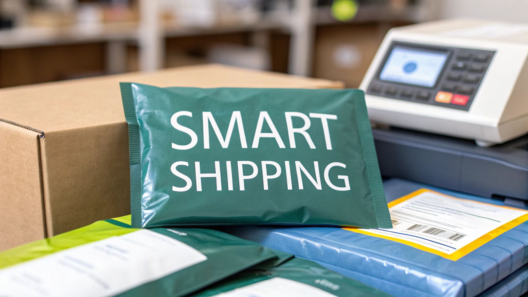 story
story what is a poly mailer bag: A quick guide to smart shipping
So, what exactly is a poly mailer bag? In the simplest terms, it’s a tough, tear-resistant envelope made from durable plastic, built specifically for shipping items that aren’t fragile. It's the secret weapon for countless eCommerce brands that need to protect their products without the weight and cost of a traditional box. Unpacking the Power of Poly Mailers If you've ever ordered clothes, accessories, or other soft goods online, you've almost certainly received your purchase in a sleek, lightweight plastic bag. That’s a poly mailer. At its core, a poly mailer is a shipping envelope made from polyethylene—a remarkably tough, flexible, and water-resistant plastic. This construction makes it the perfect shield against moisture, dust, and punctures during the often chaotic journey through the postal system. Unlike a rigid cardboard box that demands tape, void fill, and a bit of assembly, a poly mailer is an all-in-one solution. Most come with a built-in peel-and-seal adhesive strip, creating a permanent, tamper-evident closure in just a few seconds. This feature alone is a game-changer for businesses, drastically speeding up the packing process and cutting down on labor costs. Why Poly Mailers Dominate Ecommerce Shipping The explosion of online shopping has made smart packaging more critical than ever. Poly mailers quickly became an industry staple because they hit on the three things modern sellers need most: cost savings, product protection, and speed. Their lightweight design is key, as it often keeps packages under important weight thresholds for shipping carriers, leading to some serious savings on postage. The market numbers tell the story. Poly mailer bags are now fundamental to global eCommerce, with a market value hitting around USD 30.9 billion . Projections show this growing at an impressive 16.1% annually from 2025 to 2034, all fueled by the unstoppable growth of online retail. In essence, a poly mailer is more than just a bag; it's a strategic tool. It helps businesses deliver products securely and affordably, improving the customer experience from the moment they click "buy" to the second it lands on their doorstep. To give you a quick overview, here's a simple breakdown of what makes these mailers so effective for online sellers. Poly Mailer Bags at a Glance Characteristic Description Primary Benefit for eCommerce Material Made from durable, lightweight polyethylene plastic. Reduces shipping weight, leading to lower postage costs. Construction Flexible, tear-resistant, and waterproof. Protects non-fragile items from moisture, dirt, and handling damage. Closure Features a self-sealing adhesive strip for a quick, tamper-evident closure. Speeds up the packing process and enhances security. Cost-Effectiveness Generally less expensive to purchase and ship than cardboard boxes. Lowers overall packaging and operational expenses for higher margins. Storage Lays flat and takes up minimal warehouse space compared to bulky boxes. Maximizes storage efficiency, especially for small businesses. Customization Easily printed with custom logos, branding, and designs. Creates a memorable unboxing experience and strengthens brand identity. This guide will walk you through every aspect of these essential shipping supplies, from materials and sizes to branding and sustainability. We’ll arm you with the knowledge to level up your shipping strategy, helping you choose from the wide array of custom packaging products available to make your brand unforgettable. A Closer Look at Poly Mailer Materials and Construction Ever wonder what makes a poly mailer so tough yet incredibly light? It’s not magic, but it is some pretty clever material science. The secret ingredient is polyethylene (PE) , a type of plastic that has become a true workhorse in modern packaging. At a molecular level, you can think of polyethylene as a massive chain made of thousands of interlocking links. This long, chain-like structure is what gives the material its signature strength and flexibility. When these chains are formed into a thin film, they create a barrier that’s remarkably resistant to tearing, punctures, and—most importantly for shipping—water. This built-in durability is a huge reason why the polyethylene mailer market is booming. The global market was valued at around USD 4.5 billion in 2023 and is on track to hit USD 7.8 billion by 2032, all thanks to the endless demand from eCommerce businesses for reliable, cheap shipping. You can find more insights on the polyethylene mailer bags market growth on dataintelo.com . The Co-Extrusion Manufacturing Process To make a poly mailer, manufacturers don't just use a single sheet of plastic. They rely on a process called co-extrusion , where multiple layers of polyethylene film are melted and fused together. This technique allows them to combine different properties into one superior material. Think of it like making a sandwich. You wouldn't use the same bread for the inside and outside. One layer might be tough and scuff-resistant for the exterior, while another is smooth and gentle for the inside. This layered approach is what makes a poly mailer perform so well. This multi-layer design typically includes: An Outer Layer: This is the first line of defense, engineered for maximum toughness to handle the bumps and scrapes of transit. An Inner Layer: Usually made of a different color (often gray or black), this layer creates opacity, making sure nobody can see what's inside. A Smooth Interior: The surface touching your product is designed to be gentle, preventing snags or scratches on delicate items like clothing. This smart construction results in a shipping solution that’s far more than a simple plastic bag—it's an engineered protective shield for your products. Key Design Features That Matter Beyond the material itself, a few key features are built into every poly mailer to make it a secure and efficient tool for shippers. These aren't just add-ons; they're critical to how the bag works. One of the most important is the self-sealing adhesive strip . This isn't your average glue. It’s a permanent, high-tack adhesive designed for a single use. Once a poly mailer is sealed, you can't open it without visibly damaging the bag. This built-in security feature provides a tamper-evident closure, giving both you and your customer peace of mind that the package hasn't been messed with on its journey. Another crucial element is that opaque inner lining. Privacy is a big deal for online shoppers, and this feature guarantees the contents are completely hidden from prying eyes. While these bags are plastic, businesses looking for plastic-free options can always explore alternatives like our Kraft paper collection for certain products. Finally, the seams of the bag are heat-sealed, creating a bond that is often stronger than the film itself. This stops the bag from splitting at the sides, even when it's carrying something with a bit of weight, like a pair of jeans or a hardcover book. Each of these details works in harmony to create a reliable, secure, and user-friendly way to ship. Choosing the Right Type and Size for Your Products Picking the right poly mailer is a lot like choosing the right tool for a job—you wouldn't use a sledgehammer to hang a picture frame. Not all poly mailers are built the same, and getting the perfect one for your products is a game-changer for both protection and shipping costs. It all boils down to two key things: the type of mailer and its size. Get this right, and your items arrive safely without wasting money on extra bulk. This versatility is exactly why poly mailers are taking over eCommerce. The global market for these bags is expected to jump from an estimated USD 6.24 billion in 2025 to a whopping USD 9.87 billion by 2034, all because they can adapt to just about anything you need to ship. You can find more details about the growth of the polybag mailers market on cognitivemarketresearch.com . Let's break down the main categories so you can match your products with their perfect mailer. The Three Main Types of Poly Mailers Understanding the basic types of poly mailers makes the whole decision process way simpler. Each one is designed with a specific job in mind, whether you're shipping durable clothes or something that needs a little more TLC. 1. Standard Lay-Flat Mailers This is the classic poly mailer, the one you probably see the most. Think of it as the workhorse of eCommerce shipping—a simple, flat, but tough-as-nails plastic envelope. It’s perfect for anything that isn't fragile and doesn't need extra padding. Best For: Soft goods and durable items that can handle the rough and tumble of sorting machines. Example Products: T-shirts, leggings, documents, books, and other fabrics. 2. Bubble-Lined Mailers When you need an extra layer of defense, bubble-lined mailers are your go-to. These have a layer of bubble wrap built right into the interior, giving your products a cushion against bumps and drops. They strike a great balance between a standard mailer and a full-on box. Best For: Semi-fragile items that need protection from scratches, dings, or minor impacts. Example Products: Jewelry, cosmetics, small electronics, and handmade crafts. 3. Expansion Gusset Mailers Ever try to squeeze something bulky into a flat mailer? It's not pretty. Expansion mailers solve this problem with a gusseted bottom that opens up to fit thicker products, kind of like how a paper grocery bag expands. Best For: Bulky but non-fragile items that just won’t fit comfortably in a flat bag. Example Products: Hoodies, jackets, binders, or even a shoebox. Pro Tip: Whatever you do, don’t force a bulky item into a lay-flat mailer. It puts a ton of stress on the seams and seriously increases the risk of the bag bursting open mid-shipment. Always size up or grab an expansion mailer for a proper fit. To make it even easier, here’s a quick-glance table to help you decide. Poly Mailer Types and Ideal Use Cases Mailer Type Key Feature Best For Shipping Example Products Standard Lay-Flat Lightweight and durable Non-fragile, soft goods T-shirts, books, documents Bubble-Lined Built-in cushioning Semi-fragile items Jewelry, cosmetics, small electronics Expansion Gusset Expandable bottom Bulky, non-fragile items Hoodies, binders, shoeboxes This table should help you quickly pinpoint which mailer type is the hero your product needs. How to Find the Perfect Size Once you’ve nailed down the type, getting the size right is the next critical step. A mailer that’s too big adds unnecessary material and lets the product slide around, but one that’s too small will strain the seams. You're aiming for a snug fit, but not a tight one. Just follow these simple steps to measure your products the right way: Measure Your Product: Lay your item flat and measure its length (L), width (W), and thickness/height (H). Calculate Mailer Width: Add the item's width and its thickness, then add about one extra inch for some wiggle room. ( Mailer Width = W + H + 1" ) Calculate Mailer Length: Add the item's length and its thickness, plus about two extra inches to make sure you get a good seal. ( Mailer Length = L + H + 2" ) For instance, a folded t-shirt might be 12 inches long, 9 inches wide, and 1 inch thick. Using the formulas, you'd need a mailer that is at least 15 inches long (12+1+2) and 10 inches wide (9+1+1) . A 12 x 15.5-inch mailer would be a solid choice. While this formula gives you a great starting point, exploring a variety of shipping envelopes will help you find the absolute best fit for everything you sell. Poly Mailers vs. Cardboard Boxes: When to Choose Which Picking between a sleek poly mailer and a classic cardboard box is one of the most important calls you'll make for your eCommerce shop. This isn't just about what looks good; it's a strategic move that hits your shipping costs, storage space, product safety, and even your brand's eco-friendly reputation. The goal isn't to declare one winner for everything, but to know which tool is right for the job at hand. Think of it like choosing a car. You wouldn't rent a giant moving truck just to pick up a few groceries, right? And you definitely wouldn't try to cram a piano into a two-door coupe. It's the same logic here: a poly mailer is your zippy compact car, perfect for lightweight, durable goods. A box is your trusty truck, non-negotiable for anything fragile, heavy, or awkwardly shaped. The Cost Factor: Dimensional Weight When you line up poly mailers against cardboard boxes, the first thing most people notice is the price tag. The secret to finding the cheapest way to ship packages almost always comes down to one critical factor: dimensional weight , or DIM weight . Shipping carriers like USPS, FedEx, and UPS don’t just charge you for how heavy your package is. They also charge for how much space it takes up on their trucks and planes. Boxes, even light ones, are space hogs. A poly mailer, on the other hand, wraps snugly around your product, taking up as little room as possible. Let’s look at a real-world example: shipping a t-shirt. In a Box: You put the shirt in a 12x10x4 inch box. The whole thing weighs maybe 1.5 lbs , but the carrier calculates its DIM weight as 3 lbs . Guess which one you're paying for? The higher one. Always. In a Poly Mailer: That same shirt goes into a 12x15.5 inch poly mailer. It still weighs 1.5 lbs , but now there's almost no extra space. The carrier will charge you for the actual weight, which could cut your shipping cost nearly in half for that single order. This DIM weight advantage is the single biggest reason why switching to a poly mailer bag for apparel and other soft goods can dramatically lower your shipping expenses. Over hundreds or thousands of orders, these savings add up to a substantial boost to your bottom line. Protection and Security Of course, saving money doesn't mean much if your products arrive damaged. This is where the choice becomes much clearer. Cardboard boxes offer a level of rigid, structural protection that a poly mailer just can't compete with. Those sturdy walls create a crush-resistant shell, making them the only real choice for anything delicate. Here’s a quick guide to help you decide: Cardboard Boxes Are a Must For: Fragile items like glass or ceramics, electronics, anything with sharp corners that could tear through a bag, and high-value products where a premium unboxing experience matters. You can even explore different custom printed boxes to really nail that protective, on-brand feel. Poly Mailers Are Perfect For: Protecting non-fragile items from the elements. Think clothing, books, yarn, or accessories. They are fantastic at keeping out moisture, dirt, and dust, ensuring your products arrive clean and dry every time. Storage and Environmental Impact Think beyond the mail truck for a second and look at your own storage space. Boxes might arrive flat, but they still eat up a ton of room. Poly mailers? They're incredibly compact. You could store thousands of mailers in the same space that a few hundred boxes would occupy, freeing up precious square footage. On the environmental front, it's a bit more complicated. Boxes are usually made from recycled materials and are easily tossed into any curbside recycling bin. Poly mailers often use virgin plastic, but they take far less energy to make and transport because they're so light. While many are recyclable at special store drop-off locations, it does require a bit more effort from your customer. The "greener" choice really depends on what your brand prioritizes. This chart shows a simple way to think about which mailer to grab based on what you're shipping. As the image shows, it's a logical progression. You can start with simple flat mailers, move up to padded ones for a little more protection, and grab gusseted mailers when you need to ship something a bit bulkier. Branding Your Business with Custom Poly Mailers Think about it: your packaging is the very first physical thing a customer touches from your brand. It's a huge moment. So why let it be a forgettable, plain white bag? A custom-printed poly mailer transforms that simple delivery into a powerful marketing opportunity. You're not just shipping a product; you're delivering an experience. Your poly mailer instantly becomes a traveling billboard for your business. That first impression is everything. A well-designed package builds excitement before your customer even sees what's inside. It reinforces your brand's personality and can turn a routine delivery into a shareable unboxing experience on social media. Understanding the crucial role of branding in e-commerce is key to getting the most out of every single shipment. From Simple Logos to Full-Bleed Designs Customization isn't an all-or-nothing game. There's a whole spectrum of options that can fit your brand's style and, just as importantly, your budget. You can go for something subtle and chic or loud and vibrant. The possibilities are wide open: One-Color Logo Print: This is the classic, go-to starting point. It's cost-effective and instantly makes your package look professional instead of generic. A clean logo on a crisp white or colored mailer works wonders. Multi-Color Designs: Ready to step it up? Using your full brand color palette allows for more detailed artwork. You can add your tagline, social media handles, or other fun design elements. Full-Bleed Printing: If you want to make a serious impact, this is the way to go. A full-bleed design covers the entire mailer, edge to edge. It's perfect for showing off bold patterns, cool gradients, or even photo-quality images that make your package impossible to miss. The takeaway here is that even a simple logo turns that mailer from a piece of trash into a branded asset. It builds brand recognition from the second it lands on a customer's doorstep. Practical Steps for Ordering Custom Mailers Getting your own branded packaging is actually a pretty straightforward process once you know the steps. A little bit of planning upfront ensures the final product looks exactly how you envisioned it. Once you stop thinking of mailers as a shipping expense and start seeing them as a marketing investment, everything changes. A great package can build loyalty long after the product inside has been unboxed. Here’s a quick rundown on how to get started with your custom poly mailers: Get Your Design Ready: First things first, create your artwork using your logo, brand colors, and fonts. The most important thing here is to make sure your files are high-resolution . This is critical for a sharp, professional-looking print. Pick Your Mailer Specs: Decide on the size that best fits your products. Then, choose the base color of the mailer itself—think about how your design will pop against different backgrounds. Plan for Production Time: This is a big one. Custom printing takes longer than just ordering plain stock mailers. You'll want to factor in both production and shipping time so you don't run out of bags while waiting for your new ones. Place Your Order: Find a printing partner you can trust, like 4OVER4 , that knows their way around high-quality custom poly mailers . A good partner can walk you through the entire process, from uploading your files to final delivery. Navigating Eco-Friendly and Sustainable Mailer Options In a world where customers care more about where their money goes, your packaging has become more than just a box or a bag. It's a clear signal of your brand's values. For many businesses, this means ditching the standard-issue poly mailers for options that are kinder to the planet and connect better with their audience. But let's be honest, the world of "green" packaging can be a bit of a minefield. You'll see words like recyclable, biodegradable, and compostable thrown around, often as if they mean the same thing. They don't. Getting a handle on these terms is the first real step to making a choice you can stand behind. Decoding Sustainable Mailer Terminology To make a smart decision, you need to speak the language. Let's cut through the jargon and look at the three most common terms you’ll run into when shopping for an eco-friendly poly mailer bag. Recyclable: This means the material can be broken down and turned into something new. Most regular poly mailers are made from LDPE #4 plastic, which is technically recyclable, but there's a catch: you can't toss them in most curbside bins . They need to be dropped off at special collection points, usually at grocery stores, that handle plastic films. Compostable: These mailers are made from plant-based stuff (like cornstarch) and are built to break down into soil in a commercial composting facility. They are not recyclable and will actually mess up the plastic recycling process if they end up in the wrong place. Biodegradable: This one is often the most misleading. It sounds great, but many "biodegradable" plastics just have additives that make them fragment into tiny plastic bits, or microplastics, which are a serious environmental headache. For most online stores, the sweet spot is focusing on mailers that are made from recycled content and are also recyclable . It's the most practical and genuinely impactful route. The Power of Recycled Content The single best way to shrink the environmental footprint of a poly mailer bag is to use one made from materials that have already been out in the world. This is where Post-Consumer Recycled (PCR) content shines. PCR mailers are made from plastic waste that people like you and me have used, tossed out, and that has been collected and re-processed. When you choose a mailer with a high percentage of PCR, you're directly supporting a circular economy. A circular economy is just what it sounds like: a system where we keep materials in use for as long as possible instead of using them once and throwing them away. Using PCR mailers cuts down the need for brand-new plastic, saves energy, and keeps trash out of our landfills. When your customer gets their order in a mailer made from recycled materials, it says something powerful. It shows your brand isn't just talking the talk; you're part of the solution. You can find all sorts of eco-friendly printing and packaging options to make sure your entire shipping process reflects your commitment to sustainability. Taking Action: Proper Disposal and Customer Education Picking the right mailer is only half the job. The other, equally important half is making sure it gets disposed of correctly. Since most poly mailers can't just be chucked into the recycling bin at home, teaching your customers what to do is absolutely critical. A simple, clear instruction printed right on the mailer or tucked into a packing slip can make all the difference. Nudge them to find their nearest plastic film drop-off point, which they can often find at big grocery chains and retailers. It’s a small step that helps close the loop, making sure the material from your poly mailer bag gets a chance at a new life. Common Questions About Poly Mailer Bags Once you start using poly mailers, you're bound to run into a few questions. Getting straight answers helps you pack with confidence, knowing your products will arrive safe and sound, keeping your customers happy. Let's tackle some of the most common things people ask about these workhorse bags. Are Poly Mailers Waterproof? This is probably the number one question we hear. The best way to think about them is as highly water-resistant , not completely waterproof. A poly mailer will do a fantastic job protecting your goods from rain, snow, or any other moisture it runs into on its journey. But it's not meant to be dunked in a pool. Think of it like a good raincoat—it'll keep you perfectly dry in a downpour, but you wouldn't go for a swim in it. Can I Ship Fragile Items in a Poly Mailer? This is a big one for product safety. If you're shipping something truly fragile—like glass, ceramics, or delicate electronics—a standard poly mailer is not the right tool for the job . Those items need the rigid protection that only a box can provide. But, the game completely changes when you bring in bubble-lined poly mailers . These have a built-in cushion that offers great protection for semi-fragile products. They’re the perfect middle ground for items that need a little padding but don't require the full-on defense of a cardboard box. Think about things like: Jewelry (especially in small gift boxes) Cosmetics like lipstick tubes or eyeshadow palettes Small electronics like phone cases, chargers, or cables For products like these, a bubble mailer is a smart choice, giving you solid protection while keeping shipping costs low. How Do I Choose the Right Thickness? When you're shopping for poly mailers, you'll see the term ‘mil’ used to describe their thickness. A mil is simply one-thousandth of an inch, and it’s your best guide to a bag's toughness. A standard 2.5 mil mailer is the go-to for most eCommerce shops. It hits that sweet spot of strength and flexibility, perfect for shipping everyday items like clothing, fabrics, and other soft goods. If you’re sending out heavier products or anything with slightly sharper corners (like a hardcover book), it’s a good idea to upgrade to a 3-4 mil thickness. That extra layer of plastic gives you more puncture resistance and a little extra peace of mind. Can Poly Mailers Be Recycled? Yes, most poly mailers can be recycled, but there's a small catch you need to know about. They are usually made from LDPE #4 plastic , which is a type of plastic film that isn't accepted in most curbside recycling bins. To recycle them properly, you need to take them to a store drop-off location that collects plastic films. You can almost always find these collection bins near the entrance of major grocery stores and retailers. It’s one small extra step that makes a huge difference, ensuring the material gets a new life instead of just ending up in a landfill. Ready to upgrade your shipping with packaging that’s tough, affordable, and a great canvas for your brand? At 4OVER4 , we offer a huge range of custom poly mailers designed to make your business pop. Check out our high-quality printing options and create an unboxing experience your customers won’t forget by visiting us at https://4over4.com .
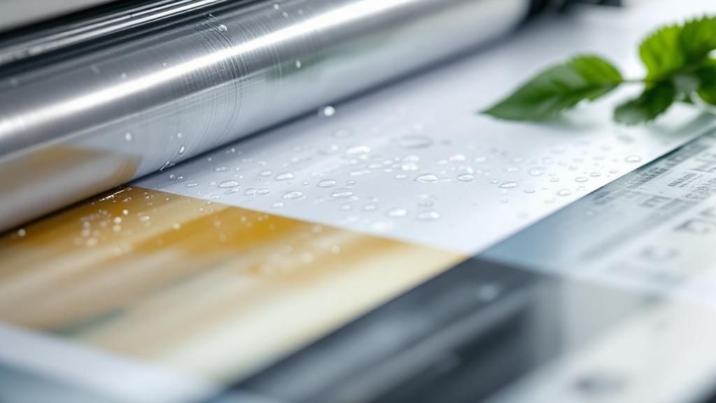 story
story What is Aqueous Coating? Eco-Friendly Print Finish Explained
Let's get right into it. Aqueous coating is a clear, water-based finish that gets applied to paper right on the printing press. Think of it as an invisible shield for your printed materials. It's the secret sauce that keeps ink from smudging, guards against fingerprints, and prevents scuffs, all while giving the paper a fantastic look and feel—whether you're going for a high-gloss shine or a subtle matte. Understanding the Essentials of Aqueous Coating You'll often hear people in the printing world refer to aqueous coating as "AQ." It's one of the most common and practical finishes out there, and for good reason. Unlike older varnishes or UV coatings, which can be oil-based or need special light to cure, aqueous coating's main ingredient is water. This makes it a much more environmentally friendly choice right off the bat. The magic happens inline, directly on the printing press. The liquid coating is applied over the wet ink and then zapped with high-intensity heat and air. This process forces the water to evaporate almost instantly, leaving behind a tough, clear polymer film that seals the ink and protects the paper. It’s an incredibly efficient method, especially for high-volume jobs like brochures, catalogs, and packaging where you need both durability and speed. Core Attributes and Benefits So, why is aqueous coating so popular? It really comes down to a perfect blend of performance, price, and eco-friendliness. It offers a solid layer of protection without the higher price tag or environmental drawbacks you might get with other finishes. Here’s a quick rundown of what makes it so great: Scuff and Smudge Resistance: It forms a tough barrier that stands up to fingerprints, dirt, and general wear and tear during shipping and handling. Eco-Friendly Nature: Since it's water-based, it has extremely low levels of Volatile Organic Compounds (VOCs) and is easy to recycle. Fast Production: The coating dries in a flash, which means printers can move on to cutting, folding, and finishing much sooner. This really speeds up turnaround times. Prevents Yellowing: Forget about your printed pieces looking old and faded. Unlike some varnishes from back in the day, AQ coating resists yellowing, keeping your designs vibrant for years to come. Aqueous coating hits that sweet spot: it’s cost-effective enough for massive print runs, protective enough for pieces that get handled a lot, and green enough to meet today's sustainability standards. To make it even clearer, I've put together a table that breaks down the key characteristics of aqueous coating. Think of this as your quick-reference guide. Aqueous Coating Key Characteristics at a Glance Attribute Description Composition A clear, water-based liquid with acrylic polymers and resins. Application Applied inline on a printing press and dried quickly with heat and air. Protection Level Offers good resistance to scuffs, fingerprints, and minor abrasions. Environmental Impact Low in VOCs (Volatile Organic Compounds) and fully recyclable. Drying Speed Dries almost instantly, speeding up the overall production timeline. Finish Options Available in gloss, satin, matte, and specialty soft-touch finishes. Cost-Effectiveness Generally more affordable than UV coating and some specialty varnishes. This table really sums up why aqueous coating has become a go-to choice for so many different print projects. It’s a versatile, reliable, and responsible option. How Aqueous Coating Actually Works To really get a feel for how aqueous coating works, don't think of it as a separate, extra step. It’s better to picture it as the final act of the printing process itself. The magic happens "inline," which is just a fancy way of saying the coating is applied on the very same press that just laid down the ink. This seamless integration is why it’s a go-to for big print runs. At its heart, the coating is a water-based liquid. We're talking about a mixture that's typically 70% to 80% water, blended with acrylic polymers and resins. This simple, water-heavy recipe is what gives the coating its eco-friendly credentials. The Application and Drying Process The action starts the second a sheet of paper is done with the ink stations on a press. Before the fresh ink can even think about smudging, the sheet is whisked away to a dedicated coating unit right on the machine. Here, a thin, perfectly even layer of the aqueous solution is spread over the entire surface. Think of it like a tiny, high-speed squeegee pulling a clear, protective film over your design. Once coated, the sheet zips under a gauntlet of high-intensity heaters and powerful air jets. This is where the real transformation happens. The combination of intense heat and airflow forces the water in the coating to evaporate in a flash. What’s left behind is a solid, clear layer of polymer that has bonded with the paper fibers, sealing the ink underneath. This creates that durable, protective shield aqueous coating is famous for. It's a lot like how water-based paint dries on a wall, but supercharged—it all happens in seconds, not hours. This incredible speed is a massive win in the world of commercial printing. It means the printed sheets can be handled, cut, and folded almost immediately without smearing or scuffing the final product. Why This Method Excels in Modern Printing This inline approach makes aqueous coating a perfect match for high-volume jobs, solidifying its place as a workhorse in modern offset printing . Since everything from inking to coating and drying happens in one fluid, continuous pass, production time gets slashed and the risk of handling errors plummets. Speed and Efficiency: Sheets come off the press ready for the next stage, whether that's binding, folding, or shipping. Consistent Quality: The automated inline process guarantees every single piece gets a uniform, flawless finish. Cost-Effectiveness: By folding the coating step into the main printing run, there's no need for a separate offline machine, which saves a ton of time and money. In the end, this smooth, integrated workflow is what makes aqueous coating such a smart and reliable choice. It takes a standard printed sheet and turns it into a tough, professional-looking product without slowing down the relentless pace of commercial production. The Real Benefits of Choosing Aqueous Coating The buzz around aqueous coating isn't just hype. It’s a smart move for anyone who cares about quality, durability, and responsibility. Choosing this finish brings some serious, real-world advantages to the table, protecting everything from your printed materials to the planet. One of the biggest wins is its incredible scuff and fingerprint resistance . Picture a catalog getting tossed in the mail or a brochure being passed from hand to hand at a trade show. Aqueous coating acts like an invisible suit of armor, keeping your materials looking sharp and clean long after they leave the press. This simple protective layer prevents the kind of wear and tear that can make a brand look cheap. The result? Fewer damaged pieces and a consistently professional image that builds trust. Speed Up Production, Not Down on Quality In the printing world, time is everything. Aqueous coating dries almost instantly right on the press, which is a game-changer for speeding up production schedules . There's no waiting around for the finish to cure, so cutting, folding, and binding can happen right away. This quick turnaround is a massive advantage, especially when you're up against a tight deadline. Plus, unlike some old-school varnishes, aqueous coating is highly resistant to yellowing. Your prints will keep their true colors for years, protecting your brand’s visual identity. The dual benefit of speed and longevity makes aqueous coating a practical workhorse. It helps you get products to market faster while ensuring they continue to look great long after they've been delivered. A Greener Way to Print Beyond the practical perks, using aqueous coating says something positive about your company's values. Since it's water-based, it contains very low levels of Volatile Organic Compounds (VOCs) —the nasty pollutants common in solvent-based finishes. This makes the whole process safer for print workers and better for the air we breathe. That commitment to sustainability matters more than ever to customers. By choosing a finish that's easy to recycle and has a small environmental footprint, you're aligning your brand with a greener future. To see more ways to make sustainable choices, check out our guide to green printing options . This industry-wide shift is clear. The global market for aqueous coating systems, valued at roughly $3.2 billion in 2024, is expected to jump to $5.6 billion by 2034 as more printers move away from harsh solvent-based alternatives. You can find more details on this growth over at Reports and Data. Aqueous Coating vs Other Print Finishes When it's time to choose a finish for your print project, the options can feel overwhelming. You've got a few different paths you can take, and picking the right one comes down to your budget, deadline, and what you want the final piece to look like. Let's break down how aqueous coating stacks up against its two main competitors: UV coating and traditional varnish. Think of them as different tools in a toolbox—each is perfect for a specific job. Aqueous Coating vs UV Coating The main rival to aqueous coating is undoubtedly UV coating . This finish gets its name from the ultraviolet light used to cure it, which creates an exceptionally hard, durable, and super high-gloss surface. If you need maximum shine and protection against scuffs and scratches, UV is your go-to. It’s a popular choice for things like high-end book covers and luxury packaging. But that top-tier performance comes with a few trade-offs. UV coating is typically more expensive than aqueous, and the chemicals and energy needed for the curing process give it a larger environmental footprint. While its protection is second to none, it can sometimes crack along folds if the paper isn't scored properly beforehand. If you're interested in using this glossy effect to highlight specific parts of a design, you can learn more about our spot UV printed products . Aqueous Coating vs Varnish Then we have varnish , the old-school original print finish. Varnishes come in both oil-based and water-based formulas and can be applied across the entire sheet (a "flood" varnish) or just to certain areas (a "spot" varnish). This flexibility is its biggest strength, opening the door for creative textural effects that are harder to achieve with other coatings. The downside? Varnish takes longer to dry, which can slow down production. It's also known to yellow over time, especially the oil-based versions, which can eventually change how the colors in your design look. Aqueous coating, on the other hand, dries almost instantly and stays crystal clear for the life of the piece, keeping your colors vibrant and true. To make the choice clearer, let's put these three finishes side-by-side. Aqueous vs UV Coating vs Varnish: A Head-to-Head Comparison This table breaks down the essential differences between the three most common print finishes, helping you see at a glance which one might be the best fit for your next project. Feature Aqueous Coating UV Coating Varnish Finish Options Satin, gloss, matte, soft-touch High gloss is standard; matte available Gloss, satin, matte Durability Good scuff and rub resistance Excellent; very hard and durable Fair to good, depending on the type Drying Speed Very fast (inline with press) Instant (cured with UV light) Slowest of the three Cost Cost-effective; often the cheapest Most expensive option Mid-range price point Yellowing Non-yellowing Non-yellowing Prone to yellowing (especially oil-based) Environmental Eco-friendly; water-based, low VOCs Higher energy use and chemicals Oil-based has high VOCs; water-based is better Ultimately, each coating has its place. Varnish offers creative flexibility, and UV provides unmatched protection and shine. But for a huge range of everyday print jobs, aqueous coating hits the sweet spot. Aqueous coating often represents the ideal middle ground. It provides excellent scuff resistance, dries quickly, resists yellowing, and is environmentally friendly—all at a cost-effective price point that makes it suitable for a wide range of applications. This visual helps illustrate where aqueous coating shines, balancing speed, cost, and the quality of the finish. As you can see, it delivers a great-looking gloss at a low per-unit cost, all without slowing down the printing process. This balance is why water-based solutions are becoming so popular. The entire industrial coatings market, valued globally at USD 149.72 billion in 2023, is seeing a shift toward coatings with a lower environmental impact. The reduced volatile organic compound (VOC) emissions of waterborne coatings like aqueous are a major reason for their growing popularity. For most everyday printing needs, aqueous coating offers a reliable, balanced, and smart solution. Where You'll Find Aqueous Coating in Action You’ve probably handled a dozen items with an aqueous coating on them today without even noticing. It’s a true workhorse in the printing world—a quiet, invisible layer that shows up on everything from your junk mail to the latest bestseller at the bookstore. Its most common stomping ground is in marketing and promotional materials. That sleek, professional feel of a high-quality brochure? That's often aqueous coating at work. It's the same finish that keeps presentation folders and catalogs from looking beat up, ensuring a brand’s message arrives crisp and clean, free of smudges and fingerprints. To see how a professional finish elevates marketing materials, explore our high-quality brochures printing options. Basically, if a printed piece has to survive a tough journey, aqueous coating is usually involved. Protecting Goods from Production to Customer Direct mail is a perfect example. A postcard needs to endure the rough and tumble of the postal system—all that sorting machinery and handling. An aqueous finish gives it the resilience to show up in a mailbox looking sharp, not scuffed and worn out. It acts as a shield against dirt and moisture, protecting the ink underneath. Publishing is another industry that relies on it heavily. That pleasant, smooth feel of a new book cover or magazine? That's the coating. More importantly, it protects them from the wear and tear of being picked up, thumbed through, and put back on the shelf by countless potential readers. Beyond just protection, the right finish is a key part of crafting an effective book cover —it’s the first handshake a story has with its reader. Product packaging is another huge arena. Think about boxes for electronics, cosmetics, or food products. That coating is what keeps them looking great on the shelf after a long trip from the factory. By preventing scuffs and abrasions during shipping and stocking, aqueous coating helps products look their best at the critical moment a customer sees them for the first time. This isn't just a niche product; it's a massive, growing market. The global demand for water-based solutions is surging. In fact, the waterborne coatings market was valued at USD 57.67 billion in 2022 and is expected to grow at a compound annual growth rate of 5.6% through 2030. This growth is largely fueled by the worldwide push for more sustainable, low-emission products. You can read the full research on this growing market to see just how big this trend has become. How to Choose the Right Aqueous Finish Picking the right finish for your print job is a bigger deal than you might think. It’s not just a protective layer; it’s a crucial design choice that shapes how people perceive your brand. Every aqueous coating has its own personality, and the trick is to find the one that matches the message you want to send. Think of it like picking out a new shirt. Are you going for a sharp, shiny look for a night out, or something more muted and sophisticated for a business meeting? The finish on your print project works the same way, setting the tone before a single word is read. Decoding the Different Finishes Let's walk through the most common aqueous finishes you'll encounter. Each one brings something unique to the table, both in how it looks and how it feels, so knowing the difference is key to getting the result you want. Gloss Finish: If you want your colors to pop and grab immediate attention, gloss is your go-to. It creates a shiny, reflective surface that makes images look vibrant and dynamic. This is why it’s a classic choice for things like sales flyers, brochures, and catalog covers—anything that needs to stand out in a crowd. Matte Finish: For a more understated, modern vibe, you can't go wrong with a matte finish. It has a smooth, non-reflective surface that cuts down on glare, giving your project an air of sophistication. It feels premium to the touch, making it a perfect fit for high-end lookbooks, art prints, or business cards that aim for quiet confidence. Satin Finish: Can't decide between shiny and subtle? Satin is the happy medium. It offers a gentle, low-level sheen that’s elegant without being flashy. It still provides good scuff protection and keeps colors looking sharp, but with a softer look than full gloss. It's a fantastic, versatile choice for almost anything, from book covers to annual reports. The most impactful finishes often appeal to more than just sight. A unique texture can make a simple print piece unforgettable, transforming it from a disposable item into a memorable brand experience. If you’re aiming for a piece that people simply can't put down, there’s one more finish you need to know about. A soft-touch coating adds a velvety, almost rose-petal-like texture that’s incredibly satisfying to hold. This tactile quality creates a powerful sensory connection, making it an amazing choice for luxury packaging or high-end invitations. You can explore these kinds of unique and interactive options in our specialty printing collection . Frequently Asked Questions About Aqueous Coating You've got the basics down, but a few practical questions always pop up when it's time to actually choose a finish. Let's tackle the common ones so you can feel totally confident in your decision. Here are the details that really matter when you're finalizing your next print job. Can You Write on Aqueous Coating? Yes, you absolutely can—but the finish you choose makes all the difference. A matte or satin aqueous coating has just enough tooth for a ballpoint pen or permanent marker to grab onto, so writing is no problem. The trouble starts with a high-gloss finish. Its slick, non-porous surface makes ink bead up and smudge instead of drying properly. If you know people will need to write on the final piece, like on a response card or a sign-up sheet, stick with a matte finish. Another great trick is to simply ask your printer to leave a specific box or area uncoated. Is Aqueous Coating Fully Waterproof? Aqueous coating is water-resistant , but it's not truly waterproof. It does a fantastic job protecting your prints from everyday hazards like fingerprints, humidity, and minor drips or spills. That resistance is what keeps the ink from smearing and the paper from getting wavy after a small splash. Think of it like a good raincoat, not a submarine. It'll keep you dry in a drizzle, but it's not meant for a deep-sea dive. If your project needs to withstand serious moisture—like an outdoor sign or a restaurant menu—lamination is the way to go for truly waterproof protection. Does This Coating Affect Print Colors? Since it's a clear coating, its effect on color is pretty minimal and really just depends on the finish you select. Gloss finishes make colors look a bit deeper and more vibrant. The shiny surface bounces more light back at you, making everything pop. Matte finishes tend to soften colors, creating a more muted, sophisticated look because they scatter light instead of reflecting it directly. When exact color matching is critical for your brand, your best move is always to ask for a printed proof. This lets you see firsthand how the coating and your color palette play together before you commit to the full run. At 4OVER4 , we specialize in high-quality printing with a huge range of finishes to bring your ideas to life. Explore our printing services and find the perfect finish for your next project today!
 story
story Addressing a Postcard: The Easy Guide to Correct Mail
Figuring out how to address a postcard isn't complicated, but getting it right is the difference between a successful delivery and a lost message. The whole system is designed for efficiency, and following a few simple rules ensures your card zips through the postal service without a hitch. In a nutshell, your message goes on the left, the recipient's address goes on the right, and the stamp finds its home in the top-right corner. That's the basic formula. The Anatomy of a Postcard Address Before you start writing, take a look at the back of your postcard. That non-glossy side is prime real estate, intentionally divided into zones for your message, the mailing address, and the postage. Getting this layout correct from the start is the key to making sure your greetings, invitations, or marketing materials arrive where they're supposed to. This simple breakdown shows how the back of the postcard is segmented into its three core components: As you can see, there’s a clear logic to the layout, designed to work perfectly with automated postal sorting machines. Mapping Out Your Postcard Most postcards have a vertical line running down the middle of the back. This isn't just for decoration—it's your primary guide for what goes where. The Left Side: Your Message This is the larger area, your canvas for whatever you want to say. Whether it's a quick "Wish you were here!" from a vacation spot or a special offer for a customer, this space is all yours. The Right Side: The Destination This half is strictly business. It’s reserved only for the recipient's mailing address. Keeping this area clean, legible, and free of any extra notes is crucial because this is the exact spot the postal scanners read. A surprisingly common mistake is letting a handwritten message creep over the dividing line into the address area. Those automated scanners can easily get confused by stray marks or words, which could delay your postcard or even prevent it from being delivered at all. Postcard Element Placement Guide To avoid any guesswork, here's a quick reference table that breaks down where everything on the back of your postcard should go and why it's so important. Element Correct Placement Why It Matters Recipient's Address On the right-hand side, below the postage stamp. This is the specific zone USPS automated sorting machines are programmed to scan. Return Address Top-left corner of the message area (optional but recommended). If the postcard is undeliverable, this ensures it can be returned to you. Personal Message On the left-hand side, clear of the address and postage areas. Keeps the mailing information clean and prevents scanning errors or confusion. Postage Stamp Top-right corner, directly above the recipient's address. Machines are designed to detect postage in this exact spot to process the mail. Following this simple map ensures your postcard has the best possible chance of a speedy and successful journey. Postage Placement is Non-Negotiable The final, and equally critical, piece of the puzzle is the stamp. Its location isn't a stylistic choice; it's a hard rule for mail processing. The stamp must be placed in the top-right corner of the postcard, right above the recipient's address. If you stick it anywhere else, you risk confusing the sorting equipment and slowing everything down. This standardized layout might feel a bit rigid, but it's the very thing that allows the postal service to sort and deliver millions of items with incredible speed and accuracy. For businesses looking to make an impact, starting with professionally designed postcards printing ensures your campaign materials meet all USPS specifications from the get-go. And if you want to add an even more personal touch, pairing your postcard with stationery from high-quality letter writing kits can create a truly memorable connection. Formatting a US Address for Flawless Delivery Let's be honest: getting the recipient's address right isn't just a suggestion. It's the single most important part of making sure your postcard actually arrives. The entire postal system, especially its high-speed sorting equipment, is built to read a standardized format. Think of a correctly formatted address as a green light for your mail. It zips through the system without needing a human to step in, which is where major delays happen. Any deviation can confuse the optical character recognition (OCR) scanners, potentially sending your postcard on a scenic detour—or right back to you. The Core Address Lines Every single line in the address block has a specific job to do. For the best results, write in all capital letters. It’s what the postal scanners prefer, and it’s much easier for them to read. Always use dark ink, like black or blue, on a light-colored background. Here's the fundamental structure you should always follow: Line 1: The Recipient's Name: Start with the full name of the person or the company. It's always best to skip nicknames to avoid any confusion. Line 2: The Street Address: This is the core delivery information—the building number and the street name. Feel free to use common USPS abbreviations like ST for Street, AVE for Avenue, and BLVD for Boulevard. Line 3: The City, State, and ZIP Code: This line pinpoints the location. Write the full city name, the two-letter state abbreviation (like CA for California), and the ZIP code. This simple, three-line format is the gold standard for most home addresses and the foundation for everything else. Handling Apartments, Suites, and PO Boxes So, what happens when it’s not a straightforward house address? Details like apartment or suite numbers are critical pieces of the puzzle and need to be placed correctly. This information always goes on the same line as the street address, immediately after the street name. Using standard abbreviations is the key to keeping it clean and saving space. For an apartment, use APT . For a suite, use STE . For a building, use BLDG . Here's a real-world example for an apartment: JANE DOE 123 MAIN ST APT 4B ANYTOWN NY 12345 For Post Office Boxes, the format is a bit different but just as simple. The PO Box info completely replaces the street address line. And for a PO Box: JOHN SMITH PO BOX 9876 ANYTOWN NY 12345 Following these standards isn’t just about being neat—it directly affects deliverability. The postal scanners are programmed to look for keywords like "APT" and "PO BOX" to correctly sort mail down to the final carrier route. The Power of the ZIP+4 Code Sure, a standard five-digit ZIP code will get your postcard to the right general area. But using the full ZIP+4 code is a pro move for pinpoint accuracy. Those extra four digits identify a hyper-specific delivery route, like one side of a city block, a specific floor in an apartment building, or even a single office that gets a high volume of mail. Using the ZIP+4 can speed up the sorting process because it gives the automated machines a much more granular destination. If you don't know it, the USPS website has a free lookup tool that's incredibly easy to use. For businesses sending marketing postcards, every detail matters for campaign success. To save time and keep everything looking consistent, many companies opt for professionally printed mailing labels. You can find tons of customizable options for address labels that make every piece of mail look sharp and guarantee it's formatted for a smooth journey. A polished label doesn't just help the USPS—it reinforces a professional image for your brand. Navigating International Postcard Addressing Sending a postcard across borders is a fantastic way to connect with people worldwide, but it does require a slightly different touch when it comes to the address. While the basic idea is the same, international mail has a few unique rules to make sure your postcard doesn't get lost in translation. The name of the game is clarity. Domestic mail runs on a familiar system of state abbreviations and ZIP codes. International mail, on the other hand, passes through multiple postal services, each with its own way of doing things. Your job is to make the address crystal clear for every single person and sorting machine that will handle it. The Golden Rule of International Addressing Here’s the most important thing you need to know: the destination country must be the very last line of the address. Write it in all capital letters , with no abbreviations. This isn't just a friendly suggestion; it's the critical instruction that tells the USPS where to send your postcard in the first place. Forgetting this line or putting it in the wrong spot is the number one reason international mail gets delayed or even lost. It’s what separates a postcard going to London, England, from one headed to London, Ohio. Pro Tip: When you're writing an address for another country, spell everything out. Avoid abbreviations for cities, provinces, or states. While "ON" is widely understood for Ontario in Canada, writing "ONTARIO" in full leaves zero room for error for a postal worker who might not know regional codes. Don't underestimate the power of physical mail. The direct mail industry is actually seeing a major comeback, with some companies planning to nearly double their mail volume. It’s a powerful reminder that tangible communication still makes a huge impact. You can learn more about these direct mail industry insights and what they mean for modern marketing. Country-Specific Formatting Examples Every country has its own preferred address format. The general structure is often similar, but little details like where the postal code goes can change. If you're ever unsure, a quick search for the destination country's postal format is always a good idea. The USPS provides a handy visual guide that really drives home the importance of that final country line. This example makes it obvious: the full country name gets its own line, right at the bottom of the address block. Let’s see how this looks in the real world with a few common examples: Addressing a Postcard to Canada: MS. HELEN SAUNDERS 1010 CLEARWATER DR OTTAWA ON K1A 0B1 CANADA Addressing a Postcard to the United Kingdom: MR. THOMAS HOWARD 45 ABBEY RD LONDON NW8 9AY UNITED KINGDOM Addressing a Postcard to Australia: CHLOE HARRIS 27 KANGAROO AVE SYDNEY NSW 2000 AUSTRALIA Notice the pattern? The recipient’s name is first, followed by the street address, then the line with the city, state/province, and postal code. And, most importantly, the country name sits alone at the very bottom, in all caps, ready to guide your postcard on its global journey. Placing Your Return Address and Postage You’ve carefully written out the recipient’s address, but don’t seal the deal just yet. Two small but critical details are left: the return address and the postage stamp. While you can technically send a postcard without a return address, I’d strongly advise against it. Think of it as free postal insurance. Including one is the only way to guarantee an undeliverable card makes its way back home, saving you the headache of wondering if it ever arrived. If the recipient moved or there's a hiccup in delivery, the USPS knows exactly where to send it back. For businesses, this isn't just a good idea—it's essential. It helps keep your mailing lists clean and stops you from wasting money on marketing materials lost to the void. The Return Address Sweet Spot Your return address has a very specific home: the top-left corner of the postcard. Placing it here keeps it far away from the recipient’s address and the postage area, which is crucial for preventing any confusion with the USPS automated sorting machines. Make sure your return address follows the same easy-to-read format as the main address: Line 1: Your Full Name or Company Name Line 2: Your Street Address Line 3: Your City, State, and ZIP Code For a clean, professional look and guaranteed legibility, pre-printed labels are a lifesaver. Using custom return address labels can save you a ton of time, especially if you’re sending postcards in bulk for a marketing campaign or wedding invitations. Why Postage Placement is So Important The final touch before your postcard starts its journey is the stamp. And its placement isn't a stylistic choice—it's a strict operational requirement. The stamp must go in the top-right corner . That specific zone is exactly where automated canceling machines are programmed to look. A stamp stuck anywhere else on the postcard might get missed, causing your card to be returned for insufficient postage or, at best, significantly delayed. Following the simple rule of placing the stamp in the top-right corner is one of the easiest ways to help the postal system run smoothly. You’re ensuring your postcard zips through the sorting process without needing manual intervention, which means faster, more reliable delivery. In a world drowning in digital noise, getting something tangible in the mail feels more special than ever. This is a huge opportunity for marketers. Research shows consumers spend 108% more time reading direct mail than digital ads, with open rates hitting an incredible 80-90% . This points to a clear preference for physical communication and has led to a remarkable average ROI of 161% for direct mail campaigns. You can dig into more details about the growing power of direct mail marketing and how it grabs attention. Current Postcard Postage Rates and Rules Postage rates can change, so it’s always smart to double-check the latest costs before you mail anything, especially a large batch. The price you pay will depend on your postcard's size and where it's headed. Here are the main things that affect postage: Standard Domestic Postcards: To get the cheaper standard postcard rate, your card needs to be rectangular and fall within specific dimensions—usually between 3.5" x 5" and 4.25" x 6" . Larger Postcards: If your postcard is bigger than the standard size, don't worry, it can still be mailed. It'll just be charged at the higher First-Class Mail letter rate. International Postcards: Sending a postcard to another country always requires an international stamp, which costs more than a domestic one. Before you buy stamps, always confirm the current rates on the official USPS website. It’s a quick step that prevents any underpayment issues that could stop your postcard in its tracks. Using Postcards for Direct Mail Marketing Sure, postcards are great for sending a quick "hello" from vacation, but in the business world? They're a heavyweight contender in direct mail marketing. Think about it: there's no envelope to open. Your message is front and center the second it leaves the mailbox. For businesses, that direct line to a potential customer is pure gold, turning a simple piece of cardstock into a serious marketing asset. The real magic, though, happens when you make the recipient feel seen. A little personalization—using their name, maybe referencing a past purchase—can be the difference between a generic flyer destined for the recycling bin and a message that feels like it was made just for them. It’s a simple touch that dramatically boosts engagement. Driving Action with Smart Postcard Design A great marketing postcard doesn't just announce a sale; it gets people to do something. That "something" could be visiting your website, scanning a QR code for an exclusive offer, or even bringing the postcard into your store for a discount. The entire design, from the headline right down to the call-to-action, needs to be laser-focused on that one single goal. And the data backs this up. Postcards are having a major moment, hitting a response rate of 4-4.5% , which is one of the highest for any direct mail format. They also grab a recipient's attention 52.5% more effectively than other types of mail, proving their immediate impact in a crowded mailbox. If you really want to get into the nuts and bolts of creating campaigns that generate immediate, measurable results, you should look into the principles of direct response marketing . It’s all about crafting messages that demand a reply. Leveraging Technology for Better ROI Modern direct mail isn't your grandpa's junk mail; it's smart, data-driven, and incredibly trackable. The MVP here is the USPS Intelligent Mail barcode (IMb) . This isn't just a random series of lines printed on your postcard—it's a tracking device that lets you follow your mail piece every step of the way through the postal system. The IMb is a total game-changer for measuring campaign ROI. You get almost real-time data on when your postcards are delivered. This means you can perfectly time your other marketing efforts, like follow-up emails or social media ads, for maximum impact. This level of tracking takes all the guesswork out of direct mail. You'll know exactly when your offer lands in your audience's hands, making it so much easier to connect sales and website traffic directly back to your postcard campaign. Streamlining Your Campaign with Professional Services While a postcard seems simple enough, pulling off a large-scale direct mail campaign has a lot of moving parts. You have to nail the design to meet strict USPS regulations for size, weight, and address placement. Get it wrong, and you could lose out on bulk mail discounts or, worse, have your mail rejected entirely. This is where professional printing and mailing services are worth their weight in gold. Working with a print partner can make the whole process feel effortless: Design Compliance: Their experts make sure your postcard design checks all the postal requirement boxes, so you avoid costly delays or rejections. List Management: They can help you get, clean up, and manage your mailing lists to make sure you're targeting the right people. Bulk Mailing: They’ll handle all the sorting, bundling, and delivery to the post office, locking in the best possible postage rates for you. Partnering with a provider that offers integrated direct mail services means you can hand off everything from printing to mailing. This frees you up to focus on what really matters: your strategy and the results. When you combine thoughtful personalization with the right tech and professional support, you can turn a simple postcard into a high-performance marketing machine that drives real growth. Common Postcard Addressing Mistakes to Avoid You've followed all the rules for addressing your postcard, but one tiny slip-up can still send it on an unfortunate detour. It happens more often than you'd think. Think of this final check as your last line of defense against the most common addressing errors we see, ensuring your postcard moves smoothly through the postal system. Remember, those small details make a massive difference to the automated machines that do most of the sorting. One of the most frequent issues is simply illegible handwriting . A personal touch is wonderful, but if a postal scanner can't read your cursive or overly stylized writing, it requires manual intervention. That immediately slows down delivery. Always opt for clear, printed capital letters in a dark ink like black or blue—it gives the optical character recognition (OCR) technology the best chance to read the address instantly. Forgetting Critical Details It’s surprisingly easy to miss a small but vital piece of information, especially when you're in a hurry. These little omissions are often the primary culprits behind returned or delayed mail. A few key offenders to double-check for: Apartment or Suite Numbers: Forgetting "APT 4B" or "STE 101" is a classic mistake. The mail carrier can get the postcard to the right building, but it will be undeliverable without the specific unit. Directional Indicators: Missing a simple "N" for North or "SW" for Southwest can send your postcard to an entirely different part of the city. Always include directionals like N, S, E, W if they are part of the official street address. Outdated ZIP Codes: People move, and ZIP code boundaries can sometimes be realigned. A quick check on the USPS website can confirm you have the most current five-digit or, even better, the full ZIP+4 code for the recipient. Every piece of the address works together like a set of coordinates. If one part is missing or wrong, the entire system can fail, and your postcard may end up returned to you days or weeks later. Avoiding Automation Pitfalls The modern postal system is a high-tech operation that relies on standardization to function efficiently. Certain creative choices, while well-intentioned, can inadvertently jam up the works. For instance, using decorative or script fonts on printed labels is a common problem. They may look beautiful, but these fonts are often unreadable to OCR scanners. Sticking to simple, sans-serif fonts like Arial or Helvetica is always a safer bet for the address block. Similarly, avoid placing stickers, glitter, or other embellishments anywhere near the address or postage areas. They can easily interfere with the scanning equipment. For businesses sending mail in bulk, accuracy is even more critical. Ensuring your mailing list is clean and correctly formatted helps you qualify for better postage rates. Professional tools can help validate addresses and apply the correct Intelligent Mail barcode (IMb), which is essential for tracking and automation. For a deeper dive into how this technology works, check out our guide on barcoding for mail . Getting these details right from the start saves time, money, and ensures your marketing message lands exactly where it should. Got Questions? We’ve Got Answers. Even after you’ve got the basics down, a few questions always seem to pop up. This is your go-to guide for sorting out those last-minute details, making sure your postcard is ready for a smooth trip through the mail. We’re covering the common ones—from postage costs and size rules to what happens when you accidentally mess up the address. Let’s clear up any confusion so you can send your postcards with total confidence. What Happens If I Make a Mistake in the Address? It happens to the best of us. If you catch a small typo, like a misspelled street name, you can usually fix it with a clean, dark pen. But if you’ve made a bigger mess, don’t just scribble it out—that’s a surefire way to confuse the postal scanners. Here’s a practical fix: write the correct address on a small piece of paper, cut it out neatly, and glue it securely right over the mistake. It's not the prettiest solution, but it gets the job done. Of course, the best strategy is always to double-check every line before you even pick up the pen. How Much Does It Cost to Mail a Postcard? The price of postage really boils down to your postcard's size and where it’s headed. To get the cheaper First-Class Mail postcard rate in the U.S., your card needs to be rectangular and fall within specific dimensions—usually between 3.5” x 5” and 4.25��� x 6” . What if your postcard is oversized? Don't worry, you can still send it. You’ll just have to use a regular First-Class letter stamp, which costs a bit more. And remember, international postcards always need a global stamp, which has its own rate. For the most up-to-date pricing, always check the official USPS website before you mail anything. Ready to design postcards that get noticed and drive real results? 4OVER4 has a massive library of customizable templates and premium printing options to bring your ideas to life. Start designing and order your perfect postcards today .
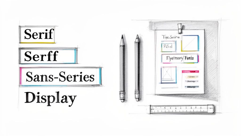 story
story Finding the Best Font for Flyers to Elevate Your Design
When you need to make an impact fast, your font choice is everything. For flyers, you can't go wrong with timeless, readable options like Helvetica , Montserrat , and Lato . These sans-serif workhorses are clean and modern, ensuring your message gets across in a single glance. They're top contenders for just about any flyer design you can dream up. Your Quick Guide to the Best Fonts for Flyers Choosing a font for your flyer is a lot like picking an outfit for a big event. It sets the tone and makes that critical first impression. You wouldn't wear a tuxedo to a backyard barbecue, right? In the same way, you shouldn't use a playful, quirky font for a serious corporate announcement. The goal is to match the font's personality with your message. When you get it right, you create a cohesive and powerful piece of marketing that connects with your audience before they even read a single word. Know Your Font Families This is where the main font categories come into play. Each one has a distinct voice and purpose, helping you steer your audience's perception. Sans-Serif Fonts: These are the modern workhorses. They don't have the small decorative strokes (called serifs) on the ends of letters, which makes them look clean, direct, and incredibly legible. Fonts like Helvetica and Montserrat are perfect for tech startups, sales promotions, or any event needing a clear, contemporary feel. Serif Fonts: With their classic, decorative strokes, serif fonts communicate tradition, elegance, and trustworthiness. Think of Playfair Display or Baskerville for a formal event invitation, a luxury brand promotion, or a menu for an upscale restaurant. Display Fonts: These are the showstoppers. They're bold, stylized, and packed with personality. Display fonts are built to grab attention in headlines but should be used sparingly. They're a fantastic choice for concert posters, festival announcements, or seasonal sales where making a loud statement is the whole point. Making the Right Choice Quickly To make your decision even easier, this visual guide helps you pick a font category based on the vibe you're going for—whether it's modern, formal, or just plain bold. The key takeaway is simple: let your flyer's purpose drive your font selection. When the style aligns perfectly with your message, you've found your winner. Top Font Picks for Common Flyer Goals To give you a head start, here’s a quick-reference table matching different flyer goals with font styles that just plain work. Flyer Goal Font Style Top Font Examples Why It Works Corporate Event or Professional Service Clean Sans-Serif Lato, Open Sans Projects a modern, competent, and trustworthy image. Easy to read quickly. Luxury Product or Formal Invitation Elegant Serif Playfair Display, Garamond Conveys sophistication, tradition, and high quality. Feels established. Big Sale or Music Festival Bold Display Oswald, Impact Grabs immediate attention with high-impact visuals. Creates excitement. Community Event or Local Business Friendly Rounded Sans-Serif Montserrat, Nunito Appears approachable, warm, and welcoming. Builds a sense of community. This table isn't exhaustive, but it's a solid starting point for finding a font that not only looks great but also does the heavy lifting for your brand. For ages, Helvetica has been crowned the king of flyer fonts, and for good reason. Its readability is unmatched, and its appeal is truly timeless. A 2023 analysis of over 3,000 design sites found it was the most popular sans-serif, used in 42% of marketing materials because of its neutral, get-the-job-done vibe. Even more telling, one study discovered that flyers using Helvetica saw a 28% higher read-through rate in A/B tests. The numbers don't lie. Ultimately, picking the best font for your flyer is all about creating an instant connection. Once you’ve nailed down your fonts and finalized the design, bringing it to life with professional flyer printing ensures your message lands with the quality and impact it deserves. Understanding Core Typography Principles Before you even think about picking a font for your flyer, we need to talk about the ground rules of good design. Think of typography principles as the foundation of a house—get them right, and the whole thing stands strong. These aren't just stuffy design theories; they're practical tools that turn a piece of paper into a powerful marketing asset. Your font choice is essentially the "tone of voice" for your flyer. A bold, modern font can shout excitement for a flash sale, while a classic, elegant font might whisper sophistication for a gallery opening. This is powerful stuff, shaping how people feel about your message before they even read a single word. We'll break down the big three—readability, legibility, and visual hierarchy—into simple, actionable advice. Once you get these down, you'll be able to create flyers that don't just look good but actually guide the reader's eye and get you the results you're after. Prioritize Readability and Legibility People often use these two words interchangeably, but in design, they mean very different things. For a flyer that someone will only glance at for a few seconds, getting both right is absolutely critical. Legibility is all about how easy it is to tell one letter from another. A font like Helvetica is super legible because its characters are clean and distinct. On the flip side, a fancy script font might have low legibility, making it a terrible choice for crucial details like a date or address. Readability focuses on how easy it is to read whole blocks of text. This comes down to things like font size, line spacing (what designers call "leading"), and even the space between letters ("kerning"). A solid body font like Lato, set at the right size, lets someone comfortably absorb your message without squinting. For flyers, where attention spans are measured in seconds, nailing both is non-negotiable. Your amazing offer is completely useless if no one can figure out what it says. Your flyer has about three seconds to capture someone's attention. If the font is difficult to read, you've lost them. The best font choices are those that communicate instantly and effortlessly, making your message accessible to everyone at a glance. Establish a Clear Visual Hierarchy Visual hierarchy is the art of arranging your content to guide the viewer's eye in order of importance. It's how you tell them what to look at first, second, and third. Your typography is the main tool you'll use to build this structure. Think of your flyer as having a conversation. The headline should be the loudest, most attention-grabbing part—the conversation starter. This is where you'll use your biggest, boldest font. Next up are the subheadings, which act as supporting points. They should be smaller than the headline but still stand out from the main body text. Finally, the body copy fills in the details using a clean, highly readable font. This natural flow makes your flyer easy to scan and understand in an instant. Here’s a simple framework to get you started: Headline: Your main message (e.g., " 50% Off Grand Opening Sale "). Use a large, bold, or eye-catching display font. Subheadings: Key details that add context (e.g., " This Saturday Only! "). Go with a medium-weight font. Body Text: The fine print and other details (e.g., location, time, website). Use a clean, simple font. A size of 10-12pt is a safe bet for print. Call to Action (CTA): The final instruction (e.g., " Visit Our Store! "). Make this pop with bolding, a different color, or a slightly larger font. By mastering these principles, you're no longer just picking pretty letters—you're making strategic design choices. This ensures every single element on your flyer has a job to do, leading to a much more professional and effective result. Choosing Your Typeface: The Main Font Categories Think of fonts like actors cast for a specific role. Each one has a personality, and picking the right one is the key to making sure your flyer’s message hits home with the right tone and emotion. We'll look at the three main families— Sans-Serif , Serif , and Display —not as dry textbook definitions, but as characters ready to bring your flyer to life. Getting a handle on these categories is your first step toward making a smart choice. A modern, minimalist font speaks a completely different language than a classic, elegant one. Once you learn their personalities, you can pick a font that clicks with your brand and message, making your design feel intentional and buttoned-up. Sans-Serif Fonts: The Modern Workhorses Sans-serif fonts are the clean, no-nonsense communicators of the typography world. The name "sans-serif" literally means "without serif," which gets right to the point—they don't have the little decorative strokes you see on serif letters. This gives them a modern, crisp, and incredibly easy-to-read look. These fonts are the ultimate multitaskers, making them a go-to for just about any flyer you can dream up. Their clarity is fantastic for headlines, subheadings, and body text alike. Personality: Direct, honest, modern, and approachable. Best For: Tech companies, corporate events, retail sales, and any flyer that needs a clean, contemporary feel. They’re champs at getting information across quickly and efficiently. Examples: Helvetica, Lato, and Open Sans. Pro Tip: Try a bold sans-serif for your headline to really grab attention, then switch to a lighter weight of the same font for your body text. This creates a clean, cohesive hierarchy without cluttering the design with too many different typefaces. Montserrat, in particular, is a modern powerhouse. It strikes a perfect balance between geometric precision and a contemporary vibe, making it a favorite for startups and creative agencies. According to AgencyAnalytics' 2024 font popularity index, Montserrat came in at #3 among sans-serifs, showing up in 31% of digital-to-print marketing assets . Its tall x-height has also been praised for boosting legibility by 25% on both screens and paper. Serif Fonts: The Elegant Storytellers If sans-serifs are modern minimalists, then serif fonts are the classic storytellers. Those small decorative strokes—the serifs—at the ends of their letters give them a traditional, formal, and trustworthy feel. They’ve been a staple in print for ages, from books to newspapers, because those little feet help guide the eye smoothly along each line of text. Using a serif font on a flyer can instantly add a layer of sophistication and authority. It sends a signal that your brand is established, refined, and cares about quality. This makes it the perfect choice when you want to project an image of elegance and tradition. For longer content, like detailed event descriptions or product benefits, well-designed marketing brochures that use serif fonts can really enhance readability and give off a premium feel. Personality: Traditional, trustworthy, elegant, and sophisticated. Best For: Luxury brands, high-end restaurants, formal event invitations, law firms, and financial services. Examples: Playfair Display, Garamond, and Baskerville. Display Fonts: The Bold Headliners Last but not least, we have the display fonts—the bold, charismatic attention-seekers of the group. These typefaces are designed to be used at large sizes, like in headlines and titles. They often have unique, stylized, or dramatic letterforms that are meant to make a huge visual statement. Display fonts are all about personality and impact. You'd never use them for body text because their wild designs would be a nightmare to read in small sizes. Instead, you should use them sparingly to create a killer focal point and inject a burst of character into your flyer. Think of them as the main event, with more subdued sans-serif or serif fonts playing the supporting roles. Personality: Expressive, loud, unique, and highly stylized. Best For: Concert posters, festival flyers, special sale announcements, and any design where grabbing immediate attention is the absolute top priority. Examples: Oswald, Impact, and Lobster. Mastering Font Pairing for Professional Flyers Pairing fonts can feel like a bit of a dark art, but it’s a skill you can absolutely pick up with a few straightforward rules. The easiest way to think about it is like a band: your headline font is the lead singer—it’s bold, has tons of personality, and grabs all the attention. Your body font is the rest of the band, providing the steady, reliable rhythm that makes the whole song work. When you get the pairing right, you create a seamless visual experience that guides the reader’s eye exactly where you want it to go. The goal is to establish contrast and clarity, not create chaos. A great pairing makes your flyer look instantly more professional and helps your message land with zero friction. The Power of Contrast The golden rule of pairing fonts is to create obvious contrast . If the two fonts you pick are too similar, it often looks like an amateur mistake. What you’re really aiming for is a duo of typefaces that are different enough to create a clear visual hierarchy. This contrast is what tells your reader, "Hey, look at me first!" A bold, attention-grabbing headline font needs a simple, super-readable body font to back it up. This creates a natural flow, pulling the eye from the main message down to the finer details. A time-tested strategy for getting this right is to combine a serif font with a sans-serif font . The classic elegance of a serif headline can be beautifully balanced by the clean, modern feel of a sans-serif body text, or you can flip it. This high-contrast combination is a design staple for a reason: it just works. Can't-Go-Wrong Font Pairing Recipes To give you a head start, here are a few professional font pairings that are pretty much foolproof for flyers. These combinations offer excellent contrast and are well-known for their readability in print. Headline: Playfair Display (Serif) & Body: Lato (Sans-Serif) This is a classic for a reason. Playfair Display’s elegant, high-contrast letterforms make it a stunning choice for headlines that need a touch of class. Lato is friendly and incredibly legible, providing the perfect counterbalance for the body text. Headline: Oswald (Sans-Serif) & Body: Merriweather (Serif) Oswald is a bold, condensed sans-serif built for impact, making it perfect for punchy headlines. When you pair it with Merriweather—a serif font specifically designed for readability on screens and in print—you get a powerful yet comfortable reading experience. Headline: Montserrat (Sans-Serif) & Body: Open Sans (Sans-Serif) This pairing shows how you can successfully use two fonts from the same family (sans-serif) by creating contrast with weight and style. Use a bold or black weight of Montserrat for the headline and the regular weight of Open Sans for the body. The subtle differences in their geometric structures keep the design interesting while feeling cohesive. To help visualize how these pairings work in different scenarios, here’s a quick-reference table. Effective Font Pairing Combinations for Flyers This table showcases some professional font pairings, offering suggestions for headlines and body text tailored to specific business flyer types. Pairing Combination Headline Font (Example) Body Font (Example) Best For (Flyer Type) Elegant & Modern Playfair Display Lato Luxury brands, art galleries, high-end events Bold & Readable Oswald Merriweather Sales events, product announcements, corporate flyers Clean & Friendly Montserrat Open Sans Tech startups, non-profits, community events Classic & Trustworthy Lora Roboto Real estate, financial services, professional consultants These combinations are tried and true, but don't be afraid to experiment to find the perfect voice for your brand. A Deeper Look at a Winning Combination The mix of a dramatic serif headline with a clean sans-serif body is particularly effective. A font like Playfair Display, for instance, immediately elevates a flyer design with its high-contrast, elegant serifs, making it a go-to for headlines that need a touch of luxury. And it's not just about looks; it’s backed by data. It consistently ranks as a top display font, and some readability tests have shown that headlines set in Playfair boosted viewer dwell time by 33% compared to plain sans-serifs. Broader trends confirm this. Pairing dramatic serifs with clean sans-serif body fonts can lift engagement by as much as 29% in small business marketing campaigns. For more great font ideas, check out Typewolf's recommendations page . When in doubt, simplify. A classic rookie mistake is over-designing with too many fonts. Sticking to just two complementary typefaces is one of the best ways to ensure your flyer looks professional, clean, and trustworthy. By applying these pairing strategies, you can confidently create flyers that are not only nice to look at but also strategically sound. The right combination turns a simple piece of paper into a powerful marketing essential that communicates your message and drives action. Remember, great font pairing isn't just about finding two "pretty" fonts; it's about creating a functional, harmonious team that works together to get the job done. From Screen to Print: Technical Tips for Perfect Flyer Fonts A gorgeous design on your screen can fall flat in print if you miss a few technical details. This is the moment of truth, where your digital creation becomes a tangible flyer, and getting it right is everything. The best font isn't just about looks; it's about making sure those looks translate flawlessly to paper. Think of your design file as a blueprint for a builder. If you hand over a blueprint with missing measurements (fonts) or unclear instructions (bad formatting), you can't be surprised when the final structure is shaky. Let's walk through the essential print settings to ensure what you see on screen is exactly what you get in your hands. Fine-Tune Your Font Spacing and Sizing Before you even think about hitting "export," it's time to become a micromanager of your text. Tiny tweaks to size and spacing can be the difference between a cluttered mess and a clean, professional layout that invites people to read. Pay close attention to these three areas: Font Size: For your main body text, 10pt is the absolute minimum for anyone to read comfortably on a printed flyer. Anything smaller is just asking for eye strain. Headlines, on the other hand, need to grab attention from a distance, so aim for 24pt or larger . Line Spacing (Leading): This is the vertical breathing room between your lines of text. If your lines are smooshed together, the text feels dense and unapproachable. A good rule of thumb is to set your leading to about 120-145% of the font size. For example, if your text is 10pt, try a leading of around 12–14.5pt. Letter Spacing (Kerning): Kerning is the art of adjusting the space between individual letters. Most fonts have decent built-in kerning, but big text like headlines and logos almost always needs a few manual nudges to look perfectly balanced and professional. Get Your Fonts Ready for the Printer This might be the single most important step in the entire process. When you send your design file to a commercial printer, their computers probably don't have the same cool fonts you used. If a font is missing, their system will swap it out for a default one—and completely butcher your design. There are two main ways to prevent this disaster: Embedding Fonts: This method essentially packs your font files inside the PDF. When the printer opens it, their system can use your exact font to display and print the design, even if they don't have it installed. This is a solid choice if you suspect last-minute text edits might be needed. Outlining Text: This is the bulletproof option. Outlining converts all of your text into vector shapes, basically turning your letters into little drawings. Since it's no longer a "font," there is a 0% chance of a substitution error. The only catch? The text is no longer editable, so this should always be the very last thing you do. Pro Tip: When you're sending the final file off for printing, always choose to outline your text. It completely removes any possibility of font issues and guarantees your flyer will print exactly as you designed it. No nasty surprises. It’s the safest bet for a flawless run. To maintain visual consistency, it's also smart to get a handle on mastering color management in printing so your font colors look just as vibrant on paper as they do on screen. Plus, a high-quality finish can make your text pop even more. Exploring options like professional laminating services not only protects your flyers but adds a premium feel that makes your whole design look sharper. Real-World Examples of Top Fonts in Action Theory is great, but seeing fonts in action is where it all clicks. The right font can take a flyer design from forgettable to fantastic, completely changing how its message is received. It's the difference between a flyer that gets a passing glance and one that makes someone stop, pick it up, and actually read. To show you exactly what I mean, let's walk through a couple of "before and after" scenarios. These examples will show you how swapping a generic, mismatched font for a carefully chosen one can breathe new life into a design, making sure it connects with the right people and gets the job done. Example 1: The Tech Startup Launch Picture a flyer for a brand-new tech app. The "before" version uses a bland system font like Arial for everything. Sure, it's readable, but it has zero personality. It does nothing to communicate the innovative, modern vibe of the company. The whole thing just feels flat and uninspired, destined to get lost in a sea of other promo materials. Now, let's give it a makeover. We'll scrap Arial and bring in a modern, geometric sans-serif pairing. Headline Font: We'll use Montserrat Bold for the main headline. Its clean, confident structure immediately gives off a feeling of cutting-edge competence and approachability—perfect for a tech brand. Body Font: For the supporting details, Lato Regular is a fantastic choice. It's known for its warm, friendly feel and incredible readability, making the app's features easy to digest. The "after" flyer instantly looks more professional and right at home in the tech world. This new font pairing creates a strong visual hierarchy, guiding the reader's eye from the exciting launch announcement straight to the important details. It's a simple change, but it makes the flyer feel far more credible and compelling. Choosing a font isn’t just a design decision; it’s a branding decision. The right typeface acts as a visual shorthand for your company's values, telling a story of professionalism, creativity, or elegance in an instant. Example 2: The High-End Retail Sale Next up, a flyer for a luxury boutique's big seasonal sale. The original version uses Times New Roman—a font most people associate with term papers and default Word documents. While it's a classic, it completely fails to capture the exclusive, high-fashion vibe the brand is going for. It makes the event feel more like a clearance bin sale than a curated shopping experience. This is where a touch of elegance can make all the difference, especially in the competitive world of retail marketing. For the redesign, we’ll bring in a sophisticated serif font to broadcast luxury from a mile away. Headline Font: Playfair Display is the star here. Its high-contrast, elegant letterforms immediately elevate the design, giving it a classy, almost editorial feel that perfectly matches the quality of the products on sale. Body Font: We'll pair it with a clean sans-serif like Open Sans for the sale details. This ensures all the crucial info—dates, location, and discounts—is perfectly legible without clashing with the stylish headline. The redesigned flyer now speaks the language of luxury. It feels exclusive and aspirational, attracting the right kind of customer and reinforcing the brand's premium identity. For more ideas on crafting promotions that pop, check out our resources on flyer printing for retail and sales . These examples prove that the best font for a flyer is simply the one that tells your brand's unique story most effectively. Frequently Asked Questions About Flyer Fonts You've got the basics down, but diving into the world of typography always brings up more questions. That's a good thing. Nailing these little details is what separates a flyer that just looks good from one that actually works . Here are some quick, no-nonsense answers to the questions we hear most often. How Many Different Fonts Should I Use on a Flyer? As a rule of thumb, stick to two or three fonts at most . Any more than that, and you risk creating a cluttered, chaotic design that’s tough on the eyes. A classic, effective approach is using one font for your headline, a second for body text, and maybe a third for a special logo or call-to-action. But honestly? You can often get away with just one. A versatile font family with multiple weights (like Bold , Regular , and Light ) can create all the contrast and hierarchy you need without introducing a whole new typeface. What Is the Best Font Size for Flyer Body Text? For your main paragraphs on a standard flyer, aim for something between 10 and 12 points . Dip below 9 points, and you’re making it hard for people to read, especially if they’re just giving your flyer a quick glance. If the message is too small to scan, it’s lost. Headlines need to do the heavy lifting from a distance, so they should be much larger—think 24 points or more . Subheadings can bridge the gap nicely at around 14 to 18 points, guiding the reader’s eye through the content. Pro tip: Always print a test copy before you send off a big order. What looks perfectly fine on a bright screen can sometimes look way too small on actual paper. This one simple step can save you from a very expensive mistake. Can I Use Free Fonts for My Business Flyers? Yes, you definitely can, but there's a huge catch: you must check the license first . This is a critical step that’s easy to miss. Many free fonts, especially those on platforms like Google Fonts (think Montserrat, Lato, or Open Sans), are open-source and specifically licensed for commercial projects. These are your safest bets. However, a lot of "free" fonts floating around the web are only free for personal use . Using one of those on a business flyer is a direct violation of its license and could land you in legal hot water. Always, always read the licensing agreement that comes with the font file. It will tell you exactly what you can and can’t do with it. Ready to see your perfectly designed flyer come to life? At 4OVER4 , we offer high-quality printing that ensures your font choices look just as sharp and professional on paper as they do on your screen. Explore our flyer printing options today!
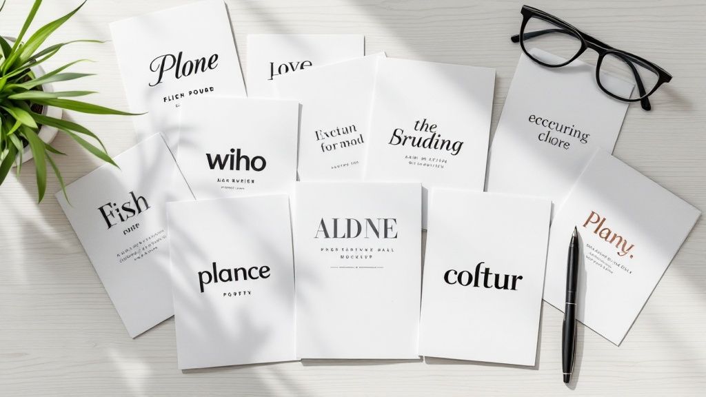 story
story 9 Best Fonts for Flyers to Capture Attention in 2025
A flyer's job is to grab attention in a split second. While compelling images and a bold offer are crucial, the silent workhorse of your design is the font. The right typeface does more than just present information; it sets the tone, establishes credibility, and guides the reader's eye. Choosing from the best fonts for flyers can mean the difference between a message that gets read and one that is instantly discarded. An effective font choice ensures your message lands with impact, whether it's posted on a community board or handed out at a busy event. This guide moves beyond generic advice to give you a curated list of powerhouse fonts, complete with specific strategies to help you select the perfect one for your message, brand, and audience. We will explore why certain typefaces like Helvetica and Futura command authority while others like Montserrat feel modern and approachable. Making a thoughtful font selection is a fundamental part of a successful physical marketing strategy. Just as understanding the different kinds of signage for your business helps you choose the right medium, picking the right font ensures your message is delivered effectively on that medium. Our goal is to provide actionable insights for every flyer you design. You will learn not only which fonts to use but also how to pair them, set them for maximum readability, and align them with your specific goals. This curated selection will ensure your next flyer doesn't just look good-it performs, turning a passing glance into a genuine customer connection. 1. Helvetica Helvetica is a titan in the world of typography, a classic sans-serif typeface renowned for its clean lines, modern aesthetic, and unparalleled readability. Developed in 1957 by Max Miedinger and Eduard Hoffmann, its design philosophy centers on neutrality and clarity, allowing the message to take center stage without distraction. This inherent versatility and professional demeanor make it a perpetually reliable choice and one of the best fonts for flyers where clear communication is paramount. Its power lies in its unassuming confidence. Helvetica can convey urgent information for a community event, project sophistication for a corporate seminar, or present a clean, modern look for a tech product launch. Its widespread adoption by global brands like Apple, BMW, and American Airlines is a testament to its effectiveness in creating a trustworthy and impactful visual identity. Why It's a Top Choice for Flyers Helvetica's genius is its chameleon-like ability to fit nearly any context while maintaining a sense of authority. For a flyer, this means your headlines will be sharp, your body text will be exceptionally legible even from a distance, and your contact information will be clear and unambiguous. It establishes an immediate sense of professionalism and order, ensuring your audience can absorb key details effortlessly. Key Insight: Use Helvetica when your primary goal is direct, unadorned communication. Its neutrality ensures the font supports your message rather than overpowering it, making it ideal for corporate, informational, and minimalist designs. Actionable Tips for Using Helvetica To maximize Helvetica's impact on your next flyer design, follow these specific strategies: Create a Strong Hierarchy: Use Helvetica Bold or Helvetica Neue Bold for your main headline to grab attention instantly. Complement it with the regular weight for subheadings and body copy to guide the reader's eye smoothly through the information. Embrace White Space: Helvetica’s clean geometry shines when given room to breathe. Generous margins and spacing between text blocks prevent your flyer from feeling cluttered and enhance its modern, professional appeal. Create Dynamic Contrast: While effective on its own, Helvetica pairs beautifully with a traditional serif font. Try using a serif like Garamond for the body text while keeping Helvetica for all headings. This classic pairing adds a touch of elegance and improves readability. Avoid Overuse: A flyer set entirely in Helvetica can feel monotonous. To maintain visual interest, introduce a complementary font for pull quotes or special offers, or use color to differentiate sections. 2. Futura Futura is a legendary geometric sans-serif typeface that embodies efficiency, modernism, and forward-thinking design. Designed by Paul Renner in 1927, its forms are derived from simple geometric shapes like circles, triangles, and squares. This clean, functional aesthetic gives it a timeless yet futuristic feel, making it one of the best fonts for flyers aimed at a contemporary audience. Its influence is vast, having been famously used by NASA for the plaque left on the moon, in the iconic branding of Volkswagen, and in the stylish filmography of Wes Anderson. Futura’s power lies in its ability to be both elegant and authoritative. It projects an image of innovation, precision, and sophistication, making it perfect for tech, design, or fashion-related flyers. Why It's a Top Choice for Flyers Futura’s geometric precision makes headlines and key information stand out with striking clarity and style. For a flyer, this means your message feels intentional, modern, and impactful. It’s a font that doesn't just present information; it makes a statement about the brand or event it represents, suggesting it is current, innovative, and sophisticated. Its various weights provide great flexibility for creating a clear visual hierarchy. Key Insight: Use Futura when you want to convey a sense of modern elegance, technological advancement, or minimalist chic. It is ideal for designs where the font itself is a key component of the brand's forward-looking identity. Actionable Tips for Using Futura To leverage Futura's clean geometry and modern appeal on your flyer, consider these strategies: Focus on Headlines: Use Futura Bold or Futura Extra Bold for your main headline to create a powerful, attention-grabbing focal point. Its clean shapes make it highly effective for short, impactful statements. Increase Letter Spacing (Tracking): For headlines set in all caps, slightly increasing the tracking (the space between letters) can enhance its sophisticated and airy aesthetic, improving readability and visual appeal. Pair with a Humanist Font: Futura's rigid geometry can feel stark in long paragraphs. Pair it with a more humanist sans-serif or a classic serif for body copy to add warmth and improve long-form readability. Utilize Its Geometric Shapes: Lean into Futura’s design roots by incorporating geometric shapes and clean lines into your flyer's overall layout. This creates a cohesive and visually harmonious design that reinforces the font’s modern character. 3. Proxima Nova Proxima Nova stands as a modern typographic bridge, expertly blending the geometric clarity of fonts like Futura with the humanist warmth of classic grotesques. Designed by Mark Simonson, it strikes a perfect balance between technical precision and friendly approachability. This unique character makes it one of the best fonts for flyers, offering a clean, contemporary feel that is both professional and inviting. Its strength is its sophisticated yet straightforward nature. Proxima Nova is the typeface of choice for countless modern digital brands like Spotify and Mashable because it feels current, clear, and trustworthy. For a flyer, it can project a forward-thinking vibe for a tech startup, offer a clean layout for a real estate listing, or create an accessible feel for a community workshop. Why It's a Top Choice for Flyers Proxima Nova's extensive family of weights and styles is its superpower. With options ranging from Thin to Black, it provides all the tools needed to build a clear and dynamic visual hierarchy within a single font family. This versatility ensures your flyer's headlines are impactful, its body copy is highly legible, and its call-to-action stands out, all while maintaining a cohesive and polished look. Key Insight: Use Proxima Nova when you need a font that feels modern and friendly without sacrificing professionalism. It is exceptionally well-suited for brands that want to appear both innovative and trustworthy. Actionable Tips for Using Proxima Nova To leverage Proxima Nova's versatility and modern appeal on your flyer, implement these strategies: Vary Your Weights: Create a strong, engaging hierarchy using different weights. Use Proxima Nova Extra Bold for your main headline, a semi-bold weight for subheadings, and the regular weight for body text. This adds visual interest and guides the reader's eye effectively. Use Light Weights for Elegance: For a more sophisticated or minimalist flyer design, such as for a gallery opening or a high-end service, use Proxima Nova Light for headlines. Paired with generous white space, it creates an airy and refined aesthetic. Pair with a Characterful Serif: Proxima Nova's clean neutrality makes it an excellent partner for a more decorative serif font. Use it for all informational text and pair it with a serif like Playfair Display for a single, impactful headline to add a touch of personality. Ensure Digital Consistency: If your flyer promotes a website or social media campaign, using Proxima Nova ensures visual harmony across both print and digital platforms, as it is a web-safe font renowned for its excellent on-screen readability. 4. Montserrat Montserrat is a geometric sans-serif typeface that captures the spirit of early 20th-century urban typography, specifically inspired by the posters and signs in the historic Montserrat neighborhood of Buenos Aires. Designed by Julieta Ulanovsky and available for free through Google Fonts, its friendly yet structured character has made it a digital-era favorite. Its blend of classic and modern aesthetics makes it one of the best fonts for flyers aiming for a clean, cosmopolitan, and approachable feel. Its widespread popularity stems from its incredible versatility and extensive family of weights, which range from Thin to Black. This allows for dynamic and expressive designs without needing a second font family. Montserrat feels both professional and personable, making it suitable for a coffee shop opening, a tech startup announcement, or a community arts festival, and it is a popular choice for everything from website headers to social media graphics. Why It's a Top Choice for Flyers Montserrat offers a perfect balance of style and readability. Its open letterforms and generous spacing ensure that even at smaller sizes, your body text remains legible, a crucial feature for information-dense flyers. The font’s geometric foundation gives headlines a strong, modern presence that is confident without being overbearing. It projects an image of being current, accessible, and design-savvy, which helps build trust with a modern audience. Key Insight: Use Montserrat when you want to convey a friendly, modern, and trustworthy tone. Its geometric clarity is excellent for tech, creative, and community-focused flyers that need to feel both professional and approachable. Actionable Tips for Using Montserrat To get the most out of Montserrat in your flyer designs, consider these practical strategies: Leverage Its Weight Range: Create a powerful visual hierarchy using only the Montserrat family. Use Montserrat ExtraBold or Black for a high-impact headline, SemiBold for subheadings, and Regular for body copy. This ensures consistency while providing clear visual separation. Focus on Kerning for Headlines: For large headlines, pay close attention to the spacing between letters (kerning). Tightening the kerning slightly can make your main message look more cohesive and professionally polished. Pair with Contrasting Fonts: While it stands strong on its own, Montserrat pairs beautifully with elegant script or serif fonts. Use a flowing script for a call-to-action or a classic serif like Merriweather for body text to add a touch of warmth and personality. Ideal for Bilingual Content: Montserrat’s clean, unambiguous characters and extensive language support make it an outstanding choice for bilingual flyers, ensuring clarity and consistency across different languages. 5. Trade Gothic Trade Gothic is an American grotesque sans-serif with an industrial strength and a straightforward, no-nonsense character. Designed by Jackson Burke between 1948 and 1960, it was crafted for the demands of advertising and headlines. This font projects an authentic, bold, and slightly rugged feel, making it an excellent choice for flyers that need to convey authority and grab attention without pretense. Its power comes from its hardworking aesthetic. Unlike more polished grotesques like Helvetica, Trade Gothic retains a touch of grit that gives it a unique voice. This makes it perfect for a music festival flyer, a promotional ad for a construction company, or any design aiming for a vintage or industrial theme. Its straightforwardness ensures your message is delivered with confidence and clarity. Why It's a Top Choice for Flyers Trade Gothic’s range of weights and widths, particularly its condensed versions, makes it incredibly versatile and one of the best fonts for flyers where space is at a premium. It allows you to create impactful, text-heavy headlines that remain legible and powerful. This font brings a raw, energetic feel to a design, ensuring your flyer stands out from more conventional options and communicates its message with force. Key Insight: Use Trade Gothic for designs that need to feel authentic, strong, and direct. It’s ideal for masculine or industrial branding, event promotions, and any context where a polished, corporate look feels out of place. Actionable Tips for Using Trade Gothic To leverage Trade Gothic’s unique character on your next flyer, consider these strategies: Go Bold with Headlines: Use Trade Gothic Bold Condensed or Bold No. 20 for your main headline. This creates an immediate, high-impact statement that is both space-efficient and visually commanding. Balance with Lighter Fonts: The strong personality of Trade Gothic can be overwhelming if used everywhere. Pair it with a lighter, neutral sans-serif like Open Sans or a simple serif for body copy to provide visual relief and improve readability. Embrace Industrial Themes: Lean into its inherent aesthetic. Trade Gothic works exceptionally well with distressed textures, strong grid layouts, and a limited, bold color palette to create a cohesive and powerful industrial or vintage design. Adjust Tracking for Readability: The condensed versions can sometimes feel tight. Slightly increasing the letter spacing (tracking) in your headlines can improve legibility and give your text a more refined, professional appearance. 6. Gill Sans Gill Sans is a quintessential humanist sans-serif, a typeface that expertly blends modern clarity with the warm, organic strokes of traditional calligraphy. Designed by Eric Gill in 1928, it carries a distinctly British character, embodying a sense of heritage, authority, and refined intelligence. Its balanced proportions and classical roots give it an approachable yet professional feel, making it one of the best fonts for flyers that need to convey trustworthiness and sophistication. Its enduring appeal lies in its unique ability to be both formal and friendly. Gill Sans can announce a university open day with academic gravitas, promote a heritage brand’s new product with timeless elegance, or outline the details of a government initiative with clarity and assurance. Its iconic use by institutions like the BBC, British Railways, and on classic Penguin Books covers highlights its power to create a reliable and intellectually engaging visual voice. Why It's a Top Choice for Flyers Gill Sans brings a level of established credibility to a flyer that few other sans-serifs can match. Its humanist characteristics, like the subtle variations in stroke weight, make long passages of text comfortable to read, which is ideal for information-heavy flyers. Headlines set in Gill Sans are strong without being aggressive, and its classic structure ensures your message is perceived as dependable and well-considered, helping to build immediate trust with your audience. Key Insight: Use Gill Sans when you want to project an image of established authority and intelligence. It’s perfect for educational, institutional, or premium brand flyers where credibility is just as important as the message itself. Actionable Tips for Using Gill Sans To effectively leverage Gill Sans on your next flyer, consider these targeted strategies: Emphasize Its Heritage: Use Gill Sans Bold or Extra Bold for a main headline to create a powerful, classic statement. Pair it with the regular weight for body copy to ensure excellent readability in text-heavy sections, such as for event schedules or program details. Create an Elegant Pairing: Gill Sans pairs exceptionally well with traditional serif fonts. Combine it with a typeface like Caslon or Bembo for the body text to create a sophisticated and highly readable design that feels both classic and scholarly. Manage Spacing Carefully: The letterforms in Gill Sans are quite distinct. Pay close attention to tracking (the space between letters) in your headlines to ensure they feel cohesive and balanced, preventing them from appearing too tight or too loose. Use for Text-Heavy Layouts: Thanks to its high legibility and open forms, Gill Sans is a workhorse for flyers that contain significant amounts of text. Its humanist design prevents reader fatigue, making it suitable for educational materials, detailed announcements, or non-profit appeals. 7. Bebas Neue Bebas Neue is a powerhouse display font, a condensed sans-serif celebrated for its tall, clean, and commanding presence. Developed by Ryoichi Tsunekawa, this typeface has become a favorite among designers for its ability to deliver impactful headlines that are both elegant and strong. Its narrow letterforms make it incredibly efficient, allowing for bold statements even in limited space, which is why it stands as one of the best fonts for flyers promoting high-energy events. Its strength is in its unapologetic confidence and modern flair. Bebas Neue is perfect for grabbing attention on a movie poster, conveying chic sophistication for a fashion brand, or announcing a high-octane sports event. Its clean, all-caps design ensures that titles are not just read but seen, making an immediate and lasting impression on passersby. Why It's a Top Choice for Flyers Bebas Neue’s brilliance lies in its ability to create maximum visual impact with minimal effort. For a flyer, this means your main message will shout from the page, instantly drawing the eye. It’s ideal for event names, promotional offers, and key taglines that need to be seen from a distance. The font’s condensed nature ensures that even long headlines feel punchy and contained rather than sprawling and messy. Key Insight: Use Bebas Neue when your flyer needs a bold, contemporary, and assertive voice. It excels in designs that aim to feel modern and energetic, making it perfect for promotions targeting a younger, style-conscious audience. Actionable Tips for Using Bebas Neue To leverage the full power of Bebas Neue on your next flyer, apply these specific techniques: Reserve for Headlines Only: Bebas Neue is a display font designed for impact, not readability in long paragraphs. Use it exclusively for your main title or key phrases and never for body copy. Pair with a Simple Sans-Serif: Create a balanced and legible hierarchy by pairing its bold headlines with a clean, neutral sans-serif like Lato, Open Sans, or Roboto for subheadings and body text. This contrast ensures clarity. Increase Letter Spacing (Tracking): To improve readability and give your headlines a more refined, cinematic feel, slightly increase the tracking (letter spacing). This prevents the tall, condensed letters from feeling too crowded. Stack Words for Vertical Impact: The font’s tall, narrow structure works exceptionally well when words are stacked vertically. This technique is great for creating dynamic, modern layouts for event announcements or nightclub flyers. 8. Lato Lato is a humanist sans-serif typeface that strikes a remarkable balance between professionalism and warmth. Designed by Łukasz Dziedzic, its name means "summer" in Polish, a nod to its friendly and approachable feel. Its semi-rounded letterforms provide a sense of harmony and ease, while its solid structure ensures it remains serious and stable, making it one of the best fonts for flyers that need to feel both authoritative and inviting. The font was originally conceived for a large corporate client but was later released for public use, becoming a staple on Google Fonts. Its strength lies in its incredible versatility and extensive family of weights, which range from Hairline to Black. This allows it to work seamlessly for everything from government and healthcare communications to flyers for non-profits and educational workshops, conveying information with a welcoming clarity. Why It's a Top Choice for Flyers Lato’s design is a study in functional elegance. It was created with body text in mind, ensuring exceptional readability in smaller sizes on a flyer, such as for event details or contact information. Yet, its bolder weights are strong and distinct enough to create impactful headlines that feel modern and accessible. This dual capability means you can design a cohesive, highly legible flyer using a single font family, creating a clean and unified look. Key Insight: Use Lato when you want to appear friendly and credible simultaneously. Its warm character builds trust and engagement, perfect for community-focused, educational, or service-oriented flyers where a human touch is essential. Actionable Tips for Using Lato To leverage Lato’s friendly professionalism on your next flyer, consider these specific techniques: Balance Headings and Body Copy: Use Lato Bold or Lato Black for a strong, inviting headline. For body text, stick with Lato Regular to ensure maximum legibility and prevent reader fatigue, creating a clear informational flow. Enhance Digital and Print Readability: Lato was optimized for screen use but performs just as beautifully in print. Its balanced letter spacing makes it an excellent choice for flyers that will be distributed both physically and as digital PDFs. Pair with an Expressive Serif: Combine Lato’s clean sans-serif style with a characterful serif like Merriweather or Playfair Display. Use the serif for the main headline to add a touch of personality, while using Lato for all subheadings and body text for clarity. Focus on Informational Clarity: Lato excels in information-heavy designs. Its straightforward and unpretentious nature makes it ideal for flyers that need to communicate schedules, program details, or instructions clearly and without distraction. 9. Impact Impact is an ultra-bold, condensed sans-serif typeface designed by Geoffrey Lee in 1965 with a single, clear purpose: to command attention. Its thick strokes, compressed letterforms, and minimal internal white space create a dense, powerful visual that is impossible to ignore. While its modern fame is often tied to internet memes, its original intent makes it one of the best fonts for flyers needing to deliver a short, powerful message with urgency. The font's design is purely functional, prioritizing visibility and force over nuance. Impact shouts rather than speaks, making it an exceptional tool for headlines that need to cut through visual noise. It is the go-to choice for high-energy promotions, urgent announcements, and bold statements, such as for a clearance sale, a boxing match promotion, or a last-chance offer where immediacy is the primary goal. Why It's a Top Choice for Flyers Impact’s strength lies in its uncompromising boldness. For a flyer, this means your headline will have an immediate and forceful presence, stopping passersby in their tracks. Its condensed nature allows you to fit large, powerful words into a tight space, maximizing every inch of your design for visual force. It’s built to be seen from a distance and processed in an instant. Key Insight: Use Impact when your message must be loud, direct, and urgent. It’s not for body text or nuanced communication; its sole purpose is to create a high-visibility, attention-grabbing headline that demands to be read. Actionable Tips for Using Impact To harness Impact's power effectively without overwhelming your flyer design, consider these tips: Reserve It for Headlines Only: Impact is a one-trick pony, and that trick is shouting. Never use it for subheadings or body copy, as its low legibility in smaller sizes will render your message unreadable. Pair it with a clean, neutral sans-serif like Arial or Roboto for supporting text. Keep Your Message Short: The font works best for one to three-word phrases like "SALE," "FREE," or "NOW OPEN." Longer sentences become dense, illegible blocks of text that defeat the purpose of grabbing quick attention. Give It Ample Space: While the font itself is condensed, the text block needs significant white space around it. This contrast prevents your flyer from looking cluttered and allows the headline's power to stand out even more. Use High-Contrast Colors: Maximize visibility by setting Impact in a color that starkly contrasts with your background. Think bold yellow on black, or bright red on a white background, to enhance its inherent urgency. Top 9 Flyer Fonts Comparison Font 🔄 Implementation Complexity ⚡ Resource Requirements 📊 Expected Outcomes 💡 Ideal Use Cases ⭐ Key Advantages Helvetica Medium Licensed commercial font (paid) High readability, professional look Corporate events, healthcare, minimalist designs Universally trusted, extremely legible Futura Medium Licensed commercial font (paid) Strong visual impact, modern feel Tech events, art exhibitions, fashion shows Geometric precision, timeless modernity Proxima Nova Medium Licensed commercial font (paid) Versatile, great readability Startups, digital marketing, social media Balanced humanist design, web & print ready Montserrat Low Free (Google Font) Clean, trendy, approachable Community events, small businesses, multicultural Free, wide weights, excellent language support Trade Gothic Medium Licensed commercial font (paid) Bold, attention-grabbing Construction, music events, industrial themes Boldness, space-efficient condensed styles Gill Sans Medium Licensed commercial font (paid) Timeless, elegant, authoritative Educational, government, traditional businesses Warm yet professional, strong brand recognition Bebas Neue Low Free Maximum headline impact Entertainment, fashion, sports, nightlife All-caps bold, space-efficient, free font Lato Low Free (Google Font) Friendly, highly readable Healthcare, education, government, non-profits Free, versatile family, great legibility Impact Low Pre-installed/Free Extreme boldness, highly visible Sales, urgent announcements, sports promotions Ultra-condensed, maximum attention grabbing From Font Selection to Flawless Flyers Choosing the right typeface is a foundational decision in flyer design, but it’s the first step, not the final one. Throughout this guide, we've explored a curated selection of the best fonts for flyers , from the timeless neutrality of Helvetica to the commanding presence of Bebas Neue. Each font carries its own distinct personality, offering a unique tool to capture attention, convey a specific mood, and guide the reader’s eye through your message. The goal was to move beyond a simple list and equip you with the strategic understanding needed to make an informed choice that aligns perfectly with your brand, your audience, and your overall marketing objective. A well-chosen font like Montserrat can communicate modern friendliness, while a classic like Gill Sans can evoke a sense of heritage and trustworthiness. The key takeaway is that typography is not merely decorative; it is a critical component of communication. The most effective flyers are those where the font works in harmony with the layout, imagery, and copy to create a cohesive and persuasive whole. Beyond the Font: Mastering Typographic Hierarchy Simply selecting one of the best fonts for flyers is not a guarantee of success. The true artistry lies in how you implement it. One of the most critical concepts to master is typographic hierarchy . This is the visual system you use to organize information, telling your audience what to read first, second, and third. Without a clear hierarchy, even a brilliant font choice can result in a confusing and ineffective design. To build a strong hierarchy, consider these actionable steps: Vary Font Weights: Use the bold or black weights of your chosen font family (like Lato or Proxima Nova) for your main headline. Use a regular or medium weight for subheadings and a light or regular weight for body text. This creates instant contrast and clarifies the information structure. Adjust Font Sizes: Your headline should be significantly larger than any other text on the flyer. Subheadings should be smaller than the headline but larger than the body copy. This size differentiation is the most direct way to signal importance. Utilize Color and Contrast: A headline in a vibrant, on-brand color will naturally draw more attention than body text in a standard black or dark grey. Ensure your text has sufficient contrast with the background to remain legible from a distance, a crucial factor for flyer design. By skillfully combining size, weight, and color, you transform a flat block of text into a dynamic and easily scannable message. This ensures your key offer or event detail is seen and understood in a matter of seconds. The Crucial Link Between Design and Print Quality Your design journey culminates in the physical production of your flyer, a stage where all your careful font selection and hierarchical planning can either be brilliantly realized or fatally undermined. A fantastic digital design can lose all its power if it's printed poorly. The subtle curves of Futura or the clean lines of Helvetica can become blurred and unprofessional with low-resolution printing. The vibrant color you chose for your headline can appear dull and muted on low-grade paper. This is where the quality of your printing partner becomes paramount. The final output must honor the integrity of your design choices. Think of it this way: choosing one of the best fonts for flyers is like selecting the finest ingredients for a meal. The printing process is the final act of cooking and presentation. Without expert execution, the quality of the ingredients is wasted. Professional printing ensures that the sharpness, clarity, and color fidelity of your design are perfectly translated into a tangible marketing tool that reflects the quality of your brand. A professionally printed flyer feels substantial, looks credible, and ultimately, drives better results. Your font is the voice of your flyer. By pairing a powerful typeface with thoughtful hierarchy and high-quality printing, you ensure that voice is heard clearly, professionally, and persuasively. Ready to bring your perfectly designed flyer to life? At 4OVER4 , we specialize in premium printing that ensures your font choices and design elements look as crisp and professional on paper as they do on your screen. Explore our vast selection of paper stocks, finishes, and flyer options to create a marketing tool that truly makes an impact. Visit 4OVER4 to see how we can transform your vision into a flawless final product.
 story
story Find the Best Paper for Flyers in 2025 | Top Picks & Tips
Elevate Your Flyers with the Perfect Paper Want to create flyers that grab attention and leave a lasting impression? Choosing the best paper for flyers is crucial for achieving professional, high-impact results. This list of the seven best paper types for flyers will help you select the perfect option for your needs. From glossy photo paper to versatile cardstock and durable synthetic options, discover which paper weight and finish will make your message pop. Stop your flyers from ending up in the recycling bin and start making them stand out with the right paper. 1. Glossy Photo Paper (200-300 GSM) When it comes to creating flyers that truly pop, glossy photo paper stands out as a premium choice. This paper type offers a high-shine finish that elevates the vibrancy of colors and sharpness of images, making it ideal for flyers where visual impact is paramount. Whether you're showcasing high-quality product photos, promoting a special event, or distributing marketing materials, the reflective quality of glossy paper catches the eye and demands attention. This makes it a strong contender for the best paper for flyers, especially when visual appeal is a top priority. Glossy photo paper typically ranges from 200-300 GSM (grams per square meter), indicating a substantial weight and thickness. This weight contributes to the paper's durability and resistance to tearing, ensuring your flyers can withstand handling and distribution. The higher GSM also lends a more premium, professional feel to the finished product. For instance, if you're a graphic designer creating flyers for a high-end client, glossy photo paper reinforces the impression of quality and sophistication. Similarly, marketing professionals can leverage the vibrant color reproduction to showcase products in the best possible light, enticing potential customers. Event organizers can use glossy flyers to create visually stunning invitations that generate excitement and anticipation. A key advantage of glossy photo paper is its exceptional image reproduction quality. The smooth, coated surface allows for precise ink application, resulting in crisp details and accurate color representation. This is especially crucial for flyers featuring intricate designs, photographs with subtle gradations, or branding elements that require precise color matching. The high-gloss finish amplifies color saturation and brightness, making images appear more vivid and dynamic. This visual impact is particularly beneficial for businesses in industries like fashion, food, and art, where vibrant imagery is essential for capturing attention and conveying brand identity. Learn more about Glossy Photo Paper (200-300 GSM) and explore various flyer printing options. Furthermore, many glossy photo papers feature a water-resistant coating, adding another layer of protection and durability. This is a practical consideration for flyers that might be exposed to moisture, such as outdoor promotional materials or flyers distributed at events where drinks might be served. This water resistance helps maintain the flyer’s pristine appearance, ensuring your message remains clear and impactful even in less-than-ideal conditions. For businesses operating in humid climates, this feature can be invaluable. While glossy photo paper offers many advantages, it’s important to be aware of its limitations. The glossy surface, while visually appealing, is prone to showing fingerprints and smudges. This requires careful handling during printing and distribution. Additionally, the reflective nature of the paper can cause glare under certain lighting conditions, potentially making the text difficult to read. It's also worth noting that inkjet printing on glossy paper can require a longer drying time, necessitating careful planning and handling to avoid smudging. Finally, glossy photo paper tends to be more expensive than standard matte or uncoated papers. In comparison to matte paper, which offers a non-reflective surface and a more understated look, glossy paper prioritizes vibrant colors and image clarity. While matte paper is a good choice for text-heavy flyers or those requiring a more classic aesthetic, glossy paper shines when visuals take center stage. You can visit the Canson website ( https://www.canson.com ) to explore their range of glossy photo papers. Although pricing information may vary depending on the specific product and retailer, expect to pay a premium for the enhanced visual quality and durability that glossy paper provides. When selecting glossy photo paper, consider the specific requirements of your project. For high-resolution photographic prints, choose a paper with a higher GSM and a smooth, microporous coating. For flyers with less demanding image requirements, a lower GSM option might be sufficient. When printing on glossy photo paper, ensure your printer settings are optimized for this paper type. This typically involves selecting the "glossy photo paper" setting in your printer's dialogue box. This setting adjusts the ink application to prevent smudging and maximize color vibrancy. Allowing sufficient drying time after printing is also crucial. Consider using a paper cutter or guillotine for clean, professional edges when trimming your flyers. These tips will help you achieve the best possible results with glossy photo paper, ensuring your flyers make a lasting impression. 2. Matte Presentation Paper (150-200 GSM) When searching for the best paper for flyers, matte presentation paper often emerges as a top contender for its blend of professionalism, readability, and versatility. This paper stock, typically ranging from 150-200 GSM (grams per square meter), offers a smooth, non-reflective surface that's ideal for showcasing text-heavy content without the distracting glare often associated with glossy finishes. From business presentations and corporate documents to informative flyers and event announcements, matte presentation paper strikes a balance between visual appeal and practical functionality. The weight of the paper, falling between 150-200 GSM, contributes to its substantial feel and durability. This medium weight provides a good balance; it’s sturdy enough to handle repeated handling without tearing easily, yet not so thick that it becomes difficult to fold or insert into presentation folders. For flyers that need to withstand distribution and maintain a professional appearance, this weight range is ideal. Furthermore, the non-reflective matte coating ensures excellent text clarity, making it easy for recipients to read your message regardless of the lighting conditions. This is particularly crucial for flyers containing important information, detailed instructions, or lengthy descriptions. Compared to glossy paper, which can sometimes prioritize visual impact over readability, matte presentation paper prioritizes clarity and professionalism. While glossy paper excels at making colors pop, the glare it produces can make text difficult to decipher, especially under bright lights. Matte paper, on the other hand, offers a more subdued, sophisticated look that's perfect for corporate settings and professional communications. If your flyer design relies heavily on text, or if it's intended for an environment with variable lighting, matte is the superior choice. Learn more about Matte Presentation Paper (150-200 GSM) This resource provides additional insights into the applications of matte presentation paper, particularly within the context of professional presentations. One of the key benefits of using matte presentation paper is its ability to enhance readability. The absence of glare significantly reduces eye strain, allowing readers to easily absorb the information presented. This is invaluable for flyers containing detailed program schedules, product specifications, or complex data. Furthermore, the smooth, non-reflective surface provides a comfortable tactile experience, further enhancing the overall impression of quality and professionalism. While matte presentation paper offers numerous advantages, it's important to be aware of its limitations. Colors on matte paper may appear slightly less vibrant than on glossy paper. While images are certainly printable on matte stock, they may lack the same level of saturation and brilliance. If your flyer design is heavily image-based and requires vibrant color reproduction, glossy paper might be a better choice. Additionally, matte paper is more susceptible to moisture damage and can show fingerprints or handling marks more readily than glossy paper. Therefore, proper storage and handling are crucial, especially for large print runs. Finally, its limited water resistance makes it unsuitable for outdoor use or applications where the flyer might be exposed to the elements. Pricing for matte presentation paper is generally lower than for premium glossy options, making it a cost-effective choice for many businesses and organizations. The specific cost will depend on factors like paper weight, quantity, and printing method. It’s readily available from most office supply stores and online printing services, like HP ( https://www.hp.com ), offering flexibility and accessibility for various printing needs. When preparing your artwork for printing on matte paper, ensure you are working with high-resolution images and a color profile suitable for matte stock. This will help optimize the print quality and achieve the best possible results for your flyers. 3. Cardstock (250-350 GSM) When you want your flyers to make a statement, cardstock is the best paper for flyers demanding a premium feel and lasting impression. This heavier paper stock, typically ranging from 250-350 GSM (grams per square meter), exudes quality and professionalism, setting it apart from standard flyer paper. Its substantial weight conveys a sense of importance, making it ideal for high-end promotional materials, impactful event invitations, or flyers designed for repeated handling. Think of product launch announcements where you want to convey exclusivity, or invitations to a gala where the feel of the invitation sets the tone for the event. This isn't your average takeout menu flyer; this is about making a statement. The superior durability of cardstock ensures your flyers withstand the test of time and frequent handling. Where a thinner paper might tear or crease easily, cardstock holds its shape and maintains its pristine appearance. This is particularly crucial for flyers that are likely to be passed around, displayed on tables, or tucked into pockets. Imagine a trade show where potential clients are constantly picking up and examining marketing materials – cardstock ensures your message remains crisp and professional throughout the event. This durability also makes it an excellent choice for loyalty cards or coupons intended for repeated use. Cardstock offers a premium tactile feel that elevates the perceived value of your message. The thickness and rigidity provide a satisfying weight in the hand, creating a subconscious association with quality and sophistication. This subtle but powerful detail can significantly impact how recipients perceive your brand and messaging. Consider a high-end boutique promoting a new collection – a flimsy flyer would undermine the brand's image, while a cardstock flyer reinforces the message of luxury and exclusivity. This paper stock is available in various finishes, offering further customization options to align with your brand aesthetic. From smooth and uncoated to matte, gloss, or even textured finishes, you can choose the perfect look and feel to complement your design. A matte finish, for example, offers a sophisticated, understated elegance, while a gloss finish creates a vibrant, eye-catching effect. For a truly unique touch, textured cardstock can add a tactile dimension that further enhances the premium feel. While cardstock offers numerous advantages, it's essential to be aware of the practical considerations. The higher cost per sheet compared to standard paper is a factor to consider, especially for large print runs. You’ll also need to ensure your printer is compatible with heavier paper stock. Some printers may struggle to feed or print on cardstock, potentially leading to jams or misprints. Check your printer's specifications or consult with a print shop for guidance. Heavier paper also translates to higher mailing costs, which should be factored into your budget. Learn more about Cardstock (250-350 GSM) for technical specifications and printing tips. Neenah ( https://www.neenah.com ) is a renowned supplier of premium paper stocks, including a wide range of cardstock options suitable for various printing projects. Exploring their website can provide further insight into the diverse options available and help you select the best cardstock for your specific needs. Choosing the best paper for flyers is a crucial step in creating effective marketing materials. When you need to convey quality, professionalism, and make a lasting impact, cardstock (250-350 GSM) stands out as a superior choice. Its durability, premium feel, and excellent print stability make it the ideal canvas for high-end promotions, impactful event announcements, and any flyer designed to leave a lasting impression. While it comes with a higher price tag and some practical considerations, the enhanced impact and perceived value often outweigh the additional cost. 4. Coated Paper (128-170 GSM) When searching for the best paper for flyers, coated paper in the 128-170 GSM range often emerges as a top contender. This weight range offers an excellent balance between quality and affordability, making it a popular choice for businesses and individuals looking for professional-looking flyers without breaking the bank. It's a versatile option suitable for a wide range of promotional activities, from advertising special offers to distributing event announcements. This GSM range strikes a sweet spot, providing sufficient heft to convey a sense of quality while remaining cost-effective for medium-volume print runs. The defining characteristic of coated paper is its smooth surface treatment. This coating significantly enhances print quality and color reproduction, resulting in vibrant, eye-catching flyers. The smooth surface allows for crisp, clear printing of both text and images, ensuring your message is communicated effectively. This characteristic is especially important for flyers featuring detailed graphics or photographs, as the coating helps prevent ink from bleeding or feathering. Compared to uncoated paper, the colors appear more saturated and true-to-life on coated stock, lending a professional and polished look to your marketing materials. This paper weight is compatible with most standard printers, including inkjet and laser printers, making it a convenient choice for in-house printing. However, for large print runs, professional printing services are often preferred to ensure consistent quality and take advantage of bulk discounts. While precise pricing can vary depending on the supplier, quantity, and specific finish (gloss or matte), coated paper in this GSM range generally offers a cost-effective solution compared to heavier premium papers. This makes it a particularly attractive option for small and medium-sized businesses, event organizers, and marketing professionals working with a budget. Coated paper in the 128-170 GSM range excels in applications where visual appeal is paramount. Consider using this paper type for flyers promoting: Retail sales and promotions: The vibrant color reproduction makes special offers and discounts pop. Product launches: Showcase new products with high-quality images that accurately represent their features. Event announcements: Create eye-catching flyers for conferences, concerts, and festivals. Corporate brochures: Present your company and services in a professional and polished manner. Restaurant menus: Showcase delectable dishes with appealing food photography. While coated paper offers numerous advantages, it's important to be aware of its limitations. It’s not as durable as heavier cardstock, making it more susceptible to bending and tearing. The coated surface, while enhancing print quality, can also be prone to showing fingerprints and smudges. Furthermore, moisture can damage the coating, so it's important to store and handle these flyers carefully. While the smooth finish contributes to a professional look, it lacks the premium tactile appeal of thicker, textured papers. If you're aiming for a truly high-end feel, a heavier paper stock might be a better choice. Implementation Tips: Choose the right finish: Glossy coated paper provides a high-shine finish that amplifies colors, while matte coated paper offers a more subdued, sophisticated look. Consider your printer: Ensure your printer can handle paper weights in the 128-170 GSM range. Design for the paper: Use high-resolution images and vibrant colors to maximize the impact of the coated surface. Test print: Always print a test copy before committing to a large print run to ensure the colors and design elements appear as intended. For more information about coated paper options, visit International Paper . By carefully considering the features and benefits of coated paper, you can choose the best paper for flyers that effectively communicates your message and achieves your marketing goals. 5. Silk/Satin Finish Paper (150-250 GSM) When searching for the best paper for flyers, silk/satin finish paper often emerges as a top contender for its unique blend of elegance and practicality. This paper type offers a luxurious middle ground between the stark simplicity of matte and the high-shine of glossy, making it an excellent choice for businesses and individuals looking to create flyers that exude sophistication without sacrificing readability. Silk/satin finish achieves this balance through its subtle sheen, which adds a touch of elegance without the intense glare often associated with glossy papers. This makes it suitable for flyers with a lot of text or images that need to be viewed in various lighting conditions. The weight range of 150-250 GSM (grams per square meter) further contributes to the premium feel and durability of silk/satin finish paper. A higher GSM generally indicates a thicker, more robust paper. While 150 GSM is suitable for standard flyers, opting for a heavier weight like 200 or 250 GSM adds a noticeable heft and luxurious feel, elevating the perceived value of your marketing materials. This is particularly beneficial for high-end businesses, product launches, or events where a strong first impression is paramount. For instance, a real estate company advertising luxury properties would benefit from the sophisticated feel of a higher GSM silk/satin finish flyer. Similarly, an art gallery promoting an exhibition would find the enhanced color reproduction and subtle sheen ideal for showcasing artwork. One of the key advantages of silk/satin finish paper is its enhanced color reproduction. Unlike matte papers, which can sometimes mute colors, silk/satin allows for vibrant and rich color printing while minimizing glare. This makes it an excellent option for flyers with visually rich designs, photography, or intricate graphics. Graphic designers and marketing professionals often appreciate this feature, as it allows their designs to truly shine without being overpowered by distracting reflections. The reduced glare also enhances readability, making it easier for recipients to engage with the content of the flyer, whether they're viewing it under bright lights or in more subdued settings. While silk/satin finish offers many benefits, it’s crucial also to consider its potential drawbacks. It's generally more expensive than standard matte or uncoated papers. The cost difference can be significant depending on the GSM and quantity ordered. Availability can also be an issue, as some local print shops may not stock a wide range of silk/satin paper options. If you’re working with a tight deadline, it's essential to confirm availability with your printer beforehand. Furthermore, due to its smooth surface, silk/satin paper requires careful handling to avoid fingerprints and smudges. This is something to keep in mind during both the printing and distribution process. Lastly, while the subtle sheen is generally considered a positive attribute, it may not be suitable for all design styles. For example, a very minimalist design might benefit more from the stark contrast of a matte paper. You can learn more about Silk/Satin Finish Paper (150-250 GSM) and lamination options that might further enhance the durability and appearance of this paper type. For businesses and organizations seeking a balance between aesthetics and practicality, silk/satin finish paper offers a compelling option. Its subtle sheen, enhanced color reproduction, and luxurious feel can elevate your flyers from simple handouts to sophisticated marketing materials. By carefully weighing the pros and cons and considering your specific design needs and budget, you can determine if silk/satin is the best paper for your next flyer campaign. Consider visiting resources like Mohawk Connects ( https://www.mohawkconnects.com ) for more information on paper options and printing techniques. This paper choice is particularly well-suited for marketing professionals, event organizers, and corporate clients who want to convey a sense of professionalism and quality. Small and medium-sized businesses can also leverage this paper type to create impactful marketing materials that stand out from the competition. 6. Uncoated Offset Paper (90-120 GSM) When it comes to high-volume flyer printing, especially for budget-conscious projects, uncoated offset paper stands out as the most economical choice. This workhorse of the printing industry is a reliable option for various applications, including newsletters, announcements, and promotional materials where cost-effectiveness is a primary concern. While it may lack the glossy sheen and premium feel of coated papers, uncoated offset paper offers a practical solution for distributing information effectively. Its natural, uncoated surface provides good ink absorption, resulting in clear, legible text, making it particularly well-suited for text-heavy designs and simpler graphics. Uncoated offset paper typically comes in a lightweight construction, usually between 90-120 GSM (grams per square meter). This lighter weight contributes to its affordability, making it ideal for large print runs where paper costs can quickly add up. For instance, distributing flyers at a large conference or a mass mailing campaign can benefit significantly from the cost savings offered by this paper type. Furthermore, the lighter weight can translate to lower postage costs, another advantage for large-scale distribution. One of the key benefits of uncoated offset paper is its excellent ink absorption. This characteristic allows for fast printing and drying times, which can be crucial for projects with tight deadlines. This rapid processing makes it a popular choice for high-speed offset printing, a common method used for large print runs. Learn more about Uncoated Offset Paper (90-120 GSM) to understand its compatibility with different printing processes. While precise pricing depends on volume, paper weight, and printing services, uncoated offset consistently remains the most budget-friendly option compared to coated stocks like gloss or matte. For businesses and organizations seeking environmentally friendly options, many suppliers now offer uncoated offset paper made from recycled materials or sustainably sourced fibers. This allows for eco-conscious marketing efforts without compromising affordability. You can often find uncoated offset options certified by organizations like the Forest Stewardship Council (FSC), ensuring responsible forest management practices. While the cost-effectiveness and practicality of uncoated offset paper make it a strong contender for the best paper for flyers, it's important to be aware of its limitations. The uncoated surface doesn't produce the same vibrancy and pop of color as coated papers. Images may appear less sharp and detailed, making this paper less suitable for designs heavily reliant on high-resolution photography or intricate artwork. The paper's lighter weight also makes it more susceptible to damage like creasing or tearing, which can detract from a professional appearance. For small businesses distributing flyers locally or event organizers on a tight budget, these drawbacks might be negligible compared to the substantial cost savings. However, for marketing campaigns aiming for a premium, high-impact impression, coated papers might be a better investment. Consider your target audience, the overall design of your flyer, and your budget when deciding if uncoated offset paper is the right choice. If your design is primarily text-based, focuses on clear communication, and requires a large print run at a minimal cost, then uncoated offset paper from suppliers like Domtar ( https://www.domtar.com ) is an excellent option. Its wide availability also makes it readily accessible for most printing services. Finally, when preparing your artwork for printing on uncoated offset paper, consider using richer, darker colors to compensate for the less vibrant color reproduction and ensure readability. Using high-resolution images, even though they won't appear as sharp, can still enhance the overall visual appeal. 7. Synthetic Paper (Yupo/Teslin) When durability and weather resistance are paramount for your flyers, synthetic paper like Yupo and Teslin stands out as the ultimate solution. While traditional paper can succumb to the elements, synthetic paper, crafted from polypropylene or other synthetic materials, endures. This makes it a top contender for the best paper for flyers, particularly for outdoor use, events, or situations where flyers are subject to frequent handling. This innovative material seamlessly blends the printability of paper with the robust durability of plastic, offering a unique solution for demanding applications. Whether you're a small business owner advertising a sidewalk sale, a marketing professional organizing an outdoor product launch, or an event organizer distributing programs in unpredictable weather, synthetic paper offers unmatched resilience. Synthetic paper is 100% synthetic, typically made of polypropylene. This construction gives it a distinct advantage over traditional paper options. It's completely waterproof, resisting rain, spills, and even submersion. Its tear-resistant nature ensures that your flyers remain intact despite handling, wind, or other environmental factors. This robust construction translates into long-lasting durability, making your flyers reusable and extending their lifespan considerably. For outdoor use, this longevity is invaluable, saving you the cost and effort of frequent reprints. Synthetic paper is available in multiple weights, mimicking the variety found in traditional paper stock. This allows you to choose the right thickness and feel for your specific needs. Whether you're looking for a lightweight option for easy distribution or a heavier, more substantial feel for a premium look, you can find a synthetic paper weight to match. Furthermore, despite its unique composition, synthetic paper offers excellent print quality. Modern printing techniques, including offset and digital printing, are compatible with synthetic paper, allowing for vibrant colors and sharp images. This ensures that your message is conveyed clearly and effectively, even in challenging environments. It's also chemically resistant, meaning it won't react negatively to cleaning agents or other substances it might encounter, and its UV resistance protects against fading caused by sunlight exposure, preserving the vibrancy of your printed materials. Compared to standard paper options like coated gloss or matte paper, synthetic paper provides significantly greater durability and weather resistance. While coated papers offer some protection against moisture and tearing, they can't match the resilience of synthetic materials. Similarly, while cardstock offers increased thickness and durability compared to standard paper, it remains susceptible to water damage and tearing. Synthetic paper excels where these traditional options fall short, making it ideal for demanding applications. One of the major advantages of synthetic paper is its complete waterproof nature. Imagine flyers advertising a beachside event surviving a sudden downpour, or menus at a poolside restaurant remaining pristine despite splashes and spills. This waterproof quality makes synthetic paper an invaluable choice for businesses operating in outdoor or high-moisture environments. The exceptional tear-resistance further enhances its durability. Flyers passed around at a crowded trade show or attached to outdoor displays will remain intact and legible, ensuring your message reaches its intended audience. However, the superior performance of synthetic paper comes at a slightly higher cost. While traditional paper remains a more budget-friendly option, the longevity and resilience of synthetic paper can offset this higher initial investment. The reduced need for reprints due to weather damage or wear and tear can translate into long-term cost savings. Another consideration is the limited recyclability of synthetic paper. While some recycling options are emerging, they are not as widely available as those for traditional paper. This is an important factor for businesses prioritizing environmentally friendly practices. Printing on synthetic paper often requires specific printer settings. Consult your printer's documentation or contact a professional printing service for guidance on optimal settings for synthetic substrates. The feel of synthetic paper is also different from traditional paper. It has a smoother, slightly plastic-like texture. While this difference contributes to its durability and water resistance, it's something to consider if you're looking for a specific tactile experience. For more information on Yupo synthetic paper, visit https://www.yupousa.com . Teslin, another popular brand, can be readily researched online. If you require flyers that can withstand the rigors of outdoor use, frequent handling, or exposure to moisture, synthetic paper offers an excellent solution. Its durability, waterproof nature, and tear-resistance make it a premium choice for conveying your message effectively, even in the most challenging environments. While the higher cost and limited recyclability are factors to consider, the long-term benefits and exceptional performance of synthetic paper make it a worthwhile investment for many applications. By carefully weighing your needs and budget, you can determine if synthetic paper is the best paper for your flyers. Top 7 Flyer Paper Types Comparison Paper Type Key Features Quality & Durability Target Audience 👥 Unique Selling Points ✨ Price & Value 💰 Glossy Photo Paper (200-300 GSM) High-gloss, water-resistant coating ★★★★☆ Professional & durable Marketing, high-impact visuals ★ Vibrant colors, eye-catching shine 💰 Higher cost, premium Matte Presentation Paper (150-200 GSM) Non-reflective matte, easy readability ★★★☆☆ Good text clarity Business, presentations ✨ Reduced glare, professional look 💰 Affordable Cardstock (250-350 GSM) Heavyweight, premium feel ★★★★★ Very durable High-end promos, frequent use 🏆 Durable, premium tactile quality 💰 Higher cost Coated Paper (128-170 GSM) Smooth surface, enhanced printing ★★★☆☆ Balanced quality/cost Medium-volume flyers 💰 Cost-effective, good color 💰 Budget-friendly Silk/Satin Finish Paper (150-250 GSM) Subtle sheen, reduced glare ★★★★☆ Elegant & readable Sophisticated flyers ✨ Luxurious look, less glare 💰 Mid to high price Uncoated Offset Paper (90-120 GSM) Natural finish, economical ★★★☆☆ Basic durability Large volume, budget campaigns 💰 Lowest cost, eco-options 💰 Very affordable Synthetic Paper (Yupo/Teslin) Waterproof, tear-resistant ★★★★★ Extreme durability Outdoor, harsh conditions 🏆 Waterproof, weather-resistant 💰 Premium price Making the Best Choice for Your Flyers Choosing the best paper for flyers is a crucial step in creating effective marketing materials. From the vibrant sheen of glossy photo paper, ideal for image-heavy designs, to the classic feel of matte or uncoated paper perfect for text-heavy flyers, the right choice significantly impacts how your message is received. For a premium feel, cardstock or a silk/satin finish elevates your brand, while synthetic paper offers exceptional durability for outdoor use or situations requiring high handling. Remember, factors like GSM (grams per square meter) directly relate to the paper's thickness and overall feel. Consider your budget and the overall impression you want to create when making your selection. The best paper for flyers is the one that best represents your brand and effectively communicates your message. Ultimately, the ideal paper for your flyers depends on a careful balance between design, budget, and intended use. By considering the various options discussed—glossy photo paper, matte presentation paper, cardstock, coated paper, silk/satin finish paper, uncoated offset paper, and synthetic paper—you can pinpoint the perfect fit for your specific needs. Ready to bring your flyer designs to life with the perfect paper? 4OVER4 offers a wide selection of high-quality printing services and paper options to help you make the best choice for your flyers. Visit 4OVER4 today and explore their extensive range of products to create stunning, effective marketing materials.
 story
story The 7 Best Paper for Printing Options for Businesses in 2025
Unlocking the Power of Print: Choosing the Right Paper From business cards to brochures, choosing the best paper for printing can significantly impact how your brand is perceived. This guide provides a curated comparison of seven distinct paper types, outlining their strengths and ideal uses. You'll learn to navigate the complexities of paper weight, finish, and coating, empowering you to make informed printing decisions. This knowledge translates to more impactful marketing materials and a stronger brand presence. Whether you're a graphic designer meticulously crafting a client's annual report or an event organizer seeking the perfect invitation stock, understanding paper nuances is key. Looking to amplify your print marketing efforts? For reaching a wider audience, consider streamlining your social media strategy with tools like an AI social media content generator for printing . This listicle explores these seven key paper types: Coated Glossy Paper: Understanding its reflective qualities and best applications. Matte Paper: Exploring its subdued elegance and uses for text-heavy documents. Plain Copy Paper (20lb Bond): A deep dive into the everyday workhorse of the office. Cardstock: Discovering its durability and applications for creating a premium feel. Photo Paper: Unlocking the secrets to achieving vibrant, high-resolution images. Presentation Paper: Making informed choices for impactful presentations and reports. Fine Art Paper: Finding the right texture and weight to showcase artistic prints. 1. Coated Glossy Paper Coated glossy paper is a premium choice for printing projects that demand vibrant, sharp images and rich color saturation. This paper type gets its signature sheen from a coating of clay and other minerals. This coating fills the paper's natural pores, creating an ultra-smooth surface that reflects light, resulting in a high-gloss finish. This characteristic makes it ideal for showcasing visuals with intricate details and a wide color gamut. Advantages of Coated Glossy Paper Coated glossy paper elevates the perceived quality of printed materials. Its reflective surface enhances color vibrancy, making images appear richer and more dynamic. The smooth finish also allows for sharper details, ensuring fine lines and small text are crisp and clear. This is why it's the preferred choice for professional photographers, graphic designers, and businesses aiming for a polished, high-end look. Ideal Applications for Glossy Paper Glossy paper excels in applications where visual impact is paramount. Think of high-quality photo prints, where accurate color reproduction and sharp details are essential. It's also a popular choice for: High-end brochures showcasing product photography Magazine covers designed to grab attention on newsstands Art reproductions seeking to replicate the original artwork's vibrancy Product catalogs presenting merchandise in its best light When selecting the right paper, it's important to consider how the final product will be presented. Similarly, you can explore effective ways to enhance the presentation of your brand. Check out these helpful tips on website layout examples from Bruce and Eddy for 2025 inspiration. Working with Coated Glossy Paper While glossy paper offers undeniable visual advantages, it requires careful handling. Fingerprints and smudges are easily visible on the smooth surface, so handle prints with clean hands or cotton gloves. Because of its low ink absorption, glossy paper requires longer drying times. Allow sufficient time for ink to dry completely before stacking or handling prints to prevent smudging or offsetting. Storing glossy paper flat helps prevent curling and maintains its pristine condition. The following infographic provides a quick reference guide to the key characteristics of coated glossy paper. It visualizes key data points regarding gloss level, color reproduction, and ink absorption. As illustrated, the high gloss, excellent color reproduction, and low ink absorption make this paper best suited for image-heavy projects that prioritize visual appeal. However, this also means it is less suitable for documents requiring extensive highlighting or note-taking due to the smooth, non-absorbent surface. Consider these characteristics when deciding if coated glossy paper is the best paper for printing your project. 2. Matte Paper Matte paper offers a non-reflective, smooth surface that provides excellent print quality without the glare associated with glossy papers. It strikes a perfect balance between professional appearance and practicality, making it versatile for both text and image printing. The surface is treated to reduce light reflection while maintaining good ink absorption and color reproduction. This makes matte paper one of the best paper for printing projects requiring a sophisticated look without compromising readability. Advantages of Matte Paper Matte paper's non-reflective surface makes it incredibly versatile. It's easy on the eyes, reducing glare under bright lights, which makes it ideal for documents meant to be read extensively. Unlike glossy paper, fingerprints and smudges are less noticeable on matte paper, allowing for easier handling. The excellent ink absorption ensures crisp text and vibrant images without the risk of smudging. Ideal Applications for Matte Paper From business presentations to fine art photography, matte paper's versatility makes it a popular choice for a wide range of applications. Its elegant, understated finish adds a touch of sophistication to any printed piece. Consider using matte paper for: Business presentations and corporate reports needing a professional look Art prints and portfolios showcasing photography or illustrations Wedding albums and photo books preserving cherished memories High-quality brochures and marketing materials Documents requiring annotations or highlighting Working with Matte Paper Matte paper is generally user-friendly and compatible with most printers. Its excellent ink absorption allows for quick drying times, reducing the risk of smudging. While handling is less of a concern compared to glossy paper, it's still good practice to handle prints with clean hands. Storing matte paper flat helps prevent curling and maintains its smooth finish. Choosing a higher GSM (grams per square meter) will provide a more substantial feel and enhance the perceived quality of the final product. Consider brands like Hahnemühle, Canson, Epson, and Red River Paper, known for their high-quality matte paper options. Matte paper provides a sophisticated, non-glare finish that balances image quality and readability. Its versatility and ease of use make it an excellent choice for a broad range of printing projects, solidifying its position as one of the best paper for printing professional, elegant materials. From presentations under bright lights to documents requiring annotations, matte paper provides the functionality and aesthetic appeal required for a polished final product. 3. Plain Copy Paper (20lb Bond) Plain copy paper, typically 20lb bond weight, is the workhorse of the office and the most economical choice for everyday printing needs. Made primarily from wood pulp, it offers a balance of quality and affordability, making it suitable for a wide range of applications, from internal memos to draft documents. Despite its simplicity, modern copy papers are engineered for consistent performance across various printer types, ensuring reliable results for everyday use. Advantages of Plain Copy Paper The key advantage of 20lb bond copy paper is its cost-effectiveness. Buying in bulk significantly reduces the per-sheet cost, making it an economical solution for high-volume printing. Its smooth surface is suitable for most inkjet and laser printers, ensuring consistent print quality without jamming or other issues. Furthermore, plain copy paper is readily available, making it a convenient choice for everyday printing tasks. Ideal Applications for Plain Copy Paper Plain copy paper excels in applications where cost-efficiency and functionality are prioritized over high-end aesthetics. It's the go-to choice for: Internal memos and communications Draft prints and revisions Office documents and reports School assignments and handouts Invoices and billing statements Everyday correspondence For more specialized paper needs, such as creating customized notepads, you might consider exploring different paper options. Learn more about printing notepads for specific project requirements. Working with Plain Copy Paper While 20lb bond copy paper is generally reliable, understanding its characteristics can help optimize printing results. It's best suited for text-based documents; images and graphics may appear less vibrant than on coated paper. Consider using a heavier weight, such as 24lb, for documents requiring a more substantial feel. Store paper in a cool, dry place to prevent moisture damage and curling. For double-sided printing, ensure your printer settings are compatible with the paper weight to prevent bleed-through. Finally, consider using recycled copy paper for a more environmentally friendly option. This demonstrates a commitment to sustainability while still providing the functionality needed for everyday printing. Choosing the best paper for printing often comes down to balancing cost, quality, and purpose. While 20lb bond copy paper may not be suitable for high-end marketing materials, its affordability and versatility make it the ideal choice for the everyday printing needs of businesses, students, and individuals. 4. Cardstock Cardstock is a heavy-duty paper significantly thicker and more durable than standard copy paper. It typically ranges from 65lb to 110lb cover weight. This substantial thickness and rigidity make it the best paper for printing projects requiring durability and a premium feel. Available in various finishes and colors, cardstock bridges the gap between paper and lightweight cardboard, offering a versatile option for diverse printing needs. Advantages of Cardstock Cardstock's thickness provides a robust feel, conveying quality and professionalism. Its rigid structure makes it resistant to bending and tearing, ensuring printed materials maintain their shape and integrity. The variety of available finishes, from smooth to textured, allows for creative expression and customization to match specific project requirements. This versatility makes cardstock a popular choice for projects demanding both durability and aesthetic appeal. Ideal Applications for Cardstock Cardstock excels in applications where strength and a premium feel are essential. Consider its use for creating impactful business cards that leave a lasting impression. It's also a superior choice for: Greeting cards and invitations that convey a sense of occasion Presentation covers that project professionalism Postcards that withstand mailing and handling Durable menus for restaurants and cafes Creative craft projects requiring a sturdy base For projects requiring an even more robust material, you might explore options like foam core printing. Learn more about foam core printing options and how they can benefit specific project types, particularly those involving signage or display materials. Working with Cardstock While cardstock offers numerous advantages, it's essential to consider its thickness when printing. Always check your printer's specifications for maximum paper weight to avoid jams or damage. Using the manual feed option often provides the best results for cardstock, allowing for more controlled handling. Due to its thickness, cardstock may require extra drying time, so allow sufficient time for ink to set before handling. Scoring cardstock before folding creates clean, professional creases and prevents cracking. Store cardstock flat to prevent warping and maintain its quality. This ensures your printed materials remain pristine and professional. Choosing the best paper for printing, like cardstock, elevates the final product, reflecting attention to detail and quality. 5. Photo Paper Photo paper is specifically engineered for printing high-quality photographs. It features multiple specialized coatings that optimize color reproduction, sharpness, and longevity. These coatings use advanced chemistry to interact perfectly with photo inks, producing gallery-quality prints. These prints boast accurate colors, deep blacks, and excellent detail resolution. This makes photo paper the best paper for printing images intended for display or archival purposes. Advantages of Photo Paper Photo paper elevates prints beyond standard output. Its specialized coatings enhance color vibrancy and gamut, resulting in richer, more accurate colors than achievable on standard paper. The coatings also improve ink absorption, allowing for sharper details and reducing ink bleed. This results in crisper lines, finer details, and an overall improved print quality. This superior performance justifies the premium often associated with photo paper, especially for professional or archival prints. Ideal Applications for Photo Paper Photo paper excels in applications where image quality is paramount. It's the ideal choice for preserving cherished memories and showcasing professional work. Consider using photo paper for: Family photos intended for albums or display Professional photography portfolios Art reproductions seeking gallery-quality output Wedding photography requiring vibrant, long-lasting prints Exhibition displays demanding accurate color representation When choosing photo paper, consider the final presentation. For framed prints, a heavier weight and matte finish might be preferable. For album inserts, a lighter weight and glossy or satin finish could be more suitable. Working with Photo Paper Handling photo paper requires care to maintain its pristine condition. Fingerprints and smudges are easily visible, so handle prints with clean hands or cotton gloves. Use manufacturer-matched ink and paper for optimal results and longevity. Calibrate your monitor to ensure accurate color representation from screen to print. Select the highest quality print settings in your printer software to maximize detail and color accuracy. Allow prints to dry completely before stacking or handling to prevent smudging or sticking. Store prints in archival sleeves and albums to protect them from light, humidity, and environmental damage. These precautions ensure your treasured photos remain vibrant and beautiful for years to come. This careful approach will maximize the longevity and quality of your prints, making photo paper a worthwhile investment for those seeking the best paper for printing their most precious images. 6. Presentation Paper Presentation paper is a premium-grade paper specifically designed for crucial business documents, proposals, and presentations. It typically features a bright white surface for a clean, professional look. Enhanced opacity minimizes show-through, particularly important for double-sided printing. The smooth finish ensures crisp text and clean graphics, creating professional-looking documents that make a strong impression. This paper strikes an excellent balance between quality and cost-effectiveness for everyday business use. Advantages of Presentation Paper Presentation paper elevates the professionalism of your documents. The bright white surface enhances the vibrancy of colors and the sharpness of text. Its smooth finish ensures ink sits cleanly on the surface, preventing feathering or bleeding. The higher opacity means less show-through, crucial for double-sided documents, creating a more polished and professional final product. This makes it a valuable asset for important communications. Ideal Applications for Presentation Paper Presentation paper is perfect for documents where a professional image is essential. Consider using it for client proposals where a strong first impression is paramount. It's also an excellent choice for: Business presentations requiring clear, easy-to-read slides Reports to executives demanding a polished, professional look Marketing materials designed to showcase your brand effectively Resumes needing to stand out from the competition Important correspondence reflecting your company's image Presentation paper can also be used to create custom greeting cards that make a lasting impression. Learn more about presentation paper's potential with custom greeting cards here . When choosing the best paper for printing, consider the specific needs of your project and how the final product will be used. Working with Presentation Paper While presentation paper is generally printer-friendly, certain considerations can optimize results. Ensure your printer settings are configured for the correct paper weight and type to avoid jams and achieve optimal print quality. While suitable for some graphics, avoid overly ink-heavy designs which could lead to longer drying times or potential smudging. Store presentation paper in a cool, dry environment to maintain its brightness and prevent curling. These simple steps will help ensure your printed materials always look their best. Proper storage is crucial for maintaining the paper's pristine condition, ensuring your documents always make a professional impact. Considering these factors will help you determine if presentation paper is the best paper for printing your project. 7. Fine Art Paper Fine art paper represents the pinnacle of printing media, designed for museum-quality reproductions and professional artistic work. These papers are typically made from 100% cotton or alpha-cellulose fibers, offering exceptional longevity, unique textures, and superior ink absorption. This makes them the best paper for printing when archival quality and artistic expression are paramount. They're engineered to meet the demanding requirements of fine art reproduction and archival printing, ensuring prints retain their vibrancy and integrity for generations. Advantages of Fine Art Paper Fine art paper elevates prints to an art form. The unique textures, from smooth hot-pressed surfaces to heavily textured cold-pressed options, add depth and character to artwork. The high-quality fibers ensure exceptional ink holdout, allowing for rich color saturation and subtle tonal gradations. The inherent archival properties of these papers protect against fading and deterioration, making them ideal for preserving precious artwork. Ideal Applications for Fine Art Paper Fine art paper excels in applications where quality and longevity are crucial. It's the preferred choice for: Gallery exhibitions showcasing original artwork Fine art reproductions of masterpieces Limited edition prints for discerning collectors Museum reproductions preserving historical artifacts Artist portfolios demonstrating professional work Collectible prints offering lasting value When choosing fine art paper, consider the artwork itself. A smooth surface complements detailed photography, while a textured paper enhances the brushstrokes of a watercolor painting. You can also explore other high-quality printing options, such as canvas prints, for a different artistic effect. Learn more about canvas prints as another premium printing solution. Working with Fine Art Paper Working with fine art paper demands care and attention. Handle prints with clean hands or cotton gloves to avoid fingerprints and smudges. Invest in printer profiling to ensure accurate color reproduction. Use appropriate print settings tailored to the specific paper type. Store prints in archival conditions, away from direct sunlight and humidity, to maintain their pristine condition. Working with experienced printing labs often yields the best results, especially for complex or large-format prints. Consider the paper's inherent character, whether it's a smooth or textured surface, when selecting images and creating artwork. The best paper for printing fine art requires thoughtful consideration of all aspects of the process. Top 7 Paper Types Comparison Paper Type Implementation Complexity 🔄 Resource Requirements ⚡ Expected Outcomes 📊 Ideal Use Cases 💡 Key Advantages ⭐ Coated Glossy Paper Medium - requires careful handling and drying Moderate - higher cost, special coating Vibrant colors, sharp images, professional look Photography, high-impact marketing materials Excellent color reproduction and sharpness Matte Paper Low - easier to handle and write on Low to moderate - less expensive than glossy Good color reproduction, minimal glare Professional documents with text and images No glare, easy to write on, versatile Plain Copy Paper (20lb Bond) Very low - standard office paper, easy to use Low - economical, widely available Adequate text quality, poor image reproduction High-volume text printing, everyday office use Very economical, suitable for double-sided printing Cardstock Medium - requires checking printer specs, may need manual feed Moderate to high - thicker, heavier Durable, premium feel, long-lasting Business cards, invitations, craft projects High durability and premium appearance Photo Paper High - requires specific printer settings and careful handling High - expensive, specialized coatings Exceptional photo quality, archival longevity Professional photography and archival prints Superior image quality and fade resistance Presentation Paper Low to medium - similar to copy paper but needs care for appearance Moderate - pricier than copy paper Professional text clarity, good opacity Business proposals, presentations, resumes Bright whiteness, enhanced opacity Fine Art Paper High - expert handling and settings required Very high - costly materials and processing Museum-quality prints, archival longevity Fine art reproductions, limited editions Exceptional longevity and unique textures Making Your Best Impression: The Final Word on Paper Selection Choosing the best paper for printing is a crucial step in creating high-impact materials. From the subtle sheen of matte paper to the vibrant gloss of coated stock, each type possesses unique characteristics that influence the final printed product. This article explored seven popular paper options, highlighting their strengths and ideal applications for various business needs. Understanding these nuances empowers you to make informed decisions that align with your project's goals and budget. Key Takeaways for Choosing the Best Paper Consider the Purpose: Everyday documents thrive on standard copy paper, while marketing materials benefit from the enhanced visual appeal of coated or matte paper. Presentations demand a heavier stock like presentation paper, whereas artistic endeavors call for the specialized textures of fine art paper. Weight and Thickness Matter: Paper weight directly impacts durability and feel. Choose lighter weights for high-volume printing and heavier weights for impactful brochures, business cards, or invitations. Finish Enhances Visual Impact: The finish of your paper significantly affects the final look. Glossy finishes create vibrant colors, while matte finishes offer a sophisticated, understated elegance. Brightness Creates Vibrancy: Brighter paper makes colors pop, while less bright paper offers a more muted, classic look. Putting Your Knowledge into Action Armed with this information, you can now confidently select the perfect paper for your next printing project. Start by defining your project's objective. Is it a high-volume internal document, a client-facing marketing piece, or a special event invitation? Then, consider the visual impact you want to achieve. Do you need vibrant colors and sharp images, or a more subtle, sophisticated look? Finally, factor in your budget. The Impact of the Right Paper Choosing the right paper isn't just about aesthetics; it's about maximizing the effectiveness of your message. The tactile feel and visual appeal of high-quality paper elevate your brand image, leaving a lasting positive impression on your audience. By carefully considering the paper you choose, you demonstrate attention to detail and a commitment to quality, which resonates with clients and partners. By understanding the nuances of different paper types and finishes, you can ensure your printed materials effectively communicate your message and resonate with your target audience, whether it's marketing professionals seeking eye-catching brochures or corporate clients requiring professional presentations. From crisp, clean copy paper for internal documents to luxurious cardstock for impactful business cards, the right paper elevates your brand image and reinforces your message. Ready to bring your printing projects to life with the perfect paper? 4OVER4 offers a wide selection of high-quality printing papers, catering to every need and budget. Explore their extensive range of options and discover how the perfect paper can elevate your brand at 4OVER4 .
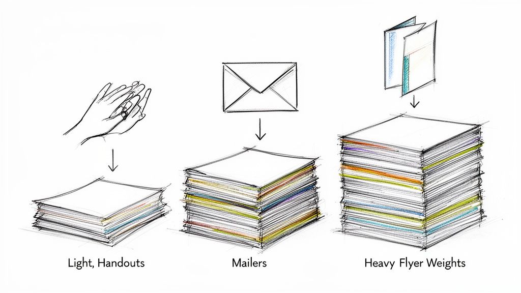 story
story A Practical Guide to the Best Paper Weight for Flyers
When you need a quick, reliable choice, the best paper weight for flyers is 100 lb Gloss Text (or Book) , which lands around 150 GSM . I always tell people to start here. It's the industry go-to because it feels professional and substantial in your hand but is still affordable enough for big print runs. It really is the perfect all-rounder for most business needs. A Quick Guide to Choosing Flyer Paper Choosing the right paper can feel like you're staring at a wall of paint swatches—overwhelming, right? But it doesn’t have to be. The weight you select sends an immediate, unspoken message about your brand. A flimsy flyer might suggest a lack of quality, while an overly thick one could seem wasteful for a simple announcement. Finding that sweet spot is how you make a great first impression. This section is all about giving you the immediate answers you need to make a confident decision, without getting lost in technical jargon. Think of it as your cheat sheet for matching the right paper to your marketing mission, whether you're handing out flyers at a trade show, slipping them into a mailing, or leaving a stack on a counter. Common Flyer Paper Weights and Their Uses Let's break down the most common options to simplify your choice. In my experience, most printers will point you toward a range between 115–150 GSM (roughly 80–100 lb text) for standard, single-sheet flyers. Why? Because it hits the perfect balance of cost, perceived quality, and durability. This weight gives you enough stiffness to feel substantial without being too rigid for easy distribution. If you want to dive deeper, this ultimate guide to paper weight is a fantastic resource. Here’s a simple reference table I put together to compare the most common paper weights, their typical uses, and the distinct impression each one creates. Flyer Paper Weight At a Glance This table is your quick reference guide. Use it to quickly match a paper weight to what you're trying to achieve with your flyer. Paper Weight (Lb / GSM) Best For Feel and Impression 80 lb Text (~120 GSM) High-volume handouts, mail inserts, event announcements Lightweight and economical; feels like a quality magazine page 100 lb Text (~150 GSM) All-purpose business flyers, trade show materials, brochures The professional standard; substantial feel with good durability 100 lb Cover (~270 GSM) Premium promotions, menus, durable keepsakes Thick and rigid like a quality postcard; conveys high value As you can see, each weight serves a different purpose, from mass-market handouts to high-end keepsakes that you want people to hold onto. Key Takeaway: For most marketing scenarios, 100 lb Text is your safest and most effective bet. It communicates professionalism without the premium cost of heavy cardstock, making it the ideal choice for achieving maximum impact on a reasonable budget. Understanding the Language of Paper Weight Choosing the right paper for your flyers can feel a bit like learning a new language. You'll run into terms like GSM , Lb , and Points , and it’s easy to feel lost in the lingo. Let's break down these concepts into simple, practical terms so you can pick the perfect paper with total confidence. Think of paper weight as the foundation of your flyer's first impression. A flimsy, see-through sheet can feel cheap, but a sturdy one communicates quality and importance before a single word is even read. Getting a handle on how paper is measured is the first step to making a smart, strategic choice. GSM: The Universal Standard The easiest and most reliable measurement you'll encounter is GSM , which stands for Grams per Square Meter . It’s the metric system’s answer to paper weight, and printers all over the world use it because it’s so straightforward. The rule here is simple: the higher the GSM number, the heavier and thicker the paper. This consistency makes it the best way to directly compare different paper types. For a little real-world context, standard office copy paper is usually around 80-90 GSM . A good-quality business flyer is often printed on 150 GSM , and a premium business card might be 300 GSM or even higher. If you see a GSM value, you can trust it's giving you a clear picture of the paper's density. The Tricky World of Pounds and Points Now for the American system, which uses Pounds (lb) and Points (pt) . This is where most of the confusion comes from, because the same number can mean wildly different things. The pound system is based on the weight of a 500-sheet stack (a ream) of paper in its original, uncut "parent sheet" size. But here’s the catch—different types of paper have different parent sheet sizes. This creates two main categories you absolutely need to know: Text Weight: This is thinner, more flexible paper, like what you’d find in a magazine or a book. It’s often just called "Book" or "Text" paper. Cover Weight: This is the thick, rigid stuff used for things like postcards or the cover of a paperback. You'll see it called "Cover" stock or "Cardstock." This is precisely why a 100 lb Text paper is so much thinner and lighter than a 100 lb Cover stock. They’re weighed using completely different standards, even though they share the same "100 lb" number. A Simple Analogy to Remember To make this crystal clear, let's use a clothing analogy. Think of Text weight paper as a t-shirt . It's flexible, lightweight, and great for everyday use. A 100 lb Text flyer is like a high-quality, durable t-shirt—it feels substantial but is still easy to fold and handle. In contrast, Cover weight paper is like a denim jacket . It’s much thicker, more rigid, and built for durability. A 100 lb Cover flyer feels stiff and substantial, making a powerful statement. You wouldn't fold it easily, and it’s meant to last. This distinction is crucial when you're planning more complex projects, like something with intricate folds. The paper's weight and stiffness dramatically impact how well it can be folded, which is a key consideration for brochures. You can see how paper choice affects folding by exploring these custom brochure printing options . With this foundation, you can now look at a printer’s specs and know exactly what you’re choosing. You’ll understand that a 150 GSM paper is a solid mid-weight option, and you’ll know to pay close attention to whether a "100 lb" stock is a flexible Text sheet or a rigid Cover stock. How to Match Paper Weight to Your Flyer's Purpose Choosing the best paper weight for a flyer isn't about finding one "perfect" option. It's about matching the paper to the specific job your flyer needs to do. Is it a disposable handout for mass distribution, or a premium keepsake you want people to save? The right choice hinges entirely on its purpose. Think of your flyer as a brand ambassador. A lightweight, flimsy paper might communicate a fleeting, low-cost message—which is perfect for a quick sale. On the other hand, a thick, sturdy stock sends a signal of quality, permanence, and value, which is exactly what a luxury brand or high-end service needs. Aligning your paper choice with your strategic goals is the key to making a memorable first impression. For High-Volume Handouts and Mail Drops When your main goal is getting the word out to as many people as possible on a tight budget, a lighter paper is your best friend. For mass distribution like street promotions, event announcements, or door-to-door mail drops, cost-effectiveness is king. In these cases, a lightweight 80 lb Text paper (around 120 GSM ) is an excellent choice. This stock feels a lot like a quality magazine page. It's substantial enough to carry color well but light enough to keep your printing and postage costs from getting out of hand. It’s the practical workhorse for campaigns where quantity is the top priority. This infographic gives you a simple way to visualize the difference between a lighter Text paper and a heavier Cover stock. As you can see, Text paper is like a flexible t-shirt for everyday use, while Cover stock provides the durable structure of a denim jacket for more demanding situations. The All-Purpose Standard for Events and In-Store Promotions What about the most common scenario? You need a versatile, professional-feeling flyer for a trade show, a stack to leave on a reception counter, or a handout for an open house. You need something that perfectly balances quality and cost. This is where the industry standard, 100 lb Text paper (or 150 GSM ), really shines. It’s the undisputed champion of all-purpose flyers for a reason. It has a noticeable heft that feels professional in hand, making your brand seem more credible and established. But here’s the best part: it’s still affordable enough for moderate to large print runs without blowing your budget. It’s the ideal middle ground, offering a significant step up in quality from lighter papers without the premium price tag of a heavy cardstock. You can find a whole range of informational and distribution flyer options that use this popular weight. Pro Tip: For double-sided flyers, 100 lb Text is the absolute minimum weight I recommend. Anything lighter can suffer from "show-through," where the ink from one side is faintly visible on the other. That can make your design look cluttered and unprofessional. For Premium Keepsakes and High-Impact Marketing When your flyer is meant to be more than just a piece of paper—when it’s a menu, a price list, an invitation, or a promotional piece for a luxury brand—you need to invest in a weight that screams durability and high value. Your goal here is to create something the recipient actually wants to hold onto. For these situations, a heavyweight 100 lb Cover stock (around 270 GSM ) is the clear winner. This paper is thick and rigid, similar to a quality postcard or the cover of a paperback book. Its substantial feel immediately signals importance and encourages the recipient to save it. This is the best paper weight for flyers designed to have a long shelf life and make a lasting impression. Industry recommendations back this up, often suggesting weights in the 170–300 GSM range for premium, double-sided, or reusable flyers to ensure they hold up and convey a higher perceived value. Choosing a heavier stock like this is a strategic decision. It tells your audience that what you're offering is worth their attention and consideration. Thinking Beyond Weight to Finishes and Folds While paper weight lays the groundwork for your flyer, the finish is what gives it a distinct personality. Think of it this way: weight is the canvas, but the finish is the style of paint. It can completely transform how your design looks and feels, affecting everything from color vibrancy to the simple experience of holding it. Choosing the right finish is just as critical as selecting the best paper weight for flyers . It’s a sensory detail that can make your message far more engaging and memorable. How Finishes Shape Your Flyer's Identity A finish is a coating applied to the paper after printing that protects the ink and creates a specific vibe. Each type serves a different purpose, so understanding them is key to producing a flyer that truly aligns with your brand. Here’s a quick rundown of the most common options and what they do best: Gloss Finish: This is your go-to for making colors explode off the page. The shiny, reflective surface gives images and bold graphics an incredible sense of vibrancy and crispness. It's a fantastic choice for event flyers, concert promotions, or any design that needs to grab attention immediately. Matte Finish: For a more sophisticated and subtle look, a matte finish is perfect. It provides a smooth, non-reflective surface that cuts down on glare, which makes designs with a lot of text much easier to read. This finish is ideal for corporate handouts, informational leaflets, or premium brand messaging. Uncoated Stock: This paper has no extra coating, giving it a natural, organic, and slightly textured feel. Because it’s the most absorbent option, it’s the only choice if you need people to write on your flyer, like for an appointment card or a sign-up form. The finish you choose can even make the paper feel a bit more substantial. While it doesn't add significant weight, a coating like gloss or matte creates a smoother, more durable surface that adds to the flyer's overall tactile experience. While we're talking flyers, many of these principles apply across all kinds of printed materials. For instance, this helpful guide to professional physical ticket printing offers great insights into getting the right look while managing costs—concerns we all share. For even more durability, you can also explore protective options like our laminating services . The Critical Connection Between Weight and Folds If your flyer design involves a fold—like a classic tri-fold brochure or a simple bi-fold leaflet—the relationship between paper weight and folding becomes absolutely crucial. A lightweight paper like 80 lb Text can be folded easily without any special prep work. Its fibers are flexible enough to create a clean crease on their own. However, everything changes once you move into heavier stocks, especially Cover weight papers. Try to fold a thick paper like a 14 pt. Cover stock without proper preparation, and the paper fibers along the fold line will crack and break. This leaves a messy, unprofessional-looking crease that can ruin your entire design. To prevent this disaster, heavier papers must be scored before they are folded. Scoring is simply the process of creating a crisp indentation along the fold line. This little channel gives the paper a clean path to fold along, preventing any cracking and ensuring a perfectly sharp, professional crease every single time. Remember this simple rule: the heavier the paper, the more essential scoring becomes. It’s the key to making sure your beautifully designed folded flyers look just as good in hand as they did on your screen. How Paper Weight Hits Your Budget and Distribution It's tempting to go for the heaviest, most luxurious paper you can find. A thick, substantial flyer feels important and makes a killer first impression. But that premium feel comes at a cost, and it’s not just what you see on the initial print quote. The smartest paper choice is always a balance between impact and your financial reality. Let's break down how that choice ripples through your budget, affecting not just printing but also the often-overlooked costs of getting flyers into people's hands. The Direct Impact on Printing Costs This one’s straightforward: heavier paper means more raw material, which means a higher price per flyer. The jump from a lightweight 80 lb Text stock to a sturdy 100 lb Cover stock isn't just a small step up; it's a significant leap in paper grade and cost. While the difference might only be a few cents per piece, that adds up fast. On a print run of 10,000 flyers , those "few cents" can easily turn into hundreds of dollars. Key Insight: Always run the numbers. Ask yourself: will the perceived value of a thicker flyer generate enough extra business to justify the higher upfront investment? The answer depends entirely on your campaign goals. Uncovering the Hidden Costs in Distribution This is where the real financial surprises can pop up. Your paper's weight directly impacts how much you'll spend on distribution, especially for shipping and direct mail. It's a critical factor that many businesses miss during the planning phase. A heavier paper stack means higher shipping fees to get the flyers from us to your office or event. But the real budget-buster is postage. Bulk mail rates are calculated in weight brackets. A seemingly tiny increase in paper weight can be just enough to bump your flyer into a more expensive postage category, instantly inflating your campaign cost. This is why for mass mailings, lighter stocks like 70–105 GSM (around 60–80 lb Text) are so popular—the postage savings are significant and measurable. Doubling the paper weight from 80 GSM to 150 GSM nearly doubles the mass of each flyer, hitting your per-piece mailing cost hard. If you're planning a mail campaign, working with professional direct mail services can be a lifesaver, helping you navigate postal rules and optimize every dollar. A Practical Cost Comparison Let's put this into perspective. Choosing a heavier paper weight isn't just a creative decision; it's a financial one with a clear impact on both your printing and postage budget. The table below breaks down what you can expect as you move up in paper weight for a flyer campaign. Cost and Postage Impact of Different Paper Weights Paper Weight (Example) Approximate Print Cost Increase Approximate Postage Cost Increase (Per 1000 Units) Best Use Case 80 lb Text Baseline Cost Baseline Postage High-volume mailers, door drops, budget-conscious handouts 100 lb Text +15-25% May increase slightly Professional event handouts, in-store promotions, versatile flyers 100 lb Cover +50-70% Can increase significantly (may jump a postage bracket) Premium keepsakes, high-end property listings, menus As the table shows, that jump to a Cover stock is a serious investment, significantly raising costs across the board. While it delivers an undeniably powerful first impression, it’s a strategic choice best saved for campaigns where durability and a high-end feel are mission-critical. This practical approach helps you make a financially sound decision that maximizes both your flyer's impact and your campaign's return on investment. Putting It All to the Test: Choosing Your Flyer Paper on 4OVER4 Alright, theory is great, but now it's time to get your hands dirty—metaphorically, of course. Let's take everything we've covered about paper weights and finishes and apply it directly to the 4OVER4 ordering process. Think of this as your practical, hands-on guide to turning that flyer concept into a stack of beautifully printed materials, minus the guesswork. We're going to walk through the flyer printing page step-by-step. The goal here is simple: to make you feel completely confident when you see a term like "100 lb. Text" and know exactly what it means for your project, your budget, and your marketing goals. Finding Your Way Around the Flyer Options When you land on the flyer printing page, you'll see a clean, simple interface designed to walk you through all the customization choices. One of the very first decisions you'll make is the paper stock, and it's easily one of the most important. Here's a quick look at what you'll see on the 4OVER4 product page. That dropdown menu is your command center. It instantly shows you every available paper stock, weight, and finish, all clearly labeled to help you make a smart choice. You'll notice the options combine the key details we've been talking about. Now, when you see choices like "100 lb. Gloss Book" or "14 pt. C2S Cover," you can decode them like a pro. "100 lb. Gloss Book" tells you you're looking at a flexible Text weight paper (that's our t-shirt) with a shiny, vibrant finish. This is your go-to for standard event handouts or mailers where you want the colors to pop. "14 pt. C2S Cover" signals a much thicker, more durable Cover stock (the denim jacket). The C2S means it's coated on two sides for a premium feel all around. This is what you'd choose for something meant to last, like a small menu or a high-end promotional card. As you click through these different paper types, you'll see the pricing calculator update in real-time. This is a game-changer for doing a quick cost-benefit analysis. You can immediately see how upgrading from a 100 lb. Book stock to a 14 pt. Cover impacts your budget. It lets you find that perfect sweet spot between premium quality and cost-effectiveness, ensuring your final product is exactly what you envisioned. Common Questions About Flyer Paper Weight Even with the best plan in hand, you might still have a few last-minute questions before you hit "order." That's completely normal. To help you lock in your decision with total confidence, here are some straightforward answers to the questions we get asked all the time. What Is the Most Popular Paper Weight for Business Flyers? Hands down, the king of the flyer world is 100 lb. Gloss Book (about 150 GSM) . It’s the industry’s go-to for a reason. This stock feels professional and substantial in someone's hand, but it won't break the bank like a heavy cover stock. It strikes that perfect sweet spot between quality, durability, and cost. That makes it an all-around great choice for trade show handouts, in-store promos, and general marketing where you need your brand to feel credible and established. Plus, the gloss finish makes colors pop. Should I Use Text Weight or Cover Weight for My Flyers? This all comes down to what you need the flyer to do . Is it meant to be folded or stand firm? Think back to our clothing analogy. Go with Text Weight (like 80 lb. or 100 lb. Book/Text ) for your standard, flexible flyers. It feels like a high-quality magazine page, making it perfect for folded brochures, mailers, and event handouts. Choose Cover Weight (like 100 lb. or 14 pt. Cover ) when you need something rigid and premium. Cover stock is thick, like a postcard. It’s ideal for single-sheet flyers, menus, or any piece you want people to keep and use again. Does a Glossy or Matte Finish Affect the Feel of the Paper? Absolutely. A finish adds a super-thin coating that changes the tactile experience, making the paper feel a bit stiffer and more substantial than an uncoated stock of the same weight. The actual paper weight doesn't change, but the perceived weight and feel certainly do. A gloss finish feels slick and smooth, and it really amps up the color vibrancy. A matte finish, on the other hand, gives you a muted, almost velvety texture that cuts down on glare and adds an instant touch of class. It's a perfect example of how small details shape the entire impression your flyer leaves. Expert Insight: Your finish is a powerful tool. A glossy coat on 100 lb. Text will feel energetic and slick. That same paper with a matte finish will feel more controlled and upscale. What Paper Weight Is Best for Flyers That Will Be Mailed? For anything going through the mail, 80 lb. or 100 lb. Text weight is almost always the sweet spot. This range is sturdy enough to survive the journey through postal sorting machines but still light enough to keep your postage costs from getting out of control. One exception: if your flyer is a self-mailer (think of a postcard that doesn't need an envelope), you might need to step up to a light cover stock to meet USPS regulations for thickness and rigidity. It’s always a smart move to double-check the specific requirements with your mail service provider to avoid any nasty surprises. Ready to create flyers that feel as good as they look? At 4OVER4 , we offer a massive range of paper weights, finishes, and custom options to bring any idea to life. Explore our high-quality printing solutions and get started today at https://4over4.com .