Content Hub
Stories, Ideas and Advice — Page 82
 story
story What is Screen Printing T Shirts? what is screen printing t shirts explained
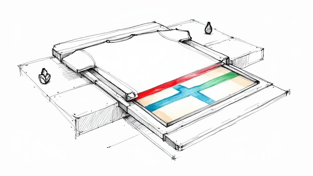
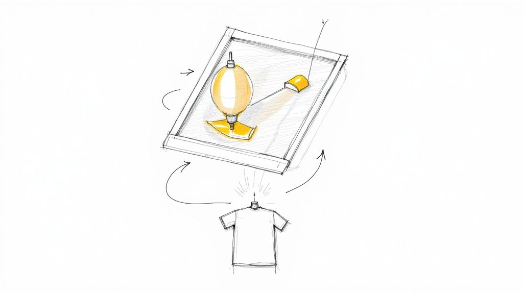
Ever wondered how those awesome, vibrant designs on your favorite band t-shirts get made? Chances are, it’s screen printing. Think of it as a highly refined stenciling method, where ink is pushed through a specialized mesh screen directly onto the fabric. This process creates a design one color at a time. It’s the secret behind the durable, bold graphics on everything from concert merch to company apparel. The Art And Science Of T-Shirt Screen Printing At its heart, screen printing is a perfect blend of hands-on craft and solid, reliable technology. It’s what ensures a design doesn't just sit on top of the shirt—it practically becomes part of the fabric itself. It’s a classic for a reason, and it remains a powerhouse in the apparel industry because it delivers a clean, sharp look that’s built to last. This guide will walk you through exactly how it works, what makes it so unique, and why it might be the perfect choice for your next project. We’ll cover the journey your idea takes from a digital file to a wearable piece of art. A Method Built on Layers The most important thing to get your head around is that screen printing builds images layer by layer. Every single color in your design needs its own dedicated screen, which acts as a stencil. This methodical, step-by-step approach is what gives screen-printed shirts their signature rich, solid colors. Picture painting a wall with a stencil. You'd lay down the stencil, apply one color, and then lift it. If you wanted to add a second color, you'd need a completely different stencil. Screen printing works on that same basic principle, just with way more precision and some really cool equipment. Screen printing is defined by its process: applying ink through a mesh screen to transfer a design onto a substrate. For T-shirts, this means each color is pushed through its own screen, resulting in a durable and vibrant print that chemically bonds with the fabric. To give you a clearer picture, here's a quick rundown of what makes screen printing tick. Screen Printing At A Glance Attribute Description Best For Medium to large bulk orders (typically 24 pieces or more) Color Method Colors are applied one at a time using separate screens Look & Feel Vibrant, opaque colors with a slightly raised texture Durability Extremely durable; prints often outlast the garment itself Cost Cost-effective for large quantities; setup fees apply per color Complexity Best for designs with a limited number of solid colors This table shows why the process is so well-suited for specific jobs, especially when you need consistency and durability in large batches. Why It Still Dominates Even with newer digital printing methods on the scene, screen printing holds its ground, especially when you need a lot of something. The efficiency and cost-effectiveness for large orders are just tough to beat. Sure, the initial setup takes a bit of time, but once those screens are prepped, a skilled printer can churn out hundreds or even thousands of high-quality shirts in no time. This makes it the absolute go-to for things like: Band Merchandise: Perfect for producing large runs of tour shirts where every piece needs to look identical. Corporate Apparel: Ideal for outfitting an entire company with branded uniforms that look sharp and professional. Event Giveaways: Great for creating memorable and tough T-shirts for marathons, festivals, and conferences. The end result is a tangible, high-quality product that feels professional and is made to be worn and washed for years. For anyone looking to produce eye-catching custom apparel, understanding the basics of T-shirts printing is the first step toward bringing a creative vision to life. It’s a method that turns a simple garment into a powerful statement. Tracing The Roots Of Modern Screen Printing The story of modern screen printing didn't start in some high-tech workshop. Its journey is a fascinating one, with roots stretching back thousands of years to ancient civilizations looking for better ways to put images onto fabric. The fact that we still use the core technique today is a huge testament to its power and adaptability. The earliest whispers of this method come from Song Dynasty China. It was here that artisans first figured out how to use finely woven silk mesh and intricate stencils to transfer beautiful, complex patterns onto textiles. This brilliant idea slowly made its way across Asia and eventually landed in Europe. For centuries, though, it remained a highly manual, niche craft. Think decorating fine fabrics, elegant wallpapers, and other specialty materials. But then the industrial age kicked into gear, setting the stage for screen printing’s commercial explosion. The Dawn of a Modern Industry The early 20th century was the real turning point. Innovators started playing around with photochemical processes to create stencils—a massive leap forward from painstakingly hand-cut paper or silk designs. Once photo-imaged stencils were patented, the game changed completely. Suddenly, you could reproduce incredibly detailed artwork and complex logos with stunning accuracy. This blew the doors wide open for commercial use. Entrepreneurs immediately saw the potential for branding and advertising, and screen printing quickly became the go-to for creating posters, signs, and banners for the masses. But it still hadn't quite conquered the world of apparel. The inks available just weren't durable enough to handle repeat washing. The true T-shirt revolution was still just around the corner. The core idea of screen printing—pushing ink through a patterned mesh—has remained unchanged for centuries. It's the materials and technology surrounding this simple concept that have evolved dramatically, turning an ancient art form into a modern industrial powerhouse. The Game-Changing Invention of Plastisol Ink If there's one moment that changed everything for what is screen printing t shirts , it was the invention of plastisol ink in 1959 . This PVC-based ink wasn't just an improvement; it was a total game-changer. Unlike older inks that merely dyed the fabric fibers, plastisol sits on top of the fabric and fuses to it when cured with heat. The result? A print that was incredibly durable, brilliantly opaque, and super vibrant. It wouldn't crack, peel, or fade, even after dozens of trips through the laundry. Better yet, plastisol was a dream to work with because it wouldn't dry out on the screen, making it absolutely perfect for mass production. This single invention is what turned the humble T-shirt from a simple undergarment into a wearable canvas for self-expression. You can see its legacy today, where roughly 50% or more of all screen printing in the U.S. is focused on garments. You can learn more about the t-shirt's journey from undershirt to iconic apparel on blog.transferexpress.com . From its delicate beginnings as an ancient art form to its status as a multi-billion dollar industry, the evolution of screen printing is nothing short of remarkable. That rich history is carried on today by everyone from massive commercial printers to the independent local artisans and crafters who continue to push the medium in new and exciting directions. Its incredible endurance is exactly why it remains one of the best ways to create lasting, high-quality apparel. Your Step-By-Step Guide To The Screen Printing Process It’s one thing to know the theory behind screen printing, but watching a design go from a computer screen to a finished T-shirt really brings the magic to life. Think of it as a meticulously choreographed dance where every step builds on the last. Each part of the process demands precision to make sure the final print is vibrant, tough, and exactly what the artist envisioned. So, how do your favorite graphic tees actually get made? Let's pull back the curtain and walk through the entire journey, step by step. This timeline gives you a great visual of the key moments that led to the screen printing process we rely on today. You can see how ancient stencil techniques, paired with chemical and photo innovations from the 20th century, paved the way for modern apparel printing. Step 1: Creating The Design Everything starts with the art. Before a drop of ink hits a shirt, the design has to be prepped and separated into individual color layers. If a design uses three colors—let's say red, yellow, and blue—the artist creates three separate, solid black files. Each of these files is called a color separation , and it represents a single color's placement in the design. These separations are then printed onto clear films, which basically become the blueprints for the stencils. Getting this prep work right is absolutely critical for the alignment and sharpness of the final print. Step 2: Preparing The Screen Next up, we get the mesh screens ready. Each screen is just a fine mesh pulled super tight over a frame. A light-sensitive liquid called photo emulsion gets coated evenly across both sides of the screen in a thin, smooth layer. The coated screen is then left to dry in a pitch-black room, totally protected from UV light. This is a vital step because the emulsion hardens when exposed to light—that’s the secret to creating our stencil in the next phase. Step 3: Burning The Image Once the emulsion is bone dry, it's time to "burn" the design onto the screen. The transparent film with one of the color separations is laid flat against the coated screen, and the whole thing is blasted with a powerful UV light. Here's where the magic happens. The emulsion covered by the black ink on the film stays soft, but all the exposed parts harden up. After a few minutes under the light, the screen is rinsed with water. The soft, unexposed emulsion just washes away, leaving behind a perfect stencil of the design embedded in the mesh. This process is repeated for every single color, creating a dedicated screen for each one. Think of the emulsion process like developing old-school camera film. The light "exposes" the image onto the screen, and washing it reveals the final stencil. This precise chemical reaction is what allows for incredibly detailed and sharp prints. Step 4: Setting Up The Press And Applying Ink With all the stencils made, the screens are locked into the printing press. For designs with multiple colors, this is usually a carousel-style press that can hold several screens at once. The T-shirts are then smoothed onto flat boards called platens. Next comes the most crucial part of the setup: registration. Each screen is meticulously aligned, or registered , to ensure every color prints exactly where it's supposed to. A line of ink is poured at the top of the first screen, and a squeegee—a tool with a firm rubber blade—is pulled across it. This motion forces the ink through the open stencil and onto the T-shirt fabric, laying down the first layer of the design. If there are more colors, the press rotates, and the process is repeated with the next screen and its ink. Each color is applied one at a time, building the image layer by layer. This layering technique is also key for specialized methods; learning about white ink printing offers a great look into how base layers are used to make colors pop on dark shirts. Step 5: Curing The Final Print The last step is curing, and you could argue it's the most important. After the final color is printed, the T-shirt is carefully taken off the press and placed on a conveyor belt that travels through a huge dryer. The temperature inside usually hits around 320°F (160°C) . This intense heat doesn't just dry the ink—it cures it. For plastisol inks, the heat causes the ink's PVC particles to melt and fuse into a permanent, flexible layer that bonds with the fabric fibers. Without proper curing, the design would crack, peel, or wash right off. Once cured, the print is incredibly durable and will often outlast the shirt itself. Now the shirt is officially done and ready to be folded, packed, and worn. Understanding The Essential Tools And T-Shirts Behind every great screen printed T-shirt is a specific set of tools and materials working in perfect harmony. While the process itself is pretty straightforward, the quality of that final shirt hinges entirely on the equipment. Getting to know this toolkit is the key to appreciating what makes screen printing such a reliable and high-quality method. Think of it like a chef's kitchen. You need the right ingredients (inks), the right pans (screens), and the right utensils (squeegees) to cook up a masterpiece. Each piece plays a critical role in turning a digital design into a durable, wearable piece of art. Let's break down the essential gear. The Screen: A Precision Stencil The screen is the heart of the entire operation. It’s made of a fine mesh pulled incredibly tight over a rigid aluminum or wooden frame. That mesh is what holds the stencil, and its fineness—known as the mesh count —determines just how much detail you can pack into a design. Low Mesh Counts (e.g., 86-110 TPI): These screens have larger openings, letting more ink flow through. They're perfect for big, bold designs and are often the go-to for printing light-colored inks on dark shirts. High Mesh Counts (e.g., 230-305 TPI): With finer threads and smaller openings, these are your secret weapon for super detailed graphics with thin lines and shading. The print also ends up with a much softer feel. Picking the right mesh count is the first step toward getting a sharp, clean print every time. The Squeegee: The Ink Applicator If the screen is the heart, the squeegee is the hand that guides the ink. It might look like a simple tool—just a firm rubber blade in a handle—but it’s responsible for pushing the ink through the screen’s stencil and onto the T-shirt. Its job is way more technical than it seems. The hardness of that rubber blade, measured in durometers , changes how the ink is applied. A softer squeegee lays down a thicker layer of ink, which is great for solid, opaque prints on dark fabrics. A harder squeegee deposits a thinner, more detailed layer, making it ideal for fine lines and complex designs. Screen Printing Inks: The Lifeblood Of The Design The ink is what brings a design to life, and in the world of screen printing, two types rule the roost: plastisol and water-based. While both can give you fantastic results, they have completely different personalities and are suited for different jobs. Plastisol ink is the industry standard for a reason. It's a PVC-based ink that sits on top of the fabric instead of soaking into it. This creates incredibly vibrant, opaque colors that really pop, especially on dark-colored T-shirts. Because it won't dry until it's cured at a high temperature (around 320°F ), it’s easy for printers to work with on long print runs. Water-based ink , on the other hand, actually dyes the fabric fibers. This gives you a much softer, more breathable print that you can barely feel. While they used to be less vibrant on dark shirts, modern formulas have made high-opacity water-based inks much more common. They’re also a more eco-friendly choice. The choice between plastisol and water-based ink is one of the most significant decisions in the screen printing process. It directly impacts the final T-shirt's feel, look, and durability, defining the character of the finished garment. To make the choice a bit clearer, let's put them head-to-head. Plastisol vs Water-Based Ink: A Comparison When you're deciding on the right ink for your project, it really comes down to the look and feel you're aiming for. Both plastisol and water-based inks have their strengths, but they deliver very different results on the final garment. Feature Plastisol Ink Water-Based Ink Feel Slightly raised, rubbery texture on the fabric. Very soft and breathable; becomes part of the fabric. Vibrancy Extremely vibrant and opaque, excellent on dark shirts. More muted on darks unless an underbase is used. Durability Highly durable and resistant to cracking and fading. Very durable as it stains the fabric fibers. Best For Bold graphics, sportswear, and printing on dark fabrics. "Vintage" looks, high-end retail, and light-colored shirts. Eco-Friendliness Contains PVC and requires solvents for cleanup. More environmentally friendly and cleans up with water. Ultimately, knowing these differences is what helps you match the perfect ink to the project's vision. For example, if you're producing apparel for a sustainable brand, exploring options from a custom fabric collection printed with water-based inks would be the ideal choice. The Press: The Machine Behind The Magic Finally, all these components come together on the printing press. This machine holds the screens and T-shirts in perfect alignment, ensuring each color is printed in exactly the right spot. Presses can be as simple as a single-color manual setup for hobbyists or as complex as massive, automated carousels that churn out thousands of shirts an hour. No matter the size, the press is what guarantees the consistency and precision that screen printing is famous for. What Makes Screen Printing The Gold Standard? When you’re looking at all the different ways to get a design onto a T-shirt, screen printing pretty much always comes out on top for a few solid reasons. It's not just the old-school industry standard because of tradition; it's earned that spot by delivering real-world advantages that other methods struggle to match. Screen printing hits a sweet spot, offering an killer combination of durability, vibrant color, and cost-effectiveness for the right kind of job. Let's break down the three biggest reasons why it’s still the go-to for so many projects, from band merch to massive corporate orders. Built To Last: Unmatched Durability And Longevity The number one reason people keep coming back to screen printing is simple: it’s incredibly durable. A properly screen-printed design doesn't just sit on top of the fabric; it becomes part of it. This is all thanks to the curing process, where the ink gets heated to around 320°F (160°C) . This blast of heat causes the plastisol ink to melt and form a permanent, flexible bond with the shirt's fibers. The result? A print that can go through dozens, if not hundreds, of wash cycles without cracking, peeling, or fading away. Honestly, the print will probably outlast the T-shirt itself. Think of screen printing ink like a liquid plastic that, once heated, chemically fuses into the fabric's structure. This physical and chemical bond is the secret sauce behind its legendary toughness, ensuring your design looks awesome for years. This makes it the perfect choice for apparel that’s going to see some serious action, like: Team Uniforms: Tough enough to handle the wear and tear of sports and constant washing. Work Apparel: Designed for daily use in demanding environments. Band Merch: Made to survive countless mosh pits and laundry days. Colors That Pop: Superior Vibrancy Another area where screen printing absolutely crushes it is color vibrancy. The process involves pushing a thick, opaque layer of ink through a mesh screen directly onto the T-shirt. This heavy deposit of ink lays down colors that are exceptionally bold, rich, and bright. You really see the difference when printing on dark-colored shirts. Screen printing allows for a solid "underbase" of white ink to be printed first, creating a bright canvas that makes the colors on top explode. Other methods, like direct-to-garment, can sometimes look a bit muted on dark fabrics because the ink soaks in. With screen printing, the colors sit right on top, giving you maximum visual punch. Smart Economics: Incredible Cost-Effectiveness At Scale Finally, screen printing is incredibly budget-friendly, but there's a catch: you need volume. The process has a decent amount of upfront work. A separate screen has to be coated, burned with the design, and lined up on the press for every single color in your artwork. That initial setup takes the same amount of time and materials whether you're printing one shirt or a thousand. But once the press is running, the printing itself is lightning fast. This means those initial setup costs get spread out across the entire order. As your quantity goes up, the price per shirt drops like a rock. This economy of scale makes screen printing the undisputed champion for bulk orders. While it might not be the cheapest way to make a single custom tee, its value becomes crystal clear for bigger projects, like creating promotional products for a marketing campaign or outfitting an entire company. For any order of 24 pieces or more, you'll be hard-pressed to find a better blend of quality and affordability. Exploring Creative Uses And Real-World Applications Screen printing is so much more than just a way to get a design on a shirt; it’s a creative powerhouse that brings ideas to life on fabric. Its incredible versatility is why you see it everywhere—from high fashion to local fundraisers—turning a simple T-shirt into a statement, a uniform, or a treasured keepsake. Think about your favorite band's tour shirt. That’s not just a piece of clothing; it's a tangible link to a memory, a wearable piece of your identity. Musicians and artists have long favored screen printing for their merch because the bold, durable prints perfectly capture their aesthetic and last for years, becoming a beloved part of any fan's collection. Branding And Identity In The Business World Businesses have also caught on, using screen printing for everything from promotional apparel to branded staff uniforms. A sharp, high-quality T-shirt acts as a walking billboard, instantly boosting brand visibility at trade shows, events, or just out and about in the community. For employees, wearing matching apparel helps build a real sense of unity and team pride. It projects a professional, cohesive image that customers notice. And since screen printing is so cost-effective for larger orders, it’s the go-to choice for outfitting entire teams or creating awesome giveaways for marketing campaigns. The vibrant colors make sure logos and messages pop, leaving a lasting impression. Fashion Runways And Retail Collections The fashion industry has fully embraced screen printing to create eye-catching retail collections. Designers aren't stuck with standard inks; they can play with specialty options to create unique textures and visual effects that really grab your attention on the rack. Some popular specialty inks include: Puff Ink: This ink expands under heat, creating a cool, raised 3D effect that you can feel. It adds a ton of tactile interest to any design. Metallic Inks: Loaded with metallic particles, these inks give off a shimmering, reflective finish that’s perfect for premium or flashy apparel. Glow-in-the-Dark Ink: Just like it sounds, this phosphorescent ink absorbs light and glows in the dark, adding a fun, surprising twist for event or novelty shirts. Screen printing's real strength lies in its adaptability. It can handle massive orders for the mass market just as easily as it can bring a niche creative vision to life. Whether it’s a simple one-color logo or a complex, multi-layered design with special textures, the process can be tweaked to fit almost any goal. Beyond custom graphics, screen printing is also the standard for more specialized needs, like professional name printing on football shirts , where you need absolute durability and clarity that can withstand the game. From the T-shirts worn by thousands at a charity run to the custom shirts celebrating a family reunion, the applications are practically endless. Every project, big or small, proves why screen printing remains a cornerstone of the apparel world—it's a powerful tool for expression, branding, and connection. Got Questions About Screen Printing? We've Got Answers. To wrap things up, let's dig into some of the most common questions people have about getting T-shirts screen printed. These are the practical, need-to-know details that will help you figure out if it's the right fit for your project. How Is Screen Printing Different From DTG Printing? Think of screen printing like a highly refined stenciling method. We push a thick layer of ink through a mesh screen, applying one color at a time. It’s perfect for bulk orders with bold graphics because once the screens are set up, you can print shirts quickly and affordably. Direct-to-Garment (DTG) printing, on the other hand, is a lot like your office inkjet printer, but built for fabric. It sprays water-based inks directly onto the shirt, which allows for stunningly detailed, full-color images that look like a photograph. DTG is the go-to for single prints or small batches since there are no setup costs for each color. Here’s the bottom line: Screen printing is your best bet for larger runs with fewer colors, delivering unbeatable durability and vibrant, punchy graphics. DTG is king for complex, colorful designs on small orders, offering a softer feel as the ink becomes one with the fabric. What Is The Minimum Order For Screen Printing? Because of all the prep work involved—burning a custom screen for every single color in your design—screen printing just doesn't make sense for one-off shirts. Most print shops will have a minimum order, which usually starts around 12 to 24 pieces for a simple, one-color design. This minimum helps cover the cost of the materials and the time it takes to get everything set up. The good news? The more you order, the lower the price per shirt gets. That’s what makes screen printing the most budget-friendly choice for bands, businesses, and big events. Can You Screen Print On Fabrics Other Than Cotton? Absolutely. While 100% cotton is a classic for a reason (it provides a fantastic printing surface), screen printing is incredibly flexible. It works beautifully on a whole range of materials, though we sometimes need to switch up the inks to get the best results. Here are a few other fabrics we print on all the time: Cotton/Polyester Blends: Super popular for their soft feel and durability. They take ink like a champ. Tri-Blends: A mix of cotton, polyester, and rayon. These shirts have that ultra-soft, vintage vibe everyone loves. Polyester: The go-to for athletic gear. This material requires special inks and curing techniques to make sure the colors stay bright and don’t bleed. Canvas and Denim: Screen printing is tough, making it the perfect match for heavy-duty items like tote bags, aprons, and jackets. The secret is always in matching the right ink and curing process to the fabric to guarantee a print that looks great and lasts forever. How Long Do Screen Printed Shirts Last? When it's done right, a screen printed design is incredibly durable—it will often outlast the shirt itself. During the curing process, the plastisol ink is heated to around 320°F (160°C) . This heat triggers a chemical reaction that permanently bonds the ink to the fabric's fibers. The result is a tough, flexible print that can handle years of washing and wearing without cracking, peeling, or fading away. Just take good care of it—wash it inside out with cold water—and that design will stay looking crisp and vibrant for a long, long time. Ready to bring your own T-shirt designs to life with professional quality? At 4OVER4 , we offer a huge range of customizable apparel options perfect for your business, event, or creative project. Explore our high-quality printing services and get started today at https://4over4.com .
 story
story what is silk screen printing: A quick guide to bold, lasting designs
Imagine using a detailed stencil to press a thick, vibrant layer of ink onto a t-shirt. That’s the core idea behind silk screen printing—a time-tested method for creating bold, durable designs that truly last. For professional-quality graphics with incredible color and resilience, it’s still the gold standard. What Is Silk Screen Printing Explained Also known as serigraphy, silk screen printing is a classic technique where ink is transferred onto a surface through a mesh screen. A squeegee pushes the ink through the openings of a stencil that has been chemically bonded to the screen, laying down a thick, opaque layer of color. This results in a design that is not only bright but also incredibly tough. Unlike digital printing, which sprays tiny dots of ink, screen printing applies solid layers of color one at a time. This method is what gives the final product its signature look and feel: a slightly raised, tactile design that sits right on top of the material. For a quick overview of what this method offers, take a look at the table below. It breaks down the essential features that make screen printing a go-to choice for so many businesses. Silk Screen Printing At a Glance Attribute Key Feature Durability Excellent; ink bonds with the material, resisting fading and wear. Color Vibrancy Superior; opaque inks create bright, solid colors, even on dark surfaces. Best For Medium to large volume orders (e.g., 50+ items). Cost High initial setup cost, but low per-item cost on large runs. Materials Versatile; works well on fabric, paper, plastic, metal, and wood. Design Detail Good for bold graphics, but less ideal for photographic or highly intricate designs. This table highlights why screen printing remains so popular. It’s a workhorse method built for quality and volume. The Stencil and Squeegee Method Think of it as painting with a highly precise stencil. Every color in your design needs its own unique screen. So, for a three-color logo, you’d need three separate screens prepared. The printer then meticulously aligns each one, applying its color in the exact right spot to build the final image, layer by layer. This method is celebrated for its ability to produce consistent, high-quality results across large quantities. Once the screens are set up, the process of printing hundreds or even thousands of items is remarkably efficient and cost-effective. This scalability is exactly why businesses and brands keep coming back to screen printing for all sorts of projects. The benefits are hard to ignore: Exceptional Durability: The ink chemically bonds with the fabric or material during a heat-curing process. This makes the print incredibly resistant to fading, cracking, and washing. Vibrant Colors: Screen printing inks are much thicker and more opaque than digital inks. This allows for stunningly bright and vivid colors, even when printing on dark-colored materials. Cost-Effectiveness at Scale: While there are initial setup costs, the price per item drops dramatically as the order quantity goes up, making it perfect for bulk projects. From custom t-shirts and tote bags to posters and signage, this technique can turn a simple digital design into a tangible product that makes a real impact. To see just how versatile it is, check out these examples of custom promotional products . The Step-by-Step Silk Screen Printing Process Ever wondered how a digital design gets onto dozens of t-shirts, looking sharp and feeling like it’s part of the fabric? It’s not magic—it's a meticulous, hands-on process that has been perfected over centuries. Getting a handle on this journey from a simple computer file to a finished product will help you understand production timelines and see why some designs are just made for this method. At its heart, silk screen printing is all about creating a very specific stencil for each individual color in your design. This isn't your grade-school paper cut-out. It’s a precise, photo-chemical process that ensures every last detail is captured perfectly before a single drop of ink touches the material. Preparing the Screen Stencil The whole thing kicks off with a fine mesh screen, usually made of polyester, stretched super-tight over a frame. This screen gets coated with a light-sensitive liquid called emulsion . After it dries in a dark room, the screen is basically a blank canvas, ready to be turned into a custom stencil. Next, we take a transparent film—think of it as a high-contrast black-and-white printout of one color from your design—and place it on the coated screen. The screen is then hit with a powerful UV light. The light instantly hardens the emulsion everywhere except where the black design blocks it. That unhardened part just washes away with water, leaving a perfect stencil of your artwork right in the mesh. People in the industry often call this the "burning" process, and it's easily the most critical step. The final quality of the print—its sharpness and clarity—is completely dependent on how well this stencil is made. It turns a simple screen into a precision tool. This technique has some seriously deep roots. Silk screen printing, also known as serigraphy, actually got its start in China during the Song dynasty ( 960-1279 AD ). Back then, stencils were made from mesh woven from human hair, which was later swapped out for silk—giving the process its name. Applying Ink and Curing the Print With a separate screen prepped and ready for each color, the real printing can begin. The item getting printed, let's say a t-shirt, is laid flat on a board called a platen. The first screen is lowered down on top of it, positioned perfectly. A line of thick, specially formulated ink is poured across the top of the screen. Using a tool called a squeegee , the printer pulls the ink across the stencil with firm, even pressure. This pushes the ink through the open mesh and directly onto the garment below, transferring the first layer of the design. This workflow—design, print, product—is beautifully simple, which is exactly why it’s so efficient for large batches. This process is repeated for every single color, using a new screen for each one. The printer has to nail the registration , which is the precise alignment of each color layer, to create a final image that looks seamless. If you're curious to see it in action, this guide on how to screen print t-shirts at home gives a great hands-on perspective. Finally, the printed item is sent through a large conveyor dryer. The heat cures the ink, making it bond chemically with the fibers of the fabric. This last step is what gives screen prints their famous durability and ensures the design won't crack, peel, or wash away. It's the reason this method is a go-to choice for so many items in our fabric collection . Key Materials And Equipment In Screen Printing The quality of a screen print really comes down to the tools of the trade. From the screen that holds your design to the ink that brings it to life, every single piece plays a part. Getting a feel for these core components will help you have smarter conversations with your printer and make better choices for your project. The whole process is built around the mesh screen , which is a fine polyester mesh pulled super tight over a wood or aluminum frame. These screens are the canvas for the stencil and come in different "mesh counts" —a term that just means the number of threads per square inch. A lower mesh count, say around 110 , has bigger openings in the grid, letting more ink flow through. This is perfect for big, bold graphics on dark shirts. On the flip side, a higher mesh count like 230 or more has tiny, fine openings, which is exactly what you need to capture sharp details and get a softer print on lighter fabrics. The Squeegee And Its Role The squeegee is where the magic really happens. It’s a pretty simple tool—just a rubber blade attached to a handle—but it’s absolutely critical. Its one job is to push ink across the screen with perfectly even pressure. The hardness of that rubber blade, measured in durometers, changes the print. A softer blade lays down a thicker coat of ink, while a harder blade gives you a thinner, more precise layer. A pro printer knows exactly which squeegee to grab to make sure the final design is crisp and clean, with no smudges or bleeding ink. Think of the screen as the blueprint and the squeegee as the builder. The precision of the squeegee's pass determines whether the blueprint is executed flawlessly, directly impacting the sharpness and vibrancy of the final product. Getting the right combination of mesh count and squeegee is fundamental to understanding what is silk screen printing on a technical level. A Look At Specialized Inks The ink itself is what defines the final look, feel, and toughness of your design. The two most common types you’ll run into in commercial printing give you very different results. Plastisol Ink: This is the industry go-to for apparel. It’s an oil-based ink that cures and sits on top of the fabric, creating a bright, opaque print that you can feel. It's incredibly durable and makes colors pop, especially on dark garments. Water-Based Ink: This type of ink actually soaks into the fabric fibers instead of sitting on top. The result is a much softer, more breathable print that you can barely feel with your hand. It’s a popular choice for achieving that vintage or "soft-hand" feel, especially on lighter-colored shirts. Knowing the difference here is key. If you need a bold, long-lasting logo for staff uniforms, plastisol is your best bet. But for a softer, more fashionable design on a retail t-shirt, water-based ink delivers a premium finish. So, you understand the nuts and bolts of silk screen printing. That's a great start. But the real question is, when should you actually use it? It's a fantastic tool, but like any specialized tool, it excels at certain jobs and isn't the best fit for others. Making the right call usually boils down to three things: quantity, color pop, and durability. Screen printing really comes into its own when you need a whole bunch of the same thing. Yes, there's an upfront cost to create the screens for each color, but once they're made, the price per item drops dramatically the more you print. Ideal Projects for Screen Printing Think about any project where you need consistency and a bold, lasting impression. For apparel, like creating a run of custom classic t-shirts , this method delivers vibrant colors that really stand up to wear and washing. The ink sits on top of the fabric in a thick, solid layer, giving it a professional finish that’s tough to replicate. Screen printing is the go-to choice for: Bulk Apparel Orders: We're talking team uniforms, merchandise for an event, or t-shirts for your whole staff. If you need 50 or more pieces , this is almost always the most cost-effective route. Promotional Products: Think tote bags, bandanas, posters, and other giveaways. The ink is incredibly durable, so your brand’s message won't fade away after a few uses. Bold, Graphic Designs: Got a design with solid colors and clean lines? Screen printing was practically made for it. It’s perfect for creating that powerful, punchy visual. This method really took off commercially in the 20th century, especially after the invention of a multi-color rotatable screen printing machine around 1960. It was a complete game-changer for the garment industry and kicked off the printed t-shirt boom we still see today. When to Consider Other Methods On the flip side, screen printing isn't a one-size-fits-all solution. Because of the setup involved, it's not practical for small, one-off jobs. If you only need a single shirt, the cost to create the screens would be way too high. You’ll want to look at other printing methods if your project involves: Photorealistic Images: Trying to capture the subtle color gradients of a photograph is tough with screen printing. A technique like Direct-to-Garment (DTG) printing is much better suited for that level of detail. Very Small Orders: For a prototype or an order of less than 10-15 items , the setup costs just don't make sense financially. Designs with a Ton of Colors: Every single color in your design needs its own screen. A design with ten or more colors can get complicated and expensive very quickly. The core takeaway is simple: Screen printing is a volume game. It rewards planning and scale with unparalleled durability and vibrancy, making it a strategic choice for businesses looking to make a lasting impression across a large run of products. For businesses outfitting their teams or creating awesome event swag, this classic method is still king. If you're planning a larger run of custom apparel, take a look at the different options for high-quality t-shirt printing to see how it can elevate your brand. Comparing Screen Printing To Other Methods To really get a feel for what screen printing brings to the table, it helps to put it side-by-side with the other big names in custom printing. The "best" method isn't one-size-fits-all; it always comes down to the specifics of your project—how many you need, how complex the design is, and what your budget looks like. The main alternatives you'll run into are Direct-to-Garment (DTG) and Heat Transfer Vinyl (HTV) . Each has its own battlefield where it shines. Screen printing is the undisputed king of large-volume orders, delivering knockout color vibrancy and durability for a low price per shirt. DTG is like a specialized inkjet printer for t-shirts, perfect for one-off photorealistic prints. And HTV is the go-to for simple, bold graphics like the names and numbers on a sports jersey. Screen Printing vs Direct To Garment (DTG) Think of DTG as the digital sibling to screen printing's analog process. A DTG machine sprays ink directly onto the fabric, much like your office printer puts ink on paper. This means it can handle an unlimited number of colors and reproduce incredibly detailed, full-color photos without any per-color setup fees. It's the perfect choice for printing a single prototype of a complex t-shirt design. But there are trade-offs. DTG ink is thinner and soaks into the fabric fibers. This means the colors don't have the same bold, opaque punch as screen printing inks, especially on dark-colored garments. More importantly, the cost per shirt stays pretty much the same whether you order 1 or 100 , making it a pricey option for bulk orders. The core difference comes down to scale and vibrancy. Screen printing provides unbeatable color pop and cost efficiency for large runs, while DTG offers detailed, full-color capability for small, custom orders. Screen Printing vs Heat Transfer Vinyl (HTV) Heat Transfer Vinyl takes a completely different path. With HTV, your design is precision-cut from a sheet of colored vinyl and then permanently bonded to the garment using a heat press. This technique is fantastic for clean, simple, and bold graphics—think company logos, single-color text, or personalizing sports jerseys with names and numbers. HTV makes it easy to add unique details to each item in an order, like adding a different name to each shirt. It also works on a huge range of fabrics, including finicky synthetics where other methods might struggle. The downside? You can feel the vinyl as a distinct layer on top of the fabric. It can sometimes feel a bit stiff on the shirt and may crack or peel after many, many washes. It’s also not built for intricate, multi-color designs, as every single color has to be cut and layered by hand, which gets complicated fast. Choosing The Right Tool For The Job Deciding between these methods really boils down to your project's specific needs. To make it easier, here’s a quick-glance comparison of the three most popular apparel decoration methods. Screen Printing vs DTG vs Heat Transfer Feature Screen Printing DTG (Direct-to-Garment) Heat Transfer (HTV) Best For Bulk orders ( 25+ items) with limited colors Small runs ( 1-10 items), full-color photos, complex designs Simple graphics, text, numbers, individual personalization Durability Excellent. Very long-lasting, withstands many washes. Good. Can fade slightly over time, especially without proper care. Good. Can crack or peel with age and repeated washing. Color Vibrancy Highest. Opaque inks create bright, bold colors on any fabric. Good. Less vibrant than screen printing, especially on darks. Excellent. Vinyl colors are solid and pop on any garment color. Feel on Fabric Soft. Ink becomes part of the fabric, minimal texture. Very Soft. Ink soaks into the fibers, almost no feel. Noticeable. A distinct layer on top of the fabric, can feel stiff. Cost Low per-item cost on large runs; high initial setup fees. High per-item cost , but no setup fees. Cost-effective for single items. Moderate per-item cost. Good for small batches and personalization. Design Complexity Best for simpler designs with a limited color palette. Unlimited colors. Perfect for photos and intricate, gradient-filled art. Best for simple shapes, text, and single-color logos. Each method has its place. Screen printing is the workhorse for merchandise and uniforms, DTG is the artist's choice for detailed one-offs, and HTV is the specialist for bold, simple personalization. While screen printing dominates large-scale apparel, the vinyl technology used in HTV is also a powerhouse in other industries. For instance, creating tough, weather-resistant signs and banners often relies on similar vinyl materials. You can explore a range of options for printing vinyl banners to see just how versatile this technology is for large-format advertising. How to Prepare Your Business for a Screen Printing Order Placing a big screen printing order can feel a little intimidating the first time around, but a bit of prep work makes all the difference. When you get your assets and information lined up beforehand, you don’t just speed things up—you guarantee the final product is exactly what you envisioned. The whole point is to remove any and all guesswork for both you and your printer. The single most critical piece of the puzzle is your artwork. For screen printing, your designs absolutely must be in a vector format . That means files like .AI (Adobe Illustrator), .EPS, or a vector-based .PDF are what you need. Why? Because they can be scaled up or down to any size without a single drop in quality. This is a non-negotiable, as using a standard image file like a JPEG or PNG will only lead to blurry, pixelated stencils and a disappointing print. Finalizing Your Artwork and Colors Beyond just the file type, getting the color right is everything for brand consistency. Don't just tell your printer you want "blue." You need to be specific by using the Pantone Matching System (PMS) . Handing over a PMS code, like "Pantone 286 C," gives the printer the exact ink formula to mix. It ensures your brand’s signature blue looks identical on every single item. Think of a Pantone code as a universal recipe for a color. It removes all subjectivity and guarantees that the royal blue on your digital proof is the exact royal blue that appears on your finished apparel, regardless of who prints it. Checklist for a Smooth Order Once your art is ready to go, there are just a few more details your printer will need to give you an accurate quote and timeline. Getting this sorted out now prevents annoying delays and surprise costs later on. To make sure everything goes off without a hitch, have this info ready: Garment Selection: Know the exact style, material (like 100% cotton or a 50/50 blend ), and color of the items you’re printing on. Different fabrics can change how the ink looks and feels. Quantity and Sizes: Have a clear breakdown of how many you need in each size. Screen printing prices are based on volume, so the more you order, the less you'll pay per piece. Print Placement: Be crystal clear about where the design goes—full front, left chest, upper back, you name it. It also helps to include the desired print dimensions in inches. After you send these details over, you'll get a digital proof back. Check it obsessively. Look for spelling errors, confirm the colors, and double-check the placement before you give the green light. Taking these steps is the key to a successful project, whether you’re ordering staff t-shirts or branded promotional items like custom tote bags printing for your next big event. Got More Questions? Here Are Some Common Ones We Hear Even after getting the basics down, it’s smart to have a few specific questions answered before you sign off on a big print order. Here are the clear, straightforward answers to the questions that pop up most often. Can You Actually Print on Dark Shirts? Yes, and honestly, this is where silk screen printing really shines. The inks used in this process, especially plastisol inks, are thick and opaque. This means they lay down a solid, vibrant layer of color that looks fantastic on dark fabrics like black, navy, or deep green. Unlike some other methods where the design can look a bit washed out on a dark background, screen printing delivers a bright, bold print that really pops. What's the Smallest Order I Can Place? Most print shops will have a minimum order, which usually falls somewhere between 25 and 50 pieces . Why the minimum? It all comes down to the setup. Creating the screens—one for each color in your design—is the most time-consuming part of the whole job. That initial setup cost has to be spread out over a decent number of items to make it affordable. Once the screens are ready to go, printing more is quick and efficient. But for a tiny handful of items, the setup cost just doesn't make sense, which is why methods like DTG are better suited for very small batches. How Long Will the Print Actually Last? A professionally done screen print is built to last. We’re talking about a print that can easily outlive the garment itself. When the ink is cured correctly with heat, it forms a permanent bond with the fabric fibers. This creates a design that’s incredibly resistant to all the usual wear and tear—cracking, peeling, and fading—even after you've run it through the wash dozens of times. That durability is exactly why it’s the go-to choice for things like company uniforms and brand merchandise that need to look good for a long, long time. Ready to bring your bold designs to life with professional quality that lasts? 4OVER4 offers premium silk screen printing solutions perfect for your business apparel and promotional products. Explore our custom printing services at 4over4.com
 story
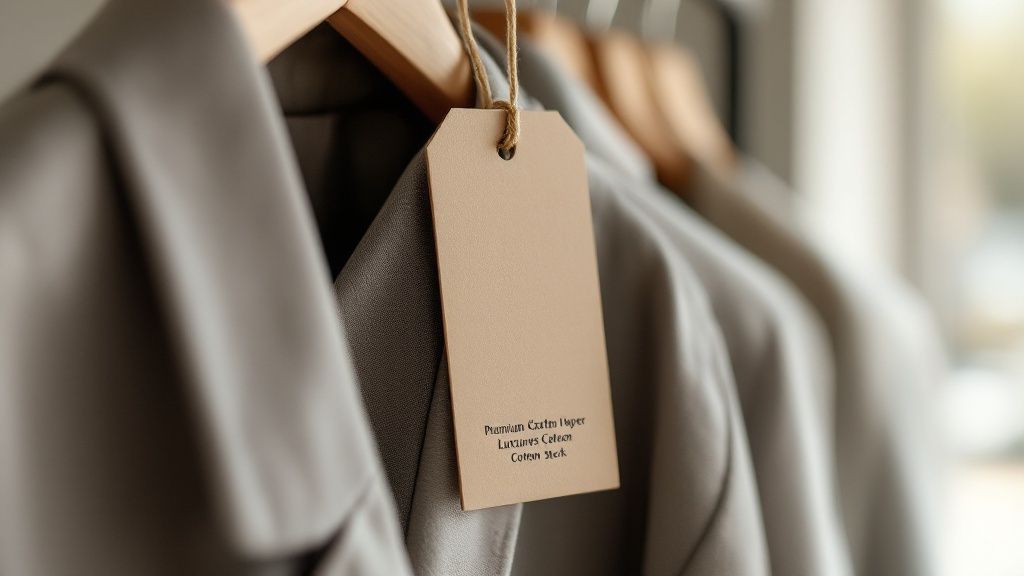
story Custom Hang Tags Clothing That Build Your Brand
Think of custom hang tags for clothing as more than just a place to stick a price. They're your brand's silent ambassador, telling your story and signaling quality right there on the sales floor. This little piece of paper or fabric is a physical touchpoint, turning a simple garment into a full-fledged brand experience. The Hidden Power of a Perfect Hang Tag Picture a customer browsing a rack, hands gliding over different fabrics. They're weighing two similar shirts. What tips the scale in your favor? Often, it's the small, tactile details—the things that whisper quality and telegraph a confident brand identity. A well-designed hang tag is that final handshake. It's the last thing a customer interacts with before heading to the register, and it has the power to turn a simple purchase into a genuine connection. This is your chance to speak directly to your audience, turning a tiny piece of real estate into a micro-billboard that does so much more than display a price. More Than Just a Price Tag A hang tag is a physical extension of your brand’s voice. It’s a chance to share the essential details that might otherwise get lost in the noise of a busy retail environment. For apparel brands, this small space is your opportunity to build trust and set expectations before the sale is even made. What can it do? Tell a story: Briefly share your brand’s mission. Are you committed to sustainability? Do you use unique, locally-sourced materials? This is the place to say it. Reinforce your brand: Use your logo, brand colors, and typography consistently. It’s all about building instant recognition and recall. Provide essential info: Clearly present the size, price, and care instructions in a way that's easy for the customer to find and read. No one likes a scavenger hunt. The shift from simple identifiers to powerful branding tools is a big reason why the global hang tag market is projected to hit USD 3,335.6 million by 2035 . That's a massive jump, and it's being driven by brands that understand the power of deeper consumer engagement. This growth shows that businesses no longer see custom hang tags for clothing as a throwaway cost, but as a strategic investment in their brand's identity. You can explore more about the growing hang tag market and its future trends. A great hang tag doesn’t just inform; it inspires. It makes the customer feel like they’re purchasing more than just a piece of clothing—they’re buying into a story, a lifestyle, and a brand they believe in. This guide will walk you through how every element, from the paper you choose to the string you use, can help you create a hang tag that truly sells. 2. Choosing Materials That Tell Your Brand Story The material you choose for a hang tag is a lot like the fabric of the clothing itself—it’s the first thing your customer touches. It sets the tone for quality, feel, and character before they even read a single word. This isn’t just a practical choice; it's a critical branding decision. Think about it. A rugged, heavyweight kraft paper tag just feels right on a sturdy pair of jeans, suggesting authenticity and durability. On the other hand, a silky, thick cotton tag with elegant embossed lettering perfectly suits a luxury cashmere sweater, whispering sophistication. When you're picking materials, you're telling a story. It's also smart to consider how the tag's quality reflects the garment itself, especially if you're using specialty materials like the best fabrics for sensitive skin . The tag should always live up to the product. Aligning Materials With Brand Identity Your hang tag material needs to be a natural extension of your brand’s personality. Let’s look at a few popular options and the kind of story they tell. Recycled and Uncoated Paper: This is the obvious choice for brands built on sustainability, nature, or artisanal craftsmanship. The slightly rough, organic texture sends a clear message about being eco-conscious and authentic. It's a perfect fit for organic cotton lines or handmade goods. Kraft Paper: With its familiar brown hue and durable feel, kraft paper gives off a rustic, handcrafted vibe. It works wonders for heritage brands, outdoor apparel, or any product that prides itself on being tough and down-to-earth. Premium Coated Cardstock: This is your go-to for a professional, modern look. A smooth matte finish can feel clean and high-end, while a glossy coat gives off a vibrant, energetic feel that’s great for contemporary fashion and streetwear brands. This diagram helps visualize how different paper types balance cost, eco-friendliness, and that premium feel. As you can see, recycled options are king for sustainability, but premium stocks often carry a higher cost to achieve that luxurious perception. It's all about finding the right balance for your brand. To make the choice a bit clearer, here's a quick breakdown of how these materials stack up against each other. Hang Tag Material Comparison Material Best For Brand Association Cost Index Recycled Paper Eco-conscious & organic brands Sustainable, Natural, Authentic $$ Kraft Paper Denim, outdoor gear, heritage lines Rustic, Durable, Handcrafted $ Coated Cardstock Modern fashion, streetwear, tech apparel Professional, Sleek, Vibrant $$$ Cotton/Fabric High-end apparel, children's clothing Soft, Premium, Unique $$$$ Wood/Leather Luxury goods, bespoke items, rugged wear Bespoke, Permanent, Exclusive $$$$$ Ultimately, the right material reinforces what your brand stands for, whether that's rustic durability or sleek, modern luxury. Beyond Paper: Creative Material Choices While paper is the classic choice, don't be afraid to think outside the box to leave a lasting impression. Exploring different materials can create a unique sensory experience that elevates your brand and helps justify a premium price. A unique material is like the perfect accessory for an outfit. It completes the look and shows an attention to detail that customers absolutely notice. Here are a few creative alternatives that can really make your products stand out: Fabric Tags: Using canvas, denim, or even felt can create a soft, tactile experience that directly connects the tag to the garment. Wood or Leather: These materials are fantastic for high-end, bespoke, or ruggedly masculine brands. They give an unmatched sense of luxury and permanence. Durable Synthetics (PVC/Plastic): Perfect for swimwear or activewear, these waterproof and tear-proof options make sure your tag stays pristine, no matter the conditions. This focus on thoughtful material selection, especially with a nod to sustainability, is a huge driver of market growth. In fact, the global market for clothing labels and hang tags is expected to hit USD 28.3 billion by 2033 , largely because consumers are demanding more eco-friendly options. It just goes to show that these small material decisions are becoming a central part of any successful brand strategy. Designing a Hang Tag That Sells A great hang tag is so much more than a price marker. It’s your last chance to speak directly to a customer before they head to the checkout counter. Think of it less as a tag and more as a pocket-sized billboard for your brand, blending creative flair with sharp marketing instincts. The very best custom hang tags for clothing are designed with purpose. They create a clear visual path for the customer's eye, making sure the most important info—your logo and brand name—pops first. After that, details like price, size, and fabric can follow. Everything has to work in harmony to tell one clear story. Weaving Your Brand Story into the Design Your hang tag is a tiny canvas for your brand's entire personality. Even with just a few square inches, you can give customers a real sense of who you are. Use this space to share your mission, mention your commitment to sustainability, or tell the story behind your unique materials. A couple of thoughtful sentences can forge a surprisingly strong connection. Nail these key design elements: Typography: The fonts you pick say a lot. A classic serif font can communicate tradition and elegance, while a clean sans-serif often feels more modern and minimalist. Just make sure it’s easy to read and fits your brand's vibe. Color Psychology: Color is all about emotion. Earthy tones can back up an eco-friendly message, while bright, bold colors might connect with a younger, more energetic crowd. Color sets the mood. White Space: Don't cram every inch with text and graphics. Giving your design room to breathe—what designers call "white space"—is essential. It makes the tag feel clean, polished, and far more high-end. If you want to dive deeper into custom design elements, a resource like the Alexander Noel Shirt Design Lab guide can offer some great insights. A hang tag should be an invitation, not a manual. It should spark curiosity and make the customer feel like they’ve found something special—not overwhelm them with a wall of text. When you get it right, a simple tag becomes an invaluable marketing asset. Making an Unforgettable Impression Want to create a hang tag so cool that people actually want to keep it? Start thinking about its physical form and feel. A unique shape or an interesting texture can make your product jump out on a packed retail floor. A tag that feels as good as it looks instantly signals quality. Here are a few ideas to get you started: Unique Die-Cut Shapes: Ditch the boring rectangle. A custom shape that mirrors your logo or another brand element makes your tag instantly recognizable. Tactile Finishes: Finishes like embossing (a raised texture) or debossing (a pressed-in design) add a layer of sophistication. They practically beg to be touched. Specialty Foils: Adding a flash of metallic foil in gold, silver, or rose gold creates a luxe highlight. It catches the light and draws the eye right where you want it. By combining these visual and physical details, your hang tag stops being an afterthought and starts playing a central role in the customer experience. The Finishing Touches: Creating a Premium Hang Tag Think of the hang tag's finish as the secret sauce. It's what takes a simple piece of cardstock and turns it into something special—a tangible piece of your brand that customers notice. The right finish is often the difference between a tag that gets ripped off and tossed aside and one that feels too nice to throw away. It’s all about adding texture, a bit of shine, and a sense of quality you can literally feel. Imagine a basic, uncoated tag. It does the job, but it’s just a blank canvas. Now, picture adding a flash of metallic foil. It’s like putting a small piece of jewelry on the tag. That glint of gold or silver instantly communicates luxury and catches the eye, boosting the perceived value of your garment before a customer even looks at the price tag. Printing Methods That Make a Difference How your design gets onto the paper is a huge part of the final look and feel. The two most common paths are digital and offset printing, and each one has its place depending on what your brand needs. Digital Printing: This is your best friend for smaller runs or designs that are heavy on color. It works a lot like a sophisticated office printer, meaning you get quick turnarounds without high setup costs. It’s perfect for new brands testing the waters or for limited-edition drops where you need vibrant, full-color designs without a massive upfront investment. Offset Printing: When you're ordering in bulk, offset is the undisputed industry standard. This method uses printing plates to transfer ink, delivering incredibly sharp, consistent colors every single time. The initial setup is more involved, but the cost per tag plummets on large orders, making it the most economical choice for established brands with big production runs. Choosing the right method for your custom hang tags clothing is really a balancing act between your order size, the complexity of your artwork, and your budget. A finish isn't just for show; it's a tactile promise. When a customer feels the raised texture of an embossed logo or the slick gloss of a Spot UV accent, they are physically interacting with your brand's commitment to quality. That physical connection is a powerful, unspoken signal that the garment itself was made with the same care and attention to detail. Adding Dimension and Flair with Specialty Finishes Beyond the printing itself, specialty finishes are what really add that "wow" factor. These techniques play with light and texture to create an impression that sticks. Embossing & Debossing: Want to add a touch of classic elegance? Embossing raises your logo or text up from the surface, creating a 3D effect you can feel. Debossing does the opposite, pressing the design into the paper. Both add a sophisticated, tactile quality that just screams premium. Foil Stamping: This is how you get that brilliant metallic shine. The process uses heat and pressure to apply a thin layer of foil to the tag. It’s perfect for creating a high-impact, luxurious detail that catches the light and demands attention. Spot UV: Picture a super high-gloss varnish, but applied only to specific parts of your design—like your logo or a key graphic. This creates a stunning contrast between a matte paper background and a slick, shiny element, making your branding literally pop off the tag. Each of these finishes tells a slightly different story, from timeless craftsmanship to bold, modern style. By mixing and matching them, you can design a hang tag that doesn't just hold information, but tells a story about your brand's quality before the customer even tries anything on. Making Your Hang Tags Interactive with Technology A hang tag used to be a simple piece of paper destined for the trash. Not anymore. Today, it can be a clever bridge connecting your physical clothing to your online world. By adding a bit of simple tech, your custom hang tags for clothing become interactive experiences that keep customers engaged long after they've left the store. The easiest way to make this happen? A QR code. Think of it as a direct portal from your garment to any online destination you want. A quick scan can pull a customer out of a busy retail aisle and into an immersive digital space, building a much deeper connection to your brand. Creating a Digital Handshake with QR Codes Adding a QR code is a deceptively simple move with a huge payoff. It costs nothing to create and opens up a universe of content that could never fit on a small piece of cardboard. It’s your chance to continue the conversation and give your customers more than just a piece of clothing. So, what can you link to? Styling Videos: Show them three different ways to wear that exact shirt they're holding. Detailed Care Guides: Link to a quick video or blog post on washing delicate fabrics so their new favorite piece lasts. Your Brand Story: Take them "behind the scenes" to see your ethical production process or meet the artisans who made their garment. Exclusive Content: Give them access to a special playlist, a sneak peek at the next collection, or an invite to your online community. A QR code turns a one-way message into a two-way conversation. It’s an invitation for the customer to explore, learn, and become a true part of your brand's world—all on their own terms. This small square shows you’ve thought about the entire customer experience, offering them support and inspiration that goes way beyond the rack. The Power of RFID for Modern Retail For brands operating at a larger scale, Radio Frequency Identification (RFID) offers a more advanced solution. Think of an RFID chip embedded in a hang tag as a unique digital fingerprint for every single item. This opens up a world of benefits for both your business operations and the end consumer. On the business side, RFID is a game-changer for: Inventory Management: What used to take hours of manual counting can now be done in minutes with near-perfect accuracy. Product Authentication: It allows customers to instantly verify the authenticity of high-value items, which is a powerful tool against counterfeits. Enhanced Checkout: RFID enables a faster, smoother, and more modern point-of-sale experience. The adoption of this tech isn't just a trend; it's a massive shift. The global market for UHF RFID clothing hang tags was valued at USD 5.24 billion in 2023 and is expected to explode to USD 15.79 billion by 2032 . This incredible growth shows just how seriously major apparel brands are taking operational efficiency and supply chain transparency. You can find more data on the rapidly expanding RFID hang tag market . Common Hang Tag Mistakes and How to Avoid Them Investing in custom hang tags for clothing is a fantastic move, but a few simple missteps can totally kill their effect. Think of your hang tag as your last chance to talk to the customer before they head to the checkout. You want that final impression to be sharp, convincing, and professional. So, where do brands usually go wrong? Let's walk through the most common traps and how you can steer clear of them. Mistake #1: Information Overload It's so tempting to squeeze every last detail onto that little piece of cardstock. The problem is, this turns your tag into a cluttered mess that customers will just ignore. A tag jam-packed with tiny text isn't just hard to read; it feels overwhelming and looks amateur. The goal is to guide the customer's eye, not assign them homework. Your hang tag should be an elegant summary, not the entire novel. Stick to the absolute must-haves: your logo, the price, the size, and your website. Anything else is probably just noise. Keeping the design clean and focused ensures the important stuff registers in a split second. Trust me, a minimalist approach almost always looks more high-end and confident. Mistake #2: Skimping on Material Quality Another classic mistake is picking the cheapest paper you can find just to save a few pennies. This is the definition of "penny wise and pound foolish." A flimsy, low-quality tag sends a quiet but powerful message: the garment itself might be cheaply made, too. You're accidentally undermining the very product you're trying to sell. The fix is simple: match the tag's quality to the product's price point and brand feel. For premium apparel: This is where you invest. Think thick, textured cardstock, or even get creative with materials like fabric or leather to signal pure luxury. For mid-range items: A solid, coated cardstock gives you that professional, durable feel without blowing up your budget. For eco-conscious brands: Using high-quality recycled paper or a nice kraft stock is a no-brainer. It instantly aligns the tag with your brand’s sustainable mission. Mistake #3: Design and Readability Blunders Finally, some basic design choices can make or break your tag. Fonts that are too frilly or too small are a huge turn-off—they make the tag impossible to read and just frustrate people. The same goes for a design that clashes with your clothing's vibe, like a loud, neon tag hanging off a minimalist linen shirt. It creates a jarring disconnect. The key to avoiding this is consistency . Your tag's font, colors, and overall style should feel like they came from the same world as your brand identity. It needs to feel like a natural extension of the garment it's attached to, reinforcing your brand story one last time. Got Questions About Custom Hang Tags? We've Got Answers. When you're diving into the world of custom hang tags, a few questions always seem to pop up. Getting them answered upfront helps you make smart, practical choices for your apparel line, ensuring your tags do more than just hang there—they work for your brand. What’s a Good, Safe Size for a Hang Tag? There's no single magic size, but a fantastic starting point for most clothing is 2 x 3.5 inches . If that sounds familiar, it's because it's the same size as a standard business card. It's a sweet spot that gives you enough room for your branding without overpowering the garment itself. But really, it's all about proportion. Think about it: a delicate silk camisole would be overwhelmed by a huge tag, while a big, chunky winter coat can easily handle something more substantial. Always step back and consider the piece of clothing the tag will live on. What Absolutely Has to Be on a Hang Tag? At the bare minimum, your hang tag needs to answer a customer's first few questions at a glance. It's your product's first handshake. The best hang tags strike a perfect balance between brand personality and essential info. Always choose clarity over clutter. Your logo, price, and size are the non-negotiables. Everything else is a bonus that should add value, not confusion. Here are the must-haves: Your Brand Logo: This is your hero. Make it prominent for instant brand recognition. Price: Don't make them hunt for it. Clear pricing prevents frustration. Size: The most critical piece of info for anyone deciding to buy. Want to take it a step further? Add your website and your main social media handle. It’s a simple, direct invitation for customers to connect with you online. How Does MOQ Affect My Order? You'll hear the term MOQ a lot, which stands for Minimum Order Quantity . It's simply the smallest number of tags a printer will agree to produce in one run. Getting a handle on your supplier's MOQ is a crucial part of managing your budget, especially if you're a smaller or emerging brand. The basic rule of thumb is that the more tags you order, the less you'll pay for each one. For new brands or those testing the waters with a limited collection, finding a printing partner with a low or flexible MOQ is a game-changer. It helps you avoid tying up cash and ending up with boxes of unused tags. Ready to create hang tags that truly capture your brand's story? At 4OVER4 , we have a huge range of materials, unique finishes, and endless customization options to bring your vision to life. Design your perfect custom hang tags today!
 story
story Your Guide to Custom Product Label Printing
Custom product label printing is all about creating unique, branded labels that turn your products from generic items into something instantly recognizable. Think of it less like a sticker and more like your product's first impression. It's the silent salesperson on the shelf, a make-or-break tool for building a brand that customers remember and trust. It’s a small detail that makes a massive impact. Why Your Brand Needs Custom Product Labels Picture yourself walking down a store aisle. What makes one bottle of cold brew coffee jump out more than another? It's almost never the bottle itself—it's the label. That little piece of paper or vinyl tells a story, signals quality, and has just a few precious seconds to grab a customer's attention. That's the power of custom labels in action. A great label works around the clock for your brand. It juggles multiple jobs that are vital for any business, whether you're selling handmade candles at a local market or shipping thousands of units from a warehouse. For starters, a quality label instantly boosts the perceived value of whatever you're selling. The Foundation of Strong Branding Your custom labels are the visual handshake that introduces your product to the world. They're the cornerstone of a cohesive brand identity and an indispensable marketing asset. When designed with care, they hit several key goals: Creates Brand Recognition: Consistent, memorable labels help customers spot your products in a heartbeat, building trust that leads to repeat business. Communicates Key Information: From ingredients and instructions to your brand’s origin story, labels deliver the essential details clearly and effectively. Drives Sales: An attractive, professional-looking label can easily be the tipping point for a shopper choosing between your product and a competitor's. Ensures Compliance: For many industries like food, cosmetics, and supplements, specific information is legally required on the label. No shortcuts here. A label is a silent ambassador for your brand. It must communicate quality, purpose, and personality in a single glance to truly connect with your target audience and stand out on a crowded shelf. The demand for personalized branding is only getting stronger. The global market for custom printed products is on track to hit USD 12.02 billion by 2032 , growing at a steady 5.2% each year. This boom is largely thanks to businesses using custom labels to create unforgettable customer experiences. Before diving in, it's helpful to see the big picture. Here's a quick look at the main decisions you'll be making as you create your custom labels. Key Label Printing Decisions at a Glance Decision Point Common Options Best For Label Format Sheets, Rolls, Die-Cut Small batches, high-volume application, unique shapes. Material Paper, BOPP, Vinyl, Kraft Cost-effective branding, moisture resistance, durability, rustic appeal. Adhesive Permanent, Removable, Repositionable Long-term use, temporary placement, easy adjustments. Finish Matte, Gloss, High-Gloss UV A subtle, elegant look; a shiny, vibrant appearance; maximum pop and protection. Special Effects Foil Stamping, Spot UV, Embossing Adding metallic shine, highlighting specific areas, creating a 3D texture. Each of these choices plays a role in the final look, feel, and function of your label. This guide will walk you through every step of the custom product label printing process. We’ll cover everything from picking the right materials and finishes to getting your artwork ready for a flawless print run. By the end, you’ll have all the know-how to create labels that not only look fantastic but also fit perfectly into your larger packaging strategy . Choosing the Right Label Format and Type Let's be honest, not all labels are created equal. The format you pick—whether it's sheets, rolls, or a custom die-cut—is going to have a huge impact on your application process, your budget, and how your final product looks on the shelf. This is one of the first and most practical decisions you'll make. Think of it like choosing the right tool for a job. You wouldn't use a tiny paintbrush to cover an entire wall, right? And you definitely wouldn't fire up an industrial paint sprayer for a small art project. The same logic applies here. The scale of your operation really dictates the best format for you. For small-batch creators—maybe you're a home baker labeling jam jars or a crafter selling handmade soaps at the local market— sheet labels are usually the perfect fit. They come printed on standard-sized sheets (think 8.5" x 11"), which makes them super easy to store and apply by hand. This format is a budget-friendly way to get started with smaller quantities, giving you a professional look without a massive upfront cost. Understanding Roll Labels for Efficiency Once your business starts to take off, applying labels one by one becomes a real bottleneck. That's where roll labels come into the picture. These labels are printed on a long, continuous liner and wound neatly around a cardboard core, built from the ground up for speed and efficiency. Roll labels are the absolute workhorse for any kind of high-volume production. They’re a must-have for any business using automated or semi-automated labeling machines, which can whip through hundreds or even thousands of labels an hour with perfect precision every time. This makes them the go-to for: Fast-growing CPG brands that need to label thousands of bottles, jars, or boxes. Breweries and wineries running high-speed bottling lines. E-commerce businesses shipping out a large volume of packaged goods daily. The biggest win with roll labels is scalability. They smoothly bridge the gap between painstakingly applying labels by hand and moving to full-scale automation, letting your production grow without sacrificing speed or consistency. Switching to roll labels also makes managing your inventory a breeze. A single roll can hold thousands of labels, taking up way less space than stacks of sheets and making it much simpler to see what you have in stock. They are the clear choice for any business with an eye on future growth. Unleashing Creativity with Die-Cut Labels While sheets and rolls are all about how the labels are delivered, die-cut labels are all about the shape. A die is basically a custom-made cookie cutter for paper or vinyl, which means you can create labels in pretty much any shape you can dream up. This format is your secret weapon for making a product completely unforgettable on the shelf. Instead of a plain old square or circle, imagine a label shaped like a honeycomb for your honey jar, a leaf for your organic tea, or your actual company logo. That unique contour immediately grabs the eye and reinforces your brand identity in a powerful, visual way. Many brands find that exploring custom shapes, like the options available when printing round labels online , gives their products a serious boost in shelf appeal. Die-cutting isn't just for the outer edge, either. You can use it to create intricate cutouts inside the label itself, adding a cool layer of depth and sophistication to your design. This level of customization ensures your product doesn't just sit on the shelf—it makes a statement. At the end of the day, the right format comes down to your production needs, how you'll be applying the labels, and what you want your brand to say. Selecting Your Materials and Adhesives The material and adhesive you choose are the unsung heroes of a great product label. More than just a sticker, they define your product’s durability, its texture, and how it feels in a customer's hand. This is where your design becomes a real, tangible experience. Think of the label material as the outfit your product wears. A high-end wine bottle needs an elegant, textured paper to signal sophistication. A shampoo bottle, on the other hand, needs a durable, waterproof vinyl getup that can survive a daily shower. Your product’s environment is the single most important factor here. Where will your product live? In a chilly refrigerator, on a sunny shelf, or will it face a bumpy ride during shipping? Answering that question is the first step toward picking a material that not only looks good but performs flawlessly. Navigating Common Label Materials Different materials tell different stories and serve different purposes. Getting a handle on the core options helps you match your label's performance with your brand's promise. Let's break down some of the most popular choices in custom product label printing. White Vinyl (BOPP): This is the all-star of durability. As a type of plastic, it’s waterproof, oil-resistant, and tear-resistant. It's the go-to for anything that might face moisture or condensation—think beverages, bath products, and refrigerated foods. If your product needs to stand up to the elements, exploring waterproof labels printing is a must. Estate Paper: For a touch of timeless class, you can't beat estate paper. Its subtle, uncoated texture gives off a premium, artisanal vibe, which is why it's a favorite for wine bottles, gourmet food jars, and high-end candles. Clear BOPP: This material delivers a sleek, modern "no-label" look, letting the product inside the container be the star of the show. It's perfect for showcasing vibrant liquids like juices or cosmetics, where the color and texture are part of the appeal. Kraft Paper: If your brand leans rustic, organic, or eco-conscious, Kraft paper is a perfect match. Its earthy, brown, recycled appearance instantly communicates a commitment to sustainability and craftsmanship. The flowchart below offers a simple way to think about your label format based on how many you're printing, which often ties directly into your material choice. This visual guide helps clarify how your production scale can steer you toward either sheet or roll labels, ensuring you pick the most practical option for your business. Choosing the Right Adhesive Just as critical as the material is the adhesive that sticks it to your product. The right glue ensures your label stays put through its entire journey, from your workshop to the customer's home. The wrong one? It can lead to peeling, curling edges, or a sticky mess. There are three main types of adhesives to get familiar with: Permanent: This is the industry standard, designed for a strong, lasting bond. It's built for applications where the label isn't meant to come off, like on food packaging or safety warnings. Removable: This adhesive lets you peel the label off cleanly without leaving that frustrating sticky gunk behind. It’s excellent for temporary promotions, price tags on gifts, or labels on reusable containers. Repositionable: Offering the best of both worlds, this glue lets you apply, peel off, and re-stick a label a few times on a clean surface. It’s perfect when getting the placement just right is critical. The adhesive's strength must be matched to the product's surface. A textured glass jar, a smooth plastic bottle, and a porous cardboard box all require different levels of "tack" to ensure a secure, professional bond. The growth in this space is undeniable. The print label market is projected to expand by USD 12.47 billion between 2024 and 2029, with self-adhesive labels leading the charge. This just goes to show how critical these material and adhesive decisions are for businesses today. Adding Professional Finishes And Special Effects Once you've nailed down the right material and adhesive, the real fun begins. This is the part where your label goes from being a simple sticker to an unforgettable brand experience. Professional finishes and special effects are the "wow" factors that stop customers in their tracks and communicate quality before they even read a single word. Think of these effects like the finishing touches on a gourmet meal. The food itself might be perfectly cooked, but it's the artful plating and garnish that make it feel special and worth the price. In the same way, a simple gloss or a pop of foil can elevate your product's perceived value and make it stand out on a crowded shelf. As you can see, different finishes create entirely different moods—from the bright, clean shine of gloss to the luxurious shimmer of metallic foil. Protective And Stylish Laminations Lamination is one of the most common and effective ways to finish a label. It’s a thin, transparent film applied over your printed design, and it does two crucial things: it protects the ink from scuffs, moisture, and fading, and it adds a distinct visual texture. Your two main options here are gloss and matte. Gloss Lamination: This finish gives you a shiny, reflective surface that makes colors pop. It’s fantastic for grabbing attention and giving products a clean, modern, high-energy look. It also offers excellent protection against moisture and daily handling. Matte Lamination: For a more understated and sophisticated feel, matte lamination is the way to go. It creates a smooth, non-reflective surface that feels soft to the touch and cuts down on glare, giving your label a premium, elegant appearance. A cosmetic brand might choose a matte finish to convey a natural, organic vibe, while a kid's toy might use a high-gloss finish to look bright and playful. Comparing Label Finishes and Effects Choosing the right finish can feel overwhelming, but this quick comparison should help you decide which is best for your product's aesthetic and functional needs. Finish/Effect Visual Appeal Durability Best For Gloss Lamination High-shine, vibrant colors Excellent moisture & scuff protection Eye-catching products, food, beverages, toys Matte Lamination Soft, elegant, no-glare Good moisture & fingerprint resistance Luxury goods, cosmetics, wine, high-end foods Foil Stamping Metallic, reflective, luxurious Moderate; best on non-scuff areas Logos, premium branding, special editions Spot Varnish (UV) High-contrast gloss on matte Good protection on selected areas Highlighting logos, patterns, or key text Each of these options tells a different story. The key is to pick the one that best aligns with the story you want your brand to tell. Creating Impact With Special Effects Beyond standard laminations, special effects add layers of texture and visual intrigue that customers can both see and feel. These are the techniques that truly set premium brands apart, creating a memorable tactile experience that deepens the connection with your product. Two of the most popular effects are foil stamping and varnish. Foil Stamping is the process of applying a thin layer of metallic or pigmented foil to specific areas of your label using heat and pressure. This creates an eye-catching, high-end shimmer that’s impossible to ignore—perfect for logos, key text, or decorative borders. Picture a luxury candle with its brand name stamped in brilliant rose gold foil, or a premium chocolate bar with shimmering silver accents. Foil stamping instantly signals quality and can justify a higher price point. It’s a powerful tool in any custom product label printing strategy for high-end goods. The Subtle Power Of Varnish Varnish is a clear liquid coating applied to the label that can be either glossy or matte. While a full-label varnish provides protection, its real power is in selective application, a technique known as spot varnish or Spot UV . This is where you apply a high-gloss varnish to only certain parts of an otherwise matte label. This contrast creates a subtle, sophisticated effect that catches the light and draws attention to key design elements. For example, a craft beer label with a matte background might use a spot gloss varnish on its logo or an illustration of hops, making them pop with a wet, textured look. It's an invitation for the customer to touch and interact with the packaging. If you want to explore this effect, learning more about spot UV printed products can give you a better idea of how it can elevate your design. Ultimately, the right finish or effect comes down to your brand's personality. A rustic, artisanal jam might look best on textured paper with no finish at all, while a high-tech gadget could use a sleek matte label with a glossy, embossed logo to signal its modern design. These details aren't just decorative; they are strategic choices that strengthen your brand story. Preparing Your Artwork for Perfect Printing A brilliant label design is only half the battle. To make sure the vibrant idea on your screen becomes a flawless physical label, you have to prepare your artwork file correctly. This is the single most important step to prevent common—and frustrating—printing errors like blurry images, off-brand colors, or critical information getting sliced off. Think of your artwork file as the architectural blueprint for your label. If that blueprint has wonky measurements or vague instructions, the final construction is going to have flaws. Proper file prep is your way of telling the printing machines exactly how to bring your design to life, resulting in a professional and polished label every single time. Nailing this part of the process is non-negotiable for effective custom product label printing . A well-made file saves you time, prevents costly reprints, and guarantees your brand looks as good in your customers' hands as it does in your head. Vector Versus Raster Files One of the first technical decisions you'll face is choosing between a vector and a raster file format. They might look the same on your monitor, but they are built in fundamentally different ways, and picking the wrong one is a recipe for pixelated, unprofessional results. Raster Images (JPEG, PNG, GIF): These are made of a fixed grid of tiny squares called pixels. They’re fantastic for detailed photographs but have a huge weakness for printing—try to enlarge them, and they lose quality fast, becoming blurry or "pixelated." Vector Images (AI, EPS, SVG): Instead of pixels, these are built from mathematical equations that define points, lines, and curves. Because of this, you can scale a vector image to any size imaginable—from a tiny sticker to a massive billboard—with absolutely zero loss of quality. When it comes to logos, text, and illustrations on your labels, vector is almost always the way to go . It's your guarantee that every design element will stay perfectly crisp and sharp, no matter how big or small the final label is. Getting Your Colors Right with CMYK Another make-or-break step is setting the correct color mode in your design software. Your computer screen creates color using the RGB (Red, Green, Blue) model, which works by combining light. Professional printers, on the other hand, use the CMYK (Cyan, Magenta, Yellow, Key/Black) model, which works by mixing ink on paper. If you send an RGB file to a printer, the colors will be automatically converted to CMYK. This forced conversion often causes noticeable color shifts, making the bright, vibrant colors on your screen look duller or just different in print. To keep your colors true, always set up your design document in CMYK from the very beginning. Think of it like this: RGB is for light, and CMYK is for ink. Designing in CMYK ensures that what you see on your screen is a much closer match to what will come off the printing press. No more unwelcome surprises. Understanding Bleed Trim and Safety Zones To avoid awkward white edges or having your design cut off, every professional print file needs to include bleed, trim, and safety zones. The easiest way to think about it is to imagine your label design as a picture inside a frame. Trim Line: This is the actual, final edge of your cut label—think of it as the visible edge of the picture frame. Bleed Area: This is a small extra margin of your background color or image that extends beyond the trim line. It’s like the part of a painting's canvas that gets wrapped around the back of the frame, making sure no unprinted edges show up after the final cut. Safety Zone: This is an inner margin where you need to keep all your essential text, logos, and graphics. It's the "safe" area well inside the frame where nothing important risks getting trimmed off during production. Setting up these zones correctly is an essential part of professional printing, and it’s especially vital for custom shapes. If you’re planning a unique design, it's a good idea to check out the technical requirements for die-cutting services to get a deeper understanding of how to prepare your files. Once your artwork is perfected and your labels are printed, don't forget how they'll look online. Using professional product photography strategies for your newly labeled products can make all the difference on e-commerce sites. Navigating the Online Ordering Process Ordering custom product labels shouldn't be a headache. It should be a straightforward, even empowering, part of bringing your brand to life. Modern online ordering systems are designed to put you in the driver's seat, giving you total control over every detail, from the exact quantity to the final cost. Knowing your way around the key variables—order size, pricing, and turnaround times—is the key to making smart decisions that fit your budget and production schedule perfectly. Think of it like building your perfect meal at a restaurant. You pick what you want (your label specs), how much you need (your quantity), and when you need it by (your lead time). A good online platform lets you play with these factors and see the price update in real-time, so there are absolutely no surprises at checkout. Mastering Quantity and Pricing One of the most powerful concepts in printing is economies of scale . It’s a simple idea: the more labels you order at once, the less you pay for each individual label. This happens because the biggest costs of any print job—setting up the machines, prepping your artwork—are fixed. When you spread that initial setup cost over a bigger order, the price per label drops dramatically. This principle should guide your ordering strategy: Startups and Test Batches: Just launching a new product or trying out a new scent? Ordering a smaller batch is the smart move. The cost per label will be higher, but you minimize your risk and avoid getting stuck with a mountain of labels you can't use. Growing Businesses: As your sales pick up, you can start ordering larger quantities with confidence. Not only does this slash your per-label cost, but it also means you won’t have to reorder as often, which simplifies your operations. Established Brands: For high-volume products, ordering in bulk is a no-brainer. It maximizes your profit margin on every sale and ensures you always have enough labels on hand to keep up with demand. The goal is to find that sweet spot—an order quantity that lands you a great price per unit without tying up too much of your cash in inventory. The best way to find it? Hop on an instant price calculator and experiment with different numbers. You’ll see the savings for yourself. Here’s a look at what an online calculator looks like. You can plug in your specs like size, material, and quantity to get an immediate price. A tool like this lets you see exactly how changing one variable—like jumping the quantity from 500 to 5,000 —can seriously impact your cost per label. Understanding Production and Shipping Times Finally, you need to get familiar with lead time . This is the total time it takes from the moment you click "order" to when the labels actually arrive at your door. It’s not just one number; it’s broken down into two distinct phases: Production Time: This is how long the printer needs to set up the job, print your labels, add any finishes, cut them to size, and get them boxed up for shipment. Shipping Time: This is simply the transit time after your order leaves the warehouse and is making its way to you. Always check the estimated production time and then add the shipping time to get a realistic delivery date. Having this timeline clear allows you to perfectly plan a product launch or restock your inventory without any of that last-minute panic. This kind of flexibility is a huge reason why digital label printing is projected to grow by USD 2.32 billion by 2028—it lets businesses of all sizes order the exact quantities they need with quick turnarounds. You can read more about the latest label printing industry trends to see how technology is making custom printing more accessible than ever. Of course. Here is the rewritten section, designed to sound like an experienced human expert, following all your specific instructions and style examples. Common Questions About Custom Label Printing Even with the best guide in hand, there are always a few practical questions that pop up when you're ready to print. Think of this as the "what everyone really wants to know" section. Getting these details ironed out ahead of time makes the whole process smoother, so you can order with total confidence. Let's start with one of the biggest questions we hear: "What's the smallest number of labels I can actually order?" In the past, this was a real barrier, but modern digital printing has completely changed the game. You can often order as few as 50 or 100 labels . This is a lifesaver for startups testing a new product, small businesses creating seasonal goodies, or anyone just trying to keep their budget in check. File Formats and Turnaround Times Another one we get all the time is about artwork. "What's the best file format to send you?" For the absolute best quality, a vector file (like an .AI, .EPS, or .SVG) is the gold standard. Vector files are built with math, not pixels, which is just a fancy way of saying they can be scaled to any size without getting blurry. Your logo and text will always be perfectly crisp. If you only have a pixel-based file like a JPEG or PNG, don't worry—just make sure it's high resolution. You're looking for at least 300 DPI (dots per inch) to keep it from looking fuzzy when it's printed. It's so important to understand the difference between production time and shipping time. Production is how long we need to print, cut, finish, and pack your labels. Shipping is how long the carrier takes to get it to your door. Always add both together to get a real delivery date. Getting that timing right prevents any last-minute panic and ensures your labels arrive exactly when you need them for a product launch or restock. Proofing and Durability Concerns Finally, people always ask, "Will I see what it looks like before you print everything?" Absolutely, and you should never skip this step. We'll send you a digital proof , which is a final PDF preview of your label. It shows you precisely where the cut lines will be and how the colors are set up. Think of it as your last chance to catch a typo or a small alignment error before the presses start rolling. It’s a simple but crucial quality check. Durability is another hot topic. "How do I make sure my labels are waterproof?" This all comes down to the material you choose. Materials like White Vinyl (BOPP) and Clear BOPP are naturally waterproof and oil-resistant. They're perfect for products that live in the fridge, get used in the shower, or might be exposed to the elements. Just be sure to pick a material that can handle whatever your product goes through. Ready to create labels that make your brand unforgettable? At 4OVER4 , we offer a huge selection of materials, finishes, and custom shapes to bring your vision to life. Design and order your perfect custom labels today!
 story
story Design a Packaging Box The Right Way
When you start thinking about designing a packaging box, you’re not just making a container. You’re crafting the very first physical handshake between your brand and your customer. It’s that initial, tangible moment that truly sets the stage for what’s inside. A well-thought-out plan is what makes this moment memorable for all the right reasons. Your Blueprint for Brilliant Box Design Think of your box as your silent salesperson. Whether it's sitting on a crowded retail shelf or landing on a customer's doorstep, it has mere seconds to scream value, quality, and brand identity. That’s why winging it just won't cut it. Rushing the process often leads to costly mistakes—think poor material choices, graphics that don’t line up, or a box that completely fails to protect its contents. A solid blueprint, however, changes everything. It’s your roadmap from a simple idea to a finished piece that’s both protective and beautiful. Before diving headfirst into design software, it's crucial to lay the groundwork. I've found that every successful packaging project, big or small, rests on a few core pillars. Getting these right from the start saves a world of headaches later. Here's a quick breakdown of what you need to have locked down before you even think about colors or fonts: Pillar Key Focus Why It Matters Product-Centric Protection Product weight, fragility, and dimensions. The box's #1 job is to keep the product safe. A delicate glass candle needs a much different structure than a durable t-shirt. Brand Storytelling Colors, fonts, imagery, and texture. Your packaging is a powerful narrative tool. It should instantly tell your brand’s story—are you minimalist and eco-friendly, or vibrant and playful? Audience Appeal Target customer preferences and expectations. A design for luxury consumers looks completely different from one for budget-conscious families. Know who you're talking to. Nailing these three elements—protection, branding, and audience appeal—is what separates a basic box from an unforgettable unboxing experience. A great box design isn't just about looking pretty. It's a strategic blend of protection, branding, and customer experience that turns a simple purchase into a moment that builds real loyalty. The global demand for effective packaging shows just how important this is. In 2023 , the Asia-Pacific region dominated the market, making up a massive 46.3% of total consumption. In terms of materials, paper and board accounted for 15.2% of the market, which tells you how popular it is for custom jobs. This data just hammers home the need to balance protective features with brand experience if you want to stand out. Ultimately, a strong blueprint is what helps you navigate both the creative and technical sides of box design. By planning ahead, you can explore a whole world of custom box printing options with confidence, knowing your final product will be functional, memorable, and ready to make an impact. Choosing the Right Materials and Finishes When you're designing a box, the material you pick is more than just a functional choice—it's the very foundation of how a customer physically experiences your brand. It’s the canvas for your art, the armor for your product, and a powerful messenger of your quality. This decision goes far beyond "just picking cardboard." It shapes everything from the vibrancy of your print to the perceived value of what's inside. The material speaks volumes before a single word is read. A thick, textured box holding a high-end watch whispers luxury. A simple, recycled paperboard for an organic soap quietly communicates eco-consciousness. Your choice is an immediate, tactile signal of what your brand stands for. Matching Materials to Your Product and Purpose First, let's get practical: what does your product actually need ? A heavy glass candle requires a much different level of protection than a lightweight scarf. Think about the entire journey your box will take. Is it built for the rough-and-tumble world of e-commerce shipping, or will it sit pretty on a curated retail shelf? Here’s a look at some of the most common materials and where they really shine: Corrugated Cardboard: This is the undisputed workhorse of the shipping world. Its fluted interior layer offers fantastic cushioning, making it a no-brainer for protecting fragile or heavy items during transit. While it's cost-effective and tough, it doesn’t always scream "premium" for primary retail packaging on its own. Paperboard (or Cardstock): Sleek, smooth, and a dream to print on, paperboard is perfect for the retail spotlight. Think of the boxes you see for cosmetics, gourmet foods, or small electronics. It provides a clean, professional look and holds vibrant colors and crisp details beautifully. Rigid Box (or Chipboard): For a true luxury experience, rigid boxes are the gold standard. Made from thick, condensed paperboard, they are non-collapsible and just feel substantial and permanent. These are what you'll find housing high-end gifts, smartphones, and top-tier subscription boxes. Always consider your product's weight. A thin paperboard might buckle under a heavy item, instantly undermining your brand’s image. On the flip side, over-engineering a box with thick corrugated material for a feather-light product leads to unnecessary shipping costs and waste. It’s all about finding that sweet spot. Elevating Your Design with Finishes Once your material is locked in, finishes are how you take your packaging from standard to absolutely stunning. These are the special treatments applied after printing that add texture, shine, and a memorable tactile quality. They guide the eye and invite touch, making the unboxing experience that much more engaging. Even a simple matte or gloss lamination can completely change the mood. Matte gives a soft, sophisticated feel, while gloss creates a vibrant, eye-catching shine that makes colors pop. But that's just the beginning. The right finish isn't just a decorative touch; it's a strategic tool. It can highlight your logo, create a focal point, and add a layer of perceived value that makes your product feel more special. Imagine a box with a velvety matte finish, where only your logo is raised and glossy ( Spot UV ). That contrast immediately draws attention and adds a touch of class. Or consider embossing , where a design element is physically raised from the surface, creating a 3D effect you can actually feel. And you can never go wrong with foil stamping , which applies a thin layer of metallic foil to add a flash of gold, silver, or even holographic shimmer for that premium look. Diving into these treatments is a crucial part of the creative process. To get a real sense of how different effects can transform your packaging, it helps to explore a full range of fantastic finishes and visualize how they might work with your design. Making an informed choice here ensures your final product perfectly aligns with your budget, brand identity, and goals, turning a simple container into a powerful marketing tool. Getting Your Artwork and Dielines Ready for Print Alright, you’ve picked out your box material and maybe even some killer finishes. Now comes the part where your design idea gets real—prepping the artwork file. This is where creative vision shakes hands with technical reality, and the whole thing hinges on one critical file: the dieline . Think of a dieline as the sewing pattern for your box. It's a flat, 2D vector file that shows the printer exactly where to cut, crease, and fold the paperboard. Get this part wrong, and you could end up with a logo chopped in half, text landing on a fold, or a box that just won't close. It is the absolute source of truth for the production machinery. What Exactly Is a Dieline? Getting a dieline is usually pretty simple. For standard box styles, you can just ask your printer for a template based on the length, width, and height you need. They'll send you a file (typically for a program like Adobe Illustrator) that’s ready for your design. When you open it up, you'll see a map of colored lines. Each one has a specific job: Cut Lines: A solid line showing where the machine will physically slice through the board. Crease/Fold Lines: A dashed or dotted line indicating where the box will be scored to create clean folds. Perforation Lines: These show where tear-off sections will be partially cut for easy removal. Your job is to lay your artwork perfectly over this template. The key is to keep the dieline itself on a separate, non-printing layer. That way, only your gorgeous design makes it to the final box, not the structural guides. As you can see, choosing the right material is the first step. It's the foundation of your dieline and directly impacts how your final box will look, feel, and perform—especially if you're aiming for an eco-friendly vibe. Flawless Artwork: The Non-Negotiable Rules Once you have that dieline, setting up your artwork correctly isn't just a suggestion; it's a must. A few common mistakes can ruin an entire print run, but thankfully, they're easy to sidestep once you know what to watch for. First up is the bleed . This is the part of your design that extends past the cut lines, usually by about 1/8th of an inch (0.125") . Why does this matter so much? Print and cutting machines are incredibly precise, but they aren't perfect. Without a bleed, even a microscopic shift during cutting can leave a nasty white sliver on the edge of your box. By extending your background colors and graphics into the bleed area, you guarantee full, edge-to-edge color. Next, you have to respect the safe zone . Think of this as an internal buffer, also about 0.125" inside the cut lines. Every critical element—your logo, main text, QR codes—needs to live comfortably inside this area. Anything pushed too close to the edge is at risk of getting trimmed off. A fantastic design can be completely undermined by a simple technical slip-up. Always put your dieline on its own layer, push your artwork to the bleed line, and keep all your important content inside the safe zone. Imagine you're designing a box for a fancy coffee brand. You decide to place the compelling brand story right on a fold line. When the box is assembled, that text becomes a distorted, unreadable mess. This is a classic rookie mistake that a quick check against the dieline's crease lines would have easily caught. Finally, double-check your color mode. The designs you create on-screen are in RGB (Red, Green, Blue), a color model based on light. Professional printing presses, however, run on CMYK (Cyan, Magenta, Yellow, Key/Black), which is based on ink. If you design in RGB and convert at the last minute, you’re in for a surprise. Vibrant blues can turn dull, and bright greens often look muddy. Always set your design file to CMYK from the very beginning to ensure the colors you print are the colors you expect. By truly understanding your dieline and sticking to these fundamental setup rules, you close the gap between your digital concept and the final physical product. It’s this level of detail that professional die-cutting services depend on to deliver perfectly constructed packaging every single time. Using Online Tools for Your Box Design The days when you needed a graphic design degree and a pricey software subscription just to create a packaging box are long gone. Thank goodness. Today, powerful and intuitive online design tools have completely leveled the playing field. This shift puts professional-grade capabilities right in your browser, empowering startups, small businesses, and makers to create stunning, print-ready packaging without the intimidating learning curve or financial drain. These web-based platforms are all about accessibility. They turn the otherwise complex process of arranging graphics on a flat dieline into a simple, visual experience. Instead of wrestling with vector paths and print layers in some beast of a program, you can just upload your assets, drag things where you want them, and see your design come to life in real-time. Navigating the Online Design Interface The real magic of a great online tool is its ability to hide all the technical stuff. At 4OVER4, our free online designer is built to guide you through the process, not throw you into the deep end. It all starts with selecting your box type and dimensions, which automatically generates the correct dieline for you. This one feature alone eliminates the huge headache—and potential for costly errors—of finding or creating your own template. From there, it’s pretty straightforward: Upload Your Assets: Place your logo, product photos, and other brand graphics directly onto the 2D dieline. Arrange Text and Information: Add product names, ingredients, instructions, or your brand story using a library of fonts. Apply Brand Colors: Use precise HEX or CMYK color codes to ensure your packaging perfectly matches your brand identity. This streamlined workflow means you can focus on being creative without getting bogged down by the technical nitty-gritty. For some great practical advice on using digital platforms, exploring resources that offer 5 tips to designing beautiful and effective packaging online can give you a fantastic starting point. Key Features That Make a Difference Beyond the basics, the best online tools offer features designed to give you total confidence in your final product. One of the most impactful is the real-time 3D preview . This function lets you instantly see your flat 2D design as a fully assembled box. Here’s a look at our online designer in action. You can see the 2D dieline on the left and the interactive 3D preview on the right. This interactive preview is a complete game-changer. You can spin the box around, zoom in on tiny details, and check how your graphics line up across different panels. It ensures there are no awkward gaps or misplaced logos before you even think about hitting "print." The ability to see your box in 3D before it exists is invaluable. It bridges the gap between a digital concept and a physical reality, letting you catch design flaws that are nearly impossible to spot on a flat template. The packaging industry is constantly evolving, with a huge push towards digital integration and sustainability. In fact, the global internet of packaging market, valued at USD 21.57 billion in 2024 , is projected to climb to over USD 23.66 billion in 2025 . This growth just underscores how technologies like online design tools are becoming essential for creating efficient and engaging packaging. You can dive deeper into these influential packaging industry trends on startus-insights.com . By embracing these accessible tools, you aren’t just making your life easier. You’re tapping into a modern, smarter approach to product presentation. You gain the power to design a box that’s not only visually compelling but also perfectly engineered for production, giving your brand the professional edge it deserves. Your Final Pre-Press Checklist That moment just before you hit "send" on a design file is your last chance to catch any gremlins hiding in the details. This final review, what we call a pre-press check in the industry, is your safety net. It's the professional discipline that separates a smooth print run from a costly, frustrating reprint. Think of it as the final inspection that guarantees the box you get is the exact box you designed. This isn't about second-guessing your creative vision; it's about nailing the technical execution. A tiny oversight—like a low-res logo or a missing font—can throw the whole project off track. Verifying Image and Color Accuracy First things first, let's talk images and color. What looks sharp on your screen can be deceiving. Print demands much higher fidelity. Every single image in your artwork needs a resolution of 300 DPI (dots per inch) at its final print size. Anything less will look blurry and pixelated, a dead giveaway of an amateur job. Your color mode is just as critical. Your design file must be in CMYK (Cyan, Magenta, Yellow, Key/Black). Sending an RGB file to a commercial printer is a classic mistake. The printer's automatic conversion can make your vibrant on-screen colors look disappointingly dull in real life. Double-checking this one setting ensures your colors print as expected. A common pitfall I see is designers using a great-looking image they found online. Web images are almost always 72 DPI to load quickly. For print, you have to go back to the original, high-resolution source file. Securing Fonts and Artwork Components Next up, you need to lock down every element of your design. This prevents anything from shifting or breaking when the file gets to the printer. Font outlining is non-negotiable here. If you send a file with live text, the printer’s computer might not have your specific fonts. When that happens, it substitutes a default font, and your beautiful typography is ruined. The fix? Convert all text to outlines (or curves). This turns the text into a fixed vector shape, so it will look exactly as you designed it, no matter what. You also need to make sure all your images and graphics are embedded directly into the file , not just linked. Linked files are a recipe for disaster; they can easily get lost or broken during file transfer, leaving you with big, empty white boxes on your final print. Embedding bundles everything into one self-contained, foolproof package. A Final Dieline Inspection Finally, give that dieline one last, careful look. It's the literal blueprint for your box, and its accuracy is everything. Here’s what to look for: Layer Separation: The dieline itself should be on its own separate, non-printing layer. This ensures the cut and fold guides don't actually get printed on your box. Line Definitions: Make sure your cut lines are solid and your crease lines are dashed, following the printer's specific guidelines. Bleed and Safe Zones: Confirm that your background artwork extends all the way to the outer bleed line. Just as important, check that all your critical text and logos are sitting comfortably inside the safe area. Print-Ready File Checklist This quick table is your final go-to reference. Run your file against these checks, and you can send it off to print with total confidence. Check Item Requirement Reason Color Mode CMYK Ensures color accuracy for professional printing. Image Resolution 300 DPI at print size Prevents blurry or pixelated images. Fonts Converted to Outlines/Curves Stops font substitution issues at the printer. Images/Graphics Embedded, not linked Prevents missing or broken image links. Dieline Layer Separate, non-printing layer Keeps guide lines from printing on the final product. Bleed Artwork extends to bleed line Avoids white edges after trimming. Safe Zone Key elements are inside Protects text/logos from being cut off. This meticulous final review is what it takes to design a packaging box like a pro. By catching these technical details before they hit the press, you're saving yourself a world of headaches, time, and money. From Digital Design to Physical Product Once your design files get the green light, you're on the final leg of the journey: turning that digital vision into something your customers can actually hold. This is where all that meticulous planning really pays off. You're about to transform pixels on a screen into a tangible object that protects your product and makes a killer first impression. How long will it take? Well, that depends. A straightforward run of standard paperboard boxes might only take a few days. But if you’ve opted for something more complex, like rigid boxes with special finishes like foil stamping or embossing, you’ll need to factor in more time. Your printing partner will give you a clear estimate, but it's always smart to build a small buffer into your launch schedule. Just in case. The Importance of Proofing Before the full production run kicks off, you'll get a proof. This is your absolute last chance to catch any mistakes. There are two main types, and each serves a different, crucial purpose. A digital proof is usually a PDF that shows how your final artwork looks all laid out. It’s perfect for that one last check of spelling, graphic placement, and content. On the other hand, a physical proof (or hard-copy proof) is a single, fully assembled sample of your box. This is invaluable for large or high-stakes orders, as it lets you feel the material, see the true color vibrancy, and test the structural integrity firsthand. A digital proof confirms what you designed . A physical proof confirms what you’ll get . While it might seem like overkill for small runs, a physical sample offers complete peace of mind. This final step is what connects your initial idea to the real-world unboxing experience you've worked so hard to create. Seeing your box come to life is a powerful reminder of how effective packaging is as a marketing tool. It’s a huge industry for a reason—the global packaging market was valued at around USD 1,080.13 billion in 2024 and is still growing. You can find more details on these packaging market trends on fortunebusinessinsights.com . This growth just goes to show the increasing demand for thoughtfully designed packaging in every sector. Ultimately, when you design a box, you're creating more than just a container. You’re building a brand ambassador that protects your product, tells your story, and creates a memorable first impression. To take that experience even further, think about adding custom packaging labels for an extra layer of brand consistency. Common Questions About Box Design When you're diving into designing a custom box, you're bound to have questions. It's a process with a lot of moving parts, and even seasoned pros pause to double-check the details. Let's walk through some of the most common questions we hear, so you can move forward with total confidence. One of the first things on everyone's mind is cost: "So, how much will my custom boxes actually be?" The honest answer is always: it depends. The price isn't a flat rate; it's a mix of a few key things. The material you pick, the exact size of the box, how many you order, and any cool finishes like foil stamping or embossing all add up. The good news? A larger order will almost always bring your per-unit cost down. Then comes the timeline question: "How long until I get my boxes?" Just like pricing, this can vary. A straightforward paperboard box might be ready in just a few business days. But if you're looking at a complex rigid box with multiple special finishes, that's going to take a bit longer. The best approach is to chat with your printer early on to get a realistic production schedule and plan your launch around it. Navigating Design and Software A lot of people worry they need to be a pro with expensive software like Adobe Illustrator . While it's true that professional designers live in that program, you absolutely don't have to be a design wizard. Online 3D design tools are made to simplify everything, letting you upload logos and tweak text on a ready-made template without needing any advanced tech skills. This often leads to another critical question: "Can I see a sample before I commit to a huge order?" The answer is a big, emphatic yes —and you definitely should! A physical proof, or hard-copy sample, is the single best way to check the material's feel, see how your colors look in person, and test the box's sturdiness. It makes sure the final product is exactly what you envisioned. Think of a physical proof as your ultimate safety net. It lets you hold your creation in your hands, test its strength, and see how the colors pop in real-world light before you go all-in on a full production run. What about the environmental side of things? We get this one a lot: "Can I get eco-friendly boxes?" Absolutely. Many printers now offer sustainable options, from materials made with recycled content to papers that are fully recyclable themselves. When you kick off your project, just make sure to ask about the green options available. Choosing sustainable materials can be a really powerful part of your brand’s story. Getting all these pieces to fit together perfectly is what it's all about. From picking the right materials to understanding print timelines, every step helps create a successful product launch. For a great overview of what's possible, take a look at the wide range of custom packaging products to get some inspiration and clarity for your own project. Ready to bring your vision to life? At 4OVER4 , we make it easy to design and print high-quality custom boxes that stand out. Explore our options and start your project today at https://4over4.com .
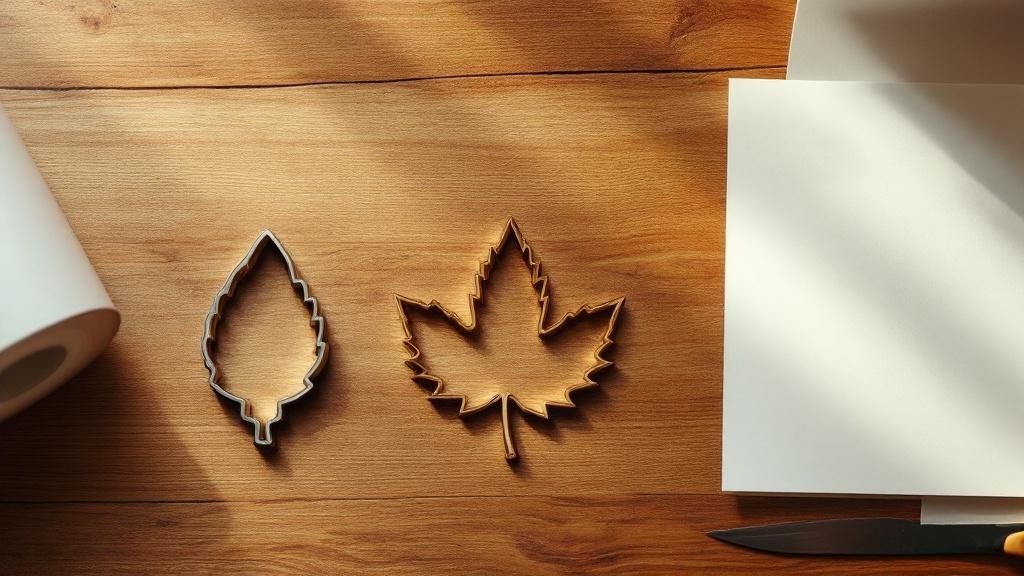 story
story What Is a Die Cut Label? A Complete Guide
So, what exactly is a die cut label? Instead of being a standard, off-the-shelf square or circle, a die cut label is cut precisely to the unique outline of your design. Think of it like getting a custom-fit suit for your product . It's designed to perfectly match its specific contours and brand aesthetic, making it a powerful tool for creating packaging that truly stands out. Why Custom Shapes Matter in Branding Ever walked down a store aisle and had a product just leap out at you? More often than not, it’s the unique shape, not just the colors, that grabs your attention. Standard rectangular labels are functional, sure, but they rarely tell a story or leave a lasting impression. They do the job, but they're easily forgotten. A die cut label, on the other hand, elevates your packaging from a simple container to a memorable brand experience. It’s the difference between using a generic stock photo and commissioning a custom piece of art. That unique shape doesn't just look different—it sends a clear message about creativity, quality, and attention to detail. A custom shape is your silent brand ambassador. It speaks to the consumer before they even read a single word, suggesting that what's inside is just as special and well-crafted. Building a Stronger Brand Identity By breaking free from the boring box, a die cut label helps carve out a distinct visual identity that customers can recognize in an instant. This visual shortcut is crucial for making your products pop in a crowded marketplace. Think about how a unique shape can work for you: Reinforce your product: A honey brand could use a label shaped like a honeycomb or a bee. Communicate your values: An organic soap company might opt for a label shaped like a leaf. Create an emotional connection: A playful, whimsical shape can make a product feel more fun and approachable. This strategic approach to packaging is a big reason why the demand for these labels is on the rise. In fact, the global die cut label market is projected to hit around USD 175.2 million in 2025 and is expected to climb to USD 230.6 million by 2032. Beyond just the physical appeal, understanding how unique branding contributes to your overall market presence is key. For brands aiming to make a real impact, mastering brand visibility is an essential piece of the puzzle. How Die Cut Labels Are Actually Made The term " die cut " sounds a bit industrial, but the idea behind it is actually pretty simple and clever. The whole process hinges on a custom tool called a die . Imagine a super-sharp, industrial-grade cookie cutter. That's essentially what a die is. But instead of dough, it’s built to slice through label materials with incredible precision, creating any custom shape you can dream up. Rather than just printing on a standard square or rectangular sheet, the label material is run through a press. The die then stamps down, punching out your specific design. This ensures every single label is a perfect match to your artwork, whether it's a simple circle or a complex custom contour. This visual breaks down the key stages in the journey of a die cut label. As you can see, it's a straightforward path from a design concept to a finished, precisely cut label that's ready to go. Key Die Cutting Methods While the cookie-cutter analogy is a great way to start, printers have a few different techniques up their sleeves. The right method for your project really comes down to the order size, how intricate the design is, and your budget. Here are the three main ways die cut labels are made: Rotary Die Cutting: Think of this as the high-speed workhorse. It uses a cylindrical die that spins and cuts shapes from a continuously fed roll of label stock. This method is incredibly fast, making it the go-to for huge print runs—like the millions of labels a national soda brand might need. Flatbed Die Cutting: This technique works more like a traditional press, where a flat die stamps down onto sheets of material. It's not as fast as rotary cutting, but it offers fantastic precision and is great for thicker materials or complex shapes on small-to-medium-sized orders. Digital Die Cutting: This is the modern, no-die-required approach. Instead of a physical tool, it uses a computer-guided laser or a tiny blade to cut the design. Because there's no custom die to create, it’s extremely cost-effective for small batches, prototypes, and one-off projects. It's the perfect choice for a small business testing a new product with just 100 or 200 labels. The choice of cutting method is strategic. It’s not about which is "best" overall, but which is best for your job. The goal is always to balance speed, precision, and cost to get the perfect result. Knowing a bit about these methods helps pull back the curtain on the production process. A die cut label isn't just about getting a cool shape; it's about using the right tool to bring a brand's vision to life efficiently and accurately. The Strategic Advantages of Custom Labels Knowing how a die cut label is made is interesting, but the real power is in what it can do for your brand. Choosing a custom shape isn't just a fun design choice—it's a smart business move that can seriously influence how customers see your product and whether they decide to buy it. Think about it. A simple shape change can turn your product from just another box on the shelf into something that catches the eye. A custom label is a shortcut to powerful brand recall. When a local honey brand uses a hexagon-shaped label, or a pet grooming company opts for a label shaped like a paw print, the packaging instantly tells a story. That visual cue sticks in a customer’s mind long after they’ve walked out the door. This need to stand out is why the market is booming. The die cut label market has grown right alongside the wider adhesive label industry, which is expected to jump from USD 4.1 billion to a whopping USD 6.8 billion by 2033. Brands are increasingly turning to die cut labels because they offer a level of uniqueness that standard labels just can't match. You can dig deeper into data on this industry trend to see how it's shaping modern branding. Maximizing Shelf Appeal and Perceived Value Walk down any retail aisle and you'll see a sea of sameness. You have only a few seconds to grab a shopper's attention, and a die cut label is your secret weapon for making them stop and look. Its unique silhouette instantly breaks up the visual monotony of all those squares and rectangles, making people curious. But it’s about more than just getting noticed. A custom shape elevates the perceived value of what you're selling. A well-designed, unique label sends a subtle message of quality and attention to detail. It tells the customer you’re a professional brand that cares about the entire experience, not just what's inside the package. A custom die cut label isn't just packaging—it's part of the product experience. It implies that the quality inside the container is just as exceptional as the presentation on the outside. Let's take a quick look at how die cut labels stack up against their standard counterparts. Standard Labels vs Die Cut Labels at a Glance Feature Standard Label Die Cut Label Shape Limited to squares, rectangles, circles, ovals. Virtually any shape imaginable. Visual Impact Blends in easily; relies solely on graphic design. Immediately stands out on the shelf. Brand Recall Generic shapes are less memorable. Unique shapes create strong visual associations. Perceived Value Can look basic or generic. Suggests a premium, high-quality product. Versatility Can be awkward on unconventional packaging. Can be designed for a perfect fit on any container. Cost Generally lower initial cost. Higher initial die cost, but often better ROI. While a standard label might get the basic information across, a die cut label truly becomes part of your brand's identity, delivering a much stronger punch. Functional and Practical Benefits Beyond just looking great, die cut labels solve real-world packaging problems. Because they're made to order, you can design them to handle very specific challenges. Perfect Fit for Contoured Surfaces: They're a dream for wrapping around curved bottles, tapered jars, or other tricky containers where a standard rectangle would wrinkle or peel. Accommodating Unique Packaging: Got a product with a weird recess or an odd-shaped lid? A die cut label can be cut to fit that exact space flawlessly. Integrated Design Elements: The shape can do more than just sit there. Imagine a label with a built-in tab that folds over the lid, acting as a tamper-evident seal. This mix of beautiful form and smart function is what makes a die cut label so effective. It’s an investment that works hard for you, creating a brand presence that’s cohesive, professional, and truly unforgettable. Choosing the Right Materials and Finishes A great shape is just the beginning. The material and finish you choose for your die cut label are what really bring your design to life, making sure it not only looks fantastic but also holds up wherever it ends up. Getting this combination right is what separates a good idea from a truly professional product. Think of the material as the very foundation of your label. It’s what determines the durability, the texture, and even how it feels in a customer’s hands. For anything that's going to be exposed to moisture, changing temperatures, or a lot of handling, picking the right material isn't just a suggestion—it's essential. Selecting the Perfect Label Material The single most important question to ask is: where will this label live? A label for a soy candle sitting on a shelf has entirely different needs than one for a beer bottle that's going to be dunked in an ice bucket. Here are a few of the most popular choices for die cut labels: BOPP (Biaxially-Oriented Polypropylene): This is a tough, plastic-based workhorse. If you need a label that’s waterproof, oil-resistant, and won’t tear, BOPP is your go-to. It’s the perfect choice for products like shampoo bottles, cold-brew coffee, and gear meant for the outdoors. Textured Paper: For a more high-end, tactile feel, nothing beats textured paper. It adds a touch of craft and elegance. Materials like felt, linen, or vellum are fantastic for wine bottles, artisanal foods, and any luxury item where a sophisticated feel is part of the brand’s story. White Vinyl: This is a crowd-pleaser for a reason. White vinyl is incredibly versatile, giving you a bright, solid background that makes your colors pop. It’s durable and weather-resistant, making it a solid all-around pick for everything from product labels to promotional stickers. It's no surprise that the demand for this kind of custom branding is exploding. The global market for custom die cut stickers was valued at around USD 48.39 million in 2023 and is on track to hit USD 75.67 million by 2032. Much of that growth comes from e-commerce brands looking for clever ways to make their products stand out. You can dive deeper into this market trend and its drivers . Applying the Final Touch with Finishes If the material is the foundation, the finish is the final coat of paint—it gives the label its personality. This protective top layer, often called a laminate, does more than just shield the ink from the elements; it completely changes the final look and feel. A finish doesn’t just change how a label looks; it changes how it feels . This tactile element can seriously elevate the perceived quality of your product before a customer even opens it. Think about which of these common finishing options fits your brand: Gloss Finish: This high-shine finish makes colors look deeper and more vibrant. It’s great for creating a bold, eye-catching look that screams for attention and offers great protection against scuffs and moisture. Matte Finish: For a more modern, subtle vibe, a matte finish gives you a smooth, non-reflective surface. It cuts down on glare and lends your die cut label a sophisticated, almost premium feel. Soft-Touch Finish: This one is all about the experience. It adds a unique velvety, almost rubbery texture that people can't help but touch. It’s an amazing choice for high-end products where you want to leave a memorable, sensory impression. In the end, the perfect choice is always a mix of function and style. By thinking carefully about your product’s journey and your brand’s personality, you can land on a material and finish combination that creates a label that's durable, beautiful, and does its job perfectly. Designing a Die Cut Label That Works A truly great die cut label is more than just a cool shape with your logo slapped on it. It’s where the shape and the artwork feel like they were made for each other—a perfect marriage, really. The secret is to think of the custom outline not just as a container, but as a core part of the design story itself. To get your vision from the screen to the finished product without a hitch, you’ll need to nail a few design fundamentals. This is what separates an amateur-looking label from one that looks polished, professional, and captures exactly what your brand is all about. Mastering the Technical Details Before you let your creativity run wild, it’s crucial to get the technical basics right. These small but vital steps are your best defense against common printing errors and the disappointment that comes with them. First up is the bleed . Think of it like coloring a picture as a kid. You’d often color a little bit over the lines to make sure there were no white gaps at the edges. A bleed works the same way for printing. You need to extend your background color or image about 1/8th of an inch past the actual cut line. This simple step ensures that even if the cutting die is off by a hair, you won't get any ugly white slivers on the edge of your label. Seriously, forgetting the bleed is the number one cause of printing headaches. It's a tiny bit of extra effort that acts as a safety net, guaranteeing a clean, edge-to-edge finish. Then there’s the safety margin . This is the opposite of a bleed. It’s an invisible border inside the cut line where you need to keep all your important stuff, like text and logos. If you place critical elements too close to the edge, you risk them getting trimmed off during the cutting process. A proper safety margin keeps your message intact. Making Shape and Artwork Work Together With the technical groundwork laid, now comes the fun part: making the shape and artwork feel like a single, cohesive unit. The goal is for them to be inseparable. For instance, if your label is shaped like a guitar, your text and graphics should flow with its curves, not just sit there in a boring rectangular block. Here are a few practical tips to help you get there: Legibility is Non-Negotiable: That fancy, swirly font might look great on your monitor, but on a small or oddly shaped label, it can become a mess. Stick to clean, clear typefaces and make sure there’s plenty of contrast with the background. Use Color to Guide the Eye: Your color choices should be strategic. Use bright, bold colors to make your brand name pop or to highlight a key feature, letting the unique shape of the label draw attention right where you want it. Balance Complexity with Simplicity: An intricate shape can be a showstopper, but it can also make your design feel cluttered if you’re not careful. Leave enough "negative space"—or breathing room—to keep the overall look clean and focused. By blending these technical must-dos with a bit of creative flair, you'll be well on your way to designing a die cut label that’s not only beautiful but prints perfectly every time. So, are die cut labels the right call for your brand? You've got the essentials down now. You know that a unique shape can make your product jump off the shelf, that the process isn't some mystical, unobtainable thing, and that the real magic happens when you pair a great design with the right material. This isn't just about sticking a label on a bottle. It's about turning your packaging into a silent salesperson. A clever die cut label can stop a busy shopper in their tracks and scream "quality" or "creativity" before they’ve even read your product's name. The trick is to make sure the shape isn't just different for the sake of it—it needs to connect back to what your brand is all about. Making the Final Call To nail down whether a custom die cut label is your best move, run through these questions. If you find yourself nodding "yes" to most of them, you can be pretty confident that going custom will pay off in a big way. Brand Identity: Does a custom shape actually amplify my brand's personality or connect to the product itself (like a honeycomb shape for a honey jar)? Shelf Impact: Is my product fighting for attention in a super crowded aisle where looking different is the only way to get noticed? Product Environment: Will this label have to survive the shower, a cold fridge, or rough handling? Do I need a specific material and finish to make it last? Perceived Value: Am I trying to position my product as a premium, handcrafted, or high-end item where the packaging needs to match the price tag? A die cut label isn't just an expense; it's an investment in making your brand unforgettable. When the shape tells a story, the product sticks in the customer's mind. At the end of the day, opting for a die cut label is a choice to lead with creativity and forge a connection that lasts long after the purchase. Answering Your Top Questions About Die Cut Labels Diving into custom labels for the first time? It's completely normal to have a few questions. Let's walk through some of the most common things people ask when they're getting started with die cut labels. Aren't Die Cut Labels Way More Expensive? It's a common misconception that custom shapes will break the bank. While there is a one-time setup fee for creating the unique metal die, the price per label evens out pretty quickly, especially on larger runs. Think of it as a small investment in making your product impossible to ignore. For smaller batches, modern digital die cutting is a fantastic, budget-friendly option that skips the physical die altogether, opening up custom shapes for everyone. That tiny bit of extra cost often pays for itself many times over in brand recognition. What’s the Smallest Order I Can Place? This really depends on the technology used. Older, traditional methods like rotary cutting often need larger minimums—sometimes in the thousands—to make the setup worthwhile. But digital die cutting has completely changed the landscape. Now, it's totally possible to order as few as 50 or 100 labels at a time. This is a huge advantage for small businesses, seasonal product launches, or if you just want to test a new design without a massive commitment. The best part about modern printing is its flexibility. You don’t need a huge budget or a warehouse full of inventory to get a professional, custom-shaped label that makes your product pop. How Well Do These Labels Hold Up? The durability of your label all comes down to your choice of material and finish. It's all about matching the label to its future environment. For instance, a BOPP label with a gloss laminate is a real workhorse. It's waterproof, shrugs off oil, and can handle the friction and condensation of being in a fridge or a shower. It’s perfect for something like a craft beer bottle or a body scrub. On the other hand, a classic paper label is less rugged but gives a beautiful, tactile feel for dry goods like coffee bags or candle jars. Can You Really Make Any Shape? Pretty much! The technology today is incredible and can handle some seriously complex designs. That said, there are some practical limits. Designs with extremely thin, wispy lines or very sharp, inward-pointing corners can be tricky. These delicate areas can be prone to tearing during application or peeling later on. A good rule of thumb is to keep your overall shape clean and solid. Your printer can always take a look at your artwork and suggest tiny adjustments to make sure it cuts perfectly and looks amazing on your product. Ready to create a label that truly reflects your brand? At 4OVER4 , we specialize in turning unique ideas into high-quality, precision-cut labels. Explore our die cut label options and get an instant quote today!
 story
story A Guide to Die Cutting Labels for Your Brand
Think of a cookie cutter slicing through dough. That's the core idea behind die cut labels, but instead of gingerbread men, we're stamping out custom shapes from paper, vinyl, or other materials. It’s a specialized process that uses a tool called a “die” to create labels in practically any shape you can dream up, moving your brand far beyond the usual rectangles and circles. What Are Die Cutting Labels and Why They Work In a world flooded with visual noise, a standard square label can easily fade into the background. Die cut labels are the answer, transforming your product's packaging from a simple container into a powerful marketing piece. It’s like giving your brand a physical silhouette—a distinct shape that customers recognize even before they read a single word. This isn't just about looking good; it's a strategic move. A unique shape instantly communicates your brand's personality or what the product does. Imagine a honey jar with a honeycomb-shaped label or a hot sauce bottle with a fiery chili-pepper-shaped sticker. That visual shortcut creates an immediate, intuitive connection with the shopper, helping your product pop on a crowded shelf. The Power of a Unique Shape The real magic of die cutting is its ability to create a bespoke fit for your brand and packaging. Instead of squeezing your design into a pre-made box, you get to create a shape that perfectly complements your logo, the product container, and your overall brand story. This level of customization pays off in several key ways: Boosts Brand Recognition: A consistent, unique shape becomes a memorable part of your brand identity, making it far easier for customers to spot your products. Increases Perceived Value: Custom-shaped labels often signal a higher-quality, more professional product, which can help justify a premium price point. Tells a Creative Story: The shape itself can tell a story, conveying playfulness, elegance, or innovation without saying anything at all. The real power of die cutting is that it aligns the physical form of your label with the conceptual identity of your brand, creating a seamless and impactful first impression. A quick look at how die cut labels stack up against the standard fare can make the choice a lot clearer. Die Cut Labels vs Standard Labels at a Glance This table breaks down the main differences, helping you see where custom shapes really shine. Feature Die Cut Labels Standard Labels Shape Fully customizable to any design Limited to pre-set shapes (squares, circles, ovals) Brand Impact High; creates a unique, memorable silhouette Low to moderate; relies on graphic design alone Initial Cost Higher due to custom die creation Lower; uses existing templates Visual Appeal High; stands out on shelves and products Standard; can blend in with competitors Best For Premium branding, unique products, promotions Budget-conscious projects, basic info, mass production Ultimately, while standard labels get the job done, die cut labels offer a level of personality and distinction that's hard to beat. A Growing Market for Customization The demand for packaging that does more than just sit there is on the rise. The global labels market, which includes die cutting labels , was valued at USD 52.3 billion in 2025 and is projected to hit USD 89.7 billion by 2035. This massive growth is fueled by the boom in e-commerce and a clear consumer preference for customized, premium products. This technology is more accessible than ever, allowing businesses of all sizes to craft a lasting impression. Explore our die cutting services to see how you can create custom labels that capture attention and build a stronger brand. How Custom Labels Are Actually Made Ever wonder how a simple digital design becomes a tangible, perfectly shaped label for your product? Pulling back the curtain reveals a fascinating process that blends precision engineering with creative flair. The method used often comes down to the project's size, complexity, and budget. Understanding how it's done helps you appreciate the technology behind it and, more importantly, make smarter choices for your own projects. Each technique has its own strengths, whether you need a small batch of intricate designs or a massive run of identical labels. Flatbed Die Cutting: Small Batches, Big Detail Think of a flatbed die cutter as a powerful, precise press, kind of like a high-tech cookie cutter. In this method, a flat steel rule die—the "cookie cutter"—is pressed down onto the label material with immense force, stamping out the exact shape you need. This technique is the go-to for smaller production runs and highly detailed or complex shapes. Because it operates with a stop-and-start motion, it’s not the fastest horse in the race, but it offers incredible accuracy. It's perfect for prototyping and premium, low-volume product labels where every single detail has to be flawless. This infographic shows just how much a custom shape can do to connect your brand with customers and make your products pop off the shelf. As the visual points out, the real magic of a custom shape is its power to create a memorable brand impression that grabs a customer's attention from a mile away. Rotary Die Cutting: Speed for Large Volumes Now, imagine taking that flat die and curving it into a cylinder. That’s the heart of rotary die cutting . This high-speed process feeds label material continuously through rotating cylindrical dies, which slice out the shapes at an incredible pace. This method is the undisputed workhorse of the industry, built for large-scale production where efficiency and consistency are everything. While the initial tooling cost is higher, the per-unit price drops dramatically on massive orders. That makes it the most cost-effective solution for high-volume jobs by a long shot. Digital Cutting: The Modern Alternative Digital die cutting completely ditches the physical die. Instead, it uses a computer-controlled blade or laser to cut the label shape directly from your digital design file. This offers amazing flexibility and is perfect for short runs, prototypes, or jobs with tons of different design variations. With no need for a physical die, digital cutting drastically reduces setup times and costs, making truly custom shapes accessible even for small businesses and startups. The market is definitely leaning into this kind of automation and flexibility. The global automatic die-cutting machine market was valued at USD 1.8 billion in 2024 and is expected to hit USD 3.1 billion by 2034. A lot of that growth is fueled by the e-commerce boom, which demands huge volumes of customized packaging. Knowing these options helps you choose the right partner for all your custom labels printing needs. The Strategic Benefits of Custom Shaped Labels Sure, understanding the production process is helpful, but the real magic of die cutting labels is what they can do for your business. A custom shape is so much more than just a pretty design; it’s a powerful marketing tool that can boost brand recognition, make your product feel more valuable, and even solve some tricky packaging headaches. Think of it this way: a standard rectangular label has to rely entirely on its graphics to get a message across. But a custom-shaped label? It tells a story with its physical form before anyone even reads a single word. A hot sauce brand with a label shaped like a chili pepper instantly screams "heat and flavor." A skincare line can use labels perfectly cut to hug the curves of an unconventional jar, giving off an air of luxury and meticulous detail. Driving Brand Recognition and Recall In a crowded market, standing out is the name of the game. A unique shape acts as a powerful visual hook for your brand. When customers see your product over and over again in a distinctive silhouette—whether it's a coffee bag with a bean-shaped label or a candle with an elegantly curved sticker—that shape becomes an unforgettable part of your brand identity. This visual consistency is key for building brand recall. The next time a shopper is scanning a busy shelf, their eyes will naturally be drawn to that familiar shape they now associate with your product. It makes it significantly easier for them to spot you and choose you over the competition. Enhancing Perceived Product Value The effort and investment it takes to create custom die cutting labels sends a subtle but powerful message to your customers: this is a high-quality, professional product. That perception can directly influence how much they're willing to pay. A bespoke label implies a bespoke product. By moving beyond generic shapes, you signal to your audience that every aspect of your product has been thoughtfully considered, from the ingredients inside to the packaging outside. This attention to detail can justify a higher price point and build a stronger sense of trust and loyalty with your customers. It transforms a simple purchase into a more memorable brand experience. Browsing through a custom shape diecut collection is a great way to get inspired and see how a unique silhouette could elevate your own product line. Solving Practical Packaging Puzzles Beyond branding, die cutting labels offer genuinely practical solutions for difficult packaging. Let's be honest, not every product comes in a simple, flat container. You've got tapered bottles, hexagonal jars, and all sorts of uniquely shaped boxes where standard labels just won't cooperate—they wrinkle, peel, or just look awkward. Custom shapes fix this by being designed to conform perfectly to any surface. This ensures a clean, professional look that feels like it’s part of the product itself. As you explore these options, it's also worth looking into other innovative solutions like UV DTF stickers , which deliver durable, vibrant prints on all kinds of surfaces and offer similar benefits for unique products. Whether it's die cutting or another method, a custom fit is essential for a polished final look. Designing Your Die Cut Labels for Success Creating a die cut label that turns heads is one thing, but making sure it actually prints perfectly? That’s where the real magic happens. A flawless label is a mix of bold creative vision and rock-solid technical prep. Getting these details right from the very beginning is the secret to a professional final product and helps you dodge those costly, time-sucking production delays. It all starts with your artwork file. When it comes to die cutting, vector files are the only way to go. You’ll want to stick with formats like Adobe Illustrator (.AI), EPS, or vector-based PDFs. These files build shapes using math instead of pixels, which means your design can be stretched or shrunk to any size without losing an ounce of sharpness. That’s how you get those satisfyingly crisp edges every single time. Setting Up Your Artwork for a Clean Cut To get your design print-ready, you need to get familiar with two crucial concepts: the bleed and the die line . Think of them as the technical blueprints that guide the printing and cutting machines. The Bleed: This is a little safety net of color or background image that extends past the final cut line. A standard bleed is 1/8th of an inch (0.125") on all sides. It’s there to make sure that even if there’s a tiny shift during the cutting process, you won’t end up with any ugly white slivers along the edge of your finished label. The Die Line: This is a separate vector path in your design file that tells the machine precisely where to cut. It needs to be a single, clean, and continuous line that outlines your label’s final shape. Any gaps or overlapping points can throw the cutting equipment for a loop, so make sure it's perfect. The die line is the most important instruction you’ll give us. A clean, well-defined die line is what separates a sharp, professional-looking label from a sloppy one. It’s the foundation that brings your unique shape to life. Before you send your file off to print, it’s always a good idea to run through a quick checklist. This helps catch any small errors that could cause big problems down the line, ensuring your design is ready for a flawless production run. Essential Design Checklist for Die Cut Labels Here’s a quick rundown of the key technical and creative steps to ensure your label design is both print-ready and impactful. Checklist Item Why It's Important Pro Tip Use Vector Artwork Guarantees sharp, clean edges no matter the size. Pixels lead to blurry cuts. Save your final file as an .AI, .EPS, or vector .PDF. Set a 0.125" Bleed Prevents white edges from appearing if the cut is slightly off-center. Extend your background design a full 1/8th inch beyond the die line on all sides. Create a Clean Die Line Provides a clear, unambiguous cutting path for the machinery. Make sure your die line is a single, closed vector path on its own layer. Establish a Safe Zone Protects crucial text and logos from being accidentally trimmed off. Keep all important elements at least 1/16th inch inside the die line. Avoid Overly Complex Shapes Prevents tearing or damage during application, especially with thin points. Smooth out sharp corners and thicken any delicate parts of your design. Choose Legible Fonts Ensures your message is easy to read, even from a distance. Pick a clear font and make sure it’s large enough to be legible on the final product. Taking a few minutes to double-check these points can save you a world of frustration and ensure the labels you receive are exactly what you envisioned. Creative Best Practices for Impactful Designs Once the technical side is buttoned up, you can get back to the fun part—making your design pop. The shape you choose shouldn't just be for show; it should connect to your product and reinforce your brand's personality. Think of a honey jar label shaped like a honeycomb—it instantly tells a story. Just be careful not to get too carried away with complexity. Shapes with super thin pieces or sharp, pointy ends are likely to tear when the labels are applied or shipped, and that can really kill the premium vibe you're going for. And here’s a final tip: make sure your logo, text, and any other can't-miss info are placed safely inside a "safe zone," away from the cut line. This ensures nothing important gets lopped off by accident. If you're looking to add another layer of texture and shine, you can always explore finishing options like spot UV printed products , which can add a glossy, raised effect to make certain parts of your unique design stand out even more. Inspiring Examples from Different Industries Theory is great, but seeing die cutting labels in action is what really gets the creative gears turning. Their versatility is on full display across countless industries, where a custom shape does more than just identify a product—it tells a story, sparks an emotion, and ultimately, helps close a sale. By looking at how other brands are doing it, you can find a ton of inspiration for your own. From the neighborhood coffee roaster to a global cosmetics giant, custom shapes help products break through the noise. Every example out there is a mini-masterclass in using clever design to solve a real-world marketing problem. Food and Beverage Brands The food and beverage aisles are a battleground, and shelf appeal is everything. Craft breweries are absolute pros at this, using die cut labels to give their bottles and cans a personality that’s impossible to ignore. Think of a rich stout with a label shaped like a barrel, or a crisp summer ale with a sun-shaped sticker. These shapes are anything but random; they're completely strategic. They broadcast flavor profiles and brand vibes before a customer even reads the name. A honeycomb-shaped label on a jar of honey instantly suggests natural, pure sweetness, while a chili-shaped sticker on a bottle of hot sauce is a clear—and fun—warning of the heat inside. Cosmetics and Personal Care In the beauty world, the package is just as important as the product inside, signaling luxury and quality. Die cut labels let brands create that seamless, high-end look that a standard rectangle just can't deliver. A skincare company, for example, might use a label cut perfectly to hug the curved lid of a jar, making it feel like an integrated, premium part of the container itself. The goal is to make the label feel like an intentional part of the container, not just something stuck on as an afterthought. This attention to detail elevates the entire product experience. Imagine a floral-scented lotion featuring a label cut into the delicate shape of a flower petal. This instantly reinforces the product’s main ingredient and scent profile. This kind of visual storytelling helps justify a higher price point and builds a much stronger connection with shoppers. Retail and Promotional Products Retailers lean on die cut labels to create price tags, promo stickers, and hang-tags that stop shoppers in their tracks. A clothing boutique might design a hang-tag in the shape of its logo, reinforcing its brand identity right at the point of sale. Around the holidays, a simple star-shaped sticker can instantly make any item feel festive and ready to be gifted. The demand for these kinds of custom solutions is booming. The global market for die cutting services, which includes custom label production, was valued at USD 20 billion in 2023. It’s projected to hit USD 25 billion by 2031. This growth shows just how much brands are investing in unique packaging to get noticed. Whether you're thinking of a simple, clean design or something more intricate, there are plenty of options. You can explore a huge variety of online labels to find the perfect match for your vision. How to Order Your Custom Labels So, you're ready to turn your design into a real, tangible label? Perfect. This last part of our guide is all about making that happen. Think of this as your roadmap, walking you through the ordering process from start to finish—no guesswork involved. We'll cover picking the right materials, adding that final finishing touch, and getting your artwork uploaded correctly. The goal here is to make the entire process feel simple and clear, so you can confidently order labels that look professional and do your brand justice. Let’s start with the foundation of any great label: the material. Selecting the Right Material and Finish The material you choose is more than just a background for your design; it’s the workhorse that ensures your label survives in the real world. Think about where your product will live. Will it be chilling in a fridge, sitting on a steamy bathroom shelf, or coming into contact with oils? BOPP (Biaxially-Oriented Polypropylene): This is your go-to for durability. It’s a tough, plastic-based material that’s both waterproof and oil-resistant . That makes it the perfect choice for things like shampoo bottles, hot sauce jars, or anything else that might face moisture. It comes in clear, white, or even a flashy metallic option. Paper Labels: A classic for a reason. Paper is a fantastic, budget-friendly option for dry goods, boxes, or any product that won’t be exposed to the elements. With different textures available, paper labels can give your packaging a more rustic or eco-conscious feel. Once you’ve locked in the material, the finish is what brings the look home. A gloss finish will make your colors practically jump off the label with a vibrant shine. On the other hand, a matte finish offers a more subtle, non-reflective look that feels modern and sophisticated. Take a look at the 4OVER4 ordering page—this is where you'll make these key decisions for your labels. As you can see, everything is laid out with simple dropdowns for size, material, finish, and quantity. It’s designed to be straightforward. Uploading Your Artwork and Proofing With the physical specs decided, it’s time for the creative part: your artwork. As we talked about earlier, you'll want to upload a print-ready vector file (like an .AI or .EPS ). Make sure it includes both a bleed and a clean die line on its own layer. This is the secret to getting a super crisp print and a perfectly precise cut. After you upload, we'll send you a digital proof. This is your last chance to be a detective. Check every single detail—spelling, colors, and especially the placement of the die line—before we hit the print button. Seriously, give it a good, hard look. This proofing step is your safety net. It protects you from any "oops" moments or costly mistakes. Once you give it the thumbs-up, your custom die-cut labels are officially headed to production and will be on their way to you before you know it. The whole system is built to make sure what you see on the screen is exactly what you get in your hands. Common Questions About Die Cut Labels When you're jumping into the world of custom labels, a few questions always seem to pop up. Nailing down these details from the start will give you the confidence to design and order exactly what your brand needs. Let's walk through some of the most common things people ask. Die Cut vs. Kiss Cut Labels One of the first hurdles is figuring out the difference between die cutting and kiss cutting . The best way to think about it is with cookies. A die cut label is like a cookie that’s been completely punched out of the dough, backing and all. You get a stack of individual, custom-shaped labels, which is perfect for handing out or slipping into product packaging. A kiss cut, on the other hand, is a much gentler process. The blade just "kisses" the top layer, cutting through the label material but leaving the backing paper completely intact. This is how sticker sheets are made, giving you multiple designs on one page that customers can peel off easily. Die Cut: Slices through both the label and the backing paper to create individual, custom-shaped pieces. Kiss Cut: Slices only the label material, leaving it on a larger backing sheet, ready to be peeled. Is There a Minimum Order for Custom Shapes? In the old days, getting a custom shape meant paying for a physical metal die to be created. That was a big upfront cost, which made small orders of unique labels pretty much impossible for most businesses. But that’s all changed, thanks to digital die cutting technology . Digital cutters work more like a plotter, using a computer-guided blade instead of a clunky metal die. Because there’s no expensive physical tool to create, the setup is incredibly simple and cheap. This means small-batch orders for die cut labels are not only doable but also surprisingly affordable. You don’t have to order thousands of labels just to get a cool shape anymore, which is a huge win for startups, limited edition products, or special events. Can Any Shape Be a Die Cut Label? While the technology is incredibly flexible, there are a few practical limits to keep in mind. You can create just about any shape you can dream up, but things get tricky with designs that have super thin, sharp, or intricate points. These delicate little areas are a nightmare for production—they tend to rip or tear, either during the cutting process or when someone tries to apply the label. The last thing you want is for your cool design to look cheap because it’s falling apart. To get a clean, professional finish, it’s always better to stick with smooth curves and avoid overly complicated edges. Your artwork needs a crisp, well-defined die line so the cutting machine has a sturdy and clear path to follow. Ready to turn your unique vision into a reality? At 4OVER4 , we make ordering custom die cut labels straightforward and quick. Explore our options and get an instant quote today.
 story
story A Guide to Dimensions of a Wine Bottle Label
When you're designing a wine label, figuring out the right size is one of the first—and most important—steps. For a standard 750ml bottle , the front label typically lands somewhere between 3.5 to 4 inches wide and 3.5 to 4 inches high . But that’s just a starting point; the bottle's shape and your design vision will ultimately guide the final dimensions. Decoding Standard Wine Label Dimensions Getting a handle on standard wine label dimensions is crucial for creating a design that’s both beautiful and compliant. While there’s no single, universal size that fits every bottle, industry norms for the common 750ml bottle give us a reliable baseline to work from. These sizes have evolved over time to strike the perfect balance between branding, aesthetics, and all the required regulatory information, making sure everything fits without feeling cluttered. In the U.S., for instance, most front labels for 750ml bottles are about 3.5 to 4 inches (90–100 mm) tall and 3 to 3.5 inches (75–90 mm) wide . These dimensions are heavily influenced by legal requirements from the TTB (Alcohol and Tobacco Tax and Trade Bureau), which mandate that certain text must be legible and clearly separated from other descriptive info. If you want to ensure your final product is spot-on, our professional bottle labels printing services can help you nail those specifications perfectly. Quick Guide to Common Wine Label Dimensions (750ml Bottle) To make things a little easier, I've put together a quick guide summarizing the most common label dimensions you'll see for a standard 750ml wine bottle. Think of this as a solid starting point for any design project. Label Type Typical Width (Inches) Typical Height (Inches) Front Label 3.5" – 4" 3.5" – 4" Back Label 3" – 4" 3.5" – 4.5" Neck Label 1.5" – 3" 0.5" – 1.5" These numbers give you a great frame of reference, but always remember to measure your specific bottle before finalizing your artwork. Bottle shapes can vary more than you'd think How to Properly Measure a Wine Bottle for Labels Getting a professional, bubble-free label application all comes down to one thing: accurate measurements. It’s a common mistake to just eyeball the dimensions, but guessing can lead to expensive printing errors, wasted labels, and a final product that just doesn't look right. Taking a few moments to measure correctly is the single best thing you can do to make sure your design fits the bottle’s usable surface area perfectly. Your goal is to measure the label panel . This is the flat, cylindrical part of the bottle that sits below the shoulder and above the bottom taper. If you try to apply a label to any of the curved or tapered surfaces, you’re just asking for wrinkles and peeling down the line. Essential Measuring Techniques There are a couple of reliable ways to get an accurate reading. Honestly, the best approach is to use both methods to double-check your numbers before you finalize any design files. Flexible Measuring Tape Method : This is hands-down the most accurate way to figure out the circumference and height for your label. For Height: Stand the bottle on a flat surface. Measure the vertical space between the point where the bottle's shoulder starts to curve up and where it begins to curve in at the base. That distance is your maximum label height. For Width: Wrap the flexible tape measure snugly around the widest, flattest part of the bottle's body. This gives you the total circumference and is the absolute maximum width you have to work with for a full wrap-around label. Paper Wrap Method : This is a great sanity check that helps you visualize the final placement and confirm you've identified the true label panel. Cut a piece of scrap paper to the dimensions you just measured. Wrap it around the bottle to see exactly how it sits. This simple physical test immediately shows you any potential issues with tapering and helps you make sure the placement looks balanced and professional. This visual guide breaks down the three main label types you'll be measuring for front, back, and neck placement. As the infographic shows, each label type corresponds to a very specific area on the bottle, which really drives home why you need distinct measurements for each. Pro Tip: For full wrap-around labels, always subtract 1/8 to 1/4 inch from your total circumference measurement. This creates a small, clean gap and prevents the label ends from overlapping, which can lead to peeling over time. Once you have your exact measurements locked in, you’re ready to explore options for custom online labels that match your specs for a flawless finish. Sizing Guide for Front and Back Wine Labels When you're figuring out the right dimensions for a wine bottle label, it's best to think of the front and back labels as two separate but complementary pieces. The front label is your brand’s billboard—it needs to have visual impact. The back label, on the other hand, plays a more functional role, communicating critical information and making sure you’re legally compliant. The shape of the wine bottle is the single most important factor that will dictate your label size. A tall, slender Riesling bottle offers a completely different surface than a broad-shouldered Bordeaux or a gently sloping Burgundy. Each shape creates a unique "label panel"—the flat, cylindrical area where a label can be applied smoothly without wrinkling up. If you try to place a label over a curve or taper, you're almost guaranteed a messy application. Balancing Branding and Compliance Your front label is where your brand story truly comes to life. Its dimensions should be generous enough to showcase your logo, brand name, and key artwork without looking crowded. For a standard 750ml bottle, a front label is often around 4 inches wide by 4 inches high or 3.5 inches wide by 4 inches high . This size gives you enough room for a powerful design that doesn't overwhelm the bottle itself. The back label, however, is all about necessity. This is where you have to fit legally required information, which directly affects its minimum size. Key elements that determine how large your back label needs to be include: The Government Warning: This text has specific font size requirements, typically needing to be at least 2mm high for most 750ml bottles to ensure it's legible. UPC Barcode: A standard UPC-A barcode needs a clear space of at least 1.469 inches wide by 1.02 inches high to scan properly. Sulfite Declaration: The "Contains Sulfites" statement is another mandatory element for wines with over 10 parts per million of sulfur dioxide. Alcohol Content and Net Contents: These details also have to be clearly displayed according to your regional regulations. By moving all these functional requirements to the back label, you free up the front for a clean, uncluttered design. This strategic separation lets your branding shine while ensuring you meet every legal obligation without compromise. Practical Dimension Examples To balance these needs, a common trick is to make the back label just a bit taller or wider than the front one. This accommodates all the required text without hurting readability. For instance, if your front label is 4" x 4", a back label could be 3.5" wide x 4.5" high. This keeps the look cohesive while giving you the real estate you need for compliance. Getting these details right is crucial, and using professional beverage labels printing ensures your final product meets both aesthetic and regulatory standards. Ultimately, the perfect dimensions are a thoughtful balance between the bottle's physical constraints, your brand's creative vision, and those non-negotiable legal requirements. Dimension Guidelines for Neck and Wrap-Around Labels Going beyond the standard front and back placements, neck and wrap-around labels give you some really unique ways to step up your packaging design. But these specialty styles come with their own set of challenges, and you’ll need a different approach to measuring your wine bottle labels. Getting them right is the key to a cohesive, high-end look that makes the most of the entire bottle. Wrap-around labels can create a seamless, panoramic canvas for your brand story, but they demand absolute precision. The width is the most critical measurement here, and it has to be calculated based on the bottle's full circumference. For a flawless application, it’s essential to leave a small gap of 1/8 to 1/4 inch where the two ends meet. This is a pro tip to prevent unsightly overlapping, which can cause bubbling or peeling down the road. Sizing Neck Labels for Tapered Surfaces Neck labels, often called "neckers," are fantastic for adding a touch of elegance or calling out a vintage year. Unlike body labels, they’re applied to a tapered, conical surface. That means a simple rectangle just won't cut it—it’ll wrinkle and buckle the moment you try to apply it. Instead, neck labels need a specific arc shape to conform perfectly to the bottle's curve. The exact dimensions will depend on the top and bottom circumferences of the specific neck area where the label will sit. Key Takeaway: Neck labels almost always require custom shapes to fit properly. This is where precise measurements and professional printing techniques are non-negotiable for creating a clean, premium finish. To get these non-traditional shapes, designers rely on specialized printing processes. You can learn more about how these unique shapes are made by exploring the possibilities of professional die-cutting services , which allow for intricate and perfectly fitted label designs. Some common neck label styles you'll see include: Ring Labels: A simple, thin band that wraps around the slimmest part of the neck. Collar and Tie: A wider band (the collar) with a decorative piece (the tie) that extends down the front. Shield Shapes: Custom-cut labels that sit on the front curve of the neck, often displaying a crest or logo. Mastering these dimensions ensures every single part of your bottle helps build a compelling brand presentation. How Global Regulations Influence Label Dimensions Beyond pure aesthetics, the dimensions of a wine bottle label are heavily shaped by a complex web of international and regional laws. Getting these rules wrong isn’t just a design mistake—it can literally stop your product at the border of a major market. For any vintner with eyes on international distribution, understanding these legal frameworks is step one. These regulations exist to give consumers clear, consistent information, but they have a direct impact on your label’s layout and minimum size. The biggest constraints come from mandatory text requirements, especially minimum font heights. These seemingly small typographic rules create a ripple effect, forcing designers to dedicate enough surface area to fit all the required information legibly. Comparing Key International Requirements The legal landscapes in major markets like the United States and the European Union are a perfect example of how regulations dictate design. While both aim to protect consumers, their specific rules differ, demanding careful attention from anyone looking to export. European Union (EU): The EU keeps things relatively simple, mandating a general minimum text height of 1.2mm for all required info, like alcohol content and importer details. This one-size-fits-all rule streamlines design for the EU bloc, but it still sets a baseline for how much space you need. United States (U.S.): The TTB (Alcohol and Tobacco Tax and Trade Bureau) uses a more layered system. For instance, the mandatory Government Health Warning must have text at least 2mm high on most standard bottles. That's significantly larger than the EU's general requirement. What this means is that a label designed perfectly for the EU might be flat-out illegal in the U.S. just because of font size. This often forces a complete redesign to increase the label's dimensions to make room for the larger text. Crucial Insight: Regulatory compliance isn't just about what you say, but how you say it. Minimum font sizes for warnings, alcohol content, and net volume are non-negotiable and have to be factored into your label dimensions from the very start. These rules apply across various bottle sizes, which are fairly standard in most markets. Common formats include 187 mL (split), 375 mL (half bottle), 750 mL (standard), 1.5 L (magnum), and 3 L (double magnum). Legal text requirements often scale with these formats. For example, the TTB says that for bottles larger than 187 mL , the bottler's name and address must be at least 2mm high, but that drops to 1mm for the smaller 187 mL bottles. You can dive into more of the specifics on these U.S. packaging regulations to ensure you're compliant. This scalability proves that a one-size-fits-all label is rarely a viable option for a product line with multiple bottle formats. Getting the Most Out of Label Design Templates Think of a professional design template as the fastest way to get from a creative idea to a file that's ready to print. These templates are essentially technical blueprints, making sure the dimensions of a wine bottle label are spot-on from the get-go. Using one completely removes the guesswork and helps you dodge common—and often expensive—printing mistakes. Your first step is to source a solid template. Most good printing services offer downloadable files that are already tailored to specific bottle shapes and label styles. When you open one up in a program like Adobe Illustrator, you’ll see it’s already structured with all the essential components for a perfect print run. Understanding the Parts of a Template A professional template is usually set up with organized layers for different elements. Keeping everything separate is the secret to a clean workflow and ensures nothing gets overlooked before you send your file off to the printer. Here are the key elements you’ll typically find: Artwork Layer: This is pretty straightforward—it's where your final design, including all logos, text, and images, should live. Die-Line: You'll see a precise vector line that shows the exact shape your label will be cut into. Whatever you do, don't change this line. Bleed Area: This is your safety net. It's a margin, usually 1/8 inch , that extends past the die-line. Any background colors or images need to fill this entire area to prevent ugly white edges after the labels are cut. A proper file setup is completely non-negotiable if you want a professional result. I always tell designers to double-check that their design resolution is at least 300 DPI , convert all text to outlines, and set colors to CMYK mode for the most accurate printing. It's also worth remembering that wine bottle label dimensions are often guided by strict government regulations. For instance, in the U.S., labels must display health warnings in type that's at least 2 mm high for most bottles, a rule that eats into your available design space. To see how creativity can work within these constraints, it's worth exploring unique wine label designs for inspiration. Once your template is ready, our guide on creating https://www.4over4.com/printing/category/custom-labels-printing can walk you through the next steps. Common Questions About Wine Label Dimensions Getting into the weeds of wine label dimensions can spark a lot of questions, especially when you're trying to balance a great design with bottle shapes and all the legal fine print. We've gathered the most common questions we hear to give you quick, clear answers. Think of this as your go-to reference to cut through the confusion and get your label application just right. Even a tiny miscalculation can snowball into big printing mistakes, so it’s smart to have these details handy. From standard sizes to regulatory must-haves, getting these answers straight will save you a ton of time and make sure your final product looks professional. What Is the Most Common Wine Label Size for a 750ml Bottle? For a standard 750ml wine bottle, the most popular front label size is a square 4 inches wide by 4 inches tall (4" x 4") . Another very common choice is just a bit slimmer at 3.5 inches wide by 4 inches tall (3.5" x 4") . These sizes give you plenty of room for branding and all the required info, and they fit perfectly on the flat "label panel" of both Bordeaux and Burgundy-style bottles. Back labels usually follow suit in size or are sometimes just a touch smaller to fit in extra details. How Much of a Gap Should I Leave for a Wrap-Around Label? When you're working with a wrap-around label, it's absolutely crucial to leave a small gap of at least 1/8 to 1/4 inch (that's about 3mm to 6mm) between the two ends. Why is this so important? This gap prevents the label edges from overlapping down the road, which can lead to peeling, bubbling, or just a sloppy-looking finish. Always measure your bottle's full circumference first, then subtract this gap measurement to get your final label width. Are There Legal Requirements for Font Size on a Wine Label? Yes, without a doubt. Legal font size requirements are a huge factor that directly impacts your label's overall dimensions. In the United States, the TTB has strict rules on minimum text heights for things like the government warning ( 2mm for most bottles), alcohol content, and net contents. The European Union has similar mandates, requiring a general text height of at least 1.2mm for all the mandatory info. Important Reminder: These rules are not suggestions—they're non-negotiable and exist to make sure consumers can easily read the label. You have to account for the space needed for this text right from the very start of your design process. Does Bottle Shape Affect Label Size? Yes, the bottle’s shape is one of the biggest things you need to consider. A classic Burgundy bottle, with its wide base and gentle slope, gives you a large, continuous surface to work with. A Bordeaux bottle, on the other hand, has those high, straight shoulders that create a more defined, rectangular area. Then you have tapered bottles, like the kind used for Riesling, which need specially shaped labels designed to fit a cone-like surface without wrinkling up. The bottom line is you must always measure the flat, cylindrical part of your specific bottle—known as the label panel —to figure out the maximum size you can work with. Ready to bring your perfectly measured design to life? 4OVER4 offers premium, customizable printing solutions to ensure your wine labels look as good in person as they do on screen. Explore our high-quality label options today.
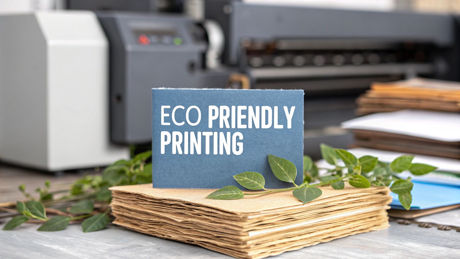 story
story Eco Friendly Printing Tips for Sustainable Results
Understanding Eco-Friendly Printing Beyond the Green Labels This snapshot from Wikipedia's Sustainable Printing page illustrates the core areas we need to consider: materials, the printing process itself, and the inks used. It's a reminder that eco-friendly printing isn't just about using recycled paper; it's about looking at the bigger picture. True sustainability means digging deep into each step of how a printed piece comes to life. Imagine trying to find your way through a complicated maze. That's what navigating the world of "green" products can feel like. Greenwashing , where companies make misleading claims about their environmental practices, adds another layer of complexity. It can make it tough to tell what’s truly eco-friendly. But, when done right, sustainable printing offers real, measurable benefits that extend far beyond marketing hype. The Science of Sustainable Printing Truly understanding eco-friendly printing means exploring every option, even things like sustainable print-on-demand options . It's about looking at the entire journey of a printed product, from the very beginning to its eventual disposal. Let's take inks as an example. Traditional petroleum-based inks release harmful volatile organic compounds (VOCs) . These VOCs pollute the air and can even create health risks. Conventional paper production also presents challenges, often contributing to deforestation and water pollution. Luckily, we have exciting new options. Think soy-based inks or even inks derived from algae! These alternatives dramatically reduce the environmental footprint. Combine them with sustainable materials like bamboo paper or recycled paper , and we start to see a truly eco-friendly printing process emerge. Want to learn more about these greener options? Check out our helpful guide on Green Printing . The Business Case for Eco-Friendly Choices Eco-friendly printing isn't just good for the planet; it's good for business, too. Sustainable practices can actually lead to cost savings by reducing how much material you use and lowering energy consumption. For instance, UV-LED curing technology uses far less energy than older drying methods. Plus, showcasing your commitment to sustainability can significantly boost your brand's image. It attracts environmentally conscious customers and investors. Making eco-friendly choices is a win-win. It helps create a healthier planet and a healthier bottom line. The Real Environmental Cost of Traditional Printing Traditional printing, while a familiar sight in offices and homes, comes with a hidden environmental price tag. Think of it like driving a gas-guzzler for short errands – it works, but not efficiently. These methods often depend on materials and processes that put a strain on our planet. Conventional paper production, for example, uses a surprising amount of water and energy. Many traditional inks also contain petroleum-based solvents . These release harmful volatile organic compounds (VOCs) , not just into the atmosphere, but also right there in your workspace. VOCs contribute to air pollution and can even affect your health. The Impact on Forests and Waterways Traditional paper production's dependence on trees contributes to deforestation. This loss of forests disrupts delicate ecosystems and reduces biodiversity. The manufacturing process often involves chlorine bleaching as well, which releases harmful chemicals into our waterways. These chemicals contaminate water sources and pose a threat to aquatic life. Every sheet of conventionally produced paper, then, carries a hidden environmental cost. Minimizing waste is crucial. For ideas on achieving this, take a look at some cost effective design solutions . The Carbon Footprint of Conventional Printing Beyond deforestation and water pollution, traditional printing adds to greenhouse gas emissions. The energy needed for paper production, the printing process itself, and even transportation all contribute to a substantial carbon footprint. This, of course, fuels climate change. But the printing industry isn't standing still. The global sustainable printing market is seeing real growth. It was valued at USD 2.07 billion in 2023 and is expected to grow at a CAGR of 7.5% from 2024 to 2030 . This shift is happening thanks to growing environmental awareness among both consumers and businesses. You can learn more about this growing trend in the sustainable printing market . For businesses looking for greener options, digital printing offers some compelling advantages. You can explore digital printing options to see how it could work for you. Sustainable Materials That Actually Work Better The infographic above gives you a snapshot of how eco-friendly printing can benefit your bottom line and the planet. Switching to sustainable materials can lead to a 20% cost savings , a 30% reduction in paper waste , and you could see a return on your investment within 12 months . This shows how sustainability and profitability can work together. Thinking about going green with your printing? It's important to understand the bigger picture, like the Carbon Footprint of the materials you choose. Eco-friendly printing isn't about sacrificing quality. It's about finding materials that are both high-performing and easier on the environment. Forget that old idea that sustainable paper is flimsy. Today's options are often stronger and more adaptable than traditional paper. Exploring Sustainable Alternatives So, what are these exciting alternatives? Let's dive in: Bamboo Paper: This remarkably fast-growing grass makes a paper that's both strong and smooth. Bamboo regenerates 30 times faster than trees, making it a highly renewable choice. Agricultural Waste Paper: Imagine turning wheat straw into beautiful, high-quality paper. This innovative approach uses materials that would normally be discarded, reducing waste and giving them a new purpose. Stone Paper: Made from calcium carbonate, stone paper is waterproof, tear-resistant, and incredibly durable. It’s a great option for projects that need to last. To help you compare these options, let's look at the following table: Sustainable Paper Materials Comparison: A comprehensive comparison of different eco-friendly paper options including recycled content, cost, durability, and environmental impact scores. Material Type Recycled Content % Cost vs Traditional Durability Rating Carbon Footprint Bamboo Paper 0% (inherently renewable) Slightly higher High Very Low Agricultural Waste Paper Variable, can be blended with recycled pulp Comparable or slightly lower Moderate to High Low Stone Paper 0% (uses mineral powder) Higher Very High Moderate (dependent on energy source for production) Recycled Paper Variable (e.g., 30%, 50%, 100%) Lower to comparable Moderate Low This table highlights the key characteristics of each material, allowing you to make an informed decision based on your specific needs. While bamboo and agricultural waste papers offer excellent sustainability profiles due to their renewable sources, stone paper stands out for its exceptional durability. Recycled paper remains a cost-effective and environmentally friendly choice. The choice is yours depending on the balance of cost, durability, and environmental impact you are looking for. The Power of FSC Certification Look for paper with Forest Stewardship Council (FSC) certification . This certification guarantees that the paper comes from responsibly managed forests. It verifies that forests are harvested in a way that protects the environment and benefits local communities. Think of it like buying fair-trade coffee – you're supporting responsible practices. Real-World Success Stories Many businesses are already enjoying the advantages of eco-friendly printing. For example, one printing company switched to soy-based inks and recycled paper . This not only lessened their environmental footprint but also attracted new clients looking for sustainable solutions. It's a win-win! Another company found that using bamboo paper for their brochures actually made them more durable. This meant less waste and, surprisingly, lower printing costs. This unexpected bonus shows how sustainable materials can sometimes outperform traditional ones in unexpected ways. Choosing sustainable printing can give you higher quality, longer-lasting materials, and significant cost savings. Each material has its own unique benefits, so doing a little research to find the right one for your project is key. Modern Inks That Outperform Traditional Options Imagine traditional petroleum-based inks as the old, bulky desktop computer of the printing world. Functional, sure, but also slow, messy, and not exactly efficient. Now picture eco-friendly inks as the sleek, powerful laptop equivalent: faster, cleaner, and surprisingly, often more effective. Traditional inks release harmful volatile organic compounds (VOCs) , impacting both the environment and the health of those working with them. They can also produce duller colors and be less durable. This makes them a less attractive option for businesses seeking high-quality, sustainable printing. The Rise of Plant-Based Inks Plant-based inks are at the forefront of eco-friendly printing. These inks use renewable resources, lessening their environmental impact without sacrificing performance. In fact, they frequently outshine traditional inks in key areas. Soy-Based Inks: Soy inks offer vibrant, rich colors and excellent print quality. They're a popular choice for many applications, from brochures and business cards to product packaging. Vegetable Oil Inks: Derived from various vegetable oils, these inks dry quickly and offer superior durability, making them ideal for products that need to withstand handling and environmental exposure. Water-Based Inks: Water-based inks eliminate the need for harmful solvents, making them a very clean option. They're perfect for businesses looking to minimize their VOC emissions. Want to add a luxurious feel? Consider exploring soft touch printing . Seeing Is Believing: The Benefits of Eco-Friendly Inks Real-world tests show eco-friendly inks often outperform traditional inks in color accuracy and durability. They produce sharper images, more vibrant colors, and are more resistant to fading. This superior performance is encouraging many printing companies to make the switch. For example, studies have shown soy-based inks produce richer, more accurate colors than petroleum-based inks on certain paper types. Other research has demonstrated that vegetable oil inks offer increased resistance to smudging and scratching, leading to longer-lasting prints. This isn't just about being environmentally conscious; it's about getting better results. The market reflects this growing demand. The eco-friendly inks market is expected to reach USD 5.10 billion by 2025 and nearly USD 8.98 billion by 2035 , growing at a CAGR of 5.8% . This growth is driven by the increasing need for non-toxic, biodegradable, and renewable inks made from sources like soy, vegetable oils, and water. Learn more about the growing eco-friendly inks market . These advancements show that eco-friendly printing delivers tangible benefits. Game-Changing Green Printing Technologies The printing industry is shifting. Think of it like trading in an old gas guzzler for a sleek electric car. Eco-friendly printing isn't just a trend; it's becoming the new normal, offering both efficiency and cost-effectiveness. Traditional methods are starting to look, well, outdated. Waterless Offset Printing: A Cleaner Approach Imagine printing with watercolors, but with inks and a specialized press. Traditional offset printing needs what are called "fountain solutions," chemical cocktails that aren't exactly earth-friendly. Waterless offset printing , true to its name, skips these solutions entirely. The result? Sharper images and a much lighter environmental impact. Digital On-Demand Printing: Reducing Waste Ever printed a whole stack of documents only to realize you needed just one page? It's a common waste culprit. Digital on-demand printing stops this by printing only the exact quantity you need. This cuts down on paper waste, saving trees and shrinking your environmental footprint. UV-LED Curing: Energy Efficiency at Its Best UV-LED curing is like a flash-dry for your prints. It uses ultraviolet light to instantly dry the ink. Not only does this method use 80% less energy than traditional heat-based drying, but it also creates prints that are more durable and resistant to fading. Companies like Xerox are leading the charge in sustainable printing. Their commitment to reducing their environmental impact is clear: Xerox's focus on circularity and minimizing waste reflects a growing trend in the printing industry. More and more companies are setting ambitious sustainability goals. Want to explore more eco-friendly printing options? Check out our article about Environmental Friendliness . Advanced Finishing Techniques Even the finishing touches on printed materials are getting a green makeover: Cold Foil Stamping: This technique creates those beautiful shiny metallic effects without needing heat, saving energy in the process. Biodegradable Coatings: These coatings offer the same premium look and feel of traditional finishes, but they break down naturally, reducing their environmental impact. Automated Waste Reduction: Some printing facilities now use automated systems to collect and process waste, turning it into reusable resources – like giving scraps a second life. These aren't just futuristic ideas. These technologies are actively used in printing facilities worldwide. They're seeing real, measurable improvements – both environmentally and financially. By embracing these technologies, businesses can make a real difference for the planet and contribute to a more sustainable future. Each technology has its own set of costs and benefits to consider, but the overall potential for positive impact is significant. Companies that adopt these green printing methods are setting themselves up for success in a world that values sustainability. Navigating Certifications That Actually Matter The world of eco-friendly printing certifications can feel a bit like wandering through a dense forest. Acronyms like FSC, PEFC, GREENGUARD, and Cradle to Cradle might seem like a foreign language. But understanding these certifications is key to making smart choices about your printing. Some certifications represent a real commitment to sustainability, while others might just be clever marketing. Think of it like choosing produce at the grocery store – the label makes a difference. Decoding the Key Certifications Several certifications stand out as especially important for eco-friendly printing: Forest Stewardship Council (FSC): The FSC focuses on responsible forest management. Seeing the FSC logo on paper tells you that the wood fiber comes from forests managed with the environment and social responsibility in mind. This includes protecting biodiversity, workers' rights, and indigenous communities. It's like a guarantee of your paper's ethical origins. Programme for the Endorsement of Forest Certification (PEFC): Similar to the FSC, PEFC promotes sustainable forest management, but works at a national level, endorsing various national certification systems. Both aim for responsible forestry, but there are differences in how they operate and what they require. Understanding these nuances can help you choose the certification that best reflects your values. GREENGUARD: This certification focuses on indoor air quality. GREENGUARD-certified printing products, like inks and cleaning solutions, meet strict limits on volatile organic compound (VOC) emissions. This means your printed materials won't release harmful chemicals into the air, protecting the health of your employees and customers. Think of it as a breath of fresh air for your workspace. Cradle to Cradle Certified™: This certification looks at the entire life cycle of a product – from creation to disposal. It evaluates material health, material reuse, renewable energy use, water stewardship, and social fairness. Achieving Cradle to Cradle certification shows a deep commitment to sustainable practices. It's like a gold medal for environmental responsibility. Verifying Legitimate Credentials It's important to be able to spot the difference between real certifications and greenwashing . Look for specific certification numbers and check them on the certifying body's website. This confirms that the certification is legitimate and current. Don't hesitate to ask your printer for proof of their certifications. Transparency is essential. The growing demand for sustainable practices is reflected in market trends. Market research suggests that the global sustainable printing market is expected to grow at a CAGR of 7.5% from 2025 to 2033 , reaching USD 2.17 billion in 2025. This growth is driven by increased environmental awareness among businesses and consumers, as well as regulatory pressures. You can find more information about this growing market in this report on the sustainable printing market . Business Benefits of Certification Working with certified printers and using certified products offers several advantages: Informed Purchasing Decisions: Certifications help businesses make well-informed choices about their printing materials and processes. Credibility and Trust: Certifications build trust with environmentally conscious customers and enhance your brand's reputation. Competitive Advantage: Showing your commitment to sustainability can set you apart from competitors. Reduced Environmental Impact: Choosing certified products directly supports responsible environmental practices. To help you better understand the various certifications available, we’ve compiled a helpful guide: Green Printing Certifications Guide Overview of major eco-friendly printing certifications, their requirements, and business benefits Certification Focus Area Key Requirements Verification Process Business Benefits Forest Stewardship Council (FSC) Responsible forest management Sustainable harvesting practices, worker protections, biodiversity conservation Third-party audits Demonstrates commitment to responsible forestry, enhances brand image Programme for the Endorsement of Forest Certification (PEFC) Sustainable forest management Adherence to national forest certification standards National system endorsements Supports sustainable forestry at a national level, provides broader sourcing options GREENGUARD Indoor air quality Low VOC emissions from printing products Product testing and certification Creates healthier workspaces, minimizes exposure to harmful chemicals Cradle to Cradle Certified™ Product lifecycle sustainability Material health, material reuse, renewable energy, water stewardship, social fairness Comprehensive assessment and certification Demonstrates holistic commitment to sustainability, drives innovation This table highlights the different focuses and benefits of each certification. Notice how some, like FSC and PEFC, concentrate on forest management, while GREENGUARD addresses air quality, and Cradle to Cradle takes a broader view of the entire product lifecycle. By understanding and using these certifications, businesses can make real progress toward eco-friendly printing, benefiting both the environment and their bottom line. It's not just about following a trend; it's about making responsible choices. Your Complete Implementation Roadmap Transforming your printing practices to be more eco-friendly doesn't have to be a sudden, jarring switch. Think of it more like a home renovation. You can start with small, impactful updates and gradually work your way towards a complete green makeover. This roadmap will guide you through a strategic, phased approach, ensuring both quick wins and long-term sustainability. Phase 1: Quick Wins – Easy Improvements This first phase focuses on changes that are simple to put in place, require minimal investment, and still deliver noticeable results: Print Less: The most straightforward way to lessen your environmental footprint is simply to print less. Encourage sharing documents digitally, use double-sided printing, and always proofread carefully before printing. Ask yourself – do you really need a hard copy? Default to Duplex: Make double-sided printing the automatic setting on all office printers. This small tweak can dramatically reduce paper consumption. Use Recycled Paper: Switch to paper with a high percentage of post-consumer recycled content. Look for the FSC certification , which ensures responsible forestry. Choose Eco-Friendly Fonts: Believe it or not, some fonts, like Garamond and Century Gothic, use less ink than others. These small savings can add up over time. These initial steps offer immediate environmental benefits and help raise awareness among your team, preparing everyone for bigger changes down the line. Phase 2: Optimizing Your Printing Processes Once you’ve tackled the quick wins, you can start optimizing your printing processes for greater efficiency and sustainability: Conduct a Print Audit: Take a closer look at your current printing habits to find areas for improvement. Track paper usage, ink consumption, and printing costs to pinpoint where you can make the biggest difference. Invest in Energy-Efficient Printers: Many newer printers have energy-saving features like sleep mode and automatic duplex printing. Consider upgrading to a more efficient model. Centralize Printing Resources: Streamline your printing by using a centralized print server. This offers better control over printing volume and helps avoid buying unnecessary printers. Phase 3: Advanced Solutions – Big Impact This phase involves larger-scale changes that deliver maximum environmental and business advantages: Partner with an Eco-Conscious Printer: Select a printing vendor dedicated to sustainable practices. Look for certifications like FSC , PEFC , and GREENGUARD . Ask about their use of eco-friendly inks , like soy-based or vegetable oil-based inks. Explore Alternative Printing Technologies: Consider options like waterless offset printing or digital on-demand printing to further reduce your environmental impact. Implement a Waste Reduction Program: Create a system for collecting and recycling paper, ink cartridges, and other printing byproducts. By taking these steps, you can change your printing practices from an environmental concern into a symbol of your commitment to sustainability. Making the Business Case To get your leadership on board, you’ll need a strong business case. Emphasize the cost savings from using less paper and ink, the boost to your brand image from sustainable practices, and the positive effect on employee well-being through better air quality. Training and Communication For this to work, you need to educate your team about the new procedures. Provide clear instructions on printing protocols, the advantages of eco-friendly printing, and how everyone can contribute to the company’s sustainability goals. Measuring Your Success Track your progress by monitoring key figures like paper usage, ink consumption, and energy costs. Share these results with your team to highlight the positive impact of your efforts. Regular monitoring keeps your eco-friendly printing initiative on track and aligned with your overall sustainability goals. For businesses including printed promotional materials with their products, exploring options like product inserts can be a good strategy. By following this roadmap, you can build a truly eco-friendly printing system that's good for the planet and good for business. Ready to improve your printing practices? Explore the range of printing solutions and sustainable options available at 4OVER4 .
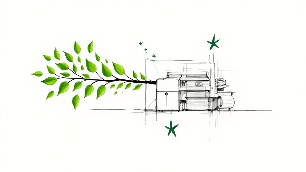 story
story A Guide to Vetting Eco Friendly Printing Companies
When you hear the term “eco-friendly printing,” what comes to mind? For a lot of people, it’s just recycled paper. But that’s only a tiny piece of the puzzle. An authentically green printing company doesn’t just offer a "green" option; they build their entire operation around minimizing their environmental footprint. This approach goes way beyond the paper bin. It’s a deep-seated philosophy that touches everything from the ink on the press to the energy powering the lights. What Makes a Printing Company Truly Eco-Friendly? The label "eco-friendly" gets thrown around a lot, but in the world of professional printing, it points to a specific set of practices that separate the real deal from companies just jumping on a trend. It’s not an add-on service—it’s a complete operational mindset. This commitment is really built on four core pillars. When you're looking for eco-friendly printing companies , these are the non-negotiables to watch for. The Pillars of Sustainable Printing Thoughtfully Sourced Materials: This is about more than just a recycling symbol. It means using paper with a high percentage of post-consumer waste (PCW) . It also means that when virgin fibers are needed, they come from responsibly managed forests, backed by certifications like the Forest Stewardship Council (FSC). Non-Toxic and Low-Impact Inks: Traditional petroleum-based inks are notorious for releasing nasty volatile organic compounds (VOCs) into the air. Green printers have moved on, opting for alternatives like soy, vegetable, or water-based inks that are biodegradable and far gentler on the planet. Energy-Efficient Operations: A truly sustainable printer invests in modern, energy-sipping equipment. They might use renewable power sources where they can and adopt smarter processes, like waterless printing, which drastically cuts down on both chemical and water waste. A Commitment to Minimizing Waste: This is where the pros really shine. It’s not just about recycling paper scraps. It means using advanced computer-to-plate (CTP) technology that reduces waste during setup and having robust recycling programs for everything from ink cartridges to used printing plates. This shift isn't just a niche movement; it's big business. The sustainable printing market was valued at USD 2.07 billion in 2023 and is on track to hit USD 3.35 billion by 2030 . That kind of growth tells you one thing: businesses and their customers are demanding more responsible ways of producing printed materials. This image gives you a great visual breakdown of what a truly green printing operation looks like. It really shows how everything is connected—from the materials they choose to the ink they use and the way they run their shop every day. A genuine eco-friendly printer doesn't just offer a "green" option; they integrate sustainability into their entire workflow. It becomes the default way of doing business, ensuring every project, big or small, has the smallest possible environmental footprint. To help you see the difference clearly, we've put together a quick comparison. Traditional vs. Eco-Friendly Printing At a Glance Aspect Traditional Printing Company Eco-Friendly Printing Company Paper Primarily virgin paper from uncertified sources. Recycled paper (high PCW), FSC-certified virgin paper. Inks Petroleum-based inks that release VOCs. Soy, vegetable, or water-based inks with low/no VOCs. Energy Use Older, less efficient machinery; standard grid power. Modern, energy-efficient presses; may use renewable energy. Waste High setup waste; limited recycling programs. CTP technology reduces waste; comprehensive recycling. Chemicals Heavy use of chemical solvents in cleaning and printing. Waterless printing options; use of biodegradable solvents. This table makes the contrast stark. One is stuck in the past, while the other is building a more responsible future. Understanding these differences is the first step. To see how these principles apply to actual products, check out our options for green printing . The contrast between old-school methods and modern, sustainable practices becomes even clearer when you see the results for yourself. Understanding Sustainable Papers and Inks The materials a printer uses are the most tangible proof of their commitment to the planet. Think of paper and ink as the core ingredients in your print project; their quality and origin story shape the final product's environmental footprint. Choosing the right ones can turn a simple print job into a powerful statement about your brand's values. Navigating the world of sustainable paper can feel a little overwhelming at first, but it really just boils down to a few key ideas. It’s not just about whether the paper is recycled, but how it was made and where it came from. Once you get a handle on this, you'll be able to ask smarter questions and make choices that truly matter. Decoding Sustainable Paper Choices The term "recycled paper" is just the tip of the iceberg. The real impact is in the details, and a good eco-friendly printing company will be upfront about the specifics. Post-Consumer Waste (PCW): This is the gold standard for recycled content. PCW paper is made from materials that people like you and me have already used and recycled—think old office paper, magazines, and mail. The higher the PCW percentage, the more waste was saved from ending up in a landfill. Pre-Consumer Waste: This material comes from manufacturing scraps, like paper trimmings from the mill that never made it to a customer. While recycling it is still a great practice, using PCW is more impactful because it completes the recycling loop. Responsibly Sourced Virgin Fibers: Let's be honest, sometimes a project needs the crispness and strength of new paper. When that's the case, look for certifications like the Forest Stewardship Council (FSC) . This seal of approval guarantees the wood pulp comes from forests that are managed to protect biodiversity, respect indigenous rights, and maintain ecological balance. Beyond the usual suspects, innovative materials are gaining ground. Stocks made from bamboo or hemp are fantastic alternatives—they grow incredibly fast, use fewer resources, and give printed materials a unique, tactile feel. Another excellent choice is Kraft paper, with its natural, unbleached look. You can check out some great rustic and responsible options in our Kraft Collection . The Critical Role of Eco-Friendly Inks The ink that goes on the paper is just as important as the paper itself. For decades, the printing industry ran on petroleum-based inks, which release harmful volatile organic compounds (VOCs) as they dry. These VOCs are bad news for air quality and can pose health risks. Thankfully, those days are fading. Modern sustainable printing has moved on to much cleaner, plant-based alternatives that have been a total game-changer for the industry. The most significant leap forward in green printing is the move away from petroleum. By replacing it with renewable resources like soy or vegetable oil, printers drastically reduce air pollutants without sacrificing the color and vibrancy your designs demand. This isn't just a niche trend; it's the future. The market for eco-friendly inks is projected to explode from USD 4.2 billion in 2025 to a massive USD 8.9 billion by 2035 . This incredible growth is fueled by innovations in bio-based materials that make green printing more accessible and effective than ever. Common Types of Sustainable Inks Soy-Based Inks: Made from soybean oil, these inks are low in VOCs and make the de-inking process much easier when the paper gets recycled. Vegetable-Based Inks: Similar to soy inks, these use other vegetable oils (like corn or linseed) to deliver brilliant colors with a tiny environmental footprint. Algae-Based Inks: This is a truly exciting innovation. Algae inks are actually carbon-negative, since the algae consume carbon dioxide while they grow. When you partner with eco-friendly printing companies , you get access to these better materials. By understanding what makes different papers and inks sustainable, you can confidently choose the options that best reflect your brand's commitment to a healthier planet. Looking for Proof with Environmental Certifications In a market flooded with green claims, how do you tell real commitment apart from clever marketing? Vague terms like “eco-conscious” or “earth-friendly” don't mean much without something to back them up. The single most reliable way to check a printer's green credentials is through third-party certifications. Think of these certifications as an auditor for sustainability. They're run by independent, globally recognized organizations that set tough standards for environmental and social responsibility. When you see their logos, you know a company has actually done the hard work to prove its commitment, not just talked about it. Certifications for Responsible Materials The most common certifications you’ll run into are all about the paper itself, making sure it comes from sustainable sources. These are your guarantee that a print job isn’t contributing to deforestation or sketchy harvesting practices. The big one here is the Forest Stewardship Council (FSC) . What it means: The FSC logo is your assurance that the paper originates from forests managed to keep biodiversity intact, protect endangered species, and respect the rights of local communities and workers. It's one of the most trusted marks for sustainable forestry on the planet. You might see a few different FSC labels, and each one signifies a different level of certified content in the final product. Seeing one of these labels confirms the product's entire supply chain—from the forest all the way to the printer—has been audited and given the green light. Other important material certifications include: Sustainable Forestry Initiative (SFI): Much like the FSC, an SFI certification ensures paper is sourced from well-managed forests, with a heavy focus on practices that protect water quality, wildlife habitats, and biodiversity. Green Seal: This one takes a much broader view, evaluating a product’s entire lifecycle impact. For paper, that means looking at everything from raw material extraction to manufacturing and disposal, ensuring it meets high environmental standards at every single stage. Certifications for Company-Wide Commitment Beyond the materials they use, the best eco friendly printing companies go after certifications that reflect their overall business ethics and operational footprint. These credentials show a deeper, more integrated approach to sustainability that goes way beyond just paper and ink choices. A certification is more than just a logo; it's a public commitment to transparency and accountability. It proves a company is willing to have its practices scrutinized by an independent expert to validate its environmental claims. One of the most respected company-level certifications out there is B Corp Certification . What it means: Becoming a Certified B Corporation is no walk in the park. It requires a company to meet sky-high standards of verified performance, accountability, and transparency on everything from employee benefits and charitable giving to supply chain practices. It’s a clear signal that a business is balancing profit with purpose. Another huge commitment to look for is carbon neutrality. A carbon-neutral printer has measured its entire carbon footprint—from energy use to shipping—and has actively worked to shrink it. Any leftover emissions are then offset through investments in renewable energy or reforestation projects. This is a powerful sign that a company takes full responsibility for its environmental impact. To learn more about how these principles come together, explore our guide on sustainability and green printing for marketing materials. By getting familiar with these key certifications, you can cut through the marketing fluff and make decisions based on verified, credible proof. What Really Goes on Behind the Scenes: Efficient Processes and Waste Reduction The most impressive sustainability efforts aren't always the ones you see. Beyond the certified papers and plant-based inks, the true heart of an eco friendly printing company's commitment lies on the production floor. It’s in the day-to-day operations where a printer's green promises are truly put to the test. Think of it like a chef running a zero-waste kitchen. It's not just about buying organic ingredients; it's about using every last scrap, optimizing the oven's heat, and conserving water at every turn. In printing, this translates to investing in smart technology and workflows that slash waste before it even has a chance to be created. Modern Technology That Shrinks Footprints A printer’s choice of machinery is a huge piece of its environmental puzzle. Older presses are often energy hogs, guzzling electricity and water. In contrast, printers who are serious about sustainability invest in equipment designed for peak efficiency. Energy-Efficient Presses: Modern digital and offset presses are engineered to use dramatically less power. Some can consume up to 75% less energy than their older counterparts, which means a smaller carbon footprint for every single project that rolls off the line. Waterless Printing Technology: This is a genuine game-changer. Conventional offset printing relies on a mix of water and chemical dampening solutions, which creates contaminated wastewater. Waterless printing completely eliminates this step, saving a precious resource and cutting out a major source of chemical pollution. These aren't minor tweaks; they're fundamental upgrades that show a real, long-term investment in sustainable operations. The "Reduce First" Philosophy Waste reduction starts long before any ink hits the paper. The pre-press stage—where your designs are prepped for printing—used to be a huge source of waste, involving all sorts of films, chemicals, and proofing materials. The smartest environmental strategy isn't just about recycling more; it's about creating less to recycle in the first place. This 'reduce first' philosophy is a hallmark of a truly sustainable operation. This is where Computer-to-Plate (CTP) technology makes a massive difference. CTP systems send digital files directly to the printing plates, completely bypassing the need for chemical-laden film. This one shift dramatically cuts material waste, eliminates hazardous chemicals, and even speeds up production. It’s a perfect example of efficiency and environmental responsibility working together. Of course, a holistic approach is always best. Beyond the print shop, businesses can find inspiration from broader guides that offer practical strategies for reducing plastic waste across their entire operation. The Reduce, Reuse, Recycle Mantra in Action Any printer genuinely dedicated to being eco-friendly lives by the waste management hierarchy. It's a simple but incredibly powerful framework. Reduce: The top priority, always, is to minimize the use of raw materials from the get-go. This means using CTP technology, optimizing layouts to fit more designs onto a single sheet (a process called gang-run printing), and accurately printing only what’s needed. Reuse: Whenever possible, materials get a second life. This could be as simple as reusing shipping boxes and pallets or internal containers to slash the need for new packaging. Recycle: As the final step, anything that can't be reduced or reused gets recycled. This includes every paper offcut, used ink cartridge, aluminum printing plate, and piece of packaging. A comprehensive recycling program is simply non-negotiable for a truly green printer. This kind of operational discipline is what separates the talkers from the doers. For a closer look at how these practices apply to specific products, check out our resources on sustainability and green printing . In the end, an efficient, low-waste process doesn't just help the planet—it also creates a leaner, more cost-effective operation that delivers better value to you. Key Questions to Ask Your Potential Printing Partner Choosing the right partner is the most critical step in turning your sustainable values into real, tangible products. Once you understand the basics of materials, certifications, and processes, it's time to put that knowledge to work. Asking sharp, specific questions is the best way to cut through the marketing fluff and find genuinely eco friendly printing companies . A truly sustainable printer will welcome your questions with open arms. Their answers should be detailed, backed by evidence, and show a deep-seated commitment that runs through their entire operation. If you get vague responses or they seem unwilling to share details, consider that a major red flag. Inquiring About Materials and Inks The physical stuff—the paper and ink—is the easiest place to start. Getting clear, knowledgeable answers here is a great sign that a printer has put real thought into their supply chain and environmental impact. "What percentage of post-consumer waste (PCW) is in your standard recycled paper stocks?" A solid answer will give you specific numbers, like, "Our house uncoated stock contains 30% PCW ," not just a generic "we use recycled paper." "For virgin paper, can you confirm it is FSC-certified and show proof of your chain-of-custody number?" Any legitimate FSC-certified printer will have this number handy and know exactly why it matters. "What types of inks do you use?" You’re listening for specific mentions of soy, vegetable, or other plant-based inks. A great follow-up is to ask what they’re doing to minimize VOCs (Volatile Organic Compounds). The demand for cleaner inks is really starting to reshape the industry. The global market for eco-friendly printing inks was valued at USD 713 million in 2024 and is projected to jump to USD 1,365 million by 2032 , all thanks to the big shift toward plant-derived alternatives. Evaluating Operational Practices and Waste A company's internal processes reveal the true depth of its commitment. This is where sustainability goes from being a product feature to an operational philosophy. Asking about waste management and efficiency shows you’re looking beyond the brochure. A printer's waste management policy is a direct reflection of their environmental ethos. A comprehensive program that prioritizes reduction and reuse over simple recycling demonstrates a mature and authentic commitment to sustainability. Here are a few key questions to dig into their day-to-day operations: "Can you describe your waste management and recycling program?" A strong partner will be able to detail their process for recycling paper scraps, used printing plates, ink cartridges, and even basic office waste. "What technology do you use to minimize pre-press waste?" The best answer you can hear is "Computer-to-Plate (CTP) technology," since it completely eliminates the need for chemical-laden film. "How do you handle the disposal of chemical solvents and other hazardous materials?" An eco-friendly printer will have a clear, compliant protocol for responsible disposal, often working with specialized waste management services. Looking beyond printing-specific certifications is also smart. A company's overall commitment to Environmental, Social, and Governance (ESG) goals says a lot. This guide for ESG-focused businesses offers some great insights into how companies manage their environmental impact across the board. Confirming Certifications and Transparency Finally, it's time to ask for the proof. Certifications are the outside validation of a company's claims, and any authentically green printer will be happy—even proud—to share their credentials with you. For a deeper dive into how these practices apply to everyday items, check out our guide to sustainability and green printing for stickers . "Which third-party environmental certifications does your company hold?" Listen for names like FSC, SFI, Green Seal, or B Corp. "Can you provide a copy of your company's environmental policy?" This document should spell out their commitments and goals in clear, actionable terms. By asking these targeted questions, you shift from being a passive buyer to an informed partner, making sure the printing company you choose truly aligns with your brand's values. Common Questions About Eco Friendly Printing Making the switch to a sustainable printing partner is a big move, and it's totally normal to have some practical questions. Concerns about cost, quality, and the real-world impact are things we hear all the time. Let's tackle these head-on and clear up some of the myths around green printing so you can make your decision with confidence. Once these common hesitations are out of the way, you can move forward with a clear picture of what partnering with truly eco friendly printing companies means for your business, your budget, and your brand. Is Eco Friendly Printing Always More Expensive? This is probably the biggest misconception out there, and the short answer is: not necessarily. While some highly specialized recycled or alternative papers might come with a premium, the full story is a lot more balanced. True eco-friendly printers have usually made huge investments in hyper-efficient equipment and processes that slash waste and energy use. Those savings often get passed right on to you. Plus, as sustainable materials have become more common, their costs have come down, shrinking any price gap that might have existed. The best thing to do is just ask for a comparative quote. You might be surprised to find the difference is tiny—or that there isn't one at all. The real math goes beyond the initial price. The brand equity and customer loyalty you build by showing a real commitment to sustainability often deliver a return on investment that blows any minor cost difference out of the water. At the end of the day, choosing a green printer is an investment in your brand’s story and its connection with today's consumers. Does Recycled Paper Affect Print Quality? This is a stubborn myth hanging on from the early days of green printing. Decades ago, recycled paper could be a bit iffy, but today’s manufacturing standards have completely changed the game. Modern recycled papers are engineered for incredible performance, delivering fantastic brightness, smoothness, and ink holdout. For the vast majority of business needs—from vibrant brochures and sharp flyers to professional business cards—high-quality recycled stock is virtually indistinguishable from paper made from virgin fibers. A good eco-friendly printer knows their materials inside and out and can guide you to the perfect recycled paper for your project, making sure your designs look crisp, vibrant, and totally professional. You don't have to sacrifice an ounce of quality to make a responsible choice. What Is Greenwashing and How Do I Avoid It? Greenwashing is a shady marketing tactic where a company makes misleading or unproven claims about its environmental benefits. It’s all about using vague, feel-good language without any real proof to back it up. Avoiding it boils down to one simple rule: look for evidence, not just adjectives. Here’s how you can spot the difference: Vague Claims: Be suspicious of generic terms like "green," "eco-conscious," or "earth-friendly" that aren't tied to anything specific. Lack of Proof: A genuinely sustainable printer will be proud and transparent about their credentials. They won't shy away from showing you their third-party certifications. Hidden Trade-Offs: Some companies might shout about one small green feature while conveniently ignoring much larger negative impacts in other parts of their business. Your best defense against greenwashing is being an informed buyer. Ask the direct questions we covered earlier about certifications, waste policies, and ink types. A legitimate partner will have clear, verifiable answers ready to go. How Does My Printer Choice Impact My Carbon Footprint? Who you choose as your vendors and suppliers is a critical, but often overlooked, piece of your company's total environmental impact. In the world of sustainability reporting, this is what's known as your Scope 3 emissions —the indirect emissions that happen all along your value chain. Working with an eco-friendly printer is a direct, measurable way to lower your own carbon footprint. When you pick a company that is actively working to reduce its environmental toll, you're essentially outsourcing a piece of your own sustainability goals. By selecting a printer that uses renewable energy, sources certified recycled materials, and operates with a zero-waste mindset, you're making a tangible difference. This isn't just a symbolic gesture; it's a concrete action you can highlight in your annual sustainability reports, share with your stakeholders, and communicate proudly to your customers. It shows that your commitment to the planet is woven into every part of your business. Ready to partner with a printing company that delivers exceptional quality without compromising on environmental responsibility? At 4OVER4 , we combine decades of expertise with a deep commitment to sustainable practices, offering a wide range of eco-friendly papers, inks, and processes to bring your vision to life. Explore our green printing solutions and see how easy it is to make a choice that’s good for your brand and the planet. Visit us at https://4over4.com today.
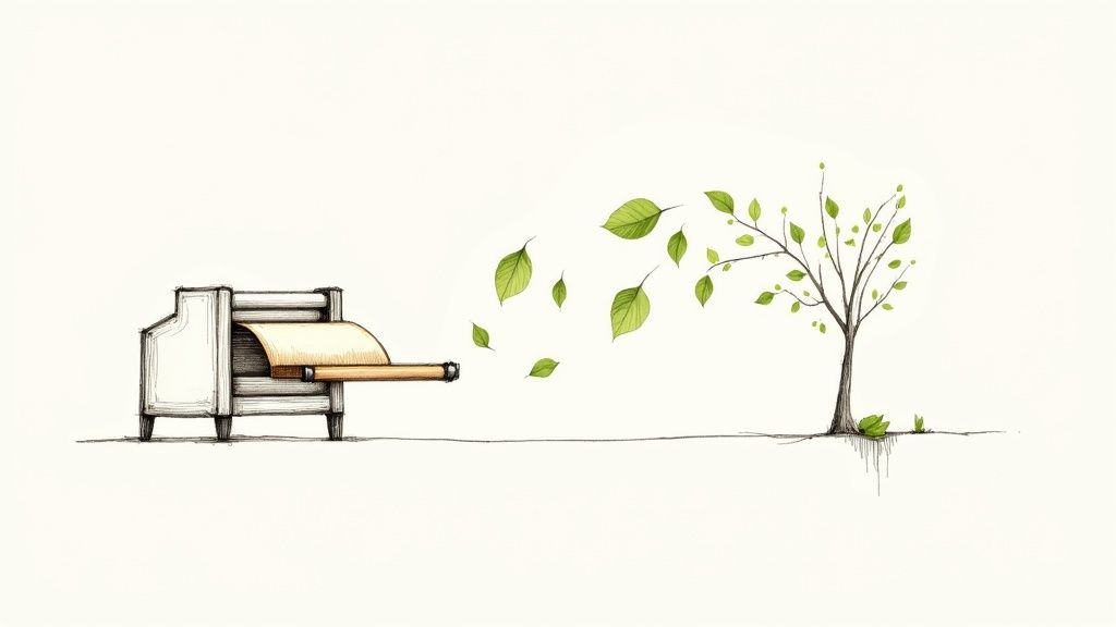 story
story Discover eco friendly printing services for greener branding
So, what does "eco-friendly printing" actually mean? It’s not just about using recycled paper. That’s a common misconception and, honestly, just scratching the surface. Eco-friendly printing is a full-circle commitment to minimizing environmental impact at every single stage of the process. It's about making conscious choices from the moment a tree is sourced until the final product lands on your doorstep. What Exactly Are Eco Friendly Printing Services While using sustainable materials like recycled paper and non-toxic inks is a huge part of the equation, true green printing goes much, much deeper. It’s a complete philosophy that examines the entire lifecycle of a print job. Think of it as a "forest-to-front-door" approach. It's not one single action but a whole chain of responsible decisions designed to save resources, cut down on pollution, and support a healthier planet. If you're looking to really get into the weeds, exploring various eco friendly printing solutions can shed more light on the different facets. Beyond the Paper and Ink A real commitment to sustainability has to go beyond the materials you can see and touch. It extends right into the print shop itself. Eco-conscious printers are the ones investing in modern, energy-efficient equipment that uses less power and creates fewer emissions. They're also the ones using smarter techniques, like chemical-free plate making, and have solid internal recycling programs to catch any waste. It's this behind-the-scenes operational dedication that really separates the truly green printers from the rest. The Lifecycle of a Sustainable Print Project Let's break down what this holistic journey looks like for a printed piece: Responsible Sourcing: It starts with the paper. Is it from a responsibly managed forest? Does it have a high percentage of post-consumer recycled content? Low-Impact Production: This is where the printer's choices matter. Are they using non-toxic, vegetable-based inks? Is their machinery built for energy efficiency? Waste Reduction: Smart printers optimize their runs to avoid overages and make sure every scrap and byproduct gets recycled. Eco-Conscious Finishing: Even the final touches count. Binding and finishing options should be chosen so they don't make the final product difficult to recycle. Green Delivery: The last mile matters, too. Top-tier green printers will offer carbon-neutral shipping to offset the emissions from transportation. This isn't just a niche market anymore; it's a significant shift in the industry. The global sustainable printing market, valued at USD 2.17 billion , is expected to hit USD 3.35 billion by 2030 . That kind of growth tells you that both businesses and their customers are voting with their wallets for more responsible options. For any business, choosing sustainable print options is a fantastic way to put your money where your mouth is and align your brand's values with concrete actions. When you partner with a green printer, you're making a tangible statement about your commitment to corporate responsibility. You can check out our full range of green printing products to see just how easy it is to make the switch. The Core Materials of Sustainable Printing The heart of any eco-friendly printing service lies in two fundamental elements: the paper it’s printed on and the ink used to bring the design to life. Making smarter choices here can slash a project's environmental impact before it even gets near a press. Let’s look at the sustainable options that elevate a standard print job into a truly green one. Think of these materials as the core ingredients in a recipe. A great chef wouldn't use subpar produce, right? In the same way, a truly sustainable printer carefully selects materials that are kinder to our planet. These choices go way beyond just "recycled paper" and open up a whole world of responsible innovation. Rethinking Paper Beyond the Basics Paper is usually the first thing that comes to mind, and for good reason. Traditional paper production is a thirsty, resource-heavy process. Thankfully, modern sustainable alternatives deliver fantastic quality without that steep environmental price tag. The main goal is to shift away from virgin fibers that come from poorly managed forests. Your most powerful choice here is paper with a high percentage of post-consumer waste (PCW) . This is just a technical term for paper made from materials you and I have already used and recycled, like old mail or office documents. By choosing high-PCW paper, you’re directly helping to keep waste out of landfills and reducing the demand for new trees. Key Takeaway: Choosing paper with 100% PCW content is one of the single biggest moves you can make toward sustainable printing. It closes the recycling loop, saves an enormous amount of water, and cuts down on energy use. But recycled content isn’t the only way to go. There are other fantastic, eco-conscious paper options available: FSC-Certified Virgin Paper: If recycled paper just won't work for your project, the next best thing is virgin paper certified by the Forest Stewardship Council (FSC). This label is a guarantee that the wood pulp comes from forests managed with the highest environmental and social standards in mind. Alternative Fibers: This is an exciting and growing field. We're now seeing incredible papers made from alternative, fast-growing fibers like bamboo, hemp, and even agricultural waste. These plants typically need less water and fewer pesticides to grow than trees, making them a brilliant renewable resource. Unbleached or Chlorine-Free Paper: The conventional bleaching process can release some nasty chemicals into the environment. Opting for unbleached stocks, like those in our rustic Kraft Collection , or papers bleached using chlorine-free methods (PCF or TCF) helps minimize that chemical footprint. The Shift to Cleaner, Greener Inks The second critical ingredient is the ink. For decades, the industry relied on petroleum-based inks, which release harmful Volatile Organic Compounds (VOCs) into the air as they dry. These VOCs contribute to air pollution and can be a health concern. Fortunately, the tide is turning. The market for eco-friendly inks is booming, projected to grow from around USD 4.7 billion to an impressive USD 8.9 billion by 2035 . This massive industry shift, highlighted in this detailed market analysis , shows just how serious printers are about getting cleaner. This transition has given us several fantastic alternatives that produce rich, vibrant colors without the hazardous side effects. Better yet, these modern inks often make the final printed piece easier to de-ink and recycle, which is another win for the circular economy. Comparing Sustainable Inks and Papers To help you navigate the options, here's a quick look at some of the most common sustainable materials and what they bring to the table. Understanding the differences will help you pick the perfect combination for your next project. Material Type Key Feature Environmental Benefit Best For 100% PCW Paper Made entirely from recycled consumer materials. Diverts waste from landfills, saves trees, and conserves water/energy. Business cards, flyers, brochures, and everyday marketing materials. FSC-Certified Paper Sourced from responsibly managed forests. Protects biodiversity, supports local communities, and ensures forest health. High-end lookbooks, catalogs, and projects where premium feel is key. Soy-Based Ink Made from a renewable resource (soybeans). Low VOC emissions and makes paper easier to de-ink for recycling. Vibrant, full-color printing on a wide range of paper stocks. Water-Based Ink Uses water as its main solvent. Free of harmful petroleum solvents and much safer for the environment. Packaging, textiles, and applications where low odor is important. By familiarizing yourself with these core material choices, you can have a much more productive conversation with your print partner. You'll know exactly what to ask for to ensure your project aligns perfectly with your brand's commitment to the planet. Decoding Green Printing Certifications Stepping into the world of eco-friendly printing can feel a bit like learning a new language. You see all these logos and acronyms—FSC, ISO, Green Seal—but what do they really mean? These aren't just fancy decorations; they're third-party certifications , the unbiased seals of approval that separate printers who are genuinely committed to the environment from those just using clever marketing, a tactic often called "greenwashing." Think of them like the organic label on your food. Understanding these certifications helps you make truly informed choices, because they prove a printer's claims have been independently verified against tough international standards. They’re your guarantee that what you’re getting is the real deal, from the forest all the way to the finished product. Paper Sourcing Certifications: The FSC Seal The logo you'll see most often on sustainable paper comes from the Forest Stewardship Council (FSC) . When it comes to responsible forestry, this is the gold standard. When that FSC logo appears on a stack of paper or a finished brochure, it's certifying that the wood fibers came from forests managed to the highest environmental and social benchmarks. That’s a big deal. It means the forest is run in a way that protects biodiversity, respects the rights of local communities, and ensures the woods will be healthy for the long haul. An FSC certification is your guarantee that the paper in your hands didn't come from deforestation or unethical logging. It’s a direct link between your print project and the well-being of the world’s forests. You might come across a few different FSC labels: FSC 100%: All the wood fiber in the product is from FSC-certified forests. Simple as that. FSC Recycled: The product is made from 100% recycled content . FSC Mix: This means the product is a blend of materials from FSC-certified forests, recycled sources, or other controlled wood. Choosing FSC-certified paper is one of the most powerful moves you can make to support responsible forestry. Any credible eco-friendly printer will have it front and center in their offerings. Facility and Process Certifications While responsibly sourced paper is a huge piece of the puzzle, it only tells part of the story. Truly sustainable printers go the extra mile by getting their entire operation certified. This shows a deep, company-wide commitment to shrinking their environmental footprint, looking at everything from how they handle chemicals and waste to how much energy they use. Here are the key operational certifications to keep an eye out for: ISO 14001: This is a globally recognized standard for an Environmental Management System (EMS) . A printer with ISO 14001 certification isn't just making promises; they've built a whole framework to measure and improve their environmental performance. This includes setting real targets for reducing waste, conserving water and energy, and staying on top of all environmental regulations. Green Seal: This is another highly respected non-profit certification that looks at a product or service's entire lifecycle. For a printer to earn the Green Seal, they have to meet incredibly strict criteria covering paper sourcing, ink composition, waste reduction, and energy efficiency. It’s a complete, holistic audit of a company’s green credentials. When you team up with a printer that holds these facility-level certifications, you're not just buying eco-friendly paper. You're supporting a business that has woven sustainability into its very DNA. This comprehensive approach is what separates the good from the great in eco-friendly printing. To see how these principles come to life in actual products, you can explore the sustainable options available for printing eco-friendly booklets and catalogs. By looking for these seals, you can confidently pick a partner whose actions truly back up their environmental promises. How Sustainable Printers Minimize Their Footprint Choosing sustainable materials like recycled paper is a fantastic first step, but it’s really only telling half the story. A truly committed eco-friendly printing service looks beyond just the raw ingredients. They optimize their entire operation—every single step—to shrink their environmental footprint. This commitment to energy efficiency, water conservation, and waste reduction is what separates the good printers from the great ones. Think of it like a chef who not only sources organic vegetables but also runs a zero-waste kitchen with energy-efficient appliances. The final meal is better for you, and the whole process is better for the planet. This is where certifications come in, ensuring that sustainability is baked into the process from the forest all the way to the finished product. The key takeaway here? Authentic sustainability isn’t just a claim; it’s a verified journey from start to finish. Investing in Greener Technology Modern printing technology plays a massive role in lightening the environmental load. Forward-thinking printers invest in equipment that delivers incredible quality while sipping, not gulping, resources. Energy-Saving Digital Presses: For smaller print runs, digital printing is a sustainability game-changer. Unlike old-school offset printing, it needs minimal setup, which means way less paper and ink are wasted just getting a job started. Plus, modern digital presses are engineered for much lower energy consumption. Waterless Printing: Traditional offset printing can be a real water hog. Waterless printing technology completely eliminates this need, conserving a critical resource and stopping dampening solution chemicals from ever entering the wastewater stream. Chemical-Free Plate Making: Not too long ago, creating printing plates was a harsh chemical process. Newer "computer-to-plate" (CTP) systems are often completely chemical-free, which gets rid of hazardous waste and makes for a much safer work environment. These aren't just minor tweaks. These are serious investments that show a printer's deep-seated commitment to doing things the right way—for their business and for the environment. A Holistic View of the Product Lifecycle A genuinely sustainable printer thinks about the entire lifecycle of a product, from the initial design concept all the way to its final disposal. It’s a holistic approach that ensures every decision is made with the planet in mind. This kind of thinking goes way beyond a simple "produce and ship" model. It’s about taking full responsibility for a product's environmental journey, making sure it can be easily recycled or returned to the earth. This big-picture view translates into several key practices: Designing for Recyclability: A green printer will actually guide you on design choices. They might advise against certain laminates or bindings that would make the final product a recycling nightmare. In-House Recycling Programs: The best printers have rock-solid internal recycling programs for absolutely everything—paper scraps, old ink cartridges, used printing plates, and even regular office waste. Carbon-Neutral Shipping: The final mile matters, too. Many eco-conscious printers offer carbon-neutral shipping options, where they purchase carbon offsets to counteract the emissions from delivering your order. By focusing on efficient technology and managing the whole product lifecycle, sustainable printers do so much more than just use green materials. They build an entire ecosystem of responsibility, ensuring that every single print job leaves the lightest footprint possible. So, you're up to speed on the materials, certifications, and methods that separate real eco-friendly printing from the greenwashing noise. Now it's time to put that knowledge to work. Picking the right print partner is the last—and most important—step to making sure your commitment to sustainability shines through in the final product. This isn't just about finding another vendor. It's about finding a partner who gets it, someone who shares your environmental values. A genuinely sustainable printer will be an open book, happy to show you exactly how they operate. Your job is to ask the right questions and know what to look for to see if their claims hold up. Start with Their Website and Materials Your first move is a little digital detective work. A company that’s truly all-in on sustainability makes it a core part of its identity, not some buried footnote. Go to their website and look for a dedicated "Sustainability" or "Eco-Friendly" page. You're looking for specifics, not fluff. Do they list the exact recycled papers they use, like 100% PCW stocks ? Do they talk about their soy or water-based inks? Vague promises like "we care about the planet" are a huge red flag. You want to see hard facts and details about what they do day-in and day-out. Pro Tip: If they have a sample pack, order it. This is the best way to physically see and feel the quality of their recycled paper and the punchiness of their eco-friendly inks. It's tangible proof that their quality lives up to their promises. Essential Questions to Ask Potential Printers Once you've got a shortlist, it's time to reach out. Any printer worth their salt will welcome your questions and be ready with answers. Use these questions to steer the conversation and get a real feel for their commitment: Certifications: "Can you confirm your facility is ISO 14001 certified? And are your paper stocks FSC certified?" Don't be shy—ask for their certification numbers. A legitimate printer will have them handy. Paper Options: "What percentage of your papers are recycled, and what’s the typical post-consumer waste (PCW) content?" The more high-PCW options they offer, the more serious they are. Ink Technology: "What kind of inks are you running? Are they soy-based, water-based, or another low-VOC option?" They should be able to tell you why they chose their ink. For instance, modern eco-inks are a huge plus for advanced digital printing services , allowing for incredible color even on recycled stocks. Waste Management: "So, what does your in-house recycling program look like?" Get them to talk about how they handle paper scraps, old ink cartridges, and used printing plates. Shipping and Logistics: "Do you offer any carbon-neutral shipping options?" This shows they're thinking about the full lifecycle of the product, not just what happens inside their shop. Checklist for Vetting an Eco Friendly Printer To make things even easier, here's a quick checklist you can use to score and compare printers. It helps you cut through the marketing and make a smart decision that lines up perfectly with your brand's green goals. Criteria What to Ask / Look For Importance (High/Med/Low) Certifications Presence of FSC, ISO 14001, or Green Seal logos and verifiable numbers. High Material Transparency Detailed information on PCW content, alternative fibers, and ink types. High Process Efficiency Use of energy-efficient presses, waterless technology, and chemical-free CTP. Medium Waste Reduction Clear policies on internal recycling and minimizing print run overages. High Expert Guidance Willingness to advise on sustainable design choices (e.g., avoiding non-recyclable finishes). Medium End-of-Life Options Offering carbon-neutral shipping and designing for easy recyclability. Low By taking the time to vet printers this way, you get past the slick marketing and focus on what really matters: their actions. This due diligence ensures your partner doesn't just produce amazing print work, but does it with genuine respect for the planet. Your choice becomes a powerful statement, reinforcing your brand's commitment to a greener future with every single project. The Business Case for Going Green When it comes to eco-friendly printing services, the first question on every business owner’s mind is usually about the cost. There's this stubborn myth that “going green” always means spending more. Honestly, that view is incredibly shortsighted. Choosing sustainable printing is so much more than an environmental nod; it’s a sharp strategic move that can pay you back in spades. Seeing sustainability as just another line item on the expense sheet is an outdated way of thinking. A much better way to look at it is as a direct investment in your brand’s future. We're in a market where customers are voting with their wallets, and they're actively looking for companies that show they care about more than the bottom line. Building Brand Loyalty and Reputation When you align your business with eco-conscious values, you're sending a powerful, positive signal to your audience. It tells them you’re thinking about the bigger picture. This kind of commitment can do wonders for your brand's reputation and build a deep, lasting loyalty with customers who put sustainability high on their own list. Think about it: when a customer gets a beautifully printed piece on recycled paper, they don't just see a flyer. They see a brand that gets them, one that shares their values. That emotional connection is what real, long-term loyalty is built on. It’s what turns a one-time buyer into a dedicated advocate who will pick you over a competitor, every single time. A study by Nielsen found that a whopping 66% of global consumers are willing to open their wallets a little wider for sustainable brands. That number jumps to 73% among millennials , shining a spotlight on a massive—and growing—part of the market that goes out of its way to reward eco-conscious businesses. Gaining a Competitive Edge In a marketplace that’s more crowded than ever, sustainability is a fantastic way to stand out. It separates you from the pack and gives you a genuine story to share. By weaving your eco-friendly choices into your marketing, you can start attracting a whole new base of value-driven customers that your competitors might be completely ignoring. To really make these efforts count, you'll want to integrate them into a robust brand strategy framework to maximize their punch in the market. It’s not just about printing green; it’s about making that commitment a core piece of who you are as a brand. For any business ready to communicate these values loud and clear, looking into sustainable sales sheet printing is a brilliant place to start. Choosing green isn't an expense; it's a strategic investment in a stronger, more resilient brand. Common Questions About Eco Friendly Printing Jumping into the world of eco-friendly printing can bring up a few questions. That’s perfectly normal. Let's clear up some of the common myths and concerns so you can feel confident about making the switch to greener print. Is Eco Friendly Printing More Expensive? This is always the first question, and the answer isn't a simple yes or no. While some niche materials—think paper made from super-unique alternative fibers—might cost a bit more, many mainstream green options are surprisingly competitive. In fact, standard recycled paper stocks and clean soy-based inks often cost about the same as their conventional counterparts. The trick is to think beyond the initial price tag. Any small difference in cost is almost always wiped out by the long-term ROI. A clear commitment to sustainability boosts your brand's reputation, builds incredible customer loyalty, and gives you a real edge over the competition. That kind of value is worth way more than a few cents per print. Does Eco Quality Mean Lower Quality? Absolutely not. This is a stubborn myth that’s a hangover from the early days of recycled paper. Today’s recycled and FSC-certified papers are engineered to incredibly high standards, delivering fantastic brightness, smoothness, and durability. They’re built to perform just as well as paper made from virgin pulp, ensuring your designs look sharp, crisp, and professional. The same goes for the inks. Modern, sustainable inks like soy and water-based formulas pack a serious punch with outstanding color saturation and longevity. They create vibrant, rich results that are practically identical to old-school petroleum-based inks. You sacrifice nothing in quality while gaining everything in sustainability. The Bottom Line: Modern eco-friendly materials are designed for performance. You can expect the same high-quality finish, vibrant color, and professional feel as you would from any conventional printing method, without the environmental compromise. What Is the Most Impactful Green Choice? Every sustainable choice you make adds up, but if you want to make the single biggest impact, it often comes down to one thing: choosing paper with a high percentage of post-consumer waste (PCW) . Going for 100% PCW paper is a direct investment in the circular economy, turning what was once trash back into a valuable product. This one simple switch dramatically cuts down the demand for new trees, which is a massive win for forest preservation. It also uses a lot less water and energy than making paper from scratch. How Can I Verify a Printer's Claims? With so much "greenwashing" out there, how do you know who's legit? The most reliable way is to look for official, third-party certifications. They're the unbiased proof that a printer walks the walk. Ask about their paper: Is it FSC certified ? This is your guarantee that it comes from responsibly managed forests. Check their facility standards: Does the printer have an ISO 14001 certification? This shows they have a serious environmental management system in place. Look for transparency: A genuinely eco-friendly printer won't hide their credentials. They’ll be proud to show them off and happy to talk about their processes and supply chain. Trustworthy partners make their eco-credentials clear, giving you the peace of mind that your investment is supporting real environmental stewardship. Ready to make a sustainable choice without giving up an ounce of quality? 4OVER4 offers a huge range of eco-friendly printing services designed to make your brand shine responsibly. Check out our green printing options today and see just how easy it is to make a positive impact. Explore Eco-Friendly Printing Options on 4over4.com
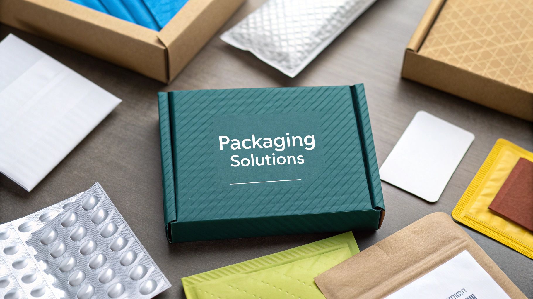 story
story Ecommerce Packaging Solutions A Modern Guide
Ecommerce packaging is more than just a box. It's the entire system of containers and materials you use to get your products safely into your customers' hands. This can be anything from a simple poly mailer for a t-shirt to a custom-printed box with foam inserts for fragile electronics. Done right, it protects your products and becomes a silent ambassador for your brand. Choosing Your Core Ecommerce Packaging Think of your packaging strategy like building a toolkit. A good carpenter doesn't just own a hammer; they have a whole range of tools, each perfect for a specific job. Your ecommerce store is no different. You need a variety of packaging solutions on hand, ready for whatever you need to ship. The goal is to pick the right tool for the job every time, striking that perfect balance between protection, cost, and the customer's unboxing experience. Get it wrong, and you're looking at damaged products, bloated shipping fees, and a first impression that falls flat. This visual guide is a great starting point, showing how your product's own qualities—like whether it's fragile or durable—can point you toward the best primary packaging. As you can see, the path to the right packaging starts with a simple question about what you're selling. From there, it branches off to the best-fit solutions, like flexible mailers for apparel or sturdy boxes for anything bulky. Before diving deep, here’s a quick overview of the main players in the ecommerce packaging world. This table breaks down the most common options to help you quickly match your products to the right type of container. Quick Guide to Primary Packaging Types Packaging Type Best For Pros Cons Poly Mailers Apparel, accessories, and other soft, non-fragile goods. Lightweight, weather-resistant, affordable, and take up minimal storage space. Offers no structural protection; not suitable for fragile items. Bubble Mailers Books, cosmetics, small electronics, and semi-fragile items. Provides a built-in layer of cushioning; lightweight and easy to use. More expensive than poly mailers; still not enough for very delicate products. Corrugated Boxes Bulkier items, multiple-product orders, and anything needing rigid protection. Highly durable, stackable, and available in countless sizes and strengths. Heavier and bulkier, which can increase shipping costs; require void fill. Mailer Boxes Subscription boxes, high-end products, and curated gift sets. Creates a premium unboxing experience; self-locking and aesthetically pleasing. More expensive than standard boxes; can be less durable for heavy shipping. Now that you have the lay of the land, let's explore each of these options in more detail to figure out which one is the perfect fit for your business. The Specialized Envelopes: Mailers Mailers are the sleek, efficient envelopes of the ecommerce world. They're the perfect choice for items that don't need the rigid protection of a box and can help you save a ton on shipping weight. Poly Mailers: These are your go-to for shipping soft goods like clothing, textiles, or accessories. They're essentially durable, lightweight, and weather-resistant plastic bags. Their flexibility and feather-light weight are huge wins for keeping shipping costs down. Bubble Mailers: Think of these as a poly mailer with a built-in security blanket. Lined with a layer of bubble wrap, they give you that crucial bit of cushioning for semi-fragile items—things like books, cosmetics, or small electronics that just need a little extra help to survive the bumps and drops of transit. The Versatile Workhorses: Boxes Boxes are the undisputed foundation of the shipping world. While traditional cartons and boxes make up a whopping 62% of the ecommerce packaging market , the variety within this category is massive. Their strength and sheer adaptability make them a fit for almost any product imaginable. The right box does more than just transport a product; it frames the entire unboxing experience. It’s the stage on which your brand makes its first physical appearance. The two most common types you'll encounter are: Standard Corrugated Boxes (RSC): These are the classic brown shipping boxes everyone knows. Their strength comes from that fluted, wavy layer of paper sandwiched between two flat liners, giving them fantastic structural integrity. They're the workhorse for bulkier, heavier, or less fragile items. Mailer Boxes: These are the elegant, presentation-focused cousins of the standard box. With their clean folds, self-locking tabs, and premium feel, they're specifically designed to create a memorable unboxing moment. It's no surprise they're the top choice for subscription boxes, high-end gifts, and any brand looking to make a serious statement. Taking the next step with custom box printing can turn these boxes into a powerful marketing tool. The Essential Supporting Cast Getting your product into a mailer or box is just step one. To do it right, you need a few supporting players to ensure everything arrives safely and looks professional. Protective Inserts: This is the catch-all term for anything you put inside the box to stop your items from sliding, shifting, or breaking. Common options include bubble wrap, air pillows, crinkle paper, or even custom-molded inserts that hold your product perfectly in place. As more brands focus on reducing transit damage, the use of smart protective packaging is on the rise. Shipping Labels: This is the final, non-negotiable piece of the puzzle. A clear, scannable shipping label has all the critical information needed to get the package from your warehouse to your customer's doorstep without a hitch. It's the passport for your product's journey. Selecting Sustainable Packaging Materials Once you’ve figured out the right type of container for your product, the next big decision is what it’s made of. This used to be a simple choice about durability, but today, it’s a powerful statement about your brand's values. Picking sustainable packaging isn’t some niche trend anymore; it's what modern customers expect. The environmental cost of ecommerce packaging has become a huge deal for shoppers and businesses. Brands are now actively looking for recyclable, biodegradable, and reusable materials to shrink their carbon footprint. This isn't just a feel-good move—it's driven by real customer demand. A huge chunk of online shoppers now expects brands to show they care about the planet through their packaging choices. Moving toward greener options is about more than just looking good. It's about aligning your business with a healthier planet. Demystifying Eco-Friendly Terms The world of sustainable packaging is packed with terms that can get confusing pretty fast. Let’s break down the big three with some simple analogies to make them stick. Recyclable: Think of an aluminum can. The material can be collected, broken down, and remade into something new. Corrugated cardboard is a perfect example—it’s one of the most recycled materials on earth. Biodegradable: This means the material can be broken down over time by natural critters like bacteria. The catch? The conditions and timeline can vary wildly, and sometimes it leaves behind residue. Compostable: This is the gold standard of green. Imagine an apple core. A compostable mailer breaks down in a proper composting environment, turning back into nutrient-rich organic matter. It leaves nothing harmful behind and truly returns to the earth. Knowing the difference here is key to making a choice that actually helps the environment. Exploring Innovative Green Materials Beyond the usual paper and cardboard, a whole new generation of materials is changing the game. These alternatives work great for shipping while doing a lot less harm. “Choosing a sustainable material is like casting a vote for the kind of world you want to live in. For brands, it’s a tangible way to show customers you’re invested in a shared future, not just a single transaction.” Many print providers now offer a wide variety of green printing options that use these forward-thinking materials. Here are a few that are really gaining steam: Mushroom Packaging (Mycelium): This stuff is incredible—it’s grown , not manufactured. It uses agricultural waste and the root structure of mushrooms to create custom-molded protective inserts that are fully compostable right in your backyard. Cornstarch-Based Plastics (PLA): Polylactic Acid (PLA) is a bioplastic made from renewable sources like cornstarch. It looks and feels just like regular plastic but is commercially compostable, making it a fantastic substitute for things like clear product windows or packing peanuts. Seaweed and Algae Packaging: These fast-growing marine plants are being used to create everything from water-soluble films to sturdy boxes. They need very little land or fresh water to grow, making them a seriously sustainable option. You can take a deeper look into the world of eco-friendly options by exploring the growing list of sustainable alternatives to plastic . Vetting Suppliers and Avoiding Greenwashing As sustainability gets more popular, so does "greenwashing"—when companies make misleading claims about how eco-friendly their products are. To make sure your packaging is the real deal, you have to vet your suppliers carefully. Here’s how to do it right: Ask for Certifications: Look for official stamps of approval from respected organizations. For anything compostable, BPI (Biodegradable Products Institute) certification is a must. For paper, look for FSC (Forest Stewardship Council) certification, which guarantees it comes from responsibly managed forests. Request Material Data Sheets: A legitimate supplier will have no problem giving you the technical details about what their products are made of and how they break down. Start with Small Orders: Before you buy a warehouse full of mailers, order some samples. Test the quality, durability, and feel of the materials for yourself. By taking these extra steps, you can confidently choose packaging that not only protects your products but also proves your brand’s commitment to a greener future. Creating an Unforgettable Unboxing Experience In ecommerce, your package is the first physical handshake between your brand and your customer. It’s so much more than just a container; it’s a powerful marketing moment that starts the second that box lands on their doorstep. This is where the unboxing experience comes into play—turning a simple delivery into a memorable brand interaction. Think of it as setting the stage for your product. Sure, a plain brown box gets the job done, but a thoughtfully designed package tells a story. The data backs this up: 40% of consumers say they're more likely to buy again from an online merchant that uses premium packaging. It signals quality, care, and attention to detail before they’ve even seen what’s inside. From Simple Logos to Full-Color Branding Custom printing is your most direct route to injecting your brand's personality into your packaging. The best part? This doesn't have to be some huge, expensive undertaking. You can scale your approach based on your budget and goals, turning even the most basic packaging into a unique brand asset. You can think of custom printing in a few different levels, each with its own impact: The Simple Stamp: For new businesses, the easiest and most affordable entry point is printing a one-color logo on a standard stock mailer or box. It’s clean, professional, and instantly sets your package apart from generic shipments. The Full-Color Mailer: As your business grows, you can graduate to fully printed mailer boxes or poly mailers. This gives you a complete 360-degree canvas to play with, opening the door for bold colors, custom patterns, and creative designs that make a serious impression. Layering the Experience Inside the Box What happens after the customer opens the flap is just as crucial as the outside. A truly great unboxing is a layered discovery, revealing the product piece by piece. This builds anticipation and adds a touch of luxury, no matter your product's price point. You can create this layered effect with a few key elements: Custom Tissue Paper: Wrapping your product in branded tissue paper adds an instant layer of sophistication while also providing a bit of protection. To really make this element shine, explore the possibilities of custom tissue paper printing to feature your logo or a unique brand pattern. Branded Stickers: A simple custom sticker is a fantastic, low-cost way to reinforce your brand. Use it to seal the tissue paper, close an interior box, or just as a decorative touch. Interior Prints: Surprise your customers with a message or pattern printed on the inside of the box lid. A quick "Thanks for your order!" or a vibrant brand pattern is an unexpected detail that brings a smile. Personalized Inserts: A thank-you card, a small flyer with a discount code, or even a handwritten note can make a customer feel genuinely valued. This is how you build a personal connection and turn a one-time buyer into a loyal fan. The unboxing experience is your chance to control the narrative. Every fold, color, and texture is a word in your brand’s story, culminating in the reveal of the product itself. A Mini Guide to Working with Printers Dipping your toes into custom printing can feel a little intimidating, with its own lingo and technical terms. But getting a handle on just a few key concepts will make the process much smoother, whether you're working with a local shop or a big online provider. Die Lines: Think of a die line as the 2D blueprint for your 3D box. Your designer uses this template to place all the artwork correctly, ensuring logos, text, and patterns land exactly where they should when the box is folded up. Color Matching (Pantone vs. CMYK): For brand consistency, color is everything. CMYK (Cyan, Magenta, Yellow, Black) is the standard for full-color digital printing. The Pantone Matching System (PMS) , on the other hand, uses pre-mixed inks to achieve a perfect color match every time—this is critical if you need to hit your brand’s signature shade with dead-on accuracy. Minimum Order Quantity (MOQ): This is simply the smallest number of units a supplier is willing to produce in a single run. MOQs for custom packaging can be anywhere from a few hundred to several thousand, so it’s vital to find a supplier whose numbers work for your business's scale. By getting these details right, you can create ecommerce packaging that doesn't just protect your products—it builds a lasting connection with your customers from the moment their order arrives. If you really want to create a premium feel, you can even explore this detailed guide to high end gift boxes and weave those principles into your strategy. Optimizing Packaging to Reduce Costs and Waste Beyond the branding and the eco-friendly materials, your ecommerce packaging choices hit two of the most critical parts of your operation: your shipping costs and whether your products arrive in one piece. Every decision, from the size of a box to the type of cushioning inside, sends ripples straight to your bottom line. Nailing this balance is the secret to running a lean, profitable, and reliable shipping game. The goal here is to stamp out waste in all its forms—wasted space, wasted materials, and the wasted money that comes from shipping replacements for damaged goods. This isn't just about saving a few bucks; it's a smarter way of doing business that shrinks your environmental footprint and, most importantly, keeps your customers happy. Understanding the Cost of Empty Space Ever wondered why shipping a big, fluffy pillow can cost more than a small, heavy brick? The culprit is a concept called dimensional (DIM) weight . Carriers like UPS and FedEx don't just bill you for what a package actually weighs. They also charge you for the amount of space it hogs on their truck. They run the numbers on both the actual weight and the DIM weight, then charge you for whichever is higher. So, if you're shipping a tiny item in a massive box filled with air, you're literally paying to ship nothing. It's an incredibly common—and expensive—mistake for ecommerce brands. The Power of Right-Sizing Your Packaging The single most effective way to fight back against DIM weight fees is right-sizing . This is just a practical way of saying you need to match your packaging as closely as possible to the dimensions of your product, which cuts down on the need for all that extra stuffing. A perfectly sized box is lighter, uses fewer materials, and costs less to ship. Period. Here’s a simple way to get started with right-sizing: Audit Your Products: Group your products into a few categories based on their general size and shape. You don't need a unique box for every single SKU. Find Your Core Sizes: Identify a handful of standard box or mailer sizes that can handle the vast majority of your product combinations. Optimize for a Snug Fit: Pick a container that leaves just enough room for a thin layer of protection, but not so much that your product is rattling around inside. By focusing on right-sizing, businesses can slash their packaging waste by over 25% and bring down their shipping expenses in a big way. It’s the single most impactful change you can make to lower your costs. Choosing the Right Protective Materials Once your product is snug in its right-sized box, the next mission is to keep it safe on its journey. Bubble wrap has its place, but the world of protective materials has grown way beyond that. The trick is to find that sweet spot between maximum protection and minimum weight and material use. Different products have different needs. Let’s break down the main types of internal packaging. Cushioning vs. Void Fill First, it’s important to know the difference between these two. Cushioning is all about absorbing shock and preventing damage from drops and impacts. Void fill , on the other hand, is just there to fill up empty space and stop your items from sliding around. Here are a few popular options you’ll see: Air Pillows: A classic void fill. These are super lightweight and cheap, perfect for filling big gaps in a box. Just know they offer very little cushioning against a direct hit. Crinkle Paper: This stuff is a great two-for-one. It’s an effective void fill that also looks fantastic for unboxing, and it offers a moderate amount of cushioning. Plus, it’s often made from recycled paper. Molded Pulp: Made from recycled paper and water, this is a brilliant eco-friendly cushioning option. It can be molded into custom shapes to hold fragile things like glass bottles or electronics perfectly still. Foam Inserts: For your high-value or extremely delicate products, nothing beats custom-cut foam. It provides the ultimate level of shock absorption and protection. Now, let's compare some of the most common options side-by-side to help you decide. Protective Packaging Options Compared Material Type Protection Level Cost Environmental Impact Air Pillows Low (Void Fill) Low Low (mostly air), but plastic film can be hard to recycle. Bubble Wrap Medium (Cushioning) Low Low-to-Medium. Plastic film is recyclable at specific drop-offs. Crinkle Paper Medium (Void Fill) Medium High. Often made from recycled paper and is curbside recyclable. Molded Pulp High (Cushioning) Medium-High High. Made from recycled materials; compostable and recyclable. Foam Inserts Very High (Cushioning) High Low. Typically petroleum-based and not easily recyclable. Choosing the right mix of packaging products for cushioning and void fill is a game-changer. When you get your box size and your internal protection right, you directly lower your shipping fees, produce less waste, and slash those costly returns from damaged goods. Every shipment becomes a little more profitable. Sourcing Suppliers and Managing Fulfillment Your brilliant packaging design is just an idea until you find the right partner to bring it to print and figure out how to get it to your warehouse. This is where your strategy moves from the drawing board to the real world. Nailing down reliable suppliers and smoothly integrating your packaging into your fulfillment process are the final, crucial steps. Choosing a supplier isn't a one-size-fits-all deal; it really comes down to the scale and specific needs of your business. The ecommerce packaging world is huge, with options for everyone, from a garage startup to a massive retail operation. And this space is only getting bigger. The global e-commerce packaging market is expected to hit around USD 272.77 billion by 2034 , growing at an impressive clip of about 13% each year. This boom is fueled by the massive shift to online shopping and new tech like smart packaging. You can check out more insights on this fast-growing market over at Mordor Intelligence. Finding the Right Supplier for Your Business Your hunt for a supplier will likely take you down one of two main roads. Understanding the difference is key to finding a partner that fits your volume, budget, and customization needs. Large-Scale Manufacturers: These are the go-to partners for established businesses with high order volumes. They offer the best price per unit, but they also have high minimum order quantities (MOQs) . We're often talking thousands of units at a time. Online Print Platforms: For startups and smaller businesses, platforms like Packlane or Arka are a perfect fit. They specialize in low MOQs, which makes getting custom-printed packaging a reality without a huge upfront investment. That flexibility is a game-changer for testing designs and managing cash flow. Domestic vs. Overseas Sourcing Another big decision is where your supplier is based. Sourcing domestically versus overseas is a classic trade-off between cost, speed, and quality control. Choosing a supplier is like choosing a business partner. Communication, reliability, and a shared understanding of quality are just as important as the price per box. Here’s a quick rundown to help guide your decision: Factor Domestic Sourcing Overseas Sourcing Cost Typically higher per-unit costs. Often significantly lower per-unit costs. Lead Time Much faster, with shipping taking days instead of weeks or months. Longer lead times due to production schedules and ocean freight. Quality Control Easier to verify quality, visit facilities, and resolve issues. More challenging to oversee production and manage quality control. Communication Simpler communication with no time zone or language barriers. Potential challenges with time zones and language differences. For a lot of brands, a hybrid approach works best. They might use domestic suppliers for urgent, small-batch needs and lean on overseas partners for the big, bulk orders planned far in advance. Connecting Packaging to Warehouse Operations Don't forget that your packaging choices have a direct, and often significant, impact on your fulfillment efficiency. A well-designed box isn't just for the customer; it should also be designed for the people packing it day in and day out. Complex, finicky packaging can seriously slow down your pick-and-pack process, driving up labor costs with every single order. Think about these operational perks when you're finalizing your packaging: Ease of Assembly: Go for boxes that are intuitive and quick to fold. "Crash lock" or "auto-bottom" boxes, for example, pop into shape in seconds. That shaves valuable time off each order. Storage and Standardization: Standardizing your packaging into a few core sizes doesn't just make ordering easier; it streamlines your entire warehouse. Uniform boxes are a breeze to stack, store, and organize, which maximizes your space and simplifies inventory management. For smaller branding touches, you can get creative with versatile options like custom packaging and retail stickers , which add personality without complicating your box inventory. Working with a Third-Party Logistics (3PL) Partner If you outsource your fulfillment to a 3PL, crystal-clear communication about your packaging standards is an absolute must. Your 3PL partner becomes the final guardian of your brand experience, and they need to execute your vision flawlessly. To keep everything consistent, give your 3PL a detailed guide—a playbook, really—that includes: Clear Instructions: Document which box or mailer to use for every single product or order combination. Visual Examples: Include photos or diagrams showing exactly how products should be arranged, wrapped, and sealed. Material Specifications: Get specific. Note the exact type and amount of void fill, where stickers should go, and how to include any marketing inserts. By providing this roadmap, you're ensuring that every package leaving the warehouse meets your brand's high standards. That's how you deliver a consistent, top-notch customer experience every single time. Answering Your Top Ecommerce Packaging Questions Jumping into the world of ecommerce packaging can feel like a puzzle. You’re busy growing your business, and suddenly you’re faced with questions about boxes, mailers, and costs. Let's clear up some of the most common questions with straightforward answers to help you make smarter choices and build a packaging strategy that just works. How Do I Choose Between a Box and a Mailer? The best way to decide comes down to your product's fragility and shape . A great rule of thumb is this: if you can drop your product from waist height without it breaking, and it’s relatively flat or soft, a mailer is almost always your most cost-effective bet. Think of it like this: a t-shirt is durable and can be folded flat, making it the perfect candidate for a lightweight poly mailer. On the other hand, a ceramic mug is rigid and fragile, and it absolutely needs the sturdy, structural protection that only a corrugated box can offer. Always put product safety first—any savings from a cheaper mailer vanish the moment you have to ship a replacement for a broken item. What Is the Most Affordable Way to Start with Custom Packaging? Getting started with custom packaging doesn't have to mean a massive investment in full-color, custom-printed boxes. Often, the most budget-friendly starting points are the small touches that leave the biggest impression on your customers. Consider these low-cost, high-impact options to get going: Custom Stickers: Branded stickers are incredibly versatile and easy on the wallet. Use them to seal tissue paper, pop your logo onto a plain stock box, or hold a thank-you note in place. They instantly make a generic package feel special. Branded Packing Tape: Custom-printed tape does double duty. It secures your boxes while splashing your brand name or logo across every side of the package, getting you noticed from the warehouse to the front door. One-Color Logo Print: Many suppliers offer simple one-color printing on standard mailers or boxes for a very small fee. It’s a clean, professional way to get your brand out there without the expense of a complex, multi-color design. How Much Protective Fill Should I Use? The goal here is simple: use just enough material to keep the product from moving and give it a bit of cushion, but not so much that you're paying to ship a box full of air. The right amount of fill prevents your item from banging against the inside of the box and stops it from sliding around in transit. The best way to check? The "shake test." Once your box is packed and sealed, give it a gentle shake. If you can hear or feel anything rattling around inside, you need a bit more void fill. If it feels solid and secure, you’ve nailed it. This quick check helps you find that sweet spot, keeping your products safe without inflating your dimensional weight costs or wasting materials. Is Sustainable Packaging Really More Expensive? It’s a common myth that going green always costs more. While some brand-new, cutting-edge eco-materials might have a higher price tag, a smart sustainable packaging strategy can actually save you money . For instance, switching to right-sized boxes made from recycled cardboard not only reduces material waste but also lowers your shipping costs. It’s a win-win. Plus, many of the go-to sustainable materials, like corrugated cardboard and kraft paper, are already very cost-competitive. The trick is to look at the total cost, which includes shipping and the massive potential for building customer loyalty. A 2021 study revealed that 73% of consumers are willing to pay more for products that arrive in sustainable packaging, turning what you thought was a cost into a serious revenue driver. What Does MOQ Mean and Why Is It Important? MOQ stands for Minimum Order Quantity . It's simply the smallest number of units a supplier is willing to make and sell in one go. For example, a huge manufacturer might have an MOQ of 5,000 custom boxes, whereas an online print platform could offer an MOQ as low as just 50. Understanding a supplier's MOQ is absolutely critical for managing your budget and your storage space. A high MOQ can be a huge roadblock for a small business, tying up a lot of cash upfront and forcing you to find room for thousands of boxes. A low MOQ, however, gives you flexibility. It lets you test out new designs, manage your cash flow, and avoid getting stuck with a mountain of outdated packaging if you decide to rebrand. Always look for a supplier whose MOQ lines up with your current sales and where you plan to be in the near future. Ready to turn your packaging from a simple container into a powerful brand statement? 4OVER4 offers a vast selection of customizable and high-quality ecommerce packaging solutions to fit any budget or business size. Explore our options and start building your unforgettable unboxing experience today at https://4over4.com .