Content Hub
Stories, Ideas and Advice — Page 79
 story
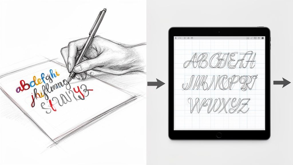
story Learn to convert handwriting into font for your brand
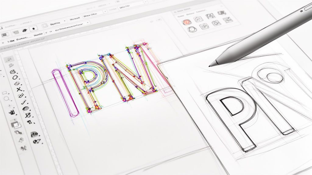
Turning your handwriting into a usable font is a fantastic way to give your projects a truly personal feel. At its core, the process involves tracing your written letters in digital software, mapping them to keys on the keyboard, and then exporting the whole package as a font file. This transforms your unique script into a digital asset you can use anywhere. Giving Your Brand a Unique Voice with a Custom Font Imagine your brand’s tagline on a business card, not in some overused, generic typeface, but in your own authentic handwriting. It’s that kind of personal touch that makes marketing materials stick in someone's memory, creating a connection that standard fonts just can't match. In this guide, we're going to walk through the entire process, from the first stroke of the pen to installing a fully functional font on your computer. This isn't just a dry, technical tutorial—think of it as a creative journey to capture your brand's true voice. The goal here is to create a high-quality, professional asset you can use across all your print materials. Why a Custom Font Matters A font crafted from your own handwriting is so much more than a cool aesthetic choice. It’s a powerful branding tool that can set you apart in a seriously crowded market. This is an approach that’s gaining a lot of traction, and for good reason. The demand for these kinds of personalized tools is growing fast. In fact, the global handwriting-to-text converter market is on track to hit USD 15.4 billion by 2026 , growing at a compound annual rate of 12.1% . That’s a huge indicator of a major shift toward personalized digital assets for businesses of all sizes. By creating a font from your own script, you infuse your brand with personality and authenticity. It’s the difference between a generic email signature and a handwritten sign-off—one is functional, the other is memorable. This personal touch works especially well for businesses aiming for an artisanal, friendly, or bespoke brand image. Whether it’s for custom labels, event banners, or thank-you notes, your font becomes a consistent and recognizable part of your identity. You can see just how much a unique font can transform professional materials by exploring options for custom business cards printing . It’s all about building a cohesive brand experience that starts with your own distinct style. Preparing Your Handwriting for Digital Conversion The journey to convert handwriting into font starts long before you ever open a piece of software. Honestly, the quality of your final font is almost entirely dictated by how good your initial, physical sample is. Think of it like cooking: the best recipe in the world can't save bad ingredients. Your handwriting is the core ingredient here, so let's get it right from the start. Choosing Your Tools for Clarity Success begins with the right tools. While you could technically use any old pen and paper, making smart choices here will save you a ton of cleanup work later. I’d steer clear of ballpoint pens, which often create thin, inconsistent lines, and avoid overly absorbent paper that makes the ink bleed. For the cleanest results, grab a fine-tipped marker or a good felt-tip pen . These create the kind of bold, consistent strokes that font software can easily trace. A black pen on pure white paper is the gold standard—it gives you the high contrast you need for a crisp scan. Consider these pairings for the best outcome: Smooth, bright white paper: This prevents the ink from feathering and gives you a clean, uniform background. Regular printer paper is fine, but a heavier stock like cardstock is even better because it stops any bleed-through. A consistent pen: This is a big one. Use the same pen for every single character. If you switch pens mid-alphabet, you'll introduce subtle variations that will make your finished font feel disjointed and weird. Nailing this step minimizes the digital cleanup you'll have to do later, saving you a whole lot of time and frustration down the line. Creating a Complete and Consistent Character Set Before you put pen to paper, you need a game plan. A font isn't just the letters A-Z; it's a complete system of characters that all need to look like they belong together. You're going to be creating a full set of glyphs —the individual characters that make up your font. Make sure your character sheet includes: Uppercase Letters (A-Z): The foundation of your font. Lowercase Letters (a-z): Pay attention to their size and make sure they feel proportional to the uppercase letters. Numbers (0-9): Keep their height and style consistent with your alphabet. Essential Punctuation: Don't forget periods, commas, question marks, exclamation points, quotes, and common symbols like the ampersand (&) and dollar sign ($). To keep everything uniform, I strongly recommend using a template. Many online font creation tools offer printable templates with little boxes for each character. This simple trick forces you to maintain a consistent height and stops your letters from touching—which is critical for the software to recognize each one as a separate glyph. Scanning for a Flawless Digital Copy Once your character sheet is filled out and looking good, it's time to bring it into the digital world. A high-quality scan is absolutely non-negotiable here. Snapping a picture with your phone is tempting, but it almost always introduces shadows, distortion, and poor resolution. Trust me, use a flatbed scanner. Set your scanner to a minimum of 300 DPI (dots per inch) , though 600 DPI is even better if you want to capture all the fine details of your handwriting. Scan in black and white or grayscale to really push that contrast. Your goal is to capture a clean, high-contrast image where the black ink is stark against the white paper, with no shadows or blurry edges. This single step can make or break the quality of your custom font. If your handwriting is particularly intricate or you're working on a larger project, a professional-grade scanner can be a huge help. You can even explore the benefits of using an A3 photo scanner for detailed handwriting conversion . Taking the time to get this foundational stage right ensures the rest of the process is built on a solid, high-quality digital file. Transforming Your Scanned Image into a Vector Font You've got a clean, high-resolution scan ready to go. Now for the fun part: bringing your physical handwriting into the digital world. This is the vectorization stage, where we'll convert the static image of your letters into a collection of editable, scalable glyphs. Think of it this way: your scan is like a photograph, but font software needs something more like a blueprint. That’s what vectors are—infinitely resizable instructions that tell a computer how to draw each letter perfectly at any size. When it comes to actually making this happen, you've got two main paths to choose from. One is the quick-and-easy automated route using online tools. The other is a more hands-on, manual approach using professional design software. Let's break them down. The Automated Approach with Online Tools If you're looking for a fast and surprisingly effective result, services like Calligraphr are a fantastic starting point. These platforms are built to do most of the heavy lifting for you. You just upload your scanned template, and the software automatically traces each character, converting the pixels into clean vector shapes. This process is powered by some seriously impressive technology, similar to what's used for historical text recognition. Back in the early 2000s, this tech had around 65% word accuracy —today, it's nearly flawless, which is what makes these modern tools so powerful. Even with automation, you'll probably need to do a little tidying up. Most tools have a simple interface that lets you erase stray marks or fill in gaps where your pen stroke might have been a bit light. It’s far less work than manual tracing and can get you a usable font in less than an hour. The Manual Method for Ultimate Control For the perfectionists out there who want absolute precision, the manual route is your best bet. Using software like Adobe Illustrator , you get complete control over every single curve and line of your characters, though it does take more patience and a bit of skill. You’ll start by placing your scanned image into a new document. From there, you'll use the Pen Tool to carefully trace each letter, creating vector paths by placing anchor points and adjusting the curves. It might sound complicated, but it's the same core skill used across many digital design fields. If you want to get a feel for the technique, check out resources that explain how to digitize a hand-drawn sketch—the fundamental process is almost identical. Why go to all this trouble? A few key reasons: Cleaner Lines: You can create perfectly smooth curves without the slightly jagged edges that automated tracing can sometimes leave behind. Fewer Anchor Points: A hand-traced letter often has fewer anchor points, which makes the final font file smaller and more efficient. Artistic Control: This is your chance to make creative adjustments. You can exaggerate a swash, sharpen a serif, or tweak a curve to get each glyph looking exactly how you want it. Pro Tip: No matter which method you pick, always aim to create closed paths for each character. If you have an open path—like an "O" that isn't fully connected—it can cause weird rendering issues when you try to use the font. Give each glyph a quick double-check to make sure all your lines form a complete, sealed shape. Once your letters are vectorized, they're no longer static images; they're flexible assets ready for the next phase. Now you can import them into font creation software, where you’ll map them to keyboard characters and fine-tune their spacing. This strong vectorized foundation is exactly what you need to create crisp, high-quality print materials, like designing professional online labels that show off your unique, personal script. Bringing Your Font to Life in Software Alright, you've got your clean, vectorized glyphs. Now for the really fun part. This is where we take that folder of individual characters and assemble them into a real, working font using specialized software. You've got a couple of solid choices here. FontForge is a beast—it's free, open-source, and incredibly powerful, though it can have a bit of a learning curve. For Mac users, Glyphs is a more polished, professional-grade option that many designers swear by. No matter which you pick, the fundamental steps are the same: get your vectors in and map each one to its proper key. Laying the Groundwork: Importing and Setting Metrics Getting your glyphs into the software is usually a breeze. Most of the time, you can just copy the vector shape from Illustrator and paste it directly into the corresponding character slot in your font editor. Drop your vectorized "A" into the "A" slot, your "b" into the "b" slot, and so on until your whole character set is loaded in. With all your letters in place, the next job is to define your font's metrics. Think of these as the invisible ruler lines that make sure your letters play nicely together on a line. Baseline: This is the ground floor where all your letters sit. It’s your main anchor. X-Height: This line defines the height of your lowercase letters without extenders, like 'x', 'a', and 'c'. Ascender Line: The ceiling for tall letters like 'h', 'd', and 'k'. Descender Line: The floor for letters with tails, like 'g', 'p', and 'y'. Nailing these guides right from the start is what separates a font that feels balanced and readable from one that looks like a chaotic mess. Be patient here; aligning everything consistently is time well spent. The Subtle Art of Kerning Just having letters in a file doesn't make a font. They need to know how to behave next to each other, and that's where kerning comes in. Kerning is all about adjusting the space between specific pairs of letters to create a rhythm that feels natural to the eye. Without good kerning, you end up with awkward gaps or letters that crash into each other. Just think about the letter pairs "AV" or "To." The default spacing almost always looks off. A little custom tuck is needed to bring them closer together for that professional, polished look. A font’s personality is defined not just by the shape of its letters, but by the rhythm of the spaces between them. Kerning is the art of perfecting that rhythm, turning a simple character set into a truly expressive tool. Interestingly, the technology behind this has come a long way. Modern font software often provides smart suggestions for kerning pairs. This tech evolved from the same AI principles used to digitize historical texts from massive archives like the IAM dataset, which helped train models to analyze characters with incredible accuracy. You can read more about this incredible technology and its research foundations if you're curious. When you're starting out, don't try to kern everything at once. Focus on the most common and problematic pairs first. Here are a few to get you started: Capital letters with diagonal sides: AV, AW, AT, AY, LV, VA Letters next to round characters: To, Te, Ty, Vo, We Punctuation pairs: A. , O. Spending time on these pairs will dramatically improve your font's final quality, making it look intentional and professional when you use it on print projects like business cards or product labels. You can see just how critical clean typography is by looking at examples of high-quality digital printing , where every detail matters. Exporting and Installing Your New Font After all that meticulous tweaking, you’re ready for the final step. Most font editors let you generate your font in standard formats like .OTF (OpenType Font) or .TTF (TrueType Font) . For nearly all modern uses, .OTF is the way to go, as it supports more advanced features and is the industry standard. Once you hit "Export," installing it is dead simple. On both Mac and Windows, you can usually just double-click the font file and click the "Install" button. And just like that, your own handwriting is a fully functional font, ready to be selected in everything from Microsoft Word to the Adobe Creative Suite. You did it—you've officially turned your handwriting into a font that's 100% yours. Putting Your Custom Font to Use in Print Designs Congratulations, you did it! After all the sketching, scanning, and fine-tuning, you’ve got a fully functional font that is uniquely yours. This is where the real fun begins, as you start weaving that personal touch into your real-world brand materials. When you convert handwriting into font , you’re creating a powerful asset that makes your brand identity feel cohesive and genuinely authentic. Your new creation can elevate everything from a business card that leaves a lasting impression to product labels with a charming, artisanal feel. Applying Your Font to Marketing Materials This is your chance to get creative. Imagine your handwritten script as the main logo on a set of thank-you cards or as a subtle, personal sign-off on direct mail postcards. The applications are pretty much endless and offer a fantastic way to stand out. Here are a few practical ideas to get you started: Business Cards: Use your font for your name or tagline. It adds a human element that helps build an immediate connection. Product Labels: A handwritten font is a perfect match for brands with an organic, bespoke, or handcrafted identity, lending a touch of authenticity. Event Banners: For a personal event or a small business trade show, a custom font can make your signage feel way more approachable and less corporate. This personalized approach is also incredibly effective for custom packaging. If you’re looking for inspiration, exploring unique packaging products can spark some great ideas for creating a memorable unboxing experience that customers will want to share. Best Practices for Print Production When you’re ready to send your designs off to print, a few technical details are crucial for ensuring your font looks just as good on paper as it does on screen. The most important thing is embedding your font correctly within your final design files. When you save your design as a print-ready PDF, make sure the "Embed Fonts" option is checked. This little step packages your custom font file right inside the PDF, so the printer’s computers can render it perfectly without needing to have it installed. Also, don't forget to pay close attention to legibility. A delicate, thin handwritten font might look beautiful on a large banner but could become an unreadable smudge on a small business card. Always print a physical proof to test different sizes and make sure your text is clear and crisp before you commit to a full print run. Your unique font is now a key part of your brand’s story—make sure it’s told clearly. Got Questions? Let's Talk Handwritten Fonts When you first decide to convert your handwriting into a font , a few questions always pop up. It's a fun creative project, sure, but there's a technical side to it, too. Knowing what to expect before you jump in will save you a ton of headaches down the road. People's first question is almost always about time. How long does this actually take? Honestly, it depends on the route you go. An automated online tool can spit out a basic, usable font in less than an hour. But if you're aiming for a truly polished, professional result using proper software for manual tracing and kerning, you'll want to block off several hours, maybe even a full day. Can I Use My Custom Font Commercially? Yes, you absolutely can! This is one of the best parts about creating your own font from scratch. Since the entire thing is based on your unique handwriting, you own 100% of the rights. That means you can use it for any personal or commercial project you can dream up without ever having to think about licensing fees or weird restrictions. For a business, this is a huge win. It’s a way to build a distinctive brand identity across all your marketing without the recurring costs that come with licensed fonts. If there's one mistake people make, it's rushing the prep work. A blurry, low-resolution scan or sloppy, inconsistent handwriting will create hours of frustrating cleanup work later. Your source image is everything. Taking a few extra minutes to write your letters clearly and scan the sheet at a high resolution ( 600 DPI is the sweet spot ) is the single most important thing you can do for a professional-looking font. This attention to detail really pays off when you're designing high-quality custom marketing materials that need to look crisp and clean. What Is the Best Software for Beginners? If you're just starting out, web-based tools are your best friend. They are designed to do the heavy lifting—like all the complex vectorization and character mapping—for you. They’re built to be incredibly user-friendly, walking you through uploading a template and generating the font file with almost zero technical know-how. Once you get a feel for the process and decide you want more control, you can always dip your toes into more advanced (and free) options like FontForge . There's no pressure to become a pro overnight. Just start simple, have fun with it, and see where it takes you. Ready to see your unique brand identity come to life on paper? At 4OVER4 , we offer premium printing services to make your custom font shine on business cards, labels, and more. Explore our printing solutions today!
 story
story Create Outlines in Illustrator A Guide to Flawless Print-Ready Files
When you hear a designer talk about "creating outlines in Illustrator," they're referring to one of two things: converting live text into vector shapes or turning a path's stroke into an editable shape. For text, the keyboard shortcut is a simple Cmd/Ctrl+Shift+O . For strokes, you'll want to head to Object > Path > Outline Stroke . This process isn't just a neat trick—it's a non-negotiable step for getting your files ready for a professional printer. Skipping it is a surefire way to run into font and scaling headaches down the line. Why Outlining in Illustrator Is Essential for Print Design Have you ever sent a beautiful design off to the printer, only for the proof to come back with your carefully chosen brand font swapped out for something generic like Arial? It’s a designer’s nightmare, and it almost always happens for one simple reason: the printer didn't have your specific font file installed on their system. Creating outlines is your insurance policy against this exact problem. When you convert text to outlines, you’re essentially freezing your editable letters into static vector shapes. The computer stops seeing "T-E-X-T" and instead sees a collection of points and lines that form the shapes of those letters. This means the appearance of your typography gets permanently locked in. Your Professional Pre-Press Checklist But outlining is about more than just fonts. It’s a fundamental piece of any professional pre-press workflow, ensuring your design looks consistent no matter where it's opened or how it's used. Think about these real-world scenarios: Logo Integrity: A logo designed with specific stroke weights absolutely must be outlined before it gets scaled up or down. If not, a 2-point stroke that looks perfect on a business card could blow up into a massive, clunky line on a billboard, completely wrecking the design. Brand Consistency: When you're handing files off to different vendors, partners, or even just colleagues, outlining guarantees your typography appears exactly as you intended. No software or system compatibility issues. Advanced Print Production: Many specialized printing services require outlined files. If you're doing anything with die-cutting, foil stamping, or engraving, the machinery needs clean vector paths to follow. Outlining provides just that. The core benefit is simple: an outlined file is completely self-contained. It doesn't need any external resources—like font files—to render correctly, making it a universal and bulletproof format for any printer. This isn't just a suggestion; it's an industry-wide standard. With Adobe Illustrator being the tool of choice for over 90% of creative professionals , its workflows set the bar for professional expectations. Getting in the habit of creating outlines is a key skill that ensures your files move smoothly through any production pipeline, whether it's for a small run of digital printing or a massive commercial job. How to Create Outlines for Text and Strokes Alright, we’ve covered the “why,” so let’s get into the “how.” There are two main ways to create outlines in Illustrator, and while both are pretty simple, they solve completely different problems. Getting a handle on both is key to making sure every part of your design—from the typography to the line art—is locked in and ready for print. Converting Live Text to Vector Shapes This is the big one. Turning your live, editable text into static vector shapes is probably the most common outlining task you'll do, and it's the one that saves you from those dreaded font substitution errors at the print shop. The process is super quick. Just grab your text box with the Selection Tool (V) . From there, you can use the keyboard shortcut: Command+Shift+O on a Mac or Ctrl+Shift+O on a PC. If you're more of a menu person, you can find the same command under Type > Create Outlines . The moment you do it, you'll see the blue baseline and the bounding box around your text disappear. In their place, you'll see individual anchor points hugging every letter. Your text is no longer text; it's a collection of compound paths, which means it’s a solid vector object that can’t be edited with the Type Tool. This is an absolute must-do before you send files like business cards or brochures to a printer, especially if you're using a unique brand font. Turning Strokes into Solid Paths Outlining strokes is just as critical, particularly for logos, icons, and any illustrations that need to be scaled up or down. A "live" stroke has a set thickness, like 2 pt , but that thickness can get weirdly distorted or stay stubbornly the same when you resize the object. Outlining it turns that fragile line into a solid, dependable shape. To get this done, select the object with the path you want to convert. Just head up to the menu and go to Object > Path > Outline Stroke . Instantly, that line with a stroke property becomes a filled shape with no stroke at all. This simple step guarantees your logo’s line weight looks just right, whether it’s printed on a tiny pen or blown up on a massive billboard. This is also a non-negotiable step for any design that's getting a specialized finish. For instance, when you're prepping files for unique shapes, our guide on custom die-cutting services dives into why clean, outlined paths are essential for the machinery to follow the cut lines perfectly. This flowchart breaks down the common—and expensive—headaches that pop up when files aren't prepped correctly. As you can see, simple mistakes like forgetting to outline fonts or using a non-vector logo almost always end in a reprint, which is a huge waste of time and money. Text Outlines vs Stroke Outlines: When to Use Each Knowing which outlining method to use can feel a bit confusing at first. This table breaks down common design scenarios to help you make the right call quickly and avoid any guesswork. Scenario Method to Use Why It's Important Finalizing a logo with text Create Outlines (Text) Locks in the typeface so it displays correctly on any machine, preserving brand consistency. Preparing an icon with line art Outline Stroke Converts line thickness into a solid shape, ensuring it scales proportionally without distortion. Sending a brochure to a printer Create Outlines (Text) Prevents the printer's system from substituting a missing font, which would ruin the layout. Designing for die-cutting Outline Stroke Creates clean, closed paths that cutting machines can easily follow for precise results. Exporting a vector file for web (SVG) Outline Stroke Guarantees that line weights and shapes render consistently across different browsers and screen sizes. Creating scalable brand assets Both A combination ensures all typographic and illustrative elements are stable, scalable vectors. Ultimately, both methods are about control. They give you the final say over how your design elements will look, no matter where they end up. The global market for digital illustration apps is expected to reach USD 1.37 billion by 2035 , a clear sign that brands are demanding high-quality, vector-ready assets more than ever. Since Adobe tools are the standard for over 90% of creative professionals , mastering Illustrator’s best practices, like outlining, has become essential for reducing file rejections and print errors. Think of it this way: just as you'd focus on optimizing images for various outputs to ensure they look sharp everywhere, outlining your vectors serves the same purpose. It's all about preparing your assets for a perfect, predictable outcome. Nailing the Perfect Outlining Workflow Knowing the right shortcuts in Illustrator is just the start. If you want to work like a seasoned pro, you need a workflow that catches mistakes before they even happen. It’s all about building habits that save you from that sinking feeling when you realize you’ve flattened the wrong file or missed a tiny, hidden text box. Here’s the single most important rule to live by: always, always save a master version of your file with live, editable text. Never perform the final outlining process on your original working file. Make a copy first—name it something obvious like ProjectName_PrintReady.ai —and do all your final prep on that duplicate. This one habit will save you more headaches than you can imagine. When a client inevitably comes back with a last-minute text change, you can just open your master file, make the fix in seconds, and spit out a new print-ready version. Without it? You’d be stuck rebuilding the text from scratch, which is as tedious and error-prone as it sounds. Your Final Pre-Flight Check Before you hit "send" and confidently ship your file off, you need a foolproof way to confirm that every single piece of text has been converted. A complex design, especially a multi-page document like you'd find in professional brochures printing , can easily have a stray text box hiding on a locked layer or off the artboard. Luckily, Illustrator has the perfect tool for this: the Find/Replace Font panel. Head up to Type > Find/Replace Font . Take a look at the Fonts in Document list at the top. If that list is completely empty , you're golden. Every font has been successfully outlined. If any fonts are still listed, there’s live text lurking somewhere. Just select the font name, click “Find,” and Illustrator will instantly zoom in on the culprit so you can outline it. Making this simple check the final step of your process is what separates an amateur from a professional. It’s the safety net that catches what the human eye might miss, ensuring you deliver technically perfect files every single time. Keeping Files Tidy with Layers For bigger projects with lots of moving parts, layers are your best friend for staying organized. A smart layer strategy lets you keep your live text and outlined versions separate but perfectly aligned in the same document. Here’s a practical way to do it: Create a "Live Text" Layer: Put all your editable text elements on a dedicated layer with a clear name. Duplicate the Layer: Right-click it and choose "Duplicate Layer." Rename the copy to something like "Outlined Text." Outline and Lock: With your new "Outlined Text" layer active, select everything on it ( Cmd/Ctrl+A ) and create your outlines ( Cmd/Ctrl+Shift+O ). Once you're done, lock the original "Live Text" layer and make it invisible by clicking the little eye icon. This approach gives you a non-destructive workflow. You have a perfectly outlined version ready to go, while your fully editable text stays safe and sound on a hidden layer, ready for any future revisions. Troubleshooting Common Problems with Outlines Even a seemingly simple command can throw you a curveball. When you create outlines in Illustrator, you’ll occasionally run into some frustrating little quirks. But don't worry—these common issues usually have simple fixes. Knowing what to look for can turn a moment of panic into a quick adjustment. One of the most frequent hangups is when letters with enclosed spaces—think ‘o’, ‘b’, or ‘A’—suddenly fill in completely after being outlined. Instead of having a hole (known as a counter ), the letter becomes a solid blob. This happens because Illustrator sometimes fails to create a proper compound path . A compound path is just Illustrator's way of understanding that one shape should be cut out of another. When it doesn't happen automatically, you just have to give it a little nudge. Fixing Filled-In Letterforms The solution for those pesky filled-in letters lives in the Pathfinder panel. It's one of Illustrator’s most powerful tools for manipulating vector shapes. If you don't see it, just head up to Window > Pathfinder to open it up. Here’s the process to get those counters back in your text: Select the Letter: Grab the Direct Selection Tool (A) and click to select only the problematic outlined letter. Unite the Shapes: In the Pathfinder panel, find and click the Unite button. This merges all parts of the letter into a single, solid object. Make the Compound Path: Right after that, go to Object > Compound Path > Make or just use the shortcut Cmd/Ctrl+8 . This tells Illustrator to treat the inner shape as a cutout, and poof—the hole in your letterform is back. This quick two-step fix works almost every time, making sure your typography looks exactly as you intended. It’s a crucial skill to have in your back pocket, especially when prepping complex or custom fonts for print. Unlocking and Ungrouping Stubborn Objects Ever had that moment where you try to create outlines and… nothing happens? You select your text, hit the shortcut, but it just stays as editable text. This almost always means the object you're trying to work with is either locked or part of a group. Check for Locked Items: Go to Object > Unlock All . If the item was locked, this will release it, and you should now be able to create the outlines. Check for Grouped Items: Right-click the object and see if the Ungroup option is available. Text is often grouped with other design elements, which can stop the outlining command from working correctly on its own. Pro Tip: If you’re working on a complex file from another designer, it’s a good habit to run both Unlock All and Ungroup (sometimes you have to do it a few times) on a copy of the file. This helps isolate the text elements you need to convert without messing up the original layout. With the rise of automated design tools, printers are seeing more files than ever. Adobe's traffic data revealed that AI-driven referrals for creative tools saw a staggering 13× increase in traffic in less than a year. For printers to keep up, artwork needs to be production-ready right out of the gate. This is exactly why outlined files are so critical—they eliminate last-minute font issues and printing failures. You can learn more about how AI is shaping design workflows on Adobe's business blog. Exporting Your Outlined File for Professional Printing Once you've meticulously converted all your text and strokes, the final hurdle is to export a bulletproof file that any professional printer can use without a single hiccup. This isn't just about clicking "Save As"; it’s about dialing in the right settings to prevent last-minute headaches like color shifts or missing elements. Think of this as your final pre-flight check before your design takes off. The undisputed industry standard for print-ready files is a PDF. When you go to save your file ( File > Save As ), be sure to select Adobe PDF from the format dropdown. This is where the magic really happens. Choosing the Right PDF Preset In the dialog box that pops up, you’ll see a preset option right at the very top. For almost any professional print job, you’ll want to select either [High Quality Print] or [Press Quality] . These presets are specifically designed to preserve all the critical information your printer needs, including high-resolution images and pristine vector data. They automatically configure things like image compression to prioritize quality over file size, which is exactly what you need for a physical product. Next, navigate to the "Marks and Bleeds" section on the left. This area is non-negotiable for print. Crop Marks: Always check the box for "Trim Marks." These are the tiny lines in the corners that show the printer exactly where to cut the paper down to its final size. Bleed: If your design has any color or imagery that touches the very edge of the page, you must include a bleed. The standard bleed is 0.125 inches (or 3mm) on all sides. Just pop that value into the bleed boxes, and you’ll avoid any ugly white borders after the final trim. A file sent without proper bleed and crop marks is one of the most common reasons for a printer to reject artwork. Taking ten seconds to set this up correctly can save you hours of back-and-forth emails and potential production delays. Finalizing Color and Asset Settings Before you smash that "Save PDF" button, there are just two more things to double-check. First, under the "Output" tab, make sure the color conversion is set to a CMYK profile, like U.S. Web Coated (SWOP) v2 , unless your printer has specified a different one. This is your best defense against unexpected color shifts from your original RGB design. For special projects that need unique finishes, a solid file setup is even more important; our guide to custom foil stamping dives into how these technical details impact specialty processes. Finally, make sure any linked images are fully embedded in the file. The "Press Quality" preset usually takes care of this for you, but it never hurts to be sure. An embedded file is completely self-contained, which is the whole reason we create outlines in Illustrator in the first place—to create a portable, reliable, and foolproof document that works anywhere. Common Questions About Creating Outlines Working with print-ready files always seems to bring up the same handful of questions. Even after you’ve got the main commands down, certain situations can make you second-guess whether you’ve done things right. Here are some quick, clear answers to the questions that pop up most often when designers create outlines in Illustrator . Can I Edit Text After I Create Outlines? The short answer is no. Once you hit Command+Shift+O (or Ctrl+Shift+O on Windows) to convert your text, it’s no longer text. It permanently becomes a group of vector shapes. You can't just grab the Type Tool and fix a typo or change a word. This is exactly why the golden rule is to always save a separate master file with your live, editable text. Keep that version somewhere safe for any future edits. The outlined file is purely for final production. Why Did My Font Appearance Change After Outlining? This one catches a lot of people by surprise. It usually happens when your text has a stroke or a special effect applied from the Appearance panel. When you outline text, Illustrator is only converting the basic shape of the font itself, and it doesn't always "bake" those live effects into the new vector shapes correctly. The fix is simple. Before you create the outlines, select your text and go to Object > Expand Appearance . This extra step commits all the effects to the object's geometry, making sure what you see is exactly what you get after you outline. Expanding the appearance first is the key to locking in all your visual properties, from complex gradients to simple strokes. It guarantees a predictable, accurate conversion and preserves the integrity of your design. Getting these little details right is what separates a smooth print job from a frustrating one. You can find more practical advice like this in our complete collection of professional printing tips . How Do I Confirm All Fonts Are Outlined? There's an easy way to do a final check. Illustrator has a built-in tool that’s perfect for this. Just head up to Type > Find/Replace Font . A dialog box will pop up. All you need to do is look at the top window, the one labeled "Fonts in Document." If this window is empty: You're good to go! All the text has been successfully converted to outlines. If you see fonts listed: That means there’s still live text hiding somewhere in your file. Just select a font from the list and click the "Find" button. Illustrator will jump right to that text box so you can outline it. Does Creating Outlines Increase My File Size? Yes, it almost always will, and sometimes by a surprising amount. Live text is incredibly efficient from a data perspective—the file just needs to reference the font's name and the characters you used. Outlined text, on the other hand, forces Illustrator to store the coordinate data for every single anchor point and curve that makes up every letter. That extra complexity naturally results in a larger file. For professional printing, however, that slightly bigger file is a small price to pay for guaranteeing font stability and avoiding costly mistakes on press. Ready to bring your perfectly outlined designs to life? At 4OVER4 , we specialize in turning your digital files into stunning, high-quality printed materials. From business cards to banners, we make professional printing simple and fast. Start your order today!
 story
story Create Your Own Wrapping Paper: Easy Design Tips
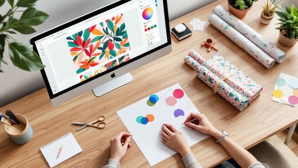
Want to make your own wrapping paper? It’s surprisingly simple. Just grab your favorite photos, your company logo, or even some original artwork, upload it to an online design tool, and arrange it into a pattern. A few clicks later, you've ordered a custom print run. This isn't just about covering a box; it's about turning a simple gift into something deeply personal and unforgettable. Why Custom Wrapping Paper Takes Your Gifts to the Next Level Picture this: your friend opens a gift wrapped in paper covered with photos of your best memories together. Or maybe it’s your mom seeing her beloved dog's face patterned across her birthday present. That's the magic of personalization. When you ditch the generic, store-bought rolls, you transform a simple present into a heartfelt experience that starts telling a story before the box is even opened. Creating your own wrapping paper means you're not just covering an object; you're crafting the first impression. The paper itself becomes an integral part of the gift, showing a level of thought and effort that mass-produced options just can't touch. Make Every Occasion Truly Unique The best part about customization is tailoring the presentation to the exact event and person. This attention to detail is what makes the whole experience feel so special. For Personal Milestones: Think about designing a roll with a collage of baby photos for a first birthday. Or for an anniversary, use snapshots that trace the couple's journey together. For Corporate Gifting: This is a fantastic way to reinforce your brand. Print wrapping paper with your company logo and colors for client holiday gifts or event giveaways. It’s professional yet personal. For Inside Jokes: Got a funny meme you both love or a quirky quote that always makes you laugh? Turn it into a pattern. The recipient will be laughing before they even see what's inside. The act of giving is amplified when the presentation is as thoughtful as the gift itself. Custom paper shows you went the extra mile because you care, turning a simple object into a cherished memory. The Growing Appeal of Personalization This move toward personalized gifting isn't just a small trend—it's part of a much bigger shift in the market. The global gift wrapping paper market was valued at around $6.81 billion and is projected to keep growing. A big reason for this is the consumer desire for unique and convenient packaging solutions. As e-commerce continues to boom, the demand for distinctive gift-wrapping that really stands out is only getting stronger. At the end of the day, the goal is to make someone feel seen and celebrated. While the gift inside obviously matters, the exterior is what sets the entire stage. For more inspiration on how presentation can transform a gift, check out these creative gift wrapping ideas . And don't forget, custom paper is just one of many amazing customizable packaging products you can use to make your gifts unforgettable. Finding Inspiration for Your Custom Design Honestly, the best wrapping paper designs don't start with a design tool. They begin with a single, clear idea. That initial brainstorming phase is where you find the creative fuel that makes the final product feel personal and intentional. The possibilities are truly endless—it could be a favorite family photo, your company's logo, or even just a funny inside joke. Think about the moment you're creating for. For a child's birthday, imagine scanning their own hand-drawn artwork to create a pattern nobody else has. For a wedding gift, using one of the couple's engagement photos or a small motif from their invitations adds a thoughtful, cohesive touch that they'll definitely notice. Sourcing Your Core Visuals Once that lightbulb goes off, the next step is finding the right visuals to bring your idea to life. I can't stress this enough: image quality is everything . That gorgeous photo on your phone can look disappointingly blurry when it's enlarged and printed on a big roll of paper. Always, always use the highest-resolution file you can get your hands on to avoid any pixelated surprises. Here are a few places I always look for great design elements: Personal Photos: Your own camera roll is a goldmine. Dig up those high-quality snapshots of pets, family members, or that unforgettable vacation spot. These create the most personal and heartfelt designs. Company Branding: If this is for your business, your logo, brand colors, and other marketing assets are your go-to. This is a fantastic way to make your corporate gifts or customer orders feel extra special. Royalty-Free Assets: Don't have the perfect photo? Websites like Unsplash or Pexels are treasure troves of high-resolution photos and patterns that are completely free to use. The real goal here is to pick visuals that are not just high-quality, but also meaningful. The right image can transform your gift wrap from simple packaging into a cherished part of the gift-giving experience itself. Understanding Basic Pattern Principles You absolutely do not need to be a graphic designer to create your own wrapping paper that looks like it was made by a pro. Just getting a handle on two simple principles—repetition and scale—will make a world of difference. Repetition is just how your single image or design element gets tiled across the paper. Our online tool handles all the technical heavy lifting, but your job is to choose something that actually looks good when repeated. A clean logo or a distinct photo without a chaotic background usually works best. Then there's scale , which is simply the size of that repeated element. A large-scale pattern with one massive, oversized photo can feel bold and modern. On the flip side, a small-scale pattern with a tiny, repeated icon creates a more subtle and classic look. Play around with both to see what really fits your vision. For more formal events, you might find some great ideas in our beautiful wedding printing collection , which is full of examples of how elegant patterns can elevate any design. Bringing Your Wrapping Paper Vision to Life You've gathered your inspiration, and now it's time for the fun part: translating those ideas into an actual design. This is where a lot of people feel a little intimidated, but trust me, today’s online design tools have made it unbelievably simple to create your own wrapping paper . You don’t need to be a graphic designer or have fancy software. All you need is your vision and a few minutes to play around. The trick is to approach the design tool not as a complicated piece of software, but as your own digital canvas. Every click, drag, and upload gets you closer to the real thing. Here’s a look at the 4OVER4 online designer. It’s set up to be super intuitive—you can upload your image and immediately see how it looks on the paper. That instant preview feature is your best friend here. It lets you tweak the scale and placement on the fly until the pattern feels just right. From A Blank Canvas To A Finished Pattern Let's walk through a couple of real-world scenarios to show you how this works in practice. Both use the same basic tools but end up with completely different, totally personalized results. Scenario 1: The Corporate Holiday Gift Your mission is to create branded wrapping paper for your end-of-year client gifts. First, you'll upload your company's high-resolution logo. The tool will automatically tile it across the paper, but the first draft might look a little busy. No problem. Just use the scaling tool to shrink the logo slightly and add a bit more space between each one. The goal is a pattern that's sophisticated, not overwhelming. Next, grab the color picker and change the background to one of your official brand colors. Just like that, you've got a polished, professional design that screams brand consistency. Scenario 2: The Dog Lover’s Birthday You're making paper for a friend who is completely obsessed with their dog. You’ve picked out three of your favorite high-quality photos of their furry friend. Instead of a standard repeating pattern, you’re picturing more of a fun, dynamic collage. Upload all three photos. Now, instead of letting the tool auto-tile them, you can manually place each one. Stagger their positions, maybe rotate a few slightly, and create a playful, scattered look. The built-in alignment guides will help keep things from looking too chaotic, so you still get a balanced composition. The most impactful designs often come from a simple, well-executed idea. Whether it’s one perfect photo or a minimalist logo, the online designer empowers you to arrange it perfectly without needing complex skills. Final Touches And Pre-Print Checks Before you hit that "order" button, take a minute to really use the live preview. Zoom in and out, and give your design a quick once-over for any potential issues. Pixelation Check: Does any part of your image look fuzzy or blocky when you zoom in? If it does, you'll probably want to find a higher-resolution version of that file. Pattern Flow: Look at how the edges of the design connect. Do you see any weird cuts or awkward overlaps where the pattern repeats? A small adjustment now can make a huge difference. Color Accuracy: Double-check that the colors on your screen look as vibrant as you imagined. This is your last chance to make sure they match your original vision. This final review is your quality control step—it ensures the design you approve is exactly what shows up at your door. These principles of creating a cohesive design aren't just for paper. To learn more about weaving personal elements into a final product, check out this a personal design guide for creating unique gifts . And if you're aiming for a complete branded unboxing experience, pairing your custom paper with custom box printing can create a truly memorable package. Choosing The Perfect Paper And Finish Once you’ve nailed down your design, it’s time to pick the material that’ll really bring it to life. This is one of my favorite parts of the process because the tactile experience—how the paper feels, folds, and catches the light—is just as crucial as the graphics printed on it. Think of it like choosing a canvas for a painting. The texture and quality of the surface will dramatically change the final masterpiece. Your choice here impacts everything from how vibrant your colors look to how well the paper holds up against excited little hands. This chart really drives home the point: while there’s a small investment of time and money upfront, the payoff you get in pure, unadulterated customization is huge. For a truly unique gift, it’s a no-brainer. Matching The Paper To The Purpose Not all wrapping paper is created equal, and the right choice really depends on what you're trying to achieve. Each finish has its own personality that can either elevate or clash with your design. Let’s break down the common options you'll run into. Before you decide, here’s a quick rundown of the most common paper types. I’ve put this table together to help you see, at a glance, which option might be the best fit for your project and the occasion. Wrapping Paper Options at a Glance Paper Type Best For Finish Key Feature Uncoated Paper Rustic, vintage, or minimalist designs Natural, matte Softer, more subdued color appearance Semi-Gloss Paper All-purpose designs; photos, patterns Subtle sheen Makes colors pop without being overly shiny Premium Gloss Paper High-impact, celebratory gifts High-gloss, reflective Delivers sharp, vibrant colors and a luxe feel Each of these has its place. Uncoated is perfect for that earthy, artisanal vibe, while a premium gloss finish practically screams "celebration!" Most of the time, I find myself reaching for semi-gloss because it's so versatile—it just works for almost everything. Considering Durability And Sustainability Beyond the finish, don't forget about the paper's weight. If you're wrapping gifts for kids, a thicker, more durable paper is a smart move to prevent accidental tears before the big reveal. For a sleek corporate package, a standard weight usually does the trick just fine. The rise of conscious consumerism has made sustainable choices more important than ever. Opting for eco-friendly paper isn't just a trend; it's a statement about your values. Sustainability is a huge factor these days. In fact, the kraft paper segment, known for being both tough and eco-friendly, is on track to capture around a 45.5% share of the wrapping paper market by 2025. People and businesses are actively choosing recycled and biodegradable options. If you're looking to make an environmentally conscious choice, you can explore 4OVER4's beautiful kraft paper printing collection for a rustic and responsible option that looks absolutely fantastic. From Digital Proof to Delivered Product You’ve done the creative work, and now you’re at the finish line. This is where your on-screen masterpiece gets ready to become a real, tangible product you can hold in your hands. Trust me, taking a few minutes to triple-check everything now is the best way to avoid that sinking "Oh no, I missed that" feeling later on. Before hitting that "Add to Cart" button, give your digital proof one last, very careful look. This is your final quality control checkpoint. Your Pre-Flight Proofing Checklist It’s so easy to get excited and just click "buy," but I’ve learned from experience that a quick, methodical review saves a lot of headaches. I always run through the same mental checklist before finalizing any order. Typos and Text: Got any words on your design? Read them backward. It’s an old-school proofreading trick that forces your brain to see each word individually instead of skimming over what you think it says. Resolution Warnings: If the design tool is flagging any of your images for low resolution, please listen to it. A slightly blurry logo on your monitor will look ten times worse when it’s printed. Pattern Seams: Zoom in and look at where the pattern repeats. Do you see any weird gaps or harsh lines where one tile ends and the next begins? A tiny nudge of your image can often fix this, creating a seamless, professional look. Treat the digital proof as the absolute final version. What you approve on the screen is exactly what gets printed. A careful five-minute review is your best insurance against disappointment. Once you’re completely happy with the design, it's time to think about quantity. Are you wrapping a single, showstopper gift for a 50th birthday? A roll or two should do the trick. On the other hand, if you're a small business gearing up for the holiday season, ordering in bulk is definitely the way to go. The price per roll almost always drops as you increase the quantity, which is a smart move for bigger projects. Finalizing Your Order and Delivery The checkout process is where all the final details get locked in—especially production and shipping times. The global wrapping paper market is a massive industry, valued at around $25.9 billion , and it all hinges on getting products from the printer to your doorstep efficiently. You can learn more about what drives this global trade from this deep dive on indexbox.io . Pay close attention to the production time estimate. That’s how long it takes for your paper to actually be printed. Shipping time is a separate clock. I always recommend choosing a delivery option that gives you a little bit of a buffer, especially if you have a hard deadline like a wedding or a corporate event. Thankfully, the technology behind today's top-tier digital printing services makes these timelines incredibly reliable, so you can plan with confidence and get that beautiful custom paper right when you need it. Answering Your Custom Wrapping Paper Questions Jumping into the world of custom gift wrap for the first time usually brings up a few questions. From technical specs to turnaround times, getting clear on the details is the best way to make sure the process is smooth and your final product looks incredible. Let's walk through some of the most common things people ask when they decide to create their own wrapping paper . Getting these little things right is what separates a cool idea from a professionally printed reality. A little prep work makes all the difference. What Resolution Should My Images Be? This is, without a doubt, one of the most important questions. For a sharp, crisp print that looks professional, your images need a resolution of at least 300 DPI (dots per inch) at the final size you want them printed. If you try to use a low-resolution photo, like something you snagged from social media, it will almost certainly come out looking blurry or pixelated. Think of it this way: a low-res image is like a small fishnet. When you stretch it out to cover a large area, the holes get bigger and you see all the gaps. A high-res image is a dense, tightly woven net that stays solid no matter how big it gets. Most online design tools will flash a warning if your image quality is too low—take that warning seriously. The best practice is to always use the original photo files straight from your camera or smartphone for the best possible results. Can I Make a Seamless, Repeating Pattern? Absolutely, and it's probably easier than you think. Most online wrapping paper designers are built specifically to create seamless patterns for you, almost automatically. You just upload a single image or design element—like a logo or a photo—and the tool intelligently tiles it across the entire surface. No gaps, no weird overlaps. This automatic process works perfectly for simple, standalone elements. But what if you're aiming for something more complex, like an interlocking pattern where the pieces need to fit together perfectly? In that case, you might want to create a single "seamless tile" first in a program like Canva or Adobe Photoshop . You’d design it so the right edge of your tile perfectly matches the left, and the top flawlessly meets the bottom. Then, you just upload that finished tile, and the printer's tool will handle the repeating part. How Long Does It Take to Print and Ship? Production and shipping times can be a bit different depending on the company and what you select at checkout. As a general rule, the printing process itself can take anywhere from 3 to 7 business days . Keep in mind, shipping time is a separate thing and depends entirely on the method you pick, whether it's standard ground or expedited air. I always tell people to check the estimated delivery date before you finalize your order. This is especially true if you need the paper for a specific event like a birthday or holiday. My personal rule of thumb is to order at least two weeks in advance to build in a comfortable buffer. Is It Expensive to Create My Own Wrapping Paper? The cost is really flexible and comes down to a few key things: the type of paper you choose, the size of the roll, and—most importantly—the quantity. Ordering just a single custom roll will naturally have a higher price per roll than if you were to order in bulk. While it's more of an investment than grabbing a generic roll from a big-box store, the price is often very comparable to what you'd pay for high-end, specialty gift wrap. For businesses or big events, bulk discounts can make it a surprisingly cost-effective way to create a branded and truly memorable unboxing experience for customers or guests. Ready to bring your unique vision to life? At 4OVER4 , our easy-to-use online designer and premium printing options make it simple to create stunning custom wrapping paper for any occasion. Start designing today at 4OVER4 .
 story
story Creating Outlines in Illustrator for Perfect Print Files
When you're getting a design ready for print, one of the most critical steps is creating outlines in Adobe Illustrator. This is the process of converting your live text, strokes, and effects into permanent vector shapes. Think of it as locking in your design to guarantee that everything—from fonts to line weights—prints exactly as you see it on your screen. It's your final quality check to prevent costly and frustrating errors, like the dreaded font substitution. Why Outlining Your Illustrator Files Is a Print Game-Changer Before we get into the how , let’s nail down the why . Sending a design to a professional printer without outlining is a recipe for disaster. It’s like sending a Word doc to someone who doesn't have your fonts installed—you're going to get a garbled mess of incorrect text and a busted layout. Creating outlines turns your dynamic, editable elements into a static, universal blueprint that any professional print machine can read perfectly. This isn't just a suggestion; it's a fundamental part of a professional prepress workflow. It ensures the business cards, brochures, or banners you designed are precisely what you get back from the printer. Securing Your Design's Integrity The main reason for outlining is to prevent any unexpected visual shifts after you’ve sent the file off. You can think of it as a final "flattening" that protects the key parts of your artwork. Adobe Illustrator is the industry standard for this, holding a solid 87.8% market share among professional designers for a reason. For pros who live and breathe vector design, creating precise outlines for print is a daily, non-negotiable task. So, what are we really protecting against? Font Substitution: This is the big one. If a printer doesn't have the exact font you used, their system will swap it out for a default. Your carefully chosen typography gets completely ruined. Outlining turns your text into shapes, so the font file is no longer needed. Stroke Inconsistency: Let's say you have a 2pt stroke on an object. If that artwork gets scaled up or down, the stroke might not scale proportionally. Outlining a stroke converts it into a filled shape, so its thickness stays consistent no matter the final size. Unpredictable Effects: Gradients, blends, and custom brushes are all "live" effects in Illustrator. Outlining (or expanding) these effects turns their dynamic appearance into simple, solid vector paths, making sure they don't render incorrectly on a commercial press. Key Takeaway: Outlining is your insurance policy against print errors. It’s the final action that transforms your file from a working design document into a production-ready asset. At the end of the day, this preparation saves time, money, and the headache of a reprint. It's what separates an amateur file from one that's ready for professional digital printing. A Quick Guide to Outlining in Illustrator Here’s a quick reference summarizing the core reasons and elements for outlining before you send files to print. Element to Outline Primary Reason (The Why) Best Time to Do It (The When) Live Text To prevent font substitution at the printer. After all text has been proofread and finalized. Strokes To ensure line weight remains consistent when scaled. When you want to lock in a specific line thickness. Live Effects To convert dynamic appearances into static vector shapes. Once you're happy with how gradients, blends, etc., look. Taking a moment to run through this mental checklist ensures your vision is perfectly translated from screen to paper. The Core Technique: How to Convert Text to Outlines If there's one make-or-break skill for getting your Adobe Illustrator files ready for print, it’s converting text to outlines. This simple command is the foundation of a print-ready file, turning your live, editable fonts into fixed vector shapes. Think of it as locking in your typography so the printer sees exactly what you see. First up, grab the Selection Tool (V) and click on the text box you want to convert. You can do this for a single word, a whole paragraph, or even multiple text boxes at once. Just select everything you need to outline. With your text selected, you have two quick ways to get this done. You can head up to the main menu and navigate to Type > Create Outlines . Or, you can use the much faster keyboard shortcut, which I highly recommend committing to memory: Windows: Shift + Ctrl + O Mac: Shift + Cmd + O The moment you do this, you’ll notice a change. The familiar text box with its baseline disappears, and instead, you’ll see individual anchor points surrounding each letter. That’s your confirmation—it's no longer a font. It’s now a group of vector shapes, just like anything you’d draw by hand with the Pen Tool. The Most Important Best Practice Here's a piece of advice I can't stress enough: once you create outlines, that text can never be edited again . You can’t go back and fix a typo or swap out the font. It’s a one-way street. This is why the single most critical habit for any designer is to always save a separate, print-ready version of your file. Never, ever outline the text in your original, working file. I guarantee you'll need to make a revision later, and without that live text, your only option is to delete everything and start over from scratch. It's a painful lesson to learn the hard way. Here’s the professional workflow I use every single time: First, finalize and triple-check all the text in your main design file (e.g., MyBrochure_Working.ai ). Once you have final approval, go to File > Save As to make a copy. Name the new file something unmistakable, like MyBrochure_PrintReady.ai or MyBrochure_For4over4.ai . Now, working only in this new file, select all your text and run the Create Outlines command. Save this print-ready file, and you're good to go. You now have two distinct versions: one you can edit forever and one that’s perfectly prepped for printing. Handling Real-World Scenarios This outlining process works beautifully on all kinds of text, not just the standard stuff in a text box. Let's say you've got some clever text wrapping around a logo using the Type on a Path Tool . No problem. The Create Outlines command works just the same, turning those letters into vector shapes while keeping them perfectly aligned to the path. The same goes for text you’ve placed inside a shape with the Area Type Tool . When you create outlines, the resulting vector letters will stay neatly contained within those original boundaries. This ensures every single piece of typography in your design gets converted safely, which is essential for producing professional files for everything from custom stickers to high-end business cards printing. Mastering Stroke Outlines for Consistent Line Work Beyond fonts, one of the most common—and frustrating—print issues I see involves strokes. You know, the lines that define your shapes and illustrations. Have you ever designed a logo with a perfectly balanced 2pt stroke, only to get the proofs back and find it looks strangely thick or has disappeared entirely? That’s what happens when strokes are left "live." Their thickness can change unpredictably when the artwork gets scaled, throwing your whole design off balance. The fix is simple but essential: convert your strokes into solid, filled shapes. This process locks in their exact thickness. It guarantees the visual weight of your lines stays consistent, whether your logo ends up on a tiny business card or a massive banner. From Live Path to Solid Shape To get this done, you'll want to head to Object > Path > Outline Stroke . This command takes the line around a path and transforms it into a closed, fillable object. Think of it this way: if you draw a single line with the Pen Tool, outlining its stroke turns that simple path into a long, thin rectangle. This is a fundamental step for any design where line weight is a critical part of the look and feel. It’s all about taking back control over the final output. Let’s use a real-world example. Imagine a coffee shop logo with a stylized cup and a steam swirl drawn as a simple path with a 3pt stroke. Without Outlining: If you shrink this logo for a loyalty card, that 3pt stroke might suddenly look way too thick and clunky. If you blow it up for a storefront sign, it could look thin and flimsy. After Outlining: That 3pt stroke is now a solid shape. When you scale the logo up or down, the line work scales perfectly in proportion with everything else. The visual balance you intended is preserved. This is precisely why the technique is so crucial. Creating outlines in Adobe Illustrator is a core skill for print pros, which makes sense given the software's dominance. Illustrator holds a solid 8% of the creative software market , making it the go-to for vector specialists who need this kind of precision for flawless print production. You can find more data on the creative software market at Statista.com . Why Stroke Outlines Matter for Production When your design file is sent off for production—especially for things like custom stickers or complex die-cutting services—outlined strokes give the printer clean, predictable vector data to work with. There’s no guesswork for the printing press or cutting machine, which means you get sharp, accurate results. Pro Tip: My advice is to always apply Outline Stroke as the very last step, once you are 100% happy with the line weights. Just like converting text to outlines, this is a one-way street; you can't go back and edit the stroke’s thickness. Always, always work on a copy of your file to be safe. By getting comfortable with outlining strokes, you can rest easy knowing that the delicate line work you so carefully crafted will look just as perfect on paper as it does on your screen. Working with Complex Objects and Expand Appearance Your designs are probably more than just simple text and strokes. What about the cool stuff—gradients, artistic brushes, blends, or live effects like drop shadows? These are dynamic, editable elements in Adobe Illustrator , but they need to be "locked down" before going to print. This is precisely what the Expand Appearance command is for. Unlike creating outlines for text or strokes, Expand Appearance is the tool for deconstructing complex, live effects. It essentially takes their fluid properties and converts them into static, predictable vector shapes. This step is critical to ensure the visual details you painstakingly designed look exactly the same on paper as they do on your screen. No nasty surprises. From a Dynamic Effect to a Solid Shape Let's look at a practical example. Say you're designing a poster and you've used a custom art brush to create a beautiful watercolor effect along a path. Right now, that's just a simple line with a fancy effect applied to it. If you send that file to a printer, their software might not know what to do with that brush data. The result? You could get a plain, boring line instead of that rich, textured stroke. To avoid that disaster, you just need to select the object and head to Object > Expand Appearance . That one click converts the live brush effect into a group of solid vector paths. Your watercolor texture is now "baked in" and becomes a permanent part of the artwork's geometry. It’s no longer an effect; it's a shape. This same logic applies to all sorts of complex objects: Gradients and Meshes: These get converted into a series of clipped, solid-colored shapes that perfectly mimic the smooth color transition. Live Effects: Things like glows, blurs, and drop shadows are flattened into either raster images or vector shapes, locking them in place. Blends: The command breaks a blend down into its individual steps, making each intermediate shape a separate, solid object. The Expand Appearance and Expand Workflow Sometimes, Expand Appearance is just the first part of the job. After you run it, you might find that some attributes, like standard fills and strokes on the new shapes, are still "live." This is where you bring in the regular Expand command. It's a very common one-two punch for fully breaking down a complex object. Pro Tip: First, use Expand Appearance to tackle the dynamic effects. Then, immediately follow up with Object > Expand to convert any remaining fills and strokes into their final outlined forms. This combination ensures every last piece of your art is flattened and ready. This two-step process is a lifesaver for intricate designs, especially if you're planning on using specialty finishes. For example, if you're preparing a file with metallic accents, the printer needs clean, solid vector shapes to create the die. Digging into the details of foil stamping makes it crystal clear why these precise outlines are absolutely non-negotiable for high-quality results. Getting this workflow right means your most creative and complex designs will translate flawlessly from screen to print. You’ve done the hard work. You’ve wrangled your text, tamed your strokes, and expanded your effects. Your Illustrator design is almost ready for its big debut in print. Now, for the final and most crucial step: the pre-flight check. Think of this as the last once-over before your file leaves your hands and hits the press. Taking a few minutes to run through this checklist can be the difference between a perfect print run and a costly, frustrating reprint. Let's make sure everything is locked in and ready to go. Core File Integrity Checks First things first, let's look at the absolute must-haves inside your Illustrator file. These are the foundational elements that can make or break your print job. Are you working in the right file? It sounds obvious, but I've seen it happen. Make sure you're in the final, outlined version of your design. Your original, editable Illustrator file with live text and effects should be safely tucked away in a separate folder. This one simple habit will save you from accidentally overwriting your masterpiece. Next up, let's talk images. Any photos or raster graphics in your design need special attention. Embed Everything: Linked images are a common source of print errors. If the link breaks, the image disappears. The fix is easy: select each placed image and hit the “Embed” button in the control panel at the top of your screen. This bundles the image data right into your Illustrator file, so it can’t get lost. Check Your Resolution: For a crisp, professional print, all your raster images must be at least 300 DPI (dots per inch) at the size they'll be printed. Anything lower will look blurry and pixelated. Getting these two details right solves the vast majority of image-related printing headaches. Pro Tip: Don't Forget Your Color Mode! Screens and printers speak different color languages. Your monitor uses RGB (Red, Green, Blue) light, while professional presses use CMYK (Cyan, Magenta, Yellow, Black) ink. Sending an RGB file to a CMYK printer is a recipe for dull, disappointing colors. Head over to File > Document Color Mode and make sure CMYK Color is selected. If it’s not, switch it over now. This is absolutely essential for getting the vibrant colors you're expecting. Preparing for Professional Production With the digital side of things sorted, it’s time to prep the file for the physical reality of printing and finishing. The single most important setting here is the bleed . This is a small margin of extra artwork—usually 0.125 inches —that extends past the final trim line of your design. Why does it matter? When a stack of printed sheets is cut, there can be tiny mechanical shifts. The bleed ensures that if the cut is a hair off, you won't see any ugly white slivers at the edge of your finished piece. You'll also need trim marks (or crop marks). These are tiny lines in the corners of your document that tell the printer exactly where to cut. You don’t have to draw them yourself; Illustrator can add them automatically when you export your PDF. Now, let's package it all up into the universal format for professional printing: a PDF. Navigate to File > Save As . From the format dropdown, choose Adobe PDF . In the PDF options window, start with the [High Quality Print] preset. It’s the industry standard for a reason. Click on the "Marks and Bleeds" tab. Here, check the box for "Trim Marks" and make sure "Use Document Bleed Settings" is also checked. And that’s it! Your file is now technically sound and ready for a flawless trip through the production process. Final Pre-Flight Checklist Before Sending to Print Before you hit "send," run through this quick table one last time. It’s a great way to catch any small details you might have missed and ensure your file is truly ready for press. Check Status (Done/NA) Why It Matters Working in Final, Outlined File Prevents overwriting your editable master copy. All Text Converted to Outlines Eliminates font-related issues and ensures text prints correctly. All Strokes Outlined/Expanded Converts strokes to solid shapes for consistent scaling and printing. All Effects Expanded Flattens complex effects into static vector shapes. Document Color Mode is CMYK Ensures accurate color reproduction on a commercial press. All Images Embedded Prevents missing or broken image links. Image Resolution is 300 DPI Guarantees images will print clearly without pixelation. Bleed is Set and Artwork Extends Avoids white edges after trimming. Proofread for Typos A final check for spelling and grammar errors. By following these steps, you’re not just sending a design; you’re sending a professionally prepared file that’s ready for a perfect result. Whether you’re creating beautiful custom brochures or any other marketing materials, this checklist is your key to success. Common Questions About Outlining in Illustrator Even seasoned designers have questions when it comes to outlining in Illustrator. Let's be honest, it's a final, permanent step, and hitting that "Create Outlines" command can feel a little nerve-wracking when a print deadline is on the line. So, let's clear up some of the most common questions and give you the confidence to prep your files like a pro. The decision to outline really boils down to one simple question: is the file completely finished and ready for print, or is there still a chance you'll need to make edits? This little flowchart breaks it down perfectly. Think of outlining as the final checkpoint before takeoff, not part of the design process itself. Can I Edit Text After Creating Outlines? The short answer is a hard no . Once you hit Shift+Ctrl+O (or Shift+Cmd+O on Mac), your text is no longer text. It’s been converted into a collection of fixed vector shapes. All its typographic intelligence—the font family, weight, kerning, and the ability to fix a typo—is gone for good. This is precisely why the golden rule is to always save a separate, outlined copy for your printer. Keep that original .ai file with all its live, editable text tucked away safely. Your outlined version is purely for production. What Happens If I Forget to Outline Fonts? This is probably the single most common—and frustrating—print error we see. If you send a file with live fonts and the print shop doesn't have those specific fonts installed, their system will be forced to substitute them. Suddenly, your carefully chosen typeface gets replaced with a default like Arial or Myriad Pro. It's a design nightmare. The entire typographic hierarchy, spacing, and brand feel you worked so hard to perfect can be completely destroyed. Creating outlines embeds the letterforms as shapes directly into the file, which completely sidesteps this problem. Outlining is your insurance policy. It guarantees that what you see on your screen is exactly what will come off the press, with no unwelcome font surprises. Does Creating Outlines Increase My File Size? Yep, it usually does, especially in text-heavy documents. When you convert text to outlines, each character goes from being a simple reference to a font file to a complex vector shape made of multiple anchor points and paths. The file now has to store a lot more geometric data for each letter. But here’s the thing: it’s a necessary trade-off for 100% design accuracy . For almost any print project, the slightly larger file size is a non-issue and something any professional printer can handle without a problem. Should I Use "Expand" or "Outline Stroke"? While they sound similar, these two commands do very different jobs. Knowing which one to use is key. Outline Stroke ( Object > Path > Outline Stroke ) : This is your go-to when you need to turn the stroke (the border or line) of an object into a solid, fillable shape. It's perfect for logos and icons where you need the line thickness to scale proportionally with the rest of the artwork. Expand ( Object > Expand ) : This is a more powerful, all-in-one command for deconstructing complex objects. It can convert objects with both fills and strokes, but it really shines when you're trying to flatten live effects, patterns, or gradients into simple vector shapes. You’ll often use Expand Appearance first to bake in dynamic effects, then Expand to finish converting the basic fills and strokes. Ensuring your files are perfectly prepped is the first step to a flawless print run. At 4OVER4 , we specialize in transforming your carefully prepared designs into high-quality marketing materials that make an impact. Explore our wide range of printing services and see how we can bring your vision to life.
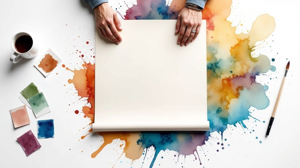 story
story How to Print Large Posters That Actually Look Professional
Getting Your Design Ready for Large Format Success It's a classic, painful, and often expensive mistake: assuming a design that looks razor-sharp on your monitor will automatically translate to a massive physical print. What seems crisp and vibrant on-screen can quickly devolve into a pixelated, blurry mess when stretched to poster size. The secret isn't just about crafting a beautiful design, but about preparing that design for the physical realities of large-format printing. The Resolution Reality Check Let's get real about resolution. You’ve probably heard the term DPI (dots per inch) . For a standard 8.5" x 11" flyer you hold in your hands, 300 DPI is the gold standard for clean, sharp printing. But for large posters, the rules bend because of one critical factor: viewing distance. Nobody is going to be inspecting your 24" x 36" trade show poster from two inches away. Close-Up Viewing (up to 3 feet): Think posters in a hallway or point-of-sale displays right next to a product. For these, stick closer to 200-300 DPI . This ensures that any fine details or small text remain perfectly legible. Medium Distance (3-10 feet): This is the sweet spot for event posters or artwork in a lobby. Here, you can comfortably drop the resolution to 150-200 DPI . From this distance, the human eye won't notice the slight decrease in dot density. Distant Viewing (10+ feet): For large banners or signs meant to be seen from across a room or outdoor space, 100-150 DPI is often more than enough. Attempting to use 300 DPI for a huge banner would result in a massive, difficult-to-manage file with no real visual payoff for the viewer. It's all about the effective resolution —how sharp the image appears from where your audience is actually standing. Before you even start designing, consider how your poster will be viewed. To help you plan, here's a quick guide on the resolution you'll need for some common poster sizes. Poster Size Minimum DPI Recommended DPI File Size (MB) 18" x 24" 100 DPI 150 DPI ~20-45 MB 24" x 36" 100 DPI 150 DPI ~35-80 MB 27" x 40" 75 DPI 120 DPI ~30-75 MB 40" x 60" 75 DPI 100 DPI ~45-80 MB As you can see, the "best" resolution changes with the physical dimensions of your poster. A higher DPI is always safer, but for very large prints, a lower DPI is practical and won't compromise the final look from a distance. Designing for Scale and Impact Thinking big means more than just scaling up your canvas; it requires you to re-evaluate every design element. A delicate, thin font that looks sophisticated on a business card will simply vanish on a large poster. You need to think bold. This infographic gives a great visual sense of how much bigger each standard poster size is compared to the next. Seeing the sizes laid out like this makes it obvious how quickly your canvas area grows. This expansion demands bolder typography and more powerful imagery to maintain its impact from afar. Finally, and this is a big one, always set up your design file in the CMYK (Cyan, Magenta, Yellow, Key/Black) color profile. Do not use RGB (Red, Green, Blue). RGB is for digital screens, while CMYK is the standard for the printing industry. That vibrant electric blue you perfected in RGB could print as a dull, disappointing purple if your file isn't set to CMYK from the start. Tools like Adobe Photoshop or Illustrator make this an easy setting to change before you begin. By focusing on these technical details upfront, you ensure your vision becomes a high-quality reality. When you're ready, check out our extensive online large format print options to see all the possibilities. Choosing Materials That Make Your Message Pop You've nailed the design, but now the success of your poster hinges on the physical material it’s printed on—the substrate . This choice is just as critical as your artwork, defining the final look, feel, and lifespan of your project. I once spoke with a retail manager who tried to save a few dollars on a major promotion by opting for the thinnest, most basic paper available. The posters looked sharp for a day, but the store's bright overhead lights created a distracting glare. To make matters worse, a bit of humidity from the front door caused them to curl within a week. They ended up reprinting everything on a sturdier matte stock, which cost them more in the end. It's a classic example of how selecting the right material from the start saves both money and headaches. Substrates for Every Scenario When you're figuring out how to print large posters, the first two questions should always be: where will it be displayed, and for how long? The answers will point you directly to the perfect material. Standard Poster Paper (Gloss & Matte): This is your reliable choice for most indoor applications. Glossy paper makes colors pop and is fantastic for photo-heavy designs. Just be mindful of direct lighting, as it can cause glare. Matte paper , with its non-reflective surface, offers a more subdued, high-end feel that’s ideal for text-heavy posters or displays in brightly lit spaces. Photo Paper: If you're printing high-resolution photography or fine art, this material is worth the investment. It delivers superior color depth and sharpness, making every detail stand out. Vinyl and PVC: These are your champions for durability and weather resistance. For an outdoor concert, a long-term retail display, or any situation where the poster needs to withstand the elements, a waterproof and tear-resistant vinyl banner is a much smarter choice than paper. Backlit Film: Have you ever noticed those brilliantly glowing posters in movie theaters or at bus stops? That's backlit film . It’s a special translucent material made to be lit from behind, creating an eye-catching effect that’s impossible to miss, especially after dark. To help you visualize the best options for your project, here’s a quick comparison of common poster materials. Poster Material Comparison Guide This table breaks down different poster substrates, highlighting their durability, ideal uses, and other key characteristics to guide your decision. Material Type Durability Best Use Case Cost Level Weather Resistance Glossy Paper Low Indoor photo-rich posters, short-term promotions Low None Matte Paper Low-Medium Indoor text-heavy posters, art prints, areas with bright lights Low-Medium None Photo Paper Medium High-resolution photography, fine art gallery prints High Low Vinyl/PVC High Outdoor banners, long-term retail displays, trade shows Medium-High High (Waterproof & Tear-Resistant) Backlit Film High Lightbox displays (movie theaters, airports, bus stops) High Varies (Typically for protected outdoor use) Choosing between glossy and matte paper is a common first step, but as you can see, materials like vinyl and backlit film open up new possibilities for making a lasting impression. The material you select is also linked to the printing technology used. Modern large format printers accommodate a huge range of substrates—including textiles and other specialty materials—thanks to advanced ink technologies like aqueous, UV-curable, and latex. This flexibility is a key driver behind the growth in advertising and promotional merchandise. To get a better sense of this trend, you can explore the latest reports on the large format printer market . By understanding these options, you can ensure your poster doesn't just look great on screen but performs perfectly in the real world. Mastering File Formats and Technical Requirements Getting your design ready is one thing; packaging it correctly for the printer is another. This technical step is where many well-designed poster projects hit a snag, leading to frustrating reprints and unexpected results. Think of your print file as the blueprint for your poster. If the blueprint has flaws, the final product will be imperfect, no matter how great the original concept was. Let's cut through the technical jargon and get your files truly print-ready. File Format: The Vector vs. Raster Showdown The first decision you'll make is choosing the right file type. Your design software can save in dozens of formats, but for large posters, two categories matter most: raster and vector . Raster Files (JPEG, TIFF, PNG): These are built from pixels and are perfect for photographs. However, they can become blurry or "pixelated" when scaled up beyond their original size. A high-resolution JPEG might work for a small poster, but for larger dimensions, you seriously risk losing sharpness. Vector Files (PDF, AI, EPS): These files are built from mathematical equations, not pixels. This means they can be scaled infinitely without any loss of quality. A logo that is one inch tall in a vector file can be stretched to ten feet tall and will remain perfectly crisp. For posters that mix text, logos, and graphics, a high-quality PDF is almost always your best bet. It’s a universal format that can contain both vector and raster elements, making it the most flexible choice for professional printing. It’s a key part of learning how to print large posters that look amazing. Critical Technical Checks Before You Upload Before you send that file off, run through this quick pre-flight checklist. A few minutes here can save you days of waiting for a corrected reprint. Technical Requirement Why It Matters How to Fix It Color Mode Your screen uses RGB (light), but printers use CMYK (ink). An RGB file can cause major color shifts, turning your bright, vibrant reds into a dull burgundy. Convert your document to CMYK in your design software, like Adobe Illustrator or Photoshop, before you start designing. Bleed Printers trim posters to their final size. Without a bleed—extending your design ~0.125 inches beyond the edge—you risk getting an ugly thin white border. Set up a bleed in your document settings. Make sure any background colors and images extend fully into this bleed area. Font Embedding If you use a special font the printer doesn't have, their system will substitute it, often with something generic like Times New Roman, ruining your design. When saving as a PDF, ensure all fonts are embedded or outlined (converted to shapes). This locks them into the design permanently. These checks are fundamental for both traditional and modern printing methods. For a deeper dive, you can learn more about how digital printing processes handle these technical aspects and why file preparation is so critical. By mastering these basics, you take control of the final quality and ensure your poster prints exactly as you imagined it. Finding Print Services That Deliver Excellence Once your design file is polished and ready to go, the next big step is finding the right partner to bring your vision to life. Choosing a print service isn't just about hunting for the lowest price; it's about finding a provider whose quality and reliability match your project's needs. A cheap poster that arrives looking faded or shows up late isn’t a bargain—it's a wasted opportunity. Looking Beyond the Price Tag When you're trying to figure out how to print large posters, it’s easy to focus only on the cost. But a truly great print partner offers value that goes far beyond the initial quote. The cheapest option might mean sacrificing crucial support, like having a real person review your file to catch a mistake before it goes to press. At 4OVER4, we pair competitive pricing with hands-on expertise to prevent those kinds of costly errors. When you're checking out a print service, here are a few things to keep in mind: Customer Support: Can you actually talk to someone who knows what they're doing if you run into an issue? Chatbots are fine for simple questions, but complex projects need real expertise. Proofing Process: Do they send you a digital proof to approve? This is your last chance to spot any problems with the layout, color, or text before the presses start rolling. Turnaround Time vs. Shipping Time: Make sure you know the difference. A "same-day print" promise doesn't mean much if your order won't ship for another three days. Why Speed and Accuracy Matter In a world where everything moves quickly, speed is a huge deal. The pressure for faster delivery is pushing the entire printing industry to get better and more efficient. In fact, recent research shows that 59% of print businesses expect customer demand for faster turnarounds to grow, which is leading them to adopt automation. This technology helps manage complicated jobs, cuts down on errors, and makes it possible to hit tight deadlines—a massive plus when you need a poster for an event that’s happening next week. For a deeper dive into these industry changes, you can check out a full analysis on emerging wide-format printing trends. This focus on streamlined production allows reliable printers like 4OVER4 to deliver excellent results without the frustrating delays. Installation and Display Strategies for Maximum Impact Your poster isn't truly finished until it’s displayed effectively. This final step is where many fantastic prints lose their power. A well-designed poster, fresh from the printer, can fall flat if it’s poorly lit, hung crooked, or placed in a spot that feels like an afterthought. Let’s explore practical strategies to ensure your investment grabs attention and looks professional from the moment it goes up. Positioning and Lighting for Visual Appeal Where you place your poster matters immensely. Think about the flow of traffic in the space. Is it for a retail store, a corporate hallway, or a trade show booth? For a retail display, positioning the poster near a related product can guide customer behavior. In a corporate setting, placing it at eye level in a well-trafficked area ensures it gets seen. A simple rule is to hang the center of the poster at roughly 57 inches from the floor, which is the average human eye level. This creates a natural and comfortable viewing experience. Lighting is your poster’s best friend or worst enemy. Avoid placing glossy posters directly opposite a bright window, as the glare will make them unreadable. Instead, use angled track lighting or overhead spots to illuminate the poster evenly. This not only enhances the colors but also creates a focal point, drawing the viewer’s eye exactly where you want it. When considering large-scale visual impact, researching the best video projectors can offer alternative solutions to traditional printed posters, especially for dynamic displays. Mounting Solutions for Every Situation How you hang your poster affects both its appearance and longevity. For temporary displays like at a conference or a special sale, simple solutions work best. Adhesive Strips: Ideal for smooth walls and short-term use without causing damage. Poster Putty: A great reusable option for lightweight paper posters. Professional Stands: For trade shows or recurring events, investing in dedicated hardware is a smart move. Our line of custom banner stands printing provides a polished, portable, and durable solution that makes setup and teardown a breeze. For permanent or long-term installations, consider more robust methods like professional framing or mounting on a rigid backing like foam core. This protects the poster from environmental factors like humidity and prevents the edges from curling over time, ensuring your message stays sharp and impactful for as long as you need it to. Avoiding the Mistakes That Cost Time and Money Knowing how to print large posters is only half the battle. The other half is dodging the expensive, time-consuming pitfalls that trip up so many people. It’s far cheaper to learn from someone else’s blunders than to make them yourself. Let's look at a few real-world scenarios where good projects went sideways and how you can prevent the same from happening to you. Communication Breakdowns and Timeline Troubles One of the most frequent points of failure is a simple communication gap. I once saw a marketing manager order posters for a big product launch, asking for a "gloss finish." The problem? The print provider offered two types of gloss: a standard one and a high-gloss UV coating. The manager received the standard finish, which didn't have the dramatic, wet-look sheen they had envisioned from seeing a competitor's poster. This misunderstanding led to a costly reprint to meet their brand standards, all because of one ambiguous word. To make sure this doesn't happen to you: Be overly specific: Don't just say "blue." Specify the exact shade, like "Pantone 286 C." Request samples: If you're unsure about a paper stock, ask for samples. Feeling the texture and seeing the sheen with your own eyes removes all the guesswork. Confirm all details: Always triple-check your order confirmation and digital proof. Make sure the material, size, and finish specifications are exactly what you expect. Managing your timeline is another area ripe for disaster. Murphy’s Law has a special fondness for tight deadlines. While rushing an order might seem like a quick fix, it often magnifies any small errors in your file. A much smarter approach is to build a buffer into your project schedule. If you need posters in hand by Friday, aim for a Wednesday delivery. This cushion gives you time to handle any shipping delays or quality control issues without derailing your campaign. For projects with unique finishes or die-cuts, you might want to explore a specialty printing collection , but remember to account for slightly longer production times. The True Cost of "Shortcuts" Taking shortcuts, like skipping the proofing process just to save a day, is a recipe for regret. A minor typo or a low-resolution logo might look perfectly fine on your monitor, but it can become a glaring, embarrassing mistake on a 24" x 36" print. This is why a thorough quality control check is an absolute must. The technology behind poster printing is always getting better. The global large-format printer market is projected to grow at a 5.0% CAGR through 2030 , fueled by automation and design tools that make production much smoother. These advancements make professional printing faster and more accessible than ever, which reduces the temptation to take risky shortcuts. You can learn more about how technology is shaping the industry and making high-quality results more attainable. By building in enough time for proper checks and communicating with total clarity, you protect your budget and ensure your final poster is something you’ll be proud of. Key Takeaways for Consistently Great Results We've covered a lot of ground in this guide, from avoiding common design mistakes to choosing the right materials and navigating the technical side of things. Now, let’s boil it all down into a handy checklist you can use for every large-format poster project. Think of this as your final pre-flight check to make sure your work turns out professional and impressive every single time. Your Design and File Prep Checklist The journey to a fantastic poster always starts with a solid, well-prepared file. Getting these fundamentals right from the beginning is the surest way to avoid a disappointing print. Rethink Resolution: The old 300 DPI rule doesn't always apply to large formats. First, consider how far away people will be when they see your poster. For up-close viewing (like in a gallery), 200-300 DPI is a good target. But if your poster will be seen from over 10 feet away, 100-150 DPI is often more than enough and keeps your file size manageable. Get the Color Right: Always design and save your files in the CMYK color profile. This simple step prevents the dreaded color shift that happens when vibrant on-screen RGB colors look dull or completely different when printed. Make Friends with Vector: Whenever you're working with logos, text, or solid graphics, use a vector format like PDF, AI, or EPS. This is your secret weapon for infinite scalability, meaning your graphics will stay perfectly sharp no matter how big you print them. Mind the Bleed and Fonts: Add a 0.125-inch bleed around your entire design. This extra margin ensures you won't have any ugly white slivers after the poster is trimmed. Just as important, make sure to either embed or outline your fonts when you save your PDF. This locks in your typography, so it prints exactly how you designed it. Material and Provider Selection With your file prepped and ready, the next set of choices will define the final look, feel, and durability of your poster. Don't let a great design fall flat because of the wrong paper. For indoor displays in well-lit rooms, a matte finish is perfect for cutting down on glare. If your design is packed with vibrant photos, a glossy finish will make those colors truly pop. And if your poster is destined for the great outdoors or needs to hold up for months, investing in a tough substrate like vinyl is a must. Finally, choosing a print partner you can trust is just as critical as the design itself. Don't just shop for the lowest price. A service that provides a free digital proof reviewed by a real person can be a lifesaver, catching errors before they become expensive mistakes. At 4OVER4, we bring together cutting-edge printing technology and more than 20 years of hands-on experience to make sure your project is a success. Ready to bring your vision to life? Explore our huge selection of custom poster printing options at 4OVER4.com and let’s create something amazing together.
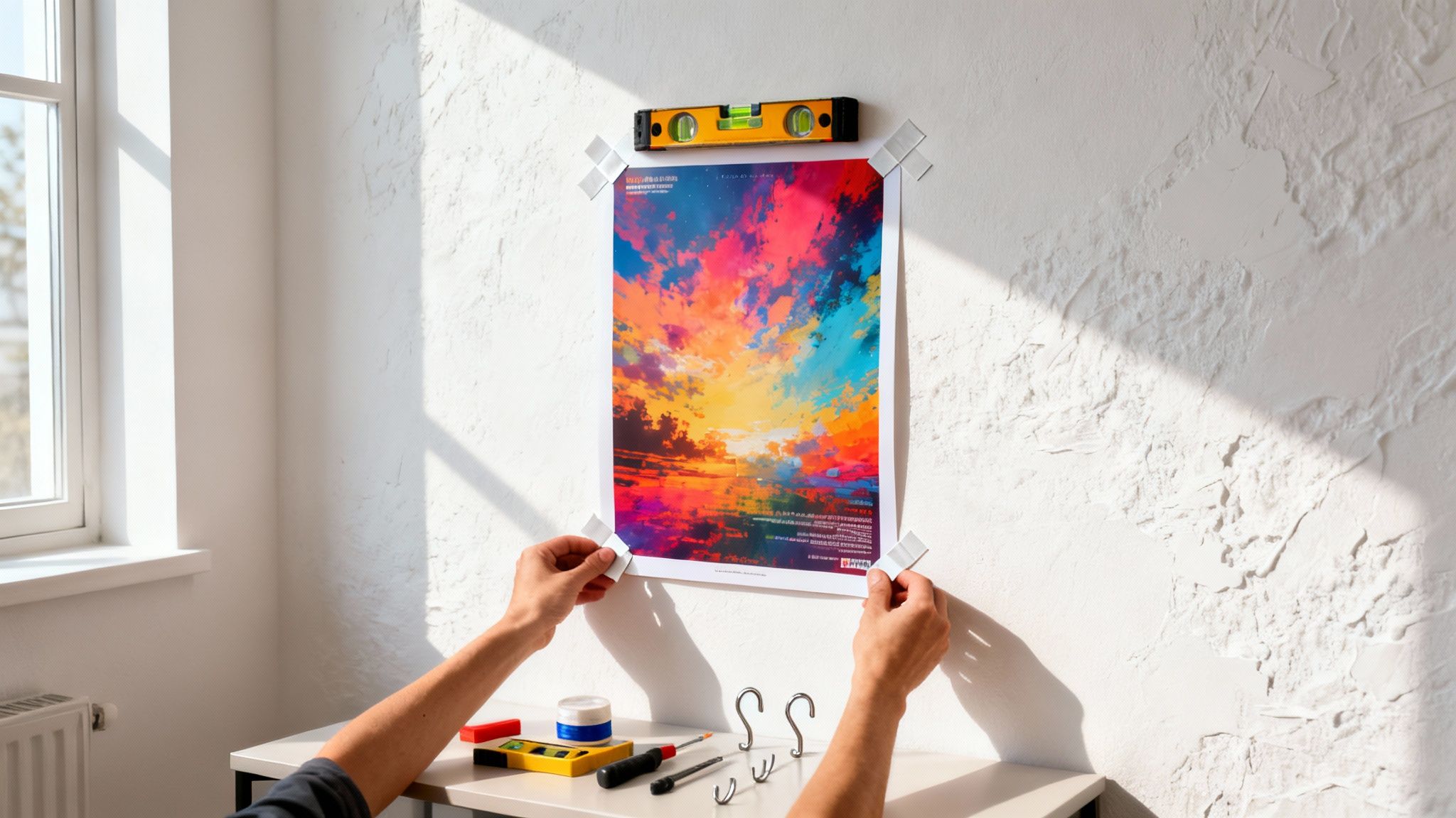 story
story How to Put a Poster on a Wall Without Damage
Before you even think about grabbing tape or a hammer, take a moment. The best way to hang a poster isn't a one-size-fits-all solution—it’s all about matching your method to your specific situation. The secret is picking the right tool for the job based on your wall type, the poster's weight, and how long you plan to keep it up. Get this right, and your poster will stay put without leaving a mess behind. Choosing The Right Poster Hanging Method The journey to a perfectly displayed poster starts with one simple question: What’s my main goal here? The method you'd use in a rented apartment where you can't leave a single mark is completely different from how you'd hang a permanently framed piece in a corporate office. Figuring this out first saves you from the classic frustrations—peeled paint, fallen posters, and holes you didn't want. Before you commit to a hanging method, think through these key points: Wall Surface: Are you working with painted drywall, exposed brick, smooth glass, or textured plaster? Every surface has its quirks and plays differently with adhesives and hardware. Poster Weight and Size: A standard, lightweight paper poster won't need much support. But a large, laminated, or professionally mounted piece? That’s a different story and requires a much sturdier solution. Permanence: Is this for a weekend event, a semester-long display, or something you want up for years? Your answer is the deciding factor between temporary, semi-permanent, or permanent fixtures. Aesthetic Goals: Are you going for that clean, floating look with hidden adhesives, or do you want the polished, professional appearance that only a frame can provide? This decision tree gives you a quick visual guide to narrow down your options based on whether you're worried about damage, how long the poster will be up, and if it's framed. As you can see, the flowchart points you toward temporary adhesives when keeping your walls pristine is the priority, or toward more permanent hardware for those framed, long-term displays. Comparing Damage-Free Hanging Methods When you need to hang something without leaving a trace, you have several great options. But which one is right for your project? This quick table breaks down the most common damage-free methods to help you decide. Hanging Method Best For Permanence Wall Compatibility Removable Putty Lightweight paper posters, temporary displays in dorms or kids' rooms. Temporary Painted drywall, wood, glass, metal. Avoid on wallpaper. Adhesive Strips Heavier paper or small laminated posters, semi-permanent displays. Semi-Permanent Most smooth, finished surfaces. Check weight limits. Micro-Suction Tape Delicate surfaces like photos or glass, frequent repositioning. Reusable/Temp. Glass, stainless steel, smooth plastic, mirrors. Magnetic Paint Creating a flexible gallery wall for very lightweight items. Permanent Paint Any paintable surface. Requires strong, small magnets. Each method has its place. Your choice really comes down to balancing the weight of your poster with how long it needs to stay up and the type of wall you're working with. Long-Term And Permanent Solutions If you're aiming for a more durable or polished look, especially for heavier or more valuable prints, framing is usually the way to go. It protects the poster and gives it a finished, professional appearance. For a truly secure and flexible system, consider installing a wall-mounted hanging rail . These systems are fantastic for businesses or galleries because they let you swap out posters and art without drilling new holes every time. Another great option is professional poster mounting . This process gives your print a rigid backing, creating a high-quality, frameless look that's perfect for a modern aesthetic. These more permanent methods provide stability and turn a simple poster into a real feature piece. Preparing Your Wall and Poster for Display The secret to hanging a poster that looks sharp and actually stays put isn’t about the adhesive—it’s about the five minutes of prep you do beforehand. I've seen it time and again: skipping this step is the number one reason posters start curling at the edges or fall off the wall entirely. A little bit of prep work on both the poster and the wall surface makes a massive difference. When you first get a new poster, it’s usually been rolled up tightly. That paper has a "memory" of being curled, so if you try to hang it right away, those edges will constantly fight whatever you’re using to stick it to the wall. First, Flatten That Curled Poster Your first goal is to gently convince the poster to lay flat. Find a clean, flat surface like a dining table or a hard floor and lay the poster down with the printed side facing up. Now, grab a few heavy books—the classic choice for a reason—and place one on each corner to hold it down. Pro Tip: Let the poster sit under the weights for at least 24 hours . If you're working with thicker paper stock or dealing with a really stubborn curl, giving it 48 hours is even better. It’ll be perfectly flat and ready for the wall. This simple act of patience prevents the constant tension that can pull weaker adhesives right off the surface. If your poster is made from a more durable material, you could also try carefully reverse-rolling it for an hour or two. Just be gentle to avoid creases. For high-value prints or posters you plan to use long-term, professional laminating services can add rigidity and protection. A laminated poster is naturally flatter and much easier to handle. Next, Prep the Wall Surface Once your poster is flat, it’s time to look at the wall. Any dust, grease, or grime on the surface will stop your adhesive from getting a good grip. It doesn't matter how great your poster tape or putty is; it can’t stick properly to a dirty wall. You don't need anything fancy here. Just mix a few drops of mild dish soap with warm water. Dampen a clean cloth or sponge—don't soak it—and gently wipe down the area where you'll be hanging the poster. Follow up with a second cloth dampened with plain water to rinse away any soap residue, then let the spot air dry completely. This is especially important for walls in: Kitchens , where airborne grease can settle on surfaces. High-traffic areas that collect more dust and fingerprints. Rooms with new paint , as freshly painted walls can have a fine layer of dust. Be sure new paint has fully cured for at least a week before sticking anything to it. This quick wipe-down ensures you're applying your poster to a clean, stable surface, giving it the best possible chance to stay put for the long haul. If you want a truly flawless result for any wall project, it always helps to know how to prep your walls like a pro , which covers everything from deep cleaning to minor repairs. These small steps guarantee a much better, longer-lasting display. Mastering Temporary and Removable Adhesives If you're in a rental, a dorm room, or just love to switch up your decor, temporary adhesives are your best friend. They give you a solid hold for your posters without the commitment—or wall damage—of nails and screws. When you're ready for a change, you can just peel them away cleanly. The demand for personalized spaces is booming. The global posters and frames market, valued at USD 6.6 billion , is expected to climb to USD 9.8 billion by 2035. This growth shows just how many people are looking for smart, non-permanent ways to hang their art and marketing materials. The Right Way to Use Poster Putty Poster putty is a classic for a reason, but using it correctly makes all the difference. Don't just tear off a big chunk. Instead, break off several small, pea-sized pieces and warm them up in your hands. This makes the putty much more pliable and sticky. Roll each piece into a small ball and place one at every corner of your poster. If you're hanging a larger print, add a few more along the edges to distribute the weight and stop it from sagging. Once it's on the wall, press firmly over each spot for about 30 seconds to get a really good bond. Key Takeaway: For posters larger than 24x36 inches , I always recommend using at least eight small pieces of putty. Securing the entire perimeter this way keeps the edges from curling and drastically reduces the chances of it falling down later. Leveraging Removable Adhesive Strips For heavier paper or any posters you've had laminated, removable adhesive strips are a much more reliable option. Products from brands like Command are engineered for specific weight limits, so always check the package to make sure you're grabbing the right strips for your poster's size and weight. Getting the best results is pretty straightforward. First, press the adhesive strip firmly onto the back of your poster . Then, peel off the second liner and press the poster against a clean, dry wall, holding it in place for about 30 seconds . Here’s a pro tip: for heavier posters, always place the strips vertically along the sides. This gives you way more holding power than placing them horizontally across the top and bottom. Done right, this bond can last for years but will still stretch off cleanly when it's time to take it down. Exploring Specialty Tapes and Vinyls Beyond the usual suspects, there are a few other great options. Specialty double-sided tapes made specifically for posters can give you a super thin, invisible hold for a sleek, modern look. Just be sure to test a small piece in a hidden spot first to make sure it won’t peel your paint off with it. For a more professional, semi-permanent display in a business setting, it’s worth looking into the world of adhesive vinyls . You can get them printed with any custom graphic or branding, and they adhere smoothly to most walls. It’s a fantastic way to elevate your temporary messaging beyond a simple paper poster. Using Frames for a Polished and Permanent Look When you want to take a poster from a temporary piece of decor to a permanent work of art, framing is the way to go. The right frame does more than just protect your print from dust and fading; it adds a layer of sophistication that can elevate an entire room. It’s a clear signal that this piece is meant to last and turns a simple poster into a real focal point. This desire to personalize our spaces is part of a much bigger trend. The global wall art market, valued at a staggering USD 63.61 billion , is expected to climb to USD 118.79 billion by 2032. That’s a massive demand for quality decorative solutions like framing. You can dive deeper into the booming wall art market on fortunebusinessinsights.com . Choosing the Right Frame and Hardware First things first, you need a frame that clicks with both the poster and the room's vibe. A slim, black metal frame gives off a modern, minimalist feel, while a classic wood frame can bring in warmth and a more traditional touch. Don't be shy about mixing styles, especially if you're creating a gallery wall. With your frame in hand, the next step is getting the right hardware. What you need is completely dictated by your wall type. Drywall: For most framed posters under 10 pounds, a simple picture-hanging hook and nail will do the trick. The angled design of the nail gives it a surprising amount of strength. Plaster Walls: These are a bit trickier since they’re harder and more brittle. Ditch the standard nail and opt for a screw-in picture hook. Or, drill a small pilot hole first and pop in a plastic wall anchor to keep the plaster from crumbling. Brick or Concrete: This is where you’ll need to put in a little more elbow grease. You’ll have to use a masonry drill bit to create a hole for a wall anchor. That anchor is what will give your screw and hook a secure grip. Expert Insight: Before you even think about picking up a hammer, lay your framed piece on the floor to get a feel for its placement. A great rule of thumb is to hang art so the center is at eye level, which is usually around 57-60 inches off the ground. Achieving a Perfectly Level Hang Nothing ruins the look of a beautifully framed poster faster than a crooked hang. Your best friend for this task is a level—a classic bubble level works great, but a laser level offers next-level accuracy. Hold the frame up against the wall right where you plan to hang it. Rest the level on top of the frame and adjust it until the bubble is smack in the middle. Then, use a pencil to make a light mark on the wall at the top corners or the center of the frame. That mark is your guide for the nail or hook. If you’re working with a larger frame that has two D-rings on the back, measure the distance between them. You’ll need to make sure your two wall hooks are perfectly level with each other. A tape measure and your level are non-negotiable here. For a streamlined, professional finish right out of the box, you can also explore options for custom framed prints printing. They often come ready to hang with all the right hardware included, ensuring your poster looks fantastic from day one. Putting Posters on Tricky Surfaces Smooth, painted drywall is the easy part. But what happens when you’re staring down a stubborn surface like brick, concrete, or that heavily textured plaster from another decade? This is where your standard poster putty and tape just give up. Tackling these challenging walls means you need a completely different set of tools and a much smarter approach. The real secret is to work with the surface, not against it. So many attempts fail because people forget this simple rule. A bumpy or porous wall drastically reduces the contact area for normal adhesives, making them pretty much useless. You need solutions built for serious grip and texture. And people are definitely looking for these solutions. The global market for custom poster printing is expected to hit a massive USD 2,430.3 million by 2030, according to a recent report on the custom printing market. As more businesses and individuals invest in unique prints, they need reliable ways to display them everywhere. Solutions for Brick and Concrete Walls Brick and concrete are tough customers. They're porous and rough, which means most adhesives don't stand a chance. Instead of fighting a losing battle with anything sticky, it's time to bring in the hardware. Masonry Nails: These hardened steel nails are your best friend for brick walls. Don't even think about hammering into the brick itself—you'll crack it. Aim for the mortar joints between the bricks. They're much softer and a few gentle taps with a hammer is all it takes to secure a small hook for a framed poster. Drilling and Anchors: If you're hanging something with a bit more heft, you'll need to break out the drill. A masonry drill bit will create the pilot hole you need. Pop a plastic wall anchor in, then screw in your picture hook. This method gives you an incredibly solid hold that absolutely will not budge. Tackling Textured and Uneven Walls Those heavily textured walls—think "popcorn" ceilings or stucco finishes—are a unique kind of headache. All those bumps and valleys mean that a flat adhesive strip can't make full contact with the wall. The way around this is to use products that can actually conform to that texture. Look for specialty adhesive hooks, especially the ones designed for outdoor or bathroom use. They usually have a much thicker, more pliable adhesive base that molds itself into the wall's texture. This creates a surprisingly strong bond where a normal adhesive strip would fail in minutes. Pro Tip: When you're applying these specialty hooks, make sure you press down firmly for at least 60 seconds . This really gives the adhesive time to seep into the nooks and crannies and establish a solid grip. Wait at least an hour before you hang anything to let the bond fully cure. Hanging Posters on Glass and Tile Glass partitions and tiled walls are everywhere in modern offices and retail spaces. These surfaces are slick and non-porous, which makes them perfect for certain adhesives but a total nightmare for others. For a completely damage-free option, powerful suction cup hooks are a fantastic choice for glass. Try to find ones that have a locking mechanism; they create a much stronger vacuum and can hold a surprising amount of weight. If you need something a bit more permanent (but still removable), a high-quality clear mounting tape creates a nearly invisible hold. It's perfect for a clean, professional look. For businesses looking to make a statement, custom-printed wall graphics are a professional and seamless alternative for branding on these sleek surfaces. Got Poster Problems? We've Got Answers Even with a solid game plan, you're bound to run into a few tricky situations when hanging posters. It happens to everyone. You're not the first person to wonder why a poster keeps peeling or how to get those stubborn wrinkles out. Let's walk through some of the most common questions so you can get your display looking perfect. If your poster just won't stay put, the issue usually comes down to one of two things: a dirty wall or not enough adhesive. Walls collect dust and oils you can't even see, which can kill a good stick. A quick wipe-down with a clean cloth often does the trick. Also, don't skimp on the sticky stuff—a bigger poster needs support in the middle, not just a tab on each corner. Dealing with Curls and Creases What about a poster that's already wrinkled before it even hits the wall? For small wrinkles, you can usually flatten them out by laying the poster under a stack of heavy books for a day or two. Just be sure to place a clean cloth or sheet of paper on top to protect the print. For more aggressive creases, you can carefully use an iron on its lowest heat setting. But never, ever put a hot iron directly on your poster. Flip the poster face down on a hard, flat surface, cover it with a thin towel, and press lightly with no steam. Keep the iron moving and check on it every few seconds to make sure you're not causing any heat damage. A Pro Tip: The best way to deal with creases is to avoid them in the first place. When you get a new poster, unroll it and let it relax under some weights for a while before you even think about hanging it. Hanging Multiple Posters or Creating a Gallery Wall Trying to arrange a whole group of posters can feel like playing Tetris on your wall. How do you make it look like a curated collection instead of a chaotic mess? The secret is to map it all out on the floor first. Measure your wall space and create a matching outline on your floor with painter's tape. Start with your biggest piece. Don't stick it right in the middle; placing it slightly off-center makes the whole arrangement more dynamic. Build out from there. Position your second-largest poster diagonally from the first to create balance. Fill in the empty spots with your smaller pieces. Try to keep the spacing consistent, aiming for about 2-3 inches between each poster or frame. This trick lets you play around with the layout until it’s just right, all without putting a single hole in the wall. Once you've got an arrangement you love, snap a quick photo on your phone for reference. Then, you can start hanging them on the wall, one by one. Ready to bring your vision to life with stunning, high-quality prints? 4OVER4 offers a massive selection of custom poster printing, mounting, and framing options perfect for any project. Create professional marketing materials or personal art pieces with ease. Explore our custom poster printing services today!
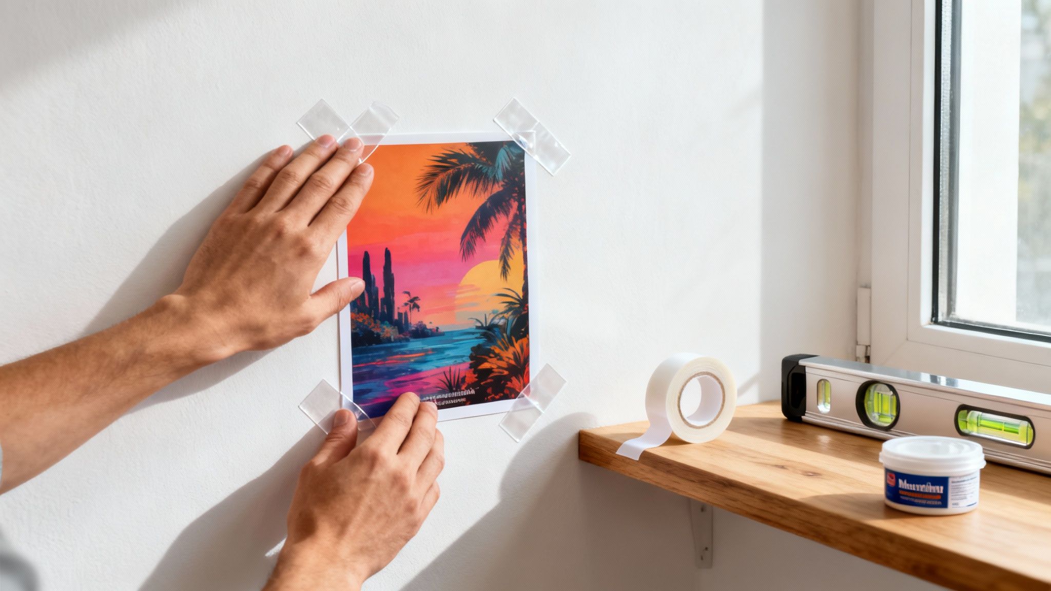 story
story How to Stick a Poster on a Wall Without Any Damage
Want to know the real secret to getting a poster to stick to a wall without it peeling off in the middle of the night? It's all about what you do before you even touch the adhesive. Proper prep and picking the right sticky stuff for your specific wall is 90% of the battle. It boils down to cleaning the wall, knowing what your poster is made of, and grabbing a few simple tools like a level and a tape measure. Get these basics right, and you're set for a perfect, long-lasting display. Your Foundation for Flawless Poster Hanging Before you even think about tape or putty, you need to prepare your walls properly . The type of surface you're dealing with—painted drywall, textured plaster, brick, or glass—is the single most important factor. Seriously. Each one has its own quirks that determine how well an adhesive will grab on. For instance, a smooth, glossy wall is a dream for most tapes. But a porous, uneven brick wall? That needs something with serious grip to hold on. Skipping this first look at your surface is the number one reason posters take a nosedive. Assess Your Poster and Gather Your Tools Next, take a look at the poster itself. Is it a lightweight, uncoated paper print, or is it made from a heavier, premium glossy stock? The weight and finish directly impact what kind of adhesive you'll need and how much of it to use. Heavier posters naturally put more strain on the adhesive, so they demand a stronger solution. Our collection of online posters comes in a bunch of different weights and finishes, and each one has an ideal way to be hung. To get that professional, "I totally meant for it to look this good" result, grab these tools before you start: A measuring tape to find the center of your space. A pencil for making light marks you can easily erase later. A level to make sure your poster isn't crooked. Trust me, you'll notice. A clean, dry cloth to wipe down the wall first. Why This Quick Prep Actually Matters This isn't just about making things look nice; it's about protecting your poster and your wall. For businesses using posters at events or in stores, a drooping or fallen display looks unprofessional and can kill engagement. Hanging your materials right ensures they make the impact you paid for. Taking just five extra minutes to wipe the wall and measure your placement can be the difference between a poster that stays up for years and one that's on the floor by morning. This tiny bit of effort pays off big time in the long run. Choosing the Right Adhesive for Your Wall This is where things usually go sideways. Picking the right adhesive is the single most important step in hanging a poster, and the wrong choice can mean peeling paint, sticky residue, or a poster that keeps falling down. The secret is matching your adhesive to your wall and your poster. A lightweight paper print going up in a dorm room has completely different needs than a heavy, laminated poster destined for a textured office wall. Let's dig into the common options so you can find the perfect match. Common Adhesives and When to Use Them Walk down the tape aisle at any store, and you'll see a dizzying number of choices. From that classic blue putty to high-tech removable strips, each one has a specific job. Knowing their strengths and weaknesses will save you a massive headache later on. Mounting Putty: That reusable, clay-like stuff is a classic for a reason. It's fantastic for lightweight posters and super temporary situations, like a dorm or a kid's room where things get rearranged constantly. It's gentle on most paints, but be warned: it can leave oily stains over time, especially in warmer rooms. Double-Sided Tape: This is a versatile and easy-to-find option, but you have to be careful. Your standard office tape will absolutely rip paint off the wall and leave a gummy mess behind. Always look for tape specifically labeled "removable" or "wall-safe." For rougher surfaces, heavy-duty foam tape is a much better choice, as its spongy texture helps it grip uneven spots. Removable Adhesive Strips: These are a renter's best friend. Brands like Command Strips are engineered to hold strong but come off clean when you stretch the little tab. They come in different sizes to handle various weights, making them great for everything from small art prints to heavier framed pieces. The only real downside is that they're a one-and-done product. The best advice I can give? Always test a small, hidden spot first. Stick your chosen adhesive behind a piece of furniture or down near the floorboard and let it sit for 24 hours . This one simple check can save you from a wall of damaged paint. Adhesive Options Compared To make the choice crystal clear, here’s a quick side-by-side comparison of the most popular methods. Think about the trade-offs between holding power, how easy it is to remove, and the potential for damage. This should point you directly to the right product for your project. Adhesive Type Best For Holding Power Damage Risk Removability Mounting Putty Dorm rooms, kids' rooms, lightweight paper posters Low Low (but can leave oil stains) High Double-Sided Tape Smooth surfaces, temporary displays Medium High (unless wall-safe) Low to Medium Removable Strips Renters, painted drywall, heavier posters High Very Low (when removed correctly) Very High Heavy-Duty Foam Tape Textured walls (brick, plaster), heavy posters Very High High Low Ultimately, the goal is to get your poster on the wall securely and without causing a mess when it's time for a change. For projects that demand a more professional, seamless look, you might want to think beyond tape altogether. Learning about adhesive vinyls can open up a whole new world of possibilities for creating durable, high-impact graphics that apply smoothly with no visible hangers. It’s an excellent route for business signage or long-term decor. Your Step-by-Step Guide to Perfect Poster Placement You’ve prepped your surface and have the right adhesive ready to go. Now for the fun part: hanging your poster. This is where a little bit of precision makes all the difference, turning a simple print into a display that looks sharp and intentional. Forget just eyeballing it—that’s a surefire way to end up with a crooked poster that you'll be tempted to fix over and over again. Instead, let's walk through a repeatable process that guarantees perfect alignment every time. A few simple measurements and a clever technique used by the pros will help you sidestep the common frustrations of wrinkles, bubbles, and slanted edges. Marking Your Placement for a Balanced Look First things first, decide exactly where you want the poster to live. Grab your measuring tape and find the ideal spot, keeping eye level and the room's other decor in mind. A great rule of thumb is to hang art so its center is about 57 inches from the floor, which is the average human eye level. Once you’ve locked in the perfect height, use your level to make sure the top corners are perfectly horizontal. A couple of light pencil marks are all you need. You can easily erase them once the poster is up. Don't skip this; it's the secret to avoiding a lopsided look. Applying Your Adhesive the Right Way How you stick the adhesive to your poster is just as important as which kind you picked. Each type has its own quirks for getting the strongest, most reliable bond. For Mounting Putty: Don’t just stick it on cold. Work a small ball of putty between your fingers for a minute or so to warm it up. This makes it much more pliable and helps it grab onto the wall's texture for a better hold. For Adhesive Strips: Follow the package directions to the letter. Most of them require you to press the strip firmly to the poster first, then press the whole thing firmly against the wall to activate the pressure-sensitive adhesive. For Double-Sided Tape: I always apply the tape to the poster's edges first. Run your finger along the tape to smooth out any air bubbles before you even think about peeling off the backing. No matter what adhesive you're using, this is the most critical part: pressure . Press firmly and evenly against the wall for at least 30 seconds . This ensures the adhesive makes full contact and creates a secure bond that's built to last. Mastering the Hinge Method for Large Posters Trying to hang a big poster can feel like you need an extra set of hands. It’s so easy to get wrinkles or accidentally stick it on crooked. To avoid that headache, try the "hinge method," a trick the pros use for a flawless application every single time. Take a single piece of low-tack painter's tape and run it across the top edge of your poster. Stick it to the wall at your marked position to create a "hinge." Now, you can flip the poster up, like it's on a hinge, so you can see the back. Remove the backing from your adhesive strips or tape on the back of the poster. Gently flip the poster back down. The painter's tape hinge will guide it perfectly into place without any guesswork. Starting from the top and moving downward, use your hand or a soft cloth to smooth the poster onto the wall. This pushes out any air bubbles as you go. Once it feels secure, you can carefully remove the painter's tape hinge from the top. This little trick gives you total control, ensuring even your largest prints go on straight and smooth. How to Hang Posters on Challenging Surfaces Hanging a poster on a smooth, painted drywall wall is one thing. But what happens when you're up against brick, concrete, glass, or a temporary event wall? That's when things get tricky. It can feel like a losing battle, but the good news is you absolutely can get your poster to stick just about anywhere—you just need the right gear and a solid game plan. Forget your standard roll of tape. These kinds of surfaces call for more specialized solutions. For anything rough and porous like brick or unfinished concrete, the uneven texture is your biggest hurdle. You need an adhesive that can actually fill in those tiny gaps and create a serious bond despite all the irregularities. Tackling Rough and Porous Walls When you're dealing with brick, stone, or concrete, you've got to bring out the heavy hitters. Heavy-duty mounting tape , especially the kind with a thick foam core, is your best friend here. The foam is designed to squish into the wall's unique texture, which means more of the adhesive actually makes contact and creates a much more secure hold. Another great option is to grab some specialty adhesive hooks made for outdoor or rough-surface use. These are built with a more aggressive adhesive formula that's made to bond with porous materials. Just stick the hooks to the wall, then use clips or even a piece of string to hang your poster. It can create a cool, industrial vibe. Solutions for Smooth and Non-Porous Surfaces Glass, mirrors, and high-gloss tiles have the opposite problem. Their super-smooth, non-porous nature means weaker adhesives can just slide or peel right off, sometimes overnight. For these slick situations, clear mounting squares are perfect. They give you a surprisingly strong, almost invisible hold and are usually designed to come off clean without that frustrating sticky residue. If you're looking for a clever trick, especially for temporary window displays, give static cling film a try. This method is completely adhesive-free and uses static electricity to hold lightweight posters in place. It’s a totally damage-free way to go, making it perfect for things like seasonal promotions or event signs. For bigger or more permanent displays on smooth surfaces, you might even consider custom wall graphics for a truly professional, long-lasting finish. No matter the adhesive, the basic hanging process is always the same. This graphic breaks it down perfectly. It’s a great visual reminder that no matter what, careful marking, smart adhesive application, and firm, even pressure are the keys to getting it right. Temporary Setups for Events For trade shows, pop-up shops, or conferences, you’re in a unique spot. You need something that’s both strong enough to last the event but will also come off cleanly without damaging those expensive rental walls or display boards. Pro Tip: In these situations, high-quality removable strips are your safest bet. Go with a brand known for clean removal and always pick a weight rating that’s much higher than what your poster actually weighs. This gives you a buffer to account for the temperature swings and humidity you often find in big event halls. Damage-Free Removal and Poster Care You've hung your poster perfectly—it looks fantastic. But the job isn't truly finished until you can take it down just as flawlessly. Leaving your walls pristine and ready for the next piece of art is the real measure of success, and how you do that depends entirely on the adhesive you chose. For those popular removable strips, the process is simple but very specific. Never pull the strip straight out from the wall. That’s a rookie mistake. Instead, grab the exposed tab and slowly stretch it straight down, keeping it parallel to the wall. Keep stretching until the strip lets go; it can sometimes stretch up to 15 inches before releasing its grip. If you rush this step, you're almost guaranteed to take a chunk of paint with it. Safely Detaching Stubborn Adhesives What about the tougher stuff, like mounting putty or heavy-duty foam tape? These require a bit more finesse to remove cleanly. Mounting putty can get surprisingly hard over time and sometimes leaves behind an oily residue. The trick is to gently warm it up with a hairdryer on a low setting for about 20-30 seconds . This softens the putty just enough, allowing you to carefully roll it off the wall with your thumb. Whatever you do, don't scrape at it. You’ll just end up marring the paint. Aggressive foam tapes are a whole different beast—you definitely can't just rip them off. The Dental Floss Trick: Grab a piece of sturdy dental floss or fishing line. Sawing Motion: Gently work the floss behind the poster and use a back-and-forth sawing motion to slice right through the foam adhesive. Residue Removal: Once the poster is off, you can tackle any remaining sticky bits with an adhesive remover that’s safe for painted surfaces. Taking the time to remove adhesives properly is non-negotiable if you want to avoid patching and repainting your walls. Patience is your best tool here; slow and steady movements will always win out over brute force. Keeping Your Posters in Prime Condition Once your poster is down, you’ll want to store it properly for future use. The biggest enemies of any print are sunlight and moisture. Always keep your posters in a cool, dry place away from direct sunlight, which will cause the ink to fade dramatically over time. If your poster has curled up from being rolled, you can gently roll it in the opposite direction around a tube. Secure it with rubber bands for a day or so, and it should flatten right out. For extra protection against creases, moisture, and fading, consider adding a protective finish. You can learn more about how laminating your prints can extend their lifespan and keep them looking vibrant for years. Elevate Your Display with Professional Mounting For those truly special posters that deserve to be a centerpiece, it's time to think beyond simple tape and putty. When you want to transform a print into a gallery-quality display, professional finishing options are the way to go. This is how you give a poster a more permanent and impactful presence on your wall. Mounting your poster gives it rigidity and a clean, premium look. You can finally stop worrying about wrinkles, sagging, or those annoying curling corners. This one step turns a standard print into a lasting piece of decor or a high-impact marketing tool that commands attention. It’s the perfect choice for showing off art in your living room or for critical signage in a retail space. Choosing the Right Mounting Material Different materials bring unique benefits to the table, so picking the right one really depends on what you need it for. Foam Board: This is a classic lightweight and affordable option. It's perfect for indoor displays, professional-looking presentations, or temporary event signage that needs to look sharp. Gatorboard: A serious step up in durability, gatorboard is much more rigid and resistant to warping. That makes it an excellent choice for long-term displays, especially in high-traffic areas where it might get bumped around. Styrene: Known for its flexibility and resilience, styrene is a thin plastic that holds up incredibly well against moisture and general wear. This makes it a versatile pick for all sorts of environments. Exploring professional mounting services can help you find the perfect match for your print and take all the guesswork out of it. A mounted poster communicates permanence and quality. It tells viewers that this isn't just a temporary image but a deliberate and valued part of the decor or brand message. The global market for custom poster printing is booming and is expected to hit an incredible USD 2,430.3 million by 2030. For businesses, this is huge. Pairing high-quality posters with durable mounting ensures your campaigns last longer, which can significantly cut down on reprint costs over time. You can find more insights on the growing custom printing market on grandviewresearch.com . Got a Poster Problem? We've Got Answers Even with the best game plan, you might hit a snag trying to get your posters perfectly placed. Let's walk through some of the most common headaches people run into and how to solve them without all the frustration. What If My Poster Keeps Falling Down? This is a classic. If your poster just won’t stick, you’re almost certainly dealing with one of two things: a sneaky layer of dust on your wall or the wrong kind of adhesive for the job. First things first, take the poster down. Grab a clean cloth, put a little rubbing alcohol on it, and give the wall area a quick wipe. This cuts through any oils or dust you can't see. If it still won't stick after that, it's time to level up your adhesive. For bumpy or textured walls, switch to a heavy-duty foam tape. For smooth walls, look for removable strips that are rated for a higher weight. No matter what you use, make sure you press down firmly for at least 30 seconds to really lock in that bond. How Do I Uncurl a Rolled Poster? Ah, the poster that thinks it's still in the tube. This one's an easy fix. Just carefully roll it in the opposite direction it was curled. You can gently secure it with a couple of rubber bands or even pop it back in the shipping tube that way for a few hours. My personal go-to trick? Lay the poster print-side-up on a clean floor or table. Then, place some heavy, flat-bottomed books on the corners and one in the middle. Let it sit overnight, and by morning, you'll have a perfectly flat poster ready for hanging. How Should I Hang a Very Heavy Poster? When you're dealing with a heavy poster—especially one printed on thick cardstock or mounted on a board—your everyday tape and putty just aren't going to have the muscle for it. Don't even risk it. Your best bets here are interlocking fasteners like heavy-duty Velcro strips or the professional-grade Command Strips designed for hanging picture frames. Here’s a pro tip: always use more than the packaging says you need. If it suggests two strips will do the trick, use four—one securely in each corner. A little extra support goes a long way. Ready to print a poster that’s worth all this effort? 4OVER4 has you covered with a huge selection of high-quality poster printing and mounting options to make your design pop. Explore our collection and bring your vision to life today.
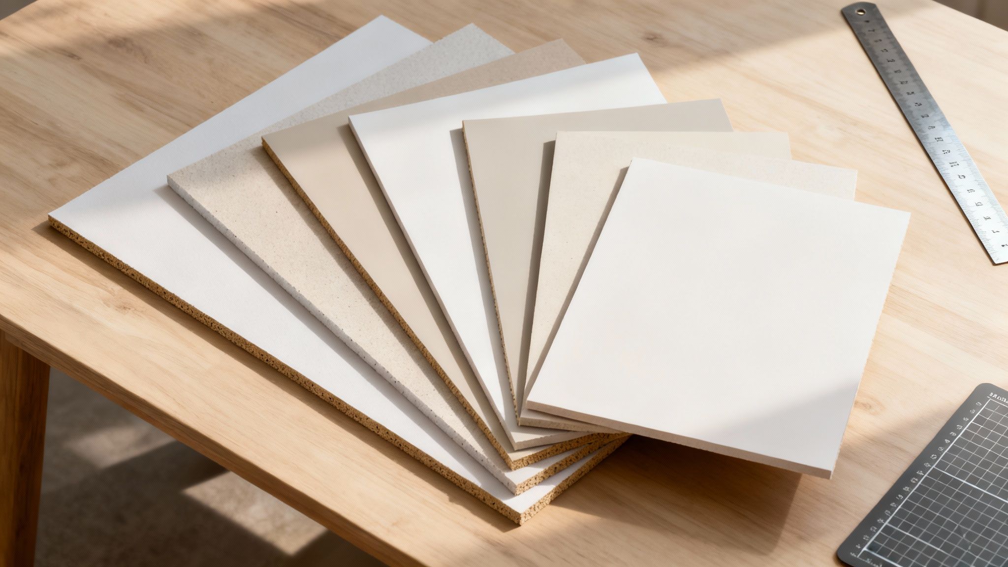 story
story Your Guide to Every Poster Board Size
Walk into any craft store, and you'll likely find that the most common poster board size is 22 x 28 inches . This dimension has become the go-to standard for a reason—it strikes a perfect balance between visibility and portability, making it a workhorse for everything from school projects to small-scale ads. A Visual Overview of Poster Board Dimensions Getting a feel for the different sizes available is the first step in picking the right one for your project. Whether you're putting together a small photo mount for a craft fair or a massive display for a trade show, each size is designed with a specific purpose in mind. This visual guide gives you a quick sense of how poster board sizes scale up, from small and personal to large and attention-grabbing. As you can see, the intended use case is everything. The larger the format, the more it's geared toward making a big impact in high-traffic areas where you need to capture attention from a distance. The Most Common Sizes and Their Uses To make things even simpler, standard poster boards are generally sorted into three main categories. Each group is tailored for different scenarios, from small, intimate informational signs to big, bold presentations that command a room. Here’s a quick-lookup table to help guide your decision. Standard Poster Board Sizes at a Glance This table breaks down the most popular poster board sizes, giving you the dimensions in both inches and centimeters, along with some typical uses for each. It's a handy reference to keep bookmarked. Size Category Dimensions (Inches) Dimensions (Centimeters) Common Use Cases Small 11" x 14" 27.9 x 35.6 cm Small signs, classroom activities, photo mounting, craft projects Medium 22" x 28" 55.9 x 71.1 cm The classic for school projects, science fairs, presentations Large 24" x 36" 61 x 91.4 cm Business presentations, event signage, retail displays While the 22" x 28" size reigns as the most popular choice, the 24" x 36" is a close second, especially in business and retail where you need that extra visual real estate. These standardized dimensions are a lifesaver because they make finding accessories like easels and frames a breeze. If you're ready to get your design printed professionally, checking out options for online posters can open up a world of additional sizes, finishes, and high-quality materials you might not find in a local store. How to Choose the Right Poster Board Size Picking the perfect poster board size isn't just about grabbing the first one you see. The right choice really hinges on who you're trying to reach, how far away they'll be, and just how much information you need to cram onto it. What works brilliantly for a classroom project might get completely lost at a chaotic trade show. This decision directly shapes how visible and effective your message is. A poster that’s too small will disappear in a crowded room, but one that's too big can overwhelm a smaller space or just be a pain to transport. Thinking about the context is always the first step. Small and Standard Sizes for Focused Projects For school assignments, intimate presentations, or point-of-sale displays in a retail shop, standard sizes are usually your best bet. They give you a manageable canvas that’s easy to read up close without eating up a ton of space. 11 x 14 inches: This compact size is perfect for photo displays, craft projects, or little informational signs on a countertop. It’s definitely meant for close-up viewing. 22 x 28 inches: This is the most common poster board size you'll find. It's the universal standard for school science fairs and academic presentations, offering a fantastic balance of usable space and portability. These smaller formats are easy on the wallet and a breeze to handle, making them ideal for projects with tight budgets or for anyone who needs to travel with their display. Plus, because they're so common, finding easels or other accessories is simple. Medium to Large Formats for Greater Impact When you absolutely need to grab attention from a distance, you have to go bigger. These larger sizes are staples for business presentations, event signage, and any advertising where visibility is everything. A larger poster board lets you use bigger fonts, more detailed graphics, and a much stronger visual presence. A great example is the 24 x 36 inch poster, a popular choice for business conferences and retail promotions. It's big enough to be noticed from across a room but still manageable enough for one person to set up. The goal is to match the poster's scale to its environment. A 24x36 inch poster might seem huge in a small office but perfectly scaled in a large convention hall, effectively grabbing the attention of passersby. For maximum impact at major events or in huge venues, the 36 x 48 inch size is the go-to option. This format provides a massive canvas for complex diagrams, detailed information, and bold branding that needs to be seen from far away. When you're weighing your options, it can be helpful to check out resources like this guide on poster printing sizes . International Sizes and How They Compare If you're working on international projects or collaborating with designers outside the US, you’ll probably run into the A-series paper sizes. Knowing their American equivalents is crucial for keeping your designs consistent across different regions. Here’s a quick comparison: A2 (16.5 x 23.4 inches): This is a bit smaller than the medium sizes common in the US. A1 (23.4 x 33.1 inches): This is the closest international equivalent to the ever-popular 24 x 36 inch poster. Keeping these differences in mind helps you sidestep common formatting headaches when sending files to be printed abroad, making sure your design fits the poster board perfectly. Selecting the Best Poster Board Material While picking the right poster board size sets the stage for your project, the material you choose really defines its durability, finish, and overall impact. The substance of your board is just as important as its dimensions, affecting everything from how easy it is to move around to how long it will last. Moving beyond standard paper, materials like foamcore and gatorboard offer unique advantages for different situations. Your choice will ultimately come down to your project's environment, how long it needs to hold up, and how you plan to display it. A flimsy material might buckle in a busy hallway, while a super-durable option could be overkill for a one-time classroom presentation. Classic Paper Poster Board The most familiar option is the classic paper poster board, which is just a single, flexible sheet of thick paper. It’s everywhere, it’s affordable, and it’s perfect for short-term indoor use. This material is the undisputed champ for school projects, quick signs, and craft activities. Its lightweight nature makes it a breeze to cut, color, and carry. However, it's also the least durable of the bunch, prone to bending, creasing, and water damage. This makes it a poor choice for professional or long-term displays where you need something more resilient. Foam Board: A Lightweight and Rigid Choice Foam board, often called foamcore, is a major step up in rigidity. It’s made with a dense polystyrene foam core sandwiched between two layers of paper, creating a panel that’s lightweight yet surprisingly sturdy. This construction makes it an excellent choice for presentations that need to look sharp and professional without being a pain to transport. Its resistance to warping is a huge plus, making it ideal for mounting graphics and photos. For anyone looking to create durable, portable displays for business meetings or science fairs, exploring professional foam core printing services is a great next step. Foam board's biggest advantage is its fantastic stiffness-to-weight ratio. It provides a professional, flat surface that makes visuals pop, making it a favorite for trade show graphics and architectural models that require both a polished look and portability. Gatorboard: For Maximum Durability When your project demands serious strength and longevity, gatorboard is the way to go. Like foamcore, it has a polystyrene foam center, but it’s encased in a much tougher exterior made of wood-fiber veneer. This robust construction makes gatorboard exceptionally rigid and resistant to dents, scratches, and warping. It's the go-to material for high-end displays, long-term retail signage, and gallery-mounted artwork. While it is heavier and costs more than foamcore, its resilience makes it a smart investment for any display meant for high-traffic areas or repeated use. To help you sort through the options, we've put together a quick comparison of these popular materials. This should make it easier to see, at a glance, which one is the right fit for your next project. Comparing Common Poster Board Materials Material Type Key Features Best For Durability Approximate Cost Paper Board Flexible, lightweight, and budget-friendly. Very easy to cut and color. School projects, crafts, temporary indoor signs, and one-time presentations. Low . Prone to bending, creasing, and water damage. $ (Least Expensive) Foam Board Rigid but lightweight with a smooth surface. Resists warping and denting. Business presentations, photo mounting, trade show graphics, and science fairs. Medium . More durable than paper but can be dented with rough handling. $$ (Mid-Range) Gatorboard Extremely rigid and durable. Resists dents, scratches, and warping. High-end displays, long-term retail signage, museum exhibits, and gallery art. High . Built to last and withstand high-traffic environments. $$$ (Most Expensive) Ultimately, the best material depends entirely on your specific needs. By weighing the durability, intended use, and cost, you can choose a board that not only looks great but also performs exactly as you need it to. Real-World Uses for Poster Board Sizes Knowing the standard dimensions is one thing, but seeing how a specific poster board performs in a real-world setting is where the theory hits the road. The perfect size for your project comes down to your environment, the viewing distance, and the message you’re trying to land. What works for a student in a classroom is worlds apart from what a business needs to stand out in a crowded convention center. Thinking about the application first helps you visualize the final outcome. When you match the poster size to its job, you make sure your message isn’t just seen—it’s effective. Let's walk through the most common scenarios to see which sizes truly shine and why. Academic and Educational Settings In schools and universities, the 22x28 inch poster board is the undisputed champ. Its popularity comes from a perfect mix of having plenty of space while still being easy to handle. This makes it the go-to for science fairs, classroom presentations, and student government campaigns. It's big enough to clearly display a hypothesis, data charts, and conclusions without overwhelming the viewer or the student lugging it around. For more intensive academic conferences or research symposiums, the larger 24x36 inch format is often the preferred choice. This size gives you the necessary real estate for detailed infographics, longer blocks of text, and all your citations, letting researchers present a comprehensive look at their work. 22x28 inches: The classic choice for K-12 projects and smaller presentations. It fits perfectly on a standard classroom easel or tabletop. 24x36 inches: Better suited for university-level poster sessions and detailed research displays where you just need more room for information. Business and Trade Show Environments In a business setting, especially at a trade show, the whole game is about grabbing attention quickly and from a distance. Small posters just get lost in the noise of a bustling convention hall. This is where larger formats aren't just an option—they're a must if you want to make a memorable impact. The 24x36 inch poster is a true workhorse for all kinds of business applications. It’s large enough to be seen from across an aisle, making it ideal for booth backdrops, new product announcements, and directional signs. When you mount it on a rigid material like foamcore or gatorboard, it projects a polished, professional image. For maximum visibility in big venues like auditoriums or exhibition halls, upgrading to a 36x48 inch poster board is a smart, strategic move. This size commands attention and acts as a powerful centerpiece for a company's booth, ensuring your branding is visible even from far away. For businesses looking to create a fully immersive experience, a variety of professional trade show displays can complement these larger posters, pulling together a cohesive and high-impact brand presence. Retail and Point-of-Sale Advertising In retail, poster boards are fundamental tools for driving sales and announcing promotions. The right poster size really depends on where the sign is going and what it needs to do. Smaller, targeted signs work great right at the point of sale, while bigger posters are needed to pull customers in from the street. Here’s a quick breakdown of common retail uses: 11x14 inches: This compact size is perfect for countertop displays, announcing a discount on a specific product, or sharing info right at the cash register. 22x28 inches: A super effective size for window displays and end-cap promotions. It's large enough for shoppers to notice but doesn't completely block their view. 24x36 inches: The ideal pick for "sidewalk" or A-frame signs placed outside a store to attract foot traffic with bold headlines and eye-catching images. Preparing Your Design for Printing You can pick the perfect poster board size and the best material, but none of it matters if your design file isn't up to snuff. The quality of your file is what truly brings your vision to life. Getting your file ready for a professional printer is that last, critical step to make sure your poster looks sharp, vibrant, and exactly how you pictured it. Little technical details like resolution, bleed, and color mode can make or break the final product. Skipping over these specs is a classic mistake, and it almost always leads to disappointment—think blurry images or weird white borders. Taking a few minutes to set up your file correctly from the start saves you the headache and cost of having to reprint everything. Setting the Correct Resolution Resolution, which we measure in Dots Per Inch (DPI) , is all about the sharpness and clarity of your printed poster. A low-resolution image will look pixelated and fuzzy when it’s printed, especially on a larger poster board where every imperfection gets magnified. For pro-level results, your design file needs to be at least 300 DPI when set to its final print size. This is the industry standard for a reason; it guarantees that every little detail, from tiny text to big photos, comes out crisp and clear. Most design software, whether you're using Adobe Photoshop or Canva, will let you set the resolution right when you create a new document. Understanding and Adding Bleed Ever seen a printed flyer or card with a sliver of a white edge where there shouldn't be one? That's what happens when a design doesn't have a print bleed . A bleed is just a small extra margin of your design that extends past where the poster will actually be cut. Printers can't print ink perfectly to the very edge of a board, so they print on a slightly larger area and then trim it down. That extra bit is the bleed, and it ensures your colors and images go all the way to the edge without any gaps. Standard Bleed Amount: Just add an extra 0.125 inches (or 1/8th of an inch) of your background design to each side of your document. Safety Margin: On the flip side, keep all your important stuff—like text and logos—at least 0.25 inches away from the trim edge. This ensures nothing important gets accidentally chopped off. Color Mode and Finishing Touches Last but not least, make sure your design file is in the right color mode for printing. Digital screens use RGB (Red, Green, Blue) light to display colors, but professional printers use CMYK (Cyan, Magenta, Yellow, Black) ink. If you design in CMYK mode from the get-go, you'll have a much more accurate idea of how the colors will look once they're actually printed. When you're putting together a poster, keeping the principles of graphic design for education in mind can really help create visuals that connect and communicate effectively. Think about the final finish of your poster as part of the actual design. A protective coating can really make your design pop and help it last longer, which is a big deal for posters in busy areas or those meant for long-term display. Options like adding a protective finish can shield your print from scuffs, moisture, and fading. It’s worth looking into different laminating services for posters to give your project that extra layer of durability and a professional sheen. It’s the perfect way to protect all the hard work you put into the design. Ever wondered why you can walk into any craft store and find a 22x28 inch poster board? That consistency isn't a coincidence. It's the direct result of practical needs that grew out of the printing, advertising, and retail worlds. The push toward standardization was all about one thing: efficiency, from the moment a poster is created to its final display. The entire system was built to simplify the process and cut costs for everyone. For manufacturers, churning out boards in uniform dimensions meant less waste, easier inventory management, and more predictable production. That efficiency naturally trickled down to distributors, retailers, and finally, to creators like you. From Printing Press to Public Square The story of standard sizes is woven into the history of printing itself. As printing technology got more sophisticated, so did the need for consistent paper and board dimensions that actually fit the machinery. Early printers figured out that working with uniform sheets made everything faster and more reliable, getting rid of the headache of custom-cutting materials for every single job. This became even more crucial with the explosion of mass advertising. The standardization of poster board sizes really took off in the late 19th century when lithographic printing completely changed the ad game. Jules Chéret’s three-stone lithographic process, developed in the 1880s, fundamentally altered how posters were made and distributed, directly influencing the dimensions that became industry norms. This development led to a nearly 40% reduction in production waste compared to older methods. This uniformity was also vital for public display. Advertisers and event promoters needed posters that would slide perfectly into existing display cases, kiosks, and frames in high-traffic spots like theaters and train stations. A standardized poster board size meant a design printed in one city could be displayed flawlessly in another without any tweaks. Practical Advantages for Modern Creators Today, those same standards offer huge practical benefits. They make it incredibly simple to find accessories like frames, easels, and portfolio cases that are guaranteed to fit. Just imagine the frustration of trying to hunt down a frame for some randomly sized board—standardization thankfully makes that a non-issue. This consistency is also a massive advantage during the design phase. Graphic designers and artists can create with confidence, knowing their digital files will translate perfectly to the physical product. When you're ready to bring your design to life, understanding the ins and outs of modern digital printing services helps ensure your final poster is as vibrant and professional as you imagined. At its core, standardization is all about predictability. It creates a stable, efficient ecosystem where manufacturers, designers, and consumers are all on the same page, ensuring quality and compatibility from start to finish. Ultimately, the humble standardized poster board is a great example of practical design in action. It’s a simple solution born from a complex history of technology and commerce, and it makes all of our creative and professional lives just a little bit easier. Common Questions About Poster Board Size Even after you've got a handle on the basics, a few specific questions always seem to pop up just as you're about to start a project. Let’s clear those up. Think of this section as your quick-reference guide for the practical, real-world poster questions we hear all the time. Getting these last few details right can be the difference between a project that just looks good and one that functions perfectly for what you need it to do. What Is the Most Common Poster Board Size for a Science Fair? The hands-down winner for school science fairs is 22 x 28 inches . This size has become the unofficial standard because it hits that perfect sweet spot—it’s large enough to comfortably fit your hypothesis, data, charts, and images, but still totally manageable to carry and set up on a table or easel. If you have a more complex project and need a bit more room to breathe, a tri-fold board with a similar height is a fantastic alternative. Those extra side panels give you more real estate for content and, just as importantly, let the display stand on its own. That’s a huge plus in a crowded exhibition hall. Can I Print a Custom Poster Board Size? Absolutely. Any professional print shop worth its salt can handle custom-sized poster boards. This is perfect for those times when you have a unique display area to fill or a creative idea that just doesn't fit into a standard box. While the common sizes are usually easier on the wallet thanks to how they’re produced, custom dimensions give you total creative control. Just remember one crucial thing: when you order a custom size, your design file has to match those dimensions exactly. And always, always set your file resolution to a minimum of 300 DPI . This guarantees your print will be sharp and clear, no matter how big or small the final board is. A classic mistake we see is people trying to stretch a low-resolution image to fit a big custom board. It always ends up looking blurry and unprofessional. Always start your design with the final print size and resolution locked in from the get-go. What Is the Difference Between Poster Board and Foam Board? The biggest difference comes down to their construction, how stiff they are, and what they’re best used for. Standard poster board is essentially a single, flexible sheet of thick paper or cardstock. It’s light and inexpensive, which makes it perfect for short-term projects, classroom crafts, or school assignments where you don’t need it to last forever. Foam board (often called foamcore), on the other hand, is a different beast entirely. It’s made of a lightweight polystyrene foam core that’s sandwiched between two sheets of paper. This layered structure makes foam board way more rigid and durable. It won’t bend or warp easily, giving you a perfectly flat, stable surface that’s ideal for professional presentations, mounting photos, or trade show graphics. Should I Design My Poster Vertically or Horizontally? The choice between a vertical (portrait) or horizontal (landscape) layout should be driven entirely by your content. There’s no right or wrong answer here; it’s all about what showcases your information most effectively. Vertical (Portrait) Layouts: These are great for posters with a lot of text, numbered lists, or information that flows naturally from top to bottom. You’ll see this orientation a lot with academic and research posters because it guides the reader through a logical sequence. Horizontal (Landscape) Layouts: This orientation is your best bet for showing off wide visuals like panoramic photos, timelines, or charts that compare data side-by-side. It gives you a broad canvas to work with. Before you do anything else, look at your core content. Let the shape of your information tell you which way your poster board should go. Ready to bring your vision to life on the perfect poster board? 4OVER4 offers a vast selection of sizes, materials, and custom printing options to ensure your project looks professional and polished. Explore our high-quality poster printing services today and find your perfect fit
 story
story Mastering Poster Design Principles for Eye-Catching Results
Poster design principles are the secret sauce that makes a design work . They’re the foundational rules—like visual hierarchy, color theory, and typography—that ensure your poster can grab attention and get a message across in a heartbeat. Sticking to these principles is what separates a poster that gets noticed from one that just fades into the background. Why Poster Design Principles Matter Ever walked down a street lined with flyers and had only one catch your eye? That’s no accident. That’s good design in action. A poster has just a few precious seconds to stop someone in their tracks, deliver a clear message, and maybe even get them to do something. Without a solid creative framework, even the most brilliant idea can devolve into a confusing mess of colors, images, and text. Think of these principles as a recipe for visual communication. Just like a chef combines specific ingredients in a certain order to create a fantastic meal, a designer uses these rules to arrange elements in a way that’s both appealing and ridiculously easy to understand. Once you get the hang of them, you can move beyond just decorating a page and start strategically guiding a viewer’s eye exactly where you want it to go. The Building Blocks of Impactful Design Effective poster design isn’t about one single thing; it’s about a few core concepts all working together in harmony. Nailing these fundamentals is the first step toward creating professional-grade marketing materials that actually deliver results for your business. We're going to walk through the essential pillars you need to know: Hierarchy: This is all about guiding the viewer’s eye to the most important information first. Typography: It’s more than just fonts. It’s about using text to set a specific tone and keep things readable. Color & Imagery: These are your tools for creating an immediate visual hook and stirring up emotion. Layout & Space: This is how you organize everything for clarity, giving your design a clean, professional look. To give you a quick overview, here’s a simple table summarizing these core ideas. The 5 Core Poster Design Principles At A Glance Principle What It Is Primary Goal Hierarchy Arranging elements to show their order of importance. Guide the viewer's eye from the most critical info to the least. Typography The art of arranging type to make it legible and appealing. Set the tone, improve readability, and reinforce the message. Color & Imagery The use of hues, visuals, and photos in a design. Evoke emotion, create a mood, and grab immediate attention. Layout & Space The organization of all visual elements on the page. Create balance, clarity, and prevent visual clutter. Accessibility Designing so that people with disabilities can use it. Ensure the message is understandable for the widest audience possible. Getting these right is what turns a simple flyer into a powerful communication tool. While our main focus here is on posters, you'll find that many of these graphic design rules are universal. For a wider look at how these concepts apply elsewhere, you might want to explore these essential design best practices as well. A great poster doesn't just display information; it creates an immediate connection. Its success is measured in seconds, making every design choice critical. By applying fundamental principles, you ensure your message isn't just seen—it's understood and remembered. Establishing a Clear Visual Hierarchy Picture your poster trying to grab someone's attention on a busy street. It can't afford to mumble. To cut through the noise, it needs to speak clearly and know exactly what to say first. This is the whole idea behind visual hierarchy , and it’s arguably the most important principle in poster design. Without a solid hierarchy, everything on your poster—headlines, images, dates, details—is shouting at the same time. It’s just visual chaos. A strong hierarchy, on the other hand, acts like a tour guide for the viewer's eye. It smoothly leads them from the most critical piece of information down to the fine print in a way that feels completely natural. Think of it as creating a pecking order for your content. The hierarchy tells the viewer, "Look here first!" for your main headline, then whispers, "Now that I've got you, here's what you need to know next." Guiding the Viewer's Eye Creating this guided path is a lot more intuitive than it might seem. You really only need four main tools to control how important each element feels on the page. By mixing and matching these, you can masterfully direct the flow of information and make sure your message hits home. Size and Scale: This one's the most obvious. Bigger things feel more important and grab the eye instantly. Your main headline should always be significantly larger than any supporting text. Color and Contrast: Bright, bold colors pop out, while muted tones tend to recede into the background. A splash of high-contrast color on your call-to-action or a key date makes it impossible to miss. Placement: We naturally read from top to bottom, left to right. Anything you place at the top or center of your design will automatically feel more significant. Putting your main message there just works with how our eyes are already trained to scan a page. Typography: A bold, heavy font carries more visual weight than a thin, delicate one. Even just using a unique display font for a headline and a simple serif for the details creates an immediate sense of order. This flowchart breaks down how core principles like hierarchy, typography, and color all feed into one another to create a poster that actually works. As you can see, these principles don't exist in a vacuum. A strong hierarchy is built on smart choices in both typography and color that work together to guide the viewer. The Five-Second Rule Here’s a gut check for your design: the five-second rule . Show your poster to someone for just five seconds, then hide it. Ask them what it was about. If they can’t tell you the main point—the event, the sale, the big news—your visual hierarchy needs another look. In poster design, clarity beats creativity every time. A simple, well-structured poster that gets its message across in seconds is far more effective than a stunningly artistic design that leaves people confused. A successful hierarchy usually follows a predictable path: Headline: The huge, can't-miss statement ("Grand Opening," " 50% Off Sale"). Key Image: An eye-catching photo or graphic that tells the story and supports the headline. Essential Details: The "what, where, and when" (Event Name, Date/Time, Location). Fine Print: Contact info, a website URL, or any other secondary details. By intentionally making each of these elements a different size, weight, or color, you create a clear roadmap for the eye to follow. This exact principle of guiding attention applies whether you're working on a huge poster or smaller handouts; learning about custom flyer printing reveals how hierarchy is just as critical on a smaller scale. At the end of the day, a well-defined hierarchy ensures your poster doesn’t just get seen—it gets understood. Using Typography to Speak Your Brand's Language Typography is so much more than just the words on your poster; it’s the voice delivering your message. Think of it like casting an actor for a role. The right choice brings personality, tone, and emotion to the script, while the wrong one can feel jarring and totally miss the mark. A sophisticated, traditional serif font (the one with the little decorative feet on the letters) can project trust, elegance, and authority. That makes it a perfect pick for a law firm's announcement or a fine dining event. On the other hand, a clean, modern sans-serif font feels direct, approachable, and contemporary—ideal for a tech startup's launch poster or a minimalist art exhibit. The goal here isn't just to decorate the page. It's to make intentional choices that reinforce what you're trying to say. Finding the Perfect Font Combination One of the most common rookie mistakes in poster design is piling on too many fonts. This just creates visual noise and makes your poster look amateurish and cluttered. A simple rule will keep you on track: limit yourself to two or three fonts at most. Typically, this means pairing a bold, attention-grabbing display font for your headline with a clean, highly readable font for all the supporting text. Here’s a quick framework for pairing fonts that work: Create Contrast: Pair a bold serif with a simple sans-serif, or an expressive script font with a neutral sans-serif. That contrast is what helps build your visual hierarchy. Maintain the Mood: Make sure both fonts feel like they belong to the same brand story. A playful, bouncy script font just won’t look right next to a rigid, corporate serif. Prioritize Readability: Your secondary font, the one for the details, has to be easy to read from a distance. Step back from your screen and check. Can you still read it? This idea isn't new; legendary designers have long understood this power. Paul Rand's text-focused posters in the mid-20th century, for example, proved typography alone could sell. In his IBM campaigns, strategic font variations boosted recall by an impressive 28% . Mastering Typographic Details Beyond just picking fonts, a few technical details will take your poster from looking okay to looking truly professional. These subtle adjustments control how your text feels and how easily it can be read. Kerning and Tracking Think of kerning as the personal space between two specific letters. Good fonts have this built-in, but sometimes you need to manually tuck letters like 'A' and 'V' a little closer to make them look right. Tracking is similar, but it applies to the overall spacing of an entire word or block of text. Tightening the tracking can make a headline feel solid and impactful, while loosening it can create an airy, elegant vibe. Leading Leading (pronounced "ledding," like the metal) is simply the vertical space between lines of text. If there's too little leading, your text will feel cramped and be a pain to read. Too much, and the lines will feel disconnected. A good rule of thumb for body text is to set your leading to about 120-150% of your font size for the best readability. These principles of visual consistency should carry across all of your marketing materials. Just as you perfect the typography on a poster, the same care is needed when designing professional business cards printing to keep your brand looking cohesive. By mastering these small but crucial details, you ensure your typography doesn't just display information—it communicates with purpose and style. Tapping Into the Psychology of Color and Imagery Long before a single word gets read, your poster is already making an impression. That instant gut reaction? It’s driven by color and imagery. Think of these elements as your poster's emotional engine. While typography gives it a voice and hierarchy guides the conversation, your visual choices set the entire mood. They’re what make a poster feel urgent and exciting, or calm and trustworthy. Making smart choices here is a fundamental part of effective poster design. The colors you pick don't just fill space; they trigger deep-seated psychological associations. A bright red clearance sign practically screams urgency, while the deep blue of a bank’s logo feels stable and secure. These reactions are almost universal, and you can use them to your advantage. Speaking with Color Picking a color palette isn't about choosing your favorite shades. It's about building a team of colors where each one has a specific job. For anything you’re printing, you’ll be working in the CMYK (Cyan, Magenta, Yellow, Key/Black) color model, which is different from the RGB model used for screens. Make sure your design files are set to CMYK from the very beginning to avoid any nasty surprises when your posters come off the press. To keep things balanced and professional, many designers lean on the classic 60-30-10 rule. It’s a simple but incredibly powerful framework for applying color. 60% Dominant Hue: This is your main brand color, the one that sets the overall tone. It should take up the most visual real estate on your poster. 30% Secondary Color: This color is there to support your dominant hue and create some visual interest. It’s great for subheadings or important graphic elements. 10% Accent Color: Here’s your pop of contrast. Use it for the stuff you absolutely need people to see, like a call-to-action button or a key date. This structured approach prevents the visual chaos that happens when too many colors are fighting for attention, giving your poster a cohesive, professional feel. Color does more than just fill space—it communicates. The right palette can increase brand recognition by up to 80% because it taps into memory and emotion, making your message stick. Choosing Powerful Imagery The images you use are just as important as your colors. In fact, a single blurry, low-quality photo can instantly torpedo all the credibility you've built with your design. For professional printing, your images have to be high-resolution—that means at least 300 DPI (dots per inch) at the size they'll be printed. Anything less will look pixelated and amateurish. When it comes to selecting imagery, you have a few options, and each one makes a different kind of impact: Authentic Photography: Nothing builds trust like genuine photos. Using custom shots of your team, your products, or your actual customers creates a powerful, real connection that stock photos just can't match. Stock Photography: Sometimes stock is the only way to go, but choose wisely. Steer clear of those cheesy, clichéd images of smiling professionals in a boardroom. Hunt for photos that feel natural and align with your brand's unique personality. Illustrations: Got a concept that’s too abstract or complex for a photo? Illustrations are your best friend. They can simplify big ideas, inject some personality, and create a visual style that's completely your own. The right image should work like a visual headline, telling a story in a single glance. But even with a killer visual, a strong headline is non-negotiable. With over 10,000 templates available to designers today, bold headlines that take up 30-40% of the space help posters cut through the noise. In fact, stats show that posters with this kind of balanced design see 42% higher engagement rates in busy places like trade shows. You can learn more about how design evolution impacts engagement on ManyPixels.co . Ultimately, your color and imagery need to work together to support your message and create an immediate, powerful impression. Transforming a stunning digital image into a physical piece of art can elevate your brand even further. You might be interested in seeing how these principles apply to high-quality canvas prints , where color and resolution are everything. The Power of Negative Space and Simple Layouts In the world of poster design, what you don’t put on the page is often more powerful than what you do. It’s a common mistake to try and fill every single inch, thinking that more information somehow equals more value. But in reality, the exact opposite is true. This is where negative space —also called white space—becomes one of your most powerful tools. Think of negative space as a strategic pause, not just an empty background. It's the silence between musical notes that gives a melody its real impact. By giving your most important elements—your headline, your main image, your call-to-action—plenty of room to breathe, you crank up their importance and make them impossible to miss. Generous spacing creates a clean, sophisticated look that guides the viewer's eye right where you want it to go. This isn't just about what looks good; it's a principle backed by a century of design theory. Movements like Bauhaus and De Stijl were all about functionality and clarity, and they proved that simple, clean layouts just work better. They understood that using lots of white space—often at least 40% of the canvas—and structured grids makes information so much easier to scan. Modern eye-tracking studies back this up, showing that well-spaced layouts can lead to 50% faster comprehension . You can explore more on how these ideas came to be on driehausmuseum.org . Organizing Content with Simple Grids and Balance To use negative space right, you need a solid structure holding everything together. This is where simple layout concepts like grids and balance come into the picture. A grid system is basically an invisible framework of lines that helps you align your text and images consistently, which immediately gives your poster a professional and organized feel. Balance is all about the visual "weight" of your elements and how you spread them out. It creates a sense of stability and keeps your design from feeling chaotic or lopsided. There are two main ways to achieve it: Symmetrical Balance: This is the classic, more formal approach where elements are mirrored on either side of a central line. It creates a feeling of order and elegance, perfect for things like institutional announcements or posters for high-end events. Asymmetrical Balance: This approach feels more dynamic and modern. Instead of a perfect mirror image, you balance elements of different visual weights to create a composition that still feels cohesive. For instance, a single large, bold image on one side can be perfectly balanced by a smaller block of text and a logo on the other. A common design mistake is confusing "empty" with "wasted." In truth, negative space is an active element. It separates information, creates focus, and makes the entire composition feel intentional and uncluttered. Embracing Minimalism for Maximum Impact Ultimately, getting good at using negative space and simple layouts is about embracing a minimalist mindset. The goal is to strip away everything that doesn't absolutely need to be there, leaving only the most essential parts of your message. This forces you to be disciplined with your design choices and makes sure every single element has a clear purpose. A cluttered poster just overwhelms people, causing them to check out before they even get your message. A simple, well-spaced design, on the other hand, is inviting. It communicates confidence and makes your key information effortless to absorb. By treating empty space as one of your most valuable design tools, you can create posters that are not only visually stunning but also far more effective at getting the job done. Preparing Your Poster File for Perfect Printing A powerful design is only half the journey. The final, critical step is getting that vibrant digital creation onto paper without a hitch. Think of it as a pre-flight checklist for your design; skipping these technical details is like building a beautiful airplane but forgetting to check the engine. A brilliant concept can easily get wrecked by a poor print job, leaving you with fuzzy images, weird colors, or ugly white borders. This final check ensures your hard work pays off and the poster in your hands looks exactly like it did on your screen. Getting a handle on a few key print concepts is what separates the pros from the amateurs. Decoding the Language of Print Before you hit "send" on that print file, you need to make sure it speaks the printer's language. Three concepts are absolutely non-negotiable if you want a high-quality result: resolution, color mode, and bleed. Resolution (DPI): For a crisp, clear print, every single image and graphic in your file needs to be at least 300 DPI (Dots Per Inch) at its final size. That cool image you pulled from a website? It's probably 72 DPI and will look like a blurry, pixelated mess on paper. Always, always start with high-resolution source files. Color Mode (CMYK): Your computer screen creates color with light, using the RGB (Red, Green, Blue) model. Professional printers use ink: CMYK (Cyan, Magenta, Yellow, Key/Black). If you design in RGB and convert at the last minute, you're in for a surprise—and not a good one. Colors can shift dramatically. To avoid this, set your document’s color mode to CMYK from the very beginning. Bleed: A "bleed" is just a little extra bit of your background color or image that extends past the final trim line. Industrial paper cutters are precise, but not perfect. A bleed ensures that if the cut is a fraction of a millimeter off, you won't see any jarring white slivers at the edge. A standard bleed is 0.125 inches on all sides. The rise of digital tools in the 90s, especially software like the Adobe Suite, totally changed how designers work. What used to take weeks of back-and-forth can now happen in a few hours. This is why using flexible file types, like high-resolution vectors, is so important—they ensure your design stays sharp whether it's on a small flyer or a giant banner. Choosing the Right Paper and Finish The actual paper your poster is printed on is a huge part of its final look and feel. The right choice can make your design sing; the wrong one can make it fall flat. Paper Stock (Weight) Paper weight, measured in pounds (lb) or points (pt), is all about thickness and durability. A standard 100 lb. paper stock is a great all-rounder—it feels substantial and professional without being as stiff as a board. Paper Finish The finish determines how your poster plays with light and how your colors show up. Finish Type Best For Characteristics Glossy Photo-heavy designs, vibrant event posters Shiny, reflective surface that makes colors pop and images look sharp. Matte Text-heavy designs, minimalist or elegant posters Non-reflective, smooth surface that prevents glare and gives a sophisticated feel. Satin/Semi-Gloss All-purpose use, trade show displays A subtle sheen that offers a middle ground, providing good color vibrancy with less glare than full gloss. Your final file prep is the bridge between your vision and reality. Taking the time to lock in the right resolution, color, and bleed is the single best way to protect your design work. One last thing before you go to print: make sure you've sorted out the legal side of any images you've used. It's crucial to know how to check if an image is copyrighted to steer clear of any legal trouble later. Once your file is technically perfect and legally sound, you're ready to bring your vision to life. For a seamless experience from upload to delivery, explore the options for printing high-quality online posters . Got Questions About Poster Design? We've Got Answers. Even after you get the hang of the main principles, a few specific questions always seem to pop up. Let's tackle some of the most common ones so you can move forward with your design, no second-guessing required. What's The Single Most Important Poster Design Principle For Beginners? If you're new to design, the one principle to obsess over is Visual Hierarchy . Forget about the perfect color palette or font pairing for a moment. First, you have to nail what your audience should look at first, second, and third. Here's a simple test: the three-second glance. If someone can't figure out the poster's main point (like "Concert This Friday" or "50% Off Sale") almost instantly, your hierarchy isn't working. A quick fix? Start by making your main headline significantly larger than anything else on the page. That one change alone can make a huge difference. How Many Fonts Should I Use On My Poster? The professional rule of thumb is to use no more than two or three fonts . A classic, effective combo is a bold, attention-grabbing font for your headline and a clean, super-readable font for the rest of your details. Throwing too many different typefaces into the mix just creates visual chaos. It looks unprofessional, confuses the viewer, and drowns out your actual message. Sticking to a limited, well-chosen font palette isn't a restriction—it's a discipline. It forces clarity and guarantees a polished, professional result. After all, a poster that's easy to read is a poster that works. Why Is Bleed So Important For My Print File? Including a "bleed" in your design file is absolutely essential if you want a professional-looking print. A bleed is just a small extra margin of your design, usually 0.125 inches , that extends past the final trim line of the poster. Think of it this way: industrial paper cutters are incredibly precise, but they still have a tiny margin of error. That extra bleed area acts as a safety net. It ensures that if the cut is just a hair off-center, you won't see any ugly, unprinted white slivers along the edge of your poster. Extending your background colors or images into this area guarantees a clean, edge-to-edge finish. What Resolution Should My Images Be For A Poster? This one's a biggie. For a sharp, high-quality print, all your images and graphics need to be at least 300 DPI (Dots Per Inch) at the size they will be printed. Most images you pull from a website are around 72 DPI, which is fine for a screen but will look blurry and pixelated on paper. Always, always use original high-resolution photos or purchase professional stock images. For logos and illustrations, your best bet is to use vector formats like .AI, .EPS, or .SVG. The beauty of vectors is that you can scale them to any size—from a business card to a billboard—without losing a single bit of quality. Ready to put these principles into action? 4OVER4 provides the high-quality printing services you need to bring your perfectly designed posters to life. Explore our options and start your project today at https://4over4.com .
 story
story Your Ultimate Guide to poster sizes inches: Standard Poster Sizes Explained
When you're ready to print a poster, one of the first questions you'll face is, "What size should it be?" The industry has a few go-to dimensions that you'll see time and time again. The most common poster sizes in inches are small (11"x17") , medium (18"x24") , and large (24"x36") . These sizes have become the standard for everything from event flyers tacked onto bulletin boards to stunning art prints hanging in a gallery. There's also a special size just for movie buffs: the 27"x40" format, famously known as the "One Sheet" you see in theater lobbies. A Quick Guide To Common Poster Sizes Getting a handle on poster printing really begins with knowing the standard dimensions. Each size is built for a specific job, whether it’s meant for up-close viewing in a hallway or grabbing attention from across a massive convention hall. Picking the right size is a big deal—it affects how people see your design, how much you'll spend, and ultimately, how well your message lands. Think of it this way: a poster that’s too small will get lost in a big space, but one that’s too big can feel overwhelming in a small room. This guide is designed to cut through the confusion. It gives you a quick, practical look at the most popular poster sizes, what they're called in the printing world, and where they work best. Standard Poster Sizes Quick Reference Chart To make things even simpler, here’s a chart breaking down the essentials. It's got everything you need: dimensions in inches and millimeters, common names to help you sound like a pro when talking to your printer, and real-world examples of where you'd use each size. Before we dive into the table, this graphic gives you a great visual for how the three main sizes—Small, Medium, and Large—compare to one another. You can instantly see how the impact scales up, moving from a handout-style flyer to a full-blown advertisement. Now, let's get into the specifics. Size in Inches (W x H) Common Name Size in Millimeters (W x H) Best For 11" x 17" Ledger / Tabloid 279 x 432 mm Flyers, bulletin boards, small window ads 18" x 24" Medium Poster 457 x 610 mm Event promotion, in-store displays, art prints 24" x 36" Large Poster 610 x 914 mm Trade shows, storefronts, decorative wall art 27" x 40" One Sheet 686 x 1016 mm Official movie theater displays, collector prints For a more exhaustive look at all the different dimensions out there, this detailed size chart is a fantastic resource. And if you're thinking about mounting your design, check out our guide on standard poster board sizes at https://www.4over4.com/content-hub/stories/poster-board-size to make sure everything lines up perfectly. Understanding Small and Medium Poster Dimensions When you need to get a message across up close, smaller poster sizes are your go-to workhorses. They hit that sweet spot between being noticeable and not taking up too much wall space, which makes them perfect for any indoor spot where your audience is just a few feet away. Plus, they're cost-effective to print and a breeze to hand out or pin up, giving you a lot of bang for your buck in targeted campaigns. The king of small posters is the 11"x17" size, which you might also hear called Ledger or Tabloid. It's really just two standard letter-sized sheets of paper side-by-side, so the format feels familiar. This size is brilliant when you need to pack in a good amount of detail that people can easily read up close. Common Uses for Small Posters Because they’re so compact, 11"x17" posters are ideal for getting specific messages out in crowded or tight spaces. You'll see them used effectively in all sorts of places. Community Boards: Perfect for announcing local events, classes, or services in cafes, libraries, and neighborhood hubs. Retail Aisles: Use them to spotlight special offers, new products, or sale items right where customers are making decisions. Event Handouts: Great for giving attendees schedules, maps, or promotional info to take with them at concerts and trade shows. Informational Signage: Display instructions, menus, or safety notices in lobbies, waiting rooms, and other business interiors. Imagine a coffee shop using an 11"x17" poster to promote a new seasonal latte right next to the register. It’s perfectly positioned to catch the customer’s eye just as they’re about to order. The Power of Medium Sized Posters Stepping up a bit, medium-sized posters command more attention without completely dominating a room. The industry standard here is 18"x24" . This format gives you a much bigger canvas for high-impact visuals and bolder text, ensuring your message is readable from a moderate distance. The 18-inch by 24-inch format is a hugely popular choice for things like event announcements and displays in schools or office hallways. It offers a clear step up in presence from its smaller cousins. If you're interested in how consumer habits have shaped these printing standards, you can explore some great insights on poster size popularity . When looking at popular mid-range options, you'll also find that specialty items like 17 x 11 inch glass prints are often chosen for their unique appeal and versatility. A retail store could put an 18"x24" poster in its front window to announce a big sale, easily grabbing the attention of people walking by on the sidewalk. It’s large enough to be noticed from across the street but still fits comfortably in most display areas, making it a super functional and effective choice. Leveraging Large Posters For Maximum Impact When your message absolutely needs to fill a space and make a statement, large format posters are your best bet. These sizes are designed for one thing: maximum visibility. They grab attention from a distance and establish a serious brand presence wherever they're placed. Think of them as an expansive canvas for stunning visuals and critical information, all without feeling cluttered. The most popular workhorse in this category is easily the 24"x36" poster. This size is a powerhouse, large enough to command attention in busy spots like retail stores, trade shows, and event venues. Its generous real estate allows for complex designs, high-impact photos, and typography that’s still perfectly readable from across the room. This format’s classic 2:3 aspect ratio feels balanced and professional, which is why it’s a favorite for everything from in-store promotions to high-quality decorative art prints. The Cinematic Standard: The One Sheet In the film world, one size truly rules them all: the 27"x40" movie poster, known in the industry as the "One Sheet." This is the official, standard size you see hanging in theater lobbies across the globe. Its impressive scale is specifically engineered to build excitement and pull audiences in with dramatic, larger-than-life imagery. But you don’t have to be a movie studio to use it. This size is perfect for making a huge impact in any large space. We see it used all the time for: Event Backdrops: Create a stunning visual anchor for photo ops or stage presentations. Storefront Window Displays: Announce a major launch or seasonal sale with a graphic that’s impossible for passersby to ignore. Exhibition Halls: Stand out from the sea of competitors with a poster that clearly defines your booth’s space and message. The sheer scale of a 24"x36" or 27"x40" poster transforms it from a simple advertisement into an environmental graphic. It has the power to shape the atmosphere of a space and create a memorable experience for the viewer. Design Tips for Large Format Printing Working with large posters requires a different mindset, especially when it comes to design. The single most critical factor is image quality. To avoid a blurry, pixelated mess, all your images need to be high resolution—we always recommend 300 DPI (dots per inch) at the final print size. For logos, text, and other line art, using vector files (.AI, .EPS, .SVG) is non-negotiable. Vector graphics can be scaled up to any size without losing a drop of sharpness, ensuring your final print looks crisp and professional. If you really want to get into the weeds on the technical side, check out our guide on how to print large posters . Exploring Historical and International Poster Sizes While today’s standard poster sizes give us plenty of options, the world of print is full of fascinating historical and international variations. Getting to know these classic formats gives you a much broader perspective, whether you're a film memorabilia collector, a graphic designer chasing a vintage vibe, or a marketer planning a global campaign. These non-standard poster sizes in inches really do tell a story about different times and places. Long before digital ads took over, movie theaters relied on a whole slew of poster formats to pull in crowds. Each size was designed for a specific spot in the theater lobby, creating a complete promotional experience from the sidewalk to the ticket counter. The dimensions were often unique and served very specific jobs. Classic American Movie Poster Formats Beyond the famous 27"x40" One Sheet that we all recognize, American cinemas used several other key sizes, and each one had a distinct role to play in the promotional game. Half Sheet (22"x28"): This horizontal poster was a common sight on countertops or in smaller lobby spaces. Its landscape orientation allowed for totally different artwork compositions compared to the vertical One Sheet. Insert (14"x36"): A tall, skinny format that was perfect for slotting into tight vertical spots between doorways or next to other displays. Inserts often featured striking, portrait-style artwork of the film's stars. Lobby Cards (11"x14"): Usually sold in sets of eight, these small posters showcased individual scenes from the movie. They were displayed in glass cases inside the theater to give moviegoers a sneak peek. These old-school sizes give us a cool glimpse into how film marketing has changed over the years and provide some authentic choices for anyone creating retro-themed designs today. International Poster Size Standards Just as the US came up with its own system, other countries developed unique standards based on their own measurement systems and printing traditions. One of the clearest examples comes from the British system, which grew out of a foundational unit used for everything from commercial ads to wartime announcements. British poster sizes were built around different imperial measurements than American ones, reflecting the unique commercial needs of the 20th century. For a deeper dive into these unique formats, check out this guide on British poster sizing traditions . Pro Tip: Understanding these international differences is crucial for any global campaign. A standard US poster might not fit into display cases in London or Tokyo, so a little regional knowledge is essential for effective marketing. For a clearer picture, let's compare some of these formats side-by-side. Historical and International Poster Size Comparison This table breaks down some key historical American movie poster sizes alongside standard British formats, showing the differences in dimensions and purpose. Format Name Typical Size in Inches (W x H) Region/Primary Use Historical Notes One Sheet 27" x 40" (modern) USA (Film) The primary US movie poster format, originally 27"x41". Half Sheet 22" x 28" USA (Film) Horizontal format used in lobbies for different artwork. Insert 14" x 36" USA (Film) Tall, narrow format for tight spaces, often featuring star portraits. Lobby Card 11" x 14" USA (Film) Part of a set of 8-10 cards showing scenes from the film. Double Crown 20" x 30" UK A foundational British size for ads and official notices. Quad 40" x 30" UK (Film) The standard horizontal British movie poster, equivalent to two Double Crowns. UK 4 Sheet 40" x 60" UK (Advertising) Large format for public displays, equal to four Double Crowns. This comparison highlights just how much variety exists once you step outside the modern standards we're used to. By looking beyond what's common in the US today, you get a much richer appreciation for the history and context behind poster design. Whether you’re trying to nail a historical look or prepping materials for an international audience, knowing these distinct poster sizes in inches will help make sure your project is both accurate and effective. How to Choose the Right Poster Size for Your Goals Choosing the right poster size isn't just about picking dimensions off a chart; it's a strategic decision that makes or breaks your message. To really nail it, you have to think like a designer and consider three core factors: viewing distance, the display environment, and how complex your message is. These pieces all work together to point you toward the perfect standard poster sizes in inches for what you need to accomplish. A poster’s job changes completely depending on how far away someone is when they see it. For up-close viewing, like at a checkout counter or on a community bulletin board, smaller sizes are perfect. An 11"x17" poster, for instance, works wonders for detailed information like a QR code, a menu, or event specifics because the viewer is standing just a few feet away. Matching Size to Environment and Message The environment where you hang your poster is just as important. Are you trying to get noticed in a visually cluttered trade show, or will your poster be the star of the show in a minimalist boutique? A busy, noisy space demands a bigger, bolder format just to cut through the chatter. Think about these real-world examples: Close-Up Detail: An 11"x17" poster on an easel right next to a product display can effectively communicate key features to a shopper who’s already engaged and interested. Mid-Range Engagement: An 18"x24" poster is a great fit for an office lobby or a hallway. It’s where people might pause for a moment to read about a company event or a new initiative. Long-Distance Impact: A big 24"x36" poster in a storefront window is all about grabbing the attention of pedestrians and drivers from the street. Here, you need a single, powerful image and very little text to make an instant impression. The complexity of your message also plays a huge role. If you have a lot of text, multiple images, or detailed graphics to include, a larger poster keeps the design from feeling cramped and unreadable. Our guide on poster design principles can help you find that perfect balance. The Influence of Historical Context Thinking strategically about size isn't some new marketing fad. Just look at the evolution of American movie poster sizes during the 20th century, and you'll see some fascinating patterns in standardization. The One Sheet format, measuring 27 inches by 40 inches , became the go-to standard in the early 1900s. Studios, however, produced multiple sizes depending on a film's release scale. The 30-inch by 40-inch drive-in poster was a more durable option, while smaller venues used the Insert (14 inches by 36 inches) and the Half Sheet (22 inches by 28 inches). This system created efficiency, letting even small businesses get promotional materials that fit the display cases they already had. You can learn more about these fascinating movie poster sizing standards and their history. By asking "Where will it be seen?" and "What must it say?" before you even start designing, you ensure your poster size isn't just a random dimension—it's a calculated tool for hitting your goals. This simple framework turns a printing expense into a strategic investment. When the physical size is aligned with its strategic purpose, you're set up for the best possible results. Essential Print Specifications for Flawless Posters Knowing the right poster size is only half the battle. The real magic—or mishap—happens when your design moves from the screen to the printer. This is where the technical specs come in, and ignoring them can lead to blurry images, weird color shifts, or critical parts of your design getting chopped off. It's a costly and frustrating mistake. Think of this as your pre-flight checklist. Getting these details right from the start ensures your final print looks as sharp and professional as you envisioned. Resolution: The Gold Standard of 300 DPI The clarity and sharpness of your printed poster all come down to resolution , which we measure in DPI (dots per inch) . For a crisp, professional-looking print, the industry standard is non-negotiable: 300 DPI at the final print size. This ensures every line of text and every detail in your images comes out clean, with zero pixelation. A classic mistake is grabbing a cool image off the web and trying to blow it up for a large poster. That image might look great on your 72 DPI monitor, but it will turn into a blurry, pixelated mess when printed. Always, always start with high-quality source files. To get a better handle on this, it helps to understand the relationship between the size of a poster in pixels and its physical dimensions. The bigger the poster, the more pixels you need to maintain that crucial 300 DPI quality. CMYK vs. RGB: Speaking the Language of Color Your screen and a printer speak two completely different color languages. It's a fundamental difference that every designer needs to get right. RGB (Red, Green, Blue): This is the color model for digital screens. Your monitor, phone, and TV create colors by mixing red, green, and blue light. It's an additive model. CMYK (Cyan, Magenta, Yellow, Key/Black): This is the color model for printing. It works by layering inks on paper to absorb (or subtract ) light, creating the colors you see. It's absolutely essential to design and save your poster file in CMYK color mode . If you send a printer an RGB file, their software will automatically convert it, which often leads to dull or unexpected color shifts. When you design in CMYK from the beginning, you’re in complete control of how the colors will look on paper. File Formats and Margins for Print Readiness Finally, let's talk about setting up your file to avoid any last-minute disasters during the cutting process. File Formats: For the best results, send your file as a PDF (Portable Document Format) or a TIFF (Tagged Image File Format) . Printers prefer these formats because they lock everything in place—they embed your fonts, preserve high-resolution images, and keep your CMYK color information accurate. What you see is what you get. Bleed, Trim, and Safety Margins: To prevent ugly white slivers at the edge or having important info trimmed off, you need to set up three key zones in your design file: Safety Margin: This is your safe zone. All your vital text, logos, and graphics should stay at least 0.125 inches inside the final trim line. This guarantees they won't get nicked by the cutting blade. Trim Line: This is the exact edge where the poster will be cut to its final size. Bleed Area: This is an extra 0.125-inch border of your background image or color that extends beyond the trim line. This gives the printer a small margin for error during cutting, ensuring your design goes right to the very edge without any white gaps. Frequently Asked Questions About Poster Sizes When you're getting ready to print, a few practical questions always seem to pop up. Here are some direct answers to the most common queries we get, helping you lock in those final details with confidence. What Is The Best Poster Size For A Trade Show? For trade shows, your best bet is to use a mix of sizes. A large 24"x36" poster is perfect for your main visual—it’s big enough to catch someone’s eye from across the aisle. Once you’ve drawn them in, you can supplement with smaller 12"x18" posters on your tables. These are great for displaying more detailed product info that people can read up close. Can I Print A Poster In A Custom Size? Absolutely. Custom sizes are always an option and can be a fantastic way to create a unique look for your brand. Just keep in mind that sticking with standard poster sizes is usually more budget-friendly. Standard frames and printing setups are readily available, which can save you a good bit of time and money in the long run. How Do I Ensure My Photos Look Sharp On A Large Poster? To get those sharp, professional-looking images on a big poster, it all comes down to resolution. The magic number in the printing world is 300 DPI (dots per inch) at the final print size. This high resolution is what prevents that fuzzy, pixelated look and makes sure your photos are crisp and clear. If you want to dive deeper, we have a whole guide on understanding print resolution . Should I Choose Portrait Or Landscape Orientation? The choice between portrait (vertical) and landscape (horizontal) really depends on two things: your design and where you plan to hang it. Portrait is a classic choice for single subjects or designs with a lot of text, as it guides the eye down the page. Landscape works beautifully for wide shots, scenic images, or group photos. Before you decide, think about the wall space you're working with. Ready to bring your designs to life? At 4OVER4 , we offer a huge selection of standard and custom poster sizes to fit any project. Start your order today at 4over4.com
 story
story Your Ultimate Guide to Every Print Poster Size
Choosing the right size for your print poster isn't just a minor detail—it's the first real decision you make in a campaign, and it sets the stage for everything else. Get the size right, and your message connects. Get it wrong, and even the best design can fall flat. The dimensions you pick will directly shape your design's clarity, the overall cost, and the impact it has on anyone who sees it. Why Your Poster Size Is the First Step to Success Think of your poster's size as the physical space your message has to live in. A small, postcard-sized flyer feels personal and works great sitting on a checkout counter. A massive banner, on the other hand, is designed to grab attention from clear across a crowded convention hall. The dimensions you choose will dictate everything that comes next, from how big your fonts can be to the level of detail you can pack into your graphics. It’s the very first choice because it literally defines the boundaries of your creativity and what you can effectively communicate. And this is about more than just looks; it has a real impact on your business. Even with everything going digital, posters are still a seriously powerful marketing tool. In fact, the global market for custom poster printing is booming and is expected to hit a staggering USD 2,430.3 million by 2030 . This growth is all about businesses needing tangible, eye-catching ways to connect with people. You can dig into the numbers yourself by checking out the latest poster printing market research . Connecting Size to Strategy Picking the right poster size really comes down to matching the physical print to your actual goals. Before you even think about specific measurements, take a step back and ask a few simple, practical questions: Where is this poster going to live? A poster tacked up in a quiet office hallway has a very different job than one plastered on a busy bus stop shelter. How far away will people be when they see it? Someone standing two feet away can easily read the fine print. But for the person across the street, you need a big, bold, and simple message on a much larger format. What's the one thing I need people to know? A detailed infographic explaining a complex process needs room to breathe on a larger poster. A simple "Big Sale!" announcement can do its job perfectly on a much smaller one. When you answer these questions first, you stop guessing and start making a smart marketing decision. The size you choose becomes an intentional part of your strategy, making sure the money you put into design and printing actually pays off. Navigating Standard US and International Poster Sizes Stepping into the world of poster dimensions can feel a bit like learning a new language. You've got the US standards, all measured in inches, and then there’s the international "A" series. Getting a handle on both is the first step to picking a size that actually works for your project. Think of it like this: a small poster is like a restaurant menu. It’s meant to be seen up close, packed with details someone can take in from just a few feet away. A large poster, on the other hand, is like a highway billboard—its one job is to shout a single, clear message from a distance. The Most Common US Poster Sizes Here in the United States, we talk about poster sizes in inches. While you can find a poster in just about any dimension you can imagine, a few have become the go-to standards because they're so versatile and it's easy to find frames for them. Small Poster (11" x 17"): You might hear this called a tabloid or ledger size. It's the perfect choice for indoor promotions—think community bulletin boards, lampposts, and in-store ads where you don't have a ton of space but need more punch than a standard flyer. Medium Poster (18" x 24"): This is arguably the most popular and flexible size out there. It’s big enough to grab attention in a retail shop, at an event, or as wall art, but not so massive that it takes over the whole room. Large Poster (24" x 36"): When you really need to make a statement, this is your size. It’s a favorite for trade show displays, promotions in high-traffic areas, and academic presentations because its generous real estate guarantees people will see it from across the room. The most iconic US poster size has to be the 27" x 40" "one-sheet." It's the official standard for movie posters you see in theaters. This specific dimension is a perfect example of how an industry locks in a size for consistency and immediate recognition. Understanding International A-Series Sizes While the US sticks to inches, most of the world runs on the ISO 216 paper standard, better known as the "A" series. The system is brilliantly logical: each size is exactly half the area of the one before it. Fold an A1 sheet in half, and you get an A2. Fold an A2, you get an A3, and so on. Here’s a quick-reference guide to help you compare poster sizes at a glance. Common Poster Sizes and Their Best Use Cases Poster Size (Inches) International Size (ISO) Common Name Best For 11" x 17" A3 (11.7" x 16.5") Tabloid/Ledger Flyers, bulletin boards, street posts, small event promos 18" x 24" A2 (16.5" x 23.4") Medium/Architectural C Retail displays, event signage, decorative art prints 24" x 36" A1 (23.4" x 33.1") Large/Architectural D Trade shows, movie posters, academic presentations 27" x 40" - One-Sheet Official movie theater posters As you can see, the international and US sizes are close, but they aren't perfect matches. An A1 poster, for example, won't fit neatly into a 24" x 36" frame. It’s a small detail, but it’s crucial to design for the right standard based on where your poster will end up. If you're working with a global audience, knowing your way around both systems is non-negotiable for professional results. This all comes down to one key idea: size is the foundation that determines everything else about your poster's design, cost, and ultimate impact. As the diagram shows, every decision you make flows from that first choice of size. To see how this works in the real world, you can explore various custom route poster dimensions that printers offer. For bigger projects, you can find a whole range of online large format print options to fit any standard or custom need you might have. The Three Technical Keys to a Perfect Print Once you’ve locked in your poster size, it’s time to dial in the technical details. This is what separates a sharp, professional poster from one that just looks… off. Getting these three things right—resolution, bleed, and aspect ratio—is the secret to making sure your design looks as good on paper as it does on your screen. Think of them as the final quality check before your design hits the press. These specs are especially critical for large format printing, the force behind those massive, eye-catching posters you see in storefronts and at events. It's a huge market, on track to become a USD 16.02 billion industry by 2030, which shows just how vital high-impact visuals are for businesses. Understanding Resolution and DPI Imagine your design is a mosaic made of thousands of tiny colored tiles. Resolution , measured in DPI (Dots Per Inch) , is simply how many of those tiles are packed into every square inch of your poster. If you have a low DPI, the tiles are bigger and fewer, creating a blurry, pixelated mess that screams amateur. For a crisp, clean print, 300 DPI is the industry gold standard. At this density, the digital "tiles" are so small and packed together that our eyes see a smooth, flawless image. Printing a low-resolution file is like trying to blow up a small, grainy photo to fit a giant picture frame—it just falls apart and loses all its detail. Pro Tip: Before you ever export your file, zoom in to 100% on your screen. If your text and images look sharp, you're good to go. If they look fuzzy or jagged, your resolution is too low. The Importance of Print Bleed Ever gotten a print back with a weird, thin white line along one edge? That’s what happens when a design is missing a bleed . A bleed is a small "safety margin" where your background or image extends just past the poster's final trim line. It’s like using painter's tape when you're painting a room. You paint slightly over the edge of the tape, and when you peel it off, you get a perfectly crisp line right up to the trim. A bleed works exactly the same way in printing. What it is: The bleed is a 0.125-inch (or 1/8th of an inch) border added to all four sides of your design file. Why it's needed: Professional paper trimmers are incredibly precise, but they aren't infallible. The bleed guarantees that even if the cut is off by a hair, your color or image still extends to the very edge of the paper. No accidental white slivers. How to set it up: If you’re designing an 18" x 24" poster, your actual file should be 18.25" x 24.25" . That extra quarter-inch in height and width covers the bleed on all sides. Forgetting the bleed is one of the most common print design mistakes, but luckily, it's also one of the easiest to fix. For more complex jobs, many digital printing services provide templates with the bleed area already marked out for you. Maintaining Your Aspect Ratio Last but not least, let's talk aspect ratio . This is just the proportional relationship between your poster's width and height. For example, a classic 24" x 36" movie poster has an aspect ratio of 2:3. So, why should you care? If you take that 2:3 design and try to force-print it on an 18" x 24" poster (which has a 3:4 aspect ratio), your design will get squished or stretched. Circles will turn into ovals, and faces will look distorted. It's not a good look. To prevent this, always lock the aspect ratio when you resize a design. This ensures the proportions stay the same. If you absolutely need to fit a design into a new poster size with a different aspect ratio, you'll have to rearrange the elements, not just stretch the file to fit. Choosing a Poster Size to Match Your Goal Picking a poster size isn't just about measurements; it's a strategic decision. Get the dimensions right, and your message connects, turning your print investment into a powerful marketing tool. Think of it as choosing the right tool for the job—you wouldn't use a tiny hammer to break down a wall. This kind of thinking is essential in the massive commercial printing market, which was recently valued at over USD 531 billion . Posters and other marketing materials are a huge driver of that figure. You can find more insights on the commercial printing market on towardspackaging.com . Posters for Retail and In-Store Promotions In a retail setting, the game is all about influencing immediate buying decisions. Viewing distances are short, and the competition for eyeballs is fierce. Small Posters (11" x 17"): These are perfect for point-of-sale displays, countertop announcements, or calling out a specific product right on the shelf. Their small footprint lets you place them exactly where customers are making choices without overwhelming the space. Medium Posters (18" x 24"): This is the real workhorse of in-store advertising. It's big enough to shout about a store-wide sale from the front window but still fits comfortably on an endcap or a blank wall. It’s the go-to for promoting new arrivals or limited-time offers. A well-placed 18" x 24" poster at eye level can easily grab a customer browsing an aisle, directly influencing where they head next in your store. Making an Impact at Events and Conferences When you're at a trade show, corporate event, or academic conference, your poster has to command attention from across a crowded room. Attendees are scanning a sea of visuals, so your message needs to be big and compelling enough to pull them in. Your poster is your silent salesperson in a bustling hall. Its size determines how loudly it can speak. A poster that is too small becomes invisible, no matter how brilliant its content. The 24" x 36" poster is the undisputed champion in this arena. Its generous size gives you plenty of real estate for bold headlines, key charts or graphs, and contact info that people can read from several feet away. For academic presentations, this size allows for detailed information without looking cramped, inviting scholars to step closer and engage with the research. Artistic Prints and Decorative Use When your poster is meant to be art, the sizing decision shifts from pure marketing to pure aesthetics. Here, the goal is to complement a space and show off the artwork in its best light. An 18" x 24" print is a hugely popular choice. It fits nicely into standard frames and works well in most residential rooms without dominating the decor. A 24" x 36" print, on the other hand, makes a bold statement. It's ideal for being the focal point of a living room or office. For artists and photographers, offering a few different sizes gives customers the flexibility to find the perfect fit for their home. It's all about giving the art the right scale for its new environment. Take a look at the wide variety of online posters available to see just how much the dimensions can change a design's entire feel. Ultimately, picking the right size means you have to picture the poster in its final home. Think about the viewing distance, the clutter around it, and what you want the viewer to do. A small poster whispers an intimate message, while a large one shouts a bold declaration. Matching the size to your goal is the first—and most important—step to a successful print. How to Prepare Your File for Flawless Printing Proper file setup is the final bridge between your brilliant design and a perfect printed poster. Getting this last step right is the difference between a masterpiece and a costly mistake. Think of it as the pre-flight check before your design takes off—it's the only way to guarantee a smooth journey to the printer. We'll walk through the essential technical details that make all the difference, helping you sidestep those common pitfalls so the final product looks exactly as you imagined. Choosing the Right Color Mode: CMYK vs. RGB One of the most frequent printing headaches comes from a simple misunderstanding of color. Your computer screen and a printed poster speak two completely different color languages. Your screen uses RGB (Red, Green, Blue) , which mixes light to create vibrant colors. It’s perfect for digital displays. Printers, on the other hand, use CMYK (Cyan, Magenta, Yellow, Key/Black) . This is a subtractive model where ink is layered onto paper to absorb light. If you send an RGB file to a professional printer, their software will have to guess at the conversion, and the results are often disappointing. Bright, punchy screen colors can end up looking dull or muddy on paper. To make sure the colors you see on screen are the colors you get on paper, always design your poster in CMYK color mode from the very beginning. This puts you in complete control and eliminates any unwelcome surprises. Selecting the Best File Format The format you save your file in directly impacts its print quality. A simple JPEG might be fine for a web graphic, but it’s usually a poor choice for a high-quality poster. JPEGs compress data to save space, which can lead to a loss of detail and fuzzy edges. For professional results that preserve every crisp line and vibrant color, you need a format built for the job. PDF (Portable Document Format) : This is the undisputed industry standard and our top recommendation. A high-quality PDF locks in all your fonts, images, and graphics into a single, reliable file that looks the same everywhere. It’s your safest bet for flawless printing. AI (Adobe Illustrator) or EPS (Encapsulated PostScript) : These are vector formats, meaning they’re built from mathematical equations instead of pixels. This incredible feature allows them to be scaled to any print poster size without ever losing quality, making them perfect for logos and illustrations. Your Final Pre-Flight Checklist Before you hit that "upload" button, run through this quick checklist. Taking just two minutes to double-check your work can save you from a major headache and a wasted print run. Check Your Resolution : Is your file set to 300 DPI at its final print size? A good test is to zoom in to 100% on your screen to hunt for any pixelation or blurriness. Confirm the Color Mode : Did you design and export the file in CMYK? Double-check your document settings just to be sure. Verify the Bleed : Have you included a 0.125-inch bleed on all four sides of your design? Your file dimensions should be slightly larger than the final poster size (e.g., 18.25" x 24.25" for an 18" x 24" poster). Outline Your Fonts : To prevent any font substitution errors at the printer, convert all your text to outlines or shapes. This locks the typography in place so it prints exactly as you designed it. Proofread Everything : It sounds obvious, but you'd be amazed how easily a typo can slip through. Read every single word one last time. By following these steps, you’re not just preparing a file; you’re setting your project up for success. For a deeper dive into best practices, you can find more professional tips on printing to help you master every detail. Using Finishes and Materials to Elevate Your Design Getting the poster size right is a huge first step, but the material you print on is what really makes your design sing. The paper stock and finish are the details that people see and feel, turning a simple piece of paper into something memorable that screams quality. Think of it like choosing the fabric for a great suit. Sure, a standard material works, but a premium weave completely changes the game. It's the same with your poster—the right material makes colors richer, adds durability, and just feels right for your brand. Choosing Your Paper Finish The finish is the coating on the paper, and it has a massive impact on how your design looks in the real world. The two most popular choices have their own unique strengths, and picking the right one depends entirely on what you're trying to achieve. Glossy Finish: This is your best friend for vibrant, photo-heavy designs. The shiny surface catches the light and makes colors practically jump off the page. It's perfect for movie posters, concert announcements, or any time you need to grab attention from a distance. Matte Finish: For a more classic, sophisticated vibe, you can't go wrong with matte. Its smooth, non-reflective surface cuts down on glare, which is a lifesaver for posters with a lot of text or for pieces that will be displayed under bright lights. This finish gives your work an artistic, almost gallery-like quality. Here's the bottom line: context is everything. A glossy movie poster looks amazing in a dimly lit theater. But that same poster would be a nightmare to read under the harsh lights of a trade show booth—that's where a matte finish would truly shine. Understanding Paper Weight and Durability Beyond the look, the paper’s thickness—what we in the industry call its weight or stock—is crucial for quality and longevity. Thin, flimsy paper just feels cheap and gets damaged easily. A heavier stock, on the other hand, feels substantial and is built to last. For most posters, a 100 lb. gloss book or cover stock is the sweet spot. It offers a great balance between feeling sturdy and being affordable, and it holds up perfectly in most indoor settings. If you're working on something extra special, you can explore a whole world of fantastic finishes that introduce unique textures and effects. Specialty Options for Maximum Impact Sometimes, you just need to pull out all the stops. When your poster has to make a serious impression, specialty finishes and mounting can provide that extra "wow" factor. UV Coating: Think of this as a super-glossy, protective shield for your poster. A liquid coating is applied and then cured with ultraviolet light, resulting in an incredible shine that deepens colors and protects against scratches. Foam Board Mounting: When you need a poster to stand tall and proud, mounting it on foam board is the way to go. This transforms your print into a rigid, durable sign that's perfect for propping on an easel at a presentation, in a retail display, or as a long-term fixture in an office. And don't forget, printing isn't the only way to make a visual splash. Creative solutions like a wedding monogram projector can turn a static design into a dynamic light display. By thinking through these final touches, you make sure your poster not only looks fantastic but does its job perfectly. Got Questions About Poster Sizes? We’ve Got Answers. When you're getting close to the finish line on a poster design, a few nagging questions always seem to pop up. Getting those final details right is what separates a good poster from a great one, and it's the key to avoiding costly mistakes. Think of this as your final pre-flight checklist before sending your masterpiece to print. Let’s tackle the most common questions we hear from designers. Answering them now will save you a world of time, money, and headaches down the road. What Is the Best Resolution for a Large Poster? The undisputed industry gold standard for a crisp, professional print is 300 DPI (Dots Per Inch) at the final poster size. This is your magic number. Hitting it ensures every photo, graphic, and piece of text comes out looking razor-sharp, even when someone's viewing it up close. Now, for massive posters meant to be seen from a distance—like something you'd see at a trade show—you can sometimes get away with 150 DPI. But for pretty much any standard poster you'd hang on a wall or display in a shop, 300 DPI is non-negotiable if you want professional results. Pro Tip: Before you even think about exporting, zoom in to 100% on your design. If you spot any pixelation or blurriness on your screen, it's going to look ten times worse in print. This one simple check can save you from a world of disappointment. How Much Bleed Should I Add to My Design? The standard bleed for just about any print job is 0.125 inches (or 1/8th of an inch) on all four sides. This tiny sliver of extra design is your safety net, and it's absolutely crucial for getting that clean, edge-to-edge color you see on professional posters. What this means is your actual design file will be slightly larger than the final trimmed poster. For an 18x24 inch poster, for example, your file should be 18.25x24.25 inches . This extra margin gets trimmed off after printing, guaranteeing you won't have any ugly, unprinted white slivers along the edges. Can I Print a Poster from a Normal JPEG Photo? Technically, yes, but it comes with a huge warning sign. The JPEG has to be massive and incredibly high-resolution. A photo you snapped on your smartphone might look stunning on your screen, but when you blow it up to poster size, it can quickly turn into a pixelated, blurry mess. To give you an idea, for a quality 18x24 inch poster at 300 DPI, your image needs to be at least 5400x7200 pixels . For the most reliable and professional outcome, we always recommend saving your final, print-ready file as a high-quality PDF. It’s simply the safest bet. What Is the Difference Between a 24x36 and an A1 Poster? They're close, but they are definitely not the same. A 24x36 inch poster is a standard size here in the US. An A1 poster is part of the international "A" series of paper sizes, measuring 23.4 x 33.1 inches . The 24x36 is a bit wider and noticeably taller. This might not sound like a huge deal, but it's critical to design for the correct standard. If you plan on popping your poster into a pre-made frame, that frame will be built for one size or the other, not both. Ready to bring your vision to life? At 4OVER4 , we make printing posters simple and stress-free, with a huge range of sizes and finishes to make your design stand out. Explore our custom poster printing options today!
 story
story Print Posters in Bulk A Pro's Guide
Going big with your poster printing isn't just about ordering a lot—it's a strategic play that can seriously pay off. When we talk about printing posters in bulk, we mean placing a single order for a large quantity, usually 100 or more , to slash the cost of each individual poster. This approach is a game-changer for anyone running a large-scale marketing campaign, promoting a major event, or trying to maintain brand consistency across multiple business locations. It's the move you make when you're ready to shift from one-off prints to a more impactful and budget-friendly strategy. Why Bulk Poster Printing Is a Smart Move Choosing to print posters in bulk is less about the single transaction and more about the long-term vision. The most obvious win? A massive drop in the cost-per-poster. A single poster might run you $20 , but ordering 500 could bring that price down to just a couple of dollars each. It’s this economy of scale that makes ambitious marketing goals actually affordable. This cost-efficiency comes down to how commercial printing works. Setting up a large offset press involves initial costs for labor and materials. But once that press is fired up and running, the expense to produce each additional poster is tiny. The setup cost gets spread thin across hundreds or thousands of posters, which means huge savings for you. To put it into perspective, here’s a quick look at how bulk printing stacks up against smaller runs. Bulk vs Small Run Poster Printing At a Glance Factor Bulk Printing (500+ Units) Small Run Printing (1-50 Units) Cost Per Poster Very low, significant savings per unit High, reflecting individual setup and print costs Best For Large campaigns, events, multi-location businesses, product launches Prototypes, one-off events, personal use, limited-time offers Consistency Perfect for ensuring brand consistency across all materials Can vary slightly between different print runs Turnaround Time Longer initial setup, but fast production once running Faster for very small quantities, ideal for urgent needs Logistics Plan ahead, one large delivery to manage Frequent reordering, more administrative work over time As you can see, when volume is part of your strategy, bulk is the clear winner. Achieving Scale and Consistency Picture this: you're rolling out a new franchise or prepping for a nationwide product launch. Ordering in bulk ensures every single location gets the exact same high-quality promotional materials, reinforcing your brand identity without a single flaw. That kind_of consistency is what builds brand recognition and trust. A large order also streamlines your marketing logistics. Forget placing small, frequent orders. One bulk purchase can set your team up for months, cutting down on administrative headaches and the stress of last-minute reprints. By planning ahead and ordering in bulk, you shift from a reactive marketing mindset to a proactive one. You'll always have top-notch materials ready to go, empowering you to seize any opportunity that comes your way. The commercial printing world, which powers bulk production, is a massive global industry. It was valued at a staggering $501.36 billion in 2024 and is on track to hit nearly $600 billion by 2030 , largely driven by the demands of retail and other growing sectors. It’s a testament to the power of print. Real-World Scenarios for Bulk Orders The practical uses for bulk poster printing are all around us. Here are just a few situations where it’s the only way to go: Event Promotion: A major music festival or conference needs to plaster a city with thousands of posters to create that can’t-miss buzz. Retail Campaigns: A retail chain launching a big seasonal sale needs identical in-store advertising across all of its locations to create a unified customer experience. Political Campaigns: Candidates need to get their message out far and wide. Bulk posters are a proven, cost-effective tool for reaching voters in every neighborhood. Product Launches: When introducing a new product, you need a coordinated marketing blitz. Posters are a crucial piece of that puzzle. By exploring our range of online posters , you can get a feel for the different options perfectly suited for these kinds of large-scale projects. At the end of the day, printing posters in bulk is an investment in efficiency, consistency, and pure, unmissable impact. Creating Your Bulk Poster Project Blueprint Every successful bulk poster run I've ever been a part of started long before anyone opened up design software. It begins with a solid plan. Think of it as your blueprint—the guide that helps you sidestep those all-too-common pitfalls like last-minute rush fees or, even worse, getting your posters the day after the big event. Before you get lost in the fun stuff like colors and fonts, you’ve got to define the mission. This whole process really boils down to locking in two critical numbers: your exact quantity and your final poster dimensions. Guessing here can get expensive, fast. Order too few, and you'll find that a small second print run costs a lot more per poster. Order too many, and you’ve just wasted marketing budget on materials that are going to collect dust in a storage closet. Nailing Down the Numbers Start by asking the right questions. Are these posters for a single event or a sprawling multi-location campaign? A local music festival might only need 500 posters to blanket the city, while a retail chain launching a new product could easily need 5,000 to cover every single one of their stores. When it comes to size, you have to think practically about where these posters are going to live. 11" x 17" Posters: These are perfect for indoor spots. Think community centers, coffee shop bulletin boards, and local libraries where wall space is at a premium. 18" x 24" Posters: This is your versatile workhorse. It’s big enough for window displays and event venues but still manageable for general outdoor advertising. 24" x 36" Posters: Go big or go home. This is your maximum impact size, made for high-traffic areas like storefronts, trade show booths, or as the main signage for an event. Here’s a pro tip: stick with a standard size if you can. Going with custom dimensions often leads to material waste during the cutting process, which drives up your cost per poster. Printers like 4OVER4 have their workflows totally optimized around these standard sizes, and that’s how you get the best price. One of the most critical mistakes I see people make is underestimating their timeline. Always work backward from your "in-hand" date—the day you absolutely, positively need the posters. I always recommend adding at least a 5-day buffer to your schedule. It’s a simple trick that can save you from the stress of shipping delays or unexpected revisions. Budgeting Beyond the Print Cost Your budget is more than just the price you see per poster on a website. A realistic budget has a few key components that are surprisingly easy to forget. The initial print quote is obviously the biggest piece of the puzzle. But don't forget to factor in shipping costs, which can be pretty significant for large, heavy orders of posters. And if you're not a designer yourself, you'll need to budget for professional design fees. It's these often-overlooked costs that can quickly turn an affordable project into a financial headache. Once you have your dimensions and quantity locked in, it's much easier to explore your options. If you're thinking about posters larger than the standard sizes I mentioned, it's worth learning more about online large format printing to see what’s possible for those truly high-impact displays. A little planning upfront prevents a lot of surprises down the road and ensures your project runs smoothly from start to finish. Designing Posters That Work at Scale I’ve seen designs look stunning on screen only to fall flat when printed in large quantities. When you roll out thousands of posters, every tiny detail becomes critical—and a weak element can dilute your entire message. The non-negotiable first rule is that high-resolution imagery is a requirement , not a suggestion. Web-sourced photos at 72 DPI may shine on your monitor but will blur and pixellate in print. For sharp, professional results, every image and graphic in your poster file must be at least 300 DPI at the size you plan to print. Mastering Visual Hierarchy You’ve got about three seconds—the “three-second glance test”—to capture someone’s attention as they walk by. Nail your visual hierarchy, and you’ll guide their eye straight to your core message. Headline First: Make it the biggest, boldest text on the poster. Key Details Next: Date, location or special offers should follow in clear, prominent type. Fine Print Last: Contact info and social handles belong in smaller text, tucked away but still legible. A common mistake is trying to say too much. When everything is bold, nothing is bold. A successful bulk poster design is an exercise in ruthless editing—strip away everything that isn't absolutely essential to your primary goal. Color And Typography Choices Your color palette and font selection do more than decorate—they set the mood and ensure readability from a distance. A messy palette or ornate type can turn viewers away. Use 2–3 Primary Colors to keep your design clean and focused. Prioritize high contrast between background and text for maximum legibility. Design in CMYK mode so printed colors match your expectations. When it comes to type, clarity wins every time. A bold sans-serif like Helvetica or Futura makes for an impactful headline, paired with a simple, readable body font. If you’re working on educational materials, check out the principles of graphic design for education for extra inspiration. A thoughtfully crafted design is the backbone of any large-scale poster campaign. It guarantees that every dollar you spend on printing truly resonates with your audience. For ideas on different applications, explore our displays printing options. Prepping Your Print Files Like a Pro The single most critical handoff in the entire printing process is submitting a flawless print file. I’ve seen it happen time and again: a great design gets completely undermined by poor technical prep, leading to delays, unexpected costs, and posters that just don't pop. Think of this as your professional cheat sheet to ensure the posters you envision are the ones you actually get. Submitting a press-ready file means you're speaking the printer's language. It's all about translating your on-screen design into a format that commercial presses can interpret perfectly, ensuring every single poster in a bulk run looks exactly the same. When it’s done right, your design sails through production without a hitch. And this matters, especially in the large-format printing sector which is booming. This market is expected to be worth over $16 billion by 2030 , largely driven by the massive demand for promotional displays and event signage. Getting Your Colors Right One of the most common pitfalls I see is color space. Your computer monitor uses the RGB (Red, Green, Blue) color model, which is based on light. But commercial printers? They use CMYK (Cyan, Magenta, Yellow, Key/Black), which is based on ink. If you design in RGB and convert to CMYK at the last minute, you're in for a surprise. That vibrant, electric blue on your screen might turn into a duller, almost purplish hue in print. To avoid this, always set up your design document in CMYK mode from the very beginning. Pro Tip: For a deep, rich black, don't just use 100% K (black). A "rich black" mix, like C:40 M:30 Y:30 K:100 , will give you a much deeper, more saturated black on the final poster. It makes a world of difference and stops your blacks from looking washed-out. This simple infographic breaks down a few core design principles that are vital before you even think about file prep. As you can see, foundational elements like resolution and hierarchy have to be solid before you can ever call your file "print-ready." Setting Up Your Document for Success Beyond just color, the actual structure of your file is paramount. Commercial printing involves trimming huge sheets of paper down to your final poster size, and that cutting process isn't perfect down to the micrometer. This is where bleeds, trim lines, and safety margins save the day. Trim Line: This is simply the final, intended dimension of your poster—where the paper will be cut. Bleed: You need to extend your background colors or images 1/8th of an inch (0.125") beyond the trim line on all sides. This little bit of extra ink ensures no ugly white slivers appear if the cut is just slightly off. Safety Margin: Keep all your critical text and logos at least 1/8th of an inch inside the trim line. This "quiet border" is a buffer zone that prevents anything important from getting accidentally chopped off. Before sending any design to print, it's a good idea to familiarize yourself with the key aspects of print quality to make sure your bulk posters come out looking professional and consistent. Finally, let's talk fonts. To prevent any font substitution nightmares (where the printer’s computer swaps your cool font for a generic one), you have two great options. You can either embed all fonts directly into your PDF, or—my personal preference— convert all text to outlines (or curves) . This turns your text into vector shapes, locking them in place permanently. The final step? Export your work as a high-quality, press-ready PDF. It's the universal standard for a reason. And if you're exploring different printing methods, our guide on https://www.4over4.com/printing/category/digital-printing is a great resource for smaller, more customized runs. Choosing the Right Paper and Finish The material you choose can completely transform a poster’s impact, turning it from a simple announcement into a statement piece. When you're printing posters in bulk, the paper and finish aren't just minor details—they are critical components of your brand message and, of course, your budget. This choice goes way beyond pure aesthetics; it directly affects durability, readability, and the overall perception of quality. A thin, flimsy paper might work for a temporary flyer, but for a high-end retail campaign, a heavier stock communicates value and permanence right off the bat. Understanding Paper Weight Paper weight, measured in points (pt) or pounds (#), is all about its thickness and stiffness. Think of it as the foundation of your poster. A higher number means a thicker, more durable paper that feels more substantial in hand. 100# Text Weight: This is a common, economical choice. It's flexible and lightweight, making it perfect for short-term promotional posters destined for indoor bulletin boards or event giveaways. 10 pt. Cardstock: A definite step up in thickness, this option offers more rigidity and a more premium feel. It holds up much better to handling and is great for posters that need to last longer, like in-store displays or art prints. 16 pt. Cardstock: Now we're talking about a substantially thick and sturdy option. Choosing a heavy cardstock like this screams quality and durability, making it ideal for high-end branding or posters that will be displayed without a frame. The global printing industry is still a powerhouse, with the market expected to hit approximately $960 billion in 2025 . A lot of this growth comes from digital printing, which is becoming the go-to for custom short-run and bulk orders. This just proves that the demand for tangible, high-quality printed materials is stronger than ever. Selecting the Perfect Finish The finish is the final touch—it's the coating applied to the paper that determines its sheen and texture. This decision can dramatically affect how your colors appear and how the poster interacts with light. Your poster's environment is the best guide for choosing a finish. A glossy poster might look amazing indoors, but place it in a sunlit window, and the glare could make your message completely unreadable. Let's break down the most common options you'll encounter: Glossy Finish: This high-shine coating makes colors absolutely pop with vibrancy and saturation. It’s a fantastic choice for photo-heavy designs and creates a modern, eye-catching look. The downside? It's highly reflective and can produce significant glare under direct light. Matte Finish: With its non-reflective, smooth surface, a matte finish offers a more subtle, sophisticated feel. It's perfect for text-heavy posters or designs displayed in brightly lit areas, as it eliminates glare entirely. Satin or Semi-Gloss Finish: This option strikes a beautiful balance between the two extremes. It has a slight sheen that enhances color without the intense reflectivity of a full gloss finish, making it an incredibly versatile choice for many applications. UV Coating: This is a high-gloss, liquid coating that's cured with ultraviolet light. It provides a brilliant shine and a durable, protective layer, making it an excellent choice for posters that need to withstand handling or even some outdoor elements. For instance, a band promoting a concert might go for a glossy finish to make their artwork look vibrant and exciting. On the other hand, a fine art gallery printing reproductions would likely opt for a matte finish to give the prints a more classic, glare-free appearance. If you need an extra layer of protection and shine, you can explore options like our gloss laminated printed products , which are perfect for creating durable, high-impact visuals. Your Bulk Poster Printing Questions Answered When you're getting ready to place a big poster order, a few key questions always seem to pop up. Getting these details sorted out from the start is the secret to a smooth, cost-effective print run that looks exactly how you imagined. Let's walk through some of the most common questions we hear from clients. A little bit of know-how here goes a long way and helps you finalize your order with total confidence. What Is The Most Cost-Effective Poster Size? This is an easy one: the most budget-friendly sizes are almost always the industry standards— 11x17, 18x24, and 24x36 inches . It’s not a coincidence; these dimensions are specifically designed to fit perfectly onto the large paper sheets used in commercial printing, which means virtually no paper goes to waste. When we can fit the maximum number of posters onto a single sheet, the whole process becomes more efficient. That efficiency translates directly into a lower cost-per-poster for you. Before you get too attached to a unique custom size, always check if a standard one will work. It’s the single fastest way to stretch your budget. How Can I Be Sure The Colors Will Print Correctly? To get the colors you see on your screen to match what comes off the press, you have to design your poster files in CMYK color mode, not RGB . This is non-negotiable. RGB is for digital screens that create color with light, while CMYK is the four-ink process (Cyan, Magenta, Yellow, Black) used for printing on paper. Converting a file from RGB to CMYK at the last minute can cause some pretty disappointing color shifts. What if color accuracy is an absolute dealbreaker, like matching a specific brand logo? Your best bet is to order a hard copy proof. A hard copy proof is a single printed sample of your poster. It shows you exactly how the colors will look on your chosen paper stock, letting you make adjustments before committing to the entire bulk run. This small step can save you from a very costly surprise. What Is A Bleed And Why Is It Important? Think of a bleed as a safety margin for your design. It's the part of your artwork that extends beyond the poster's final trim line, typically by 1/8th of an inch on all sides. Its purpose is to prevent any unprinted white slivers from showing up along the edges of your finished posters. Even with the most precise equipment, tiny shifts can happen when a massive stack of paper is being trimmed. By extending your background colors or images into the bleed area, you create a buffer that accounts for these minor variations. It’s what guarantees a clean, professional, edge-to-edge print on every single poster in your order. Ready to bring your large-scale poster campaign to life with confidence? At 4OVER4 , we make it simple to get high-quality, consistent results for your bulk printing needs. Explore your options and start your order today .