Content Hub
Stories, Ideas and Advice — Page 78
 story
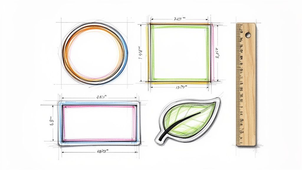
story The Complete Sticker Sizing Chart for Perfect Designs
Struggling to nail down the right dimensions for your next project? A sticker sizing chart is your best friend here. It’s designed to match common uses—think water bottles, laptops, or product packaging—with their perfect sizes, giving you measurements in both inches and centimeters. They often use real-world objects for scale, which makes it incredibly easy to visualize the final result before you even print. Your Quick Reference Sticker Sizing Chart Picking a sticker size can sometimes feel like a shot in the dark, but a good chart takes all the guesswork out of the equation. Think of it as a visual cheat sheet that turns abstract numbers into something you can actually picture. Instead of wondering if a 3" x 3" sticker is too big for your candle jars, a chart might tell you it’s about the size of a Post-it note. Just like that, you know exactly what you're getting. Leaning on standard, industry-common dimensions is also a smart move. It simplifies your entire design and printing workflow and ensures your files will be compatible with most suppliers. To get a feel for what’s out there, it's always a good idea to explore a variety of sticker options to see what fits your project best. Common Sizes and Their Uses When it comes to product labeling, a few standard sizes have really taken over. In fact, 2-inch and 4-inch circles make up a whopping 60% of all stickers used for this purpose. A 2-inch circle is about the size of an Oreo, making it a go-to for sealing boxes or branding small items. On the other end, tiny 1" x 1" stickers, roughly the size of a quarter, are perfect for price tags or subtle branding and account for 25% of orders. These well-established standards bring a level of consistency that helps everyone, from designers to consumers. This chart gives you a quick visual rundown, comparing common product and label sizes against things you see every day. As you can see, relating sticker dimensions back to familiar objects like coins and cookies just makes the whole process of choosing the right size that much easier. To make things even simpler, we've put together a quick-lookup table matching popular applications with the sticker sizes we recommend. Common Applications and Recommended Sticker Sizes Application (e.g., Laptop, Water Bottle) Recommended Size (Inches & CM) Popular Shapes Real-World Size Comparison Laptops & Tech 3" x 3" (7.6 x 7.6 cm) or 4" x 4" (10.2 x 10.2 cm) Circle, Square, Die-Cut Coaster or a baseball Water Bottles & Tumblers 2.5" x 4" (6.4 x 10.2 cm) or 3" x 5" (7.6 x 12.7 cm) Rectangle, Oval, Die-Cut A deck of playing cards Product Packaging (Boxes, Bags) 2" x 2" (5.1 x 5.1 cm) or 3" x 2" (7.6 x 5.1 cm) Circle, Square, Rectangle An Oreo cookie or a standard business card Car Bumpers & Windows 10" x 3" (25.4 x 7.6 cm) or 5" x 5" (12.7 x 12.7 cm) Rectangle (Bumper), Die-Cut A standard envelope (#10) Phone Cases & Small Items 1" x 2" (2.5 x 5.1 cm) or 1.5" x 1.5" (3.8 x 3.8 cm) Die-Cut, Circle, Rectangle A large postage stamp Hard Hats & Helmets 2" x 2" (5.1 x 5.1 cm) Circle, Die-Cut A golf ball Mailing Envelopes & Flyers 1.5" Circle (3.8 cm) or 2.5" x 1" (6.4 x 2.5 cm) Circle, Rectangle A bottle cap Hopefully, this table gives you a solid starting point and a bit more confidence when deciding on the perfect dimensions for your stickers. Navigating Standard Sticker Dimensions Picking the right sticker size from the get-go simplifies your printing process and makes sure your final design looks sharp and professional. When you stick with industry-standard dimensions, you often end up saving both time and money. These common sizes are already optimized for cost-effective printing, whether on sheets or rolls, making them a smart choice for most projects. For instance, a tiny 1-inch (2.5 cm) circle is perfect for a minimalist logo on small product packaging, like a lip balm tube or the lid of a small jar. It’s subtle but gets the job done. On the other hand, a larger 3-inch (7.6 cm) circle makes a much bigger splash and works great for more visible branding on things like laptops or takeout containers where you want the design to be noticed immediately. This same logic applies no matter the shape. Getting familiar with the typical use for each size is really the key to making a decision you'll be happy with. Common Round and Square Sizes Round and square stickers are the workhorses of the sticker world—incredibly versatile and always popular. Their symmetrical shape is a natural fit for logos, QR codes, and social media icons. 1-Inch to 2-Inch Circles: These are your go-to for small-scale applications. Think of them as seals for envelopes, little price tags, or a touch of branding on the back of a product. A 2-inch circle , for reference, is about the size of an Oreo cookie. 3-Inch Circles: This size has more visual weight, making it a favorite for promotional giveaways, laptop decals, and branding on medium-sized packaging. 2x2 Inch & 3x3 Inch Squares: Just like their round cousins, 2x2 inch squares are fantastic for QR codes or compact logos. The bigger 3x3 inch size gives you more room to play with detailed artwork or bolder branding, and it's roughly the same size as a standard drink coaster. Knowing these common dimensions helps you zero in on a size that is both visually appealing and perfectly functional for whatever you have in mind. Standard Rectangle and Oval Dimensions When your design needs a bit more text or has a horizontal layout, rectangles and ovals are the perfect solution. They give you that extra real estate without looking bulky or oversized. A standard 2x3.5 inch rectangular sticker is the exact same size as a business card, which makes it a natural choice for adding contact info or detailed product instructions. For bigger jobs, like shipping labels or prominent branding on boxes, a 4x6 inch rectangle can handle more complex designs and plenty of text. Oval stickers are especially handy for curved surfaces like bottles and jars, since their shape flows with the container's form. Browsing different online labels can give you a much better feel for what will fit your specific product. Pro Tip: Always think about the viewing distance when you're choosing a size. A bumper sticker needs big, readable text that can be seen from far away, while a small product label will be viewed up close, which allows for much finer details. How to Choose the Right Size for Your Project Picking the right sticker size is about more than just what looks good on your screen. It's a strategic decision that dictates how well your sticker actually works in the real world. A size that seems perfect in your design software can completely fail once it's stuck to its final surface. The trick is to think about function first. Your number one consideration has to be the application surface. Is it going on something flat like a laptop, or does it need to wrap around something curved like a water bottle? A big, rigid rectangular sticker will probably peel or bubble on a curved surface, but a smaller, more flexible oval or die-cut shape will hug it perfectly. The material matters, too. For bigger jobs like vehicle graphics, you'll want to look into heavy-duty options like https://www.4over4.com/printing/category/adhesive-vinyls , which are built to last and stand up to the weather. Another huge factor is how far away people will be when they see it. A sticker on a tiny cosmetic jar is going to be viewed up close, so you can get away with finer details and smaller fonts. Factor in Viewing Distance and Design Complexity On the flip side, a bumper sticker or a logo on a delivery van needs to be readable from several feet away. For those situations, simplicity and scale are your best friends. Go with bold, high-contrast designs and keep the text to a minimum to make sure your message is crystal clear and instantly recognizable from a distance. The complexity of your artwork also sets the minimum size you can get away with. An intricate illustration or a design loaded with text needs more room to breathe to avoid looking like a cluttered mess. A simple logo or a single icon, however, can still pack a punch even when it's tiny. Before you pull the trigger on a full print run, always ask yourself if your design's most important elements will get lost if you shrink it down too much. For example, a 2” x 2” sticker might be perfect for a QR code, but it would render a detailed paragraph of instructions completely unreadable. You also have to think about the sticker's job. If you're using them as trade show giveaway ideas , a tiny sticker might get lost in a goodie bag, while a larger, well-designed one becomes a piece of swag people actually want to keep. To make sure you nail it every time, just follow these quick steps: Measure the Surface: Grab a ruler and figure out the absolute maximum and minimum space you have to work with on the final product. Print a Test: Print your design on regular paper at the actual size you're considering and physically place it on the surface. Check for Legibility: Step back to the distance someone would normally see it from. Are the text and graphics still sharp and impactful? This simple reality check takes all the guesswork out of the equation, guaranteeing the size you choose is a perfect match for its purpose. Setting Up Your Print Files for Flawless Stickers A killer sticker design is only half the battle. The real magic happens when you properly prep that design for print, and this is where a lot of projects go sideways. But with a little technical know-how, you can make sure your stickers look just as amazing in your hand as they do on your screen. Think of it like learning the language your printer speaks. Terms like bleed , safe area , and resolution aren't just jargon; they're the rules of the road for professional printing. Get them right, and you're golden. Get them wrong, and you could end up with blurry images, chopped-off text, or weird white borders. Let’s walk through the essentials so your files are print-ready right from the get-go. Understanding Bleed and Safe Area Picture a machine cutting out hundreds of stickers at lightning speed. It's incredibly precise, but even the best machines can have tiny, microscopic shifts. That's where bleed and safe area come in—they're your design's safety net. Bleed Area: This is a little bit of extra artwork that extends beyond the sticker's final cut line. The standard is 0.125 inches (or 1/8") on all sides. If the cutting blade shifts just a hair, it slices through this extra color instead of leaving an ugly white sliver along the edge. Trim Line: This is the line where the sticker will actually be cut. It represents the final, finished dimensions of your product. For stickers with unique shapes, it's worth learning about how to create perfect cut lines for custom die-cutting services . Safe Area: This is an inner margin—also typically 0.125 inches (1/8") —inside the trim line. You absolutely have to keep all your important stuff, like text and logos, inside this zone to make sure nothing gets accidentally trimmed off. Essentially, the bleed is your buffer on the outside, and the safe area is your protected zone on the inside. They work together to guarantee a perfectly finished sticker every time. Resolution and File Formats The sharpness of your printed sticker all comes down to its resolution, which we measure in DPI (dots per inch) . For professional print quality, 300 DPI is the non-negotiable industry standard. A file with a lower resolution, like the 72 DPI often used for web images, will look fuzzy and pixelated when printed. Always, always start your design document at 300 DPI. The file format you send to your printer is just as important. Vector formats are king here because you can scale them up or down to any size imaginable without losing a shred of quality. Print File Technical Requirements Checklist Before you hit "export," run through this checklist. Getting these settings right from the start is the key to a professional-looking final product and saves a ton of headaches down the line. Specification Recommended Setting Why It Matters Resolution 300 DPI Ensures sharp, clear, and professional-quality printing without any pixelation. Color Mode CMYK Matches the four-color process used by commercial printers for accurate color reproduction. Bleed 0.125" (1/8") Prevents white edges by extending the design beyond the final cut line. File Formats PDF, AI, EPS Vector formats are scalable and preserve text and line art quality perfectly. Nailing these four specs—resolution, color mode, bleed, and file format—is the foundation of any great print file. It tells the printer exactly how you want your design to look, leaving no room for error. When you're ready to break free from the usual squares and circles, custom-shaped stickers are where the real fun begins. Your design literally becomes the shape of the sticker, creating something memorable that people will actually want to use. The two main ways to achieve this are with die-cut and kiss-cut stickers. It's super important to know the difference so you can pick the right one for your project. A die-cut sticker is cut straight through both the sticker vinyl and the paper backing, matching your design's exact outline. This gives it a sharp, high-end look from the get-go. On the other hand, a kiss-cut sticker is only cut through the vinyl layer itself. The paper backing stays intact, usually as a square or rectangle. This makes peeling intricate designs a whole lot easier and gives you some extra real estate on the backing for branding or instructions. Setting Up Your Custom Dieline To get a custom shape, you'll need to give your printer a dieline . Think of it as a vector path in your design file that shows the cutting machine precisely where to make the slice. If you're using a program like Adobe Illustrator, setting one up is pretty straightforward. Finalize Your Artwork: Once your design is perfect, lock that layer. You don't want it shifting around by accident. Create a New Layer: Make a new layer on top of your artwork. Name it something obvious like "Dieline" or "Cut Line." Outline Your Shape: Using the Pen Tool or other shape tools, trace a clean path exactly where you want the sticker to be cut. Set the Stroke: Give this new path a unique spot color (bright magenta is a common choice) and set it to a 0.25 pt stroke . This is a signal to the printer's software that this line is a cutting instruction, not something to be printed. A quick pro-tip: try to avoid super sharp corners or skinny, delicate parts that could easily tear. Smoother, simpler outlines tend to produce a tougher, more durable sticker. And while the dieline is critical, don't forget that solid design principles for print-on-demand are the foundation for any artwork that looks amazing in print. Need some inspiration? Check out our custom shape diecut collection to see just how impactful a unique shape can be. Getting Your Sizing Chart Sticker Design Just Right When your sticker is the sizing chart, its design has one job: be crystal clear. If it’s confusing or tough to read, it’s not just a bad sticker—it’s a one-way ticket to customer frustration, wrong orders, and costly returns. The goal here is to turn a simple label into a genuinely helpful tool that builds trust. Thoughtful design is what makes a sizing chart sticker work. It all starts with choosing a clean, legible typeface. You can't go wrong with classic sans-serif fonts like Helvetica, Arial, or Open Sans. Their simple, clean lines stay crisp even at tiny sizes, which is crucial for preventing numbers like ‘ 8 ’ and ‘ 6 ’ from turning into indistinguishable blobs. Structure for Maximum Clarity How you organize the information is just as critical as the font you pick. A logical structure makes the chart feel intuitive, letting customers find what they need in seconds without having to decipher it. Here are the non-negotiables for a user-friendly chart: Logical Data Flow: Always arrange sizes in a sequence, like smallest to largest. That predictable order lets a user’s eye scan right to their potential fit. Dual Units: This is a simple one but so important. Include both imperial ( inches ) and metric ( centimeters ). Instantly, your chart is useful to a global audience. Visual Cues: Don't just say "bust." Show it. Use simple icons or line drawings to point out exactly where someone should measure. This removes all the guesswork and helps your customers get it right the first time. There's a long history of bad sizing info, and it has a real business impact. The first attempt at a national sizing system back in 1939 was a mess from the start and was eventually dropped, leading to the inconsistent "vanity sizing" we see today. This chaos is a big reason why 25-30% of clothes bought online get returned . A clear, reliable sizing chart sticker is your first line of defense against that. Learn more about the evolution of clothing sizing and its impact on e-commerce. Design Do's and Don'ts Do: Use high-contrast colors. Think black text on a white or light-colored background. Readability is king. Don't: Get fancy. Avoid cluttering the design with decorative fonts or graphics that don’t add value. For a tool like this, clean and functional always wins. By sticking to these fundamental design principles, you'll create a sizing chart sticker that not only looks professional but also acts as an indispensable guide for your customers. It's a small detail that makes a huge difference in their buying experience and confidence. Frequently Asked Questions About Sticker Sizing When you're getting down to the nitty-gritty of sticker printing, a few technical questions almost always pop up. We get it. Getting these details right is the key to a professional-looking sticker, so we've put together clear, straightforward answers to the most common queries we see. This section covers the essential specs that guarantee your sticker looks just as sharp in your hand as it does on your screen. What Is the Best Resolution for Printing Stickers? For the best possible print quality, your design file needs to be set to 300 DPI (dots per inch) . This is the industry standard for a reason—it ensures your images and text come out crisp and clear, with zero blurriness or pixelation. If you submit a file with a lower resolution, like the 72 DPI standard for web images, you'll end up with a fuzzy, low-quality sticker. It’s a small detail that makes a huge difference. How Much Bleed Should I Add to My Sticker Design? You'll want to add a standard bleed of 1/8 inch (or 0.125 inches) to all sides of your artwork. Pretty much every printer will ask for this. The bleed is just a little extra bit of your design that extends past the final trim line. Think of it as a safety net. It gives the cutting machine a tiny margin for error, guaranteeing your design goes all the way to the edge without any weird white borders showing up. A properly set up bleed is your design's best friend. It compensates for tiny mechanical shifts during the cutting process—that's the secret to getting that flawless, edge-to-edge color you see on professionally printed stickers. Can I Make a Sticker from a Photo on My Phone? Yes, you definitely can, but there's one critical step: check the photo's resolution first. Most modern smartphone cameras take high-resolution pictures that work perfectly for small to medium-sized stickers. Before you go to print, always check the file's properties to make sure it meets the 300 DPI requirement at the size you want your sticker to be. If the photo’s resolution is too low for your chosen dimensions, the final print will look blurry and pixelated. Ready to bring your perfectly sized designs to life? At 4OVER4 , we offer a huge range of high-quality, custom sticker printing options to fit any project. Start your order today!
 story
story what is die cutting in printing - Techniques & Tips
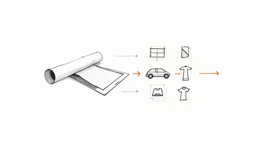
Ever wonder how printed materials get those unique, non-rectangular shapes? Think of it like using a cookie cutter on dough, but for paper and cardstock. That’s the basic idea behind die cutting. It's a finishing process that uses a sharp, custom-shaped tool—called a die —to cut materials into specific designs after they've been printed. The Foundation of Custom Printing At its heart, die cutting is the secret sauce that lets businesses move beyond the standard square or rectangle. Instead of a plain business card, you can hand out one shaped like your company’s logo. Instead of a generic box, you can create custom packaging that perfectly fits your product. It’s the technique that turns an ordinary sheet of paper into something memorable. Why It Matters for Branding This isn't just about looking fancy; it's a smart branding move. A custom shape instantly grabs attention, making your marketing materials pop in a stack of mail or on a crowded shelf. That unique look and feel give off a premium vibe, boosting how people perceive both your products and your brand. Here’s why it works so well: Enhanced Brand Recognition: A one-of-a-kind shape becomes a signature part of your brand. Increased Customer Engagement: An interesting shape is interactive. People want to touch it, look at it, and remember it. Perceived Higher Value: Customization shows you care about the details, which signals quality to your customers. The goal is to create a physical experience that a digital ad simply cannot replicate. A uniquely shaped mailer or product tag provides a tactile connection that helps cement a brand in a customer's mind. Die cutting really took off in the early 20th century with the rise of mass production and the need for more sophisticated packaging. The process allows for incredibly precise cuts, but it can also be used for creases (for folding) and even embossed effects. This versatility is what makes it so valuable for producing distinctive designs efficiently. To get a better sense of what's possible, take a look at a custom shape die-cut collection to see how other businesses are using it to stand out. Once you understand what die cutting is, you'll start seeing a whole new world of creative opportunities for your own projects. To help you remember the essentials, here’s a quick rundown of the core concepts. Die Cutting at a Glance: Key Concepts This table breaks down the main ideas we've covered so you can quickly reference them. Concept Brief Explanation Common Example Die A custom-made, sharp metal tool used to cut a specific shape into material. A steel die shaped like a star to cut out star-shaped stickers. Die Cutting The process of using a die to cut shapes from paper, cardstock, or other materials. Creating rounded corners on business cards or custom-shaped packaging. Finishing Process A step that happens after printing to complete the final product. A printed sheet of invitations is die cut into a unique arch shape. Custom Shape Any shape that isn't a standard rectangle or square, created by a die. A product tag shaped like a coffee cup for a local café. Wrapping your head around these terms is the first step. From here, you can start imagining all the ways die cutting can bring a unique, tangible flair to your brand's printed materials. The Tools Behind the Perfect Cut To bring a custom shape from a digital design into the real world, you need some serious hardware. In the printing industry, the two workhorses for this job are flatbed and rotary die cutters. Knowing the difference between them is key to understanding how your project gets made. Think of a flatbed cutter as a giant, powerful cookie cutter press. A sheet of printed material is laid flat, and the custom die presses down on it, stamping out the shape with incredible force. This method is perfect for detailed, intricate designs, thicker materials, and smaller production runs where getting every detail just right is the top priority. A rotary die cutter , on the other hand, is more like a high-speed, industrial-strength rolling pin. The die is actually a cylinder, and the paper or other material feeds through it, cutting the shape as it rolls. It's a continuous, lightning-fast process, making it the go-to for high-volume jobs like labels, stickers, and mass-produced packaging where speed is everything. The Heart of the Process: The Die No matter which machine is used, the real magic happens in the die itself. A steel-rule die is a custom-built tool. It starts with a sturdy base, usually made of wood, where sharp steel blades are carefully bent and set into place to form the exact outline of your design. These are the blades that do all the work—cutting, creasing, or even perforating the material. The craftsmanship that goes into making the die is what separates an okay result from a great one. A well-made die ensures that every single piece is cut identically, which is crucial for maintaining consistency across a run of thousands of items. While there's an initial setup cost for creating the die, its durability makes it a smart investment for repeat orders. A precisely crafted die is the difference between a rough, amateurish final product and a sharp, premium-feeling piece. It ensures every edge is clean and every fold is exact, reflecting the quality of your brand. Material Versatility and Industry Growth One of the biggest advantages of die cutting is just how versatile it is. This process isn't just for paper and cardstock. You can shape a whole range of materials to fit your vision, including: Corrugated Cardboard: For sturdy custom boxes and retail displays. Adhesive Vinyl: To create custom stickers and decals. Plastics and Foils: For unique specialty packaging and promotional items. Fabric: For one-of-a-kind apparel tags or craft projects. This technology has even expanded beyond traditional printing, with specialized tools like electric fabric die cutters like the Accuquilt Go Big offering incredible precision for all sorts of materials. Driven by the boom in e-commerce and creative packaging, the market for this technology is growing fast. The automatic die-cutting machine market was valued at $1.8 billion in 2024 and is expected to hit $3.1 billion by 2034. This ability to cut so many different materials opens up a world of creative possibilities far beyond simple shapes, including practical finishes like custom hole drilling for tags and binders . From Digital File to Finished Product Ever wonder how a design on your screen becomes a physical, custom-shaped object? It's a journey that moves from a digital concept to a tangible product through a super precise, multi-stage process. And it all starts not with the printer, but with a critical digital blueprint known as a dieline . Think of a dieline as the architectural plan for your printed piece. It’s a vector file that shows exactly where the machine needs to cut, crease, or perforate the material. This blueprint is the guide for the entire production run, ensuring every detail—from intricate cuts to simple folds—is perfectly placed. The Dieline: The Digital Blueprint Creating the dieline is the foundational first step. This digital template maps out every single cut and fold needed to bring the final shape to life. We typically build these in design software like Adobe Illustrator, using different line styles to tell the machinery what to do. Cut Lines: These are solid lines that indicate exactly where the die will slice right through the material. Crease/Fold Lines: Dashed or dotted lines mark where the material should be folded, like on a custom box or presentation folder. Perforation Lines: These show where to create a series of tiny cuts for tear-off sections, like you'd find on a ticket stub. Once the dieline is finalized and approved, it’s sent off to manufacture the custom steel-rule die. This is the physical tool, crafted to perfectly match the digital blueprint. The vector lines become sharp steel blades, ready for action. This step is where the digital design truly begins its transition into a physical tool. From Printing to Precision Cutting With the custom die ready to go, the next stage is printing. We run large sheets of the chosen material—whether it's cardstock, vinyl, or corrugated board—through the press with the artwork. It’s absolutely crucial that the printing aligns perfectly with the dieline to ensure the cuts land exactly where they need to. To boost durability and appearance, finishes are often applied at this stage. You can learn more about how different coatings can protect your print job by exploring options for laminating printed materials . After printing and finishing, the sheets are moved to the die cutting machine. Here, the custom die is pressed onto each sheet with immense pressure, stamping out the desired shape with incredible precision. This is the moment the magic happens, as the flat, printed sheet is instantly transformed into a custom-cut piece. The final stage is what we call 'stripping.' This is the process of removing all the excess waste material from around the cut shapes, leaving behind only the finished, perfectly formed products ready for folding, assembly, or shipping. This meticulous workflow ensures that what starts as a simple digital file ends up as a high-quality, uniquely shaped product that can capture attention and represent your brand with style. Why Die Cutting Is a Smart Business Move Die cutting is more than just a fancy finishing touch; it’s a strategic business decision that pays off in real, measurable ways. Let’s be honest, the world is flooded with standard, rectangular marketing materials. A custom shape is one of the most powerful ways to get noticed. It’s what makes your product literally jump off the shelf and your business card the one that doesn’t get tossed. Breaking out of the boring box immediately tells your customers you care about creativity and pay attention to the little things. This unique presentation automatically boosts the perceived value of whatever you're selling. When people see that you’ve invested in cool, custom-shaped packaging or brochures, they connect that same level of quality to your brand as a whole. Die cutting transforms a disposable piece of marketing into a memorable physical experience. It’s the difference between being glanced at and being truly seen, creating a tactile connection that digital efforts can't replicate. This technique is also incredibly practical. Think about custom presentation folders with uniquely cut pockets, hang tags that perfectly mirror a product's silhouette, or intricate box tabs that deliver that oh-so-satisfying unboxing experience. These details don't just look professional—they genuinely improve how customers interact with your brand. Boosting Brand Recognition and Engagement The biggest win with die cutting is its power to build instant brand recognition . A unique shape can become just as iconic as a logo, creating a visual shorthand that helps customers spot your products in a split second. That’s a massive leg up in today's crowded retail spaces. This infographic breaks down how a digital concept is transformed into a finished, custom-shaped product. Every step in the process, from creating the initial dieline to making the final cut, is carefully planned to guarantee a perfect result, time after time. What you get is a consistently high-quality product that not only grabs attention but also shows that your brand is committed to excellence. So, what is die cutting in printing at the end of the day? It's a marketing tool that makes your brand unforgettable. Inspiring Ways to Use Die Cutting Now that we’ve covered the mechanics, let’s get into the fun stuff—the creative side of die cutting. Moving beyond a simple rectangle is where an ordinary print job transforms into a memorable brand experience. The applications are everywhere, from your marketing materials to product packaging, and are really only limited by your imagination. Think about the first impression you want to make. Instead of a standard business card, what if you handed someone a card shaped like your company logo or your best-selling product? That small detail makes your business instantly memorable and ensures your card gets a second look instead of getting lost in a stack. The same idea works for brochures, flyers, and mailers. A custom silhouette can grab someone's attention long before they’ve even read a single word. Elevating Product Packaging and Presentation Custom packaging is easily one of the most powerful ways to use die cutting. A uniquely shaped box, a sleeve with a delicate cutout, or a window offering a sneak peek of the product—it all comes together to create an unforgettable unboxing experience. This is a huge deal in e-commerce, where that package is the very first physical interaction a customer has with your brand. In fact, die cutting is the backbone of die-cut cartons, which are just custom-shaped boxes used in practically every industry you can think of. The global market for these cartons was valued at around USD 39.96 billion in 2024 and is expected to climb to USD 58.01 billion by 2032. That growth really underscores how much brands are relying on unique packaging in sectors from food and beverage to consumer electronics. You can dig into more insights about this expanding market on fortunebusinessinsights.com . This technique also shines when creating marketing tools that are as practical as they are stylish. Custom Presentation Folders: Imagine folders with die-cut pockets designed to perfectly hold your business cards and brochures. It’s a small touch that makes your whole package feel organized and professional. Uniquely Shaped Invitations: An invitation for a special event can be cut into a shape that reflects the theme, building excitement from the moment it lands in someone's hands. Perfectly Formed Labels and Stickers: Think about product labels that trace the exact contour of your container or stickers cut into intricate, eye-catching designs that boost your branding. Die cutting isn't just about looking good; it's about building a cohesive brand story. When the shape of your marketing material reinforces your message, it creates a much stronger and more memorable impact on your audience. Making Marketing Collateral Unforgettable Beyond packaging, die cutting brings that "wow" factor to your everyday marketing materials. A door hanger with a custom shape is way more likely to get noticed than a generic rectangle. It's the same for product tags. A tag cut into a shape that complements the item itself adds a touch of sophistication and shows you care about the details. If you want to see how this works in practice, explore our guide on creating unique hang tags for your products . Ultimately, knowing what die cutting can do means seeing its potential to turn a simple piece of paper into a powerful communication tool. By thinking outside the box—literally—you can create materials that don't just inform, but also delight and engage your customers. How to Prepare Your Design for Die Cutting A great die-cut project is decided long before the press ever starts running—it all begins with a solid design file. Taking a few extra moments during the design phase is the real secret to avoiding common headaches like tearing or cuts that don't quite line up. It's what makes the difference between "good enough" and something that looks truly professional. First off, think about durability. While those super intricate, delicate designs might look incredible on screen, they can be a nightmare in real life. Thin little bridges of paper and sharp, narrow points are just asking to tear, either during the cutting process itself or with just a bit of handling. Always design with stability in mind by beefing up any weak spots and avoiding overly complex cuts that push the material to its limits. Setting Up Your Dielines Correctly Your dieline is literally the blueprint for the cutting machine, so there’s absolutely no room for error here. To guarantee a clean, crisp result, you have to include both a bleed margin and a safety margin in your artwork file. Bleed Margin: Make sure you extend your background colors or images at least 1/8th of an inch beyond the final cut line. This simple step prevents any ugly white slivers from showing up if there's a tiny shift during cutting. Safety Margin: On the flip side, keep all your critical elements—like text, logos, or key parts of an image—at least 1/8th of an inch inside the cut line. This ensures nothing important gets accidentally chopped off. Think of your dieline as a fence. The bleed is the buffer zone outside the fence, and the safety margin is the safe area inside . Keeping your prized possessions inside that fence is the only way to ensure a perfect finish. Finally, don't forget to talk to your printer. It's a simple step, but it's crucial. The thickness of the material you choose has a big impact on how well sharp corners and fine details will come out. This is especially true for projects where you're aiming to create a stunning unboxing experience. Clear communication can make all the difference. To see how these principles play out in the real world, check out our options for custom box printing . It’s a perfect example of how great design prep translates into a flawless final product. Frequently Asked Questions About Die Cutting Even after you get the hang of the basics, a few questions always pop up when it's time to apply die cutting to a real-world print project. Let's clear up some of the most common ones so you can feel confident you're making the right call. Die Cutting vs. Laser Cutting: What's the Difference? Think of it this way: die cutting is like using a metal cookie cutter, while laser cutting is like using an incredibly precise beam of light. Both create custom shapes, but they get there in completely different ways, each with its own strengths. Die cutting is a physical process. It uses a custom-made steel die to press shapes out of a material like paper or cardstock. Once that die is created, it can stamp out thousands of identical pieces incredibly quickly. This makes it the champion for high-volume jobs where you need speed, consistency, and a great price per piece. Laser cutting , on the other hand, is entirely digital. It uses a high-powered laser to burn or vaporize the material along a path programmed into a computer. This method is perfect for ridiculously intricate or delicate designs, and it’s a go-to for one-off prototypes since you don't need to create a physical die. The trade-off? It’s much slower and generally more expensive for larger runs. The bottom line is simple: Die cutting is built for speed and scale, making it the workhorse for most commercial print jobs. Laser cutting offers unmatched detail for custom, low-volume projects. How Does Die Cutting Affect the Cost? The main cost driver in a die-cutting project is the creation of the custom die itself. This is a one-time setup fee to manufacture the physical tool that will cut your unique shape. Because of this initial investment, a small batch of 50 custom-shaped flyers will have a much higher per-unit cost than an order of 5,000 . Once the die is made, though, the actual cutting process is super efficient, and the price per piece plummets as your order quantity goes up. So while die-cut projects are more expensive than standard rectangular printing, the cost becomes far more reasonable at higher volumes. Are There Minimum Order Quantities? Yes, almost every printer will have a minimum order quantity (MOQ) for custom die-cut jobs. This is tied directly to the setup costs we just talked about. The time, materials, and labor involved in making a custom die and getting the machinery calibrated just doesn't make sense for only a handful of items. The MOQ exists to make sure the production run is cost-effective for both you and the printer. By spreading that initial setup fee across a larger number of pieces, you get a much better value, and the per-item price becomes way more affordable. Ready to bring your unique vision to life? At 4OVER4 , we specialize in creating high-quality, custom-shaped print materials that make your brand stand out. Explore our wide range of die-cutting options and get an instant quote for your project today at https://4over4.com .
 story
story What Is Vinyl Printing and How Does It Work
So, what exactly is vinyl printing? At its core, it's a way to take a digital design and bring it to life on a durable sheet of vinyl. Think of it as creating a high-performance, custom-shaped sticker that you can apply to almost anything, from a storefront window to the side of a company van. It’s a remarkably versatile and tough solution for creating graphics that are bold, professional, and built to last. Understanding the Power of Vinyl Printing The real magic of vinyl printing is how it turns digital artwork into tangible, physical graphics. Unlike printing on regular paper, vinyl is a resilient plastic polymer, which gives the final product some serious staying power and flexibility. This is what makes it the perfect choice for so many applications where longevity is non-negotiable. This technology really bridges the gap between a design on a screen and branding in the real world. When you see a vibrant, full-color graphic on a delivery truck or a sleek logo decal on a coffee shop window, you're almost certainly looking at the handiwork of vinyl printing. Its ability to stick to all kinds of surfaces—both flat and curved—makes it a go-to for modern advertising and personalization. Why It Matters for Businesses The impact vinyl printing has on branding and marketing is huge. The global market for printed vinyl was valued at USD 28.4 billion and is expected to climb to USD 45.7 billion by 2034. That growth speaks volumes about its crucial role in advertising, vehicle wraps, and decor. Vinyl printing empowers businesses to turn almost any surface into a branding opportunity. From fleet vehicles to office walls, it offers a cost-effective and high-impact way to boost visibility and create a memorable customer experience. A Quick Look at the Essentials Before we dive deeper, it helps to get familiar with the core components. A quick browse through a professional vinyl collection shows just how much variety is out there for different business needs. To give you a quick primer, we've put together a table that breaks down the fundamentals of vinyl printing. Vinyl Printing at a Glance Aspect Description Common Materials Includes adhesive vinyl for hard surfaces and heat transfer vinyl (HTV) for fabrics. Printing Methods Techniques like digital/inkjet , UV , and screen printing bring designs to life. Primary Uses Applications range from business signage and vehicle wraps to custom apparel . This little cheat sheet covers the key areas we'll be exploring in this guide, giving you a solid foundation to build on. Choosing the Right Vinyl for Your Project Not all vinyl is created equal. Picking the right type is probably the single most important decision you'll make to ensure your project looks professional and actually lasts. Think of it like choosing paint. You wouldn't use interior wall paint on the outside of your house and expect it to hold up, right? Vinyl works the same way. It comes in two main families, each designed for completely different surfaces and jobs. Getting a handle on these two categories—adhesive vinyl and heat transfer vinyl (HTV)—is the key to unlocking what you can really do with vinyl printing. One is perfect for hard surfaces, while the other is made specifically for fabric. Let's break down how to choose the right one every time. The Sticker Family: Adhesive Vinyl Adhesive vinyl is essentially the "peel-and-stick" hero of the printing world. This is the stuff used for everything from tiny product labels to the massive graphics you see covering an entire delivery van. It comes on a paper backing that, when peeled away, exposes a sticky side ready for glass, metal, plastic, or even a painted wall. Within this category, there are two important sub-types you'll run into: Cast Vinyl: This is the premium stuff. It’s made through a liquid "casting" process that results in a super flexible and durable film. Its ability to conform to complex curves without shrinking or peeling makes it the gold standard for full vehicle wraps and graphics on tricky, uneven surfaces. It's built for the long haul outdoors, often lasting 5-7 years or more. Calendered Vinyl: Created by rolling and stretching heated PVC, this vinyl is a bit thicker and less bendy than cast. But for flat surfaces? It's a fantastic, budget-friendly choice. Think window decals, storefront signs, wall murals, and any job that doesn’t involve wrapping around tight corners. To get a better feel for the possibilities, check out the different types of adhesive vinyls available. It's great for sparking ideas, whether you're thinking about branding, decor, or a big promotion. The Fabric Solution: Heat Transfer Vinyl While adhesive vinyl sticks to hard goods, Heat Transfer Vinyl (HTV) is engineered just for textiles. As the name suggests, HTV uses a combination of heat and pressure to bond with fabric, essentially becoming part of the material itself. This is the magic behind custom t-shirts, branded tote bags, sports jerseys, and hats. Unlike a simple iron-on patch that just sits on top of the fabric, high-quality HTV actually embeds into the fibers. This creates a soft, flexible finish that stretches with the garment and can handle dozens of washes without cracking or fading. The application process requires a heat press (or sometimes a household iron for smaller DIY projects) to activate the heat-sensitive adhesive on the back of the vinyl. This thermal bonding is what makes the final design so incredibly durable. It’s a complete game-changer for anyone looking to produce custom apparel with crisp, vibrant, and long-lasting graphics. The choice is simple: if you’re working with fabric, you need HTV. For everything else, adhesive vinyl is your go-to. How Designs Are Transferred Onto Vinyl Ever wonder how a digital file transforms into a vibrant, durable graphic? The magic happens during the printing process, where specialized technology transfers your design onto the vinyl itself. Understanding the different methods is key to choosing the right approach for your project’s goals, from color complexity to required durability. Each printing technique has its own unique strengths. Let’s walk through the three most common methods used in the industry today, breaking down how they work and what they’re best for—without getting bogged down in technical jargon. Digital Inkjet Printing Think of this method as a super-advanced version of your desktop office printer, just on a much bigger scale. Digital inkjet printers spray microscopic droplets of ink directly onto a roll of vinyl, meticulously building the image layer by tiny layer. This process allows for stunning, photorealistic quality with millions of colors and smooth gradients. Because it prints directly from a digital file, it’s perfect for complex, one-of-a-kind designs. This makes inkjet the go-to choice for detailed vehicle wraps, intricate wall murals, and any project where crisp image quality is the top priority. It's also a versatile and cost-effective option for smaller orders. UV Printing UV printing takes a completely different approach. Instead of letting ink air-dry, this method uses high-intensity ultraviolet (UV) lights to cure —or instantly harden—the ink as it's applied to the vinyl. This rapid curing process prevents the ink from soaking into the material, leaving it sitting right on the surface as a solid, tough layer. The result is an incredibly durable finish that is highly resistant to fading, scratching, and harsh weather. Because the ink is instantly cured, UV prints are exceptionally durable right off the printer. This makes them ideal for long-term outdoor signage, permanent floor graphics, and any application that needs to withstand serious wear and tear. Screen Printing Screen printing is a classic, time-tested technique that really shines when producing bold, simple graphics in large quantities. The process involves pushing ink through a mesh screen stenciled with your design. Each color requires its own separate screen, which makes it less suitable for photorealistic images but perfect for designs with just one or two solid colors. This method is incredibly efficient for high-volume jobs. If you need hundreds or thousands of identical bumper stickers, simple logo decals, or event signs, screen printing often provides the most economical solution. It's an absolute powerhouse for bulk orders where consistency and vibrant, solid colors are key. Choosing the right printing method is much easier once you know which type of vinyl your project needs. This simple visual guide can help you decide. As the flowchart shows, the fundamental choice comes down to your surface: Heat Transfer Vinyl for fabrics and Adhesive Vinyl for hard surfaces. Knowing this helps steer you toward the right printing method. For businesses exploring options for windows or products, understanding the uses for decals printing is a great next step. Let's dive into a quick comparison to see how these methods stack up against each other. Comparison of Vinyl Printing Methods Each vinyl printing method has its place. Your choice really depends on the complexity of your design, how many you need, and where the final product will live. This table breaks down the core differences to help you decide. Printing Method Best For Durability Cost Profile Digital/Inkjet Printing Complex, full-color images, photos, and gradients. Ideal for small to medium runs like vehicle wraps or custom wall art. Good. Lamination is often added for outdoor use to boost resistance to UV rays and scratches. Low setup costs. Cost-effective for one-offs and small batches. The price per piece remains relatively constant. UV Printing Outdoor signage, floor graphics, and any application needing maximum resistance to fading, scratching, and weather. Excellent. The cured ink is highly durable and abrasion-resistant right away, no extra protection needed. Moderate setup costs. Can be more expensive per piece than inkjet for small runs but offers superior longevity. Screen Printing Simple, bold graphics with one or two solid colors. Perfect for high-volume orders like bumper stickers or event signs. Very Good. The thick ink layer is tough and long-lasting, especially for outdoor applications. High setup costs (screens must be created for each color). Extremely cost-effective for large bulk orders. Ultimately, the best method is the one that aligns with your specific needs. For a single, stunningly detailed wall mural, digital inkjet is the clear winner. But for 5,000 simple logo stickers, screen printing's efficiency can't be beaten. Understanding these trade-offs ensures your final product not only looks fantastic but performs exactly as you expect. Putting Vinyl to Work: Real-World Examples Knowing the different types of vinyl is one thing, but seeing them in action is where it all clicks. Businesses of every shape and size are using vinyl printing to turn ordinary objects and spaces into powerhouse branding tools. It’s about creating a seamless and memorable experience for your customers, from the moment they spot your storefront to the products they carry home. So, let's step away from the technical specs and into the real world. Here’s a look at how this incredibly versatile technology brings creative ideas to life every single day. Transforming Spaces with Business Signage Think of your physical location as a giant, blank canvas. Vinyl printing lets you use almost every inch of it—windows, walls, even floors—to broadcast your message, guide your customers, and set the right vibe. It’s one of the most cost-effective ways to make a massive impression. Here are just a few ways businesses put vinyl to work for signage: Dynamic Window Graphics: Using calendered adhesive vinyl, you can turn your storefront glass into prime advertising real estate. Announce a sale, showcase a new product, or just display your hours with anything from simple cut-lettering to vibrant, full-color images. Immersive Wall Murals: Why settle for a boring painted wall? Large-format digital printing can transform an entire office or retail space into a stunning mural that tells your brand’s story or creates an unforgettable atmosphere. Directional Floor Decals: Perfect for retail, events, or warehouses, UV-printed and scuff-resistant vinyl decals can guide foot traffic, promote social distancing, or lead visitors exactly where you want them to go. These touches don't just look professional; they build an engaging journey for anyone who walks through your door. For big promotions, it's also worth checking out how to create eye-catching printing vinyl banners that truly command attention. Taking Your Brand on the Road Why keep your advertising stuck in one place? Vehicle wraps are the ultimate mobile billboard, turning your company cars, vans, or trucks into brand-awareness machines that work for you 24/7 . This is easily one of the most powerful ways a local business can leverage vinyl printing. A full wrap, printed on high-performance cast vinyl, stretches and conforms to every curve of a vehicle, delivering a finish that looks just like a custom paint job. It even protects the original paint underneath while advertising your business everywhere you go. This application is a huge part of the industry's growth. The automotive world is a big reason why printed vinyl is expanding at an impressive 9.2% CAGR . Commercial fleets are constantly updating their vehicle graphics, which creates steady demand for durable, high-impact branding that can handle the elements. You can dig deeper into these trends in the full printed vinyl market analysis on emergenresearch.com. Polishing Your Products and Apparel Beyond the big, bold graphics, vinyl is a master of the finer details. Heat Transfer Vinyl (HTV) is the undisputed champion for custom apparel. It allows businesses to quickly produce branded uniforms, promotional t-shirts, and tote bags with designs that are both sharp and durable. In the same way, adhesive vinyl is perfect for creating professional product labels and packaging stickers. A well-designed vinyl label can instantly elevate how customers perceive your product, giving it a high-quality finish that resists moisture and wear. Your branding will look just as good in their home as it did on the shelf. Setting Up Your Design File for Perfect Prints A stunning vinyl print starts with a high-quality design file. You've probably heard the old saying "garbage in, garbage out," and it couldn't be more true for printing. What you send to the printer directly dictates the final quality, so taking a few extra minutes to prep your file correctly can save you from the headache of a costly reprint. The goal is to make sure your design looks just as crisp on a massive banner as it does on your screen. That all begins with one crucial choice: the right file type. This single decision has the biggest impact on the final print's sharpness and clarity. Vector Versus Raster: The Print Quality Showdown The most important distinction to get right is between vector and raster files. Think of a vector file (like an AI, EPS, or SVG) as a set of mathematical instructions. It’s like a recipe that tells the printer exactly how to draw lines, curves, and shapes. Because it’s based on math, you can scale it to any size—from a tiny sticker to a wrap for the side of a building—without losing a shred of quality. This makes vector the undisputed champion for logos, text, and solid graphics. A raster file (like a JPG, PNG, or TIFF), on the other hand, is a grid of tiny colored squares called pixels. This format is perfect for photographs, but there's a catch. When you try to stretch a raster image too far, it becomes blurry and "pixelated" as those little squares get bigger. If you absolutely must use a raster image, it needs to be high-resolution—saved at 300 DPI (dots per inch) at the exact size you intend to print it. Preparing your artwork correctly is the bridge between your creative vision and a professional, tangible product. A print-ready file eliminates guesswork and ensures the colors, fonts, and sharpness you designed are what you get back from the printer. Essential Pre-Print Checklist Beyond the file type, a few technical steps are non-negotiable if you want a perfect print. Running through this quick checklist will help you sidestep the most common printing mistakes. Convert Fonts to Outlines: Your computer has your specific fonts, but the printer's computer almost certainly doesn't. Converting your text to outlines (or "curves") essentially turns the letters into vector shapes. This locks them in place, guaranteeing they print exactly as you designed them, no weird font substitutions. Design in CMYK Color Mode: Your screen uses an RGB (Red, Green, Blue) color model, mixing light to create vibrant colors. Professional printers, however, use a CMYK (Cyan, Magenta, Yellow, Black) model with ink. If you design in RGB, you’re in for a surprise when your bright greens turn out muddy. Designing in CMYK from the get-go prevents these unexpected color shifts. Check Your Resolution: For any photos or raster elements in your design, double-check that they are at least 300 DPI . This high resolution is absolutely vital for creating sharp, clear images for products like custom vinyl labels printing . If you’re interested in diving deeper into getting images ready for reproduction, resources like a guide on how to photograph artwork for prints can offer some great additional tips. Got Questions About Vinyl Printing? We’ve Got Answers. As you start digging into what vinyl printing can do for your brand, some practical questions always pop up. Getting these sorted out early on helps you plan your projects with confidence and make sure you’re picking the right product for your goals and your budget. Let’s tackle some of the most common ones we hear. How Long Does Vinyl Printing Last? This is a big one, and the honest answer is: it depends. The lifespan of a vinyl print hinges on the material, the printing method used, and where it’s going to live. But we can give you some solid benchmarks. Indoor Graphics: When you’ve got vinyl indoors, away from harsh sunlight and weather, it can look great for a long time. Think wall graphics and indoor signs—these can easily last 5+ years . Outdoor Applications: For things like professionally installed vehicle wraps, you can expect a good 5-7 years of performance from high-quality materials. More temporary items, like a banner for a weekend event, will still hold up for a year or more before they start showing their age. Can I Apply a Vinyl Decal Myself? For smaller stuff, absolutely. If you’re working with laptop stickers, small window decals, or product labels, it’s a totally manageable DIY job. All you really need is a clean, dry surface and a little squeegee to smooth out any air bubbles along the way. But when you go big, it’s time to call in the pros. For projects like a full vehicle wrap or large-scale storefront graphics, we always recommend professional installation. The experts have the right tools and techniques to get a flawless, bubble-free finish. That perfect application is what really maximizes the vinyl's lifespan and makes it look incredible. Is Vinyl Printing an Expensive Option? Cost is always a key piece of the puzzle, and the price of vinyl printing can swing quite a bit. A small run of custom stickers can be incredibly affordable, especially when you order a larger quantity. On the flip side, a one-off project like a complete vehicle wrap is a more significant investment. Overall, vinyl is widely considered a cost-effective way to create durable, high-impact visuals. When you compare it to alternatives—like a custom paint job for a truck or hand-painted signage for a shop—vinyl printing almost always delivers a better return on your investment. You get professional, top-tier results at a much more accessible price point. Ready to bring your branding to life with high-quality, durable vinyl? 4OVER4 offers a massive selection of custom vinyl printing options, from vibrant banners to sleek vehicle decals, all with fast turnaround times. Start your next project with us today!
 story
story Unlocking Loyalty with Business Punch Cards
Business punch cards are one of the most classic, tried-and-true loyalty marketing tools out there. At their heart, they're simple: a tangible card that rewards your regulars for coming back time and again. Their secret sauce? A neat little psychological trick called the goal-gradient effect , which actually encourages customers to visit more often as they get closer to snagging that freebie or discount. Why Punch Cards Still Win in a Digital World In a world buzzing with app notifications and digital everything, you might think the humble punch card is a bit of a dinosaur. But honestly, its simplicity is its superpower. While digital loyalty programs are constantly fighting for screen time and easily get lost in the noise, a physical punch card has a special spot right in your customer's wallet. It's a constant, physical reminder of your business. That physical presence is a bigger deal than you might think. Every time you punch that card, it's a small moment of satisfying, real-world progress. It’s a gratifying little "win" that a digital alert just can't match. This simple interaction is a perfect antidote to the digital fatigue so many of us feel, offering a refreshingly straightforward way to connect with your brand. The Psychology of Progress The magic behind a successful punch card program is the goal-gradient effect . This is a well-known psychological principle that says our motivation to reach a goal skyrockets the closer we get to the finish line. When a customer sees their card with eight out of ten spots punched, a powerful urge kicks in to complete the set. A nearly full punch card isn't just a promise of a future discount; it represents the time and money a customer has already invested in your business. This "sunk cost" feeling makes walking away seem like a waste, which is a powerful nudge to make those last one or two visits. This effect feels so much stronger when you can physically hold the proof of your loyalty. It turns the whole thing into a personal journey your customer is on with your brand, one punch at a time. Simplicity and Cost-Effectiveness For small and local businesses, the benefits are crystal clear. You can skip the app development costs, monthly software fees, and complicated data systems. A stack of professionally printed punch cards is a low, one-time investment that can deliver a huge return on customer retention. The stats don't lie. Data from loyalty programs consistently shows a major impact on repeat purchases and how much customers spend. This just goes to show how directly these kinds of programs influence customer habits, driving more repeat business and encouraging them to spend a little more each time they stop by. Interestingly, the idea of using punched cards to run a business is nothing new. While today's cards are all about loyalty, their ancestors were used for complex data processing. Back in 1952 , businesses were already using sophisticated punch card systems to manage their operations, proving their practical value for decades. Whether it's for data or customer loyalty, the punch card has a long legacy of delivering tangible, effective results. Punch Cards vs Digital Apps A Quick Comparison So, when does a physical card make more sense than a digital app? It really comes down to your business, your customers, and what you're trying to achieve. Both have their place, but they shine in different areas. Feature Business Punch Cards Digital Loyalty Apps Customer Experience Tangible, satisfying, and simple. Creates a physical brand reminder. Convenient (no card to lose), personalized offers, and instant notifications. Cost Very low upfront cost (printing). No ongoing software fees. Higher initial investment for development and potential monthly subscription fees. Implementation Extremely easy. Just design, print, and hand them out. More complex, requiring setup, customer onboarding, and staff training. Data Collection Minimal. You can't track individual customer behavior in detail. Rich data insights. Tracks purchase history, frequency, and customer habits. Best For... Coffee shops, cafes, car washes, salons—businesses with frequent, small purchases. Businesses wanting to gather customer data for targeted marketing campaigns. At the end of the day, punch cards excel at simplicity, cost-effectiveness, and creating a real-world connection. Digital apps, on the other hand, offer powerful data capabilities and personalization. The right choice depends entirely on your business model and goals. The Real Business Impact of a Punch Card Program The psychology is cool, no doubt. But let's get down to brass tacks: what does a punch card program actually do for your bottom line? A smart program isn't just about giving away a freebie; it's a strategic move that fundamentally shifts customer behavior in your favor. The most immediate impact? A serious boost in customer retention . Think about it. We all know it can cost five times more to land a new customer than to keep an existing one happy. Business punch cards give your regulars a simple, tangible reason to walk past your competitor and straight back to your door. This isn't just wishful thinking, either. Loyalty programs have been shown to increase repeat visits by up to 30% . That’s how you turn a once-in-a-while visitor into a reliable regular who’s consistently adding to your revenue. Driving More Frequent Visits and Bigger Sales A punch card doesn't just get people to come back; it gets them to come back sooner and often spend a little more while they're there. That little rectangular promise of a reward creates a subtle sense of urgency. Suddenly, a customer who normally wouldn't think twice about it might pop in on a Tuesday for a coffee, just to get one punch closer to that free latte. This little nudge also has a way of bumping up the Average Transaction Value (ATV) . People are surprisingly motivated to add an extra item to their cart just to hit the mark for a punch. A simple prompt from your staff—something like, "You're only $5 away from your next punch today!"—can work wonders. Imagine a local bakery. A customer's habit is to grab a loaf of bread every Saturday. But now, with a punch card in their wallet, they start swinging by on Wednesdays for a pastry just to fill that card faster. Just like that, you've doubled their visit frequency and turned a weekend-only buyer into a loyal weekday regular. Punch cards shift the dynamic from purely transactional to something more relational. Every punch feels like a small win, a micro-commitment that strengthens their connection to your brand and makes them feel like a valued insider, not just another receipt. Turning Customers into Your Best Marketers When customers feel like you appreciate them, they do more than just open their wallets—they become your most powerful and authentic marketing team. A loyalty program is a constant, physical reminder that you value their business. That good feeling makes them far more likely to rave about you to friends, family, and coworkers. And that kind of word-of-mouth advertising? It's pure gold. A recommendation from a trusted friend will always carry more weight than the slickest ad campaign. By rewarding loyalty, you’re not just locking in a customer's next visit; you’re investing in a whole network of people who will bring new customers right to you. Here’s how a simple punch card can create brand advocates: It's Tangible Proof of Value: A filled-up punch card is like a little trophy, a physical piece of evidence of the great value they get from you. It's a Conversation Starter: When a friend sees the card, it’s a natural opening to talk about your business and the rewards you offer. It Builds an Emotional Connection: The simple act of getting a punch makes customers feel seen and appreciated, which builds a bond that fuels those glowing recommendations. For any small business, this is one of the most cost-effective marketing plays you can make. The investment is tiny—just the cost of printing the cards and the reward itself. In return, you get better retention, higher spending, and a team of unpaid brand ambassadors. That incredible ROI is exactly why the humble business punch card is still such a powerful tool for growth. Designing a Punch Card People Love to Use Think of your punch card as more than just a loyalty tracker. It’s a tiny billboard for your brand that lives in your customer’s wallet. The design is what makes the difference between a program that people are excited about and one that gets tossed in a drawer and forgotten. To make a card people actually love using, you have to strike the perfect balance between beautiful looks and dead-simple functionality. It all starts with brand consistency . Your punch cards need to feel like they're part of the family. Use the same colors, logo, and fonts that your customers already associate with your website, your storefront, and your social media feeds. When the design is cohesive, it reinforces who you are every single time they pull that card out. Crafting an Irresistible Reward Let’s be honest, the reward is the heart of the whole program. It has to be tempting enough to get people coming back for more, but not so generous that it eats into your profits. The goal is to find that sweet spot where the offer feels like a genuine score for your customer. Try to think beyond a simple percentage off. Tangible, specific rewards almost always have a bigger psychological punch. Free Premium Product: Instead of a generic "free coffee," how about a "Free Specialty Latte of Your Choice"? It just sounds more exclusive and valuable. Significant Upgrade: A salon offering a "Free Deep Conditioning Treatment with Your Next Haircut" is way more enticing than a vague "10% Off." Exclusive Merchandise: A cool branded tote bag or coffee mug doesn't just reward a customer; it turns them into a walking advertisement for your business. The reward should be something people genuinely want. That’s what transforms collecting punches from a chore into a fun little game. Prioritizing Clarity and Simplicity A confusing punch card is a useless punch card. Period. Your customers should be able to figure out the entire program in a single glance. Ditch the clutter, the fine print, and the complicated rules. The layout needs to scream two things: what do I need to do, and what do I get? Use a clean, intuitive design with a clear visual path. The most important stuff—the reward and the punch spots—should jump right off the card. This isn’t a new idea. Early data processing relied on things like the famous IBM punched card, where absolute clarity was everything. Those cards even came with the famous warning, "Do not fold, spindle or mutilate," because their physical shape was critical to the data they held. It’s a great lesson in durability that our modern business punch cards can still learn from. A great punch card design answers all the customer's questions before they even think to ask them. How many punches do I need? What do I get? Where do I redeem it? The answers should be obvious. Adding Personality with Creative Details While clarity is king, your design doesn't have to be boring. Little creative touches can make your card memorable and even fun. Instead of plain old circles for the punch spots, why not use icons that tell a story about your brand? For example: A coffee shop could use tiny coffee bean icons. A bookstore might feature little open-book symbols. A pet groomer could use cute paw prints. These unique details give the card some personality and make the whole experience feel a bit more special. And don't forget the punch itself! Using a custom-shaped hole punch instead of a standard circle not only looks cooler but also acts as a simple, clever security measure against fraud. When you blend solid branding, a killer reward, and a clear, creative design, you get a punch card customers are proud to carry and genuinely excited to complete. Choosing Materials That Reflect Your Brand Quality Before a customer even glances at the offer on your punch card, they feel it. That first touch sends an instant message about your brand's commitment to quality. A flimsy, cheap-feeling card suggests a disposable experience. On the other hand, a substantial, well-crafted card implies value, care, and a premium identity. Choosing the right materials for your business punch cards is a critical part of the design process. It's not just about making something that lasts; it's about creating a tactile experience that lines up with your brand's personality and makes customers happy to carry your card around. The weight, texture, and finish all team up to tell a story about who you are. This choice is a direct reflection of your business. A high-end boutique and a rustic coffee shop will probably go for very different materials, and that’s exactly how it should be. Let's break down the key options to help you make the perfect impression. Understanding Cardstock Weight and Durability The thickness of your card—known as its weight or "point" (pt)—is the foundation of its perceived quality. A higher point number means a thicker, more rigid card that can actually handle being shoved in a wallet or purse. Think of it this way: a thin, 10pt cardstock feels like a standard flyer, easy to bend and crease. It just doesn't feel permanent. A 14pt cardstock is a fantastic place to start and a popular industry standard for a reason. It has that familiar, sturdy feel of a quality business card—reliable, professional, and built to last. For most businesses, it strikes the perfect balance between durability and cost. But for brands that really want to signal luxury and premium quality, upgrading to a 16pt or even an 18pt cardstock is a game-changer. This thicker stock feels noticeably more substantial, almost like a high-end invitation. Handing a customer a card this thick immediately shows you invest in quality, right down to the smallest details. The weight of your punch card is its first handshake with the customer. A firm, sturdy card conveys confidence and quality, while a flimsy one can feel like an afterthought. Choose a weight that matches the quality of the experience you provide. The Power of the Perfect Finish Beyond the sheer thickness of the card, the finish is what makes your design pop. It affects everything from how your colors look to the card's overall texture. Each finish has its own personality, so it's important to pick one that complements your brand's vibe. To find the right fit for your brand, you need to consider the look and feel you're aiming for. The table below breaks down the most popular options to help you decide. How to Select Your Cardstock and Finish Option Description Best For Glossy Finish A high-shine coating that makes colors look incredibly vibrant and rich. Photo-heavy designs and modern, eye-catching brands that want their colors to "pop." Matte Finish A smooth, non-reflective surface for a more subtle, elegant, and sophisticated feel. Minimalist designs and brands aiming for an upscale, contemporary aesthetic. Uncoated Stock A natural, slightly textured paper feel without any coating. Rustic, eco-friendly, or artisanal brands. It’s also the easiest surface to write on. Each of these finishes sends a different signal. Glossy is bold and energetic. Matte is cool and understated. And Uncoated feels authentic and down-to-earth. Think about what you want your customers to feel when they hold your card. Elevating Your Card with Premium Options If you really want your business punch cards to stand out, a premium finish can add a memorable, tactile element that customers will absolutely notice. One of the most effective ways to do this is with Spot UV . This cool technique applies a glossy, slightly raised coating to specific parts of your design—like your logo or the punch icons—while the rest of the card stays matte. The contrast creates a dynamic visual and textural experience. As a customer runs their thumb over the card, they feel the different textures, making it far more engaging and memorable. It’s a small detail that takes the card from a simple marketing tool and turns it into a piece of premium print. These thoughtful touches reinforce a quality brand image and make the reward feel even more special when it's finally earned. How to Launch and Manage Your Loyalty Program A killer punch card design is just the starting point. The real magic happens when you launch it thoughtfully and manage it consistently. A great program shouldn't feel like a clunky add-on; it should weave itself seamlessly into your daily operations and feel like a natural part of the customer experience. And that process doesn’t start with your customer—it starts with your team. Your staff are the champions of your loyalty program. They're on the front lines, and their excitement (or lack of it) will make or break how many people sign up and stick with it. Getting them properly trained isn't just a good idea; it's the most critical step to success. Empower Your Team to Be Loyalty Ambassadors Before a single card gets handed out, your whole crew needs to understand the program inside and out. They should be able to explain the perks clearly and confidently during every single transaction. Give them the tools and the know-how to make it shine. Explain the "Why," Not Just the "How": Don’t just drill them on the rules. Explain how the program helps both the customer (free stuff!) and the business (more repeat visits!). When they get the bigger picture, they'll promote it with genuine energy. Develop a Simple Script: Whip up a short, friendly pitch for your team to use at checkout. Something easy like, "Hey, want to join our free rewards program? You get a punch today, so you're already on your way to a free coffee!" Role-Play Scenarios: Run through common customer questions and redemption situations. This builds confidence and guarantees a smooth, professional interaction every time someone asks about their business punch cards . Rolling Out Your Program for Maximum Impact Okay, your team is prepped and ready to go. Now it's time to introduce your punch card program to your customers. A strong launch builds that initial buzz and drives early sign-ups, creating momentum that will carry you forward. You want to make joining feel like a total no-brainer. The history of punched cards shows their power in large-scale operations. By the 1930s, the technology was a massive industrial enterprise. In 1937 alone, IBM was producing up to 10 million punched cards every day for everything from government payroll to financial documents, demonstrating how a simple card system can become deeply embedded in daily routines. Learn more about the industrial scale of early punch card technology on Wikipedia . Just like those old-school cards became essential, your loyalty card should become a natural part of every transaction. Here are a few proven strategies to kickstart your program: Offer a "Free First Punch" Incentive: Give every new member a punch just for signing up. This immediately taps into the goal-gradient effect, making the final reward feel that much closer from day one. Run a Launch Promotion: For the first week, maybe offer "Double Punch Days" to create a flurry of sign-ups right out of the gate. Use In-Store Signage: Place small, eye-catching signs at the point of sale and on your front door to announce the awesome new program. Tracking and Optimizing for Long-Term Success A loyalty program isn't a "set it and forget it" kind of deal. To make sure it keeps delivering results, you need a simple way to track how it's doing. You don’t need any fancy software—a few basic metrics will tell you if your program is hitting the mark or needs a little tweak. The most important metric? Your redemption rate . It's simple: just collect the fully punched cards that customers turn in. At the end of each month, count them. That number tells you how many people are actually completing the program and cashing in on their reward, which is a direct signal of how engaged they are. If you find that your redemption rates are low, it might be time to adjust. Is the reward not exciting enough? Is the number of punches required just a little too high? Don't be afraid to experiment to find that sweet spot for your customers. At the end of the day, a punch card is just one powerful tool in your toolbox. To really level up your customer retention, explore more ideas on how to build client loyalty . Time to Get Your Punch Cards Made You've done the hard work—you've nailed down the strategy, perfected the design, and picked out the perfect materials. Now for the exciting part: turning your vision into a physical stack of loyalty-building punch cards. Ordering with 4OVER4 is designed to be the easy part. Think of it as the final assembly line for your new loyalty program. You’ve already sourced the best components—your killer design, your brand colors, your paper choice—and now it's just a matter of putting it all together. Your Step-by-Step Ordering Guide Getting from a digital file to a finished punch card is a simple, straightforward journey. The first decision is usually the size. The standard business card size ( 3.5" x 2" ) is always a safe bet because it fits perfectly in any wallet, but don't be afraid to choose a custom size if you want to make a bolder statement. Next up is the paper stock. This is where you put all that thinking about brand quality into action. A solid 14pt stock gives you a sturdy, professional card that holds up well. If you want to signal a more premium experience, upgrading to a 16pt or 18pt stock adds that extra weight and a touch of luxury. The paper you choose says a lot about the quality you offer. After settling on the stock, you'll choose a finish to match your design's vibe. Glossy UV is your go-to for making vibrant colors leap off the card with a brilliant shine. Matte offers a smooth, modern, and sophisticated finish that feels great to the touch. Uncoated gives you a natural, writable surface—perfect for a more organic or rustic brand. For a final touch, consider adding rounded corners . It’s a small detail, but it can completely change the feel of the card, softening the design and giving it a modern, polished look that helps it stand out from the pack. Ordering your cards is the final, crucial step in launching your loyalty program. It's the moment where your strategy becomes a tangible tool you can place directly into your customers' hands, turning your thoughtful planning into real-world results. Once you’ve locked in your specs, all that's left is to upload your artwork. If your design is print-ready, just send the file our way. If you need a hand, we have an easy-to-use online design tool and a whole library of templates to help you build something from scratch. With your design uploaded and options selected, you're ready to go. The process is designed to take the guesswork out of it, so you can confidently order your business punch cards and start building the kind of customer loyalty that really moves the needle. Common Punch Card Questions Answered Even with a solid plan in hand, you're bound to have a few questions when you're about to launch a new loyalty program. It's totally normal. Nailing down a few key details right from the start can be the difference between a program that just exists and one that actually builds a loyal following. Let’s walk through some of the most common questions we hear from businesses just like yours. Getting this right from day one is how you make sure your program excites your customers and actually helps your bottom line. How Many Punches Should a Loyalty Card Have? This is the big one, and it's all about finding that magic number. If you set the bar too low, you're basically just giving away free stuff too fast, which can eat into your profits. But if you ask for too many punches, that freebie starts to feel like an impossible dream, and your customers will just give up. For most businesses that see customers frequently for smaller purchases—think coffee shops, bakeries, or your favorite lunch spot—the sweet spot is usually between 8 and 12 punches . That number feels doable. It keeps people engaged and gives them a clear goal to work toward without it feeling like a marathon. Think of it this way: you want the reward to feel like a fun, attainable prize, not a grueling task. An 8-punch card for a free coffee just feels more motivating than a 25-punch card for the same thing. What Are the Most Effective Rewards? The best rewards are the ones that feel like a genuine treat and tap into what your customers already love about you. A simple percentage-off discount is fine, but let's be honest, it's not very memorable. A specific, tangible reward? Now that has some real psychological pull. Instead of a generic discount, try offering something that feels like a real upgrade or an exclusive perk: Offer a Premium Item: Don't just give away a regular coffee. Offer a free specialty latte or one of your top-shelf pastries. Make it feel special. Provide a Service Upgrade: If you run a car wash, maybe the reward is a free wax. A hair salon could offer a complimentary deep conditioning treatment. Give Exclusive Merchandise: A cool, branded tote bag or a custom mug doesn't just reward a customer—it turns them into a walking billboard for your business. How Do I Prevent Punch Card Fraud? Keeping your loyalty program honest is way easier than you might think. You don't need some high-tech, expensive system. A couple of simple, clever tricks will do the job perfectly. First, get yourself a custom-shaped hole punch . Forget the standard circle. A unique shape like a star, a coffee bean, or your logo is surprisingly hard for someone to fake at home. Another easy win is to have your staff initial or sign over each punch, adding a quick layer of human verification. Finally, printing on high-quality, thick cardstock makes your official business punch cards feel premium and much harder to counterfeit. Ready to build a loyalty program that actually keeps people coming back? 4OVER4 makes it simple to design and print beautiful, high-quality business punch cards that show off your brand. Start building those lasting customer relationships today at https://4over4.com .
 story
story 10 Customer Engagement Strategies That Drive Growth in 2025
In today's competitive market, simply selling a product is not enough. The most successful brands understand that true, sustainable growth is built on strong, lasting relationships. This requires a deliberate shift from a transactional mindset to a relational one, placing customer engagement at the very core of your business strategy. But what do effective customer engagement strategies truly look like? It's a thoughtful blend of digital innovation and tangible, personal touchpoints. It is about creating seamless, valuable, and memorable interactions that make customers feel seen, heard, and appreciated. Moving beyond one-off purchases to foster genuine connection is how you build a loyal customer base that champions your brand. This guide moves straight to the point. We will explore 10 actionable strategies, providing the specific details and practical examples you need to transform passive buyers into passionate brand advocates. From hyper-personalized digital campaigns to high-impact print materials, you will learn how to captivate your audience and foster deep-seated loyalty. These tactics are designed for immediate implementation, helping you build the meaningful connections that drive long-term success. 1. Strategy 1: Unleash the Power of Hyper-Personalization Hyper-personalization is one of the most effective customer engagement strategies available today, moving far beyond addressing a customer by their first name. It involves leveraging detailed customer data, such as purchase history, browsing behavior, and stated preferences, to create a uniquely tailored experience across every touchpoint. This approach transforms generic marketing into a meaningful, one-to-one dialogue that shows customers you understand their specific needs. For a print and marketing provider, this means dynamically adjusting website content. Imagine a user who previously ordered business cards logging in to see new, premium card stocks and finishes, or a non-profit receiving a targeted promotion for fundraising flyers and event banners. The goal is to make every interaction feel curated and highly relevant, which builds loyalty and significantly boosts conversion rates. This level of detail makes customers feel seen and valued, not just marketed to. The Impact of Personalization in Numbers The data clearly shows the immense value of creating these tailored experiences. Giants like Amazon and Netflix have built their empires on sophisticated personalization engines that anticipate customer needs. The following infographic highlights key metrics demonstrating the power of this approach. These figures illustrate that a well-executed personalization strategy directly translates to higher engagement and substantial revenue growth. How to Implement Hyper-Personalization Getting started doesn't require an Amazon-sized budget. You can begin implementing this powerful strategy with a few key steps: Start with Segmentation: Group your audience by shared characteristics like industry, location, or past purchases before moving to one-to-one personalization. Use Progressive Profiling: Gradually collect customer data through forms and interactions rather than asking for everything at once. This builds a richer profile over time without overwhelming the user. A/B Test Your Efforts: Continuously test different personalized elements, such as product recommendations or email subject lines, to see what resonates most with your audience and optimize performance. Ensure Data Quality: Your personalization is only as good as your data. Regularly clean and update your customer information to ensure accuracy and relevance. 2. Create a Seamless Omnichannel Customer Experience An omnichannel approach is one of the most powerful customer engagement strategies because it creates a unified and consistent brand experience across every platform. It ensures that whether a customer interacts with your business online, via a mobile app, on social media, or in person, the messaging, branding, and service quality are perfectly aligned. This strategy allows customers to move effortlessly between channels, picking up where they left off without any friction. For a print and design company, this could mean a customer designs a brochure on their desktop, gets feedback on the proof via a mobile app notification, and then picks up the final printed order in-store, with staff fully aware of their order history. The goal is to make every interaction part of a single, continuous conversation, enhancing convenience and building deep-seated brand trust. This cohesion shows customers you value their time and understand their journey. Why an Omnichannel Approach Works Brands like Disney and Sephora have pioneered this strategy to great effect. Disney's MagicBand system seamlessly connects the park experience, hotel stays, and purchases, while Sephora integrates its mobile app with in-store visits, allowing customers to access their purchase history and loyalty rewards anywhere. To truly craft a seamless omnichannel experience, it's vital to understand a comprehensive omnichannel retail strategy that integrates all customer touchpoints. This unified journey makes customers feel understood and catered to, fostering loyalty that goes beyond a single transaction. How to Implement an Omnichannel Strategy Building a fully integrated experience requires careful planning and the right technology. Here’s how you can start: Map the Customer Journey: Identify all potential touchpoints a customer has with your brand, from initial awareness to post-purchase support. Integrate Your Data: Use a robust CRM or data platform to centralize customer information, ensuring all channels have access to the same up-to-date profile. Train Your Teams: Ensure that staff across all departments, from sales to customer service, are trained to provide a consistent and informed experience. Start Small and Scale: Begin by integrating two or three key channels, like your website and email marketing, before expanding to others. 3. Strategy 3: Foster a Thriving Social Media Community Building a community is one of the most powerful customer engagement strategies because it transforms passive followers into active brand advocates. This approach goes beyond just posting content; it’s about creating a dedicated online space where customers can connect, share experiences, and feel a true sense of belonging. By facilitating conversations and encouraging user-generated content, you turn your social media presence into a vibrant hub for your most loyal supporters. For a business in the print and creative space, this means cultivating a community of designers, marketers, and entrepreneurs. You could host Q&A sessions with print experts, run design contests, or create a Facebook Group where customers share how they use your products, like custom stickers or trade show displays. The goal is to build genuine relationships and make your audience feel like valued members of an exclusive club, fostering loyalty that transcends transactions. The Impact of Community in Numbers Brands that successfully build communities see incredible returns. Companies like LEGO, with its LEGO Ideas platform, and GoPro, with its user-generated content model, have leveraged their communities to drive innovation, generate authentic marketing, and build unbreakable brand loyalty. These communities become a self-sustaining ecosystem of engagement. A strong community not only retains existing customers but also attracts new ones through authentic, word-of-mouth promotion. How to Implement Social Media Community Building You can start fostering a community with a few focused, strategic actions. It’s about being present, authentic, and genuinely interested in your audience. Choose the Right Platforms: Don't try to be everywhere. Focus your efforts on the platforms where your target audience, such as designers or small business owners, is most active. LinkedIn and Instagram are often ideal for B2B and creative audiences. Engage Authentically: Respond promptly and personally to comments and messages. Ask questions, run polls, and start conversations that go beyond your products to show you care about the people in your community. Encourage and Showcase User-Generated Content (UGC): Create a unique hashtag and encourage customers to share photos of their print projects. Feature the best submissions on your feed to celebrate their work and provide social proof. Provide Exclusive Value: Offer community-only content, like behind-the-scenes looks at your printing process, early access to new products, or special discounts. This makes members feel special and incentivizes participation. 4. Gamification and Interactive Experiences Gamification is a powerful approach that infuses game-like elements into non-game contexts, transforming routine interactions into exciting challenges. This is one of the most creative customer engagement strategies because it taps into our innate desires for achievement, competition, and reward. By incorporating features like points, badges, and leaderboards, you can motivate specific customer behaviors, from making repeat purchases to sharing content on social media. This strategy turns passive consumption into active participation. For a print company, this could be a "Design Challenge" where users submit custom t-shirt designs for community votes, earning points and discounts. It could also be a loyalty program where customers "level up" through different tiers by ordering print products, unlocking exclusive access to new paper stocks or special finishes. The key is to make engaging with your brand fun and rewarding. The Impact of Gamification in Numbers The success of gamification is well-documented across various industries. Starbucks Rewards, for example, is a primary driver of the company's revenue, while Duolingo's streak system dramatically increased its daily active users. These examples show that gamified systems are not just novelties; they are serious business drivers. When customers are actively engaged in a challenge or working toward a goal, their loyalty and spending frequency increase significantly. How to Implement Gamification You can start integrating gamification into your marketing without building a complex app. Here are a few practical steps to begin: Align with Brand Goals: Ensure your game mechanics directly support your business objectives. If your goal is to increase referrals, create a referral leaderboard with valuable prizes. Start Simple: Begin with a basic points-for-purchase system or a simple digital scratch-off card for discounts on your website. You can add complexity later as you learn what resonates. Offer Meaningful Rewards: The rewards must be valuable to your audience. This could range from discounts and free products to exclusive content or early access to sales. Keep It Fresh: Regularly update challenges, introduce new rewards, and refresh the experience to maintain long-term interest and prevent user fatigue. 5. Content Marketing and Storytelling Content marketing is one of the most powerful customer engagement strategies for building lasting relationships. It moves beyond direct sales pitches to provide genuine value through educational, entertaining, or inspiring content. When combined with storytelling, this strategy forges an emotional connection, making your brand more memorable and relatable. It's about showing your expertise and building trust before a customer ever makes a purchase. For a business, this means creating content that solves a customer's problem or fulfills a need. A print company might publish a guide on designing effective trade show banners, while a local bakery could share stories about the sourcing of their ingredients. This approach positions your brand as a helpful authority in its field, attracting and retaining a loyal audience that sees you as more than just a vendor. Effective storytelling turns a transaction into a relationship. The Impact of Compelling Content The data on content marketing's effectiveness is undeniable. Brands like Red Bull and HubSpot have built massive audiences not by advertising their products, but by creating content their target audience craves. This establishes them as thought leaders and keeps their brand top-of-mind. “Content is the reason search began in the first place.” - Lee Odden These figures prove that investing in quality content directly correlates with increased brand visibility, audience loyalty, and ultimately, business growth. It's a long-term play that delivers compounding returns. How to Implement Content Marketing and Storytelling You don't need a Hollywood budget to start telling compelling stories. Begin by focusing on authenticity and providing real value to your audience. Develop a Content Strategy: Align your content plan with your audience's pain points and interests. What questions are they asking? What problems can you solve for them? Create a Consistent Schedule: Regularly publishing content, whether it's a weekly blog post or a monthly newsletter, keeps your audience engaged and signals to search engines that your site is active. Repurpose Your Best Content: Turn a successful blog post into an infographic, a video, or a social media series. This maximizes your reach and caters to different audience preferences. Learn more about effective Content Marketing and Storytelling . Encourage Audience Interaction: Ask questions, run polls, and feature user-generated content to make your audience a part of the story. This deepens engagement and builds a strong community around your brand. 6. Customer Feedback and Co-creation One of the most powerful customer engagement strategies is to transform your audience from passive consumers into active partners. This involves actively seeking their input and collaborating on everything from product development to service improvements. Co-creation makes customers feel heard and valued, creating a profound emotional investment in your brand’s success because they have a hand in shaping it. For a printing business, this could mean surveying customers on which new paper stocks to offer or running a design contest for a new line of customizable templates. When you involve customers in these decisions, they become more than just buyers; they become advocates. This strategy turns transactional relationships into collaborative partnerships, fostering unparalleled loyalty and turning feedback into a driver for innovation. Real-World Success with Co-creation The concept of letting customers steer the ship has been proven effective by major brands. LEGO Ideas, for instance, allows users to submit product concepts, with successful ideas becoming commercial sets. Similarly, Dell's IdeaStorm platform has implemented hundreds of customer-suggested improvements, directly linking user feedback to business evolution. These examples show that customers are often your best source of brilliant ideas. How to Implement Customer Feedback and Co-creation You can start fostering a collaborative environment with your customers by following these practical steps. For a deeper dive into this topic, explore these additional resources on customer feedback on 4OVER4.com . Create Multiple Feedback Channels: Use surveys, social media polls, and a dedicated "suggestions" email to make it easy for customers to share their thoughts. Respond and Acknowledge: Promptly reply to all suggestions, even if you don't plan to implement them. Acknowledgment shows you are listening. Show, Don't Just Tell: Clearly communicate how you are using their feedback. Announce when a new product or feature was inspired by customer input. Reward Valuable Contributions: Offer a discount, gift card, or special recognition to customers whose ideas you implement. This encourages further participation. 7. Build Lasting Bonds with Loyalty Programs and Rewards Loyalty programs are structured marketing strategies designed to encourage customers to continue buying from a brand by offering rewards and exclusive incentives. This is a powerful customer engagement strategy because it systematically recognizes and rewards repeat business, transforming one-time buyers into long-term brand advocates. It directly addresses customer retention by giving people a compelling reason to choose you over a competitor. For a print and design business, this could be a points-based system where every dollar spent earns points redeemable for free shipping, a discount on a future order of custom flyers, or even a complimentary design consultation. The key is to make customers feel valued for their continued patronage, which fosters an emotional connection to your brand and increases their lifetime value. Programs like Starbucks Rewards, which drive over 40% of the company's revenue, prove the immense impact of a well-executed loyalty system. The Tangible Impact of Loyalty The data is clear: rewarding customers for their loyalty pays significant dividends. Companies that master this strategy create a virtuous cycle of repeat purchases and deeper engagement. Look at the success of major players like Amazon Prime, with over 200 million members who spend, on average, more than double what non-members spend. Similarly, Sephora's Beauty Insider program boasts over 25 million active members who are incentivized to engage and purchase regularly. These examples show that loyalty programs are not just a marketing tactic; they are a core business driver. How to Implement a Loyalty Program Launching an effective rewards program is within reach for businesses of any size. Focus on creating value and making participation seamless. Align Rewards with Customer Values: Offer incentives that truly matter to your audience, whether it's product discounts, exclusive access to new paper stocks, or premium services. Keep It Simple: Ensure the program is easy to understand and join. Complicated rules and redemption processes will discourage participation. Communicate Benefits Clearly: Regularly remind customers of their status, points balance, and available rewards through email and on your website. Integrate Across All Touchpoints: Your loyalty program should be visible and accessible online, in-store, and on any marketing materials, including custom printed loyalty cards. Learn more about how Loyalty Programs and Rewards can be integrated on 4over4.com . 8. Real-time Customer Support and Chatbots Providing immediate assistance is a cornerstone of modern customer engagement strategies . This approach involves offering instant, accessible support through channels like live chat, AI-powered chatbots, and social media messaging. By combining the efficiency of automation with the empathy of human agents, businesses can resolve queries quickly, creating positive experiences that build trust and satisfaction. For a printing business, this means a customer with a question about file specifications can get an instant answer via a chatbot, day or night. If the issue is more complex, like a custom quote for a large order, the conversation can be seamlessly escalated to a live agent. This immediate responsiveness shows customers you value their time and are dedicated to their success, turning a simple query into a loyalty-building interaction. The Impact of Instant Support in Numbers The demand for real-time service is undeniable. Companies that deliver fast, effective support see significant gains in customer retention and loyalty. Leaders in this space, like Zappos and Drift, have demonstrated that exceptional, on-demand service is a powerful differentiator that directly impacts the bottom line. Bank of America’s virtual assistant, Erica, for instance, capably serves millions of users, highlighting the scalability of this strategy. These systems don't just solve problems; they create opportunities. A well-placed chatbot can guide a user to the right product, offer a discount, or even suggest adding branded promotional products to an order, actively boosting sales. How to Implement Real-time Support Integrating real-time support is more accessible than ever. You can start by implementing these key practices: Define Clear Roles: Determine which queries are best handled by chatbots (e.g., order status, FAQs) and which require a human agent (e.g., complex complaints, custom orders). Provide Easy Escalation: Always include a clear and simple option for customers to connect with a human agent if the chatbot cannot resolve their issue. Train Your Chatbot: Feed your bot with data from common customer questions, support tickets, and knowledge base articles to make its responses more accurate and helpful. Maintain a Human Touch: Program your automated responses to have a friendly, conversational tone that reflects your brand’s personality. Avoid robotic or overly formal language. 9. Influencer Partnerships and User-Generated Content This strategy combines the power of authentic endorsements with genuine customer advocacy, creating a powerful one-two punch for engagement. It involves collaborating with influencers who have credibility with your target audience and encouraging your own customers to create and share content featuring your products. These customer engagement strategies build immense trust and extend your brand’s reach in a highly relatable way. For a printing business, this could mean partnering with a popular graphic design influencer to showcase the quality of your custom-printed portfolios. It could also involve running a contest that encourages customers to share photos of their new business cards or event banners on social media with a specific hashtag. This approach turns passive customers into active brand champions, generating authentic content that resonates far more than traditional advertising. The Impact of Authentic Voices The data shows that consumers trust recommendations from peers and influencers far more than they trust direct brand messaging. Brands like Daniel Wellington and GoPro built their empires by leveraging this principle, turning influencer collaborations and user-generated content into core pillars of their growth. This approach not only boosts engagement but also generates a wealth of marketing assets. How to Implement This Strategy You can tap into the power of influencers and user-generated content without a massive budget. Here’s how to get started: Find the Right Fit: Focus on micro-influencers whose audience and values align perfectly with your brand. Their higher engagement rates often provide a better return on investment. Create Clear Guidelines: Provide influencers and customers with a clear brief but allow for creative freedom. Authenticity is key, so avoid overly restrictive or scripted content. Incentivize Participation: Encourage user-generated content by offering rewards, discounts, or features on your brand’s social media channels. Make it easy and fun for customers to participate. Build Long-Term Relationships: Instead of one-off campaigns, cultivate lasting partnerships with influencers who genuinely love your brand. These long-term collaborations feel more authentic and deliver sustained value. 10. Experiential Marketing and Events Experiential marketing is one of the most powerful customer engagement strategies because it moves your brand from a passive presence to an active, memorable participant in your customer's life. This approach involves creating immersive, hands-on experiences that allow people to interact directly with your brand, fostering a deep emotional connection that digital ads simply cannot replicate. The goal is to create a lasting impression that goes beyond the product or service itself. For a business, this could mean hosting a pop-up shop, an interactive workshop, or a sponsored community event. Imagine a local coffee roaster hosting a tasting event where attendees learn about different brewing methods. This not only showcases their product but also establishes them as a knowledgeable authority and a community hub. By creating these shared moments, brands build genuine loyalty and turn customers into vocal advocates. The Impact of Immersive Experiences The power of experiential marketing lies in its ability to generate authentic engagement and user-generated content. Memorable events like Red Bull's extreme sports competitions or IKEA's sleepover pop-ups create buzz that extends far beyond the physical attendees, driving brand recognition on a massive scale. These experiences tap into a fundamental human desire for connection and novelty, making them incredibly effective for building brand affinity. How to Implement Experiential Marketing You don't need a Red Bull-sized budget to create a powerful brand experience. Start small and focus on authenticity with these steps: Align with Brand Values: Ensure the event’s theme and activities directly reflect what your brand stands for. A sustainable brand could host a park clean-up day or a workshop on upcycling. Create Shareable Moments: Design visually appealing "Instagrammable" spots or unique activities that encourage attendees to post on social media, amplifying your reach organically. Partner with Complementary Brands: Collaborate with non-competing businesses to enhance the experience and cross-promote to a wider audience. Plan Your Promotion: A successful event requires a solid marketing plan. Utilize targeted social media ads, email campaigns, and custom-printed materials to build anticipation. You can explore high-quality promotional materials to boost your event marketing on 4over4.com . Customer Engagement Strategies Comparison Strategy Implementation Complexity 🔄 Resource Requirements ⚡ Expected Outcomes 📊 Ideal Use Cases 💡 Key Advantages ⭐ Personalization and Targeted Messaging Medium to High Medium to High Higher engagement, better ROI E-commerce, digital marketing Increased engagement and conversion Omnichannel Customer Experience High High Improved loyalty, sales uplift Retail, service industries Seamless multi-touchpoint experience Social Media Community Building Low to Medium Low to Medium Strong loyalty, brand awareness Brand building, engagement-focused campaigns Authentic relationships, cost-effective reach Gamification and Interactive Experiences Medium to High Medium to High Increased engagement and retention Apps, loyalty programs, education Fun, motivating customer participation Content Marketing and Storytelling Medium Low to Medium Brand trust, organic traffic growth Thought leadership, SEO, audience building Builds credibility and organic reach Customer Feedback and Co-creation Medium Medium Better products, deeper loyalty Product development, innovation labs Stronger customer relationships, reduced risks Loyalty Programs and Rewards Medium to High Medium to High Higher retention and spending Retail, subscription services Encourages repeat purchases, valuable data Real-time Customer Support and Chatbots Medium Medium Faster support, customer satisfaction Customer service, global audiences 24/7 availability, cost-efficient support Influencer Partnerships and User-Generated Content Low to High (varies) Low to High (varies) Extended reach, higher engagement Brand awareness, social media marketing Authentic endorsements, expanded audience Experiential Marketing and Events High High Strong emotional connections Brand activation, product launches Memorable experiences, social buzz Putting Your Engagement Blueprint into Action We’ve journeyed through a comprehensive collection of ten powerful customer engagement strategies, from the precision of personalized digital messaging to the tangible impact of experiential marketing. The path to deeper customer relationships isn't paved with a single, magical solution. Instead, it’s built by thoughtfully weaving together multiple tactics that resonate with your specific audience and reflect your brand's unique voice. The core principle connecting all these approaches is a fundamental shift in perspective. True engagement isn't about what you can get from your customers; it's about what you can give to them. It’s about providing genuine value, fostering a sense of community, and making every interaction feel personal and meaningful. Your Immediate Next Steps Transforming these ideas into results requires a strategic and incremental approach. You don't need to implement all ten strategies by tomorrow. The key is to start smart and build momentum. Audit and Prioritize: Begin by evaluating your current engagement efforts. Where are the gaps? Which of the strategies discussed, like launching a loyalty program or enhancing your social media community, aligns most directly with your immediate business goals and customer needs? Choose one or two to focus on first. Set Measurable Goals: Define what success looks like. Will you measure it through increased repeat purchases, higher social media interaction rates, or improved customer satisfaction scores? Clear metrics are essential for understanding what’s working. Combine Digital and Physical: Remember the power of an omnichannel approach. How can you link your digital efforts with physical touchpoints? A QR code on a beautifully printed postcard can lead to an interactive online experience. A follow-up thank you card after a positive chatbot interaction can create a memorable moment. This blend is where truly exceptional customer engagement strategies come to life. The Lasting Impact of Authentic Engagement Mastering customer engagement is no longer a "nice-to-have" in a crowded marketplace; it is the ultimate competitive advantage. Engaged customers are more than just repeat buyers. They become your most passionate advocates, your most honest critics, and your most valuable source of innovation through feedback and co-creation. By committing to these principles, you move beyond transactional exchanges and begin to build a loyal community that feels seen, heard, and valued. This is the foundation for sustainable growth, creating a resilient brand that can thrive through market shifts and evolving consumer expectations. The blueprint is in your hands; now is the time to start building. Ready to bring your physical customer engagement strategies to life? From personalized direct mail to stunning event materials, 4OVER4 provides the high-quality, custom printing solutions you need to create tangible connections that captivate and convert. Explore our wide range of products at 4OVER4 and start building a more engaging brand experience today.
 story
story Your Guide to Customized Paper Napkins
It's funny how something as small as a paper napkin can completely change the vibe of an event. But it's true. Think of them as tiny, functional billboards that turn an ordinary get-together into something truly special and branded. Whether it’s for a business launch or a wedding, custom napkins are one of the smartest (and most affordable) ways to level up your decor. Why Custom Napkins Make Such a Big Difference We tend to dismiss napkins as a basic necessity, but that's exactly where their power lies. Every single guest will pick one up. It's a guaranteed point of contact, giving you a chance to reinforce your brand or share a bit of your story in a way that bigger decor pieces just can't. Imagine a startup throwing its launch party. Cocktail napkins with their sleek new logo are everywhere—at the bar, on tables, with the appetizers. Guests see it, they hold it, and that subtle repetition works its magic. Long after the party's over, that logo is cemented in their memory. The same goes for personal events. For a wedding, monogrammed napkins can be a beautiful way to thread the couple's story throughout the day. A simple detail, like the date they first met or a custom-designed crest, adds a layer of warmth and personality that guests really notice. It proves you’ve sweat the small stuff. It's More Than Just a Pretty Napkin Custom paper napkins do more than just look good; they actively shape the atmosphere. You can use them to set a tone, whether you're going for professional and polished or fun and festive. For Businesses: A high-quality napkin with a sharp, clear logo screams professionalism and attention to detail. It communicates that you care about the little things, which speaks volumes about your brand. For Personal Events: They're the glue that holds your theme together. From a kid’s first birthday party to a 50th wedding anniversary, they tie all the different visual elements into one cohesive look. This isn't just a niche idea; it’s part of a massive trend. The global market for paper napkins is expected to hit around USD 20 billion by 2025 , and a big driver is the growing demand for personalized products. You can dig into more insights on the paper napkin market to see just how big this has become. The real magic of a custom napkin isn't just that it cleans up messes. It's the message it sends. It tells your guests, "We thought about every single detail to make this moment special for you." When you get down to it, this small investment pays huge dividends in how your guests feel and what they remember. It’s a simple touch that makes any event planner look like a rockstar. Choosing the Right Napkin for Your Needs Before you even think about the design, you need to pick the right canvas. Choosing the foundation for your customized paper napkins is about more than just color—it’s about matching the napkin's feel and function to the vibe of your event or business. It really boils down to three things: size, ply, and the finish of the paper. Let's start with size. It’s actually pretty intuitive, as each size is named for how it’s typically used. Beverage Napkins: These are your smallest option, usually around 5x5 inches when folded. They're perfect for handing out with drinks, appetizers, or a slice of cake at a cocktail party or in a coffee shop. Think of them as the go-to for small bites and sips. Luncheon Napkins: A bit larger, these are the versatile workhorses for casual meals. They’re ideal for buffets, corporate lunches, or any situation where guests might be balancing a plate on their lap. Dinner Napkins: As the name suggests, these are the largest and most formal choice. You'll want these for seated dinners, weddings, and other upscale events where you want to provide a more substantial, elegant napkin. Finding the Perfect Napkin Size and Ply Matching the right napkin type and thickness to your specific event is key. This quick guide will help you decide what works best for your needs, whether it's a casual get-together or a black-tie affair. Napkin Type Best For Recommended Ply Beverage Cocktail hours, coffee shops, appetizer trays 2-ply for a quality feel that isn't overkill Luncheon Casual meals, buffets, corporate lunches 2-ply is the sweet spot for durability and cost Dinner Formal seated dinners, weddings, upscale events 3-ply or Linen-Feel for a luxurious touch Ultimately, the goal is to provide a napkin that feels appropriate for the occasion without blowing your budget. A thicker ply always feels more premium, but a sturdy 2-ply is often more than enough for most situations. Getting the Thickness and Feel Just Right Next up is the ply count, which is just a simple way of saying how many layers of paper are in the napkin. A 1-ply napkin is thin and very budget-friendly, making it a practical choice for high-volume, super-casual settings where you go through a ton of them. But for most situations, a 2-ply napkin is the way to go. It offers a great balance of durability and cost, making it the most popular choice for everything from birthday parties to branded napkins in a cafe. If you really want to impress, 3-ply napkins are your best bet. They’re noticeably thicker, much more absorbent, and have a genuinely luxurious feel. You can also think about the finish. While standard paper is perfectly fine, a linen-feel napkin offers a surprisingly cloth-like texture. It’s a fantastic way to elevate the guest experience at a formal wedding or high-end corporate dinner without the cost and hassle of laundering actual linen. The right napkin quietly communicates the level of care you've put into your event. A thick, 3-ply dinner napkin at a wedding feels thoughtful, while a branded 2-ply beverage napkin at a trade show is a smart, professional touch. Don't underestimate the power of that small beverage napkin, either. It’s a branding powerhouse. The market for these specialized napkins was valued at a whopping USD 150 million globally in 2024 and is only expected to grow. You can dive into the full report on the beverage napkin market to see just how big the opportunity is. This chart really drives home how custom napkins can boost your brand-building efforts. As you can see, these small details deliver some serious returns, boosting brand recall by 75% and sparking more social media engagement. It’s amazing what a little piece of paper can do. Bringing Your Custom Napkin Design to Life Okay, you've picked the perfect napkin. Now for the fun part: making it yours. This is where you get to turn a simple square of paper into a detail that tells your story, whether it's for a wedding, a big corporate bash, or your café. And don't worry, you don't need to be a graphic designer to pull this off. Let's start with color. The goal here is simple: you want your napkin to look like it belongs . It should vibe with your wedding colors or match your company's brand guide. A quick tip I've learned over the years is to think about contrast. You need your design to be seen! A dark logo on a light napkin, or a shiny gold foil on a deep navy one? That’s what makes a design pop. Then there's the text. If you’re adding names, a date, or a company tagline, make sure people can actually read it. It's so easy to fall in love with a swirly, complicated script font, but if your guests have to squint to figure it out, it's not doing its job. I always recommend sticking to one or two clean fonts to keep the look polished, not cluttered. Getting the Technical Stuff Right Nothing's worse than getting your napkins delivered only to find the design is blurry. To avoid that disappointment, you need to get a handle on file formats. This is a common trip-up, but it's pretty straightforward once you know the difference. You’ve got two main types of image files: raster and vector. Raster images (like a JPEG or PNG) are made up of tiny little squares called pixels. They're great for photos, but if you try to make them bigger, they get all blocky and lose their quality. Vector files (like an AI, EPS, or SVG) are built from mathematical paths. This means you can scale them up to the size of a billboard, and they'll stay perfectly sharp. For logos and text, vector is always the way to go for printing. This image really shows what I mean. See how the vector graphic stays crisp when you zoom in, while the raster one turns into a jagged mess? This is precisely why your printer will ask for a vector file. It guarantees a clean, professional result every single time. Pro Tip: No matter what, make sure your artwork has a resolution of at least 300 DPI (dots per inch). This is the industry standard for a reason—it ensures everything prints sharp and clear, without that dreaded pixelated look. Finally, the printing method you choose completely changes the feel of the final napkin. Digital Printing: Think of this as a super high-quality inkjet printer. It’s perfect for designs with lots of colors or even photos. The best part? The inks are water-based and food-safe. Foil Stamping: If you want a touch of class, this is it. A metallic or colored foil is literally pressed onto the napkin, creating a shimmery, slightly indented finish. It's absolutely killer for monograms and elegant logos. Picking the right method is the last step to ensuring what you get in the box is exactly what you pictured in your head. Alright, you've got your design dialed in. Now comes the fun part: turning that digital file into a real-life, beautifully printed napkin. This is where finding the right printing partner makes all the difference. Think of a supplier as more than just a printer; they're your quality control team. The online printing world is huge, and honestly, not everyone can handle the detail work that makes customized paper napkins pop. So, how do you vet them? Start by digging into their online gallery or portfolio. Look for examples that have the same vibe as your design. Are you going for that elegant, shiny foil stamp? Check out their foil work specifically. Is it crisp? Is it clean? If your design is a full-color masterpiece, look at their digital prints. You want to see vibrant, sharp colors, not something that looks faded or blurry. This little bit of detective work speaks volumes about their standards. Another non-negotiable for me? A solid proofing process. Any printer worth their salt will send you a digital proof to sign off on before a single napkin hits the press. This is your last line of defense to catch a typo or a misplaced logo. Don't skip this step! Getting Your Order in the Queue Once you've zeroed in on a supplier you trust, it's time to get your order details sorted. Having this info ready will make the quoting and ordering process a breeze. You'll need to know: How many you need: The magic number. Remember, pricing is almost always tiered. Ordering a larger batch will bring your cost-per-napkin way down. The nitty-gritty specs: Be ready to confirm the size (beverage or luncheon), the ply (2-ply, 3-ply), and the exact napkin color you chose. Your design file: Make sure you have your high-resolution vector file (like an .ai or .eps) ready to upload. This is key for a sharp print. Your deadline: When do you absolutely need these napkins by? Be realistic and build in a buffer for shipping. Let's talk money. Most printers are upfront about pricing, but keep an eye out for setup fees. These are pretty standard one-time charges to get your design ready for their machines. And always, always ask about bulk discounts. You'd be surprised how much you can save just by bumping up your quantity a little. I can't stress this enough: lead time is everything. It's not just how long it takes to print, but also how long it takes to ship. To save yourself a world of stress, I always tell people to place their order at least three to four weeks before their event date. Trust me on this one. The demand for custom paper goods is exploding—the market is expected to jump from USD 309.3 billion in 2025 to a massive USD 395.9 billion by 2035 . You can read more about the paper goods market growth on Maximize Market Research . More options are great, but it also means you need to be pickier. Taking your time to find an experienced partner is the best way to make sure your final product is absolutely perfect. Common Napkin Customization Mistakes to Avoid Look, learning from someone else's mistake is always better than making your own. Trust me, I've seen it all. Even a brilliant design idea can go sideways with a few small missteps, leaving you with a box of napkins you're not happy with. Let's talk about the number one issue: readability. Or rather, the lack of it. This usually happens when the font color and the napkin color are just too close. A classic example is putting a light silver foil on a stark white napkin. On the screen, it might look chic and subtle, but in a well-lit event space? It practically disappears. The fix is simple: think high contrast. Got a dark napkin? Go for a bright white, a metallic gold, or a silver imprint that will pop. If you're working with a lighter napkin, that's your chance to use a bold, dark ink. This one little decision makes all the difference in whether your design gets noticed. Overlooking Proportions and Proofs Another pitfall I see all the time is getting the scale wrong. A design that looks perfectly balanced on your 24-inch monitor can end up looking comically large or disappointingly tiny on an actual napkin. The printable area, especially on a beverage napkin, is small. Really small. A detailed, intricate logo is just going to turn into a smudge. So, simplify. For smaller formats, use a clean, bold version of your logo. Stick to just the essentials—maybe the event date or a company website. Trying to cram every detail onto that little square just creates a cluttered mess that no one will even try to read. That digital proof the printer sends you? Treat it like gold. It’s your last line of defense. Scrutinize every letter, every number, and every line. What you see and approve is exactly what you're going to get. Before you hit that final "approve" button, do one last sweep for the little things that are so easy to miss: Typos: Nothing sours a beautiful design faster than a simple spelling mistake. File Quality: A low-resolution image file will always lead to a blurry, pixelated print. Centering: Make sure your design is perfectly aligned in the imprint area. It sounds obvious, but you'd be surprised. Taking just a couple of extra minutes for a final review is the best way to ensure your customized paper napkins show up looking exactly how you imagined them. Frequently Asked Questions Even after you've nailed down the design, a few last-minute questions always seem to come up. It's totally normal! Let's walk through some of the most common things people ask right before they hit that "order" button for their customized paper napkins . One of the biggest ones we hear is about timing. "How far ahead do I really need to order?" I always recommend giving yourself a buffer of at least three to four weeks before your event . That might sound like a lot, but it covers production, the time it takes for you to approve the proof, and any unexpected shipping hiccups. Peace of mind is priceless. Another hot topic is sustainability. Everyone wants their event to be beautiful, but not at the expense of the planet. Are There Eco-Friendly Napkin Options? Yes, and they're fantastic! The push for greener events means you no longer have to sacrifice quality for sustainability. You can easily find gorgeous, high-quality napkins made from 100% post-consumer recycled paper . The best part? Many of these are biodegradable and compostable, too. Printing methods have also gotten a green makeover. When you're choosing a printer, look for a couple of key things: Water-Based Inks: These food-safe inks are way better for the environment (and your guests) because they don't contain harsh solvents or chemicals. FSC-Certified Paper: This is a big one. It’s a guarantee that the paper comes from forests that are managed responsibly. The takeaway here is that you don’t have to pick between style and sustainability. Choosing recycled napkins with eco-friendly inks lets you create that perfect custom touch while keeping your event's environmental footprint small. Finally, there’s the question of quantity. "Do I have to order a massive amount?" Absolutely not. Gone are the days when you had to order thousands. Many printers now cater to smaller events, with minimums as low as 50 or 100 napkins. This makes them a perfect, affordable detail for more intimate gatherings like a baby shower or a milestone birthday, not just for huge corporate galas. Just be sure to check with your specific supplier, as minimums can vary. Ready to add that unforgettable detail to your next event? 4OVER4 has a huge range of high-quality, fully customizable printing solutions to bring any idea to life. Come design your perfect napkins with us today at https://4over4.com .
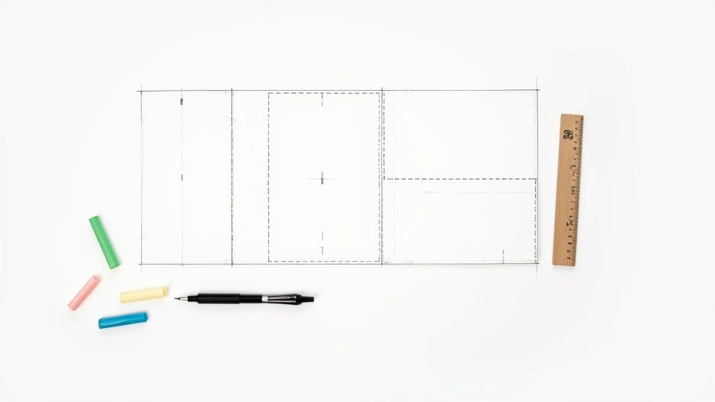 story
story Fold Card Template: fold card template Mastery for Folds, Dielines, and Print
A fold card template is really just a digital blueprint. It gives you the correct layout, dimensions, and—most importantly—the fold lines for print projects like brochures, invitations, or greeting cards. Working with a template from the get-go is one of the best ways to make sure your design lines up perfectly after it's printed and folded. It saves a ton of time and helps you dodge expensive mistakes. Choosing the Right Fold to Tell Your Story The type of fold you pick is so much more than a technical choice; it's the very first way someone will interact with your message. The physical act of opening the card needs to match the story you’re telling. In a way, the fold starts communicating before a single word is even read. A simple bi-fold creates an intimate, book-like reveal that feels personal, making it perfect for a thank you card or a heartfelt note. It's no surprise that the greeting card industry, which is projected to hit a market value of $20,102 million in 2025 , leans so heavily on this classic format. North America alone is expected to make up a $7,658.86 million slice of that pie, which just goes to show the lasting power of a simple, effective fold. Matching Folds to Project Goals When your story is a bit more complex, a tri-fold is a fantastic option. It naturally guides the reader through a sequence of information, which is ideal for marketing brochures, event programs, or menus where you can build a narrative across three distinct panels. On the other hand, if you need to make a dramatic first impression, the gatefold is your go-to. Its two front panels open from the center like a set of double doors, creating a grand reveal. This makes it a stellar choice for a wedding invitation, a new product launch, or an exclusive event announcement. Each fold type really does serve a different purpose and shapes how the user experiences your design. To help you visualize which fold might be right for your next project, here's a quick reference table. Matching Your Fold Type to Your Project Fold Type Number of Panels Best Used For Key Consideration Bi-Fold 4 (2 front, 2 back) Greeting cards, invitations, simple announcements, menus A classic, book-like opening. Straightforward and familiar. Tri-Fold 6 (3 front, 3 back) Brochures, event programs, detailed product info Guides the reader through information in a sequential flow. Gatefold 6 (3 front, 3 back) High-impact invitations, product reveals, luxury marketing Creates a dramatic, theatrical reveal when opened from the center. Ultimately, your choice directs how your audience receives your message and sets the tone for everything that follows. Key Takeaway: Think of the fold as the first chapter of your story. A bi-fold is a direct statement, a tri-fold is a short story, and a gatefold is a theatrical prologue. Real-World Fold Applications Let's put this into practice. Imagine you're a real estate agent. A bi-fold business card instantly doubles your real estate. You can put your headshot and contact info on the outside, then use the inside panels for current property listings or your personal mission statement. It’s a practical choice that makes the most of a small format. Here’s a great example of how 4OVER4's folded business cards keep information clean and effective. The image showcases how even a simple fold can add dimension and a touch of professionalism. A local restaurant might use a Z-fold brochure to lay out their menu—appetizers on the first panel, entrees on the second, and desserts on the third, creating a logical flow for diners. In the same vein, an art gallery could use a gatefold invitation for an exhibition opening, building anticipation before revealing the featured artwork inside. Exploring 4OVER4's folded collection can spark even more ideas on how to apply these concepts to your own projects. Getting Your Dielines, Safe Zones, and Bleeds Right Let's be honest, technical print terms like 'dielines,' 'safe zones,' and 'bleeds' can sound a bit intimidating at first. But trust me, these are the concepts that separate a crisp, professional folded card from one that just looks… off. Getting these right is the secret to making sure what you see on your screen is exactly what you get in your hands. Think of the dieline as the invisible blueprint for your card. It's a set of lines in your design file that tells our machines exactly where to cut and where to fold. If this blueprint is even slightly inaccurate, your panels won't line up, and the whole card can look skewed. These lines are absolutely crucial, especially for more intricate designs. If you're ever venturing into more complex shapes, you'll see just how precise these guides need to be with things like custom die cutting . Respecting the Safe Zone Inside those dielines, you have what we call the safe zone . This is a small margin running along the inside edge of your card's final trim size. Think of it as a protective bubble for all your important stuff. Any critical text, your logo, or key parts of an image absolutely must stay inside this zone. Why? Because the cutting process, while incredibly precise, can have minuscule variations. Pushing your company’s phone number right to the edge is a gamble you just don't want to take. For a typical 8.5" x 11" tri-fold, the safe zone is usually 0.125 inches inside the final trim line on all sides. It's a small buffer that makes a huge difference. As you can see, each type of fold creates unique panels that have to be perfectly measured and defined by the dielines to work together. The Importance of a Full Bleed Now, let’s talk about the area outside the trim line—the bleed . This is your secret weapon for preventing ugly white slivers from showing up on the edges of your finished card. It's physically impossible for a cutting blade to hit the exact same spot thousands of times in a row, so a tiny margin of error is built into the process. To get around this, you simply extend your background color or image past the final trim line. The industry standard for bleed is 0.125 inches (or 1/8th of an inch) on every side. Here’s a real-world example. Imagine you're designing a gatefold invitation with a rich, navy blue background that's supposed to cover the entire card. What Not to Do: You design the navy background to stop exactly at the card's final dimensions. If the cutting blade shifts even a fraction of a millimeter, a thin, jarring white line from the unprinted paper will appear on the edge. The Right Way: You extend that navy background a full 0.125 inches past the trim line on all four sides. Now, even with a tiny cutting shift, the blade only cuts through the navy ink, giving you a perfect, seamless edge. Pro Tip: Don't just assume your background is white. Even if your design has a white background, you should still extend a white box into the bleed area. This guarantees a clean, crisp edge, especially since the paper stock itself might have a slightly different shade of white. By paying close attention to the dielines, safe zones, and bleeds in your template, you're not just following rules—you're taking control of the final output. It's the best way to guarantee a high-quality, professional result every single time. Getting Your Design Ready for a Flawless Print Run What looks great on your screen doesn't always translate perfectly to paper. I've seen it happen countless times. To make sure your digital masterpiece becomes a physical reality without any hitches, there are a few non-negotiable rules you need to follow. Think of this as your final pre-flight checklist. Getting these details right is the difference between a professional-looking final product and a disappointing surprise when you open the box. Color Mode: Start and End with CMYK This is probably the most common mistake I see new designers make: they design everything in RGB (Red, Green, Blue). Your monitor uses RGB light to create colors, which is why they look so vibrant on screen. But professional printers don't use light; they use ink—specifically CMYK ink (Cyan, Magenta, Yellow, Key/Black). If you send us an RGB file, our systems have to convert it to CMYK, and that automatic conversion can lead to some seriously dull, muddy colors. The best practice? Always start your fold card template design in CMYK mode from the very beginning. This way, the colors you see on a properly calibrated screen will be a much more accurate preview of the final print. Resolution: Don’t Settle for Less Than 300 DPI For print, image quality is everything. The industry standard is 300 DPI (dots per inch), and it’s a hard rule for a reason. This resolution ensures that every photo, graphic, and piece of text on your card comes out looking crisp and sharp. If you grab an image from a website (which is often just 72 DPI ), it’s going to look blurry and pixelated when printed. Trust me on this. Check the resolution of every image before you place it into your design. Trying to upscale a low-res image just doesn't work; you can't create pixels that aren't there. You have to start with a high-quality source file to get a high-quality print. It's this commitment to detail that underpins our high-quality digital printing services . Pro Tip: It’s not just about the images. Make sure your entire document is set to export at 300 DPI . This preserves the sharpness of vector elements and text, not just your photos. Typography: Outline Your Fonts to Lock Them In Here’s another critical step that’s easy to forget: outlining your fonts . When you send a file with live text, our printing system might not have the exact same font you used. If it doesn't, it will substitute it with a default font, which can completely throw off your entire design. The solution is simple. By converting your text to outlines (or "curves" in some programs), you essentially turn the letters into vector shapes. This permanently locks in their appearance. What you send is exactly what gets printed, no font substitutions, no surprises. Imagine a beautifully designed business card that folds open to reveal more contact info—it’s a great way to make an impression. With roughly 273 million business cards printed daily worldwide, a unique fold helps you stand out. In fact, cards with innovative folds printed on premium stock have a 25% higher retention rate because people associate quality with value. Once you’ve checked everything off the list, the final step is to export your design as a high-quality or press-quality PDF. This file format is the universal standard for a reason. It embeds all your images, color profiles, and outlined fonts into a single, reliable package that’s ready for the press. Selecting Paper and Finishes That Elevate Your Design The way your folded card feels in someone's hands is just as powerful as how it looks. This is something I've learned time and again over the years. That tactile experience, created by your choice of paper stock and finish, can turn a good design into a truly memorable one. It’s about adding a layer of professionalism and perceived value that a purely digital design just can't match. It really all starts with the paper's weight, which we measure in points ( pt ). A standard 14pt cardstock is a solid, reliable choice for plenty of projects. It's sturdy enough for things like business cards or postcards without feeling overly rigid. A great all-rounder. But if you want to signal a higher level of quality, stepping up to a 16pt cardstock is the way to go. That extra thickness provides more substance and durability, making a much stronger first impression. Think premium invitations or high-end marketing materials. It’s a subtle upgrade, but it tells your audience you invested in the details. Choosing the Right Finish for Your Fold Card Template Once you've picked your paper weight, the finish is what really brings your visuals to life. This coating doesn't just protect the ink; it dramatically affects the mood and style of your design. Each finish has a specific job, so matching it to your project's goals is essential. Here’s a breakdown of the most common options: Glossy Finish: This high-shine coating makes colors pop like you wouldn't believe. It’s an excellent choice for photo-heavy designs because it makes images feel vibrant and grabs attention immediately. Perfect for event flyers or promo cards where you need maximum visual impact. Matte Finish: For a more understated and modern feel, matte is your best bet. It gives you a smooth, non-reflective surface that just exudes elegance. This finish is ideal for text-heavy designs, as it cuts down on glare and improves readability—think informational brochures or sophisticated business cards. Expert Insight: I always recommend a matte finish for designs that use dark, solid colors. A glossy finish on a dark background is a magnet for fingerprints, while matte keeps things looking clean and refined. Adding a Premium Touch with Specialty Finishes Beyond the standard gloss and matte, you can explore some really cool premium options that add a tactile dimension to your fold card template . One of my absolute favorites is Spot UV . This technique applies a high-gloss coating to specific areas of your design—like a logo, a headline, or a graphic element—while the rest of the card stays matte. This contrast creates a subtle, textured effect that just invites people to touch it. It’s a fantastic way to highlight the most important parts of your design and create a lasting, multi-sensory impression. For those looking to make a serious impact, exploring the full range of fantastic finishes available at 4OVER4 can provide even more inspiration. Your paper and finish choices are truly the final, crucial steps in bringing your design from the screen into reality. You've poured your heart into the design and wrestled with the print-ready file until it was perfect. So, what's next? Let's walk through those final steps on a real-world platform like 4OVER4 , turning your digital file into a stack of beautifully printed folded cards. This last stage is all about making sure you and the printer are on the same page. First things first, you'll land on the product page where you need to lock in your project details. This is where you'll select the final size, confirm the fold type (like that bi-fold or tri-fold we talked about), and choose the exact paper stock and finish you decided on. As you make each selection, you'll see the instant price calculator update in real-time, which is great for keeping your budget in check. No surprises here. Uploading Your Fold Card Template Once you've configured your product, it's time for the main event: uploading your file. 4OVER4’s uploader is pretty straightforward and accepts standard formats like PDF—which is absolutely the best choice for keeping your fonts, colors, and layout perfectly intact. Maybe you don't have a design ready to go. No problem. This is also the point where you can jump into their Online Designer tool . It’s a browser-based tool that gives you a solid alternative, complete with templates that already have the correct dimensions and safe zones built right in. Whichever path you take, the next step is easily the most important part of this entire journey: proofing . The Critical Importance of the Digital Proof After your file is uploaded and processed, you'll get a digital proof. Think of this as your last line of defense against any mistakes that could cost you time and money. It's a final preview showing exactly how your project will look once printed, complete with trim marks and fold lines. You absolutely have to give it your full attention. Here’s a quick mental checklist I run through every single time: Fold Line Accuracy: Are the score lines precisely where they need to be? For something like a tri-fold, I double-check that the panels are sized correctly to nest inside each other without buckling. Safe Zone Check: Is all my important stuff—text, logos, contact info—comfortably inside the safe zone? I look especially close at anything near the edges. Bleed Confirmation: Does the background art or color stretch all the way to the outer edge of the bleed line? This is non-negotiable if you want to avoid those dreaded white slivers after trimming. Color and Content: Do the colors look right? And for the love of print, proofread everything one last time. It's amazing what a fresh pair of eyes can catch. My Pro Tip: I always zoom in to at least 200% when I'm reviewing a proof. This trick makes it so much easier to spot tiny alignment issues, fuzzy images, or typos that are completely invisible at normal viewing size. With around 27 million business cards printed and passed around the globe every day , folded versions with unique styles are a massive advantage. The trends for 2025 are pointing toward artistic cards, maybe with retro vibes or even AI-generated aesthetics, perfect for a clever reveal inside a fold. Nailing the proof is how you ensure that cool design actually makes the impact you're hoping for. If you're curious, you can discover more insights about what makes business cards memorable. Only when you are 100% satisfied with that digital proof should you click "approve." That final click is what sends your job to the presses. Taking a few extra minutes to be a hawk at this stage is the difference between getting a box of perfect folded cards and a box of expensive disappointments. Answering Your Top Questions About Folded Card Templates Even with the most detailed template, a few questions always seem to pop up right when you’re about to finalize your design. It's totally normal. Let's walk through some of the most common issues we see designers run into. Getting these details sorted out can be the difference between a smooth print run and a frustrating setback. Once you get the hang of them, the whole process feels much more intuitive. What Is the Difference Between a Z-Fold and a Letter Fold? At first glance, a Z-Fold and a Letter Fold (often called a C-Fold) look pretty similar. They're both tri-folds, giving you six panels to work with. But the real difference is in how they unfold and tell a story. A Letter Fold is like a classic business letter, with one panel tucked neatly inside the others. This creates a natural sequence: a front cover, an "opener" panel, and then the main interior spread. It’s perfect when you want to guide someone through information step-by-step or build a little suspense before the big reveal. A Z-Fold , on the other hand, opens up like an accordion in a "Z" shape. When you pull it open, all three interior panels are visible at once. This makes it a fantastic choice for designs that need to flow across the entire width, like a panoramic photo, a timeline, or a side-by-side product comparison. So, which one is right for you? It really just comes down to the story your content is trying to tell. Why Do My Printed Colors Look Different From My Screen? Ah, the classic print design headache. This is one of the most common surprises for people new to printing, and it all comes down to the science of color. Your computer screen and a printing press speak two different color languages. Your monitor uses the RGB (Red, Green, Blue) color model. It creates colors by projecting light, which is why those bright, electric blues and greens look so vibrant on screen. Printers, however, use the CMYK (Cyan, Magenta, Yellow, Key/Black) model, which works by layering ink on paper to absorb light. Since the RGB color spectrum (or "gamut") is much wider than CMYK's, some of those super-bright screen colors simply can't be reproduced with ink. To avoid disappointment, the best practice is to design your file in CMYK mode from the very beginning. That way, what you see on your screen is a much closer representation of the final printed piece. What Is Scoring and Why Does It Matter for Folded Cards? Scoring is the process of creating a clean, crisp indentation in the paper right where it needs to be folded. Think of it as a guide for the fold. For any paper stock thicker than a flimsy sheet of copy paper—especially heavy cardstocks—this step is non-negotiable. If you try to fold thick paper without scoring it first, the paper fibers along the fold will stretch and crack. The result is a messy, jagged edge that looks unprofessional. A proper score line ensures that every single fold is perfectly sharp and clean, giving your project that polished, high-end feel. Any quality printer will automatically score your folded cards to prevent this from ever being an issue. Key Insight: Think of scoring as creating a designated "path" for the paper to follow. It relieves the stress on the paper fibers, allowing for a perfect fold without any cracking or damage, which is especially important for custom greeting cards on thick, premium stock. Do I Need to Submit a Separate File for Each Side? Good news—no, you don't. In fact, printers almost always prefer getting a single, multi-page file that contains the entire design. It keeps things organized and reduces the chance of error. For a simple bi-fold card, for example, your final file should be a two-page PDF. Page 1 would be the outside of the card (containing both the front and back cover panels). Page 2 would be the inside spread. Your printer’s fold card template is your best friend here—it will show you exactly how to orient each panel within your design file so everything prints correctly. Ready to bring your perfectly designed folded card to life? With an extensive range of paper stocks, finishes, and fold types, 4OVER4 has everything you need to create a stunning final product. Explore our options and start your print project today at https://4over4.com .
 story
story Mastering the Foldable Card Template
A foldable card template is really just the blueprint for your project. Think of it as the architectural plan that determines how the paper folds to create different panels. Getting this right before you even think about design is the secret to a professional-looking final piece. Choosing the Right Foldable Card Template Before you start dropping in logos or writing copy, your first and most critical decision is the fold. This isn't just a technical spec; the fold you choose sets the stage for the entire experience. It shapes how someone interacts with your card, turning a simple message into a story that unfolds panel by panel. The classic half-fold (you might also hear it called a bi-fold) is your go-to for traditional greeting cards. It has that familiar, intimate feel—perfect for birthday cards, simple thank you notes, or personal announcements. You get a nice big cover for a bold visual and a spacious inside for your handwritten message. Matching the Fold to Your Goal But what if you need to pack in more information? That’s where a tri-fold or a Z-fold really shines. Let's say you're designing a small brochure for an open house. A Z-fold lets you guide the reader on a journey: the cover piques their interest, the first panel they open reveals key features, and the final panel shows off the floor plan. You just can't tell that kind of sequential story with a simple half-fold. Then there's the gatefold , which is one of my personal favorites for making a big impression. It has two front panels that open from the middle like double doors, building a real sense of anticipation. It's fantastic for high-end event invitations, new product launches, or anything where you want the reveal to be part of the message itself. Pro Tip: Think of the fold as the narrative structure for your design. A half-fold is like a short story, a tri-fold tells a three-act play, and a gatefold is all about the grand reveal. Pick the structure that helps tell your story best. Here’s a quick visual breakdown of the most common fold types and what they're typically used for. As you can see, just adding a panel or two completely changes the game, taking a card from a simple greeting to a detailed mini-brochure or a dramatic invitation. Foldable Card Template Comparison To make it even simpler, here’s a quick reference table to help you match the right fold to your project's goal. It's a handy cheat sheet I use when brainstorming new projects. Fold Type Best For Design Complexity Common Use Case Half-Fold Simple, personal messages with a strong cover visual. Low Greeting cards, thank you notes, announcements. Tri-Fold Breaking down information into three distinct sections. Medium Brochures, menus, event programs. Z-Fold Sequential storytelling that reveals information step-by-step. Medium Direct mailers, trade show handouts, timelines. Gatefold Creating a dramatic reveal and a high-impact presentation. High Luxury invitations, product launches, portfolios. Choosing the right fold sets you up for a successful design that not only looks great but also functions exactly how you intended. Why the Right Fold Matters Picking the right template is a strategic move, not just an aesthetic one. The greeting card market is huge—projected to hit USD 28.91 billion —and a huge chunk of that is driven by things like birthday cards. This just goes to show how much people still value getting a real, tangible card in their hands. When you choose a fold that truly complements your message, you’re tapping into that appreciation for thoughtful design. It ensures your card connects with someone from the moment they hold it. If you're curious, you can learn more about the greeting card market trends and see just how powerful a well-designed card can be. Bringing Your Vision to Life with Design Tools So you've picked out the perfect foldable card template. That's a great start, but now for the fun part: turning that blank canvas into something that truly speaks for your brand or message. A good online design tool, like the one we've built at 4OVER4 , is more than just a bunch of buttons. Think of it as your creative partner, helping you get your ideas from your head onto the page, ready for print. The secret to a stress-free design process is getting a handle on a few key features. Let's start with layers . This is your best friend for organizing design elements. It lets you stack things like your background color, photos, and text boxes on top of each other without them getting tangled up. Need to nudge a photo to the left? With layers, you won't accidentally drag all your text with it. It’s a simple concept that prevents some major design headaches. Mastering the Essentials of Your Workspace Most quality design tools come equipped with guides and grids, and you should absolutely use them. Alignment guides, those little lines that pop up when you move things around, are crucial for a clean, professional finish. They help you snap elements into place, ensuring everything lines up perfectly. This is what gives your final card that intentional, well-balanced look instead of seeming like it was just thrown together. Imagine you're designing a thank you card for your business. You can use the guides to perfectly center your logo on the front and then align your "Thank You" text right below it. That symmetry feels polished and professional—a tiny detail that makes a huge impact on how people perceive your brand. A well-organized design communicates clarity and professionalism before a single word is read. Using layers and alignment tools is the easiest way to ensure your foldable card template looks polished and intentional from the start. Another tool you shouldn't overlook is the built-in color palette. Instead of having to remember and re-type your brand’s specific hex codes every time, you can often save them right in the tool. This guarantees consistency across all your projects. And that’s a big deal. With 80% of brand recognition tied directly to color, you can't afford to get it wrong. Visualizing Your Final Folded Card A top-notch design tool won't make you guess how your card will look once it's actually folded. The 4OVER4 interface, for example, gives you a clear preview showing exactly where the fold lines will be and how your design sits on each panel. This visual guide is invaluable. It helps you place your text and images confidently, making sure nothing important gets swallowed up by the crease. By staying within the designated safe zones, you can be sure that every part of your message comes across clearly and professionally. Taking a few minutes to get familiar with these previews is often the difference between a good idea and a truly great finished product. Key Design Principles for Impactful Cards Having a powerful design tool is one thing, but knowing how to use it to create a card that people actually remember? That's the real game-changer. The best designs aren't just pretty; they guide the eye, tell a little story, and feel purposeful from the moment someone picks them up. It all starts with visual hierarchy. First Things First: Visual Hierarchy Think of visual hierarchy as the art of telling your reader where to look first. On a wedding invitation, you want the couple's names and the date to pop. You can make that happen with a bigger, bolder font, a splash of a contrasting color, or simply by placing that info right in the center. Everything else—the venue, the RSVP details—should play a supporting role. Don't see the fold in your card as a limitation. It’s a creative asset! A fold is your secret weapon for pacing and creating a reveal. A Z-fold card, for instance, can unfold a mini-narrative panel by panel. The front hooks them, the middle panel gives the details, and the final panel delivers the call to action. It’s a natural storytelling device. Finding Your Design's Balance Good design is all about balance, but that doesn't always mean perfect symmetry. It's more about distributing the "visual weight" of your photos, text, and colors so the whole thing feels stable. If you drop a big, bold photo on the left side of your card, you can balance it out with a solid block of text or a few smaller graphics on the right. One of the most underrated tools you have is negative space . That's the empty, "white space" around your text and images. It’s tempting to cram every inch with information, but that just makes a design feel cluttered and overwhelming. Leaving some breathing room makes your key elements stand out and gives the entire piece a much more professional, high-end feel. So many people fight the fold. My advice? Design with it. Use it to hide a surprise, separate different ideas, or build a sequence that pulls your reader through the experience, one panel at a time. This idea of intentional, personalized design is catching on globally. The Asia-Pacific region is seeing massive growth, with China's greeting card market alone expected to hit almost USD 1.8 billion by 2030. This surge is largely thanks to a booming e-commerce scene, which just goes to show the worldwide demand for printed materials that feel special. If you're curious, you can learn more about the greeting card industry's global trends on GiftLips.com . Choosing Fonts and Colors That Work The fonts you choose say a lot before a single word is even read. A great rule of thumb is to stick with two, or at the absolute most, three fonts that complement each other. Try pairing a clean, modern sans-serif for your main text with a more decorative script for a headline. The contrast is both beautiful and highly readable. A few quick tips to keep in mind for fonts and colors: Contrast is Everything: Make sure your text is easy to read. Dark text on a light background is a classic for a reason—it just works. Set the Mood with Color: Colors carry emotion. Warm reds and oranges can build excitement, while cooler blues and greens create a sense of calm or professionalism. Stay On-Brand: If your business has brand colors, stick with them. Consistency is key to building a recognizable identity across all your marketing. When you put these principles together—hierarchy, balance, space, and smart typography—you stop making just a folded piece of paper. You create a powerful little communication tool that gets noticed and makes a genuine impression. Prepping Your Design for Flawless Printing Alright, you've poured your creativity into designing the perfect foldable card template. Now comes the moment of truth: turning that digital file into a tangible, professional-looking card. This is where a little technical prep goes a long way, and trust me, it’s the secret to avoiding those "oh no" moments when you open the box. Getting these details right ensures the masterpiece on your screen looks just as impressive in your hands. Let's quickly cut through some of that print-shop jargon you’ll see. Terms like bleed, trim, and safety margins aren't just suggestions—they are the guardrails that guarantee a perfect print. The trim line is exactly what it sounds like: the line where we'll physically cut your card. But since paper cutters aren't microscopic lasers, we need a little wiggle room. That's where bleed comes in. It's a small border (usually 1/8th of an inch ) of your background color or image that extends past the trim line. It’s your insurance policy against ugly white slivers appearing if the cut is a hair off-center. Why Margins and Resolution Matter More Than You Think Now, let's look inside the trim line. That’s your safety margin . Think of this as the "safe zone" for all your important stuff—your logo, your contact info, that killer headline. If any part of it strays outside this area, it’s at risk of getting chopped off. Keep the good stuff tucked safely inside. Then there's resolution. This is a big one. For an image to look crisp in print, it needs to be at least 300 DPI (dots per inch). Most images you pull from the web are a mere 72 DPI , which looks fine on your monitor but will come out fuzzy and pixelated on paper. Double-checking this setting alone can save a world of disappointment. My Pro Tip: I always tell people to think of it this way: bleed is your buffer on the outside , and the safety margin is your fortress on the inside . Master these two, and your cards will look professionally made every single time. The RGB vs. CMYK Color Showdown Here's another classic rookie mistake: designing in the wrong color mode. Your screen creates colors with light—mixing Red, Green, and Blue ( RGB ). It’s perfect for digital-only designs. But printers don’t use light; they use ink. We mix Cyan, Magenta, Yellow, and Black ( CMYK ) to reproduce colors on paper. If you send us an RGB file, the colors have to be converted. That vibrant, electric green you loved on screen? It might print as a much more subdued, earthy tone. The best practice is to start your design in CMYK mode from the get-go. It’s the only way to guarantee what you see is what you get. Before you send that file off, it pays to do one last technical check. I've put together a simple table of the essentials I run through before hitting "print." Your Pre-Print Technical Checklist This quick rundown covers the absolute must-haves for a print-ready file. Confirming these settings will help you avoid the most common printing headaches. Setting Recommended Specification Reason Color Mode CMYK Ensures the colors you see on screen will accurately translate to ink on paper. Resolution Minimum 300 DPI Guarantees your images and graphics will be sharp and clear, not pixelated. Bleed 1/8th inch ( 0.125" ) on all sides Prevents unwanted white edges by extending the design beyond the cut line. Safety Margin At least 1/8th inch ( 0.125" ) Keeps your critical text and logos from being accidentally trimmed off. File Format High-quality PDF Locks in all your fonts, images, and layout elements for consistent printing. Taking just a couple of minutes to review this list is the best thing you can do to ensure your final printed cards are flawless. It’s all about setting your design up for success from the start. Selecting Paper and Finishes That Wow Let's be honest: the way a card feels in someone's hands is just as important as how it looks. Get the paper and finish right, and you've instantly elevated your card from a simple piece of paper to a memorable, premium experience. This is where you communicate quality and a serious attention to detail before a single word is even read. Think of the paper as the foundation. A thicker, heavier 16pt stock feels far more substantial than the standard 14pt . That little bit of extra heft gives it a sense of importance, making it an incredible choice for things like wedding invitations or high-end corporate announcements where you absolutely need to make an impression. Choosing Between Glossy and Matte Okay, you’ve picked your paper weight. Now for the finish—and this decision dramatically changes how your colors look and how the card feels. Glossy Finish: This high-shine coating makes colors practically jump off the page. They look incredibly vibrant and saturated. It's a fantastic option for any photo-heavy design or when you want your bold graphics to do all the talking. Gloss also adds a little bit of protection against fingerprints and moisture, which is a nice bonus. Matte Finish: For a more understated, sophisticated vibe, matte is your go-to. You get a smooth, non-reflective surface that just feels modern and elegant. It's a brilliant choice for designs heavy on text because it kills the glare and makes everything easier to read. Think about it this way: a travel agency showing off stunning photos of the Maldives would want a glossy finish to make that blue water pop. On the other hand, an invitation to an art gallery opening just feels more refined with a soft-touch matte finish. It's no wonder the greeting cards market was valued at nearly USD 18 billion in 2021 and is expected to cross USD 20 billion by 2025—people still love getting something tangible. You can dive deeper into the greeting card market's growth on cognitivemarketresearch.com . Adding Special Touches for Maximum Impact If you really want to make a statement, special finishes add that custom, luxurious feel. These are the details that get people talking. Pro Tip: Don't just think about what looks good; consider what your brand stands for. An eco-conscious company could make a powerful statement by choosing a recycled paper stock for their thank you cards, aligning the physical product with their core values. Want to really push the boat out? Consider one of these premium touches: Spot UV: This is where you apply a glossy coating to specific areas of your design. Picture a matte black business card, but only the logo shines. That contrast creates a stunning tactile and visual effect that immediately draws the eye. Metallic Foil: For pure, unapologetic luxury, nothing beats adding metallic foil in gold, silver, or rose gold. It’s perfect for highlighting a company name or an event title and gives your card an instantly expensive feel. By being deliberate about your paper and finishes, you're not just designing a card—you're curating an entire sensory experience. You’re creating something that feels just as thoughtful and professional as it looks, guaranteeing it won't just be seen, but remembered. Your Foldable Card Questions, Answered Even when you've got the perfect design idea, a few questions inevitably pop up right before you hit that "order" button. Trust me, I've been there. Getting these last-minute details sorted is what separates a good project from a great one, so let's tackle the common queries we see all the time. What’s the Best File Format to Use? This is probably the number one question we get. For the sharpest, most professional results, you absolutely want to use a vector-based PDF . It’s the gold standard for a reason. This format ensures your logos and text stay perfectly crisp, with no blurriness, no matter what. If your design is more photo-heavy, a high-res JPEG or PNG (make sure it's at least 300 DPI ) can do the job. But honestly, a print-ready PDF packages everything up so neatly that it’s always the most reliable bet for a flawless print. How Do I Make Sure Everything Lines Up on the Fold? Nobody wants a crooked fold throwing off their whole design. Your best friend here is the template guide right inside the design tool. These guides show you exactly where the fold line is, but more importantly, they mark the "safe area." Think of the safe area as a buffer zone. Keep all your critical info—names, dates, logos, contact details—comfortably inside this zone. Before you finalize anything, always download the digital proof. It’s a preview of exactly how your card will look when printed and folded, giving you one last chance to spot any alignment problems. A quick pro-tip: The fold is a physical crease. Anything you place right on top of that line will get distorted. I always recommend leaving a little breathing room around the fold to keep your design elements clean and easy to read. A lot of people also wonder if they can print on the inside. Absolutely! Standard folded cards are made for printing on both sides. In the design tool, you’ll see different canvases for the outside (front/back) and the inside (left/right panels), so you have full control over the entire piece. What's the Difference Between Scoring and Folding? This one trips people up, but it's a crucial part of the printing process. They sound similar, but they’re two very different steps. Scoring: This is where we create a clean crease in the paper before it gets folded. Folding: This is simply the act of bending the card along that pre-made scored line. So, why does scoring matter so much? It’s all about the paper. For thicker cardstocks, scoring prevents the paper fibers from cracking and looking messy along the fold. It’s what gives you that sharp, professional edge instead of a frayed, amateur one. Any quality printer will score your cards first to make sure they look polished and perfect. Ready to turn your idea into a real, tangible card? Explore thousands of customizable templates and premium printing options with 4OVER4 . Start designing your perfect folded card today!
 story
story How to Improve Customer Engagement: Proven Strategies to Boost Loyalty
Improving your customer engagement isn't some fluffy, feel-good goal. It's a direct line to a healthier bottom line and a brand that can weather any storm. The real trick is to first get a handle on the actual costs of letting customers drift away—we're talking lost revenue and a tarnished reputation—and then get proactive about building relationships that make people feel seen and heard. The Hidden Costs of Disengaged Customers Before we jump into new strategies, let’s get one thing straight: customer engagement is absolutely non-negotiable in today's world. Too many businesses get laser-focused on acquiring new customers and treat engagement as an afterthought. Frankly, ignoring the people who already buy from you is one of the most expensive mistakes you can possibly make. Disengaged customers don't just quietly disappear. They actively chip away at your business. Their silence often hides a growing frustration that, sooner or later, leads to churn. And when they leave, you lose a lot more than just their future purchases. You lose their potential to become advocates—one of the most powerful (and free) marketing assets you could ever have. The Financial Drain of Apathy The financial hit from poor engagement is staggering. It kicks off a domino effect that can start with one sour experience and end up wrecking your entire revenue stream. Think about the tangible damage: Shrinking Customer Lifetime Value (CLV) : An unengaged customer isn't sticking around to make repeat purchases, try out your new product line, or upgrade their subscription. Every single one represents a massive loss in potential long-term revenue. Skyrocketing Acquisition Costs : You've probably heard it before, but it's true: it costs five times more to attract a new customer than to keep an existing one. When your churn rate is high because people feel ignored, you're stuck on a treadmill, constantly pouring money into marketing just to tread water. Negative Social Proof : Unhappy customers don't keep it to themselves. In the age of instant online reviews, one person's bad story can scare off hundreds of potential new buyers before they even visit your website. A disengaged customer isn't just a lost sale; they are a walking, talking advertisement for your competitors. Their departure creates a vacuum that is expensive to fill and can poison the well for future prospects. When Indifference Becomes a Liability Let's be real: modern consumers have zero patience for being ignored. The cost of a bad customer experience is both immediate and severe. It's pretty shocking, but 70% of customers will ditch a brand after just two poor experiences. Another 72% will switch after three or fewer negative run-ins. We're not even talking about major disasters here. Simple frustrations—like being stuck on hold forever or having to repeat your problem to five different people—are enough to drive more than half of your customers straight to a competitor. This data tells a crucial story about how to improve customer engagement: it all starts with removing friction and showing basic respect for your customer's time. You can explore more statistics on customer experience trends if you need more convincing. Ultimately, treating engagement as a "nice-to-have" is a surefire way to lose market share and weaken your brand. Go Beyond Names with Scalable Personalization Let's be honest: dropping a first name into an email subject line isn't real personalization. That’s a tactic from a decade ago. True personalization is about making your customer feel seen and understood on an individual level. It’s the kind of connection that builds real, lasting loyalty. To pull this off, you have to dig deeper than surface-level data. The real magic happens when you can build a single, dynamic view of each customer by connecting the dots from every single touchpoint—website clicks, purchase history, support chats, you name it. This is how you start to understand the why behind their actions. This unified view lets you segment your audience based on what they actually do , not just who they are demographically. You can create meaningful groups of customers who’ve shown interest in a specific product, used a key feature, or even contacted support with the same question. From Data to Delight Once you have these behavioral segments, you can start crafting messages with surgical precision. The difference between a generic blast and a truly personal touch is night and day. Take a travel company, for example. Instead of a bland "Summer Deals!" email to their entire list, they could get specific: Segment by Past Destinations: Send a curated guide on "hidden gems in Italy" to customers who have previously booked trips to Rome or Florence. Segment by Search Behavior: If someone spent time browsing family-friendly resorts in Mexico, hit them with a targeted offer for an all-inclusive package that specifically mentions the kids' club activities. This isn't just for travel. A SaaS business can send custom onboarding tips based on the very first features a new user clicks on, guiding them toward the tools that will immediately solve their problems. You’re essentially turning mass communication into a series of helpful, one-on-one conversations. The impact of this shift is massive. Just look at how personalization moves the needle on all the metrics that matter. As you can see, personalized efforts crush generic ones at every stage, from getting someone's attention to closing the deal. Unifying Customer Data for Impact The biggest roadblock to doing this well? Siloed data. Your marketing, sales, and support teams are all sitting on valuable pieces of the customer puzzle, but they rarely talk to each other. This is where a Customer Data Platform (CDP) comes in. A CDP acts as the central brain for your customer data. It collects information from all your different tools and systems, cleans it up, and builds a single, unified profile for each customer that any team can access. This unified profile is the engine that powers personalization at scale. When all your systems are in sync, you can automate incredibly relevant experiences that make every customer feel like they’re your only customer—and that’s a surefire way to boost engagement. Using AI to Enhance Human Connection Let's be real—we've all battled a clunky, unhelpful chatbot that made a simple problem a thousand times more frustrating. It's no wonder AI in customer service has a bit of a reputation. But the conversation is changing. Smart businesses are realizing AI isn't about replacing their team. It's about giving them superpowers. The goal isn't to remove people from the equation. It's about using AI to handle the predictable, mind-numbing queries that eat up your team's day. This frees up your human experts to focus on what they do best: solving complex problems that require empathy, creative thinking, and a personal touch. Automate The Simple Stuff First The quickest win is to go after the low-hanging fruit. Think about it: what are the top three to five questions your support team answers over and over again? Those are your prime candidates for AI. You know the ones: "Where's my order?" "What's your return policy?" "How do I reset my password?" When you deploy a well-trained AI to give instant, accurate answers to these queries, you deliver immediate value. The customer gets an answer in seconds, and your agent avoids answering the same question for the tenth time that day. Everybody wins. From Frustration To Smooth Resolutions Modern AI is a world away from the rigid, script-based bots of the past. Those early chatbots failed because they couldn't understand nuance or context. Today's AI can actually anticipate customer needs and adapt in real-time. Imagine a fintech company using an AI assistant to guide a new user through account setup. The AI can answer common questions, point out key features, and troubleshoot basic issues on the spot. But the moment the user gets stuck or asks a complex question, the AI seamlessly hands the conversation—along with the full context—to a human expert. No more starting from scratch. That's a smooth, supportive experience from day one. The key is to see AI as the first line of defense, not the only line. It should efficiently resolve what it can and intelligently escalate what it cannot, making the entire support system faster and more human-centric. Choosing The Right AI Engagement Tool Not all AI tools are created equal. The right choice depends entirely on what you're trying to achieve and how much complexity you're ready to handle. Here’s a quick breakdown to help you navigate the options. Tool Type Best For Key Feature Implementation Complexity Simple Chatbots Answering FAQs, basic lead capture, and routing inquiries. Rule-based conversation flows. Low AI-Powered Assistants Personalized onboarding, proactive support, and handling multi-step queries. Natural Language Processing (NLP) and context awareness. Medium Predictive Analytics Identifying at-risk customers and personalizing marketing offers. Machine learning algorithms that analyze user behavior. High Sentiment Analysis Gauging customer mood and prioritizing urgent support tickets. Identifies emotion and tone in text or voice communications. Medium-High Picking the right tool starts with a clear goal. Are you just trying to cut down on repetitive questions, or are you aiming for a deeply personalized, predictive customer journey? Your answer will point you in the right direction. For a broader look at how different technologies can help your whole company, check out these 12 AI Tools for Business Growth . Ultimately, using AI this way makes every interaction more efficient. Customers get fast answers to simple questions, and your team gets to spend their brainpower on the challenging, relationship-building conversations that truly drive loyalty. Build a Proactive Customer Feedback Loop If you’re waiting for customers to complain, you’re already behind. A reactive approach means you only ever hear from the loudest, most frustrated people. That leaves a huge, silent majority whose insights you’re completely missing out on. The brands that really get it right build systems to actively pull feedback from customers before small frustrations boil over. This is about more than just an annual survey that gets ignored. It's about creating timely, in-the-moment opportunities for people to share their thoughts. When you do this, feedback stops being a complaint channel and becomes a powerful way to build trust and create products with your customers, not just for them. Go Where Your Customers Are The best, most honest feedback doesn't come from a formal, multi-page survey. It comes from meeting customers right where they are, in the context of how they're actually using your product. Instead of interrupting their flow, weave feedback opportunities seamlessly into their experience. Here are a few ways I’ve seen this work brilliantly: Targeted In-App Polls: The moment a user tries a new feature, hit them with a quick, one-question poll. "What do you think of the new dashboard?" This gives you an immediate gut reaction, which is often the most valuable. Casual Social Media Questions: Jump on Instagram Stories and ask something simple. "What's one thing you wish our app could do?" It’s a low-effort way for your community to toss out ideas, and you’d be surprised by the gems you’ll find. Post-Interaction Surveys: As soon as a support chat ends, pop up a one-click survey. "Did we solve your problem today?" You get a real-time pulse on the effectiveness of your customer service. The whole point is to make giving feedback so easy it's almost an impulse. When it's that simple, you get a much more accurate and representative sample of how people really feel. The Power of Closing the Loop Okay, so you're collecting feedback. That's step one. The real magic, though, happens when you close the loop . This means proving to customers that you’re not just listening, but that you're actually acting on what they say. This is how you create die-hard fans. When a customer gives you feedback and then sees you implement it, they stop being just a buyer. They become a partner in your brand's journey. Acknowledging their contribution makes them feel seen, valued, and personally invested. Let’s walk through a real-world scenario. An e-commerce brand gets a handful of messages about a checkout button being confusing. It’s not a flood of complaints, just a trickle. The team could easily ignore it, but instead, they dig in and find a small bug that’s tripping up a small percentage of users. Here’s how they close the loop like pros: Acknowledge: They don't just log the ticket. They personally reach out to the few customers who reported it and thank them for the heads-up. Act: The dev team prioritizes the issue and pushes a fix live within a couple of days. Follow-Up: This is the critical part. The support team sends another personalized email to those same customers. The message is simple: "Hey, remember that bug you told us about? We fixed it— because you pointed it out ." They even toss in a small discount code as a thank you. With that one move, they turned a negative experience into a massive win. They didn't just fix a bug; they showed that a customer's voice can directly change the business. That’s how you build a rock-solid, engaged community that will stick with you for the long haul. Making Customer Engagement Everyone's Job Let's get one thing straight: exceptional customer engagement is never the job of a single department. If you've siloed it within your support team, you're missing the entire point. When a customer feels truly seen and cared for, it’s because that commitment is baked into the company’s DNA. It has to flow from the CEO all the way to the newest intern. True customer obsession happens when every single employee feels empowered and equipped to make the customer’s experience better. This cultural shift transforms your business from a bunch of separate teams into a unified force, all rallied around one shared mission: making the customer successful. When that clicks, amazing engagement becomes the default, not the exception. Fostering a Customer-First Culture To make engagement a company-wide mission, leaders have to champion it relentlessly. It all starts with making customer stories a central part of your internal conversations. Carve out time in every all-hands meeting to share real feedback—both the glowing praise and the tough critiques. It’s one thing to look at a bug report; it’s another for an engineer to hear firsthand how the bug they fixed saved a customer’s massive project. That simple act of storytelling connects an employee's daily grind directly to a customer's reality. It builds a powerful sense of shared ownership. This culture is also built on empowerment. Give every employee the authority to solve customer problems on the spot, without jumping through hoops for approval. Imagine a billing specialist who can instantly apply a credit for a confused customer, turning a moment of friction into one of delight. A customer-centric culture isn't built on policies; it's built on trust. When you trust your team to do right by the customer, they will consistently rise to the occasion, creating memorable experiences that build lasting loyalty. Cross-Functional Collaboration Drives Innovation Some of the most powerful breakthroughs happen when you demolish departmental walls. You need to actively encourage people from different teams to experience what it's like on the front lines. For instance, have your product managers shadow support calls for a few hours each month. Listening to a customer struggle with a feature they designed provides a level of raw insight no spreadsheet ever could. It’s in those unscripted moments that an engineer might have a "eureka!" moment that leads to a game-changing product improvement—one that came directly from a customer's pain point. This cross-pollination of perspectives is invaluable. To make it happen, you could: Launch a shared Slack channel where anyone can drop customer feedback or ideas. Form a "Voice of the Customer" council with members from every department. Train all teams in active listening to better understand what customers really need, not just what they say. This kind of internal synergy is becoming even more critical. Projections show that AI will soon power 95% of all customer interactions , and business leaders are already increasing their investments in these tools. To see where things are headed, you can review key customer engagement statistics and see how AI is shaping the future . By embedding a customer-first mindset everywhere, you ensure that every team—from product to finance—is aligned on creating a seamless and supportive journey for every single customer. Answering Your Top Customer Engagement Questions Even with the best game plan, you're going to have questions as you work on improving customer engagement. It's totally normal to wonder if you're tracking the right things or spending money in the right places. Let's clear up some of the most common sticking points. What Are the Best Metrics to Track Engagement? Look, every business is unique, but you can’t go wrong by focusing on metrics that tell you a story about customer behavior and happiness. Steer clear of vanity metrics and hone in on the data that shows whether people are genuinely getting value from you and deciding to stick around. A few numbers I always keep an eye on are: Customer Lifetime Value (CLV) : This is the big one. It tells you the total revenue you can realistically expect from a single customer over their entire relationship with you. When your CLV is climbing, it's a huge sign that your engagement efforts are working. Net Promoter Score (NPS) : You've probably heard of this one. It’s based on that simple question: "How likely are you to recommend our brand?" It’s an incredibly powerful way to gauge customer satisfaction and predict future growth. Active User Rate : If you're in the SaaS or app world, this is non-negotiable. It measures how many customers are regularly logging in and using your product. That's the ultimate vote of confidence. Customer Churn Rate : This is the percentage of customers who walk away over a specific period. Getting this number down is a direct result of solid, effective engagement. These aren't just numbers on a spreadsheet; they're the bridge connecting your daily engagement activities to real business results. How Much Should We Invest in Engagement Tools? The answer here isn't a dollar figure—it's about your approach. Before you even think about shopping for software, identify your single biggest engagement bottleneck. Are your support replies painfully slow? Is your personalization basically non-existent? Find the most significant point of friction your customers are experiencing right now . Once you've nailed down that core problem, go find a tool that solves that specific issue and does it really, really well. It's so tempting to get suckered in by an all-in-one platform that promises the moon but is just mediocre at everything. Don't fall for it. The right investment is one that delivers a clear, measurable return by solving a real customer problem. A simple chatbot that resolves 30% of routine queries might be a better investment than a complex analytics suite you don’t have the resources to manage. Think of it as building blocks. Solve one problem, measure the impact, and then reinvest what you've gained into tackling the next challenge on your list. Can a Small Business Really Compete on Engagement? Absolutely. In fact, small businesses often have the upper hand here. You're closer to your customers. You can offer a level of personal attention that massive corporations can only dream of. You don't need a giant budget—you need creativity and a genuine desire to make your customers' day. A local boutique, for example, can remember a regular's favorite styles and send a personal text when a new collection drops. A small software company can have its founder personally reply to feedback emails. These are the kinds of authentic, human gestures that build incredible loyalty. Ultimately, strong engagement is what keeps a business thriving for the long haul. For a deeper dive into creating those lasting relationships, you should explore these proven strategies for building customer loyalty . Remember, engagement isn't about outspending your competitors; it's about out-caring them. Use your size as an advantage by being nimble, personal, and genuinely responsive to the people who keep your business alive. Ready to make your brand unforgettable? With 4OVER4 , you can create stunning, high-quality printed materials that capture attention and leave a lasting impression. From business cards to custom banners, we provide the tools you need to engage your customers offline. Explore our printing solutions at https://4over4.com and bring your brand to life.
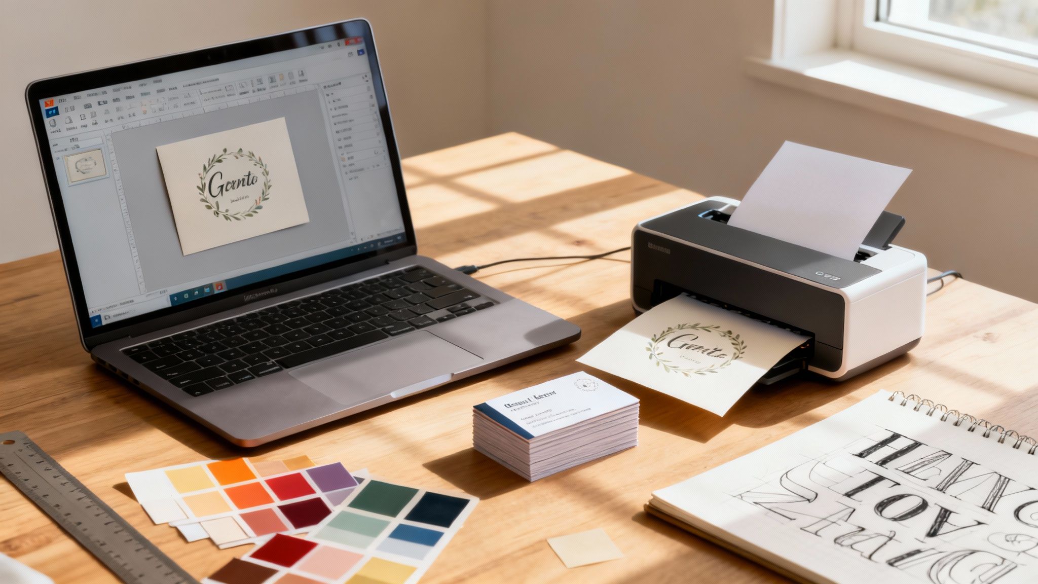 story
story How to Make a Card in Word for Pro Results
Believe it or not, figuring out how to make a card in Word is surprisingly easy. You can knock out everything from slick, professional business cards to personalized folded greeting cards just by tweaking the page setup , using text boxes and shapes , and exporting to a print-ready PDF . This whole process puts you in the driver's seat creatively, without needing to wrestle with complicated design software. Why Word Is Your Secret Weapon for Card Design When you hear "Microsoft Word," your brain probably goes straight to resumes, essays, and company reports. It's easy to write it off as just a word processor, but that perspective completely misses the powerful design tools hiding right under the surface. For years, Word has been the unsung hero for small businesses and creative folks who need to whip up professional-looking materials on a budget. The truth is, you don't need to splurge on expensive, complex programs to design a great-looking card. Word gives you all the essential tools to manage your layout, fonts, and images. It hits that perfect sweet spot: more creative freedom than a rigid online template, but way less intimidating than a blank canvas in a professional design suite. The Power of Familiarity and Accessibility One of Word’s biggest strengths is that you probably already own it and know your way around. That built-in familiarity means there’s no steep learning curve. Instead of sinking hours into tutorials just to learn the basics, you can get right to the fun part—designing. This accessibility has always been a game-changer for startups and small operations. In fact, small businesses have relied on desktop publishing tools like Word for their marketing for a long time. A Small Business Administration report from 2007 found that about 65% of small U.S. businesses used programs just like Word for their first marketing pieces. Why? Because professional printing could be 5 to 10 times more expensive per card. If you're curious, you can explore more business card statistics to see how things have evolved. Key Takeaway: Don't underestimate the tools you already have. Word's blend of easy access and solid features makes it an awesome platform for everything from quick design mockups to polished, final products ready for print. Unlocking Word's Design Capabilities So, what exactly makes Word so capable? It all comes down to a few key features that give you pinpoint control over how your card looks and feels. With these tools, you can break out of the standard text document format and create something truly custom. Text Boxes and Shapes: These are your best friends for card design. They let you place text and other design elements anywhere you want on the page, freeing you from the usual top-to-bottom flow of a document. Precise Page Setup: You can set custom page sizes to match standard card dimensions, like 3.5" x 2" for a business card. Or, you can flip the orientation to landscape and use columns to create a perfectly folded greeting card. Image and Graphic Integration: Pop in your logo, photos, or any other graphics with ease. Word’s formatting tools let you wrap text around them, add effects, and make sure everything is positioned exactly where it needs to be. Once you get the hang of these elements, you can design a card that looks like it came straight from a pro—all within a program you probably use every day. Creating Your First Folded Greeting Card Alright, let's get our hands dirty and build a classic folded greeting card from the ground up. We're going to skip the templates for now. Why? Because starting with a blank document is genuinely the best way to wrap your head around how Word builds a card. It gives you total control, letting you place every single element with purpose. Our goal here is a simple half-fold card. That's where a single sheet of paper is folded in half to create four distinct panels. To pull this off, you have to think about the layout a little differently: the front and back covers will live on one half of the page, while the two inside panels sit on the other. Setting Up the Page Foundation First thing’s first—and this is the most critical step—we need to fix the page setup. By default, Word opens in a vertical "Portrait" orientation. That’s perfect for a letter, but not for our card. We need to flip it on its side. Head over to the Layout tab in Word's ribbon. This is where you'll find all the core settings for structuring your document. Orientation: Click "Orientation" and switch it from Portrait to Landscape . Just like that, your page is now horizontal, giving you the wide format a folded card needs. Margins: Next, find "Margins." You could just use the "Narrow" preset, but selecting "Custom Margins" offers way more control. Setting all your margins to 0.5 inches or even less is a good move; it frees up a lot more design space. This initial setup is the foundation that ensures your card will fold correctly. The landscape page is now our canvas, ready to be split into the card's panels. Pro Tip: Before you add a single design element, save your document. It’s a tiny habit that can save you a world of pain if Word decides to crash. A quick Ctrl+S (or Cmd+S on a Mac) is your best friend. Dividing Your Canvas with Columns With the page orientation sorted, the next puzzle is creating the four panels. The slickest way to do this in Word is by using the columns feature. It automatically carves up your page, giving you clear boundaries to work within. Go back to that same Layout tab and click on "Columns." A dropdown menu will appear—just select Two . You’ll immediately see your page split right down the middle into two sections. This division is the secret to organizing your card. Here’s how to think about the layout now: The Right Column: This section is actually the front cover of your card. The Left Column: This one becomes the back cover . It seems a little backward, but once you print and fold the sheet, it all makes sense. The right side will fold over to become the cover, and the left will be the back. The other side of the paper is where your two interior panels will live. If you want to see some more advanced layouts, checking out a professionally designed fold card template can give you some great ideas. Placing Your Content with Precision Now for the fun part: adding your images and text. Here's a piece of advice that will save you a massive headache: do not type directly onto the page . Trust me on this. Instead, use Text Boxes and insert Pictures. These elements are treated like objects that you can move around freely for pinpoint-perfect placement. You'll find both of these tools under the Insert tab. Insert a Text Box: Click "Text Box" and pick "Simple Text Box." Get rid of the placeholder text and type in your own message. In our thank-you card scenario, this might be a simple "Thank You" placed on the front cover (which is the right-hand column). Insert an Image: Select "Pictures" and find your company logo or another image. After it appears, right-click the image, go to "Wrap Text," and choose In Front of Text . This is a game-changer. It lets you drag the image anywhere on the page without messing up your other elements. Let’s put it all together for our thank-you card. Place your company logo at the bottom of the front panel (the right column). In the middle of that same panel, use a text box with a nice, elegant font for your "Thank You" message. On the back panel (the left column), you could add another small text box with your website URL. Ready to work on the inside of the card? Just add a new page by hitting Ctrl+Enter. This second page will also be split into two columns. On this page, the left column is the inside-left panel, and the right column is where you'll write your main message. By sticking to text boxes for all your words, you guarantee every part of your design ends up exactly where you want it. Designing a Professional Business card From Scratch Alright, let's switch gears from greeting cards to the mighty business card. Making one of these in Word isn't just about shrinking your canvas; it's a whole different ballgame. Business cards are your pocket-sized pitch, packed with crucial info, so precision is key. A great card feels professional and makes you memorable long after the handshake. First thing's first: get the size right. The standard business card size in the U.S. is 3.5 x 2 inches . Nailing this dimension is non-negotiable. Head over to the Layout tab in Word, click Size , then More Paper Sizes . From there, just punch in a width of 3.5" and a height of 2" . That’s your canvas. Even with everything being digital, a physical card still makes a real impact. It’s something tangible people can hold onto, a small piece of your brand that screams professionalism and shows you care about the details. Structuring Your Card Layout With your 3.5 x 2 inch document ready, it's time to map out your information. The challenge is fitting everything you need without making it look like a cluttered mess. Remember, a card that's hard to read is a card that gets tossed. Your best friend here is visual hierarchy . It's a fancy term for making sure the most important stuff gets seen first. You want to guide the reader's eye naturally across the card. A good rule of thumb to follow is: Your Name: Make this the largest text on the card. You’re the star. Title and Company: Slot this right under your name, just a touch smaller. Contact Information: Group your phone number, email, and website together. This block of text can be the smallest, but it absolutely must be crisp and easy to read. This simple structure creates a clean, scannable flow. If you're looking for more ideas on how to arrange things, there are tons of great business card design tips out there covering everything from fonts to color psychology. Key Insight: Don't be afraid of whitespace. Seriously. The empty space on your card is just as important as the text. It prevents that cramped, desperate look and makes your design feel confident and modern. Business Card Design Elements Checklist Before you finalize your design, run through this quick checklist. It’s a simple way to make sure you’ve covered all the bases for a professional-looking card that actually works. Element Best Practice Tip Why It's Important Logo Place it prominently, but don't let it overpower your name. Top-left or top-center works well. It's your brand's visual anchor and the first thing many people will recognize. Your Name Use a clean, bold font. Make it the largest text element on the card. This is the most crucial piece of information. It needs to be immediately clear who you are. Title & Company Position it directly below your name in a slightly smaller font size. It provides essential context about your role and where you work. Contact Info Group phone, email, and website together. Keep the font small but highly legible. Makes it easy for people to find all the ways to reach you in one glance. Whitespace Leave ample empty space around text blocks and your logo. Avoid filling every corner. Prevents a cluttered look, improves readability, and gives the design a modern, clean feel. Readability Choose fonts that are easy to read at a small size. Stick to 1-2 font families maximum. If people have to squint to read your card, they won't bother. Clarity is king. QR Code (Optional) Place it in a corner where it's accessible but not distracting. Test it to ensure it works! Bridges the gap between your physical card and your digital presence (LinkedIn, portfolio). Think of this table as your final quality check. Hitting these points will take your design from just okay to genuinely professional. Printing Multiple Cards on a Single Sheet So you’ve perfected one card. Great! Now you need to print a whole batch. Word gives you a couple of solid ways to lay out multiple cards on a standard 8.5 x 11-inch sheet. The first method is using a table . Just go to the Insert tab, click Table , and create a 2-column, 5-row table . You'll have to manually set the cell dimensions to 3.5" wide by 2" high . This creates a perfect grid for ten cards. Copy your finished design and paste it into each cell. A potentially faster route is using the Labels feature. Head to the Mailings tab and click Labels . In the options, you can browse for a business card template by number (Avery 5371 or 8871 are common ones). This automatically sets up a page with perfectly sized and spaced slots for you. Whichever path you take, the process is the same: design one card, make it flawless, and then replicate it. This guarantees every card you cut out is identical. Embracing Modern Design Elements The classic business card is still a powerhouse, but its job has evolved. It's no longer just a static piece of paper; it's often a gateway to your digital world. It's wild to think that in 2019, an estimated 27 million business cards were printed daily . Post-pandemic, that number dipped, but it sparked a new trend: digital card sharing, which saw over 4 million shares in 2023. This shift led to a 45% jump in searches for "business cards in Word" as people needed quick ways to create designs for both print and digital sharing. To give your card a modern edge, think about adding a QR code. That little scannable square can be a game-changer, instantly connecting someone to your LinkedIn profile, website, or online portfolio. Just use a free online generator to create your QR code, save it as an image, and pop it into your Word document. Curious about all the things they can do? You can learn more about what QR codes are used for to see just how versatile they are. This one simple addition transforms your card from a static object into an interactive tool, seamlessly blending the physical with the digital. It’s a smart way to offer more value without adding clutter. Mastering Typography and Modern Design Trends Once you've got the basic structure of your card sorted, this is where the real fun begins. Playing with typography and other design elements is what takes a card from looking homemade to something that feels professionally crafted. The right font and color choices can completely transform your design, setting a specific tone and showing off your brand's personality before anyone even reads a word. The idea isn't just to make the text readable; it's about making it visually interesting. You have to think about fonts as design elements in their own right, not just containers for information. And believe it or not, Microsoft Word gives you a surprisingly powerful set of tools to pull this off. Choosing and Pairing Your Fonts Your font selection is what sets the entire mood. A classic serif font like Garamond feels elegant and traditional, which is perfect for a formal invitation. On the flip side, a clean sans-serif font like Calibri or Arial comes across as modern and direct—exactly what you want for a business card. One of the most effective tricks in the book is font pairing, which means using two different but complementary fonts. This simple move creates visual interest and helps guide the reader's eye by establishing a clear hierarchy. A classic, can't-go-wrong technique is to pair a serif font for headings with a sans-serif font for the body text, or vice versa. For a bold, modern look: Try a strong sans-serif font for your name or the main message, then use a lighter serif font for your contact details. For a classic, sophisticated feel: Go with an elegant serif for the primary text and a simple, clean sans-serif for the secondary info. The secret ingredient here is contrast . You want to avoid pairing two fonts that are too similar, because that can just look like a mistake. Instead, look for fonts that have distinct personalities but share a similar vibe or underlying structure. Leveraging Shapes and Color Palettes Shapes and colors are your secret weapons for injecting personality and structure into your card. In Word, you can find a huge library of them under the Insert > Shapes menu. Don't just think of them as simple squares or circles. They can be used to create visual anchors, subtle backgrounds, or brand elements that tie everything together. For instance, you could place a light gray rectangle behind your contact information to make that whole section pop. Or, you could use thin lines to divide sections of your business card, subtly guiding the reader’s eye from your logo to your name and down to your contact details. Your color palette is every bit as important. A well-chosen color scheme can instantly tell the story of your brand. Minimalist: Stick to a monochrome palette (black, white, and grays) with a single, subtle accent color. This approach feels clean, modern, and confident. Bold and Energetic: Use a palette with 2-3 vibrant, complementary colors to really grab attention. This works great for creative industries or any brand that wants to project a fun, dynamic image. Pro Tip: If you're stuck, use an online color palette generator to find colors that work well together. Tools like Coolors or Adobe Color can give you professional-looking combinations, taking all the guesswork out of the equation. Mastering Word's Advanced Text Effects Once you've picked your fonts, don't stop there. Word’s text formatting options let you get granular with every detail. Right-click on any text box and select Format Shape . This brings up a panel where you can start tweaking text effects like shadows, reflections, and glows. A very subtle drop shadow on your name can make it lift right off the card, adding a fantastic touch of depth. You can also get into the nitty-gritty of the spacing between characters, a technique known as kerning . To do this, go to the Font dialog box (just click that tiny arrow in the bottom corner of the Font section on the Home tab), then click over to the Advanced tab. Fine-tuning the character spacing just a little bit can make your text look much more balanced and professional. This level of control is what really separates a basic card from one that truly stands out. For a deeper dive into these core concepts, our guide on graphic design fundamentals is an excellent resource. Trust me, it's these small adjustments that elevate a good design to a great one. Prepping Your Design for Professional Printing You've designed a fantastic card in Word, and it looks perfect on your screen. That’s a huge step, but the job isn’t quite finished. Getting that digital file to look just as crisp and professional in your hands requires a bit of prep work. This is where many people stumble. They assume what they see on screen is exactly what they'll get from the printer. But screens and printers speak two different languages. Screens use RGB (Red, Green, Blue) light, which can create brilliant, vivid colors. Professional printers, on the other hand, use CMYK (Cyan, Magenta, Yellow, Black) ink. Because of this difference, colors can—and often do—shift slightly. Bright, electric blues and greens, for example, are notoriously tough to replicate perfectly with ink. Understanding Bleed and Safety Margins Ever wonder how professional cards get that flawless, edge-to-edge color? The secret is something called a bleed . A bleed is a small, extra margin of your background color or image that extends beyond the card's final trim line. When the print shop cuts the cards down to size, they trim this excess area off, which completely eliminates any chance of annoying white slivers along the edges. Let's say you're printing a standard 3.5" x 2" business card. You’ll need to add a 0.125-inch bleed on all four sides. Here's how that works in practice: Page Size: Instead of 3.5" x 2", you’ll set your Word document’s page size to 3.75" x 2.25" . Extend Your Design: Make sure your background color or any edge-to-edge images stretch to fill this entire, slightly larger page. Safety Margin: This is just as important. Keep all your critical text and logos at least 0.125 inches inside the final 3.5" x 2" trim area. Think of it as a "safe zone" that guarantees nothing important gets chopped off during trimming. Following this simple process is the key to a polished, professional finish every single time. Key Takeaway: Think of the bleed area as your design's insurance policy. It gives the printer a small margin of error during the cutting process, guaranteeing your colors run perfectly to the edge without any unsightly white slivers. The Non-Negotiable Need for High Resolution Another make-or-break element for professional printing is image resolution. Images grabbed from the web often look fine on a screen at 72 DPI (dots per inch), but for print, that's nowhere near enough detail. If you use a low-resolution image, your final printed card will look blurry, pixelated, and frankly, unprofessional. The industry standard for print is 300 DPI . When you're adding logos or photos to your Word document, always start with the highest-quality file you have. Never try to stretch a small image to make it bigger—that just makes the quality worse. Start big and scale down if you need to. This infographic breaks down a few design fundamentals where high-quality assets are absolutely essential. Whether you're mixing fonts, using shapes, or choosing colors, having the proper setup with high-resolution graphics makes all the difference in the final product. Exporting Your Final Print-Ready PDF Alright, your design is done, the bleeds are set, and your images are high-res. The final step is exporting it correctly. Do not just email the .docx file to your printer. The universal format for printing is a high-quality PDF. Why a PDF? It locks everything in place—your fonts, your images, your layout—so it looks identical on any computer and prints exactly as you intended. Here’s how to do it in Word: Navigate to File > Save As . From the "Save as type" dropdown menu, choose PDF (*.pdf) . Before you hit save, look for More options... or Tools > Compress Pictures . You need to make sure the output quality is set for High fidelity or Print quality (330 PPI) . This is a critical step to keep your resolution sharp. With that, you’ll have a file that any professional printer, including 4OVER4 , can use to produce a flawless card. For a deeper dive, check out our guide on https://www.4over4.com/content-hub/stories/how-to-create-a-print-ready-pdf for more advanced tips. And remember, the file is only half the story. The physical material matters just as much. When you're ready to print, choosing the right paper surface will have a huge impact on the final look and feel of your card. Common Questions About Making Cards in Word Even with a step-by-step guide, it's totally normal for questions to pop up when you're figuring out how to make a card in Word. Let's be honest, it's a powerful tool, but it wasn't built from the ground up as design software. That can lead to a few tricky moments. Think of this as your troubleshooting cheat sheet. I'm going to walk you through the most common roadblocks people hit, from print quality worries to more advanced design stuff, so you can get a smooth, professional result every time. Can I Really Get Professional Quality from Word? You absolutely can. While a dedicated program like Adobe InDesign has all the bells and whistles, Microsoft Word is more than capable of producing a high-quality, print-ready file. The secret isn’t the software—it’s how you use it. Success really just comes down to nailing the fundamentals we've already covered. If you get these three things right, your card will look fantastic: Correct Page Size: Set your dimensions precisely from the start, and don't forget to include the extra space for a bleed if you need one. High-Resolution Images: This is a big one. Always use images that are 300 DPI to avoid any blurriness or pixelation when they're printed. Clean Typography: Choose fonts that are easy to read and give your text plenty of room to breathe with lots of whitespace. For that ultimate professional touch, you can combine Word's easy-to-use interface with the premium paper and finishes from a commercial printer. Just design your card, export it as a high-quality PDF, and upload it. You get the best of both worlds. How Do I Make Sure My Colors Look Right? This is probably one of the most common worries I hear. The colors you see on your screen (which use RGB light) will almost always look a little different from printed colors (which use CMYK ink). Bright, vibrant tones are especially known for shifting during this translation. To minimize any surprises, it’s best to steer clear of complex gradients and neon colors that just don't translate well to ink. If you have specific brand colors, knowing their CMYK values can help, but you should still plan for a minor difference between screen and paper. Expert Tip: The absolute best way to check your colors is to run a single test print on a good-quality home printer. It won't be a perfect match for a professional press, but it will give you a much better feel for how your colors will look on paper than your backlit monitor ever could. When you send your file to a professional printer, their equipment is calibrated to produce the closest possible match. You can dive deeper into how resolution and color profiles impact your final print by exploring the essentials of what print resolution is and why it's so important. What Is the Best Way to Create a Full Bleed Design? A "full bleed" is a design where the background color or image goes all the way to the very edge of the card, with no white border. It’s a slick, professional look, but it's impossible to get by simply printing on a standard-sized document—printers just can't print to the absolute edge of a sheet. To create a proper bleed in Word, you have to trick it by making your document slightly larger than your final card. Let’s use a standard 3.5" x 2" business card as an example: Set a Custom Page Size: Instead of 3.5" x 2", you’ll set your page dimensions in Word to 3.75" x 2.25" . This adds an extra 0.125 inches on every side, which is the standard bleed area. Extend Your Background: Now, stretch your background image or color block to fill this entire larger page. Establish a Safe Zone: This is crucial. Keep all your important text, your logo, and any key graphics well within the original 3.5" x 2" area. This "safety margin" ensures nothing important gets accidentally trimmed off. When the card is printed on a larger sheet and trimmed down to size, that extra 0.125" on each side gets sliced off. What you're left with is a perfect, clean, edge-to-edge design. It’s a small extra step that makes a huge difference in quality. Ready to bring your card design to life with professional printing? At 4OVER4 , we offer a huge range of paper stocks, finishes, and custom options to make your creation stand out. Upload your print-ready PDF today and see the difference that quality printing makes. https://4over4.com
 story
story How to Make Trading Cards That Look Professional
So, you want to create your own trading cards? Excellent. It’s a journey that’s part creative vision, part strategic design, and part choosing just the right materials to make them feel legit. We're going to walk through the entire process, from that first spark of an idea to holding a professionally printed stack of cards in your hands. This isn't just about slapping an image on a piece of cardstock. It's about building a tangible, high-quality collectible that people will want to own, trade, and show off. Whether you're designing for a game, a business promotion, or a personal art project, getting the fundamentals right is key. Think of this as your roadmap. We'll cover the essential stages, helping you understand the key decisions you'll need to make along the way to produce cards that look and feel absolutely professional. Your Guide to Creating Custom Trading Cards Let's dive in. Creating custom trading cards is an exciting process, but a little planning goes a long way. When you approach it with a clear strategy, each phase builds perfectly on the last, helping you sidestep common mistakes and keep the project running smoothly. There are really three core areas you need to nail: The Concept: This is the "why" behind your cards. Who are they for? What's the theme? What story or information does each card need to tell? This is your foundation. Design & Layout: Now it's time to bring that concept to life. We're talking colors, fonts, and imagery. You’ll be arranging all the visual elements into a layout that’s balanced and eye-catching for both the front and the back. Printing & Finishing: The final, physical stage. This is where you pick your cardstock, decide on a protective finish, and get your files ready for a professional print run that delivers a polished, durable result. This handy visual breaks down these three main steps. As you can see, a solid concept is always the starting point. Once that’s locked in, the technical details of design and production fall into place much more easily. So, Why Make Your Own Trading Cards Anyway? The appeal of trading cards has never been stronger. Driven by a mix of pure nostalgia and the very real value of collectibles as investments, the global trading card market is booming. It was recently valued at $13 billion worldwide and is expected to grow at a compound annual rate of 8.5% , potentially hitting $21 billion within the next decade. You can learn more about the trading card market growth and see the numbers for yourself. This explosion in popularity proves that custom trading cards are for more than just sports teams or games. They've become powerful tools for marketing, personal branding, and pure artistic expression. By learning how to make your own, you're tapping into a medium that connects with people on a deeply personal level. To give you a quick reference for what's ahead, this table summarizes the core phases we're about to explore in detail. Trading Card Creation Process at a Glance Phase Primary Goal Key Decisions Concept Define the purpose and theme of your card set. Target audience, core message, overall aesthetic. Design Create a visually engaging and cohesive layout. Color scheme, typography, image selection, layout balance. Materials Select the right physical components for quality. Cardstock weight (e.g., 14pt vs. 16pt ), finishes (gloss vs. matte). Printing Produce a professional, high-quality final product. File preparation, proofing, order quantity. With this framework in mind, you're ready to tackle each stage with confidence and create something truly memorable. Laying the Groundwork for a Strong Card Concept Every truly memorable trading card starts long before you open a design tool. It begins with a solid idea. This initial concept phase is your creative blueprint; trying to design without one is like building a house with no plans. You need to nail down the "why" behind your project because that single question will guide every decision you make down the line. Think of your card's purpose as its North Star. Are you creating a set for a local sports team? A tabletop game with deep lore? Maybe it's a unique marketing giveaway or a personal art series. Each of those paths demands a completely different approach. Define Your Core Purpose First things first, get crystal clear on what you want these cards to accomplish. A sharp objective keeps your project from turning into a random collection of cool-looking images. A promotional set for a tech startup, for instance, needs to communicate brand value almost instantly. On the other hand, a card for a fantasy game has to pull players into its world. What's your end goal? To Entertain: Maybe you're building a game or a collectible series focused purely on fun and engagement. To Inform: Cards can be a fantastic way to share key facts, stats, or educational content in a bite-sized format. To Promote: You might be designing a business card that’s impossible to forget or a marketing piece that really stands out. To Commemorate: A great way to celebrate an event, a team's winning season, or a personal milestone. Answering this question upfront makes everything that follows so much easier. A card promoting a local coffee shop will absolutely need contact info and a call to action. A card depicting a mythical dragon? It’s all about stats and flavor text. Your card's purpose is the most important filter for your creative choices. If an idea doesn't serve the primary goal, it's probably best to set it aside. This simple rule saves both time and money. Don't underestimate the potential here. This can be anything from a fun weekend project to a massive commercial venture. The trading card game (TCG) market alone is a perfect example, merging incredible artistry with complex game mechanics and high-end manufacturing. That market was valued at $7.43 billion and is expected to hit $15.84 billion by 2034. It just goes to show how popular a well-thought-out card set can become. You can explore the trading card game market research to see the full scope for yourself. Establish a Cohesive Theme and Aesthetic Once you know your purpose, you can start building a world around it. The theme is what ties the entire set together—it's the visual and narrative glue. Are you going for a vintage vibe? Something futuristic and sleek? Or maybe a minimalist or grunge feel? Your aesthetic choices should flow directly from that theme. A set of cards about 1970s baseball, for example, would feel right at home with bold, groovy fonts and a muted, nostalgic color palette. In contrast, a series on sci-fi robots would probably look best with sharp lines, metallic sheens, and a cool blue-and-silver color scheme. Let's walk through a practical example. Imagine you’re creating cards for a local animal shelter to help get more pets adopted. Purpose: To inform potential adopters and forge an emotional connection. Theme: "Find Your New Best Friend." Aesthetic: Warm, friendly, and inviting. You’d want photos with soft lighting, playful fonts, and a bright, cheerful color palette. Essential Info: The animal's name, age, and breed, plus a short bio and a QR code linking straight to the shelter’s adoption page. See how that clear concept ensures every card feels like part of a thoughtful, unified family? This kind of planning prevents the costly and frustrating revisions that plague projects without a clear direction. You'll head into the design phase with a powerful blueprint, ready to create something truly special. Designing Cards That Captivate Once you've nailed down your concept, it's time for the really fun part: bringing it to life. This is where your trading cards start to take on a personality of their own. Whether you're a seasoned graphic designer or have never touched a design app, the goal is the same—create something eye-catching that works on a small canvas. This isn’t just about making things look cool. Good design is functional. It guides the viewer’s eye, communicates information instantly, and makes each card feel like a piece of a larger, cohesive set. From the font you pick to the layout, every choice builds that crucial first impression. Mastering the Art of Card Layout A standard trading card is a tiny 2.5 x 3.5 inches , so every single pixel matters. Your main objective is to establish a strong visual hierarchy , which is just a fancy way of saying you need to arrange things by order of importance. The most critical info, like a character's name or the hero image, has to pop immediately. Think of the front and back as two sides of the same coin—connected, but with different jobs: The Front: This is your hook. It’s all about immediate impact. This side should feature your best artwork, the card's title, and maybe a single, key stat or icon. The goal is instant recognition. The Back: This is where you fill in the blanks. The back is perfect for stats, lore, a short bio, or even contact details. It’s naturally more text-heavy, but it still needs a clean, organized layout to be useful. The most common mistake I see is people trying to cram way too much onto the card. Don't be afraid of white space (or negative space). It's your best friend for preventing a cluttered, overwhelming design. The 4OVER4 online tool is a great place to start because it lets you see how these elements fit together in real-time. As you can see, you can lock in your size, quantity, and paper type before you even start designing. This is a huge help for making sure your creative vision aligns with the final printed product from the get-go. Technical Specs Every Creator Should Know Before you get lost in the creative weeds, you need to get a handle on a few technical specs. Nailing these upfront will save you the headache of a blurry or off-color print run. Think of them as the unbreakable rules of professional printing. Here are the three big ones you have to get right: Resolution (DPI): For anything printed, your design files and images need to be at least 300 Dots Per Inch (DPI) . That cool image you found on the web? It's probably 72 DPI and will look pixelated and awful on a physical card. Always, always start with high-resolution assets. Color Mode (CMYK): Your computer screen uses RGB (Red, Green, Blue) light to display color. Printers use CMYK (Cyan, Magenta, Yellow, Black) ink. If you design in RGB, the colors will look dull and washed out when printed. Set your design file to CMYK from the beginning for accurate colors. Bleed and Safe Zones: This is easily the most critical—and most overlooked—step. Bleed is an extra margin of your design, usually 0.125 inches , that extends past the card's final trim line. It's a safety net. When the big cutting machine trims the cards, the bleed ensures you don't end up with ugly, accidental white edges. The Safe Zone is the opposite—it’s an inner margin where you must place all your important text and logos. This guarantees nothing critical gets chopped off during trimming. Pro tip: Pretty much any professional printer, including 4OVER4, provides downloadable templates with the bleed, trim, and safe zones clearly marked. Using these templates is the single best thing you can do to make sure your design is print-ready. Making Smart Typographic and Color Choices The fonts and colors you pick are the soul of your design. They set the tone and support the theme. A vintage baseball card set, for instance, would feel right at home with a classic serif font, while a futuristic sci-fi series needs something clean and modern. Readability is king when it comes to fonts. A wild, decorative font might look awesome, but if people can't read the text, it's a failure. A good rule of thumb is to stick to two or three fonts max: one for headers, one for body text, and maybe a third for small accents. Color theory is just as important. Colors trigger emotions and create a unified look across your entire set. A limited color palette—just a few key colors used consistently—often looks more professional and is far more memorable. Pay attention to how your colors interact. High-contrast pairings (like dark text on a light background) are non-negotiable for readability, especially for those tiny stat blocks on the back. Choosing Your Materials and Finishes A killer design is what grabs someone's attention, but the feel of the card is what makes it a true collectible. This is where we get into the tactile experience—turning your digital design into something that feels substantial and professional in your hands. The right materials don’t just support your design; they elevate it. They communicate quality and durability before the person even really processes the art. A flimsy card feels cheap, plain and simple. But one with a premium finish? That can make even a simple design look like a million bucks. Let's break down the choices that will take your project from a simple printout to something people will want to keep. Selecting the Right Cardstock Weight The foundation of any great trading card is its paper, or cardstock . The most important thing to look at here is its weight, which is measured in points (pt.). A higher point value equals a thicker, more rigid card. Simple as that. While you have a ton of options, a couple of weights have become industry standards for a good reason. 14 pt. Cardstock: This is a fantastic, all-around starting point. It’s noticeably thicker and more durable than your average business card, giving it an immediate sense of quality. It feels professional without being overly stiff, making it a smart, cost-effective choice for larger print runs. 16 pt. Cardstock: If you want that top-tier, premium feel, 16 pt. is the only way to go. That little bit of extra thickness adds a real heft and rigidity that people instantly associate with high value. This is what you want for limited edition sets, high-end promotional cards, or any project where you need the physical card to make a statement. The difference you feel between these two is distinct. Imagine making a card game for kids—the durability of 14 pt. is perfect for cards that will be handled constantly. But if you're an artist creating a collectible portfolio piece, the premium weight of 16 pt. reinforces the quality of the art itself. Your choice of cardstock isn't just a technical detail; it’s a core part of your card's identity. It’s the first physical impression someone has of your work, and a heavier stock often translates to a higher perceived value. This focus on quality materials is a huge deal in the collectibles world. Just look at the sports trading card market, valued at around $1.22 billion . That industry is built on manufacturing excellence, relying on specialized printing and premium paper to ensure authenticity and collector appeal. You can dig into the sports card market trends to see just how much these material choices matter. Understanding Finishes and Coatings Once you've nailed down your cardstock, the next decision is the finish. This is a coating applied after printing that not only protects the card from scuffs and moisture but also completely changes its look and feel. The two most popular choices sit at opposite ends of the spectrum. A Gloss UV coating gives you that classic shiny, reflective surface that makes colors absolutely pop. This high-sheen finish is incredible for designs with vibrant, saturated artwork, as it deepens the colors and boosts the contrast. It’s also super durable and moisture-resistant, a practical bonus for game cards that will see a lot of play. On the flip side, a Matte finish offers a smooth, non-reflective, and seriously sophisticated look. It has a subtle, almost velvety texture that just feels elegant. This finish is perfect for designs with a more muted color palette, a lot of text, or a vintage vibe, since it cuts down on glare and gives off an air of understated quality. To help you choose the right path for your project, here’s a quick breakdown of what each finish brings to the table. Comparison of Popular Card Finishes Finish Type Best For Key Characteristics Gloss UV Colorful artwork, game cards, modern designs. High-shine, vibrant colors, durable, moisture-resistant. Matte Elegant designs, text-heavy cards, vintage look. Non-reflective, smooth texture, sophisticated feel. Ultimately, the best choice depends entirely on the mood and function of your cards. A glossy finish screams "look at me!" while a matte finish whispers "take a closer look." Adding Premium Touches Want to really make your trading cards stand out from the crowd? A few special features can add that extra visual and tactile punch that transforms a great card into an unforgettable one. Rounded corners are a small upgrade that makes a huge difference. Not only do they prevent the corners from getting bent and frayed over time—which is a huge plus for longevity—but they also give the card a polished, professionally finished look. For a true touch of luxury, foil stamping is an incredible choice. This process presses a thin layer of metallic foil onto specific parts of your design, and the effect is stunning. It’s perfect for highlighting a logo, a title, or a special design element, creating a dazzling flash of light that immediately draws the eye. These are the kinds of details that signal you’ve invested in creating something truly special. Turning Your Design Into a Physical Card You've put in the creative work. The concept is solid, the design looks incredible, and you’ve even picked out the perfect paper stock. Now for the exciting part: turning that digital file into a professional, physical trading card. This is where all that careful planning really pays off. The online printing process itself is pretty straightforward, but the devil is in the details. Getting a great result comes down to three things: preparing your files correctly, being meticulous with the proofing stage, and choosing the right order quantity. Nail these, and the cards you hold in your hand will look just as good as they did on your screen. Getting Your Files Ready for Print Before you can hit that "order" button, your design file needs to be perfectly formatted for a commercial press. This part isn't about creativity; it's all about technical precision. I've seen more projects get delayed or end in disappointment because this step was rushed than for any other reason. First, do a final check to make sure your file meets all the technical specs we've covered. Is it set to 300 DPI resolution? Is it in CMYK color mode? Most importantly, did you extend your design into the bleed area? This is crucial for avoiding ugly white edges after the cards are trimmed. Once you’re confident, export your design in a print-ready format. The best and most common options are: High-Quality PDF: This is usually the gold standard. It embeds your fonts and images, locking your layout in place so nothing shifts or changes. TIFF (.tif): This is a "lossless" format, meaning it keeps every bit of image quality without any compression. It's another fantastic choice. JPEG (.jpg): This can work, but only if you save it at the absolute highest quality setting. Just know that it’s a "lossy" format, so a tiny bit of data is always compressed. Uploading is usually just a simple drag-and-drop. Pay attention here—many printers have automated file checkers that might flag potential issues with your resolution or dimensions before you even get to the next step. Don't Skip the Proofing Stage After your file is uploaded, you’ll get a digital proof . This is your final, last-chance-to-get-it-right moment before the entire batch goes to print. Whatever you do, don't just give it a quick glance and click "approve." A few extra minutes of careful review here can save you from a massive headache and a very expensive reprint. Think of the proof as the final quality control checkpoint. Once you approve it, you're signing off on the design. Any errors found after this point are on you. Be meticulous. So, what are you looking for? Run through this checklist: Typos & Grammar: Read every single word on the card, front and back. It's wild how a tiny typo can survive dozens of design revisions. Layout & Alignment: Is everything where it should be? Check that all your text and images are safely inside the "safe zone" and haven't mysteriously shifted. Image Quality: Zoom in. Way in. Are your logos and pictures sharp, or are they blurry and pixelated? What looks fine on your monitor might not hold up in print. Color Check: Remember, the colors on your screen won't perfectly match the final printed card because of differences in monitor calibration. The proof is the closest digital preview you'll get of the final output. Imagine you’re printing 500 cards for a big trade show. You give the proof a quick once-over and hit approve. The boxes arrive, and you realize the website URL on the back of every single card has a typo. That tiny mistake, easily caught during proofing, just turned your entire investment into expensive coasters. Seriously, take your time. Choosing the Right Quantity for Your Project The last decision to make is how many to order. This can vary wildly depending on your goals. Are you making a small batch of 50 cards for a personal art project, or do you need 5,000 for a massive promotional campaign? Most online printers, including 4OVER4, offer scaled pricing, meaning the cost-per-card drops significantly as your order size goes up. While it’s tempting to order a huge run to get the best unit price, it’s much smarter to base your quantity on what you actually need. Think about the scope. If you’re a game creator launching your first set, a smaller test run of 100-250 is a great idea. It lets you get feedback and tweak things before you commit to a bigger investment. If it's for a business promotion, figure out how many clients or event attendees you expect and then add a 10-15% buffer for extras. Planning your quantity this way ensures you get good value without ending up with boxes of cards gathering dust. Got Questions About Making Your Own Trading Cards? Even with the best plan in the world, a few questions always come up, especially if this is your first time creating custom trading cards. It's easy to get bogged down in the technical details, but a few quick answers can get you back on track and focused on the creative side of things. Let's walk through some of the most common questions we hear from creators. Answering these upfront will save you from headaches and unexpected costs later. What's the Best Software for Designing Trading Cards? This is a big one, and honestly, the "best" software really depends on your comfort level and budget. The industry-standard tools like Adobe Photoshop or Illustrator give you incredible power and total control over every single detail. They're what the pros use for a reason, but they also have a learning curve and a monthly subscription. But here's the good news: you don't need to be a professional designer to get professional results. Online design tools like Canva have become seriously impressive. They're built for people who aren't graphic designers, with intuitive drag-and-drop interfaces and tons of templates that are already sized correctly. It’s a much more beginner-friendly path to a great-looking card. No matter what program you use, the single most important thing is how you save your file. Your final design must be exported as a high-resolution file (300 DPI) in the CMYK color mode for printing. This isn't just a suggestion—it's a requirement for a sharp, vibrant print. If you upload a low-resolution file, your final card will look blurry and pixelated, and all your hard work will be for nothing. How Much Does It Cost to Make Trading Cards? There's no single price tag here, because the cost can swing pretty wildly from one project to the next. The final price is a mix of a few key choices you'll make when you place your order. Here’s what really moves the needle on cost: Quantity: This is the biggest factor. Printing more cards dramatically lowers your price-per-card. A small batch of 50 cards for a personal project will have a much higher unit cost than a run of 5,000 for a business. Cardstock: The feel of the card matters. A thicker, sturdier stock like a premium 16 pt. is going to cost a bit more than a standard 14 pt. Finishes: This is where you can add some flair. Special touches like a high-gloss UV coating or shiny foil stamping will add to the total cost, but they also make your cards look incredible. Printer: Every print shop has different equipment and pricing, so it's always smart to compare. For a small, simple run, you might spend less than a hundred dollars. If you're going all out with a large quantity on thick stock with special finishes, you could be looking at several hundred dollars or more. The smartest move is to use your printer's online quote tool to see the exact price for your specific project before you commit. What Are Bleed and Safe Zones? Okay, this is probably the most critical technical detail in all of print design. Getting bleed and safe zones right is the secret to making sure your cards look perfect, with no weird white edges or chopped-off text. Think of them as a safety net for the physical cutting process. Bleed: This is a little bit of your background design (usually 0.125 inches ) that extends past the actual trim line of the card. Paper can shift ever so slightly when it's being cut at high speed. The bleed ensures that if the cut is a tiny fraction of a millimeter off, your background color or image still goes right to the very edge. Safe Zone: This is the opposite—it's an inner margin. You need to keep all your important stuff—like names, stats, logos, and key parts of your art—inside this area. It's the "safe" space where nothing will accidentally get trimmed off. Nearly all professional printers, including 4OVER4 , will give you free downloadable templates that show you exactly where these lines are. Using a template is hands-down the easiest way to set your design up for a flawless print run. Ready to turn your ideas into something real? At 4OVER4 , we've got the high-quality materials, professional finishes, and easy-to-use online tools you need to create collectible cards that truly stand out. Start designing your custom trading cards with us today!
 story
story What Is Saddle Stitch Binding a Complete Guide
Saddle stitch binding is one of the most popular and budget-friendly ways to bind a booklet. If you've ever held a high-quality magazine, a program, or a simple product catalog, chances are you've seen saddle stitching in action. It's known for its fast turnaround time and for letting pages lay almost perfectly flat when opened. Understanding the Core Concept At its heart, the process is pretty straightforward. The "saddle" in the name comes from the way the collated pages are draped over a saddle-like piece of equipment during production. From there, they get stitched together. The whole thing is built on a simple foundation: large sheets of paper are printed, folded in half, and then "nested" one inside the other. These nested sets are called signatures . Once all the signatures for a booklet are assembled, they get stitched together with wire staples—usually two or three —right along that center fold. The Rule of Four There's one golden rule with saddle stitching: your final page count must be a multiple of four . Think about it—each sheet of paper is folded in half, which automatically creates four pages (a front and back on the left side, and a front and back on the right). This is a crucial detail to remember when you're planning out your design. Introducing Key Terms As you dive deeper into different binding options , you'll bump into a couple of key terms specific to saddle stitching. Getting familiar with them will make talking to your print provider a whole lot easier. Signatures: As we touched on, these are the printed sheets that get folded to create a section of the final booklet. Creep: Also called "binder's creep," this is what happens when the inner pages of a thicker booklet get pushed out a tiny bit farther than the outer pages. When the booklet is trimmed flush, those inner pages end up being slightly narrower. This simple, efficient method is perfect for projects with lower page counts, offering a professional finish without the higher costs associated with more complex binding techniques. How the Saddle Stitching Process Works Getting from a digital file to a finished booklet is a surprisingly slick and automated process. It’s pretty cool to see how individual pages become a single, professional-looking product with such speed. The whole operation boils down to a few key stages that flow together seamlessly. It all kicks off with something called imposition . This is a technical term for how we arrange your booklet’s pages onto large press sheets before printing. It’s not as simple as laying them out 1, 2, 3, 4. Instead, pages are positioned strategically so that once the sheets are printed, folded, and cut, everything lands in the correct sequence. For an eight-page booklet, you might see page 8 and page 1 printed side-by-side on the same sheet. It seems counterintuitive, but it’s the secret to making it all work. From Printing to Finishing Once the layout is locked in, the production line takes over, and things move fast. This is where high-volume printing really shines. Printing and Folding: First, the large press sheets are printed on both sides. Right after that, specialized machinery folds each sheet with perfect precision, usually in half. This creates what we call a "signature," which is essentially a four-page section of your booklet. Collating and Gathering: Next, all these folded signatures are gathered and nested in the correct order. A machine stacks them one inside the other, forming the complete, but still loose, pages of the booklet. Stitching and Trimming: The collated pages are then draped over a conveyor that looks a bit like a saddle—and that’s exactly where the name comes from. Industrial stitching heads drive wire staples right through the spine to bind it all together. The final touch is a three-knife trimmer that slices the top, bottom, and side edges for that clean, perfectly flush finish. Saddle stitch binding is one of the most common and historically important bookbinding methods out there. It’s defined by the use of metal staples punched through the folded spine of a publication. The name is a direct reference to how the sheets are folded and draped like a saddle over the binding machine during production. Learn more about the history and specifics of saddle stitch binding from Walsworth . This highly automated workflow is precisely what makes saddle stitching one of the fastest and most budget-friendly bookbinding methods you can choose. Whether it's for magazines, event programs, or product catalogs, this process delivers a reliable and professional result, especially for projects with a lower page count. Deciding If Saddle Stitching Is Right for You Every binding method has its own set of strengths, and picking the right one really boils down to your project's specific goals. Saddle stitch binding is a fantastic, workhorse option, but it's not a one-size-fits-all solution. Let's weigh the pros and cons to see if it truly lines up with what you need. The biggest wins for saddle stitching are efficiency and cost . The whole process is highly automated and uses the simplest materials—just a couple of wire staples. This makes it one of the most affordable and fastest binding methods out there, which is a lifesaver for projects with tight deadlines. This infographic gives you a quick look at how straightforward the production process really is. As you can see, that direct path from printing to folding and stapling is exactly what makes it so quick and easy on the wallet. To help you decide, here’s a quick rundown of where saddle stitching shines and where it falls short. Saddle Stitch Binding Pros and Cons Advantages Disadvantages Very cost-effective , especially for large runs Limited page count , typically under 80 pages Fast turnaround times due to a simple process Lacks a flat spine for printing a title Lightweight which reduces shipping costs Less durable than other binding methods Lays flat when opened, great for workbooks Can suffer from page creep on thicker booklets Ultimately, weighing these points against your project's needs will lead you to the best decision. Key Considerations and Limitations Now, let's talk about a couple of constraints you absolutely need to keep in mind. The most critical one is page count . Saddle stitching works beautifully for documents with fewer than 80 pages . Once you go beyond that, the booklet gets too bulky for the staples to hold everything together securely, and it won’t lay as flat as it should. The other thing to watch out for is a little something we in the print world call "creep." This is where the inner pages of a thicker booklet stick out just a bit farther than the outer ones. After trimming, this can leave your inner pages slightly narrower, potentially chopping off text or images if you didn't plan for it in your design. For anyone looking to get into publishing, understanding these kinds of technical details is crucial. This excellent guide on how to become a publisher is a great resource for navigating production choices like this. Key Takeaway: Saddle stitching is your go-to for low-cost, quick-turnaround projects with a modest page count. Its ability to lay flat makes it perfect for things people will write in, like workbooks, manuals, and journals. If your project fits neatly within these parameters, saddle stitching offers a professional and incredibly practical solution. It's the top choice for many types of booklets and catalogs for good reason—it delivers a clean finish without breaking the bank. Where You Will See Saddle Stitch Binding Once you know what you’re looking for, you'll start spotting saddle stitch binding everywhere. It strikes a perfect balance between being affordable and looking professional, making it the go-to choice for tons of printed materials we handle every day. From the glossy magazine in a doctor's office to the seasonal catalog that lands in your mailbox, this method is incredibly common. This isn’t a coincidence. Saddle stitching has a firm foothold in the modern printing industry because it just works. The fast production times and low setup costs give it a huge advantage, especially for items printed in high volumes. Common Examples in Print Saddle stitching is the unsung hero behind many familiar products. Its practical benefits line up perfectly with what these projects need, making it a no-brainer. Magazines and Comic Books: These are the classics. The ability to lay relatively flat and the low cost per piece are perfect for publications that aren't meant to last forever. Event Programs: Think concerts, plays, or conferences. You need to get programs into people's hands quickly and affordably, and saddle stitching delivers on both. Workbooks and Manuals: The lay-flat design is a must-have for any material people need to write in or reference easily without wrestling with the spine. Marketing Booklets and Catalogs: Because it's so lightweight, saddle stitching helps keep mailing costs down—a major win for direct mail campaigns. You can dig deeper into creating effective marketing brochures and booklets with this method. Key Insight: The real magic of saddle stitching is in its practicality. It perfectly balances cost, speed, and function for short-to-medium-length documents meant for wide distribution or temporary use. For projects like these, understanding the typical formats of softcover books and booklets is key, as saddle stitching is often the most sensible and cost-effective binding choice. The History Behind Stitched Booklets Saddle stitching might seem like a modern, efficient binding method, but its core idea is anything but new. Its roots stretch back centuries, connecting today's high-speed print shops to the meticulous work of early craftsmen. Long before machines and metal staples, people were already binding folded pages along the spine by hand. It was a simple, smart way to get information out quickly and affordably. Believe it or not, this method has been around for a surprisingly long time. We have historical evidence showing pamphlets and small books being stitched together as far back as the 16th century in Europe. Some of the earliest examples from the mid-1500s used a basic two-hole stitch, while more complex patterns, like the figure-eight stitch, appeared later on. The technique was proven, even if the tools were simple. From Thread to Wire The Industrial Revolution was the game-changer. It introduced machinery and wire that completely transformed the process from a manual craft into a high-speed, automated system. What was once painstakingly done by hand with a needle and thread could now be done in a flash. This is when the "saddle" machine was born, designed to hold pages perfectly in place for precise, rapid stapling. This leap from hand-sewn pamphlets to machine-stitched booklets shows how a brilliant, fundamental idea—securing folded pages at the spine—has been continuously perfected for speed and scale over 500 years . This long and storied history gives saddle stitching a certain gravity. It isn't just a budget-friendly choice; it's a time-tested solution for book printing . It's a method that has proven its value for centuries, adapting its tools while holding onto its brilliantly straightforward and practical core. Your Top Saddle Stitching Questions, Answered As you get your print project ready to go, a few practical questions almost always pop up. Knowing the ins and outs of saddle stitch binding is the key to making sure your final product looks just as polished as you imagined. This is your go-to guide for quick, clear answers on the stuff that trips people up. Getting these details right from the start will save you a ton of headaches and help you prep your files like a pro. What Is the Maximum Page Count for Saddle Stitching? While there's a little wiggle room, page count is the biggest limitation of saddle stitching. The sweet spot for this method is typically between 8 and 64 pages . Some printers might be able to push that up to around 80 pages, but it all comes down to how thick your paper stock is. Once you go beyond that range, the booklet starts getting too bulky. The staples have a hard time holding everything together securely, and the finished product just won't lay flat like it's supposed to. For bigger projects like thick reports, training manuals, or novels, you’ll want to look at perfect binding instead. It uses a strong adhesive to create a flat, printable spine that can handle hundreds of pages with ease. Why Must My Page Count Be a Multiple of Four? This is the golden rule of saddle stitching—and it’s a hard and fast one. The entire binding process is built on a simple foundation: sheets of paper folded in half. Every single sheet you fold automatically creates four pages—a front and back on the left, and a front and back on the right. Since the final booklet is just a collection of these folded sheets nested together, the total page count has to be divisible by four. If your document has 22 pages, you'll need to add two blank pages somewhere to hit 24. What Is Creep and How Do I Plan for It? Creep is a huge deal, especially when you’re working with thicker booklets. It’s what happens when the inner pages of a saddle-stitched document get pushed outward, away from the spine. Picture a thick stack of folded paper—the sheet in the very middle has to wrap around a much thicker fold than the one on the outside. This means when the booklet is trimmed for that nice, clean edge, the inner pages end up slightly narrower than the outer pages. If your text, images, or page numbers are too close to that edge, they could get sliced right off. The solution is a technique called shingling , which just means using larger margins on the innermost pages to create a safe zone for the trim. Most professional print shops will handle this adjustment for you, but it’s always smart to be aware of it during the design phase. Ready to create stunning, professional booklets for your business? At 4OVER4 , we specialize in high-quality saddle stitch binding that delivers a polished look on time and on budget. Explore our options and start your next project today at https://4over4.com .