Content Hub
Stories, Ideas and Advice — Page 76
 story
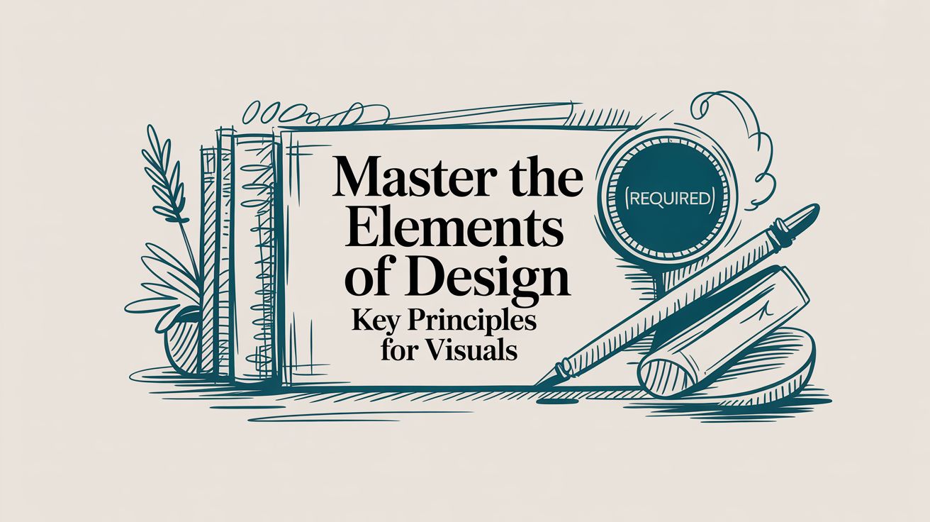
story Master the elements of design: Key Principles for Visuals
When you look at any design—a sleek business card, a vibrant flyer, a clean website—you’re seeing a collection of individual parts working together. These parts are the elements of design , and they are the absolute fundamentals of all visual work. Think of them as the ingredients for a recipe: line, shape, color, texture, space, form, typography, and size . By learning how to handle these core components, any designer can start crafting visuals that are not just beautiful, but powerful and effective. Deconstructing the Visual Language of Design Every single piece of media you see is built from this same basic toolkit. These aren't just stuffy, academic terms; they're the practical tools designers reach for every day to give a layout structure, create a specific mood, or gently guide your eyes across the page. Getting a handle on them is the first real step toward creating work that truly connects with people. It’s a bit like learning the alphabet. Before you can write a compelling story, you have to know what the letters are and how they sound. Each design element has its own personality and job, but they really shine when they collaborate to deliver a clear message or feeling. Understanding how they all fit together is what separates placing things on a page from creating a genuine visual experience. This infographic does a great job of showing how some of these core elements relate to each other. As you can see, foundational elements like line, shape, and color act as the main pillars. Once you have those in place, you can build more complex, interesting, and effective compositions. Why These Elements Matter When you really get these concepts, you start making choices with purpose. No more guessing which font looks "right" or what color might work. Instead, you can make informed decisions based on proven principles that shape how people perceive your design. This is the moment design stops being a subjective art form and becomes a strategic tool for communication. For any business, that shift is huge. The way you use these elements has a direct line to how customers feel about your brand. Great design is not just about making things look good. It's about creating clarity, building trust, and solving problems. Each element is a decision that either supports or detracts from your overall message. By using these building blocks deliberately, you make sure every piece of your brand—from business cards to trade show banners—is telling the same story. If you want to see how these principles come to life in the real world, check out the huge variety of professionally designed marketing materials that put these very elements into practice. Now, let’s break down each element one by one. Using Line and Shape to Guide the Eye At the absolute core of every visual design, you’ll find two rock-solid elements: line and shape . Think of a line as the path your eye wants to follow. It isn’t just a simple divider; it’s a director, subtly telling you where to look, what matters most, and even how you should feel about it. Straight, crisp lines often bring a sense of order, structure, and professionalism. You see this all the time in sharp corporate logos and formal invitations. On the flip side, soft, curved lines feel more organic, gentle, and calming, which makes them a perfect fit for wellness or comfort-focused brands. A strong diagonal line? That injects instant energy and movement, and it’s why they’re so powerful on posters for concerts and sporting events. Building Recognition with Shape When you connect lines, they create shapes —the true building blocks of recognition. Our brains are hardwired to identify shapes in a split second, which is why they are so vital for creating logos and icons that stick. Shapes generally fall into two camps: Geometric Shapes: These are your familiar circles, squares, and triangles. They feel structured, stable, and reliable. A logo built around a solid square, for instance, practically screams strength and dependability. Organic Shapes: Think of the irregular, free-form shapes you see in nature, like leaves, puddles, or clouds. They give off a feeling of spontaneity and approachability, helping a brand feel more human and less corporate. By weaving different lines and shapes together, you can tell a powerful visual story without saying a word. The sharp angles of a custom die-cut sticker can give it a modern, edgy feel, while the rounded corners on a business card might come across as friendlier and more inviting. A design’s underlying structure is built on the silent conversation between line and shape. They work together to create hierarchy, draw focus to key information, and establish the overall tone before a single word is even read. This principle is absolutely essential for large-format designs. Imagine you’re designing custom wall graphics for an office. You could use bold, leading lines to guide visitors through the space, almost like a path. At the same time, large, simple shapes could define different zones without needing actual walls. When you get a handle on these foundational elements, you gain real control over how your audience interacts with and understands your design. Applying Color and Texture to Create Mood If line and shape are the skeleton of a design, then color and texture are its heart and soul. These are the elements that breathe life, emotion, and personality into your work. They have the power to turn a simple layout into a memorable experience, connecting with your audience on a gut level long before they read a single word. Color is far more than just a decorative touch; it's a silent language. Think about it: a tech startup often leans on blue to signal trust and stability. A fast-food joint splashes red everywhere to stir up feelings of excitement and urgency. These aren't just random shots in the dark—they're strategic decisions rooted in powerful psychological associations. Getting a handle on the psychology of color choices is a game-changer. It’s what separates good design from truly great design. Weaving Emotion with Palettes and Textures Picking one color is just the starting point. The real magic unfolds when you build a color palette. For instance, a monochromatic scheme—using various shades and tints of a single color—creates a polished, sophisticated vibe. On the flip side, a complementary palette, which uses colors from opposite sides of the wheel, dials up the contrast and energy. Texture, which is all about an object's surface quality, brings in another layer of sensory detail. It can be literal , something you can actually feel, or implied , something you just see. The roughness of a recycled business card is a literal texture. A grainy filter on a digital photo, however, creates an implied rustic texture on a smooth screen. Color and texture are a team. They work together to shape a design’s personality. A bright, glossy color paired with a smooth texture feels modern and sleek. Muted earth tones combined with a rough, natural texture feel grounded and authentic. Bringing Your Designs to Life This interplay between color and texture can define an entire brand identity. Picture a brochure for a high-end spa. It probably uses a calming, monochromatic palette of soft greens and whites, paired with the implied texture of smooth stones or gentle water ripples. That combination instantly says "tranquility and luxury." This synergy is especially powerful in print. A grainy, tactile paper stock can make a photograph feel nostalgic and warm. You can see this effect come to life in custom canvas prints , where the material's texture transforms a simple picture into a piece of art with tangible depth. Mastering the dance between the right color palette and the perfect texture is a cornerstone of great design. Using Space and Form to Guide the Eye Space and form are the dynamic duo of design, working together to lead your audience through a layout and create a clear sense of focus. Space , which you’ll often hear called whitespace or negative space, is anything but empty. It's an active ingredient that gives every other element room to breathe, boosting clarity and adding a touch of elegance. Think of it like a spotlight on a stage. It’s the darkness surrounding the performer ( negative space ) that makes them ( positive space ) the undeniable center of attention. In design, putting generous space around your logo or a key headline does the exact same thing. It tells the viewer, "Pay attention. This part is important." Giving Your Designs Real-World Depth While space helps organize your design on a flat surface, form is what gives it a sense of three-dimensional reality. Form is the magic that makes a simple, flat shape feel like it has actual weight and volume. Designers pull off this illusion by playing with light, shadow, and perspective, making objects feel tangible enough to touch. A perfect example is turning a simple circle into a sphere just by adding a soft gradient and a subtle drop shadow. That jump from a flat shape to a believable form adds a layer of realism and depth, making the entire design more engaging. When used together, space and form build a rock-solid visual hierarchy. By mastering the relationship between an object and the space around it, you control the narrative of your design. You decide what the viewer sees first, second, and third, creating a seamless and intuitive user experience. Lessons from Design History This structured approach is nothing new; it has deep roots in some of the most influential design movements. The Swiss Style of the 1950s and ‘60s was all about clarity, using grid-based layouts and a strong visual hierarchy to direct the viewer’s eye. This movement showed that well-structured design could improve reader comprehension by up to 40% —a principle that’s still fundamental today. These principles are absolutely critical in print. When you’re designing something like full-color presentation folders , a clean layout with plenty of whitespace around your logo and key text instantly screams professionalism. Adding a subtle form through embossing can also give the folder a premium, tactile quality that leaves a lasting impression. Making Typography Your Most Powerful Tool Typography is so much more than just the words on a page; it's the visual voice of your message. Before anyone even reads the first word, the fonts you choose are already hard at work, setting the tone and shaping perceptions. Think of it this way: every typeface has its own personality and carries a unique psychological weight, making font selection a critical strategic move. For instance, a traditional law firm looking to project authority and trustworthiness will almost certainly lean towards a classic serif font—those little finishing strokes convey a sense of history and reliability. A cutting-edge tech startup, on the other hand, wants to appear innovative and approachable, making a clean, modern sans-serif font the obvious choice. The font itself reinforces the brand's identity at a glance. The Nuances of Professional Type But great typography goes beyond just picking a font family. The real magic lies in the details—the subtle adjustments that separate polished, professional work from something that just looks "off." Getting these right ensures your text is not just readable but also visually balanced and a pleasure to look at. These key principles are your best friends: Kerning: This is all about adjusting the space between individual pairs of letters. Think "AV" or "To." Without good kerning, you get awkward gaps or collisions that disrupt the flow. Tracking: This adjusts the spacing across an entire word or block of text . It helps control the overall density and can make text feel airy and open or tight and impactful. Leading (pronounced "ledding"): This is the vertical space between lines of text. Getting it right is crucial for preventing text from feeling cramped and making long paragraphs easy to follow. Even tiny tweaks to these settings can make a world of difference, giving your designs a clean, professional finish. This level of detail is absolutely essential for creating high-quality, memorable business cards that build trust . "Typography is the voice of your design. The right typeface can whisper, shout, or sing, but the wrong one can mumble incoherently, undermining your entire message." Choosing the Right Typeface for Your Project Selecting the right font family is the first step in harnessing the power of typography. Each category has a distinct personality and is suited for different purposes. This table breaks down the most common typeface categories to help guide your decision. Typeface Category Conveys Mood Of Common Use Cases 4OVER4 Print Example Serif Tradition, authority, reliability, elegance Books, newspapers, formal invitations, professional services branding High-end real estate brochures, law firm letterhead Sans-Serif Modernity, clarity, approachability, minimalism Websites, digital ads, corporate branding, signage Tech startup business cards, event posters Script Elegance, creativity, personality, luxury Wedding invitations, boutique branding, high-end packaging Custom thank-you cards, luxury product labels Display Boldness, uniqueness, attention-grabbing, fun Headlines, logos, posters, promotional flyers Music festival flyers, retail sale banners By matching the typeface to your project's goals, you create a cohesive message that resonates with your audience from the very first impression. From Handcraft to Mass Production The power of typography and other design elements truly exploded during the Industrial Revolution ( 1760–1840 ). Before this, design was a handcrafted art. But with inventions like lithography and the steam-powered press, it suddenly became a tool for mass communication. Literacy rates were soaring—reaching around 70–80% in Western Europe by 1850—and a huge new audience for printed materials like posters and packaging was born. This was the moment graphic design became a profession, driven by the need to speak to a growing consumer culture. To dig deeper into these historical shifts, check out Shutterstock's blog on graphic design movements . This history shows how typography evolved into a formidable tool for shaping public perception on a massive scale—a role it continues to play in every effective design today. How to Combine the Elements Effectively Knowing the individual elements of design is like learning the notes on a piano. But true artistry comes when you combine those notes to create a melody. Great design isn't about cramming every element you know into one project; it's about choosing the right ones so they work together to tell a single, cohesive story. This is where the magic happens. It’s what turns a random collection of shapes and colors into a powerful piece of communication. Every choice you make should reinforce the others. The crisp lines in your layout should feel like they belong with the clean, sans-serif font you've picked out. The vibrant color palette should amplify the energetic mood you're going for. Think about an event poster that really grabs you. It doesn't just list information—it creates an entire vibe. Bold typography might shout for your attention, while sharp, diagonal lines inject a sense of movement and urgency. A high-contrast color scheme adds a jolt of excitement, and smart use of space makes sure the most important details are impossible to miss. Every single decision works toward one unified goal. From Theory to Action Applying these ideas really just means paying attention to how the elements interact out in the wild. One of the best ways to learn is to simply deconstruct designs you admire. Notice how a minimalist app uses tons of negative space and a simple color palette to feel clean and intuitive. Or look at how a luxury brand uses elegant script fonts and subtle textures on its packaging to whisper "quality." If you want to see how this plays out in a commercial setting, these essential visual merchandising guidelines offer a great look at how these elements drive customer engagement in retail spaces. The most powerful designs are the ones where the elements are so perfectly blended that you don't even notice them individually. Instead, you just feel the intended message—be it clarity, urgency, trust, or joy. At the end of the day, combining the elements of design effectively boils down to being intentional. Before you start your next project, take a moment to consciously think through each component. Ask yourself: Does my use of line guide the viewer's eye exactly where I want it to go? Is the color palette I chose actually reinforcing the mood I'm trying to create? Does the typography have the right personality for this message? When you start orchestrating these components with a clear purpose, you stop just decorating a page and start crafting powerful, memorable visual experiences. Frequently Asked Questions About Design Elements Getting into design can feel like you're trying to learn a whole new language. As you start digging into the fundamental elements of design , it's totally normal to have a few questions. This section is all about giving you clear, simple answers to the stuff people ask most, so you can build a solid foundation and start creating with more confidence. Once these concepts click, you'll go from just putting things on a page to creating smart, effective visual communication. Let's clear up a few key points. Which Design Element Is Most Important? That's a classic question, but it’s kind of like asking what the most important ingredient in a cake is—it really depends on the cake you’re baking! There isn’t a single “most important” element. Their value is all about the specific goals of your project. For a minimalist logo, for instance, shape and space might be the heroes, working together to make a clean, memorable mark. But if you're designing a vibrant poster for a music festival, color and typography will probably steal the show to build energy and demand attention. The best designers know the elements are a team, and the real skill is knowing which players to put forward to get the job done. The most effective designs don't rely on a single star element. Instead, they create a powerful synergy where line, color, shape, and typography all work together to support a unified message. What Is the Difference Between Shape and Form? This one trips up a lot of beginners, but it's simpler than it sounds. The easiest way to remember it is that shape is two-dimensional (2D), while form is three-dimensional (3D) . A shape, like a circle or a square you draw on a piece of paper, only has height and width. Form, on the other hand, has height, width, and depth. It's what gives an object a sense of volume, making it feel like it takes up real space. Designers create the illusion of form on a flat surface using tricks like shading, perspective, and highlights. For example, adding a simple gradient and a soft shadow can instantly turn a flat circle (a shape) into a sphere (a form). This is key for making products on flyers or brochures look tangible and real. Can You Use All Design Elements in One Project? Technically, you could —but it's almost never a good idea. Trying to cram every single design element into one piece is the fastest way to create a cluttered, confusing mess. Great design is about making intentional choices, and that often means holding back. Think of it like conducting an orchestra. Even though every instrument is available, a composer doesn't have them all blasting at full volume at the same time. The magic comes from a thoughtful arrangement where some elements take the lead and others offer quiet support in the background. Your job is to pick only the elements that truly serve your message and use them with purpose to create something clear and powerful. Ready to see how these elements come to life in high-quality print? At 4OVER4 , we specialize in turning your well-crafted designs into tangible marketing materials that make an impact. Explore our wide range of professional printing solutions at https://4over4.com .
 story
story Your Guide to Foam Board Printing for Impactful Signage
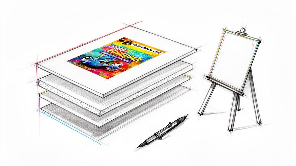
Foam board printing is a fantastic way to get high-quality images and text onto a board that’s both lightweight and surprisingly rigid. It’s a go-to choice for everything from sleek business presentations to eye-catching event signage, mainly because it delivers a professional, high-impact look without the hefty price tag. A Visual Megaphone for Your Message Think of a foam board sign as a visual megaphone. It's built to grab attention and broadcast your message, whether you're in a crowded trade show hall or a quiet office lobby. But what is it, really? The magic lies in its simple but clever construction: a core of dense polystyrene foam sandwiched between two smooth paper liners. This layered design is the secret sauce. The inner foam gives it structure and rigidity without the weight, while the paper on the outside provides the perfect canvas for crisp, vibrant printing. It's this combination that makes foam board printing such a versatile tool. Why Choose Foam Board? The real power of foam board is how it perfectly balances quality, cost, and convenience. It fills that sweet spot between a flimsy poster and expensive, heavy-duty signage, giving you a professional solution that’s easy on the budget. Here’s why so many people love it: Professional Finish: The smooth surfaces, whether matte or semi-gloss, offer a high-end look that fits right into corporate settings, presentations, and retail displays. Lightweight and Portable: It’s so light you can carry it with one hand. This makes it a breeze to transport, set up, and move around—perfect for events and temporary installations. Cost-Effective Impact: You get huge, attention-grabbing visuals for a fraction of what you’d pay for materials like acrylic or metal. Your marketing budget will thank you. Versatility in Application: From detailed photo displays to bold, simple directional signs, foam board can be easily cut and customized for almost any idea you can dream up. The Growing Demand for Quality Signage The proof is in the numbers. The global foam boards market, valued at USD 70.3 billion , is on track to hit USD 110.6 billion by 2035 . The specific type used for high-quality printing—polystyrene foam boards—is leading the charge with a massive 47.7% market share because of its smooth finish, sturdiness, and great price. In short, foam board printing is a smart, strategic choice for durable, temporary signs that look polished and professional. It’s the go-to when you need your visuals to pop, without the logistical headache or cost of heavier materials. This guide will walk you through everything you need to know to make foam board work for you. Whether you’re just exploring options for mounted prints or planning a major event, you’re about to learn how to get stunning results. Choosing the Right Foam Board for Your Project Picking the right material for your foam board printing project is a lot like choosing the right tires for a car. At a glance, they might all seem similar, but the right choice guarantees the best performance, durability, and a final product that’s perfectly suited for its job. Your decision here affects everything from visual punch to how long your sign will last, so let's walk through the options. The two main things you’ll be deciding between are the material type and its thickness . Each combo is built for a specific purpose, whether it’s a lightweight board for an internal meeting or a heavy-duty, weather-resistant sign for a bustling trade show. Nailing this choice is the first step toward a perfect print. Understanding Core Material Types Not all foam boards are created equal. The stuff on the inside (the core) and the paper on the outside can be surprisingly different, giving each type its own unique strengths. Getting to know the main players will help you match your project's needs with the best material. Here are the primary types you'll run into: Standard Foam Board: This is the classic you probably picture—a polystyrene foam core sandwiched between two sheets of smooth, clay-coated paper. It’s light, easy on the wallet, and gives you a fantastic surface for crisp, vibrant printing. PVC Foam Board (Sintra/Komatex): When your project needs a little more muscle, PVC foam board is the answer. It's made from a solid, moderately expanded closed-cell polyvinyl chloride (PVC). This makes it way more durable, rigid, and resistant to moisture and dings than standard foam board. Acid-Free or Archival Foam Board: If you’re mounting priceless photos or fine art, this is the professional standard. It's made with materials that won't yellow or degrade over time, keeping your prints safe and sound for years to come. In the world of advertising and signage, PVC foam boards are a clear favorite because they print beautifully and can take a beating. In fact, the market for PVC foam board was valued at USD 2.1 billion and is expected to hit USD 3.6 billion by 2032 . That kind of growth shows just how essential it has become for creating tough, long-lasting displays. You can find more details on this trend over at Verified Market Research . How Thickness Impacts Your Sign Thickness is all about rigidity and presence. A thicker board doesn't just resist bending and warping; it also feels more substantial and high-end. The right thickness really comes down to the sign's size and where it’s going to live. Let's look at the most common options: 3/16" (5mm): This is the go-to, all-around favorite thickness. It strikes the perfect balance between being sturdy and lightweight, making it ideal for most indoor uses like point-of-sale displays, conference signs, and presentation boards. 1/2" (13mm): When you need something that’s built like a tank and makes a statement, 1/2" thickness is your best bet. It’s perfect for big signs that absolutely have to stay flat, high-end trade show displays, or any sign that needs to stand on its own without a hint of bowing. Key Takeaway: For most indoor signs under 24" x 36", the 3/16" foam board is the perfect workhorse. For larger, more permanent, or freestanding displays, upgrading to 1/2" thickness or PVC foam board is a smart investment in durability. To make things even easier, we've put together a quick comparison table to help you visualize the best fit for your project. Foam Board Material and Thickness Guide This guide breaks down common foam board types and thicknesses to help you choose the best option for your specific application, from indoor presentations to durable outdoor signage. Material Type Common Thickness Best For Durability Price Point Standard Foam Board 3/16" Indoor presentations, short-term retail signs Low $ Standard Foam Board 1/2" Larger indoor signs, easel displays Medium $$ PVC Foam Board 3/16" Short-term outdoor use, trade shows, durable displays High $$$ Now that you have a handle on the fundamentals, you can confidently choose the perfect material for whatever you're creating next. Ready to get started? Explore our full foamcore collection to see all these options and find the ideal match for your creative vision. How Your Designs Come to Life Ever wonder how a digital file on your screen becomes a crisp, vibrant foam board sign? It’s not just a matter of hitting “print.” Getting your design from pixel to physical product involves some pretty impressive technology, all aimed at making sure your colors pop and your message gets noticed. Let's pull back the curtain on the two main ways we make that happen. The go-to method these days is direct-to-surface UV printing . Picture a highly advanced inkjet printer, but instead of paper, it’s built to print directly onto rigid materials like foam board. As this machine lays down specialized inks, a powerful ultraviolet (UV) light follows right behind, instantly curing—or hardening—the ink directly onto the board. This instant-cure process is a real game-changer. It stops the ink from bleeding or soaking into the surface, which means you get incredibly sharp details and colors that look like they're about to jump off the board. Because the ink is hardened right away, it’s also tough against fading, scratches, and even a bit of moisture, making it a durable choice for professional signs. An Alternative Method: Mounting Graphics There’s another way to get the job done: mounting . This is more like applying a perfectly fitted, high-end sticker to your foam board. We start by printing your design onto a sheet of premium adhesive vinyl. Then, using specialized equipment, we carefully apply that printed graphic to the face of the foam board, ensuring a smooth, bubble-free finish. This technique is especially handy when you’re after a specific look that direct printing can’t quite achieve. For instance, if you want an ultra-glossy finish or a unique texture, mounting a custom-printed vinyl is the perfect way to get that effect. Thinking about different surface treatments? Exploring various laminating options for your prints can add another layer of protection and really make your final product shine. To help you figure out which board is best for your project, check out this quick guide. It breaks down the choice between our standard and PVC foam boards based on where you plan to use them. As you can see, for indoor jobs like trade show displays or presentations, a standard board is perfect. But if your sign is heading outdoors or into a high-traffic area, you’ll want the extra muscle of a PVC board. The Secret Ingredient: Professional Color Calibration No matter which printing method we use, getting the color right is non-negotiable. Your brand's specific shade of blue isn’t just a color—it’s your identity. That’s where professional color calibration comes in. Professional printers use advanced color management systems to ensure the colors on your screen are faithfully reproduced on the final printed board. This involves calibrating printers, monitors, and software to a universal color standard, guaranteeing consistency across every single print run. Our top-of-the-line equipment is meticulously calibrated to translate digital color profiles (like CMYK) into physical ink with stunning accuracy. This obsession with detail is what keeps your branding consistent and professional, building trust with your audience. Understanding the principles of graphic design for branding helps create visuals that connect, and it’s our job to make sure they print perfectly. In the end, it’s this marriage of technology and color science that guarantees your foam board project looks exactly how you pictured it. Preparing Your Files for a Perfect Print Sending your design file to print can feel a little like launching a rocket. You’ve put in all the work, and now you have to trust that everything is set up correctly for a successful mission. This section is your pre-flight checklist, designed to make sure your digital file translates perfectly into a stunning physical sign, without any frustrating (and costly) mistakes. Getting these details right from the start is the secret to a smooth process. It saves you time, prevents reprints, and guarantees your final foam board looks every bit as professional as you imagined. We'll walk through the three most critical parts of file prep: resolution, color mode, and bleed. Once you get these down, you'll be submitting files like a seasoned pro. Decoding Resolution for Crisp Images Have you ever seen a printed sign that looked blurry, blocky, or just fuzzy around the edges? That’s almost always a resolution problem. Think of your digital image as a mosaic made of thousands of tiny colored squares called pixels. Resolution, measured in DPI (dots per inch) , tells the printer how many of those tiny pixels to squeeze into each square inch of the foam board. For high-quality foam board printing, the magic number is 300 DPI . A file with this resolution has enough pixel data packed in to produce sharp lines, crisp text, and clear photos that look fantastic even up close. Trying to print a file with a lower resolution, like the 72 DPI standard for web images, is like stretching a small rubber band too far—it gets thin, distorted, and eventually breaks. The image just falls apart. Pro Tip: Always set your design file to 300 DPI from the very beginning. This one step is the single biggest factor in achieving a sharp, professional-looking print and avoiding that dreaded pixelated look. Choosing the Right Color Mode Here’s something many people don’t realize: digital screens and physical printers speak two completely different color languages. Your computer monitor, tablet, and phone create colors by mixing R ed, G reen, and B lue light. This is the RGB color model , and it’s called an "additive" process because when you add all the colors together, you get pure white light. Perfect for glowing screens, but totally wrong for ink on paper (or foam board). Printers work by subtracting light. They start with a white surface and add ink in C yan, M agenta, Y ellow, and Blac k ( CMYK ) to absorb light and create colors. If you send an RGB file to a printer, its software has to make its best guess at how to translate those light-based colors into ink-based ones. This conversion often leads to disappointing surprises, like your vibrant electric blue turning into a dull, muted navy. RGB (Red, Green, Blue): This is for anything that will live on a screen—websites, social media graphics, digital ads. CMYK (Cyan, Magenta, Yellow, Black): This is the only color mode you should use for projects destined for print, including your foam board signs. By designing in CMYK from the start, what you see on your calibrated screen is a much more accurate preview of the final printed product. You stay in control, ensuring your brand’s signature red doesn't accidentally become a muddy maroon. Why Bleed Is Your Safety Margin Imagine you’re painting a room and want a perfectly clean line where the wall meets the ceiling. You’d use painter's tape, right? You paint slightly over the tape to make sure there are no gaps. In printing, bleed is your painter's tape—a small safety margin for your design. When we print your sign, it's often on a larger sheet of foam board that gets trimmed down to its final size. Even with hyper-precise cutting machines, there can be microscopic shifts of a millimeter or two during the trimming process. If your background color or image stops exactly at the edge of your design, a tiny shift could leave an ugly, unprofessional-looking white sliver on one side. To prevent this, you simply extend your background 1/8th of an inch (0.125") past the final trim line on all four sides. This extra area is the "bleed." Now, if the cutter shifts slightly, it slices through this extra printed area, guaranteeing the color goes edge-to-edge flawlessly. It’s a simple trick that makes a world of difference for a clean, polished finish. Inspiring Ways to Use Foam Board Signs While the tech specs are good to know, the real magic of foam board printing happens when you see it out in the wild. Its usefulness goes way beyond just hanging a poster. For businesses, it's a powerful tool to grab attention, point customers in the right direction, and project a sharp, professional image. Let’s walk through a few real-world examples where foam board signs really shine. Picture a startup getting ready for its first big trade show. The budget is tight, but their booth needs to look polished and pull people in. This is exactly where large-format foam board printing saves the day. They can create a stunning, full-color backdrop with their logo and main selling points, instantly making their space look legitimate and inviting. They can also scatter smaller signs around the booth to call out product features, show off pricing, or provide QR codes that link to their site. And because the material is so light, setting up and packing away is a breeze—a huge time-saver when every minute counts. Transforming Retail and Event Spaces In the blink-and-you'll-miss-it world of retail, catching a customer’s eye is everything. Foam board is the perfect material for creating can’t-miss point-of-sale (POS) displays that shout about a new sale, promote a seasonal special, or introduce a new product line. A thoughtfully placed sign on an easel by the door or a custom-cut display on the counter can be the nudge that turns a browser into a buyer. Now, think about a real estate agent holding an open house. Instead of relying on small, forgettable photos, they can print huge, gorgeous images of the property on foam board. Placed on easels in key rooms, these signs can highlight the home's best assets—like a sun-drenched garden or a sleek new kitchen—creating an immersive experience that sticks with potential buyers. The sheer versatility of foam board is a huge part of its appeal across so many industries. From buttoned-up corporate presentations to beautiful wedding welcome signs, its ability to deliver high-quality visuals in a lightweight, budget-friendly package makes it an absolute marketing staple. The broader foam market is seeing massive growth, which is great news for the printing and display world. Valued at USD 119.02 billion , the global foam market is expected to hit USD 186.16 billion by 2033 . This surge underscores just how vital this material is for brand communication and advertising in countless business sectors. Professional Presentations and Office Branding Step into the corporate world, and you'll see foam board signs adding a dose of professionalism to presentations and meetings. A speaker can use a series of boards to walk through key data points, charts, and infographics, creating a visual aid that’s far more engaging and tangible than another PowerPoint slide. They're also fantastic for internal communications, like displaying company values in the lobby or providing clear directional signage in a sprawling office. Of course, to make sure your foam board signs truly pop, it all starts with a solid foundation in effective logo and brand design . When you pair a great design with the perfect material, you create visual assets that do the heavy lifting for you. Ready to bring your own ideas to life? Explore the endless possibilities with these and other custom rigid signs for all your business needs. Finishing and Mounting for a Professional Look The final touches on your foam board printing project are what transform a great print into an unforgettable display. Think of it like framing a piece of art; the print itself is stunning, but the right finish and mounting method elevate it, protect it, and prepare it for its moment in the spotlight. These last steps are absolutely crucial. They ensure your sign not only looks professional but also has the durability to stand up to its environment, wherever that may be. A simple print is good, but a finished print is so much better. Choosing Your Protective Finish Finishing options, like lamination, act as a protective shield for your design. This thin layer of plastic film guards against scratches, fingerprints, and UV rays that cause colors to fade over time. It’s a simple addition that can significantly extend the life of your sign. The type of lamination you choose has a huge impact on the final look and feel. Each one offers a distinct aesthetic, so the best choice really depends on your design and where the sign will be displayed. Here’s a quick breakdown of the most popular choices: Gloss Lamination: This finish creates a shiny, reflective surface that makes colors appear richer and more vibrant. It's an excellent choice for photographic prints or designs with bold, saturated colors that you really want to pop. Matte Lamination: For a more subtle, sophisticated look, matte is the way to go. It produces a smooth, non-reflective surface that minimizes glare, making it perfect for signs viewed under bright lights or from various angles. Key Insight: Choose gloss to make your colors sing and grab immediate attention. Opt for matte when you need a high-end, glare-free finish for professional settings like corporate presentations or art displays. Smart Mounting for Maximum Impact Once your sign is printed and finished, the next question is: how will you display it? The right mounting hardware does more than just hold your sign up. It contributes to the entire presentation, whether you need a simple tabletop display or a sleek, modern wall installation. Exploring different mounting hardware solutions can open up a world of creative possibilities for showcasing your prints. Here are a few common mounting options to consider: Easels: The classic, go-to solution for temporary displays. An easel is a simple yet effective way to present your foam board sign at trade shows, conferences, or retail entrances without having to alter any walls. Grommets: These are small metal rings punched into the corners or edges of your sign. Grommets are perfect for hanging your foam board from ceilings or walls using rope, wire, or hooks. It’s a secure and straightforward method. Standoffs: For a truly modern and elegant look, standoffs are unbeatable. These metal hardware pieces mount your sign slightly away from the wall, creating a sophisticated "floating" effect with subtle shadows. This method is ideal for permanent displays in lobbies, offices, or galleries where you want to make a lasting impression. By carefully considering both the finish and the mounting, you ensure your foam board printing project achieves that polished, professional look that’s perfectly suited for its purpose. Answering Your Foam Board Printing Questions So, you’re just about ready to order your foam board signs, but a few last-minute questions are probably bubbling up. It's totally normal. Getting these final details sorted is the key to feeling great about your purchase, and that's exactly what this section is for. Think of this as your quick-reference guide. We’re tackling the most common questions we get, covering everything from durability to delivery times, so you have complete confidence before you hit that "order" button. How Durable Is Foam Board Printing for Outdoor Use? This is a big one. Standard foam board is really designed for indoor life. Its paper surface looks amazing, but it doesn't play well with moisture or humidity. It's the go-to choice for things like conference presentations, indoor retail displays, and trade show booths where it's safe from the weather. Now, if you do need something for short-term outdoor use, you'll want to pivot to PVC foam board . This stuff is a durable plastic, making it naturally waterproof and way more resilient. For any sign that's going to see the sun, we always recommend adding a UV-protective laminate . It's a small add-on that keeps your vibrant colors from fading. What Is the Best Way to Care for My Foam Board Sign? Good news: keeping your foam board sign looking crisp and professional is incredibly simple. A little bit of care goes a long way. Dusting: Just grab a soft, dry microfiber cloth and give it a gentle wipe. Easy. Cleaning Smudges: If you get a minor smudge, a lightly dampened cloth will usually do the trick. Avoid Chemicals: This is important—stay away from harsh chemical cleaners, anything abrasive, or solvents. They can easily ruin the printed surface and the board itself. When you're not using them, store your signs flat in a cool, dry place out of direct sunlight. This keeps them from warping and protects the print. And a pro tip: always handle them by the edges to avoid fingerprints on your design. Can Foam Board Signs Be Cut into Custom Shapes? Absolutely! This is where foam board printing gets really fun. We're not just limited to squares and rectangles. Using precision die-cutting, we can create signs in just about any custom shape you can dream up. This opens up a massive world of creative possibilities. We can cut your company logo to its exact shape, create life-size standees of people or products, or design totally unique displays that stop people in their tracks. It's the perfect way to make your brand unforgettable at events, in your store, or at a trade show. The ability to create custom shapes is a game-changer for marketers. It lets a sign be more than just an information panel—it becomes an interactive and memorable piece of your brand's story. What Are the Typical Turnaround Times for Foam Board Printing? We know that deadlines are everything. Getting your signs when you need them is our priority. The exact turnaround time depends on a few things, like how complex your order is, the quantity, and any special finishes like custom cuts or lamination. That said, many of our standard foam board orders can be produced very quickly. Here at 4OVER4 , we even offer same-day printing options for those super urgent, last-minute projects. As you build your order on our product page, you’ll see a real-time estimate for both production and shipping, so you know exactly when to expect your delivery. Feeling confident and ready to create a sign that captures attention? At 4OVER4 , we make it easy to bring your vision to life with high-quality foam board printing and a wide range of customization options. Start your order today and see the difference professional printing makes.
 story
story A Practical Guide to Graphic Design for Print
Graphic design for print is a whole different ballgame. It’s the craft of making visuals for things you can actually hold—brochures, business cards, posters, you name it. To get it right, you have to nail the technical details like CMYK color modes, 300 DPI resolution, and precise physical dimensions. Unlike digital design, where you can fix a mistake with a few clicks, print involves real, tangible materials. Getting the setup perfect from the start is non-negotiable if you want the final product to look exactly like what you see on your screen. Why Print Design Is a Different Beast Before you even think about starting a print project, you need to wrap your head around the huge differences between designing for a screen and designing for paper. I’ve seen it happen a hundred times: a design looks absolutely brilliant on a backlit monitor but turns into a muddy, blurry, or misaligned mess on the printing press. This isn’t just about aesthetics; it’s about physics and mechanics. The core of it is the medium itself. A digital screen creates color by emitting light using the RGB (Red, Green, Blue) model, which is why you get those vibrant, glowing visuals. Paper, on the other hand, absorbs light. Print uses the CMYK (Cyan, Magenta, Yellow, Key/Black) color model, where inks are layered on top of each other to subtract brightness from the white paper. That's exactly why that electric blue on your screen might come out looking much duller in your printed brochure. Thinking in Physical Terms When you’re designing for print, you have to think in tangible dimensions. Forget about pixels. Your new best friends are inches, millimeters, and picas. You need to consider how the final piece will actually be held, folded, and experienced by a real person. Tactile Experience: The weight and texture of the paper are part of the design. A glossy flyer feels completely different from a heavy, uncoated business card. These choices affect how the ink absorbs and what people think about the quality of your brand. Physical Constraints: A webpage can scroll forever, but a printed piece has hard edges. Every single element must fit neatly within a specific trim size, and you have to keep all your important info inside a "safe margin" to make sure nothing gets chopped off during cutting. This shift from a fluid digital canvas to a fixed, physical object demands a different way of thinking. You're not just creating an image; you're engineering an object. For bigger jobs, knowing the ins and outs of different printing methods is crucial. For instance, https://www.4over4.com/printing/category/offset-printing is the go-to for large runs where you need consistent, high-quality results. The Financial Stakes of Print Design In digital design, mistakes are usually a quick fix. A typo on a blog post? A wrong color on a website? You can sort that out in minutes with almost no cost. But in the world of print, errors are permanent and painfully expensive. A single oversight, like using a low-res image or forgetting to add a bleed, can turn thousands of flyers or brochures into a pile of expensive recycling. This is why the pre-press stage—where you check and finalize your files—is the most critical part of the whole process. The global graphic design industry was valued at $43.4 billion in 2025, with the U.S. market alone making up $13.3 billion of that. This massive industry runs on precision because every print run is a real financial investment. Mastering the technical side isn't just about being a good designer; it's about being a responsible one. You can find more stats on the industry's scale over at Colorlib . Getting Your Document Setup Right Getting your document set up correctly from the very beginning is your first, and best, line of defense against costly print errors. This is where we stop talking theory and start putting it into practice, turning a blank digital canvas into a solid blueprint for a physical product. Let's walk through creating a print-ready file using a standard tri-fold brochure as our example. It keeps things tangible and grounded in the real world. Imagine you're designing that brochure for a local coffee shop. The final, folded piece will be a standard letter-sized page ( 8.5" x 11" ) creased into three panels. The absolute first thing you must do is plug those exact physical dimensions into your design software, whether it's Adobe InDesign or Illustrator . This isn't a suggestion—it's the foundation of the entire project. The Holy Trinity: Bleed, Safe Zone, and Slug Once your document dimensions are locked in, the next critical step is to establish the "holy trinity" of any print layout: the bleed , the safe zone , and the slug . These aren't just technical jargon; think of them as safety nets that guarantee your final printed piece looks sharp and professional. First up is the bleed . This is a small, extra margin of your background color or image that extends beyond the final trim edge. The industry standard is typically 0.125 inches (or 1/8th of an inch ) on all sides. Why does this matter so much? Printing and trimming are physical processes, and the cutting machines can have a tiny margin of error. Without that bleed, any slight shift during the cut could leave a glaring white sliver along the edge of your beautiful design. Next, you have to define the safe zone , sometimes called the live area. This is an internal margin—usually another 0.125 inches inside the trim line. You need to keep all your critical content, like text, logos, and key parts of images, well within this zone. It's a simple way to guarantee that nothing important gets accidentally chopped off. Setting a proper bleed and safe zone is the single most effective way to prevent the most common print file rejection. It���s a non-negotiable step that separates amateur layouts from professional, press-ready artwork. Finally, there's the slug . This is an optional area that sits outside the bleed where you can leave notes for your printer. You might include your contact information, specific folding instructions, or details about any special finishes you want. It's your direct line of communication with the person running the press. To make this a bit clearer, check out this quick visual summary of the workflow, from the initial design concept to the final, structured setup with bleed and margins properly in place. This flow really highlights how essential it is to move from a creative digital space (RGB) into a technical, print-ready format (CMYK) while building in those crucial structural elements like bleed and margins. Before you jump into the creative side of things, it's a good habit to double-check these foundational settings. This simple checklist can save you a world of headaches later on. Essential Print Setup Checklist Setting Purpose Common Standard Document Size Defines the final trim dimensions of the printed piece. Matches the final product size (e.g., 8.5" x 11"). Color Mode Ensures colors will print accurately on a press. CMYK (not RGB). Bleed Prevents white edges after trimming by extending the design. 0.125" (1/8th inch) on all sides. Safe Zone Protects critical content from being trimmed off. 0.125" or more inside the trim line. Resolution Guarantees images are sharp and not pixelated. 300 DPI (Dots Per Inch). Running through this list ensures your file is built on a solid, professional foundation from the get-go. Applying It to the Brochure Project Let's circle back to our tri-fold brochure. With a final trim size of 8.5" x 11" , your document setup in InDesign should look something like this: Page Size (Trim Size): 8.5" width x 11" height. Bleed: 0.125" on all four sides. This makes your actual document size 8.75" x 11.25" . Margins (Safe Zone): At least 0.125" inside the trim edge. I often use 0.25" just to give everything more breathing room. You'd also add guides to mark the fold lines, ensuring your panels align perfectly. A little-known fact about a standard letter tri-fold is that the panels aren't all equal; one is slightly shorter so it can fold inside neatly. A quick search or a template from your printer will give you the exact measurements for these fold lines. These initial setup steps are universal, whether you're designing a business card or a massive catalog. Mastering them is what builds the foundation for every successful print project. The precision you establish here directly impacts the quality of the final product. And for those projects that need to break out of the standard rectangle, exploring options like custom die cutting can add a truly memorable touch. Mastering Color and Resolution Once you've got the basic structure of your document nailed down, it's time to tackle the two elements that can truly make or break a print job: color and resolution. Getting these right is the difference between a project that looks professional and one that’s a huge disappointment. We've all been there, especially early in our careers. You design something with vibrant, glowing colors on your screen, only to get the printed version back looking flat and muddy. This gut-wrenching moment almost always comes down to one fundamental misunderstanding: screens and printers speak two completely different color languages. The Great Divide: RGB vs. CMYK Your monitor, phone, and TV create images by emitting light. They use the RGB (Red, Green, Blue) color model, which is additive . When you combine red, green, and blue light, you get pure white. It’s why colors on a screen can look so bright and luminous. Printing is the total opposite. It's a subtractive process that works by putting ink on paper. Printers use the CMYK (Cyan, Magenta, Yellow, Key/Black) model, where inks are layered to subtract brightness from the white paper. Combine them all, and you get a dark, murky brown—which is why a true black ink ( Key ) is essential. Because of this, the range of colors CMYK can produce (its "gamut") is much smaller than RGB's. Those electric blues and neon greens you love on screen? They simply don't exist in the world of ink. When you convert an RGB file to CMYK, the software does its best to find the closest match, but it often leads to a noticeable—and usually disappointing—color shift. Here’s the single most important takeaway: Always, always, always start your print projects in CMYK mode. Designing in CMYK from the beginning means the colors you see are the colors you'll get. No more nasty surprises. Achieving Perfect Brand Consistency with Pantone Colors So, what if a brand's specific shade of "Coke Red" needs to be perfect every single time, no matter what? Mixing cyan, magenta, yellow, and black can get you close, but slight variations are inevitable from one print run to the next. That's when you bring in the big guns: the Pantone Matching System (PMS) , also known as spot colors. Think of it like buying a specific can of paint at the hardware store. Instead of mixing inks on the fly, a Pantone color is a single, pre-mixed ink created from a precise formula. You get the exact same shade every time. Here's when you'll want to use Pantone colors: Logos and Branding: To guarantee absolute color consistency across business cards, brochures, and signage. Limited Color Palettes: If a design only uses one or two colors, printing with spot inks can sometimes be cheaper than a full four-color job. Colors Outside the CMYK Gamut: Need a metallic silver, a fluorescent orange, or another color CMYK just can't handle? A spot color is your only option. When working with spot colors, you have to be crystal clear with your printer. Make sure to specify the exact Pantone code (like PANTONE 185 C ) in your design file so they know precisely which ink to load into the press. The Non-Negotiable Rule of 300 DPI Now let's talk clarity. The sharpness of your printed photos and graphics all comes down to resolution , which we measure in DPI (Dots Per Inch) . This number literally tells the printer how many tiny dots of ink to place within a one-inch line. For the web, 72 DPI is the standard. It looks perfectly fine on a screen because monitors have a relatively low pixel density. But if you try to print a 72 DPI image, you're in for a world of hurt. The result will be a blurry, pixelated mess as the printer struggles to stretch just a few dots over a large physical area. For professional-quality print, 300 DPI is the unbreakable rule. At this resolution, the ink dots are so small and packed so tightly together that our eyes perceive them as a crisp, continuous image. There's no room for negotiation on this one. The Visual Impact of Resolution The difference between low-res and high-res in print is night and day. Imagine you're designing a restaurant flyer and you grab a photo of their signature pasta dish from their website. The Low-Res Mistake: That website photo is almost certainly 72 DPI. It looks great on your monitor. But when you place it in your 300 DPI print file, it will appear tiny. If you try to scale it up to fit the space, it instantly becomes a blocky, unprofessional-looking disaster that makes the food look unappetizing. The High-Res Solution: A photo taken with a decent camera and saved at 300 DPI will look sharp, detailed, and delicious in print. Every noodle and basil leaf will be clear, making the dish—and the restaurant—look professional. Before you ever send a file off to be printed, double-check the resolution of every single image. In tools like Adobe Photoshop , you can easily see the image size and resolution to ensure everything is set to that magic number: 300 DPI. For projects where sharpness is paramount, especially for smaller batches, high-quality digital printing services can beautifully reproduce every detail of your high-resolution files. Choosing Fonts and Paper for Impact A design isn't truly finished until it becomes a physical object. That final piece—the feel of the paper in your hands, the crispness of the text—is just as critical as the digital file you spent hours perfecting. Let's get into typography and paper stock, the two elements that turn a great concept into a tangible experience. Choosing fonts for print is a whole different ballgame than designing for a screen. On paper, you’re dealing with physics. Ink bleeds into the paper’s fibers, a phenomenon called ink spread or dot gain , which can cause the fine details in a font to vanish or make thin letters look muddy and unreadable. Crafting Legible Print Typography That delicate, wispy font that looks so elegant on your monitor? It might just turn into a blurry mess on an uncoated, porous paper. The ink will naturally spread out, thickening every stroke. Because of this, it's almost always a safer bet to choose fonts with a sturdier build and clear letterforms, especially for smaller body text. Your choice between serif and sans-serif fonts should really be guided by the project’s overall vibe and where it will be seen. Serif Fonts: Think Times New Roman. Those little decorative strokes, or "feet," are traditionally loved for long blocks of text in books and newspapers. The serifs are thought to help guide the eye along each line, making for an easier read. Sans-Serif Fonts: Think Helvetica or Arial. Without the strokes, these fonts have a clean, modern feel. They shine in headlines and captions but work just as well in print when you give them enough breathing room. A crucial rule of thumb I always follow is to never go below 8 to 10 points for body text. Anything smaller is a huge risk, especially with serif fonts where the tiny details can easily get lost in the ink. Imagine a high-end fashion catalog. It might use a crisp, elegant serif for its descriptions to broadcast sophistication. On the other hand, a tech startup’s flyer would probably go for a clean, bold sans-serif to feel modern and straight to the point. The Power of Paper Stock Paper isn't just a background; it's an active part of your design. The weight, finish, and texture you select will dramatically change how the final product looks and feels, directly influencing how people perceive your brand. Paper weight is measured in GSM (Grams per Square Meter) or Points (pt) . A flimsy 90 GSM paper might be okay for a throwaway flyer, but a premium business card needs to feel substantial. We're talking 350 GSM (16 pt) or even heavier. The weight alone communicates quality before a single word is even read. For something that makes a serious statement, you can explore options like our ultra-thick collection . Matching Finish to Function The paper's finish is another make-or-break decision that directly affects how your colors and images come to life. Each type serves a different purpose and creates a totally different mood. Paper Finish Best For Characteristics Glossy Photo-heavy brochures, flyers, posters Shiny, reflective surface that makes colors pop. Shows fingerprints easily. Matte Business cards, invitations, art prints Smooth, non-reflective finish for a sophisticated, modern look. Less vibrant than gloss. Uncoated Letterheads, notebooks, eco-friendly branding Natural, textured feel. Ink absorbs more, softening colors. Easy to write on. Let's think through a couple of real-world scenarios. For a luxury wedding invitation, you want something that feels special. A heavy, uncoated cardstock with a subtle texture immediately signals elegance. In contrast, for a mass-produced pizza menu, a lightweight, glossy paper is perfect—it makes the food photos look amazing and it’s cheap to print in bulk. Ultimately, great print design is all about making intentional choices that honor the physical medium. Staying on top of what works is key, too. Studies show that 94% of first impressions are design-related, and 38% of people will toss a printed piece if the layout is unattractive. By getting your typography and paper choices right, you create more than just marketing material—you create a memorable experience. Your Final Prepress Checklist You’ve poured everything into this design. It looks absolutely perfect on your screen. But now comes the moment of truth: the handoff. This final stage is all about a meticulous preflight check to make sure your beautiful digital file becomes a flawless physical print. Think of yourself as a pilot doing a final inspection before takeoff. This is not the time to rush. It's your last chance to hunt down any gremlins hiding in your file—the kind that cause expensive, soul-crushing reprints. We're talking about sneaky RGB elements, missing fonts, or a low-res image that somehow slipped through the cracks. Conducting a Thorough Preflight Check Your design software is your best friend here. Adobe InDesign, for instance, has a fantastic built-in "Preflight" panel that acts like an automated quality control inspector. It’ll flag most of the common problems, but you still need to know what to look for. Trust me, you can't rely on it completely. Here’s a quick list of what I always check manually, no matter what the software says: Color Mode Confirmation: Go through your document and swatches with a fine-tooth comb. Is every single element, from photos to tiny vector icons, in CMYK? One stray RGB logo can throw off the entire color balance of a print run. Resolution Audit: Click on every single placed image. Check its "effective" resolution. Is it at least 300 DPI at the size it's being printed? This is non-negotiable for sharp, professional results. Bleed and Safety Margins: Visually confirm that every element touching the page edge extends all the way to the bleed line. Even more important, make sure no critical text or logos are creeping into that safety margin. Ink Coverage: Take a look at your rich blacks and other dark areas. You need to make sure the total ink coverage (the sum of C+M+Y+K values) doesn't go over the printer's limit, which is usually around 300% to 320% . Too much ink leads to muddy colors and frustrating drying issues on press. This is where you catch the tiny mistakes that become huge problems. Taking an extra ten minutes here can save you hours of headaches and hundreds of dollars down the line. Packaging Files and Outlining Fonts Once your file passes inspection, it's time to get it ready for the printer. There are two main ways to do this, and it usually depends on your software and what your printer prefers. If you're in Adobe InDesign, the "Package" feature is your absolute go-to. This command is a lifesaver—it gathers your InDesign file, all linked graphics, and every necessary font into one neat folder. This is the gold standard because it guarantees the printer has every single asset they need. Alternatively, if you're in a program like Adobe Illustrator or if the printer specifically asks for it, you might need to "Create Outlines" for your text. This essentially turns your text into vector shapes, so it no longer needs a font file to be viewed correctly. The upside? No more font issues. The downside is that the text is no longer editable, so always save a separate version with live text before you do this. Pro Tip: I always send both. Send the printer the packaged file and a press-ready PDF. The packaged file is a great backup in case they need to make a tiny, last-minute fix on their end, while the PDF is the locked-and-loaded file they'll actually print from. Exporting a Bulletproof Press-Ready PDF The final, most critical step is creating that high-quality, press-ready PDF. This is the universal format that printers love because it locks everything in place. When you export, don't just hit "Save." Use the "Adobe PDF Presets" and choose [Press Quality] . This preset does most of the heavy lifting for you, but you still need to tweak a couple of things. Navigate to the "Marks and Bleeds" tab. You absolutely must check the boxes for: Crop Marks: These little lines tell the printer exactly where to trim the final piece. Use Document Bleed Settings: This ensures the bleed you so carefully set up is actually included in the final file. Forgetting these settings is one of the most common reasons files get rejected. The standards for print are only getting more important as digital printing evolves. In fact, the digital graphic printing market is expected to grow at a CAGR of 5.2% from 2025 to 2030, showing just how critical these technical skills are. Finally, if your project has a special touch, like a unique finish, double-check that you’ve set up your files correctly for that process. For example, learning more about laminating options for your prints can add incredible durability and a premium feel, but it requires the right setup from the start. Once you’ve gone through this checklist, you can send your file off with total confidence, knowing you’ve done everything possible to guarantee a perfect print. Common Print Design Questions Even the most seasoned designers hit a wall with certain technical print questions. A few key issues tend to pop up time and again, often standing as the final hurdle between a brilliant idea and a perfect print run. Let's clear up some of the most frequent queries that land in our inbox. Vector vs. Raster: What’s the Real Difference for Print? This is probably the single most important concept to nail down for print design. Think of a raster image (like a JPG or PNG) as a detailed mosaic made from thousands of tiny colored squares, called pixels. At its original size, it looks fantastic. But the second you try to make it bigger, you're just stretching those little squares out. The result? That blurry, jagged-edged mess that every printer dreads seeing. A vector file (think AI, EPS, or SVG) works in a totally different way. Instead of pixels, it’s built from mathematical paths, points, and curves. This means you can scale a vector logo from the size of a postage stamp to a building-sized billboard with absolutely zero loss in quality . Here's the golden rule for print: Logos, typography, and any kind of line art must be in a vector format. This is the only way to guarantee they’ll print with perfectly sharp, clean edges. Reserve raster images exclusively for photographs. How Do I Get a True, Deep Black? One of the most common rookie mistakes is assuming that setting your color to 100% Black (K) in a CMYK file will give you a solid, deep black. On paper, it just doesn't work that way. Pure 100% K ink often comes out looking more like a dark charcoal gray, especially over larger areas. It can look washed out and weak. The secret is to create a "rich black" by supporting the black ink with other colors. When you mix in a little cyan, magenta, and yellow, you create a black that’s much deeper, darker, and more saturated. It just pops off the page. A safe, industry-standard formula for rich black is: C: 60% M: 40% Y: 40% K: 100% It's always a good idea to check with your printing partner for their preferred rich black values. Different presses and paper stocks can sometimes require a slightly tweaked formula to get the best results. What Is Overprinting and When Should I Use It? Overprinting is a setting that tells the printing press to lay one color of ink directly on top of another. By default, programs are set to "knockout," which means the bottom color is cut out to make a blank space for the top color to be printed into. So, when would you use it? The most critical and practical application is for small black text. If that tiny text is set to knock out, even a microscopic misalignment of the printing plates can create a thin white halo around the letters. This makes the text look fuzzy and difficult to read. By setting small black text to overprint , you’re telling the press to print the black ink directly over whatever colors are in the background. This completely eliminates the risk of those ugly gaps, keeping your text perfectly crisp and legible. As a general rule, you should only use this for black elements—avoid it for other colors unless you get specific instructions from your printer. At 4OVER4 , we're obsessed with bringing your designs to life just as you pictured them. From business cards to massive banners, our team’s expertise ensures your print projects always look professional and make an impact. Explore our full range of high-quality printing services at 4over4.com and see the difference precision makes.
 story
story Graphic Design Fundamentals for Stunning Visuals
Graphic design fundamentals are the bedrock of visual communication. Think of them less as rigid rules and more as a shared language that allows you to arrange elements on a page and tell a compelling story. They’re what guide your hand in everything from choosing a color to setting up a page layout. Getting a handle on these concepts is the first real step toward creating designs that don't just look good, but actually work. Building Your Visual Toolkit Imagine a chef in their kitchen. They don't just toss ingredients into a pan hoping for the best. They have a deep understanding of how salt brings out flavor, how acidity cuts through richness, and how heat can completely transform a dish. Graphic design fundamentals are your ingredients. They’re the core tools you'll learn to combine with skill and intuition to create something balanced, flavorful, and satisfying for the eye. This understanding is what separates professional, polished work from something that just feels… off. It’s the invisible framework that makes a poster easy to read at a glance instead of a confusing mess. We’ll walk through each of these core components one by one, building your knowledge from the ground up. The Pillars of Effective Design Before we get into the nitty-gritty, let's do a quick flyover of the key ideas we'll be covering. Each of these principles plays a unique role, contributing to both the beauty and the function of a design. Here’s what you’ll be adding to your toolkit: Color Theory: We'll look at how different colors make people feel and how to build palettes that connect with your audience. Typography: This is about giving your words a voice by choosing and pairing fonts that are easy to read and match the message's tone. Layout and Composition: You’ll learn to arrange elements on a page to create a sense of order and guide the viewer’s eye. Visual Hierarchy: This is the art of showing people what’s most important, telling them where to look first, second, and third. When you learn how these elements work together, you stop just decorating a page and start architecting a visual experience. You're building a clear path for the viewer's attention, and that skill is the backbone of any successful design. The real-world importance of these skills is undeniable. Even with economic ups and downs, the global graphic design market was valued at $43.4 billion in 2025, which shows just how essential it is to businesses everywhere. Strong design is absolutely critical for building solid brand awareness and creating effective marketing materials. Understanding the Power of Color Psychology Color isn't just a decoration; it's a silent communicator. Long before someone reads a single word on your design, the colors you’ve chosen have already set a mood, conveyed a feeling, and started telling a story. It’s a powerful tool that builds brand identity and can even nudge people toward making a decision. Think about it. There's a reason so many banks and tech companies lean heavily on the color blue. It’s not just a coincidence—blue has deep associations with trust, stability, and professionalism . On the flip side, you'll see fast-food chains splashing red and yellow everywhere. Those warm colors are known to spark feelings of hunger, excitement, and even a little bit of urgency. How to Think About Color Like a Designer To really get a handle on color, you need to know its three core ingredients: hue, saturation, and value. Don't worry about the jargon; these concepts are actually pretty simple when you break them down. Hue: This is the easy one. It’s just the pure color itself—red, green, blue, you name it. Think of it as the tube of paint you’re starting with. Saturation: Picture taking that pure, vibrant color and slowly mixing in gray paint. High saturation is the bright, intense version, while low saturation is muted and dull. The more gray you add, the less saturated it gets. Value: Imagine you have a dimmer switch for your color. Turning it up adds white, making the color lighter (this is called a tint ). Turning it down adds black, making it darker (a shade ). Value is all about the lightness or darkness of your hue. This infographic gives a great visual breakdown of how designers weigh different principles to create visuals that really work. As the chart shows, while lots of things are important, creating strong contrast is often the top priority for grabbing a viewer's eye and guiding them through a design. Building Color Palettes with a Purpose Once you've got those basics down, you can start building color schemes that feel intentional and harmonious. Instead of just grabbing colors that look nice, using established color models gives you a solid foundation for creating palettes that just work . A well-chosen color palette does more than just decorate a page; it tells a story. It guides the eye, creates a specific mood, and reinforces the core message of your design without saying a word. For example, a complementary scheme is perfect for a call-to-action button because it creates high-energy contrast that’s hard to ignore. An analogous scheme, on the other hand, feels much calmer and is great for backgrounds or branding elements that need to feel unified. The demand for professional design is on the rise, with small and medium businesses now making up over 57% of market revenue . This is a big reason the global graphic design market is expected to hit $81.3 billion by 2030 . Color plays a huge role in how brands connect with their audience. Here's a quick look at some common emotional connections tied to different colors in Western cultures. Emotional Associations of Common Colors in Branding Color Common Psychological Association Brand Example Red Excitement, Passion, Urgency, Danger Coca-Cola Blue Trust, Stability, Calm, Professionalism Facebook Green Nature, Health, Growth, Wealth Whole Foods Yellow Optimism, Happiness, Warmth, Clarity McDonald's Orange Friendliness, Confidence, Creativity Nickelodeon Purple Royalty, Luxury, Wisdom, Imagination Cadbury Black Power, Elegance, Sophistication Chanel White Purity, Simplicity, Cleanliness Apple Of course, these associations can vary across cultures, but they serve as a fantastic starting point for thinking about the non-verbal message your colors are sending. Common Color Schemes Explained Here are a few classic formulas that every designer keeps in their back pocket. They are the building blocks for creating visual harmony. Complementary: These are colors sitting directly across from each other on the color wheel (like red and green). This duo creates the strongest possible contrast, making it perfect for elements you want to make pop. Analogous: This involves picking three colors that are right next to each other on the color wheel (like yellow, yellow-green, and green). You see this all the time in nature, and it creates a really serene and comfortable vibe. Triadic: This scheme uses three colors that are evenly spaced out on the color wheel (like the primary colors: red, yellow, and blue). Triadic palettes are naturally vibrant and dynamic, giving you strong contrast while still feeling balanced. Getting comfortable with these combinations allows you to design with intention. Whether you're laying out a brochure or creating stunning custom canvas prints , the colors you choose will directly shape how your audience feels and reacts. When you move beyond just "what looks good" and start thinking strategically, your visuals become exponentially more powerful. Making Typography Speak Your Message If color sets the mood, then typography is what gives your design a voice. It’s far more than just picking a font you like; it’s the craft of arranging letters and words to make the entire message clear, engaging, and easy to read. Done right, typography turns plain text into a powerful communication tool. Think of a font as an outfit for your words. You wouldn’t show up to a black-tie gala in sweatpants, and you wouldn't send a formal wedding invitation in a playful, bubbly font. Making the right choice is one of the most critical graphic design fundamentals . Understanding Font Personalities At a high level, fonts fall into a few major families, each with its own vibe and purpose. Getting to know these is the first step toward choosing fonts that actually support your message instead of clashing with it. You'll run into these three most often: Serif Fonts: These are the classics, the ones with tiny decorative strokes (called serifs ) at the ends of the letters. Think Times New Roman. Those little feet help guide the eye, making serifs incredibly readable for long blocks of text in print, like in books or magazines. They tend to feel traditional, trustworthy, and elegant. Sans-Serif Fonts: "Sans" is just French for "without," so these are the fonts without the little feet. Fonts like Helvetica and Arial are clean, modern, and straight to the point. Their simplicity makes them incredibly versatile and a go-to for headlines, digital content, and minimalist designs. Script Fonts: These fonts look like they were written by hand, mimicking everything from formal calligraphy to casual handwriting. Because they’re so decorative, script fonts work best in small doses for adding emphasis—like on a logo, a special invitation, or a pull quote. Using them for long paragraphs is a recipe for an illegible mess. A well-chosen typeface does more than just present information; it conveys a feeling. It can make a brand feel trustworthy, a headline feel urgent, or a quote feel inspirational before the reader has even processed the words themselves. The Art of Font Pairing Just like you’d pair colors to create a palette, you combine fonts to create visual interest and hierarchy. The trick to good font pairing is creating contrast that feels intentional, not chaotic. One of the most common and effective strategies is to pair a bold, modern sans-serif for your headline with a clean, highly readable serif for the body text. This contrast does the heavy lifting for you, telling the viewer’s eye exactly where to look first. The one thing you want to avoid is pairing two fonts that are too similar—it just creates a subtle, awkward conflict that makes a design feel amateurish. As a rule of thumb, stick to two or three fonts per design to keep things clean and cohesive. Mastering the Space Between Letters Beyond the font itself, the spacing around your letters and lines is what separates good typography from truly professional work. It’s a bit like managing personal space in a conversation; too close feels crowded and uncomfortable, while too far feels disconnected. Three key concepts control this spacing: Kerning: This is all about adjusting the space between individual pairs of letters. Some letter combinations, like "AV" or "To," naturally create awkward gaps. Good kerning tucks them in for a smoother, more balanced look. Tracking: While kerning is surgical, tracking adjusts the spacing uniformly across an entire word or block of text. Loosening the tracking can give text an airy, sophisticated feel, while tightening it makes it feel more compact and urgent. Leading: Pronounced "ledding" (like the metal), this is simply the vertical space between lines of text. Getting the leading right is absolutely essential for readability, making it easy for the reader’s eye to jump from the end of one line to the start of the next. Nailing these subtle adjustments is what takes a design to the next level. It's a crucial skill for creating everything from posters to premium business cards printing , where every detail shapes the final impression. When the spacing is right, the message just flows. Building a Strong Foundation with Layout and Composition A great layout is the invisible skeleton holding your design together. It’s a core piece of graphic design fundamentals , acting as a silent guide that tells your audience's eyes exactly where to go. Without a strong composition, even the most beautiful colors and fonts can end up feeling like a chaotic mess. Think about arranging a living room. You wouldn't just toss furniture around at random. You'd group the sofa and coffee table, align chairs to create cozy conversation spots, and leave clear paths for walking. Layout and composition work the same way—it’s all about arranging visual elements for clarity and impact. Arranging Elements with Purpose Four key principles are the backbone of nearly every effective layout: proximity, alignment, repetition, and contrast. Get a handle on these, and your designs will instantly look more polished and intentional. Proximity: This is all about grouping related things together. When elements are close to each other, our brains automatically assume they're connected. Putting a caption right next to its photo, for instance, creates an immediate visual link. Alignment: This creates a clean, organized look by making sure nothing on the page feels like it was placed by accident. When you align text and images along a shared line—left, right, or center—you get a sharp, visually connected design. These aren't just digital rules; they are absolutely essential for print. A well-organized layout is critical when designing effective marketing pieces, from simple flyers to multi-page booklets. A solid grasp of layout helps create professional brochures printing that guides readers through the information without them even noticing. Using Grids as Your Blueprint Think of a grid as the architectural blueprint for your design. It's an underlying structure of intersecting lines—typically columns and rows—that helps you organize and align everything with precision. The grid itself is invisible in the final product, but its influence is obvious in the design's balance and consistency. Using a grid takes the guesswork out of placing elements. It helps you keep margins consistent, create balanced compositions, and give every element a logical home. Whether you're working on a single poster or a thick catalog, a grid provides the framework you need for a professional and cohesive result. The best layouts don't scream for attention; they work quietly in the background, making the content easy to scan and understand. A grid is the secret tool that makes this effortless organization possible. The Power of White Space One of the most misunderstood yet powerful tools in any designer's kit is white space , sometimes called negative space. It's just the empty area around and between the elements in your design. A common mistake beginners make is trying to fill every single inch of the page, but that just leads to visual clutter. White space isn't wasted space. It’s an active element that does a few critical jobs: Improves Readability: Giving text some room to breathe makes it much easier to read and less intimidating to the eye. Creates Focus: By surrounding an important element—like a headline or a call-to-action—with empty space, you immediately draw the viewer’s attention right to it. Adds Sophistication: A generous use of white space often signals a high-end, modern look. It conveys a sense of confidence and elegance, suggesting the content is important enough to stand on its own. Think of it like a pause in a song. The silence is just as important as the notes, creating rhythm and adding emphasis. In design, the empty spaces are what give the other elements meaning and punch. By strategically arranging elements using alignment and proximity and then giving them breathing room with white space, you build a composition that is both beautiful and functional. This is the foundational skill that lets you create visuals that communicate with absolute clarity. Creating a Clear Visual Hierarchy If your layout is the skeleton, then visual hierarchy is the brain telling the body what to do. It’s the art of directing your audience’s eyes, telling them precisely what to look at first, then second, and so on. Without a clear hierarchy, your message dissolves into visual noise, leaving people confused and likely to just look away. Think about the front page of a newspaper. You don’t just randomly scan it; your eyes are expertly guided. The enormous headline grabs your attention first, followed by a slightly smaller sub-headline, then a prominent image, and finally, the columns of text. That's a masterclass in visual hierarchy and a cornerstone of graphic design fundamentals . This deliberate arrangement isn't just for looks—it's about function. It ensures the most critical information gets across in a split second. A strong hierarchy doesn't just make a design look better; it makes it work better by controlling the flow of information and making it effortless to understand. Directing Attention with Size and Scale The simplest, most effective way to build hierarchy is with size. It’s instinct. Our brains are hardwired to notice bigger things first. By making one element larger than everything else, you’re essentially shouting, “Look at me!” This is exactly why headlines are always bigger than body copy and why a "Buy Now" button often takes up more real estate on a webpage. Scale creates immediate contrast and tells the viewer, without a doubt, what the most important part of your message is. But it’s not just about making one thing huge. It’s about creating a clear relationship between elements of different sizes. A good design will have an obvious primary element (the biggest), secondary elements (medium-sized), and tertiary elements (the smallest), which creates a logical path for the eye to follow. Visual hierarchy is the silent conversation you have with your audience. It's the non-verbal cue that tells them, "This is the most important thing you need to know, this is the next thing, and here are the details if you're still interested." Leveraging Color and Contrast Beyond pure size, color and contrast are your best friends for creating focal points. A bright, bold color will always pop against a more muted background. This is a simple but incredibly powerful way to pull attention exactly where you want it. Picture a design that’s mostly black and white. If you drop in a single splash of vibrant color—like a red "Sign Up" button—it becomes an unmissable target for the eye. Contrast works in a few different ways to build hierarchy: Color Contrast: Pairing a bright, saturated color with a dark or neutral one. Value Contrast: Using light and dark shades of the same color to separate elements. Typographic Contrast: Combining a bold, heavy font with a light, thin one. These techniques help you separate and prioritize information without just making everything bigger. A well-placed highlight can guide a user just as effectively as a massive headline. In fact, studies show a design's visual appeal is assessed in as little as 50 milliseconds , making these instant cues absolutely critical. Strategic Placement and Spacing Where you put things matters. A lot. People in Western cultures naturally read from top-to-bottom and left-to-right, often in a "Z" pattern across the page. Placing your most critical information along this natural reading path is an easy win to ensure it gets seen first. This is why logos are so often placed in the top-left corner—it’s where the eye naturally begins its journey. Just as important is the space around your elements. Surrounding something with plenty of white space (or negative space) makes it stand out, giving it room to breathe. This isolation signals to the viewer that this element is important and deserves their full attention. Bringing the Fundamentals Together in a Real Project Understanding these principles one by one is a great start, but the real magic happens when you see them working in concert. Let's walk through a practical example to see how these concepts click together. Imagine you've been asked to design a promotional flyer for a local "Summer Music Fest." Where do you even begin? First up: color . The event is all about high energy and good vibes, so a warm, analogous palette of orange, yellow, and a touch of red feels perfect. That choice alone instantly sets a vibrant, exciting mood. To make sure key details pop, we can bring in a deep, contrasting blue. From Blank Page to Balanced Layout Next, let's talk typography . For the headline, "Summer Music Fest," a bold yet friendly sans-serif font will capture that modern, approachable feel we're going for. But for the smaller text—listing bands, times, and other details—we need something clean and super legible. A crisp serif font is a great choice here, creating a classic font pairing that immediately signals a clear visual hierarchy. Now, we need to organize all this on the page. We'll use a simple three-column grid to give the layout an invisible backbone. This structure ensures everything from the headline to the band list feels aligned and intentional, not just randomly placed. The most important details, like the date, time, and location, will live in the central column, using proximity to group them logically. A flyer is the perfect training ground for mastering design fundamentals. It forces you to make deliberate choices about hierarchy, color, and spacing to get a clear message across—fast. To guide the viewer's eye, we lean on hierarchy . The event title gets top billing; it's the biggest thing on the page. The date and headlining band are the next most important, followed by the supporting acts and venue details in smaller text. We'll also be generous with white space around the edges and between sections. This breathing room is crucial for preventing a cluttered, overwhelming feel and makes everything easier to read. This step-by-step process shows how each principle builds on the others to create something cohesive and effective. These same fundamentals scale up to more complex projects, too, from multi-page brochures to custom packaging. In fact, a strong grid and clear hierarchy are absolutely essential when designing things like well-structured custom box printing , ensuring the final product isn't just beautiful but also functional. Your Top Questions About Design Fundamentals, Answered Even after you get the hang of the core concepts, a few questions always seem to pop up when you start putting them into practice. Let's tackle some of the most common ones that designers run into on their creative journey. How Many Fonts Should I Actually Use In A Design? There’s no hard-and-fast law here, but a solid professional guideline is to stick to two or three fonts, tops . Any more than that, and you risk creating visual chaos that confuses the eye. A classic, effective strategy is to pair a bold sans-serif for your headlines with a clean, easy-to-read serif for the body text. This contrast is intentional—it tells the viewer’s eye exactly where to look first and what to read next. Too many fonts just makes a design feel scattered and amateurish, completely undermining your message. If I Can Only Master One Thing First, What Should It Be? If you had to pick just one principle to nail down from the start, visual hierarchy is the undisputed champion. Think of it as the master principle that wrangles all the others—like size, color, and contrast—to guide the viewer's eye and control how they absorb information. Without a clear hierarchy, even the most beautiful design elements become a confusing mess. By mastering how to tell an audience what to look at first, second, and third, you ensure your design is not just pretty but also functional. It's the skill that makes visual communication click. Is It Ever Okay To Break The Rules Of Graphic Design? Absolutely—but only after you truly understand them. The fundamentals of graphic design aren't rigid laws; they're more like time-tested guidelines that help create clarity and visual harmony. Learning them gives you the power to make choices with purpose. Breaking a rule without knowing why it exists usually results in a sloppy, ineffective design. But breaking a rule intentionally —to create a specific mood, grab attention, or make a bold statement—is the mark of a confident, experienced designer. It's like learning your scales before you can improvise a killer jazz solo. How Do I Know If My Design Has Good White Space? Using white space (or negative space) well is all about creating balance and making your content easy to read. Here's a quick trick: squint your eyes while looking at your design. If the main elements all blur together into one big blob, you probably need to add more breathing room. Your design should feel open and uncluttered, giving your key elements the space they need to stand out. White space isn't just "empty" space; it's an active ingredient that sharpens focus, adds a touch of sophistication, and makes everything easier to digest. If your text feels cramped or your visuals look crowded, adding a little more space is almost always the solution. Ready to see your designs come to life with professional-grade printing? 4OVER4 has a massive selection of high-quality products, from business cards to banners, to make your vision a reality. Explore our printing services today!
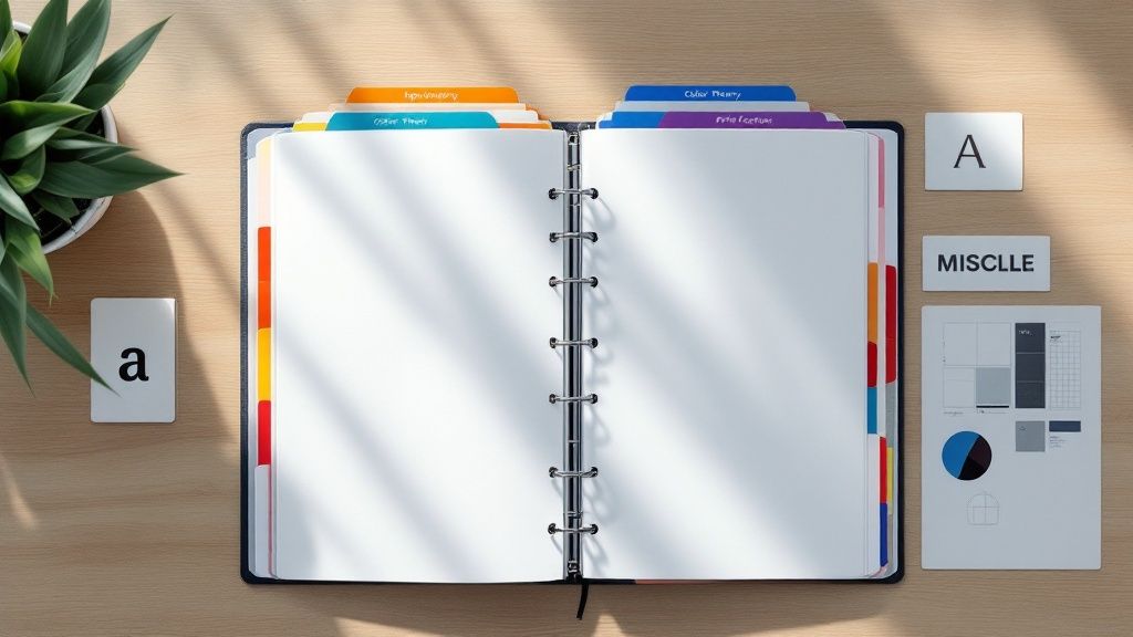 story
story A Glossary of Graphic Design Terminologies
Welcome to the definitive glossary for the language of graphic design. This guide is for everyone—from aspiring designers just starting out to seasoned pros who need a quick reference. We're here to cut through the jargon and break down complex terms into clear, practical definitions. Your Go-To Guide for Design Lingo Getting a handle on design terminology is the bedrock of great visual communication. Think of this guide as your comprehensive translator, helping you move beyond just knowing the words to truly understanding how they work in the real world. Whether you're trying to decipher client feedback, collaborating with your creative team, or just leveling up your own skills, this is the foundation you need. You'll learn to talk about design with the kind of confidence and precision that gets things done. A solid grasp of these concepts is also a must-have for producing top-notch print work. To see these terms in action, check out our wide selection of professionally printed marketing materials and see how they translate into real-world assets for your brand. This resource is all about bridging that gap between a great idea and a finished product. Foundational Design Principles and Concepts Before you can truly master the lingo of graphic design, you need a solid grip on the foundational principles that guide every visual project. Think of these as the universal rules of the road—they explain why some designs just work and feel right, while others look jumbled and confusing. They’re the secret sauce in every great composition. The practice of arranging visuals to communicate an idea is older than any formal language. You can see primitive storytelling in cave paintings from 38,000 BCE in places like Lascaux, France. Later, Sumerian cuneiform from around 3,000 BCE started to bridge the gap between simple pictures and symbolic language, really laying the groundwork for what we do today. Mastering Visual Arrangement At their core, all these principles are about creating clarity and impact. Alignment , for instance, is just the simple act of placing elements along a common line. When you see text in a magazine perfectly lined up with a grid, that’s alignment in action. It instantly creates a sharp, organized feel that’s easy on the eyes. Then there’s proximity , which is about grouping related things together. On a business card, your name, title, and phone number are all clustered together to signal that they’re one complete unit of information. It's a simple trick, but it cuts down on clutter and makes the information easier to digest. Repetition: This is where you reuse certain elements—like a font, color, or shape—throughout a design. Using the same style for all your headings is a perfect example. It creates a sense of rhythm and consistency that ties the whole piece together. Contrast: This is all about making different elements pop. Placing a bold, dark headline against a pale background is a classic use of contrast. It grabs your attention and tells you what’s important. Guiding the Viewer's Eye A great design isn't just a random assortment of elements; it's a carefully orchestrated journey for the viewer's eye. This is where visual hierarchy comes in. It's the art of arranging things in order of importance. A website’s main message might be in a huge, colorful font right at the top, while the less critical details are smaller and tucked away at the bottom. Balance is another key concept, referring to how visual weight is distributed in your design. It can be symmetrical (a perfect mirror image), asymmetrical (balanced using different elements of varying "weight"), or even radial (arranged around a central point). Imagine a poster with a large photo on one side perfectly balanced by a block of text on the other—that’s asymmetrical balance creating a sense of harmony. White Space (or Negative Space) isn’t just empty filler. It’s an active, powerful design element. It’s the breathing room you give to text and images so they don’t feel crowded. Using it well improves readability and gives your design a touch of class. Getting these principles right is absolutely vital for creating visuals that don't just look pretty but actually work. A solid understanding is key to building strong brand awareness , because applying these rules consistently is what creates a professional and memorable identity. The Complete Typography Terminology Guide Typography is so much more than just choosing a pretty font. It’s the craft of arranging text in a way that’s not just legible and readable, but also visually appealing. Think of it as the unsung hero of graphic design; when it’s done well, it elevates a design from good to truly great, ensuring your message connects with your audience on a deeper level. Let's clear up a common point of confusion right away. A typeface is the overall design of the lettering—it’s the entire family, like Helvetica or Times New Roman. A font , on the other hand, is just one specific style within that family, such as Helvetica Italic or Times New Roman Bold . Getting this right is the first step to talking like a pro. Understanding Character Anatomy To really get a handle on type, you need to know the basic building blocks of each letter. These little details might seem small, but they have a massive impact on the feel and readability of your text. Serif vs. Sans-Serif: This is the big one. Serifs are those little decorative feet or strokes you see at the ends of letters in typefaces like Garamond. Typefaces without them, like Arial, are called sans-serif (which literally means "without serif"). Baseline: Picture an invisible line that all the letters are sitting on. That’s your baseline. Ascender and Descender: An ascender is the part of a lowercase letter that pokes up above the main body (the x-height), like the tall part of an 'h' or 'b'. A descender is the opposite, dropping below the baseline, like you see in a 'p' or 'g'. Mastering Spacing and Layout The space around your letters and lines is just as critical as the letters themselves. Getting the spacing right gives your work a clean, polished look that’s effortless to read. These are some of the most essential terms every designer should have in their back pocket. Good typography is a lot like good manners. You don't notice it when it's there, but you sure do when it's not. It’s the silent partner in communication that makes everything clearer. For instance, kerning is the art of tweaking the space between two specific letters to make them look balanced. In contrast, tracking is about adjusting the spacing uniformly across a whole word or block of text. And leading (pronounced like "ledding," a nod to the old days of lead type) is the vertical breathing room between lines of text, measured from one baseline to the next. This quick-reference table breaks down these essential spacing terms to help you keep them straight. Key Typography Terminology Explained Term Definition Primary Use Kerning Adjusting space between two specific characters Fixing awkward gaps in logos or headlines Tracking Adjusting space across a range of characters Improving readability of a whole paragraph Leading Adjusting the vertical space between text lines Making body text easier to read and scan Understanding these concepts is non-negotiable when you're creating branded materials. Think about professional business stationery—mastering these typographic details is what makes it look sharp and credible. You can see great examples of this in high-quality https://www.4over4.com/printing/category/letterheads-printing , where typography is key to the brand's identity. And since the tools of our trade are always evolving, it pays to stay on top of things like new presets and Google Fonts updates for design software . Knowing what's available can make achieving typographic perfection that much easier. Understanding the Language of Color Theory Color is easily one of the most powerful tools in any designer's arsenal. It can instantly set a mood, grab a user's attention, and guide their eye exactly where you want it to go. Getting a real handle on the language of color theory means you can stop guessing and start making intentional, effective choices that truly connect with your audience. It all boils down to the three basic properties of any color, often called HSV : Hue: This is what we typically think of as the color itself—the pure pigment on a color wheel, like a true red, a classic blue, or a sunny yellow. Saturation: Think of this as the intensity or purity of a color. A highly saturated color is rich and vibrant, while a desaturated one is more muted, looking like it has a bit of gray mixed in. Value: Also known as brightness, value is simply how light or dark a color is. Color Models for Screen and Print How a color gets made depends entirely on where it's going to end up. Different media need different color models to get the shades just right, and knowing the difference is key to avoiding those frustrating (and expensive) moments when your printed piece looks nothing like your on-screen mockup. The two big ones you'll work with are RGB (Red, Green, Blue) and CMYK (Cyan, Magenta, Yellow, Key/Black) . RGB is an additive model used for digital screens, where beams of light combine to create color. CMYK, on the other hand, is a subtractive model for print, where inks are layered on paper to absorb light. For those projects that demand absolute color consistency—think brand logos—the Pantone Matching System (PMS) uses standardized, pre-mixed inks. If you're creating something special, like vibrant business cards with a unique finish, precise color management is non-negotiable. You can see how this plays out with options like metallic foil printing online . Creating Harmony with Color Schemes Putting colors together effectively is part art, part science. Color harmony is the term for pairing colors in a way that just works —it's visually pleasing and feels balanced. Designers lean on a few tried-and-true schemes to build beautiful palettes: Complementary: These are colors sitting directly across from each other on the color wheel, like red and green or orange and blue. This combo creates a ton of contrast and visual energy. Analogous: This scheme uses colors that are neighbors on the color wheel—think blue, blue-green, and green. The result is always harmonious and creates a calm, comfortable feeling. Triadic: A triadic scheme involves three colors that are evenly spaced on the wheel, forming a perfect triangle. It offers strong visual contrast but keeps things feeling balanced and rich. Digital and Print Production Terminology Every designer eventually learns a hard lesson: a great idea is only as good as its execution. To bridge the gap between your creative concept and the final product, you need to speak the language of production. Whether you're handing files off to a web developer or a commercial printer, knowing these core graphic design terminologies is the key to a smooth, error-free delivery. It's what prevents costly reprints and ensures your vision comes to life exactly as you imagined it. The history of our craft is tied directly to production. The term “graphic design” didn't even exist until 1922, when William Addison Dwiggins coined it in an essay, but the principles are ancient. The Industrial Revolution brought us technologies like lithography, which opened the door for complex, repeatable prints and blew the lid off what was possible with graphic reproduction. If you're curious about the full story, Canva.com has a great piece on its fascinating evolution. Key Terms for Digital Design When you're designing for screens, a few technical details make all the difference. The most fundamental concept to get your head around is the difference between raster and vector graphics. Think of raster images (like JPEGs or PNGs) as mosaics built from a grid of tiny squares, or pixels. If you try to make the mosaic bigger, the squares just get larger and the image looks blocky and blurry. Vector graphics (like SVGs), on the other hand, are created with mathematical equations. This means you can scale them up to the size of a billboard or shrink them down to fit on a watch face, and they’ll stay perfectly crisp and sharp every single time. This brings us right to the idea of resolution. PPI (Pixels Per Inch): This is all about pixel density on a digital screen. For web design, the long-standing standard is 72 PPI . DPI (Dots Per Inch): This one's for print, measuring the density of ink dots a printer lays down. For a sharp, high-quality printed image, 300 DPI is the magic number. Getting these two mixed up is a classic rookie mistake. It can lead to blurry, pixelated prints or bloated, slow-loading files for the web. Must-Know Print Production Vocabulary Sending files to a commercial printer is a whole different ball game with its own set of rules. One of the absolute most critical concepts is the bleed . This is simply an extra margin of your design that extends past the final trim edge. Bleed is your safety net. It guarantees that when the paper is cut down to its final size, you won't see any ugly, unprinted white slivers along the edge if the trim is just a fraction of a millimeter off. It’s essential for a professional finish. A few other print terms go hand-in-hand with this: Trim Line: This is the line where the piece will actually be cut, representing the final dimensions of your project. Slug: This is an area outside the bleed where you can leave notes for the printer—things like file information or special instructions. It all gets trimmed off and thrown away after production. Understanding these concepts is non-negotiable, especially for projects with custom shapes. For example, knowing how to set up your files correctly is crucial for specialized services like die-cutting , where precision is everything. A file prepared with the proper bleed and trim marks ensures the final product is cut perfectly and matches your exact specifications. A Look at Key Design Styles and Movements To really get a handle on graphic design, you have to look back. Understanding the major design styles and movements gives you a massive well of inspiration and context for your own work. Think of it as a visual shorthand—it helps you make deliberate choices and communicate your creative direction with total clarity. Knowing these core graphic design terminologies is key to framing your vision, whether you're briefing your team or presenting a concept to a client. The story of design is a global one, shaped as much by cultural tides as by leaps in technology. We saw the intricate, decorative styles of the Victorian era ( 1837–1901 ) and the handmade focus of Arts & Crafts ( 1880–1910 ) eventually flow into the organic, curvy forms of Art Nouveau ( 1910–1920 ). The 20th century really kicked things into high gear with disruptive movements like Futurism and the incredibly influential Bauhaus school ( 1919–1933 ). Post-war design was largely defined by the grid-based Swiss Style from the 1940s to the 1980s , which eventually paved the way for modern digital trends like Flat Design in the 2010s . For a deeper dive, this graphic design timeline offers a fantastic overview. Defining Major Styles Getting a feel for the signature traits of each movement is crucial. Every style has a distinct visual personality that was created to solve the communication challenges of its day. Minimalism: This style is all about subtraction. It strips everything down to the essentials, using extreme simplicity, generous negative space, and a tight color palette to create something clean, uncluttered, and highly functional. Art Deco: Popping up in the 1920s , Art Deco is pure glamour and luxury. You'll recognize it by its bold geometric shapes, sharp, clean lines, rich colors, and symmetrical patterns. Swiss Style (International Typographic Style): This mid-20th-century movement is built on a foundation of objectivity and clarity. Its trademarks are rigid grid-based layouts, clean sans-serif typography (hello, Helvetica), and an orderly, asymmetrical arrangement of elements. You've probably seen Brutalism in web design lately. Its roots are actually in post-war architecture, and it's all about raw, exposed functionality. Think unstyled HTML, monochromatic color schemes, and a stark, almost "brutal" honesty in how it's presented. The infographic below zeroes in on how key web design terms, in particular, have changed over time—from the very first lines of HTML to the rise of responsive design. This timeline really drives home how technological breakthroughs have directly molded the visual language and the very possibilities of digital design over the past couple of decades. By understanding where these movements came from, you can start to borrow, combine, and reinvent their visual languages to create something entirely new and effective. A Few Common Design Questions Answered If you’ve ever felt like designers are speaking a different language, you’re not alone. Getting a handle on a few key terms can make a world of difference when you’re trying to communicate your vision. Let’s clear up some of the most common points of confusion. Raster Versus Vector So, what's the real story with raster vs. vector images? Think of it this way: raster graphics, like a JPEG or a photo from your phone, are made up of a finite grid of tiny squares called pixels. When you try to make them bigger, the image gets all blurry and pixelated because you’re just stretching those squares. Vector graphics, like an SVG or an Adobe Illustrator file, are totally different. They’re built with mathematical paths and curves, not pixels. This means you can scale them up to the size of a billboard or shrink them down to fit on a pin, and they'll stay perfectly sharp and crisp every single time. That’s why your logo should always be a vector file. DPI Versus PPI Another mix-up we see all the time is DPI vs. PPI . While they sound similar, they live in two separate worlds: print and digital. DPI stands for "dots per inch" and is all about printing. It measures the density of ink dots a printer puts on a piece of paper. For anything you want to look sharp and professional in print, 300 DPI is the gold standard. PPI, or "pixels per inch," is for screens. It refers to the number of pixels packed into an inch of a digital display on your monitor, phone, or tablet. UI Versus UX Finally, let's untangle UI and UX . While they work together, they are two distinct disciplines. User Interface (UI) design is what you see . It’s the visual side of things—the colors, the typography, the buttons, the layout, and all the aesthetic choices that make up the look and feel of a website or app. User Experience (UX) design is what you feel . It’s the entire journey and overall feeling a person has while using a product. Is it easy to navigate? Is it intuitive? Does it solve their problem without causing frustration? That’s all UX. Ready to put your design knowledge into practice? Create stunning, professionally printed materials with 4OVER4 , your one-stop online print superstore. Start designing today at https://4over4.com .
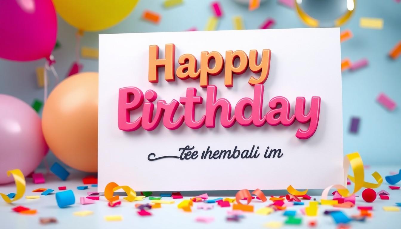 story
story 17 Essential and Attractive Holiday Card Fonts | 4OVER4.COM
Why Font Choice Matters for Holiday Cards Choosing the right font significantly impacts the overall appeal of holiday cards, making it an essential aspect of design. A well-selected font enhances the emotional connection expressed in the card, while also reflecting the theme of the celebration. Selecting playful and whimsical fonts adds charm to birthday cards, creating an inviting atmosphere that resonates with the recipient. Handwritten styles can convey a personal touch, while bold fonts provide clarity and emphasis, ensuring that heartfelt messages stand out. Moreover, the font influences how recipients perceive the card's sentiment. Elegant fonts convey sophistication, perfect for creating an impression of thoughtfulness. Conversely, quirky fonts can infuse a sense of fun, matching the joyful essence of birthday celebrations. We encourage exploring various font styles to find the perfect match for your greeting cards. For more inspiration, check out our wide range of greeting card design templates . When designing custom greetings, utilize the unique fonts available at 4OVER4 to elevate your card’s aesthetic. Remember to also consider what your brand represents if you're creating cards for business purposes. A cohesive font choice that aligns with your branding strengthens brand recognition and promotes a more professional image. Whether designing festive invitations or charming birthday greetings, the font choice creates a lasting impact. To explore various options, we recommend checking out free sample printing products to see how different fonts can transform your holiday projects. Choosing the Perfect Font for Your Holiday Cards Selecting the right font for holiday cards significantly impacts their overall appeal and emotional connection. Whimsical fonts bring charm, while handwritten styles add a personal touch. Bold fonts ensure clarity, and elegant fonts communicate sophistication, enriching the card's sentiment. We explore various font styles to enhance our holiday cards. For playful designs, consider using fonts with unique characteristics, like handwritten or script styles. These can evoke warmth and joy, making the greetings feel more intimate. When aiming for a more elegant look, serif fonts offer a classic touch. They convey formality and can elevate our holiday greetings' sophistication. Geometric fonts provide a contemporary flair, perfect for modern card designs. For businesses, embracing UNIQUE PRINTING SOLUTIONS from 4OVER4 can enhance brand presence through customized holiday cards. With options for bold and memorable designs, we can align our card aesthetics with our brand image. Utilizing design templates from 4OVER4 allows us to experiment with different font combinations and styles, ensuring our designs are both eye-catching and impactful. This practice not only brings our vision to life but also reinforces the essence of the holiday spirit. To enhance personalization in our designs, we can opt for free card samples offered by 4OVER4. These samples help us evaluate how different fonts appear on the final product, ensuring we make the best choices for our holiday greetings. Each choice of font serves a purpose, whether to express joy, love, or peace. By carefully selecting fonts that resonate with our intentions, we create lasting impressions during the festive season. Remember to choose a font that reflects our style and the message we want to convey. Exploring a variety of custom greeting card options will enhance our designs and streamline our creative process. Through collaboration with 4OVER4, we can achieve stunning results that truly encapsulate the holiday spirit. Banana Split Holiday Card Fonts Selecting the right font transforms a birthday card from ordinary to extraordinary. When it comes to Banana Split holiday card fonts, a variety of options exist to match every celebration. We recommend exploring colorful and playful fonts that evoke excitement and joy. Font Options Cupcake by Fox7 Cupcake is a vibrant display font, perfect for children’s parties and dessert-themed celebrations. Its whimsical style captures attention, making it ideal for eye-catching social media posts and cute greeting cards. Honey Beezy by Patricia DMStd Honey Beezy stands out with its playful script and cheerful bee icons. This font is excellent for spring birthday parties, looking fantastic on birthday t-shirts, invitations, and greeting cards. Banana Split The Banana Split font offers a fun, rounded style that’s perfect for festive greetings. Its lighthearted appearance contributes to a cheerful atmosphere on any birthday card or holiday greeting. Postcard Script The Postcard Script font provides a classic yet personal touch. Its cursive style enhances the heartfelt message, fitting perfectly into a range of projects including invitations and memorable posters. Pink Lemonade Pink Lemonade is a sweet and playful font that suits numerous occasions. Its charming design complements events like baby showers, weddings, and birthdays. Using these holiday card fonts on your projects adds a unique flavor to your designs. We suggest taking advantage of custom printing solutions from 4OVER4 to make your cards stand out even more. Our custom greeting cards services allow businesses to enhance brand presence while creating personalized birthday and holiday greetings. By utilizing free samples from 4OVER4, you can evaluate font choices on the final product. This evaluation ensures that your selected fonts resonate with your audience. Exploring various font styles enables us to create designs that truly reflect our unique and festive spirit. To find inspiring options, we encourage checking out our design templates for greeting cards , which offer a fantastic starting point for your birthday and holiday card projects. Using these templates allows us to experiment with different font combinations, ensuring eye-catching and impactful designs. Fiddums Family For birthday cards, selecting the right font can significantly impact the design and overall sentiment. We recommend playful and vibrant fonts like Cupcake, Honey Beezy, Banana Split, Postcard Script, and Pink Lemonade. Each font adds its unique flair, making birthday greetings lively and memorable. Cupcake : Best for whimsical celebrations, this font features round, bubbly letters that evoke joy. Honey Beezy : Its handwritten style offers a personal touch, perfect for heartfelt messages. Banana Split : This font captures fun and excitement, ideal for festive cards. Postcard Script : This elegant cursive conveys sophistication while remaining approachable. Pink Lemonade : Bright and playful, this font enhances vibrant themes and cheerful wishes. Utilizing design templates from 4OVER4 allows us to experiment with these fonts effectively. With the right visual elements, we can create birthday cards that stand out. In addition to aesthetic appeal, custom printing solutions from 4OVER4 provide businesses with the tools to elevate their brand presence. When designing birthday cards, we appreciate how 4OVER4 helps us achieve standout results through high-quality materials and finishes. Customizing our cards not only reflects our unique style but also makes a professional statement. By accessing free samples from 4OVER4, we can evaluate how each font looks in print, ensuring our designs resonate with recipients. Whether we choose playful fonts for children’s parties or elegant scripts for adult celebrations, utilizing the right font enhances our overall artistic expression. For businesses looking to reinforce their brand identity on birthday cards, the significance of a suitable font cannot be underestimated. Fonts function as visual representatives of our message and tone, strengthening our brand’s connection with customers. Leveraging custom printing solutions from 4OVER4 facilitates this process, allowing us to make each occasion feel special while promoting our brand effectively. Images showcasing the recommended fonts in action can enrich our understanding of their appeal. Incorporating visuals of cards designed with these fonts creates additional inspiration to explore various designs. Using custom greeting cards through 4OVER4 provides a perfect platform to express our creativity and enhance our communications. Androgyne Holiday Card Fonts Androgyne represents a unique font choice for our holiday card designs, blending elegance with a contemporary flair. This font features beautifully curved letters, lending sophistication to birthday cards and holiday greetings alike. Its versatility makes it suitable for various styles and occasions. Consider using Androgyne for your birthday invitations to convey a playful yet refined aesthetic. Incorporating this font adds a special touch, ensuring that every message resonates with charm. With the help of design templates from 4OVER4, we can create visually appealing cards that stand out. For custom greeting cards, Androgyne pairs well with other serif fonts, creating eye-catching combinations that elevate the overall design. By selecting the right blend, our cards reflect both personal sentiments and festive cheer, enhancing communication with recipients. Explore a range of options for custom cards, as 4OVER4 provides extensive resources that make designing easy and enjoyable. Remember, the right font enhances our artistic expression, making each occasion feel special. Utilizing resources like 4OVER4 for free samples allows us to evaluate choices before finalizing designs, ensuring the perfect fit for our projects. By embracing the characteristics of Androgyne and other top fonts, we can craft memorable birthday cards that leave a lasting impression. Channel Choosing the right font for birthday cards influences not only aesthetic appeal but also enhances our brand's presence through custom printing solutions. We recommend exploring a range of font options available at 4OVER4. Utilizing the available design templates can streamline the selection process, allowing us to experiment with various styles effectively. Here are some vibrant and playful font recommendations for birthday cards: Cupcake : This whimsical font embodies fun and cheerfulness, making it perfect for children's birthday parties. Honey Beezy : Its rounded letters convey a sense of warmth and friendliness, suitable for heartfelt messages. Banana Split : This playful typeface captures joy, ideal for celebratory announcements. Postcard Script : This cursive font offers a personal touch, perfect for handwritten notes. Pink Lemonade : A vibrant typeface that radiates positivity and is suited for festive occasions. Additionally, we suggest using Androgyne for birthday invitations. Its elegant yet contemporary style elevates communication, making it versatile for various announcements. Incorporating custom printing options from 4OVER4 not only enhances the visual impact of our birthday cards but also strengthens our brand identity. High-quality materials and finishes contribute to a polished look. With features like free card samples, we can evaluate our choices before finalizing designs. Explore the design templates to see how these fonts transform cards into memorable keepsakes. By focusing on thoughtful font selection and leveraging the exceptional custom printing options at 4OVER4, we ensure our birthday cards resonate personally, creating lasting impressions for every recipient. Intrique Script Holiday Card Fonts Intrique Script offers a traditional feel with a modern twist, making it perfect for holiday card designs. This font features elegant curves and numerous ligatures that enhance any greeting, adding sophistication to your birthday card messages. Its unique style can lend a festive spirit to birthday invitations and greeting cards alike. When selecting a font from our extensive collection of greeting card templates, we find Intrique Script stands out for its versatility. It serves well for both formal and casual occasions. Whether you’re creating a whimsical birthday invitation or a cherished holiday card, Intrique Script provides a delightful aesthetic. Explore more options with the help of unique printing solutions available at 4OVER4. Their custom printing capabilities allow businesses to elevate their brand presence while ensuring that each card reflects the intended style and atmosphere. For an extra punch of creativity, pairing Intrique Script with other font styles can produce stunning results. Combining it with playful or vintage fonts enhances visual appeal, making your invites memorable and engaging for recipients. To discover more holiday fonts, check out our selection of greeting card templates. The right choice transforms each project into a work of art, captivating the attention of anyone who receives it. Further, we suggest utilizing free Samples . to evaluate font choices and printing quality directly before finalizing your designs Black Jack Black Jack stands out as a bold and playful font, perfect for birthday cards that aim to convey joy and excitement. This font features rounded, whimsical letters that capture attention instantly. Black Jack suits a variety of birthday themes, whether for children’s parties or festive adult celebrations. Key Attributes of Black Jack Readability : The font maintains clarity, making it easy for recipients to read heartfelt messages. Versatility : Effective for both casual and semi-formal birthday cards, Black Jack complements diverse design aesthetics. Character : It brings a cheerful vibe that enhances the celebratory atmosphere of any card. Utilizing design templates from 4OVER4 can help us experiment with Black Jack's integration in various layouts. We can effectively highlight this font's charm through vibrant backgrounds and suitable imagery. Creating with Black Jack Incorporating Black Jack in birthday card designs encourages creativity. Combining it with colorful graphics and playful elements amplifies the overall impact. Additionally, employing custom printing solutions through 4OVER4 enables us to bring our ideas to life with high-quality materials and finishes. Visual Inspiration Including images that showcase Black Jack in action enriches our understanding of its potential. Relevant visuals can illustrate how this font works seamlessly with different color palettes and themes. Moreover, we can explore free samples to evaluate Black Jack's appearance on the final product, ensuring the design resonates with our intended audience. By leveraging the unique features of Black Jack and the exceptional printing capabilities of 4OVER4, we enhance the visual appeal and brand presence of our birthday cards, making them unforgettable for every recipient. Merry Scriptmas Merry Scriptmas is an enchanting font perfect for holiday-themed cards and can enhance the overall design of birthday cards as well. This script font boasts flowing, cursive letters that add a charming touch to any greeting. Its elegant, yet whimsical nature makes it suitable for various festive occasions. Using Merry Scriptmas transforms cards into keepsakes that resonate with warmth and joy. We recommend experimenting with this font through customizable design templates available at 4OVER4. Highlights of Merry Scriptmas Stylish Design : Merry Scriptmas offers elaborate curves that create a sophisticated, artistic flair, ensuring your card stands out. Versatile Use : Perfect for formal birthday parties, casual gatherings, or even holiday wishes, this font adapts to various themes and events. Emotional Appeal : The warmth conveyed through its design fosters an emotional connection, making the sender’s message feel more personal. Pairing Merry Scriptmas with bold graphics or playful elements can elevate its visual impact. Combining it with vibrant colors enhances the celebratory atmosphere, ensuring a memorable experience for recipients. We can utilize 4OVER4 to access quality printing solutions, allowing us to create stunning cards that reflect both creativity and professional quality. Custom options ensure that every card not only showcases the chosen font but also complements the design, creating a cohesive look. Incorporating Merry Scriptmas Into Your Designs Experimenting with Color : Pairing Merry Scriptmas with contrasting colors enhances readability and engagement. Combining with Different Fonts : Mixing Merry Scriptmas with simpler fonts can draw attention to core messages while maintaining elegance. Enhancing with Graphics : Adding themed illustrations or seasonal motifs will complement the font beautifully, adding depth and interest to the card. By leveraging the extensive options from 4OVER4, we can test various combinations of Merry Scriptmas with other elements to achieve the perfect card design. With the right approach, fonts like Merry Scriptmas not only create visually appealing cards but also help reinforce brand identity, ensuring that every card we send leaves a lasting impression. MF Young & Beautiful We find that the font MF Young & Beautiful stands out for birthday cards due to its stylish and contemporary design. This font combines elegance with a youthful vibe, making it perfect for celebrations aimed at various age groups. Its unique character shapes and flowing lines evoke a sense of joy, ideal for conveying heartfelt birthday wishes. We appreciate how MF Young & Beautiful offers versatility, blending seamlessly with both whimsical and traditional themes. It fits beautifully on custom greeting cards, allowing us to explore creative typography options. Using this font enhances both readability and aesthetics, ensuring that the message remains clear and impactful. Incorporating images can further elevate the design. Here are suggested placements for images featuring MF Young & Beautiful on birthday cards: Showcase with Balloons and Cake : An image of a card using MF Young & Beautiful against a vibrant balloon and cake background highlights its playful nature. Elegant Themes : A close-up of the font used in an elegant card design contrasts beautifully with floral patterns, showcasing its sophistication. Youthful Elements : Visuals depicting the font combined with fun graphics like party hats or gifts exemplify its youthful appeal. Versatile Applications : An image demonstrating the font on various card styles—ranging from formal to playful—illustrates its adaptability. For businesses aiming to elevate their brand presence through custom printing solutions, utilizing MF Young & Beautiful along with high-quality materials from 4OVER4 can make a significant impact. We leverage design templates from 4OVER4 to experiment with different font combinations, ensuring standout results. Additionally, we suggest pairing MF Young & Beautiful with other typography styles for added visual interest. Consider combining it with bold serif fonts for a classic touch or playful scripts for a more whimsical look. By integrating custom greeting cards , we enhance our designs with diverse options that cater to various themes and occasions. For those uncertain about their choices, testing with free samples offers valuable insights into how MF Young & Beautiful translates onto physical cards. This approach aids in making informed decisions about font combinations, materials, and overall aesthetics. Mademoiselle K Holiday Card Fonts Mademoiselle K offers delightful holiday card fonts perfect for adding charm to birthday greetings. The unique script styles blend elegance and playfulness, creating eye-catching designs. Let’s explore some standout options. 1. Cupcake Cupcake is vibrant and playful, ideal for festive birthday cards. Its whimsical design adds a fun touch, making it great for children’s parties and celebrations. Using Cupcake in your projects can create an inviting atmosphere that excites recipients. 2. Honey Beezy Honey Beezy exudes sweetness and warmth, perfect for heartfelt greetings. This font enhances birthday messages, making them feel personal and tender. Incorporating Honey Beezy injects character into your holiday cards. 3. Postcard Script Postcard Script gives a classic handwritten vibe, making designs feel intimate. This font is suitable for conveying sincere wishes across various projects. Postcard Script makes any greeting memorable with its charming loops and elegant strokes. 4. Pink Lemonade Pink Lemonade combines elegance and playful sophistication, fitting for celebrations of all kinds. This font adds a chic touch to birthday cards, making them standout pieces. Utilizing Pink Lemonade ensures your designs feel festive yet refined. 5. Androgyne Androgyne captures modern elegance, suitable for both birthdays and holiday greetings. This font’s beautifully curved letters enhance sophistication in any project. Pairing Androgyne with other serifs creates striking combinations. 6. Intrique Script Intrique Script offers a traditional yet contemporary style for all occasions. Its elegant curves bring life to birthday and holiday cards alike. Pairing Intrique Script with fun or vintage fonts offers a playful yet polished look. 7. Black Jack Black Jack is playful and bold, perfect for conveying joy on birthday cards. Its rounded letters maintain readability while fostering excitement. Combining Black Jack with colorful graphics enhances its lively nature. 8. Merry Scriptmas Merry Scriptmas features flowing, cursive letters that charm any recipient. This font shines on both birthday and holiday cards. Elevating card designs with Merry Scriptmas brings emotional depth and visual appeal. 9. MF Young & Beautiful MF Young & Beautiful blends elegance with a youthful spirit. This versatile font fits various holiday themes, enhancing aesthetics significantly. Pairing MF Young & Beautiful with images can elevate your card designs further. 4OVER4’s custom printing solutions enhance brand presence via unique holiday card designs. Combining thoughtful font selection with high-quality printing ensures that every card leaves a lasting impression. Explore unique fonts and design templates available at 4OVER4's greeting card templates to fit your specific needs. Lobster Lobster is an eye-catching font that exudes a fun and vibrant personality, making it perfect for birthday cards. This typeface captures attention with its bold and curvy letters, conveying a sense of joy and celebration. The design features elegant swashes that add a playful flair, enhancing the overall aesthetic of any greeting. Lobster suits various celebratory themes, from casual parties to more formal gatherings. Its versatility allows us to mix it with other elements effortlessly. We can pair it with lively graphics or bright colors to create visually stunning designs. Using custom printing solutions from 4OVER4 elevates the design even further. By leveraging their extensive design templates , we can experiment with Lobster in different layouts, ensuring a standout birthday card. Additionally, their high-quality printing options guarantee that every detail of the font shines. Overall, Lobster combines fun and elegance perfectly, making it an excellent choice for any birthday card design. We recommend utilizing free samples from 4OVER4 to observe how Lobster looks in printed form before making final decisions. This step ensures we select the best font and design for our memorable greeting cards. The ease of readability combined with its charming style allows Lobster to attract recipients while perfectly matching the celebratory spirit of the occasion. Parisienne Parisienne adds an elegant touch to birthday cards. This font's fluid curves and soft edges create a whimsical yet sophisticated feel, making it suitable for casual and formal celebrations. Its chic design enhances any greeting, ensuring messages resonate with charm and grace. When we design birthday cards using Parisienne, we find it complements various color palettes, from pastel tones to vibrant hues. We can effortlessly mix this font with decorative elements like floral graphics or geometric shapes, enhancing the overall aesthetic. The versatility of Parisienne makes it a go-to choice for those looking to impress recipients with a stylish card. To explore different combinations and layouts, we suggest utilizing custom design templates that cater to our specific needs. 4OVER4 offers exceptional options for card designs, enabling us to test multiple styles before finalizing our choices. Images featuring Parisienne in action can inspire our creativity and help visualize its potential impact on card designs. By incorporating this font, we elevate the emotional connection through visually captivating birthday greetings. Using custom printing solutions, we ensure our birthday cards maintain high quality and design integrity. The superior printing services allow us to showcase the beauty of Parisienne while creating a memorable impact. For those who appreciate stylish fonts, exploring additional options in our projects can unveil unique pairings. We often combine Parisienne with serif fonts to balance elegance with readability. Utilizing the right typography ensures a polished, professional finish that reflects our brand's identity. Experiencing different fonts firsthand can aid in making well-informed decisions. Accessing free samples from 4OVER4 enhances our understanding of how Parisienne looks on printed materials. After experimenting with Parisienne, we embrace its charm and sophistication, knowing it enhances our card designs, making each greeting special. Overall, Parisienne stands out as a top font choice for those aiming to convey heartfelt messages in style. Janda Celebration Script Janda Celebration Script serves as an excellent choice for birthday cards, offering a balance of elegance and playfulness. This script font features beautifully flowing letters that capture the festive spirit of any celebration. Its unique characteristics make it ideal for conveying heartfelt messages, ensuring that your card stands out. Janda Celebration Script provides versatility across various card styles. It pairs well with both vibrant colors and soft pastels, allowing for creative expression tailored to different themes. We can enhance its effect by combining it with lively graphics or decorative elements, resulting in visually stunning designs. To experiment with Janda Celebration Script effectively, utilizing design templates from 4over4 simplifies the process. These templates ensure that the selected font complements the overall card aesthetic. Additionally, we can explore various combinations with other fonts to create unique looks that capture the recipient's attention. When considering custom printing options, the quality of execution plays a crucial role in the final product. With exceptional custom printing solutions from 4OVER4, we can elevate our birthday card designs, leaving a lasting impression on recipients. Our choice of custom greeting cards showcases professionalism while allowing us to express our creativity. For those looking to ensure their design choices are well-made, free samples from 4OVER4 provide invaluable insights. Testing how Janda Celebration Script looks in printed form helps us gauge its effectiveness in conveying our message and enhancing the card's visual appeal. Incorporating images of birthday cards featuring Janda Celebration Script further demonstrates its potential. Images showcasing cards with this font highlight its charm and adaptability across different styles and themes, reinforcing its status as a top choice for our birthday celebrations. Marcelle Marcelle stands out for birthday cards due to its unique blend of modern appeal and elegance. This font features beautifully crafted letters that enhance any celebration's visual aesthetics, making it suitable for both casual and formal themes. Marcelle’s contemporary style captures attention while maintaining readability, ensuring heartfelt messages shine through. Marcelle's versatility allows for pairing with various design elements, enhancing the overall card layout. Combining it with vibrant colors or playful graphics creates an inviting atmosphere, perfect for birthday celebrations. Using design templates from 4OVER4’s greeting card section further aids in experimenting with Marcelle to achieve stunning results. The importance of high-quality printing solutions cannot be overstated. By leveraging 4OVER4's custom greeting card printing, we can elevate our cards' visual impact, ensuring the final product reflects the joy and excitement of the occasion. Incorporating images showcasing Marcelle enhances the article’s visual appeal, illustrating how effectively this font can complement various designs. Whether wishing a friend happy birthday or inviting loved ones to a celebration, Marcelle adds a sophisticated touch. Don't forget to utilize 4OVER4's free samples to visualize how Marcelle looks in printed form. Testing font combinations and layouts with physical samples ensures our final greeting cards resonate well with recipients and reflect the thoughtfulness and creativity we aim to convey. Shipped Goods Choosing the right font for birthday cards significantly enhances the overall aesthetic and emotional connection. We recommend utilizing the extensive design templates available at 4OVER4 to help visualize how different fonts interact with each other. We highlight several standout fonts, starting with Cupcake and Honey Beezy , known for their playful characteristics that perfectly capture the fun of birthday celebrations. Banana Split offers a cheerful vibe, while Postcard Script provides a charming handwritten look that adds a personal touch to birthday greetings. Each font presents unique qualities that resonate well in different celebratory contexts. Font Name Style Best For Cupcake Playful Children's birthday cards Honey Beezy Cheerful Casual and joyful events Banana Split Fun Youthful, vibrant designs Postcard Script Handwritten Personal notes and wishes Pink Lemonade Bright Summer birthday invitations Androgyne Elegant Sophisticated celebrations Intrique Script Versatile Formal and casual occasions Black Jack Bold Exciting birthday themes Merry Scriptmas Charming Holiday and festive cards MF Young & Beautiful Stylish Various age groups Notably, Lobster captures attention with its bold and curvy letters that embody joy. Pairing it with bright graphics amplifies the celebratory feel. For those interested in seeing how Lobster appears in print, 4OVER4 offers free samples to evaluate its quality. Moving on to more elegant choices, Parisienne complements both casual and formal settings with its fluid curves. It harmonizes beautifully with a range of color palettes, enhancing the visual impact of any birthday card. Custom printing solutions through 4OVER4 elevate such designs, creating a professional presentation. Janda Celebration Script balances elegance and playfulness, making it suitable for a variety of birthday themes. Its flowing letters adapt well to vibrant colors and pastel shades, fostering creative expression. We encourage experimenting with designs by leveraging the custom greeting cards available from 4OVER4 for stunning results. Lastly, Marcelle emerges as a modern font that combines appeal with readability, ideal for heartfelt messages. We emphasize how thoughtful font selection aligns with high-quality printing solutions to ensure memorable card designs. The images included throughout our article showcase the versatility of each font and the stunning potential of custom printing through 4OVER4. Dancing Script Dancing Script brings a playful and lively vibe to birthday cards. This font, characterized by its fluid, cursive style, enhances the card's joyful message and adds an element of cheer. Its distinctive letters evoke a sense of movement, making it a perfect choice for celebratory themes. Dancing Script pairs well with vibrant colors and decorative elements. It creates an inviting atmosphere that complements birthday wishes beautifully. We suggest utilizing design templates from 4OVER4 to experiment with this font, ensuring eye-catching layouts that resonate with recipients. Advantages of Dancing Script Playfulness : The whimsical nature of Dancing Script captures the essence of fun and festivity. Legibility : Despite its cursive style, it maintains readability, allowing heartfelt messages to shine through. Versatility : This font suits various age groups and celebrations, making it an all-around favorite. Creating cards with Dancing Script not only elevates the design but also strengthens emotional connections. To ensure high-quality results, we recommend leveraging the custom printing solutions from 4OVER4, showcasing the enchanting aspects of this font through excellent finishes. Images featuring Dancing Script on birthday cards should highlight its charm and adaptability. Incorporating visuals that demonstrate various creative uses of Dancing Script can inspire our readers to explore this delightful font further. Utilizing the free samples from 4OVER4 allows us to visually assess Dancing Script's fit for our card designs. This practical approach supports meaningful decisions, ensuring that the chosen font resonates with the intended message. By exploring the extensive options available, we can create stunning birthday cards that leave lasting impressions on every recipient. Honey Script Honey Script stands out as a warm, inviting font ideal for birthday cards. Its graceful curves and playful style convey a sense of joy and celebration. This font enhances the overall aesthetic of greetings, complementing vibrant colors and fun illustrations effectively. Honey Script's flowing letters create an emotional connection, making it suitable for various occasions, from casual parties to more intimate gatherings. When combined with suitable design elements, Honey Script captures the essence of heartfelt wishes. Using Honey Script alongside captivating graphics elevates birthday card designs. We recommend experimenting with Honey Script in templates available at 4OVER4's design templates for seamless integration. Tips for Using Honey Script Pair with Bright Colors : Choose bold hues that enhance Honey Script’s playful nature. Utilize Decorative Elements : Adding illustrations or patterns can create a cohesive look. Combine with Other Fonts : Mix with simpler fonts for impactful contrast, maintaining legibility. Using high-quality printing solutions from 4OVER4 ensures that cards featuring Honey Script maintain their beauty and clarity. High-quality prints accentuate the details of this delightful font and enhance the emotional appeal of the card. Consider leveraging 4OVER4's custom printing options for standout results. Incorporating Honey Script into birthday card designs allows for thoughtful customization and ensures powerful emotional resonance. For anyone looking to create memorable cards, exploring options on 4OVER4's free samples can help visualize how this font enhances various themes and styles effectively. Eufemia Eufemia presents a unique solution for birthday card designs. This contemporary font features clean lines and a friendly demeanor, making it suitable for both playful and elegant messages. Its versatility enhances visual aesthetics, allowing us to express sentiments with style. Eufemia pairs well with various design elements. We suggest combining it with vibrant colors and playful graphics to elevate the overall aesthetic. Complementary colors can enhance Eufemia's charm, ensuring the card captures attention. Utilizing design templates from 4OVER4 facilitates experimentation with Eufemia. Custom templates allow us to explore different combinations, ensuring standout results that resonate with recipients. High-quality printing solutions from 4OVER4 further enhance the final product, providing clarity and elegance. Including images of cards featuring Eufemia can inspire creativity. These visual aids demonstrate how the font can transform birthday greetings, showcasing various styles and themes. Additionally, taking advantage of free samples from 4OVER4 enables us to evaluate Eufemia's impact in printed form. This process ensures that our font choice aligns well with the card's overall design, enhancing emotional connection. Incorporating Eufemia into our birthday card designs offers an innovative option that stands out. Its distinct features cater to diverse celebrations, making it an exceptional choice for heartfelt greetings. Frequently Asked Questions What are the best fonts for birthday cards? Some great fonts for birthday cards include Cupcake, Honey Beezy, Pink Lemonade, and Black Jack. These playful and vibrant fonts enhance the celebratory atmosphere of birthday greetings, making them memorable and engaging. Why is font choice important for holiday cards? The right font for holiday cards significantly impacts their visual appeal and emotional resonance. Playful fonts create warmth, while elegant fonts convey sophistication, helping to effectively express the card's sentiment. How can I experiment with different fonts for my cards? You can experiment with different fonts by using design templates available from sources like 4OVER4. These templates allow you to mix and match fonts, colors, and graphics to create unique card designs. What role does printing quality play in card design? High-quality printing is essential to ensure that the chosen font and design elements are clearly visible and aesthetically pleasing. Utilizing professional printing solutions, like those from 4OVER4, enhances the overall appearance of your cards. Are there any unique font combinations I can use for birthday greetings? Yes! Fonts like Androgyne paired with serif fonts, or Intrique Script with playful fonts, create eye-catching contrasts that make birthday greetings more dynamic and visually appealing. What makes a font suitable for business cards? For business cards, a font should reflect the brand's identity. Clean, professional fonts like serif or modern sans-serif styles convey professionalism, helping to establish recognition and trustworthiness. Can I use decorative elements with fonts on my cards? Absolutely! Pairing fonts with decorative elements such as colors, graphics, and illustrations can enhance card designs. This combination elevates the visual impact and adds a personal touch. How do I choose the right font for my card's theme? Consider the occasion when selecting your font. Playful fonts are great for birthdays, while elegant fonts work well for formal events. Match the font style with the card's message and intended emotional connection.
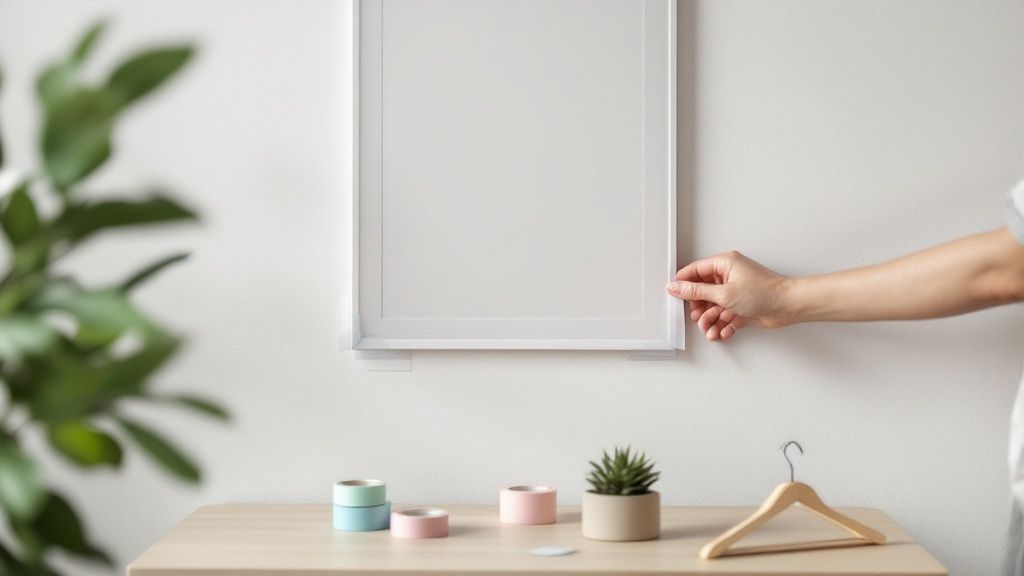 story
story How to Hang Posters Without a Frame: Easy Tips & Tricks
So you've got a great new poster but a blank wall, and the thought of putting holes in it (and losing your security deposit) is giving you pause. You're definitely not alone. The secret to how to hang posters without a frame is all about using damage-free adhesives. Things like removable strips, poster putty, or even decorative washi tape can give you a clean, stylish look that’s completely reversible. Your Guide to Flawless Poster Hanging This guide goes beyond the usual advice to show you the best frame-free methods that actual decor lovers use day in and day out. Forget about spending a fortune on frames or patching up nail holes later. Here, you'll find real, affordable solutions that let you personalize your space with confidence. Best of all, you can change your art as often as you change your mind—without leaving a single mark. Choosing The Right Adhesive For The Job The real key to success is matching your poster’s weight to the right product. A heavy, glossy print is going to need a much stronger hold than a standard, lightweight paper poster. Getting this right is the difference between a poster that stays put and one that ends up on the floor. Here are some of the most popular methods I’ve seen work wonders: Removable Adhesive Strips: These are your best bet for heavier posters. They provide a really secure, long-lasting hold, especially on smooth surfaces. Poster Putty: This is perfect for lightweight posters and even works well on textured walls, since you can mold it to fit into all the little bumps and grooves. Washi Tape: A super decorative choice for very light posters. It basically turns the adhesive into part of the art by creating a cool, creative border. This chart breaks down the weight capacity for three of the most common frameless adhesives. As you can see, adhesive strips offer the strongest hold by far. This makes them the go-to for premium or oversized prints, which is a common choice for people getting custom online posters printed on thicker, high-quality paper stock. Comparing Frame-Free Hanging Methods To make it even easier, here’s a quick look at the top methods for hanging posters without a frame. This table compares their cost, how easy they are to use, and what kind of walls they work best on. Hanging Method Best For Damage Risk Reusability Removable Strips Heavier posters, smooth walls, semi-permanent Very Low Single-use strips Poster Putty Lightweight posters, textured or smooth walls Very Low High Washi Tape Very lightweight posters, decorative borders Low Low Poster Hangers/Rails Reusable displays, protecting poster edges Low to Medium (tiny nail) High Bulldog/Binder Clips Casual or industrial look, easy to swap art Low to Medium (tiny nail) High Each method has its place, and the best one really just depends on your poster, your walls, and the look you're trying to achieve. Don't be afraid to experiment to find what works for your space Adhesives That Won’t Wreck Your Walls Let’s be honest, not all sticky things are created equal. Choosing the right adhesive is the secret to hanging a poster that looks great and comes off cleanly without taking half your paint with it. It’s less about the product itself and more about the prep work. A little bit of prep makes all the difference between a poster that stays put for years and one that ends in a paint-peeling disaster. Before you even think about sticking anything to the wall, give the spot a quick wipe with a clean, dry cloth. This gets rid of any dust or oils hanging around. If you’re working with a non-porous surface (like semi-gloss paint), a quick pass with an isopropyl alcohol pad creates the perfect canvas for your adhesive to bond securely. Matching the Right Adhesive to Your Poster and Wall The best adhesive for the job really depends on what you're hanging and where you're hanging it. A heavy, glossy poster going up on a bumpy, textured wall needs a totally different game plan than a lightweight print on a smooth, flat surface. Here are a few common scenarios I run into all the time: Lightweight Posters on Smooth Walls: Good old-fashioned poster putty is your best bet here. Just knead a small piece until it’s warm and soft, then stick a little ball in each corner. It’s super forgiving and makes repositioning a breeze. Heavier Posters on Smooth Walls: This is where high-quality removable strips or hook-and-loop fasteners really shine. They distribute the poster's weight much more evenly and give you a stronger hold that helps prevent those annoying curling edges. Any Poster on Textured Walls: Putty is often the winner on textured surfaces. Unlike flat tapes, you can press the putty right into the wall’s little nooks and crannies, which creates a much stronger physical bond where a strip might just peel away. Removable adhesive strips have become the go-to for frame-free hanging, especially in North America and Europe. In fact, one survey of home decorators in the US found that approximately 62% preferred using removable adhesives or velcro for their lightweight posters. Pro Tip: When it's time to take your poster down, never pull the adhesive strip straight out from the wall. You’ll take the paint right off with it. Instead, stretch the little tab straight down, keeping it parallel to the wall. The adhesive will release cleanly, leaving your paint intact. If you’re working with a poster printed on something unique, like vinyl or synthetic paper, you'll find that some adhesives just grab better than others. For these specialty prints, it might be worth looking into custom adhesive vinyls to find a solution that’s made for that specific material. A Polished Look with Hangers and Clips When adhesives feel a bit too temporary but a full-blown frame seems like overkill, hangers and clips are the perfect solution. This approach gives your space a sophisticated, almost gallery-like vibe, adding an architectural touch that feels both intentional and stylish. It’s a fantastic way to elevate your posters beyond basic tape or putty. Magnetic wooden hangers are one of my go-to methods for this kind of polished look. They’re made of two pairs of wooden bars—one for the top and one for the bottom—with powerful little magnets hidden inside. All you have to do is sandwich your poster between the bars, and the magnets clamp it securely without leaving a single mark. What's great is their versatility. They come in all sorts of wood finishes like oak, teak, and walnut. You can match the wood tone to your furniture to tie the room together or pick a contrasting finish to really make your poster pop. For a minimalist, Scandi-inspired aesthetic, try a light-colored wood hanger against a crisp white wall. The Industrial Chic Binder Clip Method Looking for something a little more budget-friendly with an industrial edge? The binder clip and hook method is a tried-and-true favorite, especially in creative studios. This technique is surprisingly effective and adds a casual, effortless cool to your walls. It’s a brilliant answer to the question of how to hang posters without a frame in a way that’s both functional and stylish. The process couldn't be simpler: First, fasten two binder clips to the top edge of your poster, spaced out evenly. Then, just hang the clips from small nails, thumbtacks, or clear adhesive hooks on the wall. This method has become a staple in classrooms and offices—anywhere displays need to be swapped out frequently. In fact, surveys from 2021 revealed that over 70% of art teachers in US public schools preferred binder clip methods for displaying student work because they’re so reusable and straightforward. Alignment Tip: When hanging a few posters this way, grab a level and a measuring tape to make sure your hooks are perfectly aligned. It’s a simple step, but it’s what transforms a random assortment of posters into a deliberate, balanced gallery wall that looks professionally curated. This approach is also fantastic for things that aren't traditional posters. You can get creative and use similar clipping mechanisms for other printed materials. The concept is similar to the versatility you see in custom hang tags , which often rely on unique and clever attachment methods to stand out. Designing Creative Borders with Washi Tape Why hide your hanging method when you can turn it into part of the art? Washi tape lets you do just that, transforming the simple act of sticking a poster to the wall into a creative design choice. This is a fantastic strategy for adding a pop of color and personality to dorm rooms, home offices, or kids' spaces. It’s a simple way to turn a plain poster into a unique statement piece. This Japanese paper tape is also a brilliant, low-damage alternative for renters. It’s no wonder the global market for washi tape expanded by over 15% annually between 2015 and 2023, mostly thanks to its popularity among crafters and decorators. Its gentle adhesion is perfect for anyone who loves to swap out their poster displays on a regular basis without leaving a mess behind. Creating Your Faux Frame The secret to a great washi tape border is a clean, steady application. My trick is to first secure the poster with a tiny piece of double-sided tape or a dot of poster putty on the back. Just enough to hold it steady so it doesn't shift while you work. Next, carefully apply the washi tape along the edges. You'll want about half the width of the tape on the poster and the other half on the wall. For those crisp, professional-looking corners, you have a couple of easy options: The Overlap: Run one side of the tape just past the corner, then lay the next piece directly over it. Grab a craft knife to trim the excess for a clean right angle. Simple and effective. The Mitered Corner: Let the tape extend past the corner, then fold it back on itself at a perfect 45-degree angle before continuing down the next side. This gives you a seamless, picture-frame look. Expert Tip: To avoid annoying bubbles, run your finger or a credit card along the tape as you apply it, pressing from the center outward. This little step ensures a smooth, secure bond with both the poster and the wall. If you really want to take personalization to the next level, you can even design and order your own unique tape patterns. Learning about the process of custom tape printing can open up a whole new world of creative possibilities for your projects. Installing a Professional Gallery Rail System For the serious art lover or anyone who loves to switch up their decor, a gallery rail system is the gold standard for hanging posters. This isn't your average dorm room solution. It involves a simple, discreet track installed near your ceiling. From this track, you can suspend posters using thin cables and hooks, giving you total freedom to adjust, swap, and rearrange your display whenever you want. The real beauty here? You only install the track once. That's it. You'll never need to spackle another nail hole or peel off stubborn adhesive again. It's a professional-grade system perfect for creating a dynamic, polished gallery wall in your home office or living room, turning your collection into a true focal point while preserving both your walls and your art. How Gallery Rail Systems Work The setup is surprisingly simple and works like a charm. You have three main components: The Track: A slim metal rail that you mount directly to the wall, usually just below the ceiling line. The Cables: These are typically thin cords made of nylon or steel that hook into the track and hang down vertically. The Hooks: These are the real magic. They're fully adjustable and slide up and down the cables, letting you position your poster at the perfect height. This kind of system has been a favorite among collectors for a long time, especially for those with delicate vintage pieces. Wall and ceiling hanging systems can safely display posters up to 40 inches wide, and they're so user-friendly that they've become popular for everything from fine art prints to movie posters. The genius of a rail system is its blend of permanence and adaptability. You do the work one time, and then you can curate your walls for years without ever picking up a drill or hammer. It’s a fantastic long-term investment for any art enthusiast. Now, the installation is definitely more involved than slapping on some adhesive strips, but it's a totally manageable weekend project. If you want a better grasp of securely attaching fixtures to your walls, reviewing some wall-mounted installation best practices can give you some helpful pointers. This approach also pairs beautifully with other decorative elements, like easy-to-swap wall graphics , to create a truly customized space. Your Top Poster Hanging Questions Answered Even with the best game plan, hanging posters framelessly can throw you a curveball. You might be dealing with a tricky wall surface or an unusually heavy print. Let's tackle some of the most common hangups so your project goes off without a hitch. What Is the Best Way to Hang a Heavy Poster? When you're working with heavier paper or cardstock, standard poster putty just isn't going to cut it. Your best bet is to reach for high-strength removable strips, like the ones from Command. Just be sure to use enough pairs to support the weight listed on the package. Another fantastic option is a set of magnetic wooden hangers. These grip the poster firmly across the entire top edge, which does a much better job of distributing the weight evenly. Basic tape or putty will likely fail, leaving you with a poster on the floor. How Can I Hang a Poster on a Textured Wall? Textured walls are the natural enemy of flat adhesives. If you're dealing with a popcorn or orange peel finish, adhesive putty is your friend. Unlike tape, you can mold and press it into the wall's little nooks and crannies to get a much stronger grip. A more foolproof method is to use a hanging system that only needs one or two anchor points. This way, you're not fighting to get all four corners to stick perfectly. Try hanging binder clips from a single thumbtack or a small adhesive hook. Magnetic hangers are also great here since they suspend the poster from one central point. This simple shift in approach solves the main problem with uneven surfaces. It's a smart workaround for a super common decorating headache. Will Decorative Tape Damage My Poster When Removed? Good quality washi tape is designed with a low-tack adhesive that’s generally safe for both modern paper and painted walls. However, the risk of tearing definitely goes up if you're working with older, more fragile posters. To play it safe, always test the tape on a tiny, inconspicuous corner of the poster first. Let it sit for a bit, then see how it comes off. When it's time to take it down, don't just rip it off. Peel the tape back on itself slowly at a 180-degree angle. This simple technique puts way less stress on the paper fibers. And while this guide is all about going frameless, if you've got a piece that deserves a more permanent display, you can always learn how to frame canvas paintings for a different look.
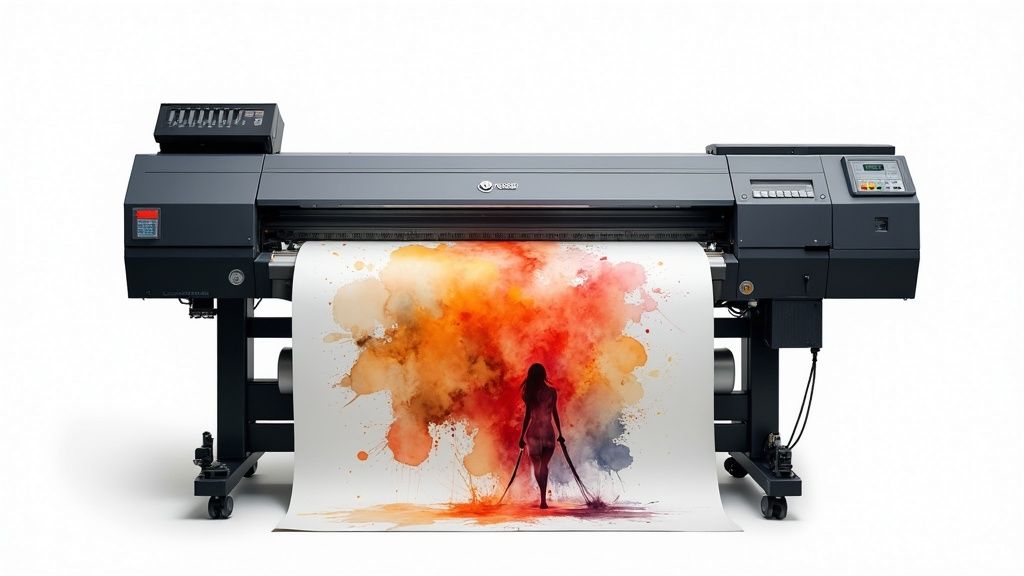 story
story A Guide to Large Format Printing Services
When you hear the term large format printing , think professional printing on a massive scale . Instead of dealing with standard paper sizes like you would at home, these services use specialized, industrial-grade equipment to create huge graphics like banners, posters, and even vehicle wraps. Understanding the Power of Going Big It helps to imagine the difference between your home office printer and a professional large format machine. Your desktop unit is perfect for A4 documents, reports, and memos. In sharp contrast, large format printers—often called wide-format printers—are beasts built to handle materials measured in feet, not inches. But this isn't just about making things bigger; it's about making a bigger impact. These services give businesses and creatives the power to produce visuals that are simply impossible to ignore, turning everyday surfaces into powerful communication platforms. To give you a clearer picture, here's a quick rundown of what makes large format printing unique. Large Format Printing at a Glance Characteristic Description Scale Prints are measured in feet, not inches, far exceeding standard paper sizes. Equipment Uses industrial-grade wide-format printers with advanced ink technologies. Materials Works with a huge variety of media, from vinyl and fabric to rigid boards and adhesives. Impact Designed to capture attention from a distance and make a bold statement. Application Ideal for advertising, branding, events, and architectural graphics. As you can see, this is a whole different world from standard printing. It opens up a new playbook for getting your message seen. What Makes It So Different? The real distinction is in the equipment and the final product. These printers use technologies like advanced inkjet or latex systems to apply ink onto massive rolls of material or directly onto rigid surfaces like foam board or PVC. This setup allows for continuous printing on enormous lengths of media, something a standard printer could never do. The whole point of large format printing is to create high-resolution graphics that stay sharp and vibrant, even when you're looking at them from across a room. This takes a special touch in both design and production to avoid blurry, pixelated results. Think about it: a banner for a trade show has to be crisp enough to grab someone's attention from across a crowded hall. A storefront window graphic needs to be vivid and clear to pull people in off the street. Each job needs the right mix of material, ink, and print quality to do its job effectively. Key Applications and Uses Because it's so versatile, large format printing is a must-have for all kinds of marketing and branding efforts. From temporary event signs to permanent architectural features, the possibilities are practically endless. Here are just a few common examples: Event and Trade Show Graphics: This covers everything from pop-up banners and fabric backdrops to custom-printed tablecloths and flooring. Retail and In-Store Displays: Think point-of-purchase signs, wall murals, window clings, and floor decals that direct customers and highlight promotions. Outdoor Advertising: Tough, weather-resistant materials are used to create stunning billboards, construction site barriers, and building wraps. You can learn more about durable materials by exploring options for printing vinyl banners made for the outdoors. Vehicle Wraps: These turn cars, trucks, and buses into mobile billboards that generate thousands of views every single day. Ultimately, these services offer a real, tangible way to cut through the visual noise of our world and make your message stand out. Choosing the Right Materials for Your Project The success of your large format project really comes down to one crucial choice that has nothing to do with the design itself—the material. Think of it like building a house; you wouldn't use drywall for the roof. The same idea applies here. The substrate you pick directly impacts the final look, durability, and overall punch of your print. This choice is a careful balance of function, environment, and the look you're going for. A material that looks stunning indoors might fade, tear, or warp in just a few days if you stick it outside. That's why getting to know the properties of each option is so critical before you get started. Matching Materials to Your Goals The first big question to ask is: where will this print live? Is it destined for the great outdoors, facing down sunlight, wind, and rain? Or will it be viewed up close in a controlled space like an office lobby or a trade show booth? For instance, a tough, weather-resistant vinyl is the gold standard for outdoor banners. It's built to stand up to moisture and UV rays, ensuring your message stays bright and intact for the long haul. On the other hand, for indoor displays where you need a professional, non-glare finish, other materials get their chance to shine. The right material doesn't just help your print survive its environment; it actually enhances its message. A high-end finish whispers quality and professionalism, while a rugged material screams durability and strength. To get a better sense of how these pieces fit together, it helps to look at the main advantages of large format printing services. The infographic below breaks down the core benefits, showing how things like high visibility, customization, and cost-effectiveness all work in concert. This really drives home that the goal isn't just a big print. It's a smart investment designed to hit specific business goals, and it all starts with laying the right material foundation. Common Materials and Their Best Uses Let's ground this in some real-world examples to see how it plays out. Each material has its own unique mix of trade-offs between appearance, longevity, and price. Foam Board/Foam Core: This stuff is incredibly lightweight yet rigid, making it perfect for indoor jobs like conference signs, presentation visuals, and mounting artwork. Its smooth surface delivers fantastic print quality for crisp, high-resolution graphics. Because it looks so professional, you can find tons of uses with foam core printing for business presentations and corporate events. Rigid PVC (Sintra): A solid step up in toughness from foam board, rigid PVC is a plastic sheet that resists dents, scratches, and moisture. This makes it an excellent choice for long-term indoor signage, menu boards, and point-of-purchase displays that will see a lot of handling. Fabric: When you're setting up for a trade show, fabric is a game-changer. It’s light, a breeze to transport, and gives you a sophisticated, glare-free finish that looks incredible under those bright convention center lights. Adhesive Vinyl: This is the chameleon of large format printing. It’s used for everything from massive wall murals and window graphics to floor decals and even full vehicle wraps. You can get different adhesives too, whether you need something permanent, temporary, or easy to reposition. Ultimately, taking the time to pick the right substrate is what ensures your investment pays off. You'll end up with a final product that not only looks amazing but performs exactly how you need it to. How Businesses Use Large Format Printing The real magic of large format printing services happens when you see them out in the wild. It’s one thing to talk about printers and materials, but it’s another to see how businesses are using these massive visuals to completely transform physical spaces, grab attention, and get actual results. From bustling retail storefronts to sprawling construction sites, the applications are as creative as they are effective. Imagine a local restaurant trying to pull more people in off the street. By installing a set of vibrant, professionally printed window graphics that show off its most delicious dishes, it can literally stop people in their tracks. Those graphics become a 24/7 salesperson, turning a simple window into an irresistible invitation. It's no wonder so many businesses are looking for captivating window display ideas to draw customers inside. This kind of versatility is exactly why the printing world is booming. The global printing industry is projected to hit around $960 billion in 2025, and large format printing is a massive piece of that pie, especially when it comes to durable outdoor advertising. Transforming Spaces and Events Events and brick-and-mortar locations are the perfect canvas for large format printing. With the right graphics, even the most generic trade show booth can become an immersive brand experience that people remember. Custom Backdrops and Banners: A seamless, floor-to-ceiling fabric backdrop with your branding printed in sharp detail makes a booth instantly recognizable from clear across a crowded convention hall. Directional Floor Graphics: Why just point when you can lead? Durable, non-slip floor decals can create an interactive and fun path right to your location. Branded Table Throws: A custom-printed tablecloth instantly elevates a plain folding table into a polished, professional welcome station. When used together, these pieces create a cohesive and memorable environment. We’ve put together a whole guide on custom trade show products that can help you make a serious impact at your next event. The goal isn't just to fill space; it's to control the narrative of that space. Large format printing gives you the tools to create an atmosphere that reflects your brand's quality and message from every angle. Turning Assets into Advertisements Smart businesses know that their existing assets can double as powerful marketing tools. For example, a construction firm can take all that unsightly chain-link fencing around a job site and turn it into a massive branding opportunity with printed mesh banners. These wraps don't just hide the mess; they advertise the company's work to thousands of people who pass by every day. Vehicle wraps are another brilliant example. They turn company cars, vans, and trucks into mobile billboards that work for you around the clock. A single wrapped vehicle can generate tens of thousands of views per day, building brand recognition across an entire city for a one-time investment. It's a strategic way to turn a functional necessity into a constant, moving advertisement. The Strategic Benefits of Thinking Big So, why should your business even think about large format printing? It’s not just about making your logo bigger. It's about using scale to get real results. In a world where we’re all drowning in digital ads on tiny screens, a massive, brilliantly printed graphic doesn’t just get a glance—it commands attention. That immediate visual power is the first major win. Picture a packed trade show floor or a busy downtown street. A towering banner or a gorgeous window wrap doesn't just get noticed; it sticks in your memory. This kind of high visibility is a massive boost for brand recall, making sure people remember you long after they've walked away. But the perks go much deeper than just catching a few eyeballs. A professionally produced large format print gives off a powerful vibe of quality and permanence. Building Trust Through Professionalism When a potential customer sees a crisp, vibrant graphic that’s installed perfectly, it sends a strong message without saying a word. It tells them your brand is established, confident, and cares about the details. That perception of professionalism is huge for building instant credibility and trust. A flimsy, faded banner can actively hurt your brand’s image. On the flip side, a high-quality, durable print is like a silent promise of your company's high standards, showing everyone you’re committed to excellence. This is a key reason why so many businesses invest in top-notch printed materials for their storefronts, reception areas, and major events. The right print makes your brand look its absolute best when it counts the most. Achieving a Strong Return on Investment While the upfront cost might look bigger than some other ad options, large format prints often deliver an incredible return over the long haul. A big piece of that is their durability. We're talking about materials like UV-cured inks on weather-resistant vinyl, designed to look great for months or even years outdoors. This makes them a smart, cost-effective tool for any sustained marketing campaign. Think about these long-term advantages: Longevity: A one-time investment in something like a vehicle wrap or a building sign keeps advertising for you 24/7, for years on end. Cost-Effectiveness: When you do the math on the cost per impression over the print's entire lifespan, it frequently beats digital ads. Versatility: Many large format pieces, like pop-up displays, are built to be used again and again, giving you great value across multiple events and promotions. You can see how this applies to a wide range of custom marketing materials . The numbers back this up. The large format printing market is expected to hit $9.88 billion by 2025 , climbing from $9.58 billion in 2024 , driven by just how effective it is in advertising and packaging. You can discover more insights about these market trends on OpenPR. This kind of growth proves that more and more businesses see these prints for what they are: lasting assets, not just one-off expenses. Finding the Best Printing Partner The final quality of your project often hinges on the people running the printer. Picking the right provider for your large format printing services is a lot like choosing a co-pilot; their skills, tech, and communication can make the difference between a smooth flight and a seriously bumpy landing. You’re not just looking for a vendor to push buttons—you need a genuine partner. A great first step is to dig into their portfolio. Look for work that mirrors your project in both scale and complexity. Do their past projects, whether they’re banners, wall murals, or vehicle wraps, show crisp details, vibrant colors, and clean finishing? This visual proof is your first and best clue about their commitment to quality. Vetting Their Technical Capabilities Once you’ve seen what they can do, it’s time to look under the hood. The equipment a print shop uses has a direct, undeniable impact on the final product. Don't be afraid to ask some pointed questions to get a feel for their technical chops. Here are a few things you’ll want to know: Equipment and Technology: What kind of printers are they running? Modern machines using UV-cured or latex inks are the gold standard, offering far better durability and color vibrancy. Material Selection: A true partner won’t just hand you a list. They should have a wide range of materials and be able to clearly explain the pros and cons of each one for your specific job. Color Matching: This one is huge. Ask about their color management process. Do they use a system like Pantone Matching (PMS) to guarantee your brand colors are reproduced with pinpoint accuracy? Choosing a printing partner is about more than just finding the lowest price. A reliable provider who invests in quality equipment and processes will save you from costly mistakes and reprints down the line, ensuring your brand is always presented professionally. Assessing the Human Element Beyond the fancy machines and rolls of vinyl, you’ll find the most important part of any print shop: the people. The way a company handles customer service, proofing, and simple communication will ultimately define your entire experience. A great partner is a guide, helping you navigate the technical stuff to get a flawless result. Before you commit to anything, make sure you understand their workflow. A reputable printer will always send a digital proof for you to approve. For projects where color is absolutely critical, some will even provide physical samples. That proofing stage is your last line of defense against mistakes. Finally, clear communication is completely non-negotiable. Your contact should be responsive, easy to get ahold of, and happy to answer your questions. This kind of collaborative relationship is what separates a forgettable transaction from a true partnership that nails it every single time. Preparing Your Design Files for Printing A brilliant idea can fall flat if the design file isn't set up correctly for print. When you send a file that isn't print-ready, you’re rolling the dice on blurry results, weird colors, and maybe even a costly reprint. But don’t worry—a few simple steps will make sure your vision translates perfectly from your screen to the final massive print. Think of your digital file as the blueprint for your project. Just like a builder needs precise measurements to construct a house, a printer needs specific information to build your graphic without a hitch. This all starts with getting the colors right. From Screen Colors to Print Colors Your computer screen uses the RGB (Red, Green, Blue) color model. It's built for light, which is why designs look so vibrant and bright on a monitor. Printers, on the other hand, run on the CMYK (Cyan, Magenta, Yellow, Black) model because they use ink, not light. If you design in RGB, the final print will almost always look different—and often duller. To avoid any nasty surprises, always set up and export your final design files in CMYK. This gives you a much more accurate preview of how the colors will actually appear on paper, ensuring your vibrant red doesn't turn into a disappointing maroon. Resolution and Safety Zones Next up is clarity. Resolution , measured in DPI (dots per inch), is all about how sharp your image will be. For something small that people see up close, like a business card, you need a high resolution—think 300 DPI . But for a massive banner that’s viewed from across the street, 100-150 DPI is usually more than enough. Sending a low-resolution file is a surefire way to get a pixelated, blurry mess. Think of bleed as a ‘safety zone’ for your design. It’s a small, extra margin of your background that extends beyond the final cut line, ensuring there are no accidental white edges after trimming. Finally, you need to think about bleed and trim areas. The trim line is the exact spot where the final print will be physically cut. To prevent tiny imperfections like a white sliver along the edge, your background should extend about 1/8th of an inch past this line. That extra bit is the bleed. At the same time, you'll want to keep important text and logos away from the edge to create a safe zone, so nothing important gets accidentally sliced off. And if your design has a unique contour or shape, it's worth looking into how custom die-cutting works to make sure your files are set up properly for those specialized cuts. Got Questions About Large Format Printing? We've Got Answers. Even after you're sold on the benefits, you probably still have a few practical questions before pulling the trigger on large format printing services . It’s completely normal. This section is here to give you clear, straightforward answers to help you get started and know what to expect. How Much Should I Expect to Pay for Large Format Printing? There really is no one-size-fits-all answer here. The final price tag boils down to three big things: the material you pick, how big the final print needs to be, and how many you’re ordering. For instance, a classic vinyl banner will always be easier on the wallet than a custom-cut sign or a full vehicle wrap that needs a team of pros to install it. The best way to get a real number is to ask for a detailed estimate from your print provider. A good printer will give you a quote that breaks everything down—materials, printing, and any special finishing or installation work—so you know exactly where your money is going. That level of transparency is a tell-tale sign of a partner you can trust. What's the Typical Turnaround Time? Like pricing, the timeline depends on the job's complexity and how busy the print shop is. Simple projects, like a handful of posters or a standard banner, can often be turned around in just 2-4 business days . More complex jobs, however, need a bit more time baked into the schedule. Custom Die-Cut Signage: These can take 5-7 business days because of the precision cutting involved. Full Vehicle Wraps: You're often looking at a week or more. This process isn't just printing; it includes laminating the material for durability and the meticulous, hands-on installation. The golden rule? Talk about your deadline with your provider right from the start. This ensures everyone is on the same page and they can realistically hit your target date. Can I Get a Proof Before Everything Is Printed? Yes, and you absolutely should insist on it. Any print shop worth its salt will send you a digital proof , which is usually just a PDF file, for you to sign off on before the presses start rolling. This is your moment to be the hero who catches a typo or a design flaw. For projects where the color has to be just right , you can also ask for a physical proof. Sometimes called a "hard proof" or "press proof," it's a small sample printed on the actual material you've chosen. It might cost a little extra, but for making sure your brand colors are perfect, it's worth every penny. Ready to see your big ideas in the real world? 4OVER4 has a huge selection of high-quality large format printing options to make your brand impossible to ignore. From eye-popping banners to sleek, professional signage, we have the know-how to deliver results that get people talking. Explore our large format printing services and start your project today!
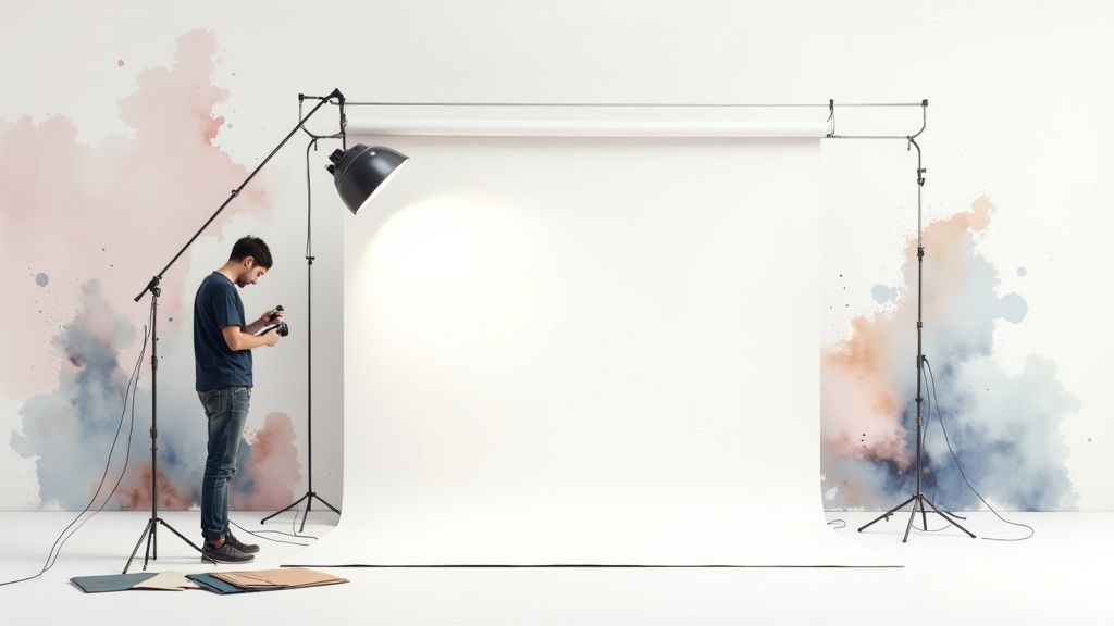 story
story Your Guide to the Perfect Photo Backdrop Banner
A photo backdrop banner is one of the most powerful tools in your branding arsenal. It does more than just fill a space—it completely transforms it into a professional, immersive setting perfect for photos and videos. Think of it less as a piece of printed fabric and more as a visual anchor that makes sure your brand is the undeniable star of every single shot. A great banner lets you control the story, gets rid of distracting backgrounds, and helps create those memorable, shareable moments that people love. The Foundation of a Professional Image Think of a photo backdrop banner as the set design for your brand’s own movie. A film director wouldn't just shoot a scene anywhere; they use specific sets to establish a mood and give context. In the same way, your backdrop sets the stage for how your audience sees your company, event, or product. It’s what separates a random, amateur-looking snapshot from a polished, professional photograph that screams brand confidence. This simple tool works by giving you a controlled visual environment. Instead of a chaotic trade show floor or a bland, forgettable wall, you’re presenting a clean, branded focal point. That one change instantly elevates how people perceive your event and makes any photo snapped in front of it feel intentional and high-value. Controlling the Visual Narrative Every photo tells a story, and a photo backdrop banner puts you in the director's chair. It guarantees that your logo, brand colors, and key messages are right there, consistently present in every picture that gets shared on social media or ends up in marketing materials. That repetition is gold for building brand recognition. Without a dedicated backdrop, you're leaving your brand's image completely to chance. A photo taken against a random background might accidentally feature: A competitor’s logo looming in the background at a busy conference. Distracting clutter that pulls focus away from your guest or product. An unprofessional or messy environment that reflects poorly on your brand. A banner wipes all those variables away, ensuring you get a consistent and professional look every time. A Growing Market for Visual Branding The demand for physical branding tools like banners isn't just a hunch—it's backed by serious market growth. The global printed signage market, which includes photo backdrop banners, was valued at a whopping $36.82 billion in 2024 and is expected to keep climbing. This surge is fueled by businesses in every sector, from retail to healthcare, needing to create impactful visual experiences. As trends like experiential marketing and personalization become standard, these banners are no longer just nice-to-haves; they're essential for cutting through the noise. You can discover more about the printed signage market trends and its impressive growth. A photo backdrop banner isn't just a background; it's a strategic asset. It turns passive attendees into active brand ambassadors, encouraging them to snap and share photos that organically amplify your reach. Ultimately, a quality backdrop banner is an investment in your brand’s image. It provides a reliable, professional, and engaging stage for all your important moments. Whether it’s a corporate gala, a product launch, or a local trade show, your brand will always look its best. It's the silent partner that turns every photo into a perfect marketing opportunity. Choosing the Right Material and Finish Picking the right material for your photo backdrop is a bit like choosing the right tires for a car. The choice you make will directly impact performance, looks, and longevity. Get it wrong, and you could end up with photos ruined by glare or a banner that falls apart after just one event. Think about it: you wouldn't put slick racing tires on an off-road truck. In the same way, the backdrop material you choose has to fit the job. Let’s walk through the most common options so you can be sure your backdrop not only looks incredible but works perfectly for your needs. The Great Debate: Fabric vs. Vinyl The two heavyweights in the backdrop world are fabric and vinyl . While both can deliver fantastic results, they each have their own personalities and are suited for very different situations. Your decision will usually come down to a balancing act between the look you want, the durability you need, and the practicalities of your event. Fabric backdrops are all about elegance. They’re typically made from polyester or similar textiles that give them a high-end, soft look. Most importantly, their surface is naturally non-reflective, so it soaks up light beautifully. This makes fabric the go-to choice for professional photoshoots, red carpet events, and any indoor setting where you want a touch of class. Vinyl backdrops , on the other hand, are the rugged workhorses. They’re built to last, known for being incredibly durable, water-resistant, and showing off colors with serious punch. This toughness makes them perfect for busy trade shows, outdoor festivals, or any spot where your banner might take a bit of a beating. As you can see, a well-chosen banner is central to hitting key goals. It boosts your visibility, solidifies your brand identity, and gets guests excited to engage—creating a powerful cycle that keeps your brand front and center. The Non-Negotiable: Always Go Matte Whether you land on fabric or vinyl, there is one detail that is absolutely non-negotiable for photography: a matte finish . This is the single most critical factor for avoiding the dreaded camera flash glare that can ruin every shot. A glossy or even semi-gloss finish will act like a mirror, reflecting camera flashes and event lighting right back into the lens. The result? Harsh, distracting hot spots that blow out your photos, hide your branding, and wash out the people in the picture. It completely defeats the purpose of having a backdrop in the first place. The golden rule of photo backdrops is to always, always insist on a matte finish. It ensures light is absorbed instead of reflected, giving you clean, professional, and glare-free photos every single time. A matte surface creates that smooth, even background that lets your logo—and the people posing in front of it—be the stars of the show. It’s a simple decision that makes an enormous difference in the quality of your event photos. Comparing Your Material Options To help you nail down the right choice, let’s put these materials head-to-head. Sometimes, seeing the options laid out clearly is the best way to figure out what truly fits your needs, whether it's for a single gala or a multi-city marketing tour. Before you look at the chart, ask yourself a few questions: What kind of event is it? A formal indoor wedding or a breezy outdoor market? What’s the lighting situation? Will there be professional photographers with flashes? How much will it travel? Does it need to be lightweight and easy to pack? How long does it need to last? Are you looking for a one-time-use banner or a long-term investment? Here’s a quick comparison to help guide you. Photo Backdrop Banner Material Comparison This table breaks down the most common materials, highlighting what they're best for and their key features. Material Best For Glare Resistance Portability Key Feature Fabric Indoor Events, Red Carpets, Professional Shoots Excellent High Elegant, high-end appearance and wrinkle-resistant Scrim Vinyl Outdoor Events, Trade Shows, High-Traffic Areas Good (Matte) Moderate Extremely durable, waterproof, and cost-effective Mesh Vinyl Windy Outdoor Locations, Fence Banners Good (Matte) Moderate Perforated design allows wind to pass through Blockout Vinyl Brightly Lit Areas, Double-Sided Printing Excellent (Matte) Low Opaque material prevents light from showing through Ultimately, choosing the right material ensures your investment delivers. A tough-as-nails vinyl banner might be the hero of a grueling trade show tour, while a luxurious fabric backdrop adds that perfect touch of sophistication to a corporate awards night. When you match the material to the mission, you’re setting yourself up for a flawless, professional look every time. How to Size and Design for Maximum Impact There's a real art and science to creating a photo backdrop that truly works. It's not just about filling a space; it's about making sure your banner commands attention and does its job flawlessly. Let's move past the theory and get into the practical side of choosing the right size and design to make a genuine impact. Think of the banner's size as the foundation. Too small, and you'll awkwardly crop people out of photos. Too big, and it might not even fit the venue. The goal is to match the dimensions to how you'll actually use it, ensuring every snapshot captures the full, intended experience. Selecting the Perfect Banner Size The first question to ask is: what's this backdrop for ? Are you snapping tight headshots of individual guests, or do you need to capture a whole team at an awards night? Each scenario calls for different dimensions to look and function its best. Here’s a quick rundown of common sizes and where they shine: 5 ft x 7 ft Banner: This compact option is your go-to for individual portraits or upper-body shots of two people. It’s a fantastic choice for tight booth spaces, content creator studios, or any event where every square foot counts. 8 ft x 8 ft Banner: As one of the most popular and versatile sizes out there, this square format is a workhorse. It easily fits small groups of 2-4 people , making it a solid all-rounder for trade shows, parties, and corporate events. 10 ft x 8 ft Banner: Need a bit more horizontal space? This is the industry standard for red carpet-style events. It comfortably accommodates groups of 4-6 people , making it ideal for those classic step-and-repeat backdrops. 20 ft x 8 ft Banner: When you're going big, this banner creates an impressive visual wall. It's built for capturing large groups, like entire departments or a stage full of award winners, ensuring nobody gets left out of the frame. Choosing the right size from the get-go is key to making sure your backdrop is both functional and professional. An 8x8 banner can comfortably frame up to four people, making it a reliable choice for most events. Before you order, take a moment to measure your event space and think about how many people you realistically want in each shot. A little bit of foresight here will save you from major logistical headaches later on. Mastering Design for Large Format Printing Designing for a massive banner isn't like whipping up a quick social media graphic. What looks sharp on your screen can easily become a blurry, pixelated mess when it's printed several feet wide. Sticking to a few technical rules is absolutely essential for a crisp, polished result. First up, resolution. Always, always use high-resolution files for your logos and any important graphics. Vector files (.AI, .EPS, or .SVG) are the gold standard here. They are built on mathematical equations, not pixels, so they can be scaled up to the size of a billboard without losing an ounce of quality. If you have to use a raster image (like a .JPG or .PNG), make sure it has a resolution of at least 150 DPI at the final, full print size. Another non-negotiable is the color mode. Your design files must be in CMYK (Cyan, Magenta, Yellow, Key/Black) , not RGB (Red, Green, Blue). Screens display color using RGB light, but professional printers use CMYK ink. If you design in RGB, you're in for an unpleasant surprise when the printed colors don't match what you saw on your monitor. Starting in CMYK prevents this. Remember, your backdrop is a big, bold piece of your brand. To see how it fits into the bigger picture, it's worth exploring effective brand design principles . This ensures your banner works in harmony with everything else you do. Step-and-Repeat and Layout Strategies For step-and-repeat backdrops, logo placement is everything. The whole point is to guarantee brand visibility in every photo without it feeling loud or distracting. The secret is a balanced pattern, typically a staggered or checkerboard layout. This setup ensures that no matter where a person stands, at least one or two logos will be clearly visible near their head and shoulders. Finally, don't underestimate the power of negative space . A cluttered backdrop screams unprofessional and pulls focus from the people in front of it. By leaving plenty of breathing room around your logos and other design elements, you create a clean, elegant composition. That "empty" space is what guides the eye to what truly matters—your brand and your guests—making every photo more powerful and polished. Where Photo Backdrop Banners Shine in the Real World A photo backdrop banner is one of those tools that proves its worth in so many different settings. It’s a lot more than just a piece of decoration—it's a strategic asset that solves real problems, from getting your brand noticed to creating moments your guests won't forget. The real power of a backdrop becomes crystal clear when you see it in action. Let's dive into the environments where these banners truly make a difference. Each application shows how this simple piece of gear can anchor an event, amplify a brand, and generate lasting, shareable memories. Dominating the Trade Show Floor Trade show floors are noisy, competitive, and honestly, a bit chaotic. A high-quality photo backdrop banner cuts through the clutter, acting as a visual anchor that instantly carves out a professional, branded space for your booth. It’s often the first thing people see from down the aisle, pulling them in with bold graphics and a clear message. In a sea of competitors, this is critical for brand visibility. With the global event and exhibition industry expected to hit $50 billion in revenue in 2025, you have to stand out. And when you consider that 67% of exhibitors see trade shows as powerful sales generators, making an impact is non-negotiable. Your backdrop becomes the centerpiece of your booth, creating a polished stage for product demos and meaningful conversations. Crafting Unforgettable Event Experiences From corporate galas to weddings, a custom backdrop banner completely elevates the atmosphere. It can turn a plain entryway or an empty corner into an exclusive photo op, making every single guest feel like a VIP. This is where the magic of engagement really happens. Backdrops are chameleons, fitting in perfectly at all kinds of events. If you're planning a professional function, a custom banner should be a key item on your ultimate corporate event checklist . Here are a few examples: Weddings and Celebrations: A personalized backdrop with the couple's names or a unique design creates a dedicated spot for guest photos. It ensures every memory captured has a beautiful, consistent look. Corporate Galas and Award Nights: A step-and-repeat banner plastered with sponsor logos adds that red-carpet glamour. It’s a classy way to acknowledge key partners and reinforce the event's professional, prestigious feel. Product Launches: A banner that showcases the new product or campaign tagline creates an "Instagrammable moment." It practically begs people to share on social media, sparking organic buzz. A great backdrop doesn't just sit there; it actively encourages interaction. It gives attendees a reason to pause, engage, and create content that naturally promotes your event or brand. In every case, the banner does more than just look pretty. It becomes an interactive focal point that seriously enhances the guest experience and generates a ton of user-generated content that keeps working for you long after the lights go out. Powering Professional Digital Content The need for a polished background isn't just for in-person events anymore. For virtual presenters, content creators, and professionals hopping on video calls, a photo backdrop banner offers a crisp, consistent, and distraction-free setting. It’s an instant signal of professionalism and brand identity. A well-designed backdrop gets rid of the visual clutter from a home office or whatever inconsistent environment you find yourself in. It makes sure the focus stays right where it should be: on the speaker and their message. This is a game-changer for: YouTubers and Streamers: Creating a recognizable set that reinforces their personal brand. Virtual Presenters: Delivering webinars or keynotes with a slick, corporate-branded background. Online Coaches and Consultants: Building credibility and a professional vibe during client calls. By giving you control over your visual environment, a photo backdrop banner helps build brand consistency across all your digital platforms. It turns every video into a powerful marketing asset. It’s a simple solution for a very modern challenge. From File to Fabric: The Printing and Ordering Process Turning a digital design file into a massive, gorgeous photo backdrop banner can feel a little intimidating. But once you pull back the curtain, it’s a pretty straightforward journey from your screen to the finished product. Knowing the steps helps you work like a pro with your print partner and guarantees you get exactly what you were picturing in your head. Think of it like commissioning a custom piece of furniture. You provide the blueprint (your design), approve the final plans (the proof), and then the craftsmen get to work building and finishing it. Let's walk through that process. Step 1: Prepping Your Artwork for a Flawless Print Before you even think about hitting that "order" button, your design file needs to be perfect. This is honestly the most important part of the whole process. Nailing the setup here prevents those all-too-common (and costly) headaches like blurry prints or colors that just look off . First up is the bleed . This is a small safety margin—usually 0.125 to 0.25 inches —that you add to all sides of your artwork. When the printer trims your banner down to its final size, the bleed ensures your design goes right to the very edge, with no risk of a weird white sliver showing up. Next, do a final check on your resolution and color mode. For a big print like a photo backdrop banner , your file should be at least 150 DPI at the final print size. Make sure it's set to CMYK color mode , which is the standard for professional printing and key to getting accurate colors. Step 2: The All-Important Proofing Cycle After you’ve uploaded your masterpiece, you’ll move into the proofing stage. This is your last line of defense—your final chance to spot any mistakes before your banner heads to the press. Your printer will send you a digital proof , which is a preview of exactly what they intend to print. Don't just glance at the proof and approve it. Seriously. Scrutinize every single detail. Check for typos. Is the logo in the right spot? Are the dimensions what you expected? If you approve a proof with an error, that error is getting printed. Take your time. If you find something wrong, you can reject the proof and tell the printer what needs to be fixed. They’ll make the changes and send a new proof. This back-and-forth continues until you give your final, confident "okay." After that, the file is locked and sent to production. Step 3: Understanding the Printing Tech Not all banners are created equal, and the printing method used is a big reason why. The technology is tailored to the material you choose, and each has its own unique benefits. Dye-Sublimation: This is the gold standard for fabric banners. The process is pretty cool—it uses heat to turn ink into a gas that gets infused directly into the fabric's fibers. The result? Stunningly vibrant, permanent colors that won’t ever crack, peel, or fade. It creates that soft, premium finish you want for photography. Inkjet Printing: For vinyl banners, large-format inkjet is the workhorse. These printers spray durable, often UV-cured inks, onto the vinyl's surface. This method is fantastic for creating super-sharp graphics that are tough enough to handle high-traffic events or even outdoor use. Step 4: Choosing Your Finishing Touches The last step is all about function. Finishing options are what determine how you’ll actually hang and display your photo backdrop banner . It’s less about looks and more about practicality. The two most popular finishes are: Pole Pockets: These are just what they sound like—pockets of material sewn along the top and bottom edges. You slide the crossbars from your banner stand right through them. It’s the easiest way to get a taut, professional-looking display. Grommets: These are the little reinforced metal rings you see punched along the edges of some banners. Grommets give you more versatility. You can use rope, hooks, or even zip ties to hang your banner on a wall, a truss, or a custom-built frame. By walking through these four steps, you can order your banner feeling totally in control, knowing you’ve covered all your bases for a professional result that looks amazing in person and on camera. We’ve all seen it happen. A beautifully planned event, a great-looking booth, but the photo backdrop is a total letdown. It’s a simple thing, but a few preventable mistakes can turn a smart investment into a visual dud. This is your guide to getting it right, every single time. Think of this as learning from other people’s hard lessons. By knowing the most common blunders, you can easily sidestep them and make sure your banner doesn’t just look good, but looks professional. Design and Artwork Blunders The journey to a perfect banner starts long before it hits the printer. Your design file is the blueprint, and any little flaw in that blueprint will get blown up—literally—on the final product. The single most common mistake? Submitting low-resolution artwork. That pixelated logo you grabbed from your website might look fine on a screen, but it will turn into a blurry, unprofessional mess when it’s stretched to eight feet wide. Another classic design flaw is just trying to do too much. It’s really tempting to cram every last bit of information onto your banner, but that just creates visual chaos. The goal is to create a clean background that makes people look great, not a busy advertisement that distracts from them. Here’s how to sidestep these issues: The Problem: Low-resolution images that print blurry. The Fix: Always, always use vector files (like .AI , .EPS , or .SVG ) for logos and graphics. If you absolutely have to use a photograph, make sure it’s at least 150 DPI at its final print size. The Problem: A cluttered design that overpowers the subject. The Fix: Let your design breathe. Embrace what designers call "negative space" and keep it simple. One or two key logos or a subtle, repeating pattern is all you need. The people in the photo are the stars of the show. Material and Logistical Missteps Choosing the wrong material can single-handedly ruin every photo taken in front of your banner. A glossy or even semi-gloss finish is a classic rookie mistake. It basically turns your backdrop into a mirror for camera flashes, creating harsh glare and bright hot spots that make the photos unusable. Beyond the material itself, a few logistical oversights can cause major headaches on event day. Forgetting to account for the stand hardware in your design is a big one. If you place a key part of your logo right where a pole pocket or a stand upright will be, it’s gone. Another common issue is improper storage. Folding a fabric banner instead of rolling it will create deep, stubborn wrinkles that are a nightmare to get out. The professional photography industry relies heavily on high-quality backdrops to create controlled, visually appealing environments. An improperly chosen banner can reflect poorly not just on an event, but on the perceived quality of the services being offered. The huge demand for perfect visual settings is a major driver in the photography services market, which was valued at a whopping $55.6 billion in 2023 . You can dig deeper into the photography market and its reliance on quality gear to see just how critical these details are. Getting your banner right is part of meeting that professional standard. To avoid these headaches, just follow these simple tips: Always Choose a Matte Finish: This one is non-negotiable for any backdrop used for photos. A matte surface absorbs light instead of reflecting it, guaranteeing your photos are completely glare-free. Ask for a Design Template: Your printer should be able to provide a template. This file will show you the "safe zones" for your artwork and mark off exactly where stand hardware might block the view. Roll, Don't Fold: When you’re done, always roll your fabric banners carefully around a cardboard tube for storage. If you do end up with some wrinkles, a handheld steamer on a low setting can gently release them. By dodging these common mistakes, you can be confident that your photo backdrop will do its job perfectly—enhancing your brand and helping create fantastic, shareable memories. Of course! Here is the rewritten section, crafted to sound like it was written by an experienced human expert, following all the specified requirements. Your Backdrop Banner Questions, Answered Even after you've picked the perfect design, you'll probably have a few practical questions. That’s completely normal. Think of this as the "day of the event" guide for getting your backdrop banner looking its absolute best. We get these questions all the time, so let’s dive into the nitty-gritty details that make all the difference between a good setup and a great one. How Do I Prevent Wrinkles in My Fabric Banner? Nothing kills the professional vibe of a photo op faster than a wrinkled banner. Thankfully, this is an easy one to solve. The number one rule is to always roll your fabric banner for storage—never fold it . Folding creates deep, stubborn creases that are a pain to get out. If you pull out your banner and find some wrinkles, don’t panic. A simple handheld steamer is your best friend here. Just gently pass it over the back of the fabric, keeping it moving so you don’t heat one spot for too long. For minor creases, sometimes all you need is gravity. Set it up on its stand the day before your event, and you’ll often find the wrinkles have smoothed themselves out by morning. What Is a Step and Repeat Banner? You've definitely seen these before, even if you didn't know the name. A step and repeat banner is a backdrop covered in a repeating pattern of one or more logos. They're a staple at red carpet events, press conferences, and any sponsored party. The whole point is to make sure company logos are visible in every single photo, no matter where people are standing. The trick to a good step and repeat is balance. You want the logos to be big enough to be clear in pictures but spaced out so they don't look like a cluttered, chaotic mess. When done right, the pattern gives you maximum brand exposure without stealing the show from the people in front of it. A well-executed step and repeat banner turns every photo into a subtle marketing asset. It seamlessly integrates branding into the event's visual story, providing value to sponsors and a professional look for hosts. Can I Use My Photo Backdrop Banner Outdoors? Yes, you absolutely can take your backdrop banner outside, but you have to bring the right gear for the job. You can't just set up a standard indoor banner and hope for the best against wind and weather. For outdoor use, you need to be more strategic with your material and stand. Here’s the breakdown: A Weather-Resistant Material: Your best bet is heavy-duty scrim vinyl. It’s tough, waterproof, and built to handle the elements without getting damaged. A Sturdy Stand: Wind is your biggest enemy outdoors. Look for a heavy-duty stand with weighted bases, or at least one designed to hold sandbags for extra stability. This is non-negotiable—otherwise, your banner will turn into a giant sail and tip right over. Consider Mesh Vinyl: If you know it’s going to be windy, a mesh vinyl banner is a fantastic choice. The material is full of tiny holes that let the wind pass right through, which dramatically cuts down on the pressure pushing against the stand. With a little planning, you can confidently bring your branded photo ops to festivals, outdoor markets, and open-air corporate events. Ready to create a stunning, professional photo backdrop for your next event? At 4OVER4 , we offer a huge range of high-quality, customizable banner options to bring your vision to life. Design your perfect photo backdrop banner today!
 story
story A Guide to Pop Up Banner Success at Any Event
A pop up banner is a portable, free-standing display sign that’s an absolute workhorse for visual marketing. Think of it as your brand's instant storefront—it's the powerful first impression you can set up in just minutes, no matter where you need to grab some attention. From trade shows to retail floors, it’s designed for quick assembly and high impact. The Role of a Pop Up Banner in Modern Marketing Picture yourself walking into a buzzing conference hall. Amid the sea of people and booths, what’s the first thing that catches your eye? It’s almost always the bold, towering graphics that stand out from all the noise. That, right there, is the main job of a pop up banner: to be a silent ambassador for your brand, communicating your message instantly and professionally. Unlike permanent signs, a pop up banner gives you unmatched portability and versatility. It collapses right down into a compact carrying case, making it the perfect marketing partner for any business on the move. This mix of easy setup, affordability, and visual punch makes it an essential piece of kit. Your Brand's First Handshake Before you even get a chance to speak to a potential customer, your banner is already doing the talking. It carves out your space, sets a professional tone, and gives a visual snapshot of what your brand is all about. A well-designed display is like a magnet, pulling people toward your booth and sparking those first conversations that can turn into valuable connections. To really get why visuals are so important at an event, just think about how a professional backdrop for hire can become the visual heart of a space. A pop up banner does the same thing on a smaller scale; it frames your promotional area, giving it focus and a sense of authority. Why Every Business Needs a Pop Up Banner It doesn't matter if you're a startup launching at a local market or a big company at a major industry expo—the benefits are the same for everyone. These displays aren't just for one-off events; they are multi-purpose assets that deliver value in all sorts of settings. Here’s why they’re so crucial: Cost-Effective Advertising: It offers a fantastic return on investment. You get a reusable advertising tool that works for you event after event. Increased Brand Recognition: Consistently using a professionally designed banner reinforces your brand identity, making your logo and colors much more memorable. Instant Professionalism: A high-quality pop up banner immediately elevates your setup. It projects an image of credibility and success. Targeted Messaging: You can easily swap out the graphics to tweak your message for different audiences or promotions, making it an incredibly adaptable tool. A great pop up banner does more than just display information; it creates an environment. It signals to attendees that you are a serious, professional player in your field and that your booth is worth visiting. Ultimately, this simple yet effective tool bridges the gap between being just another face in the crowd and becoming a memorable destination. Whether it's drawing in foot traffic or announcing special offers, its role is both foundational and critical. If you're starting to explore options for your next event, the wide world of signs, banners, and canvas printing is the perfect place to start looking for the right fit. Choosing the Right Pop Up Banner Type and Material Picking the perfect pop up banner is a bit like choosing the right tool for a job. You wouldn't use a hammer to drive a screw, right? In the same way, the banner you choose needs to be a perfect match for where you'll use it and what you want to accomplish. This decision really comes down to two things: the stand mechanism and the graphic material . First, let's get a handle on the different types of stands. Each style has its own personality, offering unique perks in setup speed, stability, and overall look. Nailing this choice means your display won't just look great, but it'll also be a breeze for your team to set up at any event. Comparing Popular Pop Up Banner Stands The three most common types of pop up banner stands each bring something different to the table. The best one for you hinges entirely on what you value most—whether that’s a lightning-fast setup, a polished look, or something super easy to carry on a budget. Retractable (Roll-Up) Banners: These are the undisputed champions of convenience. The graphic comes pre-installed in a spring-loaded base, so it just rolls up into the stand for protection. Setup literally takes less than a minute, making this style a lifesaver for frequent travelers and events with quick turnarounds. Tension Fabric Displays: If you're going for a sleek, high-end appearance, tension fabric is your go-to. The graphic is one large, seamless piece of printed fabric that stretches taut over a lightweight frame. This trick eliminates glare and creates a smooth, professional backdrop that looks incredibly sharp. X-Stand Banners: Named for their X-shaped frame, these are the most lightweight and budget-friendly option out there. The banner graphic has grommets in each corner that simply hook onto the stand. While the setup is a little more hands-on than a retractable banner, they’re so light they’re exceptionally easy to transport. The right stand mechanism is all about balancing form and function. While retractable stands offer speed you can't beat, tension fabric displays provide that seamless, premium finish that can elevate your entire booth's aesthetic. This simple decision tree can help you quickly match a banner type to your event needs. As you can see, for most indoor events, a roll-up banner is the easy choice. But once you step outside, you need to think a little more carefully about the conditions. Selecting the Ideal Banner Material Once you’ve settled on a stand, the next big decision is the material for your graphic. This choice affects everything from how vibrant your colors look to how durable your banner is and how well it travels. The two main players here, polyester fabric and vinyl , serve different but equally important roles. Polyester fabric has pretty much become the industry standard for indoor displays, giving rise to what’s known as "soft signage." People love this material because it's lightweight, shows off incredibly vibrant colors (especially with dye-sublimation printing), and is fantastic at resisting wrinkles. It creates a soft, non-glare finish that looks amazing under bright event lighting. The demand for soft signage tells you everything you need to know about its effectiveness. The market was valued globally at $3.29 billion and is expected to hit $4.81 billion by 2032 . This boom is all thanks to printing advancements that create durable, colorful, and lightweight graphics—perfect for modern marketing. Take a look at how these common materials stack up against each other. Pop Up Banner Materials Comparison Material Best For Print Quality Durability Portability Polyester Fabric Indoor events, trade shows, high-end displays Excellent, vibrant colors, non-glare Good, wrinkle-resistant Excellent, very lightweight Scrim Vinyl (13oz) Outdoor use, long-term displays, high-traffic areas Very good, sharp images, slightly glossy Excellent, waterproof, fade-resistant Good, heavier than fabric Blockout Vinyl Double-sided banners, bright environments Excellent, opaque, no light bleed-through Excellent, very tough Fair, heaviest option Mesh Vinyl Windy outdoor locations, fence wraps Good, perforated for airflow Excellent, wind-resistant Good, lighter than solid vinyl This table makes it clear: your choice really depends on where your banner is going to live. On the other hand, traditional vinyl is still king when you head outdoors. It's incredibly durable, waterproof, and fade-resistant, making it tough enough to handle sun, wind, and rain. Its smooth, slightly glossy surface produces sharp, high-contrast images, making it a reliable workhorse for outdoor festivals, markets, or storefront promotions. Ultimately, the choice comes down to one simple question: where will your banner be? For the dynamic, well-lit world of an indoor trade show, fabric is almost always the superior choice. But for the unpredictable conditions of an outdoor event, vinyl’s resilience is unmatched. Making an informed decision among the various banner stands printing options is the key to ensuring your message stands tall and looks its absolute best, no matter the setting. Designing a Pop Up Banner for Maximum Impact You get about three seconds. That's it. In a crowded event hall, your pop up banner has just three seconds to snag someone's attention. Think of it as a highway billboard—the message needs to be simple, bold, and instantly understood. A cluttered or confusing design is a wasted opportunity, but a sharp, clean one can be a powerful magnet for foot traffic. The real secret to a banner that works is mastering visual hierarchy. It's just a fancy way of saying you arrange your design to guide a person's eyes naturally from the most important info down to the least. Before we get into the layout specifics, it helps to grasp the importance of effective design for grabbing that initial attention and getting your message across clearly. Mastering the Top-Down Visual Flow People read pop up banners from top to bottom, just like they scan anything else. To make this work for you, your most important elements have to be placed strategically. The whole point is to create a logical path that makes your message a breeze to absorb in a quick glance. Top Third (Eye-Level): This is your prime real estate. Put your company logo and main headline right here. It’s the first thing people will see, and it should immediately answer the question: "Who are you and what do you do?" Middle Third: Use this central space for your core message or a single, compelling image. This is your chance to show off a key benefit, your unique selling point, or a stunning product photo. Keep the text punchy and minimal. Bottom Third: This area is for the secondary stuff—your website, social media handles, or a QR code. Don't crowd it. This info should be available but not steal focus from the main message above. Following this structure ensures that even a casual passerby can get the gist of your brand and what you offer without having to stop and study the banner. Technical Specs for a Flawless Print Even the most brilliant design idea can fall flat if it isn't prepped correctly for printing. Getting the technical details right is what separates a crisp, professional-looking banner from a blurry, amateur one. This part is non-negotiable if you want a quality result. First and foremost: image resolution. Every image and logo you use must be at least 150-300 DPI (dots per inch) at its final, full print size. Anything less will look pixelated and unprofessional, which is not a great look for your brand. Next up is color. Make sure your design file is set to CMYK (Cyan, Magenta, Yellow, Key/Black) color mode, not RGB. Your computer screen uses RGB light to show colors, but printers use CMYK ink. If you design in RGB, you're in for a surprise—the printed colors will often look dull and different from what you saw on screen. A classic mistake is packing a banner with too much text. Remember the billboard rule: less is more. Stick to one powerful headline, maybe a few key bullet points, and the essential contact details. White space is your friend—it lets your message breathe and makes everything much easier to read. Choosing Fonts and Colors That Convert Your font and color choices do more than just make your banner look pretty; they communicate a feeling about your brand. Bold, clean sans-serif fonts like Helvetica or Arial are perfect for headlines because they’re easy to read from a distance. Steer clear of overly decorative or thin script fonts that become impossible to decipher from a few feet away. Color contrast is just as crucial. High-contrast combinations—like light text on a dark background, or vice-versa—make your message pop and dramatically improve readability. Use your brand colors consistently to build that visual identity and make your booth instantly recognizable from across the room. If designing from the ground up feels like a bit much, you can always get a head start with professionally made templates. Exploring a library of pre-designed banners can spark some great ideas and give you a solid foundation to work from. You can then customize a proven layout with your own branding, message, and images for a polished, effective result. Where to Use a Pop Up Banner for Best Results Think of a pop up banner as a marketing chameleon. It's one of the most adaptable tools in your arsenal, ready to deliver your message with a punch in almost any setting. Its real magic is in its versatility—it can be a silent salesperson, a vibrant welcome sign, or a helpful directional beacon. When you place your banner strategically, it transforms from a simple sign into something that actively drives engagement. The trick is to see your banner as a physical touchpoint for your brand. In a crowded room, it carves out a professional space and makes you instantly recognizable. Let's dive into the scenarios where a pop up banner really gets to work for your business. Trade Shows and Exhibitions This is the pop up banner's natural habitat. At a buzzing trade show, you're one of hundreds of exhibitors all fighting for the same eyeballs. A tall, eye-catching banner becomes a landmark, guiding attendees to your booth from clear across the hall. It’s your visual handshake, communicating who you are and what you offer before you’ve even said a word. For the biggest impact, try positioning your banner at the corner of your booth to catch foot traffic coming from both directions. Make sure it clearly shows your company name and a headline that sparks a little curiosity. To really look the part, your banner should feel like it belongs to a larger family of trade show products that all work together visually. Retail Environments and In-Store Promotions Inside a retail store, a pop up banner is a fantastic way to stop shoppers in their tracks. Use one to announce a new product, shout about a seasonal sale, or highlight a can’t-miss promotion. Placed near the entrance or in a high-traffic aisle, it can guide customers directly to specific products, giving your sales a nice little boost. Imagine a bright, colorful banner announcing " 25% Off All Summer Apparel "—it's pretty hard to ignore. This simple visual cue can seriously influence buying decisions and create that all-important sense of urgency. A well-placed banner doesn't just inform; it persuades. It transforms a passive browsing experience into an active shopping opportunity by presenting a clear, compelling call to action right at the point of decision. The explosion of temporary retail has also opened up a perfect stage for these displays. Pop-up shops have become a retail powerhouse, with the U.S. industry hitting a market size of $15.6 billion . For these fleeting storefronts, a pop up banner is a non-negotiable, low-cost way to establish a professional brand presence in an instant. You can check out more insights on the pop-up shop industry's growth on ibisworld.com . Corporate Events and Community Gatherings Away from the sales floor, a pop up banner is just as useful. Think corporate functions, job fairs, conferences, and even local community events like farmers' markets. It’s perfect for all sorts of non-sales activities where clear communication and branding are still key. Here are just a few ideas: Job Fairs: Use a banner to show off your company culture and attract top talent. It makes your booth stand out and gives potential candidates a quick feel for your brand. Conferences: If you're speaking or running a workshop, a banner can add a layer of credibility and provide contact info or a QR code for attendees who want to learn more. Community Events: Sponsoring a local sports team or setting up a table at a farmers' market? A banner builds brand awareness and shows you're involved in the community. Directional Signage: In big, confusing venues, a series of pop up banners can be lifesavers, pointing guests toward registration, breakout rooms, or the nearest restroom. How to Assemble and Care for Your Pop Up Banner A high-quality pop up banner is a serious marketing investment, and like any good tool, a little care goes a long way. The real magic of these displays is their simplicity—you can set up a professional-looking booth in just a couple of minutes. Protecting that investment is just as easy, ensuring your banner looks sharp for every single event on your calendar. Proper assembly and maintenance are the best ways to prevent common headaches like creases, jams, and frayed edges. Following a few simple steps for setup and storage will maximize the lifespan of your pop up banner and keep your brand looking its best. Step-by-Step Banner Assembly Setting up a standard retractable banner is a quick, no-fuss process that shouldn't take more than two minutes . You don't need any tools or an extra pair of hands. Just follow this simple sequence for a flawless setup every time. Prepare the Base: Start by taking the banner stand out of its carrying case. Swing the stabilizing feet out so they’re perpendicular to the base. This creates a solid, stable foundation on the floor. Assemble the Support Pole: The support pole is usually a three-piece, bungee-corded pole. Just connect the sections to form one long, rigid pole and pop it securely into the designated slot in the center of the base. Raise the Graphic: Gently pull the graphic straight up from the base. Once you have it fully extended, hook the top rail of the graphic right onto the top of the support pole to lock it in place. And that's it! Your pop up banner is ready to start turning heads. When it’s time to pack up, just reverse the process. Unhook the graphic, guide it slowly back into the base— don't let it snap back —then take apart the pole and rotate the feet back in. Long-Term Care and Storage Tips Taking care of your banner between events is the real secret to making it last. Dust, dirt, and improper storage are the biggest threats to its professional look. A few minutes of maintenance after each use makes a huge difference. For cleaning, you can gently wipe vinyl banners with a damp cloth. If you have a fabric banner, a light dusting or a quick pass with a lint roller usually does the trick. Always double-check the manufacturer’s instructions before you try any cleaning solutions. The most critical moment in a banner's life is retraction. Allowing the graphic to snap back into the base can cause wrinkles, tears, and damage to the internal spring mechanism. Always guide it back in slowly and evenly. Storing it correctly is just as important for keeping your display in great shape. Always Use the Case: That padded carrying case your banner came in? It's your banner's best friend. It protects against scratches, dents, and moisture during transport and storage. Store in a Cool, Dry Place: Keep your banner away from extreme temperatures or humidity. That can warp the material or damage the stand over time. Store It Standing Up: If you can, store the banner upright. This prevents any unnecessary pressure from being placed on the base or the rolled-up graphic inside. By following these simple guidelines, you can ensure your investment remains a powerful marketing asset for years to come. For a full range of durable and easy-to-use options, explore our complete catalog of event displays and printing solutions . Your Go-To Checklist for Ordering the Perfect Banner Alright, you've gotten the full rundown on what makes pop up banners tick. Now, let's pull it all together so you can place your order without a hitch. Think of this as your pre-flight checklist before launching a killer marketing campaign. Following these steps will help you take your vision and turn it into a physical, high-impact banner that’s a perfect match for your brand's goals. Let's walk through it from start to finish. Step 1: Pinpoint Your Primary Goal Before you get lost in designs and materials, ask yourself one simple question: What’s the main job of this banner? Your answer will steer every other decision you make. Are you trying to drive sales right now, pull in some solid leads, or just get your brand name out there? Your objective shapes the entire approach. A banner shouting about a 50% off sale is going to look and feel completely different from one trying to attract new talent at a job fair. A clear goal is the bedrock of an effective pop up banner. Step 2: Pick the Right Size and Type Next up, think about the environment. Where is this banner going to live? A massive tension fabric display might look epic in a sprawling trade show booth but would completely swallow a small retail shop. On the flip side, a standard retractable banner is a champ for indoor use but won’t hold up against a windy day at an outdoor market. Match the banner’s specs to the venue: Indoor Events: A standard retractable banner (around 33" x 81" ) is usually your best bet. It's portable, a breeze to set up, and gets the job done. Outdoor Use: Go for durable, weather-resistant vinyl and a stand with a beefier, more stable base that can handle the elements. Large Backdrops: For that seamless, high-end look at a press conference or behind a large booth, nothing beats a tension fabric display. Step 3: Lock In a High-Impact Design With your goal and specs sorted, it's time for the fun part—the visuals. Remember the three-second rule we talked about? Your design has to be clear, concise, and compelling enough to grab attention instantly. Use that top-down hierarchy, placing your logo and main headline right at eye level where it can’t be missed. Your design file is the blueprint for your finished product. Double-checking technical details like resolution and color mode is the most important step to prevent printing disappointments. A blurry logo or off-brand colors can undermine your entire presentation. Make sure your artwork is truly print-ready. That means using high-resolution images (at least 150 DPI) and setting your file to CMYK color mode . Here at 4OVER4, you can make this whole process easier by grabbing one of our free design templates to ensure your files are perfectly formatted from the get-go. Step 4: Choose Your Material and Finish The material you pick affects both the look and the lifespan of your banner. For vibrant, glare-free indoor displays, polyester fabric is a fantastic choice. If you need something that can take a beating and withstand the outdoors, you can't go wrong with classic vinyl. Don't forget about the finish. Do you need a matte finish to cut down on glare from bright event lighting, or a glossy finish to make your colors really pop? These small details add up to give your pop up banner a polished, professional look. Step 5: Double-Check Production and Shipping Times Last but not least, work backward from your event date. Always confirm the production turnaround time and build in a little buffer for shipping. Rushing the process is a recipe for costly mistakes or, even worse, not having your banner when you need it most. If you're in a pinch, look for options like same-day or next-day turnaround . Planning ahead just makes everything smoother and guarantees your banner arrives ready for action. Got Questions About Pop Up Banners? We’ve Got Answers. Even after you've got the basics down, a few questions always pop up, especially if it's your first time ordering. Let's clear the air and tackle some of the most common queries we hear. Getting these details straight ensures you’ll feel confident in your choice. What's the Standard Size for a Pop Up Banner? While you can get a banner in just about any size, the go-to for most retractable banners is 33 inches wide by 81 inches high . Think of it as the sweet spot. It's large enough to get noticed from across a room but has a small enough footprint that it won’t crowd your trade show booth or retail space. Of course, "standard" is just a launchpad. If you have a unique space or a bold creative idea, custom sizes are always an option to make your vision a reality. Can I Use My Pop Up Banner Outdoors? This is a big one, and the honest answer is: it depends. Your standard indoor banner might hold its own for a few hours on a perfectly calm, sunny day, but it’s simply not built to wrestle with the elements. For any real outdoor use, you absolutely need a banner designed for the job. An outdoor pop up banner needs two things: weather-resistant vinyl and a heavy, stable base. This combo keeps the wind from turning your marketing into a kite and ensures your graphics won't run or fade at the first sign of rain. How Should I Prep My Artwork for Printing? To make sure your banner looks sharp and professional—not pixelated or blurry—your artwork needs to hit a few technical marks. Always save your final design as a high-resolution PDF, JPG, or TIFF file. Pay close attention to these two settings: Color Mode: Your file needs to be in CMYK color mode . This is the color language printers speak, so it ensures the colors on your screen match the final print. Resolution: All your images and logos must be at least 150 DPI when scaled to the banner's final, full size. Anything less will look fuzzy up close. Honestly, the easiest way to get it right is to use a pre-made template from your printer. It takes all the guesswork out of the dimensions and settings. What's the Difference Between a "Pop Up Banner" and a "Retractable Banner"? You'll hear these terms thrown around interchangeably, and it can definitely be confusing. "Pop up banner" is really a broad, catch-all term for any portable, free-standing display. This could include everything from X-stand banners to large fabric backdrops. A "retractable banner," often called a roll-up banner, is a very specific type of pop up banner. Its defining feature is the clever spring-loaded base that the graphic rolls down into, keeping it safe during transport and making setup a breeze. Thanks to their incredible convenience and durability, retractable banners have become the undisputed favorite for most businesses. Ready to create a pop up banner that stops people in their tracks and gets your brand noticed? The team at 4OVER4 has a huge selection of high-quality, customizable banners ready to go, with fast turnarounds to meet any deadline. Design your perfect display today!
 story
story Your Guide to Retractable Banner Stand Sizes
Picking the right size for a retractable banner stand can feel like a shot in the dark, but it's simpler than you think. More often than not, the 33-inch by 81-inch banner is your best bet. It’s the industry go-to for a reason, hitting that sweet spot between making an impact and being easy to lug around. Think of this guide as your cheat sheet. We'll break down the common sizes so you can match the perfect banner to your next event. A Quick Guide to Retractable Banner Sizes Getting a handle on retractable banner stand sizes is all about starting with the basics. It’s a bit like picking the right tool for a job—the right size ensures your message gets seen without either overpowering the space or getting lost in the noise. Whether you need a small tabletop display or a huge backdrop, each size has its moment to shine. This quick overview will get you pointed in the right direction. We'll look at how different dimensions affect everything from visual punch to portability, giving you the confidence to pick the right one. Common Banner Sizes and Their Uses The undisputed champion of retractable banners is the 33-inch by 81-inch model. Marketers love this size because it fits neatly inside a standard 10-foot by 10-foot trade show booth, giving you a strong visual presence without hogging precious floor space. Key Takeaway: The goal isn't just to go big; it's to go right. A massive banner in a small space can be just as ineffective as a tiny one in a huge hall. Match the banner's footprint to the event's scale. To make things even easier, here’s a quick look at the most common retractable banner stand sizes and where they work best. Common Retractable Banner Stand Sizes at a Glance This table breaks down the most popular sizes, giving you a starting point for figuring out what you need for your specific event or space. Size (Width x Height) Common Name Best For Impact Level 24" x 81" Slim Banner Tight retail spaces, directional signage, flanking a doorway Subtle 33" x 81" Standard Banner Trade shows, lobbies, all-purpose marketing, conferences High 48" x 92" Wide Banner Step-and-repeat backdrops, large booths, media events Very High 60" x 92" Extra-Wide Backdrop Red carpet events, stage backgrounds, significant presentations Maximum This table should help you narrow down your options. Once you have a good idea of the category you fall into, you can explore the full range of banner stands printing options available and find the perfect match for your next project. Digging Into the Most Popular Banner Sizes A quick overview is nice, but to really nail your choice, you need to get into the details of the most common retractable banner stand sizes. These dimensions didn't become industry favorites by accident—they're the result of years of figuring out what works best for specific marketing and event needs. Let's break down the champions of the banner world and see where each one truly shines. The sizes we see today have definitely evolved. Back in the early 2000s, your choices were pretty limited, usually hovering between 24 and 36 inches wide. But as events got more visually crowded, brands needed more impact. That's when manufacturers started rolling out deluxe models like the 33x78 , 45x78 , and even massive 57x78 inch stands. The All-Purpose Champion: The 33 x 81 Inch Banner If retractable banners had a hall of fame, the 33” x 81” size would be the first one in. It's the undisputed industry standard for a simple reason: it strikes the perfect balance between visibility and portability. Think of it as the reliable sedan of the banner world—it's practical and fits just about anywhere you need it to go. This size is large enough to grab attention in a packed trade show booth, yet it's compact enough to tuck into a corporate lobby or stand by a conference entrance without getting in the way. Its tall, vertical shape naturally draws the eye upward, making it a super-efficient use of floor space while still delivering a powerful branding message. Compact and Strategic: The 24-Inch Banner When you're tight on space, the narrower 24-inch wide banner is a smart, strategic move. It’s the perfect solution for spots where a full-sized banner would feel totally overwhelming or physically block a walkway. You'll often see a 24-inch banner used for: Directional Signage: Placed at hallway intersections to point attendees in the right direction. Registration Desks: Flanking a table to provide quick instructions or add a touch of branding. Retail Endcaps: Highlighting a specific product or sale in a narrow store aisle. Its slim profile makes it an excellent supporting player, reinforcing your message without trying to steal the whole show. By selecting the right dimensions, you're not just filling space—you're directing attention. A narrow banner guides, a standard banner informs, and a wide banner immerses. Making a Bigger Statement: 36 to 60 Inch Banners When your goal is to go big and get noticed, wider is definitely better. Banners in the 36-inch to 60-inch range stop being simple signs and start becoming major environmental graphics. A 48-inch or 60-inch banner can easily serve as the main backdrop for a small booth, a fun photo station, or a stage presentation. These larger retractable banner stand sizes give you plenty of canvas for more complex graphics, detailed information, or high-impact photography. They are perfect for creating a "wall" effect that defines a space and makes sure your brand is seen from clear across the room. While they aren't quite as easy to haul around as their slimmer cousins, their visual authority is unmatched for major events. If you're thinking even bigger, you might want to explore the world of custom vinyl banners for even more large-format options. How to Match Banner Size to Your Space Choosing a retractable banner isn’t just about the design—it’s about the dance between the banner and its backdrop. What dazzles in a roomy 10×10 trade show booth might overpower a cozy coffee shop corner. Think like an event planner and let the venue guide your choice. Start by asking the right questions: Is the ceiling high enough for a full-size stand? How much floor real estate can you spare without creating a traffic jam? And crucially, from what distance will your audience absorb your message? Getting these details right prevents costly misfires. Evaluating Your Venue Begin with a quick environmental scan. A standard 81-inch tall banner fits most settings, but spaces with low ceilings—say, a historic hall or an intimate boardroom—call for something shorter. Next, map out the flow of foot traffic. In tight corridors or busy entrances, a wider banner can feel like an obstacle course. Opt for a slim 24-inch stand to communicate clearly without blocking the way. A banner should complement the space, not compete with it. Its purpose is to enhance the environment and draw attention to your brand, not become a physical obstacle that attendees have to navigate around. As the infographic shows, your banner’s location is the driving force behind selecting the right width. Matching Size to Viewing Distance Now, step into your audience’s shoes. How close will people stand before they see your message? Match your banner width to their vantage point: Close-Up Viewing (Under 10 feet): Ideal for retail counters or registration desks, a 33-inch banner feels professional without overwhelming the viewer. Mid-Range Viewing (10–30 feet): At trade shows or conference halls, a 36-inch or 48-inch banner grabs eyes across the aisle and keeps your message front and center. Long-Distance Viewing (Over 30 feet): On stages or in auditoriums, a 60-inch wide banner—or even multiple banners side by side—ensures your content remains crisp from the back row. By syncing your banner dimensions with both the venue and viewing distance, you lock in maximum impact. For more tailored options, explore 4OVER4’s full range of customizable displays printing solutions. Connecting Banner Size to Your Marketing Goal Choosing the right retractable banner stand isn't just about what will fit in your car; it's a strategic marketing decision. The size you pick should work hand-in-hand with your goal for that specific banner. Before you even look at dimensions, ask yourself one simple question: what job does this banner need to do? Thinking this way completely changes how you see the different sizes. A banner stops being just a piece of printed vinyl and becomes a specific tool for a specific task—whether that's directing foot traffic, making a huge brand statement, or showing off the nitty-gritty details of a new product. Each of those jobs has a perfect size to match. Aligning Dimensions with Objectives Think of your banner's size as the physical foundation for its message. A smaller banner naturally forces you to be sharp and to the point. A larger one, on the other hand, gives you the breathing room to tell a more complete story. This direct link between size and communication style is the secret to getting the results you want. For Quick Actions: A narrow 24-inch banner is brilliant for a single, focused call to action. Picture one sitting next to a checkout counter with a big QR code and a simple headline: "Scan to Join Our Rewards Program." Its slim shape delivers one clear instruction without adding to the visual noise. For Brand Introductions: The classic, industry-standard 33-inch banner is your go-to canvas for introducing who you are. It’s got just enough space for your logo, a strong tagline, and a few key benefits, making it the perfect workhorse for trade show booths and company lobbies. For Immersive Experiences: An extra-wide 60-inch banner is more than just a sign; it's a powerful visual anchor. These are the ones you see used as photo backdrops at events—hello, user-generated content!—or as the main visual for a large exhibition space, setting the tone for the entire area. The rule of thumb is pretty straightforward: the more complex your message is, the more visual real estate you're going to need. A banner meant to simply inform can be compact, but one designed to truly immerse and engage people needs room to shine. Tailoring Size to Event Type The kind of event you're attending—and the people you'll find there—also makes a huge difference in what banner size you should choose. It’s no surprise that savvy marketers tend to match their banner dimensions to the venue. You’ll often see smaller sizes, like the 24x80 inch, used for tabletop displays or inside cozy retail shops where you don't want to overwhelm the space. On the flip side, bigger banners like the 45x78 and 57x78 inch models are the undisputed champions of major trade shows, where your number one job is to grab someone's attention from clear across a crowded hall. If your focus is on pulling in local customers, it's also smart to think about how your banner fits into a wider strategy for local marketing for small businesses . At the end of the day, a well-chosen banner doesn't just sit there looking pretty—it actively helps you hit your marketing goals, making it an indispensable part of your promotional toolkit. To see all the options available, take a look at 4OVER4’s complete lineup of trade show products . Nailing Your Design File for Any Banner Size A jaw-dropping retractable banner doesn't just happen at the printer; it starts life on your computer as a perfectly prepared design file. No matter which retractable banner size you land on, getting the technical details right is absolutely essential for a professional finish. If you skip this part, you're setting yourself up for blurry images, chopped-off text, and the headache of a costly reprint. Think of your design file as the architectural blueprint for your banner. Just like a builder needs precise measurements to construct a house, your printer needs specific file settings to bring your vision to life. This all boils down to three critical concepts you need to know: bleed , safe area , and resolution . Don't worry, it's simpler than it sounds. Imagine you're baking a cake in a rectangular pan. The bleed is the little bit of extra batter that might spill over the edges. When the cake is done, you trim those edges for a clean, perfect rectangle. In design, bleed is the extra background color or image you extend beyond the final trim line. This ensures that when the banner is cut to its final size, your design goes right to the very edge, with no accidental white slivers. The safe area , on the other hand, is the center of the cake where you'd put your most important decorations—the "Happy Birthday" text and candles. You keep these key elements away from the edges so nothing important gets sliced off during trimming or hidden by the banner stand's hardware later. Your Technical Cheat Sheet To dodge the most common design mistakes, your best bet is to start with a template—it takes all the guesswork out of the setup. But even with a template, understanding the "why" behind the rules is empowering. If your team doesn't have a design pro, it might be worth hiring a professional graphic designing company to make sure your banner's visuals are not just beautiful but also perfectly print-ready. Before you send anything off to print, run through this checklist. Think of it as your final quality control step to prevent frustrating (and expensive) errors. Essential Design File Specifications Specification Requirement Why It Matters Resolution 150 DPI at full size This keeps your images and text looking crisp and clear, not pixelated or fuzzy, even when people are standing right next to it. Bleed Area 1" on top and sides This gives the printer a margin of error for trimming, guaranteeing your background extends perfectly to the banner's edge without gaps. Bottom Bleed 3" to 6" at the bottom This extra space is crucial because it gets fed into the retractable stand's internal roller. Any design here will be completely hidden. Safe Area Keep text 1" from edges This acts as a buffer zone, protecting your logo, headlines, and contact info from being accidentally trimmed off or obscured by the stand. Color Mode CMYK This is the universal standard for professional printing. It ensures the colors on your final banner will closely match what you see on your screen. Following these specs is the single best way to ensure the final product looks exactly as you intended. Pro Tip: Always, always, always design your banner at its final print dimensions. For a 33" x 81" banner, your document should be set up to 33" x 81" (plus the bleed). Designing small and scaling it up later is a guaranteed recipe for a blurry, low-quality print. By keeping these guidelines in mind, you're setting yourself up for success. If you'd rather jump right in, you can always explore a collection of professionally formatted, pre-designed banners that are already optimized and ready to go. Finding the Right Hardware and Materials Your banner’s graphic is the star of the show, but the hardware holding it up is the unsung hero. Getting this part right is crucial. The size of your retractable banner directly impacts the kind of base, support poles, and even the graphic material you’ll need to create a display that’s stable and looks sharp. Think of it as a complete system—every piece has to work in harmony. A small, narrow banner doesn’t need much to stay upright. But as you scale up in width and height, you're basically creating a bigger sail. It catches more air and is far more likely to tip or lean. The physics are straightforward: bigger banners demand beefier hardware to stay put and look professional. Matching Hardware to Your Banner's Dimensions Picture the stand’s base as the foundation of a house. A small garden shed can get by with a simple concrete slab, but a skyscraper needs deep, heavy footings to stay standing. The same idea applies to your banner hardware. A lightweight aluminum base is perfect for a standard 24” or 33” banner. It’s a great, portable option for everyday use at trade shows or in a lobby. But once you start looking at wider retractable banner sizes, like a 48” or 60” model, that simple base just won’t cut it. These larger banners need a heavier, more substantial deluxe stand, which often comes with two support poles instead of the usual one. This dual-pole setup provides the tension and stability needed to keep the graphic perfectly flat and prevent the whole unit from toppling over, especially in a busy hallway. Choosing a stand isn't just about the price tag—it's about proper engineering. Putting a huge banner on an undersized base is a recipe for a wobbly, unprofessional display that’s just waiting to fall over. Picking the Best Material for Your Graphic The material your graphic is printed on is just as important for your banner's performance and appearance. You'll generally choose between vinyl and fabric, and each has its own strengths. Vinyl Banners: This is the go-to, most cost-effective choice for a reason. Modern vinyls produce incredibly vibrant colors and are tough enough to handle plenty of use—plus, they're water-resistant. The key feature to look for is "super flat" or "curl-free" vinyl. This stuff is specifically engineered to stop the edges from curling inward, keeping your display looking crisp. Fabric Banners: If you want a more premium, non-glare finish, fabric is a fantastic option. It has a softer, more elegant appearance that looks especially good under the bright lights of an event hall. Fabric is also very durable and less likely to crease compared to some lower-end vinyls. At the end of the day, getting the hardware and material right ensures your banner is more than just a graphic. It becomes a reliable, easy-to-use marketing tool that will look fantastic, event after event. A Few Lingering Questions About Banner Sizes Even after you've weighed all the options, a few practical questions might still be floating around. Let's tackle the most common ones we hear from customers to help you lock in your decision and avoid any last-minute hiccups. Getting these details sorted out is the final step to making sure your banner shows up and performs exactly how you pictured it. What’s the Most Versatile Retractable Banner Stand Size? If you’re looking for a true workhorse, the 33” x 81” size is your best bet. It hits that sweet spot between making a real impact and being easy to manage. It's large enough to look professional and grab attention at a busy trade show, but it won’t overwhelm a standard 10x10 booth or feel like a burden to carry around. For most businesses, this size delivers the best all-around value. How Do I Prevent Text from Being Cut Off? The secret here is all about respecting the safe area shown in your design template. Every printer provides a template with margins that show you where the hardware might cover up the graphic. Typically, you'll need to leave about 1 inch of space at the top and 3 inches at the bottom. Keep every important detail—your logo, text, and contact info—comfortably inside that safe zone. Think of the safe area as an invisible picture frame inside your design. Anything you want people to actually see has to stay inside that frame. That’s your guarantee it won’t get trimmed off or hidden by the stand’s mechanism. Can I Use My Retractable Banner Stand Outdoors? Standard retractable banners are really built for indoor life. Even a light breeze can be enough to send them tumbling. If you definitely need something for an outdoor event, you’ll want to search for banner stands specifically labeled for "outdoor" use. These are a different breed—they come with much heavier bases that you can often fill with water for stability and are built with tougher hardware made to handle the elements. Here at 4OVER4 , we offer a huge range of retractable banner stand sizes and provide professional design templates to get you started. To find the perfect match for your brand and make your next project a breeze, check out our options at https://4over4.com .
 story
story A Guide to Trade Show Banner Design That Works
Your trade show banner is your secret weapon on a crowded exhibit floor. It’s all about creating a single, impactful message from a powerful headline, compelling visuals, and clear branding—one that people can absorb in just a few seconds. Think of it as a visual handshake, inviting potential customers into your booth before you’ve even said a word. Why Your Banner Is Your Most Important Sales Tool In the chaotic world of a trade show, your banner is so much more than signage. It's your silent salesperson, working around the clock. It’s the very first thing an attendee sees and the main tool you have to stop them in their tracks. A strategic trade show banner design directly impacts who stops, the quality of your leads, and ultimately, your event ROI. Imagine two exhibitors. The first has a banner crammed with tiny text, low-quality images, and a message so confusing you don't know where to look. Attendees walk right by, their eyes glazing over. It’s a huge missed opportunity and a waste of money. The Power of a Visual Handshake Now, picture the second exhibitor. Their banner is clean and bold. It has a single, powerful headline that speaks directly to a visitor's biggest problem. The branding is crisp, the imagery is professional, and a clear call to action tells people exactly what to do next. This banner is a magnet, drawing in qualified prospects who are genuinely interested. This is the real-world impact of thoughtful design. It’s not about looking pretty; it’s about communicating value instantly. You have about three seconds to capture someone's attention. Your banner is doing all the heavy lifting in that critical window. A powerful visual handshake can draw in qualified prospects, while a weak one gets lost in the noise. Investing in smart design directly influences your event ROI by turning passive walkers into active leads. From First Glance to Lasting Impression The influence of your banner doesn't stop when the show ends. Studies show that over 75% of customers remember a business due to its signage , which tells you everything you need to know about how visual design helps with brand recognition. With the broader signage printing market projected to hit nearly $144 billion by 2029, it’s clear businesses are catching on. A well-executed banner achieves several goals at once: Builds Brand Awareness: It puts your logo, colors, and overall brand identity front and center. Filters the Audience: It attracts your ideal customers and helps others self-select out, saving your team from wasting time on dead-end conversations. Communicates a Core Message: It quickly tells people who you are and what problem you solve. Your banner truly sets the stage for every single conversation your team has. By investing in a high-quality design, you’re not just buying a print; you're investing in a powerful sales tool. When you're ready to create visuals that work, you can explore a full range of customizable trade show products to build a booth that commands attention. Building Your Banner Design Strategy Before you even touch a color palette or pick a font, you need a rock-solid strategy. It’s the truth I’ve seen play out at countless trade shows: the most beautiful trade show banner design will fall completely flat if it doesn’t have a clear job to do. This foundational work is what separates the banners that get ignored from the ones that actually pull people in and start conversations. Your first move is to nail down one, and only one, primary goal. It’s tempting to try and do it all—launch a new product, build brand awareness, and get demo sign-ups. But that’s just a recipe for a cluttered, confusing mess. An attendee walking by should get your banner's point in a single, 3-second glance. Are you there to shout about a brand-new product? Is your main goal to drive traffic for live demos right there in the booth? Maybe you're the new kid on the block, and just getting your name out there is the win. Whatever it is, your entire design hinges on serving that one specific goal. Define Your Banner's One True Goal When you commit to a single objective, every other decision—from your headline to your call to action—suddenly becomes a whole lot easier. Think about what a successful interaction at this specific show looks like for you. Product Launch: The hero of your banner should be a massive, high-quality image of the new product. Pair it with a headline that screams "It's here!" and clearly states its biggest benefit. Lead Generation: Your design needs to be a visual funnel, guiding the eye directly to a can't-miss offer. Think "Get a Free Trial" or "Book Your Demo Here," maybe even with an arrow pointing to your sign-up station. Brand Awareness: Go all-in on your visual identity. This means a bold logo, a powerful tagline, and brand colors that saturate the design, making it impossible to forget. A great way to get everyone on the same page before a single pixel is placed is by crafting a comprehensive creative brief . This simple document ensures your team, your designer, and your goals are all perfectly aligned from day one. Analyze the Trade Show Environment A banner doesn't exist on a computer screen; it lives on a chaotic, bustling trade show floor. You have to think about its physical surroundings. Put yourself in the shoes of an attendee. Most people will first spot your banner from 10 to 20 feet away while navigating a packed aisle. That means your core message has to be big and bold enough to be read from a distance. A design that looks perfect on your 27-inch monitor can easily become an unreadable blur in a massive convention hall. Think about the flow of traffic. Where will people be coming from? The left? The right? Straight on? This dictates where you should place your most critical info. A banner on a corner has totally different strategic needs than one sitting on a back wall. Create Your Brand Asset Checklist Finally, nothing stalls a design project faster than scrambling for assets at the eleventh hour. Hunting down a high-res logo or the right hex code creates needless delays and can even lead to costly print mistakes. Do yourself (and your designer) a huge favor: get all your brand assets organized in one place before the project kicks off. This simple prep work makes the whole process smoother and guarantees brand consistency. Essential Brand Assets Checklist: High-Resolution Logo: This means a vector file ( .AI , .EPS , or .SVG ). Vector logos can be scaled to the size of a billboard without losing an ounce of quality. A pixelated logo is an instant red flag that screams unprofessional. Official Brand Colors: Don't just eyeball your brand's shade of blue. You need the exact color codes in CMYK (for print) and ideally Pantone (PMS) formats to ensure what you see on screen is what you get on the final banner. Approved Fonts: List the specific fonts you use. If it's a custom or licensed font, be ready to provide the actual font files to your designer. Key Imagery: Pull together any high-resolution product photos, lifestyle shots, or custom graphics you plan to feature. Low-quality images will ruin an otherwise great design. Getting these elements ready beforehand empowers your designer to do what they do best: create a banner that turns heads. This groundwork is the secret to producing top-quality vinyl banners for trade shows that truly represent your brand and crush your strategic goals. Mastering Layout and Typography for Readability You’ve got about three seconds to stop someone in a crowded aisle. That's it. A powerful trade show banner design is all about instant communication, and it starts with a smart layout and readable typography. These two elements work hand-in-hand to create a visual hierarchy, guiding an attendee's eye exactly where you want it to go. Think of your banner's layout as a road map for the eye. The most important stop is your headline, followed by your key message or hero image, and finally, your call to action. A messy banner is like a map with no clear roads—the viewer gets lost and just moves on. A strong layout, on the other hand, creates an effortless visual journey. This strategic direction is non-negotiable on a bustling show floor. With many events now seeing attendance numbers blow past pre-pandemic levels, the competition for eyeballs is brutal. Considering that roughly 81% of trade show visitors have buying authority , a clear and compelling layout is your best shot at engaging the people who can actually make a decision. You can learn more about the impact of these stats on trade show success and see why every single design choice counts. Guiding the Eye with Visual Hierarchy Visual hierarchy is the art of arranging design elements to show their order of importance. It’s how you silently tell the viewer, "Look here first, then here, then here." You pull this off through deliberate choices in size, color, and placement. Your headline should be the biggest text element on the banner, period. It's the hook that draws the eye. Your supporting message can be smaller, with key visuals positioned to draw focus. Your logo and call to action need to be prominent but not overpowering, placed where the eye naturally lands last. A classic mistake I see all the time is making everything the same size. It just creates visual noise. When every element is shouting, none of them can be heard. Choosing Fonts That Work from a Distance Typography is where so many banner designs stumble and fall. A font that looks slick on a business card can become an unreadable smudge from 20 feet away. The number one rule for banner typography is legibility over everything. Go with Sans-Serif: Fonts like Helvetica, Arial, or Open Sans are the champions of readability from a distance. Their clean, simple lines are much easier for the brain to process in a split second than the more decorative strokes of serif fonts. Limit Your Fonts: Stick to one or two complementary fonts at most. A primary font for your headline and a secondary one for body text is a classic, effective approach. Using too many fonts creates a chaotic, unprofessional mess. Test for Size: Here's a solid rule of thumb: for every 10 feet of viewing distance, your text needs to be at least one inch tall. If you expect people to read your banner from 20 feet away, your main headline should be at least two inches high on the final print. A fantastic real-world test I always recommend is to print a small version of your design on an 11x17 paper. Tape it to a wall and step back 10-15 feet. If you can't read the main message instantly, the font is too small or too complex. This simple check can save you from a costly and completely ineffective print run. It forces you to see the design not as a designer staring at a screen, but as an attendee walking down a busy aisle. Before you send your banner off to the printer, run through this quick checklist. It’s a simple way to gut-check if your design is truly set up to grab attention and guide the eye effectively. Visual Hierarchy Quick-Check A simple checklist to evaluate if your banner design follows a strong visual hierarchy for maximum impact. Element Headline Key Message/Visual Font Readability Negative Space Logo & CTA Color Contrast If you can confidently check "Pass" on all of these, you're in a great position. If not, it’s worth taking another look at your layout before you commit to printing. Leveraging Negative Space What you don't put on your banner is just as important as what you do. Negative space—often called white space—is the empty area around your text and images. It's not wasted space; it's an active design element that gives your core message room to breathe. A cluttered banner feels overwhelming and, frankly, cheap. By contrast, a design with plenty of negative space feels confident and modern, and it's far easier to read. It helps isolate your key elements—your headline, your logo, your call to action—making them pop and increasing their impact. It creates focus and reinforces your visual hierarchy. Strategic Logo and CTA Placement Your logo is your signature, but it shouldn't be the star of the show unless your only goal is pure brand awareness. A common and effective practice is to place your logo at the top or bottom of the banner. Putting it at the top introduces your brand first, while putting it at the bottom acts as a sign-off after your message has been delivered. Your call to action (CTA) is the final, crucial piece. It has to be clear and direct. Example CTAs: "Visit Booth #1234 for a Live Demo" "Scan to Get 20% Off Your First Order" "Download Our Free Guide" The CTA should be placed where the viewer's eye journey naturally ends, which is typically in the lower portion of the banner. This logical endpoint makes it easy for an interested prospect to take that next step. By getting your layout and typography right, your banner transforms from just a sign into a seriously effective sales tool. Selecting the Right Colors and Materials You can have the most brilliant layout and the sharpest typography in the world, but it all falls apart with the wrong color choices or banner material. These two elements are where your design gets real, influencing everything from readability and brand perception to the sheer durability of your display. They bring your entire strategy to life on the show floor. Color is so much more than decoration; it’s a powerful communication tool. On a psychological level, colors trigger emotions and can instantly frame how an attendee feels about your brand. A vibrant, energetic palette might be a perfect match for a new tech gadget, while a financial services firm would likely benefit from more subdued, professional tones. But beyond matching your brand's vibe, your number one concern on the trade show floor is contrast . Your banner has to be readable from 20 feet away, across a packed aisle full of noise and movement. This is precisely where so many otherwise good designs stumble. Making Your Brand Colors Work for You Your brand palette is the starting point, but you have to be strategic. A color that looks fantastic as a small accent on your website can quickly become overpowering when blown up as a massive background. The real key is creating a stark contrast between your background and your text. Dark text on a light background is a classic for a reason. It's an unbeatable combination for readability. Light text on a dark background can be incredibly effective and dramatic, but you have to make sure your font is bold enough so it doesn't get "lost" in the darker color. Whatever you do, avoid low-contrast pairings. Think light gray text on a white background or dark blue on black—it's a guaranteed recipe for an unreadable banner. Keep it simple with bold combinations that make your core message pop. One of the most common mistakes I see is designers trying to cram too many colors into one banner. Stick to two or three of your primary brand colors. This approach creates a cohesive, professional look and avoids the visual clutter that makes attendees' eyes glaze over. Decoding Banner Materials The material you choose is every bit as important as the design you print on it. It dictates the vibrancy of your print, how your banner interacts with light, its portability, and its overall lifespan. Getting this right ensures your investment looks professional and actually holds up over time. For most indoor trade shows, you'll be deciding between vinyl and fabric. They are the two most popular kids on the block, and each has distinct advantages depending on your needs and the look you're trying to achieve. A great banner is the cornerstone of an effective booth, but the stand holding it up is just as crucial. When you're ready, you can find a variety of high-quality, durable banner stands for your printing needs that will keep your display stable and looking sharp. Vinyl Banners Best For: Incredible durability and sharp, vibrant graphics. Pros: Vinyl is tough as nails, a breeze to clean, and often more budget-friendly. Its smooth surface allows for crisp, almost photo-realistic printing. Cons: It can create a lot of glare under bright convention center lights, which can completely wash out your message. It's also heavier and can crease if you don't roll and store it carefully. Fabric Banners Best For: A high-end, completely glare-free finish. Pros: Fabric offers a sophisticated, matte appearance that just soaks up light, eliminating glare entirely. It's also lightweight, easy to transport, and wrinkle-resistant, which makes setup a dream. Cons: Fabric can be a bit pricier than vinyl and is more susceptible to stains if you aren't careful. The Rise of Sustainable and Versatile Materials The industry is also seeing a big shift in what exhibitors are looking for. Many are moving past the traditional choices to embrace eco-friendly materials, reflecting a wider trend toward sustainability. At the same time, versatility is king, as brands need adaptable solutions that maximize their budget without compromising on visual impact. For outdoor events or unique situations, mesh banners are another great option. They are perforated, which allows wind to pass right through them—perfect for preventing your banner from turning into a sail. Just know that because of the perforations, the final print won't be quite as saturated as it would be on solid vinyl or fabric. Preparing Your Design File for Flawless Printing This is where the rubber meets the road. After all the hard work on your design, the final step—handing it over to the printer—is where a tiny oversight can blossom into an expensive, full-blown disaster. A perfect print isn't an accident; it's the direct result of careful file preparation. Think of this as your pre-flight checklist. Following it ensures the stunning design on your screen translates perfectly to the physical banner, saving you from the headache of costly reprints and last-minute panic. The Non-Negotiable File Formats Let's get one thing straight: when it comes to your logo and any other key graphical elements, vector files are non-negotiable . Seriously. Formats like .AI , .EPS , or .SVG are built using math, not pixels. That means you can stretch them to the size of a billboard, and they’ll stay perfectly crisp and sharp. If you try that with a JPEG logo you pulled from your website, you'll get a blurry, jagged mess that screams unprofessional. For the complete banner layout, your printer will likely ask for a high-resolution PDF or TIFF . These formats are fantastic because they lock in all the critical information—colors, high-quality images, and fonts—into a single, stable file that’s ready for the press. I’ve seen this go wrong more times than I can count: a designer uses a beautiful, custom font but forgets to outline the text or embed the font in the final PDF. The printer’s computer doesn’t have that font, so it substitutes a default one like Arial. Just like that, one small slip-up completely torpedoes the entire design and brand aesthetic. Mastering Resolution and Color Mode Two of the most critical settings for any large-format print are resolution (DPI) and color mode (CMYK). Getting these wrong is a surefire recipe for a disappointing, muddy-looking banner. Resolution (DPI): This stands for "dots per inch." For something as large as a banner that people will see from a few feet away, a resolution of 100-150 DPI at the final print size is the sweet spot. Don't even think about using a low-resolution image from a website (usually 72 DPI ); it will look pixelated and awful when printed. Color Mode (CMYK): Your screen displays colors using RGB (Red, Green, Blue) light. Professional printers, however, use CMYK (Cyan, Magenta, Yellow, Black) ink. If you design in RGB and convert at the end, you'll often see jarring color shifts. Always, always set up your design file in CMYK from the very beginning to ensure the colors you see are the colors you get. Choosing the Right Banner Material The material you choose has a huge impact on your banner's look, feel, and durability. Here’s a quick breakdown of common banner materials to help you decide what’s right for your needs and budget. Banner Material Comparison Material Best For Pros Cons 13oz Scrim Vinyl Durability, outdoor use, budget-friendly Waterproof, tear-resistant, most affordable Can have glare under bright lights Polyester Fabric Premium look, indoor use, portability Non-glare matte finish, lightweight, vibrant colors More expensive, less durable outdoors Mesh Vinyl Windy outdoor locations Allows wind to pass through, reducing tearing Semi-transparent, colors are less vibrant Blockout Vinyl Double-sided banners, bright areas Opaque material prevents light from showing through Heavier and more expensive than standard vinyl Choosing the right material is a balancing act. Vinyl is a workhorse—durable and cost-effective—but fabric offers that high-end, glare-free look that really shines in a brightly lit convention hall. The Final Proofing Process You’ve been staring at this design for hours, maybe even days. Trust me, you’re too close to it now to spot your own mistakes. That's why getting a fresh set of eyes on it before you approve the print is absolutely essential. Run through this checklist with at least two other people: Hunt for Typos: Read every single word on the banner out loud. Typos are sneaky and love to hide in plain sight. Check Every Detail: Is the booth number correct? Is the website URL spelled right? Is that the right phone number? One wrong digit can make your banner practically useless. Look at Alignment & Spacing: Scan the layout for anything that looks slightly "off." Check for awkward gaps or elements that aren't perfectly aligned. Confirm Brand Consistency: Does the banner perfectly match your brand guidelines? Are the colors, fonts, and logo usage all spot-on? If you're feeling overwhelmed by the technical details, it's often wise to bring in an expert. Using professional graphic design services can ensure your files are set up perfectly. And if you’re looking to create something truly memorable, exploring a specialty printing collection can spark ideas for unique finishes that make your banner pop. By treating this final prep stage with the seriousness it deserves, you close the gap between a great concept and a flawless physical banner that makes your brand look amazing on the show floor. Of course. Here is the rewritten section, crafted to sound completely human-written and natural, following all your specific instructions and examples. Common Questions on Trade Show Banner Design Even with the best-laid plans, a few tricky questions always seem to pop up right when you’re finalizing your trade show banner design . Getting these details right can be the difference between a banner that pulls people in and one that just blends into the background. Let's dig into some of the most common questions I get from exhibitors. What Is the Ideal Word Count for a Banner? This is a big one, and my answer is always the same: use as few words as possible. Your banner is a giant billboard, not a detailed brochure. People are walking by, often distracted, and you’ve got maybe three seconds to grab their attention. A good rule of thumb is to keep your headline to five to seven words , max. If you need more text, stick to a few quick bullet points or a short, punchy tagline. The goal is instant comprehension. If someone has to stop and squint to read a paragraph, you've already lost them. Your design should do the heavy lifting, guiding their eyes straight to the main point. Think of your banner's copy like a powerful tweet. It needs to be short, punchy, and deliver a single, compelling idea instantly. Every single word must earn its place on the design. How Do I Design for Different Banner Sizes? This is where a lot of people get tripped up. Designing for a tall, skinny retractable banner is a totally different ballgame than designing for a massive 10-foot backwall. You have to respect the canvas you’re working with. Retractable Banners: These are all about vertical space, so you need to think from top to bottom. Your most important stuff—logo and headline—should hit right at eye level, which is usually the top third of the banner. Any supporting info or your call to action should sit lower. Just be careful not to put anything crucial at the very bottom, where it can easily get hidden by a table or other booth furniture. Backwall Displays: With a huge horizontal space like this, you have room to create a real scene. This is your chance to use a stunning, high-resolution background image to create an immersive feel. You can center your message or shift it to one side to help direct the flow of traffic into your booth. Visual hierarchy is still key, but you have a much bigger stage to play on. If you're using a mix of display types, planning them all together is the best way to get a cohesive, professional look. You can even find complete trade show booth kits that make sure everything from your backwall to your table throw is perfectly coordinated from the get-go. Can I Make My Banner Reusable for Multiple Shows? Absolutely, and you should! It’s a smart move that stretches your marketing budget. The secret is to design for longevity by keeping any time-sensitive information off the main banner. To create a reusable banner, AVOID including: Specific event names or dates Promotions tied to one show (like "Trade Show Special!") Details that might change, such as your booth number Focus on your core brand message instead. Your company tagline, your main value proposition, or a great shot of your flagship product are all perfect for an evergreen design. This gives you an asset you can use again and again. If you need to share event-specific details, use smaller, separate signs or a digital display. This modular approach gives you the best of both worlds: a timeless banner and the flexibility you need for each show. Ready to create a trade show banner that stops traffic and starts conversations? 4OVER4 offers a vast selection of high-quality, customizable banners and displays to fit any booth size and budget. Design your perfect banner today