Content Hub
Stories, Ideas and Advice — Page 75
 story
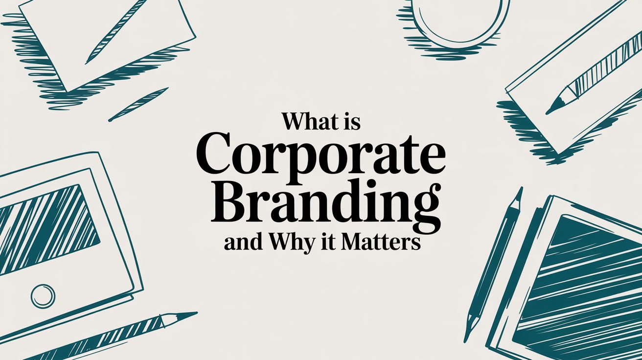
story What Is Corporate Branding and Why It Matters
So, what exactly is corporate branding, anyway? Think of it as your company's entire personality. It’s the cohesive story you tell the world about who you are, what you believe in, and the promise you make to every single customer. It���s not just a slick logo or a snappy tagline; it’s the sum total of every single interaction someone has with your business, from your mission statement all the way down to your customer service. Understanding Your Brand Beyond a Logo A powerful corporate brand shapes how people feel about your company. It’s what builds trust and forges an emotional connection that runs much deeper than any single product or service you offer. When done right, your corporate brand ensures every touchpoint feels consistent, whether someone is visiting your website, seeing a social media post, or unboxing a product. It's the art and science of managing your company's reputation, making sure you stand out from the competition in a way that truly matters. Distinguishing the Brand From Its Parts It's easy to get the lines blurred between the big-picture corporate brand and the individual products it sells. While they are definitely connected, they play very different roles. Think of the corporate brand as the "parent" that provides the credibility and core values, while its "children" are the products that live under that trusted family name. “An effective brand resonates with consumers. It powers their purchasing decisions and reflects who they are and what they stand for. Yet, competing for consumers’ attention and actually capturing it and retaining it has never been more difficult.” This parent-child relationship is crucial. Apple is the corporate brand, globally recognized for innovation, simplicity, and premium design. The iPhone is a product brand that benefits enormously from that built-in reputation. People line up for the new iPhone not just for its features, but because they trust the Apple name behind it. Even the smallest details are part of this ecosystem. The quality and design of your professional business cards printing materials, for instance, are tiny ambassadors for your corporate brand, reinforcing its values with every handshake. To really nail down the differences, it helps to see them side-by-side. Corporate Branding vs Product Branding vs Logo Here’s a quick comparison to clarify how these three distinct concepts work together. Concept Scope Primary Goal Corporate Branding Encompasses the entire organization, its mission, values, and culture. To build a strong, positive reputation and foster stakeholder trust. Product Branding Focuses on a specific product or service offered by the company. To differentiate a product from competitors and drive sales. Logo A single visual symbol representing the company or product. To provide instant visual recognition and act as a brand identifier. As you can see, the logo is a symbol, product branding creates desire for an item, and corporate branding builds the foundational trust that supports everything else. Tracing the Roots of Modern Branding It’s easy to think of corporate branding as a recent invention, something dreamed up in a Madison Avenue boardroom during the golden age of advertising. But the truth is, its roots run much deeper and are far more primal. The practice didn't start with a sleek logo or a catchy jingle; it began in open fields with a simple, powerful need: to show ownership. This idea goes back thousands of years. The word “brand” itself comes from the Old Norse term "brandr," which means “to burn.” It’s a direct reference to the ancient practice of burning a unique mark onto livestock. This wasn't just about preventing theft; it was a public declaration. That simple mark was a guarantee of origin, a signal of quality, and the very first version of a corporate promise. You can dig deeper into the fascinating history of branding on vistaprint.com . From those agricultural beginnings, the concept evolved. Fast forward to the Industrial Revolution, when factories started churning out mass-produced goods. All of a sudden, store shelves were packed, and shoppers were faced with a dizzying number of nearly identical products. Companies desperately needed a way to make their goods stand out. From Simple Marks to Emotional Connections This is where the real shift happened. Pioneers in the late 19th and early 20th centuries, like the folks at Coca-Cola , had a profound realization. They weren’t just selling a fizzy, sweet drink; they were selling a feeling. An experience. Their efforts moved beyond just slapping a name on a bottle and started to build an entire emotional world around their product. This was a game-changer. Branding was no longer just about helping a customer pick your soap off a crowded shelf. It became about crafting a consistent, desirable identity that people could connect with on a human level. The goal was to build more than just a customer base; it was to cultivate a tribe of loyal fans who trusted the name behind the product. A brand became a story, a promise of quality, and a signal of belonging. It was a strategic asset that could foster trust and command loyalty in an increasingly competitive marketplace. The Evolution into Modern Strategy As the 20th century roared on, this evolution kicked into high gear. The rise of mass media—first radio, then television, and eventually the internet—gave companies powerful new platforms to tell their brand stories to millions. Corporate branding morphed into a complex, strategic discipline that touched every single part of a business. A few key milestones mark this journey: The Trademark Era: Legal protections for names and logos became critical, cementing a brand’s unique identity in the marketplace. The Advertising Boom: Companies mastered the art of storytelling, using aspirational ads to link their products to desirable lifestyles. The Digital Age: Websites and social media opened the door for direct, two-way conversations between brands and the people who loved them. Today, you can't really understand corporate branding without appreciating this long history. It shows us that a brand isn't just a marketing tactic. It's a fundamental business concept, refined over centuries, that’s all about building trust, creating meaning, and forging real, lasting connections with people. The Building Blocks of a Strong Corporate Brand A powerful corporate brand doesn't just show up one day. It’s built, piece by piece, from a set of essential components. Think of it like building a house—you can’t put up walls without a solid foundation, and you can’t add a roof without a sturdy frame. Each part has to support the others to create something stable and impressive. These building blocks ensure that every part of your business, from internal culture to external marketing, tells the same story. When these elements click, they form a cohesive brand identity that’s both authentic and impossible to forget. Let's break down these foundational pillars one by one. Mission and Vision: The Why and Where Your mission is your brand’s "why." It’s a straightforward statement explaining your purpose—what you do, who you serve, and the impact you want to make right now. It's your reason for being, beyond just turning a profit. Your vision , on the other hand, is your "where." It’s the big, ambitious declaration of where your company is headed. This is the ultimate goal you’re striving for, inspiring both your team and your customers to come along for the ride. Core Values: The How If the mission is your destination, then your core values are the compass that guides you. These are the non-negotiable principles that shape your company's behavior and decisions. In short, your values are your brand’s moral code in action. They touch everything, from who you hire and how you handle customer service to product development and partnerships. It's not just talk, either—one study found that 80% of young Americans are likely to buy from a brand based on its mission or purpose. Authentic values have never been more critical. A brand’s values must be more than just words on a website; they need to be lived and demonstrated every single day. This authenticity builds trust and forms the bedrock of customer loyalty. Brand Voice and Visual Identity: The Look and Sound Once the internal foundation is set, it's time to decide how your brand shows up in the world. This comes down to two key pieces: Brand Voice: This is your brand's distinct personality. Are you witty and informal like Wendy's, or are you more authoritative and professional like IBM? Your voice needs to be consistent everywhere, from a social media caption to a formal email newsletter. Visual Identity: This is the aesthetic of your brand. It includes your logo, color palette, typography, and imagery. These visual cues create instant recognition and communicate a specific feeling about your company. A well-designed visual system brings all your marketing materials to life cohesively. Positioning: The Where You Fit Finally, brand positioning defines your unique spot in the market. It answers the question, "Why should a customer pick you over the competition?" This involves a deep understanding of your target audience, a sharp analysis of your competitors, and a clear idea of what makes you different. A huge part of establishing a strong corporate brand involves carving out this unique place in the market. Getting a handle on what is brand positioning is absolutely essential for this. It’s the strategic story that shapes how people see you and secures your own space in the minds of consumers. Why Investing in Branding Drives Real Growth Let's get one thing straight: a strong corporate brand is far more than a slick logo or a clever tagline. It’s the engine of your business. When you invest in building a cohesive and authentic brand, you're not just playing with aesthetics. You're building a strategic asset that delivers tangible financial returns and cements your place in the market for the long haul. This is an investment that pays dividends across the board. A well-defined brand forges deep, emotional connections with customers, turning one-time buyers into loyal advocates. That loyalty translates directly into repeat business and a much more stable revenue stream, making your company less vulnerable to market swings and competitor price wars. Fueling Financial Performance and Loyalty The numbers don't lie. Corporate branding has a massive impact on a company's valuation and how consumers behave. Interbrand's 2023 Best Global Brands report, for instance, found that the top 100 global brands hold a combined valuation north of $4.1 trillion USD . On top of that, keeping your branding consistent across all platforms can boost revenue by up to 23% on average. Why? Because brands that present a unified identity naturally build more consumer trust and loyalty. A solid brand also gives you the power to command premium pricing. When you learn how to build brand equity , you're creating an asset that makes customers willing to pay more for the quality and reliability your name represents. Attracting Top Talent and Building Credibility The perks of a strong corporate brand don't stop with customers. In today's competitive job market, your brand is a magnet for attracting and keeping top-tier talent. A company with a clear mission, a positive reputation, and strong values is simply a more attractive place to work for skilled professionals who want to be part of something they believe in. Your corporate brand acts as an internal compass, guiding your company culture and ensuring that every employee is aligned with the same core principles and goals. This alignment fosters a more engaged and motivated workforce. Finally, a powerful brand establishes serious market credibility. It’s a signal to partners, investors, and customers that your business is stable, professional, and trustworthy. This credibility is the bedrock for everything else, from securing funding to forging strategic alliances. By investing in your brand, you’re investing in a future where your business doesn’t just compete—it leads. Building strong brand awareness is the first step in creating this powerful, lasting credibility. Learning from Corporate Branding Masters Theory is one thing, but seeing corporate branding executed in the wild? That’s where the real lessons are. The best brands don’t just have a mission statement; they live and breathe it until their values and their products become one and the same. By looking at how these masters pull it off, we can get a practical playbook for building a brand people actually care about. Let's look at two companies that absolutely nail this, though in very different ways: Apple and Patagonia. They both prove that when a brand’s identity is authentic, it becomes its most powerful asset. Apple: The Embodiment of Simplicity Apple's entire brand is built on three pillars: simplicity, innovation, and elegant design . This isn't just marketing fluff—it's a philosophy that touches every single part of their business. Think about it. From the clean, minimalist look of their retail stores to the intuitive feel of their software, Apple’s obsession with simplicity is everywhere. Even their product packaging is an experience, designed to be clean and satisfying. Their ads famously skip the technical specs, focusing instead on what you can do and how it will make you feel . Apple’s brand is a promise: that technology can be powerful without being complicated. This unwavering consistency across every touchpoint has built a level of trust and loyalty that few companies ever achieve, allowing them to command premium prices and create unparalleled anticipation for new products. Patagonia: A Brand Built on Activism Patagonia’s brand is completely intertwined with environmental activism and sustainability . Their mission—"We're in business to save our home planet"—isn’t just a nice tagline. It’s the engine driving every single decision they make. You can see this in their actions, not just their words: Product Design: They make gear that’s built to last, fighting back against throwaway consumer culture. They even have a Worn Wear program to help you repair your old stuff. Marketing Campaigns: Who can forget their "Don't Buy This Jacket" ad? It was a radical move that urged people to think before they buy, cementing their anti-consumerist stance. Corporate Structure: In a game-changing move, the founder gave the company away. Ownership was transferred to a trust and a nonprofit that fights the climate crisis, ensuring all future profits go directly to the cause. The result? Patagonia attracts customers who share its deep-seated values. People aren't just buying a jacket; they're buying into a movement. This powerful connection turns customers into some of the most passionate advocates you'll ever see. It also shows how a brand's visual identity can extend into its physical spaces, where custom wall graphics can bring a company's mission to life right inside its own offices. Corporate Branding Case Study Breakdown Analyzing how leading companies align their core branding components to create a powerful and cohesive identity. To really see how Apple and Patagonia make their magic happen, let's put their strategies side-by-side. It lays bare the framework they use to create such a cohesive and compelling identity. Company Core Brand Mission Key Brand Values Demonstrated In Action Apple To create products that enrich people's lives through technology. Simplicity, innovation, design excellence, privacy. Intuitive product UI, minimalist store design, "Shot on iPhone" campaigns, clean packaging. Patagonia To save our home planet. Quality, environmentalism, activism, non-consumerism. Worn Wear repair program, 1% for the Planet pledge, durable product materials, political advocacy. Looking at these masters, one thing becomes crystal clear: a powerful corporate brand comes from aligning what you say with what you do, every single time, without compromise. Building Your Corporate Brand Strategy Turning an abstract idea into a real-world asset is all about having a clear, actionable plan. That's what a corporate brand strategy is: a roadmap that steers every single decision you make. It ensures everything you do is consistent, authentic, and makes an impact. Think of it less as a one-off project and more as a continuous cycle of defining who you are, putting it into practice, and tweaking things along the way. The whole process starts by looking inward. Before you can build anything, you have to know what you're working with. This is where a comprehensive brand audit comes in. It’s a crucial first step where you take a hard, honest look at your current market position, what customers really think of you, and what your competitors are up to. This assessment will show you your strengths, weaknesses, and the opportunities just waiting for you to grab them. It lays a foundation that’s both ambitious and firmly planted in reality. This infographic breaks down the core flow, from nailing down your mission to putting your values into practice every day. As you can see, a solid brand strategy isn't just a to-do list. It’s a connected system where your purpose fuels your principles, and those principles guide how you operate. From Core Principles to Public Persona Once you have a clear picture of your starting point, it's time to solidify your brand’s core. This means clearly articulating your mission and values —the "why" behind your business and the principles that guide every action. These become your internal compass, shaping not just your company culture but every single piece of external communication. From there, you can start to build your brand’s public-facing personality. This includes: Brand Voice: How does your brand talk? Is it an authoritative expert, a witty friend, or a nurturing guide? Whatever you choose, that voice has to stay consistent everywhere, from your website to your social media. Visual Identity: This is the whole suite of visual elements—your logo, color palette, and typography—that make your brand instantly recognizable on a crowded street. If you look at the history of corporate branding, this has always been a key differentiator. The shift from basic logos to fully integrated strategies in the 20th century really underscores this point. Brands like Coca-Cola went way beyond a simple trademark to create an entire lifestyle association. Documenting and Launching Your Brand After defining all these components, you have to document them in a brand guidelines document. This is an absolutely essential resource. It becomes the single source of truth for your entire organization, making sure everyone from marketing to sales is using the brand elements correctly and consistently. It’s the playbook that protects your brand’s integrity as your company grows. A brand strategy is only as powerful as its execution. Consistency is the mechanism that builds trust, and trust is the foundation of loyalty. Without a clear plan for implementation, even the best brand identity will fail to connect with its audience. The final steps are all about launching and managing the brand. This involves a strategic rollout plan to introduce (or reintroduce) your brand to the market. A launch isn't just about showing off a new logo; it's about telling your story and communicating your promise. Physical items, like custom promotional products , can be a huge help here, making your new brand memorable and tangible in your audience's world. From there, it's about long-term management—continuously monitoring how your brand is perceived and making adjustments to stay relevant while remaining true to your core principles. Common Questions About Corporate Branding Even with a solid plan, a few practical questions always pop up when it's time to put a corporate brand into action. Getting these common sticking points cleared up makes the path forward much easier, especially if you're just starting to think strategically about your company's identity. Let's tackle a few of the big ones. What Is the Difference Between Branding and Marketing? This is a classic, and the distinction is so important. Think of it like this: branding is the foundation of your house, and marketing is all the different ways you invite people over to see it. Branding is the long game. It’s the deep work of defining who you are as a company—your mission, your core values, how you sound, and what you look like. It’s all about shaping perception and building a reputation that sticks. Marketing is tactical. It’s the stuff you do to get the word out, like running ads, posting on social media, or writing a blog post. These actions are often short-term and designed to promote the brand you’ve already built. Simply put, branding is your identity—the who and the why . Marketing is how you broadcast that identity to the world. One builds character; the other tells the story. Can Small Businesses Afford Corporate Branding? Absolutely. And they can't afford not to. Powerful corporate branding isn't about having a Super Bowl-sized budget; it’s about being crystal clear and incredibly consistent. A small business can build an unforgettable brand simply by leaning into what makes it unique. Forget the multi-million dollar ad spend for a moment. Start with the basics: get your mission down on paper, create a clean and professional logo, and make sure you sound like the same company everywhere, from your website to your email signature. Authenticity costs absolutely nothing, and it's one of the most potent branding tools you have. For a small business, great branding is about being memorable and reliable. A consistent, authentic identity builds trust way more effectively than a huge marketing budget with no real brand behind it. How Can You Measure Branding ROI? Measuring the return on investment (ROI) for branding can feel a bit like trying to nail Jell-O to a wall. It’s not always a straight line to a sale, but you can absolutely track its impact using a mix of different numbers. Here’s how you can start connecting the dots: Brand Awareness: Keep an eye on your website traffic, mentions on social media, and how many people are searching for your company's name online. Are these numbers going up? Customer Loyalty: Use tools like customer satisfaction surveys or a Net Promoter Score (NPS) to get a real pulse on how people feel about you. Happy, loyal customers are a direct result of strong branding. Market Position: Here’s a big one—can you charge a little more than your competitors without everyone running for the hills? If the answer is yes, that's a sign of powerful brand equity at work. When you pull these data points together, you start to see a much clearer picture of how your branding efforts are strengthening your business and fueling real, sustainable growth. Ready to bring your brand to life with stunning, consistent materials? At 4OVER4 , we provide high-quality printing solutions to help your corporate brand make a lasting impression. From business cards to promotional products, let us help you build the brand you envision. Explore our printing services today!
 story
story What Is Foil Stamping and How Does It Create Luxury Branding
Picture this: you’re holding two business cards. One is a standard, everyday card. The other catches the light with a flash of gold, its logo slightly pressed into the paper. That’s the magic of foil stamping . It’s a premium printing technique that applies a thin layer of metallic or pigmented foil onto paper using heat and pressure. The result is a touch of texture, shine, and pure sophistication that regular ink just can’t touch. Unpacking the Premium Appeal of Foil Stamping At its core, foil stamping is a specialty finishing process that adds a brilliant, tactile element to your printed materials. It’s not ink. Instead, a custom-etched metal plate, called a die, is heated up. This die then presses a sheet of foil onto the paper, permanently bonding the foil to the surface in the exact shape of your design. This isn't just a decorative choice—it fundamentally changes how a product feels in someone's hands. It adds a tangible layer of quality that customers can see and feel, immediately signaling luxury and an obsessive attention to detail. It shares many of the elements that contribute to a premium, keepsake quality in other luxury items , creating a perception of higher value. The real power of foil stamping is its ability to create contrast and dimension. It adds a physical texture and a metallic sheen that separates a brand from the competition, making a product feel more valuable before it’s even opened. For a quick overview of what goes into this process, here's a simple breakdown. Foil Stamping at a Glance This table sums up the key players in the foil stamping process and the stunning effects they create together. Component Role in the Process Resulting Effect Custom Die An etched metal plate of your design is heated. Creates the precise shape and a subtle debossed feel. Foil Film A thin layer of metallic or pigmented film is laid on paper. Adds vibrant color, metallic shine, or unique texture. Heat & Pressure The heated die presses the foil firmly onto the surface. Permanently bonds the foil to the paper. This combination of custom tooling, specialized materials, and precise application is what gives foil stamping its signature high-end finish. The Science Behind the Shine The foil stamping process, often called hot stamping, is as precise as it is effective. Its wide appeal comes from its versatility, making it a favorite for everything from elegant cosmetics boxes to high-end wine labels. That unmistakable metallic sheen can dramatically boost how much a product seems to be worth. In fact, some consumer studies have shown that adding a premium finish like foil can increase a product's perceived value by as much as 30% . This impact makes it a powerful tool for any brand aiming to build a high-end identity. Key Components of the Process To really get what foil stamping is all about, it helps to know the moving parts. The entire effect hangs on three key elements working in perfect harmony: The Die: This is your design, custom-etched into a metal plate, usually made of brass or copper. The Foil: A roll of super-thin film coated with a metallic or colored pigment is positioned between the die and the paper. Heat and Pressure: The heated die presses down, activating an adhesive layer on the foil and transferring your design permanently onto the paper. This trio is what creates that crisp, slightly indented, and brilliantly reflective finish that makes custom foil stamping the go-to choice for luxury branding. Choosing Your Method: Hot vs Digital Foiling When you decide it’s time to add that brilliant metallic shine to your project, you'll run into two main techniques: the classic hot foil stamping and its modern cousin, digital foiling . Figuring out which one is right for you boils down to understanding your specific needs, your budget, and the look you’re going for. The Classic Touch of Hot Foil Stamping Think of hot foil stamping as a time-honored, artisanal craft. This method uses a custom-etched metal plate, called a die, which is heated up and pressed firmly onto the paper. The heat and pressure transfer the foil and create a beautiful, slightly indented (or debossed) texture you can actually feel. It’s the gold standard for achieving a deep, tactile impression. Because of the initial cost to create the die, this approach becomes incredibly cost-effective for large print runs. Once that die is made, the price per piece drops, making it the go-to for high-volume jobs like packaging, product labels, or thousands of event invitations. The Modern Flexibility of Digital Foiling On the other side of the coin is digital foiling—the nimble, contemporary alternative. This process works more like a high-end digital printer and completely skips the need for a custom die. Instead, it uses a special toner that the foil adheres to, which is then fused to the paper using heat and pressure. This die-less process makes it perfect for short runs, personalized items (like printing different names on each invitation), and designs with incredibly fine, delicate details that might be too fragile for a traditional metal die. The setup is much faster and more flexible, giving you a ton of design freedom, especially on smaller orders. This quick decision guide can help you visualize when to choose foil stamping over standard printing to get that high-end look. As the chart shows, if a premium look is what you're after, foil stamping is the clear winner over standard ink. Comparing Hot Stamping vs Digital Foiling So, how do you actually choose? It really comes down to the specifics of your project. If you're doing a big run and want that classic, debossed texture, traditional hot stamping is your workhorse. But if you need speed, intricate details, or personalization on a smaller batch, digital foiling is the way to go. This table breaks down the main differences to help you decide. Feature Hot Foil Stamping Digital Foil Stamping Process Uses a heated custom metal die to press foil onto the surface. Uses a special toner that attracts foil, which is then fused with heat. No die needed. Best For High-volume print runs ( 500+ pieces), simple to moderately complex designs. Short runs, variable data (personalization), highly intricate or detailed designs. Texture & Effect Creates a tactile, debossed (indented) effect that you can feel. Lays the foil flat on the surface for a smooth, purely visual effect. No debossing. Setup Cost Higher initial setup cost due to the creation of the custom die. Very low setup cost, as no die is required. Cost Per Piece Lower cost per piece on large runs, making it very economical for volume. Higher cost per piece, but more affordable for small quantities. Turnaround Time Longer, due to the time needed to manufacture the die. Faster, as the process is entirely digital and requires minimal setup. Material Options Works on a very wide range of papers, including textured stocks and thicker materials. Best suited for smooth, coated paper stocks for optimal adhesion. Design Flexibility Less ideal for extremely fine lines or variable data. Excellent for intricate details, variable text (like names or numbers), and quick design changes. Ultimately, both methods deliver a stunning result, but they get there in different ways. Your choice just depends on balancing project volume, design complexity, and budget. The market definitely reflects this split. The overall embossing and stamping market is valued at USD 5.39 billion as of 2025. While hot stamping has been a reliable staple for decades, a huge part of the industry’s future growth is coming from digital foiling, which is expanding at an impressive 8.13% CAGR . Key Takeaway: Hot stamping is your best bet for high-volume orders where you want that classic, indented feel. Digital foiling shines when it comes to short runs, complex designs, and personalized prints where speed and flexibility are top priorities. By exploring our diverse metallic foil printing options , you can see real-world examples of how both of these techniques bring designs to life. Each method offers a unique way to make your printed materials impossible to ignore, ensuring your brand leaves a lasting, high-quality impression. Exploring the Creative Palette of Foils and Papers When people hear "foil stamping," shiny gold and silver are usually the first things that pop into their head. But that's just scratching the surface. The real magic happens when you start playing with the huge variety of foils and papers available. This is where a design goes from good to genuinely unforgettable. Your choice of foil and paper is what sets the mood and creates a specific tactile experience. Let's dive into the different types of foils out there, because each one has its own personality. A Spectrum of Foil Finishes Think way beyond the classics. The world of foil is a playground of creative options that can match any aesthetic you can dream up. Metallic Foils: This is the go-to category, but it’s so much more than gold and silver. We're talking about trendy rose gold , rich copper , and deep jewel tones like sapphire blue or emerald green. These foils give you a true metallic luster that ink just can't touch. Matte Pigment Foils: For a more subtle, modern vibe, matte foils are a fantastic choice. They offer a smooth, non-reflective finish in all sorts of colors, adding a touch of class without all the shine. Holographic Foils: Ready to make a bold statement? Holographic foils are your answer. They bend light to create a stunning rainbow effect that’s impossible to ignore. It’s a futuristic, eye-catching finish perfect for designs that need to grab attention instantly. Special Effect Foils: This is where things get really interesting. You can find foils that mimic textures like leather, woodgrain, or even marble. It adds a surprising and memorable tactile element to your printed pieces. The demand for these diverse finishes is booming. In fact, the global hot stamping foils market is expected to reach USD 5.2 billion by 2035, growing at a 7.5% CAGR , driven mostly by its use in packaging and labels. The Crucial Role of Paper Stock The foil is only half the story. The paper you press it onto is just as important. The way foil interacts with different paper textures can create dramatically different outcomes, making your choice of stock a key part of the design process. The right paper doesn't just hold the foil—it collaborates with it. A smooth surface creates a clean, crisp impression, while a textured surface can give the foil a more organic, artisanal quality. Take a smooth, coated paper, for instance. It gives the foil a flawless surface to adhere to, letting it lay perfectly flat and reflect light evenly for a sharp, polished look. On the flip side, an uncoated, textured stock like linen or felt creates a more rustic feel. The foil settles into the little peaks and valleys of the paper, giving it a subtle, almost debossed character. By understanding how these elements work together, you can make deliberate choices that perfectly align with your brand's identity. You can explore our metallic foil collection to see how different combinations can elevate your next project. How Foil Stamping Elevates Everyday Designs This is where the theory behind foil stamping really comes to life. Knowing how it works is one thing, but seeing it transform everyday items is what shows off its true power. From a simple business card to the most luxurious product packaging, that little touch of foil can completely redefine the experience and boost a brand's perceived value. Let's dig into some real-world examples where this technique makes a tangible difference, turning ordinary print into something truly extraordinary. Creating an Unforgettable First Impression A business card is often the very first physical piece of your brand that a potential client touches. A standard card just passes along information. A foil-stamped card, on the other hand, tells a story—one of quality and meticulous attention to detail. Picture a matte black card with a crisp, gold foil logo. The contrast alone is stunning, but it's the slight debossed texture of the foil that feels substantial and premium in your hand. This is no longer just a piece of paper; it’s a memorable artifact. It communicates that your brand is professional, confident, and invests in quality. That tactile feedback reinforces the visual message, making a much stronger impact than ink alone ever could. You can explore a wide range of options for foil business cards that make this kind of lasting impression. Setting the Tone for Special Occasions Nowhere is the emotional power of foil more obvious than with invitations. A wedding or gala invitation with shimmering foil script does more than just share the when and where—it builds anticipation and sets the stage for an elegant event. A Sense of Luxury: The metallic sheen is an immediate signal that this is a high-end affair. An Emotional Connection: It makes the event feel more significant and thoughtfully planned out. Keepsake Quality: Guests are far more likely to treasure an invitation that feels like a small piece of art. The choice of a soft rose gold foil on a creamy, thick paper stock, for instance, can evoke romance and sophistication, creating excitement long before the actual day arrives. Dominating the Retail Shelf In a crowded store, product packaging has just seconds to grab a shopper's attention. Foil stamping is one of the most effective tools for making an item leap right off the shelf. Think of a dark chocolate bar with its name stamped in rich copper foil, or a cosmetics box with a holographic pattern that glimmers and shifts under the store lights. Foil stamping acts as a visual cue for quality. On a busy shelf, that glimmer of light can be the deciding factor that draws a customer's eye and suggests the product inside is worth the price. This strategic use of foil isn't just about looking pretty. It's about cutting through the visual noise and communicating premium quality at a single glance. It helps justify a higher price point and builds trust in the product before the customer even opens the box. The reflective surface naturally draws the eye, making sure your product gets noticed first. Essential Design Tips for Flawless Foil Printing Getting a perfect foil-stamped result isn’t just about the printing process; it all starts with smart, strategic design. Thinking ahead can save you from costly mistakes and make sure your final product looks exactly how you imagined it. A few practical rules of thumb will help your vision translate flawlessly from screen to paper. One of the biggest things to watch is line thickness. While intricate designs are possible, especially with digital foiling, traditional hot stamping definitely has its limits. Ultra-fine lines (thinner than 0.25 pt ) and tiny, delicate text can be a real problem. The heat and pressure can cause these fine details to "fill in" or bridge together, leaving you with a blurry or illegible finish. When it comes to foil stamping, bolder is often better . Setting Up Your Artwork Correctly Proper file setup is non-negotiable for a clean result. Your artwork should always be created in a vector format, like an AI or EPS file. Unlike pixel-based images, vectors can be scaled to any size without losing quality, which is absolutely crucial for creating a crisp metal die. You also need to isolate the foil elements in your file. This just means the parts of your design that will be foiled must be on a completely separate layer in your design software. Be sure to label this layer clearly (e.g., "Foil Layer") and set the color to 100% black . This is the universal sign for the printer that tells them exactly where to apply the foil, leaving no room for error. Pro Tip: Contrast is your best friend. It’s the secret to making your design truly pop. A bright gold foil on a dark, uncoated paper will create a much more dramatic impact than a silver foil on a light gray stock. Think about how the foil and paper will play off each other to create the biggest visual punch. Combining Techniques for a Deeper Impact Foil stamping plays beautifully with other printing techniques, letting you create a truly three-dimensional and tactile experience. A popular and powerful combination is pairing foil with embossing. By perfectly aligning the foil die with an embossing die, you can create a design that is both shiny and physically raised from the surface of the paper. This dual technique adds a level of texture and sophistication that you just can't get with a single process. For anyone looking to create an exceptionally premium feel, exploring custom embossing services can take your project to a whole new level. By keeping these design and production considerations in mind, you'll be able to communicate clearly with your printer and guarantee your final product is nothing short of stunning. Breaking Down the Cost and Turnaround for Foil Stamping Let's get down to brass tacks and talk about the two biggest questions for any print project: how much will it cost, and when will I get it? Foil stamping is a premium touch, for sure, but the budget and timeline are actually pretty straightforward once you know what goes into it. The final price tag on a foiling project really boils down to a few key variables. With traditional hot stamping, the main upfront cost is creating a custom metal die of your design. This is a one-time setup fee, which is exactly why hot stamping becomes so much more cost-effective on large print runs—that initial die cost gets spread thin across hundreds or thousands of pieces. Key Factors Driving Your Budget Thinking through these elements ahead of time will help you plan your project and get a much more accurate quote right from the start. Order Quantity: As we touched on, bigger orders dramatically lower the per-piece cost for traditional hot stamping. It’s the go-to for high-volume jobs. Foiled Area: This one’s simple—the more foil you use, the more it costs. A small, elegant logo is going to be less expensive than a sprawling, intricate pattern that covers half the page. Foil Type: Standard metallic foils like gold and silver are the most budget-friendly. But if you want to get fancy with specialty options like holographic, pigmented, or custom-colored foils, expect the price to go up a bit. Method Chosen: Digital foiling is the perfect answer for short runs or one-off custom pieces because it completely skips the die-making process. No setup fee makes it incredibly accessible. The most important takeaway is this: traditional hot stamping has a higher entry cost but a lower per-piece price on large orders . On the flip side, digital foiling offers an affordable path for smaller, more flexible projects without that initial setup investment. Factoring in Production Time It’s also really important to remember that foil stamping is a finishing process. It happens after the initial printing is already done, which means it adds an extra step to the production schedule. As a rule of thumb, you should plan for an additional 2-3 business days for foiling compared to a standard print job without it. This little buffer gives us the time needed for die creation (if you’re going the traditional route), machine setup, and the actual foiling application. Planning for this extra time from the get-go ensures you’ll hit your deadline without any last-minute stress. Got Questions About Foil Stamping? We've Got Answers. As you get closer to bringing your project to life, it’s natural for a few specific questions to pop up. When it comes to something as distinct as foil stamping, getting the details right is what separates a good design from a great one. Let’s walk through some of the most common questions we hear from designers and business owners just like you. Can You Print Regular Ink Over Foil Stamping? That’s a definite no-go. Foil creates a slick, non-porous surface, which means standard printing ink has nothing to grip onto. It won't absorb or dry properly, leaving you with a smudged, messy disaster. The professional way to handle this is by creating a " knock out " in your design files. Essentially, you're telling the press to leave a blank space in the foil layer exactly where you want the ink to go. This way, both the foil and the ink are applied directly to the paper, giving you that clean, crisp, and high-end finish you're after. What Is the Difference Between Foil Stamping and Metallic Ink? It’s easy to confuse them, but the final results are worlds apart. Think of metallic ink as a standard ink with tiny, glitter-like metal particles mixed in. It prints flat on the paper and gives off a subtle, muted shimmer. Foil stamping , however, is in a league of its own. It’s a process that applies a solid, opaque layer of metallic film. The result? A true, brilliant metallic shine that ink just can't touch. You also get a slight debossed texture you can feel, adding a tactile, premium quality to the piece. How Detailed Can My Foil Stamping Design Be? The level of detail you can pull off really depends on the technique. Traditional hot stamping is the heavyweight champion, perfect for bold lines and strong text. For best results, keep your lines thicker than 0.25 pt . If you go too thin, you risk the fine details getting lost or "bridging" together under the heat and pressure. On the other hand, the more modern digital foiling can often handle more delicate, intricate patterns and hairline details with incredible precision. No matter which route you go, it's always a smart move to double-check the specific design guidelines from your print provider. This ensures your artwork is perfectly set up to produce a flawless result. Ready to add that unforgettable shine to your next project? 4OVER4 offers a wide range of custom foil stamping options to make your brand stand out. Explore our collection and start designing today at https://4over4.com .
 story
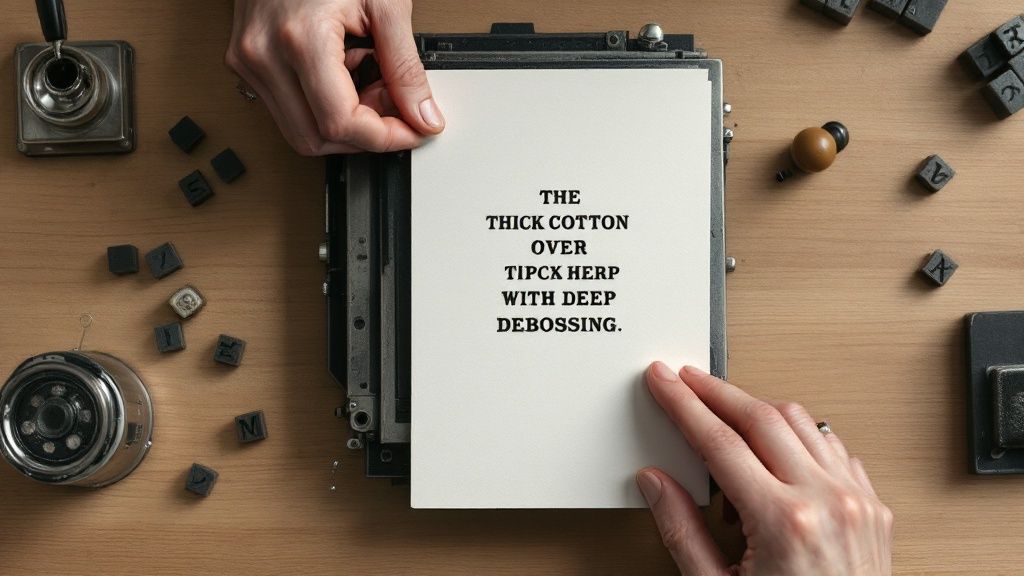
story What Is Letterpress Printing A Modern Guide
Letterpress printing is one of those timeless techniques where the process is just as beautiful as the final product. At its heart, it’s a form of relief printing. Imagine a very sophisticated, artistic stamp: a raised surface is inked up and then physically pressed into a thick, soft sheet of paper. This physical impression is what sets letterpress apart. It creates a distinct, tangible indentation that you can see and feel—a quality known as debossing . This tactile result is the unmistakable signature of true letterpress craftsmanship. A Legacy Pressed Into Paper Modern digital printing simply lays a flat layer of ink onto a surface. Letterpress, on the other hand, gives every single piece texture, depth, and character. It turns paper from a simple carrier of information into a sensory experience. This method has a rich history stretching all the way back to Johannes Gutenberg in the 15th century, and its hands-on, artistic nature is still celebrated today. Because of the meticulous attention to detail required—from hand-mixing the perfect ink color to carefully calibrating the press—this timeless craft is treasured for creating premium products that leave a lasting mark. Key Characteristics Of Letterpress The magic of letterpress really comes down to a few unique and recognizable qualities. Once you know what to look for, you'll understand why it’s the go-to choice for projects where making an incredible first impression is non-negotiable. Tactile Impression: This is the star of the show. The design is physically pushed into the paper, creating subtle shadows and a texture that just begs to be touched. Crisp Ink Application: Ink is transferred directly from the plate to the paper. The result? Exceptionally crisp lines and vibrant, saturated color that sits beautifully within the debossed area. Luxurious Paper: Letterpress shines on thick, soft papers, often made from 100% cotton . This kind of stock is plush and resilient, allowing it to take that deep impression without tearing or cracking. At its core, letterpress is about creating a connection. It’s a physical process that produces a physical result, standing out in a world saturated with fleeting digital content. This method is so much more than just putting ink on paper; it's a deliberate choice to communicate quality, care, and thoughtfulness. Its distinct feel makes it a top contender in the world of specialty printing , especially for things like wedding invitations, fine art prints, and business cards designed to make a serious statement. Each piece is a small work of art, a testament to the skill and patience poured into its creation. Tracing the Roots of Letterpress Printing To really get what letterpress printing is, you have to look back at its incredible history. This isn't just another printing method; it's a legacy that completely changed how the world communicates. The story starts way back in the 15th century when books were priceless, handwritten treasures only the wealthiest and most powerful could afford. Everything changed with one brilliant invention. The journey of mass communication as we know it kicked off with Johannes Gutenberg and his modern movable type, invented around 1440 in Germany. His system was a clever combination of reusable metal type, a specially formulated ink, and a wooden screw press he adapted from local winemakers. This setup was a game-changer. It allowed a small team to produce 180 copies of the massive, 1,282-page Gutenberg Bible in just a few years—a feat that would have been impossible for scribes. The floodgates of information were officially open. Suddenly, knowledge could be shared faster and more widely than ever before. This innovation didn't just print books; it fueled the Renaissance and laid the groundwork for widespread literacy. The Industrial Evolution of Printing For centuries, the heart of letterpress remained the same, but the machinery around it evolved in dramatic ways. The Industrial Revolution in the 19th century was a massive turning point, introducing steam-powered presses that turned a manual craft into a high-speed engine for industry. Lightning Speed: Machines like the cylinder press could churn out thousands of sheets an hour, a far cry from the few hundred a day that came before. Sharper Results: Sturdy iron presses replaced the old wooden ones, delivering more consistent pressure and crisper impressions. Information for Everyone: Newspapers, books, and pamphlets became commonplace, making information a part of daily life for the average person. This era cemented letterpress as the undisputed king of printing for over 500 years . If you want to dive deeper into the mechanics of these incredible machines, A Collector's Guide to the Antique Printing Press is a fantastic resource. While newer technologies eventually offered faster alternatives, the decline of commercial letterpress in the mid-20th century actually sparked its rebirth. It found new life as an artisanal craft, celebrated for its unique tactile beauty rather than its speed. Letterpress and Its Artisanal Relatives The core idea behind letterpress—making a physical impression on paper—is shared by other traditional printing methods. Understanding these helps put letterpress into the broader context of relief and intaglio printing. A similar technique that also uses pressure to create a distinct, raised effect is engraving . Both methods offer a premium, textured finish that modern digital printing just can't replicate. You can see how these classic techniques stack up by checking out our guide on https://www.4over4.com/printing/category/engraving . The enduring appeal of letterpress comes directly from this rich history. Every print carries an echo of centuries of craftsmanship, connecting a modern wedding invitation or business card right back to Gutenberg’s revolutionary press. It’s a tangible link to the past, reminding us of the timeless power and artistry of the printed word. How the Letterpress Printing Process Works The unique charm of a letterpress print doesn't just happen. It’s the result of a hands-on, multi-step process that beautifully merges modern design with old-school mechanics. Think of it as a craft where patience and precision are just as crucial as the artwork itself, turning a digital file into a tangible piece of art. Unlike the instant gratification of modern printing, letterpress is slow and deliberate. It’s a craft. Before a single drop of ink hits the paper, the digital design has to be turned into a physical printing plate . Most often, this is a photopolymer plate created in a process similar to developing old camera film. UV light hardens the design onto a light-sensitive material, leaving a raised, mirror-image of your final artwork. This entire workflow is a carefully choreographed dance of composition, inking, and pressing, as you can see below. What the infographic really drives home is that letterpress is a sequential, methodical craft. Each stage builds directly on the one before it to create that final, stunning impression. Preparing the Press With the plate made, the real artistry can begin: setting up the press. This isn’t like clicking "Print" on a computer. It's a meticulous calibration that can take a good chunk of time. The printer first locks the plate securely into the press bed—a frame known as a "chase"—making sure it's perfectly level and positioned. Then comes the ink. Letterpress inks are often mixed by hand to nail the exact Pantone color your design calls for. A skilled printer uses a sharp eye and precise measurements to blend pigments, creating a custom hue that brings your vision to life. The setup phase, known as "makeready," is where the printer's expertise truly shines. They adjust the press packing, roller height, and plate position to achieve the ideal impression depth—deep enough to be felt, but not so deep it punches through the paper. The Printing Run Once the press is calibrated and the ink is just right, the printing can finally get underway. Each sheet of thick, soft paper is fed into the press one at a time . This deliberate, sheet-fed method is a true hallmark of letterpress and is the secret behind its artisanal quality. As the press cycles, a set of rollers glides over the plate, applying a thin, even coat of ink. The paper is then pressed firmly against the inked plate, transferring the design and creating that signature deep impression everyone loves. This action is repeated for every single piece. A critical detail? Each color needs its own plate and a separate run through the press. Single-Color Jobs: The process is run once for every single card or invitation. Multi-Color Jobs: For a two-color design, the paper is printed, set aside to dry, and then run through the press a second time with a new plate and the second ink color. This effectively doubles the setup and run time, which is a major factor in the final cost. Finishing Touches The journey isn't over just because the ink is dry. After printing, the pieces are often left to cure for 24 hours or more. This ensures the ink is fully set and won't smudge. Finally, the finishing touches are added to wrap up the project. This can include: Trimming: Printed sheets are cut down to their final size with absolute precision. Edge Painting: A pop of color is applied to the edges of the thick card stock, adding a beautiful, custom detail. Scoring and Folding: For items like greeting cards, each piece is scored to create a clean, crisp fold. This entire sequence is worlds away from automated printing. For anyone used to the speed of modern machines, learning about the intricacies of digital printing offers a fascinating comparison. Ultimately, the letterpress process is a tribute to true craftsmanship, where every step is carefully managed to create something truly exceptional. The Defining Qualities of a Letterpress Print What is it about a letterpress piece that makes someone stop, look closer, and run their fingers over it? It’s not just one thing—it’s a combination of sensory details that digital printing simply can't mimic. These qualities turn a simple piece of paper into a memorable, tactile experience that’s a feast for the eyes and the hands. The most iconic trait is that deep, crisp impression you can both see and feel. We also call this debossing. The design isn’t just sitting on the paper; it’s physically pressed into it. This creates subtle shadows and a three-dimensional quality that just begs to be touched. This physical bite into the paper adds a tangible layer of sophistication and craft. The unique aesthetic and tactile feel of letterpress is deeply connected to the art of mastering book design and layout , creating a truly memorable experience for the reader. The Vibrancy of the Ink Another signature feature is the incredible saturation of the ink. Letterpress relies on thick, opaque inks that are pressed directly onto the paper, which results in color that is exceptionally pure and vibrant. Unlike digital printing where ink often soaks in and looks flat, letterpress ink sits beautifully right inside the debossed areas. This method delivers a richness that's tough to match. Colors look solid and true, with clean, sharp edges that make typography and illustrations really pop off the page. It's a visual punch that has become a hallmark of high-quality letterpress work. While the effect is stunning, it's different from techniques that create a raised surface. To explore a related but opposite effect, you can learn more about the process of embossing. The beauty of letterpress lies in its imperfections. Slight variations in ink coverage and impression depth from one piece to the next are not flaws but evidence of a handcrafted process, making each print truly unique. The Perfect Paper Canvas The final element that brings it all together is the paper itself. The ideal canvas for this kind of work is a thick, soft paper stock, often made from 100% cotton . This type of paper has long, plush fibers that are perfect for catching a deep, beautiful impression without cracking or tearing. Weight and Feel: Letterpress papers are noticeably heavier and more substantial—think 110lb or even 220lb cover stock. This gives the final product a luxurious, premium feel in your hands. Texture: The soft, slightly textured surface of cotton paper works perfectly with the tactile nature of the impression, enhancing the whole sensory experience. Durability: These high-quality papers are archival and built to last, making them perfect for keepsakes like wedding invitations and art prints. Together, these three things—the tangible impression, the vibrant ink, and the luxurious paper—are what make letterpress printing so special. They create a powerful connection with the recipient that communicates care, quality, and a deep appreciation for timeless craftsmanship. It’s a printing method designed to be not just seen, but felt. Modern Uses for a Timeless Printing Craft You might think of letterpress as a historical artifact, something locked away in a museum. But it's actually a vibrant, thriving craft that designers and brands turn to when they need to make a powerful statement. In a world saturated with fleeting digital ads, the tangible weight and texture of a letterpress piece create a memorable connection that truly stands out. This timeless method is the go-to choice for projects where quality and sensory experience are everything. It’s about more than just ink on paper; it’s about conveying a message of care, luxury, and permanence from the very first touch. Where Letterpress Shines Today The applications for letterpress are diverse, but they all share one common goal: to leave a lasting impression. Some of the most popular modern uses showcase its unique ability to elevate everyday items into treasured objects. Wedding Invitations: For many couples, letterpress is the only choice. The deep impression and luxurious feel set a sophisticated, personal tone for their most important day, creating a keepsake for guests. Business Cards and Stationery: A letterpress business card does more than share contact info—it communicates confidence and an uncompromising commitment to quality. It tells potential clients you value craftsmanship and sweat the details. High-End Product Packaging: Brands use letterpress for hang tags, coasters, and packaging to create an unforgettable unboxing experience. This tactile detail makes a product feel more special and justifies a premium price point. These aren't just printing jobs; they're strategic branding decisions. The physical quality of letterpress reinforces a message of excellence. By choosing letterpress, you are investing in a sensory experience. The recipient doesn't just see the design; they feel its quality, making the message more impactful and memorable. Artistry and Modern Applications Beyond its commercial uses, letterpress remains a beloved medium for artists and creators. You'll often see it used for limited-edition art prints, greeting cards, and book covers, where its rich ink saturation and crisp lines are perfect for fine art. Many modern designs also combine letterpress with other specialty techniques to create even more stunning effects. For example, pairing the deep impression of letterpress with the bright shine of metallics can produce a truly remarkable finish. To see how these elements can work together, you can explore the beautiful options available with foil stamping . This blend of old-world craft and modern aesthetics is exactly what keeps letterpress so relevant and exciting. Your Letterpress Printing Questions, Answered As you start to imagine what letterpress could do for your project, a few practical questions always pop up. It's a classic technique, and that means it plays by a different set of rules than modern digital printing. Let's walk through some of the most common queries to help you get a handle on the costs, design choices, and technical side of things. Getting these details right from the start is the key to making sure your project is a perfect match for the craft. When that happens, the final result is always something special. Why Is Letterpress More Expensive? The higher cost of letterpress comes down to two things: a very hands-on process and top-shelf materials. This isn't an automated, push-a-button kind of printing. It's a true craft, performed by a skilled operator who handles every single piece individually. That time and expertise is a big part of what you're paying for. Here’s a quick breakdown of what drives the cost: Custom Plates: Every color in your design needs its own physical printing plate. This is a one-time cost for each project, but it's a necessary first step. Manual Labor: An expert printer has to manually set up the press, mix the inks by hand to get your exact color, and then feed each sheet of paper through the machine. One at a time. Premium Paper: Letterpress truly shines on thick, luxurious cotton paper. This kind of stock costs a good bit more than the paper used for standard printing, but the tactile result is worth it. Ultimately, the price reflects a bespoke, handcrafted product—not just a simple print run. You're investing in the artistry and the undeniable quality that makes a letterpress piece feel so memorable. What Designs Work Best for Letterpress? Letterpress is at its absolute best with designs that lean into clean lines, distinct shapes, and a smart use of negative space. It makes typography and vector-style illustrations look incredibly crisp and clear. Think bold and defined, not soft and blended. Because every color requires a separate plate and another pass through the press, designs that use just one to three colors are the most popular and cost-effective. While fine, delicate lines can look stunning, you’ll want to be careful with very large, solid areas of color. They can sometimes look a little uneven or "salty" simply because of how the ink transfers from the plate to the paper. The Bottom Line: Letterpress isn't the right tool for reproducing photos, gradients, or complex, multi-colored artwork. Its superpower is bringing simple, elegant designs to life with a texture and depth you just can't get any other way. Can You Print on Both Sides? Yep, you can absolutely print on both sides of the paper! It just takes some careful planning to get it right. The deep impression on one side of the sheet can sometimes create a faint "bruise" or show-through on the other side, which can spoil the clean finish. Printers have a few clever tricks to get around this: A Lighter Impression: Your printer can use a much lighter "kiss" impression. This inks the paper perfectly but doesn't create that deep deboss, minimizing any effect on the reverse side. Thicker Paper: Using a much heavier paper stock, like a 220lb sheet , gives the paper enough heft to absorb the impression on both sides without one interfering with the other. Duplexing Sheets: This is the premium solution. The printer prints on two separate sheets and then expertly glues them together, back-to-back. Duplexing guarantees a deep, beautiful impression on both sides and gives you a final piece that feels incredibly substantial and luxurious. At 4OVER4 , we specialize in bringing the timeless beauty of letterpress to life for your brand. Whether you need unforgettable business cards or premium invitations, we have the expertise to create something truly special. Explore our custom printing solutions at https://4over4.com today.
 story
story 20 Great Graphic Design Blogs to Follow before 2024 Ends
Need a bit of inspiration before you say goodbye to 2013? Whether you are a professional, consider yourself an amateur designer or a lover of the arts, we thought you would appreciate a list of 20 of our favorite graphic design Blogs. Hurry and take a look at these 20 Blogs for incredible graphic design resources before the new year pushes its way through. Fr om photography, illustration, graphic design, typography to animation, we’ve got all your interests covered . Inspire me now Check this Blog out and get inspired by unique designs and art from around the globe. Truly unconventional. Quirksville If you love the quirky side of life, don’t miss Quirksville. Fashionistas and designers everywhere will appreciate all its offerings as well as short descriptive paragraphs that entertain and educate. The Fox Is Black Looking for a Blog that won’t disappoint? Look no further than The Fox Is Black. Featuring art on the streets, music, photography and a wealth of design information. My Design Deals Get tips and lots of free resources for graphic artists and read interviews with pros of the graphic design world. Creative Nerds Freebies, tutorials and articles that will inspire graphic designers. Nice things we like All things “nice” from artful typography, product labels, business cards and stationery. Great inspiration for product design. 92 Pixels From technology to photo manipulation to how to best use your smartphone camera, 92 pixels has that and so much more. The Sports Design Blog Combining a love of graphic design and sports, this blog covers team logos, uniforms and team colors. This Isn’t Happiness Ranked among top 100 Blogs, this is a collection of art, photography and design and life’s disappointments. Graphic Design and Tattoos Embrace your love of tattoos and graphic design with this Blog that looks at the crossover of these two creative worlds. Gura Fiko East meets west in this graphic design Blog dedicated to the history of graphic design in Japan. A MUST-Follow! Typostrate A Blog devoted to typography with photographs on the many ways it can be used. If you're a type lover, you have to check this out! Artjunks Inspiration for digital artists as well as tutorials and freebies. More Than This A design Blog dedicated to the past, present and future of design in all its forms and how it’s evolving. 9-bits Advice and inspiration by designer and web developer David Kaneda. The World We Live In If you love photography, then this is the blog that will inspire you with photos from around the world. Breath taking! Unhappy Hipsters For amazing photos of modern design and architecture with a dose of deadpan humor, this is the Blog you’ve been looking for. Creativepublic A graphic design business blog for creatives on the do’s and don’ts of running a business in this industry. Eat Sleep Draw For artists and lovers of art, Eat Sleep Draw offers original illustrations submitted by artists from across the globe. Tumblr3D Everything you ever wanted and needed to know about 3D and the latest in the CG industry as well as tutorials. We hope these 20 design blogs will inspire you in work and play as 2013 ends and 2014 waits for it’s debut. What Blogs do you look to for inspiration? We want to know!
 story
story Top Banner Design Ideas to Boost Your Brand
Unlocking the Power of Banner Design Effective banner design is crucial for capturing attention and driving conversions. This listicle presents 10 innovative banner design ideas, each accompanied by practical tips for implementation. Learn how to transform your banners into high-performing marketing assets that boost visibility and engagement. These ideas provide fresh perspectives on banner creation, moving beyond the typical approaches to offer unique design inspiration. Whether you're a seasoned marketer or just starting out, these ideas will equip you with the knowledge to create truly standout banners. A strong brand identity is essential for effective banner design, tying in closely with cohesive visuals. For more background and ideas, you can find useful resources, such as Logo Design Inspiration . This collection covers a range of banner design approaches, including: Minimalist typography Animated GIFs Interactive hover effects Photo collages Geometric patterns By exploring these diverse banner design ideas, you'll gain actionable insights to create compelling visuals that resonate with your target audience and effectively communicate your brand message. From incorporating strategic calls to action to weaving compelling brand narratives, this listicle will elevate your banner design skills and empower you to achieve your marketing goals. 1. Minimalist Typography Banner Minimalist typography banners leverage the power of strong fonts and strategic text placement to deliver a message with maximum impact and minimal design elements. This banner design idea prioritizes clarity and conciseness, cutting through visual clutter to focus on the core message. It's particularly effective for conveying a sense of sophistication, modernity, and confidence. Think of Apple's iconic iPhone campaigns, Google's product announcements, or Nike's "Just Do It" slogan. These brands effectively utilize minimalist typography to create memorable and impactful banner design ideas. Spotify also frequently uses this style for playlist promotions. This approach resonates well with audiences who appreciate clean aesthetics and straightforward communication. When your message is strong, sometimes less is more. Tips for Creating Effective Minimalist Typography Banners: Choose the right fonts: Select fonts that align with your brand personality. A tech company might choose a modern sans-serif font, while a luxury brand might opt for a classic serif. Establish clear text hierarchy: Use varying font sizes and weights to establish a clear visual hierarchy. This guides the viewer's eye through the message in the intended order. Ensure readability: Test your banner design across different screen sizes and devices. Ensure the text remains legible and impactful, regardless of the viewing platform. Incorporate power words: Use words that evoke emotion, create urgency, or pique interest. Words like "exclusive," "limited-time," or "discover" can significantly enhance engagement. Streamlining Your Design Process To streamline your banner creation and explore different font combinations quickly, consider using an Ai Banner Generator . This can be especially helpful for experimenting with various minimalist layouts and typography options. Why Minimalism Works Minimalist typography banners excel in capturing attention in visually noisy environments. By stripping away unnecessary elements, the core message stands out, making a stronger impact on the viewer. This banner design idea is particularly effective for conveying key information quickly and efficiently, making it ideal for digital advertising, social media campaigns, and website headers. Maintaining consistent spacing and alignment further enhances the clean and professional aesthetic. This style, popularized by Apple under Jony Ive and rooted in the Swiss and Bauhaus design movements, continues to be a powerful approach for banner design. 2. Product-Focused Hero Banner Product-focused hero banners showcase the product as the star of the show. High-quality product photography or 3D renders take center stage, supported by concise text and a clear call to action. This banner design idea is perfect for e-commerce and retail businesses aiming to highlight their offerings and drive sales. It's a direct and visually engaging way to capture attention and encourage product consideration. Think of Amazon's product showcase banners, or Apple's sleek device launch campaigns. These brands masterfully use product-focused hero banners to create desire and drive conversions. Fashion e-commerce sites like ASOS also utilize this style effectively to showcase new arrivals. This direct approach resonates strongly with visually-driven consumers. Learn more about printing vinyl banners like these . Tips for Creating Effective Product-Focused Hero Banners: Invest in professional photography: High-quality visuals are essential for showcasing your product in the best light. Show products in context: Use lifestyle imagery to demonstrate how the product fits into a customer's life. Optimize images for web: Ensure images load quickly and look great across all devices. Highlight key benefits: Include concise text near the image that emphasizes the product's value proposition. Experiment with angles and presentations: Test different product shots to find the most compelling visual. Maximizing Impact with Visual Storytelling Product-focused hero banners excel at telling a visual story about your product. By focusing on the product itself, you can immediately communicate its value and appeal. This banner design idea works particularly well for visually appealing products or those with unique features that can be easily showcased through imagery. Careful consideration of lighting, composition, and background elements can further enhance the banner's effectiveness and create a powerful first impression. 3. Animated GIF Banner Animated GIF banners bring dynamic movement to your online presence. These banner designs use GIF technology to create eye-catching effects with transitions and animations. By combining multiple frames, GIF banners can tell short stories, demonstrate product features, or simply grab attention through subtle motion, all without requiring video player support. This makes them versatile for various platforms. Think of Google Ads animated display campaigns, Facebook's carousel ad animations, or Mailchimp's email header animations. Even Slack uses GIF banners for feature demonstrations. These examples highlight the versatility of animated GIFs across different platforms and marketing channels. This approach resonates with audiences seeking engaging and easily digestible content. Tips for Creating Effective Animated GIF Banners: Keep animations short: Aim for animations under 3 seconds for optimal impact and to avoid annoying viewers. Optimize file size: Compress your GIFs to minimize loading times while maintaining acceptable visual quality. Front-load key information: Ensure your primary message is clearly visible in the first frame, as some users may not see the full animation. Test loading speeds: Check how your GIF banner loads across various internet connections and devices. Include a persistent call-to-action: Incorporate a clear call-to-action that remains visible throughout the animation. Streamlining Your Design Process Several online tools and software can simplify the process of creating animated GIF banners. Experimenting with different animation styles and effects can significantly enhance your banner design ideas. Why Animation Works Animated GIF banners are highly effective at capturing attention in busy online environments. The inherent movement naturally draws the eye, making them more engaging than static images. They offer a lightweight alternative to video, providing a dynamic element without the larger file sizes and playback requirements. This makes them ideal for banner design ideas across various platforms, from social media to email marketing campaigns. Maintaining visual consistency with your brand further strengthens your message. 4. Split-Screen Layout Banner Split-screen layout banners divide the banner space into two distinct sections, creating a compelling visual balance while showcasing multiple focal points. This design technique is particularly effective for comparing products, highlighting before/after scenarios, or juxtaposing contrasting elements like text and imagery. It offers a dynamic way to present information concisely and engage viewers with a clear, structured layout. Think of Spotify promoting two different playlists side-by-side, or a fitness brand showcasing a before/after transformation. Tech websites frequently use this layout for product comparisons, and even software companies like Microsoft have leveraged it to compare their offerings against competitors. This versatility makes split-screen banners a powerful tool for various marketing campaigns. Learn more about Split-Screen Layout Banner options for printing . When implementing Animated GIF Banners in a split-screen format, file size can become an issue. It's important to know how to compress GIF file for optimal performance. Read more on how to compress GIF files from Compresto. Tips for Creating Effective Split-Screen Banners: Ensure visual balance: Both sides should carry equal visual weight, preventing one side from overpowering the other. Use contrasting colors: Clearly define the two sections with contrasting colors or backgrounds to enhance visual separation. Prioritize readability: Ensure text is easily readable within both sections, regardless of the background color or image. Test mobile responsiveness: Thoroughly test the banner design on various devices to ensure it adapts seamlessly to different screen sizes. Maintain message cohesion: Though split, the overall message should remain cohesive and unified, supporting a single, clear objective. Maximizing Impact with Split-Screen Design Split-screen banners excel at presenting complex information in a digestible format. By dividing the content into distinct sections, viewers can quickly grasp the key message and understand the comparison or contrast being presented. This banner design idea is ideal for conveying a lot of information efficiently, making it well-suited for product promotions, comparative advertising, and showcasing transformations. This technique, popularized by web design agencies and comparison shopping websites in the early 2000s, continues to be a relevant and effective banner design idea. 5. Gradient Background Banner Gradient background banners utilize color transitions as the primary visual element, creating depth and a modern aesthetic. This banner design idea blends multiple colors seamlessly, resulting in a dynamic backdrop for text and other design components. It's a versatile technique that can evoke various moods, from energetic and vibrant to calming and sophisticated. Think of Instagram's vibrant brand gradient, the subtle transitions on Spotify playlist covers, or the bold backgrounds used in modern SaaS company landing pages. Even Adobe uses gradients in its promotional materials. These examples showcase the versatility of gradient backgrounds for various brands and purposes. Learn more about pre-designed banners with gradient backgrounds at 4over4 . This approach resonates particularly well with younger audiences who appreciate modern design trends. Tips for Creating Effective Gradient Background Banners: Choose complementary colors: Select colors that align with your brand palette and evoke the desired mood. Ensure text contrast: Maintain sufficient contrast between the text and the background for optimal readability. Test on various devices: Preview your banner design on different screens and devices to ensure consistent rendering. Consider subtle transitions: For a more professional look, opt for subtle and refined gradient transitions. Use gradient tools: Leverage design software gradient tools for smooth and controlled color blending. Optimizing Gradient Usage To maximize the impact of your gradient background, experiment with different blending modes and color combinations. A radial gradient can create a focal point, while a linear gradient can add direction and movement. Why Gradients Work Gradient backgrounds offer a visually engaging alternative to solid colors. They add depth and dimension, making banners more eye-catching and memorable. This banner design idea is particularly effective for creating a modern and stylish feel, making it ideal for brands targeting a younger demographic. Considering the popularity of gradients in current design trends, incorporating them into your banner design strategy can enhance your brand's visual appeal. 6. Geometric Pattern Banner Geometric pattern banners incorporate geometric shapes, patterns, and mathematical forms to create visually striking and organized layouts. This banner design idea uses circles, triangles, hexagons, and abstract geometric compositions to add visual interest while maintaining a professional appeal. This approach can create a sense of order, modernity, and dynamism, making it ideal for technology, finance, and creative industries. Think of IBM's geometric campaign designs, Microsoft's tile-based design system, or Mastercard's overlapping circles brand system. Airbnb also effectively utilizes geometric patterns in its background imagery. This design resonates with audiences who appreciate clean aesthetics and visually stimulating content. Geometric patterns can communicate complexity and sophistication without overwhelming the viewer. Tips for Creating Effective Geometric Pattern Banners: Maintain consistent spacing: Ensure uniform spacing between elements for a clean, balanced look. This enhances readability and visual harmony. Use color strategically: Highlight key shapes and guide the viewer's eye with strategic color choices. Color can create contrast, emphasis, and visual flow. Ensure clarity: Balance visual interest with message clarity. Patterns shouldn't overshadow the primary message of the banner. Test scalability: Ensure the design remains effective across various banner sizes and devices. Maintain visual integrity across different platforms. Consider cultural interpretations: Research the cultural significance of geometric symbols to avoid unintended meanings in your target market. Streamlining Your Design Process Using online design tools can help you experiment with geometric patterns and layouts. Explore different combinations to find the perfect balance between visual appeal and brand consistency. These tools can also help ensure scalability across various banner dimensions. Why Geometric Patterns Work Geometric pattern banners excel at creating visual interest and a sense of modern sophistication. This banner design idea effectively communicates complexity and structure while maintaining a clean aesthetic. Rooted in the Bauhaus design movement and Swiss graphic design traditions, this style remains a powerful approach for creating impactful banner designs. The consistent use of geometric forms creates a cohesive and memorable visual experience, aligning with modern material design principles. This approach is especially effective for businesses in technology, design, and architecture, where conveying a sense of innovation and precision is key. 7. Photo Collage Banner Photo collage banners offer a dynamic and visually rich way to capture attention. This banner design idea combines multiple photographs, images, or visual elements into a single cohesive composition, telling a story and engaging the audience through multiple focal points. Think of a travel website showcasing a dream destination, a fashion brand displaying its seasonal collection, or a restaurant highlighting menu items. This approach creates a sense of vibrancy and offers a multi-faceted view of a product, service, or event. (Placeholder - Replace with actual image) Fashion and lifestyle magazines, along with travel and hospitality marketing, popularized this design approach. Social media platforms like Pinterest further fueled its adoption. This style resonates well with audiences who appreciate visual storytelling and dynamic content presentation. Photo collage banners are perfect for showcasing variety and creating a sense of abundance. Learn more about Photo Collage Banner printing options. Tips for Creating Effective Photo Collage Banners: Maintain consistency: Ensure consistent image quality and style for a cohesive look. Using a unifying color palette or filter can further enhance visual harmony. Establish visual hierarchy: Use varying image sizes to create a clear focal point and guide the viewer's eye. Proper hierarchy ensures the most important elements stand out. Balance visuals and text: Leave sufficient space for text and call-to-action elements. Avoid overcrowding the banner, ensuring readability and clear communication. Optimize for mobile: Test your banner design on different mobile devices to guarantee it displays correctly and remains visually appealing on smaller screens. Maximizing Impact with Photo Collages Photo collage banners effectively showcase a range of products, services, or experiences within a single banner. This banner design idea is especially useful for businesses that want to highlight diversity and offer a comprehensive overview of their offerings. By carefully curating the images and maintaining a balanced composition, you can create a compelling visual narrative that captures attention and drives engagement. Consider using an online collage maker to experiment with different layouts and image combinations. 8. Call-to-Action Focused Banner Call-to-action (CTA) focused banners are specifically engineered to drive user action. Every element, from color to text, is strategically placed to guide the viewer toward clicking, purchasing, or engaging. This banner design idea prioritizes conversion optimization over pure aesthetic appeal, using psychological triggers and proven design principles to maximize impact. Think of Amazon's "Buy Now" buttons, Netflix's "Start Free Trial" campaigns, or Shopify's "Start Your Store" promotions. These banners leave no room for ambiguity, clearly directing the user toward the desired action. HubSpot also effectively uses this technique with their "Get Started Free" lead generation banners. These examples demonstrate the power of a clear and concise CTA in driving conversions. This approach resonates particularly well with audiences who are ready to take the next step in the customer journey. Learn more about Call-to-Action Focused Banner printing options for your business. Tips for Creating Effective Call-to-Action Focused Banners: Use action-oriented verbs in button text: Words like "Shop Now," "Download," or "Learn More" clearly communicate the intended action. Create visual contrast for call-to-action elements: Make your buttons stand out by using contrasting colors, sizes, and whitespace. Test different button colors and placements: A/B testing can help determine the most effective combinations for your target audience. Include social proof or urgency indicators: Phrases like "Limited Time Offer" or "Join Thousands of Satisfied Customers" can encourage immediate action. Keep the user journey simple and clear: Minimize distractions and make it easy for users to complete the desired action. Maximizing Conversions with Clear CTAs Call-to-action focused banners excel in driving measurable results. By prioritizing conversion-oriented design, these banners directly contribute to business objectives. Whether it's increasing sales, generating leads, or driving website traffic, a clear and compelling CTA is essential. Maintaining a consistent brand voice and visual identity within the banner further strengthens its impact. This approach, popularized by direct response marketing and e-commerce optimization, continues to be a crucial strategy for banner design ideas. 9. Brand Story Narrative Banner Brand story narrative banners communicate brand values, mission, and story through visual storytelling. This banner design idea focuses on emotional connection and brand building rather than immediate sales. It uses imagery, copy, and design elements that reflect the brand's personality and values, resonating deeply with the target audience. This approach fosters long-term customer loyalty and brand advocacy. Think of Patagonia's environmental activism banners, Nike's athlete empowerment campaigns, or Dove's "Real Beauty" campaign. These brands effectively use narrative banners to connect with their audience on an emotional level. Ben & Jerry's also uses this technique to highlight their commitment to social justice. This resonates with consumers who align with these values, creating a stronger brand affinity. Tips for Creating Effective Brand Story Narrative Banners: Ensure authenticity in brand messaging: Your narrative must ring true to your brand's core values. Avoid generic statements and focus on genuine beliefs. Use real customer stories and testimonials: Incorporating real stories adds credibility and emotional depth to your brand narrative. Maintain consistency across all touchpoints: Your banner design should complement and reinforce your brand story across your website, social media, and other marketing materials. Focus on values that resonate with your target audience: Understand your audience's values and tailor your narrative to connect with their aspirations and beliefs. Balance emotion with subtle product integration: While the focus is on storytelling, subtly integrate your product or service within the narrative to maintain relevance. Weaving a Compelling Narrative Brand story narrative banners excel in building brand loyalty and creating a lasting impression. By sharing your brand's values and mission, you invite customers to connect with your purpose beyond just your products or services. This banner design idea is particularly effective for building brand awareness, fostering customer engagement, and driving long-term growth. This approach, popularized by brands like Nike and Patagonia, emphasizes genuine connection over overt sales pitches, leading to more meaningful customer relationships. This resonates especially well in today's market where consumers increasingly value authenticity and brand purpose. 10. Interactive Hover-Effect Banner Interactive hover-effect banners elevate banner design ideas by incorporating dynamic elements triggered by user actions like mouse hovers or clicks. These banners utilize CSS animations, JavaScript effects, or HTML5 features to create engaging micro-interactions. These subtle animations enhance user experience and encourage deeper engagement with the banner content. This banner design idea adds a layer of sophistication and encourages users to explore more. Think of Apple's product exploration banners, where hovering reveals different product angles and features. Airbnb uses similar hover effects to preview property details, while Stripe uses interactive banners to showcase their product's functionality. GitHub employs hover effects for code previews, enriching the user experience. These examples demonstrate the effectiveness of interactive elements in conveying information and enhancing user engagement. This approach resonates with audiences accustomed to interactive web experiences. Tips for Creating Effective Interactive Hover-Effect Banners: Ensure cross-browser compatibility: Test your banner design across different browsers to guarantee consistent functionality. Provide mobile alternatives: Offer alternative interaction methods, like taps or swipes, for mobile users. Prioritize smooth animations: Keep animations fluid and purposeful, avoiding jerky or distracting movements. Test loading performance: Evaluate how the interactive elements impact the banner's loading speed. Make interactive elements obvious: Visually cue users to the interactive elements to encourage engagement. Streamlining Your Design Process Leverage modern web development frameworks and libraries to simplify the implementation of hover effects. These resources offer pre-built components and tools to streamline your workflow and create sophisticated interactive experiences. Why Interactivity Matters Interactive hover-effect banners excel at capturing attention in a crowded digital landscape. By providing an engaging experience, these banners encourage users to interact with the content, leading to increased dwell time and click-through rates. This banner design idea is particularly effective for showcasing product features, demonstrating functionality, and providing a more immersive brand experience. This approach aligns with modern web design trends that prioritize user engagement and dynamic content presentation. Banner Design Ideas: Key Features Comparison Banner Type Implementation Complexity 🔄 Resource Requirements ⚡ Expected Outcomes 📊 Ideal Use Cases 💡 Key Advantages ⭐ Minimalist Typography Banner Low 🔄 Low ⚡ Clear messaging, timeless impact 📊 Professional services, tech, luxury brands Fast loading, scalable, cost-effective ⭐ Product-Focused Hero Banner Medium 🔄 High ⚡ Strong product desire, high conversion 📊 E-commerce, retail, product launches Immediate product showcase, high conversion ⭐ Animated GIF Banner Medium-High 🔄 Medium ⚡ Increased engagement, dynamic display 📊 Social media, email marketing, product demos Eye-catching, cross-platform support ⭐ Split-Screen Layout Banner Medium 🔄 Medium ⚡ Balanced info display, product comparison 📊 Comparisons, before/after, dual offers Efficient use of space, visual balance ⭐ Gradient Background Banner Low 🔄 Low ⚡ Modern aesthetic, visual depth 📊 Tech, creative agencies, modern brands Customizable, lightweight, trendy ⭐ Geometric Pattern Banner Medium 🔄 Medium ⚡ Professional, clean visuals 📊 Tech, finance, architecture, professional services Timeless, scalable, brand consistent ⭐ Photo Collage Banner Medium-High 🔄 Medium-High ⚡ Visual richness, storytelling impact 📊 Travel, fashion, restaurants, events Emotional connection, versatile ⭐ Call-to-Action Focused Banner Medium 🔄 Low-Medium ⚡ High conversions, direct response 📊 E-commerce, SaaS, lead gen, performance marketing High CTR, measurable results, budget efficient ⭐ Brand Story Narrative Banner Medium 🔄 Medium ⚡ Strong brand connection, recall 📊 Lifestyle, B-Corp, premium products, values-driven Emotional branding, differentiation ⭐ Interactive Hover-Effect Banner High 🔄 High ⚡ Increased engagement, memorable UX 📊 Tech, web services, interactive products Sophisticated, info-rich, modern ⭐ Designing Banners that Convert: A Final Word This exploration of 10 diverse banner design ideas has highlighted the power of visual communication in capturing attention and driving engagement. From minimalist typography to interactive hover effects, each approach offers a unique way to convey your brand message and achieve specific marketing objectives. Remember, effective banner design isn't about following trends, but about understanding your audience and crafting a visual narrative that resonates. Key Takeaways for Impactful Banner Design Let's recap the essential elements for creating banners that convert: Clarity of Message: A concise and compelling message is paramount. Whether you're promoting a product, announcing an event, or sharing a brand story, ensure your message is easily understood at a glance. Visual Hierarchy: Guide the viewer's eye through strategic placement of elements. Use size, color, and contrast to emphasize key information and calls to action. Brand Consistency: Maintain a cohesive brand identity across all your banner designs. Consistent use of fonts, colors, and imagery reinforces brand recognition and builds trust. Call to Action (CTA): A clear and compelling CTA is crucial for driving conversions. Tell your audience exactly what you want them to do - visit your website, shop now, learn more, etc. Implementing these Banner Design Ideas Putting these insights into action is the key to maximizing your banner's impact. Consider the following steps: Define Your Goals: What do you want to achieve with your banner? Increased brand awareness, website traffic, or sales? Clearly defined goals will inform your design choices. Know Your Audience: Who are you trying to reach? Understanding your target audience's preferences and behaviors will help you tailor your design to resonate with them. Experiment and Iterate: Don't be afraid to try different approaches. A/B testing different banner designs can provide valuable insights into what works best for your audience. The Power of Effective Banner Design Mastering these banner design concepts empowers you to create visually compelling and strategically effective banners. These banners can significantly enhance your brand visibility, drive traffic to your website, and ultimately boost conversions. Investing time and effort in thoughtful banner design translates directly into tangible results. By capturing attention and communicating effectively, well-designed banners become valuable assets in your marketing toolkit. Ready to transform your banner design ideas into reality? 4OVER4 offers a wide range of high-quality printing and design services to help you create stunning, professional banners that make a lasting impact. Visit 4OVER4 today to explore their customizable options and bring your vision to life!
The Ultimate Checklist: 10 Best Practices for Logo Design in 2025
A great logo is more than just a pretty picture; it's the cornerstone of your brand identity, a silent ambassador that works tirelessly across every piece of marketing collateral. From the business cards you hand out to the large-format banners at a trade show, your logo must be a masterpiece of simplicity, versatility, and strategic thinking. It’s the single most important visual element that communicates your company’s essence at a glance, making it a critical asset for building brand recognition and trust. But with so many factors to consider, such as color psychology, scalability, legal protection, and print-readiness, how do you ensure your design hits the mark? Crafting an effective logo requires a disciplined approach that balances creative vision with technical precision. Getting these details right from the start prevents costly redesigns and ensures your brand presents a polished, professional image across all platforms. This comprehensive guide outlines the 10 essential best practices for logo design , providing an actionable checklist for small businesses and agencies alike. We'll move beyond generic advice to give you the technical know-how and strategic insights needed to create a logo that not only looks professional but also performs flawlessly in the real world. This blueprint will cover everything from strategic color choices optimized for print to the critical file formats required by print vendors like 4OVER4. Following these guidelines will help you develop a powerful, enduring symbol that supports your brand for years to come. 1. Simplicity and Timelessness The most effective and enduring logos share two fundamental qualities: they are simple and they are timeless. Simplicity ensures a logo is easily recognizable and memorable, cutting through the visual noise of the modern marketplace. A simple design is versatile, retaining its clarity and impact whether it’s printed on a small business card or a large format banner. Timelessness protects your brand from feeling dated. By avoiding trendy fonts, colors, or effects, your logo remains relevant for years, even decades. This approach, championed by design legends like Paul Rand (IBM) and Saul Bass, treats your logo as a long-term investment rather than a temporary fashion statement. Think of the Nike "swoosh" or the Target bullseye; their power lies in their straightforward, unchanging presence. How to Achieve Simplicity and Timelessness This principle is a core part of the best practices for logo design because it directly impacts brand recognition and longevity. A complex, trendy logo might look great today but will likely require a costly redesign in a few years. Here are actionable steps to implement this principle: Test for Memorability: Show your logo concept to someone for five seconds, then ask them to sketch it from memory. If they can capture the basic form, you are on the right track. Embrace Subtraction: Critically evaluate every element. Does that gradient, shadow, or extra line serve a strategic purpose? If not, remove it. A strong concept doesn’t need embellishment. One-Color Test: A truly versatile logo must work in a single color. This ensures it can be used for everything from single-color screen printing on apparel to embossing on custom presentation folders. If the design loses its meaning in black and white, it’s too dependent on color. Key Insight: A simple logo is not a boring logo. It is a focused one. Its strength comes from a single, powerful idea executed with precision, making it instantly recognizable and adaptable to any application. 2. Versatility Across Print Mediums A truly effective logo is a chameleon, adapting flawlessly to every environment without losing its core identity. Versatility means your logo maintains its integrity and impact whether it’s printed on a tiny promotional sticker, embroidered on apparel, or displayed on oversized banners. It must be as clear on a business card as it is on a delivery truck, a principle demonstrated by brands like FedEx and Coca-Cola, whose marks are instantly recognizable at any scale. This adaptability is not accidental; it’s the result of strategic design choices championed by corporate identity experts. A logo that fails this test creates practical problems, becoming illegible, distorted, or expensive to reproduce on different materials. It limits your marketing potential and weakens brand consistency across crucial touchpoints. How to Achieve Versatility This principle is a cornerstone of the best practices for logo design because it ensures your brand can show up consistently everywhere. A logo that only works in one specific context is a liability, not an asset. You need a mark that performs across the full spectrum of marketing materials. Learn more about versatile options like signs and banners to see why scalability matters. Here are actionable steps to implement this principle: Design in Vector Format: Always create your master logo files in a vector format (AI, EPS, SVG). Unlike pixel-based formats (JPG, PNG), vectors can be scaled infinitely without any loss of quality, ensuring sharpness on any print product. Develop Logo Variations: A single logo lockup won't fit every space. Create a system that includes a primary logo, a horizontal version, a stacked or vertical version, and an icon-only mark (logomark) for use in small spaces like social media profiles. Test on Different Backgrounds: Your logo must be legible on light, dark, and complex photo backgrounds. Prepare full-color, single-color (black), and reversed-out (white) versions to ensure it always stands out. Check Small-Scale Legibility: Shrink your logo down to a very small size (around 0.5 inches wide). Can you still read any text? Is the core shape recognizable? If intricate details merge into a blur, the design needs simplification. Key Insight: A versatile logo is designed as a system, not a single image. By creating a flexible suite of logo variations from the start, you empower your brand to maintain a strong, consistent presence across every possible application. 3. Color Strategy and CMYK Optimization Color is a powerful psychological tool that directly influences brand perception and recognition. However, a stunning digital color palette can fail spectacularly when printed if not planned correctly. Strategic color selection and CMYK optimization are essential to ensure your brand's colors remain consistent and vibrant, from a glowing screen to a physical business card. This process involves choosing colors that not only align with your brand's personality but also reproduce reliably in the CMYK (Cyan, Magenta, Yellow, Black) color model used for most printing. Famous brands like Tiffany & Co. with its signature robin egg blue and UPS with its distinct brown have built empires on meticulously controlled color consistency. This isn't an accident; it's a core part of their brand strategy, ensuring their visual identity is unmistakable everywhere. How to Implement Color Strategy and CMYK Optimization This principle is a crucial component of the best practices for logo design because it bridges the gap between digital design and tangible print materials. Ignoring CMYK can lead to dull, inaccurate colors and costly reprints, undermining your professional image. Learn more about the precision of professional offset printing on 4over4.com to see how it preserves color integrity. Here are actionable steps to master your logo’s color: Design in CMYK Mode: Start your logo design process in a CMYK color profile if its primary application will be print. Converting from RGB (for screens) to CMYK later can cause unexpected and dramatic color shifts. Utilize a Pantone Matching System (PMS): For critical brand colors, specify a PMS color. This provides a universal standard that printers use to mix ink for near-perfect color matching across different products and vendors. Order a Hard-Copy Proof: Before committing to a large print run, always request a physical proof from your printer. This allows you to see exactly how the colors will appear on your chosen paper stock, preventing any unwelcome surprises. Document Your Color Codes: Create a brand style guide that records the exact CMYK, PMS, RGB, and HEX values for your brand colors. This ensures anyone working with your logo in the future can maintain consistency. Key Insight: Color in print is a science, not a guess. Proactive CMYK optimization and the use of color standards like Pantone transform your logo from a digital concept into a reliable, consistent, and powerful real-world brand asset. 4. Font Selection and Typography Typography is the art and technique of arranging type, and it's a critical component of logo design. Whether your logo is a wordmark (like Coca-Cola) or a combination of an icon and text, the chosen typeface communicates your brand's personality, ensures readability, and significantly contributes to overall recognition. A poor font choice can undermine even the most brilliant graphic element, making a brand feel amateurish or misaligned with its core values. The right font selection can single-handedly convey a message. The custom serif of Disney's logo evokes a sense of magic and fantasy, while the clean, geometric sans-serif used by Google communicates modernity and accessibility. This is why typography experts like Erik Spiekermann and renowned foundries like Adobe and Monotype are so influential; they craft the visual language that brands use to speak to their audience without words. How to Achieve Strong Typography This principle is a non-negotiable part of the best practices for logo design because it directly influences how your audience perceives your brand's voice and professionalism. Selecting a font is not just about aesthetics; it is a strategic decision that impacts everything from legibility on business cards to the emotional connection a customer feels. Here are actionable steps to implement this principle: Prioritize Legibility: Test your chosen typeface at very small sizes. Can it still be read clearly on a pen or a small product label? If it becomes illegible, it's not a viable option for a versatile logo system. Limit Your Palette: Stick to one or, at most, two typefaces. Using too many fonts creates visual chaos and weakens brand consistency. A primary font for the main brand name and a secondary font for a tagline is a classic, effective pairing. Create Outlines for Print: Before sending your logo to a printer, convert all text to outlines (or curves). This technical step turns the letters into vector shapes, ensuring the font displays and prints correctly even if the print vendor does not have the font file installed. Avoid Overly Trendy Fonts: Decorative or trendy fonts can quickly date your logo. Opt for classic, well-crafted typefaces that have stood the test of time to ensure your brand remains relevant for years to come. Key Insight: Typography is your brand's voice made visible. A carefully chosen typeface doesn't just spell out a name; it communicates personality, establishes trust, and ensures your message is heard clearly across every application. 5. Visual Hierarchy and Focal Points An effective logo instantly directs the viewer's eye to the most critical element. This is achieved through a clear visual hierarchy, which uses size, color, contrast, and positioning to establish a focal point. A strong hierarchy ensures your logo communicates its core message immediately, which is crucial when it appears on busy signage or a small product label where attention is fleeting. This principle is about control and intention in design. Think of how the World Wildlife Fund's panda logo immediately emphasizes the iconic animal or how Mastercard's overlapping circles guide the eye to their intersection. Without a planned hierarchy, elements compete for attention, creating a confusing and forgettable mark. By establishing a clear order of importance, you make your logo easier to process and remember. How to Establish Visual Hierarchy This is one of the foundational best practices for logo design because it determines how your brand’s message is received in the split second a potential customer sees it. A logo with a muddled hierarchy fails to make a strong first impression and can hinder brand recognition. Here are actionable steps to implement this principle: Identify the Primary Element: Decide on the single most important part of your logo, whether it's an icon, a wordmark, or a specific shape. This will be your focal point. Use Scale and Contrast: Make your focal point larger, bolder, or more vibrant in color than other elements. Secondary components, like a tagline, should be significantly smaller and more subdued. Position Strategically: Place the primary element where the eye naturally looks first, often in the center or top-left. Supporting elements should frame or ground this focal point without distracting from it. The Thumbnail Test: Shrink your logo down to the size of a social media profile picture or a favicon. If the primary element is still clear and the overall message is intact, your hierarchy is effective. Key Insight: Visual hierarchy is not about making one part of your logo "more important" than the others. It’s about creating a guided visual journey that ensures the entire logo is understood in the correct sequence, reinforcing your brand identity with clarity and speed. 6. Brand Consistency and Style Guides A powerful logo is only the first step; its strength is fully realized through consistent application. A brand style guide is the official rulebook that governs how your logo and other brand elements are used, ensuring a cohesive and professional appearance across all marketing collateral. This consistency builds trust and reinforces brand recognition, whether your logo appears on a business card, a trade show banner, or digital media. Without guidelines, your logo can be stretched, recolored, or placed incorrectly, diluting its impact and damaging your brand's credibility. Companies like Apple and Uber maintain famously strict guidelines to protect their visual identity. A style guide empowers your team, vendors, and partners to represent your brand correctly, making every interaction a building block for stronger brand awareness . How to Achieve Brand Consistency This principle is a critical part of the best practices for logo design because it operationalizes your brand identity. It ensures that your logo, the cornerstone of your brand, is always presented with integrity. Maintaining brand consistency is vital when applying your logo to various materials, such as how a school utilizes its official school logo on graduation announcements to maintain a professional and unified look. Here are actionable steps to implement this principle: Define Logo Variations: Document all approved versions of your logo, including full-color, one-color (black and white), and reversed-out versions for dark backgrounds. Specify Clear Space: Mandate a "safe zone" or clear space around the logo to prevent other elements from crowding it. This rule is non-negotiable and preserves the logo's visual impact. Codify Your Colors: Provide the exact color codes for every format: Pantone (PMS) for spot color printing, CMYK for full-color print, and RGB/Hex for digital use. This ensures colors are accurate everywhere. Establish "Don'ts": Clearly illustrate unacceptable logo modifications, such as stretching, adding drop shadows, altering colors, or rotating the design. This prevents common mistakes. Key Insight: A brand style guide is not a creative constraint; it is a tool for empowerment. It provides the clarity and direction needed for anyone, from an in-house designer to a third-party print vendor, to execute your brand identity flawlessly. 7. Cultural Sensitivity and Global Applicability As businesses grow, their logos must travel across geographic and cultural borders. A design that resonates in one market may be meaningless, confusing, or even offensive in another. Cultural sensitivity ensures your logo maintains its intended meaning and positive association, regardless of language or regional context, preventing brand damage and costly redesigns. Global brands like Nike and Mercedes-Benz succeed because their symbols (the swoosh and the three-pointed star) are abstract and carry no negative cultural baggage. This approach, advocated by global branding strategists, treats your logo as a universal ambassador. It's about creating a mark that connects with humanity on a fundamental level, transcending specific traditions, beliefs, or languages. How to Achieve Cultural Sensitivity and Global Applicability This principle is a critical component of the best practices for logo design because a lack of cultural awareness can instantly alienate potential customers and undermine a global expansion strategy. A culturally insensitive logo is a liability, not an asset. Here are actionable steps to implement this principle: Research Color Symbolism: Colors carry potent meanings that vary dramatically across cultures. For example, while white signifies purity in many Western cultures, it represents mourning and death in parts of Asia. Research the color associations in your key target markets. Audit Symbols and Gestures: Avoid using symbols, hand gestures, animals, or religious icons that may have unintended negative connotations elsewhere. What seems innocuous in one country could be a grave insult in another. Test with Diverse Audiences: Before finalizing a design, gather feedback from a focus group composed of individuals from your target cultural backgrounds. This firsthand insight is invaluable for identifying potential misinterpretations. Prioritize Universal Shapes: Lean on simple, geometric, and abstract forms that are universally understood and do not rely on culture-specific imagery. This ensures clarity and avoids unintentional messaging. Key Insight: A globally applicable logo isn't culturally empty; it's culturally intelligent. It is designed with a deliberate awareness of global diversity, ensuring it can represent your brand with integrity and respect in any market. 8. Trademark and Legal Distinctiveness A visually appealing logo is only half the battle; a truly effective logo must also be legally defensible. Legal distinctiveness ensures your mark is markedly different from those of competing brands, making it protectable through trademark registration. Ignoring this step can lead to costly legal disputes, forced rebranding, and crippling market confusion for customers. This principle is about future-proofing your brand identity. By ensuring your logo is unique from the outset, you build brand equity on a secure legal foundation. Think of the intense protection surrounding marks like the McDonald's golden arches or the Apple logo; their value is intrinsically tied to their exclusive, legally enforced distinctiveness. A legally sound logo is an invaluable business asset. How to Ensure Legal Distinctiveness Incorporating legal review is one of the most critical best practices for logo design , protecting your investment in brand collateral like business cards, signage, and packaging. A preventable legal issue can nullify your entire marketing budget and set your brand back to square one. Here are actionable steps to implement this principle: Conduct a Thorough Search: Before finalizing a design, perform a comprehensive search on databases like the U.S. Patent and Trademark Office (USPTO) TESS system. This initial check can flag obvious conflicts early. Consult a Trademark Attorney: The most reliable way to ensure a logo is legally clear for use and registration is to hire an intellectual property attorney. Their expertise is crucial before you invest heavily in printing and marketing. Document the Design Process: Keep detailed records of your logo's creation, including initial sketches, revisions, and information about the original designer. This documentation can serve as crucial evidence of original work if a dispute ever arises. Use Proper Notation: Once you begin using your logo, apply the appropriate symbols. Use ™ (trademark) for unregistered marks to claim common-law rights, and ® (registered) only after your trademark has been officially granted by a national authority. Key Insight: Your logo isn't just a design; it's a piece of intellectual property. Treating it as a valuable legal asset from day one protects your brand from imitation, prevents costly conflicts, and secures your unique identity in the marketplace. 9. Negative Space and Optical Illusion Sophisticated logos often leverage the power of what isn't there. Negative space, the empty area around and within a design, can be intentionally shaped to create secondary images, hidden meanings, and clever optical illusions. This technique transforms a logo from a simple mark into an engaging visual puzzle that rewards viewers for a closer look. When executed well, negative space creates a memorable "aha!" moment that sticks with the audience. Think of the iconic FedEx logo with its hidden arrow between the 'E' and 'x', symbolizing speed and precision. This clever use of space elevates the design, making it more than just the company name; it's a visual representation of the brand's core promise. This approach is highly effective for creating distinctive branding that stands out. How to Use Negative Space and Optical Illusions Incorporating this principle is one of the more advanced best practices for logo design , as it requires a keen eye for form and balance. When done right, it adds a layer of intelligence and wit to your brand identity, making it more memorable and shareable. Here are actionable steps to implement this principle: Reinforce Your Brand Message: Use the negative space to create a symbol that relates directly to your industry or brand values. For example, the Bronx Zoo logo uses the negative space between giraffes' legs to form a city skyline. Ensure Subtlety, Not Confusion: The hidden element should be a delightful discovery, not a distraction that makes the primary logo hard to read. The main form must be strong enough to stand on its own. Test for Discernibility: Get feedback from people unfamiliar with the design. Can they find the hidden meaning without prompting? If it's too obscure, its impact will be lost. Verify Scalability: Check that the negative space element remains visible and effective at all sizes, from a tiny favicon to a large printed banner. Intricate illusions can disappear when scaled down. Key Insight: Negative space is not just empty background; it's an active design element. Using it effectively creates a smarter, more engaging logo that communicates on multiple levels and leaves a lasting impression on your audience. 10. Scalability and File Format Standards A visually stunning logo is useless if it cannot be reproduced correctly across different media. Scalability and proper file format standards are the technical foundation of a functional brand identity, ensuring your logo looks sharp and professional whether it’s displayed at 0.5 inches on a pen or 50 feet on a billboard. A logo that pixelates, distorts, or displays incorrect colors undermines brand credibility and can lead to costly reprints. The key to infinite scalability is using vector-based formats like Adobe Illustrator (AI), EPS, or SVG. Unlike raster images (JPEG, PNG) which are built from pixels and lose quality when enlarged, vectors use mathematical equations to draw shapes. This allows them to be scaled to any size without any loss of quality. Adhering to these file standards ensures your logo is versatile, professional, and ready for any application. How to Achieve Scalability and File Format Standards This principle is one of the most critical best practices for logo design because it directly affects the practical, real-world application of your brand identity. Failing here means your logo is not truly ready for professional use, especially for high-quality printing needs like those for online large format print services. Here are actionable steps to implement this principle: Design in Vector First: Always create your logo in a vector-based program like Adobe Illustrator from the very beginning. Never start in a raster program like Photoshop. Convert Fonts to Outlines: Before finalizing and exporting logo files for a printer, convert all text elements to outlines or curves. This embeds the font shape into the design, preventing font substitution errors if the printer doesn't have the specific font installed. Create a Comprehensive File Package: Your final logo package should include a variety of formats. Provide vector files (AI, EPS, SVG) for scalability, and high-resolution raster files (PNG with a transparent background, 300+ DPI TIFF) for digital or specific software use. Include versions in full color (CMYK for print, RGB for digital), black, and white (monochrome). Key Insight: Treat your logo’s technical files as the master key to your brand. A well-organized, correctly formatted logo package empowers your team and vendors to reproduce your brand identity flawlessly, protecting your investment and ensuring consistency everywhere. Logo Design: 10 Best Practices Comparison Item Implementation Complexity 🔄 Resource Requirements ⚡ Expected Outcomes 📊 Ideal Use Cases 💡 Key Advantages ⭐ Simplicity and Timelessness 🔄 Low–Medium — refine and remove clutter ⚡ Low — few colors, basic assets, skilled designer 📊 Very high recognition & longevity — ⭐⭐⭐⭐⭐ 💡 Business cards, banners, cross‑product branding ⭐ Memorable, scalable, cost‑effective Versatility Across Print Mediums 🔄 Medium — multiple variants and layouts ⚡ Medium — vector files, proofs, file variants 📊 High consistency across formats — ⭐⭐⭐⭐ 💡 Full marketing suite: stickers, labels, signage ⭐ Single asset for many touchpoints; time‑saving Color Strategy and CMYK Optimization 🔄 Medium–High — color matching and testing ⚡ Medium — Pantone/proofs, color specs 📊 Accurate print color; stronger recall — ⭐⭐⭐⭐ 💡 Brands relying on signature colors ⭐ Consistent color, reduced waste, professional look Font Selection and Typography 🔄 Medium — licensing and legibility tuning ⚡ Low–Medium — font licenses, kerning, tests 📊 Clear readability and personality — ⭐⭐⭐ 💡 Wordmarks, labels, small‑format text ⭐ Distinctive identity, improved legibility Visual Hierarchy and Focal Points 🔄 Medium — balance and emphasis testing ⚡ Low — design iterations and scale tests 📊 Faster message comprehension — ⭐⭐⭐ 💡 Small items where attention is brief (cards, labels) ⭐ Guides viewer attention; reduces cognitive load Brand Consistency and Style Guides 🔄 High — comprehensive documentation ⚡ Medium–High — templates, enforcement, updates 📊 Strong, consistent brand presence — ⭐⭐⭐⭐ 💡 Corporations, agencies, multi‑channel brands ⭐ Protects brand; accelerates production Cultural Sensitivity and Global Applicability 🔄 Medium–High — research and vetting ⚡ Medium — market research, consultants 📊 Safer international adoption — ⭐⭐⭐ 💡 Companies expanding internationally ⭐ Avoids missteps; broadens appeal Trademark and Legal Distinctiveness 🔄 High — searches and legal processes ⚡ High — attorney fees, registration, maintenance 📊 Legal protection and asset value — ⭐⭐⭐⭐ 💡 Startups and businesses scaling markets ⭐ Prevents infringement; secures ownership Negative Space and Optical Illusion 🔄 High — precise, subtle execution ⚡ Low–Medium — skilled designer and testing 📊 Memorable when executed well — ⭐⭐⭐ 💡 Brands seeking clever, distinct marks ⭐ Enhances memorability and engagement Scalability and File Format Standards 🔄 Low–Medium — proper file prep ⚡ Medium — Adobe tools, multiple formats 📊 Reliable reproduction; fewer reprints — ⭐⭐⭐⭐ 💡 Print‑heavy workflows, large format printing ⭐ Ensures quality at any size; prevents errors Bringing Your Perfect Logo to Life You have navigated the intricate landscape of professional logo design, exploring the foundational principles that separate fleeting trends from enduring brand identities. This journey through the best practices for logo design has revealed a crucial truth: a successful logo is never an accident. It is the deliberate result of strategic thinking, creative discipline, and technical precision. From the quiet power of simplicity and the non-negotiable need for versatility to the psychological impact of color and the legal necessity of distinctiveness, each element we've discussed is a vital piece of a larger puzzle. A great logo does more than just look good; it functions as a tireless ambassador for your business. It must perform flawlessly at every touchpoint, whether it's a tiny favicon on a browser tab, a sprawling banner at a trade show, or an elegant emboss on a business card. Mastering these principles ensures your brand’s primary visual asset is not a liability but a powerful, hard-working tool that builds recognition, communicates value, and fosters trust with your audience. The Synthesis of Strategy and Execution The most critical takeaway is that strategy and execution are two sides of the same coin. A brilliant concept fails if it isn't scalable. A beautiful color palette is ineffective if it cannot be reproduced accurately in CMYK for print. The most clever use of negative space is lost if the logo is illegible when shrunk down for a social media profile picture. Therefore, the best practices for logo design are not a buffet where you can pick and choose. They are a cohesive system where: Simplicity and Timelessness ensure your logo remains relevant for years, avoiding the cost and brand dilution of frequent redesigns. Versatility and Scalability guarantee your mark is functional and clear across all applications, from digital ads to physical products. Strategic Color and Typography create an immediate emotional connection and reinforce your brand’s personality. Technical Precision , including vector formats and correct color profiles, is the bedrock of professional execution, ensuring your brand looks polished and consistent everywhere. By internalizing these concepts, you move beyond merely creating a "pretty picture." You are architecting a visual system built for resilience, growth, and long-term market impact. Your logo becomes the anchor of a comprehensive brand identity, guided by a style guide that empowers your team and partners to represent your business with unwavering consistency. Key Insight: Your logo is not the end of the design process; it is the beginning of your brand's visual journey. Its success is measured not just by its initial appeal, but by its ability to perform consistently and effectively over time and across countless mediums. Your Next Step: From Pixel to Print Now that you are equipped with the knowledge to create or commission a technically sound and strategically brilliant logo, the final step is bringing it into the physical world. A logo that exists only on a screen is a job half-done. Its true power is unleashed when it appears on business cards that forge new connections, on packaging that delights customers, and on signage that draws people into your store. This transition from digital design to tangible asset is where many brands falter. Poor print quality, inaccurate color reproduction, or improper material choices can instantly undermine the professionalism of even the most well-designed logo. Upholding the high standards you've set during the design phase requires a print partner who understands the technical nuances and is committed to flawless execution. This is the final, crucial step in implementing the best practices for logo design. A perfectly designed logo deserves a perfect print execution. At 4OVER4 , we specialize in transforming your meticulous digital files into stunning, high-quality marketing materials that do your brand justice. From business cards and brochures to custom packaging and trade show displays, we ensure your logo's color, clarity, and impact are preserved with professional precision. Explore our wide range of products at 4OVER4 and see how we can help bring your brand's vision to life.
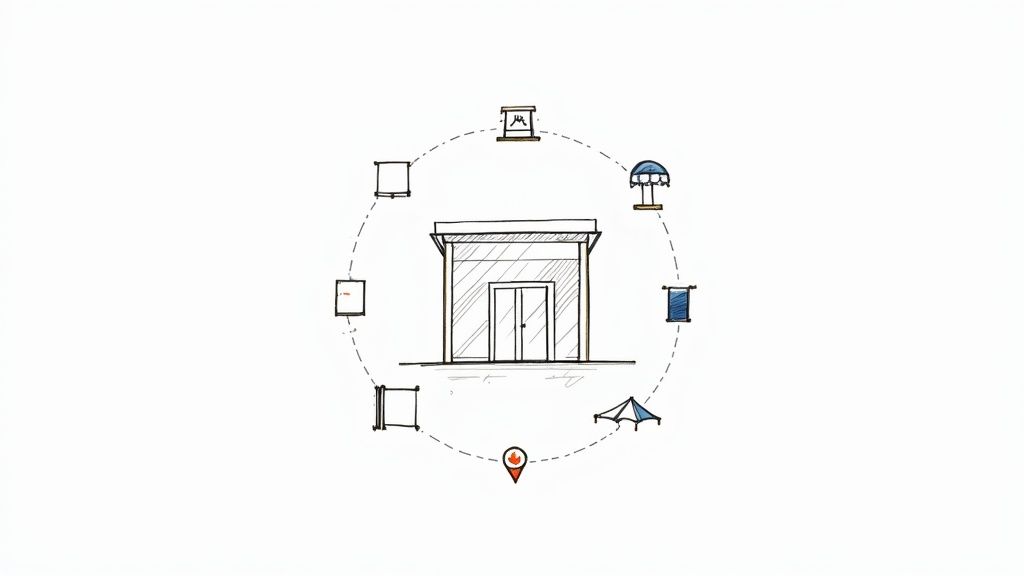 story
story Top business sign ideas to boost visibility in 2025
In today's competitive market, a generic 'Open' sign just doesn't cut it. Your business signage is the first handshake with potential customers. It sets the tone, communicates your brand's personality, and can be the deciding factor between a passerby and a paying client. More than just a marker, a well-designed sign is a silent salesperson, working 24/7 to attract attention and convey value. For businesses leveraging physical signs for visibility, exploring additional strategies to improve brand awareness can amplify their market presence and create a more cohesive marketing front. Effective signage is a fundamental component of this strategy, turning your physical location into a powerful brand asset. But with countless options available, how do you choose the right one? The ideal sign must align with your brand identity, budget, and physical location. It needs to be durable enough for its environment and visually compelling enough to stop people in their tracks. This comprehensive guide breaks down 10 powerful and practical business sign ideas , moving beyond the obvious to give you the strategic insights needed to make an informed decision. We'll explore everything from high-tech digital displays and classic neon to timeless wooden signs and versatile A-frames. Inside, you will find actionable tips, material recommendations, and specific use-cases for each sign type. We will cover: LED Digital Displays Neon Signs Wooden Signs Dimensional Letter Signs Sandwich Board Signs (A-Frame Signs) Window Decals and Vinyl Signs Monument Signs Projection and Light Show Signs Retractable Banner Stands Interactive Digital Kiosks This guide is designed to help you select and design a sign that not only gets noticed but gets results. Let's dive in. 1. LED Digital Display Signs LED digital display signs represent the cutting edge of dynamic business signage, utilizing vibrant light-emitting diodes to broadcast animated graphics, video, and real-time information. Unlike static signs, these displays capture attention with movement and color, allowing you to cycle through multiple promotions, announcements, or menu items from a single, high-impact installation. They are a powerful tool for businesses aiming to stand out in high-traffic areas, offering unparalleled brightness and visibility day or night. These signs are particularly effective for businesses with frequently changing offers, such as restaurants showcasing daily specials, retail stores announcing flash sales, or event venues promoting upcoming shows. The ability to update content remotely via software makes them incredibly versatile and cost-effective over the long term, eliminating the need to print and replace physical sign graphics. Quick Implementation Guide Location and Brightness: Assess your storefront’s lighting conditions. A sign facing direct sunlight requires a higher "nit" rating (a measure of brightness) to remain visible. For indoor use, a lower brightness setting is sufficient to avoid overwhelming customers. Content Strategy: Before installation, outline a content calendar. Plan what messages will run at different times of the day or week. For example, a cafe could promote coffee in the morning and happy hour deals in the afternoon. Check Local Codes: Digital and illuminated signage is often subject to strict local zoning regulations regarding size, brightness, and animation. Always secure the necessary permits to avoid fines and ensure compliance. Pro Tip: Keep your messaging concise and bold. Onlookers, especially drivers, have only a few seconds to absorb your message. Use large fonts, high-contrast colors, and simple graphics for maximum readability. Recommended For: This business sign idea is ideal for retail storefronts, restaurants, gas stations, and entertainment venues that need to communicate time-sensitive information and grab the attention of passersby instantly. While a significant initial investment, the ROI comes from its flexibility and powerful visual appeal. For businesses looking to explore illuminated signage on a different scale, custom light boxes from 4OVER4.com offer a fantastic way to make your brand shine. 2. Neon Signs Neon signs are an iconic and timeless business sign idea, using electrified, gas-filled glass tubes to create a distinct, radiant glow. Known for their vibrant colors and nostalgic appeal, these signs offer a unique aesthetic that is both artistic and commercial. They excel at creating a specific mood or ambiance, making them a powerful tool for businesses that want to cultivate a memorable brand identity and attract customers with a touch of retro charm or modern elegance. This type of signage is especially effective for businesses aiming to stand out in the evening, such as bars, restaurants, nightclubs, and boutique hotels. The warm, inviting light cuts through the darkness, acting as a beacon for foot traffic. From vintage-inspired diner signs to minimalist art pieces in a contemporary coffee shop, the versatility of custom neon allows for creative expressions that go far beyond simple text. Quick Implementation Guide Design for Clarity: Neon is most impactful when used for simple, bold shapes, logos, or words. Complex designs can become difficult to read from a distance. Work with a designer to translate your brand into a clean, effective neon layout. Placement and Protection: While beautiful, traditional glass neon is fragile. Install your sign in a location where it is protected from potential impact and harsh weather. Consider mounting it indoors against a window or on an interior feature wall. Professional Installation: Due to the high-voltage transformers required, always hire a professional for installation. This ensures the sign operates safely and is compliant with electrical codes, preventing potential hazards. Pro Tip: Use color strategically to evoke emotion. A warm red or pink can create an inviting and energetic atmosphere perfect for a bar, while a cool blue or white can convey a more modern, serene feeling for a chic retail store. Recommended For: This business sign idea is ideal for bars, restaurants, coffee shops, and boutique retail stores that want to create a strong atmospheric brand and attract evening customers. The investment pays off by establishing a unique visual landmark that customers will remember and photograph. For a modern, durable, and cost-effective alternative, custom LED Neon Signs from 4OVER4.com offer a similar glowing aesthetic with greater energy efficiency and resilience. 3. Wooden Signs Wooden signs offer a timeless, organic appeal that conveys authenticity, craftsmanship, and an established presence. Crafted from natural materials, these signs utilize engraving, carving, or painting to create a rustic yet sophisticated look that synthetic materials often cannot replicate. They are a perfect match for businesses aiming to project a sense of warmth, tradition, and connection to nature, instantly building a welcoming atmosphere for customers. This classic signage choice is particularly impactful for businesses like farm-to-table restaurants, boutique hotels, artisan craft shops, and vineyards. The natural texture and grain of the wood add a unique character to each sign, making it feel custom and high-end. Whether it's a sandblasted cedar sign at a luxury resort entrance or a hand-painted shingle for a bed and breakfast, wooden signs integrate seamlessly with natural landscapes and historic architecture. Quick Implementation Guide Select the Right Wood: Choose weather-resistant woods like cedar, oak, or redwood for outdoor signs to ensure longevity. These woods naturally resist rot and insects. For indoor applications, a wider variety like pine or maple can be used. Plan for Maintenance: To preserve its beauty and protect it from the elements, a wooden sign should be treated with a protective sealant annually. Regular cleaning will also prevent dirt and grime buildup. Incorporate Lighting: A wooden sign can lose visibility at night. Consider adding subtle, external uplighting or downlighting to illuminate the carving and details, ensuring your business remains visible after dark without compromising its classic aesthetic. Pro Tip: Embrace imperfections in the wood grain as part of the sign’s character. Unique knots and patterns make your sign one-of-a-kind and enhance its authentic, handcrafted feel. Pair this with a timeless, classic font for maximum impact. Recommended For: This business sign idea is ideal for cafes, artisan boutiques, historic inns, wineries, and professional service firms seeking to cultivate an image of stability, quality, and organic charm. For businesses that want to blend this natural aesthetic with modern durability, printing on a custom wood canvas from 4OVER4.com allows you to achieve a similar rustic look on a versatile and long-lasting medium. 4. Dimensional Letter Signs Dimensional letter signs bring a brand's name or logo to life by using three-dimensional, individually crafted characters mounted directly onto a building facade or interior wall. This technique adds depth, texture, and a sophisticated shadow effect that flat signs cannot replicate. By physically standing out from the surface, these signs create a high-end, professional appearance that communicates permanence and quality, making them a popular choice for businesses looking to establish a strong physical presence. These signs are exceptionally versatile and can be crafted from materials like acrylic, metal, PVC, or wood to match any brand aesthetic, from modern and sleek to rustic and traditional. They are commonly seen in corporate lobbies, on the exterior of professional service buildings like law firms or medical clinics, and as premium storefront identifiers for upscale retail and hospitality brands. The tangible, solid nature of dimensional letters conveys trust and stability. Quick Implementation Guide Font and Sizing: Choose a clean, legible font that aligns with your brand identity. Ensure the letters are large enough to be easily readable from the intended viewing distance, factoring in street traffic and pedestrian sightlines. Material and Durability: Select materials based on your location and climate. For outdoor use, metals like aluminum or weather-resistant acrylic are ideal for withstanding the elements. For indoor signs, lighter materials like PVC or foam can be effective. Lighting Strategy: While unlit dimensional signs are impactful during the day, consider adding external lighting. Uplighting or backlighting can dramatically increase visibility after dark, creating an elegant halo effect and ensuring your sign works around the clock. Pro Tip: Pay close attention to the mounting surface. The color and texture of the wall behind the letters will significantly impact their visibility and overall aesthetic. Conduct a color test to ensure there is enough contrast for the letters to pop. Recommended For: This business sign idea is perfect for corporate offices, law firms, medical facilities, and high-end retail stores that want to project an image of professionalism, quality, and permanence. The investment in dimensional lettering pays off by creating a memorable and authoritative landmark for your brand. For a durable, sleek metal option, explore the custom aluminum signs from 4OVER4.com to build a sign with lasting impact. 5. Sandwich Board Signs (A-Frame Signs) Sandwich board signs, also known as A-frame signs, are classic, freestanding displays that effectively capture the attention of foot traffic. Their A-shaped structure allows for double-sided messaging, maximizing visibility for people approaching from either direction. These portable signs are a go-to marketing tool for storefronts, placed directly in the path of potential customers to communicate immediate offers, directions, or a touch of brand personality. Their power lies in their simplicity and proximity to the consumer. A coffee shop can entice passersby with a witty message about their morning brew, while a boutique can announce a flash sale to spur impulse visits. Because they are so easy to move and update, they are perfect for businesses whose promotions change daily or weekly, such as restaurants advertising a "soup of the day" or bars promoting happy hour specials. They are one of the most cost-effective business sign ideas for generating direct, on-the-spot engagement. Quick Implementation Guide Placement is Key: Position your A-frame sign in a high-traffic area on the sidewalk without obstructing the walkway. Ensure it's directly in the line of sight for people approaching your entrance. Keep it Simple and Scannable: Pedestrians are on the move. Use large, bold fonts, high-contrast colors, and a message that can be read and understood in under three seconds. A clever illustration or a humorous line can be very effective. Check Local Regulations: Many municipalities have specific rules regarding sidewalk signage, including placement, size, and hours of use. Always check with your local business association or city hall to ensure you are in compliance. Pro Tip: Use weather-resistant materials or inserts. For handwritten messages, use chalk markers that won't run in a light rain. For a more permanent solution, use printed graphics that can withstand the elements and be swapped out as your promotions change. Recommended For: This business sign idea is ideal for cafes, restaurants, retail boutiques, and service-based businesses like salons or real estate agencies located in areas with significant foot traffic. Their affordability and portability make them a low-risk, high-reward option for any ground-level business. For those looking for durable and professional options, the customizable A-frame signs from 4OVER4.com provide a sturdy and polished way to take your message to the streets. 6. Window Decals and Vinyl Signs Window decals and vinyl signs are custom-designed adhesive graphics applied directly to glass surfaces or walls, transforming unused space into a powerful marketing tool. This business sign idea offers incredible versatility, allowing for everything from intricate logos and lettering to full-coverage promotional images. They are a cost-effective way to advertise sales, display business hours, or enhance brand ambiance without the commitment of permanent fixtures. Their strength lies in their adaptability and non-invasive nature. A coffee shop can announce seasonal drinks with a vibrant window cling, a professional office can add privacy and branding with frosted vinyl, and a retail store can create an immersive storefront display for a new collection. Because they are easy to apply and remove, businesses can keep their messaging fresh and relevant without significant overhead. Quick Implementation Guide Surface Preparation: Before application, thoroughly clean the window or wall with a mild soap and water solution, then dry it completely. Any dust or residue can cause bubbles and prevent proper adhesion. Design for Visibility: Create designs with high-contrast colors and clear, bold fonts to ensure they are readable from a distance. Consider how your graphic will look from both inside and outside your business. Choose the Right Material: Select a material based on your needs. Perforated vinyl allows for one-way visibility, while opaque vinyl blocks light completely. For longevity, opt for a UV-laminated vinyl to prevent fading from sun exposure. Pro Tip: For large or complex designs, professional installation is a worthwhile investment. An expert can ensure a bubble-free, perfectly aligned application that elevates the look of your storefront and extends the life of the decal. Recommended For: This business sign idea is ideal for retail shops, restaurants, salons, and corporate offices that want to leverage window and wall space for branding, promotions, or decor. They are perfect for communicating key information like hours of operation or featuring a call to action. For businesses ready to turn their windows into a canvas, exploring custom window graphics from 4OVER4.com provides an array of options to capture customer attention effectively. 7. Monument Signs Monument signs are prestigious, ground-level freestanding structures that project an image of permanence and authority. Often constructed from durable materials like brick, stone, or metal, these signs are integrated into the landscape to create a powerful first impression. They typically display the name and logo of a business, corporate campus, or shopping center, serving as a landmark that establishes a strong, credible brand presence right at the property line. This type of signage is a long-term investment in brand identity, ideal for institutions that want to convey stability and professionalism. You will often see them at the entrances to corporate headquarters, university campuses, professional office parks, and upscale residential communities. Their robust construction and prominent placement make them highly visible to vehicle and foot traffic, effectively guiding visitors while reinforcing the brand's distinguished image. Quick Implementation Guide Consult Professionals: The design and installation of a monument sign is a significant construction project. Always work with experienced architects, sign fabricators, and contractors to ensure the structure is safe, durable, and aesthetically pleasing. Material Selection: Choose materials that complement your building’s architecture and can withstand your local climate. Options range from classic brick and stone to modern aluminum and high-density urethane (HDU) that can mimic more expensive materials. Secure Permits: Monument signs are subject to strict zoning laws, building codes, and setback requirements. Begin the permit application process early, as it often requires detailed architectural plans and engineering approvals. Pro Tip: Integrate landscape lighting to ensure your sign is visible and impressive 24/7. Up-lighting can create dramatic shadows and highlight the sign's texture, while internal illumination makes lettering pop after dark. Recommended For: This business sign idea is perfect for corporate headquarters, professional service firms (law, finance), medical centers, and multi-tenant commercial properties aiming to establish a sense of permanence and high-end credibility. While the upfront cost is substantial, a monument sign is a lasting asset that defines a location's identity for decades. For businesses seeking to command attention at a different scale, custom vinyl banners from 4OVER4.com offer a durable and highly visible alternative for storefronts and events. 8. Projection and Light Show Signs Projection and light show signs elevate business signage into an immersive, high-tech experience, using projection mapping technology to cast dynamic, animated visuals onto building facades or custom surfaces. This cutting-edge approach transforms a physical structure into a living canvas, creating unforgettable brand stories and spectacles. Unlike traditional signs, projections are not bound by a physical frame, allowing for creative, large-scale displays that stop people in their tracks and generate significant buzz. This technique is exceptionally powerful for product launches, flagship store openings, or seasonal campaigns where making a monumental impact is key. Luxury brands often use projection mapping to turn their storefronts into animated art installations, while entertainment venues can promote upcoming events with cinematic flair. The sheer scale and interactive potential make these signs a magnet for social media sharing, extending the campaign's reach far beyond its physical location. Quick Implementation Guide Partner with Specialists: Projection mapping is a technical art. Collaborate with an experienced production company that specializes in this technology to handle the hardware setup, content creation, and execution. Surface and Environment Analysis: The success of a projection depends on the surface texture, color, and ambient light. Conduct a thorough site survey to test how visuals will appear at night and plan for potential weather interferences. Create Engaging Content: Design visuals that interact with the building’s architecture. For example, make it look like windows are opening or vines are growing up the walls. The content should be compelling and align with your brand identity. Secure Permissions: Projecting onto a building, especially a public-facing one, may require permits from local authorities. Ensure you have all necessary approvals before the event to avoid legal issues. Pro Tip: Focus on creating a narrative. A projection sign is more than just an ad; it's a performance. Tell a short story, showcase a product's creation, or create an abstract visual mood that evokes the essence of your brand. Recommended For: This business sign idea is perfect for flagship retail stores, entertainment venues, museums, and major corporate events looking to create a "wow" factor that is highly shareable and memorable. While it involves a significant investment and technical expertise, the payoff is unparalleled brand visibility and public engagement. For businesses wanting to make an impact at events on a more accessible scale, custom step and repeat banners from 4OVER4.com provide a powerful backdrop to make your brand the star of the show. 9. Retractable Banner Stands Retractable banner stands are the workhorses of portable marketing, offering a professional display solution that is both incredibly convenient and highly effective. These stands consist of a graphic banner that retracts into a compact base, allowing for instant setup and breakdown. Their lightweight design and protective carrying cases make them a go-to choice for businesses that need a powerful visual presence on the move, without the hassle of complex assembly. This type of business sign idea is indispensable for trade shows, conferences, and corporate events where making a strong first impression is critical. They are also widely used within retail environments for seasonal promotions, in-store events, or as informational displays in lobbies and reception areas. The ability to swap out the graphic banner while reusing the stand mechanism also makes them a cost-effective and sustainable option for evolving marketing campaigns. Quick Implementation Guide Choose the Right Mechanism: Invest in a stand with a high-quality, durable retraction mechanism. A smooth, reliable spring system will prevent frustrating jams and extend the life of your display. Design for Impact: Use high-resolution graphics and images to avoid pixelation, as these banners are viewed up close. Place your logo and key message at eye level (the top third of the banner) for maximum visibility. Material and Finish: Select a durable, anti-curl vinyl or fabric material that will lay flat and look professional. A matte finish is often preferable to a glossy one, as it reduces glare from overhead lighting in event halls and stores. Pro Tip: Design your banner with a clear visual hierarchy. Use a large, compelling headline, a striking image, and concise bullet points to guide the viewer’s eye from your main message down to your contact information or call to action. Recommended For: This business sign idea is perfect for trade show exhibitors, event marketers, real estate agents, and retail stores needing a portable, reusable, and professional-looking sign. They excel in any situation where you need to set up a branded backdrop or promotional message quickly. For those ready to create a versatile and impactful display, you can explore a wide variety of high-quality retractable banner stands from 4OVER4.com to suit any budget or event. 10. Interactive Digital Kiosks and Touchscreen Signs Interactive digital kiosks and touchscreen signs transform passive viewing into an active customer experience. These smart solutions use responsive displays to allow users to navigate information, browse product catalogs, place orders, or leave feedback directly. By inviting engagement, they serve as powerful, unstaffed points of contact that provide value, reduce wait times, and collect valuable user data. They represent a significant leap forward in creating a functional, modern, and customer-centric environment. This type of business sign idea is highly effective in environments where customers seek detailed information or self-service options. Think of a retail store where shoppers can look up product specs and inventory, a hospital where patients can check in for appointments, or a fast-food restaurant where customers can customize and pay for their meals. Popularized by brands like McDonald's and Apple, these kiosks empower consumers and streamline operations simultaneously. Quick Implementation Guide Design an Intuitive Interface: Your user interface (UI) is paramount. Use clear icons, logical navigation paths, and large, easy-to-tap buttons. The goal is to make the experience feel effortless and natural for a first-time user. Plan for Maintenance: These signs are sophisticated devices that require both physical and digital upkeep. Schedule regular software updates to maintain security and performance, and establish a cleaning protocol to keep screens pristine and responsive. Consider Accessibility: Ensure your kiosk is accessible to all users. This includes placing it at a height suitable for wheelchair users and incorporating features like high-contrast text modes or text-to-speech options. Pro Tip: Use the kiosk's analytics to your advantage. Track which features are most used and which content is most viewed. This data is invaluable for optimizing the user experience and tailoring your on-screen promotions for maximum impact. Recommended For: This business sign idea is ideal for large retail chains, quick-service restaurants, healthcare facilities, and transportation hubs like airports. It excels in high-traffic areas where efficiency, information access, and customer empowerment are key priorities. While the initial investment is substantial, the long-term ROI is driven by improved operational efficiency, enhanced customer satisfaction, and valuable data collection. Top 10 Business Sign Ideas Comparison Item 🔄 Implementation Complexity ⚡ Resource Requirements ⭐ Expected Outcomes 📊 Ideal Use Cases 💡 Key Advantages / Tip LED Digital Display Signs High — professional install, power, permits High upfront cost; moderate ongoing energy & software support ⭐⭐⭐⭐⭐ Dynamic, high-visibility messaging Retail façades, QSR menus, stadiums, billboards Eye-catching & remotely updatable; plan brightness and compliance Neon Signs Medium — handcrafted tube work, electrical safety Medium cost; fragile components, specialized repairs ⭐⭐⭐ Distinctive ambiance, strong nocturnal branding Bars, diners, retro retail, hotels Iconic aesthetic; use bold shapes and protective housing Wooden Signs Low–Medium — carpentry work, finishing Low materials cost; regular maintenance (seal/paint) ⭐⭐⭐ Authentic, warm appearance; limited night visibility Farms, B&Bs, artisan shops, rustic venues Choose rot-resistant wood and annual sealant; add uplighting Dimensional Letter Signs Medium–High — structural mounting, possible permits Medium–High materials & pro installation ⭐⭐⭐⭐ Professional brand presence, durable visibility Corporate lobbies, storefronts, hotels, malls Pick durable material & proper sizing; consider illumination Sandwich Board Signs (A‑Frame) Low — simple setup, portable Low cost; replaceable panels; weather vulnerability ⭐⭐ Effective for immediate foot traffic, short range Sidewalk promotions, cafés, daily specials Place in high-traffic spots; secure against wind; keep tidy Window Decals & Vinyl Signs Low — straightforward install or pro fit Low cost; periodic replacement (3–5 yrs) ⭐⭐⭐ Cost-effective, flexible seasonal messaging Retail windows, promos, wayfinding, real estate Clean surface, use UV vinyl and pro installation for smooth finish Monument Signs High — site work, foundations, permitting Very high cost; long-term maintenance & landscaping ⭐⭐⭐⭐–⭐⭐⭐⭐⭐ Strong, prestigious brand visibility at distance Corporate HQ, shopping centers, campuses Work with designers/contractors; plan materials and permits Projection & Light Show Signs Very High — mapping, rigging, technical ops Very high equipment & content production costs ⭐⭐⭐⭐–⭐⭐⭐⭐⭐ Highly memorable and shareable; weather dependent Flagship stores, events, entertainment venues Partner specialists, test for weather/ambient light, align content to brand Retractable Banner Stands Low — quick setup, portable Low–Medium cost; reusable for events ⭐⭐–⭐⭐ Good for short-term professional displays Trade shows, lobbies, pop-ups, registration areas Choose quality mechanisms, use high-res graphics, store in protective case Interactive Digital Kiosks & Touchscreens High — hardware, software, network, security High upfront & ongoing support; analytics infrastructure ⭐⭐⭐⭐ High engagement, data capture, self-service efficiency Airports, retail info, hospitals, kiosks in lobbies Design intuitive UX, secure devices, plan maintenance and analytics Choosing Your Signage: The Final Blueprint for Brand Impact You now possess a comprehensive catalog of business sign ideas , a strategic blueprint designed to elevate your brand from the background to the forefront. We've journeyed through a diverse landscape of signage, from the electrifying glow of modern neon and the dynamic content of LED displays to the rustic charm of wooden signs and the street-level engagement of A-frame sandwich boards. The core lesson is clear: your sign is far more than a marker; it is an active, silent ambassador for your brand, working tirelessly to attract, inform, and persuade. The path forward involves a thoughtful synthesis of the concepts we've explored. It's about moving from a passive understanding of what's available to an active strategy that integrates your unique brand identity, physical location, customer demographics, and marketing objectives into a single, powerful visual statement. The right sign is a catalyst for growth, transforming a simple storefront into a landmark and a fleeting glance into a lasting customer relationship. Synthesizing Your Signage Strategy Making the final decision requires a holistic view. Don't just pick the sign you like the most; choose the one that works the hardest for your specific goals. A cutting-edge tech startup might leverage an interactive digital kiosk to reflect its innovative spirit, while a heritage bakery will find that a classic dimensional letter sign conveys a sense of quality and permanence. The key is strategic alignment. Consider these final checkpoints before you commit: Brand Cohesion: Does the material, font, and color palette of your chosen sign seamlessly align with your existing branding? A projection sign might be visually stunning, but does it fit the aesthetic of an old-world law firm? Consistency is paramount. Location and Visibility: Re-evaluate your physical environment. Is your business set back from the road, making a tall monument sign a necessity? Or are you competing for attention on a crowded pedestrian street where a clever window decal or retractable banner can capture foot traffic? Audience Connection: How does your target customer interact with the world? A younger, tech-savvy audience may be more drawn to an interactive display, while a community-focused clientele might appreciate the personal touch of a hand-painted wooden sign. Functionality and Purpose: What is the sign’s primary job? Is it to announce your presence from afar (monument sign), drive an immediate sale (promotional A-frame), or provide critical information (digital kiosk)? Define its function to refine your choice. Measuring Success and Long-Term Value A common pitfall is viewing signage as a one-time expense rather than a strategic investment. The true value of your sign is measured by its return on investment (ROI), which directly ties into customer acquisition and brand recognition. Beyond initial investment, understanding how to accurately calculate customer acquisition cost will help you quantify the sign's effectiveness. By tracking metrics like increased foot traffic, customer inquiries mentioning the sign, or coupon redemptions from a specific call to action, you can connect your signage directly to business growth. Ultimately, mastering these business sign ideas is about taking control of your brand's physical narrative. It’s the difference between being a passive part of the landscape and becoming an active, unmissable destination. Your sign is your handshake with the world; make it firm, confident, and memorable. Ready to transform these business sign ideas into a tangible asset for your brand? 4OVER4 provides the professional printing solutions you need to bring any vision to life, from durable outdoor signs to vibrant indoor displays. Explore our extensive collection and start creating your perfect sign today with 4OVER4 .
 story
story 9 Fresh Card Design Ideas to Elevate Your Brand in 2025
In a world saturated with digital noise, a physical business card makes a tangible statement. But a generic design can easily get lost in a wallet or desk drawer, failing to leave a lasting impression. It's time to move beyond the standard name-and-number format and explore card design ideas that do more than just share information. The best cards tell a story, spark curiosity, and build a memorable brand connection from the very first handshake. This article rounds up nine distinct, actionable approaches to card design, tailored for small businesses, marketing teams, and designers ready to create something exceptional. We'll break down the strategy behind each concept, from the powerful simplicity of minimalist layouts to the engaging appeal of interactive elements. Many of these concepts draw from foundational principles, and to truly master them, it's essential to understand the broader best practices for user interface design , which often inform effective physical design. We provide practical steps and real-world examples to inspire your next project. Let's explore how a small piece of cardstock can become your brand’s most powerful networking tool. 1. Minimalist Card Design Minimalist card design is a powerful approach that prioritizes clarity and function by stripping away non-essential elements. This "less is more" philosophy, championed by pioneers like Dieter Rams and the Apple design team, uses generous white space, clean typography, and a limited color palette to direct user attention precisely where it's needed. The goal is to present information in an elegant, uncluttered, and highly readable format, ensuring the core message is delivered without distraction. This method is one of the most effective card design ideas for brands aiming to convey sophistication and efficiency. By focusing on fundamental content and strong visual hierarchy, minimalist designs reduce cognitive load, making it easier for users to process information and take action. Why It Works The strength of minimalism lies in its universal appeal and focus on usability. Think of the clean, intuitive interfaces of platforms like Medium or the simple elegance of an Airbnb listing card. These designs succeed because they make information accessible and aesthetically pleasing. A minimalist card feels intentional and professional, building trust and enhancing the user experience. How to Implement This Idea To successfully execute a minimalist design, concentrate on these core principles: Embrace White Space: Use ample padding and margins around elements. This creates a sense of calm and helps guide the user’s eye to the most important content. Simplify Your Color Palette: Stick to one or two primary colors against a neutral background. High-contrast combinations (like black text on a white background) are crucial for readability. Prioritize Typography: Choose a clean, legible font family and establish a clear typographic hierarchy. Use size, weight, and color to differentiate between headings, body text, and calls to action. Focus on a Single Action: Each card should ideally have one primary purpose. Whether it's to "Read More," "Add to Cart," or "View Details," a single, clear call-to-action (CTA) prevents confusion and improves conversion rates. 2. Card-Based Grid System A card-based grid system organizes content into a collection of uniform containers arranged in a responsive grid. This layout approach, popularized by platforms like Pinterest and frameworks like Bootstrap, creates a highly scannable and visually consistent interface. It allows for flexible content presentation, ensuring that information remains orderly and accessible across various screen sizes, from large desktops to small mobile devices. This method is one of the most practical card design ideas for displaying large amounts of diverse content, such as product listings, portfolios, or news articles. By packaging each piece of information into a self-contained card, the system maintains a clean structure while allowing each item to be treated as a distinct entity, complete with its own image, text, and actions. Why It Works The strength of a grid system lies in its scalability and inherent organization. Think of the Dribbble showcase or a Trello board; both use cards in a grid to present complex information in a digestible format. This modular design is intuitive for users, as it follows a predictable pattern that makes browsing and comparing items effortless. It also simplifies responsive design, as cards can reflow into different column counts to fit any viewport. How to Implement This Idea To effectively implement a card-based grid system, focus on these key elements: Ensure Consistent Sizing: Use a consistent aspect ratio or dimensions for all cards to create a visually harmonious grid. This predictability helps users scan content quickly. Establish Clear Spacing: Apply adequate and uniform spacing (gutters) between cards. This prevents the layout from feeling cramped and helps distinguish individual content blocks. Implement Proper Breakpoints: Define how the grid adapts to different screen sizes. For example, a four-column grid on a desktop might become a two-column grid on a tablet and a single column on a mobile phone. Add Interactive Feedback: Incorporate hover states or subtle animations to indicate interactivity. A slight shadow lift or a color change can signal to users that a card is clickable, improving usability. 3. Interactive Hover Effects Interactive hover effects transform static cards into dynamic, engaging elements that respond directly to user input. By adding subtle animations, transitions, and visual feedback when a user's cursor hovers over a card, you create a more immersive and satisfying experience. This approach provides immediate, intuitive cues, guiding users and making the interface feel more alive and responsive. These micro-interactions are one of the most powerful card design ideas for capturing user attention and encouraging exploration. This technique makes a digital interface feel less like a flat document and more like a tangible, interactive space, which can significantly boost engagement and click-through rates. Why It Works The effectiveness of interactive hover effects lies in their ability to provide instant visual feedback. Think of the portfolio cards on Behance that zoom in slightly or reveal project details, or the GitHub repository cards that highlight key information on hover. These effects make the user feel in control and confirm that an element is clickable, improving usability and adding a layer of professional polish that delights users. How to Implement This Idea To add compelling hover effects to your cards, focus on subtlety and performance: Keep Animations Swift: Aim for transition durations under 300ms. This is fast enough to feel responsive without being jarring or causing delays. Prioritize Performance: Use CSS properties that are hardware-accelerated, like transform and opacity , instead of top , left , or margin . This ensures smooth animations that don't strain the browser. Reveal Secondary Information: Use hover states to display extra details, action buttons, or quick-view options. This keeps the initial card design clean while offering more context on demand. Provide Mobile Fallbacks: Since hover states don't exist on touch devices, ensure all essential information and actions are accessible on the card's default state. The hover effect should enhance the experience, not hide critical functionality. 4. Gradient and Glass Morphism Gradient and glass morphism is a contemporary design trend that uses semi-transparent, blurred backgrounds to create a "frosted glass" effect. This style adds depth and a layered, tactile feel to interfaces by allowing background elements to be partially visible through the card. Popularized by systems like Apple’s iOS and Microsoft's Fluent Design, this approach combines soft gradients, subtle shadows, and a light border to make UI elements appear as if they are floating on the surface. This aesthetic is one of the most visually engaging card design ideas for modern digital products, offering a sophisticated look that feels both futuristic and intuitive. The transparency connects the user to the content behind the card, creating a more cohesive and immersive experience. Why It Works The appeal of glass morphism lies in its ability to create a clear visual hierarchy while maintaining a light, airy feel. The blur effect separates foreground content from the background without completely obscuring it, adding context and visual interest. When used correctly, it makes an interface look clean, modern, and interactive, as seen in the widgets on macOS Big Sur or the Spotify desktop app. How to Implement This Idea To effectively apply gradient and glass morphism, focus on balancing aesthetics with usability: Set the Right Transparency and Blur: Use a background blur effect combined with low opacity on the fill color. The key is finding a blur level that makes text readable while still hinting at the background. Add a Subtle Border: A 1-pixel, semi-transparent white border helps define the card's edges, making it "pop" from the background and catching light like real glass. Use Gradients Wisely: Incorporate subtle, multi-toned gradients in the background to add color and visual appeal. Avoid overly vibrant or complex gradients that could distract from the content. Ensure High Contrast for Content: Because the background can be complex, it's crucial that text and icons have high contrast. Test readability against various backgrounds to ensure accessibility for all users. 5. Illustrated Card Design Illustrated card design infuses personality and visual storytelling into a user interface by incorporating custom illustrations, icons, or playful graphic elements. This approach moves beyond pure functionality to create an emotional connection, using artwork to clarify complex ideas, guide user actions, and make the digital experience more engaging and human. It’s about blending artistry with information to communicate a brand's unique character. This method is one of the most expressive card design ideas for brands wanting to stand out and create a memorable, friendly user experience. By replacing generic stock photos or simple icons with custom artwork, illustrated designs make interfaces feel bespoke and delightful, capturing attention and improving user comprehension in a visually rich way. Why It Works The power of illustrated design lies in its ability to communicate abstract concepts and brand personality instantly. Think of the friendly, helpful illustrations used in Slack’s feature cards or the quirky, encouraging graphics in Mailchimp’s dashboard. These designs succeed because they make technology feel approachable and less intimidating, building a positive association with the brand while effectively explaining features or processes. How to Implement This Idea To integrate illustrations effectively, focus on cohesion and performance: Maintain Style Consistency: Develop a distinct illustration style guide. All graphics, from simple icons to complex scenes, should feel like they belong to the same visual family to create a cohesive brand experience. Optimize for Performance: Ensure all image files are compressed to reduce load times. Use modern formats like WebP where possible and always optimize image dimensions for their container. Use SVGs for Scalability: For icons and simple graphics, use Scalable Vector Graphics (SVGs). They are resolution-independent, ensuring they look sharp on any screen, and typically have a smaller file size than raster images. Align Art with Content: Illustrations should support and enhance the message, not distract from it. Ensure the artwork is directly relevant to the card's content and helps clarify its purpose. 6. Data Visualization Cards Data visualization cards transform complex data, metrics, and analytics into digestible, visually engaging formats. Pioneered by platforms like Google Analytics and Tableau, this approach uses charts, graphs, and key performance indicators (KPIs) within a card layout, making it ideal for dashboards and reporting interfaces. The primary goal is to present quantitative information clearly and concisely, allowing users to understand trends and insights at a glance. This method is one of the most functional card design ideas for applications that need to communicate data-driven stories. By embedding visualizations directly into the UI, these cards make analytics more accessible and actionable, turning raw numbers into meaningful information that can inform business decisions. Why It Works The power of data visualization cards lies in their ability to simplify complexity. Instead of forcing users to parse dense tables or spreadsheets, these cards offer immediate visual context. Think of the HubSpot reporting dashboard or Mixpanel's insight cards; they succeed because they make it easy to spot patterns, compare metrics, and monitor performance without overwhelming the user. A well-designed data card feels insightful and authoritative, enhancing user engagement with analytical tools. How to Implement This Idea To create effective data visualization cards, focus on clarity and context: Choose the Right Chart Type: Select a visualization that best represents the data. Use bar charts for comparisons, line charts for trends over time, and pie or donut charts for compositions. Highlight Key Metrics: Make the most important number or KPI the focal point. Use larger font sizes or a contrasting color to draw immediate attention to the primary insight. Provide Clear Context: Always label your axes, include units of measurement (e.g., $, %, users), and use titles or short descriptions to explain what the data represents. Use Consistent Color Coding: Assign specific colors to different data categories and use them consistently across all cards. This helps users quickly interpret charts and recognize patterns. 7. Content-First Card Design Content-first card design is a user-centric approach where the layout and visual styling are built around the information itself, rather than forcing content into a pre-designed template. Popularized by content-heavy platforms like Medium and The New York Times, this philosophy ensures that typography, spacing, and hierarchy all serve a single purpose: to make the content as clear, readable, and digestible as possible. The aesthetic choices are dictated by the needs of the information. This method is one of the most practical card design ideas for blogs, news aggregators, or any interface where information consumption is the primary goal. By prioritizing readability, content-first design enhances user engagement and ensures the core message is effectively communicated without visual interference. Why It Works The strength of this approach lies in its respect for the user's time and attention. When a card is designed to present information clearly, it reduces cognitive friction and builds trust. Think of the article preview cards on A List Apart or Smashing Magazine; they succeed because they allow users to quickly scan headlines, summaries, and metadata to decide what to read next, creating a seamless and efficient browsing experience. How to Implement This Idea To successfully execute a content-first design, focus on making the text the star of the show: Establish a Strong Typographic Hierarchy: Use distinct sizes, weights, and styles for headings, subheadings, and body text to guide the user's eye through the information logically. Optimize for Readability: Choose a highly legible font and maintain a comfortable line height (typically between 1.4 and 1.6). Ensure body text is at least 16px to be easily readable on all devices. Prioritize Scannability: Use short paragraphs, bullet points, and bold text to highlight key information. This allows users to quickly grasp the card's main points. Test with Real Content: Design with actual headlines and summaries, not placeholder text. This reveals how the layout holds up with varying content lengths and helps you make more realistic design decisions. 8. Progressive Disclosure Cards Progressive disclosure is a user interface design pattern that manages information complexity by revealing details gradually. Instead of overwhelming users with all the information at once, these cards present essential content upfront and allow users to access more information through interaction, such as a click or a tap. This approach keeps the initial interface clean while making deeper content accessible on demand. This technique is one of the most intelligent card design ideas for content-rich applications. By hiding secondary information until it's requested, you create a more focused and less cluttered user experience, allowing users to scan primary content efficiently and dive deeper only when they choose to. Why It Works The power of progressive disclosure lies in its ability to reduce cognitive load and improve comprehension. Think of the "See more" link on a lengthy LinkedIn post or an expandable tweet on Twitter. These designs work because they respect the user's attention, presenting a digestible summary first and offering the full context upon request. This method empowers users to control their information flow, which leads to a more satisfying and efficient interaction. How to Implement This Idea To create effective progressive disclosure cards, focus on a clear and intuitive user journey: Make Expansion Obvious: Use clear visual cues like "Read More," "View Details," or icons like a downward arrow (chevron) or a plus sign (+) to indicate that more information is available. Prioritize Initial Content: The information visible by default should be the most critical. It must be compelling enough to encourage users to explore further. Provide Clear Indicators: When a card is expanded, the interactive element should change to signal its new state (e.g., a "Show Less" link or an upward-facing arrow), making the action reversible and intuitive. Optimize for Touch Targets: Ensure that the interactive elements for expanding and collapsing the card are large enough to be easily tapped on mobile devices, preventing user frustration. 9. Brand-Centric Card Design Brand-centric card design is a strategy that embeds a company's unique identity directly into the card's visual fabric. This approach goes beyond simply adding a logo; it uses brand colors, typography, imagery style, and even personality to create a distinctive and memorable user experience. The goal is to make the card instantly recognizable as part of the brand, reinforcing identity and building a stronger connection with the audience. This method is one of the most powerful card design ideas for companies with a strong visual identity that want to stand out in a crowded digital space. By aligning every visual element with the brand's core guidelines, these cards become powerful assets that communicate brand values, promise, and personality at a single glance. Why It Works The strength of this approach lies in its ability to build brand equity and foster loyalty. Think of Spotify's playlist cards, which use bold gradients and custom typography to feel energetic and modern, or Netflix's show cards that capture the specific mood of the content. These designs succeed because they create a cohesive and immersive brand experience, making every interaction feel authentic and consistent. How to Implement This Idea To successfully execute a brand-centric design, focus on integrating your brand's essence thoughtfully: Weave in Brand Colors: Use your primary and secondary brand colors strategically. Apply them to backgrounds, borders, buttons, or typographic accents to create a consistent visual language that screams your brand. Leverage Brand Typography: Go beyond standard web fonts. Use your specific brand typeface for headings or key text to inject personality and reinforce recognition, ensuring it remains legible. Infuse Brand Personality: Reflect your brand's voice and tone. A playful brand might use rounded corners and vibrant icons, while a sophisticated brand might opt for sharp lines and elegant imagery. Ensure Visual Consistency: The card design must feel like a natural extension of your website, app, and marketing materials. Maintain consistency in spacing, iconography, and image treatment across all touchpoints. 9 Card Design Ideas Comparison Card Design Type Implementation Complexity 🔄 Resource Requirements ⚡ Expected Outcomes 📊 Ideal Use Cases 💡 Key Advantages ⭐ Minimalist Card Design Low - straightforward layout Low - simple assets and typography Clear, elegant cards with high readability Professional services, SaaS, premium brands Timeless look, fast loading, mobile friendly Card-Based Grid System Medium - requires responsive grid setup Medium - uniform card assets Consistent, organized, and scalable layout Content galleries, product catalogs, dashboards Excellent organization, flexible content types Interactive Hover Effects High - animations and transitions Medium to High - CSS3, JS interactions Enhanced engagement and interactive feedback Portfolios, creative agencies, entertainment Increased engagement, memorable experience Gradient & Glass Morphism High - advanced CSS with blur and transparency High - performance optimization needed Visually striking, modern depth effect Music apps, weather apps, modern web apps Trendy, depth creation, works on complex backgrounds Illustrated Card Design Medium to High - custom artwork needed High - illustration production Visually appealing, concept communicating SaaS onboarding, education, children’s apps Brand differentiation, emotional connection Data Visualization Cards High - embedded charts and real-time data High - data integration and visualization Clear, actionable data presentation Business dashboards, analytics, financial apps Quick insights, professional appearance Content-First Card Design Low - content-focused layout Low - emphasis on typography and spacing High readability and SEO-friendly News sites, blogs, educational platforms Excellent readability, accessibility compliant Progressive Disclosure Cards Medium to High - interaction design Medium - toggles and expandable content Reduced cognitive load, cleaner initial view Social media, FAQs, product listings User control, better mobile experience Brand-Centric Card Design Medium - branding integration Medium to High - custom brand assets Strong brand recognition and emotional impact Consumer brands, marketing campaigns Strong brand identity, cohesive experience Turn Your Inspiration Into a Tangible Asset We've explored a diverse landscape of innovative card design ideas , moving far beyond the traditional rectangle of contact information. From the disciplined elegance of minimalist layouts and grid systems to the dynamic engagement of interactive hover effects and progressive disclosure, the potential for creativity is immense. You've seen how gradients and glass morphism can add a modern, tactile feel, while custom illustrations infuse personality and storytelling into your brand's first impression. The core lesson is that a card is no longer just a delivery mechanism for data; it's a strategic micro-experience. It's an opportunity to demonstrate brand values, showcase complex information through clear data visualization, and build a memorable connection. Whether you adopt a content-first approach to prioritize your message or a brand-centric design to reinforce identity, your choice communicates volumes before a single word is read. A well-executed card design is a powerful business asset, a tangible piece of your brand that continues to work for you long after a meeting ends. From Digital Concept to Physical Reality The next critical step is translating your chosen concept from a digital file into a high-quality, physical object that feels as good as it looks. The most brilliant design can be undermined by poor execution. This is where the material, finish, and printing precision become paramount. A minimalist design, for instance, is elevated by a thick, premium card stock, while a gradient design truly pops with a high-gloss finish. Consider these final steps to bring your vision to life: Align Material with Message: Does your brand stand for sustainability? Choose a recycled paper stock. Are you a luxury brand? A heavyweight cotton or suede-finish card will reinforce that perception. Enhance with Specialty Finishes: Don't underestimate the power of touch. Elements like foil stamping, spot UV, embossing, or die-cutting can transform a great design into an unforgettable one. These details signal quality and a commitment to excellence. Prototype and Proof: Always get a sample or a printed proof. Colors can appear differently on screen versus on paper. Checking the final product ensures there are no surprises and that your design is executed exactly as you envisioned. Mastering these card design ideas means understanding that the final print is an integral part of the design process itself. Your card is a physical handshake, and its quality speaks directly to the quality of your brand. By investing in both a thoughtful design and a professional printing process, you create a networking tool that not only informs but also impresses, ensuring you leave a lasting, positive impact. Ready to bring your visionary card design ideas to life? With 4OVER4 , you can access a vast range of premium paper stocks, specialty finishes like foil and 3D lenticular, and professional-grade printing to ensure your final product is flawless. Explore our templates or upload your custom design to create a card that truly stands out.
 story
story Master Color Theory in Graphic Design
Color theory is not just about picking out a few pretty shades that look nice together. It's a science and an art form rolled into one—a visual language that lets you speak directly to your audience without saying a word. When you truly get it, you move beyond just making things look good and start creating designs that are genuinely effective. Why Color Is Your Most Powerful Design Tool Before we dive into the nuts and bolts of color wheels and harmony rules, let's talk about why this stuff matters so much. Color is a silent conversation. The right combination can instantly build trust, kick up a sense of urgency, or make a cluttered design feel clean and easy to navigate. It's usually the very first thing someone notices about your design. Think about that for a second. Research has shown that a signature color can boost brand recognition by a whopping 80% . That initial gut reaction is what makes color such a potent tool in any designer's kit. More Than Just Decoration Choosing colors is never just about filling in blank spaces. It's about setting a mood, telling a story, and guiding the viewer's journey. A smart color palette can do some heavy lifting: Guide a User’s Eye: Need someone to click a button? A bright, contrasting color will pull their attention right where you want it. It's a visual magnet. Communicate Brand Personality: Is your brand fun and zesty like Fanta's unmistakable orange, or is it steady and dependable like the deep blues favored by banks? Your colors say it all. Evoke Specific Emotions: We are wired to connect colors with feelings. Green often brings to mind nature and wellness, while red can dial up excitement or signal a warning. To see this in action, just look at how mastering this one element can build an entire empire. The iconic Tiffany Blue is a perfect example. That single, specific shade of robin's egg blue screams luxury and quality before you even know what's in the box. That’s the power of color at work—building an unshakeable brand identity. This strategic and emotional punch is what effective color theory in graphic design is all about. It’s what separates a design that’s merely attractive from one that works flawlessly, building a connection that people remember. The success of your printed materials, from a simple postcard to detailed full color presentation folders, hinges on these choices. Learning to wield color isn't just a "nice-to-have" skill—it's essential for creating work that truly resonates. Understanding the Foundations of Color Theory To really get a handle on color theory in graphic design , you have to look past the hex codes and swatches. The principles we rely on daily didn't just appear out of nowhere; they're the product of centuries of artistic and scientific exploration. Understanding this backstory is the secret to making truly informed design choices. For the longest time, painters owned the world of color. Their primary tools—red, yellow, and blue (RYB)—were the foundation of the traditional color model. This was all based on the physical act of mixing pigments. It’s a subtractive process: every drop of paint you add absorbs certain wavelengths of light, leaving behind the color our eyes perceive. The Shift From Pigment to Pixels Then, in the 19th century, everything changed. A wave of scientific discoveries about the nature of light itself completely upended our understanding of color, revealing that it behaves very differently from physical pigments. This evolution from pigment to light laid the groundwork for all modern digital design. The idea that light itself could be the source of color is precisely why your screen can blaze with millions of brilliant hues. The big breakthrough moment came in 1861 , when James Clerk Maxwell produced the world's first color photograph. His experiments proved a revolutionary concept: the primary colors weren't the artist's traditional RYB, but red, green, and blue (RGB). These new primaries mapped directly to how light works, giving us the additive color model that powers every screen you design for today. Why This History Matters for Designers Knowing this history isn't just for trivia night; it has a direct impact on your day-to-day work. The split between these two models—subtractive (pigment) and additive (light)—is the fundamental reason we have separate color systems for print and digital media. For Print (Subtractive): When you design a brochure or a business card, you're working in the tradition of the old masters. The CMYK (Cyan, Magenta, Yellow, Black) model used by printers is a subtractive system where inks absorb light on paper. This is especially critical for specialty techniques like white ink printing, where the interaction between ink and paper is everything. For Digital (Additive): When you design a website or an app, you're in Maxwell's world. Your screen emits beams of red, green, and blue light that combine to create every color you see. Mix them all at full blast, and you get pure white light. Getting this fundamental difference helps you sidestep common disasters, like choosing the wrong color model and ending up with a muddy, disappointing print job. For designers just getting their sea legs, a solid grasp of color theory for beginners is the first, most crucial step toward creating professional-level work. Creating Harmony with the Color Wheel The color wheel isn't just a pretty circle of hues you might remember from art class. For designers, it’s a powerful, practical map for building color palettes that actually work. Think of it as your cheat sheet for understanding color theory in graphic design . It lays out the relationships between colors in a logical way, helping you predict how they’ll look and feel together. It all starts with the primary colors : red, yellow, and blue. You can't mix other colors to create these three; they're the absolute foundation. Mix any two of them, and you get the secondary colors : orange, green, and violet. Take it one step further by mixing a primary with a neighboring secondary, and you get the six tertiary colors , like the nuanced blue-green or a rich red-violet. This isn’t just abstract theory. As the infographic below shows, this is where a designer starts connecting colors to feelings, forming the foundation of a brand's visual identity. Choosing a color isn't a random act. It iss a strategic decision to connect a hue with a core message. But the real magic happens when we use the wheel to build entire color schemes. Building Palettes with Harmony Rules These are not strict laws you must obey, but more like time-tested recipes for combining colors in ways that are visually pleasing and strategically smart. They give you a solid starting point for any design project. Complementary Colors: Find two colors directly opposite each other on the wheel—think red and green, or blue and orange. This duo creates the strongest possible contrast, resulting in a vibrant, high-energy look. It's perfect for making a call-to-action button demand attention or for crafting a bold, unforgettable design. Analogous Colors: Pick three colors that are neighbors on the wheel, like blue, blue-green, and green. Since they're closely related, analogous schemes feel instantly harmonious and calm. They’re fantastic for designs that need to feel cohesive and serene, without any jarring visual tension. Triadic Colors: This scheme uses three colors spaced evenly apart on the wheel, forming a perfect triangle (the classic example is red, yellow, and blue). Triadic palettes are often lively and dynamic, delivering strong contrast while still feeling balanced. While these harmonies provide an excellent framework, the true artistry is in the execution. A common pro-tip for triadic schemes is to let one color dominate the design and use the other two as smaller, supporting accents. This keeps the palette feeling exciting without becoming chaotic. The Science of Seeing Color The quest to organize color isn't new. Back in the early 20th century, a painter named Albert Henry Munsell developed a groundbreaking model that classified colors based on three dimensions: hue, value (its lightness or darkness), and chroma (its purity or saturation). His system was a massive leap forward, giving creatives a way to communicate color objectively and precisely—a foundation designers still rely on today. If you're curious about the history, you can explore this overview of color models and their development. Choosing the Right Color Model for Web and Print Every design project you touch will end up in one of two places: a glowing digital screen or a physical printed page. Each of these worlds speaks its own distinct color language, and mixing them up is a classic—and often costly—rookie mistake. Getting a handle on these color models is a non-negotiable step toward mastering color theory in graphic design . Think of it this way: your computer screen is a dark room, and you're mixing colored spotlights. This is the RGB (Red, Green, Blue) model. It’s an additive process because you’re adding light to a black starting point to create color. Crank up the red, green, and blue lights to full blast, and you get pure, brilliant white. This is the native tongue of every monitor, phone, and digital camera you've ever used. Now, picture a crisp white canvas and a set of paints. This is the CMYK (Cyan, Magenta, Yellow, Key/Black) model. It's a subtractive process because the ink on the paper subtracts or absorbs certain wavelengths of light. As you layer more ink, the color gets darker, absorbing more light. This is how physical printers bring designs to life, from simple flyers to massive banners. A Practical Comparison of RGB vs CMYK To really nail this down, it helps to see the two models side-by-side. The table below breaks down the core differences and shows you exactly when to use each one, so you can avoid those frustrating "it didn't look like that on my screen" moments. Attribute RGB (For Digital Screens) CMYK (For Printed Materials) Primary Colors Red, Green, Blue Cyan, Magenta, Yellow, Black Process Type Additive: Adding light to a black screen Subtractive: Adding ink to white paper Color Gamut Wide, vibrant range of bright colors Smaller, more limited color range Best For Websites, social media, apps, video Business cards, brochures, posters, packaging Key to Remember Creates color with light Creates color with ink Ultimately, choosing the right model from the start saves you time, money, and headaches. It���s a foundational habit that separates the pros from the amateurs. The Right Model for the Job The rule is simple but absolute: use RGB for anything that will live on a screen, and CMYK for anything destined for print. If you design a brochure in RGB, you’re setting yourself up for disappointment. The glowing, vibrant colors you perfected on your monitor will look dull and muddy when printed. Why? Because the CMYK ink gamut is physically smaller and simply cannot reproduce the brightness of emitted light. Always convert your files to the correct color model before sending them to a client or a printer. A professional designer checks their color mode as diligently as a pilot runs through a pre-flight checklist. It's a simple step that prevents expensive reprints and protects brand consistency. Imagine your client falls in love with a brilliant electric blue logo on their screen—a pure RGB color. If you send that file for a run of business cards without converting it, the printer’s automatic switch to CMYK will produce a much flatter, less saturated blue. It’s a common pitfall, but one that’s completely avoidable. When you work with pros for high-quality jobs, like those offering digital printing solutions, sending properly formatted CMYK files is critical for getting the colors you actually want. Beyond the Big Two While RGB and CMYK are the workhorses of design, you'll encounter a couple of other key players, especially if you're working on web or UI projects. These live within the RGB world but offer different ways to define color. HEX Codes: This is the six-digit alphanumeric code (like #FFFFFF for pure white) that represents a specific RGB color. It’s the universal standard for telling browsers what colors to display in HTML and CSS, making it the common language between designers and developers. HSB (Hue, Saturation, Brightness): This model is often far more intuitive for artists and designers. Instead of mixing light, you pick a base color ( Hue ), decide how intense it is ( Saturation ), and adjust its overall lightness or darkness ( Brightness ). It feels much closer to how we naturally think about color, giving you a more hands-on way to fine-tune digital palettes. Using Color Psychology in Branding and Marketing Now we get to the fun part. Beyond the technical rules and color wheels, the real magic of color theory in graphic design lies in how it taps directly into human emotion. Colors have a language all their own, shaping how we feel and what we do before we even read a single word. The right colors can make a brand feel dependable, exciting, or sophisticated, fundamentally changing how a customer perceives a product. This isn't about some oversimplified "blue means sad" or "yellow means happy" formula. The power is all in the context. In fact, research shows that up to 90% of our initial snap judgments about a product can be based on color alone. That’s a staggering number, and it highlights just how critical these choices are. Great branding is built on understanding and using these subtle, powerful psychological signals. Communicating Your Brand’s Personality Think of your color palette as your brand’s emotional signature. It’s a shortcut that instantly telegraphs your core message to your audience, setting the tone for the entire relationship. A huge part of developing strong brand identity is getting this color strategy right from the very beginning. You can see this playing out across every major industry: Trust and Stability (Blue): It’s no coincidence that banks, tech giants, and healthcare companies lean so heavily on blue. This color radiates competence, security, and reliability—exactly what you want people to feel when you're handling their finances or personal data. Think of brands like PayPal or Dell. Urgency and Excitement (Red): Red is pure energy. It grabs your attention and sparks a sense of immediacy. This is why it’s the color of choice for clearance sales, "Order Now" buttons, and brands built on passion and excitement, like Coca-Cola or Netflix. Nature and Wellness (Green): Green is universally connected to the outdoors, health, and all things natural. Brands like Whole Foods and Animal Planet use it to immediately signal that they're eco-friendly and grounded. The color itself builds an instant association with freshness and vitality. The key is aligning your color palette with your brand’s core values and the emotional response you want to evoke in your customers. Misalignment can create a confusing or untrustworthy impression, regardless of how great your product is. Color in Action Across Marketing Materials This psychological influence doesn't stop at your logo; it extends to every single piece of collateral you create. The right colors can make or break your campaigns, guiding what users do and making your message stick. On a website, a bright, contrasting color on a call-to-action button can dramatically boost click-through rates. The same principle applies to your printed materials, where the palette of your brochures or trade show banners sets the mood for every real-world interaction. When you’re thoughtful about color, all your custom marketing materials work together to tell one consistent, compelling story. Ultimately, color psychology is the bridge between your design work and your audience's gut feelings. When you move past just thinking about what looks good and start focusing on what feels right, you build a brand that doesn't just get noticed—it builds a real, lasting connection. It’s that emotional resonance that turns casual observers into loyal fans. Alright, let's move from the abstract world of theory to the nitty-gritty of your daily design work. Knowing the rules of color is one thing, but actually putting them to work quickly and effectively is a whole different ballgame. Thankfully, the design tools we use every day—like Adobe Photoshop, Illustrator, and Figma—are built to make this happen. These programs are more than just digital paint buckets; they're packed with features that bring the principles of color theory in graphic design to life. They help you bridge the gap between a great idea and a polished final product, without all the manual guesswork. Instead of agonizing over which colors might work together, you can lean on built-in tools to build stunning palettes in seconds. Mastering Your Digital Color Toolkit Let's start with the humble color picker . It might seem basic, but it's your command center for all things color. This is where you can instantly switch between color models like RGB, CMYK, and HSB, ensuring you’re using the right language for the right medium. Need a specific hex code for a website? Just type it in. Working on a print job? You can dial in the exact CMYK values needed for production. The real game-changer for your workflow, though, is using integrated palette generators. Tools like Adobe Color are incredible for this. You can plug in a single color and instantly see options for complementary, analogous, or triadic schemes. It’s like having a color theory expert right at your fingertips, turning harmony rules into an active, creative part of your process. Once you’ve locked in that perfect palette, consistency becomes key. This is where swatch panels save the day. By saving your brand’s approved colors into a swatch library, you guarantee every single element—from the text to the tiniest icon—is perfectly on-brand. No more slightly-off shades of blue! Create and Save: Once your color scheme is ready, save it as a swatch group. This keeps your primary, secondary, and accent colors neatly organized and ready for action. Share Across Projects: You can export these swatches to share with your team or import them into other projects, ensuring absolute brand consistency across every piece of collateral. Ensure Print Accuracy: This is crucial when you're sending files off to be printed. Having a saved CMYK swatch library for items in a specialty printing collection is non-negotiable. It guarantees the colors on your screen are the ones that end up on the final piece. Getting comfortable with these features is what turns abstract color theory into a practical, powerful skill. It’s how you elevate your designs and make your entire workflow smarter and more efficient. Alright, even after you've got the basics down, putting color theory into practice can still throw a few curveballs your way. Let's walk through some of the questions that pop up most often for designers so you can navigate those tricky color choices with more confidence. How Do I Choose a Primary Color for a New Brand? First things first: think about the brand's personality. Who are they, and who are they talking to? Is the vibe serious and dependable, or is it playful and energetic? Once you have that figured out, take a peek at the competition. What colors are they using? You're looking for a gap—a color space you can own that will make your brand instantly recognizable. Use what you know about color psychology to pick a hue that sends the right message, like a calm blue for a financial app or a vibrant orange for a food delivery service. Most importantly, test it out everywhere to make sure it looks great online, in print, and on a tiny app icon. What Is the 60-30-10 Rule in Color Design? The 60-30-10 rule is a timeless interior design trick that works wonders in graphic design, too. It’s a simple recipe for a balanced and visually pleasing palette. Here’s how it breaks down: 60% of your space should be your dominant, or primary, color. This sets the overall tone. 30% should be your secondary color. It’s there to create contrast and visual interest. 10% is reserved for your accent color. Think of this as the final pop—perfect for call-to-action buttons or small, important details you want people to notice. Following this formula helps guide the viewer's eye and keeps your design from feeling overwhelming or messy. Why Do My Colors Look Different on Screen and in Print? Ah, the classic designer headache. This happens because screens and paper speak two different color languages. Screens create color by adding light together using the RGB (Red, Green, Blue) model. Printers, on the other hand, create color by subtracting light as ink is applied to paper, using the CMYK (Cyan, Magenta, Yellow, Black) model. To get ahead of this, always set your design files to the CMYK color mode from the start if you know the project is destined for print. Working on a color-calibrated monitor is also a game-changer for bridging that digital-to-physical gap. Ready to see your perfectly calibrated colors come to life on paper? 4OVER4 offers high-quality printing solutions for everything from business cards to banners. Let's make your brand look its best. Explore our printing services and get started.
Mastering Conference Name Badge Design
A great conference name badge is so much more than a piece of paper with a name on it. It’s a powerful networking tool, a first impression, and a conversation starter all rolled into one. The best ones are designed for instant readability , showcase a clear brand identity , and set the tone for the entire event the second an attendee picks it up. Why Great Badge Design Matters Let’s be honest, most conference badges are completely forgettable. They’re often an afterthought, a last-minute detail that just needs to get done. But treating them this way is a huge missed opportunity to shape the entire event experience. A thoughtfully designed badge is the very first tangible thing your attendee interacts with, and it's their constant companion for the next few days. Think of it as a mini-billboard, a brand ambassador, and the key to unlocking smoother, more natural interactions on the conference floor. When done right, a badge doesn't just identify; it empowers. The Badge as a Networking Catalyst At its core, a conference is all about connection. A well-designed badge greases the wheels of networking by making names and companies easy to read from a comfortable distance. This small detail eliminates that awkward squint-and-lean-in move that can make introductions feel clumsy. A name badge isn't just an accessory; it's a piece of event infrastructure. Its design directly influences the flow of conversation and the ease with which people can connect, making it a critical component of attendee success. The evolution of conference name badge design has kept pace with a booming industry. With the global event market projected to fly past $510 billion by 2030 , badges have morphed from simple identifiers into sophisticated tools for networking and even data collection. Setting the Tone for Your Event The quality and care you put into your badge design speak volumes about your event's professionalism and attention to detail. This is one of those things that really matters for the overall attendee journey and plays a big part in broader strategies to improve guest satisfaction at live events. Every single element, from the feel of the material to the choice of font, contributes to how people perceive your brand. You can explore our complete guide to custom https://www.4over4.com/printing/category/event-badges-printing to see just how much quality materials can elevate a design. Designing for Instant Readability Let's be honest, a conference badge has one core mission: to be read from a comfortable distance, instantly. If attendees are forced into that awkward squint-and-lean-in move just to see who they’re talking to, the badge has failed. Spectacularly. The secret to a badge that actually works is a rock-solid information hierarchy. You have to decide what’s most important for people to see at a glance. Nine times out of ten, that’s the first name. The whole point is to make introductions and networking feel natural, not like an impromptu eye exam. Think about it. You're at a packed tech summit and spot a speaker you admire. A quick glance should tell you their first name and maybe their company. Their specific title, like 'Senior AI Innovation Strategist,' is just bonus info—it doesn't need to scream for attention. Getting this hierarchy right is what makes approaching someone feel easy instead of intimidating. Establishing a Clear Visual Hierarchy To get that crystal-clear layout, you need to work with how the human eye naturally scans information. We’re drawn to the biggest, boldest thing first, so your design has to be the one guiding that instinct. First Name: This needs to be the star of the show. Make it the largest and most prominent text on the badge. A 72pt font size is a great place to start. Last Name: You can keep this on the same line, but try a lighter font weight or a slightly smaller size. The goal is to let the first name really pop. Company/Affiliation: This is the next most critical detail. It should sit right below the name in a clean, legible font, but be noticeably smaller than the first name. Role/Title: This can be the smallest text on the badge. It provides context without adding unnecessary clutter. Here's the ultimate test: a well-designed badge should be easy to read from at least 15 feet away. Before you pull the trigger on a massive order, print a few samples and test them out in a real-world setting. This isn't just about aesthetics; it's about function. Prioritizing information this way is what separates a genuinely useful badge from a frustrating piece of plastic. You're trying to remove social friction, and a smart layout is your best friend. Choosing the Right Orientation and Typography The badge's orientation—vertical or horizontal—plays a surprisingly big part in how well it works. A vertical badge (something like 3" x 4" ) often hangs better and is less prone to flipping over, especially if you pair it with a good lanyard. If you really want to eliminate the dreaded badge-flip, look into lanyards with clips on both corners. You can find tons of custom lanyards that prevent flipping and keep your beautiful design front-and-center. Horizontal badges (say, 4" x 3" ) give you more real estate for long names or placing logos side-by-side, but they do tend to twist more easily. Let the content you need to display guide your choice here. When it comes to fonts, clarity beats creativity every single time. Stick to clean, simple, sans-serif fonts that are built for legibility. Font Families That Just Work: Helvetica: It's a timeless classic for a reason. The clean lines and no-fuss attitude make it incredibly easy to read. Gotham: A more modern choice that's super versatile and holds up well at different sizes and weights. Open Sans: This font was literally designed for high legibility on both screen and print. It's a rock-solid, safe bet. Steer clear of overly stylized, condensed, or script fonts. They might look cool on your monitor, but in the chaos of a crowded conference hall, they quickly turn into an unreadable smudge. By focusing on a clean layout, strong hierarchy, and legible fonts, you're creating a badge that actively helps people connect. Weaving Your Brand Identity Into the Design Think of your conference name badge as a mini-billboard. It’s a powerful, tangible piece of your event's brand, but you have to walk a fine line. Go too heavy on the branding, and it becomes a cluttered mess. The real art is weaving in your logo, colors, and overall aesthetic without sacrificing what the badge is really for: instant, easy identification. First, let's talk logo placement. The impulse is often to make it huge and central, but that's a mistake. Your attendees already know what event they're at. Instead, tuck your logo neatly into a corner or place it cleanly at the top or bottom. This keeps it present and professional without fighting for attention with the most important thing on the badge: the person's name. This physical design is just one piece of the puzzle. The badge is a physical touchpoint that reflects your digital presence. To create a truly cohesive brand experience, it's essential for organizers to be understanding the crucial role of a professional website , which acts as the core of your event's identity long before anyone picks up a badge. The Power of Strategic Color-Coding This is where you can get really smart with your design. Using color to differentiate attendee types is one of the most effective, low-effort ways to improve the entire event experience. It empowers people to find who they need at a glance and helps your team manage the floor. Imagine a bustling tech conference. With a simple color system, a new founder can instantly spot a venture capitalist, or a journalist can find a speaker for a quick quote. The preference for blue isn't surprising—it's often associated with trust and professionalism, making it a safe, solid choice for a general attendee badge. But using a full palette is what truly unlocks networking potential. This isn't just a hunch. We're seeing around 60% of large-scale conferences use color-coded badges to manage different attendee roles. It's a proven method for guiding interactions and making a large event feel more navigable. Here's a look at how you can apply a color-coding strategy to your own event. Strategic Color-Coding for Attendee Identification A simple yet effective color system can transform event navigation and networking. Here are a few common strategies I've seen work wonders. Attendee Role Suggested Color Strategic Rationale General Attendee Primary Brand Blue A neutral, welcoming color that forms the base of your audience. Speaker Gold or Vibrant Red A high-visibility color that signals authority and makes them easy to find. Sponsor / Exhibitor Secondary Brand Green Distinguishes commercial partners, helping attendees looking for solutions. Staff / Organizer Bright Orange A functional, attention-grabbing color for anyone needing assistance. Press / Media Purple A distinct color to ensure they can be quickly identified by staff and speakers. This kind of system takes the guesswork out of networking and helps facilitate the right conversations without anyone having to ask. Give Your Design Room to Breathe Finally, let's talk about something that often gets overlooked: negative space. That’s the empty, unprinted area around your logo, text, and other graphics. A badge crammed with information from edge to edge looks chaotic and is incredibly difficult to read from a few feet away. By embracing a little bit of white space, you create a design that feels clean, organized, and confident. It lets the important elements stand out. A well-balanced badge with ample negative space isn't empty—it's focused. It directs the eye straight to the attendee's name and makes the whole design feel more professional and intentional. Think of it as a frame for your content. It’s a simple design principle that dramatically improves legibility and makes your badge function exactly as it should on a busy event floor. Choosing Materials That Enhance the Experience The way a badge feels in someone's hand says a lot about your event before a single word is spoken. Material choice is a subtle yet powerful branding tool. It shapes how people perceive your event's value, speaks to its durability, and can even echo your core message. Think about it: moving beyond the standard flimsy paper tucked into a plastic sleeve can instantly elevate the entire attendee experience. The material sets an immediate tone. For example, a thick, credit-card-like PVC badge feels substantial and professional. It suggests a high-value, well-organized event. This communicates durability and importance, making it a fantastic choice for multi-day conferences where a flimsy badge might not survive the first coffee break. It’s the difference between a badge that feels disposable and one that feels like a keepsake. To get a better sense of what's possible, you can explore different types of durable plastic card printing that really make your badges stand out. Exploring Durable and Premium Options When you need a badge to last, a few materials really shine. They're built to withstand the rigors of a busy conference floor, resisting bends, spills, and general wear and tear. PVC/Plastic: This is the industry standard for a good reason. It's incredibly durable, waterproof, and offers crisp, professional print quality. It's the perfect canvas for vibrant colors and sharp logos. Teslin: A synthetic paper that’s both waterproof and tear-resistant. Teslin gives you the flexibility of paper with the resilience of plastic. It’s a great middle-ground option that feels sturdy without the rigidity of solid PVC. I once worked on a luxury brand summit where we chose a thick, matte-laminated stock with elegant gold foil stamping. The moment attendees held it, they felt the premium, exclusive nature of the event. That tactile feedback set the stage for everything that followed. Embracing Sustainable Badge Materials Today, a brand's commitment to sustainability is more important than ever. Your conference name badges offer a perfect, tangible way to showcase those values and connect with an eco-conscious audience. Sustainable choices don't have to be boring, either. They can be both beautiful and functional: Recycled Paper or Cardstock: A simple but effective choice, especially when printed with soy-based inks. It sends a clear message about reducing environmental impact. Bamboo or Wood: These materials offer a unique, organic feel that is both memorable and eco-friendly. A laser-engraved wooden badge is a definite conversation starter. Seed Paper: For a truly unique touch, seed paper badges can be planted by attendees after the event. This creates a lasting, positive memory tied directly to your conference. Choosing a sustainable material isn't just an environmental decision; it's a branding one. It tells your attendees that you care about the details and are aligned with modern values, which can significantly boost your event's reputation. These materials prove you don't have to sacrifice style or substance to be environmentally responsible. They offer a powerful way to make your event's first impression a green one. Bringing Your Badges Into the Digital Age Let's be honest, a modern conference badge can be so much more than just a name on a piece of cardstock. By weaving in some simple tech, you can turn that static badge into a dynamic tool that genuinely helps people connect and makes the whole event experience smoother for everyone. This isn't just about adding technology because it's cool. It's about solving real problems. Think easier networking, streamlined lead capture for your sponsors, and even tighter event security. The trick is picking the right tool for what you want to accomplish and making it a natural part of your badge design. QR Codes: The Go-To for Instant Connections The easiest and most common way to bridge the physical and digital worlds is with the good old QR code. It's a remarkably simple tool that, with a quick phone scan, can open up a ton of possibilities. Picture how this plays out on the event floor: Networking Made Easy: An attendee's QR code links right to their LinkedIn profile. A quick scan, a tap, and a connection request is sent. No more fumbling for business cards. Deeper Speaker Engagement: A speaker's badge could have a QR code that pulls up their presentation slides, a list of published works, or their professional social media. Real Value for Sponsors: At a sponsor's booth, scanning an attendee's badge could instantly populate a lead capture form with their contact info. Simple for them, valuable for the sponsor. Here's a pro tip I've learned the hard way: when it comes to QR codes, size matters. A tiny code that no one can scan is completely useless. Make sure it's at least 1 inch by 1 inch and give it plenty of "quiet space" in a corner. You want it to work flawlessly, even in a bustling conference hall. Stepping Up to NFC and RFID For events that need a bit more interactive punch, Near Field Communication (NFC) and Radio-Frequency Identification (RFID) are fantastic. These technologies are embedded right into the badge, allowing for simple "tap-to-interact" functions. NFC is perfect for those quick, one-tap actions like swapping contact details with another person or collecting a digital brochure from an exhibitor's kiosk. RFID, which can be read from a greater distance, is a game-changer for things like session check-ins, access control for restricted areas, and tracking attendee movement to see which sessions are drawing the biggest crowds. Of course, adding this level of functionality means you also need to think about security. With security being a top priority, it's no surprise that 50% of mid-to-large events now use features like holograms, barcode scanning, or RFID chips to keep attendees safe and prevent unauthorized entry. If you want to dive deeper, you can discover more insights about event security trends from Imprint Plus and see how tech is making events safer. All of these technologies depend on one thing: getting unique data onto every single badge. Our guide to variable data printing solutions walks you through how to manage this complex process, making sure every QR code, NFC tag, and barcode is assigned to the correct person. Getting this right is absolutely critical for a successful rollout. Prepping Your Design for a Perfect Print Run You’ve poured all this effort into designing a brilliant conference name badge. The last thing you want is a simple printing mistake to derail the whole thing. This final stage is your pre-flight checklist, the critical moment where you ensure the design on your screen translates perfectly to the physical badge. Get this right, and you'll avoid the headache and cost of a reprint. Professional printers live by technical specs, and for good reason. First up, make sure your design file is set to CMYK color mode , not RGB. Screens use RGB (Red, Green, Blue) light to display color, but printers use CMYK (Cyan, Magenta, Yellow, Black) ink. Skipping this conversion is a classic rookie mistake that leads to colors looking washed out or just plain wrong. Then, there's resolution. Every image, every logo, every graphic element needs to be a crisp 300 DPI (dots per inch) at its final print size. If you pull a low-res logo from a website, it's going to look blurry and pixelated on the final badge, instantly cheapening your event's professional vibe. Final Technical Checks Before you hit "export," there are a couple more non-negotiables. Always, and I mean always , add a bleed . This is just a little extra bit of your background color or image that extends past the actual trim line of the badge. Why? Because cutting machines aren't always perfect to the micrometer. A bleed ensures that even if the cut is slightly off, you won't see any ugly, thin white borders. Another lifesaver is to outline your fonts . This little trick converts your text into vector shapes. It means the printer doesn't need to have your specific, fancy font file installed on their system to reproduce your design accurately. This one step has saved countless projects from the dreaded "font substitution" disaster where your carefully chosen typography gets replaced by something generic like Arial or Times New Roman. Think of packaging your files as the final hand-off. You'll want to give the printer a print-ready PDF with bleed and crop marks included. It's also smart to provide the original packaged design file—the one with all your linked images and fonts—just in case they need to make a tiny adjustment on their end. Handling Attendee Data with Finesse Now for the variable data—the names, titles, and companies. A messy spreadsheet can create absolute chaos for your printer and lead to embarrassing errors. Make sure your data is squeaky clean. Use separate, clearly labeled columns for first name, last name, company, and title, and check for consistent capitalization. Got an international crowd coming? You might need to think about multiple languages. We’ve found that badges for global events often need to be 15-20% larger to comfortably fit dual-language text without looking cluttered. It’s a small adjustment that shows a huge amount of cultural respect. As one expert on euroshop-tradefair.com notes, small details make a big difference in cross-cultural settings . For these kinds of complex jobs, diving into a printer’s specialty printing collection can open up unique solutions you might not have considered. Here is the rewritten section, crafted to sound like an experienced human expert. Your Top Badge Design Questions, Answered Alright, so you've got the vision, but let's be honest—the devil is always in the details. When you start designing conference badges, a few practical questions almost always come up. Getting those sorted out early can save you a world of headaches later on. What's the Best Size for a Name Badge? This is probably the number one question I get. While there's no single "perfect" size, the industry go-to is 4" x 3" (horizontal) . It gives you a nice, wide canvas for a name, company, and a decent-sized logo without being overwhelming. That said, I'm personally a fan of the 3" x 4" (vertical) orientation. From what I've seen, they just hang better on a lanyard and don't have that annoying habit of flipping over. If you're packing a lot of info onto the badge—think mini-schedules, QR codes, or multiple sponsor logos—then bumping up to a 4" x 6" is your best bet. How Should We Handle Logistics Like Pronouns and Timelines? Next up, inclusivity. People often ask, "Should we add pronouns?" My answer is always a resounding yes. It's such a simple way to make everyone feel seen and respected. Just add an optional field to your registration form and place the pronouns (e.g., she/her, they/them) right below the name in a smaller font. They’ll be there for those who want them, clear but not overpowering. The big one, though, is timing. When do you need to order these things? My rule of thumb is to have your final order placed at least 3-4 weeks before the event. Trust me, you'll need that buffer for printing, shipping, and the inevitable "all-hands-on-deck" badge stuffing sessions. And if you’re getting fancy with custom materials or tech like RFID? Do yourself a huge favor and give it a 6-8 week window. You’ll thank me later. Ready to create conference badges that actually make an impression? The pros at 4OVER4 live and breathe this stuff. We can help you design and print standout event materials that people will genuinely appreciate. Take a look at your options at https://4over4.com .
 story
story Your Guide to the Perfect Design Brief Template
A design brief is far more than just a piece of paper. Think of it as the foundational blueprint for your entire design project. It’s a structured document that lays out all the crucial details—the objectives, scope, and any constraints—before a single pixel gets pushed. It's the one document that gets everyone, from the client to the design team, on the same page and sharing the same vision. This simple tool is your best defense against miscommunication, scope creep, and a project that goes completely off the rails. Why Projects Falter Without a Strong Design Brief Let’s be honest, we’ve all seen it happen. Project chaos almost always starts with a vague request. A client might say, "We need a new brochure," but offer zero context on who it's for, what the campaign goals are, or what message it needs to deliver. This is where things start to unravel. When you don't have a solid design brief, your team is left to fill in the blanks themselves. This guesswork is a direct path to endless revision cycles, bloated budgets, and designers who are completely burnt out. It’s a frustrating cycle for everyone, and it's almost entirely avoidable. The Real Cost of Vague Instructions Skipping this step has very real consequences. Industry data shows that a staggering 70% of design projects fall short of expectations, and the primary culprit is a lack of clear, comprehensive briefs. On the flip side, using a well-structured design brief can slash project turnaround time by up to 25% , saving everyone time, money, and headaches. Think about what this looks like in the real world. A designer pours their heart into a concept based on their best guess, only for the client to come back with, "That’s not what I had in mind." Just one sentence like that can set a project back days or even weeks, torching the budget and blowing past deadlines. A solid brief is the bedrock of any successful creative endeavor. It’s a principle that holds true across industries. For example, a detailed plan is just as critical when mastering home renovation project management as it is in graphic design. A design brief isn't just administrative busywork—it's the foundational strategy that separates successful projects from frustrating failures. It turns abstract ideas into a concrete, actionable plan. To really see the difference, let’s compare how a project unfolds with and without this crucial document. Project Outcomes With vs Without a Design Brief The table below breaks down the stark contrast in outcomes. It highlights just how much of an impact a clear brief has on every key aspect of a project. Project Aspect With a Clear Design Brief Without a Design Brief Clarity & Alignment Everyone shares a unified vision from the get-go. Teams work from assumptions, causing confusion. Revisions Minimal and focused, based on objective goals. Constant and subjective, leading to scope creep. Budget & Timeline Stays on track with predictable costs and deadlines. Often goes over budget and misses key milestones. Final Outcome Delivers on strategic goals and meets expectations. Frequently misses the mark and fails its purpose. This side-by-side comparison makes it obvious why taking the time to build a brief is a non-negotiable first step. Whether you're designing a new website or getting new corporate business cards printed, the brief is what steers every decision toward success. It's what ensures the final product doesn't just look good, but actually solves the business problem it was created for. The Essential Elements of a Powerful Design Brief So, what actually makes a design brief work ? A truly effective design brief template isn't just some checklist you fill out. It’s a strategic document that tells a story. Each piece builds on the last, painting a complete picture that both guides and inspires your creative team. Let's break down the anatomy of a brief that gets results. Instead of just listing generic stuff, we'll get into the "why" behind each section and how it helps you avoid headaches and get the design you actually want. This structure ensures every creative decision is intentional and laser-focused on the project's real purpose. Beyond the Basics: The Project Overview Every brief needs to start somewhere, but "Project Name" just doesn't cut it. This section needs to set the stage by clearly explaining the business context and, most importantly, the problem you need the design to solve. Company Background: A quick, punchy summary of who you are, what you do, and where you sit in the market. This gives designers crucial context they probably don't have. Project Goal: What is the single, most important thing you need this design to achieve? Is it to boost online sales by 20% ? Drive sign-ups for a new service? Get specific and make it measurable. The Problem: Spell out the business challenge loud and clear. For example: "Our current packaging gets lost on crowded retail shelves, which is crushing our visibility and sales." Deep Dive Into Your Target Audience Just saying your audience is "millennials" is a surefire recipe for bland, generic design. You have to go deeper. A sharply defined audience profile is the difference between design that truly connects and design that gets completely ignored. Who are you really trying to reach? Create a mini-persona that feels like a real person. What are their daily frustrations? What gets them excited? Where do they scroll online? Giving designers this level of detail allows them to create something that speaks directly to a human, not a demographic. A great design brief doesn't just describe the audience; it humanizes them. Ask yourself: What problem does our design solve for this specific person ? Instead of "young professionals," try something like: "Time-crunched project managers, age 28-35 , who live by efficiency and use tools like Asana and Slack daily." See? That instantly gives the designer a much clearer target to aim for. Defining Tone, Voice, and Visuals This is where you stop brand disasters before they even start. "Tone and Voice" isn't just corporate jargon; it’s the personality of your brand, captured on paper. Are you witty and informal, or are you authoritative and serious? Give them examples of copy that nails the tone. For visuals, don't just say "modern and clean." That means something different to everyone. Create a mini mood board with images, colors, and fonts that capture the exact aesthetic you’re after. This kind of visual guidance is pure gold for a designer. Mandatories and Restrictions Think of this section as your best defense against endless revisions. It’s where you lay down the non-negotiables. Mandatories: What absolutely must be included? This could be your logo, a specific tagline, legal fine print, or a call-to-action button. Restrictions: What should designers actively avoid? Are there certain colors, words, or images that are off-brand or look too much like a competitor? Being painfully explicit here will save you and your designer countless hours. Take website design, for example. Companies using a structured brief often see a 15-25% increase in site traffic after launch because the design is so focused. From websites to a full suite of custom printed marketing materials , a rock-solid brief ensures everything you produce is consistent, effective, and hits the mark every single time. How to Build Your Brief Collaboratively A design brief shouldn't be a decree handed down from on high; it's the start of a vital conversation. The days of one person writing a brief in isolation and tossing it over the fence to the design team are long gone. The most successful projects I've been a part of treat the brief as a living, collaborative tool right from the start. This modern approach reframes the entire process. It’s all about bringing the right people into the room—or the virtual doc—at the right time to build a sense of shared ownership. When designers are involved in the briefing stage, it's not just a courtesy. It's a non-negotiable for success. They can ask the tough questions, poke holes in assumptions, and often suggest creative solutions you hadn't even considered. Facilitating a Productive Kickoff The kickoff meeting is where this collaboration really begins. Your goal isn't just to present the brief but to co-create parts of it. Use this time to generate alignment, not confusion. Set the Stage: Start by clearly stating the project's purpose and the core problem you're all trying to solve. Encourage Input: Open the floor for questions and brainstorming. Every stakeholder should feel like their voice is heard. Capture Everything: Use a digital whiteboard or a shared document to capture ideas, questions, and decisions in real time. This ensures everyone is invested and aligned before a single pixel is pushed. It's about building consensus and a shared vision of what success actually looks like. This infographic shows how a collaborative design process typically flows, moving from initial research to the final review. As you can see, each stage builds on the last, creating a connected and continuous workflow. Using Modern Tools for Real-Time Collaboration Thankfully, technology makes this whole process easier than ever. A static design brief template in a Word doc can feel restrictive and quickly become outdated. Today's briefs are interactive, living documents. Tools like FigJam or Miro allow your team to add notes, stickies, images, and comments directly onto the brief, turning it into a dynamic workspace. This approach has been shown to improve project clarity and stakeholder engagement by over 35% . What's more, projects using these collaborative methods often enjoy a 20% higher on-time completion rate. A collaborative brief becomes the project's "source of truth." It's a reference point that everyone helped build, which makes it a much more powerful tool for keeping the project on track. Ultimately, whether you're creating a new digital campaign or planning physical presentation materials , the quality of your collaboration will directly impact the quality of the final result. By inviting your key players into the process early, you transform the brief from a simple document into a powerful alignment tool. Download Your Free, Customizable Design Brief Template Alright, we’ve covered the why and the what behind a solid design brief. Now it’s time to put all that theory into action. To make things easy, we’ve put together our own battle-tested design brief template —and it's completely free. This is your shortcut to starting your next project with absolute clarity. This isn't just some fill-in-the-blanks document. It’s a flexible framework built to kickstart better conversations and get you to clearer outcomes, right from the get-go. It’s designed to prompt the right questions and organize everything in a way that gives designers the strategic juice they need to create incredible work. Your Template, Your Workflow Every team works differently, and we get that. That's why our template is available in the formats your team probably already lives in. Just grab the one that fits best: Google Docs: Perfect for real-time collaboration. Everyone can jump in, leave comments, and share it with a simple link. Notion: A fantastic choice for teams who love structured databases and want to plug this brief right into their project management hub. PDF: The classic, print-friendly option. Great for offline reviews or when you just need to send a clean, simple document. Get Your Free Template [Link to Download Page] A Quick Peek Inside When you pop open the template, you'll see it’s more than just a list of questions. The layout is intentionally designed to walk you through the key elements we've been talking about. You’ll find sections for: Project Goals & The Business Problem: This forces you to nail down what success actually looks like before a single pixel is pushed. Deep Audience Insights: It guides you to think beyond vague demographics so you can build a profile of a real human being. Tone, Voice & Visual Direction: Clear creative guardrails for the design team to run with. Mandatories & Restrictions: This is your best friend for avoiding those soul-crushing, time-wasting revision cycles. This structure ensures you hit every critical point, turning a simple request into a strategic roadmap that everyone can follow. Beyond just design briefs, using well-structured documents can make all sorts of creative and business processes run smoother. For more ideas on how to organize your work, you can Explore more templates for different needs. Common Briefing Mistakes That Derail Projects Even with the best intentions, a badly written design brief can send a project off the rails before it even gets started. It’s a frustrating scenario that I’ve seen happen way too often, killing creative potential and forcing unnecessary rework. Let’s break down some of the most common pitfalls that turn a helpful document into a project roadblock. One of the classic blunders is being overly prescriptive. Instead of defining the problem , the brief dictates the solution . For instance, a brief that insists on "a blue banner with our logo on the left" completely ties a designer's hands. It stops them from exploring the best visual approach for the actual business challenge and turns a creative partner into a pixel-pusher. Another frequent misstep is jumping to a solution before identifying the core problem. A stakeholder might demand a new set of brochures, but the real issue is that their sales team needs more effective leave-behind materials. A good brief would frame the problem—"our sales team needs a compelling asset to share with prospects"—which opens the door for designers to propose a brochure, a digital one-sheet, or something else entirely. Vague Feedback and Unclear Goals We’ve all been there. You get feedback like "make it pop" or "give it more wow factor." These phrases are project-killers. They're totally subjective and offer zero actionable direction for a designer. When this kind of language sneaks into a brief, it's a huge red flag for a difficult, frustrating process ahead. A brief has to be anchored in objective, measurable goals. A vague objective like "increase brand awareness" is impossible to design for effectively. A much better approach is to define something specific and measurable, like, " increase social media engagement on Instagram by 15% in the next quarter." This gives the designer a clear target to aim for and a real benchmark for success. A great design brief is a compass, not a map. It sets the destination (the goal) and provides guardrails, but it doesn't dictate every single turn on the journey. This empowers designers to find the most creative and effective route. How to Spot and Fix These Issues The key is to shift your mindset from giving orders to providing context. A truly great brief inspires and guides; it doesn’t command. Before you send your next brief, it pays to double-check for these common mistakes. A few simple tweaks can transform a frustrating document into a powerful tool that empowers your design team. I've put together a quick table to help you spot these issues in your own writing and fix them on the spot. Common Briefing Pitfalls and How to Fix Them Common Mistake Why It's a Problem How to Fix It Dictating the solution Stifles creativity and almost guarantees a subpar outcome. Define the problem you're solving, not the design you think you want. Using vague feedback It's subjective and provides no clear creative direction. Use descriptive adjectives and provide visual examples or a mood board . Lacking clear goals The design's success can't be measured against a tangible outcome. Set specific, measurable goals (e.g., "drive 500 webinar sign-ups"). By steering clear of these classic blunders, your design brief template becomes a genuine tool for alignment and inspiration. It paves the way for a smoother process and, ultimately, a far more successful final product. Putting Your Design Brief Into Action A brilliant design brief is useless if it just sits in a shared drive collecting digital dust. Its real power is unlocked when you transform it from a static document into the project's living, breathing "north star." This is where the planning stops and the real work begins. Successful teams don't just write a brief and forget it. They treat their design brief template as an active participant in the creative process. It becomes the ultimate guidepost, making sure every decision—from the initial kickoff to the final delivery—is perfectly aligned with the strategic goals you set out to achieve. Making the Brief a Daily Tool The best way to bring your brief to life is to make it a constant reference point. It should be the first thing you look at during critiques and the last thing you check before giving feedback. This simple habit keeps everyone grounded and focused on what truly matters. For example, when you're looking at different design options, don't just go with your gut. Instead, ask objective questions that tie directly back to the brief: Does this concept actually speak to the target audience we defined? Is the visual style in line with the mood board and brand voice we all agreed on? Does this design solve the core business problem we identified on page one? This approach takes personal feelings out of the equation and anchors all feedback in shared, pre-approved goals. Think of your design brief as your project's constitution. When debates pop up, the brief is the unbiased judge that helps you make objective calls, keeping egos and subjective tastes out of the conversation. Inspiring the Creative Team Presenting the brief to your designers shouldn't feel like a lecture. It's a chance to tell a story. Walk them through the document, but really lean into the "why" behind each section. Explain the audience's pain points and the business challenges you're trying to overcome. This context is what sparks real inspiration and clever problem-solving. I've seen projects take off when the brief is presented as a compelling challenge instead of a rigid set of instructions. When a design team gets the full picture, they become invested partners. They don't just follow orders; they innovate. This deep understanding is crucial for any project, especially when you're creating physical assets like high-quality custom brochure printing that need to grab a customer's attention immediately. At the end of the day, the brief is your single source of truth. By using it consistently to guide discussions, check progress, and inspire your team, you ensure the final design doesn't just look good—it delivers exactly what you set out to achieve. Frequently Asked Questions About Design Briefs Even with the best design brief template in your back pocket, you’re bound to run into a few practical questions. Let’s walk through some of the most common ones I hear. Clearing these up will help you put everything you've learned into practice with a lot more confidence. How Detailed Should a Design Brief Be? Honestly, finding the right level of detail is a bit of a balancing act. You want the brief to be thorough enough to give the design team clear direction, but not so rigid that it completely stifles their creativity. A good way to think about it is you're providing the "what" and the "why," but you're trusting them with the "how." My rule of thumb? Be exhaustive about the strategic stuff. I'm talking about the business goals, the target audience's deepest pain points, and the core message you need to land. These are your non-negotiables. But when it comes to the visual direction, aim to inspire, not instruct. Share mood boards and examples, but try to avoid dictating specific layouts or design choices. The perfect brief is a compass, not a GPS. It sets the destination and provides the essential boundaries, but it trusts the creative team to navigate the best route to get there. Who Is Responsible for Writing the Design Brief? In most cases, a project manager or an account manager on the client's side is the one who takes the lead. This person is usually the closest to the project's strategic goals and has the clearest view of the business needs. But here’s a pro tip: the absolute best briefs come from collaboration. Even if one person "owns" the document, they should be gathering input from everyone with a stake in the project. That means talking to marketing leads, sales teams, and—most importantly—the designers themselves. Getting designers involved early is a game-changer. It ensures the brief is both realistic and genuinely inspiring from a creative perspective. Can a Design Brief Change After the Project Starts? Yes, but you need to be careful. While a design brief can be a living document, it’s also the bedrock of your project. Small tweaks and clarifications are perfectly normal as things evolve and you uncover new insights. However, if a major change is necessary—like suddenly shifting the target audience or changing a core business goal—it calls for a formal sit-down with all stakeholders. The brief needs to be officially updated, and everyone has to agree on how that change will affect the timeline, budget, and any work that’s already been done. This is how you prevent scope creep and keep the whole team aligned and moving forward together. What Is the Difference Between a Creative Brief and a Design Brief? This is a great question, and while people often use the terms interchangeably, there's a subtle but important distinction. A creative brief is more strategic and high-level. It’s all about the big idea, focusing on the overall campaign or project—the core message, the audience, and the main objectives. A design brief is more tactical. It builds on that creative brief, translating those big strategic goals into concrete visual and technical requirements for the designers. Think of it like this: a creative brief for a new product launch might define the campaign's tone as "energetic and bold." The design brief would then get specific, outlining the exact color palettes, fonts, and imagery needed to bring that "energetic and bold" feeling to life. When you get to the stage of creating detailed print assets, you might find that exploring options for custom printed booklets and catalogs can spark even more ideas on how to turn strategy into a tangible design. Ready to transform your creative process with a brief that actually works? At 4OVER4 , we provide the high-quality printing solutions that bring your perfectly briefed designs to life. From business cards to banners, let's create something amazing together. Start your print project with us today!
 story
story A Guide to Design on Paper Bags That Get Noticed
It’s easy to think of a paper bag as just a way to get a product from your store to a customer's home. But a thoughtful design completely changes the game, turning that simple container into a powerful marketing tool. It’s not just about carrying something; it’s about creating a mobile billboard that transforms every customer into a brand ambassador, extending your reach long after the sale is complete. Why Your Paper Bag Design Is a Marketing Powerhouse Picture this: a customer leaves your boutique with a beautifully designed bag. As they walk through a busy downtown street or a crowded mall, that bag becomes a walking advertisement. Its unique design, bold colors, and clear branding catch the eye of dozens, maybe even hundreds, of potential new customers. This single, tangible touchpoint communicates professionalism and quality before anyone even steps foot in your store. This scenario gets right to the heart of why investing in your packaging is so valuable. A generic bag does its job, sure, but a custom-designed one elevates the entire customer experience. It silently tells your brand's story and shares your values, which helps build a deeper connection and encourages loyalty. An exceptional design can even be the thing that prompts customers to snap a photo of their purchase and share it online, generating free, organic exposure for your business. More Than Just a Container The big push towards sustainable packaging has only made well-designed paper bags more important. As consumers become more eco-conscious, brands are moving away from single-use plastics, and this shift has created a massive opportunity for creative branding on recyclable materials. This isn't just a small trend; the market growth backs it up. The global paper bag market was valued at over $7 billion and is projected to shoot past $11 billion by 2032. This surge is directly tied to rising environmental awareness and the demand for sustainable packaging. What this market expansion means for you is that your paper bags are competing in an increasingly crowded space. That makes a memorable and impactful design more critical than ever. It's a key piece of a broader strategy that can include all sorts of branded items. To get ideas on how different printed products can work together, you can explore our guide on essential marketing materials . Ultimately, when you start viewing your paper bag as a core part of your marketing efforts, you'll see a tangible return. It’s an investment in your brand perception, the customer experience, and your organic reach. Developing a Design Concept That Reflects Your Brand Before you even think about opening your design software, we need to talk about the story your paper bag will tell. A great paper bag design is so much more than a logo slapped on the front; it has to communicate a feeling and your core brand message in a single glance. It's often the last tangible thing a customer touches, a true extension of their experience with you. Your concept needs to nail that. What's the immediate impression you're going for? A high-end jewelry brand, for instance, might go for a minimalist design on thick, deep-colored paper, maybe with some elegant foil stamping. That combo screams luxury, quality, and exclusivity without saying a word. On the other hand, a farm-to-table grocer would probably choose something completely different. Think unbleached, earthy-toned kraft paper with hand-drawn illustrations and a friendly, rustic font. That feels authentic, natural, and community-focused. Both are effective because the design concept is perfectly synced with the brand’s identity. Defining Your Core Message To get this right, you need to build a solid creative brief. Start by asking yourself a few foundational questions. Getting these answers down on paper will give any designer—or yourself—a crystal-clear direction and ensure the final product is a genuine brand asset. Kick things off with these prompts: Three Key Words: If a customer could only use three words to describe your bag, what would they be? (e.g., "elegant," "playful," "premium," "eco-friendly") Target Audience Vibe: Are you trying to catch the eye of a younger, trend-focused crowd, or is your clientele more established and sophisticated? The Moment of Delight: How can your design create a little spark of joy? Maybe it's a quirky message printed on the inside gusset or a unique handle design. Answering these questions really helps clarify your goals and lets you start to visualize the end result. The whole point is to create something that feels intentional and cohesive. Your paper bag design isn’t just packaging; it’s a tangible piece of your brand’s personality that customers carry with them. Make sure it represents you well. Aligning Concept with Industry Standards Once you’ve got a strong internal concept brewing, it's smart to see how it stacks up in the broader market. You want to stand out, sure, but you also need to meet certain functional and aesthetic expectations. To make sure your design is on the right track, it's worth digging into these top packaging design considerations . Understanding these principles can help you sidestep common mistakes and create something that truly works. Ultimately, a well-developed concept makes every other step—from choosing materials to finalizing the artwork—so much simpler. With your ideas firmed up, you'll be ready to explore the vast world of custom packaging products and find the perfect canvas for your vision. Choosing the Right Paper Bag for Your Artwork A brilliant design deserves the right canvas. Think of it this way: an artist wouldn't paint a vibrant watercolor on rough, dark paper. The same principle applies here. You need to choose a paper bag that not only enhances your artwork but also lines up with your brand's identity and gives your customer a great experience. The material, the style, even the handle you pick—it all comes together to create that final impression. Matching Material to Brand Aesthetic You'll mainly run into two types of paper: natural brown kraft and crisp white kraft. Brown kraft has that rustic, earthy vibe that’s a perfect match for organic, handcrafted, or eco-conscious brands. Just remember, its darker surface will naturally mute your ink colors, giving them a more subdued, almost vintage look. If your design relies on bright, true-to-life colors, white kraft is absolutely the way to go. It’s a clean, bright canvas that makes your artwork pop. For a more premium, high-end feel, you might even consider a glossy or matte coated paper. These have a smooth finish that feels luxurious and offers the best possible color reproduction. To help you decide, here’s a quick guide to matching your bag to your brand and products. Paper Bag Material and Style Selector This table breaks down the best options based on what you're selling and the look you're going for. Bag Characteristic Best For... Design Considerations Natural Brown Kraft Organic foods, handmade goods, eco-friendly products, rustic brands. Colors will appear muted and earthy. Best for bold, simple, one or two-color designs. Crisp White Kraft Fashion retail, modern brands, cosmetics, and designs needing vibrant colors. Provides excellent color accuracy. A versatile canvas for both simple and complex artwork. Coated (Glossy/Matte) Luxury goods, high-end boutiques, special promotions, gift bags. The smoothest surface for printing, delivering sharp details and rich, deep colors. Classic Shopping Bags General retail, apparel, heavier items. Ample design space on the front, back, and gussets. A true walking advertisement. Flat Merchandise Bags Books, cards, accessories, smaller and flatter items. Simpler construction, great for minimalist branding or a single, impactful logo. Ultimately, the goal is to create a cohesive package that feels like a natural extension of your product and your brand's story. Thinking Through the Finer Details Once you've landed on a material, it’s time to think about the bag’s construction. Classic shopping bags with side gussets are the workhorses of retail—versatile and practical. On the other hand, sleek, flat merchandise bags are great for smaller things like accessories or books. The style you choose directly impacts how your design is seen when the bag is actually being used. Modern manufacturing has given us a huge variety of styles, from stand-up pouches to flat-bottom bags, each suited for different products. This extends to functional details like handles, which are a key part of the customer experience. As the image shows, your budget and design complexity often point you toward a specific printing method. Simple, high-volume designs are a great fit for screen printing, while more detailed, full-color artwork will likely need digital printing to really shine. Don't forget the handles! They're a major functional and aesthetic element. Twisted Paper Handles: Strong, cost-effective, and the standard for a reason. A solid choice for most retail bags. Flat Tape Handles: These offer a wider, more comfortable grip and have a clean, modern look. Rope or Ribbon Handles: Want to add an immediate touch of elegance? This is it. Perfect for luxury brands or special gift bags. Each choice sends a subtle message about your brand's quality. A sturdy bag with comfortable handles tells your customer you care about their experience, from the moment they buy to the moment they get home. The right paper bag does more than just carry a product; it reinforces your brand’s values. An eco-friendly brand choosing a recycled kraft bag or a luxury retailer opting for a thick, soft-touch bag with ribbon handles sends a powerful, non-verbal message. Thinking through these practical elements ensures your design is not only beautiful but also functional and perfectly aligned with your brand. If you want to see how these materials look and feel up close, you might want to explore our custom Kraft collection for some real-world inspiration. Getting Your File Ready for a Perfect Bag Design Alright, you've got a fantastic concept. Now it's time to bring it to life on screen. This is the part where your creative vision gets translated into a technical file, and honestly, this is where a lot of projects go wrong. Don't let the technical side scare you off, though. Getting your file set up correctly from the very beginning is the single best way to make sure the printed bag looks exactly like you imagined, saving you from the headache and cost of a reprint. The first thing you need—and this is non-negotiable—is the dieline template from your printer. Think of this as the architectural blueprint for your bag. It’s not just a suggestion; it shows you precisely where every cut, fold, and glue flap will be. Trying to design without one is like tailoring a suit without taking measurements. It’s a recipe for disaster. Making Sense of the Dieline Your dieline template will probably land in your inbox as an AI or PDF file. When you open it, you’ll see a flat, unfolded version of your bag. It can look a little confusing at first, but it’s packed with all the critical information you need. The trick is to use layers in your design software (like Adobe Illustrator) to keep things organized. This is a simple habit that will save you a world of trouble later on. Create separate, clearly named layers for each part of the file: Dieline Layer: Put the original template on its own layer and lock it. This layer is your guide only and should be set to "non-printing" so the lines don't accidentally show up on the final bag. Artwork Layer: This is where the magic happens. All your logos, text, photos, and background colors go here. It’s the main event. Notes Layer: I always find it helpful to add a separate layer for any special instructions for the print team, like calling out specific PMS colors or explaining a varnish effect. Organizing your file this way makes it crystal clear for the prepress team to know exactly what you want. If you're getting really creative with unique shapes, it's worth learning more about how professional die-cutting services can bring those complex ideas to life. Thinking in 3D While Working in 2D Here’s the biggest mental hurdle when designing a paper bag: you’re working on a flat, two-dimensional screen, but you need to visualize a three-dimensional product. A graphic that looks amazing laid out flat can become distorted, partially hidden, or just plain awkward once the bag is actually built. The most common rookie mistake I see is placing important info—like a logo or tagline—on a gusset (the side fold) or too close to the bottom. It might look fine on your screen, but as soon as a customer opens that bag, that part of your design vanishes into the folds. Pro Tip: Keep your main logo and key messages squarely on the front and back panels. The gussets are perfect for secondary elements like your website URL, social media handles, or a repeating brand pattern. To catch these issues before they become expensive problems, do this simple, five-minute check: print your design on regular paper, grab some scissors and tape, and fold it into a mini mock-up. This hands-on test is the fastest way to see how your design elements actually behave on a 3D object. You’ll instantly spot if a logo is sitting too low, if text is wrapping weirdly around a corner, or if an image is awkwardly split by a fold. This little trick has saved me from major design flaws more times than I can count. Preparing Your Design for Flawless Printing This is it—the final checkpoint before your vision becomes a physical reality. Getting your design file print-ready might sound overly technical, but nailing these details is what separates a professional, polished result from a costly, frustrating mistake. Think of this stage as the final polish. It’s what ensures the design on your paper bags looks just as brilliant in hand as it does on your screen. Lock in Your Fonts and Layout Let's start with one of the most common—and easily avoidable—printing errors: fonts. If you send a design file with live text and the printer doesn’t have that exact font, their system will swap it for a default one. This almost always throws your entire layout into chaos. To prevent this disaster, you must convert all text to outlines . In a program like Adobe Illustrator, this is often a one-click command ("Create Outlines"). This simple action turns your text into vector shapes, essentially locking the letters in place so they’re treated like any other graphic element. Your typography will print exactly as you designed it, no matter who opens the file. Set Your Margins for Safety Next, we need to account for the physical realities of printing and cutting. Modern machines are incredibly precise, but tiny shifts can still happen during production. That’s where bleed and safety margins come in. Bleed: Does your design have a background color or image that goes right to the edge of the bag? You need to extend it about 1/8th of an inch (0.125") past the final cut line. This tiny buffer is your insurance, guaranteeing you won't end up with ugly white slivers along the edge if the cut is a fraction of a millimeter off. Safety Margin: On the flip side, you need to pull all your crucial elements—like your logo, contact info, or QR codes—at least 1/8th of an inch inside the cut line. This creates a "safe zone" and ensures nothing important gets accidentally trimmed off. A design without proper bleed and safety margins is a gamble. Taking a few moments to set them up correctly is your insurance policy against a bad print run, saving you both time and money. Image Quality and File Formats When it comes to images, resolution is non-negotiable. For crisp, clear printing, any photo or raster image in your design must have a resolution of 300 Dots Per Inch (DPI) at its final printed size. Grabbing a low-res image from a website (usually 72 DPI ) will only lead to a blurry, pixelated mess on the final product. Once everything looks perfect, it’s time to save your file in a format your printer can actually use. The industry standards are high-resolution PDFs, AI (Adobe Illustrator), or EPS files. These vector-friendly formats are perfect because they preserve the clean lines and sharp text of your design. If you're considering more advanced finishes, exploring a printer's specialty printing collection can offer some incredible ideas and will have specific file guidelines to follow. Finally, run through this quick pre-flight checklist before you hit send: Color Mode: Is your file set to CMYK, not RGB? Fonts: Is every single piece of text converted to outlines? Images: Are all raster images high-resolution ( 300 DPI )? Margins: Is your bleed set to 0.125" and are key elements within the safety zone? Dieline: Is the printer’s dieline on a separate, non-printing layer? Ticking off these five boxes gives you the confidence that you’re handing off a file that is primed for a perfect print run. Got Questions About Paper Bag Design? We’ve Got Answers Even with the best plans, a few questions always seem to pop up during the design process. It's easy to get stuck on the small details, but don't worry—the answers are usually pretty straightforward. Let's tackle some of the most common questions we hear to get you over the finish line. What Is the Most Common Design Mistake to Avoid? The single biggest—and most painful—mistake is forgetting about the gussets and the bottom of the bag. It happens all the time. Designers get laser-focused on creating a gorgeous front and back, but they completely ignore how the art will fold and look once the bag is actually opened up. This can be a real disaster. Imagine your perfectly placed logo getting chopped in half by a fold, or your tagline disappearing into a side crease. The only way to avoid this is to work directly with your printer's dieline template. This forces you to see the bag as a 3D object and ensures you're thinking about every single panel. Treat the gussets like prime real estate, not an afterthought. They're the perfect spot for your website, social media handles, or a subtle brand pattern that adds an extra layer of polish. How Much Does Custom Paper Bag Printing Cost? There's really no one-size-fits-all answer here. The final price tag is a mix of different factors, so every single project is priced a little differently. Here’s what really drives the cost: Order Quantity: The more you order, the less you pay per bag. That’s the magic of bulk printing. Bag Material and Size: Premium coated papers, or just larger and thicker bags, will naturally cost more than your standard, run-of-the-mill kraft paper. Number of Ink Colors: A simple one-color print is always going to be more budget-friendly than a full-color, photorealistic design. Special Finishes: This is where things can get fancy—and more expensive. Adding touches like foil stamping , embossing , or a spot UV coating will push the price up. To give you a rough idea, a small batch of bags with a one-color logo might just be a few hundred dollars. On the other hand, a massive order of high-end bags with all the bells and whistles could easily run into the thousands. Your best bet is always to finalize your specs and then get quotes from a couple of different printers. Can I Use a Full-Color Photograph? You absolutely can! Full-color photos on paper bags can look stunning, but your choice of paper is going to make or break the final result. If you want those colors to be bright, crisp, and true-to-life, you need to print on white kraft or a coated paper stock . These surfaces act like a clean canvas, letting the CMYK inks shine and reproduce the image accurately. Now, if you print that exact same photo on standard brown kraft paper, you'll get a completely different vibe. The brown of the paper will show through the ink, giving the image a much more muted, earthy, almost vintage look. This can be an amazing stylistic choice if it aligns with your brand's aesthetic, but it’s a total nightmare if you were expecting vibrant colors. Always, always talk to your printer about the look you're going for and ask for a printed proof if you can. It's the only way to know for sure. Ready to bring your perfect paper bag design to life? At 4OVER4 , we offer a wide range of customizable options to ensure your packaging looks exactly as you imagined. Explore our high-quality printing solutions and get an instant quote today!