Content Hub
Stories, Ideas and Advice — Page 73
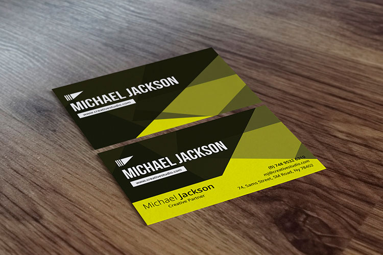
Pro Guide to Business Cards with Social Media Icons
Think of your business card as a handshake. Now, think of social media icons on that card as the conversation that follows. Adding them transforms a simple piece of paper into a direct link to your digital world, letting new connections see who you are and what you're about long after you've parted ways. It’s the simplest way to make sure that first impression sticks. Why Social Media Icons Belong on Your Business Card Let's be honest, in a world where your online presence pretty much validates your business's existence, a business card without social links feels like a missed opportunity. Your card gets the door open, but your social profiles are what invite people in. They act as a living, breathing portfolio of your work, your company’s vibe, and how you connect with your customers. This is a huge deal, especially when you consider how quickly business cards are forgotten. A shocking 88% of business cards are tossed out within a week . That’s a tiny window to make an impact. By adding those little icons, you give people an instant, no-fuss way to connect with you online, turning a brief meeting into a relationship that can actually grow. Extend Your Network and Build Credibility Putting business cards with social media icons on the table does more than just share your handles—it builds instant trust. A solid, active social profile is your modern-day portfolio and a goldmine of social proof. Potential clients can see your posts, read what others are saying, and get a real feel for your brand’s personality. It just makes you seem more real and approachable. This strategy also blows the doors wide open on your networking reach. That one person who follows you after getting your card? They can expose your brand to their entire network every time they like, share, or comment on your content. It’s a powerful ripple effect that a traditional card just can't create on its own. This isn't just a trend; it's a core part of modern branding. For a deeper dive into making this work for you, check out a complete guide to social media strategy . By connecting the physical and digital, your business card stops being just a piece of contact info. It becomes an active marketing tool that invites people into your brand's ongoing story. Selecting the Right Icons for Maximum Impact It’s tempting to cram every social media profile you have onto your business card, but trust me on this one: a cluttered card is a forgotten card. The key is to think strategically, not exhaustively. Less is always more here. So, how do you choose? Focus on the platforms that actually move the needle for your business—where your ideal clients hang out and where you shine the brightest. Prioritize Your Platforms Think about it from a potential client's perspective. If you're a wedding photographer, your Instagram and Pinterest are your visual portfolios. Slapping a rarely-used X (formerly Twitter) handle on there just adds noise. On the other hand, a B2B consultant should absolutely be pointing people to their LinkedIn profile to showcase their expertise and connections. Your goal isn't to prove you're on every platform. It's to guide new contacts to the 2-3 places where they can see the best of what you do. This isn't just a design preference; it has a real impact. Research has shown that 72% of people judge a company based on the quality of its business card . A clean, focused design with the right social icons makes a powerful first impression. It tells people you're intentional and you value their time. The data backs this up. Take a look at which platforms professionals are featuring most often on their cards. It’s no surprise LinkedIn is king for professional networking, with visual-heavy platforms like Instagram right behind. This just reinforces the need to align your choices with your specific industry and goals. By being selective, you transform your business card from a simple contact list into a powerful tool that directs people to your best online assets. This kind of intentional design is what makes printed materials so effective. If you're looking to create a cohesive brand image, explore our full range of professional marketing materials to see how every piece can work together. Getting Icon Design and Placement Just Right The little details are what take a business card with social media icons from just okay to genuinely impressive. When you nail the design and placement, you’re creating a clean, professional look that naturally guides the eye and makes it dead simple for someone to connect with you. One of the first things you'll decide is the color. Do you go with the classic, full-color versions or opt for a monochrome look? Full-color icons can inject a bit of energy if your brand is on the playful side. But if you’re aiming for a sleeker, more sophisticated vibe, monochrome icons in black, white, or a single brand color are often the better move. They blend in beautifully without fighting for attention with your logo. Next up is size. Your icons need to be big enough for someone to recognize at a glance, but not so big that they overpower the card. I’ve found a good rule of thumb is to keep them slightly smaller than the font size of your contact info. This way, they’re noticeable but still play a supporting role to the main event: your name and title. Strategic Layouts That Actually Work Where you put the icons is just as important as how they look. Throwing them on the card randomly just creates visual clutter. What you want is a clear path for the person holding your card to follow. The Horizontal Line: This is the classic for a reason. Lining up your icons in a neat row, usually along the bottom, creates a clean footer for your social links. It just works. The Vertical Stack: For a more modern or minimalist design, stacking icons vertically down one side can be a really stylish choice. It’s a great way to balance out the negative space on the card. No matter which layout you land on, there’s one rule you can't break: always put your username or handle right next to the icon . An icon by itself is basically useless. It forces people to guess or search for you online, and let's be honest, they probably won't. Make it foolproof. Paying attention to these details is what turns your card into a powerhouse networking tool. And if you really want to make a memorable impression, think about the texture and feel. Exploring options from a specialty printing collection can add that extra tactile quality that makes your card—and your brand—truly unforgettable. Using QR Codes to Bridge Print and Digital While a row of well-placed social media icons looks sharp, sometimes you need to direct people to more than just a single profile. That’s where a QR code becomes your secret weapon. It transforms your business card from a simple piece of cardstock into an interactive bridge, connecting your physical and digital presence in a single, elegant step. Instead of trying to cram three or four different social media handles onto a tiny card, you can use one QR code to point people toward a central hub. This could be a Linktree profile, a personal portfolio website, or a dedicated landing page that neatly organizes all your important links. This approach keeps your design looking clean and uncluttered while still offering a ton of value. The Power of a Single Scan The magic of a QR code on your business cards with social media icons goes way beyond just saving space. One of the biggest wins is trackability . If you use a dynamic QR code, you can actually see how many people are scanning your card. This gives you instant, real-world feedback on how effective your networking is. Are people at that last conference actually engaging? Now you’ll know. Flexibility is another huge advantage. Let's say you rebrand or decide to focus on a different social platform next year. Without a QR code, you'd be stuck with hundreds of outdated cards. With a dynamic QR code, you just update the destination URL online. Your existing cards will instantly redirect to the new link, saving you a ton of time, money, and hassle. A QR code turns your business card from a static introduction into a measurable, ongoing marketing campaign. It’s the perfect link between a great first impression and genuine digital engagement. This isn’t just a neat trick; it’s becoming standard practice for a reason. Recent data shows that including a QR code can boost user interaction by a whopping 20% . That's a serious lift in engagement from one small design choice. You can dig into this trend and other stats by exploring insights on digital business card usage . To make your QR code work even harder, don't just leave it as a generic black-and-white box. Brand it! Many QR code generators let you pop your logo in the center or change the color to match your card's design aesthetic. You could even get creative and print the QR code as a separate, fun element. Imagine handing out a card and adding a cool, custom sticker with your QR code on it—it’s memorable and interactive. Common Design Mistakes You Need to Avoid It's one thing to add social icons to your business card; it's another thing to do it right . A few common slip-ups can take your card from professional to amateur in a heartbeat. The most frequent one I see? Using low-resolution icons that end up looking blurry or pixelated once they're printed. Always—and I mean always —source high-quality vector files for your icons. This ensures they’ll be perfectly crisp and clean, no matter the size. Another classic blunder is making the icons too small. Sure, you don't want to clutter your design, but an icon so tiny it's barely recognizable is just wasted space. They need to be big enough for someone to identify at a glance without overpowering your name and contact info. It’s all about maintaining a clear visual hierarchy. The One Mistake You Can't Afford to Make There's one error that completely defeats the purpose of adding social media info in the first place: forgetting your username . An icon by itself is a dead end. It forces people to go searching for you, and let’s be honest, most won't bother. Don't make them work for it—place your handle or username right next to the corresponding icon. Just as bad is linking to a profile that's dormant, incomplete, or just plain unprofessional. Think of your social media presence as an extension of your brand. If a potential client follows the link on your card and finds an account full of outdated content or party photos, it does more harm than good. Only feature accounts you actively maintain and are genuinely proud to share. A business card is a promise of professionalism. Linking to an inactive or messy social profile breaks that promise before the relationship even begins. Finally, don’t let the card material itself let you down. Even the most brilliant design feels cheap on flimsy, low-quality card stock. If you want a card that not only looks premium but also holds up over time, consider exploring options like modern plastic business cards . This choice ensures your card—and its all-important social links—can withstand wear and tear while leaving a lasting, high-quality impression. Answering Your Top Questions About Social Media Icons As you're putting the finishing touches on your design, a few common questions always seem to surface. I've been there. Getting these details right is the difference between a card that looks professional and one that just looks… off. Let’s walk through the most common sticking points so you can finalize your design with confidence. Can I Really Use Their Logos? This is probably the #1 question I get. Do you need to ask for permission to use the official Instagram or LinkedIn icons? The short answer is no, not for this kind of thing. Social media platforms want you to promote your profiles, so they're generally fine with you using their logos on marketing materials like business cards. But there's a catch: you have to follow their brand guidelines. This isn't a suggestion; it's a rule. You can't just do whatever you want with their logos. Don’t change the colors. The Facebook blue is that blue for a reason. Don’t rotate or warp the logo. Don’t add weird effects or merge it with other graphics. The whole point is instant recognition. Sticking to the official, unaltered icon is the safest—and frankly, most effective—way to go. How Should I Format My Handles? And What About QR Codes? Another thing that trips people up is how to actually write out their username. Full URL? Just the handle? Keep it simple. For a clean, modern look, just put your handle right next to the icon. Think @yourbrand or /your-company-profile . Everyone knows what that means, and it saves a ton of precious real estate on your card. So, when does it make sense to ditch the individual icons and use a QR code instead? I generally recommend a QR code in a few specific scenarios. You're on more than three platforms. If you try to cram icons for LinkedIn, Instagram, X, Facebook, and TikTok onto a tiny card, it's just going to look cluttered and chaotic. A single QR code that links to a landing page (like a Linktree) is a much more elegant solution. You want to track who's actually scanning your card. A dynamic QR code can give you real data on how many people are engaging with your card. This is a game-changer for seeing if your networking efforts are paying off. You're going for a super minimalist vibe. A single, clean QR code can consolidate your entire online presence into one scannable square, keeping your design sleek and uncluttered. The choice really boils down to your main goal. If you want to drive traffic to one or two key platforms, icons are perfect. If you want to offer a gateway to your entire digital world without the visual noise, a QR code is definitely the way to go. By sorting out these common issues, you can move forward knowing your card is polished, professional, and ready to make a great first impression. Ready to create a business card that truly connects? 4OVER4 has a super intuitive online design tool and thousands of templates to help you get started. Design your perfect business cards with social media icons today .
 story
story Crafting the Perfect First Impression: Free Business Cards Templates and Maker
A well-designed business card is important for making a memorable first impression. It represents your brand and shows that you are professional. Having a unique card can help you stand out in a competitive market. You don't have to spend a lot of money to create them. There are many free templates and tools available online that can help you design a professional-looking card without breaking the bank. These resources offer: Ease of Use : Templates make it easy to create your own custom design. Variety : There are different templates available for different industries and styles. Personalization : Tools allow you to customize your business card with your own branding. No Cost : These platforms are free to use, so you don't have to worry about spending money on design. Whether you're a small business owner, freelancer, or employee at a large company, using these tools can help you create a high-quality custom business card that will impress your clients and colleagues. The Benefits of Using Business Cards Templates Customizable templates provide an efficient pathway to a polished and professionally crafted card. Leveraging these templates eliminates the complexity of starting the design process from a blank slate, saving significant time and effort. Time-Saving Convenience Selecting a pre-designed template allows for immediate focus on customization rather than conceptualization. This streamlines the creation process, enabling quick modifications and faster production timelines. Professional Quality With access to an array of high-res files and vector files, these templates ensure that the final product is not only visually appealing but also maintains its quality across various mediums. Customizability Despite starting with a foundation laid out by the template, the level of personalization available is vast. From inserting logos to adjusting color schemes, each template can be tailored to accurately represent your brand identity. Access to Expert Layouts Utilizing customizable templates means benefiting from expertly crafted layouts that adhere to industry standards. This provides a sense of assurance that your card will convey professionalism. For those in search of versatile options, 4OVER4.COM offers an extensive selection of blank templates designed to cater to various printing needs, facilitating the creation of stunning designs with ease. By integrating these benefits into your approach, the path to an impactful business card becomes clearer. Exploring Free Business Cards Maker Tools In the vast digital landscape, an array of free business card maker tools exists. These tools allow businesses to design their own professional and aesthetically pleasing cards without the need for a graphic designer. Free online tools like 4OVER4.COM offer a multitude of features: Customizable designs: Users can choose from a wide variety of templates, adjusting colors and layouts to align with their brand identity. Branded social media designs: Some platforms enable users to create cohesive designs across different marketing materials, ensuring consistency in branding. Unlimited edits: Users have the liberty to tweak their designs as much as they want until they achieve the desired look. 24/7 support: Most platforms provide round-the-clock assistance, offering help whenever users encounter challenges or have queries about the design process. One key advantage of these tools is their user-friendly interfaces. Even those with minimal design experience can navigate these platforms with ease, creating striking business. As you venture into creating your own business cards, remember that each tool offers unique features. It's essential to explore different platforms and select one that best meets your specific needs. Step-by-step Guide on Creating Business Cards with Free Templates and Makers Step 1: Choosing a Suitable Template Choosing the right template is crucial. With a multitude of options available on our website, it's essential to consider industry standards and personal style preferences. A real estate agent might opt for a clean, classic design, while a graphic designer could favor a more creative and unique layout. The goal is to accurately represent your professional identity. Evaluate your business card needs based on industry norms and personal taste. Explore various templates tailored to different professions for an appropriate starting point. Consider the impression you want to make—professional, innovative, approachable? Make sure to use our online designer for an easy and efficient design process. Remember, you can edit the design as much as needed until it perfectly aligns with your brand. Step 2: Customizing with Branding Elements Once the template is chosen, the next step involves infusing it with your brand's identity. This means adjusting the logo colors and incorporating branding elements that resonate with your company's image. Use high-resolution logos to ensure clarity in print. Apply your brand's color palette to maintain consistency across all marketing materials. Integrate other branded elements like icons or watermarks for added recognition. For assistance in designs, consider exploring editable design templates and allow for easy adaptation to fit your brand's aesthetic. Step 3: Adding Contact Information The business card 's primary function is to convey contact information effectively. It's about striking a balance between comprehensive details and a clutter-free design. Ensure your name, title, and company name are prominently displayed. Include essential contact details such as phone number, email address, and website. If space permits, add social media handles—particularly if you're active on platforms relevant to your audience or if you focus on creating branded social media designs. Remember that legibility is key; choose fonts and sizes that are easily readable without straining the eyes. Step 4: Reviewing Your Design Before finalizing the design, it’s vital to review every element carefully. This is the step where you fine-tune adjustments to perfect your card before printing. Preview the design at full scale to catch any typos or alignment issues. Assess color accuracy—do they match your branding guidelines? Verify that no critical information is too close to the edge or cut off. After thorough inspection and any necessary tweaks, you're ready to proceed with confident that your card will make the impactful first impression you desire. By following this methodical approach—choosing a template aligned with your professional image, branding it with distinctive elements, including essential contact details clearly, and thoroughly reviewing before committing to print—you leverage free tools effectively to create a polished representation of yourself and your business. Tips for Designing an Effective Business Card When you're designing, the most important thing to consider is how it looks and how well it communicates information. A clean and organized design will make your card more attractive and help people understand what you do. Here are some tips to help you. Prioritize Clarity Make sure that the most important information on your card stands out. This usually includes your name, job title, and contact details. You can do this by using a larger font size or a different color for these details. It's also a good idea to arrange them in a clear hierarchy, so that people can easily find what they're looking for. Consistent Branding Your print materials should reflect your brand identity. This means using the same colors, fonts, and logos that you use in your other marketing materials. By doing this, you'll create a cohesive look that helps people recognize your brand wherever they see it. Font Selection Choosing the right fonts is important for readability. You want to pick styles that are easy to read, even in small sizes. Avoid using fancy or decorative types that might look cool but are hard to understand. Stick to simple and professional-looking options instead. Edit with Precision Once you've created your design, take the time to fine-tune it. Use editing tools to make small adjustments to the layout, colors, and spacing until everything looks just right. These little changes can make a big difference in how your card looks overall. Expert Guidance If you're not confident in your design skills, don't be afraid to ask for help! There are plenty of professionals out there who specialize in graphic design and can assist you in creating an eye-catching card. They can provide valuable insights into current design trends and help you make choices that convey professionalism. Remember, the goal is to make a lasting impression. By paying attention to these details and putting effort into your design, you'll create a card that people will want to hold onto. The following section explores how creative card designs can serve various industries and professions, showcasing the diverse possibilities available when utilizing free templates and makers. Showcasing Examples of Creative Business Card Designs Business cards are an important part of brand identity, representing your business and leaving a lasting impression on potential clients. With the help of free business card templates and designer tools, you can create eye-catching designs that showcase your professionalism and attention to detail. Here are some examples of creative designs: Industry-Specific Cards For real estate professionals, featuring architectural blueprints or elegant property images sets the right tone. Healthcare providers often choose clean, trust-inspiring designs with medical imagery. Artistic Flair Designers have the freedom to use templates as a starting point and let their creativity shine through. Here's an example: An illustrator might choose a template with ample white space to highlight their vibrant portfolio pieces. Tech and Innovation Those in the tech industry usually prefer sleek, modern templates that reflect their cutting-edge mindset. Here's an example: A software developer could go for a design with sharp lines and dynamic color schemes, embodying innovation. Hospitality and Service Businesses in the hospitality industry thrive on creating warm and inviting experiences for their customers. Here's an example: A bed and breakfast owner might opt for a template with warm colors and inviting textures, conveying comfort and high-quality service. The availability of different templates allows you to customize your design according to your profession's unique story. Whether you're a corporate professional looking for a minimalist layout or a creative wanting something more ornate, you can use these tools to create visually appealing business cards that represent you well. Conclusion Crafting a compelling card has never been easier, thanks to the wealth of free resources available online. With a plethora of free templates and user-friendly design tools at your disposal, you can create personalized business cards that not only reflect your brand's identity but also leave a lasting impression on recipients. Initiating this free process allows you to explore a wide selection of high-quality designs, all tailored to suit different industries and professions. From minimalist and sleek designs to more creative and out-of-the-box templates like luxury business cards , there is something for everyone. Remember, the effectiveness of your card hinges largely on its design. Therefore, take the time to: Choose your favorite design Customize it according to your brand's color scheme and logo Incorporate all the necessary details before printing This journey of creating your own business card not only cultivates creativity but also reinforces your brand's identity. So why wait? Start exploring these tools and create impressive business cards that will make you stand out from the crowd. In the world of networking, a well-designed business card can open doors to new opportunities. Make every first impression count by leveraging these free resources today! FAQs(Frequently Asked Questions) What is the significance of professional quality in business card templates? Access to an array of high-res files and vector files ensures professional quality designs, enhancing the overall look and feel of the business card. How customizable are business card templates? Despite starting with a foundation laid out by the template, there is still ample room for customization to tailor the design to specific branding needs. What are the steps involved in creating business cards with free templates and makers? The steps involve choosing a suitable template, optimizing it with branding elements, adding contact information, and reviewing the design before finalizing it. What tips are important for designing an effective business card? Important tips include prioritizing clarity, ensuring consistent branding, choosing the right fonts, editing with precision, and seeking expert guidance if needed. What are the benefits of using business card templates? Using templates provides an efficient path to creating a well-designed business card. It allows for immediate focus on customization, access to expert layouts, and time-saving convenience. How can I customize a pre-designed business card template? Despite starting with a foundation laid out by the template, you can infuse branding elements and contact information to personalize the design according to your preferences. What are some examples of industry-specific business card designs? For real estate professionals, business cards featuring architectural elements may be suitable. Designers have the freedom to use templates as a starting point for creative flair, while those in the tech industry usually prefer sleek, modern templates. Why is it important to prioritize clarity in business card design? Prioritizing clarity ensures that the most important information on your card stands out and is easily readable. This is crucial for making a memorable first impression. What are the benefits of using a free business card maker tool? Using a free business card maker tool provides the convenience of creating professional-quality business cards without the need for advanced design skills or software. It also allows for customization to reflect your brand identity and saves time by offering pre-designed templates. How can customizable templates save time? Customizable templates save time by providing a foundation for the design, allowing for immediate focus on personalizing the template with branding elements and contact information. This eliminates the need to start from scratch and speeds up the overall design process. What is the significance of consistent branding in business card design? Consistent branding in business card design is important because it helps reinforce brand identity and recognition. Using consistent colors, fonts, and visual elements across all marketing materials, including business cards, creates a cohesive and professional image for your business. Why is it important to review your business card design before finalizing it? Reviewing your business card design before finalizing it is crucial to ensure that all information is accurate, the layout is visually appealing, and there are no errors. Taking the time to review the design helps avoid potential mistakes and ensures that your business card makes a positive first impression.
 story
story Creating a Brand Identity: Tips to Make Yours Stand Out
Your brand identity is so much more than just a logo or a catchy color scheme. Before you even think about design, you need to lay a strategic foundation. This is the deep work—understanding your audience, defining your purpose, and carving out your unique space in the market. Building Your Brand's Strategic Foundation Let's be clear: a powerful brand starts with a rock-solid strategy, long before a single design element comes into play. This is, without a doubt, the most crucial part of the process. It's the blueprint for every single decision you'll make down the road. Skipping this part is like building a house without a foundation. It might look fine for a little while, but it won't be long before the cracks start to show. The real goal here is to get past the surface-level ideas and dig into what your business truly stands for and, just as importantly, who you're here to serve. This strategic heavy lifting ensures your brand has a clear purpose, connects with the right people, and can actually stand out. Uncover Customer Motivations With Deep Research Meaningful market research isn't about ticking boxes on a demographic checklist. Sure, age and location are good to know, but the real gold is in the psychographics—your ideal customers' beliefs, motivations, challenges, and dreams. What's keeping them up at night? What are they really trying to accomplish? To get these kinds of insights, you have to go straight to the source. One-on-one interviews are invaluable. Seriously, just talk to potential customers. Ask open-ended questions about their experiences in your industry, and then listen more than you speak. You'll be amazed at what you uncover. Become a fly on the wall in online communities. Dive into forums like Reddit, relevant Facebook groups, and industry blogs. Pay close attention to the exact language people use and the frustrations they vent about. Study your competitors’ customers. Go read the reviews for similar products. What do people rave about? Even better, what do they complain about? Those complaints are often opportunities in disguise. This kind of deep dive helps you build a customer persona that feels like a real person, not just a collection of data points. That’s how you create a brand that speaks directly to them. Define Your Brand's Mission, Vision, and Values Once you have a firm grasp on who you're talking to, it's time to define your brand's soul. This isn't just fluffy corporate-speak; it's the core of what you do and why you do it. A great way to get your thoughts organized is to use a comprehensive brand strategy template to guide the process. This visual shows how all these pieces fit together to build something strong. As the infographic shows, it’s a natural progression. Your big-picture mission shapes the core values you live by, which then helps you define a unique selling proposition that truly sets you apart. To make sure these concepts are clear and actionable, here’s a quick summary of what you need to define. Component Description Key Question to Answer Mission (Your "Why") The fundamental purpose of your company beyond making a profit. Why do we exist? Vision (Your "Where") The aspirational, long-term impact your brand aims to create. What future do we want to help create? Core Values (Your "How") The 3-5 guiding principles that dictate behavior and decisions. How do we behave and make decisions? Think of these elements as your brand's internal compass. When you're facing a tough decision, you can always come back to your mission and values to make sure you're staying true to who you are. That kind of consistency is what builds real, lasting trust. A brand's strategy is its promise. Its identity is the reminder of that promise. The stronger the foundation, the more believable the promise becomes. This focus on strategy isn't just a trend; it's a fundamental shift in how businesses operate. The global market for branding agencies hit USD 5.2 billion in 2023 and is expected to climb to USD 8.7 billion by 2032 . This growth is happening for a reason: companies recognize that a sharp, well-defined identity is a primary business asset. In fact, in 2023, over 75% of businesses put more investment into brand strategy than into their own infrastructure. Once you’ve nailed down this strategic foundation, you can start bringing it to life with tangible assets. For a cohesive set of materials to get started, explore our Business Basics Collection for products designed to solidify your new brand identity. https://www.4over4.com/printing/category/business-basics-collection Defining Your Brand Voice and Personality Once you've got your strategic foundation locked in, it's time to figure out how your brand sounds . The way your brand speaks is every bit as important as how it looks. A truly memorable brand identity has a distinctive voice that feels human, builds trust, and actually connects with the people you’re trying to reach. Think of it like this: if your brand walked into a room, who would it be? An authoritative expert? A witty friend? Maybe a nurturing guide or a rebellious innovator? This personality is the soul of your communication, and it shapes every single interaction you have with the world. Crafting Your Core Messaging Before you even think about writing a social media post, you have to nail down your brand's character. This isn't about trying to be everything to everyone. It's about choosing a personality that resonates deeply with the specific audience you want to attract. A strong point of view sends a clear signal that your brand is for them . Start by brainstorming a long list of adjectives that describe your ideal brand persona. Don't hold back. Then, the hard part: whittle that list down to just three to five core attributes . Authentic: We’re always transparent and honest. No fluff. Witty: We find humor in everyday situations and don't take ourselves too seriously. Empathetic: We genuinely listen and get to the heart of our customers' needs. These chosen words become your north star. Every piece of content you create—from your website copy to your email newsletters—should filter through these personality traits. This consistency is what makes a brand feel reliable and familiar. Developing Your Brand Voice and Tone With your personality defined, you can start building out your brand voice. It's a subtle but crucial distinction: your voice is the consistent personality you project, while your tone is the emotional inflection you use in different situations. Your voice is constant; your tone adapts. For instance, a brand with a "helpful" voice might use a "reassuring" tone when handling a customer complaint. But when announcing a new product? That same helpful voice would shift to an "enthusiastic" tone. The underlying personality is always there, but the emotional delivery changes with the context. A brand voice is what you say, and a brand tone is how you say it. Consistency in voice builds trust, while flexibility in tone builds rapport. To put this into practice, create a simple messaging chart. This document is a lifesaver for keeping everyone on your team—from marketers to customer service reps—on the same page. Personality Trait Voice Description Do This Don't Do This Witty Clever, humorous, and sharp. We use humor to be relatable. Use clever wordplay. Make pop culture references. Be conversational. Use sarcasm. Be overly snarky or alienate people. Empathetic Warm, supportive, and understanding. We make people feel heard. Use "we" and "you." Validate customer feelings. Offer solutions. Be dismissive. Use cold, corporate language. Blame the customer. Authoritative Confident, knowledgeable, and direct. We are experts in our field. Use data and facts. Be clear and concise. Provide actionable advice. Be arrogant or condescending. Use complex jargon unnecessarily. This kind of framework is the key to creating a brand identity that feels cohesive. It ensures that no matter who is writing or speaking for your brand, it all sounds like it’s coming from the same place. This consistency should trickle down to everything, including official documents. For instance, even your company’s printed materials should reflect your brand’s character; you can explore professionally designed letterheads and stationery that align with your established voice. This attention to detail across every touchpoint is what separates the good brands from the great ones. Designing A Memorable Visual Identity Once you've nailed down your brand's personality and voice, it's time for the fun part: bringing it to life visually. This is where your brand stops being an abstract idea and becomes something people can actually see, touch, and form a real connection with. We're moving from the "who" and "why" into the tangible, visual world. A powerful visual identity is so much more than a cool logo. Think of it as a complete visual system where every element works in harmony to broadcast your brand's personality in a split second. It's your silent ambassador, representing you everywhere from a tiny website favicon to a massive billboard. The Psychology Of Color And Shape Before you even think about picking colors, you need to understand the serious psychological weight they carry. The right color can instantly create an emotional link with a customer, while the wrong one can push them away just as fast. Warm Colors (Reds, Oranges, Yellows): These are all about energy, passion, and excitement. It's no accident that a brand like McDonald's uses red and yellow to evoke feelings of speed and happiness. Cool Colors (Blues, Greens, Purples): These shades typically communicate a sense of calm, trust, and professionalism. Think about the deep, trustworthy blue used by financial giants like Chase or the healthy, natural green associated with Whole Foods. Neutral Colors (Black, White, Gray, Brown): Depending on how they're used, neutrals can feel sophisticated, minimalist, or rugged. Apple’s iconic black-and-white palette just screams modern elegance. Shapes play a similar role. Circles and soft curves often feel friendly and inclusive. Sharp angles and squares, on the other hand, can project stability and strength. The key is to match your color palette and core shapes to the brand personality you worked so hard to define. Your Logo: The Cornerstone Of Your Visuals Your logo is the single most concentrated piece of your brand. It’s a mental shortcut for your audience—one simple mark that says everything about who you are. The best logos are always simple, memorable, versatile, and timeless. There are a few different routes you can take: Wordmarks: These are font-based logos that put the business name front and center, like Google or Coca-Cola. They're fantastic for building name recognition right out of the gate. Lettermarks (Monograms): Using the brand’s initials, like HBO (Home Box Office) or NASA, this style works wonders for companies with long or complicated names. Iconic/Symbolic Marks: These are the abstract graphics or symbols that become legendary, like the Nike swoosh or the Apple icon. They’re incredibly powerful but require a serious marketing push to build that instant association. Combination Marks: This approach gives you the best of both worlds by pairing a symbol with a wordmark. It’s super flexible because you can use the elements together or on their own. Here’s a pro tip I always share: test your logo design in black and white first. If it falls apart without color, it’s not strong enough. You also need to make sure it scales beautifully, looking just as sharp on a pen as it does on the side of a truck. A logo doesn't sell, it identifies. It is the period at the end of a sentence, not the sentence itself. It is the flag of a nation, not the nation. If you need a creative spark for icons or symbols, you might find it helpful to explore the best AI art generator tools to get some initial concepts flowing. Choosing Typography That Speaks Volumes Typography is your brand’s voice, visualized. The fonts you choose are a massive part of your personality, so don't treat them as an afterthought. Serif Fonts (like Times New Roman): With their little "feet" on the ends of letters, they tend to feel traditional, established, and respectable. Sans-Serif Fonts (like Arial or Helvetica): Lacking the feet, these fonts have a clean, modern, and much more approachable vibe. Script Fonts: These mimic handwriting and can feel elegant and creative or fun and casual, depending on the style. Display Fonts: These are the bold, decorative fonts. They're not for body copy but are perfect for grabbing attention in headlines. A solid rule of thumb is to pick a primary font for headlines and a secondary, super-readable font for body text. The contrast creates a clear hierarchy that makes everything easier on the eyes. These visual choices aren't just for looks—they're strategic assets that build familiarity and trust. That connection is crucial, as a staggering 81% of consumers say they need to trust a brand before they'll buy from it. And since a signature color can boost brand recognition by up to 80% , it's clear that investing in a cohesive visual system directly builds the customer confidence that drives loyalty. Ultimately, a strong visual identity system locks in consistency no matter where your brand shows up. For those high-impact print materials where you really need to shine, our Specialty Printing Collection offers unique finishes like foil and 3D effects that can bring your visual identity to life in a way people won't forget. Protecting Your Brand in a Crowded Market You’ve poured countless hours—and a fair bit of your budget—into building a brand identity that perfectly captures your company’s spirit. Don’t stop now. The final, and arguably most critical, step is to build a fortress around that investment. Protecting your brand isn't just a legal formality to check off a list. It's an essential part of the creation process itself. This is where you dive into the nitty-gritty of intellectual property and trademarks. Skipping this can have disastrous consequences, from expensive legal fights to the nightmare scenario of having to rebrand entirely. A proactive approach here isn't just recommended; it's non-negotiable. Why A Trademark Search Is Your First Move Before you get too attached to that brilliant name or killer logo, you absolutely have to conduct a thorough trademark search. Think of it as due diligence. Going all-in on a brand identity without checking its availability is like buying a house without a title search—you might be in for a nasty surprise when you find out someone else already owns it. And a quick Google search won't cut it. You need to dig into official trademark databases, like the one managed by the U.S. Patent and Trademark Office (USPTO) , to see if similar names or logos are already registered in your industry. This one step can save you a world of financial and legal pain. Protecting your name is as crucial as defining your mission. A brand can't build equity on a foundation that legally belongs to someone else. It's a risk that's simply not worth taking. Imagine receiving a cease-and-desist letter right after launching. You'd be forced to scrap your website, packaging, and all your marketing materials. Not only is that a huge financial hit, but it also completely wipes out any brand recognition you've started to build. Securing Your Legal Ownership Once you've confirmed your name and logo are clear for the taking, it's time for trademark registration . This is the move that officially grants you legal ownership and the exclusive rights to use your brand elements for your specific goods or services. It’s your ultimate shield against copycats and competitors. Registering your trademark gives you some serious advantages: Nationwide Protection: Your rights are established across the entire country, not just your city or state. Legal Recourse: You'll have the legal standing to sue for infringement if someone else tries to use your branding. A Public Record: It puts the world on notice that the brand is yours, which is often enough to deter others from even trying to use it. The market is more saturated than ever, with 88.2 million active trademarks registered globally as of 2023. It’s no wonder that a recent study found that 100% of chief marketing officers believe it’s harder to find a unique, trademarkable brand name today than it was just five years ago. This crowded field makes legal protection non-negotiable. Strong trademarking is directly tied to your ability to grow brand awareness and carve out your spot in the market. When you legally protect your brand, you ensure that the unique identity you worked so hard to create remains yours and yours alone. How to Implement Your Brand Identity Consistently You’ve poured everything into building the strategy, defining the personality, and designing the visuals. Now what? This is where the rubber meets the road—the most critical part of creating a brand identity that actually sticks: execution . A brilliant brand strategy is completely useless if it just sits in a forgotten folder. For your brand to come to life, that identity needs to be applied with relentless consistency across every single place a customer might see you. This is where the real work begins. The goal is to make sure that whether someone lands on your website, sees a social media post, or gets a business card, they’re getting the exact same clear, cohesive message. It’s this consistency that builds trust, makes you instantly recognizable, and turns a good brand into an unforgettable one. Create Your Brand Style Guide The absolute cornerstone of consistent branding is a comprehensive brand style guide . Think of it as your brand’s constitution. It’s the single source of truth that dictates how your identity shows up in the world. A good guide removes all the guesswork and empowers your team to make smart, on-brand decisions without needing constant supervision. This document shouldn't feel restrictive; it should be enabling. It provides the guardrails to keep everything cohesive while still giving your team room to be creative. I can't overstate how essential this is, especially as you scale and start working with outside partners like agencies or freelancers. A solid style guide should always cover: Logo Usage Rules: This is non-negotiable. Detail exactly how the logo can and cannot be used. Specify minimum sizes, required clear space around it, and—critically—show examples of incorrect uses like stretching it, changing colors, or putting it on a busy background. Color Palette: Don't just show the colors; give the exact codes ( HEX , RGB , CMYK ) for your primary and secondary palettes. Go a step further and explain the role of each color to guide its application. For example, which color is for calls-to-action? Which is for backgrounds? Typography Guidelines: List your primary and secondary fonts, including specific weights and styles (e.g., "Inter Bold" for headlines, "Lato Regular" for body text). Define sizing for headlines ( H1 , H2 , H3 ) and body copy for both web and print. Brand Voice and Tone: Revisit the personality traits you defined earlier. Bring them to life with examples of on-brand copy. A "do's and don'ts" list is incredibly helpful here to make the voice tangible for your writers. Imagery Style: Describe the vibe of your photography or illustrations. Are they bright and optimistic? Gritty and raw? Moody and atmospheric? It's best to include a few examples of on-brand and off-brand images to make the distinction crystal clear. A brand style guide is more than a rulebook; it's a tool for empowerment. It gives your team the confidence to create, knowing they are reinforcing the brand with every action. This guide becomes the go-to resource for anyone creating anything for your brand, from a quick social media graphic to a major sales presentation. Seamlessly Roll Out Your Identity With your style guide ready, it's time for the rollout. This shouldn’t be a chaotic, all-at-once scramble. A strategic, phased rollout ensures a smooth transition across all your platforms and assets. You're methodically updating every customer-facing element to reflect the new, unified identity. I always recommend starting with your most visible and high-impact assets first. You want to make the biggest splash right away. A logical plan usually looks something like this: Digital Presence: Kick things off with your website and social media profiles. These are often the first places potential customers find you. Update your website homepage, social media headers, profile pictures, and bios. Core Marketing Materials: Next up, tackle the tools your sales and marketing teams use every day. This means updating business cards, email signatures, presentation decks, and any digital brochures or one-pagers. Physical and Printed Assets: Finally, circle back to update all your physical collateral. This step is crucial for businesses with a brick-and-mortar presence or those that rely on things like direct mail, event banners, and flyers. When you get to your printed assets, make sure every piece strictly follows your new guidelines. Working with a professional printing service for high-quality marketing materials is a smart move here—it ensures your visual identity looks just as impressive in the real world as it does on screen. Empower Your Team to Be Brand Ambassadors Your brand identity doesn’t just live in a style guide or on your website. It lives through your people. Every single employee, from customer service reps to the sales team, represents your brand. Getting them on board isn't just a nice-to-have; it's absolutely essential for creating a truly consistent customer experience. Hold an internal launch or a training session to introduce the new brand identity. Don’t just show them the style guide—walk them through the why behind the changes. When your team understands the strategy and purpose, they transform from rule-followers into enthusiastic brand ambassadors. Make the brand style guide ridiculously easy for everyone to find. Put it on a shared drive, an internal wiki, or whatever central hub your company uses. The easier it is for someone to find the right logo or color code, the more likely they are to actually use it correctly. This simple step makes a world of difference in successfully bringing the brand you’ve worked so hard to build to life. Got Questions About Brand Identity? We’ve Got Answers. Even the most buttoned-up branding plan can leave you with a few head-scratchers. That’s totally normal. Let's tackle some of the most common questions that pop up when you're building a brand identity. Getting these sorted out now can save you a ton of headaches and money down the road. How Much Does It Cost to Create a Brand Identity? This is the big one, and the honest answer is: it’s all over the map. You could get a quick logo from a freelance site for a few hundred bucks, or you could partner with a top-tier agency for a comprehensive strategy and design package that runs well over $25,000 . The final cost really boils down to the scope of the project, the experience of who you hire, and how complex your business is. For a startup or small business that needs a solid, professional foundation, a realistic budget usually lands somewhere between $2,000 and $7,000 . This range typically gets you the essentials: brand strategy sessions, core messaging, and a foundational visual identity kit with your logo, color palette, and typography. Don’t think of building a brand identity as just another expense—it's a critical investment. A well-crafted brand pays for itself many times over through customer loyalty and a higher perceived value. How Long Does the Brand Identity Process Take? Good branding takes time, so patience is your best friend here. A proper process isn't an overnight job. Generally, you can expect the timeline to be anywhere from four weeks to four months , depending on how deep you need to go. Here’s a rough idea of what to expect: A simple visual identity project (just the logo, colors, and fonts) could wrap up in about a month. This works best if you’ve already done all the strategic legwork yourself. A comprehensive branding project that covers research, strategy, messaging, visual design, and a full style guide will more realistically take three to four months . Honestly, the biggest variable in the timeline is often you. The project moves as fast as you can provide thoughtful feedback and as smoothly as your internal approval process allows. Can I Create a Brand Identity Myself? Absolutely. For many solopreneurs and bootstrapped startups, a DIY approach is the only way to get started, and that's perfectly fine. Tools like Canva have made it incredibly easy to create basic visual assets without needing a design degree. It’s a great way to get your initial ideas out into the world. But it’s important to remember that a brand is so much more than a logo. You still have to do the heavy lifting on the strategy side—really digging in to understand your audience, defining what makes you different, and creating a message that sticks. A DIY identity can be a fantastic first step. As your business grows, however, investing in a professional designer or agency will help you build a brand that’s truly distinct, can scale with you, and is legally defensible in a crowded market. What Is the Difference Between Brand and Brand Identity? This is a super common point of confusion, but getting the distinction right is key to understanding the whole branding game. Think of it this way: your brand is the intangible gut feeling people have about your company. It’s the perception that lives in their minds—your reputation, the experience they have with you, and what they say about you when you’re not in the room. It’s built over time, through every single interaction. Your brand identity , on the other hand, is the collection of tangible things you create to shape that perception. It includes all the visual and verbal tools you use to communicate who you are and what you stand for. Brand: The overall reputation and gut feeling. Brand Identity: The logo, colors, fonts, voice, and messaging used to build that reputation. In short, your brand identity is the strategic toolkit you use to build your brand. Creating a powerful and lasting brand identity is a foundational step for any business aiming for long-term success. At 4OVER4 , we specialize in bringing that identity to life with high-quality, customizable printing solutions that ensure your brand looks as good in the real world as it does on screen. From business cards to banners, let us help you make a lasting impression. Explore our full range of products and start building your brand today.
 story
story Earth Friendly Business Cards A Greener Brand Guide
Think about that business card tucked away in your wallet. It seems harmless enough, right? But that little piece of cardstock has a surprisingly large environmental footprint. Earth-friendly business cards are designed from the ground up to change that. They rely on sustainable materials, non-toxic printing methods, and a mindset that favors a circular economy, turning a simple networking tool into a tangible statement of your brand's commitment to the planet. Why Your Business Needs to Rethink Traditional Cards The casual exchange of business cards is a ritual we all know, but it carries more environmental weight than most people think. That small rectangle of paper is the final stop on a long, resource-hungry journey. For any modern, responsible brand, rethinking this old-school staple isn't just a trend—it's a critical step forward. The Hidden Environmental Cost Let's start at the source: the materials. Every year, a staggering 8 billion business cards are thrown out across the globe, fueling deforestation and piling up in our landfills. The manufacturing process is just as demanding. Did you know it can take around 17,000 gallons of water to produce a single ton of paper? Many cards are then finished with plastic laminates and printed with petroleum-based inks, which not only make recycling difficult but also release harmful volatile organic compounds (VOCs) into the atmosphere. For more business insights and trends that are shaping modern company practices, it's always good to stay informed. From Production to Landfill The card's journey doesn't stop after that initial handshake. A huge number of traditional cards are tossed within just one week. Once they hit the landfill, they start to decompose and release methane—a greenhouse gas that's 28 times more potent than carbon dioxide . When you add it all up, it's a massive use of resources for something with such a fleeting purpose. By choosing sustainable alternatives, businesses can actively reduce their contribution to this wasteful cycle. It transforms a simple networking tool into a powerful statement about corporate responsibility and environmental stewardship. Making the switch to greener options does more than just reduce your footprint. It sends a clear message to clients, partners, and competitors that your company’s values are more than just words on a page. This single, thoughtful choice helps you stand out and encourages a broader industry shift toward more mindful practices. If you're exploring different types of https://www.4over4.com/printing/category/business-cards-printing , you'll find there are plenty of eco-friendly options available that don't compromise on quality. It's a small change with a big ripple effect. Choosing Your Sustainable Business Card Material Picking the right material is your first—and most important—step toward creating truly earth-friendly business cards . It's a lot like choosing the foundation for a house. The material you select sets the tone for everything that follows, dictating the card's character, durability, and overall environmental footprint. This choice is a very real, tangible signal of your brand's commitment to sustainability. It's about moving beyond the standard, resource-heavy paper stock and exploring a whole world of unique, eco-conscious materials. Each one has its own story, texture, and set of benefits, giving you a chance to find a perfect match for your brand's voice. The Power of Recycled Paper The most popular and straightforward sustainable option is 100% post-consumer recycled paper . This isn't just paper that could have been recycled; it's made from actual paper waste that people like you and me have used and tossed into the recycling bin, diverting it from a landfill. It truly closes the loop. Opting for recycled paper makes a massive dent in the environmental impact. It demands less energy, uses less water, and, critically, saves trees from being cut down. The subtle flecks and textures often found in recycled stocks, like a rustic kraft collection , can also add an authentic, earthy charm to your design that feels genuine. Just look at the numbers—the savings are huge. The data clearly shows that choosing recycled paper results in a 60% reduction in CO₂ emissions and a staggering 50% decrease in water usage when compared to making paper from virgin pulp. Innovative and Alternative Materials If you want your card to really make a statement, there are some incredible alternative materials that are both sustainable and unforgettable to the touch. Honestly, these options often become conversation starters all on their own. Bamboo: It's one of the planet's fastest-growing plants, making it an incredibly renewable resource. Paper made from bamboo is strong with a silky-smooth finish, perfect for a clean, modern aesthetic. Hemp: This plant is a powerhouse. It grows lightning-fast and needs far less water and land than trees, all while producing incredibly strong fibers for paper. Hemp cards have a unique texture that feels both natural and high-end. Cotton: Typically made from reclaimed textile waste (think scraps from t-shirt manufacturing), cotton paper is completely tree-free. It has a soft, almost luxurious feel and is remarkably durable, making it an excellent choice for premium brands. A business card made from alternative fibers like hemp or bamboo does more than share contact details—it tells a story of innovation and resourcefulness. It communicates that your brand thinks creatively about its impact on the world. To help you decide, here’s a quick rundown of how these materials stack up. Comparing Earth-Friendly Business Card Materials Material Key Environmental Benefit Texture & Appearance Best For Recycled Paper Diverts waste from landfills and saves trees, water, and energy. Varies; often has a slightly textured, authentic feel. Eco-conscious brands looking for a classic, recognizable green choice. Bamboo Made from a highly renewable, fast-growing grass. Smooth, clean, and durable with a modern look. Sleek, minimalist brands wanting a sustainable yet polished feel. Hemp Requires minimal water and no pesticides to grow. Distinct, high-quality texture that feels premium and natural. Brands that want to project an image of durability and natural strength. Cotton Tree-free, made from reclaimed industrial textile scraps. Soft, luxurious, and exceptionally durable. High-end, artisanal brands aiming for a tactile, premium impression. Seed Paper Biodegradable and grows into plants, leaving no waste. Thick, pulpy, and visibly embedded with seeds. Memorable, interactive marketing for brands focused on growth and nature. Ultimately, the best material is the one that aligns with your brand's personality while making the smallest possible impact on the planet. Plantable Seed Paper For a business card that's truly circular and delightfully interactive, you can't beat plantable seed paper . This amazing material is embedded with tiny wildflower, herb, or even vegetable seeds. Once your contact info is saved, the recipient can plant the whole card in a pot of soil, give it some water, and watch it sprout. This completely transforms a disposable networking tool into a gift that gives back. It’s a powerful, memorable way to show your commitment to regeneration and leave a positive impression that literally grows. What Goes Into an Eco-Friendly Printing Process? Picking a sustainable paper for your business card is a great first step, but that's only half the story. The way your card is actually printed is just as important for its final environmental footprint. It’s like buying organic vegetables—if you douse them in unhealthy oil, you��re not really getting the full benefit, are you? The printing process is that final, crucial ingredient. Everything from the ink and machinery to the energy powering the print shop adds up. Knowing a little about these elements helps you ask the right questions and find a printer who genuinely cares about the planet. It’s about making sure your commitment to sustainability runs through the entire process, from the raw paper to the finished card in your hand. Moving Beyond Petroleum With Plant-Based Inks The single biggest difference between conventional and eco-friendly printing comes down to the ink. For years, the industry standard has been petroleum-based inks, which are packed with Volatile Organic Compounds (VOCs) . When these inks dry, VOCs are released into the atmosphere, contributing to air pollution and creating potential health hazards. The better alternative? Plant-based inks , typically made from soy or other vegetables. By swapping out petroleum for renewable resources like soybeans or corn, the entire process becomes cleaner. This one change makes a huge difference. Fewer VOCs: Plant-based inks release far fewer of these harmful compounds, which means cleaner air in the print shop and for the community. Better for Recycling: Paper printed with soy or vegetable ink is much easier to de-ink. This makes the recycling process more efficient, allowing more of the paper fibers to be recovered and turned into new products. Brilliant Colors: Don't think for a second that you're sacrificing quality. These natural inks produce colors that are just as sharp and vibrant as their old-school counterparts. When you opt for a printer using plant-based inks, you're backing a production method that is healthier for people and the planet. A business card printed with soy ink sends a quiet but powerful message. It shows a commitment to sustainability that goes beyond the surface, right down to the very molecules that form your logo. Smarter, Greener Printing Technologies The ink is a big piece of the puzzle, but the technology behind the printing matters, too. Modern printing methods are constantly evolving to cut down on waste and save resources, making the whole operation leaner and greener. A great example is waterless printing . Traditional printing presses use a constant stream of water and chemical solutions to control where the ink goes on the page. Waterless technology gets rid of this need entirely. It not only saves thousands of gallons of water but also prevents chemical runoff from entering our waterways. As a bonus, it often produces sharper, more detailed images. Another thing to look for is how the print shop gets its power. A facility that runs on renewable energy like solar or wind has a much smaller carbon footprint. Choosing a printer who has invested in clean energy means your business cards are being made with the environment in mind from start to finish. If you’re curious about the possibilities, exploring the full range of green printing services can show you just how sustainable your print projects can be. Designing a Card That Showcases Your Green Values The paper and printing process are the foundation, but your design is what really tells your brand’s green story. An effective design for earth friendly business cards does more than just list your contact info; it’s a visual handshake that communicates your commitment to the planet. This is your chance to show, not just tell. A thoughtful design can turn a simple card into a powerful conversation starter, making your eco-conscious values clear from the first glance. Embrace a Minimalist Aesthetic Often, the most effective strategy is the simplest one: use less. A clean, minimalist design that leans on great typography and plenty of white space doesn't just look modern and professional—it's inherently more sustainable. More white space literally means less ink. This choice directly cuts down on the amount of plant-based ink needed for your print run, shrinking your resource footprint. It’s proof that sustainable design can be both beautiful and impactful. Think of your business card's design as a direct reflection of your environmental philosophy. A minimalist layout isn't just a style choice; it's a conscious decision to reduce waste, showing that intention is at the core of your brand. Make Your Materials the Star When you’ve invested in a unique, sustainable material like hemp, bamboo, or a beautifully textured recycled paper, let that material do the talking. The last thing you want to do is cover it up with heavy blocks of color or dense graphics. An understated design allows the natural texture and flecks in the paper to become a central part of the aesthetic. This creates a memorable tactile experience, connecting the physical feel of the card directly to your brand’s down-to-earth values. You can also explore unique shapes that minimize waste through clever nesting, using various die-cutting techniques to make your card truly stand out. Clearly Communicate Your Green Credentials Don't be shy about your sustainable choices. Making them a visible, yet tasteful, part of the design is a great way to educate people and underscore your brand’s authenticity. A few subtle cues can tell the story of your card: A Simple Statement: A small line of text like, "Printed on 100% post-consumer recycled paper with soy-based inks," is direct and powerful. Certification Logos: If your paper is FSC certified, adding the official logo gives you instant, credible proof of responsible sourcing. A Call to Action: For plantable seed paper, including a short instruction like, "Plant this card and watch it grow!" transforms the card into a fun, interactive gift. These details complete the narrative, turning your business card from a simple networking tool into a proud statement about what your company stands for. Thinking Beyond Paper: Digital and Hybrid Networking Sometimes, the greenest business card is the one you never print. While swapping to sustainable materials is a huge step forward, the world of networking has expanded to include some really smart digital and hybrid options that can shrink your environmental footprint even further. These modern tools rethink what a business card even is. Instead of a disposable slip of paper, they champion reusability and efficiency, offering new ways to connect that fit perfectly with an earth-conscious mindset. It’s all about having the right tool for the job. The Rise of Hybrid Smart Cards Hybrid "smart" cards are the perfect bridge between a firm handshake and digital convenience. Think of them not as a disposable item, but as a durable, long-lasting networking tool you can use over and over again. Crafted from materials like reclaimed wood, bamboo, or metal, these cards have NFC (Near Field Communication) technology built right in. A simple tap on a smartphone instantly sends your contact info, website, and social links to a new connection. This one-time purchase cuts out the need for endless reprinting, saving a staggering amount of paper and energy over the card's lifetime. The initial investment might be higher—around $51 per card —but this model combines a memorable physical object with the ease of digital sharing, dramatically reducing paper waste. Going Fully Digital For a true zero-waste strategy, purely digital solutions are the ultimate green choice. These methods skip physical production, shipping, and materials entirely, working with the smartphones we all carry every day. QR Codes: You can save a unique QR code as an image on your phone’s lock screen. New contacts can scan it to instantly grab your details, which is a lifesaver at busy conferences and events. Business Card Apps: Apps let you design and share dynamic digital cards through a quick text, email, or link. Many even help you organize the contacts you make and can update your info in real-time for everyone who has your card. Email Signatures: Don’t underestimate your daily emails. A professionally designed signature with clickable links to your website and social profiles turns every message into a networking opportunity without using any extra resources. The best approach isn't always an either/or decision. Many professionals find success by carrying a single high-quality, reusable hybrid card for important meetings and using a QR code on their phone for larger, more casual events. As you explore these options, it helps to get a broader perspective by understanding the pros and cons of digital vs. traditional approaches . In the end, it’s about picking the method that feels natural for your networking style while leaving the lightest possible mark on the planet. Your Action Plan for Making the Switch Feeling inspired? Great. Let's channel that motivation into a simple, effective plan. Switching to earth-friendly business cards isn't complicated when you know where to start. Think of this as your step-by-step guide from a good idea to a finished, sustainable card you can be proud of. First things first, do a quick audit. Before you even think about placing an order, get a real sense of your needs. How many cards does your team actually go through in a quarter, or a year? A realistic count stops you from over-ordering—the simplest, most immediate way to cut waste and save a little cash. Finding and Vetting Your Green Printer Once you have your numbers, it's time to find the right partner for the job. Here’s the thing: not all printers who talk about sustainability are truly walking the walk. You need to ask the right questions to find one that is genuinely committed. When you're talking to a potential supplier, don't be shy. Ask them directly about: Their Paper Sourcing: Can they print on 100% post-consumer recycled paper ? Do they hold certifications from groups like the Forest Stewardship Council (FSC)? Their Inks: Are they using plant-based inks (like soy or vegetable formulas) instead of the old-school petroleum-based stuff? Their Energy Usage: Do they make an effort to power their print shop with renewable energy? Choosing a certified green printer ensures your commitment to sustainability is reflected throughout the entire supply chain, not just in the final product. It validates your effort and provides a credible story to share with your customers. After you've vetted a few printers and have quotes in hand, you can set your budget. Some eco-friendly options might seem a bit pricier upfront, but always remember the long-term value it adds to your brand's reputation. And when your new cards finally arrive? Tell people about it! Announce the switch on social media or mention it in your newsletter. This is a fantastic way to communicate your company's values and show your clients that you’re serious about making a positive impact. To see how these choices fit into your bigger picture, check out the full range of eco-friendly marketing materials available. Your Questions, Answered Switching to sustainable networking tools can feel like a new frontier, so it's natural to have a few questions. Let's clear up some of the common ones to help you feel confident about choosing earth-friendly business cards . Are Earth-Friendly Business Cards More Expensive? Sometimes, yes. The initial price tag can be a bit higher, and that usually comes down to using premium, thoughtfully sourced materials and specialized, greener printing techniques. But it's better to think of this as an investment rather than just a cost. When you hand someone a beautifully crafted, sustainable card, you're making a powerful statement about your brand's values. This resonates deeply with environmentally conscious clients and partners. Plus, if a memorable card means you hand out fewer of them, you can often balance out the cost over the long haul. A sustainable business card is a long-term investment in your brand's reputation. The lasting impression it creates often delivers a return that far outweighs the small difference in initial cost. How Can I Tell if a Printer is Genuinely Eco-Friendly? The best way is to look for proof and ask direct questions. A printer who is truly committed to sustainability will be more than happy to show you their credentials. Here’s what to look for: Certifications: The big one is FSC (Forest Stewardship Council) certification . This is your guarantee that their paper comes from forests managed with the highest environmental and social standards. Ink Type: Ask them what kind of ink they use. They should be able to tell you they use cleaner options like soy or vegetable-based inks instead of traditional petroleum-based ones. Transparency: A truly green partner will be open about their entire process, from how they minimize waste to the type of energy they use. Don't be shy about asking. Is the Quality of Recycled Paper Lower? Not at all. That’s an outdated idea from when recycled paper was still a new concept. The recycled card stocks available today are incredible—they’re premium, durable, and come in a huge range of textures, weights, and beautiful finishes. Honestly, many people find they prefer the tactile, authentic feel of a high-quality recycled card. It just feels more substantial and memorable. You won't be sacrificing anything when it comes to print clarity, color richness, or durability compared to cards made from virgin paper. Ready to make a lasting impression with a smaller footprint? 4OVER4 offers a wide selection of high-quality, earth-friendly printing options to bring your sustainable vision to life. Explore our collection of eco-friendly products .
 story
story Folding Business Cards That Make an Unforgettable Impact
A folding business card does more than just give out your contact details; it creates a memorable, physical experience that makes you stand out. Think of a standard card as a quick headline. A folding business card , on the other hand, is the full story, giving you twice the real estate to show off your brand, services, or even a mini-portfolio. This extra space helps make sure your card is kept and valued, not just tossed aside. Why Folding Business Cards Make a Stronger First Impression In a world filled with digital pings and fleeting online connections, a tangible business card is still a surprisingly powerful networking tool. But let's be honest—the standard little rectangle is so common it rarely leaves a mark. A folding business card instantly shatters that expectation. The simple act of unfolding it creates a small interactive moment. It engages the person you’ve just met, encouraging them to spend a few extra seconds with your brand. That extra moment of engagement isn't just a novelty; it can lead to real results. Studies show that for every 2,000 cards handed out, companies see a 2.5% bump in sales. And when those cards are premium, like many folded options, they have a 25% higher retention rate . Why? Because people see them as more valuable and higher quality. To give you a clearer picture, let's break down how these two card types stack up. Standard vs Folding Business Cards at a Glance Sometimes seeing the differences side-by-side makes the choice obvious. Here’s a quick comparison of what each type of card brings to the table. Feature Standard Business Card Folding Business Card Space Limited to basic contact information and a logo. Double the space for detailed information, images, or special offers. First Impression Can be easily overlooked in a stack of other cards. Creates an interactive and memorable "unboxing" experience. Functionality Primarily informational. Can serve as a mini-portfolio, appointment card, or loyalty card. Perceived Value Often seen as a standard, disposable networking tool. Perceived as higher quality, more professional, and valuable. Retention Rate Lower; easily misplaced or discarded. Higher; people are more likely to keep a unique and useful card. Brand Storytelling Minimal; relies on a single tagline or logo. Ample room to tell your brand story, list services, or add a call to action. As you can see, the folding business card isn't just a different shape—it's a fundamentally more versatile and impactful marketing tool. More Than a Card, It's a Pocket Portfolio A standard business card has one job: give someone your contact info. A folded card is a multi-tasker, transforming from a simple card into a compact and powerful marketing piece. The multi-panel format lets you get strategic. Tell a Deeper Story: Use the cover for your name and logo, and open it up to reveal your mission, list key services, or share a glowing customer testimonial. Showcase Your Work: Are you a photographer, artist, or designer? The inner panels are the perfect spot for a mini-portfolio to display high-quality images of your best work. Provide Real Value: A restaurant could turn its card into a loyalty stamp card. A consultant might include a valuable industry tip or a helpful checklist. The data here is pretty clear: while bi-folds are the most popular choice, any folded format delivers a massive 60% boost in brand recall . That makes your first impression far more likely to stick. By offering more space and a unique tactile experience, a folding business card communicates professionalism and signals that you invest in quality. It’s an immediate differentiator that helps you stand out in a stack of ordinary cards. Ultimately, choosing a folding format is a strategic move to elevate your brand. As you think about these dynamic options, you can also explore our complete guide on custom business cards printing to find the perfect match for your professional needs. How to Use the Extra Space Strategically The real magic of a folding business card isn't just the extra space—it's how you use it. Think of your card as a tiny storybook. The cover grabs their attention, but opening it up is where you pull them in. That little "reveal" moment is your secret weapon for guiding a prospect's focus and making an impression that sticks. Instead of just jamming every last detail onto a single surface, you get to dedicate each panel to a specific job. This simple, structured approach transforms your card from a basic contact slip into a genuinely useful, multi-purpose tool. The trick is to create a flow that feels logical and intuitive to whoever is holding it. For instance, you could keep the front clean with just your logo and name, building a little intrigue. Then, when they open it, one panel details your core services while the other shows off a killer testimonial. You’re taking them on a mini-journey that’s both engaging and easy to digest. Dedicate Panels for Specific Functions One of the most common mistakes I see is people treating the extra space like a blank wall they have to fill at random. A much better approach is to think like an architect designing a tiny, efficient room. Every single inch needs a purpose. When you assign a clear role to each panel, you make the information so much easier to understand. This segmentation keeps the design from looking cluttered and helps your audience actually absorb what you're trying to tell them without feeling overwhelmed. Let's break down a few practical ways to divide and conquer your card's real estate. Here are a few proven strategies for assigning jobs to each panel: The Mini-Portfolio: This is a no-brainer for photographers, designers, architects, and artists. Use the inner panels to showcase a few high-resolution images of your best work. The Service Menu: Perfect for consultants, freelancers, and service-based businesses. List your key services inside with short, benefit-focused descriptions. The Appointment Reminder: Turn one panel into a fillable appointment card with fields for the date and time. It’s a super practical choice for salons, clinics, and personal trainers. The Loyalty Program: Transform your card into a punch card to drive repeat business. This is a fantastic move for coffee shops, small retail stores, and local service providers. A well-structured folding business card becomes a useful tool in the recipient’s hands. By providing tangible value—whether it’s a map, a discount, or a portfolio—you dramatically increase the chances that your card will be kept and referenced later. Create a Narrative Journey Beyond pure functionality, that fold gives you a chance to tell a story. The physical act of opening the card actually builds a little suspense and guides the reader through a sequence you've planned out. This turns a simple exchange into a much more memorable interaction. Think about the path you want someone's eyes to take. What's the most important thing you need them to know? The order of your panels should lead them straight to that key takeaway. A Sample Narrative Flow: Front Panel (The Hook): This is where you put your name, title, and a striking logo. Its only job is to spark curiosity and get them to open the card. Left Inner Panel (The Problem/Need): Briefly touch on a common pain point your ideal client faces. This immediately shows that you get it—you understand their world. Right Inner Panel (The Solution): Now it's your time to shine. This is where you explain how your services or products solve the very problem you just mentioned. Back Panel (The Call to Action): You have to end with clear, actionable next steps. This could be a QR code to your portfolio, your website URL, or your social media handles. This structured approach is a lot like how effective marketing materials like brochures are designed. In fact, if you need to tell an even bigger story, you can apply these same principles to other print materials that complement your networking. When you think strategically about each panel, your folding business cards become powerful conversation starters that keep working for you long after the handshake. Designing a Folded Card That Captures Attention A great design for a folding business card is about so much more than just looking good. It’s about creating clarity and making a real impact. Your goal is to guide the recipient’s eye and tell a cohesive story across multiple panels. That "reveal" you get when someone opens the fold? That's your chance to build curiosity and deliver your message with confidence. Think of each panel as a chapter in a very short book. The cover has to be compelling enough to make someone want to open it, and the inside needs to deliver on that promise. This approach keeps you from creating a cluttered, overwhelming mess, which is a common pitfall when trying to cram too much information into a small space. A well-planned layout makes your card professional and surprisingly functional. Planning Your Content Across Panels First things first: you need a map. Before you even touch colors or fonts, figure out the purpose of each surface on your card. This strategic thinking is the bedrock of an effective design. A simple narrative structure is usually the most effective way to go. Front Panel: This is your hook. Keep it clean and powerful with your logo, name, and maybe a single, strong tagline. Its only job is to pique interest. Inside Panels: Here’s where you deliver the goods. You could dedicate one side to your core services and the other to a killer testimonial or a mini-portfolio of your work. Back Panel: Save this space for clear, actionable information. It’s the perfect home for all your contact details, social media handles, and a QR code that sends people straight to your website or portfolio. By giving each panel a specific job, you create an intuitive flow that guides the person holding it. This structured journey makes your information easy to digest and your brand story more memorable, turning a simple card into a powerful piece of communication. This methodical approach guarantees every element is there for a reason, all working together to create a final product that’s both beautiful and strategically sharp. Choosing the Right Fold and Layout The type of fold you pick directly shapes how your story unfolds. While there are tons of creative options out there, two folds have become popular for being both practical and impactful. Popular Fold Types Bi-fold (or Tent Fold): This is the classic choice, folding in half like a tiny book or a greeting card. It's straightforward, familiar, and gives you a clean break between the cover and your internal content. It just feels substantial and professional. Z-fold: This fold creates three equal panels that accordion out, kind of like a brochure. It's fantastic for revealing information step-by-step, creating a narrative that can be really engaging for the recipient. Once you've settled on a fold, it’s all about creating a balanced layout. Use a grid to align your text and images—it instantly brings a sense of order and professionalism. Most importantly, embrace white space . That’s the empty area around your design elements. It isn't wasted space; it's a critical design tool that prevents a cluttered look and makes everything more readable. For those who really want to make a statement, thinking beyond standard folds can be a game-changer. Custom shapes and cuts can turn your card into a memorable object. If you're considering unconventional shapes, it's worth learning about what's possible with professional die-cutting services to see just how far you can push the envelope. Integrating Visuals and Typography Your choice of images, graphics, and fonts is what will ultimately bring your brand to life on the card. Always use high-resolution images— 300 DPI is the standard for print —to make sure they look crisp and professional, not blurry or pixelated. Your visuals should feel like they belong to your brand. Typography is just as important, as it really sets the tone for the entire card. Stick to two, or at most three, complementary fonts: one for your headlines and another for the main text. This creates a clear visual hierarchy that makes the card easy to scan. Beyond the layout and colors, if you want to truly capture attention, you'll need to master design in typography , which is a crucial skill for creating stunning visuals on your card. In the end, every single design choice—from the fold to the font—should work together to communicate your message with confidence and style. Choosing the Right Paper and Finishes Long before anyone even reads your name, your folding business card has already made an impression. The moment it’s handed over, its weight, texture, and sheen create a powerful, subconscious signal about your brand. It’s the physical equivalent of a handshake—is it flimsy and forgettable, or firm and confident? Think about it this way: a thin, flimsy card feels temporary, almost disposable. A thick, substantial card, on the other hand, feels important and valuable. This is where you get to translate your brand's personality into a tangible object. Choosing the right paper and finish is a crucial step that takes your design from just looking good to feeling premium. Understanding Paper Weight and Its Impact Paper weight, also known as stock, is measured in points (pt). The higher the number, the thicker and more rigid the card. This isn’t just some technical jargon; it directly shapes how people perceive your brand. A heavier stock instantly communicates durability, quality, and a sense of permanence. 14pt Stock: This is a fantastic, industry-standard choice. It feels professional and solid without being overly bulky, offering a clear step up from the flimsy cards most people are used to. It's a great starting point for any folding business card . 16pt Stock: With a little more heft, 16pt stock gives off a more premium vibe. That extra thickness makes the card feel more durable and adds a sense of quality that people can literally feel between their fingers. 32pt Stock (and above): Welcome to the luxury tier. Ultra-thick cards, often made by bonding multiple sheets together, are simply impossible to ignore. They make a bold statement about quality and investment, perfect for high-end brands that want to leave a lasting impression. We're seeing a clear trend toward more substantial, high-quality cards. The global business card market is projected to grow at a rate of around 8.81% between 2025 and 2033. This growth is also fueled by a demand for sustainable options, as 54% of clients now prefer cards made from recycled materials, which are also kept 25% longer by recipients. Selecting the Perfect Finish for Your Brand Once you’ve nailed down the paper weight, the finish is the next layer of personality you add. A finish is a protective coating that impacts both the look and feel of the card, and each one sends a distinct message. The right finish does more than just protect the ink; it completes your brand's story. A glossy finish might shout excitement and modernity, while a matte finish whispers elegance and sophistication. Common Finish Options Glossy: This high-shine finish makes colors absolutely pop. It's vibrant, energetic, and fantastic for designs that feature bold colors or photography. Just be aware it can show fingerprints and create glare. Matte: A matte finish has a smooth, non-reflective surface that feels sophisticated and modern. It’s perfect for minimalist designs, lending an elegant, understated appeal to your card. Uncoated: With a natural, textured paper feel, uncoated stock is all about an organic or rustic vibe. It's also easy to write on, making it a super practical choice for appointment cards or anything you want to feel more handcrafted. Adding a Premium Touch with Specialty Finishes If you want your folding business card to be truly unforgettable, consider a specialty finish. These premium touches use texture and light to highlight specific parts of your design, like your logo or company name. They add a "wow" factor that practically begs people to take a closer look and run their fingers over it. Exploring these options is easier than ever, and any great printer will have a variety to choose from. If you need some inspiration, checking out a specialty printing collection can show you what's possible and spark some ideas for your own design. Premium Options to Consider: Spot UV: Imagine a high-gloss coating applied to just a few select areas of your card. It creates a stunning contrast against a matte background, making certain elements leap off the page. Foil Stamping: This process stamps metallic foil (think gold, silver, rose gold, or even holographic) onto your card, adding a brilliant, eye-catching shimmer that screams luxury. Embossing/Debossing: This technique physically raises (embosses) or indents (debosses) parts of your design, adding real depth and a unique tactile quality that people can't help but touch. By carefully choosing your paper and finishes, you take full control of the first impression your brand makes. This powerful combination of weight, texture, and shine is what transforms a simple piece of paper into a persuasive marketing tool. Creative Folding Card Ideas for Your Profession The real magic of a folding business card happens when you design it for a specific job. When you move past just listing your contact info, your card stops being a simple networking handout and becomes a genuinely useful tool—one that clients and partners will actually hang onto. Let’s put that idea into practice. By seeing how different pros can adapt this format, you can get some great ideas for your own design. The aim is to make your card so useful or impressive that tossing it feels like a waste. For Photographers and Visual Artists If you're a creative professional, a standard business card is a prison for your work. It's just too small to do your art justice. A folding card, on the other hand, is a pocket-sized gallery. Picture this: the front has your name and a clean, elegant logo. When someone opens it, they're greeted by a stunning mini-portfolio spread across the inside panels. You can feature 3-4 high-resolution images of your best work, giving them an instant taste of your skill and style. It’s no longer just an introduction; it’s a powerful visual pitch. For Real Estate Agents In the cutthroat world of real estate, giving clients something of tangible value makes all the difference. Your folding card can be a tiny, hyper-local resource guide for potential buyers. Think about dedicating the inner panels to a simple, clean map of a key neighborhood, pointing out local gems like parks, schools, and the best coffee shops. On the other side, you could include a quick mortgage calculator chart or a list of "Top 5 Things to Look for in a New Home." This instantly positions you as more than just an agent—you're the local expert they need. A purpose-driven folding card becomes an indispensable tool. When you offer something genuinely useful—a map, a checklist, a loyalty tracker—you create a reason for your card to be kept, referenced, and remembered. For Restaurant and Cafe Owners For any business that thrives on repeat customers, a folding card is a brilliant way to build loyalty. Forget those separate punch cards that always get lost. Integrate one right into your business card. A simple bi-fold design works perfectly. The front has your restaurant’s branding and location, while the inside features 10 stamp circles for a "buy 10 coffees, get one free" deal. This simple trick encourages customers to keep your card in their wallet, making sure your brand and contact info are right there every time they reach for a stamp. For Consultants and Freelancers As a consultant, you're selling your expertise. Your business card should immediately communicate the value you bring to the table, and the extra real estate on a folding card is perfect for that. Use the inside panels to list your core services or, even better, outline your signature process in three simple steps. For example, a marketing consultant could have panels for "Discovery," "Strategy," and "Execution." This approach immediately clarifies what you do and shows you have a structured, professional methodology, building confidence from the first handshake. When you pair this with other high-quality marketing materials , you create a brand image that feels cohesive and authoritative. For Tradespeople and Service Providers If you’re an electrician, plumber, or HVAC tech, a card that offers practical help builds incredible trust. Try turning your folding business card into a mini-reference guide for homeowners. One inner panel could list common troubleshooting tips, like "What to do if your AC stops working." The other panel could be a simple service log where you can jot down the date of the last maintenance check. This is unbelievably helpful for the client and all but guarantees they'll call you first for the next job. Connecting Your Physical Card to Your Digital World Your business card should do more than just hand out your contact info—it needs to be a direct bridge to your online world. A folding business card is perfect for this job. It gives you all the room you need to forge a solid link between the physical and digital, turning a simple handshake into a real connection. Think of your card as a physical launchpad. With those extra panels, you have plenty of space to add tech like QR codes without cramping your design. This hybrid approach gives you the best of both worlds: the memorable, tactile feeling of a great print piece and the rich, interactive experience of your online platforms. And it’s an incredibly effective blend. While the average website conversion rate is around 2.35%, a good old-fashioned business card can hit a conversion rate of 12% . On top of that, the use of digital business cards, which are often linked from physical cards via QR codes, is growing fast—projected to grow between 10% and 12% annually from 2021 to 2027. You can check out more on these trends and discover more insights about digital business card statistics on QRcodeChimp.com . Making QR Codes Work for You A QR code is the most direct path you can create from your card to your digital presence. But just linking to your website’s homepage? That's a missed opportunity. The extra real estate on a folding card means you can get much more creative and targeted with where you send people. Imagine dedicating an entire inner panel to a clean, well-designed QR code. This keeps your front cover looking sharp and adds a little moment of discovery when someone opens it. Strategic QR Code Destinations: Direct to Your Portfolio: If you're a creative, send them right to a gallery of your best work. No extra clicks needed. Download Your VCard: Let them save your contact details directly to their phone. It’s effortless for them and a huge win for you. Exclusive Landing Page: Create a page just for new contacts. You could have a welcome video, a special offer, or a downloadable resource waiting for them. Schedule a Meeting: Link straight to your Calendly or another scheduling tool to turn a new connection into a booked appointment. A QR code on a folding card isn't just a tech gimmick; it's a powerful call to action. It transforms your card from a static object into an interactive tool that drives traffic, captures leads, and provides trackable engagement data. Creating a Cohesive Brand Journey When you successfully guide someone from your physical card to your online profiles, that journey has to feel seamless. The brand they see on their screen should be an instant, recognizable extension of the one they just held in their hand. Consistency is what builds trust and solidifies your professional image. A strong, consistent digital identity is paramount when guiding contacts from your folding business card to your online presence; check out this Social Media Branding Guide to make sure your social profiles properly reinforce your professional image. This helps create a unified brand experience that feels intentional and expertly managed. Ultimately, by weaving in smart technology, you make your folding business cards work that much harder for you. They stop being just a first impression and become dynamic tools that actively build your digital ecosystem, one scan at a time. Common Questions About Folding Business Cards Even with all the benefits laid out, it’s completely normal to have some practical questions before you go all-in on folding business cards . Investing in your brand’s first impression is a big deal, and you want to be sure you’re getting it right. Let's tackle some of the most common worries so you can move forward with total confidence. Most people’s minds jump straight to cost and convenience. After all, if a card is too expensive or won’t even fit in a wallet, what's the point? These are fair questions, but the answers might just surprise you. What Is the Standard Size for a Folding Business Card? There's a popular myth that folded cards are bulky and awkwardly sized, but the truth is they’re designed for pure convenience. The most common folded size for these cards is 3.5" x 2" —the exact same as a standard business card. This means it unfolds to 3.5" x 4", giving you double the space while still fitting perfectly into any wallet or cardholder. It's a clever design that gives you all that extra real estate for your message without sacrificing an ounce of portability. It really is the best of both worlds. How Much More Do Folding Cards Cost? Okay, let's talk budget. It's true that folding business cards cost more than their standard, single-panel cousins. The price bump comes from a few things: you're using more paper, the printing has to cover multiple panels, and there's an extra production step for scoring the card to get that crisp, clean fold. The price increase usually lands somewhere between 50% and 100% more, depending on a few key factors like: The thickness of the paper stock you choose. Any premium finishes you add, like foil or Spot UV. The total quantity of your order. That said, many businesses find the enhanced impact and much higher retention rate deliver a fantastic return on that initial investment. Are They Too Bulky for a Wallet? This is probably the biggest myth of them all, and the answer is a resounding no. While a folded card is naturally thicker because of the extra panel, it’s far from cumbersome. Printers use sturdy but thoughtfully selected paper stocks that feel substantial and premium without becoming too thick to handle. In fact, that added weight is a key part of their appeal. It gives the card a confident, high-quality feel that flimsy, standard cards just can't compete with, all while sliding comfortably into a wallet slot. Ready to create a folding business card that gets you noticed? At 4OVER4 , we offer a wide range of premium paper stocks, finishes, and custom options to bring your vision to life. Explore our collection and start designing today!
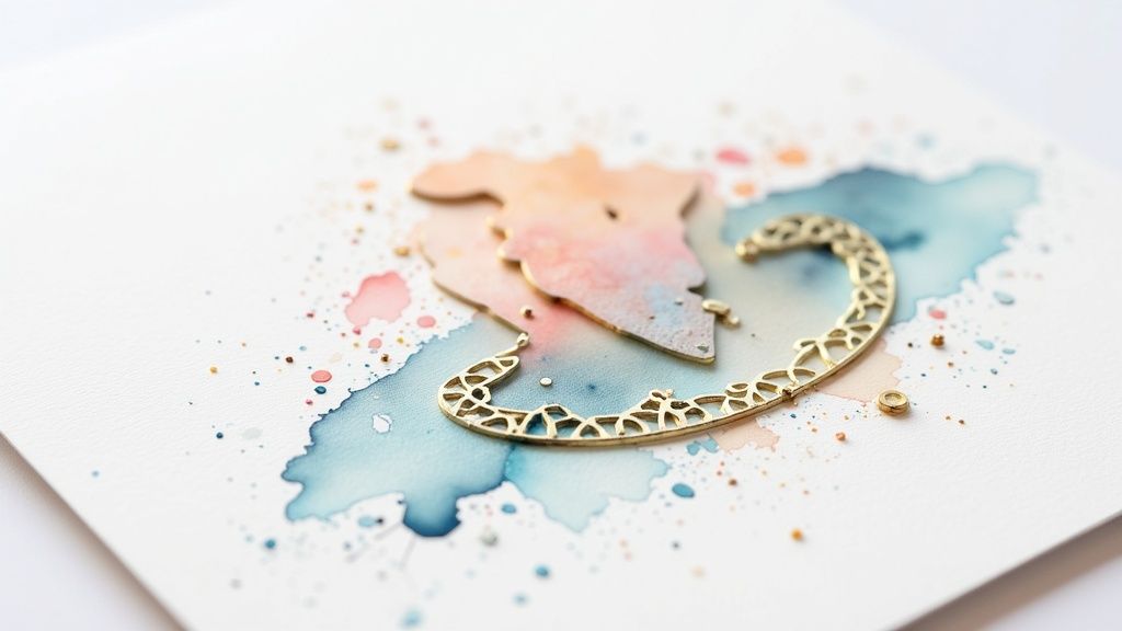 story
story How Does Embossing Work? A Guide to 3D Textures
Ever wondered how that raised lettering on a wedding invitation or a fancy business card is made? That's the magic of embossing, and it works like a high-tech, incredibly precise stamp. At its core, embossing is a physical process that reshapes a material —like paper or cardstock—using specialized metal plates and intense pressure to create a stunning three-dimensional effect. How Embossing Creates Tactile Designs Think of it like making a detailed impression in clay, but with paper. The entire process hinges on a pair of custom-milled metal plates, known as dies, to achieve its signature raised texture. It's a beautifully simple concept executed with incredible precision. A sheet of paper is carefully positioned between these two dies inside a press. One die features a raised version of the design ( the male die ), while the other has a matching recessed impression ( the female die ). When the press applies force, the male die powerfully pushes the paper’s fibers straight into the female die’s cavity. This action permanently molds the paper, creating a tangible design that literally stands out from the surface. The result is a sophisticated, touchable texture that adds a layer of quality and professionalism ink alone just can't match. The Core Components of the Embossing Process To really get a feel for how embossing comes to life, it helps to look at the key players involved. Each part has a critical job in producing a clean, crisp, and lasting impression. Here’s a quick breakdown of what makes it all happen. Component Function in the Embossing Process Male Die A metal plate with a raised (convex) version of the desired design. It pushes into the material. Female Die (Counter-die) A metal plate with a recessed (concave) version of the design. It receives the material as it's pressed. Substrate The material being embossed, most commonly paper, cardstock, or leather. Its properties affect the final look. Press The machine that applies controlled pressure, squeezing the substrate between the two dies to create the impression. Each of these elements works in concert to produce that premium, tactile feel. This method gives a high-end touch to everything from luxury packaging to formal stationery. It’s no surprise that the demand for such quality is on the rise; the global automatic embossing press market was valued at USD 1.8 billion in 2023 and is projected to keep growing. By the way, the opposite of this process is known as debossing. It creates a design that’s pressed down into the material instead of being raised from it. You can explore the differences and learn more about debossing techniques on our blog . The Tools and Machinery Behind the Texture To really get how embossing works, you have to look at the specialized hardware that brings these textured designs to life. The whole effect starts with embossing dies , which are custom-etched metal plates that act as a precision mold for paper or other materials. The easiest way to think about these dies is as a perfectly matched puzzle pair. The male die has the raised, or convex, part of your design. Its partner, the female die (sometimes called a counter-die), holds the recessed, or concave, version. During the embossing process, the paper is literally sandwiched between them. Getting their alignment just right is absolutely critical for a sharp, clean impression. The Foundation: Dies and Materials The quality of the final embossed design is directly tied to the dies that create it. These aren’t just any old metal plates; they’re typically crafted from very specific materials chosen for their durability and how well they can hold fine detail. Brass Dies: Brass is the top-of-the-line choice. It's incredibly hard and durable, making it perfect for long production runs, super intricate designs, and any job that requires heat, since it conducts temperature so evenly. Magnesium Dies: As a more cost-effective and lighter option, magnesium is a fantastic pick for shorter runs and simpler designs. It’s also easier to etch, which makes it a go-to for projects that need a quick turnaround. The way these plates are made is a fascinating craft in its own right. It’s a process closely related to other precise finishing methods. You can get a better sense of how custom shapes are created by exploring the world of custom die-cutting services . From Hand-Cranked to High-Volume Presses Once the dies are ready, they get mounted into an embossing press. The type of machine used really depends on the scale of the job, with options ranging from small-scale crafting setups to massive commercial production lines. Hand-operated presses are great for artists, crafters, or small stationery projects. They give you total hands-on control but are naturally limited in their speed and the amount of pressure they can apply. On the complete other end of the spectrum, you have automated industrial presses . These are powerful machines that can exert tons of force, process thousands of sheets an hour, and often integrate heat to create deeper, more permanent impressions on tougher materials. This huge range of equipment really shows how versatile embossing is, serving everyone from niche artisans to global brands. The embossing equipment market itself is proof of this, valued at an incredible USD 81.51 billion in 2023. This number highlights the massive demand for custom, textured finishes in packaging, print, and beyond. You can dive deeper into these market trends and insights at Wise Guy Reports . At the end of the day, whether it’s done by hand or by a fully automated system, the basic principle is the same. It’s all about applying the right amount of controlled pressure to reshape the material and create a design you can not only see but also feel. Common Embossing Techniques and Styles Embossing isn’t just one trick—it’s a whole family of techniques, each with its own personality and feel. Getting to know these different styles is the key to picking the perfect finish, whether you’re creating an elegant wedding invitation or high-impact business collateral. The most direct approach is single-level embossing . This creates a design where every raised part sits on the same plane, giving you a clean and uniform texture. Just imagine a simple, bold logo standing out consistently across a business card. For designs that need more flair, printers turn to multi-level embossing . This method uses a more intricate, sculpted die that pushes different parts of the design up to various heights. The outcome is a stunning 3D effect with real depth and detail, making it perfect for complex images like a floral pattern or an ornate family crest. Key Styles And Their Unique Aesthetics Beyond just how high the design is raised, a few distinct styles really define the final look. Each one has a different job, from quiet elegance to bold, attention-grabbing shine. Blind Embossing: This is probably the most sophisticated style of them all. It’s all about pressing a design into paper without any ink or foil. The magic is in the texture alone—the way light and shadow dance across the raised surface creates a subtle, timeless look. Debossing: As the name suggests, this is the complete opposite of embossing. Instead of raising the design, debossing presses it down into the stock, creating an indentation. It gives a distinct, sunken-in feel that can be just as striking, often used for a classic, letterpress-style effect. Combination Stamping: Also known as foil embossing, this powerful technique pulls double duty. It applies shimmering metallic foil and embosses the design in a single pass of the press. The result is a raised, brilliant finish that demands attention and adds a sense of luxury to any piece. These methods are the building blocks for creating print that people want to hold onto. Diving into a wide range of options, like those in a specialty printing collection , can be a great way to find inspiration for your next project. Embossing vs Debossing A Quick Comparison While they’re two sides of the same coin, knowing the difference between embossing and its counterpart, debossing, is essential for getting the exact finish you envision. Here's a quick rundown to make it clear. Feature Embossing Debossing Design Effect The design is raised up from the surface of the material. The design is indented or sunken into the material. Visual Feel Creates a 3D, pop-out effect that catches the light. Produces a subtle, letterpress-style recess. Reverse Side Leaves an indented (debossed) impression on the back. Leaves a raised (embossed) impression on the back. Common Use Logos, monograms, formal invitations, premium packaging. Stationery, leather goods, minimalist designs. By getting a handle on these techniques, you can better explain your vision and choose a style that truly elevates your design. It's how you turn a simple piece of paper into a memorable tactile experience. Choosing the Right Materials for a Perfect Impression The quality of your embossed design hinges just as much on the material you choose as it does on the machinery or technique. Think of your substrate as the canvas for the final texture; its unique properties will either create a crisp, deep impression or cause the whole thing to fail. The wrong material can lead to cracking, tearing, or a faint design that completely lacks impact. Paper and cardstock are the classic choices for a reason. Their fibrous nature is practically built for being reshaped under pressure. But not all papers are created equal. The two most important factors to keep in mind are weight and fiber content. As a rule, heavier paper stocks are a better bet because they have enough body to hold a deep impression without showing stress or tearing on the other side. In the same way, papers with longer fibers provide more flexibility , allowing the material to stretch and mold into the die rather than breaking. This is a big reason why uncoated stocks often produce far superior results. Coated, glossy papers have a smooth, sealed surface that can easily crack under the intense pressure of embossing, which ruins the clean finish you’re going for. Paper Properties for Optimal Results For projects where the feel is just as important as the look—like custom greeting cards or high-end business stationery—picking the right paper is everything. Here are the key characteristics you should be looking for: Weight (GSM/Cover): Heavier stocks, like 100 lb. cover or higher, are robust enough to prevent the debossed side (the indent on the back) from showing through too prominently. Finish: Uncoated papers have a natural, porous surface that takes an embossed impression beautifully, creating a rich, tactile feel you can’t get with coated stocks. Fiber Content: Papers made from cotton or other long-fiber pulps offer the best malleability, which is exactly what you need for deep, finely detailed impressions. Understanding these details is what separates good print from great print. When you're designing something personal, the paper choice directly shapes the final aesthetic and feel. You can see some fantastic examples of how materials impact the final product by exploring different options for custom greeting cards. Beyond Traditional Paper While paper is easily the most common material, embossing is a versatile technique that can be applied to a whole range of other substrates. The process is just adapted to suit the unique properties of each one. For example, leather goods are frequently embossed using heat, which creates a permanent, branded mark sometimes known as blind stamping. You can even emboss thin sheets of metal. This is a more industrial application that uses powerful stamping technology on materials like aluminum, brass, and steel to create product tags, nameplates, and decorative panels. The global market for metal embossing machines is massive, and it's projected to hit around USD 67.34 billion by 2028 . This growth is really being driven by its use in branding and industrial parts across the automotive and construction industries. You can dive deeper into these market trends on Data Bridge Market Research . The Embossing Process: From Design to Final Product Ever wonder how a flat, ordinary piece of paper becomes a stunning, textured masterpiece? The journey from a simple design to a finished embossed product is a fascinating blend of artistic vision and technical skill. Let’s pull back the curtain and look at the craftsmanship behind every raised detail. It all starts well before anything hits the press. The first step is what we call design translation . This is where a digital artwork file is turned into a physical tool. A specialized manufacturer meticulously etches the design onto metal plates, creating a matched set of male and female dies. These two pieces will work together to press the design into the paper. The complexity of the artwork—whether it's simple text or an intricate logo—determines the time and skill needed for this crucial first stage. From Preparation to Press With the dies made, the action moves to the production floor. First, the material (or substrate) is chosen and prepped. Then comes one of the most critical parts of the whole process: machine calibration . The press operator has to painstakingly align the male and female dies so they meet perfectly. Even a hairline of misalignment can create a blurry, weak impression and ruin the entire effect. Once everything is perfectly aligned, the press run can begin. This is where the magic really happens. Material Feeding: Sheets of paper or cardstock are fed into the press, positioned just right between the open dies. Impression: The press applies a precise amount of force, squeezing the material between the dies. Often, heat is used along with the pressure to help soften the paper fibers, which allows for a much deeper and more permanent impression. Release: The press opens, and the freshly embossed sheet is ejected, making way for the next one. This can be a methodical, single-sheet process or a high-speed run pumping out thousands of impressions an hour on industrial machines. The infographic below gives a great visual of the core actions—stamping, applying powder, and heating—which is a common method for smaller-scale, craft-level heat embossing. While this image shows a simplified workflow for heat embossing, the fundamental idea of using pressure to create a raised design is the same across all professional embossing methods. Ensuring a Perfect Finish The job isn't done when the press stops. The final, and arguably most important, stage is rigorous quality control . Every single piece is inspected for even the smallest flaws. Quality checks are non-negotiable. Inspectors are trained to spot common issues like "bruising" (a faint halo around the design), "cracking" (when the paper fibers actually break), or registration errors where the emboss doesn't line up perfectly with any printed ink. This meticulous attention to detail ensures that every item, from a wedding invitation to a product box, meets the highest possible standard. It’s this level of care that gives products like professionally embossed custom business card printing their premium, unforgettable feel. Only after passing this final inspection is the product considered complete—a successful transformation from a simple design into a tactile experience that people remember. Got Questions About Embossing? We’ve Got Answers. Once you start exploring what embossing can do, a few questions almost always pop up. Getting these cleared up from the get-go is key to planning your projects well and talking shop with your printer. Let's tackle some of the most common points of confusion. One of the biggest mix-ups? Embossing versus foil stamping. Here’s the simple difference: embossing physically reshapes the paper , creating a raised, three-dimensional texture you can feel. Foil stamping, on the other hand, is all about the shine—it applies a thin layer of metallic or colored foil onto the paper’s surface using heat and pressure, but it doesn't alter the paper's shape. Of course, you don’t have to choose. The two can be combined in a technique called foil embossing. This gives you a raised design with a brilliant, metallic finish, delivering the best of both worlds. Can Any Design Be Embossed? While it’s an incredibly versatile technique, embossing does have its limits. Not every design is a great candidate. Designs with extremely fine lines, tiny text, or overly busy patterns often lose their definition when pressed into paper. The details can get muddy or just fail to stand out. What works best? Bold shapes, clean lines, and simpler graphics. These elements produce the most striking and effective results. A good rule of thumb is that if a design feels too crowded on your screen, it will likely struggle to translate well into a physical emboss. It’s always smart to run your artwork by your printer to make sure it’s a good fit for the technique. Does Embossing Show Through on the Back? Yes, a standard emboss will always leave a reversed, indented impression on the back of the paper. This isn't a flaw; it's just a natural part of how the process works. The male die pushes the paper into the female die, which inevitably leaves a debossed mark on the reverse side. The good news is that the thickness of the paper stock can dramatically minimize how noticeable this is. For two-sided items like business cards or invitations, designers have a clever workaround: using an extra-thick stock or mounting two embossed sheets together. This creates a flawless, premium finish on both sides. Ready to add a touch of elegance to your next project? The experts at 4OVER4 can help you choose the perfect embossing technique to make your designs stand out. Explore our high-quality custom printing options at https://4over4.com today.
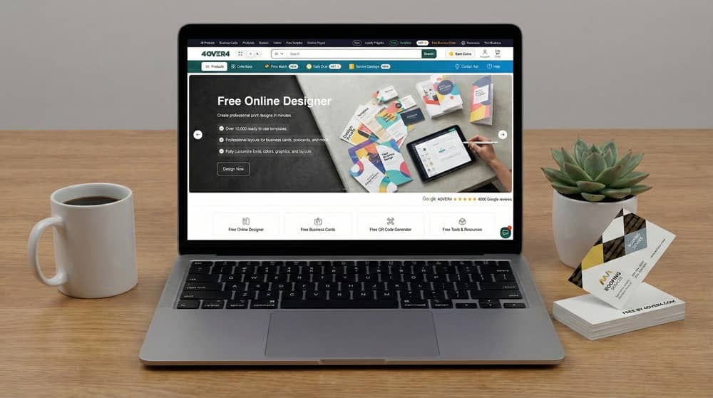 story
story How Free Business Cards Actually Work (Updated for 2026)
How Our Free Business Cards Program Works (Quick Overview) Free business cards are available through two different paths. One option is completely free through our loyalty program. The second option allows people to skip tasks and pay only for shipping. This page explains how the free business cards program works, what is actually free, what changed recently, and how real offers compare to companies that only rank for “free business cards” without printing anything. How It All Started We launched our free business cards program back in 2011. We were the only company in the United States actually offering a program that provided real, printed business cards for free. Not templates. Not paper samples. Real cards with your design, shipped to your door. People thought we were crazy. "You're just gonna give them away? How does that make any money?" We had a theory. If we let people try our printing for free, theyd see the quality. Theyd come back. Theyd tell their friends. And over time, that would build something bigger than any ad campaign could. Turns out we were right. 15 Years and 8.8 Million Cards Later Since 2011, we've given away over 8.8 million free business cards. Thats not a typo. Eight million. We've helped around 45,000 businesses get started: freelancers, small shops, side hustles, startups, people just trying to put themselves out there. For a long time, we were the single real free business cards offer in the entire country. Everyone else was either charging hidden fees or just giving you templates and calling it "free." We built an online designer so people could make their cards from scratch. We added templates. We added the option to upload your own design. About 75% of people going through the free business cards ordering process use our designer; the other 25% bring their own files. And we set up a loyalty program where you could earn coins by doing simple tasks. Collect enough coins, and the program provides access to 200 free business cards with free shipping. Completely free. $0 out of pocket. That system worked great for years. We have almost 5,000 reviews. We've shipped over 40,000 packages. About 40% of people who use the free business cards program come back to buy other stuff: flyers, postcards, banners, whatever they need. TL;DR — Our Free Business Cards by the Numbers: Started: 2011 (first real free business cards offer in the US) Cards given away: ~8.8 million Businesses helped: ~45,000 Customer reviews: ~5,000 Packages shipped: 40,000+ Cards per order: 200 (double what competitors offer) Use our online designer: 75% of free card orders Return to buy more: 40% of customers Logo removal option: $3 (we're the only ones who offer this) Customers who removed logo: ~5,000 Shipping: Free with loyalty program, or $5.99 But then we started hearing something over and over again. The Feedback We Kept Getting "We love that you offer free business cards, but we dont have time to collect coins. Can we just pay for shipping and be done with it?" We heard this dozens of times. Then hundreds. People wanted the free cards, but they didnt want to spend 10 minutes doing tasks. They just wanted to pay a few bucks and get their order. Fair enough. We listened. So we made a change. What We Changed Starting now, you have two ways to get free business cards from us: OPTION 1 Completely Free Use our loyalty program Do a few simple tasks (~10 min) Receive 200 cards + FREE shipping Total cost: $0 Best if you have a few minutes to spare OPTION 2 — NEW! Just Pay Shipping Skip the loyalty program Pick your design and complete checkout We ship 200 cards to you Total cost: $5.99 Best if you just want it done quick View the Free Business Cards Product Page No coins. No points. No games. You choose a design, we print it, and it gets shipped to you. You get the same cards either way. Same quality. Same paper. We dont cheap out on the free ones — we run them through the same printers as our paid orders. The loyalty program still exists if you want to go that route. But now you have a choice. Our Free Business Cards Program — By the Numbers 2011 Year we started 8.8M+ Cards given away 45,000 Businesses helped ~5,000 Customer reviews What About the Logo on the Back? Yeah lets talk about this because people always ask us. Our free cards do have a small 4OVER4 logo on the back. Its pretty subtle — not like a giant ad or anything. Most people dont even notice it. But heres the thing: we're the only free business cards provider that lets you remove it. We call it the "Clean Back Upgrade" — pay $3 and we take the logo off. Done. Three bucks and the back is completely blank, ready for your own design or just left clean. A simple, professional card with nothing on the back except what you put there. Around 5,000 of our customers have done exactly that. They wanted free cards but wanted full control of both sides. We get it. Thats why we offer it. The Other Companies That Actually Give Free Cards Were not the only ones anymore. A couple other companies have started offering free business cards too. Heres how they stack up: Tank Prints They give you 100 cards — half what we offer. No online designer, so you need to bring your own design or figure out Canva. Their logo is stuck on the back permanently — you cant remove it no matter what. Shipping runs around $9.99. InoPrints Same deal — 100 cards, their logo permanently on the back, no way to remove it. No design tools. And heres the kicker: shipping is about $20. Twenty damn dollars. For 100 cards. Both of these are real offers. They exist. But when you compare them to what we offer... 4OVER4 (Us) ⭐ Tank Prints InoPrints How many cards 200 100 100 Started giving free cards 2011 Later Later Customer reviews ~5,000 Way fewer Way fewer Logo on back Removable $3 Clean Back Upgrade Permanent Stuck forever Permanent Stuck forever Logo removal cost $3 Not available Not available Shipping cost Free (with coins) or $5.99 ~$9.99 ~$20 Online designer Full featured None Bring your own None Canva only Total cards given away ~8.8 million Unknown Unknown We started this. We've been doing it longer. We give you more cards. We have better tools. We let you remove the logo. And our shipping is cheaper. Theres a reason we're still the number one in this space. The Fake "Free Business Cards" Flooding Google Now heres the frustrating part. If you search "free business cards" on Google, you'll see a lot of companies ranking for that keyword. But most of them arent actually giving you free business cards. Theyre just gaming the SEO. Heres what theyre actually offering: 🚫 Companies Ranking for "Free Business Cards" That Dont Actually Offer Free Business Cards: Vistaprint — "Free sample kit" which is just paper swatches. Not cards. Just samples of their paper so you can feel the texture. You cant network with paper swatches. Canva — Free templates. Thats it. You design the card for free, then you have to pay someone else to print it. Thats not free business cards — thats free software. Adobe Express — Same thing. Free design tool. No printing. You still gotta find a printer and pay them. Freepik — Free mockups and templates. Design files. No actual cards. Visme — Free card maker. Again, just design. No printing. BrandCrowd — Templates. No printing. Placeit — Mockups. No printing. Zazzle — Shows up for "free" but charges full price for everything. None of these companies will actually print and ship you free business cards. They rank for the keyword because they know people are searching for it. Classic bait and switch SEO. So when youre searching for free business cards, youre wading through a bunch of companies that are just trying to get you on their site. They show up for "free business cards" but then try to sell you something else. The only companies that actually give you real, printed, shipped-to-your-door free business cards are us, Tank Prints, and InoPrints. Thats it. Three companies in the entire country. And out of those three, we've been doing it the longest, we give you the most cards, and we're the only ones who let you remove the logo. How to Choose the Right Free Business Cards Provider If youre looking for free business cards, not all offers are the same. Heres what to look for before you order: Check how many cards you actually get — Some places give you 100, we give you 200. Double the cards for networking, double the value. Make sure they have an online designer — If you dont have your own design ready, you need a way to create one. We have a full designer built in. Tank Prints and InoPrints dont — you gotta figure out Canva yourself. Look at the shipping cost — "Free business cards" isnt really free if shipping is $15. We offer free shipping with our loyalty program, or $5.99 if you just want to pay and skip the tasks. InoPrints charges $15. Tank Prints around $7-8. Can you remove their logo? — Most free card providers stick their logo on the back permanently. We're the only ones who let you remove it ($3 Clean Back Upgrade). If having a clean card matters to you, this is a big deal. Check the reviews — We have almost 5,000 reviews. We've been doing this since 2011. Look for providers with a track record, not random sites that just popped up. Watch out for bait and switch — If a company ranks for "free business cards" but only offers templates or paper samples, thats not free business cards. Thats SEO spam. We actually print and ship cards to you. Quick Tips for Designing Your Card (So It Doesnt End Up in the Trash) Random stat for you: 88% of business cards get thrown away within a week. Thats... a lot. So once you get your free cards, heres how to make sure people actually keep them: Keep it simple — Name, what you do, how to reach you. Maybe your logo. Thats it. Nobody needs your company mission statement crammed onto a tiny card. Make one thing pop — Bold color. Weird texture. A line that sticks in their head. Give them a reason to hold onto it. Use the back — Lot of people leave the back blank. Dont. Put a QR code there, or a short list of what you do, or just a cool design. (And if you got the $3 Clean Back Upgrade from us, you have full control of that space.) Go thicker if you can — 86% of people think thicker cards look more professional. Small thing but it matters. Common Questions We Get Is this actually free? The cards themselves are free. You either earn points for free shipping, or you choose to pay $5.99 for shipping as part of the program. Whats the catch? Theres a small logo on the back. You can pay us $3 to take it off if you want. Thats really the only "catch." How many cards do you give? 200. Most other places give 100. We give double. Can I use my own design? Yep. Upload whatever you want. Or use our free designer to make something from scratch — about 75% of our customers use the designer. How long til they arrive? Usually 5-10 business days. We have faster shipping if you need them but that costs extra. What about Vistaprint? Dont they have free cards? No. They have a free sample kit — paper swatches you can touch. Not business cards you can hand out. Its confusing because they rank for "free business cards" but they dont actually offer that. Classic bait and switch. What about Canva? Canva has free templates. Not free printing. You design the card there for free, then you pay someone else to print it. Thats not free business cards. How long have you been doing this? Since 2011. We were the first company in the US to offer real free business cards. Over 8.8 million cards given away, 45,000 businesses helped. Related Guides About Business Cards How to design cards people don’t throw away Can I print on the back of the free business cards How to create unique business cards for free How to make business cards at home for free Here's the Bottom Line We started giving away free business cards in 2011 when nobody else was doing it. 15 years later, we've given away over 8.8 million cards. We've helped ~45,000 businesses. We've built a designer that 75% of our customers use. We have almost 5,000 reviews. And now, because you asked for it, we've made it even easier. You can still earn coins and get everything completely free. Or you can just pay $5.99 for shipping and skip all that. 200 cards. Real quality. Your design. Small logo on back (or pay us $3 and its gone).
 story
story How to Brand Your Business Like a Pro
So, what does it really mean to brand your business? It’s about figuring out who you are at your core, who you’re talking to, and then showing up consistently everywhere your customers see you. It's a deliberate journey from an internal idea to an external reality, one that builds a name people recognize and trust. Build Your Brand on a Strategic Foundation Before you even think about sketching a logo or picking a color palette, you have to lay the groundwork. It's a common mistake to jump straight into the fun, visual stuff, but truly powerful brands are built on a solid foundation of research and purpose. This isn't just about looking good; it's about creating something meaningful that truly connects with people. Think of your brand as a promise. It’s your way of telling the world who you are, what you believe in, and why you’re the right choice. Nailing this strategy from the start makes every other decision—from marketing to product development—infinitely easier down the road. Pinpoint Your Position in the Market First things first, you need a clear view of the world you’re stepping into. This means doing some serious market research, but not just to see what your competitors are up to. You're on a mission to find a unique, unclaimed spot in the market that your brand can truly own. Look for the gaps. What needs aren't being met? What are customers frustrated with? Instead of just making a list of competitors' features, dig into their brand positioning. What are they promising? Who are they talking to? Your goal is to find a fresh angle that makes you the only logical choice for a specific group of people. Define Your Ideal Customer You can’t be everything to everyone, and trying to is a recipe for a bland, forgettable brand. The most successful brands speak directly to a very specific audience. To do this well, you need to build out a detailed customer persona —a vivid profile of your ideal client, pieced together from real data and research. Don’t just stop at demographics. You need to get inside their head. Motivations: What really drives them? What are they aspiring to? Pain Points: What problems keep them up at night? What frustrations are you solving? Values: What principles guide their decisions? What do they truly care about? Media Habits: Where do they hang out, both online and off? When your persona starts to feel like a real person, crafting a brand they'll love becomes second nature. Every choice gets filtered through a simple question: "What would Sarah think of this?" Key Insight: A brand doesn't live in a PowerPoint deck or a style guide. It lives in the minds of your customers. Your strategy is the blueprint for shaping that perception and building real value from day one. Articulate Your Core Brand Pillars Once you know your market and your customer, it's time to look inward. Your mission, vision, and values are the soul of your brand—they're the non-negotiables. These are the principles that keep you authentic and on track as you grow. Mission Statement: This is your "why." It defines your purpose right now and should be clear and action-oriented. Vision Statement: This is your "what." It paints a picture of the future you’re trying to build. Think bigger, think aspirational. Core Values: These are the "how." They are the 3-5 core beliefs that guide every action, decision, and hire you make. These aren't just fluffy statements for your website's "About Us" page; they're your brand's compass. To see how these pieces come together, especially in a B2B context, check out this fantastic guide on a modern B2B brand strategy . This foundational work is what ultimately fuels powerful brand awareness and forges connections that go beyond a simple transaction. Craft a Memorable Brand Identity Now that you've done the heavy lifting on strategy, it's time for the fun part: giving your brand a face and a voice. This is where all those abstract ideas about your mission, values, and ideal customer get translated into the tangible things people will actually see, touch, and—if we do this right—remember. Your brand identity is the complete visual and verbal system that communicates who you are in a heartbeat. It’s about taking your brand’s soul and turning it into a look and feel that truly connects. When every element works in harmony, your identity tells your story without you ever having to say a word. Brainstorm a Name That Sticks Your brand name is your first handshake. It needs to be memorable, easy to say, and hint at what you offer without boxing you in for the future. You can go for something evocative, like Patagonia (it just sounds like adventure, doesn't it?), or something more direct and descriptive, like The Container Store. As you start brainstorming, keep these practical points in mind: Availability: Before you fall in love with a name, check if the domain and social media handles are free. A quick search now will save you a world of pain later. Memorability: Can people spell it after hearing it once? Is it easy to recall? Anything too complex or awkwardly spelled creates an unnecessary barrier. Meaning: Does the name feel authentic to your brand's core mission? It should sound like it belongs to you. Don't just grab the first idea that comes to mind. Make a long list, say the names out loud, and run them by people you trust. This name is going to be with you for a long, long time, so choose wisely. Design a Versatile and Timeless Logo Think of your logo as the visual cornerstone of your entire brand. It’s so much more than a pretty graphic; it’s a hard-working symbol that has to be clear and effective everywhere. A truly great logo is distinctive, simple, and incredibly versatile. It needs to look just as sharp on a tiny app icon as it does blown up on a billboard. Just look at the most iconic logos out there—Nike’s swoosh or Apple’s bitten apple. They are stunningly simple yet instantly recognizable. That’s the goal. Resist the temptation to chase the latest design trend that will feel dated in a year. Focus on creating a mark that is timeless and perfectly captures the essence of your brand. It should be a visual shortcut to everything you stand for. A strong visual identity is non-negotiable for building trust. Consider this: 81% of consumers say they need to trust a brand before buying from them, and research shows that 55% of first impressions are purely visual. Your logo and colors are doing the heavy lifting from the very first glance. You can dig deeper into how visuals influence consumer trust on ExplodingTopics.com . Choose Your Colors and Fonts Deliberately Color is a shortcut to emotion. The palette you choose will immediately trigger feelings and associations in your audience. For example, blue often communicates stability and trust, while green can bring to mind nature, health, and growth. Your palette should have a couple of primary colors and a few secondary, accent colors to give you flexibility across different designs. In the same way, typography—the fonts you use—gives your brand its unique voice. Is it classic and reliable? A serif font might work well. Modern and clean? A sans-serif is probably a better fit. The key is to choose one or two font families that are highly legible and genuinely reflect your brand's personality. These aren't just decorative choices; they are strategic decisions that complete your visual identity. This system is what makes every single marketing piece, from your website to your printed materials, feel like it came from the same place. For instance, when you're ready to create high-quality custom business cards, having these colors and fonts defined is what will ensure they make a professional and lasting impression. Consistency is what builds recognition. Develop Your Authentic Brand Voice What your brand says is just as important as how it looks. Once you've nailed down your visual identity, the next piece of the puzzle is finding your authentic voice. Think of it as your brand's personality—and keeping it consistent is what builds real, lasting trust with your audience. So, who are you? Are you the witty friend who breaks the ice with a clever joke? The seasoned expert who delivers clear, no-nonsense advice? Or maybe the inspirational coach who motivates people to chase their dreams? The goal is to move past generic corporate speak and land on a voice that feels genuine. When you get this right, your brand stops feeling like a faceless company and starts feeling like a trusted friend. Establish Your Core Messaging Pillars Before you even think about writing a single line of copy, you need to lock in your messaging pillars. These are the 3-4 foundational themes your brand will talk about, time and time again. They’re the big ideas that tie directly back to your mission, your values, and what makes your product or service special. Think of these pillars as the guardrails for all your content. For instance, a sustainable coffee brand might build its messaging around: Ethical Sourcing: Telling the human stories behind their partner farms and fair-trade practices. Artisanal Quality: Diving deep into the craft of roasting and the unique flavor notes of their beans. Community Impact: Showing exactly how each purchase helps fund local projects and protect the environment. Every blog post, social media update, and email should echo at least one of these pillars. This creates a clear, cohesive story that people can actually follow and remember. A consistent brand presentation across all platforms can increase revenue by up to 23% . Your brand voice is a massive part of that consistency, directly impacting how customers perceive and value what you offer. Craft a Compelling Value Proposition Your value proposition has one job: to answer your customer’s unspoken question, "Why should I choose you over everyone else?" It needs to be a clear, concise statement that communicates the unique benefit you deliver. This isn't just a catchy slogan; it’s a promise of the value you’re going to provide. A powerful value proposition is specific, focused on a customer’s pain point, and makes your unique selling point impossible to ignore. For example, instead of a bland statement like, "We sell high-quality shoes," a much stronger value proposition would be, "The only dress shoe engineered for 18-hour comfort, so you can go from the boardroom to dinner without the pain." It hits a specific problem and offers an immediate, tangible solution. Defining your voice can feel abstract, which is where archetypes come in handy. They provide a framework to help you understand the emotional connection you want to build. Finding Your Brand Voice with Archetypes This table breaks down a few common brand archetypes. See which one resonates most with your brand's core desire and how that might translate into your communication style. Archetype Core Desire Communication Style Example Brands The Sage To find the truth Wise, factual, and informative. Uses data and expertise. Google, The Wall Street Journal The Jester To live in the moment with full enjoyment Playful, witty, and humorous. Uses jokes and lighthearted fun. M&M's, Old Spice The Caregiver To protect and care for others Nurturing, supportive, and reassuring. Focuses on empathy. Johnson & Johnson, Dove The Hero To prove one's worth through courageous acts Bold, confident, and inspiring. Motivates and empowers. Nike, FedEx The Everyman To belong and connect with others Friendly, relatable, and down-to-earth. Avoids pretense. IKEA, Target Using an archetype as a starting point gives you a clear direction for your tone, word choice, and overall personality, making it easier to maintain consistency. This image shows just how much word choice and tone can shift perception between a friendly and an authoritative voice. As you can see, the friendly voice uses warmer, more concise language, while the authoritative voice leans into formal phrasing and more detail to establish credibility. Apply Your Voice Everywhere This is where the magic happens—and also where so many businesses drop the ball. Your brand voice needs to show up at every single customer touchpoint to create a seamless experience. It’s jarring to see a brand with a fun, witty voice on social media send robotic, formal customer service emails. Make a checklist and be ruthless about consistency. Your voice needs to be present in: Website Copy: From your homepage headline all the way down to your FAQ page. Social Media: Every caption, reply, and direct message should sound like you. Email Marketing: Newsletters, promotions, and even automated password reset emails. Printed Materials: Your brand's personality should shine through even on official documents. For instance, maintaining your voice on professional letterheads for printing reinforces your identity in even the most formal communications. Customer Support: How your team answers the phone or responds in a live chat. When you apply your voice consistently, you build familiarity. People know what to expect. That predictability builds trust, turning one-time buyers into loyal advocates who feel a genuine connection to who you are and what you stand for. Implement Your Brand Across Every Touchpoint All that hard work developing a brand strategy is just theory until you put it into practice. The real magic happens when you apply that identity to every single place a customer interacts with you. This is where the rubber meets the road. Every email, every social post, every box you ship is an opportunity to reinforce who you are. Any inconsistency, no matter how small, can chip away at the trust and recognition you've worked so hard to build. Let's walk through how to roll out your brand cohesively so nothing gets missed. First Things First: Your Brand Style Guide Before you touch a single asset, you need to build your brand’s "bible"—the brand style guide . This isn't just a nice-to-have document; it's the most critical tool for keeping your brand consistent, especially as your team grows or you bring on outside help. Think of it as the ultimate rulebook. A great style guide gives anyone, from a new marketing hire to a freelance designer, the exact instructions they need to represent your brand perfectly every time. It’s what keeps everyone on the same page. Make sure your guide clearly outlines: Logo Do's and Don'ts: Specify how and where your logo can be used. Include rules for minimum size, clear space, and, just as importantly, what not to do with it (like stretching, re-coloring, or altering it). Your Color Palette: Define your primary and secondary colors with their exact hex codes, RGB, and CMYK values. This ensures color accuracy whether it’s on a screen or on a printed brochure. Typography System: Lay out the fonts for headlines, body copy, and captions. Include specific weights and sizing guidelines to create a clear visual hierarchy. Brand Voice and Tone: Show, don't just tell. Provide real examples of your brand’s communication style, including key messages and words to use or avoid. Imagery Guidelines: Define the look and feel of your photography and illustrations. Is it bright and airy? Gritty and authentic? Your guide should make it clear. A style guide is your brand's single source of truth. It's what empowers your entire organization to be brand ambassadors, ensuring every customer interaction, big or small, reinforces who you are. Audit and Update Every Touchpoint With your style guide in hand, it's time to take stock of everything that carries your brand's name. The best way to start is with a comprehensive audit, sorting all your materials into two buckets: digital and physical. Your Digital Presence This is where many first impressions happen. Go through your digital assets with a fine-tooth comb. Website: Your website is your digital flagship. Every page, button, and form needs to be on-brand. Social Media Profiles: Update your profile pictures, cover photos, and bios across all your channels. It's a quick fix that makes a big impact. Email Signatures: Don't overlook this one. Standardizing email signatures for the entire team creates a clean, professional, and unified front in every single communication. Email Marketing: Your newsletters and automated email flows should be completely redesigned to reflect the new branding. For bringing your visual identity to life online, tools like Framer's design and prototyping platform can be incredibly helpful for designing and launching a cohesive website and other digital experiences. Your Physical Footprint Tangible items have a unique power to make your brand feel real and substantial. Business Cards & Stationery: Often the first physical piece of your brand someone holds. Make it count. Packaging: Your product’s packaging is a powerful marketing tool. It should feel like a natural extension of your brand story. In-Store Signage: If you have a brick-and-mortar location, the physical space is the brand experience. Signage, displays, and decor must all align. Marketing Materials: Every flyer, brochure, and trade show banner needs to be perfectly in sync. Bringing this identity to life across a wide range of printed marketing materials is how you build a tangible connection with your audience. High-quality, consistent print work reinforces the credibility you've carefully crafted. This isn't just about looking good; it's about driving growth. Statistics show that companies with strong, globally recognized brands grow 24% faster than their competitors. That success is built on consistency, with 82% of global marketers agreeing that localizing brand campaigns is vital for market success. A brand launch should feel intentional and coordinated. When you meticulously apply your brand identity across every asset—guided by a clear style guide—you build the kind of recognition and trust that turns casual onlookers into loyal fans. Grow Your Brand Equity and Customer Loyalty Getting your brand out the door is just the starting line. The real marathon begins now, and it’s all about turning your brand from a name and a logo into your company’s most valuable asset. This is where we talk about building brand equity . Strong brand equity isn't something that just happens. It's earned through consistency, exceptional customer experiences, and a genuine connection with your audience. When you get this right, amazing things start to happen. Customers are willing to pay more, they stick with you even when a competitor dangles a discount, and they’ll eagerly try your next product just because it has your name on it. That's the power of trust. Tune In to Your Audience You can’t improve what you don’t understand. To really build brand equity, you have to know how people actually see you, not just how you want them to see you. That means setting up systems to listen—really listen—to your audience. You need to keep a finger on the pulse of what people are saying, both to you and about you. This involves tracking a mix of hard numbers and human stories. The Numbers (Quantitative): This is your high-level dashboard. Keep an eye on your Net Promoter Score (NPS), customer satisfaction (CSAT) scores, and how often customers come back to buy again. These metrics give you a quick health check. The Stories (Qualitative): This is where the magic is. Dive into social media comments, online reviews, and customer support emails. What words do people use to describe you? What’s the one frustrating thing that keeps popping up? This is the "why" behind the numbers. This feedback loop—listening, analyzing, and then acting—is what separates brands that grow from those that guess. Build a Thriving Community The most powerful brands don’t just have customers; they have communities. We're talking about people who feel a real sense of belonging and are excited to engage with the brand and with each other. Cultivating this transforms people from passive buyers into passionate participants. Creating this kind of space is about more than just making a sale. It’s about adding value to their lives. Create Content That Serves: Your content should be for them , not just for you. Think helpful tutorials, fun behind-the-scenes glimpses, or campaigns that feature your own users and make them the heroes of the story. Deliver Memorable Experiences: Every single interaction is a chance to build your brand. The way you answer a DM, how you handle a return, the unboxing experience—it all matters. One surprisingly positive moment can create a fan for life. A big part of building equity is simply being seen and trusted. This is where you can use smart SEO strategies to build brand authority , making sure your helpful content actually finds the people who need it. Key Takeaway: Brand equity is the grand total of every experience a person has with you. It’s built one small moment at a time—a helpful blog post, a friendly chat with support, a beautifully packaged product—that all add up to create unshakable trust. Turn Customers into Your Biggest Fans Ultimately, the goal is to turn your customers into your best marketing team. An advocate is so much more than a repeat buyer. They are a true fan who goes out of their way to tell others about you. They leave glowing reviews without being prompted, recommend you to their friends, and even defend you online. You earn this level of devotion through consistent, positive reinforcement. A fantastic way to do this is by creating programs that recognize and reward your best customers. Having a solid plan for building powerful customer loyalty gives you a structured way to systematically turn happy buyers into passionate evangelists for your brand. This creates a self-perpetuating cycle of growth. The financial impact here is massive. By 2025 , the total value of the Top 100 global brands soared to a record $10.7 trillion . This staggering number proves the immense financial power of a beloved brand. Much of this value was built by companies that master the art of customer relationships and equity. You can see more of these global brand trends on Kantar.com . Think of your brand as a living asset. By constantly listening, engaging, and delivering real value, you’ll cultivate the kind of deep-seated loyalty that not only secures your spot in the market but also turns your customers into your greatest champions. Common Questions About Branding a Business Even with a solid plan, jumping into the world of branding can feel a bit overwhelming. Let's tackle some of the most common questions I hear from business owners. Getting these answers straight will help you move forward with confidence and make smarter moves right from the get-go. How Much Should a Small Business Budget for Branding? This is the big one, isn't it? The honest answer is: it varies wildly. You could spend a few hundred dollars on DIY tools or tens of thousands for a full-service agency. For most small businesses looking to hire a good freelancer or a small studio, a realistic budget typically falls somewhere between $3,000 and $15,000 . So, what does that kind of money usually get you? Brand Strategy Session: This is the critical discovery phase where you nail down your mission, target audience, and how you fit into the market. Logo Design Suite: Not just one logo, but a whole family of them—primary, secondary, and submarks for different applications. Basic Style Guide: A rulebook that spells out how to use your colors, fonts, and logos correctly. Key Asset Templates: Think business card designs, social media post templates, or a letterhead. It’s tempting to see this as just another expense, but it's truly an investment in your company's future. If your budget is tight, focus every penny on getting the strategy and logo right. Those two pieces are the absolute foundation of everything else. Can I Rebrand My Business If I Get It Wrong? Absolutely. But let me be clear: a rebrand is a major undertaking, not a quick fix. If you're not careful, it can confuse your loyal customers and erase all the hard-earned recognition you've built up. This is precisely why it pays to put in the deep work upfront. That said, businesses change. A rebrand isn't just appropriate but necessary when: Your entire business model has shifted. You're aiming to capture a completely new market segment. Your branding just feels dated and doesn't reflect the company you are today. If you do decide to rebrand, you need a rock-solid strategy. The most important part is communicating why you're making the change. Be transparent. Share the journey with your existing customers to keep their trust and, hopefully, get them excited for what’s next. Key Insight: The most vital part of branding isn't your logo or your company name—it's consistency . A gorgeous logo means nothing if your website is a mess or your customer service is off-brand. Consistency is the glue that makes people trust you. What Is the Single Most Important Part of Branding? People often think it's the logo, but the real hero of any strong brand is consistency . It’s the relentless commitment to showing up as the same brand, everywhere your customers interact with you. Consistency is what builds recognition over time, which eventually blossoms into trust. It means your visuals, your tone of voice, and the actual experience customers have with you all need to sing the same song. This perfect alignment is what turns a random assortment of marketing materials into a brand that people remember and rely on. When every single touchpoint reinforces the same core feeling, your brand becomes a dependable and authentic presence in your customers' lives. Ready to bring your brand to life with professional, high-quality printed materials? From business cards to marketing brochures, 4OVER4 has everything you need to make a lasting impression. Explore our vast selection of customizable printing solutions at 4over4.com.
 story
story How to Build Brand Awareness from Scratch
Building brand awareness is about making your name stick in people’s minds. It sets the stage for every campaign that follows, whether it’s a flashy ad or a detailed guide. Show up consistently, tell your story with authenticity, and earn trust one interaction at a time. Why Brand Awareness Is Your Ultimate Growth Engine Forget the buzzwords. Recognizing a brand goes beyond a cool logo or slogan—it’s the bedrock of steady growth. People tend to stick with names they know, even if there’s a cheaper option next door. Think about your last coffee run. Most of us head straight for a familiar cup. That split-second choice? It’s brand awareness in action. Turning Recognition Into Revenue When your audience already knows who you are, every marketing dollar stretches further. Brand awareness isn’t just a vanity metric; it’s a real asset that can boost sales and lift company value. In fact, the 2025 Kantar BrandZ report pegs the world’s top 100 brands at $10.7 trillion , with Apple alone at $1.3 trillion . Even newer players like Nvidia and Spotify saw their values jump by over 100% . Discover more insights from the 2025 Kantar BrandZ report When you invest in awareness, you're not just buying ads; you're building a mental footprint in the minds of your customers. This footprint creates preference, commands loyalty, and ultimately drives sales without you having to fight for every single click. The Ripple Effect Of A Strong Brand A well-known name does more than lift revenue. It turns customers into advocates and gives you a cushion when things don’t go perfectly. Key benefits include: Improved Marketing Efficiency: Ads resonate more with audiences who already recognize you Higher Customer Loyalty: Familiar faces build trust, leading to repeat business Attraction Of Top Talent: A respected brand naturally draws skilled professionals Building brand awareness is a marathon, not a sprint. Invest in that initial spark, and you’ll create a thriving, go-to presence in your industry. Defining Your Unforgettable Brand Identity Before you can show the world who you are, you have to know it yourself. This is the bedrock of any solid brand awareness strategy. Without a clear identity, your marketing efforts will feel disconnected and, frankly, they just won't work. Think of your brand as a person. What does it believe in? How does it talk? What makes it stand out in a crowd? Nailing down the answers to these questions is the first real step to building a presence people remember. Pinpoint Your Mission And Core Values First things first: what's your "why?" Your mission is the reason you exist beyond just turning a profit. Your values are the principles that guide every decision you make. These two things are the heart and soul of your brand. For instance, a local coffee shop’s mission might be "to create a welcoming space for community connection." Their values could be sustainability, quality craftsmanship, and inclusivity. This isn't just corporate jargon; it drives everything they do, from how they source their beans to what they post on Instagram. On the other hand, a B2B software company might have a mission to "simplify complex data for growing businesses," with values like efficiency, reliability, and customer success. This identity shapes their product roadmap, their support style, and the kind of content they create. To get to the core of your own brand, ask yourself: What problem are we genuinely solving for our customers? What impact do we want to make in our industry or community? What are the non-negotiable principles that steer our business? Craft A Unique Brand Voice And Personality Once you know what you stand for, you can figure out how you'll say it. Your brand voice is the specific tone you use across all your communications, whether it's on your website or in a quick tweet. It’s how your brand’s personality comes to life. Are you the witty expert? The friendly, approachable guide? Or the formal, trusted authority? A consistent voice is what builds familiarity and trust over time. In fact, consistent brand presentation has been shown to increase revenue by 33% . Your brand's voice has to be authentic to your values and connect with your target audience. Trying to be something you're not is a fast track to losing credibility. The goal is a personality that people feel they know and can count on. This consistency is non-negotiable. Imagine if that quirky, friendly coffee shop suddenly started sending out stuffy, corporate-sounding emails. It would feel completely off and break the trust they’ve worked to build. Develop A Cohesive Visual Style Long before they read a single word, people see your visuals. Your logo, colors, fonts, and images all team up to create an instant impression. A powerful visual identity makes your brand recognizable in a split second, whether it’s on a billboard or a social media feed. Think about the iconic Tiffany Blue box or the simple, clean aesthetic of Apple. These visual cues are so strong they communicate the brand’s entire vibe without any text at all. Your visual style needs to be a direct reflection of your brand’s personality and values. This is where brand guidelines become absolutely essential. You can learn how to create comprehensive brand guidelines to keep everyone on the same page. This document is your rulebook, ensuring that every single creative asset—from a business card to a website banner—is reinforcing the same, unified identity. By getting this foundation right, you’re setting the stage for a brand awareness strategy that is coherent, memorable, and built to last. Building Your Omnichannel Awareness Plan Once you’ve nailed down your brand identity, the real work begins: getting noticed. An omnichannel plan isn't about shouting from every rooftop; it's about being in the right places at the right times, creating a seamless experience for your audience, whether they stumble upon you online or in the real world. This is where your digital strategy shake hands with your physical marketing. The ultimate goal? To make your brand feel familiar and reliable, no matter where a customer bumps into it. A well-designed postcard can be a fantastic driver of website traffic, just as a sharp social media ad can pack the house for a local event. Unifying Digital and Physical Touchpoints The most effective awareness strategies simply erase the line between the online and offline worlds. Your audience moves fluidly from their phone to a storefront, and your brand needs to do the same. This creates a cohesive story that constantly reminds them of who you are. Think about a local clothing boutique. They could put QR codes on their in-store price tags. A quick scan could take a shopper to a page showing three different ways to style that exact item, featuring photos from other customers on Instagram. It’s a simple touch, but it brilliantly connects a physical shopping trip to the brand's vibrant online community. Or consider a B2B company at a trade show. Instead of just handing out flyers that will end up in the trash, they can use their booth to sign people up for an exclusive webinar. After the event, they can send a personalized LinkedIn message, followed by a beautifully printed recap of the show's key insights. Every touchpoint builds on the last, creating a layered impression that’s hard to forget. The real magic of an omnichannel approach is in the connections. It’s not about running a print campaign and a digital campaign in separate silos. It’s about designing them to feed each other, creating a brand experience that's far greater than the sum of its parts. This integrated method is crucial for getting your brand to stick. It’s a well-known marketing truth that brands need at least 6 to 7 impressions before a consumer even starts to recognize them. Social media is a huge piece of this puzzle, as 77% of consumers say they prefer buying from brands they follow. You can dig deeper into the power of repeated touchpoints with these branding statistics on shapo.io . To help you visualize how these different channels work together, here’s a quick comparison of some common tactics. Digital vs. Print Awareness Tactics: A Strategic Comparison This table breaks down some popular digital and print tactics, showing where each one shines and how you can measure its success. Tactic Primary Goal Best For Audience Key Measurement Metric SEO-Driven Blog Content Attract organic traffic; build authority Actively searching for solutions Organic keyword rankings; website traffic; time on page Social Media Campaigns Build community; drive engagement Browsing and looking for inspiration Follower growth; engagement rate; social media reach Direct Mail (Postcards/Flyers) Drive local traffic; announce offers Geographically targeted; existing customers Redemption rates (with codes); direct website visits Trade Show/Event Sponsorship Generate qualified leads; build relationships Niche industry professionals; local community Booth visitors; leads collected; post-event follow-up rate Choosing the right mix depends entirely on your specific goals and who you're trying to reach. Content and SEO: Your Inbound Engine Think of your content as the fuel for all your digital awareness efforts. By creating genuinely helpful, problem-solving content, you naturally attract an audience that's already looking for the answers you provide. This isn't just shouting into the void; it's building brand awareness with people who are ready to listen. And don’t just stick to blog posts. Mix it up! In-depth Guides: Position yourself as the go-to expert on a key topic in your industry. Video Tutorials: Show, don’t just tell. Walk people through a process and make complex ideas feel easy. Case Studies: Nothing beats a good story. Show potential customers the real-world results you’ve delivered. SEO is what makes sure all this great content actually gets discovered. By targeting the keywords your audience is typing into Google, you put your brand directly in their path right when they need you most. A great sign that your awareness efforts are working? When people start searching for your brand by name. Using Social Media to Build a Community Social media is not a megaphone; it’s a community center. It’s the perfect place to let your brand’s personality shine, have real conversations, and build genuine connections. The trick is to show up on the platforms where your target audience actually hangs out. This image shows how you can think of your social channels as extensions of your core brand, each with its own role to play. As you can see, a strong strategy ensures every platform connects back to a central, consistent brand identity. Instead of just blasting out promotions, focus on sharing things that are interesting, helpful, or entertaining. A local bakery, for example, could share behind-the-scenes chaos on Instagram Stories, run a Facebook poll to name a new cupcake, or share quick baking tips on TikTok. This is how you turn passive followers into a passionate community of advocates. The Strategic Role of Print and Events In a world overflowing with digital noise, something you can physically hold can make a huge impression. High-quality business cards, brochures, or even custom-printed packaging create a tangible connection that a digital ad just can't match. They’re a lasting, physical reminder of your brand. Local events and sponsorships are another powerhouse for awareness. Sponsoring a community 5K or setting up a booth at a farmers market puts you right in front of a relevant audience. It's a chance to have real, face-to-face conversations and create positive memories that build brand loyalty for the long haul. Executing Tactics That Build Real Trust A brilliant strategy on paper means nothing if it doesn't actually connect with people. This is where we shift from planning to doing, focusing on tactics that don't just get you noticed—they earn genuine trust. Real brand awareness isn't about being the loudest voice in the room. It’s about becoming a reliable, helpful presence people can count on. The secret is to stop thinking like a seller and start acting like a solver. Every blog post, every social media reply, every partnership you form should be designed to provide real, tangible value. That's how you build a reputation that speaks for itself. Create Content That Actually Helps People Your audience is swimming in a sea of marketing messages. The fastest way to stand out is to stop selling and start helping. Creating genuinely useful content is, without a doubt, the most powerful way to show what you know and build credibility over the long haul. Instead of another flashy ad, what if you created a detailed guide that solves a common frustration for your ideal customer? Imagine you've just launched an e-commerce store for sustainable home goods. You could publish a blog post like "5 Simple Swaps for a Zero-Waste Kitchen." Suddenly, you’re not just another shop—you're a helpful resource. To make this work, you need to think beyond the blog post: How-To Videos: Show your product in action or teach a related skill. A local hardware store could post quick videos on fixing a leaky faucet. Simple. Effective. In-Depth Guides: Own a topic. A financial advisor could publish the ultimate guide to retirement planning for freelancers, becoming the go-to source. Customer Stories: Let your customers do the talking. Showcasing how real people use your product gives you powerful social proof and makes your brand feel much more human. Engage in Authentic Social Conversations Social media isn't a billboard; it's a conversation. Building trust here means showing up, listening, and participating like a real person. Ditch the automated responses and corporate-speak. Let's go back to that sustainable home goods store. Instead of just posting product pics, they could ask followers to share their favorite eco-friendly life hacks. They could then feature the best tips in their Instagram Stories, which fosters a real sense of community. This is also where you can turn a negative into a positive. When someone has a bad experience, a quick, empathetic, and public response can build more trust than a dozen glowing reviews. It shows you're paying attention and that you actually care. Forge Partnerships That Boost Credibility You don’t have to do this alone. Teaming up with other trusted voices in your industry can give you a massive credibility boost and extend your reach almost overnight. This could mean collaborating with other businesses, influencers, or even local community groups. The most important thing here is alignment . Your partners have to share your values and talk to a similar audience. For our e-commerce brand, a perfect partner might be a popular zero-waste blogger or the local farmers' market. These partnerships can come in a few different flavors: Co-Hosted Webinars or Workshops: Partner with a complementary business to teach your shared audience something valuable. Influencer Collaborations: Find micro-influencers who genuinely love what you do. Their authentic perspective is far more powerful than a paid celebrity endorsement. Community Sponsorships: Supporting a local event or charity shows that your brand is invested in the community it serves. Building trust is the bedrock that turns simple brand recognition into unshakable loyalty. Without it, even the most visible brand will fail to turn eyeballs into customers. This isn't just a hunch; the data backs it up. Trust is a make-or-break factor for modern consumers. A staggering 81% of consumers say they need to trust a brand before they'll even consider buying from it. And it's not just about the company— 65% of consumers say their perception of a brand's people influences their purchasing decisions. You can read the full research about these brand awareness findings . To truly connect with your audience, you might even consider the power of experiential marketing . Creating memorable, real-world experiences can forge an emotional bond that digital-only interactions often struggle to match. These efforts show you’re willing to invest in the relationship, building a foundation of trust that will pay off for years. How to Actually Measure Brand Awareness Brand awareness often feels like a fuzzy, hard-to-pin-down goal. It's not a sales figure you can neatly slot into a spreadsheet. But just because it’s abstract doesn't mean you can't measure it. If you don't track your progress, you're just guessing at what works. The trick is to look at a combination of direct and indirect signals. Some numbers you can pull right from your analytics, while other clues give you a broader sense of your brand’s footprint. When you put them together, you get a surprisingly clear picture of your growing influence. Checking Your Direct Website Traffic One of the cleanest ways to see if your brand is sticking in people's minds is to look at who comes directly to your website. When people really know you, they stop relying on Google; they come straight to the source. Dive into your website analytics and look for the Direct Traffic channel. This number represents visitors who typed your URL right into their browser or used a bookmark. A steady climb here is a fantastic sign that your brand name is becoming memorable. Direct traffic is the purest measure of brand recall you can get online. It's the digital equivalent of someone walking into your physical store because they already know your name. When this number goes up, you know you're doing something right. While you're there, keep an eye on your Organic Search Traffic , but get specific. Look at the actual search queries people are using. A growing number of searches for your exact brand name—what we call "branded search"—means people are actively looking for you , not just a solution you offer. Using Social Media Metrics Your social media accounts are a goldmine for awareness data. Likes and follows are nice ego boosts, but the real value is in the metrics that show how far your message is traveling and how people are reacting to it. Here’s what I always recommend tracking: Reach and Impressions: Think of reach as the number of unique people who saw your post, and impressions as the total number of times it was shown. If your reach is growing, you're successfully breaking out of your bubble and finding new audiences. Engagement Rate: This is the big one—it covers likes, comments, shares, and saves. High engagement proves your content is connecting, not just passing by on a screen. Shares are especially powerful; they’re a direct endorsement from a fan. Audience Growth: A consistent increase in followers shows your brand is not just attracting people, but also holding their interest over time. For example, imagine a local print shop posts a quick video showing how they create a complex foil-stamped invitation. If that video gets shared hundreds of times, its reach explodes far beyond their current customer base, introducing their craft to thousands of potential new clients. That's brand awareness in action, and it's completely measurable. Monitoring Your Share of Voice It’s one thing to see your own numbers grow, but it’s another to know how you stack up against the competition. You need to understand how much of the conversation in your industry you actually own. This is called your Share of Voice (SoV) . Think of the entire online conversation about "custom business cards" as a pie. Your SoV is the size of your slice compared to everyone else's. To figure this out, you’ll need a social listening tool to track mentions of your brand, your products, and key industry terms across the web. I suggest setting up alerts for: Your brand name Your top competitors' names Key industry hashtags Important product or service categories By tracking this over time, you can see if your presence is growing relative to the competition. If your slice of the pie is getting bigger month over month, you can be confident your brand awareness strategy is paying off. There are plenty of tools that can automate this, giving you a dashboard to monitor your market position and jump on new opportunities. Answering Your Toughest Brand-Building Questions Alright, so you've got the strategies. But as you start to put them into action, you're going to hit some real-world snags. This is completely normal—it's the part where theory bumps up against reality. Let's walk through some of the most common questions and hurdles I see business owners face when they’re trying to get their brand off the ground. How Much Should I Actually Budget for Brand Awareness? This is the million-dollar question, isn't it? While there’s no single magic number, a solid rule of thumb for most small to medium-sized businesses is to set aside 10-20% of your total marketing budget for brand awareness. This is your top-of-funnel money, dedicated purely to getting your name out there. But honestly, the exact dollar amount isn't what matters most. Consistency is king. It's far better to spend a smaller, steady amount every month on content, social media, or local print ads than to blow your budget on one splashy campaign that's over in a week. Think of it like this: A consistent trickle of water helps a plant build deep, strong roots. Drenching it once and then ignoring it for months is a recipe for disaster. Once you see which channels are actually working, you can confidently start turning up the dial on your spending. Seriously, How Long Until I See Real Results? I get it. You're putting in the work, and you want to see a payoff. Building a brand that people recognize and trust is a marathon, not a sprint. You might see some encouraging blips on the radar within the first 3 to 6 months —a little jump in website traffic, a few more social media followers. But for most businesses, achieving that coveted "top-of-mind" status in your market takes real dedication. We're usually talking 12 to 18 months of consistent, focused effort. Patience is your most valuable tool here. It’s so easy to get frustrated when you don't become a household name overnight. Here's a pro tip: Keep your eye on the leading indicators. Are people starting to search for your brand by name? Are you getting more organic mentions on social media? These are the small wins that prove your strategy is on the right track, long before the major results roll in. Don’t give up if it feels slow. Every blog post you write, every helpful comment you leave, every positive customer interaction—it’s all a brick in the foundation of your brand. Just keep building. My Industry Is So Crowded. How Do I Even Stand Out? In a noisy market, shouting louder rarely works. You have to be different. The biggest mistake I see is trying to appeal to everyone. That’s a surefire way to be invisible. The most effective thing you can do is find your specific niche and own it completely. Your unique angle could be built on almost anything: Ridiculously Good Customer Service: Be the company everyone raves about. An Unbeatable Product Feature: Offer one thing nobody else can. A Powerful Mission: Rally a community around a cause that matters. A Fearless Personality: Ditch the corporate-speak and talk like a real person. Get in there and really analyze what your competitors are doing. Even more important, find out what they’re not doing. Is there an underserved audience they're ignoring? A conversation they’re too scared to start? That gap in the market? That's your sweet spot. When you stop trying to compete on volume and start connecting with people on shared values, you build a brand that not only gets noticed but actually means something. Ready to bring your brand to life with stunning print materials? At 4OVER4 , we provide high-quality, customizable printing solutions that make your brand unforgettable. From business cards to banners, let us help you make a lasting impression. Start creating with 4OVER4 today!
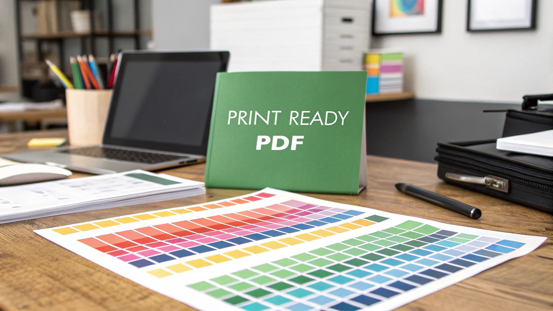 story
story How to Create a Print Ready PDF: Professional Guide
Understanding What Makes PDFs Print Ready Creating a file that looks great on your screen is only half the battle. A print-ready PDF requires a different approach. It focuses on technical aspects to ensure your design translates flawlessly to physical media. This means paying close attention to elements often overlooked in digital viewing, such as resolution, color spaces, and font embedding . Let's explore what distinguishes a truly print-ready PDF from a standard digital document. Key Differences Between Screen and Print Many people assume a PDF perfect on screen will print equally well. This is a misconception. Digital screens and printers handle color and resolution very differently. Screens use RGB (Red, Green, Blue) color mode, mixing light to create colors. Printers primarily use CMYK (Cyan, Magenta, Yellow, Black). CMYK is a subtractive color model, using ink to absorb light and reflect color. This fundamental difference can cause unexpected color shifts if not addressed during PDF creation. Resolution also plays a vital role. A lower resolution might be fine for on-screen viewing. Print, however, requires higher resolutions, typically 300 dpi , for clarity and sharpness. Technical Requirements for Print-Ready PDFs Several technical details are crucial for print-ready PDFs. Font embedding is paramount. Embedding fonts ensures the printer uses the intended typeface, avoiding font substitution issues. These substitutions can disrupt your layout. Setting appropriate bleed margins , usually 0.125 inches or 3 mm , prevents unwanted white edges after trimming. You might find this helpful: How to master brochure printing . Meticulous attention to technical details is essential for flawless output in commercial printing. This precise process adheres to internationally recognized print standards, crucial for high-quality printed materials. Explore this topic further. The Role of PDF/X Standards PDF/X standards , developed by the International Organization for Standardization (ISO) , further refine the process. These standards, such as PDF/X-1a or PDF/X-4 , establish specific requirements for print-ready PDFs. This ensures compatibility and reliability across different printing systems. For example, PDF/X standards mandate embedded fonts, high-resolution images, and defined color spaces. This provides print service providers with files they can process without errors or unexpected results. These standards are vital for consistent, high-quality printing in the global printing industry. Choosing The Right Tools For Professional Results Creating a print-ready PDF involves more than simply saving your document in PDF format. The software you choose plays a vital role in the final output quality. Selecting the right tool can be the difference between a polished, professional print and a blurry, color-distorted disappointment. This section will guide you through popular options, highlighting their strengths and weaknesses for print production. Software Options for Print-Ready PDFs Several software options are available for creating print-ready PDFs, each with its own features and pricing structure. Some, like Adobe InDesign , are industry standards, renowned for their comprehensive print controls. Others, like Affinity Publisher , offer a more budget-friendly alternative without sacrificing essential print features. Adobe InDesign: Adobe InDesign is the industry standard, offering advanced typography, layout control, and robust PDF export options. Its steep learning curve and subscription-based pricing may be a barrier for some. Affinity Publisher: Affinity Publisher is a powerful, lower-cost alternative to InDesign. It provides excellent print features, including support for CMYK, Pantone colors, and preflight checks. QuarkXPress: QuarkXPress is another professional layout application with a long history in publishing. Known for its precision and stability, it remains a less popular choice than InDesign or Affinity Publisher. Adobe Acrobat Pro: Adobe Acrobat Pro, while not a design tool, allows for fine-tuning and preflighting existing PDFs. It's ideal for checking and correcting potential print issues before sending files to a printer. To help you compare these different software options, we've compiled a table highlighting their key features and pricing. To help you compare these different software options, we've compiled the following table: Print-Ready PDF Software Comparison: Comparison of popular design and PDF creation software showing features, pricing, and suitability for different print projects. Software Best For Print Features Price Range Learning Curve Adobe InDesign Complex, professional publications Advanced typography, CMYK, Pantone, preflighting Subscription (high) Steep Affinity Publisher Budget-conscious designers, mid-sized projects CMYK, Pantone, preflighting One-time purchase (mid) Moderate QuarkXPress Precision layout, complex documents CMYK, Pantone, preflighting Subscription or one-time purchase (high) Steep Adobe Acrobat Pro PDF editing and preflighting Preflighting, color correction, font management Subscription (mid) Moderate This table provides a quick overview of popular software choices, making it easier to choose the best tool for your print projects. Remember to consider your budget and the complexity of your designs when making your decision. Optimizing Your Workflow with the Right Tools The right tools can significantly improve your workflow, saving you time and preventing frustration. Consider your printing needs and budget when choosing your software. For instance, if you're creating simple business cards, a less complex program like Affinity Publisher might be sufficient. You might be interested in: How to master business cards . However, for a multi-page brochure with intricate designs, the advanced features of InDesign might be necessary. PDF Optimization Software Beyond design software, dedicated PDF optimization tools can be essential. These tools help reduce file size without compromising print quality, which is crucial for large format printing or online distribution. They also address common PDF problems, such as missing fonts or incorrect color profiles. This optimization ensures your files are truly print-ready and helps avoid costly reprints. These specialized programs simplify prepress tasks and improve the final quality of your printed materials. Your Complete PDF Creation Workflow Creating a print-ready PDF involves a detailed process, from initial setup to final export. This workflow ensures your files are truly optimized for professional printing. Let's explore the key steps involved in preparing images, managing fonts, and organizing design elements to achieve optimal print results. Setting Up Your Document The first crucial step is setting up your document correctly. This involves defining three key parameters: document size , bleed area , and color mode . The document size must match the final trimmed size of your printed piece. The bleed area , typically 0.125 inches , extends beyond the trim lines. This is vital to prevent unsightly white edges when the document is trimmed. Finally, setting the color mode to CMYK from the start ensures accurate color representation in the final print. Preparing Images and Graphics High-resolution images are essential for sharp, clear prints. Aim for 300 dpi for all images to maintain quality. Using low-resolution images will result in pixelated or blurry results. Just as important as resolution is the CMYK color mode . Ensure all images are in CMYK to avoid unexpected color shifts during the printing process. Managing Fonts Font management is key to a smooth printing process. Embed all fonts used in your document within the PDF. Embedding ensures the printer uses the intended typeface, preserving your design and layout integrity. If your design incorporates special characters or symbols, double-check their compatibility with your chosen fonts to avoid any unexpected glitches. Organizing Design Elements Before exporting, meticulously organize all design elements. This includes ensuring proper layering, grouping related objects, and verifying alignment and spacing. A well-organized document translates directly into a cleaner and more professional final print. Exporting Your Print-Ready PDF The final step is exporting your document as a print-ready PDF. Most design software, like Adobe InDesign , offers specific PDF/X presets , such as PDF/X-1a or PDF/X-4. These are optimized for print. Choose the appropriate preset based on your printer's requirements and the specifics of your project. When exporting, double-check the settings to ensure all fonts are embedded, images are at the correct resolution, and the color mode is set to CMYK. For complex projects like booklets and catalogs, precise PDF creation is paramount. Learn more about booklets and catalogs printing . Reviewing and Preflighting After exporting, review your PDF and conduct a preflight check . Preflighting verifies that your file meets all the technical specifications for printing. Many design programs include built-in preflight tools. Specialized preflight software offers more comprehensive analysis. This helps catch potential issues before they become costly reprint problems. Be on the lookout for common errors like missing fonts, low-resolution images, or incorrect color profiles. Addressing these beforehand ensures a smooth printing process and high-quality results. Careful attention to the PDF creation workflow saves time, money, and frustration, resulting in a professional and polished final product. Mastering Color For Perfect Print Results Color is a powerful design element. However, managing color for print can be tricky. The on-screen appearance of colors differs significantly from how they appear when printed. This is due to the different color models used: RGB for screens and CMYK for print. Mastering color management ensures your printed projects accurately reflect your design vision. Understanding RGB and CMYK Screens use RGB, an additive color model. Red, green, and blue light combine to create a wide spectrum of colors. Print, conversely, uses CMYK, a subtractive model. Cyan, magenta, yellow, and black inks absorb light, reflecting the desired color. This fundamental difference explains why a vibrant RGB blue might appear duller when printed in CMYK. Converting From RGB to CMYK Converting your design to CMYK is essential for print-ready PDFs. Most design software, such as Adobe InDesign or Affinity Publisher , allows for this conversion. However, simply converting isn’t enough. You need to understand how the conversion affects your colors. For example, vibrant RGB colors often lose saturation in CMYK. To compensate, you might need to adjust colors in CMYK mode to achieve the desired printed result. This is where soft proofing becomes invaluable. Soft Proofing: Your Print Preview Soft proofing simulates the printed appearance of your design. It’s like holding a preview of your final product before it goes to the printer. Most design software includes soft proofing tools. These tools allow you to preview your design using your chosen printer's color profile. This provides a realistic view of how colors will translate to print. You might also be interested in learning more about specific printing techniques, such as banner printing . Handling Spot Colors, Rich Blacks, and Transparency Beyond CMYK, spot colors , such as Pantone colors , offer precise color matching, especially beneficial for branding. Rich black , a combination of CMYK inks, creates a deeper, more luxurious black than using black ink alone. Transparency effects , while visually appealing on screen, can sometimes cause unexpected results in print. These elements require careful handling. For spot colors, ensure your PDF includes the correct Pantone references. For rich black, use the recommended ink combinations specified by your printer. For transparency, consider flattening it before creating your PDF to avoid potential printing issues. Optimizing Your Color Workflow Several techniques can optimize your color workflow for print. Regularly calibrate your monitor to ensure accurate color display. Implement a color management system. This helps maintain color consistency across different devices and software. Work in CMYK mode from the project's start. This simplifies the process and reduces unexpected color shifts. By understanding the nuances of color management and applying these techniques, you’ll achieve print results that accurately reflect your design vision. This ensures your printed projects make a strong visual impact. Getting Technical Details Right Every Time Creating a print-ready PDF is more than just clicking "save as PDF." It involves careful attention to technical specifics to ensure your design translates perfectly onto the printed page. Mastering these details is what separates amateur work from professional-grade print products. Resolution: More Than Just 300 DPI While the 300 DPI rule is a good starting point, resolution needs change depending on how something is printed and how far away it's viewed. A large banner seen from a distance might look great at 150 DPI , while a business card held up close needs the full 300 DPI to appear sharp. Understanding this connection between viewing distance and required resolution is key to optimizing your PDFs without making files unnecessarily large. For example, a poster viewed from several feet away doesn't need the same high resolution as a brochure designed to be held and examined closely. Choosing the right resolution can save you valuable storage space and processing time. Font Management: Embedding and Troubleshooting Font embedding is crucial to maintaining the integrity of your design. It guarantees that the printer uses the right font, preventing unexpected substitutions that could mess up your layouts. However, special characters or symbols can sometimes cause issues. When troubleshooting missing fonts, check the font license to see if it allows embedding. If not, try using a similar font with the correct permissions or outlining the text. Outlining converts text into vector shapes, keeping the visual look the same regardless of the printer's font library. This ensures consistent results across different printing setups. Bleeds, Trim Marks, and Registration Marks Bleeds , trim marks , and registration marks are important guides for professional printing. A bleed extends your design a little past the cut edge, preventing white borders after trimming. Trim marks show exactly where the paper should be cut. Registration marks help align different colors during the printing process. These elements are typically set up in your design software like Adobe InDesign or Adobe Illustrator before exporting to PDF. Think of the bleed area as a safety net, compensating for small variations in the trimming process. Compression Techniques for Manageable File Sizes Large files can be difficult to email and process. Compression techniques reduce file size without significantly affecting print quality. Most PDF export settings offer compression options. Try different settings to find the best balance between a smaller file and acceptable print quality. This is especially important for large-format prints, where file sizes can get very large. For example, using JPEG compression for images with lots of color gradients is often fine, while ZIP compression works better for illustrations with large areas of solid color. Knowing which compression method to use will optimize your files for easier handling. Navigating Professional Print Standards Creating a print-ready PDF means understanding professional print standards. These standards ensure your design translates accurately from digital to print, regardless of the printing process or provider. This is crucial for high-quality results and a smooth printing experience. Understanding PDF/X Standards The PDF/X family of standards , developed by the International Organization for Standardization (ISO) , defines requirements for print-ready PDFs. Different PDF/X versions address various printing scenarios. Choosing the correct one is key for compatibility with your printing service. PDF/X-1a: This widely used standard for offset printing restricts features like transparency and RGB color. This ensures consistent output across different printing setups. PDF/X-3: More flexible than PDF/X-1a, this standard allows both CMYK and RGB color data. It's suitable when color management happens at the printing stage. PDF/X-4: Building upon PDF/X-3, this standard supports transparency and live transparency effects. This offers greater design freedom while maintaining print compatibility. Understanding these standards is essential for creating a print-ready PDF. Each standard has a purpose, catering to specific printing industry needs. Selecting the right standard ensures your file is correctly interpreted by printing equipment. ICC Color Profiles and Transparency ICC color profiles define how colors appear in a document. They act as a translator between your design software and the printer, ensuring accurate color reproduction. Transparency flattening simplifies transparency effects to ensure they print correctly. For example, if your design has partially transparent elements, flattening them before creating your PDF prevents unexpected visual artifacts during printing. It’s like merging layers in image editing software: what you see is what you get. Overprint settings control how overlapping colors interact. These settings are crucial for achieving the desired results in logos and complex graphics. Correct overprint settings prevent color shifts and unexpected blending. Communicating With Print Service Providers Effective communication with your print service provider is paramount. Before submitting files, discuss their requirements. Some providers prefer a particular PDF/X standard or have specific bleed requirements. Clarifying these details avoids costly reprints and delays. You might be interested in: How to master marketing materials . Adapting your workflow to your provider's specifications streamlines the process and ensures your final product meets your expectations. This includes discussing paper stock, finishing options, and delivery timelines. As of 2024, print-ready PDFs play a key role in the evolving printing industry. The production print segment is projected to grow, showing increasing demand for streamlined print workflows. The global print industry's substantial revenue emphasizes the need for standardized file preparation, including accurate PDF creation. Find more detailed statistics here. Mastering these technical details, including adhering to formats like PDF/X, provides a significant advantage in the printing market. Catching Problems Before They Cost You Money Prevention is paramount in the printing world. Catching errors early can save you a substantial amount of money on reprints and prevent missed deadlines. A robust quality control process is essential for smooth and efficient print projects. Preflighting: Your First Line of Defense Preflighting is the process of inspecting your PDF for potential printing issues before it's sent to the presses. Consider it a crucial final check before your project goes live. Preflighting analyzes your PDF file for problems such as missing fonts, low-resolution images, and incorrect color profiles , among other technical glitches that can negatively impact the final product. The infographic below illustrates the most common causes of print rejections. As shown, low-resolution images are the primary reason for print rejection, followed closely by missing bleeds and unembedded fonts. Addressing these issues before sending your files to the printer is vital. Many design programs, like Adobe Photoshop , include built-in preflight tools. However, dedicated preflight software offers a more thorough analysis. This specialized software can detect a broader range of potential problems and generates detailed reports to help guide you through the necessary corrections. Common Preflight Issues and Solutions Understanding common preflight issues and their solutions is essential for printing success. The following table, "Common PDF Preflight Issues and Solutions," offers an overview of frequent problems found during preflight checks, along with corresponding solutions and preventative measures. Common PDF Preflight Issues and Solutions: Overview of frequent PDF problems detected during preflight checks with corresponding solutions and prevention strategies Issue Type Description Impact Solution Prevention Low-Resolution Images Images with a DPI below 300 Blurry or pixelated print Replace with high-resolution images (300 DPI) Ensure all images are 300 DPI before placing them in your design Missing Fonts Fonts not embedded in the PDF Text may appear differently or not at all Embed all fonts used in the document Always embed fonts when creating a PDF Missing Bleeds Bleed area not extended beyond trim lines White edges may appear after trimming Add bleed area (typically 0.125 inches) to the design Include bleed from the document setup stage Incorrect Color Mode Document in RGB instead of CMYK Colors may appear dull or different than expected Convert document to CMYK color mode Design in CMYK color mode from the start This table highlights the importance of checking for these common issues. Addressing these problems before printing saves time and money by avoiding costly reprints. Establishing a Quality Control Workflow A reliable quality control workflow is the backbone of consistent, high-quality prints. This involves integrating preflight checks into your PDF creation process. Custom preflight profiles , tailored to your specific printing needs, can further refine this process. This is particularly beneficial for businesses with high-volume print production. This personalized approach prevents expensive errors and streamlines the printing workflow. The print-on-demand (POD) market relies heavily on print-ready PDFs and is expected to reach nearly $103 billion by 2034 , emphasizing the importance of mastering PDF creation. Discover more insights about print-on-demand statistics. Investing in a solid quality control system protects your investment and ensures professional-looking printed materials. Ready for a smooth, high-quality printing experience? Explore the printing solutions offered by 4OVER4 and bring your designs to life.
 story
story How to Create Brand Guidelines for Your Business
Before you can even think about picking colors or fonts, you need to lay the groundwork. The most effective brand guidelines are built on a rock-solid strategic foundation. This isn't just fluffy marketing talk; it's the core of your brand's identity, the "why" that drives every single decision you'll make later. Defining Your Brand's Strategic Foundation Think of it like building a house. You wouldn't obsess over paint swatches before you have a blueprint and a poured foundation. Your brand’s strategic core—its purpose, vision, and values—is that blueprint. It dictates the entire structure and ensures every part of your brand, from a tweet to a trade show banner, works together. Uncovering Your Brand's Core Purpose Your purpose is your reason for being, and it goes way beyond just making money. What positive change are you trying to create? Patagonia, for example, is famous for its purpose: "use business to protect nature." That one powerful idea shapes everything they do, from product design to activism. To get to your own purpose, you have to ask some tough questions: What problem did we originally set out to solve? If our brand vanished tomorrow, what would the world lose? What is the legacy we want to leave behind? This isn’t about writing a stuffy mission statement for your "About Us" page. It’s about finding a genuine truth that energizes your team and resonates deeply with your audience. A strong brand purpose is your North Star. When you're at a crossroads—whether in marketing, product development, or customer service—you can simply ask, "Does this decision align with our purpose?" It’s the ultimate filter for consistency. Articulating a Clear Vision and Values If your purpose is your "why," your vision is your "where"—the future you're actively building. Your values are the "how"—the non-negotiable principles that guide your actions on that journey. These elements have to be clear, concise, and most importantly, actionable. Ditch the generic values like "innovation" or "integrity." They’re meaningless without context. Instead, define what they look like in the real world. If a value is "customer obsession," what does that actually mean? Does it translate to 24/7 support, a no-questions-asked return policy, or proactive check-ins? Get specific. To tie this all together, it's incredibly helpful to build a powerful brand positioning framework that clearly defines your unique value and where you stand in the market. This framework is what separates you from the noise. Before moving on to the visual and verbal elements, it's crucial to have these foundational components clearly defined. They are the strategic bedrock of your entire brand identity. Core Brand Foundation Components Component Description Key Question to Answer Purpose Your fundamental reason for existing beyond profit. Why do we do what we do? Vision The long-term future your brand is working to create. Where are we going? Values The core principles guiding your behavior and decisions. How do we act on our journey? Positioning Your unique place in the market relative to competitors. How do we want to be perceived? Audience A deep understanding of who you are serving. Who are we talking to? Having these answers documented provides the clarity needed to create guidelines that are both meaningful and effective. Defining Your Ideal Audience The final piece of your strategic puzzle is knowing exactly who you're talking to. Don't just stop at basic demographics like age and location. You need to dig into their psychographics—their motivations, fears, dreams, and how they communicate. Create detailed user personas to make this abstract audience feel real. Give them a name, a job, a backstory. What are their daily headaches? Where do they hang out online? What other brands do they love? When you have this level of understanding, your messaging and visuals will connect on a much deeper level, making your brand feel like it was made just for them. This strategic groundwork has a very real financial impact. One study found that 32% of companies reported that consistent messaging increased their brand revenue by over 20% . Despite this, a shocking 15% of companies still don't have any formal brand guidelines, leaving a massive opportunity for growth on the table. Defining Your Brand Voice and Core Messaging While your logo and colors grab attention, your brand’s voice is what truly builds a lasting connection. The way your brand sounds—the personality it projects through words—is every bit as vital as its visual identity. So, who are you? Are you the witty, clever friend who’s always ready with a sharp comeback, like Wendy's on Twitter? Or are you the inspiring, authoritative coach, like Nike, pushing your audience toward greatness? Getting this right is about so much more than picking a few vague adjectives. Go Beyond Adjectives to Create Actionable Rules Simply saying your brand is "bold" or "friendly" isn't enough to guide a writer. What does "bold" actually sound like in a blog post or an email? The real magic happens when you translate those abstract traits into concrete, actionable rules. This is about creating clear guardrails for anyone creating content for your brand. A "Playful" brand voice, for instance, needs more than just the label. You need to define the specifics: Do: Use lighthearted humor, relevant emojis, and pop culture references. Don't: Make jokes at a customer's expense or treat serious topics flippantly. An "Authoritative" voice would have a completely different set of rules: Do: Write with confidence, using direct language supported by data and evidence. Don't: Use slang, overly casual phrasing, or hesitant words like "we think" or "maybe." These do's and don'ts remove the guesswork, ensuring consistency across the board. If you're looking for inspiration on how different companies pull this off, check out these inspiring brand voice examples to see how the pros do it. My Two Cents: Your brand voice isn't just what you say, but how you say it. The secret to consistency is moving from fuzzy descriptors to a practical list of do's and don'ts. What Are Your Messaging Pillars? Once you've nailed down how you'll speak, it's time to decide what you'll consistently talk about. Enter messaging pillars. These are the three to five core themes you want to own in your audience's mind. Think of them as the foundational ideas that every piece of content you create should reinforce. Your pillars are the main chapters of your brand’s story. They should flow directly from your mission and the unique value you deliver to your customers. For a B2B software company, these pillars might look something like this: Effortless Efficiency: Always highlighting how the product saves time and eliminates friction. Scalable Growth: Focusing on how the tool supports businesses as they expand. Data-Driven Decisions: Emphasizing the features that deliver actionable insights. Every blog post, case study, and ad campaign should connect back to at least one of these pillars. This approach keeps your messaging laser-focused and constantly reminds people why you're different. Get Your Core Copy Down on Paper With your voice and pillars locked in, you can now write the essential pieces of copy that will be used over and over again. Having these ready-made ensures everyone is telling the exact same story from day one. Tagline: A short, memorable phrase that captures your brand's essence. Think Nike’s “Just Do It” or Apple’s “Think Different.” It’s all about being catchy and evocative. Elevator Pitch: A tight, 30-second summary of what you do, who you help, and what makes you special. This is gold for sales teams, networking events, and onboarding new hires. Brand Story: A brief narrative—usually one to three paragraphs—explaining your origin, your mission, and the problem you exist to solve. This is perfect for your "About Us" page and other key brand materials. Documenting this core copy in your brand guidelines gives your team a toolkit of perfectly on-brand assets. It saves a massive amount of time and stops inconsistent messaging before it even starts. Building Your Visual Identity System This is where the magic happens—where your brand’s strategy becomes something people can actually see and touch. If your mission and voice are the soul of your brand, consider your visual identity its body. It’s the collection of design elements that people will see everywhere, instantly recognizing and connecting them with you. A rock-solid visual system ensures every single touchpoint, from a business card to a billboard, feels like it came from the same source. Don't think of these visual rules as limitations on creativity. They're quite the opposite. By setting clear standards, you empower your team and any outside partners to create work that is both inventive and perfectly on-brand. Let's break down the three pillars you need to build: your logo, color palette, and typography. Your Logo Usage Rules Your logo is the most concentrated version of your brand, so protecting its integrity is absolutely non-negotiable. Your guidelines must have explicit, easy-to-follow rules for how it should—and, just as importantly, should not—be used. Leaving this open to interpretation is a recipe for disaster. Before you know it, you'll see stretched, recolored, or obscured versions of your logo floating around, actively weakening your brand recognition. Start by defining the absolutes: Clear Space: This is the mandatory "breathing room" around your logo. Think of it as a personal bubble that prevents other text or graphics from crowding it. A common pro move is to use a key element from the logo itself, like the height of a specific letter, to define this minimum clear space on all sides. Minimum Size: How small can your logo get before it turns into an unreadable smudge? You need to define this for both digital (in pixels) and print (in inches or millimeters). This simple rule prevents a blurry, unrecognizable mark on small items like social media avatars or promotional pens. Color Variations: Show every acceptable version of your logo. This almost always includes the full-color primary version, an all-white (or knockout) version for dark backgrounds, and an all-black version for simple, single-color printing. Showing what not to do is often even more critical than explaining what to do. Visual examples of incorrect usage are far more powerful than just writing out a rule. Pro Tip: Create a dedicated "logo misuse" or "don't do this" section in your guidelines. Show clear, visual examples of what to avoid, such as stretching the logo, changing its colors, adding cheesy drop shadows, or plastering it on a busy, low-contrast background. This visual guide is incredibly effective for preventing the most common mistakes I see in the wild. Building a Strategic Color Palette Color is one of the most powerful tools in your brand’s arsenal. It triggers emotion, communicates meaning without a single word, and dramatically boosts brand recognition. The right color palette creates visual harmony across all your materials and makes your brand instantly identifiable at a glance. The data here is pretty compelling. A well-chosen signature color can boost brand recognition by a staggering 80% . In fact, research shows that 81% of consumers are more likely to recall a brand’s color than its name. When you consider that around 90% of snap judgments about products are based on color alone, you realize a strategic palette is a business imperative, not just an aesthetic choice. You can find more branding statistics that highlight the importance of this visual consistency. Your palette should always be organized into a clear hierarchy. Primary and Secondary Colors Your primary colors are the heart of your brand identity. This is usually a small, tight set of one to three colors that will be used most often. They should feel directly tied to your main logo and the personality you defined earlier. Secondary colors are there to support and complement your primary palette. They’re used for accents, subheadings, charts, and other design elements that add depth and visual interest without overpowering your core identity. For every single color in your palette, you must provide its specific color codes. This is the only way to ensure perfect reproduction across every possible medium. Color Space Use Case Example HEX For all digital applications like websites and apps. #0066CC RGB For screens, like presentations and digital videos. R:0 G:102 B:204 CMYK For all four-color process printing (e.g., brochures). C:95 M:63 Y:0 K:0 PMS For spot color printing to ensure exact color matching. Pantone 2145 C This level of detail eliminates all the guesswork for designers, developers, and print vendors. It guarantees that your brand’s blue looks identical on a website, a PowerPoint slide, and a printed flyer from a quality service like 4OVER4 . Establishing a Clear Typography Hierarchy Typography is the art of making your words legible, readable, and appealing. In branding, it’s what gives your written voice its visual form, shaping how your audience actually experiences your messaging. A clear typographic system ensures everything is easy to read and creates a cohesive visual rhythm. This process involves selecting specific typefaces (fonts) and defining strict rules for how they are used. Most brands I've worked with land on a primary typeface for headlines and a secondary typeface for body copy. Your guidelines should specify: Headline Font: The font for all your H1, H2, and H3 headings. Define its weight (e.g., Bold, Semi-Bold) and recommended sizes. Body Copy Font: The font for paragraphs and longer text blocks. This must be highly legible, even at smaller sizes. Specify its weight (e.g., Regular) and an ideal size range. Accent Font: This is an optional font you can use for things like blockquotes, captions, or calls-to-action to inject a little extra personality. Creating a clear hierarchy is absolutely crucial for usability. For example, your H1 heading might be set in your primary font at 48px Bold, while your body copy is set in your secondary font at 16px Regular. These rules ensure that a reader can easily scan a document and understand the structure of the information at a glance. Providing these detailed specifications is a cornerstone of learning how to create brand guidelines that actually work in the real world. Setting Guidelines for Imagery and Media Your brand’s story isn't just told with logos and colors. The photos, illustrations, and even the tiniest icons you use pack a serious punch, shaping how your audience feels about you. Without clear rules of the road, your visuals can quickly become a messy, confusing mix of styles, completely undermining the cohesive brand you’ve worked so hard to build. This is why nailing down your media guidelines is a non-negotiable step. Every single visual asset, from a big hero image on your homepage to a quick graphic for social media, needs to feel like it came from the same creative mind. Defining Your Photography Style Photography is all about capturing a vibe. So, the first thing you have to do is decide what that vibe is. Do your brand photos need to feel energetic and candid, like you're capturing real moments as they happen? Or does a more composed, professional, and polished look better match your brand's personality? There’s no single right answer here—only what’s right for your brand. A B2B software company might want crisp, bright photos of diverse teams collaborating in a modern office. A high-end artisan coffee brand, on the other hand, might go for moodier, artfully styled shots with deep shadows and a focus on texture. Your guidelines should get specific about: Lighting and Mood: Are we talking bright, airy, and optimistic? Or something more dramatic with high contrast and deep shadows? Color Treatment: Should every photo have a consistent color grade? Maybe you prefer a warm, sun-kissed look or a slightly desaturated, cinematic feel. Providing a custom Lightroom preset is an absolute game-changer for consistency. Composition: Do you favor clean, centered, symmetrical shots? Or do you prefer more dynamic, off-center compositions that follow the rule of thirds? Laying out these details gives any photographer or designer a clear roadmap to follow, whether they're shooting custom photos or digging through stock image sites. It’s how you keep your visual story straight. Choosing Your Subject Matter What you show in your photos is just as critical as how you show it. Your guidelines need to be explicit about the subjects that will tell your brand’s story most effectively. Think about what you want your audience to see again and again. People: If you use people in your photos, who are they? Real customers? Diverse models who look like your target audience? Or your own team members? Showing genuine people can make a brand feel instantly more human and trustworthy. Products: Should products be shot in a pristine studio setting, isolated on a simple background? Or should they be captured "in the wild," being used in real-life situations that help customers imagine the product in their own lives? Abstract & Textural: Sometimes, a less literal approach works wonders. Abstract shots of architecture, natural textures, or blurred city lights can evoke a powerful mood without showing a specific person or product. These are perfect for backgrounds. The whole point is to build a library of on-brand images your team can pull from with total confidence. Nail down the "what" (subject matter) and the "how" (photographic style) to eliminate the guesswork. Curating a Unique Icon and Illustration Style Icons and illustrations are brilliant for breaking down complex ideas and injecting a bit of personality. But a random grab-bag of styles just looks amateurish and disjointed. Your brand guidelines have to define a single, unified approach. When it comes to iconography , you really have two solid options: Create a Custom Set: Honestly, this is the gold standard. It guarantees your icons are unique and perfectly aligned with your brand's look and feel. The key is to keep the line weight, corner style, and level of detail consistent across the entire set. Choose a Single Library: If a custom set isn't in the budget, the next best thing is to pick one high-quality icon library—like Feather Icons or Google's Material Symbols —and stick with it religiously. The same thinking applies to illustrations . The rules need to be crystal clear. Style: Are your illustrations hand-drawn and organic, or are they clean, geometric vector art? Color Usage: Do they pull from your entire brand palette, or do they use a more limited, specific subset of colors? Complexity: How detailed should they be? Are we talking simple line art, or fully rendered scenes with rich shading and texture? By setting these rules, you ensure that every visual element, from the smallest icon to the biggest illustration, is working together to reinforce your brand. Putting Your Brand Guidelines into Practice So you’ve poured all that hard work into creating a killer brand guide. That's a huge step, but the document itself is worthless if it just collects dust on a digital shelf. The real win comes from getting everyone to actually use it. This is where your guidelines stop being a static PDF and become a living, breathing part of your company culture. The best way to get started? Make your guidelines impossible to ignore. A polished PDF is a decent starting point, but an interactive microsite or a dedicated hub on your company intranet is far better. Accessibility is everything. If a designer needs a hex code or a salesperson needs the right logo, they should be able to find it in under 30 seconds. Empower Your Brand Champions Let's be realistic—you can't be everywhere at once. That’s why one of the smartest things you can do is identify and empower a team of brand champions . These people aren't the brand police. Think of them as enthusiastic evangelists from different corners of the company—marketing, sales, HR, even the product team—who genuinely get and believe in the brand. Their job is to: Be the friendly, go-to person for brand questions within their department. Gently nudge colleagues toward correct usage in a supportive, helpful way. Funnel feedback to the core brand team about what’s working and what isn’t in the real world. When you have champions, brand consistency becomes a shared responsibility, not some top-down mandate. They help humanize the rules and build a sense of collective pride in how your company shows up. The gap between having brand guidelines and using them is staggering. While an incredible 95% of companies report having brand guidelines, research shows only about a quarter of them enforce them consistently. This creates a massive opportunity for brands that treat their guidelines as a serious business tool. You can dig into more of these branding statistics and their business impact . Make It Easy with Practical Templates Here’s the single most effective way to ensure people follow the rules: make the right way the easy way. Instead of just telling people how to design a presentation, give them a beautiful, on-brand template that’s ready to go. You’re removing all the friction. Suddenly, staying on-brand is the path of least resistance. Start by building a library of essential, ready-to-use assets: Presentation Decks: A master template for Google Slides or PowerPoint with the correct logos, colors, and typography already baked in. Social Media Graphics: Pre-sized templates for platforms like Instagram and LinkedIn, complete with proper logo placement and font styles. Email Signatures: A standardized format everyone can copy and paste, ensuring every single email looks professional and unified. Document Templates: Branded headers and footers for Word documents or Google Docs . By providing these tools, you aren’t just enforcing rules. You're actively helping your team work faster and more efficiently, all while maintaining a polished, consistent brand presence. How Should You Share Your Guidelines? Choosing the right format for your guidelines is crucial for adoption. A simple PDF might work for a small team, but a growing company might need something more robust. Each format has its own set of trade-offs. Brand Guideline Format Comparison Format Type Pros Cons Best For PDF Document Easy to create and share; universally accessible. Static, hard to update, not interactive. Small teams, freelancers, or as a quick-reference summary. Internal Wiki/Intranet Page Centrally located, easy to update, can link to other resources. Can be visually bland; access is limited to internal teams. Mid-to-large companies with an established internal knowledge base. Interactive Microsite Highly engaging, easy to navigate, can include videos and animations. More complex and costly to build and maintain. Larger brands that need to share guidelines with external partners. Digital Asset Management (DAM) Platform Combines guidelines with downloadable assets; excellent for version control. Can be expensive; requires training and platform management. Organizations with a high volume of creative assets and many stakeholders. Ultimately, the "best" format is the one your team will actually use. Consider your company’s size, budget, and technical resources before you commit. The goal is to make the guidelines a helpful, living resource, not a forgotten file. Establish a Simple Review Process For new or high-stakes materials, a light-touch review process can be a lifesaver. This isn't about creating a bureaucratic bottleneck. It’s a quick check-in to catch potential missteps before they go public. This could be as simple as having one designated "brand reviewer" give a final once-over to a new ad campaign or a major annual report. Keep the process simple and fast—a dedicated Slack channel or a simple submission form can streamline everything and ensure feedback is timely. This small step acts as a valuable safety net, protecting your brand's integrity without slowing your teams down. And remember, your guidelines are a living document. Plan to revisit and update them annually to reflect your brand's growth, ensuring they always stay relevant and useful. Common Questions About Brand Guidelines Even the most thorough plan for creating brand guidelines can leave you with some nagging practical questions. I've seen it time and time again. Working through these common sticking points is what separates a guide that gets used from one that just collects digital dust. Let's dig into a few of the questions I hear most often. How Strict Should My Guidelines Be? This is the big one. The classic tug-of-war between consistency and creativity. The honest answer? Your guidelines need to be firm, but not rigid . Think of them as guardrails on a highway, not a creative straitjacket. Their job is to prevent you from driving off a cliff, not to dictate every single lane change. For the absolute core of your brand—your logo, primary colors, and foundational voice—the rules need to be ironclad. These are the non-negotiables. But when it comes to things like secondary color palettes, illustration styles, or the tone on a specific social media channel, you can build in some wiggle room. You want to give your team a framework that empowers them to be creative within your brand's world. The best brand guidelines I've ever worked with leave space for smart interpretation. They nail down the "what" and "why," but trust skilled creators to figure out the "how." A good target to aim for is making about 80% of the guide firm rules and leaving 20% as flexible principles. How Often Should I Update My Brand Guidelines? Your brand guide is a living document, not something you carve into a stone tablet. It has to grow and change right along with your business. While you probably don't need a top-to-bottom overhaul every single year, you should absolutely schedule a formal review and a minor refresh annually . Certain business milestones should also trigger an immediate review. Things like: A major product launch: Does your messaging or visual style need to shift to support it? Entering a new market: Will your current voice and visuals connect with a totally new audience? A merger or acquisition: How are you going to blend two different brand identities without creating a mess? Outside of those big moments, the annual check-in is your chance to see what's working, what isn't, and what just feels dated. It keeps your brand from going stale and ensures it remains one of your most powerful assets. Do I Really Need Brand Guidelines If I'm a Small Business or Solopreneur? Yes. Absolutely. In fact, I'd argue they're even more crucial for a small operation. When you're a small team—or a team of one—every single thing you put out into the world carries immense weight. Your email signature, your social media posts, your invoices... they all have an outsized impact on how people see your brand. Consistency is how you build trust, and for a small business, trust is everything. Even a simple one-page guide covering your logo rules, color codes, main font, and a few key voice principles is a game-changer. It sets a professional standard from day one and ensures that when you do start hiring freelancers or bringing on your first employee, your brand's integrity doesn't get lost in the shuffle. It's the foundation for growth. Ready to bring your brand's visual identity to life with flawless execution? At 4OVER4 , we specialize in high-quality printing that honors your brand guidelines down to the last detail. From business cards to banners, ensure every piece reflects your brand's quality and consistency. Explore our professional printing services today!
 story
story How to Make Business Cards
Whether you're an established business magnate or an emerging entrepreneur on the rise, one thing remains undeniable: business cards are an essential tool for networking. In the increasingly digital world we live in, the tactile nature of a business card offers a personal touch that simply can't be replicated online. This comprehensive guide will walk you through the process of creating your own unique business cards using the 4OVER4.COM platform. Alongside this, you'll get a glimpse into our user-friendly online designer tool that allows you to create eye-catching business cards with ease. Use the Power of 4OVER4.COM's Online Designer Creating stylish and professional-looking business cards doesn't require years of graphic design experience. With 4OVER4.COM's intuitive online tool, you can easily craft your own bespoke designs. The tool offers a straightforward drag-and-drop interface and provides blank templates complete with clear printing guidelines to ensure your content is always placed perfectly and never too close to the edge of your card. This powerful online designer allows anyone to kickstart their business from scratch. The ability to upload your own design is there for those who have a clear vision of what they want. But for those who prefer choosing from existing templates, we have an extensive library of over 10,000 templates ready and waiting for you. These templates are not merely static images; they are editable fields where you can add names, logos, and personalize them according to your brand identity. One significant feature integrated into our online designer is the QR secure code generator. This unique technology lets you create QR-based business cards—an innovative way to connect with your clients digitally while maintaining the traditional approach of physical networking. Clients can simply scan the QR code on your card using their mobile device to access further information about your services or products, ensuring that every card you hand out becomes a dynamic marketing tool. Just as important is the ability to save all these designs directly on our platform. Think of it as a cloud storage system for all your creative outputs. You can revisit these saved designs anytime, edit them if necessary, or reuse them for different projects or campaigns. This feature not only streamlines the designing process but also allows for consistent branding across different mediums. In essence, 4OVER4.COM's online designer is more than just a tool—it's a comprehensive solution that caters to both seasoned professionals and first-time entrepreneurs in creating impactful business cards that truly represent their brand. Ready-Made Templates for Instant Professional Designs From 4OVER4.COM As said, we have a vast collection of over 10,000 ready-made templates that are designed to cater to different industries and use cases. These templates are neatly categorized, allowing you to easily browse and select the one that best suits your business needs. Our powerful filters allow you to sift through this extensive collection with ease. You can filter the templates based on color, industry, business use case, and more. This not only simplifies your search but also ensures you find a design that aligns with your brand's visual identity. What's more, these templates are not rigid or restrictive. On the contrary, they serve as a starting point for your creativity. With our powerful editor—Portfoliator—you can tweak and customize any chosen template to match your specific requirements. Whether it's changing the color scheme or adding new design elements, the possibilities are endless. The importance of speed in business cannot be overstated. In today's fast-paced world, time is money. This is where our ready-made templates shine. Created by experts, these designs save you the hassle and time of starting from scratch. All you need to do is upload your logo or brand elements, tweak the design as needed, and voila! Your professional-looking business card is ready. In essence, our ready-made templates offer an ideal blend of convenience, flexibility, and speed. They empower you to create visually striking business cards that not only stand out but also encapsulate what your brand stands for—all while saving valuable time and effort. Expert Guides on Creating Various Types of Business Cards With 4OVER4.COM For those wanting to explore specific types of business cards or different creation methods, we have an array of detailed guides available on our blog. Dive into these articles by clicking on the links below: Make Plastic Business Cards Plastic business cards offer a unique and durable alternative to traditional paper cards. Discover how you can create your own with this step-by-step guide from 4OVER4.COM. Make Business Cards Using Word Word processing programs like Microsoft Word can be used effectively to design business cards. Learn the process in this comprehensive guide. Make Clear Business Cards Clear business cards are a standout choice for professionals looking to make a memorable impression. This guide will walk you through the creation process. Business Cards On Google Docs Google Docs isn't just for documents and spreadsheets - you can create impressive business cards too! Find out how in this guide. Make Embossed Business Cards Embossed business cards add a touch of luxury and professionalism that helps your brand stand out. Learn how to create your own with this detailed guide. Make Painted Edge Business Cards Add a pop of color to your business cards with painted edges. This guide from 4OVER4.COM will show you how it's done. Make Business Cards With Cricut Step By Step Fancy getting crafty? Discover how you can use a Cricut machine to make unique, personalized business cards. Make Glitter Business Card Glitter business cards are perfect for those who want their brand to shine. Find out how to create yours with this step-by-step guide. Make Laminated Business Cards Laminated business cards are durable and professional. Our guide will show you how easy it is to create them. Make Holographic Business Cards Holographic business cards are surefire attention-grabbers. Learn how to make your own with this comprehensive guide. Creating business cards has never been easier, thanks to 4OVER4.COM. Our tools and resources not only simplify the process but also guarantee a final product that perfectly encapsulates your brand's identity. FAQs(Frequently Asked Questions) How do I create stylish and professional-looking business cards with 4OVER4.COM's Online Designer? To create stylish and professional-looking business cards, you can harness the power of 4OVER4.COM's Online Designer. This tool allows you to design your own business cards with ease, using a wide range of customization options and templates. Does 4OVER4.COM offer ready-made templates for instant professional designs? Yes, 4OVER4.COM provides a vast collection of over 10,000 ready-made templates for instant professional designs. These templates cover a wide range of styles and industries, making it easy to find the perfect design for your business cards. Are there expert guides available on creating various types of business cards with 4OVER4.COM? Yes, for those wanting to explore specific types of business cards, there are expert guides available on creating various types of business cards with 4OVER4.COM. These guides provide step-by-step instructions and tips for designing different kinds of business cards. How can I make plastic business cards? Plastic business cards offer a unique and durable alternative. To make plastic business cards, you can explore this option through the design tools and services offered by 4OVER4.COM, which provide the ability to customize and order plastic business cards online. Can I use Word to make business cards? Yes, word processing programs like Microsoft Word can be used effectively to make business cards. However, it's important to ensure that the design meets the required specifications for printing. Alternatively, you can also use online design tools provided by printing services like 4OVER4.COM.