Content Hub
Stories, Ideas and Advice — Page 72
 story
story Brilling Branding for Startups to Build Your Legacy
So, you’re building a startup. Your mind is probably racing with product development, fundraising, and go-to-market strategies. But what about your brand? Too often, founders think of branding as just a logo and a color palette—something to figure out later. That's a huge mistake. Your brand is the soul of your company. It’s the gut feeling people have when they hear your name. It's the story you tell, the promises you keep, and the reputation you earn. A powerful brand is the one thing your competitors can’t copy. Why Your Brand Is More Than Just a Logo Many founders get caught up in the visual identity first. While a great logo is definitely important, it's just the tip of the iceberg. Real branding is about creating a unified experience that shapes how people see your startup at every single touchpoint—from your website copy to your customer support emails. It all starts with your story. What’s the "why" behind your business? When you can connect with customers on an emotional level, they don't just feel like consumers; they feel like they’re part of a movement. A brand that’s all style and no substance is like a beautiful but empty box. It might catch someone's eye, but it won’t build the deep, lasting relationships you need to thrive. Think of your brand as your company's DNA—it should guide every decision you make. Building Trust Through a Cohesive Story In a sea of competitors, trust is your most valuable currency. When customers trust you, they’ll choose you, stick with you, and tell their friends about you. You don't build this kind of trust overnight; you earn it by consistently living up to your promises. Think about how your brand story connects to real-world trust. If you claim to be innovative, your product better deliver on that. If you promise world-class service, every single customer interaction needs to reflect it. Any gap between what you say and what you do will break that trust in an instant. "Your brand is what other people say about you when you're not in the room." - Jeff Bezos, Founder of Amazon This quote nails it. Your brand isn't what you claim to be; it's the reputation you build through your actions, day in and day out. The Tangible Impact of Brand Perception A strong brand isn't just a fluffy concept; it directly impacts your revenue. Trust is the bridge that turns curious prospects into loyal customers. The numbers don't lie: a staggering 81% of consumers say they need to trust a brand before they'll even think about buying from it. And it’s not just about the company as a faceless entity. Research shows 65% of consumers are influenced by the public image of a brand’s CEO and its team. To get a feel for how major companies build this trust visually, it’s worth exploring the symbolism behind popular brand logos and seeing how they telegraph their core values. For any founder, these statistics point to some clear takeaways: First impressions count. Your visual identity is often the first handshake. Make it professional and consistent. You are the brand. How founders and employees behave in public directly reflects on the company. Community builds credibility. A strong social media presence isn't just for marketing; it's for building a community and showcasing your brand's personality, which reinforces trust. Building a strong brand identity from the ground up is not just an expense. It is a core investment in an asset that will drive growth for years. The table below summarizes the key pillars you'll need to focus on as you get started. Core Components of Startup Branding Component Why It Matters for Startups Brand Story & Mission This is your "why." It attracts the right customers and team members who believe in what you're doing. Target Audience You can't be everything to everyone. Defining your ideal customer ensures your message resonates deeply. Visual Identity Your logo, colors, and fonts are the visual shorthand for your brand. They must be consistent and memorable. Brand Voice & Tone How you communicate—from witty and casual to formal and authoritative—shapes your brand's personality. Customer Experience Every interaction is a chance to reinforce your brand promise. This is where trust is truly built or broken. By thoughtfully developing each of these components, you move beyond just having a business and start building a brand that people connect with, trust, and champion. Building Your Brand's Strategic Foundation Before you even think about logos or color palettes, the real work of branding begins. This is the discovery phase—the deep, foundational stuff where you define the soul of your startup. It’s less about how your brand looks and all about what it is . Think of this strategy as your startup's North Star. It’s the compass that will keep you on track as you grow, make tough decisions, and evolve. Skipping this step is like trying to build a house without a blueprint. Sure, you can throw some walls up, but it won't be long before the cracks start to show. What Do You Stand For? Defining Your Core Identity Your brand’s identity rests on three key pillars: your mission, vision, and values. These aren't just fluffy words to stick on your careers page; they are the active, guiding principles behind every single thing you do. Your Mission: This is your "what" and "how." It's a straightforward statement about what your company does, who you do it for, and the problem you solve. A meal-kit startup's mission could be, "To make healthy, home-cooked meals accessible to busy families everywhere." Simple and clear. Your Vision: This is your big, audacious "why." It's the future you're trying to create and the inspiration that fuels your team. For that same meal-kit company, the vision might be, "A world where every family meal is a moment of connection and nourishment." It’s aspirational. Your Core Values: These are the non-negotiables—the 3-5 beliefs that shape your culture and decisions. Think "Simplicity in Everything," "Customer Obsession," or "Sustainable Sourcing." These values will dictate who you hire, how you build your product, and the way you handle customer service. A brand without a strong foundation of purpose is just a pretty facade. Real connection with customers comes from authenticity, and that starts with knowing exactly who you are and what you believe in. This internal clarity is the bedrock of any brand that lasts. It ensures every piece of marketing, every product feature, and every customer email feels genuine and connected. Getting to Know Your People Once you know who you are, you need to get crystal clear on who you're for . One of the most common mistakes I see startups make is trying to be everything to everyone. You can't. Great branding is about connecting deeply with a specific group of people, which is why creating detailed customer personas is so important. A persona is more than just a demographic like "women, 25-40." It's a vivid, semi-fictional character based on real research who represents your ideal customer. Give them a name, a job, hopes, and frustrations. For example, let's invent "Sustainable Sarah." She's a 32-year-old graphic designer who frequents farmers' markets, feels a twinge of guilt about her carbon footprint, and actively seeks out eco-friendly brands. When you're marketing to Sarah, you know to highlight your recycled packaging and ethical sourcing—not just your price point. That level of detail is what makes your brand feel like it gets her. Carving Out Your Niche No startup exists in a bubble. A solid competitive analysis is your map to finding a unique spot in the market. Don’t just make a list of your competitors; really dig in. What’s their core message? Who are they talking to? What does their visual brand and tone of voice feel like? More importantly, where are their weaknesses? What gaps have they left open? This isn't about copying what others are doing. It's about finding an opportunity to be different. Maybe all your competitors are super serious and corporate. That's your opening to be the friendly, down-to-earth alternative. Finding that gap is how you go from being just another option to being the only option for your target audience. This strategic groundwork is essential for building a brand that connects with people today. Authenticity isn't optional anymore; customers expect brands' actions to line up with their stated values. From Patagonia's famous "Don't Buy This Jacket" campaign to local startups that put ethical practices first, having a clear purpose is what separates memorable brands from forgettable ones. You can learn more about this by exploring the evolving branding landscape and its trends. Crafting a Memorable Visual Identity With your strategy locked in, it’s time for the fun part: giving your brand a face. This is where you translate all that foundational work—your mission, values, and personality—into the colors, fonts, and imagery that people will recognize instantly. This isn’t about chasing the latest design trend on Instagram. It’s about building a visual system that’s a direct, tangible expression of who you are. Get this right, and your look will feel timeless. Think of it this way: your brand strategy is the script, and your visual identity is the actor. If you’ve written a bold, disruptive character, you can't have them whispering their lines in a monotone. A startup claiming to be a game-changer can't afford to look like a stuffy, old-school corporation. This is where consistency becomes your greatest ally, building the kind of recognition that fosters real trust. The Psychology of Color Color is visceral. Long before someone reads a single word of your copy, they’ve already had an emotional reaction to your color palette. It speaks a universal, subconscious language. The right colors don't just look good; they make your brand feel right. In fact, research shows that a signature color can boost brand recognition by a staggering 80% . Reds and Oranges: These are high-energy colors. They shout passion, urgency, and excitement. It’s no accident that brands like Netflix and Coca-Cola use red to grab your attention. Blues and Greens: These cooler tones project stability, trust, and calm. This is why so many financial institutions and tech companies lean on blue to seem reliable. Greens, naturally, are a favorite for brands in the wellness and sustainability spaces. Yellows: Think optimism and warmth. Yellow is friendly, approachable, and radiates a cheerful vibe. It's a great choice for brands that want to feel accessible and positive. The key is to move beyond your personal favorites. Instead, think about your ideal customer. If you're targeting "Sustainable Sarah," she's more likely to connect with earthy greens and calming blues that mirror her values, not loud, flashy neons. Choosing Your Brand’s Typography If color sets the emotional tone, typography is your brand’s voice. The fonts you select have a personality all their own, adding a subtle but critical layer to your message. Your goal is to find typefaces that are not only easy to read but also a perfect match for the brand voice you’ve defined. You'll mainly be working with two font families: Serif Fonts: These classic fonts have small decorative lines (serifs) on the ends of the letters. They tend to feel traditional, elegant, and authoritative. Think of legacy publications like The New York Times or high-end luxury brands. Sans-Serif Fonts: "Sans" means "without," so these fonts lack those little lines. The result is a look that’s modern, clean, and direct. They are a staple for tech startups aiming for a minimalist, user-friendly feel. I see so many startups make this one mistake: they use way too many fonts. A good rule of thumb is to stick to just two—one for your headlines and a complementary one for body text. This creates a clean, professional hierarchy that guides the reader’s eye without causing confusion. The infographic below breaks down how these core visual elements come together. This visual flow shows how building a strong identity is a sequential process. Each decision informs the next, leading to a cohesive and powerful brand presence. Designing a Logo That Lasts Your logo is the cornerstone of your visual identity—the single most important graphic you'll create. It's the visual shortcut to your brand, appearing on everything from your website and app to your business cards and social media icons. A great logo is three things: simple, memorable, and incredibly versatile. For startups, a couple of logo types are particularly effective: Wordmarks: These are font-based logos that showcase the company’s name. Think Google or Visa. This is a smart move if you have a unique name you want people to remember. Lettermarks (Monograms): These use the company’s initials, like HBO (Home Box Office) or NASA. This is a practical solution for businesses with long or hard-to-pronounce names. The absolute non-negotiable for any logo is scalability . It has to look just as crisp and clear on a giant billboard as it does as a tiny favicon in a browser tab. This means you have to resist the temptation to create something overly complex with tons of colors or fine details that will turn into a smudge when shrunk down. To ensure you have all your bases covered when building your visual identity, use this checklist. Visual Identity Elements Checklist Element Key Consideration Purpose Logo Is it simple, memorable, and scalable? Your brand's primary visual identifier. Color Palette Does it evoke the right emotion for your audience? Sets the mood and drives brand recognition. Typography Is it readable and tonally aligned with your brand voice? Gives your brand a consistent "voice" in text. Imagery/Photography Does it reflect your brand's personality and values? Shows your brand in action and connects with users. Iconography Are the icons simple, clear, and part of a cohesive set? Provides quick visual cues on your website and app. Brand Patterns/Textures Can these be used as backgrounds to add depth? Adds a unique visual layer to branding materials. Having these elements defined and ready to go is what separates an amateur brand from a professional one. The Power of a Brand Style Guide Finally, you need to document all this hard work. This is where a brand style guide comes in. Think of it as your brand's official rulebook—a living document that details exactly how to use your logo, color palette, typography, and every other visual asset. It is absolutely essential for maintaining consistency. This guide empowers everyone—from your marketing team to a freelance designer—to create materials that are instantly recognizable as yours . It removes the guesswork and prevents the brand dilution that inevitably happens when people start making their own creative calls. For any startup serious about its image, a style guide ensures your branding for startups efforts remain coherent and powerful as you grow. Finding Your Authentic Brand Voice If your visual identity is how your brand looks , then your brand voice is how it speaks . It's the unique personality that shines through in every piece of communication, from your website copy to your social media replies. A lot of startups get this wrong. They think a brand voice needs to be witty, clever, or funny. The truth? It just needs to be authentic and consistent . Your voice should be a direct reflection of your company's mission and values, building a connection that feels genuine and trustworthy. This goes way beyond just the words you pick. It’s the distinct personality behind them. Is your brand an encouraging mentor, a quirky best friend, or a seasoned expert? Nailing this down is what makes people feel like they actually know your brand. Clarifying Voice Versus Tone I see founders mix this up all the time: voice versus tone. Here’s a simple way to think about it. Your voice is your core personality—it’s fixed. Your tone, on the other hand, is your mood, and it absolutely should change depending on the situation. For instance, you wouldn't use the same tone to celebrate a customer's big win on X (formerly Twitter) as you would to explain a service outage. The first scenario calls for enthusiasm, while the second requires a serious, apologetic tone. But both responses should still feel like they're coming from the same brand personality. Voice (Personality): Who you fundamentally are. It's constant. Examples: Playful, Authoritative, Empathetic, Edgy. Tone (Mood): How you express your voice in a specific context. It's situational. Examples: Humorous, Formal, Concerned, Casual. Mastering this distinction is how your brand becomes both recognizable and emotionally intelligent. A rigid, unchanging tone makes a startup feel robotic and completely out of touch. Building Your Core Messaging Pillars Your messaging pillars are the 3-5 central themes your brand will own. Think of them as the big ideas you want to be known for—the concepts that directly link your product to what your customers actually need and aspire to. Let’s imagine a sustainable fashion startup. Their pillars might look something like this: Ethical Production: Telling the story of the people and fair practices behind the clothing. Timeless Style: Designing pieces that outlast fast-fashion trends. Conscious Consumerism: Giving customers the knowledge to make better buying decisions. These pillars become your North Star for content. Every blog post, ad, and social update should connect back to at least one of them. This is how your branding for startups efforts create a powerful, coherent story over time, instead of just random noise. “People are more likely to engage with other people, not brands. An authentic product demo from the founder in a Loom video can be just as effective (if not more!) than expensive animated illustrations as long as the problem, solution, and differentiation are clearly articulated.��� This piece of wisdom from the marketing experts at Olivine hits the nail on the head. A genuine, unpolished voice connects on a much deeper level than a slick but soulless corporate message. Your messaging pillars provide the substance you need to speak with that kind of authentic authority. From Elevator Pitch to Powerful Storytelling Once your voice is defined and your pillars are set, it's time to craft the actual messages that bring your brand to life. Start with your value proposition . This is the single, most concise expression of your brand’s promise. It answers the question, "What do you do, and why should I care?" This needs to be impossible to miss on your homepage. Remember Slack’s classic value prop? "Be less busy." It was brilliant—simple, benefit-driven, and crystal clear. From there, you can build out your elevator pitch . This is the 30-60 second conversational version you’ll use at networking events or when someone asks what you do. The goal isn’t to list features; it’s to spark genuine curiosity. Finally, weave storytelling into everything you do. Don't just describe your product; share the story of why you built it. Turn customer testimonials into compelling mini-case studies. Talk about the "aha!" moment that led to a new feature. These stories are what transform basic copy into an emotional hook, making your brand impossible to forget. Bringing Your Brand into the Physical World Even if your startup is a digital-first company, don’t ever discount the power of having something real for people to touch and hold. Think about it: a well-designed business card, a beautifully crafted product box, or even a simple thank-you note creates a tangible connection that a screen just can't match. It’s the difference between looking at a photo of a coffee and actually smelling the rich aroma. This is where you translate all that hard work on your brand identity into the real world. Every single printed item is a new chance to show off your commitment to quality and leave a genuine, physical impression. You're turning your brand from pixels into something your customers can actually feel. Choosing Your First Print Materials Let's be realistic—you don't need to print a thousand of everything on day one. Start smart. Focus on a few high-impact pieces that directly support your immediate business goals. For most startups I've worked with, this is the essential starting lineup: Business Cards: They are far from dead; they’ve just gotten a promotion. A premium business card, maybe with a unique finish or on a seriously thick paper stock, does more than just share your contact details. It's a statement. It communicates quality and shows you care about the little things. Often, it's the very first physical piece of your brand anyone will ever touch. Packaging: If you sell a physical product, the unboxing experience is a huge part of your brand’s story. Don't let it be an afterthought. Branded boxes, custom tissue paper, or even a well-placed sticker can transform a routine delivery into a memorable moment that people want to share. Marketing Collateral: Things like flyers, brochures, and postcards are your ground game. They're perfect for trade shows, direct mail campaigns, or for leaving with potential partners. They give you a physical, easy-to-digest way to tell your story and point people back to your digital home base. As you start using physical marketing to generate local buzz, you absolutely have to make sure your online presence can capture that new attention. It’s crucial that when someone gets your flyer and searches for you, they find you. It pays to be prepared by optimizing your local digital presence so your online and offline efforts work together, not against each other. Platforms like 4OVER4 are built to make this whole process easier for founders. They cut through the noise and offer a massive range of products and customizations. Just look at their homepage—it immediately shows you everything from business cards to banners. What I love about this is how accessible it is. You can find exactly what you need without needing a degree in print production. Getting the Technical Details Right To make sure your printed materials look as sharp in person as they do on your screen, you need to get a handle on a few technical basics. Nailing these details is what separates a professional, polished look from a costly, amateurish mistake. The most common trip-up I see is color management. Your computer screen uses an RGB (Red, Green, Blue) color model. It's designed to project light. But professional printers use a CMYK (Cyan, Magenta, Yellow, Key/Black) model, which is all about how ink absorbs light on paper. Key Takeaway: If you send an RGB file to a pro printer, the colors will shift when they convert it to CMYK. They’ll often look duller or just off . Always, always convert your design files to the CMYK color space before you export them for printing. Another deal-breaker is image resolution. For printing that looks crisp and clean, every single image and graphic needs to have a resolution of at least 300 DPI (dots per inch). Those images you pull from a website? They're usually 72 DPI . That looks perfectly fine on a screen, but it will come out looking pixelated and blurry on paper. Always start with high-resolution source files. Choosing Finishes That Match Your Brand Vibe Finally, it’s time for the fun part: picking the paper and finishes that feel like your brand. These tactile details are powerful because they communicate value and personality without saying a word. Here are a few popular choices to get you thinking: Paper Stock: A thicker, heavier paper (like a 16 pt. cardstock) just feels more substantial and premium. An uncoated or recycled stock can give off an earthy, eco-friendly vibe, while a glossy finish feels more modern and high-energy. Special Finishes: This is where you can really make an impression. Things like spot UV (a glossy coating on specific areas), foil stamping (adding metallic details), or embossing (creating a raised, 3D texture) can turn a simple design into something truly special and memorable. Go back to your brand personality. Is your startup a sleek, minimalist tech company? You might go for a clean, matte finish on a thick, uncoated cardstock. Are you a luxury fashion brand? Maybe you’ll use gold foil and a soft-touch laminate to communicate pure elegance. These little choices make a massive impact and reinforce the very story you've been working so hard to build. Your Top Startup Branding Questions, Answered Even with a solid plan, building a brand from scratch is bound to bring up some tough questions. It's a journey filled with specific, tricky hurdles. This is where we tackle the most common challenges founders run into, offering straight-up, actionable answers to help you move forward with confidence. Think of this as your go-to guide for those "what now?" branding moments. How Much Should a Startup Budget for Branding? There's no magic number here—it really boils down to your stage and resources. A bootstrapped, pre-revenue startup might scrape together a few hundred dollars for a solid logo from a freelancer. On the other hand, a venture-backed company could easily invest tens of thousands with a full-service agency. For most early-stage founders, a smart approach is to carve out a specific piece of your initial marketing budget just for brand development. Don't try to boil the ocean. Focus your initial funds on the absolute must-haves: A professionally designed, versatile logo . A basic brand style guide that covers your colors, fonts, and how to use your logo. A clean, functional website that actually looks and feels like your brand. Remember, a simple brand executed with excellence is far more powerful than an ambitious one done poorly. You can always invest more as you find product-market fit and start to scale. When Is the Right Time to Rebrand a Startup? Let's be clear: a rebrand is major surgery for your company, not a simple haircut. It should be a strategic move driven by a fundamental shift in your business—never just because you're bored with your current look. So, what are the real triggers? Here are a few that signal it might be time: A Major Business Pivot: Your original brand no longer tells the story of what your company actually does. A Shift in Target Audience: You're trying to connect with a completely different type of customer now. A Brand Disconnect: There’s a widening gap between your internal culture and how the public sees you. Losing to Competitors: You're consistently being outshined by better-branded rivals in your space. It’s crucial to know the difference between a rebrand (a new name, logo, and core message) and a refresh (just updating colors or fonts). Any big change has to be tied to a clear business goal. Can I Build a Strong Brand Myself, or Do I Need an Agency? You can absolutely DIY the early stages of your brand, especially if you have a crystal-clear vision. The risk, however, is significant. Nothing tanks credibility faster than a brand that looks amateurish, and that can sink you before you even get started. Often, a hybrid approach works best for startups. As the founder, you are the heart of the company. You're the one who can best define the mission, vision, and core values. Nobody knows the "why" better than you. "People are more likely to engage with other people, not brands... An authentic product demo from the founder in a Loom video can be just as effective (if not more!) than expensive animated illustrations as long as the problem, solution, and differentiation are clearly articulated." This idea gets to the core of it—founder-led authenticity is incredibly powerful. Once you’ve laid that strategic groundwork, consider hiring a talented freelancer or a small agency. They can take your vision and translate it into a polished, professional visual identity that gives you a real competitive edge. How Do I Measure the ROI of My Branding Efforts? Measuring the return on branding isn't as straightforward as tracking ad clicks, but it's far from impossible. The impact is a long-term play, so you need to look at a mix of qualitative and quantitative signs over time. First, track metrics that point to brand awareness . Keep an eye on direct traffic to your website, the number of branded search queries (people Googling your company name), and mentions on social media. Next, you need to measure brand perception . You can do this with customer satisfaction surveys or by tracking your Net Promoter Score (NPS). Are customers turning into passionate fans? That's a huge sign your brand is connecting on a deeper level. Ultimately, a strong brand should lead to real business results, like a higher customer lifetime value (LTV) and lower customer acquisition costs (CAC), because your reputation starts doing some of the selling for you. Ready to bring your startup’s brand into the physical world with stunning, high-quality printed materials? From premium business cards to custom packaging that wows, 4OVER4 has everything you need to make a lasting impression. Explore our vast selection and create materials that truly reflect your brand’s quality.
 story
story 7 Incredible Business Card Artist Examples for 2025
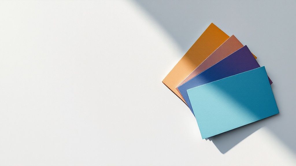
In a world of fleeting digital connections, a physical business card must deliver an immediate, tangible impact. It's no longer just a contact slip; it’s a micro-portfolio, a brand statement, and a powerful conversation starter, all condensed onto a 3.5x2 inch canvas. But how do you translate a complex artistic vision into such a small, functional format? This guide moves beyond generic templates to showcase a curated collection of exceptional business card artist examples . We're diving deep into the platforms and individual artists shaping modern card design, breaking down the strategy behind what makes their work effective. You'll learn not just where to find inspiration, but how to analyze material choice, typography, layout, and specialty finishes to create a card that leaves a memorable impression. A great card functions as a miniature interface for your brand; to truly make it unforgettable, it's essential to grasp the underlying design principles, much like understanding the fundamental principles of User Experience (UX) design . We will explore 7 incredible sources, including Behance, Dribbble, and Etsy, providing a comprehensive look at the tactics top designers employ. Each entry includes screenshots and direct links, allowing you to see the designs in context. This resource is built to help you transform your networking tool from a simple handout into a genuine masterpiece. 1. Etsy Etsy stands as a global marketplace where independent artists, designers, and craftspeople converge to sell their unique creations. For anyone seeking standout business card artist examples , it's an unparalleled source of inspiration and accessible design. Unlike monolithic print-on-demand services, Etsy’s strength lies in its artist-driven variety, offering a direct connection to individual creators with distinct aesthetic visions. The platform is a treasure trove for both DIY enthusiasts and those seeking a fully managed print service. You can browse thousands of editable templates, often designed for popular tools like Canva or Adobe Illustrator, and purchase them for just a few dollars. This instant-download model empowers small businesses and startups to achieve a high-end look on a minimal budget. Strategic Breakdown Etsy’s model decentralizes the design process, putting you in direct contact with the artist. This creates opportunities for customization that larger platforms can't match. Many sellers offer not just templates but also bespoke design services and made-to-order printed cards. This direct-to-creator pipeline allows for a more personal and collaborative design experience. Key Insight: Etsy thrives on niche aesthetics. Whether you need a card with holographic foil, die-cut shapes, letterpress details, or a minimalist boho vibe, there's an artist specializing in that exact style. The platform functions as a curated gallery where you can find and commission an artist whose portfolio already aligns with your brand identity. Actionable Takeaways To make the most of Etsy for your business card needs, follow a strategic approach. Start by using specific keywords to narrow your search (e.g., "minimalist letterpress business card," "botanical illustrator calling card"). This will help you sift through the massive selection to find relevant artists. Evaluate Seller Reviews: Always check shop ratings and read customer reviews. Look for comments on print quality, communication, and shipping times to vet potential creators. Clarify Licensing: Before purchasing a digital template, carefully read the item description for licensing terms. Ensure you understand whether it's for personal or commercial use. Request Samples: For larger or more complex print orders, don't hesitate to message the seller and ask if they offer printed samples. Seeing and feeling the cardstock and finish can prevent costly mistakes. Leverage Customization: If you find a design you love but need a minor tweak, message the artist. Many are happy to adjust colors, fonts, or layouts for a small fee, giving you a semi-custom result. Etsy's structure is particularly beneficial for local artisans and crafters who want to translate their handmade quality into their branding materials. Exploring the work of these creators provides a powerful lesson in brand authenticity. To discover more about branding for this specific group, check out these printing options for local artisans and crafters on 4over4.com . Feature Etsy's Approach Selection Massive, artist-driven variety across countless niches and styles. Pricing Highly accessible, with digital templates often priced from $1–$10. Process Direct-to-creator interaction for templates, custom design, and printing. Quality Control Varies by seller; relies on a user-driven review and rating system. By treating Etsy as a directory of individual artists rather than a single store, you can unlock a world of unique and affordable business card designs that truly capture your brand's essence. Website: https://www.etsy.com 2. Behance Behance is a creative powerhouse, functioning as a massive online portfolio platform where professional designers and agencies showcase their best work. For those searching for high-caliber business card artist examples , it offers an unparalleled window into the world of professional brand identity design. Unlike marketplaces, Behance is an exhibition space, providing deep-dive case studies rather than ready-made templates for sale. The platform excels at showing the "why" behind a design. Artists present their business card projects as part of comprehensive branding systems, often including detailed mockups, print specifications, and behind-the-scenes glimpses into their creative process. This makes it an essential resource for benchmarking quality and gathering sophisticated inspiration before commissioning a designer. Strategic Breakdown Behance’s value lies in its role as a gallery and professional network. It connects clients directly with top-tier talent, offering a curated look into an artist's entire body of work, not just a single product. This context is crucial for understanding a designer’s strategic thinking, style versatility, and ability to execute complex print finishes. Key Insight: Behance is where you go to find a creative partner, not just a product. The platform’s strength is in its detailed project presentations. You can see how a business card uses special techniques like embossing or foil stamping and how it fits into a larger brand narrative, complete with logos, stationery, and digital assets. Actionable Takeaways To use Behance effectively, treat it as a research tool and a talent directory. Your goal is to identify artists whose style aligns with your brand vision and then initiate a conversation about a potential commission. Filter with Intent: Use filters like "Most Appreciated" and "Most Recent" to discover trending and current design styles. Search for specific terms like "luxury law firm business card" or "die-cut coffee shop card" to find relevant case studies. Analyze Project Details: Pay close attention to the descriptions artists provide. They often list the paper stock, printing methods, and typography used. This information is invaluable when writing a creative brief for your own project. Vet the Designer's Profile: Beyond the project itself, review the designer’s full portfolio, client list, and any testimonials. This holistic view helps ensure they are a good fit for your company’s scale and industry. Initiate Professional Outreach: When you find a designer you want to work with, use the platform's messaging feature or follow the links to their professional website. Be prepared with a clear brief outlining your needs, budget, and timeline. The detailed visuals on Behance are particularly useful for understanding the impact of tactile finishes. Exploring how artists use raised textures can inspire your own design; discover more about these special effects and explore different embossing options on 4over4.com . For artists showcasing their business card designs, inspiration can also come from broader creative showcases. Explore effective examples of online portfolios to see how professionals present their talent and attract new clients. Feature Behance's Approach Selection Vast collection of professional case studies and high-end design examples. Pricing Varies widely; custom pricing is negotiated directly with the artist/agency. Process Primarily for inspiration and commissioning custom design work from freelancers. Quality Control Community-curated via an "Appreciation" system, highlighting top-tier talent. By leveraging Behance as an inspirational gallery and networking tool, you can find a world-class artist to create a truly bespoke and strategic business card. Website: https://www.behance.net 3. Dribbble Dribbble serves as a high-caliber social network and portfolio platform for digital designers and creatives. For anyone hunting for premium business card artist examples , it is an essential destination for discovering cutting-edge trends and connecting directly with top-tier talent. Unlike marketplaces focused on templates, Dribbble is a real-time feed of professional design work, offering a pure, unfiltered look into what the best in the industry are creating. The platform’s "shots," or small screenshots of designers' work, provide a fast-paced, visual browsing experience. This format allows you to quickly assess a designer's style, from minimalist and corporate to experimental and illustrative. It's less about purchasing a pre-made product and more about finding the perfect artist to commission for a custom branding project. Strategic Breakdown Dribbble’s primary function is as a discovery engine for design talent. The platform is structured to showcase visual excellence, making it an ideal place to find an artist whose aesthetic perfectly matches your brand vision. After finding work you admire, you can click through to the designer's profile, view their full portfolio, check their availability, and initiate contact for a custom project. The platform has also integrated a "Services" marketplace where designers can list specific offerings, like brand identity packages. Key Insight: Dribbble is where you go to find the trendsetters. Designers often post conceptual work and passion projects alongside client work, meaning you get a glimpse of future design trends before they hit the mainstream. This makes it an invaluable resource for creating a business card that feels modern, innovative, and truly unique. Actionable Takeaways To use Dribbble effectively, think of it as a creative recruiting tool rather than a store. Your goal is to identify and vet potential design partners for your business card and broader branding needs. Use Specific Search Tags: Start by searching for tags like "business card," "branding," "identity design," or even specific finishes like "spot UV" to narrow down the results. Analyze Portfolios, Not Just Shots: A single great shot is a good start, but a strong portfolio is better. Review a designer’s body of work to ensure consistency and a style that aligns with your long-term vision. Check for a "Hire Me" Button: Many top designers on Dribbble are available for freelance projects. Look for a "Hire Me" button on their profile or check their bio for contact information and availability. Prepare a Clear Brief: When you reach out to a designer, have a clear project brief ready. Include your company background, target audience, brand values, and examples of designs you like to ensure a productive conversation. Dribbble is a showcase for sophisticated design techniques, with many artists featuring high-end finishes in their mockups. To understand how these concepts translate to reality, explore the possibilities with unique printing methods. You can learn more about how special finishes like Spot UV can elevate your design by exploring the various Spot UV printed products on 4over4.com . Feature Dribbble's Approach Selection A curated feed of high-quality, professional design examples and portfolios. Pricing Varies widely; pricing is project-based and negotiated directly with designers. Process Visual discovery followed by direct outreach to commission custom design work. Quality Control Community-driven; quality is self-regulated by the high standards of top designers. By leveraging Dribbble as a source of inspiration and a direct line to professional artists, you can commission a truly bespoke business card that stands apart from template-based designs. Website: https://dribbble.com 4. 99designs by Vista 99designs by Vista bridges the gap between hiring a freelance artist and sourcing creative concepts from a global community. It offers a structured platform for commissioning custom business card designs, making it a powerful resource for finding unique business card artist examples . Instead of browsing pre-made templates, businesses use 99designs to source original, bespoke artwork tailored specifically to their brand. The platform is renowned for its two distinct commissioning models. You can either run a design contest, where multiple designers submit concepts based on your brief, or you can browse artist portfolios and hire a specific designer for a one-to-one project. This flexibility allows businesses to choose the creative process that best suits their budget, timeline, and collaboration style. Strategic Breakdown 99designs formalizes the freelance design process, providing a secure and managed environment for collaboration. Its contest model is particularly strategic for businesses that are unsure of their exact visual direction, as it allows them to see dozens of different interpretations of their brand before committing to a single artist. This crowdsourced approach minimizes risk and maximizes creative exploration. Key Insight: 99designs is not a marketplace for templates; it’s a platform for commissioning original art. The value lies in receiving multiple creative directions from a vetted global talent pool. This is ideal for establishing a strong, unique brand identity from scratch, as the final design is guaranteed to be one-of-a-kind. Actionable Takeaways To maximize your results on 99designs, a clear and detailed creative brief is essential. The more information and inspiration you provide, the higher the quality and relevance of the submissions you will receive. Write a Detailed Brief: Clearly articulate your brand values, target audience, and stylistic preferences. Include examples of designs you like (and dislike) to give artists a strong starting point. Choose the Right Package: Contest packages (Bronze, Silver, Gold, Platinum) attract designers of varying experience levels. Select a package that aligns with your quality expectations and budget. Engage Actively: In a contest, provide feedback on submissions promptly. This helps artists refine their concepts and shows them you are an engaged client, which encourages more participation. Review Artist Portfolios: If you opt for a one-to-one project, thoroughly vet designer portfolios. Look for artists whose work already aligns with your desired aesthetic to ensure a smoother collaboration. The platform's structured payment and handover process, including full copyright ownership, provides a level of security that direct freelance hiring sometimes lacks. This makes it an excellent choice for businesses that need professional results without the administrative overhead of managing independent contracts. Feature 99designs' Approach Selection Access to a large, vetted global community of designers for custom work. Pricing Tiered contest pricing and project-based quotes; generally higher than templates. Process Two distinct models: crowdsourced design contests or direct one-to-one hiring. Quality Control Vetting of designers, a money-back guarantee on contests, and a managed platform. By leveraging its contest model or curated artist search, 99designs empowers businesses to source truly custom and professional business card designs that stand out from the competition. Website: https://99designs.com 5. MOO MOO has carved out a distinct niche in the online printing world by focusing on premium quality and a superior tactile experience. For those looking for business card artist examples that feel as good as they look, MOO serves as both a high-end printer and an inspiration gallery. Its reputation is built on offering unique paper stocks and special finishes that elevate a simple card into a memorable branding tool. Unlike budget-focused printers, MOO positions itself as a partner for brands that want to make a tangible impact. The platform offers downloadable templates for professional design software, but its true value shines in its curated selection of premium materials like Original, Super Soft Touch, and 100% Cotton paper stocks. These options allow artists and businesses to create cards with a distinct feel and weight. Strategic Breakdown MOO’s strategy centers on bridging the gap between accessible online printing and boutique-level quality. By standardizing premium options like raised spot gloss and metallic foils, it makes sophisticated finishes available without the complexity of a custom print job. The platform’s "Inspiration Hub" is a key part of this strategy, showcasing real-world designs and proving that a well-crafted card is a powerful marketing asset. Key Insight: MOO excels at turning a business card into a sensory experience. The emphasis on paper feel (like their signature Soft Touch finish) and visual effects (like gold foil) encourages designers to think beyond two-dimensional design and consider how the card will feel in a recipient's hand. This focus on tactile quality is their core competitive advantage. Actionable Takeaways To leverage MOO effectively, focus on its premium features and fast turnaround times. The platform is ideal for when you need to make a strong impression quickly, such as before a major conference or client meeting. Order a Sample Pack: Before committing to a full order, get MOO’s free sample pack. This allows you to physically handle their different paper stocks, finishes, and card thicknesses, ensuring you choose the right materials for your brand. Check Next-Day Eligibility: If you're on a tight deadline in the US, filter for products eligible for next-day delivery. Be aware that many special finishes and thicker paper stocks require longer production times. Use the Inspiration Hub: Browse the "Inspiration" section to see how other artists and businesses use MOO’s finishes. This can spark ideas for combining elements like spot gloss with a matte finish for a subtle, high-impact effect. Leverage Printfinity: MOO’s Printfinity technology allows you to print a different design on the back of every card in a pack at no extra cost. Use this to showcase a portfolio of work, different brand messages, or unique artist illustrations. MOO's premium offerings are an excellent choice for businesses ready to invest in high-quality branding. Exploring their materials can provide valuable insights into how different paper and finishing choices affect brand perception. To compare these premium options with other possibilities, learn more about various business cards printing choices on 4over4.com . Feature MOO's Approach Selection Curated range of premium paper stocks and special finishes. Pricing Premium pricing model reflecting higher-quality materials and finishes. Process Streamlined online ordering with fast-track options for select products. Quality Control High and consistent; known for excellent print and color fidelity. By focusing on MOO's strengths in material quality and unique finishes, you can produce a business card that stands out and communicates a message of quality and professionalism. Website: https://www.moo.com 6. VistaPrint VistaPrint is a dominant force in the online printing industry, known for making professional marketing materials accessible to businesses of all sizes. For those exploring business card artist examples , VistaPrint serves as a foundational platform, offering a vast library of templates alongside powerful customization tools. Its primary strength lies in its blend of affordability, speed, and scale, making it an ideal starting point for startups and a reliable partner for established companies. The platform streamlines the design and ordering process, catering to both users who need a quick, template-based solution and those who want to upload their own unique artwork. With an extensive range of paper stocks, finishes, and specialty options, VistaPrint empowers users to create cards that feel premium without the associated cost. It has positioned itself as the go-to service for fast, reliable, and budget-conscious printing. Strategic Breakdown VistaPrint’s model is built on efficiency and volume, providing a centralized system for design, printing, and delivery. While it may not offer the direct artist connection of a marketplace like Etsy, its sophisticated online editor gives users significant creative control. This allows for rapid prototyping and ordering, which is invaluable for businesses needing a quick turnaround for events or marketing campaigns. Key Insight: VistaPrint excels at bridging the gap between DIY design and professional printing. Users can start with a professionally designed template and customize it extensively or upload a fully realized design, all while accessing commercial-grade printing options like raised foil or spot UV that would otherwise be difficult to source for small-batch orders. Actionable Takeaways To maximize VistaPrint’s potential for your business cards, approach it with a clear design goal. The sheer volume of options can be overwhelming, so having a strategy is key to achieving a high-quality result. Filter Templates Strategically: Use the sidebar filters to narrow down the template selection by industry, style (e.g., "modern," "elegant"), and features. This saves time and helps you find a base design that aligns with your brand. Invest in Better Paper Stock: The default paper is functional, but upgrading to a premium or signature stock makes a significant impact on the perceived quality of your card. Consider matte, recycled, or linen finishes for a more tactile experience. Proofread Meticulously: Use the digital proofing tool to carefully check every detail of your design before ordering. Look for typos, alignment issues, and image resolution problems, as what you see on the proof is what will be printed. Explore Specialty Finishes: Don't overlook options like metallic foil or spot UV. These finishes can elevate a simple design into something memorable and professional. To understand how these effects work, you can find more information about premium metallic foil printing on 4over4.com . VistaPrint is particularly effective for businesses that need to scale their orders or require consistent branding across multiple marketing materials. Its combination of user-friendly tools and industrial-scale printing makes it a practical and powerful resource. Feature VistaPrint's Approach Selection Extensive library of editable templates and support for custom uploads. Pricing Highly competitive, with frequent promotions and discounts on bulk orders. Process Centralized, user-driven design and ordering through an online platform. Quality Control Standardized printing process; quality can vary based on selected stock. By leveraging its customization tools and strategic upgrades, you can use VistaPrint to produce business cards that are both professional and affordable, meeting the demands of a fast-paced business environment. Website: https://www.vistaprint.com 7. Creative Market Creative Market is a curated digital marketplace where independent graphic designers sell professional-grade assets, including a massive library of business card templates. For businesses and entrepreneurs who need top-tier business card artist examples without the cost of a full custom commission, it's an indispensable resource. Unlike print-on-demand services, Creative Market focuses purely on the design asset, giving you total control over the final print production. The platform bridges the gap between hiring a freelance designer and using a generic online builder. You gain access to templates created by vetted artists, often available in multiple formats like Adobe Illustrator (AI), Photoshop (PSD), and Canva. This instant-download model allows for rapid customization, enabling a polished, agency-quality look in a fraction of the time and cost. Strategic Breakdown Creative Market’s strength lies in its professional-grade quality and clear licensing structure. The templates are typically well-organized with layered files, making them easy for anyone with basic software knowledge to edit. The platform empowers users to take a designer-created foundation and infuse it with their own brand identity, ensuring a unique yet polished result. This approach separates the design phase from the printing phase, giving you the freedom to choose any print vendor you prefer. Key Insight: Creative Market excels at providing time-saving, high-quality design solutions. The platform is not for printing; it's for acquiring the digital blueprint. This is ideal for marketers and entrepreneurs who want creative control and access to professional files without starting from scratch or paying for bespoke design services. Actionable Takeaways To effectively leverage Creative Market, it’s crucial to understand its role as a digital asset provider. Your primary goal is to find a template that aligns with your brand and is compatible with the software you use. From there, you will handle the customization and printing yourself. Filter by Software: Start your search by filtering templates by the application you are most comfortable with (e.g., Canva, Photoshop, Illustrator). This is the single most important step to ensure you can actually edit your purchase. Check File Specs: Before buying, carefully read the product description to see what’s included. Look for details on file dimensions, color mode (CMYK is standard for print), and whether fonts are included or need to be downloaded separately. Review Shop Policies: While the platform is curated, quality still varies by designer. Check the creator’s shop reviews and see how responsive they are to questions in the comments section. Understand Licensing: Creative Market offers clear licensing options (Personal, Commercial, Extended Commercial). Ensure you purchase the correct license for your intended use to avoid any legal issues. Feature Creative Market's Approach Selection Thousands of professional templates from vetted independent designers. Pricing Digital templates typically range from $10–$40 for a commercial license. Process Instant download of editable files; printing is a separate, user-managed step. Quality Control Designers are vetted, but quality relies on individual creator standards and user reviews. By using Creative Market strategically, you can secure a professional, artist-designed business card template that gives you full control and flexibility for a very reasonable one-time cost. Website: https://creativemarket.com Top 7 Business Card Artist Platforms Comparison Platform 🔄 Implementation complexity Resource requirements ⭐📊 Expected outcomes 💡 Ideal use cases ⚡ Key advantages Etsy Low — buy/download templates or commission individual sellers Very low-cost templates ($1–$5); variable printing costs & shipping ⭐⭐☆ — wide design variety; print quality depends on seller Browse artist-created examples; cheap DIY templates; small custom orders Instant downloads; direct creator tweaks; niche aesthetics Behance Low to browse; moderate to hire (direct negotiation) Time to review portfolios; hiring budgets when commissioning ⭐⭐⭐⭐ — high-caliber, portfolio-quality work with detailed specs In-depth inspiration; benchmarking finishes and layouts; finding pro designers Rich case studies and print specs for reference Dribbble Very low to browse; moderate to hire via Services Design budget to hire; account needed for some features ⭐⭐⭐ — strong visual trend discovery; portfolio snippets Fast visual discovery of specific styles; sourcing designers for hire Quick spotting of aesthetics; designer contact/Services marketplace 99designs by Vista Moderate — contest or one-to-one process with platform workflow Higher cost (tiered packages); time for contest/revisions ⭐⭐⭐⭐ — multiple concepts from vetted designers; ownership options Seeking many concepts or vetted professional design via contest Structured process, escrow, transparent tiers, money-back guarantee MOO Low — use templates/upload, select finishes increases choices Premium pricing for specialty stocks and finishes; possible expedited fees ⭐⭐⭐⭐⭐ — consistent, tactile, premium print results Premium business cards and specialty finishes; fast turnaround (select) High-quality papers/finishes; next-day delivery options on eligible products VistaPrint Very low — template editor or upload custom files Budget-friendly with frequent promotions; scalable quantities ⭐⭐⭐ — affordable, practical printed results; color varies by stock Quick, affordable small runs to large batches; template-based printing Competitive pricing, fast/expedited shipping, easy scaling Creative Market Low — instant download; editing may require software Mid-range per template; requires Adobe/Canva where applicable ⭐⭐⭐⭐ — professional-grade templates ready to customize Acquire polished templates for in-house customization and print Clear licensing, many formats (AI/PSD/Canva), fast acquisition From Inspiration to Impression: Printing Your Perfect Card We've journeyed through a diverse landscape of creative platforms, from the bespoke creations on Etsy to the high-level conceptual work on Behance and the trend-setting designs on Dribbble. This exploration of business card artist examples has revealed a fundamental truth: a business card is far more than a simple piece of cardstock. It's a strategic marketing tool, a physical embodiment of your brand’s identity, and often, the first tangible connection a potential client has with your business. The most compelling examples we analyzed share common strategic foundations. They don't just list contact details; they communicate a brand's core values through deliberate choices in typography, color theory, material selection, and layout. Each element serves a purpose, working in harmony to create a memorable and impactful experience. A minimalist design can convey sophistication and confidence, while a vibrant, tactile card can express creativity and approachability. The key is to ensure every choice aligns with your brand's unique story. Synthesizing Inspiration into a Cohesive Strategy Your next step is to transform this wealth of inspiration into a concrete design strategy. Don't just pick a design you like; deconstruct why you like it. Was it the clever use of negative space you saw on a Dribbble shot? The luxurious, tactile feel of a MOO sample? Or the powerful brand consistency demonstrated in a Behance portfolio? To bridge the gap between concept and creation, consider these actionable steps: Define Your Core Message: Before you think about design, define the single most important feeling or message you want your card to convey. Is it "trustworthy and professional," "innovative and bold," or "elegant and premium"? Write it down. Audit Your Brand Assets: Gather your logo, brand colors, and fonts. Do they align with your core message? The examples from 99designs by Vista show how even template-based designs can be elevated with strong, consistent branding. Select a Platform for Your Needs: Your path forward depends on your resources and goals. For Direct Inspiration & Custom Art: Browse Etsy for handcrafted concepts or commission a unique illustration. For High-Level Conceptual Ideas: Study portfolios on Behance to understand how a business card fits into a larger brand system. For Custom Design on a Budget: Use 99designs by Vista to run a contest and source multiple creative concepts from different designers. For Premium Templates & Unique Materials: Explore MOO for high-quality, curated templates and innovative printing options like extra-thick paper or spot gloss. From Digital Design to Tangible Reality Once your design is finalized, the final and most critical step is production. The most brilliant digital concept can be undermined by poor-quality printing, flimsy paper, or inaccurate color reproduction. This is where your choice of a printing partner becomes a pivotal part of the process. A professional printer translates your digital vision into a physical object that people will hold and remember. Think about the physical experience you want to create. Factors like paper weight (stock), finish (matte, gloss, uncoated), and special treatments (foil stamping, embossing, die-cutting) are not just add-ons; they are integral parts of the design that engage the senses. The weight of a thick card communicates substance and quality, while a subtle embossed logo adds a layer of sophisticated detail that begs to be touched. This final stage is where the best business card artist examples truly come to life, turning a good design into an unforgettable one. Ready to bring your expertly designed business card to life with unmatched quality and precision? 4OVER4 specializes in premium printing solutions that help your brand make a lasting impression. Explore our vast selection of luxury paper stocks, custom finishes, and advanced printing techniques at 4OVER4 to ensure your final product is as impactful as your vision.
 story
story Mastering Business Card Colors for Your Brand
The best colors for your business card are the ones that tell your brand’s story. Think blue for trust , black for luxury , or green for growth . At the end of the day, it's about making a strategic choice that feels authentic and leaves a lasting impression, turning a simple piece of paper into a powerful networking tool. The Hidden Power of Business Card Colors Your business card is often the very first tangible thing someone gets from your brand. Think of it like a handshake—is it firm and confident, or does it feel flimsy and forgettable? The colors you pick play a huge part in that initial gut reaction, working on a subconscious level to communicate your brand's personality before a single word is read. This isn't just about picking something that looks nice; it's a critical strategic decision. The right color palette can build trust, signal professionalism, and spark just enough curiosity to make someone take a second look. Get it wrong, and you might send a mixed message, come off as unprofessional, or just fade into the sea of other cards they've collected. A plain white card might be safe, but let's be honest, it rarely makes a statement. Why Color Is Your Silent Ambassador Every color comes with its own baggage—a whole set of psychological associations that are subtle but incredibly powerful. These connections influence how a potential client or partner feels about your business from the moment you hand them your card. Learning to speak this silent language is the first step toward designing a card that actually works for you. Here's what your business card colors are doing behind the scenes: Communicating Brand Personality: Are you a bold, disruptive startup or a traditional, reliable firm? Bright, energetic colors tell a completely different story than muted, earthy tones. Building Instant Trust: Some colors just feel dependable. Hues like deep blue and dark gray are universally linked to stability and professionalism, making them a natural fit for corporate or financial industries. Enhancing Memorability: Let's face it, a unique or striking color combination is just harder to forget. In fact, studies show that people keep colored cards 10 times longer than their plain white counterparts. Driving Action: A pop of a strategic accent color can pull the eye directly to the most important info, like your website or a QR code, giving the recipient a gentle nudge to take that next step. Your business card isn’t just a tool for sharing contact details; it's a miniature billboard for your brand. The colors you select are the foundation of that billboard's message, setting the stage for every interaction that follows. Choosing the right palette is about more than just picking your favorites from a color wheel. It’s a thoughtful process of matching color psychology with your brand identity and what people in your industry expect. When you're ready to bring that vision to life, exploring professional business cards printing options ensures your carefully chosen colors pop with perfect accuracy and impact. Ultimately, a well-chosen color scheme can be the difference between a card that gets tossed and one that starts a conversation. Decoding The Psychology Of Color In Branding Colors speak a language all their own, sending messages and stirring up feelings long before our logical brain has a chance to catch up. The moment someone gets your business card, the colors you chose are already telling a story about your brand. This isn't just about what looks good; it's a strategic move that taps into the powerful world of color psychology. When you understand this language, you can pick business card colors that are in perfect harmony with your brand's core message. A financial consultant who wants to project stability and trust will naturally gravitate toward different colors than a creative agency aiming to signal innovation and energy. Every color family sparks a different emotional reaction, and getting these associations right is your first step to making a killer first impression. The Emotional Spectrum Of Business Colors Think of colors like different personality types. Some are loud and energetic, others are calm and dependable, and a few are all about luxury and sophistication. Your goal is to find the color personality that’s a perfect match for your brand. Picking the right shade is an essential part of building strong brand awareness from that very first handshake. For example, warm colors like red and orange are all about energy, passion, and excitement. They’re fantastic for brands that need to grab attention and project a sense of urgency or momentum. Picture a personal trainer or a fast-moving tech startup—these colors scream action. On the other side of the spectrum, cool colors like blue and green foster feelings of calm, trust, and professionalism. They’re the go-to choices for industries where reliability is everything, like finance, healthcare, and law. These colors don't shout; they reassure. The image below gives you a great visual of how different colors are seen in a business setting, showing the main emotions they tend to trigger. It’s clear from this that blue is a heavyweight champion for building trust, while red and green pack a punch for conveying energy and growth. A Practical Guide To Key Business Card Colors Let's dive into some of the most popular colors for business cards and what they’re really saying. Getting a handle on both the good and the bad associations will help you make a smarter choice that fits your brand and your industry. To make things even easier, here's a quick cheat sheet you can use as a reference. Business Card Color Psychology Cheat Sheet This table breaks down common colors, what they mean in business, which industries love them, and what to watch out for. Color Primary Meaning Common Industries Potential Pitfall Blue Trust, Stability, Professionalism Finance, Tech, Healthcare, Legal Can feel cold or overly conservative Black Luxury, Power, Sophistication Fashion, High-End Goods, Creative Arts Might seem intimidating or unapproachable Green Growth, Wellness, Nature, Wealth Environmental, Health, Finance, Food Some shades can look bland or dated Red Energy, Passion, Urgency Food & Beverage, Automotive, Retail Can be aggressive or alarming if overused Purple Creativity, Wisdom, Luxury Tech, Wellness, Creative Agencies May feel too whimsical for some markets Orange Enthusiasm, Friendliness, Fun Youth Brands, Creative Services, Food Can come off as cheap or unsophisticated Yellow Optimism, Clarity, Warmth Energy, Food, Creative Industries Can cause eye strain or seem childish White Simplicity, Cleanliness, Modernity Healthcare, Tech, Minimalist Brands May appear stark or lacking personality This guide is a great starting point, but remember that context is everything. The right shade, combined with smart design, can overcome almost any potential pitfall. Colors For Innovation And Creativity While blue, black, and green are corporate staples, other colors are perfect for brands that want to break the mold and communicate a message of creativity, friendliness, or forward-thinking. To see some great examples in action, check out these pieces of inspirational branding for tech companies and notice how they use color to build a distinct identity. Purple for Vision and Wisdom: Purple is a fascinating mix, blending the calm stability of blue with the fiery energy of red. It’s often linked to creativity, luxury, and vision, making it a stellar choice for tech startups, wellness brands, and creative agencies. Orange for Enthusiasm and Fun: Orange is vibrant, friendly, and full of life. It’s perfect for brands that want to feel approachable, cheerful, and confident. It’s less aggressive than red but still knows how to get noticed. Yellow for Optimism and Clarity: Yellow is the color of sunshine and happiness, plain and simple. It brings up feelings of optimism, warmth, and clarity. Even a small splash of yellow can make a design feel more positive and accessible. At the end of the day, the best business card colors are the ones that feel true to your brand's story. By understanding the psychology behind each hue, you can go beyond just picking what you like and make a strategic choice that forges a real connection from the very first glance. Building a Cohesive Brand Color Palette Picking a single color based on psychology is a fantastic start, but a truly memorable brand needs more than just one note—it needs a full symphony. This is where building a cohesive color palette comes in. You’re moving from a solo act to a harmonious set of hues that work together to tell your brand's complete story. Think of it like putting together the perfect outfit. You wouldn't just pick a shirt and call it a day; you'd coordinate everything to create a specific, intentional impression. Your business card's color scheme works the exact same way, making sure your brand looks polished and put-together. The goal is to land on a palette that’s both versatile and consistent. These colors won't just live on your business card. They’ll show up on your website, your social media, and every other piece of marketing you create. A well-defined palette is the bedrock of a strong, recognizable visual identity. Aligning Colors with Your Brand Identity Before you even think about cracking open a color wheel, you need to look inward at what your brand is all about. Your business card colors should be a direct reflection of your company's mission, values, and overall personality. Are you an innovator, or are you the trusted, traditional choice? To get started, ask yourself a few simple questions: What is our brand's personality? Are we playful and fun, or are we serious and luxurious? Who is our target audience? What colors will click with the people we want to reach? What message are we trying to send? Are we aiming for high energy, calm and focus, or sophistication? Answering these questions helps you cut through the noise of endless color options and zero in on shades that genuinely represent who you are. As you build this palette, it's also crucial to remember the critical role of logo design in cementing your visual identity—your logo is often the star of your brand's color story. Mastering Common Color Schemes Once you have your primary brand color locked in, the next move is to build a full palette around it using some time-tested principles from color theory. These schemes are like proven recipes for creating visual harmony, giving you a structure that ensures your colors play nicely together instead of clashing. Here are three of the most effective color schemes you can use for your business card design: Monochromatic: This scheme is all about using different shades, tones, and tints of a single color. It creates a clean, sophisticated, and incredibly cohesive look. For example, a palette built from light blue, royal blue, and navy feels instantly unified and professional. Analogous: This approach uses colors that are neighbors on the color wheel, like green, teal, and blue. Analogous palettes feel naturally harmonious and are very pleasing to the eye, creating a sense of calm without being quite as uniform as a monochromatic scheme. Complementary: If you're going for a bold, high-impact look, a complementary scheme is your best bet. It uses colors that are directly opposite each other on the color wheel, like blue and orange. This pairing creates maximum contrast, making key elements pop right off the card. It's perfect for brands that want to feel dynamic and full of energy. A great color palette is a versatile toolkit. It should give you a dominant color for backgrounds, a secondary color for key information, and a punchy accent color to draw the eye to your logo or call to action. Ensuring Consistency Across All Platforms Your business card is just one piece of a much larger brand puzzle. The color palette you choose has to be applied consistently everywhere your brand shows up. This repetition is what builds brand recognition and trust over time. A customer should see the same familiar colors whether they're holding your card, scrolling through your website, or seeing one of your ads on social media. This consistency reinforces your brand identity and makes you instantly recognizable. Think of iconic brands like Coca-Cola or Tiffany & Co.—their colors are so ingrained in our minds that we know the brand without even seeing a name. That's the power of a consistent color palette. For designs that need an extra touch of class, you can find inspiration from the unique finishes available with https://www.4over4.com/printing/category/silk-laminated-printed-products , which can beautifully showcase a well-chosen color scheme. By creating a cohesive and consistent visual language, you turn your business card colors into a powerful asset that works for your brand long after the first handshake. Have you ever designed a gorgeous business card on your screen, only to get a box of dull, disappointing prints? It’s a common frustration. That gap between digital and physical happens when your vibrant screen colors get lost in translation during the printing process. To make sure the colors you design are the ones you hand out, you need to peek behind the curtain at the technical side of color production. Think of it like this: your design is the recipe, but your color settings and paper choice are the key ingredients. A fantastic recipe with the wrong ingredients leads to a kitchen disaster. Printing is no different. The most common trip-up? The battle between RGB and CMYK. Getting this right is the single most important step you can take. The Crucial Difference Between RGB and CMYK Your computer monitor, phone, and digital camera all create color by mixing light. They use the RGB (Red, Green, Blue) color model. It's an additive process, meaning that when you combine all three colors at full blast, you get pure white light. This is perfect for glowing digital screens, but it just doesn't work for putting ink on paper. Printers use a completely different system: CMYK (Cyan, Magenta, Yellow, Key/Black) . This is a subtractive process. Ink is layered onto a white surface, and as the colors mix, they subtract (or absorb) light. The combination of all four inks creates black. If you design in RGB and print in CMYK, the printer has to convert the colors, which often leads to them looking muted, muddy, or just... off. Imagine trying to paint a glowing sunset with a pack of Crayola markers. You can get close, but you’ll never quite capture the brilliant, luminous quality of the real thing. That's the challenge of converting vibrant RGB light into physical CMYK ink—some screen colors just don't have a direct equivalent in the ink world. The fix is simple: always set your design software’s color mode to CMYK right from the start. This ensures the colors you’re working with on-screen are a much more accurate preview of what will actually come off the press. No more unwelcome surprises. Achieving Perfect Brand Consistency with Spot Colors For brands where "close enough" isn't good enough, standard CMYK printing might not cut it. Tiny variations can happen from one print run to the next. That’s where spot colors enter the picture, with the most famous system being the Pantone Matching System (PMS) . Instead of mixing CMYK inks to approximate a color, a spot color uses a single, pre-mixed ink formula. This is your guarantee that your brand’s signature blue will be the exact same shade on every single business card, every single time. You should think about using spot colors if: Your brand has a specific, legally protected color. You need absolute color consistency across all your marketing materials. Your design relies on just one or two key colors. While it can be a bit more expensive, the investment in spot colors pays for itself with perfect, unwavering brand integrity. How Paper Stock Transforms Your Colors The final piece of the color puzzle is the paper you print on. The finish and texture of your business card can completely change how your colors look. The same exact ink will appear totally different depending on the surface. For a deep dive into how printing technologies work with various materials, explore this guide on digital printing services. Glossy Stock: This paper has a shiny, reflective coating. It makes colors pop, appearing more vibrant and saturated. It’s a fantastic choice for photo-heavy designs or bold, bright color palettes. Matte Stock: With its non-reflective, smooth finish, matte paper gives off a more subdued and professional vibe. Colors appear softer, and the lack of glare makes text incredibly easy to read. Uncoated Stock: This paper has a natural, porous texture with no coating at all. It soaks up more ink, which causes colors to look flatter and less intense. It offers a wonderful organic, tactile feel but isn't the best pick for designs that need brilliant, punchy color. Whenever you can, ask your printer for a printed proof. This lets you see exactly how your colors and paper choice play together in the real world, giving you the final confirmation that your business cards will turn out perfect. How Strategic Colors Boost Memorability Picking the right colors for your business card is about so much more than just looking good. It’s a tactical move that can make or break your networking efforts. Imagine a potential client sifting through a stack of cards after a conference. Amidst a sea of generic designs, a card that pops with color acts like a powerful memory trigger, anchoring your brand in their mind long after you've shaken hands. The goal isn't just to be seen—it's to be remembered. Think of your card as a tiny billboard fighting for prime real estate inside someone's wallet. Sure, a basic black-and-white card gets the job done by communicating information. But a card with a thoughtful color scheme? That tells a story. It creates an emotional connection. This visual flair is what separates a card that earns a second look from one that gets tossed without a thought. Making Your First Impression Last The numbers don't lie: color plays a huge part in how long your card sticks around. A standard, run-of-the-mill card might get chucked within a week. But add a splash of color, and its chances of survival go way up. Why? Because color makes things visually appealing, giving your card a sense of value that makes people want to hang onto it. In fact, some studies show that colored business cards are 10 times more likely to be kept than their plain black-and-white counterparts. That's a massive boost in retention from a single design choice. It really drives home how much visual appeal influences whether someone keeps your contact info or not. You can dig into more stats on the impact of color by checking out some great insights on business card effectiveness on wavecnct.com . The Power of Tactile Experience But memorability isn't just about what people see; it's also about what they feel. When you pair a killer color palette with a high-quality paper stock, you create a full sensory experience that screams professionalism. A thick, textured card with deep, rich colors just feels important. Here are a few combinations that really pack a punch: Deep Blues on Matte Stock: This pairing feels solid, trustworthy, and all-business. The matte finish absorbs light, making that rich blue look even deeper and more sophisticated. Vibrant Oranges on Glossy Stock: A glossy finish makes energetic colors like orange absolutely jump off the card. It creates a feeling of creativity and excitement that’s impossible to ignore. Earthy Greens on Uncoated Paper: The raw, natural texture of uncoated stock is the perfect partner for organic colors, driving home a message of wellness, sustainability, or growth. A business card is more than just a piece of paper. It’s a physical stand-in for your brand’s quality and attention to detail. When the look and feel are perfectly aligned, you create an impression of premium value that makes someone think twice before tossing it. At the end of the day, you want to create a card that’s both a feast for the eyes and feels substantial in the hand. That one-two punch of smart color and quality material ensures your card doesn't just get collected—it gets kept, remembered, and, most importantly, used. It’s a small detail that can pay off big time in building real, lasting professional connections. Balancing Modern Trends with Timeless Design Picking your business card colors often feels like a tightrope walk. You want a design that’s fresh and modern, but you also need something with real staying power. Jump on every hot trend and your card could look dated in a year; play it too safe and you risk being completely forgettable. The real magic happens when you blend a little contemporary flair with solid, timeless design. This doesn't mean you have to shy away from what's current. Go ahead and embrace those bold, beautiful gradients that add so much depth, or try a minimalist palette where a single, electric pop of color does all the talking. Even the strategic use of negative space is a powerful way to create a clean, uncluttered look that feels confident and high-end. The trick is to ground these modern touches in a strong foundation. When your core color palette is solid and truly reflects your brand, a trendy element like a gradient just becomes an accent—not your entire identity. This approach ensures your card will still feel relevant long after a particular style has faded. Adopting Trends with a Timeless Twist Instead of tearing up your design every time a new trend emerges, think about weaving in popular elements in small, strategic ways. This lets you look current without sacrificing longevity. The goal is to be fashion-forward, not a fashion victim. Here are a few ways to strike that balance: Minimalism with a Punch: Start with a clean, classic layout using neutrals like gray, white, or black. Then, drop in a single, vibrant trend color for your logo, a key piece of text, or even just the painted edges of the card. Subtle Gradients: Forget the full-card rainbow effect. A gentle, two-tone gradient used within your logo or as a soft background texture adds just enough visual interest without screaming "I was designed in 2024!" Focus on Typography: A timeless font paired with a trendy color is a fantastic combination. The font provides the stability, while the color adds that contemporary edge. A truly effective business card design doesn’t just follow trends; it adapts them. It borrows the energy and excitement of modern aesthetics while staying true to the core principles of good design—clarity, balance, and brand alignment. By using trends as accents rather than the main event, you create a card that feels both timely and timeless. For brands that really want to make an impression, exploring a specialty printing collection can open up options like foil or embossing that pair beautifully with modern color trends. The Growing Importance of Sustainable Color Choices These days, a business card says more than what’s printed on it; it also speaks volumes about your company’s values. As environmental awareness grows, sustainability has become a powerful trend in its own right, directly influencing the colors and materials we choose. Eco-friendly paper stocks, like those made from recycled or cotton fibers, often have a more natural, slightly off-white, or textured look. This pairs beautifully with earthy and muted color palettes, reinforcing a message of environmental responsibility. Opting for soy-based inks can take that story even further, showing a real commitment to green practices. This isn’t just a passing fad; it’s a response to a serious problem. A staggering 88% of printed business cards get tossed out within a week, creating a mountain of waste. But here's the kicker: when clients receive cards made from recycled materials, they are 25% more likely to keep them , as noted by QR Code Tiger in their analysis of business card retention . Choosing sustainable materials and colors isn’t just good for the planet—it’s smart for your business. Common Questions About Business Card Colors Alright, let's tackle some of the common questions that pop up when you're zeroing in on the perfect business card colors. Getting these last few details right is what separates a good card from a great one, giving you the confidence to finally hit "print." Think of this as the final checklist before your design goes live. How Many Colors Should I Use? For a look that’s both professional and easy on the eyes, your sweet spot is somewhere between two and four colors . A tried-and-true formula is to lean on your primary brand color, bring in a secondary accent color for a bit of pop, and use a neutral like a dark gray or an off-white for your text. Throwing too many colors at your card can make it look chaotic and amateurish. On the flip side, being too reserved might make your card fade into the background. You're looking for that perfect balance—a tight, harmonious palette that makes your information a breeze to read and tells your brand's story at a glance. The goal isn't to cram in every color you love. It’s about choosing a small, strategic team of colors that work together. When it comes to design, simplicity often makes the loudest statement. What Is the Best Color to Make a Card Stand Out? Honestly, there's no single "best" color. The right choice depends entirely on your industry and the personality of your brand. A color that’s perfect for a cutting-edge design studio would likely feel out of place for a financial advisor. The real secret to standing out is high contrast . Here are a few ways to achieve that: A Pop of Accent: Use a bright, energetic color like a bold orange, a sunny yellow, or a cool teal against a more neutral backdrop. It immediately draws the eye where you want it to go. Premium and Minimal: Sometimes, less is more. A minimalist design printed on a unique, deeply colored paper stock can feel incredibly luxe and memorable. Unexpected Pairings: Don't be afraid to get a little creative. Combining colors in a fresh way, like a rich, deep purple with a soft mint green, can carve out a truly unique visual identity. The aim is to be memorable for all the right reasons. Make sure whatever standout choice you make still feels authentic to your professional message. Should My Business Card Background Be White? A crisp white background is a classic for a reason—it’s a safe bet that always delivers fantastic readability and a clean, professional vibe. But it’s definitely not your only move. A colored or even a solid black background can create a striking, high-end feel when it's done right. If you decide to go with a dark background, the key is to use a light-colored font that has enough size and weight to it. You need to create enough contrast to make sure your details are still easy to read. Also, keep in mind that printing a full-color background (what printers call a "full bleed") might cost a tiny bit more, but it almost always pays off with a much more polished and impressive final product. Ready to create a business card that truly captures your brand? At 4OVER4 , we offer a huge range of printing options, from premium paper stocks to vibrant, precise color reproduction. We'll make sure your design looks just as impressive in hand as it does on your screen. Explore our customizable business card solutions today and make an impression that lasts.
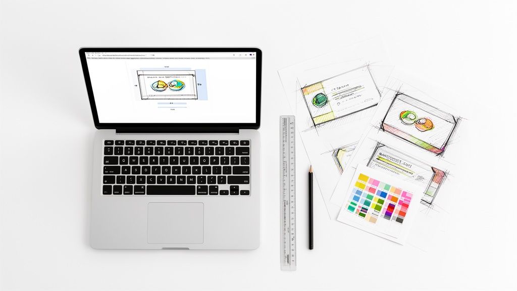 story
story A Practical Guide to Business Card Design Online
In a world drowning in digital pings and overflowing inboxes, the humble business card is more powerful than ever. It's a real handshake, a physical piece of your brand that someone can actually hold, feel, and remember long after the meeting is over. When you learn how to handle business card design online , you're not just making a contact sheet—you're crafting a first impression that sticks. Why Business Cards Are Still a Power Move It’s easy to think that with LinkedIn and QR codes, the old-school business card is a relic. But that small piece of paper carries a surprising amount of professional weight. It shows you’re prepared, you’re serious, and you’re interested in building a real relationship. A digital request can get lost in the noise, but a physical card is a direct, personal touch. A well-designed card does more than just share your info; it speaks volumes about your brand. It’s your chance to stand out at a crowded networking event or leave a memorable artifact behind after a pitch. Imagine a freelance graphic designer whose card has a unique die-cut shape and bold colors—it instantly screams creativity before anyone even sees their portfolio. The Undeniable ROI of a Great First Impression The impact of a business card isn't just a gut feeling; the numbers back it up. We’ve all been there—judging a book by its cover. The same goes for business cards. To put it in perspective, take a look at these stats. They really highlight how a small investment in design can pay off big time. Business Card Impact at a Glance Statistic What It Means for Your Business 72% of people judge a company by its business card A quality card instantly builds credibility. A flimsy one does the opposite. 39% will refuse to do business with someone who has a cheap-looking card That's nearly four out of ten potential clients you could lose before you even start talking. These figures show that handing over a poorly designed card is more than a missed opportunity; it can actively harm your business. Investing in quality business card design online is a smart, low-cost marketing move with a potentially massive return. The right card keeps selling for you long after you've left the room. A business card is more than just a piece of paper; it's a physical reminder of a personal connection. In a digital-first world, that tactile experience is more memorable and valuable than ever. Making Your Brand Tangible A great business card takes your online brand and makes it real. It gives you total control over that first impression through smart choices in paper, finish, and typography. Think about these real-world examples: The Startup Founder: At a pitch event, a founder hands a VC a card printed on thick, soft-touch paper with clean, minimalist foil stamping. The card feels premium and confident, subtly reinforcing the quality of their idea. The Local Artisan: A baker’s business card is printed on rustic, uncoated kraft paper. The texture and look perfectly match their brand’s organic, handcrafted vibe. The Tech Consultant: An IT consultant’s card has a sleek, modern layout and a QR code that links straight to their booking calendar. It communicates efficiency and tech-savvy expertise at a glance. Each of these examples shows how the physical qualities of a card tell a story. By exploring the huge range of business cards printing options available, you can find the perfect mix to represent your brand and make every introduction count. It's your first chance to prove you sweat the details. First Things First: Gather Your Brand Ingredients Jumping straight into an online design tool without a plan is a recipe for frustration. I've seen it happen countless times. A great business card isn’t just a random collection of your contact details; it’s a tiny, powerful piece of your brand. Before you even glance at a template, take a moment to gather your core brand ingredients. Trust me, this prep work makes the entire business card design online process smoother, faster, and way more effective. This little bit of planning ensures your final card is consistent, professional, and authentically you . If you have one, a corporate style guide is your best friend here. Think of it as your north star, guiding every single design choice. In fact, developing a corporate style guide is one of the smartest moves any growing business can make. Figure Out Your Information Hierarchy Not all information is created equal, especially on a tiny 3.5 x 2-inch canvas. Your first real task is to decide what's absolutely essential. This is your information hierarchy—basically, a ranked list of what someone needs to see first. What’s the main goal of your card? Is it to get phone calls? Drive traffic to your website? Get people to follow you on Instagram? The answer to that question will shape your call-to-action (CTA) and tell you what gets top billing. Tier 1 (The Non-Negotiables): Your Name, Company Name, and one primary way to get in touch (like an email or phone number). Tier 2 (The Context-Givers): Your Website URL and Job Title. These give people the "what" and "where" to learn more about you. Tier 3 (The Nice-to-Haves): Social media handles, a physical address, or a QR code. Only include these if they directly support your main goal. A local bakery, for example, would consider its physical address a Tier 1 item. For a freelance web developer? It might not even make the list. You have to be ruthless here to avoid a cluttered, confusing design. Your business card isn’t your resume; it's a headline. Its job is to start a conversation, not tell your whole life story. Keep it clean and focused on a single, powerful action. Get Your Visual Assets in Order Once you know what you're going to say, you need the visual elements to bring it to life. Having these files ready to go and correctly formatted will save you a world of headaches and prevent common printing disasters, like a fuzzy, pixelated logo. Here’s your quick asset checklist: High-Resolution Logo: This has to be a vector file ( AI, EPS, or SVG ) or, at the very least, a high-resolution raster file ( PNG or TIFF at 300 DPI ). That low-quality JPEG from your website header just won't cut it for print. Brand Color Codes: You need the exact color values. No guesswork. Grab both the CMYK codes (for printing) and the HEX codes (for digital). Brand Fonts: If you use specific fonts, make sure you have the files ( OTF or TTF ) on hand. Some design tools let you upload them; if not, you'll need to pick the closest alternative. Key Images or Graphics: If your design includes a photo or a background pattern, it absolutely must be a high-resolution image ( 300 DPI ) to avoid looking blurry. Do yourself a favor and organize all of these into a dedicated folder before you start your business card design online . It’s a simple step that makes a huge difference. And if you're just starting out and need some inspiration, checking out a business basics collection can spark some ideas for other essentials that will go perfectly with your new cards. This foundational work is what ensures your card will be a true reflection of your brand, ready to make a great impression. Applying Layout and Typography That Works A great business card speaks volumes before anyone reads a single word. How you arrange the text and graphics—the layout and typography—are the silent storytellers of your brand. They guide the eye and instantly shape someone's perception of your professionalism. This is where the magic of business card design online really comes alive. It's not just what information you include, but how you present it. A good layout feels intuitive, making your details easy to absorb at a quick glance. Master Visual Hierarchy to Guide the Eye Visual hierarchy is just a fancy way of saying you need to arrange things to show what's most important. For a business card, that’s almost always your name and your company's name. They need to stand out first. Think of it like a newspaper. The massive headline grabs you, then the smaller subheadings, and finally the body text. Your card should follow the same logic. So, how do you pull this off? Size and Weight: Make your name and logo the biggest things on the card. Use a bolder font for your job title or website to give it a little more punch. Color and Contrast: A splash of your main brand color on your name or email will naturally draw attention. Less critical info, like a physical address, can be a more muted, subtle color. Placement: We’re conditioned to see things at the top or in the center as more important. Tuck the secondary details toward the bottom. A classic rookie mistake is making everything the same size. This forces people to hunt for the information they need. A strong hierarchy makes your card scannable and user-friendly. Embrace the Power of Negative Space What you don’t put on your card is just as crucial as what you do. Negative space (or white space) is simply the empty area around your text and logo. It’s the breathing room that keeps your design from looking cluttered and chaotic. A card packed to the edges with information just looks desperate and unprofessional. In contrast, plenty of negative space signals confidence and sophistication. It isolates the key information, making it easier to read and giving the whole design a clean, high-end feel. Don't be afraid of empty space. It’s an active and powerful element in your design. A minimalist layout with plenty of white space often has a bigger impact than a cluttered one. For instance, a luxury brand might just have a tiny logo and one line of contact info floating in a sea of clean background. That intentional emptiness screams "premium" without saying a word. Choose Fonts That Tell Your Brand Story Typography is your brand's voice. The fonts you pick have a real psychological impact. Are you a cutting-edge tech startup, a reliable financial firm, or a creative photographer? Your fonts should reflect that vibe. Serif Fonts (like Times New Roman, Garamond): These have little "feet" on the letters. They feel traditional, trustworthy, and elegant. They’re a perfect fit for lawyers, consultants, or established businesses. Sans-Serif Fonts (like Helvetica, Open Sans): These fonts lack the little feet, giving them a clean, modern, and no-nonsense feel. They’re a go-to for tech companies, startups, and minimalist brands. Script Fonts (like Pacifico, Allura): These look like handwriting and can feel personal, creative, or luxurious. They work well for photographers, event planners, or boutique shops. When you're doing your business card design online , stick to two fonts at most . Any more and it starts to look messy. A great strategy is pairing a bold sans-serif for your name with a clean, readable serif for your contact details. The contrast works wonders. Legibility Is Non-Negotiable It doesn’t matter how cool your font is if nobody can read it. On the small canvas of a business card, legibility has to be your number one priority. Here are a few hard-and-fast rules to live by: Minimum Font Size: Never, ever go below 7pt for your contact info. Anything smaller is a struggle for many people to read, especially in a dimly lit room. Your name can be larger, maybe 10-12pt , to help with that hierarchy we talked about. Avoid Overly Ornate Scripts: A touch of script can add flair, but stay away from anything too frilly or condensed. It can quickly turn into an unreadable smudge when printed, which is a disaster for an email address or URL. Ensure High Contrast: Light gray text on a white background is a recipe for failure. You need strong contrast between your text and the background. Black on white is unbeatable for readability, but other combinations like dark navy on cream or charcoal on light gray also work beautifully. By getting these layout and typography fundamentals right, you’ll create a card that not only looks fantastic but works incredibly hard for your brand. Using Online Design Tools With Confidence Jumping into a modern online design tool can feel a bit like being handed the keys to a professional studio. It's exciting, but all those buttons and options can also be overwhelming. The trick isn't to stare at a blank canvas and panic; it's to see the tool as your guided partner in the design process. With a smart approach, you can create a business card that genuinely looks like it was crafted by a seasoned pro. It really all boils down to how you use templates. A good template isn't a cookie-cutter solution—it’s a professional foundation built on solid design principles like visual hierarchy and proper spacing. Your job is to pick one that vibes with your brand and then tweak it until it’s undeniably you . Selecting the Right Template The sheer number of templates available can feel like a tidal wave. Don't just scroll endlessly. Filter your search with a specific goal in mind. Are you a minimalist tech startup that needs something sharp and clean? A photographer who needs a layout that puts an image front and center? Maybe you’re a consultant who needs a design that screams "trustworthy and established." Look for a template that already respects your information hierarchy. If your main goal is driving traffic to your website, find a layout that gives the URL prime real estate. If you have an intricate logo, you'll want a more minimalist template that gives it plenty of room to shine. Don’t just pick a design you like —pick one that works for the information you have. Here’s a glimpse of what a typical online designer interface looks like, similar to the one we have at 4OVER4. As you can see, a visual editor lets you directly click, drag, and edit text, images, and other elements, giving you total hands-on control to make a template your own. Making a Template Your Own Once you’ve chosen your starting point, the real fun begins. This is where you inject your brand’s personality and transform the template from a generic layout into your personal calling card. Think of it like moving into a new apartment—the layout is solid, but you need to paint the walls and bring in your furniture to make it feel like home. Your workflow for customizing a template should hit these key points: Logo Upload: Always start with a high-resolution version of your logo. A vector file (like an SVG or EPS ) is ideal, but a transparent PNG works too. This ensures it prints sharp and clear, without any fuzzy edges or a blocky white background. Color Palette Swap: This is a big one. Replace the template's default colors with your brand’s official CMYK or HEX codes. Use your primary brand color on the most important element, like your name, to create an immediate focal point. Typography Adjustment: Switch out the default fonts for your own brand fonts. If you can’t upload custom ones, find the closest web-safe alternatives that match your brand’s voice (e.g., a clean sans-serif like Lato for a modern feel). And please, make sure your contact info is legible—never go below 7pt font size. Content Placement: A template is just a guide. You’ll likely need to nudge text boxes around to accommodate a longer job title or a slightly different address format. Don't be afraid to shift things to achieve the perfect balance. The goal of using a template isn't to find one that's perfect out of the box. The goal is to find one that's 80% there, allowing you to add the final 20% that makes it unmistakably yours. Working with Design Layers Most online design tools are built on a system of layers. Picture them as clear sheets stacked on top of each other. Your background might be the bottom sheet, with your logo on the one above it, and your text on the very top layer. Getting the hang of layers is a total game-changer for designing efficiently. It lets you: Lock Elements: Lock your background layer in place so you don't accidentally click and drag it while you’re trying to edit your phone number. Reorder Content: Easily drag your logo layer to sit on top of a colored shape or background image. Group Objects: Select your name and job title, then group them. Now you can move them around as a single unit, perfectly preserving their alignment and spacing. Spending just a few minutes familiarizing yourself with the layers panel will save you a ton of time and headaches. It’s easily the most powerful feature for getting a clean, professional layout in any business card design online tool. And if you’re looking for a little inspiration or some pre-built options you can customize in a snap, checking out a library of ready-made products can be a fantastic way to kickstart any project. When you get comfortable with these tools, you really do put the power of great design right in your own hands. Getting Your Design Ready For A Perfect Print Job So, you’ve designed a business card on screen that looks absolutely killer. That’s a huge first step, but it's only half the journey. The real magic—and potential for mistakes—happens when your digital file hits a printing press. This is where a little technical know-how goes a long way, ensuring the card in your hand looks just as sharp as the one on your monitor. Trust me, understanding a few core printing concepts is the secret to avoiding those frustrating (and expensive) reprints. It lets you hand over your file with total confidence, knowing you’ve done everything right. The last few steps in any online design tool are all about finalizing the file for print, just like this. It’s a simple flow: start with a layout, make it your own, and then get a file that’s ready for the presses. The Holy Trinity: Bleed, Trim, and Safe Area If you only learn three technical terms today, make them these. Getting bleed, trim, and safe area right is absolutely non-negotiable for a professional finish. Think of them as the guardrails that protect your design from the physical realities of the printing and cutting process. Trim Line: This is pretty straightforward—it’s the final cut edge of your business card. For a standard U.S. card, that’s 3.5 x 2 inches . Bleed Area: This is a small buffer zone, usually 0.125 inches , that extends beyond the trim line. If your design has a background color or an image that touches the edge, you must stretch it out to fill this bleed area. Safe Area: This is an inner margin, also typically 0.125 inches , inside the trim line. Your most important stuff—name, logo, contact info—needs to live comfortably inside this zone. Why is this so critical? Paper can shift slightly during printing, and cutting machines, while precise, have a tiny margin of error. The bleed ensures that if the cut is a hair off, you won’t see an ugly white sliver along the edge. The safe area is your insurance policy against any crucial text getting trimmed off. Your Screen Is Lying To You (About Color and Clarity) Here’s a hard truth: the vibrant colors on your backlit monitor look different than ink on paper. Screens and printers use completely different color systems, and not accounting for this is one of the most common rookie mistakes. RGB vs. CMYK Your screen creates color by mixing light using an RGB (Red, Green, Blue) model. Professional printers, on the other hand, mix ink using a CMYK (Cyan, Magenta, Yellow, Black) model. If you send an RGB file to a printer, their software has to guess how to convert it, which often leads to dull, muddy, or just plain wrong colors. Always start your design in CMYK mode if you can. Resolution Matters For any images or logos to look crisp, they need to be high-resolution. The industry standard for print is 300 DPI (dots per inch). An image that looks perfectly fine on your 72 DPI monitor will turn into a pixelated, blurry mess when printed. To make sure your file is set up for success, we've put together a quick checklist. Run through this before you hit "export." Your Print-Ready File Checklist Technical Element Requirement Why It Matters Color Mode CMYK (not RGB) Ensures the colors you see on screen are accurately reproduced in print without unexpected shifts. Resolution 300 DPI for all images/logos Guarantees your graphics will be sharp and clear, not pixelated or blurry. Bleed 0.125 inches on all sides Prevents white edges on your final card if the cut is slightly off. Safe Area 0.125 inches from trim line Protects all your important text and logos from being accidentally cut off. File Format High-Quality PDF The industry standard that embeds fonts, preserves colors, and includes bleed settings reliably. Once you’ve ticked these boxes, you’re in great shape to export a file that any professional printer will love. Finalizing And Sending Your File With your layout, colors, and resolution dialed in, the last step is to export your design correctly. Many online design tools will handle the technical settings for you, but it’s still smart to know what a good file looks like. For anyone getting started, it’s worth reviewing some basic artwork submission tips for beginners . Here at 4OVER4, like most printers, we prefer a high-quality, print-ready PDF. A properly made PDF locks everything in place—it embeds your fonts, keeps the CMYK color profile, and includes the bleed. It's the gold standard for a reason. Getting this right isn't just about quality; it helps reduce waste. With 88% of the over 8 billion business cards printed each year getting thrown out in a week, a well-designed, high-quality card has a much better shot at being kept. Our advanced https://www.4over4.com/printing/category/digital-printing services are designed to ensure every card you create makes a fantastic—and lasting—impression. A Few Common Business Card Design Questions Even with the best online tools in front of you, a few questions always seem to pop up during the design process. Getting straight answers to these common hurdles can be the difference between a good card and a great one. Let’s tackle the most frequent questions to help you nail the final product. What Information Absolutely Has to Be on My Card? At a bare minimum, your card needs to be a direct line to you and your business. That means your name, company name, title, a primary phone number, and a professional email address. In this day and age, your website is also non-negotiable—it’s the digital front door to everything you do. Beyond the essentials, you have to get strategic to avoid a cluttered mess. For local businesses: A physical address is vital. A cafe or retail shop needs to guide people to its door. For digital creators or online brands: Your social media handles are far more important than a mailing address. Pick the platform where you’re most active and engaged. For consultants or service pros: A QR code that links directly to a booking page or your portfolio can be a game-changer. The goal isn't to list every possible way someone can find you. It's about curating the information to steer the conversation exactly where you want it to go. How Do I Pick the Right Paper and Finish? The physical feel of your card says just as much as the design itself. The paper stock and finish you choose should feel like an extension of your brand’s personality. A flimsy, generic card feels instantly forgettable, while a premium, heavy stock makes a statement about quality and attention to detail before a single word is read. Think about the story you're telling. A thick, uncoated kraft paper might signal an earthy, organic brand. On the other hand, a sleek, glossy finish feels modern and makes vibrant, photo-heavy designs pop. A smooth matte finish offers a sophisticated, glare-free look that’s perfect for elegant, minimalist layouts. A business card is a sensory experience. The weight of the paper and the texture of the finish are powerful, non-verbal cues that shape a person's perception of your brand before they even read your name. Specialty options can elevate your card from a simple piece of contact info to a memorable keepsake. For a deeper dive into what’s possible, exploring some of the fantastic finishes available for printing can spark some incredible ideas. Touches like spot UV (a glossy highlight on a matte card) or metallic foil stamping can add a premium feel that gets you noticed and makes your card incredibly hard to throw away. What Are the Most Common Design Mistakes People Make? When it comes to business card design online , a few classic slip-ups can completely undermine an otherwise solid effort. The single biggest mistake is clutter—trying to cram way too much information into a tiny 3.5" x 2" space. It just creates a card that’s impossible to read and instantly overwhelming. Here are a few other frequent errors to watch out for: Using a low-resolution logo. This is a rookie move. A logo you pulled from your website will look pixelated and blurry in print, which just screams unprofessional. Choosing tiny or overly ornate fonts. Any text below 7pt is a real struggle to read. Fancy script fonts can also devolve into an illegible smudge, especially for something critical like an email address. Ignoring the bleed and safe zones. This is a crucial technical mistake that results in important text or parts of your logo getting chopped off during the trimming process. Forgetting to proofread. It sounds so simple, but a typo in your name, phone number, or email address makes the entire card worthless. Check every single detail twice. Then have someone else check it. Should I Really Put a QR Code on My Card? Absolutely. A QR code is a fantastic way to bridge the gap between your physical card and your digital world. It gives someone an instant, friction-free way to take the next step—whether that's visiting your portfolio, connecting on LinkedIn, or watching a product demo. If you decide to add one, just follow a few best practices to make sure it works perfectly. First, make it large enough to be easily scanned; 0.5 x 0.5 inches is a safe minimum. Second, ensure there's high contrast between the code and the background. A black code on a white or light-colored background is always your best bet. Most importantly, test the QR code with several different phones before you approve your design for print. You need to be 100% sure it goes exactly where you want it to.
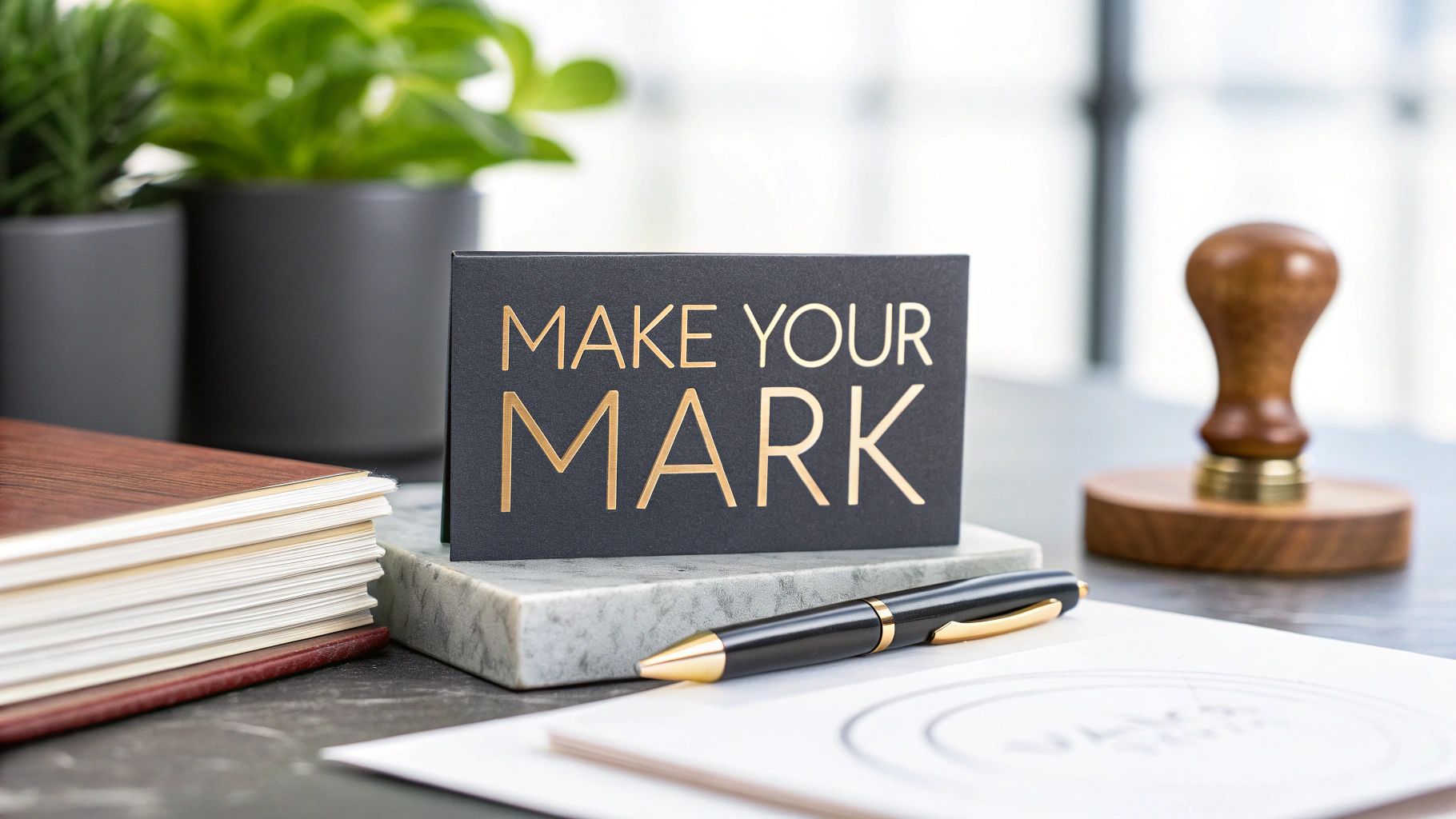 story
story Top Business Card Design Tips to Make an Impact
Make Your Mark with a Memorable Business Card Your business card is a first impression and a branding opportunity. These seven business card design tips will help you create a card that effectively communicates your brand and makes a lasting impact. Learn how to optimize your card's design, from choosing the right paper stock and font to maximizing the use of both sides. These simple yet powerful concepts can elevate your business card from a contact exchange to a memorable marketing tool. 1. Keep It Simple and Uncluttered In the realm of business card design, the age-old adage "less is more" reigns supreme. A cluttered business card can overwhelm the recipient, making it difficult to discern the essential information. A clean, minimalist approach, on the other hand, exudes professionalism and ensures your contact details are easily accessible and memorable. This principle of "keeping it simple and uncluttered" is paramount for creating a business card that effectively represents you and your brand. It focuses on delivering maximum impact with minimal elements, ensuring your card stands out for its clarity and sophistication rather than an overabundance of design features. This approach hinges on several key features: generous use of white space, a limited color palette (typically two to three colors maximum), a clear hierarchy of information, minimal text content, and strategic placement of elements. White space, often underestimated, provides breathing room for the design and draws attention to the crucial information. Restricting the color palette maintains a professional and cohesive look, while a clear hierarchy guides the recipient's eye through the card’s content in a logical order. This hierarchy can be achieved through variations in font size, weight, and color. Minimizing text content ensures the card isn't overwhelming, allowing the recipient to quickly grasp the key details. Lastly, the strategic placement of elements, such as the logo, name, and contact information, contributes to a balanced and visually appealing design. Think of industry giants like Apple, Google, and Airbnb. Apple's business cards are iconic for their minimal text and ample white space, instantly communicating a sense of sophisticated simplicity. Google’s clean, typography-focused cards emphasize their brand identity through carefully selected fonts, while Airbnb's simple cards leverage their distinctive logo as the primary visual element. These examples demonstrate how a minimalist design can effectively communicate brand identity and essential information without unnecessary clutter. The benefits of a simple and uncluttered design are numerous. Firstly, it's easier to read and understand quickly, enabling recipients to instantly grasp your contact details. Secondly, a clean design projects a professional and sophisticated image, enhancing your credibility. Thirdly, by focusing on essential information, a minimalist card increases the likelihood of the recipient remembering your details. Furthermore, a simple design is often more cost-effective to print, requiring less ink and simpler printing processes. Finally, a timeless minimalist design won’t look outdated quickly, ensuring your cards remain relevant for years to come. However, it's important to acknowledge the potential downsides. A minimalist design, if not executed well, can appear boring or generic, failing to capture attention in competitive industries. The limited space for creative expression might also be a constraint for some. Finding the right balance between simplicity and visual interest is crucial to avoid a bland and forgettable card. To successfully implement a minimalist design for your business card, consider these actionable tips: Include only essential contact information: Your name, title, company, phone number, email address, and website are usually sufficient. Consider a QR code to link to a more comprehensive online profile if needed. Use a maximum of two fonts: Too many fonts can create a cluttered and unprofessional look. Choose two complementary fonts or stick with one for ultimate simplicity. Maintain consistent spacing between elements: Consistent spacing enhances readability and creates a sense of order and professionalism. Choose one focal point per side: This could be your logo, your name, or a striking visual element. Having a single focal point helps draw the eye and prevents the design from feeling overwhelming. Test readability at actual card size: What looks good on a computer screen might be illegible at actual card size. Print a test copy to ensure all text is easily readable. This minimalist approach is particularly beneficial for businesses and individuals seeking to project a professional and sophisticated image. It's ideal for industries where clarity and credibility are paramount, such as finance, law, and technology. However, even in more creative fields, a minimalist approach can be highly effective, demonstrating a focus on quality and attention to detail. By embracing the principle of "keep it simple and uncluttered," you can create a business card that is both visually appealing and highly effective in conveying your essential information. 2. Choose High-Quality Paper and Printing Your business card is often the first tangible impression you make, and its physical quality speaks volumes before you even utter a word. Choosing high-quality paper and printing elevates your business card from a simple contact information exchange to a tactile experience that conveys professionalism, reliability, and a keen attention to detail. This seemingly small investment can significantly impact how others perceive your brand and ultimately influence their decision to do business with you. The weight and feel of the card, the crispness of the printing, and the subtle textures all contribute to a subconscious assessment of your brand's quality. A flimsy, cheaply printed card can suggest that your business cuts corners, while a premium card demonstrates that you value quality and invest in the details. This is why selecting the right paper stock, printing techniques, and finishes is a crucial element of effective business card design tips. Paper weight is a key factor. Standard business cards are often printed on thin, flimsy stock. Opting for a heavier weight, between 14-16pt, creates a more substantial and durable card that feels premium in the hand. Beyond weight, a variety of finishes can further enhance the tactile experience. A matte finish offers a sophisticated, understated look, while a glossy finish adds a touch of vibrancy and shine. Satin finishes provide a smooth, silky feel, and uncoated paper offers a natural, textured appeal. Special printing techniques can truly set your business card apart. Embossing creates a raised, three-dimensional effect, adding a touch of elegance and sophistication. Foil stamping, available in various metallic shades, adds a luxurious sheen and highlights specific design elements. Letterpress, a traditional printing method, creates a deep impression in the paper, resulting in a unique, textured feel. Even the edges of your card can be customized. Rounded corners offer a softer, more modern look and prevent the corners from bending or creasing. Painted edges, where the side of the card is colored, add a pop of color and a unique visual detail that sets your card apart. Texture adds another dimension to the tactile experience. Linen, felt, and smooth finishes offer different tactile sensations, allowing you to choose a texture that aligns with your brand's personality. For instance, a law firm might choose a thick, textured linen paper with an embossed logo to convey tradition and authority. A luxury brand might employ foil stamping and a glossy finish for a glamorous feel. An architect might opt for uncoated paper with a simple, minimalist design for a sophisticated, modern look. Learn more about Choose High-Quality Paper and Printing to explore different printing options and paper stocks available. While high-quality paper and printing offer numerous benefits, it's important to consider the potential drawbacks. Premium printing typically comes at a higher cost than standard printing and often requires longer production times. It may also require larger minimum order quantities. For some industries, such as startups or businesses with tight budgets, the added expense might be overkill. Therefore, it's essential to weigh the pros and cons and balance quality with your budget constraints. Pros of High-Quality Paper and Printing: Creates a premium, professional impression More durable and long-lasting Enhanced tactile experience Stands out from standard cards Reflects the quality of your business Cons of High-Quality Paper and Printing: Higher cost than standard printing Longer production times May be overkill for some industries Requires larger minimum order quantities Tips for Choosing High-Quality Paper and Printing: Request paper samples: Before committing to a specific paper stock and finish, request samples from the printer. This allows you to see and feel the different options in person and make an informed decision. Consider your industry's expectations: Certain industries have established norms and expectations for business card design. Research what's common in your field and choose options that align with those standards while still reflecting your unique brand identity. Balance quality with budget constraints: High-quality printing doesn't have to break the bank. Explore different options and find a balance between quality and affordability. Test how ink looks on different paper types: The same ink can look different on various paper types and finishes. Test your design on different samples to ensure the final product looks as intended. Choose finishes that complement your brand: The finish you choose should complement your brand's overall aesthetic. A sleek, modern brand might opt for a smooth, matte finish, while a vibrant, creative brand might choose a glossy or textured finish. By carefully considering these factors and following these business card design tips, you can create a business card that not only conveys your contact information but also makes a lasting positive impression and reinforces your brand's identity. 3. Use Readable Fonts and Appropriate Sizing Typography is the silent ambassador of your brand on your business card. It speaks volumes about your professionalism, attention to detail, and overall brand personality. Choosing readable fonts and appropriate sizing is paramount for ensuring your contact information is accessible and leaves a positive impression. Poor typography can render even the most creatively designed business card ineffective, making it crucial to prioritize legibility and clarity. This seemingly simple design element can make or break the effectiveness of your business card as a networking tool. Effective typography on a business card hinges on a few key factors: selecting appropriate typefaces, sizing them correctly, and maintaining a clear visual hierarchy. Your font choices should reflect your brand identity. A tech startup might opt for a modern, clean sans-serif font, while a law firm might choose a more traditional serif font. Size is equally important. A minimum font size of 8pt for body text is generally recommended, with names and titles ideally set at 10pt or larger. This ensures readability across various age groups and vision abilities. Finally, establishing a clear hierarchy through variations in font size, weight, and style helps guide the reader's eye through the information, making it easy to quickly find what they need. Successful implementation of this principle can be seen in many well-known brands. IBM, for example, leverages its custom Plex typeface, a modern and versatile font family that embodies the company's innovative spirit while remaining highly legible. FedEx's use of a bold, easily readable font, particularly for their logo and company name, ensures instant recognition and reinforces their brand identity of reliability and efficiency. More traditional businesses, such as law firms, often employ classic serif fonts like Times New Roman, projecting an image of established authority and professionalism. These examples demonstrate how typography can effectively communicate a brand's personality and values while maintaining readability. This approach is essential for any business card design, regardless of industry or brand aesthetic. It directly impacts the accessibility and usability of the card, ensuring that recipients can easily decipher the provided information. By prioritizing readability, you demonstrate professionalism and a commitment to clear communication, which can significantly enhance your brand image. Pros of Using Readable Fonts and Appropriate Sizing: Ensures Accessibility: Information is easily digestible for everyone, regardless of age or visual acuity. Conveys Professionalism: Thoughtful typography demonstrates attention to detail and elevates the perceived quality of your brand. Improves Brand Consistency: Consistent font choices across marketing materials strengthen brand recognition. Enhances Overall Design Quality: Well-chosen typography elevates the entire design, making it more visually appealing and impactful. Cons of Using Readable Fonts and Appropriate Sizing: Limits Creative Font Choices: Focusing on readability may restrict the use of highly stylized or decorative fonts. May Require Larger Card Sizes: Accommodating larger font sizes and sufficient spacing might necessitate a larger card format. Can Be Challenging with Decorative Designs: Balancing readability with intricate design elements can be complex. Restricts Design Flexibility: Strict adherence to readability guidelines can sometimes limit creative exploration. Actionable Tips for Business Card Design Typography: Test Readability at Actual Print Size: Don’t rely solely on screen previews. Print a test version to assess legibility. Use No More Than Two Font Families: Maintain visual harmony and avoid a cluttered look by limiting your font choices. Ensure 10pt Minimum for Names and Titles: Make key information stand out and easily identifiable. Maintain Consistent Font Weights: Avoid using too many different weights (bold, italic, etc.) within the same font family. Consider Your Target Audience's Demographics: Tailor your font choices and sizing to suit the age and visual needs of your target audience. For example, if your target demographic is older, slightly larger font sizes might be beneficial. By prioritizing readable fonts and appropriate sizing, you ensure that your business card effectively fulfills its purpose as a concise and accessible communication tool. This fundamental principle, popularized by typography experts, design schools, and corporate branding guidelines, significantly contributes to a professional and impactful business card design that resonates with your target audience. By following the tips outlined above, you can create a business card that is not only visually appealing but also effectively communicates your brand message and contact information, ultimately contributing to successful networking and business growth. 4. Include Only Essential Information In the realm of business card design, less is often more. Including only essential information is a crucial tip that can significantly impact the effectiveness of your card. This principle revolves around prioritizing the most critical contact details and avoiding unnecessary clutter. The goal is to provide just enough information for someone to connect with you while maintaining a clean, uncluttered design that enhances readability and memorability. A cluttered card can be overwhelming and may lead to your key information being overlooked. A well-designed, minimalist card, on the other hand, makes a strong professional statement and ensures your contact details are easily accessible. This approach is particularly relevant in today's fast-paced world where people are constantly bombarded with information. A concise and clear business card is more likely to stand out and be retained. The essential information typically includes your name and job title, primary phone number, professional email address, company name and logo, and website or LinkedIn profile URL. A physical address is relevant for businesses with a storefront or office that clients frequently visit, like retail stores or consulting firms. For businesses operating primarily online, a physical address is often unnecessary. This minimalist approach carries several benefits. First, it prevents information overload, making it easier for the recipient to quickly grasp and retain your contact details. Second, it allows for larger, more readable text, improving the overall user experience. Third, a clean card projects a more professional and organized image. Fourth, it focuses attention on the key contact methods you want people to use. Finally, a simpler design is typically easier and less expensive to create and print. However, there are also some potential drawbacks to consider. Omitting secondary information like a fax number or secondary email address might be inconvenient in certain situations. This method necessitates careful selection of which information is truly essential, which can be subjective and dependent on your industry and target audience. You might even need to develop multiple versions of your business card for different networking scenarios or target demographics. For example, a card distributed at a conference might prioritize your LinkedIn profile, while a card given to a local client might emphasize your phone number and physical address. Finally, limiting the information on your card could potentially restrict networking opportunities if someone is looking for a specific piece of information that you've chosen to omit. Here are some examples of successful implementation: Tech startups often focus on their email address and LinkedIn profile, recognizing the digital nature of their industry. Retail businesses, on the other hand, typically emphasize their location and phone number to encourage in-person visits. Consultants and freelancers often highlight their area of expertise and website to showcase their portfolio and services. To effectively apply this principle to your business card design, consider these actionable tips: Prioritize your most frequently used contact method. Ensure you use a professional email address, avoiding generic free email providers. Include social media handles only if they are relevant to your professional activities. Consider using a QR code to provide additional information, such as a link to your full online portfolio or a special offer. Lastly, regularly review and update the information on your card to ensure its accuracy and relevance. This "less is more" philosophy in business card design has been popularized by minimalist designers, startup founders, and professional networking experts who understand the value of concise and impactful communication. By adopting this approach, you can ensure your business card serves its primary purpose: to connect you with potential clients and partners effectively. This principle contributes significantly to a strong and professional first impression, making it a well-deserved inclusion in any list of business card design tips. 5. Create a Consistent Brand Identity Your business card is often the first tangible impression you make, and it should speak volumes about your brand. Creating a consistent brand identity across all your marketing materials, including your business card, is crucial for building recognition, establishing credibility, and maximizing your marketing efforts. This means your business card should seamlessly integrate with your overall brand identity, serving as a miniature representation of your company’s visual language. Think of it as a pocket-sized ambassador for your brand, communicating your values and personality at a glance. This is why establishing a consistent brand identity deserves a prominent place in any list of business card design tips. A consistent brand identity translates to a cohesive visual experience for your audience. It’s about ensuring that every element, from your logo and color scheme to your typography and messaging, aligns perfectly with your brand guidelines. This consistency fosters a sense of familiarity and trust, making it easier for potential clients or partners to recognize and remember your brand. Consistent brand identity on your business card encompasses several key features: Consistent Color Scheme: Use the exact colors defined in your brand guidelines. This includes specifying Pantone or CMYK codes to guarantee color accuracy across different printing methods. Don't deviate from these established colors; they are a core component of your brand's visual identity. Proper Logo Usage and Placement: Your logo is the cornerstone of your brand. Ensure it is used correctly and consistently on your business card, adhering to established size and placement guidelines. A distorted or improperly placed logo can damage your brand image. Brand-Appropriate Typography: Font choices contribute significantly to your brand's personality. Select fonts that align with your brand guidelines and maintain consistency in font usage across all your marketing materials, including your business card. Consistent Tone and Messaging: Even the briefest message on your business card should reflect your brand's tone of voice. Maintain a consistent messaging style that aligns with your overall brand communication. Alignment with Other Marketing Materials: Your business card shouldn't exist in isolation. It needs to visually connect with your website, letterhead, brochures, and other marketing materials, creating a unified and recognizable brand presence. The advantages of maintaining a consistent brand identity are numerous: Strengthens Brand Recognition: When your audience consistently sees the same visual elements, they begin to associate them with your brand, leading to increased recognition. Creates Professional Cohesion: A cohesive brand identity projects professionalism and attention to detail, building trust and credibility with potential clients. Builds Trust and Credibility: Consistency signals reliability and stability, fostering trust in your brand and its offerings. Enhances Marketing Effectiveness: A consistent brand identity reinforces your marketing messages and increases their impact. Simplifies Design Decisions: Established brand guidelines provide a clear framework for design choices, streamlining the design process. However, maintaining a consistent brand identity also presents some challenges: Limits Creative Freedom: Adhering to strict brand guidelines can sometimes restrict creative exploration in business card design. Requires Established Brand Guidelines: This approach necessitates having comprehensive brand guidelines in place. May be Restrictive for Personal Brands: Individuals building a personal brand might find strict adherence to brand guidelines limiting. Needs Regular Updates with Brand Changes: As your brand evolves, your brand guidelines and business card design need to be updated accordingly. Consider these successful examples of consistent brand identity: Coca-Cola’s instantly recognizable red and white color scheme, Starbucks’ consistent use of green across all their materials, and the seamless integration of Nike’s swoosh logo into their branding. These brands have leveraged consistent brand identity to build global recognition and customer loyalty. To achieve a consistent brand identity on your business card, follow these actionable tips: Develop Comprehensive Brand Guidelines: If you don't have them already, create detailed brand guidelines that cover logo usage, color palettes, typography, and messaging. Use Exact Brand Colors (Pantone/CMYK Codes): Ensure accurate color reproduction by specifying Pantone or CMYK codes for your brand colors. Maintain Consistent Logo Sizing and Placement: Follow your brand guidelines for logo size and placement to maintain visual consistency. Align with Website and Letterhead Design: Your business card design should complement your website and letterhead, creating a unified brand experience. Consider Brand Personality in Material Choices: The material you choose for your business card can also reflect your brand personality. A sleek, minimalist design might call for a matte finish, while a more vibrant brand could opt for a glossy finish. Learn more about Create a Consistent Brand Identity for further insights and resources on creating effective marketing materials that align with your brand identity. By implementing these business card design tips, you can ensure that your business card effectively represents your brand and makes a lasting positive impression. It's a small investment that can yield significant returns in terms of brand recognition and business growth. 6. Consider Unique Shapes and Sizes In the competitive world of business, making a lasting impression is crucial, and your business card is often the first tangible representation of your brand a potential client encounters. While the standard 3.5" x 2" rectangle remains a staple, thinking outside the box – literally – with unique shapes and sizes for your business cards can significantly enhance your brand image and create a memorable experience for those who receive them. This is a powerful business card design tip that can elevate your networking efforts. This approach leverages the element of surprise and novelty. A uniquely shaped card disrupts the expected, capturing attention and sparking curiosity. It's a way to physically embody your brand's personality and values, making a statement before a single word is spoken. Imagine a yoga instructor handing out a business card shaped like a yoga mat, or a restaurant presenting a card resembling a chef's knife. These unconventional shapes immediately communicate the nature of the business and leave a lasting impression. There are various ways to implement this business card design tip. Die-cutting allows for intricate custom shapes that can perfectly reflect your industry. Consider a real estate agent using a house-shaped card, or a creative agency employing geometric or abstract designs. Square cards offer a modern and creative appeal, while mini cards are ideal for conveying minimal, essential information in a compact format. On the other hand, oversized cards can create a sense of grandeur and importance, making a bold statement. Even something as simple as rounded corners can soften the appearance of a traditional rectangular card, adding a touch of elegance and sophistication. The benefits of using unique shapes and sizes are numerous. Increased memorability and impact are arguably the most significant advantages. A non-standard card is more likely to be remembered and kept, increasing the chances of future contact. It reflects creativity and innovation, portraying your business as forward-thinking and dynamic. This approach can reinforce your brand message, visually communicating your core values and offerings. It also serves as a conversation starter, providing a natural icebreaker in networking situations. Finally, and perhaps most importantly, it differentiates you from competitors, helping you stand out in a crowded marketplace. However, it’s crucial to carefully weigh the potential drawbacks. One major consideration is the increased printing costs associated with custom die-cutting and non-standard sizes. You’ll also need to consider practicality. Unusually shaped cards may not fit standard wallets or card holders, potentially leading to them being discarded. In conservative industries, a non-traditional card might be perceived as unprofessional or gimmicky. Furthermore, storage and filing can become problematic with unconventional shapes. Finally, you might encounter limited printer options capable of handling unique card dimensions and materials. Before venturing into the realm of unique shapes, ensure the shape genuinely relates to your business and enhances your brand message, rather than appearing as a forced gimmick. Test how the card fits in standard storage, such as wallets and card holders, to ensure practicality. Consider your industry’s expectations. A playful, unconventional card might be well-received in creative industries but could be detrimental in more traditional sectors. Factor in the increased printing costs and ensure the shape doesn’t compromise the readability of essential information like your contact details. Learn more about Consider Unique Shapes and Sizes This business card design tip has been popularized by creative agencies and designers, boutique branding firms, and innovative startups who understand the power of visual communication. They've demonstrated that a well-designed, uniquely shaped business card can be a powerful marketing tool, leaving a lasting impression and setting the stage for successful business relationships. By carefully considering the pros and cons and following the tips outlined above, you can leverage this approach to elevate your brand and make your business card a memorable representation of your company. Examples of successful implementation include yoga instructors using cards shaped like yoga mats, restaurants using cards shaped like kitchen utensils, and real estate agents using house-shaped cards. These examples showcase how a unique shape can effectively communicate the essence of a business. 7. Optimize Both Sides of the Card One of the most effective business card design tips is to maximize your real estate by utilizing both sides of your card. This simple yet powerful strategy effectively doubles your available space, providing ample room for enhanced design, crucial information, and reinforced branding. Thinking beyond the front-only approach allows you to create a more impactful and memorable card, making a stronger impression on potential clients and partners. This approach is particularly valuable in today's competitive landscape, where standing out from the crowd is crucial for success. By strategically employing both sides, you transform your business card from a simple contact tool into a dynamic marketing asset, contributing significantly to your overall branding efforts. Optimizing both sides is a key component of effective business card design, offering a range of benefits for individuals and businesses alike. The front of your business card typically serves as the primary point of contact, prominently displaying essential information such as your name, title, company, phone number, and email address. Think of this as your digital handshake – the core information someone needs to connect with you. However, the back of the card presents a unique opportunity to expand on this initial introduction and provide additional value. So, how can you effectively leverage this valuable space? The possibilities are numerous and depend largely on your specific industry and business goals. For visually driven professions like photography or graphic design, the back of the card becomes a mini-portfolio, showcasing a striking image or design element that highlights your skills and aesthetic. Restaurants can utilize the back to list their hours of operation, location details, or even a QR code linking to their online menu. Consultants can feature client testimonials or highlight their credentials and areas of expertise, adding a layer of credibility and trust. Retail businesses can showcase product images, special offers, or loyalty programs, incentivizing recipients to engage further. Even a simple, elegant pattern or texture can enhance the overall visual appeal and reinforce your brand identity. The advantages of utilizing both sides of your business card are plentiful. It maximizes the limited space available, allowing you to convey a more complete picture of your business and offerings. This approach also opens up creative design opportunities, allowing you to incorporate visual elements that capture attention and reinforce your brand message. You can include additional useful information, such as social media handles, website URLs, or a brief company tagline. Furthermore, providing backup contact details on the back can be a lifesaver if the front gets damaged or misplaced. Ultimately, a well-designed double-sided card enhances your visual appeal and projects a sense of professionalism and attention to detail. However, there are also some potential drawbacks to consider. Double-sided printing inevitably increases costs, although the added value often outweighs the slight price difference. Designing for both sides also requires more complex coordination to maintain a cohesive and balanced look. There's a risk of information overload if you try to cram too much onto the card, potentially making it appear cluttered and difficult to read. A poorly executed double-sided design can detract from your overall image, so careful planning and professional execution are essential. To successfully implement a double-sided business card design, consider the following tips: Maintain design consistency: Ensure a cohesive visual flow between the front and back, using consistent fonts, colors, and imagery. Both sides should feel like part of a unified whole. Prioritize supporting information: Use the back for information that supports the front, not essential contact details. The back should enhance, not overshadow, the primary purpose of the card. Consider simplicity: A simple pattern, texture, or a striking image can add a touch of elegance without overwhelming the design. Include a call-to-action: Encourage engagement by including a call-to-action on the back, such as "Visit our website," "Follow us on social media," or "Scan for exclusive offers." Ensure independent functionality: Design both sides so they can function independently. Someone should be able to glean key information from either side, even if they don't immediately see the other. The practice of utilizing both sides of business cards has been popularized by graphic designers promoting versatile layouts, marketing experts emphasizing engagement, and professional print shops showcasing the possibilities of modern printing techniques. By following these business card design tips and carefully considering your design choices, you can create a double-sided business card that effectively communicates your brand message and leaves a lasting impression. 7 Key Business Card Design Tips Comparison Tip Implementation Complexity 🔄 Resource Requirements 💡 Expected Outcomes ⭐📊 Ideal Use Cases 💡 Key Advantages ⚡ Keep It Simple and Uncluttered Low 🔄 Minimal (design focus, low cost) 💡 Professional, memorable, timeless design ⭐📊 Corporate, minimalist, cost-conscious Easy to read, cost-effective, timeless ⚡ Choose High-Quality Paper and Printing Medium 🔄 High (premium materials, printing) 💡 Premium impression, durable, tactile quality ⭐📊 Luxury brands, professional services Enhanced tactile experience, stands out ⚡ Use Readable Fonts and Appropriate Sizing Low to Medium 🔄 Moderate (typography choices) 💡 Accessibility, professionalism, brand consistency ⭐📊 Corporate, legal, diverse demographics Clear information, professional appearance ⚡ Include Only Essential Information Low 🔄 Minimal (content selection) 💡 Clean appearance, readability, focused contacts ⭐📊 Startups, networking, all industries Prevents overload, easier layout ⚡ Create a Consistent Brand Identity Medium 🔄 Moderate (branding alignment) 💡 Strong brand recognition, trust, cohesion ⭐📊 Established brands, marketing-focused Builds trust, simplifies design ⚡ Consider Unique Shapes and Sizes Medium to High 🔄 High (custom dies, printing costs) 💡 Memorable, creative impact, differentiation ⭐📊 Creative industries, startups, boutique firms Stands out, sparks conversations ⚡ Optimize Both Sides of the Card Medium 🔄 Moderate to High (design, printing) 💡 Increased space, creative flexibility, enhanced info ⭐📊 Photographers, consultants, retail Maximizes space, adds design options ⚡ Print Your Perfect Business Card with 4OVER4 Mastering these business card design tips is crucial for making a strong first impression and leaving a lasting impact. From maintaining a clean, uncluttered design and selecting high-quality paper stock to using readable fonts and maximizing both sides of the card, each element contributes to a professional and memorable business card. Remember, your business card is often the first tangible representation of your brand that potential clients or partners encounter. By implementing these design principles, you ensure your card effectively communicates your brand identity and professionalism, ultimately leading to more meaningful connections and opportunities. Don't let your meticulously designed business card fall flat due to subpar printing. 4OVER4 offers exceptional print quality, diverse customization options, and a wide selection of paper stocks to bring your vision to life. Transform your digital design into a tangible masterpiece and make a lasting impression with every handshake. Visit 4OVER4 today to explore our extensive printing solutions and create the perfect business card that reflects your brand’s unique identity.
 story
story 10 Business Card Design Trends for 2024
Business cards are still important for marketing in 2024. For every 2,000 cards given out, sales go up by 2.5%. Let's look at the top 10 business card designs that are popular this year. Key Takeaways Simple designs and big text are very popular QR codes connect paper cards to online information Cards made from eco-friendly materials are becoming more common Textured surfaces and shiny metals make cards feel fancy Both very simple and very busy designs are trending 1. Simple and Elegant Many people like business cards that are simple and clean. These cards use basic colors and easy-to-read fonts. Our standard business cards are great for this look. The trick is to use just the right amount of information so the card looks neat and is easy to remember. 2. Big, Bold Text In 2024, many business cards use big, eye-catching text. This makes the card stand out and shows what the company is all about. You can mix different sizes and styles of text to make important information easy to see. The right text can quickly tell people if your business is serious, creative, or high-tech. 3. Cards That Do More Business cards now do more than just show your contact info. Some have QR codes or special chips that link to websites or online portfolios. This lets you share more information without needing to print new cards. Some cards even use augmented reality, which means you can see 3D images or animations when you look at them through a smartphone. 4. Earth-Friendly Materials More businesses are using cards made from materials that are good for the environment. Our kraft business cards are great for this. Some cards are even made from recycled paper or paper that can be planted to grow flowers. Using these kinds of cards shows that a company cares about the planet. 5. Unique Shapes Not all business cards are rectangles anymore. Die-cut business cards can be made in all sorts of shapes. A musician might have a card shaped like a guitar pick, or a real estate agent might have one shaped like a house. These special shapes make the card more fun and memorable. 6. Cards You Can Feel Some business cards have special textures that make them interesting to touch. Silk lamination can make a card feel smooth, while other techniques can create raised patterns. These textures make the card more memorable because people can feel the difference. 7. Shiny Metal Touches Adding shiny metal to business cards can make them look fancy. This could be just a little bit of gold or silver, or even whole cards made of metal . The shiny parts catch the light and people's attention, making the card look special. 8. Simple Color Choices Many people are choosing cards with just one or two colors. This can look very professional and make the information on the card easy to read. Different colors can mean different things - like blue for trust or green for nature. Key Trends: Simple Business Card Colors 2024 White cards with black text Light colored backgrounds with dark text Cards using different shades of one color Black cards with white or shiny text Cards with a surprise color on the edges 9. Using Both Sides Many people are now using both sides of their business cards. One side might have contact info, while the other has a picture or more details about the business. This gives you more space to share information and make your card interesting. 10. Very Busy Designs Some cards go the opposite way and use lots of colors, patterns, and designs. Our diamond glitter business cards are perfect for this style. These busy cards can be great for creative jobs or businesses that want to look fun and exciting. Even with all the design, it's important to make sure people can still read the important information. Conclusion In 2024, business cards can be simple or fancy, but they should always show what makes your business special. Colorful cards are kept 10 times longer than plain ones, so don't be afraid to make your card stand out. The best business cards not only give your contact info but also show what your business is all about. At 4OVER4, we have many types of business cards to help you keep up with these trends. We can make cards that are good for the environment or cards that look and feel fancy. Think about what makes your business unique when you choose your design. With the right business card, you can make a great first impression and help people remember you long after you've met.
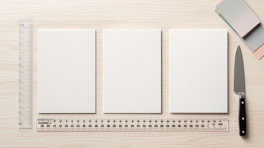 story
story Business Card Dimensions CM: The Complete Guide for Perfect Sizes
The standard business card is 8.9 cm x 5.1 cm if you're in North America, but it shifts to 8.5 cm x 5.5 cm across most of Europe. Ever wonder why? It’s simple, really. These sizes became the go-to because they slide perfectly into a wallet next to a credit card, making them incredibly practical to carry around. Your Quick Guide to Standard Business Card Dimensions When you're designing a business card, getting the size right is the absolute first step—and it's a big one. Think of it like pouring the foundation for a house. If you get it wrong, everything you build on top will feel just a little bit off. Nailing the dimensions from the start ensures your card not only looks sharp but is actually useful to the person you hand it to. Luckily, you don't have to guess. There are established standards that have been shaped over the last century by regional habits, printing press sizes, and yes, the simple practicality of wallet design. In the U.S. and Canada, the dominant size is 3.5 by 2 inches , which converts to about 8.9 cm by 5.1 cm . This size took hold because it closely matched credit card dimensions, making it a no-brainer for people to store and carry. You can dive deeper into the history and evolution of these sizes with various printing resources online . Common Business Card Dimensions at a Glance To make things easy, here’s a quick-reference table breaking down the most common business card dimensions in centimeters for key regions. Region Dimensions (cm) Dimensions (mm) North America (USA, Canada) 8.9 x 5.1 cm 89 x 51 mm Europe (Most of EU) 8.5 x 5.5 cm 85 x 55 mm Japan 9.1 x 5.5 cm 91 x 55 mm China 9.0 x 5.4 cm 90 x 54 mm Keeping this table handy can save you from a world of headaches and costly printing mistakes, especially if you’re working with international clients. Knowing these slight regional differences is more than just trivia. It’s a small detail that shows you've done your homework and respect local customs—a subtle but powerful way to make a great impression in a global market. Why Card Sizes Change Across Borders Have you ever been handed a business card from an international colleague and noticed it felt just a little… different? It’s not your imagination. The subtle shifts in business card dimensions from one country to another are the result of history, culture, and good old-fashioned practicality. Think of it like electrical outlets. They all do the same job, but their shapes and sizes vary all over the world because they were developed independently. Business cards went down a similar path. There was no global committee deciding on one universal size; instead, dimensions evolved organically based on local printing press capabilities, measurement systems (imperial vs. metric), and even the structure of different languages. These differences aren't just trivial quirks. They're a reflection of deep-seated preferences that have become the standard over decades. Getting to the "why" behind these sizes is a must for anyone doing business on a global scale. Cultural and Practical Drivers of Size The reasons for these variations are actually pretty fascinating. In some places, historical printing standards set the precedent a long time ago, and the dimensions just stuck. In others, the very nature of the written language helped shape the ideal canvas for a business card. For example, European business cards generally measure 8.5 cm by 5.5 cm , making them a bit taller and narrower than what you’d find in North America. Meanwhile, Japan’s standard is wider, around 9.1 cm by 5.5 cm . This isn’t a random choice; that extra horizontal space is perfect for accommodating names and titles written in intricate Kanji characters. If you want to dive deeper, you can explore more of these nuances in this detailed guide to global business card sizes . It’s a subtle adaptation, but it shows a real consideration for local needs—which brings us to why respecting these norms is so important. Key Takeaway: Using a locally appropriate business card size is more than just a nice gesture. It’s a non-verbal cue that you understand and respect the business culture you're operating in. The Impact on International Business So, does this really matter when you're in a meeting? Absolutely. Handing a German client a card that’s too wide to fit in their standard cardholder creates a small but noticeable moment of friction. It unintentionally sends the message that you're an outsider. On the flip side, presenting a card that fits local expectations shows a sharp attention to detail. It’s a simple move that helps build rapport and prevents your thoughtfully designed card from being awkwardly tucked away because it doesn't fit. Getting the right business card dimensions in cm can truly make all the difference. Mastering the Essentials of Print Setup Once your design looks perfect on screen, the next step is getting it ready for the printer. This is where a few simple technical rules make all the difference, ensuring the card in your hand looks just as crisp and professional as the one you designed. Think of it like framing a painting. You don't just jam the canvas against the wood frame—you need a little buffer, a margin for error. In printing, we create this buffer using three key guides: the bleed , the trim line , and the safe zone . Understanding Your Design Boundaries These three concepts work together to protect your design from the tiny mechanical shifts that can happen during the printing and cutting process. Getting them right is the secret to avoiding common slip-ups, like a sliced-off logo or an ugly white sliver along the edge of your finished cards. Here’s a quick rundown of what each term means for your design file: Trim Line: This is the finish line—the exact edge where your business card will be cut to its final size, like 8.9 cm x 5.1 cm . Safe Zone: Think of this as the VIP area for your most important content. It’s an inner margin, usually about 0.3 cm inside the trim line, where all your text and logos must stay to avoid getting clipped. Bleed Area: This is a safety net of color or imagery that extends beyond the trim line, typically by 0.3 cm . If any background elements are meant to go right to the edge, they need to fill this entire area. This diagram shows how these three zones work together on a standard business card layout. As you can see, all the critical info is tucked safely inside the safe zone. Meanwhile, the background color stretches all the way to the outer edge of the bleed, giving the cutting machine a crucial margin for error. To make setting up your files even easier, here’s a quick-reference table summarizing the standard measurements. Standard Print Preparation Measurements (in cm) Print Element Standard Dimension (cm) Purpose Bleed Area 0.3 cm (added to each side) Extends the background past the trim line to prevent white edges after cutting. Trim Line 8.9 cm x 5.1 cm (example) The final, intended dimensions of the cut business card. Safe Zone 0.3 cm (inside the trim line) An inner margin where all critical text and logos must be placed to avoid being cut off. Following these specifications is the best way to ensure your design translates perfectly from screen to print, without any surprises. Why These Margins Matter Ignoring these guidelines is one of the most common reasons for printing mishaps. A design without a proper bleed might end up with thin, unprofessional-looking white borders if the cut is just a fraction of a millimeter off. Likewise, text placed too close to the trim line is at risk of being partially sliced away. Setting up your bleed and safe zones correctly is the single most effective way to guarantee a flawless print. It’s the difference between a card that looks homemade and one that looks professionally produced. For a standard 8.9 cm x 5.1 cm business card, this means your actual design file needs to be a bit bigger. With a standard 0.3 cm bleed on all four sides, your total document size should be 9.5 cm x 5.7 cm . This extra real estate gives the printer the wiggle room they need to deliver a perfect cut every time. Paying attention to the correct business card dimensions in cm for your print file is a small step that makes a huge impact on the final quality. How Dimensions Shape Your Card's Design Think of a business card as a tiny canvas. Its dimensions are the frame, and that frame dictates every single creative choice you make. The size you pick isn't just some technical detail you hand off to the printer—it's the very foundation of your design's composition. It shapes everything from the layout and typography to the overall vibe your brand gives off. Let's look at the subtle but significant difference between a North American card ( 8.9 cm x 5.1 cm ) and a European one ( 8.5 cm x 5.5 cm ). That wider North American standard gives you more horizontal real estate, which is perfect for a big, landscape-style logo or a longer company name. On the flip side, the slightly taller European format lends itself beautifully to elegant, vertical layouts that create a completely different visual flow. These proportions have a direct impact on how you use one of the most powerful tools in design: white space . Balancing White Space and Information White space, sometimes called negative space, is simply the empty area around your text and logo. It’s not wasted space; it’s an active design element that gives your content room to breathe. When you use it well, it prevents that cluttered, junk-mail look and naturally guides the recipient's eye right to the important stuff. On a surface as small as a business card, thoughtful use of white space is what separates a professional, high-impact design from one that feels amateur and overwhelming. It creates a sense of luxury and confidence. For instance, on a standard 8.9 cm x 5.1 cm card, a minimalist design with plenty of white space can make a brand feel modern and clean. But if you try to cram too much information into that same space, you immediately cheapen the impression, no matter how nice the cardstock is. The goal is to find that sweet spot between what you need to say and the space you have to say it in. Horizontal vs. Vertical Layouts The orientation of your card—horizontal or vertical—is another huge decision tied directly to its dimensions. This choice should really line up with your brand's personality and the story you're trying to tell. Horizontal (Landscape): This is the classic, traditional choice. It feels familiar, stable, and professional. It’s a favorite in established industries like finance and law because it mimics our natural field of vision, making it easy to scan from left to right. Vertical (Portrait): This orientation feels more modern and unconventional. It instantly stands out in a stack of cards and is often used by creative professionals, tech startups, and any brand wanting to project a forward-thinking, unique image. The taller format can also be a great way to show off a vertical logo or create a clean, stacked list of contact details. At the end of the day, the best business card dimensions in cm and layout are the ones that work in harmony. They need to reinforce your brand identity while presenting your information clearly and memorably. A thoughtful layout can turn a simple piece of paper into a networking tool that actually works. Choosing the Right Card Size for Your Brand Sure, the standard business card size is popular for a reason—it’s safe, familiar, and tucks neatly into a wallet. But sticking to the 8.9 cm x 5.1 cm rectangle isn’t your only move. Sometimes, stepping outside that box is a powerful strategic choice, turning a simple card exchange into a memorable brand moment. The trick is to make sure your choice is deliberate. It needs to feel like an authentic extension of your brand’s identity, not just different for the sake of being different. An unconventional size or shape is an instant conversation starter, signaling that your brand breaks the mold. Aligning Card Shape with Brand Identity Think of your business card’s physical form as part of its personality. A luxury goods company might choose an oversized, extra-thick card stock to give it a sense of weight and exclusivity. That unique size makes a statement before anyone even reads a word. So, who are you? A sleek, minimalist mini-card might be perfect for a tech startup, while a bold square card could be just the thing for a graphic designer showing off their creative chops. Here are a few popular non-standard options and the vibes they usually give off: Square Cards (e.g., 6.5 cm x 6.5 cm): Modern, creative, and confident. These are great for artists, designers, and any brand that wants to feel contemporary and a little bit edgy. Mini Cards (e.g., 7 cm x 2.8 cm): Sleek, minimalist, and memorable. They work well for brands that value precision and simplicity, but just be careful—that limited space means every single element has to count. Folded Cards: Informational and practical. These are perfect when you have more to say. Think menus, maps, or a list of services, all neatly contained without cluttering the main design. While this guide helps you nail your brand’s physical presence, remember that a strong brand is consistent everywhere. It's just as important to explore essential website design best practices to keep your message cohesive, both in-hand and online. Weighing the Pros and Cons Veering from the standard path has its perks and its pitfalls. You’ll want to weigh them carefully before you commit. Advantages of Custom Sizes: High Memorability: An unusual card stands out in a sea of rectangles. It’s simply harder to forget. Brand Reinforcement: The physical feel of the card can powerfully communicate what your brand is all about—be it creativity, luxury, or stripped-down efficiency. Creative Freedom: Breaking free from the standard canvas can open up a world of new and exciting layout possibilities that just wouldn't work otherwise. Potential Downsides: Practicality: Here’s the big one. Will it fit in a standard wallet or cardholder? If it’s awkward to store, it’s more likely to get lost or tossed. Printing Costs: Custom shapes and non-standard cuts often require special dies, which can drive up your printing expenses compared to a standard run. Information Space: This is especially true for mini cards. The smaller you go, the less room you have for your details before the design starts to feel cramped and unreadable. At the end of the day, it's all about balancing impact with practicality. The true sweet spot is a custom card that’s both memorable and convenient for the person you’re giving it to. Alright, you’ve poured your creativity into designing the perfect business card. Before you hit "send" and ship it off to the printer, let's run through one last pre-flight check. A few minutes here can save you a world of headache—and a costly reprint. Think of this as your final quality control step. First things first, double-check the basics of the document itself. Make sure your final business card dimensions in cm are correct for your region. For example, if you're in North America, you'll want to confirm it's set to 8.9 x 5.1 cm . Getting this wrong can lead to some seriously awkward results. Next up, get forensic with your print margins. A tiny slip-up here can compromise your entire print run, so it’s worth taking your time. Technical File Review The way your file is built is the bedrock of a professional print job. Get these three things right, and you're already halfway there: Safe Zone: Is all your important stuff—like your logo and contact info—tucked well inside the safe area? Keep everything at least 0.3 cm away from the trim line. Bleed Area: Does your background art or color stretch all the way to the bleed edge? This should be 0.3 cm beyond the trim line on every side. This is your number one defense against those dreaded white slivers at the edge of your card. Resolution: Take a look at your images and logo. Are they a crisp 300 DPI ? Anything less is going to look fuzzy and pixelated when it hits the paper. It helps to think of this checklist like a recipe. You wouldn't skip an ingredient when baking a cake, right? Same principle applies here. Nailing these details is the secret to getting a flawless, professional result every single time. Last but not least, export your file correctly. The gold standard for printing is a high-quality, print-ready PDF. This format is brilliant because it locks everything—your fonts, images, and layout—in place. It ensures that what you see on your screen is exactly what the printer’s machine will see. Once you’ve ticked these boxes, you can send that file off with total confidence. Got Questions? We’ve Got Answers Alright, after digging into all the details on sizes, printing specs, and design best practices, you probably have a few practical questions rattling around. Let's tackle some of the most common ones that come up when it's time to turn theory into a real-world business card. What’s the Most Common Business Card Size in CM? That really depends on where you are in the world. Here in North America (the US and Canada), the go-to size is 8.9 cm x 5.1 cm . Hop across the pond to Europe, and you'll find that 8.5 cm x 5.5 cm is the more popular choice. Both are intentionally sized to slip easily into a standard wallet. Does a Vertical Design Change the Dimensions? Nope, not one bit. The physical dimensions stay the same. A standard North American card is still 8.9 cm x 5.1 cm , whether you design it horizontally (landscape) or flip it vertically (portrait). All you're doing is rotating your creative canvas, not changing its actual measurements. Choosing an orientation is purely a creative call. It dramatically changes the look and feel of your card, but it won’t affect its physical size. It’ll still fit perfectly in a wallet, no matter which way it’s designed. What Resolution Do I Need for My Business Card File? This is a big one. For a professional, high-quality print job, your file absolutely must be at least 300 DPI (dots per inch) . Think of this as the gold standard for printing—it guarantees that every bit of text, every logo, and every image comes out looking sharp and crystal clear. If you use a lower resolution, like the 72 DPI used for web images, you’ll end up with a blurry, pixelated card that looks unprofessional. Always, always export your final print-ready file at 300 DPI to get that crisp, clean finish. How Big Should a QR Code Be on a Business Card? To make sure a QR code is actually scannable by any smartphone, it needs to be at least 2 cm x 2 cm . If you make it any smaller, you're running the risk of it being unreadable, which completely defeats the purpose of having it there in the first place. Also, remember to leave a little bit of empty space—a "quiet zone"—around the QR code. This buffer prevents other design elements from getting in the way and confusing the camera trying to scan it. Ready to create a business card that nails these dimensions and looks fantastic? 4OVER4 has a massive selection of high-quality printing options to bring your vision to life. From standard sizes to completely custom shapes, find the perfect fit for your brand .
 story
story Business Card Dimensions Photoshop: Your Ultimate Guide
Before you even think about dropping a logo onto the canvas, you need to get your document settings right. This is one of those non-negotiable steps. Get it wrong, and you're looking at a blurry, poorly cropped print job, no matter how brilliant your design is. For a standard US business card, the magic numbers are 1050 x 600 pixels . This translates to a final trimmed size of 3.5 x 2 inches at a crisp 300 PPI resolution. To avoid any ugly white slivers at the edge after printing, you also need to add a "bleed," bringing your total canvas size up to 1125 x 675 pixels . Setting Up Your Canvas for Print-Ready Results Jumping into Photoshop to design a business card is exciting, but a little prep work goes a long way. Think of your canvas setup as the foundation of a house—if it's not perfect, everything you build on top of it will have problems. Taking a minute to dial in the correct settings now will save you a world of hurt later. It’s the difference between a professional result and a costly reprint. Let's get that foundation rock-solid. Core Document Settings When that "New Document" window pops up, it's time to get specific. Don't just accept the defaults. The settings you input here are precisely what the print shop will use. Here’s exactly what you need to plug in: Width: 3.75 Inches (this includes that critical bleed area) Height: 2.25 Inches (also with the bleed) Resolution: 300 Pixels/Inch (the gold standard for print quality) Color Mode: CMYK Color (essential for getting colors right on paper) That 300 PPI resolution is especially crucial. A common mistake is leaving it at the web-standard 72 PPI, which will make your final printed card look pixelated and amateurish. Why These Numbers Matter It’s easy to get lost in all the numbers, but they all serve a purpose. The standard print resolution of 300 pixels per inch (PPI) is the sweet spot for sharp, clear images without creating a massive file. That’s how we get to the 1050 x 600 pixels for a 3.5 x 2-inch card. The extra space you add for the bleed—usually 1/8 inch on all sides—is a safety net. It ensures your background color or image extends all the way to the edge, so when the printer trims the cards, there are no unprinted white borders. This brings your total canvas size to 1125 x 675 pixels . For a deeper dive into print specifications, the team at MOO offers a great guide that breaks it down even further. To make it even easier, here’s a quick reference table with everything you need. Photoshop Settings for a Standard US Business Card Use this table as your go-to reference when creating a new print-ready business card document in Photoshop. Setting Value Why It Matters Width 3.75 Inches Includes the standard 0.125-inch bleed on both the left and right sides. Height 2.25 Inches Includes the standard 0.125-inch bleed on both the top and bottom sides. Units Inches The standard unit of measurement for print projects in the United States. Orientation Landscape The most common orientation for a traditional business card layout. Resolution 300 Pixels/Inch The industry standard for high-quality printing to ensure your design isn't blurry. Color Mode CMYK Color / 8 bit This is the color space used by professional printers for accurate color output. Bookmark this page or save these settings as a preset in Photoshop. Trust me, it’s a small step that makes a huge difference in your final product. Navigating Business Card Dimensions Around the World While the 3.5 x 2 inch card is king in the US, stepping outside those borders reveals a whole different world. If you’re designing for international clients or even just planning a business trip abroad, sticking to the American standard can be a subtle misstep. It’s a small detail, but getting it right shows you’ve done your homework. For instance, most of Europe has standardized around the 85 x 55 mm card, which has a similar feel to a credit card. Head over to Japan, and you'll find their famous meishi are a bit longer and narrower at 91 x 55 mm . These aren't huge differences, but they're noticeable enough to signal a respect for local customs. A Look at Different International Sizes It's a simple tweak in Photoshop , but knowing the right dimensions from the start is what separates the pros. While North America has its standard, you’ll find that Europe and Asia have their own preferences. These variations might seem minor, but they impact everything from how the card fits in a wallet to the layout of your design. For a quick reference, here's a breakdown of some of the most common sizes you'll encounter. Global Business Card Size Quick Reference This table provides a handy comparison of common business card dimensions worldwide, perfect for when you're designing for an international audience. Region or Country Dimensions (Inches) Dimensions (Millimeters) United States & Canada 3.5" x 2" 88.9 x 50.8 mm United Kingdom & Europe 3.35" x 2.17" 85 x 55 mm Japan (Meishi) 3.58" x 2.17" 91 x 55 mm China 3.54" x 2.13" 90 x 54 mm Australia & New Zealand 3.54" x 2.17" 90 x 55 mm As you can see, a one-size-fits-all approach doesn't quite work. Keeping these regional standards in mind is a simple way to make a great first impression. Pro Tip: My go-to move when working with a new international client is to ask for their preferred printer's specs before I even open Photoshop. Getting the exact dimensions and bleed requirements upfront saves a ton of headaches and back-and-forth later. This chart really puts the pixel differences into perspective, showing what these sizes look like at a print-ready 300 DPI . You can immediately see that while the heights are nearly identical, the widths vary. The Japanese card is noticeably wider in pixels, which is a critical detail to account for in your layout. Without adjusting for this, your perfectly balanced US design could look cramped or off-kilter on a meishi . Mastering Bleed, Trim, and Safe Zones in Photoshop Alright, now that we’ve got the basic document set up, it’s time to talk about what really makes a design print-ready. This is where we separate the pros from the folks who end up with a pile of misprinted cards. I’m talking about bleed, trim, and safe zones. These three areas are your blueprint for a perfect print job, every single time. Think of the bleed area as your design's insurance policy. It's the outer edge of your design—usually a background color or image—that extends past where the card will actually be cut. We typically add 0.125 inches on every side for this. Why? Because industrial cutting machines aren't always perfect down to the micrometer. That little bit of extra design ensures you won’t see an ugly, unprofessional-looking white sliver along the edge of your finished cards if the cut is just a tiny bit off. Defining Your Print Boundaries Next up is the trim line . This is simple: it’s the line where the blade will fall and cut your card to its final size. For a standard business card in the US, that's the 3.5 x 2 inch perimeter we set up earlier. Finally, we have the most critical area of all: the safe zone . This is an inner buffer, another 0.125 inches inside the trim line. I can't stress this enough—all your vital information has to live inside this box. Your name, your logo, your phone number, your email... if it's important, it must be inside the safe zone. Anything outside of it is flirting with disaster and risks getting chopped off during trimming. Trust me, it's a painful and expensive mistake to learn the hard way. The easiest way to see these zones while you work is by using guides in Photoshop . Just head up to View > New Guide and pop in these values to create your framework: Vertical Guides: Set these at 0.125" , 0.25" , 3.5" , and 3.625" Horizontal Guides: And these at 0.125" , 0.25" , 2.0" , and 2.125" Once you do that, you'll have a crystal-clear visual map on your canvas. It shows you exactly where your bleed ends, where the card gets cut, and most importantly, where your content is safe. Taking a minute to set up these guides is probably the single best thing you can do to guarantee your business card dimensions are prepped for a flawless print run. Okay, let's give this section a more human, expert touch. Here’s the rewrite: Getting Your Color and Resolution Right When you first open that "New Document" window in Adobe Photoshop , two little dropdowns can absolutely make or break your business card design: Color Mode and Resolution . Seriously, getting these wrong from the get-go is a recipe for disaster. First up, let's talk Color Mode . Your monitor thinks in RGB (Red, Green, Blue). It’s all about light. But professional printing presses work with ink, which means they speak CMYK (Cyan, Magenta, Yellow, Black). If you design your card in RGB, those bright, punchy colors you see on screen will look completely different—and usually much duller—when they come off the press. I can't tell you how many times I've seen a designer fall in love with a vibrant electric blue in RGB, only to have their heart broken when the printed cards arrive looking like a sad, muted navy. Always, always start your print projects in CMYK to avoid that nasty surprise. What you see will be much closer to what you get. Why 300 PPI is the Magic Number Next, you've got Resolution . For print, the gold standard is 300 PPI (Pixels Per Inch). No exceptions. This is what ensures your text is razor-sharp and your logo looks crisp, not like a blurry mess. Designing with a lower resolution, like the 72 PPI standard for web images, is a one-way ticket to a pixelated, unprofessional-looking card. It just won’t have enough data for the printer to create clean, smooth lines. Think of it as the difference between a high-definition photo and a fuzzy, low-quality video still. This obsession with precise standards isn't new, by the way. The business card dimensions and print quality we rely on today evolved from old-school printing limitations and the need for global consistency. If you're curious, you can dive into the history of business card standardization on Popl.co . Getting Your Design Ready for the Printers Alright, you've put in the work and your design looks fantastic. Now for the final, crucial hand-off. Getting your file from Photoshop to the print shop correctly is what makes all that setup worth it. Botch this step, and you might get back a card with blurry text or, worse, weird white edges. It's so tempting to just go to File > Save As and pick whatever, but professional printing has its own rules. You need a format that essentially locks everything in place—the colors, the fonts, the spacing—so there are no nasty surprises when the press starts running. Picking the Right File Format For print, it almost always comes down to two heavyweights: PDF and TIFF . Forget about JPEGs for this. They're great for photos on a screen, but they use a "lossy" compression that can slowly chew away at the quality of crisp text and logos. Not what you want for a professional card. Let’s break down the best choices: PDF (Press Quality): This is the undisputed king of print files. Think of it as a locked box that contains absolutely everything—your images, fonts, and vector graphics—all bundled up neatly. What you see on your screen is exactly what the printer will see. No shifts, no substitutions. TIFF: Another top-tier option. TIFFs are "lossless," which means they hold on to 100% of your design's quality without any compression artifacts. The files can be beefy, but for designs that are heavy on high-quality photography, they're a bulletproof choice. Pro Tip: When you're saving as a PDF in Photoshop, look for a preset named something like "High Quality Print" or "Press Quality." Even better, some printers will give you their own custom preset file (often a .joboptions file). If they do, use it. That's a direct line to their exact machine specs. Your Final Export Checklist Before you hit that final save button, let’s walk through the settings. It’s always a good idea to save a copy of your file for the printer, so your original, editable .PSD file with all its layers remains untouched. From the "Save As" window, choose Photoshop PDF from the format list. A new dialog box will pop up. Here’s what to check: Adobe PDF Preset: This is the big one. Select [High Quality Print] from the dropdown menu. Compatibility: It’s always smart to ask your printer, but generally, a recent version of Acrobat is a safe bet. Marks and Bleeds: Click over to this section on the left. Find the checkbox that says "Use Document Bleed Settings" and make sure it’s ticked. This is the magic button that tells Photoshop to include that 0.125-inch safety margin you so carefully set up in the beginning. Nail these settings, and you'll be sending a file that any professional printer will be happy to work with, guaranteeing a clean, sharp, and perfectly trimmed business card. A Few Common Questions About Business Card Design Even with a perfectly sized Photoshop file, a few questions always seem to pop up once you get into the design weeds. Let's run through a couple of common ones to make sure your project stays on track and your business card dimensions are dialed in. Should I Go With a Vertical or Horizontal Layout? Honestly, this one is all about your brand's style. A standard 3.5 x 2 inch card just flips to 2 x 3.5 inches for a vertical orientation. All the critical setup details—your bleed, safe zone, and resolution—stay exactly the same. While horizontal is the classic choice, a vertical layout can give your card a more modern, unexpected feel, which works great if it echoes the shape of your logo. As long as the technical specs are right, any professional printer can handle either orientation without a second thought. My Printer Asked for a Different Bleed Size. Now What? Always, always listen to your printer. While a 0.125-inch bleed is the go-to standard for most of the industry, it’s not a universal rule. Some print shops have specific equipment that needs a little more wiggle room. The best move is to check their website for a "Technical Specifications" or "File Setup Guide" before you start designing. It'll save you a headache later. If you've already designed the card, don't sweat it. You can adjust the bleed pretty easily. Just head to Image > Canvas Size in Photoshop. From there, you can add or remove space around your design without messing up the artwork itself. Is Photoshop Really the Best Tool if My Card Has a Lot of Text? For a simple design with a name, title, and phone number, Photoshop works just fine. But it's important to remember that Photoshop is a raster (pixel-based) program. This means super small or detailed text can sometimes end up looking a little less sharp than you'd get from a vector-based tool like Adobe Illustrator . A common workflow for pros is to handle the text and logos in Illustrator for that razor-sharp vector quality, and then bring those elements into Photoshop to combine them with photos or other pixel-based effects. It’s the best of both worlds. Ready to turn that perfectly designed file into a physical card you can be proud of? At 4OVER4 , we specialize in transforming print-ready designs into stunning, professional business cards. Explore our premium business card options today!
 story
story Unlocking Potential with a Business Card Fold
A standard, flat business card is a fantastic tool for the basics: sharing your contact details. But what if you could do more? A business card fold takes that simple rectangle and turns it into an interactive marketing piece, instantly giving you double or even triple the space to truly tell your brand's story. Why a Simple Fold Changes Everything Think of a traditional business card as a single-frame snapshot. It’s quick and effective for one specific purpose—delivering names, numbers, and titles. Now, imagine that snapshot unfolding into a miniature brochure. That's the power you get when you add a fold. This isn't just about cramming in more information; it's about creating a genuine experience. The moment someone has to physically open your card, you’ve grabbed their attention in a way a flat card just can't. That tiny action builds a sense of curiosity and makes your first impression far more memorable. You can guide them through a story, reveal a special offer, or show off a stunning visual on the inside panels. From Information to Interaction This one simple design choice elevates your card from a passive object to an active marketing tool. Suddenly, you have the power to structure your information in a much more compelling way. For instance, you can use the front panel for a clean, powerful first look with just your logo and name, while reserving the interior for things like: A Mini-Portfolio: Photographers, designers, and artists can showcase small, high-impact images of their best work. Service or Product Lists: Consultants and small businesses can detail their offerings without making the card look cluttered. Maps and Directions: An absolute must-have for brick-and-mortar stores, restaurants, or event venues. Appointment Reminders: Healthcare professionals and service providers can add a genuinely functional element their clients will appreciate. This approach really works. With an estimated 27 million business cards still being printed every single day, standing out is more critical than ever. In fact, market insights reveal that 65% of people remember a business better when they receive a uniquely folded card compared to a standard one. That’s a testament to its impact. If you're curious about the long history of these networking staples, you can find more on the evolution of business cards over at Sansan.com. A folded card isn’t just about holding more text; it's about controlling the reveal. You create a beginning, a middle, and an end to your introduction, all within a pocket-sized package. Ultimately, choosing a business card fold is a strategic move to make your brand unforgettable. When you're ready, explore our complete collection of business cards printing options to find the perfect format to tell your unique story. From Social Cue to Modern Marketing Tool A business card fold isn’t just a clever printing trick; it’s a communication method with surprisingly deep roots. The simple act of folding a piece of paper has always been a way to add meaning, turning a flat object into a message with layers of purpose. To really get why folded cards are so effective today, it helps to look back at how they evolved from a polite social gesture into a killer branding tool. Our story starts way back in 15th-century China , where visiting cards, or meishi , were a non-negotiable part of social etiquette. The fold was a silent language all its own. A card with a folded corner told the recipient that the visitor had shown up in person—a sign of genuine effort and respect. If the card was folded down the middle, it meant the visit was intended for the entire family, not just one person. These historical details show us that a fold was never just for show. It was a specific, deliberate action meant to add real context and weight to an interaction. The Rebirth of the Fold in Marketing Flash forward to today, and that same idea is back, just playing in a different field. The fold has been reborn as a seriously effective marketing tool. While its original job was to send social signals, its new role is to craft a brand experience that people remember. It makes your card stand out from the sea of boring flat rectangles by sparking curiosity and inviting people to interact. Think of it this way: a standard flat card just gives information. A folded card tells a story. It’s like having a miniature stage to control how someone experiences your brand. The front cover grabs their attention, the inside panels deliver your core message, and the back can seal the deal with a call to action. By embracing a business card fold, you are using a centuries-old technique of adding value through design. You're not just handing over contact details; you're delivering a tactile experience that makes your brand stick. This idea fits into a bigger picture. When you understand the full range of essential small business marketing materials , you see how a standout card can amplify your entire strategy. It becomes a critical piece of a much larger puzzle, connecting your brand’s physical and digital presence. Ultimately, the journey of the folded card teaches us something important. Choosing a folded design isn't just about printing; it's a nod to a long history of using design to say more. It transforms a simple networking handout into a sophisticated tool for making an impact that lasts. When you're ready to create a first impression that truly stands out, our full suite of custom marketing materials can help bring your vision to life. A Visual Guide to Common Fold Styles Think of your business card's fold style like the frame on a piece of art. The right choice doesn't just hold everything together; it guides the eye, sets the tone, and completely changes how your message is received. Getting familiar with the most common folds is the first step to creating a card that does more than list your contact info—it makes a real impression. The image below shows you exactly what I mean. It contrasts a standard, flat card with a folded one, showing how those extra panels can be used to tell a much richer story. As you can see, a flat card gives the facts. A folded card, on the other hand, takes someone on a journey, creating a structured path for them to follow. Let's break down the most popular options, each with its own distinct personality. To help you quickly compare the different styles we'll cover, here's a simple table breaking down the key features of each fold. At-a-Glance Guide to Fold Styles Fold Type Number of Panels Best For Key Advantage Bi-Fold 4 Clean, professional presentations, appointment cards, or service menus. Simplicity and familiarity. Tri-Fold 6 Detailed storytelling, step-by-step guides, or product showcases. Maximum content space. Z-Fold 6 Panoramic images, timelines, or designs that flow across panels. A dynamic, wide-screen reveal. Gate-Fold 4 High-impact reveals, luxury brands, or special event invitations. Creates anticipation and drama. This table is a great starting point, but the real magic is in understanding the unique personality and purpose behind each fold. Let's dive deeper into what makes each one special. The Classic Bi-Fold The bi-fold is the greeting card of the business card world. It’s the most straightforward and recognizable folded style, made from a single sheet scored right down the middle. This creates four distinct panels: a front cover, two inside panels, and a back cover. It’s a masterclass in elegant simplicity. You can put your logo on the front for a clean first look, then use the spacious inside for a detailed service list, a mini-portfolio, or appointment reminders. Because everyone knows how it works, it’s instantly approachable for any audience. The Storytelling Tri-Fold If you have a story to tell, the tri-fold is your best friend. It’s a single sheet folded into three sections, giving you six panels of prime marketing real estate. Just imagine a tiny brochure that fits perfectly in a wallet. This fold is perfect for brands that need to walk a client through a message, step by step. You can showcase different product lines, outline a process, or present a problem-and-solution narrative across the panels. It’s the ideal choice when you need to give a richer, more detailed introduction. The Dynamic Z-Fold The Z-fold is the tri-fold's more energetic cousin. It also has three sections and six panels, but it folds like an accordion in a distinct "Z" shape. When someone opens it, the panels stretch out to reveal one wide, continuous space. This makes it absolutely fantastic for big graphics, timelines, or sweeping panoramic photos. That unique opening creates a surprising and memorable reveal. It’s perfect for things like: Showcasing a timeline of your company’s journey. Displaying a panoramic image for a photographer or real estate agent. Creating a flowing design that connects seamlessly from one panel to the next. The Z-fold breaks away from the simple open-and-shut motion, which helps make it stick in people's minds. The Theatrical Gate-Fold Last but not least, the gate-fold delivers a touch of drama and sophistication. Here, two front panels meet in the middle, like a pair of gates, and swing open to reveal a larger central panel inside. This creates a powerful sense of anticipation and a "ta-da!" moment. This style is built for the big reveal. Use the "gates" to spark curiosity with a simple logo or a compelling question, then hit them with your core message or a stunning visual on the impactful interior panel. It’s an exceptional choice for luxury brands, special event invitations, or anyone who wants to make a grand entrance. If you're feeling inspired, you can explore these styles and other creative formats in this amazing folded collection of printing options. Choosing the Right Fold for Your Brand Story Picking a business card fold is about way more than just cramming in extra information. It's a strategic move that needs to feel like an extension of your brand’s personality and purpose. The right fold turns a simple piece of paper into a storytelling tool. The real trick is to make sure the fold’s function lines up perfectly with what you’re trying to achieve. Are you looking to show off a gorgeous portfolio? Maybe you need to list out your services or present a can't-miss offer. Each of these goals points to a different kind of fold. You want to create an experience that feels authentic to your brand and genuinely helpful to the person holding the card. A mismatched fold can feel just as awkward as a flimsy handshake. Matching the Fold to the Function Think of the fold as your opening line in a conversation. What's the first thing you want to say? How do you want to lead someone through your message? Having a clear framework helps you connect your needs to the perfect fold, ensuring your card works just as hard as you do. Let's walk through a few real-world scenarios: The Photographer’s Mini-Portfolio: A photographer’s work should do the talking. A simple bi-fold card can act like a tiny, personal gallery. The front can be all about a clean logo, while the inside panels swing open to reveal two or three of their most powerful images, instantly showing off their skill and style. The Restaurant’s Compact Menu: A restaurant owner can use a tri-fold to create a seriously multi-functional piece. One panel could feature a condensed menu with signature dishes, the middle panel could handle the location and hours, and the last panel? That could be a loyalty stamp card, giving customers a reason to come back again and again. The Real Estate Agent’s Grand Reveal: An agent specializing in luxury homes can leverage a gate-fold to build anticipation. The two front "gates" could tease with a headline like, "Your Dream Home Awaits." When opened, they reveal a stunning, wide shot of a property’s interior or a breathtaking exterior view. Choosing your fold is like storyboarding your introduction. Each panel is a scene, and the way they unfold guides your audience through the narrative you want to tell. Thinking Beyond the Rectangle While the standard folds will cover most situations, sometimes your brand's story demands something truly different. When your goal is to be unforgettable, custom shapes can make a massive impact. Techniques like die-cutting can transform your card into a shape that directly reflects your business—think a key for a realtor or a cupcake for a baker. This approach pushes creativity to the next level, merging the card's function with its physical form. For anyone looking to break the mold, exploring options for custom die-cutting can unlock a whole new world of branding potential. When you align the fold and the shape with your brand's core message, you create a powerful and cohesive first impression that people won't soon forget. Designing for the Fold to Maximize Impact A brilliant idea for a folded business card can easily fall flat without smart design. That extra real estate is a fantastic asset, but only if you use it with a clear purpose. Designing for a fold is like choreographing a dance—every movement and reveal needs to be planned to guide your audience smoothly from one step to the next. The goal is to create a clear information hierarchy. Think of your card's panels as rooms in a house. The front cover is the entryway; it needs to be inviting and intriguing, often with just a logo or a compelling question. Once inside, the main panels are where you share your core message, services, or portfolio. Finally, the back is the functional exit, perfect for a call to action or contact details. Creating a Clear Visual Path Without a logical flow, the extra panels can create confusion instead of clarity. You have to guide the recipient's eye naturally from one section to the next as they open the card. Resist the temptation to fill every inch with text and graphics. That will only overwhelm them and defeat the purpose of the fold. A truly successful design uses the fold itself as a creative element. For example, a gate-fold style is perfect for building suspense. As the "gates" swing open, a stunning image or a key piece of information is unveiled, making the entire interaction far more memorable. The biggest mistake I see is designers treating a folded card like a flat one with more room. Instead, you should see each panel as a distinct part of a larger, interactive story. Common Pitfalls and How to Avoid Them Even seasoned designers can trip up when working with folds. Just being aware of these common traps is the first step to creating a card that looks professional and works effectively. Here are a few critical errors to steer clear of: Placing Text on a Crease: Never, ever run important text or key parts of an image directly over a fold line. The crease will distort the words, making them hard to read and giving your card an amateurish look. Ignoring Safe Zones: Just like with standard cards, keep all your critical information away from the edges and fold lines. This "safe zone" ensures nothing important gets trimmed off or lost in the crease during production. Inconsistent Branding: Your branding—colors, fonts, and logo—must be consistent across all panels. While the content on each panel will differ, the overall look and feel have to remain unified to project a strong, coherent brand identity. Modern production has made creating sophisticated folded cards more accessible than ever. What was once a luxury item in the 19th century is now a practical marketing tool, thanks to digital printing and laser cutting that allow even small businesses to create intricate designs with special finishes. These cards often cost 10-30% more than flat ones, but the boost in engagement can deliver a much better return. Ultimately, a well-designed business card fold balances creativity with clarity. By thoughtfully arranging your content and respecting the physical nature of the fold, you can turn a simple piece of paper into a powerful marketing tool. For those looking to add an extra layer of distinction, exploring a specialty printing collection can introduce unique finishes that make your folded card truly stand out. Your Folded Card Questions, Answered Thinking about switching to a folded business card? It’s a great idea, but it’s natural to have a few questions. People often wonder about the practical side of things—cost, size, and whether it’s genuinely a better fit than a classic flat card. Let's walk through some of the most common questions we hear so you can feel confident in your choice. Are Folded Business Cards More Expensive? The short answer is yes, folded business cards do cost more than standard flat cards. This comes down to a few simple reasons: they use double the paper, require printing on more than one side, and have the extra production steps of scoring and folding. All in, this can raise the price anywhere from 30% to over 100% , depending on the paper stock and any special finishes you choose. But it helps to think of it less as an expense and more as an investment. The extra real estate and interactive feel can make a much stronger first impression, boosting brand recall and getting people more engaged with what you do. That "wow" factor often delivers a much better return. While the upfront cost is higher, a folded card's ability to tell a richer story often justifies the price. The goal is to make a lasting impression, and a unique format is a powerful way to achieve that. Do Folded Cards Fit in Standard Wallets? Absolutely. This is a huge—and very valid—concern for many people, but you can put it to rest. Professional printers design folded cards so that their final, folded size is identical to a standard business card, which is typically 3.5 x 2 inches in the US. They’re specifically built to be portable. For instance, a bi-fold card that opens up to 3.5 x 4 inches will fold down neatly into that familiar 3.5 x 2-inch rectangle. This clever design ensures they slide into a wallet, cardholder, or organizer just as easily as a traditional card. You get the extra space without sacrificing convenience. When Is a Standard Card a Better Choice? A folded card is a powerful tool, but it's not always the right one for the job. In some cases, a classic, flat business card is still the best way to go. If your brand is all about minimalism and simplicity, the clean, no-fuss format of a flat card is going to align perfectly with your image. It's also the more practical choice if you're on a tight budget or if your main goal is simply a fast, efficient exchange of contact details. Some industries, like corporate finance or law, often lean toward the traditional, straightforward feel of a flat card. When you don't need the extra room for a portfolio, menu, or special offer, simplicity is your friend. Ready to create a business card that tells your full story? 4OVER4 offers a wide range of custom folded business card options to help your brand make an unforgettable impression. Explore our collection and start designing today at https://4over4.com .
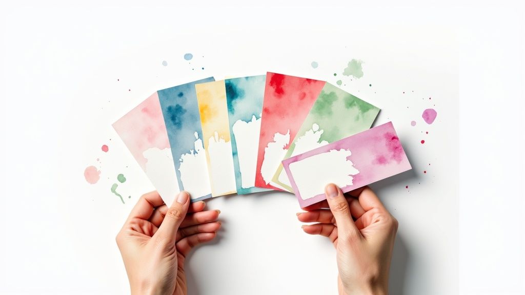 story
story 7 Fresh Business Card Layout Ideas for 2025
Beyond the Basics: Why Your Business Card Layout Matters More Than Ever A well-designed business card does more than just share your contact information; it’s a tangible representation of your brand's identity and professionalism. While a simple card gets the job done, a strategic layout can transform it from a mere informational tool into a powerful marketing asset. The arrangement of text, logos, and negative space directly influences perception, guiding the recipient's eye and conveying a specific message about your company's values, whether that's modern efficiency, bold creativity, or trusted elegance. Your layout is a critical component in building a memorable personal brand that leaves a lasting impression, long after a meeting ends. This roundup moves beyond generic templates to showcase actionable business card layout ideas that you can implement immediately. We will deconstruct seven distinct approaches, providing a clear rationale for why each works and for whom it works best. Instead of just showing you examples, we will dive into the specific design principles behind each layout, offering practical tips on typography, color palettes, and spatial arrangements. You will learn how to: Structure information for maximum clarity and impact. Align your card’s design with your core brand identity. Utilize unique formats to create an unforgettable physical interaction. Get ready to explore layouts that will make your business card a conversation starter, not an afterthought. 1. Minimalist Layout The minimalist layout is a powerful design approach rooted in the principle that "less is more." It strips away unnecessary visual noise, focusing on core information and the strategic use of negative space. This layout conveys confidence, sophistication, and clarity by prioritizing essential elements: your name, title, company, and contact details. Instead of relying on elaborate graphics, it uses typography, alignment, and high-quality materials to make a lasting impression. This approach is one of the most timeless and effective business card layout ideas for professionals who want to communicate precision and elegance. Why Choose a Minimalist Layout? Minimalism is more than just an aesthetic choice; it's a strategic one. This style is particularly effective for industries where trust, precision, and high-end quality are paramount. Think of architecture firms like Foster + Partners, where structure and form are key, or luxury brands like Calvin Klein, which thrive on an image of refined simplicity. Tech startups and SaaS companies also favor minimalism to project a modern, user-focused, and uncluttered brand identity. A minimalist card feels intentional, suggesting that the brand behind it is focused and values quality over quantity. Actionable Tips for Implementation To execute a minimalist design effectively, every detail counts. The simplicity of the layout means that any imperfection will be more noticeable. Prioritize Premium Materials: The tactile experience is crucial. A thick, high-quality cardstock, such as cotton or a heavyweight matte paper, elevates the design from plain to premium. Consider subtle finishes like letterpress debossing or a spot UV varnish on your logo for a touch of understated luxury. Master Your Typography: With minimal graphic elements, your font choice becomes the star. Limit yourself to one or two classic, highly legible fonts, like Helvetica, Futura, or Garamond. Pay meticulous attention to kerning (the space between letters) and leading (the space between lines) to ensure perfect balance and readability. Embrace Negative Space: Don't be afraid of empty space; it's your most powerful tool. Ample "breathing room" around your text and logo draws the eye to the important information and creates a sense of calm and order. Stick to a Limited Color Palette: A monochromatic scheme or a simple two-color combination (like black text on a cream card) reinforces the clean aesthetic. Ensure there is high contrast between the text and the background for effortless readability. For those ready to create a card that speaks volumes through simplicity, you can explore various high-quality paper and finish options. Learn more about premium business card printing on 4over4.com to bring your minimalist vision to life. 2. Bold Typography Layout The bold typography layout turns your font into the main event. This design strategy uses large, impactful, and often artistic lettering as the central visual element, commanding attention instantly. Instead of relying on logos or images, this layout uses the power of type to convey brand personality, confidence, and a strong point of view. It’s a design-forward approach that organizes information through a clear hierarchy of font sizes, weights, and styles, making a statement before a single word is even read. This is one of the most expressive business card layout ideas for creatives and brands wanting to appear modern and audacious. Why Choose a Bold Typography Layout? This layout is a powerful choice for brands that are built on a strong, distinct personality. It’s a favorite among creative industries where unique expression is valued. Think of design studios like Pentagram, whose work often celebrates typography, or creative agencies like the former Sagmeister & Walsh, known for their provocative and type-driven projects. Fashion brands with an edgy, minimalist-but-strong identity, such as Helmut Lang, also use bold type to project confidence. This style works because it’s direct and unapologetic, suggesting the brand behind it is innovative, assertive, and an expert in its field. Actionable Tips for Implementation Executing a typography-focused layout requires a keen eye for balance and a deep understanding of how fonts communicate. The key is to be bold, not chaotic. Limit Your Font Families: Stick to a maximum of one or two font families to avoid a cluttered or amateur look. A single, versatile font family with multiple weights (light, regular, bold, black) is often all you need to create a sophisticated hierarchy. Let the Font Reflect the Brand: Your font choice is your brand's voice. A geometric sans-serif like Montserrat can feel modern and technical, while an elegant, high-contrast serif can feel more classic and luxurious. Ensure the font's personality aligns perfectly with your brand identity. Create Clear Visual Hierarchy: Use size and weight to guide the reader's eye. Your name or company name should be the largest and boldest element, followed by your title, and then smaller contact details. This ensures key information is absorbed instantly. Consider Custom Lettering: For a truly unique impact, commission custom lettering or a logotype. This guarantees your card is one-of-a-kind and reinforces your brand's commitment to bespoke quality and creativity. Pairing a strong typographic design with a special finish can create an unforgettable tactile experience. To make your letters truly pop, explore different enhancement options. Discover how to add a metallic sheen to your type with special printing techniques and learn more about foil stamping on 4over4.com for a premium finish. 3. Vertical Layout The vertical layout flips the traditional business card on its side, creating an immediate and memorable distinction. By adopting a portrait orientation (typically 2" x 3.5"), this design challenges convention and forces recipients to physically handle and view the card differently. This simple rotation provides a unique canvas that can guide the eye downwards, allowing for a different flow of information and a modern, innovative feel. It's one of the most effective business card layout ideas for brands that want to communicate a forward-thinking and creative identity from the very first glance. Why Choose a Vertical Layout? A vertical orientation is an excellent strategic choice for industries and professionals who benefit from a non-traditional image. Creatives like graphic designers, photographers, and architects often use this format to signal their unique perspective. It’s also highly effective for brands whose logos are naturally taller than they are wide. For example, a real estate agent could use the vertical space to feature a striking image of a property, while a personal trainer might use an action shot to convey energy and dynamism. The layout inherently stands out in a stack of standard horizontal cards, ensuring it gets noticed. Actionable Tips for Implementation Successfully executing a vertical design requires careful consideration of flow and balance to avoid feeling awkward or cramped. Adapt Your Logo and Branding: Ensure your logo and any key brand marks are versatile enough to work within a portrait orientation without looking squished or poorly scaled. Some brands develop a specific vertical lockup for this purpose. Guide the Reader’s Eye: Use the vertical space to your advantage. Stack information logically from top to bottom, placing the most important element, like your name or logo, at the top to anchor the design. Optimize Text Flow: Keep lines of text short and scannable. Long lines of contact information can be difficult to read in a narrow column. Use alignment and spacing to create a clear, organized hierarchy. Consider Durable Materials: A unique format can be enhanced by a unique material. A vertical layout printed on a sturdy, waterproof plastic card can create a powerful and lasting impression of resilience and modernity. For those looking to create a card that is both unique and durable, explore the possibilities of combining a vertical format with different materials. Find out more about durable plastic card printing on 4over4.com to make your design truly unforgettable. 4. Photo-Centric Layout A photo-centric layout places high-quality imagery at the forefront of the design, making a powerful visual statement before a single word is read. This approach uses a photograph as the primary background or a dominant element, with contact information strategically overlaid or placed around it. It immediately communicates the nature of a business by showing, not just telling. For professionals whose work is inherently visual, this is one of the most direct and compelling business card layout ideas available, creating an instant connection with the recipient. Why Choose a Photo-Centric Layout? This layout is ideal for industries where a visual portfolio is key to attracting clients. Wedding photographers can showcase their signature style with a stunning shot, while a chef or restaurant owner can feature a mouth-watering dish to entice diners. It’s also highly effective for real estate agents displaying a beautiful property, makeup artists highlighting their work, or travel agencies featuring a breathtaking destination. The image serves as a mini-portfolio, giving potential clients a tangible example of the quality and value you provide. Actionable Tips for Implementation Executing a photo-centric design requires a careful balance between the image and the text to ensure both are effective. The goal is a harmonious composition, not a cluttered one. Select a High-Resolution Image: Your photograph is the hero, so it must be sharp and professional. Use an image with a minimum resolution of 300 DPI (dots per inch) to avoid any pixelation or blurriness when printed. For any layout featuring imagery, especially a Photo-Centric one, the quality of your visuals is crucial. Learn more about creating professional, impactful images to ensure your card stands out. Ensure Text Readability: The biggest challenge is making sure your contact information is easy to read against the photo. Place text in areas of the image with low detail or a solid color, like the sky or a simple background. Alternatively, apply a subtle color overlay or a semi-transparent box behind the text to create sufficient contrast. Choose Timeless Imagery: While it may be tempting to use a trendy photo, opt for an image that has lasting appeal and accurately represents your brand. A classic, well-composed shot will remain relevant far longer than one based on a fleeting visual trend. Verify Licensing and Rights: If you are not using your own photography, ensure you have the proper commercial licenses to use the image on your business cards. Using copyrighted photos without permission can lead to legal issues. 5. Geometric/Abstract Layout The geometric/abstract layout is a modern and dynamic design choice that leverages shapes, lines, and patterns to create a visually stimulating effect. This approach moves beyond traditional layouts by using mathematical precision and artistic expression to build a memorable brand identity. It communicates innovation, creativity, and a forward-thinking mindset by transforming the card into a small piece of art. This style is one of the most effective business card layout ideas for brands that want to appear bold, structured, and inventive. Why Choose a Geometric/Abstract Layout? This layout is ideal for industries where creativity and structure converge. Tech startups and app developers use geometric patterns to reflect digital precision and innovation. Graphic design agencies and creative consultancies choose abstract designs to showcase their artistic capabilities and unique brand personality. The structured yet creative nature of this layout also appeals to modern architecture firms and digital marketing companies, allowing them to project an image of being both organized and imaginative. It’s a powerful choice for any business that wants to stand out and be remembered for its distinctive style. Actionable Tips for Implementation Executing a geometric layout requires a careful balance between artistic flair and professional clarity. The design elements should enhance, not overpower, the core information. Balance Creativity with Readability: While the shapes and patterns are the main attraction, your contact information must remain clear and legible. Position text away from busy patterns or use a solid color block to ensure your name and details are easily readable. Integrate Your Brand Colors: Use your established brand palette within the geometric elements. This creates a cohesive look that reinforces your brand identity and makes the card instantly recognizable as part of your marketing materials. Use Shapes to Guide the Eye: Strategically place lines, triangles, or circles to direct the viewer's gaze toward key information, such as your name, logo, or website. This creates a visual flow that makes the card both interesting and functional. Consider Special Finishes: Elevate the design with printing techniques that complement the geometric theme. Metallic foil stamping on certain lines, embossing on shapes, or a spot UV gloss can add texture and a premium feel that makes the design pop. 6. Two-Sided Asymmetrical Layout The two-sided asymmetrical layout is a sophisticated design approach that leverages both sides of the card to create a dynamic and engaging experience. This layout intentionally avoids symmetrical balance, arranging key elements like logos, text, and graphics unevenly to generate visual tension and guide the viewer's eye. By distributing information across two distinct but connected canvases, it allows for a cleaner front while providing comprehensive details on the back. This is one of the most functional business card layout ideas for professionals who need to present a lot of information without creating a cluttered design. Why Choose a Two-Sided Asymmetrical Layout? This layout is ideal for businesses that need to convey multiple layers of information without sacrificing a modern aesthetic. For example, a consulting firm can use the front for a bold brand statement and the back for a bulleted list of services. Creative agencies can feature a striking portfolio image on one side with contact details cleanly organized on the other. It's also perfect for international professionals who need to include different contact methods or addresses, as the asymmetry allows for logical separation of these details. This approach signals that a brand is both organized and creative, capable of managing complexity with style. Actionable Tips for Implementation Successfully executing an asymmetrical layout requires careful planning to ensure the design feels intentional rather than accidental. The goal is dynamic balance, not chaos. Plan Your Information Hierarchy: Decide what information is primary and what is secondary. A common approach is placing the logo and name on the front for immediate impact, with contact details, services, or certifications on the back. Create Visual Counterweights: Balance a large graphic or logo on one side with a block of text on the opposite side or corner. This creates equilibrium and prevents the card from feeling lopsided. Maintain Branding Consistency: While the layouts on the two sides are different, they must feel like part of the same brand. Use the same color palette, typography, and logo treatment on both sides to create a cohesive whole. Guide the Flip: Consider how the card will be handled. Use a design element, like a color block or line that wraps from front to back, to encourage the recipient to turn it over and discover more information. Protect Your Design: A two-sided design benefits greatly from added durability to protect the information on both sides. Consider a protective finish to prevent scuffs and enhance the visual appeal. Explore various options to protect your card by learning more about laminating services on 4over4.com . 7. Interactive/Die-Cut Layout An interactive or die-cut layout transforms a business card from a simple piece of information into a memorable physical experience. This approach uses custom cutting, folding, or other assembly techniques to create a card that engages the recipient’s sense of touch and curiosity. By breaking the conventions of a standard rectangular card, these designs immediately stand out and communicate a high level of creativity, craftsmanship, and attention to detail. This is one of the most inventive business card layout ideas for brands that want to leave a lasting, playful, and unforgettable impression. Why Choose an Interactive/Die-Cut Layout? This layout is a powerful choice for creative industries and any business that benefits from demonstrating a hands-on, tangible quality. For example, an architect could use a card that folds into a miniature 3D building, or a personal trainer might have a card with a tear-off section for a trial session. Creative agencies use them to showcase their innovative thinking, while furniture makers might opt for a wood-textured card cut into the shape of a chair. The goal is to create a "wow" moment that makes your brand instantly more memorable than the competition. To help you decide if this advanced layout is the right fit, the decision tree below walks through key considerations like budget and function. The infographic highlights that a high budget tolerance is the first prerequisite, followed by a clear strategic need for interactivity. Actionable Tips for Implementation Executing an interactive or die-cut design requires careful planning and collaboration with a skilled printing partner. The complexity introduces more variables than a standard card. Budget Accordingly: Custom dies and special finishing are significantly more expensive than standard printing. Factor in these higher production costs from the beginning to avoid surprises. Prioritize Functionality: While creativity is key, the card must still function. Ensure that essential contact information remains clear and legible and isn't obscured by folds or cuts. The interactive element should enhance, not compromise, the card's purpose. Consider Portability and Durability: How will your card fit into a standard wallet or cardholder? Test the durability of any moving parts, folds, or delicate cut-outs to ensure they don't easily bend or tear before they reach their intended recipient. Work with Specialists: Not all printers can handle complex die-cuts or interactive assemblies. Partner with a vendor experienced in these techniques. Explore the possibilities and get expert guidance by learning more about custom die-cutting services on 4over4.com . Business Card Layouts: 7-Style Comparison Layout Type Implementation Complexity 🔄 Resource Requirements ⚡ Expected Outcomes 📊 Ideal Use Cases 💡 Key Advantages ⭐ Minimalist Layout Low - Simple design and typography Low - Basic printing needs Clean, professional, easy to read Corporate professionals, consultants, tech Timeless, cost-effective, readable Bold Typography Layout Medium - Careful font selection Low - Mostly text-based High visual impact and brand recall Creative professionals, marketing, fashion Memorable, strong brand recognition Vertical Layout Medium - Different orientation Medium - May affect printing Unique visual flow, stands out Photographers, real estate, fashion Distinctive, creative layout options Photo-Centric Layout High - Requires quality photography High - Professional images Strong visual storytelling Photographers, restaurants, travel Immediate impact, engaging visuals Geometric/Abstract Layout Medium to high - Complex designs Medium to high - Printing and design precision Innovative, creative impression Tech companies, design agencies Memorable, modern, flexible designs Two-Sided Asymmetrical Layout High - Balancing two sides High - Double-sided printing Detailed, professional, dynamic Consulting firms, multi-service businesses Maximizes info space, highly creative Interactive/Die-Cut Layout Very high - Special cutting & engineering Very high - Specialized printing Highly memorable, unique experience Luxury providers, architects, creatives Unique, tactile, high perceived value Bringing Your Vision to Life: Your Next Steps to a Perfect Business Card We've explored a diverse landscape of powerful business card layout ideas , from the quiet confidence of minimalism to the engaging novelty of interactive die-cuts. Each approach offers a unique pathway to making an unforgettable first impression. The journey through these distinct styles reveals a core truth: a business card is far more than a simple carrier of contact information. It's a strategic tool, a miniature billboard for your brand, and a physical representation of your professional promise. The layouts we've detailed, whether it's the rule-breaking vertical orientation or a bold, typography-led design, are all built on the foundational principles of visual hierarchy, balance, and brand consistency. Your choice isn't just about aesthetics; it’s about alignment. A law firm might leverage the stability of a two-sided asymmetrical layout, while a graphic designer could showcase their creativity with a striking geometric pattern. The most effective card is one that feels like a natural extension of your brand's voice and values. Key Takeaways for Your Design Journey To distill our exploration into actionable wisdom, remember these crucial points before you begin your design process: Hierarchy is Non-Negotiable: No matter the layout, your audience must know what to look at first. Is it your name? Your logo? A compelling tagline? Use size, color, and placement to guide their eye effortlessly through the most critical information. Space is an Active Element: The negative space, or white space, in your design is as important as the text and graphics. It prevents a cluttered feel, enhances readability, and can create a sense of sophistication and focus, especially in minimalist and typography-centric layouts. Consistency Builds Trust: Your business card must visually connect to your other brand assets, like your website, social media profiles, and marketing materials. Consistent use of fonts, colors, and logo variations reinforces brand identity and builds recognition. Your Actionable Next Steps Feeling inspired? It's time to translate that inspiration into a tangible asset. Don't let these business card layout ideas remain just concepts on a screen. Follow this simple plan to move forward with confidence: Define Your Core Message: Before you even think about design, what is the single most important thing you want your card to communicate about you or your business? Is it creativity, reliability, innovation, or accessibility? Audit Your Brand Assets: Gather your logo files, brand color codes (HEX, CMYK), and official fonts. Having these ready will streamline the design process and ensure consistency from the start. Choose a Layout That Aligns: Revisit the examples in this article. Which layout style best supports your core message and brand identity? Select a primary direction, but don't be afraid to borrow elements from other styles. Sketch and Iterate: Grab a pen and paper (or open your favorite design software) and start sketching rough layouts. Don't aim for perfection. The goal is to experiment with the placement of your logo, name, title, and contact details. Try several variations of your chosen layout style. By moving from abstract inspiration to a concrete design process, you transform the humble business card from a mere formality into a potent marketing tool. This small piece of cardstock has the power to open doors, start conversations, and solidify your professional identity in the mind of every person you meet. Ready to bring your perfect business card layout to life with premium quality and unmatched customization options? The expert team at 4OVER4 specializes in turning creative visions into reality, offering everything from unique die-cut shapes to luxurious paper stocks and finishes. Explore their extensive printing services to ensure your final product is as impressive as your design.
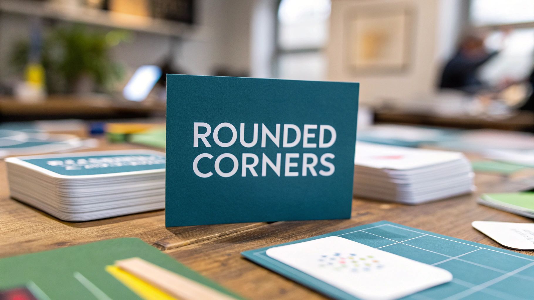 story
story A Guide to Business Card Rounded Corners
Choosing business card rounded corners isn't just a simple design tweak—it's a deliberate choice that makes your brand feel more current and approachable. More than that, it actually makes your cards last longer. This one small detail swaps out those traditional sharp corners for a gentle curve, which helps stop them from getting frayed and bent. It’s a subtle touch that makes a surprisingly strong first impression. Why Rounded Corners Make a Lasting Impression That little curve on a business card? It does way more than just look nice. It sends a message. It takes a standard piece of cardstock and turns it into a branding tool that feels thoughtful and intentional. The Psychology of Soft Edges Think about it—sharp, pointy corners can come off as a bit harsh or rigid. On the other hand, rounded shapes are psychologically linked to things like friendliness, comfort, and warmth. This small shift makes your brand feel more human and accessible from the moment you hand someone your card. When you choose business card rounded corners , you're showing a level of care and a modern sensibility. This design choice really started catching on around 2011 . Pioneering online printers began offering them as a way for brands to break away from the pack. The whole idea was to create a card that was different both to the eye and to the touch, helping businesses look more contemporary while also making the cards themselves more durable. Rounded corners aren’t just a design trend; they are a functional upgrade. They signal attention to detail and a commitment to quality, telling potential clients you care about the small things. Practical Benefits Beyond Aesthetics Beyond the good vibes it gives your brand, a rounded corner offers some real, practical advantages that protect your investment. The biggest one? They’re just way more resilient to the abuse of daily life. Prevents "Dog-Earing": You know how standard cards get all bent and frayed at the corners after a week in a wallet or pocket? Rounded edges get rid of those weak points, keeping your cards looking sharp and professional for much longer. Enhanced Tactile Experience: The smooth, curved edge is just plain nice to hold. It creates a subtle but positive physical connection with your brand, and that memorable feel helps your card stand out in a stack of sharp-edged competitors. At the end of the day, going with rounded corners is a smart, stylish investment. It’s a tiny detail that says a lot about your brand’s personality and professionalism. When you’re ready to design a card that really gets noticed, check out the huge range of options available for business cards printing to find the perfect style for you. Choosing the Right Corner Radius for Your Brand That subtle curve on the edge of your business card has a name: the radius . And believe it or not, this tiny detail does some heavy lifting for your brand. It can instantly shift the entire vibe of your card, turning it from buttoned-up and corporate to friendly and modern. Think of the radius as the personality dial for your design. A small, tight curve is like a confident whisper, while a big, loopy one is a bold, energetic statement. Getting this right is key to making sure your card’s first impression matches the story you want to tell. Even with rounded corners, your cards still stick to the standard 3.5 x 2-inch size. It’s the curve that makes all the difference. The most common choice worldwide is about a quarter-inch radius, a sweet spot that feels good in your hand, adds durability, and looks great without messing up your design. For a deeper dive into specs, shopcreativehub.com offers a great breakdown of business card details . Decoding Common Radius Options When you’re ready to order, you’ll likely see two main choices: the 1/8" and 1/4" radii. Understanding what each one looks like is the first step to picking the right one for your brand. 1/8" Radius (Subtle and Sophisticated): This is the quiet one. It’s a very slight, gentle curve that just softens the sharp points of a standard card. It doesn’t scream for attention. This makes it perfect for professionals—law firms, financial advisors, consultants—who want a touch of modern class without sacrificing their trustworthy, traditional image. 1/4" Radius (Bold and Creative): This is the extrovert. The curve is much more obvious, giving the card a friendly, approachable, and innovative feel. It’s a fantastic fit for creative agencies, tech startups, photographers, or any brand that wants to come across as fresh and dynamic. Here’s a simple trick to picture the difference: a 1/4" radius is roughly the curve of a dime. A 1/8" radius is much tighter, just barely taking the sharp edge off. It's a tiny measurement that makes a huge visual impact. Corner Radius and Brand Personality Guide Still not sure which way to lean? This quick guide should help you connect the curve to the brand personality you're aiming for. Radius Size Visual Feel Ideal for Brand Type 1/8" Polished, elegant, refined, professional Corporate, financial, legal, luxury, real estate 1/4" Friendly, approachable, modern, creative Tech, startups, design agencies, photographers, cafes 3/8" Playful, unique, soft, unconventional Children's brands, artists, boutiques, event planners 1/2" Bold, dramatic, circular, statement-making Entertainment, music, innovative product brands Ultimately, your brand identity is your north star. If you’re all about stability and tradition, the understated elegance of a 1/8" radius will serve you well. If you’re built on creativity and making connections, the 1/4" radius is probably your best bet. Look at your logo, your colors, and your overall message, and pick the corner that feels like the perfect finishing touch. How Rounded Corners Are Actually Made Ever wondered about the magic that goes into creating that perfect, smooth curve on a business card? It’s definitely not someone with a pair of scissors. The clean, professional finish you see on business card rounded corners is the result of one of two very precise manufacturing methods. The choice between them usually boils down to three things: speed, cost, and just how custom you want to get. One method is like a high-speed, automated paper punch, while the other is more like creating a custom cookie cutter just for your cards. The Corner Rounding Method The most common and direct technique is called corner rounding . Think of this as a final touch that happens after your business cards have been printed and cut into their standard rectangular shape. Stacks of cards are loaded into a specialized machine that has a sharp, curved blade. With a quick, powerful press, this blade slices through the entire stack, trimming one corner at a time with perfect consistency. It’s fast, efficient, and ideal for creating standard curves like the popular 1/8" and 1/4" radius on big batches of cards. This is the go-to method for: Standard orders where consistency and speed are the name of the game. Cost-effective production , since it doesn’t need any custom tools. Smaller print runs that just need a simple, elegant finish without getting too complex. The Die-Cutting Method Now, when you need something truly unique, printers turn to die-cutting . This process is way more flexible and opens the door to complete creative freedom, going far beyond just standard rounded corners. It starts with a custom metal tool, called a "die," which is forged into the exact shape of your card design. Picture a sharp, metal outline of your card. This die is then pressed through the card stock, stamping out the final shape with incredible precision—a lot like a cookie cutter slicing through dough. Die-cutting isn't just for rounding corners; it's how you get cards shaped like your logo, a product, or even cards with unique cutouts and asymmetrical curves. This method is the only choice for really complex designs because the precision is unmatched. It can produce any corner radius you can dream up, round just one or two corners instead of all four, or even create intricate cuts inside the card. Because it requires a custom-made tool for every unique shape, it's a more involved process. If you’re curious about exploring truly one-of-a-kind shapes, you can learn more about the possibilities of professional die-cutting services and how they can seriously elevate your designs. Ultimately, knowing how these are made helps you appreciate the craftsmanship behind your cards. Whether they’re quickly trimmed with a standard rounder or stamped out from a custom die, the goal is always the same: a clean, professional finish that makes your brand look its absolute best. Setting Up Your Design Files for Perfect Curves A killer design can still fall flat if the print file isn't set up correctly. To get those flawless business card rounded corners , you have to prep your artwork with a few key printing concepts in mind. Think of it as the blueprint for your card—nailing the foundation is the only way to ensure the final product looks absolutely perfect. The whole process boils down to understanding three critical zones in your design file: the safe area, the trim line, and the bleed area. Each one plays a huge part in preventing printing mistakes, especially when you're dealing with the unique challenge of a curved edge. Understanding Bleed and Safe Area Bleed is simply the part of your design that extends beyond where the card will actually be cut. Picture this: you want a solid color background. If your design stops exactly at the card's edge, even a tiny shift during the cutting process could leave a thin, unprofessional-looking white sliver. By extending your background 1/8 inch (0.125") past the trim line, you create a buffer that guarantees your color goes right to the very edge. On the flip side, the safe area (sometimes called the live area) is the zone inside the trim line where all your critical information—like your name, phone number, and logo—needs to live. For rounded corners, this area is even more vital. You should keep all those essential elements at least 1/8 inch (0.125") away from the trim line so they don't get sliced off by the curve. The rule of thumb is simple: background elements should "bleed" off the page, while important content must stay safely tucked inside. This ensures nothing important is lost and your background looks seamless. This infographic breaks down the two main ways rounded corners are made—corner rounding and die-cutting—which shows you exactly why these design files are set up this way. As you can see, it doesn't matter if your card is trimmed with a standard rounder or a custom die. The cutting machinery absolutely needs that buffer zone (the bleed) to produce a clean, professional result. Common Mistakes to Avoid Even when you think you've got the setup right, a few common design choices can cause headaches with rounded corners. Knowing what to look out for can save you a ton of frustration and make sure your cards look exactly how you imagined. Borders Too Close to the Edge: Thin borders look sharp, but they are notoriously tough to get right with any cutting process. The slightest shift can make the border look lopsided. If you’re set on using a border, make it thick and place it well inside the safe area. Text Hugging the Curve: This is a classic mistake. Placing text or logos right up against the corner is asking for trouble, as the rounding process can chop right through them. Always, always double-check that your safe area provides plenty of breathing room around the curves. Ignoring the Corner Radius: Remember that specific radius you chose, like 1/4" or 1/8" ? Visualize how that curve will actually interact with your design elements. A larger radius cuts deeper into the corner, which means you need an even more generous safe margin in that spot. By mastering bleed and respecting the safe area, you're really taking control of the final printed outcome. For designs that push the envelope with unique shapes beyond simple rounding, exploring a custom shape die-cut collection can open up even more creative doors, but they all still rely on these same fundamental setup principles. Paying attention to these details is what elevates a good design into a perfectly executed, totally professional business card. Pairing Your Cards with the Right Paper and Finishes Choosing business card rounded corners is a great first step, but the real magic happens when you pair that modern shape with the perfect paper and finish. The material your card is printed on is just as crucial as its shape; together, they create a complete sensory experience for anyone who receives it. Think of it this way: the rounded corners are the architectural blueprint, but the paper and finish are the high-end materials that truly bring the structure to life. A well-chosen paper stock doesn't just hold the ink—it amplifies the effect of the curves, making them feel more intentional and luxurious. The goal is to create harmony so your card doesn't just look good, it feels memorable. Matching Paper Weight to Your Design Paper thickness, or weight, plays a massive role in how substantial and premium your rounded corner card feels in someone's hand. A thicker, heavier stock gives those curved edges a satisfying sturdiness and a high-end touch that flimsier cards just can't replicate. Thick, Premium Stocks (16pt and above): Heavier stocks are fantastic for rounded corners. They make the curved edges feel more pronounced and deliberate, adding a sense of quality and durability that perfectly complements the fray-resistant nature of the design. Uncoated or Kraft Paper: If you're going for a more organic, down-to-earth vibe, an uncoated stock is an excellent choice. Its natural texture combined with soft corners creates a card that feels handmade and authentic—ideal for artisans, eco-conscious brands, or anyone wanting a more approachable feel. The classic 3.5 x 2 inch business card became standard in the late 19th century, but it wasn't until the early 2000s that on-demand printing really opened the door for customization. This is when rounded corners took off, appealing to modern startups who wanted a durable, standout design. Elevating the Experience with Finishes The finish is the final touch that seals the deal, enhancing both the look and feel of your business card. The right coating can either lean into the modern aesthetic of rounded corners or create a stunning contrast that makes your design pop. A finish is more than just a protective layer; it's a tactile choice that defines how your brand is perceived. It’s the difference between a card that’s just seen and one that’s truly felt. A soft-touch matte finish is an incredibly popular partner for rounded corners, and for good reason. It provides a velvety, smooth texture that feels both modern and luxurious, making the card a genuine pleasure to hold. If you're curious about this premium feel, you can explore a variety of soft touch printed products to see how it looks and feels. On the other hand, you could use a spot gloss (or Spot UV) to highlight specific elements like your logo or company name. This creates a dynamic, eye-catching contrast against a matte background that naturally draws attention to the card's unique shape. By carefully selecting your paper and finish, your business card transforms from a simple piece of contact info into a powerful branding tool. Common Questions About Rounded Corner Business Cards Got a few questions before you hit that order button? Perfect. We’ve put together some straightforward answers to the most common things people ask about rounded corners. Think of this as your go-to guide for getting all the details right. Our goal is to give you the practical info you need to make smart decisions and feel confident that your final cards will look exactly how you imagined. Let's clear up any last-minute uncertainties. Are Rounded Corner Business Cards More Expensive? Yes, but usually just by a little bit. Adding rounded corners is an extra finishing step, so it typically adds a small fee to your order. Think of it as a minor upgrade. This fee usually covers your entire batch of cards, whether you're ordering 100 or 1,000 , making it a really cost-effective way to get that premium, modern look. When you consider the sleek aesthetic and extra durability, most people find the small investment is well worth the powerful first impression it helps create. How Much Longer Does Printing Take? Adding rounded corners typically adds about one to two business days to the production timeline. This gives our finishing department the time they need to carefully trim the corners after your cards have been printed and cut down to size. So, if a standard business card order takes three business days, an order with rounded corners might take four or five business days before it’s ready to ship. It’s always a good idea to check the estimated turnaround time your printer provides during checkout. That will give you the most accurate timeline for your specific order. Does Paper Thickness Make a Difference? It absolutely does, and the difference is something you can really feel. The weight and stiffness of your card stock have a big impact on how the rounded edge looks and feels. Thicker card stocks, like a solid 16pt or a luxe 32pt paper, produce a much cleaner, more defined rounded edge. The density of a heavier paper allows for a smoother, crisper cut that feels incredibly premium in your hand. While rounded corners still look good on standard 14pt stock, the effect is far more noticeable and impressive on a thicker card. A heavier stock also makes the card more durable, which pairs perfectly with the anti-fraying benefit of rounded corners. Can I Get Just Two Corners Rounded? Yes, you can! This is a fantastic way to create a unique, asymmetrical design that really stands out from the stack. Whether you want two corners rounded on the same side for a tab-like feel or on a diagonal for a more dynamic look, it's definitely possible. This kind of customization is usually done through die-cutting rather than with a standard corner rounding machine. When you’re placing your order, look for custom shape options or be sure to specify your exact needs in the order notes. Most importantly, make sure your design file clearly shows which corners you want rounded to avoid any mix-ups during production. This is just one of many ways to elevate your card; you can explore a wide variety of other fantastic finishes to make your design even more memorable. Ready to create a business card that leaves a lasting impression? At 4OVER4 , we offer a wide range of paper stocks, finishes, and custom options to bring your vision to life. Design your perfect rounded corner business cards today at https://4over4.com .
 story
story Elevate Your Brand with business card spot uv: Design That Impresses
Picture this: someone hands you a business card. Before your eyes even register the words, your fingers do the talking. They glide across a smooth, matte surface, then suddenly catch on a slick, raised logo that gleams in the light. That tiny moment of surprise? That's the magic of Spot UV . What Is Spot UV and How Does It Make Business Cards Pop? At its core, Spot UV is a clear, glossy coating applied to specific areas of your business card. Think of it less as a finish and more as a design tool. It’s a way to add a layer of texture and shine that creates an incredible contrast against a matte or silk background. Instead of coating the entire card, you get to choose exactly which elements get the star treatment. The "spot" in Spot UV means precision—you're highlighting your logo, a pattern, or maybe just your name. The "UV" part comes from the curing process, where ultraviolet light instantly hardens the coating, locking in that durable, glass-like finish. This isn’t about adding color; it’s all about adding depth and a tactile feel that transforms a simple piece of paper into a memorable experience. How We Get That Perfect Sheen The process is pretty cool. First, your card is printed with the full-color design. Then, a protective base lamination—usually matte or silk to maximize contrast—is applied. Next, a specialized machine applies a liquid polymer varnish to only the spots you’ve designated in your artwork. This varnish is immediately hit with powerful UV light, causing a reaction that dries it instantly. Because it cures so fast, the varnish doesn't have a chance to soak into the paper. Instead, it sits right on top, creating that distinct, raised layer that you can see and feel. Spot UV isn't just a design choice; it's a strategic tool. It guides the recipient's eye and touch to the most important parts of your card, reinforcing brand identity through a multi-sensory interaction. Spot UV at a Glance: Key Features and Benefits To break it down, here’s a quick look at what makes Spot UV such a powerful choice for your business cards and other print materials. Feature Description Primary Benefit Selective Gloss Finish A high-gloss varnish is applied to specific areas of the design. Creates a striking visual contrast that draws attention. Raised, Tactile Texture The UV coating sits on top of the paper, creating a noticeable texture. Makes the card feel premium and memorable to the touch. Durability The UV-cured varnish is hard and resistant to scuffs and moisture. Protects key design elements and adds longevity to the card. Versatility Works beautifully on logos, text, patterns, or as a "blind" design element. Offers endless creative possibilities to enhance any design. This combination of visual appeal and physical texture is what sets Spot UV apart, turning a standard card into a conversation starter. Why It's So Effective The secret to Spot UV's success is simple: contrast. When you pair a super glossy, reflective element with a non-reflective, matte background, you create a powerful visual and textural separation. That pop is what makes your design leap off the card. It���s a small detail that says a lot about your brand. It communicates a commitment to quality, a keen eye for detail, and a desire to make a lasting impression. From bold logos to subtle background patterns, it’s an incredibly versatile way to make your card unforgettable. Spot UV has become a go-to for professionals who want to stand out. It's part of a massive trend in printing technology. The global UV inkjet printing market, which drives these finishes, was valued at USD 50.61 billion and is expected to climb to USD 87.62 billion by 2032. Understanding this process helps you see why our range of spot UV printed products can give your brand a serious edge. Mastering Your Spot UV Design for Maximum Impact Applying Spot UV is really where the art and science of print design come together. You can have the most incredible finish in the world, but if it's slapped onto a weak design, it's just a missed opportunity. But when you pair a great finish with thoughtful placement? The result is nothing short of spectacular. Let's walk through the playbook for making smart, impactful decisions that ensure your Spot UV finish doesn't just look good—it communicates quality from the first touch. The single most important principle to remember is contrast . Think of a spotlight on a dark stage; its beam is sharp and immediately grabs your attention. It's the same idea here. The high-gloss, reflective nature of Spot UV stands out most dramatically against a background that isn't reflective. This is why you'll almost always see it paired with a matte or silk lamination. That smooth, non-shiny surface makes the glossy areas pop, creating a powerful one-two punch of visual and tactile appeal. Strategic Placement: Where to Apply Spot UV Deciding where to apply the gloss is easily the most creative part of the process. You're basically choosing which parts of your card get the star treatment. The goal is to guide the recipient's eye (and hand) to the most important information, reinforcing your brand in a way they won't soon forget. Here are some of the most effective ways to use it: Accentuate Your Logo: This is the classic, go-to application for a reason. Applying Spot UV to your logo makes it the undeniable focal point of the card. It adds a subtle layer of professionalism that makes your brand feel premium and established. Highlight Key Information: Want to make sure your name, title, or website is impossible to miss? A touch of gloss on your primary contact details makes them jump right off the card. Create Subtle Patterns: This is one of my favorite techniques. You can create a "blind" or "ghost" effect by applying a Spot UV pattern directly onto the cardstock without any ink underneath. The pattern is only visible when it catches the light, adding a layer of sophisticated, discoverable detail. It’s a real "wow" moment for anyone holding the card. Emphasize Graphic Elements: Have a unique icon, illustration, or design element that’s part of your brand? Applying Spot UV can give it life, making it a tactile feature that practically begs to be touched. By selectively applying gloss, you control the narrative of your card. You're telling the person holding it, "Look here. Feel this. This part is important." Of course, a special finish can only enhance what's already there. The foundation of an impressive business card is always its core visual elements. To get the most out of your Spot UV design, it’s worth brushing up on the principles of strong logo design to ensure your branding is as powerful as the finish you choose. Design Do’s and Don’ts To get a flawless result, you have to work with the technology, not against it. Some design choices play beautifully with Spot UV, while others can lead to disappointment. What to Do: Use Bold Shapes and Fonts: Spot UV makes its biggest impact on larger, bolder elements. Think thick lines, solid logos, and confident sans-serif fonts. These give the gloss enough surface area to really shine and create that satisfying raised texture. Keep It Simple: Often, less is more. Highlighting just one or two key elements, like your logo and name, can be far more effective than covering the card in glossy spots. Simplicity reads as confidence. Consider Raised Spot UV: For an even more dramatic tactile effect, you can take it a step further. We offer raised spot UV printed products that add a truly three-dimensional feel, elevating the sensory experience to a whole new level. What to Avoid: Tiny Text and Thin Lines: Steer clear of applying Spot UV to very small text (under 8pt ) or lines thinner than 0.5 points . The registration process in printing is incredibly precise, but on microscopic elements, even a tiny shift can cause the gloss to misalign with the ink underneath. The result is a blurry, messy look that undermines the premium feel you're going for. Overcrowding the Design: Applying Spot UV to too many elements can make the card look cluttered and cheapens the "special" feel of the finish. Remember the spotlight analogy—if everything is shiny, nothing stands out. Full Coverage: Don't use Spot UV to coat the entire surface of your card. If you want an all-over gloss, a standard gloss lamination is a much more effective and economical choice. The magic of "spot" UV is in its selectivity. Preparing Flawless Print Files for Spot UV A brilliant design is only half the battle. Making sure it translates perfectly from your screen to the finished, printed card is where the real magic happens. The technical side of prepping files for a business card spot uv finish might sound a little intimidating, but it’s actually a pretty straightforward process once you get the hang of the most important piece: the spot mask. Nailing this step is everything if you want a professional result. Think of the spot mask as a treasure map for the printing press. It’s a completely separate, black-and-white file that tells the machine exactly where to apply that glossy UV coating. Where the mask is black, the gloss goes on. Where it's white, the area is left alone with its original paper finish. That simple instruction is the foundation for a stunning final product. To pull this off, you'll need to create a special layer or a totally separate file in your design software that is dedicated only to this spot mask. Creating Your Spot UV Mask File Here's the most critical rule, and it’s a simple one: your mask must use 100% black . We’re not talking about a "rich black" (a mix of CMYK colors) or a shade of gray. In your color palette, you have to set the color to 100% K (black) and leave Cyan, Magenta, and Yellow at 0% . This pure, single-channel black is the universal language the printer understands. It’s a clear signal that says, "Apply UV coating right here." Any other color or shade will just confuse the press and lead to printing errors. Your mask file should only contain these 100% K elements against a plain white background. It has to be a clean, high-contrast file—no gradients, blurs, or shadows allowed. The edges of your black shapes need to be sharp and clean to make sure the UV application is just as crisp. This diagram breaks down the core design principles to keep in mind as you decide where to place your spot UV elements. As you can see, focusing on strong contrast and accentuating key details—while steering clear of anything too fine or complex—is the ticket to an effective spot UV design. Essential File Specifications Beyond creating the mask itself, there are a few technical specs that are non-negotiable for professional printing. Following these guidelines helps you avoid common headaches like pixelation or misalignment, ultimately saving you time and money. Alignment is Everything: Your spot mask file has to line up perfectly with your main color design file (the CMYK artwork). Every black element on the mask must sit in the exact same spot as the corresponding element on your print file. If they are even a tiny bit off, the UV coating will be offset from your design, and the whole effect will be ruined. Resolution Matters: Both your main print file and your spot mask file must have a resolution of at least 300 DPI (dots per inch) . Anything lower is going to look blurry or pixelated in the final print, which completely undermines the premium quality you’re going for. Correct File Formats: Printers almost always prefer vector-based files or high-quality PDFs. Submitting your files as PDFs or native Adobe Illustrator (.ai) or InDesign (.indd) files is the best way to go, as it preserves the quality and integrity of all your design elements. By following these steps, you’re taking control of the production process. You aren’t just handing over a design; you’re providing a precise blueprint for a premium finish. When you're ready to bring your idea to life, you can explore the wide variety of premium business cards printing options, knowing your files are set up for a perfect outcome. Choosing the Right Finish Spot UV vs Foil Stamping Picking a special finish for your business card is a lot like choosing the right accessory for an outfit—it has to complement the overall style and send the right message. While business card spot uv brings a modern, tactile sheen to the table, another heavyweight contender in the premium finish world is Foil Stamping. Both finishes can transform a standard card into something memorable, but they get there in completely different ways. Spot UV adds a clear, subtle gloss that feels contemporary and sophisticated. Foil Stamping, on the other hand, introduces an opaque, metallic shimmer for a more classic, luxurious statement. Getting a feel for the distinct personality each finish brings to a business card is the key. When you choose correctly, your card will perfectly align with your brand’s identity, its message, and, of course, your budget. The Tale of Two Textures The biggest difference between them comes down to how they look and feel. Spot UV is all about creating subtle contrast and texture . It’s a clear varnish, so it actually enhances the printed colors underneath, making them look richer and deeper. The real magic happens when you feel the contrast between the high-gloss areas and the smooth matte or silk background. It’s an effect that just begs to be touched and rewards a closer look. Foil Stamping is a different beast entirely—it’s all about bold, metallic impact . Instead of a clear coating, a super-thin layer of metallic foil is heat-pressed directly onto the cardstock. This creates an opaque, shimmering element that completely covers whatever is beneath it. It doesn't just enhance color; it replaces it with pure, reflective metal. Spot UV whispers elegance through texture and light. Foil Stamping shouts luxury with metallic brilliance. The right choice depends entirely on the story your brand wants to tell. Business Card Finishes Compared Seeing the options side-by-side makes the decision-making process much clearer. Each finish really shines in different scenarios and helps communicate a unique brand persona. Here’s a quick comparison to help you figure out which one is the best fit for your next project. Finishing Type Visual Effect Feel & Texture Best For Cost Level Spot UV Clear, high-gloss shine that enhances underlying colors. Smooth, slightly raised, and slick to the touch. Modern, minimalist brands; tech companies; creative agencies; designs with subtle patterns. $$ Foil Stamping Opaque, metallic shimmer (gold, silver, copper, colors). A slight debossed feel from the heat-press application. Luxury brands; law firms; high-end retailers; formal invitations. $$$ As you can see, the choice is about more than just looks. If your brand is going for a sleek, innovative vibe, the tactile nature of a business card spot uv finish is often the perfect match. But for a brand built on tradition, prestige, and timeless quality, the classic gleam of foil is tough to beat. If that metallic look is calling your name, you can explore a huge variety of foil stamping options to find the perfect shade for your brand. Making the Final Call So, which one is right for you? It's pretty straightforward when you break it down. Choose Spot UV if: Your brand identity is modern, clean, and understated. You want to highlight a logo or create a subtle pattern that adds a layer of discovery without being overpowering. It's also an excellent choice for making dark colors look exceptionally rich and deep. Choose Foil Stamping if: Your brand projects luxury, elegance, and established authority. You want an unmistakable mark of quality that immediately communicates a premium feel. It’s perfect for classic typography and iconic logos that demand attention. The growing popularity of these advanced finishes is also pushing innovation in the printing industry. For example, spot UV is part of the booming UV LED printers market, a sector projected to hit USD 1,070.05 million by 2035. This technology is all about efficiency and sustainability, which is making these premium finishes more accessible than ever. You can find more insights about the UV LED printer market growth on futuremarketinsights.com . Ultimately, both Spot UV and Foil Stamping are fantastic tools for making your business card stick in someone's memory. Just think about your brand’s personality and the message you want to send, and you’ll be able to confidently pick the finish that will make the best first impression. Inspiring Ways to Use Spot UV on Your Business Cards Ready to see what this business card spot uv finish can really do? Let's move past the technical stuff—this is where your creativity gets to shine. A slick, well-placed touch of gloss can turn a pretty good card into a tiny piece of art, completely changing what a first impression can be. Let's look at a few killer applications, from bold statements to quiet elegance, that will get you thinking about how to design a card that feels authentically you . The Power of Subtlety and Contrast Picture this: a minimalist, all-black business card printed on a deep, matte stock. But here’s the twist—the company name and logo aren't printed in ink. Instead, they’re just sleek Spot UV elements, almost invisible until they catch the light and reveal the brand with a flash of gloss. This "blind" or "ghost" effect is a masterclass in confident, modern design. It creates a little moment of discovery for the person holding it, rewarding them with a detail that feels exclusive and incredibly thoughtful. This approach is a perfect match for: Creative Agencies: It immediately communicates a sharp, design-forward vibe. Tech Startups: Hints at innovation and a sleek, user-focused experience. Luxury Brands: Projects an image of quiet confidence and understated elegance. Adding Life to Visuals If you're a photographer, designer, or artist, Spot UV gives you a unique way to make your work literally pop off the card. Think of a photographer’s business card that features a stunning portrait or a dramatic landscape. By applying Spot UV just to a specific detail—like the glint in a person's eye, the chrome on a vintage car, or the dewdrops on a leaf—the image gains an incredible sense of depth and realism. It's a simple trick that draws the eye right where you want it to go, making the whole card more dynamic and memorable. Creating Unique Tactile Patterns Spot UV isn't just for highlighting things that are already there; it can be the star of the show. Imagine an intricate, tactile pattern covering the entire background of your card. This could be a clean geometric design, a subtle wave pattern, or even a texture that mimics one of your products. This adds a unique sensory layer that just makes the card feel more substantial and interesting to hold. You can lay the pattern over a solid color or even a blank background to create an unforgettable texture that reinforces your brand without adding any visual clutter. A well-executed Spot UV design does more than just look good; it creates an interactive experience. It invites touch, sparks curiosity, and makes your card a conversation piece long after the initial handshake. These examples are just the beginning. By checking out our full range of fantastic finishes , you can find the perfect combination to bring your own vision to life and design a card that people won’t just take—they’ll keep. Your Simple Checklist for Ordering Spot UV Business Cards You've nailed the design and prepped your files like a pro. Now for the exciting part—turning that vision into a real, tangible business card. This final step, placing your order, should be the easiest part of the whole process. Think of this as your pre-flight checklist. Running through these points ensures the stunning, premium cards you designed are exactly what shows up at your door. Let's walk through it together. Final Design and File Review Before you even think about uploading, give your artwork one last, careful look. This is your chance to catch those tiny mistakes that can become big headaches later on. Proofread Everything: Seriously, check every single word. Names, phone numbers, email addresses—one small typo can undermine an otherwise perfect card. If you can, get a second pair of eyes on it. Confirm Your Dimensions: Make sure your design file is set to the correct final size (like 3.5" x 2" ) and includes a 0.125-inch bleed on all sides. This is non-negotiable for a clean, edge-to-edge print. Verify Your Spot Mask: Pull up your spot mask file and your main CMYK design side-by-side. Do the black areas on the mask line up perfectly with the elements you want to shine? And just to be sure, confirm that mask is 100% K black and nothing else. Selecting Your Print Specifications Now you get to choose the physical details of your card. These choices are what make the Spot UV effect truly stand out. The right paper and finish are the stage for your Spot UV design. A high-contrast base like Silk Lamination is what allows the glossy elements to really perform and grab everyone's attention. Choose the Right Paper Stock: To get that premium feel that a Spot UV finish deserves, you need a thicker stock. We highly recommend our 16pt cardstock ; it has the sturdiness and substance a high-end card needs. Select the Best Lamination: This is the secret to getting that dramatic contrast. You should always pair Spot UV with a non-glossy base. Silk Lamination is the perfect partner, giving the card a smooth, luxurious texture that makes the glossy areas pop. Finalizing and Placing Your Order You're at the finish line! Just a few more clicks and your new cards will be on their way. Upload Your Files Correctly: At the upload prompt, add your main CMYK artwork and your separate Spot UV mask file. Label them clearly (e.g., "Design_Front.pdf" and "Mask_Front.pdf") so there’s absolutely no room for confusion. Review the Digital Proof: Once your files are processed, you'll get a digital proof. Look at it carefully. This is your final opportunity to approve how we've interpreted your files before we hit "print." By checking off these points, you're taking the guesswork out of the equation. It guarantees a smooth ordering process and a final business card spot uv finish that will look even better in person. Your Top Questions About Spot UV Business Cards, Answered As you get closer to choosing this premium finish, some practical questions are bound to pop up. Getting a handle on durability, design limits, and best practices will help you make a smart decision and get the absolute best results for your business card spot uv project. Let's tackle some of the most common ones. Can Spot UV Be Applied to Both Sides of a Business Card? You bet it can. Adding Spot UV to both sides is a fantastic way to create a card that feels high-end and thoughtfully designed from front to back. For example, you could make your logo shine on the front and then use a subtle, glossy pattern on the back to add some texture. Another great idea is to highlight your key contact info on the back with a touch of gloss. Just remember to send us a separate spot mask file for each side when you order so we know exactly where to apply the magic. Does the Spot UV Finish Scratch or Wear Off Easily? The UV-cured varnish is surprisingly tough. It’s designed to hold up against scuffs and moisture during normal day-to-day handling, creating a hard, protective layer over the parts of your card you want to feature. Of course, like any print finish, it’s not invincible. It can get scratched by sharp objects if you toss it in a pocket with your keys. To keep your cards looking flawless, we always recommend storing them in a dedicated business card case. The magic of Spot UV is all in the contrast. When you pair that high-gloss, reflective shine with a non-glossy base like a matte or silk lamination, you get a dramatic visual and tactile pop that makes the glossy areas truly leap off the card. Is There a Minimum Line Thickness for Spot UV? Yes, and this is a big one for getting the best results. For Spot UV to really work its wonders, you need to apply it to design elements with a bit of substance. We strongly recommend avoiding any lines thinner than 0.5 points or super tiny, delicate fonts. The printing process is incredibly precise, but when you're working with microscopic elements, even the slightest shift can become noticeable and potentially blur the effect. Bolder fonts and thicker lines will always give you a cleaner, more powerful result, making the finish look crisp and intentional. Why Is Spot UV Always Paired with a Matte or Silk Lamination? The whole point of Spot UV is to create a stunning, eye-catching contrast. Pairing the super glossy, reflective finish with a non-glossy base—like our matte or silk laminations—is what gives you that incredible visual and tactile pop. The smooth, non-reflective surface makes the shiny parts stand out, catching both the light and the fingertips. If you tried to put Spot UV on an already glossy card, the effect would be completely lost. It would just blend in, and you’d lose that special "spot" distinction that makes this finish so unique. Ready to create a business card that people will actually remember? At 4OVER4 , we specialize in premium printing that makes your brand stand out. Explore our Spot UV Business Card options and start designing today!