Content Hub
Stories, Ideas and Advice — Page 71
 story
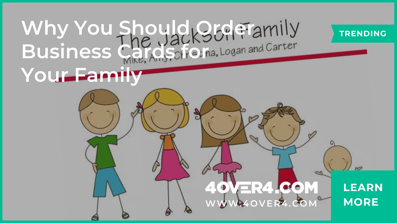
story Why You Should Order Business Cards for Your Family
In a face-to-face set-up, business cards play the most time-honored and essential role. A family-owned business is one of the most excellent examples of ordering business cards. Do you know why? It is because advertising your family business in a local community with cheap business cards can effectively spread the word and create a solid customer base. I can tell this so confidently because I was lucky enough to reach my goal of 2000 customers within a week with the help of family business cards. You must be thinking that it is impossible. I must be mad to talk about such numbers. But that is the sheer truth and power of unique business cards. It is a fact that a successful run depends on the nature of a business, targeted demographic, location, and more. But I also believe the warmth in the family business, face-to-face meet-ups, and handing out tactile full-color business cards can create a significant difference. As a small family-run business owner, I chose to transfer my family members' warmth to the would-be family members, my customers. Family Members as Part of Promotions Do you have a family business and good relationships at home? When you have several members in your family, you don’t need to hire personnel for business card distribution or business promotions. The younger generation is capable of managing promotions for your business. It saves time and money and allows you to order calling card for your family and market it like a pro. With personal business cards for your family, you can connect with your customers at an individual level. It gives you a chance to convince them that you are better than your competitors. According to the United States Small Business Profile, 2018, there are 30.2 million small businesses in the US, out of which 5.5 million are family-owned businesses (Family Enterprise USA, 2011) having strong values and positive business culture. It would be best if you channel the values of your family members with the right marketing tool. Can you think of anything better than cost-effective business cards? Whatever the size of a business, the 3.5 x 2 inches business card exchange has always proven beneficial for professionals. Order Family Business Cards for Enhanced Warmth and Trust You must be aware that branding is much more than just a snippy logo. It involves a budget, excellent customer service, and unique products. When you include your family members to promote your brand, people are easily convinced. Your family members have seen the efforts that you have put into your business. Therefore, order business cards and customize them to make them unique . When they hand over a high-quality business card to the client, their vibe and aura reflect positivity. They promote your brand not just for the sake of promotions but they speak from their heart while interacting. This is one of the biggest reasons to order business cards for your family. They will never let you down. Using the experience of stable grownups and the brilliance of amateur teenagers can help to create a strong sense of trust in consumers for family businesses. You must be aware that belief can lead to sales, and sales lead to profitability. Build trust by handing off a business card that people can never ignore. The family-owned business is considered reliable, easily approachable, customer-friendly, and stable. You need a tool to help your customers remember your brand. Ordering paid or free business cards for your family members is the best way to increase market visibility. Order Business Cards to Communicate the Story Family businesses usually have many stories to communicate, and especially traditional companies have many unusual occurrences. It can be the base of attracting more and more customers. For instance, you give a bunch of business cards to your old granddad and ask him to hand off one to every person he meets and interacts with. You can motivate him to tell the stories to people he meets in the clubs, parks, etc. It makes him happy, and you get leads for your business. Isn’t that a profitable deal? People hardly forget such exciting conversations. It motivates them to step into your store and be a part of those fantastic stories. You can order business cards for your family members that have tempting perforated parts with 50% off printed. You may also choose die-cut shapes to entice the customers or business card templates to make your card clean and straightforward. Stories combined with the right business presentation with perfect business card designs can help you carry your legacy forward successfully. Power of Personal References While You Order Business Cards Personal references often work the best way, and when you promote it with a unique business card, there is nothing that can stop you. Referrals from your family members help to offer an understanding of your capacities and work ethics. Having a professional reference may be much more effective, but one cannot ignore a personal recommendation. When you order business cards for your family members to advertise your business, you can relax as your new set-up will get a boost. If you have an influential person in your family or a teenager with a massive following on social media, you can be sure that their reference or word in public about your business will turn in your favor. For instance, you are a recent graduate with no paid experience and have an uncle who is a professor, and he knows how bright of a student you are. Your uncle handing over a business card, recommending your business based on familiarity and a unique skill set, can successfully give a head start to your business. Conclusion Your family is your treasure, and involving them to promote your business can bring in more success and accomplishments. When you design business cards for your family members, it results in a combined effort. By giving out small stacks of quality business cards to your family members and friends, they can now act as brand ambassadors for your business. This is especially important when personal references can make or break a business. If you have ten people handing your cards to people looking for a company like yours, you can boost your business cards' marketing effectiveness tenfold. Order business cards and choose the best ultra-thick paper stock and finish like soft touch, spot UV, or metallic foil from reliable printers like 4OVER4 for eye-catching business card printing to stand out in the crowd and make a difference. FAQs Q: Why should I order business cards for my family? A: Ordering business cards for your family is a convenient way to share contact information with others in a professional and organized manner. It can help keep your family's information easily accessible for friends, acquaintances, and other contacts. Q: How can I personalize my family's business cards? A: You can personalize your family's business cards by choosing a design template that suits your preferences and adding your contact details such as names, phone numbers, and email addresses. Customizing the cards with a family portrait or illustration can also make them more unique. Q: What are some popular designs for family business cards? A: Popular designs for family business cards include custom engraved cards, monogram cards, nautical-themed cards, and festive Christmas card designs. You can also opt for simple and elegant business card templates or playful kid-friendly designs. Q: Can I order digital family business cards for immediate use? A: Yes, you can order digital family business cards for immediate download and use. These digital files are convenient for sharing electronically via email or social media platforms, making it easy to distribute your family's contact information quickly. Q: Are there options for mini business cards suitable for kids? A: Yes, there are mini business card options available that are perfect for kids. These mini cards can feature fun illustrations, play date information, or personalized contact details for children to share with their friends or classmates. Q: Do you offer printing services for personalized family contact cards? A: Yes, we offer printing services for personalized family contact cards. You can choose from a variety of card stocks, finishes, and quantities to create attractive gift cards or enclosure cards for your family. Q: What is the shipping process for custom family business cards? A: The shipping process for custom family business cards varies depending on the provider. Typically, orders are processed and shipped within a specified timeframe, and you can choose from different shipping options based on your preferences and delivery timeline.
 story
story Will Robots and AI Replace the Best Human Writers?
It’s no secret that technology is taking over at a high speed! All around us, we find robots and artificial intelligence software taking over human jobs including writing. Technology is here to stay, and so are the human writers. Some people say, this is just the beginning as AI and robots will keep getting better and more human-like every day. AI started in the early 1940s and 1950s at a workshop as many of them predicted that a machine, as intelligent as a human being would exist in no more than a generation. But look at how much it has evolved now! The first modern robots were created in the 1950s in Kentucky by George C. Devol. However, his attempts to sell the robots which he named “Unimate," from "Universal Automation", did not succeed. Digitally programmed industrial robots with artificial intelligence have been built since the 2000s. According to AI Multiple, the AI market will grow to a $190 billion industry by 2025 . This is a huge deal and goes to show how much people are now integrating robots and AI into their day-to-day lives. Let’s look at some of the pros and cons of both AI and robots vs humans when it comes to writing. Benefits of using human writers Humans are creative . At the end of the day, nothing can beat how creative humans can get. This is because they can feel, see, touch, and experience things. This makes humans more imaginative, visionary, and innovative, unlike robots. If for example you are looking for customized thanksgiving card ideas and you let an AI software come up with the thanksgiving card message , then the message won’t be as heartfelt compared to if a human comes up with it. Creativity is fundamental when it comes to writing. It's almost impossible for AI to come up with stories the way humans do. Humans have the human touch. Robots are good but they won’t deliver comprehensive writing as human writers can. This is because as a human, you will know how to deliver value that will be understood by fellow humans. You will know how certain words will make people feel and evoke emotions in your writings. Human Illustration Human writers use storytelling techniques in their writing to build relationships with people, something which AI software can’t. And writers of all forms understand that storytelling is important because it helps others remember what they read. Only you can create a unique and powerful story based on your experiences. AI and robots can’t compete with the human brain for storytelling. Cons of using human writers There are always two sides to a coin. As much as human writers have strong benefits, they also have subliminal cons like they are not fast. For humans, they have to go through a thought process before writing. Thought process illustration They have to research a lot to come up with something comprehensive. All this takes time together with having to key in or write down their details which is also time-consuming. As human writers, we all get tired. This means, unlike machines, humans need to rest. Nobody can write for 10 hours straight without taking a break due to exhaustion or boredom. Humans are also subjected to moodiness and health conditions. This means that there are days where one might not feel like writing or not be in good condition, both of which will determine the quality of writing they deliver. Benefits of using robots and AI Robots and software are generally fast. They have all the information they need as they have vast access to the internet. This makes them write quickly compared to humans. They are also grammar-error-free. Robots and AI are programmed to have minimal to non-existent errors. Artificial intelligence illustration They don’t get tired. You can use software for days and months consecutively and they will deliver good, unwavering results. Unlike humans, machines can work round the clock to deliver whatever they are asked. AI and robots are also not subjected to health issues. This makes them available 24/7. Cons of using robots and AI They don’t think like humans. At least not yet! This means that even after they have written something, a human will still have to go through the document to check if it’s accurate. This also makes their writing plain and boring for humans to read since they lack the human senses. AI software is also prone to viruses which may make them lose data or stop functioning altogether. This may be a big setback especially for a business that relies heavily on the software. It’s not possible, yet, for human writers to be replaced by robots and AI software, however, humans can incorporate the bots and AI software into their writing to make it better. To sum up… Humans, at the end of the day, make fantastic writers. They can be imaginative and more comprehendible than machines and software. Hiring human writers is an asset to any organization however hiring from the right company is equally important. Get great, accurate, and mind-blowing articles from a company that is known for excellent services at a pocket-friendly price. All you have to do is submit a topic that you want them to write about. You will save time and the headache of boosting your search engine results.
 story
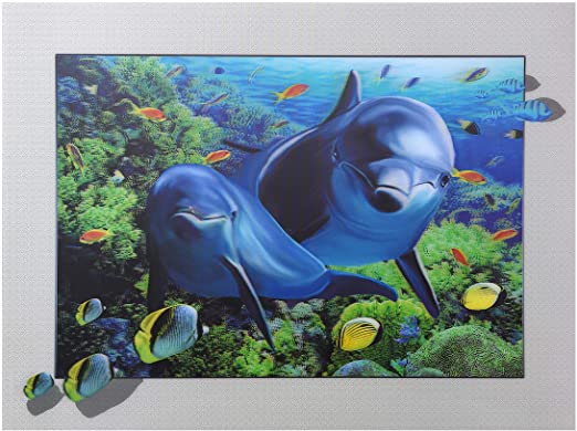
story Wonderful 3D Lenticular Magnets to Attract
Source Spark curiosity and interest with such remarkable 3D Lenticular Magnets . With so many styles of 3D lenticular magnet out here, it should become clear why having the right one is so important for the particular message you want to convey. Think hard about what your 3D Magnets will communicate what your brand is about and help you seal the deal with your clients. Don’t be afraid to get original 3D Lenticular Magnets just like the one we’ve shared here. After all, the right one might just be what sparks the interest of a new customer! Design 3D Lenticular Magnets Let your creative self shine by displaying all your amazing ideas on a blank Lenticular Magnet that you can customize with different designs and get a feel of what the final look will be.
 story
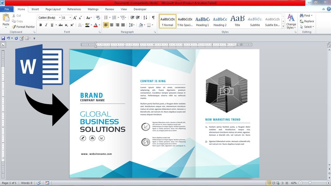
story Wonderful Custom Brochure Design in MS Word
When it comes to direct mail services , users who create a custom brochure template in Microsoft Word have a versatile platform at their disposal. Microsoft Word offers a user-friendly interface and a range of design features that make it an excellent choice for designing brochures. Let's explore the process of creating a custom brochure template in Microsoft Word. How to Create a Custom Brochure Template in Microsoft Word? Designing a Microsoft Word templates brochures can be a straightforward process when you follow a step-by-step guide. Start by selecting the appropriate layout for your brochure, whether it's a bi-fold or a tri-fold design. Customize the font styles, colors, and images to align with your business's branding. Ensure that the brochure is visually appealing and captures the essence of your marketing message. For customizing your ms word pamphlet template brochure design, consider using design elements that showcase your agency or photography effectively. Experiment with different layouts and sizes to create a unique brochure that stands out. Microsoft Word provides ample flexibility to personalize your brochure according to your specific requirements. The benefits of using customizable brochure templates are vast. You can save time and effort by starting with a predesigned template and then tailoring it to meet your needs. This process allows for quick and efficient brochure creation without compromising on the design quality. Why Choose Microsoft Word for Designing Brochures? Microsoft Word offers several advantages for designing brochures compared to other design tools like Photoshop or PowerPoint. The ease of use and accessibility of Word make it a preferred choice for many users. With features that enhance brochure design, such as customizable templates and a wide range of fonts and colors, Microsoft Word provides a comprehensive platform for creating professional-looking brochures. When compared to more complex design tools, Microsoft Word stands out for its simplicity and convenience. Users can create and edit brochures seamlessly, even if they have limited design experience. The familiarity of Word's interface and the availability of various design elements make it a reliable option for designing impactful marketing materials. Whether you're promoting a business, showcasing a new product, or advertising an event, Microsoft Word provides the tools you need to create compelling brochures that effectively communicate your message. Top Free Brochure Templates for Microsoft Word For those looking to kickstart their brochure design process, there's a wide array of free brochure templates available online. These templates offer a starting point for creating custom brochures by providing a well-designed layout that can be easily customized. By downloading a free brochure template, users can expedite their design process and focus on the content and visuals. Customizing a free brochure template for your project involves making adjustments to the text, images, and colors to suit your branding and messaging. Whether you opt for a flyer template or a tri-fold brochure design, these free templates offer flexibility and convenience. Utilize the variety of templates to find one that aligns with your vision and effectively promotes your message. By using pre-designed templates for quick projects, you can save valuable time and resources while still producing professional and eye-catching brochures. These templates serve as a foundation for your design and can be easily adapted to meet your specific needs. Design Tips for Creating Eye-catching Brochures Designing an eye-catching brochure involves careful consideration of various elements, including font selection, layout design, color schemes, and image placement. Choosing the right font for your brochure is crucial as it sets the tone for your message and enhances readability. Experiment with different fonts to find the one that best suits your content. When it comes to colors and images, ensure they complement each other and align with your branding. Use high-quality images that resonate with your target audience and reflect the essence of your business. Effective use of colors can evoke emotions and guide the reader's attention to key information within the brochure. For marketing purposes, creating a professional-looking brochure is essential to leave a lasting impression on potential customers. Pay attention to the overall layout and design elements to ensure a cohesive and visually appealing result. A well-designed brochure can help promote your business and attract new clients. Printing and Distributing Your Custom Brochure Once your custom brochure design is finalized, you have various options for printing the brochures. Consider the size and fold of the brochure when selecting a printing method to ensure the final product meets your expectations. Whether you choose to print in-house or use a professional printing service, ensure that the quality and color accuracy of the printed brochures are maintained. Prior to printing, it's important to format and edit your brochure to eliminate any errors or inconsistencies. Review the content, layout, and design elements to ensure that they align with your intended message. Making any necessary adjustments before printing will help you achieve a polished and professional result. Once the brochures are printed, strategize ways to distribute them effectively to reach your target audience. Whether through direct mail, in-person distribution, or digital channels, distributing your brochures strategically can enhance their impact and generate leads for your business. Consider the best approach to reach potential customers and promote your services or products. Brochures play a crucial role in marketing and promotional activities for businesses of all sizes. Creating a visually appealing brochure can help attract potential customers and convey your message effectively. This article will delve into the realm of custom free brochure template design in Microsoft Word and explore the various aspects of utilizing templates for brochure design. Why Should You Use Custom Free Brochure Templates? When it comes to designing brochures, using customizable templates can offer a myriad of benefits. These templates provide a foundation for your design and allow you to personalize them according to your marketing needs. By incorporating free brochure templates in Microsoft Word, you can customize the layout, fonts, and format to create a professional-looking brochure in a time-efficient manner. Templates not only save you time and effort in the design process but also ensure design consistency across all your marketing materials. Whether you're promoting a business or showcasing a photography agency, utilizing Microsoft Word templates can streamline your brochure creation process. How to Design a Stunning Brochure in Microsoft Word? To create an eye-catching brochure in Microsoft Word, you can follow a step-by-step guide using brochure templates. These templates offer a starting point for your design and provide ample opportunities to customize fonts, layouts, and design elements. By leveraging Word features, such as fold options like tri-fold or bi-fold, you can enhance the visual appeal of your brochure. Furthermore, incorporating promotional strategies in your brochure design can help attract a wider audience. Utilize free downloadable templates to create printed materials that effectively promote your business's products or services. What Makes Microsoft Word Brochure Templates Stand Out? Microsoft Word offers a plethora of design options for brochure templates, ranging from different sizes like A4 to various folding options like half-fold or tri-fold. These templates are not just limited to brochures; you can also create flyers for events or pamphlets for business purposes. The advantages of using Word templates for your marketing and promotional material lie in their customizabilityand ease of editing. Whether you're an individual looking to promote a personal event or an agency aiming to showcase your services, Microsoft Word templates provide a versatile platform for all your design needs. How to Create a Professional Brochure for Your Next Project? Designing a brochure that resonates with your target audience is essential for successful marketing. Consider customizing brochure templates to align with your branding and message. Additionally, editing and printing your brochure using high-quality materials can ensure hassle-free distribution and a positive brand image. Whether you're creating menu designs for a restaurant, event flyers for a social gathering, or pamphlets for informational purposes, customizing templates in Microsoft Word can cater to various marketing needs. Customizing Brochure Templates for Different Marketing Needs Explore a variety of templates in Microsoft Word to fulfill your marketing requirements. Whether you need a template for word to promote a new product or a brochure template in word for your business plan, there's a Word template for every occasion. By leveraging the design elements and formatting options in Microsoft Word, you can create printable materials that effectively promote your business and engage your audience. Whether you're a novice user or a seasoned designer, using Microsoft Word for your unique brochure design offers a seamless experience with professional results. Let your creative self shine by displaying all your amazing ideas on a blank custom brochure that you can customize with different designs and get a feel of what the final look will be. FAQs Q: What is a custom free brochure template design in Microsoft Word? A custom free brochure template design in Microsoft Word is a pre-designed flyer or pamphlet layout that can be easily customized and edited in MS Word to promote a business, event, menu, or any other information in a hassle-free way. Q: How can I create a brochure using a Word template? To create a brochure using a Word template, simply download a customizable flyer or pamphlet template available in Word format, open it in MS Word, edit the content, swap images, highlight key information, and add your contact information. You can then save the document as a PDF for printing. Q: What are the benefits of using a customizable Word template for designing a brochure? Using a customizable Word template for designing a brochure allows you to easily edit and customize the layout, text, and images according to your needs. It saves time and effort compared to creating a brochure from scratch or hiring a graphic designer. Q: Is it possible to make a printable brochure with a Word template? Yes, it is possible to make a printable brochure with a Word template. You can adjust the resolution, layout, and design elements to ensure the brochure looks professional and effective when printed. Q: Can I promote my next event using a customizable flyer template for Word? Absolutely! You can advertise your next event by using a customizable flyer template for Word. Highlight the event details, add eye-catching visuals, and include a call-to-action to attract attendees and create top-of-mind awareness. Q: How can I create a trifold brochure in Microsoft Word? To create a trifold brochure in Microsoft Word, use a bifold template as a starting point. Customize the layout to have three sections, design the front cover, inside content, and back cover accordingly. You can easily create a professional trifold brochure using Word templates. Q: Are Word templates available for different types of promotional materials? Yes, Word templates come in various designs suitable for different promotional materials such as flyers, menus, business plans, handouts, and more. You can choose the template that fits your needs and easily customize it to promote your business or event. Q: How can I find word templates for creating customizable brochures? A: You can find word templates for creating customizable brochures by searching for "word flyer templates," "brochure templates for word," or by checking online sources that offer free downloadable templates. Q: Why is it beneficial to use a design template for creating a brochure? A: Using a design template for creating a brochure saves time, ensures a professional look, provides customizable elements, and simplifies the process of designing a brochure even for those without graphic design skills. Q: What are the advantages of using a customizable flyer template in Word? A: The advantages of using a customizable flyer template in Word include easy editing, the ability to highlight key information, making the flyer more engaging, and the option to promote events or businesses effectively. Q: How can a custom bifold brochure template help in promoting my business? A: A custom bifold brochure template can help in promoting your business by providing a visually appealing way to showcase your products or services, share contact information, and highlight key features in a professional manner. Q: Why is it important to make a brochure that is easily editable? A: Making a brochure that is easily editable allows you to update information, change designs, and adapt to different marketing needs without starting from scratch, providing a hassle-free way to keep your promotional materials up to date. Q: How can I create a promotional handout using Microsoft Word? A: You can create a promotional handout using Microsoft Word by selecting a template, customizing it with your content and branding, adding images or graphics, and then saving or printing the handout for distribution at events or in-store promotions. Q: What are the key features of a customizable flyer that can help advertise my next event effectively? A: Key features of a customizable flyer that can help advertise your next event effectively include eye-catching design, clear call-to-action, event details, contact information, and a visually appealing layout that grabs the audience's attention.
 story
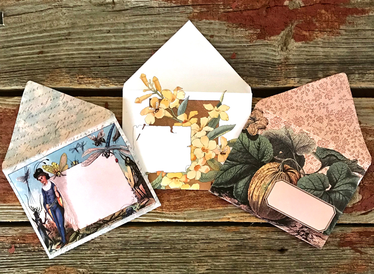
story Wonderful Custom Envelopes to Impress Your Clients
Source With so many styles of custom envelopes out here, it should become clear why having the right one is so important for the particular message you want to convey. Think hard about what your envelope template will communicate what your brand is about and help you seal the deal with your clients. Don’t be afraid to get an original custom envelopes just like the one we’ve shared here. After all, the right one might just be what sparks the interest of a new customer! Custom Envelopes to Impress Let your creative self shine by displaying all your amazing ideas on a blank envelope template that you can customize with different designs and get a feel of what the final look will be.
 story
story Wonderful Custom Labels for Jars
In the competitive world of product packaging, attention to detail can be the key to standing out from the crowd. When it comes to jarred products, custom labels play a significant role in capturing customers' attention and leaving a lasting impression. In this article, we'll explore the importance of custom labels for jars and how they can help your brand make a memorable impact on consumers. The Power of Custom Labels: Custom labels are more than just a means of identifying your product. They serve as a visual representation of your brand's identity and values, helping to communicate your message to consumers. By investing in custom labels, you have the opportunity to showcase your unique style, differentiate yourself from competitors, and create a sense of professionalism. Captivating Designs: One of the major advantages of custom labels is the creative freedom they provide. With a blank canvas in front of you, you can let your imagination run wild and design a label that truly captures the essence of your brand. Consider experimenting with colors, fonts, and graphics to create a visually appealing design that aligns with your product and target audience. Crafting Compelling Content: Beyond visual aesthetics, the content on your custom labels plays a crucial role in engaging customers and conveying important information. Make sure to include essential details such as product name, ingredients, usage instructions, and any certifications or awards your product has received. Remember to keep the text concise and easily readable, using bullet points or subheaders to organize information effectively. Building Brand Identity: Your custom labels should be a reflection of your brand identity. Incorporate your logo and brand colors to ensure consistency across all your products. Consistent branding not only reinforces brand recognition but also helps customers establish a connection between your product and your company. Quality Materials and Printing: To create a truly professional impression, it's important to invest in high-quality materials and printing for your custom labels. Consider options like waterproof or durable materials to ensure that your labels withstand the rigors of handling and storage. Additionally, choose a reliable printing service that can deliver vibrant colors and crisp details to make your labels visually appealing. Creating a Memorable Experience: Custom labels for jars can contribute to creating a memorable experience for your customers. By investing in unique and eye-catching designs, you're making your product visually appealing and more likely to be noticed. When customers have a positive experience with your packaging, it increases the chances of them remembering your brand and becoming repeat buyers. Conclusion: Custom labels for jars offer a valuable opportunity to make a lasting impression on your customers. By leveraging captivating designs, compelling content, and consistent branding, you can create labels that truly represent your brand and attract attention. Remember to prioritize high-quality materials and printing for a professional look. With the right custom labels, you can enhance your product's visibility, engage customers, and leave a memorable mark in their minds.
 story
story Writing Thank You Notes: Ideas, Examples, & Inspiration
Are you facing a difficult time writing thank you notes? There are many like you facing problems or boredom in writing thank you cards . You may even be confused about what to write in a thank-you card. There are people who completely avoid it as they don’t know how to write a thank-you note. This trap or excuse is old because today you can find numerous ways to express your gratitude. The only thing you have to worry about is ensuring the spelling of the person's name is perfect. There are several thank you note design ideas and greeting card ideas or card wording that you may use, and the best way is to be specific, personalize, and genuinely feel thankful. Your handwritten note makes the recipient especially your friends and family feel that at least you made some effort and cared enough to convey it to them. Are you wondering where to start or how to send a thank you card? You're probably thinking about what to write in a blank thank you card. Here are some of the thank you writing ideas, examples, and inspiration to make your thank you messages both considerate and sincere. General Phrases for Thank You Notes To keep your thank-you notes sober and simple, below you may check out some of the general phrases to get some ideas for handwritten thank you notes. I'm so thankful I feel so blessed. Thank you Thanks a ton My sincerest gratitude Thank you so much Many thanks I can't thank you enough. My deepest gratitude You are very generous Thanks for everything You are so thoughtful I really appreciate this All I can say is thanks Words can't describe how thankful I am I appreciate your time Thank you for being present when I wanted you by my side I appreciate your generosity I want to extend my gratitude I appreciate your thoughtfulness Thank You Notes for Gifts Whether a dinner party, baby shower or a birthday party, the most common reasons for buying thank you cards are the gifts or birthday wishes you receive from someone during such events. If you want quality paper stock and great printing finish, 4OVER4.COM is one of the best platforms to get your blank thank you card printed according to your tastes with the custom print options. Find below some amazing handwritten and probably the best thank you notes ever written examples and sample inspirations that you may send when you receive a gift card, wedding gift, baby gift, etc. to return the favor. "Much gratitude, and thanks for the generous gift. I feel extremely blessed and lucky to know you." “Thank you for the gift. You didn't have to, but you're the kind of person who does. Your generosity is much appreciated.” "Your gift left me speechless! I’m so touched. Thank you very much." "We’re grateful for our Anniversary gift sent by you. It was especially noticed by us. I'm glad to know someone like you with a golden heart. Thank you!" "I am clueless about your thoughts when you chose this gift. You are either crazy or too generous. But, as I know it is your generosity that made me receive such a wonderful gift. Thank you so much." "You made my day by giving us the gift/card. What an amazing gift. Thanks is a small word. My happiness knows no measure." "Thank you _________(mention the name). I was so pleased to open your gift and always knew it could only be you to gift me something like this. Thanks a ton." “You surprised me with such a beautiful gift. It is just an awesome gift. Thank you so much.” Thank You Notes for Services If you have taken services from someone, it is another reason to send the thank-you notes. For job search help or job interviews, business thank you note or card is a common term that has to be mentioned if you don’t wish to offend. But, if a great friend drives you to the airport or helps you with your grocery, writing thank you notes help them to know their efforts and time are appreciated. Here are some of the thank-you note examples and ideas for you to personalize. Check out the note wordings and customize as per your need. "You are a Godsend angel for me. I can’t explain how much your help meant that day. You were a savior and I don’t know how I would have managed without you. Thank you for taking out time to check on me." "Thank you for your help and support. Please accept this card as a sign of my genuine appreciation and gratefulness for everything you've done so far." "Your friendship is special and I treasure it. You are definitely the best. Thank you." "In spite of your busy schedule, you came out to help. Thank you so much for your help. A person like you is hardly found, and I'm very lucky to know you." "Your helping hand is highly appreciated. I am inundated by all that you've done for us. Hope that this card message helps me to convey my sincere gratitude. Thank you!" How to Write a Thank You Card with 4OVER4.COM by Your Side The above thank-you notes clearly says that you need to express your feelings and thoughts about the gift or about the person who gave you the gift. Free thank you notes must be able to express the feelings and thoughts. These are just a few ideas and inspirations that you may pick and personalize your messages. While writing the thank-you message ensure; You write the initial reaction you have after seeing the thoughtful gift like I was surprised, or I was completely clueless, etc. Compliment the person or the gift and the choice of the person that helped you out in a particular situation (if you are thanking for services). Write down how the gift has helped you or how you are using or planning to use it. Convey your feeling like happy, shocked, surprised, and grateful or whatever it is. With years of experience, 4OVER4.COM believes in delivering the best to the clients. You can order any number and sizes of thank you cards online without worrying about the quality of the cards. We offer a range of paper selection and finishes and different quality of thank you cards like flat thank you card, folded thank you card , and velvet thank you notes . Select the best quality to thank and express gratitude with handwritten messages from the bottom of your heart, irrespective of Christmas gift, wedding gift, or for just mere services. FAQs Q: What are some examples of meaningful thank you messages for a birthday gift? A: "Thank you so much for the thoughtful birthday gift! I truly appreciate your kindness and generosity." Q: How can I show my appreciation in a baby shower thank you card? A: Express your gratitude by mentioning the specific gift received and sharing how it will be useful once the baby arrives. Q: Do you have any suggestions on what to write in a thank-you card for a job interview? A: Consider thanking the interviewer for their time and reiterating your enthusiasm for the position. You can also mention specific aspects of the interview that stood out to you. Q: What are some creative ways to say thank you for a thoughtful gesture? A: You can express your gratitude by saying phrases like "I am truly grateful for your generosity" or "Your kindness means the world to me." Q: How can I write a heartfelt thank you message in a sympathy card? A: Offer your sincere condolences and express your gratitude for the comfort and support received during a difficult time. Q: What are some ways to say thank you for a wedding gift? A: You can show your appreciation by mentioning the specific gift received and expressing how much it means to you as you start your new life together. Q: Can you provide examples of card message ideas for showing appreciation? A: Consider phrases like "Your thoughtfulness has touched my heart" or "I am grateful for your continuous support and encouragement."
 story
story Open House Yard Signs and Details: Secrets to a Successful Open House!
If you are part of the home selling business or a realtor, then you clearly understand how important yard signs or real estate signs are to see off the successful sale of your open house. An applicable sign can be an open house yard sign, neon sign, or any other relevant to the property. Along with the ever-powerful yard sign, real estate agents like yourself, spend countless hours organizing their real estate prints and creative online marketing efforts, including neon sign displays, to get the most buyers in the door. Tip #1: Make a Great First Impression The hosting of a successful open house isn’t just about sales, it’s majorly about having to network with potential clients that are looking to make investments! For this particular reason, an open house provides an excellent opportunity for you to meet potential sellers and buyers and build a great first impression with your professionalism and knowledge. Creative open house signs can be a great way to invite them without knowing them or inviting them for a site visit! In setting up an open piece of property top agents are not only focused on putting up signs, they are all about creating an atmosphere and mood that is appealing to a prospective client or investor, integrating signs ideas that reflect the warmth and charm of a farmhouse aesthetic. If you aim to dispose of the property quickly or have as many individuals as possible to add up your client list, organizing an open house is no walk in the park. Fortunately, we have gathered some suitable open house tips from industry-leading real estate gurus, from the baking of cookies to taking advantage of real estate yard signs and incorporating farmhouse aesthetics for a cozy feel. Take note of these tips to get more sales and more clients. Tip #2: Add Accessories and Furniture Not A funny Open House Sign After hiring professional cleaners to have the home in the cleanest of conditions, ascertain that you freshen up the landscaping, exterior paint, and add a welcoming front door sign. Buy a few new items such as exterior doors, garage doors, and mailboxes. Clean the driveway and walkways, and consider placing a polite no soliciting sign near the front to maintain privacy during viewings. Such tweaks will help in the building of an amazing initial impression. Use an appropriate sign relevant to the property and not funny open house signs that will relay a sense of unprofessionalism and make the weakest of first impressions. Remember, funny signs might also mean that the property was constructed in an unprofessional or careless way, turning off customers, but a well-placed humorous sign can serve as a funny gift, enhancing the property's appeal. Adding well-selected accessories such as fresh towels in the bathrooms, vases for flowers, and a charming farmhouse-style home sign in the entryway. As far as furniture is concerned, it is known that less is always more. Paint the walls with colors that are bold and if the budget gives you room, paint the kitchen cabinets and add new hardware for a modern or current look. Such small touches help you as an agent move the extra mile when it comes to selling a piece of property or home. Tip #3: Get Rid of Personal Items Since potential homeowners desire to walk into a home and paint a picture of it as their own, you must get rid of the personal items of the seller. When a client walks in and sees the children’s drawings on the refrigerator door and family photos on the tables, it becomes quite hard for them to visualize it as their future home. Tip #4: Declutter It is difficult for home buyers to see the amazing features of a house if there are many knickknacks and furniture around. Sellers or agents must start packing before the house goes to the market, making the property as sparse and streamlined as possible during the open house. Tip #5: Advertise This is a no-brainer, much like choosing the perfect home sign for a welcoming entrance. Ensure your open house is listed on all the industry-leading real estate portals, Craigslist, and other listing options, not forgetting to update your etsy privacy settings to attract more potential buyers. Next, share the information on the open house with friends through channels such as email and social media. Ensure that you do everything in your power to acquire the largest number of individuals in the door and last but not least, check your leaflet catalog so that you can keep your neighbors in the know about the property at hand. Having large open house signs talks more to the neighborhood than word of mouth. Have the sign or signs double-sided to enable labeling on both ends making it easy for people from both the front and the back to read. Tip #6: Take Advantage of Yard Signs Use the best yard signs for an open house and implement an eye-catching design. Place the sign right on the property’s front lawn exactly one week before the event. On the exact day, erect yard signs that direct people to the open house at various locations that are key along busy streets. Use brightly colored balloons, tied to the signs, to help them become more and more visible. We offer water and weatherproof yard signs, plus, you can order any of our real estate print products for 30% OFF their price! Reach out and have the best price open house signs. Tip #7: Draw Attention to the Property with Outdoor Banners Outdoor banners help real estate agents sell properties quickly just like an open house yard sign. Draw attention to the property, during the open house, by placing full-color outdoor banners with pictures of luxury amenities or a modern kitchen on the building. This is exceptionally important when selling new construction. When potential buyers see the attention-grabbing banner in conjunction with creative open house signs, they will be compelled to have a look! To meet your requirements, we offer custom-sized outdoor banners. Order outdoor banners at 30% OFF using coupon code RLST30 at checkout, and consider adding a custom sign svg for a personal touch. Tip #8: Bake Some Cookies According to most real estate agents, refreshments can and are considered an important part of open houses. Serving freshly baked cookies and drinks during such big events gives you a chance to interact or network with potential clients every single time they come back for a bite or a drink . Plus, the smell of fresh-baked cookies creates a warm and inviting atmosphere, making potential buyers feel more comfortable and at home in the space. It's a small gesture that can go a long way in making a positive impression and setting your property apart from the rest. So, whip up a batch of your favorite cookies before your next open house and watch as potential buyers flock to your property. Tip #9: Provide Brochures with Relevant Info Provide leaflets or brochures with necessary details during an open house event for buyers to take home. Detail should consist of photos, comparable home sales, nearby school information, and community information. A well-structured brochure will complement the advertising of the property and won't make a whack impression as it is with having funny open house signs. Make sure to include contact information for the listing agent or real estate agency so that potential buyers can easily follow up with any questions or make an offer. This additional information will help buyers remember the property and make an informed decision. Additionally, including a map with the property's location highlighted can be helpful for buyers who may not be familiar with the area. This can show them the nearby amenities, schools, parks, and other points of interest that may influence their decision to purchase the property. Overall, providing a well-designed and informative brochure can make a significant impact on potential buyers and help them visualize themselves living in the property. It also shows that you are prepared and professional, which can leave a lasting impression on buyers. Tip #10: Collect Names and Contact Information From hosting an open house, a key takeaway is being aware of exactly what individuals think about the price and features of a home. Pick up names and contact information from every attendee and if you don't mind, give a call to those who are interested to find out how they feel about the house or property and if they’re ready and interested in making a good offer. We hope this information comes in handy. Use these tips to have a more successful open house event, considering real estate sign ideas that stand out in order to bring in new clients. FAQs Q: What types of signs are included in the Funny House Signs collection? A: The collection includes bar signs, wall decor, door signs, metal signs, wall signs, funny signs, wood signs, home signs, and more! Q: Are the signs suitable for home decor or wall art? A: Yes, the signs can be used for home decor and wall art to add a touch of humor and style to your space. Q: Can I find farmhouse-themed signs in this collection? A: Yes, there are farmhouse-inspired signs available in the Funny House Signs collection for a rustic charm. Q: Are there any digital downloads or printable signs in this collection? A: Yes, there are digital downloads and printable sign options for immediate access and convenience. Q: Do you offer funny bathroom signs or welcome signs? A: Absolutely! You can find funny bathroom signs, welcome signs, and other humorous home decor options in this collection. Q: Are there any man cave signs or funny dog-themed signs available? A: Yes, you can discover man cave signs, funny dog-themed signs, and other quirky options for a unique touch to your space. Q: Can I find house warming gifts or funny door signs in the Funny House Signs collection? A: Yes, there are house warming gifts, funny door signs, and other amusing gift ideas to surprise your friends and family.
 image
image Your Circumstances Don’t Define You - Cosmas Maduka
Have you ever questioned your capabilities based on your socioeconomic background? Do you think it hinders your ability to achieve your goals? Th...
 story
story 10 Best Business Card Ideas to Elevate Your Brand in 2025
Beyond the Rectangle: Why Your First Impression Matters More Than Ever In a digital-first world, a physical business card has become a powerful statement. It's no longer just a vessel for contact details; it's a tangible piece of your brand, a conversation starter, and a testament to your professionalism. Moving beyond the standard glossy rectangle is crucial for standing out in a saturated market. The right business card can solidify your brand identity, convey quality, and create a memorable experience that digital interactions often lack. To truly make your business card a powerful first impression, it helps to understand your brand's core identity. Explore these essential branding tips for small businesses to ensure your card perfectly aligns with your overall message. This guide explores some of the best business card ideas that leverage innovative materials, modern technology, and timeless design principles. We will move beyond generic advice to provide specific, actionable strategies for choosing a card that is both impressive and functional. This list is designed to help you think differently about that small piece of cardstock, transforming it into a strategic marketing tool that ensures your first impression is both impactful and lasting. From the tactile feel of textured paper to the futuristic appeal of interactive NFC technology, we will cover a curated selection of concepts. You will learn how to implement these ideas, from die-cut shapes that reflect your industry to the sophisticated sheen of foil stamping. Our goal is to provide a comprehensive roundup of options so you can find the perfect match for your unique brand, ensuring your card doesn’t just get filed away, but remembered. 1. Die-Cut and Shaped Business Cards One of the most effective ways to make a business card unforgettable is to move beyond the standard rectangle. Die-cut business cards are custom-shaped, using a specialized process to cut paper or cardstock into unique forms that directly reflect a brand's identity or services. This technique instantly separates your card from the pile, creating a powerful and tactile first impression that communicates creativity and attention to detail. This method is one of the best business card ideas because it transforms a simple piece of contact information into a conversation starter. A unique shape makes your brand more memorable and reinforces what you do in a tangible way. Implementation and Strategic Use The key to a successful die-cut card is relevance. The shape should be an intuitive symbol of your business. For example: For a photographer: A card shaped like a camera or a vintage photo slide. For a coffee shop: A card cut into the shape of a coffee cup or a coffee bean. For a real estate agent: A house or key-shaped card. For a dog groomer: A card shaped like a bone or a dog paw. Actionable Tips for Die-Cut Designs To ensure your investment in custom shapes pays off, consider these practical tips: Prioritize Durability: Complex shapes with thin, protruding parts can easily bend or break. Opt for sturdy cardstock and consider simpler, more robust shapes. Rounded corners can also help prevent fraying and damage. Balance Shape with Function: The primary purpose of a business card is to convey information. Ensure your chosen shape has a clear, flat area where text is easily readable. Avoid placing critical contact details on parts of the card that might be bent or obscured. Test for Practicality: Before placing a large order, get a sample. Check if the card fits comfortably in a standard wallet or cardholder. An awkwardly sized card may be impressive initially but could be discarded if it’s inconvenient to carry. Die-cutting offers a fantastic opportunity for creative branding. To explore the possibilities and technical specifics, you can learn more about die-cutting services at 4over4.com . 2. Transparent and Clear Plastic Cards For a business card that feels futuristic and immediately stands out, transparent and clear plastic cards offer a sleek, high-tech alternative to traditional paper. Made from durable PVC materials, these cards can be fully transparent or feature a frosted finish, creating a sophisticated and modern aesthetic. This choice signals innovation and precision, making a lasting impression that associates your brand with quality and cutting-edge design. This approach is one of the best business card ideas because it leverages a unique material to create a memorable tactile and visual experience. The see-through element is inherently intriguing, prompting recipients to take a closer look and ensuring your card gets noticed in a sea of standard cardstock. Implementation and Strategic Use The transparency of the card should complement the brand's message. It is particularly effective for industries that want to project a clean, modern, or forward-thinking image. For example: For technology companies: A clear card can symbolize transparency and innovation. For architects or designers: A frosted plastic card can highlight clean lines and minimalist aesthetics. For photographers: A transparent card can be designed to mimic a camera lens or viewfinder. For medical professionals: The clean, sterile look of a plastic card can project precision and hygiene. Actionable Tips for Plastic Card Designs To maximize the impact of your transparent card design, keep these tips in mind: Prioritize Readability: Text can disappear on a fully transparent background. Use bold, opaque inks like white or metallic colors for maximum contrast and visibility. Incorporating frosted or semi-opaque sections behind your contact details is a great way to ensure legibility. Balance Simplicity and Detail: The beauty of a clear card is often in its minimalism. Avoid cluttering the design. Use negative space effectively and focus on a strong logo and essential contact information. Consider the Finish and Thickness: Plastic cards come in various thicknesses. A thicker card (e.g., 30mil) feels more substantial and premium, like a credit card, while a thinner one offers more flexibility. A frosted finish can reduce fingerprints and glare compared to a glossy, fully clear card. Plastic cards provide a durable and impressive medium for your brand. To see the different finishes and printing options available, you can explore various styles of plastic card printing at 4over4.com . 3. Metal Business Cards For those looking to make a powerful statement of permanence, luxury, and prestige, metal business cards are the ultimate choice. Crafted from materials like stainless steel, aluminum, brass, or copper, these cards move beyond paper to offer a tangible sense of quality and durability. Their substantial weight and cool, distinctive feel command immediate respect and signal that your brand operates at a premium level. This visualization provides a quick reference for the defining characteristics of metal cards. The combination of exceptional durability and a high-end feel justifies the investment for brands aiming to project authority. This method is one of the best business card ideas because it creates an unparalleled impression of exclusivity and confidence, ensuring your card is not just kept but treasured. Implementation and Strategic Use A metal card is an investment in your brand's perceived value, making it ideal for high-stakes industries and roles where first impressions are critical. The key is to align the material with your brand identity. For executive-level professionals: A sleek, black stainless steel card with laser-etched details communicates authority and sophistication. For luxury brands (e.g., high-end automotive, jewelers): Polished brass or copper cards can evoke a classic, opulent feel. For premium construction or architectural firms: A brushed aluminum card reflects modernism, strength, and precision. For exclusive financial advisors: A heavy, refined metal card instills a sense of security and trust. Actionable Tips for Metal Designs To maximize the impact of your metal business cards, consider these practical tips: Choose the Right Metal: Your choice of metal and finish should mirror your brand's personality. Stainless steel is modern and durable, brass is classic and warm, and black metal is sleek and commanding. Keep the Design Minimalist: The material is the main feature. Overly complex designs can clutter the surface and detract from the premium feel. Simple logos and crisp text, applied through laser etching or cut-outs, often yield the most elegant results. Factor in Production and Weight: Metal cards are significantly heavier and more expensive to produce and ship than their paper counterparts. Plan your budget accordingly and consider reserving these cards for high-value contacts. Consider Finishes: A brushed finish is not just a stylistic choice; it's a practical one that helps conceal minor scratches and fingerprints, keeping your card looking pristine for longer. Metal cards are designed to leave a lasting mark. To see the full range of customization options, explore the different types of metal business cards from 4over4.com . 4. Embossed and Debossed Cards To elevate a business card from a simple informational tool to a sophisticated statement piece, consider the tactile effects of embossing and debossing. Embossing creates a raised, three-dimensional element on the cardstock, while debossing presses a design into the surface, creating an indentation. These techniques add a layer of physical depth and elegance, encouraging recipients to touch and engage with the card, which significantly enhances brand recall. This method is one of the best business card ideas for conveying a sense of quality, tradition, and luxury. The subtle interplay of light and shadow across the textured surface communicates a brand’s commitment to craftsmanship and attention to detail, making it a powerful choice for businesses that want to project an image of premium value and prestige. Implementation and Strategic Use The key to effective embossing or debossing is subtlety and purpose. The textured element should highlight the most important part of your brand identity, such as a logo or monogram. This approach is ideal for: Law firms and financial consultants: Reinforcing a sense of stability, tradition, and authority. Luxury wedding planners: Evoking the elegance and high-end nature of their services. High-end consulting firms: Projecting an image of established expertise and premium quality. Premium jewelry designers: Mirroring the craftsmanship and fine detail of their products. Actionable Tips for Embossed and Debossed Designs To ensure your textured card makes the right impression, follow these practical guidelines: Use Thicker Cardstock: Embossing and debossing require pressure that can warp or tear thin paper. Opt for a thick, high-quality cardstock (at least 16pt or heavier) to support the depth and ensure a crisp, clean finish. Keep Designs Simple and Bold: Intricate, fine-lined designs can lose their detail and become muddled when embossed or debossed. Bold logos, simple patterns, or clear typography work best for a strong tactile and visual impact. Consider Blind Embossing: For a minimalist and highly sophisticated look, use blind embossing, which is a raised design without any ink or foil. This creates a subtle, elegant texture that speaks of confidence and refined taste. Test Text Readability: If you plan to emboss or deboss text, get a sample first. Ensure that the letters are still perfectly legible and that the effect enhances, rather than hinders, readability. Embossing adds a memorable, tactile dimension to your branding. To see how these techniques can be applied, you can explore the options for embossing services at 4over4.com . 5. Wood Business Cards For a truly organic and sophisticated impression, wood business cards offer a distinct departure from paper. Crafted from thin, real wood veneers like cherry, birch, or bamboo, these cards provide an unmatched tactile experience. The natural grain and warm texture instantly communicate a commitment to quality, sustainability, and craftsmanship, making them a powerful tool for brands that value authenticity and an eco-friendly ethos. This material is one of the best business card ideas because it connects your brand to nature and durability. A wood card feels substantial and valuable, ensuring it won't be easily discarded. The unique grain of each card means no two are exactly alike, adding a layer of bespoke exclusivity to your professional introduction. Implementation and Strategic Use Wood business cards are most effective when the material itself aligns with the brand's core values. The organic feel makes them a perfect fit for specific industries. For example: For sustainable architecture firms: A card that reflects their commitment to natural building materials. For artisan craftspeople and woodworkers: A literal sample of their craft and attention to detail. For organic food companies: Reinforces a connection to nature and wholesome ingredients. For environmental consulting firms: A tangible symbol of their dedication to the planet. Actionable Tips for Wood Designs To maximize the impact of your wood business cards, keep these practical considerations in mind: Choose the Right Wood Type: Different woods have unique colors, grains, and levels of durability. Bamboo is light and eco-friendly, while cherry or walnut offers a darker, more luxurious feel. Select a wood that complements your brand's aesthetic and can withstand handling. Use Laser Engraving for Clarity: While printing is an option, laser engraving offers a crisp, permanent, and professional finish. The burned-in effect creates a beautiful contrast and enhances the card's natural texture, ensuring text and logos are sharp and legible. Apply a Protective Coating: A thin, matte protective coating can prevent moisture damage, warping, and splintering without sacrificing the wood's natural feel. This small step significantly extends the life and durability of the card. Consider Grain Direction: Work with your designer to align your layout with the wood's natural grain. Placing text and logos thoughtfully in relation to the grain pattern can create a more harmonious and visually appealing design. Wood cards offer a memorable and premium branding opportunity. To see the various options available, you can explore the wood collection at 4over4.com . 6. Interactive NFC/QR Code Cards Bridging the gap between physical networking and the digital world, interactive business cards use technology like QR codes or embedded Near Field Communication (NFC) chips. This allows recipients to instantly access a wealth of digital information, such as a website, portfolio, or social media profiles, simply by scanning the card with their smartphone. This modern approach positions your brand as tech-savvy and forward-thinking, providing a seamless user experience that traditional cards cannot match. This method is one of the best business card ideas for professionals who want to offer more than just static contact details. It turns the card into a gateway to a dynamic, rich digital profile, making it easier for new connections to engage with your work, book an appointment, or add your contact details directly to their phone. Implementation and Strategic Use The power of an interactive card lies in its immediate utility. The linked digital destination should offer significant value beyond the printed information. Examples include: For tech professionals: Linking to a GitHub profile, a live project demo, or an interactive resume. For digital marketing agencies: A QR code leading to a case study portfolio or a video reel of successful campaigns. For social media consultants: Direct links to their most active and curated social media channels. For modern real estate agents: A link to a virtual tour of a featured property or an up-to-date listings page. Actionable Tips for Interactive Designs To ensure your tech-infused card is effective and professional, follow these guidelines: Include Backup Printed Information: Technology can fail, and not everyone is comfortable using QR codes or NFC. Always include your most essential contact information, like your name, phone number, and email, printed on the card itself. Test Thoroughly Before Printing: Scan your QR code with multiple devices (both Android and iOS) and from different angles to ensure it works flawlessly. If using NFC, test the chip's read distance and reliability. Use Mobile-Optimized Landing Pages: The destination link must lead to a page that is fast, responsive, and easy to navigate on a mobile device. A poor mobile experience will undermine the card's sophisticated first impression. Consider NFC for a Premium Experience: While QR codes are universally recognized, an NFC-enabled card offers a more seamless "tap-to-share" experience that feels modern and exclusive, making it ideal for high-value networking. To further explore how cutting-edge technology can enhance your networking tools, consider how top branded tech gifts are being utilized to create lasting impressions. 7. Foil Stamped Business Cards For brands aiming to convey luxury, sophistication, and premium quality, foil stamping is an unparalleled choice. This technique involves applying a thin metallic or pigmented foil to specific areas of a business card using heat and pressure. The result is a shimmering, reflective accent that catches the light and adds a tactile, high-end finish, instantly elevating your brand's perceived value. This method is one of the best business card ideas because it communicates a commitment to quality and detail. A touch of foil can transform a standard card into a memorable token of prestige, making it ideal for industries where a premium image is crucial for attracting the right clientele. Implementation and Strategic Use The power of foil stamping lies in its ability to highlight key information with elegance. It works best when applied thoughtfully to specific design elements rather than the entire card. Consider these applications: For high-end fashion brands: Foil stamping a logo or designer's signature in gold or silver. For luxury real estate agencies: Using rose gold or copper foil to accent property details or the company name. For premium event planners: Highlighting event titles or contact information with holographic or colored foil. For exclusive financial services: Applying a subtle, matte silver foil to a logo for a modern, sophisticated look. Actionable Tips for Foil Stamped Designs To get the most out of this premium finish, follow these practical guidelines: Use Foil Sparingly: Less is more. Overusing foil can make a design look gaudy and detract from its elegance. Apply it strategically to a logo, your name, or a single graphic element for maximum impact. Choose Complementary Colors: Select a foil color that aligns with your brand's palette. Classic gold, silver, and copper work well with dark, rich cardstocks, while colored or holographic foils can add a modern, creative flair. Combine with Quality Cardstock: Foil stamping looks best on thick, high-quality paper. A matte or soft-touch laminate finish can create a stunning contrast with the shiny foil, enhancing the tactile experience. Ensure Readability: When applying foil to text, make sure the font is thick enough to hold the foil application clearly. Very thin or intricate fonts may not stamp cleanly, resulting in a loss of detail. Foil stamping adds a layer of distinction that is hard to ignore. To see the variety of foil options available, check out the foil stamping services at a printer like Vistaprint. 8. Minimalist Design Cards In a world saturated with visual noise, a minimalist business card communicates confidence, clarity, and sophistication. This design philosophy strips away non-essential elements, focusing instead on powerful typography, strategic use of white space, and only the most critical information. The result is a clean, uncluttered card that feels intentional and premium, allowing the quality of the materials and the elegance of the design to speak for themselves. This approach is one of the best business card ideas because it conveys professionalism through restraint. Rather than shouting for attention with bright colors or complex graphics, a minimalist card draws the eye with its purposeful simplicity and impeccable execution, suggesting a brand that is focused, modern, and detail-oriented. Implementation and Strategic Use Minimalism is not about being boring; it's about making every single element count. This style is particularly effective for brands that want to project an image of modern elegance, precision, and trustworthiness. Examples include: For a tech startup: A simple logo mark with a single, elegant font for contact details on a clean background. For a modern architecture firm: Using grid-based layouts, precise alignment, and a monochrome color palette to reflect structural design principles. For a high-end consultant: A card featuring only a name and a website, printed on exceptionally thick, textured paper stock. For a contemporary medical practice: A clean, spacious layout that inspires a sense of calm, order, and trust. Actionable Tips for Minimalist Designs To execute a minimalist design effectively, attention to detail is paramount. Here are some tips to ensure your card makes a powerful statement: Invest in Premium Typography: Since text is the main design element, your choice of font is crucial. Select one or two high-quality, legible typefaces. Consider a professional font license from a reputable foundry like MyFonts to find a unique typeface that aligns with your brand. Prioritize High-Quality Materials: When the design is simple, the texture and weight of the paper become central to the experience. Opt for ultra-thick cardstock, cotton paper, or other premium materials that feel substantial and luxurious to the touch. Master White Space and Alignment: Use negative space intentionally to guide the eye and create a balanced, uncluttered composition. Ensure every element is perfectly aligned, as even minor imperfections become highly noticeable in a minimalist layout. Limit Your Color Palette: Stick to a monochrome scheme or a maximum of two complementary colors. This restraint reinforces the clean aesthetic and ensures the focus remains on the essential information and overall design structure. 9. Vintage and Retro Style Cards Tapping into the power of nostalgia, vintage and retro style business cards leverage design elements from past decades to create a sense of authenticity, craftsmanship, and timeless quality. By using classic typography, muted color palettes, and period-specific aesthetics, these cards evoke a feeling of heritage and tradition. This approach instantly communicates a brand's commitment to established values and artisanal skill, making it a standout in a world of modern, minimalist design. This method is one of the best business card ideas because it builds an immediate emotional connection. A retro design tells a story, suggesting a brand is not just a fleeting trend but is built on a foundation of enduring quality, making it highly effective for businesses that pride themselves on traditional methods or products. Implementation and Strategic Use The success of a vintage card lies in its ability to transport the recipient to a specific era that aligns with the brand's ethos. The design should feel authentic, not like a superficial costume. For instance: For a craft brewery: A design reminiscent of a 1930s Prohibition-era poster or a 1950s beer label. For a traditional barbershop: An ornate, Victorian-inspired design with detailed borders and script fonts. For an artisanal food producer: A simple, rustic look inspired by mid-20th-century farm packaging. For a vintage clothing store: A design that mimics Art Deco patterns from the 1920s or groovy typography from the 1970s. Actionable Tips for Vintage Designs To create a retro card that feels genuine and professional, focus on the details: Research Your Era: Before designing, immerse yourself in the aesthetics of your chosen decade. Study old advertisements, packaging, and typography to understand the authentic design language and avoid anachronisms. Use Period-Appropriate Fonts: Typography is crucial. Use fonts that were popular during the era you are emulating. Look for classic serifs, hand-drawn scripts, or bold, geometric sans-serifs that fit the period. Consider Textured Paper Stocks: Enhance the tactile experience with paper that feels aged. Uncoated, cream-colored, or kraft paper stocks can add a layer of authenticity that standard glossy cards lack. Balance Vintage with Modern Readability: While style is important, the card must still function. Ensure that your contact information is clear, legible, and easy to find. Combine ornate vintage elements with clean, modern layouts for key details to achieve the perfect balance. Vintage designs offer a powerful way to tell a brand's story. For inspiration and high-quality printing options, check out the offerings at MOO . 10. Textured Paper Cards While visual design is crucial, the sense of touch can leave an equally powerful and lasting impression. Textured paper cards leverage specialty stocks with unique finishes like linen, felt, cotton, or even wood grain to create a distinctive tactile experience. When someone holds your card, they don't just see your brand; they feel its quality, sophistication, and character, making it one of the best business card ideas for creating an immediate sense of premium value. This method transforms a standard business card into a sensory experience, communicating brand attributes like luxury, craftsmanship, or organic quality before a single word is read. The subtle texture can elevate a simple design, making the card feel more substantial and thoughtfully produced. Implementation and Strategic Use The key to using textured paper is aligning the feel of the card with your brand’s personality and the expectations of your clientele. The texture should feel like a natural extension of your business. For high-end interior designers: A card with a subtle linen or canvas texture can evoke the feel of fine fabrics and materials. For luxury wedding planners: A soft, cotton-feel paper suggests elegance, romance, and attention to detail. For artisanal food producers: A card with a recycled, fibrous, or craft paper texture can reinforce a commitment to natural, handmade quality. For premium consulting firms: A sleek, subtly ribbed, or felt-finished stock communicates professionalism and a high-end service. Actionable Tips for Textured Designs To ensure your textured card effectively represents your brand, consider these practical tips: Request Samples First: Always test how your design prints on a textured surface before placing a full order. Some intricate details or light-colored fonts may not appear as crisp on heavily textured paper. Match Texture to Brand Voice: A rustic, pulpy texture is perfect for an eco-conscious brand but would feel out of place for a modern tech startup. Ensure the tactile feel supports your brand's core message. Consider Readability: While texture adds depth, it shouldn't detract from the card's main function. Choose textures that enhance, rather than obscure, your contact information. Embossing or debossing text can help it stand out on a textured background. Pair with Minimalist Design: Often, a beautiful texture speaks for itself. A clean, minimalist design allows the paper’s quality to be the main feature, preventing the overall look from becoming too busy. Textured paper is a superb way to add a layer of sophistication. You can explore a variety of specialty paper options at a provider like Moo , which offers unique stocks like cotton made from recycled t-shirt fabric. Top 10 Business Card Styles Comparison Card Type Implementation Complexity 🔄 Resource Requirements ⚡ Expected Outcomes 📊 Ideal Use Cases 💡 Key Advantages ⭐ Die-Cut and Shaped Cards High: specialized die-cutting needed Higher cost, longer production time Unique, memorable shapes emphasizing brand identity Creative industries, personal branding Distinct silhouette, memorable, strong brand reinforcement Transparent Plastic Cards Medium: requires plastic printing Durable plastic materials, moderate cost Modern, premium, and durable visual appeal Tech, creative, medical, architecture Water-resistant, modern look, unique translucency Metal Business Cards High: requires metal etching/engraving Very high cost and weight Luxury, durable, and professional with strong tactile impression Luxury brands, executives, premium services Exceptional durability, premium feel, very memorable Embossed/Debossed Cards Medium-High: embossing equipment plus design care Higher cost, longer print times Sophisticated, tactile depth with subtle luxury Law firms, luxury planners, high-end services Tactile texture, professional look, elegant detail Wood Business Cards Medium: laser engraving, special material Higher cost, eco-friendly materials Natural warmth, eco-conscious branding Sustainable brands, artisans, outdoors Unique natural texture, sustainable, memorable Interactive NFC/QR Code Medium: tech integration and print Higher cost for NFC, QR integration Digital connectivity, instant information transfer Tech, marketing, modern networking professionals Seamless digital sharing, trackable, reduces manual entry Foil Stamped Cards Medium-High: foil stamping equipment Higher printing costs, precise design Luxurious, eye-catching metallic accents Luxury fashion, hospitality, premium services Premium metallic shine, durable, strong brand differentiation Minimalist Design Cards Low: simple design focus Low cost, standard printing Clean, timeless, highly readable Modern firms, tech startups, medical practices Cost-effective, readable, timeless elegance Vintage and Retro Cards Medium: authentic design reproduction Moderate cost for specialty printing Nostalgic, emotional appeal, distinctive aesthetic Artisanal, creative, traditional businesses Memorable, emotional connection, stands out from modern look Textured Paper Cards Medium: specialty paper and printing Higher cost for textured stocks Premium tactile feel with visual interest Luxury planners, designers, artisanal businesses Memorable texture, premium impression, wide variety of options Choosing Your Perfect Card and Bringing It to Life We've explored a dynamic landscape of the best business card ideas, from the unmissable tactile sensation of embossed and debossed designs to the futuristic engagement of NFC-enabled smart cards. Each concept offers a unique avenue for connection, a distinct way to make your first impression count and, more importantly, to make it last. The journey from a simple contact exchange to a memorable brand experience starts with this small but mighty piece of marketing collateral. The true power of these ideas lies not in simply picking the most novel or expensive option, but in aligning your choice with the core of your brand's identity. The most effective business card is a tangible echo of your brand's voice, values, and vision. It's a physical artifact that continues the conversation long after you’ve left the room. From Concept to Connection: A Strategic Framework Choosing the right card is a strategic decision, not just an aesthetic one. To move from inspiration to implementation, consider this simple framework to guide your choice: Reflect Your Brand Personality: Is your brand modern and sleek, or rustic and artisanal? A minimalist design on premium textured paper might suit a contemporary consulting firm, while a custom die-cut wooden card perfectly captures the essence of a bespoke furniture maker. The material, texture, and design should feel like a natural extension of your company. Understand Your Target Audience: Who are you trying to connect with? A tech-savvy audience at a startup conference might be wowed by the instant digital access of a QR code or NFC card. Conversely, a C-suite executive in a traditional industry might be more impressed by the substantial, luxurious feel of a metal or foil-stamped card. Align with Your Core Message: Your business card is a key physical touchpoint that reflects your brand's identity. Understanding effective brand positioning strategies is crucial to ensure your card conveys the right message. A card that highlights eco-friendly materials reinforces a commitment to sustainability, while an interactive card showcases a brand built on innovation and forward-thinking. The Critical Path to Execution Once you have a clear vision, the execution phase becomes paramount. The difference between a good idea and a great business card often comes down to the quality of production. A poorly printed foil stamp or a clumsily executed die-cut can undermine the very impression you're trying to create. This is where partnering with a skilled and experienced printing partner is not just a recommendation; it's a necessity. Look for a provider who demonstrates mastery over the specialty techniques you're interested in. Ask for samples, review their portfolio, and ensure they have the capabilities to translate your ambitious concept into a flawless finished product. Precision in printing, cutting, and finishing ensures that the final card feels as premium and professional as you envisioned. Your brand deserves nothing less than expert execution. Your Card Is Your Brand's Ambassador Ultimately, the best business card ideas are those that transform a standard networking tool into a powerful brand ambassador. It’s not merely about sharing your name and number; it’s about creating a moment of surprise and delight, sparking a conversation, and building a memorable connection. Whether it’s through the intriguing feel of a textured card, the visual pop of a foil stamp, or the interactive magic of technology, your card has the potential to be a defining element of your professional identity. Don’t settle for a generic placeholder. Seize the opportunity to create a card that truly represents the quality, creativity, and value you bring to the table. Ready to turn these ideas into a stunning reality? Explore the vast array of custom printing options at 4OVER4 . With their extensive experience in specialty finishes like die-cutting, foil stamping, and metal cards, they provide the expert tools and support needed to create a business card that gets you noticed.
 story
story The Best Color Profile For Printing: Your Professional Guide
Why Your Color Profile Choice Makes Or Breaks Print Quality The screenshot below visualizes an ICC profile. This representation helps illustrate how these profiles map colors between devices and color spaces. Visualizing an ICC profile reveals the complexities of translating color across devices. This intricate process is crucial for achieving accurate and consistent print color. Think of color profiles as the language of color, translating between your screen and the printer. Without the correct profile, the “conversation” breaks down. The final print may not match your digital vision, potentially leading to costly reprints and wasted materials. This miscommunication can significantly impact your bottom line. The Cost of Color Mismatches Choosing the right color profile is a strategic business decision. A mismatched profile can cause color inconsistencies, resulting in wasted resources and financial losses. Imagine designing a vibrant brochure in Adobe RGB, known for its wide color gamut . Printing this brochure using a profile optimized for the narrower sRGB gamut (common for web graphics) will result in a dull, lifeless final product. This undermines your marketing efforts and necessitates costly reprints. Printers offering detailed color management information to their clients understand this critical dynamic. They recognize that achieving vibrant, accurate prints depends on selecting the correct color profile from the outset. The Growing Importance of Color Accuracy The color printing market is booming. The global color printers segment generated USD 27,992.6 million in 2023 and is projected to reach USD 37,337.0 million by 2030. Discover more insights on the color printer market . This increasing demand underscores the importance of accurate color reproduction. It's not just about printing; it’s about printing with precision and vibrancy. The proper application of color profiles is the key. Choosing the right profile isn’t simply about getting the colors right; it's about optimizing resources and maximizing the impact of your printed materials. CMYK Reality Check: When The Standard Actually Works Best This image illustrates the subtractive nature of CMYK , where colors are created by partially or entirely masking white. The overlapping colors demonstrate how cyan, magenta, and yellow combine to produce other hues. Notice the absence of all inks results in white, and the combination of all inks theoretically produces black. CMYK , or Cyan, Magenta, Yellow, and Key (black), remains the industry standard for print. This isn't simply habit; it's rooted in the physical interaction of ink and paper. Understanding this allows designers to use CMYK effectively and achieve predictable print results. Think of a simple business card. Its design relies on the consistent color reproduction offered by CMYK, especially important for brand consistency across large print runs. You might be interested in: our business card printing services . Embracing CMYK's Strengths CMYK shines in high-volume print jobs, especially for items like brochures, flyers, and magazines. The controlled environment of commercial printing, using calibrated presses and standardized inks, provides tight color control within the CMYK color gamut. This translates to reliable and consistent color, critical for brand identity. CMYK also tends to be the most economical choice for these print projects. However, CMYK's smaller color gamut, compared to RGB color spaces, presents challenges when reproducing vibrant, saturated colors. This is especially apparent when printing photographs or artwork originally created in RGB. This limitation stems from CMYK's subtractive nature, where inks absorb, rather than emit, light. To see how color profiles impact print output, consider the printing process: How To Print Coloring Pages Complete Guide Perfect Results . Understanding ink and paper interactions empowers designers to select appropriate color profiles and manage client expectations regarding color accuracy. Managing CMYK's Limitations Even with these limitations, designers create impactful printed pieces using CMYK. Understanding the nuances of the CMYK color space, and the printing process itself, allows them to anticipate and correct for potential color shifts. This often involves careful image preparation and color adjustments during pre-press, optimizing the final printed result. Choosing the right color profile means considering the entire print production workflow, not just the color space. To further illustrate CMYK’s performance in various print applications, let’s examine the following table: CMYK Profile Performance Across Print Applications Comparison of CMYK effectiveness across different printing scenarios including quality scores, cost factors, and recommended use cases Print Application Quality Score Cost Efficiency Best Use Case Limitations Business Cards High (8/10) High Large print runs, brand consistency Can struggle with highly saturated colors Brochures & Flyers High (9/10) High Mass marketing, event promotion Some color limitations, especially with photographic images Magazines Medium (7/10) Medium High-volume print, image-heavy content Requires careful image preparation for optimal color reproduction Posters Medium (6/10) Medium Large format advertising Vibrant colors may appear less saturated Art Prints (Limited Edition) Low (5/10) Low Not generally recommended for fine art Limited color gamut restricts accurate reproduction of original artwork This table summarizes CMYK’s strengths and weaknesses in common print scenarios. Notice how applications prioritizing high-volume, consistent color, and cost-effectiveness benefit the most from CMYK. While CMYK may not be ideal for every print job, understanding its capabilities and limitations ensures successful project execution. sRGB vs Adobe RGB: The Gamut Battle That Actually Matters The infographic below illustrates the color gamuts of sRGB, Adobe RGB, and CMYK as percentages of the visible color spectrum. This helps clarify how these common color spaces relate, especially for print work. Notice how Adobe RGB covers a wider range than sRGB, while CMYK has the smallest area. This shows the potential advantages, and also the difficulties, of using wide-gamut profiles like Adobe RGB for print. For example, if your design features vibrant blues and greens—colors where Adobe RGB excels—you might see better print quality. However, converting those rich colors to CMYK for printing can be tricky. This raises a key question: When does the larger gamut actually make a visible difference in the final product? Adobe RGB: A Closer Look This screenshot visualizes the Adobe RGB color space and its expanded range compared to sRGB. It's helpful for understanding how Adobe RGB handles vibrant, saturated colors. The broader range of Adobe RGB allows for richer colors. But consider your whole workflow. If you're printing, you'll convert to CMYK, possibly losing some of those vibrant colors. Projects like wine label printing , where accurate color is critical for branding, often require careful color management. The Growing Importance of Color Accuracy The need for precise color in printing is driving market growth. The multi-color printer market reached USD 48.5 billion in 2023 and is expected to reach USD 63.7 billion by 2034. Industries like packaging and office infrastructure, which demand consistent color across different materials, fuel this growth. Learn more about the multi-color printer market. This highlights the importance of choosing the right color profile based on your specific project and output. Choosing between sRGB and Adobe RGB means weighing the potential color improvements against the practicalities of your printing process. Pantone Spot Colors: When Brand Standards Rule Everything Pantone isn't merely a color system; it's the foundation upon which brand identities are built. Consider Coca-Cola's instantly recognizable red or the elegant blue associated with Tiffany & Co. These aren't happy accidents; they're meticulously maintained using Pantone spot colors , ensuring unwavering consistency across every piece of marketing material. This precision allows brands to cultivate a visual identity that resonates deeply with consumers. Straying from these carefully chosen hues, even subtly, can dramatically impact how a color is perceived, as explored in articles discussing the impact of bold bedroom paint colors . The Value of Spot Color Accuracy Brand integrity is a valuable asset, and companies invest heavily in Pantone matching to protect it. Even a slight color variation can significantly alter customer perception. Imagine Coca-Cola's red appearing even slightly orange. This seemingly minor shift could erode consumer trust and damage brand recognition, potentially impacting sales and overall brand value. In some industries, like pharmaceuticals, precise color matching isn't just preferred—it's mandated. Specific Pantone colors differentiate medications, highlighting the critical link between color and product identification. The following screenshot details Pantone's various color systems. Understanding these systems provides clarity on how Pantone caters to diverse applications, ranging from graphic design to the fashion industry. As the screenshot illustrates, Pantone offers a comprehensive suite of color matching tools and libraries tailored to specific industries, reinforcing its role in maintaining color consistency across varied production environments. This dedicated focus underscores the value Pantone brings to brands seeking accurate and instantly recognizable color reproduction. Pantone in a CMYK World While Pantone offers distinct advantages, it's crucial to understand the cost implications of using spot colors versus process colors (CMYK). Adding spot colors increases printing expenses. Each spot color necessitates its own printing plate, adding complexity and cost to the printing process. However, there are strategies to balance cost and brand consistency. Strategically use Pantone for key brand elements (like logos) while using CMYK for other design elements. This approach delivers visually appealing results without breaking the bank. Online label printing often utilizes this combined approach effectively. The global label color printing market is experiencing rapid growth, projected to increase from USD 3.41 billion in 2021 to USD 5.34 billion by 2030. This expansion underscores the growing importance of color accuracy in packaging and labeling, especially in enhancing product appeal. The label color printing market report offers further insights into this trend. Selecting the optimal color profile for printing depends on understanding the nuances of each color system and balancing brand requirements with budget considerations. Specialized Profiles: When Standard Solutions Fall Short Beyond the familiar territory of CMYK, sRGB, and Adobe RGB, we find a world of specialized color profiles , designed to tackle unique printing challenges. These profiles cater to specific industries and printing technologies, often requiring a deeper understanding of color management. Think of them as finely tuned instruments for achieving precise color reproduction in situations where standard solutions simply won't cut it. Let's take a look at this diagram from the Wikipedia article on Color Management : This visual representation of different color spaces and their relationships illustrates the inherent complexities of color management. Choosing the right profile isn't just about picking a name; it's about navigating these relationships to ensure your printed output matches your vision. Beyond Paper: Textiles, Packaging, and More Different materials interact with color in unique ways. Textile printing, for example, presents a distinct set of challenges due to the way fabric absorbs and reflects light. The texture and weave of the fabric itself become integral to how the color appears, often necessitating custom ICC profiles tailored to specific fabric types and ink sets. Similarly, the world of packaging printing, especially for consumer goods, demands precise color matching. Brand identity and shelf appeal are paramount, making color consistency a key factor in a product's success. Think about how a slight color shift could make a product look off-brand or less appealing. In these cases, a custom profile can be a worthwhile investment, offering increased brand consistency and reducing the risk of expensive reprints. Emerging Technologies and Their Color Needs The constant evolution of printing technologies brings new color management considerations. UV and latex inks , for instance, possess distinct color characteristics compared to traditional inks. Their interaction with different substrates can significantly impact the final color output. UV inks, with their instant curing under UV light, offer vibrant results and minimize color bleeding on a wider range of materials. However, this unique property necessitates specialized profiles optimized for these specific inks and the substrates they're printed on. This optimization ensures you're maximizing color accuracy and print quality with these advanced inks. Custom Profiles: Investment vs. Adaptation The decision between a custom profile and adapting your workflow to a standard option like CMYK or sRGB involves weighing cost against quality. Custom profiles provide superior accuracy for specific needs but come with upfront development costs. Adapting your workflow to a standard profile can be a cost-effective solution for many projects. This may involve adjusting your design files to work within the limitations of the chosen profile. While not as precise as a custom solution, this approach offers predictable and often satisfactory results. Ultimately, the best choice depends on the specific demands of your project. Do you need absolute color accuracy, or is a good approximation sufficient? What’s your budget? What are your deadlines? Understanding the nuances of each option empowers you to make informed decisions that balance quality with practical considerations. To further explore specialized color profiles, consider the following table: Specialized Color Profile Applications Overview of niche color profiles, their specific applications, cost considerations, and performance characteristics Profile Type Primary Application Setup Cost Accuracy Benefit Industry Usage Custom ICC Profile Textile Printing High Highest Fashion, Apparel Custom ICC Profile Packaging Printing High High Consumer Goods, Food Packaging Optimized Profile for UV Inks UV Inkjet Printing Moderate High Signage, Promotional Products Optimized Profile for Latex Inks Latex Printing Moderate Moderate Wide Format Graphics, Vehicle Wraps Standard CMYK with Workarounds General Commercial Printing Low Low-Moderate Brochures, Flyers, Posters This table summarizes the key aspects of various specialized color profiles, highlighting their strengths and ideal use cases. As you can see, the accuracy benefit often correlates with the setup cost. While custom profiles offer the highest accuracy, standard profiles with workflow adjustments can be a viable alternative for projects with tighter budgets. Choosing the right profile requires carefully considering your project’s unique needs and balancing accuracy with cost-effectiveness. Your Color Profile Decision Framework: From Theory To Practice This image from Adobe underscores the importance of color management throughout your entire print workflow. Consistent color relies on carefully coordinated profiles, from the initial design stages all the way to the final output. A holistic approach, considering every step of the printing process, is key. This translates to fewer unexpected color shifts and more predictable, satisfying results. Let's explore how this theory translates into practical strategies for choosing the right color profile. Balancing Quality and Budget Selecting the optimal color profile often involves balancing your desired quality level with your budget constraints. A high-end art print, for example, demands the absolute precision that a custom profile provides, often justifying the added expense. On the other hand, a simple flyer might achieve perfectly acceptable results using a standard CMYK profile, keeping costs down. Consider the specific requirements of each print job. Is absolute color fidelity paramount, or will a close approximation suffice? Understanding these priorities will guide your profile selection. This targeted approach lets you allocate resources wisely and maximize your print budget's impact. For a deeper dive into achieving consistent results with CMYK, check out our guide: Check out our guide on full-color presentation folders . Building Your Color Management Team Effective color management often requires training your team on core color principles and establishing clear quality control procedures. It's about giving your team the right knowledge and tools to succeed. A designer well-versed in color theory and profile selection can drastically reduce the risk of color mismatches later in the process. Similarly, a press operator trained to interpret color proofs and adjust press settings ensures color consistency throughout large print runs. Investing in staff training pays off in better quality control and fewer costly reprints. Tailoring Your Approach to Business Models Different business models often call for different color profile strategies. A fast-paced digital print shop, focused on speed and affordability, might primarily utilize standard sRGB or CMYK profiles. This approach maximizes efficiency and meets the typical color expectations of their clients. Conversely, a high-end commercial printer specializing in brand-critical materials might invest significantly in custom profiles and Pantone matching. This allows them to deliver the exceptional color accuracy and consistency demanded by their clients. Aligning your color management strategy with your specific business model optimizes your workflow and strengthens your reputation for quality. Managing Client Expectations Setting realistic expectations regarding color reproduction is vital for building trust and avoiding client dissatisfaction. Clearly communicating the limitations of different profiles allows clients to make informed decisions. For instance, explaining why a vibrant RGB color on a screen might appear slightly more muted when printed in CMYK helps manage expectations and fosters client satisfaction. Educating your clients about the basics of color profiles positions you as a knowledgeable and trustworthy partner. This not only streamlines communication but also strengthens your reputation for consistent, high-quality print services. Choosing the right color profile isn’t just a technical decision; it’s about aligning your technical capabilities with client needs and expectations. Future-Proofing Your Color Management Investment The printing industry is constantly evolving, and today's smart color choices are tomorrow's solutions. Think of color management as an ongoing investment, not a one-time purchase. Adaptability is key to staying ahead. This Wikipedia screenshot illustrates how different RGB color spaces compare. The visualization highlights the range of colors each space covers. Notice how Adobe RGB and ProPhoto RGB encompass more colors than sRGB . This wider gamut is great for image capture and editing, but it presents challenges for accurate representation on displays and in print. The best color profile for printing depends on your entire workflow, from image source to final output. AI and the Future of Color Artificial Intelligence (AI) is changing how we predict and correct color. Adobe and other software developers are creating AI-powered tools that analyze images and suggest optimal color profiles based on printing conditions. This automation simplifies workflows and reduces manual adjustments. However, understanding color management fundamentals is still essential. AI is a powerful tool, but it's not a substitute for human expertise. Consider AI a helpful assistant that enhances, not replaces, your skills. Environmental Regulations and Color Chemistry Environmental regulations are increasingly impacting ink formulations and printing processes. Color profiles must adapt to these changes in ink chemistry and printing substrates. For example, the transition to eco-friendly inks can affect color gamut and vibrancy. Choosing color profiles that align with sustainable practices is vital for responsible businesses. This proactive approach minimizes environmental impact without compromising print quality. Adapting to New Display Technologies New display technologies boast wider color gamuts and higher dynamic range, raising customer expectations for color accuracy. What looks amazing on a high-end monitor might not be reproducible with current printing technology. Managing these expectations requires clear communication with clients about what's achievable with different printing processes. Educating clients about color profiles and their impact on print quality builds trust and encourages collaboration. This helps clients make informed decisions and sets realistic expectations for the final product. Building a Future-Ready Color Management System A future-proof color management system requires flexibility. Keep up with industry trends and new technologies. Experiment with different color profiles and tools. Regularly calibrate your equipment and train your team on best practices. By adapting to the evolving print landscape, you can maximize your color management investment and ensure consistent, high-quality printing for the long term. Ready to elevate your business with high-quality printing? Explore the printing solutions at 4OVER4 and see how vibrant, accurate color can bring your vision to life.
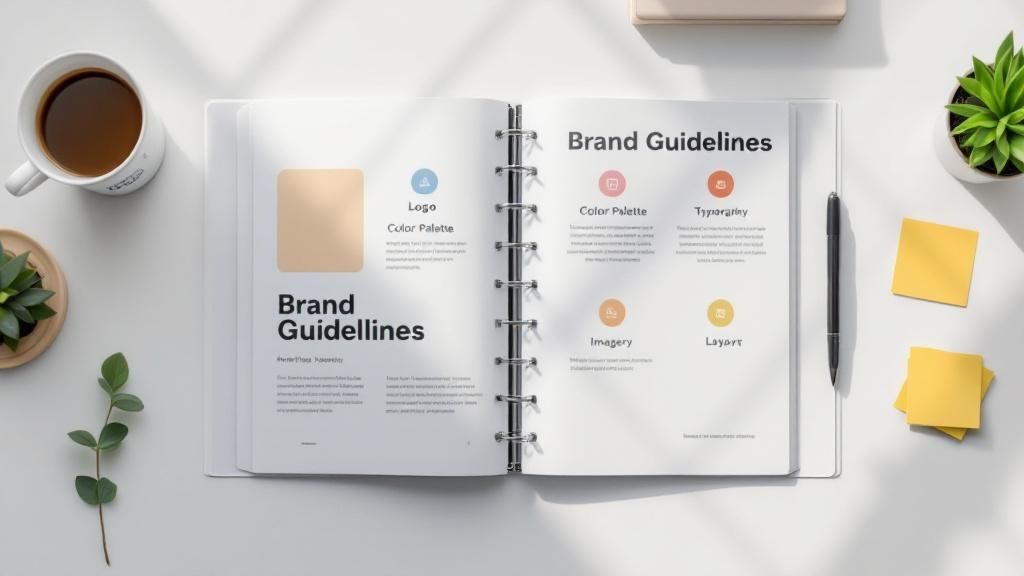 story
story The Ultimate Brand Guidelines Checklist: 6 Core Components
In a crowded market, consistency is the bedrock of a memorable brand. Without a clear set of rules, your brand's message can become diluted and confusing across different platforms, undermining the trust you've worked hard to build. This is where a comprehensive brand guidelines document becomes indispensable. It's more than a simple style guide; it's the single source of truth that empowers your team, freelancers, and partners to represent your brand accurately and cohesively. This detailed brand guidelines checklist breaks down the six non-negotiable components every successful brand needs to document. We'll move beyond theory to provide actionable steps and practical insights for each critical element, including: Logo Usage and Clear-Space Rules Color Palette Specifications (Print & Digital) Typography Hierarchies and Font Pairing Voice and Tone Principles for All Communications Imagery Guidelines for Photography and Illustration Brand Applications and Ready-to-Use Templates By the end of this guide, you will have a clear roadmap to creating a robust framework that protects your identity, streamlines your marketing efforts, and builds lasting recognition with your audience. This checklist ensures your brand looks, feels, and sounds the same everywhere, every time. 1. Logo Usage and Variations Your logo is the most recognizable element of your brand, making its consistent application a cornerstone of any effective brand guidelines checklist. This section isn't just about showing your primary logo; it's a comprehensive rulebook that governs how it appears everywhere, from a massive billboard to a tiny social media icon. Proper documentation prevents dilution of your brand identity and ensures it remains strong and instantly identifiable across all mediums. Pioneering designers like Paul Rand (IBM) and Saul Bass (AT&T) established that a logo’s power comes from a systematic, disciplined approach to its use. Without these rules, your logo can be stretched, recolored, or crowded, quickly eroding brand recognition and appearing unprofessional. Key Components of Logo Guidelines To ensure consistency, your guidelines must be specific and leave no room for interpretation. Cover these critical areas: Primary Logo: This is your main, full-color logo. It should be the default choice for most applications. Logo Variations: Document all approved alternatives. This includes horizontal and vertical lockups, monogram or icon-only versions, and one-color (monochromatic) variants for use on complex backgrounds or in restrictive printing scenarios. Clear Space: Also known as the exclusion zone, this is the minimum amount of empty space that must surround the logo at all times. A common practice, as seen with Nike’s swoosh, is to define this space using a key element from the logo itself (e.g., the height of the swoosh or a letter). This prevents other text or graphics from cluttering it. Minimum Size: Specify the smallest size the logo can be reproduced while remaining legible, both for print (in millimeters or inches) and digital (in pixels). Test this thoroughly before finalizing. Incorrect Usage: Provide clear visual examples of what not to do. This "logo abuse" section is crucial and should include things like stretching the logo, changing its colors, adding drop shadows, or placing it on a busy background that compromises readability. Actionable Implementation Tips Your logo guidelines are only effective if they are accessible and easy to use. Start by creating a centralized brand asset library where employees and partners can download approved logo files. Offer various formats like SVG (for scalability), PNG (for web with transparency), and EPS (for print). Understanding the practical application of logo guidelines means considering various file types and usage scenarios; you can see an example of a cropped logo asset here. Finally, remember to include guidelines for co-branding situations to maintain your brand’s integrity when working with partners. 2. Color Palette and Specifications Color is a powerful psychological tool that evokes emotion and communicates meaning faster than words. A well-defined color palette is a critical component of your brand guidelines checklist, ensuring that your brand’s visual language is consistent and emotionally resonant across every touchpoint. This section goes beyond simply listing colors; it provides a precise, technical system for their application, preventing the chaotic and unprofessional appearance that comes from inconsistent color use. Iconic brands have mastered this discipline. Think of Tiffany & Co.'s trademarked 'Tiffany Blue' (Pantone 1837) or McDonald's instantly recognizable red and yellow. These color systems, often pioneered by visionaries like Walter Landor, demonstrate that strict color governance creates an unforgettable brand identity. Without these rules, your brand’s colors can vary wildly from screen to print, weakening recognition and trust. Key Components of Color Guidelines To ensure your colors are always on-brand, your guidelines must be meticulously detailed, leaving no room for guesswork. Cover these essential areas: Primary Colors: These are the core colors of your brand identity, used most frequently. Typically, this includes one to three dominant colors that are integral to your logo and primary marketing materials. Secondary Colors: This palette complements your primary colors. These are used for accents, subheadings, call-to-action buttons, or to differentiate product lines. Define when and how these should be used. Color Codes: Providing exact color values is non-negotiable. Include codes for every format: HEX for web (e.g., #1DB954 for Spotify’s green), RGB for digital screens, CMYK for four-color process printing, and Pantone (PMS) for spot color printing to ensure perfect accuracy. Color Hierarchy and Ratios: Define the visual dominance of each color. For example, specify a 60-30-10 rule where your primary color takes up 60% of the design, a secondary color 30%, and an accent color 10%. This creates a balanced and harmonious look. Accessibility Standards: Specify color combinations that meet Web Content Accessibility Guidelines (WCAG) contrast ratios. Provide clear examples of acceptable text and background pairings to ensure your content is legible for all users, including those with visual impairments. Actionable Implementation Tips Your color palette is only useful if it can be accurately reproduced. Start by ensuring all stakeholders have access to digital color swatches (.ase files) for design software. Once you've defined your brand's color palette and specifications, ensuring these colors are reproduced accurately across all mediums is crucial. This often involves mastering color management in printing , a critical step for maintaining visual consistency. Always test colors on actual physical materials, as a color on a screen can look different on a printed brochure or a T-shirt. For instance, when producing branded items, you can explore options for customized online labels to see how your colors translate to specific materials. 3. Typography and Font Specifications Beyond your logo and colors, typography is the voice of your brand. The fonts you choose and how you use them significantly impact readability, tone, and the overall personality of your communication. A well-defined typography section in your brand guidelines checklist ensures that every headline, paragraph, and caption speaks with a consistent and recognizable voice, reinforcing your brand’s character across all written materials. Pioneering typographers like Erik Spiekermann and Matthew Carter demonstrated that a systematic approach to fonts is essential for creating a cohesive brand experience. Without clear rules, inconsistent font usage can make your brand appear disjointed and unprofessional. Brands like Airbnb (with its custom 'Cereal' typeface) and Google (with 'Product Sans') have invested in unique typography to create strong, ownable brand identities that are instantly recognizable. Key Components of Typography Guidelines To create a clear and functional system, your guidelines need to be detailed, leaving no room for guesswork. Address these critical elements: Primary and Secondary Typefaces: Define your main font (primary) for headlines and key messages, and a secondary font for body copy and extended text. For example, you might pair a distinctive serif font for headlines with a clean sans-serif for paragraphs. Typographic Hierarchy: Establish a clear visual hierarchy for text. Specify font sizes, weights (e.g., Light, Regular, Bold, Black), and styles for different levels of information, such as H1, H2, H3, body text, and captions. This guides the reader's eye and improves comprehension. Spacing and Alignment: Provide rules for line spacing (leading), letter spacing (tracking), and paragraph indentation. Specify preferred text alignment (e.g., left-aligned, centered) for different contexts to maintain a clean and consistent layout. Web and Fallback Fonts: Designate web-safe fonts or provide necessary web font files. It's also crucial to specify fallback fonts (e.g., Arial, Georgia) that will be used if your primary fonts fail to load on a user's device, ensuring a usable experience. Incorrect Usage: Show visual examples of what to avoid. This includes distorting font proportions, using too many different fonts or weights on one page, or using colors that create poor contrast and reduce readability. Actionable Implementation Tips Make your typography system easy to adopt. Start by ensuring all necessary font files are available in your centralized brand asset library, along with clear documentation on licensing restrictions to prevent legal issues. Create pre-formatted text styles in common software like Google Docs, Microsoft Word, and design programs to help your team apply them correctly. When designing physical assets, you can see how typography choices translate to printed materials by looking at how companies format custom notepads on 4over4.com. Finally, test your chosen fonts across various devices and sizes to ensure they remain legible and effective in every application. 4. Voice and Tone Guidelines If your logo is the face of your brand, your voice is its personality. How your brand communicates through words is just as critical as its visual identity, making voice and tone a vital component of any comprehensive brand guidelines checklist. This section defines your brand’s communication style, ensuring that whether a customer is reading a tweet, a product description, or an email, the personality they encounter is consistent and recognizable. Pioneering content strategists like Kate Kiefer Lee, who developed Mailchimp's famous Voice & Tone guide, demonstrated that a clearly defined voice builds trust and connection. Without these rules, your brand messaging can become fragmented, with one message sounding formal and corporate while another is overly casual, confusing audiences and weakening brand affinity. Mailchimp’s guide, which distinguishes between a consistent voice (personality) and an adaptable tone (emotional inflection), set a new standard for brand communication. Key Components of Voice and Tone Guidelines To build a consistent personality, your guidelines must offer clear direction on how to write for the brand. Be specific and provide practical examples. Brand Personality Traits: Define your brand’s core characteristics with 3-5 key adjectives (e.g., "Confident, Witty, Empathetic"). For each trait, describe what it means in practice and what it doesn't mean (e.g., "Witty, not sarcastic"). Voice vs. Tone: Clearly explain the difference. Your voice is your consistent personality that never changes. Your tone is the emotional inflection that adapts to different situations (e.g., a celebratory announcement vs. a customer support apology). Vocabulary and Grammar: List specific words to use and words to avoid. Include rules on grammar and punctuation, such as whether you use the Oxford comma, contractions (like "you're" vs. "you are"), or specific industry jargon. "This, Not That" Examples: This is one of the most effective ways to teach your voice. Provide side-by-side examples showing a sentence written "off-brand" and then rewritten to be "on-brand." This makes abstract concepts concrete for writers. Actionable Implementation Tips Your voice guidelines are useless if they aren’t actively used by everyone creating content. Begin by developing training workshops for writers, marketers, and customer service teams. Create interactive exercises that challenge them to apply the brand voice in various scenarios. A well-defined voice ensures that every piece of communication, from a social media post to marketing materials like custom postcards, consistently reflects your brand's unique personality. You can learn more about how to apply these principles to direct mail with these postcard printing options. Finally, conduct regular content audits to check for consistency and provide constructive feedback to content creators, ensuring the guidelines remain a living, practical tool. 5. Visual Style and Imagery Guidelines While your logo is the primary identifier, the broader visual ecosystem surrounding it is what truly builds a cohesive and memorable brand experience. Visual style and imagery guidelines are the rules that govern all other visual elements, from photography and illustration to iconography and layout. This section of your brand guidelines checklist ensures that every visual asset, whether on your website or in a printed brochure, speaks the same aesthetic language and reinforces your brand’s personality. The importance of this visual consistency was championed by creative leaders like Jonathan Ive, whose philosophy shaped Apple's iconic clean and minimalist design language. Without these standards, your marketing materials can quickly become a disjointed collage of competing styles, confusing your audience and weakening your brand's impact. A well-defined visual style ensures every piece of content feels intentionally crafted and part of a larger, unified whole. Key Components of Visual Style Guidelines To create a consistent visual identity, your guidelines must provide clear direction for all non-logo visual elements. Cover these essential areas: Photography Style: Define the mood, subject matter, and technical aspects of your brand's photography. Should it be warm and authentic like Airbnb's, featuring real people, or sleek and product-focused like Apple's, with clean backgrounds and consistent lighting? Specify color treatment (e.g., desaturated, high-contrast) and composition rules. Illustration and Iconography: Detail your brand's approach to illustration. Is it playful and character-driven like Slack's, or geometric and technical? Provide rules for line weight, color palettes, and overall complexity. Create a dedicated icon set that is stylistically aligned and visually consistent. Graphic Elements and Treatments: Document any recurring shapes, patterns, textures, or other graphic devices used to support the brand. This could include specific line styles, background treatments, or ways of framing content. Layout and Composition: Provide principles for how elements are arranged on a page or screen. This includes guidance on white space, grid systems, alignment, and visual hierarchy. Dropbox’s minimalist design, for example, relies heavily on generous white space to create a clean, uncluttered user experience. Do's and Don'ts: Just as with the logo, show clear visual examples of correct and incorrect imagery usage. Contrast on-brand photos with off-brand ones. Show how to properly apply graphic elements versus how not to. Actionable Implementation Tips Make your visual style easy for your team and partners to adopt. Start by creating a mood board that serves as a quick visual reference for the desired aesthetic. Develop a library of pre-approved photos, illustrations, and icons that are readily accessible. You can also build templates for common applications like social media posts or presentations. For materials like custom flyers, defining these visual standards ensures consistency even when creating new designs. For more information, you can explore best practices for flyer printing and design . Finally, specify technical requirements, such as minimum image resolution and quality standards, to prevent low-quality visuals from degrading your brand's appearance. 6. Brand Applications and Templates Brand guidelines are theoretical until they are applied. This section bridges that gap by providing tangible examples and ready-to-use templates that demonstrate how to bring your brand to life. It moves beyond abstract rules about logos and colors and shows how these elements should be implemented across various real-world materials, from a business card to a complex software interface. This ensures that every brand touchpoint, no matter how small, is consistent and professionally executed. Great design systems, as popularized by pioneers like Massimo Vignelli and contemporary methodologies like Brad Frost's Atomic Design, are built on the principle of systematic application. Without pre-defined templates, employees and partners are left to interpret the guidelines themselves, leading to inconsistency and a fragmented brand experience. Providing templates removes guesswork and empowers your team to create on-brand materials quickly and efficiently. Key Components of Application Guidelines To ensure your brand is applied correctly everywhere, your guidelines must provide clear, visual examples and functional templates for common use cases. Cover these critical areas: Corporate Stationery: This includes foundational materials like business cards, letterheads, and email signatures. Provide exact layouts, font sizes, and logo placements. Presentation Decks: Offer templates for PowerPoint or Google Slides with pre-set title slides, content layouts, and chart styles that incorporate your brand's typography and color palette. Social Media Assets: Create a suite of templates for different platforms (e.g., Instagram posts, LinkedIn banners, YouTube thumbnails). Specify dimensions, safe zones for text, and how to use your logo or brand marks. Marketing & Advertising: Include mockups and templates for digital ads, print flyers, and event banners. When developing your brand guidelines, remember that external applications like physical signage also play a critical role in reinforcing your brand identity; understanding the critical role of consistent signage can inform how you design these assets for maximum impact. Digital Interfaces: For tech companies, this is crucial. Showcase how brand elements are applied within user interfaces (UI) for apps and websites, as seen in Google's comprehensive Material Design system. Actionable Implementation Tips Make your templates accessible and easy for anyone to use, regardless of their design skill level. Start by organizing all assets into a centralized digital library, categorized by use case (e.g., "Marketing," "Sales," "Internal Comms"). When it comes to printed materials like business cards, it's beneficial to have templates that are already configured for professional printing; you can get high-quality business cards printed using files based on these specifications. To further empower your team, create both editable versions for designers (e.g., in Adobe Illustrator) and locked-down versions for non-designers (e.g., in Canva or Microsoft Word) to prevent accidental edits to core brand elements. Brand Guidelines Elements Comparison Item Implementation Complexity 🔄 Resource Requirements ⚡ Expected Outcomes 📊 Ideal Use Cases 💡 Key Advantages ⭐ Logo Usage and Variations Moderate – Requires detailed specs and regular updates Medium – Design assets, documentation, and training Consistent brand recognition and logo integrity Brand identity management, partnership branding Ensures logo consistency and prevents misuse Color Palette and Specifications Moderate – Precise color codes and accessibility compliance Medium – Color swatches, testing tools, printing resources Strong brand recognition and color accuracy Multi-media branding, print and digital consistency Maintains color cohesion and supports accessibility Typography and Font Specifications Moderate to High – Licensing, testing, and fallback fonts Medium – Font files, licensing costs, documentation Cohesive and readable communications All brand communications, digital and print content Enhances readability; reinforces brand personality Voice and Tone Guidelines Moderate – Requires ongoing training and regular audits Low to Medium – Documentation and training sessions Consistent and engaging brand voice Marketing content, customer service, social media Builds emotional connection and brand differentiation Visual Style and Imagery Guidelines High – Complex visual standards needing frequent updates High – Visual asset creation, licensing, and management Recognizable and cohesive brand aesthetic Marketing materials, digital platforms, campaigns Ensures professional and consistent visual identity Brand Applications and Templates Moderate to High – Template creation and maintenance Medium to High – Design files and update resources Streamlined brand application and reduced errors Business collateral, presentations, digital formats Saves time and maintains professional consistency From Checklist to Cohesion: Putting Your Brand Guidelines to Work Navigating the extensive brand guidelines checklist can feel like a monumental task, but completing it is a foundational achievement for any serious business. You’ve now outlined the critical components that define your brand’s identity, from the precise applications of your logo and the hex codes of your color palette to the hierarchy of your typography. You have a blueprint for your brand’s unique voice, its visual style, and the practical application of these elements across various templates and marketing materials. However, the true value of this document isn't in its completion, but in its consistent application. A set of brand guidelines gathering digital dust on a server is useless. It must be transformed from a static file into a dynamic, living resource that powers every aspect of your communication. This is where the real work of building a cohesive brand begins. Turning Your Guidelines into Action The ultimate goal of this comprehensive checklist is to achieve unwavering brand consistency. This consistency builds trust, enhances recognition, and creates a seamless experience for your audience at every touchpoint. To make this happen, you must actively integrate your guidelines into the fabric of your organization. Onboarding and Training: Your brand guide should be a cornerstone of your onboarding process for every new hire, from marketing interns to sales executives. Conduct regular training sessions to ensure everyone understands not just the "what" but the "why" behind each guideline. Centralized Accessibility: Make your brand guidelines easily accessible to all employees, freelancers, and agency partners. A centralized, cloud-based location ensures everyone is working from the most current version. Workflow Integration: Embed the guidelines directly into your creative workflows. Use them to build templates in Canva, Figma, or your content management system. Create pre-flight checklists for designers and copywriters to review before publishing any content. A Living Document for an Evolving Brand Your brand is not static; it will grow and evolve with your business. As you launch new products, enter new markets, or adapt to cultural shifts, your guidelines must evolve too. Schedule periodic reviews, perhaps quarterly or annually, to assess what’s working and what needs updating. This proactive approach ensures your brand remains relevant, fresh, and consistently aligned with your strategic goals. Ultimately, completing your brand guidelines checklist is the first step toward transforming your brand from a collection of disparate elements into a powerful, unified force. When your logo, colors, fonts, voice, and imagery all work in perfect harmony, you create more than just marketing materials. You build a memorable, trustworthy, and impactful brand experience that resonates deeply with your audience and sets you apart from the competition. Ready to bring your meticulously planned brand identity to life? The most detailed guidelines are only as good as their execution. For premium printing that honors your brand standards with flawless precision, trust 4OVER4 . From business cards and brochures to custom packaging and event banners, 4OVER4 ensures your brand looks as professional in print as it does on paper.