Content Hub
Stories, Ideas and Advice — Page 38
 story
story How to Deal with Clients from Hell (Based on True Stories)
When I grow up, I want to be… full of patience! [caption id="attachment_5015" align="alignleft" width="246"] Seriously?[/caption] Remember that time in High School when you were trying to decide what your future would be like? Whatever your dream occupation was , you probably hoped to be amazing at it and make a difference. You know what you’re able to do and are willing to work for it. But for whatever reason, there’s no ‘Clients from Hell 101’ class included in education programs. Which means that you will have to deal with them with your own resources. Don’t despair though! We collected 5 real clients from hell stories to let you know you are not alone and how to deal, in this fight that is pretty much daily in any service-industry! Round 1. The Misunderstanding The Restaurant Owner Vs. The Graphic Designer R.O: I want the menu to be more prominent G.D: We can make the dishes pictures the stars of the menu R.O: But I’m not convinced on the letters, can you make them more prominent? G.D: Just to make sure… what do you mean by prominent? R.O: That thing when the letters look darker than the rest G.D: Do you mean putting them in bold? R.O: Yes! That’s prominent enough. You see? You don’t have to complicate the design so much. I have an eye for these things! How to Deal with this Hellish Situation: Don’t get into a debate about the terms; most of the times they don't know what things are properly called which s leads to misunderstandings! Try to get a clear idea of what they mean by asking politely. Show your clients a proposed design and a second version with their revisions; a side-by-side comparison helps them realize their original idea might not be the best idea. Include an email or note with their exact requests and let them decide on which one they like better. Help them make informed decisions by adding short but self-explanatory observations on why *your* idea should work better towards their goal. Round 2. The Duplicitous or Liable The Client vs. The Marketer T.C: I was reading your proposal and it looks unprofessional T.M: What do you mean? T.C: I don’t like it, it looks unprofessional for an event proposal T.M: Which part? T.C: For example, you should say we’re expecting 10,000 attendants, so exhibitors will get excited T.M: But you told me you were expecting 5,000 attendants… tops T.C: Yes, but they don’t need to know that! Once they’ve paid it's irrelevant. Also, tell them the lucky draw will take place later, so everyone will just assume they didn’t win. That’s marketing! T.M: Thanks for the lesson How to Deal with this Hellish Situation: Discourage false advertising. Let your client know about the risks of putting false information on a proposal, ad, business promo material, etc. If there is a fee or sponsorship to be paid by exhibitors, talk about liability and potential lawsuits. If the client doesn’t want to change the text, remember to put their company name on the proposal to make them accountable for the outcome. If you are still uncomfortable, decline the project. You can always add a disclaimer to your site and portfolio stating that the work does not reflect your own opinions or views. Round 3. The Logic-Defying The Artist vs. The Printer CLIENT: Can you scan this painting and make 5x7 greeting cards? ME: Well, it’s a square painting. CLIENT: Yes, I see that, I painted it. Can’t you just make it fit without any cropping? ME: As magical as you think I may be, I am still bound by the laws of physics. CLIENT: Then just bend the laws a bit. Source: Clientsfromhell.net How to Deal with this Hellish Situation: Explain specifically how something works. If a client does not seem to get on board with the explanations, show them! In this case Print the greeting card so they can see what the problem is. Don't snap at them or reply with snarky or sarcastic retorts, instead calmly state the right way to do it. Humor them without patronizing them: if they don't seem to understand, just show them an adjusted version and let them believe their insight was useful. Once they see a good final result, they won't try to question it (although they might want to take credit!) Round 4. The Know-It-All The Fonts Expert vs. The Graphic Designer Client: Can we change the heading font to more acrylic? Me: Sorry? Client: Can we change it to more of an acrylic style font? You know, like slantways. Me: Oh, you mean italic? Client: No, I think its acrylic, please don’t correct me again. The slanty-‘i’ in word, you know. For acrylic. Source: Clientsfromhell.net How to Deal with this Hellish Situation: Sometimes you just have to go with the flow and give a client its acrylic style… italic... that is. Round 5. The Oximoron The Overthinker vs. The Graphic Designer "Looking for something fresh. I would say smart fun, good colors, smooth, edgy-with-restraint, innovative but familiar, subdued classic with updated flair but not flash. Bold and outgoing. Nothing exaggerated but don’t be afraid to go over the top." Source: Clientsfromhell.net How to Deal with this Hellish Situation: Make them fill out a brief . Make them show you at least two examples of what they like (so you can clearly see what they mean by "edgy with restraint") Determine deliverables and deal-breakers (some clients will -for no reason- despise blue and work in the medical supply industry, try to adjust) Be prepared for a few revisions. Remember that as much as you would like to, you can’t change the world. Whether it is yoga, meditation, stress release toys or screaming into pillows, find your way to release the anger and don’t blow up in front of your clients. Have you dealt with any clients from hell before? Go to the comments and share your story with us. It’ll be cathartic.
![How to Design a Greeting Card Using InDesign [FREE Tutorials]](https://cloud-cdn.4over4.com/2014/02/greeting-cards.jpg) story
story How to Design a Greeting Card Using InDesign [FREE Tutorials]
We are into greeting card printing for all sorts of special occasions, they serve the purpose of telling our friends and family that we're thinking of them on that special date or holiday. This is why the tradition still lives on -despite some detractors- and will be continued by future generations! To keep it interesting, we encourage you to walk that extra mile and create an original piece. Not to worry though, we found an easy tutorial that shows you how to design a greeting card step by step. Design a Greeting Card That Everyone Will One to Keep Nowadays, everything is done using technology; with many alternatives for software and programs, everyone can create and design. However, most people use InDesign for print greeting card design because it renders better results...which is why it is the most common format used in professional printing. If you haven't mastered InDesign yet and need to make your own greeting card these Free Tutorials will help you get there fast! By learning the most basic elements of the InDesign software, so you can create a greeting card anytime you choose. Mastering the Greeting Card InDesign Tutorials Also, if you need a shorter version of the greeting card design process or don't really like video tutorials, here's a simplified step-by-step version, so you can learn the basics and still get the job done. Don't feel panic if you don't nail it on the first attempt, remember it takes years for professionals to master these types of programs. Just make sure to practice, take your time, and do every step indicated in the tutorials. There are other ways to make it easier for you to greet your loved ones with style, using pre-designed greeting card templates that can save you some time and effort when you're in a rush, or just looking to send a good and sharp design that you can personalize. You can make these templates unique by including your own message, pictures, different textured types of printing paper, and by changing the color palette. After your design is done, you can always add a handmade touch after printing or choose custom envelopes that match your theme and style. Let us know how your project went, we'd love to see the results! If you have any questions, doubts or find this post useful, let us know in the comment section. Exploring the Boundless Potential of Adobe InDesign Amidst the myriad of software options available for design endeavors, Adobe InDesign emerges as a premier choice for crafting impeccable greeting cards . Renowned for its prowess in print design, InDesign offers a versatile platform that seamlessly blends functionality with creativity. Whether crafting intricate designs for a cherished holiday or fashioning elegant expressions for momentous occasions, InDesign empowers creators to realize their artistic visions with precision and finesse. Unveiling the Secrets of Folded Greeting Cards: InDesign Tutorials Delving into the realm of folded greeting cards unveils a world of creative possibilities, where every crease and fold becomes a canvas for expression. Through comprehensive tutorials tailored for Adobe InDesign, aspiring designers can embark on a journey of discovery, mastering the intricacies of card construction with ease. From conceptualization to execution, each tutorial segment offers invaluable insights into the art of folding, shaping, and embellishing greeting cards to perfection. Part I: Initiating Your Design Odyssey: The inaugural segment of the tutorial series serves as a gateway to the realm of folded greeting cards, acquainting designers with fundamental concepts and techniques. Participants are guided through the initial stages of layout creation, learning to wield InDesign's array of tools to bring their visions to life. From selecting appropriate dimensions to arranging graphical elements, this foundational tutorial sets the stage for subsequent creative endeavors. Part II: Elevating Your Design Aesthetic: Building upon the groundwork laid in the preceding tutorial, Part II delves deeper into the nuances of folded greeting card design, unraveling advanced techniques and strategies. Participants are introduced to sophisticated layout considerations, such as grid systems and typography hierarchy, essential for crafting visually striking compositions. With a focus on refinement and coherence, this tutorial segment empowers designers to elevate their creations from mere cards to captivating works of art. Mastering the Craft Simplified Step-by-Step Guide to Greeting Card Design: For those seeking a streamlined approach to greeting card creation, a simplified step-by-step guide offers a viable alternative to video tutorials. Presented in a concise format, this guide distills essential design principles into actionable steps, enabling beginners to navigate the intricacies of InDesign with confidence. By adhering to a systematic workflow and embracing a spirit of experimentation, designers can gradually refine their skills and unleash their creative potential. Unlocking Efficiency with Pre-designed Greeting Card Templates In the quest for efficiency without compromising on quality, pre-designed greeting card templates emerge as indispensable tools for busy creators. These ready-to-use indesign greeting card templates serve as versatile canvases, offering a myriad of design options that can be effortlessly customized to suit individual preferences. From elegant motifs to whimsical illustrations, the diversity of templates ensures ample choices for every occasion, allowing designers to imbue their creations with a personal touch. Personalization: Infusing Your Signature Style: While pre-designed templates provide a convenient starting point, true innovation lies in the art of personalization. Designers are encouraged to inject their unique personality and flair into each greeting card, whether through heartfelt messages, cherished photographs, or custom color palettes. By infusing their creations with a sense of authenticity and warmth, designers forge genuine connections with recipients, transforming simple gestures into memorable moments. Adding a Handcrafted Touch: Elevating Your Designs: In the age of digital proliferation, the allure of handcrafted embellishments remains unrivaled. After printing their designs, creators can enhance the tactile appeal of greeting cards by incorporating handmade elements, such as embossed textures, decorative embellishments, or hand-written notes. These artisanal accents add a layer of charm and sophistication to the final product, imbuing it with a timeless elegance that transcends fleeting trends. Embracing the Finishing Flourish: Custom Envelopes and Presentation: In the realm of greeting card design, presentation is paramount. To complement their meticulously crafted designs, creators can opt for custom envelopes that reflect the theme and style of their cards. Whether adorned with ornate patterns, subtle textures, or vibrant colors, these envelopes serve as the perfect prelude to the delights contained within. By attending to every detail, from design to delivery, creators ensure that their greetings leave a lasting impression on recipients. Conclusion In the realm of greeting card design, Adobe InDesign serves as an indispensable ally, empowering creators to unleash their imagination and craft personalized masterpieces that resonate with authenticity and charm. Whether embarking on a journey of discovery through tutorials or harnessing the efficiency of pre-designed templates, designers are poised to elevate the art of greeting card creation to new heights. As each card finds its way into the hands of a cherished recipient, it becomes more than a mere token of affection—it becomes a testament to the enduring power of human connection and creativity. FAQs Q: What is Adobe InDesign and how is it related to designing greeting cards? A: Adobe InDesign is a graphic design software used to create various types of print and digital materials, including greeting cards. It provides tools for layout, typography, and image manipulation, making it ideal for designing beautiful greeting cards. Q: Can I create my own greeting card template using Adobe InDesign? A: Yes, you can create your own custom greeting card template in Adobe InDesign by designing the layout, adding graphics and text, and saving it as a reusable file for future projects. Q: How can layout guidelines templates help in designing greeting cards? A: Layout guidelines templates provide pre-defined structures and designs that can serve as a starting point for your greeting card layout. They help in ensuring proper alignment, sizing, and placement of elements for a professional-looking design. Q: Is there a specific file format required for print-ready greeting cards? A: Yes, for print-ready greeting cards, it is recommended to save your design as a PDF file with proper bleed and trim settings to ensure accurate printing and trimming of the final product. Q: What are some key moments where custom greeting cards can be a great product? A: Custom greeting cards are perfect for special occasions like birthdays, holidays, weddings, anniversaries, or any meaningful event where you want to convey a personalized message to someone. Q: How can I download greeting card templates for Adobe InDesign? A: You can find and download greeting card templates for Adobe InDesign from various websites and design resources that offer free or paid templates. Simply search for the type of card template you need and download the file to start designing. Q: What are some tips for creating a greeting card from scratch in Adobe InDesign? A: Some tips for creating a greeting card from scratch include planning your layout, using high-quality graphics and fonts, incorporating meaningful messages, and ensuring your design follows printer requirements for a professional finish.
 story
story How To Design A Quality Custom Poster
Posters are a great way to add a pop of color and personality to any space. Whether you're looking to decorate your home, office, or event, designing and printing a high-quality poster online can be a fun and creative process. From choosing the right poster category to understanding high-quality poster printing, designing your custom poster online, and finally printing and framing your art print, there are several steps to consider. How can I design a high-quality poster online? To design a high-quality poster online, you can explore different styles and browse through various photographic options to find the perfect fit for your space. You can also combine premium paper and vibrant colors to create a stunning piece of wall art. How to Choose the Right Poster Category When it comes to selecting the right poster category, it's important to explore different poster styles that suit your taste and space. Whether you prefer artistic and photographic posters or customizing your poster with templates, there are endless options to choose from to create a unique piece of art. Exploring Different Poster Styles: From graphic designs to illustrations, posters come in a wide range of styles to suit different preferences. Finding Artistic and Photographic Posters: For art enthusiasts, browsing through a collection of beautiful art prints can be inspiring. Customizing Your Poster Templates: If you're looking for a quick and easy way to design your poster, using pre-designed poster templates can be a great option. Understanding High Quality Poster Printing High-quality poster printing involves selecting the right paper for your poster, choosing the best print file format, and utilizing high-quality printing options to ensure a professional-looking final product. Selecting the Right Paper for Your Poster: The type of paper you choose can drastically impact the appearance and durability of your poster. Choosing the Best Print File Format: Opting for a high-resolution file format is essential to maintain the quality of your poster during printing. Utilizing High-Quality Printing Options: Whether you prefer a matte or glossy finish, selecting the right printing options can enhance the overall look of your poster. Designing Your Custom Poster Online Creating an eye-catching poster involves choosing a clear and engaging design, selecting high-quality images, and using bold fonts. When considering how to make a poster, start with a strong focal point, incorporate contrasting colors, and ensure your text is readable from a distance. Utilize design software or online tools for a professional finish.Designing a custom poster online gives you the flexibility to create a poster tailored to your preferences. From creating custom size posters to exploring color and style options, there are numerous ways to unleash your creativity. Creating Custom Size Posters: Depending on the space where you intend to display your poster, customizing the size can ensure a perfect fit. Exploring Poster Color and Style Options: Play around with different color schemes and styles to find the right aesthetic for your poster. Using Artistic Inspiration for Poster Design: Drawing inspiration from art, photography, or nature can help you create a unique and captivating design. Printing and Framing Your Art Print Once you have designed your poster, the next steps involve printing and framing your art print. Shopping for frames, deciding on poster size and finish, and enhancing your decor with exclusive posters are essential in the final stages of the process. Shopping for Frames for Your Poster: Finding the perfect frame can complement your poster and elevate its visual appeal. Deciding on Poster Size and Finish: Consider the dimensions of your space and the overall look you want to achieve when choosing the size and finish of your poster. Enhancing Your Decor with Exclusive Posters: Showcase your style and personality by selecting exclusive posters that resonate with your taste. Tips for Hanging and Displaying Your Posters Once your standing poster is ready, it's important to hang and display it properly to make a statement in your space. Choosing the right location, utilizing creative display ideas, and creating a coordinated poster display can make all the difference. Choosing the Right Location for Your Poster: Consider the lighting and existing decor in the room when determining the best spot to hang your poster. Utilizing Creative Display Ideas for Your Posters: Experiment with different hanging methods or frames to create a unique and eye-catching display. Creating a Coordinated Poster Display in Your Home: If you have multiple posters, consider curating a gallery wall or grouping them together for a cohesive look. Conclusion Posters make great gifts for friends and family, allowing you to share your favorite images and memories in a tangible and meaningful way. No matter the occasion, a personalized poster is sure to make a lasting impression. So, why wait? Start designing your amazing custom poster today and transform any space into a work of art! FAQs Q: Where can I buy prints of my favorite artist's work? A: You can buy prints of your favorite artist's work online from websites that offer posters and prints for sale. You can also check if the artist has their own website where they sell their artwork. Q: What paper options are available for printing posters? A: Posters are printed on a variety of paper options such as fine art paper, uncoated paper, glossy paper, and premium paper. Each type of paper provides a different finish and look for your poster. Q: Can I download a PDF of the poster I designed? A: Yes, after designing your poster online, you can download a PDF of the artwork for your records or to share with others before confirming your order. Q: How can I convert a photo into a poster? A: You can convert a photo into a poster by using design software like Illustrator to enhance the image and adjust it to poster size. It's a great way to showcase your photography or artwork as wall art. Q: What are some trendy poster styles for decorating my living room? A: Some trendy poster styles for decorating your living room include Scandinavian design, typography-based posters, bold and colorful motifs, and movie posters. These styles can serve as a focal point in your interior design. Q: Do you offer shipping for posters in different sizes? A: Yes, we offer shipping for posters in various sizes to accommodate different wall spaces in your home. You can select the size that best fits your bedroom, living room, or any other area you wish to decorate.
 story
story How to Design a Stunning Custom Poster | Design in Minutes
Poster making Large format posters are one of the best ways to promote your brand. Learn how to create printed posters in just a few minutes. With so many styles of posters out here, it should become clear why having the right one is so important for the particular message you want to convey. Think hard about what your custom poster template will communicate what your brand is about and help you seal the deal with your clients. Don’t be afraid to get an original custom poster just like the one we’ve shared here. After all, the right one might just be what sparks the interest of a new customer! Custom Poster Designs Let your creative self shine by displaying all your amazing ideas on a blank custom poster template that you can customize with different designs and get a feel of what the final look will be. Do you have too much on your plate already? Just relax and let us do all the heavy lifting for you by checking out our services in the community section.
 story
story How to Design a Unique Custom Rack Card in Canva
In today's digital world, creating visually appealing promotional materials is essential for businesses to attract the attention of potential customers. One effective method is through the use of innovative rack cards. These compact, informative tools can be a game-changer when it comes to marketing your products or services. With the rise of online design platforms like Canva, designing custom rack cards has become easier than ever before. How to Use Canva to Design Rack Cards Canva offers a user-friendly interface that simplifies the design process for rack cards . Whether you are a novice or an experienced designer, Canva's intuitive tools make it easy to create beautiful professional-quality rack card designs. One of the key advantages of using Canva is the vast library of customizable rack card templates available at your fingertips. Benefits of Using Canva for Rack Card Design By utilizing Canva for your rack card design, you can save time and effort in creating eye-catching promotional materials. The drag-and-drop editing tools allow you to easily customize your designs without the need for advanced design skills. Furthermore, Canva offers a range of free rack card templates ready for you to use, making it a cost-effective solution for businesses of all sizes. Steps to Design Printable Rack Cards in Canva Designing a rack card in Canva is a straightforward process that can be completed in a matter of minutes. Simply browse through the customizable collection of rack card templates, select a template that suits your needs, and start customizing to make it your own. With Canva's easy-to-use editing tools, you can personalize every aspect of your rack card to create a standout design. Customizing Templates in Canva for Rack Card Canva allows you to edit every element of your chosen template, from the layout to the font choices. You can also incorporate images, logos, and contact details to make your rack card more personalized. With Canva's drag-and-drop functionality, designing a custom rack card tailored to your brand has never been easier. Choosing the Right Template for Your Rack Card When selecting a rack card template on Canva, it is essential to consider factors such as the design style, color scheme, and text placeholders. Choosing a template that aligns with your brand's aesthetic can help create a cohesive promotional campaign. Canva's editable templates provide the flexibility to customize every aspect of the design to suit your preferences. Factors to Consider in Selecting a Rack Card Template Before finalizing a rack card template, consider the target audience and the message you want to convey. A minimalist design may work best for certain industries, while others may require a more vibrant and eye-catching layout. Canva offers a diverse range of templates to cater to various business needs. Customizing Pre-made Rack Card Templates Make use of Canva's editing tools to personalize pre-made rack card templates with your brand's colors, logos, and images. Tailoring the design to reflect your business identity can help create a lasting impression on potential customers. Additionally, incorporating bulleted texts or QR codes can enhance engagement with your target audience. Utilizing Double-Sided Designs for Impact For a comprehensive marketing approach, consider utilizing double-sided rack card designs. This allows you to include more information about your products or services while maintaining a sleek and professional look. Canva offers the flexibility to create double-sided rack cards that stand out and make a lasting impact on your audience. Personalizing Your Custom Rack Card Personalization plays a crucial role in creating effective rack cards that resonate with your target audience. Canva provides a variety of customizable elements that can be added to your rack card designs to make them more engaging and informative. By incorporating personalized text, graphics, and images, you can effectively communicate your brand's message. Adding Customizable Elements to Your Rack Card Enhance your rack card design by adding elements such as icons, shapes, and text holders that can be tailored to suit your business needs. Canva's extensive library of design elements ensures that you can create a unique and visually appealing rack card that captures the essence of your brand. How to Personalize Text and Graphics on Canva With Canva's easy-to-use text and graphic customization features, you can easily personalize every aspect of your rack card design. Experiment with different fonts, colors, and layouts to create a visually striking design that conveys your message effectively. By customizing the text and graphics on your rack card, you can make it more memorable and impactful. Incorporating Images and QR Codes for Engagement Images and QR codes can be powerful tools for engaging your audience and driving them to take action. By incorporating high-quality images that showcase your products or services, you can capture the attention of potential customers. Additionally, including QR codes that lead to your website or promotional offers can further enhance engagement and encourage interaction with your brand. Design Tips for Creating a Professional Rack Card When designing a rack card, it is important to pay attention to essential design elements that contribute to a stunning visual appeal. Canva's design tools offer a wide range of options to create professional-quality rack cards that leave a lasting impression on your audience. By utilizing Canva Pro features, you can take your designs to the next level and achieve a polished and visually appealing result. Essential Design Elements for Stunning Rack Cards Ensure that your rack card design includes a balance of text and images to convey your message effectively. Pay attention to the layout and color choices to create a cohesive and visually appealing design. Canva's design elements and templates provide a solid foundation for creating professional-quality rack cards that are tailored to your business needs. Using Canva Pro Features for Enhanced Designs By upgrading to Canva Pro, you gain access to a range of advanced features that can elevate your rack card designs. From additional design elements to premium fonts and colors, Canva Pro offers tools that help you create standout promotional materials that reflect your brand identity. With Canva Pro, you can take your rack card designs to the next level and make them truly unique. Optimizing Layout and Color Choices for Your Rack Card Creating a visually striking rack card involves optimizing the layout and color choices to create a cohesive and impactful design. Experiment with different color schemes, fonts, and graphic elements to find the right balance that resonates with your target audience. Canva's intuitive design platform allows you to explore various options and create a rack card that stands out. Effective Marketing Strategies with Custom Rack Cards Custom rack cards can be a powerful tool for promoting your business and reaching a wider audience. By incorporating effective marketing strategies, you can maximize the impact of your rack cards and drive engagement with potential customers. Canva's versatile platform allows you to design rack cards tailored to specific industries and promotional goals. Utilizing Custom Rack Cards for Promotional Purposes Designing custom rack cards for promotional purposes can help you showcase your products, services, or special offers in a visually appealing format. Canva's design tools enable you to create eye-catching promotional materials that grab the attention of your target audience and drive them to take action. Whether you are promoting a new product or a special event, custom rack cards can effectively convey your message. Designing Rack Cards for Specific Industries like Real Estate For businesses operating in specific industries like real estate, designing industry-specific rack cards can be highly effective. Canva offers templates and design elements tailored to various sectors, making it easy to create professional-quality rack cards that resonate with your target market. By customizing your rack cards to align with industry standards and aesthetics, you can effectively showcase your offerings to potential clients. Maximizing Rack Card Distribution for Greater Reach Once you have designed your custom rack cards, it is essential to maximize their distribution for greater reach and impact. Distribute your rack cards at strategic locations, events, or through direct mail to ensure they reach your target audience. By leveraging Canva's printable options, you can easily create high-quality rack cards that can be distributed to potential customers' doorsteps.
 Story
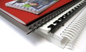
Story How to Design, Print & Bind Your Own Book
If you're looking to save some money on your book layout and design, you'll probably opt to do it yourself from beginning to end. Perhaps, you're looking to make a book with those delicious family recipes that have passed from one generation to another or maybe need to make it as a design project for college or a client. Inexpensive and Elegant DIY Book & Booklet Printing Is not only possible, but easy to do! Whichever the reason you may have for wanting to print your own book , the final product will always be an original creation of yours, something nobody else has and that you'll value even more than any other product you can buy at stores. This is why we decided to show you how to create your own book design and print it properly, to look as pro as you wish. 1. Remember: It's All About Content Choose your main theme and develop the information. You can create a book of almost anything you can imagine, but remember doing your research first. People may judge a book by its cover, but they keep reading it for its useful or interesting content. Divide your content into sections or chapters to separate main ideas, create an index that can help readers find a specific part in the book. Always include quotes and cite authors when you need to reference something you investigated. In cookbook and children's books add an extra touch with your personal tips or interesting sections for kids to learn. 2. Layout and Design After the first step has been taken care of, you need to decide how you want to diagram your book, if you want full pages of content or pictures, combine both, use columns, to name a few items. You'll need to consider what type of pagination you want to use, depending on your content, you can choose from roman numbers to numerical, page according to chapters or only the right pages. There's also the pagination style factor in which you have to decide if you want to keep orphans and widows, which are those lines that appear lonely at the top or bottom of paragraphs. In case you don't want them around the result will be an uneven number of lines on each page, so you'll have to consider the alternatives. Then choose if you want the pages to have a background, theme or main design and include it before you put the content into the book layout. 3. Book Cover and Back Cover Make an original design that represents the content of the book for your cover, it could be an illustration, picture, sculpture's photograph or anything you can imagine that actually draws attention to your product. For the back cover you can include a short text, teaser, description or an author's biography if you wish. 4. Printing like a Pro Nowadays there are many options to make your work look professional. Choose a printing firm that offers a wide variety of printing and binding options that go accordingly to its thickness and type of paper of your choosing. (Check out these Free templates ) From saddle- stich to wire-O bidding s, the important thing is that you can print your own book in a way that fits its theme and content. For example, children's activity books can benefit from wire-O biddings, making it easier for kids to turn pages without causing any damage to the book or ripping its pages off. For a professional, historic or something directed to an adult audience, saddle-stick is highly recommended due to the actual book appearance, it'll give to your finished product, while side-stitch binding will look better for specialized magazines or lighter reading material. Bonus tip: If you're not a professional designer and you are not familiarized with conventional design softwares, there are many online apps and softwares that can make the whole process of design easier for beginners, and some of them even combine word processors and book layout in one. Choose the one that adapts to your particular needs before starting, because they tend to have very limited features. Are you planning on publishing your book or is a personal project? Let us know how your process went. We'd love to help you and see the results.
 story
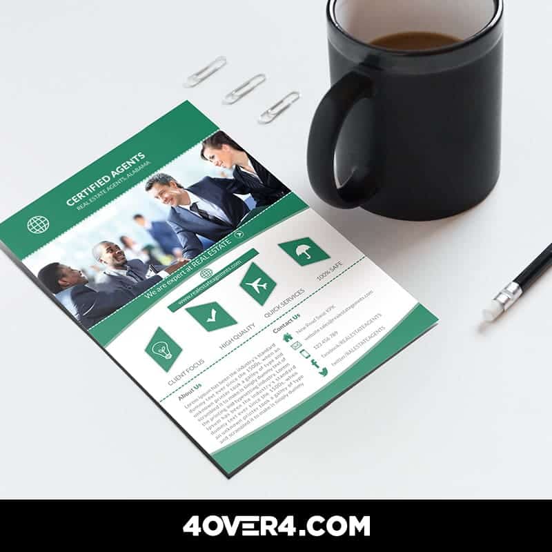
story How to Design the Ultimate Real Estate Print Marketing Kit
Print marketing is a very important resource for Real Estate companies and agents. Creative materials allow them to brand their image and attract more prospective customers. In this era of digital frenzy and need for local exposure, Real Estate print marketing offers a world of creative opportunities , from the traditional yard signs to large-scale billboards. If you can take advantage of the extraordinary potential of print marketing materials including cleverly-designed real estate corporate kits, you can quickly become the go-to agent for your market. Real Estate Print Marketing: Back to the Basics We’ve compiled a shortlist of secrets to designing the ultimate Real Estate corporate kit including business cards, newsletters, brochures and flyers from the pros. Here’s a look: #1 Make a Lasting First Impression With Custom Business Cards Although there is a myriad of business cards to choose from, it is important that you go with the option that best describes you as a professional real estate agent and the brand you represent , for that matter. If you like traditional, you can’t go wrong with the 90x55mm in classic white or ivory business card. However, you can go with different shapes and sizes and add pictures or graphics along with fascinating text layouts that will give your brand an extra kick. Check out our hundreds of free business card templates for some ideas. #2 Keep Your Audience Involved With Real Estate Newsletters Newsletters are another important resource for many Real Estate companies for staying in touch with both clients and prospects. However, you don’t have to limit newsletters for communication and branding purposes; you can put them to dynamic use by carrying advertisement for complementary businesses such as insurance companies, banks and lenders or mortgage brokers. When planning a marketing campaign, newsletters allow you to stay connected with existing clients in a visually appealing way. They are also ideal for open house invitations, listings and launches. To make your business look more knowledgeable and professional, when designing a real estate newsletter, it must feature your company colors, logo, personal greetings and/or articles about finance and real estate. Our custom printed newsletters are available in a range of standard and custom sizes. #3 Display Your Properties With Real Estate Brochures When it comes to property marketing, Real Estate brochures are almost embedded as an absolute necessity in the real estate culture . They are a simple and cost-effective solution for showcasing your property, building brand recognition and, finally, closing the sale. Half-fold real estate brochures are typically printed on both sides and feature pictures and layout of the property, architectural details and other important features. Depending on the design, you can use real estate brochures to portray noticeable marketing points for your listing.The design can help you create a feeling of uniqueness for high-end properties or affordability for listings targeted towards working-class families. Order our custom printed half fold brochures in a range of sizes. #4 Grab Some Attention With a Striking Real Estate Flyer Creating a good first impression, as a rule of thumb in life, is an absolute must. Make sure to come up with and eye-catching design and compelling copy that will stand out on the spot . If you fail to do so, you are running the risk of having your flyer end up in a trash can along with your marketing dollars. If you want to make the best impact on buyers, use the right combination of graphics and content on your flyer to generate leads and engage your audience. If you want to get your target audience fully engaged, think long and hard about your niche and custom-build your flyer design to match the needs and wants of that particular group. Pictures of the listing are definitely important, but you should also try complementing with other nice details, such as unique features of the property, helpful tips for buyers, or a relevant quote. Last but not least, make sure to include a call-to-action and the real estate agent’s contact information. We offer two exceptional flyer printing services : staggered cut flyers and standard flyers. Last Thoughts As you can see, as your Real Estate company grows, the number of items you’ll need to get designed and printed grow, too. But today, we went back to the basics and talked about properly designing the print marketing materials that you’ll need in your corporate kits in order to get started in a prosperous Real Estate print marketing strategy. Tell us about your own corporate kit. What items does it feature? We would love to hear your thoughts. Please feel free to leave a comment below. We offer outstanding print services for Real Estate agencies and professionals. Click the banner below to learn more and get a 30% discount on your next order!
 Story
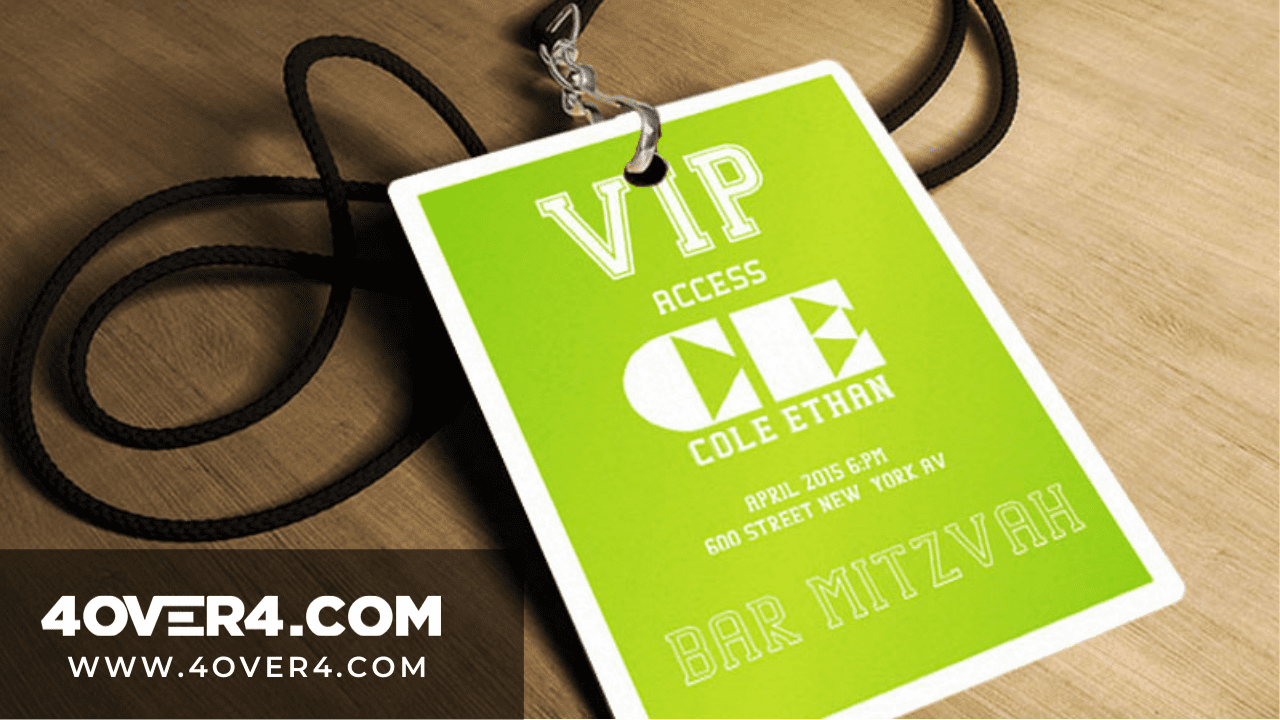
Story How To Design Unique Conference Badges That Stand Out
Conference badges help you to stand out and get noticed. Are you thinking how? Event conferences or conventions are where people or stakeholders with a common interest gather. The agenda could be about business, technology, academics, or industry. Now, how big are these conventions? Well, according to Statisca.com , in 2017, there were 250 convention centers in the United States. Over 30 percent of the largest conventions had over 2,500 attendees. This simply says that the number of persons who attend these events is high. Think of conferences as social networks that are not virtual but you still need to ensure your profile stands out. It all starts with conference badges. Conference Event Badges-Its All About The Culture Sending employees to event conferences is an important corporate culture. The conference badges design they have will be a clear indicator of their corporate culture They will be able to sharpen their skills but here are the main reasons why you should attend conferences. 1. Networking with Conference Badges Your network is your net worth. Conferences are full of like-minded people and you are surrounded by your industry peers. This is the only time you can interact with them without booking a flight or an appointment. 2. Expanding knowledge While you could have held onto one perspective, you might just discover that your 6 was a 9 all along. At such events you get to learn new techniques, different types of equipment, new data or simply broaden your perspective thanks to the thought leaders present. You get the chance to talk and ask questions and your small idea gets significant attention that could make it viable. 3. Meeting people Day one you are just a number, day three you are the guy who asked a very difficult question and everyone is waving and saying hi. That is the power of event conferences and guess what? The publicity sticks with you and it grows. You might even sit down and have coffee with a prospective investor. How To Design One Of A Kind Conference Badges Template You could be wondering why did we start with the reasons why people attend event conferences and their stats. Well, if you are going to design conference badges that stand out then you will have to understand that design and purpose should always integrate. This is how a concept is actualized. You should also be able to fully discern the impact good conference badges has. Once you already know the purpose of an event and the opportunity that beckons then it is now time to understand the basic rules of name badges design. The 10 Commandments Of Designing Conference Badges “I’ve spoken at hundreds of conferences in the course of my career and the one thing that most of them have in common is crappy name badges.” Brian Fitzpatrick, former Googler, and regularly peeved conference presenter. So you have a crappy badge and your networking skills aren’t helping either but you have to BADGE in. The average name badge won’t work. You need to start working with a designer and printer who understands the art of choose a great conference badge template. At 4OVER4 , we abide by the following rules: 1. The delegate’s first name should be displayed looking nice and big. This serves the purpose of boosting visibility and jogging memory. If you have read Dale Carnegie’s ‘ How To Win Friends and Influence People’ then you will understand that people love the sound of their name more than anything and you should, therefore, remember well. Nice and big means that 72pt is the bare minimum. The last name is large but it should not overshadow the first one. 2. Legibility at 15 feet. The name badge should be legible even when the reader is four and a half meters away. That is why it so rude to shout names at a conference. 3. A good conference badge design always has the element of starting conversations. As a designer, always ask the conveners of a conference to give you their three main agendas. Use these agendas to create an excuse for people to read each other’s badges. Make it interesting. 4. Choose from a big conference badge size. The bigger the better 10 cm x 15 cm is the standard event badges size. 5. Use a clear font so that the badge can be read at a glance. 6. The badge should have the conference title and its logo. 7. Conference badges should not be flip overs. Lanyards should work just fine. 8. The badges should be adjustable and comfortable. 9. Clear off some designs. This is not the time to be quirky. Practicality is everything. 10. A good name badge is an investment. Treat it as such. Spend a little more and gain so much more. 11. Include a hashtag. There’s no exaggerating the impact of a hashtag. Be sure to include both the company handles and event hashtags to encourage attendees to connect and spread the word. 12. Add rounded corners. You wouldn’t think a rounded edge could make much of a difference. But with a sea of square event badges floating around, they will really catch the eye. 13. Customize your lanyard. The badge carries a lot of weight. A personalized lanyard will only increase its impact. Custom printed lanyards are available for purchase at 4OVER4.COM. We said 10 commandments but we just added the extra because at 4OVER4, our commitment to our readers goes beyond printing. Talk to us today on custom conference badges printing.
 Story
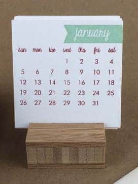
Story How To Design Your Own Calendar Like a Boss -or a Pro!
With the holiday full in, most of us are already making plans for next year, buying presents for our loved ones and thinking of our new year’s resolutions. But we’re also thinking of new ways to promote our businesses and ourselves. A great souvenir or present we can give to clients, potential customers or even family members – if you’d like to give them something personalized – is a professional calendar design. You can make your own calendar in many different ways and even make it a decorative piece for anyone to put on their offices or living rooms. A great calendar design should be functional and useful in order to past the test of time and you can even make it a great piece of art. But how exactly can you make your own calendar from scratch and make it look pro? How to Make A Calendar Like a Pro There are many ways for this to happen, for example you can start by downloading a PSD calendar template and adding personal touches to it, or if you’d like to make your own design with illustrations, projects or a theme, try using this site to create only the calendar shape and numbers and you can put the rest of the design yourself. Stand Out with A Different Calendar for Business or Personal Purposes If you want your DIY calendar to be functional and different from the rest of the conventional designs , you can try different printing ideas such as making a set of refrigerator magnets one for each month of the year, you can also use dry erase viny l to print your calendars so people can mark important dates or commitments in it and erase them later, keeping the design intact. Another more stylish presentation could be using our ultra-thick paper stock for a more lasting calendar printing and use a theme for each month of the year, such as a valentine theme for February, Passover and/or Holly week, spring break, Christmas to name a few. After your design and printing process is finished you can look for something to hold your templates together such as wooden base, clear plastic or even a picture holder. Using the back of your business card is a another great way to promote you and your business and making sure people won’t toss it away . Promotional items such as custom printed mugs or holiday themed puzzles can help you getting your name out there and also serve as a decorative piece. Try this holidays to give your designs a different use, at the same time people will have an item at home with your business ’ name printed and your contact information. Are you planning on using any of these ideas or do you have something else in mind for your calendars this year? Let us know, we’d love to see your designs!
 story
story How to effectively Organize Your PSD Files in 5 Simple Steps
Setting up your files for extreme custom prints takes time and attention to detail. After all, you want to get the job done right the first time, which at the end of the day will save you time and money. When someone asks what type of software is mostly used in graphic design, the first one that comes to mind is Photoshop. This is probably because we’ve learned to associate the two of them, but what many don’t know is that it takes many tools, layers, brushes, types and other resources to make every design unique and sometimes this can create a big mess when it’s time to find a file or make the modification the client asked for. You’ve spent a lot of time working on your project and getting the design details exactly as you pictured them, now it’s time to send them off for professional printing. Before you go ahead and do this, there are some very important factors to consider. Keeping the layers, brushes, paths and effects of your design organized can be a challenge! Why? Well, if you're in the design business or an amateur Photoshoper you've probably duplicated a layer at least once, ending up with something like "layer 1", "copy of layer 1" and "copy of copy of layer 1" in the file. And that's just the beginning of the nightmare! That is why we decided to help designers, photographers and anyone who uses or works with Photoshop on daily bases, to organize a PSD file on their computers and make everything a simpler task, thereby enhancing their graphic design work. How can I effectively organize my PSD files in my design portfolio? You can organize your PSD files by creating separate folders for different projects, labeling files with clear and descriptive names, creating subfolders for different design elements, and using a consistent file naming convention. The basics: create folders and arrange all files properly The first thing you need to know to organize your archives properly is how to make your folders coherent. Make one folder for each different project and keep all files named according to their use, each time you make a change delete past versions and save only the latest one and the previous to that, so clients can see the modifications. Don’t use names such as: final version, latest version, latest latest version; for your PSD file. If you must, change "final" to "revised + date". Organized Files Make Your Life Easier. Contact your printer. No two printing firms are alike so it makes the most sense to contact your printer first and ask as many pertinent questions as you can think of before sending over your job. Ask your printer how they would like the files set to avoid complications during the printing process. After all, you don’t want to waste time with do-overs, you want to get busy on your next project. At 4over4, we try to make this process easy and effective - you can contact us for any custom project like pole banners or printing project idea! Or check out our FAQs Name your layers Some people even name their cars – which has absolutely no purpose–why not name your layers, which will be so useful every time you need to change something on your design? Keep it simple and easy to relate to the actual content of each layer. Delete unnecessary layers you won’t need and keep them in a folder where you can hide or show common elements of your graphic design easily. Keep your types close Put Fonts In the File Folder. When you download a type don’t leave on the download folder, keep them all arranged in just one specific for these files. Also make sure they’re licensed to be shared. Use separate boxes for each different text, in case you’ll need to change their type or size later. Don’t make the text box longer than the actual content and make sure you’re not stretching types, it’ll look terrible whether you’re using them for web or print design. Image is all about Quality! Whether you are a professional designer or like to dabble in your spare time, your image is everything. To get it done right every time, make sure that your image is set to 300 dpi (dots per inch). You want to ensure that the quality image you are designing transfers to the page beautifully. At 4over4, we try to make this process easy and effective - you can contact us for any custom design templates for your file designs and printings. Export your files like a Pro First choose a decent name for your file and keep it in the folder for that project, so you won’t mistake it with undesirable objects on your desktop. Keep all files in a size range, when saving the archive try to negotiate its quality and colors making it small or medium, depending on its purpose. Remember that for the web you'll want smaller sized images and that for print design, you'll need high quality ones. This distinction is crucial for web design and graphic design portfolios. Check with your client Get the OK Before Saving/Deleting. Once your design is ready or when the client approves all the project, ask him if he’ll need anything else before erasing anything. If something has spent more than a few months sitting on your desktop: erase it (or store it in a portable hard drive), keep only the basics in case you want to include it in your portfolio, but the rest has got to go. Start practicing with these useful tips and see the difference when the time comes to finding your archives or a specific layer on your PSD file, a key strategy for creating the best graphic design portfolio. Which ones of these steps do you already use and which others are you going to? Let us know in our comment section below! Printing companies typically offer a range of professional digital printing services including digital printing, offset printing, large format printing, and specialty printing such as screen printing or flexography. They may also provide additional services like graphic design, binding, finishing, and mailing services. Conclusion When it comes to preparing files for extreme custom prints, investing time and effort into utilizing Photoshop can make all the difference in achieving a professional and high-quality result. By utilizing this software effectively, designers can ensure that their designs are optimized for print and meet the desired specifications. So, if you're looking to create stunning custom prints, consider mastering Photoshop to take your designs to the next level. At 4OVER4, we offer a complete guide for professional printing on how start a printing businessThis is probably because we’ve learned to associate the two of them, but what many don’t know is that it takes many tools, layers, brushes, types and other resources to make every design unique and sometimes this can create a big mess when it’s time to find a file or make the modification the client asked for. You’ve spent a lot of time working on your project and getting the design details exactly as you pictured them, now it’s time to send them off for professional printing. Before you go ahead and do this, there are some very important factors to consider. FAQs Q: What is a graphic design portfolio and why is it important for a graphic designer? A: A graphic design portfolio is a collection of a designer's best work that showcases their skills and expertise to potential clients or employers, often highlighted on a personal portfolio site or platforms like Behance. It is important because it demonstrates the designer's capabilities and creativity. Q: What are some tips for creating a visually appealing graphic design portfolio website? A: Some tips for creating a visually appealing graphic design portfolio website include using high-quality images of your work, choosing a clean and modern design layout, providing easy navigation for visitors, and including clear contact information. Q: How many examples of design work should I include in my graphic design portfolio? A: It is recommended to include a variety of 8-12 examples of your best design work in your portfolio. Choose projects that showcase your skills and range of abilities as a graphic designer, incorporating portfolio examples that demonstrate a variety of work can attract a wider audience. Q: What are some best practices for showcasing logo design projects in a graphic design portfolio? A: Some best practices for showcasing logo design projects in a graphic design portfolio include including a description of the project goals and client brief, displaying the logo in various applications, and showcasing the design process from concept to final product. Q: How can freelance graphic designers attract potential clients through their design portfolios? A: Freelance graphic designers can attract potential clients through their design portfolios by highlighting their unique design style, including case studies or testimonials from satisfied clients, and showcasing a range of diverse projects that demonstrate their skills and expertise. Q: What are some important design trends to keep in mind when creating a graphic design portfolio? A: Some important design trends to keep in mind when creating a graphic design portfolio include using minimalistic design elements, incorporating interactive and multimedia content, implementing responsive design for mobile optimization, and utilizing bold typography and colors.
 story
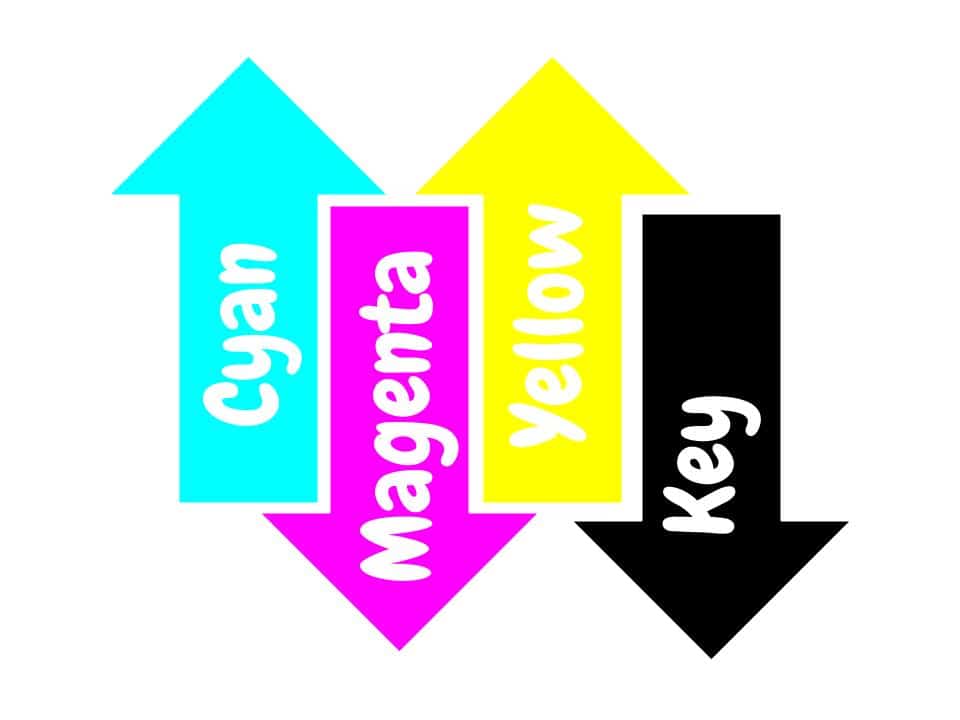
story How to get The Color Right With Professional Printing (Or Pantone Vs. CMYK)
Show of hands amongst non-designers: Who knows what PANTONE and CMYK are?... ...No idea? It’s ok, Let’s take it step by step. When it comes to custom printing , PMS Colors are created from their own formula or order by number.CMYK instead are printed with 4 presses, one for each of the base colors. Pantone colors are standardized, there will be no surprise once printed. CMYK colors can vary from your monitor to paper. However, it is not impossible to accomplish. In the world of printing, colors are more than just pigments; they are the language that speaks volumes to the eyes and emotions of the beholder. From the vibrant hues of a sunset to the subtle shades of a grayscale photograph, printing colors hold the power to evoke feelings, convey messages, and breathe life into the printed page. Next time graphic designers ask you about PMS Color do not feel offended. They’re talking about the Pantone Matching System, a set of over 1000 colors that cannot be simulated by combination of other ink. They are also known as solid or spot colors, because their mixed with such precision that you can see no traces of it. Special colors like metallics and fluorescents belong to this system and can be used to print custom postcards . Only a few of them can be accomplished by mixing the CMYK gamut. What are the primary colors used in printing? The primary colors used in printing are cyan, magenta, yellow, and black (CMYK). These colors are combined in various proportions to create a wide range of colors in printed materials. The Science Behind Printing Colors Printing colors is not merely a stroke of a brush or a click of a button; it's a complex interplay of science and art. At its core lies the understanding of color theory, where primary colors blend harmoniously to create an endless spectrum of shades and tones. From the subtractive color model used in traditional printing methods to the additive model employed in digital displays, each approach offers its unique insights into the manipulation and reproduction of colors with utmost accuracy. Which brings us to the next point... What is CMYK? Well, it’s another color system. The difference is that this one is based on a mix of four colors: Cyan, Magenta, Yellow and Key (black). All colors are created by mixing the four basics. The PMS color chart is more expensive to print than the CMYK one. Pantone colors are normally used for very specific designs like logos that cannot change or magazine titles. It is also useful when large spaces of the design need to be filled with solid color with no shade variation. When you opt for digital printing, CMYK colors may have small variations from one sheet to the other. But designs with CMYK can be as powerful as Pantone ones when mixed properly. Here are some tips to make sure your professional digital printing services and projects meet the highest quality standards of professional color printing: Talk to your designer about your printing needs. Getting the right color starts with the digital copy. Be clear about your printing objective. Ask your printing company about the best option for your product before making the order. Most of them offer printing samples. If it doesn’t turn out how you expected it to, you can make changes before printing large quantities. Image resolution is key. Especially if you’re printing in different sizes. Pantone or CMYK, quality printing will make the difference for your product. Only trust your projects to professionals. It’ll save you money and headaches in the long run. Make sure choose your designs from our design templates and also to leave us a comment below on what you think about our services. Pushing the Boundaries of Creativity While precision is essential in color reproduction, creativity thrives in the realm of experimentation and innovation. From bold, eye-catching designs to subtle, nuanced compositions, artists and designers push the boundaries of color to evoke mood, provoke thought, and spark imagination. With advancements in printing technology and a vast array of substrates and inks at their disposal, creators are empowered to bring their visions to life with unparalleled vibrancy and clarity, transforming blank canvases into vibrant works of art. In the tapestry of human experience, colors are the threads that weave together moments, memories, and emotions. From the dawn of civilization to the digital age, the art of matching colors for printing has evolved into a symphony of precision and perception, where science and creativity converge to paint the world in all its splendor. As we continue to explore the depths of color reproduction and the psychology of perception, let us celebrate the timeless beauty and boundless possibilities that printing colors bring to our lives. FAQs Q: What is the difference between RGB and CMYK color spaces? A: RGB is used for digital displays like computer monitors and TVs while CMYK is used for printing. RGB uses additive colors (red, green, blue) while CMYK uses subtractive colors (cyan, magenta, yellow, black). Q: How can I convert RGB to CMYK for printing? A: To ensure accurate colors when printing, you can use design software like Adobe Photoshop or Illustrator to convert RGB colors to CMYK before sending your files to the printer. Q: What is a spot color in printing? A: A spot color is a premixed ink used in printing to ensure a specific color is reproduced accurately. Spot colors are often used for branding or when precise color matching is required. Q: Why is color management important in printing? A: Color management ensures consistency in colors across different devices and printing processes. It helps maintain the accuracy of colors from the initial design phase to the final print output. Q: How does the color gamut differ between RGB and CMYK? A: RGB has a wider color gamut than CMYK, which means it can reproduce a broader range of colors. When converting from RGB to CMYK, some colors may appear different or less vibrant due to this limitation. Q: What should I consider for high-quality color printing? A: Factors such as using the right color profiles, choosing the appropriate color mode (CMYK for printing), and ensuring proper color management are essential for achieving high-quality color prints. Q: How can I ensure that the printed colors match what I see on my screen? A: To achieve accurate color reproduction, you should calibrate your monitor, use color-managed applications, and request color proofs from the printer before finalizing the print job.
 story
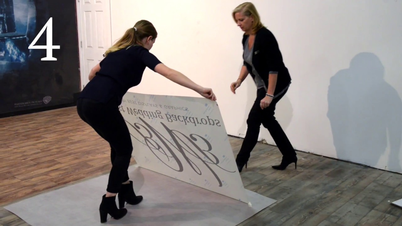
story How to Install A Dance Floor Decal by Best Wedding Backdrops
source With so many styles of floor decals out here, it should become clear why having the right one is so important for the particular message you want to convey. Think hard about what your dance floor decal template will communicate what your brand is about and help you seal the deal with your clients. Don’t be afraid to get an original floor decal just like the one we’ve shared here. After all, the right one might just be what sparks the interest of a new customer! Custom Floor Decal Templates to Impress Let your creative self shine by displaying all your amazing ideas on a blank floor graphics or decals template that you can customize with different designs and get a feel of what the final look will be.