Content Hub
Stories, Ideas and Advice — Page 6
 story
story 14 Free Memorial Day Party Printables and Ideas
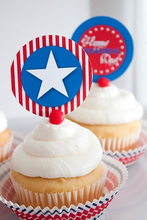
Memorial Day is a day to honor U.S. soldiers lost, while in military service. We commemorate and celebrate them on this special day with parades, family gatherings and fireworks. Marking the unofficial start of summer, Memorial Day is a popular weekend for trips to the beach, parties and cookouts. Plan a one-of-a-kind weekend celebration with these Memorial Day party ideas. From Free Printable Memorial Day bingo cards to pass the time, to high quality banners, we scoured the web looking for 14 fun and memorable printables to help your celebrations. Take a look: 1. Memorial Day Patriotic Bingo Cards Pass the time in patriotic style with these Memorial Day bingo cards. Don’t you love the flag layout in this gorgeous printable? How about printing a dozen of them for your Memorial Day party? Kids and adults are sure going to enjoy playing bingo with these cards. Perhaps, if you want to spruce up the festive spirit, you can offer candy or small chocolates instead of buttons to play the game. 2. Memorial Day Patriotic Flair Banners How about decorating your home for a Memorial Day BBQ with this eye-catching flair banner? Luckily, this versatile item includes all the letters of the alphabet- now you can come up with any phrase you want and brighten it up with a few stars! 3. Memorial Day Patriotic Fill-In Menu Are you planning on hosting a Memorial Day dinner party? This stylish fill-in menu–one blue striped and one red striped–can be used both as an invitation and as a menu. Just open the file with Acrobat Reader, click on the box, type your letters, print and… voila! 4. Memorial Day Patriotic Cake Stakes These handy, create-your-own cake stakes make perfect muffin or cupcake toppers. Additionally, you can use them on paper medallions for added flare and style! Your guests will love the look and taste of your cupcakes topped with these patriotic decorations. 5. Memorial Day Patriotic Party Cards These patriotic party cards make wonderful food labels on your buffet or place cards. It’s very simple- just open the file, click on the box, type in your letters and print! We are crazy about these party cards because not only can you use them to fill them in with the names of your dishes, but, alternatively, you can identify the guests' seats. 6. Memorial Day Patriotic Water Bottle Labels In order to further enhance your Memorial Day celebration décor, wow guests by going all the way and not missing any details. How about these awesome create-your-own water bottle labels which can be printed on full-sheet waterproof labels or white paper? 7. Memorial Day Patriotic Party Squares These useful create-your-own patriotic flair party squares can be placed at the center of your paper medallion.Besides, they can be used to decorate cakes or other table items in order to have the same theme all over your party area. 8. Memorial Day Patriotic Flair Paper These adaptable patriotic flair papers can help you come up with all kinds of fun décor! You can create eye-catching paper medallions by using the patriotic flair paper, the patriotic flair cake stakes and the patriotic flair party squares. What better way to decorate your home for the party than with these gorgeous holiday medallions? Your yard or room will be party-ready in no time! Give them a try! 9. Memorial Day Patriotic Party Circles How about these beautifully-designed Memorial Day patriotic party circles? Just as the party squares, these attention-grabbing party circles are perfect as cupcake toppers to add a touch of pizzazz. 10. Memorial Day Patriotic Pinwheel Children will just adore spinning these star-spangled pin spinners at your Memorial Day celebration. Also, they’re perfect for making potted plants or flower bouquets more festive for the holiday. Make sure to print lots of these to celebrate Memorial Day in style! 11. Memorial Day Patriotic Cake Decorations With Memorial Day just around the corner, how about baking a cake and decorating it with patriotic colors? To make it look outstanding and even more appealing, garnish the side with these patriotic medallions. You’re guests will love it! 12. Memorial Day Patriotic Party Invitations Party invitations can make or break a party. If you want to impress guests before the celebration, you can send these professional-grade invitations that won’t break the bank. The chic cover features a large red white and blue flag, balloons, stars and party confetti. 13. Memorial Day Patriotic Flag Banner Are you having friends and family over for a BBQ on Memorial Day? Use this adorable flag banner to decorate an outdoor patio with patriotic colors such as red, white and blue, making it more inviting for guests. It's so easy and fun! 14. Memorial Day Patriotic Coloring Pages Nothing can grab the interest of children like colors can. Download this fun Memorial Day patriotic coloring page and keep them busy at your celebration. Just gather the markers and get the little ones to begin- parents will be amazed and your party will be a big hit! We hope these free downloads come in handy and that you’re absolutely inspired for your patriotic Memorial Day celebration. Which idea did you find the most interesting and unique? We would love for you to share it with your Followers, Fans and Friends.
15 Cool Facts About Famous Logos You Didn't Know
Logos are relevant because they can fully represent your company and make it recognizable. For example, familiar logos like the Apple logo doesn't just represent the brand; users now see it as a symbol of privacy and exclusivity. Similarly, your business logo should stick in people's memory and make them think deeply about your product or service every time they see it. Interesting logo may represent brand facts. Designing the perfect logo is a challenge that can be simpler when you realize that some of the most famous logos have exciting facts. Moreover, these sometimes hidden logo facts and their hidden meaning can provide cool logo ideas so that you can design your remarkable business logo. Here are 15 interesting facts about logos you didn't know. 1. The Tostitos Logo Features Two Friends Dipping the Product in Salsa The "t's" on the word illustrate friends eating a chip and dipping it in salsa, which is the dot on the "i." Due to its subtlety, this illustration may go unnoticed, but you can't miss it. With this simple artistic maneuver, the Tostitos brand showed it's more than a snack. This simple snack can engender communion among friends. The lesson here is that cool company logos don't need to come from drastic ideas. Additionally, clever or funny company logos like this is good for business . Noted, Tostitos! 2. The logos of these 4 tech giants are well known and instantly recognized globally due to the sheer worth of these companies. But it's for a surprisingly different reason that these most famous logos gain the recognition they enjoy. All 4 interesting logos are simple in design, thus conveying unmissable messages. This message ranges from exclusivity (Apple) to inclusivity (Google and Microsoft) and customer satisfaction (Amazon). The most popular logos teach us that simplicity is best in logo design. 3. The Old Twitter Logo Only Cost $15 Today, a professional logo design could cost about $5,000, but Twitter bought its initial bird's image from iStockphoto for $15! The artist received about $6 from the sale. After Twitter's popularity, its logo redesign is worth approximately $100,000! The redesign is only a simplified version of the same bird! Talk about logo-flipping, eh? Fun facts logo don't always cost an arm and a leg. However, if you are starting a new business, you must look for deals that will deliver quality yet save you precious costs. 4. The Peacock’s Feathers on the NBC Mean Something Most people notice the peacock on the NBC logo, but did you know that each one of its feathers symbolizes a division of the network? These divisions are News, Sports, Entertainment, Stations, Networks, and Productions. They are each represented by one of the logo's 6 colors. Yes, some cool logo designs have symbols that reveal facts about brands. 5. The BBC's New Logo Costs $1.8 Million When the BBC decided it was time to get rid of their old 1997 logo for a modern look, they discovered that such an upgrade would cost $1.8 million! As a result, the BBC has one of the most expensive redesigns of this era. The new logo uses the type Gill Sans Script created by Eric Gill, one of the leading sculptors of the original BBC building in London back in 1932. Indeed, it takes a true master to make complex things simple. If you need to splurge on a logo design like the BBC, make sure it's worth it. 6. The Original Pepsi Cola Logo Was a Copycat of Coca-Cola's Design Pepsi once tried to sell out through mimicry and underhand tacticsFinally, in 1989, Pepsi did a similar logo design to its arch-rival. Such cutthroat competition is not unheard of among these two, even though it has been less pronounced recently. This kind of mimicry still exists regarding logo design and can give you apparent advantages. But be on the lookout for a possible boomerang! You're much safer being original. 7. Sony VAIO Has a Hidden Message in Its Logo The VAIO logo is a stylish representation of the VAIO word, but the VA letters represent the waves that create the analog signal. The IO is a binary symbol representing two possible outcomes, on and off or input and output. Isn't that cool? 8. There’s a Bear on Toblerone's Logo Great use of the negative space makes possible the inclusion of a bear in the middle of the mountain in the Toblerone logo. The chocolate is originally from Bern, Switzerland, also known as "The City of Bears." Hence the bear reference in its logo is a tribute to their origin. 9. 8 year-olds can already Identify and Match a Logo with its Brand In a study made in the Netherlands, 100% of 8 years old kids could put together some of the most recognizable logos with their representative brand. Is your logo recognizable to 8-year-olds? You just may have another unicorn! 10. Greek Mythology Is Behind Starbucks' Logo The famous logo represents a siren with two tails; the idea was to capture a part of Seattle's seaport roots, where the company was born in 1971. In the past few years, this logo has seen significant changes, but they've never left behind the basic concept of the mermaid with two tails, only changing a few elements to keep it fresh. So you can say Starbucks was trying to allure customers with their beverages, as sirens do in Greek mythology with their voices. 11. Nike Swoosh was Supposed to Represent Wings The company, Blue Ribbon Sports, snowballed and made the owners consider changing the name to something more attractive but more straightforward. Founders of the brand, track, and field coach Bill Bowerman and medium-distance runner Phil Knight opted for Nike, the name of the Greek goddess of victory. In 1971, graphic design student Carolyn Davidson based the concept for Nike's logo (the swoosh) on the goddess's wings, representing speed. Nowadays, it's become so recognizable that they decided to use the symbol alone. 12. Early Logos Represented Makers of the Product The first logo ever created was in the 1800s. Logos used to be nothing but a mark, symbol, or branding that identified the product's sellers or makers. However, logos have noticed a revolution as brands today tell exciting stories and share their values via a logo. 13. The Bell System Logo Is Still Used and Owned By Many Companies The resulting companies from the breakup of Bell IP Holdings obtained the rights to use the redesigned Bell logo. Saul Bass did this redesign. Nowadays, many of the remaining companies still use the Bell logo in one way or another. For example, Verizon uses it on its trucks, payphones, and Cincinnati Bell on bills and vehicles. At the same time, Bellsouth used the logo and name until its merger with AT&T in 2006. Now you know why these brands have a familiar ring to them. 14. There's a Number 31 on the Baskin Robbins Logo Figure “31” represents the original 31 ice cream flavors that the company sold when it started. 15. Nickelodeon's most recognizable Logos From 1984 - 2009 Were Created After the Slime This network used different variations of its orange splash logo from 1984 - 2009, representing the slime used on the TV show "You can't do that on TV." The original CTV series changed networks in 1982 and became an instant hit in Canada for this channel. Bonus Fact: The Yellow Arrow in Amazon's Logo is NOT Just a Smile The orange smile at this logo indicates that Amazon sells everything from A to Z. They're amazing like that. Although somewhat speculative, Amazon may be referring to its namesake and the world’s largest river, the Amazon, with a curved orange line from A - Z. Such rich symbolisms only help further solidify the company’s values. Talk about cool logos! Albeit simple, much thought goes into designing some of the world’s most popular logos.
 story
story 15 CS6 and CC Photoshop Secrets You'll Love
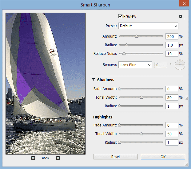
There is no doubt that Photoshop has become a part of modern culture. You don’t have to be a designer to know about the ‘almighty’ software that seems to have no limitation over image editing. Being such an influential tool, no one seemed to be shocked when the word ‘photoshop’ simply became one of those spontaneous new verbs. Photoshop 1.0 was first launched in 1990, since then, new versions have been released to keep up with photo retouching developments. The latest ones are Photoshop CS6 (2012), Photoshop CC (2013), and the fresh from the oven Photoshop CC 2014. We decided to talk to some professionals and look for reputable tutorials to bring you some of the best-hidden gems of the latest versions. So let’s take a look at what they have to offer and see what the graphic design pros love about them. Check Out these 15 Photoshop Secrets to dominate the CS6 and CC Suites 1. CS6’s and CC's Nondestructive Crop Tool The seemingly small change makes a big difference when it comes to preserving information. Not only are the handles easier to use, but it is also easier to go back and recover the dismissed area. Additionally, you can preset the tool to keep the photo dimensions instead of holding the shift key. 2. Smart Sharpen Differences You’ll find a few differences between CS6’s and CC’s smart sharpen filter. Both improved from previous versions. Photoshop CC includes the Shadows/Highlights options, allowing you to have more control over the sharpen tool. Plus, you can reduce noise from the smart sharpen filter now. 3. Generate Images by Changing Layer Names You can generate images by changing layer names on both Photoshop CS6 and CC. However, CC allows more characters, which means more images. All you have to do is enable image assets (from the file tab) and specify the kind of file you want. For example, if the layer is called ‘image.png’, photoshop will create a png file from that layer called ‘image.’ You can create several images by separating such names by commas and type the desired size first (e.g. 400x400 image.png, 503x403 image.png) which you can later use for thumbnails or size samples. 4. Adding Scripted Patterns Photoshop CS6 allows you to create scripted patterns from default ones to your very own creations. Just click edit >fill and you’ll find 5 scripted pattern options to choose from. Plus, the CC version included a ‘Tree’ pattern, where, you guessed it, you can add a very realistic tree to any scenery. 5. Creating Picture Frames This option is also part of CC’s scripted patterns (edit > fill > scripted patterns > picture frame). It has everything from standard lines to more elaborated and decorative elements. You can add as a theme to your pictures or maybe create a personal style of publications. 6. Turn the Background Into a Layer This is not a new feature, but Photoshop CC added yet another way to do it with a single click. Basically, all you have to do is click the lock and instantly turn your background into a layer. It doesn’t get any easier than that. For more details about image generation, scripted patterns, picture frames and background unlock, watch Terry White’s great tutorial here. 7. CS6’s Merge to HDR Pro Merging several images is a good way to tone an image and get nicer results. The feature also includes an ‘edge smoothness’ option, which is very useful after the merging process. 8. CS6’s Photo Toning Presets This feature is definitely a great gift for photographers. If you choose ‘gradient map’ as an adjustment layer, you’ll find the ‘photographic toning’ option as part of the gradient editing preferences. You can play with a vast range of color effects to fit the style of any project. 9. CS6 Brought Contact Sheet Back This feature was not a part of Photoshop CS5, but it came back with CS6. What it does is create a contact sheet from a folder of images. It lets you choose from different settings and ultimately optimizes the process for you. You can click here to watch Scott Kelby’s tutorial on some of these useful features. 10. CC’s Camera Raw Filter This new filter has everything you need to bring any .jpg to the standard you want. It allows you to treat is as raw file from the same layer, with no need for external tools. 11. CC’s Shake Reduction Feature We can now fix blurred images with the ‘shake reduction’ feature by clicking filter > sharpen > shake reduction. As soon as you open the smart filter, there will be a automatic assessment of the image. However, you will be able to apply more controlled changes to smaller loops. This is a great feature to reconstruct those blurred images we would normally just delete. If you want to see the new filter in action, click here to watch lynda.com’s tutorial. 12. CC’s Perspective Warp This feature was added in the January 2014 Photoshop CC update. It simplifies the process of warping an object without losing its realistic looks. We can tell the software what the current perspective, so we can warp it easily. It comes with a couple of automatic features, but you can do it manually for more accurate results. You’ll find it by clicking edit > perspective warp. 13. Removing Elements From a Stack of Photos With Photoshop CC You would usually take a number of photographs from the same angle to make sure you’ve got the perfect shot of a monument or landscape. And if that happens to be a place with lots of traffic, there’s a chance you’ll end up with a series of pictures with unknown walking people. If you select a group of layers with this description, auto align them and then convert them to a smart object, you can easily remove the moving objects and leave the static ones. Meaning, the buildings and landscape will stay and the people will go. All you have to do is click layer > smart objects > stack mode > maximum. 14. Adding More Than one Focus Point With Photoshop CS6 and CC As you now, Photoshop CS6 came with a new blur gallery. One of the favorite tools involves an action that you can’t actually accomplish without digital manipulation. Which is adding two different focus points to the same photograph. You will be able to manipulate them from their respective blur features dialogue panels and come up with interesting results. 15. CS6’s and CC's Adaptive Wide Angle This filter is a more efficient way to deal with fisheye lens corrections. You will be able to draw intuitive lines in order to straighten certain elements, such as buildings, ground lines, or horizons. The reason it works so well is that it identifies the lens used to take the photo and can perform the necessary adjustments. Are you ready to start designing like a pro? Remember that all tools are only great if they fit your purpose and let your creativity flow. Feel free to share some of your favorite graphic design resources as a comment below and tell us what you love about them. Also, our online catalog is filled with custom print products for you to bring your designs to life. Click here to check it out !
 image
image 15 Design and Creativity Quotes to Live By
It’s no secret that the creative process can sometimes hit a brick wall. With that in mind, here are 15 creativity quotes to get your left side...
 story
story 15 Easter Inspired Free Fonts to Download Today
Easter is just around the corner and we know what that means: Eggs hunting and lots of chocolate! We’re sure you’ll be able to find great spots to hide your Easter eggs and hopefully won't regret all that chocolate. But we do have Lovely and Free Easter Fonts to download and get you into the holiday spirit at home or around the office. Leaving religious traditions aside, a bunny and chocolate eggs are the two most recognizable symbols of Easter. Egg hunting parties are organized everywhere and beautifully wrapped chocolate is the norm for seasonal gifts. So if you're planning to host an Easter hunt personalize it with some seasonal fonts and make something simple stand out like this: Easter is a great season for printables. From games to postcards, the print world gets busy with colorful orders. And fonts are a simple way to create perfect designs for the season. Whether you’re creating fun activities to get your kids busy or preparing multiple gifts for your friends, free downloadable fonts are an Easter must have. Before we get down to business (you can scroll down to get your fix of adorable easter fonts) we thought it'd be a good time to let you in on some font basics (for all of those non-designers out there): Fonts are files that you can download and install to your computer. If you open an editable file to a different computer where the font has not been installed, it will automatically change it to an available font. (Which is important to know if you're ordering professional prints) Fonts can be TrueType or OpenType. The first one was developed by Apple Computers in 1980, but it is used for both Microsoft and Mac OS. The second one is a Microsoft registered trademark. Sites like 1001fonts.com, Dafont.com, and Fontpalace.com offer free font download services to all users. We have gathered 15 useful links on this post. Typography is an art of its own. Not only for fonts designs, but also for type only designs. Creative designers have come up with wonderful pieces without a single image before. Whatever the type of project you have in mind, we decided to do the browsing for you and bring you 15 Easter inspired free fonts: 1. KR Easter Rabbit Font by Kats Fun Facts This adorable font captures the playful spirit of Easter with its cute bunny-inspired characters. Perfect for creating charming Easter-themed designs that will bring a smile to anyone's face. 2. Easter Egg by Typographer Mediengestaltung Embrace the festive vibe of Easter with this vibrant and colorful font featuring cheerful Easter egg-shaped letters. Ideal for creating eye-catching headlines and titles that capture the essence of the holiday. 3. Kingthings Eggypeg by Kingthings Add a touch of whimsy to your Easter designs with this charming font featuring quirky egg-shaped letters and playful embellishments. Perfect for creating unique Easter cards, posters, and more. 4. KR Mr. Bunny Font by Kats Fun Fonts Bring a dash of bunny-inspired charm to your Easter creations with this fun and playful font featuring adorable rabbit-themed characters. Great for adding personality to your designs. 5. Bunny Rabbits by GemFonts Let your creativity hop to new heights with this cute and cuddly font featuring charming bunny rabbit characters. Ideal for Easter-themed projects, children's books, and more. 6. RMEgg by Renny Murray Get cracking with this delightful font featuring whimsical egg-shaped letters and playful accents. Perfect for adding a touch of Easter magic to your designs. 7. Easter Fun by Tom Font Celebrate the joy of Easter with this playful font featuring colorful Easter eggs and festive decorations. Great for creating cheerful Easter cards, banners, and more. 8. Summers Easter Eggs Capture the essence of springtime with this charming font featuring delicate Easter egg motifs and elegant lettering. Perfect for adding a touch of sophistication to your Easter designs. 9. LMS My Favorite Rabbit Hop into Easter festivities with this adorable font featuring cute bunny rabbit characters and playful doodles. Ideal for creating charming Easter cards, posters, and more. 10. KG Hippity Hop Add a spring to your step with this cheerful font featuring playful Easter bunny characters and whimsical lettering. Perfect for creating fun and festive Easter-themed designs. 11. Funny Bunny Get ready to bunny hop with this quirky font featuring whimsical bunny rabbit characters and playful embellishments. Ideal for adding a touch of humor to your Easter creations. 12. Bizzy Bunny Keep busy as a bunny with this delightful font featuring charming rabbit characters and playful designs. Great for adding a playful touch to your Easter projects. 13. HappyEaster by Des Spread Easter cheer with this cheerful font featuring colorful Easter eggs and festive decorations. Perfect for creating vibrant and joyful Easter-themed designs. Some ideas for using this font could include creating Easter greeting cards, invitations to Easter egg hunts or brunches, decorations for Easter parties or events, social media posts, or even personalized gifts like mugs or t-shirts. 14. EggsWhite Becker Keep it classy with this elegant font featuring delicate Easter egg motifs and sophisticated lettering. Ideal for adding a touch of elegance to your Easter creations. 15. ADFB Easter Egg by Perry Mason Crack open the creativity with this whimsical font featuring adorable Easter egg characters and playful designs. Perfect for adding a touch of Easter magic to your designs. Now that you have the tools, use your creativity to design gifts, games, or seasonal decorations to celebrate the holidays. Download free fonts to spice up simple formats and give your friends something that they won't be able to find at their local store. Like a chocolate box with an Easter inspired personalized label or postcard . Visit 4OVER4.COM’s vast catalog of customizable formats to get inspired. Remember that custom items make for the most special gifts and entertainment, and the most affordable too. Share your projects with us by leaving a link as a comment below. We are always happy to see your creations!
 story
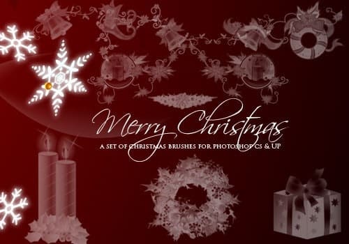
story 15 Essential Holiday Brushes for Photoshop for FREE
Need your graphics to pop with Holiday cheer? If you’re looking for festive free PSD holiday brushes to give your designs sparkle, you’re in luck. We’ve selected some of our favorites. We hope they inspire your creativity and infuse you with holiday spirit! Whether you are working on a client’s end-of-year sale campaign or designing seasonal promotional t shirts , holiday Photoshop brushes can transform average designs into winter wonderland extravaganzas! And if you're not desiging professionally, Holiday PSD brushes are perfect for adding an attractive border to a Christmas party invitation, a Secret Santa gift or even enhancing your site's or social media avatar. From snowflakes to snowmen, wreaths, Christmas trees, Menorahs and sleighs, our selection of free holiday brushes are essential tools for any graphic artist. Choose a holiday Photoshop brush set that best expresses the essence of the message you are conveying. Also did we mention Free and ready to download? Check them out below: 1. Merry Christmas 2. Vintage Christmas 3. Snowflakes 4. Christmas text 5. All that Glitters 6. Nightmare before Christmas 7. Gift Boxes 8. Christmas Handmade Brushes 9. Christmas Text Brushes 10. Celestial 11. Christmas Vector Brushes 12. Holiday Christmas and Hanukkah Brushes 13. Christmas Cheer Brushes 14. Pine Brushes 15. Star Clip Art Brushes Every designer needs an arsenal of holiday brushes for their portfolio. Keep these at hand during the winter season to embellish your Hanukkah, Christmas and New Year’s marketing materials. Your clients will be sure to love them. Let us know which are your favorites below! We love the stars; they embody hope for better things in the New Year.
 story
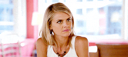
story 15 Gifs That Perfectly Sum Up Being a Designer
53.3 percent of Americans feel unhappy with their job, according to a recent report. People who can make a living off their passion are truly privileged. In the world of graphic design, those who truly stand out are those who love what they do and work with passion, whether trained or amateur. However, not all that glitters is not gold, graphic design has its cons too. Working as a graphic designer is not for the faint of heart. In fact, it can be one of the most stressful, arduous and mentally draining jobs out there. Those designers who are trying to build a successful career not only have to stay creative and resourceful, but also have to know how to interact with clients and effectively meet their requirements. Apart from your career satisfaction and rewards, every designer has many days of frustration. You are not alone in this. There are some things that drive you insane and make you cringe, but at the end of the day it’s all part of that doing what you love, here are 15 gifs that perfectly sum up life as a designer. When a friend asks you for help with free design work ¨Can you make me a logo?¨ via GIPHY When your client says ¨ We need this yesterday.¨ via GIPHY When you’re told you’re finally getting paid after several months of working on a freelance project. via GIPHY When you are waiting for inspiration that never arrives. via GIPHY When your client wants your design to look like someone else’s, but without copying. via GIPHY When your client says ¨ the project looks great, but we need to make a few adjustments. Only to proceed to list everything you’ve done so far. ¨ via GIPHY When they say “Great but make the logo bigger”. via GIPHY When your client asks… “Can you try some other fonts? And then they pick Comic Sans or Papyrus” via GIPHY When someone offers you to work on a demanding project ¨ for exposure¨ because they do not have a budget. via GIPHY Yeah, that’s not a thing. When your client asks you to fill white space. via GIPHY It’s there for a reason! When all of a sudden your computer crashes… mid-render. via GIPHY When you are working in your pajamas and you have to go on a videoconference with your client. via GIPHY When your client sends you past files in Word format. via GIPHY When your client says, ¨ Can’t you just download the images from Google? ¨ via GIPHY When your client communicates clearly, gives you some creative freedom and pays on time. via GIPHY Like all things in life the graphic design lifestyle can be both, overwhelming and highly rewarding. It all depends on which side of the coin you look at. What gif best expresses your most common frustrations or joys? The struggle is real y’all.
 story
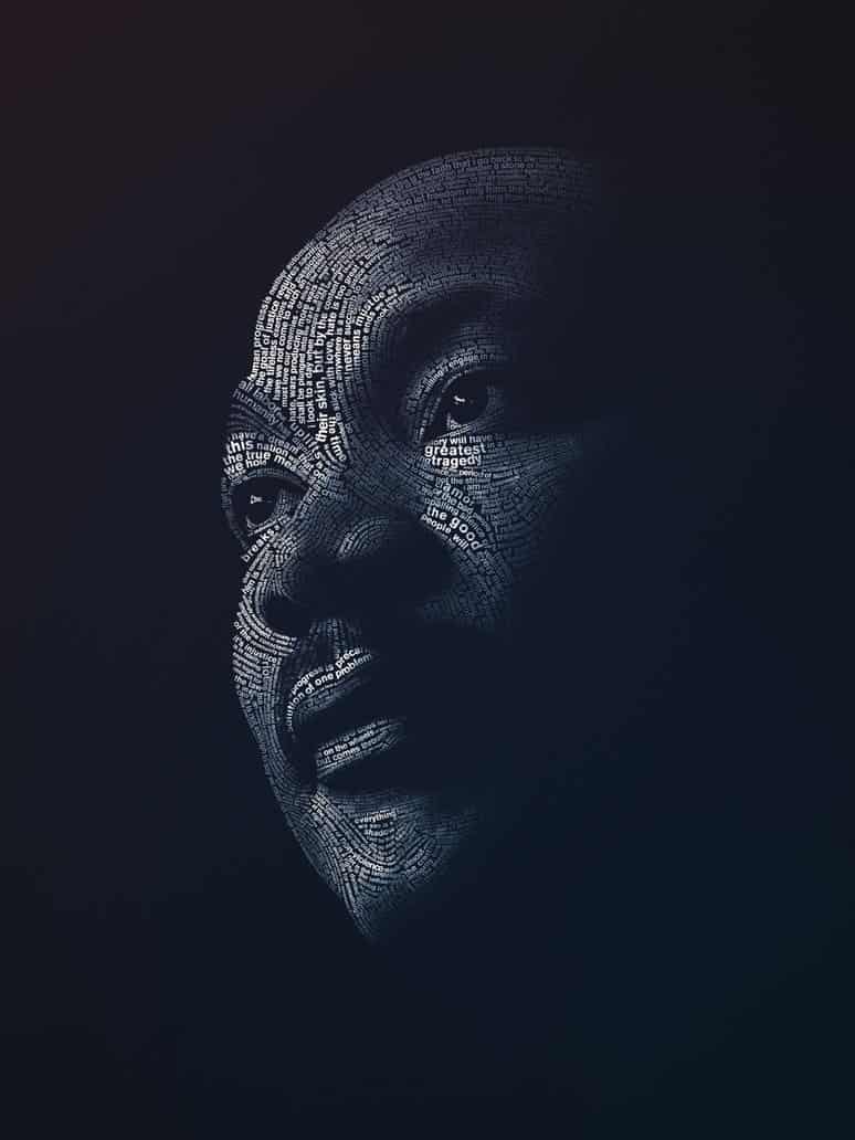
story 15 Martin Luther King Portrait Designs to Honor His Life
Martin Luther King’s life came to a tragic and early end when he was assassinated in 1968 at the age of only 39. The Nobel Prize winner for peace - the youngest person ever to have been awarded such accolade at the time- remains as one of the most important figures in American history; his work to ensure equal rights for the African-American community, resonates with us now as much as it did when he lived. “ Faith is taking the first step even when you don’t see the whole staircase ” One of the most famous and empowering quotes from Dr. Martin Luther King, guides us as we commemorate the 86th birthday of this unparalleled and truly committed civil rights leader . On this Martin Luther King’s day -a well-deserved tribute to one of our most iconic orators and activists- we have collected some of the most outstanding artwork we could find to honor the man and the dream. We hope you find this beautiful collection of portrait designs as inspiring as we did: #1 Martin Luther King Jr. design . By Lindsey Weigley. Illustration originally created for Relevant Magazine. Found on dribbble.com along with other great editorial by this author. #2 One of the greatest . Project by Jeroen van Eerden. "A personal design project produced in Illustrator (CS5) & Photoshop (CS5)." that includes some of the most influential personalities of the last century, from Warhol to Ghandi. Worth the look, check out the full Behance.net gallery for more inspired designs and quotes. #3 Dr. King . By Josh Balleza. A minimalist illustration that captures the essence of Dr. King's most emblematic look. Check out this artist and other works at dribbble.com #4 Happy Martin Luther King Day . By Maztrone. Accompanied by the wonderful caption "Being reminded of his role in the advancement of civil rights is the best way to realize that the fight for peace and human dignity is not over." graphic designer and visual artist Maztrone, brings home the reason why MLK Day is important in American culture. #5 Martin Luther King Sketch . By OG Abel. Fantastic lifelike sketch. The attention to detail and depth in the eyes is what originally drew us to this image. Take a look at the other outstanding illustrations and hand lettering examples in OG Abel's dribbble.com portfolio. #6 Martin Luther King Mixed Media Art . By Dwayne Walker. The artist describes it as "A mix media artwork of Luther King using graphite, water color and oil paint. There are civil rights quotes embedded into the American flag. ( watercolor ) while the flag is morphing into his face ( oil paint )". Go take a look at Dwayne's portfolio for close ups, all on Behance.net #7 Martin Luther King Special Section . By April Walczak. 2013 Cover for the Martin Luther King Jr. Annual Special Section of the Milwaukee Journal Sentinel, a beautifully youthful and heartfelt approach to the image we have of Dr. King today. Perfect for the cover, which you can see at the creative's Behance.net portfolio. #8 He Had a Dream . By Maxim Zudilkin. Portraits series by Moscow based designer and illustrator. His work includes portraits of actors, politicians and even sports players. Take a look. #9 The Voice of Change . By Richie Stutler. According to the artist "The piece was originally created as part of an assignment for a graphic illustration class" with the purpose of mixing "animals with history in a creative way." The artwork, later purchased by purchased by the ad agency ANIMAL in Pittsburgh, PA. uses butterflies to symbolize how Dr. King's words had "the ability to create change". Other pieces by this prolific designer explore illustration further. Visit his portfolio to see the full creative process behind this poster. #10 Luther King Portrait . By Pedro Molina. Digital painting project from a Nicaragua based artist, whose caricatures of historic figures will mesmerize you. Visit his portfolio to look at the lovely Malala Yousafzai portrait that follows the same style as Dr. King's here. #11 A Great Man Once Said … By Lavoi . One of our favorites in this collection, talk about bringing words to life! This design takes light, shadow and typography design to another level. Posted on deviantart.com #12 MLK . Project by TheCharles . ¨We must learn to live together as brothers or perish together as fools. ¨ This digital artist started a challenge: one Martin Luther King Design a day, until MLK Day. In his words "Brave, innovative souls need to be honored." - indeed! #13 I Have a Dream . By PhotoLife512. Remarkable work with great use of color. Digital art well worth a visit, other portraits include Einstein and even Phillip Seymor Hoffman. #14 The America That Should Be . By LifeisArt91. The artist says that "this piece was made using the magnificent words of the ¨ I Have a Dream¨ speech." With a call for unity and equality, the creative takes Dr. King's message to heart. #15 ¨The Dream¨ Martin Luther King . By Jonas Fleuraime. This project is also made out of the words on the "I have a Dream" speech, every single word is represented, the artist took great care in the use of color to highlight certain words and add depth to this 2D typography design. Visit the portfolio entry for a close up. Dr. King was one of the most influential leaders of the 20th century. We wanted to honor the memory of one of America's greatest civil rights leaders and visionaries by sharing a collection of fan art- a great way to celebrate Martin Luther King’s day! Did you find inspiration for your next design project? Feel free to share your thoughts about this collection and if you have your own, please contact us and we will feature your design!
 image
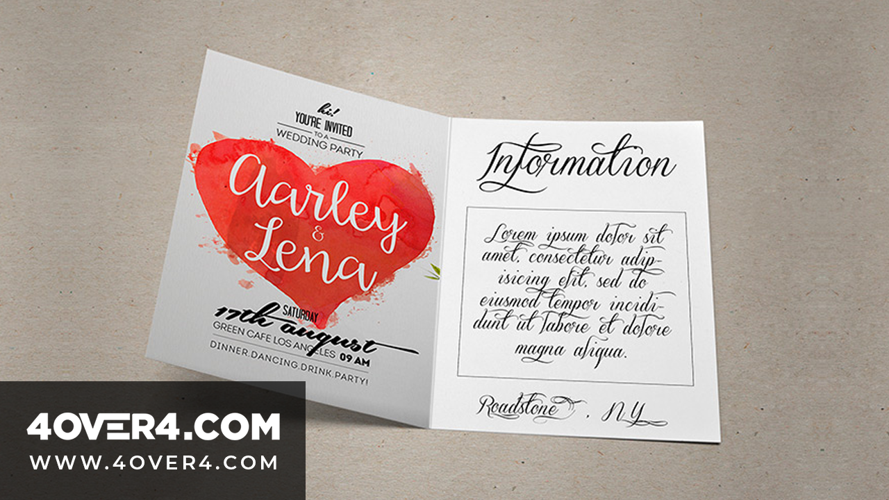
image 15 Refreshingly Geeky Wedding Invitations for Inspiration
Have you been looking for the perfect way to celebrate your and your loved ones' special day but need wedding ideas? Planning a wedding is ha...
 story
story 15 Retro Fonts for the Hipster in You
Hipster is defined as “a person who follows the latest trends and fashions, especially those regarded as being outside the cultural mainstream”. This cool style combines simple and minimalist designs and patterns with with a rustic, modern, vintage and retro vibe. While it’s gotten a bit of a bad rep, the hipster style is actually quite attractive for different demographics, if you want to try it out for some hand lettering style work, or any other project this the right place to start! Finding awesome free and low cost retro/hipster fonts can be quite hectic and time-consuming, so we did the legwork for you and found you 15 retro fonts to let out the hipster in you! Coolvetica It´s a scratch built, sans serif font. It recreates the letters from the 1970s with funky curls. Display fonts like Coolvetica are used ideally in funky headings and titles. Lobster This new open type font gives us the opportunity to have multiple versions of each letter so they can connect with the next and previous letters. We love it! Brownwood Brownwood is an excellent retro font suited to bring that country and cowboy look into any design. Chunk Chunk is an ultra-bold slab serif typeface that reminds us of old American Western woodcuts, old newspaper headlines and broadsides. This fat block lettering is the perfect match to your *hipster* western-themed designs. Franchise It’s a display typeface made to communicate your message quickly and thoroughly. Its characters are uniform and stylish. We like that it's perfect for print and web ads alike. As you can see above it works great for text-block designs. Geared Geared is inspired in Condensed Slab Serif and comes in 4 weights: thin, regular, bold and extra bold. It has an extensive character set, a versatile addition to your next project. The slightly grunge feel is a lovely bonus. Streetwear Streetwear is a script typeface ideal for logos, posters, packaging, t-shirts and branding. With its bold and retro style, it brings us back stylish 1960s and 1970s fashion. (We'd love to see it on one of our custom mugs !) Hand Shop Typography C30 The hand shop fonts have a hand-made or hand-typography feel that brings flashbacks of shop signboards from the past, where the shop owners strived in finding unique, yet exciting ways to promote their products and services. It may feel more vintage than hipster, but bear in mind that this style takes a leaf from the old with a twist of the new. Also: banners and ornaments! Blanch Blanch is a display face, designed for a family-run company. This is a traditional font with a contemporary feel. It's simple, but very attractive. It's a pay what you want personal font and super affordable for commercial or multi-user projects. American Captain This is a narrow and bold, yet blunt, heavy and tall but deep font, centered in the 1940s and represents powerful men. You know, Captain America inspired ;) Mister Sinatra This typeface is based on vintage styles and it´s named after one the greatest singer of all times “Frank Sinatra.” They had us at do be do be do. Haymaker A display typeface inspired by the lettering, workmanship and baseball jerseys from the 1930s and 40s. There's something versatile in this font that works well on a print ad, a specific section of a web design and that would rock on a custom made tote bag . Aldine This font was created from proofs of a 19th Century American Wood Type alphabet. Aldine Expanded was designed and embellished by Javier Viramontes at the University of Austin, Texas. It's evocative and fun. Super retro m54 This is an extended retro style font that mimics that vintage feel. It’s perfect for T-shirts and apparel designs. Add some black frame ray-bans and you're golden. Code Pro This is a font inspired by the original Sans Serif fonts like Avant Garde or Futura, but with a modern look. It is clean, elegant and straight-to-the-point. You can use the Code Pro font for most of your graphic design assignments. Choosing the right font and staying on top of the latest trends can really make a difference. Are you ready to use these awesome hipster fronts in your projects? Which retro font did you like best? We’d love to hear your thoughts. Don’t forget to leave a comment below!
 story
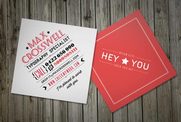
story 15 Square Business Cards For Inspiration
90 percent of business cards recipients will toss a card in less than a week, according to this infographic shared by The Design inspiration. This means, only 10 percent of business card designs in circulation make an impact on the receivers. Talk about pressure! Undoubtedly, attention-grabbing business cards are a powerful weapon in your marketing arsenal regardless of what industry you belong to, but the question remains: How can your business cards stand out in a sea of competition? Sometimes the smallest change can be the most significant , mix it up trying 2”X2” square business cards and make an impression that lasts. Here are 15 square business cards for inspiration and a handy link to order your own . #1. Perfect White Zach Woolford created a remarkable design combining whispy colors and bold lines. A clever visual effect makes these business cards interesting and memorable . Combined with the shape these simple but attractive calling cards are not to be discarded. #2. Photographer’s Tool to Self-Promotion Claudia Sofía Llaguno’s The contrast of vivid color with black and white photography plays a key role in the aesthetic of this design, promoting professional photography. The card s beautiful and easy to remember. #3. Square Cards With Rounded Corners Minimalist design with an edge. Or lack thereof, the rounded corner is a beautiful addition that costs very little and adds an air of sophistication. The best part? Round corners increase the life of your square calling card. Project by DK Design Studio . #4. Chic Square-Cut Cards Jason Kinouchi’s self-promotional business cards offer a classy and contemporary alternative to the norm . Their thick cardstock and elegant shimmering touch look professional and glamorous. You can get the look with a metallic foil card or with an ultra thick card . #5. Highly-Visual Layout As Raanan Rosenfeld says ¨ square cards are just so damn cute. ¨ He is right, a square business card design looks appealing . These cards catch people’s focus since they have a striking highly visual style. Every icon is geared at creating a connection with the audience. #6. Colorful Inspiration Nicolo Grosso's square cards leave a lasting visual impression . The striking monochromatic gradient is both modern and vibrant - a stimulating combination. #7. Two Sides Are Better Than One Patrizia Parca wows with a whimsical design that you can't help but notice. An effective way to grab your audience’s attention is to go with a light color on the front and dark on the back . Double sided business cards offer many benefits compared single-sided ones. #8. Take Note! If you are the kind of person who thinks outside of the box, then you should create a unique, yet personal project like this one below . This nice-looking mini square design definitely beats the competition. This mini agenda stands out from conventional rectangle cards. A stunning design allows you to have the ¨wow¨ factor that can distinguish you from the rest. #9. Delicate, Yet Distinctive Style Kristin Carlson's goal was to create an identity that matched her personality and portfolio. These business cards are printed on thick linen paper. The square shape was selected to mimic the shape of a Polaroid. Since marketing materials lend legitimacy to your business, it is crucial to reflect your essence, choose a simple typography, clean design and appropriate colors . #10. Mini Social Photo Card César Santiago Molina crafted a minimalist and unique design. Since we are immersed in the digital world of social networks, it's easy to understand these mini cards at first glance. Promote your online presence or Instagram photo album with offline advertising strategies like these business cards. This square business card inspiration sparks conversation and stays in people's minds and like many other designs on Behance portfolios available for purchase! #11. Embossed Printing on Both Sides Hendrick Rolandez commands the viewer’s attention with an elegant and clean design that relies on a coveted finish, you can get the same with debossing or embossing. Pro tip: the th ick card stock has the advantage of a longer lifespan in the hands of your clients . His design stands out not only for being a square mini card, but because he used it as a rhombus. #12. Bakery Icons on Top Right Corner Betsey DiSanza proves that less is more . This lovely set of cards effectively promotes the brand of an up and coming cake company without much ado and with unassuming simplicity. The delightful tones, color bars reminiscent of a tiered cake and the delightful script font come together nicely in the square format, much more so than in a rectangular one. #13. Pink and Bows Louisa Xanthopoulou designed square business cards with a fluorescent girly pink to attract the right target audience for a bag and accessory business. Rich tactile textures and simplicity do not just cut printing costs , but also create a positive, lasting impression. #14. Diamond Shape Tania Macarenco designed these delicate business cards with a flexible format to promote brand visibility and recognition . White, black and red go along very well and leave a mark on the viewer’s minds. The different categories of typefaces show off the skills of a typography specialist. If you want to maximize the value of your square cards, add a tactile feel. #15. Clean, Simple and Structured Design Hybrid Expression business cards give a friendly yet professional look . The illustration and individual color palette are fundamental elements of these outstanding printed materials. Uncoated stock was used to emphasize the raw appeal of the card. When designing your own, remember that clients appreciate the quality of materials and authenticity of ideas. If square business card printing seems like a great option for your marketing needs, order 2X2 business cards at only $16. ( click here to check out the specs ). We offer you a wide variety of paper options to choose from including coated, uncoated, linens, metallic pearlescent and the prestige collection stock. Our large collection of paper types can meet your functional as well as aesthetic needs. With optional high gloss UV coating, the superior quality paper will show off your overall design in the best light. We finish off with the square business card inspiration to help you come up with innovative ideas for your next printing project. A square business card design can catch the attention of your target audience resulting in more engagement and improved business reputation.
 story
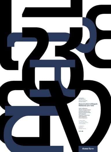
story 15 Type Only Graphic Design Projects to Inspire
When we think of the perfect graphic design balance, we consider the proportions of images and text to convey a message. In some cases, one image can say it all; in others, the mix of words gets the job done. Type-only graphic design can be used both in advertising and in personal projects of all sizes Type graphic design is very much in vogue and can be very inspiring. Creating an effective composition using only type is both logos, art, and science. You need to place the text in a way that the reader cannot avoid seeing the words, reading the text, or gathering the composition of an image out of letters. Advertising and promotional material use typography to set the mood for the piece. The same message can make you feel different depending on whether it is written with a soft calligraphy style or a tough graffiti font. Typography designs rely on creative arrays of fonts, colors, and words to make phenomenal pieces that are definitely worth showing. they can also incorporate nicely with spaces to make logos for brands. We decided to go online searching for inspiration and select and bring you our 15 favorite Type Only design projects. Take a look, enjoy, and get creative! 1. Make Art Your Life by WRDBNR This design by WRDBNR encapsulates the essence of artistic expression through bold typography, urging viewers to embrace creativity as a way of life. 2. 3D Typography by Lex Wilson Lex Wilson's 3D typography adds depth and dimension to letterforms, creating visually striking compositions that leap off the page. 3. Live On The Edge by Crymz With edgy typography and dynamic layout, Crymz's design embodies the spirit of adventure and risk-taking. 4. Alphabet All Letters by Kuldar Leement Kuldar Leement explores the entire alphabet in this captivating design, showcasing the beauty and versatility of letterforms. 5. Do It by Alder Sketch Simple yet impactful, Alder Sketch's "Do It" design motivates viewers with minimalist typography and bold messaging. 6. Don't Die With Dreams Inside by Mister Doodle Mister Doodle's design delivers a powerful message with playful typography and whimsical illustrations, urging viewers to pursue their dreams fearlessly. 7. J Hughes FBDO by The Friends The Friends' typographic composition for "J Hughes FBDO" demonstrates the artistry of letterforms and the importance of typography in branding and identity design. 8. Soul Poster by Gotz Gramlich Gotz Gramlich's "Soul Poster" features elegant typography and subtle textures, evoking a sense of introspection and depth. 9. CMU Poster by Cadson Demak Cadson Demak's typography-driven poster design for CMU showcases the versatility of type in creating dynamic and engaging visual narratives. 10. I Will Always Love Your Stupid Faces by DysfuncValentines With irreverent humor and bold typography, DysfuncValentines' design celebrates the quirks and idiosyncrasies of love. 11. Typography In Magazines Laura Meseguer Laura Meseguer's typography design for magazines demonstrates the importance of font selection and layout in editorial design. 12. Typography Design by WRDBNR WRDBNR's typography design exemplifies the brand's signature style, combining bold letterforms with minimalist aesthetics. 13. Custom Typography T Shirt by REJECTCONVENTION REJECTCONVENTION's custom typography t-shirt design showcases the versatility of typography in apparel branding and design. 14. Typography T Shirt Design on Prepresstoolkit.com This typography t-shirt design on Prepresstoolkit.com features playful lettering and vibrant colors, making a bold statement. 15. Audrey Hepburn Typography Poster by Ayse Toyran Ayse Toyran's typography poster featuring Audrey Hepburn demonstrates the elegance and sophistication of type-driven designs. There you go! Graphic design with type has great possibilities for expression. Get inspired and create your own digital designs with our free online designer tool . Then, choose to have them printed as posters, customized t-shirts , mugs, postcards, or stickers. If you search for fonts, you could spend all day long looking at all available options on the internet, or you could look at some of our curly font and decorative font selections to get started. Type away! FAQs Q: What are typographic design projects? A: Typographic design projects refer to design projects that focus on using typography as the main visual element to convey a message or communicate a concept. Q: How can I showcase my typography projects effectively? A: To showcase your typography project ideas effectively, you can create a portfolio on platforms like Pinterest, Behance, or your personal website. Make sure to highlight the creativity and attention to detail in your projects. Q: What impact can typography have on a brand's identity? A: Typography plays a crucial role in defining a brand's identity by conveying its personality, values, and brand message through the use of specific typefaces, styles, and layouts. Q: How can I stay updated on current design trends in typographic projects? A: You can stay updated on current design trends in typographic projects by following design blogs, attending design conferences, exploring design resources, and engaging with other designers in the industry. Q: Why is typographic hierarchy important in design projects? A: Typographic hierarchy is essential in design projects as it helps create visual structure, establish content hierarchy, guide the viewer's eye, and enhance readability and clarity in communication. Q: How can I promote my typographic design projects to clients? A: You can promote your typographic design projects to clients by creating a visually appealing portfolio, highlighting your design skills and expertise, and actively engaging with potential clients through social media, networking, and design showcases. Q: What are some popular software tools used for typographic design projects? A: Popular software tools like Adobe Illustrator, InDesign, and Photoshop are commonly used for typographic design projects as they offer a wide range of typography features, design elements, and layout options for designers to work