Content Hub
Stories, Ideas and Advice — Page 59
 image
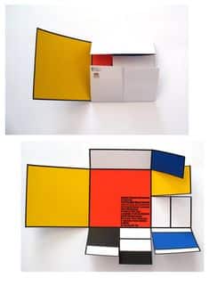
image The Folded Postcards - Unique Element Of Surprise
Source Have you ever thought of breaking the norm and just surprising your clients? Well, this is your chance to do so with folded postcar...
 story
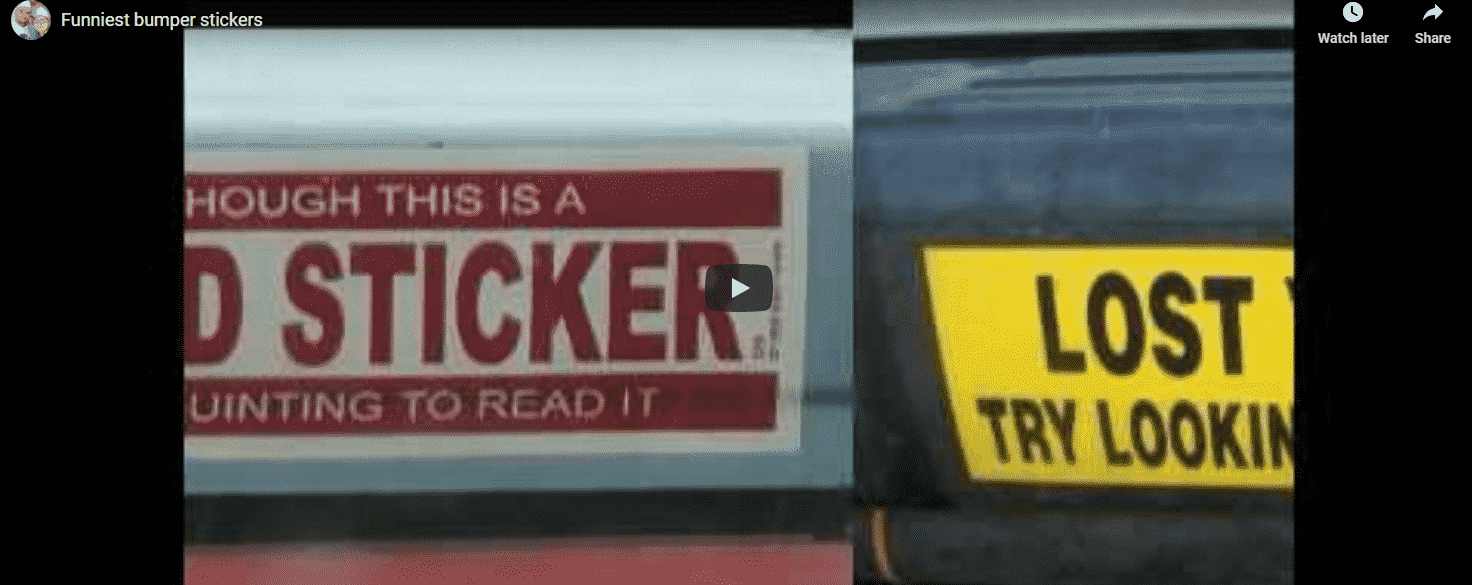
story The Funniest Bumper Stickers You’ve Ever Seen
When it comes to personalizing your vehicle and adding a touch of humor to your daily commute, there's nothing quite like a funny bumper sticker. Bumper stickers have been a popular form of self-expression and entertainment for drivers around the world. From witty one-liners to clever memes, the possibilities are endless when it comes to adorning your car bumper with a humorous twist. Bumper stickers are a car's best accessory, and they even get better when you can make people squint or laugh while on a boring journey. Check out this video of some of the funniest bumper stickers ever people have encountered on the road. If you get ideas, go ahead and order some for your own or your business. What Makes a Bumper Sticker Funny? Humor plays a significant role in the appeal of bumper stickers . Whether it's a sarcastic remark or a punny saying, funny bumper stickers never fail to bring a smile to people's faces. Clever sayings and popular trends often find their way onto bumper stickers, creating a unique form of visual comedy that resonates with drivers. Humor and Sarcasm in Bumper Stickers One of the key elements that make bumper stickers funny is the use of humor and sarcasm. Drivers enjoy displaying stickers that poke fun at various aspects of life, from politics to everyday situations on the road. Clever Sayings and Memes Bumper stickers often feature clever sayings and popular memes that capture the essence of a particular moment or feeling. These witty phrases add a dash of humor to an otherwise mundane drive, sparking conversations and chuckles among fellow travelers. Popular Trends and Parodies From pop culture references to political parodies, funny bumper stickers draw inspiration from popular trends and iconic figures. Whether it's a hilarious spoof of a well-known brand or a witty take on current events, these stickers never fail to amuse and entertain. Choosing the Perfect Funny Bumper Sticker for Your Car With a plethora of options available, selecting the ideal funny bumper sticker for your car can be an enjoyable yet challenging task. Consider your sense of humor, preferred style, and the message you want to convey before making your choice. Finding Your Sense of Humor Before investing in a funny bumper sticker, take some time to reflect on your sense of humor. Whether you appreciate dry wit, silly puns, or irreverent jokes, there's a bumper sticker out there that perfectly aligns with your comedic preferences. Magnet vs. Decal: Which is Better? When it comes to affixing a bumper sticker to your car, you have the option of choosing between magnets and decals. Magnets offer the flexibility of easy removal and repositioning, while decals provide a more permanent solution. Consider your preferences and needs before deciding which option is best for you. Reflecting Your Personality Through Bumper Stickers Your choice of funny bumper sticker can serve as a reflection of your personality and interests. Whether you opt for a whimsical design, a humorous quote, or a quirky illustration, let your bumper sticker showcase a glimpse of who you are to the world. Placement and Maintenance of Bumper Stickers Once you've selected the perfect funny bumper sticker for your car, it's essential to ensure proper placement and maintenance to keep it looking its best. Follow these tips to make the most of your bumper sticker: Properly Applying Bumper Stickers Clean the surface of your car bumper before applying the sticker to ensure a smooth attachment. Use a squeegee or credit card to remove any air bubbles for a seamless finish. Ensuring Longevity on Your Car Bumper Protect your bumper sticker from the elements by using a clear protective cover or sealant. This will help extend the lifespan of the sticker and maintain its vibrant colors over time. Removing Bumper Stickers Without Damage If you decide to remove a bumper sticker, use a heat gun or hairdryer to loosen the adhesive before peeling it off gently. Avoid using sharp objects that could damage your car's paint. Creative Uses of Funny Bumper Stickers Beyond Cars While bumper stickers are commonly associated with cars, their versatility extends far beyond vehicle decorations. Explore creative ways to incorporate funny bumper stickers into other aspects of your life: Laptop Stickers: Adding Personality to Your Device Personalize your laptop with funky bumper stickers that reflect your interests and sense of humor. Transform your device into a conversation starter with eye-catching designs and humorous slogans. Bumper Stickers as Fridge Magnets Give your kitchen appliances a humorous makeover by using bumper stickers as fridge magnets. Showcase your favorite funny sayings and memes in a fun and practical way that adds character to your home. Decorating Tailgates and Vinyl Decals Enhance the look of your tailgate or vinyl decals with funny bumper stickers that command attention. Whether you're tailgating at a sports event or simply cruising around town, these stickers are sure to turn heads and elicit smiles. Expressing Unique Statements with Funny Bumper Stickers Go beyond the traditional use of bumper stickers and express your individuality with unique statements and designs that resonate with you. Whether you're a fan of puns, quotes, or quirky illustrations, there's a funny bumper sticker out there waiting to make a statement on your behalf. Capturing Quotes and Memes on Bumper Stickers Turn your car bumper into a canvas for capturing your favorite quotes and memes. Share your love for witty one-liners, inspirational phrases, or viral memes by proudly displaying them for the world to see. Adding a Touch of Sarcastic Humor Inject a dose of sarcastic humor into your daily commute with bumper stickers that deliver clever jabs and witty comebacks. Make fellow drivers chuckle with snarky remarks and irreverent comments that lighten the mood on the road. Customizing Bumper Stickers for Special Occasions Mark special occasions and milestones with custom-made funny car bumper stickers that celebrate your achievements or memorable events. Whether it's a birthday, anniversary, or graduation, create a personalized sticker that captures the essence of the moment. Bumper Stickers Template With so many styles of bumper stickers out there, it should become clear why having the right one is so important for the particular message you want to convey. Think hard about what your bumper stickers will communicate, what your brand is about, and how it will help you seal the deal with your clients. Don’t be afraid to get an original custom-made bumper sticker just like the one we’ve shared here. After all, the right one might just be what sparks the interest of a new customer! We offer great discounts and hundreds of free templates that will make your brand stand out. Let your creative self shine by displaying all your amazing ideas on blank bumper sticker templates you can customize with different designs and get a feel of what the final look will be. FAQs Q: What are some popular terms related to car bumper stickers? A: Some popular terms related to car bumper stickers include car sticker, funny meme, retro, funny sayings, and aesthetic car. Q: Where can I purchase unique car bumper stickers? A: You can find a variety of unique car bumper stickers on platforms like 4over4.com or etsy, which offer a wide range of designs. Q: Are there any funny meme bumper stickers available for purchase? A: Yes, you can find a selection of funny meme bumper stickers with humorous slogans and designs to add a playful touch to your vehicle. Q: Can you recommend any humorous bumper sticker phrases? A: Some humorous bumper sticker phrases include "Bestie, wanna let me merge," "Live laugh lobotomy," and "Hot girls hit curbs." Q: What are some trendy themes for car bumper stickers? A: Trendy themes for car bumper stickers may include goblin, feral, cute car, and anti-establishment slogans, catering to various tastes and preferences. Q: Do car stickers featuring animals or creatures like frogs and black cats exist? A: Yes, you can find car stickers featuring animals such as frogs, black cats, geese, and possums, adding a quirky and fun element to your vehicle. Q: Is there a collection of retro-inspired bumper stickers available? A: Yes, you can explore a range of retro-inspired bumper stickers featuring nostalgic designs and references to past eras for a unique aesthetic appeal.
 story
story The Global Impact of Business Card Printing on International Business
International expansion helps businesses gain global recognition and become more profitable. However, it may be necessary to adapt your marketing to the new country. Many international brands use business cards as marketing accessories for creating brand awareness, promoting offers, and forming strategic partnerships. Therefore, this article discusses business card design tips for multinational brands. The Universal Language: How Business Cards Bridge Cultural Divides Cultural differences can affect people's perceptions. So, branding or marketing that works in your home country may be ineffective in another. However, business cards help to convey professional courtesy and respect worldwide. These cards contain more than contact information; they can help you gain ground in foreign markets. Also, they project your brand's values and attract your ideal audience. Adapting Designs for Global Audiences: Tips for International Appeal Consider these business card design tips for international audiences: Stick to the Basics Prominently place your name, address, phone number, and email address on the card. You can list local and international phone numbers as necessary. Your business card printing and material type can contribute to your overall presentation. So consider using a high-quality printing service like 4OVER4. Choose the Right Font and Language Sans-serif fonts like Helvetica and Arial are easier to read on prints. Also, ensure that the font size is legible. Some cultures may be less receptive to business cards in foreign languages. You can use a multilingual business card in such cases. Choose Neutral Colors Colors can have local political associations. Also, colors convey varying emotions that are often subject to culture. For example, Westerners associate white with purity, but the same color represents death in the East. So, you can go with neutral colors. Some brands may redesign their logo to match the changes. Use Foreign Social Media Countries have smaller but popular social media sites that are different from the major social networks. Also, your company may have other social media handles for different languages. In each case, ensure to include the appropriate social media profiles. Printing Considerations for Different Regions: Size, Language, and Etiquette The internationally accepted business card size is 85 х 55 mm (or 3.3 x 2.1 inches). The cards will fit most wallets or cardholders. However, you can opt for a less popular size. Often, unconventional choices can help you stand out in the market. For example, some businesses choose big-sized cards around 89 x 64 mm (or 3.5 x 2.5 inches). Another benefit is the extra space for more information. Some brands translate the entire business card so locals can understand them. Another alternative is using multinational cards with two languages on them. However, you must ensure that this arrangement doesn't communicate disrespect or lack of professionalism to the different cultures. Either way, it's vital to employ an excellent translator to convey your thoughts and ideas. Networking Customs Worldwide: Navigating Cultural Norms with Cards The standards of what is acceptable in different cultures vary. For example, Asian countries like Japan and China emphasize respect and courtesy when exchanging cards. However, in U.S. culture, you can share business cards in a meeting as if dealing poker cards to players. Hence, it is critical to learn the appropriate etiquette for the country of your operation. Exporting Your Brand: Utilizing Business Cards in International Trade Shows Business cards are effective at international trade shows for networking and generating leads. Yet, you must handle this exchange correctly. Read our earlier articles about business card soliciting and card etiquette and exchange . Also, you should attend these events with sufficient business card quantities. Success Stories: How Business Cards Opened Doors in Global Markets One multinational construction company in China was able to secure a long-term, high-profile client in the country despite their non-native status. The business could contain marketing costs and increase profitability through targeted business card campaigns. You too can have similar success with a well-designed business card. In Conclusion We understand the importance of the various design elements when creating business cards for international audiences. That’s why you can order a fully custom design with your own business card size, shape, paper type, and finish. You can win in a foreign market by ordering tailor-made business cards on 4OVER4 today.
 story
story The History Behind Arial: Helvetica Ripoff or Inspired Design?
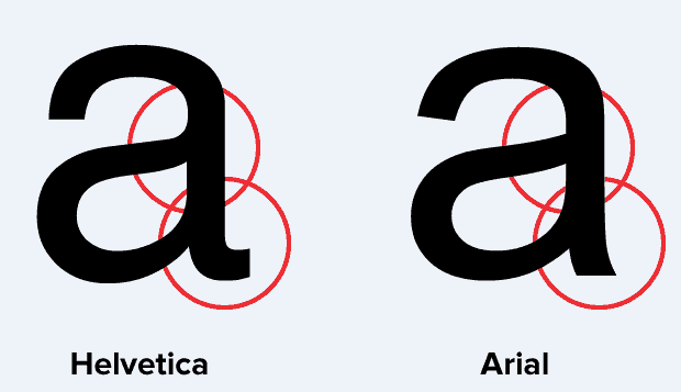
History, in general, is full of facts that are subject to personal interpretation and not always solely based on concrete data. The same can be said for the history of Arial font; ripoff or inspired design? We decided to take a look at this debate and share what we’ve learned. If you are a designer or typographer chances are you have developed your own opinions. For the professional the answer may seem obvious, Arial is a knockoff of Helvetica. But at a closer glance, the nuances of Arial typeface do set it apart Evolution of Typeface Design: A Historical Perspective The evolution of typeface design spans centuries, reflecting shifts in technology, cultural trends, and aesthetic preferences. The debate between Arial and Helvetica encapsulates this evolution, raising questions about originality, influence, and the nature of design itself. let's look at Helvetica and arial font history. Historical Precedents: Tracing the Roots of Typeface Design Before Helvetica and Arial entered the scene, typefaces like Akzidenz Grotesk laid the groundwork for modern sans-serif fonts. Developed in the late 19th century, Akzidenz Grotesk represented a departure from the ornate, serifed styles of traditional typography. Its clean lines and minimalistic aesthetic set a precedent for the emergence of Helvetica decades later. Helvetica: A Modern Classic Emerges Max Miedinger's creation of Helvetica in 1957 marked a milestone in typeface design. Inspired by Akzidenz Grotesk, Helvetica refined and modernized the sans-serif genre, offering unparalleled legibility and versatility. Its widespread adoption by corporations and designers alike cemented its status as a timeless classic, embodying the principles of Swiss design and functionalism. Arial: Innovation or Imitation? When was Arial font created? The introduction of Arial in 1982 sparked controversy within the typographic community. While its creators, Robin Nicholas and Patricia Saunders, positioned Arial as an original design, its striking resemblance to Helvetica raised eyebrows. Critics argued that Arial's similarities amounted to little more than a copycat strategy, challenging notions of authenticity and artistic integrity. While Arial has been criticized for being a scourge of typography, it remains a popular choice for advertising and promotions. It copies Helvetica's proportions and stroke width, making it a cohesive font family for various design projects. Arial's versatility has led to its widespread use in magazines, etc. Another well-known sans-serif font, Gill Sans, is often compared to Arial in terms of design. However, Arial's terminal strokes and overall look set it apart from other fonts in the same category. Its clean and modern design makes it a font of choice for many designers, alongside Calibri, another popular font from the Arial family. Despite its success, Arial continues to be overshadowed by fonts like Times New Roman and Monotype Grotesque. However, its close resemblance to Helvetica and wide availability have solidified its place as a key font in modern design. The Rise of Digital Typography: Implications for Design Ethics The proliferation of digital typography in the late 20th century transformed the landscape of graphic design. As technology made typefaces more accessible and customizable, questions of ownership and attribution became increasingly complex. The case of Arial versus Helvetica exemplifies these tensions, prompting discussions about intellectual property rights and ethical standards in design practice. Helvetica font vs Arial History of Helvetica Helvetica typeface was designed in 1957 by Max Miedinger. Miedinger based his design on that of Akzidenz Grotesk 1896 which was classified as Grotesque san serif face. With its friendly, cheerful appearance and clean lines, it was universally embraced for a time by both the corporate and design worlds as a nearly perfect typeface to be used for anything and everything. “When in doubt, use Helvetica” was a common rule. Mark Simonson Arial history In 1982, Robin Nicholas and Patricia Saunders created the Arial typeface for Monotype and labeled it Neo Grotesque. Essentially, it’s an “original” design that just happens to share exactly the same proportions and weight as another typeface, as stated by Mark Simonson. In other words, it’s a copy with very few differences to be able to call it a unique typeface. Arial is everywhere! Some say that Arial was created by Microsoft for their Windows 3.1 so that they could avoid paying licensing fees and save money. Whatever you choose to believe, you most likely use Arial everyday without thinking about it much. The popularity of Windows 3.1 has made Arial a household name. Microsoft understood that the average person could not tell the difference between Helvitica and Arial and -more importantly- they would not care. It seems they were right in their thinking. Today, a version of Arial font can be seen everywhere, from academic papers to advertising design, and has knocked Helvetica out of the top spot for the last 30 years. The Arial vs Helvetica debate is still strong amongst those in the typography industry and font historians. (Also among designers and Type lovers!) The best way to get a sense of the similarities and differences is to place the typefaces side by side. Only individual tastes can say which font reigns supreme. The Differences: Under the microscope! Let’s take a look at the lower case “a” side by side. What do we see? In Helvetica, the lowercase “a” has a tail unlike the Arial version which does not. If we put capital C’s side by side, we can see that in Helvetica the ends of the strokes of letters like “C” are perfectly horizontal. In the case of Arial, the ends of the “C” are cut at a slight angle. The differences are subtle, but they are apparent. Some may say that if Arial is a rip-off of Helvetica, then Helvetica is a rip-off of Akzidenz Grotesk, or we could simply say that they are both rip-offs of earlier Grotesque faces. As in most areas of life, there are very few originals, just adaptations. After all, imitation is the best form of flattery, right? Ripoff or inspired design? The choice is really yours, we just had fun presenting it to you! Remember you can use any of these fonts on the 4over4.com online design tool which offers custom trims and countless print templates for all your design needs. Tell us which typeface you would choose for your print designs. Our curious minds want to know! FAQs Q: What is the difference between a serif and a sans serif font? A: A serif font has decorative lines or strokes at the ends of characters, while a sans serif font does not have these decorative strokes. Q: Why did Microsoft choose Arial as its default font for Windows? A: Microsoft chose Arial because it is a contemporary sans serif font that is easy to read on screens and in print. Q: Is Arial part of the Helvetica font family? A: Arial is not part of the Helvetica font family, but it does share some similarities with Helvetica in terms of proportions and stroke width. Q: What is the significance of the Arial font family in typography? A: Arial is a widely used font family known for its clean and modern appearance, making it a popular choice for a variety of design projects. Q: Can you explain the relationship between Arial and Helvetica? A: Arial was designed as a typeface that copies some of Helvetica's proportions and stroke characteristics, but it is not an exact replica of Helvetica. Q: Why is Arial sometimes referred to as the "scourge of typography"? A: Some designers criticize Arial for its lack of originality and for being overused, leading to its nickname as the "scourge of typography." Q: Who created Arial font? Arial font was created by Monotype Typography in 1982 as an alternative to Helvetica. It is a sans-serif typeface known for its softer and fuller treatment of curves compared to Helvetica. Arial is often used as the core font in Microsoft Windows operating systems, serving as the default font in many applications. Q: What are some other fonts in the Arial font family? A: Other fonts in the Arial font family include Arial Black, Arial MT, and fonts that are variations or extensions of the original Arial typeface.
 story
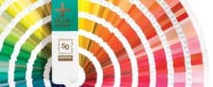
story The History Behind Pantone Colors
Ever wonder where Coca-Cola found their dramatic red color? Do you love Barbie’s hot pink logo? If you answered yes, then you should thank Pantone, the magicians of color. Since 1962, Pantone has been responsible for creating and educating the world on the hottest color trends in print, fashion and the web. Their history is as colorful as their products. The Birth of Pantone as We Know It In the early days of the 1950s, Pantone was a commercial printing company based in New Jersey. In 1956 a young college graduate by the name of Lawrence Herbert began working there and quickly changed the face of the company. Herbert, the current CEO, Chairman and President of Pantone, used his knowledge of chemistry to create a system to simplify the production of the company’s stock pigments and colored inks. In 1962 Herbert purchased the company from his employers and has been making history ever since. Color Inspired by World Events Did you know that neon pink sweater you loved in the 80s was inspired by the economic upturn and the MTV pop culture? That vibrant era transformed into the more Zen colored 90s and the grunge generation. It seems that Pantone colors have expressed our culture's feelings and concerns over these last 50 decades. The 21st century has no doubt been affected by technology and globalization. Citizens embracing their individuality have inspired Pantone colors Cerulean, Satellite, Chili Pepper, and Aspen Green just to name a few. Colors, it seems, are a definition of our times. How Pantone Became The Definitive Language Of Color Pantone has become the definitive language of color, thanks to its innovative Pantone Matching System (PMS). This color system is widely used in industries such as graphic design and printing to ensure accurate color matching. The Pantone Color Institute is renowned for its color expertise, and each year they select a Pantone Color of the Year to set trends in color palettes. In 2023, Pantone introduced the Pantone GOE system to further enhance color measurement, and in 2024, they launched Pantone 18-1750 Viva Magenta as a new hue to their line of base colors. Pantone's color guides and color chips are essential tools for designers and printers to choose a color accurately for printing or digital projects. The Pantone Color Matching System ensures consistency in color variance across different materials and platforms. With over 180 million possible spot colors to choose from, Pantone has become the ultimate color reference for professionals in the industry. In fact, Pantone is considered the color authority by many, and even has a Pantone Hotel in Brussels dedicated to showcasing their iconic color palettes. Whether using CMYK or PMS color guides , designers and printers alike rely on Pantone and X-Rite technology for their color expertise and accuracy in color matching. Patriotic Influence An interesting fact that most people may not know is that many states within the United States and some foreign nations have chosen specific PMS colors from Pantone when producing their flags. In one instance back in 2003, the Scottish Parliament debated a petition to recognize the blue color in their flag as Pantone 300. Similarly, Texas has set legislation regarding the PMS colors of their state flag. How Pantone Stays Relevant Pantone didn’t become a success by standing still. Advances in technology have only improved the Pantone system and selection of products. Originally known for their color formula guide swatch books, Pantone has evolved into so much more. Introduced in 2007, the Goe system consists of over 2,000 new colors with a new numbering system. Unlike the basic swatch books, the Goe system includes GoeSticks with adhesive backs. Pantone also provides its users with interactive software, tools and social media so that users can share color swatches and information learned through personal experience. The 2014 Color As their new selection of colors are unveiled every season, with it comes the coveted award for the “color of the year”. Imagine a group of color standard specialists from around the world assembling together in some secret European location. After two long days of presentations and discussions, a color of the year is crowned. The color is usually a representation of our times. Emerald was chosen as the color for 2013. For 2014, color enthusiasts can get excited about Radiant Orchid that encourages expanded creativity and originality, which is increasingly valued in today’s society. The history of Pantone colors has been evolving for over 5 decades. Their colors inspire designers and artists everywhere to create and popularize brands through logos on company t shirts and promotional marketing tools. How do you use your Pantone colors? We want to know! (Sound off below) Sources Cited and Images courtesy of www.Pantone.com FAQs Q: What is the significance of Pantone Colors? A: Pantone Colors are standardized color matching systems used by a variety of industries to ensure consistent color reproduction. Q: How does the Pantone matching system work? A: The Pantone matching system assigns a unique number to each color, making it easy to communicate and replicate specific colors across different materials and industries. Q: What is the Pantone Color of the Year? A: The Pantone Color of the Year is a color selected by color experts that reflects the current zeitgeist and influences trends across design, fashion, and beyond. Q: Can you explain the history behind Pantone Colors? A: Pantone Colors were developed by Lawrence Herbert in the 1960s to standardize color reproduction in the printing industry. Over the years, Pantone has become a global authority on color. Q: What is the Pantone GOE system? A: The Pantone GOE system is a color matching system that offers an expanded range of colors for more precise color reproduction in print materials. Q: Who is Laurie Pressman in relation to Pantone Colors? A: Laurie Pressman is the Vice President of the Pantone Color Institute and is a renowned color expert who helps select the Pantone Color of the Year. Q: How are Pantone Colors used in the industry? A: Pantone Colors are used in various industries such as graphic design, fashion, interior design, and product manufacturing to ensure color consistency and quality in their products.
 story
story The History of Business Cards: How it all Started
Business cards have been around for so many years and are still in such high demand that there are 10 billion business cards printed in the US annually! (according to Statistic Brain) It's safe to say that they are one of the most common business networking tools today. Why still now in the era of LinkedIn and business apps? Because they're still useful and give you and your business credibility. Today, print technology allows modern designs to be translated into a business card format that go beyond a colored or black and white card. But the format has quite a history in the evolution of society. In fact, during the 15th century, China started using “visiting cards” as a self-promoting item. Leaving them to business owners, who would then decide if the card owner was someone worth meeting with. The humble business card , a staple in networking and professional communication, has a rich and storied history that spans centuries. From its origins in ancient China to its modern-day evolution, the business card has undergone significant transformations, reflecting changes in society, technology, and etiquette. A brief history of the business card: When was the business card invented? The concept of business cards traces back to ancient China, where "visiting cards" or calling cards were used as a means of self-promotion. During the 15th century, Chinese individuals would leave these cards with business owners, signaling their desire for a meeting or transaction. These early cards laid the foundation for the exchange of contact information and formal introductions, setting the stage for the modern business card. The Trade Card Era in Europe In the 1600s, King Louis XIV introduced the "trade card" to Europe, ushering in a new era of business communication. These cards, used for both personal and professional purposes, often included maps on the back to help customers locate service providers. As trade and commerce flourished, the trade card became an essential tool for promoting businesses and facilitating transactions. The Era of Gentlemen Manners During the 17th and 18th centuries, gentlemen used intricate etiquette rules to convey messages through their cards. Sending acquaintance cards to ladies was a common practice, with the way the card was folded serving as a subtle form of communication. Each fold held a specific meaning, allowing gentlemen to express sentiments such as congratulations or condolences with precision and elegance. The Advent of Color and Design As the 18th and 19th centuries unfolded, advancements in printing technology revolutionized the business card industry. The invention of lithography enabled color printing and the creation of more durable cards. With the introduction of letterpress printing, materials such as plastic and wood were used to produce cards with vibrant designs and intricate details. These colorful and visually appealing cards became a symbol of status and professionalism, reflecting the changing social norms of the time. Modern-Day Innovations and Customization Today, after the printing press, technology continues to shape the landscape of business card design, offering limitless possibilities for customization and creativity. From incorporating digital information and QR codes to experimenting with innovative printing techniques like Spot UV and Wonderfoil, businesses strive to create memorable and impactful cards that stand out in a competitive market. As social media and online networking platforms gain prominence, business cards serve as a tangible extension of one's digital presence, reinforcing personal branding and facilitating meaningful connections. Looking Ahead: Embracing Tradition with a Modern Twist Despite the rise of digital communication tools, the enduring appeal of the business card persists. Whether it's a classic design with a touch of elegance or a bold statement piece that pushes the boundaries of creativity, the business card remains a timeless symbol of professionalism and networking. As individuals and businesses continue to seek innovative ways to make a lasting impression, the evolution of the business card will undoubtedly continue, blending tradition with modernity in the quest for effective communication and meaningful connections. Embracing Tradition with a Modern Twist In today's fast-paced digital world, the business card serves as a tangible reminder of personal connections made in a sea of virtual interactions. While digital communication channels offer convenience and efficiency, there's something inherently special about exchanging physical cards during face-to-face encounters. As businesses navigate the ever-evolving landscape of networking and branding, the role of the business card remains paramount. It serves as a tangible representation of one's professional identity, conveying not just contact information but also personality, style, and brand values. The Power of Personalization In an era where personalization reigns supreme, the business card offers a canvas for self-expression and creativity. From unique designs and materials to innovative printing techniques, individuals and businesses have endless possibilities to customize their cards and leave a lasting impression. By infusing their cards with elements that reflect their brand identity and values, professionals can differentiate themselves in a competitive market and forge meaningful connections with clients, partners, and colleagues. A Bridge Between Physical and Digital Worlds While the business card remains firmly rooted in the physical realm, its integration with digital technologies has opened up new avenues for engagement and interaction. QR codes, NFC chips, and augmented reality are just a few examples of how business cards are bridging the gap between offline and online experiences. By incorporating digital elements into their cards , businesses can provide instant access to additional information, resources, and interactive content, enhancing the overall user experience and fostering deeper engagement with their audience. Sustainability and Ethical Considerations In an age of increased environmental awareness, sustainability and ethical considerations are shaping the design and production of business cards. Eco-friendly materials, recyclable options, and responsible printing practices are becoming increasingly important factors for businesses seeking to minimize their environmental footprint and align with values of sustainability. By opting for sustainable alternatives and ethically sourced materials, businesses can demonstrate their commitment to environmental stewardship and social responsibility while also appealing to eco-conscious consumers. The Enduring Legacy of the Business Card Despite the rise of digital alternatives, the business card continues to endure as a timeless symbol of professionalism, connection, and opportunity. Its evolution over the centuries reflects not just changes in technology and design trends but also the fundamental human need for connection and communication. As we look to the future, the business card will undoubtedly continue to evolve, adapting to the shifting dynamics of the modern business landscape while retaining its essential role as a conduit for meaningful connections and relationships. So when you get ready to order your next business cards, consider where they came from, get back to basics (include a map maybe?) and use the latest in printing technology to make sure your design stays ahead of the pack. Try Spot UV, Wonderful , Silk Laminated, 3D Lenticular, or Ultra-thick Papers and see what happens. Test them out, compare which one gets the most compliments, and hand that one out. Ready to start marketing yourself with a business card that really makes others remember you? Order your business cards now and visit 4OVER4.COM to take a look at different printing options we have available for you!
 story
story The Ideal Graphic Designer Profile: What Makes You Stand Out?
Quick show of hands among our graphic designer friends! Who has heard any of these before? You can simply remove the watermark using Photoshop. Right? I don’t think the logo looks prominent enough I want a minimalist design that pops Can’t you just draw something really quick? Ok, you can put your hands down, we know...There are clients from hell and it's not always easy dealing with them Posted by Luca Masini on Behance.net Graphic designers have the responsibility to visually convey the feeling of a product or service. They are creative individuals, able to portray a message with their creations. It is not an easy task, but mixing talent with an ability to communicate is what makes a remarkable designer stand out from the rest. So what makes them stand out and be competitive in this growing and very demanding industry? The Perfect Skill Set In addition to your coffee-making competence to help you stay awake during long designing nights, there are certain key skills you should be nurturing: Sensitivity towards the feelings and motives surrounding the brand you are working for Relevant knowledge, not just about designing techniques, but about marketing basics to appeal to the target audience Be eager to learn about the brand you are creating visual material for, as well as the industry they belong to A sense of aesthetics and visual appeal to reach different markets Develop a personal designing style so it shows in your creations Communication skills to understand customer’s demands and suggest new alternatives Nurturing Your Skills You have probably heard that the best way to learn is by putting your talent to work, instead of going to school. And while there’s some truth about the value of work experience, it is also a fact that attending courses and updating sessions can make you better at your work, ultimately improving your graphic designer profile. According to the Bureau of Labor Statistics , the average entry-level for a position in graphic design is a Bachelor’s Degree. Attending industry conferences will expand your network and help you keep up with the latest design trends. There are numerous events happening all year long an all around the world, for example, AIGA’s Design and Business Conference in NYC and the SIGGRAPH in Vancouver . Be Your Own Brand As it happens with many other careers, people relating to you is always a business opportunity. There is a reason for models to be constantly uploading pictures of themselves, as well as aspiring singers posting Youtube videos. The point is to grow your network and be recognized for an activity. In the case of a graphic designer, is a good idea to join artistic communities and start sharing your work. This will also work as an online portfolio that you can later show to potential employers. Websites like Deviantart and Behance are only two of the most popular graphic communities you could join. [caption id="attachment_6215" align="aligncenter" width="800"] Posted by MrBadger on Deviantart.com[/caption] Don’t be afraid to be different, for example, putting together a creative graphic designer resume like the one below. [caption id="attachment_6216" align="aligncenter" width="567"] Posted by Ashley Spencer on Behance.net[/caption] Quick Tips Blank spaces are not the enemy , so you need to stop trying to kill them all. Make your message the focus of the design and avoid unnecessary elements. Your pieces will have harmony and look professional. [caption id="attachment_6218" align="aligncenter" width="762"] Posted by MaxWIllustration on Deviantart.com[/caption] Be assertive , no good will come from fighting with a client. If you feel the requested design is not the best option, prepare something else and show it as an alternative. In most cases, non designers have sketchy ideas of what they want and value a professional opinion, especially after they are given a point of comparison, i.e.: they're clueless idea vs. your professionally sound idea. [caption id="attachment_6219" align="aligncenter" width="600"] Posted by Sok Hwee on Behance.net[/caption] Keep it consistent , as different as each campaign might be, the main goal of any brand is to be instantly recognize. Incorporate certain elements or colors to help anyone identify the manufacturer. Remember that the best way to keep growing as a professional is to keep up with the industry you work in. Don’t be afraid to learn new things or make innovative propositions . It will not only show you are a proactive worker, but also keep you interested and motivated. Share your experiences and advice with other designers. Leave a comment below and tell us what sets you apart as a graphic professional. As usual, we invite you to browse our online catalog for new custom print ideas.
 story
story The Importance of High-Quality Business Cards for Networking
Low-quality business cards will cost you money. One report published that 39% of people would reject an offer if you promote it with "cheap-looking" business cards. The business world can be harsh, with clients making key decisions based on just perception. But it is best you don't leave anything to chance. A high-quality business card creates a favorable impression, making selling easier. This article discusses how you can benefit from high-quality cards. The First Impression in a Professional Encounter As the saying goes: “you don’t get a second chance to make a first impression.” First impressions matter even more in the business world. After all, potential clients and partners immediately form an impression that determines if they buy or dismiss your offer. However, the good news is that you can control customer impressions with high-quality business card designs. Professional-looking cards reflect well on your business and can spark interest in your offer. So, at events or conferences, you can exchange business cards with potential clients or partners. Or you can hand out your cards after pitching to investors. Reflecting Your Brand with High-Quality Cards High-quality business cards don’t just put you in good stead; they help represent or reflect your brand identity. These cards complement your brand image, making you trustworthy. Choosing quality materials will help you achieve this high-end look. However, selecting materials that best reflect your work or industry is crucial. For example, brands that deal with organic, natural, or hand-made products can opt for Wood cards . Luxury brands can use Metal or Ultra Thick Velvet Laminated cards. Similarly, brands that make durable products can convey this idea with Plastic cards . Beauty and fashion brands can choose glamorous designs, like Edge Gilded or Diamond Glitter cards. Lastly, Die-cut and 3D Lenticular cards help brands showcase their creativity. Memorable Networking with Business Cards Of course, business success will come from sharing your cards. In this vein, consider these networking tips: Always have your card with you: The opportunity to network can come anywhere, but you must be prepared. You can leave some cards in your wallet, car, gym bag, and suitcase so you always have them. Talk to strangers: Strangers can quickly become a part of your professional network. Talk to the people you meet at the queue, bookstore, or meetings. You can start by asking them what they do and then listen. They will likely ask you the same question, and then you can exchange cards. This exchange has resulted in several work opportunities and relationships. Follow up: Follow up on your potential networks within two days of the meeting. This action will convey your seriousness when the interaction is still fresh in their memory. Technological Integration with QR Code and NFC QR code and NFC technology will make it easier for prospects to connect with you. For example, a tech-savvy audience can scan your code to visit your website or social media page. Visitors can then understand your services and offers. This simple feature can increase your social media engagements and website visitors. Similarly, NFC-enabled cards can facilitate contact sharing. Users can tap their smartphones against the business card to save your contact details. You can get more calls, emails, and consultations this way. Sustainable and Eco-Friendly Cards Brands can demonstrate their interest in sustainability with Kraft or Cotton cards . We designed these cards from recycled materials. Also, you can easily recycle unused cards. At 4OVER4, we maintain our interest in the planet's well-being by using eco-friendly, sustainably sourced materials for printing. Conclusion Low-quality cards can cost you networking and business success. But you can overturn this grim outcome when you order high-quality business cards on 4OVER4. You can also print other marketing collaterals like postcards , stickers and labels , hangtags , and flyers . Although our prices are affordable, we don’t cut corners on quality. You can order remarkable prints on 4OVER4 today.
 image
image Why Is Cardstocks the Best Paper for Business Cards?
You need a business card, but what cardstock or paper type option should you choose? What is the best cardstock for business cards? An important ...
 story
story The Scribble Effect: FREE Illustrator, Photoshop and After Effects Tutorials
Every time a new superhero movie comes out, we all wonder what sort of hardcore fan stunt will grab our attention this time. And sure, there is Comic-Con and the occasional custom t-shirt. But highly involved fans go as far as creating their own content to celebrate a beloved character. Some fans camp outside a movie theater for days before their favorite movie premieres. Others buy all official merchandise and display it proudly. And the most creative fans, use their talents to share astonishing art pieces with the rest of us. Designers around the world have been inspired by the latest release from Marvel Studios, Captain America: The Winter Soldier. Talented illustrators are spending hours in front of their tablets and computers to feel as close to their hero as possible. Superhero graphic design is usually one of the favorites, it shows creativity and unique views of iconic characters. Fans add their personal touch and feelings to their creations. We figured it’s always better to show than tell. So get your tablet or mouse ready, because we guarantee you’ll want to share a piece of your own after seeing these Captain America vector designs. How to Use the Scribble Effect Let’s talk about how to create the animated scribble effect in Adobe Premiere Pro. This scribble animation effect can add a fun and creative touch to your videos. First, open your video editor and import the footage you want to animate. Then, select the clip and go to the Effects panel. Search for the scribble effect in Adobe Premiere Pro, and download it if you don't already have it. Customize the settings like width, overlap, and spacing, and select a creative texture for the doodle effect. Play around with the pen tool to edit the stroke path and shape of the animation. Finally, show you how to create a cool neon scribble effect for your YouTube channel! For more advanced users, you can also create a scribble effect in Adobe After Effects. This animation effect allows for more control over the properties of your scribble animation. Mask out certain areas to make the doodles more dynamic, and animate the path to make the scribble effect come to life. You can even create a text effect by using the scribble animation as a mask for your text. This adds a unique and eye-catching element to your videos. Check out tutorials on YouTube to learn more about creating scribble animations in Adobe After Effects. Captain America Illustrations - The Posters The great thing about fan made movie posters is that each artist is able to feature the character or scene they liked the most. These 3 posters found on Behance.net are proof of it. They were all made for the same movie, yet each one has a different approach. A great poster does more than showing a movie title. Designers have the responsibility to tell a story from a single image, so people will feel compelled to get a ticket and watch it. And even though these are not official movie posters, illustrators have done a pretty good job creating promotional items. Posted on Behance.net by Thomas Walker Posted on Behance.net by Oli Riches Posted on Behance.net by Tom Miatke Captain America Graphic Design - The Juvenile Approach Here's a smart move to win over a younger audience. The little ones probably didn't know about Captain America until the latest Avengers movie came out. But who doesn't love a Minion? Incorporating popular trends into your designs will increase your chances of exposure. Posted on Behance.net by Wagner De Souza Posted on Behance.net by Mohamed Elkady Posted on Deviantart.com by Themrock Superhero Fan Art - Captain America and Friends... And Some Enemies The real feel of this Paul Shipper Captain America design sure got our attention! Doesn't it already look like a canvas print? *SPOILER ALERT* If you haven't seen the latest Captain America skip the poster below (why haven't you?) Posted on Behance.net by Paul Shipper Posted on Behance.net by Dusan Cezek Posted on Behance.net by Florey Captain America Vector Art - The Shield! Posted on Behance.net by Yuri Scwedoff Posted on Behance.net by Andy Fairhurst Super Hero Vector Art - The Pose Posted on Deviantart.com by alicexz If you are not into hand drawing. Check our previous blog post: The Scribble Effect: FREE Illustrator, Photoshop and After Effects Tutorials, and get that drawing finish by altering a regular photo. Posted on Behance.net by William Teal Superhero Graphic Design - In Action Posted on Deviantart.com by earache-J Posted on Deviantart.com by DanLuVisiArt Posted on Behance.net by Andy Criki Parisi By now, hopefully you feel inspired to share your Captain America Art with the world. You can either post it on the internet or order canvas photo prints and turn them into original decorative elements. Start browsing 4OVER4.COM for more print formats and let us know which design you like the best. Would you like to show us a gallery of your own? Comment below and we'll be glad to check it out! FAQs Q: What is the Scribble Effect tutorial all about? A: The Scribble Effect tutorial offers FREE lessons on creating unique animations using Adobe Illustrator, Photoshop, and After Effects. Q: Where can I find the description of the Scribble Effect tutorial? A: You can find the detailed description of the tutorial on the official website, along with related articles for additional learning. Q: Is there a transcript available for the Scribble Effect tutorials? A: Yes, transcripts are provided for each tutorial to make it easier for users to follow along. Q: How can I create the Scribble Effect in Adobe Illustrator? A: You can learn how to create the Scribble Effect step by step in the Adobe Illustrator tutorial provided in the chapters. Q: Are there any tutorials specifically for animation effects? A: Yes, there are tutorials dedicated to animation effects to help you enhance your projects. Q: Can I download additional textures for the Scribble Effect tutorials? A: Yes, you can download various textures and brushes to customize your art brush and add a touch of uniqueness to your animations. Q: How can I spice up my animations as a developer? A: As a developer, you can explore different methods explained in the tutorials to add new effects and customize your animations.
 story
story The Ultimate Guide for Professional Printing: A Cheat Sheet!
Got poor results with your last print project? Well, not to point any fingers, but the problem could be in the file. A lot could go wrong from your monitor to the printer if the file resolution is not the most appropriate one to your print size. Whenever you are ordering extreme custom prints , sending the right file is the key to a great result. We decided to make a cheat sheet for ideal printing results. What type of printing services do printing companies offer? Printing companies typically offer a range of professional digital printing services including digital printing, offset printing, large format printing, and specialty printing such as screen printing or flexography. They may also provide additional services like graphic design, binding, finishing, and mailing services. Take a look at the following tips before sending the art to your next digital and offset printing project: File Format: check which file formats are accepted by your printer. Sending an unsupported file will lead to delays as they will require for you to resend it. JPEG, PNG and PDF are the most common exchangeable formats. However, other file formats are accepted by most printers. Usually Photoshop, InDesign, Quark and Illustrator will be available, if you don't want changes made to your file export and keep the backup at hand in case your printer requires it. Image Resolution: not to be confused by image size. Remember that an image might look great on screen, but if the resolution is too low, it won’t look good in print. The standard printing resolution varies from 150dpi to 300dpi. Consult your printer for their requirements. Trim Size : when your files are meant to be cut, as most print advertising does (flyers, business cards, etc.), it is really important to consider the bleed area and trim size. Allow enough blank space between your design and the cutting area so you won’t lose information afterwards. Color System: some files are created with the RGB color system. This will not work for a printer. Send the file on a CMYK format or Pantone colors if it’s the case. Have in mind that Pantone or spot colors are printed separately and have different costs. If you did not intend to include a spot color in the design, remove it before sending it to print. Also remember that while spot colors have no variation from web to print, CMYK does. So sample your printed color before making large orders. Print size: research the available printing sizes before sending the file and ordering professional printing. A file can look great on a Keychain, but it might be too small for a custom T-shirt . Take your time to decide what is the exact product you want, if you are not familiar with the terms, you could end up ordering posters when all you wanted were flyers. Cutting, scoring and folding: once your file has been printed, it is time to shape it up. Professional printers will do it for you but you need to consider your design size and distribution before. Trimming and folding lines need to be very clear so you won't end up with out of place text or incomplete information on any side. While designing a brochure or folded card, define your spaces and text boxes. Leave enough space in between for folding purposes. Require online proof and if possible test print at home just to check information distribution on paper.At 4over4, we try to make this process easy and effective - you can contact us for any custom design templates for your file designs and printings. Conclusion Starting a printing business can be a lucrative venture for small business owners. With the right printing equipment, a solid business plan, and a focus on a specific niche like t-shirts or apparel, you can attract potential customers and grow your business from home. The 2024 guide outlines the steps you need to take to start a t-shirt printing business, including investing in high-quality digital printing equipment and using design software like shopify to create custom designs. By utilizing digital marketing strategies and starting an online print store, you can reach a broader target audience and break into the competitive printing market. When considering which printing service is best to use, it's important to research different printing techniques and invest in the tools you need to produce quality printing. Whether you're interested in sign printing or starting a t-shirt printing business, having the right printing equipment can make all the difference in your business growth. By offering personalized print solutions and consistently delivering high-quality products, you can attract business owners looking for reliable printing services. Use these printing business guide as a checklist for your next printing project and avoid any final product disappointment. Are there any other steps you take before printing? Or is there any doubt you’d like to ask about? Leave us a comment a let us know! FAQs Q: How can I start a printing business? A: To start a printing business, you will need a business plan, printing equipment such as a printing machine, and design software. It's also important to research your target market and create a strong online presence. Q: What are the key steps to starting a t-shirt printing business? A: The key steps to starting a t-shirt printing business include identifying your target audience, sourcing quality t-shirts and printing materials, creating unique designs, and marketing your business effectively. Q: How do I set up an online print business? A: To set up an online print business, you need to choose an ecommerce platform, create a user-friendly website, showcase your print products, and implement online payment solutions. Q: What type of printing machine do I need for a small print shop? A: For a small print shop, it is recommended to invest in a versatile and cost-effective printing machine that can handle various printing tasks efficiently. Q: What are the advantages of starting a home-based printing business? A: Starting a home-based printing business offers benefits such as low overhead costs, flexible working hours, and the convenience of working from home. Q: How important is a business plan to the success of a printing business? A: A well-thought-out business plan is crucial to the success of a printing business as it outlines your business goals, target market, financial projections, and marketing strategies. Q: How can social media platforms help promote my printing business? A: Social media platforms can help promote your printing business by reaching a wide audience, showcasing your print products, engaging with customers, and driving traffic to your online store. Q: What are some common mistakes to avoid when starting a printing business? A: Some common mistakes to avoid when starting a printing business include not researching the market, underestimating startup costs, neglecting customer service, and not having a solid business plan in place.
 story
story The Who, What, When and Why of Sending Birth Announcements
In recent years a new phenomenon has cropped up, the birth announcement. It’s a letter that draws lots of oohs and aws from recipients all over the globe. The birth announcement has become very common place, but parents everywhere have taken up the cause to make sure they are anything but ordinary. From greeting cards to postcards to custom magnets to a personalized photo puzzle, baby announcements and invitations are a trend not likely to go away soon. Lets begin by taking a look at why and to whom birth announcements are sent. We will also cover what information to add to your birth announcement and when to send baby announcements. Whether they are fun, elegant or sentimental, the key is to make sure that your birth announcements express your personality and sense of style. What To Send Out as A Birth Announcement Essentially a greeting card in an envelope to unveil your biggest accomplishment to date, the birth of your baby. Whether it’s your first child as a new parent or your third, announcing your new baby is always a treat for family and friends. Do your baby justice with an announcement using one of our custom shaped invitations that will grace the refrigerators of family and friends for years. Front of the Card: A beautiful, hand-painted illustration of a stork delivering a precious bundle, with the words "Announcing Our Little Miracle" written across the top in elegant script. Inside the Card: Dear Friends and Family, We are overjoyed to announce the arrival of our newest addition, [Baby's Name]. Born on [Baby's Birthdate], weighing [Baby's Weight] and measuring [Baby's Length], this little bundle of joy has already stolen our hearts. We are so grateful for your love and support as we embark on this new chapter as a family of [number of children]. Thank you for being a part of our lives and sharing in our happiness. With love and gratitude, [Your Family's Names] About the envelope? It could be a soft pastel envelope with a delicate lace pattern and a wax seal featuring a baby carriage design. The recipient will be delighted to receive such a special announcement in the mail. Who You Should Send Birth Announcements And Invitations To There are no real rules as to whom you should send birth announcements to. Like many proud mamas and papas, you probably want to send them out to everyone on your Holiday list, but maybe skip the barista who makes your coffee every morning. If your baby is born close to Christmas, Hanukkah and the New Year, you might want to think about designing holiday greeting cards featuring your newborn. It’s the perfect marriage of holiday card and birth announcement and certainly one family members will treasure. When to send out birth announcements Having a newborn, especially for the first time, is no walk in the park and people understand. You don’t need to rush and send out birth announcements within the first few weeks of life. Some parents like to wait a few months and allow the baby time to show their personality before sending out postcard announcements to their inner circle. Other moms and dads create a sort of thank you birth announcement which kills two birds with one stone. Whether you had a baby shower or not, friends, family and colleagues will buy you gifts. Sending a combination birth announcement thank you card is a great idea and a time saver. Why You Should Send Out Birth Announcements and Invitations Why not?! You’ve been waiting for this day for nine months and you are certainly not alone. Just as excited as the mom and dad are the grandparents, aunts, uncles, cousins and friends and colleagues. It’s your baby’s first introduction to the world. Birth announcements are perhaps even more popular these days because more and more people find themselves living miles away from loved ones. A birth announcement is a perfect way to keep friends and family informed and offer a first photograph of your baby. Important Info You’ve taken hundreds of digital photos to capture that special moment, now what do you include on your greeting card or postcard? Most like to just get right to the statistics: date of birth, time, length, weight, names of parents and names of any and all older siblings. Some parents like to take this moment to showcase their family’s personality with either a humorous or sentimental message. It’s really up to the individual and what kind of tone you want to set. Want to standout? Why not take the time to design your own authentic birth announcement by choosing from one of our amazing free invitation templates . You can get the whole family in on the act by using your collective imaginations. We’ll share a few announcements that we found adorable below: Most likely to break hearts Most imaginative Most loved Most festive Most hilarious We hope we’ve answered some questions and inspired you with some tips that would help you get your perfect custom invitations in a unique way to announce the most momentous occasion in your life. If you’ve got some extraordinary baby announcements, please share them with us in the comments below or on our social networks! FAQs Q: When should I send out my birth announcements? A: It is recommended to send your birth announcements as soon as possible after the baby's birth. Q: What information should I include in my birth announcements? A: You should include the baby's full name, the time of birth, weight and length, the parents' names, and any other relevant details you wish to share. Q: Is there a traditional way to word birth announcements? A: Yes, traditional birth announcements usually include formal wording such as "We are delighted to announce the arrival of [Baby's Full Name], born on [Date] at [Time]." Q: How should I mail out my birth announcements? A: You can mail out your birth announcements in envelopes with the necessary postage, or opt for photo birth announcement cards which can be sent like regular greeting cards. Q: What should I do if I am late to send out my birth announcements? A: If you are late to send out your announcements, it is still acceptable to do so. Include a brief explanation for the delay if you feel it is necessary. Q: Should I send a gift with my birth announcements? A: While it is not required, some people choose to send a small gift along with their birth announcements as a thoughtful gesture. Q: Do I need to send thank you notes for gifts received with the birth announcements? A: Yes, it is considered polite to send thank you notes for any gifts received along with your birth announcements.