
Tips on Business Card Content That Converts


Your card has about three seconds to make an impression. The content you choose, your name, title, contact details, and brand message, decides whether someone keeps it or tosses it. Here is exactly what to include, what to cut, and how to format every line.
To decide what to put on a business card, keep the essentials and cut the rest: your name and job title, company logo, one phone number, a branded email, and a clean website URL. Add a tagline, one or two social handles, and a QR code only when they help someone act. Leave real white space, use the back of the card, and print a proof before the full run.

The checklist
What to put on a business card
A business card needs your name, job title, company name and logo, one phone number, a branded email address and your website. Everything beyond that has to earn its place.
- Your name. The biggest thing on the card after the logo.
- Your job title. Plain language over an internal title nobody outside your company understands.
- Your company name and logo. Same lockup as your site, not a stretched version of it.
- One phone number. The one you actually answer. Two at most.
- A branded email address. you@yourcompany.com, never the free webmail account.
- Your website URL. Drop the https and the www, keep the domain.
- One or two social handles. Only the platforms you post on this month.
- A QR code when it earns the space. Pointing at a booking page or a portfolio, at least 0.75 inches square.
- Logo, at the size it stays legible
- Your name, the largest type on the card
- Job title, in words an outsider understands
- Company name, under the title
- One phone number, the one you answer
- Branded email address on your own domain
- Website URL, no https, no www
- QR code, 0.75 inches square minimum
- Three services at most, so the back is scannable
- A tagline, only if it says something specific
Quick tips
Tips on business card content, at a glance
Put your name and logo first, then give one clean way to reach you: a single phone number, a branded email, and a tidy URL. Add a tagline, one or two social handles, and a QR code only when they earn the space. Leave real margins, use the back of the card, and keep every line at 8pt or larger. 4OVER4.COM customers who tighten their content this way get cards people keep.
Watch it printed
See standard business cards on the press, in 167 seconds
Why the words matter more than the design

Tips on business card content all start with one idea: the words carry the job, not the artwork. A gorgeous card with missing details or cluttered text will not get you a callback, while a plain card with the right information placed cleanly turns a small rectangle into a real networking tool.
Think of your card as a tiny billboard for yourself. Every word earns its spot or gets cut. You need the right mix of identity, contact details, and brand personality without cramming the space. If you are also working on other print pieces, our guides on how to fold a brochure and how to clean rubber stamps keep the rest of your kit sharp.
Ready to lay it out? 4OVER4.COM offers design templates that give you a head start on layout and content placement. Below you will find the specific elements that belong on your card and exactly how to present each one.
Start with your name and job title
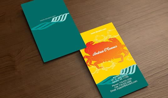
This sounds obvious, but plenty of cards get the basics wrong. Your name should be the most prominent text element after your logo. Use your professional name, the one people actually call you. If you go by Mike instead of Michael, put Mike on the card.
Your job title goes right below your name. Keep it clear and specific. Marketing Director tells someone exactly what you do, while Brand Evangelist and Growth Hacker tells them nothing useful. If your title runs long, shorten it to the version that communicates your role fastest, because people scanning your card will not puzzle over a creative one.
The company name line and where it belongs
Your name identifies you. The company name tells a stranger which business you are calling from three weeks later, when the card surfaces in a drawer. It sits under the job title, in the same lockup you use on your website rather than a stretched or recolored version of it.
Three cases are worth deciding up front. When the logo already spells out the company name, printing it again as text is repetition, so let the logo carry it. When you trade under your own name, the company line is the place for what you actually do, because Sarah Bell Photography says more than Sarah Bell twice. And when the registered name differs from the trading name, print the one customers recognize and keep the legal name for the invoice.
Set it smaller than your name and larger than the contact block, and the card reads in the right order without anyone thinking about it.
A logo and tagline that build instant recognition

Your logo is the visual anchor. It should appear on every card, positioned where the eye naturally lands first, usually the top left or the center. Make sure it is high resolution, because a pixelated logo on a printed card reads as amateur before anyone even scans the text.
A tagline is optional but powerful. A good one in three to seven words states your value without the reader working for it. Fast Plumbing. Done Right. says more than a paragraph ever could. For a format that shows off a brand mark, explore 3D lenticular business cards that add motion the moment the card tilts.
Contact details: phone, email, and website

Include one phone number, or two only if you genuinely use both. A mobile number and an office line can work together, but three numbers is clutter and your prospect should never have to guess which one to call. Format the number consistently with dashes or dots, pick one style, and always include the area code, because cards travel to other cities.
Use your business email, not a personal Gmail or a college address from 2009. A branded address at your own domain adds credibility instantly. Keep it readable too, since j.smith@company.com beats johnathan.smitherson@superlongcompanyname.com at 8pt on a tiny card.
For the website, drop the https and www prefix and just print yourcompany.com. It is cleaner and saves space, and a dedicated page like yourcompany.com/meet gives new contacts a personal landing spot. Test the URL before you print 500 cards, then test it again. For more printed-material walkthroughs, the guide hub has dozens of resources.
QR codes bridge the physical and digital

A QR code on the back of your card can link to a portfolio, a scheduling page, a short video introduction, or your digital vCard. It closes the gap between the paper in someone’s hand and everything you do online. Just make sure the code is large enough to scan easily, at least 0.75 inches square.
Do not let the QR code dominate the design. It is a tool, not the main event, so place it on the back when the front is already full. To plan the layout around it, start from the blank templates library at 4OVER4.COM and drop the code into a spot with real breathing room.
White space is content too
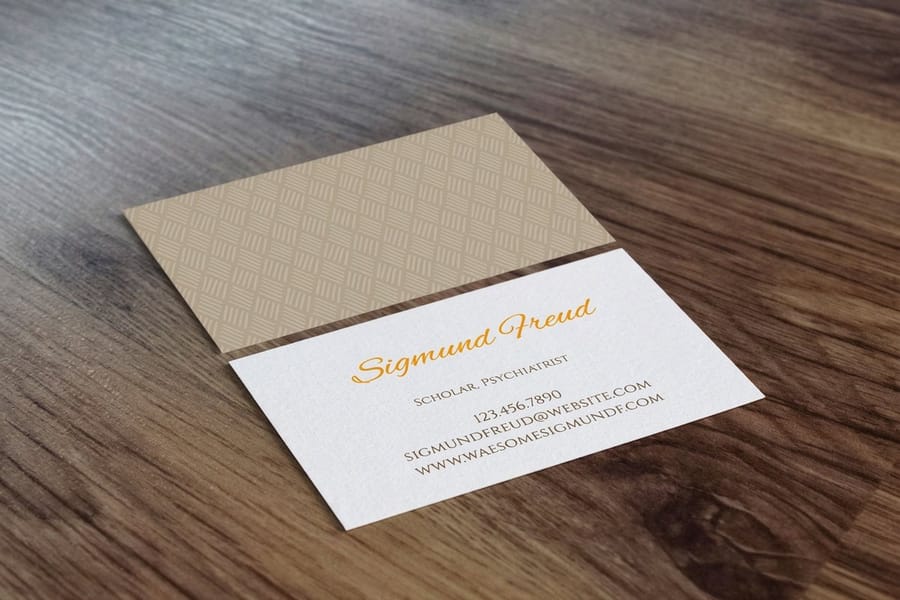
Here is the tip most people miss: what you leave off the card matters as much as what you put on it. White space gives your content room to breathe. A card packed edge to edge feels desperate, while a card with intentional spacing feels confident and premium.
Aim for margins of at least 0.125 inches on all sides. Group related information together, contact details in one cluster and branding in another, so the eye flows from one group to the next without confusion.
Put the back of the card to work
A blank back is a wasted opportunity. Use it for a QR code, a short list of services, a memorable quote, appointment lines, or a referral offer. Some professionals print a mini portfolio or a small map to their office. The back gives you a second canvas to reinforce your message at almost no extra cost.
If you are producing other pieces alongside your cards, it pays to build a matching set. Learn how to make envelopes for coordinated stationery, and see our guide to custom magnets for a keepsake that lands your brand on a fridge long after the event.
Font size and readability
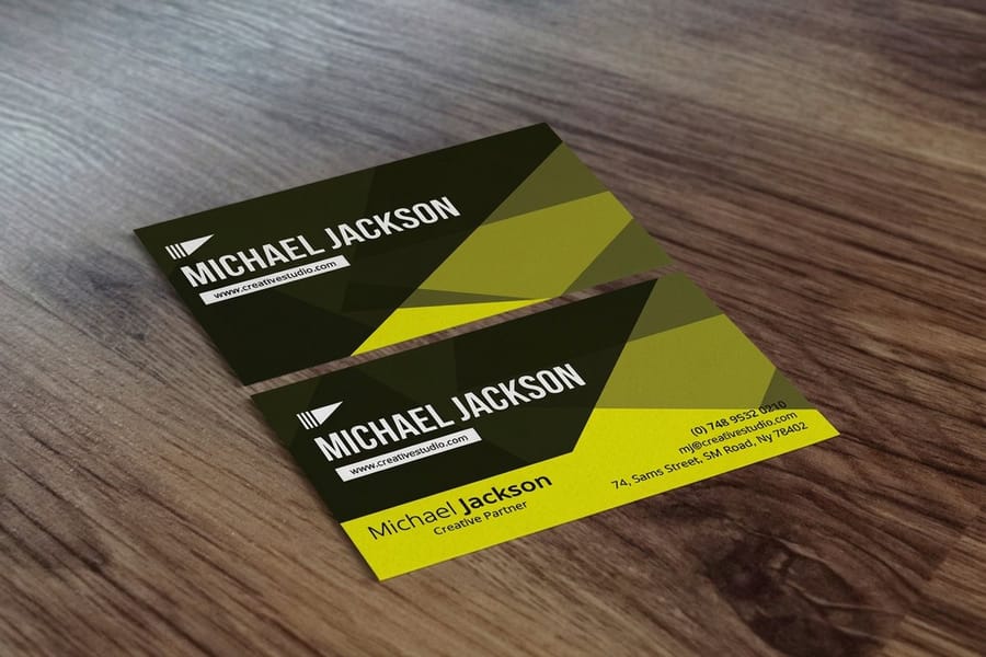
No text on your card should be smaller than 7pt. Keep body content like phone numbers and emails at 8 to 9pt, and set your name at 10 to 12pt. If someone needs reading glasses to find your phone number, you have already lost them.
Stick to one or two font families. A sans-serif for contact info paired with a serif for your name creates nice contrast, while three or more fonts looks chaotic. Consistency builds trust, even at this small scale.
The print numbers behind every content decision
Content choices only work inside the physical limits of the card, so it helps to know the numbers before you write a word.
- 3.5 x 2 inches. The standard US card, and the space every line has to share.
- 0.125 inches of margin. Hold text and logos inside that on all sides so a normal trim never clips them.
- 7pt minimum. Nothing smaller is readable. Contact lines sit at 8 to 9pt and your name at 10 to 12pt.
- 0.75 inches square. The smallest a QR code can print and still scan on the first try.
- Two sides. Double sided printing costs very little more, so a crowded front is a layout decision rather than a space problem.
Print one proof and read it at arm's length before the run. 4OVER4.COM includes free proofs on every order, and a proof is where a cramped line or a stale phone number is cheapest to catch.
Ready-made templates to start from
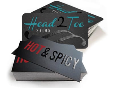
You do not have to start from a blank rectangle. 4OVER4.COM keeps a library of design templates and blank templates that already handle spacing and hierarchy, so you drop in your content and go. For a bolder look, the black business cards layout gives your text high contrast without any extra effort.
Prefer to browse finished looks? Open the Ambitious Execution business card template, the Time-saving Quality business card template, a free business card template, another free business card layout, the Abstract Shapes business card template, or the Geometric Shapes business card template in the online designer and swap in your name, logo, and details.
Content mistakes that ruin a great card
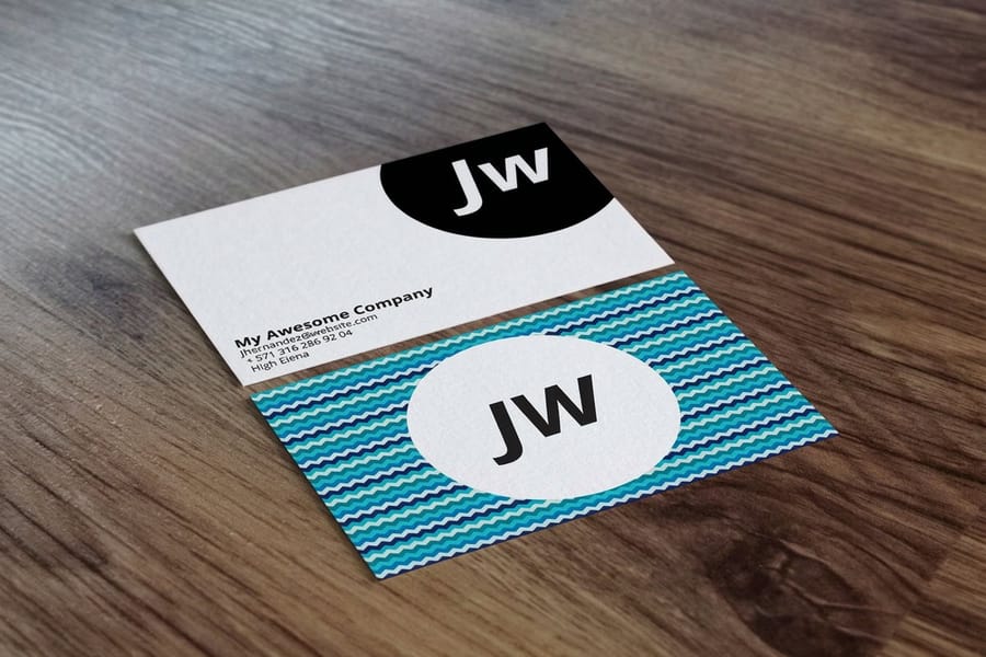
Even with solid tips on business card content in hand, people still make avoidable errors. Here are the ones 4OVER4.COM sees most often across thousands of print orders.
- Cramming too much text. If you cannot read every line at arm’s length, there is too much on there. Cut the fax number and the secondary address, because less is more.
- Using outdated contact info. Old phone numbers, dead email addresses, or a website that redirects kill credibility instantly. Review your content before every reorder.
- Inconsistent branding. Your colors, fonts, and logo should match your website, social profiles, and other print materials. Mismatched branding confuses people.
- Forgetting a call to action. A line like Book a free consultation gives the recipient a reason to act. Without direction, your card just sits there.
- Tiny or decorative fonts. That script font looks beautiful on screen, but at 7pt on a 3.5 x 2 inch card it is unreadable. Always put legibility ahead of flourish.
4OVER4.COM offers free proofs on every order, so you can catch these mistakes before they land on 500 cards.
Wally explains business card content
Every line either earns its spot or gets cut
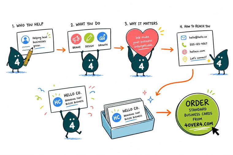
Wally reads a business card the way a stranger does, in about three seconds. Name and logo first, one clear way to get in touch, and a little breathing room around it all. Everything that does not help the reader act is just noise crowding the good stuff. Nail the content, then print it on a card that feels as sharp as it reads at 4OVER4.
Order business cards →Specs and pricing
Standard business card specs and pricing
Once your content is dialed in, here is what a standard business card gives you at 4OVER4.COM, with live specs and price-per-unit straight from the configurator.

| Quantity | Price Per Unit | Total |
|---|---|---|
| 100 | 17.6¢ | $17.57 |
| 200 | 11.5¢ | $23.07 |
| 300 | 9.15¢ | $27.46 |
| 400 | 7.96¢ | $31.86 |
| 500 | 7.25¢ | $36.26 |
| 600 | 6.77¢ | $40.64 |
| 700 | 6.43¢ | $45.04 |
| 800 | 6.18¢ | $49.43 |
Print it
Cards worth printing once your content is set
Your content is ready, now print it. Test the layout first with free business cards, or when an event is close, same-day printing puts a finished stack in your hands fast.

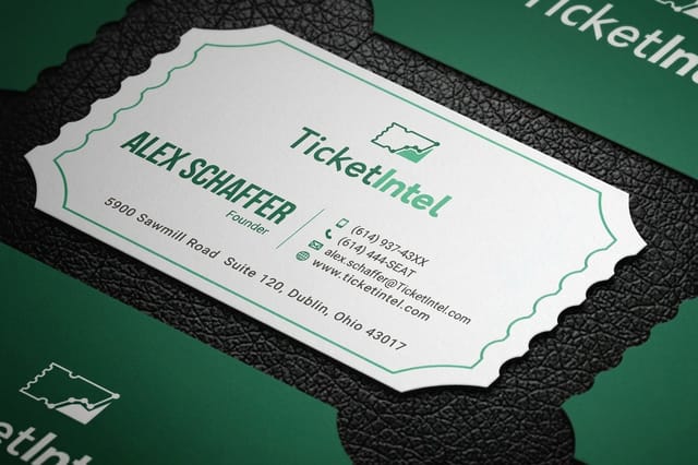

See it in use
Business cards our customers put these tips on








Explore more
Where to go next



By the numbers
The stock list your card content gets printed on
Common Questions
Your business card content questions, answered
What is a common mistake on business cards?
Cramming. Most cards that fail are trying to hold a fax number, two addresses, four social handles and a paragraph of services on a 3.5 x 2 inch rectangle. Close behind are outdated contact details, type set below 7pt, branding that does not match the website, and no reason to call. Print one proof and read it at arm's length, and most of these show up before the run does.
What should a student put on a business card?
Your name, what you are studying or the work you want, a phone number and an email you will still have after graduation. A school address is not needed. If you have a portfolio, a QR code on the back at 0.75 inches square is worth more than a list of software you know. Leave the job title off rather than inventing one, because a plain card that is honest reads better than a padded one.
What should a business owner put on a business card?
The same core list as anyone else, with Owner or Founder as the title so nobody has to guess who they are talking to. Your name, the company name and logo, one phone number, a branded email on your own domain and your website. Skip the home address if customers never visit you, and use the back for three services or an offer rather than crowding the front.
What information is absolutely required on a business card?
At minimum, include your name, job title, company name, phone number, and email address. A logo and website URL round out the essentials. Everything else, from social handles to QR codes and taglines, is optional but worth adding when space allows. The 4OVER4.COM standard 3.5 x 2 inch card gives you enough room for all of the core content.
How many phone numbers should I put on my business card?
One is ideal and two is the maximum. Listing a mobile and an office line works if you actually answer both. Three or more numbers creates confusion, because your prospect will not know which one to call first and might not call at all.
Should I include a QR code on my business card?
Yes, when it links to something useful like a scheduling page, a portfolio, or a digital contact card. Make the QR code at least 0.75 inches square so it scans reliably, and place it on the back if your front is already full of content.
What font size works best for business card text?
Never go below 7pt for any text. Body content like phone numbers and emails reads best at 8 to 9pt, and your name should sit at 10 to 12pt. Test readability by printing a proof and reading it at arm’s length.
Is it better to use the front and back of a business card?
Almost always. A blank back is wasted space. Use it for a QR code, a short services list, appointment lines, or a brief tagline. Double-sided printing at 4OVER4.COM costs very little extra and doubles your content real estate.
How do I decide which social media to include on my card?
Pick one or two platforms where you are most active and where your audience actually is. A B2B professional should list LinkedIn, while a visual creative should list Instagram. Skip platforms you rarely update, because a stale handle looks worse than listing none at all.
What should you put on a business card?
Your name, your job title, your company name and logo, one phone number, a branded email address, and your website. That is the whole required list. After that, a tagline, one or two social handles, and a QR code are worth adding only when they help the reader do something. Keep the type at 8pt or larger, leave real margins, and use the back rather than crowding the front.
Should I put my photo on my business card?
Only if people buy you rather than your company. Real estate agents, personal trainers, and anyone whose face is on their signage benefit from it, because the card matches the person the client just met. For most other roles the photo eats the space your contact details need and dates the card the moment you change your hair. If you use one, keep it small, professional, and shot at high resolution so it does not print soft.
Should I put my home address on my business card?
No. If you work from home, leave the street address off entirely. Your phone number, email, and website are enough for anyone to reach you, and a city and state line covers the question of where you are based. Print a mailing address only when customers actually visit you, such as a shop or a studio with public hours.
Get Started
Ready to print business cards that get kept?
Lock in your content, drop in your logo, and we print crisp, professional cards on the stock that fits your brand.
Legal Disclaimer
Gold Standard guarantees apply to all standard orders placed through 4over4.com. Price match requires verifiable proof of a competitor's published price for an equivalent product with matching specifications and turnaround time. Satisfaction guarantee covers manufacturing defects and print quality issues. Contact support with order number and documentation. On-time delivery rate based on tracked orders 1999 to 2026. Individual results may vary based on shipping carrier performance.

Social handles and a physical address, when they help
Do not list every platform you have ever joined. Pick one or two that matter most for your work. A photographer leans on Instagram, a B2B consultant lists LinkedIn, and a restaurant owner might point to Facebook or TikTok. Use the @ handle format where you can, since it is compact and universally understood. If your social presence ties into other print, learn how to make flyers that drive the same engagement.
A physical address belongs on the card when clients visit you. A retail store, a law office, or a salon needs one. If you work remotely or your office is not client facing, skip it and use that space for something more useful. When you do include an address, keep it to two lines at most, and city plus state is often enough when the full street line makes things crowded.