
Matte vs Glossy Printing and How to Choose the Right Finish


Glossy finishes bounce light for punchy color and photos that pop. Matte finishes absorb light for a smooth, glare-free, writable surface. The job, the lighting, and whether anyone writes on it decide which you pick.
Matte versus glossy printing is decided by light: glossy coatings reflect it for richer color and sharper photos, while matte coatings absorb it for a flat, easy-to-read, fingerprint-resistant surface you can actually write on. Choose glossy for image-driven pieces and matte for text-heavy or writable ones, and reach for satin when a design needs a little of both.

Start here
Why your paper finish changes everything
Matte versus glossy printing is not just a cosmetic call. It shapes readability, color accuracy, how the piece feels in someone's hand, and whether they keep it or toss it. The wrong finish can undercut a great design, and the right one can make a simple layout look expensive.
This guide lays out the real differences between matte, glossy, and satin so you can choose with confidence. If you are zeroing in on one product, our matte vs glossy business cards guide and the matte vs glossy brochure comparison both go deeper. 4OVER4.COM prints on 60+ paper types with multiple finish options, so you will find exactly what fits your project.
How matte and glossy finishes actually differ
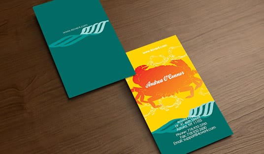
Matte versus glossy printing turns on one thing, how the surface handles light. A glossy finish carries a reflective coating that bounces light straight back at you, so colors look more saturated and photos look sharper. A matte finish scatters light across the sheet instead, which gives you a flat, low-glare look that stays easy on the eyes.
That is the textbook version. In practice, glossy prints look vivid under bright light but get hard to read when glare hits them, while matte prints stay legible in any room but will not make a photo pop the same way. Neither finish is better than the other. They are different tools for different jobs, and the rest of this guide walks through which one fits which project.
| What you are weighing | Matte | Glossy |
|---|---|---|
| Glare | Scatters light, stays readable under overhead light and behind framing glass | Bounces light back, hard to read at an angle or under a spotlight |
| Fingerprints and smudges | Hides handling marks almost completely | Shows prints and smudges, worst across solid blacks and dark photos |
| Color pop | Softer, accurate, muted tones that suit typography and earth tones | Deepest blacks and the most saturated reds and blues, best for photography |
| Writability | Takes pen and pencil ink cleanly and dries fast | Beads ink up and smears, no realistic handwriting |
| Scanning and photographing | Scans and photographs flat, no hot spots | Throws scanner light and camera flash back as bright hot spots |
| Durability in hand | Marks and scuffs stay invisible, so pieces that get handled all day keep looking new | Coating shrugs off moisture and wipes clean, but every wipe streak and scuff shows while it is there |
Read that as a shortlist, not a verdict. Most jobs hang on one row: an appointment card on writability, a menu on how well it hides handling, a photo postcard on color pop.
Color and image quality, side by side

Glossy finishes win on color saturation. The reflective coating acts almost like a magnifying glass for ink, making reds redder, blues deeper, and blacks richer. If your design leans on photography or bold blocks of color, glossy gives you the most visual punch on a counter or in the mailbox.
Matte finishes produce softer, more muted tones. The color still reads accurately, it just does not jump the way it does on glossy stock. For layouts built on typography, earth tones, or a minimalist look, that restraint is a strength rather than a weakness. Think of it this way, glossy is a billboard and matte is a gallery print. If your piece mixes photos with text, our guide on how to fold a brochure covers layouts that work with either finish.
Readability and text-heavy designs

Here is where matte pulls ahead. Large blocks of text are easier to read on matte paper. No glare, no reflections, and your eyes never have to fight the surface to process the words. That is exactly why books, instruction manuals, and copy-heavy marketing pieces almost always run on matte or uncoated stock.
Glossy paper can make small text look crisp, but try reading a full paragraph under fluorescent office lights and you will end up tilting the page back and forth to dodge the reflections. For a business card with a few lines, glossy is fine. For a flyer packed with event details or a menu full of items, matte is the smarter call. Our guide on how to make flyers goes deeper on getting dense layouts to read cleanly.
Touch and the tactile experience

People underrate how much touch matters in print. Matte paper feels smooth, velvety, and solid. There is a softness to it that quietly signals quality. Glossy paper feels slick and polished, closer to a magazine cover. Each texture triggers a different association the moment someone picks the piece up.
Matte says understated luxury. Glossy says high energy. A real estate agent handing over a matte business card sends a different message than a DJ passing out a glossy one, and both are making the right choice for their audience. Want to feel the difference before you commit? 4OVER4.COM lets you order free paper samples so you can compare finishes in your own hands.
Durability and fingerprint resistance

Glossy finishes show fingerprints. Every smudge, every thumbprint, every greasy lunch finger tends to show up on the surface. Matte finishes hide fingerprints almost completely, so if your printed piece gets handled a lot, think menus, product tags, or event passes, matte is the more forgiving pick.
On the other side, a glossy coating adds a thin layer of protection against moisture and minor scuffing. Matte surfaces scuff a little more easily, though a matte lamination solves that neatly. For anything that has to survive real wear and tear, picture the environment it will live in and choose the finish that holds up there.
Writability, can you actually write on it?
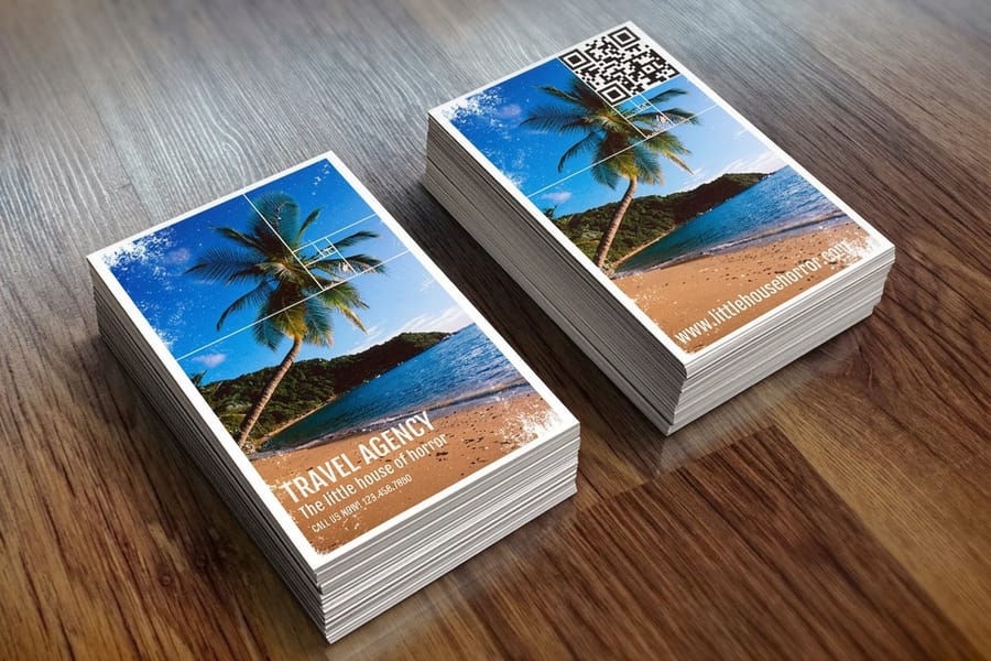
Need to jot a note on a business card, sign a certificate, or fill in a date on a postcard? Matte finishes accept pen and pencil ink. Glossy finishes do not. Ink beads up on a glossy surface and smears, so if your piece needs any handwriting at all, matte is the only realistic option.
This matters more than you would guess. Appointment cards, gift certificates, RSVP cards, and name tags all need a writable surface. If you are designing a full mailing set that includes writable pieces, our guide on how to make envelopes walks through the components that need to take ink.
Matte vs glossy for photos and signatures
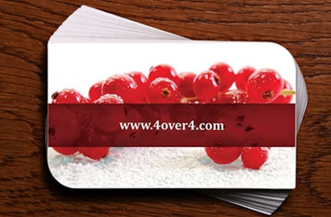
Photo prints are where this argument gets loudest, and the answer flips depending on what happens to the print after it leaves the press. Glossy holds the deepest blacks and the most saturated color, so a portrait, a landscape shot, or a product photo looks its sharpest on a glossy sheet. Put that same print behind framing glass or under an overhead light and the coating throws glare straight back at whoever is looking, and every finger that touches it leaves a mark on the dark areas.
Matte scatters the light instead, so the print reads from any angle, sits well behind glass, and hides handling marks. Blacks look softer and colors read a step quieter than glossy, and that is the trade you make for a print people can pick up, pass around, and hang anywhere in the room. Satin lands in the middle here too, close to glossy color with far less glare, which is why it is the usual pick for photo prints that get framed and handled.
Signing is the part most people find out about too late. Matte and satin take pen, pencil, and paint marker ink and dry fast. Glossy resists it. Water-based ink beads on a glossy coating, stays wet long enough to smear under a sleeve, and can lift straight off if the print is touched before it sets. That is why autograph collectors ask for matte or satin photo prints, and why anything being signed at an event and handed over on the spot should not leave the printer glossy. An oil-based paint marker will grip a glossy surface if the print is left flat to dry, but matte still gives you the cleaner line and the shorter wait.
Quick rule: framed and never touched, glossy or satin. Handled, mailed, or signed, matte. For more finish calls by product, browse the printing guide hub.
Satin vs matte, the middle ground
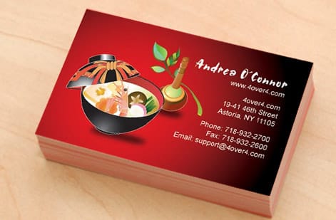
Satin finish sits right between matte and glossy. It carries a slight sheen without throwing harsh reflections. Colors look a touch richer than matte but never as intense as full glossy, and fingerprints show less than glossy while showing a bit more than matte.
Satin is the safe choice when you cannot decide. It works well for photo-heavy pieces that still need to read cleanly, which is why it is popular for brochures, lookbooks, and product catalogs. If your paper finish comparison keeps swinging back and forth, satin is often the answer that ends the debate.
4OVER4.COM offers satin options across multiple product lines. Browse the full printing guide hub for more help matching a finish to a specific product.
When to choose glossy
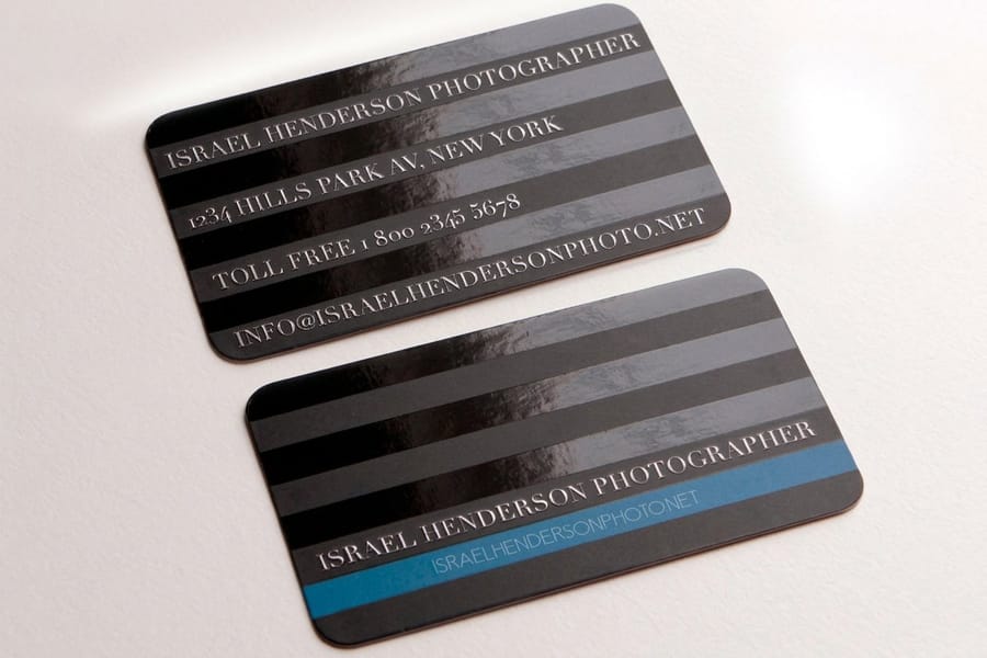
Reach for glossy when your design is image driven. Photo postcards, product catalogs with full-bleed photography, and event flyers with bold graphics all benefit from the color boost a glossy coating provides. Glossy also earns its keep on anything meant to grab attention fast, like a promotional mailer or retail signage on a crowded counter.
- Photo-heavy postcards and mailers where colors pop and images stay sharp.
- Retail promotional materials where the reflective surface catches the eye.
- Product photography catalogs where glossy makes each shot look polished.
- Event invitations with bold graphics where a high-energy design matches a high-energy finish.
The through line is energy. If you want the piece to shout from across a room and the visuals are carrying the message, glossy is built for that job.
When to choose matte
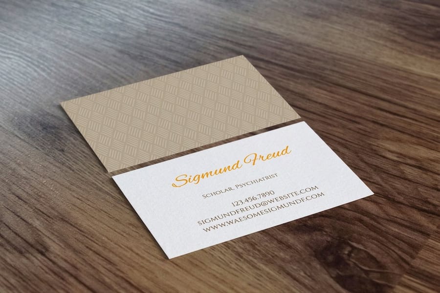
Reach for matte when your design is text forward or when you want a premium, understated feel. Matte versus glossy cards is an easy call for lawyers, consultants, and architects who want a card that reads as expensive without looking flashy.
- Business cards for professional services like law firms, accounting, and consulting.
- Menus and price lists that stay readable under any lighting and hide fingerprints.
- Wedding and event stationery that feels elegant, soft, and writable.
- Text-heavy brochures and sell sheets where zero glare means zero readability issues.
- Any piece that needs handwritten notes, since matte takes ink and glossy does not.
If you are building custom promotional items alongside your print run, our guide on how to make custom magnets is worth a look, and to keep your stamps sharp between projects there is our walkthrough on how to clean rubber stamps.
Mixing finishes for maximum impact
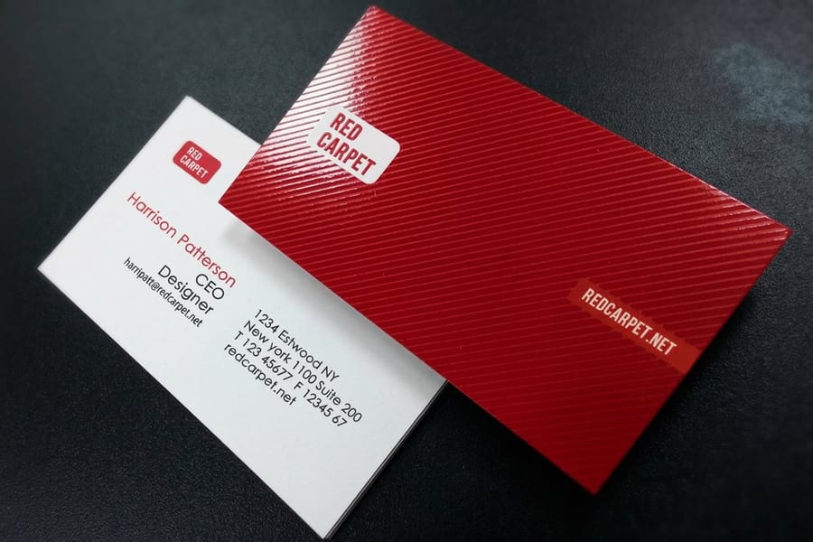
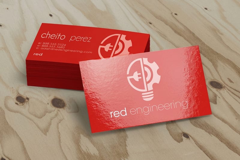
You do not have to pick just one finish. Some of the most striking print pieces combine matte and glossy in the same design. Spot UV coating lays a glossy layer over specific areas of an otherwise matte card, so your logo shines while the background stays smooth and subdued. It turns the card into a tactile experience that makes people notice the details.
The trick works beautifully on business cards, postcards, and folder covers. That contrast between a matte field and a glossy accent creates a sense of depth that a flat finish simply cannot match. A spot UV business card is the easiest way to try it, or a gloss laminated business card when you want the whole surface to gleam.
Finish mistakes that quietly cost you money
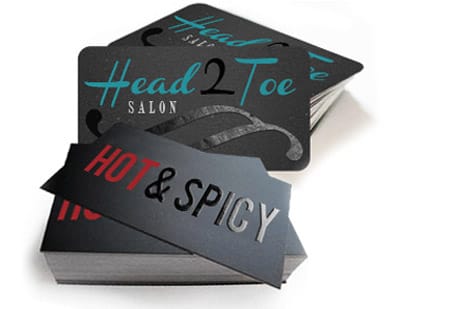
The most common mistake with matte versus glossy printing is choosing based on personal preference instead of the design's needs. You might love glossy, but if your flyer is eighty percent text, your audience will struggle to read it under overhead lighting no matter how nice it looks in your hand.
Another big one is forgetting about writability. Printing appointment reminder cards on glossy stock means your clients cannot write on them, and that turns into a wasted print run. Do not ignore the environment either. Glossy menus in a dim restaurant look great, while the same glossy menus in a bright cafe with big windows turn into a glare problem.
Skipping samples is its own kind of mistake. Color shifts between finishes, so a design that looks bold on screen can read washed out on matte or overly intense on glossy. Finally, do not assume satin and matte are the same thing. Satin carries a subtle sheen that changes how color renders, and if you ordered matte expecting zero reflection you would spot the difference right away. When a question comes up mid-order, the 4OVER4.COM help center can talk you through finish selection before you commit.
Wally explains matte vs glossy
One reflects the light, the other reads clean in it
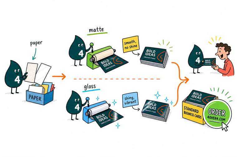
Wally treats finish like a lighting choice: glossy bounces the light back for color that pops, matte drinks it in for a surface that stays readable and takes a pen. Match the finish to the job instead of the mood, order free samples when you are torn, and reach for satin or a spot UV accent when a design wants a little of both. Get it right and a simple card starts to feel expensive.
Order business cards →Specs and pricing
Compare finishes on a real business card
A standard card and a gloss laminated card line up at 4OVER4.COM like this, with live specs and price-per-unit pulled straight from the configurator so you can weigh finish against budget.

| Quantity | Price Per Unit | Total |
|---|---|---|
| 100 | 17.6¢ | $17.57 |
| 200 | 11.5¢ | $23.07 |
| 300 | 9.15¢ | $27.46 |
| 400 | 7.96¢ | $31.86 |
| 500 | 7.25¢ | $36.26 |
| 600 | 6.77¢ | $40.64 |
| 700 | 6.43¢ | $45.04 |
| 800 | 6.18¢ | $49.43 |
| Quantity | Price Per Unit | Total |
|---|---|---|
| 500 | 15.4¢ | $76.88 |
| 1,000 | 8.96¢ | $89.63 |
| 2,500 | 5.36¢ | $133.98 |
| 5,000 | 4.30¢ | $214.84 |
| 10,000 | 3.43¢ | $342.67 |
| 15,000 | 3.32¢ | $497.53 |
| 20,000 | 3.26¢ | $652.41 |
| 25,000 | 3.21¢ | $802.87 |
Print it
Order matte and glossy business cards at 4OVER4

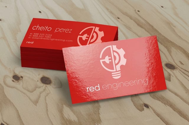
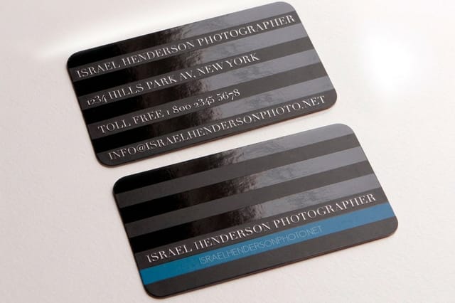
See it in use
Business cards customers chose a finish for








Explore more
Where to go next




By the numbers
The coating line behind both finishes
Common Questions
Common questions about matte vs glossy printing
Does matte or glossy printing cost more?
Pricing is typically the same for standard matte and glossy finishes at 4OVER4.COM. Specialty options like spot UV, which combines both finishes, can cost a little more. The finish you pick will not blow your budget either way, so decide based on the design rather than the price tag.
Which finish is better for business cards?
It depends on your industry. Matte feels premium and understated, which suits professional services like law, accounting, and consulting. Glossy pops with color and reads as energetic, which fits creative fields. Both make a strong impression when paired with a thick card stock.
Can I print photos on matte paper?
Yes. Photos print well on matte stock, but the color looks softer and more muted than it does on glossy. If your design leans on bright, saturated photography, glossy gives you more visual impact. If it favors mood and subtlety, matte handles it beautifully.
Is matte or glossy better for photo prints?
Glossy holds the deepest blacks and the most saturated color, so the image itself looks sharpest on it. Matte kills glare behind framing glass and hides fingerprints, at the cost of softer, more muted tones. Pick glossy for a print that stays behind glass in controlled light, matte for one that gets handled, mailed, or hung under overhead lighting, and satin when the same print has to do both.
Which finish is better for signing?
Matte, with satin a close second. Matte takes pen, pencil, and paint marker ink and dries fast, so the signature sets before anyone touches it. A glossy coating repels water-based ink, so it beads, stays wet, and smears under a sleeve. If a photo, certificate, or card is going to be autographed at an event and handed straight over, print it matte.
Is matte or glossy better for flyers?
Glossy for image-driven flyers, matte for copy-heavy ones. A flyer built on full-bleed photography or bold color blocks grabs attention faster on glossy, which is why event and retail promos run that way. A flyer packed with dates, prices, and paragraphs reads cleaner on matte because there is no glare fighting the reader under overhead light, and it takes a handwritten note or a signature if anyone needs to add one.
What's the difference between satin and matte?
Satin is a question of sheen. It carries a subtle glow that sits between flat matte and full glossy. Satin shows slightly richer color than matte without the glare of glossy, which makes it a solid middle ground for designs that mix photos and text.
Will glossy prints smudge or show fingerprints?
Yes. Glossy surfaces show fingerprints and smudges far more than matte. If your printed piece gets handled a lot, like a menu or a product tag, matte is the more practical choice because it hides marks almost completely.
Can I write on glossy paper?
Not easily. Pen ink beads up and smears on a glossy coating. If your print piece needs a writable area, go with matte or leave that section uncoated. Appointment cards, certificates, and RSVP cards all belong on matte for this reason.
Does the finish affect how long my prints last?
Glossy coatings add a thin protective layer that resists minor moisture and scuffing. Matte surfaces scuff a bit more easily but hold up well to daily wear, especially with lamination. Both finishes last for years under normal handling.
Get Started
Order gloss laminated business cards from $37.24
Choose matte for a smooth, writable, understated card or glossy for punchy, high-energy color, then send us your design and we print it clean every time.
Legal Disclaimer
Gold Standard guarantees apply to all standard orders placed through 4over4.com. Price match requires verifiable proof of a competitor's published price for an equivalent product with matching specifications and turnaround time. Satisfaction guarantee covers manufacturing defects and print quality issues. Contact support with order number and documentation. On-time delivery rate based on tracked orders 1999 to 2026. Individual results may vary based on shipping carrier performance.
