
Matte vs Glossy Brochures and Which Finish Wins in 2026


Matte kills glare and reads clean for text. Glossy deepens color and makes photos pop. The right pick comes down to your content, where the brochure travels, and the paper weight underneath it.
To choose between a matte and glossy brochure, match the finish to your content. Go matte for text-heavy, frequently handled pieces where readability and a fingerprint-free surface matter. Go glossy for photo-driven, promotional pieces where color depth and moisture resistance matter. For mixed layouts, a satin or silk finish sits in the middle, and a heavier paper makes either finish feel premium.
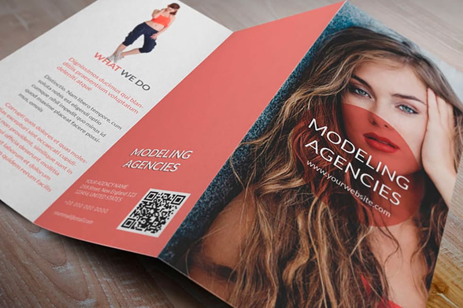
The short verdict: matte for text-heavy pieces people handle and write on, glossy for photo-led pieces that need color depth and moisture resistance, satin when the layout mixes both.
Quick tips
Quick tips for choosing a brochure finish
Choose your brochure finish after the design is final, not before. Use matte for text-heavy, high-touch pieces and glossy for image-led, promotional pieces. For layouts that mix both, a satin finish balances sheen and readability. Order free samples so you can feel the stock in your hands before you print a full run, because a screen never shows texture or glare.
Ready to print? Order brochures in matte or glossy on 60+ paper types, from 80lb text that folds without cracking to 100lb cover for a leave-behind, or shop all brochures to compare folds and sizes first.
Watch it printed
See standard brochures on the press, in 153 seconds
Why your brochure finish matters more than you think
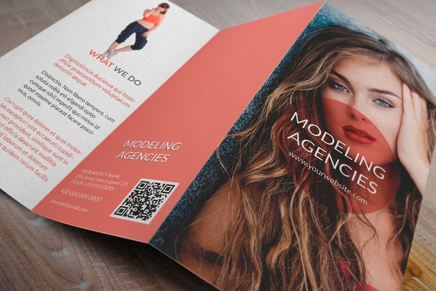
Picking a brochure finish is not just a style choice. It shapes how people read your piece, how long it survives in a bag or on a counter, and the impression your brand leaves behind. A matte and glossy brochure printed from the same file can feel like two different products in the hand.
Matte finishes absorb light instead of bouncing it, which gives a smooth, understated look and keeps text easy to read. Glossy finishes reflect light, so colors look richer and photos look sharper. Both earn their place in smart marketing once you know when to reach for each one. If you are still working out the layout, our guide on how to fold a brochure helps you pair the right finish with the right fold.
4OVER4.COM makes it easy to test before you commit. Use the online designer to preview your artwork on different stocks, browse the full range of marketing materials for a cohesive set, and if stamps are on your list too, our guide on how to clean rubber stamps answers another common printing question.
Matte brochures: when understated wins the room

Matte brochures work best when your message leans on words more than pictures. The non-reflective surface removes glare, so readers can scan paragraphs under fluorescent office light, bright sun, or a dim conference room without tilting the page to dodge a reflection. That matters when you are handing out material at a trade show or slipping it into a welcome packet.
Readability is the real win. Body copy, bullet lists, and data-heavy layouts stay crisp on matte stock. The ink sits flat on the surface with no wet-looking sheen, which gives text an almost letterpress feel. For a pricing guide, a service menu, or an educational handout, matte is usually the right call.
Matte also shrugs off fingerprints and smudges. People pick a brochure up, flip through it, set it down, and pick it up again, and glossy stock shows every thumbprint after a few passes while matte stays clean. That refined, high-touch quality is why wedding brochure printing so often lands on a matte stock.
Where matte falls short
Matte is not the answer for everything. Photographs can look slightly muted next to glossy, and colors do not pop as hard. If your brochure is mostly photography, think real estate listings, food shots, or travel scenes, matte can flatten images you want to leap off the page. The surface also scuffs a little more easily, so a matte piece tossed loose into a bag without a folder can pick up surface marks.
Industries that lean matte include finance, legal, healthcare, education, and consulting, anywhere the goal is to look serious and trustworthy. Browse custom brochures to compare paper stocks and finishes side by side.
Glossy brochures: when you need colors that demand attention
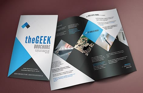
Glossy brochures are built for visual impact. The reflective coating amplifies color, making reds redder, blues deeper, and whites brighter. When your layout is carried by product photography, lifestyle imagery, or bold graphics, glossy stock makes those elements sing.
The color jump is obvious the moment you compare stocks. The same image on matte and on glossy can look like two different photos. Glossy gives you that magazine-quality sheen people tie to high production value, which is why retail brands, restaurants, event promoters, and creative agencies reach for it first.
The coating adds a layer of protection too. For pieces that travel outdoors, think door hangers, event handouts, and direct mail brochures, glossy stands up to rain, humidity, and handling better than matte. If flyers are part of the same campaign, our guide on how to make flyers covers design tips that carry straight over to glossy brochures.
Where glossy falls short
Glare is the obvious tradeoff. Under direct light a glossy brochure can be hard to read, and one small tilt can bury a paragraph behind a reflection. Fingerprints show on every touch, so a piece passed around a meeting table wears faster than matte would. Writing on glossy is tricky as well, since pen ink smears or refuses to stick, which is a problem when a sales rep needs to jot a name or circle a price.
Head-to-head: choosing the right finish for your project
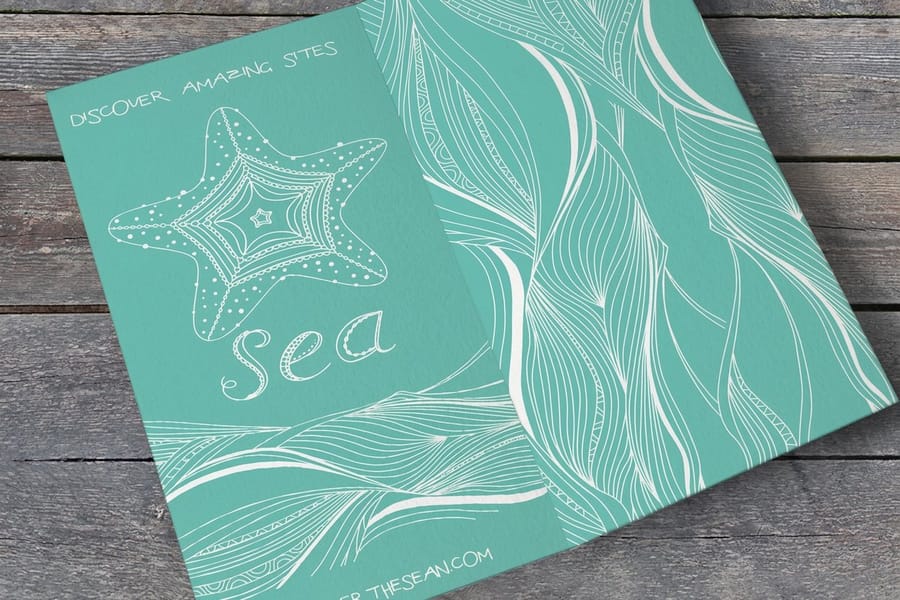
In the end the matte versus glossy decision comes down to two things, the kind of content you are printing and where the brochure ends up. Here is how to think it through.
Text-heavy designs
Go matte. Service descriptions, pricing breakdowns, technical specs, and company profiles all read easier on a non-reflective surface that keeps the focus on your words.
Photo-driven designs
Go glossy. Product catalogs, portfolio pieces, travel brochures, and food menus with photography all gain from the sheen, which adds perceived value to every image.
Mixed content
Most brochures blend the two. For those, a satin or silk finish gives moderate sheen without heavy glare, a middle ground that flatters text and photos at once. Request free samples so you can feel the difference before you commit to a full run.
Distribution environment
Outdoor events and direct mail favor glossy for its moisture resistance. Indoor handouts, conference materials, and desk-reference pieces favor matte for readability and smudge resistance.
Brand personality
Matte reads refined, serious, and trustworthy. Glossy reads bold, energetic, and eye-catching. Neither is better, they are different tools for different jobs, and a luxury spa and a children's party venue should not reach for the same one. You can even add a QR code to either finish to carry readers from print to your site.
Matte vs glossy at a glance
If you want the short version, here is the matte and glossy comparison side by side. Use it as a quick gut check once your design is locked.
| Factor | Matte finish | Glossy finish |
|---|---|---|
| Surface | Non-reflective, smooth | Reflective, high shine |
| Best for | Text-heavy, refined pieces | Image-heavy, promotional pieces |
| Readability | Excellent under any light | Can glare under direct light |
| Color and photos | Understated, slightly muted | Vivid, sharp, high contrast |
| Durability | Scuffs a little more easily | Resists moisture and wear |
| Handling | Hides fingerprints | Shows fingerprints |
| Writability | Takes pen and pencil cleanly | Ink smears and lifts |
| Typical industries | Legal, finance, healthcare, weddings | Retail, restaurants, travel, events |
Both columns point to the same rule of thumb. Match the surface to the job, then back it with the right paper weight so the finish you chose feels intentional in the hand.
Paper weight and thickness: the other half of the equation

Finish gets the attention, but paper weight carries just as much of the experience. A glossy brochure on flimsy stock still feels cheap, while a matte brochure on thick, rigid paper feels like a document worth keeping. Finish and weight together create the whole impression.
Heavier stocks like 100lb cover hold up better in both finishes. They resist bending, feel sturdy, and signal quality before anyone reads a word. Lighter stocks like 80lb text fold cleanly, which makes them a better fit for tri-fold brochures that need to crease without cracking.
4OVER4.COM offers more than 60 paper types so you can match weight, texture, and finish to the exact job. If you are building a matching set, our guides on how to make envelopes and custom magnets cover complementary pieces that round out a branded kit.
Printing brochures at home versus a professional matte finish
A desktop printer puts ink on paper. It cannot coat that paper, score it before the fold, or hold the same color from the first sheet to the two hundredth. That is where the two paths separate.
| Factor | Home printer | Professional press |
|---|---|---|
| Cost per sheet | Retail ink plus retail paper, and a full-bleed photo page drains a cartridge fast | Priced by the run, so the cost per brochure falls as the quantity rises |
| Paper weight | 80lb text feeds fine, 100lb cover usually jams, curls, or never leaves the tray | 80lb text through 100lb cover and heavier, on equipment built to pull the weight |
| Fold quality | Folded by hand with no score, so heavier stock cracks along the crease and panels drift out of line | Scored first, then machine folded, so the crease is clean and every piece lines up |
| Coating and finish | Whatever sheen the paper arrived with, since you cannot add matte, gloss, or satin at home | Matte, gloss, or satin applied after the ink, across more than 60 paper types |
| Volume | Fine for a few proofs, then it becomes an afternoon of feeding paper and clearing jams | Hundreds or thousands printed, trimmed, and folded in a single run |
Print at home when you need a proof you can hold, mark up, and show someone. Print professionally the moment the brochure leaves the building, because the matte coating, the score, and the trim are exactly the parts a desktop printer cannot do.
Real-world use cases: five industries, two finishes
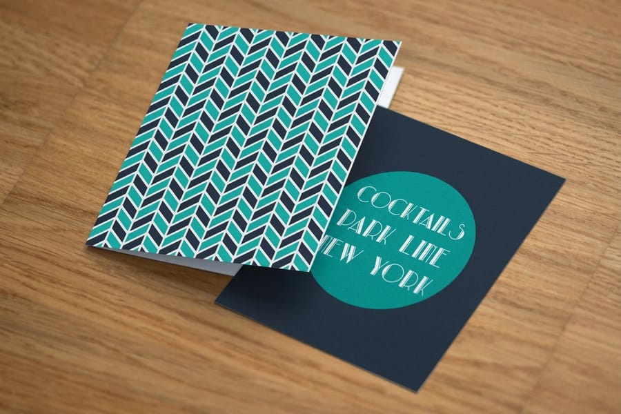
Finish choices get clearer once you see them applied. Here is how five common industries tend to split between matte and glossy.
Real estate agents
Property brochures with large listing photos shine on glossy stock, where the images read as professional and survive being left on kitchen counters during open houses. Pair that with a heavier weight to match the price tag on the property.
Law firms and financial advisors
Matte, every time. These pieces are information-dense and read carefully under office light, so matte keeps the text legible and signals the seriousness the work demands.
Restaurants and cafes
Glossy menus and promotional brochures make food look fresh and appetizing in a way matte cannot match, and the coating shrugs off the occasional coffee spill.
Event planners and wedding coordinators
Matte brochures with elegant type feel romantic and personal rather than commercial, and clients respond to the tactile quality of the stock.
Startups and tech companies
This one depends on the brand. A sleek SaaS launch might go glossy for bold visuals, while a B2B consulting startup might go matte for credibility. Know the audience first, then pick the finish. For answers across every product type, the printing FAQ hub is a good next stop.
Free brochure templates to start from
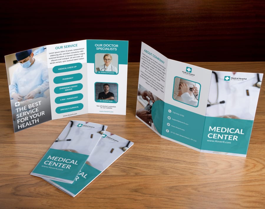
Want to see these finishes on a real layout before you design from scratch? Start from a free brochure template and swap in your own content. Each one opens in the 4OVER4.COM online designer, ready to edit.
Popular starting points include the Medical Brochure, Dental Clinic Brochure, Mental Health Brochure, a second Medical Brochure layout, the Holiday in Paris Brochure, and the Tour Agency Brochure. Prefer a clean slate? Grab the blank brochure templates and build from the ground up.
Once your art is ready, 4OVER4.COM prints it in either finish. Need it quickly? Same day printing gets brochures out the door fast. Want a lighter footprint? Green printing options let you choose sustainable stocks without giving up quality.
Common mistakes when picking a brochure finish

Even people who know finishes well slip on these. Avoid them and your brochures come out looking exactly as intended.
Choosing the finish before the design is done. This is the big one. People pick glossy because it sounds better, then watch a text-heavy layout drown in glare. Design first, then match the finish to the content.
Ignoring where the brochure will live. The comparison means nothing if you skip the handling environment. Outdoor distribution rewards glossy for moisture resistance, while a conference table rewards matte for hiding fingerprints.
Skipping paper samples. A screen never shows texture or sheen. What looks perfect on a monitor can feel wrong in the hand, so order sample kits and touch the actual stock before you print a full run.
Using one finish for every project. Your brand might lean matte overall, but a product launch built on bold photography can still call for glossy. Match the finish to the goal, not the habit.
Forgetting about writability. If your sales team adds names, circles services, or jots prices, glossy will fight the pen while matte takes ink cleanly.
All five come out the same way. Lock the design first, order free samples so you can feel the sheen and the stock in your hand, then print the run in that exact finish and paper weight. Nobody reprints a brochure they already held.
Wally explains matte vs glossy
Match the finish to the message
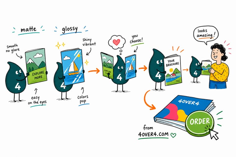
Wally keeps it simple: reach for matte when words carry the page and you want a calm, glare-free read, and reach for glossy when photos carry the page and you want color that pops. Mixed layout? A satin finish splits the difference. Whatever you choose, back it with a heavier stock so the brochure feels as good as it looks. Order free samples first, then print with confidence at 4OVER4.
Order brochures →Specs and pricing
Custom brochure specs and pricing
Once you have picked a finish, here is what a made-to-order brochure gives you at 4OVER4.COM in 2026. Sizes, folds, stocks, and price-per-unit come straight from the live configurator, so the numbers below move with your quantity and turnaround instead of sitting in a table that went stale two years ago.

| Quantity | Price Per Unit | Total |
|---|---|---|
| 50 | $1.14 | $57.11 |
| 100 | 82.4¢ | $82.38 |
| 200 | 53.3¢ | $106.55 |
| 300 | 41.0¢ | $123.02 |
| 400 | 34.9¢ | $139.49 |
| 500 | 31.2¢ | $155.97 |
| 600 | 26.7¢ | $160.36 |
| 700 | 23.5¢ | $164.75 |
Print it
Order brochures in matte or glossy at 4OVER4

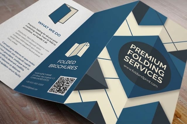
See it in use
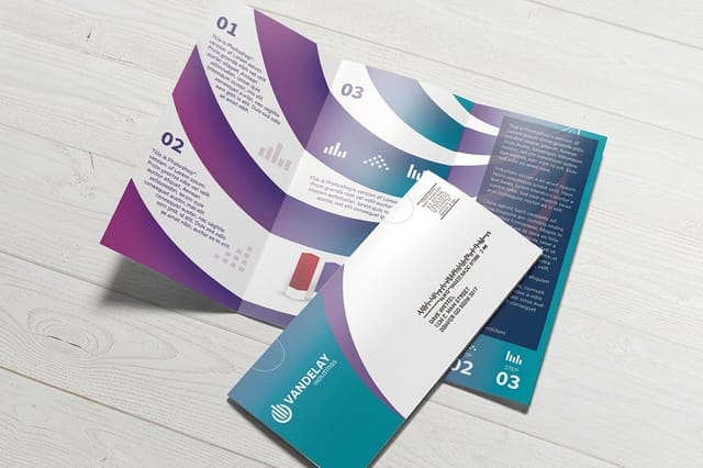
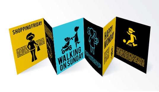
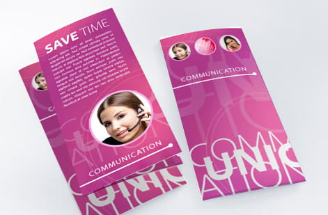
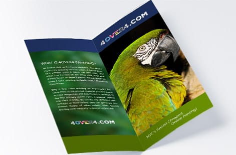
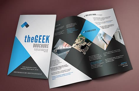
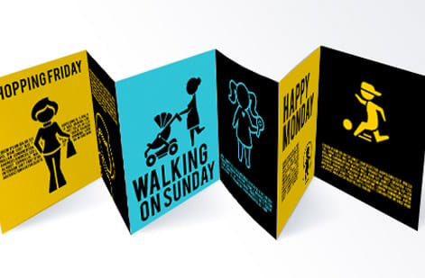
Brochures we printed in both finishes



Explore more
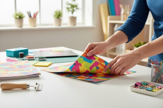
Where to go next




By the numbers
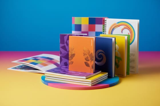
Sixty paper types, matte and gloss among them
Common Questions
Common questions about matte and glossy brochures
What type of paper is typically used for glossy brochures?
A coated text weight stock with a gloss finish, most often 100lb gloss text for a tri-fold that has to crease cleanly, or 100lb gloss cover when the brochure is a leave-behind that should feel stiff. The gloss is a coating applied over the ink, so the same sheet can be ordered matte. Heavier paper is what makes a glossy brochure feel premium rather than slick.
How much does a brochure cost?
Standard brochures at 4OVER4.COM start around $57.11 for a run, and the finish barely moves the number. Size, paper weight, fold and quantity do the moving, with the per-piece price falling as the run grows. Set the options on the brochure configurator and the live total shows exactly what a heavier cover stock or a second fold adds before you order.
Does matte or glossy cost more for brochure printing?
On the same paper weight, matte and glossy usually cost about the same, and the difference at 4OVER4.COM is minimal. Your total depends far more on paper thickness, quantity, and size than on the coating itself. Check the live price on the brochure product page for exact numbers.
Can I use both matte and glossy on the same brochure?
Yes. Spot UV coating lets you lay a glossy finish over specific areas like a photo or a logo while the rest of the brochure stays matte. That contrast in texture draws the eye straight to the elements you want people to notice.
Which finish is better for direct mail brochures?
Glossy usually wins for direct mail. The reflective surface stands out in a stack of envelopes, and the coating guards against moisture in transit. If your mailer is text-heavy, a satin finish is a solid compromise.
Will glossy brochures smudge if I write on them?
They can. Ballpoint ink dries slowly on glossy and smears easily. If your brochures need handwritten names or notes, choose matte, which absorbs ink quickly and cleanly.
How do I decide between matte and glossy for my brand?
Start with your content. Photo-heavy designs lean glossy, text-heavy designs lean matte. Then weigh your industry and what your audience expects. Whichever you pick, you can add a QR code to the design to carry readers from the printed page to your site.
Does the finish affect how long brochures last?
Glossy coatings give slightly better protection against moisture and fading, and matte can scuff over time. For long-term durability, though, a heavier paper stock matters more than the finish you choose.
Get Started
Ready to print your brochures?
Pick your finish, drop in your artwork, and 4OVER4.COM prints a brochure that reads clean and looks sharp in either matte or glossy.
Legal Disclaimer
Gold Standard guarantees apply to all standard orders placed through 4over4.com. Price match requires verifiable proof of a competitor's published price for an equivalent product with matching specifications and turnaround time. Satisfaction guarantee covers manufacturing defects and print quality issues. Contact support with order number and documentation. On-time delivery rate based on tracked orders 1999 to 2026. Individual results may vary based on shipping carrier performance.
