
Best Color Profile for Printing and When to Use CMYK vs RGB


Screens show color in RGB light, presses print with CMYK ink. Convert every print file to CMYK, match the profile to your paper, and keep it at 300 DPI. Those three steps are what close the gap between your screen and the sheet.
The best color profile for printing in North America is US Web Coated SWOP v2 for coated stocks and US Web Uncoated v2 for uncoated stocks, both in CMYK at 300 DPI. RGB is built for screens and shifts on paper, so convert every print file to CMYK, use US Web Coated (SWOP) v2 for coated stock and US Web Uncoated v2 for uncoated, keep resolution at 300 DPI, and embed the profile in your PDF. Reserve Pantone spot color for brand-exact logo colors.
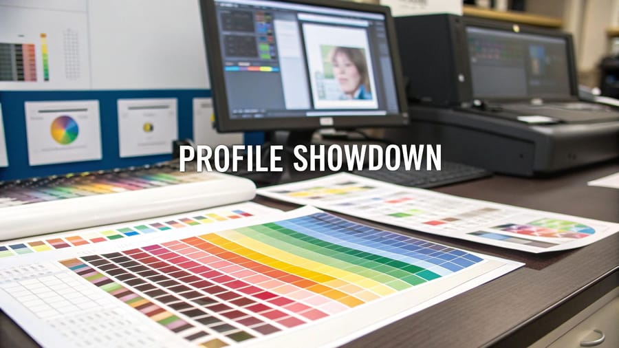
Quick tips
Quick tips for print-ready color
| Paper or product | CMYK profile | PDF preset | Resolution |
|---|---|---|---|
| Coated stock: gloss, silk, semi-gloss, spot UV | US Web Coated (SWOP) v2 | PDF/X-1a | 300 DPI at final size |
| Uncoated stock: kraft, linen, cotton, recycled | US Web Uncoated v2 | PDF/X-1a | 300 DPI at final size |
| Plastic cards | US Web Coated (SWOP) v2 | PDF/X-1a | 300 DPI at final size |
| Large format: banners, posters, signs | US Web Coated (SWOP) v2 | PDF/X-1a | 150 DPI at full print size |
| Pantone spot work: brand-exact logo color | Pantone spot channels kept alongside CMYK | PDF/X-4, spot channels preserved | 300 DPI at final size |
Convert every print file to CMYK before you submit it. Use US Web Coated (SWOP) v2 for coated stocks and US Web Uncoated v2 for uncoated, keep resolution at 300 DPI, and embed the profile in your exported PDF. Soft-proof in your design app to catch color shifts early, and reserve Pantone spot inks for brand-exact logo colors. 4OVER4.COM customers who set files up this way get prints that match their screens.
Why your color profile choice determines print quality
Color profiles act as translators between your screen and the printing press. Your monitor displays color using light (RGB). A printer lays down ink (CMYK). Without the right translation, that electric blue on your screen prints as a muddy purple. That neon green comes out olive.
This best color profile for printing guide walks you through exactly which profile to use, when to use it, and how to set it up in your design software. The principles are the same in the Online Designer and in Photoshop. With 10,000+ reviews behind 4OVER4.COM's print quality, you can trust that proper file setup leads to sharp, accurate results.
If you are working on other print projects, our guide on how to clean rubber stamps is a handy read. And for quick design work, the Online Designer handles color conversion automatically.
What a color profile actually is

A color profile is a set of data that tells devices how to interpret and reproduce color. Think of it like a recipe. Your screen follows one recipe (RGB) to mix light and create colors. Your printer follows a different recipe (CMYK) to mix inks. If you hand a printer the wrong recipe, the dish comes out wrong.
The International Color Consortium (ICC) created standardized profiles so different devices can agree on what a specific color looks like. When you embed an ICC profile in your file, you are giving the printer exact instructions. Skip this step and the printer guesses, and guessing leads to color shifts.
RGB vs CMYK, built for different jobs
RGB stands for Red, Green, Blue. These three colors of light combine to create every color you see on monitors, phones, and tablets. RGB can produce roughly 16.7 million color combinations, a far wider range than any ink-on-paper process can replicate. The catch is that RGB includes colors like electric neon green and vivid cyan that physically cannot be reproduced with printing ink. Send an RGB file to a press and the software force-converts those out-of-range colors to the nearest CMYK equivalent, which is where dull, shifted color comes from.
Use RGB for anything staying on screen: websites, social media graphics, email headers, and digital presentations. If you are learning how to make flyers for digital distribution only, RGB works fine. The moment that file hits paper, switch to CMYK.
CMYK stands for Cyan, Magenta, Yellow, and Key (black). These four inks combine on paper to create the full spectrum of printed color, and every commercial offset and digital press uses it. The CMYK gamut is smaller than RGB, around 16,000 colors, but that is a strength for print work. When you design in CMYK from the start, what you see in your software closely matches what comes off the press, with no surprises.
Which CMYK profile to pick
The specific CMYK profile matters too. For most commercial printing in North America, use US Web Coated (SWOP) v2. This profile is calibrated for coated paper stocks, the glossy and semi-gloss finishes most business cards, brochures, and postcards use. For uncoated paper, use US Web Uncoated v2. Colors on uncoated stock absorb more ink and appear slightly muted, and this profile accounts for that.
4OVER4.COM recommends US Web Coated (SWOP) v2 as the default for most print jobs. It is the industry standard and produces the most predictable results across their 60+ paper types.
You will also see GRACoL 2013 offered in the same dropdown. GRACoL is the sheetfed profile, calibrated for commercial sheetfed presses rather than web offset, so it suits short-run premium work on heavy coated stock where the printer has told you the job runs sheetfed. If nobody has told you that, stay on SWOP v2. Fogra39 belongs to European presses and should not be used for a North American print run.
Pantone, when exact color is non-negotiable
The Pantone Matching System (PMS) uses pre-mixed spot colors. Instead of combining four inks to approximate a color, a Pantone color is a single, specific ink formula. This guarantees consistency across every print run, every printer, every time.
Brands like Coca-Cola, Tiffany, and UPS use Pantone colors for their logos. If your brand guidelines specify a Pantone number, use it for logo elements. For everything else on the page, photos, backgrounds, and gradients, CMYK handles the job, and most commercial print jobs combine Pantone spot colors with CMYK process printing.
Not every project needs Pantone. It adds cost because the printer mixes a custom ink. For business cards, postcards, and marketing materials where brand-exact color is not critical, CMYK alone delivers strong results. Browse the guide hub for more detail on when spot colors make sense.
Setting up the right profile in your design software
Adobe Photoshop
Go to Edit then Color Settings. Under Working Spaces, set CMYK to US Web Coated (SWOP) v2 and set RGB to sRGB IEC61966-2.1 so your screen preview stays accurate. Under Color Management Policies, set CMYK to Preserve Embedded Profiles, then click OK. When creating a new document for print, go to File then New and select CMYK Color as the Color Mode at 300 DPI. That combination is the foundation of every print-ready file.
Adobe Illustrator
Same path, Edit then Color Settings, and match the CMYK working space to US Web Coated (SWOP) v2. When creating new documents, choose Print from the profile presets and Illustrator sets CMYK and the correct resolution for you. If you are designing envelopes or magnets, the same profile applies, and our guides on how to make envelopes and custom magnets cover file setup in detail.
Adobe InDesign
Go to Edit then Color Settings and select North America Prepress 2 from the Settings dropdown. This configures CMYK to SWOP v2 and RGB to Adobe RGB (1998). When exporting to PDF, use the PDF/X-1a preset, which flattens transparency and embeds the CMYK profile.
Canva and free tools
Canva Pro exports in CMYK: go to Share then Download, select PDF Print, and check Flatten PDF and CMYK color profile. Free Canva only exports RGB, so you will need to convert afterward. 4OVER4.COM's Online Designer handles color conversion on the backend, so you do not need manual profile setup when designing directly on the platform.
Converting RGB files to CMYK without wrecking the color

Already designed in RGB? Do not panic, you can convert, but do it carefully. In Photoshop, go to Image then Mode then CMYK Color, and Photoshop converts using your working space profile. Some colors will shift. Bright blues get duller and vivid greens lose saturation. This is normal, because those RGB colors were outside CMYK's printable range.
After converting, review every element and adjust saturation and brightness where needed. Blues and purples shift the most, often appearing more muted or slightly red. Bright neon and lime greens have no CMYK equivalent and appear darker. Smooth RGB gradients can show banding, so add a touch of noise to prevent it. Photographs usually convert well, though skin tones may need minor correction, and brand logos should be checked against your brand guidelines after conversion.
A pro tip: design in CMYK from the start. Converting after the fact always involves compromise, but when you begin in CMYK you are working within the printable range from minute one.
Color profile settings for specific products

Different print products have different needs. Business cards on coated 30mil clear plastic cards need different consideration than a tri-fold brochure on uncoated stock.
For coated papers (gloss, semi-gloss, silk, spot UV), use US Web Coated (SWOP) v2. Colors appear more vivid on coated stock because ink sits on top of the surface rather than absorbing into fibers. For uncoated and textured papers (kraft, linen, cotton), use US Web Uncoated v2, and expect colors to appear 10 to 15% less saturated than on coated stock, so bump up saturation slightly in your design to compensate.
For brochures with folds, our guide on how to fold a brochure covers layout tips that work hand in hand with proper color profile setup.
Set the profile per product before you upload: postcards and standard business cards print on coated stock by default, while brochures are ordered on both. If you are unsure what happens to a file you already exported, read can I send an RGB file for printing and can you match PMS and CMYK colors in the help center.
Resolution and color depth, the other half of the equation
300 DPI is the minimum for print. Anything lower and you will see pixelation, soft edges, and fuzzy text. Your color profile can be perfect, but if your resolution is 72 DPI (screen resolution), the print will look terrible.
Color depth matters too. Work in 8-bit color for most print projects. 16-bit gives you more editing flexibility in Photoshop but produces larger files. When you export your final print-ready PDF, 8-bit CMYK at 300 DPI is the sweet spot.
Ready to start clean? These blank templates come set up so your next project begins with the correct color profile already configured: carbonless forms and large format posters.
Color profile mistakes that ruin print jobs

Even experienced designers slip up with color profiles. Here are the most common mistakes 4OVER4.COM sees across thousands of daily print orders.
- Designing in RGB and never converting. This is the number one file error. Your screen looks perfect and your print looks washed out, so always check your color mode before exporting.
- Using the wrong CMYK profile. There are dozens of them. A European profile like Fogra39 on a North American press produces different results, so stick with US Web Coated (SWOP) v2 unless told otherwise.
- Setting black as RGB (0,0,0) instead of rich black. In CMYK, use C:40 M:30 Y:30 K:100 for deep, rich black on large areas. Pure K:100 can look washed out or show streaks.
- Ignoring soft proofing. Most design apps preview how CMYK will look on screen. Use View then Proof Colors in Photoshop to catch issues before ordering.
- Forgetting to embed the profile in the exported PDF. An untagged PDF forces the printer's software to guess your color intent, so always embed.
Following this best color profile for printing guide eliminates these errors. 4OVER4.COM delivers 99.8% on-time delivery, but color accuracy starts with your file. When you are ready to test your setup, a free business cards order is the fastest way to see how CMYK translates to paper, and online label printing is a great place to combine Pantone brand color with CMYK process for the rest of the design.
Wally explains print color
What you see on screen is not always what prints
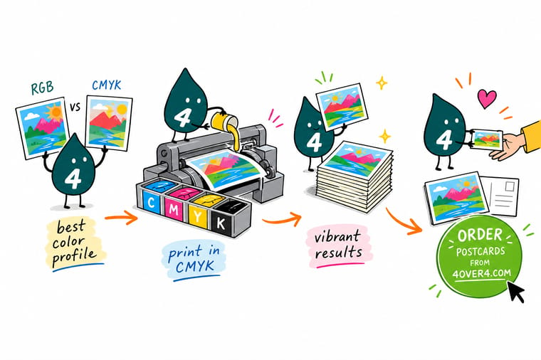
Wally thinks of RGB and CMYK like two languages. Your screen speaks in light, the press speaks in ink, and the color profile is the translator between them. Convert to CMYK before you print, match the profile to your paper, keep the file at 300 DPI, and the colors you designed are the colors that land on the page. Skip the translation and bright blues turn muddy. Get it right and your print looks exactly like your screen.
Order postcards →Specs and pricing
Postcard specs and pricing at 4OVER4
Postcards are photographic and color-critical, which makes them the perfect test of a clean CMYK file. Here are the live specs and price-per-unit straight from the configurator.

| Quantity | Price Per Unit | Total |
|---|---|---|
| 50 | 33.0¢ | $16.48 |
| 100 | 24.2¢ | $24.16 |
| 200 | 15.9¢ | $31.86 |
| 300 | 12.8¢ | $38.45 |
| 400 | 11.3¢ | $45.04 |
| 500 | 10.3¢ | $51.62 |
| 600 | 9.89¢ | $59.31 |
| 700 | 9.57¢ | $67.00 |
Print it
Color-critical print, done right at 4OVER4


See it in use
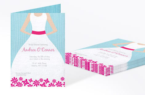
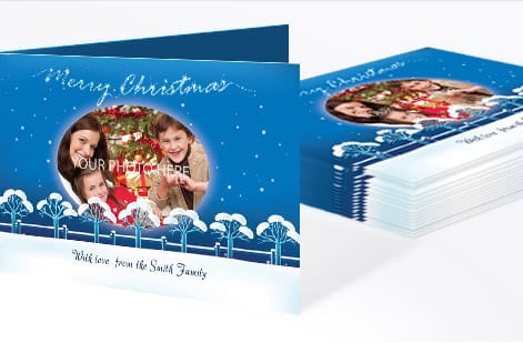
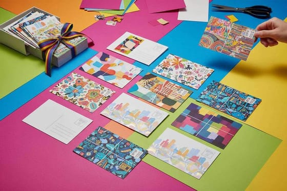
Full color postcards printed from customer files






Explore more
Where to go next



By the numbers
Ten billion cards through the same color process
Common Questions
Common questions about choosing color profiles for print
What is the best color profile for printing business cards?
Use US Web Coated (SWOP) v2 for business cards on coated stock, which covers most finishes like gloss, matte, and silk. For uncoated or textured paper like kraft or cotton, switch to US Web Uncoated v2. Set your file to CMYK mode at 300 DPI before exporting.
Can I print an RGB file, or do I have to convert to CMYK?
You can submit an RGB file and the press will auto-convert it, but you will not control how colors shift during that conversion. Bright blues, greens, and purples lose vibrancy. Converting to CMYK yourself lets you adjust colors before printing so the final product matches your vision.
Why do my prints look different from my screen?
Screens use light (RGB) to display color while printers use ink (CMYK), and these two systems have different color ranges. A calibrated monitor helps, but the best solution is designing in CMYK from the start and using soft proofing in your design software to preview how colors will print.
What's the difference between US Web Coated SWOP v2 and other CMYK profiles?
SWOP v2 is calibrated for web offset printing on coated paper in North America. Other profiles like Fogra39 are European standards, and GRACoL is optimized for commercial sheetfed presses. For most 4OVER4.COM products, SWOP v2 produces the most accurate and consistent results.
Do I need Pantone colors for my print project?
Only if your brand guidelines require exact color matching across every print run. Pantone uses pre-mixed spot inks for guaranteed consistency. For most marketing materials like flyers, postcards, and business cards, CMYK delivers strong color accuracy without the added cost of spot color printing.
What resolution should I use alongside my color profile?
300 DPI is the minimum for all print files, and this applies for CMYK files and for conversions from RGB alike. Lower resolutions cause blurry text and pixelated images even with the correct color profile. Export as PDF/X-1a for the most reliable print results.
Get Started
Order 50 brochures on 100# Gloss Text from $57.11
Set your file to CMYK, upload it, and we print sharp, accurate color on your choice of 60+ paper stocks.
Legal Disclaimer
Gold Standard guarantees apply to all standard orders placed through 4over4.com. Price match requires verifiable proof of a competitor's published price for an equivalent product with matching specifications and turnaround time. Satisfaction guarantee covers manufacturing defects and print quality issues. Contact support with order number and documentation. On-time delivery rate based on tracked orders 1999 to 2026. Individual results may vary based on shipping carrier performance.
