
Leading vs Kerning vs Tracking Explained


Leading sets the space between lines, kerning fixes the gap between two characters, and tracking spaces a whole block at once. Here is how each one works and how to set all three for crisp, readable print.
Leading, kerning, and tracking are three separate spacing controls. Leading is the vertical space between lines of text. Kerning is the horizontal adjustment between two specific characters. Tracking is the uniform horizontal spacing across an entire word, line, or block. Set tracking first, then kern the pairs that still look off, and remember that in print these choices are permanent once ink hits paper.

Quick tips
The fast rules for spacing print type
Leading is vertical, tracking is the block, kerning is the pair. Start leading at 120 percent of your font size and loosen it for small body copy. Add positive tracking to all caps and small text, and pull it in on oversized headlines. Set tracking before you kern, then fix awkward pairs by hand. Because print is permanent, proof headlines and fine print before you approve, and clean typography will read sharp on every 4OVER4.COM product.
Watch it printed
See standard business cards on the press, in 167 seconds
Side by side
Leading vs kerning vs tracking comparison
Three tools, three different jobs. Leading is vertical, tracking moves a whole block, kerning moves one pair, and you set them in that order.
| Term | What it controls | Unit | When to adjust | Common value |
|---|---|---|---|---|
| Leading | Vertical space between lines of text | Points, or a percentage of the font size | First, on every block of type | 120 percent of the font size, 130 to 150 percent for 7 to 10pt business card text |
| Tracking | Horizontal space across a whole word, line, or block | Thousandths of an em | Second, before you touch a single pair | Plus 25 to plus 75 on all caps and small text, negative on oversized headlines |
| Kerning | The gap between two specific characters | Thousandths of an em | Last, on headlines, logos, and display type above 24pt | Metric or optical automatically, then fix the awkward pairs by hand |
Why leading, kerning, and tracking shape every print design
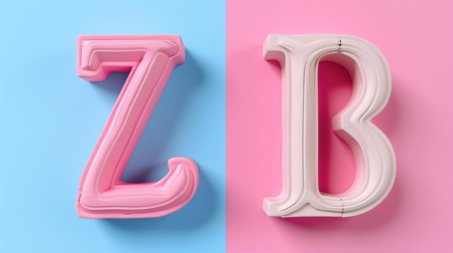
You have probably seen a business card or flyer where the text just felt off. Letters crammed together, lines overlapping, words floating in too much white space. That is what happens when leading, kerning, and tracking are not handled with care.
These three spacing adjustments sit at the core of readable, professional typography. They are different tools that solve different problems, and they all affect how your audience experiences your printed materials. Whether you are designing a brochure, a poster, or a business card, your spacing decisions show up in the final product.
4OVER4.COM backs every print order with our 5 Gold Guarantees, but no guarantee can fix bad typography. That part is on you. If you are working on something unusual, our custom project options give you specialized print formats where type precision really counts. Let us break down each concept so you can make confident spacing calls on your next design.
Leading: the vertical space between your lines
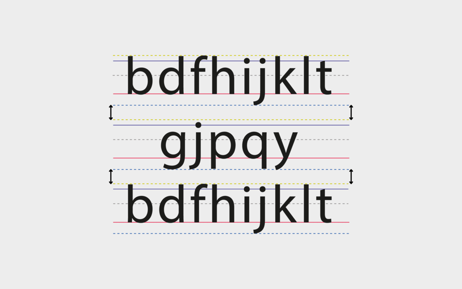
Leading (pronounced "ledding") is the vertical distance between the baselines of consecutive lines of text. The term comes from the days of metal typesetting, when printers literally slid strips of lead between rows of type. Today you control it with a slider or a number field, but the principle has not changed. Good leading makes text breathable. It guides the reader's eye from one line to the next without confusion. Too tight and the lines blur together. Too loose and the text feels disconnected, like each line is its own island.
The standard leading rule is to start at 120 percent of your font size. So if you are setting 12pt type, set your leading to at least 14.4pt. Adobe InDesign and Illustrator default to that ratio automatically. It is a solid baseline, but you will almost always adjust from there. Long paragraphs benefit from more generous leading, around 130 to 150 percent, because readers need room to track across multiple lines without losing their place. When you design folded pieces, understanding how to fold a brochure also helps you plan how text blocks sit across panels.
Tighten leading for short, punchy headlines. Display type at large sizes often carries too much default space between lines, and pulling the lines closer reads as one cohesive unit rather than stacked words. Loosen leading for body text, especially in print. A business card with 8pt type and tight leading becomes unreadable, and a flyer packed with dense paragraphs needs breathing room. Your audience will not squint, they will just stop reading. Sans-serif fonts with tall x-heights like Helvetica or Futura usually need more leading than serif fonts, because the letters read visually larger.
Kerning: fine-tuning the space between two characters
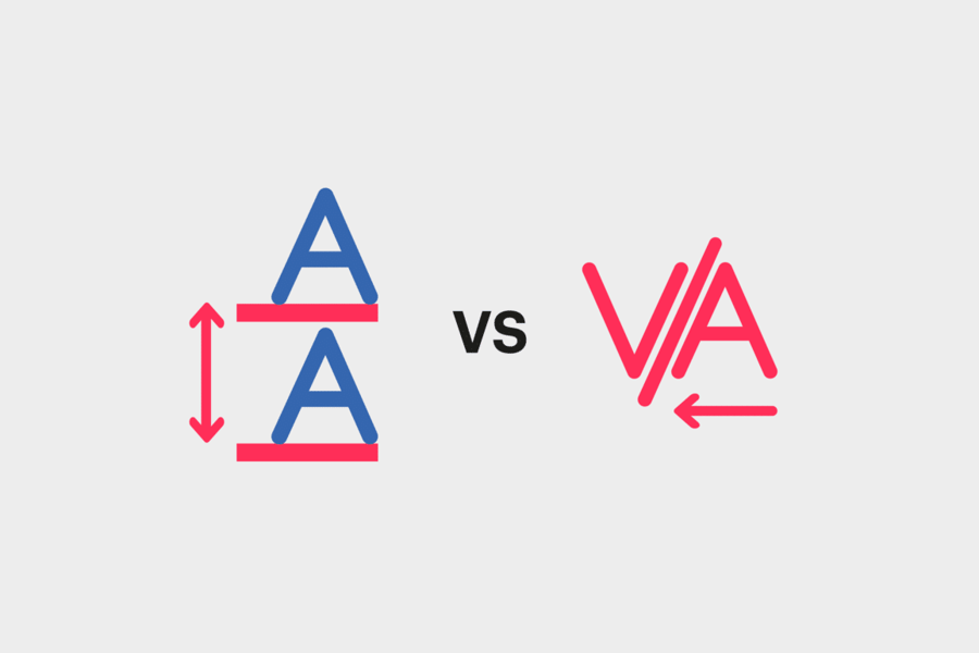
Kerning is the adjustment of space between two specific characters. Not all characters, not a whole word, just a pair. It is the most precise of the three spacing tools, and it is where typography gets personal. Certain letter combinations create awkward visual gaps. The classic examples are "AV", "To", "WA", and "Ty". The shapes of those letters leave uneven white space that your eye picks up immediately, even when you cannot articulate why something looks wrong.
Most design software offers two automatic options. Metric kerning uses the kern tables built into the font file, so the type designer already decided how much space "AV" or "To" should carry. It is reliable for well-made fonts. Optical kerning lets the software read letter shapes and adjust spacing by appearance, which works better for fonts with thin kern tables or when you mix typefaces. If you are building flyers with mixed display and body fonts, optical kerning often gives cleaner results.
Automatic kerning handles most situations, but logos, headlines, and any large display text need a manual pass. At big sizes even small inconsistencies become obvious, and an un-kerned headline on a poster or banner looks amateur. The squint test works. Zoom out or squint at your text, and if you notice uneven dark and light patches between letters, those pairs need attention. Kern in pairs, left to right, and always kern after you have locked your typeface and size, because changing either one resets the game.
Tracking: uniform spacing across entire text blocks

Tracking adjusts the spacing between all characters in a selected range at once. Unlike kerning, which targets two specific characters, tracking affects every letter pair equally. Think of it as a volume knob for overall letter spacing. Positive tracking spreads letters apart. Negative tracking pulls them closer together. Both have legitimate uses depending on the size and context of your text.
Reach for positive tracking on small text and all caps. When type drops below 8pt, common on business cards, labels, and packaging, letters can merge visually, and a small bump of roughly plus 20 to plus 50 improves legibility without changing the character of the typeface. All-caps text almost always needs positive tracking too, because capital letters were drawn to sit alongside lowercase, so a full word in caps feels cramped at default spacing. That open, authoritative look matters on everything from envelopes with return addresses to large-format signage.
Reach for negative tracking on large display type. At 36pt and above the default gaps can feel too open, and pulling tracking in slightly creates a more cohesive, impactful headline. Do not overdo it, letters should not touch or overlap unless that is a deliberate choice. A line that runs one word too long for a text box can often be saved with a small reduction of minus 10 to minus 20 without visible quality loss. The simplest way to remember the difference is that tracking is a blanket adjustment and kerning is a surgical one. Set the overall tone with tracking, then fix the specific pairs that still look off with kerning.
Spacing, the fourth term people mix up with kerning
Type carries a fourth spacing value that never appears in a panel, and it is the one behind most of the confusion about kerning. Every character in a font is drawn with a sliver of blank space built into its left and right side, called a side bearing. Those side bearings are the font's default spacing, the rhythm the type designer set before anyone touched a slider.
Tracking and kerning both work on top of that default rather than replacing it. Tracking adds or removes the same amount at every side bearing across a run of text. Kerning overrides the value for two specific characters. Neither one edits the font, which is why the same tracking number looks open in one typeface and tight in another.
The practical read is short. If a word looks cramped in every typeface you try, the size is the problem. If it looks cramped in one face only, the side bearings are, and a different face fixes it faster than any slider.
How leading, kerning, and tracking work together in print
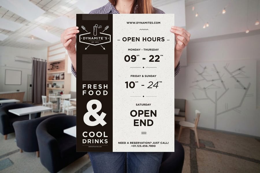
These three tools are not competing. They operate on different axes and at different scales. Leading handles the vertical, tracking handles the horizontal at the macro level, and kerning handles the horizontal at the micro level. A well-typeset business card uses all three: the headline gets tightened tracking and manual kerning on a tricky pair, the body text uses standard tracking with slightly increased leading, and the tagline in all caps gets positive tracking to breathe.
For print, these decisions are permanent. You cannot nudge spacing after ink hits paper, which is why 4OVER4.COM provides blank templates for common products so you can set type within the exact dimensions of the final piece. Always review a digital proof and zoom in on headlines and small text before you approve. Our help center has the file-preparation guidelines that keep your spacing intact from screen to press.
Typography settings shift by product. Business cards magnify every decision, so use 120 to 130 percent leading, add plus 25 to plus 50 tracking on any all caps, and manually kern the name or company that anchors the card. Flyers and postcards want tighter tracking and manual kerning on headlines, with generous 130 to 150 percent leading on the body because readers scan quickly. Posters and banners demand manual kerning with no exceptions, because a poorly kerned "AW" or "LT" pair is visible from across the room, and tracking should run slightly negative for impact.
Here is how to make those adjustments in Adobe InDesign or Illustrator.
- Open the Character panel from the Window menu so leading, kerning, and tracking are all in reach.
- To kern, select the Text tool and place the cursor between the two letters you want to adjust, then type a value in the kerning field or hold Option or Alt and tap the left and right arrows to move the pair closer or farther apart.
- To track, select the full range of text, then use the tracking field below kerning or hold Option or Alt with the arrows to open or close spacing across every letter at once.
- Reserve kerning for the details that carry the design, like a logotype, and test a few tracking settings so the block stays readable without feeling over-tightened or over-loose.
Two quick notes on other tools. Canva maps letter spacing to tracking and line height to leading, but it has no manual kerning, so use a professional tool when you need character-level precision. Figma also maps letter spacing to tracking and line height to leading, with auto kerning from the font kern table and manual kerning only through workarounds. Working on more than type today? Browse the guide hub, or pick up how to clean rubber stamps and how to make custom magnets for more hands-on print tips.
Setting leading, kerning and tracking in Photoshop
The Character panel in Photoshop holds the same three controls in the same order as Illustrator and InDesign, so every number in this guide carries straight across. Open it from the Window menu and the leading field sits beside the font size, set to Auto, which resolves to the 120 percent starting point.
Kerning and tracking sit on the row below. Set the kerning menu to Metrics to use the font's own pair values, or Optical to let Photoshop judge by letter shape. Both fields read in thousandths of an em, so a tracking value of 25 opens every gap by 25 thousandths of the current point size. That is why the same number does far more at 8pt than it does at 72pt.
One Photoshop caution that does not apply to the other two. Type on a Photoshop layer turns to pixels when the file flattens, so set the document to its final print size and full print resolution before you space anything, not after.
Spacing mistakes that ruin printed typography
Understanding the three tools is one thing. Avoiding the common pitfalls is another. These are the mistakes 4OVER4.COM sees most often on submitted print files, and every one of them is easy to catch before you upload.
Ignoring kerning on headlines. Auto-kerning is fine for body text, but any type above 24pt needs a manual pass, because no paper stock will rescue a sloppy headline. Using default tracking on all caps. This is the single most common tracking error. All-caps text without added tracking looks squeezed, so always open it up. Setting leading too tight on small body text. Anything under 10pt needs room to breathe, and the 120 percent rule is a minimum, not a target. On business cards and labels, push it to 140 or 150 percent.
Kerning after changing font size. Resize first, finalize the size, then kern, because changing size afterward undoes your careful work. Applying tracking when you actually need kerning. If only one pair looks off, do not shift the whole word, target that pair with kerning instead. Catch these five and your typography will already look more professional than most of what crosses a print queue.
Print products where typography spacing matters most

Getting leading, kerning, and tracking right pays off most on products where text is the star. Business cards, posters, and brochures live or die by their typography. Large-format pieces like 3D lenticular posters magnify every spacing decision, because kerning errors that hide at 12pt turn glaring at 72pt.
Each format has its own numbers. On a 3.5 by 2 inch business card the contact block sits at 7 to 10pt, so leading needs 130 to 150 percent of the font size before the lines stop touching. On a poster read from across a room, headline type above 24pt is exactly where a bad pair shows, and oversized display lines usually want negative tracking rather than positive. In a brochure, leading carries a long read across every panel, and our guide on how to fold a brochure shows how the fold decides the column width you are setting that type into.
4OVER4.COM offers more than 1,000 products across 60-plus paper types, and clean typography looks sharp on all of them. When your spacing is dialed in, order the pieces that show it off: crisp standard business cards for the details that get read up close, bold posters for type viewed at scale, and multi-panel brochures where leading carries a long read. Set the type once, proof it, and let the print do the talking.
Wally explains spacing
Three knobs, one clean layout
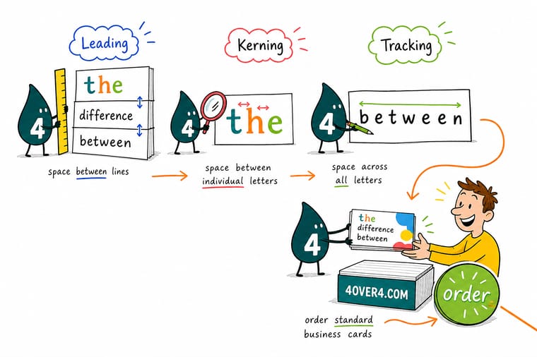
Wally thinks of type like a tiny grid: leading sets the space between the lines, tracking opens or closes a whole word, and kerning nudges the one pair that still looks off. Get the three working together and your name reads sharp from a business card at arm's length to a poster across the room. Set your spacing once, proof it, and let 4OVER4 print it permanently crisp.
Order business cards →Specs and pricing
Standard business card specs and pricing
Once your type is dialed in, here is what a set of standard business cards gives you at 4OVER4.COM, with live specs and price-per-unit straight from the configurator.

| Quantity | Price Per Unit | Total |
|---|---|---|
| 100 | 17.6¢ | $17.57 |
| 200 | 11.5¢ | $23.07 |
| 300 | 9.15¢ | $27.46 |
| 400 | 7.96¢ | $31.86 |
| 500 | 7.25¢ | $36.26 |
| 600 | 6.77¢ | $40.64 |
| 700 | 6.43¢ | $45.04 |
| 800 | 6.18¢ | $49.43 |
Print it
Products where your typography does the talking



See it in use
Type as it landed on printed business cards








Explore more
Where to go next




By the numbers
Ten billion cards set in type and printed
Common Questions
Common questions about typography spacing in print
What is the golden rule of typography?
There is no single rule everyone agrees on, but the one that survives every style is that spacing should be invisible. If a reader notices the gaps before the words, the setting is wrong. In practice that means starting leading at 120 percent of the font size, opening tracking on small text and all caps, and kerning only the pairs that still catch the eye.
What are the basic rules of kerning?
Kern last, after the typeface, the size and the tracking are locked, because changing any of those resets your work. Work left to right in pairs rather than jumping around. Judge by the white space between letters rather than the distance, so the gaps read as equal even when the letter shapes are not. And kern only what is large enough for a reader to see, which in practice means headlines, logos and anything above 24pt.
How can I check my kerning?
Squint at the line until the letters lose their detail and only light and dark patches remain. Even patches mean even spacing, and a dark clump or a bright hole marks the pair to fix. Turning the text upside down works the same way, because it stops you reading the words and leaves only the shapes. For print, check those pairs on a proof rather than on screen, since a screen renders spacing at its own resolution.
What's the difference between leading, kerning, and tracking?
Leading controls vertical space between lines of text. Kerning adjusts the horizontal gap between two specific characters. Tracking changes horizontal spacing uniformly across an entire word, line, or text block. All three work together to create readable, visually balanced typography on printed materials.
Should I adjust kerning on every piece of text?
No. Body text at small sizes rarely needs manual kerning, because automatic metric or optical kerning handles it well. Focus manual kerning on headlines, logos, and any display text above 24pt where spacing inconsistencies are visible to the naked eye.
What's the right leading for body text on a business card?
Start at 130 to 150 percent of your font size. Business card text is typically small, around 7 to 10pt, so it needs more generous leading than standard body copy. If lines feel cramped when you print a test, increase the leading until the text breathes comfortably.
Does all-caps text always need extra tracking?
Yes, almost always. Capital letters are designed to sit next to lowercase letters. When used alone, they look too tight at default spacing. Adding positive tracking, roughly plus 25 to plus 75 depending on the typeface, gives all-caps text the open, confident appearance it needs.
Can I fix bad spacing after sending my file to print?
Once your file is submitted and in production, spacing cannot be changed. That is why proofing matters. Review our help center file-preparation guidelines and always approve a digital proof first, zooming in on headlines and small text to catch spacing issues early.
Which should I adjust first, tracking or kerning?
Always set tracking first. Tracking shifts all letter pairs uniformly, establishing the overall spacing tone. Then go in and manually kern any specific character pairs that still look uneven. Kerning first and then changing tracking will undo your manual adjustments.
Get Started
Ready to put your typography in print?
Pick your stock, drop in your design, and we print sharp, true-to-file type that reads clean on every piece.
Legal Disclaimer
Gold Standard guarantees apply to all standard orders placed through 4over4.com. Price match requires verifiable proof of a competitor's published price for an equivalent product with matching specifications and turnaround time. Satisfaction guarantee covers manufacturing defects and print quality issues. Contact support with order number and documentation. On-time delivery rate based on tracked orders 1999 to 2026. Individual results may vary based on shipping carrier performance.
