
Business Card Format Design Tips for a Polished Layout


Lead with a clean layout, a clear visual hierarchy, and two readable fonts, then hold the address to two lines and let 30 to 40 percent of the card stay empty. Those four constraints separate a card that gets kept from one that gets tossed.
To format a business card, start with the 3.5 by 2 inch trim and a 0.125 inch safe zone, then build a clear hierarchy with your name largest, the title smaller, and contact details smallest. Use two fonts at 7pt or larger, keep the address to two lines, and leave 30 to 40 percent white space so the card reads clean and stays in the wallet.

The format in one block
Standard business card format specs
The standard business card format is 3.5 by 2 inches. Build the file at 3.75 by 2.25 inches so the bleed is included, then keep everything that matters inside the safe zone.
| Trim size | 3.5 by 2 inches, the finished card after cutting |
|---|---|
| Bleed | 0.125 inches on every side |
| Full working file | 3.75 by 2.25 inches, trim plus bleed |
| Safe zone | 0.125 inches inside the trim line, for every logo and every line of text |
| Minimum text size | 7pt, with contact details at a legible 8 to 9pt |
| Resolution and color | 300 DPI, CMYK |
Quick tips
Quick tips for formatting your business card
Clean formatting wins. 4OVER4.COM has printed 10 billion cards, and the pattern is clear: cards with a logical layout, readable fonts, and real white space get held onto longer. Start with the standard 3.5 by 2 inch size, build a clear hierarchy so your name reads first, hold the address to two lines, and cut anything the reader does not need. Good design is not about cramming in every detail, it is about clarity.
Start with the standard size and safe zone

The standard business card size in the United States is 3.5 by 2 inches, and that trim size is your final canvas after cutting. Build the artwork a little larger to allow for bleed, usually 0.125 inches on every side, so no thin white slivers show up if the blade drifts. Bleed is the quiet insurance that keeps a full-color edge looking intentional.
More important than bleed is the safe zone. Keep every logo and every line of text at least 0.125 inches inside the trim line so nothing critical gets clipped. Crowding the edge is one of the most common and most avoidable formatting mistakes we see.
Creative shapes still play by the same rules. If you want to break the rectangle, 3D lenticular business cards, rounded corners, and square shapes keep the safe zone intact while adding a hook, and you can start from ready-made blank templates that already have the margins built in.
Free business card format templates

You do not have to build the format from scratch. Two sets of files already have the geometry in them.
- Blank templates: the press-ready blank at the exact 3.5 by 2 inch trim with the 0.125 inch bleed and the safe zone already drawn, so you drop artwork in and export.
- Design templates: editable layouts with the hierarchy already set, so you swap in the name, the title and the contact lines and keep spacing that is known to work.
Either way the file you send back should be 3.75 by 2.25 inches with bleed, 300 DPI, CMYK. Starting from a template also kills the two mistakes we see most: artwork crowding the trim, and contact text set under 7pt.
Visual hierarchy: what gets read first

People do not read a business card top to bottom the way they read a page. Their eyes jump straight to the largest, boldest element, so the order you assign to type sizes is the order the card gets read. That is your visual hierarchy, and it is fully under your control.
Your name or company name should dominate as the biggest text on the card. Your title or tagline sits one step down, and the contact details stay the smallest readable size. A clean three-level structure looks like this:
- Level one, the largest: company name or your name, the anchor for the card identity.
- Level two, medium: job title, tagline, or specialty, the context for who you are.
- Level three, smallest: phone, email, website, and address, the actionable details.
When every element shouts at the same volume, nothing lands. Let size and weight do the guiding. For more layout ideas across print formats, the 4OVER4.COM guide hub is stacked with hands-on walkthroughs.
Choosing fonts that work at small sizes
A font that sings on a poster can turn to mush at 8pt on a card, so type choice quietly makes or breaks the whole layout. Stick to two typefaces at most, one for headings like your name and company, and one for the body details. Three or more fonts on a surface this small reads as chaos.
Sans-serif faces such as Helvetica, Montserrat, or Open Sans stay crisp at tiny sizes, while serifs like Garamond or Georgia lend names and titles a touch of polish. Save script fonts for the occasional tagline and never for a phone number. On sizing, do not drop below 7pt for anything, keep primary text around 10 to 12pt, and let contact details ride at a readable 8 to 9pt. Ready-made design templates take the guesswork out of pairing type that already prints clean.
How to format your address on a business card
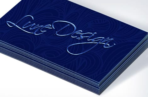
The address is where most layouts wobble. People either pack in too much or break the lines in odd places. The fix is simple. Hold it to two lines. Line one carries the street address, line two carries the city, state, and zip. Abbreviate Suite as Ste. and drop the country unless you actually do international business.
A clean address reads like this:
- 123 Main St, Ste. 400
- Austin, TX 78701
If you run online only, skip the street entirely, since a city and state still signal local credibility, or hand that space to your website, which is the real storefront now. Running several locations? Pick the primary one and let the site list the rest. If matching stationery is next on your list, our guide on how to make envelopes keeps the whole set consistent.
White space is not wasted space
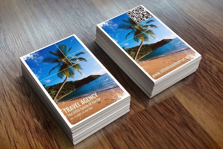
This is the hardest habit to build. You have a tiny card and a pile of information, and the instinct is to fill every square millimeter. Fight it. White space is what makes a card easy to read and pleasant to hold. It gives each element room to breathe, and cards with generous spacing simply feel more premium than ones packed wall to wall.
A useful target is to leave 30 to 40 percent of the surface empty. That sounds like a lot until you see the result next to a crammed card that reads like a classified ad. When the layout feels tight, edit the content rather than the spacing. You probably do not need both an office and a cell number, and a fax line in 2026 is almost always cuttable. Trim the clutter and the design breathes on its own.
Front and back: using both sides strategically
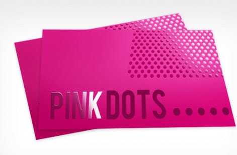
A two-sided card hands you double the real estate, so use each face on purpose. Put the front to work as the memorable side: your name, title, company name, and logo, kept clean and uncrowded. That is the first thing anyone sees.
Give the back a job of its own. Contact details, social handles, a QR code to your portfolio or booking page, or a bold brand pattern all earn their place here. What you should not do is repeat yourself. If the phone number lives on the back, it does not need to sit on the front too. When you are ready to pair cards with matching promo, our guide on how to make flyers keeps the family of pieces looking related.
Color and contrast: making text pop
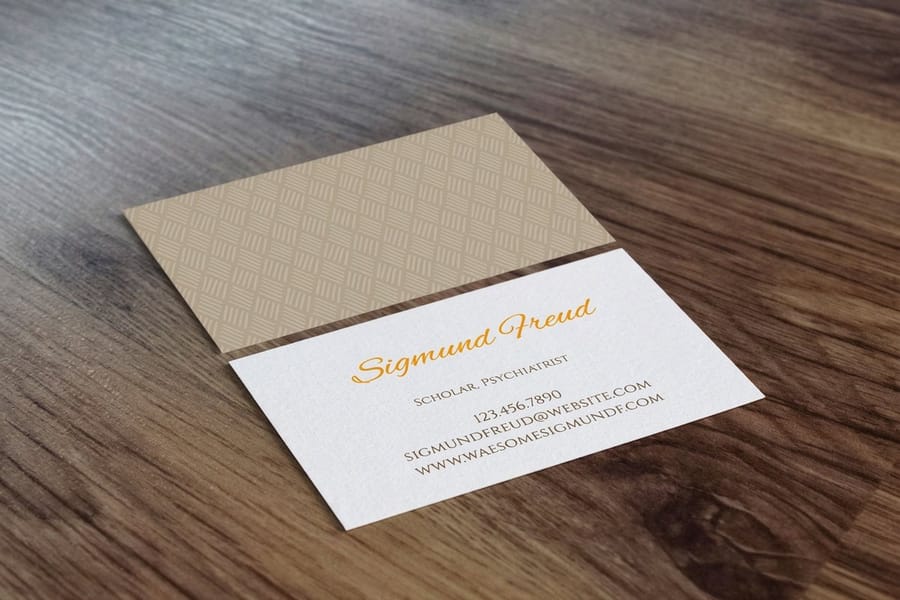
Dark text on a light background is the safest route to legibility, but safe does not have to mean dull. Color, used with intent, sharpens the layout instead of muddying it:
- An accent color on your name or title pulls the eye to the most important line.
- Brand colors in rules, borders, or blocks reinforce who you are at a glance.
- High contrast on contact details, black on white or dark gray on cream, keeps them effortless to read.
Steer clear of light type on light backgrounds and dark type on dark ones. It sounds obvious, yet it happens constantly on colored stocks where the ink and the paper fight each other. Check your contrast before you export, and if you want to see how a stock shifts your colors in real life, order free samples and test before you commit to a full run.
QR codes and digital elements
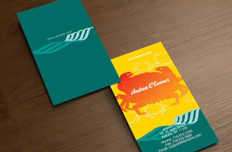
QR codes have earned their comeback. A well-placed code can send someone straight to your site, your LinkedIn, a digital portfolio, or a vCard that saves your details to their phone in one tap. Size it at least 0.75 by 0.75 inches so scanners read it reliably, and park it on the back with a short label underneath, something like Scan for portfolio or Save my contact.
Give the code room to work. A clear quiet zone, the white border around the pattern, is what lets a camera lock on, so resist crowding it with type or graphics. Treat it as a tool, not the focal point. Your brand is going to show up on more than cards anyway, from packaging to invitation cards for a launch, so keep the digital details consistent everywhere they land.
Paper stock and finish affect perceived format
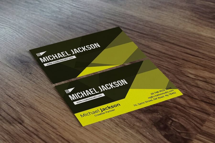
Format choices never live in a vacuum. The stock and finish you pick change how the design actually feels in a hand. A thick, textured sheet like 32pt makes a statement on contact, roughly three times a standard card, and people notice the heft immediately. A matte finish reads modern and understated, gloss makes color leap, and soft-touch lamination feels velvety and expensive.
So let the material and the layout agree. A minimalist design with lots of white space reads best on thick uncoated stock, while a bright, full-color piece sings on gloss. For finishes that push past the flat rectangle, our guide on how to fold a brochure sparks folded-card ideas, custom magnets open another promotional angle, and a moody black business card shows how far a single stock choice can carry a look.
Formatting errors that undermine your business card
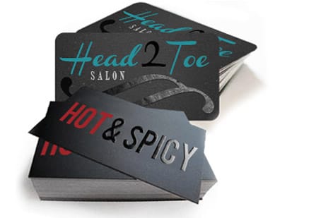
Even people who know layout cold trip over the same handful of errors. Dodge these and your cards look sharper than most of what lands in the same stack:
- Text too close to the edge. A phone number clipped at the cut makes the card useless, so stay inside the safe zone every time.
- Too many fonts. Three or more typefaces on a 3.5 by 2 inch card looks frantic. Two is the ceiling.
- No hierarchy. When name, title, phone, and email share one size, nothing stands out. Let weight and scale sort them.
- A blank back. An empty reverse is wasted space. Give it contact details, a QR code, or a brand mark.
- Low-resolution logos. A pixelated mark reads amateur instantly. Print from vector files at 300 DPI or better.
- Skipping the proof. One typo in an email address means zero replies, so read every character twice.
None of this is decoration. It is the line between a card that works and one that quietly gets tossed. Keeping the finished cards clean matters too, and if stamps are part of your kit, our guide on how to clean rubber stamps keeps those impressions crisp. When your file is ready, business cards printing at 4OVER4.COM turns it into something people keep.
Wally explains business card format
A clean layout is a brand that reads in one glance
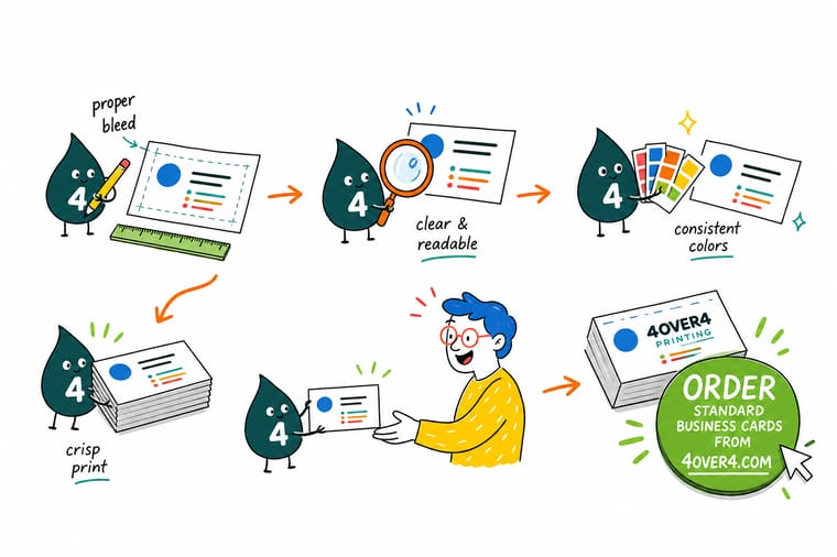
Wally treats a business card like a tiny billboard: give the name top billing, keep the title and contact details in their lanes, and leave real white space so the eye lands where you want it. Two fonts, a two-line address, and a safe-zone margin do most of the work. Nail the format first, then pick the stock, and 4OVER4 turns the file into a card people actually keep.
Order business cards →Specs and pricing
Business card specs and pricing
Once your format is locked, here is what a made-to-order business card gives you at 4OVER4.COM, with live specs and price-per-unit straight from the configurator.

| Quantity | Price Per Unit | Total |
|---|---|---|
| 100 | 17.6¢ | $17.57 |
| 200 | 11.5¢ | $23.07 |
| 300 | 9.15¢ | $27.46 |
| 400 | 7.96¢ | $31.86 |
| 500 | 7.25¢ | $36.26 |
| 600 | 6.77¢ | $40.64 |
| 700 | 6.43¢ | $45.04 |
| 800 | 6.18¢ | $49.43 |
Print it
Business cards ready for your design

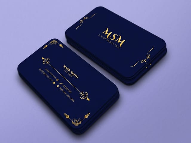
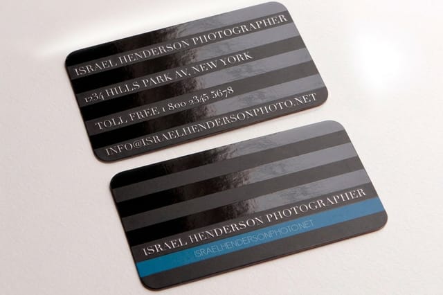
See it in use
Layouts we printed for customers








Explore more
Where to go next
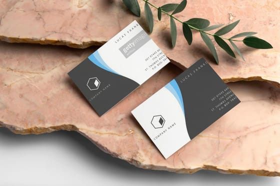


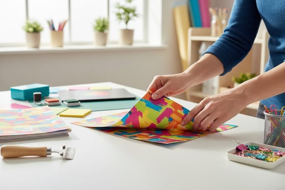


By the numbers
The catalog your layout gets printed from
Common Questions
Your business card format questions, answered
What is the standard business card size in the United States?
The standard US business card measures 3.5 by 2 inches, or 89 by 51 mm. Add 0.125 inches of bleed on each side, which makes the working file 3.75 by 2.25 inches, and keep every important logo and line of text inside the safe zone at least 0.125 inches from the trim edge.
How many fonts should I use on a business card?
Two at most. Use one face for headlines like your name or company name and one for the contact details. More than two starts to look cluttered on a surface this small, so choose fonts that stay readable down to 8 or 9pt for the finest text.
Should I print on both sides of my business card?
Yes. A two-sided card doubles your usable space. Put your name, title, and logo on the front, then place contact details, a QR code, or social handles on the back. Avoid repeating the same information on both sides, since each face should do a different job.
What is the minimum font size for readable business card text?
Never go below 7pt for any text. Your name works well at 10 to 12pt, and contact details like phone and email should sit at 8 to 9pt minimum. Sans-serif fonts tend to hold up better at small sizes than decorative or script typefaces.
How much white space should a business card have?
Aim to leave 30 to 40 percent of the surface empty. White space lifts readability and gives the card a professional, uncluttered feel. If everything will not fit, cut non-essential details rather than shrinking the type or squeezing out the spacing.
What file format should I use when submitting my business card design?
A high-resolution PDF with fonts outlined and images at 300 DPI is the safest choice for sharp, accurate printing. 4OVER4.COM also accepts AI and EPS files. Avoid final JPEGs or PNGs, which often lack the resolution needed for crisp text.
Do I need to include a physical address on my business card?
Not necessarily. If you run an online-only business, your website URL can stand in for the street address. If you have a location, list it in a clean two-line format with the street on line one and the city, state, and zip on line two, and skip the country unless you serve international clients.
Get Started
Order 50 black business cards from $40.62 with the layout squared
Lock in your layout, pick your stock and finish, and we print sharp, professional cards that make the right first impression.
Legal Disclaimer
Gold Standard guarantees apply to all standard orders placed through 4over4.com. Price match requires verifiable proof of a competitor's published price for an equivalent product with matching specifications and turnaround time. Satisfaction guarantee covers manufacturing defects and print quality issues. Contact support with order number and documentation. On-time delivery rate based on tracked orders 1999 to 2026. Individual results may vary based on shipping carrier performance.
