
How to Improve Print Quality


Set files to 300 DPI, design in CMYK, pick the right paper, and add bleed. These five habits turn a blurry, washed-out job into sharp, professional print every time.
To improve print quality, control three things before ink hits paper: set every file to 300 DPI at final size, design and export in CMYK so colors do not shift, and match the paper stock to the job. Add 0.125 inches of bleed, keep text inside the safe zone, and review the free digital proof before you approve. Get those right and 4OVER4.COM handles the rest across 60+ paper types and 1,000+ products.

Quick tips
Quick tips to improve print quality on any project
Print quality depends on three things: file resolution, paper choice, and printer settings. Most print issues start before ink hits paper. Set files to 300 DPI minimum, use CMYK color mode for commercial printing, and pick the right paper stock for your project type. 4OVER4.COM offers 60+ paper types so you can match the material to the job, and with 1,000+ products in the catalog there is a print-ready option for every use case.
Why print quality matters more than you think

Print quality is how closely the printed piece reproduces your file: sharp edges, accurate color, clean trim, and a surface that holds up in a hand. The biggest lever is the file, at 300 DPI in CMYK with bleed, and the paper decides the rest. How to improve print quality is one of the most common questions designers, marketers, and small business owners ask, and it makes sense. A blurry business card or a washed-out flyer does not just look bad, it makes your brand look careless. People notice, and they judge.
The good news is that most print quality problems have simple fixes. You do not need expensive equipment or a design degree. You need the right file setup, the right paper, and a printer that actually delivers. 4OVER4.COM has printed 10 billion+ cards and serves 150,000+ businesses, so the production side is covered.
This guide walks you through every step, from file preparation to finish selection. These techniques apply to a brochure (see how to fold a brochure for folding tips) and to something built from scratch in the Online Designer. Even details like keeping your tools clean matter, so our how to clean rubber stamps guide is a good example of maintenance that protects quality.
File resolution: the foundation of sharp prints

Print quality starts in your design file, period. If your source file is low resolution, no printer on earth can fix that. The minimum standard for commercial printing is 300 DPI (dots per inch) at the final print size. That is not a suggestion, it is a hard rule.
Here is where people trip up. They design at screen resolution (72 DPI) and expect the print to look crisp. It will not. A 72 DPI image that looks sharp on your monitor will print blurry and pixelated, so always check your resolution before exporting.
For detailed artwork, illustrations with fine lines, or small text, bump up to 600 DPI. Large format prints like banners can sometimes get away with 150 to 200 DPI because viewers stand farther back. But for anything handheld, such as business cards, postcards, and flyers, stick with 300 DPI minimum.
How to check and set DPI in common design tools
In Adobe Photoshop, go to Image then Image Size, and make sure Resolution reads 300 pixels/inch with Resample unchecked if you are only checking. In Illustrator, your vector art is resolution-independent, but any embedded raster images still need 300 DPI.
Canva users, pay attention: Canva exports at 300 DPI only when you select PDF Print as your download format. The standard PNG export is 96 DPI, and that is a common mistake that tanks print quality on flyers and postcards. Speaking of which, our guide on how to make flyers covers file setup in detail.
CMYK vs RGB: getting your colors right

Your screen uses RGB (red, green, blue) to display color, and printers use CMYK (cyan, magenta, yellow, black). These are fundamentally different color systems. If you send an RGB file to a commercial printer, the colors will shift, sometimes dramatically.
Bright neon greens, electric blues, and vivid purples are the worst offenders. RGB can produce those colors with light, but CMYK cannot reproduce them with ink. The result is that your bright design comes back looking muddy or dull.
Convert your files to CMYK before exporting. In Photoshop, go to Image then Mode then CMYK Color. In Illustrator, go to File then Document Color Mode then CMYK. Do this early in your design process, not at the end, so you are designing within the printable color range from the start.
Pantone and spot colors for brand-critical work
If exact color matching matters, think brand logos, packaging, and corporate stationery, consider specifying Pantone spot colors. Pantone inks are pre-mixed to exact formulas, so your red is the same red every single time. CMYK builds colors from four inks layered together, which introduces slight variation between print runs.
For most marketing materials like flyers, postcards, and custom booklets, CMYK delivers excellent results. Pantone is worth the investment for brand identity pieces where color consistency is non-negotiable.
Paper stock selection and how it affects print quality
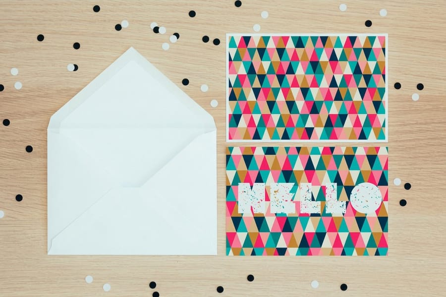
Paper is not just a surface, it is part of the design. The same file printed on glossy cardstock versus uncoated kraft paper will look like two completely different pieces. Ink absorbs differently, colors shift, and texture changes the entire feel.
Glossy and coated papers produce the sharpest images with the brightest colors. The coating prevents ink from soaking into the paper fibers, keeping dots tight and edges crisp. This is your go-to for photo-heavy designs, product catalogs, and anything where color pop matters.
Uncoated and textured papers absorb more ink, so colors appear softer and more muted, and text can look slightly less sharp. But the tactile quality is unmatched. For letterheads, invitations, and premium business cards, that organic feel communicates quality in a way glossy cannot.
Matching paper weight to your project
Thicker paper does not automatically mean better print quality, but it does affect perception. A 14pt cardstock works great for budget-friendly postcards and mailers, and it is about the thickness of a standard playing card. Step up to 16pt for a more substantial feel, roughly credit card thickness.
For luxury pieces, 32pt stock is three times the thickness of standard business cards. It holds ink beautifully and feels hefty in the hand, and the weight tells the recipient this piece matters. If you are creating custom mailers, our how to make envelopes guide shows how to match your envelope stock weight to your insert for a cohesive feel.
Bleed, margins, and safe zones explained
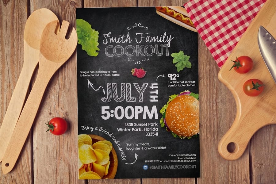
Ever received a print where the edge of your design got cut off, or there is a thin white strip along one side? That is a bleed problem, and it is one of the most common reasons prints look unprofessional.
Bleed is the area beyond your trim line where your design extends. Standard bleed is 0.125 inches (1/8 inch) on all sides. If your business card is 3.5 by 2 inches, your file with bleed should be 3.75 by 2.25 inches. Any background color, image, or design element that touches the edge must extend into the bleed area.
Safe zone is the opposite boundary. Keep all important text and logos at least 0.125 inches inside the trim line. Cutting is not pixel-perfect, so there is always slight variation. If your phone number sits right at the edge, it might get trimmed.
Setting up bleed in your design software
In Adobe InDesign, set bleed when creating a new document: File then New then Document, then expand Bleed and Slug and enter 0.125 inches on all sides. In Illustrator, go to File then Document Setup then Bleed. Canva does not support custom bleed, which is another reason to use professional design tools for print projects.
The 4OVER4.COM guide hub has templates and guides for every product with correct dimensions, bleed, and safe zones already marked. Download the template for your product before you start designing. It saves time and prevents headaches.
Choosing the right finish to polish your print
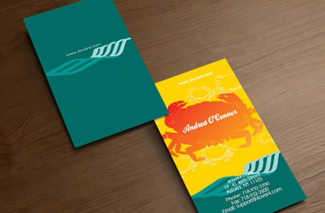
Finish is the final layer that can make or break how your print looks and feels. It is the difference between "that looks nice" and "wow, that feels expensive." The right finish protects your print too, from fingerprints, scuffs, and moisture.
Matte vs gloss vs specialty finishes
Gloss finish makes colors pop and adds a reflective sheen. It is great for photos, product images, and designs with bold color blocks. The downside is that it shows fingerprints and can create glare under direct light.
Matte finish eliminates glare and gives a smooth, sophisticated look. Colors appear slightly more subdued. It is easier to write on, which is important for postcards where recipients might jot notes. Matte is the safe choice for most professional applications.
Soft-touch lamination adds a velvety texture that people cannot stop touching. It is a premium upgrade that makes 16pt stock feel like 32pt. Spot UV adds a glossy raised layer to specific areas, such as your logo, a pattern, or key text, creating contrast against a matte background.
For projects like custom magnets, finish matters just as much. Our custom magnets guide has finish recommendations specific to magnetic materials.
Proofing: your last line of defense
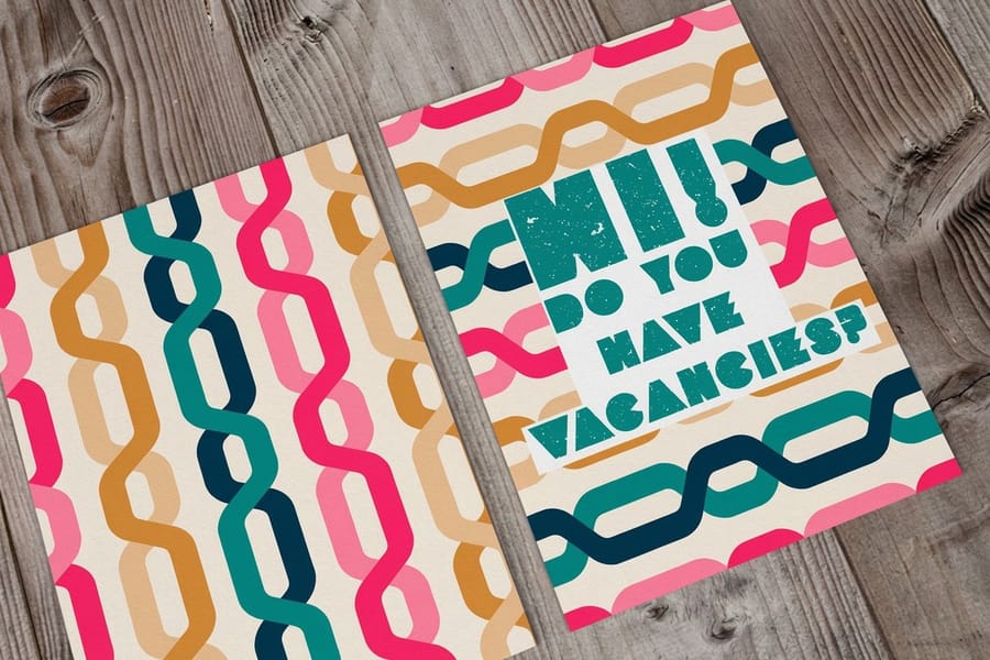
Never skip the proof. This is your chance to catch problems before they become 500 or 5,000 expensive mistakes. A digital proof shows you how your design will look when printed, including colors, layout, text, and everything else.
When reviewing a proof, check these things in order:
- Spelling and contact info. Typos on printed materials are permanent and painful.
- Image placement. Make sure nothing important falls outside the safe zone.
- Color accuracy. Compare against your CMYK values, not your screen.
- Bleed and margins. Verify your design extends properly to all edges.
- Font rendering. Confirm all fonts converted to outlines or embedded correctly.
4OVER4.COM includes a free digital proof with every order. Use it, review it carefully, then approve. This single step prevents more print quality disasters than any other technique in this guide. When you are ready to put these tips into practice, start with a blank template built for print output, like the acrylic prints or dry erase prints templates.
Print quality mistakes that waste your money
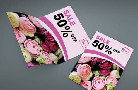
Knowing how to improve print quality also means knowing what to avoid. These are the errors the 4OVER4.COM production team sees most often, and every single one is preventable.
- Designing in RGB and never converting to CMYK. Your neon green will print as olive, every time.
- Using web images at 72 to 96 DPI for print. If you grabbed it from a website, it is almost certainly too low resolution. You need 300 DPI minimum.
- Ignoring bleed settings. No bleed means white edges on your finished piece. It looks like a mistake because it is one.
- Placing text too close to the trim line. Keep critical content at least 0.125 inches inside. Cutting machines have tolerance, your text does not.
- Skipping the proof review. "It looked fine on screen" is not a quality check. Screens lie, proofs do not.
- Choosing the wrong paper for the design. Photo-heavy designs on uncoated stock look washed out, and bold typography on glossy stock can feel cheap. Match the material to the message.
4OVER4.COM catches many file issues during pre-press review, but your best protection is getting it right before you upload. With 10,000+ reviews and a 4.8/5 star rating, the production quality is there, so just make sure your file is ready for it.
Print quality checklist before you order
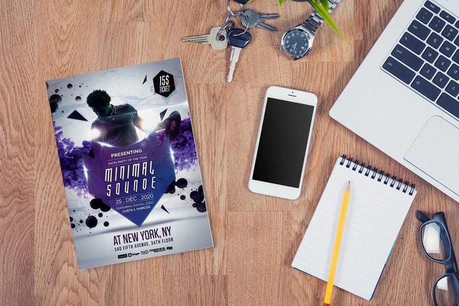
Run these eight checks on the file before you upload. Together they take about five minutes, and they catch nearly everything that turns into a reprint.
- 300 DPI at final size. Not 300 DPI on a small image scaled up on the page. Check resolution at the dimensions the piece actually prints, and go to 600 DPI for fine lines or small type.
- CMYK working space. Convert before you export, not after, so the color shift happens on your screen where you can correct it instead of in the delivered box.
- 0.125 inch bleed on every edge. Extend the background past the trim line so a cut that lands inside normal tolerance never leaves a white sliver.
- Safe margin respected. Keep text, logos, page numbers, and anything you would miss at least 0.125 inches inside the trim.
- Fonts embedded or outlined. Outlined type cannot be substituted by a machine that does not own your font, and font substitution is the most common reason a proof comes back looking wrong.
- Flattened, press-ready PDF. Transparency, live effects, and forgotten layers behave differently on press than on screen. Flatten, then export a print PDF.
- Rich black built for large solids. A big panel of black built from a single ink prints as a flat gray-black. Build large solid areas as rich black, and leave small body copy in plain black so it stays crisp.
- Proof approved with your eyes open. 4OVER4.COM includes a free digital proof with every order. View it at full size, read every word, check the trim and the bleed, then approve, because approval is the moment the file becomes final.
If brand color is the thing you cannot get wrong, convert it deliberately instead of letting the export decide: how to match Pantone to CMYK color walks through that conversion. Everything on this list is the fastest way to improve print quality without changing the design itself.
Troubleshooting common print quality problems
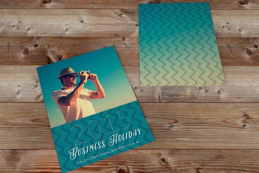
Holding a piece that came out wrong? Match the symptom to the cause before you reprint, because flaws that look alike have different fixes.
- Banding, visible stripes across a gradient. Cause: the gradient was built small, stretched large, or left in a low bit-depth RGB file and converted at export. Fix: rebuild it at final size in CMYK, keep the file at 300 DPI, and add a little noise so the steps between tones break up.
- Blurry or pixelated images. Cause: a web image at 72 to 96 DPI, or artwork enlarged after it was placed. Fix: replace it with a 300 DPI source at final size. No software recovers detail that was never in the file.
- Color that does not match your screen. Cause: an RGB file converted at the last second, or a monitor showing you light where the press lays down ink. Fix: convert to CMYK while you can still adjust, specify Pantone spot colors for brand-critical work, and judge color from the proof rather than the display.
- Muddy or gray blacks. Cause: large black areas built from one ink, or a photo carrying an RGB black straight through. Fix: build big solids as rich black, keep small text in plain black, and check the proof for the difference.
- Text or logo clipped at the trim. Cause: content sitting outside the safe zone, or a file supplied with no bleed at all. Fix: 0.125 inches of bleed out, 0.125 inches of safe margin in, then re-export and re-proof.
- Ink that scuffs or rubs off. Cause: heavy coverage on uncoated stock, or a piece that gets handled hard, like a menu, a loyalty card, or a table tent. Fix: add a coating or lamination and move up in paper weight. Matte and soft-touch lamination protect the surface as well as change how it feels.
If the same flaw survives a reprint, the file is the constant. Send it back through the checklist above before you change anything else.
Products that show off great print quality
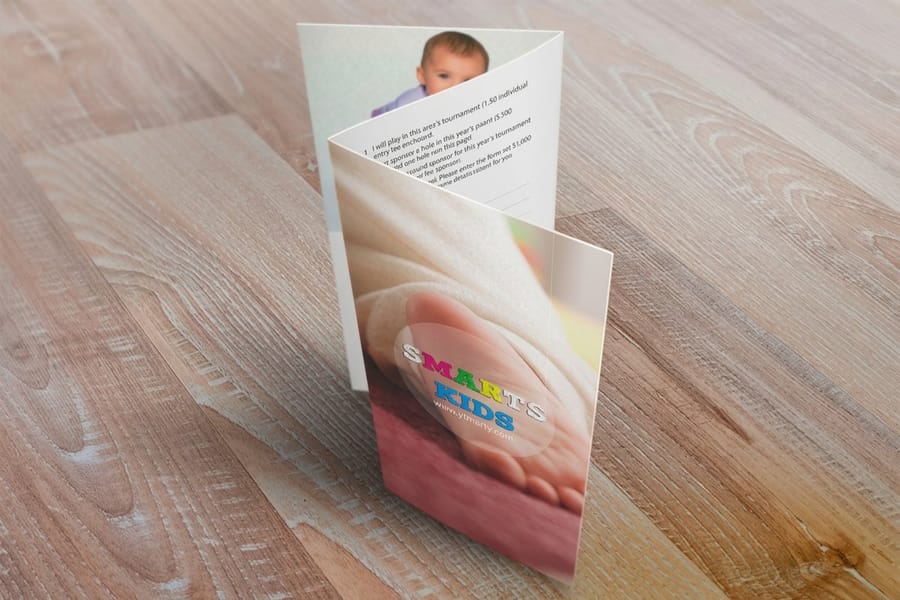
Once you have dialed in your file setup, the right product makes all the difference. The 4OVER4.COM catalog includes 1,000+ products across dozens of paper stocks and finishes. Need something fast? Same day printing gets your order out the door without sacrificing quality.
Want to test print quality before committing to a big run? Grab a set of free business cards to see how your design translates to paper. It is the easiest way to evaluate stock, finish, and color accuracy on an actual printed piece. Whether you are experimenting with soft-touch lamination, spot UV, or a new paper weight, ordering free business cards lets you hold the result in your hands before scaling up to a larger order.
Reference the two quick tables below to match DPI, paper, and color profile to your project type before you upload.
| Project type | Recommended DPI | Paper type | Expected quality |
|---|---|---|---|
| Everyday documents (emails, web pages) | 72 to 150 | Standard printer paper | Suitable for on-screen viewing and general printing |
| Flyers and posters | 300 | Glossy or matte paper | Clear text and images, bright colors |
| Photos | 300 to 600 | Photo paper (glossy, matte, or satin) | Sharp details, accurate color reproduction |
| Fine art prints | 600 to 1200 | Fine art paper | Exceptional detail, smooth gradients, accurate color |
| Large format banners | 150 to 300 | Vinyl, mesh, or fabric | Visible from a distance, clear images and text |
| Print type | Recommended profile | Color gamut | Best use cases |
|---|---|---|---|
| Photos on glossy paper | sRGB or Adobe RGB | Wide | Bright, saturated images |
| Art prints on matte paper | Adobe RGB | Wide | Detailed, accurate color reproduction |
| Business cards | sRGB | Standard | Consistent color across different devices |
| Documents | sRGB | Standard | Accurate representation of text and graphics |
For scannable elements that link to a digital color reference or your latest offer, our QR code generator makes a print-ready code in seconds.
Wally explains print quality
Great print is decided before ink hits paper
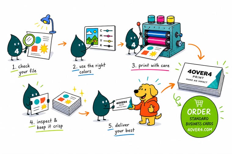
Wally sees the same three levers behind every sharp print job: resolution, color mode, and paper. Send a 300 DPI file in CMYK on the right stock and the result reads crisp and true to your brand. Skip a step and the press faithfully prints your mistake at full size. Nail the file, then let 4OVER4 handle the rest across 60+ papers and 1,000+ products.
Order business cards →Specs and pricing
Custom business card specs and pricing
Once your file is print-ready, here is what a made-to-order business card gives you at 4OVER4.COM, with live specs and price-per-unit straight from the configurator.

| Quantity | Price Per Unit | Total |
|---|---|---|
| 100 | 17.6¢ | $17.57 |
| 200 | 11.5¢ | $23.07 |
| 300 | 9.15¢ | $27.46 |
| 400 | 7.96¢ | $31.86 |
| 500 | 7.25¢ | $36.26 |
| 600 | 6.77¢ | $40.64 |
| 700 | 6.43¢ | $45.04 |
| 800 | 6.18¢ | $49.43 |
Print it
Order print that shows off great quality at 4OVER4



See it in use
Business cards as they came off the press








Explore more
Where to go next





By the numbers
The scale our presses run at
Common Questions
Your print quality questions, answered
What DPI should I use to get the best print quality?
Use 300 DPI at the final print size for any handheld piece like business cards, postcards, or flyers. For highly detailed artwork with fine lines, 600 DPI produces even sharper results. Large format prints viewed from a distance can work at 150 to 200 DPI. Always check resolution before exporting your file.
Does paper type really affect how my print looks?
Absolutely. Coated and glossy papers keep ink on the surface, producing sharper images and brighter colors. Uncoated papers absorb ink, creating softer tones and a more organic feel. Choosing the right stock for your design is one of the fastest ways to improve print quality without changing anything in your file.
Why do my printed colors look different from my screen?
Screens display color using RGB light and printers use CMYK ink, and these systems have different color ranges. Convert your design files to CMYK before exporting to minimize color shifts. For exact brand color matching, specify Pantone spot colors. A QR code generator can also help you add scannable elements that link to digital color references.
What's the difference between bleed and safe zone?
Bleed is the extra 0.125 inches of design that extends beyond the trim line, and it prevents white edges after cutting. Safe zone is 0.125 inches inside the trim line where all important text and logos should stay. Both are critical for professional-looking prints, and 4OVER4.COM provides downloadable templates with these zones pre-marked.
How do I know if my file is print-ready?
A print-ready file meets these criteria: 300 DPI resolution, CMYK color mode, proper bleed of 0.125 inches, all fonts converted to outlines or embedded, and exported as a press-ready PDF. 4OVER4.COM includes a free digital proof with every order so you can verify everything before production begins.
Will a matte or gloss finish give me better print quality?
Neither is objectively better because they serve different purposes. Gloss makes colors appear more vivid and saturated, ideal for photo-heavy designs. Matte reduces glare and gives a refined, professional look. Soft-touch lamination adds a premium tactile element. Choose based on your design needs and the impression you want to create.
Why does my print look banded or striped across a gradient?
Banding shows up when a gradient is built small, stretched large, or left in a low bit-depth RGB file and converted only at export. Build the gradient at final size in CMYK, keep the file at 300 DPI, and add a small amount of noise so the steps between tones break up. Large flat areas of a single tint band more easily than textured ones, so a subtle grain is often the whole fix.
What is the fastest way to improve print quality on a file I already have?
Three moves, in this order. Convert to CMYK and look at what shifts while you can still correct it. Check that every placed image is 300 DPI at the size it prints, and replace the ones that are not. Then match the stock to the artwork, because a photo-heavy design on coated stock gains more sharpness and color than any setting you can change in the file. After that, read the free digital proof at full size before approving.
Get Started
Order 50 flyers on 100# Gloss Text from $39.54
Upload your print-ready file or build it in the browser, pick your stock and finish, and we deliver crisp, color-accurate print that makes your brand look its best.
Legal Disclaimer
Gold Standard guarantees apply to all standard orders placed through 4over4.com. Price match requires verifiable proof of a competitor's published price for an equivalent product with matching specifications and turnaround time. Satisfaction guarantee covers manufacturing defects and print quality issues. Contact support with order number and documentation. On-time delivery rate based on tracked orders 1999 to 2026. Individual results may vary based on shipping carrier performance.
