
How to Design Conference Badges That Drive Networking


Put the name first at 28pt or larger, size the badge to the content, color-code by attendee type, and export a clean CMYK print file. Here is the design routine that turns a badge into a real conversation starter.
To design conference badges that stand out, lead with the name: set the first name at 28 to 36pt bold so it reads from six feet, pick a 4 by 3 inch size for networking events or 4 by 6 inch for multi-track summits, color-code by attendee type, and build a print-ready file in CMYK at 300 DPI with a 0.125 inch bleed. Variable data printing then personalizes every badge from one clean spreadsheet.
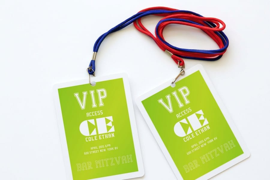
Quick tips
Quick tips for designing conference badges that actually work
Prioritize readability so attendee names are visible from at least six feet away. Use a clean layout with your event logo, the person's name, company, and role, and pick a font size of 24pt or larger for names. 4OVER4.COM has helped 150,000+ businesses print badges that make networking easier, not harder. Keep colors consistent with your event branding and leave white space so nothing feels cramped.
Watch it printed
See event badges on the press, in 117 seconds
Why your conference badge design matters more than you think
Conference badges are the first thing people look at when they meet you. Not your face. Not your outfit. Your badge. It is the icebreaker before the handshake. A poorly designed badge makes networking awkward, all squinting at tiny text and flipping it over to find a name. A well-designed badge does the opposite. It starts conversations.
Understanding how to design conference badges gives you control over the attendee experience from the moment people walk through the door. Whether you are organizing a 50-person workshop or a 2,000-person industry summit, the badge sets the tone. Just like knowing how to fold a brochure matters for your printed collateral, badge design is a skill worth learning.
4OVER4.COM offers design templates that make badge creation fast, even if you have never designed one before. And if you are handling other event materials, you might also find our guide on how to clean rubber stamps helpful for custom stamp projects. Let us walk through everything you need to create badges that attendees actually appreciate.
Start with the right badge dimensions

Most conference badges fall into one of three standard sizes: 3.5 by 2.25 inches (similar to a business card), 4 by 3 inches (the most common name badge size), or 4 by 6 inches (for events that need extra information or sponsor logos). Your choice depends on how much content you need to display.
For a straightforward networking event, the 4 by 3 inch size hits the sweet spot. It is large enough to read from a comfortable distance but small enough to clip to a lanyard without feeling bulky. If your event includes multiple tracks, breakout sessions, or VIP tiers, go with the 4 by 6 inch format because you will need the extra real estate.
Before you start designing, check out blank templates to grab a properly sized file with bleed marks and safe zones already set up. This saves you from the most common rookie mistake, which is designing content that gets cut off during trimming. There is a ready-made event badge template waiting for you there.
Conference badge templates
You do not have to start on a blank artboard. Pull a print-ready file from blank templates, or go straight to the event badge template, which already has bleed marks and safe zones set.
Three starter layouts cover almost every event. Each places the same four zones, and only the proportions change.
| Template size | Best for | Zone layout |
|---|---|---|
| 3.5 by 2.25 inches | Small meetups, and anything printed on business card stock | First name across the middle, last name under it, company on one line at the base, no QR, lanyard slot centered on the top edge |
| 4 by 3 inches | Standard networking conferences, the safe default | Name zone across the top two thirds, company and title stacked below, QR zone in the lower outer corner, event logo small at the base, lanyard slot centered on the top edge |
| 4 by 6 inches | Multi-track events, VIP tiers, sponsor logos | Name zone in the upper half, company and title under it, a track or tier band across the middle, QR zone in the bottom outer corner, sponsor row at the base, lanyard slot centered on the top edge |
Whichever size you start from, set the type at the sizes that read across a room: first name 28 to 36pt bold, last name 20 to 24pt, company 14 to 16pt, title 12 to 14pt. Keep every zone clear of the lanyard slot, because a punch through the top of somebody's name is the one mistake you cannot fix on site.
What is the best template for conference badges?
The one that puts the attendee name first and leaves the lanyard slot alone. For most events that is the 4 by 3 inch layout: large enough for a name to be read across a table, small enough to hang without flipping over. Start from the event badge template and only move up to 4 by 6 inches if you genuinely have tracks, tiers, or sponsor logos to place.
What size is a standard conference badge template?
4 by 3 inches is the standard name badge size and the one most templates are built around. The other two common sizes are 3.5 by 2.25 inches, the business card format, and 4 by 6 inches for events that need extra information. Design at the finished size with bleed and safe zones already in the file so nothing important trims off.
Establish your visual hierarchy
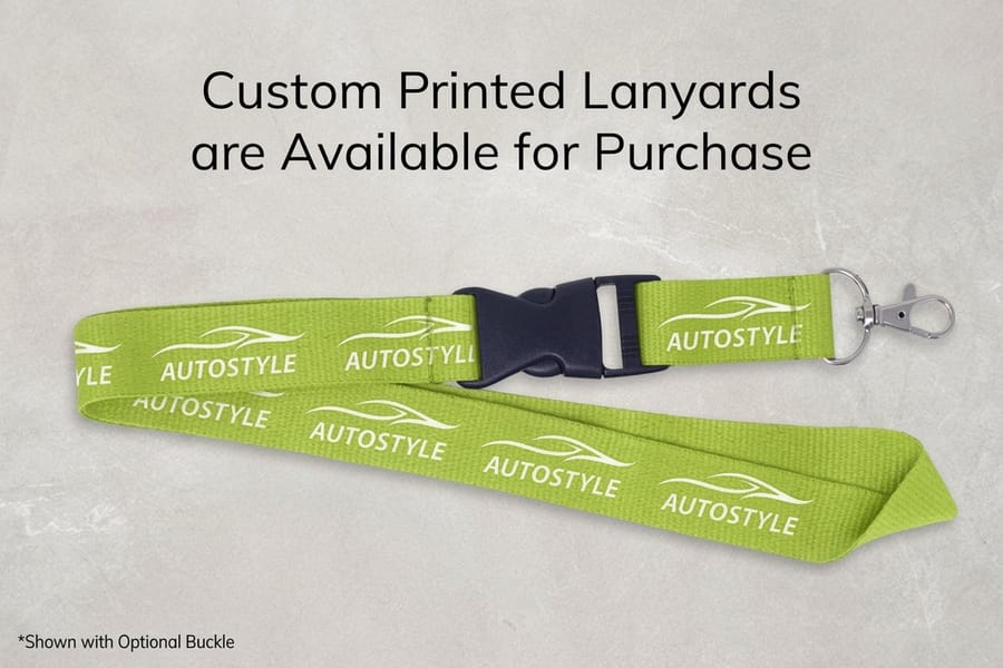
Here is the golden rule of badge design: the attendee's name is the most important element. Everything else is secondary. Structure your badge content in this order of visual priority.
- First name is the largest text on the badge, 28 to 36pt minimum. Make it bold.
- Last name is slightly smaller, 20 to 24pt. Same font family, regular weight.
- Company or organization at 14 to 16pt gives context during introductions.
- Title or role at 12 to 14pt helps people gauge relevance for conversation.
- Event logo and name sit at the top or bottom, not competing with the attendee name.
A common mistake is making the event logo the dominant element. Your attendees already know what event they are at. They do not know who the person standing in front of them is. Keep the logo present but proportional, roughly 15 to 20 percent of the badge area at most.
Choose fonts that read from a distance
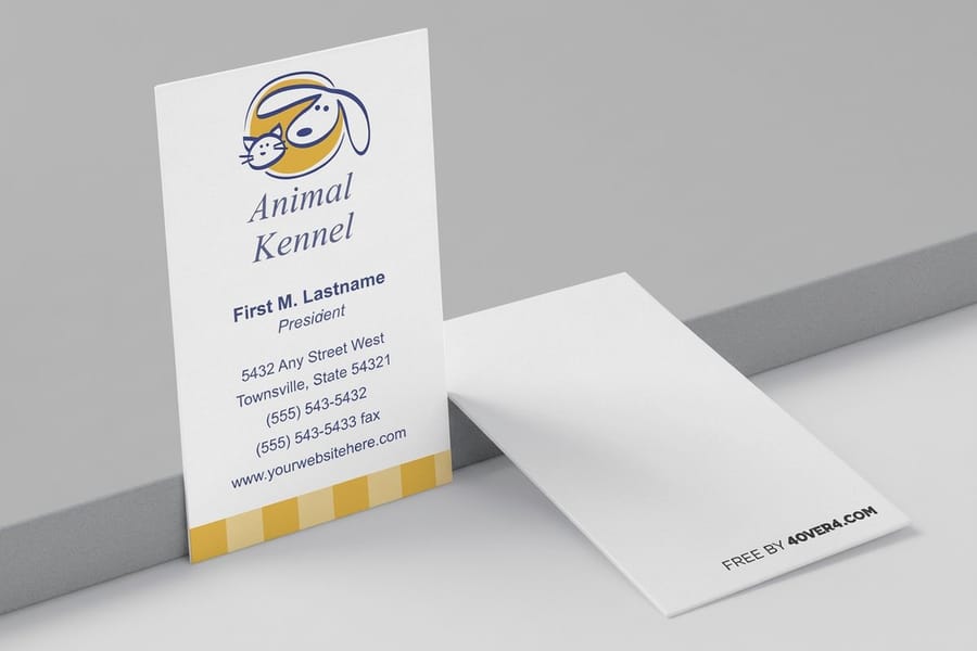
Readability from six feet away is your benchmark. If someone cannot read a badge from conversational distance, the design fails. Stick with sans-serif fonts for names such as Helvetica, Arial, Open Sans, Montserrat, or Lato. These are clean, modern, and highly legible at any size.
Avoid script fonts, thin weights, or decorative typefaces for any critical information. Save those for decorative elements if you need them. Use a maximum of two font families on the entire badge, one for names and titles, another for secondary details or the event name.
Test your design by printing a sample and holding it at arm's length. If you cannot read the first name instantly, increase the size. This simple test catches problems that look fine on screen but fail in person. For more design tips across different print materials, browse our guide hub for step-by-step walkthroughs.
Use color coding to organize attendees
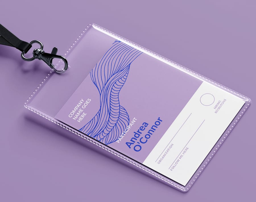
Color-coded badges are a big deal for large conferences. Assign distinct colors to different attendee types such as speakers, sponsors, VIPs, general attendees, press, and volunteers. This lets staff identify who belongs where without checking lists, and it helps attendees find the right people to talk to.
Keep your color palette to four to six distinct colors at most. More than that creates confusion instead of clarity. Use high-contrast combinations: dark text on light backgrounds, or white text on dark-colored sections. Avoid red text on green backgrounds or similar low-contrast pairings that are hard for colorblind attendees to distinguish.
A simple approach is to keep the badge background white or light gray, then use a colored strip or banner across the top or bottom to indicate attendee category. This preserves readability while making categories instantly recognizable across a crowded room.
Add functional elements that earn their space
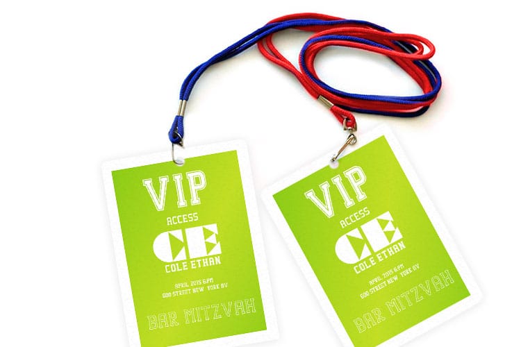
Every element on your badge should serve a purpose. If it does not help attendees network or handle the event, cut it. Here are functional additions worth considering.
- QR code links to the attendee's LinkedIn profile, digital business card, or event app profile. This replaces the old-school business card exchange and keeps connections digital.
- Pronouns on a small line under the name (he/him, she/her, they/them) show inclusivity and prevent awkward moments.
- Session track indicators such as small icons or colored dots show which breakout sessions an attendee registered for.
- Wi-Fi credentials printed on the back save everyone a trip to the help desk. Attendees will thank you.
Skip elements like lengthy bios, full addresses, or multiple phone numbers. A badge is not a resume. It is a conversation starter. If you are also creating directional signage for your event, custom aluminum signs work great for wayfinding in larger venues.
Design for print: file setup and specifications
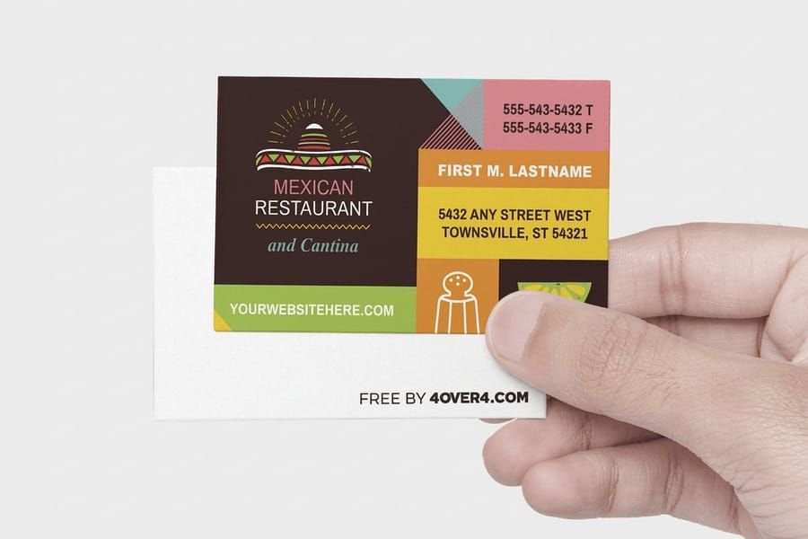
Once your design looks good on screen, you need to prepare it for print. This is where many event organizers stumble. Here is what your print-ready file needs.
Set your document to CMYK color mode, not RGB. RGB is for screens. CMYK is for print. Colors will shift if you submit an RGB file, so that bright blue on your monitor might print as a dull navy. Set resolution to 300 DPI minimum. Anything lower will look fuzzy or pixelated when printed.
Add 0.125 inch bleed on all sides. This means your background colors and images extend past the trim line, so you do not end up with thin white edges after cutting. Keep all critical text and logos at least 0.125 inch inside the trim line, which is the safe zone. Export your final file as a press-quality PDF, flatten any transparency effects, and embed all fonts. Similar to how you would set up flyers for print, the file prep fundamentals stay the same.
Pick the right badge material and finish
The material you choose affects both the look and durability of your conference badges. For a one-day event, standard cardstock works fine. For multi-day conferences, you will want something sturdier that holds up to repeated handling, lanyard clips, and the occasional coffee spill.
Consider these options based on your event type.
- Standard cardstock is budget-friendly and great for single-day events or workshops.
- Thick cardstock feels sturdy and premium, perfect for multi-day conferences where badges get handled constantly.
- Laminated badges are water-resistant, tear-resistant, and polished, ideal for outdoor events or conferences spanning three or more days.
- PVC or plastic badges are the most durable option and reusable for recurring events.
4OVER4.COM prints event badges on a range of stocks so you can match the material to your event's needs and budget. If you are handling other printed materials for your event, check out how to make envelopes for invitation packaging or custom magnets for branded giveaways.
Printing the badges yourself or sending them to press
Under about 50 attendees, printing at the office is a fair choice. Perforated badge insert sheets run through a laser printer four to a page, you drop names in from a mail merge, and the inserts slide into holders you already own. The limits show up fast though. Office printers work in RGB, so the color strip that separates speakers from press drifts between sheets, and a single wet ring from a coffee cup turns a home printed badge into a mess by mid morning.
Past that count, send one print ready file and one clean spreadsheet to press. Variable data printing puts every name on the right badge in one run, thick cardstock or lamination survives a three day event, and the color coding stays consistent from the first badge to the last. Allow two to three weeks for proofing and shipping, and lean on same day printing only for the walk ups you could not predict. Event badges run from one file at any quantity, so the design work is the same either way.
Variable data printing: personalizing each badge
Unless your conference has 10 attendees, you are not designing badges one at a time. Variable data printing lets you create a single badge template and automatically populate each badge with unique attendee information from a spreadsheet.
Prepare your data file with these columns: First Name, Last Name, Company, Title, Attendee Type (for color coding), and any other variable fields your design includes. Clean the data before uploading, checking for typos, inconsistent formatting, and missing fields. Nothing undermines a professional event faster than a misspelled name on a badge.
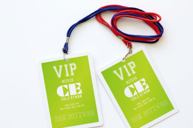
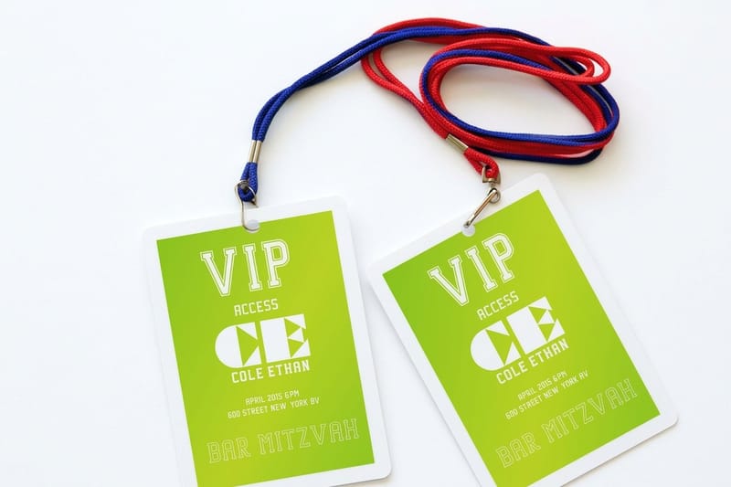
Double-check name lengths. Some attendees will have short names (Li Chen), others will have long ones (Bartholomew Worthington III). Your design needs to handle both without breaking the layout. Set a maximum character count for each field and test with the longest names in your data set. Two ready-made starting points are the Colorful Event Badge and the Trade Show Event Badge templates.
Badge design pitfalls that ruin the attendee experience
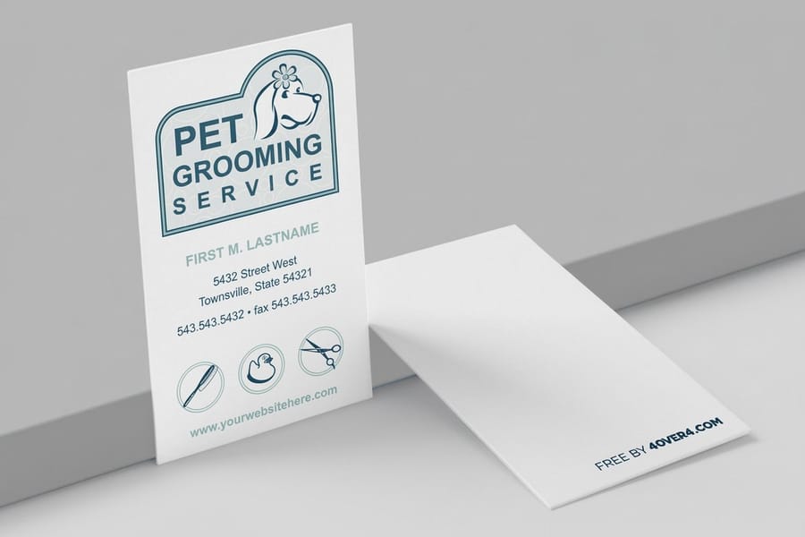
Even experienced event planners make these mistakes when designing conference badges. Avoid them and you will save yourself reprints, complaints, and wasted budget.
- Text too small. If the first name is not readable from six feet, it is too small. This is the number one complaint at conferences.
- Oversized logos. Your event logo should not dominate the badge. Attendees need to read names, not admire branding.
- No bleed in the file. Submitting files without bleed results in white edges or cropped text. Always add 0.125 inch bleed.
- RGB color mode. Designing in RGB instead of CMYK means your printed colors will not match what you saw on screen.
- Ignoring badge orientation. Badges on lanyards flip and rotate. Consider printing key info on both sides, or use a badge holder that prevents flipping.
- Dirty data. Misspelled names destroy credibility. Proofread your attendee spreadsheet twice before submitting.
4OVER4.COM prints with 99.8 percent on-time delivery, so your badges arrive when you need them. Getting the design right on your end is just as important as the print quality. Need badges fast? Same-day printing covers rush orders, and pairing free business cards with your badge order gives speakers something to hand out.
Wally explains badge design
A name that reads from across the room is a badge that starts conversations
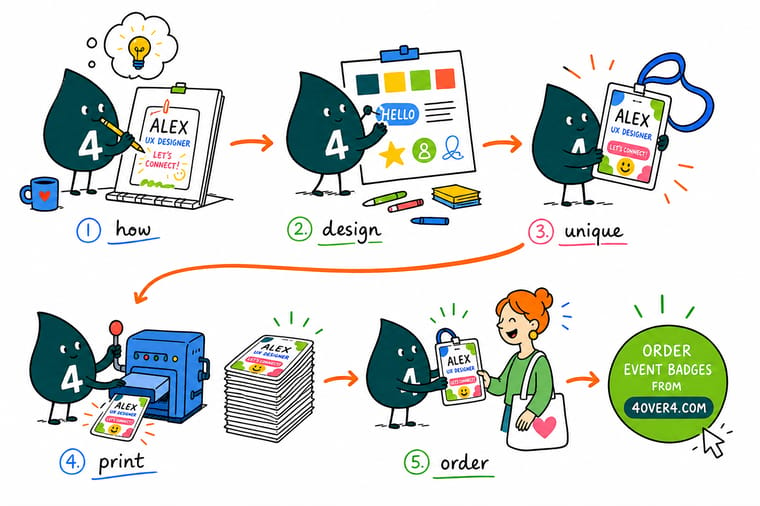
Wally treats a conference badge like a tiny billboard for a person: put the name first and big, keep the logo small, and color-code the crowd so everyone finds their people fast. Build the file in CMYK with a bleed, let variable data fill in every name, and the whole room reads clean. When the design is ready, order event badges with lanyards and personalization built to your exact event at 4OVER4.
Order event badges →Specs and pricing
Event badge specs and pricing
Once your design is print-ready, here is what a made-to-order event badge gives you at 4OVER4.COM, with live specs and price-per-unit straight from the configurator.

| Quantity | Price Per Unit | Total |
|---|---|---|
| 25 | $2.00 | $49.88 |
| 50 | $1.25 | $62.51 |
| 100 | $1.01 | $101.04 |
| 150 | 86.7¢ | $130.10 |
| 200 | 78.0¢ | $155.93 |
| 250 | 73.1¢ | $182.74 |
| 300 | 68.6¢ | $205.78 |
| 400 | 63.9¢ | $255.67 |
Print it
Order badges and event print at 4OVER4

Explore more
Where to go next

By the numbers
Badge stock from sixty paper types
Common Questions
Common questions about designing conference badges
Is there a free conference badge design template?
Yes. Blank templates carry the trim, bleed and safe zone for the 3.5 by 2.25, 4 by 3 and 4 by 6 inch sizes, and the event badge template already has the name zone, company line, QR corner and lanyard slot placed. Start from the size you need, keep the first name at 28pt or larger, and export a CMYK PDF at 300 DPI. The Colorful Event Badge and Trade Show Event Badge layouts skip the setup entirely.
Should conference badges be portrait or landscape?
Portrait for a lanyard, landscape for a clip or a pin. A badge that hangs from a lanyard swings, and a portrait layout keeps the name high and centered over the slot so it reads even when the badge twists. Landscape 4 by 3 suits long names, bilingual text and a logo lockup beside the name, and it sits better on a magnetic clip at chest height. Match the orientation to the holder you bought before you design.
What size should conference badges be?
The most popular conference badge size is 4 inches by 3 inches. It is large enough for readable text and small enough to wear comfortably on a lanyard. For events with extra information like session tracks or sponsor logos, use 4 inches by 6 inches badges instead.
What font size works best for names on badges?
Use 28 to 36pt for first names and 20 to 24pt for last names. The goal is readability from six feet away. Sans-serif fonts like Helvetica, Open Sans, or Montserrat work best because they stay legible at distance.
Should I design conference badges in RGB or CMYK?
Always design in CMYK color mode for print. RGB is for digital screens and will cause color shifts when printed. Your bright on-screen blue could print as a muted navy if you submit an RGB file.
How do I handle variable data for hundreds of badges?
Create one badge template and prepare a spreadsheet with columns for First Name, Last Name, Company, Title, and Attendee Type. Variable data printing pulls from this file to personalize each badge automatically. Clean your data for typos before submitting.
What's the best badge material for a multi-day conference?
For conferences lasting two to three days, thick cardstock or laminated badges hold up best. Standard cardstock works for single-day events but can bend and wear over multiple days of handling.
How far in advance should I order conference badges?
Order at least two to three weeks before your event to allow time for design review, proofing, and shipping. 4OVER4.COM delivers with 99.8% on-time reliability. For last-minute needs, same-day printing options are available for rush orders.
Can I add QR codes to conference badges?
Yes, and you should. QR codes linking to attendee LinkedIn profiles or digital contact cards make networking faster. Keep the QR code at least 0.75 inches by 0.75 inches so it scans reliably. Test the code before printing your full batch.
How do I color-code badges for different attendee types?
Assign a distinct colored banner or strip to each attendee category such as speakers, sponsors, VIPs, general attendees, and press. Stick to four to six colors maximum and use high-contrast combinations. Map colors to your attendee type column in the variable data spreadsheet.
Get Started
Ready to print your conference badges?
Pick your size, drop in your attendee data, add a lanyard, and we print sharp, readable badges that make networking easy.
Legal Disclaimer
Gold Standard guarantees apply to all standard orders placed through 4over4.com. Price match requires verifiable proof of a competitor's published price for an equivalent product with matching specifications and turnaround time. Satisfaction guarantee covers manufacturing defects and print quality issues. Contact support with order number and documentation. On-time delivery rate based on tracked orders 1999 to 2026. Individual results may vary based on shipping carrier performance.
