
Business Cards with Social Media Icons


Pick two or three platforms, use a clean icon next to each handle, group them small along one edge, and let a single QR code carry the rest. Here is how to design a card that turns contacts into real follows.
To add social media to a business card, keep it to two or three platforms that fit your audience, print the brand icon next to each handle rather than a full URL, and group the icons small (4mm to 6mm) along the bottom or one side. On the back, a single QR code linking to a landing page consolidates every profile. Match icon color to your brand and choose a matte or soft-touch finish so small icons stay sharp.
Quick tips
Quick tips for social media on business cards
Choose two or three platforms your audience actually uses, then print the brand icon beside each handle instead of a full URL. Keep the icons small and grouped along one edge, and use a single QR code on the back to link to a landing page with every profile. Match icon color to your brand and pick a matte or soft-touch finish so small details stay crisp. 4OVER4.COM has printed 10 billion+ cards for 150,000+ businesses, and the ones that convert best almost always include social links.
Watch it printed
See standard business cards on the press, in 167 seconds
Why your business card needs social media links

A business card without social media is a dead end. Someone takes your card, maybe glances at it, and that is where the relationship stalls. Add your Instagram handle or LinkedIn URL and suddenly that card becomes a doorway into your brand's full story: your work, your personality, your proof.
Business cards with social media icons bridge the gap between a physical handshake and a lasting digital connection. This guide walks you through everything: icon selection, layout best practices, QR code integration, and the mistakes that make cards look cluttered instead of professional. Whether you are a freelancer, real estate agent, or startup founder, you will leave knowing exactly how to design a card that drives real follows and engagement.
Before you dive in, check current pricing on card stock options through 4OVER4.COM Daily Deals. And if you are exploring other print projects, our guide on how to clean rubber stamps is worth a read too.
Choose the right platforms, not all of them

The biggest mistake people make is listing every social account they have ever created. Your card has limited real estate. Pick two to three platforms that actually matter for your business. A photographer needs Instagram. A B2B consultant needs LinkedIn. A restaurant needs Facebook and maybe TikTok.
Ask yourself where your ideal clients or customers spend their time. That is your answer. A real estate agent does not need a Twitch handle on their card, and a gaming streamer does not need LinkedIn. Be intentional. If you are unsure which platforms pair best with your industry, the guide hub at 4OVER4.COM has resources to help you think it through.
Here is a quick breakdown by industry:
- Creative professionals (designers, photographers, artists): Instagram and Behance or Dribbble.
- Corporate and B2B (consultants, lawyers, accountants): LinkedIn and X.
- Retail and food service (restaurants, boutiques, salons): Instagram and Facebook.
- Tech startups: LinkedIn, X, and GitHub if relevant.
- Event planners and entertainers: Instagram, TikTok, and YouTube.
Icon placement and sizing that keeps things clean

Social media icons should support your card design, not fight it for attention. The standard approach is grouping them together, usually along the bottom edge or vertically along one side. This creates a clean visual block that is easy to scan.
Size matters here. Icons that are too large compete with your name and title, and icons that are too small become unreadable. Aim for icons between 4mm and 6mm in height. That is big enough to recognize at a glance but small enough to stay out of the way. Keep consistent spacing between each icon, because uneven gaps look sloppy even when the rest of your design is polished. And always use the official brand icons rather than random clip art versions, since Facebook, Instagram, LinkedIn, and other platforms all provide downloadable icon packs in their brand guidelines.
You have two reliable layouts to choose from. The horizontal line is the classic for a reason: lining up your icons in a neat row along the bottom creates a clean footer for your social links. The vertical stack is a more modern, minimalist choice that runs the icons down one side and balances out the negative space on the card.
Six card layouts with social icons
Bottom strip row. Every icon in one line along the bottom edge, 4mm to 6mm tall, evenly spaced. The safest layout, and the one that still works when the front is busy.
Vertical stack on the right edge. Icons running top to bottom down the right margin. It fills dead space and keeps the center clear for your name and title.
Back-of-card row. The front stays clean with name, title, and contact details, and the whole social block moves to the back where it can sit larger and centered.
Icon and handle pairs. Each icon with its handle set beside it, stacked in two or three rows. Use this when your handle changes from platform to platform.
QR code on the back. One code instead of a list, at least 20mm by 20mm, pointing at a page that holds every profile. Make it dynamic so you can change the destination without reprinting.
Single-platform emphasis. One icon and one handle, set large. Right when nearly all your work arrives through one platform, and it reads as confidence rather than clutter.
If you are working on other printed marketing materials alongside your cards, learning how to make flyers with matching social branding creates a cohesive look across everything you hand out.
How to format your social media handles
Do not print full URLs on your business card. Nobody wants to read "https://www.instagram.com/yourbusiness" in 6-point type. Use the platform icon followed by your handle: @yourbusiness. That is it. Clean, scannable, and universally understood.
If your handle is the same across all platforms, you can simplify even further and list the icons in a row with a single handle underneath. This works beautifully when your branding is consistent. For LinkedIn, handles can be awkward strings of random characters, so create a custom LinkedIn URL first. It takes about 30 seconds in your profile settings. The same goes for Facebook, where a custom URL like facebook.com/yourbrand is far more professional than facebook.com/profile.php?id=100042738.
One more habit that saves an entire print run: test every handle and URL before you send your card to print. A typo in your Instagram handle means every single card in that batch is wrong. 4OVER4.COM offers proofing on every order, but catching handle errors is on you.
QR codes, the smart alternative to printed handles

QR codes have made a serious comeback. Instead of listing three or four handles, you can use a single QR code that links to a landing page with all your social profiles. Tools like Linktree, Beacons, or a simple custom page on your website work perfectly for this.
Place the QR code on the back of your card. This keeps the front clean for your name, title, and primary contact info, and the back becomes your digital gateway. Make sure the QR code is at least 20mm by 20mm, because anything smaller can cause scanning issues, especially on textured paper stocks. A dynamic QR code beats a static one, since it lets you update the destination URL without reprinting your cards. If you change your Linktree or update your social handles, the same code still works, and a dynamic code can also tell you how many people are actually scanning your card.
A QR code is the right move when you are active on more than three platforms, when you want to track engagement, or when you are going for a super minimalist look that consolidates your whole online presence into one scannable square. For cards that really stand out with QR functionality, consider 3D lenticular business cards from 4OVER4.COM. The dimensional effect grabs attention and practically begs someone to flip the card over and scan.
Design principles for social-media-friendly cards
Your card overall design needs to accommodate social media elements without feeling cramped. These are the principles that work:
- White space is your friend. Do not fill every square millimeter. Breathing room makes social icons pop.
- Use a two-sided layout. Front for name, title, and primary contact. Back for social icons, QR code, and tagline.
- Match icon color to your brand. Monochrome icons (all black, all white, or all one brand color) look cleaner than multicolor platform logos.
- Hierarchy matters. Your name should be the largest text, your title second, and your social handles smaller but still legible, never below 7pt.
- Pick a paper stock that supports readability. Matte and soft-touch finishes reduce glare, making small text and icons easier to read, while glossy finishes can cause reflection that obscures fine details.
If you want to see how different finishes look and feel before committing, order free samples from 4OVER4.COM. Holding the actual paper in your hand tells you more than any screen preview.
Start from a social media business card template
Most searches for social media business cards end at a template, and the fastest route is a layout that already has the icon row and the QR block placed. Our ready-made standard business card layouts in the online designer open at the 3.5 by 2 inch trim with the 0.125 inch bleed and safe zone drawn, so the icons you drop in stay 3mm clear of the cut. Swap the placeholder icons for the official versions from each platform's brand guidelines, set them 4mm to 6mm tall, and type your handles beside them.
If you design elsewhere, set the canvas to 3.75 by 2.25 inches at 300 DPI in CMYK, place the social row inside a 3.25 by 1.75 inch safe area, and export a PDF with the icons as vector shapes rather than pasted screenshots, because a 5mm icon pulled from a web image turns soft in print. Free template packs from design apps work the same way once the bleed is added. For a QR code that carries every profile, the setup in our guide on QR codes on business cards covers the size and the landing page.
Color and contrast for social media icons
Icons need contrast to be visible. A light gray Instagram icon on a white card is invisible, and a dark icon on a dark background has the same problem. Test your design in both digital preview and a physical proof.
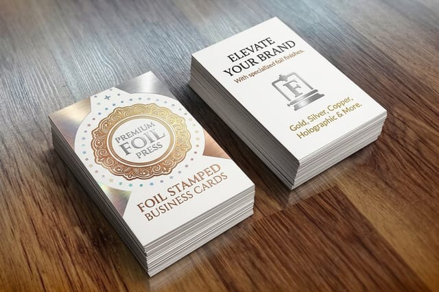
The safest approach is to use monochrome icons that match your primary brand color. If your brand is navy blue, make all social icons navy blue. This creates visual unity and avoids the rainbow-of-logos look that cheapens an otherwise nice card. For dark-colored cards, white or light metallic icons stand out beautifully, and foil stamping on social icons is a premium touch that catches light and draws the eye directly to your handles. One rule stays firm when you use official logos: do not change the colors, do not rotate or warp the logo, and do not add effects or merge it with other graphics.
Learning to pair your card design with other branded materials makes a big difference. Our guide on how to make envelopes covers matching print collateral, and how to fold a brochure shows how consistent branding extends across formats.
Industry-specific social media card strategies
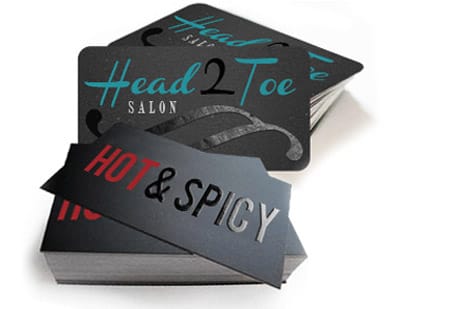
Real estate agents: Lead with LinkedIn and Instagram. Include a QR code linking to your property listings page. Your card should feel sturdy and premium, since thick stock signals trustworthiness in real estate.
Beauty and salon professionals: Instagram is non-negotiable because your work is visual. Consider a card with a soft-touch matte finish that feels as luxurious as the services you provide, and place your Instagram handle prominently, since it is basically your portfolio.
Startup founders: LinkedIn and X. You are building credibility fast, and these platforms show thought leadership. A clean, minimalist card with bold typography and just two social icons says you are focused and know what you are doing.
Event planners: Instagram and TikTok for showcasing past events. A QR code on the back linking to a highlight reel converts better than any list of handles. If you are also creating event materials, check out custom magnets for save-the-date ideas that complement your cards.
Mistakes that ruin business cards with social media elements
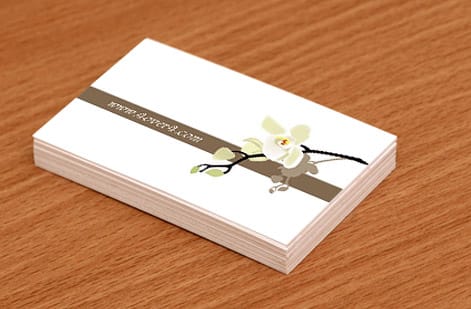
Even well-designed cards fall flat when social media details are handled carelessly. These are the most common errors 4OVER4.COM sees across thousands of customer designs:
- Listing inactive accounts. If you have not posted on X since 2022, do not put it on your card. Dead profiles hurt credibility more than having no social presence at all.
- Using outdated icons. Twitter's bird logo is gone, and it is X now. Facebook's logo has changed too. Old icons make your card look dated before someone even reads it.
- Cramming too many platforms. Five or six icons create visual noise. Stick to two or three that actually drive business results.
- Forgetting to proofread handles. One wrong character means your card points to someone else account, or nowhere at all.
- Placing icons in the bleed zone. Icons too close to the card edge risk getting trimmed during cutting. Keep all elements at least 3mm from the trim line.
A guide like this is only useful if you avoid these pitfalls. Double-check every detail before approving your proof at 4OVER4.COM. If you want to test how your social branding looks on other formats, event invitations are an easy place to try it, and you can browse ready-made 3D lenticular business card templates or black business card templates to start from a clean layout.
Wally explains social media cards
Your card is the handshake, your handles are the follow-up
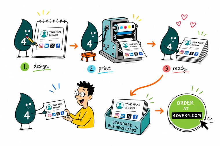
Wally thinks of a business card as the shortest bridge between meeting someone and them following your brand online. Keep it to two or three icons, print the handle beside each one, and let a single QR code on the back carry the rest. Match the icon color to your brand, print on a matte or soft-touch stock so the small details stay sharp, and every card you hand out keeps working long after the conversation ends.
Design your business cards →Specs and pricing
Standard business card specs and pricing
When you are ready to print, here is what a standard business card gives you at 4OVER4.COM, with live specs and price-per-unit straight from the configurator.

| Quantity | Price Per Unit | Total |
|---|---|---|
| 100 | 17.6¢ | $17.57 |
| 200 | 11.5¢ | $23.07 |
| 300 | 9.15¢ | $27.46 |
| 400 | 7.96¢ | $31.86 |
| 500 | 7.25¢ | $36.26 |
| 600 | 6.77¢ | $40.64 |
| 700 | 6.43¢ | $45.04 |
| 800 | 6.18¢ | $49.43 |
Print it
Best card options for social-media-ready designs
Not every stock works equally well for designs with icons and QR codes. Matte and soft-touch finishes keep small icons crisp, and thicker stocks feel premium enough that people do not toss the card.


See it in use
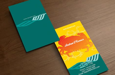
Business cards we printed for real brands








Explore more
Where to go next
Ready to print? Put your two or three handles on standard business cards in matte or soft-touch, the finishes that keep a 4mm icon readable instead of bouncing light off it.




By the numbers
Business cards, counted in the billions
Common Questions
Your questions about social media on business cards, answered
What is a social media business card?
A social media business card is a standard business card that carries your social handles alongside your phone and email, usually as a row of small platform icons with a handle beside each one, or a single QR code that opens a page listing every profile. It is the same 3.5 by 2 inch card on the same stock, with the digital links added so the person holding it can follow you instead of filing you.
Where can I get a free social media business card template?
The 4OVER4 online designer includes free business card layouts with icon rows and QR blocks already placed at the correct size, and you print straight from it. Free design apps offer templates too, and those work once you set the file to 3.75 by 2.25 inches so the 0.125 inch bleed is included. Whichever you use, replace the sample icons with the official brand versions before you order.
Can social media icons be printed in color on a business card?
Yes, full-color icons print fine on any stock, but a row of six different brand colors pulls the eye away from your name. Monochrome icons in one brand color read cleaner, and on a dark card white or foil-stamped icons stand out best. If you keep the official colors, leave the logos unaltered, since each platform's guidelines forbid recoloring or warping the mark.
Should I put social media on my business card?
Yes, if you are actually active on the platforms you list. Print two or three at most, chosen for where your customers already spend their time, and give each one the icon plus your handle rather than a full URL. Listing every profile you have ever opened clutters the card and points people at accounts you are not posting to, which does more damage than leaving them off.
How many social media icons should I put on my business card?
Stick to two or three platforms that are most relevant to your business. Listing more creates clutter and makes your card harder to read. Choose the platforms where you are most active and where your target audience spends their time.
Should I use full URLs or just my handle for social media on business cards?
Use the platform icon followed by your handle, like @yourbrand. Full URLs waste space and look messy. If your handles vary across platforms, list each one next to its icon. For a single link to all profiles, use a QR code pointing to a Linktree or similar landing page.
What size should social media icons be on a business card?
Icons should be between 4mm and 6mm in height. This size is large enough to recognize instantly but small enough to keep your layout clean. Always maintain consistent spacing between icons for a polished, professional look.
Can I use a QR code instead of listing individual social handles?
Yes, and it is a smart move. A single QR code on the back of your card can link to a page with all your social profiles. Use a dynamic QR code so you can update the destination without reprinting cards. Make the code at least 20mm by 20mm for reliable scanning.
What paper finish works best for business cards with social media icons?
Matte and soft-touch finishes are ideal. They reduce glare, making small icons and handles easier to read. Glossy finishes can cause reflection that obscures fine details. 4OVER4.COM offers 60+ paper types so you can find the right match for your design.
Do social media icons on business cards actually increase followers?
They do when your profiles are active and your card design makes the handles easy to find. The key is pairing a well-designed card with strong social content. A card gets someone attention, and your social profile keeps it.
Get Started
Ready to print business cards with social media icons?
Pick your stock, add your icons and handles, drop a QR code on the back, and we print a crisp card that turns every handshake into a follow.
Legal Disclaimer
Gold Standard guarantees apply to all standard orders placed through 4over4.com. Price match requires verifiable proof of a competitor's published price for an equivalent product with matching specifications and turnaround time. Satisfaction guarantee covers manufacturing defects and print quality issues. Contact support with order number and documentation. On-time delivery rate based on tracked orders 1999 to 2026. Individual results may vary based on shipping carrier performance.
