
Logo Design Best Practices for Print-Ready Brand Identity


A strong logo does heavy lifting for your brand. It shows up on business cards, banners, packaging, and every printed piece your audience touches. Scale, color mode, and file format decide whether it stays sharp on all of them.
Logo design best practices come down to a few non-negotiable principles: keep it simple, make it scalable, choose colors with print in mind, and always prepare vector files. Design in CMYK or Pantone, cap the palette at two or three colors, prove the mark in black and white, and test it on real products before you commit. 4OVER4.COM has printed 10 billion+ cards, and the logos that look best on press follow these rules every time.
Quick version
Logo design best practices, the quick version
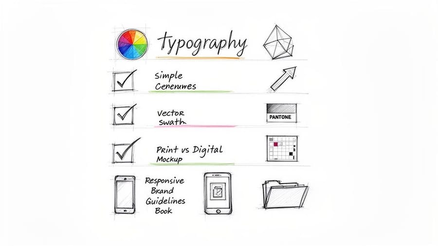
A strong logo is simple, scalable, and built for the press. Keep the mark clean enough to read at half an inch, build the master file as a vector, and design in CMYK or Pantone with a palette of two or three colors. Prove it works in plain black and white, prepare the full set of file formats, and test it on real printed products before you commit. Do that and your logo looks sharp on everything from a business card to a banner.
Why your logo shapes every print piece you'll ever order

Vector logo design is the difference between a mark that prints sharp everywhere and one you keep apologizing for. Your logo shows up on everything, from postcards and flyers to trade show banners and rubber stamps. Get the file right once and every print run looks clean from day one.
This guide walks you through logo design best practices with a focus on real-world print applications. You will learn how color choices affect ink costs, why file formats matter more than most designers admit, and how to stress-test your logo before it hits the press. Browse our Showcase to see how strong logos translate to printed products.
These principles apply to a brand built from scratch and to a mark being refreshed. Need help with other print prep? Check out our guide on how to clean rubber stamps or explore our design templates to see how logos fit into real layouts. 4OVER4.COM offers 1,000+ products, and your logo needs to look great on all of them.
Keep it simple, complexity is the enemy of recognition
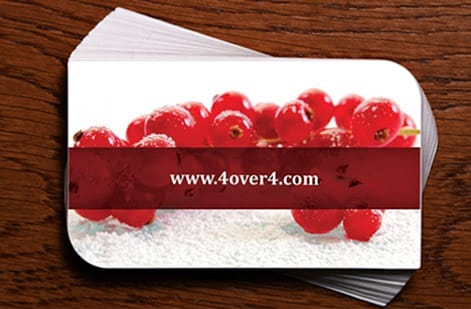
The most recognizable logos in the world share one trait: simplicity. Think about the marks you remember instantly. They are clean, uncluttered, and readable at a glance. A simple logo reproduces well at any size, from a half-inch stamp to a 2 sided blockout banners display.
Strip your design down to its core idea. If you cannot describe what the logo looks like in one sentence, it is probably too complicated. Remove decorative elements that do not carry meaning. Every line, shape, and curve should earn its place in the composition.
Test your logo at small sizes. Print it at 0.5 inches wide. Can you still identify it? If details blur together or thin lines disappear, simplify further. This small-size test catches problems that screen-only designers miss entirely.
Design for scalability from the start

Your logo will appear on surfaces as small as a pen and as large as a building wrap. That range demands a design built for scalability. Always create your primary logo file as a vector graphic (AI, EPS, or SVG format). Vector files use mathematical paths instead of pixels, so they scale infinitely without losing quality.
Create multiple logo versions for different contexts. You will need a primary horizontal version, a stacked version, an icon-only mark, and a wordmark-only option. Each version should feel like the same brand while working in its specific space. Visit our guide hub for more guidance on preparing files for different print products.
Do not forget about clear space rules. Define a minimum amount of empty space around your logo that no other element can invade. A common approach: use the height of one letter in your wordmark as the minimum buffer zone on all sides.
Vector logo design best practices

The master file is where a logo lives or dies. Build it as vector in Illustrator or Affinity Designer, save the master as AI, and hand printers EPS or a vector PDF. SVG is the web sibling of the same paths. All three describe the mark as math, so the same file prints at half an inch on a stamp and at eight feet on a banner with identical edges.
Keep the anchor points few and deliberate. A curve drawn with four points is smoother, smaller, and easier to edit than the same curve traced with forty. If you drew the mark with the pencil tool or auto-traced it from a sketch, simplify the path before you call it final, because ripple in an outline shows up as a wobbly edge once it is enlarged.
Two steps get skipped constantly and both break files at the printer. Expand your strokes so a 1pt line becomes a filled shape instead of a stroke weight that scales unpredictably. Outline your type so the wordmark is artwork rather than live text that depends on a font the print shop does not have. Save an editable copy with live text for yourself first, then outline the version you send out.
Send a raster logo to a press and the story is short. A PNG or JPEG is a fixed grid of pixels, so enlarging it invents nothing and the edges go soft and stair-stepped. Worse, PNG transparency and RGB color both get flattened on the way to CMYK, which is where a crisp black turns into a muddy four-color black. If the only file you have is a PNG, it needs to be redrawn as vector, not upscaled.
| Format | Scales cleanly | Best use | What happens at press |
|---|---|---|---|
| AI | Yes | Your editable master file | Opens natively at any print shop running Illustrator, layers and all |
| EPS | Yes | The file you hand a printer | Rips cleanly, holds spot colors, the safest thing to email |
| Vector PDF | Yes | Sharing and proofing | Prints sharp as long as type is outlined and no image is embedded |
| SVG | Yes | Web, apps, screens | Fine for print if converted, but color is defined in RGB so it needs a CMYK pass |
| PNG | No | Screens, email signatures | Soft stair-stepped edges above its native size, transparency flattens |
| JPEG | No | Photos, never logos | Compression artifacts around every edge, no transparency at all |
If your only logo is a raster file, our design services team can redraw it as vector and set up the print files, so the mark you already use keeps working on every product you order.
Choose colors with print production in mind

Color is where logo design gets technical fast. What you see on your monitor is RGB (red, green, blue), light-based color. What comes off a printing press is CMYK (cyan, magenta, yellow, black), ink-based color. These two systems do not produce identical results.
Some RGB colors, especially bright neons, deep purples, and vivid oranges, shift noticeably when converted to CMYK. Design your logo in CMYK from the start if print is a priority. Or better yet, specify Pantone (PMS) spot colors for your brand. Pantone inks are pre-mixed to exact formulas, giving you consistent color across every print run and every vendor.
Limit your color palette to two or three colors maximum. Fewer colors mean lower printing costs, especially for specialty items like envelopes and stamps, and stronger brand recognition. Every additional color adds complexity and cost. When you are ready to see how color choices play out on real products, check out the Showcase for examples.
Make it work in black and white first
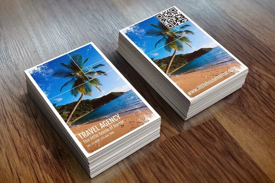
Before you add any color, your logo should work in pure black on white. This is not optional, it is a foundational test. A logo that depends on color to communicate its shape or meaning will fail in single-color applications: fax headers, newspaper ads, embossed stationery, engraved products, and dark backgrounds.
Design the mark in monochrome. Evaluate the shapes, proportions, and overall impact without color as a crutch. If the black-and-white version looks weak or confusing, the design itself needs work. Color should add personality, not compensate for structural problems.
Also create a reversed (white on dark) version. Test it on dark backgrounds at various sizes. Some logos that look bold on white become illegible when reversed. Thin elements and tight spaces are usually the culprits. If you are designing materials like flyers, our guide on how to make flyers covers layout considerations that apply to logo placement too.
Typography choices that hold up on press

If your logo includes text, and most do, font selection matters more than you might think. Avoid ultra-thin or hairline typefaces. Lines thinner than 0.5pt can disappear entirely in print, especially on textured paper stocks. What looks elegant on a Retina display becomes invisible on a 14pt uncoated card.
Custom lettering or modified typefaces give your logo a unique identity that stock fonts cannot match. But if budget or timeline pushes you toward existing fonts, choose ones with clear licensing for commercial use. Getting hit with a font licensing violation after you have printed 10,000 business cards is an expensive headache.
Pay attention to letter spacing (kerning) and the relationship between your icon and wordmark. These details affect readability at small sizes. Print a test sheet at actual size on a few different paper types before finalizing. If you are curious about how typography works across folded formats, our guide on how to fold a brochure covers some useful layout principles.
Prepare the right file formats for every situation
A finished logo is not one file. It is a complete package of formats, each serving a specific purpose. Here is what you need:
- Vector files (AI, EPS, SVG), for print production, signage, and any application that requires scaling. These are your master files.
- High-resolution PNG, transparent background, at least 300 DPI, for digital use where transparency matters.
- JPEG, for web, email signatures, and social media where file size matters more than transparency.
- PDF, a universal format that preserves vector data and works across platforms.
When submitting files to a print vendor like 4OVER4.COM, vector formats are always preferred. They give the press operator maximum flexibility and produce the sharpest output. Raster files (JPEG, PNG) work for digital but can cause quality issues in print if resolution is too low. A pro move before export: convert all text to outlines so letters print correctly even if the vendor does not have your font installed.
Organize your files into clearly labeled folders: Print, Web, Social, and Reversed versions. Your future self, and any designer who works with your brand later, will thank you.
Test on real products, plan for context, and protect it legally
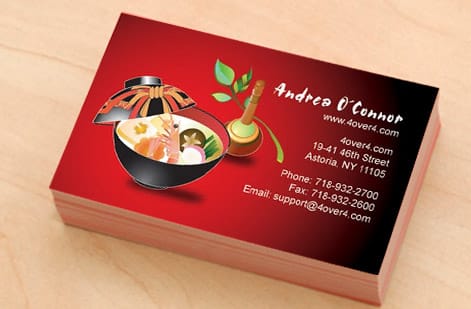
Mockups are helpful. Actual printed samples are better. Before you finalize your logo, get it onto physical products. Print test runs on business cards, letterheads, and at least one large-format item. You will catch issues that screens simply cannot reveal: color shifts, detail loss, and spacing problems. 4OVER4.COM offers 60+ paper types, so your logo has to hold on coated, uncoated and laminated stock alike, and ordering sample packs or small test quantities is a smart investment.
Your logo will not live in isolation either. It will sit next to other design elements, inside layouts, on products with their own visual demands. Consider how your logo works within a business card layout, on a brochure cover, as a social media avatar, on branded event invitations, and on promotional items like custom magnets or custom envelopes. A simple one-page brand guidelines document that specifies minimum sizes, color values (CMYK, RGB, Pantone, and hex), clear space, and approved variations keeps everything consistent. For envelope-specific considerations, our guide on how to make envelopes covers sizing and layout details.
Finally, a logo you cannot legally defend is not really yours. Before investing in large print runs, run a free search on the USPTO Trademark Electronic Search System (TESS) for conflicts with existing marks. Filing a trademark application costs between $250 and $350 per class, a fraction of what you would spend rebranding if someone challenges your mark after you have printed thousands of pieces. Reverse image searches also help you catch accidental resemblance to an existing logo before production, not after.
Wally explains logo design
Keep it simple and it prints sharp everywhere
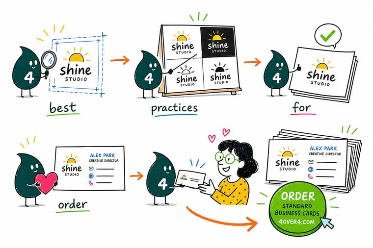
Wally treats a logo like a tool that has to work at every size, from a half-inch stamp to a full-wall banner. Strip it down until you can describe it in one sentence, build the master file as a vector, and cap the palette at two or three print-safe colors. Prove it in plain black and white, then print a few real samples before you commit. Do that and your mark lands crisp on every product you order from 4OVER4.
Order business cards →Specs and pricing
Business card specs and pricing at 4OVER4
Once your logo is print-ready, the business card is where most people see it first. Here are the live specs and price-per-unit for standard business cards, straight from the configurator.

| Quantity | Price Per Unit | Total |
|---|---|---|
| 100 | 17.6¢ | $17.57 |
| 200 | 11.5¢ | $23.07 |
| 300 | 9.15¢ | $27.46 |
| 400 | 7.96¢ | $31.86 |
| 500 | 7.25¢ | $36.26 |
| 600 | 6.77¢ | $40.64 |
| 700 | 6.43¢ | $45.04 |
| 800 | 6.18¢ | $49.43 |
Print it
Put your new logo to work

See it in use
Logos at business card scale








Explore more
Where to go next



By the numbers
Where your mark actually gets printed
Common Questions
Your logo design questions, answered
What file format should I send to a printer for my logo?
Always send vector files, AI, EPS, or SVG. These formats scale to any size without losing quality. If your printer accepts PDF, a high-resolution vector PDF works too. Avoid sending JPEG or PNG files for print production since they are resolution-dependent and can appear blurry, especially on large-format items.
Why should a logo be vector?
Because a vector file is math, not pixels. The same file prints at half an inch on a stamp and at eight feet on a banner with identical edges, since the shapes are redrawn at whatever size the press needs. A raster logo has a fixed pixel grid, so enlarging it softens every edge. Vector files also hold spot colors and let a printer separate plates cleanly, which a PNG cannot do.
What file format should a vector logo be?
Keep your editable master as AI. Send EPS or a vector PDF to a printer, since both rip cleanly and hold spot colors. Use SVG for the web, and convert its RGB values to CMYK before anything goes to press. Outline the type and expand the strokes on the version you send out, so nothing depends on a font the print shop does not have.
How many colors should a logo have for cost-effective printing?
Stick to two or three colors. Fewer ink colors keep printing costs lower, especially for specialty items like envelopes and stamps. Specify Pantone (PMS) values for each color to guarantee consistency across different print vendors and product types.
Why does my logo look different on screen versus on paper?
Screens display color using RGB light, while printers use CMYK ink. These systems do not overlap perfectly. Bright greens, vivid purples, and neon tones shift the most during conversion. Design in CMYK from the start, or define Pantone spot colors for accurate reproduction. 4OVER4.COM offers 60 plus paper types, and each substrate can affect how colors appear.
What's the minimum size my logo should work at?
Your logo should remain legible and recognizable at 0.5 inches wide. Print it at that size and check for lost details, merging lines, or illegible text. If anything breaks down, simplify the design. This small-size test is one of the most practical logo design best practices you can adopt.
Do I need a trademark for my logo before printing?
You do not need a registered trademark to start printing, but it is smart to file early. A USPTO trademark search is free, and filing costs $250 to $350 per class. Catching conflicts before you have printed thousands of branded pieces saves big money and brand disruption down the road.
Should I design my logo in CMYK or RGB?
If print is your primary use, design in CMYK first. Converting RGB to CMYK after the fact often shifts colors in unexpected ways. For brands that need both digital and print consistency, define your colors in Pantone, then create matched CMYK and RGB conversions from those Pantone values.
Get Started
Put your logo on 100 business cards from $17.57
Upload your print-ready mark, pick your paper, and we print business cards that show off your brand exactly the way you designed it.
Legal Disclaimer
Gold Standard guarantees apply to all standard orders placed through 4over4.com. Price match requires verifiable proof of a competitor's published price for an equivalent product with matching specifications and turnaround time. Satisfaction guarantee covers manufacturing defects and print quality issues. Contact support with order number and documentation. On-time delivery rate based on tracked orders 1999 to 2026. Individual results may vary based on shipping carrier performance.
