
Hand Lettering Tutorial With 20 Examples to Master Your Style


Learn to draw letters instead of writing them. Start with a handful of strokes, build clean letterforms, then borrow from 20 distinct styles to find a look that is unmistakably yours.
To learn hand lettering, treat every letter as a drawing: practice downstroke, upstroke, oval, and curve drills first, build letters from those strokes, then connect them into words along penciled guidelines. Once your lettering reads clean, develop a personal style from the 20 examples below and print your finished artwork on a heavier stock so it feels as good as it looks.
Quick answer
The short version of learning hand lettering
Hand lettering is drawing letters, not writing them. Warm up with stroke drills, build letters from those strokes, and keep your slant and spacing consistent with penciled guidelines. Study the 20 styles below to shape your own look, from brush calligraphy to negative-space letters. When your artwork is ready, scan it at 300 DPI and print it on a premium stock so the finished piece feels as considered as the lettering itself.
Watch it printed
See standard postcards on the press, in 154 seconds
Why hand lettering still matters in a digital world
Hand lettering is the art of drawing letters by hand rather than typing them. It is personal, it is textured, and it stands apart from every generic font on the market. Whether you are designing wedding invitations, branded packaging, or custom postcards, hand lettering gives your work a human touch that digital type simply cannot replicate.
This tutorial walks you through the fundamentals, from basic strokes to full compositions. You will see 20 distinct lettering styles and learn how to build your own. If you want to put your lettering on printed pieces, 4OVER4.COM offers design templates that make it easy to upload your artwork, and you can request free samples to see how your hand-lettered designs look on real paper stocks before you commit to a full order.
Ready to pick up a pen? Below you will find visual inspiration and practical techniques to build your skills from scratch. Browse our full library of design templates to see how lettering pairs with professional print layouts.
Script and calligraphy styles (examples 1 to 5)
Seeing diverse lettering styles helps you figure out what resonates with your own aesthetic. Here are the first five approaches worth studying and practicing, all rooted in flowing, connected letterforms.
1. Brush calligraphy. Fluid, expressive strokes created with a brush pen. The thick-thin contrast gives each letter dramatic movement. Perfect for wedding invitations and greeting cards.
2. Modern calligraphy. A relaxed, contemporary take on traditional calligraphy. Fewer rigid rules, more personality. Bounce lettering fits naturally here.
3. Copperplate-inspired script. Elegant, formal, and precise. High contrast between hairline upstrokes and bold downstrokes. Ideal for certificates and formal stationery.
4. Hand-drawn script. Warm and imperfect on purpose. The slight irregularities give it charm and it is great for branding that wants to feel approachable. If you use rubber stamps alongside your lettering practice, our guide on how to clean rubber stamps keeps your tools in top shape.
5. Italic script. A slanted, flowing style that reads quickly and looks sophisticated. Works well for body text in hand-lettered compositions.
Bold and display styles (examples 6 to 10)
When your lettering needs to shout from a poster or a shelf, bold and display styles do the heavy lifting. These five approaches trade delicacy for impact.
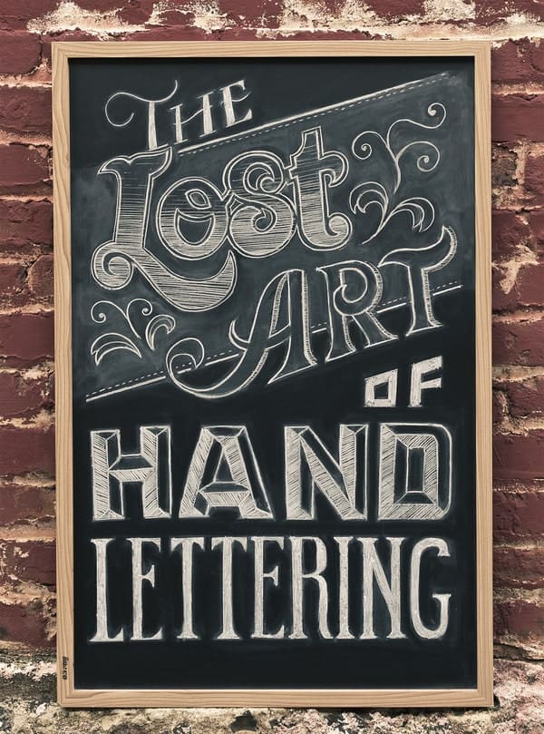
6. Vintage signage. Inspired by hand-painted shop signs from the early 1900s. Serif letterforms with dimensional shadows and aged textures. Nostalgic and eye-catching.
7. Chalkboard lettering. Bold, playful, and slightly rough around the edges. The chalkboard aesthetic works beautifully for restaurant menus, event signage, and social media graphics.
8. Graffiti lettering. Urban, bold, and full of energy. Thick outlines, wild colors, and exaggerated proportions. Not for every project, but unforgettable when it fits.
9. 3D block letters. Add drop shadows, bevels, or perspective to flat letters for a dimensional effect. These pop on posters and packaging. For a truly dimensional printed piece, see our custom magnets guide to learn how hand-lettered artwork translates to physical products.
10. Retro bubble letters. Round, inflated letterforms with a playful 70s or 80s vibe. Fun for kids' events, casual branding, and poster art.
Decorative and artistic styles (examples 11 to 15)
These five styles treat letters as a canvas in their own right, weaving illustration, color, and texture into the letterforms themselves.
11. Floral typography. Letters intertwined with botanical illustrations. Roses, leaves, and vines grow from the letterforms themselves. Romantic and detailed.
12. Watercolor lettering. Soft, blended color fills inside hand-lettered outlines. The unpredictable nature of watercolor makes each piece one-of-a-kind.
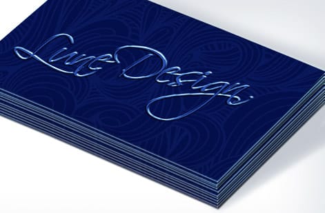
13. Embossed lettering. Designed to look raised or pressed into the surface. When printed with actual embossing or spot UV, the tactile result is stunning.
14. Geometric lettering. Letters constructed from circles, triangles, and straight lines. Clean, modern, and architectural in feel.
15. Fun illustrated lettering. Letters surrounded by or built from playful illustrations. Animals, food, objects, anything goes. Perfect for children's books and playful branding.
Minimalist and contemporary styles (examples 16 to 20)

The final five styles strip lettering back to its essentials, proving that restraint can be just as striking as ornament.
16. Minimalist sans-serif. Clean, simple, hand-drawn sans-serif letters. The slight imperfections distinguish them from typed fonts while keeping a modern feel.
17. Monoline lettering. Consistent stroke width throughout, no thick-thin variation. Created with a fine-tip pen or marker. Sleek and uniform.
18. Monogram lettering. Single or interlocking initials designed as a decorative unit. Popular for personal branding, wedding logos, and embroidered goods.
19. Mixed media lettering. Combining hand lettering with collage, photography, or digital elements. The hand-drawn text grounds the composition with a personal touch.
20. Negative space lettering. Letters formed by the space around them rather than drawn directly. Clever, attention-grabbing, and perfect for logos and poster designs.
Want to fold your hand-lettered designs into a printed brochure? Our guide on how to fold a brochure walks you through layout and folding techniques. And if you want to feel the paper quality before printing your lettering work, grab free samples from 4OVER4.COM to test different stocks.
Gather your tools

Hand lettering starts with understanding how letters are built. Not typed, built. Every curve, every thick downstroke, every thin upstroke is a deliberate choice. That is what separates hand lettering from handwriting. You are drawing letters, not writing them.
You do not need expensive supplies to begin. A pencil, smooth paper, and a basic brush pen will get you started. Here is what works well for beginners:
- Brush pens. Tombow Dual Brush Pens or Pentel Fude Touch Sign Pens offer great flexibility for thick-and-thin strokes.
- Smooth paper. Rhodia or HP Premium LaserJet paper prevents ink from bleeding and feathering.
- Pencil and eraser. For sketching layouts before inking.
- Ruler or guidelines sheet. Consistency depends on even baselines and x-heights.
- Tracing paper. Useful for practicing over printed exemplars.
Once you are comfortable, you can explore pointed nibs, watercolor brushes, and digital tablets. But start simple. Mastery comes from repetition, not from owning fancy tools. For more creative print projects, see our guide on how to make flyers, since hand lettering on a flyer design is a real attention-grabber.
Learn the basic strokes
Before you letter a single word, practice individual strokes. Hand lettering is built on a small set of foundational movements:
- Downstrokes. Apply pressure for thick lines as you pull the pen downward.
- Upstrokes. Release pressure for thin, delicate lines going upward.
- Ovals. The building block for letters like o, a, d, g, and q.
- Curves. Compound curves form letters like s, n, and m.
- Entrance and exit strokes. The connecting lines that flow between letters.
Spend at least 15 minutes on stroke drills before attempting full letters. This builds muscle memory. Think of it like warming up before a workout. Your hand needs to learn the pressure variations that create contrast between thick and thin lines.
The words every lettering tutorial assumes you know
Tutorials throw these terms around without stopping, so here is the short list, in the order you meet them on the page.
- Baseline is the line the letters sit on. X-height is the height of a lowercase x above it, and it sets how big the word looks at a given size.
- Ascender is the part of b, d, h or k that rises above the x-height. Descender is the tail of g, p, q or y that drops below the baseline. Cap height is the top of a capital, usually a touch below the ascender line.
- Stem is the main vertical stroke. Bowl is the closed round part of a, b or d. Counter is the enclosed space inside it, the part that fills in when a brush pen is pressed too hard.
- Contrast is the difference between thick downstrokes and thin upstrokes. Copperplate has high contrast, monoline has none.
- Slant is the angle of the stems. Tracking is the space between letters across a word, and kerning is the gap between one specific pair.
- Flourish is a decorative extension of a stroke. Bounce is letting letters ride above and below the baseline on purpose.
Draw four guidelines, baseline, x-height, ascender and descender, and most of these become visible on the page. The same terms carry over to type, which is why our lettering styles and fonts guide reads the same way, and the free practice sheets print the guidelines for you.
Build letters from strokes
Once your basic strokes feel natural, start combining them into lowercase letters. Begin with simpler forms, such as i, l, t, u, and n, before moving to more complex letters like g, k, and z. Here is the progression that works:
Group 1, straight strokes: i, l, t, f. These use mostly vertical downstrokes with minimal curves.
Group 2, basic curves: n, m, u, h, r. These introduce the overturn and underturn strokes.
Group 3, ovals: o, a, c, e, d, g, q. Oval-based letters require smooth, consistent curves.
Group 4, complex: s, k, b, p, w, x, y, z. These combine multiple stroke types and often trip up beginners.
Work through each group methodically. Do not rush to words until individual letters feel solid. If you want to apply lettering to printed materials like custom envelopes, our guide on how to make envelopes shows you how to pair hand-lettered addresses with professional printing.
Connect letters into words

Connecting letters is where hand lettering gets tricky and fun. The key is maintaining consistent spacing and angle throughout each word.
Keep your letter slant uniform. Whether you letter upright or at a 55-degree angle, stick with it across the entire word. Inconsistent slant makes lettering look sloppy fast.
Use guidelines. Draw light pencil lines for your baseline, x-height, ascender line, and descender line. These four lines keep your letters proportional and aligned. Erase them after inking.
Do not rush the connections. The exit stroke of one letter should flow naturally into the entrance stroke of the next. If a connection feels forced, lift your pen and start the next letter fresh. Not every letter needs to connect.
Add style and personality
Once you can letter clean, readable words, it is time to develop your own style. This is where hand lettering becomes genuinely creative. Experiment with these approaches:
Bounce lettering. Vary the baseline position of each letter slightly for a playful, organic feel. Some letters sit above the baseline, others dip below.
Flourishes. Extend entrance and exit strokes into decorative swirls. Use them sparingly. A single elegant flourish on a capital letter can define an entire piece.
Mixed styles. Combine script lettering with block letters or sans-serif caps. This creates visual hierarchy and contrast within a single composition.
Embellishments. Add small illustrations, banners, or decorative elements around your lettering. Floral accents, geometric frames, and simple line drawings pair beautifully with hand-lettered text. For more creative inspiration across different print formats, visit our guide hub, where you will find dozens of design and printing guides.
Mistakes that hold back your hand lettering progress
Even dedicated beginners hit the same walls. Here are the most common hand lettering mistakes and how to fix them before they become habits.
Skipping stroke drills. Jumping straight to words without practicing basic strokes is like trying to run before you walk. Spend at least 10 minutes on drills every session. Your letterforms will improve dramatically.
Gripping the pen too tightly. A death grip kills the fluid movement you need for smooth curves. Hold your brush pen loosely and move from your shoulder, not your fingers.
Ignoring guidelines. Freehand lettering without penciled guidelines almost always results in uneven baselines and inconsistent letter heights. Draw your lines, then erase them later.
Rushing the process. Hand lettering is slow by design. Each stroke is intentional. Speed comes naturally after hundreds of hours of practice, so do not force it.
Using the wrong paper. Cheap copy paper bleeds and feathers, ruining your brush pen tips. Use smooth, coated paper designed for markers. 4OVER4.COM prints on 60+ paper types, so when you are ready to print your lettering, you will find a stock that matches your vision perfectly.
Wally explains hand lettering
Drawn letters carry a warmth type never will
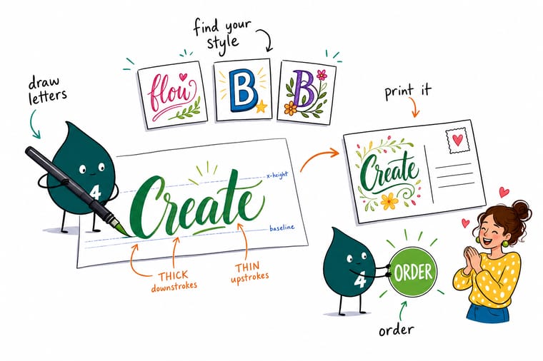
Wally treats every letter like a tiny drawing: slow strokes, steady guidelines, and a personal flourish or two. Master the thick-and-thin contrast on paper first, then let 4OVER4 print it on a stock heavy enough to feel like the real thing. That is how a hand-drawn word turns into a keepsake.
Print your lettering →Practice plan
Your hand lettering workflow in seven steps
Follow this loop every session and your lettering improves faster than you expect. Sketch light, ink with intent, and clean up without fear.
- 1 Gather your supplies. You will need paper, pencils, pens, markers, or brushes depending on your preferred style.
- 2 Practice basic strokes. Start with upstrokes, downstrokes, and loops to get a feel for your tools.
- 3 Choose a style. Experiment with different lettering styles until you find one that resonates with you.
- 4 Sketch your design. Lightly pencil your design before committing to ink to keep accuracy and proportion.
- 5 Add details. Once you are happy with the sketch, go over it with ink or color to add depth and detail.
- 6 Refine and edit. Use an eraser or a white gel pen to clean up any errors and refine your design.
- 7 Share your work. Post your hand lettering creations to inspire and motivate fellow lettering enthusiasts.
Start from a layout
Blank templates for your lettered print projects
These blank layouts give your hand-lettered artwork a print-ready home, so you can drop your work straight into a proven size and setup.
Specs and pricing
Print your hand lettering on postcards
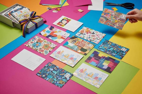
Postcards are one of the best canvases for hand-lettered artwork. Here are the live specs and price-per-unit straight from the 4OVER4.COM configurator. If you need file preparation guidance before you upload, the Help Center walks you through it.
| Quantity | Price Per Unit | Total |
|---|---|---|
| 50 | 33.0¢ | $16.48 |
| 100 | 24.2¢ | $24.16 |
| 200 | 15.9¢ | $31.86 |
| 300 | 12.8¢ | $38.45 |
| 400 | 11.3¢ | $45.04 |
| 500 | 10.3¢ | $51.62 |
| 600 | 9.89¢ | $59.31 |
| 700 | 9.57¢ | $67.00 |
Print it
Products that do your lettering justice
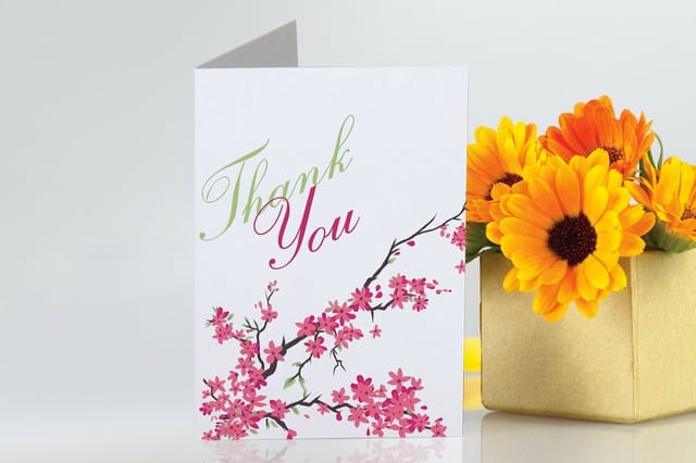
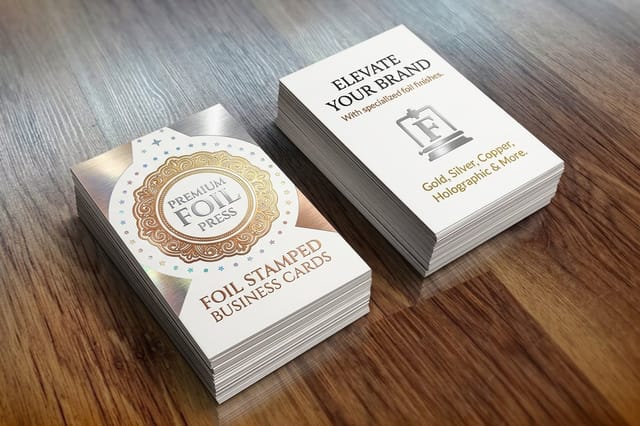
Your hand lettering deserves more than a sketchbook. For a truly eye-catching result, try printing your designs on 3D lenticular postcards, where motion and depth make hand-drawn artwork feel alive in someone's hands.

See it in use
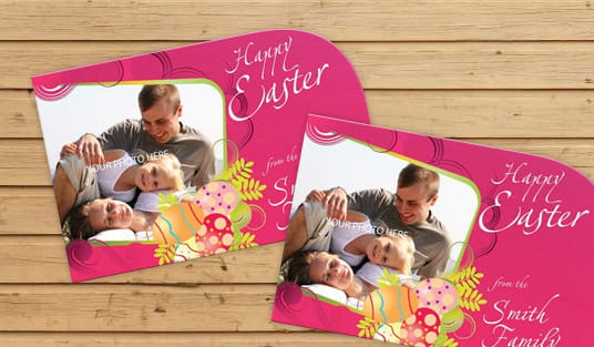
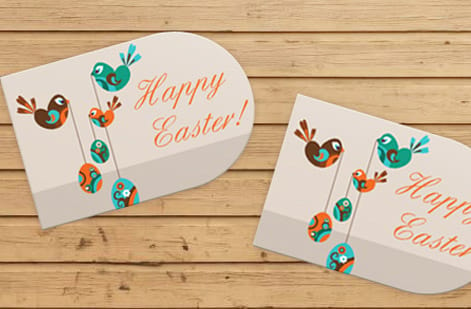
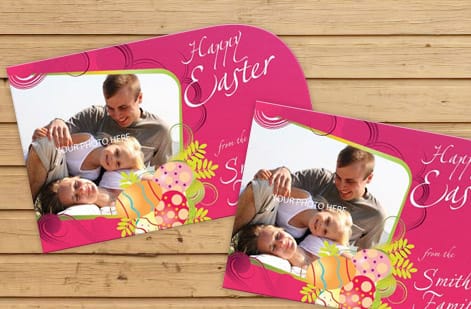
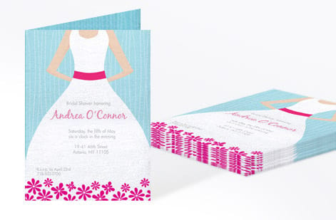
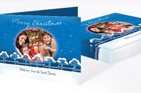
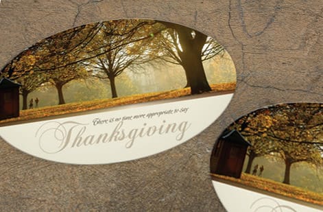
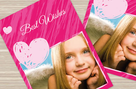
Hand lettered designs customers sent to press

Explore more
Where to go next


By the numbers
Paper types and card volume behind printed lettering
Common Questions
Your hand lettering questions, answered
What are the four main types of lettering styles?
Most guides sort lettering into serif, sans serif, script and decorative. Serif letters carry small feet on the strokes, sans serif letters do not, script is the connected, flowing family that brush and copperplate lettering belong to, and decorative covers anything built for effect, from chalkboard and graffiti to floral and 3D block letters. The 20 examples on this page fall into those four families, grouped as script, bold display, decorative and minimalist.
What are some different styles of handwritten fonts?
Handwritten fonts copy the same styles you draw by hand: brush script with thick and thin strokes, monoline script with one even line weight, casual print that looks like neat handwriting, signature and flourished scripts, chalk and marker styles with rough edges, and bounce scripts where letters sit above and below the baseline. If you want your own hand instead of a font, scan your lettering at 300 DPI and print it on a postcard or card stock.
What are the 10 different types of writing fonts?
A common ten-way split is serif, sans serif, slab serif, script, handwritten, display, blackletter, monospaced, decorative and dingbat. The first three are for reading, script and handwritten mimic the pen, display and decorative are built for headlines, blackletter is the old gothic style, monospaced gives every letter the same width, and dingbats are symbols rather than letters. Hand lettering borrows from all of them, which is where the styles on this page come from.
What's the difference between hand lettering and calligraphy?
Hand lettering is the art of drawing letters, treating each one as an illustration you can sketch, erase, and refine. Calligraphy is the art of writing letters with specific pen strokes in a single pass, following stricter rules about stroke order and pen angle. Hand lettering gives you more creative freedom, and many artists blend both techniques in their own practice.
How long does it take to get good at hand lettering?
Most beginners see noticeable improvement within 2 to 4 weeks of daily practice at 15 to 30 minutes per session. Developing a consistent personal style usually takes 3 to 6 months. The key is regular practice with stroke drills, not just lettering full words. Muscle memory builds over time, and your control with brush pens improves steadily with repetition.
What's the best pen for hand lettering beginners?
The Tombow Dual Brush Pen is the most recommended starter pen. It has a flexible brush tip on one end and a fine tip on the other. The Pentel Fude Touch Sign Pen is another strong option because it is smaller and easier to control. Start with brush pens before moving on to pointed nibs or dip pens.
Can I print my hand lettering on custom products?
Yes. Scan or photograph your lettering at 300 DPI minimum, then clean it up digitally with free tools like GIMP or Canva. Upload the high-resolution file to 4OVER4.COM and print it on business cards, postcards, stickers, or any of our 1,000+ products. Visit the Help Center if you need file preparation guidance.
Do I need to learn digital tools for hand lettering?
Not at all. Hand lettering is fundamentally an analog skill. Learning basic digitization, such as scanning and vectorizing in Adobe Illustrator or Inkscape, lets you reuse your lettering across print and digital projects. Many lettering artists work entirely on paper and only digitize when they need to reproduce their work.
What paper weight works best for printing hand-lettered designs?
For printed products featuring hand lettering, heavier stocks like 16pt or 32pt cardstock showcase the artwork beautifully. Thicker paper feels premium in the hand and gives your lettering the weight it deserves. 4OVER4.COM offers 60+ paper types so you can match the stock to your design, from smooth and sleek to textured and rustic.
Get Started
Ready to print your hand lettering?
Scan your artwork, pick a premium stock, and we print postcards and cards that give your lettering the weight it deserves.
Legal Disclaimer
Gold Standard guarantees apply to all standard orders placed through 4over4.com. Price match requires verifiable proof of a competitor's published price for an equivalent product with matching specifications and turnaround time. Satisfaction guarantee covers manufacturing defects and print quality issues. Contact support with order number and documentation. On-time delivery rate based on tracked orders 1999 to 2026. Individual results may vary based on shipping carrier performance.
