
Interesting Facts About Logo Design You Need to Know in 2026


Interesting facts about logo design that change how you see brands

Logo design is a discipline packed with hidden stories, psychological tricks, and choices most people never notice. Here is one of the most interesting facts about logo design to start with. The Nike Swoosh cost just $35 when Portland State University student Carolyn Davidson drew it in 1971, and that single mark now anchors a brand identity valued in the billions. 4OVER4.COM has helped 150,000+ businesses turn brand ideas into printed reality since 1999, and knowing what makes a logo work is the first step toward materials that actually get noticed.
Whether you are drawing your first logo or refreshing a tired one, these facts about famous logos, color psychology, and design history will sharpen your eye. Once the mark is locked in, you will want it printed on everything from Standard Business Cards to stickers to banners. That is where a screen idea turns into something people can hold.
Hidden messages inside the world's most famous logos
Great logos do more than look good. They hide clever details that reinforce what the brand stands for. These touches are intentional, and once you spot them you cannot unsee them.
The FedEx arrow you almost missed
Look at the space between the E and the x in the FedEx logo. A forward pointing arrow sits right there. Designer Lindon Leader created it in 1994 to signal speed and direction, and it has become one of the most studied uses of negative space in graphic design. The arrow was no accident. Leader tested more than 200 versions before landing on the one where it appeared naturally between the letters.
Amazon's A to Z smile
The curved arrow under the amazon wordmark points from the letter A to the letter Z, a quiet promise that the company sells everything in between. It also forms a smile, a nod to customer satisfaction. Turner Duckworth designed this version in 2000 and it has barely changed since. Simple, effective, and easy to remember.
The Starbucks siren's long history
The Starbucks logo features a two tailed siren from Greek mythology. The 1971 original was far more detailed. Across four redesigns the siren grew more stylized and zoomed in, and in 2011 the company name left the mark entirely. That move only works once your logo is already famous. If you want graphic design portfolio examples that show this kind of evolution, studying logo redesigns is a smart place to begin.
BMW's Bavarian roots
The blue and white quarters in the BMW logo echo the Bavarian flag and honor the company's Munich home. A popular myth calls it a spinning propeller, but BMW historians have made clear that the propeller story was a marketing link added later. The design dates to 1917 and has been simplified over the decades while keeping those Bavarian colors intact.
Patterns that repeat across great logos
Many iconic marks lean on geometric shapes to carry meaning. Circles suggest community and trust. Triangles imply stability or a fresh idea. The classic Coca-Cola red triggers warmth and excitement. None of it is random. It grows from color psychology and shape theory refined over a century of commercial art. When you are ready to move a logo from screen to paper, the 4OVER4.COM design templates show how marks translate onto real print.
Color psychology in logo design and why brands choose specific palettes
Color is one of the most powerful tools in a designer's kit. Research from the University of Loyola found that color raises brand recognition by up to 80%. That is not a rounding error. The palette you choose decides whether people remember you at all.
Red logos demand attention
Red is the most common color in logo design. Coca-Cola, YouTube, Netflix, Target, and CNN all reach for it. Red sparks urgency, excitement, and appetite, which is why fast food chains lean so hard on red and yellow. McDonald's, Wendy's, Burger King, and In-N-Out prove the pattern is everywhere once you notice it.
Blue builds trust
Blue is the default for tech and finance. Facebook, LinkedIn, PayPal, Samsung, Intel, and Chase all wear it. The color reads reliable and professional, and it is the most widely liked hue across cultures, which makes it a safe bet for global brands.
Black and white logos never age
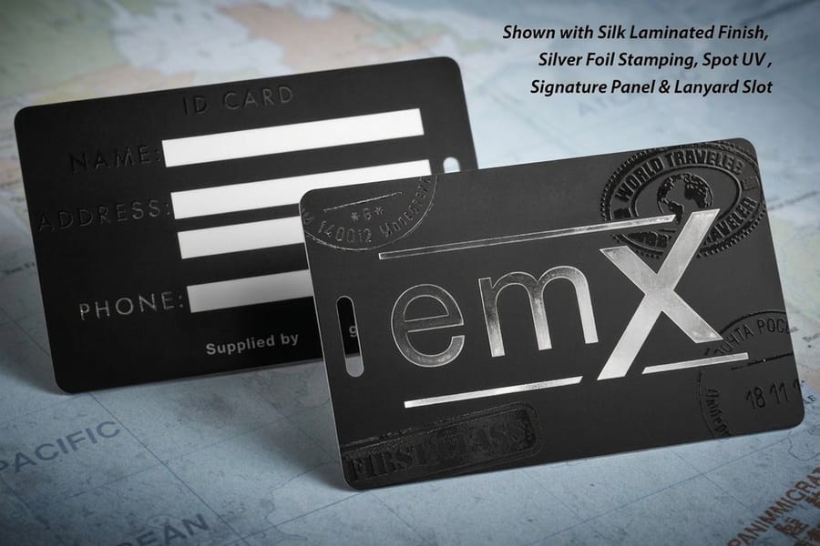
Nike, Apple, Chanel, and Adidas all run monochrome. Black signals sophistication, luxury, and staying power. A black and white logo also carries a practical edge because it works on any background, any material, and any print method. Put a clean monochrome mark on 30Mil Clear Plastic Cards and it reproduces with sharp clarity every time.
Green signals growth and health
Whole Foods, Spotify, Starbucks, and Animal Planet all use green. It connects to nature, health, and freshness, and it is climbing fast among fintech names like Robinhood and Mint, where green hints at financial growth. The color works across industries because its associations are almost all positive.
The cost of famous logos, from $0 to $1.8 million
One of the most interesting facts about logo design comes down to price, and the spread is wild. Some of the most recognizable marks on earth cost almost nothing. Others cost a fortune.
The Google logo was built by co-founder Sergey Brin in the free program GIMP, for $0. The Coca-Cola script was hand drawn by bookkeeper Frank Mason Robinson in 1886, also essentially free. On the other end, BP spent $211 million on its sunflower rebrand in 2000, Pepsi paid $1 million for its 2008 refresh, and Symantec reportedly spent $1.28 billion on a rebrand that included a new logo.
The lesson is simple. Price does not decide quality. The $35 Nike Swoosh is arguably the most successful logo in history. What matters is the thinking behind the mark, not the invoice. For tighter budgets, the 4OVER4.COM online design tools help you build professional branded materials without hiring an agency. You do not need a million dollar budget to look like a million dollar brand.
Print it
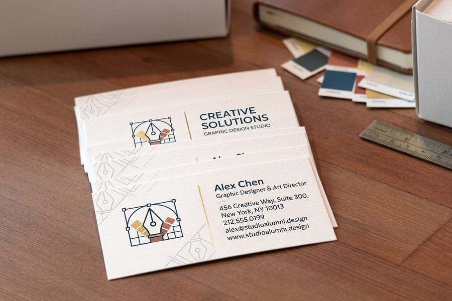
Put your logo on business cards
Real configurator pricing for Standard Business Cards. The more you print, the lower the cost per card.
| Quantity | Price Per Unit | Total |
|---|---|---|
| 100 | 17.6¢ | $17.57 |
| 200 | 11.5¢ | $23.07 |
| 300 | 9.15¢ | $27.46 |
| 400 | 7.96¢ | $31.86 |
| 500 | 7.25¢ | $36.26 |
| 600 | 6.77¢ | $40.64 |
Logo design speed records and surprising timelines

Some logos take years. Others come together in an afternoon. The Twitter bird went through many versions across six years before the simplified 2012 mark, which was built from 15 overlapping circles borrowed from classical geometry.
The Apple logo took designer Rob Janoff about two weeks in 1977. The bite gave it scale so nobody would mistake it for a cherry, and the rainbow stripes were Steve Jobs' idea to show off the Apple II color display. When Apple dropped the rainbow in 1998, it signaled the minimalist look that defines the brand today.
The Airbnb Belo took DesignStudio a full year and more than 100 concepts in 2014. The final mark stands for belonging and packs four ideas into one shape, a head for people, a pin for place, a heart for love, and the letter A for Airbnb. Every curve earns its keep. If these timelines make you think harder about your own identity, these logo sticker design ideas show creative ways to put a finished mark to work.
Typography facts that shape logo recognition
Font choice in a logo is strategy, not decoration. About 37% of the world's top 100 brands use custom typefaces built from scratch, fonts you cannot download, made to give the brand a one of a kind fingerprint.
Serif versus sans serif tells a story
Serif fonts, the kind used by Vogue, Tiffany, and The New York Times, read as tradition, authority, and elegance. Sans serif fonts like Google, Facebook, and Spotify feel modern, clean, and friendly. The last decade brought a huge swing toward sans serif. Luxury houses such as Burberry, Balmain, and Saint Laurent all traded serif logos for clean wordmarks between 2017 and 2019.
Custom fonts cost serious money
Netflix commissioned a typeface called Netflix Sans partly to escape licensing fees that ran into the millions each year. Samsung, Apple, Google, and Airbnb have all done the same. When you use a font millions of times across apps, packaging, and ads, owning it outright simply adds up.
Legibility at every size
A logo that sings on a billboard but turns to mush on a business card has a real problem. The best marks are drawn to work at every scale, which is why many brands keep a full lockup for big applications and a simplified icon for small ones. This matters most in print. To keep a mark crisp on the page, the guide on how to prepare a business card logo for printing walks through the exact steps.
Every option
Business card stocks and finishes
Paper weights, coatings, and finishing choices that keep your logo and type crisp on the card.

Logo redesigns that backfired and what they teach us
Not every logo change lands. In 2010, Gap swapped its classic blue box for a plain Helvetica wordmark with a small gradient square. The backlash was instant. Social media lit up, and Gap put the old logo back within six days. The failed run reportedly cost the company $100 million in lost equity and expenses.
Tropicana learned the same lesson in 2009. Its packaging redesign replaced the famous orange with a straw for a generic glass of juice. Sales fell 20% in two months, an estimated $50 million hit, and the brand reverted to the original design.
These stories point to one principle. Logos build equity over time, and changing them without understanding what customers are attached to is a gamble. If your current mark works, refining it often beats replacing it. For more design decisions that made an impact for better or worse, these funny print ad examples show how creative risk plays out in the wild.
Compare formats
Popular business cards, side by side
Stock, finish, quantity, turnaround, and from-price across our most-ordered business cards.
 free business cards |  Standard Business Cards |  3D Lenticular Business Cards |  Metallic Foil Business Cards | |
|---|---|---|---|---|
| Min price | Free | $17.57 | $690.88 | $222.13 |
| Paper / stock | 14pt Gloss Cover | 14pt Gloss Cover | 31pt Lenticular Lens | 16 Point Silk Laminated |
| Finish | - | Standard Finish | - | - |
| Size | 2" x 3.5" | 2" x 3.5" | 2" x 3.5" - Vertical | 2" x 3.5" |
| Default qty | 200 | 100 | 500 | 500 |
| Turnaround | 5 business days | 3 business days | 22 business days | 7 business days |
| Rating | ||||
| View & customize | View & customize | View & customize | View & customize |
How logo design has changed in the digital age

Logos used to be built mainly for print. Letterheads, signage, newspaper ads. Today a mark has to hold up on a 16 by 16 pixel favicon, an app icon, a social avatar, a smartwatch face, and a highway billboard. That is a punishing range.
This pressure drove the simplification trend. Mastercard dropped its name in 2019 and kept only the overlapping circles. Google simplified in 2015, moving from serif to sans serif and shrinking the file from 14,000 bytes to 305 bytes. That 98% cut means the logo loads faster on every device.
Responsive logos are the new standard
Responsive logo design means drawing several versions that adapt to screen size and context. Spotify runs its full wordmark on desktop and switches to the green circle on mobile. The trick is to treat your logo as a system, not a single image.
Motion logos and animation
With video everywhere, animated logos are becoming standard. The Netflix ta dum paired with the red N, Google's playful doodles, and Slack's bounce all add personality through motion. Static marks still rule in print, so most brands now keep both a static and an animated version. When you are ready to see how a mark translates to physical products, the 4OVER4.COM printing articles cover everything from file prep to finish selection, and the Help Center answers the questions that pop up along the way.
Putting your logo to work on printed materials
Knowing these interesting facts about logo design is one thing. Putting them to work on real materials is where it gets practical. Your logo will land on business cards, stickers, postcards, packaging, banners, and signage, and each format has its own needs for resolution, color mode, and size.
For print, always start from vector files (AI, EPS, or SVG), which scale to any size without losing quality. If all you have is a raster file (PNG or JPG), make sure it is at least 300 DPI at final print size. Anything less shows up blurry.
Color needs a plan too. Logos made for screens use RGB while print uses CMYK, and the conversion can shift hues slightly, so always check a proof before a big run. Pantone spot colors give you the most accurate match across different jobs and materials. 4OVER4.COM prints on 60+ paper types with a range of finishes, so you can match a mark's personality to the right stock. A bold, modern logo often looks best on smooth matte, while a vintage feel shines on textured kraft. The material becomes part of the brand.
Start fast
Templates and print-ready blanks
Business card design templates and exact-size blanks so your logo lands inside the cut and bleed lines.














Wally decodes the logos you thought you knew
Hidden arrows, $35 marks, and the colors that make you trust a brand
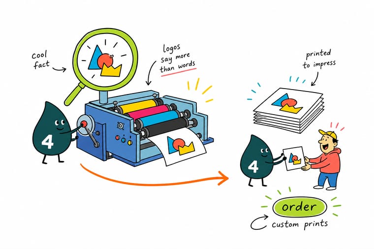
The best logos hide a whole story. FedEx tucks an arrow between two letters, Amazon points from A to Z with a smile, and the Nike Swoosh cost just $35. When it is time to move your own mark from screen to paper, start from a vector file, pick the right stock, and 4OVER4.COM prints it sharp. Bold and modern loves smooth matte, and a premium plastic card makes a logo feel real.
Print your logo on business cards →What to remember about logo design facts
Why design templates work
- Time-saving. Drop your logo, colors, and text into a ready layout instead of starting from a blank canvas.
- Consistency. Every piece matches your brand, which keeps your logo recognizable across materials.
- Professional look. Pre-built layouts deliver clean, polished results with no designer on retainer.
- Cost-effective. You skip the design fees and still get a custom look.
- Print-ready. Templates are sized to exact product specs, so your logo lands inside the cut and bleed lines.
- Creativity. A template is a starting point you can still make your own with fresh color, type, and art.
- Ease of use. Anyone can customize and print, no advanced design skills required.
Explore more
More ways to design and print your brand
Every related page type on 4OVER4.COM, one card each, so you can keep exploring logo design and print.
 Guide Logo Design Best Practices Print-ready rules for a stronger brand identity.
  Guide 6 Key Principles of Logo Design The fundamentals behind every mark that works.
  Article Amazing Business Card Designs Inspiration for putting your logo on a card.
  Article 3D Lenticular Card Ideas Add motion and depth to your logo on print.
  Product Standard Business Cards The fastest way to print your logo, from $17.57.
  Product 3D Lenticular Business Cards A logo that shifts as the card tilts.
  Statistics Graphic Design Statistics The data marketers use to plan brand work.
  Hub Business Stationery Hub Every branded print your business needs.
  Showcase Wall Graphics Showcase Real installs of logos at large scale.
  Collection Plastic Cards Collection Premium plastic stocks for a logo that lasts.
 Ready to put your logo on print?
Drop your vector logo into a free template, pick your stock, and 4OVER4.COM prints it sharp, as fast as same day.
The first logos and how trademarks began
Marks on goods are older than branding by a few thousand years. Potters in ancient Greece and Rome pressed a stamp into wet clay so a buyer could tell one workshop from another, and medieval guilds required a maker's mark on metalwork so a bad batch could be traced back to a bench. None of that was marketing. It was accountability.
What turned a mark into property was registration. Britain's Trade Marks Registration Act came into force in 1876, and the red triangle on a Bass ale label was the first mark entered under it, which is why Bass is so often called the first registered trademark. Stella Artois dates its brewing lineage to 1366, so older marks plainly existed. They were simply not owned in the legal sense.
The lesson has not moved since the potters. A mark earns its value from being used consistently on the thing it stands for, and from being registered before somebody else registers something close to it.
Common questions about logo design facts and branding
What was the very first logo?
There is no single first. Potters in ancient Greece and Rome stamped their clay so buyers could tell workshops apart, and medieval guilds required a maker's mark on metalwork. The first legally registered trademark is a narrower and answerable question, and that is usually given as the Bass red triangle, entered in Britain in 1876.
What are five interesting facts about logos?
The Nike Swoosh cost $35. The FedEx arrow hides in the space between the E and the x. Color raises brand recognition by up to 80 percent. Google shrank its logo file by about 98 percent when it simplified in 2015. And Gap put its old logo back six days after replacing it.
What are some cool hidden things in logos?
The FedEx arrow between the E and the x is the famous one. The Amazon curve runs from the A to the Z and doubles as a smile. The Airbnb mark folds a head, a location pin, a heart and the letter A into a single shape. The Tostitos wordmark hides two people sharing a chip over a bowl of salsa.
What are the best practices for applying interesting facts about logo design to my brand?
Start with simplicity. The most iconic logos use clean shapes, a tight color set, and a hidden idea or two. Study how FedEx and Amazon fold meaning into their marks. Test your logo at several sizes so it reads on a favicon and a billboard alike. Use vector files for every print job, and consider a premium stock like 30Mil White Plastic Cards to make the mark feel solid in hand.
How do I choose the right logo style for my business?
Match the style to your industry and audience. Serif fonts read as tradition and authority, while sans serif fonts feel modern and approachable. For a truly distinct identity, explore 3D Lenticular Business Cards that add motion to your logo on a printed card. Decide whether the mark lives mostly on screens, in print, or both, then design for that.
What makes interesting facts about logo design effective for marketing?
Logo trivia grabs attention and makes a brand more relatable. Sharing that the Nike Swoosh cost $35 or that Gap's failed redesign cost $100 million starts a conversation. Use these stories in social posts, blog content, and pitches. They humanize design choices and help clients understand why branding matters. The 4OVER4.COM Help Center has tips for turning a finished logo into effective printed marketing.
How much should I budget for professional logo design?
Freelance designers usually charge $300 to $2,500 for a logo, while agencies run from $5,000 to $50,000 or more. Remember that Google made its logo for free and the Nike Swoosh cost $35. The strategic thinking matters most. Set aside budget for brand guidelines, file formats, and a first round of printed materials so the logo reaches the physical world. Browse the printing articles for guidance on that step.
