
Matte Finish Explained for Cards, Flyers, and Posters


Sofia is our design and templates voice, built from the knowledge of our production team, with over 20 years in printing.
A matte finish is the low-shine surface that keeps prints soft, readable, and fingerprint-free. Here is what it is, how it differs from gloss and soft touch, and exactly when to use it.
A matte finish is a non-reflective coating or stock that scatters light instead of reflecting it. The surface reads soft and glare-free, resists fingerprints, takes pen ink, and gives a design an understated, premium feel. Gloss does the opposite, reflecting light for deeper, punchier color. Choose matte for text-forward, handled, or brightly lit pieces.
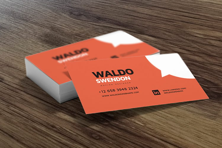
Start here
What a matte finish is, in one paragraph
A matte finish is a non-reflective surface that scatters light for a soft, glare-free look. At 4OVER4 you meet it three ways: soft touch business cards on 32pt to 80pt uncoated stock, posters with a 3 mil matte lamination, and labels on uncoated label stock. It keeps prints readable under bright lighting, hides fingerprints, takes pen ink, and reads as understated and premium. Gloss reflects light instead, deepening color and contrast for photo-led work. The diagram below shows how each finish handles a beam of light.
Watch it printed
See soft touch business cards on the press, in 141 seconds
Why the finish decides how your print feels
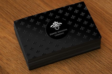
Print one design on a 32pt soft touch card and again on a glossy card, and the two land as different brands; the finish is the reason. The finish is the surface treatment on top of the ink, and it controls one thing above all: how the piece handles light. Get that right and the design lands the way you pictured it.
A matte finish is the low-shine option. Instead of reflecting light back at the viewer, it scatters it, so the surface reads soft, flat, and glare-free from every angle. That single property is why matte feels understated and premium, stays readable under bright lighting, and shrugs off the fingerprints that a glossy card collects within minutes.
This guide covers what a matte finish actually is, how it stacks up against gloss and soft touch, and exactly when to reach for it. If you would rather see the finish before you decide, our online design tool lets you build the piece, and you can compare matte across matte products on one page.
What a matte finish actually is
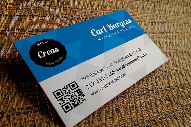
Matte comes from one of two places, the paper stock itself or a coating laid over the ink, and either way the surface is non-reflective. Under a microscope the surface is slightly textured, and that micro-texture is what breaks up incoming light and sends it in many directions at once. The result is a look with no hot spots and no mirror-like shine.
It helps to separate two ideas. An uncoated matte stock is naturally low-sheen paper with nothing added on top. A matte coating or laminate is a thin layer applied after printing that seals and protects the ink while keeping that flat look. Both give you the matte appearance, but the coated versions add durability and a smoother hand. The catalog shows both routes: 32# bright white uncoated poster paper and uncoated label stock are matte by nature, while the 3 mil matte lamination on posters and the soft touch finish on cards go on after printing.
Matte is available across most of our catalog, from soft touch business cards and menus to matte posters and labels. If you are starting from scratch and want the finish rules handled for you, our design templates take the guesswork out.
Matte vs gloss: how each one treats light and color
Set the two finishes side by side under one lamp and the trade shows at once. Gloss reflects light, which deepens color and contrast and makes photography look rich and vivid. The cost is glare and visible fingerprints, and gloss can be hard to read under bright store or trade-show lights when the shine bounces straight back at the reader.
Matte scatters light, which softens color a touch but keeps the surface readable at every angle. Fingerprints do not show, and pen ink actually sticks, so matte is the natural pick for anything handled or written on. The muted color also reads as calm and premium, which is why many high-end brands choose it on purpose.
So the decision comes down to the artwork and the setting. Photo-led flyers and posters that need color to jump often favor gloss, while text-first menus, cards, and signage favor matte. On a poster the choice is literal: a 3 mil gloss lamination or a 3 mil matte lamination, single or double sided, over 10mil semi gloss or hi gloss paper. Our deeper matte vs gloss comparison walks through more real examples side by side.
When to choose a matte finish
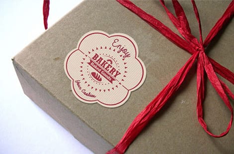
Pick matte when readability, handling, or an understated feel outranks color punch. Matte labels run from 2 by 3.5 up to 5 by 7 inches on uncoated label stock, and a matte poster runs from 11 by 17 up to 48 by 96 inches with a 3 mil matte laminate. Restaurant labels and menus stay legible under warm lighting. Business cards feel refined and take pen ink for appointment or loyalty notes. Reports and letterhead read as serious and professional rather than flashy.
Matte also earns its keep anywhere glare would hide the message. Retail signage, informational posters, and trade-show graphics all benefit because the surface stays readable from any angle, even under harsh overhead lights. And because fingerprints do not show, anything passed hand to hand keeps looking clean.
Lean gloss instead when the piece is a photography showcase or a bold, color-driven promotion that needs to shout from a rack. When you are genuinely torn, order a proof or a printed sample so you can judge the finish on your real artwork before committing to the run.
Matte, soft touch, and where they differ
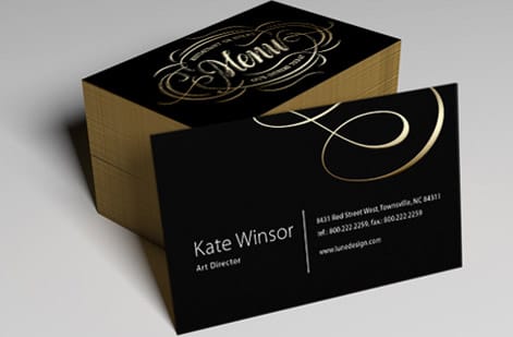
From across the room matte and soft touch look alike; in the hand they part ways. A standard matte finish is low-shine and nothing more. A soft touch finish is a laminate that keeps that non-reflective look while adding a velvety, almost suede-like texture you notice the instant you pick the piece up.
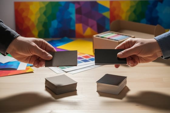
That texture is the whole point. Soft touch turns a card into a tactile experience, which is why premium brands use it when the goal is for the recipient to hold the card a beat longer. It also resists scuffs and fingerprints even better than a plain matte coat, so the piece stays looking new. Our soft touch business cards carry the finish on uncoated stock at 32pt, 48pt, 64pt or 80pt, in 2 by 3.5, 2 by 2 or 1.5 by 3.5 inch sizes.
If you want the flat, glare-free matte look at a standard price, choose matte. If you want that look plus a memorable feel, step up to soft touch cards. Our guide on the best business card finish lays out when each one earns its place.
Matte as a material, from fabric and paint to paper
Outside a print shop the word matte describes any surface that does not shine. A matte fabric is a cloth with a dull, non-reflective weave, such as cotton or a brushed polyester, as against the sheen of satin or silk. Matte paint is the flat wall finish that hides roller marks and marks easily. A matte screen protector, a matte lipstick and a matte car wrap all share the one property: light hits the surface and scatters instead of bouncing back.
On paper the same idea splits into two materials. An uncoated stock is matte by nature, because the fibers stay exposed and drink ink a little, which gives a soft, warm look and a surface a pen can write on. A matte coated stock has a thin clay layer that seals the fibers, so color sits sharper on top while the surface still stays free of glare. A matte laminate goes further and adds a film over the ink for wear resistance; on a poster order that film is 3 mil thick, on one side or both.
When you order, matte is chosen as a finish on the product, not as a separate paper. Our guide on matte versus gloss paper finishes shows the two coated versions side by side, and soft touch business cards show the laminate version in the hand. For a closer look at that finish, watch the soft touch business cards video.
Wally holds matte up to the light
Matte just means the shine stays out of the way
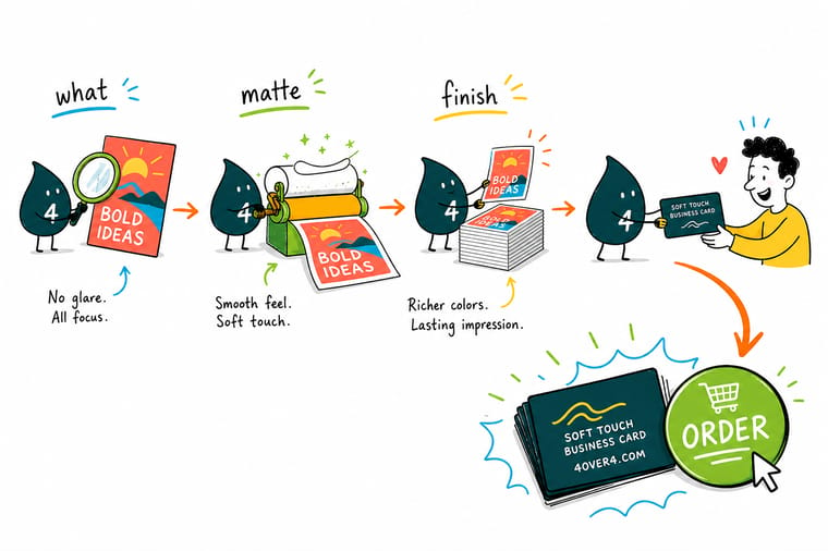
Wally shines a lamp on two identical cards. The gloss one throws the light straight back and shows every fingerprint, while the matte one soaks the glare up and stays soft, readable, and clean. That is the whole trick: matte scatters light so your message reads at any angle. Pick matte at 4OVER4 and your print keeps its calm, premium feel.
Print a matte finish →Quick reference
Matte finish at a glance
Six traits decide it, from glare to writability. If most of the middle column describes the piece you are printing, order a matte coating, the 3 mil matte laminate on a poster, or a 32pt to 80pt soft touch card.
| Trait | Matte gives you | Why it matters |
|---|---|---|
| Look | Soft, non-reflective | Matte scatters light for an even surface with no hot spots or mirror glare. |
| Best for | Text-heavy and handled pieces | Menus, cards, and reports stay readable and fingerprint-resistant. |
| Color feel | Muted, refined | Colors read a touch softer than gloss, which suits understated brands. |
| Writability | Takes pen ink | You can write on matte cards and forms, unlike a slick gloss coat. |
| Gloss alternative | Reflective, saturated | Choose gloss when photos and bold color need to pop off the page. |
| Soft touch upgrade | Velvet feel | A soft touch laminate adds a suede-like texture on top of the matte look. |
Step by step
How to pick matte, gloss, or soft touch in 6 steps
- Decide what the piece has to do A finish is a job, not a preference. Handled, text-first pieces like menus and business cards favor matte, while photo-led flyers and posters often favor gloss. Write down the product and its size first, a 2 by 3.5 inch card or an 18 by 24 inch poster, because the finish options differ by product.
- Look at your artwork honestly If the design is mostly type, line art, and flat color, matte keeps it clean. If it leans on rich photography, decide whether you want that photography muted or amplified.
- Think about the lighting where it lives Under bright store or trade-show lights, gloss can throw glare that hides the message. Matte stays readable at every angle, which is why signage and menus often go matte.
- Match the finish to the touch test Cards and cards-in-hand pieces get judged by feel. Matte reads premium and understated, while a soft touch laminate takes that further with a velvet texture.
- Order a sample if color is critical Finish shifts how saturated a color looks. When brand color has to be exact, hold a printed sample before you commit to a full run.
- Set the finish in the configurator Pick matte, gloss, or soft touch on the product page and the price updates live, so you can compare finishes before you buy.

Specs and pricing
Soft touch matte card specs and live pricing
Once you have chosen matte, the print decisions come down to size, stock, and quantity. Soft touch matte cards come in 2 by 3.5, 2 by 2 and 1.5 by 3.5 inches on 32pt, 48pt, 64pt or 80pt uncoated stock, from 50 cards at $40.28 with 5 business days of production; the widgets show the live specs and price per unit.

| Quantity | Price Per Unit | Total |
|---|---|---|
| 50 | 80.6¢ | $40.28 |
| 100 | 76.7¢ | $76.65 |
| 200 | 59.9¢ | $119.74 |
| 300 | 53.9¢ | $161.67 |
| 400 | 44.9¢ | $179.65 |
| 500 | 38.3¢ | $191.60 |
| 600 | 33.9¢ | $203.60 |
| 700 | 30.8¢ | $215.58 |
Print it
Order a matte finish at 4OVER4
Three matte routes: soft touch cards from 50 pieces, matte posters from 11 by 17 inches with a 3 mil matte laminate in 2 business days, and matte labels from 2 by 3.5 inches in 3 business days.
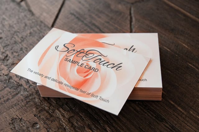
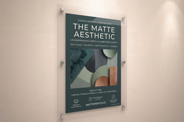

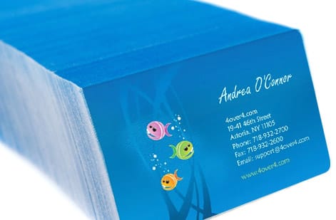
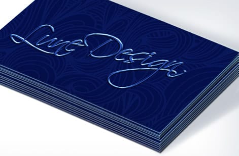
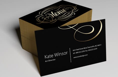
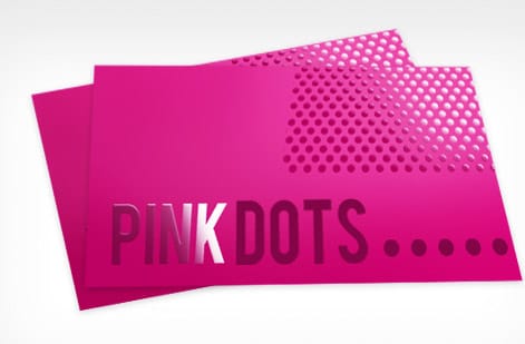
Customer soft touch cards
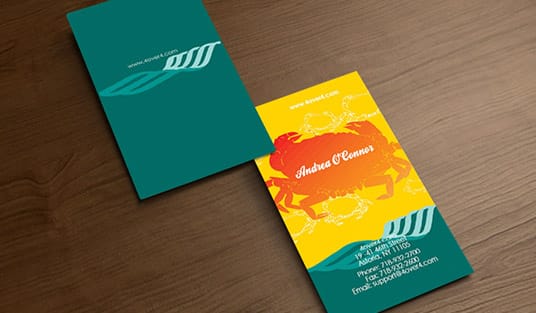
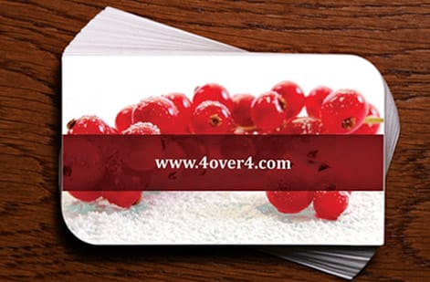
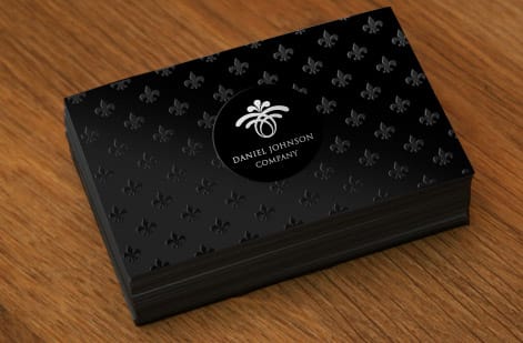
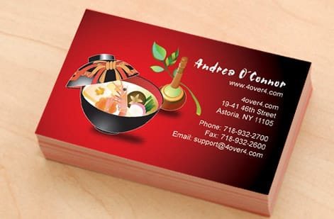
Matte and soft touch cards from customer orders

More on finishes
Where to go next




By the numbers
Sixty stocks, a thousand products, one finish decision
Common Questions
Common questions about matte finishes
What is a matte material?
A matte material is any surface that scatters light instead of reflecting it, so it looks flat and has no shine. The word is used for fabric, paint, plastic and paper alike. In printing it means either an uncoated paper, which is matte by nature, or a paper with a matte coating or laminate that seals the ink while keeping the surface free of glare.
What does matte mean?
Matte means dull or non-reflective. The word comes from the French mat, meaning without luster, and it is the opposite of gloss. A matte surface has a fine texture that breaks up incoming light, which is why it shows no hot spots, hides fingerprints and stays readable under bright lighting.
What is a matte texture?
A matte texture is the slightly rough, dry-feeling micro-surface that gives a matte material its flat look. It is too fine to see, but it is enough to scatter light in every direction. On paper it feels smooth and soft rather than slick. A soft touch laminate is the velvety version of the same texture, which you notice the moment you pick the card up.
What is a matte finish?
A matte finish is a non-reflective coating or paper surface that scatters light instead of reflecting it. Where a gloss finish acts almost like a mirror, matte diffuses light in every direction, which gives the surface a soft, even, glare-free look. It is popular on business cards, menus, flyers, posters, and labels because it stays readable under bright light, resists visible fingerprints, and gives a design an understated, premium feel.
What is the difference between matte and gloss?
The core difference is how each finish handles light. Gloss reflects it, so colors look deeper and more saturated and photos really pop, but the shine can create glare and show fingerprints. Matte scatters light, so the surface stays soft and glare-free, colors read a touch more muted, and the piece resists smudges and is easy to write on. Gloss suits photo-heavy marketing pieces, while matte suits text-forward, frequently handled, or brightly lit work.
When should I choose a matte finish?
Choose matte when your piece is text-forward, gets handled often, or lives under bright lighting. Menus, business cards, letterhead, reports, and signage all benefit because matte stays readable and clean-looking. It is also the right call when your brand leans understated and refined rather than bold and shiny. If a design is built around rich photography and vivid color that you want to jump off the page, gloss is usually the stronger pick.
Is matte or gloss better for business cards?
Neither is objectively better, they simply do different jobs. Matte business cards feel refined, resist fingerprints, and let people write on them, which is handy for appointment or punch-card uses. Gloss business cards make logos and photos look richer and more vibrant. Many brands split the difference with a soft touch finish, which keeps the matte, non-reflective look while adding a velvety texture in the hand. You can compare all three on the product page.
Can I write on a matte finish?
Yes. Because matte is not sealed under a slick reflective coat, it accepts pen and marker ink far better than gloss. That makes matte the practical choice for anything meant to be written on after printing, such as appointment cards, loyalty punch cards, forms, and place cards. If you need a truly write-on surface plus durability, an uncoated or matte stock is the safe bet over a glossy one.
What does a matte finish cost, and how is the price set?
Matte is offered as a finish option on the product page, and the price scales with the same levers as any print job: quantity, size, paper stock, and the specific finish you pick. Heavier stocks and specialty finishes like soft touch cost more than a standard matte coat, and larger runs lower the unit price. You set each option in the configurator and watch the total update live, so you can weigh a matte, gloss, or soft touch finish against your budget before ordering.
Get Started
Ready to print with a matte finish?
Choose matte on the size, stock, and product your project calls for at 4OVER4.COM. Adjust every option and watch your price update live.
Legal Disclaimer
Gold Standard guarantees apply to all standard orders placed through 4over4.com. Price match requires verifiable proof of a competitor's published price for an equivalent product with matching specifications and turnaround time. Satisfaction guarantee covers manufacturing defects and print quality issues. Contact support with order number and documentation.