
How to Make an Image Black and White in Photoshop That Prints Sharp


The conversion takes about a minute. Making it survive ink on paper takes four more settings, and those are the ones nobody shows you.
Add a Black and White adjustment layer (Layer, New Adjustment Layer, Black & White), move the six color sliders until the tones separate, add a Curves layer for contrast, then flatten a copy and convert it with Image, Mode, Grayscale as the last step. Do not start with the mode change, and do not use Desaturate: both throw away the color information the sliders need. For press work, keep the deepest shadow near 90 percent rather than a solid 100, keep the lightest tone that needs detail around 5 percent, set 300 ppi at final size, and export a grayscale PDF/X so the image prints with black ink alone.

Quick answer
Sliders first, mode change last, and shadows that stop at 90
The Black and White adjustment layer converts the image, and everything after it protects the conversion. The six sliders decide which color becomes which gray, so a red sign and a green wall can be pulled apart instead of merging into one flat tone. A Curves layer above sets the punch. Only then do you flatten a copy and switch it to Grayscale mode, because that step deletes the color channels and there is no way back. Aim the darkest detailed shadow at roughly 90 percent ink and the lightest textured highlight at 5 percent, set the resolution at final size, and let the file leave as grayscale so it prints on the black plate alone.
Why Convert to Black and White Before You Print
The honest reason first: on our presses a grayscale photo does not cost less than a color one. Four color printing is priced by the sheet, not by how many inks the image happens to use, so black and white is a decision about how the piece looks and how reliably it repeats, never a discount.
What it does buy you is consistency. Put six photos on one brochure spread, shot on three different cameras under three different lights, and no amount of color correction will make them agree. Strip the color out and the mismatch disappears, because now the only thing left to match is tone. That is why annual reports, staff pages and mixed-source photo walls so often run in grayscale.
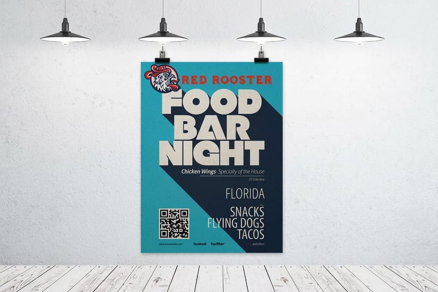
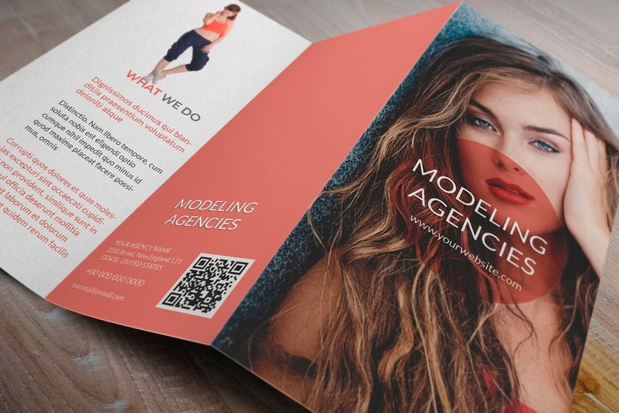
It also survives cheap paper better. A color image on uncoated stock shifts, usually warmer and duller, and skin is the first thing to look wrong. A neutral image on the same sheet just prints a little heavier, which is a problem you can fix with a curve before the file leaves your desk. For a wall piece where the photo carries the whole page, that predictability is the point, and it is the reason a lot of poster printing work still goes out in black and white. Our standard posters start at $108.75 and print the same tonal range whether the image is color or gray.
Grayscale Mode, Black and White Adjustment, Desaturate and Duotone
Four different things in Photoshop all produce a picture with no color in it, and they are not interchangeable. Three of them are conversions you apply, one of them is a file mode, and mixing them up is where most flat prints start.
| Route | What it actually does | Editable after | Reach for it when |
|---|---|---|---|
| Black & White layer | Six sliders, one per color family, decide how light or dark each hue becomes. | Yes, forever. The color data stays live under it. | Every conversion. This is the default answer. |
| Image, Mode, Grayscale | Runs one fixed conversion and deletes the color channels, leaving a single gray channel. | No. Undo or start over. | The very last step, on a flattened copy, right before export. |
| Desaturate | Drops saturation to zero and keeps whatever luminance each pixel already had. | Only if you did it on a Hue/Saturation layer. | Almost never. Colors of similar brightness collapse into the same gray. |
| Duotone | Prints the same gray image with two inks, each on its own curve. | Yes, the curves stay adjustable. | When one ink cannot give you the shadow depth the image needs. |
Read the second column carefully. Desaturate keeps luminance, and that sounds fine until you photograph a red logo on a mid green wall: both sit at roughly the same brightness, so the logo vanishes into the background. The Black and White sliders exist precisely so you can drag the reds down and the greens up and pull those two apart. Duotone is the specialist option, and it is worth knowing before you fight a flat shadow for an hour. Our walkthrough on building duotones in Photoshop covers how the second ink is set up.
The Conversion, Step by Step in Photoshop
Seven moves, in this order. The order matters more than any individual setting, because each step assumes the one before it is done.
- Work on a copy at full bit depth. Open the original, not an already exported JPEG. If the file is 16-bit, leave it 16-bit for now: the extra levels are what stop a stretched sky from banding when you push the sliders.
- Add the adjustment layer. Layer, New Adjustment Layer, Black & White. Photoshop drops in a default mix that is usually too flat, which is exactly why you are here.
- Drag on the image, not the panel. Click the small hand icon at the top of the Properties panel, then click and drag directly on the part of the photo you want to change. Photoshop finds whichever slider owns that color and moves it for you, so you never have to guess whether a wall is cyan or blue.
- Separate the two things that matter most. In a portrait that is skin against background, so the reds and yellows do the work. In a landscape it is sky against cloud, which lives in the blues and cyans. Fix those, then leave the rest alone.
- Check at 100 percent before you commit. A slider pushed hard on the color that dominates the frame will stretch that tonal range and can leave visible noise or banding in smooth areas. Skies show it first. If a channel needs an extreme move, back it off and make up the difference with a curve.
- Add contrast on a Curves layer above. The sliders decide which hue becomes which gray. Curves decide the overall punch. Keeping them on separate layers means you can change one without redoing the other.
- Set the size and resolution last. Image, Image Size, with the final print dimensions in inches, then resample once and sharpen after. Getting this backwards costs you detail you cannot get back, and our 300 dpi setup guide shows the dialog settings.
If the photo is going into a fixed layout, build it on the real trim size from the start. The blank template library has correctly sized files with bleed already marked, which saves you discovering at export time that the image is a quarter inch short.
Setting Contrast and Tones for Paper, Not for a Screen
A monitor throws light at you and paper reflects it, so the same image is always going to look flatter on the sheet. Ink also spreads a little as it meets the fibers, which pushes midtones and shadows heavier than they appeared. You can either be surprised by that at delivery or set the file up for it now.
Turn soft proofing on first. View, Proof Setup, Custom, choose the profile that matches the press and stock, then Command plus Y to toggle the preview. Edit with it on. Our guide to picking a print color profile explains which profile belongs to which job, and it applies to grayscale work just as much as color.
Then use the Info panel instead of your eyes. Set the readout to show ink percentage and hover over the parts of the image that matter. The darkest area that still needs visible detail should read around 88 to 92 percent, not 100, because a solid 100 fills in and the detail is simply gone. The lightest area that still needs texture should sit near 5 percent. Specular highlights, a chrome reflection or the sun on water, can go to zero and should. Below about a 3 percent dot, the halftone is small enough that it may not transfer at all, so anything you leave there is a gamble.
Uncoated stock gains more than coated, so a brochure on an uncoated sheet wants its midtone opened a few points before export. If the job is going to a coated gloss, leave the midtone alone and check only the shadow. The same reasoning drives how color files are prepared, which our RGB to CMYK conversion guide walks through.
Exporting a Grayscale File the Press Can Use
Everything above lives in an editable file. The export is where it becomes something a RIP has to interpret, and this is the shortest list of things that go wrong.
- Flatten a copy, never the master. Image, Duplicate, then flatten the duplicate. Your layered file stays intact for the next revision.
- Set the gray working space before you convert. Edit, Color Settings, and set Gray to a Dot Gain space rather than Gray Gamma 2.2. Gamma 2.2 is a display space, and a file built in it tends to land darker than intended once it is on paper.
- Convert to Grayscale, then to 8-bit. Image, Mode, Grayscale, discard the adjustment layers when prompted, then Image, Mode, 8 Bits/Channel. Do not convert the image to CMYK: grayscale is what keeps it on one ink.
- Confirm 300 ppi at the finished size for hand-held pieces, and 150 to 200 ppi for anything read across a room. Sharpen after resampling, and judge the sharpening at 100 percent, not zoomed in.
- Any black type sitting over or beside the photo stays 100K only. A rich black built from four inks next to a K-only photo will read as two different blacks on the sheet, and misregistration shows on the type first. The rich black recipe guide covers where each one belongs, and why RGB black prints muddy explains the version everyone sends by accident.
- Export as a PDF/X, not a JPEG. The PDF carries the color mode, the resolution and the trim geometry together. Our print-ready PDF guide lists the settings, and adding bleed and crop marks in Photoshop handles the geometry.
One more check that takes ten seconds and saves reprints: open the finished PDF in Acrobat and look at the output preview separations. A correctly built grayscale file shows ink on the black plate and nothing on cyan, magenta or yellow. If the other three plates light up, the image got converted to CMYK somewhere along the way and needs to go back. The same trap catches people who change resolution the wrong way and never look at the file again.
Ordering the Piece Your Grayscale File Is Going On

The file is only half of it. Stock and size decide how much of your carefully placed shadow detail actually survives, so pick them with the image in mind.
Coated stock holds the most detail because the ink sits on the surface instead of soaking in, which is why a photographic image on standard brochures from $57.11 keeps separation in the dark areas that the same image loses on an uncoated sheet. Standard flyers from $39.54 are the cheap way to see how your conversion behaves at volume before you commit to a bigger run. For anything held and studied, a photo on standard business cards from $17.57 is the strictest test there is, because a card gets looked at from ten inches away and every soft highlight shows.
Large format is the forgiving end. Standard posters from $108.75 are read from across a room, so a 150 ppi file that would embarrass you on a card looks clean on a wall. If you are printing a set, order them together so they run on the same sheet and share the same ink balance, since two posters printed a month apart can differ slightly even in grayscale.
Not sure how a given image will land on a given stock, order paper samples and hold them under the light where the piece will live. Browse the full range through poster printing or brochure printing, and configure the size, stock and quantity before you upload.
Wally explains the grayscale handoff
Six sliders, one curve, then one ink
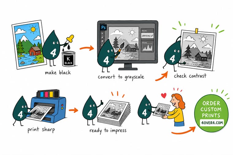
Wally does not touch Image, Mode, Grayscale until the very end. First he stacks a Black and White adjustment layer on the photo and drags the sliders until the red sign stops disappearing into the green wall. Then a Curves layer for contrast. Then he hovers the shadow with the Info panel open and stops at 90 percent, because a solid 100 fills in on paper and takes the detail with it. Last move: flatten a copy, convert to Grayscale, export a PDF. One ink on the sheet, neutral from the first poster to the last.
Print your black and white poster →Specs and pricing
Sizes, stocks and starting prices for photo pieces
Where a grayscale image usually ends up, with live configuration choices and starting prices straight from the 4OVER4.COM configurator.


Print it
Put the converted file on paper



Explore more
Where to go next

By the numbers
The press that will print your grayscale file
Common Questions
Your black and white conversion questions, answered
Should I use Image, Mode, Grayscale or a Black and White adjustment layer?
Start with the adjustment layer and use the mode change only at the end, as the last step before you export. The adjustment layer keeps the color data live, so you can go back a week later and lift the reds or drop the blues. Image, Mode, Grayscale runs one fixed conversion and discards the color channels, which means the only way to change your mind is to start again from the original file. In practice the workflow is: adjustment layer, then Curves, then duplicate and flatten a copy, then convert that copy to Grayscale.
Why does my black and white photo print darker than it looks on screen?
A monitor emits light and paper absorbs it, and the ink dot spreads slightly as it soaks into the sheet, so midtones and shadows land heavier than they looked. The fix is not to guess. Turn on soft proofing with View, Proof Setup, Custom, pick the profile for the stock, then press Command plus Y and edit with it on. Uncoated stock gains the most, so on an uncoated brochure lift the midtone a few points and keep the darkest shadow around 90 percent rather than a flat 100.
Should I send a grayscale file or convert it to CMYK?
Send it grayscale. A grayscale image separates to black ink alone, so it cannot pick up a color cast when the ink balance drifts during the run, and it holds neutral across the whole job. Building the same gray from cyan, magenta, yellow and black gives you a deeper maximum black, but every one of those four inks has to stay in balance or the photo turns slightly green or slightly warm. If you genuinely need more depth than one ink can give, a duotone is the controlled way to get it.
What resolution does a black and white photo need for print?
300 ppi at the size it will actually print, for anything read close up. A photo that fills a 3.5 by 2 inch business card needs to be about 1050 by 600 pixels at minimum. Large format is different because the viewing distance is different: a poster on a wall reads cleanly at 150 to 200 ppi, and pushing a 24 by 36 inch poster to 300 ppi mostly buys you a file too large to handle. Set the resolution last, resample once, then sharpen.
How do I stop skin tones going flat when I convert a portrait?
Skin lives mostly in the reds and yellows sliders, and the default conversion often pushes both up until the face is a pale mask. Pull the reds slider down until the cheeks and shadows separate again, then nudge the yellows to control how bright the lit side of the face sits. Use the on-image tool: click on the skin with the Black and White layer selected and drag left, and Photoshop moves whichever slider owns that color. Watch the histogram while you drag, because a hard push on one channel can leave noise in smooth areas.
Can I print a black and white photo on uncoated or colored stock?
Uncoated works, colored stock is a trap. On uncoated the image will look softer and slightly darker because the sheet absorbs more ink, so open the midtones a few points before you send it. On a colored or kraft sheet, black ink is transparent and the paper color shows through every light tone, so a black and white photo comes back tinted with the stock color and the highlights vanish into the sheet. If the piece has to be on colored stock, order paper samples first and judge the photo on the real sheet.
Get Started
See the conversion on 50 posters from $108.75
Pick the size and stock, upload the grayscale PDF, and we print it on the black plate alone so the first sheet and the last look the same.
Legal Disclaimer
Gold Standard guarantees apply to all standard orders placed through 4over4.com. Price match requires verifiable proof of a competitor's published price for an equivalent product with matching specifications and turnaround time. Satisfaction guarantee covers manufacturing defects and print quality issues. Contact support with order number and documentation. On-time delivery rate based on tracked orders 1999 to 2026. Individual results may vary based on shipping carrier performance.
