High-Converting Landing Page Frameworks and When Each One Works

Marcus is our print marketing voice, built from the knowledge of our production team, with over 20 years in printing.
Four running orders, the five page slots they all fill, and the proof block that three of them quietly leave out. Plus how to pick one from the traffic source rather than from taste, and how to print the postcard, flyer or business card that sends people to the page with a headline and URL that match it.
A landing page framework is a fixed running order for the blocks on the page: what the visitor sees first, what carries them down, and what asks for the action. The four that still earn their keep are PAS (Problem, Agitate, Solution), AIDA (Attention, Interest, Desire, Action), BAB (Before, After, Bridge) and the 4 Ps (Promise, Picture, Proof, Push). Choose between them by how much the visitor already knows: PAS for cold traffic, AIDA for browsers, BAB for switchers, the 4 Ps for someone who arrived ready to ask a price.
Quick answer
Same five slots, four opinions about what goes in slot two
Every framework fills the same skeleton: above the fold, opening block, the turn, proof, and the close. They differ in how they open slot two and in whether they make room for slot four, so pick by traffic temperature and spend the rest of your effort on the offer.
The Five Slots Every Framework Is Rearranging
Read any landing page as five slots. Every framework fills the same five in the same order, and the four of them only argue about slot two.
Slot one is above the fold. One headline, one supporting line, one image and one button. The headline has a single job: confirm to the visitor that they are in the right place. If it does not repeat the promise that brought them, nothing further down gets read.
Slot two is the opening block. This is where the frameworks disagree. PAS names the problem, AIDA grabs attention, BAB describes life as it is now, the 4 Ps state the promise. All four are answering the same question: why should this person keep reading.
Slot three is the turn. Something changes here. The solution appears, the desire is built, the bridge is crossed. This is also the slot where most pages get vague, because it is easier to write "our proven process" than to explain what actually happens in week one.
Slot four is proof, and it is the one that gets left out. Reviews with a full name, a photograph of the real work, a client list, a guarantee, a sample you can hold. Without it, slot three is a claim.
Slot five is the close. The same action as the button above the fold, worded the same way, with the main objection handled right next to it. Visitors who scrolled the whole page should not have to scroll back up to act, so the ask appears twice.
Layout does the same work visually. Our guide to hierarchy in graphic design covers how size, weight and spacing tell the eye which of these five blocks matters most.
PAS, AIDA, BAB and the 4 Ps, Side by Side
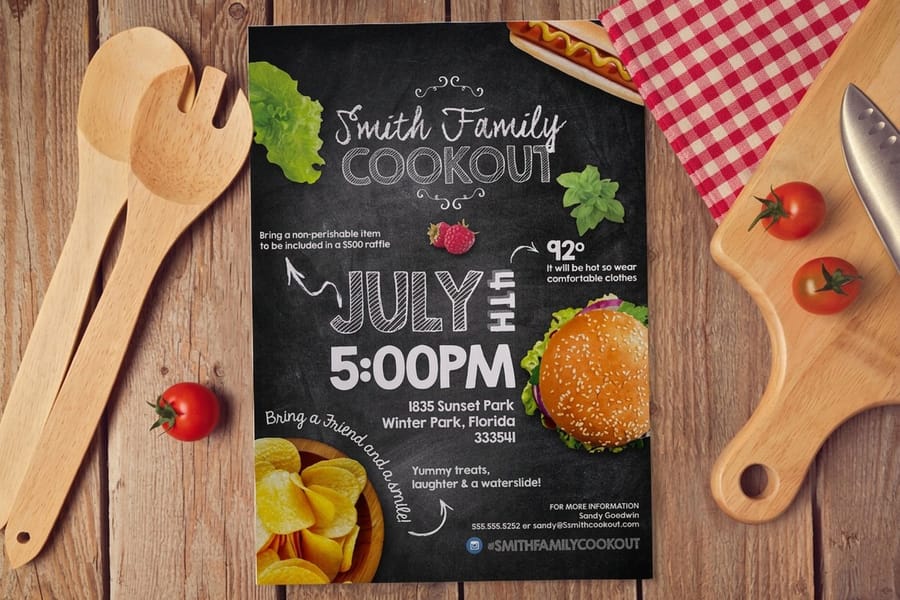
Four frameworks, four different bets about the reader. The column that decides your choice is the last one.
| Framework | Running order | Use it when | Where it breaks |
|---|---|---|---|
| PAS | Problem, Agitate, Solution | The visitor feels something is wrong but has not named it. Cold ads, cold mail, cold search. | Agitation overdone reads as manipulation, and an audience that already knows the problem finds it patronizing. |
| AIDA | Attention, Interest, Desire, Action | Browsing traffic that needs pulling forward one step at a time, and longer pages with several blocks. | It says nothing about what to put in each stage, so it turns into a filing system rather than an argument. |
| BAB | Before, After, Bridge | The visitor already has a solution and you want them to switch. Competitor comparisons and upgrades. | The After has to be specific and honest. Vague future-state copy makes the whole page feel like a brochure. |
| 4 Ps | Promise, Picture, Proof, Push | Warm traffic that arrived ready to ask for a price. Quote requests, bookings, sample orders. | Push without a real reason to act now becomes a fake deadline, and visitors recognize those quickly. |
The frameworks also stack. A long service page can run PAS across the whole document and use BAB inside one section to handle the "we already have somebody" objection. Nothing forces you to pick one for the entire page.
Pick the Framework by How Cold the Traffic Is
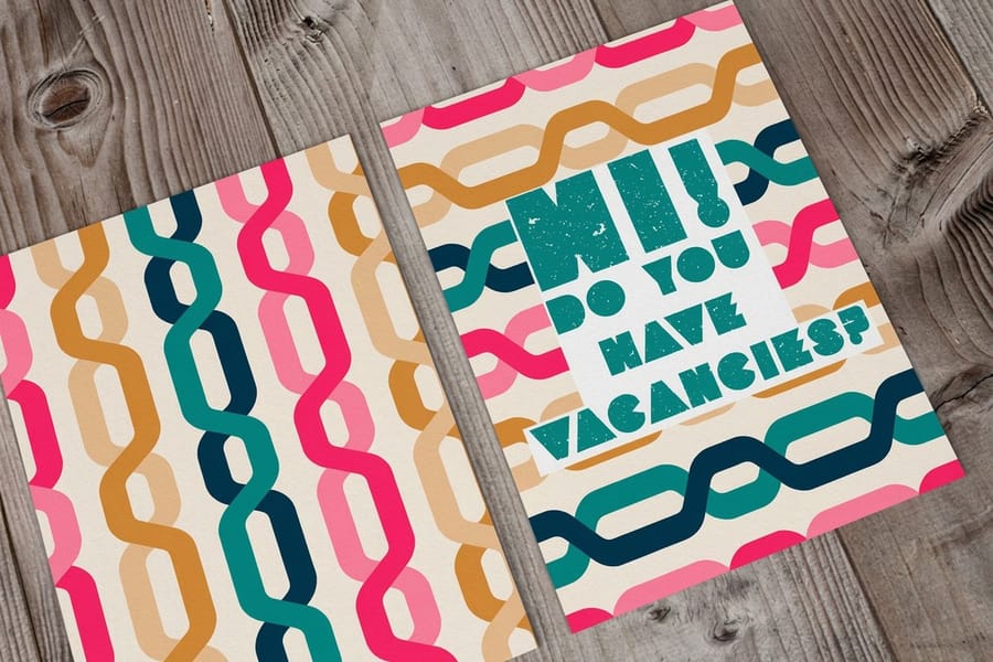
Traffic temperature decides the framework more reliably than industry does. A dentist and a software company selling to the same awareness level need the same running order.
Cold traffic has never heard of you and has not defined the problem. PAS earns its keep here because the first block does the defining. Give the page more room than feels comfortable, and expect a low conversion rate that still pays if the offer is right.
Warm traffic knows the category and is comparing options. BAB and AIDA both work, and this is where a comparison table, a spec list and named clients matter more than another paragraph of persuasion.
Hot traffic already decided and wants a price or a date. The 4 Ps get out of the way fast. Anything above the form that is not the promise, the picture or the proof is slowing down someone who was ready to convert.
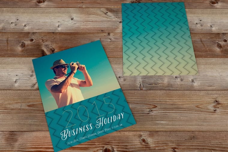
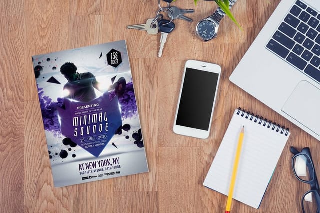
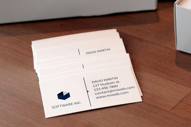
Print is one of the few channels that lets you choose the temperature before anyone lands on the page. A mailed standard postcard puts your offer in the hands of a list you selected, so the traffic arrives warmer, which suits a shorter 4 Ps page. Standard flyers handed out at an event do the same job for people who just spoke to you. A standard business card with a short vanity URL on the back is a small landing page driver that keeps working months after the conversation.
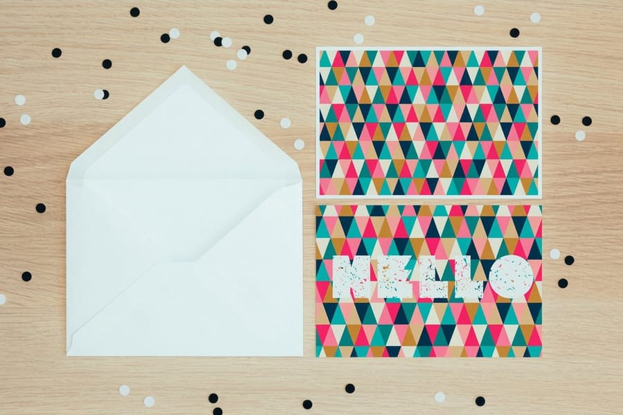
Two rules make offline traffic actually convert. First, the printed headline and the page headline say the same thing, word for word. Our postcard design guide covers the ten elements that carry that promise across the mailing panel. Second, give a scannable route and a typeable route: a QR code for phones and a short URL for anyone who does not scan. The QR code setup walkthrough shows how to build one that survives at print size. Give each print run its own landing URL and you can tell which mailing produced which lead without touching analytics.
Printing the Piece That Sends People to the Page
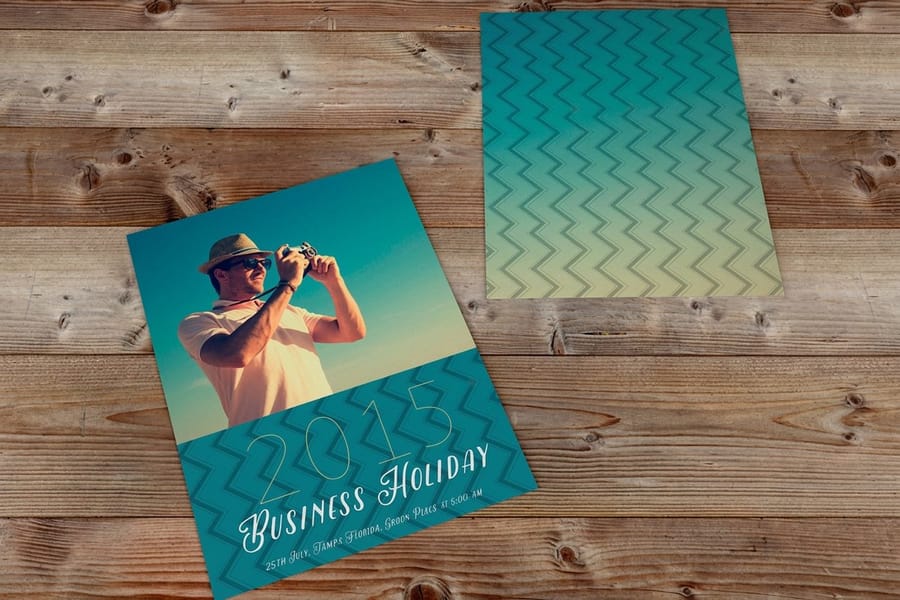
Choose the printed piece by where the visitor meets it, then set the file up so the headline, the URL and the QR code all survive the press.
| Piece | Size and stock to start with | What it carries | Starts at |
|---|---|---|---|
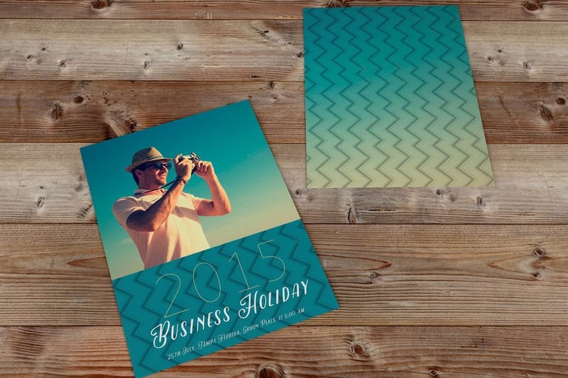
| Postcard | 4 x 6 or 6 x 9 in on 14pt or 16pt gloss cover, from 14 sizes and 22 stocks | Slots one and two: the promise, one image, a QR code and a short URL on the back | $16.48 for 50 at 2.5 x 2.5 in |
| Flyer | 5.5 x 8.5 or 8.5 x 11 in on 100# gloss text, from nine sizes | The promise plus the offer terms, handed over at an event or a counter | $39.54 for 50 at 4.25 x 5.5 in |
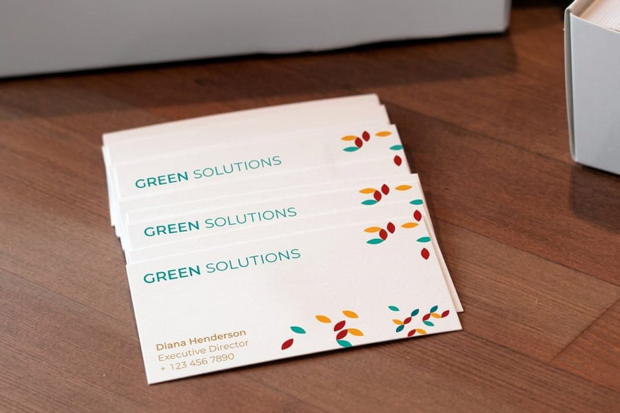
| Business card | 2 x 3.5 in on 14pt or 16pt cover, printed on both sides | A vanity URL on the back that keeps working after the conversation | $17.57 for 100 |
Build the file at the final size with 0.125 inch of bleed, and keep the URL and the QR code inside the safe area so the trim never touches them. Set the URL large enough to read at arm's length and check that it types the same way it sounds. Postcards and business cards both offer a variable data option, so each piece can carry its own code or URL and you can trace a lead back to a single mailing. Order a free online proof and scan the QR code on the proof before the run goes to press.
The Parts That Move Conversion More Than the Framework
Rewriting a page from AIDA into PAS is the smallest lever on this list. These are the bigger ones, in the order worth attacking them.
- The offer. "Contact us" is not an offer. A free roof inspection, a printed sample pack, a fixed-price audit, a 15 minute call with a named person: these change the number more than any structural edit. If the page is failing, suspect the offer first.
- Form length. Ask only for what someone will use before the first conversation. Fields you do not act on are pure friction.
- Load speed and the mobile fold. Much of the traffic from print and ads arrives on a phone. If the headline and the button are not visible without scrolling, slot one is not doing its job.
- Proof that can be checked. A named reviewer, a photograph of the real job, a client logo you can verify. Anonymous praise is easy to fake, so readers discount it.
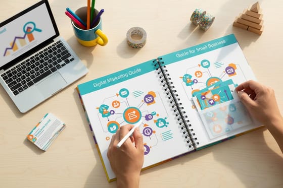
Clarity in the words themselves sits underneath all of it. Brand messaging for small business covers how to fix the value proposition once rather than rewriting it on every page. And when a page has to be handed over in person, a standard brochure carries the same five slots in a form the prospect keeps on a desk.
Testing a Framework Without Fooling Yourself
Most small business landing pages do not get enough traffic for a clean split test, and calling a winner early is how teams end up confidently wrong.
If a page gets a few hundred visits a month, a split test comparing two button colors will never separate signal from noise. What you can do is test large differences and accept slower, rougher answers. Swap the whole framework, swap the offer, swap the headline promise. A change big enough to move the number is a change big enough to see without a statistics degree.
Run one change at a time and give it a fixed window rather than stopping the moment one version pulls ahead. Two weeks with the same traffic mix beats four days that happened to include a holiday.
Measure the outcome you are paid for, not the one that is easiest to count. Form fills are a proxy. A shorter form always lifts form fills and sometimes lowers booked jobs, and you only see that if you track the lead through to the sale. The same discipline applies offline: put a distinct URL or code on each print run and the direct mail campaign guide shows how to structure the drop so the result means something.
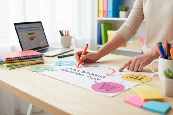
Keep the wider plan in view while you do it, because a page is one step in a sequence that starts with the list and the channel. Our small business marketing plan guide sets that sequence, and the postcards printing range covers the sizes and stocks most campaigns test first.
Wally explains landing page frameworks
Same five slots, and one of them is usually empty
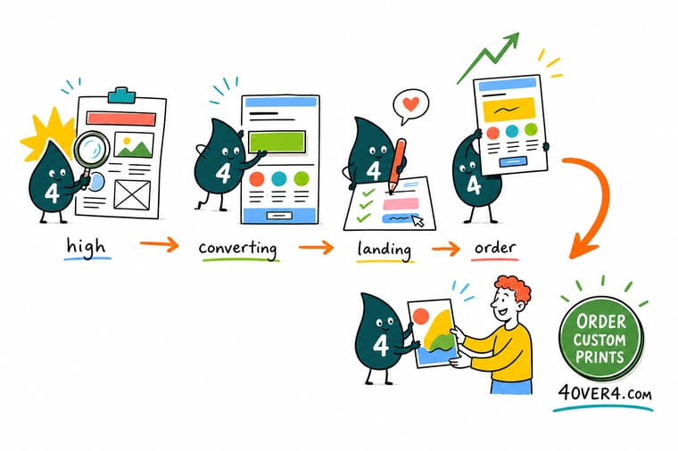
Wally lays the page out in five slots: the fold, the opening, the turn, the proof, the close. PAS, AIDA and BAB tell him what to put in the first three and in the last one, then go quiet on slot four. So he fills it himself with named reviews, a photo of the real job and a guarantee. Then he prints the postcard that sends people there with the exact same headline, because a mailer that promises one thing and a page that promises another wastes the whole drop.
Order postcards for your campaign →
Specs and pricing
The print formats that feed a landing page
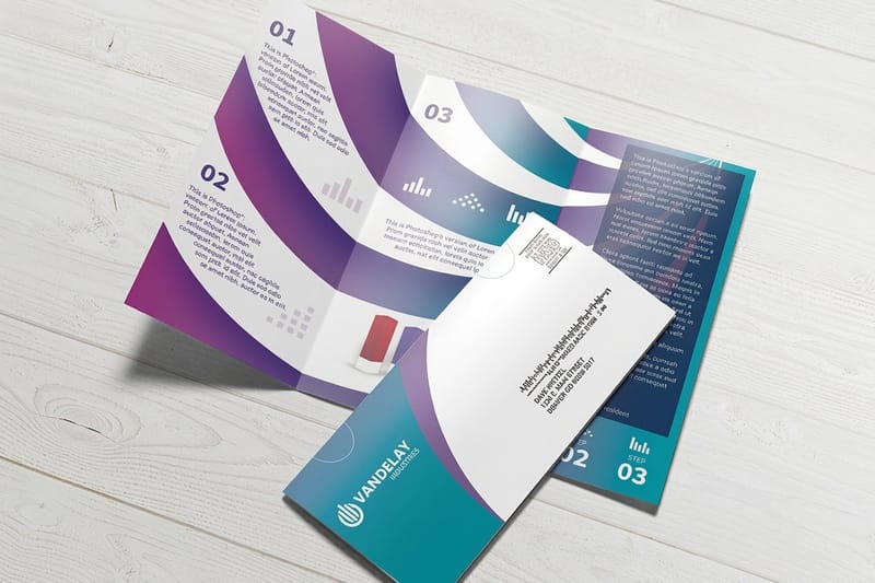
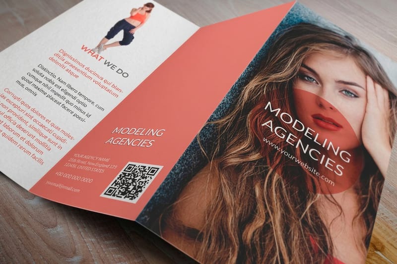
Postcards run 14 sizes from 2.5 by 2.5 to 6 by 11 inches on 22 stocks, from 50 for $16.48. Flyers run nine sizes from 4.25 by 5.5 to 11 by 25.5 inches on seven stocks, from 50 for $39.54, and brochures run six flat sizes with a half fold option, from 50 for $57.11. Sizes, stocks and starting prices come straight from the 4OVER4.COM configurator, for the three formats most campaigns use to drive traffic to a single URL.


Print it
Send pre-qualified traffic to the page
A mailed postcard reaches a list you chose, a flyer reaches the people you just spoke to, and a business card carries a short URL for months. All three print in full color on both sides and ship after 3 business days of standard production.

Explore more
Where to go next
Six next reads: building the marketing plan a page sits inside, the digital channels that feed it, running a direct mail campaign to a URL, designing a flyer with one call to action, the marketing materials hub and every postcard size we print.

By the numbers
Campaign print that backs a landing page, by the numbers
Common Questions
Your landing page questions, answered
How long should a landing page be?
Long enough to answer every objection that stands between the visitor and the action, and not one block longer. A free download for warm email traffic can be a headline, three lines and a form. A $6,000 service sold to cold traffic needs the problem, the method, the proof, the pricing logic and the objections, which usually runs several screens. Write out the questions a salesperson gets asked on the phone, answer each one in a block, then delete anything left over. Word count targets are the wrong tool.
Should a landing page have a navigation bar?
Remove it when the traffic is paid, mailed or scanned from print, because those visitors arrived for one thing and every nav link is a way out of the funnel. Keep a logo that links home so the page does not feel like a trap. Pages that also need to rank in organic search are a different case: they sit inside the site, they benefit from internal links, and stripping the navigation cuts them off from the rest of your content.
Can I use the same framework on a printed piece and the landing page?
Use the same first two stages, not the whole thing. A postcard has room for one promise, one image and one instruction, so it carries slot one and slot two of the framework and hands the rest to the page. The critical part is that the printed headline and the page headline say the same thing in the same words. A postcard offering a free roof inspection that lands on a page headlined "Quality roofing services" throws away everything the mailing cost.
How many fields should the form have?
Only the fields somebody will actually use before the first conversation. Name, email and one qualifying question is enough for most services, because phone number, company size and budget can be asked once a human is on the call. Every extra field is a request the visitor has to justify before they trust you. The exception is a business that is drowning in unqualified leads, where adding a budget question on purpose reduces volume and raises quality.
What is the difference between a landing page and a homepage?
A homepage serves everyone who arrives without a specific reason, so it has to route visitors: services, about, pricing, contact. A landing page serves one campaign, one audience and one action, and everything that does not serve that action comes off. That is why sending ad or direct mail traffic to a homepage usually underperforms a page built for the campaign, even when the homepage is the better looking page.
Get Started
Print the postcard that sends people to your page
Print the postcard, flyer or card that carries the same headline as the page, add a QR code and a short URL, and you can tell exactly which drop produced which lead.
Legal Disclaimer
Gold Standard guarantees apply to all standard orders placed through 4over4.com. Price match requires verifiable proof of a competitor's published price for an equivalent product with matching specifications and turnaround time. Satisfaction guarantee covers manufacturing defects and print quality issues. Contact support with order number and documentation.