
6 White Ink Print Products That Look Right on Black, Kraft and Clear Stock
White ink is the one ink you have to order on purpose. These are the six products at 4OVER4.COM where it earns its keep, in the order most brands buy them, from $24.75 for 100 kraft cards.
White ink is a real pass of pigment, not the absence of color, so it only exists on stock that is dark or transparent. Six products carry it well: black and kraft business cards, black postcards, black hangtags, clear stickers, and clear business cards. Density comes from ink film thickness, which is why solid marks look white and hairlines look gray.
The picks
Six pieces, from $24.75 kraft cards to $125.22 clear cards
Buy the piece your brand is missing, or print all six at once so one white mark runs across every surface a customer touches. Prices come from the configurator and fall as the quantity climbs. Every one of these can be built from scratch in the free online designer or started from a design template.
| Pick | Starting price | Why this one |
|---|---|---|
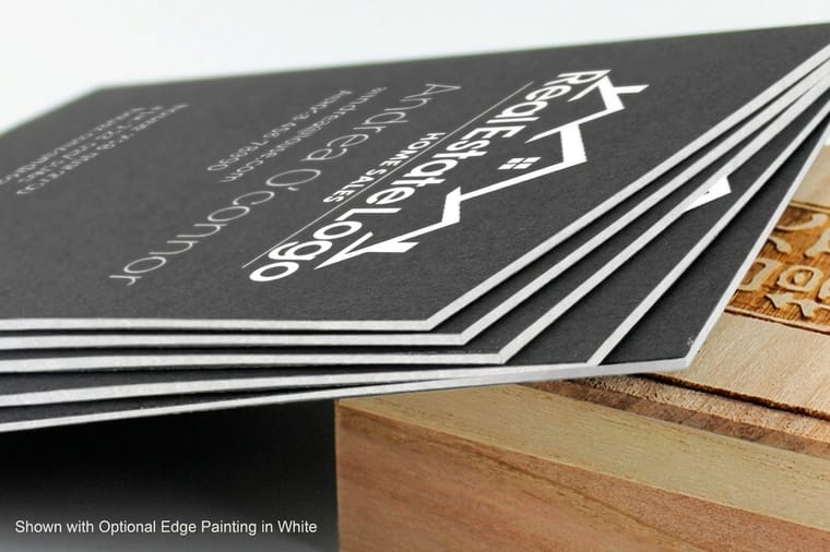
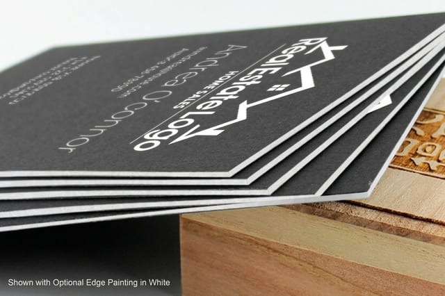
| 1. Black Business Cards | From $40.62 | The piece white ink was made for. Black core stock keeps the edge black, so the only bright thing on the card is the ink you paid for. |
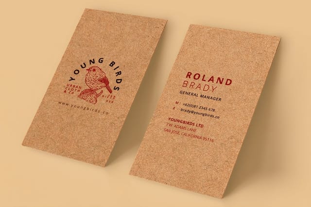
| 2. Kraft Business Cards | From $24.75 | The cheapest way into the set, and the softest look. Kraft warms the white toward cream, which suits a bakery or a workshop better than a hard black. |
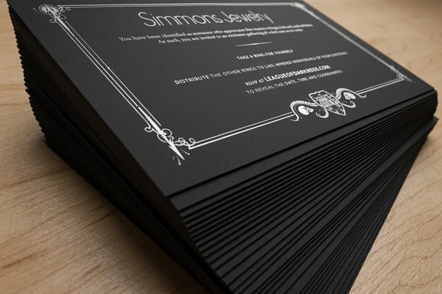
| 3. Black Postcards | From $25.60 | A black mailer stands out in a stack of white ones. Keep the address panel light so it still scans at the post office. |
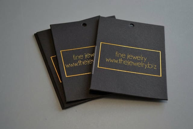
| 4. Black Hangtags | From $30.76 | The tag is what the customer holds while deciding. White logo on black board is the fastest way to make a $20 item look like a $60 one. |
| 5. Clear Stickers | From $25 | The white underbase decides whether the sticker reads on a dark bottle or vanishes into it. Order it with the white and you control both. |
| 6. Clear Business Cards | From $125.22 | The showpiece of the set, and the one with the highest entry price. White ink is what makes anything on clear plastic legible at all. |


How it works
Why the same white looks different on every stock
White ink goes down as its own pass, and what sits under that pass decides what you end up seeing. Black coated board holds the ink on the surface, kraft fiber drinks it, and clear plastic has nothing behind it at all. Read the cross-sections below and the rest of this page stops being surprising.
The practical version is short. Solid shapes carry more ink than thin ones, so a logo prints white and a hairline rule prints gray. Two hits of white in the same place look better than one, which is why an underbase job costs more than a single-pass job. And on transparent stock, anything you want to appear in color needs white beneath it, or the color reads as a tint of whatever the card is lying on.
Nothing here is a fault in the press. It is how ink film thickness works, and every printer who runs white deals with the same three limits. Designing around them is faster than arguing with them.
1. Black business cards: the benchmark for white ink
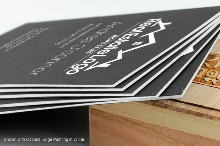
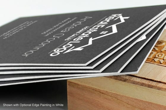
If you only order one piece from this set, order this one. Black business cards are printed on stock that is black all the way through, so the cut edge stays black instead of flashing a white core when the card is handed over. That edge is half the reason the card reads as expensive, and it is the detail people notice without being able to name it.
Design it as a solid mark, not a fine one. White holds beautifully in a logo, a bold wordmark, or a solid rule. It struggles in hairline serifs and in type below about 8pt, because a thin stroke does not carry enough ink film to look properly white and starts to read gray against the black around it. Set your white type at 8pt or larger, keep strokes at half a point or heavier, and the card comes back looking the way it did on screen.
Do not put a photograph on it. Process ink is transparent, so an image printed straight onto black stock disappears into it. If the design needs a picture, either move that side to a light stock or put the picture on a separate piece in the kit. Our walkthrough of how to design black business cards covers the layout habits that hold up, and business card thickness explains why a heavier board suits a dark card better than a thin one.
2. Kraft business cards: white that comes out warm
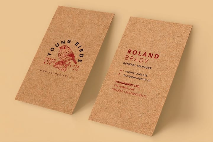
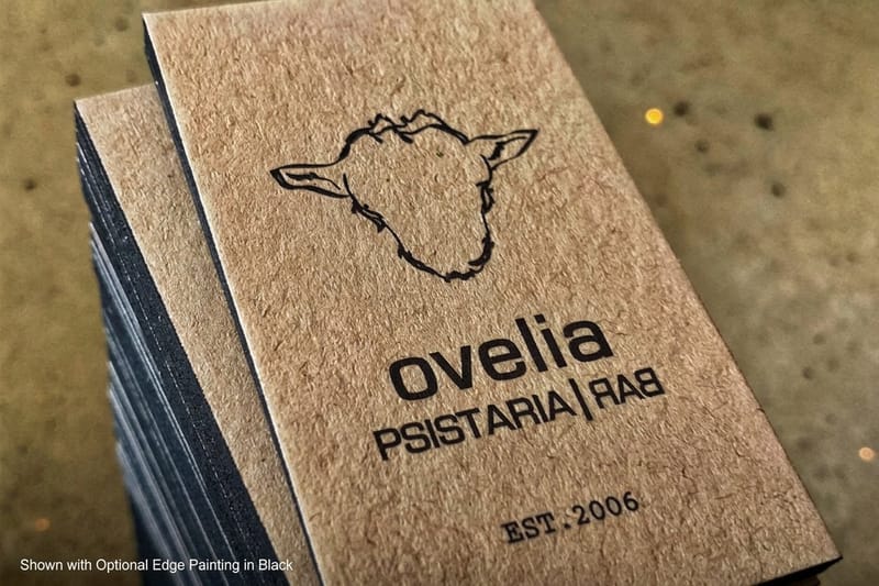
Kraft is the other end of the set, and it behaves differently from black. Kraft business cards are uncoated brown board with a visible fiber, and uncoated fibre absorbs ink instead of holding it on the surface. The practical result is that white on kraft never comes out as the pure white you see on a coated black card. It lands warm, closer to cream, and the brown reads through it slightly.
That is not a defect to fight. It is the look people buy kraft for, and it is why kraft suits a bakery, a coffee roaster, a candle maker, or a joinery shop better than a hard black card does. What it does mean is that a design relying on crisp white against a strong contrast will underdeliver on kraft, so lean on shape and weight rather than on brightness.
The stock decision is worth making before the design, not after. Kraft against standard cards lays out where each one wins, and printing paper stocks explained covers how coating changes the way any ink sits on the sheet. Order a kraft card and a black card together and you can see the whole range of what white ink does in one hand.
3. Black postcards: the one with a rule attached
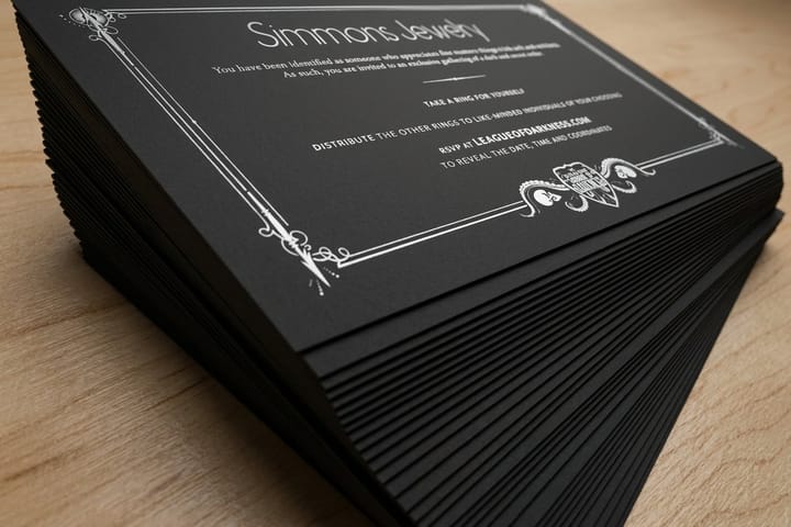
A black mailer arrives in a stack of white ones and gets picked up first. That is the entire argument for black postcards, and it is a good one. The catch is on the back, and it is a rule rather than a preference: the address side has to carry dark print on a light background so the sorting equipment can read the address and the barcode. White type on a solid black address panel will not scan.
The fix is simple once you know it. Design the front in white on black and give the address side a light panel, either the full side or a clean white block covering the address block and the barcode clear zone. Plenty of good direct mail runs exactly this way, dramatic on the front, plain and machine-readable on the back.
Colour behaves the same here as on the cards. Anything you want to appear in color on a black postcard needs white laid under it first, otherwise it sinks. If you are new to how ink density works on dark sheets, rich black explained and why black prints muddy are the two pieces that make the rest of this obvious.
4. Black hangtags: the piece the customer holds
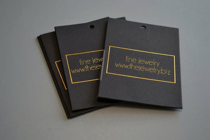
A tag is picked up, turned over, and read at arm's length while somebody decides whether to buy. Black hangtags printed with a white mark do more for perceived value than almost anything else in the kit, because the tag is one of the few printed pieces a shopper physically handles before paying.
Keep the front to the mark and the back to the work. Logo, one line, done on the front. Size, price, care instructions, and the barcode on the back, where they need to be legible rather than beautiful. If the barcode has to scan, print it dark on a light patch, the same rule as the postcard address panel, because a scanner reads contrast and white bars on black board give it nothing to read.
Match the tag to the card and the sticker and the effect compounds. One white mark, three surfaces, and the brand starts to look bigger than it is. Browse the rest of the kraft printing collection if you want the softer version of the same tag, and see spot UV designs for what happens when you add a gloss finish on top of the white.
5. Clear stickers: white is the difference between visible and invisible

Clear stickers are the cheapest way to see what an underbase actually does. Put a clear sticker without white on a dark bottle and the artwork drops into the glass. Put the same artwork down with white behind it and the design sits on top of the bottle instead of inside it. Nothing else changed except one pass of ink.
So decide the surface before you decide the file. On glass, on amber bottles, on dark packaging, and on anything you want to read from across a room, ask for white behind the artwork. On a window where you want the light to come through, or on a pale label where the point is the no-label look, leave the white off and let the stock disappear. Both are correct, and the only mistake is not choosing.
Material matters as much as the white. Our guides on choosing the right sticker material and glossy sticker paper cover what survives a dishwasher, a cooler, or a year of sun, and the wider clear printing collection shows the labels, clings, and decals that use the same underbase trick.
6. Clear business cards: the showpiece, and the priciest entry

This is the piece people remember, and it is the one with the highest starting price in the set. Clear business cards are printed on transparent plastic, which means every legible element on them exists because white ink is holding it up. Take the white away and the card is a piece of see-through plastic with a faint tint on it.
Two decisions do most of the work. First, how much of the card stays clear: a card with a small clear window is far easier to read than one that is mostly open, and the window is the effect anyway, so use it sparingly. Second, which side reads first, because anything printed on the reverse of a transparent card has to be mirrored, and text set the right way round on the wrong side comes back backwards.
Build the file with the white on its own named spot channel rather than as a fill you hope somebody notices. The step-by-step is in setting up white ink with spot colors in Illustrator, and how to make clear business cards covers the layout side. If you would rather not build it from scratch, start from a design template and swap the mark.
Specs and pricing
The two pieces most brands reorder
Black business cards and clear stickers get reprinted more often than anything else in the set, one because people run out of cards and one because stock rotates. Here are the live specs and the price ladders for both, straight from the configurator.

| Quantity | Price Per Unit | Total |
|---|---|---|
| 50 | 81.2¢ | $40.62 |
| 100 | 75.8¢ | $75.78 |
| 200 | 56.6¢ | $113.11 |
| 300 | 51.3¢ | $153.77 |
| 400 | 42.4¢ | $169.69 |
| 500 | 36.2¢ | $181.22 |
| 600 | 32.2¢ | $193.30 |
| 700 | 29.2¢ | $204.29 |
| Quantity | Price Per Unit | Total |
|---|---|---|
| 100 | 24.8¢ | $24.75 |
| 250 | 14.2¢ | $35.57 |
| 500 | 13.1¢ | $65.60 |
| 1,000 | 13.3¢ | $132.55 |
Before you upload
The three file mistakes that cost a reprint
Most white ink reprints come from the same three things, and all three are decided in the file rather than on press.
- Treating unprinted area as white. On a black or clear sheet, an area with no ink is stock, not white. Anything meant to be white needs a spot swatch named White applied to it.
- Fading white into a gradient. A white gradient running to zero over a dark sheet goes chalky and bands, because the film gets too thin to read. Keep white flat.
- Forgetting to mirror the reverse of a clear card. Text set the right way round on the back of transparent plastic comes back reversed. Decide which side reads first, then flip the other one.
Set the file up once the right way and the same artwork runs across all six products without a second thought. The full walkthrough is in setting up white ink with spot colors in Illustrator, and if the run is time-sensitive, check what qualifies for same-day printing before you place it.
Wally explains the white pass
One ink, four surfaces, one brand
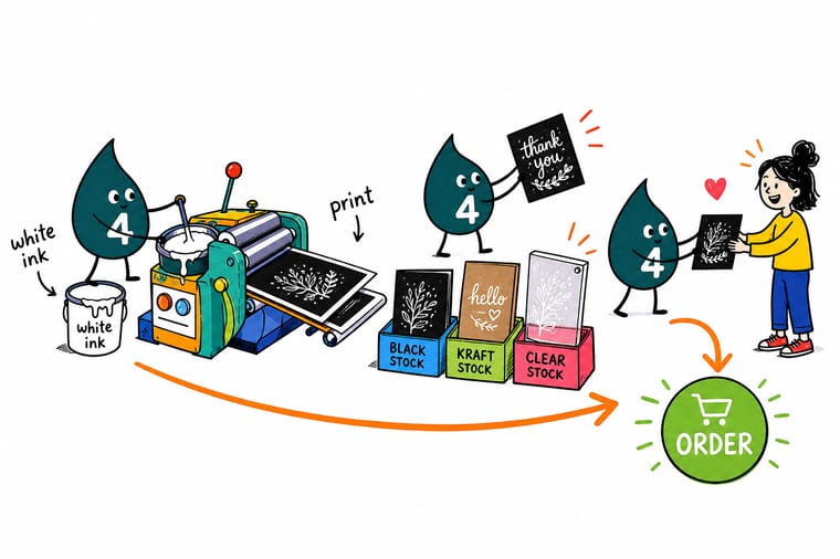
Wally lines the six pieces up in order: the black card that sets the benchmark, the kraft card that warms the white, the black postcard with its light address panel, the hangtag the customer holds, the clear sticker that needs an underbase, and the clear card that is nothing without one. Print the same white mark across all of them and a small brand starts to look like a big one. Pick the piece you are missing, or let 4OVER4 run the whole set together.
Shop white ink printing →Explore more
Where to go next




By the numbers
What a white pass can be laid down on
Common Questions
Common questions about white ink printing
Is white ink actually opaque, or does the stock show through?
It is a real pigmented ink, but opacity depends on how much of it lands. A single thin hit over black stock reads as a soft gray-blue rather than a clean white, which is why solid shapes and heavier type look right while hairlines and small serifs look washed. Build the design around solid marks and the white behaves. Order a sample before a large run if the exact shade of white matters to the brand.
Can I print a photograph on black or kraft stock?
Not directly. CMYK inks are transparent, so a photo printed onto a dark sheet lets the stock show through every tone and comes back muddy. The workaround is to lay white under the image first so the picture has something to sit on, which adds a pass. If the photo is the point of the piece, it is usually cheaper and better to print that side on a light stock and keep the dark stock for the branded side.
Why did my white come back looking gray or slightly blue?
Almost always ink film thickness. Thin elements, fine type, and gradients that fade toward zero carry less white, and less white means more of the black underneath reads through. Gradients are the worst offender because a white fade on a dark sheet turns chalky and bands. Keep white flat, keep it solid, and keep type at 8pt or above.
Does white ink cost more than normal printing?
Yes. White is an extra pass on press, so a piece printed with white ink sits above the same piece in plain CMYK, and jobs with a white underbase under color cost more again because the sheet goes through for both. Live prices for all six products in this set update as you set quantity and options in the configurator, so you can see the difference for your own run before you commit.
Can I mail a black postcard?
Yes, with one condition. The address side must be dark print on a light background so the sorting equipment can read the address and the barcode, so give that side a light panel even when the front is solid black. The front is where the black does its work anyway, since a dark card in a stack of white mail gets picked up first.
Do clear stickers need a white underbase?
It depends on where they go. On glass, dark bottles, and colored packaging you want white behind the artwork, or the design sinks into the surface underneath. On a window where you want light through the graphic, or where the no-label look is the whole idea, leave the white off. Decide the surface first, because the answer changes the file, not just the order.
Does white on kraft look the same as white on black?
No. Kraft is uncoated, so the fiber absorbs ink instead of holding it on the surface, and the brown reads through. White on kraft lands warm and slightly creamy rather than bright. That is the reason people choose kraft, but if your brand depends on a clean cold white, print it on black stock instead.
How do I set up a file with white ink in it?
Make a spot color swatch, name it White, and apply it to the elements that should print white, keeping them on their own layer at the top of the file. Do not use a CMYK white fill and do not assume an unprinted area will become white, because on dark stock an unprinted area is just the stock. Our Illustrator walkthrough covers the swatch, the overprint setting, and how to export it so nothing gets flattened away.
Get Started
Order 50 black business cards from $40.62 and print them in white
Print the six-piece white ink set as one branded run at 4OVER4.COM. Choose your stocks, sizes, and finishes, and watch every price update live as you build the order.
Legal Disclaimer
Gold Standard guarantees apply to all standard orders placed through 4over4.com. Price match requires verifiable proof of a competitor's published price for an equivalent product with matching specifications and turnaround time. Satisfaction guarantee covers manufacturing defects and print quality issues. Contact support with order number and documentation. On-time delivery rate based on tracked orders 1999 to 2026. Individual results may vary based on shipping carrier performance.
