
Corporate Identity Design That Holds Up in Print


The four elements of a corporate identity, the spec each one has to become before a press can use it, and the five printed pieces that carry the whole system.
Corporate identity design is the fixed visual system a company uses to identify itself: the logo and its lockups, the typefaces, the color values, and the shape and layout rules, all written down so anyone can apply them. Branding is the reputation that system earns; identity is the part you can specify, file and hand to a printer. Four elements carry it, and each one has to become something concrete: vector artwork with a minimum width, a licensed font that gets outlined, a Pantone number with its CMYK build, and one corner radius reused everywhere.

Quick answer
The system you can specify, not the reputation you hope for
An identity exists when a stranger can produce a correct business card from your documents without asking a single question. That means the logo is supplied as vector artwork with a stated minimum width, the typefaces are licensed for print and get outlined before upload, the colors carry a Pantone number alongside their CMYK build, and the shape rules name one corner radius. Everything left to judgement drifts at the second reorder, when the designer who made the first batch is no longer in the room.
Corporate Identity Versus Branding, and Why Mixing Them Up Costs Money

Identity is the specified part. Branding is the earned part. You can hand a printer a logo file, a Pantone number and a trim size; you cannot hand anyone the feeling a customer gets when your envelope lands on their desk.
The confusion has a price attached. A company pays for what it thinks is an identity, receives a set of mood boards, three logo directions and a page of adjectives, then discovers at the first print job that nobody wrote down which typeface, at what weight, at what minimum size. The designer fills the gap by judgement. Six months later a different designer fills the same gap by different judgement, and the second batch of cards does not match the first.
Use one test. Give your documents to somebody who has never spoken to you and ask them to set a business card. If they come back with a question, that question marks a hole in the identity. Write the answer down and the hole closes permanently.
This distinction also decides how much work a change actually is. Swapping a tagline is a brand decision that costs a sentence. Swapping a logo is an identity decision that reaches every printed item you own, which is the part companies underestimate. Our guide to the rebranding process works through the sequencing so you are not left with four cartons of obsolete letterhead.
What a Locked Identity Actually Buys You
Recognition is the reason people give. Fewer reprints is the reason you feel first.
Most wasted print money comes from files, not from taste. A logo supplied as a 150 dpi PNG pulled off the website gets rejected, or worse, gets printed and arrives soft-edged. Type that was never outlined gets substituted by the RIP and a heading comes back in the wrong face. A color built in RGB converts on its own somewhere in the workflow and the blue shifts toward purple. None of that is a design failure. It is a documentation failure, and every instance of it costs a run.
The second thing a locked identity buys is speed. When the templates exist at final trim size with bleed already marked, a new hire can order standard business cards in ten minutes for $17.57 without routing anything through a designer. When they do not exist, the same request becomes a three-day thread.
The third is a fair comparison over time. If every piece follows the same rules, you can tell whether the identity is working. If each piece was improvised, you are comparing noise. Before any of that pays off, the mark itself has to be built to survive reproduction, which is what our logo design guide covers in detail.
The Four Elements, and the Spec Each One Has to Become

Logo, typography, color, form. Every identity system reduces to these four, and each one is only real once it has become a file or a number somebody at a press can act on.
| Element | What you decide | What you hand over | The failure it prevents |
|---|---|---|---|
| Logo | The primary mark, a stacked and a horizontal lockup, a one-color version, and a simplified small-size version. | Vector AI or EPS, plus SVG for screens, plus a stated minimum width and clear space. | A mark that fills in and turns to mud at 0.75 inches on a business card. |
| Typography | One display face and one text face, with the specific weights you allow. Two families is usually enough. | The font files, a license that permits print embedding, and text converted to outlines before upload. | The press RIP substituting a font you never chose, silently, on a live job. |
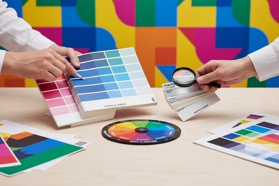
| Color | One brand color, one accent, and a neutral. Decide which of them must match exactly across pieces. | A Pantone number, its CMYK build written next to it, and a hex value for screen use. | Independent RGB conversions in three different files producing three different blues. |
| Form and shape | Corner radius, rule weights, the grid, the frame or shape motif that repeats. | A die line for any non-rectangular piece, and one radius value reused on every layout. | Rounded corners on the cards and square corners on the folder, ordered six weeks apart. |
Read the last column first. Each of those failures is cheap to prevent and expensive to discover after 2,500 pieces are boxed.
Two of the four deserve extra care. Color is the one that surprises people: bright orange, vivid green and deep reflex blue all sit outside what four process inks can reach, so they lose some intensity in a CMYK build, and the same build prints softer on uncoated stock than on gloss because uncoated fibers drink more ink. Matching Pantone to CMYK walks through which colors convert cleanly. Typography is the one that fails quietly, and the fix takes a minute: convert your text to shapes before the file leaves your machine. For the mark itself, the constraints that keep a logo printable are set out in the six key principles of logo design.
Turning the Identity Into Things You Can Order
An identity that never gets printed is a PDF. Five pieces carry almost all of the work, and each one puts a different kind of pressure on the design.
- Business cards, from $17.57. The hardest test in the set. A 3.5 by 2 inch trim means the logo usually sits under an inch wide, so this is where the simplified version earns its existence. Keep contact text at least an eighth of an inch inside the trim line. Browse stocks and finishes in business card printing.
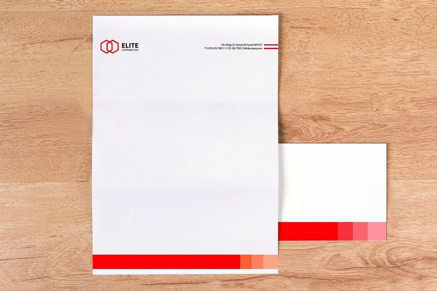
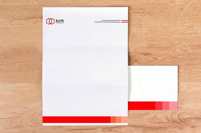
- Letterhead, from $99.95. The piece with a constraint people forget. Office laser and inkjet printers cannot print to the edge of a sheet, so if the design has a full-bleed color band it has to be printed by us and then run through the office printer for the text only. Leave a generous clear zone for that text. See standard letterheads.
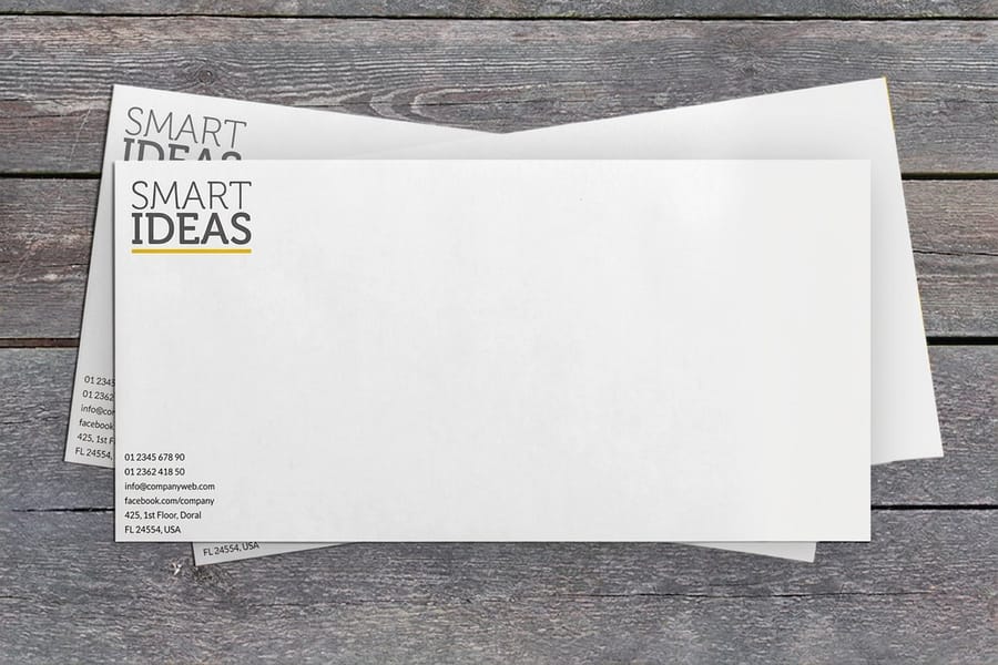
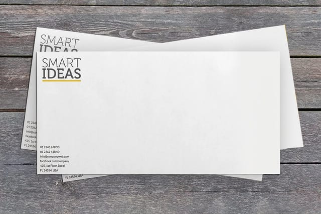
- Envelopes, from $142.99. A number 10 envelope is 9.5 by 4.125 inches, and the printable area shrinks further around the seams and the flap. Keep the return address block simple and away from the glued edges. Configure printed envelopes to match the letterhead stock.
- Notepads, from $93.37. The cheapest identity carrier per impression, because they sit on a desk for weeks. A header, a rule and a footer are enough. See standard notepads.
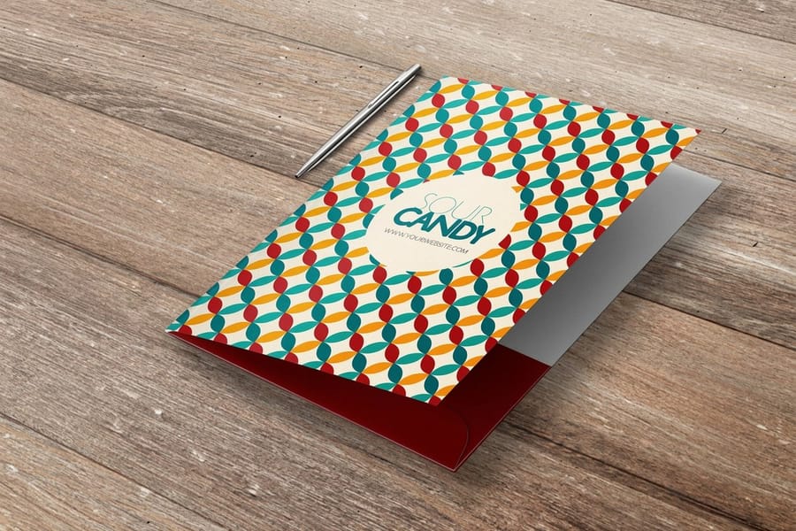
- Pocket folders, from $844.54. The big-ticket item, so put them on a slower cycle than the rest. Artwork here spans a die line, folds and glue tabs, which means the layout has to be built on the template rather than adapted to it. Compare options in presentation folder printing or start with plain pocket folders.
Order the card first and judge everything else against it. It is the piece that gets held, compared, and kept, and if the identity does not survive at that size it will not be rescued by a larger format. Once the card is signed off, the rest of the set is a matter of applying the same values, which is exactly the sequence in our branded stationery set guide.
Holding the Line Across Print and a Remote Team
Identity drift almost never happens on the first run. It happens on the second, when the designer has moved on and somebody in another time zone rebuilds a file from a logo they right-clicked off the website.
Four things stop it, and none of them is a longer style guide. First, one asset pack in one place, with the vector logo, the licensed fonts, the color values and the templates, and no second copy floating in an email thread. Second, templates at final trim size with bleed already marked, so nobody has to remember the numbers. Ours sit in the blank template library, and if there is no in-house designer, the online design templates keep the layout inside the rules automatically.
Third, one reorder path. When cards for a new hire in another city are ordered from the same account against the same saved job, the file cannot drift, because nobody is rebuilding anything. Fourth, name one person who approves new applications of the identity. Not a committee. One person, with the authority to say no to a fifth typeface.
Two habits are worth adding for distributed teams. Keep a printed reference set, one card, one letterhead, one folder, at each location, so color arguments happen against paper rather than against monitors that are all calibrated differently. And when a reprint has to match a batch already in circulation, say so on the order and send the sample, because matching an existing piece is a different job from printing to a number. If you want the full picture of what happens between upload and delivery, read how online printing works.
Wally explains corporate identity
Four elements, written down, then printed
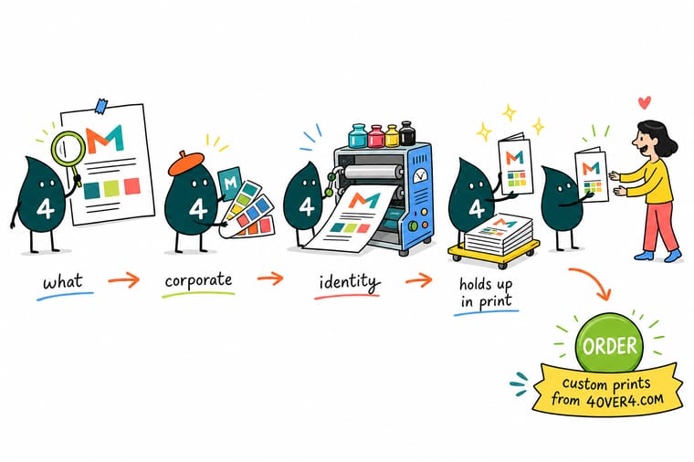
Wally pins four things to the board: the logo, the typeface, the color and the shape rule. Then he writes a number next to each one, because a mark without a minimum width and a color without a Pantone value are opinions, not specifications. He prints the business card first, since that is where the logo gets squeezed hardest, and lines the letterhead, the envelope and the folder up against it. When batch two arrives six months later it matches, because nobody had to guess.
Order business cards that match your identity →Specs and pricing
The identity set, sizes and starting prices
Cards, letterhead and folders carry most of an identity. Compare the sizes, stocks and starting prices straight from the 4OVER4.COM configurator.

Print it
Put the identity on paper

Explore more
Where to go next




By the numbers
Identity work printed by 4OVER4
Common Questions
Your corporate identity questions, answered
What is corporate identity design?
Corporate identity design is the deliberate visual system a company uses to identify itself: the logo and its approved lockups, the typefaces, the color values, and the shapes and layout rules that repeat across everything the company produces. The test of whether it exists is practical rather than aesthetic. Hand the documents to somebody who has never met you, and they should be able to set a business card, a letterhead and an envelope that all look like they came from the same place, without a single follow-up question.
What is the difference between corporate identity and branding?
Corporate identity is what you specify. Branding is what people conclude. You control the logo files, the Pantone numbers, the type licenses and the templates, and you can enforce those with a document. You do not control whether a customer trusts you, and no amount of design work makes that decision for them. The practical consequence is that identity work has a finish line, a set of files and rules that either exist or do not, while brand work never really ends.
What files belong in a corporate identity pack?
At minimum: the logo as vector artwork in AI or EPS plus an SVG for web, a horizontal and a stacked lockup, a one-color version for single-ink jobs, and a simplified small-size version. Then the font files with a license that permits print embedding, the color values written three ways as Pantone, CMYK and hex, and the print templates at final trim size with bleed marked. Add a short page that states the minimum logo width and the clear space around it. That page prevents most of the arguments.
Why does my logo look different in print than on screen?
A monitor emits light and a press lays down ink, so the two never match exactly. The gap is widest on saturated colors, particularly bright orange, vivid green and deep blue, because those sit outside what four process inks can reproduce. Stock makes it worse: the same CMYK build prints softer and slightly duller on uncoated paper than on gloss, because uncoated fibers absorb more ink. If a color has to be exact across every piece, specify it as a Pantone spot ink and expect to pay a setup premium for it.
How small can a logo be on a business card?
Test it at 0.75 inches wide, because that is roughly where most logos land on a 3.5 by 2 inch card once the name, title and contact details have their share of the space. Print the test on the actual stock rather than judging it on screen. Thin strokes, tight counters inside letters and any tagline set below about 5 point will close up or disappear. That is the moment to draw the simplified version, not later.
How do I keep colors consistent across cards, letterhead and folders?
Order the pieces that have to match from the same printer, in the same run where you can, and give every job identical color values rather than letting each designer convert from RGB independently. Different stocks will still read slightly differently, so decide which piece is the reference. Most companies use the business card, since it is the piece people compare in the hand. If a batch has to match one already in circulation, send us a printed sample with the order and say so.
Get Started
Letterheads 50 for $99.95, folders 250 for $844.54
Start with the business card, since that is where the logo gets squeezed hardest, then match the letterhead, envelopes and folders to it from the same saved job.
Legal Disclaimer
Gold Standard guarantees apply to all standard orders placed through 4over4.com. Price match requires verifiable proof of a competitor's published price for an equivalent product with matching specifications and turnaround time. Satisfaction guarantee covers manufacturing defects and print quality issues. Contact support with order number and documentation. On-time delivery rate based on tracked orders 1999 to 2026. Individual results may vary based on shipping carrier performance.
